Embed Size (px)
Citation preview
Acknowledgements: Contributing Minnesota producers Minnesota State Colleges and Universities Farm Business Management Education
Program Southwestern Minnesota Farm Business Management Association
Copyright © 2016, Regents of the University of Minnesota. All rights reserved. This material may not be reproduced without the written permission of the Center for Farm Financial Management, University of Minnesota. The University of Minnesota is committed to the policy that all persons shall have equal access to its programs, facilities, and employment without regard to race, color, creed, religion, national origin, sex, age, marital status, disability, public assistance status, veteran status, or sexual orientation. This project was partially funded by a National Farm Business Management and Benchmarking Grant from the USDA National Institute of Food and Agriculture.
2015 FINBIN Report on Minnesota Farm Finances
Dale Nordquist Center for Farm Financial Management
The 2,184 Minnesota farms included in the FINBIN database represent a broad cross-section of Minnesota production agriculture. While there is no “typical” Minnesota farm, these farms include a large enough sample to provide a good barometer of commercial farming in Minnesota. FINBIN data is provided by farms that participate in MnSCU Farm Business Management Education programs and the Southwestern Minnesota Farm Business Management Association. These farms represent about 3 percent of the farms in the state and 9% of commercial farms with sales of over $250,000.1 Highlights Despite record crop yields, net income for
Minnesota farms continued to decline in 2015, reaching the lowest point in 20 years in inflation-adjusted dollars. The median net farm income for Minnesota farmers included in the study was $27,078, down 37% form 2014.
Crop farm earnings increased slightly, but remained low by historical standards. The median crop farm earned $26,586 in 2015, up from $16,582 in 2014. Crop prices continued their decline that started in 2013, but price declines were offset by record crop yields. Yields were generally 20% above the ten year average for participating farms.
Dairy farm profits declined by 70%
following a very profitable 2014. The median dairy farm earned $41,521 compared to $137,962 in 2014. The average price received for milk was $17.94 per hundred pounds, down from $24.45 in 2014.
Earnings evaporated for hog producers. The
median hog farm earned less than $1,000, down from over $200,000 in 2014.
! Most beef producers lost money on farm operations in 2015. The median beef farm lost -$6,872 in 2015, down from profits of $40,950 a year ago.
The average farm earned a rate of return on assets of 1.2%, down from 3.8% in 2014 (based on adjusted cost or book valuation of assets). Liquidity declined as the average farm consumed 22% of their working capital. Debt coverage was less than 1:1, meaning that the average farm did not earn enough to cover scheduled debt payments.
Government payments were up as the first
payments were received from the 2014 farm program. Payments averaged $33,456 as declining crop prices triggered sizable payments. Payments represented 4% of gross revenue.
The average farm’s net worth increased by
over $35,000, but the majority of the increase resulted from increases in the estimated market value of farm assets. Earnings contributed only $7,143 to net worth growth. The average farm’s debt to asset ratio increased slightly, from 41% to 42%.
Earnings were down in every region except
Northwestern Minnesota. Earnings were up slightly in the Northwest primarily due to improved returns on sugar beets.
As is usually the case, profits generally
increased with farm size. However, when measured based on rate of return on assets, the advantage to size was negligible.
The average family spent $61,000 on family
living expenditures, down 5% from 2014. Below are financial trends for these farms over the past three years.
1 Minnesota Ag News – Farms and Land in Farms, United States Department of Agriculture, National Agricultural Statistics Service, Washington, D.C., February 19, 2015.
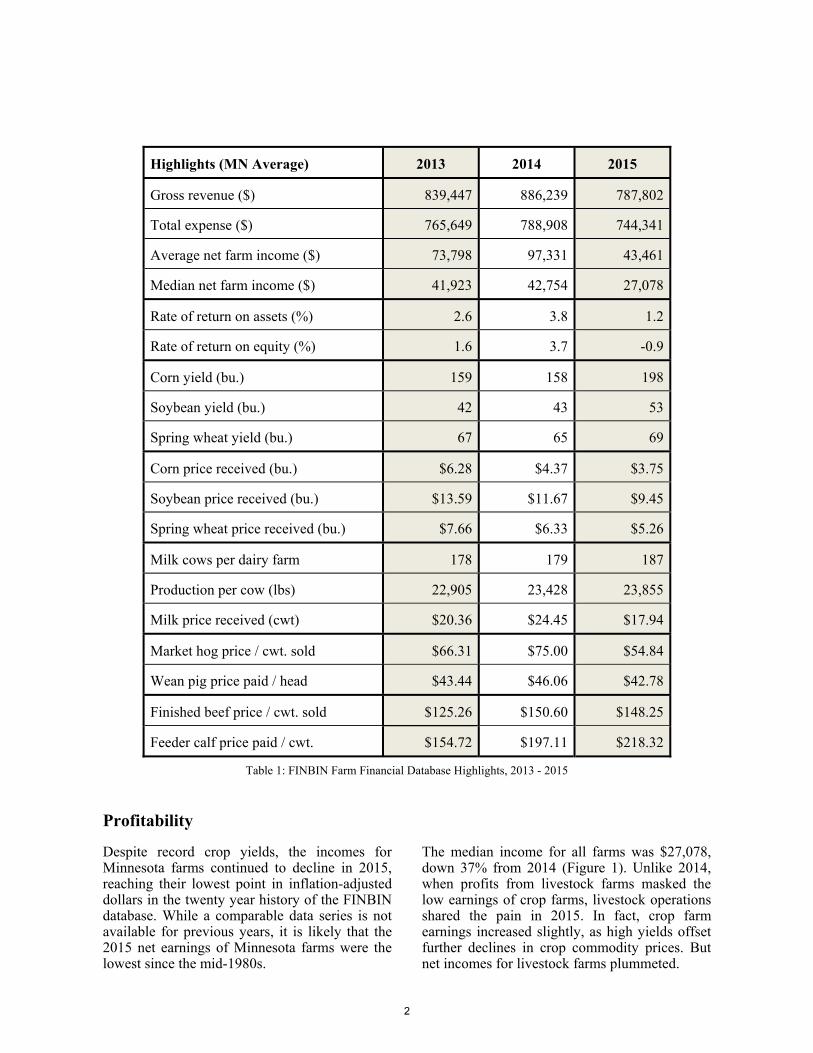
Highlights (MN Average) 2013 2014 2015
Gross revenue ($) 839,447 886,239 787,802
Total expense ($) 765,649 788,908 744,341
Average net farm income ($) 73,798 97,331 43,461
Median net farm income ($) 41,923 42,754 27,078
Rate of return on assets (%) 2.6 3.8 1.2
Rate of return on equity (%) 1.6 3.7 -0.9
Corn yield (bu.) 159 158 198
Soybean yield (bu.) 42 43 53
Spring wheat yield (bu.) 67 65 69
Corn price received (bu.) $6.28 $4.37 $3.75
Soybean price received (bu.) $13.59 $11.67 $9.45
Spring wheat price received (bu.) $7.66 $6.33 $5.26
Milk cows per dairy farm 178 179 187
Production per cow (lbs) 22,905 23,428 23,855
Milk price received (cwt) $20.36 $24.45 $17.94
Market hog price / cwt. sold $66.31 $75.00 $54.84
Wean pig price paid / head $43.44 $46.06 $42.78
Finished beef price / cwt. sold $125.26 $150.60 $148.25
Feeder calf price paid / cwt. $154.72 $197.11 $218.32
Table 1: FINBIN Farm Financial Database Highlights, 2013 - 2015
Profitability
Despite record crop yields, the incomes for Minnesota farms continued to decline in 2015, reaching their lowest point in inflation-adjusted dollars in the twenty year history of the FINBIN database. While a comparable data series is not available for previous years, it is likely that the 2015 net earnings of Minnesota farms were the lowest since the mid-1980s.
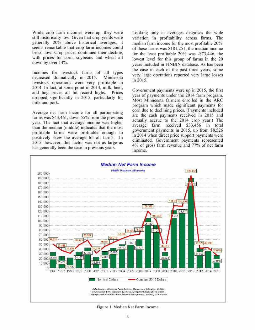
The median income for all farms was $27,078, down 37% from 2014 (Figure 1). Unlike 2014, when profits from livestock farms masked the low earnings of crop farms, livestock operations shared the pain in 2015. In fact, crop farm earnings increased slightly, as high yields offset further declines in crop commodity prices. But net incomes for livestock farms plummeted.
2
While crop farm incomes were up, they were still historically low. Given that crop yields were generally 20% above historical averages, it seems remarkable that crop farm incomes could be so low. Crop prices continued their decline, with prices for corn, soybeans and wheat all down by over 14%.
Incomes for livestock farms of all types decreased dramatically in 2015. Minnesota livestock operations were very profitable in 2014. In fact, at some point in 2014, milk, beef, and hog prices all hit record highs. Prices dropped significantly in 2015, particularly for milk and pork.
Average net farm income for all participating farms was $43,461, down 55% from the previous year. The fact that average income was higher than the median (middle) indicates that the most profitable farms were profitable enough to positively skew the average for all farms. In 2015, however, this factor was not as large as has generally been the case in previous years.
Looking only at averages disguises the wide variation in profitability across farms. The median farm income for the most profitable 20%of these farms was $181,251; the median income for the least profitable 20% was -$73,446, the lowest level for this group of farms in the 20 years included in FINBIN database. As has been the case in each of the past three years, some very large operations reported very large losses in 2015.
Government payments were up in 2015, the first year of payments under the 2014 farm program. Most Minnesota farmers enrolled in the ARC program which made significant payments for corn due to declining prices. (Payments included are the cash payments received in 2015 and actually accrue to the 2014 crop year.) The average farm received $33,456 in total government payments in 2015, up from $8,526 in 2014 when direct price support payments were eliminated. Government payments represented 4% of gross farm revenue and 77% of net farm income.
Figure1:MedianNetFarmIncome
3
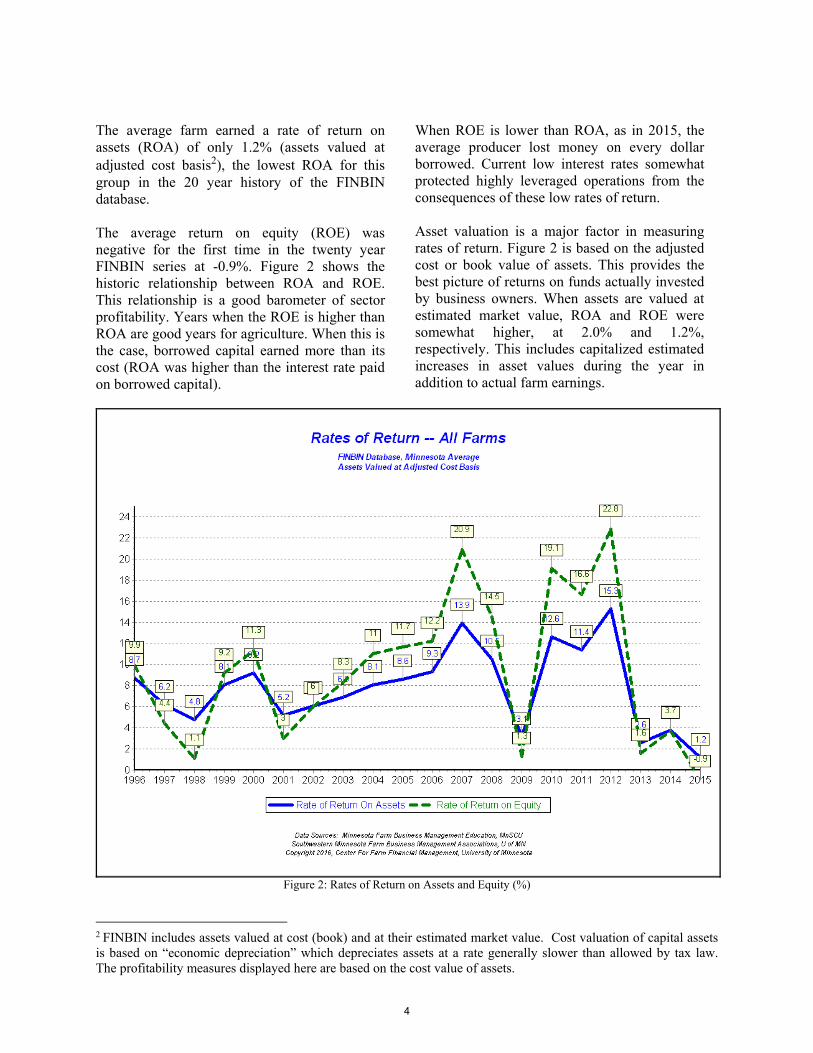
The average farm earned a rate of return on assets (ROA) of only 1.2% (assets valued at adjusted cost basis2), the lowest ROA for this group in the 20 year history of the FINBIN database.
The average return on equity (ROE) was negative for the first time in the twenty year FINBIN series at -0.9%. Figure 2 shows the historic relationship between ROA and ROE. This relationship is a good barometer of sector profitability. Years when the ROE is higher than ROA are good years for agriculture. When this is the case, borrowed capital earned more than its cost (ROA was higher than the interest rate paid on borrowed capital).
When ROE is lower than ROA, as in 2015, the average producer lost money on every dollar borrowed. Current low interest rates somewhat protected highly leveraged operations from the consequences of these low rates of return.
Asset valuation is a major factor in measuring rates of return. Figure 2 is based on the adjusted cost or book value of assets. This provides the best picture of returns on funds actually invested by business owners. When assets are valued at estimated market value, ROA and ROE were somewhat higher, at 2.0% and 1.2%, respectively. This includes capitalized estimated increases in asset values during the year in addition to actual farm earnings.
Figure 2: Rates of Return on Assets and Equity (%)
2 FINBIN includes assets valued at cost (book) and at their estimated market value. Cost valuation of capital assets is based on “economic depreciation” which depreciates assets at a rate generally slower than allowed by tax law. The profitability measures displayed here are based on the cost value of assets.
4
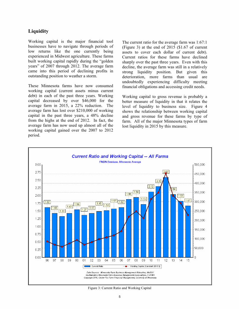
Liquidity
Working capital is the major financial tool businesses have to navigate through periods of low returns like the one currently being experienced in Midwest agriculture. These farms built working capital rapidly during the “golden years” of 2007 through 2012. The average farm came into this period of declining profits in outstanding position to weather a storm.
These Minnesota farms have now consumed working capital (current assets minus current debt) in each of the past three years. Working capital decreased by over $46,000 for the average farm in 2015, a 22% reduction. The average farm has lost over $210,000 of working capital in the past three years, a 48% decline from the highs at the end of 2012. In fact, the average farm has now used up almost all of the working capital gained over the 2007 to 2012 period.
The current ratio for the average farm was 1:67:1 (Figure 3) at the end of 2015 ($1.67 of current assets to cover each dollar of current debt). Current ratios for these farms have declined sharply over the past three years. Even with this decline, the average farm was still in a relatively strong liquidity position. But given this deterioration, more farms than usual are undoubtedly experiencing difficulty meeting financial obligations and accessing credit needs.
Working capital to gross revenue is probably a better measure of liquidity in that it relates the level of liquidity to business size. Figure 4 shows the relationship between working capital and gross revenue for these farms by type of farm. All of the major Minnesota types of farm lost liquidity in 2015 by this measure.
Figure 3: Current Ratio and Working Capital
5
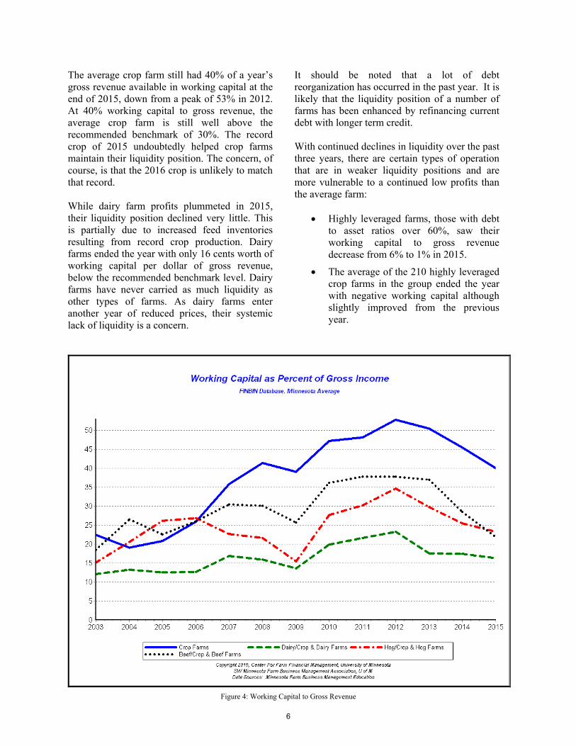
The average crop farm still had 40% of a year’s gross revenue available in working capital at the end of 2015, down from a peak of 53% in 2012. At 40% working capital to gross revenue, the average crop farm is still well above the recommended benchmark of 30%. The record crop of 2015 undoubtedly helped crop farms maintain their liquidity position. The concern, of course, is that the 2016 crop is unlikely to match that record.
While dairy farm profits plummeted in 2015, their liquidity position declined very little. This is partially due to increased feed inventories resulting from record crop production. Dairy farms ended the year with only 16 cents worth of working capital per dollar of gross revenue, below the recommended benchmark level. Dairy farms have never carried as much liquidity as other types of farms. As dairy farms enter another year of reduced prices, their systemic lack of liquidity is a concern.
It should be noted that a lot of debt reorganization has occurred in the past year. It is likely that the liquidity position of a number of farms has been enhanced by refinancing current debt with longer term credit.
With continued declines in liquidity over the past three years, there are certain types of operation that are in weaker liquidity positions and are more vulnerable to a continued low profits than the average farm:
Highly leveraged farms, those with debtto asset ratios over 60%, saw theirworking capital to gross revenuedecrease from 6% to 1% in 2015.
The average of the 210 highly leveragedcrop farms in the group ended the yearwith negative working capital althoughslightly improved from the previousyear.
Figure 4: Working Capital to Gross Revenue
6
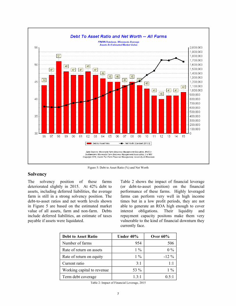
Figure 5: Debt to Asset Ratio (%) and Net Worth
Solvency
The solvency position of these farms deteriorated slightly in 2015. At 42% debt to assets, including deferred liabilities, the average farm is still in a strong solvency position. The debt-to-asset ratios and net worth levels shown in Figure 5 are based on the estimated market value of all assets, farm and non-farm. Debts include deferred liabilities, an estimate of taxes payable if assets were liquidated.
S
Table 2 shows the impact of financial leverage (or debt-to-asset position) on the financial performance of these farms. Highly leveraged farms can perform very well in high income times but in a low profit periods, they are not able to generate an ROA high enough to cover interest obligations. Their liquidity and repayment capacity positons make them very vulnerable to the kind of financial downturn they currently face.
Debt to Asset Ratio Under 40% Over 60%
Number of farms 954 506
Rate of return on assets 1 % 0 %
Rate of return on equity 1 % -12 %
Current ratio 3:1 1:1
Working capital to revenue 53 % 1 %
Term debt coverage 1.3:1 0.5:1 Table 2: Impact of Financial Leverage, 2015
7
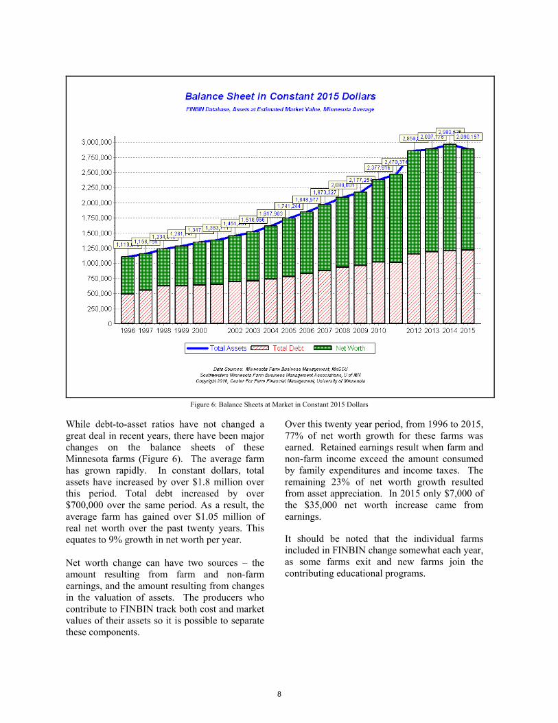
Figure 6: Balance Sheets at Market in Constant 2015 Dollars
While debt-to-asset ratios have not changed a great deal in recent years, there have been major changes on the balance sheets of these Minnesota farms (Figure 6). The average farm has grown rapidly. In constant dollars, total assets have increased by over $1.8 million over this period. Total debt increased by over $700,000 over the same period. As a result, the average farm has gained over $1.05 million of real net worth over the past twenty years. This equates to 9% growth in net worth per year.
Net worth change can have two sources – the amount resulting from farm and non-farm earnings, and the amount resulting from changes in the valuation of assets. The producers who contribute to FINBIN track both cost and market values of their assets so it is possible to separate these components.
Over this twenty year period, from 1996 to 2015, 77% of net worth growth for these farms was earned. Retained earnings result when farm and non-farm income exceed the amount consumed by family expenditures and income taxes. The remaining 23% of net worth growth resulted from asset appreciation. In 2015 only $7,000 of the $35,000 net worth increase came from earnings.
It should be noted that the individual farms included in FINBIN change somewhat each year, as some farms exit and new farms join the contributing educational programs.
8
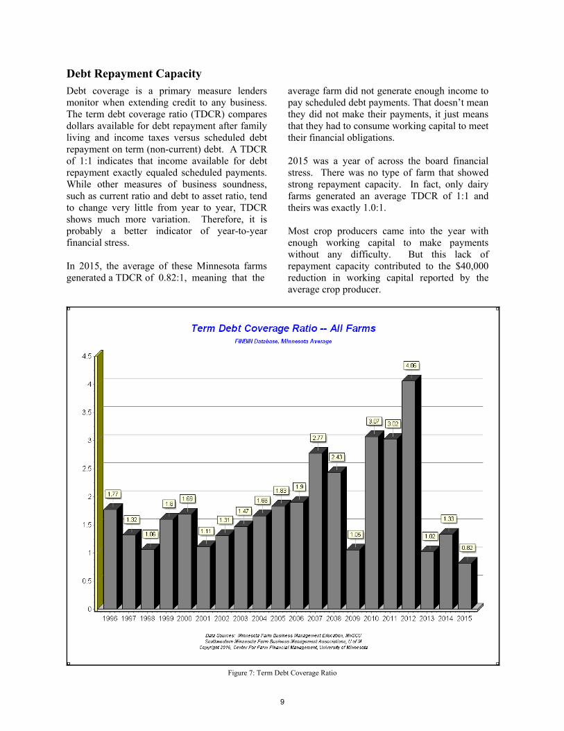
Debt Repayment Capacity
Debt coverage is a primary measure lenders monitor when extending credit to any business. The term debt coverage ratio (TDCR) compares dollars available for debt repayment after family living and income taxes versus scheduled debt repayment on term (non-current) debt. A TDCR of 1:1 indicates that income available for debt repayment exactly equaled scheduled payments.While other measures of business soundness, such as current ratio and debt to asset ratio, tend to change very little from year to year, TDCR shows much more variation. Therefore, it is probably a better indicator of year-to-year financial stress.
In 2015, the average of these Minnesota farms generated a TDCR of 0.82:1, meaning that the
average farm did not generate enough income to pay scheduled debt payments. That doesn’t mean they did not make their payments, it just means that they had to consume working capital to meet their financial obligations.
2015 was a year of across the board financial stress. There was no type of farm that showed strong repayment capacity. In fact, only dairy farms generated an average TDCR of 1:1 and theirs was exactly 1.0:1.
Most crop producers came into the year with enough working capital to make payments without any difficulty. But this lack of repayment capacity contributed to the $40,000 reduction in working capital reported by the average crop producer.
Figure 7: Term Debt Coverage Ratio
9
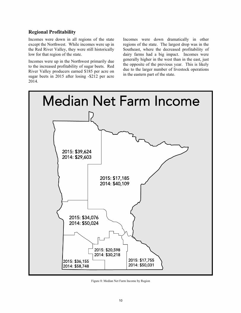
Regional Profitability
Incomes were down in all regions of the state except the Northwest. While incomes were up in the Red River Valley, they were still historically low for that region of the state.
Incomes were up in the Northwest primarily due to the increased profitability of sugar beets. Red River Valley producers earned $185 per acre on sugar beets in 2015 after losing -$212 per acre 2014.
Incomes were down dramatically in other regions of the state. The largest drop was in the Southeast, where the decreased profitability of dairy farms had a big impact. Incomes were generally higher in the west than in the east, just the opposite of the previous year. This is likely due to the larger number of livestock operations in the eastern part of the state.
Figure 8: Median Net Farm Income by Region
10
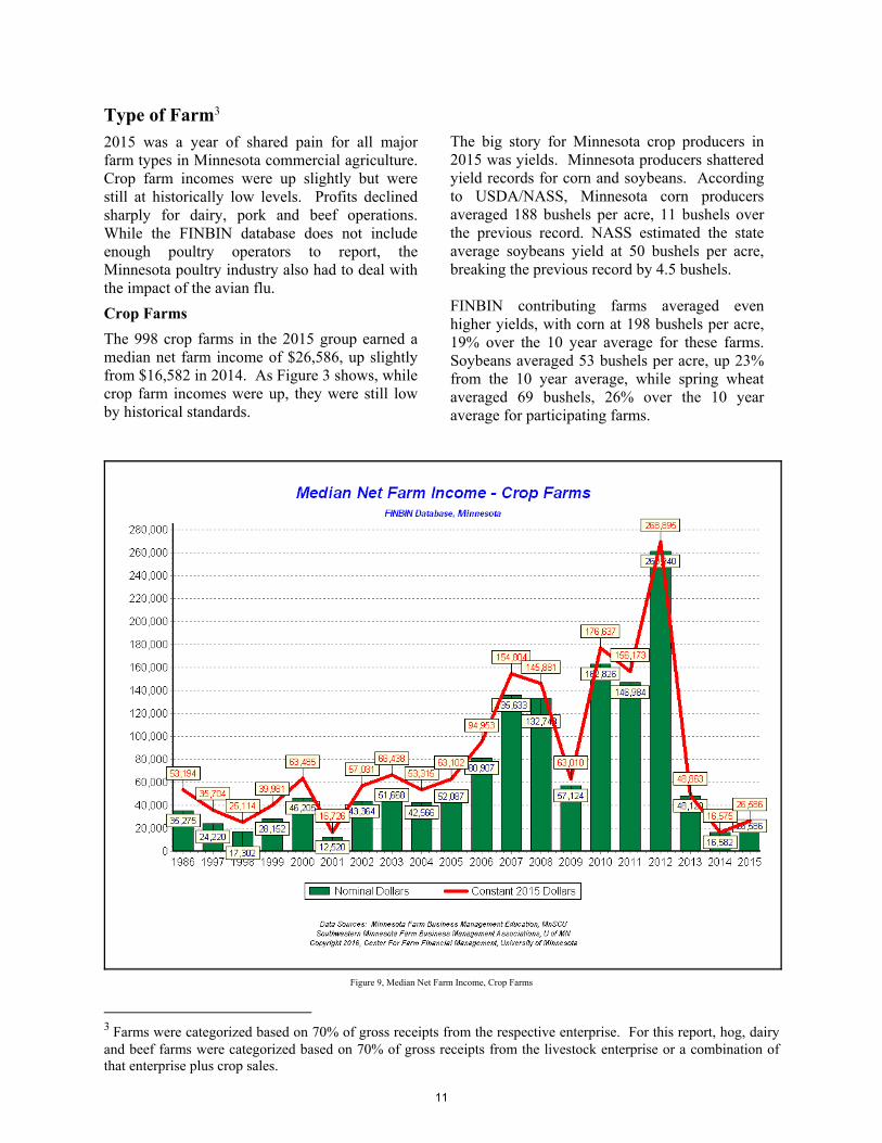
Type of Farm3 2015 was a year of shared pain for all major farm types in Minnesota commercial agriculture. Crop farm incomes were up slightly but were still at historically low levels. Profits declined sharply for dairy, pork and beef operations. While the FINBIN database does not include enough poultry operators to report, the Minnesota poultry industry also had to deal with the impact of the avian flu.
Crop Farms
The 998 crop farms in the 2015 group earned a median net farm income of $26,586, up slightly from $16,582 in 2014. As Figure 3 shows, while crop farm incomes were up, they were still low by historical standards.
The big story for Minnesota crop producers in 2015 was yields. Minnesota producers shattered yield records for corn and soybeans. According to USDA/NASS, Minnesota corn producers averaged 188 bushels per acre, 11 bushels over the previous record. NASS estimated the state average soybeans yield at 50 bushels per acre, breaking the previous record by 4.5 bushels.
FINBIN contributing farms averaged even higher yields, with corn at 198 bushels per acre, 19% over the 10 year average for these farms. Soybeans averaged 53 bushels per acre, up 23% from the 10 year average, while spring wheat averaged 69 bushels, 26% over the 10 year average for participating farms.
3 Farms were categorized based on 70% of gross receipts from the respective enterprise. For this report, hog, dairy and beef farms were categorized based on 70% of gross receipts from the livestock enterprise or a combination of that enterprise plus crop sales.
Figure 9, Median Net Farm Income, Crop Farms
11
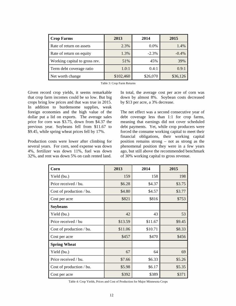
Crop Farms 2013 2014 2015
Rate of return on assets 2.3% 0.0% 1.4%
Rate of return on equity 1.3% -2.3% -0.4%
Working capital to gross rev. 51% 45% 39%
Term debt coverage ratio 1.0:1 0.4:1 0.9:1
Net worth change $102,460 $26,070 $36,126 Table 3: Crop Farm Returns
Given record crop yields, it seems remarkable that crop farm incomes could be so low. But big crops bring low prices and that was true in 2015. In addition to burdensome supplies, weak foreign economies and the high value of the dollar put a lid on exports. The average sales price for corn was $3.75, down from $4.37 the previous year. Soybeans fell from $11.67 to $9.45, while spring wheat prices fell by 17%.
Production costs were lower after climbing for several years. For corn, seed expense was down 4%, fertilizer was down 11%, fuel was down 32%, and rent was down 5% on cash rented land. om
In total, the average cost per acre of corn was down by almost 8%. Soybean costs decreased by $13 per acre, a 3% decrease.
The net effect was a second consecutive year of debt coverage less than 1:1 for crop farms, meaning that earnings did not cover scheduled debt payments. Yet, while crop producers were forced the consume working capital to meet their financial obligations, their working capital position remains strong – not as strong as the phenomenal position they were in a few years ago, but still above the recommended benchmark of 30% working capital to gross revenue.
Corn 2013 2014 2015
Yield (bu.) 159 158 198
Price received / bu. $6.28 $4.37 $3.75
Cost of production / bu. $4.80 $4.57 $3.77
Cost per acre $821 $816 $753
Soybeans
Yield (bu.) 42 43 53
Price received / bu $13.59 $11.67 $9.45
Cost of production / bu. $11.06 $10.71 $8.33
Cost per acre $457 $470 $456
Spring Wheat
Yield (bu.) 67 64 69
Price received / bu. $7.66 $6.33 $5.26
Cost of production / bu. $5.98 $6.17 $5.35
Cost per acre $392 $389 $371 Table 4: Crop Yields, Prices and Cost of Production for Major Minnesota Crops
12
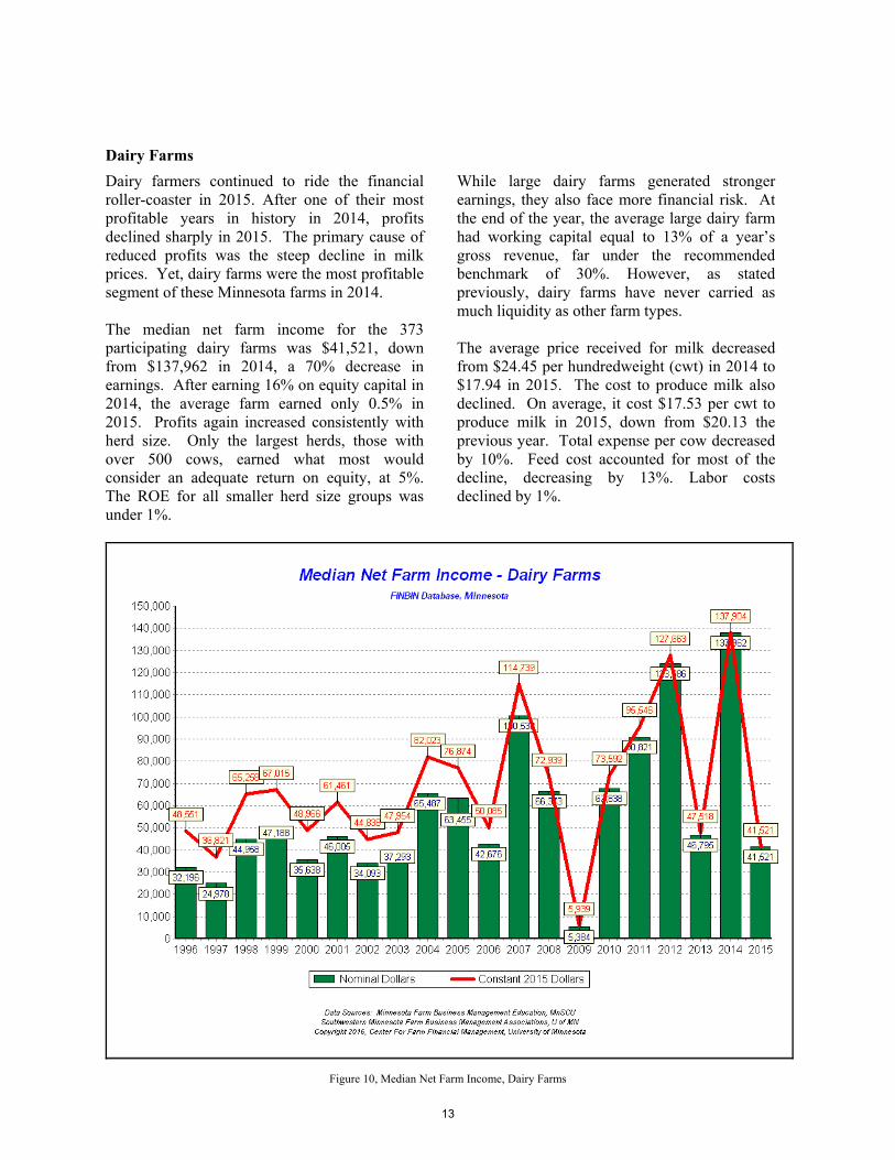
Dairy Farms
Dairy farmers continued to ride the financial roller-coaster in 2015. After one of their most profitable years in history in 2014, profits declined sharply in 2015. The primary cause of reduced profits was the steep decline in milk prices. Yet, dairy farms were the most profitable segment of these Minnesota farms in 2014.
The median net farm income for the 373 participating dairy farms was $41,521, down from $137,962 in 2014, a 70% decrease in earnings. After earning 16% on equity capital in 2014, the average farm earned only 0.5% in 2015. Profits again increased consistently with herd size. Only the largest herds, those with over 500 cows, earned what most would consider an adequate return on equity, at 5%. The ROE for all smaller herd size groups was under 1%.
While large dairy farms generated stronger earnings, they also face more financial risk. At the end of the year, the average large dairy farm had working capital equal to 13% of a year’s gross revenue, far under the recommended benchmark of 30%. However, as stated previously, dairy farms have never carried as much liquidity as other farm types.
The average price received for milk decreased from $24.45 per hundredweight (cwt) in 2014 to $17.94 in 2015. The cost to produce milk also declined. On average, it cost $17.53 per cwt to produce milk in 2015, down from $20.13 the previous year. Total expense per cow decreased by 10%. Feed cost accounted for most of the decline, decreasing by 13%. Labor costs declined by 1%.
Figure 10, Median Net Farm Income, Dairy Farms
13
Dairy Farms 2013 2014 2015
Rate of return on assets 3.3% 10.9% 2.0%
Rate of return on equity 2.4% 15.8% 0.5%
Working capital to gross rev. 18% 17% 16%
Term debt coverage ratio 1.1:1 2.5:1 1.0:1
Net worth change $84,956 $211,015 $43,082
Table 5: Dairy Farm Returns
One of the noticeable trends for Minnesota dairy farms in recent years has been the performance advantage of large operations. Milk production per cow averaged 23,855 pounds across all herds. But herds of over 500 cows averaged 26,425 pounds per cow. Herds of fewer than 100 cows averaged 20,185 pounds per cow.
Large herds did have higher costs on a per cow basis, with higher feed costs and significantly higher labor costs. Total cost per cow trended from $2,819 for the smallest herds (1 – 50 cows), up to $4,244 for those with over 500 cows. But on a per hundredweight basis, given higher production per cow, large herds produced milk at a lower cost than any other herd size. On the bottom line, the net return per cow was $474 for large operations compared to $231 for all smaller herds.
While profits for conventional dairy farms declined sharply in 2015, organic dairies had a profitable year. Over the years, organic dairy herds have typically netted higher returns per cow than conventional herds. That pattern was temporarily reversed in 2014 but it was back in 2015. On average, organic herds netted, $1,452 per cow compared to $287 for all conventional herds. The average price received for organic milk was $34.47 per hundredweight. The median net farm income for organic dairy farms was $100,745.
The profit outlook for dairy farms does not improve for 2016. Class III milk futures are under the $15.00 per cwt, which would suggest an average mailbox price under $17.00. Feed prices are likely to be slightly lower. That would suggest profits for 2016 not much different from 2015 earnings levels.
Dairy Farm Highlights 2013 2014 2015
Number of dairy enterprises 402 408 373
Average number of cows 178 180 187
Production per cow (lb) 22,905 23,428 23,855
Price received / cwt $20.36 $24.45 $17.94
Cost of production / cwt $19.94 $20.13 $17.53
Cost per cow $4,104 $4,330 $3,888
Table 6: Dairy Farm Highlights
14
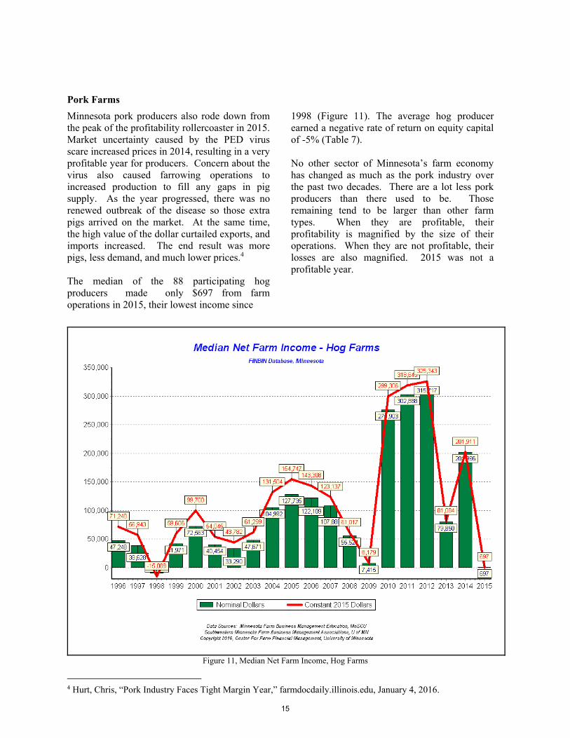
Pork Farms
Minnesota pork producers also rode down from the peak of the profitability rollercoaster in 2015. Market uncertainty caused by the PED virus scare increased prices in 2014, resulting in a very profitable year for producers. Concern about the virus also caused farrowing operations to increased production to fill any gaps in pig supply. As the year progressed, there was no renewed outbreak of the disease so those extra pigs arrived on the market. At the same time, the high value of the dollar curtailed exports, and imports increased. The end result was more pigs, less demand, and much lower prices.4
The median of the 88 participating hog producers made only $697 from farm operations in 2015, their lowest income since
1998 (Figure 11). The average hog producer earned a negative rate of return on equity capital of -5% (Table 7).
No other sector of Minnesota’s farm economy has changed as much as the pork industry over the past two decades. There are a lot less pork producers than there used to be. Those remaining tend to be larger than other farm types. When they are profitable, their profitability is magnified by the size of their operations. When they are not profitable, their losses are also magnified. 2015 was not a profitable year.
Figure 11, Median Net Farm Income, Hog Farms
4 Hurt, Chris, “Pork Industry Faces Tight Margin Year,” farmdocdaily.illinois.edu, January 4, 2016.
15
Hog Farms 2013 2014 2015 Rate of return on assets 3.3% 8.5% -0.9% Rate of return on equity 3.0% 12.5% -4.9% Working capital to gross rev. 30% 26% 23% Term debt coverage 1.2:1 2.6:1 0.3:1 Net worth change $102,422 $246,982 $26,577
Table 7: Hog Farm Returns
Farrow to finish operators lost $120 on every litter farrowed in 2015. The average price received was $75 per hundredweight carcass, down 28% from the previous year. Costs per litter were virtually unchanged from the previous year. We noted above that participating hog producers are, on average, larger than other types of farm. That is not true of these farrowing operations. In fact, most are small compared to their peers. Therefore they are not a good barometer for industry trends.
Participating wean to finish operators operate on a much larger scale. The average wean to finish farm finished over 16,000 pigs. In 2015 these operations almost exactly broke even before any returns to operator labor and management. Their price received per hundredweight carcass was $73.69, down from $101.22 in 2014. s
Costs of production for finishers decreased by 13%, partially offsetting the decrease in market price. The cost to purchase a weaned pig was down over $3.00 while feed costs were down 13%.
It is easy to see the hog cycle for the past two decades in Figure 11. The cycle has been disrupted by disease and highly variable feed costs in the past several years. 2014 looks to be an aberration. It is impossible to know how the picture would have changed had there not been a PEDV scare.
Industry experts are predicting a slightly better year for 2016. Slightly higher prices along with continued low feed prices should result in some profit, but will not likely return the sector to the strong earnings of recent years.5
Hog Farm Highlights 2013 2014 2015 No. farrow-to-finish farms 8 12 8 Average number of sows 333 372 431 Pigs weaned per sow 21.5 21.1 20.6 Price received / cwt (carcass) $97.18 $104.32 $74.63 Cost of production / cwt $97.49 $97.47 $78.96
No. pig finishing enterprises 66 70 64 Number of pigs finished 12,543 10,445 13,073 Price received / cwt (carcass) $89.06 $100.46 $73.68 Cost of production / cwt $92.58 $87.70 $76.17
Table 8: Hog Farm Highlights
5 Hurt, Chris, “Fewer Hogs and Higher Prices,” farmdocdaily.illinois.edu, March 28, 2016.
16
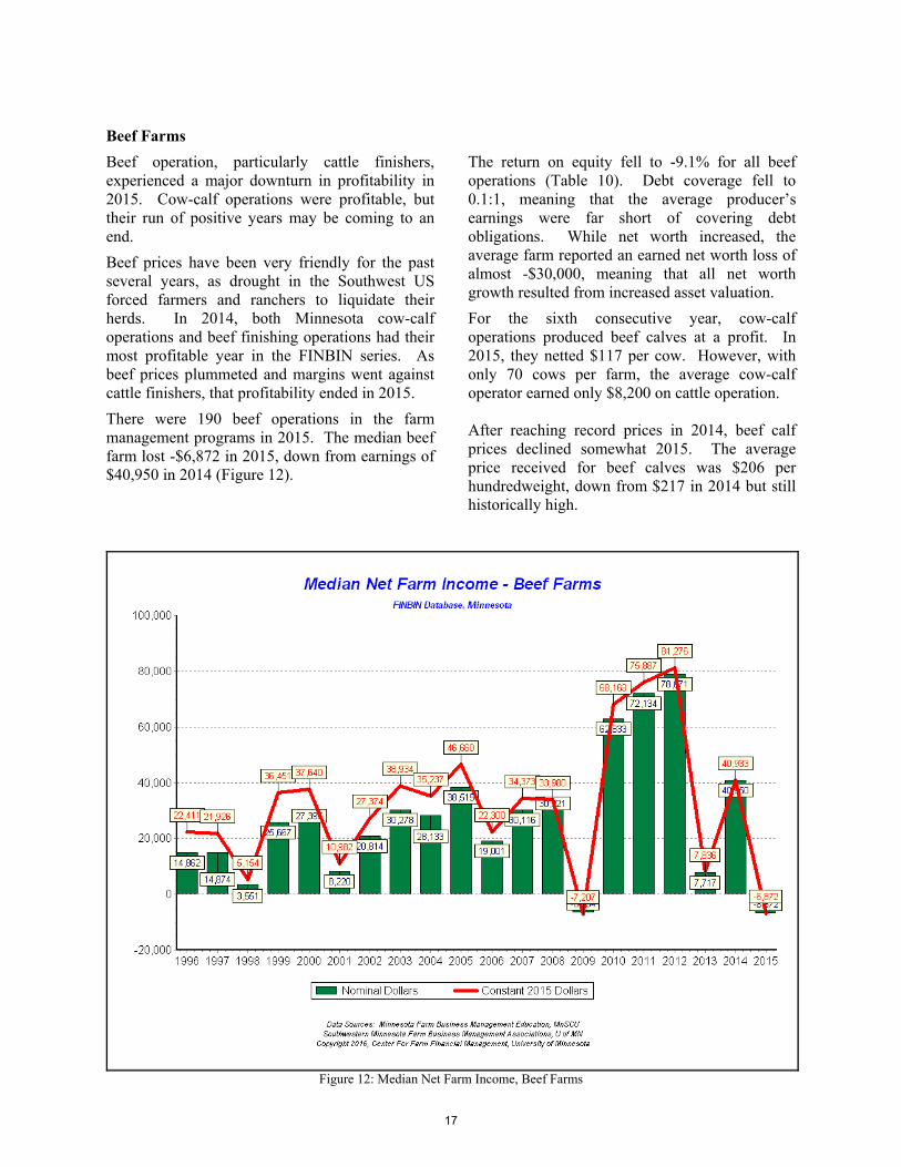
Beef Farms
Beef operation, particularly cattle finishers, experienced a major downturn in profitability in 2015. Cow-calf operations were profitable, but their run of positive years may be coming to an end.
Beef prices have been very friendly for the past several years, as drought in the Southwest US forced farmers and ranchers to liquidate their herds. In 2014, both Minnesota cow-calf operations and beef finishing operations had their most profitable year in the FINBIN series. As beef prices plummeted and margins went against cattle finishers, that profitability ended in 2015.
There were 190 beef operations in the farm management programs in 2015. The median beef farm lost -$6,872 in 2015, down from earnings of $40,950 in 2014 (Figure 12).
The return on equity fell to -9.1% for all beef operations (Table 10). Debt coverage fell to 0.1:1, meaning that the average producer’s earnings were far short of covering debt obligations. While net worth increased, the average farm reported an earned net worth loss of almost -$30,000, meaning that all net worth growth resulted from increased asset valuation.
For the sixth consecutive year, cow-calf operations produced beef calves at a profit. In 2015, they netted $117 per cow. However, with only 70 cows per farm, the average cow-calf operator earned only $8,200 on cattle operation.
After reaching record prices in 2014, beef calf prices declined somewhat 2015. The average price received for beef calves was $206 per hundredweight, down from $217 in 2014 but still historically high.
Figure 12: Median Net Farm Income, Beef Farms
17
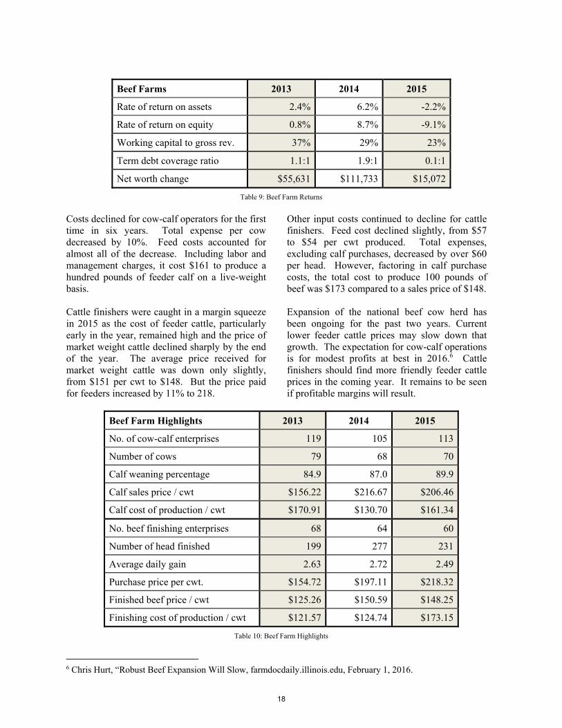
Beef Farms 2013 2014 2015
Rate of return on assets 2.4% 6.2% -2.2%
Rate of return on equity 0.8% 8.7% -9.1%
Working capital to gross rev. 37% 29% 23%
Term debt coverage ratio 1.1:1 1.9:1 0.1:1
Net worth change $55,631 $111,733 $15,072
Table 9: Beef Farm Returns
Costs declined for cow-calf operators for the first time in six years. Total expense per cow decreased by 10%. Feed costs accounted for almost all of the decrease. Including labor and management charges, it cost $161 to produce a hundred pounds of feeder calf on a live-weight basis.
Cattle finishers were caught in a margin squeeze in 2015 as the cost of feeder cattle, particularly early in the year, remained high and the price of market weight cattle declined sharply by the end of the year. The average price received for market weight cattle was down only slightly, from $151 per cwt to $148. But the price paid for feeders increased by 11% to 218.
Other input costs continued to decline for cattle finishers. Feed cost declined slightly, from $57 to $54 per cwt produced. Total expenses, excluding calf purchases, decreased by over $60 per head. However, factoring in calf purchase costs, the total cost to produce 100 pounds of beef was $173 compared to a sales price of $148.
Expansion of the national beef cow herd has been ongoing for the past two years. Current lower feeder cattle prices may slow down that growth. The expectation for cow-calf operations is for modest profits at best in 2016.6 Cattle finishers should find more friendly feeder cattle prices in the coming year. It remains to be seen if profitable margins will result.
Beef Farm Highlights 2013 2014 2015
No. of cow-calf enterprises 119 105 113
Number of cows 79 68 70
Calf weaning percentage 84.9 87.0 89.9
Calf sales price / cwt $156.22 $216.67 $206.46
Calf cost of production / cwt $170.91 $130.70 $161.34
No. beef finishing enterprises 68 64 60
Number of head finished 199 277 231
Average daily gain 2.63 2.72 2.49
Purchase price per cwt. $154.72 $197.11 $218.32
Finished beef price / cwt $125.26 $150.59 $148.25
Finishing cost of production / cwt $121.57 $124.74 $173.15
Table 10: Beef Farm Highlights
6 Chris Hurt, “Robust Beef Expansion Will Slow, farmdocdaily.illinois.edu, February 1, 2016.
18
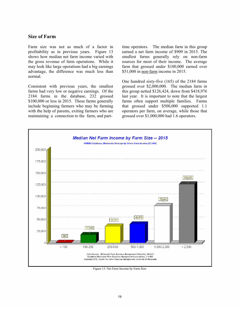
Size of Farm
Farm size was not as much of a factor in profitability as in previous years. Figure 13 shows how median net farm income varied with the gross revenue of farm operations. While it may look like large operations had a big earnings advantage, the difference was much less than normal.
Consistent with previous years, the smallest farms had very low or negative earnings. Of the 2184 farms in the database, 232 grossed $100,000 or less in 2015. These farms generally include beginning farmers who may be farming with the help of parents, exiting farmers who are maintaining a connection to the farm, and part-
time operators. The median farm in this group earned a net farm income of $909 in 2015. The smallest farms generally rely on non-farm sources for most of their income. The average farm that grossed under $100,000 earned over $51,000 in non-farm income in 2015.
One hundred sixty-five (165) of the 2184 farms grossed over $2,000,000. The median farm in this group netted $126,424, down from $418,976 last year. It is important to note that the largest farms often support multiple families. Farms that grossed under $500,000 supported 1.1 operators per farm, on average, while those that grossed over $1,000,000 had 1.6 operators.
Figure 13: Net Farm Income by Farm Size
19
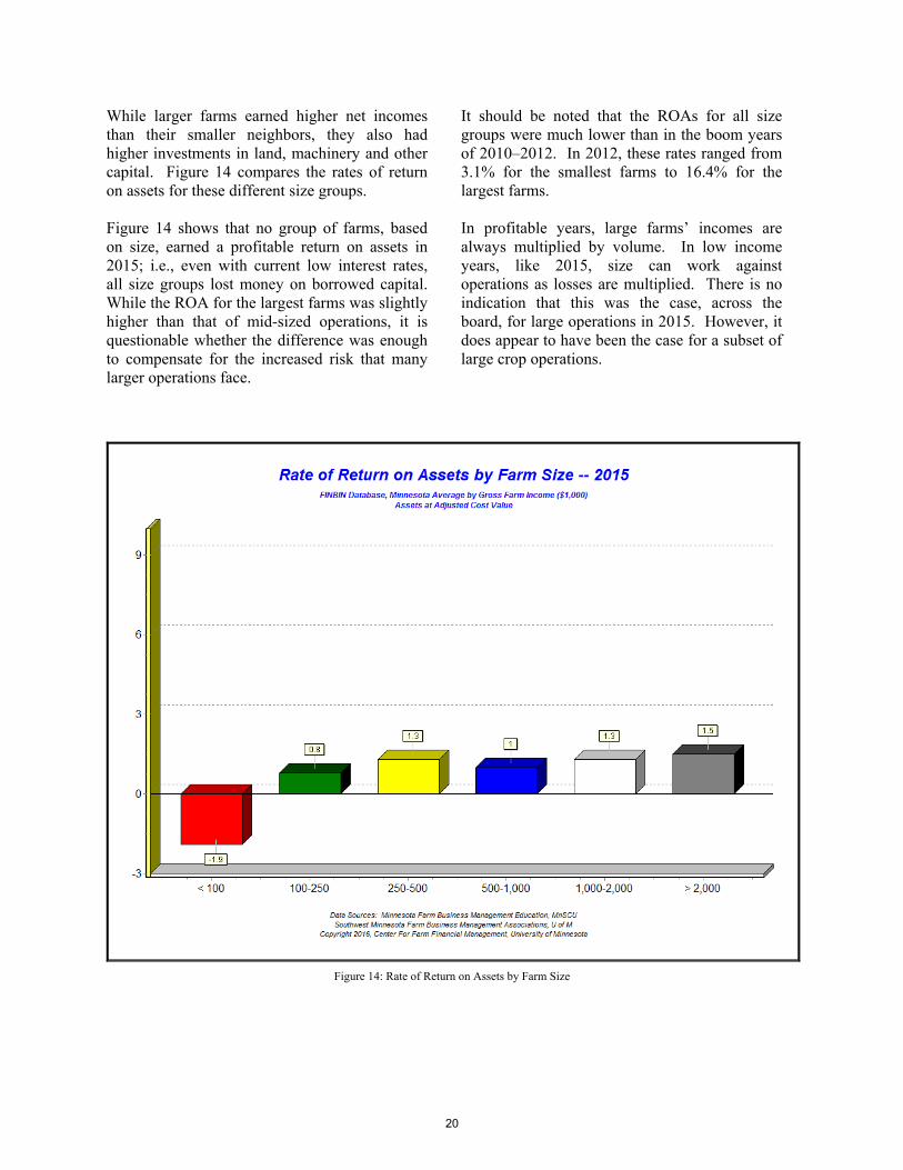
While larger farms earned higher net incomes than their smaller neighbors, they also had higher investments in land, machinery and other capital. Figure 14 compares the rates of return on assets for these different size groups.
Figure 14 shows that no group of farms, based on size, earned a profitable return on assets in 2015; i.e., even with current low interest rates, all size groups lost money on borrowed capital. While the ROA for the largest farms was slightly higher than that of mid-sized operations, it is questionable whether the difference was enough to compensate for the increased risk that many larger operations face.
It should be noted that the ROAs for all size groups were much lower than in the boom years of 2010–2012. In 2012, these rates ranged from 3.1% for the smallest farms to 16.4% for the largest farms.
In profitable years, large farms’ incomes are always multiplied by volume. In low income years, like 2015, size can work against operations as losses are multiplied. There is no indication that this was the case, across the board, for large operations in 2015. However, it does appear to have been the case for a subset of large crop operations.
Figure 14: Rate of Return on Assets by Farm Size
20
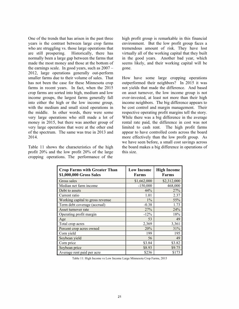
One of the trends that has arisen in the past three years is the contrast between large crop farms who are struggling vs. those large operations that are still prospering. Historically, there has normally been a large gap between the farms that made the most money and those at the bottom of the earnings scale. In good years, such as 2007 – 2012, large operations generally out-perform smaller farms due to their volume of sales. That has not been the case for these Minnesota crop farms in recent years. In fact, when the 2015 crop farms are sorted into high, medium and low income groups, the largest farms generally fall into either the high or the low income group, with the medium and small sized operations in the middle. In other words, there were some very large operations who still made a lot of money in 2015, but there was another group of very large operations that were at the other end of the spectrum. The same was true in 2013 and 2014.
Table 11 shows the characteristics of the high profit 20% and the low profit 20% of the large cropping operations. The performance of the om
high profit group is remarkable in this financial environment. But the low profit group faces a tremendous amount of risk. They have lost virtually all of the working capital that they built in the good years. Another bad year, which seems likely, and their working capital will be gone.
How have some large cropping operations outperformed their neighbors? In 2015 it was not yields that made the difference. And based on asset turnover, the low income group is not over-invested, at least not more than their high income neighbors. The big difference appears to be cost control and margin management. Their respective operating profit margins tell the story. While there was a big difference in the average rental rate paid, the difference in cost was not limited to cash rent. The high profit farms appear to have controlled costs across the board more effectively than the low profit group. As we have seen before, a small cost savings across the board makes a big difference in operations of this size.
Crop Farms with Greater Than $1,000,000 Gross Sales
Low Income Farms
High Income Farms
Gross sales $1,662,000 $2,312,000 Median net farm income -150,000 468,000 Debt to assets 44% 27% Current ratio 1.01 2.37 Working capital to gross revenue 1% 55% Term debt coverage (accrual) -0.38 1.73 Asset turnover rate 27% 24% Operating profit margin -12% 18% Age 53 49 Total crop acres 2,369 3,361 Percent crop acres owned 20% 31% Corn yield 199 195 Soybean yield 56 49 Corn price $3.84 $3.82 Soybean price $8.93 $9.75 Average rent paid per acre $236 $173
Table 11: High Income vs Low Income Large Minnesota Crop Farms, 2015
21
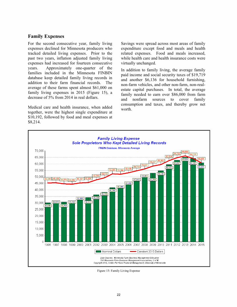
Family Expenses
For the second consecutive year, family living expenses declined for Minnesota producers who tracked detailed living expenses. Prior to the past two years, inflation adjusted family living expenses had increased for fourteen consecutive years. Approximately one-quarter of the families included in the Minnesota FINBIN database keep detailed family living records in addition to their farm financial records. The average of these farms spent almost $61,000 on family living expenses in 2015 (Figure 15), a decrease of 5% from 2014 in real dollars.
Medical care and health insurance, when added together, were the highest single expenditure at $10,192, followed by food and meal expenses at $8,214.nother
Savings were spread across most areas of family expenditure except food and meals and health related expenses. Food and meals increased, while health care and health insurance costs were virtually unchanged.
In addition to family living, the average family paid income and social security taxes of $19,719 and another $6,136 for household furnishing, non-farm vehicles, and other non-farm, non-real-estate capital purchases. In total, the average family needed to earn over $86,000 from farm and nonfarm sources to cover family consumption and taxes, and thereby grow net worth.
Figure 15: Family Living Expense
22
Data Sources
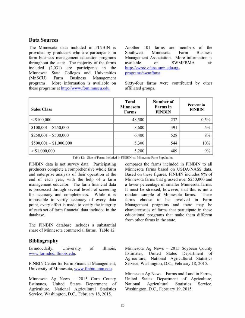
The Minnesota data included in FINBIN is provided by producers who are participants in farm business management education programs throughout the state. The majority of the farms included (2,031) are participants in the Minnesota State Colleges and Universities (MnSCU) Farm Business Management programs. More information is available on these programs at http://www.fbm.mnscu.edu.
S
Another 101 farms are members of the Southwest Minnesota Farm Business Management Association. More information is available on SWMFBMA at: http://swroc.cfans.umn.edu/ag-programs/swmfbma.
Sixty-four farms were contributed by other affiliated groups.
Sales Class
Total Minnesota
Farms
Number of Farms in FINBIN
Percent in FINBIN
< $100,000 48,500 232 0.5%
$100,001 – $250,000 8,600 391 5%
$250,001 – $500,000 6,400 528 8%
$500,001 – $1,000,000 5,300 544 10%
> $1,000,000 5,200 489 9%
Table 12: Size of Farms included in FINBIN vs. Minnesota Farm Population
FINBIN data is not survey data. Participating producers complete a comprehensive whole farm and enterprise analysis of their operation at the end of each year, with the help of a farm management educator. The farm financial data is processed through several levels of screening for accuracy and completeness. While it is impossible to verify accuracy of every data point, every effort is made to verify the integrity of each set of farm financial data included in the database.
The FINBIN database includes a substantial share of Minnesota commercial farms. Table 12
compares the farms included in FINBIN to all Minnesota farms based on USDA/NASS data. Based on these figures, FINBIN includes 9% of Minnesota farms that grossed over $250,000 and a lower percentage of smaller Minnesota farms. It must be stressed, however, that this is not a random sample of Minnesota farms. These farms choose to be involved in Farm Management programs and there may be characteristics of farms that participate in these educational programs that make them different from other farms in the state.
Bibliography farmdocdaily, University of Illinois, www.farmdoc.illinois.edu.
FINBIN Center for Farm Financial Management, University of Minnesota, www.finbin.umn.edu.
Minnesota Ag News – 2015 Corn County Estimates, United States Department of Agriculture, National Agricultural Statistics Service, Washington, D.C., February 18, 2015.
Minnesota Ag News – 2015 Soybean County Estimates, United States Department of Agriculture, National Agricultural Statistics Service, Washington, D.C., February 18, 2015.
Minnesota Ag News – Farms and Land in Farms, United States Department of Agriculture, National Agricultural Statistics Service, Washington, D.C., February 19, 2015.
23

24