Embed Size (px)
Citation preview

1
Paper 294-2011
Introduction to ODS Graphics for the Non-Statistician
Mike Kalt and Cynthia Zender, SAS Institute Inc., Cary, NC
ABSTRACT
Are you a History, English, or other humanities major who has stumbled into SAS® programming? Are you a business analyst or report analyst whose statistical knowledge ends with mean, median, percentiles, and standard deviation? Don't know a fitted loess curve from a survival estimate? Need to produce some series plots and bar charts and maybe the occasional box plot? Don't panic! This presentation is for you!
This presentation illustrates how to use Base® SAS procedures and new statistical graphics (SG) procedures (in particular, SGPLOT and SGPANEL) in SAS/GRAPH to produce simple plots and bar charts. Once you know the basics of the SGPLOT statements to produce single graphs, learning SGPANEL to create paneled output will be a cinch. Through concrete examples, this paper will guide you through the basics of producing and customizing simple graphs using the new SG procedures. In addition, use of the ODS GRAPHICS statement for setting graph options is covered. (Note: The SGRENDER procedure falls outside the scope of this presentation.)
INTRODUCTION
Although ODS Graphics was initially designed to make the production of standard statistical graphics easier, its capabilities are also well suited for the production of non-statistical, or business graphics. This paper is an introduction to the general capabilities of ODS Graphics. It is not intended to provide complete syntax information, but rather to illustrate general approaches to creating commonly used business graphics.
WHAT IS ODS GRAPHICS?
Until Version 9 of SAS, all graphics in SAS were done with” classic" SAS/GRAPH® procedures such as PROC GCHART and PROC GPLOT. Below is an example of a chart and plot created by these procedures:
Figure 1: PROC GCHART Output
Figure 2: PROC GPLOT Output
While “classic” SAS/GRAPH procedures were very flexible and could produce customized output, many users found them difficult to use because customization came at the cost of additional statements and graphic options. In addition, creating statistical graphs required running a statistical procedure to create an output data set and then using a SAS/GRAPH procedure to graph the output data.
ODS Graphics was primarily designed to make it easier for statistical users to develop commonly used statistical graphics. ODS Graphics consists of the following features:
1. Graphics capabilities added to statistical procedures
2. Graphics capabilities added to some Base SAS procedures
3. New components added to SAS/GRAPH. These include:
Reporting and Information VisualizationSAS Global Forum 2011

Introduction to ODS Graphics for the Non-Statistician, continued
2
"SG" procedures
Graphics Template Language
ODS Graphics Designer
ODS Graphics Editor
This collection of features is ODS Graphics, sometimes referred to as "Statistical Graphics", or “ODS Statistical Graphics”.
Although the original purpose of ODS Graphics was to make producing statistical graphics easier, it is also a convenient way for producing general purpose plots and charts.
HOW TO USE ODS GRAPHICS
To use ODS Graphics with statistical and Base SAS procedures, do all of the following:
Use the ODS GRAPHICS statement to activate graphics.
Add options to procedure code to generate graphs.
Use the ODS GRAPHICS OFF statement to deactivate graphics.
To produce ODS Graphics with SAS/GRAPH, use the SAS/GRAPH "SG" Procedures. When producing graphics with these procedures, just use SG procedure statements; no ODS GRAPHICS statement is required.
The following is an example of code used to produce ODS Graphics output with Base and SAS/STAT® procedures, and sample output:
Figure 3: Code and Graphics Output from PROC FREQ
ods graphics on;
proc freq
data=orion.back_orders;
tables region/plots=freqplot;
run;
ods graphics off;
Reporting and Information VisualizationSAS Global Forum 2011

Introduction to ODS Graphics for the Non-Statistician, continued
3
The following example uses the SGPLOT procedure in SAS/GRAPH to produce a vertical bar chart::
Figure 4: Code and Output from PROC SGPLOT
ODS GRAPHICS OUTPUT
Output from ODS Graphics can be sent either to an image file, such as a JPEG or PNG file, or to an ODS destination, such as HTML, PDF, or RTF. When SAS creates an image file using ODS Graphics, the image file can be accessed from the SAS results window. Clicking on the image filename in the Results window causes the image to be displayed in a host image viewer, such as Windows Picture and Fax Viewer.
In the display below, PROC FREQ has created two graphs, whose names are shown in the SAS Results window (red icons). Selecting the graphs from the Results window causes them to be displayed with the default image viewing program.
Figure 5: Creating and Viewing Image Files
In the example below, the output is sent to an ODS destination by inserting an ODS statement before the PROC FREQ statement. ODS creates a document (an HTML file in this case) and the graph is an image embedded within the document. The document is normally displayed in the SAS Results Viewer.
proc sgplot data=orion.back_orders;
vbar region;
title 'Back Orders by Region';
run;
Reporting and Information VisualizationSAS Global Forum 2011

Introduction to ODS Graphics for the Non-Statistician, continued
4
Figure 6: Creating an HTML File
The following table summarizes the most important differences between SAS/GRAPH “Classic” Procedures and ODS Graphics.
Table 1: Differences between "Classic" SAS/GRAPH and ODS Graphics
SAS/GRAPH Classic Procedures ODS Graphics
Output goes to GRAPH1 window or other destinations (including ODS)
Output to image file or ODS document only
Graph created as a GRSEG entry in a SAS catalog No catalog entries created
GREPLAY procedure replays graphs stored in catalogs
No GREPLAY procedure
Annotate facility available to add elements to existing graphs
No Annotate facility (coming in SAS 9.3)
GOPTIONS statement sets general graphics options GOPTIONS statement not used
PRODUCING NON-STATISTICAL GRAPHS USING BASE SAS PROCEDURES
You can produce ODS Graphics with the FREQ, UNIVARIATE, and CORR procedures in Base SAS. These procedures produce both statistical and non-statistical graphics. This section will focus on the non-statistical charts and plots that PROC FREQ and PROC UNIVARIATE can produce; later sections will focus on the “SG” procedures.
To produce graphics with Base SAS procedures:
1. Use ODS GRAPHICS statement to activate graphics. 2. Add options or statements to procedure code to generate specific graphs. 3. Use ODS GRAPHICS OFF statement to deactivate graphics.
ods graphics on;
ods html file='freq.html';
proc freq data=orion.back_orders;
tables region / plots=freqplot;
run;
ods html close;
ods graphics off;
Reporting and Information VisualizationSAS Global Forum 2011

Introduction to ODS Graphics for the Non-Statistician, continued
5
For PROC FREQ, if you activate graphics using ODS GRAPHICS ON, but do not specify a specific plot with a one-way frequency table request, both frequency and cumulative frequency plots are generated, as shown below:
Figure 7: Default Graphics Output from PROC FREQ
If you activate graphics, but do not specify a specific plot with a two-way frequency table request, a single graph is generated containing a frequency plot for each variable. No cumulative frequency plots are produced.
Figure 8: Default Graphics Output from a PROC FREQ 2-Way Table
You can use the PLOTS= option with PROC FREQ to request specific types of plots, including various statistical plots. By using the PLOTS= option, you can also specify some appearance options.
ods graphics on;
proc freq data=orion.back_orders;
tables region;
run;
ods graphics off;
ods graphics on;
proc freq
data=orion.employee_payroll;
tables employee_gender*
marital_status;
run;
ods graphics off;
Reporting and Information VisualizationSAS Global Forum 2011

Introduction to ODS Graphics for the Non-Statistician, continued
6
Figure 9: Graphics Output from PROC FREQ Using the PLOTS Option
To produce graphics with PROC UNIVARIATE, you must explicitly supply a statement requesting a graph. The HISTOGRAM statement produces histograms.
Figure 10: Output Using HISTOGRAM Statement with PROC UNIVARIATE
Various options can be used in the HISTOGRAM statement to control the appearance of the plot.
Figure 11: Output Using Options in the PROC UNIVARIATE HISTOGRAM Statement
ods graphics on;
proc freq data=orion.employee_payroll;
tables marital_status/plots=freqplot
(orient=horizontal scale=percent);
run;
ods graphics off;
ods graphics on;
proc univariate
data=orion.employee_payroll;
var salary;
histogram salary;
run;
ods graphics off;
ods graphics on;
proc univariate
data=orion.employee_payroll;
var salary;
histogram salary/barlabel=count
normal(color=red)
grid;
run;
ods graphics off;
Reporting and Information VisualizationSAS Global Forum 2011

Introduction to ODS Graphics for the Non-Statistician, continued
7
ODS GRAPHICS WITH SAS/GRAPH
Several new procedures and features that implement ODS graphics have been added to SAS/GRAPH. They are:
PROC SGPLOT
PROC SGPANEL
PROC SGSCATTER
PROC SGRENDER
Graphics Template Language (GTL)
The SGPLOT, SGPANEL, and SGSCATTER procedures are designed to create commonly used graphs quickly. They can produce many of the same types of graphs as the original SAS/GRAPH procedures such as GPLOT and GCHART, but use the ODS architecture.
PROC SGRENDER and the Graphics Template Language are used to produce more complex, customized graphs. They have a steeper learning curve and are not covered in this presentation
When using the SG procedures, note the following:
An ODS GRAPHICS statement is not required, but can be used to specify some options.
The GOPTIONS statement is not used.
Symbols and patterns are specified in the procedure, rather than with SYMBOL and PATTERN statements.
Titles and footnotes work as in "classic" SAS/GRAPH.
The QUIT statement is not used as a step boundary.
USING PROC SGPLOT TO PRODUCE NON-STATISTICAL CHARTS AND PLOTS
PROC SGPLOT can be used to produce many different types of graphs, including the following:
simple bar charts
stacked bar charts
histograms
scatter plots
series plots
overlaid graphs including bar-line charts
Note that although the procedure is named SGPLOT, it produces both plots and charts.
The following terms are used to describe the output from PROC SGPLOT and other ODS Graphics procedures:
Table 2: Terminology Used with ODS Graphics
Term Meaning
Plot any type of plot or chart, such as a scatter plot, bar chart, and so on. Note that this differs from the definition used in “classic” SAS/GRAPH procedures in which a “plot” refers to scatter and line plots, and not to bar charts.
Cell area containing one plot, or multiple overlaid plots.
Graph a collection of one or more cells.
The terms are illustrated below:
Reporting and Information VisualizationSAS Global Forum 2011

Introduction to ODS Graphics for the Non-Statistician, continued
8
Figure 12: Illustration of ODS Graphics Terminology
The following statements are used with PROC SGPLOT:
The PROC SGPLOT statement invokes the procedure and specifies an input data set.
The plot statement specifies the type of graph, variables, and options. Note that the plot statement does not contain the word “plot”; it begins with a keyword (such as SCATTER or VBAR) that specifies the type of plot.
Axis statements control the appearance of axes (optional).
The KEYLEGEND statement controls the appearance of the legend (optional).
Multiple plot statements can be used to overlay multiple plots on the same axes.
Reporting and Information VisualizationSAS Global Forum 2011
Introduction to ODS Graphics for the Non-Statistician, continued
9
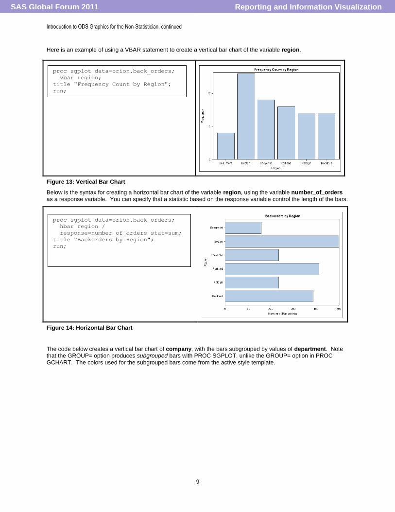
Here is an example of using a VBAR statement to create a vertical bar chart of the variable region.
Figure 13: Vertical Bar Chart
Below is the syntax for creating a horizontal bar chart of the variable region, using the variable number_of_orders
as a response variable. You can specify that a statistic based on the response variable control the length of the bars.
Figure 14: Horizontal Bar Chart
The code below creates a vertical bar chart of company, with the bars subgrouped by values of department. Note that the GROUP= option produces subgrouped bars with PROC SGPLOT, unlike the GROUP= option in PROC GCHART. The colors used for the subgrouped bars come from the active style template.
proc sgplot data=orion.back_orders;
vbar region;
title "Frequency Count by Region";
run;
proc sgplot data=orion.back_orders;
hbar region /
response=number_of_orders stat=sum;
title "Backorders by Region";
run;
Reporting and Information VisualizationSAS Global Forum 2011

Introduction to ODS Graphics for the Non-Statistician, continued
10
Figure 15: Bar Chart Using GROUP= Option
The program below illustrates using the HISTOGRAM statement to create a histogram for the variable salary.
Figure 16: Histogram
Specifying two plot statements overlays the plots on the same set of axes. In this case the HISTOGRAM and DENSITY statements generate a density plot on top of a histogram.
proc sgplot data=orion.employees;
where company=:'Orion';
vbar company / group=department;
title 'Employees By Country/Department';
run;
proc sgplot data=orion.employees;
where department='Sales';
histogram salary;
title 'Distribution of Employee
Salaries';
run;
proc sgplot data=orion.employees;
histogram salary;
density salary / type=normal;
where department='Sales';
title 'Distribution of Employee
Salaries';
run;
Reporting and Information VisualizationSAS Global Forum 2011

Introduction to ODS Graphics for the Non-Statistician, continued
11
Figure 17: Overlaid Histogram and Density Plot
Use a SCATTER statement to generate a scatter plot. The X= and Y= options specify the variables.
Figure 18: Scatter Plot
Use a SERIES statement to generate a series plot. A series plot is similar to a scatter plot, but the points are connected. To generate a separate line for each value of a grouping variable, specify the GROUP= option. Again, the colors for each series line come from the active style template.
Figure 19: Grouped Series Plot
To create multiple series plots, where each plot line represents a separate Y-axis variable, use multiple SERIES statements. The plots are automatically overlaid.
proc sgplot data=orion.employees;
where company='Orion Italy' and
department='Sales';
scatter y=salary
x=employee_birthdate;
title 'Salary by Birth Date';
run;
proc sgplot data=orion.profit;
where company in ('Orion France',
'Orion Italy');
series y=sales x=yymm /
group=company;
title 'Sales by Country';
run;
Reporting and Information VisualizationSAS Global Forum 2011
Introduction to ODS Graphics for the Non-Statistician, continued
12
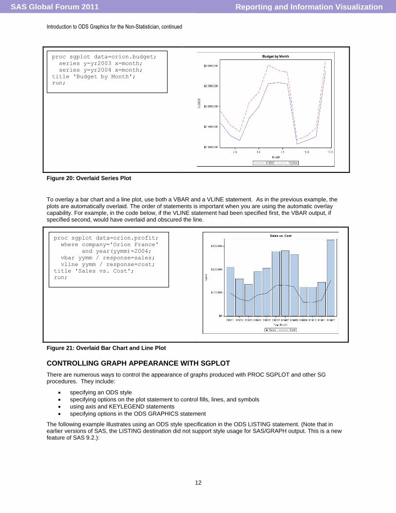
Figure 20: Overlaid Series Plot
To overlay a bar chart and a line plot, use both a VBAR and a VLINE statement. As in the previous example, the plots are automatically overlaid. The order of statements is important when you are using the automatic overlay capability. For example, in the code below, if the VLINE statement had been specified first, the VBAR output, if specified second, would have overlaid and obscured the line.
Figure 21: Overlaid Bar Chart and Line Plot
CONTROLLING GRAPH APPEARANCE WITH SGPLOT
There are numerous ways to control the appearance of graphs produced with PROC SGPLOT and other SG procedures. They include:
specifying an ODS style
specifying options on the plot statement to control fills, lines, and symbols
using axis and KEYLEGEND statements
specifying options in the ODS GRAPHICS statement
The following example illustrates using an ODS style specification in the ODS LISTING statement. (Note that in earlier versions of SAS, the LISTING destination did not support style usage for SAS/GRAPH output. This is a new feature of SAS 9.2.):
proc sgplot data=orion.budget;
series y=yr2003 x=month;
series y=yr2004 x=month;
title 'Budget by Month';
run;
proc sgplot data=orion.profit;
where company='Orion France'
and year(yymm)=2004;
vbar yymm / response=sales;
vline yymm / response=cost;
title 'Sales vs. Cost';
run;
Reporting and Information VisualizationSAS Global Forum 2011

Introduction to ODS Graphics for the Non-Statistician, continued
13
Figure 22: Specifying STYLE in an ODS Statement
The program below uses the FILLATTRS= option in the VBAR statement to specify the bar fill color. The DATALABEL option adds data labels to the bars.
Figure 23: Controlling Bar Color with the FILLATTRS= Option
To create transparent overlaid bars, specify the TRANSPARENCY= option in the plot statement. The multiple VBAR statements automatically overlay the bars. The BARWIDTH= option makes one set of bars narrower than the other. In the example below, the red bar is the wider bar, with the width automatically calculated by PROC SGPLOT. The specification of .5 for the BARWIDTH value causes the blue bar to be half the width that is automatically calculated. Making both bars transparent allows a shorter, narrower bar to still appear against a taller, wider bar, especially if the plot statement generating the wide bar is specified first.
ods listing style=banker;
proc sgplot data=orion.profit;
where company='Orion France'
and year(yymm)=2004;
vbar yymm / response=sales;
vline yymm / response=cost;
title 'Sales vs. Cost';
run;
ods listing style=listing;
proc sgplot data=orion.back_orders;
vbar
region/response=number_of_orders
fillattrs=(color="verylightred")
datalabel;
title "Back Orders by Region";
run;
Reporting and Information VisualizationSAS Global Forum 2011

Introduction to ODS Graphics for the Non-Statistician, continued
14
Figure 24: Overlaid Bars with Transparency
The MARKERS option adds symbols to a series plot. To control the color and thickness of lines, use the LINEATTRS= option on the plot statement. To control the appearance of symbols, use the MARKERATTRS= option. The list of available markers is slightly different from the list of markers that you might normally associate with “classic” SAS/GRAPH procedures. To see the full list of available markers and lines, refer to the documentation topic entitled, “Values for Marker Symbols and Line Patterns”, in the SAS/GRAPH 9.2: Graph Template Language User's Guide, Second Edition.
Figure 25: Controlling Appearance of Plot Lines and Symbols
To control axis attributes, use XAXIS and YAXIS statements. Options in these statements can be used to add gridlines and labels. The XAXIS and YAXIS statements are different from “classic” SAS/GRAPH AXIS statements. The SGPLOT procedure supports four types of AXIS statements: XAXIS and YAXIS, as shown n Figure 26 and X2AXIS and Y2AXIS, as shown in Figure 27. These statements are not global statements. The XAXIS and YAXIS definitions that you specify are used only for the current program.
In addition to the fact that these statements are not global statements, these statements have different options and syntax that have been designed to operate on a more intuitive basis. For example, with the data for Figure 26, you might know ahead of time that the full month names will not fit horizontally on the X axis. The SGPLOT XAXIS and YAXIS statements have a FITPOLICY option, which allows you to specify the “policy” (such as ROTATE, THIN, STAGGER, and so on) that SGPLOT should undertake to make the axis values fit. The use of FITPOLICY=ROTATE in Figure 27, shows that the long values for month name were automatically rotated.
proc sgplot data=orion.budget;
vbar month/response=yr2003
fillattrs=(color=red)
transparency=.7;
vbar month/response=yr2004
fillattrs=(color=blue)
transparency=.7
barwidth=.5;
run;
proc sgplot data=orion.budget;
series y=yr2003 x=month/ markers
lineattrs=(color=red thickness=3)
markerattrs=(color=black
symbol=circlefilled
size=8);
title 'Budget by Month';
run;
Reporting and Information VisualizationSAS Global Forum 2011

Introduction to ODS Graphics for the Non-Statistician, continued
15
Figure 28: Controlling Axis Attributes
You can use X2AXIS and Y2AXIS statements to create and control the appearance of a top and right axis, respectively. You must assign them to specific plots in the plot statement. In Figure 27, the X2AXIS repeats the values shown on the X axis and the Y2AXIS repeats the values shown on the Y axis. The axes are labeled (or not labeled) independently of each other. The axis control statements also allow you to set offset values, shown here as OFFSETMAX=.1 for the YAXIS and Y2AXIS in order to add a bit of extra offset space between the last tick mark on the axis and the edge of the plot area for readability.
Figure 29: Adding Right and Top Axes
Use a KEYLEGEND statement to control the location and appearance of the legend. In Figure 28, the KEYLEGEND values change the default placement of the single legend using the LOCATION and POSITION options. However, in an overlay plot scenario, especially where you want separate legend boxes or you want to organize your legends differently from the default treatment, you can provide names for your plot statements and then later use those names to create multiple legends. If you do not specify a name for a plot statement, the legend contains references to all of the plots in the graph. Other options in the KEYLEGEND statement include the TITLE= option to add a title and the NOBORDER option to remove the default border.
proc sgplot data=orion.profit;
where (company='Orion Australia' or
company='Orion Italy') and
year(yymm)=2003;
series y=sales x=yymm/ markers
group=company;
xaxis fitpolicy=rotate
tickvalueformat=monname.
grid label='Month';
yaxis label='Total Sales' grid;
title '2003 Sales';
run;
proc sgplot data=orion.budget;
series y=yr2003 x=month;
series y=yr2004 x=month/x2axis y2axis;
xaxis type=discrete;
yaxis display=(nolabel) grid offsetmax=.1;
x2axis type=discrete display=(nolabel);
y2axis display=(nolabel)
values=(1e6 to 3e6 by 500000)
offsetmax=.1;
title 'Budget by Month';
run;
Reporting and Information VisualizationSAS Global Forum 2011

Introduction to ODS Graphics for the Non-Statistician, continued
16
Figure 30: Controlling the Legend
You can specify options in the ODS GRAPHICS statement to control some aspects of your graphics output. Note that you do not need to use the ODS GRAPHICS statement with the SG procedures unless you want to specify or reset options. Some of the options that you can specify include the height and width of the graph. the format (file type) and name of the graphics file, and whether a border is drawn around the graph.
The example below uses options in the ODS GRAPHICS statement to control the height and width of the graph, and also causes the output file to be created in JPEG format.
ods graphics / height=200px width=500px
imagefmt=jpeg;
proc sgplot data=orion.back_orders;
vbar region/response=number_of_orders
fillattrs=(color="verylightred")
datalabel;
title "Back Orders by Region";
run;
Figure 31: Using the ODS GRAPHICS Statement to Resize the Graph
Options specified in the ODS GRAPHICS statement remain in effect until they are reset or the SAS session ends. To reset the options, submit the following statement:
ods graphics/ reset;
USING PROC SGPANEL TO DISPLAY MULTIPLE CELLS PER PAGE
PROC SGPANEL produces graphs similar to PROC SGPLOT, but creates separate cells for each value of a categorical variable or crossing of multiple categorical variables. You can control the placement of the cells on a graph.
The SGPANEL procedure uses the following statements:
The PROC SGPANEL statement invokes the procedure and specifies the input data set.
The plot statement specifies type of graph, variables, and options.
The PANELBY statement specifies the classification variables and the arrangement of cells on the page.
The ROWAXIS and COLAXIS statements specify the appearance of axes (optional).
The KEYLEGEND statement controls the appearance of a legend (optional).
The plot statements supported by PROC SGPANEL are the same as those supported by PROC SGPLOT. They include HBAR, VBAR, HISTOGRAM, SCATTER, SERIES, and others. As with PROC SGPLOT, multiple plot
proc sgplot data=orion.budget;
series y=yr2003 x=month;
series y=yr2004 x=month;
xaxis type=discrete;
keylegend / location=inside down=2
position=topleft;
title 'Budget by Month';
run;
Reporting and Information VisualizationSAS Global Forum 2011

Introduction to ODS Graphics for the Non-Statistician, continued
17
statements produce overlay graphs. The same options used to control plot appearance with PROC SGPLOT (such as LINEATTRS, FILLATTRS, and so on) can be used with PROC SGPANEL.
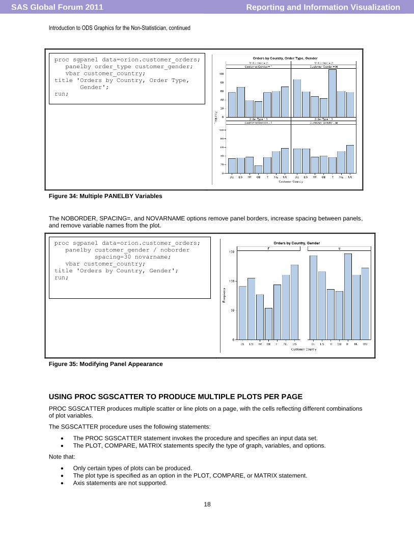
In the example below the SERIES statement defines the plot and the PANELBY statement specifies a categorical variable whose values are used to define panels. The resulting graph has the appearance of a “small multiple” type of
graph, as described by Edward Tufte in his book, Envisioning Information (pg. 67). A “small multiple” is generally
shown as a series of separate graphs, each with the same design and arranged in a grid pattern.
Figure 32: Using the PANELBY Statement with PROC SGPANEL
The PANELBY statement provides the LAYOUT= option, which can be used to define the order of the panels, either in COLUMNLATTICE form as shown in Figure 31, or in ROWLATTICE form (where each graph would occupy a row in the grid). If you have exactly two categorical variables and you want to arrange the grid so that the values of the first variable are columns and the values of the second variable are rows, use the LAYOUT=LATTICE option in your PANELBY statement. The ONEPANEL option forces all of the panels onto one page.
Figure 33: Using the LAYOUT= and ONEPANEL Options
Specifying multiple PANELBY variables causes the procedure to produce a separate plot for each combination of values of the PANELBY variables.
proc sgpanel data=orion.profit;
where company in ('Orion Belgium'
'Orion Germany'
'Orion France'
'Orion Italy');
panelby company;
series y=sales x=yymm;
title 'Monthly Sales';
run;
proc sgpanel data=orion.profit;
where company in ('Orion Belgium'
'Orion Germany'
'Orion France'
'Orion Italy');
panelby company/onepanel
layout=columnlattice;
series y=sales x=yymm;
title 'Monthly Sales';
run;
Reporting and Information VisualizationSAS Global Forum 2011
Introduction to ODS Graphics for the Non-Statistician, continued
18
Figure 34: Multiple PANELBY Variables
The NOBORDER, SPACING=, and NOVARNAME options remove panel borders, increase spacing between panels, and remove variable names from the plot.
Figure 35: Modifying Panel Appearance
USING PROC SGSCATTER TO PRODUCE MULTIPLE PLOTS PER PAGE
PROC SGSCATTER produces multiple scatter or line plots on a page, with the cells reflecting different combinations of plot variables.
The SGSCATTER procedure uses the following statements:
The PROC SGSCATTER statement invokes the procedure and specifies an input data set.
The PLOT, COMPARE, MATRIX statements specify the type of graph, variables, and options.
Note that:
Only certain types of plots can be produced.
The plot type is specified as an option in the PLOT, COMPARE, or MATRIX statement.
Axis statements are not supported.
proc sgpanel data=orion.customer_orders;
panelby order_type customer_gender;
vbar customer_country;
title 'Orders by Country, Order Type,
Gender';
run;
proc sgpanel data=orion.customer_orders;
panelby customer_gender / noborder
spacing=30 novarname;
vbar customer_country;
title 'Orders by Country, Gender';
run;
Reporting and Information VisualizationSAS Global Forum 2011

Introduction to ODS Graphics for the Non-Statistician, continued
19
The legend is controlled by options in the PLOT statement.
The PLOT statement below specifies the variables to be plotted against each other. In this case the variables yr2003, yr2004, yr2005, and y2006 will all be plotted against month.
Figure 36: PROC SGSCATTER Example
In the example below, the JOIN option joins the points. COLUMNS=1 arranges the plots into one column, and UNISCALE=Y forces the same scale on all the vertical axes.
Figure 37: PROC SGSCATTER COLUMNS= and UNISCALE= Options
Using the COMPARE statement instead of the PLOT statement causes the plots to share a single horizontal axis. The SPACING= option specifies the amount of space (in pixels) between plots.
proc sgscatter data=orion.budget;
where month le 6;
plot (yr2003 yr2004 yr2005 yr2006)
*month;
title 'Monthly Budget by Year';
title2 '(First 6 Months)';
run;
proc sgscatter data=orion.budget;
where month le 6;
plot (yr2003 yr2004 yr2005)*month/
join columns=1 uniscale=y;
title 'Monthly Budget by Year';
title2 '(First 6 Months)';
run;
Reporting and Information VisualizationSAS Global Forum 2011

Introduction to ODS Graphics for the Non-Statistician, continued
20
Figure 38: PROC SGSCATTER COMPARE Statement
The following are major differences between the SGPANEL and SGSCATTER procedures:
PROC SGPANEL creates a separate cell for each value of a categorical variable or variables. For example, Sales by Month with a separate cell for each country.
PROC SGSCATTER creates cells for different combinations of variables. For example Sales by Month and Cost by Month (for all countries), on the same page.
THE ODS GRAPHICS DESIGNER
The ODS Graphics Designer provides an interactive interface for creating the same types of graphs produced by the SGPLOT, SGPANEL, and SGSCATTER procedures. It also allows creation of some types of graphs that cannot be created with the above procedures.
To invoke the ODS Graphics Designer, submit the following statement from your SAS Editor:
%sgdesign;
The ODS Graphics Designer comes up in a separate application window, as shown below:
Figure 39: ODS Graphics Designer Main Window
proc sgscatter data=orion.budget;
where month le 6;
compare x=month y=(yr2003 yr2004 yr2005)/
join spacing=10;
title 'Monthly Budget by Year';
title2 '(First 6 Months)';
run;
Reporting and Information VisualizationSAS Global Forum 2011

Introduction to ODS Graphics for the Non-Statistician, continued
21
To create a graph using the ODS Graphics Designer, you can do the following:
Select a graph type from the Graph Gallery. The graph is created using default data sets and variables.
Fill in a popup form to specify your data set, variables, and options. The updated graph is displayed.
Add additional plots and elements to the panel by dragging them from the Elements Pane onto the graph.
or
Add additional panels to the graph and then drag plots and elements into the panels.
Creating a Graph Using the ODS Graph Designer
Step 1: Select a graph from the Graph Gallery. A graph
using a default data set and variables is generated and the Assign Data menu is displayed.
Step 2: Choose a data set and variables from the Assign
Data menu. The graph is updated.
Step 3: Right-click on the graph to set appearance
options.
The updated graph is displayed.
Reporting and Information VisualizationSAS Global Forum 2011

Introduction to ODS Graphics for the Non-Statistician, continued
22
Step 4: Add a legend by dragging the legend object onto
graph.
Step 5: Add another panel to the graph by selecting “Row” from the Insert pulldown menu.
A new row is added.
Step 6: Drag a series plot into the empty row and specify
the input data set and variables.
Step 7: Drag another series plot into the same panel to
create an overlay plot.
An overlay plot is created.
Reporting and Information VisualizationSAS Global Forum 2011

Introduction to ODS Graphics for the Non-Statistician, continued
23
Step 8: Right-click on the plot and add enhancements. Step 9: Click FileSave in Graph Gallery.
Step 10: Specify the location and name, and then click
OK.
Creating Paneled Graphs Using the ODS Graphics Designer
Step 1: Select the “Panel” tab from the Graph Gallery
and choose a graph type.
Step 2: A graph using default data set and variables
appears. Fill in the data set and plot and panel variables.
Reporting and Information VisualizationSAS Global Forum 2011

Introduction to ODS Graphics for the Non-Statistician, continued
24
The paneled graph is displayed.
To see other types of graphs that can be created with the ODS Graphics Designer, click other tabs in the Gallery Window.
To view graphs that you have created and saved earlier, click the “My Graphs” tab.
Saving and Viewing Code Generated by the ODS Graphics Designer
The ODS Graphics Designer generates SAS/GRAPH code that can be saved and reused. The generated code is written using Graphics Template Language (GTL) and PROC SGRENDER, and is more complex than the SG procedure code shown above. However, generating the GTL code and reviewing it is a good way to learn GTL! To view the generated code, click ViewCode.
Reporting and Information VisualizationSAS Global Forum 2011

Introduction to ODS Graphics for the Non-Statistician, continued
25
Once you have saved a graph in the Graph Gallery, you can redisplay the graph, or use the saved layout to create graphs with other data sets and variables. To do this, use any of the following methods:
Double-click a graph in the Gallery window, and change parameters as needed.
Modify and run the generated GTL and PROC SGRENDER code.
Use the SGDESIGN procedure.
You can change input data set and plot variables in the PROC SGDESIGN code. For example, the following program replays the graph that was saved to the gallery and specifies a different grouping variable for the bar chart.
EDITING GRAPHS PRODUCED BY SG PROCEDURES
The ODS Graphics Editor is designed to make simple, ad hoc changes such as adding text lines and symbols to graphs created by SG and other procedures. The editor cannot modify data components. The ODS Graphics Editor cannot be used to edit graphics created with "classic" SAS/GRAPH procedures.
To enable use of the editor, submit the following statement before creating the graph:
ods listing sge=on;
When an SG procedure is run and SGE=ON is specified, the Results window shows two graphs—one is an image file, and the second is the editable graph.
proc sgdesign sgd='globalforum2011.sgd';
dynamic _order_type='supplier';
run;
Reporting and Information VisualizationSAS Global Forum 2011

Introduction to ODS Graphics for the Non-Statistician, continued
26
Step 1: Double-click on the editable graph to open it in
the ODS Graphics Editor.
Step 2: Right-click on a graph component to display a
dialog box that you can use to modify the component.
Graph after editing.
Step 3: Click on FileSave As to save the edited graph.
image file
editable graph
Reporting and Information VisualizationSAS Global Forum 2011

Introduction to ODS Graphics for the Non-Statistician, continued
27
You can save the edited graph as either a .png (Portable Network Graphics) file, which can be printed or inserted into other documents, or as an .sge file, which can be opened and re-edited with the ODS Graphics Editor.
The ODS Graphics Editor does not generate SAS code.
UPCOMING ODS GRAPHICS FEATURES IN SAS 9.3
The following new features are currently under development, and scheduled for inclusion in SAS 9.3:
Clustered groups for bar charts (similar to the GROUUP= option in PROC GCHART)
Fill pattern "skins" for bar charts
Bubble plots
Annotation
CONCLUSION: SOME CONSIDERATIONS FOR USING ODS GRAPHICS
Whether you are creating graphs with SAS for the first time or you are an experienced SAS/GRAPH programmer, you might find that ODS Graphics are an optimal solution, even if your graphs are not statistical in nature.
Reasons for Using ODS Graphics
ODS Graphics produces many types of graphs that "classic” procedures either cannot produce or need ANNOTATE or GREPLAY or extensive programming to produce. These include paneled graphs or “small multiples”, and graphs with inset boxes. In addition ODS Graphics can produce overlay plots, panel graphs, and plot matrices much more easily than classic SAS/GRAPH procedures.
Reasons for Using “Classic” SAS/GRAPH Procedures
ODS Graphics cannot produce some types of graphs that "classic" SAS/GRAPH procedures can, such as pie and donut charts, radar charts, 3-D bar charts, maps, and tile charts. In addition, ODS Graphics does not (yet) support Annotate. When deciding whether to use ODS Graphics to develop your graphic applications, also consider the following:
You cannot use SAS to combine ODS Graphics with graphs produced by "classic" SAS/GRAPH procedures.
If you are already creating graphs for a specific application using "classic" SAS/GRAPH procedures, continue to use them (they won't go away).
If your graphs require complex annotation, use "classic" SAS/GRAPH procedures.
Consider using SG procedures for new applications that do not require complex annotation.
ACKNOWLEDGMENTS
Thanks to Sanjay Matange, Dan Heath, Susan Schwartz, Warren Kuhfeld, and Robert Rodriguez for their patience and help answering the authors’ questions. This paper is dedicated to Jeff Cartier.
RECOMMENDED READING
Kuhfeld, Warren. 2010. Statistical Graphics in SAS: An Introduction to the Graph Template Language and the Statistical Graphics Procedures. Cary, NC: SAS Institute, Inc. Available at http://support.sas.com/publishing/index.html
Cartier, J. 2002. "Visual Styles for V9 SAS® Output." Proceedings of the Twenty-Seventh Annual SAS Users Group
International Conference. Cary, NC: SAS Institute Inc. Available at http://support.sas.com/rnd/datavisualization/papers/
Cartier, J. 2002. "The Basics of Creating Graphs with SAS/GRAPH® Software." Proceedings of the Twenty-Seventh
Annual SAS Users Group International Conference. Cary, NC: SAS Institute Inc. (Paper 63-27)
Available at http://support.sas.com/rnd/datavisualization/papers/
Cartier, J. 2003. "It's All in the Presentation." Proceedings of the Twenty-Eighth Annual SAS Users Group International Conference. Cary, NC: SAS Institute Inc. Available at http://support.sas.com/rnd/datavisualization/papers/
Reporting and Information VisualizationSAS Global Forum 2011

Introduction to ODS Graphics for the Non-Statistician, continued
28
Cartier, J. and Heath, D. 2007. "Using ODS Styles with SAS/GRAPH®". Proceedings of the SAS Global Forum 2007 Conference. Cary, NC. SAS Institute Inc. (Paper 088-2007) Available at http://support.sas.com/events/sasglobalforum/previous/online.html
Heath, Dan. 2007."New SAS/GRAPH® Procedures for Creating Statistical Graphics in Data Analysis". Proceedings of the SAS Global Forum 2007 Conference. Cary, NC. SAS Institute Inc. (Paper 193-2007) Available at http://support.sas.com/events/sasglobalforum/previous/online.html
Heath, Dan. 2008. "Effective Graphics Made Simple Using SAS/GRAPH® SG Procedures". Proceedings of the SAS Global Forum 2008 Conference. Cary, NC. SAS Institute Inc. (Paper 255-2008) Available at http://support.sas.com/events/sasglobalforum/previous/online.html
Heath, Dan. 2009. "Secrets of the SG Procedures". Proceedings of the SAS Global Forum 2009 Conference. Cary, NC: SAS Institute Inc. (Paper 324-2009) Available at http://support.sas.com/events/sasglobalforum/previous/online.html
Holland, Philip R. 2010. " Developing ODS Templates for Nonstandard Graphs in SAS". Proceedings of the SAS Global Forum 2010 Conference. Cary, NC: SAS Institute Inc. (Paper 226-2010) Available at http://support.sas.com/events/sasglobalforum/previous/online.html
Kuhfeld, Warren F. 2010. "The Graph Template Language and the Statistical Graphics Procedures: An Example-Driven Introduction". Proceedings of the PharmaSUG 2010 Conference. Cary, NC: SAS Institute Inc. (Paper TU-SAS01)
Matange, Sanjay. 2008. "Introduction to the Graph Template Language". Proceedings of the SAS Global Forum 2008 Conference. Cary, NC: SAS Institute Inc. (Paper 313-2008) Available at http://support.sas.com/events/sasglobalforum/previous/online.html
Rodriguez, Robert N. 2008. "Getting Started with ODS Statistical Graphics in SAS 9.2." Proceedings of the SAS Global Forum 2008 Conference. Cary, NC: SAS Institute Inc. (Paper 305-2008)
Available at http://support.sas.com/events/sasglobalforum/previous/online.html
Schwartz, Susan. 2008. "Butterflies, Heat Maps, and More: Explore the New Power of SAS/GRAPH®" Proceedings of the SAS Global Forum 2008 Conference. Cary, NC. SAS Institute Inc. (Paper 243-2008) Available at http://support.sas.com/events/sasglobalforum/previous/online.html
Schwartz, Susan. 2009. "Clinical Trial Reporting Using SAS/GRAPH® SG Procedures". Proceedings of the SAS Global Forum 2009 Conference. Cary, NC: SAS Institute Inc. (Paper 174-2009) Available at http://support.sas.com/events/sasglobalforum/previous/online.html
Truxillo, C. and Zender, C. 2005. "Customizing ODS Statistical Graphs". Proceedings of the Thirtieth Annual SAS Users Group International Conference, 30. CD-ROM. (Paper 239-30) Available at http://support.sas.com/events/sasglobalforum/previous/online.html
CONTACT INFORMATION
Your comments and questions are valued and encouraged. Contact the authors at:
Mike Kalt Cynthia Zender SAS Institute, Inc. SAS Institute, Inc. Cary, NC 27513 Cary, NC 27513 919-531-7524 (Eastern) 919-531-9012 (Mountain) [email protected] [email protected]
SAS and all other SAS Institute Inc. product or service names are registered trademarks or trademarks of SAS Institute Inc. in the USA and other countries. ® indicates USA registration.
Other brand and product names are trademarks of their respective companies.
Reporting and Information VisualizationSAS Global Forum 2011