Embed Size (px)
Citation preview
Statistics in Business, Finance, Management & Information Technology
Copyright © 2018 M. E. Kabay. All rights reserved. < statistics_text.docx > Page 6-1
6 Descriptive Statistics
6.1 Summarizing Groups of Data using EXCEL Descriptive Statistics Listing raw data and even sorted data becomes confusing when we deal with many observations. We lose track of overall tendencies and patterns in the mass of detail. Statisticians have developed a number of useful methods for summarizing groups of data in terms of approximately what most of them are like (the central tendency) and how much variation there is in the data set (dispersion). When more than one variable is involved, we may want to show relations among those variables such as breakdowns in the numbers falling into different classes (cross-tabulations or contingency tables), measures of how predictable one variable is in terms of another (correlation) and measures of how to predict the numerical value of one variable given the value of the other (regression).
Descriptive statistics have two forms:
Point estimates, which indicate the most likely value of the underlying phenomenon; e.g., “the mean of this sample is 28.4”
Interval estimates, which provide a range of values with a probability of being correct; e.g., “the probability of being correct is 95% in stating that the mean of the population from which this sample was drawn is between 25.9 and 30.9”
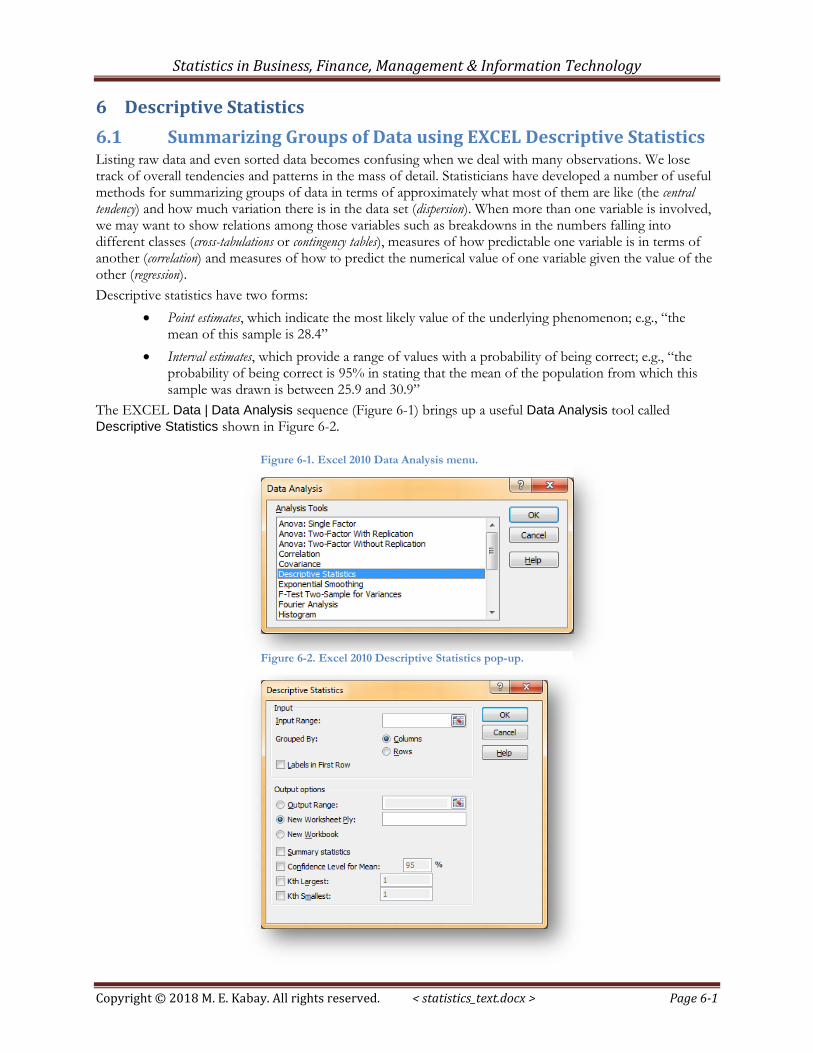
The EXCEL Data | Data Analysis sequence (Figure 6-1) brings up a useful Data Analysis tool called Descriptive Statistics shown in Figure 6-2.
Figure 6-1. Excel 2010 Data Analysis menu.
Figure 6-2. Excel 2010 Descriptive Statistics pop-up.
Statistics in Business, Finance, Management & Information Technology
Copyright © 2018 M. E. Kabay. All rights reserved. < statistics_text.docx > Page 6-2
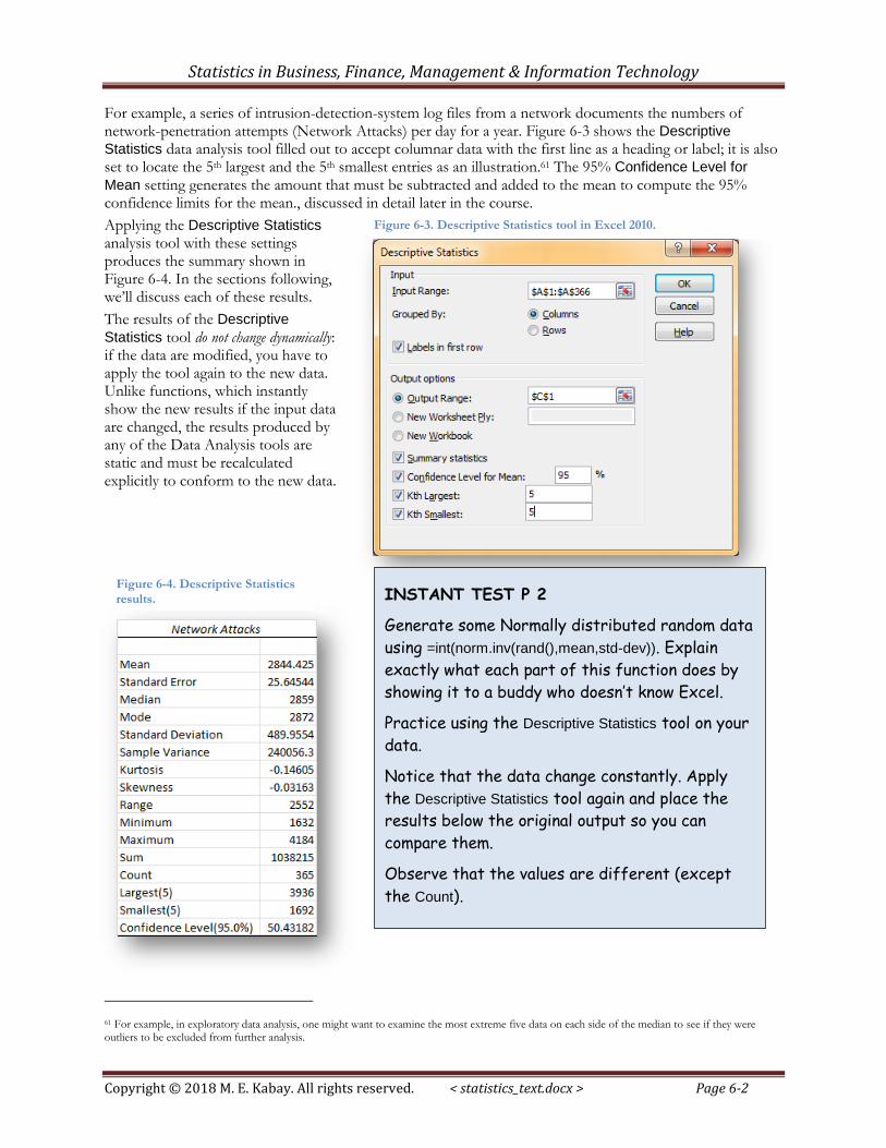
For example, a series of intrusion-detection-system log files from a network documents the numbers of network-penetration attempts (Network Attacks) per day for a year. Figure 6-3 shows the Descriptive
Statistics data analysis tool filled out to accept columnar data with the first line as a heading or label; it is also set to locate the 5th largest and the 5th smallest entries as an illustration.61 The 95% Confidence Level for
Mean setting generates the amount that must be subtracted and added to the mean to compute the 95% confidence limits for the mean., discussed in detail later in the course.
Applying the Descriptive Statistics analysis tool with these settings produces the summary shown in Figure 6-4. In the sections following, we’ll discuss each of these results.
The results of the Descriptive
Statistics tool do not change dynamically: if the data are modified, you have to apply the tool again to the new data. Unlike functions, which instantly show the new results if the input data are changed, the results produced by any of the Data Analysis tools are static and must be recalculated explicitly to conform to the new data.
61 For example, in exploratory data analysis, one might want to examine the most extreme five data on each side of the median to see if they were outliers to be excluded from further analysis.
Figure 6-3. Descriptive Statistics tool in Excel 2010.
Figure 6-4. Descriptive Statistics
results. INSTANT TEST P 2
Generate some Normally distributed random data
using =int(norm.inv(rand(),mean,std-dev)). Explain
exactly what each part of this function does by
showing it to a buddy who doesn’t know Excel.
Practice using the Descriptive Statistics tool on your
data.
Notice that the data change constantly. Apply
the Descriptive Statistics tool again and place the
results below the original output so you can
compare them.
Observe that the values are different (except
the Count).
Statistics in Business, Finance, Management & Information Technology
Copyright © 2018 M. E. Kabay. All rights reserved. < statistics_text.docx > Page 6-3
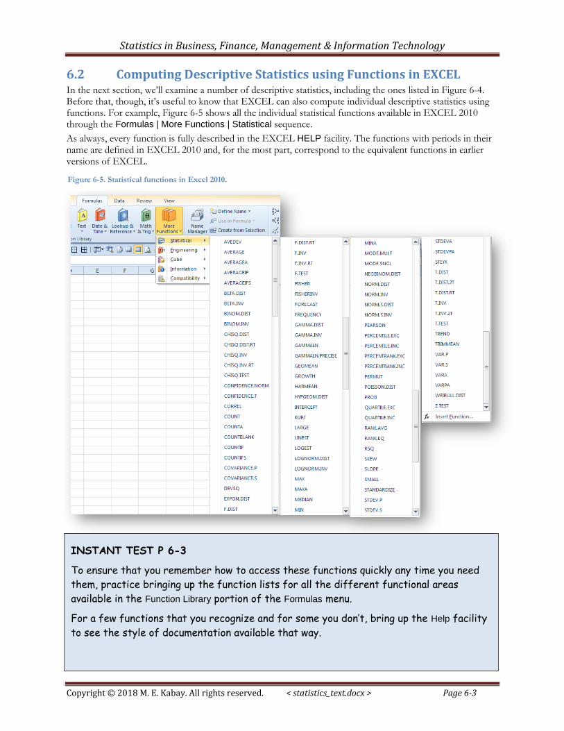
6.2 Computing Descriptive Statistics using Functions in EXCEL In the next section, we’ll examine a number of descriptive statistics, including the ones listed in Figure 6-4. Before that, though, it’s useful to know that EXCEL can also compute individual descriptive statistics using functions. For example, Figure 6-5 shows all the individual statistical functions available in EXCEL 2010 through the Formulas | More Functions | Statistical sequence.
As always, every function is fully described in the EXCEL HELP facility. The functions with periods in their name are defined in EXCEL 2010 and, for the most part, correspond to the equivalent functions in earlier versions of EXCEL.
Figure 6-5. Statistical functions in Excel 2010.
INSTANT TEST P 6-3
To ensure that you remember how to access these functions quickly any time you need
them, practice bringing up the function lists for all the different functional areas
available in the Function Library portion of the Formulas menu.
For a few functions that you recognize and for some you don’t, bring up the Help facility
to see the style of documentation available that way.
Statistics in Business, Finance, Management & Information Technology
Copyright © 2018 M. E. Kabay. All rights reserved. < statistics_text.docx > Page 6-4
6.3 Statistics of Location At an intuitive level, we routinely express our impressions about representative values of observations. Even without calculations, we might say, “I usually score around 85% on these exams” or “Most of the survey respondents were around 50 years of age” or “The stock seems to be selling for around $1200 these days.” There are three important measures of what statisticians call the central tendency: an average (the arithmetic mean is one of several types of averages), the middle of a ranked list of observations (the median), and the most frequent class or classes of a frequency distribution (the mode or modes). In addition, we often refer to groups within a distribution by a variety of quantiles such as quartiles (quarters of the distribution), quintiles (fifths), deciles (tenths) and percentiles (hundredths).62 These latter statistics include attributes of statistics of disperson as well as of central tendency.
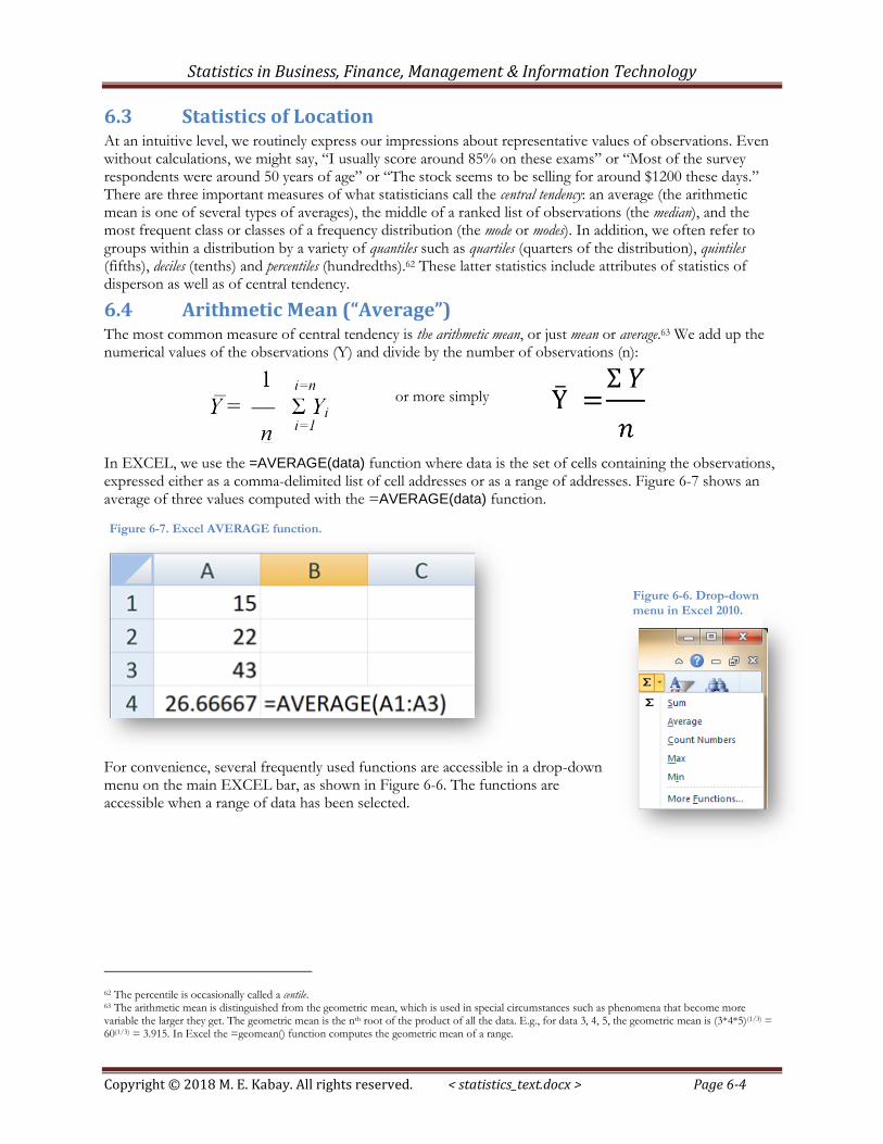
6.4 Arithmetic Mean (“Average”) The most common measure of central tendency is the arithmetic mean, or just mean or average.63 We add up the numerical values of the observations (Y) and divide by the number of observations (n):
or more simply
In EXCEL, we use the =AVERAGE(data) function where data is the set of cells containing the observations, expressed either as a comma-delimited list of cell addresses or as a range of addresses. Figure 6-7 shows an average of three values computed with the =AVERAGE(data) function.
For convenience, several frequently used functions are accessible in a drop-down menu on the main EXCEL bar, as shown in Figure 6-6. The functions are accessible when a range of data has been selected.
62 The percentile is occasionally called a centile. 63 The arithmetic mean is distinguished from the geometric mean, which is used in special circumstances such as phenomena that become more variable the larger they get. The geometric mean is the nth root of the product of all the data. E.g., for data 3, 4, 5, the geometric mean is (3*4*5)(1/3) = 60(1/3) = 3.915. In Excel the =geomean() function computes the geometric mean of a range.
Figure 6-7. Excel AVERAGE function.
Figure 6-6. Drop-down
menu in Excel 2010.
Statistics in Business, Finance, Management & Information Technology
Copyright © 2018 M. E. Kabay. All rights reserved. < statistics_text.docx > Page 6-5
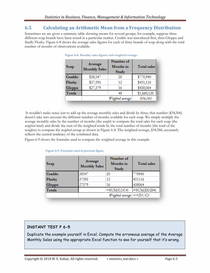
6.5 Calculating an Arithmetic Mean from a Frequency Distribution Sometimes we are given a summary table showing means for several groups; for example, suppose three different soap brands have been tested in a particular market. Cruddo was introduced first, then Gloppu and finally Flushy. Figure 6-8 shows the average sales figures for each of three brands of soap along with the total number of months of observations available.
It wouldn’t make sense just to add up the average monthly sales and divide by three; that number ($34,506) doesn’t take into account the different number of months available for each soap. We simply multiply the average monthly sales by the number of months (the weight) to compute the total sales for each soap (the weighted totals) and divide the sum of the weighted totals by the total number of months (the total of the weights) to compute the weighted average as shown in Figure 6-8. The weighted average, $34,586, accurately reflects the central tendency of the combined data.
Figure 6-9 shows the formulas used to compute the weighted average in this example.
Figure 6-8. Monthly sales figures and weighted average.
Figure 6-9. Formulas used in previous figure.
INSTANT TEST P 6-5
Duplicate the example yourself in Excel. Compute the erroneous average of the Average
Monthly Sales using the appropriate Excel function to see for yourself that it’s wrong.
Statistics in Business, Finance, Management & Information Technology
Copyright © 2018 M. E. Kabay. All rights reserved. < statistics_text.docx > Page 6-6
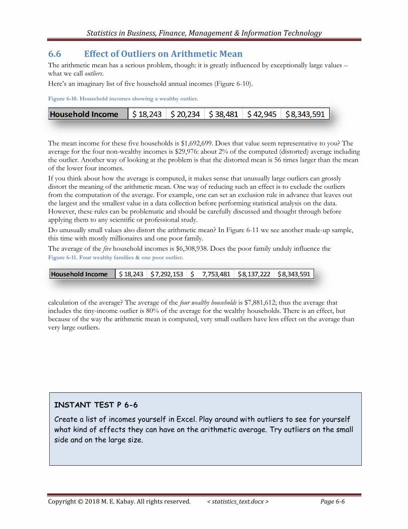
6.6 Effect of Outliers on Arithmetic Mean The arithmetic mean has a serious problem, though: it is greatly influenced by exceptionally large values – what we call outliers.
Here’s an imaginary list of five household annual incomes (Figure 6-10).
The mean income for these five households is $1,692,699. Does that value seem representative to you? The average for the four non-wealthy incomes is $29,976: about 2% of the computed (distorted) average including the outlier. Another way of looking at the problem is that the distorted mean is 56 times larger than the mean of the lower four incomes.
If you think about how the average is computed, it makes sense that unusually large outliers can grossly distort the meaning of the arithmetic mean. One way of reducing such an effect is to exclude the outliers from the computation of the average. For example, one can set an exclusion rule in advance that leaves out the largest and the smallest value in a data collection before performing statistical analysis on the data. However, these rules can be problematic and should be carefully discussed and thought through before applying them to any scientific or professional study.
Do unusually small values also distort the arithmetic mean? In Figure 6-11 we see another made-up sample, this time with mostly millionaires and one poor family.
The average of the five household incomes is $6,308,938. Does the poor family unduly influence the
calculation of the average? The average of the four wealthy households is $7,881,612; thus the average that includes the tiny-income outlier is 80% of the average for the wealthy households. There is an effect, but because of the way the arithmetic mean is computed, very small outliers have less effect on the average than very large outliers.
Figure 6-10. Household incomes showing a wealthy outlier.
Figure 6-11. Four wealthy families & one poor outlier.
INSTANT TEST P 6-6
Create a list of incomes yourself in Excel. Play around with outliers to see for yourself
what kind of effects they can have on the arithmetic average. Try outliers on the small
side and on the large size.
Statistics in Business, Finance, Management & Information Technology
Copyright © 2018 M. E. Kabay. All rights reserved. < statistics_text.docx > Page 6-7
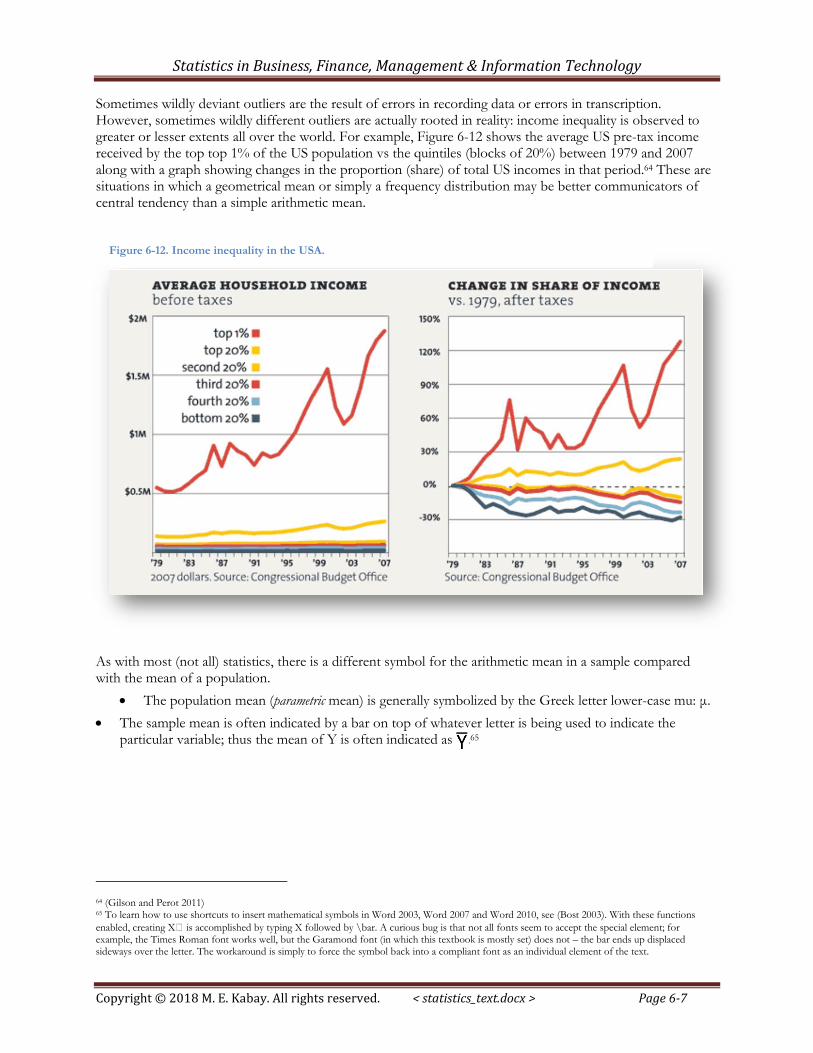
Sometimes wildly deviant outliers are the result of errors in recording data or errors in transcription. However, sometimes wildly different outliers are actually rooted in reality: income inequality is observed to greater or lesser extents all over the world. For example, Figure 6-12 shows the average US pre-tax income received by the top top 1% of the US population vs the quintiles (blocks of 20%) between 1979 and 2007 along with a graph showing changes in the proportion (share) of total US incomes in that period.64 These are situations in which a geometrical mean or simply a frequency distribution may be better communicators of central tendency than a simple arithmetic mean.
As with most (not all) statistics, there is a different symbol for the arithmetic mean in a sample compared with the mean of a population.
The population mean (parametric mean) is generally symbolized by the Greek letter lower-case mu: μ.
The sample mean is often indicated by a bar on top of whatever letter is being used to indicate the particular variable; thus the mean of Y is often indicated as .65
64 (Gilson and Perot 2011) 65 To learn how to use shortcuts to insert mathematical symbols in Word 2003, Word 2007 and Word 2010, see (Bost 2003). With these functions
enabled, creating X̅ is accomplished by typing X followed by \bar. A curious bug is that not all fonts seem to accept the special element; for example, the Times Roman font works well, but the Garamond font (in which this textbook is mostly set) does not – the bar ends up displaced sideways over the letter. The workaround is simply to force the symbol back into a compliant font as an individual element of the text.
Figure 6-12. Income inequality in the USA.
Statistics in Business, Finance, Management & Information Technology
Copyright © 2018 M. E. Kabay. All rights reserved. < statistics_text.docx > Page 6-8
6.7 Median One way to reduce the effect of outliers is to use the middle of a sorted list: the median. When there is an odd number of observations, there is one value in the middle where an equal number of values occur before and after that value. For the sorted list
24, 26, 26, 29, 33, 36, 37
the median is 29 because there are seven values; 7/2=3.5 and so the fourth observation is the middle (three smaller and three larger). The median is thus 29 in this example.
When there is an even number of observations, there are two values in the middle of the list, so we average them to compute the median. For the list
24, 26, 26, 29, 33, 36, 37, 45
the sequence number of the first middle value is 8/2 = 4 and so the two middle values are in the fourth and fifth positions: 29 and 33. The median is (29 + 33)/2 = 62/2 = 31.
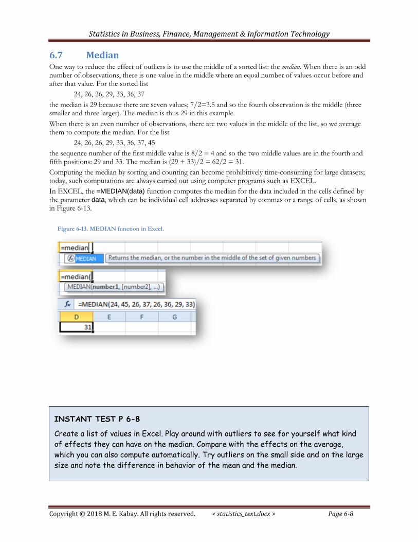
Computing the median by sorting and counting can become prohibitively time-consuming for large datasets; today, such computations are always carried out using computer programs such as EXCEL.
In EXCEL, the =MEDIAN(data) function computes the median for the data included in the cells defined by the parameter data, which can be individual cell addresses separated by commas or a range of cells, as shown in Figure 6-13.
Figure 6-13. MEDIAN function in Excel.
INSTANT TEST P 6-8
Create a list of values in Excel. Play around with outliers to see for yourself what kind
of effects they can have on the median. Compare with the effects on the average,
which you can also compute automatically. Try outliers on the small side and on the large
size and note the difference in behavior of the mean and the median.
Statistics in Business, Finance, Management & Information Technology
Copyright © 2018 M. E. Kabay. All rights reserved. < statistics_text.docx > Page 6-9
6.8 Quantiles Several measures are related to sorted lists of data. The median is an example of a quantile: just as the median divides a sorted sequence into two equal parts, these quantiles divide the distribution into four, five, ten or 100 parts:
Quartiles divide the range into four parts; the 1st quartile includes first 25% of the distribution; the second quartile is the same as the median, defining the midpoint; the third quartile demarcates 75% of the distribution below it and 25% above; the fourth quartile is the maximum of the range.
Quintiles are similar to quartiles but involve five divisions.
Deciles demarcate the 1st tenth of the values, the 2nd tenth and so on; the median is the 5th decile.
Percentiles (sometimes called centiles) demarcate each percentage of the distribution; thus the median is the 50th percentile, the 1st quartile is the 25th percentile, the 3rd quintile is the 60th percentile and the 4th decile is the 80th percentile.
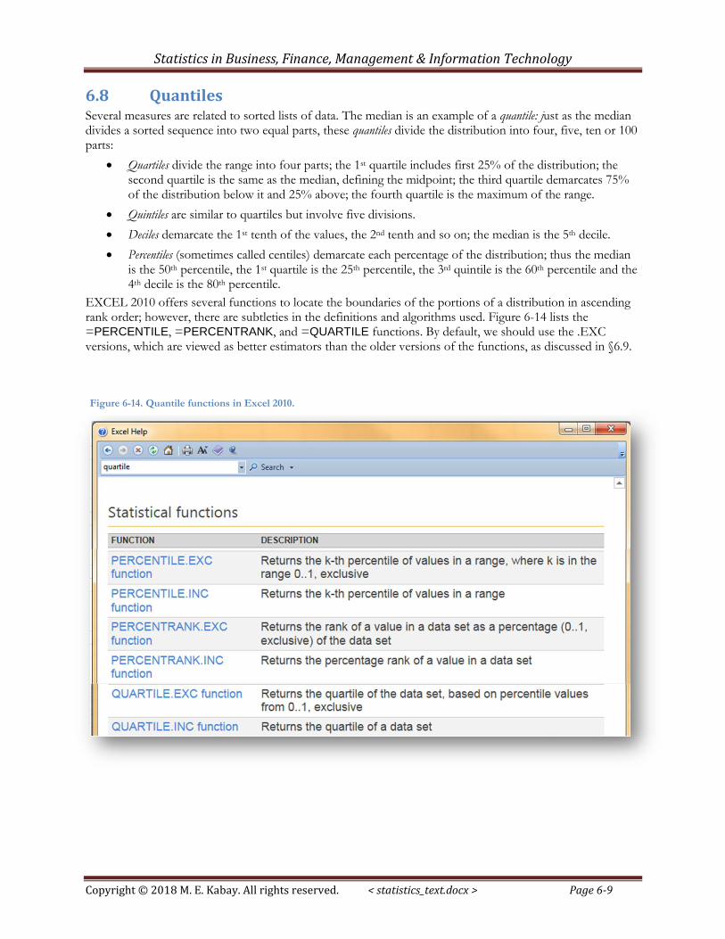
EXCEL 2010 offers several functions to locate the boundaries of the portions of a distribution in ascending rank order; however, there are subtleties in the definitions and algorithms used. Figure 6-14 lists the =PERCENTILE, =PERCENTRANK, and =QUARTILE functions. By default, we should use the .EXC versions, which are viewed as better estimators than the older versions of the functions, as discussed in §6.9.
Figure 6-14. Quantile functions in Excel 2010.
Statistics in Business, Finance, Management & Information Technology
Copyright © 2018 M. E. Kabay. All rights reserved. < statistics_text.docx > Page 6-10
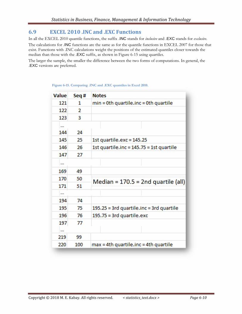
6.9 EXCEL 2010 .INC and .EXC Functions In all the EXCEL 2010 quantile functions, the suffix .INC stands for inclusive and .EXC stands for exclusive.
The calculations for .INC functions are the same as for the quantile functions in EXCEL 2007 for those that exist. Functions with .INC calculations weight the positions of the estimated quantiles closer towards the median than those with the .EXC suffix, as shown in Figure 6-15 using quartiles.
The larger the sample, the smaller the difference between the two forms of computations. In general, the .EXC versions are preferred.
Figure 6-15. Comparing .INC and .EXC quantiles in Excel 2010.
Statistics in Business, Finance, Management & Information Technology
Copyright © 2018 M. E. Kabay. All rights reserved. < statistics_text.docx > Page 6-11
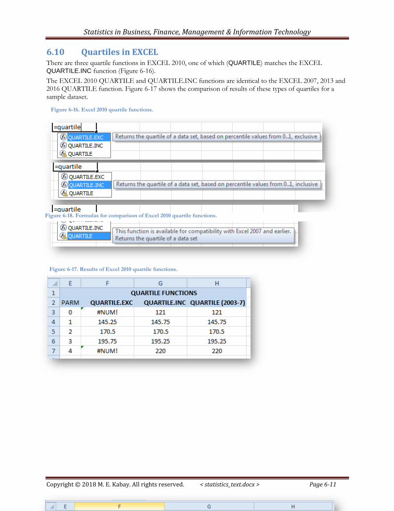
6.10 Quartiles in EXCEL There are three quartile functions in EXCEL 2010, one of which (QUARTILE) matches the EXCEL QUARTILE.INC function (Figure 6-16).
The EXCEL 2010 QUARTILE and QUARTILE.INC functions are identical to the EXCEL 2007, 2013 and 2016 QUARTILE function. Figure 6-17 shows the comparison of results of these types of quartiles for a sample dataset.
Figure 6-16. Excel 2010 quartile functions.
Figure 6-17. Results of Excel 2010 quartile functions.
Figure 6-18. Formulas for comparison of Excel 2010 quartile functions.
Statistics in Business, Finance, Management & Information Technology
Copyright © 2018 M. E. Kabay. All rights reserved. < statistics_text.docx > Page 6-12
6.11 QUARTILE.EXC vs QUARTILE.INC The following information is provided for students who are curious about the different calculation methods used for n-tiles in EXCEL. The details are unnecessary if the advice “use the .EXC versions” is acceptable at face value.
Depending on the number of data points in a sample, it may be necessary to estimate ("interpolate") between existing values when computing quartiles. For example, if we have exactly 10 values in the sample, we have to compute the second quartile (Q2, which is the median) as being half way between the observed value s #5 and #6 in the ranked list if we label the minimum as #1. If we label the minimum as #0, Q2 is half way between the values called #4 and #5. The calculations of Q1 and Q3 depend on whether we start counting the minimum as #0 or as #1.
Newer versions of EXCEL include a function called =QUARTILE.EXC where EXC stands for exclusive. In this method, the minimum is ranked as #1 and the maximum in our sample of 10 sorted values is called #10. The median (Q2) is half way between value #5 and value #6. The value of Q1 is computed as if it were the 0.25*(N+1)th value (remembering that the minimum is labeled #1); in our example, that would be the observation ranked as #2.75 – that is, 3/4 of the distance between observation #2 and observation #3.. Similarly, Q3 is computed as the 0.75*(N+1)th = 0.75*11 which would be rank #8.25, 1/4 of the way between observation #8 and observation #9. There are 2 values below Q1 in our sample of 10 values and 2 values above Q3. There are 3 values between Q1 and Q2 and 2 value between Q2 and Q3.
The older versions of EXCEL use the =QUARTILE function which is exactly the same as the modern =QUARTILE.INC function. The INC stands for inclusive and the minimum is labeled as #0. This method is the commonly used version of the calculations for quartiles. In this method, for the list of 10 values (#0 through #9), the median (Q2) is halfway between the values ranked as #4 and #5. Q2 is calculated as if it were rank #(0.25*(N-1)) = #2.25 – that is, 25% of the distance between value ranked #2 and the one that is #3. Similarly, Q3 is the value corresponding to rank #(0.75*(N-1) = #6.75 – 75% of the distance between values #6 and #7. Thus in our example there are 3 values below Q1 in our sample of 10 values and 3 values above Q3. There are 2 values between Q1 and Q2 and 2 values between Q2 and Q3.
The QUARTILE.EXC function is theoretically a better representation of the values of Q2 and of Q3. You can simply ignore the QUARTILE.INC and QUARTILE functions in most applications, but they are available if you are ordered to use it.66
66 For detailed explanation of the differences between these functions, see (Alexander 2013) < http://datapigtechnologies.com/blog/index.php/why-excel-has-multiple-quartile-functions-and-how-to-replicate-the-quartiles-from-r-and-other-statistical-packages/ > or < http://tinyurl.com/kcrxlfn >.
Statistics in Business, Finance, Management & Information Technology
Copyright © 2018 M. E. Kabay. All rights reserved. < statistics_text.docx > Page 6-13
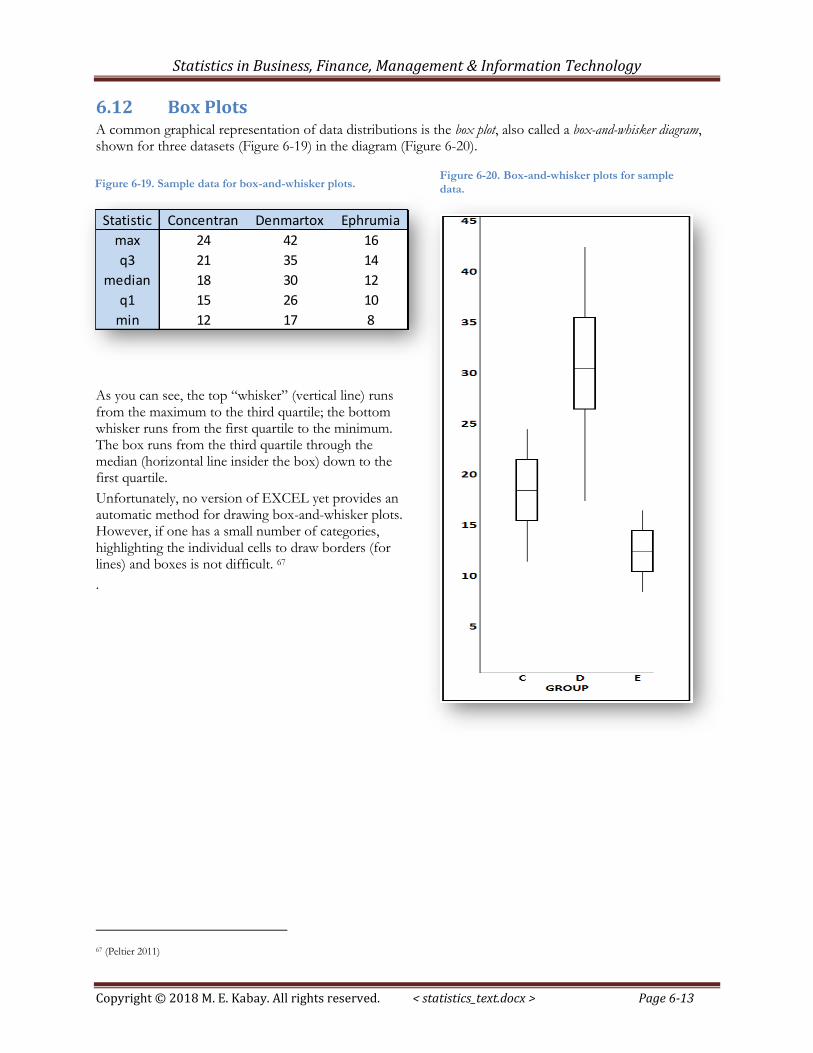
6.12 Box Plots A common graphical representation of data distributions is the box plot, also called a box-and-whisker diagram, shown for three datasets (Figure 6-19) in the diagram (Figure 6-20).
As you can see, the top “whisker” (vertical line) runs from the maximum to the third quartile; the bottom whisker runs from the first quartile to the minimum. The box runs from the third quartile through the median (horizontal line insider the box) down to the first quartile.
Unfortunately, no version of EXCEL yet provides an automatic method for drawing box-and-whisker plots. However, if one has a small number of categories, highlighting the individual cells to draw borders (for lines) and boxes is not difficult. 67
.
67 (Peltier 2011)
Statistic Concentran Denmartox Ephrumia
max 24 42 16
q3 21 35 14
median 18 30 12
q1 15 26 10
min 12 17 8
Figure 6-19. Sample data for box-and-whisker plots. Figure 6-20. Box-and-whisker plots for sample
data.
Statistics in Business, Finance, Management & Information Technology
Copyright © 2018 M. E. Kabay. All rights reserved. < statistics_text.docx > Page 6-14
6.13 Percentiles in EXCEL The same principles apply to percentiles as to quartiles.
Figure 6-14 lists the =PERCENTILE.EXC and the =PERCENTILE.INC functions. Both produce an estimate of the value in an input array that corresponds to any given percentile. The .EXC functions are recommended.
The HELP facility provides ample information to understand and apply the =PERCENTILE functions.
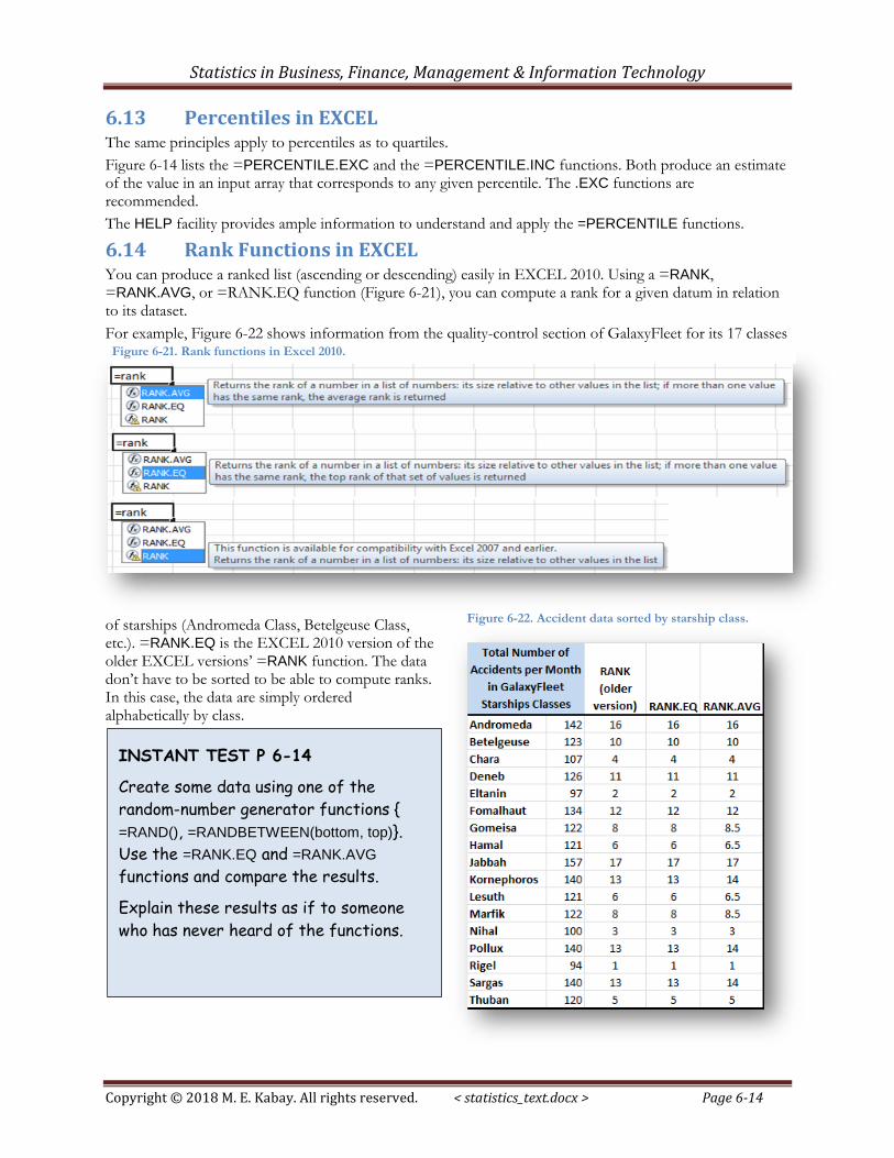
6.14 Rank Functions in EXCEL You can produce a ranked list (ascending or descending) easily in EXCEL 2010. Using a =RANK, =RANK.AVG, or =RANK.EQ function (Figure 6-21), you can compute a rank for a given datum in relation to its dataset.
For example, Figure 6-22 shows information from the quality-control section of GalaxyFleet for its 17 classes
of starships (Andromeda Class, Betelgeuse Class, etc.). =RANK.EQ is the EXCEL 2010 version of the older EXCEL versions’ =RANK function. The data don’t have to be sorted to be able to compute ranks. In this case, the data are simply ordered alphabetically by class.
Figure 6-21. Rank functions in Excel 2010.
Figure 6-22. Accident data sorted by starship class.
INSTANT TEST P 6-14
Create some data using one of the
random-number generator functions {
=RAND(), =RANDBETWEEN(bottom, top)}.
Use the =RANK.EQ and =RANK.AVG
functions and compare the results.
Explain these results as if to someone
who has never heard of the functions.
Statistics in Business, Finance, Management & Information Technology
Copyright © 2018 M. E. Kabay. All rights reserved. < statistics_text.docx > Page 6-15
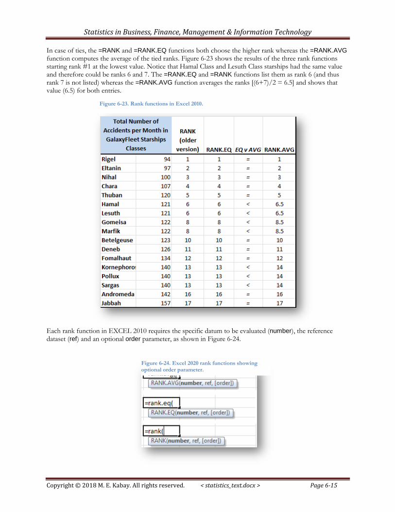
In case of ties, the =RANK and =RANK.EQ functions both choose the higher rank whereas the =RANK.AVG function computes the average of the tied ranks. Figure 6-23 shows the results of the three rank functions starting rank #1 at the lowest value. Notice that Hamal Class and Lesuth Class starships had the same value and therefore could be ranks 6 and 7. The =RANK.EQ and =RANK functions list them as rank 6 (and thus rank 7 is not listed) whereas the =RANK.AVG function averages the ranks [(6+7)/2 = 6.5] and shows that value (6.5) for both entries.
Each rank function in EXCEL 2010 requires the specific datum to be evaluated (number), the reference dataset (ref) and an optional order parameter, as shown in Figure 6-24.
Figure 6-23. Rank functions in Excel 2010.
Figure 6-24. Excel 2020 rank functions showing optional order parameter.
Statistics in Business, Finance, Management & Information Technology
Copyright © 2018 M. E. Kabay. All rights reserved. < statistics_text.docx > Page 6-16
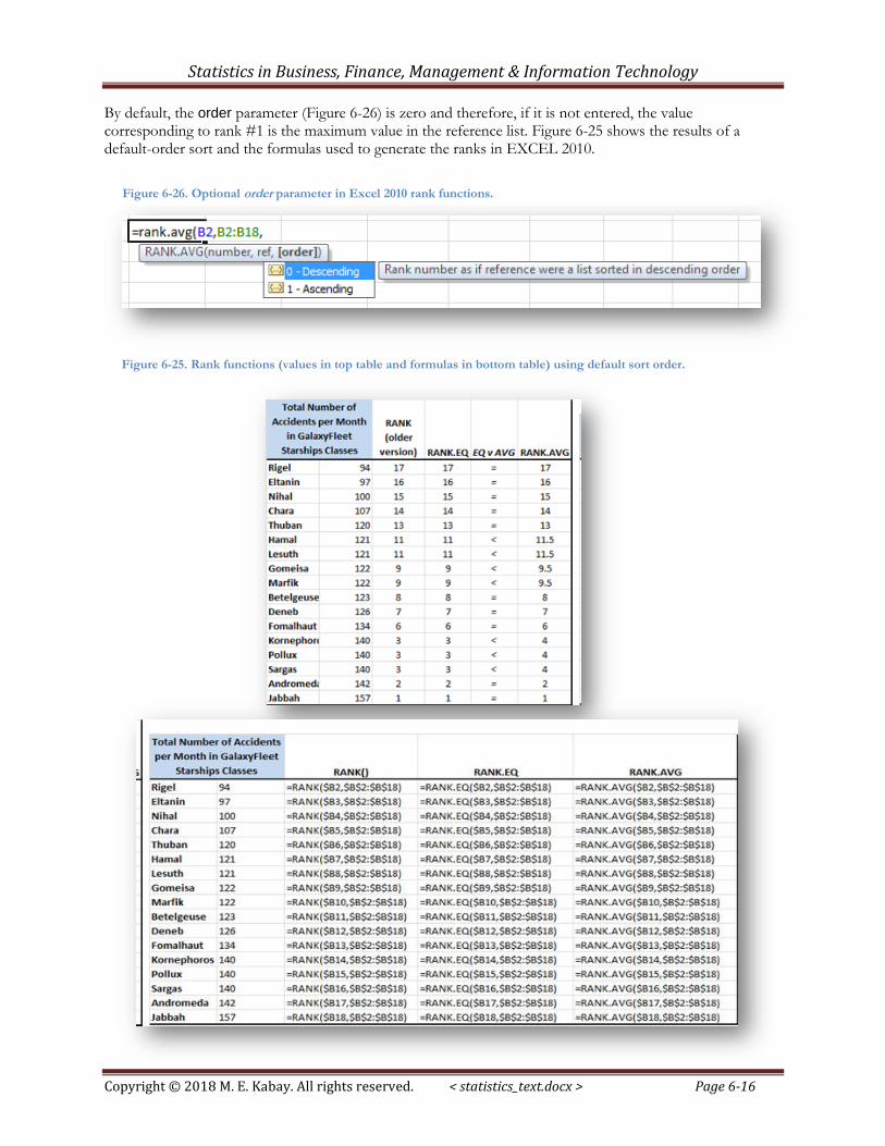
By default, the order parameter (Figure 6-26) is zero and therefore, if it is not entered, the value corresponding to rank #1 is the maximum value in the reference list. Figure 6-25 shows the results of a default-order sort and the formulas used to generate the ranks in EXCEL 2010.
Figure 6-26. Optional order parameter in Excel 2010 rank functions.
Figure 6-25. Rank functions (values in top table and formulas in bottom table) using default sort order.
Statistics in Business, Finance, Management & Information Technology
Copyright © 2018 M. E. Kabay. All rights reserved. < statistics_text.docx > Page 6-17
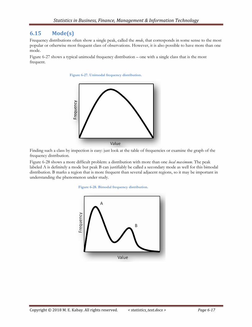
6.15 Mode(s) Frequency distributions often show a single peak, called the mode, that corresponds in some sense to the most popular or otherwise most frequent class of observations. However, it is also possible to have more than one mode.
Figure 6-27 shows a typical unimodal frequency distribution – one with a single class that is the most frequent.
Finding such a class by inspection is easy: just look at the table of frequencies or examine the graph of the frequency distribution.
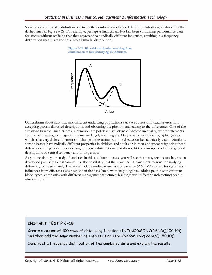
Figure 6-28 shows a more difficult problem: a distribution with more than one local maximum. The peak labeled A is definitely a mode but peak B can justifiably be called a secondary mode as well for this bimodal distribution. B marks a region that is more frequent than several adjacent regions, so it may be important in understanding the phenomenon under study.
Figure 6-27. Unimodal frequency distribution.
Figure 6-28. Bimodal frequency distribution.
Statistics in Business, Finance, Management & Information Technology
Copyright © 2018 M. E. Kabay. All rights reserved. < statistics_text.docx > Page 6-18
Sometimes a bimodal distribution is actually the combination of two different distributions, as shown by the dashed lines in Figure 6-29. For example, perhaps a financial analyst has been combining performance data for stocks without realizing that they represent two radically different industries, resulting in a frequency distribution that mixes the data into a bimodal distribution.
Generalizing about data that mix different underlying populations can cause errors, misleading users into accepting grossly distorted descriptions, and obscuring the phenomena leading to the differences. One of the situations in which such errors are common are political discussions of income inequality, where statements about overall average changes in income are largely meaningless. Only when specific demographic groups which have very different patterns of change are examined can the discussion be statistically sound. Similarly, some diseases have radically different properties in children and adults or in men and women; ignoring these differences may generate odd-looking frequency distributions that do not fit the assumptions behind general descriptions of central tendency and of dispersion.
As you continue your study of statistics in this and later courses, you will see that many techniques have been developed precisely to test samples for the possibility that there are useful, consistent reasons for studying different groups separately. Examples include multiway analysis of variance (ANOVA) to test for systematic influences from different classifications of the data (men, women; youngsters, adults; people with different blood types; companies with different management structures; buildings with different architecture) on the observations.
Figure 6-29. Bimodal distribution resulting from
combination of two underlying distributions.
INSTANT TEST P 6-18
Create a column of 100 rows of data using function =INT(NORM.INV(RAND(),100,10))
and then add the same number of entries using =INT(NORM.INV(RAND(),150,10)).
Construct a frequency distribution of the combined data and explain the results.
Statistics in Business, Finance, Management & Information Technology
Copyright © 2018 M. E. Kabay. All rights reserved. < statistics_text.docx > Page 6-19
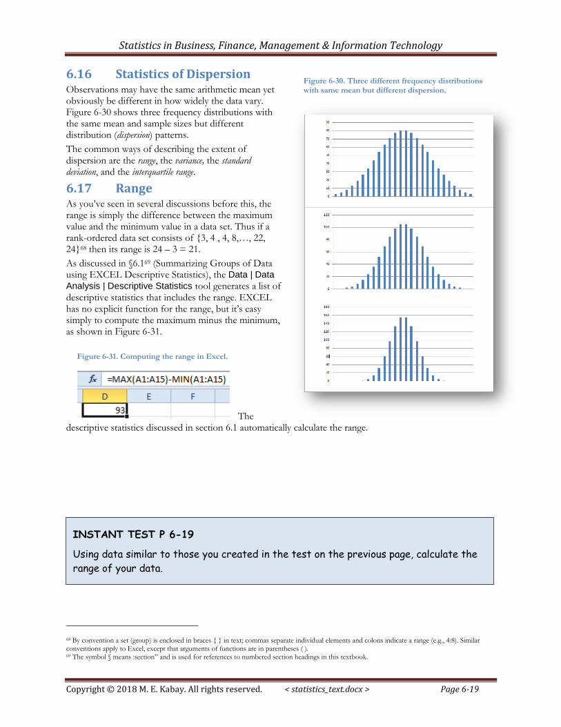
6.16 Statistics of Dispersion Observations may have the same arithmetic mean yet obviously be different in how widely the data vary. Figure 6-30 shows three frequency distributions with the same mean and sample sizes but different distribution (dispersion) patterns.
The common ways of describing the extent of dispersion are the range, the variance, the standard deviation, and the interquartile range.
6.17 Range As you’ve seen in several discussions before this, the range is simply the difference between the maximum value and the minimum value in a data set. Thus if a rank-ordered data set consists of {3, 4 , 4, 8,…, 22, 24}68 then its range is 24 – 3 = 21.
As discussed in §6.169 (Summarizing Groups of Data using EXCEL Descriptive Statistics), the Data | Data
Analysis | Descriptive Statistics tool generates a list of descriptive statistics that includes the range. EXCEL has no explicit function for the range, but it’s easy simply to compute the maximum minus the minimum, as shown in Figure 6-31.
The descriptive statistics discussed in section 6.1 automatically calculate the range.
68 By convention a set (group) is enclosed in braces { } in text; commas separate individual elements and colons indicate a range (e.g., 4:8). Similar conventions apply to Excel, except that arguments of functions are in parentheses ( ). 69 The symbol § means :section” and is used for references to numbered section headings in this textbook.
Figure 6-30. Three different frequency distributions with same mean but different dispersion.
Figure 6-31. Computing the range in Excel.
INSTANT TEST P 6-19
Using data similar to those you created in the test on the previous page, calculate the
range of your data.
Statistics in Business, Finance, Management & Information Technology
Copyright © 2018 M. E. Kabay. All rights reserved. < statistics_text.docx > Page 6-20
6.18 Variance: σ2 and s2 The variance, σ2 (sigma squared), is used throughout applied statistics. It is the average of squared deviations from the mean.
We start by computing the individual deviations y, from the mean:
y = Y - Y̅
where y is a deviate.
In the early years of applied statistics, statisticians tried using the average of these deviates as a measure of dispersion. However, the sum of all the deviates around the mean is always zero, so they tried using the absolute value of y, represented as |y|. That worked, but the average deviate turned out not to be a reliable measure of dispersion. The statisticians developed the idea of squaring the deviates before averaging them, resulting in the variance, represented for an entire group (what we call the parametric variance) as σ2. Thus the equation for the parametric variance is as shown below:
However, calculating individual deviates, y, is tedious, so a better formula for parametric variance is derived from expanding the definition of y:
If our data set consists only of randomly selected values from all possible observations – what we call a sample – then we have to use a slightly different formula for the sample variance. The reason is that when we compute a statistic based on a sample, we expect to that statistic to have the same value on average as the parametric statistic (the one for the entire population). We say that a good sample statistic is an unbiased estimator of the parametric value of that statistic.
It turns out that the parametric variance calculation is slightly too small: variances calculated on samples consistently underestimate the parametric variance. The correct, unbiased estimator of the variance is the sample variance, s2; it is calculated almost the same way as σ2 except that we divide the sum of the squared deviates by one less than the sample size, thus producing a slightly larger value than that of σ2 on the same data:
This is the statistic that is most commonly used to describe the dispersion or variability of a data set, since most data sets are samples.
Statistics in Business, Finance, Management & Information Technology
Copyright © 2018 M. E. Kabay. All rights reserved. < statistics_text.docx > Page 6-21
Practically no one actually uses manual calculation of variance today, however. EXCEL, for example, has several variance functions, as shown in Figure 6-32, which is a composite image that shows all the pop-up descriptors at once (normally one sees only one at a time). With your experience of other EXCEL functions, you can now easily learn about these using the EXCEL help functions.
6.19 Standard Deviation: σ and s The standard deviation is simply the square root of the variance:
EXCEL 2010 functions are shown in a composite image in Figure 6-33.
The standard deviation is used extensively in computations of confidence intervals and confidence limits in statistical estimation. It also plays an important role in many hypothesis tests about whether observed sample statistics support theoretical models about the corresponding parametric statistics (e.g., testing to see if samples support the hypothesis of equality of parametric means among groups).
Figure 6-32. Excel 2010 variance functions.
Figure 6-33. Excel 2010 standard-deviation functions.
Statistics in Business, Finance, Management & Information Technology
Copyright © 2018 M. E. Kabay. All rights reserved. < statistics_text.docx > Page 6-22
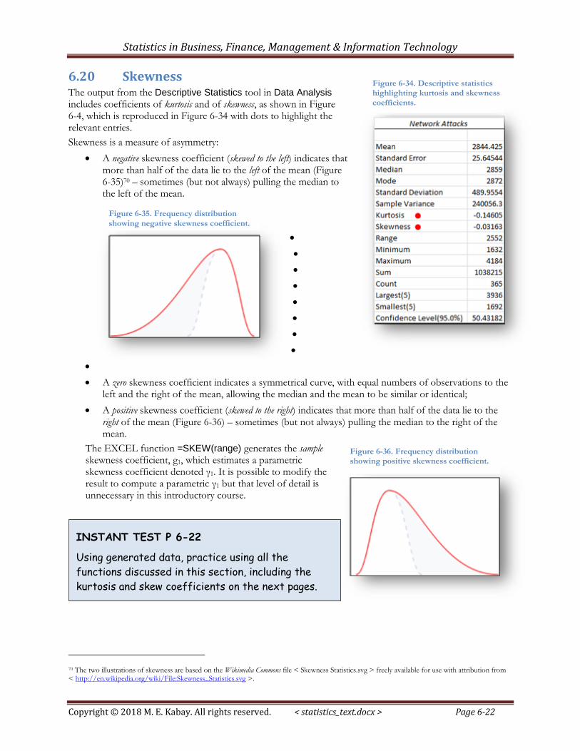
6.20 Skewness The output from the Descriptive Statistics tool in Data Analysis includes coefficients of kurtosis and of skewness, as shown in Figure 6-4, which is reproduced in Figure 6-34 with dots to highlight the relevant entries.
Skewness is a measure of asymmetry:
A negative skewness coefficient (skewed to the left) indicates that more than half of the data lie to the left of the mean (Figure 6-35)70 – sometimes (but not always) pulling the median to the left of the mean.
A zero skewness coefficient indicates a symmetrical curve, with equal numbers of observations to the left and the right of the mean, allowing the median and the mean to be similar or identical;
A positive skewness coefficient (skewed to the right) indicates that more than half of the data lie to the right of the mean (Figure 6-36) – sometimes (but not always) pulling the median to the right of the mean.
The EXCEL function =SKEW(range) generates the sample skewness coefficient, g1, which estimates a parametric skewness coefficient denoted γ1. It is possible to modify the result to compute a parametric γ1 but that level of detail is unnecessary in this introductory course.
70 The two illustrations of skewness are based on the Wikimedia Commons file < Skewness Statistics.svg > freely available for use with attribution from < http://en.wikipedia.org/wiki/File:Skewness_Statistics.svg >.
Figure 6-34. Descriptive statistics highlighting kurtosis and skewness
coefficients.
Figure 6-35. Frequency distribution
showing negative skewness coefficient.
Figure 6-36. Frequency distribution showing positive skewness coefficient.
INSTANT TEST P 6-22
Using generated data, practice using all the
functions discussed in this section, including the
kurtosis and skew coefficients on the next pages.
Statistics in Business, Finance, Management & Information Technology
Copyright © 2018 M. E. Kabay. All rights reserved. < statistics_text.docx > Page 6-23
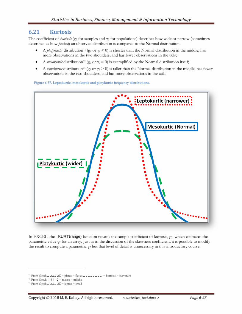
6.21 Kurtosis The coefficient of kurtosis (g2 for samples and γ2 for populations) describes how wide or narrow (sometimes described as how peaked) an observed distribution is compared to the Normal distribution.
A platykurtic distribution71 (g2 or γ2 < 0) is shorter than the Normal distribution in the middle, has more observations in the two shoulders, and has fewer observations in the tails;
A mesokurtic distribution72 (g2 or γ2 = 0) is exemplified by the Normal distribution itself;
A leptokurtic distribution73 (g2 or γ2 > 0) is taller than the Normal distribution in the middle, has fewer observations in the two shoulders, and has more observations in the tails.
In EXCEL, the =KURT(range) function returns the sample coefficient of kurtosis, g2, which estimates the parametric value γ2 for an array. Just as in the discussion of the skewness coefficient, it is possible to modify the result to compute a parametric γ2 but that level of detail is unnecessary in this introductory course.
71 From Greek = platus = flat & = kurtosis = curvature 72 From Greek = mesos = middle 73 From Greek = leptos = small
Figure 6-37. Leptokurtic, mesokurtic and platykurtic frequency distributions.