Embed Size (px)
Citation preview
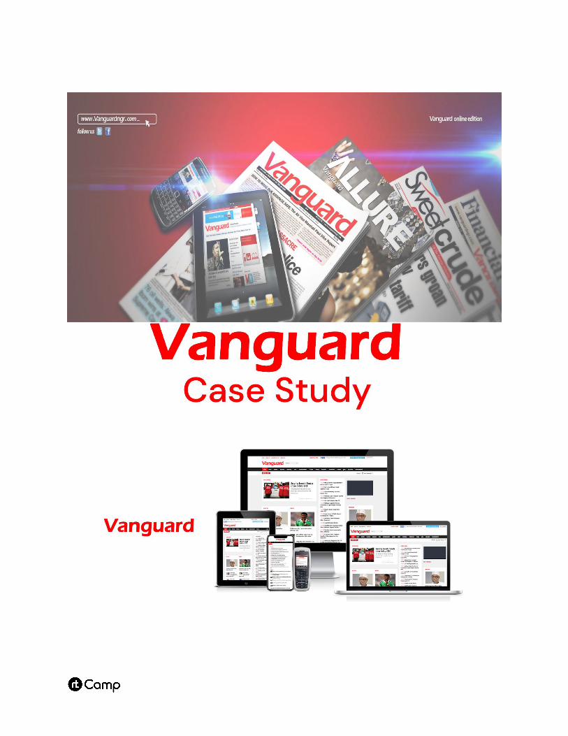
Table of Content
1. About Vanguard
2. Services Delivered
3. Creating a Custom Theme
4. Optimizing for Opera Mini
5. Identifying Device Type
6. Configuring Page Caching
7. Conclusion
About Vanguard
Vanguard is one of the largest news agencies in Nigeria.
They cover local and international news, sports,
technology, entertainment and more through their daily
newspaper and website.
Vanguard approached rtCamp because they were
experiencing a rise in visitors across all platforms and
were looking to scale up while keeping server
infrastructure costs manageable.
They were also looking for a website design refresh, with
a theme that could cater to a large demographic of
potential readers who accessed the Internet via slow
2G connections on low-end feature phones using the
Opera Mini browser.
Services delivered
● WordPress Theme Development
● Server Architecture & Maintenance
● WordPress Plugin Development
● Ongoing Support
Creating a Custom Theme
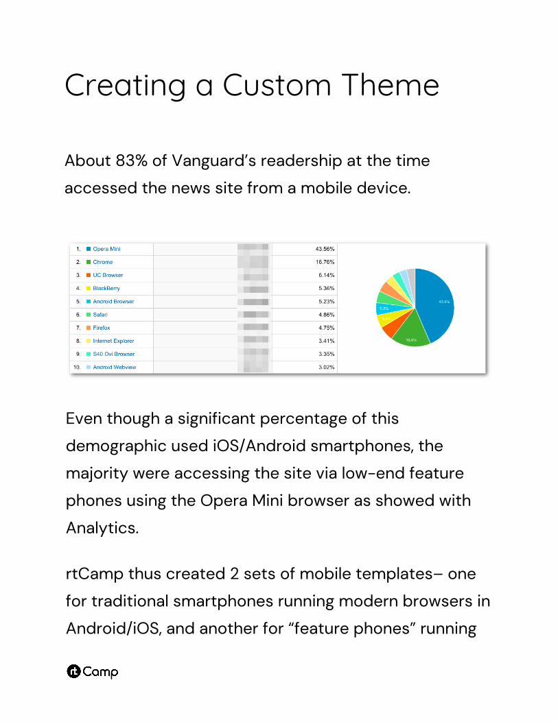
About 83% of Vanguard’s readership at the time
accessed the news site from a mobile device.
Even though a significant percentage of this
demographic used iOS/Android smartphones, the
majority were accessing the site via low-end feature
phones using the Opera Mini browser as showed with
Analytics.
rtCamp thus created 2 sets of mobile templates– one
for traditional smartphones running modern browsers in
Android/iOS, and another for “feature phones” running
the Opera Mini browser. Both had all the usual mobile
optimizations– including responsive design and scaled
down images– to account for the smaller screen sizes
and 2G internet speeds. However, because of the way
that Opera Mini works, we needed to go a step further
to fully account for readers using it through feature
phones.
Optimizing for Opera Mini
In order to save bandwidth and minimize rendering on
low-end devices, Opera Mini requests web pages
through a proxy server. This server parses any
HTML/CSS and processes the JavaScript on the page
before converting it to the Opera Binary Markup
Language (OBML) format. A page in OBML is up to 90%
smaller than the original.
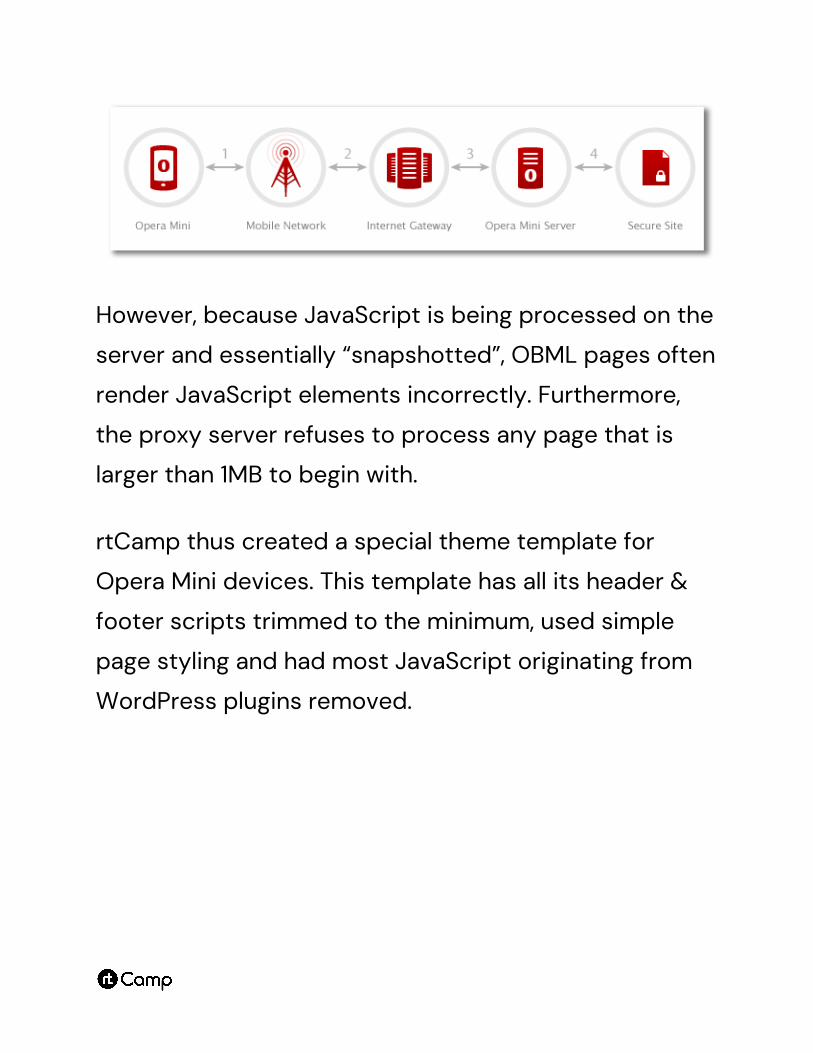
However, because JavaScript is being processed on the
server and essentially “snapshotted”, OBML pages often
render JavaScript elements incorrectly. Furthermore,
the proxy server refuses to process any page that is
larger than 1MB to begin with.
rtCamp thus created a special theme template for
Opera Mini devices. This template has all its header &
footer scripts trimmed to the minimum, used simple
page styling and had most JavaScript originating from
WordPress plugins removed.
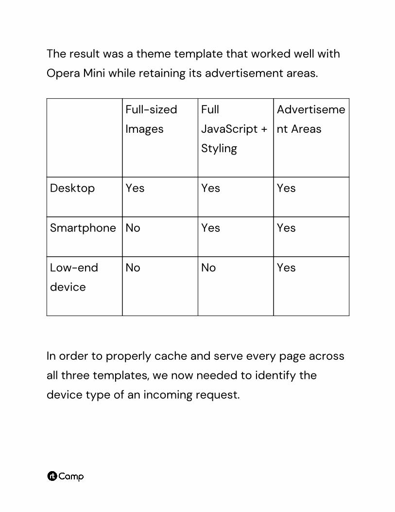
The result was a theme template that worked well with
Opera Mini while retaining its advertisement areas.
Full-sized
Images
Full
JavaScript +
Styling
Advertiseme
nt Areas
Desktop Yes Yes Yes
Smartphone No Yes Yes
Low-end
device
No No Yes
In order to properly cache and serve every page across
all three templates, we now needed to identify the
device type of an incoming request.
Identifying Device Type
The two common ways to identify device type are via
WordPress’ wp_is_mobile() function and via a regex on
the HTTP request’s user agent. Both these solutions rely
on PHP code in the theme/plugin and are far from ideal
for a site that needs to scale because, at peak times,
they would result in >25,000 concurrent visitors
starting >25,000 database queries. This in itself would
bring the site down.
rtCamp thus used Nginx’s Map Module to detect the
user agent. This offloads device detection from
WordPress (and PHP) to Nginx. Detecting the user agent
at Nginx is orders of magnitude faster than relying on
WordPress/PHP for this.
To set this up, we interfaced WordPress with
Nginx/Redis using a server variable. The flow looked
something like:
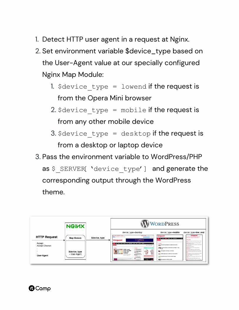
1. Detect HTTP user agent in a request at Nginx.
2. Set environment variable $device_type based on
the User-Agent value at our specially configured
Nginx Map Module:
1. $device_type = lowend if the request is
from the Opera Mini browser
2. $device_type = mobile if the request is
from any other mobile device
3. $device_type = desktop if the request is
from a desktop or laptop device
3. Pass the environment variable to WordPress/PHP
as $_SERVER[‘device_type’] and generate the
corresponding output through the WordPress
theme.
Configuring Page Caching
rtCamp used Nginx with a Redis cache as the free
version of FastCGI does not support cache purging via
wildcard URL rules and Vanguard required us to keep
costs as low as possible.
The Redis cache thus had three entries for every URL,
corresponding to the three templates they could be
rendered in. We thus used the aforementioned
device_type environment variable to differentiate
cache entries for each URL–
nginx-cache:httpGETwww.vanguardngr.com/–desktop
nginx-cache:httpGETwww.vanguardngr.com/–mobile
nginx-cache:httpGETwww.vanguardngr.com/–lowend
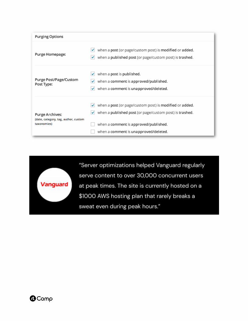
We also created a custom WordPress plugin to provide
a visual interface to manage cache updates.
Conclusion
Vanguard’s new theme is accessible to visitors on any
device, allowing it to remain the most visited news site
in a country of 188 million residents.
Server optimizations helped Vanguard regularly serve
content to over 30,000 concurrent users at peak times.
The site is currently hosted on a $1000 AWS hosting
plan that rarely breaks a sweat even during peak hours.
rtCamp was founded in 2009 and has always worked
exclusively with WordPress. We’ve grown by doing great
work and building a great place to work: our tagline is
“Good Work. Good People”.
We build enterprise WordPress websites, higher
performance eCommerce stores, and manage hosting
infrastructure for the biggest brands including
Facebook, News UK, and Vanguard. As one of the
WordPress VIP partners world-wide, we craft the
highest quality code and have access to the best
WordPress infrastructure.


![Markup Validation Service - 京都産業大学g1144498/pdfBox/pentagon/Markup Valida… · [Invalid] Markup Validation of - W3C Markup Validator 13/01/08 15:45](https://img.pdfslide.net/doc/110x75/5ec08432b95dbf01a2684a21/markup-validation-service-efc-g1144498pdfboxpentagonmarkup-valida.jpg)