Embed Size (px)
Citation preview

84th Annual Report1 April 2013–31 March 2014
Basel, 29 June 2014

This publication is available on the BIS website (www.bis.org/publ/arpdf/ar2014e.htm).
Also published in French, German, Italian and Spanish.
© Bank for International Settlements 2014. All rights reserved. Limited extracts may be reproduced or translated provided the source is stated.
ISSN 1021-2477 (print) ISSN 1682-7708 (online)
ISBN 978-92-9131-532-1 (print) ISBN 978-92-9131-533-8 (online)

Contents
Letter of transmittal . . . . . . . . . . . . . . . . . . . . . . . . . . . . . . . . . . . . . . . . . . . . . . . . . . . . . 1
Overview of the economic chapters . . . . . . . . . . . . . . . . . . . . . . . . . . . . . . . . . . 3
I. In search of a new compass . . . . . . . . . . . . . . . . . . . . . . . . . . . . . . . . . . . . . . . . . 7
The global economy: where do we stand? . . . . . . . . . . . . . . . . . . . . . . . . . . . . . . . . . . . . . . . 8The global economy through the financial cycle lens . . . . . . . . . . . . . . . . . . . . . . . . . . . . . 10
A balance sheet recession and its aftermath . . . . . . . . . . . . . . . . . . . . . . . . . . . . . . . . . 10Current macroeconomic and financial risks . . . . . . . . . . . . . . . . . . . . . . . . . . . . . . . . . . 12
Policy challenges . . . . . . . . . . . . . . . . . . . . . . . . . . . . . . . . . . . . . . . . . . . . . . . . . . . . . . . . . . . . . . 14Near-term challenges: what is to be done now? . . . . . . . . . . . . . . . . . . . . . . . . . . . . . 14Longer-term challenges: adjusting policy frameworks . . . . . . . . . . . . . . . . . . . . . . . . . 17
Conclusion . . . . . . . . . . . . . . . . . . . . . . . . . . . . . . . . . . . . . . . . . . . . . . . . . . . . . . . . . . . . . . . . . . . 20
II. Global financial markets under the spell of monetary policy . . . 23
The year in review: a bumpy ride in the search for yield . . . . . . . . . . . . . . . . . . . . . . . . . . 23Emerging market economies suffered sharp reversals . . . . . . . . . . . . . . . . . . . . . . . . . . . . . 27Box II.A: Determinants of recent currency depreciations in EMEs . . . . . . . . . . . . . . . . . . . 29Central banks left their mark on financial markets . . . . . . . . . . . . . . . . . . . . . . . . . . . . . . . . 30
Financial markets fixated on monetary policy . . . . . . . . . . . . . . . . . . . . . . . . . . . . . . . . 31Box II.B: The 2013 sell-off in US Treasuries from a historical perspective . . . . . . . . . . . . . 32
Low funding costs and volatility encouraged the search for yield . . . . . . . . . . . . . . 34
III. Growth and inflation: drivers and prospects . . . . . . . . . . . . . . . . . . . . . 41
Growth: recent developments and medium-term trends . . . . . . . . . . . . . . . . . . . . . . . . . . . 42A stronger but still uneven global recovery . . . . . . . . . . . . . . . . . . . . . . . . . . . . . . . . . 42The long shadow of the financial crisis . . . . . . . . . . . . . . . . . . . . . . . . . . . . . . . . . . . . . . 44
Box III.A: Recovery from a balance sheet recession . . . . . . . . . . . . . . . . . . . . . . . . . . . . . . . 45Box III.B: Measuring output losses after a balance sheet recession . . . . . . . . . . . . . . . . . . 48Inflation: domestic and global drivers . . . . . . . . . . . . . . . . . . . . . . . . . . . . . . . . . . . . . . . . . . . 49
Better-anchored inflation expectations? . . . . . . . . . . . . . . . . . . . . . . . . . . . . . . . . . . . . . 51Box III.C: Measuring potential output and economic slack . . . . . . . . . . . . . . . . . . . . . . . . . 52
A bigger role for global factors? . . . . . . . . . . . . . . . . . . . . . . . . . . . . . . . . . . . . . . . . . . . 53Investment and productivity: a long-term perspective . . . . . . . . . . . . . . . . . . . . . . . . . . . . . 56
Declining productivity growth trends . . . . . . . . . . . . . . . . . . . . . . . . . . . . . . . . . . . . . . . 58
IV. Debt and the financial cycle: domestic and global . . . . . . . . . . . . . 65
The financial cycle: a short introduction . . . . . . . . . . . . . . . . . . . . . . . . . . . . . . . . . . . . . . . . . 65Box IV.A: Measuring financial cycles . . . . . . . . . . . . . . . . . . . . . . . . . . . . . . . . . . . . . . . . . . . . . 68Where are countries in the financial cycle? . . . . . . . . . . . . . . . . . . . . . . . . . . . . . . . . . . . . . . 69
iiiBIS 84th Annual Report
What is driving the financial cycle in the current context? . . . . . . . . . . . . . . . . . . . . . . . . . 69Global liquidity and domestic policies fuel credit booms . . . . . . . . . . . . . . . . . . . . . . 71
Risks and adjustment needs . . . . . . . . . . . . . . . . . . . . . . . . . . . . . . . . . . . . . . . . . . . . . . . . . . . . 73Indicators point to the risk of financial distress . . . . . . . . . . . . . . . . . . . . . . . . . . . . . . 74Returning to sustainable debt levels . . . . . . . . . . . . . . . . . . . . . . . . . . . . . . . . . . . . . . . . 78
Box IV.B: Estimating debt service ratios . . . . . . . . . . . . . . . . . . . . . . . . . . . . . . . . . . . . . . . . . . 81
V. Monetary policy struggles to normalise . . . . . . . . . . . . . . . . . . . . . . . . . . . 85
Recent monetary policy developments . . . . . . . . . . . . . . . . . . . . . . . . . . . . . . . . . . . . . . . . . . 85Box V.A: Forward guidance at the zero lower bound . . . . . . . . . . . . . . . . . . . . . . . . . . . . . . 89Key monetary policy challenges . . . . . . . . . . . . . . . . . . . . . . . . . . . . . . . . . . . . . . . . . . . . . . . . 90
Low monetary policy effectiveness . . . . . . . . . . . . . . . . . . . . . . . . . . . . . . . . . . . . . . . . . 91Monetary policy spillovers . . . . . . . . . . . . . . . . . . . . . . . . . . . . . . . . . . . . . . . . . . . . . . . . 92
Box V.B: Effectiveness of monetary policy following balance sheet recessions . . . . . . . . 93Box V.C: Impact of US monetary policy on EME policy rates: evidence from Taylor rules 95
Unexpected disinflation and the risks of deflation . . . . . . . . . . . . . . . . . . . . . . . . . . . 96Box V.D: The costs of deflation: what does the historical record say? . . . . . . . . . . . . . . . . 98
Normalising policy . . . . . . . . . . . . . . . . . . . . . . . . . . . . . . . . . . . . . . . . . . . . . . . . . . . . . . . 99
VI. The financial system at a crossroads . . . . . . . . . . . . . . . . . . . . . . . . . . . . . . 103
Overview of trends . . . . . . . . . . . . . . . . . . . . . . . . . . . . . . . . . . . . . . . . . . . . . . . . . . . . . . . . . . . . 103Banks . . . . . . . . . . . . . . . . . . . . . . . . . . . . . . . . . . . . . . . . . . . . . . . . . . . . . . . . . . . . . . . . . . . 103
Box VI.A: Regulatory reform – new elements and implementation . . . . . . . . . . . . . . . . . . 105Box VI.B: Regulatory treatment of banks’ sovereign exposures . . . . . . . . . . . . . . . . . . . . . 108
Insurance sector . . . . . . . . . . . . . . . . . . . . . . . . . . . . . . . . . . . . . . . . . . . . . . . . . . . . . . . . . . 109Bank versus market-based credit . . . . . . . . . . . . . . . . . . . . . . . . . . . . . . . . . . . . . . . . . . . 110
Structural adjustments in the financial sector . . . . . . . . . . . . . . . . . . . . . . . . . . . . . . . . . . . . . 111Changes in business models . . . . . . . . . . . . . . . . . . . . . . . . . . . . . . . . . . . . . . . . . . . . . . . 112Shifting patterns in international banking . . . . . . . . . . . . . . . . . . . . . . . . . . . . . . . . . . 113The ascent of the asset management sector . . . . . . . . . . . . . . . . . . . . . . . . . . . . . . . . . 114
Box VI.C: Financing infrastructure investment . . . . . . . . . . . . . . . . . . . . . . . . . . . . . . . . . . . . 116How strong are banks, really? . . . . . . . . . . . . . . . . . . . . . . . . . . . . . . . . . . . . . . . . . . . . . . . . . . 117
Banks in post-crisis recovery . . . . . . . . . . . . . . . . . . . . . . . . . . . . . . . . . . . . . . . . . . . . . . . 117Banks in a late financial boom phase . . . . . . . . . . . . . . . . . . . . . . . . . . . . . . . . . . . . . . . 120
Box VI.D: The effectiveness of countercyclical policy instruments . . . . . . . . . . . . . . . . . . . 121
Organisation of the BIS as at 31 March 2014 . . . . . . . . . . . . . . . . . . . . . . . . . . . . . . . . . . . . . 128
The BIS: mission, activities, governance and financial results . . . . . 129
BIS member central banks . . . . . . . . . . . . . . . . . . . . . . . . . . . . . . . . . . . . . . . . . . . . . . . . . . . . . 163Board of Directors . . . . . . . . . . . . . . . . . . . . . . . . . . . . . . . . . . . . . . . . . . . . . . . . . . . . . . . . . . . . 164
Financial statements . . . . . . . . . . . . . . . . . . . . . . . . . . . . . . . . . . . . . . . . . . . . . . . . . . . . 171
Independent auditor’s report . . . . . . . . . . . . . . . . . . . . . . . . . . . . . . . . . . . . . . . . . . 245
Five-year graphical summary . . . . . . . . . . . . . . . . . . . . . . . . . . . . . . . . . . . . . . . . . . 246
iv BIS 84th Annual Report

Graphs
I.1 Debt levels continue to rise . . . . . . . . . . . . . . . . . . . . . . . . . . . . . . . . . . . . . . . . . . . . . . . 10
II.1 Accommodative policy in advanced economies holds down bond yields . . . . . . . 24II.2 Monetary accommodation spurs risk-taking . . . . . . . . . . . . . . . . . . . . . . . . . . . . . . . . 25II.3 The bond market sell-off induces temporary financial tightening . . . . . . . . . . . . . 26II.4 Financial market tensions spill over to emerging market economies . . . . . . . . . . . 27II.5 Emerging market economies respond to market pressure . . . . . . . . . . . . . . . . . . . . 28II.6 US interest rates show the first signs of normalisation . . . . . . . . . . . . . . . . . . . . . . . 34II.7 News about US monetary policy triggers repricing . . . . . . . . . . . . . . . . . . . . . . . . . . 35II.8 Lower-rated credit market segments see buoyant issuance . . . . . . . . . . . . . . . . . . . 36II.9 Credit spreads narrow despite sluggish growth . . . . . . . . . . . . . . . . . . . . . . . . . . . . . . 37II.10 Equity valuations move higher while volatility and risk premia fall . . . . . . . . . . . . . 38II.11 Volatility in major asset classes approaches record lows . . . . . . . . . . . . . . . . . . . . . . 39
III.1 Advanced economies are driving the pickup in global growth . . . . . . . . . . . . . . . . 42III.2 Credit growth is still strong in EMEs . . . . . . . . . . . . . . . . . . . . . . . . . . . . . . . . . . . . . . . 43III.3 The recovery in output and productivity has been slow and uneven . . . . . . . . . . . 44III.4 Fiscal consolidation in advanced economies is still incomplete . . . . . . . . . . . . . . . . 47III.5 Global inflation has remained subdued . . . . . . . . . . . . . . . . . . . . . . . . . . . . . . . . . . . . . 50III.6 The price and wage Phillips curves have become flatter in advanced economies . . . . . . . . . . . . . . . . . . . . . . . . . . . . . . . . . . . . . . . . . . . . . . . . . . . . . . . . . . . . . . 51III.7 Inflation is a global phenomenon . . . . . . . . . . . . . . . . . . . . . . . . . . . . . . . . . . . . . . . . . 54III.8 Domestic inflation is influenced by global slack . . . . . . . . . . . . . . . . . . . . . . . . . . . . . 55III.9 Trends in investment diverge . . . . . . . . . . . . . . . . . . . . . . . . . . . . . . . . . . . . . . . . . . . . . . 57III.10 Productivity growth and working-age population are on a declining path . . . . . 59
IV.1 Financial cycle peaks tend to coincide with crises . . . . . . . . . . . . . . . . . . . . . . . . . . . 67IV.2 Where are countries in the financial cycle? . . . . . . . . . . . . . . . . . . . . . . . . . . . . . . . . . 70IV.3 Uneven deleveraging after the crisis . . . . . . . . . . . . . . . . . . . . . . . . . . . . . . . . . . . . . . . 71IV.4 Low yields in advanced economies push funds into emerging market economies . . . . . . . . . . . . . . . . . . . . . . . . . . . . . . . . . . . . . . . . . . . . . . . . . . . . . . . . . . . . . . 72IV.5 Low policy rates coincide with credit booms . . . . . . . . . . . . . . . . . . . . . . . . . . . . . . . . 73IV.6 Emerging market economies face new risk patterns . . . . . . . . . . . . . . . . . . . . . . . . . 77IV.7 Demographic tailwinds for house prices turn into headwinds . . . . . . . . . . . . . . . . . 79IV.8 Debt sustainability requires deleveraging across the globe . . . . . . . . . . . . . . . . . . . 80IV.9 Debt service burdens are likely to rise . . . . . . . . . . . . . . . . . . . . . . . . . . . . . . . . . . . . . 83
V.1 Monetary policy globally is still very accommodative . . . . . . . . . . . . . . . . . . . . . . . . 86V.2 Policy rates remain low and central bank assets high in major advanced economies . . . . . . . . . . . . . . . . . . . . . . . . . . . . . . . . . . . . . . . . . . . . . . . . . . . . . . . . . . . . . . 87V.3 Small advanced economies are facing below-target inflation and high debt . . . . 88V.4 EMEs respond to market tensions while concerns about stability rise . . . . . . . . . . 91V.5 Global borrowing in foreign currencies rises while short-term interest rates co-move . . . . . . . . . . . . . . . . . . . . . . . . . . . . . . . . . . . . . . . . . . . . . . . . . . . . . . . . . . . . . . . . 94V.6 Well anchored inflation expectations . . . . . . . . . . . . . . . . . . . . . . . . . . . . . . . . . . . . . . . 97V.7 Taylor rule-implied rates point to lingering headwinds . . . . . . . . . . . . . . . . . . . . . . . 101
VI.1 Capital accumulation boosts banks’ regulatory ratios . . . . . . . . . . . . . . . . . . . . . . . . 106VI.2 Divergent trends in bank lending . . . . . . . . . . . . . . . . . . . . . . . . . . . . . . . . . . . . . . . . . . 110VI.3 Hurdles to bank lending . . . . . . . . . . . . . . . . . . . . . . . . . . . . . . . . . . . . . . . . . . . . . . . . . . 111VI.4 Efficiency and earnings stability go hand in hand . . . . . . . . . . . . . . . . . . . . . . . . . . . 112
vBIS 84th Annual Report

Conventions used in this Report
lhs, rhs left-hand scale, right-hand scalebillion thousand milliontrillion thousand billion%pts percentage points... not available. not applicable– nil or negligible$ USdollarunlessspecifiedotherwise
Components may not sum to totals because of rounding.
The term “country” as used in this publication also covers territorial entities that are not states as understood by international law and practice but for which data are separately and independently maintained.
The economic chapters of this Report went to press on 18–20 June 2014 using data available up to 6 June 2014.
Tables
III.1 Output growth, inflation and current account balances . . . . . . . . . . . . . . . . . . . . . . 61III.2 Recovery of output, employment and productivity from the recent crisis . . . . . . 62III.3 Fiscal positions . . . . . . . . . . . . . . . . . . . . . . . . . . . . . . . . . . . . . . . . . . . . . . . . . . . . . . . . . . 63
IV.1 Early warning indicators for domestic banking crises signal risks ahead . . . . . . . . 75
V.1 Annual changes in foreign exchange reserves . . . . . . . . . . . . . . . . . . . . . . . . . . . . . . . 102
VI.1 Banks’ common equity (CET1) has risen relative to risk-weighted assets . . . . . . . . 104VI.2 Profitability of major banks . . . . . . . . . . . . . . . . . . . . . . . . . . . . . . . . . . . . . . . . . . . . . . . 107VI.3 Profitability of the insurance sector . . . . . . . . . . . . . . . . . . . . . . . . . . . . . . . . . . . . . . . . 109VI.4 Business models: traditional banking regains popularity . . . . . . . . . . . . . . . . . . . . . . 113
VI.5 International banking: the geography of intermediation matters . . . . . . . . . . . . . . 114VI.6 The asset management sector grows and becomes more concentrated . . . . . . . . 115VI.7 Banks’ ratings remain depressed . . . . . . . . . . . . . . . . . . . . . . . . . . . . . . . . . . . . . . . . . . . 118VI.8 Markets’ scepticism differs across banking systems . . . . . . . . . . . . . . . . . . . . . . . . . . 118VI.9 Non-performing loans take divergent paths . . . . . . . . . . . . . . . . . . . . . . . . . . . . . . . . 119
vi BIS 84th Annual Report

1BIS 84th Annual Report
84th Annual Report
submitted to the Annual General Meeting of the Bank for International Settlements held in Basel on 29 June 2014
Ladies and Gentlemen,It is my pleasure to submit to you the 84th Annual Report of the Bank for
International Settlements, for the financial year which ended on 31 March 2014.The net profit for the year amounted to SDR 419.3 million, compared with
SDR 895.4 million for the preceding year. The figure for the preceding year has been restated to reflect a change in accounting policy for post-employment benefit obligations. The amended policy is disclosed under “Accounting policies” (no 26) on page 184, and the financial impact of the change is disclosed in note 3 to the financial statements on pages 186–8. Details of the results for the financial year 2013/14 may be found on pages 167–9 of this Report under “Net profit and its distribution”.
The Board of Directors proposes, in application of Article 51 of the Bank’s Statutes, that the present General Meeting allocate the sum of SDR 120.0 million in payment of a dividend of SDR 215 per share, payable in any constituent currency of the SDR, or in Swiss francs.
The Board further recommends that SDR 15.0 million be transferred to the general reserve fund and the remainder – amounting to SDR 284.3 million – to the free reserve fund.
If these proposals are approved, the Bank’s dividend for the financial year 2013/14 will be payable to shareholders on 3 July 2014.
Basel, 20 June 2014 JAIME CARUANA General Manager

3BIS 84th Annual Report
Overview of the economic chapters
I. In search of a new compass
The global economy has shown encouraging signs over the past year. But its malaise persists, as the legacy of the Great Financial Crisis and the forces that led up to it remain unresolved. To overcome that legacy, policy needs to go beyond its traditional focus on the business cycle. It also needs to address the longer-term build-up and run-off of macroeconomic risks that characterise the financial cycle and to shift away from debt as the main engine of growth. Restoring sustainable growth will require targeted policies in all major economies, whether or not they were hit by the crisis. Countries that were most affected need to complete the process of repairing balance sheets and implementing structural reforms. The current upturn in the global economy provides a precious window of opportunity that should not be wasted. In a number of economies that escaped the worst effects of the financial crisis, growth has been spurred by strong financial booms. Policy in those economies needs to put more emphasis on curbing the booms and building the strength to cope with a possible bust, and there, too, it cannot afford to put structural reforms on the back burner. Looking further ahead, dampening the extremes of the financial cycle calls for improvements in policy frameworks – fiscal, monetary and prudential – to ensure a more symmetrical response across booms and busts. Otherwise, the risk is that instability will entrench itself in the global economy and room for policy manoeuvre will run out.
II. Global financial markets under the spell of monetary policy
Financial markets have been acutely sensitive to monetary policy, both actual and anticipated. Throughout the year, accommodative monetary conditions kept volatility low and fostered a search for yield. High valuations on equities, narrow credit spreads, low volatility and abundant corporate bond issuance all signalled a strong appetite for risk on the part of investors. At times during the past year, emerging market economies proved vulnerable to shifting global conditions; those economies with stronger fundamentals fared better, but they were not completely insulated from bouts of market turbulence. By mid-2014, investors again exhibited strong risk-taking in their search for yield: most emerging market economies stabilised, global equity markets reached new highs and credit spreads continued to narrow. Overall, it is hard to avoid the sense of a puzzling disconnect between the markets’ buoyancy and underlying economic developments globally.
III. Growth and inflation: drivers and prospects
World economic growth has picked up, with advanced economies providing most of the uplift, while global inflation has remained subdued. Despite the current upswing, growth in advanced economies remains below pre-crisis averages. The slow growth in advanced economies is no surprise: the bust after a prolonged financial boom typically coincides with a balance sheet recession, the recovery from which is much
4 BIS 84th Annual Report
weaker than in a normal business cycle. That weakness reflects a number of factors: supply side distortions and resource misallocations, large debt and capital stock overhangs, damage to the financial sector and limited policy room for manoeuvre. Investment in advanced economies in relation to output is being held down mostly by the correction of previous financial excesses and long-run structural forces. Meanwhile, growth in emerging market economies, which has generally been strong since the crisis, faces headwinds. The current weakness of inflation in advanced economies reflects not only slow domestic growth and a low utilisation of domestic resources, but also the influence of global factors. Over the longer term, raising productivity holds the key to more robust and sustainable growth.
IV. Debt and the financial cycle: domestic and global
Financial cycles encapsulate the self-reinforcing interactions between perceptions of value and risk, risk-taking and financing constraints, which translate into financial booms and busts. Financial cycles tend to last longer than traditional business cycles. Countries are currently at very different stages of the financial cycle. In the economies most affected by the 2007–09 financial crisis, households and firms have begun to reduce their debt relative to income, but the ratio remains high in many cases. In contrast, a number of the economies less affected by the crisis find themselves in the late stages of strong financial booms, making them vulnerable to a balance sheet recession and, in some cases, serious financial distress. At the same time, the growth of new funding sources has changed the character of risks. In this second phase of global liquidity, corporations in emerging market economies are raising much of their funding from international markets and thus are facing the risk that their funding may evaporate at the first sign of trouble. More generally, countries could at some point find themselves in a debt trap: seeking to stimulate the economy through low interest rates encourages even more debt, ultimately adding to the problem it is meant to solve.
V. Monetary policy struggles to normalise
Monetary policy has remained very accommodative while facing a number of tough challenges. First, in the major advanced economies, central banks struggled with an unusually sluggish recovery and signs of diminished monetary policy effectiveness. Second, emerging market economies and small open advanced economies contended with bouts of market turbulence and with monetary policy spillovers from the major advanced economies. National authorities in the latter have further scope to take into account the external effects of their actions and the corresponding feedback on their own jurisdictions. Third, a number of central banks struggled with how best to address unexpected disinflation. The policy response needs to carefully consider the nature and persistence of the forces at work as well as policy’s diminished effectiveness and side effects. Finally, looking forward, the issue of how best to calibrate the timing and pace of policy normalisation looms large. Navigating the transition is likely to be complex and bumpy, regardless of communication efforts. And the risk of normalising too late and too gradually should not be underestimated.

5BIS 84th Annual Report
VI. The financial system at a crossroads
The financial sector has gained some strength since the crisis. Banks have rebuilt capital (mainly through retained earnings) and many have shifted their business models towards traditional banking. However, despite an improvement in aggregate profitability, many banks face lingering balance sheet weaknesses from direct exposure to overindebted borrowers, the drag of debt overhang on economic recovery and the risk of a slowdown in those countries that are at late stages of financial booms. In the current financial landscape, market-based financial intermediation has expanded, notably because banks face a higher cost of funding than some of their corporate clients. In particular, asset management companies have grown rapidly over the past few years and are now a major source of credit. Their larger role, together with high size concentration in the sector, may influence market dynamics and hence the cost and availability of funding for firms and households.

7BIS 84th Annual Report
I. In search of a new compass
The global economy continues to face serious challenges. Despite a pickup in growth, it has not shaken off its dependence on monetary stimulus. Monetary policy is still struggling to normalise after so many years of extraordinary accommodation. Despite the euphoria in financial markets, investment remains weak. Instead of adding to productive capacity, large firms prefer to buy back shares or engage in mergers and acquisitions. And despite lacklustre long-term growth prospects, debt continues to rise. There is even talk of secular stagnation.
Why is this so? To understand these dynamics, we need to go back to the Great Financial Crisis. The crisis that erupted in August 2007 and peaked roughly one year later marked a defining moment in economic history. It was a watershed, both economically and intellectually: we now naturally divide developments into pre- and post-crisis. It cast a long shadow into the past: the crisis was no bolt from the blue, but stemmed almost inevitably from deep forces that had been at work for years, if not decades. And it cast a long shadow into the future: its legacy is still with us and shapes the course ahead.
Understanding the current global economic challenges requires a long-term perspective. Such a perspective should extend well beyond the time span of the output fluctuations (“business cycles”) that dominate economic thinking. As conceived and measured, these business cycles play out over no more than eight years. This is the reference time frame for most macroeconomic policy, the one that feeds policymakers’ impatience at the slow pace of economic recovery and that helps to answer questions on how quickly output might be expected to return to normal or how long it might deviate from its trend. It is the time frame in which the latest blips in industrial production, consumer and business confidence surveys or inflation numbers are scrutinised in search of clues about the economy.
But this time frame is too short. Financial fluctuations (“financial cycles”) that can end in banking crises such as the recent one last much longer than business cycles. Irregular as they may be, they tend to play out over perhaps 15 to 20 years on average. After all, it takes a lot of tinder to light a big fire. Yet financial cycles can go largely undetected. They are simply too slow-moving for policymakers and observers whose attention is focused on shorter-term output fluctuations.
The fallout from the financial cycle can be devastating. When financial booms turn to busts, output and employment losses may be huge and extraordinarily long-lasting. In other words, balance sheet recessions levy a much heavier toll than normal recessions. The busts reveal the resource misallocations and structural deficiencies that were temporarily masked by the booms. Thus, when policy responses fail to take a long-term perspective, they run the risk of addressing the immediate problem at the cost of creating a bigger one down the road. Debt accumulation over successive business and financial cycles becomes the decisive factor.
This year’s BIS Annual Report explores this long-term perspective.1 In taking stock of the global economy, it sets out a framework in which the crisis, the policy
1 See also J Caruana, “Global economic and financial challenges: a tale of two views”, lecture at the Harvard Kennedy School in Cambridge, Massachusetts, 9 April 2014; and C Borio, “The financial cycle and macroeconomics: what have we learnt?”, BIS Working Papers, no 395, December 2012 (forthcoming in Journal of Banking & Finance).

8 BIS 84th Annual Report
response to it and its legacy take centre stage. The long-term view complements the more traditional focus on shorter-term fluctuations in output, employment and inflation – one in which financial factors may play a role, but a peripheral one.
The bottom line is simple. The global economy has shown many encouraging signs over the past year. But it would be imprudent to think it has shaken off its post-crisis malaise. The return to sustainable and balanced growth may remain elusive.
The restoration of sustainable growth requires broad-based policies. In crisis-hit countries, there is a need to put more emphasis on balance sheet repair and structural reforms and relatively less on monetary and fiscal stimulus: the supply side is crucial. Good policy is less a question of seeking to pump up growth at all costs than of removing the obstacles that hold it back. The upturn in the global economy is a precious window of opportunity that should not be wasted. In economies that escaped the worst effects of the financial crisis and have been growing on the back of strong financial booms, there is a need to put more emphasis on curbing those booms and building strength to cope with a possible bust. Warranting special attention are new sources of financial risks, linked to the rapid growth of capital markets. In these economies also, structural reforms are too important to be put on the back burner.
There is a common element in all this. In no small measure, the causes of the post-crisis malaise are those of the crisis itself – they lie in a collective failure to get to grips with the financial cycle. Addressing this failure calls for adjustments to policy frameworks – fiscal, monetary and prudential – to ensure a more symmetrical response across booms and busts. And it calls for moving away from debt as the main engine of growth. Otherwise, the risk is that instability will entrench itself in the global economy and room for policy manoeuvre will run out.
The first section takes the pulse of the global economy. The second interprets developments through the lens of the financial cycle and assesses the risks ahead. The third develops the policy implications.
The global economy: where do we stand?
The good news is that growth has picked up over the past year and the consensus is for further improvement (Chapter III). In fact, global GDP growth is projected to approach the rates prevailing in the pre-crisis decade. Advanced economies (AEs) have been gaining momentum even as their emerging counterparts have lost some.
On balance, though, the post-crisis period has been disappointing. By the standards of normal business cycles, the recovery has been slow and weak in crisis-hit countries. Unemployment there is still well above pre-crisis levels, even if it has recently retreated. Emerging market economies (EMEs) have stood out as the main engines of post-crisis growth, rebounding strongly after the crisis until the recent weakening. Overall, while global GDP growth is not far away from the rates seen in the 2000s, the shortfall in the GDP path persists. We have not made up the lost ground.
Moreover, the longer-term outlook for growth is far from bright (Chapter III). In AEs, especially crisis-hit ones, productivity growth has disappointed during the recovery. And this comes on top of a longer-term trend decline. So far, productivity has held up better in economies less affected by the crisis and especially in EMEs, where no such long-term decline is generally evident. That said, demographic headwinds are blowing strongly, and not only in the more mature economies.
What about inflation? In a number of EMEs, it is still a problem. But by and large, it has stayed low and stable – this is good news. At the same time, in some crisis-hit jurisdictions and elsewhere, inflation has been persistently below target. In

9BIS 84th Annual Report
some cases, new concerns have been voiced about deflation, notably in the euro area. This raises the question, discussed below, of how much one should worry.
On the financial side, the picture is one of sharp contrasts.Financial markets have been exuberant over the past year, at least in AEs,
dancing mainly to the tune of central bank decisions (Chapter II). Volatility in equity, fixed income and foreign exchange markets has sagged to historical lows. Obviously, market participants are pricing in hardly any risks. In AEs, a powerful and pervasive search for yield has gathered pace and credit spreads have narrowed. The euro area periphery has been no exception. Equity markets have pushed higher. To be sure, in EMEs the ride has been much rougher. At the first hint in May last year that the Federal Reserve might normalise its policy, emerging markets reeled, as did their exchange rates and asset prices. Similar tensions resurfaced in January, this time driven more by a change in sentiment about conditions in EMEs themselves. But market sentiment has since improved in response to decisive policy measures and a renewed search for yield. Overall, it is hard to avoid the sense of a puzzling disconnect between the markets’ buoyancy and underlying economic developments globally.
The financial sector’s health has improved, but scars remain (Chapter VI). In crisis-hit economies, banks have made progress in raising capital, largely through retained earnings and new issues, under substantial market and regulatory pressure. That said, in some jurisdictions doubts linger about asset quality and how far balance sheets have been repaired. Not surprisingly, the comparative weakness of banks has supported a major expansion of corporate bond markets as an alternative source of funding. Elsewhere, in many countries less affected by the crisis and on the back of rapid credit growth, balance sheets look stronger but have started to deteriorate in some cases.
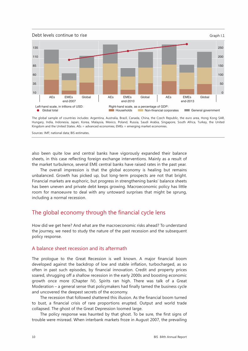
Private non-financial sector balance sheets have been profoundly affected by the crisis and pre-crisis trends (Chapter IV). In crisis-hit economies, private sector credit expansion has been slow, but debt-to-GDP ratios generally remain high, even if they have come down in some countries. At the other end of the spectrum, several economies that escaped the crisis, particularly EMEs, have seen credit and asset price booms which have only recently started to slow. Globally, the total debt of private non-financial sectors has risen by some 30% since the crisis, pushing up its ratio to GDP (Graph I.1).
Particularly worrying is the limited room for manoeuvre in macroeconomic policy.Fiscal policy remains generally under strain (Chapter III). In crisis-hit economies,
fiscal deficits ballooned as revenues collapsed, economies received emergency stimuli and, in some cases, the authorities rescued banks. More recently, several countries have sought to consolidate. Even so, government debt-to-GDP ratios have risen further; in several cases, they appear to be on an unsustainable path. In countries that were not hit by the crisis, the picture is more mixed, with debt-to-GDP ratios in some cases actually falling, in others rising but from much lower levels. The combined public sector debt of the G7 economies has grown by close to 40 percentage points, to some 120% of GDP in the post-crisis period – a key factor behind the 20 percentage point increase in total (public plus private sector) debt-to-GDP ratios globally (Graph I.1).
Monetary policy is testing its outer limits (Chapter V). In the crisis-hit economies and Japan, monetary policy has been extraordinarily accommodative. With policy rates at or close to the zero lower bound in all the main international currencies, central banks have eased further by adopting forward guidance and aggressive balance sheet policies such as large-scale asset purchases and long-term lending. Never before have central banks tried to push so hard. The normalisation of the policy stance has hardly started. In other countries, post-crisis interest rates have
10 BIS 84th Annual Report
also been quite low and central banks have vigorously expanded their balance sheets, in this case reflecting foreign exchange interventions. Mainly as a result of the market turbulence, several EME central banks have raised rates in the past year.
The overall impression is that the global economy is healing but remains unbalanced. Growth has picked up, but long-term prospects are not that bright. Financial markets are euphoric, but progress in strengthening banks’ balance sheets has been uneven and private debt keeps growing. Macroeconomic policy has little room for manoeuvre to deal with any untoward surprises that might be sprung, including a normal recession.
The global economy through the financial cycle lens
How did we get here? And what are the macroeconomic risks ahead? To understand the journey, we need to study the nature of the past recession and the subsequent policy response.
A balance sheet recession and its aftermath
The prologue to the Great Recession is well known. A major financial boom developed against the backdrop of low and stable inflation, turbocharged, as so often in past such episodes, by financial innovation. Credit and property prices soared, shrugging off a shallow recession in the early 2000s and boosting economic growth once more (Chapter IV). Spirits ran high. There was talk of a Great Moderation – a general sense that policymakers had finally tamed the business cycle and uncovered the deepest secrets of the economy.
The recession that followed shattered this illusion. As the financial boom turned to bust, a financial crisis of rare proportions erupted. Output and world trade collapsed. The ghost of the Great Depression loomed large.
The policy response was haunted by that ghost. To be sure, the first signs of trouble were misread. When interbank markets froze in August 2007, the prevailing
Debt levels continue to rise Graph I.1
The global sample of countries includes: Argentina, Australia, Brazil, Canada, China, the Czech Republic, the euro area, Hong Kong SAR, Hungary, India, Indonesia, Japan, Korea, Malaysia, Mexico, Poland, Russia, Saudi Arabia, Singapore, South Africa, Turkey, the United Kingdom and the United States. AEs = advanced economies; EMEs = emerging market economies.
Sources: IMF; national data; BIS estimates.
10
35
60
85
110
135
0
50
100
150
200
250
AEs EMEs Globalend-2007
AEs EMEs Globalend-2010
AEs EMEs Globalend-2013
Global totalLeft-hand scale, in trillions of USD:
HouseholdsRight-hand scale, as a percentage of GDP:
Non-financial corporates General government
11BIS 84th Annual Report
view was that the stress would remain contained. But matters changed when Lehman Brothers failed roughly one year later and the global economy hit an air pocket. Both monetary and fiscal policies were used aggressively to avoid a repeat of the 1930s experience. This echoed well beyond the countries directly hit by the crisis, with China embarking on a massive credit-fuelled expansion.
At first, the medicine seemed to work. Counterfactual statements are always hard to make. But no doubt the prompt policy response did cushion the blow and forestall the worst. In particular, an aggressive monetary policy easing in crisis-hit economies restored confidence and prevented the financial system and the economy from plunging into a tailspin. This is what crisis management is all about.
Even so, as events unfolded, relief gave way to disappointment. The global economy did not recover as hoped. Growth forecasts, at least for crisis-hit economies, were repeatedly revised downwards. Fiscal policy expansion failed to jump-start the economy. In fact, gaping holes opened up in the fiscal accounts. And in the euro area, partly because of the institutional specificities, a sovereign crisis erupted in full force, threatening a “doom loop” between weak banks and sovereigns. Globally, concerns with fiscal unsustainability induced a partial change of fiscal course. In the meantime, in an effort to boost the recovery, monetary policy continued to experiment with ever more imaginative measures. And regulatory authorities struggled to rebuild the financial system’s strength. The global economy was not healing.
With hindsight at least, this sequence of events should not be surprising. The recession was not the typical postwar recession to quell inflation. This was a balance sheet recession, associated with the bust of an outsize financial cycle. As a result, the debt and capital stock overhangs were much larger, the damage to the financial sector far greater and the room for policy manoeuvre much more limited.
Balance sheet recessions have two key features. First, they are very costly (Chapter III). They tend to be deeper, give way to
weaker recoveries, and result in permanent output losses: output may return to its previous long-term growth rate but hardly to its previous growth path. No doubt, several factors are at work. Booms make it all too easy to overestimate potential output and growth as well as to misallocate capital and labour. And during the bust, the overhangs of debt and capital stock weigh on demand while an impaired financial system struggles to oil the economic engine, damaging productivity and further eroding long-term prospects.
Second, as growing evidence suggests, balance sheet recessions are less responsive to traditional demand management measures (Chapter V). One reason is that banks need to repair their balance sheets. As long as asset quality is poor and capital meagre, banks will tend to restrict overall credit supply and, more importantly, misallocate it. As they lick their wounds, they will naturally retrench. But they will keep on lending to derelict borrowers (to avoid recognising losses) while cutting back on credit or making it dearer for those in better shape. A second, even more important, reason is that overly indebted agents will wish to pay down debt and save more. Give them an additional unit of income, as fiscal policy would do, and they will save it, not spend it. Encourage them to borrow more by reducing interest rates, as monetary policy would do, and they will refuse to oblige. During a balance sheet recession, the demand for credit is necessarily feeble. The third reason relates to the large sectoral and aggregate imbalances in the real sector that build up during the preceding financial boom – in construction, for instance. Boosting aggregate demand indiscriminately does little to address them. It may actually make matters worse if, for example, very low interest rates favour sectors where too much capital is already in place.
Debt levels continue to rise Graph I.1
The global sample of countries includes: Argentina, Australia, Brazil, Canada, China, the Czech Republic, the euro area, Hong Kong SAR, Hungary, India, Indonesia, Japan, Korea, Malaysia, Mexico, Poland, Russia, Saudi Arabia, Singapore, South Africa, Turkey, the United Kingdom and the United States. AEs = advanced economies; EMEs = emerging market economies.
Sources: IMF; national data; BIS estimates.
10
35
60
85
110
135
0
50
100
150
200
250
AEs EMEs Globalend-2007
AEs EMEs Globalend-2010
AEs EMEs Globalend-2013
Global totalLeft-hand scale, in trillions of USD:
HouseholdsRight-hand scale, as a percentage of GDP:
Non-financial corporates General government

12 BIS 84th Annual Report
To be sure, only part of the world went through a full balance sheet recession (Chapter III). The countries that did so experienced outsize domestic financial cycles, including, in particular, the United States, the United Kingdom, Spain and Ireland, together with many countries in central and eastern Europe and the Baltic region. There, debt overhangs in the household and non-financial company sectors went hand in hand with systemic banking problems. Other countries, such as France, Germany and Switzerland, experienced serious banking strains largely through their banks’ exposures to financial busts elsewhere. The balance sheets of their private non-financial sectors were far less affected. Still others, such as Canada and many EMEs, were exposed to the crisis largely through trade linkages, not through their banks; their recessions were not of the balance sheet variety. This was also true of Japan, a country that has been struggling under the weight of a protracted demand shortfall linked to demography; its own balance sheet recession was back in the 1990s: this hardly explains the country’s more recent travails. And only in the euro area did a “doom loop” between banks and sovereigns break out.
This diversity also explains why countries now find themselves in different positions in their domestic financial cycles (Chapter IV). Those that experienced full balance sheet recessions have struggled to manage down their overhangs of private debt amid falling property prices. That said, some of them are already seeing renewed increases in property prices while debt levels are still high, and in some cases growing. Elsewhere, the picture varies, but credit and property prices have generally continued to rise post-crisis, at least until recently. In some countries, the pace of financial expansion has remained within typical historical ranges. But in others it has gone well beyond, resulting in strong financial booms.
In turn, the financial booms in this latter set of countries reflect in no small measure the interplay of monetary policy responses (Chapters II, IV and V). Extraordinarily easy monetary conditions in advanced economies have spread to the rest of the world, encouraging financial booms there. They have done so directly, because currencies are used well beyond the borders of the country of issue. In particular, there is some $7 trillion in dollar-denominated credit outside the United States, and it has been growing strongly post-crisis. They have also done so indirectly, through arbitrage across currencies and assets. For example, monetary policy has a powerful impact on risk appetite and risk perceptions (the “risk-taking channel”). It influences measures of risk appetite, such as the VIX, as well as term and risk premia, which co-move strongly worldwide – a factor that has gained prominence as EMEs have deepened their fixed income markets. And monetary policy responses in non-crisis-hit countries have also played a role. Authorities there have found it hard to operate with interest rates that are significantly higher than those in the large crisis-hit jurisdictions for fear of exchange rate overshooting and of attracting surges in capital flows.
As a result, for the world as a whole monetary policy has been extraordinarily accommodative for unusually long (Chapter V). Even excluding the impact of central banks’ balance sheet policies and forward guidance, policy rates have remained well below traditional benchmarks for quite some time.
Current macroeconomic and financial risks
Seen through the financial cycle lens, the current configuration of macroeconomic and financial developments raises a number of risks.
In the countries that have been experiencing outsize financial booms, the risk is that these will turn to bust and possibly inflict financial distress (Chapter IV). Based on leading indicators that have proved useful in the past, such as the behaviour of credit and property prices, the signs are worrying. Debt service ratios appear
13BIS 84th Annual Report
somewhat less worrisome, but past experience suggests that they can surge before distress emerges. This is especially so if interest rates spike, as might happen if it became necessary to defend exchange rates under pressure from large unhedged foreign exchange exposures and/or monetary policy normalisation in AEs.
Moreover, compared with the past, specific vulnerabilities may have changed in unsuspected ways (Chapter IV). Over the past few years, non-financial corporations in a number of EMEs have borrowed heavily through their foreign affiliates in the capital markets, with the debt denominated mainly in foreign currency. This has been labelled the “second phase of global liquidity”, to differentiate it from the pre-crisis phase, which was largely centred on banks expanding their cross-border operations. The corresponding debt may not show up in external debt statistics or, if the funds are repatriated, it may show up as foreign direct investment. It could represent a hidden vulnerability, especially if backed by domestic currency cash flows derived from overextended sectors, such as property, or used for carry trades or other forms of speculative position-taking.
Likewise, the asset management industry’s burgeoning presence in EMEs could amplify asset price dynamics under stress (Chapters IV and VI). This is especially the case in fixed income markets, which have grown strongly over the past decade, further exposing the countries concerned to global capital market forces. Like an elephant in a paddling pool, the huge size disparity between global investor portfolios and recipient markets can amplify dislocations. It is far from reassuring that these flows have swelled on the back of an aggressive search for yield: strongly procyclical, they surge and reverse as conditions and sentiment change.
To be sure, many EMEs have taken important steps to improve resilience over the years. In contrast to the past, these countries have posted current account surpluses, built up foreign exchange reserves, increased the flexibility of their exchange rates, strengthened their financial systems and adopted a plethora of macroprudential measures. Indeed, in the two episodes of market strains in May 2013 and January 2014, it was the countries with stronger macroeconomic and financial conditions that fared better (Chapter II).
Even so, past experience suggests caution. The market strains seen so far have not as yet coincided with financial busts; rather, they have resembled traditional balance of payments tensions. To cushion financial busts, current account surpluses may help, but only up to a point. In fact, historically some of the most damaging financial booms have occurred in countries with strong external positions. The United States in the 1920s, ahead of the Great Depression, and Japan in the 1980s are just two examples. And macroprudential measures, while useful to strengthen banks, have on their own proved unable to effectively constrain the build-up of financial imbalances, especially where monetary conditions have remained accommodative (Chapters V and VI). Time and again, in both advanced and emerging market economies, seemingly strong bank balance sheets have turned out to mask unsuspected vulnerabilities that surface only after the financial boom has given way to bust (Chapter VI).
This time round, severe financial stress in EMEs would be unlikely to leave AEs unscathed. The heft of EMEs has grown substantially since their last major reverse, the 1997 Asian crisis. Since then, their share has risen from around one third to half of world GDP, at purchasing power parity exchange rates. And so has their weight in the international financial system. The ramifications would be particularly serious if China, home to an outsize financial boom, were to falter. Especially at risk would be the commodity-exporting countries that have seen strong credit and asset price increases and where post-crisis terms-of-trade gains have shored up high debt and property prices. And so would those areas in the world where balance sheet repair is not yet complete.

14 BIS 84th Annual Report
In crisis-hit economies, the risk is that balance sheet adjustment remains incomplete, in both the private and the public sectors. This would increase their vulnerability to any renewed economic slowdown, regardless of its source, and it would hinder policy normalisation. Indeed, in the large economies furthest ahead in the business cycle, notably the United States and United Kingdom, it is somewhat unsettling to see growth patterns akin to those observed in later stages of financial cycles, even though debt and asset prices have not yet fully adjusted (Chapter IV). For example, property prices have been unusually buoyant in the United Kingdom, and segments of the corporate lending market, such as leveraged transactions, have been even frothier than they were before the crisis in the United States (Chapter II). Reflecting incomplete adjustment, in both cases private sector debt service ratios appear highly sensitive to increases in interest rates (Chapter IV). Meanwhile, especially in the euro area, doubts persist about the strength of banks’ balance sheets (Chapter VI). And all this is occurring at a time when, almost everywhere, fiscal positions remain fragile when assessed from a longer-term perspective.
Policy challenges
On the basis of this analysis, what should be done now? Designing the near-term policy response requires taking developments in the business cycle and inflation into account, which can give rise to awkward trade-offs. And how should policy frameworks adjust longer-term?
Near-term challenges: what is to be done now?
The appropriate near-term policy responses, as always, have to be country-specific. Even so, at some risk of oversimplification, it is possible to offer a few general considerations by dividing countries into two sets: those that have experienced a financial bust and those that have been experiencing financial booms. It is then worth exploring a challenge that cuts across both groups: what to do where inflation has been persistently below objectives.
Countries that have experienced a financial bust
In the countries that have experienced a financial bust, the priority is balance sheet repair and structural reform. This proceeds naturally from three features of balance sheet recessions: the damage from supply side distortions, the lower responsiveness to aggregate demand policies and the much narrower room for policy manoeuvre, be this fiscal, monetary or prudential. The objective is to lay the basis for a self-sustaining and robust recovery, to remove the obstacles to growth and to raise growth potential. This holds out the best hope of avoiding chronic weakness. Policymakers should not waste the window of opportunity that a strengthening economy affords.
The first priority is to complete the repair of the banks’ balance sheets and to shore up those of the non-financial sectors most affected by the crisis. Disappointingly, despite all efforts so far, banks’ stand-alone ratings – which strip out external support – have actually deteriorated post-crisis (Chapter VI). But countries where policymakers have done more to enforce loss recognition and recapitalise, such as the United States, have also recovered more strongly. This is nothing new: before the recent crisis, the contrasting ways in which the Nordic countries and Japan dealt with their banking crises in the early 1990s were widely regarded as an important factor behind the subsequent divergence in their
15BIS 84th Annual Report
economic performance. The European Union’s forthcoming asset quality review and stress tests are crucial in achieving this objective. More generally, banks should be encouraged to further improve their capital strength – the most solid basis for further lending (Chapter VI). The completion of the post-crisis financial reforms, of which Basel III is a core element, is vital.
This suggests that failure to repair balance sheets can sap the longer-term output and growth potential of an economy (Chapter III). Put differently, what economists call “hysteresis” – the impact on productive potential of the persistence of temporary conditions – comes in various shapes and sizes. Commonly, hysteresis effects are seen as manifesting themselves through chronic shortfalls in aggregate demand. In particular, the unemployed lose their skills, thus becoming less productive and employable. But there are also important, probably dominant, effects that operate through misallocations of credit and other resources as well as inflexible markets for goods, labour and capital. These are hardly mentioned in the literature but deserve more attention. As a corollary, in the wake of a balance sheet recession, the allocation of credit matters more than its aggregate amount. Given the debt overhangs, it is not surprising that, as empirical evidence indicates, post-crisis recoveries tend to be “credit-less”. And even if overall credit fails to grow strongly on a net basis, it is important that good borrowers obtain it rather than bad ones.
Along with balance sheet repair, targeted structural reforms will also be important. Structural reforms play a triple role (Chapter III). First, they can facilitate the required resource transfers across sectors, so critical in the aftermath of balance sheet recessions, thereby countering economic weakness and speeding up the recovery (see last year’s Annual Report). For instance, it is probably no coincidence that the United States, where labour and product markets are quite flexible, has rebounded more strongly than continental Europe. Second, reforms will help raise the economy’s sustainable growth rate in the longer term. Given adverse demographic trends, and aside from higher participation rates, raising productivity growth is the only way to boost long-term growth. And finally, through both mechanisms, reforms can assure firms that demand will be there in future, thus boosting it today. Although fixed business investment is not weak globally, where it is weak the constraint is not tight financial conditions. The mix of structural policies will necessarily vary according to the country. But it will frequently include deregulating protected sectors, such as services, improving labour market flexibility, raising participation rates and trimming public sector bloat.
More emphasis on repair and reform implies relatively less on expansionary demand management.
This principle applies to fiscal policy. After the initial fiscal push, the need to ensure longer-term sustainability has been partly rediscovered. This is welcome: putting the fiscal house in order is paramount; the temptation to stray from this path should be resisted. Whatever limited room for manoeuvre exists should be used, first and foremost, to help repair balance sheets, using public funds as backstops of last resort. A further use, where the need is great, could be to catalyse private sector financing for carefully chosen infrastructure projects (Chapter VI). Savings on other budgetary items may be needed to make room for these priorities.
And the same principle also applies to monetary policy. More intensive repair and reform efforts would help relieve the huge pressure on monetary policy. While some monetary accommodation is no doubt necessary, excessive demands have been made on it post-crisis. The limitations of policy become especially acute when rates approach zero (Chapter V). At that point, the only way to provide additional stimulus is to manage expectations about the future path of the policy rate and to use the central bank’s balance sheet to influence financial conditions beyond the
16 BIS 84th Annual Report
short-term interest rate. These policies do have an impact on asset prices and markets, but have clear limits and diminishing returns. Term and risk premia can only be compressed up to a point, and in recent years they have already reached or approached historical lows. To be sure, exchange rate depreciation can help. But, as discussed further below, it also raises awkward international issues, especially if it is seen to have a beggar-thy-neighbour character.
The risk is that, over time, monetary policy loses traction while its side effects proliferate. These side effects are well known (see previous Annual Reports). Policy may help postpone balance sheet adjustments, by encouraging the evergreening of bad debts, for instance. It may actually damage the profitability and financial strength of institutions, by compressing interest margins. It may favour the wrong forms of risk-taking. And it can generate unwelcome spillovers to other economies, particularly when financial cycles are out of synch. Tellingly, growth has disappointed even as financial markets have roared: the transmission chain seems to be badly impaired. The failure to boost investment despite extremely accommodative financial conditions is a case in point (Chapter III).
This raises the issue of the balance of risks concerning when and how fast to normalise policy (Chapter V). In contrast to what is often argued, central banks need to pay special attention to the risks of exiting too late and too gradually. This reflects the economic considerations just outlined: the balance of benefits and costs deteriorates as exceptionally accommodative conditions stay in place. And political economy concerns also play a key role. As past experience indicates, huge financial and political economy pressures will be pushing to delay and stretch out the exit. The benefits of unusually easy monetary policies may appear quite tangible, especially if judged by the response of financial markets; the costs, unfortunately, will become apparent only over time and with hindsight. This has happened often enough in the past.
And regardless of central banks’ communication efforts, the exit is unlikely to be smooth. Seeking to prepare markets by being clear about intentions may inadvertently result in participants taking more assurance than the central bank wishes to convey. This can encourage further risk-taking, sowing the seeds of an even sharper reaction. Moreover, even if the central bank becomes aware of the forces at work, it may be boxed in, for fear of precipitating exactly the sharp adjustment it is seeking to avoid. A vicious circle can develop. In the end, it may be markets that react first, if participants start to see central banks as being behind the curve. This, too, suggests that special attention needs to be paid to the risks of delaying the exit. Market jitters should be no reason to slow down the process.
Countries where financial booms are under way or turning
In the countries less affected by the crisis and that have been experiencing financial booms, the priority is to address the build-up of imbalances, which could threaten financial and macroeconomic stability. This task is a pressing one. As shown in May last year, the eventual normalisation of US policy could trigger renewed market tensions (Chapter II). The window of opportunity should not be missed.
The challenge for these countries is to seek ways to curb the boom, and to strengthen defences against any eventual financial bust. First, prudential policy should be tightened, especially through the use of macroprudential tools. Monetary policy should work in the same direction while fiscal measures should preserve enough room for manoeuvre to deal with any turn in the cycle. And, just as elsewhere, the authorities should take advantage of today’s relatively favourable climate to implement needed structural reforms.
17BIS 84th Annual Report
The dilemma for monetary policy is especially acute. So far, policymakers have relied mostly on macroprudential measures to dampen financial booms. These measures have no doubt strengthened the financial system’s resilience, but their effectiveness in constraining the booms has been mixed (Chapter VI). Debt burdens have increased, as has the economy’s vulnerability to higher policy rates. After rates have stayed so low for so long, the room for manoeuvre has narrowed (Chapter IV). Particularly for countries in the late stages of financial booms, the trade-off is now between the risk of bringing forward the downward leg of the cycle and that of suffering a bigger bust later on. Earlier, more gradual adjustments are preferable.
Interpreting recent disinflation
In recent years, a number of countries have experienced unusually and persistently low inflation or even an outright fall in prices. In some cases, this has occurred alongside sustained output growth and even some worrying signs that financial imbalances are building up. One example is Switzerland, where prices have actually been gradually declining while the mortgage market booms. Another is found in some Nordic countries, where inflation has sagged below target and output performance has been a bit weaker. The most notorious instance of long-lasting price declines is Japan, where prices started to fall after the financial bust in the 1990s and continued to edge down until recently, albeit by a mere 4 percentage points cumulatively. More recently, concerns have been expressed about low inflation in the euro area.
In deciding how to respond, it is important to carefully assess the factors driving prices and their persistence as well as to take a critical look at the effectiveness and possible side effects of the available tools (Chapters III and V). For instance, there are grounds for believing that the forces of globalisation are still exerting some welcome downward pressure on inflation. Pre-crisis, this helped central banks to keep inflation at bay even as financial booms developed. And when policy rates have fallen to the effective zero lower bound, and the headwinds of a balance sheet recession persist, monetary policy is not the best tool for boosting demand and hence inflation. Moreover, damaging perceptions of competitive depreciations can arise, given that in a context of generalised weakness the most effective channel for raising output and prices is to depreciate the exchange rate.
More generally, it is essential to discuss the risks and costs of falling prices in a dispassionate way. The word “deflation” is extraordinarily charged: it immediately raises the spectre of the Great Depression. In fact, the Great Depression was the exception rather than the rule, in the intensity of both its price declines and the associated output losses (Chapter V). Historically, periods of falling prices have often coincided with sustained output growth. And the experience of more recent decades is no exception. Moreover, conditions have changed substantially since the 1930s, not least with regard to downward wage flexibility. This is no reason to be complacent about the risks and costs of falling prices: they need to be monitored and assessed closely, especially where debt levels are high. But it is a reason to avoid knee-jerk reactions prompted by emotion.
Longer-term challenges: adjusting policy frameworks
The main long-term challenge is to adjust policy frameworks so as to promote healthy and sustainable growth. This means two interrelated things.
The first is to recognise that the only way to sustainably strengthen growth is to work on structural reforms that raise productivity and build the economy’s

18 BIS 84th Annual Report
resilience. This is an old and familiar problem (Chapter III). As noted, the decline in productivity growth in advanced economies took hold a long time ago. To be sure, as economies mature, part of this may be the natural result of shifts in demand patterns towards sectors where measured productivity is lower, such as services. But part is surely the result of a failure to embark on ambitious reforms. The temptation to postpone adjustment can prove irresistible, especially when times are good and financial booms sprinkle the fairy dust of illusory riches. The consequence is a growth model that relies too much on debt, both private and public, and which over time sows the seeds of its own demise.
The second, more novel, challenge is to adjust policy frameworks so as to address the financial cycle more systematically. Frameworks that fail to get the financial cycle on the radar screen may inadvertently overreact to short-term developments in output and inflation, generating bigger problems down the road. More generally, asymmetrical policies over successive business and financial cycles can impart a serious bias over time and run the risk of entrenching instability in the economy. Policy does not lean against the booms but eases aggressively and persistently during busts. This induces a downward bias in interest rates and an upward bias in debt levels, which in turn makes it hard to raise rates without damaging the economy – a debt trap. Systemic financial crises do not become less frequent or intense, private and public debts continue to grow, the economy fails to climb onto a stronger sustainable path, and monetary and fiscal policies run out of ammunition. Over time, policies lose their effectiveness and may end up fostering the very conditions they seek to prevent. In this context, economists speak of “time inconsistency”: taken in isolation, policy steps may look compelling but, as a sequence, they lead policymakers astray.
As discussed, there are signs that this may well be happening. The room for policy manoeuvre is shrinking even as debt continues to rise. And looking back, it is not hard to find instances in which policy appeared to focus too narrowly on short-term developments. Consider the response to the stock market crashes of 1987 and 2000 and the associated economic slowdowns (Chapter IV). Policy, especially monetary policy, eased strongly in both cases to cushion the blow and was tightened only gradually thereafter. But the financial boom, in the form of credit and property price increases, gathered momentum even as the economy softened, responding in part to the policy easing. The financial boom then collapsed a few years later, causing aggravated financial stress and economic harm. Paradoxically, the globalisation of the real economy added strength and breadth to the financial booms: it raised growth expectations, thus turbocharging the booms, while keeping a lid on prices, thereby lessening the need to tighten monetary policy.
This also has implications for how to interpret the downward trend of interest rates since the 1990s. Some observers see this decline as reflecting deeper forces that generate a chronic shortfall in demand. On this interpretation, policy has passively responded to such forces, thus preventing greater economic damage. But this analysis indicates that policies with a systematic easing bias can be an important factor in themselves, as they interact with the destructive force of the financial cycle. Interest rates are hindered from returning to more normal levels by the accumulation of debt, together with the distortions in production and investment patterns associated with those same unusually low interest rates. In effect, low rates validate themselves. By threatening to weaken balance sheets still further, the looming downward pressure on asset prices linked to negative demographic trends can only exacerbate this process.
What would it take to adjust policy frameworks? The required adjustments concern national frameworks as well as the way they interact internationally.
19BIS 84th Annual Report
The overall strategy for national policy frameworks should be to ensure that buffers are built up during a financial boom so that they can be drawn down in the bust. Such buffers would make the economy more resilient to a downturn. And, by acting as a kind of sea anchor, they could also dampen the boom’s intensity. Their effect would be to make policy less procyclical by rendering it more symmetrical with respect to the boom and bust phases of the financial cycle. This would avoid a progressive loss of policy room for manoeuvre over time.
For prudential policy, this means strengthening the framework’s systemic or macroprudential orientation. Available instruments, such as capital requirements or loan-to-value ratios, need to be adjusted to reduce procyclicality. For monetary policy, this means being ready to tighten whenever financial imbalances show signs of building up, even if inflation appears to be under control in the near term. And for fiscal policy, it means extra caution when assessing fiscal strength during financial booms, and taking remedial action. It also means designing a tax code that does not favour debt over equity.
Following the crisis, policies have indeed moved in this direction, but to varying degrees. And there is still more to do.
Prudential policy is furthest ahead. In particular, Basel III has introduced a countercyclical capital buffer for banks as part of a broader trend towards establishing national macroprudential frameworks.
Monetary policy has shifted somewhat. It is now generally recognised that price stability does not guarantee financial stability. Moreover, a number of central banks have adjusted their frameworks to incorporate the option of tightening during booms. A key element has been to lengthen policy horizons. That said, no consensus exists as to whether such adjustments are desirable. And the side effects of prolonged and aggressive easing after the bust continue to be debated.
Fiscal policy lags furthest behind. There is little recognition of the huge flattering effect that financial booms have on the fiscal accounts: they cause potential output and growth to be overestimated (Chapter III), are particularly generous to the fiscal coffers, and mask the build-up of contingent liabilities needed to address the consequences of the busts. During their booms, for example, Ireland and Spain could point to declining government debt-to-GDP ratios and to fiscal surpluses that turned out, after all, not to be properly adjusted for the cycle. Similarly, there is scant appreciation of the limitations of an expansionary fiscal policy during a balance sheet recession; indeed, the prevailing view is that fiscal policy is more effective under such conditions.
For monetary policy, the challenges are especially tough. The basic idea is to lengthen the policy horizon beyond the two years or so that central banks typically focus on. The idea is not to mechanically extend point forecasts, of course. Rather, it is to permit a more systematic and structured assessment of the risks that the slower-moving financial cycles pose to macroeconomic stability, inflation and the effectiveness of policy tools. Concerns about the financial cycle and inflation would also become easier to reconcile: the key is to combine an emphasis on sustainable price stability with greater tolerance for short-run deviations from inflation objectives as well as for exchange rate appreciation. Even so, the communication challenges are daunting.
Turning to the interaction of national policy frameworks, the challenge is to tackle the complications that ensue from a highly integrated global economy. In such a world, the need for collective action – cooperation – is inescapable. National policies, taken individually, are less effective. And incentive problems abound: national policymakers may be tempted to free-ride, or they may come under political pressure to disregard the unwelcome impact of their policies on others.
20 BIS 84th Annual Report
Cooperation is continuously tested; it advances and retreats. Post-crisis, it has advanced considerably in the fields of financial regulation and fiscal affairs. Witness the overhaul of financial regulatory frameworks, most notably Basel III and the efforts coordinated by the Financial Stability Board, as well as the recent initiatives on taxation under the aegis of the G20. In these areas, the need for cooperation has been fully recognised.
By contrast, in the monetary field the own-house-in-order doctrine still dominates: as argued in more detail elsewhere,2 there is clearly room for improvement. The previous discussion indicates that the interaction of national monetary policies has raised risks for the global economy. These are most vividly reflected in what have been extraordinarily accommodative monetary and financial conditions for the world as a whole, and in the build-up of financial imbalances within certain regions. At a minimum, there is a need for national authorities to take into account the effects of their actions on other economies and the corresponding feedbacks on their own jurisdictions. No doubt, the larger economies already seek to do this. But if their analytical frameworks do not place financial booms and busts at the centre of the assessments and if they fail to take into account the myriad of financial interconnections that hold the global economy together, these feedback effects will be badly underestimated.
Conclusion
The global economy is struggling to step out of the shadow of the Great Financial Crisis. The legacy of the crisis is pervasive. It is evident in the comparatively high levels of unemployment in crisis-hit economies, even as output growth has regained strength, in the disconnect between extraordinarily buoyant financial markets and weak investment, in the growing dependence of financial markets on central banks, in rising private and public debt, and in the rapidly narrowing policy room for manoeuvre.
This chapter has argued that a return to healthy and sustainable global growth requires adjustments to the current policy mix and to policy frameworks. These adjustments should acknowledge that the post-crisis balance sheet recession is less amenable to traditional aggregate demand policies and puts a premium on balance sheet repair and structural reforms, that financial booms and busts have become a major threat to macroeconomic stability, and that the only source of lasting prosperity is a stronger supply side, notably higher productivity growth. And they should be based on the premise that, in a highly integrated global economy, keeping one’s own house in order is necessary but not sufficient for prosperity: for this, international cooperation is essential.
In the near term, the main task is to take advantage of the window of opportunity presented by the current pickup in world growth. There is a need to rely relatively less on traditional aggregate demand stimulus and more on balance sheet repair and structural reforms, especially in crisis-hit economies. Monetary policy, in particular, has been overburdened for too long. After so many years of an exceptional monetary expansion, the risk of normalising too slowly and too late deserves special attention. And, where applicable, the response to surprising disinflationary pressures needs to carefully take into account the nature and persistence of the forces at work, diminished policy effectiveness and its side effects.
2 J Caruana, ”International monetary policy interactions: challenges and prospects”, speech at the CEMLA-SEACEN conference on The role of central banks in macroeconomic and financial stability: the challenges in an uncertain and volatile world, Punta del Este, Uruguay, 16 November 2012.

21BIS 84th Annual Report
In countries experiencing strong financial booms, the priority is to strengthen defences to face a potential bust. There, too, structural reforms should not be delayed.
In the longer term, the main task is to adjust policy frameworks so as to make growth less debt-dependent and to tame the destructive power of the financial cycle. More symmetrical macroeconomic and prudential policies over that cycle would avoid a persistent easing bias that, over time, can entrench instability and exhaust the policy room for manoeuvre.
The risks of failing to act should not be underestimated. The global economy may be set on an unsustainable path. And at some point, the current open global trade and financial order could be seriously threatened. So far, institutional setups have proved remarkably resilient to the huge shock of the financial crisis. But we should not take this for granted, especially if serious financial stress were to resurface. The intermittent noise about “currency wars” is particularly worrying: where domestic expansionary policies do not work as expected, exchange rate depreciation may come to be seen as the only option. But competitive easing can be a negative sum game when everyone tries to use this weapon and the domestic costs of the policies exceed their benefits. Also worrying is the growing temptation for nation states to withdraw from the laborious but invaluable task of fostering international integration.
Meanwhile, the consensus on the merits of price stability is fraying at the edges. And, as memories of the costs and persistence of inflation fade, the temptation could grow to void the huge debt burdens through a combination of inflation, financial repression and autarky.
There is a lot of work to do. A new policy compass is conspicuously lacking. This introductory chapter has outlined the broad direction of travel. Major analytical and operational challenges remain to be solved if policies are to adequately address financial booms and busts. Some of the possible tools are described in the pages that follow, but much more needs to be done. And the political economy challenges are even more daunting. As history reminds us, there is little appetite for taking the long-term view. Few are ready to curb financial booms that make everyone feel illusively richer. Or to hold back on quick fixes for output slowdowns, even if such measures threaten to add fuel to unsustainable financial booms. Or to address balance sheet problems head-on during a bust when seemingly easier policies are on offer. The temptation to go for shortcuts is simply too strong, even if these shortcuts lead nowhere in the end.
The road ahead may be a long one. All the more reason, then, to start the journey sooner rather than later.

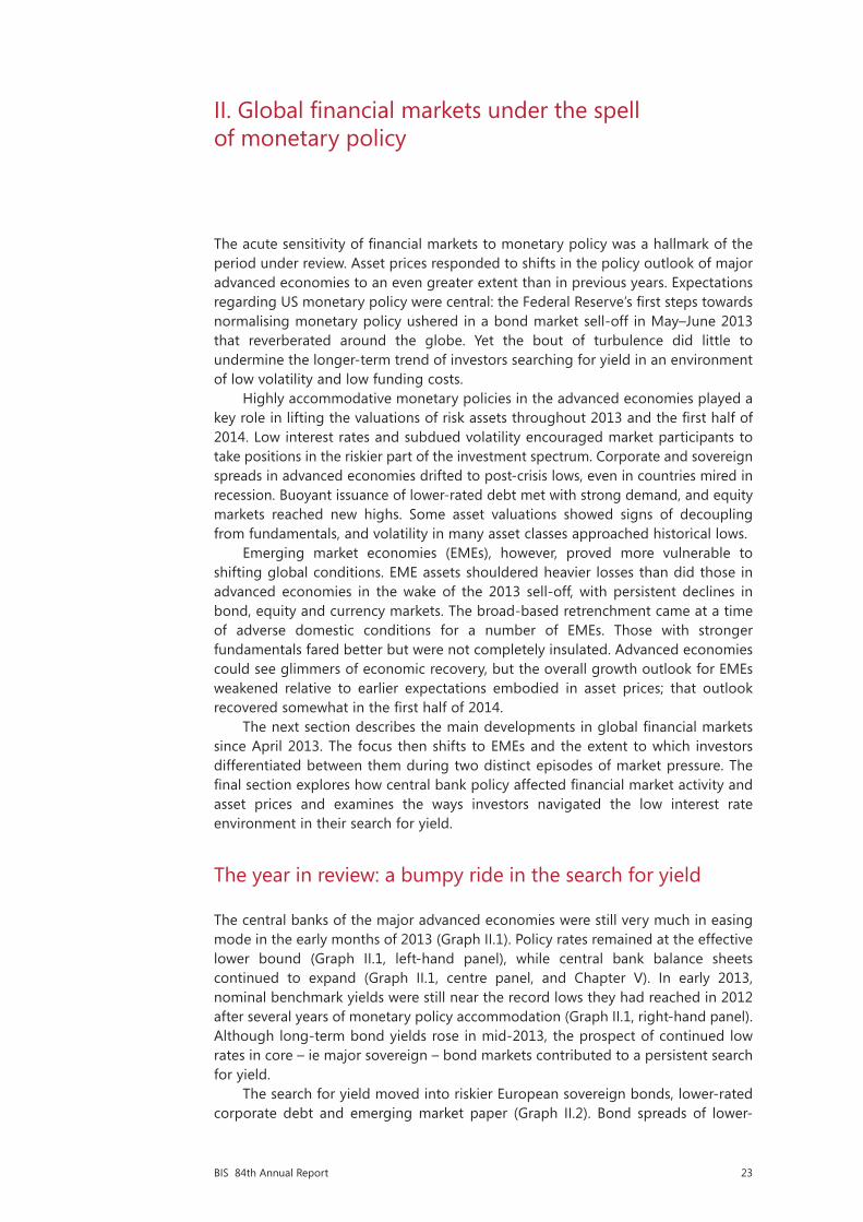
23BIS 84th Annual Report
II. Global financial markets under the spell of monetary policy
The acute sensitivity of financial markets to monetary policy was a hallmark of the period under review. Asset prices responded to shifts in the policy outlook of major advanced economies to an even greater extent than in previous years. Expectations regarding US monetary policy were central: the Federal Reserve’s first steps towards normalising monetary policy ushered in a bond market sell-off in May–June 2013 that reverberated around the globe. Yet the bout of turbulence did little to undermine the longer-term trend of investors searching for yield in an environment of low volatility and low funding costs.
Highly accommodative monetary policies in the advanced economies played a key role in lifting the valuations of risk assets throughout 2013 and the first half of 2014. Low interest rates and subdued volatility encouraged market participants to take positions in the riskier part of the investment spectrum. Corporate and sovereign spreads in advanced economies drifted to post-crisis lows, even in countries mired in recession. Buoyant issuance of lower-rated debt met with strong demand, and equity markets reached new highs. Some asset valuations showed signs of decoupling from fundamentals, and volatility in many asset classes approached historical lows.
Emerging market economies (EMEs), however, proved more vulnerable to shifting global conditions. EME assets shouldered heavier losses than did those in advanced economies in the wake of the 2013 sell-off, with persistent declines in bond, equity and currency markets. The broad-based retrenchment came at a time of adverse domestic conditions for a number of EMEs. Those with stronger fundamentals fared better but were not completely insulated. Advanced economies could see glimmers of economic recovery, but the overall growth outlook for EMEs weakened relative to earlier expectations embodied in asset prices; that outlook recovered somewhat in the first half of 2014.
The next section describes the main developments in global financial markets since April 2013. The focus then shifts to EMEs and the extent to which investors differentiated between them during two distinct episodes of market pressure. The final section explores how central bank policy affected financial market activity and asset prices and examines the ways investors navigated the low interest rate environment in their search for yield.
The year in review: a bumpy ride in the search for yield
The central banks of the major advanced economies were still very much in easing mode in the early months of 2013 (Graph II.1). Policy rates remained at the effective lower bound (Graph II.1, left-hand panel), while central bank balance sheets continued to expand (Graph II.1, centre panel, and Chapter V). In early 2013, nominal benchmark yields were still near the record lows they had reached in 2012 after several years of monetary policy accommodation (Graph II.1, right-hand panel). Although long-term bond yields rose in mid-2013, the prospect of continued low rates in core – ie major sovereign – bond markets contributed to a persistent search for yield.
The search for yield moved into riskier European sovereign bonds, lower-rated corporate debt and emerging market paper (Graph II.2). Bond spreads of lower-

24 BIS 84th Annual Report
rated European sovereigns continued to narrow, easing their funding conditions and continuing a rally that had followed the announcement of the ECB’s programme of Outright Monetary Transactions (OMT) in 2012 (Graph II.2, centre panel). The low interest rate environment also boosted advanced economy equity markets, which extended their rally in 2013 as the economic outlook in those economies gradually improved and investors expected monetary accommodation to continue to support asset prices (Graph II.2, right-hand panel).
Markets entered a more turbulent phase in early May 2013. After the release of strong US labour market data, comments by Federal Reserve officials were interpreted by investors as signals that the central bank would soon slow the pace of asset purchases and end its quantitative easing policy. After a prolonged period of exceptional monetary accommodation, the discussion of tapering caught many market participants by surprise. The expectation of a significant policy shift triggered a bond market sell-off. The short end of the US yield curve (up to two-year maturities) remained anchored by current rates and forward guidance. But with new uncertainty about the nature and timing of policy normalisation, long-term bond yields rose by 100 basis points by early July, with a corresponding surge in trading volume and volatility (Graph II.3, left-hand panel).
The sell-off in US Treasury bonds had global repercussions, battering a broad range of asset classes in both advanced and emerging market economies. Yields on core European sovereign bonds increased markedly, although neither inflation nor ECB rate hikes were on the horizon; EME bond yields rose even more than US yields (Graph II.3, centre panel). Prices of mortgage-backed securities fell, followed by equities a few weeks later. Spreads on corporate bonds and bank loans increased as well (Graph II.3, right-hand panel). Rising yields in advanced economies, in combination with other factors, triggered a first wave of selling pressure on EME assets. While investors in advanced economy investment funds shifted from bonds to equity, they pulled out of EME funds of all asset classes (see below).
Accommodative policy in advanced economies holds down bond yields Graph II.1
Policy rates1 Total central bank assets Long- and short-term interest rates2 Per cent 2007 = 100 Per cent
1 Policy rate or closest alternative; for target ranges, the midpoint of the range. 2 Based on monthly averages of daily nominal rates; simple average of the euro area, Japan, the United Kingdom and the United States. 3 Simple average of Australia, Canada, New Zealand, Norway, Sweden and Switzerland.
Sources: Bloomberg; Datastream; national data; BIS calculations.
0
1
2
3
4
5
07 08 09 10 11 12 13 14United StatesEuro areaUnited Kingdom
JapanOther advancedeconomies3
100
180
260
340
420
500
07 08 09 10 11 12 13 14United StatesEuro area
United KingdomJapan
0
1
2
3
4
5
00 02 04 06 08 10 12 14Long-term (10-year)Short-term (three-month)Twenty-year average

25BIS 84th Annual Report
Responding to mere perceptions of future changes in monetary policy, markets thus induced tighter funding conditions well before major central banks actually slowed their asset purchases or raised rates. To alleviate the market-induced tightening, central banks on both sides of the Atlantic felt compelled to reassure markets. The turbulence abated in early July when the Federal Reserve, the ECB and the Bank of England issued or reiterated their forward guidance regarding the path of monetary policy (Chapter V).
Markets in advanced economies quickly shrugged off the tapering scare, and the search for yield resumed (Graph II.2). The bout of volatility did little to undermine the relative appeal of higher-yielding asset classes, as benchmark yields remained low by historical standards (Graph II.1, right-hand panel). The combination of better growth prospects in the United States and the Federal Reserve’s decision in September 2013 to postpone monetary tightening supported further gains in bond and equity markets in the final quarter of 2013. Markets even brushed aside the possibility of a technical default by the US government – which was resolved in mid-October with the end of the 16-day federal government shutdown. And when the Federal Reserve announced in December that it would steadily reduce asset purchases beginning in January 2014, the market reaction was muted. For 2013 as a whole, all the major stock exchanges gained 14–57% (Graph II.2, right-hand panel).
Monetary accommodation spurs risk-taking Graph II.2
Corporate credit spreads Selected euro area sovereign spreads1
Major equity indices
Basis points Basis points Per cent Per cent 1 June 2012 = 100
The black vertical line indicates 26 July 2012, the date of the speech by ECB President Mario Draghi at the Global Investment Conference in London.
1 Ten-year government bond yield spread over the comparable German bond yield. 2 Option-adjusted spreads on the BofA Merrill Lynch Global Non-Financial High Yield Index, which tracks the performance of sub-investment grade corporate (non-financial sector) debt denominated in US dollars, Canadian dollars, sterling or euros and publicly issued in the major domestic or internationalmarkets. 3 Option-adjusted spreads on the BofA Merrill Lynch High Yield Emerging Markets Corporate Plus Index, which tracks theperformance of non-sovereign EME debt rated BB1 or lower, denominated in US dollars or euros and publicly issued in the major domestic or international markets. 4 Option-adjusted spreads on the BofA Merrill Lynch Global Broad Market Industrials Index, which tracks theperformance of investment grade corporate (industrial sector) debt publicly issued in the major domestic or international markets. 5 IG = investment grade. Option-adjusted spreads on the BofA Merrill Lynch High Grade Emerging Markets Corporate Plus Index, which tracks theperformance of non-sovereign EME debt rated AAA to BBB3, denominated in US dollars or euros and publicly issued in the major domestic or international markets.
Sources: Bank of America Merrill Lynch; Bloomberg; BIS calculations.
0
200
400
600
800
1,000
0
100
200
300
400
500
2011 2012 2013 2014
Global2
EMEs3
Lhs:High-yield: AA-rated4
A-rated4
BBB-rated4
Rhs:EMEsIG5
0
6
12
18
24
30
0
4
8
12
16
20
2011 2012 2013 2014
GreeceLhs:
IrelandItaly
Rhs:PortugalSpain
80
100
120
140
160
180
2011 2012 2013 2014S&P 500EURO STOXX 50
FTSE 100Nikkei 225

26 BIS 84th Annual Report
In the first half of 2014, investor optimism continued to fuel higher asset valuations in spite of macroeconomic and geopolitical uncertainties (Graph II.2). In late January 2014, concerns that weakness in US activity might be more than weather-related and a second wave of selling pressure on EME assets put a dent in investor confidence that lasted until mid-February. Market tensions rapidly subsided when the authorities in the advanced economies reaffirmed their support for policies designed to spur economic recovery (Chapter V). Financial conditions eased further as the macroeconomic outlook improved in the advanced economies (Chapter III). Markets remained resilient to stresses, including the geopolitical tensions surrounding Ukraine – the Russian stock market and the rouble initially declined by 15% and 10%, respectively, between January and mid-March, and then recovered much of their losses. Once more, communication from the Federal Reserve and the ECB, together with stronger economic data, helped support credit and equity markets, with the major stock exchanges reaching record highs in May and June 2014.
Sovereign borrowers in the euro area periphery benefited greatly from these developments, which were reinforced by the new easing measures unveiled by the ECB in early June 2014. Their spreads reached a post-crisis minimum relative to the German 10-year bund, whose yield itself dropped below 1.5% (Graph II.2, centre panel). Yields on Spanish and Italian 10-year debt thus fell below 3% in May and early June, respectively. Taking advantage of the benign funding environment, Greece issued an oversubscribed five-year bond in April, raising €3 billion at a yield below 5%, in its first offering since losing access to bond markets in 2010. Similarly, in its first regular debt auction since receiving official support in May 2011, Portugal
The bond market sell-off induces temporary financial tightening Graph II.3
US Treasuries Ten-year yields Funding conditions Basis points USD bn Per cent Per cent Basis points Basis points
The black vertical lines indicate positive surprises on US employment on 3 May and 5 July 2013 and news and announcements by the Federal Reserve on 22 May and 19 June 2013 related to the prospect of tapering of its asset purchases.
1 The Merrill Lynch Option Volatility Estimate (MOVE) is an index of implied Treasury bond yield volatility over a one-month horizon, based on a weighted average of Treasury options of two-, five-, 10- and 30-year contracts. 2 Daily trading volume for US Treasury bonds, notes and bills, reported by ICAP; centred 10-day moving average. 3 JPMorgan GBI-EM Broad Diversified Index, yield to maturity. The JPMorgan GBI-EM provides a comprehensive measure of fixed rate government debt issued in EMEs in the local currency. 4 Option-adjusted spreads on high-yield corporate bonds. 5 Bank loan rates in excess of the respective policy rates; non-weighted averages of composite rates on loans to households and non-financial corporations.
Sources: ECB; Bank of America Merrill Lynch; Bloomberg; Datastream; national data; BIS calculations.
0
100
200
300
0
150
300
450
2013 2014Lhs:
Rhs:
Ten-year US benchmark yieldImplied volatility1
Treasury trading volume2
4
5
6
7
1
2
3
4
2013 2014
EMEs3Lhs:
United StatesGermanyUnited KingdomFrance
Rhs:
300
450
600
750
200
300
400
500
2013 2014
United StatesEuro areaEMEs (lhs)
Corporate bond spreads:4
United StatesEuro area
Bank loan spreads:5
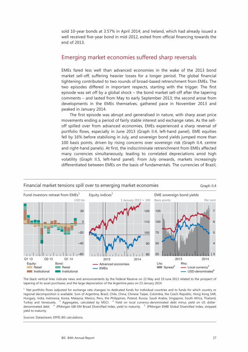
27BIS 84th Annual Report
sold 10-year bonds at 3.57% in April 2014; and Ireland, which had already issued a well received five-year bond in mid-2012, exited from official financing towards the end of 2013.
Emerging market economies suffered sharp reversals
EMEs fared less well than advanced economies in the wake of the 2013 bond market sell-off, suffering heavier losses for a longer period. The global financial tightening contributed to two rounds of broad-based retrenchment from EMEs. The two episodes differed in important respects, starting with the trigger. The first episode was set off by a global shock – the bond market sell-off after the tapering comments – and lasted from May to early September 2013; the second arose from developments in the EMEs themselves, gathered pace in November 2013 and peaked in January 2014.
The first episode was abrupt and generalised in nature, with sharp asset price movements ending a period of fairly stable interest and exchange rates. As the sell-off spilled over from advanced economies, EMEs experienced a sharp reversal of portfolio flows, especially in June 2013 (Graph II.4, left-hand panel). EME equities fell by 16% before stabilising in July, and sovereign bond yields jumped more than 100 basis points, driven by rising concerns over sovereign risk (Graph II.4, centre and right-hand panels). At first, the indiscriminate retrenchment from EMEs affected many currencies simultaneously, leading to correlated depreciations amid high volatility (Graph II.5, left-hand panel). From July onwards, markets increasingly differentiated between EMEs on the basis of fundamentals. The currencies of Brazil,
Financial market tensions spill over to emerging market economies Graph II.4
Fund investors retreat from EMEs1 Equity indices2 EME sovereign bond yields USD bn 1 January 2013 = 100 Basis points Per cent
The black vertical lines indicate news and announcements by the Federal Reserve on 22 May and 19 June 2013 related to the prospect of tapering of its asset purchases; and the large depreciation of the Argentine peso on 23 January 2014.
1 Net portfolio flows (adjusted for exchange rate changes) to dedicated funds for individual countries and to funds for which country or regional decomposition is available. Sum of Argentina, Brazil, Chile, China, Chinese Taipei, Colombia, the Czech Republic, Hong Kong SAR,Hungary, India, Indonesia, Korea, Malaysia, Mexico, Peru, the Philippines, Poland, Russia, Saudi Arabia, Singapore, South Africa, Thailand,Turkey and Venezuela. 2 Aggregates, calculated by MSCI. 3 Yield on local currency-denominated debt minus yield on US dollar-denominated debt. 4 JPMorgan GBI-EM Broad Diversified Index, yield to maturity. 5 JPMorgan EMBI Global Diversified Index, stripped yield to maturity.
Sources: Datastream; EPFR; BIS calculations.
–60
–40
–20
0
20
Q1 13 Q3 13 Q1 14
RetailInstitutional
Equity:RetailInstitutional
Bond:
80
90
100
110
120
2013 2014Advanced economiesEMEs
25
50
75
100
125
3
4
5
6
7
2013 2014
Spread3Lhs:
Local currency4
USD-denominated5
Rhs:

28 BIS 84th Annual Report
India, Indonesia, South Africa and Turkey depreciated by more than 10% against the US dollar during the first episode (Graph II.5, centre panel); Brazil, India, Indonesia and Russia each lost more than $10 billion in reserves. Countries with rapid credit growth, high inflation or large current account deficits were seen as more vulnerable and experienced sharper depreciations (Box II.A).
Compared with the first episode, the second round of retrenchment had a more sustained and discerning character. In the period of relative calm in September and October, EMEs recovered less than advanced economies did, and investors’ concerns about EMEs built up in the final months of 2013. In this prelude to the second episode, market pricing increasingly reflected a deteriorating macroeconomic outlook in many EMEs and the gradual unwinding of financial imbalances in some (Chapters III and IV). Government bond yields and credit spreads remained elevated, and markets witnessed continuing losses amid persistent fund outflows (Graph II.4). When market tensions escalated in January 2014, further losses on equities and bonds were more contained than in the first episode; the focus had turned to EMEs with poor growth prospects or political tensions. The pressure on EME currencies reached a climax on 23 January 2014, when Argentina’s central bank let the peso devalue by more than 10% against the US dollar. Although the depreciations were comparable in magnitude to those in the first episode, they reflected country-specific factors to a greater extent in the second episode (Box II.A).
Central banks in several EMEs stepped up their defence against renewed currency pressure by raising interest rates and intervening in foreign exchange markets. Led by Turkey, the policy response was more forceful in the second episode than in the first (Graph II.5, right-hand panel, and Chapter V). These actions
Emerging market economies respond to market pressure Graph II.5
Currency co-movement and volatility Exchange rates vis-à-vis US dollar1 Monetary policy reactions2 Per cent Percentage points 2 January 2013 = 100 Per cent 2 January 2013 = 100
The black vertical lines indicate news and announcements by the Federal Reserve on 22 May and 19 June 2013 related to the prospect of tapering of its asset purchases; and the large depreciation of the Argentine peso on 23 January 2014.
1 US dollars per unit of local currency. A decrease indicates a depreciation of the local currency. 2 Simple average of Argentina, Brazil, Chile, Colombia, the Czech Republic, Hungary, India, Indonesia, Korea, Malaysia, Mexico, Peru, the Philippines, Poland, Russia, South Africa, Thailand and Turkey. 3 Based on the US dollar exchange rates of the currencies of the economies in footnote 2 plus China, Hong Kong SAR and Singapore. Median of all pairwise correlations of the spot rate changes over the preceding month. 4 JPMorgan EM-VXY index of three-month implied volatility across 13 EME currencies.
Sources: Bloomberg; Datastream; BIS calculations.
–30
–10
10
30
50
70
6
9
12
15
18
21
2011 2012 2013 2014
Median correlation3Lhs:
FX volatility4Rhs:
50
60
70
80
90
100
2013 2014BrazilChinaIndia
RussiaArgentinaTurkey
South Africa
4.7
5.0
5.3
5.6
5.9
6.2
85
88
91
94
97
100
Q2 13 Q4 13 Q2 14Three-month money market rate (lhs)Exchange rate (rhs)1
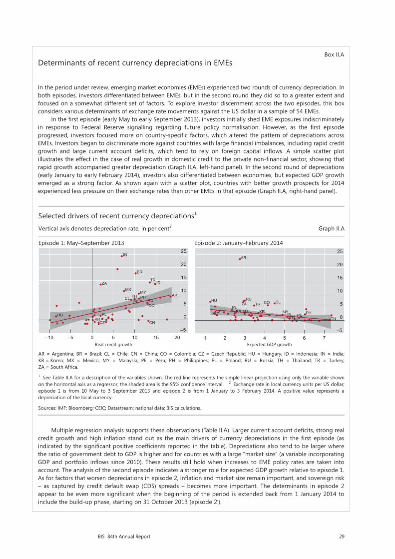
29BIS 84th Annual Report
Box II.ADeterminants of recent currency depreciations in EMEs
In the period under review, emerging market economies (EMEs) experienced two rounds of currency depreciation. In both episodes, investors differentiated between EMEs, but in the second round they did so to a greater extent and focused on a somewhat different set of factors. To explore investor discernment across the two episodes, this box considers various determinants of exchange rate movements against the US dollar in a sample of 54 EMEs.
In the first episode (early May to early September 2013), investors initially shed EME exposures indiscriminately in response to Federal Reserve signalling regarding future policy normalisation. However, as the first episode progressed, investors focused more on country-specific factors, which altered the pattern of depreciations across EMEs. Investors began to discriminate more against countries with large financial imbalances, including rapid credit growth and large current account deficits, which tend to rely on foreign capital inflows. A simple scatter plot illustrates the effect in the case of real growth in domestic credit to the private non-financial sector, showing that rapid growth accompanied greater depreciation (Graph II.A, left-hand panel). In the second round of depreciations (early January to early February 2014), investors also differentiated between economies, but expected GDP growth emerged as a strong factor. As shown again with a scatter plot, countries with better growth prospects for 2014 experienced less pressure on their exchange rates than other EMEs in that episode (Graph II.A, right-hand panel).
Multiple regression analysis supports these observations (Table II.A). Larger current account deficits, strong real credit growth and high inflation stand out as the main drivers of currency depreciations in the first episode (as indicated by the significant positive coefficients reported in the table). Depreciations also tend to be larger where the ratio of government debt to GDP is higher and for countries with a large “market size” (a variable incorporating GDP and portfolio inflows since 2010). These results still hold when increases to EME policy rates are taken into account. The analysis of the second episode indicates a stronger role for expected GDP growth relative to episode 1. As for factors that worsen depreciations in episode 2, inflation and market size remain important, and sovereign risk – as captured by credit default swap (CDS) spreads – becomes more important. The determinants in episode 2 appear to be even more significant when the beginning of the period is extended back from 1 January 2014 to include the build-up phase, starting on 31 October 2013 (episode 2’).
Selected drivers of recent currency depreciations1
Vertical axis denotes depreciation rate, in per cent2 Graph II.A
Episode 1: May–September 2013 Episode 2: January–February 2014
Real credit growth Expected GDP growth
AR = Argentina; BR = Brazil; CL = Chile; CN = China; CO = Colombia; CZ = Czech Republic; HU = Hungary; ID = Indonesia; IN = India;KR = Korea; MX = Mexico; MY = Malaysia; PE = Peru; PH = Philippines; PL = Poland; RU = Russia; TH = Thailand; TR = Turkey;ZA = South Africa.
1 See Table II.A for a description of the variables shown. The red line represents the simple linear projection using only the variable shown on the horizontal axis as a regressor; the shaded area is the 95% confidence interval. 2 Exchange rate in local currency units per US dollar; episode 1 is from 10 May to 3 September 2013 and episode 2 is from 1 January to 3 February 2014. A positive value represents a depreciation of the local currency.
Sources: IMF; Bloomberg; CEIC; Datastream; national data; BIS calculations.
AR
–5
0
5
10
15
20
25
–10 –5 0 5 10 15 20
BR
CL
CN
CO
CZ
HU
ID
IN
KR
MXMY
PE
PH
PL
RU
TH
TRZA
–5
0
5
10
15
20
1 2 3 4 5 6 7
AR
BR
CL
CN
CO
CZ
HU
ID
INKRMX MY
PEPH
PL
RU
TH
TRZA
25
30 BIS 84th Annual Report
Overall, the regression explains a larger share of the second episode’s variation in depreciation rates across countries (more than 80% of the variation as measured by R2), suggesting that country-specific factors were more prominent in that episode.
Drivers of currency depreciations1 Table II.A
Episode 1 Episode 2 Episode 2’
Current account deficit2 0.152* 0.031 0.063
Real credit growth3 0.607*** –0.027 0.145*
Inflation rate4 0.889*** 0.281*** 0.481***
Expected GDP growth5 –0.560 –0.692*** –1.006***
Ratio of government debt to GDP6 0.075* –0.021 –0.024
Sovereign CDS spreads7 –0.014* 0.015*** 0.025***
Market size8 0.038* 0.015* 0.021*
Number of observations 53 54 53
R2 (%) 61.6 83.0 87.0
***/**/* denotes significance at the 1/5/10% level. A regressor (driver) with a significant positive coefficient contributed to the depreciation of the local currency vis-à-vis the US dollar; a regressor with a significant negative coefficient is associated with a lower rate of depreciation. The regressions are estimated by ordinary least squares with heteroskedasticity-robust standard errors; a constant is included (not reported).
1 The sample consists of 54 major EMEs. Dependent variable: percentage change in the exchange rate (local currency units per US dollar) between 10 May and 3 September 2013 (episode 1), between 1 January and 3 February 2014 (episode 2) and between 31 October 2013 and 3 February 2014 (episode 2’). 2 As a percentage of GDP, Q1 2013 (episode 1), Q4 2013 (episode 2) and Q3 2013 (episode 2’). 3 Year-on-year percentage change in domestic bank credit to the private sector deflated by CPI, Q1 2013 (episode 1), Q4 2013 (episode 2) and Q3 2013 (episode 2’). 4 Year-on-year percentage change in CPI, April 2013 (episode 1), December 2013 (episode 2) and September 2013 (episode 2’). 5 IMF WEO growth forecast for 2014: in April 2013 (episode 1) and in September 2013 (episodes 2 and 2’), in per cent. 6 General government gross debt as a percentage of GDP, end-2012 (episode 1) and end-2013 (episodes 2 and 2’). 7 Increase in five-year sovereign CDS spreads: between April and August 2013 (episode 1), between December 2013 and January 2014 (episode 2) and between October 2013 and January 2014 (episode 2’); end-month data, in basis points. 8 Product of 2013 GDP based on PPP and cumulative portfolio inflows (if positive) from Q1 2010 to Q1 2013 (episode 1), from Q1 2010 to Q4 2013 (episode 2) and from Q1 2010 to Q3 2013 (episode 2’); both variables in US dollars, re-expressed in logarithms (base 10).
Sources: IMF; CEIC; Datastream; Markit; national data; BIS calculations.
helped to stabilise EME exchange rates and boosted the value of some currencies, providing breathing space to local firms that had tapped international markets by issuing foreign currency bonds (Chapter IV). Starting in February, EME currencies and equities recouped much of their January losses, while bond spreads narrowed again (Graphs II.4 and II.5). With the reversion to a low-volatility environment, selected EME assets and currency carry trades regained popularity among investors searching for yield.
Central banks left their mark on financial markets
The sensitivity of asset prices to monetary policy stands out as a key theme of the past year. Driven by low policy rates and quantitative easing, long-term yields in major bond markets had fallen to record lows by 2012. Since then, markets have become highly responsive to any signs of an eventual reversal of these exceptional conditions. Concerns about the course of US monetary policy played a central role – as demonstrated by the mid-2013 bond market turbulence and other key events during the period under review. But monetary policy also had an impact on asset prices and on the behaviour of investors more broadly.
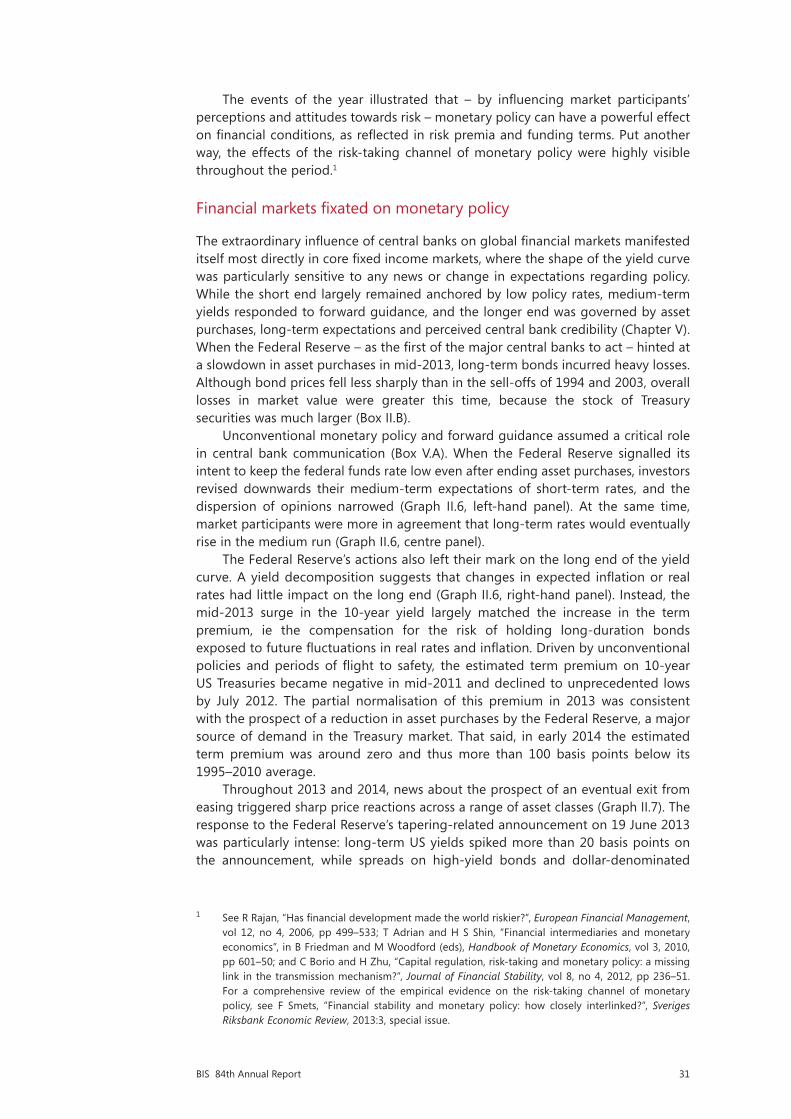
31BIS 84th Annual Report
The events of the year illustrated that – by influencing market participants’ perceptions and attitudes towards risk – monetary policy can have a powerful effect on financial conditions, as reflected in risk premia and funding terms. Put another way, the effects of the risk-taking channel of monetary policy were highly visible throughout the period.1
Financial markets fixated on monetary policy
The extraordinary influence of central banks on global financial markets manifested itself most directly in core fixed income markets, where the shape of the yield curve was particularly sensitive to any news or change in expectations regarding policy. While the short end largely remained anchored by low policy rates, medium-term yields responded to forward guidance, and the longer end was governed by asset purchases, long-term expectations and perceived central bank credibility (Chapter V). When the Federal Reserve – as the first of the major central banks to act – hinted at a slowdown in asset purchases in mid-2013, long-term bonds incurred heavy losses. Although bond prices fell less sharply than in the sell-offs of 1994 and 2003, overall losses in market value were greater this time, because the stock of Treasury securities was much larger (Box II.B).
Unconventional monetary policy and forward guidance assumed a critical role in central bank communication (Box V.A). When the Federal Reserve signalled its intent to keep the federal funds rate low even after ending asset purchases, investors revised downwards their medium-term expectations of short-term rates, and the dispersion of opinions narrowed (Graph II.6, left-hand panel). At the same time, market participants were more in agreement that long-term rates would eventually rise in the medium run (Graph II.6, centre panel).
The Federal Reserve’s actions also left their mark on the long end of the yield curve. A yield decomposition suggests that changes in expected inflation or real rates had little impact on the long end (Graph II.6, right-hand panel). Instead, the mid-2013 surge in the 10-year yield largely matched the increase in the term premium, ie the compensation for the risk of holding long-duration bonds exposed to future fluctuations in real rates and inflation. Driven by unconventional policies and periods of flight to safety, the estimated term premium on 10-year US Treasuries became negative in mid-2011 and declined to unprecedented lows by July 2012. The partial normalisation of this premium in 2013 was consistent with the prospect of a reduction in asset purchases by the Federal Reserve, a major source of demand in the Treasury market. That said, in early 2014 the estimated term premium was around zero and thus more than 100 basis points below its 1995–2010 average.
Throughout 2013 and 2014, news about the prospect of an eventual exit from easing triggered sharp price reactions across a range of asset classes (Graph II.7). The response to the Federal Reserve’s tapering-related announcement on 19 June 2013 was particularly intense: long-term US yields spiked more than 20 basis points on the announcement, while spreads on high-yield bonds and dollar-denominated
1 See R Rajan, “Has financial development made the world riskier?”, European Financial Management, vol 12, no 4, 2006, pp 499–533; T Adrian and H S Shin, “Financial intermediaries and monetary economics”, in B Friedman and M Woodford (eds), Handbook of Monetary Economics, vol 3, 2010, pp 601–50; and C Borio and H Zhu, “Capital regulation, risk-taking and monetary policy: a missing link in the transmission mechanism?”, Journal of Financial Stability, vol 8, no 4, 2012, pp 236–51. For a comprehensive review of the empirical evidence on the risk-taking channel of monetary policy, see F Smets, “Financial stability and monetary policy: how closely interlinked?”, Sveriges Riksbank Economic Review, 2013:3, special issue.
32 BIS 84th Annual Report
Box II.BThe 2013 sell-off in US Treasuries from a historical perspective
How significant was the sell-off in the market for US Treasury securities in May–June 2013? It depends on how one measures losses. Valuation losses on individual securities were slightly less than those incurred during the sell-offs in 1994 and 2003, whereas the scale of aggregate losses on the stock of outstanding securities was greater in 2013, both in absolute terms and relative to GDP.
In comparing the mark-to-market losses in mid-2013 with those of 1994 and 2003, we first adopt a security-level perspective and quantify the percentage losses for marketable Treasuries at each maturity (the results for a selection of three Treasury maturities are shown in Graph II.B, left-hand panel, along with losses on certain private sector debt securities). Then we estimate the aggregate mark-to-market losses on the total stock of outstanding marketable Treasury securities, taking into account their specific maturity and cash flow profiles (Graph II.B, right-hand panel).
The sell-off in 1994 was different from the 2003 and 2013 episodes in that, in 1994, not only did long-term rates surge, but short-term rates also picked up significantly. In early February 1994, after a long period of monetary accommodation, a modest but unexpected increase in the Federal Reserve’s policy rate produced strong upward revisions in expected future inflation and short-term rates. Over the course of the following three months, the policy rate increased by 75 basis points, and 10-year yields rose more than 140 basis points. By contrast, in both 2003 and 2013, the bond market stress was confined mostly to longer maturities, although the drivers of the 2003 event were different from those in 2013. The 2003 surge in long-term yields was driven largely by a pickup in expected future real rates and inflation; in 2013, the rise was due almost entirely to a lift-off of term premia from unprecedented lows (see Graph II.6, right-hand panel, and discussion in the main text).
As illustrated in the left-hand panel of Graph II.B, mark-to-market losses of individual securities during the 2013 turmoil were not quite as great as those seen in 1994 and 2003. But the 2013 sell-off stands out because of the massive expansion in the stock of debt in the wake of the financial crisis (Graph II.B, centre panel). Between early 2007 and 2014, the stock of outstanding marketable US Treasury securities almost tripled, from $4.4 trillion to $12.1 trillion, with an increasing share of the securities held in the Federal Reserve System Open Market Account (SOMA).
Publicly available data on outstanding amounts, remaining maturities and coupon payments of marketable Treasury securities permit the calculation of the cash flow profile and duration of both the Federal Reserve holdings and those of the public for the 2003 and 2013 episodes. The duration of all outstanding securities – and thus their sensitivity to sudden changes in interest rates – has increased from around 3.8 years to 4.8 years since 2007 as a result of debt management policies and the drop in yields to record lows (with corresponding valuation gains). The duration of the Federal Reserve’s holdings has increased even more under its maturity extension programme (MEP), introduced in late 2011, which in turn has helped keep the duration of debt held by the public largely constant.
Because of the great rise in the stock of Treasury securities since the financial crisis, the 2013 bond market sell-off generated a larger aggregate loss in both dollar and GDP terms than did the 1994 and 2003 episodes. Between May and end-July 2013, all holders of marketable US Treasury debt incurred aggregate cumulative mark-to-market losses of about $425 billion, or about 2.5% of GDP (Graph II.B, right-hand panel). Aggregate losses during the 2003 sell-off amounted to an estimated $155 billion, or 1.3% of GDP; and in 1994 about $150 billion, or about 2% of GDP.
However, in 2013, public holders incurred only about two thirds of the aggregate losses – some $280 billion, or roughly 1.7% of GDP – and that GDP share of losses was probably no greater than the share in 1994. Hence, because of the high amount of duration risk which the Federal Reserve had taken onto its own balance sheet, the valuation losses for public holders of US Treasury securities in 2013 were relatively contained despite the much larger amount of outstanding marketable Treasury securities.
Treasury securities held within various US government accounts, including trust funds, are not marketable. In this box, we use the term “public holders” of marketable Treasury securities to mean any domestic or foreign investor except the Federal Reserve. SOMA holdings are reported by the Federal Reserve Bank of New York for the last Wednesday of each month; outstanding marketable Treasury securities from Treasury Direct’s monthly statements of public debt are for the last day of each month. We abstract from the differences in outstanding amounts and duration that may result from this time difference. The information on outstanding Treasuries is available in electronic form only from April 1997 onwards. To estimate mark-to-market losses in 2013 and compare them with losses incurred in the two earlier episodes, we rely on security-level data on all marketable US Treasury securities outstanding as well as their maturity and cash flow profiles and then quantify the monthly fluctuations in the aggregate market value of outstanding securities that were due to changes in the shape of the US yield curve. For discount rates, we use linearly interpolated constant maturity yields from the Federal Reserve Board’s H.15 tables. Estimates of the month-to-month losses in market value were obtained by comparing the present value of cash flows at the end of a given

33BIS 84th Annual Report
EME paper jumped 16 and 24 basis points, respectively (Graph II.7, left-hand panel). The S&P 500 equity index lost about 4%, while implied volatility in equity markets rose by 4 percentage points. However, subsequent Federal Reserve communications, on 17 July and 18 September 2013, reassured markets that eventual tightening lay further in the future than participants had anticipated. On that more accommodative news, two-year yields dropped, while high-yield and EME bond spreads narrowed (Graph II.7, right-hand panel). By the time the actual tapering was announced in December 2013, markets were more prepared. Although long-term yields picked up around 10 basis points, credit spreads declined, and US equity prices actually rose, by 1.6% (Graph II.7, left-hand panel).
month with the present value of cash flows for the same portfolio of securities at the end of the following month. When the level of the yield curve increases or the slope steepens over the course of the month, the value of outstanding Treasuries declines because future cash flows are discounted more heavily. To calculate the difference in the present value, we abstract from all cash flows occurring between the end of a given month and the end of the following month. The analysis of estimated aggregate mark-to-market gains and losses prior to April 1997 is based on less granular information, assuming a maturity structure of outstanding Treasury securities in line with that of common US government bond market indices. Federal Reserve holdings in 1994 are not likely to have exceeded $350 billion and presumably had a duration no longer than that of the entire stock of outstanding Treasury securities. The conclusion for 1994 can be inferred from data provided by J Hamilton and C Wu, “The effectiveness of alternative monetary policy tools in a zero lower bound environment”, Journal of Money, Credit and Banking, vol 44, February 2012, pp 3–46.
Losses on US Treasury securities during three major sell-off episodes Graph II.B
Mark-to-market losses on selected Treasury maturities during sell-offs1
Outstanding marketable Treasury securities
Cumulative (three-month) gains and losses2
Per cent Years USD trn Percentage of GDP
The black vertical lines in the right-hand panel indicate the beginning of the sell-off periods in 1994, 2003 and 2013.
1 The three sell-off periods are 7 February–11 May 1994, 12 June–3 September 2003 and 2 May–5 July 2013. The panel shows mark-to-market losses, in percentage terms, incurred over the three periods. 2 The panel depicts estimated aggregate mark-to-market gains and losses on the stock of outstanding marketable US Treasury securities over a three-month horizon due to movements in the shape of the US yield curve; the changes are measured in billions of US dollars and then expressed as a percentage of GDP. The underlying security-level data cover all marketable US Treasury securities outstanding, including information on their maturity and cash flow profiles. Gains and losses in market value over a given month are estimated by comparing the present value of the stream of cash flows at the end of a given month with the present value of future cash flows of the same portfolio of securities at the end of the following month. For periods before April 1997, the mark-to-market gains and losses were computed on the basis of data on total marketable Treasury debt outstanding andduration and return information from the BofA Merrill Lynch US Treasury Master Index, which tracks the performance of US dollar-denominated sovereign debt publicly issued by the US government. 3 Total return on the BofA Merrill Lynch Current US Treasury Index for two-year, five-year and 10-year maturities. 4 Total return on the BofA Merrill Lynch United States Corporate Index, which tracks investment grade corporate debt publicly issued in the US domestic market. 5 MBS = mortgage-backed securities. JPMorgan MBS Index. Data for 1994 are not available.
Sources: Federal Reserve Bank of New York; US Department of the Treasury; Bank of America Merrill Lynch; Bloomberg; Datastream; JPMorgan Chase; BIS calculations.
–10
–8
–6
–4
–2
0
2-yr3 5-yr3 10-yr3 Memo:Corp MBS5
credit4
1994 2003 2013
2.5
3.5
4.5
5.5
6.5
7.5
2
4
6
8
10
12
04 05 06 07 08 09 10 11 12 13 14
AllFed holdings
Duration (lhs):Non-Fed Fed
Holdings (rhs):
–2.70
–1.35
0.00
1.35
2.70
93 96 99 02 05 08 11 14
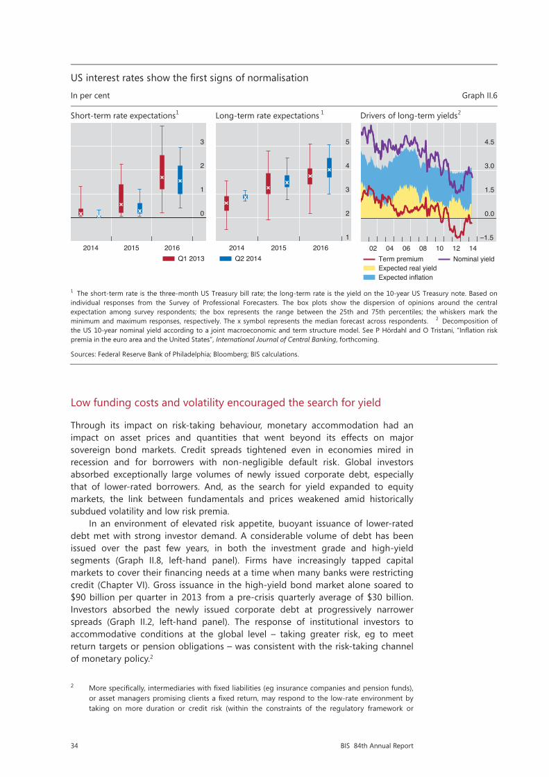
34 BIS 84th Annual Report
Low funding costs and volatility encouraged the search for yield
Through its impact on risk-taking behaviour, monetary accommodation had an impact on asset prices and quantities that went beyond its effects on major sovereign bond markets. Credit spreads tightened even in economies mired in recession and for borrowers with non-negligible default risk. Global investors absorbed exceptionally large volumes of newly issued corporate debt, especially that of lower-rated borrowers. And, as the search for yield expanded to equity markets, the link between fundamentals and prices weakened amid historically subdued volatility and low risk premia.
In an environment of elevated risk appetite, buoyant issuance of lower-rated debt met with strong investor demand. A considerable volume of debt has been issued over the past few years, in both the investment grade and high-yield segments (Graph II.8, left-hand panel). Firms have increasingly tapped capital markets to cover their financing needs at a time when many banks were restricting credit (Chapter VI). Gross issuance in the high-yield bond market alone soared to $90 billion per quarter in 2013 from a pre-crisis quarterly average of $30 billion. Investors absorbed the newly issued corporate debt at progressively narrower spreads (Graph II.2, left-hand panel). The response of institutional investors to accommodative conditions at the global level – taking greater risk, eg to meet return targets or pension obligations – was consistent with the risk-taking channel of monetary policy.2
2 More specifically, intermediaries with fixed liabilities (eg insurance companies and pension funds), or asset managers promising clients a fixed return, may respond to the low-rate environment by taking on more duration or credit risk (within the constraints of the regulatory framework or
US interest rates show the first signs of normalisation
In per cent Graph II.6
Short-term rate expectations1 Long-term rate expectations 1 Drivers of long-term yields2
1 The short-term rate is the three-month US Treasury bill rate; the long-term rate is the yield on the 10-year US Treasury note. Based on individual responses from the Survey of Professional Forecasters. The box plots show the dispersion of opinions around the central expectation among survey respondents; the box represents the range between the 25th and 75th percentiles; the whiskers mark the minimum and maximum responses, respectively. The x symbol represents the median forecast across respondents. 2 Decomposition of the US 10-year nominal yield according to a joint macroeconomic and term structure model. See P Hördahl and O Tristani, “Inflation risk premia in the euro area and the United States”, International Journal of Central Banking, forthcoming.
Sources: Federal Reserve Bank of Philadelphia; Bloomberg; BIS calculations.
0
1
2
3
2014 2015 2016Q1 2013
1
2
3
4
5
2014 2015 2016Q2 2014
–1.5
0.0
1.5
3.0
4.5
02 04 06 08 10 12 14Term premiumExpected real yieldExpected inflation
Nominal yield
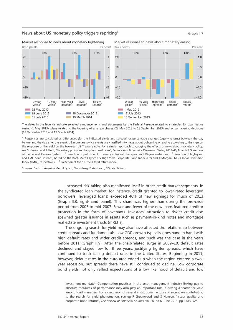
35BIS 84th Annual Report
Increased risk-taking also manifested itself in other credit market segments. In the syndicated loan market, for instance, credit granted to lower-rated leveraged borrowers (leveraged loans) exceeded 40% of new signings for much of 2013 (Graph II.8, right-hand panel). This share was higher than during the pre-crisis period from 2005 to mid-2007. Fewer and fewer of the new loans featured creditor protection in the form of covenants. Investors’ attraction to riskier credit also spawned greater issuance in assets such as payment-in-kind notes and mortgage real estate investment trusts (mREITs).
The ongoing search for yield may also have affected the relationship between credit spreads and fundamentals. Low GDP growth typically goes hand in hand with high default rates and wider credit spreads, and such was the case in the years before 2011 (Graph II.9). After the crisis-related surge in 2009–10, default rates declined and stayed low for three years, justifying tighter spreads, which have continued to track falling default rates in the United States. Beginning in 2011, however, default rates in the euro area edged up when the region entered a two-year recession, but spreads there have still continued to decline. Low corporate bond yields not only reflect expectations of a low likelihood of default and low
investment mandate). Compensation practices in the asset management industry linking pay to absolute measures of performance may also play an important role in driving a search for yield among fund managers. For a discussion of several institutional factors and incentives contributing to the search for yield phenomenon, see eg R Greenwood and S Hanson, “Issuer quality and corporate bond returns”, The Review of Financial Studies, vol 26, no 6, June 2013, pp 1483–525.
News about US monetary policy triggers repricing1 Graph II.7
Market response to news about monetary tightening Market response to news about monetary easing Basis points Per cent Basis points Per cent
The dates in the legends indicate selected announcements and statements by the Federal Reserve related to strategies for quantitative easing (1 May 2013), plans related to the tapering of asset purchases (22 May 2013 to 18 September 2013) and actual tapering decisions(18 December 2013 and 19 March 2014).
1 Responses are calculated as differences (for the indicated yields and spreads) or percentage changes (equity returns) between the day before and the day after the event. US monetary policy events are classified into news about tightening or easing according to the sign on the response of the yield on the two-year US Treasury note. For a similar approach to gauging the effects of news about monetary policy,see S Hanson and J Stein, “Monetary policy and long-term real rates”, Finance and Economics Discussion Series, 2012-46, Board of Governors of the Federal Reserve System. 2 Reaction of yields on US Treasury notes with two-year and 10-year maturities. 3 Reaction of high-yield and EME bond spreads, based on the BofA Merrill Lynch US High Yield Corporate Bond Index (HY) and JPMorgan EMBI Global Diversified Index (EMBI), respectively. 4 Reaction of the S&P 500 total return index.
Sources: Bank of America Merrill Lynch; Bloomberg; Datastream; BIS calculations.
–20
–10
0
10
20
–4
–2
0
2
4
2-year 10-year High-yield EMBI Equityyields2 yields2 spreads3 spreads3 returns4
Lhs Lhs Rhs
22 May 201319 June 201331 July 2013
18 December 201319 March 2014
–20
–10
0
10
20
–1.0
–0.5
0.0
0.5
1.0
2-year 10-year High-yield EMBI Equityyields2 yields2 spreads3 spreads3 returns4
Lhs Lhs Rhs
1 May 201317 July 201318 September 2013

36 BIS 84th Annual Report
levels of risk premia, but also contribute to the suppression of actual default rates, in that the availability of cheap credit makes it easier for troubled borrowers to refinance. The sustainability of this process will ultimately be put to the test when interest rates normalise.
Fuelled by the low-yield environment and supported by an improving economic outlook, equity prices on the major exchanges enjoyed a spectacular climb throughout 2013 (Graph II.2, right-hand panel). In many equity markets, the expected payoff from dividends alone exceeded the real yields on longer-dated high-quality bonds, encouraging market participants to extend their search for yield beyond fixed income markets. Stocks paying high and stable dividends were seen as particularly attractive and posted large gains.
As major equity indices in the advanced economies reached record highs, prices rose by more than the expected growth in underlying fundamentals. Conventional valuation metrics such as the price/earnings ratio and Tobin’s Q moved above their longer-term averages (Graph II.10, top panels). The S&P 500 Index, for instance, gained almost 20% in the 12 months to May 2014, whereas expected future earnings grew less than 8% over the same period. The cyclically adjusted price/earnings ratio of the S&P 500 stood at 25 in May 2014, six units higher than its average over the previous 50 years. Prices of European equities also rose over the past year, by more than 15%, despite low growth in the aftermath of the euro area debt crisis and a drop of 3% in expected earnings. Between June 2007 and September 2011, the crisis-related plunge in equity prices and the subsequent rebound were associated with shifts in investor expectations about growth in future corporate earnings (Graph II.10, bottom left-hand panel, data in blue). Since then, earnings expectations have been less influential in driving stock prices (as illustrated by the flatter slope of the red line relative to the blue line in Graph II.10, bottom left-hand panel).
The recent rise in equity returns was accompanied by a growing appetite for risk and historically subdued levels of volatility (Graph II.10, bottom right-hand panel, and Graph II.11, left-hand panel). By early June 2014, the option-implied volatility index (VIX) dipped under 11% – below its 2004 to mid-2007 average of
Lower-rated credit market segments see buoyant issuance Graph II.8
Corporate bond issuance1 Syndicated lending, global signings USD bn Per cent USD bn Per cent
1 Gross issuance of corporate bonds by non-financial corporations. 2 Share of high-yield issuance in total corporate bond issuance. 3 Share of leveraged loans in total syndicated loan signings.
Sources: Dealogic; BIS calculations.
0
125
250
375
500
0
7
14
21
28
00 02 04 06 08 10 12 14
High-yieldInvestment grade
Lhs:High-yield share2
Rhs:
0
200
400
600
800
0
10
20
30
40
05 06 07 08 09 10 11 12 13 14
LeveragedInvestment grade
Lhs:Leveraged share3
Rhs:

37BIS 84th Annual Report
13.6% and some 10 percentage points lower than in mid-2012. The volatility of actual stock market returns fell to levels last seen in 2004–07 and during the equity boom in the late 1990s (Graph II.11, left-hand panel).
The strength of investors’ risk appetite is apparent from a comparison of two risk measures, implied volatility and actual (“empirical”) volatility.3 Implied volatility, a forward-looking measure derived from option prices, declined more than investors would have expected when projecting actual volatility from past returns. A gauge of risk premia, computed as the difference between implied and empirical volatility, has recently fluctuated near post-crisis lows. This offers yet another sign of investors’ elevated appetite for risk, as it suggests that investors were relatively less inclined to insure themselves against large price fluctuations via derivatives (Graph II.10, bottom right-hand panel).
In fact, low levels of implied and actual volatility prevailed well beyond equity markets (Graph II.11). While the ongoing recovery went hand in hand with lower variability in macroeconomic and firm-specific fundamentals, central banks also played an important role in keeping volatility low. Asset purchases and forward guidance removed some of the uncertainty about future movements in bond yields and thereby contained the amplitude of swings in bond prices. US bond market volatility accordingly continued to fall, reaching its lowest level since 2007, after spiking during the sell-off in mid-2013 (Graph II.11, right-hand panel). At the same time, implied volatility in currency markets declined to levels last seen in 2006–07, while the volatility in credit markets (computed from options on major CDS indices referencing European and US corporations) fell to post-crisis lows.
3 This indicator of risk tolerance is commonly referred to as the variance risk premium. See T Bollerslev, G Tauchen and H Zhou, “Expected stock returns and variance risk premia”, The Review of Financial Studies, vol 22, no 11, November 2009, pp 4463–92; and G Bekaert, M Hoerova and M Lo Duca, “Risk, uncertainty and monetary policy”, Journal of Monetary Economics, vol 60, no 7, October 2013, pp 771–88.
Credit spreads narrow despite sluggish growth
In per cent Graph II.9
Euro area United States
The shaded areas indicate recession periods as defined by OECD (euro area) and NBER (United States).
1 High-yield option-adjusted spreads on an index of local currency bonds issued by financial and non-financial corporations. 2 Trailing 12-month issuer-weighted default rates by borrowers rated below investment grade. 3 Year-on-year growth rate of quarterly real GDP.
Sources: Bank of America Merrill Lynch; Moody’s; national data.
–5
0
5
10
15
20
00 02 04 06 08 10 12 14High-yield spreads1 Default rates2
–5
0
5
10
15
20
00 02 04 06 08 10 12 14Real GDP growth3
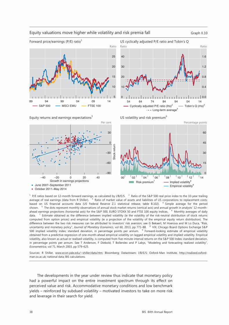
38 BIS 84th Annual Report
The developments in the year under review thus indicate that monetary policy had a powerful impact on the entire investment spectrum through its effect on perceived value and risk. Accommodative monetary conditions and low benchmark yields – reinforced by subdued volatility – motivated investors to take on more risk and leverage in their search for yield.
Equity valuations move higher while volatility and risk premia fall Graph II.10
Forward price/earnings (P/E) ratio1 US cyclically adjusted P/E ratio and Tobin’s Q Ratio Ratio Ratio
Equity returns and earnings expectations5 US volatility and risk premium6 Per cent Percentage points
1 P/E ratios based on 12-month forward earnings, as calculated by I/B/E/S. 2 Ratio of the S&P 500 real price index to the 10-year trailing average of real earnings (data from R Shiller). 3 Ratio of market value of assets and liabilities of US corporations to replacement costs; based on US financial accounts data (US Federal Reserve Z.1 statistical release, table B.102). 4 Simple average for the period shown. 5 The dots represent monthly observations of annual stock market returns (vertical axis) and annual growth in analysts’ 12-month-ahead earnings projections (horizontal axis) for the S&P 500, EURO STOXX 50 and FTSE 100 equity indices. 6 Monthly averages of daily data. 7 Estimate obtained as the difference between implied volatility (ie the volatility of the risk-neutral distribution of stock returns computed from option prices) and empirical volatility (ie a projection of the volatility of the empirical equity return distribution). The difference between the two risk measures can be attributed to investors’ risk aversion; see G Bekaert, M Hoerova and M Lo Duca, “Risk, uncertainty and monetary policy”, Journal of Monetary Economics, vol 60, 2013, pp 771–88. 8 VIX, Chicago Board Options Exchange S&P 500 implied volatility index; standard deviation, in percentage points per annum. 9 Forward-looking estimate of empirical volatility obtained from a predictive regression of one-month-ahead empirical volatility on lagged empirical volatility and implied volatility. Empirical volatility, also known as actual or realised volatility, is computed from five-minute-interval returns on the S&P 500 Index; standard deviation, in percentage points per annum. See T Anderson, F Diebold, T Bollerslev and P Labys, ”Modeling and forecasting realized volatility”, Econometrica, vol 71, March 2003, pp 579–625.
Sources: R Shiller, www.econ.yale.edu/~shiller/data.htm; Bloomberg; Datastream; I/B/E/S; Oxford-Man Institute, htt : realized.oxford-man.ox.ac.uk; national data; BIS calculations.
5
10
15
20
25
89 94 99 04 09 14S&P 500 MSCI EMU FTSE 100
0
10
20
30
40
0.0
0.4
0.8
1.2
1.6
54 64 74 84 94 04 14Cyclically adjusted P/E ratio (lhs)2 Tobin’s Q (rhs)3
Long-term average4
–90
–60
–30
0
30
–40 –20 0 20 40
Stoc
k re
turn
Growth in earnings projectionsJune 2007–September 2011October 2011–May 2014
0
15
30
45
60
00 02 04 06 08 10 12 14 Risk premium7 Implied volatility8
Empirical volatility9
//p
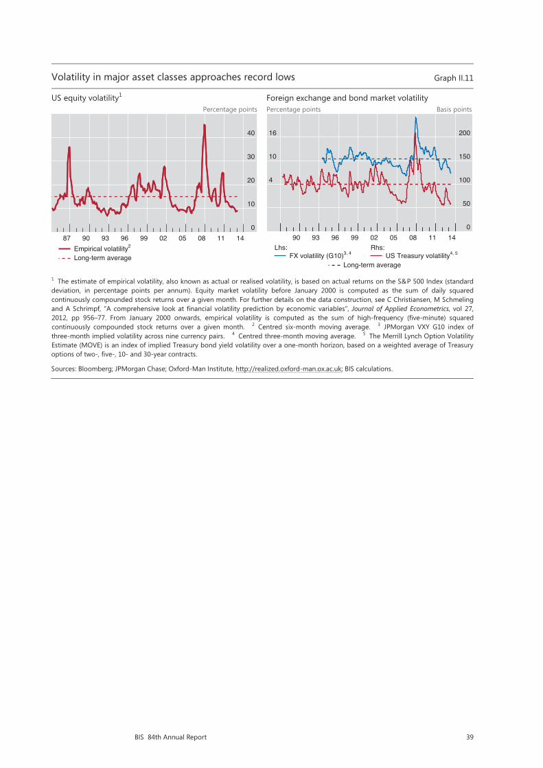
39BIS 84th Annual Report
Volatility in major asset classes approaches record lows Graph II.11
US equity volatility1 Foreign exchange and bond market volatility Percentage points Percentage points Basis points
1 The estimate of empirical volatility, also known as actual or realised volatility, is based on actual returns on the S&P 500 Index (standard deviation, in percentage points per annum). Equity market volatility before January 2000 is computed as the sum of daily squaredcontinuously compounded stock returns over a given month. For further details on the data construction, see C Christiansen, M Schmeling and A Schrimpf, “A comprehensive look at financial volatility prediction by economic variables”, Journal of Applied Econometrics, vol 27, 2012, pp 956–77. From January 2000 onwards, empirical volatility is computed as the sum of high-frequency (five-minute) squaredcontinuously compounded stock returns over a given month. 2 Centred six-month moving average. 3 JPMorgan VXY G10 index of three-month implied volatility across nine currency pairs. 4 Centred three-month moving average. 5 The Merrill Lynch Option Volatility Estimate (MOVE) is an index of implied Treasury bond yield volatility over a one-month horizon, based on a weighted average of Treasury options of two-, five-, 10- and 30-year contracts.
Sources: Bloomberg; JPMorgan Chase; Oxford-Man Institute, http://realized.oxford-man.ox.ac.uk; BIS calculations.
0
10
20
30
40
87 90 93 96 99 02 05 08 11 14Empirical volatility2
Long-term average
4
10
16
0
50
100
150
200
90 93 96 99 02 05 08 11 14
FX volatility (G10)3, 4Lhs:
US Treasury volatility4, 5Rhs:
Long-term average


41BIS 84th Annual Report
III. Growth and inflation: drivers and prospects
Over the past year, global growth has firmed. Advanced economies provided most of the uplift, supported by highly accommodative financing conditions. Thanks in part to stronger exports to advanced economies, output growth in emerging market economies (EMEs) stabilised in the second half of 2013.
Yet global growth still remains below pre-crisis averages. This is not surprising. A number of advanced economies are still recovering from a balance sheet recession. Households, banks and, to a lesser extent, non-financial firms have been repairing their balance sheets and reducing excessive debt. Private sector deleveraging is most advanced in the United States, while it is far from over in other countries, including a large part of the euro area. Resources also need to move to new and more productive uses. Meanwhile, many EMEs are in the late stage of financial booms, suggesting a drag on growth going forward.
Restoring sustainable global growth poses significant challenges. In crisis-hit countries, it is unrealistic to expect the level of output to return to its pre-crisis trend. This would require the growth rate to exceed the pre-crisis average for several years. Historical evidence shows that this rarely happens following a balance sheet recession. Moreover, even the prospects for restoring trend growth are not bright. Productivity growth in advanced economies has been on a declining trend since well before the onset of the financial crisis, and the workforce is already shrinking in several countries as the population ages. Public debt is also at a record high and may act as an additional drag on growth. In many EMEs, the recent tightening of financial conditions and late-stage financial cycle risks are also clouding growth prospects.
Investment is still below pre-crisis levels in many advanced economies, but this is unlikely to be a major drag on trend growth. Most of the shortfall is accounted for by the construction sector in countries that experienced large property booms and thus represents a necessary correction of previous overinvestment. That said, spending on equipment is also below the pre-crisis average owing to the weak demand and slow recovery typical of balance sheet recessions rather than the lack of finance. At the global level, a trend rise in investment in EMEs has offset a long downward trend in advanced economies.
Inflation has remained low, or declined further, in many economies. A low utilisation of domestic resources is, however, unlikely to be the key driver. With greater integration of trade, finance and production, inflation has become increasingly influenced by conditions prevailing in globally integrated markets. Global factors have helped to reduce the inflation rate as well as its sensitivity to domestic conditions for a long time. Such forces may still be at play.
The rest of this chapter describes the main macroeconomic developments over the past year, taking stock of the progress that crisis-hit countries have made in recovering from the 2008–09 recession. It then reviews recent developments in inflation, stressing the increasing role of global forces. Finally, the chapter discusses the possible reasons for the weakness of investment and productivity growth.

42 BIS 84th Annual Report
Growth: recent developments and medium-term trends
A stronger but still uneven global recovery
Over the past year, global economic growth gathered strength. World GDP growth increased from a 2% year-on-year rate in the first quarter of 2013 to 3% in the first quarter of 2014 (Graph III.1, left-hand panel). This compares with average growth of 3.9% in the period 1996–2006 (Annex Table III.1). Advanced economies accounted for most of last year’s increase, while growth in EMEs remained stable at a relatively low level (though still higher than that of the advanced economies). This relative shift in growth momentum is even more visible in survey indicators. The manufacturing purchasing managers’ index (PMI) for advanced economies rose steadily during 2013, while that for EMEs has firmed to levels that indicate steady growth (Graph III.1, centre panel). Reflecting improved demand in advanced economies, world trade growth picked up gradually over the past year, although it was still slower than pre-crisis (Graph III.1, right-hand panel).
Growth picked up rapidly in the United States and the United Kingdom. Falling unemployment, some stabilisation in housing markets and progress in private sector deleveraging supported US private consumption and, to a smaller extent, investment, lifting year-on-year US growth to about 2% in early 2014, about ¾ percentage point more than at the beginning of 2013. Despite less progress in tackling balance sheet problems, falling unemployment and a buoyant housing market also helped boost UK growth to over 3% in early 2014.
The euro area returned to growth against the backdrop of receding concerns about sovereign risk and the future of the euro. Driven by Germany and initially
Restricted
1/12
Annual report 2014, chapter 3 graphs
17 June 2014 - 16:00
Changes: Graph III.1: left panel
Graph III.5: left & centre panel + footnote 2
Graph III.8: left + right panels
Advanced economies are driving the pickup in global growth Graph III.1
Output growth1 Manufacturing PMIs2 Global trade growth3
1 Year-on-year percentage changes in historical and expected real GDP; forecasts are shown as dots; the dashed lines show average annualgrowth in 1996–2006. Economies as defined in Annex Table III.1. Weighted averages based on 2005 GDP and PPP exchange rates. 2 Manufacturing purchasing managers’ indices (PMIs); a value above 50 indicates an expansion of economic activity. Advanced economies: Canada, France, Germany, Italy, Japan, Sweden, Switzerland, the United Kingdom and the United States; EMEs: Brazil, China, Hungary, India, Mexico, Russia, Singapore, South Africa and Turkey. Weighted averages based on 2005 GDP and PPP exchange rates. 3 Year-on-year changes, in per cent.
Sources: IMF, World Economic Outlook; Bloomberg; Consensus Economics; CPB Netherlands Bureau for Economic Policy Analysis;Datastream; HSBC-Markit; national data; BIS calculations.
–5.0
–2.5
0.0
2.5
5.0
7.5
07 08 09 10 11 12 13 14 15Advanced economiesEMEs World
30
35
40
45
50
55
07 08 09 10 11 12 13 14Advanced economiesEMEs
–30
–20
–10
0
10
20
07 08 09 10 11 12 13 14
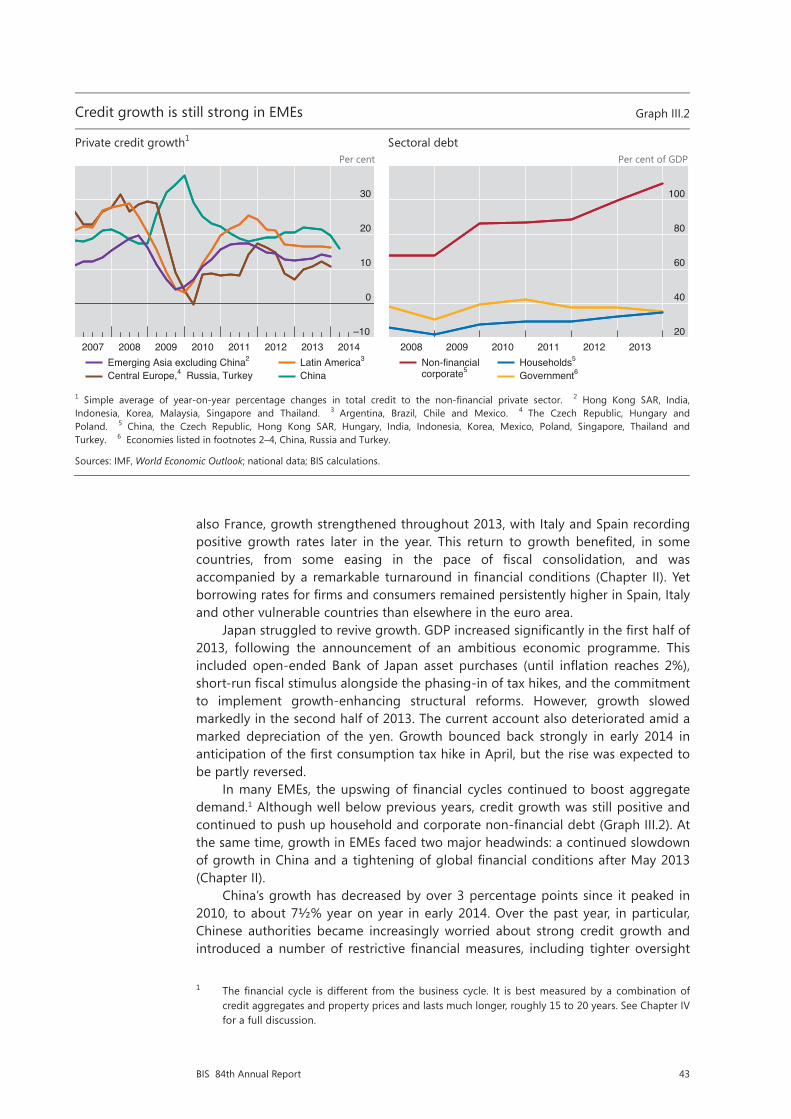
43BIS 84th Annual Report
also France, growth strengthened throughout 2013, with Italy and Spain recording positive growth rates later in the year. This return to growth benefited, in some countries, from some easing in the pace of fiscal consolidation, and was accompanied by a remarkable turnaround in financial conditions (Chapter II). Yet borrowing rates for firms and consumers remained persistently higher in Spain, Italy and other vulnerable countries than elsewhere in the euro area.
Japan struggled to revive growth. GDP increased significantly in the first half of 2013, following the announcement of an ambitious economic programme. This included open-ended Bank of Japan asset purchases (until inflation reaches 2%), short-run fiscal stimulus alongside the phasing-in of tax hikes, and the commitment to implement growth-enhancing structural reforms. However, growth slowed markedly in the second half of 2013. The current account also deteriorated amid a marked depreciation of the yen. Growth bounced back strongly in early 2014 in anticipation of the first consumption tax hike in April, but the rise was expected to be partly reversed.
In many EMEs, the upswing of financial cycles continued to boost aggregate demand.1 Although well below previous years, credit growth was still positive and continued to push up household and corporate non-financial debt (Graph III.2). At the same time, growth in EMEs faced two major headwinds: a continued slowdown of growth in China and a tightening of global financial conditions after May 2013 (Chapter II).
China’s growth has decreased by over 3 percentage points since it peaked in 2010, to about 7½% year on year in early 2014. Over the past year, in particular, Chinese authorities became increasingly worried about strong credit growth and introduced a number of restrictive financial measures, including tighter oversight
1 The financial cycle is different from the business cycle. It is best measured by a combination of credit aggregates and property prices and lasts much longer, roughly 15 to 20 years. See Chapter IV for a full discussion.
Restricted
2/12
The current account balance panel taken out of the graph below
Credit growth is still strong in EMEs Graph III.2
Private credit growth1 Sectoral debt Per cent Per cent of GDP
1 Simple average of year-on-year percentage changes in total credit to the non-financial private sector. 2 Hong Kong SAR, India, Indonesia, Korea, Malaysia, Singapore and Thailand. 3 Argentina, Brazil, Chile and Mexico. 4 The Czech Republic, Hungary andPoland. 5 China, the Czech Republic, Hong Kong SAR, Hungary, India, Indonesia, Korea, Mexico, Poland, Singapore, Thailand and Turkey. 6 Economies listed in footnotes 2–4, China, Russia and Turkey.
Sources: IMF, World Economic Outlook; national data; BIS calculations.
–10
0
10
20
30
2007 2008 2009 2010 2011 2012 2013 2014Emerging Asia excluding China2
Central Europe,4 Russia, TurkeyLatin America3
China
20
40
60
80
100
2008 2009 2010 2011 2012 2013Non-financialcorporate5
Households5
Government6

44 BIS 84th Annual Report
of lending in the shadow banking system. The slowdown dampened growth in commodity exporters, including Russia and some Latin American countries, exporters of intermediate inputs and capital goods located mainly in Asia, and suppliers of high-tech goods such as Korea, Japan and Germany. However, the recovery of exports to advanced economies since mid-2013 helped stabilise growth somewhat in EMEs.
The tightening of global financial conditions since May–June 2013 initially led to larger currency depreciations and capital outflows in countries that had wider current account deficits, faster private credit growth and larger public debt. Following the market sell-off of January 2014, the countries that were hit harder were those with relatively high inflation and deteriorating growth prospects (Chapter II). The initial sell-off prompted countries such as India, Indonesia and Turkey to adopt restrictive measures, such as raising policy rates and tightening capital controls, as well as macroprudential and fiscal policy measures. In contrast, countries with positive external balances and low inflation rates, including most of emerging Asia and central and eastern Europe, were able to maintain accommodative monetary and fiscal policies or, in some cases, ease policy further to offset worsening growth prospects (Chapter V).
The long shadow of the financial crisis
The global economy is still coping with the legacy of the financial crisis. Despite the recent strengthening, the recovery remains weak by historical standards. In several advanced economies, output and productivity remain below their pre-crisis peak (Graph III.3), as does employment (Annex Table III.2). This is no surprise: financial crises generally cause deeper and longer recessions and are followed by much slower recoveries (Box III.A).
Restricted
3/12
The recovery in output and productivity has been slow and uneven
Q1 2014 relative to the values specified in the legend, in per cent Graph III.3
Real GDP1 Output per person employed1
AT = Austria; BE = Belgium; DE = Germany; ES = Spain; FR = France; GB = United Kingdom; IT = Italy; JP = Japan; NL = Netherlands; US = United States.
1 Pre-crisis peak and trend calculated over the period 1996–2008, trough from 2008 to latest available data. Linear trend calculated on log-levels of real GDP and output per person employed.
Sources: OECD, Economic Outlook; Datastream; BIS calculations.
–32
–24
–16
–8
0
8
US JP GB DE FR IT NL ES AT BEVersus troughVersus pre-crisis peak
Versus pre-crisis trend
–20
–15
–10
–5
0
5
10
US JP GB DE FR IT NL ES AT BE

45BIS 84th Annual Report
Box III.ARecovery from a balance sheet recession
Severe financial or banking crises are typically accompanied by deeper and longer recessions and followed by much slower recoveries compared with standard business cycle recessions. Such crises tend to occur after prolonged financial booms and close to the peak of financial cycles (Chapter IV). The fundamental causes of these recessions are large intertemporal and sectoral imbalances, the correction of which requires large and drawn-out changes in patterns of spending. To distinguish them from ordinary business cycle recessions, they are referred to as balance sheet recessions. This box discusses the factors that make recoveries from such recessions sluggish.
During financial booms, intertemporal and sectoral imbalances build up. Households, firms and often governments accumulate debt based on optimistic expectations about their future income, asset prices and the ease with which they are able to access credit. Banks overestimate the solidity of their assets, the solvency of their borrowers and their own ability to refinance themselves by rolling over short-term debt. Meanwhile, the composition of output – and hence the allocation of capital and labour across different sectors – may not match the composition of sustainable demand. One clear example is the expansion of the construction sector in several countries, with its legacy of large inventories of unsold properties. The public sector too may grow too large, and its debt may become unsustainable.
Misplaced confidence and optimistic expectations sooner or later prove unfounded, triggering a collapse of asset prices and a sharp output contraction. Some agents will no longer be able to service their debt and default, imposing losses on their lenders – typically financial institutions. Others will begin reducing the stock of debt by increasing net saving and selling assets to ensure they remain solvent and have sufficient funds to meet future commitments and needs. Lenders will face soaring non-performing loans and assets. Thus, the crisis heralds a period of balance sheet adjustment in which agents prioritise balance sheet repair over spending. As one agent’s spending is another’s income, balance sheet repair by some agents depresses the income and value of asset holdings of others. This inevitably keeps aggregate expenditure and income growth below pre-crisis norms until debt ratios have returned to more sustainable levels and capital stock overhangs have been reabsorbed. Meanwhile, a significant fraction of capital and labour becomes idle and needs to find new uses. This generally entails the financing of new capital and creation of new firms as well as the need for unemployed workers to retrain, relocate and search for new jobs. All of this requires time and effort.
The duration and intensity of the slump following a balance sheet recession depend on several factors. The first is the extent of the initial imbalances. The larger the excess during the boom, the larger is the needed correction afterwards. Financial busts tend to be associated with deeper recessions, and the speed of the recovery tends to be inversely related to the size of the preceding boom in credit and real estate. Households and firms that accumulated more debt tend to cut their spending by more than those which had less debt. The second is the extent of credit supply disruptions. After the most acute phase of the crisis, lenders usually need time to recognise losses and rebuild their capital ratios. Funding may be difficult because balance sheets are opaque and slow growth raises non-performing loans. What matters, however, is not so much the overall amount of credit that banks supply but its efficient allocation. After all, the debt overhang needs to be reabsorbed and credit demand is likely to be weak in aggregate. Indeed, empirical studies find that output growth and credit growth are at best only weakly correlated in the recovery – that is, so-called “credit-less” recoveries are the norm rather than the exception. Instead, key to a speedier recovery is that banks regain their ability to allocate credit to the most productive uses. There is also evidence that private sector deleveraging during a downturn helps induce a stronger recovery. The third factor driving the severity of the slump is the extent of structural rigidities and inefficiencies. In the presence of large sectoral imbalances, the recovery of output growth and employment tends to be stronger, other things equal, in countries that have more flexible labour markets. Finally, the policies followed by governments in managing the crisis and during the recovery phase can speed up or hinder a recovery (see Chapters I and V for a full discussion).
The empirical evidence confirms that recoveries from a financial crisis are drawn-out affairs. On average, it takes about four and a half years for (per capita) output to rise above its pre-crisis peak, or about 10 years if the Great Depression is taken into account. The recovery of employment is even slower (Reinhardt and Rogoff (2009)). By comparison, in a standard business cycle recession, output takes about a year and a half to return to the pre-recession peak. The evidence also points to wide dispersion around the mean, which supports the view that various factors, including those mentioned above, play a role in speeding up or slowing the recovery. The GDP losses in balance sheet recessions also tend to be larger (Box III.B).
The term “balance sheet recession” was probably first introduced by R Koo, Balance Sheet Recession, John Wiley & Sons, 2003, to explain Japan’s stagnant growth after the bursting of its equity and real estate bubble in the early 1990s. This box uses the same term to indicate
46 BIS 84th Annual Report
The crisis impact differed considerably across countries. Most directly hit were the United States, the United Kingdom, Spain and Ireland, and also several countries in central and eastern Europe. Following a boom in credit and property prices, this group of countries experienced a housing market bust and a banking crisis, leading to a full-fledged balance sheet recession. Another set of countries was affected more indirectly, especially through financial exposures to the first group. In particular, in Austria, France, Germany and Switzerland banks faced strains due to their cross-border exposures. A third group of countries, including most EMEs, commodity exporters such as Australia and Canada and Nordic countries, was indirectly hit through trade channels but subsequently buoyed by a strong increase in commodity prices. Japan and Italy did not suffer from a domestic bust or excessive cross-border exposures, but had to deal with the longer-term drag on growth resulting from high public debt, an ageing population and long-standing structural inefficiencies.
While expansionary macro policies were instrumental in stabilising the global economy, the recovery path of individual countries also depended on their ability to tackle the root causes of the balance sheet recession. Among the countries that suffered a full balance sheet recession, the United States has recovered relatively fast. Since 2008, output has risen by over 10% and is now about 6% above its pre-crisis peak. To an important extent, this reflects the flexibility of the US economy, progress in household deleveraging, and determined and credible measures to strengthen bank balance sheets (Chapter VI). In the United Kingdom, which suffered an initial drop of 7½%, output has increased by 6¾%, and after six years is still about ½% below its pre-crisis peak. That said, unemployment has fallen rapidly, thanks to a relatively high degree of labour market flexibility.
In the euro area, the sovereign debt crisis of 2010–12 aggravated the balance sheet problems that had remained from the earlier financial crisis. Countries that entered the euro area crisis with highly indebted households and weak banking sectors witnessed a further fall in property prices and real credit. Banking and public sector weakness reinforced each other through rising funding costs and declining asset quality. The fall in credit and property prices was particularly large in Ireland and Spain, but seems to have bottomed out recently. Italy, which had a less pronounced boom, has more recently experienced some decline in both credit aggregates and real estate prices (Chapter IV). Trade links within the euro area have also contributed to the sluggish recovery in several countries. One major exception was Germany, which suffered from the collapse of world trade in 2009 but also
the contraction of output associated with a financial crisis that follows a financial boom. It also embeds the term in a somewhat different analysis, which does not imply the same policy conclusions: see C Borio, “The financial cycle and macroeconomics: what have we learnt?”, BIS Working Papers, no 395, December 2012, forthcoming in Journal of Banking and Finance; and J Caruana, “Global economic and financial challenges: a tale of two views”, lecture at the Harvard Kennedy School in Cambridge, Massachusetts, 9 April 2014. See also Chapter I of this Report. See eg Ò Jordà, M Schularick and A Taylor, “When credit bites back”, Journal of Money, Credit and Banking, vol 45, 2013. See eg IMF, “Dealing with household debt”, World Economic Outlook, April 2012, Chapter 3; K Dynan, “Is a household debt overhang holding back consumption?”, Brookings Papers on Economic Activity, Spring 2012; A Mian and A Sufi, “Household leverage and the recession of 2007–2009”, IMF Economic Review, vol 58, 2010; A Mian, K Rao and A Sufi, “Household balance sheets, consumption and the economic slump”, Quarterly Journal of Economics, vol 128, 2013; and C Hennessy, A Levy and T Whited, “Testing Q theory with financing frictions”, Journal of Financial Economics, vol 83, 2007. See E Takáts and C Upper, “Credit growth after financial crises”, BIS Working Papers, no 416, July 2013; S Claessens, A Kose and M Terrones, “What happens during recessions, crunches and busts?”, Economic Policy, vol 24, 2009; and G Calvo, A Izquierdo and E Talvi, “Phoenix miracles in emerging markets: recovery without credit from systematic financial crises”, American Economic Review, vol 96, 2006. See M Bech, L Gambacorta and E Kharroubi, “Monetary policy in a downturn: are financial crises special?”, International Finance, vol 17, Spring 2014. See BIS, 83rd Annual Report, June 2013, Chapter III. C Reinhardt and K Rogoff, This time is different, Princeton University Press, 2009; see also eg D Papell and R Prodan, “The statistical behavior of GDP after financial crises and severe recessions”, paper prepared for the Federal Reserve Bank of Boston conference on Long-term effects of the Great Recession, October 2011; and G Howard, R Martin and B Wilson, “Are recoveries from banking and financial crises really so different?”, International Finance Discussion Papers, no 1037, Federal Reserve Board, 2011.
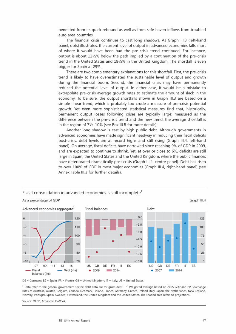
47BIS 84th Annual Report
benefited from its quick rebound as well as from safe haven inflows from troubled euro area countries.
The financial crisis continues to cast long shadows. As Graph III.3 (left-hand panel, dots) illustrates, the current level of output in advanced economies falls short of where it would have been had the pre-crisis trend continued. For instance, output is about 12½% below the path implied by a continuation of the pre-crisis trend in the United States and 18½% in the United Kingdom. The shortfall is even bigger for Spain at 29%.
There are two complementary explanations for this shortfall. First, the pre-crisis trend is likely to have overestimated the sustainable level of output and growth during the financial boom. Second, the financial crisis may have permanently reduced the potential level of output. In either case, it would be a mistake to extrapolate pre-crisis average growth rates to estimate the amount of slack in the economy. To be sure, the output shortfalls shown in Graph III.3 are based on a simple linear trend, which is probably too crude a measure of pre-crisis potential growth. Yet even more sophisticated statistical measures find that, historically, permanent output losses following crises are typically large: measured as the difference between the pre-crisis trend and the new trend, the average shortfall is in the region of 7½–10% (see Box III.B for more details).
Another long shadow is cast by high public debt. Although governments in advanced economies have made significant headway in reducing their fiscal deficits post-crisis, debt levels are at record highs and still rising (Graph III.4, left-hand panel). On average, fiscal deficits have narrowed since reaching 9% of GDP in 2009, and are expected to continue to shrink. Yet, at over or close to 6%, deficits are still large in Spain, the United States and the United Kingdom, where the public finances have deteriorated dramatically post-crisis (Graph III.4, centre panel). Debt has risen to over 100% of GDP in most major economies (Graph III.4, right-hand panel) (see Annex Table III.3 for further details).
Restricted
4/12
Fiscal consolidation in advanced economies is still incomplete1
As a percentage of GDP Graph III.4
Advanced economies aggregate2 Fiscal balances Debt
DE = Germany; ES = Spain; FR = France; GB = United Kingdom; IT = Italy; US = United States.
1 Data refer to the general government sector; debt data are for gross debt. 2 Weighted average based on 2005 GDP and PPP exchange rates of Australia, Austria, Belgium, Canada, Denmark, Finland, France, Germany, Greece, Ireland, Italy, Japan, the Netherlands, New Zealand, Norway, Portugal, Spain, Sweden, Switzerland, the United Kingdom and the United States. The shaded area refers to projections.
Source: OECD, Economic Outlook.
–10
–8
–6
–4
–2
0
70
80
90
100
110
120
07 09 11 13 15Fiscal balances (lhs)
Debt (rhs)
–15.0
–12.5
–10.0
–7.5
–5.0
–2.5
0.0
US GB DE FR IT ES2009 2014
0
25
50
75
100
125
US GB DE FR IT ES2007 2014
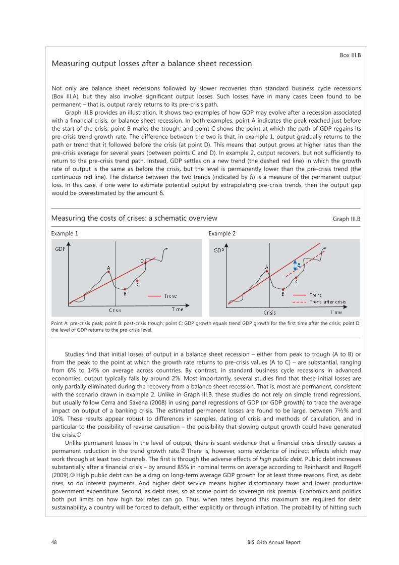
48 BIS 84th Annual Report
Box III.BMeasuring output losses after a balance sheet recession
Not only are balance sheet recessions followed by slower recoveries than standard business cycle recessions (Box III.A), but they also involve significant output losses. Such losses have in many cases been found to be permanent – that is, output rarely returns to its pre-crisis path.
Graph III.B provides an illustration. It shows two examples of how GDP may evolve after a recession associated with a financial crisis, or balance sheet recession. In both examples, point A indicates the peak reached just before the start of the crisis; point B marks the trough; and point C shows the point at which the path of GDP regains its pre-crisis trend growth rate. The difference between the two is that, in example 1, output gradually returns to the path or trend that it followed before the crisis (at point D). This means that output grows at higher rates than the pre-crisis average for several years (between points C and D). In example 2, output recovers, but not sufficiently to return to the pre-crisis trend path. Instead, GDP settles on a new trend (the dashed red line) in which the growth rate of output is the same as before the crisis, but the level is permanently lower than the pre-crisis trend (the continuous red line). The distance between the two trends (indicated by δ) is a measure of the permanent output loss. In this case, if one were to estimate potential output by extrapolating pre-crisis trends, then the output gap would be overestimated by the amount δ.
Studies find that initial losses of output in a balance sheet recession – either from peak to trough (A to B) or from the peak to the point at which the growth rate returns to pre-crisis values (A to C) – are substantial, ranging from 6% to 14% on average across countries. By contrast, in standard business cycle recessions in advanced economies, output typically falls by around 2%. Most importantly, several studies find that these initial losses are only partially eliminated during the recovery from a balance sheet recession. That is, most are permanent, consistent with the scenario drawn in example 2. Unlike in Graph III.B, these studies do not rely on simple trend regressions, but usually follow Cerra and Saxena (2008) in using panel regressions of GDP (or GDP growth) to trace the average impact on output of a banking crisis. The estimated permanent losses are found to be large, between 7½% and 10%. These results appear robust to differences in samples, dating of crisis and methods of calculation, and in particular to the possibility of reverse causation – the possibility that slowing output growth could have generated the crisis.
Unlike permanent losses in the level of output, there is scant evidence that a financial crisis directly causes a permanent reduction in the trend growth rate. There is, however, some evidence of indirect effects which may work through at least two channels. The first is through the adverse effects of high public debt. Public debt increases substantially after a financial crisis – by around 85% in nominal terms on average according to Reinhardt and Rogoff (2009). High public debt can be a drag on long-term average GDP growth for at least three reasons. First, as debt rises, so do interest payments. And higher debt service means higher distortionary taxes and lower productive government expenditure. Second, as debt rises, so at some point do sovereign risk premia. Economics and politics both put limits on how high tax rates can go. Thus, when rates beyond this maximum are required for debt sustainability, a country will be forced to default, either explicitly or through inflation. The probability of hitting such
Restricted
11/12
Measuring the costs of crises: a schematic overview Graph III.B
Example 1 Example 2
Point A: pre-crisis peak; point B: post-crisis trough; point C: GDP growth equals trend GDP growth for the first time after the crisis; point D: the level of GDP returns to the pre-crisis level.
49BIS 84th Annual Report
Inflation: domestic and global drivers
The pickup in world growth has so far not coincided with a sustained rise in inflation (Graph III.5, left-hand panel). Since mid-2013, headline measures have remained below or close to target in several countries. In particular, headline inflation stood at 0.7% in the euro area in April 2014, while it rose to 2% in the United States after being below target for several months. Japan is an exception: both core and headline inflation rates rose considerably following the announcement in early 2013 of a 2% inflation target. Headline inflation has also remained below average in EMEs. Yet inflation continued to be persistently high in Brazil, Indonesia, Russia and Turkey.
limits increases with the level of debt. And with higher sovereign risk premia come higher borrowing costs, lower private investment and lower long-term growth. Third, as debt rises, authorities lose the flexibility to employ countercyclical policies. This results in higher volatility, greater uncertainty and, again, lower growth. Cecchetti et al (2011) as well as a number of studies which look at advanced economies in the post-World War II period find a negative effect of public debt levels on trend growth after controlling for the typical determinants of economic growth.
The second channel is an increase in resource misallocation. Market forces should normally induce less efficient firms to restructure their operations or quit the market, making more resources available to the most efficient firms. But the functioning of market forces is restricted, to an extent that varies from country to country, by labour and product market regulations, bankruptcy laws, the tax code and public subsidies as well as by inefficient credit allocation. As a result, an excessive number of less efficient firms may remain in the market, leading to lower aggregate productivity growth (and hence lower trend GDP growth) than would be possible otherwise.
A financial boom generally worsens resource misallocation (as noted in Box III.A). But it is the failure to tackle the malfunctioning of the banking sector as well as to remove barriers to resource reallocation that could make the problem chronic. In the aftermath of a financial crisis, managers in troubled banks have an incentive to continue lending to troubled and usually less efficient firms (evergreening or debt forbearance). They may also cut credit to more efficient firms anticipating that they would in any case survive, yet depriving these firms of the resources needed to expand. Policymakers might tolerate these practices to avoid unpopular large bailouts and possibly large rises in unemployment from corporate restructuring. A few recent studies suggest that debt forbearance has been at play in the most recent post-crisis experience, at least in some countries. There is, in addition, considerable evidence of forbearance in Japan after the bursting of its bubble in the early 1990s. Capital and labour mobility diminished compared with the pre-crisis period. And strikingly, not only were inefficient firms kept afloat, but their market share also seems to have increased at the expense of that of more efficient firms. This shift is likely to have contributed to the decline in trend growth observed in Japan in the early 1990s.
V Cerra and S Saxena, “Growth dynamics: the myth of economic recovery”, American Economic Review, vol 98, 2008. For a review of the literature estimating the output losses, see Basel Committee on Banking Supervision, An assessment of the long-term economic impact of stronger capital and liquidity requirements, 2010. Not all studies, however, find a permanent shift in potential output. For instance, D Papell and R Prodan (“The statistical behavior of GDP after financial crises and severe recessions”, paper prepared for the Federal Reserve Bank of Boston conference on Long-term effects of the Great Recession, October 2011) find more mixed evidence. In particular, after a severe crisis, the United States (1929) and Sweden (1991) were able to return to pre-crisis trends after about 10 years. The return to pre-crisis trend, however, may be due to other factors than the crisis (eg rearmament, structural reforms). One exception is C Ramírez, “Bank fragility, ‘money under the mattress’, and long-run growth: US evidence from the ‘perfect’ panic of 1893”, Journal of Banking and Finance, vol 33, 2009. C Reinhardt and K Rogoff, This time is different, Princeton University Press, 2009. S Cecchetti, M Mohanty and F Zampolli, “The real effects of debt”, in Achieving Maximum Long-Run Growth, proceedings from the symposium sponsored by the Federal Reserve Bank of Kansas City, Jackson Hole, August 2011. For a review of the evidence, see “Is high public debt a drag on growth?”, in BIS, 83rd Annual Report, June 2013, pp 45–6. See eg D Restuccia and R Rogerson, “Misallocation and productivity”, Review of Economic Dynamics, vol 16, 2013. See eg U Albertazzi and D Marchetti, “Credit supply, flight to quality and evergreening: an analysis of bank-firm relationships in Italy after Lehman”, Bank of Italy, Temi di discussione, no 756, 2010; Bank of England, Financial Stability Report, no 30, December 2011; and A Enria, “Supervisory policies and bank deleveraging: a European perspective”, speech at the 21st Hyman P Minsky Conference on the State of the US and World Economies, 11–12 April 2012. On evergreening, see eg R Caballero, T Hoshi and A Kashyap, “Zombie lending and depressed restructuring in Japan”, American Economic Review, vol 98, 2008; and J Peek and E Rosengren, “Unnatural selection: perverse incentives and the misallocation of credit in Japan”, American Economic Review, vol 95, 2005. On the reduction of capital and labour mobility, see eg T Iwaisako, “Corporate investment and restructuring”, in Reviving Japan’s Economy, MIT Press, 2005, pp 275–310. On inefficient firms surviving and efficient firms quitting the market, see eg A Ahearne and N Shinada, “Zombie firms and economic stagnation in Japan”, International Economics and Economic Policy, vol 2, 2005.
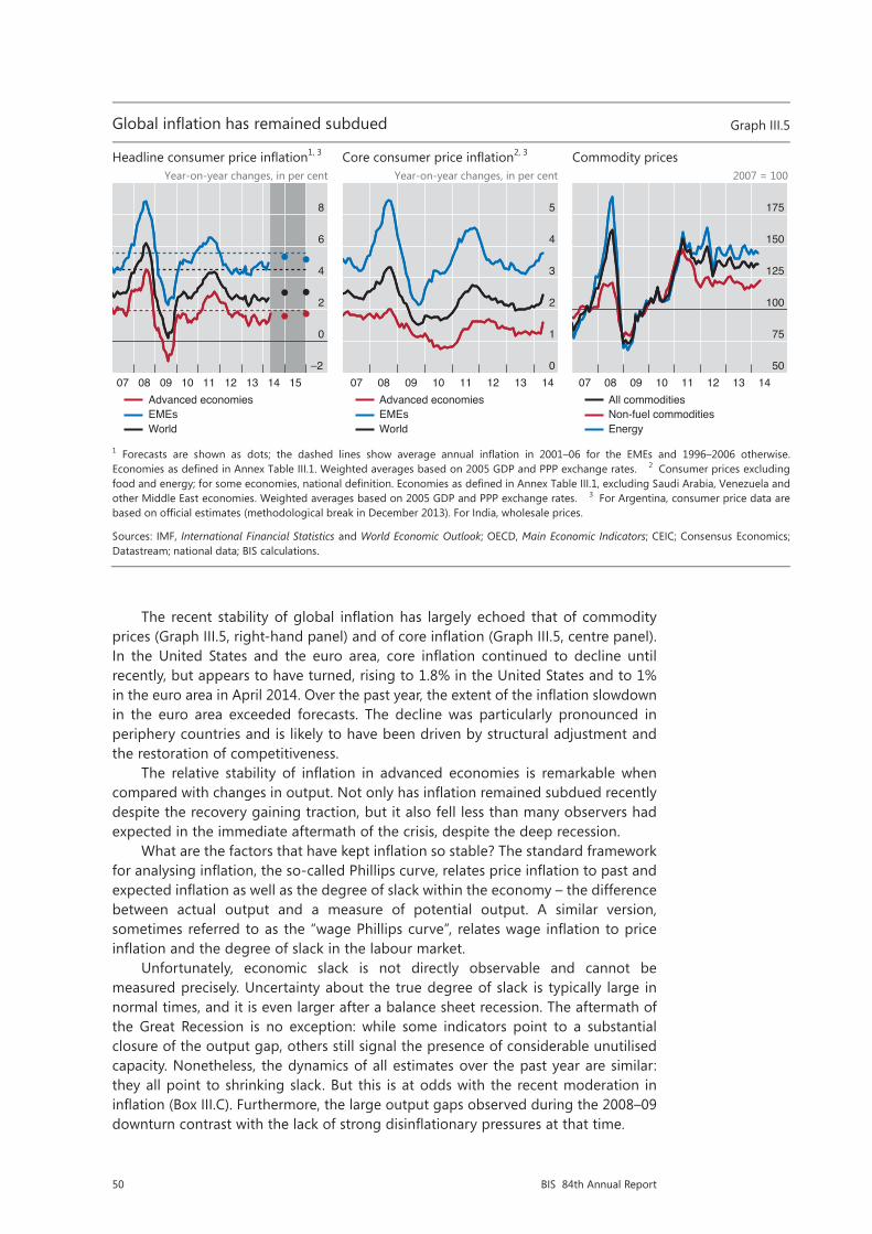
50 BIS 84th Annual Report
The recent stability of global inflation has largely echoed that of commodity prices (Graph III.5, right-hand panel) and of core inflation (Graph III.5, centre panel). In the United States and the euro area, core inflation continued to decline until recently, but appears to have turned, rising to 1.8% in the United States and to 1% in the euro area in April 2014. Over the past year, the extent of the inflation slowdown in the euro area exceeded forecasts. The decline was particularly pronounced in periphery countries and is likely to have been driven by structural adjustment and the restoration of competitiveness.
The relative stability of inflation in advanced economies is remarkable when compared with changes in output. Not only has inflation remained subdued recently despite the recovery gaining traction, but it also fell less than many observers had expected in the immediate aftermath of the crisis, despite the deep recession.
What are the factors that have kept inflation so stable? The standard framework for analysing inflation, the so-called Phillips curve, relates price inflation to past and expected inflation as well as the degree of slack within the economy – the difference between actual output and a measure of potential output. A similar version, sometimes referred to as the “wage Phillips curve”, relates wage inflation to price inflation and the degree of slack in the labour market.
Unfortunately, economic slack is not directly observable and cannot be measured precisely. Uncertainty about the true degree of slack is typically large in normal times, and it is even larger after a balance sheet recession. The aftermath of the Great Recession is no exception: while some indicators point to a substantial closure of the output gap, others still signal the presence of considerable unutilised capacity. Nonetheless, the dynamics of all estimates over the past year are similar: they all point to shrinking slack. But this is at odds with the recent moderation in inflation (Box III.C). Furthermore, the large output gaps observed during the 2008–09 downturn contrast with the lack of strong disinflationary pressures at that time.
Restricted
5/12
Global inflation has remained subdued Graph III.5
Headline consumer price inflation1, 3 Core consumer price inflation2, 3 Commodity prices
Year-on-year changes, in per cent Year-on-year changes, in per cent 2007 = 100
1 Forecasts are shown as dots; the dashed lines show average annual inflation in 2001–06 for the EMEs and 1996–2006 otherwise.Economies as defined in Annex Table III.1. Weighted averages based on 2005 GDP and PPP exchange rates. 2 Consumer prices excluding food and energy; for some economies, national definition. Economies as defined in Annex Table III.1, excluding Saudi Arabia, Venezuela and other Middle East economies. Weighted averages based on 2005 GDP and PPP exchange rates. 3 For Argentina, consumer price data are based on official estimates (methodological break in December 2013). For India, wholesale prices.
Sources: IMF, International Financial Statistics and World Economic Outlook; OECD, Main Economic Indicators; CEIC; Consensus Economics; Datastream; national data; BIS calculations.
–2
0
2
4
6
8
07 08 09 10 11 12 13 14 15Advanced economiesEMEsWorld
0
1
2
3
4
5
07 08 09 10 11 12 13 14Advanced economiesEMEsWorld
50
75
100
125
150
175
07 08 09 10 11 12 13 14All commoditiesNon-fuel commoditiesEnergy

51BIS 84th Annual Report
Restricted
6/12
The price and wage Phillips curves have become flatter in advanced economies1
In per cent Graph III.6
Inflation and output gap Wage inflation and unemployment
1 Annual data; regression lines were estimated in unbalanced panel regressions with cross-section fixed effects, controlling for year-on-year changes in commodity prices. The dots show data for Australia, Canada, France, Germany, Italy, Japan, Spain, Sweden, Switzerland, the United Kingdom and the United States. 2 Estimated with a Hodrick-Prescott filter. 3 Year-on-year changes in the consumer price index. 4 Unemployment rate minus the non-accelerating inflation rate of unemployment. 5 Year-on-year changes in wage rates.
Sources: IMF, World Economic Outlook; OECD, Economic Outlook and Main Economic Indicators; Datastream; national data; BIS calculations.
–10
0
10
20
30
–6 –4 –2 0 2 4 6Output gap2
Hea
dlin
e in
flatio
n3
1971–85 1986–98 1999–2013
–10
0
10
20
30
–6 –4 –2 0 2 4 6Cyclical unemployment4
Wag
e in
flatio
n5
1971–85 1986–98 1999–2013
This suggests that the degree of domestic slack is exerting a small influence on inflation. This is not a new phenomenon: the flattening of the Phillips curve seems to have started in the 1980s, and continued gradually over the subsequent years. As an illustration, the left-hand panel of Graph III.6 plots the rate of inflation against the output gap (as estimated by the Hodrick-Prescott filter) for a set of advanced economies. The regression lines show that the slope of the curve has decreased over different sample periods. The flattening is also evident when wage inflation is plotted against an estimate of the cyclical component of the unemployment rate (Graph III.6, right-hand panel).
Better-anchored inflation expectations?
The main factor behind a flatter Phillips curve is often considered to be greater confidence in central banks’ commitment to keep inflation low and stable. If firms and workers view this commitment as credible, they will look through temporary inflationary surprises, be they positive or negative, and will reset prices and wages less frequently. Thus, firmly anchored long-term inflation expectations will tend to be associated with lower cyclical inflationary pressures. Similarly, stronger credibility is also reflected in a reduced exchange rate pass-through into import and consumer prices: insofar as movements in nominal exchange rates are perceived as temporary and prices are costly to adjust, firms may simply let their margins fluctuate.
Long-term inflation expectations have so far remained well anchored in major economies, contributing to the observed stability of their inflation. Even in Japan, despite many years of mild deflation, long-term inflation expectations have hovered around a positive rate of 1%. Past stability notwithstanding, financial market measures of medium-term inflation expectations in the euro area (such as swap-implied inflation rates) have declined steadily since early 2013, suggesting that market participants expect inflation to remain persistently below the upper end of

52 BIS 84th Annual Report
Box III.CMeasuring potential output and economic slack
Potential output is a key variable for policymakers. It conveys information about the sustainability of output and the degree of economic slack. Unfortunately, potential output is not observable, not even ex post. In the past, policymakers relied on the fact that an overheating economy would normally show up in rising inflation, as demand puts increasing pressure on limited resources. Over the last few decades, however, the link between the output gap and inflation has become ever more tenuous. As a result, with inflation not increasing as much as in previous expansionary episodes, policymakers were tempted to believe that rising output could be sustained indefinitely. In fact, the signs of an unsustainable expansion took the form of unsustainable increases in credit and asset prices. This box reviews the traditional methods used for estimating potential output and compares them with a new method that explicitly takes into account financial variables.
Traditional methods range from the purely statistical to those that are explicitly based on economic theory. At one end of the spectrum, univariate statistical methods, and especially the Hodrick-Prescott (HP) filter, are among the most popular. These techniques decompose the output series into a cyclical component and a trend, which is interpreted as potential output. Such methods are appealing in their simplicity and transparency but, being completely data-driven, they suffer from the so-called endpoint problem: estimates of potential output usually change substantially when new observations become available, even in the absence of any data revisions. The problem is most severe around business cycle turning points, precisely when accurate estimates are most needed.
Other methods combine statistics with economic theory. A popular choice is to use models of the production function, whereby an estimate of potential output is obtained as a function of the inputs of capital and labour. Structural approaches are appealing in that movements in potential output can be attributed to economic factors. Yet they are also prone to errors, reflecting misspecification of the underlying model, as well as uncertainties in its parameter estimates and in the measurement of the variables. Furthermore, these methods, too, can entail substantial endpoint problems, since they rely heavily on pure statistical filters to smooth out cyclical fluctuations in factor inputs. Orphanides and Van Norden (2005) find that real-time estimates of output gaps have low explanatory power for inflation developments compared with estimates based on ex post data, and that revisions could be as large as the output gap itself.
Recently, Borio et al (2013) introduced a Kalman filter method for estimating the output gap which incorporates information about credit and property prices (Chapter IV). Their approach accounts for the fact that credit expansion and buoyant asset prices might push output to unsustainably high levels, but are not always accompanied by rising consumer price inflation. One reason is that financial booms often coincide with temporary expansion of supply capacity, which tends to dampen price pressures. Thus, including financial variables leads to
Restricted
12/12
Full sample and real-time estimates for the US output gap
In percentage points of potential output Graph III.C
HP OECD Finance-neutral
Sources: C Borio, P Disyatat and M Juselius, “Rethinking potential output: embedding information about the financial cycle”, BIS Working Papers, no 404, February 2013; OECD, Economic Outlook.
–6
–4
–2
0
2
01 03 05 07 09 11 13Real-time with revisions
–6
–4
–2
0
2
01 03 05 07 09 11 13–6
–4
–2
0
2
01 03 05 07 09 11 13Ex post
53BIS 84th Annual Report
the ECB’s “below but close to 2%” definition of price stability (see Chapter V for a discussion of the monetary policy implications of low inflation).
A bigger role for global factors?
Along with greater central bank credibility, an additional factor that can explain why inflation has become ever less tied to domestic developments is the much greater interconnectedness of the world economy. The last three decades have seen the entry and growing integration into the global economy of China and India (which together make up almost 40% of world population), former communist countries and many other EMEs. Advances in communication technology and logistics have facilitated the creation of extensive global production chains. Many international firms, in particular, have relocated part of their production processes to EMEs with an ample supply of labour. And further scope for relocation remains.
Larger trade flows, and above all the greater contestability of both product and factor input markets, have made domestic inflation developments more dependent on international market conditions. More specifically, such conditions cannot be fully captured by import price inflation – adding this variable to a standard Phillips curve does not suffice. Not least, measures of global economic slack also matter.2 A reduction in trade barriers and transport costs has made tradable goods produced in one country more substitutable with those produced elsewhere. In addition,
2 See C Borio and A Filardo, “Globalisation and inflation: new cross-country evidence on the global determinants of domestic inflation”, BIS Working Papers, no 227, May 2007, for more details.
estimates of the trend component which are less affected by unsustainable financial booms. The corresponding “finance-neutral” output gap indicates how far output is from its sustainable level.
Differences among different methods are illustrated in Graph III.C: the left-hand panel shows the output gap for the United States estimated using the popular HP filter; the centre panel shows the same variable estimated using the OECD production function approach; and the right-hand panel shows the “finance-neutral” estimate. The first two measures failed to indicate in real time that the economy had been overheating in the run-up to the Great Recession: the estimates of the output gap obtained with the same methods after having observed the recession are significantly different. In contrast, both the real-time and ex post estimates of the output gap obtained with the “finance-neutral” filter are much more aligned. And, more importantly, the real-time estimate was clearly signalling that output was above sustainable levels well before the onset of the recession.
The uncertainty surrounding output gap estimates is likely to be much higher after a balance sheet recession than a standard business cycle recession. Output losses are typically permanent, although there is uncertainty about how large they could be (Box III.B). In this respect, estimates of the output gap based on different methods paint a very different picture. The measure obtained with the HP filter suggests that the output gap in the United States has been closed. By contrast, the measure based on the OECD production function continues to indicate ample economic slack, at over 3% of potential output in 2013. The finance-neutral gap indicates a similar amount of slack, but with a vigorous pickup over the most recent quarters, as credit growth resumed. It must be noted, however, that the finance-neutral output gap too is likely to overestimate the true amount of slack in the aftermath of a balance sheet recession to the extent that it adjusts only slowly to the permanent losses in output.
A Orphanides and S Van Norden, “The reliability of inflation forecasts based on output gap estimates in real time”, Journal of Money, Credit and Banking, vol 37, June 2005. C Borio, P Disyatat and M Juselius, “Rethinking potential output: embedding information about the financial cycle”, BIS Working Papers, no 404, February 2013. See also D Arseneau and M Kiley, “The role of financial imbalances in assessing the state of the economy”, FEDS Notes, April 2014. Even if augmented with financial variables, the “finance-neutral” filter does not capture the large non-linear effects of financial busts on the level of potential output, except only gradually over time. For example, real-time estimates of the Swedish output gap in the years following the financial bust of the early 1990s were considerably lower than ex post estimates.

54 BIS 84th Annual Report
technological advances have increased the range of tradable goods and services. Hence prices of domestically produced tradables cannot diverge too much from those of similar goods produced abroad. This means that changes in the price of these goods should be more dependent on the degree of tightness or slack in the use of resources globally, not just locally. Likewise, domestic wages cannot differ too much from those prevailing in other countries producing similar goods for international markets lest production be relocated abroad.3
Consistent with the importance of global factors, individual countries’ inflation rates have been highly synchronous with each other: a common factor accounts for over half of the total variability of inflation in a panel of advanced economies (Graph III.7, left-hand panel).4
Swings in commodity prices are important drivers of global inflation. And these are in turn increasingly related to global demand conditions, rather than idiosyncratic supply developments. Strong growth and improvements in living standards in EMEs have pushed up not only the prices of industrial commodities, but also those of
3 Greater migration flows seem to have had only a modest mitigating impact on wage demands in destination countries. See eg G Ottaviano and G Peri, “Rethinking the effect of immigration on wages”, Journal of the European Economic Association, February 2012, and S Lemos and J Portes, “New Labour? The effects of migration from central and eastern Europe on unemployment and wages in the U.K.”, The B.E. Journal of Economic Analysis and Policy, January 2014, for evidence on the United States and the United Kingdom, respectively.
4 Globalisation might have also contributed to reducing the measured degree of exchange rate pass-through to domestic prices. Large manufacturing firms can distribute production over a larger number of countries and rapidly switch suppliers, thereby minimising the impact on their final product of currency movements in a single country. For a review of the literature, see eg J Bailliu, W Dong and J Murray, “Has exchange rate pass-through really declined? Some recent insights from the literature”, Bank of Canada Review, Autumn 2010.
Restricted
7/12
Inflation is a global phenomenon Graph III.7
Principal component analysis of inflation1 China: export prices, wages, ULC and labour productivity2
Per cent 2005 = 100
1 In a country panel comprising Australia, Canada, France, Germany, Italy, Japan, Spain, Sweden, Switzerland, the United Kingdom and the United States. 2 Export prices and wages in US dollar terms; ULC = nominal unit labour costs; labour productivity = output per person employed. 3 Due to data availability, the manufacturing sector is proxied by the industry sector for ULC and labour productivity. The share of manufacturing in the industry sector is about 80%; the other components are mining and electricity, gas and water production.
Sources: CEIC; Datastream; national data; BIS calculations.
0
15
30
45
60
% of variance explained bythe first principal component for headline inflation
% of variance of the first principalcomponent explained by Chinese non-commodity export price inflation
1971–85 1986–98 1999–2013 1986–98 1999–2013
0
100
200
300
400
00 01 02 03 04 05 06 07 08 09 10 11 12 13Wages in manufacturingNon-commodity export prices
ULC of industry sector3
Labour productivity ofindustry sector3

55BIS 84th Annual Report
food. In turn, higher commodity prices have fed into other countries’ inflation rates, regardless of their relative cyclical position.
However, despite the upward pressure on commodity prices from demand in EMEs, the overall impact of globalisation on advanced economies has been largely disinflationary so far. The rapid industrialisation of large EMEs with a huge supply of cheap labour has boosted productive capacity, holding down merchandise goods prices. China’s role, in particular, has increased substantially over the past decade and a half (Graph III.7, left-hand panel): the share of the variation in advanced economies’ inflation explained by Chinese export price inflation doubled to over 30% in the period 1999–2013 compared with 1986–98. At the same time, the prices of Chinese export goods remained remarkably subdued, even against the background of rising compensation and unit labour costs: they are now still relatively close to the 2005 level (Graph III.7, right-hand panel).
To further illustrate the growing role of global factors in driving inflation, one can augment standard specifications of the Phillips curve with a measure of the global output gap. The left-hand panel of Graph III.8 reports estimates of the slope of the price Phillips curve with respect to the domestic and global output gap, obtained over different samples from a panel of advanced economies. The coefficient on the domestic output gap declines and becomes statistically insignificant from the end of the 1990s onwards, while the coefficient on the global output gap gains relevance. The results are very similar for a similarly augmented wage Phillips curve.
Looking ahead, it is unclear to what extent the greater role of global factors will continue to affect domestic inflation. The strength of disinflationary tailwinds crucially depends on differences in the levels of wages and unit labour costs across countries. These differences have been narrowing. In China, for example, wages in
Restricted
8/12
Domestic inflation is influenced by global slack Graph III.8
Price Phillips curve1 Wage Phillips curve1
1 Obtained from unbalanced panel regressions (11 major advanced economies) with cross-section fixed effects (Newey-West standard errors and covariance) based on the specifications in Borio and Filardo (2007) and Galí (2011), respectively. The bars show the coefficients of the following equations: π���� − π����� = c� + ��y������ + ��y���� + γπ������ + δρ����� (left-hand panel), where π���� is headline inflation, π����� is the Hodrick-Prescott trend of core inflation, y������ is the lagged domestic output gap, y���� is the lagged global output gap, π������ is lagged import price inflation, and ρ����� is lagged year-on-year changes in nominal unit labour costs; and ω��� = c� − ���μ��� + ���∆μ��� + ��y�� +γπ������ (right-hand panel), where ω��� is wage inflation, μ��� is the unemployment gap, ∆μ��� is the change in the unemployment gap, y�� is the global output gap, and π������ is lagged headline inflation. Unemployment gap, domestic and global output gaps are estimated with a Hodrick-Prescott filter.
Sources: C Borio and A Filardo, “Globalisation and inflation: new cross-country evidence on the global determinants of domestic inflation”, BIS Working Papers, no 227, May 2007; J Galí, “The return of the wage Phillips curve”, Journal of the European Economic Association, no 9, June 2011; IMF, International Financial Statistics; OECD, Economic Outlook and Main Economic Indicators; Datastream; JPMorgan Chase; national data; BIS calculations.
–0.1
0.0
0.1
0.2
0.3
Domestic output gap Global output gap1971–85 1986–98 1999–2013 1971–85 1986–98 1999–2013
Significant at the 5% level
–0.1
0.0
0.1
0.2
0.3
Domestic unemployment gap Global output gap
1.1972
1971–85 1986–98 1999–2013 1971–85 1986–98 1999–2013
// // //
Insignificant at the 5% level
56 BIS 84th Annual Report
the manufacturing sector have increased steadily while labour productivity growth appears to have slowed somewhat in recent years. If not met by similar gains in productivity, wage rises will eventually put upward pressure on export prices. Disinflationary tailwinds, however, do not appear to have run their full course yet. And there is still scope for further integration into the global economy of low-income countries with an ample supply of cheap labour.
Investment and productivity: a long-term perspective
Since 2009, investment and labour productivity growth have lagged behind previous recoveries. Total gross fixed investment in advanced economies is generally lower than before the crisis (Graph III.9, left-hand panel). The largest investment shortfall has occurred in countries that experienced the strongest real estate booms: 14 percentage points in Ireland, 9 in Spain, 4 in the United States and 3 in the United Kingdom. Construction accounts for most of the drop. But spending on equipment is also below the pre-crisis average in many countries, reflecting weakness of demand and the slow recovery typical of balance sheet recessions.
It is unrealistic to expect investment, as a share of GDP, to return to its pre-crisis level in advanced economies. The drop in construction spending is a necessary correction of previous overinvestment and is unlikely to be entirely reversed. Moreover, the investment share had been on a downward trend long before the crisis, suggesting that, as output growth recovers, investment may settle below the pre-crisis average.
This downward trend in advanced economies reflects a number of factors. One is the decline in trend growth over the past few decades. Since the capital-to-output ratio has generally remained stable or risen slightly in most countries, a smaller share of GDP needs to be invested to keep the ratio constant over time. A second factor is a shift in the composition of output from capital-intensive manufacturing sectors towards less capital-intensive service sectors. Third, to the extent that the decline in output growth is driven by exogenous factors, such as adverse demographics, a slower pace of technological innovation or shifting long-run patterns in consumer demand, the associated fall in the investment-to-GDP ratio would be a natural consequence of this slowdown, rather than a driving force.
Moreover, the investment weakness may be overstated. Over the past few decades, the relative prices of investment goods have been trending down: firms have been able to keep their capital stocks constant by spending less in nominal terms. In fact, in real terms, investment spending has fluctuated around a mildly increasing, not decreasing, trend in advanced economies. In addition, official statistics may underestimate intangible investment (spending on research and development, training, etc), which has been gaining importance in serviced-based economies.
Finally, and most importantly, at the global level investment is not weak. The secular drop in the investment-to-GDP share in advanced economies has been offset by a trend increase in EMEs (Graph III.9, centre panel). Part of it reflects strong investment in China, which at close to 45% of GDP looks unsustainably high (Graph III.9, right-hand panel). But even excluding China, EME investment has trended up, albeit at a more moderate pace, in particular in emerging Asia.
This broad picture, however, does not mean that investment could not or should not be higher. Ageing infrastructure is a potential drag on growth in the United States, the United Kingdom and other advanced economies. In parts of the euro area, product market and other rigidities hold back business investment. And supply bottlenecks are having similar effects in several EMEs, including South Africa, Brazil and various other Latin American countries.
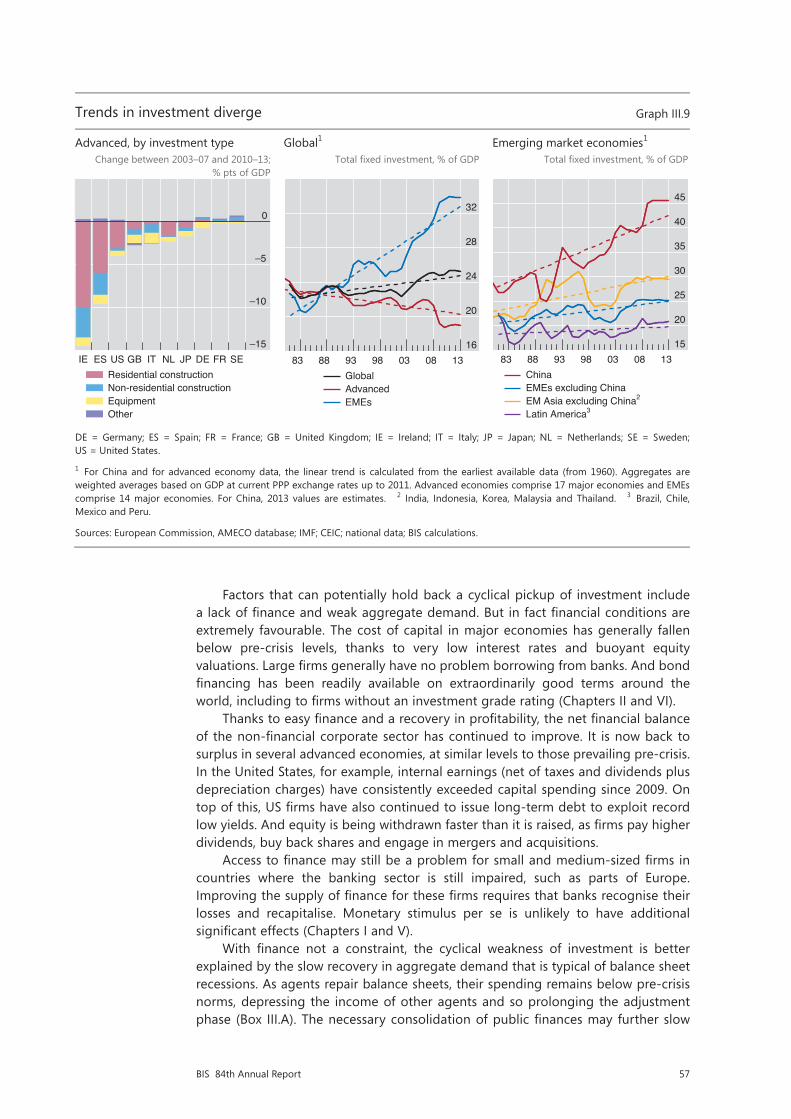
57BIS 84th Annual Report
Factors that can potentially hold back a cyclical pickup of investment include a lack of finance and weak aggregate demand. But in fact financial conditions are extremely favourable. The cost of capital in major economies has generally fallen below pre-crisis levels, thanks to very low interest rates and buoyant equity valuations. Large firms generally have no problem borrowing from banks. And bond financing has been readily available on extraordinarily good terms around the world, including to firms without an investment grade rating (Chapters II and VI).
Thanks to easy finance and a recovery in profitability, the net financial balance of the non-financial corporate sector has continued to improve. It is now back to surplus in several advanced economies, at similar levels to those prevailing pre-crisis. In the United States, for example, internal earnings (net of taxes and dividends plus depreciation charges) have consistently exceeded capital spending since 2009. On top of this, US firms have also continued to issue long-term debt to exploit record low yields. And equity is being withdrawn faster than it is raised, as firms pay higher dividends, buy back shares and engage in mergers and acquisitions.
Access to finance may still be a problem for small and medium-sized firms in countries where the banking sector is still impaired, such as parts of Europe. Improving the supply of finance for these firms requires that banks recognise their losses and recapitalise. Monetary stimulus per se is unlikely to have additional significant effects (Chapters I and V).
With finance not a constraint, the cyclical weakness of investment is better explained by the slow recovery in aggregate demand that is typical of balance sheet recessions. As agents repair balance sheets, their spending remains below pre-crisis norms, depressing the income of other agents and so prolonging the adjustment phase (Box III.A). The necessary consolidation of public finances may further slow
Restricted
9/12
Trends in investment diverge Graph III.9
Advanced, by investment type Global1 Emerging market economies1 Change between 2003–07 and 2010–13;
% pts of GDP Total fixed investment, % of GDP Total fixed investment, % of GDP
DE = Germany; ES = Spain; FR = France; GB = United Kingdom; IE = Ireland; IT = Italy; JP = Japan; NL = Netherlands; SE = Sweden; US = United States.
1 For China and for advanced economy data, the linear trend is calculated from the earliest available data (from 1960). Aggregates are weighted averages based on GDP at current PPP exchange rates up to 2011. Advanced economies comprise 17 major economies and EMEs comprise 14 major economies. For China, 2013 values are estimates. 2 India, Indonesia, Korea, Malaysia and Thailand. 3 Brazil, Chile, Mexico and Peru.
Sources: European Commission, AMECO database; IMF; CEIC; national data; BIS calculations.
–15
–10
–5
0
IE ES US GB IT NL JP DE FR SEResidential constructionNon-residential constructionEquipmentOther
16
20
24
28
32
83 88 93 98 03 08 13GlobalAdvancedEMEs
15
20
25
30
35
40
45
83 88 93 98 03 08 13ChinaEMEs excluding ChinaEM Asia excluding China2
Latin America3
58 BIS 84th Annual Report
growth in the short term. As the recovery proceeds, investment should pick up. Indeed, investment growth has already risen in recent quarters, albeit modestly, in a number of countries, including Germany, the United States and the United Kingdom.
The current weakness of aggregate demand may suggest the need for further monetary stimulus or for easing the pace of fiscal consolidation. However, these policies are likely to be either ineffective in current circumstances (Chapter V) or unsustainable: taking a long-term perspective, they may simply succeed in bringing forward spending from the future rather than increasing its overall amount over the long run, while leading to a further rise in public and private debt. Instead, the only way to boost demand in a sustainable manner is to raise the production capacity of the economy by removing barriers to productive investment and the reallocation of resources. This is even more important in the face of declining productivity growth.
Declining productivity growth trends
Since 2010, labour productivity growth has been below pre-crisis averages in most advanced economies and has so far risen much more slowly than in previous business cycle recoveries. For instance, it has averaged about 1% in both the United States and Germany, compared with 2.3% and 1.8%, respectively, over the pre-crisis decade; and it has been close to zero in the United Kingdom, against a pre-crisis average of 2½%. Spain is an exception: there it has risen above pre-crisis averages following the large decline in employment.
Part of the weakness of productivity growth since the start of the recovery reflects (as noted earlier) the slow recovery typical of a balance sheet recession. But it also reflects, to some degree, the continuation of a downward trend which began well before the onset of the financial crisis (Graph III.10, left-hand panel). Such a trend is also evident in estimates of total factor productivity (TFP), which measures the efficiency with which both capital and labour are employed in production (Graph III.10, centre panel). In the United States and the United Kingdom, both measures indicate that productivity growth underwent a revival from the mid-1980s till the early 2000s, but has since subsided. TFP growth in the euro area, by contrast, has been falling steadily since the early 1970s and is currently negative. TFP growth in Japan has also clearly lagged behind that of the United States: it first fell sharply and then turned negative during the financial bust of the early 1990s, recovering somewhat only in the early 2000s.
The productivity growth slowdown, which may have been partly obscured by the pre-crisis financial boom, is likely to reflect deeper factors. The first is the pace of technological innovation, which is, however, difficult to predict. One pessimistic view is that the information technology revolution led only to a temporary one-off revival of productivity, which ran its course before the start of the crisis.5 The second is patterns of demand: the shift towards low-productivity growth sectors, such as services (health care, education, leisure, etc) tends to reduce aggregate productivity growth.6 The third is the worsening of various structural impediments to the efficient
5 For a pessimistic view, see eg R Gordon, “U.S. productivity growth: the slowdown has returned after a temporary revival”, International Productivity Monitor, 2013. For an optimistic view, see M Baily, J Manyika and S Gupta, “U.S. productivity growth: an optimistic perspective”, International Productivity Monitor, 2013.
6 See eg C Echevarría, “Changes in sectoral composition associated with economic growth”, International Economic Review, vol 38, 1997; and M Duarte and D Restuccia, “The role of structural transformation in aggregate productivity”, Quarterly Journal of Economics, vol 125, 2010.
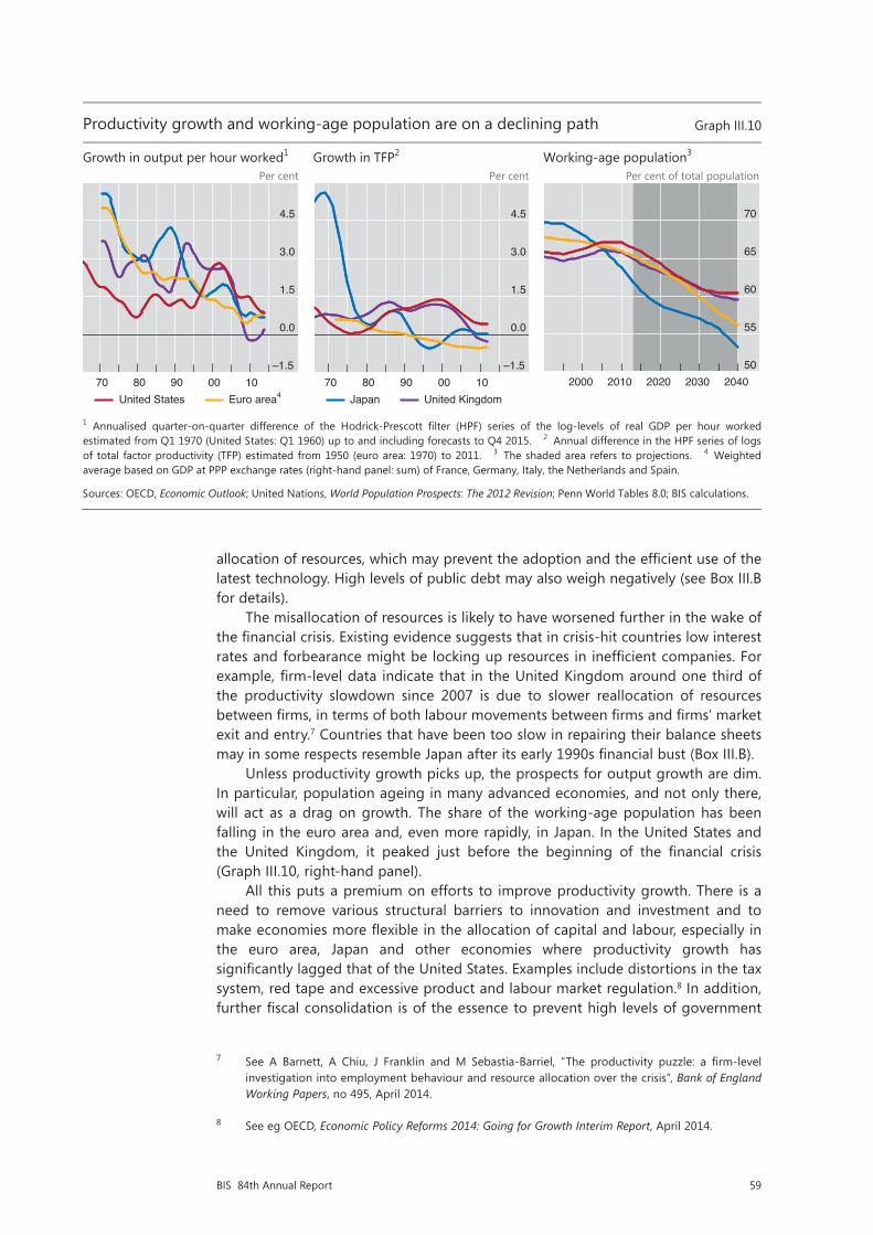
59BIS 84th Annual Report
allocation of resources, which may prevent the adoption and the efficient use of the latest technology. High levels of public debt may also weigh negatively (see Box III.B for details).
The misallocation of resources is likely to have worsened further in the wake of the financial crisis. Existing evidence suggests that in crisis-hit countries low interest rates and forbearance might be locking up resources in inefficient companies. For example, firm-level data indicate that in the United Kingdom around one third of the productivity slowdown since 2007 is due to slower reallocation of resources between firms, in terms of both labour movements between firms and firms’ market exit and entry.7 Countries that have been too slow in repairing their balance sheets may in some respects resemble Japan after its early 1990s financial bust (Box III.B).
Unless productivity growth picks up, the prospects for output growth are dim. In particular, population ageing in many advanced economies, and not only there, will act as a drag on growth. The share of the working-age population has been falling in the euro area and, even more rapidly, in Japan. In the United States and the United Kingdom, it peaked just before the beginning of the financial crisis (Graph III.10, right-hand panel).
All this puts a premium on efforts to improve productivity growth. There is a need to remove various structural barriers to innovation and investment and to make economies more flexible in the allocation of capital and labour, especially in the euro area, Japan and other economies where productivity growth has significantly lagged that of the United States. Examples include distortions in the tax system, red tape and excessive product and labour market regulation.8 In addition, further fiscal consolidation is of the essence to prevent high levels of government
7 See A Barnett, A Chiu, J Franklin and M Sebastia-Barriel, “The productivity puzzle: a firm-level investigation into employment behaviour and resource allocation over the crisis”, Bank of England Working Papers, no 495, April 2014.
8 See eg OECD, Economic Policy Reforms 2014: Going for Growth Interim Report, April 2014.
Restricted
10/12
Productivity growth and working-age population are on a declining path Graph III.10
Growth in output per hour worked1 Growth in TFP2 Working-age population3 Per cent Per cent Per cent of total population
1 Annualised quarter-on-quarter difference of the Hodrick-Prescott filter (HPF) series of the log-levels of real GDP per hour worked estimated from Q1 1970 (United States: Q1 1960) up to and including forecasts to Q4 2015. 2 Annual difference in the HPF series of logs of total factor productivity (TFP) estimated from 1950 (euro area: 1970) to 2011. 3 The shaded area refers to projections. 4 Weightedaverage based on GDP at PPP exchange rates (right-hand panel: sum) of France, Germany, Italy, the Netherlands and Spain.
Sources: OECD, Economic Outlook; United Nations, World Population Prospects: The 2012 Revision; Penn World Tables 8.0; BIS calculations.
–1.5
0.0
1.5
3.0
4.5
70 80 90 00 10United States Euro area4
–1.5
0.0
1.5
3.0
4.5
70 80 90 00 10Japan United Kingdom
50
55
60
65
70
2000 2010 2020 2030 2040
60 BIS 84th Annual Report
debt from becoming a persistent drag on trend growth. In this regard, despite some progress, most advanced economies have yet to set their public finances on a sustainable long-term trajectory (Graph III.4 and Annex Table III.3).9
Several EMEs have until recently displayed stable or even rising productivity growth. But productivity growth may have turned in some countries. The recent financial booms may partly obscure the fact that improvements in efficiency may become harder to achieve. As an economy reaches middle income levels, the size of the manufacturing sector peaks and demand for services becomes more important. This makes it harder to close the productivity gap with the most advanced economies: quite apart from slower productivity growth in the service sector, institutional and structural weaknesses tend to be a stronger drag on the service sector than on manufacturing. Increasing demographic headwinds are also expected to weigh on growth in a number of EMEs.
These considerations suggest that sustainable long-term growth requires structural measures that directly tackle the sources of low productivity rather than policies aimed at stimulating aggregate demand. Relaxing supply constraints may also have positive spillovers on current demand, as agents could spend more in anticipation of higher future income. By contrast, debt-financed stimulus may be less effective than hoped and raise long-term sustainability issues (Chapter V).
9 Fiscal adjustment needs are particularly large in Japan, the United States, the United Kingdom, France and Spain. Most of the required adjustment in the United States and the United Kingdom is due to age-related spending, which is expected to rise rapidly by the end of the current decade in the absence of reforms. For a more detailed analysis, see BIS, 83rd Annual Report, June 2013, Chapter IV.
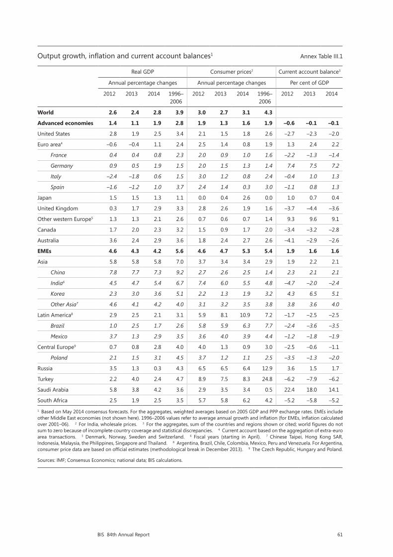
61BIS 84th Annual Report
Output growth, inflation and current account balances1 Annex Table III.1
Real GDP Consumer prices2 Current account balance3
Annual percentage changes Annual percentage changes Per cent of GDP
2012 2013 2014 1996–2006
2012 2013 2014 1996–2006
2012 2013 2014
World 2.6 2.4 2.8 3.9 3.0 2.7 3.1 4.3
Advanced economies 1.4 1.1 1.9 2.8 1.9 1.3 1.6 1.9 –0.6 –0.1 –0.1
United States 2.8 1.9 2.5 3.4 2.1 1.5 1.8 2.6 –2.7 –2.3 –2.0
Euro area4 –0.6 –0.4 1.1 2.4 2.5 1.4 0.8 1.9 1.3 2.4 2.2
France 0.4 0.4 0.8 2.3 2.0 0.9 1.0 1.6 –2.2 –1.3 –1.4
Germany 0.9 0.5 1.9 1.5 2.0 1.5 1.3 1.4 7.4 7.5 7.2
Italy –2.4 –1.8 0.6 1.5 3.0 1.2 0.8 2.4 –0.4 1.0 1.3
Spain –1.6 –1.2 1.0 3.7 2.4 1.4 0.3 3.0 –1.1 0.8 1.3
Japan 1.5 1.5 1.3 1.1 0.0 0.4 2.6 0.0 1.0 0.7 0.4
United Kingdom 0.3 1.7 2.9 3.3 2.8 2.6 1.9 1.6 –3.7 –4.4 –3.6
Other western Europe5 1.3 1.3 2.1 2.6 0.7 0.6 0.7 1.4 9.3 9.6 9.1
Canada 1.7 2.0 2.3 3.2 1.5 0.9 1.7 2.0 –3.4 –3.2 –2.8
Australia 3.6 2.4 2.9 3.6 1.8 2.4 2.7 2.6 –4.1 –2.9 –2.6
EMEs 4.6 4.3 4.2 5.6 4.6 4.7 5.3 5.4 1.9 1.6 1.6
Asia 5.8 5.8 5.8 7.0 3.7 3.4 3.4 2.9 1.9 2.2 2.1
China 7.8 7.7 7.3 9.2 2.7 2.6 2.5 1.4 2.3 2.1 2.1
India6 4.5 4.7 5.4 6.7 7.4 6.0 5.5 4.8 –4.7 –2.0 –2.4
Korea 2.3 3.0 3.6 5.1 2.2 1.3 1.9 3.2 4.3 6.5 5.1
Other Asia7 4.6 4.1 4.2 4.0 3.1 3.2 3.5 3.8 3.8 3.6 4.0
Latin America8 2.9 2.5 2.1 3.1 5.9 8.1 10.9 7.2 –1.7 –2.5 –2.5
Brazil 1.0 2.5 1.7 2.6 5.8 5.9 6.3 7.7 –2.4 –3.6 –3.5
Mexico 3.7 1.3 2.9 3.5 3.6 4.0 3.9 4.4 –1.2 –1.8 –1.9
Central Europe9 0.7 0.8 2.8 4.0 4.0 1.3 0.9 3.0 –2.5 –0.6 –1.1
Poland 2.1 1.5 3.1 4.5 3.7 1.2 1.1 2.5 –3.5 –1.3 –2.0
Russia 3.5 1.3 0.3 4.3 6.5 6.5 6.4 12.9 3.6 1.5 1.7
Turkey 2.2 4.0 2.4 4.7 8.9 7.5 8.3 24.8 –6.2 –7.9 –6.2
Saudi Arabia 5.8 3.8 4.2 3.6 2.9 3.5 3.4 0.5 22.4 18.0 14.1
South Africa 2.5 1.9 2.5 3.5 5.7 5.8 6.2 4.2 –5.2 –5.8 –5.2
1 Based on May 2014 consensus forecasts. For the aggregates, weighted averages based on 2005 GDP and PPP exchange rates. EMEs include other Middle East economies (not shown here). 1996–2006 values refer to average annual growth and inflation (for EMEs, inflation calculated over 2001–06). 2 For India, wholesale prices. 3 For the aggregates, sum of the countries and regions shown or cited; world figures do not sum to zero because of incomplete country coverage and statistical discrepancies. 4 Current account based on the aggregation of extra-euro area transactions. 5 Denmark, Norway, Sweden and Switzerland. 6 Fiscal years (starting in April). 7 Chinese Taipei, Hong Kong SAR, Indonesia, Malaysia, the Philippines, Singapore and Thailand. 8 Argentina, Brazil, Chile, Colombia, Mexico, Peru and Venezuela. For Argentina, consumer price data are based on official estimates (methodological break in December 2013). 9 The Czech Republic, Hungary and Poland.
Sources: IMF; Consensus Economics; national data; BIS calculations.

62 BIS 84th Annual Report
Recovery of output, employment and productivity from the recent crisis
In per cent Annex Table III.2
Q1 20141 vs pre-crisis peak (trough for unemployment rate)
Q1 20141 vs pre-crisis trend
Peak-to-trough fall2
Memo: Average annual output
growth
Real GDP
Employ- ment
Output per
worker
Unemp rate
(%pts)
Real GDP
Output per
worker
Real GDP
Employ- ment
Pre- crisis3
Post- crisis4
United States 5.9 –0.8 6.6 2.8 –12.6 –6.8 –4.4 –5.9 3.4 2.2
Japan 1.2 –3.7 2.6 0.4 –2.3 –3.0 –9.7 –4.6 1.1 1.8
United Kingdom –0.6 2.5 –3.8 2.3 –18.6 –15.3 –7.5 –2.5 3.3 1.3
Euro area
Germany 3.8 4.0 –0.6 –2.2 –2.5 –5.1 –7.0 –0.5 1.5 2.1
France 1.1 –1.0 2.1 3.0 –12.1 –4.3 –4.1 –1.7 2.3 1.1
Italy –9.4 –5.2 –5.7 6.8 –17.7 –4.6 –9.4 –5.2 1.5 –0.5
Netherlands –4.5 –2.5 –2.4 5.0 –17.4 –8.4 –5.1 –2.5 2.7 0.1
Spain –7.1 –17.8 10.6 17.9 –29.0 12.1 –7.7 –18.3 3.7 –0.7
Austria 0.5 4.2 –4.2 1.7 –11.4 –12.0 –6.5 –1.1 2.5 1.4
Belgium 1.2 1.8 –1.0 2.1 –10.7 –7.6 –4.4 –0.7 2.2 1.0
Greece –28.3 –20.4 –6.9 20.6 –50.5 –18.8 –28.3 –20.4 3.6 –5.6
Ireland –10.1 –11.4 1.3 7.9 –47.6 –12.5 –12.2 –15.1 7.1 0.2
Portugal –7.5 –11.6 4.3 11.5 –20.0 –1.7 –8.8 –13.4 2.4 –0.9
Poland 15.0 1.4 12.7 3.1 –3.9 –15.2 –1.3 –1.4 4.5 3.0
Korea 16.8 7.6 9.3 1.1 –11.0 –10.9 –3.4 –0.8 5.1 3.8
1 Q4 2013 for real GDP and output per worker for Ireland; Q4 2013 for unemployment rate for Greece. 2 Trough calculated over 2008 to latest available data. 3 1996–2006. 4 2010 to latest available data.
Sources: OECD, Economic Outlook; Datastream; BIS calculations.

63BIS 84th Annual Report
Fiscal positions1 Annex Table III.3
Overall balance2 Underlying government primary balance3
Gross debt2
2009 2014 Change 2009 2014 Change 2007 2014 Change
Advanced economies
Austria –4.1 –2.8 1.3 –1.4 1.7 3.2 63 90 26.6
Belgium –5.6 –2.1 3.5 –0.9 1.4 2.3 88 107 19.0
Canada –4.5 –2.1 2.4 –2.6 –1.6 1.0 70 94 23.8
France –7.5 –3.8 3.7 –4.6 0.1 4.7 73 115 42.1
Germany –3.1 –0.2 2.9 0.9 0.8 –0.1 66 84 18.3
Greece –15.6 –2.5 13.2 –10.2 7.5 17.7 119 189 69.4
Ireland –13.7 –4.7 9.0 –7.7 1.8 9.5 29 133 104.0
Italy –5.4 –2.7 2.7 0.4 4.7 4.3 117 147 30.6
Japan –8.8 –8.4 0.5 –7.0 –7.1 –0.1 162 230 67.2
Netherlands –5.6 –2.7 2.9 –3.6 1.2 4.8 51 88 36.1
Portugal –10.2 –4.0 6.2 –4.9 3.5 8.4 76 141 65.7
Spain –11.1 –5.5 5.6 –9.4 –0.7 8.6 43 108 66.0
Sweden –1.0 –1.5 –0.6 1.8 –0.6 –2.4 48 49 0.4
United Kingdom –11.2 –5.3 5.9 –7.5 –2.6 4.9 47 102 54.7
United States –12.8 –5.8 7.0 –7.5 –2.4 5.1 64 106 42.4
Emerging market economies
Brazil –3.3 –3.3 –0.1 2.7 2.0 –0.7 65 67 1.5
China –3.1 –2.0 1.1 –2.2 –0.5 1.7 20 20 0.6
India –9.8 –7.2 2.5 –5.0 –2.4 2.6 74 65 –8.7
Indonesia –1.8 –2.5 –0.8 0.0 –1.2 –1.2 35 26 –9.0
Korea –1.0 0.1 1.1 –0.7 0.7 1.4 27 38 11.0
Malaysia –6.7 –3.5 3.3 –4.3 –1.7 2.7 41 56 15.1
Mexico –5.1 –4.1 1.0 –1.9 –1.4 0.5 38 48 10.6
South Africa –4.9 –4.4 0.5 –0.9 –0.8 0.0 28 47 19.0
Thailand –3.2 –1.6 1.6 –1.4 0.2 1.6 38 47 8.2
1 For the general government. 2 As a percentage of GDP. OECD estimates for advanced economies and Korea, otherwise IMF. 3 As a percentage of potential GDP; excluding net interest payments. OECD estimates for advanced economies and Korea, otherwise IMF. OECD estimates are adjusted for the cycle and for one-off transactions, and IMF estimates are adjusted for the cycle.
Sources: IMF; OECD.


65BIS 84th Annual Report
IV. Debt and the financial cycle: domestic and global
A pure business cycle view is not enough to understand the evolution of the global economy since the financial crisis of 2007–09 (Chapters I and III). This view cannot fully account for the interaction between debt, asset prices and output that explains many advanced economies’ poor growth in recent years. This chapter explores the role debt, leverage and risk-taking have played in driving economic and financial developments, in particular by assessing where different economies stand in terms of the financial cycle.
Financial cycles differ from business cycles. They encapsulate the self-reinforcing interactions between perceptions of value and risk, risk-taking and financing constraints which translate into financial booms and busts. They tend to be much longer than business cycles, and are best measured by a combination of credit aggregates and property prices. Output and financial variables can move in different directions for long periods of time, but the link tends to re-establish itself with a vengeance when financial booms turn into busts. Such episodes often coincide with banking crises, which in turn tend to go hand in hand with much deeper recessions – balance sheet recessions – than those that characterise the average business cycle.
High private sector debt levels can undermine sustainable economic growth. In many economies currently experiencing financial booms, households and firms are in a vulnerable position, which poses the risk of serious financial distress and macroeconomic strains. And in the countries hardest hit by the crisis, private debt levels are still high relative to output, making households and firms sensitive to increases in interest rates. These countries could find themselves in a debt trap: seeking to stimulate the economy through low interest rates encourages the taking-on of even more debt, ultimately adding to the problem it is meant to solve.
The growth of new funding sources has changed the character of risks. In the so-called second phase of global liquidity, corporations in emerging market economies (EMEs) have tapped international securities markets for much of their funding. In part, this has been done through their affiliates abroad, whose debt is typically off authorities’ radar screens. Market finance tends to have longer maturities than bank finance, thus reducing rollover risks. But it is notoriously procyclical. It is cheap and ample when conditions are good, but can evaporate at the first sign of problems. This could also have knock-on effects on domestic financial institutions, which have relied on the domestic corporate sector for an important part of their funding. Finally, the vast majority of EME private sector external debt remains in foreign currency, thus exposing borrowers to currency risk.
This chapter begins with a short description of the main characteristics of the financial cycle, followed by a section analysing the stage of the cycle particular countries find themselves in. The third section looks at drivers of the financial cycle in recent years. The final section discusses risks and potential adjustment needs.
The financial cycle: a short introduction
While there is no consensus definition of the financial cycle, the broad concept encapsulates joint fluctuations in a wide set of financial variables including both quantities and prices. BIS research suggests that credit aggregates, as a proxy for

66 BIS 84th Annual Report
leverage, and property prices, as a measure of available collateral, play a particularly important role in this regard. Rapid increases in credit, particularly mortgage credit, drive up property prices, which in turn increase collateral values and thus the amount of credit the private sector can obtain. It is this mutually reinforcing interaction between financing constraints and perceptions of value and risks that has historically caused the most serious macroeconomic dislocations. Other variables, such as credit spreads, risk premia and default rates, provide useful complementary information on stress, risk perceptions and risk appetite.
Four features characterise financial cycles empirically (Box IV.A describes how financial cycles can be measured). First, they are much longer than business cycles. As traditionally measured, business cycles tend to last from one to eight years, and financial cycles around 15 to 20 years. The difference in length means that a financial cycle can span several business cycles.
Second, peaks in the financial cycle tend to coincide with banking crises or periods of considerable financial stress. Financial booms in which surging asset prices and rapid credit growth reinforce each other tend to be driven by prolonged accommodative monetary and financial conditions, often in combination with financial innovation. Loose financing conditions, in turn, feed into the real economy, leading to excessive leverage in some sectors and overinvestment in the industries particularly in vogue, such as real estate. If a shock hits the economy, overextended households or firms often find themselves unable to service their debt. Sectoral misallocations built up during the boom further aggravate this vicious cycle (Chapter III).
Third, financial cycles are often synchronised across economies. While they do not necessarily move in lockstep globally, many drivers of the financial cycle have an important global component. For example, liquidity conditions tend to be highly correlated across markets. Mobile financial capital tends to equalise risk premia and financing conditions across currencies and borders and acts as the (price-setting) marginal source of finance. External capital thus often plays an outsize role in unsustainable credit booms, amplifying movements in credit aggregates, and may also induce overshooting in exchange rates. It does so directly when a currency is used outside national jurisdictions, as exemplified by the international role of the US dollar. Monetary conditions can also spread indirectly through resistance to exchange rate appreciation, if policymakers keep policy rates lower than suggested by domestic conditions alone and/or intervene and accumulate foreign currency reserves.
Fourth, financial cycles change with the macroeconomic environment and policy frameworks. For example, they have grown both in length and amplitude since the early 1980s, probably reflecting more liberalised financial systems, seemingly more stable macroeconomic conditions and monetary policy frameworks that have disregarded developments in credit. The significant changes in regulatory and macroeconomic policy frameworks after the financial crisis may also change the dynamics going forward.
These four features are evident in Graph IV.1, which depicts financial cycles in a large range of countries. In many advanced economies, the financial cycle as measured by aggregating medium-term movements of real credit, the credit-to-GDP ratio and real house prices peaked in the early 1990s and again around 2008 (Box IV.A). Both turning points coincided with widespread banking crises. The financial cycles in many Asian economies show a markedly different timing, peaking around the Asian financial crisis in the late 1990s. Another boom started in these economies just after the turn of the millennium and persists today, barely interrupted by the financial crisis. In some cases, for instance the banking distress in Germany and Switzerland in 2007–09, strains have developed independently from the domestic financial cycle through banks’ exposures to financial cycles elsewhere.

67BIS 84th Annual Report
AR84 Chapter 4 – June 19 2014 16:00h
Financial cycle peaks tend to coincide with crises1 Graph IV.1
Euro area2 Other advanced countries3 Emerging Asia4
Germany Japan Korea
Switzerland United Kingdom United States
1 The financial cycle as measured by frequency-based (bandpass) filters capturing medium-term cycles in real credit, the credit-to-GDP ratio and real house prices (Box IV.A). Vertical lines indicate financial crises emerging from domestic vulnerabilities. 2 Belgium, Finland, France, Ireland, Italy, the Netherlands, Portugal and Spain. 3 Australia, Canada, New Zealand, Norway and Sweden. 4 Indonesia, Hong Kong SAR and Singapore.
Sources: National data; BIS; BIS calculations.
–0.30
–0.15
0.00
0.15
90 95 00 05 10–0.30
–0.15
0.00
0.15
90 95 00 05 10–0.30
–0.15
0.00
0.15
90 95 00 05 10
–0.30
–0.15
0.00
0.15
90 95 00 05 10–0.30
–0.15
0.00
0.15
90 95 00 05 10–0.30
–0.15
0.00
0.15
90 95 00 05 10
–0.30
–0.15
0.00
0.15
90 95 00 05 10–0.30
–0.15
0.00
0.15
90 95 00 05 10–0.30
–0.15
0.00
0.15
90 95 00 05 10
The loose link between business and financial cycles over prolonged periods may tempt policymakers to focus on the former without paying much heed to the latter. But setting policy without regard to the financial cycle comes at a peril. It may result in financial imbalances, such as overindebted corporate or household sectors or bloated financial systems, that render certain sectors fragile to even a small deterioration in macroeconomic or financial conditions. This is what happened in Japan and the Nordic countries in the 1980s and early 1990s and in Ireland, Spain, the United Kingdom and the United States in the years before the financial crisis.
Diverging financial and business cycles can also help to explain the phenomenon of “unfinished recessions”. For example, in the wake of the stock market crashes in 1987 and 2000, monetary policy in the United States was eased substantially, even though the financial cycle was in an upswing (Graph IV.A). Benefiting from lower interest rates, property prices and credit did not contract but expand, only to collapse several years later.
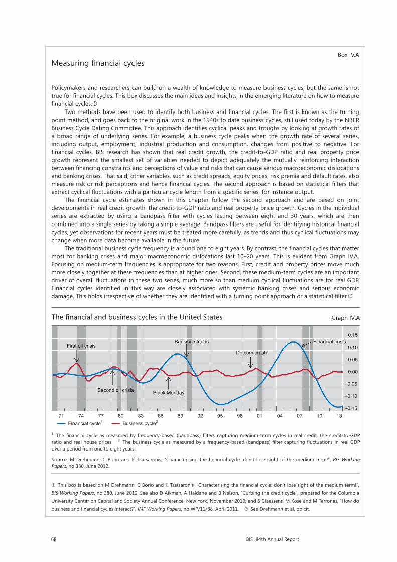
68 BIS 84th Annual Report
Box IV.AMeasuring financial cycles
Policymakers and researchers can build on a wealth of knowledge to measure business cycles, but the same is not true for financial cycles. This box discusses the main ideas and insights in the emerging literature on how to measure financial cycles.
Two methods have been used to identify both business and financial cycles. The first is known as the turning point method, and goes back to the original work in the 1940s to date business cycles, still used today by the NBER Business Cycle Dating Committee. This approach identifies cyclical peaks and troughs by looking at growth rates of a broad range of underlying series. For example, a business cycle peaks when the growth rate of several series, including output, employment, industrial production and consumption, changes from positive to negative. For financial cycles, BIS research has shown that real credit growth, the credit-to-GDP ratio and real property price growth represent the smallest set of variables needed to depict adequately the mutually reinforcing interaction between financing constraints and perceptions of value and risks that can cause serious macroeconomic dislocations and banking crises. That said, other variables, such as credit spreads, equity prices, risk premia and default rates, also measure risk or risk perceptions and hence financial cycles. The second approach is based on statistical filters that extract cyclical fluctuations with a particular cycle length from a specific series, for instance output.
The financial cycle estimates shown in this chapter follow the second approach and are based on joint developments in real credit growth, the credit-to-GDP ratio and real property price growth. Cycles in the individual series are extracted by using a bandpass filter with cycles lasting between eight and 30 years, which are then combined into a single series by taking a simple average. Bandpass filters are useful for identifying historical financial cycles, yet observations for recent years must be treated more carefully, as trends and thus cyclical fluctuations may change when more data become available in the future.
The traditional business cycle frequency is around one to eight years. By contrast, the financial cycles that matter most for banking crises and major macroeconomic dislocations last 10–20 years. This is evident from Graph IV.A. Focusing on medium-term frequencies is appropriate for two reasons. First, credit and property prices move much more closely together at these frequencies than at higher ones. Second, these medium-term cycles are an important driver of overall fluctuations in these two series, much more so than medium cyclical fluctuations are for real GDP. Financial cycles identified in this way are closely associated with systemic banking crises and serious economic damage. This holds irrespective of whether they are identified with a turning point approach or a statistical filter.
This box is based on M Drehmann, C Borio and K Tsatsaronis, “Characterising the financial cycle: don’t lose sight of the medium term!”, BIS Working Papers, no 380, June 2012. See also D Aikman, A Haldane and B Nelson, “Curbing the credit cycle”, prepared for the Columbia University Center on Capital and Society Annual Conference, New York, November 2010; and S Claessens, M Kose and M Terrones, “How do business and financial cycles interact?”, IMF Working Papers, no WP/11/88, April 2011. See Drehmann et al, op cit.
The financial and business cycles in the United States Graph IV.A
1 The financial cycle as measured by frequency-based (bandpass) filters capturing medium-term cycles in real credit, the credit-to-GDP ratio and real house prices. 2 The business cycle as measured by a frequency-based (bandpass) filter capturing fluctuations in real GDP over a period from one to eight years.
Source: M Drehmann, C Borio and K Tsatsaronis, “Characterising the financial cycle: don’t lose sight of the medium term!”, BIS Working Papers, no 380, June 2012.
–0.15
–0.10
–0.05
0.00
0.05
0.10
0.15
71 74 77 80 83 86 89 92 95 98 01 04 07 10 13
First oil crisis
Second oil crisis Black Monday
Banking strains
Dotcom crash
Financial crisis
Financial cycle1 Business cycle2
69BIS 84th Annual Report
Where are countries in the financial cycle?
In recent years, financial cycle downswings in most advanced economies have coincided with upswings in large EMEs and other countries. Unfortunately, the lack of long series on credit and property prices precludes the construction of the financial cycle indicator illustrated in Graph IV.1 for several important economies. But recent credit and property price developments offer a useful picture, if an incomplete one. These data suggest that countries are at very different stages of the financial cycle (Graph IV.2).
Many euro area countries are in a financial downswing. Following a prolonged boom, the euro area countries that were most affected by the financial crisis and the subsequent European debt crisis, such as Greece and Spain, have seen real credit and property prices fall by an average of 5–10% annually in recent years. But downward pressures appear to be receding somewhat, as the decline in credit and house prices has slowed in recent quarters.
Financial cycles in other economies that experienced a crisis seem to have bottomed out. The United States saw a large run-up in credit and asset prices that ended with the onset of the financial crisis. The subsequent downswing in asset prices and non-financial corporate borrowing ended in 2011, and household borrowing started to pick up in 2013. The picture is less clear-cut for the United Kingdom and many central and eastern European economies – countries that also experienced boom-bust cycles in the last decade. Deleveraging in these countries continues, but the pace is slowing and property prices have started to rise again, suggesting that the downward trend in the financial cycle may have reversed.
Signals are mixed for advanced economies that did not see an outright crisis in recent years. Australia, Canada and the Nordic countries experienced large financial booms in the mid- to late 2000s. But the global and European debt crises dented these dynamics; asset prices fluctuated widely and corporate borrowing fell as global economic activity deteriorated. This pushed the medium-term financial cycle indicator on a downward trend, even though households in all these economies continued to borrow, albeit at a slower pace. But the strong increase in commodity prices in recent years prevented a lasting turn of the cycle, and over the last four quarters real property price and (total) credit growth in Australia and Canada has picked up to levels close to or in line with developments in large EMEs.
Booms are clearly evident in several other countries, in particular EMEs. In many cases, the surge in credit and asset prices slowed in 2008 and 2009 but resumed full force in 2010. Since then, credit to the private sector has expanded by an average of about 10% per year. In China, this growth was mainly driven by non-banks, whereas banks financed the expansion in Turkey. At present, there are signs that some of these booms are stalling. For example, property price growth in Brazil has weakened, which is typical of the later stages of the financial cycle. Rising defaults in the property sector in China also point in this direction.
What is driving the financial cycle in the current context?
To some extent, the current state of the financial cycle reflects the self-reinforcing adjustment after the financial crisis. The ratios of private sector debt to GDP have slid by roughly 20 percentage points from their recent peaks in the United States, the United Kingdom and Spain. While substantial, these reductions still fall well
The financial and business cycles in the United States Graph IV.A
1 The financial cycle as measured by frequency-based (bandpass) filters capturing medium-term cycles in real credit, the credit-to-GDP ratio and real house prices. 2 The business cycle as measured by a frequency-based (bandpass) filter capturing fluctuations in real GDP over a period from one to eight years.
Source: M Drehmann, C Borio and K Tsatsaronis, “Characterising the financial cycle: don’t lose sight of the medium term!”, BIS Working Papers, no 380, June 2012.
–0.15
–0.10
–0.05
0.00
0.05
0.10
0.15
71 74 77 80 83 86 89 92 95 98 01 04 07 10 13
First oil crisis
Second oil crisis Black Monday
Banking strains
Dotcom crash
Financial crisis
Financial cycle1 Business cycle2
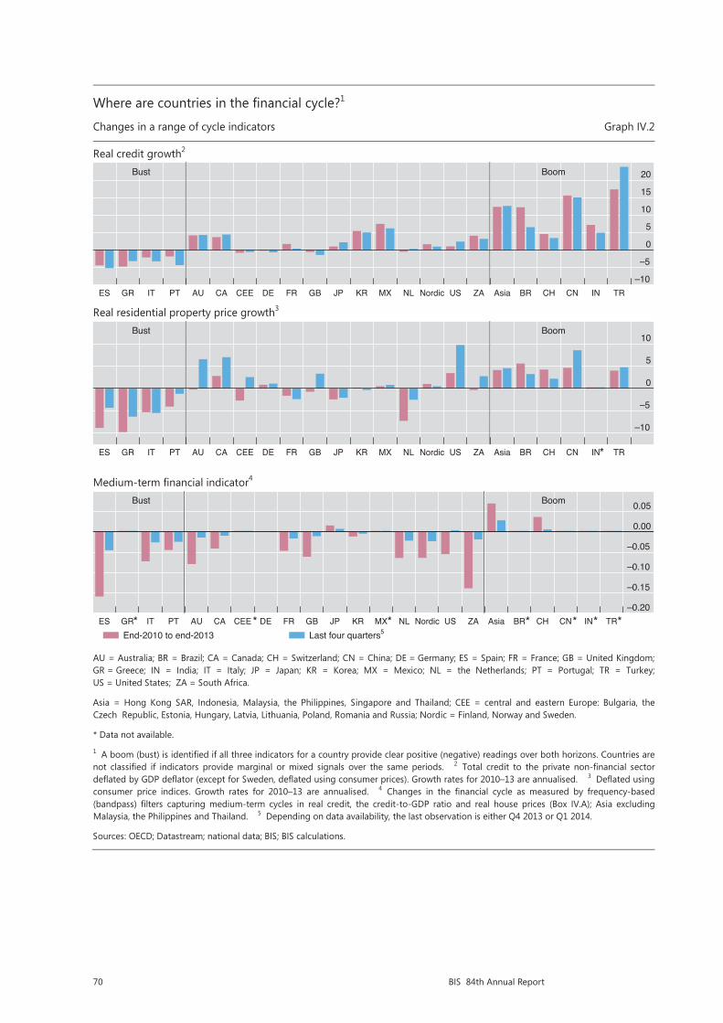
70 BIS 84th Annual Report
Where are countries in the financial cycle?1
Changes in a range of cycle indicators Graph IV.2
Real credit growth2
Real residential property price growth3
Medium-term financial indicator4
AU = Australia; BR = Brazil; CA = Canada; CH = Switzerland; CN = China; DE = Germany; ES = Spain; FR = France; GB = United Kingdom; GR = Greece; IN = India; IT = Italy; JP = Japan; KR = Korea; MX = Mexico; NL = the Netherlands; PT = Portugal; TR = Turkey; US = United States; ZA = South Africa.
Asia = Hong Kong SAR, Indonesia, Malaysia, the Philippines, Singapore and Thailand; CEE = central and eastern Europe: Bulgaria, the Czech Republic, Estonia, Hungary, Latvia, Lithuania, Poland, Romania and Russia; Nordic = Finland, Norway and Sweden.
* Data not available.
1 A boom (bust) is identified if all three indicators for a country provide clear positive (negative) readings over both horizons. Countries arenot classified if indicators provide marginal or mixed signals over the same periods. 2 Total credit to the private non-financial sector deflated by GDP deflator (except for Sweden, deflated using consumer prices). Growth rates for 2010–13 are annualised. 3 Deflated using consumer price indices. Growth rates for 2010–13 are annualised. 4 Changes in the financial cycle as measured by frequency-based (bandpass) filters capturing medium-term cycles in real credit, the credit-to-GDP ratio and real house prices (Box IV.A); Asia excluding Malaysia, the Philippines and Thailand. 5 Depending on data availability, the last observation is either Q4 2013 or Q1 2014.
Sources: OECD; Datastream; national data; BIS; BIS calculations.
–10
–5
0
5
10
15
20
ES GR IT PT AU CA CEE DE FR GB JP KR MX NL Nordic US ZA Asia BR CH CN IN TR
Bust Boom__
____
____
____
____
____
__
____
____
____
____
____
____
–10
–5
0
5
10
ES GR IT PT AU CA CEE DE FR GB JP KR MX NL Nordic US ZA Asia BR CH CN IN TR
Bust Boom
____
____
____
____
____
____
____
____
____
____
____
____
*
–0.20
–0.15
–0.10
–0.05
0.00
0.05
ES GR IT PT AU CA CEE DE FR GB JP KR MX NL Nordic US ZA Asia BR CH CN IN TR
Bust Boom
____
____
____
____
____
____
____
____
____
____
____
____
* * * ** * *End-2010 to end-2013 Last four quarters5
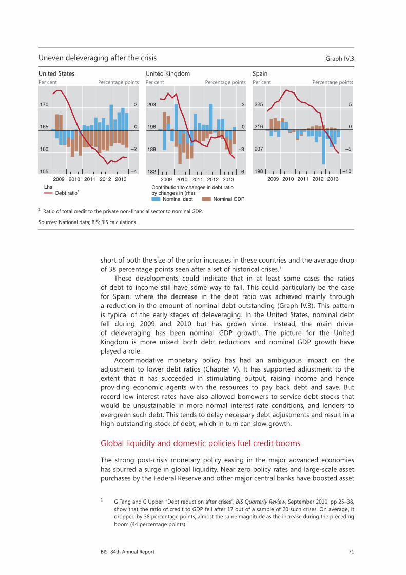
71BIS 84th Annual Report
short of both the size of the prior increases in these countries and the average drop of 38 percentage points seen after a set of historical crises.1
These developments could indicate that in at least some cases the ratios of debt to income still have some way to fall. This could particularly be the case for Spain, where the decrease in the debt ratio was achieved mainly through a reduction in the amount of nominal debt outstanding (Graph IV.3). This pattern is typical of the early stages of deleveraging. In the United States, nominal debt fell during 2009 and 2010 but has grown since. Instead, the main driver of deleveraging has been nominal GDP growth. The picture for the United Kingdom is more mixed: both debt reductions and nominal GDP growth have played a role.
Accommodative monetary policy has had an ambiguous impact on the adjustment to lower debt ratios (Chapter V). It has supported adjustment to the extent that it has succeeded in stimulating output, raising income and hence providing economic agents with the resources to pay back debt and save. But record low interest rates have also allowed borrowers to service debt stocks that would be unsustainable in more normal interest rate conditions, and lenders to evergreen such debt. This tends to delay necessary debt adjustments and result in a high outstanding stock of debt, which in turn can slow growth.
Global liquidity and domestic policies fuel credit booms
The strong post-crisis monetary policy easing in the major advanced economies has spurred a surge in global liquidity. Near zero policy rates and large-scale asset purchases by the Federal Reserve and other major central banks have boosted asset
1 G Tang and C Upper, “Debt reduction after crises”, BIS Quarterly Review, September 2010, pp 25–38, show that the ratio of credit to GDP fell after 17 out of a sample of 20 such crises. On average, it dropped by 38 percentage points, almost the same magnitude as the increase during the preceding boom (44 percentage points).
Uneven deleveraging after the crisis Graph IV.3
United States United Kingdom Spain Per cent Percentage points Per cent Percentage points Per cent Percentage points
1 Ratio of total credit to the private non-financial sector to nominal GDP.
Sources: National data; BIS; BIS calculations.
Low yields in advanced economies push funds into emerging market economies Graph IV.4
External flows into EME debt1 International debt securities issuance by EME non-financial corporations3
USD bn Amount outstanding, USD bn
1 Cumulative inflows starting in Q1 2008; excluding Hong Kong SAR and Singapore. 2 Portfolio debt securities (liabilities) plus other debt instruments (liabilities) minus corresponding BIS reporting banks’ inflows. For India, the balance of payments data start in Q2 2009 and end in Q1 2013. 3 Excluding official sector and banks.
Sources: IMF, Balance of Payments Statistics and International Financial Statistics; BIS international banking statistics; BIS calculations.
155
160
165
170
–4
–2
0
2
2009 2010 2011 2012 2013
Debt ratio1Lhs:
182
189
196
203
–6
–3
0
3
2009 2010 2011 2012 2013
Nominal debt
Contribution to changes in debt ratio by changes in (rhs):
Nominal GDP
198
207
216
225
–10
–5
0
5
2009 2010 2011 2012 2013
–500
0
500
1,000
1,500
2,000
2008 2009 2010 2011 2012 2013From BIS reporting banks From other investors2
0
200
400
600
800
1,000
02 03 04 05 06 07 08 09 10 11 12 13Nationality Residence
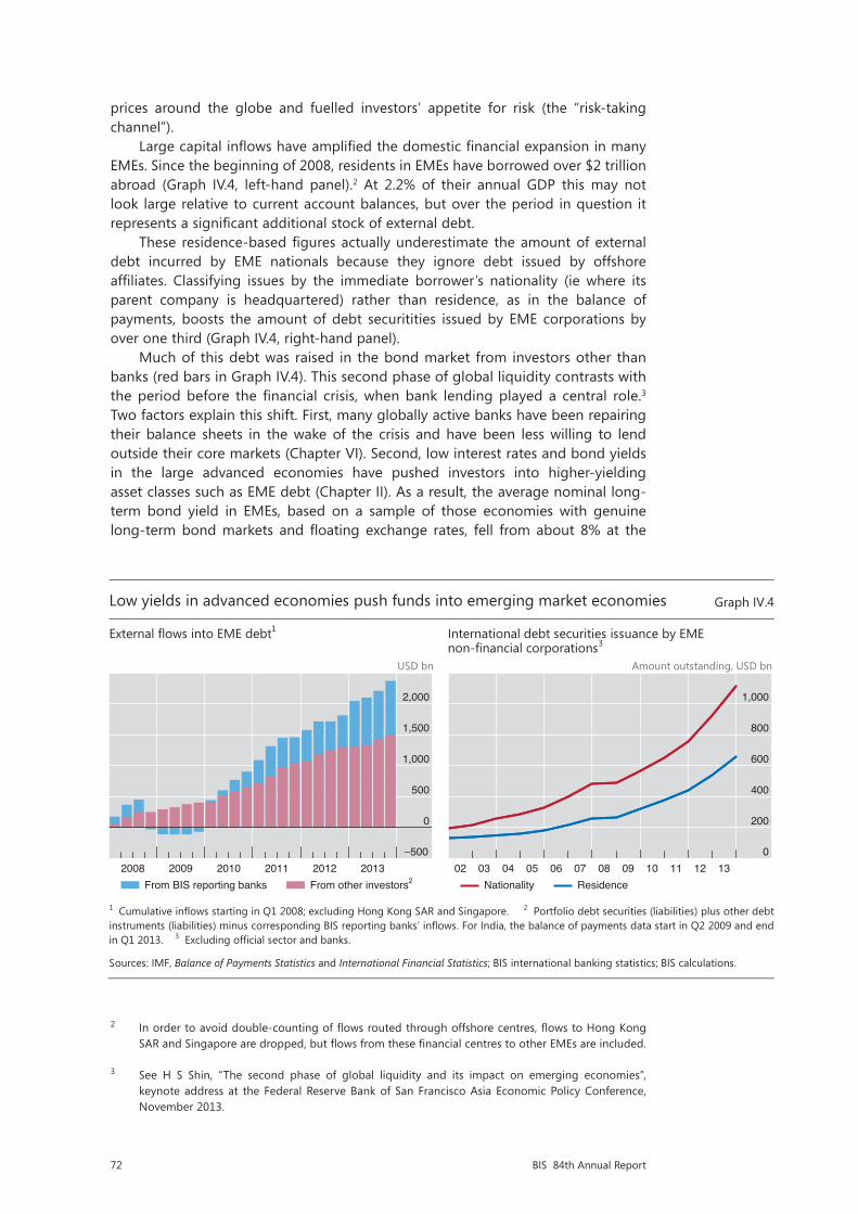
72 BIS 84th Annual Report
prices around the globe and fuelled investors’ appetite for risk (the “risk-taking channel”).
Large capital inflows have amplified the domestic financial expansion in many EMEs. Since the beginning of 2008, residents in EMEs have borrowed over $2 trillion abroad (Graph IV.4, left-hand panel).2 At 2.2% of their annual GDP this may not look large relative to current account balances, but over the period in question it represents a significant additional stock of external debt.
These residence-based figures actually underestimate the amount of external debt incurred by EME nationals because they ignore debt issued by offshore affiliates. Classifying issues by the immediate borrower’s nationality (ie where its parent company is headquartered) rather than residence, as in the balance of payments, boosts the amount of debt securitities issued by EME corporations by over one third (Graph IV.4, right-hand panel).
Much of this debt was raised in the bond market from investors other than banks (red bars in Graph IV.4). This second phase of global liquidity contrasts with the period before the financial crisis, when bank lending played a central role.3 Two factors explain this shift. First, many globally active banks have been repairing their balance sheets in the wake of the crisis and have been less willing to lend outside their core markets (Chapter VI). Second, low interest rates and bond yields in the large advanced economies have pushed investors into higher-yielding asset classes such as EME debt (Chapter II). As a result, the average nominal long-term bond yield in EMEs, based on a sample of those economies with genuine long-term bond markets and floating exchange rates, fell from about 8% at the
2 In order to avoid double-counting of flows routed through offshore centres, flows to Hong Kong SAR and Singapore are dropped, but flows from these financial centres to other EMEs are included.
3 See H S Shin, “The second phase of global liquidity and its impact on emerging economies”, keynote address at the Federal Reserve Bank of San Francisco Asia Economic Policy Conference, November 2013.
Uneven deleveraging after the crisis Graph IV.3
United States United Kingdom Spain Per cent Percentage points Per cent Percentage points Per cent Percentage points
1 Ratio of total credit to the private non-financial sector to nominal GDP.
Sources: National data; BIS; BIS calculations.
Low yields in advanced economies push funds into emerging market economies Graph IV.4
External flows into EME debt1 International debt securities issuance by EME non-financial corporations3
USD bn Amount outstanding, USD bn
1 Cumulative inflows starting in Q1 2008; excluding Hong Kong SAR and Singapore. 2 Portfolio debt securities (liabilities) plus other debt instruments (liabilities) minus corresponding BIS reporting banks’ inflows. For India, the balance of payments data start in Q2 2009 and end in Q1 2013. 3 Excluding official sector and banks.
Sources: IMF, Balance of Payments Statistics and International Financial Statistics; BIS international banking statistics; BIS calculations.
155
160
165
170
–4
–2
0
2
2009 2010 2011 2012 2013
Debt ratio1Lhs:
182
189
196
203
–6
–3
0
3
2009 2010 2011 2012 2013
Nominal debt
Contribution to changes in debt ratio by changes in (rhs):
Nominal GDP
198
207
216
225
–10
–5
0
5
2009 2010 2011 2012 2013
–500
0
500
1,000
1,500
2,000
2008 2009 2010 2011 2012 2013From BIS reporting banks From other investors2
0
200
400
600
800
1,000
02 03 04 05 06 07 08 09 10 11 12 13Nationality Residence
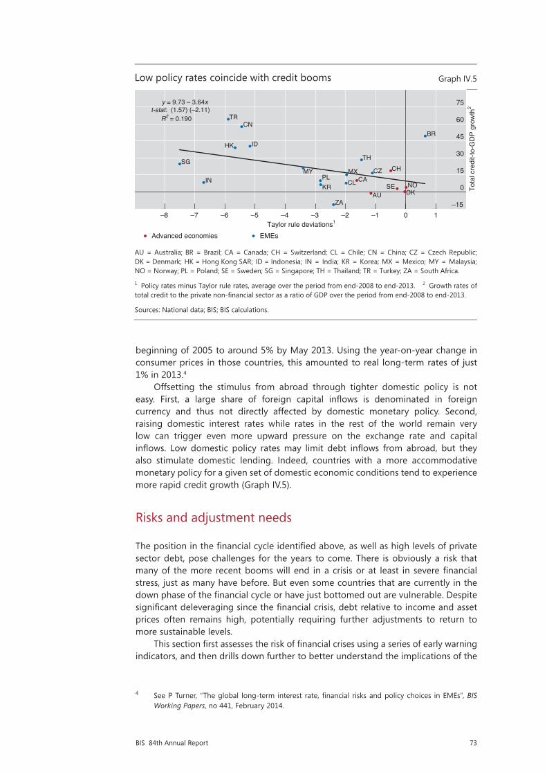
73BIS 84th Annual Report
beginning of 2005 to around 5% by May 2013. Using the year-on-year change in consumer prices in those countries, this amounted to real long-term rates of just 1% in 2013.4
Offsetting the stimulus from abroad through tighter domestic policy is not easy. First, a large share of foreign capital inflows is denominated in foreign currency and thus not directly affected by domestic monetary policy. Second, raising domestic interest rates while rates in the rest of the world remain very low can trigger even more upward pressure on the exchange rate and capital inflows. Low domestic policy rates may limit debt inflows from abroad, but they also stimulate domestic lending. Indeed, countries with a more accommodative monetary policy for a given set of domestic economic conditions tend to experience more rapid credit growth (Graph IV.5).
Risks and adjustment needs
The position in the financial cycle identified above, as well as high levels of private sector debt, pose challenges for the years to come. There is obviously a risk that many of the more recent booms will end in a crisis or at least in severe financial stress, just as many have before. But even some countries that are currently in the down phase of the financial cycle or have just bottomed out are vulnerable. Despite significant deleveraging since the financial crisis, debt relative to income and asset prices often remains high, potentially requiring further adjustments to return to more sustainable levels.
This section first assesses the risk of financial crises using a series of early warning indicators, and then drills down further to better understand the implications of the
4 See P Turner, “The global long-term interest rate, financial risks and policy choices in EMEs”, BIS Working Papers, no 441, February 2014.
Low policy rates coincide with credit booms Graph IV.5
AU = Australia; BR = Brazil; CA = Canada; CH = Switzerland; CL = Chile; CN = China; CZ = Czech Republic;DK = Denmark; HK = Hong Kong SAR; ID = Indonesia; IN = India; KR = Korea; MX = Mexico; MY = Malaysia;NO = Norway; PL = Poland; SE = Sweden; SG = Singapore; TH = Thailand; TR = Turkey; ZA = South Africa.
1 Policy rates minus Taylor rule rates, average over the period from end-2008 to end-2013. 2 Growth rates of total credit to the private non-financial sector as a ratio of GDP over the period from end-2008 to end-2013.
Sources: National data; BIS; BIS calculations.
AU
CA
DKNOSE
CH
BR
CL
CN
CZ
HK
IN
ID
KR
MY MXPL
SG
ZA
TH
TR
–15
0
15
30
45
60
75
–8 –7 –6 –5 –4 –3 –2 –1 0 1
y = 9.73 – 3.64xt-stat: (1.57) (–2.11)
Tota
l cre
dit-t
o-G
DP
grow
th2
Taylor rule deviations1
R2 = 0.190
Advanced economies EMEs

74 BIS 84th Annual Report
shift from bank to bond finance in EMEs. Finally, the degree to which households and firms need to reduce their debt levels relative to GDP to return to more sustainable levels is analysed, and a potential debt trap is identified.
Indicators point to the risk of financial distress
Early warning indicators in a number of countries are sending worrying signals. In line with the financial cycle analysis developed in the previous section, several early warning indicators signal that vulnerabilities have been building up in the financial systems of several countries. Many years of strong credit and, often, property price growth have left borrowers exposed to increases in interest rates and/or sharp slowdowns in property prices and economic activity. Early warning indicators cannot predict the exact timing of financial distress, but they have proved fairly reliable in identifying unsustainable credit and property price developments in the past.
Credit-to-GDP gaps in many EMEs and Switzerland are well above the threshold that indicates potential trouble (Table IV.1). The historical record shows that credit-to-GDP gaps (the difference between the credit-to-GDP ratio and its long-term trend) above 10 percentage points have usually been followed by serious banking strains within three years.5 Residential property price gaps (the deviation of real residential property prices from their long-term trend) also point to risks: they tend to build up during a credit boom and fall two to three years before a crisis. Indeed, the Swiss authorities have reacted to the build-up of financial vulnerabilities by increasing countercyclical capital buffer requirements from 1% to 2% of risk-weighted positions secured by domestic residential property.
Debt service ratios send a less worrying signal. These ratios, which measure the share of income used to service debt (Box IV.B), remain low in many economies. Taken at face value, they suggest that borrowers in China are currently especially vulnerable. But rising rates would push debt service ratios in several other economies into critical territory (Table IV.1, last column). To illustrate, assume that money market rates rise by 250 basis points, in line with the 2004 tightening episode.6 At constant credit-to-GDP ratios, this would push debt service ratios in most of the booming economies above critical thresholds. Experience indicates that debt service ratios tend to remain low for long periods, only to shoot up rapidly one or two years before a crisis, typically in response to interest rate increases.7 Low values therefore do not necessarily mean that the financial system is safe.
It would be too easy to dismiss these indicator readings as inappropriate because “this time is different”. True, no early warning indicator is fully reliable. The financial system evolves continuously, and the nature of risks shifts over time. But credit gaps and debt service ratios have proved to be relatively robust. They are based on total
5 The Basel Committee on Banking Supervision chose the credit-to-GDP gap as a starting point for discussions about countercyclical capital buffer levels because of its reliability as an early warning indicator. A credit-to-GDP gap above 2 (beige cells in Table IV.1) indicates that authorities should consider putting in place buffers, which would reach their maximum at readings above 10 (red cells).
6 In the 2004 tightening episode, money market rates in advanced economies increased by around 250 basis points over three years. The thought experiment here assumes that there is a one-to-one pass-through from money market rates to average lending rates for loans to the private non-financial sector, which, together with current credit-to-GDP ratios and average remaining maturities, determine the debt service burden (Box IV.B).
7 See M Drehmann and M Juselius, “Evaluating early warning indicators of banking crises: satisfying policy requirements”, International Journal of Forecasting, 2014.

75BIS 84th Annual Report
Early warning indicators for domestic banking crises signal risks ahead1 Table IV.1
Credit-to-GDP gap2
Property price gap3
Debt service ratio (DSR)4
Debt service ratio if interest rates rise by
250 bp4, 5
Boom Asia6 19.9 16.7 2.4 4.4
Brazil 13.7 3.7 4.0 6.3
China 23.6 –2.2 9.4 12.2
India –2.7 3.4 4.4
Switzerland 13.1 13.0 0.6 3.6
Turkey 17.4 4.5 6.2
Mixed signals Australia –6.9 –2.0 1.5 4.5
Canada 5.6 5.1 2.0 4.9
Central and eastern Europe7 –10.5 –0.1 1.6 2.9
France –0.9 –9.3 2.6 4.9
Germany –8.8 5.4 –2.7 –0.9
Japan 5.3 2.8 –4.4 –2.0
Korea 4.1 4.1 0.8 3.5
Mexico 3.7 –1.6 0.5 0.9
Nordic countries8 –0.5 –2.2 1.5 4.7
Netherlands –13.2 –24.2 1.8 5.2
South Africa –3.1 –7.5 –1.0 0.2
United Kingdom –19.6 –11.1 0.9 3.6
United States –12.3 –5.7 0.3 2.6
Bust Greece –11.3 –2.8
Italy –6.4 –16.6 –1.0 0.9
Portugal –13.9 –7.4 0.3 4.0
Spain –27.8 –28.7 2.3 5.4
Legend Credit/GDP gap>10 Property gap>10 DSR>6 DSR>6
2≤Credit/GDP gap≤10 4≤DSR≤6 4≤DSR≤6
1 Thresholds for red cells are chosen by minimising false alarms conditional on capturing at least two thirds of the crises over a cumulative three-year horizon. A signal is correct if a crisis occurs in any of the three years ahead. The noise is measured by the wrong predictions outside this horizon. Beige cells for the credit-to-GDP gap are based on guidelines for countercyclical capital buffers under Basel III. Beige cells for DSRs are based on critical thresholds if a two-year forecast horizon is used. For a derivation of critical thresholds for credit-to-GDP gaps and property price gaps, see M Drehmann, C Borio and K Tsatsaronis, “Anchoring countercyclical capital buffers: the role of credit aggregates”, International Journal of Central Banking, vol 7, no 4, 2011, pp 189–240. For debt service ratios, see M Drehmann and M Juselius, “Do debt service costs affect macroeconomic and financial stability?”, BIS Quarterly Review, September 2012, pp 21–34. 2 Difference of the credit-to-GDP ratio from its long-run, real-time trend calculated with a one-sided HP filter using a smoothing factor of 400.000, in percentage points. 3 Deviations of real residential property prices from their long-run trend calculated with a one-sided HP filter using a smoothing factor of 400.000, in per cent. 4 Difference of DSRs from country-specific long-run averages since 1985 or later depending on data availability and when five-year average inflation fell below 10% (for Russia and Turkey, the last 10 years are taken). 5 Assuming an increase in the lending rates of 2.50 percentage points and that all of the other components of the DSRs stay fixed. 6 Hong Kong SAR, Indonesia, Malaysia, the Philippines, Singapore and Thailand; excluding the Philippines and Singapore for DSRs and their forecasts. 7 Bulgaria, the Czech Republic, Estonia, Hungary, Latvia, Lithuania, Poland, Romania and Russia; excluding the Czech Republic and Romania for the real property price gap; excluding Bulgaria, Estonia, Latvia, Lithuania and Romania for DSRs and their forecasts. 8 Finland, Norway and Sweden.
Sources: National data; BIS; BIS calculations.
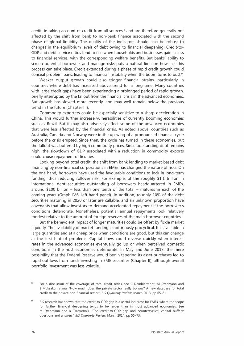
76 BIS 84th Annual Report
credit, ie taking account of credit from all sources,8 and are therefore generally not affected by the shift from bank to non-bank finance associated with the second phase of global liquidity. The quality of the indicators should also be robust to changes in the equilibrium levels of debt owing to financial deepening. Credit-to-GDP and debt service ratios tend to rise when households and businesses gain access to financial services, with the corresponding welfare benefits. But banks’ ability to screen potential borrowers and manage risks puts a natural limit on how fast this process can take place. Credit extended during a phase of rapid credit growth could conceal problem loans, leading to financial instability when the boom turns to bust.9
Weaker output growth could also trigger financial strains, particularly in countries where debt has increased above trend for a long time. Many countries with large credit gaps have been experiencing a prolonged period of rapid growth, briefly interrupted by the fallout from the financial crisis in the advanced economies. But growth has slowed more recently, and may well remain below the previous trend in the future (Chapter III).
Commodity exporters could be especially sensitive to a sharp deceleration in China. This would further increase vulnerabilities of currently booming economies such as Brazil. But it may also adversely affect some of the advanced economies that were less affected by the financial crisis. As noted above, countries such as Australia, Canada and Norway were in the upswing of a pronounced financial cycle before the crisis erupted. Since then, the cycle has turned in these economies, but the fallout was buffered by high commodity prices. Since outstanding debt remains high, the slowdown of GDP associated with a reduction in commodity exports could cause repayment difficulties.
Looking beyond total credit, the shift from bank lending to market-based debt financing by non-financial corporations in EMEs has changed the nature of risks. On the one hand, borrowers have used the favourable conditions to lock in long-term funding, thus reducing rollover risk. For example, of the roughly $1.1 trillion in international debt securities outstanding of borrowers headquartered in EMEs, around $100 billion – less than one tenth of the total – matures in each of the coming years (Graph IV.6, left-hand panel). In addition, roughly 10% of the debt securities maturing in 2020 or later are callable, and an unknown proportion have covenants that allow investors to demand accelerated repayment if the borrower’s conditions deteriorate. Nonetheless, potential annual repayments look relatively modest relative to the amount of foreign reserves of the main borrower countries.
But the benevolent impact of longer maturities could be offset by fickle market liquidity. The availability of market funding is notoriously procyclical. It is available in large quantities and at a cheap price when conditions are good, but this can change at the first hint of problems. Capital flows could reverse quickly when interest rates in the advanced economies eventually go up or when perceived domestic conditions in the host economies deteriorate. In May and June 2013, the mere possibility that the Federal Reserve would begin tapering its asset purchases led to rapid outflows from funds investing in EME securities (Chapter II), although overall portfolio investment was less volatile.
8 For a discussion of the coverage of total credit series, see C Dembiermont, M Drehmann and S Muksakunratana, “How much does the private sector really borrow? A new database for total credit to the private non-financial sector”, BIS Quarterly Review, March 2013, pp 65–81.
9 BIS research has shown that the credit-to-GDP gap is a useful indicator for EMEs, where the scope for further financial deepening tends to be larger than in most advanced economies. See M Drehmann and K Tsatsaronis, “The credit-to-GDP gap and countercyclical capital buffers: questions and answers”, BIS Quarterly Review, March 2014, pp 55–73.
77BIS 84th Annual Report
Emerging market economies face new risk patterns Graph IV.6
Scheduled repayments of international debt securities1
Bank deposits of non-financial corporations3
Net assets of dedicated EME funds
USD bn USD bn
BG = Bulgaria; CL = Chile; CN = China; CZ = Czech Republic; EE = Estonia; HU = Hungary; ID = Indonesia; KR = Korea; MX = Mexico; MY = Malaysia; PE = Peru; PL = Poland; RO = Romania; RU = Russia; SI = Slovenia; TH = Thailand; TR = Turkey. ETF = exchange-traded fund.
1 International debt securities issued by non-bank corporations resident/headquartered (nationality) in Brazil, Bulgaria, Chile, China, Colombia, the Czech Republic, Hong Kong SAR, Hungary, Iceland, India, Indonesia, Korea, Lithuania, Malaysia, Mexico, Peru, the Philippines, Poland, Romania, Russia, Singapore, South Africa, Thailand, Turkey and Venezuela. 2 No maturity date available. 3 As a percentage of banks’ assets. The line represents the 45° line. 4 Except for Peru (beginning of 2012).
Sources: IMF, International Financial Statistics; Datastream; EPFR; national data; BIS international debt securities statistics; BIS calculations.
Demographic tailwinds for house prices turn into headwinds
Basis points per annum Graph IV.7
AU = Australia; BE = Belgium; CA = Canada; CH = Switzerland; DE = Germany; DK = Denmark; ES = Spain; FI = Finland; FR = France; GB = United Kingdom; GR = Greece; IT = Italy; JP = Japan; KR = Korea; NL = Netherlands; NO = Norway; PT = Portugal; SE = Sweden; US = United States.
Source: E Takáts, “Aging and house prices”, Journal of Housing Economics, vol 21, no 2, 2012, pp 131–41.
0
80
160
240
320
14 15 16 17 18 19 20 >20 na2
YearNationality Residence
BG
CL CN
CZ
EE
HU
ID
KRMX
MY
PL
RORU
SI
THTR
PE
0
10
20
30
40
10 20 30 40 50Beginning 20084
End-
2013
0
300
600
900
1,200
04 06 08 10 12 14ETFs Non-ETFs
–400
–300
–200
–100
0
100
KR JP PT DE IT GR FI ES DK NL FR BE CH GB CA NO SE US AU
Historical (1970–2009)Forecasted (2010–50)
Demographic impact:HistoricalForecasted
Population-weighted average:
A higher proportion of investors with short-term horizons in EME debt could amplify shocks when global conditions deteriorate. Highly volatile fund flows to EMEs indicate that some investors view their investments in these markets as short-term positions rather than long-term holdings. This is in line with the gradual shift from traditional open- or closed-end funds to exchange-traded funds (ETFs), which now account for around a fifth of all net assets of dedicated EME bond and equity funds, up from around 2% 10 years ago (Graph IV.6, right-hand panel). ETFs can be bought and sold on exchanges at low cost, at least in normal times, and have been used by investors to convert illiquid securities into liquid instruments.
Financing problems of non-financial corporations in EMEs can also feed into the banking system. Corporate deposits in many EMEs stand at well above 20% of the banking system’s total assets in countries as diverse as Chile, China, Indonesia, Malaysia and Peru (Graph IV.6, centre panel), and are on an upward trend in others. Firms losing access to external debt markets may be forced to withdraw these deposits, leaving banks with significant funding problems. Firms that have been engaging in a sort of carry trade – borrowing at low interest rates abroad and investing at higher rates at home – could be even more sensitive to market conditions.
Finally, the sheer volume of assets managed by large asset management companies implies that their asset allocation decisions have significant and systemic implications for EME financial markets. For instance, a relatively small (5 percentage point) reallocation of the $70 trillion in assets managed by large asset management companies from advanced economies to EMEs would result in additional portfolio flows of $3.5 trillion. This is equivalent to 13% of the $27 trillion stock of EME bonds and equities. And the ratio could be significantly larger in smaller open economies. Actions taken by asset managers have particularly strong effects if they are

78 BIS 84th Annual Report
correlated across funds. This could be because of top-down management of different portfolios, as is the case for some major bond funds, similar benchmarks or similar risk management systems (Chapter VI).
The shift from bank to securities financing has apparently had little impact on currency risk. Over 90% of international debt securities and well over 80% of cross-border loans by non-bank corporations resident in EMEs are effectively denominated in foreign currency. And some of the heaviest borrowers in the international bond market are property firms and utilities, which are unlikely to have significant foreign currency assets or payment streams that could back up their debt. There are financial instruments that could hedge some of the currency risk. But in practice many hedges are incomplete, because they cover exposures only partly, or are based on shorter-term contracts that are regularly rolled over. Such strategies significantly reduce the value of financial hedges against large fluctuations in exchange rates, which often coincide with illiquid markets.
Returning to sustainable debt levels
Regardless of the risk of serious financial distress, in the years ahead many economies will face headwinds as outstanding debt adjusts to more sustainable long-run levels. Determining the exact level of sustainable debt is difficult, but several indicators suggest that current levels of private sector indebtedness are still too high.
For one, sustainable debt is aligned with wealth. Sharp drops in property and other asset prices in the wake of the financial crisis have pushed down wealth in many of the countries at the heart of the crisis, although it has been recovering in some. Wealth effects can be long-lasting. For example, real property prices in Japan have decreased by more than 3% on average per year since 1991, thus reducing the collateral available for new borrowing.
Long-run demographic trends could aggravate this problem by putting further pressure on asset prices (Chapter III). An ageing society implies weaker demand for assets, in particular housing. Research on the relationship between house prices and demographic variables suggests that demographic factors could dampen house prices by reducing property price growth considerably over the coming decades (blue bars in Graph IV.7).10 If so, this would partially reverse the effect of demographic tailwinds that pushed up house prices in previous decades (red bars).
Debt service ratios also point to current debt levels being on the high side. High debt servicing costs (interest payments plus amortisations) compared with income effectively limit the amount of debt that borrowers can carry. This is clearly true for individuals. Lenders, for example, often refuse to provide new loans to households if future interest payments and amortisations exceed a certain threshold, often around 30–40% of their income. But the relationship also holds in the aggregate.
Empirically, aggregate debt service ratios fluctuate around stable historical averages (Graph IV.B), which can be taken as rough approximations for long-term sustainable (steady state) levels. High private sector debt service costs relative to income will result in less credit being extended, eventually translating into falling aggregate debt service costs. Conversely, low debt service ratios give borrowers ample room to take on more debt. Hence, over time economy-wide debt service ratios gravitate back to steady state levels.11
10 See E Takáts, “Aging and house prices”, Journal of Housing Economics, vol 21, no 2, 2012, pp 131–41.
11 Box IV.B discusses caveats associated with the choice of long-run averages as benchmarks.

79BIS 84th Annual Report
In all but a handful of countries, bringing debt service ratios back to historical norms would require substantial reductions in credit-to-GDP ratios (Graph IV.8). Even at the current unusually low interest rates, credit-to-GDP ratios would have to be roughly 15 percentage points lower on average for debt service ratios to be at their historical norms. And if lending rates were to rise by 250 basis points, in line with the 2004 tightening episode, the necessary reductions in credit-to-GDP ratios would swell to over 25 percentage points on average. In China, credit-to-GDP ratios would have to fall by more than 60 percentage points. Even the United Kingdom and the United States would need to reduce credit-to-GDP ratios by around 20 percentage points, despite having debt service ratios in line with long-term averages at current interest rates.
How can economies bring debt back to sustainable levels?
Downward pressures from lower wealth and high debt service burdens suggest that many economies will have to lower their debt levels in the years to come. This can happen through several channels. The first, and least painful, channel is through output growth, which has the dual effect of reducing credit-to-GDP and debt service ratios and also supports higher asset prices. The muted growth outlook in many economies (Chapter III) is not particularly reassuring from this perspective.
Inflation can also have an effect. But the extent to which it reduces the real debt burden depends on how much interest rates on outstanding and new debt adjust to higher price increases. More importantly, though, even if successful from this narrow perspective, it also has major side effects. Inflation redistributes wealth arbitrarily between borrowers and savers and risks unanchoring inflation expectations, with unwelcome long-run consequences.
The alternative to growing out of debt is to reduce the outstanding stock of debt. This happens when the amortisation rate exceeds the take-up of new loans. This is a natural and important channel of adjustment, but may not be enough. In some cases, unsustainable debt burdens have to be tackled directly, for instance
Emerging market economies face new risk patterns Graph IV.6
Scheduled repayments of international debt securities1
Bank deposits of non-financial corporations3
Net assets of dedicated EME funds
USD bn USD bn
BG = Bulgaria; CL = Chile; CN = China; CZ = Czech Republic; EE = Estonia; HU = Hungary; ID = Indonesia; KR = Korea; MX = Mexico; MY = Malaysia; PE = Peru; PL = Poland; RO = Romania; RU = Russia; SI = Slovenia; TH = Thailand; TR = Turkey. ETF = exchange-traded fund.
1 International debt securities issued by non-bank corporations resident/headquartered (nationality) in Brazil, Bulgaria, Chile, China, Colombia, the Czech Republic, Hong Kong SAR, Hungary, Iceland, India, Indonesia, Korea, Lithuania, Malaysia, Mexico, Peru, the Philippines, Poland, Romania, Russia, Singapore, South Africa, Thailand, Turkey and Venezuela. 2 No maturity date available. 3 As a percentage of banks’ assets. The line represents the 45° line. 4 Except for Peru (beginning of 2012).
Sources: IMF, International Financial Statistics; Datastream; EPFR; national data; BIS international debt securities statistics; BIS calculations.
Demographic tailwinds for house prices turn into headwinds
Basis points per annum Graph IV.7
AU = Australia; BE = Belgium; CA = Canada; CH = Switzerland; DE = Germany; DK = Denmark; ES = Spain; FI = Finland; FR = France; GB = United Kingdom; GR = Greece; IT = Italy; JP = Japan; KR = Korea; NL = Netherlands; NO = Norway; PT = Portugal; SE = Sweden; US = United States.
Source: E Takáts, “Aging and house prices”, Journal of Housing Economics, vol 21, no 2, 2012, pp 131–41.
0
80
160
240
320
14 15 16 17 18 19 20 >20 na2
YearNationality Residence
BG
CL CN
CZ
EE
HU
ID
KRMX
MY
PL
RORU
SI
THTR
PE
0
10
20
30
40
10 20 30 40 50Beginning 20084
End-
2013
0
300
600
900
1,200
04 06 08 10 12 14ETFs Non-ETFs
–400
–300
–200
–100
0
100
KR JP PT DE IT GR FI ES DK NL FR BE CH GB CA NO SE US AU
Historical (1970–2009)Forecasted (2010–50)
Demographic impact:HistoricalForecasted
Population-weighted average:
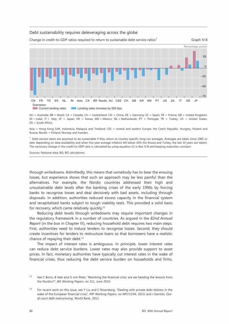
80 BIS 84th Annual Report
through writedowns. Admittedly, this means that somebody has to bear the ensuing losses, but experience shows that such an approach may be less painful than the alternatives. For example, the Nordic countries addressed their high and unsustainable debt levels after the banking crises of the early 1990s by forcing banks to recognise losses and deal decisively with bad assets, including through disposals. In addition, authorities reduced excess capacity in the financial system and recapitalised banks subject to tough viability tests. This provided a solid basis for recovery, which came relatively quickly.12
Reducing debt levels through writedowns may require important changes in the regulatory framework in a number of countries. As argued in the 82nd Annual Report (in the box in Chapter III), reducing household debt requires two main steps. First, authorities need to induce lenders to recognise losses. Second, they should create incentives for lenders to restructure loans so that borrowers have a realistic chance of repaying their debt.13
The impact of interest rates is ambiguous. In principle, lower interest rates can reduce debt service burdens. Lower rates may also provide support to asset prices. In fact, monetary authorities have typically cut interest rates in the wake of financial crises, thus reducing the debt service burden on households and firms.
12 See C Borio, B Vale and G von Peter, “Resolving the financial crisis: are we heeding the lessons from the Nordics?”, BIS Working Papers, no 311, June 2010.
13 For recent work on this issue, see Y Liu and C Rosenberg, “Dealing with private debt distress in the wake of the European financial crisis”, IMF Working Papers, no WP/13/44, 2013; and J Garrido, Out-of-court debt restructuring, World Bank, 2012.
Debt sustainability requires deleveraging across the globe
Change in credit-to-GDP ratios required to return to sustainable debt service ratios1 Graph IV.8
Percentage points
AU = Australia; BR = Brazil; CA = Canada; CH = Switzerland; CN = China; DE = Germany; ES = Spain; FR = France; GB = United Kingdom; IN = India; IT = Italy; JP = Japan; KR = Korea; MX = Mexico; NL = Netherlands; PT = Portugal; TR = Turkey; US = United States; ZA = South Africa.
Asia = Hong Kong SAR, Indonesia, Malaysia and Thailand; CEE = central and eastern Europe: the Czech Republic, Hungary, Poland and Russia; Nordic = Finland, Norway and Sweden.
1 Debt service ratios are assumed to be sustainable if they return to country-specific long-run averages. Averages are taken since 1985 or later depending on data availability and when five-year average inflation fell below 10% (for Russia and Turkey, the last 10 years are taken). The necessary change in the credit-to-GDP ratio is calculated by using equation (1) in Box IV.B and keeping maturities constant.
Sources: National data; BIS; BIS calculations.
–75
–50
–25
0
25
CN FR TR ES NL IN Asia CA BR Nordic AU CEE CH GB KR MX PT US ZA IT DE JP
Current lending ratesScenarios:
Lending rates increase by 250 bps

81BIS 84th Annual Report
Box IV.BEstimating debt service ratios
This box details the construction of debt service ratios (DSRs) and some of the technicalities underlying Graphs IV.8 and IV.9.
Calculating economy-wide DSRs involves estimation and calibration, as detailed loan-level data are generally not available. We use the methodology outlined in Drehmann and Juselius (2012), who in turn follow an approach developed by the Federal Reserve Board to construct debt service ratios for the household sector (Dynan et al (2003)). We start with the basic assumption that, for a given lending rate, debt service costs – interest and repayments – on the aggregate debt stock are repaid in equal portions over the maturity of the loan (instalment loans). By using the standard formula for calculating the fixed debt service costs (DSC) of an instalment loan and dividing it by GDP, we can calculate the DSR at time t as
(1)
where Dt denotes the aggregate stock of debt to the private non-financial sector as reported by the BIS, Yt quarterly GDP, it the average interest rate per quarter, and st the average remaining maturity in quarters (ie for a five-year average remaining maturity st = 20).
While credit and GDP are readily observable, this is generally not the case for the average interest rate and average remaining maturities. For data availability reasons, we proxy the average interest rates on the entire stock of debt with the average interest rates on loans from monetary and financial institutions to the non-financial private sector. This assumes that the evolution of interest rates from bank and non-bank lenders is similar, which seems reasonable. For a few countries, mainly in central and eastern Europe and emerging Asia, no lending rates are available. We proxy them with the short-term money market rate plus the average markup between lending rates and the money market rates across countries. Drawing on the few available sources, we approximate remaining maturities, but this remains crude. Particularly in the earlier parts of the sample, it may well be the case that maturities were lower, and DSRs thus higher, given higher inflation rates and shorter life expectancy.
The historical averages may be biased downwards and thus the deleveraging needs shown in Graph IV.8 upwards. But the bias is likely to be small, as changes in the maturity parameter have limited effects on the estimated DSR trends. Furthermore, estimates for the US household sector lead to similar DSRs to those published by the Federal Reserve, which are based on much more granular data. Levels are also generally comparable across countries, and the derived DSRs exhibit long-run swings around country-specific historical averages, indicating that these are realistic benchmarks.
Comparing the evolution of DSRs with that of lending rates and credit-to-GDP ratios shows that falling interest rates allowed the private sector to sustain higher debt levels relative to GDP (Graph IV.B). From 1985 onwards, debt-to-GDP ratios in the United Kingdom and the United States increased substantially, even after taking into account the fall in the wake of the financial crisis. At the same time, lending rates decreased from more than 10% to around 3% now. The combined effect implies that DSRs fluctuate around long-run historical averages.
To construct projections of the DSR for different interest rate scenarios (Graph IV.9), we estimate the joint dynamics of lending rates and credit-to-GDP ratios using a standard vector autoregression (VAR) process. In addition to these two variables, we include real residential property prices as an endogenous variable to control for changes in collateral values, which may allow agents to increase their leverage. The short-term money market rate enters exogenously. Using the estimated VAR, credit-to-GDP, average lending rates and real property prices are then projected based on different scenarios for the money market rate. Assuming maturities remain constant, the resulting credit-to-GDP ratios and lending rates are then transformed into the DSRs shown in Graph IV.9.
Four interest rate scenarios are considered, all of which start in the second quarter of 2014 and end in the fourth quarter of 2017. In the first, money market rates evolve in line with market-implied short rates. In the second scenario, absolute changes in money market rates follow those observed in each country during the tightening episode that began in June 2004, and are fixed once the maximum is reached. Third, interest rates are raised to their country-specific long-run averages over eight quarters, and remain constant thereafter. In the fourth scenario, interest rates are kept constant from the second quarter of 2014 onwards.
The results highlight that debt service burdens are likely to increase, or at least not decrease, even taking into account several caveats. For instance, the confidence intervals of the projections increase with the horizon and become fairly large by 2017, but even they do not suggest any substantial decrease. Furthermore, the VAR is
*(1 (1 ) )t
t t tt s
t tt
DSC i DDSR
Y Yi

82 BIS 84th Annual Report
estimated using a sample from the first quarter of 1985 to the fourth quarter of 2013. Thus, the projections are based on mostly normal relationships, which may not be accurate during periods of financial stress or balance sheet recessions, when excessive leverage may imply that credit-to-GDP ratios become unresponsive to interest rates. The VAR framework also assumes that increases or decreases in money market rates are passed on symmetrically to lending rates. If borrowers have locked in current low rates and rates rise, the increase in the DSRs may be less pronounced than shown but still more than in the constant rate scenario, as new borrowers have to pay higher rates.
M Drehmann and M Juselius, “Do debt service costs affect macroeconomic and financial stability?”, BIS Quarterly Review, September 2012, pp 21–35; and K Dynan, K Johnson and K Pence, “Recent changes to a measure of US household debt service”, Federal Reserve Bulletin, vol 89, no 10, October 2003, pp 417–26. The justification is that the differences between the repayment structures of individual loans will tend to cancel out in the aggregate. For example, consider 10 loans of equal size for which the entire principal is due at maturity (bullet loans), each with 10 repayment periods and taken out in successive years over a decade. After 10 periods, when the first loan falls due, the flow of repayments on these 10 loans jointly will be indistinguishable from the repayment of a single instalment loan of the same size. Typically, a large share of private sector loans in most countries will in any case be instalment loans, eg household sector mortgage credit. See the BIS database on total credit to the private non-financial sector (www.bis.org/statistics/credtopriv.htm). These series are typically only recorded for the past decade or so, but can be extended further back using a weighted average of various household and business lending interest rates, including the rates on mortgage, consumption and investment loans. We take only long-run averages as proxies for long-run sustainable levels of DSRs for Graph IV.8, after inflation has fallen persistently below 10%. Projected increases in DSRs are somewhat larger if inflation is included in the VAR as an endogenous variable. Inflation was not included for the results shown in Graph IV.9, to base the projections on the most parsimonious system.
Debt service ratios and their main components1
In per cent Graph IV.B
United States United Kingdom
1 For the total private non-financial sector.
Sources: National data; BIS; BIS calculations.
80
100
120
140
160
180
0
5
10
15
20
25
86 89 92 95 98 01 04 07 10 13
Credit-to-GDP ratioLhs:
30
60
90
120
150
180
0
5
10
15
20
25
86 89 92 95 98 01 04 07 10 13
Debt service ratioRhs:
Lending rate
Unfortunately, however, low interest rates can also have the perverse effect of incentivising borrowers to take on even more debt, making an eventual rise in rates even more costly if debt continues to grow. Depending on initial conditions, low rates could therefore lead countries into a debt trap: debt burdens that already seem unsustainable now may grow even further.
Scenario analysis suggests that a debt trap is not just a remote possibility for some countries. The analysis is based on a model capturing the joint dynamics of credit-to-GDP ratios, interest rates and property prices (Box IV.B). Graph IV.9 shows the estimated future trajectories for debt ratios and property prices for four interest rate scenarios for the United Kingdom and the United States. The estimated trajectories look similar for other economies, such as Korea or Brazil.

83BIS 84th Annual Report
The scenarios highlight that debt service burdens would increase in some countries irrespective of whether policy rates rose or remained low. At one extreme, a reversion of money market rates to historical averages would push debt service burdens to levels close to the historical maxima seen on the eve of the crisis. But debt service burdens would also grow at the other extreme, if interest rates remained at the current low levels. Whereas costs on the current stock of debt would remain constant, further borrowing by households and firms would push up aggregate debt service costs in this scenario.
To be sure, this scenario analysis is only illustrative. Moreover, it is based on the assumption that interest rates rise independently of macroeconomic conditions: presumably, central banks would not raise them unless the outlook for output was favourable. However, the scenarios examined do point to the tensions embedded in the current situation.
The conclusion is simple: low interest rates do not solve the problem of high debt. They may keep service costs low for some time, but by encouraging rather than discouraging the accumulation of debt they amplify the effect of the eventual normalisation. Avoiding the debt trap requires policies that encourage the orderly running-down of debt through balance sheet repair and, above all, raise the long-run growth prospects of the economy (Chapters I and III).
Debt service burdens are likely to rise
Projected debt service burdens with endogenous debt levels for different interest rate scenarios, in per cent1 Graph IV.9
United States United Kingdom
1 Scenarios are: (i) market-implied: interest rates evolve in line with market-implied rates; (ii) 2004 tightening: absolute changes in interest rates follow the 2004 tightening episode in advanced economies; (iii) rapid tightening: interest rates are tightened to their country-specific long-run averages over eight quarters; and (iv) constant rates: interest rates are kept constant. Debt service burdens are measured by the debt service ratio. Historical average since 1985. Projections are based on a simple vector autoregression (VAR) model capturing the joint dynamics of credit-to-GDP ratios, lending rates, money market rates and real residential property prices (Box IV.B).
Sources: National data; BIS; BIS calculations.
18
20
22
24
26
01 03 05 07 09 11 13 15 17Actual debt service ratio Historical average
18
20
22
24
26
01 03 05 07 09 11 13 15 17
Market-implied2004 tightening
Scenarios:Rapid tighteningConstant rates

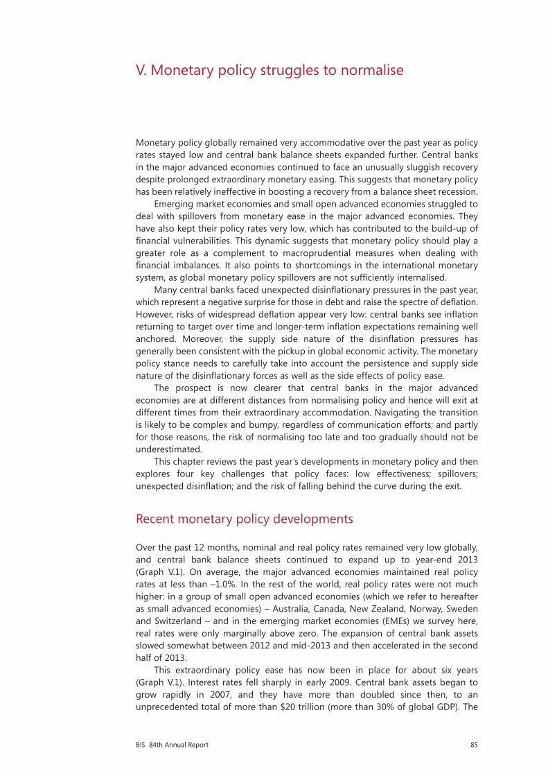
85BIS 84th Annual Report
V. Monetary policy struggles to normalise
Monetary policy globally remained very accommodative over the past year as policy rates stayed low and central bank balance sheets expanded further. Central banks in the major advanced economies continued to face an unusually sluggish recovery despite prolonged extraordinary monetary easing. This suggests that monetary policy has been relatively ineffective in boosting a recovery from a balance sheet recession.
Emerging market economies and small open advanced economies struggled to deal with spillovers from monetary ease in the major advanced economies. They have also kept their policy rates very low, which has contributed to the build-up of financial vulnerabilities. This dynamic suggests that monetary policy should play a greater role as a complement to macroprudential measures when dealing with financial imbalances. It also points to shortcomings in the international monetary system, as global monetary policy spillovers are not sufficiently internalised.
Many central banks faced unexpected disinflationary pressures in the past year, which represent a negative surprise for those in debt and raise the spectre of deflation. However, risks of widespread deflation appear very low: central banks see inflation returning to target over time and longer-term inflation expectations remaining well anchored. Moreover, the supply side nature of the disinflation pressures has generally been consistent with the pickup in global economic activity. The monetary policy stance needs to carefully take into account the persistence and supply side nature of the disinflationary forces as well as the side effects of policy ease.
The prospect is now clearer that central banks in the major advanced economies are at different distances from normalising policy and hence will exit at different times from their extraordinary accommodation. Navigating the transition is likely to be complex and bumpy, regardless of communication efforts; and partly for those reasons, the risk of normalising too late and too gradually should not be underestimated.
This chapter reviews the past year’s developments in monetary policy and then explores four key challenges that policy faces: low effectiveness; spillovers; unexpected disinflation; and the risk of falling behind the curve during the exit.
Recent monetary policy developments
Over the past 12 months, nominal and real policy rates remained very low globally, and central bank balance sheets continued to expand up to year-end 2013 (Graph V.1). On average, the major advanced economies maintained real policy rates at less than –1.0%. In the rest of the world, real policy rates were not much higher: in a group of small open advanced economies (which we refer to hereafter as small advanced economies) – Australia, Canada, New Zealand, Norway, Sweden and Switzerland – and in the emerging market economies (EMEs) we survey here, real rates were only marginally above zero. The expansion of central bank assets slowed somewhat between 2012 and mid-2013 and then accelerated in the second half of 2013.
This extraordinary policy ease has now been in place for about six years (Graph V.1). Interest rates fell sharply in early 2009. Central bank assets began to grow rapidly in 2007, and they have more than doubled since then, to an unprecedented total of more than $20 trillion (more than 30% of global GDP). The
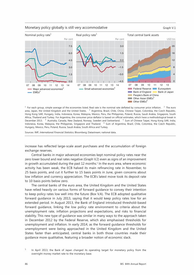
86 BIS 84th Annual Report
increase has reflected large-scale asset purchases and the accumulation of foreign exchange reserves.
Central banks in major advanced economies kept nominal policy rates near the zero lower bound and real rates negative (Graph V.2) even as signs of an improvement in growth accumulated during the past 12 months.1 In the euro area, where economic activity has been weak, the ECB halved its main refinancing rate in November, to 25 basis points, and cut it further to 15 basis points in June, given concerns about low inflation and currency appreciation. The ECB’s latest move took its deposit rate to 10 basis points below zero.
The central banks of the euro area, the United Kingdom and the United States have relied heavily on various forms of forward guidance to convey their intention to keep policy rates low well into the future (Box V.A). The ECB adopted qualitative forward guidance in July 2013, saying that it would keep policy rates low for an extended period. In August 2013, the Bank of England introduced threshold-based forward guidance, linking the low policy rate environment to criteria about the unemployment rate, inflation projections and expectations, and risks to financial stability. This new type of guidance was similar in many ways to the approach taken in December 2012 by the Federal Reserve, which also emphasised thresholds for unemployment and inflation. In early 2014, as the forward guidance thresholds for unemployment were being approached in the United Kingdom and the United States faster than anticipated, central banks in both those countries made their guidance more qualitative, featuring a broader notion of economic slack.
1 In April 2013, the Bank of Japan changed its operating target for monetary policy from the overnight money market rate to the monetary base.
20 June - 14.15h
Monetary policy globally is still very accommodative Graph V.1
Nominal policy rate1 Real policy rate1 Total central bank assets Per cent Per cent USD trn
1 For each group, simple average of the economies listed. Real rate is the nominal rate deflated by consumer price inflation. 2 The euro area, Japan, the United Kingdom and the United States. 3 Argentina, Brazil, Chile, China, Chinese Taipei, Colombia, the Czech Republic, Hong Kong SAR, Hungary, India, Indonesia, Korea, Malaysia, Mexico, Peru, the Philippines, Poland, Russia, Saudi Arabia, Singapore, South Africa, Thailand and Turkey. For Argentina, the consumer price deflator is based on official estimates, which have a methodological break in December 2013. 4 Australia, Canada, New Zealand, Norway, Sweden and Switzerland. 5 Sum of Chinese Taipei, Hong Kong SAR, India, Indonesia, Korea, Malaysia, the Philippines, Singapore and Thailand. 6 Sum of Argentina, Brazil, Chile, Colombia, the Czech Republic, Hungary, Mexico, Peru, Poland, Russia, Saudi Arabia, South Africa and Turkey.
Sources: IMF, International Financial Statistics; Bloomberg; Datastream; national data.
0.0
1.5
3.0
4.5
6.0
7.5
07 08 09 10 11 12 13 14Major advanced economies2
EMEs3
–4.5
–3.0
–1.5
0.0
1.5
3.0
07 08 09 10 11 12 13 14Small advanced economies4
0
4
8
12
16
20
07 08 09 10 11 12 13Federal ReserveBank of EnglandPeople’s Bank of ChinaOther Asian EMEs5
Other EMEs6
EurosystemBank of Japan
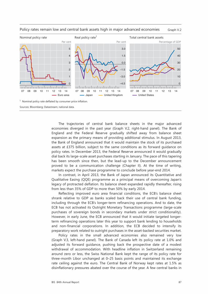
87BIS 84th Annual Report
The trajectories of central bank balance sheets in the major advanced economies diverged in the past year (Graph V.2, right-hand panel). The Bank of England and the Federal Reserve gradually shifted away from balance sheet expansion as the primary means of providing additional stimulus. In August 2013, the Bank of England announced that it would maintain the stock of its purchased assets at £375 billion, subject to the same conditions as its forward guidance on policy rates. In December 2013, the Federal Reserve announced it would gradually dial back its large-scale asset purchases starting in January. The pace of this tapering has been smooth since then, but the lead-up to the December announcement proved to be a communication challenge (Chapter II). At the time of writing, markets expect the purchase programme to conclude before year-end 2014.
In contrast, in April 2013, the Bank of Japan announced its Quantitative and Qualitative Easing (QQE) programme as a principal means of overcoming Japan’s legacy of protracted deflation. Its balance sheet expanded rapidly thereafter, rising from less than 35% of GDP to more than 50% by early 2014.
Reflecting improved euro area financial conditions, the ECB’s balance sheet shrank relative to GDP as banks scaled back their use of central bank funding, including through the ECB’s longer-term refinancing operations. And to date, the ECB has not activated its Outright Monetary Transactions programme (large-scale purchases of sovereign bonds in secondary markets under strict conditionality). However, in early June, the ECB announced that it would initiate targeted longer-term refinancing operations later this year to support bank lending to households and non-financial corporations. In addition, the ECB decided to intensify its preparatory work related to outright purchases in the asset-backed securities market.
Policy rates in the small advanced economies also remained very low (Graph V.3, left-hand panel). The Bank of Canada left its policy rate at 1.0% and adjusted its forward guidance, pushing back the prospective date of a modest withdrawal of accommodation. With headline inflation in Switzerland remaining around zero or less, the Swiss National Bank kept the range of its policy rate for three-month Libor unchanged at 0–25 basis points and maintained its exchange rate ceiling against the euro. The Central Bank of Norway kept rates at 1.5% as disinflationary pressures abated over the course of the year. A few central banks in
Policy rates remain low and central bank assets high in major advanced economies Graph V.2
Nominal policy rate Real policy rate1 Total central bank assets Per cent Per cent Percentage of GDP
1 Nominal policy rate deflated by consumer price inflation.
Sources: Bloomberg; Datastream; national data.
0
1
2
3
4
5
07 08 09 10 11 12 13 14Euro area
–4.5
–3.0
–1.5
0.0
1.5
3.0
07 08 09 10 11 12 13 14Japan United Kingdom
0
10
20
30
40
50
07 08 09 10 11 12 13 14United States
88 BIS 84th Annual Report
Small advanced economies are facing below-target inflation and high debt Graph V.3
Nominal policy rate Deviation of inflation from target1 Household debt2 Per cent Percentage points Percentage of net disposable income
1 Deviation of inflation from either the central bank’s inflation target or the midpoint of the central bank’s target range for all economiesshown in the left-hand panel. 2 Debt and income measures summed across all economies shown in the left-hand panel.
Sources: OECD, Economic Outlook; Bloomberg; Datastream; national data.
0
1
2
3
4
5
2011 2012 2013 2014AustraliaCanadaNew Zealand
NorwaySwedenSwitzerland
–3
–2
–1
0
1
2
07 08 09 10 11 12 13 14Median 25th–75th percentile
155
160
165
170
175
180
07 08 09 10 11 12 13 14
this group changed their policy rates. To support recovery, the Reserve Bank of Australia twice cut its rate to reach 2.5%. Sveriges Riksbank lowered its policy rate by 25 basis points, to 75 basis points, against the background of inflation that was persistently below target. In contrast, on evidence of increased economic momentum and expectations of rising inflation pressures, the Reserve Bank of New Zealand raised its rate three times, for a total of 75 basis points, to reach 3.25%.
Overall, central bank policies in many of the small advanced economies were strongly influenced by the evolution of inflation rates: on average they had fallen short of targets by almost 1 percentage point since early 2012 (Graph V.3, centre panel), and lingering disinflation led many central banks to mark down inflation forecasts.
Moreover, many of these central banks had to balance the short-term macroeconomic effects of low inflation and a lacklustre recovery against the longer-term risks of building up financial imbalances (Chapter IV). Household debt, which was high and rising, reached an average of roughly 175% of net disposable income by end-2013 (Graph V.3, right-hand panel). Those elevated levels, and the prospect of even further debt increases encouraged by accommodative monetary policies, made these economies vulnerable to a sharp deterioration in economic and financial conditions. In those jurisdictions in which house prices were high, the risk of a disorderly adjustment of household sector imbalances could not be ruled out.
In EMEs, central banks had to contend with various monetary policy challenges after a strong post-crisis recovery, which has weakened recently. One such challenge came from bouts of financial market volatility associated with depreciation pressures during the year (Chapter II). In general, their past strong macroeconomic performance had helped to insulate many EMEs from the fallout and afforded them some room for manoeuvre, but only up to a point. Most affected were countries with weaker economic and financial conditions. In many of them, central banks used the policy rate to defend their currencies (Graph V.4, left-hand panel). Between April 2013 and early June 2014, several central banks tightened considerably on net: in Turkey, by 400 basis points, including a 550 basis point hike in one day in
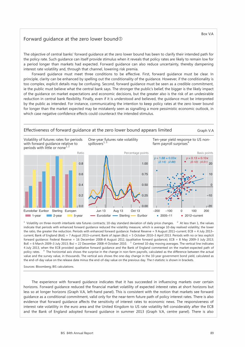
89BIS 84th Annual Report
Box V.AForward guidance at the zero lower bound
The objective of central banks’ forward guidance at the zero lower bound has been to clarify their intended path for the policy rate. Such guidance can itself provide stimulus when it reveals that policy rates are likely to remain low for a period longer than markets had expected. Forward guidance can also reduce uncertainty, thereby dampening interest rate volatility and, through that channel, lowering risk premia.
Forward guidance must meet three conditions to be effective. First, forward guidance must be clear. In principle, clarity can be enhanced by spelling out the conditionality of the guidance. However, if the conditionality is too complex, explicit details may be confusing. Second, forward guidance must be seen as a credible commitment, ie the public must believe what the central bank says. The stronger the public’s belief, the bigger is the likely impact of the guidance on market expectations and economic decisions, but the greater also is the risk of an undesirable reduction in central bank flexibility. Finally, even if it is understood and believed, the guidance must be interpreted by the public as intended. For instance, communicating the intention to keep policy rates at the zero lower bound for longer than the market expected may be mistakenly seen as signalling a more pessimistic economic outlook, in which case negative confidence effects could counteract the intended stimulus.
The experience with forward guidance indicates that it has succeeded in influencing markets over certain horizons. Forward guidance reduced the financial market volatility of expected interest rates at short horizons but less so at longer horizons (Graph V.A, left-hand panel). This is consistent with the notion that markets see forward guidance as a conditional commitment, valid only for the near-term future path of policy interest rates. There is also evidence that forward guidance affects the sensitivity of interest rates to economic news. The responsiveness of interest rate volatility in the euro area and the United Kingdom to US rate volatility fell considerably after the ECB and the Bank of England adopted forward guidance in summer 2013 (Graph V.A, centre panel). There is also
Graphs for Box:
Effectiveness of forward guidance at the zero lower bound appears limited Graph V.A
Volatility of futures rates for periods with forward guidance relative to periods with little or none1, 2
One-year futures rate volatility spillovers1, 3
Ten-year yield response to US non-farm payroll surprises4
Ratio Percentage points Basis points
1 Volatility on three-month interbank rate futures contracts; 10-day standard deviation of daily price changes. 2 At less than 1, the values indicate that periods with enhanced forward guidance reduced the volatility measure, which is average 10-day realised volatility; the lower the ratio, the greater the reduction. Periods with enhanced forward guidance: Federal Reserve = 9 August 2011–current; ECB = 4 July 2013–current; Bank of England (BoE) = 7 August 2013–current; Bank of Japan (BoJ) = 5 October 2010–3 April 2013. Periods with no or less explicit forward guidance: Federal Reserve = 16 December 2008–8 August 2011 (qualitative forward guidance); ECB = 8 May 2009–3 July 2013;BoE = 6 March 2009–3 July 2013; BoJ = 22 December 2008–4 October 2010. 3 Centred 10-day moving averages. The vertical line indicates 4 July 2013, when the ECB provided qualitative forward guidance and the Bank of England commented on the market-expected path of policy rates. 4 The horizontal axis shows the surprise in the change in non-farm payrolls, calculated as the difference between the actual value and the survey value, in thousands. The vertical axis shows the one-day change in the 10-year government bond yield, calculated as the end-of-day value on the release date minus the end-of-day value on the previous day. The t-statistic is shown in brackets.
Sources: Bloomberg; BIS calculations.
0.0
0.2
0.4
0.6
0.8
Eurodollar Euribor Sterling Euroyen1-year 2-year 5-year
0.00
0.25
0.50
0.75
1.00
Jun 13 Aug 13 Oct 13Eurodollar Sterling Euribor
–20
–10
0
10
20
–200 –100 0 100 200
y = 1.68 + 0.03x(2.14) (2.88)
y = 0.13 + 0.10x(0.10) (4.51)
2005–11 2012–current
90 BIS 84th Annual Report
January; and in Russia and Indonesia, by 200 and 175 basis points, respectively. India and South Africa raised rates by 50 basis points. Brazil boosted rates gradually by 375 basis points over the period as currency depreciation and other forces helped keep inflation pressures elevated. The EME policy responses to currency depreciation appeared to reflect in part their recent inflation experience (Graph V.4, centre panel). Where inflation was above target, depreciation pressures tended to be stronger and policy rates rose by more. Where inflation was at or below target, no such relationship is visible.
The monetary authorities in the EMEs less affected by capital outflows and exchange rate pressures had more policy room to respond to other developments. In Chile and Mexico, the central banks cut policy rates as their economies showed signs of slowing. In the Czech Republic, the policy rate remained low as inflation fell below target, and the central bank decided to use the exchange rate as an additional instrument for easing monetary conditions by establishing a ceiling for the exchange value of the koruna against the euro. Poland cut rates several times early on as disinflationary pressures took hold. In China, the central bank maintained its monetary policy stance with some deceleration in monetary and credit growth as financial stability concerns grew, especially in relation to the expanding non-bank financial sector.
A number of EMEs also conducted foreign exchange operations last year to help absorb unwelcome depreciation pressures. Nonetheless, foreign exchange reserves for EMEs as a whole continued to increase, especially for China (Annex Table V.1). However, in a number of EMEs, for example Brazil, Indonesia, Russia and Thailand, foreign exchange reserves dropped; for several such economies, it was the first reported annual decline in many years.
Credit expansion in many EMEs has been raising financial stability concerns, especially against the backdrop of volatile financial markets. For the group of EMEs surveyed here, the credit-to-GDP ratio rose on average by around 40% from 2007 to 2013 (Graph V.4, right-hand panel). For these central banks, questions remain about the best mix of monetary, macroprudential and capital flow management tools.
Key monetary policy challenges
Central banks are facing a number of significant challenges. For the major advanced economies recovering from balance sheet recessions (that is, a recession induced
evidence that forward guidance made markets more sensitive to indicators emphasised in the guidance. For instance, US 10-year bond yields became more sensitive to non-farm payroll surprises beginning in 2012 (Graph V.A, right-hand panel); one interpretation is that news reflecting a stronger recovery tended to bring forward the expected time at which the unemployment threshold would be breached and policy rate lift-off would ensue.
Policy rate forward guidance also raises a number of risks. If the public fails to fully understand the conditionality of the guidance, the central bank’s reputation and credibility may be at risk if the rate path is revised frequently and substantially, even though the changes adhere to the conditionality originally announced. Forward guidance can also give rise to financial risks in two ways. First, if financial markets become narrowly focused on it, a recalibration of the guidance could lead to disruptive market reactions. Second, and more importantly, forward guidance could lead to a perceived delay in the speed of monetary policy normalisation. This could encourage excessive risk-taking and foster a build-up of financial vulnerabilities.
For a more detailed analysis, see A Filardo and B Hofmann, “Forward guidance at the zero lower bound”, BIS Quarterly Review, March 2014, pp 37–53.

91BIS 84th Annual Report
by financial crisis and an unsustainable accumulation of debt), the key challenge has been calibrating the monetary policy stance at a time when policy appears to have lost some of its ability to stimulate the economy. For many EMEs and small advanced economies, the main challenge has been the build-up of financial vulnerabilities and the risk of heightened capital flow volatility, problems complicated by global monetary policy spillovers. Worldwide, many central banks are struggling with the puzzling disinflationary pressures that materialised in the past year. And looking ahead, questions arise about the timing and pace of policy normalisation.
Low monetary policy effectiveness
Central banks played a critical role in containing the fallout from the financial crisis. However, despite the past six years of monetary easing in the major advanced economies, the recovery has been unusually slow (Chapter III). This raises questions about the effectiveness of expansionary monetary policy in the wake of the crisis.
Effectiveness has been limited for two broad reasons: the zero lower bound on the nominal policy rate, and the legacy of balance sheet recessions. First, the zero lower bound constrains the central banks’ ability to reduce policy rates and boost demand. This explains attempts to provide additional stimulus by managing expectations about the future policy rate path and through large-scale asset purchases. But those policies also have limitations. For instance, term premia and credit risk spreads in many countries were already very low (Graph II.2): they cannot fall much further. In addition, compressed and at times even negative term premia
EMEs respond to market tensions while concerns about stability rise Graph V.4
Change in policy rates since April 2013 …1
… is linked to exchange rate and inflation performance
Credit-to-GDP ratio3
Percentage points Q1 2007 = 100
BR = Brazil; CL = Chile; CN = China; CO = Colombia; CZ = Czech Republic; HU = Hungary; ID = Indonesia; IN = India; KR = Korea; MX = Mexico; PE = Peru; PH = Philippines; PL = Poland; RU = Russia; TH = Thailand; TR = Turkey; ZA = South Africa.
1 Nominal policy rate or the closest alternative; for China, seven-day repo rate; changes from 1 April 2013 to 6 June 2014, in percentage points. 2 Percentage changes in the nominal effective exchange rate from 1 April 2013 to 6 June 2014. A positive (negative) number indicates depreciation (appreciation). 3 For each group, simple average of the economies listed. 4 China, Hong Kong SAR, India, Indonesia, Korea, Malaysia, the Philippines, Singapore and Thailand. 5 Argentina, Brazil, Chile, Colombia, Mexico and Peru. 6 The Czech Republic, Hungary, Poland, Russia, Saudi Arabia, South Africa and Turkey.
Sources: Bloomberg; Datastream; national data; BIS.
–4
–2
0
2
4
TR BR RU ID IN ZA COPH CZ PE KR CN TH PL MX CL HU
Above inflation objectiveBelow inflation objective
Inflation since 2013 on average:
KRPH
CNCL
COCZ
PL
HU
ID
TH
IN
PE
BR
MX
ZA
TR
RU
–3.0
–1.5
0.0
1.5
3.0
–10 –5 0 5 10Depreciation in exchange rate2
Cha
nge
in p
olic
y ra
te1
Above inflation objectiveBelow inflation objective
Inflation since 2013 on average:
100
110
120
130
140
07 08 09 10 11 12 13Emerging Asia4
Latin America5
Other EMEs6

92 BIS 84th Annual Report
reduce the profits from maturity transformation and so may actually reduce banks’ incentives to grant credit. Moreover, the scope for negative nominal interest rates is very limited and their effectiveness uncertain. The impact on lending is doubtful, and the small room for reductions diminishes the effect on the exchange rate, which in turn depends also on the reaction of others. In general, at the zero lower bound, providing additional stimulus becomes increasingly hard.
Second, the legacy of balance sheet recessions numbs policy effectiveness. Some of this has to do with financial factors. When the financial sector is impaired, the supply of credit is less responsive to interest rate cuts. And the demand for credit from non-financial sectors is sluggish – they are seeking instead to pay down debt incurred on the basis of overly optimistic income expectations. This is why “credit-less recoveries” are the norm in these situations (Chapter III). But some of the legacy of balance sheet recessions has to do with non-financial factors. The misallocations of capital and labour that go hand in hand with unsustainable financial booms can sap the traction of demand management policies, as these address only symptoms rather than underlying problems. For instance, the residential construction sector would normally be more sensitive than many others to lower interest rates, but it expanded too much during the boom. In fact, the historical record indicates that the positive relationship between the degree of monetary accommodation during recessions and the strength of the subsequent recovery vanishes when the recession is associated with a financial crisis (Box V.B). Moreover, deleveraging during the recession, regardless of how it is measured, eventually ushers in a stronger recovery.
None of this means that monetary accommodation has no role to play in a recovery from a balance sheet recession. A degree of accommodation was clearly necessary in the early stages of the financial crisis to contain the fallout. But the relative ineffectiveness of monetary policy does signify that it cannot substitute for measures that tackle the underlying problems, promoting the necessary balance sheet repair and structural reforms.
Unless it is recognised, limited effectiveness implies a fruitless effort to apply the same measures more persistently or forcefully. The consequence is not only inadequate progress but also amplification of unintended side effects, and the aftermath of the crisis has highlighted several such side effects.2 In particular, prolonged and aggressive easing reduces incentives to repair balance sheets and to implement necessary structural reforms, thereby hindering the needed reallocation of resources. It may also foster too much risk-taking in financial markets (Chapter II). And it may generate unwelcome spillovers in other economies at different points in their financial and business cycles (see below). Put differently, under limited policy effectiveness, the balance between benefits and costs of prolonged monetary accommodation has deteriorated over time.
Monetary policy spillovers
EMEs and small advanced economies have been struggling with spillovers from the major advanced economies’ accommodative monetary policies. The spillovers work through cross-border financial flows and asset prices (including the exchange rate) as well as through policy responses.3
2 See J Caruana, “Hitting the limits of ‘outside the box’ thinking? Monetary policy in the crisis and beyond”, speech at the OMFIF Golden Series Lecture, London, 16 May 2013.
3 See J Caruana, “International monetary policy interactions: challenges and prospects”, speech at the CEMLA-SEACEN conference in Punta del Este, Uruguay, 16 November 2012.
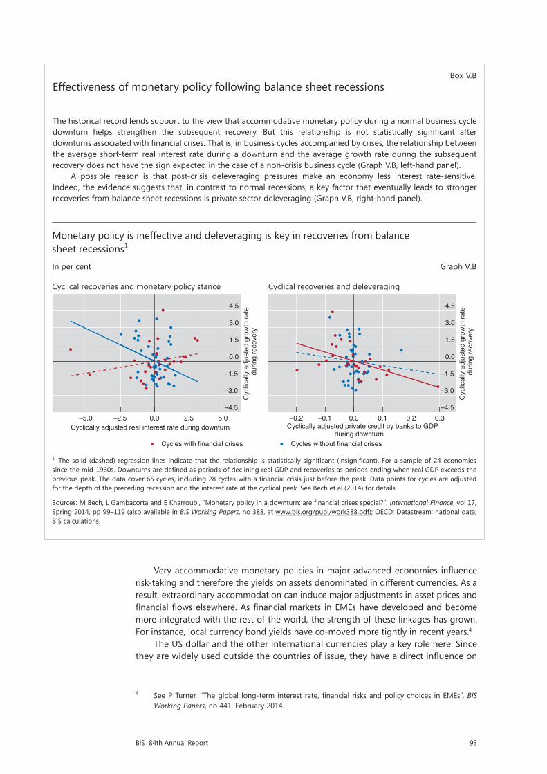
93BIS 84th Annual Report
Very accommodative monetary policies in major advanced economies influence risk-taking and therefore the yields on assets denominated in different currencies. As a result, extraordinary accommodation can induce major adjustments in asset prices and financial flows elsewhere. As financial markets in EMEs have developed and become more integrated with the rest of the world, the strength of these linkages has grown. For instance, local currency bond yields have co-moved more tightly in recent years.4
The US dollar and the other international currencies play a key role here. Since they are widely used outside the countries of issue, they have a direct influence on
4 See P Turner, “The global long-term interest rate, financial risks and policy choices in EMEs”, BIS Working Papers, no 441, February 2014.
Box V.BEffectiveness of monetary policy following balance sheet recessions
The historical record lends support to the view that accommodative monetary policy during a normal business cycle downturn helps strengthen the subsequent recovery. But this relationship is not statistically significant after downturns associated with financial crises. That is, in business cycles accompanied by crises, the relationship between the average short-term real interest rate during a downturn and the average growth rate during the subsequent recovery does not have the sign expected in the case of a non-crisis business cycle (Graph V.B, left-hand panel).
A possible reason is that post-crisis deleveraging pressures make an economy less interest rate-sensitive. Indeed, the evidence suggests that, in contrast to normal recessions, a key factor that eventually leads to stronger recoveries from balance sheet recessions is private sector deleveraging (Graph V.B, right-hand panel).
Monetary policy is ineffective and deleveraging is key in recoveries from balance sheet recessions1
In per cent Graph V.B
Cyclical recoveries and monetary policy stance Cyclical recoveries and deleveraging
1 The solid (dashed) regression lines indicate that the relationship is statistically significant (insignificant). For a sample of 24 economies since the mid-1960s. Downturns are defined as periods of declining real GDP and recoveries as periods ending when real GDP exceeds the previous peak. The data cover 65 cycles, including 28 cycles with a financial crisis just before the peak. Data points for cycles are adjusted for the depth of the preceding recession and the interest rate at the cyclical peak. See Bech et al (2014) for details.
Sources: M Bech, L Gambacorta and E Kharroubi, “Monetary policy in a downturn: are financial crises special?”, International Finance, vol 17, Spring 2014, pp 99–119 (also available in BIS Working Papers, no 388, at www.bis.org/publ/work388.pdf); OECD; Datastream; national data;BIS calculations.
–4.5
–3.0
–1.5
0.0
1.5
3.0
4.5
–5.0 –2.5 0.0 2.5 5.0
Cyc
lical
ly a
djus
ted
grow
th ra
te
dur
ing
reco
very
Cyclically adjusted real interest rate during downturn
Cycles with financial crises
–4.5
–3.0
–1.5
0.0
1.5
3.0
4.5
–0.2 –0.1 0.0 0.1 0.2 0.3
Cyc
lical
ly a
djus
ted
grow
th ra
te
dur
ing
reco
very
Cyclically adjusted private credit by banks to GDP during downturn
Cycles without financial crises

94 BIS 84th Annual Report
international financial conditions. For example, the amount of US dollar credit outstanding outside the United States was roughly $7 trillion at end-2013 (Graph V.5, left-hand panel). When interest rates expressed in these currencies are low, EME borrowers find it cheaper to borrow in them, and those who have already borrowed at variable rates enjoy lower financing costs. Before the crisis, flows of dollar credit in particular were driven by cross-border bank lending; since 2008, activity in global capital markets has surged (Graph V.5, centre panel).5
Policy responses matter too. Central banks find it difficult to operate with policy rates that are considerably different from those prevailing in the key currencies, especially the US dollar. Concerns with exchange rate overshooting and capital inflows make them reluctant to accept large and possibly volatile interest rate differentials, which contributes to highly correlated short-term interest rate movements (Graph V.5, right-hand panel). Indeed, the evidence is growing that US policy rates significantly influence policy rates elsewhere (Box V.C).
Very low interest rates in the major advanced economies thus pose a dilemma for other central banks. On the one hand, tying domestic policy rates to the very low rates abroad helps mitigate currency appreciation and capital inflows. On the other hand, it may also fuel domestic financial booms and hence encourage the build-up of vulnerabilities. Indeed, there is evidence that those countries in which policy rates have been lower relative to traditional benchmarks, which take account of output and inflation developments, have also seen the strongest credit booms (Chapter IV).
5 See R McCauley, P McGuire and V Sushko, “Global dollar credit: links to US monetary policy and leverage”, Economic Policy, forthcoming.
Global borrowing in foreign currencies rises while short-term interest rates co-move Graph V.5
Credit to non-residents, by currency1 Credit to non-residents, by type1, 2 Three-month interest rate Amount outstanding, USD trn Year-on-year growth, per cent Per cent Per cent
1 At end-2013 exchange rates. For each currency, credit is to non-financial borrowers outside the respective currency-issuing country or area. Credit includes loans to non-banks and debt securities of non-financial issuers. In addition, in countries not reporting to the BIS, loans by local banks to domestic residents in each of the currencies shown are proxied by the respective cross-border loans received by the banks on the assumption that these funds are then extended to non-banks. 2 Based on the sum of credit in currencies shown in the left-hand panel. 3 Simple average of Brazil, Chile, China, Chinese Taipei, Colombia, the Czech Republic, Hong Kong SAR, Hungary, India, Indonesia, Korea, Malaysia, Mexico, Peru, the Philippines, Poland, Russia, Saudi Arabia, Singapore, South Africa, Thailand and Turkey. 4 Simple average of the euro area, Japan, the United Kingdom and the United States. 5 Simple average of Australia, Canada, New Zealand, Norway, Sweden and Switzerland.
Sources: Bloomberg; Datastream; BIS international debt statistics and locational banking statistics by residence.
0
2
4
6
8
10
03 05 07 09 11 13US dollarEuroYen
Pound sterlingSwiss franc
–20
–10
0
10
20
30
03 05 07 09 11 13Cross-border loansInternational debt securities
0
2
4
6
8
10
0
1
2
3
4
5
03 05 07 09 11 13EMEs (lhs)3
Major advanced economies (rhs)4
Small advanced economies (rhs)5
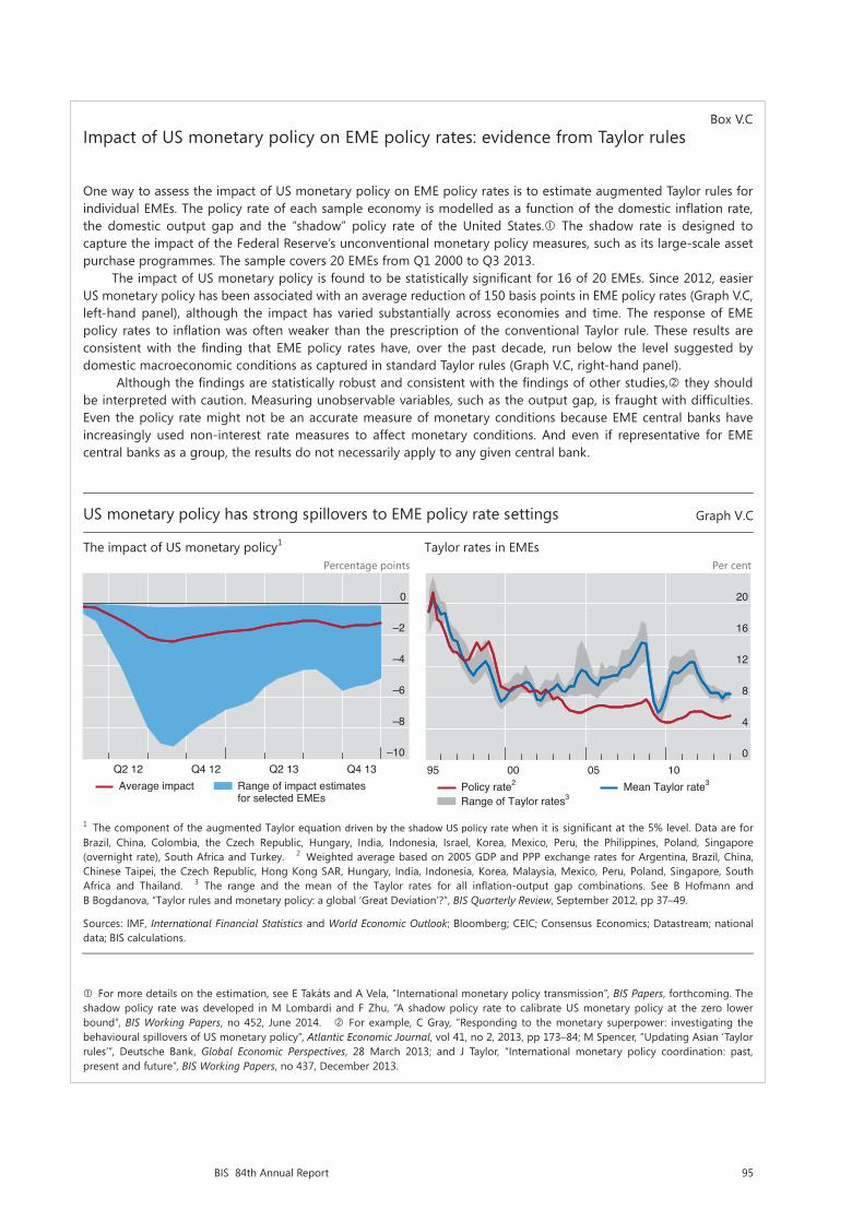
95BIS 84th Annual Report
Box V.CImpact of US monetary policy on EME policy rates: evidence from Taylor rules
One way to assess the impact of US monetary policy on EME policy rates is to estimate augmented Taylor rules for individual EMEs. The policy rate of each sample economy is modelled as a function of the domestic inflation rate, the domestic output gap and the “shadow” policy rate of the United States. The shadow rate is designed to capture the impact of the Federal Reserve’s unconventional monetary policy measures, such as its large-scale asset purchase programmes. The sample covers 20 EMEs from Q1 2000 to Q3 2013.
The impact of US monetary policy is found to be statistically significant for 16 of 20 EMEs. Since 2012, easier US monetary policy has been associated with an average reduction of 150 basis points in EME policy rates (Graph V.C, left-hand panel), although the impact has varied substantially across economies and time. The response of EME policy rates to inflation was often weaker than the prescription of the conventional Taylor rule. These results are consistent with the finding that EME policy rates have, over the past decade, run below the level suggested by domestic macroeconomic conditions as captured in standard Taylor rules (Graph V.C, right-hand panel).
Although the findings are statistically robust and consistent with the findings of other studies, they should be interpreted with caution. Measuring unobservable variables, such as the output gap, is fraught with difficulties. Even the policy rate might not be an accurate measure of monetary conditions because EME central banks have increasingly used non-interest rate measures to affect monetary conditions. And even if representative for EME central banks as a group, the results do not necessarily apply to any given central bank.
For more details on the estimation, see E Takáts and A Vela, “International monetary policy transmission”, BIS Papers, forthcoming. The shadow policy rate was developed in M Lombardi and F Zhu, “A shadow policy rate to calibrate US monetary policy at the zero lower bound”, BIS Working Papers, no 452, June 2014. For example, C Gray, “Responding to the monetary superpower: investigating the behavioural spillovers of US monetary policy”, Atlantic Economic Journal, vol 41, no 2, 2013, pp 173–84; M Spencer, “Updating Asian ‘Taylor rules’”, Deutsche Bank, Global Economic Perspectives, 28 March 2013; and J Taylor, “International monetary policy coordination: past, present and future”, BIS Working Papers, no 437, December 2013.
US monetary policy has strong spillovers to EME policy rate settings Graph V.C
The impact of US monetary policy1 Taylor rates in EMEs Percentage points Per cent
1 The component of the augmented Taylor equation driven by the shadow US policy rate when it is significant at the 5% level. Data are forBrazil, China, Colombia, the Czech Republic, Hungary, India, Indonesia, Israel, Korea, Mexico, Peru, the Philippines, Poland, Singapore(overnight rate), South Africa and Turkey. 2 Weighted average based on 2005 GDP and PPP exchange rates for Argentina, Brazil, China, Chinese Taipei, the Czech Republic, Hong Kong SAR, Hungary, India, Indonesia, Korea, Malaysia, Mexico, Peru, Poland, Singapore, SouthAfrica and Thailand. 3 The range and the mean of the Taylor rates for all inflation-output gap combinations. See B Hofmann and B Bogdanova, “Taylor rules and monetary policy: a global ‘Great Deviation’?”, BIS Quarterly Review, September 2012, pp 37–49.
Sources: IMF, International Financial Statistics and World Economic Outlook; Bloomberg; CEIC; Consensus Economics; Datastream; national data; BIS calculations.
–10
–8
–6
–4
–2
0
Q2 12 Q4 12 Q2 13 Q4 13Average impact Range of impact estimates
for selected EMEs
0
4
8
12
16
20
95 00 05 10Policy rate2
Range of Taylor rates3Mean Taylor rate3

96 BIS 84th Annual Report
To address this dilemma, central banks have relied extensively on macroprudential tools. These tools have proved very helpful in increasing the resilience of the financial system, but they have been only partially effective in restraining the build-up of financial imbalances (Chapter IV and Box VI.D). A key reason is that, as in the case of capital flow management measures, macroprudential tools are vulnerable to regulatory arbitrage. The implication is that relying exclusively on macroprudential measures is not sufficient and monetary policy must generally play a complementary role. In contrast to macroprudential tools, the policy rate is an economy-wide determinant of the price of leverage in a given currency, so its impact is more pervasive and less easily evaded. Countries using monetary policy more forcefully as a complement to macroprudential policy need to accept a greater degree of exchange rate flexibility.
Failing to rely on monetary policy can raise even more serious challenges down the road. Allowing the financial imbalances to build over time would exacerbate a country’s vulnerability to an unwinding, thereby imposing greater damage and, most likely, precipitating an external crisis as well. But if they do not unwind and the country is hit by an external shock, the central bank will find it very hard to raise interest rates without generating the financial stress it was trying to avoid in the first place. Full-blown financial busts have not as yet occurred in EMEs or small advanced economies, but countries in which credit growth had been relatively high proved more vulnerable to the May–June 2013 period of market tensions (Chapter II). This indicates that a more gradual but early tightening is superior to a delayed but abrupt one later on – delayed responses cause a more wrenching adjustment.
Disruptive monetary policy spillovers have highlighted shortcomings in the international monetary system. Ostensibly, it has proved hard for major advanced economies to fully take these spillovers into account. Should financial booms turn to bust, the costs for the global economy could prove to be quite large, not least since the economic weight of the countries affected has increased substantially. Capturing these spillovers remains a major challenge: it calls for analytical frameworks in which financial factors have a much greater role than they are accorded in policy institutions nowadays and for a better understanding of global linkages.
Unexpected disinflation and the risks of deflation
Many central banks faced unexpected disinflationary pressures in the past year; as a result, inflation fell or remained below their objectives. The pressures were particularly surprising in the advanced economies because the long-awaited recovery seemed to be gaining traction (Chapter III). A key monetary policy challenge has been how best to respond to such pressures.
Generally, all else equal, inflation unexpectedly below objectives would call for an easier monetary policy stance. However, the appropriate response depends on a number of additional factors. Especially important are the perceived costs and benefits of disinflation. Another factor, as noted above, is the evidence suggesting that the effectiveness of expansionary monetary policy is limited at the zero lower bound, especially during the recovery from a balance sheet recession.
Recent developments indicate that the likelihood of persistent disinflationary pressures is low. Long-term inflation expectations (six to 10 years ahead) have been well anchored up to the time of writing (Graph V.6), which suggests that shortfalls of inflation from objectives could be transitory. Under such conditions, wage inflation and price inflation are less likely to reinforce each other – ie so-called second-round effects would not operate. For example, the decline in commodity prices from recent historical highs has contributed to the disinflationary pressures in the past few years. Even if these prices stabilise at current levels rather than bounce back, as appears to be the case at the time of writing, the disinflationary pressures would
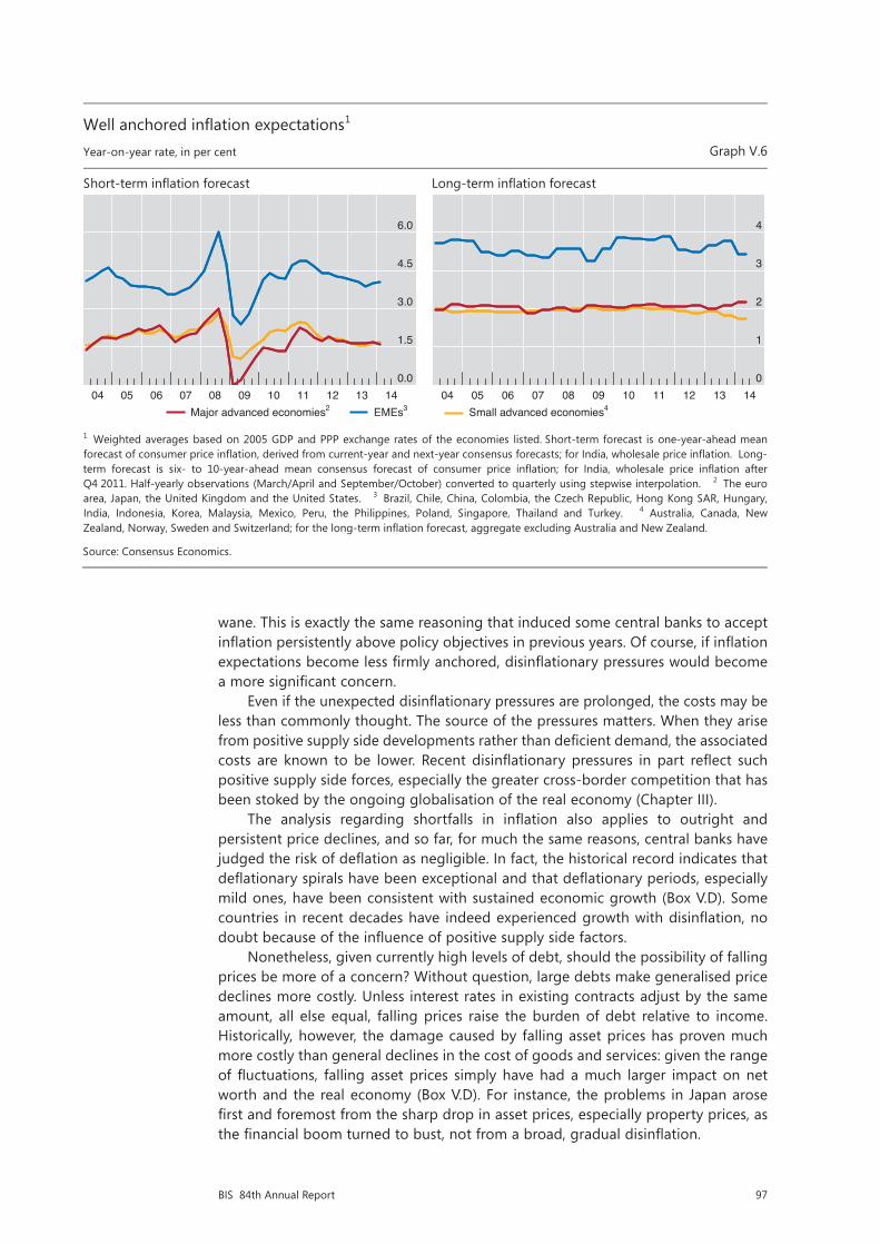
97BIS 84th Annual Report
wane. This is exactly the same reasoning that induced some central banks to accept inflation persistently above policy objectives in previous years. Of course, if inflation expectations become less firmly anchored, disinflationary pressures would become a more significant concern.
Even if the unexpected disinflationary pressures are prolonged, the costs may be less than commonly thought. The source of the pressures matters. When they arise from positive supply side developments rather than deficient demand, the associated costs are known to be lower. Recent disinflationary pressures in part reflect such positive supply side forces, especially the greater cross-border competition that has been stoked by the ongoing globalisation of the real economy (Chapter III).
The analysis regarding shortfalls in inflation also applies to outright and persistent price declines, and so far, for much the same reasons, central banks have judged the risk of deflation as negligible. In fact, the historical record indicates that deflationary spirals have been exceptional and that deflationary periods, especially mild ones, have been consistent with sustained economic growth (Box V.D). Some countries in recent decades have indeed experienced growth with disinflation, no doubt because of the influence of positive supply side factors.
Nonetheless, given currently high levels of debt, should the possibility of falling prices be more of a concern? Without question, large debts make generalised price declines more costly. Unless interest rates in existing contracts adjust by the same amount, all else equal, falling prices raise the burden of debt relative to income. Historically, however, the damage caused by falling asset prices has proven much more costly than general declines in the cost of goods and services: given the range of fluctuations, falling asset prices simply have had a much larger impact on net worth and the real economy (Box V.D). For instance, the problems in Japan arose first and foremost from the sharp drop in asset prices, especially property prices, as the financial boom turned to bust, not from a broad, gradual disinflation.
Well anchored inflation expectations1 Year-on-year rate, in per cent Graph V.6
Short-term inflation forecast Long-term inflation forecast
1 Weighted averages based on 2005 GDP and PPP exchange rates of the economies listed. Short-term forecast is one-year-ahead mean forecast of consumer price inflation, derived from current-year and next-year consensus forecasts; for India, wholesale price inflation. Long-term forecast is six- to 10-year-ahead mean consensus forecast of consumer price inflation; for India, wholesale price inflation afterQ4 2011. Half-yearly observations (March/April and September/October) converted to quarterly using stepwise interpolation. 2 The euro area, Japan, the United Kingdom and the United States. 3 Brazil, Chile, China, Colombia, the Czech Republic, Hong Kong SAR, Hungary,India, Indonesia, Korea, Malaysia, Mexico, Peru, the Philippines, Poland, Singapore, Thailand and Turkey. 4 Australia, Canada, New Zealand, Norway, Sweden and Switzerland; for the long-term inflation forecast, aggregate excluding Australia and New Zealand.
Source: Consensus Economics.
0.0
1.5
3.0
4.5
6.0
04 05 06 07 08 09 10 11 12 13 14Major advanced economies2 EMEs3
0
1
2
3
4
04 05 06 07 08 09 10 11 12 13 14Small advanced economies4

98 BIS 84th Annual Report
Box V.DThe costs of deflation: what does the historical record say?
Deflations are not all alike. Owing to the prevalence of price declines in the 19th and early 20th centuries as well as since the 1990s, the historical record can reveal important features of deflation dynamics. Four stand out.
First, the record is replete with examples of “good”, or at least “benign”, deflations in the sense that they coincided with output either rising along trend or undergoing only a modest and temporary setback. In the pre-World War I period, deflation episodes were generally of the benign type, with real GDP continuing to expand when prices declined (Graph V.D, left-hand panel). Average real growth in the five years up to the peak in the price level was roughly similar to the growth rate in the five years after the peak (2.3% vs 2.1%). In the early interwar period (mainly in the 1920s), the number of somewhat more costly (“bad”) deflations increased (Graph V.D, centre panel): output still rose, but much more slowly – the average rates in the pre- and post-peak periods were 2.3% and 1.2%, respectively. (Perceptions of truly severe deflations during the interwar period are dominated by the exceptional experience of the Great Depression, when prices in the G10 economies fell cumulatively up to roughly 20% and output contracted by about 10%. That experience is not fully reflected in Graph V.D, centre panel.)
The deflation episodes during the past two and a half decades have, on average, been much more akin to the good types experienced during the pre-World War I period than to those of the early interwar period (although identifying peaks in the price level during this period is much more difficult than in the earlier periods because the recent deflations tend to be fleeting). For the most recent episodes, the average rates of GDP growth in the pre- and post-peak periods were 3.6% and 3.1%, respectively, a difference that is not statistically significant.
Deflation periods: the good and the bad
CPI peak = 100 Graph V.D
Pre-World War I1, 2 Early interwar1, 2 1990–20131, 3
1 A series of consumer price index (CPI) readings five years before and after each peak for each economy, rebased with the peak equal to 100 (denoted as year 0). The simple average of the rebased indices of each economy is calculated. 2 Pre-World War I peaks range from 1860 to 1901; early interwar period peaks range from 1920 to 1930. Simple average of G10 economies. See Borio and Filardo (2004) for details on identifying the local CPI peaks based on the annual price index. CPI peak years for each G10 economy in the pre-World War I and early interwar periods are as follows: Belgium, 1862, 1867, 1873, 1891, 1901, 1929; Canada, 1882, 1889, 1920, 1929; France, 1871, 1877, 1884, 1902, 1930; Germany, 1928; Italy, 1874, 1891, 1926; Japan, 1920; the Netherlands, 1892, 1920; Sweden, 1862, 1874, 1891, 1920; Switzerland, 1892, 1898; the United Kingdom, 1860, 1873, 1891, 1920; the United States, 1866, 1881, 1891, 1920, 1926. 3 Simple average of 13 economies, quarterly CPI data. A peak occurs when the CPI level exceeds all previous levels and the levels of at least the next four quarters. CPI peak quarters are as follows: Australia, Q1 1997; Canada, Q4 1993, Q3 2008; China, Q1 1998, Q2 2008; the euro area, Q3 2008; Hong Kong SAR, Q2 1998; Japan, Q4 1994, Q4 1998; New Zealand, Q3 1998; Norway, Q1 2003; Singapore, Q4 1997, Q1 2001, Q4 2008; South Africa, Q2 2003; Sweden, Q4 1997, Q3 2008; Switzerland, Q2 2008; the United States, Q3 2008.
Sources: C Borio and A Filardo, “Looking back at the international deflation record”, North American Journal of Economics and Finance, vol 15, no 3, December 2004, pp 287–311; national data; BIS calculations.
85
90
95
100
105
110
–5 –4 –3 –2 –1 0 1 2 3 4 5Years relative to peak date
60
70
80
90
100
110
–5 –4 –3 –2 –1 0 1 2 3 4 5Years relative to peak date
Consumer price index Real GDP
70
80
90
100
110
120
–5 –4 –3 –2 –1 0 1 2 3 4 5Years relative to peak date

99BIS 84th Annual Report
More generally, financial stability concerns call into question the wisdom of seeking to push inflation back towards its objective over the conventional two-year horizon. Instead, allowing inflation to undershoot the target may be appropriate, especially in those jurisdictions in which financial imbalances have been building up (Chapter IV). All else the same, failing to do so may actually risk unwelcome disinflationary pressures down the road as the boom turns to bust. This, along with evidence of diminished policy effectiveness, suggests that although recent disinflationary pressures deserve close monitoring, the factors limiting their effects and the costs of further monetary ease should be carefully assessed.
Normalising policy
Looking ahead, the transition from extraordinary monetary ease to more normal policy settings poses a number of unprecedented challenges. It will require deft timing and skilful navigation of economic, financial and political factors, and hence it will be difficult to ensure a smooth normalisation. The prospects for a bumpy exit together with other factors suggest that the predominant risk is that central banks will find themselves behind the curve, exiting too late or too slowly.
The central banks from the major advanced economies are at different distances from normalising policy. The Bank of England has maintained its stock of purchased assets since mid-2012, and in 2014 the Federal Reserve began a steady reduction of its large-scale asset purchases as a precursor to policy rate lift-off. In contrast, the Bank of Japan is still in the midst of its aggressive programme of balance sheet expansion. And the ECB has just announced targeted longer-term refinancing operations and lowered its key policy rates to unprecedented levels.
Central banks have also indicated that they will calibrate the pace of policy normalisation on the basis of the strength of the recovery and the evolution
The second important feature of deflation dynamics revealed by the historical record is the general absence of an inherent deflation spiral risk – only the Great Depression episode featured a deflation spiral in the form of a strong and persistent decline in the price level; the other episodes did not. During the pre-World War I episodes, price drops were persistent but not large, with an average cumulative decline in the consumer price index of about 7%. More recently, deflation episodes have been very short-lived, with the price level falling mildly; the notable exception is Japan, where price levels fell cumulatively by roughly 4% from the late 1990s until very recently. The evidence, especially in recent decades, argues against the notion that deflations lead to vicious deflation spirals. In addition, the fact that wages are less flexible today than they were in the distant past reduces the likelihood of a self-reinforcing downward spiral of wages and prices.
Third, it is asset price deflations rather than general deflations that have consistently and significantly harmed macroeconomic performance. Indeed, both the Great Depression in the United States and the Japanese deflation of the 1990s were preceded by a major collapse in equity prices and, especially, property prices. These observations suggest that the chain of causality runs primarily from asset price deflation to real economic downturn, and then to deflation, rather than from general deflation to economic activity. This notion is also supported by the trajectories of prices and real output during the interwar period (Graph V.D, centre panel), which show that real GDP tended to contract before deflation set in.
Fourth, recent deflation episodes have often gone hand in hand with rising asset prices, credit expansion and strong output performance. Examples include episodes in the 1990s and 2000s in countries as distinct as China and Norway. There is a risk that easy monetary policy in response to good deflations, aiming to bring inflation closer to target, could inadvertently accommodate the build-up of financial imbalances. Such resistance to “good” deflations can, over time, lead to “bad” deflations if the imbalances eventually unwind in a disruptive manner.
For formal evidence on this point, see C Goodhart and B Hofmann, House prices and the macroeconomy, Oxford University Press, 2006, Chapter 5, “Goods and asset price deflations”.
100 BIS 84th Annual Report
of various crisis-related headwinds. The Federal Reserve expects labour market headwinds and balance sheet problems to wane over the next few years; nonetheless, it expects that the real interest rate consistent with macroeconomic balance (ie the natural rate) will normalise, at about 2%, only over a longer period, in part because of a persistent surfeit of global saving. The Bank of England’s Monetary Policy Committee has said that the natural rate is being held down by continuing strains in the financial system and the process of repair in private and public balance sheets. The ECB sees different headwinds. It expects bank deleveraging and financial fragmentation, among other factors, to hold back the recovery for several years. Overall, the gap between current market expectations of policy rates and the trajectory of rates implied by Taylor rules (Graph V.7) may be shaping the perception of headwinds and their persistence.
A common view today is that central banks should be extra cautious to avoid endangering the fragile recovery. According to this view, deflation would impose major costs, and even delaying exit would not be a major problem: inflation might rise, but central banks could then quickly catch up. Moreover, according to this view, careful communication, announcing any exit well in advance and making it clear that it would be gradual, would help limit the risk of market disruptions.
This view is supported by a number of historical observations. The Federal Reserve’s exit decision in 1994 created serious market tensions globally, whereas the better anticipated and more gradual exit in 2004 had no such large effects. Moreover, the gradual pace of exit in 2004 did not result in inflation increasing beyond the central bank’s control. Indeed, this exit was designed to a considerable extent to avoid some of the shortcomings of the 1994 process.
However, the argument urging central bank restraint focuses on inflation and the business cycle at the expense of the financial cycle, ignores the impact on sovereign fiscal positions and may well put too much faith in the powers of communication. Each issue deserves some elaboration.
The argument loses some of its appeal once attention turns to concerns about the financial cycle. Arguably, it was precisely the slow pace of the policy normalisation after 2003 that contributed to the strong booms in credit and property prices leading up to the financial crisis. For example, in the United States in the early 2000s, the business cycle turned and equity prices fell, but the rising phase of the financial cycle continued (Chapter IV). Today, several developments deserve close attention: the signs of a global search for yield (Chapter II); the risk of financial imbalances building up in some regions of the world (Chapter IV); and the high interest rate sensitivity of private sector debt burdens, as debt levels have failed to adjust relative to output (Chapter IV).
A very slow pace of normalisation also raises issues about the impacts on fiscal sustainability. One such impact is indirect. Keeping interest rates unusually low for an unusually long period provides an opportunity to consolidate strained fiscal positions, but more often than not it lulls governments into a false sense of security that delays the needed consolidation.
Another impact is more direct, but not very visible. Wherever central banks engage in large purchases of sovereign or quasi-sovereign debt (financed naturally with short-term claims), they shorten the debt maturity profile of the consolidated public sector balance sheet, which comprises the central bank and the government. This raises the sensitivity of the debt service burden to changes in short-term interest rates. It may also lead to political economy pressures on the central bank to refrain from normalising policy at the appropriate time and pace, ie the risk of fiscal dominance. The government will no doubt dislike seeing its budget position deteriorate; in that context, the losses that are likely to be incurred by the central bank could put its room for manoeuvre and even its autonomy at risk. In addition,
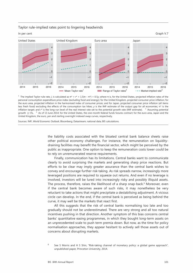
101BIS 84th Annual Report
the liability costs associated with the bloated central bank balance sheets raise other political economy challenges. For instance, the remuneration on liquidity-draining facilities may benefit the financial sector, which might be perceived by the public as inappropriate. One option to keep the remuneration costs lower could be to rely on unremunerated reserve requirements.
Finally, communication has its limitations. Central banks want to communicate clearly to avoid surprising the markets and generating sharp price reactions. But efforts to be clear may imply greater assurance than the central bank wishes to convey and encourage further risk-taking. As risk spreads narrow, increasingly more leveraged positions are required to squeeze out returns. And even if no leverage is involved, investors will be lured into increasingly risky and possibly illiquid assets. The process, therefore, raises the likelihood of a sharp snap-back.6 Moreover, even if the central bank becomes aware of such risks, it may nonetheless be very reluctant to take actions that might precipitate a destabilising adjustment. A vicious circle can develop. In the end, if the central bank is perceived as being behind the curve, it may well be the markets that react first.
All this suggests that the risk of central banks normalising too late and too gradually should not be underestimated. There are very strong and all too natural incentives pushing in that direction. Another symptom of this bias concerns central banks’ quantitative easing programmes, in which they bought long-term assets on an unprecedented scale to push term premia down. But now, as the time for policy normalisation approaches, they appear hesitant to actively sell those assets out of concerns about disrupting markets.
6 See S Morris and H S Shin, “Risk-taking channel of monetary policy: a global game approach”, unpublished paper, Princeton University, 2014.
Taylor rule-implied rates point to lingering headwinds
In per cent Graph V.7
United States United Kingdom Euro area Japan
1 The implied Taylor rule rate, i, is calculated as π* + r* + 1.5(π – π*) + 0.5y, where π is, for the United States, projected inflation rates of the personal consumption expenditure price index (excluding food and energy); for the United Kingdom, projected consumer price inflation; for the euro area, projected inflation in the harmonised index of consumer prices; and for Japan, projected consumer price inflation (all items less fresh food) excluding the effects of the consumption tax hikes; y is the IMF estimate of the output gap for all economies; π* is the inflation target; and r* is the long-run level of the real interest rate set to the potential growth rate (IMF estimate). 2 Assuming potential growth ±1%. 3 As of 13 June 2014; for the United States, the one-month federal funds futures contract; for the euro area, Japan and the United Kingdom, the euro, yen and sterling overnight indexed swap curves, respectively.
Sources: IMF, World Economic Outlook; Bloomberg; Datastream; national data; BIS calculations.
–2
–1
0
1
2
3
4
2014 2015 2016–2
–1
0
1
2
3
4
2014 2015 2016Mean Taylor rate1
–2
–1
0
1
2
3
4
2014 2015 2016Range of Taylor rates2
–2
–1
0
1
2
3
4
2014 2015 2016Market-implied rate3
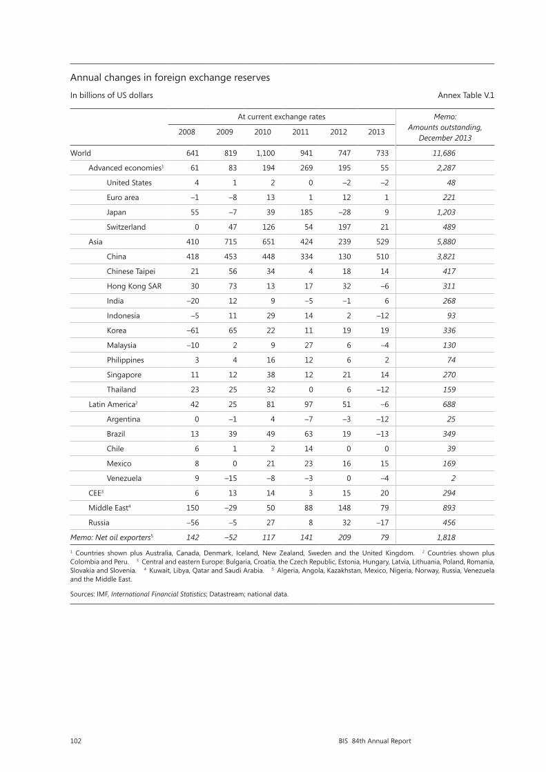
102 BIS 84th Annual Report
Annual changes in foreign exchange reserves
In billions of US dollars Annex Table V.1
At current exchange rates Memo: Amounts outstanding,
December 20132008 2009 2010 2011 2012 2013
World 641 819 1,100 941 747 733 11,686
Advanced economies1 61 83 194 269 195 55 2,287
United States 4 1 2 0 –2 –2 48
Euro area –1 –8 13 1 12 1 221
Japan 55 –7 39 185 –28 9 1,203
Switzerland 0 47 126 54 197 21 489
Asia 410 715 651 424 239 529 5,880
China 418 453 448 334 130 510 3,821
Chinese Taipei 21 56 34 4 18 14 417
Hong Kong SAR 30 73 13 17 32 –6 311
India –20 12 9 –5 –1 6 268
Indonesia –5 11 29 14 2 –12 93
Korea –61 65 22 11 19 19 336
Malaysia –10 2 9 27 6 –4 130
Philippines 3 4 16 12 6 2 74
Singapore 11 12 38 12 21 14 270
Thailand 23 25 32 0 6 –12 159
Latin America2 42 25 81 97 51 –6 688
Argentina 0 –1 4 –7 –3 –12 25
Brazil 13 39 49 63 19 –13 349
Chile 6 1 2 14 0 0 39
Mexico 8 0 21 23 16 15 169
Venezuela 9 –15 –8 –3 0 –4 2
CEE3 6 13 14 3 15 20 294
Middle East4 150 –29 50 88 148 79 893
Russia –56 –5 27 8 32 –17 456
Memo: Net oil exporters5 142 –52 117 141 209 79 1,818
1 Countries shown plus Australia, Canada, Denmark, Iceland, New Zealand, Sweden and the United Kingdom. 2 Countries shown plus Colombia and Peru. 3 Central and eastern Europe: Bulgaria, Croatia, the Czech Republic, Estonia, Hungary, Latvia, Lithuania, Poland, Romania, Slovakia and Slovenia. 4 Kuwait, Libya, Qatar and Saudi Arabia. 5 Algeria, Angola, Kazakhstan, Mexico, Nigeria, Norway, Russia, Venezuela and the Middle East.
Sources: IMF, International Financial Statistics; Datastream; national data.

103BIS 84th Annual Report
VI. The financial system at a crossroads
Nearly six years after the apex of the financial crisis, the financial sector is still coping with its aftermath. Financial firms find themselves at a crossroads. Shifting attitudes towards risk in the choice of business models will influence the sector’s future profile. The speed of adjustment will be key to the financial sector again becoming a facilitator of economic growth.
The banking sector has made progress in healing its wounds, but balance sheet repair is incomplete. Even though the sector has strengthened its aggregate capital position with retained earnings, progress has not been uniform. Sustainable profitability will thus be critical to completing the job. Accordingly, many banks have adopted more conservative business models promising greater earnings stability and have partly withdrawn from capital market activities.
Looking forward, high indebtedness is the main source of banks’ vulnerability. Banks that have failed to adjust post-crisis face lingering balance sheet weaknesses from direct exposure to overindebted borrowers and the drag of debt overhang on economic recovery (Chapters III and IV). The situation is most acute in Europe, but banks there have stepped up efforts in the past year. Banks in economies less affected by the crisis but at a late financial boom phase must prepare for a slowdown and for dealing with higher non-performing assets.
The role of non-bank financial firms has grown as market-based intermediation has gained in importance following banks’ retrenchment. Low policy rates and a continuing search for yield have encouraged private bond issuance, while banks have faced a persistent cost disadvantage relative to their corporate clients. The portfolios of asset management companies (AMCs) have soared over the past few years, and AMCs are now a major source of credit. This, together with high size concentration in the sector, may influence bond market dynamics, with implications for the cost and availability of funding for businesses and households.
The chapter is organised in three sections. The first section discusses financial sector performance over the past year. The second focuses on structural changes that have been shaping business models. The third explores the near-term challenges institutions face, some in dealing with legacy losses, others in strengthening their defences in view of a possible turn in the financial cycle.
Overview of trends
On aggregate, the financial sector has made progress in overcoming the crisis and adjusting to the new economic and regulatory environment. Banks are building capital faster than planned, and their profitability is improving. In some countries, however, problems with asset quality and earnings persist. The picture in the insurance sector is similar, with generally robust premium growth but an uneven return on equity across jurisdictions.
Banks
Key trends for banks include stronger capital positions and a reduction in risk-weighted assets (RWA). The sector has made progress in rebuilding its capital base primarily through retained earnings, supported by a recovery in profitability. This
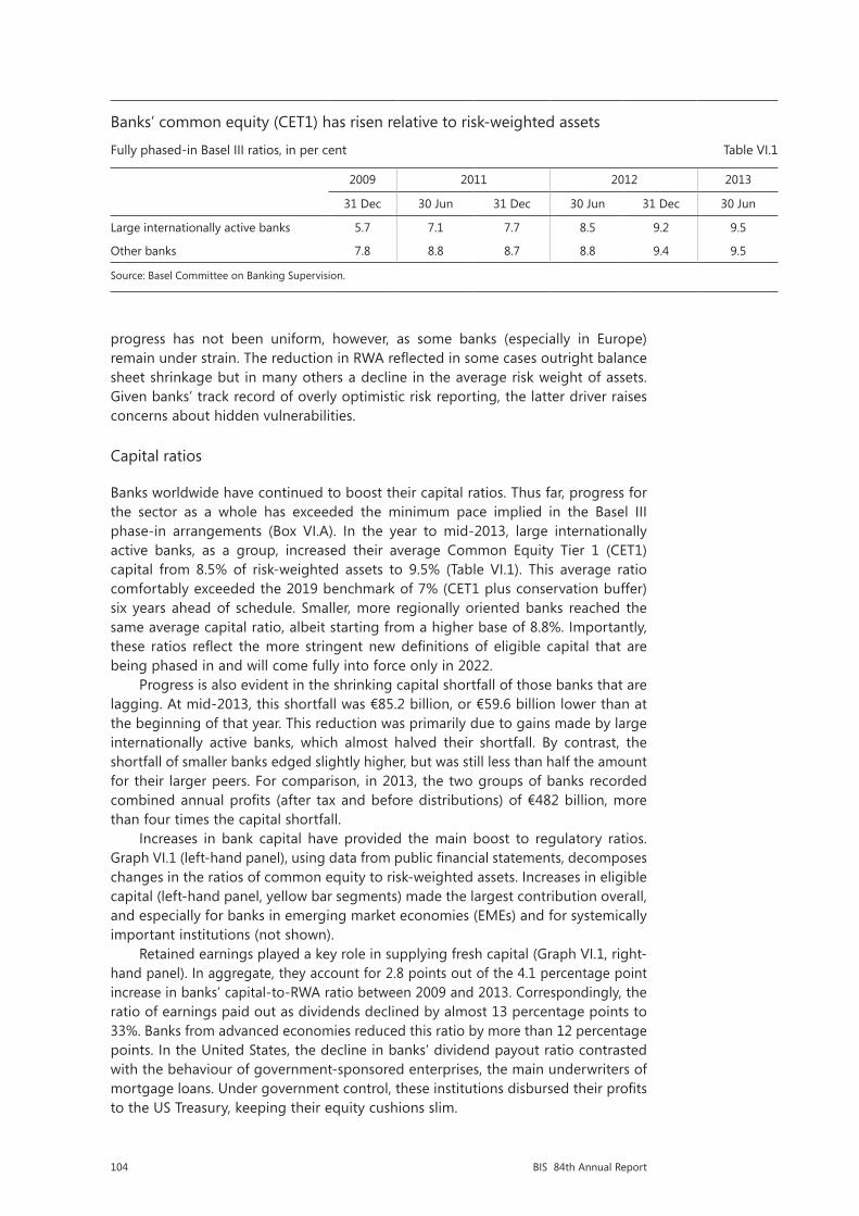
104 BIS 84th Annual Report
progress has not been uniform, however, as some banks (especially in Europe) remain under strain. The reduction in RWA reflected in some cases outright balance sheet shrinkage but in many others a decline in the average risk weight of assets. Given banks’ track record of overly optimistic risk reporting, the latter driver raises concerns about hidden vulnerabilities.
Capital ratios
Banks worldwide have continued to boost their capital ratios. Thus far, progress for the sector as a whole has exceeded the minimum pace implied in the Basel III phase-in arrangements (Box VI.A). In the year to mid-2013, large internationally active banks, as a group, increased their average Common Equity Tier 1 (CET1) capital from 8.5% of risk-weighted assets to 9.5% (Table VI.1). This average ratio comfortably exceeded the 2019 benchmark of 7% (CET1 plus conservation buffer) six years ahead of schedule. Smaller, more regionally oriented banks reached the same average capital ratio, albeit starting from a higher base of 8.8%. Importantly, these ratios reflect the more stringent new definitions of eligible capital that are being phased in and will come fully into force only in 2022.
Progress is also evident in the shrinking capital shortfall of those banks that are lagging. At mid-2013, this shortfall was €85.2 billion, or €59.6 billion lower than at the beginning of that year. This reduction was primarily due to gains made by large internationally active banks, which almost halved their shortfall. By contrast, the shortfall of smaller banks edged slightly higher, but was still less than half the amount for their larger peers. For comparison, in 2013, the two groups of banks recorded combined annual profits (after tax and before distributions) of €482 billion, more than four times the capital shortfall.
Increases in bank capital have provided the main boost to regulatory ratios. Graph VI.1 (left-hand panel), using data from public financial statements, decomposes changes in the ratios of common equity to risk-weighted assets. Increases in eligible capital (left-hand panel, yellow bar segments) made the largest contribution overall, and especially for banks in emerging market economies (EMEs) and for systemically important institutions (not shown).
Retained earnings played a key role in supplying fresh capital (Graph VI.1, right-hand panel). In aggregate, they account for 2.8 points out of the 4.1 percentage point increase in banks’ capital-to-RWA ratio between 2009 and 2013. Correspondingly, the ratio of earnings paid out as dividends declined by almost 13 percentage points to 33%. Banks from advanced economies reduced this ratio by more than 12 percentage points. In the United States, the decline in banks’ dividend payout ratio contrasted with the behaviour of government-sponsored enterprises, the main underwriters of mortgage loans. Under government control, these institutions disbursed their profits to the US Treasury, keeping their equity cushions slim.
Banks’ common equity (CET1) has risen relative to risk-weighted assets
Fully phased-in Basel III ratios, in per cent Table VI.1
2009 2011 2012 2013
31 Dec 30 Jun 31 Dec 30 Jun 31 Dec 30 Jun
Large internationally active banks 5.7 7.1 7.7 8.5 9.2 9.5
Other banks 7.8 8.8 8.7 8.8 9.4 9.5
Source: Basel Committee on Banking Supervision.
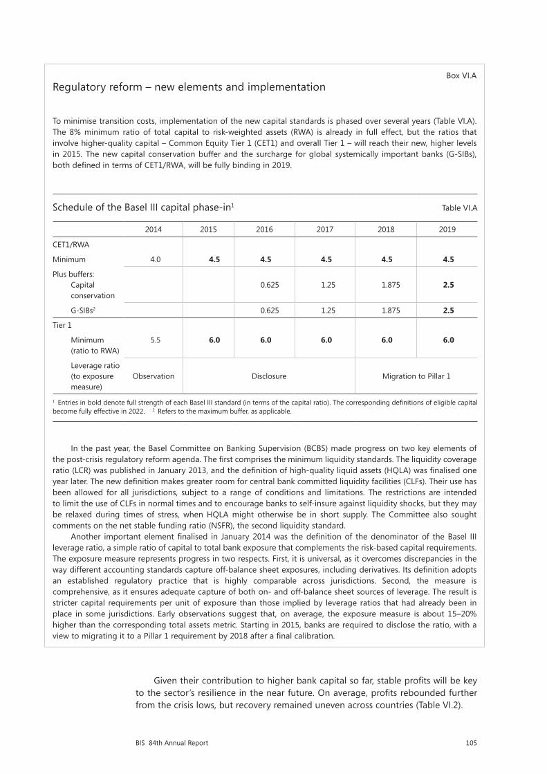
105BIS 84th Annual Report
Box VI.ARegulatory reform – new elements and implementation
To minimise transition costs, implementation of the new capital standards is phased over several years (Table VI.A). The 8% minimum ratio of total capital to risk-weighted assets (RWA) is already in full effect, but the ratios that involve higher-quality capital – Common Equity Tier 1 (CET1) and overall Tier 1 – will reach their new, higher levels in 2015. The new capital conservation buffer and the surcharge for global systemically important banks (G-SIBs), both defined in terms of CET1/RWA, will be fully binding in 2019.
Schedule of the Basel III capital phase-in1 Table VI.A
2014 2015 2016 2017 2018 2019
CET1/RWA
Minimum 4.0 4.5 4.5 4.5 4.5 4.5
Plus buffers: Capital conservation
0.625
1.25
1.875
2.5
G-SIBs2 0.625 1.25 1.875 2.5
Tier 1
Minimum (ratio to RWA)
5.5 6.0 6.0 6.0 6.0 6.0
Leverage ratio (to exposure measure)
Observation Disclosure Migration to Pillar 1
1 Entries in bold denote full strength of each Basel III standard (in terms of the capital ratio). The corresponding definitions of eligible capital become fully effective in 2022. 2 Refers to the maximum buffer, as applicable.
In the past year, the Basel Committee on Banking Supervision (BCBS) made progress on two key elements of the post-crisis regulatory reform agenda. The first comprises the minimum liquidity standards. The liquidity coverage ratio (LCR) was published in January 2013, and the definition of high-quality liquid assets (HQLA) was finalised one year later. The new definition makes greater room for central bank committed liquidity facilities (CLFs). Their use has been allowed for all jurisdictions, subject to a range of conditions and limitations. The restrictions are intended to limit the use of CLFs in normal times and to encourage banks to self-insure against liquidity shocks, but they may be relaxed during times of stress, when HQLA might otherwise be in short supply. The Committee also sought comments on the net stable funding ratio (NSFR), the second liquidity standard.
Another important element finalised in January 2014 was the definition of the denominator of the Basel III leverage ratio, a simple ratio of capital to total bank exposure that complements the risk-based capital requirements. The exposure measure represents progress in two respects. First, it is universal, as it overcomes discrepancies in the way different accounting standards capture off-balance sheet exposures, including derivatives. Its definition adopts an established regulatory practice that is highly comparable across jurisdictions. Second, the measure is comprehensive, as it ensures adequate capture of both on- and off-balance sheet sources of leverage. The result is stricter capital requirements per unit of exposure than those implied by leverage ratios that had already been in place in some jurisdictions. Early observations suggest that, on average, the exposure measure is about 15–20% higher than the corresponding total assets metric. Starting in 2015, banks are required to disclose the ratio, with a view to migrating it to a Pillar 1 requirement by 2018 after a final calibration.
Given their contribution to higher bank capital so far, stable profits will be key to the sector’s resilience in the near future. On average, profits rebounded further from the crisis lows, but recovery remained uneven across countries (Table VI.2).

106 BIS 84th Annual Report
Outside the euro area, banks’ pre-tax profits improved last year but remained generally below pre-crisis averages. Interest rate margins did not contribute as much as in previous years. They remained mostly flat globally, and in some cases even declined (eg in the United States). Instead, lower credit-related costs were the main factor at work. Loan loss provisions have been declining in most countries, reflecting the economic recovery and progress in loss recognition.
In the euro area, the picture was quite different. Profits remained lacklustre. Sovereign debt strains continued to affect asset quality, and a stagnating economy compressed revenues. Banks are stepping up their effort to deal with impaired balance sheets ahead of the ECB’s asset quality review later this year, as witnessed by the recent spike in the write-off rate.
Recent developments in the Chinese banking sector illustrate the benefits of retaining earnings as a buffer against losses. As economic growth in China weakened, borrowers in the country came under financial strain and the volume of impaired loans ballooned. By drawing on their reserves, however, the five largest Chinese banks were able in 2013 to absorb credit losses twice as large as a year earlier, post strong profits and maintain high capital ratios.
Investment banking activity produced mixed results. Revenues from merger and acquisition advisory business and securities underwriting strengthened, aided by very robust corporate debt issuance. By contrast, secondary market trading of fixed income products and commodities weakened, dragging down related revenues and, alongside a tougher supervisory stance, leading several large capital market players to trim their trading activity. Legal risk also played a role. Intensifying official probes into market benchmark manipulation have resulted in very large fines in recent years.
Chapter 6 - all graphs as of 19 June - 12:00h
Capital accumulation boosts banks’ regulatory ratios1
Changes between end-2009 and end-2013 Graph VI.1
Drivers of capital ratios Sources of bank capital Per cent Per cent
1 The graph decomposes the change in the ratio of common equity capital to risk-weighted assets (left-hand panel) and the percentage change in common equity capital (right-hand panel) into additive components. Overall changes are shown by diamonds. The contribution of a particular component is denoted by the height of the corresponding segment. A negative contribution indicates that the component had a depressive effect. All figures are weighted averages using end-2013 total assets as weights.
Sources: B Cohen and M Scatigna, “Banks and capital requirements: channels of adjustment”, BIS Working Papers, no 443, March 2014; Bankscope; Bloomberg.
–9
–6
–3
0
3
6
9
All US Euro Other EM Latin EMarea Europe Asia America Europe
Capital to risk-weighted assetsRatio of risk-weighted to total assets
CapitalTotal assets
–5.0
–2.5
0.0
2.5
5.0
7.5
10.0
All US Euro Other EM Latin EMarea Europe Asia America Europe
CapitalNet income
DividendsOther

107BIS 84th Annual Report
Risk-weighted assets
The second driver of the improvement in banks’ capital ratios was the reduction in the denominator: risk-weighted assets (Graph VI.1, left-hand panel). This may reflect shrinkage in total assets (magenta segments) or a decline in RWA relative to total assets (blue segments). Most banks grew in size but lowered the average risk weight of their asset portfolio. In advanced economies, the decline in RWA relative to total assets contributed 0.7 points to the 3 percentage point average increase in banks’ capital ratios. Euro area banks are an exception to this pattern, as shrinking balance sheets also contributed to the increase in their capital ratios.
In fact, the average risk weight in bank portfolios has been falling since 2007. Despite the Great Recession and the sluggish recovery, ratios of RWA to total assets were about 20% lower in 2013 than six years earlier. Market commentary indicates that more than a genuine reduction in assets’ riskiness has been at play and suggests that banks redesigned risk models in order to lower capital requirements by underestimating risk and providing optimistic asset valuations. This may explain in part the persistent discount at which bank shares trade on the book value of equity (Graph VI.8, left-hand panel). This concern has been intensified by the observation that risk weights for similar assets vary substantially across banks.
Market observers and supervisory studies point to a dispersion of reported RWA that is hard to justify given the underlying risk exposures. The dispersion is generally higher for more complex positions. Focused analysis of banks’ loan and
Profitability of major banks
As a percentage of total assets1 Table VI.2
Pre-tax profits Net interest margin Loan loss provisions Operating costs3
Country2 2000–07
2008–12
2013 2000–07
2008–12
2013 2000–07
2008–12
2013 2000–07
2008–12
2013
Australia (4) 1.58 1.09 1.28 1.96 1.81 1.79 0.19 0.30 0.17 1.99 1.20 1.11
Canada (6) 1.03 0.85 1.06 1.74 1.58 1.65 0.24 0.25 0.17 2.73 1.85 1.78
France (4) 0.66 0.27 0.32 0.81 0.95 0.92 0.13 0.24 0.21 1.60 1.09 1.16
Germany (4) 0.26 0.06 0.10 0.68 0.81 0.99 0.18 0.16 0.18 1.38 1.15 1.55
Italy (3) 0.83 –0.04 –1.22 1.69 1.82 1.58 0.40 0.67 1.43 2.27 1.79 1.84
Japan (5) 0.21 0.40 0.68 1.03 0.89 0.77 0.56 0.19 0.02 0.994 0.734 0.604
Spain (3) 1.29 0.77 0.50 2.04 2.32 2.32 0.37 0.94 0.96 2.29 1.61 1.75
Sweden (4) 0.92 0.58 0.77 1.25 0.93 0.98 0.05 0.16 0.08 1.34 0.87 0.84
Switzerland (3) 0.52 –0.03 0.36 0.64 0.54 0.61 0.05 0.05 0.01 2.39 1.86 1.90
United Kingdom (6) 1.09 0.19 0.23 1.75 1.12 1.12 0.31 0.54 0.36 2.02 1.27 1.55
United States (9) 1.74 0.53 1.24 2.71 2.49 2.32 0.45 1.06 0.21 3.58 3.01 3.03
Brazil (3) 2.23 1.58 1.62 6.56 4.71 3.55 1.24 1.43 1.07 6.21 3.69 3.28
China (4)5 1.62 1.61 1.86 2.74 2.34 2.38 0.31 0.29 0.25 1.12 1.02 1.01
India (3)6 1.26 1.37 1.41 2.67 2.46 2.82 0.88 0.50 0.57 2.48 2.47 2.36
Russia (3) 3.03 1.64 2.04 4.86 4.56 4.15 0.87 1.59 0.80 4.95 2.73 2.68
1 Values for multi-year periods are simple averages. 2 In parentheses, number of banks included in 2013. 3 Personnel and other operating costs. 4 Excludes personnel costs. 5 Data start in 2007. 6 Data start in 2002.
Sources: Bankscope; BIS calculations.
108 BIS 84th Annual Report
Box VI.BRegulatory treatment of banks’ sovereign exposures
Risk sensitivity is at the core of the capital framework. Basel II and III prescribe minimum capital requirements commensurate with the credit risk of all exposures. This risk sensitivity also applies to sovereign exposures.
The most relevant standard for internationally active banks is the internal ratings-based (IRB) approach. It requires a meaningful differentiation of risk and asks banks to assess the credit risk of individual sovereigns using a granular rating scale. The Basel framework is based on the premise that banks use the IRB approach across the entire banking group and across all asset classes. But it allows national supervisors to permit banks to gradually phase in the approach across the banking group and, only if the exposures are non-material in terms of both size and risk, to keep certain exposures in the external ratings-based, standardised approach (SA) indefinitely.
The SA, as a rule, prescribes positive risk weights to all but the highest-quality credits (AAA to AA). For instance, it assigns a 20% weight to A-rated borrowers and a 100% weight to B-rated ones. National supervisors, however, are allowed to exercise discretion and set lower risk weights to sovereign exposures that are denominated and funded in the corresponding national currency. As a result, the risk weights on such exposures have varied considerably across large international banks, including global systemically important ones. In fact, the variability in sovereign risk weights across banks is an important driver of the variability of overall risk-weighted assets.
Data on individual bank risk assessments are generally not available outside the supervisory community. A notable exception is the European Banking Authority’s welcome initiative to disclose the risk weights and total exposures of large European banks for different asset classes. The information reveals a wide range of practices and a general tendency to assign a lower weight to exposures to the home sovereign.
In aggregate, banks assign a zero risk weight to more than half of their sovereign debt holdings. This is particularly true for portfolios under the SA, which cover the majority of banks’ sovereign exposures, but also for some IRB portfolios. Interestingly, the tendency to use the potentially more permissive SA is not related to the capitalisation of the bank but increases with the perceived riskiness of the borrower. In particular, exposures to sovereigns in the euro area periphery tend to be overwhelmingly under the SA, thus obtaining zero risk weights. This applies especially to banks with sovereign exposures exceeding 10% of their capital.
Banks assign to their own sovereign a considerably lower risk weight than do banks from other countries. The “home bias” is particularly pronounced for Portuguese, Spanish and Irish banks and somewhat less so for French, UK and Austrian banks.
For further discussion, see “Treatment of sovereign risk in the Basel capital framework”, BIS Quarterly Review, December 2013, pp 10–11.
trading portfolios finds that both supervisory practices and individual bank choices are at work.1 These practices reflect a combination of discretion permitted under the Basel framework and, occasionally, deviations from the framework. Examples include the implementation of capital floors and the partial use of the standardised (non-model-based) approach – for instance, for credit exposures to sovereigns (Box VI.B). Internal model risk estimates based on short data samples, and wide variation in the valuation of trading positions, contribute to the dispersion of RWA. The combined effect of these varying practices suggests that there is scope for inconsistency in risk assessments and hence in regulatory ratios.
What is the appropriate policy response to the need to improve the reliability and comparability of RWA (Chapter V of last year’s Annual Report)? The internal ratings-based (IRB) approach should remain a pillar of the regulatory framework. It provides an essential link to banks’ own decision-making and it permits a natural and welcome diversity of risk assessments among banks. What is needed is to tighten the link to an objective measurement of the underlying risks and to improve
1 See BCBS, Regulatory Consistency Assessment Programme – second report on risk-weighted assets for market risk in the trading book, December 2013; and BCBS, Regulatory Consistency Assessment Programme – analysis of risk-weighted assets for credit risk in the banking book, July 2013.
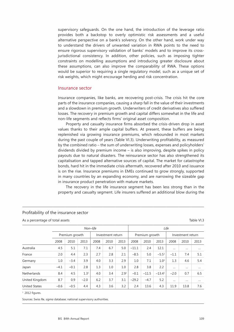
109BIS 84th Annual Report
supervisory safeguards. On the one hand, the introduction of the leverage ratio provides both a backstop to overly optimistic risk assessments and a useful alternative perspective on a bank’s solvency. On the other hand, work under way to understand the drivers of unwanted variation in RWA points to the need to ensure rigorous supervisory validation of banks’ models and to improve its cross-jurisdictional consistency. In addition, other policies, such as imposing tighter constraints on modelling assumptions and introducing greater disclosure about these assumptions, can also improve the comparability of RWA. These options would be superior to requiring a single regulatory model, such as a unique set of risk weights, which might encourage herding and risk concentration.
Insurance sector
Insurance companies, like banks, are recovering post-crisis. The crisis hit the core parts of the insurance companies, causing a sharp fall in the value of their investments and a slowdown in premium growth. Underwriters of credit derivatives also suffered losses. The recovery in premium growth and capital differs somewhat in the life and non-life segments and reflects firms’ original asset composition.
Property and casualty insurance firms absorbed the crisis-driven drop in asset values thanks to their ample capital buffers. At present, these buffers are being replenished via growing insurance premiums, which rebounded in most markets during the past couple of years (Table VI.3). Underwriting profitability, as measured by the combined ratio – the sum of underwriting losses, expenses and policyholders’ dividends divided by premium income – is also improving, despite spikes in policy payouts due to natural disasters. The reinsurance sector has also strengthened its capitalisation and tapped alternative sources of capital. The market for catastrophe bonds, hard hit in the immediate crisis aftermath, recovered after 2010 and issuance is on the rise. Insurance premiums in EMEs continued to grow strongly, supported in many countries by an expanding economy, and are narrowing the sizeable gap in insurance product penetration with mature markets.
The recovery in the life insurance segment has been less strong than in the property and casualty segment. Life insurers suffered an additional blow during the
Profitability of the insurance sector
As a percentage of total assets Table VI.3
Non–life Life
Premium growth Investment return Premium growth Investment return
2008 2010 2013 2008 2010 2013 2008 2010 2013 2008 2010 2013
Australia 4.5 5.1 7.1 7.4 6.7 5.0 –11.1 2.4 12.1 … … …
France 2.0 4.4 2.3 2.7 2.8 2.1 –8.5 5.0 –5.51 –1.1 7.4 5.1
Germany 1.0 –3.4 3.9 4.0 3.3 2.9 1.0 7.1 1.01 1.3 4.6 5.4
Japan –4.1 –0.1 2.8 1.3 1.0 1.0 2.8 3.8 2.2 … … …
Netherlands 8.4 4.5 1.31 4.0 3.4 2.91 –0.1 –11.5 –13.41 –2.0 0.7 6.5
United Kingdom 8.7 0.9 –2.0 6.2 3.7 3.1 –29.2 –4.7 5.2 … … …
United States –0.6 –0.5 4.4 4.3 3.6 3.2 2.4 13.6 4.3 11.9 13.8 7.6
1 2012 figures.
Sources: Swiss Re, sigma database; national supervisory authorities.

110 BIS 84th Annual Report
crisis because of the combination of losses from embedded product guarantees and an increase in the valuation of liabilities driven by a decline in interest rates. While premium income is recovering from its sharp drop during the crisis, it is still growing less than benefit payments and surrenders.
Premium growth counteracted weak returns on investment portfolios. The low yields of high-quality bonds, a key asset class for insurers, remain a drag on investment revenue. Return on equity has recovered from its crisis trough, but remains below its historical average. A subdued growth outlook and low returns on other asset classes have triggered a search for yield by insurance companies, fuelling demand for riskier securities (Chapter II).
Changes in the regulatory framework tighten insurers’ capital requirements and impose stricter constraints on the valuation of long-term assets and liabilities. This should increase the resilience of the sector. It might also whet insurers’ appetite for fixed income securities with regular cash flow streams, including corporate debt.
Looking forward, insurers, and life insurers in particular, are exposed to interest rate risk. The limited supply of long-term investable assets amplifies this risk by exacerbating the duration mismatch of assets and liabilities. In this case, derivatives can provide a good hedge and insurers will benefit from reforms in over-the-counter market infrastructure that should reduce counterparty risk. But interest rate risk arises also from guarantees and other option-like elements of life insurance products with investment features. This risk is complex, more difficult to predict and harder to hedge. In this case, capital buffers are a better line of defence.
Bank versus market-based credit
The crisis and its aftermath halted the trend growth in bank-intermediated finance. In the advanced economies most affected by the crisis, bank credit to corporates has ceded ground to market-based financing. In EMEs, both sources have grown, with market-based financing registering the faster pace.
Divergent trends in bank lending
Starting period = 100, nominal values Graph VI.2
United States Europe1, 2 Emerging market economies1, 3
1 Weighted averages based on 2005 GDP and PPP exchange rates. 2 The euro area and the United Kingdom. 3 Argentina, China, Hong Kong SAR, India, Indonesia, Korea, Mexico, Poland and Russia.
Sources: Datastream; national data; BIS estimates.
75
100
125
150
175
200
225
02 04 06 08 10 12 14Households Corporates
75
100
125
150
175
200
225
02 04 06 08 10 12 14Households Corporates
50
100
150
200
250
300
350
08 09 10 11 12 13Households Corporates
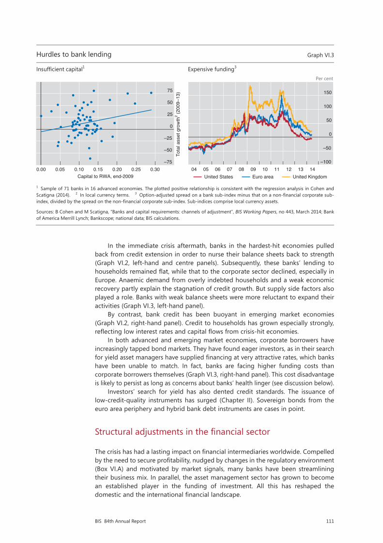
111BIS 84th Annual Report
In the immediate crisis aftermath, banks in the hardest-hit economies pulled back from credit extension in order to nurse their balance sheets back to strength (Graph VI.2, left-hand and centre panels). Subsequently, these banks’ lending to households remained flat, while that to the corporate sector declined, especially in Europe. Anaemic demand from overly indebted households and a weak economic recovery partly explain the stagnation of credit growth. But supply side factors also played a role. Banks with weak balance sheets were more reluctant to expand their activities (Graph VI.3, left-hand panel).
By contrast, bank credit has been buoyant in emerging market economies (Graph VI.2, right-hand panel). Credit to households has grown especially strongly, reflecting low interest rates and capital flows from crisis-hit economies.
In both advanced and emerging market economies, corporate borrowers have increasingly tapped bond markets. They have found eager investors, as in their search for yield asset managers have supplied financing at very attractive rates, which banks have been unable to match. In fact, banks are facing higher funding costs than corporate borrowers themselves (Graph VI.3, right-hand panel). This cost disadvantage is likely to persist as long as concerns about banks’ health linger (see discussion below).
Investors’ search for yield has also dented credit standards. The issuance of low-credit-quality instruments has surged (Chapter II). Sovereign bonds from the euro area periphery and hybrid bank debt instruments are cases in point.
Structural adjustments in the financial sector
The crisis has had a lasting impact on financial intermediaries worldwide. Compelled by the need to secure profitability, nudged by changes in the regulatory environment (Box VI.A) and motivated by market signals, many banks have been streamlining their business mix. In parallel, the asset management sector has grown to become an established player in the funding of investment. All this has reshaped the domestic and the international financial landscape.
Hurdles to bank lending Graph VI.3
Insufficient capital1 Expensive funding3 Per cent
1 Sample of 71 banks in 16 advanced economies. The plotted positive relationship is consistent with the regression analysis in Cohen and Scatigna (2014). 2 In local currency terms. 3 Option-adjusted spread on a bank sub-index minus that on a non-financial corporate sub-index, divided by the spread on the non-financial corporate sub-index. Sub-indices comprise local currency assets.
Sources: B Cohen and M Scatigna, “Banks and capital requirements: channels of adjustment”, BIS Working Papers, no 443, March 2014; Bank of America Merrill Lynch; Bankscope; national data; BIS calculations.
Efficiency and earnings stability go hand in hand
In per cent Graph VI.4
Retail banks Wholesale-funded banks Trading banks
Sources: Bankscope; BIS estimates.
–75
–50
–25
0
25
50
75
0.00 0.05 0.10 0.15 0.20 0.25 0.30Capital to RWA, end-2009
Tota
l ass
et g
row
th2 (2
009–
13)
–100
–50
0
50
100
150
04 05 06 07 08 09 10 11 12 13 14United States Euro area United Kingdom
0
20
40
60
80
0
10
20
30
40
06 07 08 09 10 11 12 13
Cost-to-income ratio (lhs)RoE (rhs)
Emerging market economies (25 banks):
0
20
40
60
80
0
10
20
30
40
06 07 08 09 10 11 12 13
Cost-to-income ratio (lhs)RoE (rhs)
Advanced economies (60 banks):
0
20
40
60
80
0
10
20
30
40
06 07 08 09 10 11 12 13
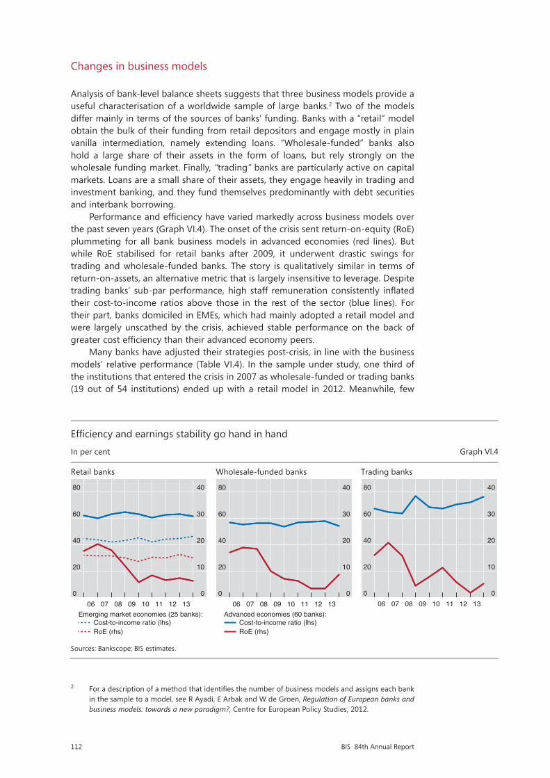
112 BIS 84th Annual Report
Changes in business models
Analysis of bank-level balance sheets suggests that three business models provide a useful characterisation of a worldwide sample of large banks.2 Two of the models differ mainly in terms of the sources of banks’ funding. Banks with a “retail” model obtain the bulk of their funding from retail depositors and engage mostly in plain vanilla intermediation, namely extending loans. “Wholesale-funded” banks also hold a large share of their assets in the form of loans, but rely strongly on the wholesale funding market. Finally, “trading” banks are particularly active on capital markets. Loans are a small share of their assets, they engage heavily in trading and investment banking, and they fund themselves predominantly with debt securities and interbank borrowing.
Performance and efficiency have varied markedly across business models over the past seven years (Graph VI.4). The onset of the crisis sent return-on-equity (RoE) plummeting for all bank business models in advanced economies (red lines). But while RoE stabilised for retail banks after 2009, it underwent drastic swings for trading and wholesale-funded banks. The story is qualitatively similar in terms of return-on-assets, an alternative metric that is largely insensitive to leverage. Despite trading banks’ sub-par performance, high staff remuneration consistently inflated their cost-to-income ratios above those in the rest of the sector (blue lines). For their part, banks domiciled in EMEs, which had mainly adopted a retail model and were largely unscathed by the crisis, achieved stable performance on the back of greater cost efficiency than their advanced economy peers.
Many banks have adjusted their strategies post-crisis, in line with the business models’ relative performance (Table VI.4). In the sample under study, one third of the institutions that entered the crisis in 2007 as wholesale-funded or trading banks (19 out of 54 institutions) ended up with a retail model in 2012. Meanwhile, few
2 For a description of a method that identifies the number of business models and assigns each bank in the sample to a model, see R Ayadi, E Arbak and W de Groen, Regulation of European banks and business models: towards a new paradigm?, Centre for European Policy Studies, 2012.
Hurdles to bank lending Graph VI.3
Insufficient capital1 Expensive funding3 Per cent
1 Sample of 71 banks in 16 advanced economies. The plotted positive relationship is consistent with the regression analysis in Cohen and Scatigna (2014). 2 In local currency terms. 3 Option-adjusted spread on a bank sub-index minus that on a non-financial corporate sub-index, divided by the spread on the non-financial corporate sub-index. Sub-indices comprise local currency assets.
Sources: B Cohen and M Scatigna, “Banks and capital requirements: channels of adjustment”, BIS Working Papers, no 443, March 2014; Bank of America Merrill Lynch; Bankscope; national data; BIS calculations.
Efficiency and earnings stability go hand in hand
In per cent Graph VI.4
Retail banks Wholesale-funded banks Trading banks
Sources: Bankscope; BIS estimates.
–75
–50
–25
0
25
50
75
0.00 0.05 0.10 0.15 0.20 0.25 0.30Capital to RWA, end-2009
Tota
l ass
et g
row
th2 (2
009–
13)
–100
–50
0
50
100
150
04 05 06 07 08 09 10 11 12 13 14United States Euro area United Kingdom
0
20
40
60
80
0
10
20
30
40
06 07 08 09 10 11 12 13
Cost-to-income ratio (lhs)RoE (rhs)
Emerging market economies (25 banks):
0
20
40
60
80
0
10
20
30
40
06 07 08 09 10 11 12 13
Cost-to-income ratio (lhs)RoE (rhs)
Advanced economies (60 banks):
0
20
40
60
80
0
10
20
30
40
06 07 08 09 10 11 12 13
113BIS 84th Annual Report
Business models: traditional banking regains popularity
Number of banks1 Table VI.4
Business model in 2007
Retail Wholesale-funded Trading Total
Business model in 2005
Retail 34 10 3 47
Wholesale-funded 1 23 0 24
Trading 3 1 17 21
Total 38 34 20 92
Business model in 2013
Retail Wholesale-funded Trading Total
Business model in 2007
Retail 35 3 0 38
Wholesale-funded 14 18 2 34
Trading 5 2 13 20
Total 54 23 15 92
1 An italicised entry indicates the number of banks that started a period with the business model indicated in the row heading and finished that period with the business model indicated in the column heading. Based on a sample of 92 banks from advanced and emerging economies.
Sources: Bankscope; BIS calculations.
banks switched from retail to another business model post-crisis (three out of 38), confirming the relative appeal of stable income and funding sources. This recent trend stands in contrast to developments in the banking sector pre-crisis. From 2005 to 2007, only four of 45 banks switched to a retail model. In parallel, easy funding and high trading profits led a quarter of the banks with a retail model in 2005 (13 out of 47 institutions) to adopt another model by 2007.
Shifting patterns in international banking
A key aspect of internationally active banks’ business model relates to the geographical location of their funding compared with that of their assets (Graph VI.5, left-hand panel). At one end of the spectrum are German and Japanese banks, whose international positions are mostly cross-border, largely funded in the home country. At the other end of the spectrum, Spanish, Canadian and Australian banks use foreign offices both to obtain funding and to extend credit within the same host country. Between these two extremes, Belgian and Swiss banks tap geographically diverse sources of funding and have large cross-border positions mostly booked in international financial centres, such as London, New York, Paris or the Caribbean.
International banking conducted through local offices in foreign countries has proved to be more resilient than cross-border banking over the past five years. This is evident in the positive relationship between the share of locally conducted intermediation in a banking system’s foreign claims and the overall growth in these claims (Graph VI.5, right-hand panel). As a case in point, the foreign claims of Australian banks have increased markedly on the back of growing activity by offices in New Zealand and emerging Asia. Similarly, robust conditions in Latin America have allowed Spanish banks to increase their foreign claims, despite general pressure on European banks to reduce foreign lending in order to preserve capital for their home markets.

114 BIS 84th Annual Report
By contrast, cross-border activities came under strain when liquidity evaporated during the crisis, subjecting global financial markets to stress. Since then, cross-border bank lending has retreated, driving much of the decline in the foreign claims of Swiss and German banks over the past five years. In this context, the sizeable increase in Japanese banks’ cross-border claims, mainly to US and emerging Asia residents, is a notable exception.
The ascent of the asset management sector
As banks reorganise their business lines and retreat from some capital market activities, market-based financial intermediaries have been gaining ground. The growth in the asset management sector is a case in point. Because asset managers are responsible for the investment of large securities portfolios, they can have a substantial impact on market functioning, on asset price dynamics and, ultimately, on the funding costs of governments, businesses and households.
AMCs manage securities portfolios on behalf of ultimate investors. They cater to both retail and wholesale customers. They manage the savings of households and handle the surplus cash balances of small businesses, but also manage large sums for institutional investors, such as corporate and public pension funds, insurance companies, corporate treasuries and sovereign wealth funds.
Arrangements vary widely in terms of product design and characteristics, in line with client funds’ investment objectives. For example, open- and closed-end mutual funds pool individual investors’ funds in larger portfolios that are managed collectively. By contrast, corporate and public sector pension funds can place money
International banking: the geography of intermediation matters
In per cent Graph VI.5
Foreign assets, by booking location1 Local intermediation boosts resilience2
Banks domiciled in: AU = Australia; BE = Belgium; CA = Canada; CH = Switzerland; DE = Germany; ES = Spain; FR = France; GB = United Kingdom; IT = Italy; JP = Japan; NL = Netherlands; US = United States.
1 At end-Q4 2013. Cross-border, from home office = cross-border positions booked by the lending bank’s home office plus estimatedcross-border funding of positive net positions vis-à-vis residents of the home country; cross border, from a third country = cross-border positions booked outside the lending bank’s home country; local = positions booked where the borrower resides. 2 Local intermediation= ∑imin{LCni,LLni}/FCn, where LCni (LLni) stands for local claims (liabilities) in country i booked by banks headquartered in country n. Foreign activity is defined as the sum of foreign claims and liabilities. A plotted percentage change in foreign activity occurred between quarter Q(the quarter between Q2 2008 and Q2 2009 in which the degree of foreign activity in a particular national system attained its maximum level) and Q4 2013.
Sources: BIS consolidated banking statistics (ultimate risk and immediate borrower basis); BIS locational banking statistics by nationality.
0
20
40
60
80
100
DE JP BE US NL CH FR IT AU GB CA ESCross-border,from home office
Cross-border,from a third country
Local
JP
DE
US
BE
FR ITNL
CH
AU
GB
CA
ES
–50
–25
0
25
50
75
10 20 30 40 50 60 70Local intermediation
Fore
ign
activ
ity, %
cha
nge

115BIS 84th Annual Report
with AMCs in segregated accounts managed on the basis of mandates tailored to client needs. In most arrangements, AMCs do not put their balance sheets at risk in managing those funds. Rather, in exchange for a fee, they offer economies of scale and scope in the form of expertise in securities selection, transaction execution and timing, and portfolio administration. There are exceptions, though. For example, hedge funds actively manage portfolios following investment strategies that embody a high appetite for risk-taking and involve substantial leverage. The hedge fund manager has own funds at risk and is rewarded on the basis of performance. Similarly, a hidden form of leverage relates to the implicit reassurances of capital preservation made by money market funds. The AMC responsible for those funds might feel compelled to cover shortfalls due to bad portfolio performance. Explicit or implicit backing of a segregated fund’s borrowing by the umbrella organisation managing the fund may also put the AMC balance sheet at risk.
The asset management sector has grown substantially over the past several years. While the diversity in the profiles of AMCs and products complicates statistical measurement, estimates put the total assets under management at dozens of trillions of US dollars (Graph VI.6). Despite a brief decline in the size of the aggregate portfolio during the crisis, reflecting mainly a drop in valuations rather than client withdrawals, AMCs managed roughly twice as much money in 2012 as they did 10 years before.
The sector’s growth has coincided with an increase in the market share of the largest players. That of the top tier of AMCs accounts for more than one quarter of the total assets under management (Graph VI.6, red line). Concentration is greatest at the very top, where a handful of firms dominate the rankings. Many of these top AMCs are affiliated with and/or operate under the same corporate umbrella as large, systemically important financial institutions.
The ascent of the asset management sector presents both opportunities and challenges for financial stability. On the one hand, strengthening market-based financial intermediation can provide a complementary channel to bank-based funding for businesses and households (see Box VI.C for an example). In fact, the growth in AMCs’ portfolios mirrors the rebalancing of funding of the real economy away from banks and towards markets. Greater diversity in funding channels can be a strength, to the extent that one might compensate for supply problems in the other. That said, the nexus of incentives and objectives influencing the behaviour of
The asset management sector grows and becomes more concentrated Graph VI.6
USD trillions Per cent
Sources: Towers Watson; BIS estimates.
0
20
40
60
10
15
20
25
2002 2003 2004 2005 2006 2007 2008 2009 2010 2011 2012
Aggregate assets, 500 global asset managersLhs:
Share of largest 20 asset managersRhs:

116 BIS 84th Annual Report
Box VI.CFinancing infrastructure investment
Investment in infrastructure, if properly targeted and designed, can boost potential growth. Both emerging and advanced economies need to create, or upgrade, crucial transport and energy-related infrastructure. Overstretched fiscal positions set clear limits to the availability of public sector funding in many countries and put a premium on promoting private sector funding for such projects. Unlocking this potential requires a degree of certainty about project design and operation as well as diversity in financing instruments.
A key impediment to greater private sector funding is uncertainty about the pipeline of projects. The suitability of a project for private investors often hinges on the design of legal contracts that govern the distribution of risks and cash flows. Ill-structured contracts can lead to cost overruns and even failure. Political risks also loom large. For instance, a history of politically motivated changes to the prices that infrastructure operators can charge greatly increases the perception of such risks. Private financiers will bear the fixed costs of building up expertise if they can invest in well planned projects that are not subject to cancellation, or major revisions, during the long period of gestation and construction. Otherwise, less complex asset classes will be preferred.
Another factor that can attract long-term portfolio investors is greater diversity in financing instruments. Infrastructure bonds, for instance, are potentially attractive to pension funds and insurance companies. Over the long life cycle of infrastructure projects, these bonds’ credit risk tends to subside more rapidly than that of comparable corporate bonds (Graph VI.C, left-hand panel). The bonds also tend to exhibit greater ratings stability and higher recoveries in the event of default. Specialised investment vehicles, such as infrastructure funds, can also attract new investors by offering diversification possibilities across projects in different sectors and countries. Nevertheless, bank loans remain the main form of debt financing for infrastructure (Graph VI.C, right-hand panel). While loans have some advantages in the construction and early operational phases, bonds could be used more widely for seasoned projects or the privatisation of existing infrastructure. In EMEs, their issuance is tied to the development of onshore local currency markets.
Hence, longer-term infrastructure debt is not necessarily riskier than its shorter-term counterpart. See M Sorge, “The nature of credit risk in project finance”, BIS Quarterly Review, December 2004, pp 91–101. For more detail, see T Ehlers, F Packer and E Remolona, ”Infrastructure and corporate bond markets in Asia”, in A Heath and M Read (eds), Financial Flows and Infrastructure Financing, proceedings of the Reserve Bank of Australia annual conference, March 2014.
Infrastructure finance: default profiles, volumes and composition Graph VI.C
Lower risk at long horizons1 Post-crisis pickup in volumes2 Per cent USD bn
1 Cumulative default rates of investment grade bonds. 2 Aggregate issuance for the periods 2004–08 and 2009–13. Local currency issues are converted into US dollars at the prevailing exchange rate at issue date. 3 Australia, Canada, western Europe, Japan and the United States. 4 Other emerging market economies: Africa, emerging Asia excluding China, central and eastern Europe, the Middle East and LatinAmerica.
Sources: Moody’s Investors Service, “Infrastructure default and recovery rates 1983–2012 H1”, Special Comment, 18 December 2012; Bloomberg; Dealogic; BIS calculations.
0.0
0.5
1.0
1.5
2.0
Y1 Y2 Y3 Y4 Y5 Y6 Y7 Y8 Y9 Y10Corporate bonds Infrastructure bonds
0
100
200
300
400
Advanced China Other EMEs4
economies3
2004–08
2009–13
Syndicated loans Project bonds

117BIS 84th Annual Report
AMCs can adversely affect market dynamics and funding costs for the real economy. Portfolio managers are evaluated on the basis of short-term performance, and revenues are linked to fluctuations in customer fund flows. These arrangements can exacerbate the procyclicality of asset prices, feeding the market’s momentum in booms and leading to abrupt withdrawals from asset classes in times of stress.
Greater concentration in the sector can strengthen this effect. Single firms in charge of large asset portfolios may at times exert disproportionate influence on market dynamics. This is especially true when different managers within the same organisation share research and investment ideas, and are subject to top-down risk assessments. Reduced diversity in the marketplace weakens the system’s ability to deal with stress. Another concern arising from concentration is that operational or legal problems at a large AMC may have disproportionate systemic effects.
How strong are banks, really?
Banks still need to take important steps to buttress their resilience and ensure the long-term sustainability of their business models. In order to regain markets’ confidence, institutions from a number of crisis-hit countries must further repair their balance sheets by recognising losses and recapitalising. This would reduce their funding costs and strengthen their intermediation capacity. At the same time, banks operating in, or exposed to, countries with recent financial booms should avoid excessive expansion and ensure that they have enough loss-absorbing capacity to face a turning financial cycle (Chapter IV).
Banks in post-crisis recovery
Banks directly affected by the financial crisis have not yet fully recovered. Even though their capital positions have improved (see above), analysts and markets remain sceptical. Downbeat perceptions drive banks’ stand-alone ratings, which capture inherent financial strength and factor out explicit and implicit guarantees from an institution’s parent or sovereign, as well as all-in ratings, which gauge overall creditworthiness. Scepticism is also evident in the valuation of certain banks’ equity and in the spreads markets charge for bank debt.
In April 2014, the stand-alone ratings of banks on both sides of the Atlantic stood several notches below their pre-crisis levels (Graph VI.7, left-hand and centre panels, green bar segments). The crisis exposed these banks’ 2007 ratings as overly optimistic, triggering a wave of large downgrades. The major rating agencies’ assessments of banks’ inherent health continued to deteriorate even past 2010, showing only marginal signs of improvement more recently.
Low and deteriorating stand-alone ratings can undermine confidence in the banking sector. For one, they cast doubt on banks’ own assessments that their financial strength has been improving. They also imply that banks need to rely more than in the past on external support to improve their creditworthiness. But, facing financial problems of their own or trying to reduce taxpayers’ exposure to financial sector risks, sovereigns have had less capacity and have expressed a reduced willingness to provide such support. As a result, banks’ all-in ratings have deteriorated in step with, or by more than, stand-alone ratings (Graph VI.7, left-hand and centre panels, combined height of green and red bar segments).
Price-based indicators from credit and equity markets also reveal scepticism, especially about euro area and UK banks. Given credit ratings in the non-financial corporate sector (Graph VI.7, right-hand panel), this scepticism has resulted in a positive wedge between the banks’ funding costs and what their potential

118 BIS 84th Annual Report
customers can obtain on the market (Graph VI.3, right-hand panel). Coupled with a slow recovery of the interbank and repo markets, this has weakened banks’ cost advantage, thus causing them to lose ground to market-based intermediation. Likewise, euro area and UK banks’ price-to-book ratios have remained persistently below one, in contrast to those of US banks, which seem to have regained market confidence (Graph VI.8, left-hand panel).
Banks’ ratings remain depressed
Asset-weighted averages Graph VI.7
Bank ratings, Fitch1 Bank ratings, Moody’s1 Non-financial corporate ratings2
1 Numbers of banks in parentheses. 2 From Moody’s.
Sources: Fitch Ratings; Moody’s; BIS calculations.
BB
BBB–
BBB+
A
AA–
Euro Other United EMEsarea Europe States (64)(44) (20) (17)
end–
2007
end–
2010
Apr 2
014
Stand-alone
BB
BBB–
BBB+
A
AA–
Euro Other United EMEsarea Europe States (72)(50) (21) (13)
External support
BB
BBB–
BBB+
A
AA–
Euro Other United EMEsarea Europe States
end–
2007
end–
2010
Apr 2
014
Markets’ scepticism differs across banking systems Graph VI.8
Price-to-book ratios1 Capitalisation ratios2
Ratio Per cent Per cent
1 Based on 200 large banks. Aggregates are calculated as the total market capitalisation across institutions domiciled in a particular region, divided by the corresponding total book value of equity. 2 Region-wide market capitalisation divided by the sum of region-wide market capitalisation and region-wide book value of liabilities; averages over the previous three months; based on the Moody’s KMV sample oflisted entities. 3 Nordic countries = Denmark, Norway and Sweden.
Sources: Datastream; Moody’s; BIS calculations.
–0.50
0.25
1.00
1.75
2.50
05 06 07 08 09 10 11 12 13 14Euro areaUnited States
EMEsUnited Kingdom
Switzerland andNordic countries3
40
50
60
70
0
10
20
07 08 09 10 11 12 13 14
Advanced economies Emerging markets
Non-financial corporates (lhs): Banks (rhs):
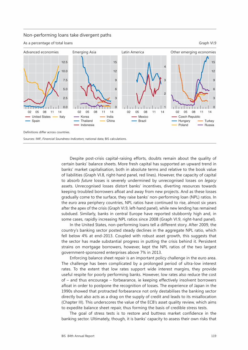
119BIS 84th Annual Report
Despite post-crisis capital-raising efforts, doubts remain about the quality of certain banks’ balance sheets. More fresh capital has supported an upward trend in banks’ market capitalisation, both in absolute terms and relative to the book value of liabilities (Graph VI.8, right-hand panel, red lines). However, the capacity of capital to absorb future losses is severely undermined by unrecognised losses on legacy assets. Unrecognised losses distort banks’ incentives, diverting resources towards keeping troubled borrowers afloat and away from new projects. And as these losses gradually come to the surface, they raise banks’ non-performing loan (NPL) ratios. In the euro area periphery countries, NPL ratios have continued to rise, almost six years after the apex of the crisis (Graph VI.9, left-hand panel), while new lending has remained subdued. Similarly, banks in central Europe have reported stubbornly high and, in some cases, rapidly increasing NPL ratios since 2008 (Graph VI.9, right-hand panel).
In the United States, non-performing loans tell a different story. After 2009, the country’s banking sector posted steady declines in the aggregate NPL ratio, which fell below 4% at end-2013. Coupled with robust asset growth, this suggests that the sector has made substantial progress in putting the crisis behind it. Persistent strains on mortgage borrowers, however, kept the NPL ratios of the two largest government-sponsored enterprises above 7% in 2013.
Enforcing balance sheet repair is an important policy challenge in the euro area. The challenge has been complicated by a prolonged period of ultra-low interest rates. To the extent that low rates support wide interest margins, they provide useful respite for poorly performing banks. However, low rates also reduce the cost of – and thus encourage – forbearance, ie keeping effectively insolvent borrowers afloat in order to postpone the recognition of losses. The experience of Japan in the 1990s showed that protracted forbearance not only destabilises the banking sector directly but also acts as a drag on the supply of credit and leads to its misallocation (Chapter III). This underscores the value of the ECB’s asset quality review, which aims to expedite balance sheet repair, thus forming the basis of credible stress tests.
The goal of stress tests is to restore and buttress market confidence in the banking sector. Ultimately, though, it is banks’ capacity to assess their own risks that
Non-performing loans take divergent paths
As a percentage of total loans Graph VI.9
Advanced economies Emerging Asia Latin America Other emerging economies
Definitions differ across countries.
Sources: IMF, Financial Soundness Indicators; national data; BIS calculations.
0.0
2.5
5.0
7.5
10.0
12.5
02 05 08 11 14United StatesSpain
Italy
0
3
6
9
12
15
02 05 08 11 14KoreaThailandIndonesia
IndiaChina
1
2
3
4
02 05 08 11 14MexicoBrazil
0
3
6
9
12
15
02 05 08 11 14Czech RepublicHungaryPoland
TurkeyRussia

120 BIS 84th Annual Report
would support this confidence on a continuous basis. Hence the importance of policy initiatives to promote transparent, reliable and internationally harmonised risk measurement systems and enhanced disclosure.
Banks in a late financial boom phase
In countries with recent financial booms, banks may be weaker than they appear. This concern applies mainly to institutions exposed to those emerging market economies where perceptions of a benign credit outlook and strong earnings potential have ridden on an unstable leverage-based expansion. A similar concern applies to bank operations in certain advanced economies, such as Switzerland and the Nordic countries, where strong valuations (Graph VI.8, left-hand panel) may be reflecting fast credit growth and frothy property prices (Chapter IV).
Several indicators deliver an upbeat message about EME banks. For one, the NPL ratios of banks domiciled in parts of emerging Asia and Latin America have been low and declining, standing at around 3% or lower at end-2013 (Graph VI.9, second and third panels). In this context, Indian banks’ rising NPL ratios are an exception. In addition, the credit ratings that both Fitch and Moody’s assign to large EME banks have remained stable and even improved slightly on aggregate since 2007 (Graph VI.7). And the corresponding price-to-book ratios have been high, hovering around 2 over the past five years (Graph VI.8, left-hand panel).
That said, such indicators failed to signal vulnerabilities in the past. Because of their backward-looking nature, NPL ratios did not pick up in advanced economies until 2008, when the crisis was already under way (Graph VI.9, left-hand panel). Similarly, pre-crisis credit ratings and market valuations did not warn about the imminent financial distress.
In contrast, measures of credit expansion and the speed of property price inflation, which have been reliable early warning indicators, are flashing red lights about a number of emerging market economies at the current juncture (Chapter IV). These warnings are echoed by capitalisation ratios, which equal the market value of equity divided by the book value of liabilities (Graph VI.8, right-hand panel, blue lines). On the back of leverage-based balance sheet growth, these ratios have declined steadily on aggregate for both banks and non-financial corporates (NFCs) in EMEs. Thus, any event that triggers investor scepticism would depress capitalisation ratios from a low starting point, potentially endangering financial stability. The EME NFC sector is an important part of the picture not only because it is the main source of credit risk to domestic banks but also because it has recently entered the intermediation chain (Chapter IV).
In a sign of growing investor scepticism, Chinese banks’ price-to-book ratios have diverged from those of EME peers and have been declining over the past five years. Explicit and implicit links between regulated and shadow banks have contributed to this scepticism. National data indicate that non-bank credit to private NFCs grew sevenfold between mid-2008 and end-2013, thus increasing its share in the country’s total credit from 10% to 25%. The fragilities accompanying this rapid rise surfaced in a number of near and outright defaults among China’s shadow banks and contributed to a drastic reduction in the country’s credit supply in the first quarter of 2014. Industry analysts expect such strains to have repercussions on banks, not least because they have acted as issuers and distributors of shadow banking products.
Authorities in EMEs need to alert banks to the scale of current risks, enforce sound risk management and strengthen macroprudential measures. For one, the deteriorating growth outlook in these economies calls for a downward revision of earnings forecasts. In addition, EME authorities will need to cope with the fallout

121BIS 84th Annual Report
from the phasing-out of monetary accommodation in advanced economies. The resulting market tensions (Chapters II and IV) have highlighted the importance of proper management of interest and exchange rate risk. More generally, the build-up of financial vulnerabilities underscores the importance of not being lulled into a false sense of security and of reassessing previously used macroprudential tools (Box VI.D). Emerging market economies have been early adopters of such tools and have gained extensive experience regarding their operation and effectiveness. This experience can be the basis for further refinements and improvements to the macroprudential policy framework.
Box VI.DThe effectiveness of countercyclical policy instruments
Policies that address macro-financial vulnerabilities require effective instruments that take a system-wide perspective. In recent years, several jurisdictions have strengthened the systemic orientation of their prudential framework by redesigning existing, and introducing new, macroprudential policy tools to mitigate the risks arising from the financial cycle. Similar tools have been incorporated in international standards. Even though it is premature to seek firm conclusions about the effectiveness of newly introduced tools, such as countercyclical capital buffers, the historical experience of some jurisdictions with similar tools provides a useful context.
The yardstick for the assessment of instrument effectiveness is tied to the objective of the policy. In the case of countercyclical tools, there are two complementary objectives. The first, narrower, one is to protect financial institutions from the effects of the cycle. The second, broader, objective is to tame the financial cycle. Success in the narrow objective does not guarantee success in the broader one, as policymakers’ experience so far with the most prominent countercyclical instruments confirms.
Capital buffers and dynamic provisions
A number of jurisdictions have introduced a countercyclical capital requirement in order to increase banks’ resilience in the face of risk built up during credit booms. Switzerland activated the tool in 2013 with a focus on the domestic mortgage market. The early signs are that the tool is more effective in strengthening banks’ balance sheets than in slowing down mortgage credit growth or affecting its cost. This mirrors Spain’s experience with dynamic provisioning. More ample provisions helped Spanish banks to partially buffer the impact of the bust in the property market, but did not prevent the bubble from inflating in the first place.
Loan-to-value (LTV) and debt service-to-income (DSTI) ratios
These tools have a longer track record in a number of jurisdictions. The evidence indicates that they help to improve banks’ resilience by increasing that of borrowers. A number of studies find that tighter LTV caps reduce the sensitivity of households to income and property price shocks. The impact on the credit cycle is less well documented, but experience suggests that tightening LTV and DSTI caps during booms slows real credit growth and house price appreciation to some extent. In particular, a typical tightening of the maximum DSTI ratio generates a 4–7 percentage point deceleration in credit growth over the following year. But relaxing the constraint has a more ambiguous effect.
Time-varying liquidity requirements / reserve requirements
Similarly to capital, the impact of higher liquidity buffers on the resilience of banks is self-evident. There is also evidence that liquidity-based macroprudential tools can effectively enhance the system’s resilience. The evidence on the impact of liquidity-based tools in curbing the credit cycle is not as strong. Studies assessing the impact of higher reserve requirements find that lending spreads increase and lending shrinks, but that the effects do not last.
See S Claessens, S Ghosh and R Mihet, “Macro-prudential policies to mitigate financial system vulnerabilities”, Journal of International Money and Finance, vol 39, December 2013, pp 153–85; and K Kuttner and I Shim, “Can non-interest rate policies stabilise housing markets? Evidence from a panel of 57 economies”, BIS Working Papers, no 433, November 2013. For a study of the net stable funding ratio, see BCBS, An assessment of the long-term economic impact of stronger capital and liquidity requirements, August 2010.