Embed Size (px)
Citation preview
University of Groningen
Bachelor thesis
A Dashboard forAutomatic MonitoringPython Web Services
Patrick Vogel
First supervisorDr. Mircea Lungu
Second supervisorDr. Vasilios Andrikopoulos
August 2, 2017
Abstract
This bachelor thesis describes the problem of monitoring the performanceof Flask-based Python web-services. For the web developer that wants tomonitor the performance for their web-services, a solution is presented.The solution consists of an automatic monitoring dashboard, that canbe installed in any existing web-service with Python and Flask. Afterthe installation (installation requires 2 lines of code) an automatic mon-itoring service is ready to use. With several lines of extra configuration,the following features are supported:
1. Automatic version detection. The monitoring tool detects the ac-tive version of this VCS and combines this with the collected data.
2. Comparison of execution times across different users. Which usersperform better or worse on certain versions of the system and howcan this be improved? The monitoring dashboard creates graphsautomatically, wherein it is easy to spot differences in executiontimes.
3. Automatic outlier detection. Whenever the execution time is largerthan usual – an outlier –, the monitoring tool collects extra infor-mation about the requested data, such as the stack-trace of activethreads, and CPU- and memory usage of the system. In order toreduce the overhead of the dashboard, logging extra information isonly done for potential outliers.
Moreover, this thesis describes the design of the monitoring tool.After the development of the dashboard, it is deployed for a case studyto validate its usefulness. The collected results have been used to analyzeand improve the performance of that case study.
1
Contents
1 Introduction 51.1 Web frameworks . . . . . . . . . . . . . . . . . . . . . . . 5
1.1.1 Flask and Django . . . . . . . . . . . . . . . . . . . 51.2 Flask . . . . . . . . . . . . . . . . . . . . . . . . . . . . . . 61.3 Service Evolution . . . . . . . . . . . . . . . . . . . . . . . 71.4 The problem . . . . . . . . . . . . . . . . . . . . . . . . . 71.5 Research question . . . . . . . . . . . . . . . . . . . . . . . 81.6 Article . . . . . . . . . . . . . . . . . . . . . . . . . . . . . 8
2 Related work 9
3 Automatic Monitoring Dashboard 113.1 Binding the dashboard . . . . . . . . . . . . . . . . . . . . 113.2 Evolving systems . . . . . . . . . . . . . . . . . . . . . . . 123.3 Automatic User Detection . . . . . . . . . . . . . . . . . . 13
4 Architecture 154.1 Rule selection . . . . . . . . . . . . . . . . . . . . . . . . . 154.2 Automatic outlier detection . . . . . . . . . . . . . . . . . 174.3 Dependencies . . . . . . . . . . . . . . . . . . . . . . . . . 19
4.3.1 SQLAlchemy . . . . . . . . . . . . . . . . . . . . . 194.3.2 WTForms and Flask-WTF . . . . . . . . . . . . . 194.3.3 Plotly . . . . . . . . . . . . . . . . . . . . . . . . . 194.3.4 ConfigParser . . . . . . . . . . . . . . . . . . . . . 194.3.5 PSUtil . . . . . . . . . . . . . . . . . . . . . . . . . 204.3.6 ColorHash . . . . . . . . . . . . . . . . . . . . . . . 204.3.7 Requests . . . . . . . . . . . . . . . . . . . . . . . . 20
5 Case Study 215.1 Overview . . . . . . . . . . . . . . . . . . . . . . . . . . . 215.2 The Most Used Endpoint . . . . . . . . . . . . . . . . . . 225.3 The Slowest Endpoint . . . . . . . . . . . . . . . . . . . . 25
6 Conclusion 28
7 Future work 29
A Source code setup-script 32
B Installation and configuration 33B.1 Virtual Environment . . . . . . . . . . . . . . . . . . . . . 33B.2 Downloading . . . . . . . . . . . . . . . . . . . . . . . . . 34B.3 Installing . . . . . . . . . . . . . . . . . . . . . . . . . . . 35B.4 Configuration . . . . . . . . . . . . . . . . . . . . . . . . . 35
B.4.1 The configuration in more detail . . . . . . . . . . 36
2

C Case study 38
3
General information
Start date: April 17, 2017First supervisor: Dr. Mircea Lungu ([email protected])Second supervisor: Dr. Vasilios Andrikopoulos ([email protected])Student: Patrick Vogel ([email protected])Project partner: Thijs Klooster ([email protected]
4
Chapter 1
Introduction
“The web is the only true object oriented system”, says Alan kay, the in-ventor of object oriented programming. This because the service orientedarchitecture of the web embodies the early ideas of the OO paradigmmuch better than the way it has been implemented in the mainstreamprogramming languages. Indeed, the web becomes increasingly a systemof interconnected services.
1.1 Web frameworks
A web framework is a code library that makes a developer’s life eas-ier when building reliable, scalable and maintainable web applications.Web frameworks encapsulate what developers have learned over the pasttwenty years while programming sites and applications for the web.Frameworks make it easier to reuse code for common HTTP opera-tions and to structure projects so other developers with knowledge ofthe framework can quickly build and maintain the application. [6]
Frameworks provide functionality in their code or through extensionsto perform common operations required to run web applications. Thesecommon operations include:
1. URL routing
2. HTML, XML, JSON, and other output format templating
3. Database manipulation
4. Security against Cross-site request forgery (CSRF) and other at-tacks
5. Session storage and retrieval
1.1.1 Flask and Django
Flask and Django are two of the most popular web frameworks forPython. The biggest difference between Flask and Django is:
• Flask implements a bare-minimum and leaves the bells and whistlesto add-ons or to the developer. Flask provides simplicity, flexibilityand fine-grained control. It is unopinionated (it lets you decide howyou want to implement things).
5
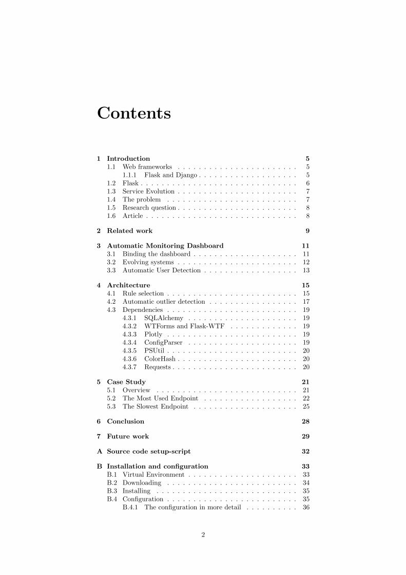
Figure 1.1: Number of questions for Flask and Django on StackOverflow
• Django follows a “batteries included” philosophy and gives you alot more out of the box. Django provides an all-inclusive experi-ence: you get an admin panel, database interfaces, an ORM, anddirectory structure for your apps and projects out of the box.
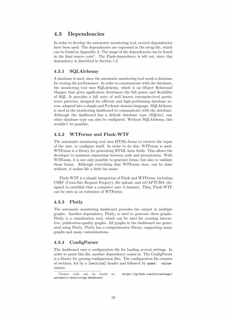
Django has been around for longer — it was first released in 2005,while Flask debuted in 2010 — and is more popular — in January2017, there were 2631 StackOverflow questions about Django and 575for Flask. Both frameworks are growing steadily in popularity, as canbe seen by the number of StackOverflow questions about each in Figure1.1. [4]
1.2 Flask
Since this bachelor project is about implementing a dashboard for Flask,a bit more information about Flask is provided and details are left outfor Django.
Flask is called a micro framework because it does not require par-ticular tools or libraries. It has no database abstraction layer, formvalidation, or any other components where pre-existing third-party li-braries provide common functions. However, Flask supports extensionsthat can add application features as if they were implemented in Flaskitself. Extensions exist for object-relational mappers, form validation,upload handling, various open authentication technologies and severalcommon framework related tools. Extensions are updated far more reg-ularly than the core Flask program. [9]
Flask is easy to get started with as a beginner because there is littleboilerplate code for getting a simple app up and running:
from flask import Flaskapp = Flask( name )
@app.route(’/’)
def hello world():return ’Hello World!’
if name == ’ main ’:
app.run()
With the code snippet above, a simple web-service is created (line 1and 2). Moreover, an endpoint is connected to the web-service (line 4).
6
The web-service can be started with the code expressed on the last line(line 9). Each Flask web-service contains the parts that are expressedin this code snippet, but are usually more complex1 than this simpleexample.
1.3 Service Evolution
Software evolves over time. Due to new ideas or new requirements, newfeatures have to be added, or existing features have to be updated. Sinceservices consists of software, it is not different for web-services. In orderto keep track of the changes, it is important for their maintainers tounderstand them.
The evolution of software is usually done is several versions. Popu-lar Version Control Systems (VCS), like Git, make it easier to see thechanges throughout different versions. However, VCS’s are not designedfor combining the different versions with the performance of web-services.
1.4 The problem
One of the problems of existing web-services, like Flask, is the fact thatthe developers of the web-service do not have information about whichparts of their web-services are used the most and which are used theleast or even not at all. In a Java system, for example, one can performstatic analysis to discover such dependencies, but on the web, everythingis dynamic, there is no equivalent way of analyzing the dependencies toa given web-service.
Thus, every one of those Flask projects faces one of the followingoptions when confronted with the need of gathering insight into theexecution time performance behavior of their implemented service:
1. Use a third party, heavyweight, professional service on a differentserver.
2. Implement their own analytics tool.
3. Live without analytics insight into their services.2
An example of a third party service is Google Analytics. It works byinserting a piece of JavaScript on the page that has to be monitored. [10]When requesting this page, the load time has increased, due to the over-head of this script. Another disadvantage of using third party servicesis that some requests are not being collected, since the script is usuallyblocked by tools such as Adblock. This leads to an incomplete overviewof the performance of the web-service.
For projects which are done on a budget (e.g. research projects)the first and the second options are often not available due to timeand financial constraints. To avoid these projects ending up in the thirdsituation, this thesis presents a low-effort, lightweight service monitoringAPI for Flask and Python web-services.
1Web-services usually contain more than one endpoint.2This is very real option: and is exactly what happened to the API that will be
presented in this case study for many months.
7
1.5 Research question
Thus, to address the previous problem, the following research questionis proposed:
How to design a system that can measure the performance of a Flaskweb service as it evolves over time, in such a way that the overhead ofthe service is minimal?
The overhead that is meant in the question above, consists of twoparts. First, the overhead of starting to measure the performance shouldbe minimal. Second, the overhead of the monitoring program should beminimal.
1.6 Article
Related to this thesis an article has been published [7]. The articleshortly introduces the Dashboard. It is easy to read for people that wantto gain interest in this topic. The article is a collaboration between twoprofessors (Mircea Lungu and Vasilios Andrikopoulos) and two students(Thijs Klooster and Patrick Vogel).
8
Chapter 2
Related work
Several monitoring tools already exists for Python or web services. Afew popular open source monitoring projects are listed below.
Sentry
Sentry is a Python project that focuses on monitoring real-time errorsfor various programming languages including Python. Thus, it can beused perfectly for monitoring Python web-services, like Flask. Sentryis focused at monitoring errors, but has no notion of errors throughoutdifferent software-versions. Whenever Sentry captured an error, the erroris automatically sent to their website1. On that website it is possible tosee all errors including a stack trace.
Graphite
Graphite is an enterprise-scale monitoring tool. It was originally de-signed and written by Chris Davis at Orbitz in 2006 as side project thatultimately grew to be a foundational monitoring tool. In 2008, Orbitz al-lowed Graphite to be released under the open source Apache 2.0 license.Since then Chris has continued to work on Graphite and has deployed itat other companies including Sears, where it serves as a pillar of the e-commerce monitoring system. [3] Graphite is focused on metrics, ratherthan the performance as a whole.
Flask jsondash
Flask JSON-Dash is an open source project at Github [2]. With FlaskJSON-Dash it is possible to build complex dashboards without anyfront-end code. It is easy to configure the project in an existing Flask-application. This project focuses on easily designing dashboard, ratherthan using them. Another disadvantage is that Flask JSON-dash has nonotion of versioning. Thus, it is not possible to detect changes in theperformance of execution times as the system evolves.
1https://sentry.io/welcome/
9
ELK Stack
The ELK Stack combines Elasticsearch, Logstash and Kibana.
• Elasticsearch is a distributed, open source search and analyticsengine based on Lucene. Elasticsearch is the most popular enter-prise search engine followed by Apache Solr, also based on Lucene.Elasticsearch can be used to search all kinds of documents. [8]
• Logstash is an open source data collection, and transportationpipeline. With connectors to common infrastructure for easy in-tegration, Logstash is designed to process a growing list of log,event, and unstructured data sources for distribution into a vari-ety of outputs, including Elasticsearch.
• Kibana is an open source data visualization platform that allowsthe user to interact with the data. It provides visualization capa-bilities on top of the content indexed on an Elasticsearch cluster.Users can create bar, line and scatter plots, or pie charts and mapson top of large volumes of data. your data far and wide. [1]
The disadvantage of using the ELK stack is the same as for Sentry. Itis focused at logging relevant information, rather than monitoring a webservice. The ELK stack deals well with datasets that rapidly grow.
The ELK-stack is rather complicated to setup, since all three pro-grams must be installed separately. Once the installation is complete,the programs must be configured to work with each other.
10
Chapter 3
Automatic MonitoringDashboard
3.1 Binding the dashboard
After the research that has been done in the previous chapter, it is clearthat there is no system that can measure the performance of a Flask webservice as it evolves over time. In order to solve this problem, the Auto-matic Monitoring Dashboard has been developed. The dashboard con-sists of a drop-in Python library that allows developers to monitor theirFlask based web-service. In order to achieve the simplicity of installingthe dashboard, only two lines of code are required to start monitoringan existing web-service:1
import dashboard# app is the Flask applicationdashboard.bind(app)
After binding to the service, the dashboard becomes available at/dashboard. In order to configure the dashboard at a different URL, anadditional line of code is required. For all configuration options of thedashboard, see Appendix B.
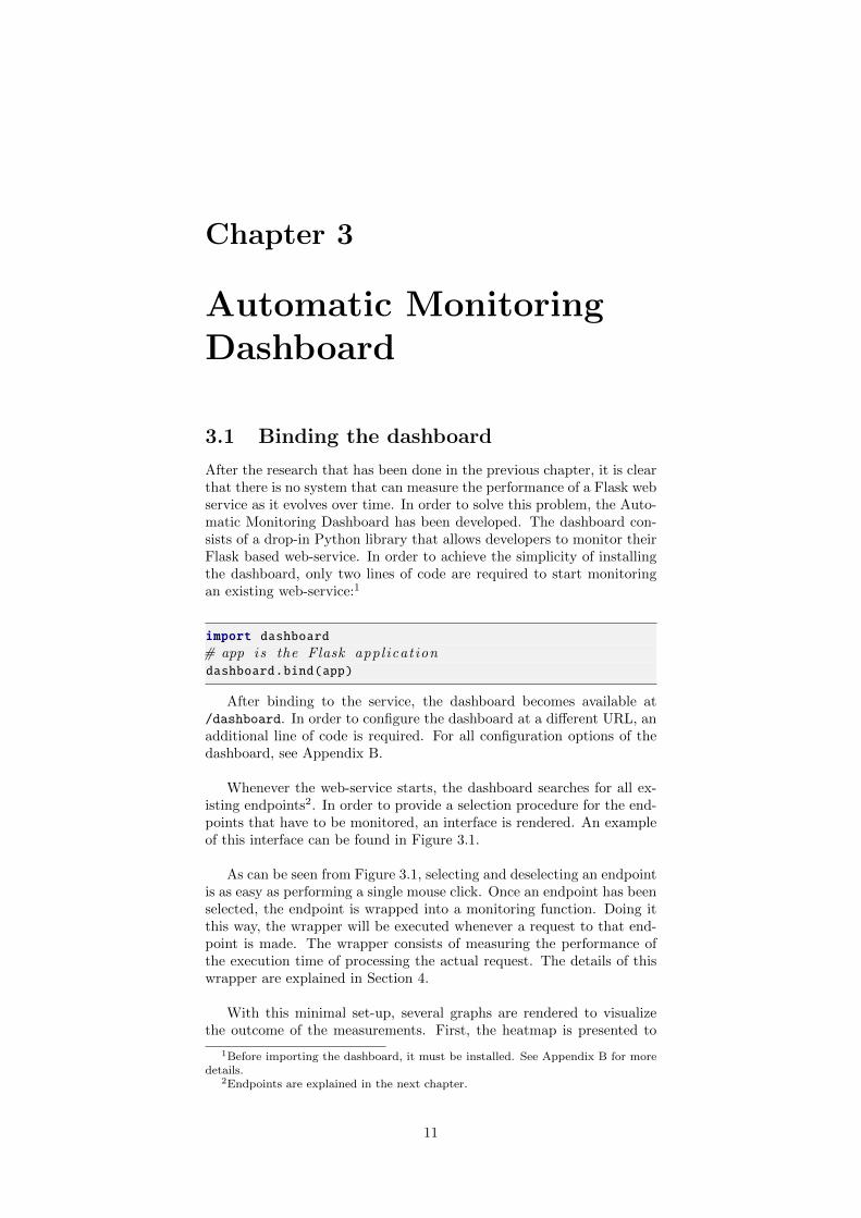
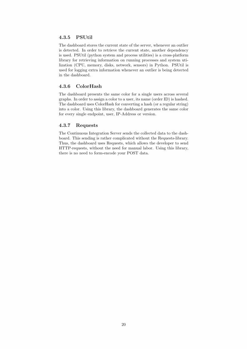
Whenever the web-service starts, the dashboard searches for all ex-isting endpoints2. In order to provide a selection procedure for the end-points that have to be monitored, an interface is rendered. An exampleof this interface can be found in Figure 3.1.
As can be seen from Figure 3.1, selecting and deselecting an endpointis as easy as performing a single mouse click. Once an endpoint has beenselected, the endpoint is wrapped into a monitoring function. Doing itthis way, the wrapper will be executed whenever a request to that end-point is made. The wrapper consists of measuring the performance ofthe execution time of processing the actual request. The details of thiswrapper are explained in Section 4.
With this minimal set-up, several graphs are rendered to visualizethe outcome of the measurements. First, the heatmap is presented to
1Before importing the dashboard, it must be installed. See Appendix B for moredetails.
2Endpoints are explained in the next chapter.
11
Figure 3.1: Example of rules-table
detect any outliers in the number of requests. This heatmap answersquestions like: During what hours does the endpoint get the most re-quests? Does the endpoint gets more requests during the week or in theweekend? And does the number of requests per day grow over time?For answering these questions, the monitoring tool shows a heatmapwith on the y-axis every hour and the x-axis the last 30 days. Thus acolumn consists of 24 cells and the color of the cells represents whetherthe number of requests in that hour on that day is large (red) or small(blue) or any light-red, white, light-blue color in between. The heatmapis presented in Figure 3.2a.
In order to investigate the number of requests in the past two daysof this endpoint, two additional graphs are created in Figure 3.2b andFigure 3.2c. The first graph (Figure 3.2b) is a vertical bar graph, whichshows the maximum, average and minimum execution time per hour. Inthis graph it is easy to compare different hours with each other. Also,it is possible to detect whether the average execution time is due toone busy hour, or to requests with sequentially large execution times.The second graph is also a vertical bar graph, but shows the numberof requests per hour. This is the same information as presented in theheatmap. However, the advantage of this graph is that it easier to com-pare different hours with each other. In a heatmap it is harder to seethe relative differences (e.g. twice the number of requests in that hour,compared to another hour), while it is clearly visible in this graph.
3.2 Evolving systems
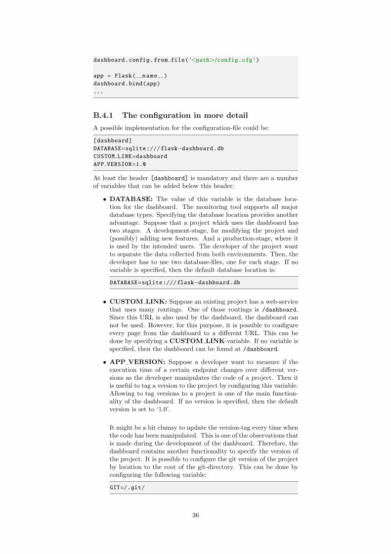
With the two lines of code given in the previous section, a simple dash-board is installed. However, one of the problems described in the previ-ous section was to monitor the system as it evolves. In order to detectwhether the system evolves, a configuration file can be set-up. Config-uring the dashboard with this file can be done with the following linesof code:
import dashboarddashboard.config.from file(’<path>/config.cfg’)dashboard.bind(app)
It is for example possible to tag the version of the system in the config-uration file, this can be done with a file that looks like:
12
[dashboard]
APP VERSION=1.0
Thus, the version of the active system is now 1.0, according to the con-figuration file. It might not be handy to update the configuration file,every time a change to the code has been made. Therefore, the function-ality of the dashboard is to automate the detection of evolving systems.With this functionality, it is possible to detect whether the executiontime of certain endpoints increases as newer versions of a system aredeployed. An observation that was made during the development of thedashboard is that most professional projects are built with a VersionControl System (VCS). In a VCS, the development of a software-projectconsists of multiple versions. Each version has a hash-code. The func-tionality of the dashboard consists of reading the hash-code of the activeversion as soon as the application starts. For configuring the dashboardwith the functionality of automatically detecting versions, the followingconfiguration file can be used:
[dashboard]
GIT=/.git/
With the detection of different versions of the system, more graphscan be visualized. An example of such a graph is Figure 3.2d, whichshows boxplots for all execution times for every version. The data inthe boxplot are the execution times for that endpoint. Whenever anendpoint performs better since the release of a new version, it shouldbe possible to detect in this graph. Also the release date and time of aversion is presented, since the data could be less reliable if the versionwas exposed in a short time period.
3.3 Automatic User Detection
The last configuration option contains another main functionality of thedashboard. The performance of some endpoint could be different peruser. Using this configuration it is possible to see which users of theapplication perform better than others. Which users get fast executiontimes, and which do not? To differentiate between the users, a customfunction has to be set up. That function retrieves the session-id orusername of a specific user that is requesting your site. Specifying thefunction is done using the following lines of code:
import dashboard
def get user name():return session.get(’username’)
dashboard.config.get group by = get user name
dashboard.bind(app)
Allowing the dashboard to distinguish between different users helpsin finding differences in execution times for those users. Suppose theapplication has an endpoint that iterates through all instances of a cer-tain list that is being retrieved from the database, then that endpointhas a complexity of O(n). Suppose the length of the list is for user A10 instances, and for user B 10,000 instances, then the application has
13
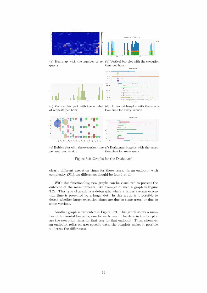
(a) Heatmap with the number of re-quests
(b) Vertical bar plot with the executiontime per hour
(c) Vertical bar plot with the numberof requests per hour
(d) Horizontal boxplot with the execu-tion time for every version
(e) Bubble plot with the execution timeper user per version
(f) Horizontal boxplot with the execu-tion time for some users
Figure 3.2: Graphs for the Dashboard
clearly different execution times for those users. In an endpoint withcomplexity O(1), no differences should be found at all.
With this functionality, new graphs can be visualized to present theoutcome of the measurements. An example of such a graph is Figure3.2e. This type of graph is a dot-graph, where a larger average execu-tion time is presented by a larger dot. In this graph is it possible todetect whether larger execution times are due to some users, or due tosome versions.
Another graph is presented in Figure 3.2f. This graph shows a num-ber of horizontal boxplots, one for each user. The data in the boxplotare the execution times for that user for that endpoint. Thus, wheneveran endpoint relies on user-specific data, the boxplots makes it possibleto detect the differences.
14
Chapter 4
Architecture
The core functionality of the dashboard is to collect statistics about a se-lection of the endpoints. In order to let the maintainer of the dashboardchoice which endpoints must be monitored, there are three options.
The first option is to statically add a python decorator to the end-point that is followed. But the code of the user might not always beclearly written. Therefore it might be hard to find all endpoints.
Another option would be to write a Python-parser that searchesthrough the code and adds a decorator to each endpoint. But pars-ing is an exhausting and complicated task, which would not be the bestsolution.
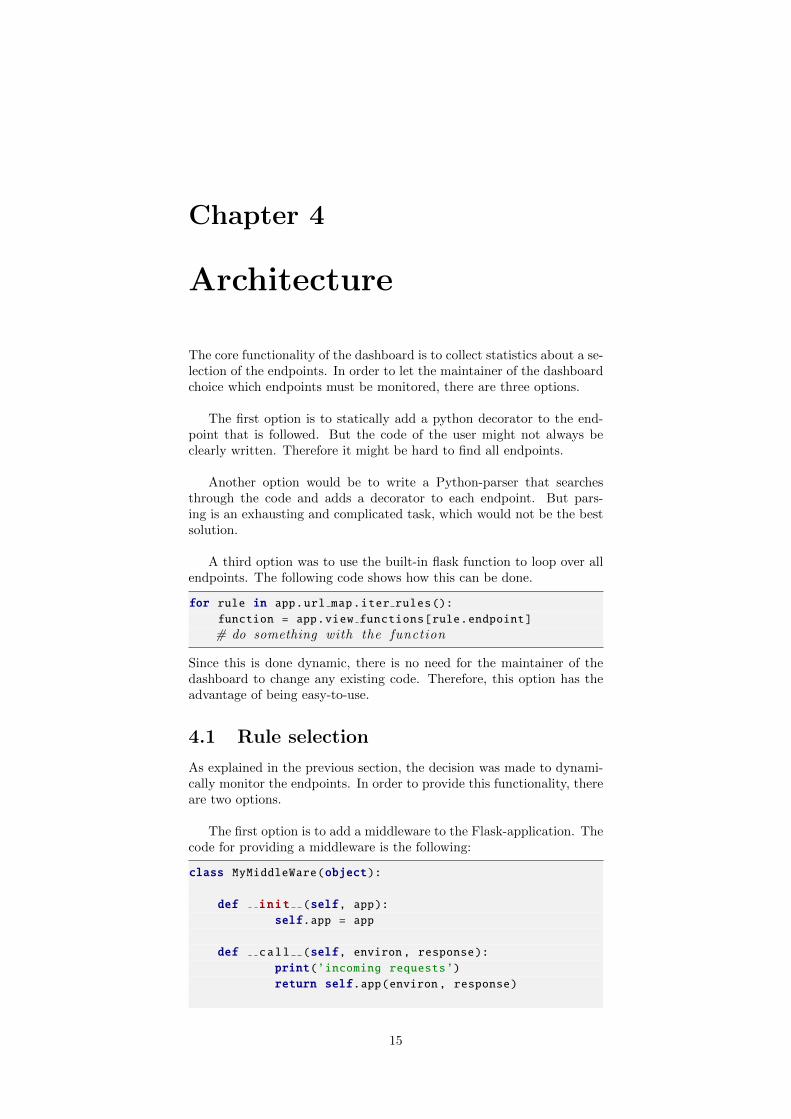
A third option was to use the built-in flask function to loop over allendpoints. The following code shows how this can be done.
for rule in app.url map.iter rules():function = app.view functions[rule.endpoint]
# do something with the function
Since this is done dynamic, there is no need for the maintainer of thedashboard to change any existing code. Therefore, this option has theadvantage of being easy-to-use.
4.1 Rule selection
As explained in the previous section, the decision was made to dynami-cally monitor the endpoints. In order to provide this functionality, thereare two options.
The first option is to add a middleware to the Flask-application. Thecode for providing a middleware is the following:
class MyMiddleWare(object):
def init (self, app):self.app = app
def call (self, environ, response):print(’incoming requests’)return self.app(environ, response)
15
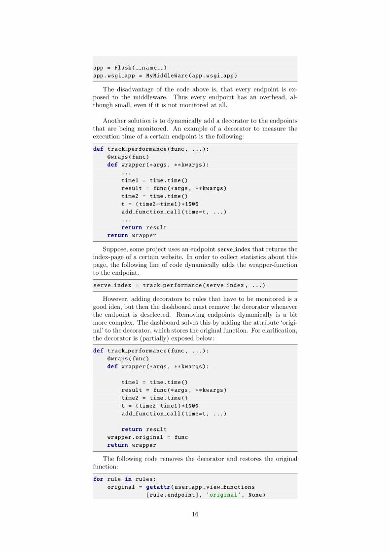
app = Flask( name )
app.wsgi app = MyMiddleWare(app.wsgi app)
The disadvantage of the code above is, that every endpoint is ex-posed to the middleware. Thus every endpoint has an overhead, al-though small, even if it is not monitored at all.
Another solution is to dynamically add a decorator to the endpointsthat are being monitored. An example of a decorator to measure theexecution time of a certain endpoint is the following:
def track performance(func, ...):@wraps(func)
def wrapper(∗args, ∗∗kwargs):...
time1 = time.time()
result = func(∗args, ∗∗kwargs)time2 = time.time()
t = (time2−time1)∗1000add function call(time=t, ...)
...
return resultreturn wrapper
Suppose, some project uses an endpoint serve index that returns theindex-page of a certain website. In order to collect statistics about thispage, the following line of code dynamically adds the wrapper-functionto the endpoint.
serve index = track performance(serve index , ...)
However, adding decorators to rules that have to be monitored is agood idea, but then the dashboard must remove the decorator wheneverthe endpoint is deselected. Removing endpoints dynamically is a bitmore complex. The dashboard solves this by adding the attribute ‘origi-nal’ to the decorator, which stores the original function. For clarification,the decorator is (partially) exposed below:
def track performance(func, ...):@wraps(func)
def wrapper(∗args, ∗∗kwargs):
time1 = time.time()
result = func(∗args, ∗∗kwargs)time2 = time.time()
t = (time2−time1)∗1000add function call(time=t, ...)
return resultwrapper.original = func
return wrapper
The following code removes the decorator and restores the originalfunction:
for rule in rules:original = getattr(user app.view functions
[rule.endpoint], ’original’, None)
16
if original:user app.view functions[rule.endpoint] =
original
Using the latter has the advantage of not having overhead for decoratorsthat not have to be monitored. This option lead to the decision to makea page in the monitoring dashboard in which rules can be easily selectedor deselected. This page provides a better overview and is easier forthe developer and user of the dashboard. A possible table can be foundin Figure 3.1. In this table it is easy to see which endpoints are beingmonitored and which are not.
4.2 Automatic outlier detection
In a number of graphs in the dashboard, it is possible to spot outliers.An example of such a graph can be found in Figure 5.6. In this figure,outliers are represented by dots. In case an outlier occurs, it is usefulto discover possible reasons. Therefore, extra information is being col-lected. This information includes the current state of the server, like theamount of memory used on the server and the CPU-percentage used.Also, extra requests parameters are logged, like the headers, full URL,environment of the client and all GET-, POST-values of that request.And the current stack trace during the execution of the request is logged.
In order to log the current stack trace during the execution of therequests, an additional thread is created. Suppose a request arrives attime t1, then at that moment an extra thread is created. The purposeof the thread is to sleep N seconds, which is calculated by the averageexecution time for that endpoint, times the outlier-detection-constant,as explained in Appendix B. Thus, this moment can be expressed ast2 = t1 + N . At t2, the additional thread logs the entire stack trace (ofall active threads).
Now, suppose that the request finished at t3. Then there are twopossible cases:
• t3 ≤ t2: The request is not an outlier and no extra information islogged.
• t3 > t2: By definition, the request is an outlier.
In the first case, the additional thread hasn’t even started to collectthe stack traces, and thus no overhead (apart from creating the thread)is used. In the second case, the additional thread logs the entire stacktrace. This information is passed to the main thread, which stores thisinformation, after the thread is finished processing the requests (this isat t3). In order to make it more clear, the information above is visualizedin Figure 4.1. Note that this figure presents only the second case of thetheory above.
An example of an outlier that is registered in the system, can befound in Figure 4.2. Note that the table is too large to fit in a singleimage, therefore the stack trace has been left out. The figure shows thatthe information is too large to fit in a single table. This is due to thefact that the data is unformatted.
17
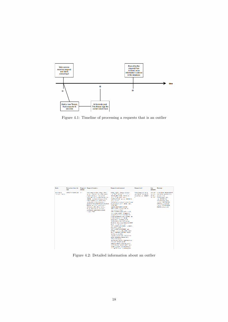
Figure 4.1: Timeline of processing a requests that is an outlier
Figure 4.2: Detailed information about an outlier
18
4.3 Dependencies
In order to develop the automatic monitoring tool, several dependencieshave been used. The dependencies are expressed in the setup file, whichcan be found in Appendix A. The usage of the dependencies can be foundin the final source code1. The Flask-dependency is left out, since thisdependency is described in Section 1.2.
4.3.1 SQLAlchemy
A database is used, since the automatic monitoring tool needs a databasefor storing the performance. In order to communicate with the database,the monitoring tool uses SQLalchemy, which is an Object RelationalMapper that gives application developers the full power and flexibilityof SQL. It provides a full suite of well known enterprise-level persis-tence patterns, designed for efficient and high-performing database ac-cess, adapted into a simple and Pythonic domain language. SQLAlchemyis used in the monitoring dashboard to communicate with the database.Although the dashboard has a default database type (SQLite), anyother database type can also be configured. Without SQLAlchemy, thiswouldn’t be possible.
4.3.2 WTForms and Flask-WTF
The automatic monitoring tool uses HTML-forms to retrieve the inputof the user, to configure itself. In order to do this, WTForms is used.WTForms is a library for generating HTML form fields. This allows thedeveloper to maintain separation between code and presentation. WithWTForms, it is not only possible to generate forms, but also to validatethose forms. Although everything that WTForms does, can be donewithout, it makes life a little bit easier.
Flask-WTF is a simple integration of Flask and WTForms, includingCSRF (Cross-Site Request Forgery), file upload, and reCAPTCHA (de-signed to establish that a computer user is human). Thus, Flask-WTFcan be seen as an extension of WTForms.
4.3.3 Plotly
The automatic monitoring dashboard provides the output in multiplegraphs. Another dependency, Plotly, is used to generate these graphs.Plotly is a visualization tool, which can be used for creating interac-tive, publication-quality graphs. All graphs in the dashboard are gener-ated using Plotly. Plotly has a comprehensive library, supporting manygraphs and many customizations.
4.3.4 ConfigParser
The dashboard uses a configuration file for loading several settings. Inorder to parse this file, another dependency comes in. The ConfigParseris a library for parsing configuration files. The configuration file consistsof sections, led by a [section] header and followed by name: value-entries.
1Source code can be found at: https://github.com/mircealungu/
automatic-monitoring-dashboard
19
4.3.5 PSUtil
The dashboard stores the current state of the server, whenever an outlieris detected. In order to retrieve the current state, another dependencyis used. PSUtil (python system and process utilities) is a cross-platformlibrary for retrieving information on running processes and system uti-lization (CPU, memory, disks, network, sensors) in Python. PSUtil isused for logging extra information whenever an outlier is being detectedin the dashboard.
4.3.6 ColorHash
The dashboard presents the same color for a single users across severalgraphs. In order to assign a color to a user, its name (order ID) is hashed.The dashboard uses ColorHash for converting a hash (or a regular string)into a color. Using this library, the dashboard generates the same colorfor every single endpoint, user, IP-Address or version.
4.3.7 Requests
The Continuous Integration Server sends the collected data to the dash-board. This sending is rather complicated without the Requests-library.Thus, the dashboard uses Requests, which allows the developer to sendHTTP-requests, without the need for manual labor. Using this library,there is no need to form-encode your POST data.
20
Chapter 5
Case Study
For collecting the results, the dashboard has been deployed in the Zeeguuweb-service. For more information about the Zeegue web-service, seeAppendix C. The data collection started on May 30, 2017. For a periodof 28 days1, the dashboard processed ∼ 33,500 requests. The data ofthese requests is presented below.
5.1 Overview
Below is a quick overview of the rules that are monitored during theentire lifetime of the implemented dashboard and their intended purpose.
• api.report exercise outcome: (∼ 12,500 requests, average exe-cution time of 99.9 ms) The purpose of this endpoint is to logs theperformance of an exercise. Every such performance, has a source,and an outcome.
• api.get possible translations: (∼ 8,000 requests, average exe-cution time of 1.48 s) This returns a list of possible translations ina specific language for a specific word in another specific language.
• api.bookmarks to study: (∼ 5,000 requests, average executiontime of 1.08 s) This returns a number of bookmarks that are rec-ommended for this user to study.
• api.learned language: (∼ 5,000 requests, average execution timeof 5.8 ms) This returns the learned language of the user.
• api.get feed items with metrics: (∼ 2,000 requests, averageexecution time of 11.5 s) Get a json-list of feed items for a givenfeed ID.
• api.validate: (∼ 500 requests, average execution time of 5.7 ms)To test whether the session is valid.
• api.studied words: (∼ 400 requests, average execution time of67.5 ms) Returns a list of the words that the user is currentlystudying.
• api.upload smartwatch events: (∼ 400 requests, average exe-cution time of 107 ms) This processes a smartwatch event.
1This section was written on June 27, 2017
21
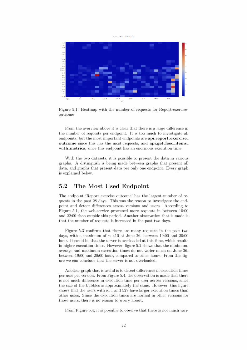
Figure 5.1: Heatmap with the number of requests for Report-exercise-outcome
From the overview above it is clear that there is a large difference inthe number of requests per endpoint. It is too much to investigate allendpoints, but the most important endpoints are api.report exerciseoutcome since this has the most requests, and api.get feed itemswith metrics, since this endpoint has an enormous execution time.
With the two datasets, it is possible to present the data in variousgraphs. A distinguish is being made between graphs that present alldata, and graphs that present data per only one endpoint. Every graphis explained below.
5.2 The Most Used Endpoint
The endpoint ‘Report exercise outcome’ has the largest number of re-quests in the past 28 days. This was the reason to investigate the end-point and detect differences across versions and users. According toFigure 5.1, the web-service processed more requests in between 10:00and 22:00 than outside this period. Another observation that is made isthat the number of requests is increased in the past two days.
Figure 5.3 confirms that there are many requests in the past twodays, with a maximum of ∼ 410 at June 26, between 19:00 and 20:00hour. It could be that the server is overloaded at this time, which resultsin higher execution times. However, figure 5.2 shows that the minimum,average and maximum execution times do not varier much on June 26,between 19:00 and 20:00 hour, compared to other hours. From this fig-ure we can conclude that the server is not overloaded.
Another graph that is useful is to detect differences in execution timesper user per version. From Figure 5.4, the observation is made that thereis not much difference in execution time per user across versions, sincethe size of the bubbles is approximately the same. However, this figureshows that the users with id 1 and 527 have larger execution times thanother users. Since the execution times are normal in other versions forthose users, there is no reason to worry about.
From Figure 5.4, it is possible to observe that there is not much vari-
22
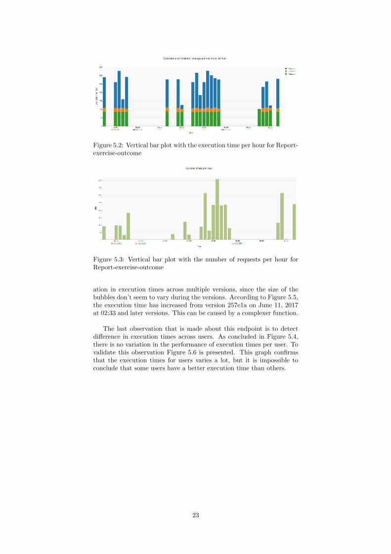
Figure 5.2: Vertical bar plot with the execution time per hour for Report-exercise-outcome
Figure 5.3: Vertical bar plot with the number of requests per hour forReport-exercise-outcome
ation in execution times across multiple versions, since the size of thebubbles don’t seem to vary during the versions. According to Figure 5.5,the execution time has increased from version 257e1a on June 11, 2017at 02:33 and later versions. This can be caused by a complexer function.
The last observation that is made about this endpoint is to detectdifference in execution times across users. As concluded in Figure 5.4,there is no variation in the performance of execution times per user. Tovalidate this observation Figure 5.6 is presented. This graph confirmsthat the execution times for users varies a lot, but it is impossible toconclude that some users have a better execution time than others.
23
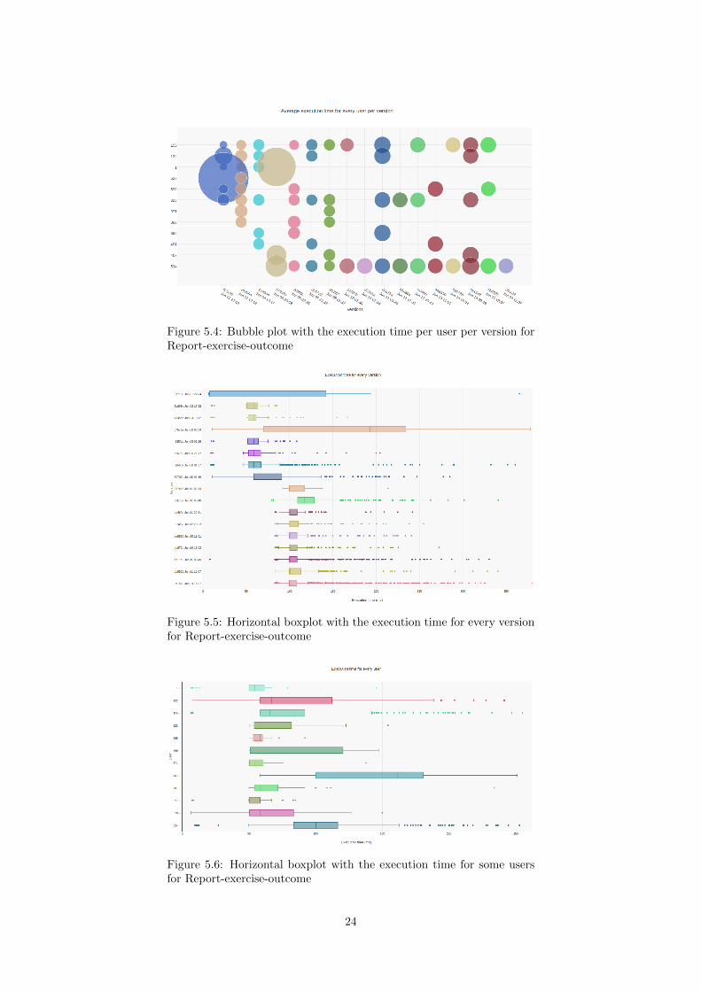
Figure 5.4: Bubble plot with the execution time per user per version forReport-exercise-outcome
Figure 5.5: Horizontal boxplot with the execution time for every versionfor Report-exercise-outcome
Figure 5.6: Horizontal boxplot with the execution time for some usersfor Report-exercise-outcome
24
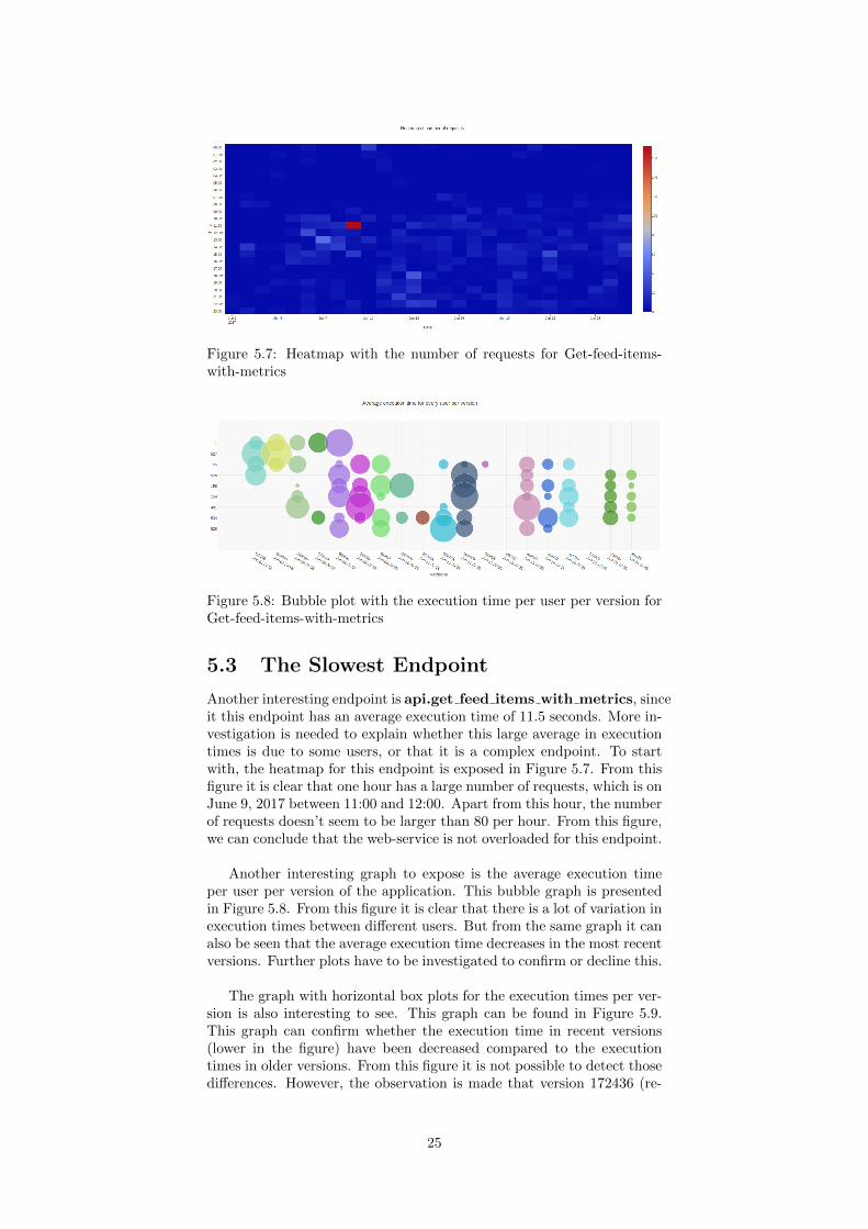
Figure 5.7: Heatmap with the number of requests for Get-feed-items-with-metrics
Figure 5.8: Bubble plot with the execution time per user per version forGet-feed-items-with-metrics
5.3 The Slowest Endpoint
Another interesting endpoint is api.get feed items with metrics, sinceit this endpoint has an average execution time of 11.5 seconds. More in-vestigation is needed to explain whether this large average in executiontimes is due to some users, or that it is a complex endpoint. To startwith, the heatmap for this endpoint is exposed in Figure 5.7. From thisfigure it is clear that one hour has a large number of requests, which is onJune 9, 2017 between 11:00 and 12:00. Apart from this hour, the numberof requests doesn’t seem to be larger than 80 per hour. From this figure,we can conclude that the web-service is not overloaded for this endpoint.
Another interesting graph to expose is the average execution timeper user per version of the application. This bubble graph is presentedin Figure 5.8. From this figure it is clear that there is a lot of variation inexecution times between different users. But from the same graph it canalso be seen that the average execution time decreases in the most recentversions. Further plots have to be investigated to confirm or decline this.
The graph with horizontal box plots for the execution times per ver-sion is also interesting to see. This graph can be found in Figure 5.9.This graph can confirm whether the execution time in recent versions(lower in the figure) have been decreased compared to the executiontimes in older versions. From this figure it is not possible to detect thosedifferences. However, the observation is made that version 172436 (re-
25
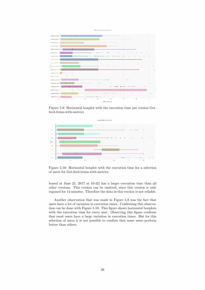
Figure 5.9: Horizontal boxplot with the execution time per version Get-feed-items-with-metrics
Figure 5.10: Horizontal boxplot with the execution time for a selectionof users for Get-feed-items-with-metrics
leased at June 21, 2017 at 10:42) has a larger execution time than allother versions. This version can be omitted, since this version is onlyexposed for 14 minutes. Therefore the data in this version is not reliable.
Another observation that was made in Figure 5.8 was the fact thatusers have a lot of variation in execution times. Confirming this observa-tion can be done with Figure 5.10. This figure shows horizontal boxplotswith the execution time for every user. Observing this figure confirmsthat most users have a large variation in execution times. But for thisselection of users it is not possible to confirm that some users performbetter than others.
26
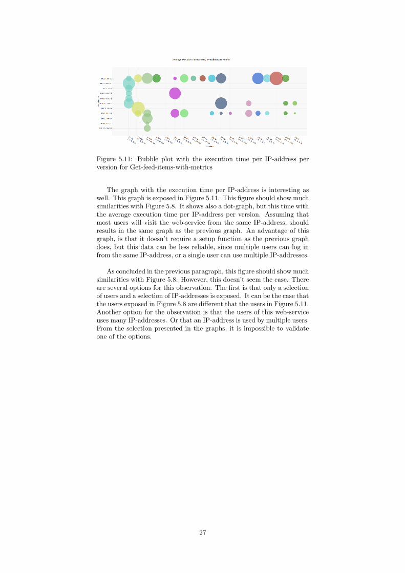
Figure 5.11: Bubble plot with the execution time per IP-address perversion for Get-feed-items-with-metrics
The graph with the execution time per IP-address is interesting aswell. This graph is exposed in Figure 5.11. This figure should show muchsimilarities with Figure 5.8. It shows also a dot-graph, but this time withthe average execution time per IP-address per version. Assuming thatmost users will visit the web-service from the same IP-address, shouldresults in the same graph as the previous graph. An advantage of thisgraph, is that it doesn’t require a setup function as the previous graphdoes, but this data can be less reliable, since multiple users can log infrom the same IP-address, or a single user can use multiple IP-addresses.
As concluded in the previous paragraph, this figure should show muchsimilarities with Figure 5.8. However, this doesn’t seem the case. Thereare several options for this observation. The first is that only a selectionof users and a selection of IP-addresses is exposed. It can be the case thatthe users exposed in Figure 5.8 are different that the users in Figure 5.11.Another option for the observation is that the users of this web-serviceuses many IP-addresses. Or that an IP-address is used by multiple users.From the selection presented in the graphs, it is impossible to validateone of the options.
27
Chapter 6
Conclusion
The goal of this bachelor project is to investigate the possibility to mon-itor the impact of the system evolution on the quality of the service,and in particular, on the performance for the deployed service. As ex-plained in Section 1, there is no dedicated solution for monitoring theperformance of Python web-applications. This thesis presents a solutionby developing an automatic monitoring dashboard, that can be imple-mented in any web-service that uses Python and Flask.
This thesis describes exhaustively which frameworks and program-ming languages are used to develop the automatic monitoring dashboard.A lot of different programming techniques are used to develop the dash-board. All those techniques are also described in detail in the sectionsabove.
The automatic monitoring dashboard is created in such a way, thatit is possible to configure the dashboard to the needs of the maintainer.Once the configuration is successful, the dashboard is extended to theexisting Flask application. This has been done to make the dashboardas easy-to-use as possible.
The dashboard has been deployed in the Zeeguu web-service for 28days. In those days, ∼ 33,000 requests have been collected to investigatethe impact on the performance. All data is visualized in various graphs.Those graphs allow the maintainer of the dashboard to detect differencesin execution times across various versions. With the same approach it ispossible to detect differences in execution times across various users.
With the visualization of the graphs, it is possible to monitor theimpact of the system evolution of the quality of the service. Variousresults have been presented to observe differences in various executiontimes. The results conclude that, with the automatic monitoring dash-board, is it possible to visualize the impact on the performance of thesystem as the system evolves.
28
Chapter 7
Future work
As concluded in the previous section, the automatic monitoring dash-board succeeds in monitoring the performance of the system as it evolves.However, several improvements can be made.
The dashboard provides various graphs which shows the executiontime across per users across several versions. Since most web-servicesare used by many users, the collected data may be too large to fit in asingle graph. Currently, the size of the graph grows as the number ofusers grow. However, a graph in which more than 100 users are pre-sented during 20 different versions, results in a bubble graph with 2,000entries. It is not very useful to provide such a graph, since it impossibleto maintain the overview. Further research can be made by providing anautomatic selection procedure to reduce the entries in the graph, with-out losing monitoring information about possible outliers.
Another improvement in the field of the outliers has to be made.Currently the information that is presented is unformatted. Therefore,the information is not useful (yet) for detecting reasons for slow execu-tion times of this outlier. An example of the data that is collected ispresented in Figure 4.2. Further development is required to obtain abetter overview of possible outliers and the reasons for having an execu-tion time that is worse, compared to other requests.
Lastly, each dashboard is bound to the existing web-service. How-ever, it is not rare for a company to have multiple web-services. In orderto obtain the overview of all dashboards, a meta-dashboard can be setup. Such a meta-dashboard, possibly on a third party server, can beused to maintain a list of existing monitoring dashboards. With themeta-dashboard only one log-in procedure is required and easily showswhich web-services are used the most.
29

Acknowledgements
In the first place, I want to thank Mircea Lungu, for assigning this bach-elor project to Thijs and me. The process of developing the automaticmonitoring dashboard was nice and attractive to do, since I really likedthe project. Although the entire bachelor project took more than 10weeks, the weeks flew over. I also want to thank Mircea for his enthusi-asm and assistance in the meetings that we have to discuss the bachelorproject.
Another person that I would really want to thank is Vasilios. Hisenthusiasm and experience contributes to a much better automatic mon-itoring dashboard. Vasilios has contributed to the project with a lot ofprofessional feedback and he has provided useful tips in order to improvethe final result. Also his positive feedback for the bachelor presentationhas lead to this great result.
Last but not least, I want to thank Thijs for this contributions tothe dashboard. Thijs implemented the testing-procedure for gatheringresults on the performance of unit-tests. His contributions to the dash-board has improved the design and the way of presenting the data in thegraphs. Not only were his contributions professional, his personal ideasabout the project in general were also great.
30
Bibliography
[1] Damyan Bogoev. How to monitor your flask application. https:
//damyanon.net/flask-series-monitoring/, 2015. [Online; ac-cessed 20-June-2017].
[2] christabor. Flask jsondash. https://github.com/christabor/
flask_jsondash, 2017. [Online; accessed 21-July-2017].
[3] Chris Davis. What graphite is and is not. https://graphite.
readthedocs.io/en/latest/overview.html, 2008. [Online; ac-cessed 2-June-2017].
[4] Gareth Dwyer. Flask vs. django: Why flask mightbe better. https://www.codementor.io/garethdwyer/
flask-vs-django-why-flask-might-be-better-4xs7mdf8v,2017. [Online; accessed 4-June-2017].
[5] Mircea F. Lungu. Bootstrapping an ubiquitous monitoring ecosys-tem for accelerating vocabulary acquisition. In Proccedings of the10th European Conference on Software Architecture Workshops,ECSAW ’16, pages 28:1–28:4, New York, NY, USA, 2016. ACM.
[6] Matt Makai. Web frameworks. https://www.fullstackpython.
com/web-frameworks.html, 2002. [Online; accessed 4-June-2017].
[7] Patrick Vogel, Thijs Klooster, Vasilios Andrikopoulos, and MirceaLungu. A low-effort analytics platform for visualizing evolving flask-based python web services. In Proceedings of the 5th IEEE WorkingConference on Software Visualization (VISSOFT’17), September2017.
[8] Wikipedia. Elasticsearch. https://en.wikipedia.org/wiki/
Elasticsearch, 2017. [Online; accessed 10-July-2017].
[9] Wikipedia. Flask (web framework). https://en.wikipedia.org/
wiki/Flask_(web_framework), 2017. [Online; accessed 4-June-2017].
[10] Wikipedia. Google analytics. https://en.wikipedia.org/wiki/
Google_Analytics, 2017. [Online; accessed 3-July-2017].
31
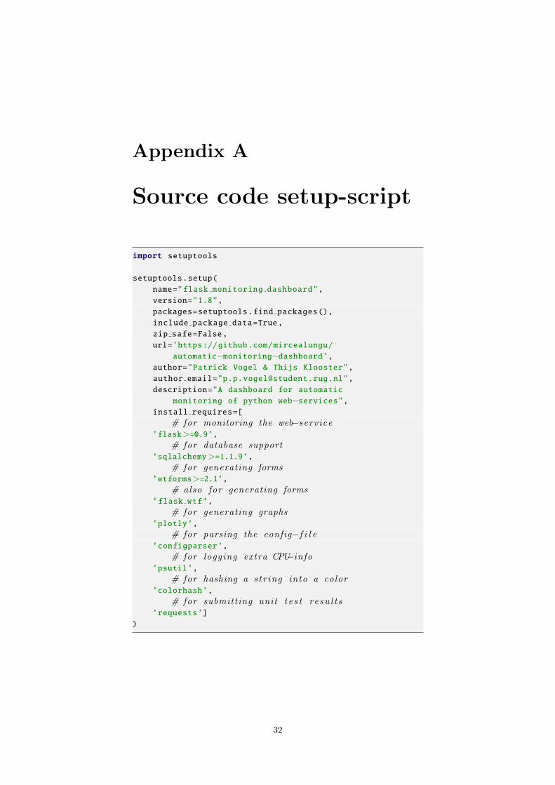
Appendix A
Source code setup-script
import setuptools
setuptools.setup(
name="flask monitoring dashboard",
version="1.8",
packages=setuptools.find packages(),
include package data=True,
zip safe=False,
url=’https://github.com/mircealungu/
automatic−monitoring−dashboard’,author="Patrick Vogel & Thijs Klooster",
author email="[email protected]",
description="A dashboard for automatic
monitoring of python web−services",install requires=[
# for monitoring the web−service’flask>=0.9’,
# for database support’sqlalchemy>=1.1.9’,
# for generating forms’wtforms>=2.1’,
# also for generating forms’flask wtf’,
# for generating graphs’plotly’,
# for parsing the config−f i l e’configparser’,
# for logging extra CPU−info’psutil’,
# for hashing a str ing into a color’colorhash’,
# for submitting unit t e s t resu l t s’requests’]
)
32
Appendix B
Installation andconfiguration
One of the main nonfunctional requirements of the bachelor project is,that the monitoring tool should be ‘easy to use’. Python supports afeature to achieve this simplicity. This can be done by creating a setupscript. With the setup script, the dashboard can be installed withoutmuch effort. More information on installing and using the project canbe found at section B.2.
The main purpose of the setup script is to describe the module dis-tribution to the Distutils1, so that the various commands that operateon the modules do the right thing. Our setup script can be found inAppendix A.
Most setup scripts only contain a call to the setup function. Ar-guments to this function are the name of our project, version, whichpackages to export, data files, authors, contact information to the au-thors, descriptions and other dependencies. The dashboard exports allmarkup-files, HTML-templates, JavaScript-functions and other files fordesigning our dashboard.
B.1 Virtual Environment
One of the arguments in the setup script is a list with dependencies ofthe project2. Each entry in the list consists of the name of the depen-dency and possible a lower- and an upper version.
Now suppose that a developer has two projects which both uses alist of dependencies. It could be that project A uses dependency A witha minimum version of 2.0, while project B uses dependency A with amaximum version of 1.9. Switching from project A to B requires todowngrade dependency A and switching back requires to upgrade de-pendency A. Such a conflict can be clumsy for the developer of projectA and B.
Python offers a solution to resolve this type of conflict by using aVirtual Environment. A Virtual Environment is a tool to keep the de-pendencies required by different projects in separate places, by creating
1This is the standard tool for packaging in Python.2A description of all dependencies can be found in section 4.3.
33
virtual Python environments for them. A Virtual Environment can becreated using virtualenv. This module is by default installed in Python3, but on other versions it can also be installed using the following com-mand:
$ pip install virtualenv
Once it is installed, you can create a new virtual environment usingthe command:
$ mkdir my−environment$ cd my−environment$ virtualenv ENV
The commands above creates a virtual environment with Python 2 asthe interpreter. Since the use of Python 2 is discouraged, the followingcommands create a Python 3 virtual environment:
$ mkdir my−environment$ cd my−environment$ virtualenv −p python3 ENV
The last line (in both examples above) creates a directory ‘ENV’inside the directory ‘my-directory’ and creates the following:
• ENV/lib/ and ENV/include/ are created, containing supportinglibrary files for a new virtualenv python. Packages installed in thisenvironment will live under ENV/lib/pythonX.X/site-packages/.
• ENV/bin is created, where executables live - noticeably a newpython. Thus running a script with #! /path/to/ENV/bin/pythonwould run that script under this virtualenv’s python.
• The crucial packages pip and setuptools are installed, which allowother packages to be easily installed to the environment. Thisassociated pip can be run from ENV/bin/pip.
Once the virtual environment is created, it can be activated usingthe following command:
$ source ENV/bin/activate
Now, the virtual environment is up and running. If you want to shutit down, you can use the following command:
$ deactivate
B.2 Downloading
Once the virtual environment is created and running, the monitoringtool can be downloaded from Github manually, or automatically usingthe following command:
$ git clonehttps://github.com/mircealungu/automatic−monitoring−dashboard.git
The command creates the folder ‘automatic-monitoring-dashboard’ in-cluding the setup script.
34
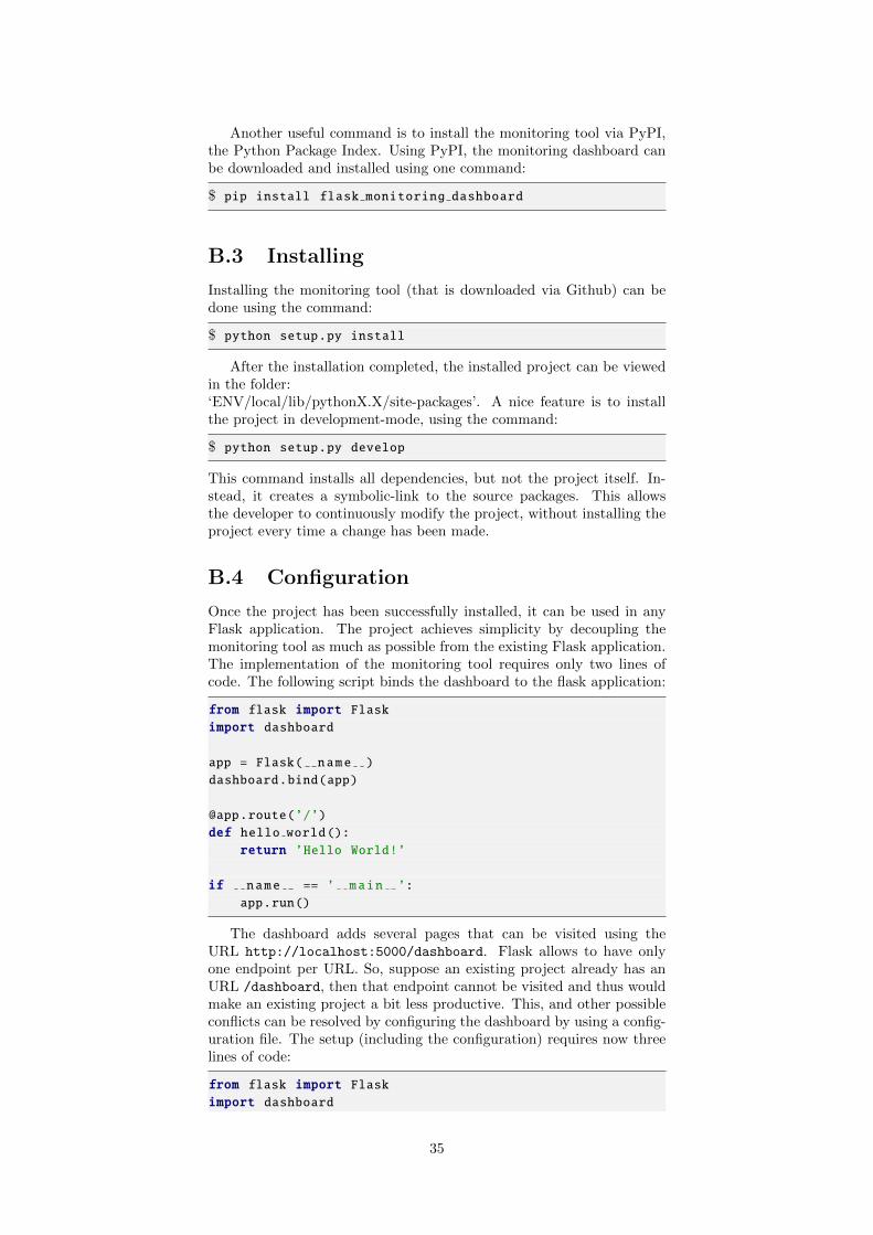
Another useful command is to install the monitoring tool via PyPI,the Python Package Index. Using PyPI, the monitoring dashboard canbe downloaded and installed using one command:
$ pip install flask monitoring dashboard
B.3 Installing
Installing the monitoring tool (that is downloaded via Github) can bedone using the command:
$ python setup.py install
After the installation completed, the installed project can be viewedin the folder:‘ENV/local/lib/pythonX.X/site-packages’. A nice feature is to installthe project in development-mode, using the command:
$ python setup.py develop
This command installs all dependencies, but not the project itself. In-stead, it creates a symbolic-link to the source packages. This allowsthe developer to continuously modify the project, without installing theproject every time a change has been made.
B.4 Configuration
Once the project has been successfully installed, it can be used in anyFlask application. The project achieves simplicity by decoupling themonitoring tool as much as possible from the existing Flask application.The implementation of the monitoring tool requires only two lines ofcode. The following script binds the dashboard to the flask application:
from flask import Flaskimport dashboard
app = Flask( name )
dashboard.bind(app)
@app.route(’/’)
def hello world():return ’Hello World!’
if name == ’ main ’:
app.run()
The dashboard adds several pages that can be visited using theURL http://localhost:5000/dashboard. Flask allows to have onlyone endpoint per URL. So, suppose an existing project already has anURL /dashboard, then that endpoint cannot be visited and thus wouldmake an existing project a bit less productive. This, and other possibleconflicts can be resolved by configuring the dashboard by using a config-uration file. The setup (including the configuration) requires now threelines of code:
from flask import Flaskimport dashboard
35
dashboard.config.from file(’<path>/config.cfg’)
app = Flask( name )
dashboard.bind(app)
...
B.4.1 The configuration in more detail
A possible implementation for the configuration-file could be:
[dashboard]
DATABASE=sqlite:///flask−dashboard.dbCUSTOM LINK=dashboard
APP VERSION=1.0
At least the header [dashboard] is mandatory and there are a numberof variables that can be added below this header:
• DATABASE: The value of this variable is the database loca-tion for the dashboard. The monitoring tool supports all majordatabase types. Specifying the database location provides anotheradvantage. Suppose that a project which uses the dashboard hastwo stages. A development-stage, for modifying the project and(possibly) adding new features. And a production-stage, where itis used by the intended users. The developer of the project wantto separate the data collected from both environments. Then, thedeveloper has to use two database-files, one for each stage. If novariable is specified, then the default database location is:
DATABASE=sqlite:///flask−dashboard.db
• CUSTOM LINK: Suppose an existing project has a web-servicethat uses many routings. One of those routings is /dashboard.Since this URL is also used by the dashboard, the dashboard cannot be used. However, for this purpose, it is possible to configureevery page from the dashboard to a different URL. This can bedone by specifying a CUSTOM LINK-variable. If no variable isspecified, then the dashboard can be found at /dashboard.
• APP VERSION: Suppose a developer want to measure if theexecution time of a certain endpoint changes over different ver-sions as the developer manipulates the code of a project. Then itis useful to tag a version to the project by configuring this variable.Allowing to tag versions to a project is one of the main function-ality of the dashboard. If no version is specified, then the defaultversion is set to ‘1.0’.
It might be a bit clumsy to update the version-tag every time whenthe code has been manipulated. This is one of the observations thatis made during the development of the dashboard. Therefore, thedashboard contains another functionality to specify the version ofthe project. It is possible to configure the git version of the projectby location to the root of the git-directory. This can be done byconfiguring the following variable:
GIT=/.git/
36
The version of the project is updated during the first request.Whenever a developer updates the project, commits the changes,and restarts the application, a new version is automatically de-tected.
A disadvantage of using versions in general is that whenever theversion is updated (either by using the APP VERSION-variableor the GIT-variable), not every endpoint might be manipulated.The graphs that are being rendered do not keep this in mind andshow the execution time for every version, whether the code ismanipulated or not. In case of the latter, the graphs shouldn’tproduce different results.
• USERNAME and PASSWORD: An username and passwordcan be specified to login into the dashboard. Without configur-ing the username and password, the user of the dashboard muststill login before having access to the dashboard. In that case, thedefault values for the username and password are both ‘admin’.Since the username and password are stored in plain text, the con-figuration file must not be published, otherwise everyone has canlogin into the dashboard.
Two similar variables are GUEST USERNAME and GUESTPASSWORD. These variables are configured to provide a guestto login into the dashboard. A guest can only see the graphs,but cannot download the exported data, or change which rules aremonitored. By default, the username and password for guests are‘guest’ and ‘guest password’.
• OUTLIER DETECTION CONSTANT: Another functional-ity of the dashboard is to provide extra information wheneveran outlier in the graph is detected. This information includes:request-values, request-headers, request-environment and request-URL But also the CPU percent, memory and the stack-trace.3.Whenever the application has received a number of requests forthat endpoint, the dashboard computes the average execution timefor that endpoint (the average is updated whenever a new requestis processed). When the execution time is more than this constanttimes the average, the dashboard sees this request as an outlier andextra information is logged. Outlier detection can help in inves-tigating why the request took more time to process. The defaultvalue for the outlier detection constant is 2.5.
3Those three values are calculated at the moment of processing the request
37

Appendix C
Case study
Zeeguu is a research project designed to speed and fun up vocabularylearning in a new language. According to [5], the approach is designedaround three fundamental principles:
1. Unlike most traditional learning materials based on pre-defined,standardized and let’s admit it: boring texts, we think that youshould read only the stuff that you love: eBooks, blogs, articlesand news in the desired language. In each of these contexts andon any chosen device, you should have translations of unfamiliarterms “at the touch of a fingertip”.
2. Words that you have once translated, will be available to you al-ways (read as “from any of your devices”) and they will go intoyour own, private dictionary. The information about the contextwhere you encountered a given new word will also be synchronizedamong the applications and devices. There is no doubt we under-stand and remember so much better words in context.
3. Based on the texts you read, the words you translate, and listsof word frequencies, Zeeguu will use machine learning to build amodel of your current vocabulary in the target language. Applyingthis model and using spaced repetition, you will receive personal-ized exercises that will help you learn, practice and retain the newwords, ranked according to their importance.
Zeeguu is the perfect test-case for the project, because it is buildwith Flask and the number of users is not too large. This keeps the datathat is being collected reasonable small. In a small dataset it is easierto remain the overview. On the other hand the dataset is large enoughto make statistical conclusions about the service performance during thelifetime. This is one of the major research questions for this thesis.
38