Embed Size (px)
Citation preview

A FRAMEWORK FOR TEACHING STATISTICS WITHIN THE K-12 MATHEMATICS CURRICULUM
[DRAFT version for presentation at JSM 2004] Executive Summary The goals of this document are to provide a basic framework for informed K-12 stakeholders that describes what is meant by a statistically literate high school graduate and to provide steps to achieve this goal. Over the past quarter century, statistics (often labeled data analysis and probability) has become a key component of the K-12 mathematics curriculum. The foundation for this Framework rests on the Principles and Standards for School Mathematics published by the National Council of Teachers of Mathematics, which describes the content strand as follows.
Data Analysis and Probability Instructional programs from pre-kindergarten through grade 12 should enable all students to— • formulate questions that can be addressed with data and collect, organize, and display
relevant data to answer them; • select and use appropriate statistical methods to analyze data; • develop and evaluate inferences and predictions that are based on data; • understand and apply basic concepts of probability.
The NCTM document elaborates on these themes and provides a few examples of the types of lessons and activities that might be used in a classroom. But these elaborations are not sufficiently detailed to provide a cohesive and coherent curriculum strand in statistics that affords a student the possibility of completing a K-12 mathematics sequence with knowledge of statistical concepts and practices that will serve the student adequately on the job or in higher education. This Framework provides the missing pieces; it fleshes out the NCTM strand with guidance and clarity on the content that NCTM is recommending at the elementary, middle and high school grades, focusing on a connected curriculum that will allow a high school graduate to develop a working knowledge of and an appreciation for the fundamental ideas of statistics. It also provides guidance on methods that are accepted as effective in teaching statistical concepts to students with wide varieties of learning styles. This Framework is designed to inform not only teachers but also other stakeholders in the educational enterprise. Since statistics is a relatively new science that is still developing, many teachers have not had an opportunity to develop sound knowledge of the principles and practices of data analysis that they are now called upon to teach. Thus, the “fleshing out” of the Standards is more essential for the statistics strand than it might be for other strands. The issue of teacher preparation is addressed in the recent report from the Conference Board of the Mathematical Sciences (CBMS) entitled The Mathematics Education of Teachers. Here are a few quotes.
• Statistics is the study of data, and despite daily exposure to data in the media, most elementary teachers have little or no experience in this vitally important field. Thus, in

addition to work on particular technical questions, they need to develop a sense of what the field is about.
• Prospective teachers need both technical and conceptual knowledge of the statistics and probability topics now appearing in middle grades curricula.
• Over the past decades, statistics has emerged as a core strand of school and university curricula. …The traditional school mathematics emphasis on probability has evolved to include more statistics, often in the context of using data analysis to gain insight into real-world situations. Curricula for the mathematical preparation of high school teachers should include courses and experiences that help them appreciate and understand the major themes of statistics.
NCTM and CBMS are not the only groups calling for improved statistics education beginning at the school level. The National Assessment of Educational Progress (NAEP) is developed around the same strands as in the NCTM Standards, with data analysis and probability questions playing an increasingly prominent role in the NAEP exam. The emerging quantitative literacy movement calls for greater emphasis on practical quantitative skills that will help assure success for high school graduates in life and work; many of these skills are statistical in nature. The statistics education proposed in this Framework will, indeed, empower people and allow them to “thrive in the modern world” if delivered thoughtfully throughout the K-12 mathematics curriculum. The main content of this Framework is divided into three levels, A, B, and C that roughly parallel the PreK-5, 6-8, and 9-12 grade bands of the NCTM Standards. Although we hope that school curriculum is such that these three levels (A, B, and C) are somewhat equivalent to elementary, middle, and secondary, the framework levels are based on experience not age. Thus, a middle school student who has had no prior experience (or no rich experiences) with statistics will need to begin with Level A concepts and activities before moving to Level B. This holds true for a secondary student as well - if a student hasn't had Level A and B experiences prior to high school, then it is not appropriate to jump into Level C expectations. At Level A the learning is more teacher driven, but transitions toward student-centered work at Level B and becomes highly student driven at Level C. Hands-on, active learning is a predominant feature throughout. Statistical analysis is an investigatory process that turns often loosely formed ideas into scientific studies by:
• understanding the problem at hand and formulating one (or more) questions that can be answered with data
• designing a plan to collect appropriate data • analyzing the collected data using graphical and numerical methods, • interpreting the analysis so as to reflect light on the original question.
All four steps of this process are used at all three levels, but the depth of understanding and sophistication of methods used increases across the levels. For example, an elementary class may collect data to answer questions about their classroom (take a census of their classroom), a middle school class may collect data to answer questions about the school (transition to obtaining a simple random sample within the school), and a high school class may collect data to answer questions about the community and model the relationship between, say, housing prices and geographic variables such as the location of schools. This framework will also clarify the role of probability in the K-12 curriculum. It is important to emphasize that probability is not statistics. However, statistics depends upon probability in designing the data collection plan and in assessing the possible errors in drawing conclusions

from data. From a statistical perspective, probability should emphasize relative frequency interpretations and models for distributions of data. Counting rules and development of theorems on the mathematics of probability would be better left to areas of discrete mathematics and/or pre-calculus and will be touched upon lightly in this framework. Suppose students are interested in knowing what type of music (rock, country, or rap) is most popular among their peers in school? Level A students could collect data in their classroom and analyze the data by summarizing frequencies for the different categories in a table or bar graph. They could draw conclusions about the most popular type of music and the least popular in their classroom. At Level B, students could transition to summarizing categorical data by reporting relative frequencies – making the leap to proportional reasoning for comparing categories or groups. At Level C, the emphasis is on interpretation and the use of statistical methods to answer questions rather than on the mechanics of computing summary statistics or drawing graphs for exploring the data as at Levels A and B. Regarding the music preference question, a level C student will transition to understanding sampling distributions for a sample proportion and the role of probability in finding a margin of error which provides information about the maximum likely distance between a sample proportion and the population proportion being estimated. Clearly defining the expected development of a concept at each level, as illustrated in the previous example, is a major goal of this document and one that nicely complements the NCTM standards. Another example of clarity of concepts at each level relates to the mean. Level A: Idea of fair share – foreshadow the balance point Level B: Mean as a balancing point Level C: Mean as an estimate from a sample that will be used to make an inference about a population – understanding the concept of using a sampling distribution to take a sample mean to estimate the population mean. Statistical literacy is the ultimate goal of instruction in data analysis and probability at the K-12 level. Quantitative reasoning is essential in our personal lives as consumers, citizens and professionals. Sound statistical reasoning skills take a long time to develop. They cannot be obtained by the ordinary citizen to the level needed in the modern world through one college course or one high school course. In delivering instruction in data analysis and probability at the K-12 level, basic principles around which the Framework revolves can be summarized as:
• Both conceptual understanding and procedural skill should be developed deliberately, but conceptual understanding should not be sacrificed for procedural proficiency.
• Active learning is key to the development of conceptual understanding. • Real world data must be used wherever possible in statistics education. • Appropriate technology is essential in order to emphasize concepts over calculations.
This document lays out a framework for educational programs designed to help students achieve the noble goal of being a sound statistically literate citizen.

Introduction What is This Document and why is it Needed? The goals of this document are to provide a basic framework for informed K-12 stakeholders that describe what is meant by a statistically literate high school graduate and to provide steps to achieve this goal. Over the past quarter century, statistics (often labeled data analysis and probability) has become a key component of the K-12 mathematics curriculum. Advances in technology and in modern methods of data analysis of the 1980’s, coupled with the data richness of society in the information age, led to the development of curriculum materials geared toward introducing statistical concepts into the school curriculum as early as the elementary grades. This grass-roots effort was given sanction by the National Council of Teachers of Mathematics (NCTM) when their influential document Curriculum and Evaluation Standards for School Mathematics, published in 1989, included Data Analysis and Probability as one of the five content strands. As this document and its 2000 replacement entitled Principles and Standards for School Mathematics became the basis for reform of mathematics curricula in many states, the acceptance of and interest in statistics as part of mathematics education gained strength. In recent years many mathematics educators and statisticians have devoted large segments of their careers to the improvement in statistics education materials and pedagogical techniques. The foundation for this Framework rests on the NCTM Standards, which describes the content strand as follows.
Data Analysis and Probability Instructional programs from pre-kindergarten through grade 12 should enable all students to— • formulate questions that can be addressed with data and collect, organize, and display
relevant data to answer them; • select and use appropriate statistical methods to analyze data; • develop and evaluate inferences and predictions that are based on data; • understand and apply basic concepts of probability.
The Data Analysis and Probability Standard recommends that students formulate questions that can be answered using data and addresses what is involved in gathering and using the data wisely. Students should learn how to collect data, organize their own or others' data, and display the data in graphs and charts that will be useful in answering their questions. This Standard also includes learning some methods for analyzing data and some ways of making inferences and drawing conclusions from data. The basic concepts and applications of probability are also addressed, with an emphasis on the way that probability and statistics are related. The NCTM document elaborates on these themes somewhat, and provides a few examples of the types of lessons and activities that might be used in a classroom. But these elaborations are not sufficiently detailed to provide a cohesive and coherent curriculum strand in statistics that affords a student the possibility of completing a K-12 mathematics sequence with knowledge of statistical concepts and practices that will serve the student adequately on the job or in higher education. This Framework provides the missing pieces; it fleshes out the NCTM strand with guidance on the content that NCTM is recommending at the elementary, middle and high school grades, focusing on a connected curriculum that will allow a high school graduate to develop a

working knowledge of and an appreciation for the basic ideas of statistics. It also provides guidance on methods that have proven effective in teaching statistical concepts to students with wide varieties of learning styles. Since statistics is a relatively new science that is still developing, many teachers have not had an opportunity to develop sound knowledge of the principles and practices of data analysis that they are now called upon to teach. Thus, the “fleshing out” of the Standards is more essential for the statistics strand than it might be for other strands. The issue of teacher preparation is addressed in the recent report from the Conference Board of the Mathematical Sciences (CBMS) entitled The Mathematics Education of Teachers. Here are a few quotes.
• Statistics is the study of data, and despite daily exposure to data in the media, most elementary teachers have little or no experience in this vitally important field. Thus, in addition to work on particular technical questions, they need to develop a sense of what the field is about.
• Prospective teachers need both technical and conceptual knowledge of the statistics and probability topics now appearing in middle grades curricula.
• Over the past decades, statistics has emerged as a core strand of school and university curricula. …The traditional school mathematics emphasis on probability has evolved to include more statistics, often in the context of using data analysis to gain insight into real-world situations. Curricula for the mathematical preparation of high school teachers should include courses and experiences that help them appreciate and understand the major themes of statistics.
Good materials for teaching the subject are now available, but may not be found among the standard materials with which teachers are most familiar. Given their lack of experience in the subject, teachers need help in seeing what the components of a sound statistics education program should be so that they can appropriately choose materials and strategies for teaching. This Framework supplies descriptions of the components of a sound curriculum in data analysis and probability; it is designed to inform not only teachers but also other stakeholders in the mathematics education enterprise. Other Justifications for Statistical Education NCTM and CBMS are not the only groups calling for improved statistics education beginning at the school level. The National Assessment of Educational Progress (NAEP) is developed around the same strands as in the NCTM Standards, with data analysis and probability questions playing an increasingly prominent role in the NAEP exam. The emerging quantitative literacy movement calls for greater emphasis on practical quantitative skills that will help assure success for high school graduates in life and work; many of these skills are statistical in nature. To quote from Mathematics and Democracy: The Case for Quantitative Literacy
• Quantitative literacy, also called numeracy, is the natural tool for comprehending information in the computer age. The expectation that ordinary citizens be quantitatively literate is primarily a phenomenon of the late twentieth century.
• Unfortunately, despite years of study and life experience in an environment immersed in data, many educated adults remain functionally illiterate.
• Quantitative literacy empowers people by giving them tools to think for themselves, to ask intelligent questions of experts, and to confront authority confidently. These are the skills required to thrive in the modern world.

The statistics education proposed in this Framework will, indeed, empower people and allow them to “thrive in the modern world” if delivered thoughtfully throughout the K-12 mathematics curriculum. The College Board launched the Advanced Placement Statistics course in 1997, and it has since become one of its fastest growing programs. This organization is now developing, for grades 6 through 12, Expected Proficiencies for Success in College-Level Mathematics and Statistics which, as can be seen in the title has heavy emphasis on statistics. In addition to teaching useful academic and life skills, statistics provides a way to motivate and illustrate the remainder of the mathematics curriculum, not to mention a pathway for connecting the mathematical sciences to the rest of the world. Although progress has been made, there is still much to be accomplished in order to move the recommended curriculum into the classroom as the taught curriculum. An article by Lynn Arthur Steen entitled Back to the Future in Mathematics Education [Education Week, Wednesday, April 7, 2004, http://www.edweek.org/ew/ewstory.cfm?slug=30steen.h23] reports that, in spite of great effort on many fronts, not much real progress has been made in many areas of mathematics education since the publication of the seminal report A Nation at Risk in 1983. “Recent reports dealing with the mathematical expectations of higher education and the world of work show that little has changed in the last 20 years. … The very need for these reports reveals that we are still very much a nation at risk.” A Nation at Risk had this to say about mathematics education:
The teaching of mathematics in high school should equip graduates to (a) understand geometric and algebraic concepts; (b) understand elementary probability and statistics; (c) apply mathematics in everyday situations; and (d) estimate, approximate, measure, and test the accuracy of their calculations.
One of the recent studies Professor Steen uses in his argument is Ready or Not: Creating a High School Diploma That Counts, from the American Diploma Project. [See the Education Week site for more details.] According to this report "must have" competencies needed for high school graduates "to succeed in postsecondary education or in high-performance, high- growth jobs" include, in addition to algebra and geometry, aspects of data analysis, statistics, and other applications that are vitally important for other subjects as well as for employment in today's data-rich economy. This Framework for Teaching Statistics has as a goal the improvement of competencies in data analysis, statistics and their applications. Success in these areas will produce a nation that is less at risk. Framework Organization and Principles The main content of this Framework is divided into three levels, A, B, and C that roughly parallel the PreK-5, 6-8, and 9-12 grade bands of the NCTM Standards. Although we hope that school curriculum is such that these three levels (A, B, and C) are somewhat equivalent to elementary, middle, and secondary, the frameworks levels are based on experience not age. Thus, a middle school student who has had no prior experience (or no rich experiences) with statistics will need to begin with Level A concepts and activities before moving to Level B. This holds true for a secondary student as well - if a student hasn't had Level A and B experiences prior to high school, then it is not appropriate to jump into Level C expectations. At Level A the learning is more

teacher driven, but transitions toward student centered work at Level B and becomes highly student driven at Level C. Hands-on, active learning is a predominant feature throughout. Statistical analysis is an investigatory process that turns often loosely formed ideas into scientific studies by:
• understanding the problem at hand and formulating one (or more) questions that can be answered with data
• designing a plan to collect appropriate data • analyzing the collected data using graphical and numerical methods, • interpreting the analysis so as to reflect light on the original question.
All four steps of this process are used at all three levels, but the depth of understanding and sophistication of methods used increases across the levels. For example, an elementary class may collect data to answer questions about their classroom, a middle school class may collect data to answer questions about the school, and a high school class may collect data to answer questions about the community and model the relationship between, say, housing prices and geographic variables such as the location of schools. Probability is not statistics, but statistics uses probability in designing the data collection plan and in assessing the possible errors in drawing conclusions from data. From a statistical perspective, probability should emphasize relative frequency interpretations and models for distributions of data. Counting rules and development of theorems on the mathematics of probability would be better left to areas of discrete mathematics and/or pre-calculus. To clarify the connection between data analysis and probability, here is a typical data analysis problem. Suppose subjects are randomly divided into two groups with one group receiving a new treatment for a disease and the other receiving a placebo (looks like the primary treatment but has no active ingredient). If the group receiving the treatment does better than the placebo group, a basic statistical question is, “Could the observed difference have been caused by chance (the random division) alone?” In this problem (and in many other similar problems) an answer to the basic statistical question requires an understanding of probability distributions. An adequate answer to the above questions also requires knowledge of the context in which the underlying question was asked and “good” data collected according to a plan developed around the key question. Basic principles around which the Framework revolves can be summarized as:
• Both conceptual understanding and procedural skill should be developed deliberately, but conceptual understanding should not be sacrificed for procedural proficiency.
• Active learning is key to the development of conceptual understanding. • Real world data must be used wherever possible in statistics education. • Appropriate technology is essential in order to emphasize concepts over calculations.
The Ultimate Goal: Statistical Literacy Every morning the newspaper or other media confront us with statistical information on topics which range from the economy to education, from movies to sports, from food to medicine, from public opinion to social behavior; such information informs decisions in our personal lives and enables us to meet our responsibilities as citizens. As we move from the breakfast table to work, we are confronted by more quantitative information on, perhaps, issues of budget, stock supplies,

cancelled orders, manufacturing specifications, market demands, delivery times, sales forecasts or workloads. Teachers may be confronted with educational statistics concerning student performance or their own accountability. Professionals in the pharmaceutical business must understand the statistical methods and results of experiments used for testing the effectiveness and safety of drugs. Law enforcement professionals depend on crime statistics. If we consider changing jobs and moving to another community, then our decision can be informed by statistics about cost of living, crime rate, and educational quality. Our lives are governed by numbers. Because of this, every high school graduate deserves to have sound grounding in statistical reasoning - reasoning about data and chance - so that he or she can cope intelligently with the demands of citizenship, employment and family, and can be equipped to have a healthy, happy and productive life. Education in quantitative thinking of this type will not come about through traditional mathematics programs that are geared toward emphasizing algebra and geometry in the high school years, although modern courses in these areas can help. It will not even come about through many college programs, although most college students will have some exposure to statistics somewhere along their undergraduate path. Citizenship
Public opinion polls are the most visible examples of a statistical application that has an impact on our lives. Our opinions can be influenced by the opinions of others. If a nationwide poll proclaims that a majority of adults in the USA oppose gun control then this can affect our feelings about the issue. In addition to informing individual citizens directly, polls are used by others in ways that affect us. The political process, for instance, employs opinion polls in several ways. Candidates for office use polling to guide campaign strategy. A poll can determine a candidate’s strengths with voters, which can in turn be emphasized in the campaign. Citizens might be suspicious also that poll results might influence a candidate to take positions just because they are popular. A citizen informed by polls needs to understand that the results were determined from a sample of the population under study, that the reliability of the results depends on how the sample was selected, and that the results are subject to sampling error. The statistically literate citizen should understand the behavior of “random” samples and be able to interpret a “margin of sampling error”. We cannot escape the impact of government on our lives and the Federal Government has been in the statistics business from its very inception. The U.S. Census was established in 1790 to provide an official count of the population for the purpose of allocating representatives to the congress. But that was just the beginning for statistics and government. Not only has the role of the Census Bureau greatly expanded to include the collection of a broad spectrum of socio-economic data but other Federal departments produce extensive “official” statistics concerned with agriculture, health, education, environment and commerce. The information gathered by these agencies influences policy making, helps to determine priorities for government spending, and is also available for general use by individuals or private groups. Thus, statistics compiled by government agencies have a tremendous impact on the life of the ordinary citizen. Personal Choices Statistical literacy is required for daily personal choices. Statistics provide information on the composition of foods and thus inform our choices at the grocery store. Statistics help to establish the safety and effectiveness of drugs to help us choose a treatment. Statistics help to establish the

safety of toys to assure that our little ones are not at risk. Our investment choices are guided by a plethora of statistical information about stocks and bonds. The Nielsen ratings decide which shows will survive on television and thus affect what is available; these ratings can also be used by the individual to determine which shows are popular. Many of the products that we buy or use have a previous statistical history and our choices of products can be affected by awareness of this history. The design of an automobile is aided by anthropometrics, the statistics of the human body, to enhance passenger comfort. Statistical ratings of fuel efficiency, safety and reliability are available to help us select a vehicle. The Workplace and Professions The marketplace has numerous potential rewards for statistically literate persons; the individuals who are prepared to use statistical thinking in their jobs and careers will have the opportunity to advance to more rewarding and challenging positions. Broader and deeper education in statistics will improve the quality of the work force in the United States and allow the country to be more competitive in the global market place; a statistically literate populace will help the U.S. improve its position in the international economy. An investment in statistical literacy is an investment in our nation’s economic future as well as the well-being of individuals. Applications of statistics pervade the workplace, and efforts to improve accountability and quality are especially prominent among the many ways that statistical thinking and tools are used in the contemporary workplace to enhance productivity. We live in an age of accountability. Systems of accountability can help produce more effective and efficient behaviors of employees and organizations, and can be used to insure fair evaluations. Unfortunately, many accountability systems now in place are not based on sound statistical principles and may, in fact, have the opposite effect from the one desired. Good accountability systems must compare performance with valid criteria. Statistical tools can be used to determine these criteria, and to make the evaluation of performance. One success story is Statistical Process Control, which is used in manufacturing and service industries to distinguish between changes in levels of performance due to natural causes as opposed to changes which are due to a special cause, such as a bad supply of raw material or imperfections in the design of a product. The competitive marketplace demands quality. Quality control practices such as the statistical monitoring of design and manufacturing processes identify where improvement can be made and lead to better product quality. Science Life expectancy in the USA almost doubled during the 20th century and this rapid increase in life spans is the consequence of “science.” Science has enabled us to improve medical care and procedures, food production, and the detection and prevention of epidemics. And statistics plays a prominent role in this scientific progress. The Federal Drug Administration requires extensive testing of drugs to determine effectiveness and side effects before they can be sold. A recent advertisement for a drug designed to reduce blood clots stated “PLAVIX, added to aspirin and your current medications, helps raise your protection against heart attack or stroke.” But the advertisement also warns that “The risk of bleeding may increase with PLAVIX...” This was determined by a clinical trial involving over 12,000 subjects. Among the 6259 taking PLAVIX + aspirin 3.7% showed major bleeding problems while only 2.7% of the 6303 taking the placebo had major bleeding. This is viewed as a “statistically significant” result.

Statistical literacy involves a healthy dose of skepticism about “scientific” findings. Is the information about side effects of PLAVIX treatment reliable? A statistically literate person should ask such questions and be able to answer them intelligently. A statistically literate high school graduate will be able to understand the conclusions from scientific investigations and to offer an informed opinion about the legitimacy of the reported results. To quote once more from Mathematics and Democracy, such knowledge “empowers people by giving them tools to think for themselves, to ask intelligent questions of experts, and to confront authority confidently. These are skills required to survive in the modern world.” Summary Statistical literacy is essential in our personal lives as consumers, citizens and professionals. Statistics plays a role in our health and happiness. Sound statistical reasoning skills take a long time to develop. They cannot be honed to the level needed in the modern world through one college course or one high school course. The surest way to reach the necessary skill level is to begin the educational process in the elementary grades and keep strengthening and expanding these skills throughout the middle and high school years. A statistically literate high school graduate will know how to interpret the data in the morning newspaper and will ask the right questions about statistical claims. He or she will be comfortable handling quantitative decisions that come up on the job, and will be able to make informed decision about quality of life issues. The remainder of this document lays out a framework for educational programs designed to help students achieve this noble end.
LEVEL A Statistics can be thought of as the science of data. Children are surrounded by data. They may think of data as tallying a student’s favorite object or as measurements on other students in their classroom such as arm span and number of books in their school bag. It is in Level A that children need to develop data sense. What is the process and content needed for children to develop this notion of data sense?
� Investigatory process – what are data and what can they tell us? � Design of a study – using a census or simple experiment to address questions � Describing distributions for a single variable and possible associations of two variables–
using graphical and numerical summaries to focus on frequencies for categorical data and to focus on shape, center, and spread for numerical data; also, looking for possible associations betweens two variables
� Interpretation – modeling relationships and drawing conclusions � Describing notions of probability – its role in making sense of data
Investigatory process Students in Level A should develop an understanding that data are more than just numbers. Statistics changes numbers into information. In particular, students should learn that data are generated with respect to particular contexts or situations and can be used to answer questions about the context or situation. Students should have opportunities to generate questions about a particular context (such as their classroom) and determine what data could be collected to answer these questions. Statistics helps us make better decisions. It is preferable that students actually
collect data but not necessary in every case. It is important for students to gain experience with defining a context, posing interesting questions about that context, and noting what data might be collected to answer the questions. Teachers should also take advantage of naturally occurring situations in which students notice a pattern about some data and begin to raise questions. For example, when taking daily attendance one morning, students might note that many students are absent. The teacher could capitalize on this opportunity to have the students formulate questions that could be answered with attendance data. Two types of variables are important for Level A students to experience: categorical and numerical.
� Categorical data are obtained whenever the item of interest fits into non-numerical categories. Questions about students’ “favorite” ice cream flavor, the type of shoes students wear to school, and favorite type of music generate categorical data (e.g., type of shoes students wear to schools generates the categories tie, buckle, velcro, and slip on).
� Numerical data are obtained from situations in which objects are counted (e.g., determining the number of letters in your first name, the number of pockets on clothing worn by children in the class, or the number of siblings each child has) or by taking measurements such as height, length (How far can a child jump under certain conditions), or temperature.
Although it is not important for students to explicitly discuss the terms categorical and numerical, it is important for teachers to expose students to both types of variables and for teachers to be aware of the appropriate uses of each type of data (See the section on Describing a Distribution for more detail.)
Design of a Study Different types of designs for collecting data are appropriate at Level A, including a classroom census, a simple experiment taking measures pertaining to a particular condition, and a simple comparative experiment.
� The classroom census simply consists of surveying each child in the classroom on whatever question is being considered. This form of data collection is fairly common in classrooms and can be done by a show of hands, by having children record their answers on a chart, or by having children use objects (such as snap cubes) to represent their answer. Young students are fascinated with learning more about themselves and those around them. Note that we often collect data on a number of different variables at the same time – age, height, distance traveled to school, numbers of siblings, etc. which may be analyzed separately or together.
� A simple experiment consists of taking measurements on a particular condition or group. Level A students may be interested in timing the swing of a pendulum or seeing how far a toy car runs off the end of a slope from a fixed starting position (future Pinewood Derby participants?). Also, measuring the same thing several times and taking find a mean helps to lay the foundation for the fact that the mean has less variability as an estimate of the true value than does a single reading.
� A simple comparative experiment is like a science experiment in which children compare the results of two conditions or groups. For example, children might plant dried beans in soil and let them sprout and then compare which one grows fastest–the one in the light or the one in the dark. The treatments or groups to be compared are the type of lighting environment – light or dark. The type of lighting environment is an example of a categorical variable. Measurements of the plants’ heights can be taken at regular intervals (e.g., every day) to collect data to answer the question of whether one lighting

environment is better for growing beans. The heights collected are an example of numerical data.
Describing distributions Once a question has been established and data have been collected to answer the question, the data may be organized into a distribution. A distribution summarizes the possible values for a variable and the frequency with which they occur. Organizing data involves making use of various representations, and describing the distribution of a data set involves commenting on its shape, center and spread for numerical data and describing frequencies for categorical data. Note that before organizing the data, it’s important to examine the data for possible recording errors. Representation. Students at Level A should have experiences with a variety of types of representations, including tabular representations, physical representations, and graphical representations.
� A physical representation might be used if children are investigating the types of shoes worn by their classmates (shoes that tie, shoes that buckle, shoes that have Velcro, and shoes that slip on). Students could each remove one of their shoes, put them in a pile in the center of the room, sort them, and then make a graph using the actual shoes. Similar graphs could be made with favorite books, stuffed animals, or pictures children have drawn of their families (to show how many people live in their house). Note that if the physical objects differ in size (as shoes might), it is necessary to create a grid on which to place the objects. Otherwise, it will be difficult to tell which category has the greatest number of elements. Tape or chalk on the floor or playground can be used to create a grid, or a reusable grid can be made with tape/marker and an inexpensive shower curtain. Another type of physical representation involves having children use snap cubes to represent their data point. Cubes that correspond to the same category (vanilla ice cream or 3 pockets) can be snapped together to create a “tower.”
� Tabular representations should be used at Level A in both collecting data and in
summarizing them. Making a tally table or compiling a frequency count table helps find summative data. A frequency count table for shoe example based on a class of 14 students might be
Shoe Type Frequency or Count Tie 7 Buckle 2 Velcro 3 Slip on 4 Older children at Level A may be interested in the favorite type of music among students at a certain grade level. An end of the year party is being planned and there is only enough money to hire one musical group for the party. A survey of the 50 students at that grade is taken with the data summarized below in the frequency count table. . Favorite Frequency or Count Country 16 Rap 9 Rock 25

� Appropriate graphical representations for categorical data at Level A include picture
graphs and bar graphs. These two types of graphs represent a developmental progression that builds on children’s experiences with physical representations of data. We will illustrate each of these using the shoe data and the music data from above. A picture graph uses a picture of some sort (such as shoe) to represent each element. Thus, each child who is wearing a shoe with ties would put their cut-out of a shoe directly onto the graph the teacher has created on the board. Instead of a picture of a shoe, another representation such as an X or a square can be used to represent each element of the data set. A child who is wearing shoes that tie would go to the board and place a dot or X or color in a square above the column labeled “tie.” In both of these cases, there is a deliberate recording of each element, one at a time. A bar graph takes the student to a summative level because the data must be summarized from some other representation, such as a picture graph, a tally or frequency count table. The bar on a bar graph is drawn as a continuous rectangle reaching up to the desired number on the y-axis.
7
6
5
4
3

2
1
Tie Buckle Velcro Slip on
Picture Graph
7 X 6 X 5 X 4 X X 3 X X X 2 X X X X 1 X X X X Tie Buckle Velcro Slip on
������������
�
�
�
�
�
�
�
�
�� ����� ������ �������
��������
� ��������������
�������
Bar Graph

Below is a bar graph for the favorite music data, constructed using the information in the frequency count table.
Frequency Bar Graph Frequency
Note that a picture graph refers to a graph where an object such as a construction paper cut-out is used to represent one element on the graph. (A cut-out of a tooth might be used to record how many teeth were lost by children in a kindergarten class each month.) The term pictograph is often used to refer to a graph in which a picture or symbol is used to represent several items that belong in the same category. For example, on a graph showing the distribution of car riders, walkers, and bus riders in a class, a cut-out of a school bus might be used to represent 5 bus riders. Thus, if the class had 13 bus riders, there would be approximately 2.5 busses on the graph. This type of graph requires a basic understanding of proportional or multiplicative reasoning, and for this reason we do not advocate its use at Level A except possibly with students who are nearly ready for Level B. Similarly, circle graphs require an understanding of proportional reasoning, so we do not advocate their use at Level A except possibly at the top of level A. The vertical axes on the bar graphs constructed above could be scaled in terms of the proportion or percentage of the sample size for each category. Since this also involves proportional reasoning, converting frequencies to proportions (or percentages) will be developed in Level B.
� An appropriate graphical representation for numerical data of one variable at Level A is
a dotplot. A stem-and-leaf plot is an additional option for numerical data on one variable. Both the dotplot and stem-and-leaf plot can also be used to compare two or more similar sets of numerical data. In creating a dotplot, the x-axis should be labeled with a range of values that the numerical variable can assume. For example, in the bean growth experiment children might record in a dotplot the height of beans that were grown in the dark and in the light using a dot plot.
Country Rap Rock
5
10
15
20
25
Favorite

�������
���� ��
������
�
�
������������������������� ��
Most children love to eat hot dogs but are aware that too much sodium is not necessarily healthy. Is there as difference in the sodium content between beef hotdogs and meat hotdogs? To investigate this question, students can make use of available data. Using data from the June 1986 issue of Consumer Reports magazine, parallel dotplots can be constructed.
Sodium
250 300 350 400 450 500 550 600 650
B&P Hot Dogs Dot Plot
Similarly, children might compare the length of jumps of girls and boys using a double stem-and-leaf plot
Girls Boys 10 9 8 7

6 1 5 6 9 2
2 9 7 4 5 5 5 3 1 3 5 1 3 2 5 3 3 6 1 2 5 1 7
9 7 6 8 4 7 2 4 3 2 3 2 4 6 1
Inches jumped in the standing broad jump
A scatterplot can be used to graphically represent data when values of two numerical variables are obtained from the same individual or object. Can we use arm span to predict a person’s height? Students can measure each other’s arm spans and heights, and then construct a scatterplot to look for a relationship between these two numerical variables.
�����������������
�
��
��
��
��
��
��
��
� �� �� �� �
��������������
Scatterplot
A time plot can be used to graphically represent a numerical variable to show changes over time. For example, children might chart the outside temperature at various times during the day by recording the values themselves or by using data from a newspaper or the internet.

��������� �����������
�
��
��
��
��
��
��
��
��������
Time Plot
Center or typical value Students at Level A should know several ways to find and describe the center of a set of data; that is, finding a ‘representative’ or ‘typical’ value for the distribution.
� The mode is the representative value that students naturally use first. The mode is most useful for categorical data. Students should understand that the mode is the category that contains the most data points, often referred to as the modal category. For example, in the favorite music example, rock music was preferred by more children, thus the mode of the data set is rock music. Students could use this information to help the teachers in seeking a musical group for the end of the year party that specializes in rock music. The mode can also be used for numerical data; however, it does not tend to be as useful a measure of center as the mean and median. The most frequently occurring value for numerical data is often not a value in the center of the distribution.
� Students should understand that the median describes the center of a numerical data set in
terms of how many data points are above and below it. Half of the data points lie above the median and half lie below it. Children can create a human graph to show how many letters are in their first name. All of the children with 2-letter names can stand in a line with all of the children having 3-letter names standing in a parallel line right next to them, etc. Once all children are assembled, the teacher can ask one child from each end of the graph to sit down, repeating this procedure until one child is left standing, representing the median. With Level A students, we advocate using an odd number of data points so that the median is clear until students have mastered computation of the mean.
� Students should understand the mean as a fair share at Level A. In the name length
example above, the mean would be interpreted as “How long would our names be if they were all the same length?” This can be illustrated in small groups by having children take one snap cube for each letter in their name. In their small groups, have them put all of the cubes in the center of the table and redistribute them one at a time so that each child has the same number. Depending on the children’s experiences with fractions, they may say that the mean name length is 4 R. 2 or 4 1/2 or 4.5. Another example would be for the

teacher to collect 8 pencils of varying lengths from children and lay them end-to-end on the chalk rail. Finding the mean will answer the question “How long would each pencil be if they were all the same length?” That is, if we could glue all of the pencils together and cut them into 8 equal sections, how long would the sections be? This can be modeled using adding machine tape or string by tearing off a piece of tape that is the same length as all 8 pencils laid end-to-end. Then fold the tape in half three times to get eights, showing the length of one pencil out of eight pencils of equal length. Both of these demonstrations can be mapped directly onto the algorithm for finding the mean: combine all data elements (put all cubes in the middle, lay all pencils end-to-end and measure, add all elements) and share fairly (distribute the cubes, fold the tape, and divide by the number of data elements). Level A students should master the computation (by hand or using appropriate technology) of the mean so that more sophisticated definitions of the mean can be developed at Levels B and C.
� Use caution when calculating a mean and median. For example, when collecting
categorical data on favorite type of music, the number of children in the sample who prefer each type of music is summarized as a frequency. It is easy to confuse categorical and numerical data in this case and try to find the mean or median favorite type of music. However, one cannot use the frequency counts to describe the categorical data in terms of a mean or median because this is only appropriate for numerical data.
� The mean and median are measures of location for describing the center of a numerical
data set. Determining the maximum and minimum values of a numerical data set assists children in describing the position or location of the smallest and largest value in a data set. These two measures of location lead to a measure of spread for the distribution, the range.
Spread In addition to describing the center of a data set, it is useful to know how the data are spread out. Measures of spread only make sense with numerical or measurement data.
� The range is a single number that tells how far it is from the minimum element to the maximum element. This can be determined visually from a graph or numerically from a tally table or frequency count.
� In addition to looking at the range of a data set, it is important for students to notice outliers, or data points that are very different from the majority of data points. Was the outlier a recording error? If not a recording error, what are possible explanations for the outlier in the distribution? Identifying outliers leads to a possible investigation of error in the interpretation phase of the data analysis process.
� Students should also note where there are clusters of data points and gaps in the data. For example, in the stem-and-leaf plot of spelling test grades below, students should notice that students tended to do well or poorly on their tests. Most students did well, but a few did poorly. Few students received Cs or Ds. Identifying clusters will help students focus on what is a typical or representative value for the variable. Identifying gaps will help students to identify possible outliers and other possible interesting features of the data.
Spelling test grades
10 0 0 0 0 9 9 8 5 7 4 6 3 2 0 1 9 8 8 0 9 7 5 6 4 3

7 2 4 6 1 5 4 8 3 6 8 5 2 2 1 9
Shape Looking for clusters and gaps in the distribution helps students to identify the shape of the distribution. Students should develop a sense of why a distribution takes on a particular shape for the context of the variable being considered.
� Does the distribution have one main cluster (or mound) with smaller groups of similar size on each side of the cluster? This is a symmetric distribution.
� Does the distribution have one main cluster with smaller groups on each side that are not the same size? Students may classify this as ‘lopsided’ or may use the term asymmetrical. Why is the distribution taking on this shape?
� Does the distribution have more than one main cluster (or mound)? What does this indicate about the variable of interest? Student may be able to reason that another variable, such as the method used for taking measurements, could be causing the distribution to have two clusters. For example, if the distribution of all jumping distances had two distinct mounds, the students may recognize that in taking measurements for the jumping distances, one measuring tape was consistently being read a certain number of inches too short.
Describing shape connects the student to properties of geometry. As students advance to Level B, the importance of describing shape will lead to an understanding of what measures are appropriate for describing center and spread. Interpretation: Modeling relationships/drawing conclusions/inference In this phase of the data analysis process, students will draw conclusions or make inferences based on the data they have collected. They may also model relationships, make comparisons, and identify patterns and relationships.
� Because most of the data collected at Level A will involve a census of the student’s classroom, the first stage is for them to learn to read and interpret at a simple level what the data show about their own class. Reading and interpreting come before inference. Even here it is important to consider the sort of question, “What might have caused the data to look like this?”
� Then, it is important for children to think about if and how their findings would “scale up” to a larger group, such as the entire first grade, the whole school, all children in the United States, all children in the world, or all people in their town. They should note variables (such as age or geographic location) that might affect the data in the larger set. In the shoe example above, students might speculate that if they collected data on shoe type from teachers, they might find fewer people wearing shoes that tie and more people wearing shoes that slip on. However, they might expect the results to be very similar to theirs if they surveyed another class at their grade level.

� Given two categorical variables in a set of collected data, students should be able to speculate and describe the ways in which the variables might relate. For example, students should discuss which variables–the weather, the lunch menu, or being a car rider/bus rider/walker–are most likely to influence what kind of shoes students are wearing. Why might there be a relationship between one of these variables and certain types of shoes? Why isn’t there a relationship between the others? What other variables might determine what kind of shoes a person wears? Students should, with help from the teacher, work to make probabilistic statements such as, “In the winter, people are more likely to wear shoes that tie. In summer, people are more likely to wear shoes that slip on.”
� Students should be able to use a scatterplot to look for a pattern or relationship between two numerical variables such arm span and height. With the use of a scatterplot, level A students can visually look for trends and patterns. For example, in the arm span vs. height scatterplot above, students should be able to identify the consistent relationship between the two variables: as one gets larger, so does the other. In a scatterplot showing length of your first name vs. number of pets, students should predict that there is no relationship between these variables and note the wide scattering of points on the scatterplot. When the student advances to Level B, these trends and patterns will be quantified with measures of association and fitting a line.
� Students should be able to look at the possible association of a numerical variable and a categorical variable by comparing dotplots or histograms of a numerical variable disaggregated by a categorical variable. For example, using the parallel dot plots showing the growth habits of beans in the light and dark, students should look for similarities within each category and differences between the categories. Students should readily recognize from the dot plot that the beans grown in the light environment have grown taller overall and reason that it is best for beans to have a light environment. Measures of center and spread can also be compared. For example, students could calculate or make a visual estimate of the mean height of the beans grown in the light and the beans grown in the dark to substantiate their claim that light conditions are better for beans. They might also note that the range for plants grown in the dark is 4 and for plants grown in the light is 5. Putting that information together with the mean should enable students to further solidify their conclusions about the advantages of grown beans in the light. Considering the hot dog data, general impressions from the dot plots are that there is more variation in the sodium content for beef hot dogs. For beef hot dogs the sodium contents are between 250 and 650, while for poultry hot dogs all are between 350 and 600. Neither the centers nor the shapes for the distributions are obvious from the dot plots. It is interesting to note the two apparent clusters of data for poultry hot dogs. Nine of the 17 poultry hot dogs have sodium content between 350 and 450 mg, while 8 of the 17 poultry hot dogs have sodium content between 500 and 650 mg. A possible explanation for this division is that some poultry hot dogs are made from chicken, while others are made from turkey.
� Students should explore possible reasons that data look the way they do and differentiate between variation and error. For example, in graphing the colors of candies in a small packet, children might expect the colors to be evenly distributed (or they may know from prior experience that they are not). Children could speculate about why certain colors appear more or less frequently due to variation (e.g., cost of dyes, market research on people’s preferences, etc.). Children could also identify possible places where errors could have occurred in their handling of the data/candies (e.g., dropped candies, candies stuck in bag, eaten candies, candies given away to others, colors not recorded because they don’t match personal preference, miscounting). Teachers should capitalize on naturally-occurring “errors” that happen when collecting data in the classroom and help students speculate about the impact of these errors on the final results. For example,

when asking students to vote for their favorite food, it is common for students to vote twice, to forget to vote, to record their vote in the wrong spot, to misunderstand what is being asked, to change their minds, or to want to vote for an option that is not listed. Counting errors are also common among young children and can lead to incorrect tallies of data points in categories. Teachers can help students think about how these events might affect the final outcome if only one person did this, if several people did it, or if many people did it. Students can generate additional examples of ways that errors might occur in a particular data-gathering situation.
� The notions of error and variability should be used to explain the outliers, clusters, and gaps that students observe in the graphical representations of the data. An understanding of error versus natural or expected variability will help students to interpret whether an outlier is usual (to be expected) or is the outlier unusual (could it be a recording error?)
At level A, it is imperative that students begin to understand this concept of variability. As students move from Level A to Level B, then Level C, it is important to always keep at the forefront that understanding variability is the essence of developing data sense. The role of probability Level A students need to develop basic ideas of probability in order to support their later use of probability in drawing inferences at levels B and C.
� At level A, students should understand that probability is a measure of the chance that something will happen. It is a measure of certainty or uncertainty. Events should be seen as lying on a continuum from impossible to certain, with less likely, equally likely, and more likely lying in between. Students learn to informally assign numbers to the likelihood that something will occur. An example of assigning numbers on a number line is given below.
0 ¼ 1/2 ¾ 1 _________________________________________________________________ Impossible Unlikely Equally likely Likely Certain Or less likely to occur and or more likely not occur
� Student should have experiences finding probabilities using empirical data. Through experimentation (or simulation), students should develop an explicit understanding of the notion that the more times you repeat an experiment, the closer the results will be to the expected mathematical model. At Level A we are only considering simple models based on equally likely outcomes or, at the most, something based on this such as the sum of the faces on two number cubes. For example, very young children can state that a penny should land on heads half the time and on tails half of the time when flipped. The student has given the expected model and probability for tossing a head or tail, assuming that the coin is ‘fair’. However, if a child flips a penny 10 times to obtain empirical data, it is quite possible that s/he will not get 5 heads and 5 tails. If all children in the class flip a penny 10 times and the results are aggregated across the class, we would expect to see that the results will begin stabilizing to the expected probabilities of 50% heads and 50% tails. This is known as the Law of Large Numbers. Thus, at Level A, probability experiments should focus on obtaining empirical data to develop relative frequency

interpretations that children can easily translate to models with known and understandable ‘mathematical’ probabilities. The classic flipping coins, spinning simple spinners and tossing a number cube are reliable tools to use in helping level A students develop an understanding of probability.
� As students work with empirical data, such as flipping a coin, they can develop an understanding for the concept of randomness. They will see that when flipping a coin 10 times, although we would expect 5 heads and 5 tails, the actual results will vary from one student to the next. They will also see that if a head results, that doesn’t mean that the next flip will result in a tail. With a random process, there is always uncertainty as to how the coin will land from one toss to the next. However, at level A, students can begin to develop the notion that although we have uncertainty and variability in our results, by examining what happens to the random process in the long run, we can quantify the uncertainty and variability with probabilities – giving a predictive number for the likelihood of an outcome in the long run.
If students become comfortable with the ideas and concepts described above for the five bullets under process and content, they will be prepared to further develop and enhance their understanding of the key concepts for data sense at level B. It is also important to recognize that helping students develop data sense allows mathematics instruction to be driven by data. The traditional mathematics strands of algebra, functions, geometry, and measurement can all be developed with the use of data. Making sense of data should be an integrated part of the mathematics curriculum starting in prekindergarten. LEVEL B Benchmarks Question Formulation Skills
° begin to understand the limited scope of questions that can be addressed with statistics and to develop question formulation skills
° make decisions on what variables to measure and how to measure them in order to
address the question posed Data Collection Design
• have a basic understanding of the principles involved in the design of a good survey or experiment and the role of probability in the selection of units for a study.
Data Analysis Design
• use and expand the graphical, tabular and numerical summaries introduced at Level A to investigate more sophisticated problems.
Expanded Types of Problems

• investigate problems with more emphasis placed on possible associations among two or more variables and understand how a more sophisticated collection of graphical, tabular and numerical summaries is used to address these questions.
Use and Misuse of Statistics
• recognize ways that statistics is used or misused in their world.
Role of Probability in Statistics
• understand the relative frequency interpretation of probability and the basic notion of a theoretical probability model.
Introduction [Begin with an introduction describing/summarizing “benchmarks” from level A – to be inserted] Instruction at Level B should build on the statistical base developed at Level A and set the stage for statistics at Level C. Instructional activities at Level B should be activity based, should continue to emphasize the complete cycle in the statistical process, and should have the spirit of genuine statistical practice. Students who complete Level B should see statistical reasoning as a process for solving problems through data and quantitative reasoning. Many of the graphical, tabular and numerical summaries introduced at Level A can be used and expanded to investigate more sophisticated problems at Level B. For example, an eighth grade class might be interested in investigating the kinds of popular music middle grade students like. What are the statistical issues that need to be addressed in Level B in order to design and conduct such a survey? First, students should begin to understand the limited scope of questions that can be addressed with statistics and should begin to develop question formulation skills. For example, two questions that could be explored using statistics are:
What type of music is most popular among middle grade students? Do people who like rock music tend to like or dislike rap music?
The following survey could be used to address these questions:
What kinds of music do you like? A Survey 1. What kinds of music do you like? a. Do you like country music? Yes or No b. Do you like rap music? Yes or No c. Do you like rock music? Yes or No 2. Which of the following types of music do you like to most? Select only one. Country Rap/Hip Hop Rock

Another issue is that there are several ways to conduct this survey. The class might conduct a census and try to contact all students at the school, or they might select a sample of students. There are many practical difficulties associated with either conducting a census or selecting a sample. For a census, contacting all students might be difficult for a large school. For a sample, a group of students that is similar to the entire population of all students would be ideal. That is, we would like a sample that is representative of the larger population (the entire school). What procedure might the class use for selecting a sample that tends to produce representative samples? In statistics, randomness is incorporated into the sample selection procedure in order to provide a method that is unbiased (fair) and to improve the chances of selecting a representative sample. For example, if the class decides to select what is called a simple random sample of 50 students, then each possible sample of 50 students has the same probability of being selected. Dealing with these statistical issues is an important component for students at Level B. Although the class may not actually employ a random selection procedure when they collect data, it is useful to discuss the issues related to obtaining representative samples and the limitations on the conclusion that can drawn from a non-representative sample. What types of analyses are appropriate for addressing the two questions posed? The data collected on most popular music might be summarized in the frequency table shown in Table 1 and the bar graph in Figure 1, which indicates that the most popular music for the 50 students in the survey was rock (25 of the 50 students selected Rock music as their favorite) and the least popular was Rap (9 of the 50 student selected Rap music as their favorite). Table 2/Frequency Table Figure 1/ Frequency Bar Graph Favorite Frequency Frequency Country 16 Rap 9 Rock 25 Total 50 Level A students should be comfortable with the previous analyses and interpretation. What types of analyses and interpretations should be developed beyond these for Level B students? It is common in statistics to compare results between different groups. For example, we might want to compare the musical preferences of middle grade students with those of high school students. If the sample sizes are different then in order to make comparisons the analyses and interpretations are usually expressed in terms percentages or fractions. Percentages are useful in that they allow us to think of having comparable results for a sample of size 100. This motivates another way to summarize categorical data at Level B -- report the relative frequencies of each
Country Rap Rock
5
10
15
20
25
Favorite

value instead of (or along with) the frequencies. The relative frequency table for the data on favorite type of music is shown in Table 2 and the relative frequency bar graph shown in Figure 2. Table 2/Frequency and Relative Frequency Table Figure 2/Relative Frequency Bar Graph Relative Relative Frequency (%) Favorite Frequency Frequency Country 16 32% Rap 9 18% Rock 25 50% Total 50 At Level B, students will see more emphasis in proportional reasoning throughout the mathematics curriculum. The previous investigation illustrates how their statistical reasoning will take advantage of this increased emphasis, as well as strengthen their skills in proportional reasoning. Should these sample results be used to generalize to a larger population? If these data represent a random sample of students from a particular school, then statistics provides ways to make generalizations to entire school; however, they should not be generalized to all middle school students since students from other schools did not have the opportunity to be included in the sample. A Two-Way Frequency Table (or Contingency Table) provides a way to explore possible connections between two categorical variables. Data on “Do you like rock music?” and “Do you like rap music?” are summarized simultaneously in Table 3. Table 3/Two-Way Frequency Table Like Rock Music? Yes No Row Totals Yes 25 4 29 Like Rap Music? No 6 15 21 Column Totals 31 19 Grand Total = 50 There are a variety of ways to interpret data summarized in a contingency table such as Table 3. Some examples based on all 50 students in the survey include: 25 of the 50 students (50%) liked both rap and rock music.
Country Rap Rock
10
20
30
40
50
Favorite

29 of the 50 students (58%) liked rap music. 19 of the 50 students (38% ) did not like rock music. Another way to interpret the results summarized in Table 3 is to restrict our view to a portion of the students in the survey. For example, we might restrict our discussion to only those students in the survey who liked rock music. According to results in Table 4 a total of 31 students in survey liked rock music. For these students, we might ask: What percent like rap music? Of the students who liked rock music, the percent who also like rap music is (25/31)(100%) ≈ 81%. Since a high percentage (81%) of the students who like rock music also like rap music, this indicates that students who like rock music tend to like rap music as well. Another idea developed at Level A that can be expanded at Level B is the mean for a collection of numeric data. At Level A the mean is interpreted at the “fair share” value for data. That is, the mean is the value you would get if all the data are combined and then redistributed evenly so that each value is the same. Another interpretation of the mean is that it is the balance point of the corresponding data distribution. Following is an outline of an activity that develops the notion of the mean as a balance point.
Activity Nine students were asked: “How many pets do you have?” The resulting data are: 1, 3, 4, 4, 4, 5, 7, 8, 9. These data are summarized in the dot plot below. Note that in the actual activity, stick-on notes are used as “dots” instead of X’s.
X X X X X X X X X -+----+----+----+----+----+----+----+----+- 1 2 3 4 5 6 7 8 9
If the pets are combined into one group there are a total of 45 pets. If the pets redistributed evenly among the 9 students, then each student would get 5 pets. So, the mean number of pets is 5. The dot plot representing the result that all 9 students have exactly 5 pets is shown below:
X X X X X X X X X -+----+----+----+----+----+----+----+----+- 1 2 3 4 5 6 7 8 9
It is hopefully obvious that if a pivot is placed at the value 5 then the horizontal axis will “balance” at this pivot point. That is, the “balance point” for the horizontal axis for this dot plot is 5. What is the balance point for the dot plot displaying the original data? We begin by noting what happens to the axis if one of the dots over 5 is removed and placed over the value 7 as shown below.

X X X X X X X X X -+----+----+----+----+----+----+----+----+- 1 2 3 4 5 6 7 8 9
Clearly, if the pivot remains at 5, the horizontal axis will tilt right. What can be done to the remaining dots over 5 to “re-balance” the horizontal axis at the pivot point? Since 7 is 2 above 5, one solution is to move a dot 2 below 5 to 3 as shown below:
X X X X X X X X X -+----+----+----+----+----+----+----+----+- 1 2 3 4 5 6 7 8 9
Clearly, the horizontal axis is now re-balanced at the pivot point. Is this the only way to re-balance the axis at 5? Another way to re-balance the axis at the pivot point would be to move two dots from 5 to 4 as shown below:
X X X X X X X X X -+----+----+----+----+----+----+----+----+- 1 2 3 4 5 6 7 8 9
The horizontal axis is now re-balanced at the pivot point. That is, the “balance point” for the horizontal axis for this dot plot is 5.

Replacing each “X” (dot) in this plot with the distance between the value and 5, we have: 0 0 0 0 1 0 1 0 2 -+----+----+----+----+----+----+----+----+- 1 2 3 4 5 6 7 8 9
Notice that the total distance for the two values below the 5 (the two 4’s) is the same as the total distance for the one value above the 5 (the 7). For this reason, 5 is the balance point of the horizontal axis. Replacing each value in the dot plot of the original data by its distance from 5 yields the following plot.
1 1 4 2 1 0 2 3 4 -+----+----+----+----+----+----+----+----+- 1 2 3 4 5 6 7 8 9
Notice that the total distance for the values below 5 is 9, the same as the total distance for the values above 5. For this reason, 5 is the balance point of the horizontal axis. Using the previous activity, the ideas of the deviation of a value and distance from the mean can be introduced at Level B. Deviation = Value – Mean Distance = |Value – Mean| Replacing each value in the dot plot of the original data with the value of its deviation from the mean (5) yields the following plot.
-1 -1 -4 -2 -1 0 +2 +3 +4 -+----+----+----+----+----+----+----+----+- 1 2 3 4 5 6 7 8 9
Notice that the sum of the deviations for values below 5 is the negative of the sum of the deviations for values above 5. For this reason, 5 is the balance point of the horizontal axis. Through additional explorations, students can be convinced the following statements are always true:
1. The deviations for values below the mean are always negative and the deviations for values above the mean are always positive.
2. The total of the deviations from the mean is always 0.

3. The total distance for the values below the mean is the same as the total distance for the values above the mean.
Describing a distribution for numeric data involves commenting on its shape, center and spread. At Level A, the median was described as the quantity that has the same number of data values on each side of it in the ordered data. This sameness of each side of the median is why it is considered to be a measure of center. The previous activity demonstrates that the total distance for the values below the mean is the same as the total distance for the values above the mean and illustrates why the mean is also considered to be a measure of center. The previous activity can also be used to expand the idea of measuring spread in numeric data. At Level A the range was presented as a single number for measuring spread. The range has its shortcomings in that it relies on only two data values, only indicates the maximum difference between any two data values, and is susceptible to being inflated from unusually large or small data values. At Level B students should be introduced to the idea of variation in data from a representative value such as the mean. One quantity that measures the degree of variation in data from the mean is the Mean Absolute Deviation (the MAD). The MAD is the average distance of all the data from the mean. Using the data on number of pets from the previous activity, the dot plot below shows the distance from the mean for each data value.
1 1 4 2 1 0 2 3 4 -+----+----+----+----+----+----+----+----+- 1 2 3 4 5 6 7 8 9
The MAD for these data is simply the average of these 9 distances. That is, MAD = 18/9 = 2. The MAD indicates that the actual number of pets for the 9 students differ from the mean of 5 pets on average by 2 pets. It is not unreasonable to present the algorithm for determining the MAD at Level B:
MAD =
| x i −i=1
n
� x |
n or MAD =
Sum[|Value − Mean |]NumberofValues
The MAD is an indicator of spread based on all the data and provides a measure of average variation in the data from the mean. The MAD also serves as a precursor to the standard deviation developed at Level C. At Level B, students will develop additional tabular and graphical devices for representing data distributions for numeric variables. Several of these will build upon representations developed at Level A. For example, a problem students at Level B might explore is that of placing an order for hats. Most hats and caps come in “one size fits all”, or sometimes in "small, medium, or large." Only more expensive hats come in sizes and these are expected to fit properly. European hat sizes correspond to head circumference measured in centimeters. Hat sizes in the USA and Great Britain correspond to the head diameter in inches. To obtain information about hat sizes it is necessary to obtain information about head circumferences. A merchant of fine hats must decide what styles to keep in stock and how many hats of each size to order. The manufacturer of a certain unisex style hat requires that an order be in multiples of

250 hats. To prepare an order, the merchant needs to know which sizes are most common and which occur least often. In other words, the merchant needs to know the distribution of hat sizes.
In planning an order of hats for adults, students might collect preliminary data on the
head circumferences of their parents, guardians, or other adults. Such data would be the result of a non-random sample survey, known as a convenience sample. The data summarized in the following stem and leaf display are head circumferences measured in millimeters for a sample of 55 adults.
51| 3 52| 5 53| 133455 54| 2334699 55| 12222345 56| 0133355588 57| 113477 58| 02334458
59| 1558 60| 13 61| 28
Based on the stem and leaf plot, some head sizes do appear to be more common than others. Head circumferences between 530 mm and 590 mm are most common. Head circumferences smaller than 530 mm and larger than 600 mm appear to be less common. European hat sizes increase in 1 cm (or 10 mm) increments and correspond to the stems on the stem and leaf display. For example, a hat size of 53 corresponds to stem 53. Using the stem and leaf display, the distribution of hat sizes to order for the these 55 people is:
Hat Size Number to Order
51 1 52 1 53 6 54 7 55 8 56 10 57 6 58 8 59 4 60 2 61 2
In practice, a decision of how many hats to order would be based on a much larger sample, possibly hundreds or even thousands of adults. A great source for data is the world-wide-web. However, it is important that students understand where such data come from. If a larger sample were available, a stem and leaf display would not be a practical device for summarizing the data distribution. An alternative to the stem and leaf display is to form a distribution based on groups or intervals of data. This method can be illustrated through a smaller data set such as the 55

head circumferences but is applicable for larger sets as well. For the data in the hat shop problem, the stems in the stem and leaf display provide a natural way to form groups. The grouped frequency and relative frequency distribution and the relative frequency histogram that corresponds to the above stem-and-leaf display are: Limits on Head Interval of Head Relative Stem Circumference Circumferences Frequency Frequency (%)
51 500 - 509 500 - < 510 1 1.8 52 510 - 519 510 - < 520 1 1.8 53 520 - 529 520 - < 530 6 10.9 54 530 - 539 530 - < 540 7 12.7 55 540 - 549 540 - < 550 8 14.5 56 550 - 559 550 - < 560 10 18.2 57 560 - 569 560 - < 570 6 10.9 58 570 - 579 570 - < 580 8 14.5 59 580 - 589 580 - < 590 4 7.3 60 590 - 599 590 - < 600 2 3.6
61 600 - 609 600 - < 610 2 3.6 TOTAL 55 99.8 Relative Frequency (%)
500 520 540 560 580 600
5
10
15
20
Head Circumference Since the manufacturer requires that orders for hats be in multiples of 250 hats, how many hats of each size should the merchant order? Based on the relative frequency distribution, the number of each size to order for an order of 250 hats would be:

Hat Size Number to Order
51 5 52 5 53 27 54 32 55 36 56 46 57 27 58 36 59 18 60 9 61 9
Once again, notice how students at Level B must utilize proportional reasoning in determining the number to order of each size. At Level B, more sophisticated data representations should be developed for the investigation of problems that involve comparisons of distributions of numeric data between two or more groups. For example, we might want to compare the amount of sodium (salt) between “beef” hotdogs and “poultry” hotdogs. The data summarized in the comparative dot plots below are the sodium content in milligrams in one hot dog for a number of major brands of hotdogs (from the June 1986 issue of Consumer Reports magazine). The sodium contents are reported for “all beef” hot dogs (B) and “poultry” hot dogs (P).
Sodium
250 300 350 400 450 500 550 600 650
B&P Hot Dogs Dot Plot
General impressions from the dot plots are that there is more variation in the sodium content for beef hot dogs. For beef hot dogs the sodium contents are between 250 and 650, while for poultry hot dogs all are between 350 and 600. Neither the centers nor the shapes for the distributions are obvious from the dot plots. It is interesting to note the two apparent clusters of data for poultry hot dogs. Nine of the 17 poultry hot dogs have sodium content between 350 and 450 mg, while 8 of the 17 poultry hot dogs have sodium content between 500 and 650 mg. A possible explanation for this division is that some poultry hot dogs are made from chicken, while others are made from turkey. One of the most useful graphical devices for comparing numerical data distributions between two or more groups is the box plot. The box plot is a graph based on four groups formed from the ordered data with the same number of data values in each group (approximately one-fourth). The four groups are determined from the Five-Number Summary (the minimum data value, the first quartile, the median, the third quartile, and the maximum data value). The Five-Number

Summaries and comparative box plots for the data on sodium content for beef and poultry hot dogs are given below. Five Number Summaries for Sodium Content Beef Hot Dogs(n=20) Poultry Hot Dogs (n = 17) Minimum 253 357 First Quartile 320.5 379 Median 380.5 430 Third Quartile 478 535 Maximum 645 588
Sodium
250 300 350 400 450 500 550 600 650
B&P Hot Dogs Box Plot
Box plots require students to make comparisons based on global distributional characteristics (center, spread, and shape). For these data, the box plots reveal several interesting features about the two distributions. For example, the median sodium content for poultry hot dogs is 430 mg, almost 50 mg more than the median sodium content for beef hot dogs. So, typically, poultry hot dogs have more sodium. Overall, there is more variation in the beef hot dogs. The range for the beef hot dogs is 392 mg versus 231 mg for the poultry hot dogs. However, the inter-quartile ranges are nearly the same (the interquartile range for beef is157.5 mg versus 156 mg for poultry). This suggests that the degree of variation within the middle half of data for beef hot dogs is similar to the degree of variation within the middle half of data for poultry hot dogs. The box plots also suggest that each distribution is slightly skewed right. That is, each distribution appears to have somewhat more variation in the upper half. Finally, it is interesting to note that more than 25% of beef hot dogs have less variation than all poultry hot dogs. On the other hand, the highest sodium levels are for beef hot dogs. There are both advantages and disadvantages of using a box plot to summarize a distribution. One of the advantages is that certain patterns in data may be revealed that are not apparent in a display such as the dot plot. For example, it is not clear from the dot plots that poultry hot dogs typically have more sodium than beef hot dogs. Another advantage is that box plots are displays based on a grouping of the order data with approximately the same number of data values in each group (approximately 25%). This allows comparisons between samples of different sizes to be valid. On the other hand, the reduction of all the data down to five summary values may mask certain interesting features of the distribution. For example, the two distinct groups of poultry hot dogs revealed in the dot plot are not apparent from the box plot. A lesson here for students is that there are a variety of ways to summarize data distributions, and examining multiple representations will often provide better understanding of the data. Current technology such as graphics calculators and modern statistical software enables students to thoroughly probe data and to easily examine multiple representations of data distributions. There are also dangers in having ready access to powerful computing tools in that statistical

software may be misused to provide inappropriate representations. For example, some computer software will produce a pie chart for numerical data. To avoid such misuse requires that students at Level B have a sound understanding of the relationship between variable type and appropriate data representations. At Level B, more sophisticated data representations should be developed for the investigation of problems that involve the study of the relationship between two numeric variables. A problem introduced earlier for Level A was a study of the relationship between height and arm span. There are several statistical questions related to this problem that can be addressed at Level B where a more in-depth exploration of this problem can occur. For example,
Is height a useful predictor of arm span? Can the relationship between height and arm span be described using a linear function? How strong is the association between height and arm span?
Data on height and arm span measured in centimeters for 26 students are displayed in the
following scatter plot. The scatter plot suggests a fairly strong increasing relationship between height and arm span, and the relationship between height and arm span appears to be quite linear.
150
155
160
165
170
175
180
185
190
Height
155 160 165 170 175 180 185 190
temp Scatter Plot
The study of linear relationships will be introduced in other areas of the mathematics curriculum to students at Level B. The degree to which these ideas have been developed will determine how we might proceed at this point. For example, if students have not yet been introduced to the equation of a line, then they might simply draw an “eye=ball” line through the scatter plot to make prediction of arm span based on height. If students are familiar with the equation for a line and know how to determine the equation from two points, then they might determine the Mean – Mean line, which is determined as follows. Order the data according to the X-coordinates and

divide the data into two “halves” based on this ordering. In the case that you have an odd number of measurements, remove the middle point from the analysis. Determine the means for the X-coordinates and Y-coordinates in each half and determine the equation of the line that passes through these two points. This equation can be used to more accurately predict a person’s height than an eye-ball line Additional statistical concepts that should be developed at Level B are the idea of association between two variables and measures of association. The previous example provides a way to introduce students to these important statistical concepts. The scatter plot below for the Height/Arm Span data includes a vertical line drawn through the mean height and a horizontal line drawn through the mean arm span.
150
155
160
165
170
175
180
185
190
Height155 160 165 170 175 180 185 190
temp Scatter Plot
The two lines divide the scatter plot into four regions (or quadrants). The upper right region (Quadrant 1) contains points that correspond to individuals with above average height and above average arm span. The upper left region (Quadrant 2) contains points that correspond to individuals with below average height and above average arm span. The lower left region (Quadrant 3) contains points that correspond to individuals with below average height and below average arm span. The lower right region (Quadrant 4) contains points that correspond to individuals with above average height and below average arm span. Notice that almost all points in the scatter plot are either Quadrant 1 or Quadrant 3. That is, most people with above average height also have above average arm span (Quadrant 1) and most people below average height also have below average arm span. Two people have above average heights with below average arm span (Quadrant 4) and one person has above below average height with above average arm span (Quadrant 2). These results indicate that there is a positive

association between the variables height and arm span. Generally stated, two numeric variables are positively associated when above average values of one variable tend to occur with above average values of the other and when below average values of one variable tend to occur with below average values of the other. Negative association between two numeric variables can be stated in a similar way. A correlation coefficient is a quantity that measures the direction and strength of an association between two variables. What summary measure could be introduced at Level B that provides a measure of the strength of the association between two variables? Note that in the previous example, points in Quadrants 1 and 3 contribute to the positive association between height and arm span, and there are a total of 23 points in these two quadrants. Points in Quadrants 2 and 4 contribute to the negative association between height and arm span, and there are a total of 3 points in these two quadrants. One correlation coefficient between height and arm span is given by the QCR (Quadrant Count Ratio): QCR = 23 –3 = .77 26 A QCR of .77 indicates that there is a fairly strong positive association between the two variables height and arm span. In general, the QCR is defined as:
[(Number of Points in Quadrants 1& 3) – (Number of Points in Quadrants 2& 4)] Number of Points in all Four Quadrants The QCR has the following properties: The QCR is unitless The QCR is always between –1 and +1 inclusive The QCR will be +1 (-1) whenever there is perfect positive (or negative) association. The QCR is a measure of association based only on the number of points in each quadrant and, consequently, has its shortcomings. At Level C the shortcomings of the QCR can be addressed and used as foundation for developing Pearson’s correlation coefficient. In statistics, we will often want to extend the results beyond the particular group studied to a larger group, the population. We are trying to gain information about the population by examining a portion of the population, called a sample. Such generalizations are only valid, however, if the data are representative of that larger group. A representative sample is one in which the relevant characteristics of the sample members are generally the same as the characteristics of the population. Improper or biased sample selection tends to systematically favor certain outcomes and can produce misleading results and erroneous conclusions. What procedure might be used for selecting a sample that tends to produce representative samples? Random sampling is a way to remove bias in sample selection and tends to produce representative samples. Random sampling attempts to reduce bias in sample selection by being fair to each member of the population. At Level B, students should experience the consequences of non-random selection and develop a basic understanding of the principles involved in random selection procedures. Following is a description of an activity that allows students to compare

sample results that are based on personal selection (non-random selection) versus sample results that are based on random selection. Consider the 80 circles on the next page. What is the average diameter for these 80 circles? Each student should take about 15 seconds and select five circles that he/she thinks best represents the size of all 80 circles. After selecting their sample, each student should find the average diameter for the circles in her/his personal sample. Note that the diameter for the small circles is 1 cm, for the medium sized circles is 2 cm, and for the large circles is 3 cm. Next, each student should number the circles from 00 to 79 and use a table of random digits to select a random sample of size 5. Each student should find the average diameter for the circles in her/his random sample. The sample mean diameters for the entire class results can be summarized for the two selection procedures with back-to-back stem and leaf displays. How do the means for the two sample selection procedures compare with the true mean diameter of 1.25 cm? Personal selection will tend to yield sample means that are generally larger than 1.25. That is, personal selection tends to be biased with a systematic favoring towards the larger circles and an overestimation of the population mean. Random selection tends to produce sample means that both underestimate and overestimate the population mean, but on the average, yield the sample mean. That is, random selection tends to be unbiased.

Eighty Circles

Another important statistical idea that should be introduced at Level B is that of comparative experimental studies. Comparative experimental studies involve comparisons of the effects of two or more treatments. At Level B, studies comparing two treatments are adequate. For example, we might want to study the effects of listening to rock music on one’s ability to memorize. Before undertaking a study such as this, it is important that students have the opportunity to identify and, as much as possible, to adjust for as many potential extraneous sources that may interfere with the results. To address these issues, the class needs to develop a design strategy for collecting appropriate data. One simple experiment would be to randomly divide the class into two equal sized (or near equal sized) groups. Random assignment will tend to “average out” differences in student ability and other characteristics that might affect the result. For example suppose a class has 28 students. The 28 students are randomly assigned into one of the two groups of fourteen. One way to accomplish this is to place 28 pieces of paper in a box –14 labeled “ M” and 14 labeled “S.” Shake the box well and have each student remove a piece of paper. The 14 M’s will listen to music the 14 S’s will have silence. Each student will be shown a list of words. Rules for how long students have to study the words and how long they have to reproduce the words must be determined. For example, students may have two minutes to study the words, a one-minute pause, and then two minutes to reproduce (write down) as many words as possible. The number of words remembered under each condition (listening to music or silence) is the variable of interest. The Five- Number Summaries and Comparative box plots for a hypothetical set of data are shown below. These results suggest that students generally memorize fewer words when listening to music compared to when there is silence. With the exception of the maximum value in the Music Group (which is an outlier), all summary measures for the Music Group are lower than the corresponding summary measures for the Silence Group. Without the outlier, the degree of variation in the scores appears to be similar for both groups, and both distributions appear to be reasonably symmetric. Five Number Summaries Music Silence Minimum 3 6 First Quartile 6 8 Median 7 10 Third Quartile 9 12 Maximum 15 14

Score2 4 6 8 10 12 14 16
Memory Experiment Box Plot
At Level B students should also start to know about how statistics is used in society. Such things as the census, index numbers, and the use of statistics in product testing are areas rich in statistical applications. The United States Constitution requires a census of the American population every ten years. The United States Census Bureau maintains a web-site that provides instructional activities for various grade levels (www.census.gov/dmd/www/teachers.html). Two commonly reported indices are the unemployment rate and the consumer price index (CPI) Each month the Bureau of Labor Statistics (BLS) reports the unemployment rate for the previous month. The unemployment rate is define as: Unemployment Rate = Number of People Unemployed Number of People in Labor Force There are several questions related to the unemployment rate that can be discussed at Level B. For example,
Who is included in the labor force in the determination of this index number? What does it mean to be unemployed? Does the BLS contact everyone in the labor force or do they select a sample?
The CPI is designed to measure the prices of goods and services in the United States over time. Information on the unemployment rate and the CPI are available at the Bureau of Labor Statistics web-site: www.stats.bls.gov/bls/list.htm. A thorough discussion of these two indices, as well as others, can be found the Statistics: Concepts and Controversies (Fifth edition, 2001) by David Moore. Some of the successes of statistics in history are also worthy of discussion at Level B. For example, one of the most important historical undertakings of statistics was the Salk polio vaccine trial. In the early 1950’s polio left many children as cripples. In 1954 over a million children participated in a comparative experiment to assess the effectiveness of the Salk vaccine as a protection against polio. Through this study the effectiveness of the Salk vaccine was established. A detailed description of the Salk polio trial and other important application of statistics can be found in Statistics: A Guide to the Unknown (Third Edition, 1989; Editors Judith Tanur, et. al.).

Probability at Level B involves • relative frequency • simulation • distribution – Binomial – introduction to inference • sample space and events, probability rules • conditional probability – area models, tree diagrams
If asked what is the probability while not looking of choosing the yellow marble from a can containing one yellow and one green marble, the child will no doubt reply “½,” and when asked why will reply “because there are two choices.” Will a thumbtack land “point up” and “point down” equally often if tossed on a hard surface? What about a railroad spike? If two red and two blue M&M’s are put in a Dixie cup and shaken, two patterns can emerge – the two reds (and similarly two blues) are next to each other, or they are opposite each other. There are two patterns. When asked the probability of each occurring, the natural response is “1/2, because there are two choices.” To correct this incorrect notion that probabilities are equal because there are two possibilities requires learning about probability through relative frequency, not through counting. This applies even to the simplest of experiments because if one were to stand a penny on its edge or spin it, the probability of getting a head is not ½ in either case. A relative frequency approach will show that. Finding probabilities through counting techniques such as combinations and permutations is not part of Level B probability. Experiments (and Surveys) and Relative Frequency Probability: An experiment is any outcome-producing device whose outcomes are random in the short run but a pattern emerges in the long run. For example, consider a spinner of four congruent parts with one part red and three parts blue. To develop the probability of spinning red, results of successive spins are recorded and graphed. The appropriate graph is a line graph with the number of spins defining the horizontal axis and the relative frequency of red outcomes (the cumulative number of red outcomes divided by the number of spins) defining the vertical axis. Pairs of such points are plotted. For example, if the first spin is blue, then the relative frequency of red is 0/1 and a point is plotted at (1,0); if the second spin is blue, then the relative frequency of red is 0/2 and a point is plotted at (2,0); if the third spin is red, then the relative frequency of red is 1/3 and a point is
plotted at (3,__
.3 ), etc. As the number of spins increases, the relative frequencies will start to “settle down” to the actual probability of getting red on the spinner, namely .25, by a result in probability called the Law of Large Numbers. Typically, 500 outcomes show the result clearly. Suppose that the first 27 spins were: BBRRBBRRBRRRRRBRBBRBBBRBBRB Then the line graph would be as follows.

3020100
0.7
0.6
0.5
0.4
0.3
0.2
0.1
0.0
Number of Trials
FrequencyRelativ e
Consider the experiment of shaking four M&M’s in a cup, two of one color and two of another and observe the two patterns they form: like colors opposite each other or like colors adjacent to each other. Level B students should start to organize all outcomes of an experiment in a list or set called a sample space and attach probabilities to each outcome that they find using the relative frequency procedure. It is true that their conjectured probabilities from their relative frequency experiments will not necessarily be exactly the same but they will be very close to each other (and to the actual probability). Students should discuss what the actual probabilities might be. They may need to perform more trials in order to reach agreement. Note: It is tempting to construct a theoretical counting argument that shows there are six ways of doing the above experiment, two of which result in like colors being opposite each other, and four of which result in like colors being adjacent to each other, hence giving the probability of observing the opposite pattern as 2/6, and the probability of observing the adjacent pattern as 4/6. That could be instructive for these simpler situations but in general avoid the temptation! Trying to count how many ways something happens can become complicated very quickly and is not part of Level B probability. Also note that the relative frequency approach to estimate a probability may be used for survey type situations also. For example, to estimate the probability that a randomly chosen student participates in at least two extra-curricular activities, successively ask students whether or not they participate in at least two extra-curricular activities and compute the successive relative frequencies. A corresponding line graph would have the number of students as the horizontal axis and relative frequencies on the vertical. Finding relative frequency probabilities through simulation: More complicated experiments may be considered. From experiments that involve a single move or spin or toss, the level B student should progress to those that involve several stages. For example, many games such as Monopoly involve summing two number cubes in determining the number of spaces to move. What are the chances of getting out of jail if doubles are required to do so? If a sum of five is needed to get to “Free Parking” and collect all the money there, how likely is it of that happening on one’s next move? How likely is it that there will be at least two students with the same birthday in a class of 26 students? What is the probability of passing a ten question true-false pop quiz by purely guessing at the answers?

There are situations in which conducting an experiment is very difficult. For example, what is the probability that in a class of 26 students there are at least two students with the same birthday. One observation is determined by polling one entire class. If there are birthday matches, the class is called a “success,” otherwise, “failure.” So the estimate after one data point is 0 or 1 for the event. Where are students going to find more data for their relative frequency line graph? Finding 500 or so other classes is not feasible. The technique of simulation is needed to generate more data. To simulate this experiment, 26 random numbers from 1 to 366 with replacement are generated from a random number table or appropriate key on a calculator. If there are any repetitions in the list so generated, then the observation is a success, otherwise failure. Suppose that 500 such lists are simulated. The estimate for the probability of finding at least one birthday match in a class of 26 students is the number of successes divided by 500. The line graph with number of classes on the horizontal and relative frequency on the vertical will settle in on the actual probability as the number of classes observed increases (around .57). Introduction to the Probability Distribution: Consider a ten question true-false pop quiz in which the quiz-takers guess at their answers. Ideally, to create a truly “guessed” quiz, answers to each question should be arrived at randomly, e.g., by the result of a toss of a balanced coin, or by successive entries taken from a random number table (even digit for true, odd digit for false). By whatever device, once ten randomly generated true-false answers are found, the number of correct answers is recorded (the teacher gives the answer key). By simulation, 500 such quizzes are taken. The distribution of the number of correct answers is a table of values 0 through 10 and their respective relative frequencies. An example follows. Number of Correct Answers
Frequency Relative Frequency
0 0 .000 1 4 .008 2 24 .048 3 56 .112 4 105 .210 5 129 .258 6 100 .200 7 59 .118 8 22 .044 9 1 .002 10 0 .000 A dot plot or histogram of the number correct answers could be drawn to display the distribution of the number of correct answers. The horizontal axis would be the number of questions correctly answered from 0 to 10, inclusive, and the vertical axis would be the relative frequency of occurrences for the respective number correct. This activity generalizes to introducing the theoretical model, the Binomial distribution, in which a two-outcome trial with probability p of success per trial is repeated successively independently n times. The outcomes are generally referred to as success and failure; their definitions are determined by the user in the context of the problem.
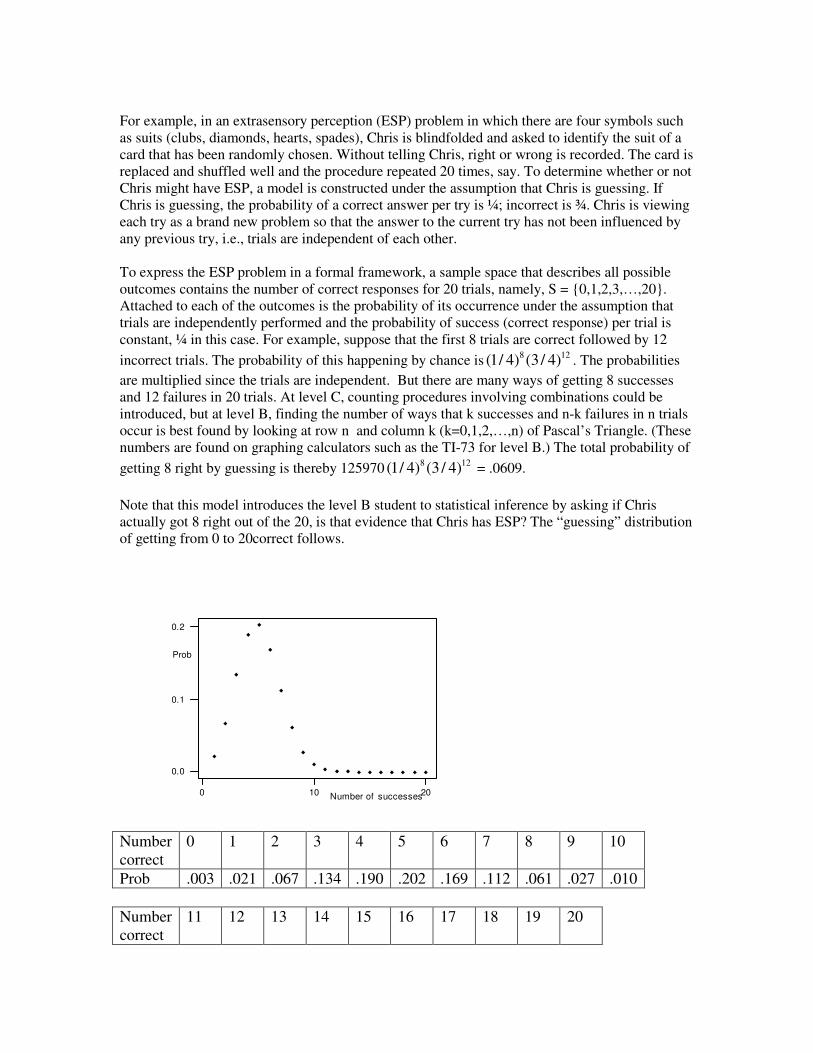
For example, in an extrasensory perception (ESP) problem in which there are four symbols such as suits (clubs, diamonds, hearts, spades), Chris is blindfolded and asked to identify the suit of a card that has been randomly chosen. Without telling Chris, right or wrong is recorded. The card is replaced and shuffled well and the procedure repeated 20 times, say. To determine whether or not Chris might have ESP, a model is constructed under the assumption that Chris is guessing. If Chris is guessing, the probability of a correct answer per try is ¼; incorrect is ¾. Chris is viewing each try as a brand new problem so that the answer to the current try has not been influenced by any previous try, i.e., trials are independent of each other. To express the ESP problem in a formal framework, a sample space that describes all possible outcomes contains the number of correct responses for 20 trials, namely, S = {0,1,2,3,…,20}. Attached to each of the outcomes is the probability of its occurrence under the assumption that trials are independently performed and the probability of success (correct response) per trial is constant, ¼ in this case. For example, suppose that the first 8 trials are correct followed by 12 incorrect trials. The probability of this happening by chance is 8 12(1/ 4) (3 / 4) . The probabilities are multiplied since the trials are independent. But there are many ways of getting 8 successes and 12 failures in 20 trials. At level C, counting procedures involving combinations could be introduced, but at level B, finding the number of ways that k successes and n-k failures in n trials occur is best found by looking at row n and column k (k=0,1,2,…,n) of Pascal’s Triangle. (These numbers are found on graphing calculators such as the TI-73 for level B.) The total probability of getting 8 right by guessing is thereby 125970 8 12(1/ 4) (3 / 4) = .0609. Note that this model introduces the level B student to statistical inference by asking if Chris actually got 8 right out of the 20, is that evidence that Chris has ESP? The “guessing” distribution of getting from 0 to 20correct follows.
0 10 20
0.0
0.1
0.2
Prob
Number of successes
Number correct
0 1 2 3 4 5 6 7 8 9 10
Prob .003 .021 .067 .134 .190 .202 .169 .112 .061 .027 .010 Number correct
11 12 13 14 15 16 17 18 19 20

Prob .003 .001 .000 .000 .000 .000 .000 .000 .000 .000 By looking at the graph and the distribution of probabilities, the probability that Chris would get 8 or more correct purely by guessing is .061+.027+.010+.003+.001 = .102, i.e., guessing 8 or more correct our of 20 trials occurs about 1 out of 10 times the experiment is performed. Students will debate whether or not that is a rare or common occurrence. Note that getting 9 or more correct occurs only about 4% of the time, a rare event building evidence that Chris may indeed have ESP. Probability rules – compound events Consider a balanced dodecahedron die whose twelve sides have been painted red (r), white (w), and blue (b) according to: 1, 7, 9, and 10 are red; 2, 5, 6, 8, and 12 are blue; and 3, 4, and 11 are white. Level B students should be introduced to the formal structure of a sample space, the set of all possible outcomes of an experiment, an appropriate probability assignment to the outcomes, subsets of the outcomes called events, and putting events together called compound events by the use of “and” or “or.” If the experiment is to roll the dodecahedron die once, then the most explicit sample space would be S = {1w,2b,3w,4r,5b,6b,7r,8b,9r,10b,11w,12w}. Since the die is balanced, each of the outcomes has probability 1/12 of occurring in one roll. The probability of observing an even number when the die is rolled once is 6/12; a prime is 5/12; a red even is 1/12. More formally, events are subsets of the sample space. For example, let A be the roll of the die resulted in a “looped” number, i.e., A={4r,6b,8b,9r,10r}, and let B be the roll of the die resulted in “red,” i.e., B={4r,7r,9r}. The probability that A occurs when the die is rolled once is 5/12; the probability that B occurs when the die is rolled once is 3/12. The “And” or “intersection” compound event is the occurrence of A and B together when the die is rolled once, i.e., A� B={4r,9r}, i.e., the outcome has to be both looped and red. The probability of A� B is therefore 2/12. The “Or” or “union” compound event is the occurrence of A by itself or B by itself or perhaps both A and B, i.e., A� B={4r,6b,8b,9r,10r,7r}, i.e., the outcome is colored red regardless of its shape, or it is looped regardless of its color, or it is both red and looped. The probability of A� B is therefore 6/12. Note that the probability of the union is also the probability of A + the probability of B – the probability of A and B, i.e., 5/12 + 3/12 – 2/12 = 6/12. Events A and B can be viewed using a Venn Diagram, or another representation is a cross classification table. A: red not red B: looped 2 3 not looped 1 6

Easily, the probability of A (looped) is 5/12 by adding the first row; of B (red) is 3/12 by adding the first column; of A� B is 2/12 by looking at the intersection of the first row and first column; of A� B is 6/12 by adding 1 + 2 + 3 or by adding the first row plus the first column minus the upper left hand corner since it was counted twice. Conditional probability and two-way tables Recall the following contingency table earlier. Like Rock Music? Yes No Totals Yes 25 4 29 Like Rap Music? No 6 15 21 Totals 31 19 50 The totals for the rows are the marginal totals for “like rap music.” The totals for the columns are the marginal totals for “like rock music.” The entries inside the 2x2 table are referred to as joint frequencies. If all entries were converted to relative frequencies, they would be divided by 50. For example, an estimate of the probability that a student from the school likes rap but not rock is 4/50 or .08. Very interesting questions that arise involve restricting attention to a level of one of the variables and asking a question about the other variable. For example, if a student is known to like rap music, how likely is she or he not to like rock? This is a very much different situation than the previous question because whereas before no prior information was known about the likes or dislikes of the student, in this problem only students who like rap are being considered. So, attention is restricted to the first row of the table since those are the students who like rap music. Of those 29, 4 do not like rock. So, the probability that a randomly chosen student will not like rock conditioned on his or her liking rap is estimated by the conditional relative frequency 4/29 = .14. Note that if there were 750 students in the school, one would expect (29/50)(750) = 435 of them to like rap music. Of those 435, (4/29)(435) = 60 of them would not like rock. Finding probabilities through area models/tree diagrams Consider a game in which a digit from 0 through 9 is chosen at random. Suppose that 7 of the digits, say 0 through 6, are losers; 7 through 9 are winners. If a loser is chosen, then the game stops and no points are earned. If a winner is chosen, the player chooses another digit at random. If the second digit is a loser, then the game is over and the player has earned one point. If the second digit is a winner, then the game is over and the player has earned a total of two points. What is the probability of earning 0, 1, or 2 points? As previously discussed, these probabilities can be estimated through simulation. There are a couple other ways to approach finding the desired probabilities – tree diagram and area model.

Solution by tree diagram: The tree diagram for this game would look as follows.
To find the probability of winning a certain number of points, clearly the probability of winning 0 points is .7 since the situation that leads to that outcome is to choose a loser on one’s first choice. To win one point requires a winning digit followed by a losing digit. These choices are done independently from each other, hence the probability is .3 times .7 or .21. The probability of winning two points is .09 by similar reasoning. Solution by area model: On a 10x10 grid with 100 congruent shapes, let the rows of the grid represent the outcome of the first choice digit and the columns represent the result of the second chosen digit. So, seven of the ten rows are losers and three are winners. L L L L L L L L L L L L L L L L L L L L L L L L L L L L L L L L L L L L L L L L L L L L L L L L L L L L L L L L L L L L L L L L L L L L L L W W W W W W W W W W W W W W W W W W W W W W W W W W W W W W
Loser; 0 points .7 Loser; 1 point .7 .3 Winner .3 Winner; 2 points

According to the rules, the game is over if the first choice was a loser. However, the first choice winners have another choice. Restricting attention to the W’s in the table, 70% of them are losers for the second choice of digit and 30% are winners. These situations are indicated on the grid as follows. L L L L L L L L L L L L L L L L L L L L L L L L L L L L L L L L L L L L L L L L L L L L L L L L L L L L L L L L L L L L L L L L L L L L L L WL WL WL WL WL WL WL WW WW WW WL WL WL WL WL WL WL WW WW WW WL WL WL WL WL WL WL WW WW WW So the probabilities of getting 0, 1, and 2 points are the respective areas of the 10x10 grid. Easily, the probability of getting 0 points (L) is 70/100 and 1 point (WL) is 21/100. Summary of Level B Statistics [To be added] LEVEL C
Background from Levels A and B Levels A and B of the statistics guidelines introduce students to:
• Statistics as an investigatory process • The importance of using data to answer appropriately framed questions • Types of variables (categorical versus numerical) • Graphical displays (bar graph, histogram, box plot, scatterplot) • Numerical summaries (counts, proportions, mean, median, range, quartiles, interquartile
range, correlation) • Common designs of studies (census, simple random sample, randomized designs for
experiments) • The process of drawing conclusions from data • The role of probability in statistical investigations
All of these ideas are revisited at Level C, but the types of studies emphasized here will be of a deeper statistical nature. Statistical studies at this level will require students to draw on basic concepts from earlier work, to extend the concepts to cover a wider scope of investigatory issues, and to develop a deeper understanding of inferential reasoning along with increased ability to explain that reasoning to others. Objectives of Level C

At Level C, the emphasis will be on interpretation and the use of statistical methods to answer questions rather than on the mechanics of computing summary statistics or drawing graphs. In general, students should be able to
• Formulate questions that can be answered with data. • Devise a reasonable plan for collecting appropriate data through observation, sampling or
experimentation. • Draw conclusions and use data to support these conclusions. • Understand the role that variability plays in the decision making process.
Specifically, Level C content recommendations include:
1. The Investigatory Process: What is the Question? 2. Design of a Study Sample survey Experiment Completely randomized design Matched pairs Observational study 3. Analysis of Data Mean and standard deviation Sampling distributions Simulation Association (categorical variables) Regression and correlation (measurement variables) Transformations of data 4. Interpretation: Statistical Inference P-values Margin of Error 5. The Role of Probability Review of probability as essential to statistical inference Special role of the normal distribution
The Investigatory Process: What is the Question? As stated at the beginning of Level A, data are more than just numbers. Students need to understand the types of questions that can be answered with data. “Is the overall health of high school students declining in this country?” That is too big a question to answer by a statistical investigation (or even many statistical investigations). Certain aspects of the health of students, however, can be investigated by formulating more specific questions like “What is the rate of obesity among high school students?”; “What is the average daily caloric intake per high school senior?”; “Is a three-day-a-week exercise regimen enough to maintain heart rate and weight within acceptable limits?” Question formulation, then, becomes the starting point for a statistical investigation.

Most questions that can be answered through data collection and interpretation require data from a designed study, either a sample survey or an experiment. These two types of statistical investigations have some common elements, as each requires randomization both for purposes of reducing bias and building a foundation for statistical inference, and each makes use of the common inference mechanisms of margin of error in estimation and significance level in hypothesis testing. But these two types of investigations have very different objectives and requirements. Sample surveys are used to estimate or make decisions about characteristics (parameters) of populations and a well-defined, fixed population is the main ingredient of such a study. Experiments are used to estimate or compare the effects of different experimental conditions, called treatments, and require well-defined treatments and experimental units on which to study those treatments. Estimating the proportion of residents of a city that would support an increase in taxes for education requires a sample survey. If the selection of residents is random, then the results from the sample can be extended to represent the population from which the sample was selected. A measure of sampling error can be calculated to ascertain how far the estimate is likely to be from the true value. Testing to see if a new medication to improve breathing for asthma patients produces greater lung capacity than a standard medication requires an experiment in which a group of patients who have consented to participate in the study are randomly assigned to either the new or the standard medication. With this type of randomized comparative design, an investigator can determine, with a measured degree of uncertainty, whether or not the new medication caused an improvement in lung capacity. Randomized experiments are, in fact, the only statistical devices available for establishing cause and effect. That generalization extends only to the types of units used in the experiment, however, as the experimental units are not usually sampled randomly from a larger population. To generalize to a larger class of experimental units, more experiments would have to be conducted. That is one reason why replication is a hallmark of good science. Studies that have no random selection of sampling units or random assignment of treatments to experimental units are often referred to as observational studies. A study of how many students in your high school have asthma and how this breaks down among gender and age groups would be of this type. Observational studies are not amenable to statistical inference in the usual sense of that term, but that can provide valuable insights on the distribution of measured values and the types of associations among variables that might be expected. Design of a Study Students should understand the key features of both sample surveys and experimental designs, including how to set up simple versions of both types of investigations, how to analyze the data appropriately (as the correct analysis is related to the design), and how to clearly and precisely state conclusions for these designed studies. Key elements on the construction and implementation of the designs will be addressed here; the analysis and interpretation components will be addressed in the following two sections. Sample Surveys Students should understand that obtaining good results from a sample survey depends on four basic features - the population, the sample, the randomization process that connects the two, and the accuracy of the measurements made on the sampled elements. For example, to investigate a question on health of students, a survey might be planned for a high

school. What is the population to be investigated? Is it all the students in the school (which changes on a daily basis)? Perhaps the questions of interest involve only juniors and seniors. Once the population is defined as precisely as possible, what is an appropriate sample size and how can a random sample be selected? Is there, for example, a list of student who can then be numbered for random selection? Once the sampled students are found, what questions are to be asked of them? Are the questions fair and unbiased (as far as possible) and can or will the students actually answer them accurately? One such study of this type was actually carried out by a high school class. A random sample of 50 students selected from those attending a high school on a particular day were asked a variety of health related questions, including these two:
1. Do you think you have a healthy lifestyle? 2. Do you eat breakfast at least three times a week?
The data are given in Table 1. TABLE 1: Results of lifestyle questions Eat Breakfast Healthy Lifestyle Yes No Total Yes 19 15 34 No 5 11 16 Total 24 26 50 From these data, collected in well-designed sample survey, it is possible to estimate the proportion of students in the school who think they have a healthy lifestyle and the proportion who eat breakfast at least three times a week. It is also possible to assess the degree of association between these two categorical variables. Students at another location were interested in how SUV’s compare to family sedans in terms of variables such as weight, gas mileage and cost. Data on these variables were found on the web, but lists of these two types of vehicles will differ from site to site. Taking one such list as the population of interest, the students selected a random sample of size 5 for each type of vehicle (ruling out luxury cars, sports cars, and convertibles) and then proceeded to find data on the three variables of interest (manufacturer’s suggested retail price, highway miles per gallon, and weight). The results are in Table 2. TABLE 2: Facts on samples of vehicles from the 2001 model year [Source: www.autoweb.com].
SEDANS MSRP (dollars)
MPG:HY WEIGHT (pounds)
Buick Century Custom 20020 29 3368 Chevrolet Malibu 17150 29 3051 Chrysler Concorde LX 22510 28 3488 Ford Taurus LX 18550 27 3354 Toyota Camry LE 20415 32 3120 SUV’S

Blazer 4WD LX 26905 20 4049 Explorer AWD XLT 30185 19 4278 Jimmy 4WD SLT 30225 20 4170 Trooper S 4x4 27920 19 4465 Grand Cherokee 4WD 35095 20 4024
From these sample data the students can estimate the mean for the population on any of the three variables being studied. They can also compare the means for the two types of vehicles on any of the three variables. Experiments Students should understand that obtaining good results from an experiment depends upon four basic features - well-defined treatments, appropriate experimental units to which these treatments can be assigned, the randomization process that is used to assign treatments to experimental units, and accurate measurements of the results of the experiment. Experimental units generally are not randomly selected from a population of possible units. Rather, they are the ones that happen to be available for the study. In experiments with human subjects, the people involved have to sign an agreement stating that they are willing to participate in an experimental study. In experiments with agricultural crops, the experimental units are the field plots that happen to be available. In an industrial experiment on process improvement the units may be the production lines in operation this week. Back to health issues, a student decided to answer the question of whether or not simply standing for a few minutes increases the pulse (heart rate) by an appreciable amount. Subjects available for the study were the 15 students in a particular class. The “sit” treatment was randomly assigned to eight of the students; the remaining seven were assigned the “stand” treatment. The measurement recorded was a pulse count for 30 seconds, which was then doubled to approximate a one-minute count. The data, arranged by treatment, are in Table 3. From these data it is possible to either test the hypothesis that standing does not increase pulse rate, on the average, or to estimate the difference in mean pulse between those who stand and those who sit. The randomization is intended to balance out the unmeasured and uncontrolled variables that could affect the results, such as gender and health conditions. This is called a completely randomized design. TABLE 3

But, randomly assigning 15 students to two groups may not be the best way to balance background information that could affect results. It may be better to block on a variable related to pulse. Since people have different resting pulse rates, the students in the experiment were paired on resting pulse rate by pairing the two students with the lowest resting pulse rate, then the two next lowest, and so on. One person in each pair was randomly assigned to sit and the other to stand. The matched pairs data are in Table 4. As in the completely randomized design, the mean difference between sitting and standing pulse rate can be tested or estimated. The main advantage of the blocking is that the variation in the differences (which now form the basis of the analysis) is much less than the variation among the pulse measurements that form the basis of analysis for the completely randomized design. TABLE 4
Pulse Data
Pulse Group Category
1
2
3
4
5
6
7
8
9
10
11
12
13
14
15
62 1 sit
60 1 sit
72 1 sit
56 1 sit
80 1 sit
58 1 sit
60 1 sit
54 1 sit
58 2 stand
61 2 stand
60 2 stand
73 2 stand
62 2 stand
72 2 stand
82 2 stand

Some experiments lead to modeling the relationship between two variables, instead of testing or estimating means. Such an experiment is a study of the dissolve time of Alka Seltzer tablets carried out by a group of science students. Their question was “What is the relationship between the temperature of the water and the dissolve time of an Alka Seltzer tablet?” The students heated cups of water to various temperatures (centigrade) and then randomly choose a tablet to drop into the water. The measurement of interest was the time (seconds) until the tablet was completely dissolved. The data from the experiment is in Table 5 and the scatterplot of the data is in Figure 1. It is obvious that the dissolve time decreases with increasing temperature of the water, but the curvature in the pattern makes the actual relationship between time and temperature somewhat challenging to model. A transformation is in order if techniques of simple linear regression analysis are to be used. TABLE 5: Dissolve Time and Temperature
Time (sec) Temperature (C)
23 43 116 3 122 5 66 23 30 42 25 35 60 14 45 20 24 38 22 42 121 7 60 17 40 22 26 43 90 10 28 32 24 87 25 42 65 17 15 70 53 23
Pulse data: matched pairs
=
MPSit MPStand difference
1
2
3
4
5
6
7
68 74 6
56 55 -1
60 72 12
62 64 2
56 64 8
60 59 -1
58 68 10

23 45 64 18 25 42 45 21 18 74 10 72 13 47 15 18 20 45 49 16 57 17 28 33 55 20
FIGURE 1
Observational Study Students should understand that observational studies are useful for suggesting patterns in data and relationships between variables, but do not provide a strong basis for estimating population parameters or establishing differences among treatments. Relationships among various physical features, such as height versus arm span and neck size versus shoe size, can be the basis of many interesting questions for student investigation. One such investigation carried out by students compared forearm length and height. The data (in centimeters) is provided in Table 6. This is an observational study. Even though measurements were made by the students, there was no random sampling of students and no random assignment of treatments. The analysis, as presented in the next section, is merely descriptive and should not be used for inferential purposes. TABLE 6: Heights versus Forearm Lengths
Forearm (cm) Height (cm) 45.0 180.0
0
20
40
60
80
100
120
140
0 10 20 30 40 50 60 70 80 90Temperature
Alka Seltzer Dissolve Time Scatter Plot

44.5 173.2 39.5 155.0 43.9 168.0 47.0 170.0 49.1 185.2 48.0 181.1 47.9 181.9 40.6 156.8 45.5 171.0 46.5 175.5 43.0 158.5 41.0 163.0 39.5 155.0 43.5 166.0 41.0 158.0 42.0 165.0 45.5 167.0 46.0 162.0 42.0 161.0 46.0 181.0 45.6 156.0 43.9 172.0 44.1 167.0
Analysis of Data When analyzing data from designed sample surveys, student should understand that an appropriate analysis is one that can lead to justifiable inferential statements based on estimates of population parameters. Statistical inference hinges on information provided by the sampling distribution of the sample statistic that is being used to summarize the sample data. The two most common statistics used in applications are the sample proportion for categorical data and the sample mean for measurement data. When the sample mean is used as the statistic of interest, the appropriate measure of spread (variation) is the sample standard deviation. Students should gain an understanding of the behavior of means and standard deviations through the practice of calculating and interpreting these summary statistics on many real data sets.
Proportions
Properties of the sampling distribution for a sample proportion can be illustrated quite simply by using random digits as a device to model various populations. Suppose a population is assumed to have 60% “success” (p = .6) and we are to take a random sample of n=40 cases from this population. How far can we expect the sample proportion of “successes” to deviate from this population value? This can be answered by demonstrating what the sampling distribution of sample proportions looks like through repeated selection of samples of 40 random digits (with replacement) from a population in which 6 of the ten digits from 0 to 9 are labeled “success” and 4 are not. Such a simulated distribution made up of 200 sample proportions is shown in Figure 2.

FIGURE 2
Getting into the habit of using shape, center and spread to describe distributions, one can state that this simulated sampling distribution of sample proportions has a mound shape (approximately normal) with a mean of .59 (very close to p = .6) and a standard deviation of .08. By studying this sampling distribution and others that can be generated the same way, students will see that the sampling distributions for sample proportions center at p, the population proportion of “successes”, and that the standard deviations for the sampling distribution turns out to be approximately
ˆ p (1− ˆ p )n
where ˆ p is the observed sample proportion in a single sample. In addition, if the sample size is reasonably large, the shape of the sampling distribution is approximately normal. Thus, the sampling distribution can be described rather completely without doing any more simulations. This description improves as the sample size increases. A follow-up analysis of these simulated sampling distributions will show students that about 95% of the sample proportions lie with a distance of
2ˆ p (1 − ˆ p )
n
from the true value of p. This distance, sometimes called the margin of error, is useful in estimating where a population proportion might lie in relation to a sample proportion for a new study in which the true population proportion is not known. For example, in the lifestyle survey previously described, 24 students in a random sample of 50 students attending a particular high school reported that they eat breakfast at least three times per week. Based on this sample survey, it is estimated that the proportion of students at this school who eat breakfast at least three times per week to be 24/50 = .48 with a margin of error of
2(.48)(.52)
50= .14
Means
5
10
15
20
25
30
Proportion0.4 0.5 0.6 0.7 0.8
Sample proportions Histogram

Properties of the sampling distribution for a sample mean can be illustrated in a similar way. Now, samples of 10 random digits will be selected at random (with replacement) and the sample mean calculated for each sample. Figure 3 shows the resulting sampling distribution. FIGURE 3
This distribution can be described as approximately normal with a mean of 4.53 and a standard deviation of 0.87. For a population of random digits, the mean is 4.5 and the standard deviation is 2.9. By studying this sampling distribution and others produced similarly students will see that the standard deviation of the sampling distribution for a sampling mean is approximately the population standard deviation divided by the square root of the sample size, in this case 2.9/�10 = 0.92. The margin of error in estimating a population mean from a single random sample is approximately
2sn
where s denotes the sample standard deviation for the observed sample. The sample mean should be within this distance of the true population mean about 95% of the time in repeated usage of this method of estimation. This approximation improves as the sample size increases. Differences In constructing margins of error for the difference between two independent statistics, such as the difference between two sample means, students should understand that the variances (the squares of the standard deviations) add. Thus, when the samples are selected independently the margin of error for the difference between two sample means, one sample of size n1 and the other n2, becomes approximately
2s1
2
n1
+s2
2
n2
5
10
15
20
25
30
Mean1 2 3 4 5 6 7
Sample Means Histogram

Regression Regression analysis refers to the study of relationships between variables. If the “cloud” of points in a scatterplot of the paired data has a linear shape, a straight line may be a realistic model of the relationship between the variables under study. The least squares line runs through the center (in some sense) of the cloud of points. Residuals are defined to be the deviations in the y direction between the points in the scatterplot and the line; spread is now the variation around the least squares line, as measured by the standard deviation of the residuals. When using a fitted model to predict a value of y from x, the margin of error depends on the standard deviation of the residuals.
Transformations Most high school students need not go beyond simple linear regression for their general knowledge of statistical thinking, but many of the relationships in the real world are not linear. Fortunately, some of the most common ones can be made linear by a transformation of one or both variables. One of the most common non-linear relationships is exponential growth (or decay). This relationship is modeled by the equation
y = abx where a and b are constants that are determined by the size of y at x=0 and the rate of growth (or decay). Students should see that this can be made into a linear equation by taking logarithms of both sides:
log(y) = log(a) + x log(b) Thus, a and b can be estimated by fitting a least squares line to log(y) versus x. Perhaps the second most common non-linear relationship is the power model, represented by the equation
y = axb where a and b are again the constants to be estimated. Again, this can be made into a linear equation by taking logarithms. Thus, a and b can be estimated by first fitting a least squares line to log(y) versus log(x). Interpretation: Statistical Inference
Inference from Samples The key to statistical inference is the sampling distribution of the sample statistic, which provides information on the population parameters being estimated or the treatment effects being tested. As described in the previous section, knowledge of the sampling distribution for a statistic, like a sample proportion or sample mean, leads to a margin of error that provides information about the maximum likely distance between a sample estimate and the population parameter being estimated. Said another way, an estimator plus and minus the margin of error produces an interval of plausible values for the population parameter, any one of which could have produced the observed sample result as a reasonably likely outcome.

From Table 1 the sample proportion of students who eat breakfast is (24/50) = 0.48. Using the margin of error result from above (.14), the interval of plausible values for the population proportion of students who eat breakfast at least three times a week is (0.34, 0.62). Any population proportion in this interval is consistent with the sample data in the sense that the sample result could reasonably have come from a population having this proportion of students eating breakfast. From Table 2, the sample mean for the sedan weights is 3276 pounds and the sample standard deviation is 183.3 pounds. This results in a margin of error of
2sn
= 2183.3
5= 164
Plausible values for the population means then lie in the interval (3112, 3430), but the 95% rule may no hold here because of the small sample. By comparison, the sample mean for the SUV weights is 4197 pounds and the plausible values of the population mean lie in the interval (4036, 4358). Among the conclusions that can be made here is that the average SUV weighs considerable more than the average sedan. This should not be a surprise to anyone, but the size of the difference might be surprising. In fact an interval for plausible values of the difference between the means for SUV’s and sedans can be constructed, using the ideas of the previous section, and this interval turns out to be approximately (695, 1147). On the average, SUV’s weigh at least 695 pounds more than family sedans.
Inference from Experiments
Do the treatments differ? In analyzing experimental data this is one of the first questions asked. This question of difference is generally interpreted in terms of differences between the centers of the data distributions (although it could be interpreted as a difference between 90th percentiles or any other measure of an aspect of a distribution). Because the mean is the most commonly used statistic for measuring center of a distribution, this question of differences is generally interpreted as a question about the differences in means. The analysis of experimental data, then, usually involves a comparison of means. Unlike sample surveys, experiments do not depend on random samples from a fixed population. Instead, they require random assignment of treatments to pre-selected experimental units. The key question, then, is of the following form: “Could the observed difference in treatment means be due to the random assignment (chance) alone, or should the investigator look for another cause?” In the first pulse rate experiment (Table 3) the treatments of “sit” or “stand” were randomly assigned to students. If there is no real difference in pulse rates for these two treatments, then the observed difference in means (4.1 beats per minute) is due to the randomization process itself. To check this out the data resulting from the experiment can be re-randomized (reassigned to sit or stand after the fact) and a new difference in means recorded. Doing the re-randomization many times will generate a distribution of differences in sample means due to chance alone and one can see the likelihood of the original observed difference. Figure 4 shows the results of 200 such re-randomizations. The observed difference of 4.1 was matched or exceeded 48 times, which gives a probability of 0.24 of seeing a result of 4.1 or greater by chance alone. Because this is a fairly large probability, it can be concluded that there is little evidence of any real difference in means pulse rates between the sitting and the standing positions based on the observed data.

FIGURE 4
In the matched pairs design the randomization occurs within each pair, one person randomly assigned to sit while the other stands. To assess whether the observed difference could be due to chance alone and not due to treatment differences, the re-randomization must occur within the pairs. This implies that the re-randomization is merely a matter of randomly assigning a plus or minus sign to the numerical values of the observed differences. Figure 5 shows the distribution of the mean differences for 200 such re-randomizations; the observed mean difference of 5.14 was matched or exceeded 8 times. Thus, the estimated probability of getting a mean difference of 5.1 or larger by chance alone is 0.04. This very small probability provides evidence that the mean difference must be caused by something other then chance (induced by the initial randomization process) alone. A better explanation is that standing increases mean pulse rate over the sitting rate. The mean difference shows up as significant here, while it did not for the completely randomized design, because the matching reduced the variability. The differences in the matched pairs design have less variability than the individual measurements in the completely randomized design, making it easier to detect a difference in mean pulse for the two treatments. FIGURE 5
-12 -8 -4 0 4 8 12
MeanDiffMovable line is at 4.1
Randomized Differences in Means; Pulse Data Dot Plot

Connection between Inference for Sample Surveys and Experiments Returning to the first sample survey involving lifestyle questions asked of 50 students, one can observe that a comparison of the proportions of yes answers to the healthy lifestyle question for those who regularly eat breakfast with those who do not is much like the comparison of means for the completely randomized design. In fact, if a 1 is recorded for each yes answer and a 0 for each no answer, the sample proportion of yes answers is precisely the sample mean. For the observed data, there a re a total of 34 1’s and 16 0’s. Re-randomizing these 50 observations to the groups of size 24 and 26 (corresponding to the yes and no groups on the breakfast question) gave the results in Figure 4. The observed difference in sample proportions of (19/24) – (15/26) = 0.21 was matched or exceeded 13 times out of 200 runs, for an estimated probability of 0.065. This is moderately small, so there is some evidence that the two sample proportions differ. In other words, the responses to the health lifestyle question and the eating breakfast question appear to be related in the sense that those who think they have a healthy lifestyle also have a tendency to eat breakfast regularly. FIGURE 6
-6 -4 -2 0 2 4 6
meandifMovable line is at 5.1
Randomized Paired Difference Means, Pulse Data Dot Plot

Inference in Modeling
In modeling the relationship between the time for an Alka Seltzer tablet to dissolve and the temperature of the water (see Figure 1) it was observed that the relationship is more complicated than a simple straight line. Straightening out this relationship requires a transformation of one or both variables; either the extreme temperatures need to be reduced or the extreme times need to be reduced, or both. It turns out that a logarithmic transformation on both variables works well, as shown in Figure 7. The equation of the least squares line is given under the figure. The slope of -0.76 indicates that the ln(time) will decrease, on the average, 0.76 units for every one unit increase in ln(temp). The residual plot shows no strong pattern (although there may still be some curvature here) and the correlation of -0.88 (negative square root of 0.77) shows a fairly strong relationship between the two variables. The standard deviation of the residuals is 0.32, which indicates that a prediction of ln(time) for a new situation with known ln(temp) would have a margin of error of approximately 2(0.32)= 0.64 units. FIGURE 7
-0.4 -0.3 -0.2 -0.1 0.0 0.1 0.2 0.3 0.4
MeanDiffMovable line is at 0.21
Healthy Lifestyle Differences Dot Plot

Modeling in Observational Studies Recall that the study of height versus forearm length by a group of high school students resulted in the data of Table 6. These data are plotted in Figure 8 with the least squares line and residual plot added. The linear trend is fairly strong, with a few large residuals but no unusual pattern in the residual plot. The slope (about 2.8 cm) can be interpreted as an estimate of the expected difference in heights for two persons whose forearms are 1 centimeter different in length. The intercept of 45.8 centimeters cannot be interpreted as the expected height of a person with a forearm zero centimeters long! And, as previously stated, observational data can be used for descriptive purposes, but generally not for inferential purposes in the context of the methodologies available at this level of statistical investigation. FIGURE 8
-1.2-0.6
0.00.6
1.0 1.5 2.0 2.5 3.0 3.5 4.0 4.5
LnTemp
2.0
2.5
3.0
3.5
4.0
4.5
5.0
1.0 1.5 2.0 2.5 3.0 3.5 4.0 4.5
LnTemp
LnTime = -0.758LnTemp + 6.04; r^2 = 0.77
Alka Seltzer Dissolve Time Scatter Plot

The Role of Probability in Statistics
Teachers and students must understand that statistics and probability are not the same thing. Statistics uses probability, much as physics uses calculus, but only certain aspects of probability make their way into statistics. The concepts of probability needed for introductory statistics (with emphasis on data analysis) include relative frequency interpretations of data, an introduction to the normal distribution as a model for sampling distributions, and the basic ideas of expected value. Counting rules, most specialized distributions, and development of theorems on the mathematics of probability should be left to areas of discrete mathematics and/or calculus. Understanding the reasoning and logic of statistical inference requires a basic understanding of some important ideas in probability. Students should be able to
• Understand probability as a long-run relative frequency. • Understand the concept of independence. • Understand how probability can be used in making decisions and drawing conclusions.
In addition, because so many of the standard inferential procedures are based on the normal distribution, students should be able to evaluate probabilities using the normal distribution (preferably with the aid of technology). Probability is an attempt to quantify uncertainty. The fact that, even though it is not possible to predict individual outcomes, the long-run behavior of a random process is predictable leads to the long-run relative frequency interpretation of probability. Students should be able to interpret the probability of an outcome as the proportion of the time, in the long run, that the outcome would occur. This long-run relative frequency interpretation of probability also provides the justification for using simulation to estimate probabilities. After observing a large number of chance outcomes, the observed proportion of occurrence for the outcome of interest can be used as an estimate of the relevant probability.
-20
-5
10
39 40 41 42 43 44 45 46 47 48 49 50
Forearm
155160165170175180185190
39 40 41 42 43 44 45 46 47 48 49 50
Forearm
Height = 2.76Forearm + 45.8; r^2 = 0.64
Heigth v Forearm Length Scatter Plot

Students also need to understand the concept of independence. Two outcomes are independent if our assessment of the chance that one outcome occurs is not affected by knowledge that the other outcome has occurred. Particularly important to statistical inference is the notion of independence in sampling settings. Random selection (with replacement) from a population ensures that the observations in a sample are independent—for example, knowing the value of the third observation does not provide any information about the value of the fifth (or any other) observation. Many of the methods used to draw conclusions about a population based on data from a sample require the observations in a sample to be independent. Most importantly, the concepts of probability play a critical role in developing statistical methods that make it possible to draw conclusions based on data from a sample and to assess the reliability of such conclusions. To clarify the connection between data analysis and probability we will return to the key ideas presented in the inference section. Suppose an opinion poll shows 60% of sampled voters in favor of a proposed new law. A basic statistical question is, “How far might this sample proportion be from the true population proportion?” That the difference between the estimate and truth is less than the margin of error approximately 95% of the time is based on a probabilistic understanding of the sampling distribution of sample proportions. For large samples, this relative frequency distribution of sample proportions is approximately normal under random sampling. Thus, students should be familiar with how to use appropriate technology to find areas under the normal curve. Suppose an experimenter divides subjects into two groups with one group receiving a new treatment for a disease and the other receiving a placebo. If the treatment group does better than the placebo group, a basic statistical question is, “Could the difference have been caused by chance alone?” Again, the randomization allows us to determine the probability of a difference being greater than that observed under the assumption of no treatment effect, and this probability allows us to draw a meaningful conclusion from the data. (A proposed model is rejected as implausible not primarily because the probability of an observed outcome is small, but rather because it is in the tail of a distribution.) Adequate answers to the above questions also require knowledge of the context in which the underlying questions were asked and a “good” experimental design. This reliance on context and design is one of the basic differences between statistics and mathematics. As demonstrated in the Analysis of Data section, it is known that the sampling distribution of a sample mean will be approximately normal under random sampling, as long as the sample size is reasonably large. The mean and standard deviation of this distribution is usually unknown (introducing the need for inference) but sometimes these parameter values can be determined from basic information about the population being sampled. To compute these parameter values students will need some knowledge of expected values, as demonstrated next. According to the March 2000 Current Population Survey of the U.S. Census Bureau, the distribution of family size is as given by the data Table 7. (A family is defined as two or more related people living together. The number “7” really is the category “7 or more”, but very few families are larger than 7.) TABLE 7
Family Size, x Proportion, p(x) 2 0.437

3 0.223 4 0.201 5 0.091 6 0.031 7 0.017
The first connection between data and probability to note is that these proportions (really estimates from a very large sample survey) can be taken as approximate probabilities for the next survey. In other words, if someone randomly selects a U.S. family for a new survey, the probability that it will have 3 members is about .223. The second point is that we can now find the mean and standard deviation of a random variable (call it X) defined as the number of people in a randomly selected family. The mean, sometimes called the expected value of X and denoted by E(X), is found by formula
E(X ) = x • p(x)� which turns out to be 3.11 for this distribution. If the next survey contains 100 randomly selected families, then the survey is expected to produce 3.11 members per family, on the average, for a total of 311 people in the 100 families altogether. The standard deviation of X, SD(X), is the square root of the variance of X, V(X), given by
V(X ) = [x − E(X)]2� • p(x)
For the family size data, V(X)=1.54 and SD(X)=1.24. Thirdly, these facts can be assembled to describe the sampling distribution of the mean family size in a random sample of 100 families yet to be taken. That sampling distribution will be approximately normal in shape, centering at 3.11 with a standard deviation of 1.24/�100 = 0.124. This would be useful information for the person designing the next survey. In short, the relative frequency definition of probability, the normal distribution, and the concept of expected value are the keys to understanding sampling distributions and statistical inference. Summary of Level C Students at Level C should become adept at using statistical tools as a natural part of the investigative process. Once an appropriate plan for collecting data have been implemented and the resulting data is in hand, the next step is usually to summarize the data using graphical displays and numerical summaries. At level C, students should be able to select summary techniques appropriate to the type of data available, construct these summaries, and describe in context the important characteristics of the data. Students will use the graphical and numerical summaries learned at Levels A and B, but should be able to provide a more sophisticated interpretation that integrates the context and the objectives of the study. At Level C, students should also be able to draw conclusions from data and support these conclusions using statistical evidence. Students should see statistics as providing powerful tools that enable them to answer questions and to make informed decisions. But, students should also

understand the limitations of conclusions based on data from sample surveys and experiments, and should be able to quantify uncertainty associated with these conclusions using margin of error and related properties of sampling distributions.