Embed Size (px)
Citation preview

Report Issued: April 29, 2009 Disclaimer: This report is released to inform interested parties of research and to encourage discussion. The views expressed are those of the authors and not necessarily those of the U.S. Census Bureau.
STUDY SERIES (Survey Methodology #2009-05)
A Usability Evaluation of Iteration 1 of the New American FactFinder Web Site:
Conceptual Design
Jennifer Romano Erica Olmsted-Hawala
Elizabeth Murphy
Statistical Research Division U.S. Census Bureau
Washington, D.C. 20233
A Usability Evaluation of Iteration 1 of the New American FactFinder Web Site: Conceptual Design
Human-Computer Interaction Memorandum Series #133
Submitted to: Marian Brady
Data Access and Dissemination System Office (DADSO)
February 10, 2009
Submitted by:
Jennifer Romano, Erica Olmsted-Hawala, & Elizabeth Murphy Statistical Research Division
(SRD)
_____________________________________________________________________________________ This report is released to inform interested parties of research and to encourage discussion of work in progress. Any views expressed on the methodological issues are those of the authors and not necessarily those of the U.S. Census Bureau.

2
A Usability Evaluation of Iteration 1 of the New American FactFinder Web Site: Conceptual Design
Abstract
In October 2008, the U.S. Census Bureau’s Statistical Research Division (SRD) conducted usability testing to evaluate the conceptual design of the newly designed American FactFinder (AFF) Web site. AFF is the Census Bureau’s primary tool for disseminating data about the U. S. population and economy. The usability testing evaluated the success and satisfaction of seven externally recruited participants with a paper prototype of the conceptual design. Usability testing revealed several usability problems, including lack of direct guidance for the users, an overwhelming amount of information and Census jargon that was confusing to users, and confusing action icons on the site. Recommendations were provided to the sponsor and team responses were received. This report provides a complete summary of this usability evaluation, including methods, findings, recommendations and team decisions based on our recommendations.
3
Executive Summary
In October 2008, the U.S. Census Bureau’s Statistical Research Division (SRD) conducted usability testing to evaluate the conceptual design of the newly designed American FactFinder (AFF) Web site. The testing evaluated the success and satisfaction of seven externally recruited participants with a paper prototype of the conceptual design. Testing took place at the Census Bureau’s Usability Laboratory in Suitland, MD. Purpose. The primary purpose of the usability testing was to identify elements of the user-interface design that were problematic and led to ineffective, inefficient and un-satisfying experiences for people using the Web site. Method. Seven participants were recruited externally through a database maintained by the Usability Lab. Participants were knowledgeable in navigating the Internet and using a computer, and all were unfamiliar with the American FactFinder Web site. Participants had no known disabilities. Each participant sat at a table in a small room beside the test administrator. The sessions were audio and video recorded. Working with paper prototypes of the screen designs, participants completed search-related tasks and results-related tasks, guided by the test administrator. The participants discussed step-by-step what they would do to complete each task if the prototype were a working Web site. During the task, the test administrator noted any behaviors that indicated confusion, such as hesitation and frowning. At the conclusion of each task, the test administrator asked probing questions about the task and about the site. After the participants completed all tasks, they completed a Satisfaction Questionnaire then answered debriefing questions. Overall, each usability session ran approximately 60 minutes. Results. The full report provides complete descriptions of each finding, recommendations and responses for usability issues. The following section highlights issues and recommendations to resolve them. 1. There was no direct, useful guidance displayed about what the user needed to do. Most users were initially confused about whether the geography and topic sections (to define their search criteria) worked together. The Advanced tab on the Select/Define page did not work well for half of the users who saw and tried to use the tab. Recommendation: To demonstrate that the two sections work together, make the black section above both sections stretch across the entire page. Eliminate the black vertical line between the two sections. Add instructions, emphasizing the user’s actions, on how to use these sections. In the fine print below “Choose your geography,” have explicit instructions about how/what users can select. Keep headings simple, beginning with user actions (verbs). In the geography section, add instructions that tell users that they can select more than one geography at a time. In the advanced tab, minimize the program names so users are not immediately confronted with program information that they don’t understand. Re-word the instructions so users are guided on what they are supposed to do under the advanced tab.

4
2. The Results page was overwhelming; there was too much information and no clear direction on what users were supposed to do to understand, interpret and act on the information they were looking at. Recommendation: Reduce the amount of information on the screen and increase the amount of white space. Move Action items (icons) over to the left a bit and make them larger. 3. Census Jargon and poorly worded text confused users. Throughout the pages tested, most users commented that they did not know what some words and phrases meant. Jargon prevented users from successfully completing some tasks. Recommendation: Reduce jargon. Use plain language that the average person uses and understands. 4. Action Icons on Results page were confusing for users. When probed about what they meant, most users did not understand most of the icons and, thus, said they would not use them. Recommendation: Work on creating user identifiable icons that can be simply understood without text. 5. Users were confused about the functionality of My Workspace and initially did not understand how to save their search criteria. Throughout testing, users commented that they were confused about exactly what My Workspace was and did. During debriefing, most users were not sure how to save and access information in My Workspace. Recommendation: Change Add to Workspace to “Save to Workspace.” Add a Help button in Workspace that lists the steps users must take in order to get searches and individual items saved into the workspace. 6. It was not immediately clear that users needed to go into the Geography tab to make changes to the current geographical selection. In addition, there was no indication on the page which geographies were actually included in the results. Recommendation: List the geography or geographies somewhere highly visible on the results page so that it is clear which geographies are represented in the results list. As always, the Usability Lab recommends further testing after changes have been made to determine whether the changes were effective and whether they introduced any new problems.

5
Table of Contents 1.0 Introduction............................................................................................................................... 9
1.1 Background........................................................................................................................... 9 1.2 Purpose................................................................................................................................ 10 1.3 Usability Goals.................................................................................................................... 10 1.4 Assumptions........................................................................................................................ 10
2.0 Method .................................................................................................................................... 10 2.1 Participants and Observers.................................................................................................. 11 2.2 Facilities and Equipment..................................................................................................... 12
2.2.1 Testing Facilities.......................................................................................................... 12 2.2.2 Audio and Video Recording ........................................................................................ 12
2.3 Materials ............................................................................................................................. 12 2.3.1 General Introduction .................................................................................................... 12 2.3.2 Consent Form............................................................................................................... 12 2.3.3 Questionnaire on Computer Use and Internet Experience........................................... 12 2.3.4 Tasks and Task-based Goals........................................................................................ 12 2.3.5 Post-Task Questions..................................................................................................... 12 2.3.6 Satisfaction Questionnaire ........................................................................................... 12 2.3.7 Debriefing Questionnaire............................................................................................. 13 2.3.8 Payment Voucher......................................................................................................... 13
2.4 Procedure ............................................................................................................................ 13 2.4.1 Part 1: Conceptual Approach ....................................................................................... 13 2.4.2 Part 2: Task Completion .............................................................................................. 13 2.4.3 Part 3: Additional Probes ............................................................................................. 13
2.5 Performance Measurement Methods .................................................................................. 14 2.5.1 Accuracy ...................................................................................................................... 14 2.5.2 Satisfaction................................................................................................................... 14 2.5.3 Identifying and Prioritizing Usability Problems .......................................................... 14
3.0 Results, Recommendations, and Team Responses Based on Usability Testing..................... 15 3.1 Participant Accuracy........................................................................................................... 15 3.2 User Satisfaction ................................................................................................................. 15 3.3 Positive Findings................................................................................................................. 15 3.4 Usability Problems.............................................................................................................. 17
3.4.1 High-Priority Usability Problems ................................................................................ 17 3.4.2 Additional Usability Testing Results ........................................................................... 30
4.0 Limitations .............................................................................................................................. 33 5.0 Conclusions............................................................................................................................. 33 6.0 References............................................................................................................................... 34 Appendix A: Paper Prototypes of the Tested Web Site................................................................ 35 Appendix B: Screen Shots of the New Web Site.......................................................................... 38 Appendix C: General Introduction of Usability Test.................................................................... 39 Appendix D: Consent Form.......................................................................................................... 40 Appendix E: Questionnaire on Computer Use and Internet Experience ...................................... 41 Appendix F: Task List .................................................................................................................. 43 Appendix G: Post-Task Questions for Iteration 1 Usability Test ................................................. 45 Appendix H: Satisfaction Questionnaire ...................................................................................... 46

6
Appendix I: Debriefing Questionnaire for Iteration 1 Usability Test........................................... 47 Appendix J: Pay Voucher ............................................................................................................. 49 Appendix K: Probing Questions For Strategy to Begin................................................................ 50 Appendix L: Users Responses to Search-Related Probes............................................................. 51
7
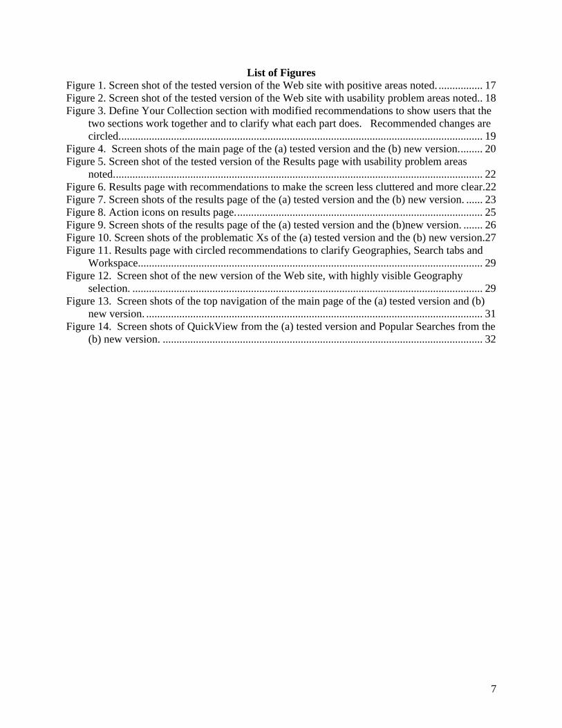
List of Figures Figure 1. Screen shot of the tested version of the Web site with positive areas noted. ................ 17 Figure 2. Screen shot of the tested version of the Web site with usability problem areas noted.. 18 Figure 3. Define Your Collection section with modified recommendations to show users that the
two sections work together and to clarify what each part does. Recommended changes are circled.................................................................................................................................... 19
Figure 4. Screen shots of the main page of the (a) tested version and the (b) new version......... 20 Figure 5. Screen shot of the tested version of the Results page with usability problem areas
noted...................................................................................................................................... 22 Figure 6. Results page with recommendations to make the screen less cluttered and more clear.22 Figure 7. Screen shots of the results page of the (a) tested version and the (b) new version. ...... 23 Figure 8. Action icons on results page.......................................................................................... 25 Figure 9. Screen shots of the results page of the (a) tested version and the (b)new version. ....... 26 Figure 10. Screen shots of the problematic Xs of the (a) tested version and the (b) new version.27 Figure 11. Results page with circled recommendations to clarify Geographies, Search tabs and
Workspace............................................................................................................................. 29 Figure 12. Screen shot of the new version of the Web site, with highly visible Geography
selection. ............................................................................................................................... 29 Figure 13. Screen shots of the top navigation of the main page of the (a) tested version and (b)
new version. .......................................................................................................................... 31 Figure 14. Screen shots of QuickView from the (a) tested version and Popular Searches from the
(b) new version. .................................................................................................................... 32
8
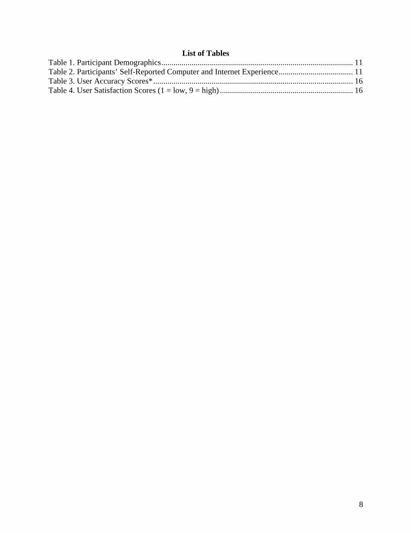
List of Tables Table 1. Participant Demographics............................................................................................... 11 Table 2. Participants’ Self-Reported Computer and Internet Experience..................................... 11 Table 3. User Accuracy Scores*................................................................................................... 16 Table 4. User Satisfaction Scores (1 = low, 9 = high) .................................................................. 16
9
A Usability Evaluation of Iteration 1 of the New American FactFinder Web Site: Conceptual Design
1.0 Introduction The American FactFinder (AFF) is a free online tool that allows users to find, customize and download data on the population and economy of the United States. AFF is available to the public, and a multitude of diverse users search the site for a vast range of information. Since AFF is undergoing a major redesign, a series of usability tests was planned in October 2008 to test successive iterations of the Web site as well as to gather baseline usability data on the current AFF site. The first usability test, Iteration 1, was a low-fidelity usability test of a conceptual design represented solely on paper. This report specifies the methods that the Statistical Research Division (SRD) used in evaluating the usability of the conceptual design of Iteration 1 of the new AFF Web site. The report also documents the results of the testing, recommendations made by the usability analysts, and the design team’s responses to the recommendations. The testing specified here evaluates the user-interface of the new Web site developed by International Business Machines (IBM) and Roundarch by examining the success, satisfaction and understanding of the site by the test participants, as measured by their performance. Participants attempted to complete tasks supported by the Web site but developed specifically for the usability test. The evaluation identifies design features that support user success (accuracy and efficiency) and satisfaction.
1.1 Background The user-interface is an important element to the design of a Web site. For a Web site to be successful, the user-interface must meet the needs of its users in an efficient, effective, and satisfying way. It is the job of the user-interface to provide cues and affordances that allow users to get started quickly and to find what they are looking for with ease. While the existing AFF Web site houses a massive amount of data, users encounter great difficulty accessing the information. Common complaints emailed to the Census Bureau about the current site include the annoyance of needing to start over for each custom table when making more than one; discrepancies in data and the inability to compare data side by side; data that are not easily accessible, and errors when users download data. In a recent “pop-up window” survey administered online to users of the AFF Web site, complaints were of the same nature. Suggestions from the survey include, but are not limited to, the following: add custom tabulation functions and downloadable raw datasets; add the ability to extract data across Census years for specific population groups; have access to more data and earlier data; incorporate a drag-and-drop method to compare data; add a “Select All” and “Deselect All” option for variables when creating tables; allow comparisons across time periods; link with other data, such as economic data; support easier download (to Excel); allow the user to display and download multiple years of data; add more thematic maps; start with a map to locate state information; add a searchable interface for datasets only; have better naming conventions for tables; and make it more “user-friendly” (i.e., more usable). The new AFF Web site attempts to relieve these issues. The new bookmarking, presentation and navigation functionalities, as well as new data services, user activity services, logging and

10
shopping cart services are being designed with the intention of making the user experience easier, more efficient and more satisfying. This usability test examines the conceptual design of the user-interface of the new AFF Web site, which is scheduled to launch sometime in 2011 or 2012. Users of the Web site must be able to successfully navigate throughout the interface to find the appropriate information in an efficient and effective manner. The user experience should be satisfying in that the user gains a sense of competency or mastery from using the software. Seven participants were tested between October 23 and October 28, 2008. A brief report was prepared for and disseminated to the client on November 10, 2008. Members of SRD’s Usability Lab met with members of the Data Access and Dissemination System Office (DADSO) and IBM on December 12, 2008 to discuss findings and recommendations. Responses from DADSO and IBM to the recommendations provided by SRD are included in this report following each item. See Appendix A for the paper prototypes of the version tested and Appendix B for screen shots of the updated version.
1.2 Purpose The primary purpose of usability testing is to identify elements of the user-interface design that are problematic and lead to ineffective, inefficient and unsatisfying experiences for people using the Web site. The purpose of the first low-fidelity iteration usability test is to test the conceptual design of the new Web site from the user’s perspective.
1.3 Usability Goals The usability goals for this study are to identify the users’ expectations and logic as they attempt to find information. The main goal is to examine the compatibility of the design concepts, also known as the designer’s conceptual or mental model of the product, with that of the users’ (Rubin, 1994). Through low-fidelity testing, we gain an understanding of whether users intuitively grasp the concepts of the new AFF Web site and understand the Web site’s capabilities. Typically, in high-fidelity usability testing, quantitative goals (e.g., percent accurate and time to complete tasks) are established. Since this usability study took place in the preliminary stages of the Web site design, these types of goals were not established. Instead, the goal was to examine the users’ logic and expectations of the conceptual design of the site.
1.4 Assumptions • Participants were external, non-federal employees who were recruited via the SRD
Usability Lab database. • Participants had at least one year of prior Internet and computer experience. • Participants had prior knowledge of how to navigate a Web site. • Participants did not have extensive prior experience using the AFF Web site. • Participants had no known disabilities.
2.0 Method This usability test is an early exploratory test of the new AFF Web site. Preliminary paper versions of the interface and supporting materials (i.e., pages that a user would typically arrive at

11
upon clicking on a link) were used. Members of the IBM team developed the paper prototypes that were used in this study. See Appendix A. The participants used the paper prototypes to “walk through” tasks that were given to them by the test administrator. The tasks were designed to expose test participants to the new “look and feel” of the product without leading them in a step-by-step fashion.
2.1 Participants and Observers Seven participants were recruited externally through a database maintained by the Usability Lab. Each test participant had at least one year of prior experience in navigating different Web sites and did not have prior experience using the AFF Web site. Observers from DADSO were invited to watch the usability tests on television screens in a separate room. Prior to beginning the tasks, participants were briefly informed about the purpose of the study and the uses of the data to be collected during the study. At the end of each test session, the test administrator and observers had the opportunity to discuss the findings from that session and compared them to findings from other sessions. See Table 1 for participant demographics and Table 2 for participants’ self-reported computer and Internet experience. Table 1. Participant Demographics
Gender Age Education Male 5 < 30 2 HS, GED 1 Female 2 31-45 1 Some college, AA 2 46-60 3 Bachelor’s 3 61+ 1 Master’s + 1 Mean = 44.86 years Mean = 15.43 years
Table 2. Participants’ Self-Reported Computer and Internet Experience
Scale: 1:No Experience -
9:Very Experienced Scale: 1:Not Comfortable - 5:Comfortable Scale: 1:Never - 5:Very Often
Participant
Hours per day on the
Internet
Overall experience
with computers
Overall experience
with Internet
Comfort in
learning to
navigate new Web
sites
Comfort in manipulating
a window
Comfort in using and navigating the Internet
How often working with data through a computer
How often working
with complex analyses of data
through a computer
How often using the
Internet or Web sites to
find information
1 5 6 7 5 5 5 5 5 5
2 7 8 8 5 5 5 5 3 5
3 2 8 8 4 4 4 4 3 5
4 7 6 7 5 5 5 5 3 5
5 2 5 5 3 3 3 1 1 3
6 5 7 7 4 4 4 4 3 5
7 2 8 8 5 5 5 5 3 5 Average across
participants 4.29 6.86 7.14 4.43 4.43 4.43 4.14 3.00 4.71

12
2.2 Facilities and Equipment
2.2.1 Testing Facilities Testing took place at the Usability Lab (Room 5K509) at the Census Bureau in Suitland, MD. The participant sat at a table in a small room beside the test administrator.
2.2.2 Audio and Video Recording Two video cameras were used. The overhead camera recorded the paper prototypes and the participant’s handling of the material, such as pointing to specific boxes and areas. The wall-mounted camera recorded the participant’s face. Video was fed through a PC Video Hyperconverter Gold Scan Converter, mixed in a picture-in-picture format with the camera video, and recorded via a Sony DSR-20 digital Videocassette Recorder on 124-minute, Sony PDV metal-evaporated digital videocassette tape. Audio for the videotape was picked up from one desk microphone located close to the participant and one ceiling microphone. The audio sources were mixed in a Shure audio system to eliminate feedback, and then they were fed to the videocassette recorder.
2.3 Materials
2.3.1 General Introduction The test administrator read some background material and explained several key points about the session. A key purpose of the introduction was for the participant to understand that he or she was assisting in the evaluation. That is, we tested the user interface; we did not test the participant. See Appendix C.
2.3.2 Consent Form Prior to beginning the usability test, the participant completed a consent form. See Appendix D.
2.3.3 Questionnaire on Computer Use and Internet Experience Prior to the usability test, the participant completed a questionnaire on his or her computer use and Internet experience. See Appendix E.
2.3.4 Tasks and Task-based Goals Working collaboratively, members of IBM, the DADSO team and the SRD Usability Lab created the tasks. The tasks were designed to capture the participant’s interaction with and reactions to the design and functionality of the AFF Web site prototype. Each task established a target outcome for the user but did not tell the user how to reach the target. See Appendix F.
2.3.5 Post-Task Questions After each task question, the test administrator probed the participant to gain a greater understanding of the participant’s thoughts and logic for that task. See Appendix G.
2.3.6 Satisfaction Questionnaire Upon completion of all tasks, the participant filled out the satisfaction questionnaire. See Appendix H.

13
2.3.7 Debriefing Questionnaire Upon completion of the satisfaction questionnaire, the participant answered debriefing questions about his/her experience using the AFF Web site prototype. See Appendix I.
2.3.8 Payment Voucher Upon completion, the participant signed and dated a payment voucher. See Appendix J.
2.4 Procedure The participant reported to the usability lab at the U.S. Census Bureau. Upon arriving, the participant was seated in the testing room. The test administrator greeted the participant and read the general introduction (Appendix C). Next, the participant read and signed the consent form (Appendix D). After signing the consent form, the participant completed the questionnaire on computer use and Internet experience. Video recording began and the participant then began the AFF prototype tasks (Appendix F). Each session took approximately one hour to complete. Each participant received an honorarium of $40 for assisting in the research.
2.4.1 Part 1: Conceptual Approach First, participants began with the blank prototype page and answered probing questions about their initial thoughts about how to attempt the following task:
What percent of the population in California and Texas were White and college educated in 2006? Is there a way to visualize this information? See Appendix K.
The goal of this approach was to get the participant to articulate their understanding of the logic of the task and to articulate how they would approach it, conceptually. We wanted to extract the user’s concept of the task and how they would complete the task (i.e. their mental model), before showing any design concepts.
2.4.2 Part 2: Task Completion The test administrator guided the participant to the first task question, and the next part of the session began. Each participant began with task 1. Tasks 2 through 5 were search-related tasks and were administered after the completion of task 1. The remaining tasks, the results-related tasks, were administered third. For each task, the test administrator gave the participant the task question and set up the paper prototypes for that task. The participant read each task aloud and discussed step-by-step what they would do to complete the task if the prototype were actually a working Web site. The test administrator probed the participant on each task to gain more information about the participant’s thoughts about the Web site and its ideal functionality. During each task, the test administrator noted any behaviors that indicated confusion, such as hesitation and frowning. At the conclusion of each task, the test administrator asked probing questions about the task and the site. See Appendix G.
2.4.3 Part 3: Additional Probes After completing all tasks, the test administrator probed the participant about specific parts of the Web site prototype, such as Help icons, the QuickView area, the Name dropdown box, the Finder/Map dropdown box, and the My Workspace area, and asked debriefing questions about the Web site as a whole. See Appendix I. These items were discussed at the end to avoid

14
interfering with the natural thought processes of the users during the testing. At the conclusion of the debriefing, the video recording was stopped. Overall, each usability session ran about 60 minutes.
2.5 Performance Measurement Methods In this report, we document the reactions that the participants reported about the new AFF Web site, based on their experience with the paper prototype. We report the exact routes they took to complete each task (both before and after seeing the design concept), their responses to the test administrator probes and if their performance showed whether the Web site was intuitive and useful.
2.5.1 Accuracy After each participant completed a task, the test administrator rated that task as a success or a failure. In the context of usability testing, successful completion of a task means that the design supported the user in reaching a goal. Failure means that the design did not support task completion. A successful task involved the test participant successfully navigating the user interface to identify the correct piece of information on the Web site based on the task objective. If the participant struggled to find the information, but eventually arrived at the correct response, this was marked as a success. A failure was recorded when the user interface presented obstacles to the participant’s attempts to identify the correct piece of information. The average accuracy score is divided into two different means: (1) accuracy across the participants and (2) accuracy across the tasks.
2.5.2 Satisfaction After completing the usability test, each participant indicated his/her satisfaction with the Web site using the tailored, ten-item Satisfaction Survey (Appendix H). For example, participants were asked to rate their overall reaction to the site by circling a number from 1 to 9, with 1 being the lowest possible rating and 9 the highest possible rating. From the Satisfaction Survey data, we report ranges and mean scale values for the various rated attributes of the Web site. We also identify below-mean values, which indicate that problems exist even when the overall mean is acceptable or better.
2.5.3 Identifying and Prioritizing Usability Problems To identify design elements that caused participants to have problems completing the task objectives, the test administrator recorded detailed notes during the usability sessions. To reinforce those notes, the test administrator used the videotape recordings to refresh memory and to confirm findings. By noting participant behavior and comments, the test administrator, in cooperation with additional usability staff members, inferred the likely design element that caused the participant to experience difficulties. The usability issues were grouped into categories based on priority:
• High Priority – These problems bring the test participant to a standstill. He or she is not able to complete the task.
• Medium Priority – These problems cause some difficulty or confusion, but the test participant is able to complete the task.
15
• Low Priority – These problems cause minor annoyances but do not interfere with the flow of the tasks.
3.0 Results, Recommendations, and Team Responses Based on Usability Testing Results from the usability testing are discussed below. The quantitative data and usability findings are presented. Recommendations follow the findings, and the team response (decision) rounds out the documentation of each result.
3.1 Participant Accuracy The overall accuracy score was 40 percent. Accuracy scores ranged from zero to 82 percent across users and from zero to 71 percent across tasks. It appears that participants struggled the most with tasks 2 and 3. See Table 3 for user accuracy scores and Appendix F for the complete tasks.
3.2 User Satisfaction The average satisfaction score was 4.79 (standard deviation = 1.80), which is below the mid-point of the scale. None of the satisfaction question means achieved a score higher than 5.57, while one individual rating was as low as 1, and some individual participant ratings were as low as 2 and 3. Ratings below the mid-point of the scale indicate difficulties that may affect other users. See Table 4 for mean and standard deviation user satisfaction ratings and Appendix H for the complete Satisfaction Questionnaire.
3.3 Positive Findings 1. Most users saw the Address tab and said they would click on it to search for an address. See Figure 1. 2. When probed about not knowing where a state was in the U.S., most users said they would go to the Map tab and type in the state name. See Figure 1. 3. Most users understood how to click on a box, or uncheck a box to deselect it (Topics section on lower right side of screen in Define Search; see Figure 1). 4. Sans serif font is used throughout the Web site, making it more readable than a site using a serif font.

Table 3. User Accuracy Scores*
Tasks*
Participant 1 2 3 4 5 6a 6b 6c 6d 6e 6f
Overall Success
Rate 1 Success Failure Failure Success Success Success Success Failure Success Success Success 73% 2 Success Failure Failure Failure Failure Success Failure Failure Failure Failure Failure 18% 3 Failure Failure Failure Failure Failure Failure Failure Failure Failure Failure Failure 0% 4 Failure Failure Failure Failure Success Failure Failure Success Failure Success Failure 27% 5 Failure Failure Failure Failure Failure Failure Failure Success Success Success Failure 27% 6 Success Failure Success Failure Success Failure Success Failure Failure Success Success 55% 7 Success Failure Failure Success Success Success Success Success Success Success Success 82%
Success by Task 57% 0% 14% 29% 57% 43% 43% 43% 43% 71% 43% 40%
*Note: A task was considered a success when a user was able to complete it up to the point determined by DADSO and the Usability Lab prior to usability testing. If this round of testing had been on the live Web site, some users might have completed tasks successfully once computer feedback was/was not received.
Table 4. User Satisfaction Scores (1 = low, 9 = high)
Satisfaction Survey Items
Participant
Overall reaction to
site: terrible - wonderful
Screen layouts:
confusing - clear
Use of terminology throughout
site: inconsistent -
consistent
Information displayed on the screens: inadequate -
adequate
Arrangement of information on the screens:
logical - illogical
Tasks can be
performed in a
straight-forward manner: never - always
Organization of information
on the site: confusing -
clear
Forward navigation: impossible
- easy
Overall experience of finding
information: difficult -
easy
Census Bureau specific
terminology: too frequent - appropriate
Mean (and Standard Deviation)
Satisfaction Rating by
Participant
1 7 5 3 7 7 6 5 5 6 3 5.40 (1.51) 2 3 3 5 3 6 3 3 3 3 5 3.70 (1.16) 3 7 7 8 7 5 6 7 7 7 7 6.80 (0.79) 4 4 3 4 4 6 2 3 4 3 2 3.50 (1.18) 5 7 7 7 7 7 5 5 5 5 5 6.00 (1.05) 6 5 3 3 2 3 5 4 4 5 4 3.80 (1.03) 7 6 7 7 8 3 3 3 2 3 1 4.30 (2.45)
Mean (and Standard Deviation)Rating by Question
5.57 (1.62)
5.00 (2.00)
5.29 (2.06)
5.43 (2.37)
5.29 (1.70)
4.29 (1.60)
4.29 (1.50)
4.29 (1.60)
4.58 (1.62)
3.86 (2.04)
4.79 (1.80)

Users understood how to click on boxes to select and unselect them.
Figure 1. Screen shot of the tested version of the Web site with positive areas noted.
3.4 Usability Problems Reasons for the performance deficits are discussed in the list of usability violations that follows. The usability problems are prioritized from high to low in terms of their effect on participant performance. The usability issues deal primarily with lack of useful guidance for the user and overwhelming information throughout the site. Fixing the high and medium priority problems as they occur throughout the Web site should result in improvement in the participants’ performance using the Web site and should also improve satisfaction.
3.4.1 High-Priority Usability Problems Testing identified seven high-priority usability issues, listed below. Additional usability issues follow. 1. An overarching problem with both of the pages we tested (the Select/Define Search page and the initial Results page), was that there was no direct, useful guidance displayed about what the user needed to do. A. Select/Define Search page: There was initial confusion on whether the geography and topic sections (to define search) worked together. Five of the seven users were initially confused about whether the two sections (to select the geography and to select topics) actually
18
Users were confused about whether the two sections worked together.
went together. One user never really understood that the two were connected at all. All other users eventually understood that the two sections were connected, but most mentioned that they would like it to be more obvious. The black vertical line that currently is in between the two sections does not tell the user anything, and actually gives the illusion that the sections are not joined (see Figure 2). Best designs are intriguing and draw attention to the actual data or the means by which to obtain data (Tufte, 1983). Extra lines on the page take away from the important elements of the Web site design.
Figure 2. Screen shot of the tested version of the Web site with usability problem areas noted. None of the users clicked Show Results during the initial task. Most expected results once they clicked on Look Up. Some later saw Show Results during debriefing or after probing by the Test Administrator (TA) and said they would also click that. One user mentioned that having both a Look Up button and a Show Results button implies that the two sections are separate. Later he decided that they work together and did the geography lookup first; he then followed up with a topic selection, saying he would click Show Results. He said that he expected results on the topics he had selected for the specific geographies he had looked up. So his actions and comments showed that he did understand the design, but it was not immediately clear to him what action to take. One user did not choose more than one topic item at a time on the right panel and said, “There is nothing here that says that I can choose more than one at a time.”
None of the users said they would click on Show Results.
19
This wording in the small print needs to be modified to work for the user. See recommendations in Finding 2.
One user understood how to add a geography; however, when she wanted to add a topic she thought she would type “commercial bakeries” in either the name lookup box (not correct), the Quick Views section (not correct), or the top navigation search input box (correct). She did not mention clicking the green Show Results button. On the next task, this user expected the information on the topic to immediately pop up once she had clicked on the term. Again, she missed the Show Results button. In the Geography section, most users selected one state at a time and then went back and repeated all the steps for the second state. Users did not know what the icons on the map page represented. They wanted a key that explained what the tools on the map did or the ability to hover over the icons to get definitions. Recommendation: To demonstrate that the two sections work together, make the black section above both sections stretch across the entire page. Eliminate the black vertical line that is between the two sections. Add “and/or” in between the two sections. Add instructions, emphasizing the user’s actions, on how to use these sections. In the fine print below “Choose your geography,” have explicit instructions about how/what users can select. Keep headings simple, beginning with user actions. For example, change “What geographies do you want information about?” to “Choose your geography” or “Choose your location.” Change the icons in the Map tab to icons that are familiar to the average user or change them to words (IT Standard 15.0.2 states that developers should avoid non-standard icons which can be ambiguous or confusing to users). See Figure 3 for a conceptual design based on these recommendations. In the geography section, add instructions telling users that they can select more than one geography at a time (e.g., “Select all areas/locations that you want information on” or “Choose your geography/locations”).
Figure 3. Define Your Collection section with modified recommendations to show users that the two sections work together and to clarify what each part does. Recommended changes are circled.
20
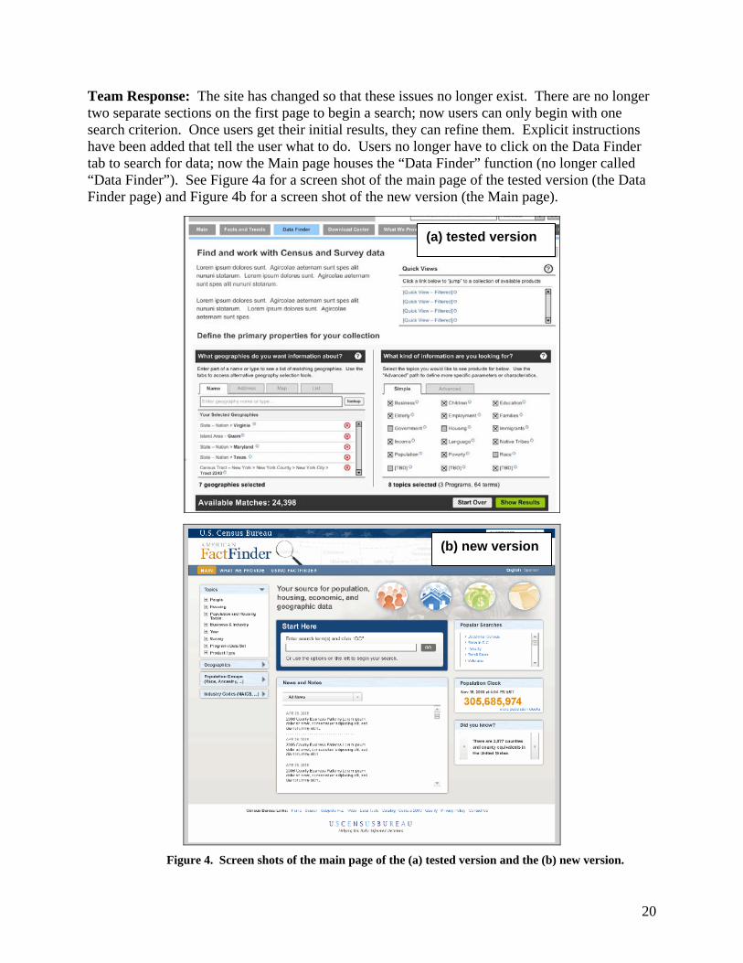
Team Response: The site has changed so that these issues no longer exist. There are no longer two separate sections on the first page to begin a search; now users can only begin with one search criterion. Once users get their initial results, they can refine them. Explicit instructions have been added that tell the user what to do. Users no longer have to click on the Data Finder tab to search for data; now the Main page houses the “Data Finder” function (no longer called “Data Finder”). See Figure 4a for a screen shot of the main page of the tested version (the Data Finder page) and Figure 4b for a screen shot of the new version (the Main page).
Figure 4. Screen shots of the main page of the (a) tested version and the (b) new version.
(a) tested version
(b) new version

21
B. The Advanced tab on the Select/Define page: The Advanced tab did not work well for half of the users who saw and tried to use the tab. Three of the seven users did not go into the “Advanced” tab on their own. Of the four who did, two were successful and two were confused by what they saw. Users said they were confused by the terminology (e.g., “program,” “attributes,” “characteristics”) as well as what they were supposed to do on the page. One user saw the confusing words (i.e., program names) and layout in the “Advanced” tab and immediately clicked back to the “Simple” tab, even though she was not confident that she could find Commercial Bakeries under the more general topic “Business.” Users said that it was not clear to users what was meant by codes. In addition, "attributes" and "characteristics" do not have much distinction or context for the user and are jargon terms. A standard dictionary defines attributes as “characteristics” and characteristics as “attributes.” Trying to force a distinction between these vague, abstract terms imposes a cognitive burden on the user. Recommendation: Change the label “simple” to “basic” or change the label “advanced” to “complex”; “simple” and “advanced” are not on the same scale. Minimize the program names so users are not immediately confronted with program information that they don’t understand. Re-word the instructions so a user is guided on what they are supposed to do under the advanced tab. For example, change “Limit search to specific programs” to “Refine search to specific census or surveys.” Modify the sentence "Limit search to industries, characteristics, attributes, and codes" to "Refine search by adding industry, features and/or NAICS codes." If NAICS are the only code the user could type in, it should read “NAICS” rather than “codes,” and NAICS should be defined somewhere. See Figure 3 for recommended changes. Team Response: See Response from Item A above. This issue no longer exists due to the new design. With the new design, users refine their search using the blue filters on the left side of the screen. “Simple” and “Advanced” options are no longer segregated. See Figure 4. C. The Results page was overwhelming with too much information and no clear direction on what users were supposed to do to understand, interpret and act on the information they were looking at. There is a lot of information on the page and, as it stands, the page is overloaded, causing users not to know where to direct their attention. See Figure 5. There is not enough “white space” on the page. White space allows the user’s attention to be directed to critical regions of the display (Mullet & Sano, 1995, p.126), while clutter decreases the usability of a page (Lazar, 2001, p.156). Furthermore, since people can only process a limited number of items in their short-term memory, having all of the information on the screen at once, does not help, but rather overloads and confuses the user (Baddeley, 1990; Lazar, 2001, p.156). Much information can be condensed allowing for more white space and instruction. Organizing choices into categories can assist users in finding what they are looking for in an efficient manner. Three users specifically said that there was too much going on and too many options. One user said, “I’m trying to look at too much information,” and “There is nothing to explain it.” Another user said, “The page is confusing.” And still another user said that the page was “a little overwhelming” and that she did not understand “some of the terminology” (e.g., “nativity” in a product title confused her). Four users specifically said that they would have liked some content-specific help and instruction on the page. One user was confused about why “view, download, [and] bookmark” were highlighted.
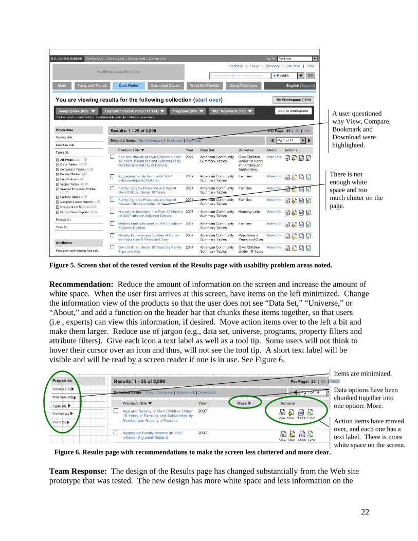
22
Figure 5. Screen shot of the tested version of the Results page with usability problem areas noted. Recommendation: Reduce the amount of information on the screen and increase the amount of white space. When the user first arrives at this screen, have items on the left minimized. Change the information view of the products so that the user does not see “Data Set,” “Universe,” or “About,” and add a function on the header bar that chunks these items together, so that users (i.e., experts) can view this information, if desired. Move action items over to the left a bit and make them larger. Reduce use of jargon (e.g., data set, universe, programs, property filters and attribute filters). Give each icon a text label as well as a tool tip. Some users will not think to hover their cursor over an icon and thus, will not see the tool tip. A short text label will be visible and will be read by a screen reader if one is in use. See Figure 6.
Figure 6. Results page with recommendations to make the screen less cluttered and more clear. Team Response: The design of the Results page has changed substantially from the Web site prototype that was tested. The new design has more white space and less information on the
There is not enough white space and too much clutter on the page.
A user questioned why View, Compare, Bookmark and Download were highlighted.
Items are minimized.
Data options have been chunked together into one option: More.
Action items have moved over, and each one has a text label. There is more white space on the screen.
23
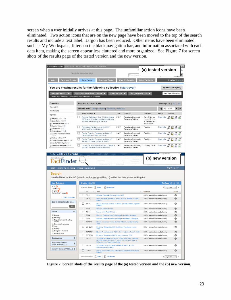
screen when a user initially arrives at this page. The unfamiliar action icons have been eliminated. Two action icons that are on the new page have been moved to the top of the search results and include a text label. Jargon has been reduced. Other items have been eliminated, such as My Workspace, filters on the black navigation bar, and information associated with each data item, making the screen appear less cluttered and more organized. See Figure 7 for screen shots of the results page of the tested version and the new version.
Figure 7. Screen shots of the results page of the (a) tested version and the (b) new version.
(a) tested version
(b) new version

24
2. Census Jargon (e.g., “products,” “properties,” “collections,” “attributes,” etc.) and poorly worded statements confuse users. Throughout the two pages tested, all seven users had trouble understanding Census-specific jargon and poorly worded statements. For example, the phrase “Select the topics you would like to see products for below” on the first tested page should be rewritten. It is not clear what “below” modifies. Does it modify “see,” as in “see below,” or does it modify “Select the topics” as in “Select the topics…below”? The phrase “topics you would like to see products for” is made up of a main noun (topics) and then a string of words that modifies that noun: “you would like to see products for.” This word order requires repeated reading to figure out what the instruction is saying. Words at the end of a phrase are fixated on longer than the same words in the middle of a phrase (Forsythe, Grose, & Ratner, 1998, p.37); therefore, phrases should be short and concise so that the user's action does not get lost in the phrase. It would be better to say “Select topics and get results below.” The word “products” is not clear. It conjures up images of cleaning products, groceries, or items produced by manufacturers. The normal user does not associate the word “product” with a data table or a document. This is Census jargon. One user specifically said, “I don’t know what a product is.” Another user said, “Is disability or elderly a product?” One user said, “My collection…is that my searches?” The word “collection” is a metaphor being imposed on the Web site’s content by the designers. It is not the user’s metaphor or way of looking at the content. For the user to understand the metaphor, it will need to be introduced and explained somewhere early in the user’s experience with the site. One user felt it would be better to say “Define your search criteria” instead of “Define the primary property for your collection.” The terms “property” and “collection” are extremely abstract and vague. In addition, under Attributes (on the left of the screen), some items include “characteristics” in their names. This adds to the confusion. In the Advanced tab, “programs,” “characteristics,” “attributes,” “codes,” and “terms” were not familiar terminology. Most users said they were confused by these terms and did not know what they meant. In Results, one user did not understand “subject tables” and “detailed tables.” Two users did not understand “universe.” One user thought the label Name meant for her to type in a person’s name and search information on that individual name. Novice users may interpret “Name” to mean an individual’s name and may try to search for personal information--which the Census Bureau never gives out. Recommendation: Reduce jargon. Use plain language that the average person uses. For example, “Save” has more meaning than “Add to Workspace.” Change the word “product” to a more simple term, such as “information,” which conveys the same meaning but isn’t as awkward for people who don’t know Census jargon. “Select the topics you would like to see products for below” could be simplified to “Select topics you would like information about” or simply “Choose your topics.” “Define the primary properties for your collection” can be reworded to “Define your search criteria.” See Figure 1.
25
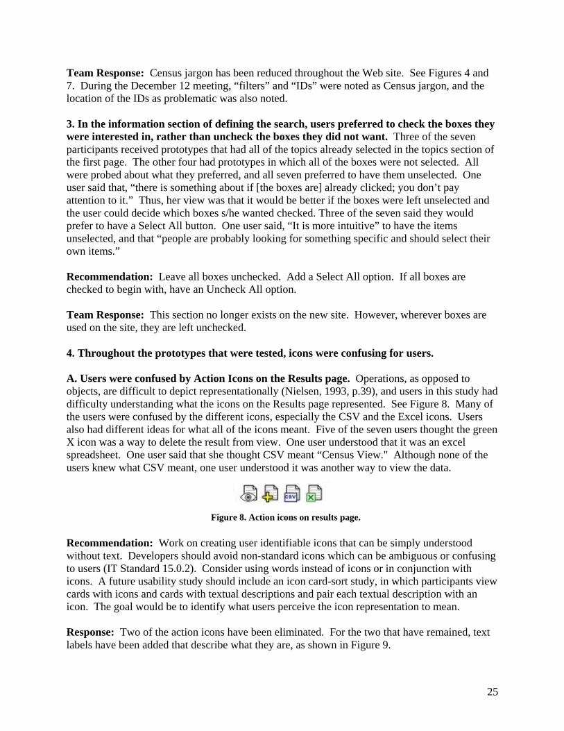
Team Response: Census jargon has been reduced throughout the Web site. See Figures 4 and 7. During the December 12 meeting, “filters” and “IDs” were noted as Census jargon, and the location of the IDs as problematic was also noted. 3. In the information section of defining the search, users preferred to check the boxes they were interested in, rather than uncheck the boxes they did not want. Three of the seven participants received prototypes that had all of the topics already selected in the topics section of the first page. The other four had prototypes in which all of the boxes were not selected. All were probed about what they preferred, and all seven preferred to have them unselected. One user said that, “there is something about if [the boxes are] already clicked; you don’t pay attention to it.” Thus, her view was that it would be better if the boxes were left unselected and the user could decide which boxes s/he wanted checked. Three of the seven said they would prefer to have a Select All button. One user said, “It is more intuitive” to have the items unselected, and that “people are probably looking for something specific and should select their own items.” Recommendation: Leave all boxes unchecked. Add a Select All option. If all boxes are checked to begin with, have an Uncheck All option. Team Response: This section no longer exists on the new site. However, wherever boxes are used on the site, they are left unchecked. 4. Throughout the prototypes that were tested, icons were confusing for users. A. Users were confused by Action Icons on the Results page. Operations, as opposed to objects, are difficult to depict representationally (Nielsen, 1993, p.39), and users in this study had difficulty understanding what the icons on the Results page represented. See Figure 8. Many of the users were confused by the different icons, especially the CSV and the Excel icons. Users also had different ideas for what all of the icons meant. Five of the seven users thought the green X icon was a way to delete the result from view. One user understood that it was an excel spreadsheet. One user said that she thought CSV meant “Census View." Although none of the users knew what CSV meant, one user understood it was another way to view the data.
Figure 8. Action icons on results page. Recommendation: Work on creating user identifiable icons that can be simply understood without text. Developers should avoid non-standard icons which can be ambiguous or confusing to users (IT Standard 15.0.2). Consider using words instead of icons or in conjunction with icons. A future usability study should include an icon card-sort study, in which participants view cards with icons and cards with textual descriptions and pair each textual description with an icon. The goal would be to identify what users perceive the icon representation to mean. Response: Two of the action icons have been eliminated. For the two that have remained, text labels have been added that describe what they are, as shown in Figure 9.
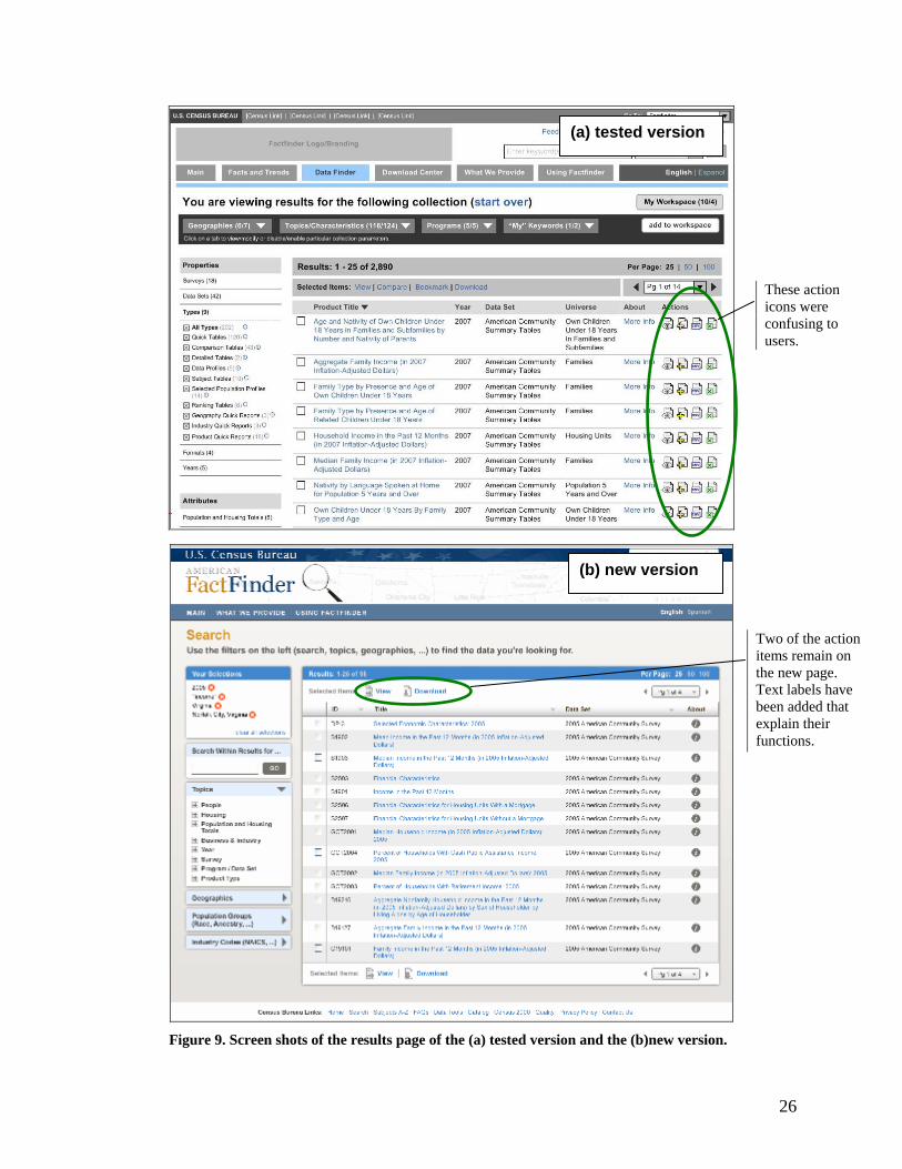
26
Figure 9. Screen shots of the results page of the (a) tested version and the (b)new version.
Two of the action items remain on the new page. Text labels have been added that explain their functions.
These action icons were confusing to users.
(a) tested version
(b) new version

27
B. Red X within the red circle ( ) to delete geography was not intuitive for users. Throughout the two pages we tested, this icon caused confusion to all users. In the Define Search section, one user thought that by clicking on it by CA, it would take her to information for CA. One user thought it looked like an error message. In the Results section, one user thought that by clicking on it, she would actually select a state instead of deleting it. One user said she would click on it to get more information to appear about the geography. One user felt it was confusing to see the red X within the red circle and the black X within the black box on the same line and wasn’t sure which to use. Recommendation: Instead of having both the red X within the red circle on the right to delete an item and the black X within the black box on the left to select an item, change the red X within the red circle to read “remove.” See Figure 1 for an example of the word “Remove” instead of the icon for the Define Search section. Response: The black boxes with a black X in them have been eliminated from the site. The red Xs within the circles have been moved directly next to the word that they are paired with. See Figure 10.
Figure 10. Screen shots of the problematic Xs of the (a) tested version and the (b) new version.
Having both X options on the screen confused users.
In the new design, the black boxes with the black X have been eliminated. The red circles with the red X have been moved directly next to the item they serve.
(a) tested version
(b) new version

28
5. Users were confused with the functionality of My Workspace and initially did not understand how to save their search criteria. Users tend to use previous knowledge to make inferences and expectations about the physical world (Forsythe, Grose & Ratner, 1998, p.27). Since other Web sites use login names and passwords to access saved data/items, users expect that. Four of the seven users in this study expected to need a login name and password to access saved items and searches. Some users questioned “My” in “My Keywords” and “My Workspace” and thought that it inferred some sort of login and password. Some users expected “download” and “bookmark” to download or bookmark everything, without having selected any specific items. Most users looked for a “Save” button and/or an area to save their searches. Users had a variety of ways that they expected their searches to be saved. See Appendix L for details on each user for each task that involved the save functions. One user said that a tab that said “My Searches” or “My Search Results” would be straightforward; another said that "Saved Searches” or “Save Search” would be clearer than “My Workspace”. When prompted to only keep three results, most users understood that they needed to select the three items by checking the box in front of the items; however, users were unclear about what to do next. By task 6e, most users had seen or been encouraged by the test administrator to open “My Workspace.” However, users were often confused by exactly what they needed to do once in the Workspace area. Furthermore, most users were confused by where exactly items and searches would be stored. Recommendation: Change My Workspace to “Saved Searches/Workspace.” Change Add to Workspace to “Save to Workspace.” Add a Help button in Workspace that tells the steps users must take in order to get searches and individual items saved into the workspace. Another help feature could include content-sensitive pop-up help. For example, if users must make some action before proceeding, such as checking a box of one of the results, tell users in a pop-up instruction what action they need to make. See Figure 3 for an example of some of these changes on a screen shot of the results page. Response: Changes to My Workspace have been postponed. My Workspace will be tested in future iterations. 6. It was not immediately clear that users needed to go into the Geography tab to make changes to the current geographical selection. In addition, there was no indication on the page which geographies were actually included in the results. Three of the seven users went to the Geographies tab first, without being prompted by the test administrator. The other four users did not go into the Geographies tab at all or only went in after the test administrator prodded them to try other routes. Initially, one user thought she could go to “Geography Quick Reports” which has a number 3 next to it. She interpreted the number to mean one spreadsheet had information on CA, one on TX and one spreadsheet had information on both states together. She also thought she might be able to highlight CA from there.

29
One user said initially to view results with CA that she would go into the search at the top and type in CA (correct though not the ideal path using the Geography tab). Alternatively she would click into the Geography Quick Reports, on the far left. Finally after probing by the test administrator, she said she would click on the Geographies tab and then click on the red X within the red circle to select CA. Two users said they would go back to the previous page and unselect TX and resubmit the search. One user said, “It would help if one of the menu items at the top said ‘states you have selected.’” On another task related to the results page, a user asked “Am I in California?” The user continued, “I am not sure.” Once in the Geographies tab, some users were confused with what action to take to only have one state in their results. Most users thought initially about highlighting or selecting California, rather than deleting or deselecting Texas. Recommendation: List the geography or geographies somewhere highly visible on the results page so that it is clear which geographies are represented in the results list. For example, next to Results, add a line that says “Geographies: (list of geographies included in results).” Change “Click on a tab to view/modify or disable/enable particular collection parameters” to “Refine your search.” Make it larger and more visible. Consider changing “Geographies” to “Locations” or “Locations/Geographies.” See Figure 11 for an example. Response: Geographies are now shown with other filter options in Your Selections, which is a highly visible area above the filters on the left side of the screen. See Figure 12.
Figure 11. Results page with circled recommendations to clarify Geographies, Search tabs and Workspace.
Figure 12. Screen shot of the new version of the Web site, with highly visible Geography selection.
In the new design, Geographies are listed, with filters, on the left.
30
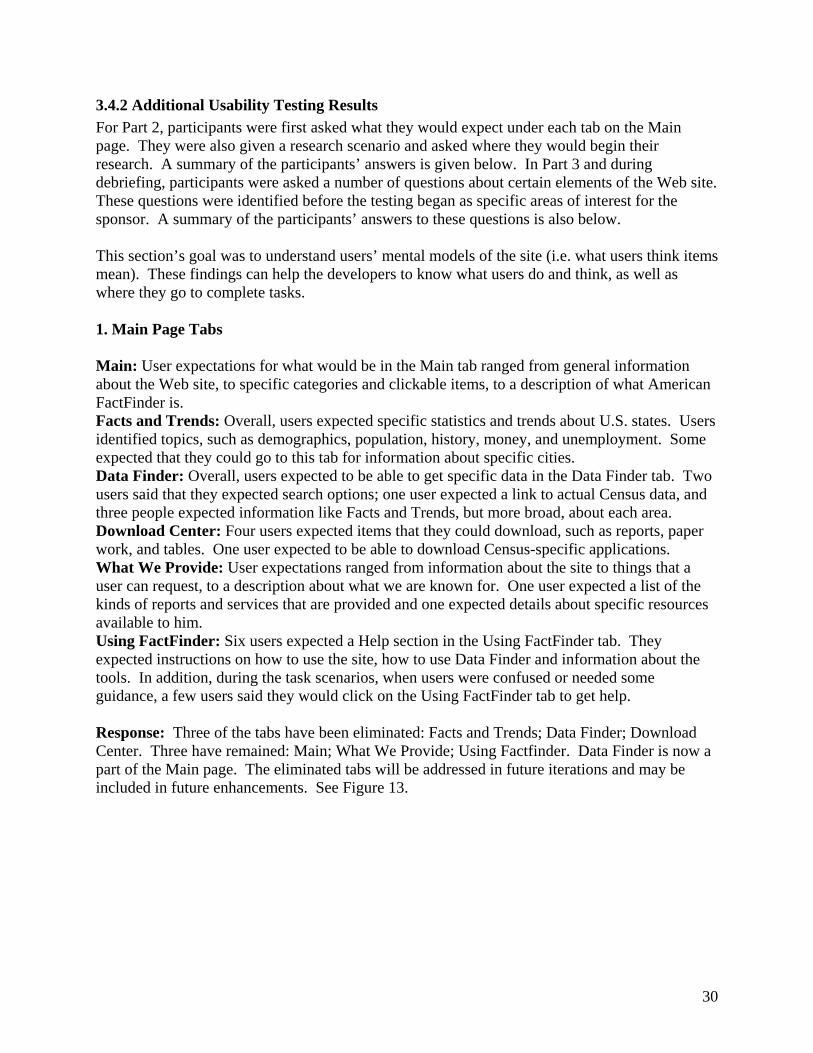
3.4.2 Additional Usability Testing Results For Part 2, participants were first asked what they would expect under each tab on the Main page. They were also given a research scenario and asked where they would begin their research. A summary of the participants’ answers is given below. In Part 3 and during debriefing, participants were asked a number of questions about certain elements of the Web site. These questions were identified before the testing began as specific areas of interest for the sponsor. A summary of the participants’ answers to these questions is also below. This section’s goal was to understand users’ mental models of the site (i.e. what users think items mean). These findings can help the developers to know what users do and think, as well as where they go to complete tasks. 1. Main Page Tabs Main: User expectations for what would be in the Main tab ranged from general information about the Web site, to specific categories and clickable items, to a description of what American FactFinder is. Facts and Trends: Overall, users expected specific statistics and trends about U.S. states. Users identified topics, such as demographics, population, history, money, and unemployment. Some expected that they could go to this tab for information about specific cities. Data Finder: Overall, users expected to be able to get specific data in the Data Finder tab. Two users said that they expected search options; one user expected a link to actual Census data, and three people expected information like Facts and Trends, but more broad, about each area. Download Center: Four users expected items that they could download, such as reports, paper work, and tables. One user expected to be able to download Census-specific applications. What We Provide: User expectations ranged from information about the site to things that a user can request, to a description about what we are known for. One user expected a list of the kinds of reports and services that are provided and one expected details about specific resources available to him. Using FactFinder: Six users expected a Help section in the Using FactFinder tab. They expected instructions on how to use the site, how to use Data Finder and information about the tools. In addition, during the task scenarios, when users were confused or needed some guidance, a few users said they would click on the Using FactFinder tab to get help. Response: Three of the tabs have been eliminated: Facts and Trends; Data Finder; Download Center. Three have remained: Main; What We Provide; Using Factfinder. Data Finder is now a part of the Main page. The eliminated tabs will be addressed in future iterations and may be included in future enhancements. See Figure 13.
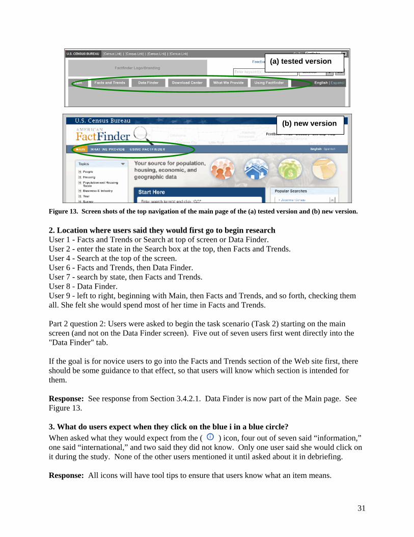
31
Figure 13. Screen shots of the top navigation of the main page of the (a) tested version and (b) new version. 2. Location where users said they would first go to begin research User 1 - Facts and Trends or Search at top of screen or Data Finder. User 2 - enter the state in the Search box at the top, then Facts and Trends. User 4 - Search at the top of the screen. User 6 - Facts and Trends, then Data Finder. User 7 - search by state, then Facts and Trends. User 8 - Data Finder. User 9 - left to right, beginning with Main, then Facts and Trends, and so forth, checking them all. She felt she would spend most of her time in Facts and Trends. Part 2 question 2: Users were asked to begin the task scenario (Task 2) starting on the main screen (and not on the Data Finder screen). Five out of seven users first went directly into the "Data Finder" tab. If the goal is for novice users to go into the Facts and Trends section of the Web site first, there should be some guidance to that effect, so that users will know which section is intended for them. Response: See response from Section 3.4.2.1. Data Finder is now part of the Main page. See Figure 13. 3. What do users expect when they click on the blue i in a blue circle? When asked what they would expect from the ( ) icon, four out of seven said “information,” one said “international,” and two said they did not know. Only one user said she would click on it during the study. None of the other users mentioned it until asked about it in debriefing. Response: All icons will have tool tips to ensure that users know what an item means.
(a) tested version
(b) new version
32
4. What do users expect when they click on the white ? in a black circle?
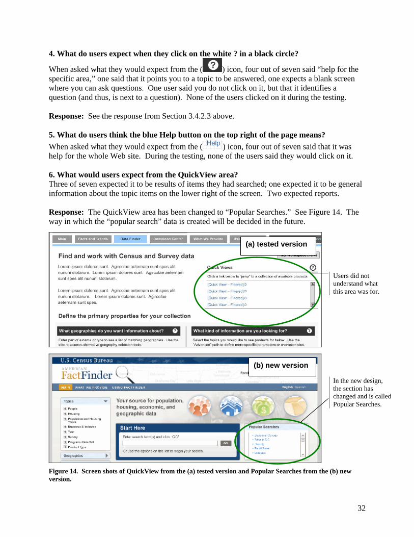
When asked what they would expect from the ( ) icon, four out of seven said “help for the specific area,” one said that it points you to a topic to be answered, one expects a blank screen where you can ask questions. One user said you do not click on it, but that it identifies a question (and thus, is next to a question). None of the users clicked on it during the testing. Response: See the response from Section 3.4.2.3 above. 5. What do users think the blue Help button on the top right of the page means? When asked what they would expect from the ( ) icon, four out of seven said that it was help for the whole Web site. During the testing, none of the users said they would click on it. 6. What would users expect from the QuickView area? Three of seven expected it to be results of items they had searched; one expected it to be general information about the topic items on the lower right of the screen. Two expected reports. Response: The QuickView area has been changed to “Popular Searches.” See Figure 14. The way in which the “popular search” data is created will be decided in the future.
Figure 14. Screen shots of QuickView from the (a) tested version and Popular Searches from the (b) new version.
Users did not understand what this area was for.
In the new design, the section has changed and is called Popular Searches.
(b) new version
(a) tested version

33
7. What does “Available Matches” mean to users? Three out of seven expected the number to be associated with how many items fit their search criteria. They wanted to refine their search to make the number smaller. One user thought it was the number of times other people had asked for similar information. Team Response: Available Matches are no longer relevant and have been eliminated from the new design.
4.0 Limitations We recognize that low-fidelity usability testing reduces realism, but the benefits outweigh the costs. In a number of studies, it has been shown that paper prototyping and low-fidelity iterative prototyping uncover problems just as high-fidelity usability testing does (Catani & Biers, 1998; Novick, 2000; Virzi, Sokolov & Karis, 1996). With paper-prototyping, the usability lab at the Census Bureau has been able to identify areas where the technical communication of information to the public falters, while at the same time offering suggestions on how to improve the communication of information. Thus, in the case of the redesign of the AFF Web site, lab members, working together with the re-design team, proposed conducting a series of usability tests, which would test successive iterations of the site as they were developed.
5.0 Conclusions Overall, users struggled with the American FactFinder Web site. To most users, the Define Search page was confusing, and the Results page was both confusing and overwhelming. Many recommendations that were provided in the Quick Report were implemented, along with several other major changes to the Web site. Participants in this usability study were diverse in age, education and comfort with Web sites and the Internet. Individuals who were more comfortable with the Internet and had higher education were likely to understand the site better than those who were at a more novice level. Future usability testing on the site should aim to include a diverse sample of both novices and experts. Future usability testing will include functional testing of the Visual Design of Iteration 1. The next round of testing will use a slightly higher fidelity screen and will include some clickable elements.
34
6.0 References Catani, M. B. & Biers, D. W. (1998). “Usability evaluation and prototype fidelity: User and usability professionals.” In Proceedings of the Human Factors and Ergonomics Society 42nd Annual Meeting, 1331-1335. Santa Monica, CA: HFES. Baddeley, A. (1990). Human Memory: Theory and Practice. Boston: Allyn and Bacon. Forsyth, C., Grose, E., & Ratner, J. (1998). Human Factors and Web Development. Mahwah, NJ: Erlbaum. Lazar, J. (2001). User-Centered Web Development. Sudbury, MA: Joans and Bartlett. Mullet, K., & Sano, D. (1995). Designing Visual Interfaces: Communication Oriented Techniques. Upper Saddle River, NJ: Sunsoft Press. Nielsen, J. (1993). Usability Engineering. San Diego, CA: Academic Press. Novick, D.G. (2000). “Testing documentation with ‘low-tech’: simulation. In Proceedings of the IEEE Professional Communication Society International Professional Communication Conference, 55-68. New York, NY: IEEE. Tufte, E. R. (1983). The Visual Display of Quantitative Information. Cheshire, CT: Graphics Press. Virzi, R.A., Soklov, J.L., & Karis, D. (1996). “Usability Problem Identification Using Both Low- and High-Fidelity Prototypes.” In Proceedings of Conference on Human Factors in Computing Systems: CHI’96: 236-43. New York, NY: ACM Press.
35
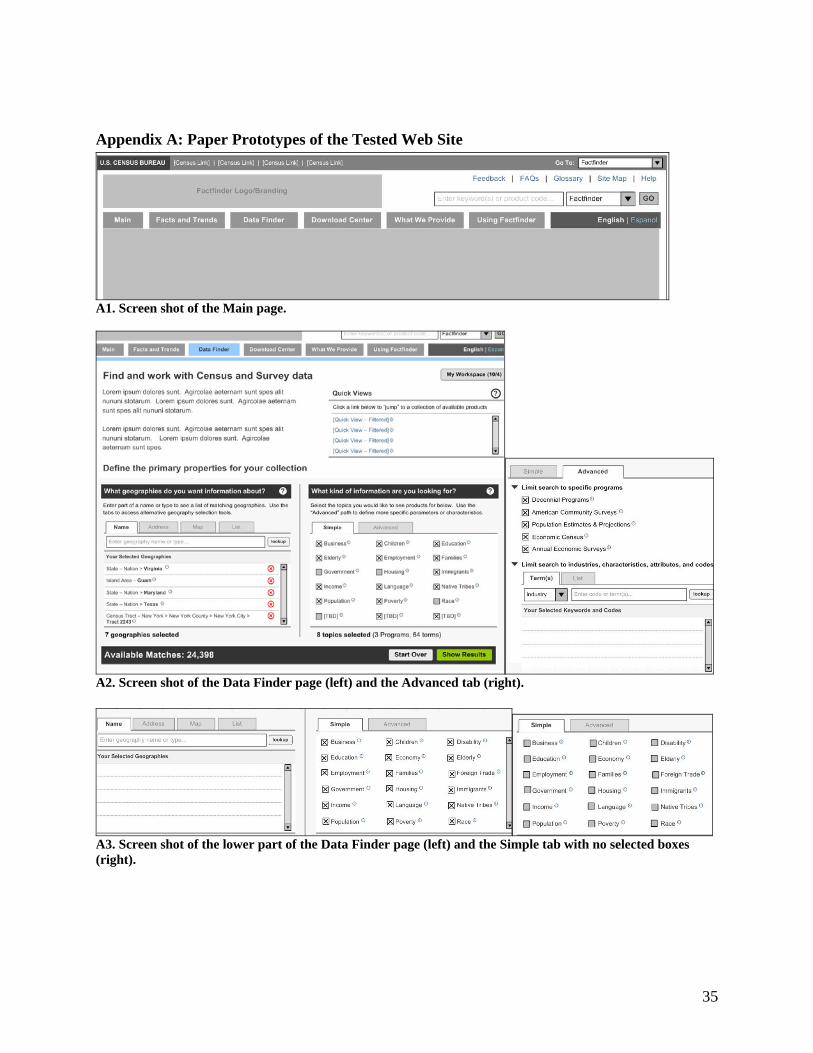
Appendix A: Paper Prototypes of the Tested Web Site
A1. Screen shot of the Main page.
A2. Screen shot of the Data Finder page (left) and the Advanced tab (right).
A3. Screen shot of the lower part of the Data Finder page (left) and the Simple tab with no selected boxes (right).
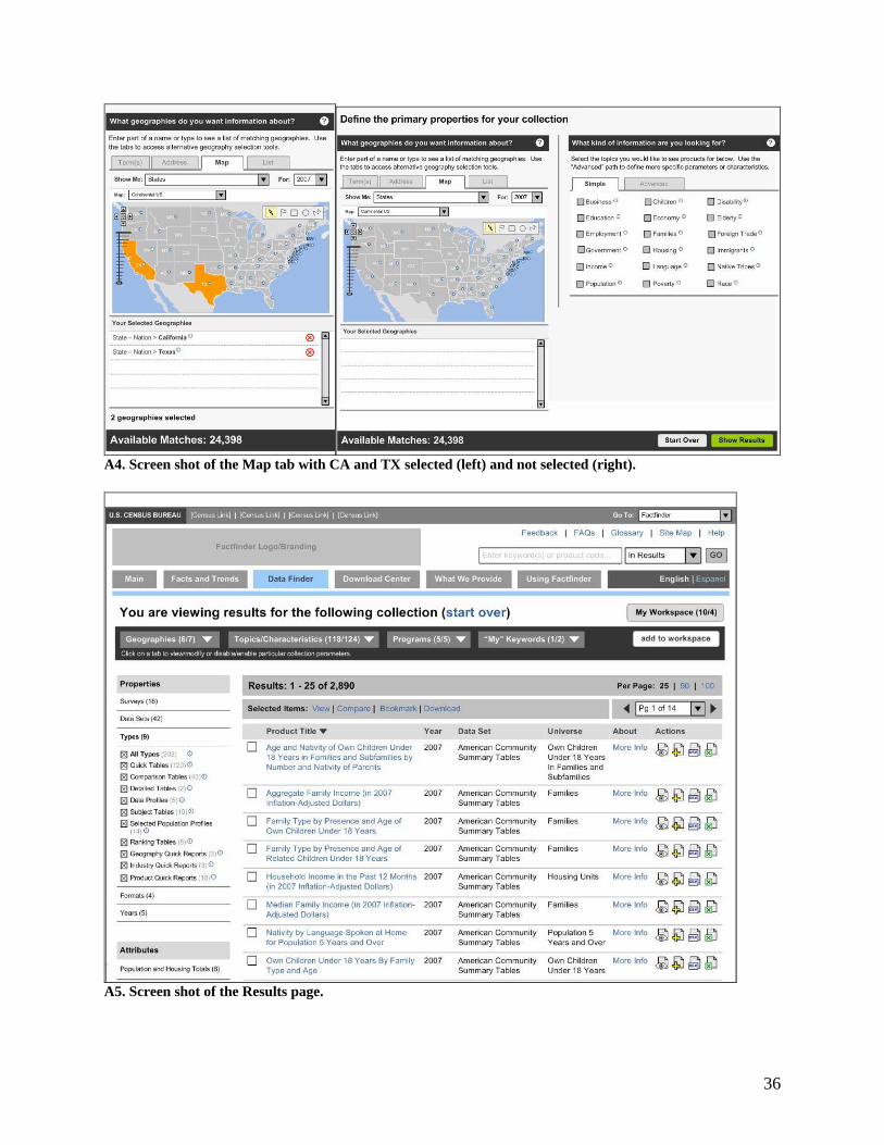
36
A4. Screen shot of the Map tab with CA and TX selected (left) and not selected (right).
A5. Screen shot of the Results page.
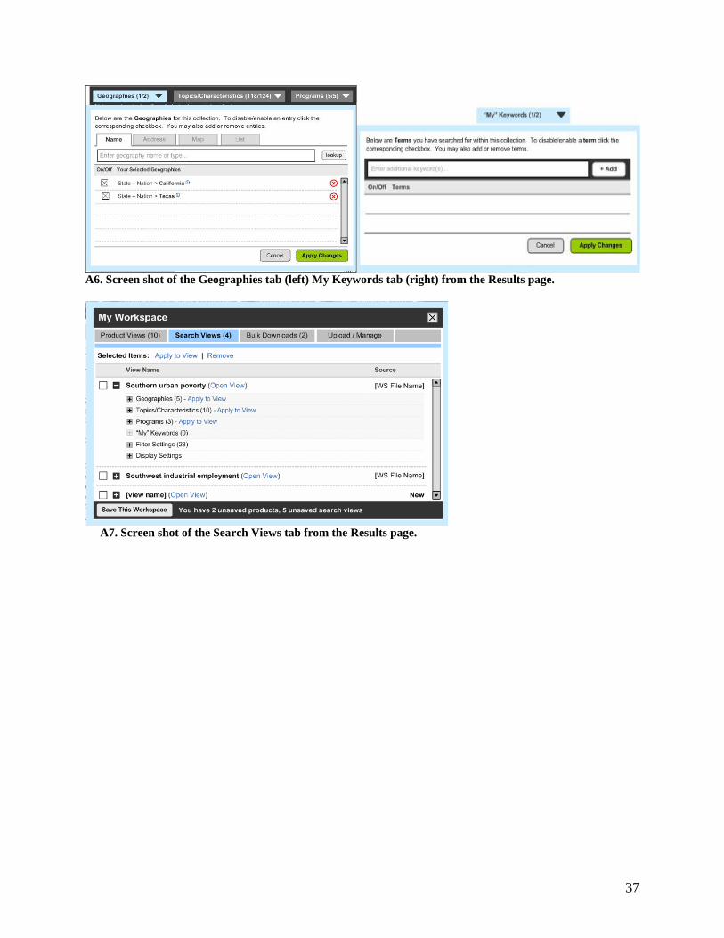
37
A6. Screen shot of the Geographies tab (left) My Keywords tab (right) from the Results page.
A7. Screen shot of the Search Views tab from the Results page.

38
Appendix B: Screen Shots of the New Web Site
B1. Screen shot of the Main page; replaced A1 and A2 in Appendix A.
B2. Screen shot of the Results page; replaced A5 in Appendix A.
39
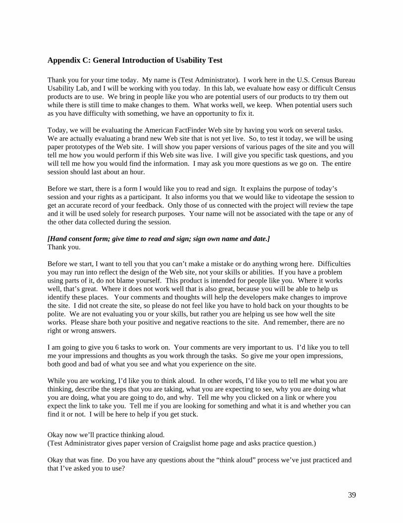
Appendix C: General Introduction of Usability Test Thank you for your time today. My name is (Test Administrator). I work here in the U.S. Census Bureau Usability Lab, and I will be working with you today. In this lab, we evaluate how easy or difficult Census products are to use. We bring in people like you who are potential users of our products to try them out while there is still time to make changes to them. What works well, we keep. When potential users such as you have difficulty with something, we have an opportunity to fix it. Today, we will be evaluating the American FactFinder Web site by having you work on several tasks. We are actually evaluating a brand new Web site that is not yet live. So, to test it today, we will be using paper prototypes of the Web site. I will show you paper versions of various pages of the site and you will tell me how you would perform if this Web site was live. I will give you specific task questions, and you will tell me how you would find the information. I may ask you more questions as we go on. The entire session should last about an hour. Before we start, there is a form I would like you to read and sign. It explains the purpose of today’s session and your rights as a participant. It also informs you that we would like to videotape the session to get an accurate record of your feedback. Only those of us connected with the project will review the tape and it will be used solely for research purposes. Your name will not be associated with the tape or any of the other data collected during the session. [Hand consent form; give time to read and sign; sign own name and date.] Thank you. Before we start, I want to tell you that you can’t make a mistake or do anything wrong here. Difficulties you may run into reflect the design of the Web site, not your skills or abilities. If you have a problem using parts of it, do not blame yourself. This product is intended for people like you. Where it works well, that’s great. Where it does not work well that is also great, because you will be able to help us identify these places. Your comments and thoughts will help the developers make changes to improve the site. I did not create the site, so please do not feel like you have to hold back on your thoughts to be polite. We are not evaluating you or your skills, but rather you are helping us see how well the site works. Please share both your positive and negative reactions to the site. And remember, there are no right or wrong answers. I am going to give you 6 tasks to work on. Your comments are very important to us. I’d like you to tell me your impressions and thoughts as you work through the tasks. So give me your open impressions, both good and bad of what you see and what you experience on the site. While you are working, I’d like you to think aloud. In other words, I’d like you to tell me what you are thinking, describe the steps that you are taking, what you are expecting to see, why you are doing what you are doing, what you are going to do, and why. Tell me why you clicked on a link or where you expect the link to take you. Tell me if you are looking for something and what it is and whether you can find it or not. I will be here to help if you get stuck.
Okay now we’ll practice thinking aloud. (Test Administrator gives paper version of Craigslist home page and asks practice question.) Okay that was fine. Do you have any questions about the “think aloud” process we’ve just practiced and that I’ve asked you to use?

40
Appendix D: Consent Form
Consent Form
For Individual Participants
Usability Testing of the American FactFinder Web Site Each year the Census Bureau conducts many different usability evaluations. For example, the Census Bureau routinely tests the wording, layout and behavior of products, such as Web sites and online surveys and questionnaires in order to obtain the best information possible. You have volunteered to take part in a study to improve the usability of the American FactFinder Web site. In order to have a complete record of your comments, your usability session will be videotaped. We plan to use the tapes to improve the design of the product. Only staff directly involved in the research project will have access to the tapes. Your participation is voluntary and your answers will remain strictly confidential. This usability study is being conducted under the authority of Title 13 USC. The OMB control number for this study is 0607-0725. This valid approval number legally certifies this information collection. I have volunteered to participate in this Census Bureau usability study, and I give permission for my tapes to be used for the purposes stated above. Participant’s Name: ______________________________________ Participant's Signature: ____________________________________ Date: __________ Researcher’s Name: _____________________________________ Researcher's Signature: ___________________________________ Date: __________

41
Appendix E: Questionnaire on Computer Use and Internet Experience 1. Do you use a computer at home or at work or both? (Check all that apply.) ___Home ___Work 2. If you have a computer at home,
a. What kind of modem do you use at home? ___Dial up ___Cable ___Other __________ ___Don’t know
b. Which browser do you typically use at home? Please indicate the version if you can recall it. ___Firefox
___Internet Explorer ___Netscape ___Other ___________
___Don’t know c. What operating system does your home computer run in? ___MAC OS ___Windows 95 ___Windows 2000 ___Windows XP ___Windows Vista ___Other ___________ ___Don’t know
3. On average, about how many hours do you spend on the Internet per day? ___0 hours
___1-3 hours ___4-6 hours
___7or more hours 4. Please rate your overall experience with the following: Circle one number. No experience Very experienced
Computers 1 2 3 4 5 6 7 8 9
Internet 1 2 4 5 5 6 7 8 9
42
5. What computer applications do you use? Mark (X) for all that apply
___ E-mail ___ Internet ___ Word processing (MS-Word, WordPerfect, etc.) ___ Spreadsheets (Excel, Lotus, Quattro, etc.) ___ Accounting or tax software ___ Engineering, scientific, or statistical software ___ Other applications, please specify____________________________
For the following questions, please circle one number. 6. How comfortable are you in learning to navigate new Web sites?
Not Comfortable Comfortable 1 2 3 4 5
7. Computer windows can minimize, resize, and scroll through. How comfortable are you in manipulating a window? 8. How comfortable are you using and navigating through the Internet? 9. How often do you work with any type of data through a computer? 10. How often do you perform complex analyses of data through a computer? 11. How often do you use the Internet or Web sites to find information? (e.g., printed reports, news articles, data tables, blogs, etc.) 12. How familiar are you with the Census (terms, data, etc)? 13. How familiar are you with the current Economic Census Web site (terms, data, etc.)?
1 2 3 4 5 1 2 3 4 5
Never Very Often 1 2 3 4 5 1 2 3 4 5 1 2 3 4 5
Not familiar Very familiar
1 2 3 4 5 1 2 3 4 5

43
Appendix F: Task List
1. Let us imagine that you are thinking about moving to Maryland or Virginia and you want to do extensive research on those areas before moving. Your friend recommended this American FactFinder site to you. Here is the Main page.
a. What do you expect when you click on each of these (top navigation buttons)? b. How would you begin your research?
2. You are interested in finding out information about your sister’s neighborhood. You
want to get as much information as you can about her home and the area that she lives in. She lives at 4237 Peapod Lane, Fairfax, VA, 22030. How would you find all the available information about her neighborhood?
3. What percent of the population in California and Texas were White and college educated
in 2006? Is there a way to visualize this information?
4. You are thinking about opening a bakery and want to know how much money commercial bakeries make in California and Texas. How would you find this information?
5. You want to find out as much information as possible in California and Texas before you
move there. Specifically, you are interested in the following: bilingual areas, including bilingual schools for your children; senior centers for your mother; the areas that are wealthy and the areas that are not; the areas that are family-friendly; where you would do your shopping. How would you find this information?
6. So now, here are your results. You looked for as much information as possible in
California and Texas. Specifically, you looked at a number of topics, including education, income, population, children, families, language, poverty, and elderly.
a. You decide that there is just way too much information here and you want to
narrow your results to just California. What would you do? b. You want to change some search options to find different information but you do
not want to lose these search results. What would you do?
c. You only want to keep 3 of these results. What would you do?
d. Now you want information specifically about older immigrants in California. What would you do next?
e. Now you want to go back to your original search. Where would you go to find
that information?

44
7. Now you decide that it is late and you want to go home. But you plan to come back tomorrow and know you will want to access the same exact search results. What would you do?
45
Appendix G: Post-Task Questions for Iteration 1 Usability Test
1. How easy or difficult was it to work on the task, overall?
Very Easy Very Difficult 1 2 3 4 5 6 7 8 9 10
2. Can you tell me something more about your experience with the task and the prototype? 3. (For task 3 and/or 5) Would you have preferred to check all the relevant boxes or
uncheck all the irrelevant boxes? (Explain) If Results was “clicked”, ask what they expect. How would results be organized? How would the get the proper (year)?
46
Appendix H: Satisfaction Questionnaire Please circle the numbers that most appropriately reflect your impressions about using this Web -based instrument.
terrible wonderful 1. Overall reaction to the Web site: 1 2 3 4 5 6 7 8 9 not applicable
confusing clear 2. Screen layouts: 1 2 3 4 5 6 7 8 9 not applicable
inconsistent consistent 3. Use of terminology throughout the Web
site: 1 2 3 4 5 6 7 8 9 not applicable
inadequate adequate 4. Information displayed on the screens: 1 2 3 4 5 6 7 8 9 not applicable
logical illogical 5. Arrangement of information on the
screen: 1 2 3 4 5 6 7 8 9 not applicable
never always 6. Tasks can be performed in a straight-
forward manner: 1 2 3 4 5 6 7 8 9 not applicable
confusing clear 7. Organization of information on the site: 1 2 3 4 5 6 7 8 9 not applicable
impossible easy 8. Forward navigation: 1 2 3 4 5 6 7 8 9 not applicable
difficult easy 9. Overall experience of finding information: 1 2 3 4 5 6 7 8 9 not applicable
too frequent appropriate 10. Census Bureau-specific terminology: 1 2 3 4 5 6 7 8 9
Additional Comments:

47
Appendix I: Debriefing Questionnaire for Iteration 1 Usability Test If during the session, participant does not “use” the following functions, ask these accordingly. 1. Let us imagine that you are using this Web site, and you arrived at this page and are unsure what the term “Business” encompasses (Test Administrator: point to “Business” on Main page prototype). How would you find out what it means? (This is a probe for the Info icons referenced below.)
2. What do you think this (point to “i” in circle) means? Would you ever use it? 3. What do you think this (point to “?” in circle) means? Would you ever use it? 4. What do you think this (point to Help button on top right) means? Would you ever use it? 5. (Point to QuickView area.) What would you expect if you clicked on this? Would you ever use it?
6. (Point to the Available Matches on the lower left side.) What does this mean to you? Is it useful? Would you ever use it?

48
7. (Point to the Action items on the right- excel, eye, etc.) What would you expect if you clicked on these items? Would you ever use them?
8. What did you like best about the prototype? 9. What did you like least about the prototype? 10. Is there anything that you feel should be changed? 11. Is there anything that you feel should stay the same? 12. How easy or difficult do you feel it was to work on the tasks? What made a task easy or difficult? 13. Is there anything you would like to mention that we have not talked about? 14. (TA: Refer to Part 1, when P first looked at prototype and said what they would do to answer Question 3). Talk about what they said they would do and what they actually did for the task. How do they feel about it? What do they think about it? Did the user interface behave how the participant would have expected it to? 15. (TA: Refer back to tasks that they took a different/wrong route. Ask what they would do if they had seen the proper way. Use back of this page if needed.) 16. Additional Comments:

49
Appendix J: Pay Voucher
50
Appendix K: Probing Questions For Strategy to Begin What is their strategy for Question 3? What part of the task do they hone in on? What is their logic? Do not show any of the materials yet. Note what they say, then bring it back in debriefing. See debriefing page, Q15.
Q3. What is the percent of the total population who were White and college educated in 2006 in the United States? In Virginia, Kansas, Maryland and Texas? Is there a way to visualize this information graphically?
Based on this task, what do you think you would need to do to begin finding the information you are looking for? What would you first look for? What would your strategy be in order to find the answer?
What would you do to begin looking for the information? What would you look for first? Tell me a little bit about your strategy to find the answers. How you would go about finding this information. What would your strategy be?
51
Appendix L: Users Responses to Search-Related Probes Task 6B. “You want to change your search options but do not want to lose these results.” - User 1 and 2 chose download, but thought it would download spreadsheets (User 1) or “the whole page” (User 2) to the desktop. Both then changed their minds to Bookmark but was not sure where it would go. They were looking for an area to save searches. User 2 then said she would go to Help in the Search box at the top and type in a question and hit Go. - User 7 said she would click My Workspace and then Add to Workspace. It was not clear which order would work for what she was being asked to do. The user said she would like to save and looked for terminology that said “save.” - Users 8 and 9 said they would click on Add to Workspace or Bookmark. Both expected to either have to give it a name, or that a name would be provided that they would type in later to retrieve it, “like a temporary file.” - User 6 went right into My Workspace (without selecting anything) and expected that all her searches would be in there. She wanted something that said “Save Search.” - User 4 said she would use a thumb drive to save. - User 1 recommended using more straight forward wording on a tab, such as “My Searches” or “My Search Results.” - User 9 there were no other buttons on the page that would work, but that “Saved Searches” or “Save Search” would be clearer than “My Workspace”. - User 2 said, “There is not enough information…nothing here says what My Workspace is.” Task 6C. “You only want to keep 3 of these results.” - User 1 would click on the box in front of those 3 and view them. It wasn’t clear how he could get rid of the rest so he would just view the 3 individually. - User 7 would check My Workspace first. He didn’t find what he was looking for, so then he checked the boxes in front of each of the 3 items and then clicked Add to Workspace. - User 9 checked the boxes in front of the items and then clicked Bookmark, expecting them to go to My Workspace. - User 8 said she would click on all the ones she did not want and click on the green x icon. When asked what she would do if there were 2,000 results, she said she would look for a Select All button, click on that, then unselect the ones she wanted to keep, and then look for a button that said Delete All and delete all that were checked. - User 6 would select the 3 items then hover over the icons on the right to see if one was applicable. - User 4 would save them on her thumb drive. - User 2 said she would check the boxes in front of the 3 items then look for an update button. She would expect a prompt after selecting the items. She said maybe she would click on the green x icon but maybe they would be deleted. Task 6E. “You want to access the original search that you saved/bookmarked.” - Users 1, 6, 7, 8 and 9 would click on My Workspace and would find the original search in Search Views. User 7 said she did not know what each of the headings meant. Users 8 and 9 would click Apply to View to open it.
52
- User 4 would go to Bookmark and would expect a list of pages visited. He said Bookmark would work in a similar way to a browser history. He would look for saved pages there. - User 2 said she had downloaded into her documents so she would look in her documents. She said, “If I knew what My Workspace was, I’d go there, but I don’t know what it is.” - User 6 mentioned that it is only near the end of the session that she has a better understanding of what My Workspace is. She wanted a more straight forward way to save searches. Task 6F. “You want to access the same search results tomorrow.” - “My” seemed to imply that users needed a log in and password. Users 1, 8 and 9 thought that to retrieve their search they had to have a login and password. - User 1, 6, 8 and 9 would go into My Workspace and then click Save This Workspace. Users 1, 8 and 9 expected it to be saved on the site and to need a log in to retrieve it later. User 8 said that if it didn’t work, she would go to Using AFF and expect instructions on how to save data and come back to it another time. User 9 said she might try Upload/Manage and expect it to upload to a database where she would need a log in and password. She said, “It seems typical. Most sites ask you to register with a name and password.” - User 7 would click Bookmark and expected that the whole page would be bookmarked in My Workspace. She expected to have to give it a title and that it would go onto the hard drive. - User 4 expected to download to a disk or thumb drive. - User 2 would select each one and Bookmark. She expected them to go to My Workspace. She wasn’t sure where they would go and said she would go to Help at the top and type Save Search Results and follow the instructions.