Embed Size (px)
Citation preview
Active Traffic Management Case Study: Phase 1
Final Report


Technical Report Documentation Page
1. Report No.
SPR-P1(14) M007
2. Government Accession No.
3. Recipient's Catalog No.
4. Title and Subtitle
Active Traffic Management Case Study: Phase 1
5. Report Date
March 2016
6. Performing Organization Code
7. Author(s)
Anuj Sharma, Shuo Wang, and Aemal Khattak
8. Performing Organization Report No.
SPR-P1(14) M007
9. Performing Organization Name and Address
Iowa State University for University of Nebraska-Lincoln
527 Nebraska Hall
PO Box 830851
Lincoln, NE 68588-0529
10. Work Unit No. (TRAIS)
11. Contract or Grant No.
12. Sponsoring Agency Name and Address
Nebraska Department of Roads
1500 Hwy. 2
Lincoln, NE 68502
13. Type of Report and Period Covered
August 2013 – December 2015
14. Sponsoring Agency Code
15. Supplementary Notes
16. Abstract
This study developed a systematic approach for using data from multiple sources to provide active traffic management
solutions. The feasibility of two active traffic management solutions is analyzed in this report: ramp-metering and real-time
crash risk estimation and prediction. Using a combined dataset containing traffic, weather, and crash data, this study
assessed crash likelihood on urban freeways and evaluated the economic feasibility of providing a ramp metering solution.
A case study of freeway segments in Omaha, Nebraska, was conducted. The impact of rain, snow, congestion, and other
factors on crash risk was analyzed using a binary probit model, and one of the major findings from the sensitivity analysis
was that a one-mile-per-hour increase in speed is associated with a 7.5% decrease in crash risk.
FREEVAL was used to analyze the economic feasibility of the ramp metering implementation strategy. A case study of a
6.3 mile segment on I-80 near downtown Omaha showed that, after applying ramp metering, travel time decreased from
9.3 minutes to 8.1 minutes and crash risk decreased by 37.5% during the rush hours. The benefits of reducing travel time
and crash cost can easily offset the cost of implementing ramp metering for this road section.
The results from the real-time crash risk prediction models developed for the studied road section are promising. A
sensitivity analysis was conducted on different models and different temporal and spatial windows to estimate/predict crash
risk. An adaptive boosting (AdaBoost) model using a 10 minute historical window of speeds obtained from 0.25 miles
downstream and 0.75 miles upstream was found to be the most accurate estimator of crash risk.
17. Key Words
active traffic management, crash risk, ramp metering
18. Distribution Statement
19. Security Classif. (of this report)
Unclassified
20. Security Classif. (of this page)
Unclassified
21. No. of Pages
70
22. Price


Active Traffic Management Case Study: Phase 1
Final Report
Anuj Sharma, PhD
Research Scientist and Associate Professor
Center for Transportation Research and Education
Institute for Transportation
Iowa State University
Shuo Wang, MS
Graduate Research Assistant
Civil, Construction, and Environmental Engineering
Iowa State University
Aemal Khattak, PhD
Associate Professor
Civil Engineering
University of Nebraska-Lincoln
A Report on Research Sponsored by
Nebraska Department of Roads
March 2016

v
Table of Contents
DISCLAIMER ............................................................................................................................... ix
EXECUTIVE SUMMARY .............................................................................................................x
1. INTRODUCTION .......................................................................................................................1
2. LITERATURE REVIEW ............................................................................................................3
2.1 Aggregate-Level Crash Model ..........................................................................................3 2.2 Disaggregate Level Crash Model......................................................................................4 2.3 Classification with Imbalanced Data ................................................................................7
3. DATABASE DEVELOPMENT ................................................................................................10
3.1 Road Network .................................................................................................................10
3.2 Data Description .............................................................................................................10 3.3 Data Integration ..............................................................................................................11
3.4 Data Processing Platform ................................................................................................11
4. EXPLORATORY DATA ANALYSIS .....................................................................................13
4.1 Data Visualization – Traffic Speed Heat Maps ..............................................................13 4.2 Speed, Weather, and Crashes ..........................................................................................15
5. CRASH RISK ASSESSMENT .................................................................................................18
5.1 Correlation among Crashes, Speed, and Weather Conditions ........................................18 5.2 Crash Risk Modeling and Sensitivity Analysis ..............................................................20
6. TRAFFIC PERFORMANCE MEASURE AND BOTTLENECK IDENTIFICATION...........24
6.1 Speed Based Performance Measure ................................................................................24
6.2 Bottlenecks on the Omaha Urban Freeway System ........................................................27
7. EVALUATING THE IMPACTS OF RAMP METERING ......................................................34
7.1 Modeling the Bottleneck Segment ..................................................................................34 7.2 Speed to Volume Conversion and Model Validation .....................................................35 7.3 Ramp Metering Evaluation .............................................................................................37
7.4 Cost-Benefit Analysis .....................................................................................................39
8. CRASH ESTIMATION/PREDICTION AND POTENTIAL APPLICATIONS ......................41
8.1 Crash Estimation/Prediction Using a Single Speed Variable .........................................41
8.2 Crash Estimation Using Multiple Speed Variables ........................................................42
8.2.1 Data Structure, Window Selection, and Distinction ..............................................43
8.2.2 Resampling ............................................................................................................45
8.2.3 Modeling Algorithms and AdaBoost .....................................................................45
8.2.4 Model Performance Metric ....................................................................................45
8.2.5 Model Comparison.................................................................................................46
8.2.6 Window Selection Strategy Comparison ...............................................................47

vi
8.3 Potential Applications .....................................................................................................48
9. CONCLUSIONS AND RECOMMENDATIONS ....................................................................49
9.1 Findings...........................................................................................................................49 9.2 Limitations and Future Work ..........................................................................................50
REFERENCES ..............................................................................................................................51
APPENDIX: DAILY SPEED HEAT MAPS 2013–2014 .............................................................53

vii
List of Figures
Figure 2.1 Previously used aggregate-level crash analysis models ................................................ 3
Figure 2.2 Previously used disaggregate-level crash analysis models ........................................... 5
Figure 2.3 Best predictors found in the literature ........................................................................... 5
Figure 2.4 Predictor selection by Abdel-Aty et al. (2) .................................................................... 6
Figure 3.1 RTMS locations in the Omaha area............................................................................. 10
Figure 4.1 Annual average speed of I-80 westbound in Omaha in 2008 ...................................... 13
Figure 4.2 Daily speed heat map of I-80 westbound in Omaha in December 2008 ..................... 14
Figure 4.3 Daily speed heat map of eastbound I-80 in Omaha in September 2013 ..................... 15
Figure 4.4 Clustered daily congestion overlaid with crashes and precipitation ........................... 16
Figure 6.1 Congestion counts for I-80 westbound in Omaha on weekdays in 2008 .................... 24
Figure 6.2 Average travel time delay for I-80 westbound in Omaha on weekdays in 2008 ........ 25
Figure 6.3 Monthly travel time profile for I-80 westbound in Omaha in 2008 ............................ 26
Figure 6.4 Monthly traffic speed profile for I-80 westbound in Omaha in 2008 ......................... 27
Figure 6.5 Summary of AM and PM congestion in 2008 and 2009 ............................................. 29
Figure 6.6 Cumulative travel time delay on I-80 westbound in 2008 and 2009 ........................... 30
Figure 6.7 Cumulative travel time delay on I-80 eastbound in 2008 and 2009 ............................ 30
Figure 6.8 Average daily traffic condition on I-80 eastbound in 2008 ......................................... 31
Figure 6.9 Daily traffic conditions on I-80 eastbound in August 2008 ........................................ 32
Figure 6.10 Average traffic conditions on I-80 eastbound on Fridays ......................................... 32
Figure 6.11 Bottleneck on I-80 eastbound near downtown Omaha .............................................. 33
Figure 7.1 Segment selected for ramp metering analysis with nine sensors on I-80
eastbound .............................................................................................................................. 34
Figure 7.2 Ramps and sensor locations on the studied roadway .................................................. 34
Figure 7.3 Speed-flow curves from HCM 2010 ........................................................................... 35
Figure 7.4 Speed-flow curves for the study segments .................................................................. 36
Figure 7.5 Speed profile for the studied segment without ramp metering.................................... 38
Figure 7.6 Speed profile for the study segment with ramp metering............................................ 38
Figure 8.1 Daily speed heat maps overlaid with crashes for the studied segment........................ 43
Figure 8.2 Attribute selection for crash likelihood prediction ...................................................... 43
Figure 8.3 Speed heat maps for randomly selected non-crash cases (top row) and crash
cases (bottom row) ................................................................................................................ 44
Figure 8.4 Distribution of speed for crash and non-crash cases ................................................... 45
Figure 8.5 ROC curve colored according to cut-off threshold ..................................................... 46
Figure 8.6 AUC of different classifiers on nine training sets ....................................................... 47
Figure 8.7 Eleven windows used for building a big data model ................................................... 47
Figure 8.8 Impact of window size and location on model performance ....................................... 48

viii
List of Tables
Table 2.1 Comparison of aggregate-level models .......................................................................... 4
Table 4.1 Data summary statistics of I-80 westbound in Omaha in 2008 .................................... 16
Table 5.1 Crash summary for I-80 westbound in Omaha in 2008 ................................................ 18
Table 5.2 Contingency analysis of weather conditions by traffic speed....................................... 19
Table 5.3 Nonparametric chi-square test results for crash distribution ........................................ 20
Table 5.4 Descriptive statistics of variables ................................................................................. 21
Table 5.5 Estimated parameters by the binomial probit model .................................................... 22
Table 5.6 Sensitivity analysis: Estimated elasticity ...................................................................... 23
Table 7.1 Summary of characteristics for the 18 studied segments .............................................. 35
Table 7.2 Model validation summary ........................................................................................... 37
Table 7.3 Nebraska cost estimate for motor vehicle crashes in 2013 ........................................... 40
Table 8.1 Summary of model results ............................................................................................ 42

ix
Disclaimer
The contents of this report reflect the views of the authors, who are responsible for the
facts and the accuracy of the information presented herein. This document is disseminated under
the sponsorship of the Nebraska Department of Transportation in the interest of information
exchange. The contents do not necessarily reflect the official views of the Nebraska Department
of Roads. This report does not constitute a standard, specification, or regulation. The U.S.
Government assumes no liability for the contents or use thereof.

x
Executive Summary
This report documents a study of active traffic management on an urban freeway system
in Omaha, Nebraska. The objective of this study was twofold: (1) evaluate the benefits and costs
of ramp metering in terms of alleviating traffic congestion and reducing delay and crash risk and
(2) report the feasibility of crash risk estimation and prediction using real-time speed information.
This study demonstrates a systematic way to use multiple data sources for traffic
condition monitoring and operations decision support. A comprehensive database was built by
integrating traffic speed data from radar sensors, weather information from roadside weather
stations, and crash reports from the police department. An automatic data visualization program
was created to easily display traffic conditions with archived speed data in multiple time
intervals and distance ranges. Various traffic performance measures were developed to help
understand the traffic conditions across different road segments or different time periods and to
identify bottlenecks in the urban freeway network. The data visualization program can also be
used with a real-time data feed to monitor and analyze current traffic conditions.
With the comprehensive database, this study performed two levels of analysis for crash
risk assessment. The aggregate-level analysis was used to identify the crash contributing factors.
Statistical hypothesis tests were used to examine the relationships between crash occurrence and
potential contributing factors such as traffic speed and weather conditions (e.g., precipitation). A
binomial probit model was built and a sensitivity analysis was conducted to quantify the impacts
of the crash contributing factors. The model found that a one mile per hour increase in traffic
speed is associated with 7.5% decrease in crash risk.
A comprehensive analysis of five urban freeway segments was also performed. A 6.3
mile long segment on I-80 eastbound near the downtown area was identified as a bottleneck.
This segment was used as a study subject for implementing ramp metering strategy. A cost-
benefit analysis focusing on the impact of ramp metering on travel time and crash risk indicated
that the ramp metering strategy was cost-effective.
The crash risk estimation and prediction models used disaggregate-level analysis.
Multiple data mining methods were applied and compared. Related issues were considered,
including attribute selection, sampling, ensemble learning, and performance metrics. The
disaggregate-level analysis showed that using a combination of speed data from a series of time
intervals for both the upstream and downstream segments and the target road segment can
capture the details of traffic conditions and predict crash risk reasonably well. Also, it is possible
to increase the buffer time to improve the reaction time of operations by moving the time
window earlier. However, as a trade-off to acquiring more time to respond, the model prediction
accuracy could degenerate.
Some good insights can be drawn from this study. The integrated database, data
processing platform, and data visualization methods developed in this study were found to be
very helpful for understanding the traffic problem from a comprehensive perspective. The
proposed real-time crash prediction mechanism is ready for real-world implementation in
subsequent phases of the study.

1
1. Introduction
While traffic congestion tends to increase continuously, the growth of transportation
infrastructures is limited by the availability of financial and land resources, especially in urban
areas. This has led to the use of intelligent transportation systems (ITS) to efficiently manage the
existing capacities of transportation systems. Active traffic management (ATM) is a method of
smoothing traffic flows on busy urban freeway segments based on real-time traffic conditions so
that better traffic system performance can be achieved. ATM is different from the conventional
passive traffic management because ATM can actively respond to traffic, weather, and other
available information in real-time to increase traffic safety and operational reliability. Some of
the most notable ATM strategies include ramp metering, speed harmonization, temporary
shoulder use, junction control, and dynamic signing and rerouting.
In Nebraska, the main traffic management methods passively react to traffic conditions.
These traditional management methods may not be capable of handling the increased travel
demands during peak periods. Therefore, advanced traffic management methods like ATM are
desired to provide a better understanding of current traffic conditions, predict short-term trends,
and proactively apply optimal control strategies. For any effective traffic management system
such as ATM, the basic requirement is a reliable, spatially dense network of traffic detectors that
can obtain essential data. The Nebraska Department of Roads (NDOR) has been investing
significant resources in ITS infrastructure such as sensors, dynamic message signs, and roadside
weather stations. The existing traffic surveillance systems in NDOR’s jurisdiction collect an
enormous amount of data in real-time. This data collection lays the foundation for implementing
an advanced traffic management system and provides the data sources necessary for monitoring
and identifying high crash risk locations.
Crash prediction can be treated as a classification problem in the field of data mining.
Observed instances (labeled as crash or non-crash) are used to build a classifier that can best
distinguish crashes from non-crash cases using traffic sensor information. The likelihood of a
crash has to be estimated on a real-time basis because the likelihood is significantly affected by
short-term turbulence in the traffic flow. Therefore, high-resolution data, that is, data collected in
short time intervals, are required. The high-resolution data for real-time crash prediction can be
extremely imbalanced. For example, in a one-year data set aggregated in five-minute intervals
for a road segment with 10 crashes, the ratio of crash instances to non-crash instances is as low
as 10:105,110 (every five-minute interval is treated as an instance, and there are only 10 crash
cases out of a total of 105,120 instances in one year). Consequently, real-time crash prediction
can be seen as a classification problem with an extremely imbalanced class distribution. Here,
“non-crash” is the major class and “crash” is the minor class.
The size of the data set, along with the extreme imbalance, could become an issue due to
the computational capacity of the hardware used to process the data. To address this concern,
H2O, a big data tool, was introduced. This tool uses a batch processing technique that allows the
training of a model on a large data set. Both imbalance and data size issues are carefully
addressed in this report.
To analyze the effect of a ramp metering strategy, FREEVAL (FREway EVALuation), a
computational engine provided in the Highway Capacity Manual (HCM) by the Transportation
Research Board of the National Academy of Sciences, was used as the tool to study the travel
time reduction after the implementation of ramp metering.

2
This report is organized as follows. A literature review summarizing previous related
studies is provided in Chapter 2. Chapter 3 presents the data used in this report and discusses the
integrated database and data processing platform. The details of the data visualization procedure
and its findings are described in Chapter 4. Chapter 5 presents the binomial probit model for
identifying the crash contributing factors. Chapter 6 discusses the identification of traffic
bottlenecks. The performance of ramp metering is evaluated in Chapter 7. Chapter 8 discusses
real-time crash prediction comprehensively and explains some potential applications. Chapter 9
concludes with the findings of this study and discusses future recommendations.

3
2. Literature Review
This chapter provides a review of the literature on traffic crash prediction. The crash
prediction techniques can be classified into two categories: aggregate level and disaggregate
level. Aggregate-level models link crash statistics (such as number of crashes, crash rate, etc.) to
potential effective factors and quantify the impact of each factor by estimating the coefficient for
it. Disaggregate-level models focus on each individual crash or non-crash case. These models
classify crash and non-crash cases based on observable factors and predict crashes in the short-
term future. Traffic crash data are extremely imbalanced, which highly influences the
performance of disaggregate-level crash prediction models. Research related to imbalanced data
is discussed in this chapter.
2.1 Aggregate-Level Crash Model
Most commonly, for aggregate models a crash performance function is built using
regression models to grade the parameters of geometric and traffic characteristics according to
their contribution to crash potential. Besides the regression models, some black-box algorithms
such as artificial neural networks are used for constructing the crash performance function.
Figure 2.1 summarizes some of the aggregate crash analysis models previously used.
Figure 2.1 Previously used aggregate-level crash analysis models
The models’ advantages and disadvantages are provided in Table 2.1.

4
Table 2.1 Comparison of aggregate-level models
2.2 Disaggregate Level Crash Model
Geometric and general traffic characteristics are analyzed as predictor variables while
crash frequencies are treated as the response to identify the factors that contribute to high crash
potential. Aggregate-level approaches are not an appropriate fit for the real-time crash prediction
problem, but using them in a preliminary analysis helps to understand the impact of potential
predictive factors and supports attribute selection. The aggregate-level preliminary crash analysis
for this study is presented in Chapter 5.
For the real-time crash prediction problem, a disaggregate-level approach attempts to
classify individual cases (e.g., a five-minute interval) as a “crash” case (i.e., a crash occurred
within the five-minute interval) or “non-crash” case (i.e., no crash occurred within the five-
minute interval). For such analyses, previous studies have usually built models using data that
contain predictors in a certain time interval prior to the occurrence of the accident and the
corresponding crash data. The models are then used to predict crash occurrence in the near future.
The major predictors used in disaggregate-level models are traffic-related characteristics such as
speed, volume, and occupancy. The level of aggregation and the locations of traffic data
collection can significantly influence the models’ performance. Some of the previous models
used in disaggregate-level analysis and the most significant predictors are summarized in Figures
2.2 and 2.3.
Model/Method Advantage Disadvantage
Poisson and negative
binomial (NB) Easy estimation
Poisson model cannot handle over- and
under-dispersion, while NB can only
deal with over-dispersed data
Zero-inflated and
random effect negative
binomial
Able to deal with all
kinds of data Requires a specified functional form
Classification and
regression tree (CART)
Does not require a
specified functional form
Has the risk of over-fitting and cannot
handling the interactions between risk
factors
Artificial neural network
(ANN)
Does not require a
specified functional form
and can handle the
interactions between the
predictors
Difficult to perform elasticity and
elasticity analyses, which is important
to provide the marginal effects of the
variables on crash frequency
Full Bayesian (FB)
hierarchical approach
Capable of accounting for
uncertainty

5
Figure 2.2 Previously used disaggregate-level crash analysis models
Figure 2.3 Best predictors found in the literature
As shown in Figure 2.4, previous studies have chosen predictors in different time
domains.

6
Figure 2.4 Predictor selection by Abdel-Aty et al. (2)
For example, Abdel-Aty and Pande (0) found that the logarithm of the coefficient of
variance (CV) of speed 10 to 15 minutes prior to the crash occurrence can significantly affect
crash potential, and the authors used it as the only predictor.
Figure 2.3 shows that some studies used a short time interval immediately before the
study’s time point as the time domain of the crash prediction model. In practice, this kind of
attribute selection strategy leaves no time for the operation system to respond to the predicted
crash. A model built on such strategy is more likely to be a quick crash identification model.
Other studies (such as the bottom five studies in Figure 2.3) used a time interval to identify crash
propensity that is prior to (e.g., 10 to 15 minutes before) the study time point. This kind of
attribute selection could be appropriate for practical use in traffic operations because it provides
some time to take action to avoid the predicted crash. In addition to different time domains,
different distance domains were also considered in the previous studies shown in Figure 2.3. The
crash likelihood on a certain road segment may be influenced by the traffic conditions on
adjacent segments. For example, the congestion at a certain location might influence the
likelihood of rear-end crashes in the upstream segment, or a high-volume merging location may
increase the likelihood of side-swipe crashes in the downstream segment because of the high lane
change frequency. Therefore, to determine the influenced range, the study of predictors in
different distance domains is critical. Abdel-Aty et al. (2) conducted a comprehensive case study
of analysis window selection in both the time and distance domains. The researchers divided the
time domain into six slices by five-minute increments (i.e., the first slice is zero to five minutes
prior to study time point, the second slice is five to ten minutes prior to study time point, and so
on). The distance to the study location was divided into eight segments according to the location
of traffic detectors. The detectors are labeled A through H, from upstream to downstream, in
Figure 2.4. For each time and location combination, six independent variables (AV: average

7
volume, SV: standard deviation of volume, AS: average speed, logCVS: logarithm of coefficient
of variation of speed, logAO: logarithm of average occupancy, SO: standard deviation of
occupancy) were used as predictor variables so that a total of 288 (6 × 8 × 6) variables were
tested for each case. The crashes were also classified into low-speed and high-speed crashes and
modeled separately. Figure 2.4 shows the significant predictor variables, and the point of the
study target is marked as a red X. The most significant slots were located within the nearest two
detectors both upstream and downstream and from 5 to 15 minutes prior to the study point. The
optimal slots varied by target location.
In Chapter 8 of this report, different data mining methods are used to develop a
disaggregate-level crash prediction model, and the selection of the analysis window is carefully
examined.
2.3 Classification with Imbalanced Data
Previous work has pointed out that class imbalance can significantly limit the
performance attainable by most standard classifier learning algorithms (3). Most standard
classifiers assume equal class distribution and equal misclassification costs, which does not hold
true in most classification problems with an imbalanced data set. In using the standard
classification approach in a real-time crash prediction problem, the crash cases tend to be ignored
while the overall prediction accuracy can be close to 100% for non-crash cases (e.g., for 10
crashes out of 105,120 cases, the accuracy is 105110/105120 = 0.9999905 if all cases are
predicted as non-crash cases). Sun et al. (4) comprehensively reviewed solutions to address the
problems of performing classification with imbalanced data and categorized the solutions into
the data-level approach and the algorithm-level approach.
For the data-level approach, the objective is to rebalance the class distribution by
resampling the data space, including oversampling instances of the minor class and
undersampling instances of the major class. Padmaja et al. (5) applied two data-level approaches
to a highly overlapped and imbalanced data set of automobile insurance information to resample
the fraud and non-fraud cases: (1) a hybrid sampling technique that is a combination of
oversampling the minority data and undersampling the majority data and (2) an extreme outlier
elimination data cleaning method for eliminating extreme outliers in minority regions. On using
the resampled data set in analysis, improved performance of the classifier was reported.
For the algorithm-level approach, the solution is to adapt existing classifier learning
algorithms to create a bias towards the minor class. Ensemble learning techniques, such as
adaptive boosting (AdaBoost), and cost-sensitive learning are the two main approaches. Sun et al.
(6) introduced cost items into the learning framework of AdaBoost. On investigating the effect of
this cost-sensitive meta-learning technique on most classifier learning algorithms, better results
were found in most of the experiments.
Rather than working specifically on either data-level or algorithm-level approaches, most
previous studies combined the resampling method with a minor class–adapted algorithm to
improve classification performance. Phua et al. (7) proposed an innovative fraud detection
method named stacking-bagging that combined minor class oversampling with a meta-learning
technique. Seiffert et al. (8) introduced random undersampling into AdaBoost. Tang et al. (9)
applied both oversampling and undersampling and cost-sensitive items to support vector
machine–based strategies. Khalilia et al. (10) combined repeated random subsampling with the
8
random forest method. The performance of these hybrid methods match or surpass most standard
classifiers.
As to real-time crash prediction, although most studies work on both the data level and
the algorithm level to build a crash classifier, few studies have emphasized or focused on the
data imbalance problem, which greatly hinders the performance of standard data mining
algorithms. This data imbalance problem is a relative rarity rather than an absolute rarity (3)
because a large amount of traffic surveillance and crash data are available. The simplest method
to tackle relative rarity is to undersample the non-crash cases. This method is used in most
models at the data level. Another reason for undersampling the non-crash cases is because the
size of the data set for real-time crash prediction is usually too large to be handled by normal
analytic tools.
Other than randomly undersampling the non-crash cases, the most common method used
is the matched case-control method, which has proven to be an efficient method for studying rare
events in the field of epidemiology (11). For either randomly undersampling or matched case-
control methods, the key issue is to determine the optimal class distribution. Weiss and Provost
(12) implemented a thorough experimental study on the effect of a training set’s class
distribution on a classifier’s performance using artificial data sets. The findings indicated that a
balanced class distribution (a class size ratio of 1:1) performed relatively well but is not
necessarily optimal. Optimal class distributions vary by the data used. Abdel-Aty et al. (13) used
matched case-control sampling with a control-to-case ratio of 5:1, while Zheng et al. (14) and Xu
et al. (15) used a control-to-case ratio of 4:1. Pande and Abdel-Aty (16) studied 49 lane change–
related collisions along with 1,096 randomly selected non-crash cases. Another study by these
authors (17) used a distribution of 2,179 crashes and 150,000 (0.04% of a total of 362,862,720
cases) randomly selected non-crashes. Data sets with different class distributions have been
documented in the literature, but few studies have investigated the impact of class distribution on
model performance for real-time crash prediction.
In most of the previous research on algorithm-level models, logistic regression or
classifiers based on probabilistic neural networks (PNN) have been applied with little concern
for the data imbalance problem. Abdel-Aty and Pande (18) and Oh et al. (19) applied PNN to
real-time crash prediction in 2004. Abdel-Aty et al. (13) then conducted an analysis using a
logistic regression model in 2005. Xu et al. (20) built a sequential logit model to predict crashes
with severity in 2012. In 2013, Hossain and Muromachi (21) introduced an ensemble learning
method, which is recognized as an effective approach for tackling the imbalanced classification
problem. In their study, a random multinomial logit model (RMNL), a random forest of logit
models, was applied to very high-resolution traffic data (eight-millisecond raw data grouped into
five-minute aggregate data) collected in Tokyo for real-time crash prediction; good prediction
performance was reported.
Another issue that can be identified in studies on real-time crash prediction models is
inappropriate or unclear model performance metrics. Because the cost of ignoring a crash case
(positive) is much higher than misclassifying a non-crash case (negative), the overall accuracy is
not as important as the true positive rate (or sensitivity or recall) and the false positive rate (or
false alarm rate). A high true positive rate and a low false alarm rate are desired, but there is a
trade-off between the two. A higher true positive rate can always be achieved by increasing the
classification cut-off threshold, but the false positive rate can also rise as a result. The optimal
threshold for the performance metric varies across models. The receiver operating characteristic
(ROC) curve and the total area under the curve (AUC) are the most appropriate performance

9
metrics for classifiers (12). Most of the aforementioned studies provided the model performance
metric at the threshold with highest overall accuracy, which makes it difficult to compare the
performance of the model across different studies.
This chapter summarized previous studies on urban freeway crash analysis. At the
aggregate level, statistical models and long time-scaled data (e.g., data aggregated monthly) have
been used to examine the impact of factors contributing to crash risk. At the disaggregate level,
short time-scaled data (e.g., data aggregated every 20 seconds) have been used to develop crash
prediction models. In order to improve the accuracy of crash prediction models in a way that has
more practical value, both data-level and algorithm-level approaches were studied. In this study,
both aggregate- and disaggregate-level crash analyses were conducted using traffic speed data
collected by field sensors, and this report includes a comprehensive discussion on ways to
improve crash prediction accuracy. The following chapter describes the data and the data
processing platform.

10
3. Database Development
Good data sources and high-quality data are essential for any analysis. This chapter
describes the data sources as well as the integrated database and automated data processing
platform used in this study.
3.1 Road Network
This study focuses on urban freeways and major arterials in the Omaha, Nebraska, area.
NDOR has installed permanent remote traffic microwave sensors (RTMS) on five routes in
Omaha, including I-80, I-480, I-680, US-75, and West Dodge Street. Figure 3.1 shows the geo-
locations of the RTMS. The sensors on I-80, I-480, I-680, US-75, and West Dodge Street are
colored in red, yellow, pink, violet, and green, respectively. The studied road segments are those
covered by the sensors shown in Figure 3.1.
Figure 3.1 RTMS locations in the Omaha area
3.2 Data Description
Three data sources were available for this study:
Traffic speed data: The RTMS vendor, Speed Info, provides one-minute speed data
for each sensor from 2008 to 2014. These speed data were obtained from NDOR’s
Microsoft SQL Server database.
Weather data: The temperature and precipitation data collected from roadside sensors
were also obtained from NDOR’s Microsoft SQL Server database. Due to the low

11
quality and incompleteness of the data, additional weather data (in CSV format) were
downloaded from MesoWest (http://mesowest.utah.edu/) for validation purposes.
Crash data: The crash records (in CSV format) of Douglas County and Sarpy County
from 1997 to 2012 were provided by the Omaha Police Department.
3.3 Data Integration
In this study, data integration is defined as the process of storing all the related data from
different sources in a single database with the same format. This method of data processing
ensures consistency throughout the database and makes the data processing procedure easier to
automate. For crash prediction purposes, data integration and data processing automation are
important because the data processing system should be able to quickly handle a large amount of
data.
Because the majority of the data for this study were stored in Microsoft SQL Server, data
in all other formats were integrated into a Microsoft SQL Server research database to ensure easy
access to the data and to allow querying and editing of the data in one place. This integration
made it easy to query and process the data by linking the Microsoft SQL Server database to
MATLAB.
The data sources were processed as follows:
Traffic speed: The Microsoft SQL Server tables remained unchanged.
Weather data: The original data in the Microsoft SQL Server tables remained
unchanged. The CSV tables of weather data from MesoWest were imported into the
Microsoft SQL Server database through the Microsoft SQL Server import wizard.
Crash data: The crash-related data, including crash-level description data, vehicle-
level description data, and traffic crash coordinates, were stored in large Microsoft
Excel files with more than half a million rows on each sheet. Due to the large file size,
the Microsoft SQL Server import wizard could not process the crash data files.
Therefore, MATLAB was used to create the data set. A Java database connectivity
(JDBC) connection was created between the MATLAB and Microsoft SQL server
programs. A program was developed in MATLAB to read crash data from CSV files
and insert them into SQL tables line by line.
In addition to the data sources mentioned above, the geo-locations of speed sensors and
weather sensors were also uploaded into the Microsoft SQL Server database. The integrated data
in the Microsoft SQL Server research database could be accessed from any machine on the same
network as the research database.
3.4 Data Processing Platform
After the Microsoft SQL Server database was created, MATLAB was used as a
processing platform to query and edit the data and perform data analytics. The workflow of the
MATLAB- Microsoft SQL Server data processing platform is described below:
All the data processing code was written and run in MATLAB.
A JDBC connection was established between MATLAB and Microsoft SQL Server.
When a data processing job was requested, a query to retrieve the needed data was sent
by MATLAB and executed in Microsoft SQL Server.

12
When a data table was generated by Microsoft SQL Server as a query result, it was
returned to the MATLAB workspace as a MAT-file.
All necessary analytics were performed on the MAT-file in MATLAB. Appropriate
graphics were generated as needed.
Any updates to the database were also executed through SQL commands run using
MATLAB.
The data processing procedure was semi-automated using computer programming, as
described above. With the integrated database and the data processing platform, it was possible
to quickly generate performance measures or compute crash likelihood between different sensor
groups or between different time periods. Also, with this platform new crash-related data could
be easily added into the existing database for analysis.
In summary, this chapter provided a description of the study road network, the data, and
the design of the data processing platform. This platform can be of great use when the data
processing procedures are automated. The following chapter introduces data visualization
methods that take advantage of the capability of this data processing platform for both single-
layer information (traffic speed) and multi-layer information (traffic speed, weather, and crashes).
13
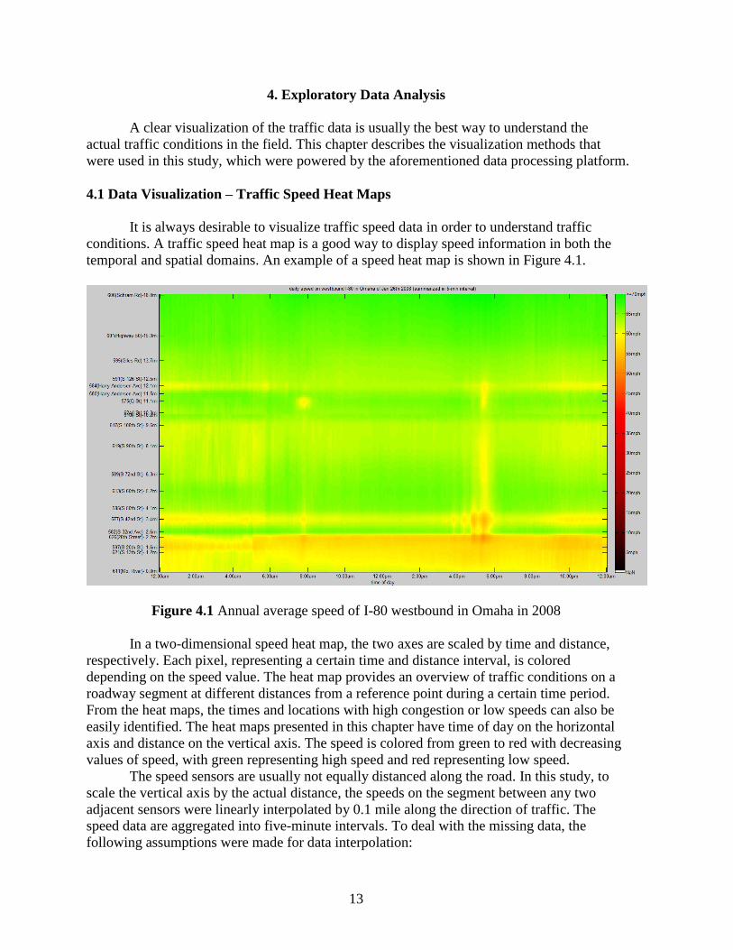
4. Exploratory Data Analysis
A clear visualization of the traffic data is usually the best way to understand the
actual traffic conditions in the field. This chapter describes the visualization methods that
were used in this study, which were powered by the aforementioned data processing platform.
4.1 Data Visualization – Traffic Speed Heat Maps
It is always desirable to visualize traffic speed data in order to understand traffic
conditions. A traffic speed heat map is a good way to display speed information in both the
temporal and spatial domains. An example of a speed heat map is shown in Figure 4.1.
Figure 4.1 Annual average speed of I-80 westbound in Omaha in 2008
In a two-dimensional speed heat map, the two axes are scaled by time and distance,
respectively. Each pixel, representing a certain time and distance interval, is colored
depending on the speed value. The heat map provides an overview of traffic conditions on a
roadway segment at different distances from a reference point during a certain time period.
From the heat maps, the times and locations with high congestion or low speeds can also be
easily identified. The heat maps presented in this chapter have time of day on the horizontal
axis and distance on the vertical axis. The speed is colored from green to red with decreasing
values of speed, with green representing high speed and red representing low speed.
The speed sensors are usually not equally distanced along the road. In this study, to
scale the vertical axis by the actual distance, the speeds on the segment between any two
adjacent sensors were linearly interpolated by 0.1 mile along the direction of traffic. The
speed data are aggregated into five-minute intervals. To deal with the missing data, the
following assumptions were made for data interpolation:

14
First, for each plotted time interval, the percentage of missing data was verified. If the
percentage of missing data exceeded a predetermined threshold, and thus not enough
data were available to make a meaningful interpolation, the entire time interval was
omitted. (For example, in Figure 4.2, all sensors are treated as having missing data
around 3 p.m. on December 2.)
If enough data were available for interpolation, the algorithm only interpolated speeds
between two points with known speeds and never extrapolated. (For example, in
Figure 4.2, speed data recorded around 6 p.m. on December 28 are reported for the
segments between 2 to 12 miles from the start point.)
Heat maps were plotted for both annual average speed and daily average speed for all
studied roads. Figure 4.1 shows the annual average speed heat map of I-80 westbound in
Omaha in 2008. Each pixel is colored based on the average speed over the entire year for the
corresponding location at a specific time of day. The vertical axis is ticked at each actual
sensor location along the direction of traffic. On this segment, vehicles travel from the east
end (bottom of the vertical axis) to the west end (top of the vertical axis). The lowest speed
was observed on the segment within two miles from the east end, which is roughly in the
downtown area. On average, the most congested time appeared to be from 5 p.m. to 6 p.m.
and the evening peak hours were more congested than the morning peak hours. The general
trend of traffic conditions on I-80 westbound in Omaha can be easily determined by reading
this annual average speed heat map.
Note: blue stars represent mainline crashes, blue Xs represent on-ramp crashes, and blue plus signs
represent off-ramp crashes
Figure 4.2 Daily speed heat map of I-80 westbound in Omaha in December 2008
To investigate the finer details, daily speed heat maps were created. Figure 4.2
displays the historical traffic speed of I-80 in December 2008. Each subplot in this figure is a
one-day speed heat map. The daily heat maps are arranged in calendar order, with Sundays in
15
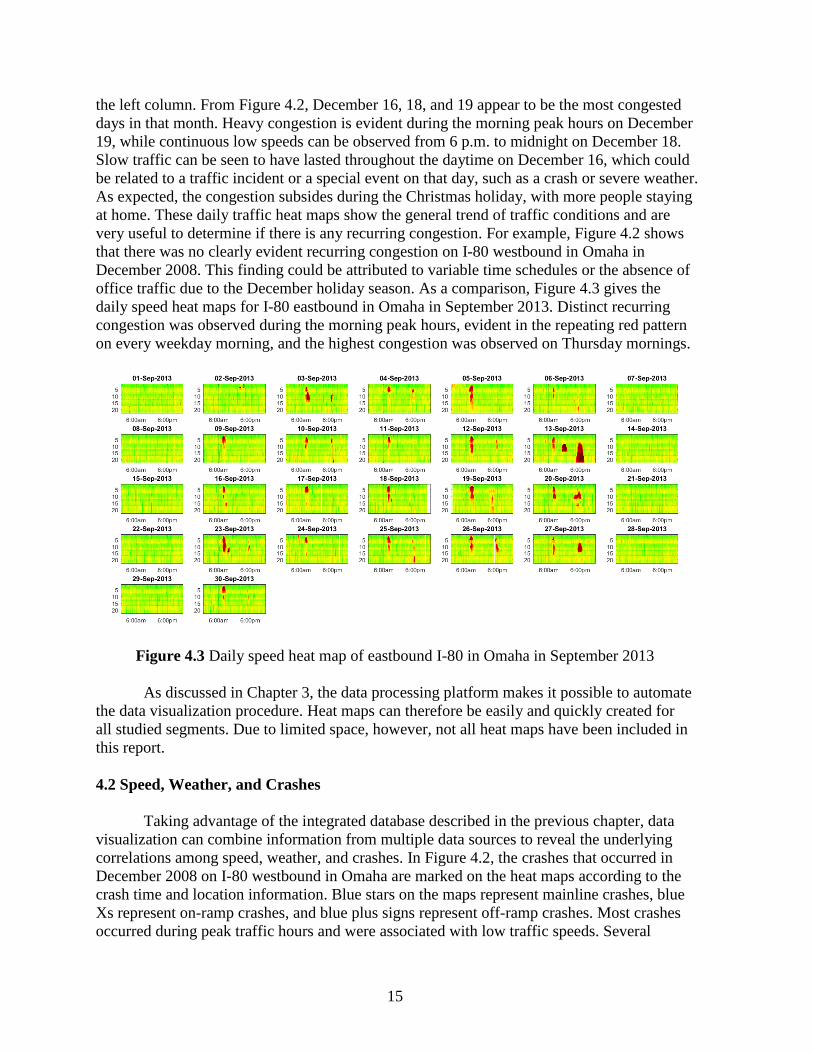
the left column. From Figure 4.2, December 16, 18, and 19 appear to be the most congested
days in that month. Heavy congestion is evident during the morning peak hours on December
19, while continuous low speeds can be observed from 6 p.m. to midnight on December 18.
Slow traffic can be seen to have lasted throughout the daytime on December 16, which could
be related to a traffic incident or a special event on that day, such as a crash or severe weather.
As expected, the congestion subsides during the Christmas holiday, with more people staying
at home. These daily traffic heat maps show the general trend of traffic conditions and are
very useful to determine if there is any recurring congestion. For example, Figure 4.2 shows
that there was no clearly evident recurring congestion on I-80 westbound in Omaha in
December 2008. This finding could be attributed to variable time schedules or the absence of
office traffic due to the December holiday season. As a comparison, Figure 4.3 gives the
daily speed heat maps for I-80 eastbound in Omaha in September 2013. Distinct recurring
congestion was observed during the morning peak hours, evident in the repeating red pattern
on every weekday morning, and the highest congestion was observed on Thursday mornings.
Figure 4.3 Daily speed heat map of eastbound I-80 in Omaha in September 2013
As discussed in Chapter 3, the data processing platform makes it possible to automate
the data visualization procedure. Heat maps can therefore be easily and quickly created for
all studied segments. Due to limited space, however, not all heat maps have been included in
this report.
4.2 Speed, Weather, and Crashes
Taking advantage of the integrated database described in the previous chapter, data
visualization can combine information from multiple data sources to reveal the underlying
correlations among speed, weather, and crashes. In Figure 4.2, the crashes that occurred in
December 2008 on I-80 westbound in Omaha are marked on the heat maps according to the
crash time and location information. Blue stars on the maps represent mainline crashes, blue
Xs represent on-ramp crashes, and blue plus signs represent off-ramp crashes. Most crashes
occurred during peak traffic hours and were associated with low traffic speeds. Several

16
crashes occurred on December 16, in parallel with one of the worst congestion periods
observed for the segment in the month of December.
Weather information such as rain or snow events can also be included in the speed
heat maps. To make the maps easy to read, speed data were made more brief and concise,
and only clustered low-speed events (speeds lower than or equal to 45 mph) are displayed.
Figure 4.4 shows the clustered daily low-speed events overlaid with crashes and precipitation
for I-80 westbound in Omaha in December 2008.
Note: light blue: rain, dark blue: snow, *: mainline crash, +: on-ramp crash, ×: off-ramp crash
Figure 4.4 Clustered daily congestion overlaid with crashes and precipitation
The red points represent low-speed clusters. This figure shows that some correlation
exists among crashes, low-speed events, and precipitation. The summary statistics for speed,
crashes, and precipitation for the studied segment on I-80 westbound in 2008 are listed in
Table 4.1.
Table 4.1 Data summary statistics of I-80 westbound in Omaha in 2008
Variables Value
Mean speed (mph) 62.05
Standard deviation of speed (mph) 5.54
Number of crashes 257
Total hours of rain (hour) 647.4
Total hours of snow (hour) 45.7
The model developed to investigate the relationship between crashes and contributing
factors will be discussed in Chapter 5. Furthermore, if certain patterns of speed events and
precipitation are frequently observed before the occurrence of a crash, some identification
mechanism for the hazardous condition could be developed for crash prediction. This topic
will be discussed in Chapter 8.

17
This chapter demonstrated several data visualization methods. The annual average
speed heat map reveals the trends in traffic speed by time of day. The daily average speed
heat maps, plotted in calendar order, display the traffic speeds of a certain segment in detail,
and speed trends can be identified by different measures (day of the week, month, mile
marker, etc.). In addition, through the integrated database and data processing platform,
speed, weather, and crash data can be displayed together to show the correlation among these
data. To verify and quantify this correlation, the impacts of different factors on crash risk
based on aggregate-level crash analysis are studied in the next chapter

18
5. Crash Risk Assessment
Safety is an important aspect of traffic management. Crash risk assessment can reveal the
relationships between crashes and contributing factors and can help to quantify the benefits of
traffic operation strategies in improving safety. In this chapter, preliminary hypothesis tests were
conducted to analyze the correlations among traffic speeds, ambient weather conditions, and
crash occurrences. A binomial probit model was developed to identify the crash contributing
factors. A sensitivity analysis of these factors was conducted and is discussed in this chapter.
5.1 Correlation among Crashes, Speed, and Weather Conditions
Using the MATLAB-Microsoft SQL Server data processing platform presented in
Chapter 4, descriptive statistics were obtained and a preliminary data analysis was conducted for
the traffic, weather, and crash data. Table 5.1 summarizes the crash occurrences by traffic and
weather conditions on I-80 westbound in Omaha in 2008.
Table 5.1 Crash summary for I-80 westbound in Omaha in 2008
Crash Summary
Weather Condition
Clear Rain Snow
Traffic
Condition
Speed > 50mph
Crash counts 187 28 0
Crash percentage 72.76% 10.89% 0.00%
Time percentage 92.09% 5.84% 0.29%
Speed ≤ 50mph
Crash counts 26 16 0
Crash percentage 10.12% 6.23% 0.00%
Time percentage 0.020% 1.53% 0.23%
A threshold of 50 mph divides the traffic conditions into two categories: uncongested
conditions (speeds greater than 50 mph) and congested conditions (speeds less than or equal to
50 mph). This threshold was selected based on the traffic characteristics of the studied road
segment. The weather conditions were categorized into clear, rain, and snow. A total of 257
crashes were observed on this road segment. The crash percentage was calculated by dividing the
crash counts in each category by the total number of crashes. The time percentage is the time
duration of a certain combination of traffic and weather conditions out of the entire study period.
For 92% of the time in 2008, this road segment was uncongested and in clear weather, and 73%
of the crashes in that year occurred in this combination of traffic and weather conditions. The
segment was congested and in clear weather for 0.02% of the time in 2008, and 10% of the total
crashes occurred in such conditions. The relationships implied by the data in Table 5.1 are as
follows: (1) the conditional probability of a low-speed event given different weather conditions
varied significantly, which indicated a potential correlation between weather and traffic speed,
and (2) the conditional probability of a crash given different traffic and weather conditions
differed, which indicated the impact of speed and weather on crash occurrence.

19
For the interrelationship between weather and traffic conditions, if these two factors are
independent, the probability of a combined traffic and weather event should be equal to the
product of the individual probabilities of the corresponding traffic event and weather event. The
hypothesis that the traffic and weather conditions are independent was tested by a chi-square test
using a contingency table. The test results are shown in Table 5.2. Because some of the expected
counts of events were lower than five, Fisher’s exact test was appropriate. The null hypothesis
was rejected at a 95% confidence level, and there was no evidence that the traffic and weather
conditions were independent of each other. The highest chi-square values were observed for low
speed with rain and low speed with snow, which shows that rain and snow significantly
increased the chance of congestion.
For the crash likelihood, if the crash occurrence has an equal likelihood across different
combinations of traffic and weather conditions, the crash percentage values presented in Table
5.2 should follow the distribution of time percentage.
Table 5.2 Contingency analysis of weather conditions by traffic speed
Weather
Clear Rain Snow Marginal Total
Speed >
50mph
Total %
Expected %
Chi-square
92.09
90.4704
0.0290
5.84
7.238
0.2703
0.29
0. 5107
0.0954
98.22
Speed ≤
50mph
Total %
Expected %
Chi-square
0.02
1.6395
1.5998
1.53
0.1312
14.9153
0.23
0.0092
5.2645
1.78
Marginal Total 92.11 7.37 0.52 100.00
Test Results
Log likelihood 4.6249
R square 0.1567
p-value
Pearson 0.0098
Likelihood Ratio <0.0001
Fisher’s Exact Test 0.0007
Note: A small p-value indicates that the null hypothesis should be rejected
This hypothesis that crash percentage and time percentage have the same distribution was
tested by a nonparametric chi-square test. The results are shown in Table 5.3.

20
Table 5.3 Nonparametric chi-square test results for crash distribution
Conditions
(speed-weather) Crash
Counts
Observed
Probability
Hypothesis
Probability
High-clear 187 0.7275 0.9209
High-rain 28 0.1089 0.0584
High-snow 0 0.00004 0.0029
Low-clear 26 0.1012 0.0002
Low-rain 16 0.0622 0.0153
Low-snow 0 0.00004 0.0023
Total 257 1.0000 1.0000
Test Results
chi-square p-value
Likelihood Ratio 315.2836 <0.0001
Pearson 13,158.78 <0.0001
Note: A small p-value indicates that the null hypothesis should be rejected
The null hypothesis was rejected at a 95% confidence level, which indicates that the
likelihood of a crash varies by traffic and weather conditions. From Table 5.3, the observed
probabilities of high speed and rain, low speed and clear weather, and low speed and rain are
much higher than the hypothesized values, which provides evidence that these three conditions
increase the likelihood of a crash. A high crash likelihood was usually associated with low speed
and rain. Rain is an important causal factor for low speed and high crash likelihood. Although
the causal relationship between low speed and crash occurrence was difficult to determine for
each individual case, the interaction was statistically detected.
5.2 Crash Risk Modeling and Sensitivity Analysis
After the preliminary hypothesis tests, a binomial probit model was built to identify the
crash contributing factors, and the data for I-80 westbound in Omaha in 2008 were used. The
descriptive statistics of the model variables are provided in Table 5.4.

21
Table 5.4 Descriptive statistics of variables
Variable Mean S.D. Min Max Sum Obs.
Dependent variables
Indicator of crash occurrence 0.028 0.164 0 1 285 10,285
Independent variables
speed (mph) 62.456 5.258 5.88 76.84 10,285
indicator of weekend 0.275 0.447 0 1 2,828 10,285
indicator of Monday 0.137 0.344 0 1 1,408 10,285
indicator of Tuesday 0.148 0.355 0 1 1,518 10,285
indicator of Wednesday 0.142 0.349 0 1 1,459 10,285
indicator of Thursday 0.154 0.361 0 1 1,587 10,285
indicator of Friday 0.144 0.351 0 1 1,485 10,285
indicator of Saturday 0.144 0.351 0 1 1,481 10,285
indicator of Sunday 0.131 0.337 0 1 1,347 10,285
indicator of 12am-6am 0.239 0.427 0 1 2,459 10,285
indicator of 6am-8am 0.090 0.286 0 1 922 10,285
indicator of 8am-10am 0.083 0.276 0 1 853 10,285
indicator of 10am-12pm 0.084 0.278 0 1 869 10,285
indicator of 12pm-2pm 0.084 0.277 0 1 862 10,285
indicator of 2pm-4pm 0.080 0.271 0 1 820 10,285
indicator of 4pm-6pm 0.090 0.287 0 1 929 10,285
indicator of 6pm-8pm 0.084 0.278 0 1 869 10,285
indicator of 8pm-12pm 0.165 0.372 0 1 1,702 10,285
indicator of 0 mile - 3 mile 0.184 0.387 0 1 1,892 10,285
indicator of 3 mile - 6 mile 0.182 0.386 0 1 1,869 10,285
indicator of 6 mile - 9 mile 0.157 0.363 0 1 1,610 10,285
indicator of 9 mile - 12 mile 0.136 0.343 0 1 1,399 10,285
indicator of 12 mile - 15 mile 0.176 0.381 0 1 1,807 10,285
indicator of 15 mile - 18 mile 0.166 0.372 0 1 1,708 10,285
indicator of clear weather 0.926 0.262 0 1 9,520 10,285
indicator of rain 0.060 0.238 0 1 618 10,285
indicator of snow 0.014 0.119 0 1 147 10,285
Besides speed and weather conditions, the time of day, day of the week, and location on
the road were also considered in the model. Indicators were created for each day of the week.
The time of day was classified into nine intervals (12 a.m. to 6 a.m., 6 a.m. to 8 a.m., 8 a.m. to 10
a.m., 10 a.m. to 12 p.m., 12 p.m. to 2 p.m., 2 p.m. to 4 p.m., 4 p.m. to 6 p.m., 6 p.m. to 8 p.m.,
and 8 p.m. to 12 a.m.). The 18 mile long freeway was divided into six equal-length segments (0:
east end, 18 miles: west end), and indicators were created for modeling. The period of 8 p.m. to
12 a.m. and the location between 15 and 18 miles on Monday on this segment was used as the
baseline to evaluate the impacts of the other variables.
Using the indicator of crash occurrence as a dependent variable, a binomial probit model
was built. The estimated coefficients of the independent variables are shown in Table 5.5.

22
Table 5.5 Estimated parameters by the binomial probit model
Independent Variable Coefficient t-statistic Confidence Level
Constant -0.1153 -0.37
speed (mph) -0.0451 -11.79 ***
indicator of weekend -0.3057 -3.02 ***
indicator of Tuesday -0.0253 -0.25
indicator of Wednesday -0.0575 -0.55
indicator of Thursday 0.0172 0.18
indicator of Friday -0.1639 -1.53
indicator of 12am-6am -0.1075 -0.95
indicator of 6am-8am 0.4436 3.84 ***
indicator of 8am-10am 0.1599 1.19
indicator of 10am-12pm 0.3206 2.50 **
indicator of 12pm-2pm 0.2764 2.18 **
indicator of 2pm-4pm 0.1887 1.41
indicator of 4pm-6pm 0.5746 5.26 ***
indicator of 6pm-8pm 0.2257 1.73 *
indicator of 0 mile - 3 mile 0.7483 3.88 ***
indicator of 3 mile - 6 mile 1.3577 7.23 ***
indicator of 6 mile - 9 mile 0.6375 3.21 ***
indicator of 9 mile - 12 mile 0.5220 2.53 **
indicator of 12 mile - 15 mile 0.1976 0.90
indicator of rain 0.1572 1.47
indicator of snow 0.3504 1.68 *
Model performance
Log Likelihood -1028.6419
Restricted log likelihood -1303.0108
R-squared 0.2106
Note: ***, **, and * indicate confidence at a 99%, 95%, and 90% level, respectively
The model results are summarized in the following:
The crash risk is higher on this road when the road is operated at a lower traffic speed.
The crash risk was consistent on different weekdays but significantly lower on weekends.
During the 6 a.m. to 8 a.m., 10 a.m. to 2 p.m., and 4 p.m. to 6 p.m. intervals, the crash
risk was higher than at other times of day. The highest crash risk appeared to be between
the 6 a.m. to 8 a.m. and 4 p.m. to 6 p.m. intervals.
The western 12 miles had a higher crash risk than the rest of the road, and the hot spot
appeared to be 3 to 6 miles toward the western end.
Rain and snow did not have a significant impact on crash risk at a 95% confidence level.
However, there was some evidence that the impact of snow was larger than that of rain.
To better quantify the impacts of contributing factors on crash risk, a sensitivity analysis
was conducted. The estimated elasticities are shown in Table 5.6.

23
Table 5.6 Sensitivity analysis: Estimated elasticity
Independent Variable Elasticity t-statistic Confidence Level
speed (mph) -0.0750 11.16 ***
indicator of weekend -0.7762 3.32 ***
indicator of 6am-8am 0.9887 5.04 ***
indicator of 4pm-6pm 1.1879 7.88 ***
indicator of 3 mile - 6 mile 1.7899 28.90 ***
indicator of rain 0.3984 1.55
indicator of snow 0.8134 2.04 **
Note: ***, **, and * indicate confidence at a 99%, 95%, and 90% level, respectively
These elasticity results show the following:
Every one mile per hour increase in speed was associated with a 7.5% decrease in
crash risk.
The crash risk on weekends was 77.6% lower than on weekdays.
The crash risk approximately doubled during morning peak hours (6 a.m. to 8 a.m.)
and afternoon peak hours (4 p.m. to 6 p.m.) compared to the rest of the day.
The crash risk on the segment three to six miles toward the western end of the road
was much higher than on all other segments.
Rain did not have a statistically significant impact on crash risk, while snow could
increase the crash risk by 81%.
This chapter analyzed the impact of speed, weather, time, and location on crash
occurrence at the aggregate level. A binomial probit model for predicting crash count was
developed to identify the contributing factors, and a sensitivity analysis was conducted to
quantify their impacts. The crash analysis found that a one mile per hour increase in speed was
associated with a 7.5% decrease in crash risk. The crash risk on weekends was 77.6% lower than
the crash risk on weekdays. The rate of crash risk during the peak hours (6 a.m. to 8 a.m. and 4
p.m. to 6 p.m.) was approximately twice the rate of the crash risk during the rest of a given day.
The crash risk was also affected by the location of the road. Rain, observed during the analysis
period, was found to have no significant impact on crash risk, while snow could increase the
crash risk by 81%. These results are used in the cost-benefit analysis of ramp metering discussed
in Chapter 7. The following chapter introduces speed-based performance measures, identifies the
bottleneck locations on the Omaha urban freeway system, and prioritizes these locations for
potential ramp metering implementation.

24
6. Traffic Performance Measure and Bottleneck Identification
In Chapter 5, traffic speed, snow, certain time periods of the day, and certain segments on
the road were identified as statistically significant factors impacting the expected number of
crashes per year. Among these factors, traffic speed is the topic of focus for this study because it
is most commonly used as the control variable in active traffic management strategies. As
described in this chapter, several traffic speed–based performance measures were developed and
used to identify the bottlenecks on the Omaha urban freeway system.
6.1 Speed Based Performance Measure
To quantify and compare the traffic conditions across different locations and time periods,
a series of performance measures was developed in this study. In this study, congestion is
defined as traffic speeds lower than a threshold of 40 mph. A colored three-dimensional (3D) bar
chart was developed to show the congestion at different times and locations. Figure 6.1 shows
congestion counts and illustrates the congestion conditions on weekdays on an 18 mile road
segment of I-80 westbound in Omaha in 2008.
Figure 6.1 Congestion counts for I-80 westbound in Omaha on weekdays in 2008
Data were aggregated in five-minute intervals for each 0.1 mile section along this
segment. The x and y axes represent the time of day and location on the road, respectively. Each
bar represents a grid of 0.1 mile × five minutes, and the height of the bar represents congestion
count, that is, the number of days that congestion was observed on a 0.1 mile segment (specified
by location axis) during a five-minute period (specified by the time of day axis). A higher value
for congestion count implies a higher frequency or higher likelihood of congestion. The
congestion count is also color coded. Dark blue represents no congestion, and yellow and red

25
represent a medium to high likelihood of congestion. For the studied road on I-80 westbound in
Omaha, the heaviest congestion was observed on the segment between one to six miles from the
eastern end during the period from 4 p.m. to 7 p.m. Similar bar charts can be created for each day
of the week or weekend to show the congestion distribution patterns on different days of the
week.
The 3D bar chart of congestion counts treats speed as a categorical variable (congestion
or non-congestion) and can be a good illustration of congestion frequency. However, the chart is
unable to accurately quantify the severity of congestion. Travel time delay can be used as a
performance measure to capture the severity of congestion. A colored 3D bar chart of travel time
delay was developed, as shown in Figure 6.2, and is similar to the chart of congestion counts.
Figure 6.2 Average travel time delay for I-80 westbound in Omaha on weekdays in 2008
The horizontal axis represents the grid of the time of day and the location on the road.
Travel time delay was calculated for each grid (1 mile × 15 minutes). The vertical axis represents
travel time delay, or travel time deficiency. Travel time delay is the additional time required to
travel through a road segment at an observed speed compared to traveling at a reference speed.
In this study, the posted speed limit was used as the reference speed. The height of each bar in
Figure 6.2 represents the amount of travel time delay for the location and time period specified
by the horizontal axis. The colors of the bars also indicate the congestion levels, with dark blue
representing no congestion and red representing high congestion levels. As seen in Figure 6.2,
the location and time period with the highest travel time delay was similar to the location and
time period with the highest congestion frequency identified in Figure 6.1.
On average, the segment between one to two miles from the eastern end of the road
experienced longer delays than all other road segments throughout the day.
Two new performance charts, travel time profile and speed profile, were designed to
visualize and compare the temporal and spatial trends in traffic conditions. Travel time profiles

26
provide a description of expected travel time and travel time reliability along the road by time of
day. The travel time profiles can be created for a wide range of analysis periods. Figure 6.3
shows the monthly travel time profile for an 18 mile segment on I-80 westbound in Omaha in
2008. The black line in the figure represents the median travel time at a particular time of day,
and the red line marks the 85th percentile travel time. The difference between the median and the
85th percentile travel time is used as a measure of travel time reliability. In Figure 6.3, all of the
missing data were replaced by the mean; therefore, the accuracy of this travel time profile
depends greatly on the quality of the sensor data. The data quality could be improved by using
additional data sources, such as INRIX (INRIX, Inc. http://inrix.com/) data. INRIX provides
better data completeness and provides segment speed instead of point speed from roadside
sensors. The percentage of missing data is shown on top of each subplot in Figure 6.3.
Figure 6.3 Monthly travel time profile for I-80 westbound in Omaha in 2008
There were relatively higher percentages of missing data during February and July, and
hence, in these cases, the travel time profiles would fail to capture parts of the real variation.
Overall, the average travel time on this road was stable. There were more variations during the
morning peak hours and afternoon peak hours, specifically during the afternoon peak hours. The
highest travel times observed were during the afternoon traffic peak hours in the months of
January, September, October, and December.
A travel speed profile illustrates the number of hours during the analysis period that the
operational speed on a segment is within a predefined range. Figure 6.4 shows the monthly speed
profile for the aforementioned road on I-80 westbound in 2008.

27
Figure 6.4 Monthly traffic speed profile for I-80 westbound in Omaha in 2008
The speed profile is a stacked bar chart drawn horizontally. The colors from dark brown
to green represent speed ranges from lowest to highest, respectively. The vertical axis is scaled
by 0.l mile increments and labeled by mile marker. Due to space limitations, only the top 100
hours with the lowest operational speeds are shown for each month. The locations near mile
marker 452.5 (at the eastern end of the road) had longer travel times with lower operational
speeds, and December was found to be the month with the most frequent observations of low
speeds.
The charts for travel time profile and speed profile are also useful for comparing the
traffic characteristics between different travel directions along a corridor or among different
roadways. Benefiting from the integrated database and data processing platform, the data
visualization methods and performance measure charts can be easily applied to any road segment
in the database for a wide range of analysis periods. This technique provides the ability to
quickly investigate traffic conditions on multiple corridors and display key findings.
6.2 Bottlenecks on the Omaha Urban Freeway System
This part of the analysis used data collected for the years 2008 and 2009 on five major
corridors in Omaha, including I-80, I-480, I-680, US-6, and US-75. To identify the traffic
bottlenecks, daily traffic speed heat maps were created for the entire two years in both travel
directions of these five corridors. These heat maps include a total of 7,310 subplots (731 days × 5
corridors × 2 directions). All of the heat maps used a uniform color scale for easy comparison.
The findings from the daily heat maps are summarized below:
I-80: For the westbound direction, recurring congestion during the afternoon (PM) peak
hours was observed, while there was no congestion observed during the morning (AM)
peak hours. For the eastbound direction, recurring congestion was observed during both

28
the AM and PM peak hours on weekdays, specifically during the PM peak hours on
Fridays. It was also observed that the congested locations were different between the AM
and PM peak hours. During the PM peak hours, the most congested area was near the
eastern end near downtown (mile markers 450 to 454), while during the AM peak hours
the most congested area was near the western end (mile markers 445 to 448).
I-480: The average speed was slightly lower than that on I-80. The eastbound direction of
I-480 experienced recurring congestion during the AM peak hours, and the westbound
direction experienced congestion during the PM peak hours.
I-680: The overall speed was above the speed limit (60 mph). There was some recurring
congestion during the AM and PM peak hours on I-680 northbound, but no obvious
issues were observed for the southbound traffic.
US-6: The speed sensors on both directions of US-6 were not in good working condition,
and hence there was a significant amount of missing data. However, the data showed
some evidence that US-6 eastbound experienced congestion during the AM peak hours,
and minor congestion was observed during the PM peak hours for the westbound traffic.
US-75: US-75 had similar patterns to I-680 and US-6. The northbound traffic
experienced congestion during the AM peak hours, and the southbound traffic was
slightly worse during the PM peak hours than the AM peak hours.
Overall, the traffic on the analyzed freeways in 2008 and 2009 demonstrated some
similar patterns: the roads going into the Omaha central district experienced recurring congestion
during the AM peak hours, and those roads going out of the Omaha central district experienced
severe congestion during the PM peak hours. The recurring congestion could most likely be
attributed to commuter traffic. The most congested segments are shown in Figure 6.5.

29
Figure 6.5 Summary of AM and PM congestion in 2008 and 2009
The yellow arrows in the top two windows represent the congested areas during the AM
peak hours. The red arrows in the bottom two windows represent the congested areas during the
PM peak hours. The left two windows show the congested areas in 2008, and the right two
windows show the traffic in 2009. The traffic direction is indicated by the direction of the arrow,
and the congestion level is indicated by the width of the arrow. The traffic in the years 2008 and
2009 had similar congestion patterns. Out of the five studied corridors, I-80 experienced the
highest congestion and was selected for further analysis.
Three-dimensional charts for travel time delay were created for I-80 westbound and are
shown in Figure 6.6. Similar charts for I-80 eastbound are shown in Figure 6.7. The
corresponding AM and PM congestion locations are marked on the map below each bar chart by
a yellow circle and a red circle, respectively.

30
Left: 2008, Right: 2009
Figure 6.6 Cumulative travel time delay on I-80 westbound in 2008 and 2009
Left: 2008, Right: 2009
Figure 6.7 Cumulative travel time delay on I-80 eastbound in 2008 and 2009

31
To better visualize the bar charts, a 180 degree rotated view is provided for both 2008
and 2009 in Figure 6.7. The traffic patterns for travel time delay are consistent with the findings
from the daily heat maps. The travel delay slightly decreased in 2009, but the patterns remain the
same. Comparing the travel time delay shown in Figures 6.6 and 6.7, it is clear that the
eastbound traffic on the studied segment experienced higher travel delay than the westbound
traffic and that several miles near the western end performed consistently well. Therefore, a ramp
metering cost-benefit analysis was conducted for the segment on I-80 eastbound from the I-680
interchange to the eastern end.
The average daily traffic condition on I-80 eastbound is shown on the heat map in Figure
6.8.
Figure 6.8 Average daily traffic condition on I-80 eastbound in 2008
The vertical axis of the map shows sensor ID. Widespread congestion was observed
during the PM peak hours. To further investigate the speed distribution of the eastbound traffic
on this road, daily traffic speed heat maps were plotted for the entire year of 2008. The daily
traffic conditions in August 2008 are illustrated in Figure 6.9.

32
Figure 6.9 Daily traffic conditions on I-80 eastbound in August 2008
Recurring congestion was identified during the PM peak hours, and the most severe
congestion occurred on Fridays. Figure 6.10 shows the average daily traffic conditions on
Fridays from May 1 to September 30, 2008.
Based on data from May 1 to September 30, 2008
Figure 6.10 Average traffic conditions on I-80 eastbound on Fridays
Comparing Figures 6.8 and 6.10, it can be seen that the congestion on Fridays was the
main cause of the low speed trend during the PM peak hours. The most congested period was
between 3 p.m. and 8 p.m. on Fridays along the road from sensor 590 to sensor 612, and the
congestion lasted for about four hours.

33
The analysis above ultimately identified a 6.3 mile segment on I-80 eastbound as the
main recurring bottleneck among the five major corridors in Omaha. This segment is shown in
Figure 6.11.
Figure 6.11 Bottleneck on I-80 eastbound near downtown Omaha
This segment was covered by nine sensors (IDs 590 to 612) and included four
interchanges near the Omaha downtown district. The heaviest congestion occurred from 3 p.m.
to 8 p.m. on Fridays. This segment was selected as a potential location for ramp meter
installation. The analysis of ramp metering is discussed in Chapter 7.
Because the bottleneck analysis used traffic data from 2008 and 2009, which is six years
before this study was conducted, there was a concern that the data may not reflect the current
traffic conditions. To check this issue, daily speed heat maps similar to those in Figure 6.9 were
plotted using INRIX data for both travel directions on the five studied corridors in 2013 and
2014. These daily heat maps are included in the Appendix. There were work zones in Council
Bluffs during 2013 and 2014, which potentially influenced the eastbound traffic from Nebraska
to Iowa. The heat maps show that the overall traffic conditions on I-80 eastbound in 2013 and
2014 were better than those in 2008 and 2009, but several heavy congestion areas were still
observed near the western end of I-80 eastbound during the PM peak hours on Fridays.
This chapter introduced several speed-based traffic performance measures, including 3D
bar charts of congestion counts, 3D bar charts of travel time deficiency, monthly travel time
profiles, and monthly traffic speed profiles. After comparing the performance measures as well
as the speed heat maps of different roadway segments, a 6.3 mile segment on I-80 eastbound
(from sensor 590 to sensor 612) was identified as the main recurring bottleneck among the five
major corridors in Omaha. The following chapter delves into the costs and benefits of providing
a ramp metering solution for the section of the road identified as having the most critical
recurring congestion.

34
7. Evaluating the Impacts of Ramp Metering
This chapter presents a case study that evaluates the costs and benefits of implementing a
ramp metering solution for the congested corridor identified in the previous chapter. The change
in travel speed after applying the ramp metering strategy was analyzed using FREEVAL.
FREEVAL requires traffic volume as one of the inputs, but the radar sensors on the corridor only
provide speed measurements. Due to the lack of traffic volume data, several assumptions were
made to estimate the volume from the speed data. The following two sections describe in detail
the modeling of the bottleneck segment and the assumptions made for the calculation of the
traffic volumes. The benefits obtained from ramp metering were quantified in dollar values and
are reported in subsequent sections.
7.1 Modeling the Bottleneck Segment
A 6.3 mile segment on I-80 eastbound was selected for ramp metering analysis. A total of
nine speed sensors were installed along this segment, as shown in Figure 7.1.
Figure 7.1 Segment selected for ramp metering analysis with nine sensors on I-80 eastbound
The segment included eight on-ramps and five off-ramps, which are indicated by arrows
in Figure 7.2 along with the locations of the speed sensors.
Figure 7.2 Ramps and sensor locations on the studied roadway
The studied road was further divided into 18 segments based on the on-ramp and off-
ramp locations. Segments included basic, merging, diverging, and weaving sections and were
classified according to the criteria in the Highway Capacity Manual (HCM) 2010. These
segments included eight basic freeway segments, five merging segments, two diverging

35
segments, and three weaving segments. The characteristics of each segment are presented in
Table 7.1.
Table 7.1 Summary of characteristics for the 18 studied segments
The length and number of lanes on each segment were checked using Google Earth. The
free flow speed was determined using the HCM 2010 methodology. Seven out of the nine speed
sensors were located on basic freeway segments, while sensors 625 and 598 were located on a
diverging segment and a weaving segment, respectively. Generally, the traffic conditions on the
basic freeway segments were more stable, and the detectors performed more reliably. The data
for the 18 segments were used for ramp metering analysis in FREEVAL.
7.2 Speed to Volume Conversion and Model Validation
While FREEVAL requires traffic volume data to conduct the analysis, only speed data
were available from the radar sensors deployed on the study corridor. The HCM speed-flow
curves, shown in Figure 7.3, were used to estimate traffic volume from the observed speed data.
Figure 7.3 Speed-flow curves from HCM 2010

36
The average daily speed data on all Fridays between May 1 and September 30, 2008 were
used to calculate the average traffic volume on Fridays for the studied segments. The data were
aggregated in 15 minute intervals. After estimating the traffic volume from the speed data, the
estimated speed-flow curve was created, as shown in Figure 7.4.
Figure 7.4 Speed-flow curves for the study segments
Three regimes are shown in this figure. Regime 1 indicates an uncongested condition and
corresponds to the straight horizontal line in Figure 7.3. To be conservative, the highest
uncongested flow rate was used, and any speed greater than or equal to the free flow speed was
mapped to this volume. Regime 2 indicates an undersaturated congested condition and
corresponds to the curved lines in Figure 7.3. In this regime, speed and flow rate are highly
correlated; thus, the volume can be estimated at a much higher confidence level compared to the
other regimes. Regime 3 indicates an oversaturated condition, and all the speeds in this regime
were mapped to the capacity flow rate. Most of the points were located in regimes 2 and 3, which
reflects the congestion observed on the study segment.
The average speed and converted volume between 12:00 p.m. and 1:00 p.m. on Fridays
were used as the validation samples. The reason for choosing this sample is that all the data
points for this period were in regime 2, and it is therefore reasonable to assume that the traffic
behavior during this hour would be similar to that during the upcoming PM peak hours. The
converted volumes were first calculated for the nine segments with speed sensors. The ramp
volume was then estimated. To estimate the ramp volume, two assumptions were made due to
the lack of information: (1) the on-ramps have the same volume in each lane and (2) the
minimum ramp flow rate is 100 passenger cars per hour per lane (pc/hour/lane). After the ramp
volume was obtained, the speed data were simulated in FREEVAL based on the converted
volume. The simulated speed data were compared back to the sensor data for validation. The
validation results are listed in Table 7.2.
1
2
3

37
Table 7.2 Model validation summary
Segment
Segment
Type
Detector
ID
Observed
Speed
(mph)
Converted
Volume
(veh. /hour)
Calculated
Ramp Volume
(veh. /hour) Simulated
Speed
(mph) on off
1 B 590 57.56 7,657 61.25
2 M 1,256
3 W 1,257 2,084
4 B 614 60.68 8,086 59.53
5 M 1,256
6 M 1,257
7 B 586 59.05 10,599 60.20
8 D 100
9 B 578 58.98 10,582 61.38
10 M 1,256
11 W 1,257 7,129
12 B 581 63.41 5,966 61.29
13 D 625 62.32 5,966 2,117 61.29
14 B
15 W 598 62.24 6,362 2,513 2,277 31.32
16 B 622 61.07 4,085 63.13
17 M 2,458
18 B 612 62.71 6,542 61.59
B: basic freeway segment; M: merging segment; D: diverging segment; W: weaving segment
The differences between the observed speed and simulated speed were acceptable, except
for segment 15. Segment 15 is a small weaving segment in the simulation, and a potential
explanation for the speed difference is that the sensor might be situated beyond the weaving
effect.
7.3 Ramp Metering Evaluation
In order to simulate the over-congested condition, the inflow volume from the mainline
and the volumes on all the ramps in the study segments were increased based on the calibration
case using the following assumptions:
The inflow volume from the mainline segment upstream of the study segments
was assumed to be at capacity.
The increases of all ramp volumes were in proportion to the increase of inflow
volume from the mainline segment upstream of the study segments.
The results of the ramp metering evaluation are subject to the accuracy of these
assumptions. However, the methodology used here can easily be transferred to another study if
the actual volumes are measured in the field.

38
Four 15 minute periods were modeled. Figure 7.5 shows the speed profiles for the Friday
p.m. peak hours without ramp metering. The average travel time on the 6.3 mile long segment
was 9.3 minutes.
Figure 7.5 Speed profile for the studied segment without ramp metering
Alternatively, if ramp meters were used on all eight on-ramps along the studied road and
the ramp metering flow rate was set at 1,000 pc/hour/lane (one vehicle per 3.6 seconds), the
average travel time could be reduced from 9.3 minutes to 8.1 minutes. The speed profile with
ramp metering is shown in Figure 7.6.
Figure 7.6 Speed profile for the study segment with ramp metering

39
7.4 Cost-Benefit Analysis
The analysis in Section 7.3 shows that after ramp metering was implemented, the travel
time saved was 1.2 minutes per vehicle for the eastbound traffic on the studied segment. The
average travel time was reduced by 14.8%, and the average speed was increased by 14% (from
40.7 mph to 46.7 mph). Some studies conducted in other states have also identified the benefits
of ramp metering in terms of speed and travel time improvements (22):
9% increase in speed – Long Island, NY
7.5% increase in speed – Minneapolis, MN
16.3% increase in speed – Denver, CO
11.5 to 22 minute decrease in average travel time – Seattle, WA
The sensitivity analysis of the effect of speed on crash risk presented in Section 5.2 found
that a one mile per hour increase in speed was associated with a 7.5% decrease in crash risk.
After applying ramp metering, a speed increase of 6 mph was obtained; consequently, the crash
risk is expected to decrease to 62.5% of the crash risk before the implementation of ramp
metering, resulting in a 37.5% reduction in crash risk. The results of this study are comparable
with similar findings reported in the literature, listed below (22):
26% reduction in collisions during the peak period – Minneapolis, MN
34% reduction in the collision rate – Seattle, WA
50% reduction in rear-end and sideswipe collisions – Denver, CO
50% reduction in total collisions – Detroit, MI
43% reduction in collisions – Portland, OR
15% reduction in the collision rate – Long Island, NY
A cost-benefit analysis was conducted using the estimated benefits of the mobility and
safety improvements. These benefits include the travel time savings and crash cost savings.
Some assumptions were made for the cost-benefit analysis:
The volume on the studied segment was assumed to be 10,000 vehicles per hour (assume
five lanes, with each lane operating at a capacity of 2,000 vehicles per hour) during
congestion hours.
The average congestion duration was assumed to be four hours every week.
The value of time was assumed to be $20.45 per hour (average Nebraska hourly wage in
2015, according to the Nebraska Department of Labor).
The total travel time savings can be estimated using the equation below:
Total travel time savings on mainline freeway
= 4ℎ𝑜𝑢𝑟
𝑤𝑒𝑒𝑘× 52
𝑤𝑒𝑒𝑘
𝑦𝑒𝑎𝑟× 10,000
𝑣𝑒ℎ
ℎ𝑜𝑢𝑟× 1.2
𝑚𝑖𝑛𝑢𝑡𝑒
𝑣𝑒ℎ×
ℎ𝑜𝑢𝑟
60 𝑚𝑖𝑛𝑢𝑡𝑒×
$20.45
ℎ𝑜𝑢𝑟
= $850,720/𝑦𝑒𝑎𝑟 (7-1)
The crash cost savings were estimated based on the crash risk reduction due to the increased
speed. The crash cost was estimated using the capital monetary losses related to emergency
services, medical care, property damage, and lost productivity. Table 7.3 lists the cost estimates
for motor vehicle crashes in Nebraska 2013 provided by the Nebraska Office of Highway Safety
(http://www.transportation.nebraska.gov/nohs/pdf/trcostest.pdf).

40
Table 7.3 Nebraska cost estimate for motor vehicle crashes in 2013
Type of Crash
Cost per each
type of Crash
Number of each
type of Crash Total cost
Death $1,500,000 225 $337,500,000
Injury $80,700 1,620 $130,734,000
Property damage crash
(including minor
injuries)
$9,300 35,350 $328,755,000
Total $21,427 37,195 $796,989,000
The average cost per crash in Nebraska in 2013 was $21,427. (Because the average cost
of Death and Injury crashes indicate the average cost per person and not per crash, the actual
average cost per crash should be higher than $21,427.) This number was used for the following
safety benefit analysis.
According to the crash statistics in Table 4.1, a total of 257 crashes occurred in one
direction of I-80 in Omaha (Table 4.1 gives the westbound crashes, and we assume the number
of crashes in both directions is equal). By applying ramp metering, the number of crashes could
be reduced by 37.5%. The cost savings of reducing 96 crashes is calculated as follows:
Total crash savings on mainline freeway per year
= 96 × $21,427 = $2,056,992 (7-2)
The total benefit from using ramp metering was calculated by obtaining the sum of travel
time savings and crash cost savings. For the studied segment on I-80 eastbound, the total benefit
was $2,907,712 per year.
The cost of using ramp metering was determined based on the cost estimates of ramp
metering projects in other states. The cost of installing a ramp meter ranged from $10,000 to
$100,000 per site. Assuming that the cost for each ramp metering installation is $50,000 and one
ramp meter is needed for each of the eight ramps on the studied road, the total cost of ramp
metering would be $400,000. This cost can be easily recovered by the travel time savings and
crash cost savings in one year. Therefore, the ramp metering strategy is recommended for traffic
operations during peak hours on the identified bottleneck segment.
In this chapter, FREEVAL was used to analyze the impact of ramp metering on the
selected 6.3 mile long segment. The characteristics and traffic volumes of each subsegment were
carefully modeled and calibrated. The simulation results show that the mainline travel time on
the 6.3 mile segment can be reduced from 9.3 minutes to 8.1 minutes and that the crash risk can
be reduced by 37.5% after applying a ramp metering strategy. The cost-benefit analysis shows
that the benefits from travel time savings and crash cost savings can easily offset the cost of
implementing ramp metering. The following chapter discusses the feasibility of real-time crash
risk prediction as an active traffic management approach.

41
8. Crash Estimation/Prediction and Potential Applications
The analyses in previous chapters have shown that traffic speed is an important indicator
of crash risk. Compared to a statistical analysis of the relationship between speed and crash risk,
crash estimation/prediction using real-time traffic speed data is a relatively new research topic
and is of more practical value in traffic operations. This chapter describes a comprehensive study
of real-time crash estimation/prediction. A method of crash estimation/prediction based on traffic
speed was developed and is described, and potential applications are discussed.
8.1 Crash Estimation/Prediction Using a Single Speed Variable
The original data set used for this part of the analysis was described in detail in Section
5.2 (data for I-80 westbound in Omaha in 2008) and consists of 10,000 non-crash instances and
285 crash instances. Two data sets were generated from the original one: in the “No
Discretization” data set, the original numeric attributes were kept unchanged, and in the
“Discretization” data set, the numeric attributes were converted into categorical attributes by the
minimum description length discretization algorithm. The impact of different input data formats
can be investigated by comparing the model outputs for the two data sets. The indicator of crash
occurrence was used as the response variable for the crash estimation/prediction model, and the
predictors included traffic speeds, weather conditions, time of day, day of the week, and road
location.
Both data sets, each with 10,000 non-crash instances and 285 crash instances, were split
into two subsets: a training set and a test set. A large portion of each data set, including 9,000
non-crash instances and 256 crash instances, was used to form a training set, and a smaller
portion, with 1,000 non-crash instances and 29 crash instances, was preserved as a test set.
Considering the imbalanced ratio of crash to non-crash instances, a resampling method
combining bootstrap oversampling of the minority class (crash instances) and random
undersampling of the majority class (non-crash instances) was applied to the larger subset (9,000
non-crash and 256 crash instances) to form a training set with balanced data. The final training
set included 4,644 non-crash instances and 4,612 crash instances.
Several data mining algorithms were investigated in the modeling, including Bayesnet,
J48 decision tree, random tree, and random forest. The widely used ensemble learning techniques,
bagging and AdaBoost, were also applied to check whether they could improve model
performance. All of the models were developed in Weka (23). The model results are summarized
in Table 8.1.
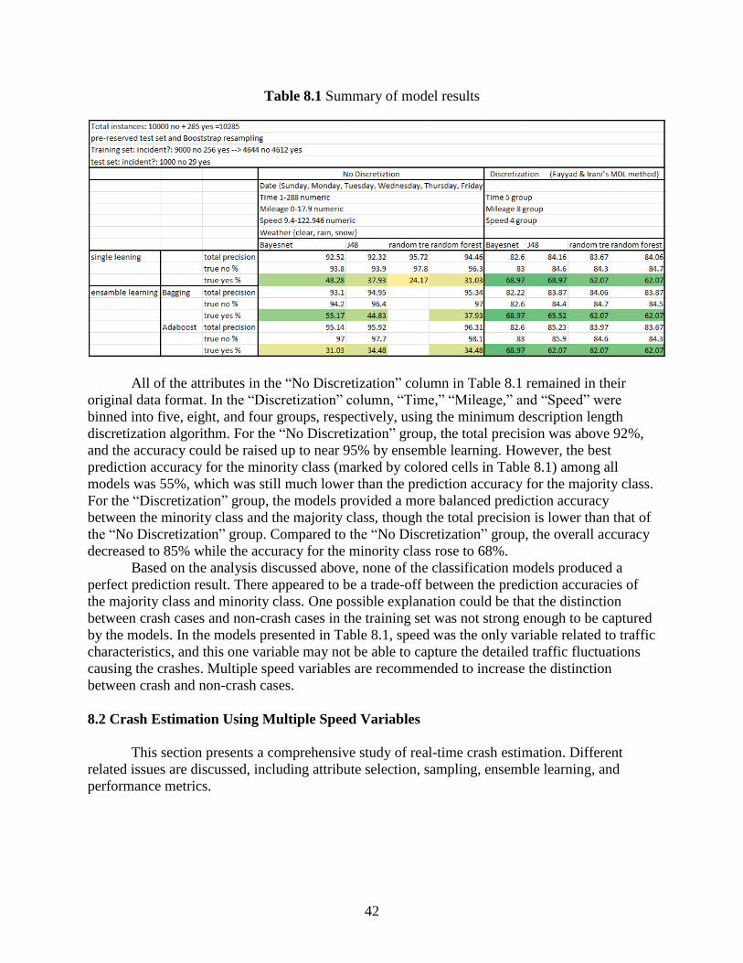
42
Table 8.1 Summary of model results
All of the attributes in the “No Discretization” column in Table 8.1 remained in their
original data format. In the “Discretization” column, “Time,” “Mileage,” and “Speed” were
binned into five, eight, and four groups, respectively, using the minimum description length
discretization algorithm. For the “No Discretization” group, the total precision was above 92%,
and the accuracy could be raised up to near 95% by ensemble learning. However, the best
prediction accuracy for the minority class (marked by colored cells in Table 8.1) among all
models was 55%, which was still much lower than the prediction accuracy for the majority class.
For the “Discretization” group, the models provided a more balanced prediction accuracy
between the minority class and the majority class, though the total precision is lower than that of
the “No Discretization” group. Compared to the “No Discretization” group, the overall accuracy
decreased to 85% while the accuracy for the minority class rose to 68%.
Based on the analysis discussed above, none of the classification models produced a
perfect prediction result. There appeared to be a trade-off between the prediction accuracies of
the majority class and minority class. One possible explanation could be that the distinction
between crash cases and non-crash cases in the training set was not strong enough to be captured
by the models. In the models presented in Table 8.1, speed was the only variable related to traffic
characteristics, and this one variable may not be able to capture the detailed traffic fluctuations
causing the crashes. Multiple speed variables are recommended to increase the distinction
between crash and non-crash cases.
8.2 Crash Estimation Using Multiple Speed Variables
This section presents a comprehensive study of real-time crash estimation. Different
related issues are discussed, including attribute selection, sampling, ensemble learning, and
performance metrics.

43
8.2.1 Data Structure, Window Selection, and Distinction
The essential data-level feature influencing model prediction accuracy is the distinction
between classes. All data-level approaches focus on increasing this distinction. Therefore, the
distinction defined within the original data set can be critical.
In this analysis, an 11.7 mile segment on I-80 eastbound from mile marker 442.9 to mile
marker 454.6 in the metropolitan area of Omaha, Nebraska, was studied. The data set consisted
of archived traffic speed data and crash data from 2008 with 313 crashes. Figure 8.1 shows the
daily traffic speed heat maps overlaid with crashes for the study segment in September 2008.
Figure 8.1 Daily speed heat maps overlaid with crashes for the studied segment
Each pixel on the heat maps is a five-minute by 0.1 mile grid. Each grid is colored based
on speed and marked based on crash history (i.e., no “×” marker means no crashes). As evident
in these heat maps, a large portion of crashes occurred when the traffic speed was low. If crash
occurrence is predictable by speed, a normal speed pattern and a certain speed pattern as a
precursor to crash occurrence could be classified; in other words, the speed pattern captured by a
small window on the heat map should be classifiable into normal and hazardous conditions.
Three window selection strategies (the three squares identified by the labels 1, 2, and 3)
are illustrated in Figure 8.2.
Figure 8.2 Attribute selection for crash likelihood prediction

44
In this figure, the target study point where the crash risk will be estimated for a given
time is marked as “Current” in the grid and is colored red. On the vertical axis, the “+” marker
indicates the downstream direction and the “-” marker indicates upstream. Intuitively, the
downstream traffic should have a greater impact on the current study point than the upstream
traffic. Large speed differences resulting from the low speed of downstream traffic could
possibly lead to a higher risk of rear-end crashes. In the real-time crash prediction problem,
Window 2 in Figure 8.2 represents a “crash prediction” scenario because there is a buffer time
(five minutes in this case) between speed measurement and the target interval (the red box). Both
Window 1 and Window 3 represent “crash risk estimation” scenarios because the target interval
is included in the measurement frame. A model based on Window 1 or Window 3 might be more
reliable because the traffic condition immediately before the crash occurrence is most predictive.
However, a model based on Window 2 might have more practical value because it leaves a
buffer time for traffic operations. The window size is also critical. If the window is too small, it
is possible that important information might be missed; if the window is too large, unrelated
information could decrease the model’s accuracy.
In this analysis, Window 1 was first selected. This window is reasonably large enough to
ensure that no critical information is missing and can be broken down into smaller windows for
further analysis. The speed heat maps for 14 randomly selected samples are shown in Figure 8.3,
which includes seven non-crash cases in the top row and seven crash cases in the bottom row.
Figure 8.3 Speed heat maps for randomly selected non-crash cases (top row) and crash cases
(bottom row)
For four of the seven crash cases in Figure 8.3, the speed pattern in the window is
significantly different from the speed pattern for the corresponding non-crash cases. The other
three crash cases have speed patterns similar to the speed patterns of their corresponding non-
crash cases and therefore would not be easy to differentiate from non-crash cases. In real-time
crash prediction modeling, the risk of crash occurrence at a certain study point is explained by
the traffic speed pattern in each grid within the selected window.
The distributions of traffic speeds at the target intervals for both crash and non-crash
cases are shown in Figure 8.4.

45
Figure 8.4 Distribution of speed for crash and non-crash cases
In each of the left two subplots of this figure, the blue bars represent the speed
distribution and the red curve is the fitted normal distribution. The two fitted normal distributions
are displayed together in the subplot on the right, with crash cases in red and non-crash cases in
blue. At the target interval, the speed distributions for crash and non-crash cases had a large
overlap, and the distinction between the two cases was not very good.
The scenario described above is a one-grid window case. If more grids are introduced, the
combination of speeds may enhance the classification accuracy. Hence, it is essential to select
the right window for maximizing the distinction of data.
8.2.2 Resampling
Data resampling is the most widely used data-level approach for dealing with imbalanced
data. The idea behind data resampling is to create a new training set with a more balanced class
rate from the raw data to better fit the modeling algorithm. Commonly used resampling methods
include oversampling the minority class, undersampling the majority class, and a combination of
both. In this analysis, a base data set was created using the matched case control method, and
seven training sets with different crash to non-crash ratios were generated using resampling
methods. Two “bad” training sets with very small crash to non-crash ratios were also created for
comparison purposes. These sets were created by intentionally selecting crash and non-crash
cases from the overlaid regime.
8.2.3 Modeling Algorithms and AdaBoost
Two approaches are often used to handle imbalanced data. One approach is to introduce
extra cost-sensitive factors to make the individual modeling algorithm robust for the data with an
unbalanced class rate. The other is to develop a robust model by combining several non-robust
individual models together. The AdaBoost ensemble learning algorithm represents the latter
approach. In the following sections of this chapter, four different common classification models
are tested with and without AdaBoost on all the training sets.
8.2.4 Model Performance Metric
Because the cost of ignoring a crash case (positive) is much higher than misclassifying a
non-crash case (negative), the overall accuracy of crash prediction is not as important as the true

46
positive rate (or sensitivity or recall) or the false positive rate (or false alarm rate). A high true
positive rate and a low false alarm rate are desired, but there is trade-off between these two. A
higher true positive rate can always be achieved by increasing the classification cut-off threshold,
but the false positive rate will rise in response. The optimal classification cut-off threshold varies
by application. In most cases, the ROC curve and the AUC are more appropriate performance
metrics for classifiers than a confusion matrix using 0.5 as the cut-off threshold. Figure 8.5
shows two similar ROC curves from two different models.
Figure 8.5 ROC curve colored according to cut-off threshold
The vertical and horizontal axes of a ROC curve are the true positive rate and false
positive rate, respectively. On a ROC curve, the point closest to the upper left corner is usually
the best choice for the cut-off threshold. If a value of 0.5 is used as the threshold, the model
shown on the left of Figure 8.5 will classify most of the data as negative (i.e., ignore most of the
positive cases), and both the true positive rate and false positive rate will be close to zero;
conversely, the model on the right will classify most of the data as positive, and both the true
positive rate and false positive rate will be close to one. Under this performance metric, neither
of the two models is desired. The two ROC curves have similar shapes. If a threshold of 0.3 is
used for the model on the left and a threshold of 0.7 is used for the model on the right, both
models can achieve a high true positive rate with a low false positive rate.
8.2.5 Model Comparison
Using the nine training sets described in Section 8.2 and the eight algorithms introduced
in Section 8.3, a total of 72 classification models were developed. The performance of the
models is shown in Figure 8.6 with the AUC as a performance criterion.

47
Figure 8.6 AUC of different classifiers on nine training sets
The classifiers with the AdaBoost algorithm are shown in blue in Figure 8.6, and the
other single classifiers are shown in red. Overall, the AdaBoost algorithm improved the models’
performance in handling imbalanced data, and the algorithm was not very sensitive to the ratio of
crash to non-crash cases in the data set. As expected, the two “bad” training sets resulted in bad
model performance. This demonstrates to some degree the importance of data distinction. The
Adaboost_J48 decision tree classifier was found to be the best model, especially when the
training set has a large ratio of non-crash to crash cases.
8.2.6 Window Selection Strategy Comparison
The Naive Bayes algorithm, although simple, was shown to perform reasonably well in
Section 8.2.5. This algorithm has good scalability and is time-efficient for processing huge data
sets. Here, the Naive Bayes algorithm was selected to compare different window selection
strategies. Eleven training sets were created using different window selection strategies. These
eleven windows are shown in Figure 8.7.
Figure 8.7 Eleven windows used for building a big data model
The AUC values for Windows 1 to 9 in Figure 8.7 are shown in the bar chart on the left
of Figure 8.8.

48
Figure 8.8 Impact of window size and location on model performance
The bar chart is arranged by window size. This chart indicates that adding more
information from old time slices would reduce model performance. Also, adding information
from downstream segments could make the mode more predictive. The ROC curves for
Windows 9, 10, and 11 are displayed together on the right of Figure 8.8. These curves show that
when the window was moved to an earlier period, the speed information became less predictive.
However, the performance deterioration was not very significant. Therefore, in practice it is
possible to perform both crash risk estimation and crash risk prediction for up to 10 minutes with
reasonable accuracy.
8.3 Potential Applications
The analyses in this chapter have shown that using a combination of speeds from a series
of time intervals from both the upstream and downstream segments of the target segment
captures the details of traffic conditions and improves the accuracy of crash risk predictions. The
combination of speeds can be represented as a rectangular window frame on a speed heat map.
An appropriate window selection strategy can enhance the model’s performance. A pre-trained
model can continue predicting crash risk based on the window of speed (time and location)
specified by the user. The real-time data feed can be obtained from either field sensor data or
probe data provided by a company such as INRIX. With this kind of real-time application,
proactive traffic management can be deployed against predicted upcoming high crash risk events;
for example, appropriate geo-sensitive information could be provided to the drivers entering the
area with an elevated crash risk. Furthermore, based on this real-time crash risk prediction
system, more applications, such as rerouting and coordinated dynamic message signs, can be
developed.
This chapter explored real-time crash estimation and prediction using high-resolution
traffic speed data from field sensors. The first section developed several preliminary crash
prediction models and illustrated the challenge of achieving prediction accuracy by comparing
the model results. The second section discussed modeling issues, including attribute selection,
sampling, ensemble learning, and performance metrics. The Adaboost_J48 decision tree
classifier was found to be the best model, and more buffer time to improve the reaction time of
operations can be gained by trading some model prediction accuracy. The last section
recommended several useful applications that can be developed to improve traffic operations
based upon real-time crash estimation and prediction.

49
9. Conclusions and Recommendations
9.1 Findings
This report described a comprehensive study of active traffic management on the urban
freeway system in Omaha, Nebraska. The study presented a systematic way to use data and
provide support for understanding traffic conditions and making effective operational decisions.
The use of an integrated database and the developed data processing platform
demonstrated the advantages of automating data processing procedures, developing data
visualization applications, speeding up data reduction, and reducing calculation errors. Built
upon this data platform, a speed heat map–based data visualization system was developed to
provide an overview of traffic conditions on selected roadway segments during specified time
periods. General traffic trends and the exact ranges of congestion were easily identified using
traffic speed heat maps. In addition, crash occurrences, weather conditions, and other related
information were overlaid together on the heat maps to reveal potential traffic problems and
causal factors by relating multiple layers of information both temporally and spatially. The traffic
speed heat map visualization system is a good use of traffic sensor data and has high practical
value in daily traffic operations. Another advantage of the integrated database and data
processing platform is that the system is flexible enough to build new features onto it. For
example, programs for fusing new data sources or calculating new performance measures can be
coded and embedded into the existing systems. This system is a sustainable way to handle large
amounts of traffic data and to gain knowledge from integrating multiple data sources.
Based on the data for a segment on I-80 westbound in Omaha in 2008, a crash risk
analysis was conducted using traffic, weather, and crash data. A binomial probit model was
developed to identify the crash contributing factors, and a sensitivity analysis was conducted to
quantify those factors. The crash analysis found that a one mile per hour increase in speed was
associated with a 7.5% decrease in crash risk. The crash risk on weekends was 77.6% lower than
the crash risk on weekdays. The rate of crash risk during the peak hours (6 a.m. to 8 a.m. and 4
p.m. to 6 p.m.) was approximately twice the rate of crash risk during the rest of a day. Crash risk
was also affected by location of the road. Rain was found to have no significant impact on crash
risk, while snow could increase crash risk by 81%. These results were used in the cost-benefit
analysis to evaluate the ramp metering strategy.
Using the proposed visualization methods and travel time–related performance measures,
the traffic conditions on five major freeways in Omaha were scanned, and a 6.3 mile segment on
I-80 eastbound was identified as the main recurring bottleneck. The FREEVAL software
provided with the HCM 2010 was used to analyze the impact of ramp metering. The results
showed that the mainline travel time on the 6.3 mile segment can be decreased from 9.3 minutes
to 8.1 minutes and that crash risk can be reduced by 37.5% after applying a ramp metering
strategy. The cost-benefit analysis showed that the benefits from travel time savings and crash
cost savings can easily offset the cost of implementing ramp metering.
A comprehensive study on real-time crash estimation and prediction was described in this
report. Modeling issues, including attribute selection, sampling, ensemble learning, and
performance metrics, were discussed. The Adaboost_J48 decision tree classifier was found to be
the best model, and more buffer time to improve the reaction time of operations can be gained by
trading some model prediction accuracy. This study also recommended several useful

50
applications that can be developed to improve traffic operations based upon real-time crash
prediction.
9.2 Limitations and Future Work
There are some limitations of this study. The data available for this study were collected
during the years of 2008 and 2009, and traffic conditions may have changed drastically over the
intervening six to seven years. Near-term history data are preferred for this type of study.
Although some of the results related to the descriptive traffic conditions, such as the bottleneck
location, may not hold true today, the analysis methods are completely transferable.
In future studies, efforts should be made to develop the capability of the data processing
platform for processing and visualizing traffic and road weather sensor data in real-time. Other
real-time applications like real-time crash prediction and rerouting driver guidance systems could
be built on the real-time data processing platform.

51
References
1. Abdel-Aty, Mohamed, and Anurag Pande. “Predicting Traffic Crashes Using Real-Time
Traffic Speed Patterns.” Paper presented at the 10th World Conference on Transport
Research, Istanbul, Turkey (2004): 16.
2. Abdel-Aty, Mohamed, Nizam Uddin, and Anurag Pande. “Split models for predicting
multivehicle crashes during high-speed and low-speed operating conditions on
freeways.” Transportation Research Record: Journal of the Transportation Research
Board 1908 (2005): 51-58.
3. Weiss, Gary M. “Mining with rarity: a unifying framework.” ACM SIGKDD Explorations
Newsletter 6, no. 1 (2004): 7-19.
4. Sun, Yanmin, Andrew KC Wong, and Mohamed S. Kamel. “Classification of imbalanced
data: A review.” International Journal of Pattern Recognition and Artificial Intelligence 23,
no. 04 (2009): 687-719.
5. Padmaja, T. Maruthi, Narendra Dhulipalla, Raju S. Bapi, and P. Radha Krishna. “Unbalanced
data classification using extreme outlier elimination and sampling techniques for fraud
detection.” Paper presented at the International Conference on Advanced Computing and
Communications (ADCOM), 2007. (2007): 511-516.
6. Sun, Yanmin, Mohamed S. Kamel, Andrew KC Wong, and Yang Wang. “Cost-sensitive
boosting for classification of imbalanced data.” Pattern Recognition 40, no. 12 (2007): 3358-
3378.
7. Phua, Clifton, Damminda Alahakoon, and Vincent Lee. “Minority report in fraud detection:
classification of skewed data.” ACM SIGKDD Explorations Newsletter 6, no. 1 (2004): 50-
59.
8. Seiffert, Chris, Taghi M. Khoshgoftaar, Jason Van Hulse, and Amri Napolitano. “RUSBoost:
Improving classification performance when training data is skewed.” Paper presented at
the 19th International Conference on Pattern Recognition (ICPR), 2008. (2008): 1-4.
9. Tang, Yuchun, Yan-Qing Zhang, Nitesh V. Chawla, and Sven Krasser. “SVMs modeling for
highly imbalanced classification.” Systems, Man, and Cybernetics, Part B: Cybernetics,
IEEE Transactions on 39, no. 1 (2009): 281-288.
10. Khalilia, Mohammed, Sounak Chakraborty, and Mihail Popescu. “Predicting disease risks
from highly imbalanced data using random forest.” BMC Medical Informatics and Decision
Making 11, no. 1 (2011): 51.
11. Schlesselman, J. J., and P. D. Stolley. “Sources of bias.” Case-Control Studies Design,
Conduct, Analysis. New York: Oxford (1982): 124-143.
12. Weiss, Gary M., and Foster Provost. “Learning when training data are costly: the effect of
class distribution on tree induction.” Journal of Artificial Intelligence Research (2003): 315-
354.
13. Abdel-Aty, Mohamed, Nizam Uddin, Anurag Pande, Fathy Abdalla, and Liang Hsia.
“Predicting freeway crashes from loop detector data by matched case-control logistic
regression.” Transportation Research Record: Journal of the Transportation Research Board
1897 (2004): 88-95.
14. Zheng, Zuduo, Soyoung Ahn, and Christopher M. Monsere. “Impact of traffic oscillations on
freeway crash occurrences.” Accident Analysis & Prevention 42, no. 2 (2010): 626-636.

52
15. Xu, Chengcheng, Pan Liu, Wei Wang, and Zhibin Li. “Evaluation of the impacts of traffic
states on crash risks on freeways.” Accident Analysis & Prevention 47 (2012): 162-171.
16. Pande, Anurag, and Mohamed Abdel-Aty. “Assessment of freeway traffic parameters leading
to lane-change related collisions.” Accident Analysis & Prevention 38, no. 5 (2006): 936-948.
17. Pande, Anurag, and Mohamed Abdel-Aty. “Comprehensive analysis of the relationship
between real-time traffic surveillance data and rear-end crashes on freeways.” Transportation
Research Record: Journal of the Transportation Research Board 1953 (2006): 31-40.
18. Abdel-Aty, Mohamed, and Anurag Pande. “Identifying crash propensity using specific traffic
speed conditions.” Journal of Safety Research 36, no. 1 (2005): 97-108.
19. Oh, Cheol, Jun-Seok Oh, and Stephen G. Ritchie. “Real-time hazardous traffic condition
warning system: framework and evaluation.” IEEE Transactions on Intelligent
Transportation Systems 6, no. 3 (2005): 265-272.
20. Xu, Chengcheng, Andrew P. Tarko, Wei Wang, and Pan Liu. “Predicting crash likelihood
and severity on freeways with real-time loop detector data.” Accident Analysis &
Prevention 57 (2013): 30-39.
21. Hossain, Moinul, and Yasunori Muromachi. “Understanding crash mechanism on urban
expressways using high-resolution traffic data.” Accident Analysis & Prevention 57 (2013):
17-29.
22. Jacobson, Leslie, Jason Stribiak, Lisa Nelson, and Doug Sallman. Ramp Management and
Control Handbook, Federal Highway Administration, Washington, DC (2006).
23. The University of Waikato. n.d. Weka 3: Data Mining Software in Java.
http://www.cs.waikato.ac.nz/ml/weka/. Last accessed February 4, 2016.

53
Appendix: Daily Speed Heat Maps 2013–2014
A. 1 Daily speed heat maps of I-80 eastbound Omaha in January 2013
A. 2 Daily speed heat maps of I-80 eastbound Omaha in February 2013
A. 3 Daily speed heat maps of I-80 eastbound Omaha in March 2013

54
A. 4 Daily speed heat maps of I-80 eastbound Omaha in April 2013
A. 5 Daily speed heat maps of I-80 eastbound Omaha in May 2013
A. 6 Daily speed heat maps of I-80 eastbound Omaha in June 2013
55
A. 7 Daily speed heat maps of I-80 eastbound Omaha in July 2013
A. 8 Daily speed heat maps of I-80 eastbound Omaha in August 2013
A. 9 Daily speed heat maps of I-80 eastbound Omaha in September 2013

56
A. 10 Daily speed heat maps of I-80 eastbound Omaha in October 2013
A. 11 Daily speed heat maps of I-80 eastbound Omaha in November 2013
A. 12 Daily speed heat maps of I-80 eastbound Omaha in December 2013

57
A. 13 Daily speed heat maps of I-80 eastbound Omaha in January 2014
A. 14 Daily speed heat maps of I-80 eastbound Omaha in February 2014
A. 15 Daily speed heat maps of I-80 eastbound Omaha in March 2014

58
A. 16 Daily speed heat maps of I-80 eastbound Omaha in April 2014
A. 17 Daily speed heat maps of I-80 eastbound Omaha in May 2014
A. 18 Daily speed heat maps of I-80 eastbound Omaha in June 2014

59
A. 19 Daily speed heat maps of I-80 eastbound Omaha in July 2014
A. 20 Daily speed heat maps of I-80 eastbound Omaha in August 2014
A. 21 Daily speed heat maps of I-80 eastbound Omaha in September 2014

60
A. 22 Daily speed heat maps of I-80 eastbound Omaha in October 2014
A. 23 Daily speed heat maps of I-80 eastbound Omaha in November 2014
A. 24 Daily speed heat maps of I-80 eastbound Omaha in December 2014