Embed Size (px)
Citation preview
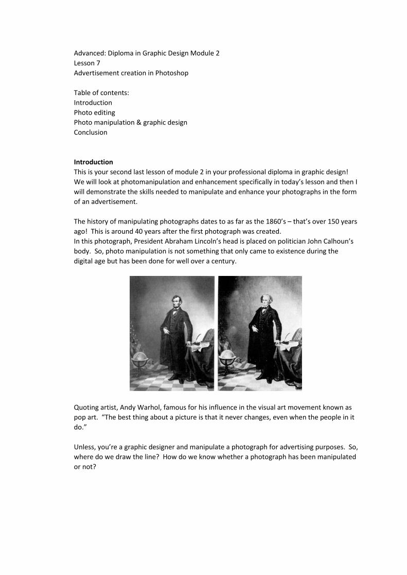
Advanced: Diploma in Graphic Design Module 2 Lesson 7 Advertisement creation in Photoshop Table of contents: Introduction Photo editing Photo manipulation & graphic design Conclusion Introduction This is your second last lesson of module 2 in your professional diploma in graphic design! We will look at photomanipulation and enhancement specifically in today’s lesson and then I will demonstrate the skills needed to manipulate and enhance your photographs in the form of an advertisement. The history of manipulating photographs dates to as far as the 1860’s – that’s over 150 years ago! This is around 40 years after the first photograph was created. In this photograph, President Abraham Lincoln’s head is placed on politician John Calhoun’s body. So, photo manipulation is not something that only came to existence during the digital age but has been done for well over a century.
Quoting artist, Andy Warhol, famous for his influence in the visual art movement known as pop art. “The best thing about a picture is that it never changes, even when the people in it do.” Unless, you’re a graphic designer and manipulate a photograph for advertising purposes. So, where do we draw the line? How do we know whether a photograph has been manipulated or not?
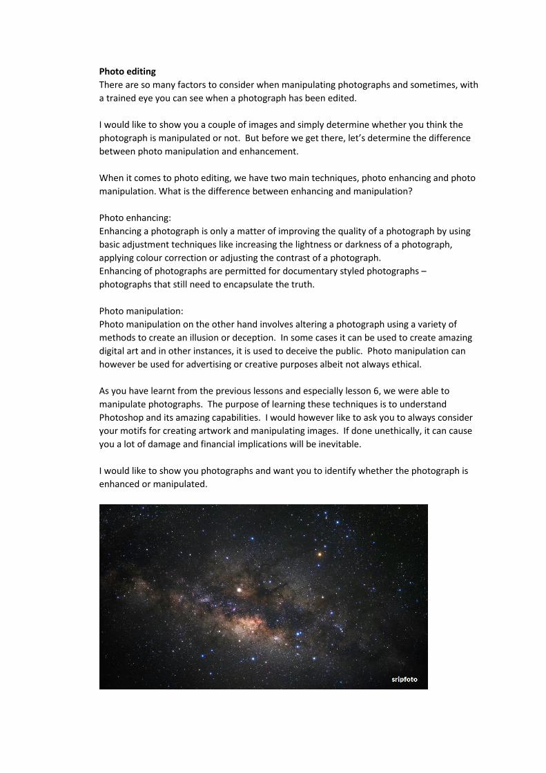
Photo editing There are so many factors to consider when manipulating photographs and sometimes, with a trained eye you can see when a photograph has been edited. I would like to show you a couple of images and simply determine whether you think the photograph is manipulated or not. But before we get there, let’s determine the difference between photo manipulation and enhancement. When it comes to photo editing, we have two main techniques, photo enhancing and photo manipulation. What is the difference between enhancing and manipulation? Photo enhancing: Enhancing a photograph is only a matter of improving the quality of a photograph by using basic adjustment techniques like increasing the lightness or darkness of a photograph, applying colour correction or adjusting the contrast of a photograph. Enhancing of photographs are permitted for documentary styled photographs – photographs that still need to encapsulate the truth. Photo manipulation: Photo manipulation on the other hand involves altering a photograph using a variety of methods to create an illusion or deception. In some cases it can be used to create amazing digital art and in other instances, it is used to deceive the public. Photo manipulation can however be used for advertising or creative purposes albeit not always ethical. As you have learnt from the previous lessons and especially lesson 6, we were able to manipulate photographs. The purpose of learning these techniques is to understand Photoshop and its amazing capabilities. I would however like to ask you to always consider your motifs for creating artwork and manipulating images. If done unethically, it can cause you a lot of damage and financial implications will be inevitable. I would like to show you photographs and want you to identify whether the photograph is enhanced or manipulated.
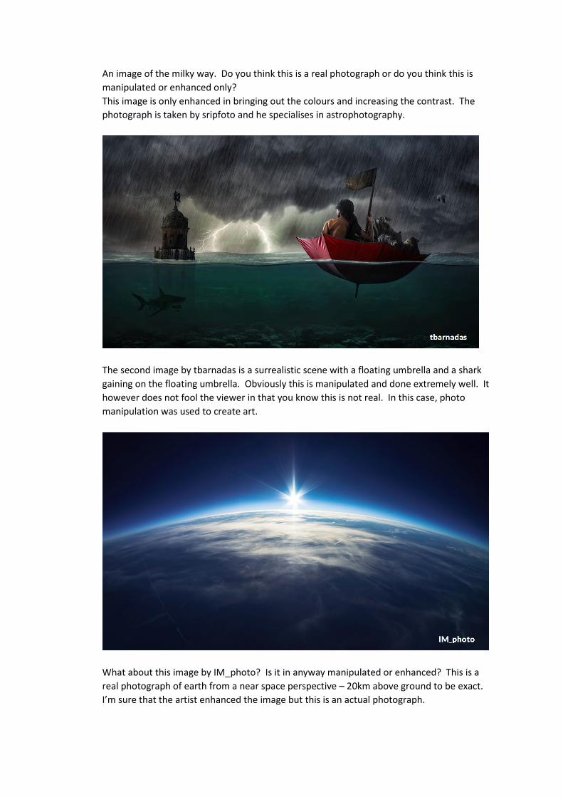
An image of the milky way. Do you think this is a real photograph or do you think this is manipulated or enhanced only? This image is only enhanced in bringing out the colours and increasing the contrast. The photograph is taken by sripfoto and he specialises in astrophotography.
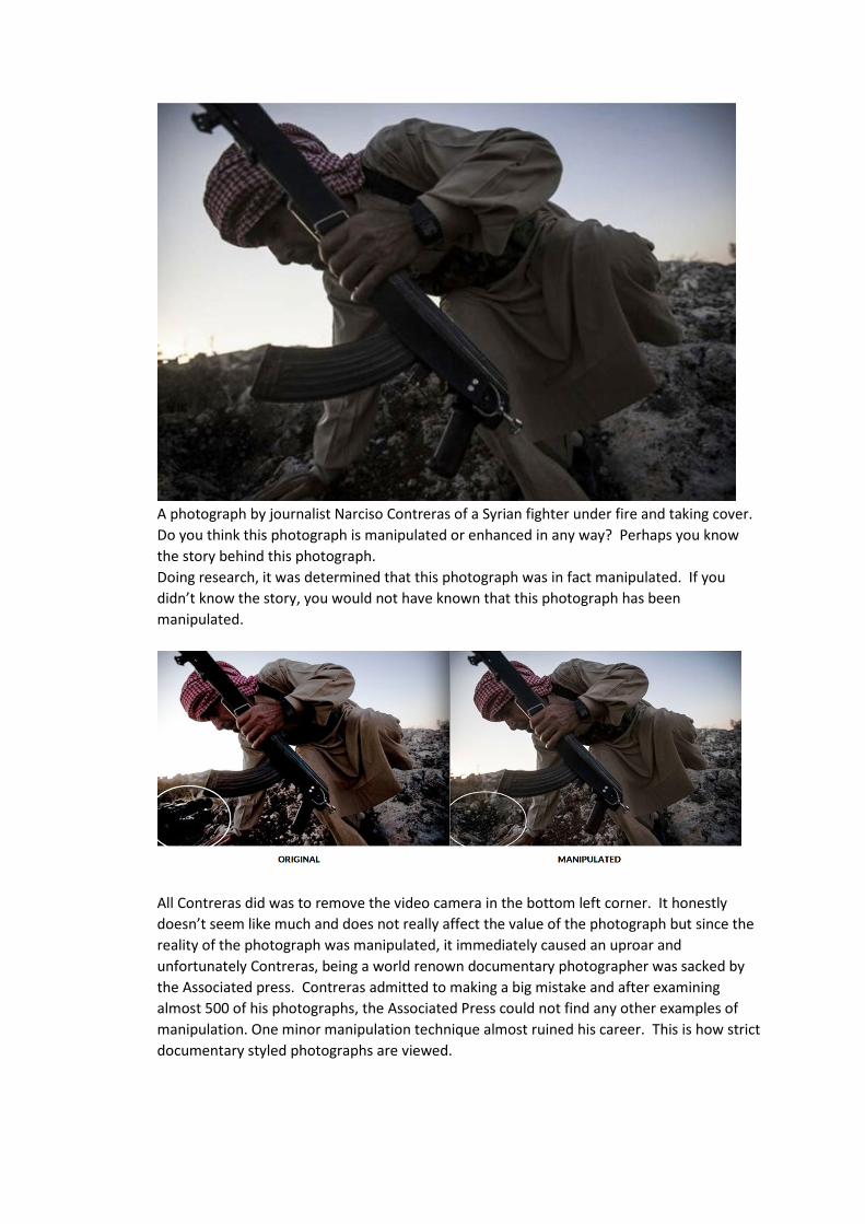
The second image by tbarnadas is a surrealistic scene with a floating umbrella and a shark gaining on the floating umbrella. Obviously this is manipulated and done extremely well. It however does not fool the viewer in that you know this is not real. In this case, photo manipulation was used to create art.
What about this image by IM_photo? Is it in anyway manipulated or enhanced? This is a real photograph of earth from a near space perspective – 20km above ground to be exact. I’m sure that the artist enhanced the image but this is an actual photograph.
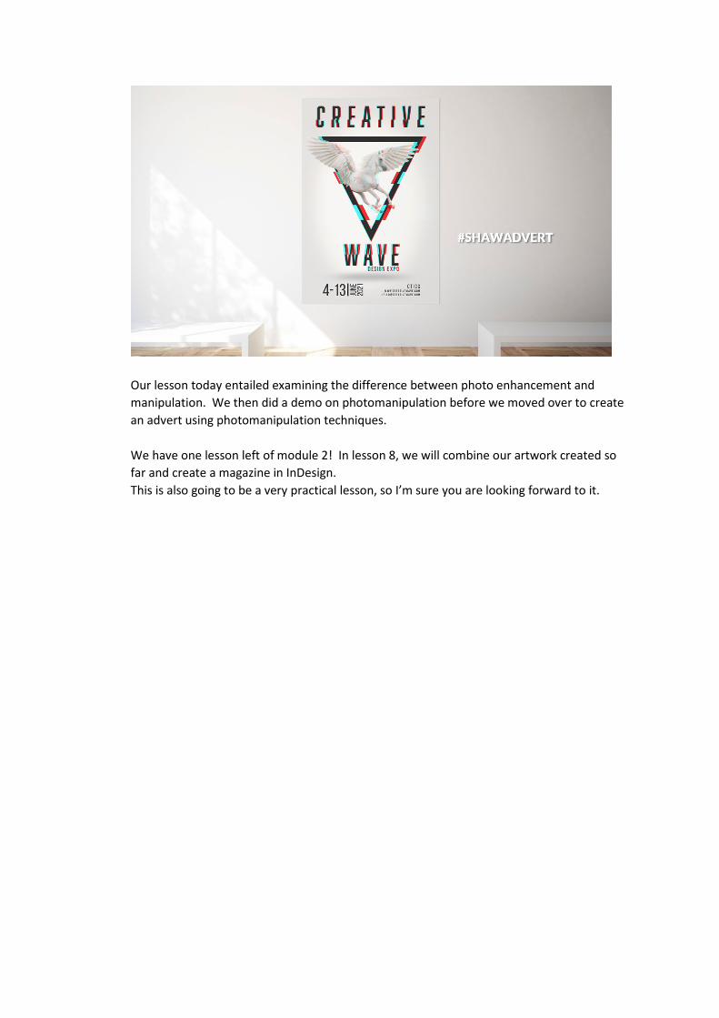
A photograph by journalist Narciso Contreras of a Syrian fighter under fire and taking cover. Do you think this photograph is manipulated or enhanced in any way? Perhaps you know the story behind this photograph. Doing research, it was determined that this photograph was in fact manipulated. If you didn’t know the story, you would not have known that this photograph has been manipulated.
All Contreras did was to remove the video camera in the bottom left corner. It honestly doesn’t seem like much and does not really affect the value of the photograph but since the reality of the photograph was manipulated, it immediately caused an uproar and unfortunately Contreras, being a world renown documentary photographer was sacked by the Associated press. Contreras admitted to making a big mistake and after examining almost 500 of his photographs, the Associated Press could not find any other examples of manipulation. One minor manipulation technique almost ruined his career. This is how strict documentary styled photographs are viewed.
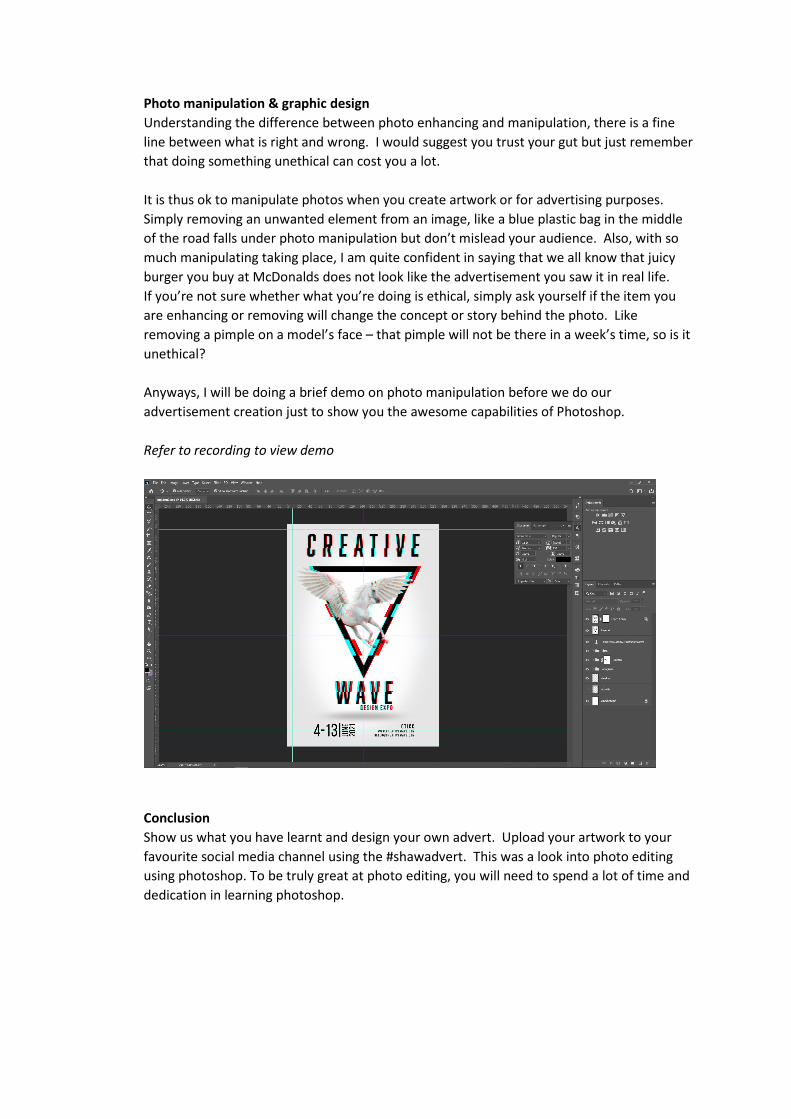
Photo manipulation & graphic design Understanding the difference between photo enhancing and manipulation, there is a fine line between what is right and wrong. I would suggest you trust your gut but just remember that doing something unethical can cost you a lot. It is thus ok to manipulate photos when you create artwork or for advertising purposes. Simply removing an unwanted element from an image, like a blue plastic bag in the middle of the road falls under photo manipulation but don’t mislead your audience. Also, with so much manipulating taking place, I am quite confident in saying that we all know that juicy burger you buy at McDonalds does not look like the advertisement you saw it in real life. If you’re not sure whether what you’re doing is ethical, simply ask yourself if the item you are enhancing or removing will change the concept or story behind the photo. Like removing a pimple on a model’s face – that pimple will not be there in a week’s time, so is it unethical? Anyways, I will be doing a brief demo on photo manipulation before we do our advertisement creation just to show you the awesome capabilities of Photoshop. Refer to recording to view demo
Conclusion Show us what you have learnt and design your own advert. Upload your artwork to your favourite social media channel using the #shawadvert. This was a look into photo editing using photoshop. To be truly great at photo editing, you will need to spend a lot of time and dedication in learning photoshop.
Our lesson today entailed examining the difference between photo enhancement and manipulation. We then did a demo on photomanipulation before we moved over to create an advert using photomanipulation techniques. We have one lesson left of module 2! In lesson 8, we will combine our artwork created so far and create a magazine in InDesign. This is also going to be a very practical lesson, so I’m sure you are looking forward to it.
Advanced: Diploma in Graphic Design Module 2 Lesson 8 Layout in InDesign – Magazine creation Table of contents: Introduction Using a grid Conclusion Introduction This is officially your last lesson for Module 2! After today’s lesson, you will be half way through your Professional diploma in Graphic Design and at the end of this course, we will take all the work that you have done and create an amazing portfolio that you can use to showcase your extraordinary ability. Basic photography Now, as a designer, it comes in handy to have knowledge on other fields as well, examples include web designing, marketing and photography. This is also the reason why I did additional courses whilst was studying graphic design back in the day. I will give you some very basic tips on photography in this lesson, but I do recommend that if you’re interested, to check out our photography course as well (if you have not done so already). Punctuation is used for clarifying a written sentence to avoid misinterpretation. This include punctuation marks like the , . ? Colon, but also capital letters, paragraphing and indicating the end or beginning of a sentence. But did you know that during the middle ages, with the evolution of the written language still in progress, punctuation was almost non-existent? There was no identification of the beginning or end of a sentence and writings were done in either square capitals or rustic capitals. Lowercase letters only evolved later from design traits from Carolingian miniscule. Punctuation was indicated by the variable sizes between words. Considering how grammar and punctuation has evolved, it is a lot easier to read and understand and makes you appreciate these small details a lot more. If not for punctuation, we would all misinterpret one another. Let’s end off module two from an inspiring quote by design influencer, Paula Scher again. “The thing that’s most to be feared, is doing the same thing over and over again.” In any creative field, you will need to constantly adapt and change your methods for doing things. Doing the same things over will not help you in growing and your creativity will suffer due to this. As difficult as change may seem sometimes, embrace it because the more you change things, the easier this process becomes. Using a grid Lesson 8 today entails designing a magazine cover from the content we have created specifically in lesson 6 and 7 so far. Before you simply jump in and create your magazine, because getting over excited can cost you unnecessary time and effort. Like with all designs, consider your 5 steps in the design cycle before blatantly jumping into the deep end.
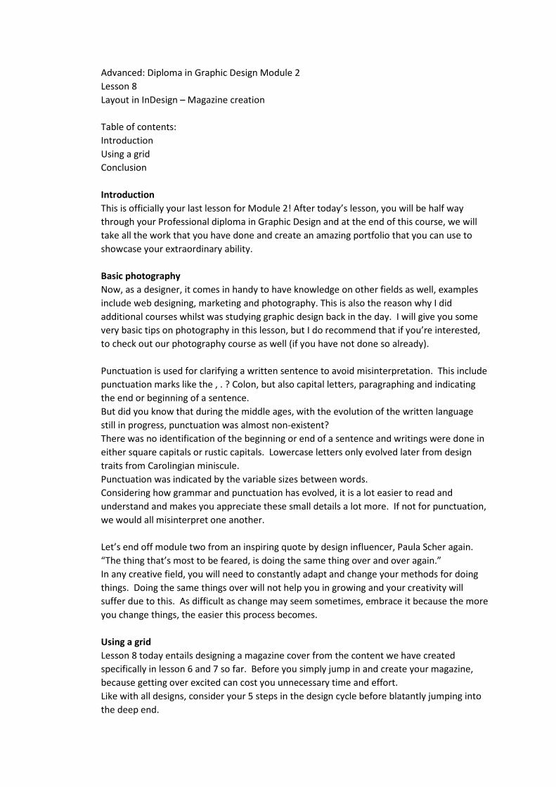
Can you recall the design cycle steps from lesson 3 in module 1? Have you been applying these steps to your designs that you have been creating? These steps include, briefing, research & brainstorming, thumbnails, production and present. I would like to focus on the thumbnails stage specifically. When it comes to layout design in general but specifically publication design, we make use of a grid to organise our elements. The whole idea of a grid is to make the design process easier and quicker, so don’t let the process put you off. So, when designing your thumbnails, consider your grid and how all your elements will be laid out on your grid. The idea is to use your grid creatively but still make the content understandable. We don’t live in the middle ages any longer, so practicality and functionality are key. The first step is to determine the size and ratio of your document size, whether it is for digital or printing purposes. This is referred to as the trim size. Next, add your bleed, which, as you should know by now is around 3mm or 0,125” for printed documents. Next determine your safe or live area and this is the area we use to make sure that the content within this area is printed or visible on screen – remember when I constantly say “have generous margins”? Well, this refers to your safe or live area. Other terms we will look into today are columns, gutter and alley. As you know by now columns are the vertical lines indicating legs of paragraphs.
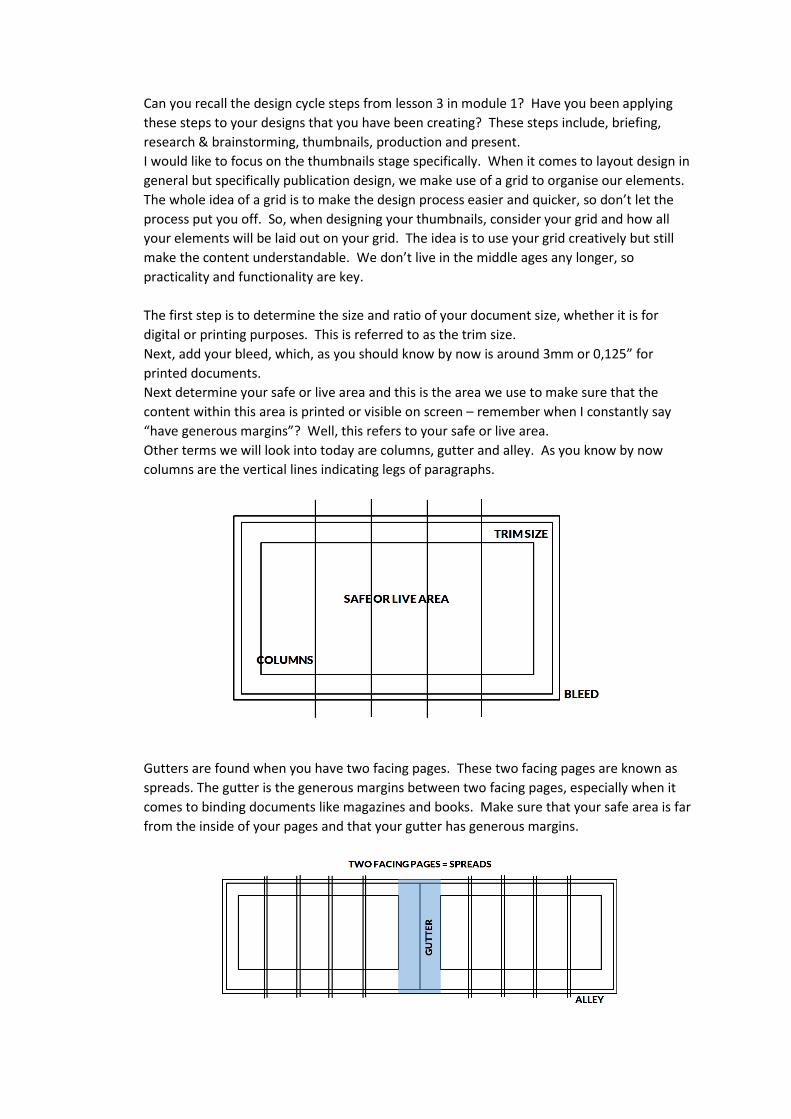
Gutters are found when you have two facing pages. These two facing pages are known as spreads. The gutter is the generous margins between two facing pages, especially when it comes to binding documents like magazines and books. Make sure that your safe area is far from the inside of your pages and that your gutter has generous margins.
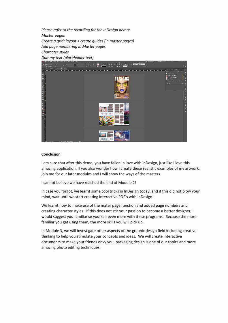
Please refer to the recording for the InDesign demo: Master pages Create a grid: layout > create guides (in master pages) Add page numbering in Master pages Character styles Dummy text (placeholder text)
Conclusion
I am sure that after this demo, you have fallen in love with InDesign, just like I love this amazing application. If you also wonder how I create these realistic examples of my artwork, join me for our later modules and I will show the ways of the masters.
I cannot believe we have reached the end of Module 2!
In case you forgot, we learnt some cool tricks in InDesign today, and if this did not blow your mind, wait until we start creating interactive PDF’s with InDesign!
We learnt how to make use of the mater page function and added page numbers and creating character styles. If this does not stir your passion to become a better designer, I would suggest you familiarise yourself even more with these programs. Because the more familiar you get using them, the more skills you will pick up.
In Module 3, we will investigate other aspects of the graphic design field including creative thinking to help you stimulate your concepts and ideas. We will create interactive documents to make your friends envy you, packaging design is one of our topics and more amazing photo editing techniques.