Embed Size (px)
Citation preview
1
Welcome to Advanced Excel: Pivot Tables. I’m sure you’re excited to get started
on your journey into the depths of Microsoft Excel.
In this course we will cover:
• Pivot Tables
• Creating
• Formatting
• Sorting & Filtering
• Printing
Of course, we do have some expectations about what you already know. In order
to get the most out of this class, you will need to feel comfortable:
• Using Windows 8.1
• Using Excel 2013 and the “ribbon”
• Switching between worksheets
• Copying and Pasting
• Using formulas in Excel
• Using the right mouse button for context menus
Throughout this course we will use several practice files. These files can be found
posted on the Elmhurst Public Library website. Each section header will list any
files that are used by indicating the file name below the section title.
What is a Pivot Table?
A pivot table is a tool that is part of Microsoft Excel (and other spreadsheet
applications, like Google Sheets) that helps users not only to quickly view and
analyze data in a more visual way, but also to just as easily change the
arrangement of the data so that it can be seen from multiple perspectives. It is,
Advanced Excel: Pivot Tables
2
surprisingly, one of the most feared features of Excel, but as you’ll quickly
discover, pivot tables are easy to make, fun to use, and extremely helpful and
informative.
Originally, if you wanted to take a collection of data and make an attractive and
useful presentation out of it, you needed to spend a lot of time copying, pasting,
writing formulas, and formatting the result. Pivot tables help you to accomplish
this in just a few clicks.
Preparing Your Data:
File: 001TableData.xlsx
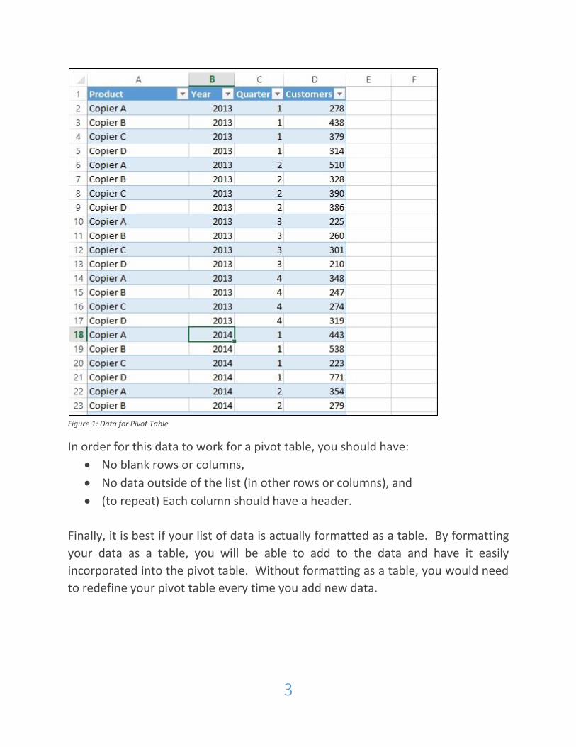
Before you can make a pivot table, you need data. Your data needs to be
arranged in a list or table format. Each column of your data will have a column
header or title. So, if your data is a list of how many customers buy products that
your company sells to over time, you might have a column for year, quarter,
product, and customers (see figure 1).
3
Figure 1: Data for Pivot Table
In order for this data to work for a pivot table, you should have:
No blank rows or columns,
No data outside of the list (in other rows or columns), and
(to repeat) Each column should have a header.
Finally, it is best if your list of data is actually formatted as a table. By formatting
your data as a table, you will be able to add to the data and have it easily
incorporated into the pivot table. Without formatting as a table, you would need
to redefine your pivot table every time you add new data.
4
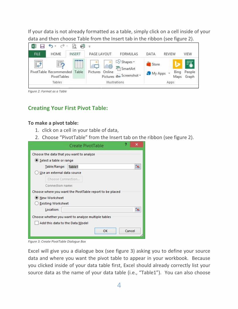
If your data is not already formatted as a table, simply click on a cell inside of your
data and then choose Table from the Insert tab in the ribbon (see figure 2).
Figure 2: Format as a Table
Creating Your First Pivot Table:
To make a pivot table:
1. click on a cell in your table of data,
2. Choose “PivotTable” from the Insert tab on the ribbon (see figure 2).
Figure 3: Create PivotTable Dialogue Box
Excel will give you a dialogue box (see figure 3) asking you to define your source
data and where you want the pivot table to appear in your workbook. Because
you clicked inside of your data table first, Excel should already correctly list your
source data as the name of your data table (i.e., “Table1”). You can also choose
5
which worksheet the table will be placed into. In this case, we will leave it as
“New Worksheet.” After making these 2 selections, click “OK” and your pivot
table will be created (see figure 4).
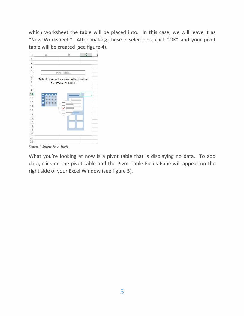
Figure 4: Empty Pivot Table
What you’re looking at now is a pivot table that is displaying no data. To add
data, click on the pivot table and the Pivot Table Fields Pane will appear on the
right side of your Excel Window (see figure 5).
6
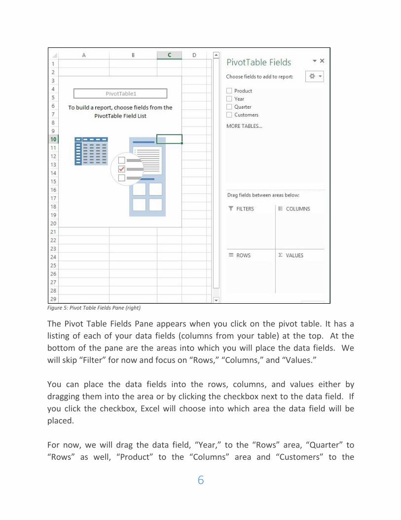
Figure 5: Pivot Table Fields Pane (right)
The Pivot Table Fields Pane appears when you click on the pivot table. It has a
listing of each of your data fields (columns from your table) at the top. At the
bottom of the pane are the areas into which you will place the data fields. We
will skip “Filter” for now and focus on “Rows,” “Columns,” and “Values.”
You can place the data fields into the rows, columns, and values either by
dragging them into the area or by clicking the checkbox next to the data field. If
you click the checkbox, Excel will choose into which area the data field will be
placed.
For now, we will drag the data field, “Year,” to the “Rows” area, “Quarter” to
“Rows” as well, “Product” to the “Columns” area and “Customers” to the
7
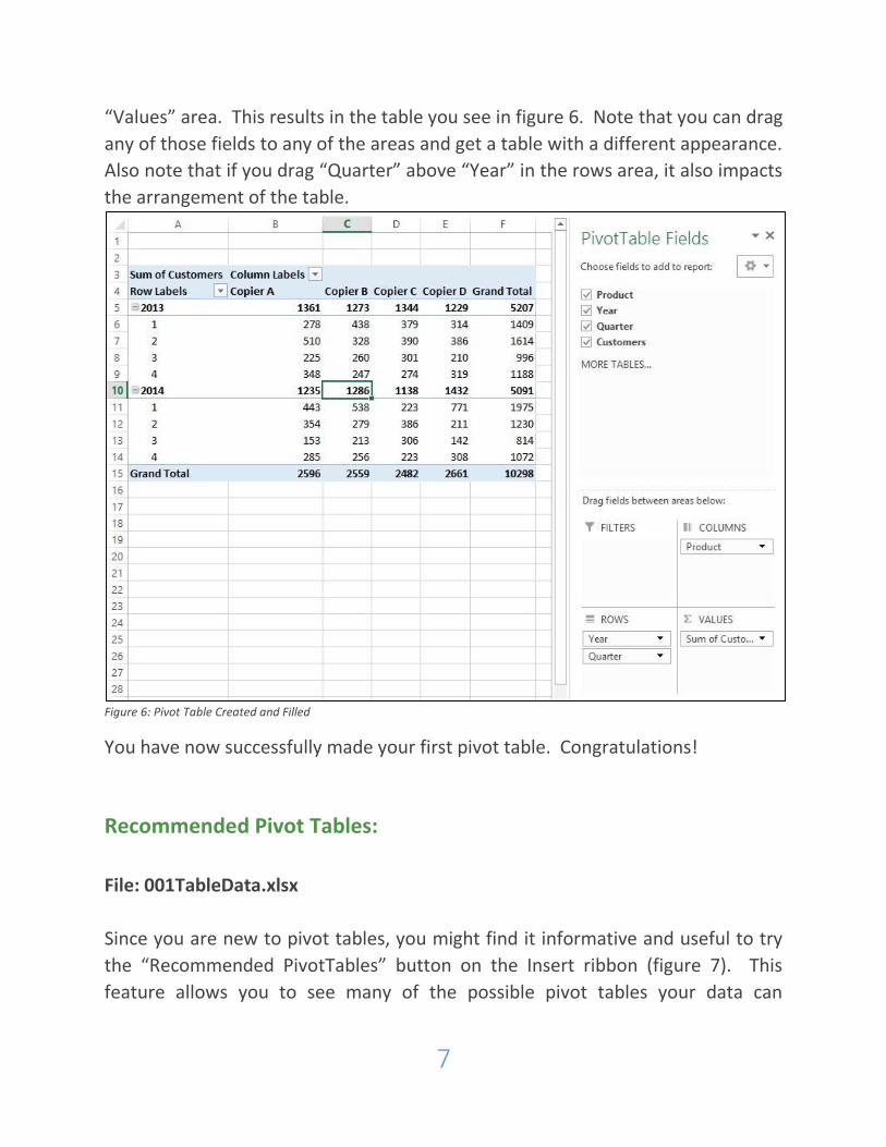
“Values” area. This results in the table you see in figure 6. Note that you can drag
any of those fields to any of the areas and get a table with a different appearance.
Also note that if you drag “Quarter” above “Year” in the rows area, it also impacts
the arrangement of the table.
Figure 6: Pivot Table Created and Filled
You have now successfully made your first pivot table. Congratulations!
Recommended Pivot Tables:
File: 001TableData.xlsx
Since you are new to pivot tables, you might find it informative and useful to try
the “Recommended PivotTables” button on the Insert ribbon (figure 7). This
feature allows you to see many of the possible pivot tables your data can
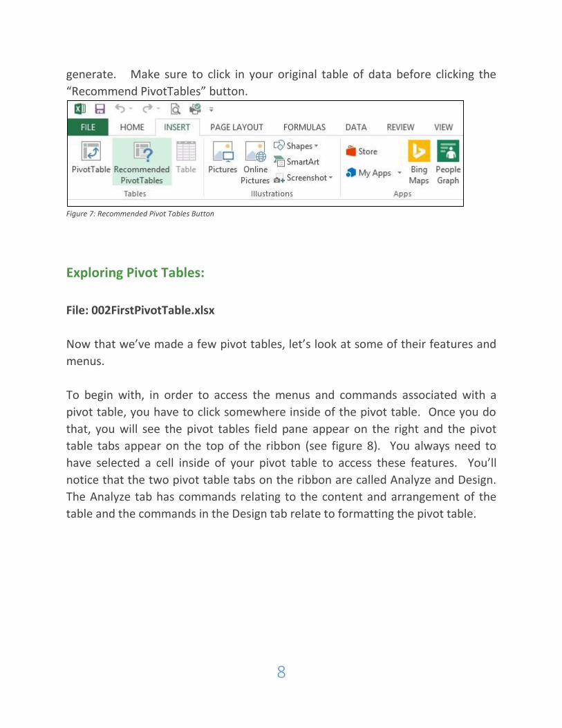
8
generate. Make sure to click in your original table of data before clicking the
“Recommend PivotTables” button.
Figure 7: Recommended Pivot Tables Button
Exploring Pivot Tables:
File: 002FirstPivotTable.xlsx
Now that we’ve made a few pivot tables, let’s look at some of their features and
menus.
To begin with, in order to access the menus and commands associated with a
pivot table, you have to click somewhere inside of the pivot table. Once you do
that, you will see the pivot tables field pane appear on the right and the pivot
table tabs appear on the top of the ribbon (see figure 8). You always need to
have selected a cell inside of your pivot table to access these features. You’ll
notice that the two pivot table tabs on the ribbon are called Analyze and Design.
The Analyze tab has commands relating to the content and arrangement of the
table and the commands in the Design tab relate to formatting the pivot table.

9
Figure 8: Pivot Tables Field Pane (right) and Pivot Tables Analyze and Design Tabs (top)
10
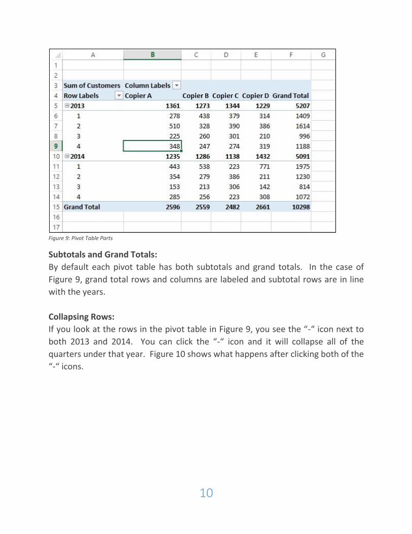
Figure 9: Pivot Table Parts
Subtotals and Grand Totals:
By default each pivot table has both subtotals and grand totals. In the case of
Figure 9, grand total rows and columns are labeled and subtotal rows are in line
with the years.
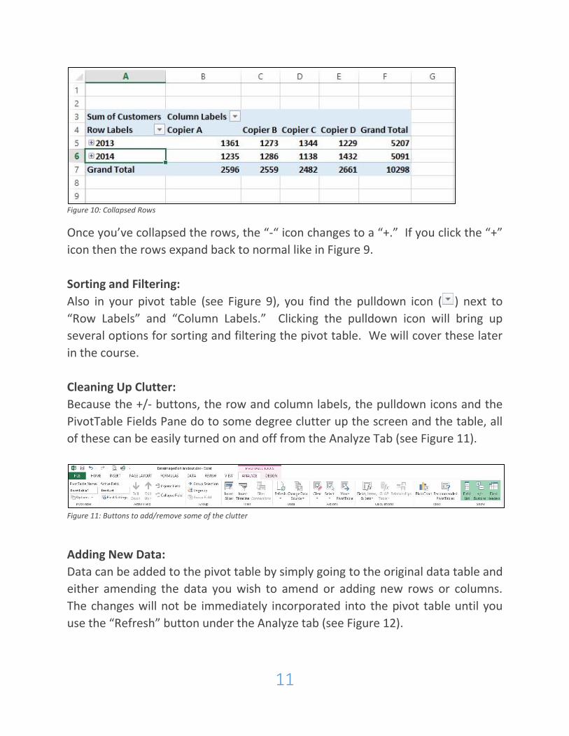
Collapsing Rows:
If you look at the rows in the pivot table in Figure 9, you see the “-“ icon next to
both 2013 and 2014. You can click the “-“ icon and it will collapse all of the
quarters under that year. Figure 10 shows what happens after clicking both of the
“-“ icons.
11
Figure 10: Collapsed Rows
Once you’ve collapsed the rows, the “-“ icon changes to a “+.” If you click the “+”
icon then the rows expand back to normal like in Figure 9.
Sorting and Filtering:
Also in your pivot table (see Figure 9), you find the pulldown icon ( ) next to
“Row Labels” and “Column Labels.” Clicking the pulldown icon will bring up
several options for sorting and filtering the pivot table. We will cover these later
in the course.
Cleaning Up Clutter:
Because the +/- buttons, the row and column labels, the pulldown icons and the
PivotTable Fields Pane do to some degree clutter up the screen and the table, all
of these can be easily turned on and off from the Analyze Tab (see Figure 11).
Figure 11: Buttons to add/remove some of the clutter
Adding New Data:
Data can be added to the pivot table by simply going to the original data table and
either amending the data you wish to amend or adding new rows or columns.
The changes will not be immediately incorporated into the pivot table until you
use the “Refresh” button under the Analyze tab (see Figure 12).
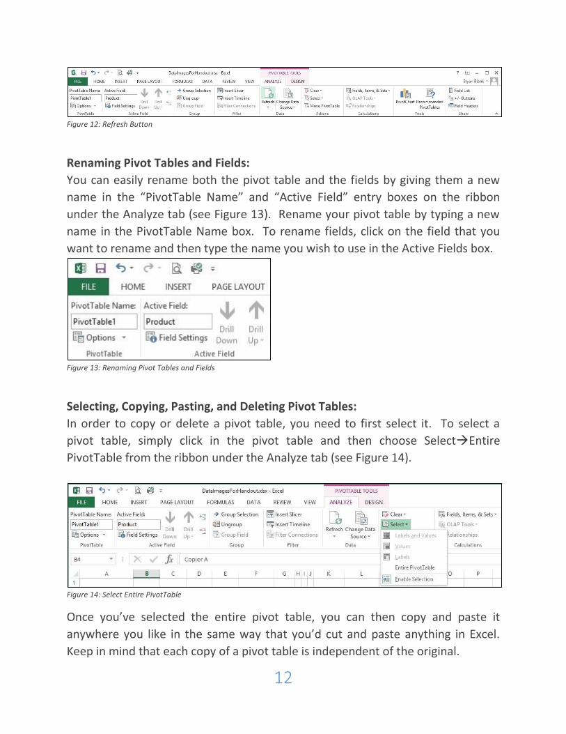
12
Figure 12: Refresh Button
Renaming Pivot Tables and Fields:
You can easily rename both the pivot table and the fields by giving them a new
name in the “PivotTable Name” and “Active Field” entry boxes on the ribbon
under the Analyze tab (see Figure 13). Rename your pivot table by typing a new
name in the PivotTable Name box. To rename fields, click on the field that you
want to rename and then type the name you wish to use in the Active Fields box.
Figure 13: Renaming Pivot Tables and Fields
Selecting, Copying, Pasting, and Deleting Pivot Tables:
In order to copy or delete a pivot table, you need to first select it. To select a
pivot table, simply click in the pivot table and then choose SelectEntire
PivotTable from the ribbon under the Analyze tab (see Figure 14).
Figure 14: Select Entire PivotTable
Once you’ve selected the entire pivot table, you can then copy and paste it
anywhere you like in the same way that you’d cut and paste anything in Excel.
Keep in mind that each copy of a pivot table is independent of the original.
13
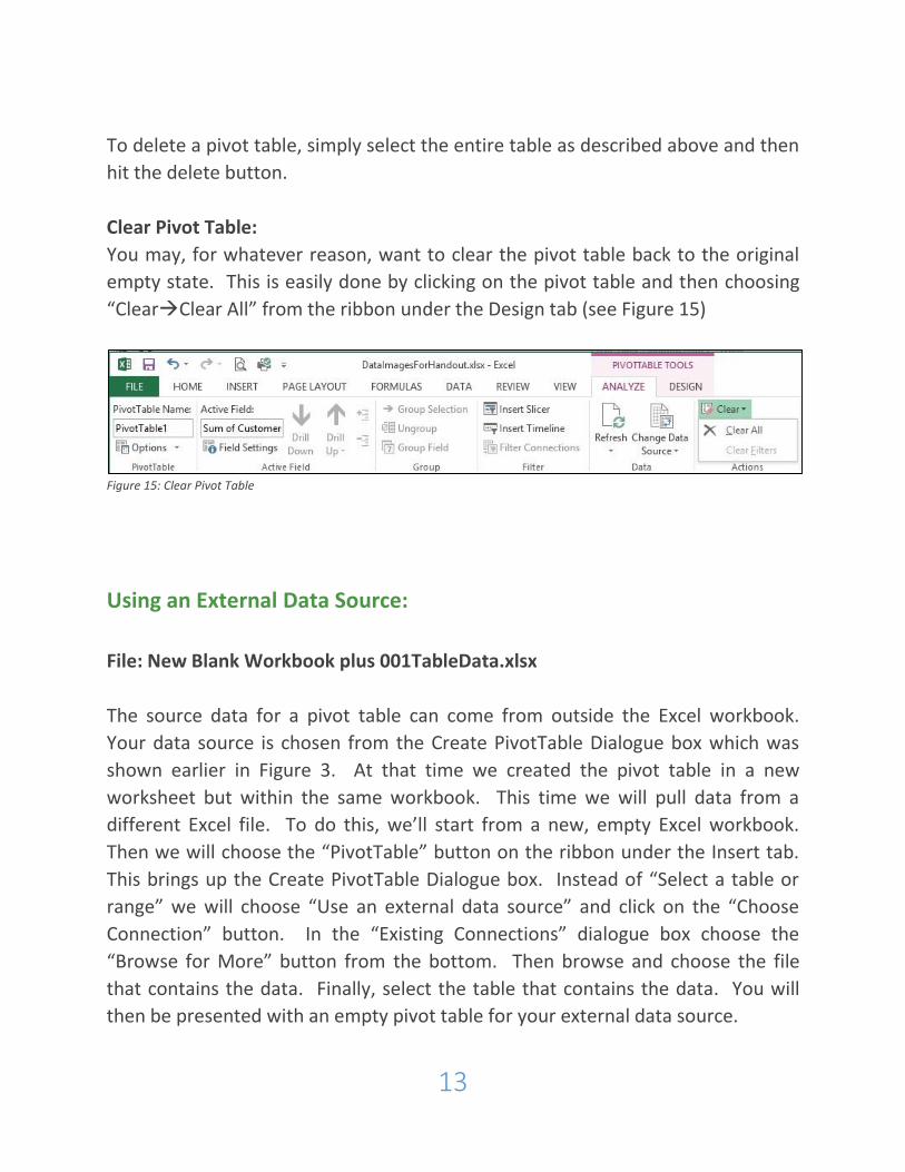
To delete a pivot table, simply select the entire table as described above and then
hit the delete button.
Clear Pivot Table:
You may, for whatever reason, want to clear the pivot table back to the original
empty state. This is easily done by clicking on the pivot table and then choosing
“ClearClear All” from the ribbon under the Design tab (see Figure 15)
Figure 15: Clear Pivot Table
Using an External Data Source:
File: New Blank Workbook plus 001TableData.xlsx
The source data for a pivot table can come from outside the Excel workbook.
Your data source is chosen from the Create PivotTable Dialogue box which was
shown earlier in Figure 3. At that time we created the pivot table in a new
worksheet but within the same workbook. This time we will pull data from a
different Excel file. To do this, we’ll start from a new, empty Excel workbook.
Then we will choose the “PivotTable” button on the ribbon under the Insert tab.
This brings up the Create PivotTable Dialogue box. Instead of “Select a table or
range” we will choose “Use an external data source” and click on the “Choose
Connection” button. In the “Existing Connections” dialogue box choose the
“Browse for More” button from the bottom. Then browse and choose the file
that contains the data. Finally, select the table that contains the data. You will
then be presented with an empty pivot table for your external data source.
14
Drilling Into Your Data:
File: 002FirstPivotTable.xlsx
Sometimes it is helpful to look at the data that produced a number in your table.
Doing this is easy. Simply double-click on any cell and a new worksheet is created
with all of the source data that relates to that cell.
This feature is especially useful if you’re working with external data. If you turn
off all of the data fields in the rows and the columns, leaving only the sum values,
then you can double-click on the single cell that is left and see all of the source
data.
15
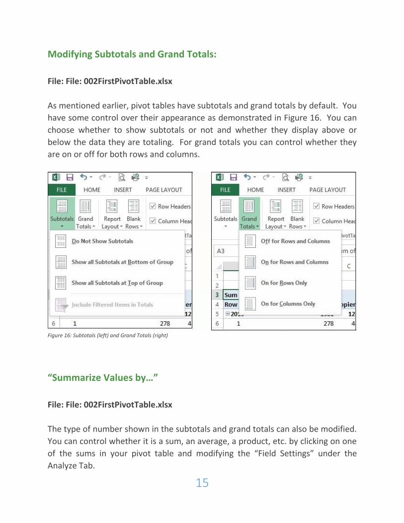
Modifying Subtotals and Grand Totals:
File: File: 002FirstPivotTable.xlsx
As mentioned earlier, pivot tables have subtotals and grand totals by default. You
have some control over their appearance as demonstrated in Figure 16. You can
choose whether to show subtotals or not and whether they display above or
below the data they are totaling. For grand totals you can control whether they
are on or off for both rows and columns.
Figure 16: Subtotals (left) and Grand Totals (right)
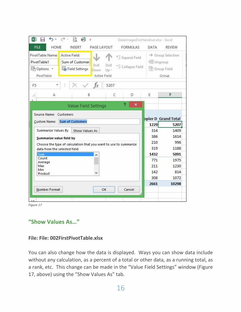
“Summarize Values by…”
File: File: 002FirstPivotTable.xlsx
The type of number shown in the subtotals and grand totals can also be modified.
You can control whether it is a sum, an average, a product, etc. by clicking on one
of the sums in your pivot table and modifying the “Field Settings” under the
Analyze Tab.
16
Figure 17
“Show Values As…”
File: File: 002FirstPivotTable.xlsx
You can also change how the data is displayed. Ways you can show data include
without any calculation, as a percent of a total or other data, as a running total, as
a rank, etc. This change can be made in the “Value Field Settings” window (Figure
17, above) using the “Show Values As” tab.

17
Number Format:
You will also notice in Figure 17 the “Number Format” button on the bottom of
the “Value Field Settings.” This allows you to display data as currency,
percentage, etc.
18
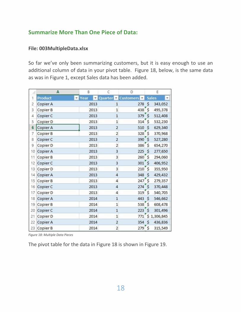
Summarize More Than One Piece of Data:
File: 003MultipleData.xlsx
So far we’ve only been summarizing customers, but it is easy enough to use an
additional column of data in your pivot table. Figure 18, below, is the same data
as was in Figure 1, except Sales data has been added.
Figure 18: Multiple Data Pieces
The pivot table for the data in Figure 18 is shown in Figure 19.
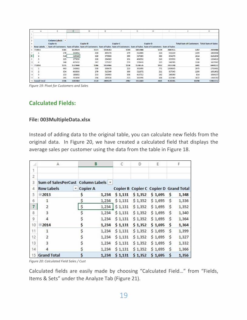
19
Figure 19: Pivot for Customers and Sales
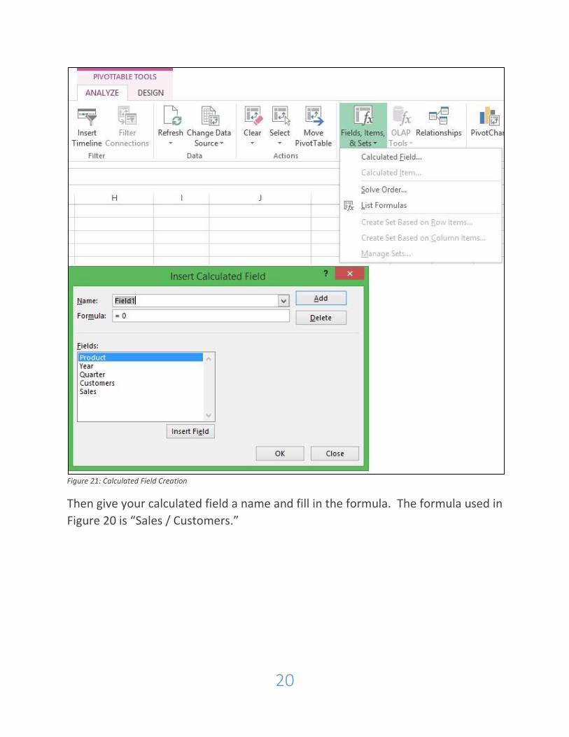
Calculated Fields:
File: 003MultipleData.xlsx
Instead of adding data to the original table, you can calculate new fields from the
original data. In Figure 20, we have created a calculated field that displays the
average sales per customer using the data from the table in Figure 18.
Figure 20: Calculated Field Sales / Cust
Calculated fields are easily made by choosing “Calculated Field…” from “Fields,
Items & Sets” under the Analyze Tab (Figure 21).
20
Figure 21: Calculated Field Creation
Then give your calculated field a name and fill in the formula. The formula used in
Figure 20 is “Sales / Customers.”
21
Referencing Data from Outside of a PivotTable:
File: 002FirstPivotTable.xlsx
Referencing data from outside of the pivot table works similarly to referencing
data elsewhere in Excel. The difference is that normally Excel uses a cell
reference (e.g. A3, B7, D13, etc.), but when you reference data from a pivot table,
Excel uses the “GETPIVOTDATA” function to pull the data.
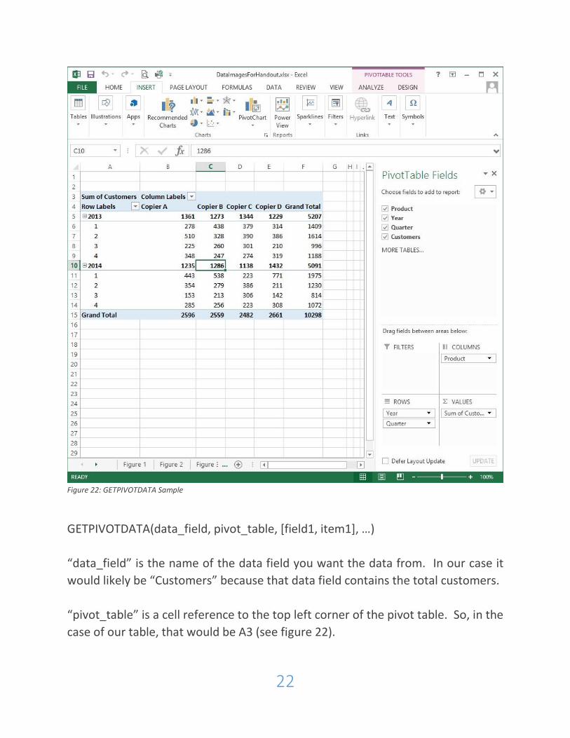
The GETPIVOTDATA function is relatively straightforward. We’ll use figure 22 to
illustrate.
22
Figure 22: GETPIVOTDATA Sample
GETPIVOTDATA(data_field, pivot_table, [field1, item1], …)
“data_field” is the name of the data field you want the data from. In our case it
would likely be “Customers” because that data field contains the total customers.
“pivot_table” is a cell reference to the top left corner of the pivot table. So, in the
case of our table, that would be A3 (see figure 22).
23
So, based on pivot table in figure 22, the formula,
GETPIVOTDATA(“Customers”,A3) results in the total number of customers which
is 10298.
GETPIVOTDATA(“Customers”,A3,”Product”,”Copier B”,”Year”,2013, “Quarter”, 2)
equals 328.
GETPIVOTDATA(“Customers”,A3,”Product”,”Copier D”,”Year”,2014, “Quarter”, 3)
equals 142.
The one limitation to be aware of when referencing pivot table data is that
changes to the pivot table can impact the reference. For instance, if you are
referencing a total but turn the totals off, then you break the reference.
Sorting PivotTables:
File: 002FirstPivotTable.xlsx
You can sort pivot tables by most any part of the table. This can be done by:
right-clicking the element by which you wish to sort,
choosing “sort” from the pull-down menus ( ) in the pivot table, or
choosing “sort” from the pull-down menus in the Pivot Table Fields Pane.
Filtering PivotTables:
File: 002FirstPivotTable.xlsx
Pivot tables can be filtered in many ways, including:
Selection
Rule
Search
Slicers
24
Report Filters
Report Filter Pages
Let’s look at each of these methods.
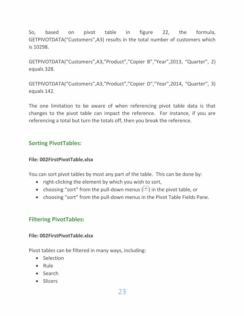
Selection:
As illustrated in Figure 23, to filter by selection, simply check or uncheck the data
you wish to show. In this case 2013 or 2014. On the top of the pull-down menu is
the selection for year, but you can change it to Quarter and then filter by quarter.
Figure 23: Filter by Selection
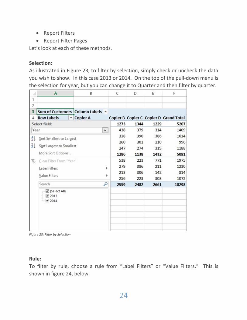
Rule:
To filter by rule, choose a rule from “Label Filters” or “Value Filters.” This is
shown in figure 24, below.
25
Figure 24: Filter by Rule
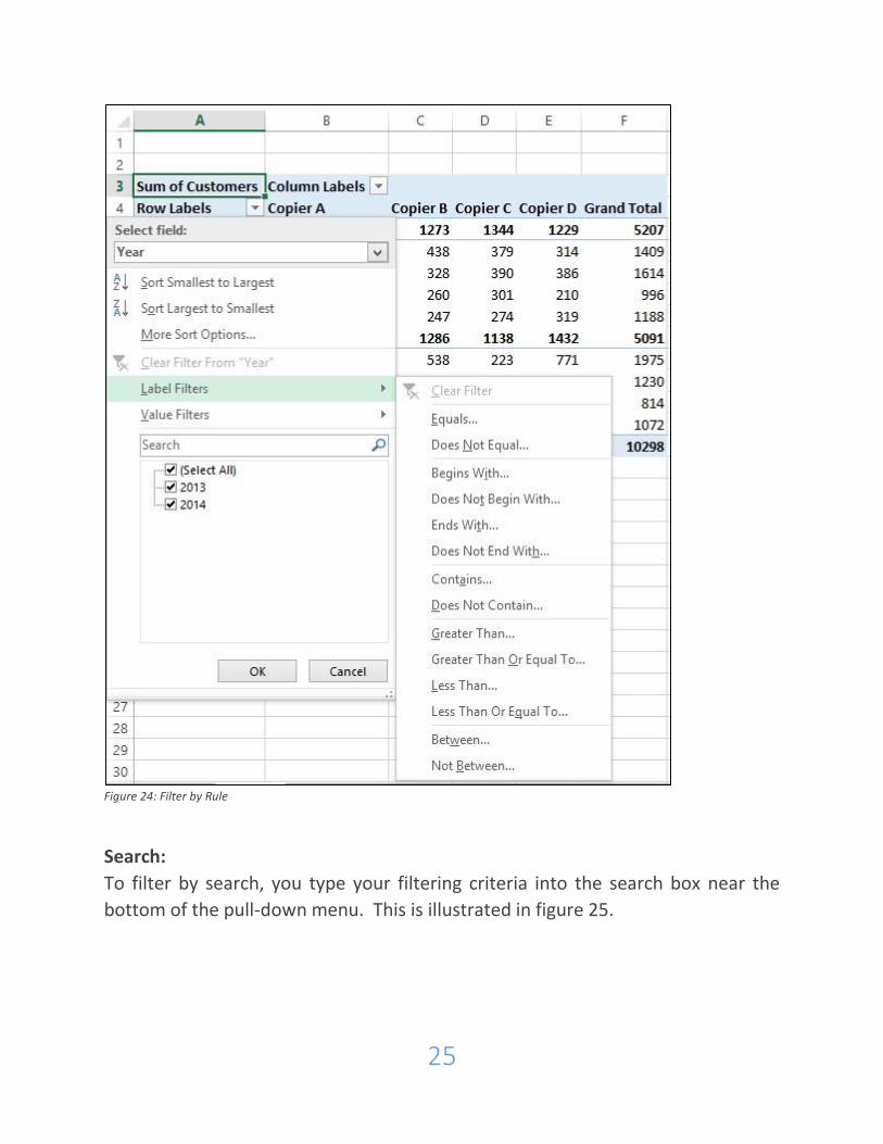
Search:
To filter by search, you type your filtering criteria into the search box near the
bottom of the pull-down menu. This is illustrated in figure 25.
26
Figure 25: Filter by Search
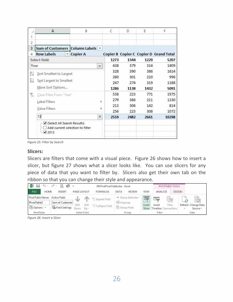
Slicers:
Slicers are filters that come with a visual piece. Figure 26 shows how to insert a
slicer, but figure 27 shows what a slicer looks like. You can use slicers for any
piece of data that you want to filter by. Slicers also get their own tab on the
ribbon so that you can change their style and appearance.
Figure 26: Insert a Slicer
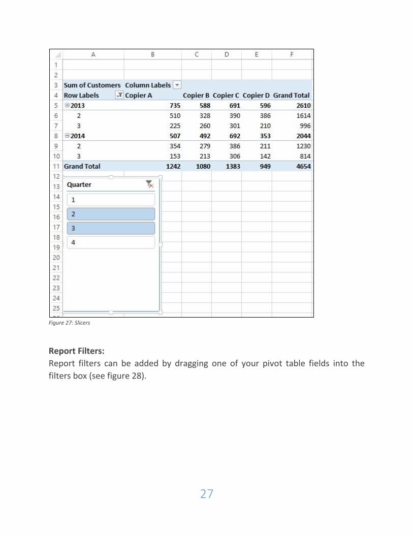
27
Figure 27: Slicers
Report Filters:
Report filters can be added by dragging one of your pivot table fields into the
filters box (see figure 28).
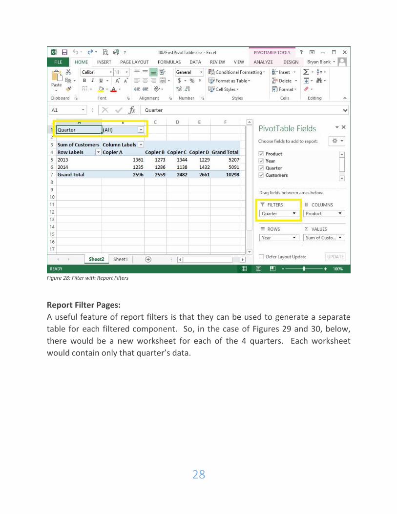
28
Figure 28: Filter with Report Filters
Report Filter Pages:
A useful feature of report filters is that they can be used to generate a separate
table for each filtered component. So, in the case of Figures 29 and 30, below,
there would be a new worksheet for each of the 4 quarters. Each worksheet
would contain only that quarter’s data.
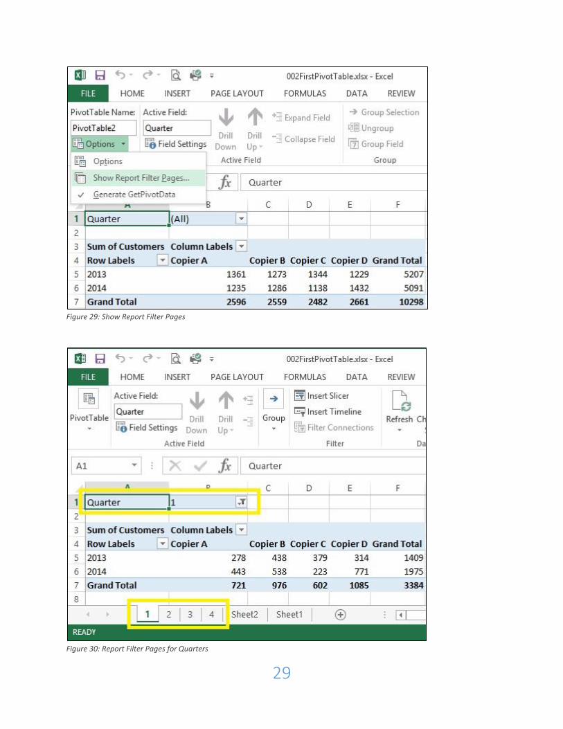
29
Figure 29: Show Report Filter Pages
Figure 30: Report Filter Pages for Quarters
30
Formatting PivotTables:
File: 002FirstPivotTable.xlsx
Excel offers many ways to enhance the look of your pivot table to make it look
visually pleasing, increase readability and highlight specific data. Below, we will
discuss the following functions:
pivot table styles
banding and headers
report layout and blank lines
conditional formatting
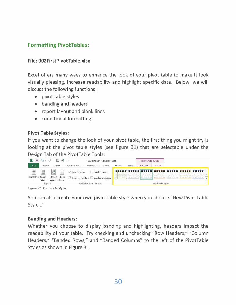
Pivot Table Styles:
If you want to change the look of your pivot table, the first thing you might try is
looking at the pivot table styles (see figure 31) that are selectable under the
Design Tab of the PivotTable Tools.
Figure 31: PivotTable Styles
You can also create your own pivot table style when you choose “New Pivot Table
Style…”
Banding and Headers:
Whether you choose to display banding and highlighting, headers impact the
readability of your table. Try checking and unchecking “Row Headers,” “Column
Headers,” “Banded Rows,” and “Banded Columns” to the left of the PivotTable
Styles as shown in Figure 31.
31
Report Layout and Blank Lines:
To the left of the options for headers and banding are the “Report Layout” and
“Blank Lines” buttons (again, see figure 31). Try these out to see the subtle ways
they change the look of the table.
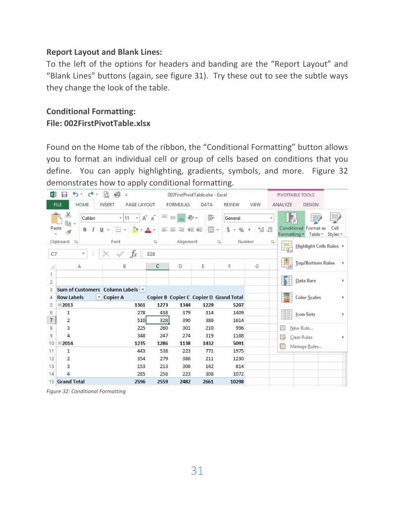
Conditional Formatting:
File: 002FirstPivotTable.xlsx
Found on the Home tab of the ribbon, the “Conditional Formatting” button allows
you to format an individual cell or group of cells based on conditions that you
define. You can apply highlighting, gradients, symbols, and more. Figure 32
demonstrates how to apply conditional formatting.
Figure 32: Conditional Formatting
32
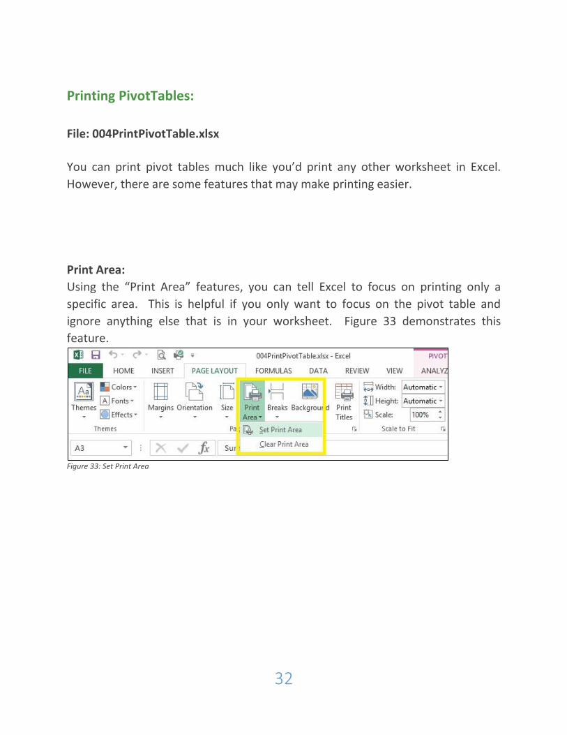
Printing PivotTables:
File: 004PrintPivotTable.xlsx
You can print pivot tables much like you’d print any other worksheet in Excel.
However, there are some features that may make printing easier.
Print Area:
Using the “Print Area” features, you can tell Excel to focus on printing only a
specific area. This is helpful if you only want to focus on the pivot table and
ignore anything else that is in your worksheet. Figure 33 demonstrates this
feature.
Figure 33: Set Print Area
33
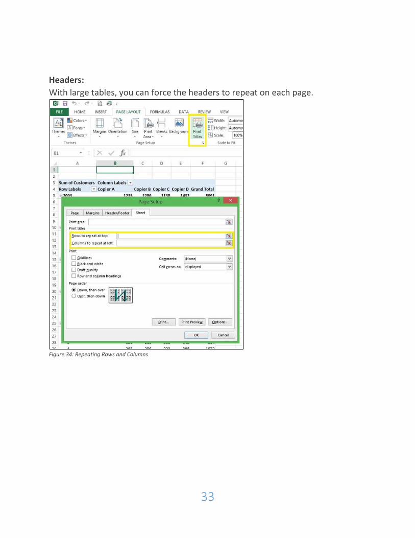
Headers:
With large tables, you can force the headers to repeat on each page.
Figure 34: Repeating Rows and Columns

34
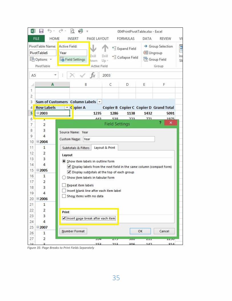
Page Breaks for Fields:
You can also (as demonstrated in Figure 35, below) cause each field to print on a
separate page by automatically inserting page breaks.
35
Figure 35: Page Breaks to Print Fields Separately

36
The End:
Now that you’ve completed this introduction, you can learn more about Pivot
Tables by visiting our online training through Lynda.com at:
http://elmlib.org/lynda
Good luck!


![Excel Training Pivot Tables[1]](https://img.pdfslide.net/doc/110x75/55cf8ab355034654898d1682/excel-training-pivot-tables1.jpg)