Embed Size (px)
Citation preview

Adverse Selection and an Individual Mandate:
When Theory Meets Practice∗
Martin B. HackmannDepartment of Economics, Yale University
Jonathan T. KolstadWharton School, University of Pennsylvania and NBER
Amanda E. KowalskiDepartment of Economics, Yale University and NBER
September 2, 2014
Abstract
We develop a model of selection that incorporates a key element of recent health reforms:an individual mandate. Using data from Massachusetts, we estimate the parameters of themodel. In the individual market for health insurance, we find that premiums and average costsdecreased significantly in response to the individual mandate. We find an annual welfare gainof 4.1% per person or $51.1 million annually in Massachusetts as a result of the reduction inadverse selection. We also find smaller post-reform markups.
∗We thank Kate Archibald and Xu “Sophie” He for excellent research assistance. This project has benefitedgreatly from comments from John Asker, Marika Cabral, Keith Ericson, Mathis Wagner, Ebonya Washington, HeidiWilliams, and Nicolas Ziebarth. We are also grateful for comments by an editor and anonymous referees, seminarparticipants at the Federal Reserve Bank of San Francisco, NYU, the University of Pennsylvania, the Universityof Texas, and Yale, and conference participants at the AEA Meetings, the Health Care Markets Conference at theKellogg School of Management, and the NBER Summer Institute. Funding from the Robert Wood Johnson Foun-dation and the National Institute on Aging grant #P30 AG012810 is gratefully acknowledged. Contact information:[email protected], 203-298-2916, [email protected], 215-573-9075, [email protected],202-670-7631.
1

1 Introduction
An individual mandate that requires individuals to purchase health insurance or pay a penalty is
a centerpiece of both the Affordable Care Act (ACA) of 2010 and the Massachusetts health reform
of 2006. The individual mandate was also at the heart of the legal challenges to the ACA, and the
mandate was upheld as constitutional by the Supreme Court in June 2012. Economic theory has
long held that mandates can reduce the welfare loss from adverse selection in insurance markets (see
e.g. Akerlof (1970) and Rothschild and Stiglitz (1976)). On the other hand, recent empirical work
on adverse selection finds relatively little welfare loss, suggesting otherwise. Reconciling these two
views is of interest to economists, and it is of broader interest given the centrality of the individual
mandate to both major health reforms.
The Massachusetts experience gives us a novel opportunity to examine how the mandate af-
fected selection and welfare. We model adverse selection following the work of Einav et al. (2010a),
henceforth “EFC.” EFC stipulates that if the average cost of the insured decreases as coverage
increases — in our case, from before reform to after reform — then healthier people entered the
insurance pool, and the initial market was adversely selected. We extend the framework to incor-
porate key features of health reform in practice — the individual mandate and insurer markups —
matching the empirical context more closely and allowing us to examine the impact of the mandate
on social welfare in Massachusetts.
In addition to addressing a key policy question, we contribute to the small but growing literature
on the welfare cost of adverse selection in insurance markets (see Einav et al. (2010b) for a review
and Bundorf et al. (2012), Einav et al. (2010c), and Beauchamp and Wagner (2012) for recent
additions). Most papers in the literature examine selection within a set of plans offered by employers
and generally find that the welfare cost of adverse selection is small in that context (e.g. EFC
and Bundorf et al. (2012)). However, the distinction between different employer-sponsored health
insurance plans is less stark than the distinction between having health insurance and not having it
at all. Accordingly, the welfare cost of adverse selection on the intensive margin between plans may
differ, potentially substantially, from the welfare impact on the extensive margin. Furthermore, we
focus on the individual health insurance market, the market defined to include all individuals not
offered health insurance through employers. The welfare cost of adverse selection could be higher in
2

the individual health insurance market than it is in the employer-sponsored market since employers
are potential risk pooling mechanisms.
Another advantage of the Massachusetts experience as an empirical context is that even before
reform, Massachusetts had regulations that limited insurers’ ability to deny coverage to individuals
and to price based on observable risks. These regulations, as we discuss in further detail, could
potentially exacerbate adverse selection. Although Massachusetts was only one of a handful of
states to have these regulations in the past, all states now have them following the implementation
of the national reform. Therefore, our findings speak to the magnitude of adverse selection on the
extensive margin in the presence of insurance market regulations but in the absence of an individual
mandate. Our findings are therefore germane to discussions that propose removal or weakening of
the national individual mandate.
Applying the theory to the data, we estimate the slopes of the average cost and demand curves
using insurer enrollment, premium, and health expenditure information from regulatory filings of
insurance companies. We combine the enrollment information with coverage information from the
National Health Interview Survey (NHIS). Both data sets distinguish between the individual and
group (employer) insurance markets, allowing us to model the impact of reform on the individual
market separately.
To model demand, we treat the individual penalty as an effective change in price in Mas-
sachusetts. Since the Massachusetts reform was implemented at the state level, we control for
other trends in the market for health insurance using data from other states. Using a similar
strategy, we also recover the change in the average and marginal per capita cost of the insured
population from before to after reform. Combined with the change in coverage and the magnitude
of the penalty, we can estimate the slope of the insurance demand and the cost curves; allowing us
to evaluate the welfare impact of Massachusetts reform.
Our empirical estimates suggest that the Massachusetts individual market was adversely selected
prior to health reform.1 We find that the individual mandate reduced adverse selection, increasing
welfare in the individual health insurance market by 4.1% (about $241) per person in the individual
market, which translates into a market-wide annual welfare gain of $51.1 million. We also find
evidence for smaller post-reform markups in the individual market, which increased welfare by
1We also found evidence of adverse selection on our previous work (Hackmann et al. (2012)). However, that paperfocused solely on hospital cost and did not address the welfare impact of the change in selection.
3
another 1% (about $59) per person per year and about $12.4 million per year overall. Finally, our
model and empirical estimates suggest an optimal mandate of 24.9% of the premium or $1,462 per
year, which induces universal coverage in the individual market.
The remainder of this paper is organized as follows. Section 2 describes the institutional back-
ground of the individual mandate. In Section 3 we develop a simple model of adverse selection
with an individual mandate, and in Section 4 we describe the estimation of the model. Section 5
describes the data, and Section 6 presents the results. Finally, we conduct a series of robustness
checks in Section 7, and Section 8 concludes.
2 Institutional Background on the Massachusetts Health Reform
The Massachusetts health reform, which was signed into law in April 2006, became a model for the
national reform (the ACA), which was enacted four years later in March 2010. Kolstad and Kowalski
(2012a,b) discuss these reforms in depth. Here, we focus on the features of the Massachusetts reform
and health insurance environment that are relevant to adverse selection in the individual health
insurance market.
An individual mandate was the key feature of both reforms. In Massachusetts, the individual
mandate requires that almost all non-poor residents either purchase a health insurance plan that
meets minimum coverage criteria defined in the “Minimum Creditable Coverage” (MCC) plan or
pay a penalty. Specifically, non-exempt individuals that do not have proof of sufficient health
insurance coverage when they file their income taxes are charged an income- and age-dependent
penalty of up to 50% of the lowest-priced plan available in the Massachusetts health insurance
exchange market. Table 1 summarizes the respective penalties for the year 2012.2 Individuals that
earn less than 150% of the federal poverty line (FPL) are exempt from the penalty. The reform
makes this population eligible for Medicaid or full premium discounts.3
The mandate is particularly important for individuals and families who do not have access to
employer-sponsored health insurance and must purchase health insurance through the individual
market instead. These people face higher annual premiums than those with employer-sponsored
2See http://www.massresources.org/health-reform.html.3Individuals that earn less than 100% of the FPL became eligible for Medicaid, and individuals that earn between
100% and 150% of the FPL became eligible for full premium discounts. Individuals can also claim exemption forreligious reasons or because of different affordability criteria using the Certificate of Exemption Application, availableat http://tinyurl.com/awmjfyo (Accessed September 17th, 2012.)
4

Table 1: Tax Penalty
Income and Age 150.1-200% FPL 200.1-250% FPL 250.1-300% FPLAbove 300% FPL
Age 18-26 Age 27+
Tax penalty$19 per month $38 per month $58 per month $83 per month $105 per month
$228 per year $456 per year $696 per year $996 per year $1260 per year
health insurance. Moreover, they are exposed to the full cost of health insurance, unlike employees,
who have access to the tax advantage for employer sponsored health insurance. Figure 1 lends
empirical support to this appraisal using data from the National Health Interview Survey (NHIS)
for individuals whose family income exceeds 300% of the federal poverty line. In Figure 1, we
compare trends in Massachusetts to trends in all other states, where we have aggregated other
states using NHIS sampling weights. Across the panels, we compare insurance coverage trends for
consumers who are offered health insurance through their employers (the “group market”) with
trends for consumers who are not offered health insurance through their employers (the “individual
market”). The vertical lines separate the pre-reform and the post-reform years. Consequently, the
years 2006 and 2007 represent the reform implementation years. Comparing coverage trends in the
individual market with coverage trends in the group market allows us to document two important
stylized facts. First, health insurance coverage is substantially higher in the group market both
in Massachusetts and nationally. Second, the impact of Massachusetts health reform on health
insurance coverage for the non-poor population is much larger in the individual market than the
group market. We see a large coverage increase in the Massachusetts individual market relative
to the national individual market following health reform, whereas the coverage increase in the
group market is much smaller. This is not particularly surprising given that insurance coverage in
Massachusetts group market was already close to universal levels prior to health reform. Therefore,
we expect that the effects of selection, and consequently the welfare effects from the individual
mandate, are small in the group market and focus our empirical analysis on the individual market.
We provide our methodology for classifying individuals as members of the individual or group pools
in Section 5.
Another element of the Massachusetts health reform is the introduction of a health insurance
exchange market: the Commonwealth Choice program. This exchange market aims to facilitate
5
Figure 1: Insurance Coverage Trends: NHIS Data
.4.6
.81
2004 2006 2008 2010Year
Non−MA MA
Group Market
.4.6
.81
2004 2006 2008 2010Year
Non−MA MA
Individual Market
access to health insurance for consumers in the individual market as well as small employers (up
to 50 employees). For more details see Ericson and Starc (2012) who study consumer response
to the specific pricing rules employed by the Massachusetts Connector. The Connector simplifies
the comparison of insurance plans across and within carriers which may encourage competition
and lead to smaller differences between premiums and average costs in the post-reform years. One
advantage of our theory is that it allows us to capture the welfare gains from reduced adverse
selection separately from the welfare gains from smaller differences between premiums and average
costs.4
Finally we emphasize two important regulations that may have exacerbated adverse selection in
the pre-reform years: community rating and guaranteed issue. Since 1996, Massachusetts has had
4Smaller differences between premiums and average costs in the individual market are also consistent with manyother mechanisms such as newly-imposed restrictions in the premium rating methodology. Since reform, Mas-sachusetts has required insurance carriers to use the same premium rating methodology for small employers andindividuals that purchase health insurance directly, see Gorman Actuarial et al. (2006) for details. This regulationmay lower premiums in the individual market because insured employees in small businesses are younger and healthieron average. We allow for differences between premiums in average cost in practice but do not explicitly model themechanisms for changes.
6

community rating regulations in place, which restrict price differentiation across consumers within
the same plan. Specifically, these regulations require health insurers in the individual market to
charge the same price to individuals of the same age, see Wachenheim and Leida (2012). Across
ages, premiums could only vary by up to a factor of two. This legislation benefits consumers
with relatively high expected claim expenditures, who might face higher premiums than their less
expensive peers otherwise.
Massachusetts has also had guaranteed issue regulations since 1996, which require insurers with
at least 5,000 members to guarantee that any interested beneficiary could join the insurance pool.
Combining these two regulations, we expect a disproportionately high share of consumers with high
claim expenditures amongst the enrolled consumers in the pre-reform years. The Massachusetts
reform retained these regulations. The ACA also established community rating and guaranteed
issue regulations nationally, in addition to the individual mandate.
3 Adverse Selection and an Individual Mandate in Theory
In this section, we develop a simple model that incorporates both an individual mandate and in-
surer markups into the general model of adverse selection developed by EFC. This model addresses
selection at the extensive margin but abstracts from intensive margin selection amongst differenti-
ated plans. This modeling decision follows naturally from the policy intervention of interest, the
individual mandate, which affects the demand for health insurance on the extensive margin.5
3.1 Demand and Cost of Insurance with an Individual Mandate
In each period t, consumer i decides either to purchase a representative health insurance plan,
Hi = 1, or not to purchase the plan, Hi = 0. We take the characteristics of the health insurance
plan as given, and we assume that they do not change over time.6 Consumers have an underlying
type, θi, which determines their willingness to pay for insurance, v(θi), and the expected cost to
health insurers on their behalf if they take up insurance, c(θi). The consumer type is potentially
multi-dimensional and describes the individual’s health profile and risk preferences, as well as other
characteristics. Consumer type is distributed according to Gθ in the population. Each consumer
5We discuss these modeling decisions in further detail in the online appendix section A.1.6Lack of data on plan generosity motivates this assumption. We relax it in Section 7.4.
7

solves the following maximization problem:
maxHi
{Xi + v(θi) ∗Hi} s.t. Yi = Xi + P ∗Hi,
where Yi measures income, Xi is a numeraire good, and P denotes an insurance premium that does
not vary across individuals. The share of insured consumers at the market level, I, is as follows:
I :=
∫v(θ)>P
dGθ.
To incorporate the impact of the individual mandate on consumer demand, we introduce a
financial penalty, π, paid by consumers who do not purchase health insurance. The mandate,
because it changes the cost of not having health insurance, changes the budget constraint for an
individual to Yi = Xi + P ∗Hi + π ∗ (1−Hi); the penalty effectively lowers the price of insurance
relative to the numeraire.7 Thus, insurance coverage at the market level with a mandate is:
I :=
∫v(θ)>P−π
dGθ.
We express the market level demand curve P = D(I, π). It is a function of insurance coverage
at the market level, I, and the penalty associated with the individual mandate, π (zero in the
period before the individual mandate is introduced).
In order to consider welfare, we need both willingness-to-pay — demand — as well as the cost
of insuring the population. We can express the market level average cost curve as a function of
market level insurance coverage by
AC(I) =1
I
∫v(θ)>D(I,0)
c(θ) dGθ.
This equation expresses the average costs of consumers, who purchase health insurance at annual
premiums P = D(I, 0). By construction, these are the I consumers with the highest willingness to
pay.
7Here, income Yi includes tax penalty revenues that are redistributed to households as a lump sum.
8

Analogously, the marginal cost curve is given by
MC(I) = E[c(θ)|v(θ) = D(I, 0)].
Figure 2 presents the market equilibrium graphically in the case of an adversely select market —
a downward sloping average cost curve.8 Before the reform, the efficient equilibrium should occur
where the marginal cost curve intersects the true demand curve for insurance. However, because
of asymmetric information or regulatory restrictions on pricing, in the pre-reform period (t = pre),
the equilibrium occurs at point A, where the true demand curve intersects the average cost curve,
yielding coverage level I∗, pre and premium P ∗,pre equal to average cost.
The individual mandate simply shifts the demand curve upward by the penalty amount, π.9 In
the pre-reform period before the individual mandate is introduced, consumer demand is captured
by the lower demand curve. After reform is implemented (t = post), the tax penalty increases
the demand for insurance because the outside option of going without health insurance is less
attractive. Therefore, consumers are willing to pay an extra amount, up to π, to avoid the tax
penalty; the higher demand curve in Figure 2. The new equilibrium premium and the marginal
cost are determined by the point at which the new demand curve intersects the average cost curve
(shown by A’ and D’ respectively). Notice from Figure 2 that the mandate does not change the
ordering of the consumers’ willingness to pay for health insurance. Consequently, while the tax
penalty induces a shift in the demand curve, it induces movement along the cost curves (D to D’).
3.2 Welfare Implications of the Individual Mandate
With the demand curve and the average cost curve, we can calculate the change in welfare intro-
duced by the individual mandate. The change in welfare is given by the integral over the difference
between the willingness to pay and the marginal costs for the newly insured consumers, as depicted
by the gray area in Figure 2.10
Intuitively, the welfare gain due to the individual mandate captures the extent to which the
8Consistent with our empirical evidence on adverse selection, discussed in Section 6, we focus on the case of adversenot advantageous selection.
9The depicted demand curves D(I, 0) and D(I, π) have the same linear functional form, which is an approximationto a more general nonlinear functional form.
10We discuss this result in further detail in the online appendix section A.3.
9

Figure 2: Adverse Selection And The Mandate Without Markups
I*,pre I*,postInsurance
P*,pre
P*,post
Premium
A
A'
D
D' Π
ACHIL
MCHIL
DHI,0LDHI,ΠL
outward shift in demand induced by the penalty corrects existing adverse selection; the number
of individuals who are moved into coverage whose willingness-to-pay for insurance exceeds the
marginal cost of insuring them but for whom that average cost of insuring them is greater than
their willingness-to-pay. We note also that an individual penalty can be large enough to induce
additional consumers into the market for whom the marginal cost of insuring them is greater than
their willingness-to-pay, inducing a welfare loss. We return to this issue in detail below when we
derive the optimal penalty.
3.3 Welfare Implications from Adverse Selection and Changes in Markups
In this section, we extend our previous pricing model and allow insurers to charge a positive markup
on top of average costs. Furthermore, we allow the markup to change in response to health reform.
We allow for this extension for several reasons: (i) markups are a well-documented feature of
health insurance markets (see e.g. Dafny (2010)), (ii) our data allows us to estimates markups in
a straightforward way because health insurance is a financial product and (ii) we have reason to
believe that health reform affected markups.
Figure 3 captures these extensions and differs from Figure 2 in three important ways. First, in
equilibrium, premiums may differ from average costs, which is why we introduce separate notation
10

for each. While point A still refers to the premium in the pre-reform equilibrium, we introduce point
H to refer to average cost in the pre-reform equilibrium. The vertical difference between point A
and point H captures the markup. Similarly, points A’ and H’ refer to premiums and average costs
in the post-reform equilibrium. Notice that we can construct a second point on the old demand
curve, point C, if we subtract the observed tax penalty from the observed post-reform premium.
Therefore, the pre-reform and the post-reform equilibrium outcomes determine two points on the
average cost curve and two points on the old demand curve, which allow us to estimate the slopes
and the intercepts of these two curves.
Second, we allow for different markups in the pre and the post-reform period. Specifically, the
vertical difference between A’ and H’ may be smaller or larger than the vertical difference between
A and H. To the extent that the introduction of health exchanges decreased consumer search costs,
increased competition, or otherwise altered market structure such that insurers cannot maintain
pre-reform markups, our model captures the change.
Third, the change in markups affects social welfare. A decrease in the markup, as shown in
Figure 3, is not just a transfer from insurers to consumers. It increases social welfare in the presence
of adverse selection because the size of the insured population expands.
To distinguish between the welfare effect from the removal of adverse selection and the welfare
effect from an increase in competition, we add a pre-reform pricing curve in Figure 3. We simply
add the pre-reform markup to the average cost curve to predict insurance coverage, premiums,
and costs in the post-reform period under the pre-reform markup. Specifically, the intersection
between the pre-reform pricing curve and the post-reform demand curve determines the insurance
coverage under the pre-reform markup, I∗,markup. Therefore, we attribute the welfare gain up to
I∗,markup to the removal of adverse selection and the additional increase up to I∗, post to the smaller
post-reform markup.
Graphically, we decompose the full welfare effect into two effects. The light gray area refers to
the welfare gain from the removal of adverse selection, and the dark gray area measures the welfare
gain from a decrease in the post-reform loading factor. We refer to the former effect as the net
welfare effect.
Following the theoretical discussion, the full welfare effect is given by the change in consumer
11

Figure 3: Adverse Selection And The Mandate With Markups
I*,pre
I*,markup
I*,post
Insurance
P*,pre
AC*,preP
*,post
AC*,post
Premium
A
H
H'
A'
C
D
D'
Π
ACHIL
MCHIL
DHI,0L DHI,ΠL
surplus, minus the change in insurer profits:
∆Wfull = ∆CS −∆Profits. (1)
Using the geometry of Figure 3, we can express the full welfare change in terms of the change in
coverage, premiums, and average costs between the pre-reform and the post-reform period, the
pre-reform levels of coverage, premiums, and average costs, and the tax penalty:11
∆Wfull = (P ∗, pre −AC∗, pre) ∗ (I∗, post − I∗, pre)
− (AC∗, post −AC∗, pre) ∗ (I∗, pre + (I∗, post − I∗, pre))
+1
2((P ∗, post − π)− P ∗, pre) ∗ (I∗, post − I∗, pre). (2)
This equation shows that beyond the penalty, we need information on 6 empirical moments to
identify the change in welfare.
11To see this, notice that two points on the linear demand curve identify the change in consumer surplus and thattwo points on the potentially nonlinear average cost curve identify the change in costs. We discuss the details of thisderivation in Section A.4 of the online appendix. We revisit the linearity assumption for the demand curve in SectionA.5 of the online appendix, where we provide bounds for the full welfare effect.
12

Because the mechanisms for welfare improvements due to health reform differ substantially
between reductions in adverse selection and changes in market competitiveness, we separate these
two mechanisms in our model. Separating the two mechanisms theoretically also provides a basis
for us to separate them empirically. We can express the net (of changes in competition) welfare
effects as follows:
∆Wnet = (P ∗,pre −AC∗,pre) ∗ (I∗,markup − I∗,pre)
− AC∗,post −AC∗,pre
I∗,post − I∗,pre∗(I∗,pre + (I∗,markup − I∗,pre)
)∗ (I∗,markup − I∗,pre)
+1
2∗ (P ∗,post − π)− P ∗,pre
I∗,post − I∗,pre∗ (I∗,markup − I∗,pre)2 (3)
where we express the post-reform coverage level under the pre-reform markup, I∗,markup, as:
I∗,markup = I∗, pre + π(I∗, post − I∗, pre)
(AC∗, post −AC∗, pre)− ((P ∗, post − π)− P ∗, pre). (4)
Intuitively, I∗,markup equals I∗, post if the pre-reform markup equals the post-reform markup.12
3.4 Optimal Tax Penalty
In addition to using the model to compute welfare impacts, we can also extend our framework to
compute the optimal tax penalty. The optimal tax penalty induces the optimal level of coverage
– the level of coverage at which the pre-reform demand curve intersects the marginal cost curve.
Figure 4 depicts the optimal coverage level I∗, opt.
Increasing the penalty improves welfare as long as marginal enrollees have a willingness-to-pay
in excess of their marginal cost of coverage. Of course, a penalty can be too big in the sense that
it is welfare reducing beyond a point. Figure 4 demonstrates such a case. As depicted, post-reform
insurance coverage exceeds optimal insurance coverage, leading to a welfare loss. Specifically,
consumers who are located on the pre-reform demand curve between the points X and C are not
willing to buy health insurance at the marginal cost of covering them. Therefore, their purchase
decision decreases social welfare such that the full welfare effect of the mandate is given by the
light gray area minus the dark gray area.
12We derive equation 4 in Section A.6 in the online appendix.
13

To calculate the optimal tax penalty, first, we solve for the socially optimal coverage level, I∗, opt.
We can express the optimal insurance coverage as follows:
I∗, opt = max(
0,min
(1, I∗, pre +
(P ∗, pre −MC∗, pre) ∗ (I∗, post − I∗, pre)2(AC∗, post −AC∗, pre)− ((P ∗, post − π)− P ∗, pre)
))= max
(0,min
(1, I∗, pre +
(P ∗, pre −AC∗, pre) ∗ (I∗, post − I∗, pre)2(AC∗, post −AC∗, pre)− ((P ∗, post − π)− P ∗, pre)
− (AC∗, post −AC∗, pre) ∗ I∗, pre
2(AC∗, post −AC∗, pre)− ((P ∗, post − π)− P ∗, pre)
)). (5)
Here, the minimum and the maximum operator address potential corner solutions at zero coverage
and full coverage. For an interior solution, we see from the first equality that the optimal insurance
coverage exceeds the pre-reform equilibrium coverage, whenever the pre-reform market price exceeds
the costs of the marginal consumer.13
Next, we can calculate the optimal tax penalty (conditional upon the observed post-reform
markup) which shifts the equilibrium coverage to the optimal coverage level. The optimal tax
penalty, π∗, equals:
π∗ = (P ∗, post − P ∗, pre)− (AC∗, post −AC∗, pre)
+(AC∗, post −AC∗, pre)− ((P ∗, post − π)− P ∗, pre)
(I∗, post − I∗, pre)∗ (I∗, opt − I∗, pre). (6)
Intuitively, the optimal tax penalty increases proportionally as the difference between optimal
coverage and pre-reform coverage increases.
4 Empirical Model
We next develop a simple empirical model that is linked very tightly to our theoretical model. It
follows directly from the graphical depiction of our model that we only need to estimate a small
number of parameters to quantify the welfare effects and the optimal tax penalty. Specifically, we
can fully identify our model if we combine the magnitude of the tax penalty with estimates of pre-
reform levels and changes in coverage, log premiums, and log average costs. While we simply read
the pre-reform levels from the data using the average realizations in the pre-reform years 2004 and
13We derive equation 5 in Section A.7 in the online appendix.
14
Figure 4: Adverse Selection And The Optimal Tax Penalty
I*,pre
I*,opt
I*,post
Insurance
P*,pre
AC*,pre
P*,post
AC*,post
Premium
AH
H'A'
X
C
D
F
Π ACHIL
MCHIL
DHI,0L DHI,ΠL
2005, we estimate changes in coverage, log premiums, and log average costs to account for national
trends in health insurance coverage, premiums, and average costs. Our primary estimating equation
is as follows:
Y kst = γk ∗ (MA ∗After)st + ρk1 ∗ (MA ∗During)st + ρk2 ∗MAs
+ ρk3 ∗Aftert + ρk4 ∗Duringt + ρk5 + εkst, (7)
where Y kst denotes the respective outcome measure for state s in year t. Specifically, k is either
coverage, log premiums, or log average costs. MA is a dummy variable that equals one for Mas-
sachusetts. During and After are dummy variables that equal one for the reform years 2006 and
2007, and the post-reform years 2008-2010, respectively. The key parameters of interest are γk,
which denote the reform’s impact on coverage, premiums, and average health claim expenditures.
To estimate the full change in welfare, the net change in welfare, the optimal amount of coverage,
and the optimal penalty, we simply substitute the changes in coverage, log premiums, and log
average health claim expenditures between the pre-reform and the post-reform period with the
respective γk estimate in equations 2, 3, 5, and 6. We use the average realization in the pre-reform
years 2004 and 2005 as our pre-period estimates. Finally, we calibrate the level of the tax penalty,
15

which allows us to calculate the change in welfare according to equation 2.
One empirical challenge is that premiums and claim expenditures in Massachusetts differ from
the national average both in pre-reform levels and trends. While there are various potential ex-
planations for the general differences in health care costs between states, guaranteed issue and
community rating regulations are likely to explain at least a portion of these differences. Our ap-
proach allows us to control for persistent level differences between Massachusetts and the control
states. However, we are concerned that our reform effect estimates may be confounded with differ-
ences in trends between Massachusetts and the control states, which are unrelated to health reform.
To address this concern, we employ two approaches. First, we model the trends in premiums and
claim expenditures using logarithmic specifications. Second, we apply the synthetic control method
proposed by Abadie and Gardeazabal (2003). Specifically, we construct weights for the the control
states such that they match Massachusetts pre-reform trends in coverage, log premiums, and log
average claim expenditures as well as Massachusetts pre-reform health insurance enrollment levels.
This data-driven procedure ensures that trends in the key endogenous variables are equal between
Massachusetts and the control states so that we can isolate the impact of the reform.
5 Data
One advantage of our methodology to is that we are able to estimate welfare using relatively
easy-to-obtain data. We require data on coverage, premiums, and cost. To support our primary
analysis, we obtain data on enrollment, premiums, and cost from SNL Financial. We add coverage
information from NHIS to express the enrollment information in percentages.
SNL Financial is a leading financial information firm that collects and prepares corporate, fi-
nancial, market, and M&A data for a variety of different industries, including the health insurance
industry. The data set we use is based on data from the National Association of Insurance Com-
missioners (NAIC), subsequently aggregated by SNL. We are the first, to our knowledge, to employ
the SNL data in an economic applications, though we note that NAIC data have been used in a
number of previous studies (e.g. Abraham et al. (2013)). The main advantage of the SNL data in
our application is that it has been entered into matrix form, cleaned, and aggregated. Our SNL
data provide information on enrollment in member-months, premiums, and claim expenditures for
16

US health insurers at the firm-market-year-level. The SNL market definition distinguishes between
the group and the non-group (individual) market within each state. While the group market data
do not include self-insured plans offered by large employers, the data on the individual market
should represent the universe of plans and enrollment on the individual market, which is the focus
of our analysis.14
We note that because the SNL data are at the firm-market-year level, they aggregate plans of
different generosities together by firm, so we cannot directly examine changes in plan generosity.
We are not aware of any data that would contain information on plan generosity for all policies sold
in the individual health insurance market nationally because plan generosity can vary along many
dimensions.15 In their analysis, EFC control for plan generosity by restricting analysis to a subset
of plans offered by one particular firm. This control comes at the cost of only allowing for changes
in adverse selection on the intensive margin in a particular firm. In our analysis, to tackle the
broad question of adverse selection on the extensive margin, we need to make a broad assumption
about changes in plan generosity. On theoretical grounds, we believe that this assumption is more
innocuous for studying changes in extensive margin adverse selection than it would be for studying
changes in intensive margin adverse selection because the difference between any insurance and no
insurance is arguably more stark than the difference between two insurance plans. On empirical
grounds, we believe that changes in plan generosity have a small impact on our results based on
our robustness analysis in Section 7.4, in which we incorporate additional data on plan generosity.
For our baseline analysis, we use data from 2004-2010, and we attempt to focus our attention
on non-poor individuals, defined as those above 300% of the FPL. The restriction to the non-
poor population in the individual market is interesting for three key reasons. First, we see the
largest changes in private health insurance coverage following health reform in the Massachusetts
individual market, rather than in the group market where the employer served as an effective
pooling mechanism prior to reform, see Figure 1. Second, the individual market is more likely to be
adversely selected than the group market prior to the reform because individual market consumers
internalize the full cost of the health plan premium, while group consumers choose from a set of
14One exception are life insurers, to the extent that they also sell health insurance plans in the individual market,who do not file these reports, see Abraham et al. (2013).
15This is the case even with the advent of “bronze,” “silver,” and “gold” plans sold on exchanges under the ACA,especially since plans that do not fit these classifications can be sold outside of the exchanges and because plannetworks can vary in ways that are difficult, if not impossible, to observe.
17

employer sponsored and subsidized health plans. Third, it is important to focus on the non-poor
population because individuals that earn less than 300% of the federal poverty line gained access
to highly subsidized health insurance through the Medicaid expansion or the newly introduced
Commonwealth Care plans. These programs introduce price variation amongst consumers that is
difficult to address using data at the insurer level. Furthermore, crowd-out of private coverage,
as has been found in Medicaid expansions (e.g. Cutler and Gruber (1996)), would bias our price
elasticity estimates (and welfare estimates) downwards if left unaddressed.16
To restrict our analysis to non-poor individuals, we drop insurers in the Massachusetts individ-
ual market that offer Commonwealth Care health plans.17 The Commonwealth Care program is
administered by the Connector and offers highly subsidized access to health insurance for individ-
uals that earn up to 300% of the FPL.18 This subsidy is conceptually similar to the tax penalty
as both instruments lower the choice-relevant premium. However, our empirical strategy uses data
aggregated at the insurer-year level. Therefore, we can not address price variation within a plan
unless we impose additional assumptions. We discuss these assumptions in Section 6.1, but for our
baseline analysis we drop these insurers to ensure a homogeneous consumer population that does
not qualify for subsidies and faces the maximum penalty, assuming that most of these individuals
earn more than 300% of the federal poverty line, see Table 1.
We compute member-month premiums by dividing reported revenues by enrollment in member-
months. Similarly, we derive member-month health claim expenditures using the reported annual
expenditures. We multiply these measures by 12 to annualize the premium and the health expen-
diture estimates. We drop insurer-year observations with premiums or health expenditures that
are smaller than $50 or larger than $20,000.19 In order to implement to synthetic control method,
we drop states in which we do not have information on any insurer in a given sample year. We also
16In theory, the Medicaid expansion can also crowd-in private coverage if the expansion targets the unhealthypopulation (see Clemens (2013)). We think that our estimates would still be biased downwards in this case becauseof a healthier risk pool of privately insured consumers.
17Following state documents, we drop Boston Medical Center Health net Plan, CeltiCare Health Plan, FallonCommunity Health Plan, Neighborhood Health Plan, and Network Health,see http://tinyurl.com/p92cdx.
18For instance, between July 2012 and June 2013 the premiums per member month range from $40 for individualswith incomes between 150% and 200% of the FPL to $182 per member month for individuals with incomes between250% and 300% (https://www.mahealthconnector.org/. Accessed February 1st, 2013.)
19This reduces the number of observations by about 8% in the individual market. We also revise the enrollmentinformation of one provider in New York for the year of 2008 and we drop an insurer in the state of Washingtonbecause the provided information seemed unreasonable. These adjustments do not affect our baseline estimates.However, they would add noise to our estimates in Section 7.2, where we choose synthetic control states based onan indicator for guaranteed issue regulations because New York and Washington have such regulations. The dataappendix provides additional information on these observations.
18

drop states who experience a change in average claim expenditures, averaged at the state level, of
more than 40% from one year to the other.20 Finally, we normalize all financial variables to 2012
dollars using the Medical Consumer Price Index.
We complement the SNL information with restricted-access NHIS data with state identifiers
from years 2004-2010.21 We primarily use these data to translate the enrollment measures from the
SNL data, which is reported in levels, into coverage percentages inside and outside of Massachusetts.
We make this conversion using the representative population weights. We use the NHIS rather
than the SNL to determine the percentage of individuals insured in the individual health insurance
market because those data include insured as well as uninsured individuals, while the SNL data only
include insured individuals. In addition to detailed data on health insurance coverage, the NHIS
also collects demographic information, which allows us to distinguish between the individual and the
group markets in our empirical analysis. To match the SNL sample population, we restrict the NHIS
sample population to non-elderly adult family members aged 18-64 and drop families that earned
less than 300% of the family-size adjusted federal poverty line.22 We also drop family members
that were enrolled in a public insurance plan.23 We classify family members as participating in
the individual market whenever no members of the family are offered health insurance through
their respective employer(s).24 We aggregate these observations to the family level and consider
the observation (family) to be uninsured whenever none of the remaining family members has
health insurance. Finally, we compute average enrollment at the state-year-market level using
representative population weights. As discussed earlier, Figure 1 presents the respective coverage
trends for Massachusetts and the control states.
20We do this because we construct our control states based on trends in average costs. We are concerned that thesesubstantial changes in average costs merely reflect measurement error.
21We note here that we have explored using the Current Population Survey (CPS) for our analysis since it includesboth a measure of coverage and income for individuals. Given the small sample size in Massachusetts when we restrictthe sample by income and to those with individual insurance, we are concerned about the ability to measure theimpact of the reform at the state level in the individual market. Consistent with this issue, in analyzing the CPS, wefind implausibly small coverage level changes (near zero). Since the coverage increase is a stylized fact that has beendocumented in other databases, we are concerned about the CPS data quality regarding the individual market, and sowe prefer the NHIS data. The issues with the CPS data underscore the value of using comprehensive administrativedata from SNL.
22The NHIS uses the poverty thresholds from the Census Bureau, which are not identical but very similar to thepoverty thresholds for Medicaid and discount eligibility in Massachusetts. We keep children because we also useout-of-pocket spending information in a robustness check, which is reported at the family level.
23These public plans include Medicare, Indian Health services, SCHIP, Military health coverage, Medicaid andother state- or government-sponsored plans.
24The NHIS asks all adult family members that are present at the time of the interview whether they are offeredhealth insurance though their workplace. For adult persons that are not present during the interview, the NHISgathers the respective information through a present adult family member.
19

To compute coverage in percentages, we normalize the average observed post-reform enrollment
in the SNL data for the years 2007-2010 to the average observed (state-specific) post-reform cover-
age in the NHIS data for the same time period.25 Using this normalization, we calculate insurance
coverage in percentages for all years using the SNL enrollment estimates. We find post-reform cov-
erage levels in the individual market of 92% in Massachusetts and about 67% at the national level,
see Figure 1. It is worth emphasizing that our sample population in Massachusetts did not achieve
universal coverage in the post-reform period. Therefore, we interpret the post-reform equilibrium
as an interior solution and assume that the marginal consumer is indifferent between buying and
not buying health insurance. Near-universal coverage simplifies the analysis considerably relative
to the case of universal coverage. In the latter case, it might be that all consumers strictly pre-
fer health insurance, such that premiums do not necessarily reflect the willingness to pay of the
marginal consumer.
6 Adverse Selection and an Individual Mandate in Practice
In this section, we discuss our empirical results. We provide graphical and regression-based re-
sults that demonstrate the impact of health reform on coverage, premiums, and average costs and
quantify the key parameters for welfare analysis. The regression results, presented in Table 2,
correspond to the model in equation 7 for each dependent variable of interest.
We begin by studying the impact of reform on coverage rates. Figure 5 presents coverage
trends in the individual market using the SNL data, normalized by coverage rates in the NHIS
as described above. The dotted blue curve and the solid black curve present coverage trends in
Massachusetts and the synthetic control states, respectively.26 To emphasize the effects of health
reform, we normalize 2004 coverage levels in Massachusetts and other states to zero. The vertical
lines separate the pre-reform and the post-reform years. Consistent with our findings in the NHIS
data alone, (Figure 1) we observe a pronounced increase in coverage in Massachusetts following
health reform. At the same time, we do not observe increases at the national level. There is a
25Our approach delivers sensible coverage estimates for all states but Maine. For Maine, we conclude that coveragemust have equaled 154% in the pre-reform period because we either overestimate the post-reform coverage in theNHIS data or because we overestimate the reduction in enrollment based on the SNL data. The measurement errorbiases us towards finding excessive coverage gains in Massachusetts because of health reform. To mitigate the bias,we normalize pre-reform coverage in Maine to 100% and simply adjust the post-reform coverage based on changes inenrollment.
26We present and discuss the empirical weights in the synthetic control states in Section A.8 of the online appendix.
20
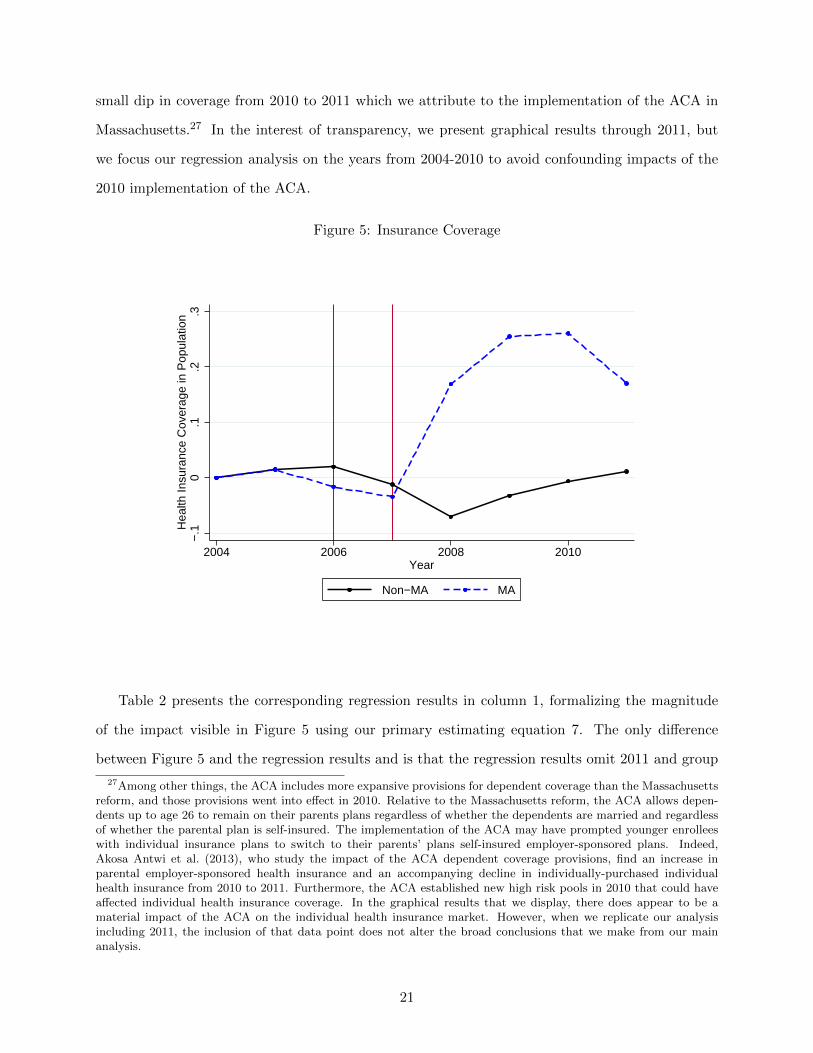
small dip in coverage from 2010 to 2011 which we attribute to the implementation of the ACA in
Massachusetts.27 In the interest of transparency, we present graphical results through 2011, but
we focus our regression analysis on the years from 2004-2010 to avoid confounding impacts of the
2010 implementation of the ACA.
Figure 5: Insurance Coverage
−.1
0.1
.2.3
Hea
lth In
sura
nce
Cov
erag
e in
Pop
ulat
ion
2004 2006 2008 2010Year
Non−MA MA
Table 2 presents the corresponding regression results in column 1, formalizing the magnitude
of the impact visible in Figure 5 using our primary estimating equation 7. The only difference
between Figure 5 and the regression results and is that the regression results omit 2011 and group
27Among other things, the ACA includes more expansive provisions for dependent coverage than the Massachusettsreform, and those provisions went into effect in 2010. Relative to the Massachusetts reform, the ACA allows depen-dents up to age 26 to remain on their parents plans regardless of whether the dependents are married and regardlessof whether the parental plan is self-insured. The implementation of the ACA may have prompted younger enrolleeswith individual insurance plans to switch to their parents’ plans self-insured employer-sponsored plans. Indeed,Akosa Antwi et al. (2013), who study the impact of the ACA dependent coverage provisions, find an increase inparental employer-sponsored health insurance and an accompanying decline in individually-purchased individualhealth insurance from 2010 to 2011. Furthermore, the ACA established new high risk pools in 2010 that could haveaffected individual health insurance coverage. In the graphical results that we display, there does appear to be amaterial impact of the ACA on the individual health insurance market. However, when we replicate our analysisincluding 2011, the inclusion of that data point does not alter the broad conclusions that we make from our mainanalysis.
21
individual years into the Before, During, and After periods. We do not include any covariates in
our main graphical or regression results.28 The coefficient γk presented in the first row captures the
impact of the reform. The estimate in the first column implies that enrollment in the individual
market increased by 26.5 percentage points. This is both statistically and economically significant.29
As shown in the bottom row of the table, pre-reform enrollment in the Massachusetts individual
market equaled 70.3% (49,000 annual contracts) such that the estimated impact on enrollment
corresponds to an increase of 18,500 annual contracts. These estimates are generally consistent
with the enrollment trends reported by the Massachusetts Division of Health Care Finance and
Policy (DHCFP), supporting the validity of the SNL data for Massachusetts.30 Aside from the
NHIS data and the DHCFP data, very few other sources allow for estimates of the change in
individual health insurance market enrollment in Massachusetts, underscoring the value of our
coverage estimates from SNL data combined with NHIS data.31
Turning next to the impact on log premiums, Figure 6 shows trends in log premiums per person
in the individual market, again relative to the 2004 levels.32 While the medical-CPI-adjusted
28Following EFC, we intentionally do not include any covariates because total coverage, premiums, and costs arerelevant for welfare. Because covariates such as the age and gender of enrollees are important drivers of coverage,premiums, and costs, but insurers cannot price based on them, including them as controls could obscure real impactsof the reform. It could be argued that while the characteristics of enrollees should never be included as controls, itcould make sense to control for characteristics of the entire population that could enroll. We discuss robustness of theestimates with respect to the inclusion of controls for concurrent economic and demographic trends in Section A.9 ofthe online appendix. We find that our results are very robust to the inclusion of these factors and suggest, if anything,that our baseline estimates understate the effects on coverage, log average costs, log premiums, and ultimately onsocial welfare.
29We use a block bootstrap method to calculate the confidence intervals. We discuss this method in the onlineappendix section B. We provide further evidence on the significance of our findings in the online appendix sectionA.10, where we conduct a series of placebo studies. Following Abadie and Gardeazabal (2003) and Abadie et al.(2010), we replace Massachusetts with a set of control states as though they were treated. Our findings suggest thatthe experience in Massachusetts was distinctively different from those in the placebo states, which corroborates ourmain results.
30Based on unaudited enrollment reports submitted to the DHCFP, it reports that enrollment in the individ-ual market increased from 38k in June 2006, to 71k in March 2011, see www.mass.gov/chia/docs/r/pubs/12/
2011-june-key-indicators.pdf. There are at least two reasons for why the estimates from the DHCFP suggest alarger increase in enrollment. First, the DHCFP measures enrollment in persons whereas we measure enrollment inmember months. Since we divide our observed member month estimates by 12, our results will likely understate en-rollment measured in the DHCFP. Second, the DHCFP enrollment counts include insurers that offer CommonwealthCare plans, which we drop in our estimates.
31The Massachusetts Health Reform Survey (MHRS) has the potential to separate individual market coverage fromother coverage, but in practice, “respondents in the survey often reported being enrolled in multiple programs (e.g.,Commonwealth Care and Commonwealth Choice) or having both direct purchase and public coverage. As this raisesconcerns about the accuracy of the reporting of coverage type for the various public programs and direct purchase,the analysis of source of coverage is limited to ESI coverage and all other types of insurance” (Long et al. (2010),page 7). Given the issues with the MHRS, it is not surprising that other national surveys have well-known issues inestimating the size of the individual health insurance market (see Abraham et al. (2013)).
32Premiums are higher in Massachusetts than they are in other states before reform. While there are variouspotential explanations for the general differences in health care costs between states, guaranteed issue and community
22

Table 2: Regression Results
(1) (2) (3)Coverage Log Premium Log Claim Exp
γk MA*After 0.265∗∗∗ -0.233∗∗∗ -0.087∗∗∗
[0.175, 0.362] [-0.286, -0.176] [-0.143, -0.025]ρk1 MA*During -0.030∗ -0.012 -0.019
[-0.066, 0.003] [-0.063, 0.036] [-0.076, 0.038]ρk2 MA 0.112∗ 0.700∗∗∗ 0.761∗∗∗
[-0.010, 0.238] [0.622, 0.779] [0.662, 0.870]ρk3 After -0.044 0.128∗∗∗ 0.213∗∗∗
[-0.139, 0.046] [0.072, 0.182] [0.151, 0.269]ρk4 During -0.003 0.087∗∗∗ 0.156∗∗∗
[-0.036, 0.033] [0.040, 0.138] [0.099, 0.213]ρk11 Constant 0.591∗∗∗ 7.978∗∗∗ 7.808∗∗∗
[0.467, 0.713] [7.899, 8.056] [7.699, 7.907]
Pre-Reform Value (levels) 0.703 5,871.33 5,270.64
The bootsrapped 95% confidence interval is displayed in brackets.
Standard errors are clustered at the state level. Abadie weights depend on member month en-rollment as well as changes in coverage, relative changes in average costs, and relative changes inpremiums between 2004 and 2005.∗ p < 0.10, ∗∗ p < 0.05, ∗∗∗ p < 0.01
log premiums continue to trend upwards in the control states, we observe a distinct decrease
in Massachusetts following the implementation of health care reform. We also notice a nominal
premium decrease in Massachusetts following health reform.
Column 2 in Table 2 quantifies the reform’s effect on log premiums. Our results suggest that
log premiums in Massachusetts fell by 0.233 following health care reform, relative to other states.
This corresponds to a 23.3% decrease relative to Massachusetts pre-reform level of $5,870. This
estimate is in the same range as that found by Graves and Gruber (2012), who use data collected
by the Association for Health Insurance Plans (AHIP).33
Finally, we turn to the impact of reform on log average claim expenditures. Figure 7 presents
trends in log average claim expenditures in the individual market. Again, we observe a noticeable
trend break in the Massachusetts individual market following health reform. Log average claims
expenditures trend upwards in the pre-reform and the reform implementation years, both in Mas-
rating regulations are likely to explain the relatively larger cost differences in the individual market, at least in part.In the absence of an individual mandate, we expect that these regulations may lead to an adversely selected pool ofinsured individuals and the associated high premiums. Supporting this, we find that insurers located in other statesthat also had guaranteed issue and community rating regulation in place, henceforth “guaranteed issue states”, hadhigher premiums and claim expenditures than the national average. We come back to this comparison in Section 7.2,where we contrast premium and health expenditure trends in Massachusetts with trends in synthetic control stateschosen with weight assigned to guaranteed issue status.
33The authors find that between 2006 and 2009, family plans and single plans decreased by 52.3% and 35.3% relativeto the national trend, respectively. We consider the impact of these alternative estimates on welfare in Section 7.7.
23
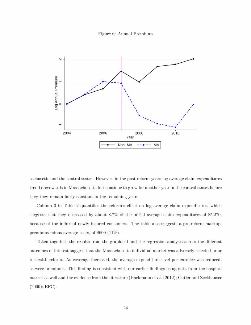
Figure 6: Annual Premiums
−.1
0.1
.2Lo
g A
nnua
l Pre
miu
m
2004 2006 2008 2010Year
Non−MA MA
sachusetts and the control states. However, in the post reform-years log average claim expenditures
trend downwards in Massachusetts but continue to grow for another year in the control states before
they they remain fairly constant in the remaining years.
Column 3 in Table 2 quantifies the reform’s effect on log average claim expenditures, which
suggests that they decreased by about 8.7% of the initial average claim expenditures of $5,270,
because of the influx of newly insured consumers. The table also suggests a pre-reform markup,
premiums minus average costs, of $600 (11%).
Taken together, the results from the graphical and the regression analysis across the different
outcomes of interest suggest that the Massachusetts individual market was adversely selected prior
to health reform. As coverage increased, the average expenditure level per enrollee was reduced,
as were premiums. This finding is consistent with our earlier findings using data from the hospital
market as well and the evidence from the literature (Hackmann et al. (2012); Cutler and Zeckhauser
(2000); EFC).
24
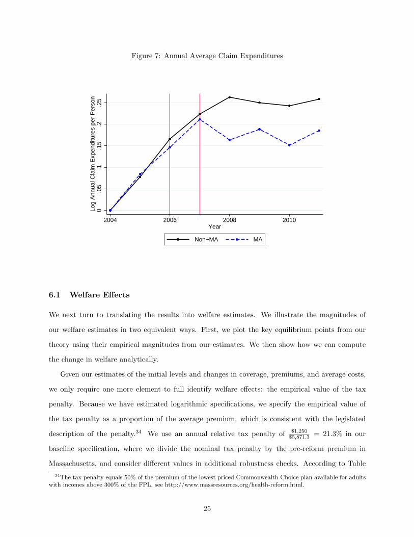
Figure 7: Annual Average Claim Expenditures
0.0
5.1
.15
.2.2
5Lo
g A
nnua
l Cla
im E
xpen
ditu
res
per
Per
son
2004 2006 2008 2010Year
Non−MA MA
6.1 Welfare Effects
We next turn to translating the results into welfare estimates. We illustrate the magnitudes of
our welfare estimates in two equivalent ways. First, we plot the key equilibrium points from our
theory using their empirical magnitudes from our estimates. We then show how we can compute
the change in welfare analytically.
Given our estimates of the initial levels and changes in coverage, premiums, and average costs,
we only require one more element to full identify welfare effects: the empirical value of the tax
penalty. Because we have estimated logarithmic specifications, we specify the empirical value of
the tax penalty as a proportion of the average premium, which is consistent with the legislated
description of the penalty.34 We use an annual relative tax penalty of $1,250$5,871.3 = 21.3% in our
baseline specification, where we divide the nominal tax penalty by the pre-reform premium in
Massachusetts, and consider different values in additional robustness checks. According to Table
34The tax penalty equals 50% of the premium of the lowest priced Commonwealth Choice plan available for adultswith incomes above 300% of the FPL, see http://www.massresources.org/health-reform.html.
25

1, the average tax penalty is potentially smaller, but equation 2 shows that the overall welfare
effects decreases in the calibrated tax penalty. Therefore, our baseline specification describes a
conservative welfare estimate with respect to the tax penalty.
Figure 8 illustrates the empirical average cost curve, the empirical demand curve, and the
associated welfare effects graphically. Our findings suggest that the individual mandate increased
consumer welfare in the individual market. In fact, we find that the tax penalty could have been
even larger to fully internalize the social costs of adverse selection, an observation we return to
below. Following the derivation in Section 3.3, we can express the full welfare effect (the light gray
Figure 8: Adverse Selection And Welfare In Practice
I*,pre=0.7 I
*,markup=0.87 I*,post=0.97
Insurance
P*,pre=8.7
P*,post=8.4
AC*,pre=8.6
AC*,post=8.5
9
Log Premium
H
A
H'A'
C
D
D'
Π=0.24
ACHIL
MCHIL
DHI,0L
DHI,ΠL
and the dark gray area in figure 8) in terms of parameters that we quantified in the difference-
in-differences regression analysis. Specifically, we substitute the estimated pre-reform levels and
changes in coverage, log premiums, and log average costs from Table 2 into equation 2 and find the
reform’s annual effect on social welfare in Massachusetts.
∆Wfull =(
8.678− 8.57)∗ 26.5%
− (−0.087) ∗(
70.3% + 26.5%)
+1
2(−0.233− 0.239) ∗ 26.5% = 0.051.
26

The first term on the right hand side addresses the observed positive pre-reform markup. The
second term summarizes the role of the downward sloping average cost curve for our welfare esti-
mates. Intuitively, the size of this effect depends on the change in log average costs and the change
in coverage but also on the wedge between average and marginal costs in the pre-reform equilib-
rium, which is why coverage in the pre-reform equilibrium enters the formula. Finally, the third
term summarizes the role of changes in premiums for our welfare estimates.35 A larger decrease in
log premiums suggests that the newly insured consumers value health insurance by less.
Our model is derived from the perspective of a representative individual. To extrapolate our
results to determine overall welfare gains requires us to determine the relevant population. Given
the population of interest — the individual market — our estimates can be interpreted as a welfare
gain relative to the pre-reform premium of approximately 5.1% ∗ $5, 870 = $299 per person and
year. For our primary estimates, we assume that individuals above 300% of the FPL are similar
to those receiving full subsidies (i.e. marginal costs and the willingness to pay for insurance are
independent of an individual’s annual earnings). Accordingly, we extrapolate this gain to the
universe of individual market participants. We revisit this assumption in the robustness section.
To get a population welfare impact, we multiply the per-person estimate by a conservative market
size estimate of 212,000 individuals36 and find a full welfare effect for the entire individual market
of $63.5 million per year.
To assess the precision of our welfare estimates, we derive the distribution of the welfare effects
via bootstrap. The bootstrapped confidence intervals are conditional upon the calibrated tax
penalty, which we vary in the robustness section. We describe the details of the bootstrap method
in Section B of the online appendix. The first row in Table 3 displays the results for our baseline
specification, which suggest that the full welfare effect is statistically significant at the 5% level
(see column 2). We can rule out full welfare gains that are negative or greater than 9.9% with 95%
35The proportional tax penalty shifts the demand curve by log(1−π) = log(1−$1, 250/$5, 870) = log(1−21.3%) =0.239, see the online appendix section A.11.
36To quantify the size of Massachusetts individual market, we first aggregate the reported individual marketenrollment in the SNL data across all insurers in Massachusetts at the year level. This includes consumers enrolledin Commonwealth Care plans. Second, we add the uninsured by dividing the aggregate enrollment estimate by ourcoverage estimate from the NHIS. Specifically, we calculate average enrollment in the years 2007-2010 and divide thenumber by our post-reform coverage estimate from the NHIS. Our market size estimate is smaller than the estimatereported by the DHCFP, which suggests that in 2011 about 245,000 individuals were enrolled in the individualmarket, see rows 2, 5, and 6 in table 2 of the quarterly enrollment update: www.mass.gov/chia/docs/r/pubs/12/
2011-june-key-indicators.pdf. As mentioned earlier, this report measures enrollment at the individual level andnot at the the member month level. Therefore, the reported enrollment figures overstate our enrollment measure,which is based on 12 member months.
27

confidence.
Table 3: Welfare Effects
Tax Penalty % Tax Penalty Full Welfare Effect Net Welfare Effect
Baseline: 1250 21.3% 0.051∗∗ 0.041∗∗
[0,0.099] [0.01,0.072]450 7.7% 0.072∗∗ 0.03∗∗∗
[0.017,0.124] [0.011,0.05]550 9.4% 0.07∗∗ 0.033∗∗∗
[0.015,0.121] [0.012,0.055]650 11.1% 0.067∗∗ 0.036∗∗∗
[0.013,0.118] [0.012,0.06]750 12.8% 0.064∗∗ 0.038∗∗∗
[0.011,0.115] [0.013,0.064]850 14.5% 0.062∗∗ 0.039∗∗∗
[0.009,0.112] [0.012,0.067]950 16.2% 0.059∗∗ 0.04∗∗∗
[0.007,0.108] [0.012,0.069]1050 17.9% 0.056∗∗ 0.041∗∗∗
[0.005,0.106] [0.012,0.071]1150 19.6% 0.054∗∗ 0.041∗∗
[0.003,0.102] [0.011,0.072]1350 23.0% 0.048∗ 0.041∗∗
[-0.003,0.095] [0.009,0.073]1450 24.7% 0.045∗ 0.04∗∗
[-0.005,0.092] [0.008,0.072]1550 26.4% 0.042∗ 0.039∗∗
[-0.008,0.089] [0.006,0.072]1650 28.1% 0.039 0.038∗∗
[-0.011,0.085] [0.005,0.071]1750 29.8% 0.036 0.037∗∗
[-0.014,0.082] [0.003,0.07]1850 31.5% 0.032 0.035∗∗
[-0.017,0.078] [0.001,0.069]1950 33.2% 0.029 0.033∗
[-0.021,0.074] [0,0.067]2050 34.9% 0.026 0.031∗
[-0.024,0.07] [-.003,0.065]
GI: 1250 21.3% 0.056∗ 0.044∗∗∗
[0,0.107] [0.013,0.075]
6.2 Changes In The Markup vs. Adverse Selection
The full welfare effect combines two effects: the welfare gain from the removal of adverse selection
and the welfare gain from a smaller post-reform loading factor. A smaller post-reform markup is
consistent with a more competitive market environment in the post-reform period and also with
the change in the rating methodology in the individual market, which was carried out in July
2007. One advantage of our empirical method is that we can decompose the full welfare gain into
28
a welfare gain from the removal of adverse selection and a welfare gain from a smaller post-reform
markup. Furthermore, we can decompose these effects and assess welfare without modeling the
mechanisms for enhanced competition directly, making our framework robust to changes in the
market environment that may have affected the conduct of competition. To separately identify
the welfare impacts, we compute the welfare gains holding the pre-reform markup constant and
attribute this effect to the removal of adverse selection.
Using equation 4, we conclude that health insurance coverage would have increased by 17
percentage points to I∗,markup = 87%, if the pre-reform load had remained constant. Graphically,
I∗,markup refers to the coverage share at which the post-reform demand curve intersects with the
pre-reform pricing policy of the insurers. Under the pre-reform markup, premiums and average
costs would have decreased by only 5.4%. Based on equation 3, we find that the welfare gains due
to the removal of adverse selection, represented by the light gray area, equal 4.1% per individual
and year, which is statistically significant at the 5% level, see column 3 in the first row of Table 3.37
From Table 2, the average premium in the population pre-reform was $5,870 per year. Therefore,
the welfare gain from the reduction in adverse selection is about 4.1%∗$5, 870 = $241 per person and
year. As expected, this gain in the individual health insurance market is larger than the welfare
loss from adverse selection that EFC find in their empirical context of the employer sponsored
health insurance market of 2.3% of the maximum money at stake (which is roughly equivalent to
our measure of total cost). The welfare gain also exceeds the welfare effects in Einav et al. (2010c),
which suggest that adverse selection in the UK annuity market reduces welfare by about 2% of
annuitized wealth. Combined with the market size estimate, the net welfare effect for the entire
individual market equals $51.1 million per year. This welfare gain seems substantial even relative
to the approximately $800 million of outlays from the federal government to finance Massachusetts
health reform, see McDonough et al. (2006).
The transition to a more competitive market and the change in the premium rating methodology,
on the other hand, decreased annual premiums by another 17.9% and the associated welfare gain
equals 1% ($58.7) per person and $12.4 million for the entire market. While both effects enhanced
welfare, these estimates suggest that 80% of the total welfare gains came from reductions in adverse
selection.38
37We can reject a negative net welfare effect with 98.8% confidence.38We also consider the reverse welfare breakdown, by considering the change in the markup first. In this calculation
29
6.3 Optimal Tax Penalty
Our final application of our methodology is to compute the optimal individual mandate penalty
based on our empirical estimates for demand and cost curves. While theoretically straightforward,
to do so we must lean heavily on our assumption of linearity in demand and cost curves. Because
estimation of an optimal penalty requires out of sample prediction over coverage ranges we do not
observe in the data this assumption may not hold and, therefore, the precise magnitude of these
estimates should be viewed with caution. Nevertheless, Figure 8, demonstrates that a larger shift
would have increased welfare even further. Specifically, our empirical results suggest that the social
optimum occurs at universal coverage levels, as even the consumers with the lowest willingness
would purchase health insurance if it were offered at their marginal costs. We can use our model
to compute the smallest tax penalty that implies universal insurance coverage.39
In practice, the tax penalty must be sufficiently large such that the consumer with the lowest
willingness-to-pay is willing to purchase health insurance if it is offered at average costs of all con-
sumers plus the post-reform markup that insurers charge on top of the realized average costs. Using
equation 6,40 we conclude that the minimal tax penalty that implements universal coverage levels
equals 24.9% ($1,461).41 While this optimal penalty exceeds the actual penalty in Massachusetts,
is does resemble the proposed penalty for national reform, which can equal the maximum of $2,085
and 2.5% of household income.
7 Robustness
In this section, we first conduct a sensitivity analysis of our welfare estimates with respect to the
tax penalty. Next, we contrast the trends in Massachusetts individual market with other states
that also had guaranteed issue regulations as well as community rating laws in place. We continue
with a more careful analysis of the community rating regulations in Massachusetts and investigate
we find a smaller net welfare effect of 2.8%($164) per person and a welfare gain from lower markups of 2.3% ($135)per person.
39In order to quantify the socially optimal penalty, we assume that the post-reform markup remains unchanged ifwe vary the magnitude of the tax penalty.
40In general, the formula builds on the linearity assumption in the marginal cost curve. However, our findingsindicate that universal coverage is optimal. Therefore, we can calculate the optimal penalty using our demandestimates.
41Notice that the formula suggests an optimal penalty of 0.286. However, the underlying proportional tax penaltyequals only 1 − exp(−0.286) = 0.249, see the online appendix section A.11 for details.
30

whether they affect our empirical estimates. Next, we test whether there have been meaningful
changes in the generosity of the offered health insurance plans. We then revisit the welfare gains for
the entire individual market using reported average costs of all insurers in Massachusetts individual
market. Finally, we compare our regression results to other findings in the literature and investigate
the implications for social welfare.
7.1 The Role of the Penalty
Because we have calibrated the penalty, we assess the robustness of our welfare results to alternative
penalty amounts.42 Equation 2 shows that as the penalty decreases, there is a linear increase in
the change in welfare. Since our baseline penalty constitutes an upper bound for the actual tax
penalty, see Table 1, our baseline estimate provides a conservative estimate for the full welfare
effect. For instance, the full welfare effect increases by 0.3% per person if the underlying changes
in coverage stem from a $100 smaller tax penalty. Graphically, a smaller tax penalty shifts point C
in the direction of point A’, see Figure 8. The effect of the tax penalty on the welfare estimate is
linear because the width of the shaded polygon, I∗, post−I∗, pre, remains unchanged. However, if the
perceived tax penalty is higher than the actual tax penalty, as argued by Ericson and Kessler (2013),
then our full welfare estimate may overstate the actual effect. Therefore, we conduct robustness
checks with smaller and larger tax penalties. Column 2 of Table 3 summarizes the respective
full welfare estimates for different calibrated tax penalties. The estimates are generally similar to
our baseline estimate of 5.1% but differ somewhat if we consider substantial deviations from the
calibrated tax penalty. The estimates vary from 2.9% at a penalty of 33.2% to 7.2% at a penalty
of 7.7%.
The effect of the tax penalty on the net welfare effect is ambiguous. While a smaller tax penalty
still implies a more elastic market demand function, a smaller tax penalty also implies a smaller
post-reform coverage level in the absence of changes in insurer markups. Column 3 of Table 3
summarizes the welfare effects associated with the removal of adverse selection for different tax
penalties. These welfare effects are hump-shaped and peak at a penalty of about 20%. While the
net welfare effects vary with the underlying penalty, we think that the relevant support for the
42This robustness exercise also addresses differences between the actual tax penalty and the perceived tax penalty,see e.g. Ericson and Kessler (2013) who investigate counterfactual demand responses to the mandate had it beenarticulated as a tax on the uninsured.
31

underlying penalty lies between 16.2% and 21.3% given our restrictive sample selection. Therefore,
the net welfare effect ranges between 4% and 4.1% per individual and year. Here, the calibration of
the penalty seems to have a very small impact on our estimated net welfare effects. Finally, Table
3 indicates that the net welfare effect exceeds the full welfare effects for tax penalties of more than
29.8%. This is because consumers are less price elastic if higher tax penalties lead to the same
coverage gains. Graphically, this is captured by a steeper demand curve that intersects with the
marginal cost curve at a point to the left of the post-reform coverage level. Therefore, a further
reduction in markups leads to a partial welfare loss: coverage increases to inefficiently high levels.
Throughout our analysis, we have assumed that individuals are responding to the statutory
value of the penalty. This ignores the potential for non-pecuniary perceptions about the penalty to
impact choices. For example, some consumers may see a government mandate as an affront that has
a cost of compliance. Conversely, some individuals may see the penalty as their duty as a citizen.
When reform was first passed in Massachusetts there was also a substantial advertising initiative
that included cross-marketing with the Red Sox that may have also influenced perceptions about
the need to comply. One can interpret the robustness of our results to differences in the optimal
tax penalty as robustness to non-pecuniary factors that change behavior as though the penalty
were larger or smaller.
7.2 Comparison to States with Community Rating and Guaranteed Issue Reg-
ulations
Our main empirical specification compares trends in the Massachusetts individual market to trends
in the individual market of other states. If pre-reform regulations led to different trends in the
individual market across states, then we might better control for trends by comparing Massachusetts
to other states with similar pre-reform regulations. Only five states - Maine, Massachusetts, New
York, Vermont, and Washington - had comparable guaranteed issue regulations combined with
community rating laws in place.43 If these states experience common time trends that differ from
43Kentucky and New Hampshire enacted similar regulations in 1994 but repealed the laws in 2000 and 2002respectively, see Wachenheim and Leida (2012). New Jersey passed similar regulations in 1992 as well but wedropped the state from this small control group since it passed a legislation in 2008, which aimed at coverageexpansion. Among other aspects, this legislation mandated coverage for children and expanded coverage for low-income parents. Furthermore, the law included several reforms to the small group and in the individual market, seeWachenheim and Leida (2012). Therefore, it remains unclear whether New Jersey constitutes a control state or atreatment state in our empirical framework.
32

those observed in other US states, then our baseline point estimates confound the effects of health
reform with general time trends that are unrelated to health reform.
To test for differences in time trends between states with guaranteed issue and community
rating regultations and other states, we add an indicator variable that takes the value of one for
guaranteed issue/community rating states to the set of matching variables in the synthetic control
method. The regression results are presented in Table 4.44 The findings are very similar to the
baseline results, see Table 2, but slightly larger in magnitude. While larger coverage gains and
higher average cost savings indicate larger welfare gains, larger decreases in premiums suggest the
opposite.
Following the outlined steps in Section 6, we revisit the welfare effects using the parameter
estimates from the first row in Table 4. The results in the last row of Table 3 suggest a larger
full welfare effect of 5.6%, which combines a net effect of 4.4% and a welfare gain from a smaller
Table 4: Difference-in-Differences Regression Results
(1) (2) (3)Coverage Log Premium Log Claim Exp
γk MA*After 0.305∗∗∗ -0.266∗∗∗ -0.099∗∗∗
[0.205, 0.402] [-0.319, -0.213] [-0.157, -0.033]ρk1 MA*During -0.012 -0.028 -0.051
[-0.048, 0.022] [-0.082, 0.028] [-0.110, 0.012]ρk2 MA 0.154∗∗ 0.559∗∗∗ 0.609∗∗∗
[0.018, 0.301] [0.497, 0.626] [0.539, 0.682]ρk3 After -0.084∗ 0.161∗∗∗ 0.225∗∗∗
[-0.182, 0.016] [0.109, 0.214] [0.159, 0.282]ρk4 During -0.021 0.103∗∗∗ 0.188∗∗∗
[-0.054, 0.015] [0.047, 0.157] [0.125, 0.247]ρk11 Constant 0.549∗∗∗ 8.119∗∗∗ 7.960∗∗∗
[0.403, 0.682] [8.052, 8.180] [7.887, 8.030]
Pre-Reform Value (levels) 0.703 5,871.33 5,270.64
The bootsrapped 95% confidence interval is displayed in brackets.
Standard errors are clustered at the state level. Abadie weights depend on member month enroll-ment, an indcator variable that takes on the value of one for guaranteed issue states as well aschanges in coverage, relative changes in average costs, and relative changes in premiums between2004 and 2005.∗ p < 0.10, ∗∗ p < 0.05, ∗∗∗ p < 0.01
post-reform loading factor of 1.2%. The revised welfare effects exceed our baseline results by about
20%, but they are still within the 95% confidence interval on our main estimate.
44We also report the relevant trend graphs in the online appendix, Section A.12.
33

7.3 Community Rating
Our baseline model assumes perfect community rating such that premiums may not vary in ob-
servable consumer characteristics. In reality, premiums may vary across ages but only up to a
factor of two. While this regulation is not as stringent as our baseline assumption, the community
rating regulation is still binding as expected health expenditures vary considerably across ages.
To quantify age-related differences in health expenditures, we use data from the Medical Expendi-
ture Panel Survey (MEPS). We use data from 2004-2010 from all states and sum expenditures on
emergency room visits, inpatient and outpatient stays, prescription drugs, and other expenditures
at the individual-year level. We use the Medical Consumer Price Index to normalize the average
health expenditures to 2012 prices. Finally, we estimate conditional means for the non-elderly
adult population aged 18-65 using a standard nonparametric kernel estimator and find that health
expenditures vary by up to factor of 6 across ages.
Even though the community rating regulations appear to be binding, insurers may still, at
least to some extent, price discriminate against older (more expensive) consumers. This may affect
our demand estimates if the average age of the newly insured differs from the average age of the
previously insured. For instance, if the newly insured are younger on average, then we overstate the
change in the premiums by imposing perfect community rating. Consequently, we would conclude
that the demand for health insurance is too inelastic and our welfare estimates would be too
conservative. The opposite holds, if the newly insured are older on average.
To test for changes in the age composition in the pool of insured consumers, we revisit changes in
the age distribution reported by the DHCFP, see Table 5.45 The estimates suggest that the average
Table 5: Average Age in Massachusetts by Market Segment
2005 2006 2007 2008 2009 2009-2005
Individual 36.9 36.8 37.3 37.1 37.3 0.4Small Group 33.1 33.3 33.5 33.7 34.1 1.0Mid-Size Group 32.6 33.0 33.2 33.2 33.3 0.7Large Group 33.3 33.4 33.7 33.7 34.8 1.5
age of insured consumers in Massachusetts individual market increased by 0.4 years between 2005
45We combine information from the Massachusetts Health Care Cost Trends Final Report 2010, Appendices A.1a-A.3b, p.138, and the Massachusetts Health Care Cost Trends, Premium Levels and Trends in Private health Plans:2007-2009, p.13.
34

and 2009. Our cost estimates would imply that the average age of the insured consumers decreased
over the reform period. However, the increase may reflect a reform-unrelated demographic time
trend, which is consistent with even larger increases in average age in the other market segments.
Unlike our main estimates, these results do not control for national trends because they are based
only on Massachusetts data. Nevertheless, we continue our analysis assuming that the increase
in age was reform-related, which provides a conservative lower bound for our welfare estimates
with respect to the role of community rating. Next, we estimate the effect of age on average
health expenditures in a simple linear regression model using the MEPS data. We find that a
one year increase in age increases total health expenditures by $93. Assuming that insurers could
perfectly price discriminate based on age, we conclude that premiums vary on average by up to
$93 ∗ (Actuarial Value) ∗ (1 + Markup) per year of age. To be conservative, we assume that the
actuarial value equals 100% and use the larger pre-reform markup of 11.4%. Hence, we conclude
that the average annual premium may have increased by only $41 (0.7%) because of the increase in
average age of 0.4 years. This effect is negligible compared to our estimated change in the effective
premium of −23.3% − 21.3% = −44.6%. Therefore, we conclude that our welfare estimates are
robust with respect to deviations from our perfect community rating assumption.
7.4 Change in the Generosity of Plan Design
Our baseline specification abstracts from potential changes in the generosity of health insurance
plans. Therefore, our estimates overstate the role of adverse selection if consumers in the Mas-
sachusetts individual market purchase relatively less generous health insurance plans following
health care reform. To quantify potential changes in plan generosity, we analyze insurer character-
istics in the SNL data and information on plan characteristics from the literature.
We begin our discussion with an analysis of the SNL data. The data are aggregated at the
insurer-year level, which implies that we can only address differences in plan generosity between
insurance carriers. Since the SNL data do not provide explicit information on plan characteristics,
we use the insurer name as a proxy for the generosity of the representative (most popular) insurance
plan. Specifically, we assume that insurers that carry the word “HMO” in their name offer insurance
plans that are on average less generous. Based on this assumption, we calculate the share of insured
consumers that are enrolled in HMO plans at the state-year level. In Massachusetts, we find that
35

HMO enrollment trends upward over time, but we do not find a noticeable change in enrollment
between 2007 and 2008.46 On the other hand, we observe a trend break and a level shift in average
costs between 2007 and 2008, see Figure 7. Therefore, we do not think that changes in HMO
enrollment can explain the changes in Massachusetts average cost trend. To investigate the role of
HMO enrollment for our baseline results in further detail, we re-estimate our empirical specification,
see equation 7, controlling for the share of insured consumers that purchase insurance plans from
HMO-type insurers at the state-year level. The findings suggest that, holding plan generosity
constant, premiums and average costs decrease by 26.4% and 7.1% respectively. These estimates
are similar to our baseline findings and suggest slightly smaller welfare effects. However, based on
the standard errors of our baseline estimates, we conclude that the differences in the point estimates
are not statistically significant.
Second, we revisit evidence from the literature on changes in plan generosity. The DHCFP
computes the actuarial value of the most popular plan of each carrier in Massachusetts individual
market for 2007 and 2008, based on a proprietary pricing model, and reports the actuarial value
and other characteristics for the least generous plan, the median plan, and the most generous
plan, see Table 6.47 The results suggest that the entire distribution shifted between 2007 and 2008
toward slightly more generous insurance plans. On the other hand, the DHCFP also finds that
consumer cost sharing increased as a percentage of total expenditures in the individual market
from 11.1% in 2007 to 12.7% in 2008. As argued earlier, this can be interpreted as evidence for
adverse selection because the newly insured healthy individuals contribute relatively more to their
total expenditures in benefit plans with high deductibles. But even if we interpret the increase
in consumer cost sharing as evidence for a decrease in plan generosity, despite the evidence on
an increase in the actuarial value, then the increase can only account for a small fraction of our
baseline welfare estimates. Specifically, we conclude that $161 (35%) of the measured decrease in
average costs can be explained by a decrease in plan generosity.48
We also note that an important change in plan generosity was the potential for younger enrollees
46In Massachusetts, we find one HMO insurer. This insurer does not report enrollment in 2004, even though othersources suggest that enrollment for this insurer was similar in 2004 and 2005. Therefore, we assume that HMOenrollment in 2004 equals the observed enrollment in 2005. Otherwise, enrollment would increase from 0% to 59% in2005.
47Unfortunately, we could not find these statistics for earlier years. We also note here that while these resultsreflect the population weights within each carrier, they do not reflect the enrollment-weighted generosity.
48Total expenditures per person combine the average costs paid by the insurer, AC, and the consumer’s contribution
36

Table 6: Plan Generosity
2007 2008
Minimum Median Maximum Minimum Median Maximum
Actuarial Value 0.578 0.694 0.726 0.635 0.726 0.860Deductible $2000 $2000 $2000 $2000 $2000 NoneCoinsurance N/A N/A N/A N/A N/A N/APCP Office Visit $35 $25 $25 $35 $25 $25SPC Office Visit $50 $25 $25 $50 $25 $25Inpatient Copay Deductible Deductible $500 Deductible $500 $800Outpatient Surgery Copay Deductible Deductible $250 Deductible $250 $250Emergency Room Copay $200 $100 $75 $200 $75 $100Pharmacy Deductible N/A None None $250 None NoneRetail Generic N/A $10 $10 $20 $10 $15Retail Preferred N/A $50 $30 $50 $30 $30Retail Non-Preferred N/A $100 $60 $75 $60 $50
Source: DHCFP Massachusetts Health Care Cost Trends Final Report 2010. Appendices A.1a-A.3b, p.149
who qualified for YAP plans Based on the evidence from the SNL data and the literature, we
conclude that changes in the plan generosity can at most explain a small fraction of our baseline
welfare estimates. In fact, the evidence suggests that our welfare estimates are conservative with
respect to potential changes in plan generosity.
7.5 Changes in Care Delivery Due to Reform
The Massachusetts reform, while primarily focused on insurance, may have impacted care delivery
through general equilibrium effects on prices or access to care. Kolstad and Kowalski (2012a)
discuss the impact of the Massachusetts reform on delivery in detail. While they find an impact
on access, notably use of the emergency room as a point of entry into the health care system, they
do not find a change in total hospital cost growth in Massachusetts relative to other states before
versus after the reform. These findings, both with and without controls for patient illness severity,
are not consistent with substantial increases in prices or quantity, holding illness severity fixed.
C. Since consumer cost sharing in 2008 equaled 12.7%, we know that
0.127 =C∗,post
AC∗,post + C∗,post .
We know that AC∗,post = $4, 650. Therefore, we can solve for C∗,post, which equals $677. Now we can calculatethe post-reform consumer contribution that maintains the pre-reform expenditure share of 11.1%. We conclude thatthe post-reform cost-sharing ratio equals the pre-reform cost-sharing ratio if the post-reform consumer and insurerexpenditures equal $591 and $4,735 respectively. Hence, our baseline results overestimate the reform’s effect onaverage costs by about $4, 811 − $4, 650 = $161. Average costs decreased by 8.7% ($458). Hence, about $161
$458= 35%
of the cost decrease can be attributed to a decrease in plan generosity.
37

Since hospital cost is the primary driver of total claims, this evidence suggests our findings do not
result from changes in prices for care.
Furthermore, if expanding insurance to near-universal levels results in increases in prices charged
by health care providers in Massachusetts (relative to other states) our findings would be biased
down. That is, claims cost would be rising due to price increases. Therefore, our finding that the
average cost of the insured declined is a lower bound.
One other potentially important issue is access to physician services. If the Massachusetts
reform did increase demand, but capacity constraints on supply meant that the newly insured
could not access a provider, then we would see lower cost among the newly insured as a result.
While the potential for such constraints has been much discussed in the popular press, the empirical
evidence does not suggest major impacts of reform. In 2005, the average wait time for an internal
medicine appointment in Massachusetts was 47 days. In 2008, 2009 and 2010 the average wait was
50, 44 and 53 days respectively.49 While these are average measures, we do not see a sharp change
between pre- and post-reform in Massachusetts. Similar trends hold for specialties as well. Taken
together, the evidence suggests that general equilibrium shifts in health care delivery are unlikely
to explain our results. Nevertheless, given the aggregate data on wait times, we are unable to rule
out potential impacts of access on cost.
7.6 Welfare Gains For The Entire Individual Market
In Section 6, we multiplied the per person welfare gains in our sample population by the size of
the individual market to predict the welfare gains for the entire individual market. This approach
is valid if marginal costs and the slope of the demand curve do not differ across income groups.
While we can not recover the demand curve for the entire market from aggregate data,50 we revisit
variation in costs using data on all insurers in the Massachusetts individual market, including those
that offer Commonwealth Care plans. We re-estimate the coverage and the average cost difference-
in-differences specifications using the entire Massachusetts individual market. Finally, we combine
these findings with the demand estimates from Section 6 to compute the welfare effects in this
population.
49See the 2013 report on patient access to care by the Massachusetts Medical Society,http://www.massmed.org/patientaccess/#.UxU4nfldU8g.
50This is because consumers face different income-dependent premiums because of the variation in penalties andsubsidies, see the discussion in Section 5.
38

Using the post-reform coverage normalization discussed earlier, we find that the reform increased
coverage by 69 percentage points in the full sample. This effect combines the coverage gains in our
baseline sample with coverage gains in Commonwealth Care plans. The results from the average
cost specification suggest that pre-reform log average costs equal 8.57 per insured person and that
the reform decreased average costs by -0.21. Consistent with the larger enrollment gains, the effect
on average costs exceeds our baseline results as well. To compare the magnitude of changes in
average costs across samples, we calculate the average costs of the newly insured.51 We find that
the average costs of the newly insured equal 8.29 in the full sample and 8.25 in our baseline sample.
This suggests that the newly insured individuals in our non-poor baseline population have better
health profiles than the new enrollees in the Commonwealth Care plans, who earn less than 300%
of the FPL.
Using the new average cost estimates, we can now revisit the full and the net welfare effects
per person. We update the average costs in the post-reform period using a weighted average of
the average costs of the previously insured and the newly insured, where the weights reflect the
coverage trends in our baseline analysis. Specifically, we find that the log average costs in the
post-reform period for the entire market equal 8.49 in the absence of subsidies and variation in the
tax penalty.52 As mentioned earlier, we assume that the slope of the demand curve does not vary
across income groups. Therefore, coverage would have increased by only 26.5% in the the entire
sample, had everybody been exposed to same tax penalty of 21.3% and had there been no subsidies
for individuals earning less than 300% of the FPL. Using the new average cost estimates, we find
that the full and the net welfare effects per person equal 0.04 ($235) and 0.034 ($200), respectively.
Both effects fall short of our baseline estimates by about 20%, but they are still within the 95%
confidence intervals on our baseline estimates, and they are statistically different from zero at the
1% level. Multiplied by the predicted market size of 212,000 individuals, we conclude that the full
welfare gains for the entire individual market equal $50 million. The net welfare gains attributed
51For the full sample we solve for the average costs of newly insured x as follows:
0.23 ∗ 8.57 + 0.69 ∗ x0.23 + 0.69
= 8.57 − 0.21 .
Similarly, we solve for the average costs of newly insured in our baseline sample.52We have
AC∗,post =0.703 ∗ 8.57 + 0.265 ∗ 8.29
0.703 + 0.265= 8.49
39

to the removal of adverse selection equal $42.4 million.
7.7 Robustness of Welfare Effects to Estimates from Other Studies
To assess the sensitivity of our welfare estimates with respect to our sample population, we revisit
the welfare results using premium and cost estimates from other sources in the literature. We begin
by considering estimates for premium changes from Graves and Gruber (2012). The authors use
data from the Association for Health Insurance Plans and find that after health reform, premiums in
Massachusetts decreased relative to other states by 35% and 52% for single plans and family plans,
respectively. The average number of members per insurance contract in Massachusetts individual
market decreased from 1.6 in 2005 to 1.4 in 2008.53 This suggests, that the reform induced a
disproportionately large share of singles to purchase health insurance plans in the individual market.
Therefore, we use the premium estimates for single plans in our first robustness check. Since Graves
and Gruber (2012) do not provide information on changes in average costs, we continue with our
cost estimates from the SNL data. Based on the premium results, we expect that the authors would
find a larger decrease in average costs, relative to our findings, had they explored changes in average
costs as well. Therefore, we interpret the revised welfare estimates as a potentially conservative
benchmark. Using the new estimate on changes in premiums, we find a full welfare gain of 3.5%
and a net welfare gain of 3%, see the second row of Table 7. These estimates fall short of our
baseline results by 31% and 27%, which is roughly proportional to the underlying change in the
slope of the demand curve.54
Table 7: Welfare Gains Using Demand Estimates From the Literature
Full Welfare Effect Net Welfare Effect
Baseline Estimates 0.051 0.041Graves and Gruber (2012) 0.035 0.030Ericson and Starc (2012): Premiums 0.075 0.088Ericson and Starc (2012): Coverage 0.059 0.051Hackmann , Kolstad, and Kowalski (2012) 0.125 0.100
Next, we reconsider our welfare estimate using the demand elasticity estimates from Ericson
and Starc (2012). The authors use data from the Massachusetts Connector on unsubsidized health
53See DHCFP data appendix, page 140.54Our baseline results suggest a demand slope of −0.233−0.24
0.265= −1.78. The new results suggest a slope of
−0.35−0.240.265
= −2.23, which exceeds our baseline slope by 25%.
40
insurance purchases in the individual market. Their price elasticities reflect the demand behavior at
the intensive margin since the authors do not observe individuals that decide to remain uninsured.
In comparison to our demand estimates, we expect that the authors find relatively high price
elasticities because plan characteristics vary less at the intensive margin (compared to the extensive
margin) and because the connector provides an internet platform that allows consumers to compare
premiums amongst plans. We multiply the reported age group specific semi-price elasticities by
representative population weights in the individual market reported by the DHCFP and find an
average semi-price elasticity of -2.25% per $100 increase in premiums.55 We reconsider our welfare
estimates in two different specifications. In the first specification, we hold on to our coverage
estimates and adjust the effect on log premiums such that changes in coverage and log premiums
are consistent with the semi-price elasticity from Ericson and Starc (2012). If we extrapolate the
large empirical price elasticities from the intensive margin to the less elastic extensive margin, then
we conclude that the observed change in coverage could have been induced by a much smaller
nominal decrease in premiums of only 4.5%. By contrast, our own estimates indicate a nominal
decrease in premiums of 23.3%, see Table 2.56 The relatively large demand elasticity implies a
higher willingness to pay amongst the marginal consumers, which is why we find larger full and
net welfare effects of 7.5% and 8.8% respectively.57 In the second specification, we retain our
baseline premium estimates and adjust our coverage estimates. We conclude that the effective
premium decrease of 23.3%+24%=47.3% should have resulted in a coverage gain of 50%, which
implies universal coverage in the post-reform period. The respective welfare gains are displayed in
the fourth row of Table 7 and suggest a full and a net welfare gain of 5.9% and 5.1% respectively.
Finally, we revisit our welfare analysis based on the cost estimates from our earlier work (Hack-
mann et al. (2012)), where we compare changes in hospital costs following Massachusetts health
reform across counties that exhibited different coverage changes. All Massachusetts counties reached
55See http://www.mass.gov/chia/docs/cost-trend-docs/cost-trends-docs-2011/premium-report.pdf , page13.
56Combining the observed changes in coverage with the semi-price elasticity from Ericson and Starc (2012) suggeststhat, effectively, premiums should have decreased by 26.5%
70.3%∗ 1
2.25∗ $100 = $1, 673 (28.5%). The effective change in
premiums combines a nominal decrease and the effect of the tax penalty. Since the adjusted tax penalty effectivelydecreased premiums by 24%, we adjust our baseline parameter estimate displayed in Table 2 from -23.3% to -28.5%-(-24%)=-4.5%.
57The net welfare gain exceeds the full welfare gain because the post-reform markup exceeds the pre-reform markup.To calculate the net welfare gain, we calculate the coverage the post-reform coverage level at which the pre-reformmarkup equals the post-reform markup. In this case, we find a coverage level that exceeds 100%. Therefore, wechoose I∗,markup = 100%.
41

near-universal health insurance level after reform. Therefore, we see the largest coverage gains in
those counties that had the lowest pre-reform coverage levels. Using hospital claims data from
Massachusetts, we find that the slope of the average hospital cost curve equals -$2,250. The slope
estimate suggests that a coverage increase of 26.5% percentage points reduces the average hospital
related costs of the insured population by 0.265∗$2, 250 = $596. To extrapolate the slope estimate
to our sample population we have to make two adjustments. First, we divide the slope estimate by
the share of hospital expenditures of total insured health expenditures assuming that the magnitude
of adverse selection is similar between hospital related and non-hospital related health care costs.
In 2007, hospital expenditures accounted for about 50% of total insured health expenditures.58
Second, we multiply the slope estimate by the actuarial value of the representative insurance plan
in Massachusetts individual market. We use the actuarial value of the median plan in the year
2008, see Table 6. Combining these adjustments, we conclude that average insurer costs decrease
by 0.265 ∗ $2, 250 ∗ 10.5 ∗ 0.726 = $865 = 16.4% in response to a coverage increase of 26.5 percentage
points. This slope estimate exceeds our baseline estimate by 7.7 percentage points. We combine
the revised cost estimate with the demand estimates from the SNL data and find larger full and
net welfare effects of 12.5% and 10% respectively.
Overall, we conclude that our welfare estimates are in the center of welfare predictions that
could have been made based on different premium and cost data sources.
8 Conclusion
One important theoretical rationale for an individual mandate is that it can mitigate the welfare
loss from adverse selection by requiring both the healthy and the sick to purchase coverage. On the
other hand, recent empirical work on adverse selection finds relatively little welfare loss, suggesting
otherwise. Reconciling these two views is of interest to economists, and it is of broader interest
given the centrality of the individual mandate to both major health reforms.
To do so requires (i) a model of adverse selection that incorporates an individual mandate
explicitly and is empirically tractable and (ii) a setting to estimate adverse selection at the extensive
margin between insurance and uninsurance. The Massachusetts health reform of 2006 gives us a
58See http://www.kff.org/insurance/upload/7692_02.pdf, exhibit 2. We defined hospital care, physi-cian/clinical services and prescription drugs to be the insured health spending categories. If we add the secondcategory to overall hospital services, then up to 84% of health care spending occurs in the hospital.
42

novel opportunity to do just that: examine the impact of a mandate on adverse selection among
the entire insured population in a policy very similar to the ACA.
We begin by extending existing theory to express the welfare impact of a mandate in terms of a
small number of moments in commonly available data. We demonstrate that the change in welfare
between pre- and post-reform can be computed based on changes in coverage, premiums, average
costs (paid claims) and the size of the mandate penalty. Because we have independent measures
of premiums and costs, and because changes in markups are an interesting potential outcome of
health reform, we also incorporate markups into our welfare analysis, allowing us to distinguish
changes in competition from changes in adverse selection. This approach makes the welfare effects
of reform theoretically clear, and it also allows us to estimate the impact of reform from available
data with a minimum of assumptions. We do so using the Massachusetts reform and data on
coverage, premiums, and insurer costs from the SNL financial database and the NHIS. Each of
these data sets delineates the individual and group markets, allowing us to focus our analysis on
the market where we expect reform to have the largest impact (and adverse selection to be most
egregious in the absence of reform): the individual market.
We find that the individual market for health insurance was adversely selected prior to reform.
The introduction of reform increased coverage by 26.5 additional percentage points. The growth
in coverage was associated with a reduction in the average cost of the insured by 8.7%. Trans-
lating our difference-in-difference estimates into welfare estimates suggests that the representative
Massachusetts resident in the individual market was 5.1% better off due to reform. Scaling this
estimate by the relevant population in the state suggests a substantial aggregate welfare gain of
$63.5 million per year statewide. Welfare increased by 4.1% due to reductions in adverse selection
alone.
Finally, we are able to compute the optimal individual mandate penalty; the penalty that in-
duces the level of coverage that would occur without information asymmetries. Given the estimated
demand in Massachusetts, the optimum occurs at universal coverage. The statutory penalty $1,250
(21.3% of the pre-reform premium) would, therefore, have to be increased to the estimated opti-
mum of 24.9% to enhance welfare. While the estimated optimal penalty is higher than the penalty
in Massachusetts it is relatively close to the penalty selected under national reform.
Our estimates require a number of assumptions and we rely on data with clear limitations.
43

Nevertheless, our findings are robust to a variety of tests. Our methodology is tied very closely
to the institutional features of Massachusetts health reform. We also expect that future work can
build on our methodology to model and estimate the impact of the ACA as it is implemented
nationwide.
44

References
Alberto Abadie and Javier Gardeazabal. The economic costs of conflict: A case study of the basque
country. American Economic Review, 93(1):113–132, March 2003.
Alberto Abadie, Alexis Diamond, and Jens Hainmueller. Synthetic control methods for compar-
ative case studies: Estimating the effect of californias tobacco control program. Journal of the
American Statistical Association, 105(490), 2010.
Jean M. Abraham, Pinar Karaca-Mandic, and Michel Boudreaux. Sizing up the individual market
for health insurance: A comparison of survey and administrative data sources. Medical Care
Research and Review, 2013.
George A. Akerlof. The market for “lemons”: Quality uncertainty and the market mechanism.
Quarterly Journal of Economics, 84(3):488–500, 1970.
Yaa Akosa Antwi, Asako S. Moriya, and Kosali Simon. Effects of federal policy to insure young
adults: Evidence from the 2010 affordable care act’s dependent-coverage mandate. American
Economic Journal: Economic Policy, 5(4):1–28, 2013. doi: 10.1257/pol.5.4.1. URL http://
www.aeaweb.org/articles.php?doi=10.1257/pol.5.4.1.
Andrew Beauchamp and Mathis Wagner. Dying to retire: Adverse selection and welfare in social
security. 2012.
M. Kate Bundorf, Jonathan Levin, and Neale Mahoney. Pricing and welfare in health plan choice.
American Economic Review, 102(7):3214–3248, December 2012.
Jeffrey Clemens. Regulatory redistribution in the market for health insurance. Working Paper,
2013.
David M. Cutler and Jonathan Gruber. Does public insurance crowd out private insurance? The
Quarterly Journal of Economics, 111(2):391–430, 1996.
David M. Cutler and Richard J. Zeckhauser. The Anatomy of Health Insurance, volume 1, Part
A of Handbook of Health Economics, chapter 11, pages 563–643. Elsevier, 2000. doi: 10.
1016/S1574-0064(00)80170-5. URL http://www.sciencedirect.com/science/article/pii/
S1574006400801705.
45

Leemore Dafny. Are health insurance markets competitive? Annual Review of Economics, 100(4):
1399–1431, September 2010.
Liran Einav, Amy Finkelstein, and Mark Cullen. Estimating welfare in insurance markets using
variation in prices. Quarterly Journal of Economics, 125(3):877–921, August 2010a.
Liran Einav, Amy Finkelstein, and Jonathan Levin. Beyond testing: Empirical models of insurance
markets. Annual Review of Economics, 2:311–336, September 2010b.
Liran Einav, Amy Finkelstein, and Paul Schrimpf. Optimal mandates and the welfare cost of
asymmetric information: Evidence from the uk annuity market. Econometrica, 78(3):1031–1092,
May 2010c.
Keith M. Marzilli Ericson and Amanda Starc. Pricing regulation and imperfect competition on the
massachusetts health insurance exchange. NBER Working Paper 18089, 2012.
Keith Marzilli Ericson and Judd B. Kessler. The articulation effect of government policy: Health
insurance mandates versus taxes. NBER Working Paper 18913, 2013.
LLC Gorman Actuarial et al. Impact of merging the massachusetts non-group and small group
health insurance markets. Massachusetts Division of Insurance and Market Merger Special Com-
mission, Gorman Actuarial, LLC, Marlborough, MA, 2006.
John A. Graves and Jonathan Gruber. How did health care reform in massachusetts impact in-
surance premiums? American Economic Review Papers And Proceedings, 102(3):508–513, May
2012.
Martin B. Hackmann, Jonathan T. Kolstad, and Amanda E. Kowalski. Health reform, health
insurance, and selection: Estimating selection into health insurance using the massachusetts
health reform. American Economic Review Papers And Proceedings, 102(3):498–501, May 2012.
Jonathan T. Kolstad and Amanda E. Kowalski. The impact of health care reform on hospital
and preventive care: Evidence from massachusetts. Journal of Public Economics, 96:909–929,
December 2012a.
Jonathan T Kolstad and Amanda E Kowalski. Mandate-based health reform and the labor market:
Evidence from the massachusetts reform. NBER Working Paper 16012, 2012b.
46

Sharon K. Long, Karen Stockley, and Heather Dahlen. Health reform in massachusetts
as of fall 2010: Getting ready for the affordable care act i& addressing affordabil-
ity. Technical report, Urban Institute, 2010. URL http://www.urban.org/uploadedpdf/
412491-Health-Reform-in-Massachusetts-as-of-Fall-2010.pdf.
John E. McDonough, Brian Rosman, Fawn Phelps, and Melissa Shannon. The Third Wave of
Massachusetts Health Care Access Reform. Health Affairs, 25(6):w420, 2006.
Michael Rothschild and Joseph Stiglitz. Equilibrium in competitive insurance markets: An essay on
the economics of imperfect information. Quarterly Journal of Economics, 90(4):629–650, 1976.
Leigh Wachenheim and Hans Leida. The impact of guaranteed issue and community rat-
ing reforms on states’ individual insurance markets. Technical report, America’s Health In-
surance Plans, 2012. URL http://www.ahipcoverage.com/wp-content/uploads/2012/03/
Updated-Milliman-Report.pdf.
47

A Online Appendix:
A.1 Plan Heterogeneity and the Extensive Margin
Our model addresses selection at the extensive margin and abstracts from intensive margin selection
amongst differentiated plan. Our modeling decision follows naturally from the policy intervention,
the individual mandate, which affects the demand for health insurance in general. While our
framework may not be accurate in other contexts, we think that the modeling assumptions are
sensible in this application for the following two reasons.
First, heterogeneity in plan generosity is limited in the Massachusetts individual health in-
surance market. According to Ericson and Starc (2012), 80% of the consumers in this market
purchase bronze or silver plans, whose actuarial value varies between 60% and 70%.1 We think
that the variation at the intensive margin is small relative to having no health insurance at all.
Second, our modeling framework is consistent with plan heterogeneity if selection at the intensive
margin is orthogonal to selection at the extensive margin. If so, we expect that the newly insured
consumers purchase health insurance according to the observed market shares of the previously
insured, holding the set of offered health insurance plans constant. In this case, we can aggregate
heterogeneous plans to a single representative plan, which corresponds to a weighted average over
the underlying individual plans, weighted by the plan market shares. Our framework models the
willingness to pay and the costs of this representative plan.
While our data do not allow us to disentangle differences in preferences between the previously
insured and the newly insured on the one hand from changes in plan generosity on the other hand,
we notice that the actuarial value of the most popular plans changes only modestly between the
pre- and the post-reform years, see Table 6. Hence, we conclude that on net, these effects do not
seem to affect our empirical results considerably.
A.2 The Group Market and The Individual Market
Our model focuses on the individual market and abstracts from changes in the distribution of
consumer types that may result from inflows from or outflows to the group market. For instance,
Massachusetts health reform introduced an employer mandate, which encourages employers to offer
1We are not counting silver plus and silver plus and silver select plans
1

health insurance to their employees, see Kolstad and Kowalski (2012b). Hence, the reform may have
created access to employer sponsored health insurance for at least some consumers that purchased
health insurance individually in the pre-reform years.
Unfortunately, our data do not allow us to quantify the transition between the individual and
the group market. The group market information in the SNL data is incomplete –it does not
provide information on self-insured employers– and the NHIS sample population is too small to
measure these transitions accurately.
Qualitatively, we interpret our welfare estimates as a conservative lower bound with respect to
potential transitions from the individual to the group market for two reasons. First, if consumers
switch to the group market, then we will understate the number of insured consumers in the
individual market in the post-reform years, which biases our welfare estimates downwards. Second,
we think that healthier individuals are more likely to be offered health insurance through their
employers. Therefore, we will overstate the marginal costs of the newly insured. In other words,
adverse selection would be more pronounced had the switchers remained in the individual market.
Hence, the transition of inexpensive consumers to the group market biases our welfare estimates
downward as well.
A.3 The Welfare Relevant Area
This section discusses the change in welfare caused by the elimination of adverse selection, which
combines changes in consumer surplus, insurer surplus, and government surplus.
The consumer surplus corresponds to the integral over the difference between the willingness
to pay and the market price for buyers minus the tax penalty payments made by the non-buyers.
Using the notation from the consumer problem we can express the consumer surplus as:
CS(I∗,t,Πt) =
∫ I∗,t
0(D(x, 0)−D(I∗,t,Πt))dx−Πt ∗ (1− I∗,t) + Y,
where we have substituted the equilibrium premium P (∗, t) with the market level demand curve
evaluated at the equilibrium coverage level and the respective tax penalty, D(I∗,t,Πt). Therefore,
2

the change in consumer surplus between the pre-reform and the post-reform period is given by
∆CS = CS(I∗,post,Πpost = π)− CS(I∗,pre,Πpre = 0)
=
∫ I∗,post
I∗,preD(x, 0)dx− I∗,post ∗D(I∗,post, π) + I∗,pre ∗D(I∗,pre, 0)− π ∗ (1− I∗,post),
which depends on the demand curve, the pre-reform and post-reform coverage levels, I∗,pre and
I∗,post, and the magnitude of the introduced penalty π. However, changes in consumer expenditures
on health plan premiums, captured by the second and the third term, are not relevant for social
welfare as they affect the insurer surplus through changes in revenues as well. Specifically, the
insurer surplus refers to the integral over the difference between the market price and the marginal
costs of the insured consumer. Therefore, the change in insurer surplus is given by
∆IS = IS(I∗,post,Πpost = π)− IS(I∗,pre,Πpre = 0)
= I∗,postD(I∗,post, π)− I∗,preD(I∗,pre, 0)−∫ I∗,post
I∗,preMC(x)dx,
which simply represents the difference between changes in revenues and changes in costs. Finally,
the tax penalty payments increase government revenues. We assume that an extra dollar in govern-
ment revenues adds φ to social welfare. For our empirical analysis, we assume φ = 1 but generally
φ may be smaller or greater than 1. Therefore, the overall change in welfare is given by
∆CS + ∆IS + ∆GS =
∫ I∗,post
I∗,pre(D(x, 0)−MC(x))dx− (1− φ) ∗ π ∗ (1− I∗,post),
where ∆GS refers to the change in government surplus. Intuitively, the mandate increases welfare
if the willingness to pay exceeds the marginal costs of the newly enrolled individuals. This welfare
change can be visualized simply as a shaded region as shown in Figure 2 after we specify functional
forms for the demand curve and the average cost curve. Furthermore, the mandate may reduce
welfare if the raised tax penalty revenues do not contribute to social welfare at face value, i.e.
φ < 1.
3

A.4 Modeling Welfare
In this section, we derive equation 2, which allows us to express the full welfare effect in terms of
a set of measurable moments of the data.
The change in consumer surplus and provider profits, displayed in equation 1, can be expressed
by the primitives of the economic model, which will be particularly relevant in the empirical analysis.
The full welfare effect is given by the combination of the light gray and the dark gray area, which
equals the area underneath the old demand curve minus the area underneath the marginal cost
curve bounded by I∗,pre and I∗,post. We refer to these areas as Area D and Area MC respectively.
Assuming linearity in demand, we can express the demand area as follows:
Area D =1
2∗ (P ∗,pre − (P ∗,post − π)) ∗ (I∗,post − I∗,pre) + (P ∗,post − π) ∗ (I∗,post − I∗,pre) .
Here, the first summand describes the triangle underneath the old demand curve, which is bounded
by the equilibrium coverage levels and the post-reform premium minus the tax penalty. This ad-
justed post-reform premium marks the old willingness to pay evaluated at the post-reform coverage
level. The second summand corresponds to the rectangle underneath the triangle, which is bounded
by the coverage levels, the adjusted post-reform premium and the x-axis. The area underneath the
marginal cost curve is simply the total change in variable costs, which can also be expressed as the
difference between the post-reform and pre-reform product of average variable costs and coverage:
Area MC = AC∗,post ∗ I∗,post −AC∗,pre ∗ I∗,pre.
Combining and rearranging the terms we have:
∆Wfull = Area D −Area MC = (P ∗,pre −AC∗,pre) ∗ (I∗,post − I∗,pre)
− (AC∗,post −AC∗,pre) ∗(I∗,pre + (I∗,post − I∗,pre)
)+
1
2∗(
(P ∗,post − π)− P ∗,pre)∗ (I∗,post − I∗,pre)
4

A.5 Linearity in Demand and the Welfare Effects
In this section, we assess the sensitivity of our baseline welfare effects with respect to the linearity
assumption on the demand curve. Our baseline estimates equal 5.1% and 4.1% for the full and the
net welfare effect respectively.
The data reveal two points on the old demand curve as indicated by point A and point C
in Figure 8. Therefore, we can calculate a lower bound and an upper bound of our full welfare
effect by considering a L-shaped and an inverse L-shaped demand curve between points A and
C. To construct the lower bound, we assume that the demand curve drops instantaneously to the
post-reform level on the old demand curve and remains flat up until point C. Integrating the area
between this L-shaped old demand curve and the marginal cost curve suggests a full welfare effect
of -1.2%. This effect is, however, not statistically significant. To construct the upper bound, we
assume that the demand curve remains flat between points A and C and drops to the to the post-
reform level on the old demand curve at the post-reform coverage level. The revised demand curve
raises the full welfare effect to 11.3%. Hence, the baseline estimate for the full welfare effect of 5.1%
can be bounded by -1.2% from below and by 11.3% above if we allow for all possible downward
sloping demand curves that go through points A and C.
Providing bounds for the net welfare effect is slightly more involved since we need to impose
structure on the cost curves in order to calculate the interior coverage level at which the vertical
difference between new demand curve and the average cost curve equals the pre-reform markup. We
maintain the linearity assumption on the cost curves and construct bounds for different downward
sloping demand curves. To construct an upper bound for the net welfare effect, we first notice that
I∗,markup converges to I∗,post as the demand curve bends out from its linear form towards the inverse
L-shaped form, see Figure 8. In the limit, we have I∗,markup = I∗,post and Wnet = W full = 11.3%.
To construct the lower bound, we notice that I∗,markup converges to I∗,pre as the demand curve
bends in from its linear form towards the L-shaped form. In the limit, the net welfare effect
converges to 0% as the coverage gain I∗,markup− I∗,pre converges to 0. Hence, the baseline estimate
for the net welfare effect of 4.1% can be bounded by 0% from below and by 11.3% from above.
5

A.6 Post-Reform Coverage Under Pre-Reform Markup
In this section, we derive the formula for the post-reform coverage level under the pre-reform
markup, see equation 4.
To find the post-reform coverage level under the pre-reform markup, we set the post-reform
demand curve equal to the average cost curve plus the pre-reform markup. In our linearized
framework, we can express these curves as follows:
D(I, π) = α0 + α1 ∗ I + π
AC(I) + load∗,pre = β0 + β1 ∗ I + P ∗,pre −AC∗,pre.
Here, α0 and β0 are intercept terms and α1 and β1 are the respective slope terms. Solving for
coverage I, we find:
I∗,markup =β0 − α0 + P ∗,pre −AC∗,pre
α1 − β1− π ∗ 1
α1 − β1.
We also now that I∗,markup = I∗,pre for π = 0. Therefore, we have:
I∗,markup = I∗,pre + π ∗ I∗,post − I∗,pre
(AC∗,post −AC∗,pre)− ((P ∗,post − π)− P ∗,pre).
A.7 Optimal Coverage And Optimal Penalty
In this section, we derive the formulas for optimal coverage and the optimal tax penalty displayed
in equations 5 and 6 respectively.
To find the optimal insurance coverage we first consider an interior solution that corresponds to
the intersection of the pre-reform demand curve and the marginal cost curve. Using the notation
from the previous section, we find that:
α0 + α1 ∗ I = β0 + 2 ∗ β1 ∗ I
⇐⇒ I∗,opt =β0 − α0
α1 − 2β1
6

Adding and subtracting P ∗,pre −MC∗,pre in the numerator we find that:
I∗,opt =β0 − α0 + (P ∗,pre −MC∗,pre)
α1 − 2β1− (P ∗,pre −MC∗,pre)
α1 − 2β1
= I∗,pre +(P ∗,pre −MC∗,pre) ∗ (I∗,post − I∗,pre)
2(AC∗,post −AC∗,pre)− ((P ∗,post − π)− P ∗,pre).
Adding and subtracting AC∗,pre ∗ (I∗,post− I∗,pre) to the numerator of the ratio, we can rewrite the
second term as:
(P ∗,pre −AC∗,pre) ∗ (I∗,post − I∗,pre)2(AC∗,post −AC∗,pre)− ((P ∗,post − π)− P ∗,pre)
+(AC∗,pre −MC∗,pre) ∗ (I∗,post − I∗,pre)
2(AC∗,post −AC∗,pre)− ((P ∗,post − π)− P ∗,pre)
and using the linearity of the average cost curve, we have:
AC∗,pre −MC∗,pre = −AC∗,post −AC∗,pre
I∗,post − I∗,pre∗ I∗,pre .
Finally, we consider that the optimal coverage is bounded from below and above by one and zero
respectively. Combining these terms, we find that the optimal insurance coverage can be expressed
as shown in equation 5. The optimal tax penalty shifts the equilibrium coverage level to the
optimum. To find this penalty, we set the post-reform demand curve, evaluated at the optimal
coverage level, equal to the average cost plus the post reform markup:
D(I∗,opt, π) = AC(I∗,opt) + P ∗,post −AC∗,post .
and solve this equation for π. We have:
α0 + α1 ∗ I∗,opt + π = β0 + β1 ∗ I∗,opt + P ∗,post −AC∗,post
⇐⇒ P ∗,pre + α1(I∗,opt − I∗,pre) + π = AC∗,pre + β1(I
∗,opt − I∗,pre) + P ∗,post −AC∗,post
⇐⇒ π∗,opt = (P ∗,post − P ∗,pre)− (AC∗,post −AC∗,pre)
+AC∗,post −AC∗,pre − ((P ∗,post − π)− P ∗,pre)
I∗,post − I∗,pre∗ (I∗,opt − I∗,pre)
7

A.8 Synthetic Control Weights
Table A1 displays the weights of each control state in the empirical analysis. We use the same
weights to estimate the effect of Massachusetts health reform on insurance coverage, log average
costs, and log premiums. Table A1 reports a missing value for those states that are excluded from
the empirical analysis, see the data section 5 for details. While all of the remaining 34 control states
receive a positive weight, it is evident that Maine, Vermont, and North Dakota receive the highest
weights. Interestingly, Maine and Vermont had comparable guaranteed issue and community rating
regulations in place. We revisit the role of states with guaranteed issue and community rating
regulations as potential control states in appendix section A.12.
Table A1: Synthetic Control Weights
State Synthetic Control Weights State Synthetic Control Weights
Alabama - Montana 0.019Alaska - Nebraska 0.013Arizona 0.007 Nevada 0.007Arkansas 0.014 New Hampshire 0.007California - New Jersey 0.038Colorado 0.007 New Mexico 0.052Connecticut 0.004 New York 0.009Delaware - North Carolina 0.006District of Columbia - North Dakota 0.178Florida 0.004 Ohio -Georgia 0.007 Oklahoma -Hawaii - Oregon 0.01Idaho 0.006 Pennsylvania 0.007Illinois - Rhode Island 0.007Indiana - South Carolina 0.008Iowa - South Dakota -Kansas - Tennessee 0.005Kentucky 0.007 Texas 0.003Louisiana 0.018 Utah 0.017Maine 0.226 Vermont 0.235Maryland 0.01 Virgina -Michigan 0.008 Washington 0.006Minnesota 0.005 West Virgina -Mississippi - Wisconsin 0.006Missouri 0.027 Wyoming 0.018
A.9 Demographic and Economic Trends
In this section, we assess the sensitivity of our main estimates with respect to concurrent demo-
graphic and economic trends in the sample period. We do not advocate controlling for character-
8

istics of enrollees in the main specifications because doing so could obscure real impacts of reform.
Following EFC, the characteristics of the enrollees ultimately drive coverage, costs, and premi-
ums, but because insurers cannot price based on them, it does not make sense to hold them fixed.
However, from an empirical standpoint, it might be interesting to examine whether broad demo-
graphic trends in the entire population (and not just the enrolled population) drive our results.
To this end, we add controls for demographic and economic characteristics at the state-year level
to our primary empirical equation. Using data from the American Community Survey (ACS), we
construct demographic and economic variables for the non-elderly adult population aged 18-64.
Unfortunately, the ACS time series begins in 2005, which is why we treat the 2005 measures as
pre-reform characteristics and simply extrapolate this information to the year 2004.2
Table A2 compares the baseline estimates in columns 1,3, and 5 with the estimates from the
extended regression specification in columns 2,4, and 6. The main effects of interest are displayed
in the first row. The results are very similar in magnitude and suggest, if anything, larger effects
on coverage, log average costs, log premiums, and ultimately on social welfare. Based on this
evidence, we conclude that our primary estimates are robust to the inclusion of additional state-
wide demographic and economic variables.
2One alternative would be to use information from the decennial census. In this case, we would have to extrapolatebased on information in 2000, which is potentially less accurate for 2004 than the information in 2005.
9

Table A2: Demographic and Economic Trends
(1) (2) (3) (4) (5) (6)Coverage Coverage Log Premium Log Premium Log Claim Exp Log Claim Exp
MA*After 0.265∗∗∗ 0.340∗∗∗ -0.233∗∗∗ -0.235∗∗∗ -0.087∗∗∗ -0.124∗
[0.175, 0.362] [0.198, 0.485] [-0.286, -0.176] [-0.309, -0.147] [-0.143, -0.025] [-0.214, 0.015]MA*During -0.030∗ 0.009 -0.012 -0.032 -0.019 -0.063
[-0.066, 0.003] [-0.098, 0.122] [-0.063, 0.036] [-0.092, 0.043] [-0.076, 0.038] [-0.152, 0.047]MA 0.112∗ 0.229 0.700∗∗∗ 0.430∗∗ 0.761∗∗∗ 0.544∗
[-0.010, 0.238] [-0.132, 0.711] [0.622, 0.779] [0.052, 0.833] [0.662, 0.870] [-0.073, 0.994]After -0.044 0.181∗∗ 0.128∗∗∗ -0.009 0.213∗∗∗ 0.076
[-0.139, 0.046] [0.035, 0.360] [0.072, 0.182] [-0.128, 0.128] [0.151, 0.269] [-0.095, 0.235]During -0.003 0.021 0.087∗∗∗ 0.060 0.156∗∗∗ 0.106∗
[-0.036, 0.033] [-0.112, 0.124] [0.040, 0.138] [-0.033, 0.182] [0.099, 0.213] [-0.011, 0.277]Share 18-24 0.561 -6.935∗∗∗ -4.868
[-7.033, 4.647] [-10.444, -1.794] [-9.998, 2.408]Share 25-34 0.871 -9.181∗∗ -7.967
[-9.757, 6.489] [-14.677, -0.000] [-13.634, 4.866]Share 35-44 7.277∗∗ -7.898∗∗∗ -8.959∗∗
[1.488, 13.986] [-12.483, -2.153] [-16.233, -1.022]Share 45-54 -2.849 -8.660∗∗ -4.370
[-14.902, 3.782] [-15.616, -0.492] [-11.054, 3.458]Share Women -0.577 -1.231 0.610
[-9.406, 6.602] [-7.892, 7.341] [-7.204, 12.715]Share Black 0.029 0.528 0.855
[-6.778, 1.797] [-2.351, 3.998] [-2.680, 5.156]Share White -0.244 1.180∗ 1.856∗
[-7.183, 0.823] [-0.376, 4.493] [-0.517, 6.216]Share Asian 7.315 3.486 5.946
[-5.271, 27.129] [-8.006, 12.523] [-8.721, 18.086]Share Unemployed -3.902∗ -0.957 -3.555
[-8.476, 0.468] [-3.748, 3.072] [-6.722, 1.379]Avg. Wage -0.000∗∗∗ 0.000∗∗ 0.000
[-0.000, -0.000] [0.000, 0.000] [-0.000, 0.000]Constant 0.591∗∗∗ 1.549 7.978∗∗∗ 13.188∗∗ 7.808∗∗∗ 10.246
[0.467, 0.713] [-3.349, 13.325] [7.899, 8.056] [2.843, 19.336] [7.699, 7.907] [-4.004, 17.656]
The bootsrapped 95% confidence interval is displayed in brackets.
Standard errors are clustered at the state level. Abadie weights depend on member month enrollment, an indicatorvariable that takes on the value of one for guaranteed issue states as well as changes in coverage, relative changes inaverage costs, and relative changes in premiums between 2004 and 2005. The additional control variables refer to thepopulation of nonelderly adults ages 18-64.∗ p < 0.10, ∗∗ p < 0.05, ∗∗∗ p < 0.01
A.10 Placebo Analysis
In this section, we conduct a placebo analysis in which we replace Massachusetts with a set of
plausible control states as though they were treated. Specifically, we conduct three exercises.
Following Abadie et al. (2010), we first revisit the analysis by replacing Massachusetts with placebo
states whose pre-reform trends can be reasonably matched by respective control states. Second,
following Abadie and Gardeazabal (2003), we revisit the analysis by replacing Massachusetts with
placebo states that are similar to Massachusetts. Finally, we compare post-reform deviations to
pre-reform deviations from the respective control state trends between Massachusetts and all other
10

states. This approach has been advocated by Abadie et al. (2010).
Following Abadie et al. (2010), we first construct control states for each placebo state by match-
ing the pre-reform trends in coverage, log average costs, and log premiums as well as pre-reform
health insurance enrollment levels in the placebo state. Second, we evaluate the quality of the
pre-reform match by constructing the mean-squared prediction error (MSPE) for our key outcome
variables in the year 2006, when the health reform has not had an effect yet. Specifically, we first
construct the MSPE for each outcome variable. Second, we normalize the measure by the respective
MSPE in Massachusetts, and third, we sum the MSPEs across the three outcome variables. Finally,
we construct our pre-reform MSPE criterion by dividing the normalized placebo state-specific total
MSPE by the total MSPE in Massachusetts. This pre-reform MSPE criterion summarizes the qual-
ity of the match relative to Massachusetts. Following Abadie et al. (2010), we only focus on those
placebo states whose pre-reform trends can be reasonably matched by potential control states. We
have used their proposed MSPE cutoff of 2 to select the relevant placebo states. These are Arizona,
Nebraska, and North Dakota. Figures A1, A2, and A3 contrast the experience in Massachusetts
with those in the plausible placebo states.
Figure A1: Placebo Analysis for Insurance Coverage (Based on Pre-Reform MSPE Criterion)
-0.4
-0.3
-0.2
-0.1
0
0.1
0.2
0.3
0.4
2004 2005 2006 2007 2008 2009 2010
Control States
MA
11
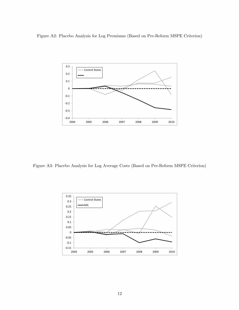
Figure A2: Placebo Analysis for Log Premiums (Based on Pre-Reform MSPE Criterion)
-0.4
-0.3
-0.2
-0.1
0
0.1
0.2
0.3
2004 2005 2006 2007 2008 2009 2010
Control States
Figure A3: Placebo Analysis for Log Average Costs (Based on Pre-Reform MSPE Criterion)
-0.15
-0.1
-0.05
0
0.05
0.1
0.15
0.2
0.25
0.3
0.35
2004 2005 2006 2007 2008 2009 2010
Control States
MA
12
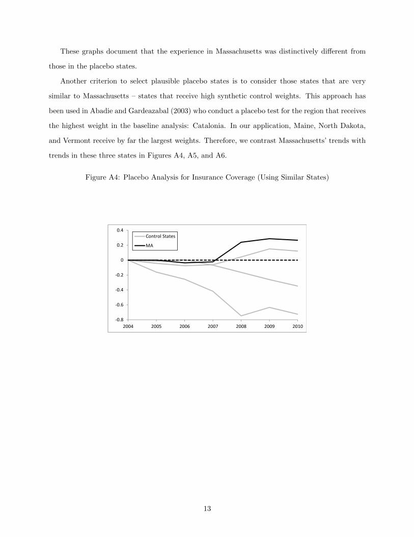
These graphs document that the experience in Massachusetts was distinctively different from
those in the placebo states.
Another criterion to select plausible placebo states is to consider those states that are very
similar to Massachusetts – states that receive high synthetic control weights. This approach has
been used in Abadie and Gardeazabal (2003) who conduct a placebo test for the region that receives
the highest weight in the baseline analysis: Catalonia. In our application, Maine, North Dakota,
and Vermont receive by far the largest weights. Therefore, we contrast Massachusetts’ trends with
trends in these three states in Figures A4, A5, and A6.
Figure A4: Placebo Analysis for Insurance Coverage (Using Similar States)
-0.8
-0.6
-0.4
-0.2
0
0.2
0.4
2004 2005 2006 2007 2008 2009 2010
Control States
MA
13
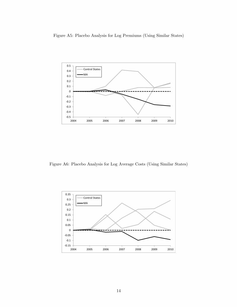
Figure A5: Placebo Analysis for Log Premiums (Using Similar States)
-0.5
-0.4
-0.3
-0.2
-0.1
0
0.1
0.2
0.3
0.4
0.5
2004 2005 2006 2007 2008 2009 2010
Control States
MA
Figure A6: Placebo Analysis for Log Average Costs (Using Similar States)
-0.15
-0.1
-0.05
0
0.05
0.1
0.15
0.2
0.25
0.3
0.35
2004 2005 2006 2007 2008 2009 2010
Control States
MA
14

Again, these graphs document that the experience in Massachusetts was distinctively different
from those in the placebo states. Finally, again following Abadie et al. (2010), we have also
constructed the post/pre-reform MSPE-ratio. This measure, which contrasts the MSPE in the
post-reform year 2008 with the discussed MSPE in 2006, provides a measure of how poorly the
pre-reform match fits the post-reform data, relative to the pre-reform period. The idea behind
this statistic is that a high post/pre-reform MSPE-ratio indicates that after the reform, the trends
in the given state have moved away from the trends predicted in the pre-period data. Hence, a
high post/pre-reform MSPE-ratio is indicative of an effect of the reform. The histogram in figure
displays the post/pre-reform MSPE-ratio for all states.
Figure A7: Placebo Analysis: Post/Pre-reform MSPE Criterion
0
1
2
3
4
5
6
7
8
9
10
0 5 10 15 20 25 30 35 40 45 50 55 60
Fre
qu
en
cy
Post/Pre-Reform Mean Squared Prediction Error
MA
Massachusetts has the second highest post/pre-reform MSPE-ratio, lagging only behind New
Jersey. However, it appears that there may be data issues in the New Jersey reporting in 2008.
The data suggest that average costs as well as premiums have fallen by more than 50% in the
major carrier between 2006 and 2007 despite the fact that inpatient admissions per enrollee have
increased and the average number hospital days has remained fairly constant in this carrier. While
New Jersey is included in the main regressions, it has a relatively low weight, so the data issue in
15

2008 is unlikely to impact our main results. If anything, though, it would bias our findings down.
A.11 Proportional Demand Shifts in the Logarithmic Model
In our empirical analysis, we assume that the old demand curve is loglinear, that is
log(P ) = α0 + α1 ∗ I .
Now we consider the effects of a relative tax penalty of π = $1,250P ∗,pre , where we divide the tax penalty
by the pre-reform premium in Massachusetts. The new demand curve equals:
log(P − π ∗ P ) = α0 + α1 ∗ I .
Rearranging terms, we see that the proportional tax penalty implies a parallel shift of the old
demand curve as shown in Figures 2 and 3:
log(P ) = −log(1− π) + α0 + α1 ∗ I .
The magnitude of the demand shift is given by −log(1−π) > 0 for 0 < π < 1. With respect to the
optimal parallel shift suggested by equation 6, we see that this shift of magnitude x can be induced
by a tax penalty of 1− exp(−x).
A.12 Synthetic Control Weights with Focus on Guaranteed Issue States
Table A3 displays the revised underlying weights that emphasize the role of important pre-reform
regulations in Massachusetts: guaranteed issue and community rating. These weights were gener-
ated by adding an indicator for states with these regulations to the weight-generating algorithm,
alongside the variables used to generate the baseline weights. Compared with the weights in the
baseline analysis shown in Table A1, we see that this alternative approach continues to place a
high weight on Maine and Vermont, but it also places much more weight on New York, a third
state which had guaranteed and community rating regulations in place. The approach also assigns
positive weight to Connecticut and Texas, which did not have these regulations in place, in order to
match other key characteristics of pre-reform period: changes in coverage, changes in log average
16

costs, changes in log premiums, and health insurance enrollment levels.
Table A3: Synthetic Control Weights with Focus on Guaranteed Issue States
State Synthetic Control Weights State Synthetic Control Weights
Alabama - Montana 0Alaska - Nebraska 0Arizona 0 Nevada 0Arkansas 0 New Hampshire 0California - New Jersey 0Colorado 0 New Mexico 0Connecticut 0.099 New York 0.206Delaware - North Carolina 0District of Columbia - North Dakota 0Florida 0 Ohio -Georgia 0 Oklahoma -Hawaii - Oregon 0Idaho 0 Pennsylvania 0Illinois - Rhode Island 0Indiana - South Carolina 0Iowa - South Dakota -Kansas - Tennessee 0Kentucky 0 Texas 0.017Louisiana 0 Utah 0Maine 0.308 Vermont 0.37Maryland 0 Virgina -Michigan 0 Washington 0Minnesota 0 West Virgina -Mississippi - Wisconsin 0Missouri 0 Wyoming 0
A.13 Trends Using Synthetic Control Weights with Focus on Guaranteed Issue
States
Figures A8, A9, and A10 show trends in enrollment, premiums, and claim expenditures in Mas-
sachusetts relative to the other states, adding more weight to states with guaranteed issue and
community rating regulations. The trends in the control states look very similar to the national
trends displayed in Figures 5, 6, and 7.
17
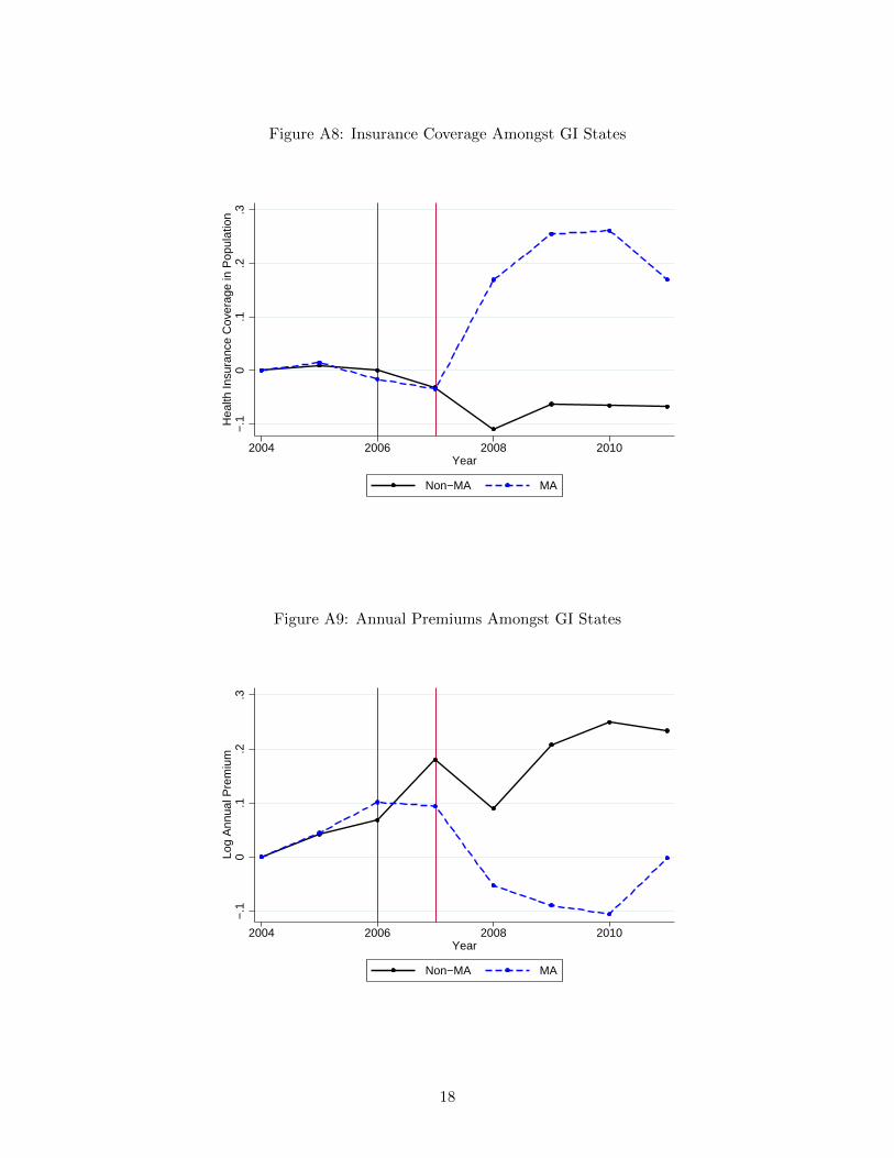
Figure A8: Insurance Coverage Amongst GI States
−.1
0.1
.2.3
Hea
lth In
sura
nce
Cov
erag
e in
Pop
ulat
ion
2004 2006 2008 2010Year
Non−MA MA
Figure A9: Annual Premiums Amongst GI States
−.1
0.1
.2.3
Log
Ann
ual P
rem
ium
2004 2006 2008 2010Year
Non−MA MA
18
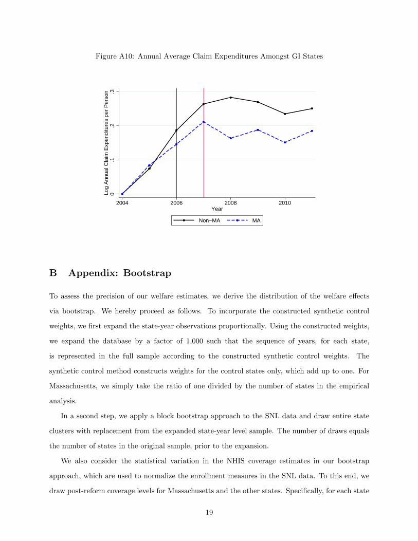
Figure A10: Annual Average Claim Expenditures Amongst GI States
0.1
.2.3
Log
Ann
ual C
laim
Exp
endi
ture
s pe
r P
erso
n
2004 2006 2008 2010Year
Non−MA MA
B Appendix: Bootstrap
To assess the precision of our welfare estimates, we derive the distribution of the welfare effects
via bootstrap. We hereby proceed as follows. To incorporate the constructed synthetic control
weights, we first expand the state-year observations proportionally. Using the constructed weights,
we expand the database by a factor of 1,000 such that the sequence of years, for each state,
is represented in the full sample according to the constructed synthetic control weights. The
synthetic control method constructs weights for the control states only, which add up to one. For
Massachusetts, we simply take the ratio of one divided by the number of states in the empirical
analysis.
In a second step, we apply a block bootstrap approach to the SNL data and draw entire state
clusters with replacement from the expanded state-year level sample. The number of draws equals
the number of states in the original sample, prior to the expansion.
We also consider the statistical variation in the NHIS coverage estimates in our bootstrap
approach, which are used to normalize the enrollment measures in the SNL data. To this end, we
draw post-reform coverage levels for Massachusetts and the other states. Specifically, for each state
19

within the sample, we draw Nstate observations from a Bernoulli distribution with mean µstate and
construct the arithmetic mean. Here, Nstate and µstate refer to the number of observations and
the coverage level in the post-reform NHIS sample for the given state respectively. We use the
respective post-reform coverage levels to normalize the enrollment trends in the drawn sample.
Third, we conduct the relevant difference-in-differences regressions and save the estimated pre-
reform levels in Massachusetts and the estimates for γk. Notice that these are unweighted re-
gressions. The weighting is captured by the sample expansion. We calculate the full and the net
welfare effect using the outlined formulas. Finally, we report the 2.5, and the 97.5 percentile of the
estimated welfare effect distributions. We repeat this procedure for different penalty values and
report the results in Table 3.
20