Embed Size (px)
Citation preview

Agency Web site Guidebook
Contents:Design Philosophy 2
Common Look & Feel 4
Template Guidelines 6
Tech Specs 14
Real World Examples 15
Tips & Tricks 19
Feedback / Next Steps 21
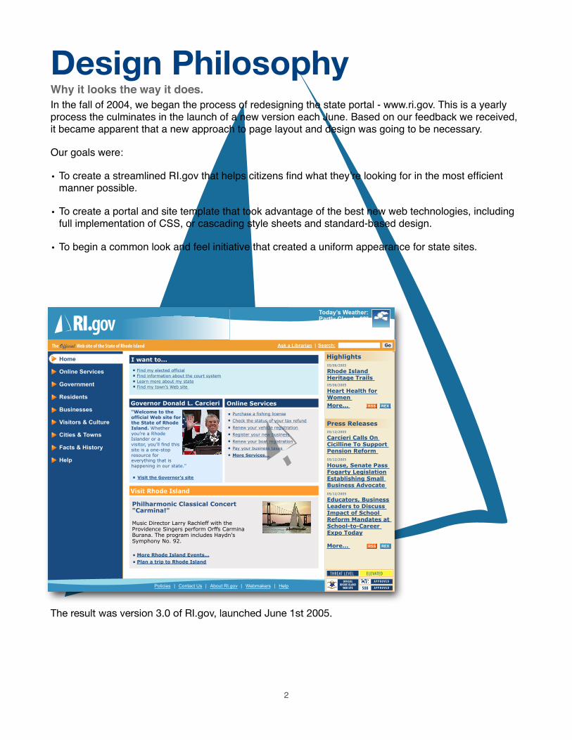
Design PhilosophyWhy it looks the way it does.In the fall of 2004, we began the process of redesigning the state portal - www.ri.gov. This is a yearly process the culminates in the launch of a new version each June. Based on our feedback we received, it became apparent that a new approach to page layout and design was going to be necessary.
Our goals were:
• To create a streamlined RI.gov that helps citizens find what they’re looking for in the most efficient manner possible.
• To create a portal and site template that took advantage of the best new web technologies, including full implementation of CSS, or cascading style sheets and standard-based design.
• To begin a common look and feel initiative that created a uniform appearance for state sites.
The result was version 3.0 of RI.gov, launched June 1st 2005.
2
Search:
Policies | Contact Us | About RI.gov | Webmakers | Help
Ask a Librarian |Official
Home
Online Services
Government
Residents
Businesses
Visitors & Culture
Cities & Towns
Facts & History
Help
I want to...
Governor Donald L. Carcieri Online Services
Find my elected official
Find information about the court system
Learn more about my state
Find my town’s Web site
Visit Rhode Island
"Welcome to the official Web site for the State of Rhode Island. Whether you’re a Rhode Islander or a visitor, you’ll find this site is a one-stop resource for
Today’s Weather:Partly Cloudy 68º
Detailed forecast...
Philharmonic Classical Concert "Carmina!"
Music Director Larry Rachleff with the Providence Singers perform Orffs Carmina Burana. The program includes Haydn's Symphony No. 92.
Highlights
05/06/2005
Rhode IslandHeritage Trails05/06/2005
Heart Health for Women
More...
Press Releases
05/12/2005
Carcieri Calls On Cicilline To Support Pension Reform
05/12/2005
House, Senate PassFogarty Legislation Establishing Small Business Advocate
05/12/2005
Educators, Business Leaders to Discuss Impact of School Reform Mandates at School-to-Career Expo Today
More...
Visit the Governor's site
More Rhode Island Events...
Plan a trip to Rhode Island
REXRSS
REXRSS
Go
Purchase a fishing license
Check the status of your tax refund
Renew your vehicle registration
Register your new business
Renew your boat registration
Pay your business taxes
More Services...
everything that is happening in our state."

As part of this redesign, the portal implemented the following design standards:
• Simplified and consistent left column navigation throughout the site
• Consistent use of a “zone and block” methodology - content and navigation elements always appear in the same areas of the page. These include search, headers, footers and content zones within the main body of the site.
• The addition of a third column option, with content related to the primary content displayed in the center column
What this means for the user:
• Consistent navigation aids in reducing confusion while navigating the site
• Less choices from the outset reduces the risk of a user going too far down the wrong path for the information they are seeking.
• Less time spent navigating the site = more time focused on relevant content.
Version 4.0, launched June 1, 2006
3
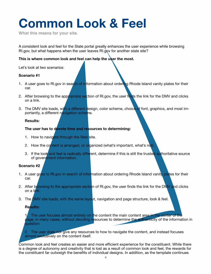
Common Look & FeelWhat this means for your site.
A consistent look and feel for the State portal greatly enhances the user experience while browsing RI.gov, but what happens when the user leaves RI.gov for another state site?
This is where common look and feel can help the user the most.
Let’s look at two scenarios:
Scenario #1
1. A user goes to RI.gov in search of information about ordering Rhode Island vanity plates for their car.
2. After browsing to the appropriate section of RI.gov, the user finds the link for the DMV and clicks on a link.
3. The DMV site loads, with a different design, color scheme, choice of font, graphics, and most im-portantly, a different navigation scheme.
Results:
The user has to devote time and resources to determining:
1. How to navigate through the Web site.
2. How the content is arranged, or organized (what’s important, what’s not).
3. If the look and feel is radically different, determine if this is still the trusted authoritative source of government information.
Scenario #2
1. A user goes to RI.gov in search of information about ordering Rhode Island vanity plates for their car.
2. After browsing to the appropriate section of RI.gov, the user finds the link for the DMV and clicks on a link.
3. The DMV site loads, with the same layout, navigation and page structure, look & feel.
Results:
1. The user focuses almost entirely on the content the main content area in the center of the page, in many cases, without devoting resources to determine the authenticity of the information in question
2. The user does not give any resources to how to navigate the content, and instead focuses almost exclusively on the content itself.
Common look and feel creates an easier and more efficient experience for the constituent. While there is a degree of autonomy and creativity that is lost as a result of common look and feel, the rewards for the constituent far outweigh the benefits of individual designs. In addition, as the template continues
4

to evolve, agencies are continuing to find ways to expand upon the common look and feel without sacrificing the overall goal of better serving the constituent.
Case in point: browsing between these four sites results in consistent navigation for the user.
5

Template GuidelinesHow to best work with the RI.gov template
If you haven’t worked with RI.gov to create your agency Web site or template, please start by visiting:
http://www.ri.gov/resource/
There you will find the Web maker’s resource, complete with clip art, tools, tips and tricks, the state header sliver, and the RI.gov Workbook - take a moment download, fill out and fax to RI.gov at: (401) 831-8095, or email us at: [email protected] to get started right away!
Assuming you already have your new Web site and are ready to go, let’s get started.
First, let’s break the page up into sections and look at each individually.
Header:
Each agency header is comprised of the following elements:
1. The Rhode Island Government State sliver
2. Agency seal, logo, or Rhode Island Seal (as appropriate)
3. Agency title
4. Photo montage, or branding elements (optional)
Guidelines:
• Statewide sliver should be placed at the top of the header of all pages.
• Agency logo should be 80 pixels x 80 pixels, and either an official state seal or emblem, or agency / municipality logo, with standard blue background.
Please contact RI.gov if you need a custom agency / municipality seal or logo optimized for the template.
• Agency name should follow the standard template format - State or Rhode Island aligned top, followed by the agency name, with the department or division underneath where appli-cable. Header should be 80 pixels in height, and width should fit on a screen sized for 800 x 600 resolution.
If you need revisions to your header name graphic, please contact RI.gov for a new copy.
6
3
1
2 4

• Branding elements may be added to the right side of the header zone, with the following guidelines:
Graphics, photos or other branding elements should either be placed on standard blue header background color, or should use a fade to create a smooth transition into the agency name.
All branding elements must be sized to allow for logo, name and branding elements to all fit horizontally on a screen sized at 800 x 600 resolution.
Header Bar:
This area is designed to contain the following content elements:
1. Agency Site Search boxNote: This is currently unavailable for municipality, or non-state agency sites.
2. Secondary link categoriesLinks can be added to this area links that are general enough in scope to pertain to the entire site, but are of secondary importance to the main navigation categories. Good examples of this include “Contact Us” and “Press Releases”.
Guidelines:
• Secondary links should remain consistent throughout the site, and should be mirrored in the footer links are as well.
• Links should be of secondary importance to main navigation categories.
Breadcrumb Trail
Where am I? The bread crumb is designed to illustrate to the user where they are in relation to the rest of the site, how they got there, and how to get back as needed. Example:
Guidelines:
• Links should be placed at the home page, followed by each successive level to the current page you are on, separated by a > sign. Note: To style these correctly, these should be located inside the breadcrumb <div> element, as provided in your template.
• All levels, or pages should be linked to the appropriate section or page, with the exception of the current page - this should remain unlinked to avoid confusion, as it is the page you are currently viewing and does not require a link.
• Breadcrumb trail should always be used at the top of the content area, before the first content box h1 to avoid confusion and keep navigation consistency with other sites using the standard template.
7
12

Main Navigation:
The main navigation is limited to ONLY the following:
Your main site categories. (That’s it!)
Reason? This helps set a precedent that primary navigation tasks always occur using this area of the screen, while leaving the user’s attention free to focus on primary and related content in the other defined zones on the screen. Adding additional items to this are would create unnecessary confusion.
Guidelines:
• Main navigation items should link ONLY to pages, or major sections of your site. Linking to other items such as PDFs, Word documents, or other web sites should be reserved for the main content area, or right column as appropriate. Reason: Linking to other items or sites creates an break in the user experience - rather than being presented with a section of the web site to view, the user unexpectedly, or without warning is presented with either a document, or entirely different web site to navigate. If it is important to have a main category item link to either a document or another site, first have the main navigation item link to a page on your site that then links to this item from the content area on the corresponding page with an appropriate description.
Tech Note
Main navigation depicts which category you are on by a combination of php code, and standards-based CSS. (See example above, with home as the selected, or current page).
8

Sub Navigation:
Sub Navigation can be used to assist the user in navigating major sub categories, or pages within a main navigation or category section. There are two styles available:
• “Quick Links” or sub-pages box
• Dynamic drop down menus
Quick Links / Sub-pages box:
Simple, unordered list of links to pages within the main category
Guidelines:
• Subcategory links should remain consistent throughout the main category selected.
• “sub sub” categories should be displayed by using an indented list for all pages two levels deep. See demo site at: http://www.ri.gov/development/DEMO/ for examples.
Tech Note
Heading 1, or h1 styles should be used to denote the main category name that relates to the quick links, or sub category box.
Dynamic drop down menusControlled by javascript to show/hide subcategories as needed in the main navigation.
Guidelines:
• Subcategories must go only one level deep - no “sub sub categories”.
Tech Note
Subcategory menu system should be driven by the jquery framework as designed as part of your custom-built agency template. Contact RI.gov for more information on adding this item to your site template.
9

Related Links (third column, or right column content)
Note: This applies only to sites using the three column version of the template - two column version also available.
• Related Links
• Press release headlines
• Highlights headlines (using the RI.gov toolbox) - See www.ri.gov/rex for more information
• Short snippets of content general in scope to the entire site, or related to the main content.
• Related association logos, sponsors, agency badges and seals.
This area is designed to contain the following types of content:
Tip: While the template is designed to stretch vertically to accommodate any of the three columns, if your third column content stretches the page significantly more than the main content area, you should consider moving or adjusting your third column content.
In other words, If there is that much of the content that is important, it’s likely too important for the third column - try summarizing part of the content and linking to a full page that contains more information, or more to a content area in the main body of the page.
Guidelines:
• Content should be padded using “content” <div> tags - as implemented in your template. See the tips and tricks section for more information on this.
• Third column content should not overly extend the length of the screen beyond the main content area. In other words, if the third column becomes the main reason a page is as long as it is, consider summarizing the content in the third column and linking to a page with the full text in the main content area. Or consider, moving the content in it’s entirety to a main content area on a dedicated page.
Example: Press releases list only the headline, while using a link to view the entire press release in the body of a page.
Reason: This helps limit scrolling and intervention to navigate content, and makes for a better designed web page.
Footer
Much like the header bar, this are should accommodate links that are broad in scope to be used throughout the site, while not important enough to warrant space on the main navigation. The footer area is divided into two areas: One for standard identification buttons (1), and one for site-wide secon-dary page links (2). It is recommended that these links mirror those in the header bar area.
10
12
Guidelines:
• All agency sites should use, or link directly to the RI.gov privacy policy - located at: http://www.ri.gov/policies/
• Links placed here should mirror those in the header bar.
• Links placed in this region should be of secondary importance to those in the main naviga-tion, but broad enough in scope to justify placement on every page of the site.
• ONLY text links should be placed here.
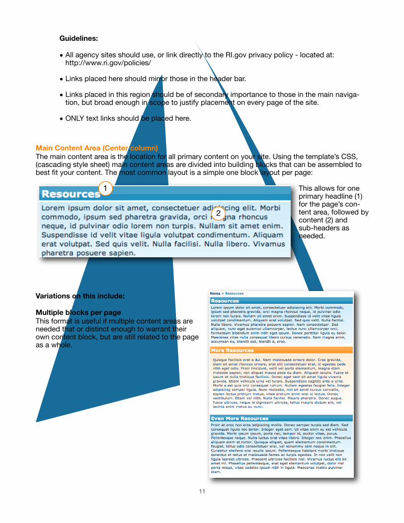
Main Content Area (Center column)
The main content area is the location for all primary content on your site. Using the template’s CSS, (cascading style sheet) main content areas are divided into building blocks that can be assembled to best fit your content. The most common layout is a simple one block layout per page:
This allows for one primary headline (1) for the page’s con-tent area, followed by content (2) and sub-headers as needed.
Variations on this include:
Multiple blocks per page
This format is useful if multiple content areas are needed that or distinct enough to warrant their own content block, but are still related to the page as a whole.
11
1
2

50% / 50% width split boxes
Used to place smaller content boxes that are 50 percent width or less into the main content area. These are espe-cially useful with small “headline” items like “news this week” or, “top five fre-quently asked questions”, “contact numbers” and so on. Also helps avoid additional scrolling when multiple con-tent boxes are needed, especially on the home page of your site.
For examples of this, see www.ri.gov, www.governor.ri.gov or www.dmv.ri.gov
For assistance adding split boxes to your site, please contact RI.gov for more information.
Subheadings:
Within content boxes, standard html headings can be used to divide con-tent into subheadings as needed. these include h2 h3 and h4. NOTE: h1s should not be used within a con-tent box after the initial h1 has been used - this will create aesthetic issues with the style sheet, and confusion within the heir-achy of your content for the user.
Lists:
Another great way to organize main content information is through unor-dered or ordered lists. This can be done by either hand-coding list items using standard html list tags, or by us-ing the list tools in Dreamweaver.
List buttons in Dreamweaver
12
Tech Note
Subheadings can be added by using the headline drop down menu in the “properties” palate in Dreamweaver, or by manually adding html tags. For example:<h2>Subheading text</h2>

Images:
Images can easily be added to content area, and arranged as need be — this includes centering, as well as aligning left or right to allow for text to wrap around the image.
Guidelines:
Make sure the image is compressed for web (small enough for someone to download on a dial-up connection) and small enough in size to still fit in the main content area on an 800x600 screen.
Tech Note
To allow for easy downloading on a dial-up connection, all images should be compressed for web, using an application such as Photoshop, Photoshop Elements, Fireworks or Thumbs Plus.
Tables:
While the RI.gov template uses a fully CSS (no tables) design, the main content area is fully optimized to work with tables where appropriate for tabular data.
Guidelines:
To make sure your table works well with the full liquid, or expandable nature of the template, template widths must either not be set, or set to a percentage of 100 percent or less to ensure they remain within the main content area.
13

Tech SpecsFonts: Verdana, Arial, Helvetica, sans-serif (sizes are percentage based)
HTML Specifications: HTML 4.0 Transitional, CSS 1
Colors:
#FF9819
#FEC587
#FFECD2
#194b80
#1C90C0
#97D9E8
#FFC634
#FDD66F
#FFF0AC
14

Real World ExamplesReal people using the template.
Examples of the template out in the wild - see how different agencies have used the template to fit their needs.
The Governor’s Office
• Three column template
• Blue and gold color scheme
• Uses full content boxes, 50/50 split boxes and two custom-design content boxes for the welcome message, and “stay informed” sec-tion
• Related links, documents and press releases used in the third column
• Use of photo montage in header
• Search the Governor’s site in header bar
15
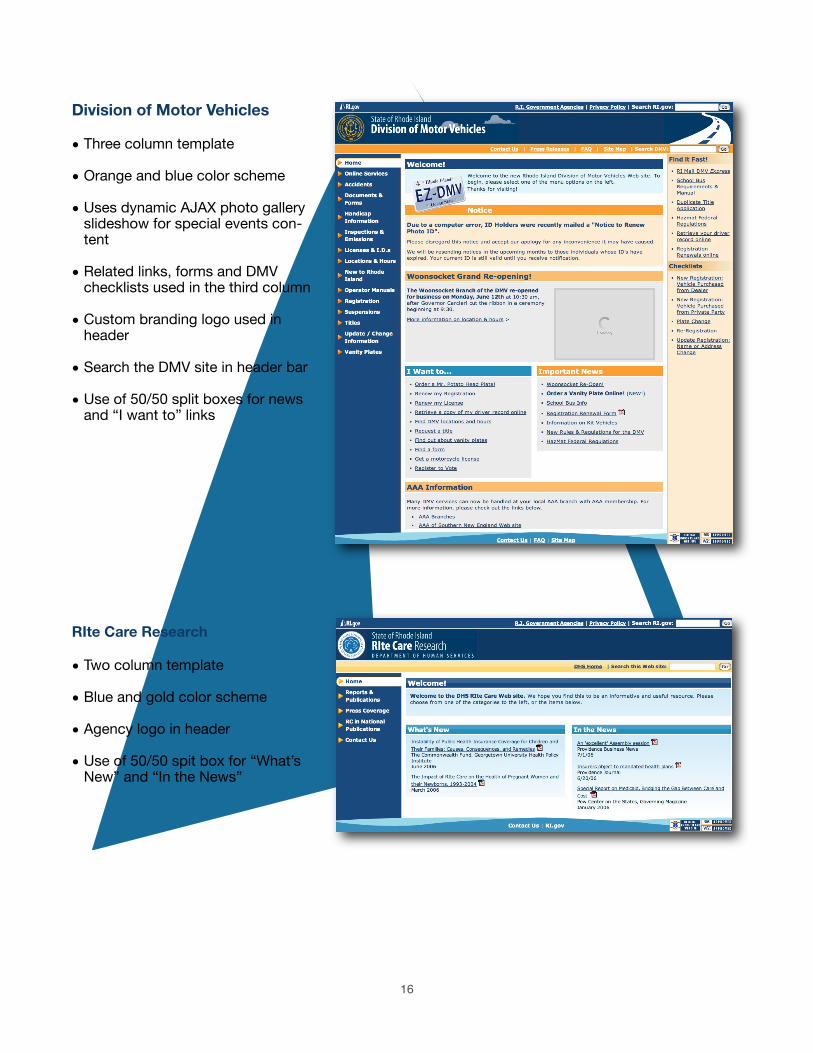
Division of Motor Vehicles
• Three column template
• Orange and blue color scheme
• Uses dynamic AJAX photo gallery slideshow for special events con-tent
• Related links, forms and DMV checklists used in the third column
• Custom branding logo used in header
• Search the DMV site in header bar
• Use of 50/50 split boxes for news and “I want to” links
RIte Care Research
• Two column template
• Blue and gold color scheme
• Agency logo in header
• Use of 50/50 spit box for “What’s New” and “In the News”
16
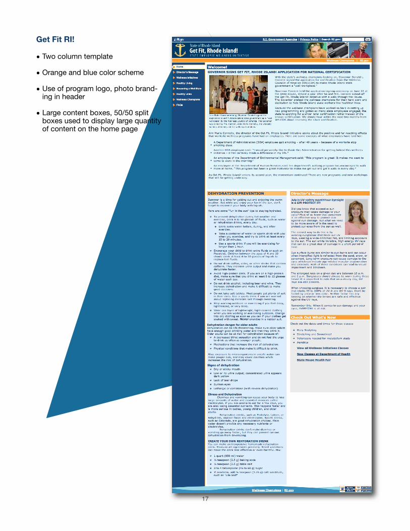
Get Fit RI!
• Two column template
• Orange and blue color scheme
• Use of program logo, photo brand-ing in header
• Large content boxes, 50/50 split boxes used to display large quantity of content on the home page
17
A sampling of Web sites already using the RI.gov common look & feel:
• The Governor’s Office
www.governor.ri.gov
• The Lt. Governor’s Office
www.ltgov.ri.gov
• Division of Motor Vehicles
www.dmv.ri.gov
• Rhode Island Emergency Management Authority
www.riema.ri.gov
• RISCA (Rhode Island state council on the Arts)
www.arts.ri.gov
• Department of Administration
www.admin.ri.gov
• Historical and Preservation Commission
www.preservation.ri.gov
• Rhode Island State Police
www.risp.ri.gov
• Town of Lincoln
www.lincolnri.org
• Town of Bristol
www.bristolri.us
• Town of Middletown
www.middletownri.com
• Municipal Affairs
www.muni-info.ri.gov
• Fiscal Fitness
www.fiscalfitness.ri.gov
• DOIT (Division of Information Technology)
www.doit.ri.gov
• Department of Elderly Affairs
www.dea.ri.gov
• Commission on Deaf and Hard of Hearing
www.cdhh.ri.gov
18

Tips & TricksTips to get the most out of your new Web site
The following tips are designed to help alleviate the most common template problems.
“My page is broken!”Nine times out of ten, this is due to either an extra closing </div> tag, or a missing closing </div> tag on your page.
In other words:
For a content box on your page:
This content box is controlled by an opening and closing container, or in HTML, a pair of <div> tags - one to open <div> and one to close </div>
This container (one called light blue content in the example above) is then transformed by the style sheet into the look you see above.
However, what can happen if the box is not properly closed with a closing </div> tag (note the /), is that this style for the content box is no longer contained to the area it should be, and is now free to cascade into other page elements where it doesn’t belong.
By the same token, if you end up with an additional </div> tag in your main content area, elements that need to cascade that control the layout and other style elements on the page, can be prematurely closed, resulting in errors when rendering the page.
What to do:
If you’re using Dreamweaver, use the “split” view, then highlight the text in your content box.
You should now see your text highlighted in both the design area in the bottom half of the screen, as well as in the code view at the top of the screen. Check the code in the code view - your content box should begin with an opening div statement that looks like this:
19

<div class=”lightblueContent”>
Your content in the middle, with a closing div at the end like the one in this example.
</div>
If you have an additional closing </div> tag, or don’t have one at all rectify by adding or deleting one in the code as necessary.
Tip: For ease in determining what’s missing or been inappropriately added, check out the great Firefox plugin — HTML Tidy, available from:
http://users.skynet.be/mgueury/mozilla/
Note: RI.gov / New England Interactive is not available for support on this plugin.Please install and use at your own discretion.
“I need more padding!”To add more padding to almost anything, wrap the content in question in the following:
<div class=”content”>
My padded content goes here.
</div>
This will add 4 pixels of padding to anything contained inside - pictures, text, you name it. This is es-pecially useful for third column items that look like they’re getting too close to the edges.
“My page content is creeping into the third column!”The RI.gov template is a fully “liquid layout” - as such, your site will stretch and contract to fit the user’s window / screen size. Keeping this in mind as you work with content is key to building a successful site. Keep in mind that while screen resolutions are now typically 1024 x 768 or larger for the majority of us-ers, there are many computers still in use with resolutions of 800 x 600, or even lower.
To keep your content inline at these smaller screen sizes, we recommend the following.
If you’re using tables on a page, always use percentage widths (or no widths at all) of 100% or less. This will ensure that a table will not “bleed” into the third column, or worse, off the page entirely.
For images on your page, make sure they do not start to push into the third column be using a resizing utility to shrink your browser to an 800 x 600 screen size, or better yet, test on a computer set to that resolution. As a general rule of thumb, keeping images 300 pixels wide or less will ensure that you won’t run into problems.
20

Feedback / Next StepsGet in touch with us
Questions? Comments? Ready to get started? Get in touch with us!
Contact us
E-mail: [email protected]: (401) 831 8099
Visit the Web Maker’s resource online at:www.ri.gov/resource/
See a demo template at:http://www.ri.gov/development/DEMO/
21