Embed Size (px)
Citation preview

1
AmplifireUSABILITY TEST FINDINGS AND RECOMMENDATIONSDRAFT

2
Project Overview
3
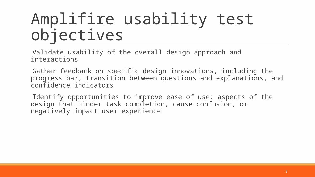
Amplifire usability test objectives
Validate usability of the overall design approach and interactions
Gather feedback on specific design innovations, including the progress bar, transition between questions and explanations, and confidence indicators
Identify opportunities to improve ease of use: aspects of the design that hinder task completion, cause confusion, or negatively impact user experience
4
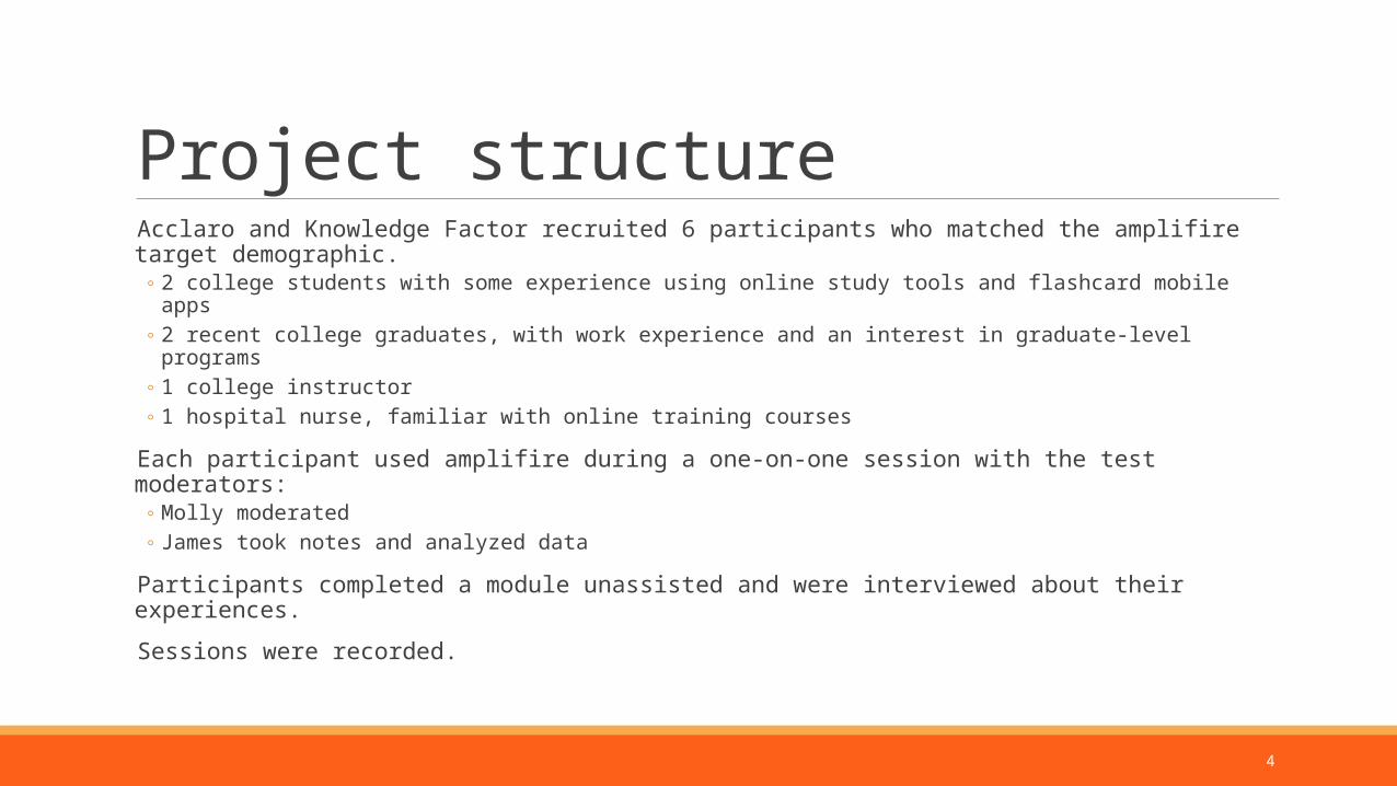
Project structure Acclaro and Knowledge Factor recruited 6 participants who matched the amplifire target demographic.
◦ 2 college students with some experience using online study tools and flashcard mobile apps◦ 2 recent college graduates, with work experience and an interest in graduate-level programs◦ 1 college instructor◦ 1 hospital nurse, familiar with online training courses
Each participant used amplifire during a one-on-one session with the test moderators:◦ Molly moderated◦ James took notes and analyzed data
Participants completed a module unassisted and were interviewed about their experiences.
Sessions were recorded.
5
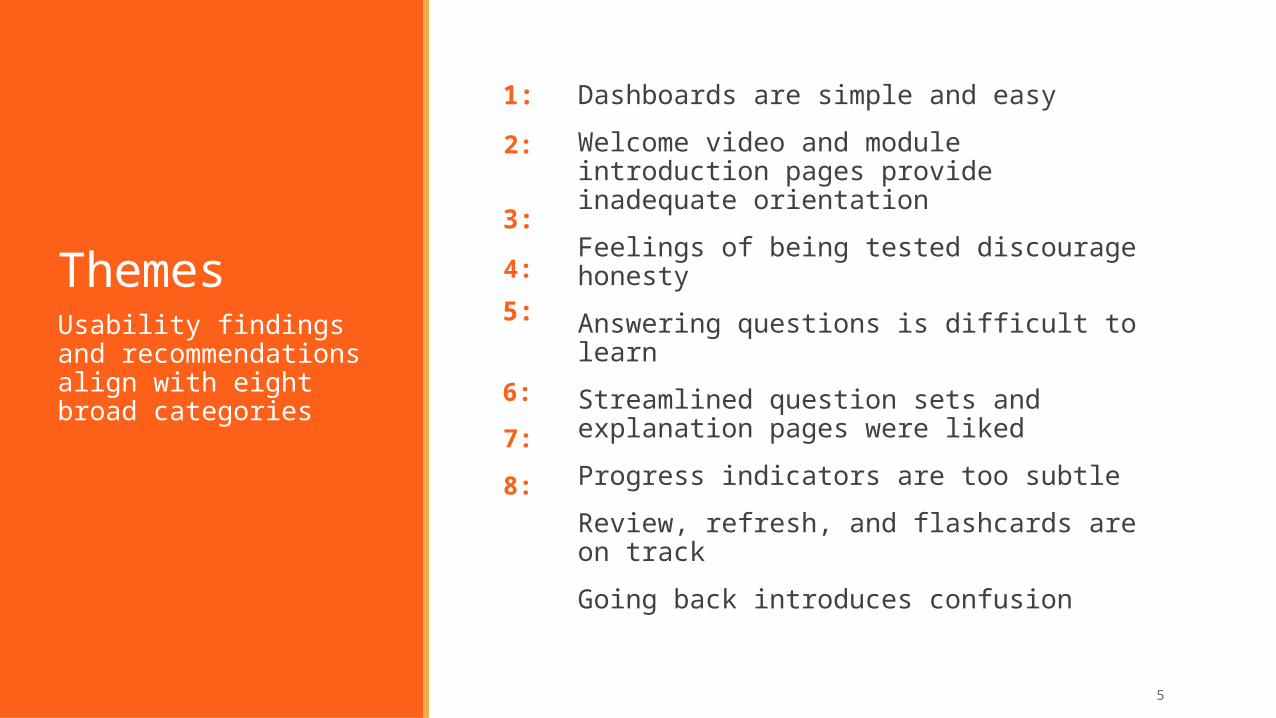
Themes
1:
Usability findings and recommendations align with eight broad categories
Dashboards are simple and easy
Welcome video and module introduction pages provide inadequate orientation
Feelings of being tested discourage honesty
Answering questions is difficult to learn
Streamlined question sets and explanation pages were liked
Progress indicators are too subtle
Review, refresh, and flashcards are on track
Going back introduces confusion
2:
3:
4:
5:
6:
7:
8:
6
1:
Positive feedback:◦ General impressions were positive – simple and clean◦ Launching modules and changing courses were easy◦ The new dashboards were useful and easy to interpret◦ The term “module” is intuitive
Opportunities:◦ The Learn link is hidden when a course contains chapters ◦ The Change Book control was not noticed, so assignments were
missed
Dashboards are simple and easy
7
Positive feedbackParticipants described amplifire as “clean” and “easy to follow”.
Participants were able to understand the purpose of amplifire by looking at the dashboard.
Most participants had no trouble locating the Learn link to begin modules.
All participants found and successfully used the My Courses drop down in the header.
All participants were comfortable with the term “Module”.
1: Dashboards
8
New dashboard mockups well received
1: Dashboards
9
New dashboard mockups well received
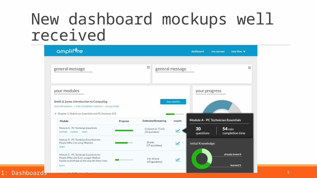
The new dashboards were perceived as useful and easy to interpret.
Participants liked that estimated time remaining was shown, and commented that they would start a module only if they had enough time to finish it in one study session.
Participants thought that showing progress through each book (rather than for the entire course) was appropriate.
Participants understood and liked the “Knew It” / “Learned It” chart. They said it would guide them in determining what to study.
One participant was an instructor, so we showed him the instructor dashboard mockup. He thought the information presented would help him decide which topics he needs to address in class. He would like it to be broken down by class section.
1: Dashboards
10
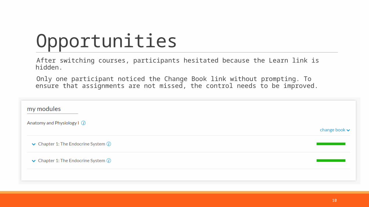
Opportunities After switching courses, participants hesitated because the Learn link is hidden.
Only one participant noticed the Change Book link without prompting. To ensure that assignments are not missed, the control needs to be improved.
11
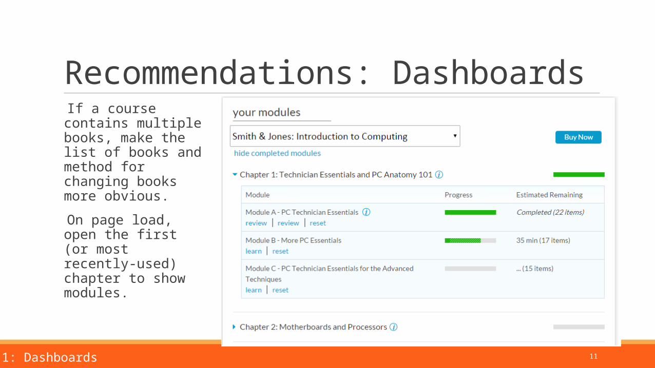
Recommendations: Dashboards If a course contains multiple books, make the list of books and method for changing books more obvious.
On page load, open the first (or most recently-used) chapter to show modules.
1: Dashboards
12
2:
Positive feedback:◦ Participants thought the introduction page was informative◦ Participants liked the video
Opportunities:◦ The introduction page is too long its purpose is unclear◦ The video is shown at the wrong time and can’t be accessed
again laterWelcome video and module introduction pages provide inadequate orientation
13
Positive feedback Participants liked the style and tone of the welcome video.
Participants who read the introduction page found the information about how amplifire works to be informative.
2. Video and introduction
14
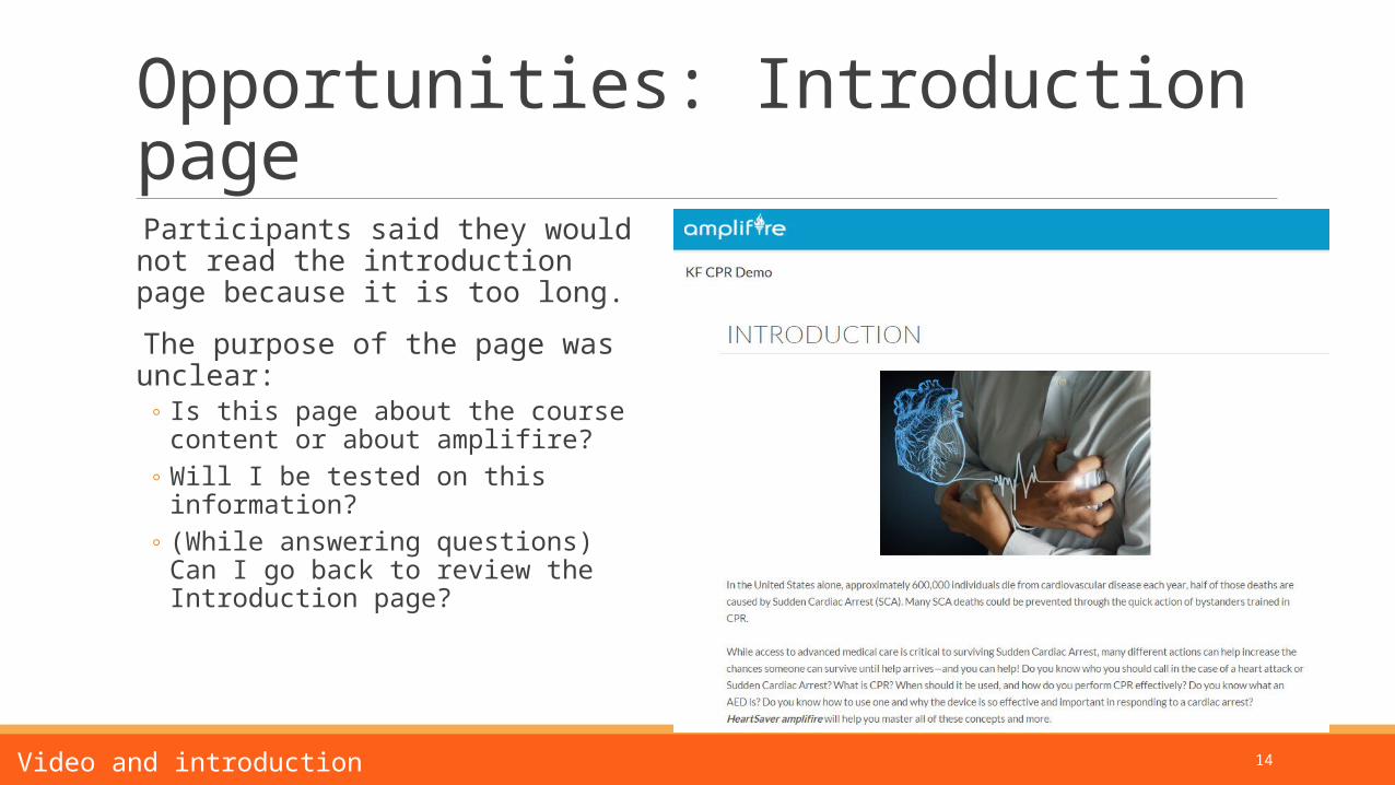
Opportunities: Introduction page Participants said they would not read the introduction page because it is too long.
The purpose of the page was unclear:◦ Is this page about the course content or
about amplifire?◦ Will I be tested on this information?◦ (While answering questions) Can I go back
to review the Introduction page?
2. Video and introduction
15
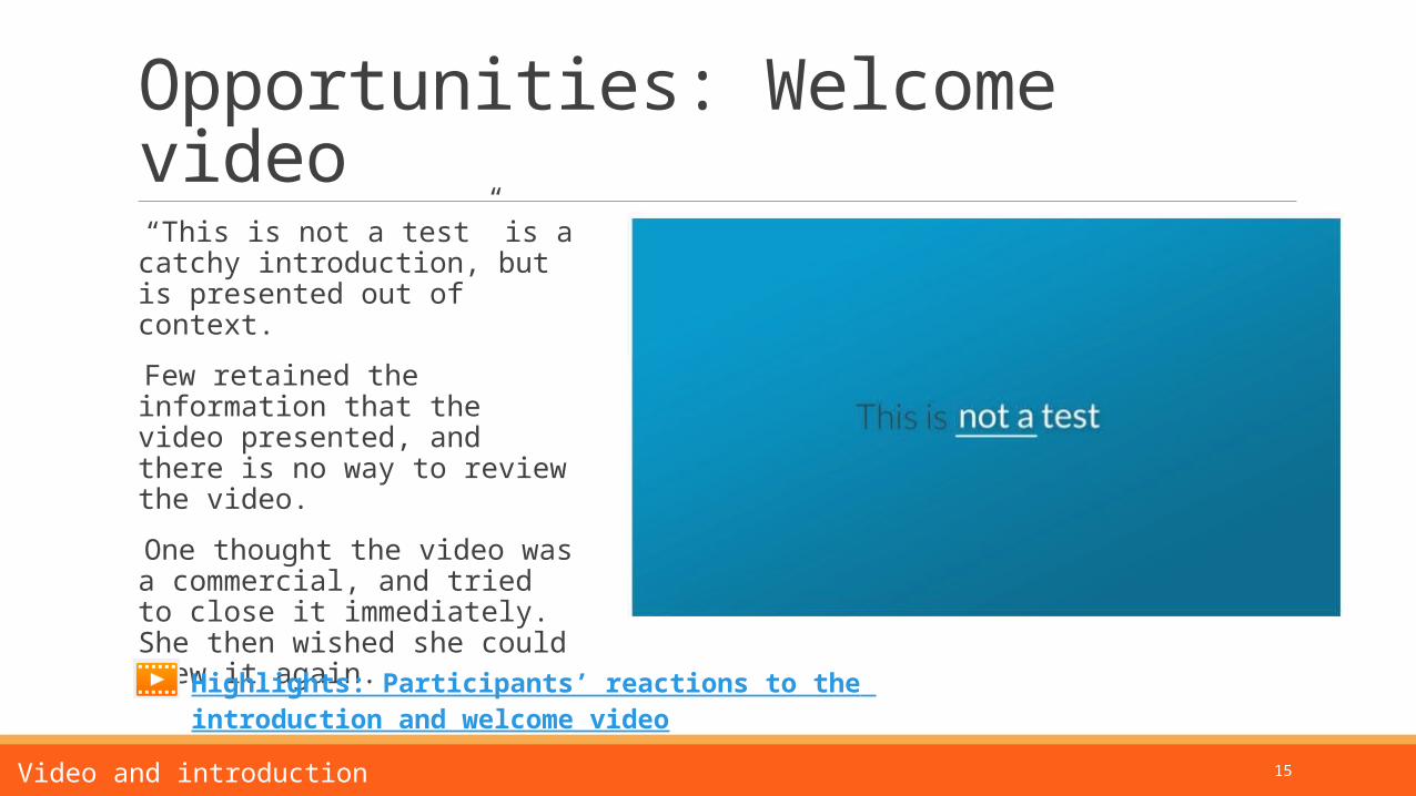
Opportunities: Welcome video “This is not a test” is a catchy introduction, but is presented out of context.
Few retained the information that the video presented, and there is no way to review the video.
One thought the video was a commercial, and tried to close it immediately. She then wished she could view it again.
2. Video and introduction
Highlights: Participants’ reactions to the introduction and welcome video
16
Recommendations Introduction:
◦ Improve labeling on the introduction. ◦ Break the page into two clear sections (or pages?) – about this module and how online learning works◦ Or, make the introduction only about the module content, and pull how online learning works into a
separate opt-in tutorial.
Video:◦ Wait until the user has answered a few questions to show a prompt for the video. (Put the video into
context and allow the user to opt in.)◦ Add a Help option in the global navigation to allow users to access the video and informational overlays
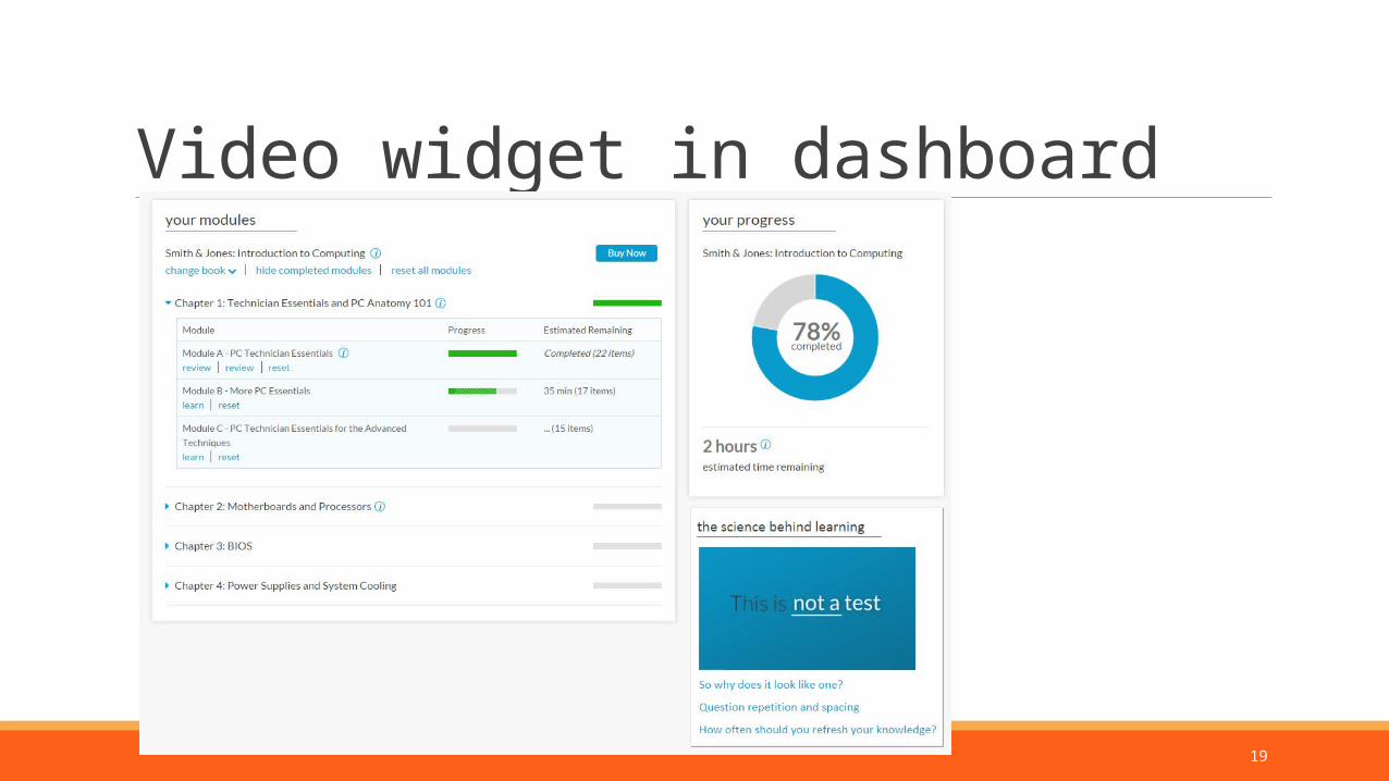
later.◦ Include the video in the dashboard as a widget to access later.
2. Video and introduction
17
Prompt to watch video
18
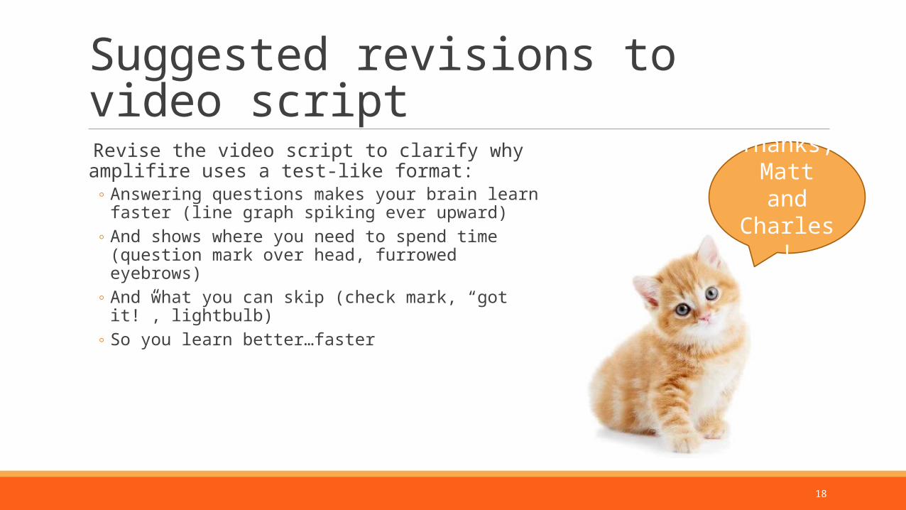
Suggested revisions to video script
Revise the video script to clarify why amplifire uses a test-like format:
◦ Answering questions makes your brain learn faster (line graph spiking ever upward)
◦ And shows where you need to spend time (question mark over head, furrowed eyebrows)
◦ And what you can skip (check mark, “got it!”, lightbulb)◦ So you learn better…faster
Thanks, Matt and Charles!
19
Video widget in dashboard
20
3:
Opportunities:◦ Participants felt like modules were tests◦ Participants were more inclined to guess than choose “I Don’t
Know”
Feelings of being tested discourage honesty
21
Students bring a strong mental model that any system asking questions is testing them.
Aspects that created a test-like feeling:◦ The correct answer is withheld.◦ Learners can’t go back to view a previous question.◦ Learners can’t change their responses after learning that they missed a question
Participants wondered how the modules would “be graded” and whether instructors would be able to see students’ grades.
3. Feelings of being tested
Opportunities: Feelings of being tested
22
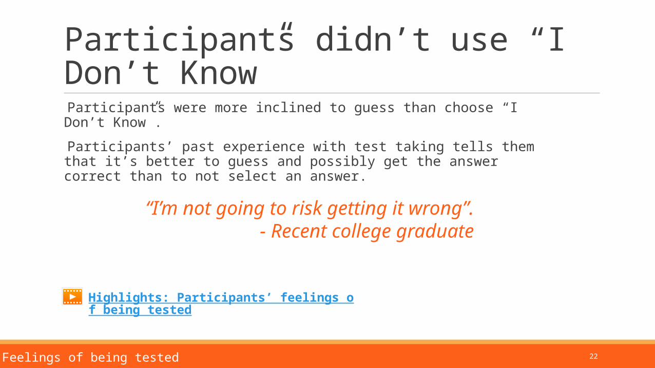
Participants didn’t use “I Don’t Know”
Participants were more inclined to guess than choose “I Don’t Know”.
Participants’ past experience with test taking tells them that it’s better to guess and possibly get the answer correct than to not select an answer.
3. Feelings of being tested
Highlights: Participants’ feelings of being tested
“I’m not going to risk getting it wrong”.- Recent college graduate
23
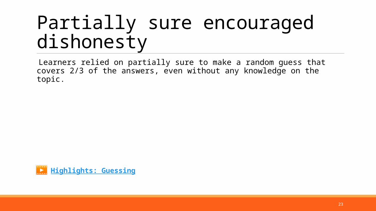
Partially sure encouraged dishonesty
Learners relied on partially sure to make a random guess that covers 2/3 of the answers, even without any knowledge on the topic.
Highlights: Guessing
24
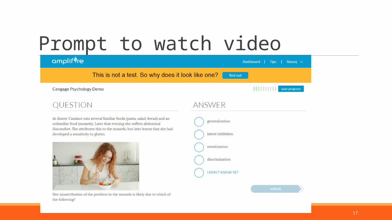
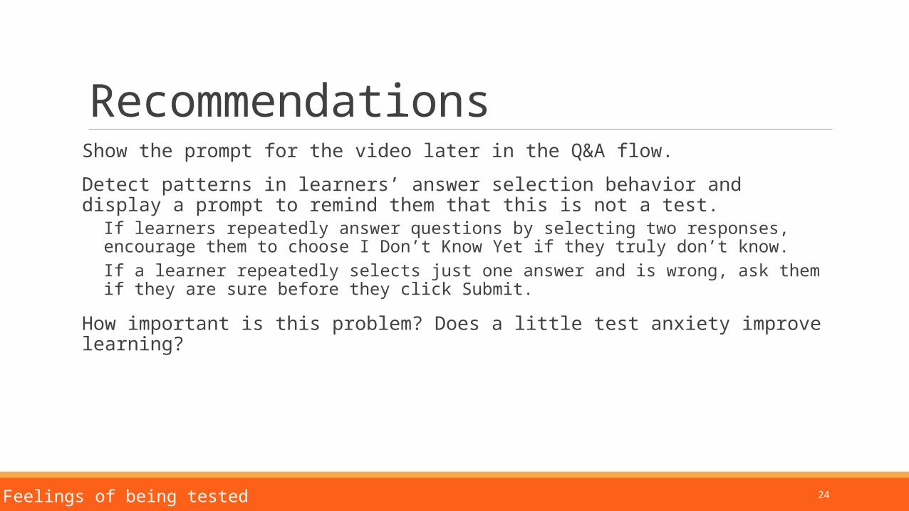
RecommendationsShow the prompt for the video later in the Q&A flow.
Detect patterns in learners’ answer selection behavior and display a prompt to remind them that this is not a test.
If learners repeatedly answer questions by selecting two responses, encourage them to choose I Don’t Know Yet if they truly don’t know.If a learner repeatedly selects just one answer and is wrong, ask them if they are sure before they click Submit.
How important is this problem? Does a little test anxiety improve learning?
3. Feelings of being tested
25
4:
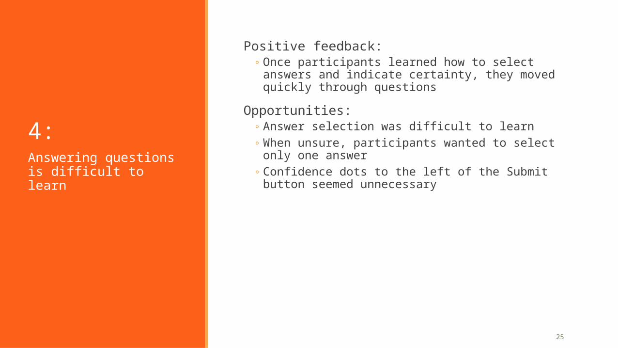
Positive feedback:◦ Once participants learned how to select answers and indicate
certainty, they moved quickly through questions
Opportunities:◦ Answer selection was difficult to learn◦ When unsure, participants wanted to select only one answer◦ Confidence dots to the left of the Submit button seemed
unnecessaryAnswering questions is difficult to learn
26
Positive feedback Once participants figured out how to answer questions, they were able to move through questions efficiently.
4. Answering questions
27
Opportunities: Answer selection difficult to learn
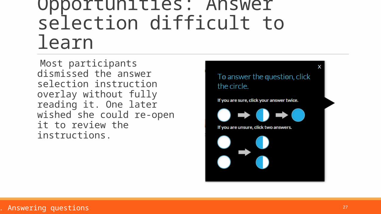
Most participants dismissed the answer selection instruction overlay without fully reading it. One later wished she could re-open it to review the instructions.
4. Answering questions
28
Opportunities: Answer selection difficult to learn
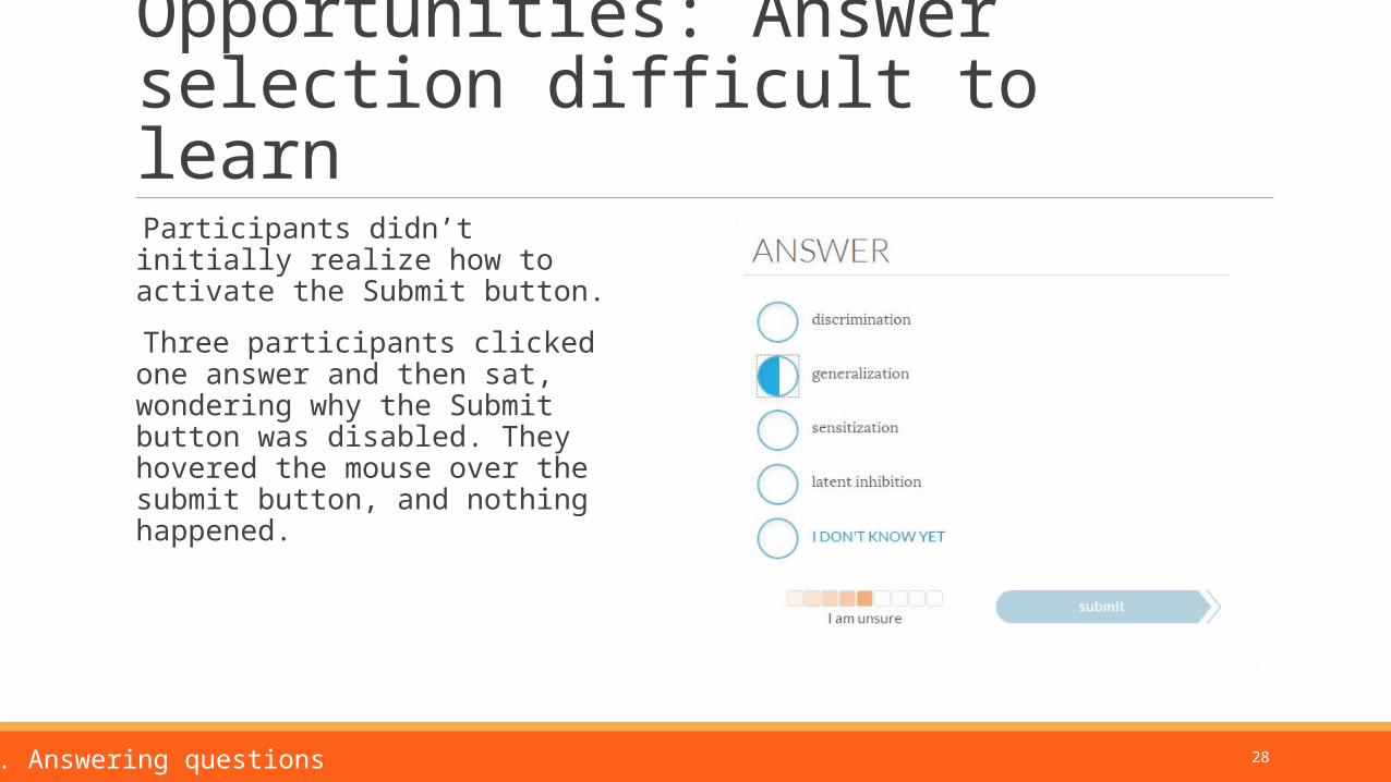
Participants didn’t initially realize how to activate the Submit button.
Three participants clicked one answer and then sat, wondering why the Submit button was disabled. They hovered the mouse over the submit button, and nothing happened.
4. Answering questions
29
Answer selection difficult to learn
Two accidentally discovered that clicking two responses would activate the Submit button. Those participants answered the next few questions by clicking two answers, unclear why the system “required” this.
One participant clicked an answer twice because she thought that was required for activating the Submit button, even though she wasn’t sure of her response.
4. Answering questions
Highlights: A participant struggling with answer selection
30
Participants wanted to select one answer and “I am unsure”
Selecting two answers didn’t match the way participants think about uncertainty.
Most participants attempted to guess by clicking submit after selecting only one partially sure answer. The system doesn’t allow this, which forces them to choose a second guess.
Two participants told us they wanted to be able to select just one answer, and indicate that they weren’t sure.
4. Answering questions
31
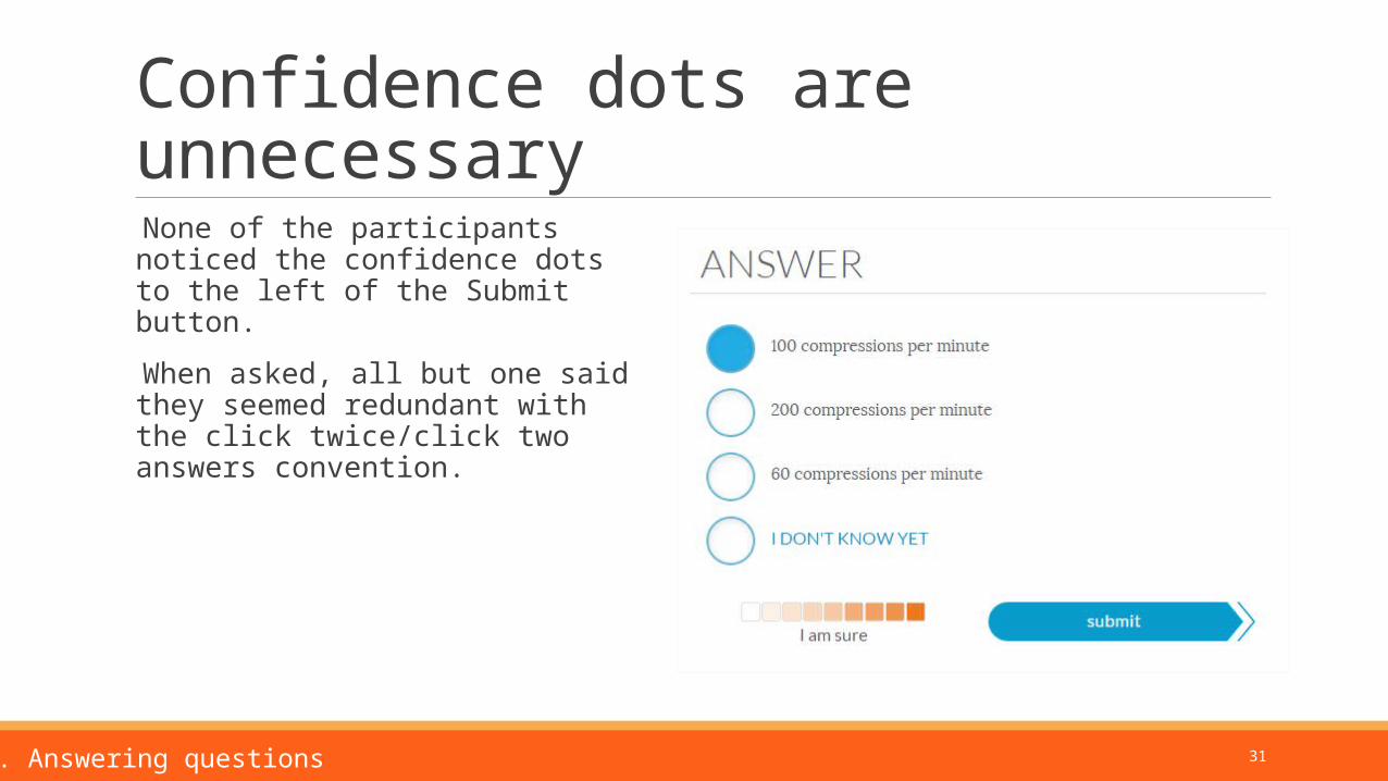
Confidence dots are unnecessary
None of the participants noticed the confidence dots to the left of the Submit button.
When asked, all but one said they seemed redundant with the click twice/click two answers convention.
4. Answering questions
32
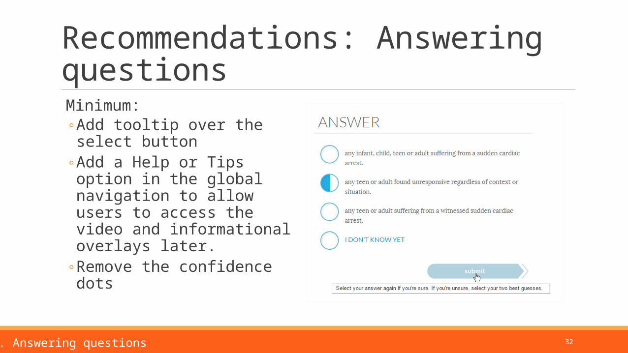
Recommendations: Answering questions
Minimum:◦ Add tooltip over the select button◦ Add a Help or Tips option in the
global navigation to allow users to access the video and informational overlays later.
◦ Remove the confidence dots
4. Answering questions
33
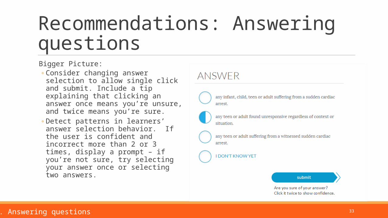
Recommendations: Answering questions
Bigger Picture:◦ Consider changing answer selection to
allow single click and submit. Include a tip explaining that clicking an answer once means you’re unsure, and twice means you’re sure.
◦ Detect patterns in learners’ answer selection behavior. If the user is confident and incorrect more than 2 or 3 times, display a prompt – if you’re not sure, try selecting your answer once or selecting two answers.
4. Answering questions
34
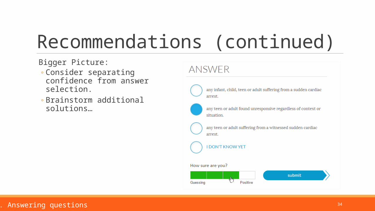
Recommendations (continued) Bigger Picture:
◦ Consider separating confidence from answer selection.
◦ Brainstorm additional solutions…
4. Answering questions
35
5:
Positive feedback:◦ Participants liked the small question sets and alternating
between question and explanation modes
Opportunities:◦ Participants wondered about question order and spacing◦ The combined answer/explanation page was understood, but
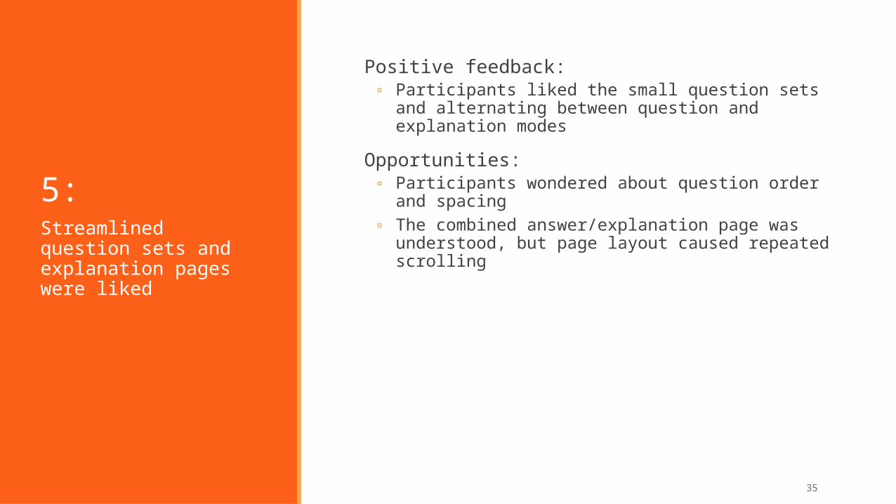
page layout caused repeated scrollingStreamlined question sets and explanation pages were liked
36
Positive feedback: Small question sets
Participants liked the small question sets and alternating between question and explanation modes. The learning experience felt manageable, and not overwhelming.
Participants appreciated the format of “small chunks” of learning.
Participants appreciated that questions they struggled with were repeated frequently, while at the same time, new questions were introduced.
The transition between learning and review/explanations caught some participants by surprise. But, they were not annoyed by it.
One said he thought he had “finished the test”, but then realized that there were more questions when amplifire automatically moved into the next question set. This is a success in terms of not letting students stop after the first round.
5. Question sets and explanations
37
Opportunity: Question order and spacing
Participants were aware that there was something special about question order and spacing.
Most participants expressed interest in understanding the underlying factors behind the determined question order.
Participants were unclear on how the answer choices they made affected their progress.
5. Question sets and explanations
Highlights: Comments on question order and spacing
38
Positive feedback: Combined answer/explanation page
Participants appreciated the availability of additional learning (but didn’t use it).
Placement of the Review Correct Answers link at the end of the review cycle seemed appropriate to participants, and a few said they might use it.
Participants repeatedly scrolled up and down between the answer choices and the explanation.
◦ When asked why, one participant confirmed that it was so that he could see the correct answer in context and contrast it with the other answer choices.
5. Question sets and explanations
Highlights: Scrolling on explanation pages
39
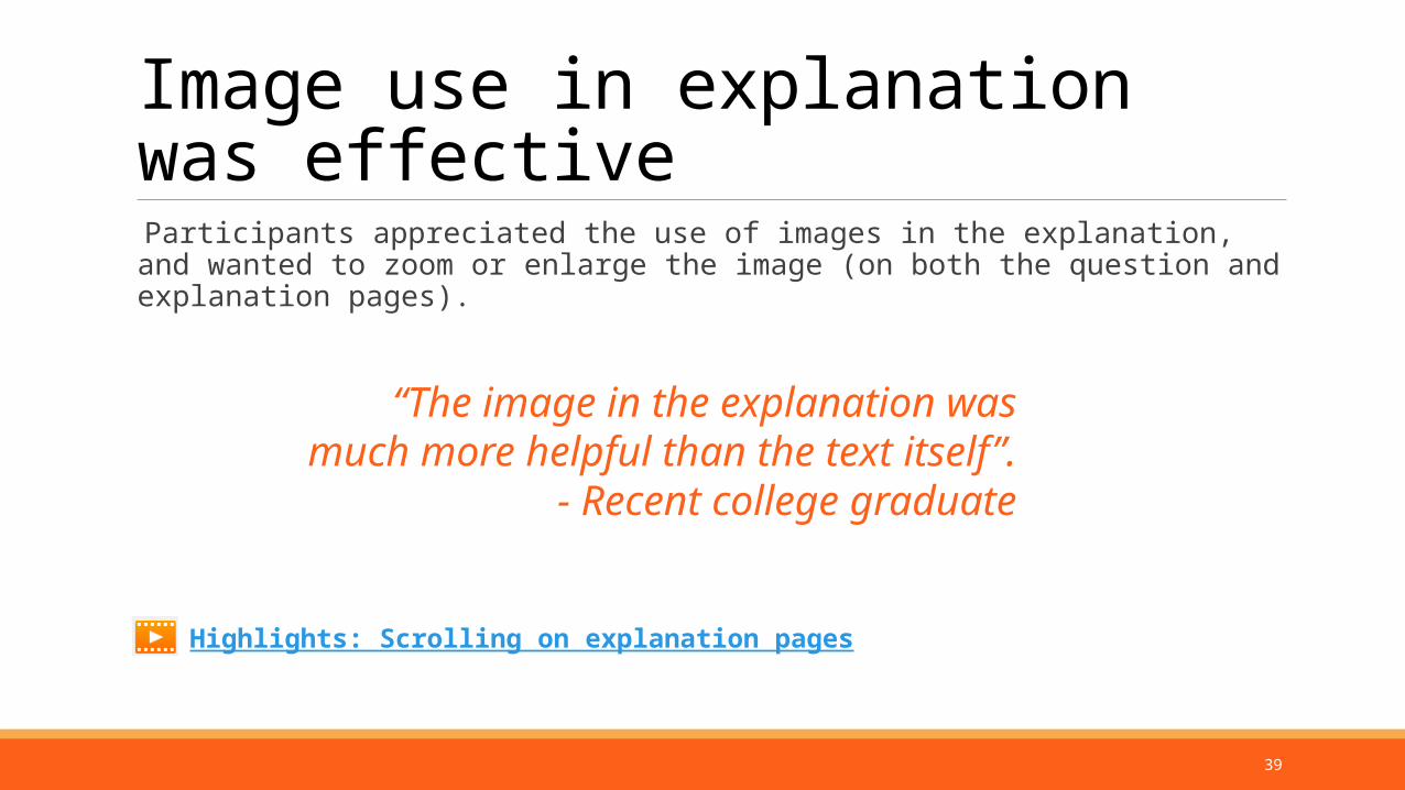
Image use in explanation was effective
Participants appreciated the use of images in the explanation, and wanted to zoom or enlarge the image (on both the question and explanation pages).
Highlights: Scrolling on explanation pages
“The image in the explanation was much more helpful than the text itself”.
- Recent college graduate
40
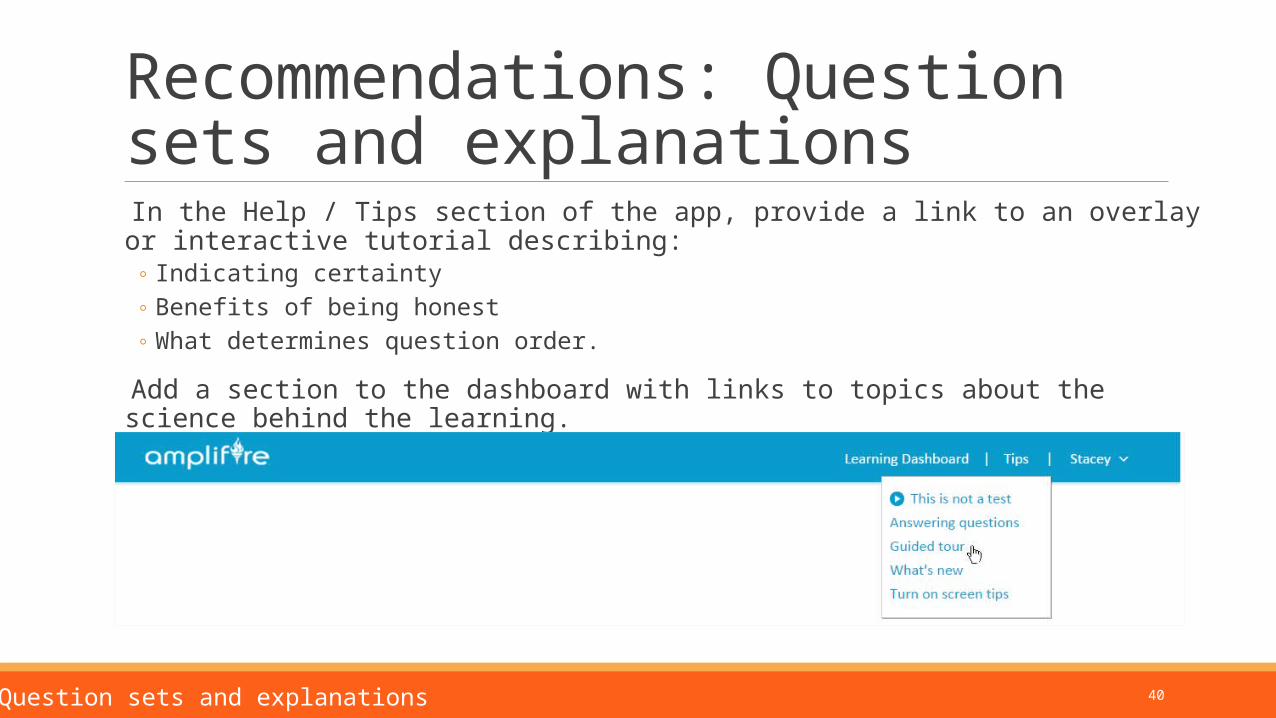
Recommendations: Question sets and explanations
In the Help / Tips section of the app, provide a link to an overlay or interactive tutorial describing:◦ Indicating certainty◦ Benefits of being honest◦ What determines question order.
Add a section to the dashboard with links to topics about the science behind the learning.
5. Question sets and explanations
41
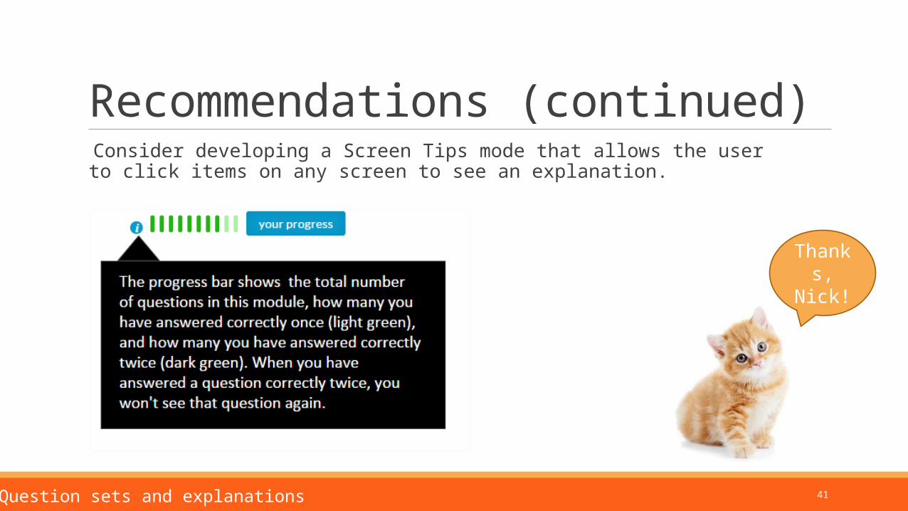
Recommendations (continued) Consider developing a Screen Tips mode that allows the user to click items on any screen to see an explanation.
5. Question sets and explanations
Thanks, Nick!
42
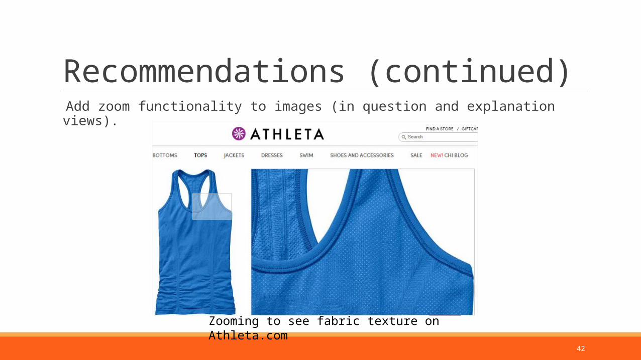
Recommendations (continued) Add zoom functionality to images (in question and explanation views).
Zooming to see fabric texture on Athleta.com
43
6:
Positive feedback:◦ Once participants understood the progress bar, they liked the
affirmation that they were progressing toward completing the module
Opportunities:◦ The number of questions and color coding in the progress bar
was not understood◦ The overlay after completing the first question was not noticed or
was misleadingProgress indicators are too subtle
44
Positive feedback Once participants understood the progress bar, they liked the feedback as they completed questions progressed through the module.
45
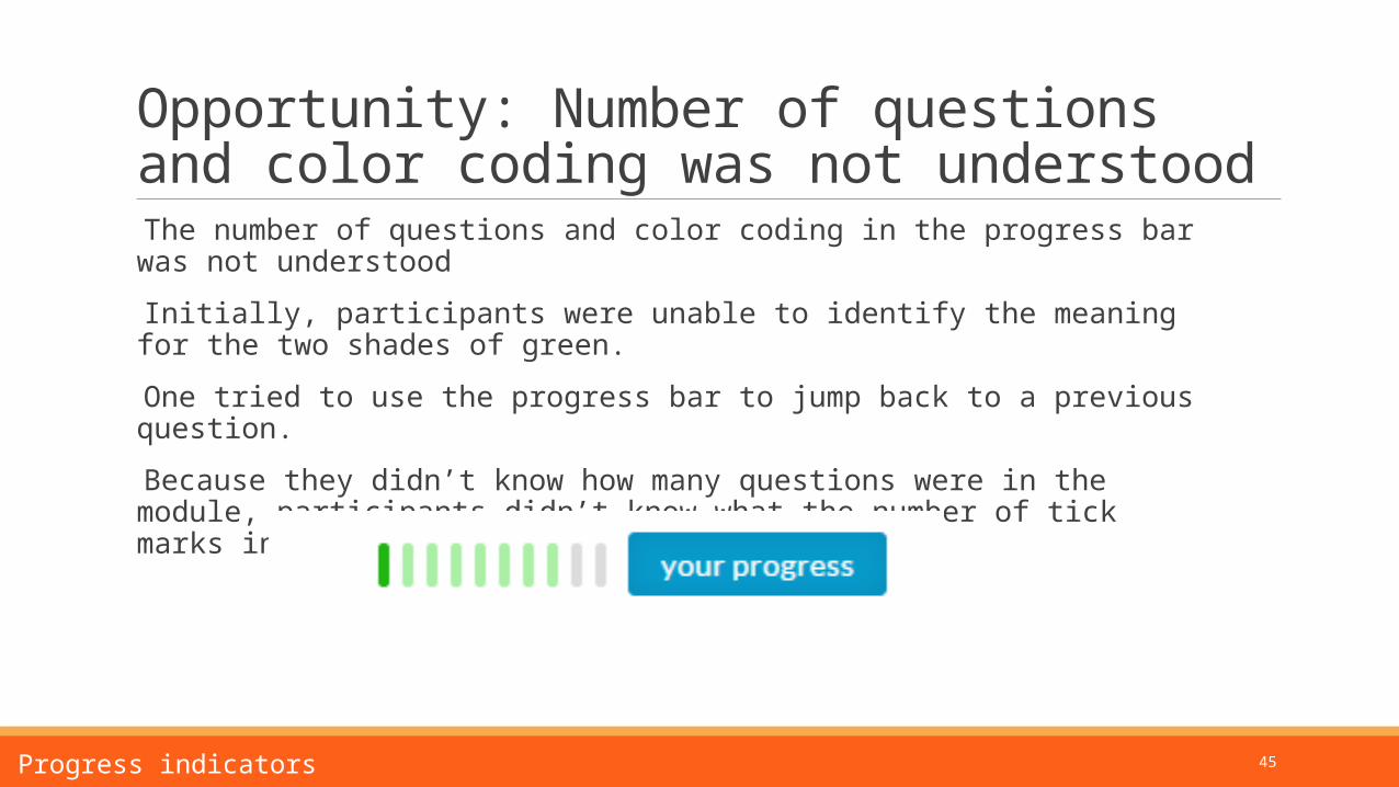
Opportunity: Number of questions and color coding was not understood
The number of questions and color coding in the progress bar was not understood
Initially, participants were unable to identify the meaning for the two shades of green.
One tried to use the progress bar to jump back to a previous question.
Because they didn’t know how many questions were in the module, participants didn’t know what the number of tick marks in the progress bar corresponded to.
6. Progress indicators
46
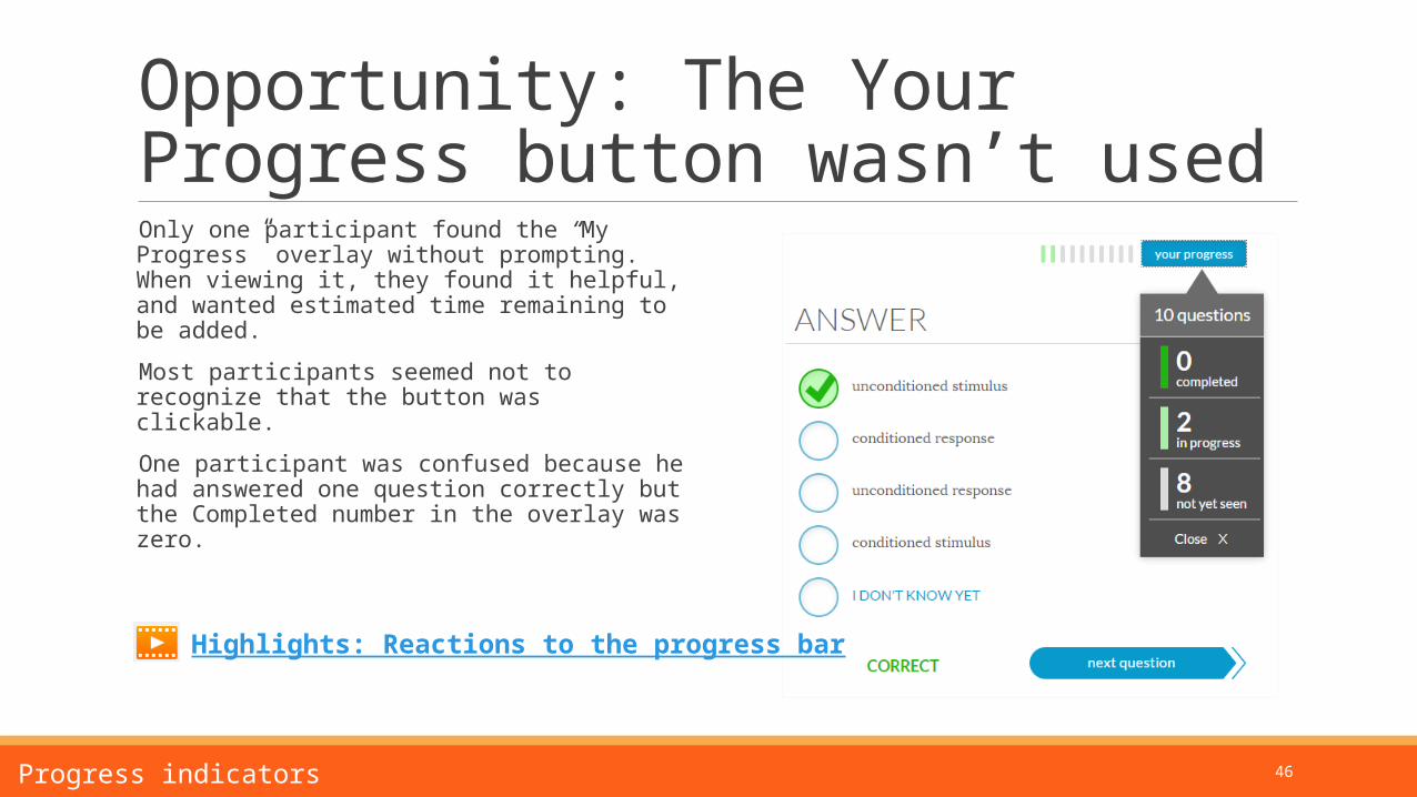
Opportunity: The Your Progress button wasn’t used
Only one participant found the “My Progress” overlay without prompting. When viewing it, they found it helpful, and wanted estimated time remaining to be added.
Most participants seemed not to recognize that the button was clickable.
One participant was confused because he had answered one question correctly but the Completed number in the overlay was zero.
6. Progress indicators
Highlights: Reactions to the progress bar
47
Overlay after completing the first question was confusing
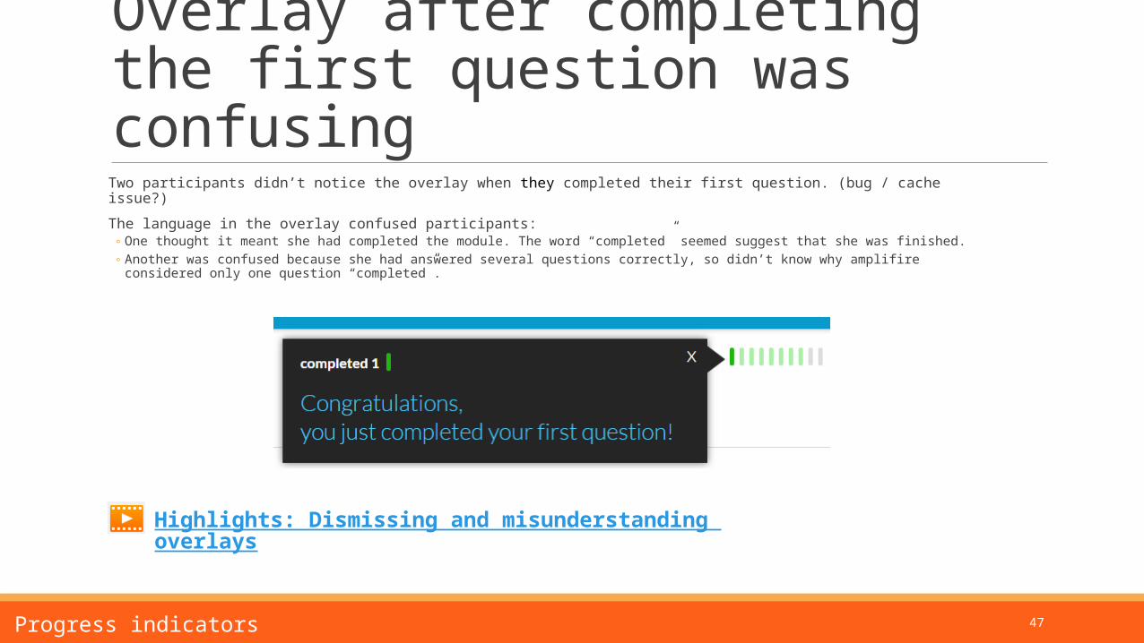
Two participants didn’t notice the overlay when they completed their first question. (bug / cache issue?)
The language in the overlay confused participants:◦ One thought it meant she had completed the module. The word “completed” seemed suggest that she was finished.◦ Another was confused because she had answered several questions correctly, so didn’t know why amplifire considered
only one question “completed”.
6. Progress indicators
Highlights: Dismissing and misunderstanding overlays
48
Recommendations: Progress indicators and overlay
Improve click affordance on the Your Progress button.
Include a “What does “Completed mean” link or info icon in the Your Progress overlay.
Change the wording on the first question completed overlay to “You answered that question correctly twice, so won’t see it again.”)
Add estimated time remaining to the Your Progress overlay.
6. Progress indicators
49
7:
Positive feedback:◦ Refresh, review, and flashcards were well received
Opportunities:◦ Upcoming changes to review should be re-evaluated◦ Flashcards should be developed
Review, refresh, and flashcards are on track
50
Positive feedback: Refresh, review, and flashcards are useful concepts
All participants correctly guessed what refresh and review links on the dashboard would display.
All participants thought that refresh and review would be useful.◦ Opportunity: Participants weren’t sure whether they would need to answer questions correctly
once or twice in Refresh.
All participants except one said that digital flashcards would be useful.
7. Review, refresh, and flashcards
51
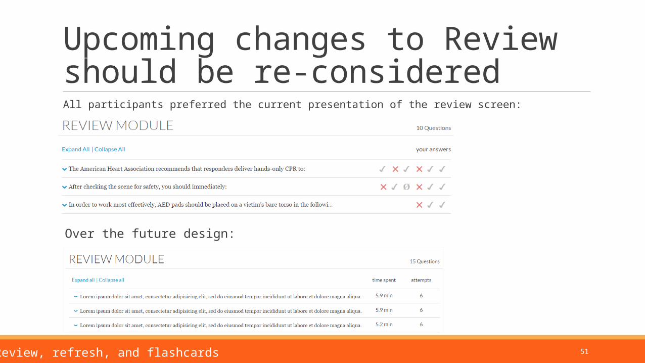
Upcoming changes to Review should be re-considered
All participants preferred the current presentation of the review screen:
7. Review, refresh, and flashcards
Over the future design:
52
Recommendations Review:
◦ Keep the current design
Refresh:◦ Clarify for users how many times a question must be answered correctly in Refresh mode.
7. Review, refresh, and flashcards
53
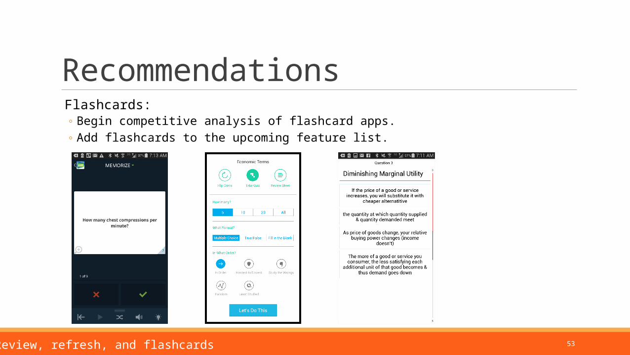
Recommendations Flashcards:
◦ Begin competitive analysis of flashcard apps.◦ Add flashcards to the upcoming feature list.
7. Review, refresh, and flashcards
54
8:
Positive feedback:◦ Participants were largely successful in navigating the app
Opportunities:◦ The browser Back button behaved unexpectedly◦ Save and Return introduces unnecessary doubt
Going back introduces confusion
55
Positive feedback Overall, participants navigated successfully among and within modules.
56
Opportunity: Browser back button behaves unexpectedly
Participants wanted to page back through questions and explanations, and were naturally drawn to use the browser back button.
In most cases the back button crashes amplifire.
8. General navigation
57
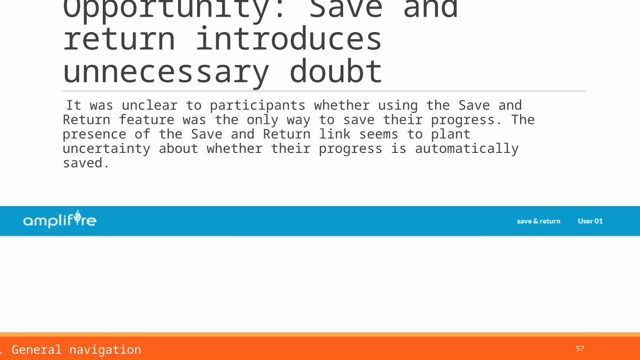
Opportunity: Save and return introduces unnecessary doubt
It was unclear to participants whether using the Save and Return feature was the only way to save their progress. The presence of the Save and Return link seems to plant uncertainty about whether their progress is automatically saved.
8. General navigation
58
Recommendations: General navigation
Change Save and Return to a Dashboard link.
Fix the browser Back button.◦ Question – what would happen when a learner clicks Back when answering questions?
8: General navigation
59
Priorities
This report provided many recommendations and illustrations. The highest priorities are:
1. List will go here.