Embed Size (px)
Citation preview

Kandidatuppsats i matematisk statistikBachelor Thesis in Mathematical Statistics
An analysis of the relationshipbetween income inequality andindicators of social and infra-structural development
Elin Magnusson

Matematiska institutionen
Kandidatuppsats 2013:11
Matematisk statistik
Oktober 2013
www.math.su.se
Matematisk statistik
Matematiska institutionen
Stockholms universitet
106 91 Stockholm

Mathematical StatisticsStockholm UniversityBachelor Thesis 2013:11
http://www.math.su.se
An analysis of the relationship between income
inequality and indicators of social and
infrastructural development
Elin Magnusson∗
Oktober 2013
Abstract
In this paper a multiple regression analysis will be undertaken to
examine which social and infrastructural indicators best explain and
predict income inequality. To quantify income inequality, the Gini co-
effcient is used. The analysis is made on two separate data sets with
different ways of measuring income. In the first data set the income
from countries worldwide is calculated on the basis of household per
capita, while in the second set it is calculated for OECD countries
on a modified scale. The two data sets reach between the years 1990
and 2006. The explanatory variables are basic indicators for devel-
opment such as age and population demographics, school enrolment
and infrastructural factors. In the regression analysis it is shown that
models for explaining income inequality can be found but that ex-
act predictions cannot be made. Variables used in both final models
include Life expectancy, Urban population and Infant mortality rate.
Additionally, age demographic variables are used in both models but
the demographic variable used differs between the two.
∗Postal address: Mathematical Statistics, Stockholm University, SE-106 91, Sweden.
E-mail:[email protected] . Supervisor: Gudrun Brattstrom.

Preface and acknowledgements
This is a thesis of 15 ECTS credits in Mathematical Statistics at the De-partment of Mathematics at Stockholm University. I would like to thank mysupervisor Gudrun Brattstrom for help and support throughout the workon this paper.
Disclaimer
This paper is not in any way a collaboration with or acknowledged by theWorld Bank or the the UNU-WIDER.
2

Contents
1 Introduction 41.1 Background . . . . . . . . . . . . . . . . . . . . . . . . . . . . 41.2 Description of data . . . . . . . . . . . . . . . . . . . . . . . . 5
2 Method 102.1 Regression analysis . . . . . . . . . . . . . . . . . . . . . . . . 11
2.1.1 Simple linear regression . . . . . . . . . . . . . . . . . 112.1.2 Multiple regression . . . . . . . . . . . . . . . . . . . . 11
2.2 Definitions . . . . . . . . . . . . . . . . . . . . . . . . . . . . . 112.2.1 R2 . . . . . . . . . . . . . . . . . . . . . . . . . . . . . 112.2.2 PRESS statistic . . . . . . . . . . . . . . . . . . . . . . 132.2.3 Stepwise regression . . . . . . . . . . . . . . . . . . . . 13
3 Statistical Analysis 143.1 GINI-HPC . . . . . . . . . . . . . . . . . . . . . . . . . . . . . 173.2 GINI-OECD . . . . . . . . . . . . . . . . . . . . . . . . . . . 223.3 Conclusion . . . . . . . . . . . . . . . . . . . . . . . . . . . . 26
4 Discussion 28
5 References 29
6 Appendix 30
A Figures 30
B Lorenz curve 37
3

1 Introduction
This analysis will look at income inequality and what social and infrastruc-tural factors there are to explain and predict such inequality. There areseveral ways of defining and measuring inequality, in this paper the inequal-ity in income is the object of analysis and for that the Gini coeffient (a.k.aGini index) is a good measurement. Data has been collected internationallyand the index is not dependent on specifics such as the form of governmentin a country, it’s national legal system or adherence to international law.The basis for the Gini coefficient is the Lorenz curve (see Appendix B forfurther calc.), which is used for several measurements of dispersion in data −economic as well as social and biological. The Gini coefficient may in somecases refer to the dispersion of wealth though in this paper only incomeinequality is used to calculate the Gini coefficient. We want the explana-tory variables used in the analysis to have the same characteristics as theGini coefficient, so that the variables are measured in the same way in eachcountry. E.g. if the meaning of a variable is dependent on the laws in eachcountry, the variable is not comparable between countries, only within eachcountry.
1.1 Background
The Gini coefficient created by Corrado Gini published in 1912, is a measureof the diversity in data and lies between 0 (perfect equality) and 1 (perfectinequality) [1]. It is based on the Lorenz curve, as seen in Figure 1 if theLorenz curve coincides with the diagonal the data is perfectly equal. In thispaper it is the income equality that is measured which theoretically meansthat if the Gini coefficient is 0 everyone has the same income and if it is 1one person has all the income in the measured data. There are of courseseveral difficulties surrounding the measuring of equality, for instance thesame Gini can come from numerous distributions. The Gini coefficient inthis analysis is measured as an index of 0− 100 instead of 0− 1. The basiccalculations of the Gini coefficient is:
Gini =A
A+B
A is the area between the Lorenz curve and the diagonal and B is the areabelow the Lorenz curve. For calculation of Lorenz curve see Appendix B.
4

Figure 1: The Lorenz curve [1]
1.2 Description of data
The data for the Gini coefficient in the following analysis comes from WIID2[2], the UNU-WIDER World Income Inequality Database, which includeshistoric data which uses a number of different ways of measuring income/con-sumption distribution data. The data set in total includes 5314 observationsbetween the years 1867-2006 with 36 variables. The difficulties in comparingincome distributions between countries are numerous, and include the factthat there are several methods used to collect information about incomethat gives different coefficients. In developing countries with a large agri-cultural sector it is often hard to get accurate data, and in these countriesthe inequality distribution is often based on consumption instead of income.The 36 variables include the geographic coverage of the surveys underlyingthe observations, the unit of analysis and the equivalence scale, the incomeconcept, the income share unit and the quality of data.
In Table 1 we see an extract from WIID2, we see 15 of the 36 variablesin the data set and 21 of the 5314 observations. So in between Rep. Giniand PopCovr lies 21 variables that are not used in this paper except forthe variable AreaCovr. There are two different Gini coefficients reported inWIID2 as seen in Table 1, the first is calculated by WIDER and the second”Rep. GINI” is either the one reported by the source or the Gini coefficientgiven in the old data base WIID1. In this report the Gini coefficient used is
5

the one calculated by WIDER, not the ”Reported GINI”.
Table 1: Extract from WIID2
Country Year Gini Rep. ...... Pop Age IncSharU Uof Equivsc IncDefn Source1 Survey/ Qual.Gini Covr Covr Anala Source2
Canada 1993 33,6 33,57 ....... All All Census Fam. Person Census fam. eq, sqrt Income, Disp. Frenette... Tax data 2Canada 1994 33,9 33,85 ....... All All Census Fam. Person Census fam. eq, sqrt Income, Disp. Frenette... Tax data 2Canada 1995 34,3 34,28 ....... All All Census Fam. Person Census fam. eq, sqrt Income, Disp. Frenette... Tax data 2Canada 1996 34,9 34,90 ....... All All Census Fam. Person Census fam. eq, sqrt Income, Disp. Frenette... Tax data 2Canada 1997 35,2 35,18 ....... All All Census Fam. Person Census fam. eq, sqrt Income, Disp. Frenette... Tax data 2Canada 1998 35,5 35,48 ....... All All Census Fam. Person Census fam. eq, sqrt Income, Disp. Frenette... Tax data 2Canada 1999 35,9 35,85 ....... All All Census Fam. Person Census fam. eq, sqrt Income, Disp. Frenette... Tax data 2Canada 2000 36,5 36,53 ....... All All Census Fam. Person Census fam. eq, sqrt Income, Disp. Frenette... Tax data 2Canada 1990 28,1 28,06 ....... All All Eco. Fam. Person Eco. fam. eq, sqrt Income, Disp. Frenette... Survey... 1Canada 1991 28,7 28,73 ....... All All Eco. Fam. Person Eco. fam. eq, sqrt Income, Disp. Frenette... Survey... 1Canada 1992 28,3 28,32 ....... All All Eco. Fam. Person Eco. fam. eq, sqrt Income, Disp. Frenette... Survey... 1Canada 1993 28,6 28,58 ....... All All Eco. Fam. Person Eco. fam. eq, sqrt Income, Disp. Frenette... Survey... 1Canada 1994 28,3 28,34 ....... All All Eco. Fam. Person Eco. fam. eq, sqrt Income, Disp. Frenette... Survey... 1Canada 1995 28,8 28,78 ....... All All Eco. Fam. Person Eco. fam. eq, sqrt Income, Disp. Frenette... Survey... 1Canada 1996 29,1 29,14 ....... All All Eco. Fam. Person Eco. fam. eq, sqrt Income, Disp. Frenette... Survey... 1Canada 1996 29,6 29,62 ....... All All Eco. Fam. Person Eco. fam. eq, sqrt Income, Disp. Frenette... Survey... 1Slovenia 2005 24,0 24,00 ....... All All Household Person Household Income, Disp. European... The Eur... 1
eq, OECDmodSlovenia 2006 24,0 24,00 ....... All All Household Person Household Income, Disp. European... The Eur.. 1
eq, OECDmodSweden 2004 23,0 23,00 ....... All All Household Person Household Income, Disp. Eur... . 2
eq, OECDmodSweden 2005 23,0 23,00 ....... All All Household Person Household Income, Disp. European... The Eur... 1
eq, OECDmodSweden 2006 23,0 24,00 ....... All All Household Person Household Income, Disp. European... The Eur... 1
eq, OECDmod. . . . ....... . . . . . . . . .. . . . ....... . . . . . . . . .. . . . ....... . . . . . . . . .
To be able to compare the Gini coefficient between countries the definitionsof measuring income have to be the same in each country. The CanberraGroup on Household Income Statistics was a group active between 1996-2000, working for the United Nations Statistic Division and was assembledto amplify the national household income statistics and created guidelinesto enhance comparability on income distribution[3]. The group met fourtimes and had representatives from a large group of countries and multiplegroups like the Luxembourg Income Study Group at the Centre for Popula-tion, United Nations Statistics Division, the World Bank and the EconomicCommission for Europe. A final report written by the Canberra Group givesrecommendations on which factors surveys should take into account whendata is collected and which data is most comparable [7].
The Canberra Group states that the basic statistical unit should be thehousehold i.e. calculating the total income of households instead of for ex-ample only looking at personal income. There are several problems withcalculating the personal income e.g. children in most countries have no in-come so an age limit probably should be set and in extension it is not possibleto calculate how many persons actually share the income. The income or
6

consumption should be adjusted to take account of household size usingper capita income or consumption. This means that we adjust the incomewith respect to how many people that is provided by it, or equivalently, howmany people that consumes in the household unit. The Canberra group alsostates that personal weights is preferred for analysis, the weight is given tohow many the income represent. For example, if a household has the prob-ability 1 in 500 of being selected in a survey the household has a weight of500, to calculate the person weights each household unit is multiplied bythe number of persons in the specific unit. So the personal weights create aover all distribution of income for individuals, assuming that the householdincomes are pooled. Further down we will see that household size is not anabsolute measurement. The label ”disposable income” is given to the obser-vation if it corresponds to the one described by the Canberra Group, simplythe income that after loans, taxes etc. have been paid that can be used forexpenditures and savings. In this paper the data that is used follows therecommendations of the Canberra Group when possible.
All data for the explanatory variables come from the World Bank [4], adatabase of world development indicators. The data catalogue providesover 1200 indicators in a large range of areas and the chosen variables havebeen collected to be used as basic indicators of development and for mappingsimple social factors, such as age demographics. Data for the variables needto be collected and counted in the same way in each country, for example,data for domestic violence is law based and since the laws are different ineach country the variable is not comparable between countries. From thedata catalogue 41 variables have been chosen. Of these 39 are explanatoryfactors and the other two are country and year, which is used to merge thedata with the variables from WIID2. In Table 2 we see an extract of thedata set downloaded from the World Bank, we see 21 observations of 1426and the first 6 explanatory variables.
7

Table 2: Extract from data set of indicators from the World Bank
Country Name Year Agri. Alt. and nuc. Adj. net enroll. rate, Adj. net enroll. Pupil/teacher Fem./ male sec. ...land (%) energy (%) primary, fem. (%) rate, primary (% ) , primary enroll. (%)
Armenia 1990 1,74 ...Austria 1990 42,45 10,98 10,86 91,49 ...Belarus 1990 0 104,27 ...Belgium 1990 23,11 101,07 ...Bolivia 1990 32,73 3,89 ...Botswana 1990 45,91 0,04 89,13 85,64 31,66 111,1 ...Bulgaria 1990 55,67 13,95 99,72 ...Canada 1990 7,45 21,54 95,59 95,23 15,69 100,86 ...Chile 1990 21,38 5,48 105,49 ...China 1990 54,23 1,25 97,04 22,32 73,28 ...Croatia 1990 3,64 ...Cyprus 1990 17,53 0 78,79 78,83 21,38 102,95 ...Czech Republic 1990 6,82 24,49 91,45 ...Denmark 1990 65,77 0,34 97,58 97,5 11,28 102,12 ...Ecuador 1990 28,34 7,12 30,41 ...El Salvador 1990 68,05 20,33 ...Estonia 1990 0 ...Finland 1990 7,87 20,94 118,03 ...France 1990 55,82 38,71 99,91 106,87 ...Gabon 1990 20,01 5,13 ...Georgia 1990 5,25 .... . . . . . . . .... . . . . . . . .... . . . . . . . .... . . . . . . . .... . . . . . . . ...
First the WIID2 is sorted and reduced by these criteria which follows therecommendation from the Canberra Group. We keep only the observationswhere the definitions and coverage of the Gini coefficient is:
• Unit of Analysis= Person
• Income share unit= Household
• Income definition= Disposable income
• Area, Population & Age coverage= All
• Year= 1990-2006
We will now divide data into two separate data sets depending on the equiv-alence scale. Since the income surveys have been collected on a householdbasis it is important to scale the income depending on the size of the house-hold, in WIID2 there are mainly four different ways of scaling seen in Table3. So the equivalence scales are used to calculate the economic ”number ofpersons” in the household unit. As seen in Table 1 other scales are usedlike the size of a family, the problem is that family, or equivalent, is a vagueexpression and differs between countries. This is why the Canberra grouprecommends one of the equivalence scales in the table below. We can seein Table 1 that the observations for ”Canada” does not correspond to thedefinitions above so these are among the variable deleted from the data set.
8

Table 3: Equivalence scales
Equivalence scale Calc. for unit size
Household per capita Number of persons in household
Square root√
Number of persons in Household
OECD scale 1 + 0.7· n (add. adults)+ 0.5· n(add. children)
OECD scale modified 1 + 0.5· n (add. adults)+ 0.3· n(add. children)
The data is now divided into two different data sets. First, one with equiv-alence scale ”Household eq. OECDmod” from the survey made by theEuropean Commission 2005-2008. Containing only the European Commu-nity Household Panel Survey and The European Union Statistics on Incomeand Living Conditions (EU-SILC) survey, this new data set has 160 ob-servations. We see that in Table 1 that the observation ”Sweden, 2004”has the right definitions and coverage to be included in the data set withequivalence scale ”Household eq. OECDmod”, but it lacks the underlyingSurvey/Source2 and is therefore excluded from the data set. The seconddata set contains the observations derived from the reduced WIID2 withthe equivalence scale ”Household per capita”, and this new data set has 297observations. These two data sets now have comparable observations withineach set since the corresponding observations in each data set are collectedfrom comparable surveys and the way of calculating the Gini coefficient isthe same.
For these two data sets all variables except for Gini, Year and Country isdeleted. The data sets are now merged with the data set with the explana-tory variables by Year and Country. All observations lacking a respondingGini coefficient is then deleted. So we now have two data sets one with 160observations and the other one with 297 and both with Year and Countryas reference variables, Gini as responding variable and 39 explanatory vari-ables.
From now on the two data sets will be referred to as GINI-HPC (Householdper capita) and GINI-OECD (Household eq. OECDmod) after their cor-responding equivalence scale. A table of which countries and which yearsrepresented in each data set can be found in Table 20. GINI-HPC have obser-vations with quality 1− 3 and GINI-OECD contains only observations withquality 1. The quality of the observations in WIID2 are somewhat basedon the Canberra Group’s recommendations, and are divided into three parts:
1)Whether the concepts underlying the observations are known or not
9

This might be seen as a given, although this is not always the case. Conceptslike disposable, monetary and gross income are not absolute concepts, so theconcepts differ and it is not always known what is meant. Especially in oldersurveys it is not always clear what concepts underlying the observations are.
2)The coverage of the income/consumption concept
This adheres closely to the Canberra Group’s recommendation, though forexample monetary income it has been accepted for most developing coun-tries since home production and in-kind income have little effect on incomedistribution.
3)The survey quality
This point has been divided into three basic points:
• Coverage issues Most important is if the survey coverage is known.• Questionnaires Need to have enough information on income
and expenditures.• Data collection methodology For example on consumption data either diaries
must be used or frequent visits must occur.
These requirements have been checked for every observation/survey andthe quality is then set on the basis of the extent to which the data reachesthe requirements. The quality can be seen more as a guideline, if an obser-vation has low quality it can still be a usable indicator of inequality in thatcountry. A good example is the observation ”Sweden, 2004” in Table 1 thatreaches the requirements except that the Survey/Source2 is missing whichlowers the quality.
2 Method
Our main goal is to find a linear model describing the relationship betweenthe Gini coefficient and the explanatory variables, which we do using re-gression analysis. Another part of the analysis concerns how well the Ginicoefficient can be predicted through the chosen models, especially how wellit can be predicted with the data from GINI-OECD.
10

2.1 Regression analysis
Linear regression models are models used to show if a variable, the response,depends or at least is explained linearly by one or several other, explanatory,variables [5].
2.1.1 Simple linear regression
The model for simple linear regression is defined as
yi = α+ βxi + εi
where xi is the explanatory variable for i = 1...n, α and β is parameters andεi is the errors. β and α is estimated with least square.
2.1.2 Multiple regression
The model used for the multiple regression is
y = βX + ε
Where y, β, X and ε are matrices and vectors for the observed values, theparameters and the errors.
y =
y1y2...yn
X =
1 x11 ... x1p1 x21 ... x2p. . ... .. . ... .. . ... .1 xn1 ... xnp
β =
β0β1...βp
ε =
ε1...εn
for p-1 variables and n observations, the parameters β are estimated withordinary least squares.
β = (XTX)−1XTy
2.2 Definitions
The following are some important definitions used in the analysis.
2.2.1 R2
The coefficient of determination, R2 [5], is the most commonly used mea-surement of adjustment in connection with linear models and in particularwith multiple regression models. The coefficient of determination is definedas the share of the total variation that the model explains and goes from 0to 1.
11

R2 =SSmodel
SStotal= 1− SSerror
SStotal
Where the sum of squares are defined as
SSmodel =
n∑i=1
(yi − y)2
SSerror =n∑
i=1
(yi − yi)2
SStotal =n∑
i=1
(yi − y)2
Fory = Mean of response variableyi = ith predicted responseyi = ith observed response
12

2.2.2 PRESS statistic
PRESS stands for Predicted Residual Sum of Squares and is a statistic usedto measure the fit of a model and can be used to compare models fitted onthe same data set. For the fitted model a form of cross-validation is usedwere in turn each of the observations used is eliminated where as the modelis re-fitted using the remaining observations, so the model is re-fitted n timeswhere n is the number of observations. A statistic is then computed usingthe residuals and the leverage of the observation used as below [6].
PRESS =
n∑i=1
(ri
1− hi)2
for ri=residual for ith observation hi=leverage of ith observation
Where the lowest PRESS indicates the best fit of the models, an overparametrised model tends to give a higher PRESS in comparison with R-square which always gets higher with more variables. This PRESS is theone that SAS calculates and therefore the one used in the analysis.
2.2.3 Stepwise regression
Stepwise regression is a procedure where a regression model is built by start-ing with zero explanatory variables and adding variables in each step thathave a p-value below a chosen α and in each step removing the variables witha p-value above a chosen α , continuing until a model with only significantexplanatory variables are left in the model. Although p-value is the mostcommon determining value other statistics can be used for the procedure.
13

3 Statistical Analysis
We begin by looking at the data sets and each variable, since some of thevariables have missing values. The first step is to see how many missing val-ues each variable has in the two data sets. When we perform simple linearregression in the program SAS, which is used for the analysis, as a bonus weget the number of missing values for each variable. We can then look at theGini coefficient plotted against each variable and the corresponding residu-als. When we look at the plots we can also examine if any of the variablesneed to be transformed. We begin by excluding every variable with morethan 20% (237 for GINI-HPC and 128 for GINI-OECD) missing values, thisas a first crude reduction of variables.
When the variables have been reduced there are 24 explanatory variablesleft for GINI-HPC and 28 for GINI-OECD. Later in the analysis there mightbe more variables that are excluded depending on where the missing valueslie since when multiple regression is performed all observations with onemissing value or more are eliminated from the regression. This means if allmissing values are under the same countries and years then at least 80%of the observations are used but if the missing values lie within differentobservations there might be very few observations used in the analysis.
We now look at the plots of the Gini coefficient on each of the explana-tory variables and the corresponding residuals. We see that in GINI-HPCthe variables Population size, Net national income, GNI (Gross NationalIncome) per capita and GDP (Gross Domestic Product) per Capita all haveboth observations and residuals very concentrated in a small area. We takethe logarithm of the variables and as can be seen in Figure 5 the residualsnow look randomized. In GINI-OECD we take the logarithm of the samevariables as in GINI-HPC and as can be seen in Figure 6 also for this dataset the residuals are not as concentrated. In Table 21 we see the completelist of explanatory variables, with the transformed variables in the bottom,and which are used for GINI-HPC and for GINI-OECD. In Table 4 we see allthe variables used with abbreviations that will be used during the analysis.
14

Table 4: Explanatory variable abbreviations
Variable Abbreviation
Agricultural land (% of land area) Agri.landAlternative and nuclear energy (% of total energy use) Alt& nuc engiRatio of female to male secondary enrolment (%) Fem/male sec.enrollDeath rate, crude (per 1,000 people) Death rateFertility rate, total (births per woman) Fert.rateLife expectancy at birth, total (years) Life exp.Mortality rate, infant (per 1,000 live births) Mort. ratePopulation ages 0-14 (% of total) Pop. 0-14Population ages 15-64 (% of total) Pop 15-64Population ages 65 and above (% of total) Pop 65+Internet users (per 100 people) Int. usersEmployment to population ratio, 15+, female (%) Emp/pop femEmployment to population ratio, 15+, male (%) Emp/pop maleGDP per person employed (constant 1990 PPP $) GDP.p.p.emp.Labour force with secondary education, female (% of female labour force) Lab.w.sec edu femLabour force with secondary education, male (% of male labour force) Lab.w.sec edu maleLabour force with primary education (% of total) Lab.w.prim eduLabour force, female (% of total labour force) Lab.fem % tot.Unemployment, total (% of total labour force) Unemp. tot.Female legislators, senior officials and managers (% of total) Fem. leg.Electric power consumption (kWh per capita) Elec.pow.con.Population density (people per sq. km of land area) Pop.densUrban population (% of total) Urb.popArmed forces personnel (% of total labour force) Armd.personnelLOG(Population, total) Log.popLOG(Adjusted net national income (current US$)) Log.adj.net.incLOG(GNI per capita (constant LCU)) Log.GNILOG(GDP per capita (constant LCU)) Log.GDP
15

As can be hinted by the residuals GNI per capita and GDP per capita lookvery correlated, in Figure 2 we see that they are extremely correlated. SinceGNI per capita have less observations in both data sets it is eliminated fromthe analysis, only GDP per capita is used in the analysis from now on.
Figure 2: Scatterplot for GNI per capita on GDP per capita
(a) GINI-HPC (b) GINI-OECD
If we continue to look at the relationship between the variables, in Figure 3we see the absolute value of the correlation coefficients between the variables,in the same order, as listed in Table 21.
Figure 3: Correlation between variables
(a) GINI-HPC (b) GINI-OECD
We can see in scatterplots between each variable as well as in the figuresabove that some variables are very correlated, if we take a look at Table 21this is to be expected. The cluster of green in the middle of the plot are thevariables that are age-related so some correlation between them was to beexpected.
16

In the continuation of the analysis we will look at each of the data setsindividually. Since there are a lot of variables it is hard to grasp different di-mensions of the data set. To get a better overview and to see if the variablesmight give us the same information multiple times we perform regressionanalysis on some of the explanatory variables and then create groups basedon the models. Basically, if one or several of the other explanatory variablescan explain any of the other variables, we call these intervening variables. Ifa good fitted model can be created using some of the other explanatory vari-ables in the data set, the program we use might not create the best modelpossible for the Gini coefficient, since some of the information is alreadyincluded. This is another reason to create groupings of the explanatoryvariables so that the groups consist of variables that are not dependent ofeach other. The last reason to create the intervening models is that whenwe get a final model for our Gini coefficient we then know more about theexplanatory variables in that model.
3.1 GINI-HPC
When we concentrate on the data set GINI-HPC we can see that the corre-lations in this data set are more prominent than in GINI-OECD. This canbe related to several different things, in the analysis we will further explorethe relationship between the variables. If we look closer at the scatter plotsbetween the variables we see that they correspond well to the Figure 3A.The variables most correlated to each other in some way are the variablesexplaining age demographic and the variables infant mortality, fertility rate,crude death rate, employment to population ratio (male) and GDP per per-son employed.
Even if we know that some of the variables are correlated to each other,this does not necessarily mean that there is a cause and effect relationshipbetween the variables, though it hints that some variables can be explainedby other variables in the data set and are therefore intervening. This is howwe will try to do the partition, that is to say by examining if we can createdata sets with fewer explanatory variables by showing that the excluded vari-ables can be explained by other variables within the same data set. Whenlooking closer at the variables we also exclude the variables Armd.personnel,Agri.land, Int. users and Unemp. tot. due to lack of observations. In thedata set it is now 10 observations having one or more missing values.
After analysing several explanatory variables we do a multiple linear regres-sion with the response variable crude death rate and see that we can createa model shown in Table 5 with all P-values for the slopes being < 0.0001.The model also has normally distributed and randomized residuals. As we
17

can see in Table 5 the crude death rate is well explained by the age demo-graphics, fertility rate and mortality rate.
Table 5: Parameter estimates Death rate
Variable Parameter Estimate Pr < |t|Intercept 113.96957 <.0001
Fert.rate -0.62514 <.0001
Mort rate -0.04630 <.0001
Pop 0-14 -0.66786 <.0001
Pop 15-64 -0.65189 <.0001
R-square= 0.9658
We create a first group (Group 1) without the intervening variable crudedeath rate and try to reduce this group even more. Since all of the ex-planatory variables in Table 5 are needed to explain the death rate we wantto keep these but examine if one or several of these four variables can beexplained by the remaining variables in Table 21. So we do models usingstepwise regression for each of the four variables as response and the remain-ing variables as explanatory.
We find that for the variables Fertility rate and Infant Mortality rate wecannot find any good models, but for the variables Population ages 0-14 (%of total) and Population ages 15-64 (% of total) there exist models withgood fit. As we see in Table 6 and 7 the models both include the sameexplanatory variables but for the Population ages 0-14 (% of total) a modelwith the variable Fert. rate is used. The coefficients for these models haveno real value for us in this part of the analysis, but it is worth noticingthat the coefficients for the two variables used in both models switches signsbetween the two intervening models.
Table 6: Parameter estimates Pop 0-14
Variable Parameter Estimate Pr < |t|Intercept 25.91195 <.0001
Fert rate 4.84593 <.0001
Pop 65+ -0.96276 <.0001
Elec.pow.con. -0.00016697 <.0001
R-square= 0.9740
18

Table 7: Parameter estimates Pop 15-64
Variable Parameter Estimate Pr < |t|Intercept 73.43597 <.0001
Fert. rate -4.69670 <.0001
Elec.pow.con. 0.00015520 <.0001
R-square= 0.9039
A look at the remaining variables in the data set that are not yet explained inany of the models above reveals that the only variable that can be explainedwell by the other remaining variables are Labour force, female (% of totallabour force). In Table 8 we can see the model created with good goodnessof fit and with normally distributed residuals.
Table 8: Parameter estimates Lab.fem % tot.
Variable Parameter Estimate Pr < |t|Intercept 52.26360 <.0001
Emp/pop. fem 0.47868 <.0001
Emp/pop. male -0.46581 <.0001
Elec.pow.con. -0.00009448 <0.0001
R-square= 0.9419
Since we now have a lot more information about the data set and the depen-dence between the variables we can use this information to ”puzzle” groupstogether so that the groups we create consist of as few variables holding thesame information as possible. In each of the groups one or several inter-vening variables is eliminated depending on the models above, the variablesleft are either needed to explain a variable that is eliminated or is not usedin the intervening model. The groups we create are as follows in Table 9.We begin by creating Group 1 by eliminating the intervening variable Deathrate, using the model in Table 5. For Group 2 we use the same argument andeliminate the variables Pop 0-14 and Pop 15-64 since they are explainedby the same variables. In Group 3 we eliminate Lab.fem % tot.. In Group 4instead of eliminating the response variable in the intervening models seenin Table 5, 6, 7 and 8 we keep them and eliminate the explanatory variablesused.
19

Table 9: Grouping of GINI-HPC
Group 1 Group 2 Group 3 Group 4
Alt& nuc engi Alt& nuc engi Alt& nuc engi Alt& nuc engi
Fert.rate Fert.rate Fert.rate Death rate
Life exp. Life exp. Life exp. Life exp.
Mort. rate Mort. rate Mort. rate GDP.p.p.emp
Pop 0-14 Pop 65+ Pop 65+ Lab.fem % tot.
Pop 15-64 GDP.p.p.emp Emp/pop. fem Pop.dens.
Emp/pop. fem Lab.fem % tot Emp/pop. male Urb.pop
Emp/pop. male Elec.pow.con. GDP.p.p.emp Log.pop
GDP.p.p.emp Pop.dens. Elec.pow.con. Log.adj.net.inc
Lab.fem % tot. Urb.pop Pop.dens. Log.GDP
Elec.pow.con. Log.pop. Urb.pop
Pop.dens. Log.adj.net.inc Log.pop
Urb.pop Log.GDP Log.adj.net.inc
Log.pop Log.GDP
Log.adj.net.inc
Log.GDP
We know that even if the intervening models are good models, they are stillmodels, so for the analysis of the Gini coefficient we will also analyse thecomplete data set. We use stepwise regression on each of the groups and stopat the best PRESS. This means that one by one the variables are includedin the model and if the PRESS statistic is lower or the same as before thevariable is left in the model, the variables excluded from the finished modelwill all give a higher PRESS if included. In Table 10 and 11 we see themodels statistics.
Table 10: Fit statistics for groups of GINI-HPC
All variables Group 1 Group 2
Root MSE 6.20205 Root MSE 5.85298 Root MSE 5.84273
R-Square 0.7053 R-Square 0.7566 R-Square 0.7592
Adj R-Sq 0.7009 Adj R-Sq 0.7522 Adj R-Sq 0.7531
AIC 1271.68834 AIC 1300.09786 AIC 1301.04817
PRESS 10643 PRESS 10061 PRESS 10140
20

Table 11: Fit statistics for groups of GINI-HPC
Group 3 Group 4
Root MSE 5.81435 Root MSE 6.51360
R-Square 0.7624 R-Square 0.6996
Adj R-Sq 0.7555 Adj R-Sq 0.6931
AIC 1299.24210 AIC 1362.03106
PRESS 10091 PRESS 12478
We look at the goodness of fit in Table 10 and 11 and see that the two modelsfrom Group 1 and Group 3 that has the lowest PRESS also have high R-square so we look closer at these two models. The model for Group 2 alsohas a relatively small PRESS but has several more explanatory variables sofor the simplicity and goodness of fit we do not analyse this model further.
Table 12: Parameter estimates Group 1
Parameter Estimate Pr > |t|Intercept -65.577230 >.0001
Life exp. 0.917397 >.0001
Mort. rate 0.403076 >.0001
Pop. 0-14 0.703150 >.0001
Elec.pow.con -0.001020 >.0001
Urb.pop. 0.252385 >.0001
Table 13: Parameter estimates Group 3
Parameter Estimate Pr> |t|Intercept -8.703615 0.5855
Fert. rate 0.493753 0.0092
Mort. rate 0.435718 >.0001
Pop. 65+ -0.815274 >.0001
Emp. fem -0.237524 0.0010
Emp. male 0.204032 0.0060
Elec.pow.con. -0.000712 >.0001
Urb.pop. 0.256238 >.0001
Log.GDP -0.493119 0.0092
As we can see the two models differ by just two extra variables in the lattermodel. In Figure 7 and 8 we see plot of the diagnostics fit, the models lookvery much alike when it comes to residuals and prediction plots. Since thereis no preferable model in the fit diagnostics or statistics we choose the modelfrom Group 1 based on simplicity. It can be noticed that in both figures
21

we see that two observations have more leverage then the others, the twoobservations are the ones for Kenya and Tajikistan.
3.2 GINI-OECD
We make the same analysis here as in the last section. If we look at the twodata sets and consider what we know so far, a difference in the results forthe two data sets is to be expected. A guess could have been that the GINI-OECD can be divided analogous to how the GINI-HPC was divided. If amodel is made with response variable Death rate and explanatory variablesas in the GINI-HPC we can examine the significance of the variables andthe R-square and see that the model is not in any way relevant for this dataset. So for the GINI-OECD we take the same approach as to the previousdata set and start from scratch. When looking at where the missing valueslie we decide to exclude Agri. land due to lack of observations, it is now 5observations that has one or more missing values.
Although the same models for reducing the data set cannot be used wecan still try to see if there is a sufficient model for the variable Death rateas in the previous data set. It turns out that analysing the variable is morecomplex then in the previous data set, in which only four variables wereused for a sufficient model. In this data set the model best suited for data isas shown in Table 14 below. Although the model fit is more than acceptablethe model is not as good, in terms of R-square and PRESS, as for the modelwith same response variable created for GINI-HPC.
Table 14: Parameter estimates for Death rate
Variable Parameter Estimate Pr < |t|Intercept 59.55075 <.0001
Fem/male sec.enroll -0.01828 0.0008
Life exp. -0.63446 <.0001
Mort. rate 0.09777 0.0006
Pop. 65+ 0.54270 <.0001
Emp/pop. fem 0.14241 <.0001
Emp/pop. male -0.08626 <.0001
Lab.fem % tot. -0.21897 <.0001
Urb.pop 0.01344 <.0001
R-square= 0.9559
22

As in the previous data set we look at the variables not used to explain Deathrate and find that the model shown below in Table 15 for the variable Fert.rate has a good fit with plots for residuals looking normally distributed andprediction on observed going along the diagonal.
Table 15: Parameter estimates for Fertility Rate
Variable Parameter Estimate Pr < |t|Intercept -2.15946 <.0001
Fem/male sec.enroll 0.00691 <.0001
Pop. 0-14 0.09580 <.0001
Pop. 65+ 0.03158 <.0001
Int. users 0.00104 0.0086
GDP.p.p.emp 0.00000652 <.0001
Lab.fem % tot. 0.01389 <.0001
Fem. leg. -0.00647 0.0021
R-square= 0.8903
If we continue analysing different intervening models for the remaining vari-ables, we see that some of the variables can be explained but with poorgoodness of fit so for the simplicity of creating new groups and for thegroups not to be too entangled the two models above are the ones we baseour groups on. We create the groups in the same way we did for GINI-HPC,eliminating the intervening variables that are explained by other variables inthe group and keep the variables either explaining or not used in the modelsfor the eliminated ones. The reduced groups are created as seen in Table 16.So in the first group we have eliminated both Death rate and Fert. rate, inGroup 2 Fert. rate in Group 3 Death rate and in Group 4 the explanatoryvariables for both are deleted.
23

Table 16: Grouping of GINI-OECD
Group 1 Group 2 Group 3 Group 4
Alt& nuc engi Alt& nuc engi Alt& nuc engi Alt& nuc engi
Fem/male sec.enroll Fem/male sec.enroll Fem/male sec.enroll Death rate
Life exp. Death rate Fert.rate Fert. rate
Mort. rate Pop. 0-14 Life exp. Pop. 15-65
Pop. 0-14 Pop. 65+ Mort. rate Lab.w.sec edu fem
Pop. 15-64 Int. users Pop. 15-65 Lab.w.sec edu male
Int. users GDP.p.p.emp Pop. 65+ Lab.w.prim edu
Emp/pop. fem Lab.w.sec edu fem Emp/pop. fem Elec.pow.con.
Emp/pop. male Lab.w.sec edu male Emp/pop. male Armd.personnel
GDP.p.p.emp Lab.w.prim edu Lab.w.sec edu fem Log.pop
Lab.w.sec edu fem Lab.fem % tot Lab.w.sec edu male Log.adj.net.inc
Lab.w.sec edu male Elec.pow.con. Lab.w.prim edu Log.GDP
Lab.w.prim edu Pop.dens. Lab.fem % tot
Lab.fem % tot. Urb.pop Elec.pow.con.
Fem. leg. Fem. leg. Urb.pop
Elec.pow.con. Elec.pow.con. Armd.personnel
Pop.dens. Armd.personnel Log.pop
Urb.pop Log.pop. Log.adj.net.inc
Armd.personnel Log.adj.net.inc Log.GDP
Log.pop Log.GDP
Log.adj.net.inc
Log.GDP
So we now do exactly what we did for GINI-HPC, which is to use stepwiseregression and stop when our PRESS is as small as possible. In Table 17and 18 we see the result of the goodness of fit statistics.
Table 17: Grouping of GINI-OECD
All variables Group 1 Group 2
Root MSE 2.65641 Root MSE 2.87938 Root MSE 2.86179
R-Square 0.6416 R-Square 0.5703 R-Square 0.5840
Adj R-Sq 0.6221 Adj R-Sq 0.5560 Adj R-Sq 0.5614
AIC 471.54612 AIC 493.84488 AIC 494.78200
PRESS 1194.45243 PRESS 1362.97079 PRESS 1384.75015
24

Table 18: Grouping of GINI-OECD
Group 3 Group 4
Root MSE 2.87938 Root MSE 3.19550
R-Square 0.5703 R-Square 0.4938
Adj R-Sq 0.5560 Adj R-Sq 0.4737
AIC 493.84488 AIC 533.95126
PRESS 1362.97079 PRESS 1693.48174
As we can see here, contrary to GINI-HPC, the best fitted model for GINI-OECD is the one we create where all variables were used from the beginning.We also saw in the model created for Death rate that the model fit was betterin GINI-HPC than for this data set. We should also remember that themodel chosen for GINI-HPC was the one created from Group 1, the groupwhere only Death rate was eliminated. Let us take a look at the estimatedparameters in Table 19
Table 19: Parameter estimates
Parameter Estimate Pr > |t|Intercept 111.555483 0.0009
Fem/male sec.enroll 0.153972 0.0040
Death rate -2.967997 >.0001
Fert.rate 6.305182 >.0001
Life exp. -1.393607 0.0005
Mort. rate 1.571114 >.0001
Pop. 65+ 2.177106 >.0001
GDP.p.p.emp. -0.000123 0.0034
Urb.pop. -0.099475 0.0007
In Figure 9 we see plots over residuals and scatter plot over the predictedon observed. Also in this model the residuals look normally distributed andrandomized.
25

3.3 Conclusion
The models created correspond well to what could be expected from the twodata sets, the model for GINI-OECD can be seen as a better more precisemodel then the model for GINI-HPC since it both have lower PRESS androot-mean-square error. Both models take the age demographic into con-sideration, something to be expected since the part of the population thatactually has an income is very much determined by age. Let us now lookat the difference in the coefficients in the two models. Two of the threeexplanatory variables that are used in both models switch signs betweenthem. In the model for GINI-HPC the Life expectancy at birth is a positivecoefficient while in the model for GINI-OECD it is negative. So if all othervariables stay the same in the OECD-countries it is positive to have a longlife expectancy in order to have as little inequality as possible and the otherway around for the countries represented in GINI-HPC. The other variablethat switches sign is Urban population also here the coefficient is negativefor the OECD-countries while positive for the GINI-HPC data set. So highurban populations and high life expectancies have completely different ef-fects in the two models. One explanation at least for the difference in urbanpopulation is that in an international model a high urban population givesmore diversion in social class, i.e. a large urban population with high incomeand a very poor rural population. In the OECD-countries the difference ineconomy between the urban and rural population is no longer a major sig-nificant factor.
We can also see in the model for GINI-OECD that even though the in-equality is lower with a high life expectancy, the Gini coefficient grows witha large Population 65+. As mentioned earlier the age demographic is animportant factor, as having a large elderly community often means havinga large group with a low income. This leaves us in the paradoxical posi-tion that if we want equality in income we want to have populations withhigh life expectancy but where no one ever gets old. This could also be thereason that for GINI-OECD the parameter estimate for Crude death rateis negative. Equally we can see that in the model for GINI-HPC the Ginicoefficient grows with a large Population 0-14, this is also a low income partof a population so this is to be expected.
In both models the coefficient for Infant mortality rate is positive, this vari-able is a very good indicator of health care in a country and the assumptionthat a good health care system implies a more equal income seems correct.In GINI-HPC the Electric power consumtion is the last variable and the co-efficient is positive, a large power consumption can be an example of several
26

things including both demographics and the level of the country’s industrial-isation. In the model for the OECD countries when the indicator of an equalschool system Ratio of female to male secondary enrolment (%) grows theGini coefficient grows as well. It should be mentioned that the observationsused in the GINI-OECD data set varies between 93.85-117.3 with only 66out of 160 observations being below 100 . A high fertility rate also seems toincrease income inequality, while the indicator on economy GDP per personemployed results in less inequality.
Now let us turn our attention to the plot between the observed value andthe predicted values, in Figure 4 we see the predicted values plotted by theobserved.
Figure 4: Predictions for Gini coefficient by observed
(a) GINI-HPC (b) GINI-OECD
As we see the model for GINI-HPC has a far greater range than GINI-OECDboth in the predicted values and between the observed, something we couldalready see in the Figures 7 and 9 where the former looks more clustered.The idea all along has been to use the model for GINI-HPC as an indicator,not a prediction, of what increases and decreases the Gini coefficient, and asmentioned in the data background the quality of the data used is not alwaysperfect. On the other hand the quality of data for the Gini coefficient for theOECD-countries is very good, but again as we can see the model we havecreated can be used as an excellent indication, but not an exact predictionof the Gini coefficient.
27

4 Discussion
The analysis could have been improved in many ways, mostly in terms ofthe data. With this sort of data an exact model for prediction is often veryhard to find. It can be more interesting to have a model showing severalindicators, as in this paper, than to have a more exact model including e.g.quantiles of income, which should make the prediction better since quantilesare a part of calculating the Gini coefficient. For both data sets more obser-vations would have been desirable both in terms of observations for the Ginicoefficient using the same measurements for calculation and more observa-tions for the explanatory variables. Some of the variables had to be excludedfrom the analysis because the low number of observations, and the analysiswould have been better if these variables could be included in the analysis.It would have been preferable if the quality of data was the same for allvariables. For the data from the World Bank it is sometimes hard to knowthe quality of data because it is often collected from statistical institutionsin each country, not from a independent organisation. The quality overallis good but variance in data can of course increase the variance in the models.
Another desirable improvement would have been to have had more cur-rent data, as the latest observations are from 2006, and since then a lot hashappened in terms of both infrastructural and social factors. Several OECD-countries have had government changes and it would be interesting to know,for example, if the financial crisis in 2008 had an effect on what factors couldbe good indicators of low inequality in income. One way of analysing thiswould have been to create two data sets, modelling data between 1990-2000and 2001-2011, which was not possible in this instance given the date rangeof the data used.
28
5 References
[1] http://website1.wider.unu.edu/wiid/WIID2c.pdf, 26 febuary 2013
[2] http://www.wider.unu.edu/research/Database/en GB/wiid/ files/79789834673192984/default/WIID2C.xls, 26 febuary 2013
[3] http://unstats.un.org/unsd/methods/citygroup/canberra.htm , 11 October 2013
[4] http://databank.worldbank.org/data/views/variableselection/selectvariables.aspx?source=world-development-indicators, 17 April 2013
[5] Ajit C. Tamhane och Dorothy D. Dunlop (2000) ”Statistics and Data Analysis.From Elementary to Intermediate”, Prentice Hall
[6] http://support.sas.com/documentation/cdl/en/statug/63033/HTML/default/viewer.htm#statug glmselect sect025.htm, 26 September 2013
[7] http://www.unece.org/fileadmin/DAM/stats/groups/cgh/Canbera Handbook 2011 WEB.pdf, 11 October 2013
29

6 Appendix
A Figures
Figure 5: Transformations for GINI-HPC
(a) Population size (b) log(Population size)
(c) Net national income (d) log(Net national income)
(e) GNI per capita (f) log(GNI per capita)
(g) GDP per capita (h) log(GDP per capita)
30
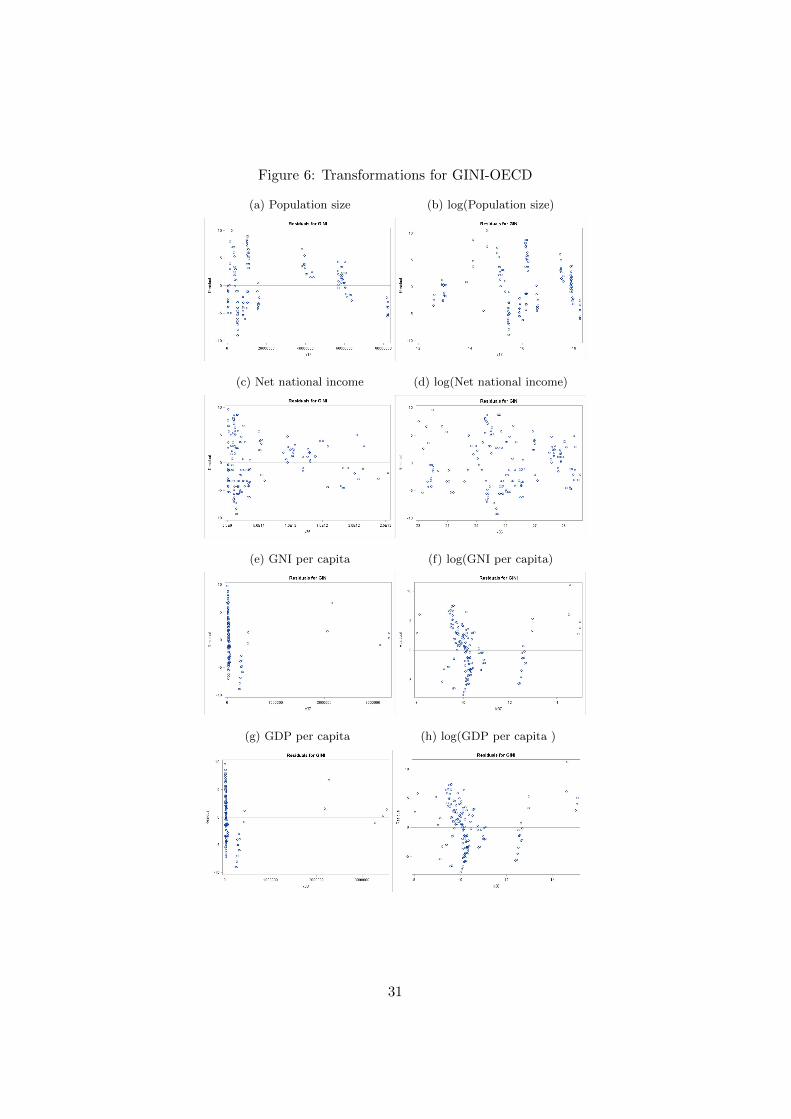
Figure 6: Transformations for GINI-OECD
(a) Population size (b) log(Population size)
(c) Net national income (d) log(Net national income)
(e) GNI per capita (f) log(GNI per capita)
(g) GDP per capita (h) log(GDP per capita )
31
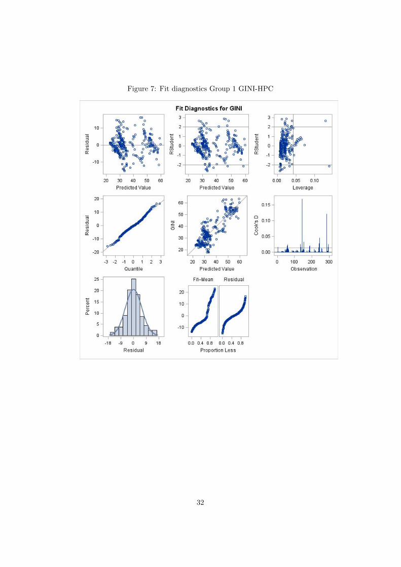
Figure 7: Fit diagnostics Group 1 GINI-HPC
32

Figure 8: Fit diagnostics Group 3 GINI-HPC
33
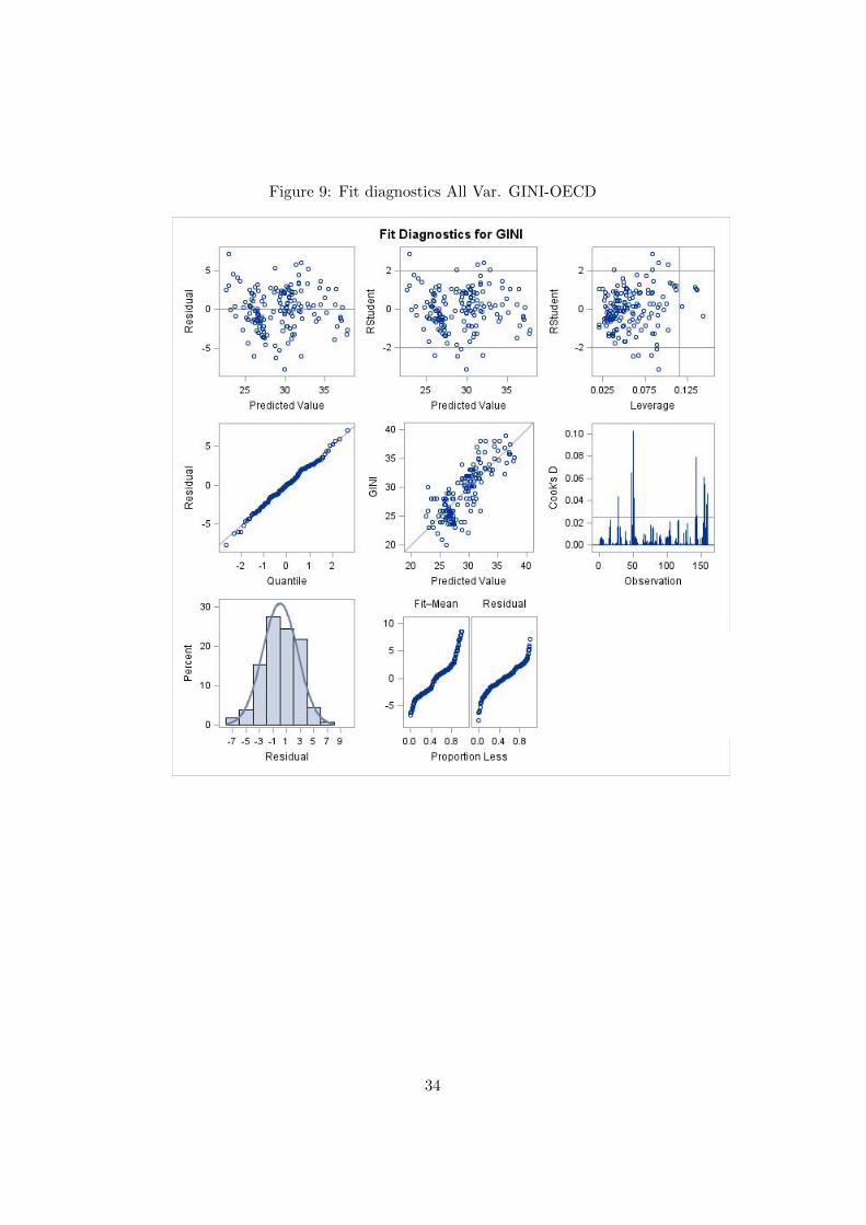
Figure 9: Fit diagnostics All Var. GINI-OECD
34
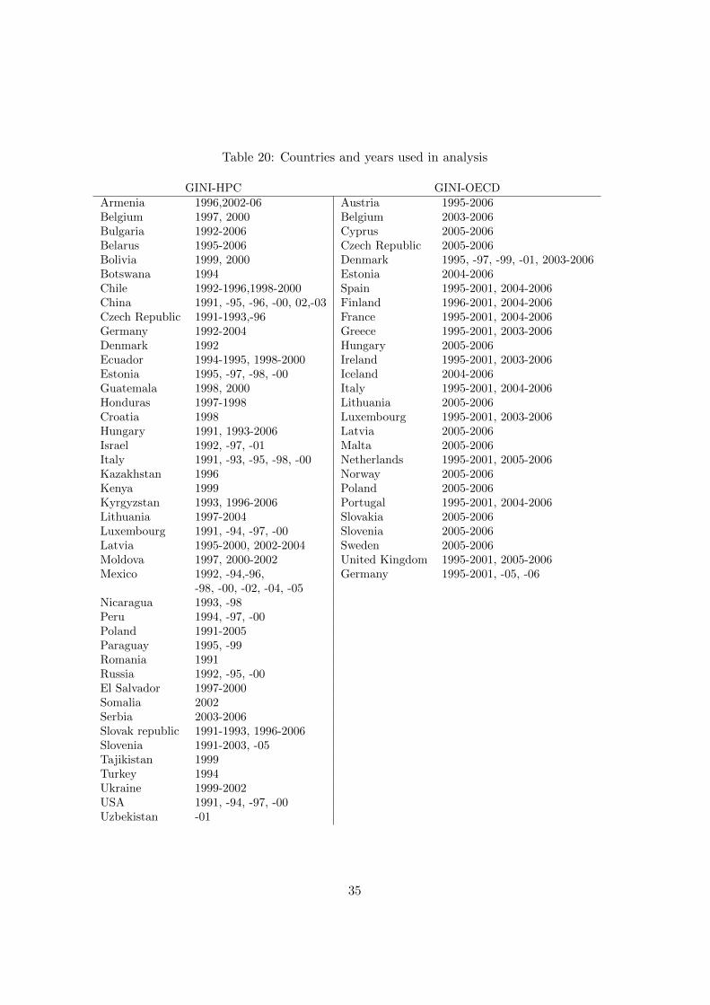
Table 20: Countries and years used in analysis
GINI-HPC GINI-OECDArmenia 1996,2002-06 Austria 1995-2006Belgium 1997, 2000 Belgium 2003-2006Bulgaria 1992-2006 Cyprus 2005-2006Belarus 1995-2006 Czech Republic 2005-2006Bolivia 1999, 2000 Denmark 1995, -97, -99, -01, 2003-2006Botswana 1994 Estonia 2004-2006Chile 1992-1996,1998-2000 Spain 1995-2001, 2004-2006China 1991, -95, -96, -00, 02,-03 Finland 1996-2001, 2004-2006Czech Republic 1991-1993,-96 France 1995-2001, 2004-2006Germany 1992-2004 Greece 1995-2001, 2003-2006Denmark 1992 Hungary 2005-2006Ecuador 1994-1995, 1998-2000 Ireland 1995-2001, 2003-2006Estonia 1995, -97, -98, -00 Iceland 2004-2006Guatemala 1998, 2000 Italy 1995-2001, 2004-2006Honduras 1997-1998 Lithuania 2005-2006Croatia 1998 Luxembourg 1995-2001, 2003-2006Hungary 1991, 1993-2006 Latvia 2005-2006Israel 1992, -97, -01 Malta 2005-2006Italy 1991, -93, -95, -98, -00 Netherlands 1995-2001, 2005-2006Kazakhstan 1996 Norway 2005-2006Kenya 1999 Poland 2005-2006Kyrgyzstan 1993, 1996-2006 Portugal 1995-2001, 2004-2006Lithuania 1997-2004 Slovakia 2005-2006Luxembourg 1991, -94, -97, -00 Slovenia 2005-2006Latvia 1995-2000, 2002-2004 Sweden 2005-2006Moldova 1997, 2000-2002 United Kingdom 1995-2001, 2005-2006Mexico 1992, -94,-96, Germany 1995-2001, -05, -06
-98, -00, -02, -04, -05Nicaragua 1993, -98Peru 1994, -97, -00Poland 1991-2005Paraguay 1995, -99Romania 1991Russia 1992, -95, -00El Salvador 1997-2000Somalia 2002Serbia 2003-2006Slovak republic 1991-1993, 1996-2006Slovenia 1991-2003, -05Tajikistan 1999Turkey 1994Ukraine 1999-2002USA 1991, -94, -97, -00Uzbekistan -01
35

Table 21: Explanatory variables
Variable Included in data set
GINI-OECD GINI-HPCAgricultural land (% of land area) x xAlternative and nuclear energy (% of total energy use) x xRatio of female to male secondary enrolment (%) x xDeath rate, crude (per 1,000 people) x xFertility rate, total (births per woman) x xLife expectancy at birth, total (years) x xMortality rate, infant (per 1,000 live births) x xPopulation ages 0-14 (% of total) x xPopulation ages 15-64 (% of total) x xPopulation ages 65 and above (% of total) x xInternet users (per 100 people) x xEmployment to population ratio, 15+, female (%) x xEmployment to population ratio, 15+, male (%) x xGDP per person employed (constant 1990 PPP $) x xLabour force with secondary education, female (% of female labour force) xLabour force with secondary education, male (% of male labour force) xLabour force with primary education (% of total) xLabuor force, female (% of total labour force) x xUnemployment, total (% of total labour force) x xFemale legislators, senior officials and managers (% of total) xElectric power consumption (kWh per capita) x xPopulation density (people per sq. km of land area) x xUrban population (% of total) x xArmed forces personnel (% of total labour force) x xLOG(Population, total) x xLOG(Adjusted net national income (current US$)) x xLOG(GNI per capita (constant LCU)) x xLOG(GDP per capita (constant LCU)) x x
36

B Lorenz curve
The Lorenz curve is a curve that is used to calculate inequality, althoughoften used for income or wealth it can be used in varying ways such as di-versity in demographics or populations in ecology. The curve is based onthe cumulative distribution. The Lorenz curve shows the cumulative shareof income aggregating to each category of the population, from lowest torichest.ForP= Cumulative share of populationC= Cumulative share of incomeI= Share of income
Perfect equality Ex. of income dist.
Income category P I C I C
Richest 20% 100 20 100 40 100
2nd richest 20% 80 20 80 30 60
3rd richest 20% 60 20 60 15 30
4th richest 20% 40 20 40 10 15
Poorest 20% 20 20 20 5 5
The examples in Table B is demonstrated in Figure 10 below, where thecurve corresponds to the Ex. of income dist. and the diagonal to perfectequality.
Figure 10: The Lorenz curve [1]
37