Embed Size (px)
Citation preview
An Introduction to the Analysis of Rare EventsNate Derby, Stakana Analytics, Seattle, WA
ABSTRACT
Analyzing rare events like disease incidents, natural disasters, or component failures requires specialized statisticaltechniques since common methods like linear regression (PROC REG) are inappropriate. In this paper, we’ll firstexplain what it means to use a statistical model, then explain why the most common one (linear regression)is inappropriate for rare events. Then we’ll introduce the most basic statistical model for rare events: Poissonregression (using PROC GENMOD or PROC COUNTREG).
KEYWORDS: SAS, Poisson regression, PROC COUNTREG.
The graphical output in this paper is from SAS 9.3 TS1M0. All data sets and SAS code used in this paper aredownloadable from www.nderby.org/docs/RareEvents.zip.
INTRODUCTION: STATISTICAL MODELING WITH LINEAR REGRESSION
Suppose we have a data set of two variables of n observations, written as Xi and Yi for the i th observation. Ourobjective is to use (known) Xi to get an estimate of (unknown) Yi . That is, while we know both Xi and Yi in ourdata set of past events, to predict future events with our model, we will know Xi only.
As a simple example, let’s look at Figure 1 on page 2, generated from PROC GPLOT:
SYMBOL1 HEIGHT=3 COLOR=blue;
PROC GPLOT DATA=home.fuel;PLOT fuel*dlic=1 / ...;
RUN;
This data set, taken from Weisberg (2005, pp. 15-17, 52-64), shows the percentage of the adult population witha driver’s license (hereafter referred to as driver population percentage) and per capita fuel consumption for eachof the 50 states and the District of Columbia, with all data from 2001. We want to look at the effect of the driverpopulation percentage on per capital fuel consumption – meaning that we’d like to estimate the state per capitafuel consumption Y , given the state population percentage X .1 We can do this using a statistical model.
When we create a statistical model, we really mean that we’re going to fit a trend line to the data. Meaning, wewant to fit a line (or certain types of curves, as described on page 4) that best describes the general trend of thedata. Most of the time, the data don’t fit a linear trend exactly, but we can use a variety of statistical algorithmsto find the line that fits the data better than any other lines according to some criteria. Mathematically, we fit theequation
Yi = β0 + β1Xi︸ ︷︷ ︸linear trend
+ εi︸︷︷︸error term
where β0 and β1 are unknown quantities (called parameters) that we will need to estimate to make our model.The error term εi is simply the difference between our linear trend line β0 + β1Xi and the data point Yi . This termnecessary in the equation above, since there will always be some remainder term after the linear trend.
When we fit a model, we mean that we have estimates for β0 and β1, denoted β0 and β1 (the hat · designates theestimate of something), which means that if we have Xi , we can estimate the data point Yi by
Yi = β0 + β1Xi . (1)1As described in Weisberg (2005, pp. 52-64), there are actually many other variables that have an effect on per capita fuel consumption.
Here, we’re looking at just one of them.
1

Ann
ual F
uel C
onsu
mpt
ion
per
Pers
on (
x 10
00 g
allo
ns)
30
50
70
90
Driver Population Percentage
70% 80% 90% 100% 110%
Fuel Consumption vs Driver Population PercentageScatterplot
Figure 1: Scatterplot of population percentage with a driver’s license and per capita fuel consumption for each ofthe 50 states and the District of Columbia, from 2001. Data set is described in Weisberg (2005, pp. 15-17, 52-64) and ultimately from US DoT (2001). Note that data points with a driver population percentage over 100% areperfectly legit, as many driver license holders are residents of another state and thus not counted in the population.
As mentioned above, this was our objective: To estimate (unknown) Yi from (known) Xi . That’s what linearregression does.
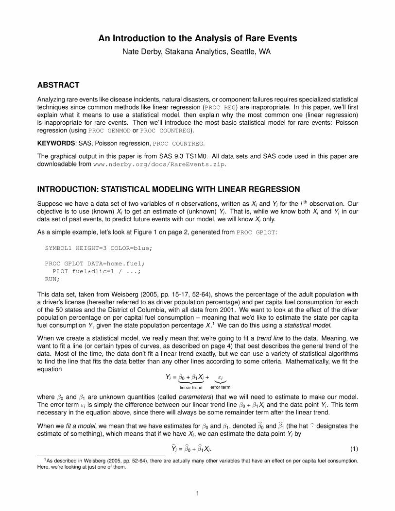
As an example, suppose we want to find a line that best fits the data shown in Figure 1 – meaning we want to findestimates for β0 and β1 in equation (1) on page 1. We can do this in SAS via PROC REG or a number of otherprocedures, but to make a simple graph, there’s a trick we can do:
SYMBOL1 COLOR=blue ...;SYMBOL2 LINE=1 COLOR=red INTERPOL=rl ...;
PROC GPLOT DATA=home.fuel;...PLOT fuel*dlic=1
fuel*dlic=2 / ... OVERLAY;RUN;
The INTERPOL=rl option tells SAS to include a regression line in the output (rl = “regression linear”), which wesee in Figure 2(a) on page 3. Doing this gives the equation of the regression line in the log output:
NOTE: Regression equation : fuel = 9.617975 + 57.20502*dlic.
So that in our equation (1) on page 1, given the driver population percentage DLICi , our estimate of the per capitafuel consumption FUELi is
FUELi = β0 + β1 · DLICi = 9.617975 + 57.20502 · DLICi .
2
(a)
Ann
ual F
uel C
onsu
mpt
ion
per
Pers
on (
x 10
00 g
allo
ns)
30
50
70
90
Driver Population Percentage
70% 80% 90% 100% 110%
Fuel Consumption vs Driver Population PercentageLinear Regression Line
(b)
Ann
ual F
uel C
onsu
mpt
ion
per
Pers
on (
x 10
00 g
allo
ns)
30
50
70
90
Driver Population Percentage
70% 80% 90% 100% 110%
Fuel Consumption vs Driver Population PercentageLinear Regression Line + 95% Prediction Bounds
Figure 2: Fuel scatterplot (a) with a linear regression line only and (b) with 95% prediction bounds. Note thatdata points with a driver population percentage over 100% are perfectly legit, as many driver license holders areresidents of another state and thus not counted in the population.
3

In addition to giving us estimates of β0, β1 and this Yi (equal to β0 + β1Xi ), linear regression gives us much moreoutput. For example, it gives us estimates of how accurate each of those estimates are by giving us predictionintervals of the output Yi . A 95% prediction interval of the dependent variable Yi tells us that we are 95% sure thatthe predicted model of Yi (given Xi is within this interval. This definition is analogous for any percentage. To showthis graphically in SAS, we can follow a similar trick as above:
SYMBOL1 COLOR=blue ...;SYMBOL3 COLOR=red INTERPOL=rlcli ...;
PROC GPLOT DATA=home.fuel;...PLOT fuel*dlic=1
fuel*dlic=3 / ... OVERLAY;RUN;
The INTERPOL=rlcli option tells SAS to include a regression line in the output with prediction intervals (rlcli= “regression linear with confidence limits for the individual observations”), which we see in Figure 2(b) on page3. There are 95% prediction bounds, where roughly 95% of the data fall between the two dotted lines. Indeed, ofthe 51 data points shown, you can see that all but three data points are within those bounds, thus 48
51 = 94.12% ofthe data are within those bounds, as expected.
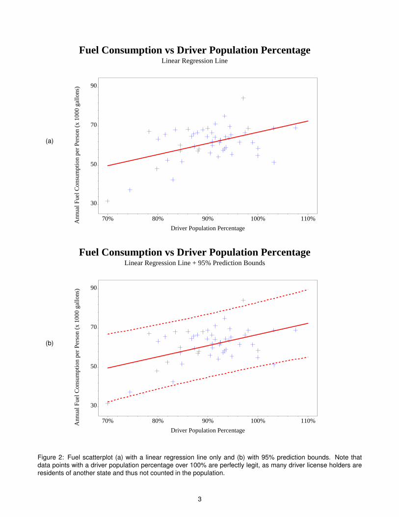
Linear regression need not fit a straight line. Indeed, the word “linear” simply means that the equation follows alinear form. However, you can also have a quadratic or cubic trend, meaning a linear equation with powers of Xiup to 2 or 3:
Quadratic trend: Yi = β0 + β1Xi + β2X 2i + εi
Cubic trend: Yi = β0 + β1Xi + β2X 2i + β3X 3
i + εi
This can be graphed in SAS via the INTERPOL=rqcli or INTERPOL=rccli options in the SYMBOL statements(or without cli for the line only). As before, SAS gives you the equation of the line in the log output. The resultsare shown in Figure 3(a)-(b) on page 5. As before, we have roughly 95% of the data within these bounds (in eachcase, only two data points = 2
51 = 3.92% are left out).
The choice of whether to use a linear, quadratic or cubic regression line depends on the context. The addedflexibility gives a better fit, but it’s more difficult to interpret the results. That is, for a linear regression line, for aone-unit change in X , Y increases by β1. But this doesn’t hold for a quadratic or cubic fit. Furthermore, you needmore data to give you statistically valid results, since you’re now estimating one or two more parameters from thesame data set. Lastly, these problems become worse when we model Y on more variables than just X . As such,it’s typical to just use linear regression, even if a quadratic or cubic model fits the data better.
4
(a)
Ann
ual F
uel C
onsu
mpt
ion
per
Pers
on (
x 10
00 g
allo
ns)
30
50
70
90
Driver Population Percentage
70% 80% 90% 100% 110%
Fuel Consumption vs Driver Population PercentageQuadratic Regression Line + 95% Prediction Bounds
(b)
Ann
ual F
uel C
onsu
mpt
ion
per
Pers
on (
x 10
00 g
allo
ns)
30
50
70
90
Driver Population Percentage
70% 80% 90% 100% 110%
Fuel Consumption vs Driver Population PercentageCubic Regression Line + 95% Prediction Bounds
Figure 3: Fuel scatterplot with a (a) quadratic and (b) cubic regression line, each with 95% prediction bounds.Note that data points with a driver population percentage over 100% are perfectly legit, as many driver licenseholders are residents of another state and thus not counted in the population.
5
LINEAR REGRESSION WITH RARE EVENTS
The term rare events simply refers to events that don’t happen very frequently, but there’s no rule of thumb asto what it means to be “rare.” Any disease incidence is generally considered a rare event (van Belle (2008)).Therefore, if an event happens about as rarely as a given disease (such as earthquakes or component failures),we can consider it a rare event.
For rare events, we look at counts of how many events happened within a given time period. If the events inquestion really are rare, we would expect most of the observations to be in the single digits, but clearly thisdepends on the time period in question. For example, the number of earthquakes in various regions of the WestCoast in the past ten years would be in the single digits, but the same quantity over the past million years wouldmost definitely not be! As such, we can devise our own rule of thumb for what constitutes as rare: If the numberof events within a certain time period is often in the single digits.
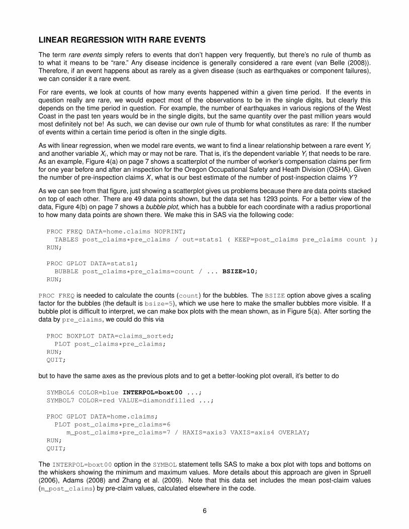
As with linear regression, when we model rare events, we want to find a linear relationship between a rare event Yiand another variable Xi , which may or may not be rare. That is, it’s the dependent variable Yi that needs to be rare.As an example, Figure 4(a) on page 7 shows a scatterplot of the number of worker’s compensation claims per firmfor one year before and after an inspection for the Oregon Occupational Safety and Heath Division (OSHA). Giventhe number of pre-inspection claims X , what is our best estimate of the number of post-inspection claims Y ?
As we can see from that figure, just showing a scatterplot gives us problems because there are data points stackedon top of each other. There are 49 data points shown, but the data set has 1293 points. For a better view of thedata, Figure 4(b) on page 7 shows a bubble plot, which has a bubble for each coordinate with a radius proportionalto how many data points are shown there. We make this in SAS via the following code:
PROC FREQ DATA=home.claims NOPRINT;TABLES post_claims*pre_claims / out=stats1 ( KEEP=post_claims pre_claims count );
RUN;
PROC GPLOT DATA=stats1;BUBBLE post_claims*pre_claims=count / ... BSIZE=10;
RUN;
PROC FREQ is needed to calculate the counts (count) for the bubbles. The BSIZE option above gives a scalingfactor for the bubbles (the default is bsize=5), which we use here to make the smaller bubbles more visible. If abubble plot is difficult to interpret, we can make box plots with the mean shown, as in Figure 5(a). After sorting thedata by pre_claims, we could do this via
PROC BOXPLOT DATA=claims_sorted;PLOT post_claims*pre_claims;
RUN;QUIT;
but to have the same axes as the previous plots and to get a better-looking plot overall, it’s better to do
SYMBOL6 COLOR=blue INTERPOL=boxt00 ...;SYMBOL7 COLOR=red VALUE=diamondfilled ...;
PROC GPLOT DATA=home.claims;PLOT post_claims*pre_claims=6
m_post_claims*pre_claims=7 / HAXIS=axis3 VAXIS=axis4 OVERLAY;RUN;QUIT;
The INTERPOL=boxt00 option in the SYMBOL statement tells SAS to make a box plot with tops and bottoms onthe whiskers showing the minimum and maximum values. More details about this approach are given in Spruell(2006), Adams (2008) and Zhang et al. (2009). Note that this data set includes the mean post-claim values(m_post_claims) by pre-claim values, calculated elsewhere in the code.
6
(a)
Post
-Ins
pect
ion
Cla
ims
0
2
4
6
8
10
12
14
16
18
Pre-Inspection Claims
0 2 4 6 8 10 12 14 16
Pre- vs Post-Inspection ClaimsScatterplot
(b)
Post
-Ins
pect
ion
Cla
ims
0
2
4
6
8
10
12
14
16
18
Pre-Inspection Claims
0 2 4 6 8 10 12 14 16
Pre- vs Post-Inspection ClaimsBubble Plot
Figure 4: (a) A scatterplot and (b) a bubble plot of the number of the number of worker’s compensation claimsfor one year before and after an inspection by the Oregon Occupational Safety and Health Division (OSHA), forindividual firms.
7

(a)
Post
-Ins
pect
ion
Cla
ims
0
2
4
6
8
10
12
14
16
18
Pre-Inspection Claims
0 2 4 6 8 10 12 14 16
Pre- vs Post-Inspection ClaimsBox Plots
(b)
Freq
uenc
y
0
100
200
300
400
500
600
700
800
Pre-Inspection Claims
0 2 4 6 8 10 12 14 16
Pre-Inspection ClaimsHistogram
Figure 5: (a) A box plot of the number of pre- and post-Oregon OSHA inspection claims by individual firm, with thered diamond indicating the mean, and (b) a histogram of the number of pre-inspection claims.
8

While this box plot shows the distribution of the data, it doesn’t show how many data points are in each category.We can do this with a simple histogram, which we’re making with PROC GPLOT to keep the horizontal axisconsistent:
SYMBOL9 COLOR=blue INTERPOL=boxf00 CV=blue ...;
PROC GPLOT DATA=stats2;PLOT count*pre_claims=9 / HAXIS=axis3 VAXIS=axis6;
RUN;QUIT;
Again, we make use of the INTERPOL option in the SYMBOL statement to make our graphs. In this case, theINTERPOL=boxf00 tells us to make a box plot, but filled with the CV color (blue). There are no whiskers becausewe read the data set stats2 (in the downloadable code), which creates a data set showing only the final talliesand the value 0 for each value of pre_claims for which there are data.
The main thing to see in the box plots and histograms is that the data are highly skewed, or lopsided. Certainlywe can see from the histogram in Figure 5(b) on page 8 that the pre-claim claims are highly skewed, with by farthe most data (number of firms) with 0 claims. This would tell us that having a pre-inspection claim is a rare event,but as mentioned before, what we really care about in the analysis of rare events is the outcome variable, whichin this case is the number of post-inspection claims. These are shown to be highly skewed in the box plots in anumber of ways:
• The standard definition of skewness, as explained in e.g., Derby (2009, p. 6), is that the distribution is left-skewed (or left-tailed) if the mean is less than the median, and right-skewed (right-tailed) is the mean is morethan the median. In Figure 5(a), with the mean and median represented by the red diamond and blue centerline of the box, we clearly see this is the case for 3, 4, 5 and 7 pre-inspection claims.
• At first glance, it’s difficult to see what’s happening for 0, 1 or 2 pre-inspection claims because we don’t see acomplete box and whiskers plot. We get a better picture when we combine this with the bubble plot of Figure4(b) on page 7:
– For 0 pre-inspection claims (X = 0), the data are so concentrated at 0 post-inspection claims (Y = 0)that the minimum, 25 th percentile, median and 75 th percentile are all at Y = 0. This is why we don’tsee a box at all.
– For 1 pre-inspection claim (X = 1), the minimum, 25 th percentile and median are all at Y = 0, so wejust see the top half of the box. The data are still highly right skewed (mean > median).
– For 2 pre-inspection claims (X = 2), the minimum, 25 th percentile and median are again all at Y = 0,so we once again just see the top half of the box. Once again, the mean > the median so the data areagain right-skewed.
• With 6 pre-inspection claims, we only have three data points. It’s a little left-skewed (mean less than themedian), but with so few data points, it hardly matters.
• There is no real distribution to speak of for 8, 9, 13 and 16 pre-inspection claims, since each of thosecategories has one data point.
There is one subtle but important additional point from the box plots: The data get less skewed for larger valuesof X .
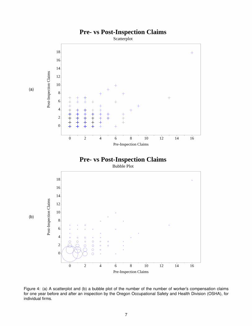
Now that we have a good visualization of the data, how should we model it? That is, what is a trend line that fitsthe data well? Unfortunately, linear regression doesn’t help us very much. Figure 6(a) on page 10 shows a linearfit, whereas Figures 6(b) and 7(a) (page 11) show a quadratic and cubic fit. At first glance, this might look good.The lines go through the boxes, right? The real thing to look for are the 95% prediction bounds. There are twomain points to notice:
• The median (the horizontal line in the center of the box) is usually below the linear regression line. This tellsus that more than 50% of the data is below the line for these categories.
• As noted before, the prediction bounds are symmetric around the regression line – meaning, they are thesame distance above it as they are below it. But the data are not symmetric around the median values. Thisis a fundamental mismatch between linear regression and rare events.
9
(a)
Post
-Ins
pect
ion
Cla
ims
0
2
4
6
8
10
12
14
16
18
Pre-Inspection Claims
0 2 4 6 8 10 12 14 16
Pre- vs Post-Inspection ClaimsLinear Regression Line + 95% Prediction Bounds
(b)
Post
-Ins
pect
ion
Cla
ims
0
2
4
6
8
10
12
14
16
18
Pre-Inspection Claims
0 2 4 6 8 10 12 14 16
Pre- vs Post-Inspection ClaimsQuadratic Linear Regression Line + 95% Prediction Bounds
Figure 6: A box plot of the number of pre- and post-Oregon OSHA inspection claims by individual firm, with the(a) linear and (b) quadratic regression lines and their 95% prediction bounds.
10

(a)
Post
-Ins
pect
ion
Cla
ims
0
2
4
6
8
10
12
14
16
18
Pre-Inspection Claims
0 2 4 6 8 10 12 14 16
Pre- vs Post-Inspection ClaimsCubic Linear Regression Line + 95% Prediction Bounds
(b)
Post
-Ins
pect
ion
Cla
ims
0
2
4
6
8
10
12
14
16
18
Pre-Inspection Claims
0 2 4 6 8 10 12 14 16
Pre- vs Post-Inspection ClaimsConnecting the Means
Figure 7: A box plot of the number of pre- and post-Oregon OSHA inspection claims by individual firm, with (a) thecubic regression line and 95% prediction bounds and (b) just connecting the means.
11

This is important because we can get erroneous results. In statistical terms, we would say that the data violate afundamental assumption about the linear regression model. You can see the erroneous results by looking at thedata outside the 95% prediction bounds. We should have just 5% of our data outside of those bounds. However,visually you can see that there is actually a lot of data outside of those bounds. So not only is the trend line biased(more over the median lines than below them), but the intervals are off as well. That is, we have a wrong trendline and a false level of accuracy. If we didn’t look at any of these graphs, it would look like we have reallyaccurate models. This is completely false.
If linear regression doesn’t work, what are we to do? We would like a smooth trend line with some intervals. Onesimple method could be to connect the mean lines (Figure 7(b) on page 11), but this isn’t smooth, it’s not a model,and it doesn’t give us any intervals.
POISSON REGRESSION
The solution is actually very easy: We go through a similar process to linear regression, but instead of assuminga symmetric, continuous distribution (the normal distribution), we assume a skewed, discrete distribution (thePoisson distribution). All we are really doing is applying a theoretical distribution that better fits the data better.
Recall that for linear regression, we fit the model
Yi = β0 + β1Xi + εi (2)
which really means
Yi follows a symmetric (normal) distribution with mean E[Yi ] = β0 + β1Xi .
since in equation (2), we assume that the mean of the error term εi is zero. However, for rare events, this doesn’twork because the effect is highly nonlinear, as shown by connecting the mean values in Figure 6(b) on page 10.A solution to this is to change the above somewhat to
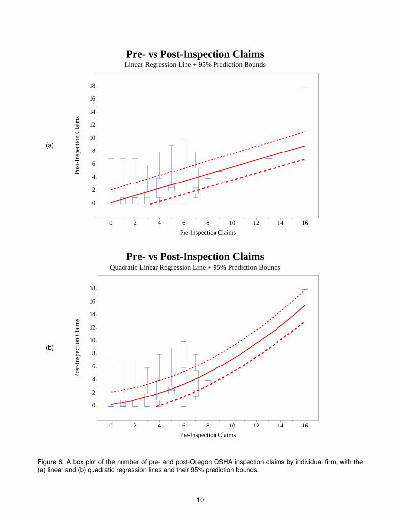
Yi follows a right-skewed distribution with mean E[Yi ] = exp(β0 + β1Xi ).
There are two parts to this:
• Yi follows a right-skewed distribution. However, to fit our data situation, we’d like a distribution which becomesless skewed for larger values of E[Yi ].
• The expected value is exp(β0 + β1Xi ) = eβ0+β1Xi rather than β0 + β1Xi itself.2 This is just a way to make acurve that starts out small but rapidly increases, as shown in Figure 8 on page 13. The increase can thenbe scaled by the parameters β0 and β1.
It turns out that the Poisson distribution is a skewed distribution which fits our needs rather well. An introduction tothis distribution is shown in Lavery (2010). This approach might seem complicated, but mathematically, it makesthe estimation technique quite easy. We’ll see later that using a regression with the Poisson distribution (calledPoisson regression) gives a better fit for our data, for both of the reasons above.
FITTING THE MODEL
Poisson regression is easily implemented in SAS with either PROC GENMOD or PROC COUNTREG:
• PROC GENMOD is part of the SAS/STAT package and is more generalized, so it provides more output.
• PROC COUNTREG is part of the SAS/ETS package and is more specialized, so it provides less output.
Both approaches will be shown below.2The number e is equal to 2.71828....
12
y = exp(x)
x
y
0 1 2 3
2
4
6
8
10
Figure 8: The function y = exp(x) = ex . The number e is equal to 2.71828....
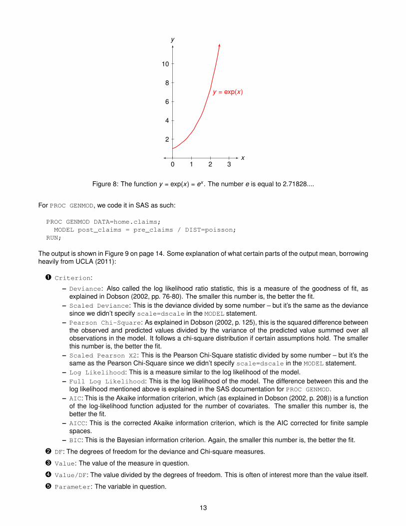
For PROC GENMOD, we code it in SAS as such:
PROC GENMOD DATA=home.claims;MODEL post_claims = pre_claims / DIST=poisson;
RUN;
The output is shown in Figure 9 on page 14. Some explanation of what certain parts of the output mean, borrowingheavily from UCLA (2011):
Ê Criterion:
– Deviance: Also called the log likelihood ratio statistic, this is a measure of the goodness of fit, asexplained in Dobson (2002, pp. 76-80). The smaller this number is, the better the fit.
– Scaled Deviance: This is the deviance divided by some number – but it’s the same as the deviancesince we didn’t specify scale=dscale in the MODEL statement.
– Pearson Chi-Square: As explained in Dobson (2002, p. 125), this is the squared difference betweenthe observed and predicted values divided by the variance of the predicted value summed over allobservations in the model. It follows a chi-square distribution if certain assumptions hold. The smallerthis number is, the better the fit.
– Scaled Pearson X2: This is the Pearson Chi-Square statistic divided by some number – but it’s thesame as the Pearson Chi-Square since we didn’t specify scale=dscale in the MODEL statement.
– Log Likelihood: This is a measure similar to the log likelihood of the model.– Full Log Likelihood: This is the log likelihood of the model. The difference between this and the
log likelihood mentioned above is explained in the SAS documentation for PROC GENMOD.– AIC: This is the Akaike information criterion, which (as explained in Dobson (2002, p. 208)) is a function
of the log-likelihood function adjusted for the number of covariates. The smaller this number is, thebetter the fit.
– AICC: This is the corrected Akaike information criterion, which is the AIC corrected for finite samplespaces.
– BIC: This is the Bayesian information criterion. Again, the smaller this number is, the better the fit.
Ë DF: The degrees of freedom for the deviance and Chi-square measures.
Ì Value: The value of the measure in question.
Í Value/DF: The value divided by the degrees of freedom. This is often of interest more than the value itself.
Î Parameter: The variable in question.
13

The GENMOD Procedure
Model Information
Data Set HOME.CLAIMSDistribution PoissonLink Function LogDependent Variable post_claims Post-Inspection
Claims
Number of Observations Read 1310Number of Observations Used 1293Missing Values 17
Criteria For Assessing Goodness Of Fit
Criterion DF Value Value/DFÊ Ë Ì Í
Deviance 1291 1623.3440 1.2574Scaled Deviance 1291 1623.3440 1.2574Pearson Chi-Square 1291 2070.2270 1.6036Scaled Pearson X2 1291 2070.2270 1.6036Log Likelihood -972.7283Full Log Likelihood -1309.5635AIC (smaller is better) 2623.1270AICC (smaller is better) 2623.1363BIC (smaller is better) 2623.4564
Algorithm converged.
Analysis Of Maximum Likelihood Parameter Estimates
Standard Wald 95% Confidence WaldParameter DF Estimate Error Limits Chi-Square Pr > ChiSq
Î Ï Ð Ñ Ò ÓIntercept 1 -0.8425 0.0415 -0.9238 -0.7611 412.14 <.0001pre_claims 1 0.2686 0.0098 0.2493 0.2878 749.10 <.0001Scale 0 1.0000 0.0000 1.0000 1.0000
NOTE: The scale parameter was held fixed.
Figure 9: Output of a Poisson regression using PROC GENMOD.
Ï Estimate: The estimate of the coefficient of the variable in question.
Ð Standard Error: The standard error of the estimate.
Ñ Wald 95% Confidence Limits: 95% confidence limits for the estimate. For an estimate to be consideredstatistically significant, we do not want these limits to include zero.
Ò Wald Chi-Square: The Wald Chi-square statistic for the hypothesis test that the parameter is equal tozero.
Ó Pr > ChiSq: The p-value of the Wald Chi-square statistic.
Before we interpret these results, let’s fit the model with PROC COUNTREG:
14
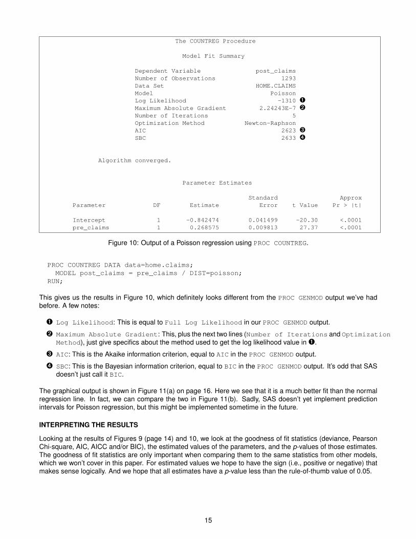
The COUNTREG Procedure
Model Fit Summary
Dependent Variable post_claimsNumber of Observations 1293Data Set HOME.CLAIMSModel PoissonLog Likelihood -1310 ÊMaximum Absolute Gradient 2.24243E-7 ËNumber of Iterations 5Optimization Method Newton-RaphsonAIC 2623 ÌSBC 2633 Í
Algorithm converged.
Parameter Estimates
Standard ApproxParameter DF Estimate Error t Value Pr > |t|
Intercept 1 -0.842474 0.041499 -20.30 <.0001pre_claims 1 0.268575 0.009813 27.37 <.0001
Figure 10: Output of a Poisson regression using PROC COUNTREG.
PROC COUNTREG DATA data=home.claims;MODEL post_claims = pre_claims / DIST=poisson;
RUN;
This gives us the results in Figure 10, which definitely looks different from the PROC GENMOD output we’ve hadbefore. A few notes:
Ê Log Likelihood: This is equal to Full Log Likelihood in our PROC GENMOD output.
Ë Maximum Absolute Gradient: This, plus the next two lines (Number of Iterations and OptimizationMethod), just give specifics about the method used to get the log likelihood value in Ê.
Ì AIC: This is the Akaike information criterion, equal to AIC in the PROC GENMOD output.
Í SBC: This is the Bayesian information criterion, equal to BIC in the PROC GENMOD output. It’s odd that SASdoesn’t just call it BIC.
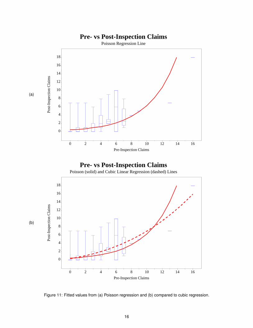
The graphical output is shown in Figure 11(a) on page 16. Here we see that it is a much better fit than the normalregression line. In fact, we can compare the two in Figure 11(b). Sadly, SAS doesn’t yet implement predictionintervals for Poisson regression, but this might be implemented sometime in the future.
INTERPRETING THE RESULTS
Looking at the results of Figures 9 (page 14) and 10, we look at the goodness of fit statistics (deviance, PearsonChi-square, AIC, AICC and/or BIC), the estimated values of the parameters, and the p-values of those estimates.The goodness of fit statistics are only important when comparing them to the same statistics from other models,which we won’t cover in this paper. For estimated values we hope to have the sign (i.e., positive or negative) thatmakes sense logically. And we hope that all estimates have a p-value less than the rule-of-thumb value of 0.05.
15
(a)
Post
-Ins
pect
ion
Cla
ims
0
2
4
6
8
10
12
14
16
18
Pre-Inspection Claims
0 2 4 6 8 10 12 14 16
Pre- vs Post-Inspection ClaimsPoisson Regression Line
(b)
Post
-Ins
pect
ion
Cla
ims
0
2
4
6
8
10
12
14
16
18
Pre-Inspection Claims
0 2 4 6 8 10 12 14 16
Pre- vs Post-Inspection ClaimsPoisson (solid) and Cubic Linear Regression (dashed) Lines
Figure 11: Fitted values from (a) Poisson regression and (b) compared to cubic regression.
16

Our fitted model is thus
E[Yi ] = exp(−0.842474 + 0.268575Xi )
where for firm i , Xi is the number of pre-inspection claims and Yi follows a Poisson distribution (with the mean andvariance equal to E[Yi ] above).
As an interpretation, we can say that
• A firm that has no pre-inspection claims has an expected of E[Yi ] = exp(−0.842474) ≈ 0.43 post-inspectionclaims. We get this by setting Xi = 0 in the above equation.
• For every pre-inspection claim that a firm has, that firm’s expected number of post-inspection claims will riseby exp(0.268575)− 1 ≈ 1.308099− 1 = 30.81%. We get this by setting
E[Yi |Xi + 1] = exp(−0.842474 + 0.268575(Xi + 1))= exp(−0.842474 + 0.268575Xi + 0.268575)= exp(−0.842474 + 0.268575Xi ) · exp(0.268575)= E[Yi |Xi ] · 1.3081.
GETTING PREDICTED COUNTS
Predicted counts means that if we have an input value X , what is the estimated value of Y = exp(β0 +β1X )? This isthe point of the model fit, and we have all the results we need from Figures 9 (page 14) and 10 (page 15) to figurethese out. We can always run a DATA step to add a column of predicted counts to an input data set. However,SAS can do this automatically with an OUTPUT OUT= option:
PROC GENMOD DATA=home.claims;MODEL post_claims = pre_claims / DIST=poisson;OUTPUT OUT=home.claims_pred PRED=predicted;
RUN;
PROC COUNTREG DATA=home.claims;MODEL post_claims = pre_claims / DIST=poisson;OUTPUT OUT=home.claims_pred PRED=predicted;
RUN;
Note that for PROC COUNTREG, you only get predicted values for unknown values of Y , whereas you get it for allvalues of Y with PROC GENMOD.
The OUTPUT OUT= statement doesn’t work for PROC COUNTREG before 9.22. In that case, use the %PROBOUNTSmacro as given in SAS Institute (2011). Sadly, prediction bounds are not (yet) available from either PROCCOUNTREG or PROC GENMOD.
We can graph the predicted values against the box plots as we did with the regression output, only using this newvariable:
SYMBOL10 COLOR=blue INTERPOL=boxt00 ...;SYMBOL11 COLOR=red INTERPOL=join MODE=include ...;
PROC GPLOT DATA=home.claims_pred;PLOT post_claims*pre_claims=10
predicted*pre_claims=11 / HAXIS=axis3 VAXIS=axis4 OVERLAY;RUN;
The result is shown in Figure 11(a) on page 16. There are a couple things to notice here, especially whencompared with the cubic regression fit in Figure 11(b):
• First of all, this is a smooth line, as opposed to the bumpy line that would result from connecting the meanpoints as in Figure 7(b) on page 11. This is one goal of a statistical model.
17
• As opposed to the cubic regression fit, or any of the regression fits of Figures 6(a) (page 10), 6(b) or 7(a)(page 11), the Poisson regression line comes very close to most of the median values. This is betterthan hitting the mean values, since the median is robust against outliers, and we are dealing with skeweddistributions.
• The Poisson regression fit even comes close to the singular values at X = 8 and X = 9.
Overall, we see visual evidence that the Poisson regression fit is a better fit of the data than the linear,quadratic, or cubic regression fits.
BEYOND POISSON REGRESSION
This paper is merely an introduction to Poisson regression. Indeed, we didn’t even cover using multiple regressors.While Poisson regression solves many problems, it still has some limitations:
• The theoretical distribution assumes that the mean is equal to the variance, which is often not the case.
• Often there can be many more zero values than the model can handle.
These two problems can be solved by using the negative binomial regression and zero-inflated Poisson/negativebinomial regression. But those topics are beyond the scope of this paper.
Lastly, note that the analysis done in this paper does not isolate the effect of inspections, and doesn’t show thatinspections have any effect at all. To do that, we need to have a control group of firms without inspections, thenincorporate a Poisson regression with a variable indicating whether the firm in question had an inspection. Again,this is outside the scope of this paper.
CONCLUSIONS
When we model a process Y with linear regression, we’re really fitting a trend line to the data, which can alsobe a curve if we incorporate squared or cube versions of the independent variable X . One important aspect oflinear regression is to give us 95% prediction bounds, between which roughly 95% of the data should be. Forlinear regression, these prediction bounds are symmetric, reflecting the fact that the data points are assumed tobe symmetrically distributed around that regression line.
For rare events, this symmetry doesn’t match the distribution of the data. In this situation, the data distributionus typically skewed, or lopsided, concentrated on a low value. Furthermore, the distribution of the independentvariable Y typically becomes less skewed for a range of values of the independent variable X . Lastly, the trend linetypically rapidly increases for larger values of the independent variable X . This behavior violates the underlyingassumptions of the linear regression model, which can give erroneous results such as a biased estimate of thetrend or prediction bounds which are too narrow (giving a false measure of accuracy).
Poisson regression solves this skewed distribution problem in two ways:
• It uses the Poisson regression to model the skewed distribution of the data.
• Rather than use a linear model of the data, it uses an exponential function, with the linear model in theexponent. This effectively models a rapid increase in the trend line which is typical of rare events.
The Poisson regression coefficients give us an estimate of the baseline estimate of the dependent variable Y (i.e.,when the independent variable X = 0) and of a percentage expected increase in Y for a one-unit increase in X .
SAS implements Poisson regression with PROC GENMOD or PROC COUNTREG, although without the predictionintervals at this time. We can effectively use PROC GRAPH to see both the data and the fitted trend line on thesame set of axes.
18

REFERENCESAdams, R. (2008), Box plots in SAS: UNIVARIATE, BOXPLOT, or GPLOT?, Proceedings of the Twenty-First
Northeast SAS Users Group Conference.http://nesug.org/proceedings/nesug08/np/np16.pdf
Derby, N. (2009), A little stats won’t hurt you, Proceedings of the 2009 Western Users of SAS SoftwareConference.http://www.wuss.org/proceedings09/09WUSSProceedings/papers/ess/ESS-Derby.pdf
Dobson, A. J. (2002), An Introduction to Generalized Linear Models, second edn, Chapman and Hall/CRC, BocaRaton, FL.
Lavery, R. (2010), An animated guide: An introduction to Poisson regression, Proceedings of the Twenty-ThirdNortheast SAS Users Group Conference.http://www.nesug.org/Proceedings/nesug10/sa/sa04.pdf
SAS Institute (2011), Sample 26161: Predicted counts and count probabilities for Poisson, negative binomial, zip,and zinb models.http://support.sas.com/kb/26/161.html
Spruell, B. (2006), SAS Graph: Introduction to the world of boxplots, Proceedings of the Thirteenth SouthEastSAS Users Group Conference.http://analytics.ncsu.edu/sesug/2006/DP06_06.PDF
UCLA (2011), Annotated SAS output: Poisson regression, Academic Technology Services: Statistical ConsultingGroup.http://www.ats.ucla.edu/stat/SAS/output/sas_poisson_output.htm
US DoT (2001), Highway statistics 2001, United States Department of Transportation.http://www.fhwa.dot.gov/ohim/hs01/index.htm
van Belle, G. (2008), Statistical Rules of Thumb, second edn, John Wiley and Sons, Inc., Hoboken, NJ.
Weisberg, S. (2005), Applied Linear Regression, third edn, John Wiley and Sons, Inc., New York.
Zhang, S., Zhu, X., Zhang, S., Xu, W., Liao, J. and Gillespie, A. (2009), Producing simple and quick graphs withPROC GPLOT, Proceedings of the 2009 Pharmaceutical Industry SAS Users Conference, paper CC03.http://www.lexjansen.com/pharmasug/2009/cc/cc03.pdf
ACKNOWLEDGMENTS
We thank the Oregon Department of Consumer Affairs for working with us on this topic.
CONTACT INFORMATION
Comments and questions are valued and encouraged. Contact the author:
Nate DerbyStakana Analytics815 First Ave., Suite 287Seattle, WA [email protected]://nderby.orghttp://stakana.com
SAS and all other SAS Institute Inc. product or service names are registered trademarks or trademarks of SASInstitute Inc. in the USA and other countries. ® indicates USA registration.
Other brand and product names are trademarks of their respective companies.
19