Embed Size (px)
Citation preview

Analyse, Collaborate and Publish Statistics
for Measuring Progress in our Society using Storytelling
Prof. Mikael Jern
NCVA – National Center for Visual Analytics, ITN, Linkoping University, 60174 Norrköping, Sweden
[email protected] http://ncva.itn.liu.se
Abstract. Official statistics such as demographics, environment, health, social-economy and education from national or regional territories are a rich and important source of information for many important aspects of life. Web-enabled geovisual analytics is a technique that can help illustrating
comprehensive statistical data which for the eye are hard perceive or interpret. In this paper, we introduce “storytelling” means for the author to 1) select spatio-temporal and multivariate statistical data, 2) explore and discern trends and patterns, 3) orchestrate and describe metadata, 4) collaborate with colleagues to confirm and 5) finally publish essential gained insight and knowledge embedded as dynamic visualization “Vislet” in a blog or web page. The author can guide the reader in the directions of both context and discovery while at the same time follow the analyst’s way of logical reasoning. We are
moving away from a clear distinction between authors and readers affecting the process through which knowledge is created and the traditional models which support editorial work. Value no longer relies solely on the content but also on the ability to access this information.
1 Introduction
We live in a data-rich world where people have become familiar with notions like
GDP and sustainable development; statistics that compare countries’ economic
performance often hit the news headlines. This paper reflects a challenging applied
research task to stimulate, at global level, an exchange of best practices through
geovisual analytics reasoning. Tools are introduced to help gathering and sharing national and local initiatives aimed at measuring economic, social and environmental
developments and to engage policy makers, statisticians and the public in
collaborative activities. The global dimension of such a task responds to build a
repository of progress indicators, where experts and public users can use geovisual
analytics tools to compare situations for countries, regions or local communities. At
the same time, people want to see statistics that describe the places where they live
and capture the quality of their own lives, taking into account a broader perspective
beyond the economic one. The geographical level to which statistics are referred is,
therefore, increasingly important. Understanding the variety in regional economic
structures and performance [12] is essential knowledge for initiating development
which could improve regional competitiveness and in turn increases national growth.
The results from our research [6] make these variations more visible, providing region-by region indicators in the form of motion graphs and maps that could lead to
better identification of areas that are outperforming or lagging behind. Patterns of
growth and the persistence of inequalities are analyzed over time, highlighting the
factors responsible for them. How can such significant knowledge about these
statistical facts be collaborated and published to analysts and citizens?
The paper introduces tools [3] for an integrated statistics analysis, collaboration
and publication process facilitating storytelling aimed at producing statistical news
content in support of an automatic authoring process. The author should simply press
a button to publish the gained knowledge from a visual interactive discovery process.
We present our latest research that focuses on the most ancient of social rituals
“storytelling” - telling a story about a region’s development over time and shape the
measure of economic growth and well-being. Discoveries that more engagingly draw us into reflections about the knowledge on how life is lived - and can be improved –
from region to region and in addition let the reader dynamically participate in this
process and help advancing research critical to the dissemination of official statistics
by means of web-enabled tools. A platform for dissemination of embedded dynamic
statistics data visualization with the analytics sense-making metadata (story) joined
together and publishable in any web pages such as blogs, wikis etc. Publishing official
statistics through assisted content creation with emphasis on visualization and
metadata represents a key advantage of our storytelling and has the potential to
change the terms and structures for learning.
Geovisual analytics tools [1, 2] that address a challenge to advance research critical
to visualization of statistics data facilitating seamless integration of visual exploration, collaboration and dissemination. The global dimension of such a task responds to
build a repository of progress indicators, where experts and public users can use
geovisual analytics tools to compare situations for countries, regions or local
communities. A storytelling mechanism enables the transition of tedious statistics data
into heterogeneous, open and communicative sense-making news entities with
integrated contextual metadata that will emphasize on content creation aspects and
where dynamic embedded temporal visualization could engage the user.
We build upon previous research [8] and our web-enabled application Statistics
eXplorer [4] platform that is emerging as a de facto standard in the statistics
community for exploring and communicating statistics data. A novel storytelling
mechanism is introduced for the author to: 1) import regional statistical data; 2) explore and make discoveries through trends and patterns and derive insight - gained
knowledge is the foundation for 3) creating a story that can be 4) shared with
colleagues and reach consensus and trust. Visual discoveries are captured into
snapshots together with descriptive metadata and hyperlinks in relation to the
analytics reasoning. The author gets feedback from colleagues, adopts the story and 5)

finally publishes “tell-a-story” to the community using a “Vislet” that is embedded in
blogs or Web pages.
2 Related Work
Volumes of official national and sub-national statistical data are today generated
by statistics offices all over the world and stored in public databases such as the
Worldbank or OECD Stat but not used as effectively as one would wish for. Little
focus has been given to make web-enabled sophisticated geovisual analytics
technologies accessible to statisticians and advance research for collaborative
dissemination to the public.
The importance of a capacity to snapshot explorative sessions and then reuse them
for presentation and evaluation within the same environment was early demonstrated
by MacEachren [11] and Jern [6,8] in geovisualization and incorporated features to
capture and reuse interactions and integrate them into electronic documents. Another
effort was made by Visual Inquiry Toolkit [5] that allows users to place pertinent
clusters into a “pattern-basket” to be reused in the visualization process. [14] describes a method they call “Re-Visualization” and a related tool ReVise that
captures and re-uses analysis sessions Keel [10] describes a visual analytics system
of computational agents that support the exchange of task-relevant information and
incremental discoveries of relationships and knowledge among team members
commonly referred to as sense-making. Wohlfart [15] describes a storytelling
approach combined with interactive volume visualization and an annotated animation.
Many capture and reuse approaches are limited to be used within the same
application environment that may well require a software license and are not always
easily accessible to team members without installing external software [9]. Increased
computer security practice for statisticians could also limit this possibility.
Research has so far focused on tools that explore data [1] while methods that communicate gained knowledge with clarity, precision, and efficiency has not
achieved the same attention. Geovisual analytics tools should share discoveries with
colleagues and communicate efficiently relevant knowledge to the public with the
goal to advance research critical to educational communication and publishing.
3 System Implementation
The conceptual data model for our Statistics eXplorer platform can be seen as a
data cube with three dimensions: space, time and indicators. The spatial dimension is
represented by the regions and the indicators are various demographics measurements (GDP growth, elderly dependency rate, etc). Time is the data acquisition period. The
general method for finding a value in the cube is by its position (space; time;
indicator;) and fast access time is essential for motion graphs. Space-time-indicator
awareness means that the data cube can be analysed and visualized across all three
dimensions simultaneously. Statistics eXplorer performs this task by integrating and
time-linking all its motion graphs (figure 1): choropleth map, parallel coordinates,
scatter plot, table lens, data grid, pie glyphs and time graph etc.

Statistics eXplorer is customized from our GAV Flash class library [16],
programmed in Adobe’s object-oriented language ActionScript and includes a
collection of common geo- and information visualization representations. Statistical
data are effectively analysed through the use of time-linked views controlled by a
time slider. Complex patterns can be detected through a number of different visual
representations simultaneously, each of which is best suited to highlight different
statistics pattern and can help stimulate the analytical visual thinking process so
characteristic for geovisual analytics reasoning. All graphs are time-linked, important in the synthesis of animation within explorative statistical data analysis.
Interactive features that support the analytical reasoning process include tooltips,
brushing, highlight, visual inquiry, conditioned statistics filter mechanisms that can
discover outliers and simultaneously update all views. Of particular interest is the
common information visualization methods table lens and parallel coordinates, to a
great extent unknown to the statistics community extended with special features that
are important to statistics exploration, for example, compare the profiles of selected
regions, motion to see these profiles change over time, frequency histograms and
filter operations based on percentile statistics. The Flash-based enhanced parallel
coordinates plot and table lens have slowly demonstrated to be not only functional but
also productive visualizing patterns for multivariate statistical (6-12) indicators [9].
Collaboration is achieved through a mechanism in GAV Flash (figure 2) that supports the storage of interactive events in an analytical reasoning process through
“memorized interactive visualization views” or “snapshots” that can be captured at
any time during an explorative data analysis process and becomes an important task
of the storytelling authoring analytical reasoning process.
3.1 Snapshot
When exploring and making sense of comprehensive statistics data, we need a
coherent cognitive workspace to hang our discoveries on for organizing and
navigating our thoughts. The GAV Flash toolkit includes such means by capturing
saving and packaging the results of a Statistics eXplorer “gain insight” process in a
series of “snapshots” that could help the analyst to highlight views of particular
interest and subsequently guide other analysts to follow important discoveries. The
snapshot tool creates a single or a continuous series (story) of visualization captures during the exploration process. In a typical scenario the analyst has selected relevant
attributes, time step (temporal data), regions-of-interest, colour class values, filter
conditions for selected attributes and finally highlights the “discovery” from a certain
angle (viewing properties).
The analyst requests a snapshot with the Capture function that results in a snapshot
class operation scanning through all its connected GAV Flash components for
properties to be captured. Each of these properties will then be parsed into XML and
written to a file that also contains details on which data (attributes and GIS regions)
was used and a unique name for each component. When a snapshot is activated, the
saved state of the snapshot class will be read from the XML file and parse its nodes
back into component properties again. The previously marked properties will then be applied and set the state of the application.

3.2 Storytelling
Storytelling, in our context, is about telling a story on the subject of statistics data
and related analytics reasoning about how gained knowledge was achieved.
Storytelling within this participative web context, could more engagingly draw the
user into exciting reflections and sometimes change a perspective altogether. The story is placed in the hands of those who need it, e.g. policy and decision makers,
teachers but also the informed citizens. Dynamic visual storytelling is a way of telling
stories through interactive web-enabled visualization. Our proposed novel storytelling
technology could advance research critical to collaboration and dissemination of
digital media and enable a leap in understanding by the audience so as to grasp how
statistical indicators may influence our society.
Fig. 1. Statistics eXplorer and Vislets are developed from GAV Flash components customized
and optimized to sustain real-time coordinated time-linked views [17] that are simultaneously updated with changing regional statistics data for every new time step. The user can stop the time animation and start interacting with the statistics data at any time step.
Statisticians with diverse background and expertise participate in a creative
discovery processes that transforms statistical data into knowledge. Storytelling tools
integrate this geovisual analytics process with collaborative means that streamline a
knowledge exchange process of developing a shared understanding with other
statisticians and after consensus has been reached can be published. The snapshot
mechanism helps the author of a story to highlight data views of particular interest
and subsequently guide others to important visual discoveries.
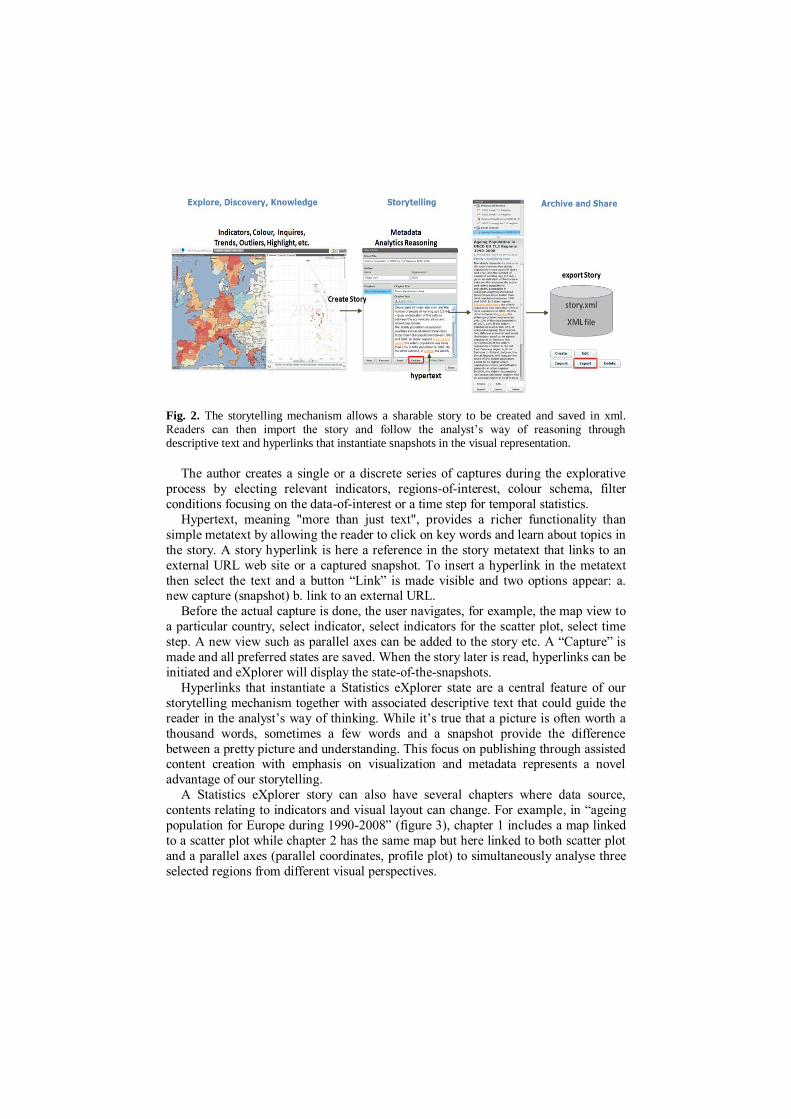
Fig. 2. The storytelling mechanism allows a sharable story to be created and saved in xml. Readers can then import the story and follow the analyst’s way of reasoning through descriptive text and hyperlinks that instantiate snapshots in the visual representation.
The author creates a single or a discrete series of captures during the explorative
process by electing relevant indicators, regions-of-interest, colour schema, filter
conditions focusing on the data-of-interest or a time step for temporal statistics.
Hypertext, meaning "more than just text", provides a richer functionality than
simple metatext by allowing the reader to click on key words and learn about topics in
the story. A story hyperlink is here a reference in the story metatext that links to an
external URL web site or a captured snapshot. To insert a hyperlink in the metatext
then select the text and a button “Link” is made visible and two options appear: a. new capture (snapshot) b. link to an external URL.
Before the actual capture is done, the user navigates, for example, the map view to
a particular country, select indicator, select indicators for the scatter plot, select time
step. A new view such as parallel axes can be added to the story etc. A “Capture” is
made and all preferred states are saved. When the story later is read, hyperlinks can be
initiated and eXplorer will display the state-of-the-snapshots.
Hyperlinks that instantiate a Statistics eXplorer state are a central feature of our
storytelling mechanism together with associated descriptive text that could guide the
reader in the analyst’s way of thinking. While it’s true that a picture is often worth a
thousand words, sometimes a few words and a snapshot provide the difference
between a pretty picture and understanding. This focus on publishing through assisted content creation with emphasis on visualization and metadata represents a novel
advantage of our storytelling.
A Statistics eXplorer story can also have several chapters where data source,
contents relating to indicators and visual layout can change. For example, in “ageing
population for Europe during 1990-2008” (figure 3), chapter 1 includes a map linked
to a scatter plot while chapter 2 has the same map but here linked to both scatter plot
and a parallel axes (parallel coordinates, profile plot) to simultaneously analyse three
selected regions from different visual perspectives.

3.3 Publisher and Vislets
A Vislet is a standalone Flash application (widget) assembled from low-level GAV
Flash components in a class library and Adobe Flex GUI tools and is represented by,
for example, a single map view or a composite time-linked map and scatter plot view
(figure 3). A Vislet facilitates the transition of selected tedious statistics data into
heterogeneous and communicative sense-making news entities with integrated
metadata and dynamic embedded animated visualization that could engage the user.
Publisher (figure 4) is the server tool that imports a story and generates the HTML
code that represents the Vislet and metadata.
First, the user selects appropriate visual representation for the Vislet e.g. map, scatter plot, parallel axes, table lens or time graph. Then the size of the Vislet window
with metadata is set and Publisher generates the HTML code. This code is manually
copied and finally manually (copy/paste) embedded into a web page. The Vislet can
now be opened in the reader’s Web browser and dynamically communicate the story.
A Publisher server maintains the Vislet flash (swf) files together with a story
repository, statistical data and regional shape maps. The Vislets run locally in the
client’s Flash Player and can thus achieve dynamic interactive performance.
Interactive features in a Vislet are exposed to all visualizations including tooltips,
brushing, highlight, filter that can discover outliers and dynamic multiple-linked
views. Several specialist colour legend tasks are supported e.g. show outliers based on
5th and 95th percentiles in certain colours or dynamic sliders that control class values etc. (figure 3).
4 Case Study
Our case study is based on an World eXplorer “explore, discover trends and gain
insight” scenario and is here used to explain the process from creating a story with
snapshots and metatext, save the story and finally use Publisher to load the story and
generate the HTML code that is placed in a web site and a Vislet is created:
I. Create new or select existing Story in World eXplorer
World eXplorer is used to 1) select spatio-temporal and multivariate statistical data; 2) explore and discern trends and patterns; 3) orchestrate and create snapshots in
the Story Editor for important discoveries and associate these snapshots with
hyperlinks in the metatext; 4) Save the story in XML format; 5) collaborate with
colleagues to confirm.
II. Use Publisher to customize your Vislet
Set Vislet properties in the Publisher (figure 4) panel e.g. height, width, graphics
layout for visualization and metadata, background and text colour.
III. Choose visual representations and copy HTML code
Select visual representations (map, scatter plot, table lens, parallel coordinates or time graph) in drop-down menus. The HTML-code is now automatically generated by

Publisher and copied when you press “Copy”. This HTML code, when pasted into a
web page or blog, will load your Vislet with associate metadata and hyperlinks using
the settings you have chosen (figure 4).
IV. Paste the HTML-code into your web page
Paste the HTML code either into a web page or directly into a CMS or blog. The
resulting Vislet can be evaluated at: http://www.ncomva.com/?page_id=307.
Fig.3. Fertility Rates vs. Population age 0-14 1960-2008. A Vislet with metadata is embedded in a web page using three time-linked views: map, scatter plot and time graph. Only
data relevant for the story is included. The user can select countries and see snapshots.

Fig. 4. Statistics Publisher imports stories and produce HTML code representing Vislets
7 Conclusions and future development
The technique introduced in this paper allows the analyst (author) to communicate
with interested readers through visual discoveries captured into snapshots together
with descriptive text. Selected indicators and visual representations can be published together with their metadata, thus facilitating the comprehension of statistical
information by non expert readers. We believe that this advanced storytelling
technology can be very useful for media as some examples of using Statistics
eXplorer to tell a story have already showed. At the same time, the Vislet technique
applied to ,in this case, World eXplorer can help developing agile on-line
publications, which draw the attention on recent trends and inequalities. Reviews
from our partners (OECD, Sweden and Denmark Statistics, Eurostat, Italy Statistics,

Goteborg City) who have evaluated the platform and tool highlights the following
features:
eXplorer can easily be customized by a statistics organisation - requires only
regional boundaries (shape file) and associate indicator data;
eXplorer is a comprehensive tool for advanced users – the Vislet approach is
regarded as a painless and more attractive to public;
Encourage collaboration between statistics analysts and users of statistics;
Possibility to capture, save and open discoveries (snapshots) with attached analytics reasoning metadata e.g. Storytelling;
IT expertise is not required to publish interactive visualization embedded in
blogs or web pages;
Possible strategic tool for news media to publish statistics news on the web;
Easy-to-import external statistical data into eXplorer;
Ability to have dynamic time-link views and see the multi-dimensionality of
regional development;
Increased expectations in terms of user experience;
Will encourage more educational use of official statistics;
References 1. Andrienko G, and Andrienko N,: Visual Exploration of Spatial Distribution of Temporal
Behaviors, In Proceedings of IEEE IV2005. 2. Geovisual Analytics: http://geoanalytics.net/GeoVisualAnalytics08/.
3. Geovisual Analytics tools: http://ncva.itn.liu.se/explorer/tools 4. OECD eXplorer. 2010 http://www.oecd.org/gov/regional/statisticsindicators/explorer 5. Guo D., Chen J., MacEachren A.M., Liao K.: A visualization system for space-time and
multivariate patterns, IEEE Visualization and Computer Graphics, Vol 12, No 6, 2006. 6. Jern M.: Smart Documents for Web-Enabled Collaboration, Published in “Digital Content
Creation”, Vince J. A. and R. A. Earnshaw (Eds) Springer Verlag, June 2001. 7. Jern M., Franzén J.: “GeoAnalytics – Exploring spatio-temporal and multivariate data”,
Reviewed proceedings, IV 2006, London, published by IEEE Computer Society. 8. Jern M., Rogstadius J., Åström T., and Ynnerman A: ”Visual Analytics presentation tools
applied in HTML Documents”, Reviewed proceedings, IV08, London, July 2008, published by IEEE Computer Society.
9. Jern M., Thygesen L., Brezzi M: “A web-enabled Geovisual Analytics tool applied to OECD Regional Data”, Reviewed Proceedings in Eurographics 2009, Munchen.
10. Keel P.: Collaborative Visual Analytics: Inferring from the Spatial Organisation and Collaborative use of information, VAST 2006, pp.137-144, IEEE.
11. MacEachren A.M., Brewer I., et al.: Geovisualization to mediate collaborative work: Tools to support different-place knowledge construction and decision-making. In 20th
International cartographic conference, Beijing, China. 2001. 12. OECD web site: http://www.oecd.org/GOV/regionaldevelopment 13. Roberts, J. C.: Exploratory Visualization with Multiple Linked Views, Exploring
Geovisualization, J. Dykes, A.M. MacEachren, M.-J. Kraak (Editors) 2004. 14. Robinson A.: Re-Visualization: Interactive Visualization of the Progress of Visual
Analysis, workshop proceedings, VASDS. 2006. 15. Wohlfart, M., Hauser, H.: Story Telling for Presentation in Volume Visualization,
EuroVis2007.
16. GAV Flash class library http://ncva.itn.liu.se/tools