Embed Size (px)
Citation preview

MATLAB®Data Analysis
R2018a

How to Contact MathWorks
Latest news: www.mathworks.com
Sales and services: www.mathworks.com/sales_and_services
User community: www.mathworks.com/matlabcentral
Technical support: www.mathworks.com/support/contact_us
Phone: 508-647-7000
The MathWorks, Inc.3 Apple Hill DriveNatick, MA 01760-2098
MATLAB® Data Analysis© COPYRIGHT 2005–2018 by The MathWorks, Inc.The software described in this document is furnished under a license agreement. The software may be usedor copied only under the terms of the license agreement. No part of this manual may be photocopied orreproduced in any form without prior written consent from The MathWorks, Inc.FEDERAL ACQUISITION: This provision applies to all acquisitions of the Program and Documentation by,for, or through the federal government of the United States. By accepting delivery of the Program orDocumentation, the government hereby agrees that this software or documentation qualifies as commercialcomputer software or commercial computer software documentation as such terms are used or defined inFAR 12.212, DFARS Part 227.72, and DFARS 252.227-7014. Accordingly, the terms and conditions of thisAgreement and only those rights specified in this Agreement, shall pertain to and govern the use,modification, reproduction, release, performance, display, and disclosure of the Program andDocumentation by the federal government (or other entity acquiring for or through the federal government)and shall supersede any conflicting contractual terms or conditions. If this License fails to meet thegovernment's needs or is inconsistent in any respect with federal procurement law, the government agreesto return the Program and Documentation, unused, to The MathWorks, Inc.
TrademarksMATLAB and Simulink are registered trademarks of The MathWorks, Inc. Seewww.mathworks.com/trademarks for a list of additional trademarks. Other product or brandnames may be trademarks or registered trademarks of their respective holders.PatentsMathWorks products are protected by one or more U.S. patents. Please seewww.mathworks.com/patents for more information.

Revision HistorySeptember 2005 Online only New for MATLAB Version 7.1 (Release 14SP3)March 2006 Online only Revised for MATLAB Version 7.2 (Release
2006a)September 2006 Online only Revised for MATLAB Version 7.3 (Release
2006b)March 2007 Online only Revised for MATLAB Version 7.4 (Release
2007a)September 2007 Online only Revised for MATLAB Version 7.5 (Release
2007b)March 2008 Online only Revised for MATLAB Version 7.6 (Release
2008a)October 2008 Online only Revised for MATLAB Version 7.7 (Release
2008b)March 2009 Online only Revised for MATLAB 7.8 (Release 2009a)September 2009 Online only Revised for MATLAB 7.9 (Release 2009b)March 2010 Online only Revised for MATLAB 7.10 (Release 2010a)September 2010 Online only Revised for MATLAB Version 7.11 (R2010b)April 2011 Online only Revised for MATLAB Version 7.12 (R2011a)September 2011 Online only Revised for MATLAB Version 7.13 (R2011b)March 2012 Online only Revised for MATLAB Version 7.14 (R2012a)September 2012 Online only Revised for MATLAB Version 8.0 (R2012b)March 2013 Online only Revised for MATLAB Version 8.1 (R2013a)September 2013 Online only Revised for MATLAB Version 8.2 (R2013b)March 2014 Online only Revised for MATLAB Version 8.3 (R2014a)October 2014 Online only Revised for MATLAB Version 8.4 (R2014b)March 2015 Online only Revised for MATLAB Version 8.5 (R2015a)September 2015 Online only Revised for MATLAB Version 8.6 (R2015b)March 2016 Online only Revised for MATLAB Version 9.0 (R2016a)September 2016 Online only Revised for MATLAB Version 9.1 (R2016b)March 2017 Online only Revised for MATLAB Version 9.2 (R2017a)September 2017 Online only Revised for MATLAB Version 9.3 (R2017b)March 2018 Online only Revised for MATLAB Version 9.4 (R2018a)


Data Processing1
Importing and Exporting Data . . . . . . . . . . . . . . . . . . . . . . . . . . 1-2Importing Data into the Workspace . . . . . . . . . . . . . . . . . . . . . 1-2Exporting Data from the Workspace . . . . . . . . . . . . . . . . . . . . 1-2
Plotting Data . . . . . . . . . . . . . . . . . . . . . . . . . . . . . . . . . . . . . . . . 1-3Introduction . . . . . . . . . . . . . . . . . . . . . . . . . . . . . . . . . . . . . . 1-3Load and Plot Data from Text File . . . . . . . . . . . . . . . . . . . . . . 1-3
Missing Data in MATLAB . . . . . . . . . . . . . . . . . . . . . . . . . . . . . . 1-6
Data Smoothing and Outlier Detection . . . . . . . . . . . . . . . . . . 1-11
Inconsistent Data . . . . . . . . . . . . . . . . . . . . . . . . . . . . . . . . . . . 1-24
Filter Data . . . . . . . . . . . . . . . . . . . . . . . . . . . . . . . . . . . . . . . . . 1-26Filter Difference Equation . . . . . . . . . . . . . . . . . . . . . . . . . . 1-26Moving-Average Filter of Traffic Data . . . . . . . . . . . . . . . . . . 1-26Modify Amplitude of Data . . . . . . . . . . . . . . . . . . . . . . . . . . . 1-27
Smooth Data with Convolution . . . . . . . . . . . . . . . . . . . . . . . . . 1-31
Detrending Data . . . . . . . . . . . . . . . . . . . . . . . . . . . . . . . . . . . . 1-35Introduction . . . . . . . . . . . . . . . . . . . . . . . . . . . . . . . . . . . . . 1-35Remove Linear Trends from Data . . . . . . . . . . . . . . . . . . . . . 1-35
Descriptive Statistics . . . . . . . . . . . . . . . . . . . . . . . . . . . . . . . . 1-39Functions for Calculating Descriptive Statistics . . . . . . . . . . 1-39Example: Using MATLAB Data Statistics . . . . . . . . . . . . . . . . 1-41
v
Contents

Interactive Data Exploration2
What Is Interactive Data Exploration? . . . . . . . . . . . . . . . . . . . . 2-2Interacting with MATLAB Data Graphs . . . . . . . . . . . . . . . . . . 2-2
Marking Up Graphs with Data Brushing . . . . . . . . . . . . . . . . . . 2-4What Is Data Brushing? . . . . . . . . . . . . . . . . . . . . . . . . . . . . . 2-4How to Brush Data . . . . . . . . . . . . . . . . . . . . . . . . . . . . . . . . . 2-5Effects of Brushing on Data . . . . . . . . . . . . . . . . . . . . . . . . . . 2-8Other Data Brushing Aspects . . . . . . . . . . . . . . . . . . . . . . . . 2-10
Making Graphs Responsive with Data Linking . . . . . . . . . . . . 2-12What Is Data Linking? . . . . . . . . . . . . . . . . . . . . . . . . . . . . . 2-12Why Use Linked Plots? . . . . . . . . . . . . . . . . . . . . . . . . . . . . . 2-13How to Link Plots . . . . . . . . . . . . . . . . . . . . . . . . . . . . . . . . . 2-13How Linked Plots Behave . . . . . . . . . . . . . . . . . . . . . . . . . . . 2-14Linking vs. Refreshing Plots . . . . . . . . . . . . . . . . . . . . . . . . . 2-17Using Linked Plot Controls . . . . . . . . . . . . . . . . . . . . . . . . . . 2-19
Interacting with Graphed Data . . . . . . . . . . . . . . . . . . . . . . . . . 2-22Data Brushing with the Variables Editor . . . . . . . . . . . . . . . . 2-22Using Data Tips to Explore Graphs . . . . . . . . . . . . . . . . . . . . 2-23Example — Visually Exploring Demographic Statistics . . . . . 2-24
Regression Analysis3
Linear Correlation . . . . . . . . . . . . . . . . . . . . . . . . . . . . . . . . . . . . 3-2Introduction . . . . . . . . . . . . . . . . . . . . . . . . . . . . . . . . . . . . . . 3-2Covariance . . . . . . . . . . . . . . . . . . . . . . . . . . . . . . . . . . . . . . . 3-3Correlation Coefficients . . . . . . . . . . . . . . . . . . . . . . . . . . . . . 3-4
Linear Regression . . . . . . . . . . . . . . . . . . . . . . . . . . . . . . . . . . . . 3-6Introduction . . . . . . . . . . . . . . . . . . . . . . . . . . . . . . . . . . . . . . 3-6Simple Linear Regression . . . . . . . . . . . . . . . . . . . . . . . . . . . . 3-7Residuals and Goodness of Fit . . . . . . . . . . . . . . . . . . . . . . . 3-11Fitting Data with Curve Fitting Toolbox Functions . . . . . . . . 3-15
vi Contents

Interactive Fitting . . . . . . . . . . . . . . . . . . . . . . . . . . . . . . . . . . . 3-16The Basic Fitting UI . . . . . . . . . . . . . . . . . . . . . . . . . . . . . . . 3-16Preparing for Basic Fitting . . . . . . . . . . . . . . . . . . . . . . . . . . 3-16Opening the Basic Fitting UI . . . . . . . . . . . . . . . . . . . . . . . . . 3-17Example: Using Basic Fitting UI . . . . . . . . . . . . . . . . . . . . . . 3-18
Programmatic Fitting . . . . . . . . . . . . . . . . . . . . . . . . . . . . . . . . 3-35MATLAB Functions for Polynomial Models . . . . . . . . . . . . . . 3-35Linear Model with Nonpolynomial Terms . . . . . . . . . . . . . . . 3-41Multiple Regression . . . . . . . . . . . . . . . . . . . . . . . . . . . . . . . 3-42Programmatic Fitting . . . . . . . . . . . . . . . . . . . . . . . . . . . . . . 3-44
Time Series Analysis4
What Are Time Series? . . . . . . . . . . . . . . . . . . . . . . . . . . . . . . . . 4-2
Time Series Objects . . . . . . . . . . . . . . . . . . . . . . . . . . . . . . . . . . . 4-3Types of Time Series and Their Uses . . . . . . . . . . . . . . . . . . . . 4-3Time Series Data Sample . . . . . . . . . . . . . . . . . . . . . . . . . . . . 4-3Example: Time Series Objects and Methods . . . . . . . . . . . . . . 4-5Time Series Constructor . . . . . . . . . . . . . . . . . . . . . . . . . . . . 4-17Time Series Collection Constructor . . . . . . . . . . . . . . . . . . . . 4-17
vii


Data Processing
• “Importing and Exporting Data” on page 1-2• “Plotting Data” on page 1-3• “Missing Data in MATLAB” on page 1-6• “Data Smoothing and Outlier Detection” on page 1-11• “Inconsistent Data” on page 1-24• “Filter Data” on page 1-26• “Smooth Data with Convolution” on page 1-31• “Detrending Data” on page 1-35• “Descriptive Statistics” on page 1-39
1

Importing and Exporting DataIn this section...“Importing Data into the Workspace” on page 1-2“Exporting Data from the Workspace” on page 1-2
Importing Data into the WorkspaceThe first step in analyzing data is to import it into the MATLAB workspace. See “Methodsfor Importing Data” for information about importing data from specific file formats.
Exporting Data from the WorkspaceWhen you analyze your data, you might create new variables or modified importedvariables. You can export variables from the MATLAB workspace to various file formats,both character-based and binary. You can, for example, create HDF and Microsoft®Excel® files containing your data. For details, see the documentation on “Supported FileFormats for Import and Export”.
1 Data Processing
1-2

Plotting DataIn this section...“Introduction” on page 1-3“Load and Plot Data from Text File” on page 1-3
IntroductionAfter you import data into the MATLAB workspace, it is a good idea to plot the data sothat you can explore its features. An exploratory plot of your data enables you to identifydiscontinuities and potential outliers, as well as the regions of interest.
The MATLAB figure window displays plots. See “Types of MATLAB Plots” for a fulldescription of the figure window. It also discusses the various interactive tools availablefor editing and customizing MATLAB graphics.
Load and Plot Data from Text FileThis example uses sample data in count.dat, a space-delimited text file. The file consistsof three sets of hourly traffic counts, recorded at three different town intersections over a24-hour period. Each data column in the file represents data for one intersection.
Load the count.dat Data
Import data into the workspace using the load function.
load count.dat
Loading this data creates a 24-by-3 matrix called count in the MATLAB workspace.
Get the size of the data matrix.
[n,p] = size(count)
n = 24
p = 3
n represents the number of rows, and p represents the number of columns.
Plotting Data
1-3

Plot the count.dat Data
Create a time vector, t, containing integers from 1 to n.
t = 1:n;
Plot the data as a function of time, and annotate the plot.
plot(t,count), legend('Location 1','Location 2','Location 3','Location','NorthWest')xlabel('Time'), ylabel('Vehicle Count')title('Traffic Counts at Three Intersections')
1 Data Processing
1-4

See Alsolegend | load | plot | size | title | xlabel | ylabel
More About• “Types of MATLAB Plots”
See Also
1-5

Missing Data in MATLABWorking with missing data is a common task in data preprocessing. Although sometimesmissing values signify a meaningful event in the data, they often represent unreliable orunusable data points. In either case, MATLAB� has many options for handling missingdata.
Create and Organize Missing Data
The form that missing values take in MATLAB depends on the data type. For example,numeric data types such as double use NaN (not a number) to represent missing values.
x = [NaN 1 2 3 4];
You can also use the missing value to represent missing numeric data or data of othertypes, such as datetime, string, and categorical. MATLAB automatically convertsthe missing value to the data's native type.
xDouble = [missing 1 2 3 4]
xDouble = 1×5
NaN 1 2 3 4
xDatetime = [missing datetime(2014,1:4,1)]
xDatetime = 1x5 datetime arrayColumns 1 through 3
NaT 01-Jan-2014 00:00:00 01-Feb-2014 00:00:00
Columns 4 through 5
01-Mar-2014 00:00:00 01-Apr-2014 00:00:00
xString = [missing "a" "b" "c" "d"]
xString = 1x5 string array <missing> "a" "b" "c" "d"
xCategorical = [missing categorical({'cat1' 'cat2' 'cat3' 'cat4'})]
1 Data Processing
1-6

xCategorical = 1x5 categorical array <undefined> cat1 cat2 cat3 cat4
A data set might contain values that you want to treat as missing data, but are notstandard MATLAB missing values in MATLAB such as NaN. You can use thestandardizeMissing function to convert those values to the standard missing value forthat data type. For example, treat 4 as a missing double value in addition to NaN.
xStandard = standardizeMissing(xDouble,[4 NaN])
xStandard = 1×5
NaN 1 2 3 NaN
Suppose you want to keep missing values as part of your data set but segregate themfrom the rest of the data. Several MATLAB functions enable you to control the placementof missing values before further processing. For example, use the 'MissingPlacement'option with the sort function to move NaNs to the end of the data.
xSort = sort(xStandard,'MissingPlacement','last')
xSort = 1×5
1 2 3 NaN NaN
Find, Replace, and Ignore Missing Data
Even if you do not explicitly create missing values in MATLAB, they can appear whenimporting existing data or computing with the data. If you are not aware of missing valuesin your data, subsequent computation or analysis can be misleading.
For example, if you unknowingly plot a vector containing a NaN value, the NaN does notappear because the plot function ignores it and plots the remaining points normally.
nanData = [1:9 NaN];plot(1:10,nanData)
Missing Data in MATLAB
1-7

However, if you compute the average of the data, the result is NaN. In this case, it is morehelpful to know in advance that the data contains a NaN, and then choose to ignore orremove it before computing the average.
meanData = mean(nanData)
meanData = NaN
One way to find NaNs in data is by using the isnan function, which returns a logical arrayindicating the location of any NaN value.
TF = isnan(nanData)
TF = 1x10 logical array
1 Data Processing
1-8

0 0 0 0 0 0 0 0 0 1
Similarly, the ismissing function returns the location of missing values in data formultiple data types.
TFdouble = ismissing(xDouble)
TFdouble = 1x5 logical array
1 0 0 0 0
TFdatetime = ismissing(xDatetime)
TFdatetime = 1x5 logical array
1 0 0 0 0
Suppose you are working with a table or timetable made up of variables with multipledata types. You can find all of the missing values with one call to ismissing, regardlessof their type.
xTable = table(xDouble',xDatetime',xString',xCategorical')
xTable=5×4 table Var1 Var2 Var3 Var4 ____ ____________________ _________ ___________
NaN NaT <missing> <undefined> 1 01-Jan-2014 00:00:00 "a" cat1 2 01-Feb-2014 00:00:00 "b" cat2 3 01-Mar-2014 00:00:00 "c" cat3 4 01-Apr-2014 00:00:00 "d" cat4
TF = ismissing(xTable)
TF = 5x4 logical array
1 1 1 1 0 0 0 0 0 0 0 0 0 0 0 0
Missing Data in MATLAB
1-9

0 0 0 0
Missing values can represent unusable data for processing or analysis. Use fillmissingto replace missing values with another value, or use rmmissing to remove missing valuesaltogether.
xFill = fillmissing(xStandard,'constant',0)
xFill = 1×5
0 1 2 3 0
xRemove = rmmissing(xStandard)
xRemove = 1×3
1 2 3
Many MATLAB functions enable you to ignore missing values, without having to explicitlylocate, fill, or remove them first. For example, if you compute the sum of a vectorcontaining NaN values, the result is NaN. However, you can directly ignore NaNs in thesum by using the 'omitnan' option with the sum function.
sumNan = sum(xDouble)
sumNan = NaN
sumOmitnan = sum(xDouble,'omitnan')
sumOmitnan = 10
See Alsoismissing | fillmissing | standardizeMissing | missing
Related Examples• “Clean Messy and Missing Data in Tables”
1 Data Processing
1-10

Data Smoothing and Outlier DetectionData smoothing refers to techniques for eliminating unwanted noise or behaviors in data,while outlier detection identifies data points that are significantly different from the restof the data.
Moving Window Methods
Moving window methods are ways to process data in smaller batches at a time, typicallyin order to statistically represent a neighborhood of points in the data. The movingaverage is a common data smoothing technique that slides a window along the data,computing the mean of the points inside of each window. This can help to eliminateinsignificant variations from one data point to the next.
For example, consider wind speed measurements taken every minute for about 3 hours.Use the movmean function with a window size of 5 minutes to smooth out high-speed windgusts.
load windData.matmins = 1:length(speed);window = 5;meanspeed = movmean(speed,window);plot(mins,speed,mins,meanspeed)axis tightlegend('Measured Wind Speed','Average Wind Speed over 5 min Window','location','best')xlabel('Time')ylabel('Speed')
Data Smoothing and Outlier Detection
1-11

Similarly, you can compute the median wind speed over a sliding window using themovmedian function.
medianspeed = movmedian(speed,window);plot(mins,speed,mins,medianspeed)axis tightlegend('Measured Wind Speed','Median Wind Speed over 5 min Window','location','best')xlabel('Time')ylabel('Speed')
1 Data Processing
1-12

Not all data is suitable for smoothing with a moving window method. For example, createa sinusoidal signal with injected random noise.
t = 1:0.2:15;A = sin(2*pi*t) + cos(2*pi*0.5*t);Anoise = A + 0.5*rand(1,length(t));plot(t,A,t,Anoise)axis tightlegend('Original Data','Noisy Data','location','best')
Data Smoothing and Outlier Detection
1-13

Use a moving mean with a window size of 3 to smooth the noisy data.
window = 3;Amean = movmean(Anoise,window);plot(t,A,t,Amean)axis tightlegend('Original Data','Moving Mean - Window Size 3')
1 Data Processing
1-14

The moving mean achieves the general shape of the data, but doesn't capture the valleys(local minima) very accurately. Since the valley points are surrounded by two largerneighbors in each window, the mean is not a very good approximation to those points. Ifyou make the window size larger, the mean eliminates the shorter peaks altogether. Forthis type of data, you might consider alternative smoothing techniques.
Amean = movmean(Anoise,5);plot(t,A,t,Amean)axis tightlegend('Original Data','Moving Mean - Window Size 5','location','best')
Data Smoothing and Outlier Detection
1-15

Common Smoothing Methods
The smoothdata function provides several smoothing options such as the Savitzky-Golaymethod, which is a popular smoothing technique used in signal processing. By default,smoothdata chooses a best-guess window size for the method depending on the data.
Use the Savitzky-Golay method to smooth the noisy signal Anoise, and output thewindow size that it uses. This method provides a better valley approximation compared tomovmean.
[Asgolay,window] = smoothdata(Anoise,'sgolay');plot(t,A,t,Asgolay)axis tightlegend('Original Data','Savitzky-Golay','location','best')
1 Data Processing
1-16

window
window = 3
The robust Lowess method is another smoothing method that is particularly helpful whenoutliers are present in the data in addition to noise. Inject an outlier into the noisy data,and use robust Loess to smooth the data, which eliminates the outlier.
Anoise(36) = 20;Arlowess = smoothdata(Anoise,'rlowess',5);plot(t,Anoise,t,Arlowess)axis tightlegend('Noisy Data','Robust Lowess')
Data Smoothing and Outlier Detection
1-17
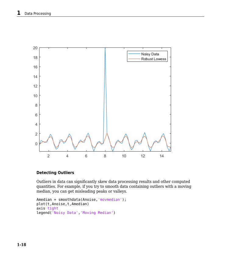
Detecting Outliers
Outliers in data can significantly skew data processing results and other computedquantities. For example, if you try to smooth data containing outliers with a movingmedian, you can get misleading peaks or valleys.
Amedian = smoothdata(Anoise,'movmedian');plot(t,Anoise,t,Amedian)axis tightlegend('Noisy Data','Moving Median')
1 Data Processing
1-18

The isoutlier function returns a logical 1 when an outlier is detected. Verify the indexand value of the outlier in Anoise.
TF = isoutlier(Anoise);ind = find(TF)
ind = 36
Aoutlier = Anoise(ind)
Aoutlier = 20
You can use the filloutliers function to replace outliers in your data by specifying afill method. For example, fill the outlier in Anoise with the value of its neighborimmediately to the right.
Data Smoothing and Outlier Detection
1-19

Afill = filloutliers(Anoise,'next');plot(t,Anoise,t,Afill)axis tightlegend('Noisy Data with Outlier','Noisy Data with Filled Outlier')
Nonuniform Data
Not all data consists of equally spaced points, which can affect methods for dataprocessing. Create a datetime vector that contains irregular sampling times for the datain Arand. The time vector represents samples taken every minute for the first 30minutes, then hourly over two days.
t0 = datetime(2014,1,1,1,1,1);timeminutes = sort(t0 + minutes(1:30));
1 Data Processing
1-20

timehours = t0 + hours(1:48);time = [timeminutes timehours];Airreg = rand(1,length(time));plot(time,Airreg)axis tight
By default, smoothdata smooths with respect to equally spaced integers, in this case,1,2,...,78. Since integer time stamps do not coordinate with the sampling of the pointsin Airreg, the first half hour of data still appears noisy after smoothing.
Adefault = smoothdata(Airreg,'movmean',3);plot(time,Airreg,time,Adefault)axis tightlegend('Original Data','Smoothed Data with Default Sample Points')
Data Smoothing and Outlier Detection
1-21

Many data processing functions in MATLAB®, including smoothdata, movmean, andfilloutliers, allow you to provide sample points, ensuring that data is processedrelative to its sampling units and frequencies. To remove the high-frequency variation inthe first half hour of data in Airreg, use the 'SamplePoints' option with the timestamps in time.
Asamplepoints = smoothdata(Airreg,'movmean',hours(3),'SamplePoints',time);plot(time,Airreg,time,Asamplepoints)axis tightlegend('Original Data','Smoothed Data with Sample Points')
1 Data Processing
1-22

See Alsosmoothdata | isoutlier | filloutliers | movmean | movmedian
Related Examples• “Filter Data” on page 1-26
See Also
1-23
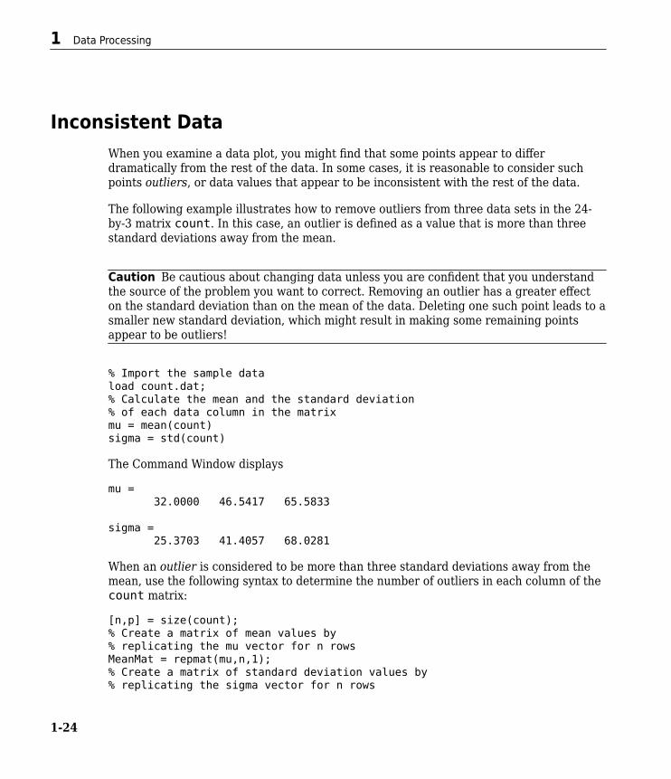
Inconsistent DataWhen you examine a data plot, you might find that some points appear to differdramatically from the rest of the data. In some cases, it is reasonable to consider suchpoints outliers, or data values that appear to be inconsistent with the rest of the data.
The following example illustrates how to remove outliers from three data sets in the 24-by-3 matrix count. In this case, an outlier is defined as a value that is more than threestandard deviations away from the mean.
Caution Be cautious about changing data unless you are confident that you understandthe source of the problem you want to correct. Removing an outlier has a greater effecton the standard deviation than on the mean of the data. Deleting one such point leads to asmaller new standard deviation, which might result in making some remaining pointsappear to be outliers!
% Import the sample dataload count.dat;% Calculate the mean and the standard deviation% of each data column in the matrixmu = mean(count)sigma = std(count)
The Command Window displays
mu = 32.0000 46.5417 65.5833
sigma = 25.3703 41.4057 68.0281
When an outlier is considered to be more than three standard deviations away from themean, use the following syntax to determine the number of outliers in each column of thecount matrix:
[n,p] = size(count);% Create a matrix of mean values by% replicating the mu vector for n rowsMeanMat = repmat(mu,n,1);% Create a matrix of standard deviation values by% replicating the sigma vector for n rows
1 Data Processing
1-24

SigmaMat = repmat(sigma,n,1);% Create a matrix of zeros and ones, where ones indicate% the location of outliersoutliers = abs(count - MeanMat) > 3*SigmaMat;% Calculate the number of outliers in each columnnout = sum(outliers)
The procedure returns the following number of outliers in each column:
nout = 1 0 0
There is one outlier in the first data column of count and none in the other two columns.
To remove an entire row of data containing the outlier, type
count(any(outliers,2),:) = [];
Here, any(outliers,2) returns a 1 when any of the elements in the outliers vectorare nonzero. The argument 2 specifies that any works down the second dimension of thecount matrix—its columns.
Inconsistent Data
1-25

Filter DataFilter Difference EquationFilters are data processing techniques that can smooth out high-frequency fluctuations indata or remove periodic trends of a specific frequency from data. In MATLAB, the filterfunction filters a vector of data x according to the following difference equation, whichdescribes a tapped delay-line filter.
a y n b x n b x n b N x n Nb b( ) ( ) ( ) ( ) ( ) ( ) ( ) ( )1 1 2 1 1= + - + + - +…
- - - - - +a y n a N y n Na a( ) ( ) ( ) ( )2 1 1…
In this equation, a and b are vectors of coefficients of the filter, Na is the feedback filterorder, and Nb is the feedforward filter order. n is the index of the current element of x.The output y(n) is a linear combination of the current and previous elements of x and y.
The filter function uses specified coefficient vectors a and b to filter the input data x.For more information on difference equations describing filters, see [1].
Moving-Average Filter of Traffic DataThe filter function is one way to implement a moving-average filter, which is a commondata smoothing technique.
The following difference equation describes a filter that averages time-dependent datawith respect to the current hour and the three previous hours of data.
Import data that describes traffic flow over time, and assign the first column of vehiclecounts to the vector x.
load count.datx = count(:,1);
Create the filter coefficient vectors.
a = 1;b = [1/4 1/4 1/4 1/4];
1 Data Processing
1-26

Compute the 4-hour moving average of the data, and plot both the original data and thefiltered data.
y = filter(b,a,x);
t = 1:length(x);plot(t,x,'--',t,y,'-')legend('Original Data','Filtered Data')
Modify Amplitude of DataThis example shows how to modify the amplitude of a vector of data by applying atransfer function.
Filter Data
1-27

In digital signal processing, filters are often represented by a transfer function. The Z-transform of the difference equation
is the following transfer function.
Use the transfer function
to modify the amplitude of the data in count.dat.
Load the data and assign the first column to the vector x.
load count.datx = count(:,1);
Create the filter coefficient vectors according to the transfer function .
a = [1 0.2];b = [2 3];
Compute the filtered data, and plot both the original data and the filtered data. This filterprimarily modifies the amplitude of the original data.
y = filter(b,a,x);
t = 1:length(x);plot(t,x,'--',t,y,'-')legend('Original Data','Filtered Data')
1 Data Processing
1-28

References[1] Oppenheim, Alan V., Ronald W. Schafer, and John R. Buck. Discrete-Time Signal
Processing. Upper Saddle River, NJ: Prentice-Hall, 1999.
See Alsoconv | filter | filter2 | movmean | smoothdata
See Also
1-29

Related Examples• “Smooth Data with Convolution” on page 1-31
1 Data Processing
1-30

Smooth Data with ConvolutionYou can use convolution to smooth 2-D data that contains high-frequency components.
Create 2-D data using the peaks function, and plot the data at various contour levels.
Z = peaks(100);levels = -7:1:10;contour(Z,levels)
Inject random noise into the data and plot the noisy contours.
Znoise = Z + rand(100) - 0.5;contour(Znoise,levels)
Smooth Data with Convolution
1-31

The conv2 function in MATLAB® convolves 2-D data with a specified kernel whoseelements define how to remove or enhance features of the original data. Kernels do nothave to be the same size as the input data. Small-sized kernels can be sufficient to smoothdata containing only a few frequency components. Larger sized kernels can provide moreprecision for tuning frequency response, resulting in smoother output.
Define a 3-by-3 kernel K and use conv2 to smooth the noisy data in Znoise. Plot thesmoothed contours. The 'same' option in conv2 makes the output the same size as theinput.
K = 0.125*ones(3);Zsmooth1 = conv2(Znoise,K,'same');contour(Zsmooth1, levels)
1 Data Processing
1-32

Smooth the noisy data with a 5-by-5 kernel, and plot the new contours.
K = 0.045*ones(5);Zsmooth2 = conv2(Znoise,K,'same');contour(Zsmooth2,levels)
Smooth Data with Convolution
1-33

See Alsoconv | conv2 | filter | smoothdata
Related Examples• “Filter Data” on page 1-26
1 Data Processing
1-34

Detrending DataIn this section...“Introduction” on page 1-35“Remove Linear Trends from Data” on page 1-35
IntroductionThe MATLAB function detrend subtracts the mean or a best-fit line (in the least-squaressense) from your data. If your data contains several data columns, detrend treats eachdata column separately.
Removing a trend from the data enables you to focus your analysis on the fluctuations inthe data about the trend. A linear trend typically indicates a systematic increase ordecrease in the data. A systematic shift can result from sensor drift, for example. Whiletrends can be meaningful, some types of analyses yield better insight once you removetrends.
Whether it makes sense to remove trend effects in the data often depends on theobjectives of your analysis.
Remove Linear Trends from DataThis example shows how to remove a linear trend from daily closing stock prices toemphasize the price fluctuations about the overall increase. If the data does have a trend,detrending it forces its mean to zero and reduces overall variation. The example simulatesstock price fluctuations using a distribution taken from the gallery function.
Create a simulated data set and compute its mean. sdata represents the daily pricechanges of a stock.
t = 0:300;dailyFluct = gallery('normaldata',size(t),2); sdata = cumsum(dailyFluct) + 20 + t/100;
Find the average of the data.
mean(sdata)
ans = 39.4851
Detrending Data
1-35

Plot and label the data. Notice the systematic increase in the stock prices that the datadisplays.
figureplot(t,sdata);legend('Original Data','Location','northwest');xlabel('Time (days)');ylabel('Stock Price (dollars)');
Apply detrend, which performs a linear fit to sdata and then removes the trend from it.Subtracting the output from the input yields the computed trend line.
detrend_sdata = detrend(sdata);trend = sdata - detrend_sdata;
1 Data Processing
1-36

Find the average of the detrended data.
mean(detrend_sdata)
ans = 1.1425e-14
As expected, the detrended data has a mean very close to 0.
Display the results by adding the trend line, the detrended data, and its mean to thegraph.
hold onplot(t,trend,':r')plot(t,detrend_sdata,'m')plot(t,zeros(size(t)),':k')legend('Original Data','Trend','Detrended Data',... 'Mean of Detrended Data','Location','northwest')xlabel('Time (days)'); ylabel('Stock Price (dollars)');
Detrending Data
1-37

See Alsocumsum | detrend | gallery | plot
1 Data Processing
1-38

Descriptive StatisticsIn this section...“Functions for Calculating Descriptive Statistics” on page 1-39“Example: Using MATLAB Data Statistics” on page 1-41
If you need more advanced statistics features, you might want to use the Statistics andMachine Learning Toolbox™ software.
Functions for Calculating Descriptive StatisticsUse the following MATLAB functions to calculate the descriptive statistics for your data.
Note For matrix data, descriptive statistics for each column are calculated independently.
Statistics Function Summary
Function Descriptionmax Maximum valuemean Average or mean valuemedian Median valuemin Smallest valuemode Most frequent valuestd Standard deviationvar Variance, which measures the spread or dispersion of the values
The following examples apply MATLAB functions to calculate descriptive statistics:
• “Example 1 — Calculating Maximum, Mean, and Standard Deviation” on page 1-40• “Example 2 — Subtracting the Mean” on page 1-41
Descriptive Statistics
1-39

Example 1 — Calculating Maximum, Mean, and Standard Deviation
This example shows how to use MATLAB functions to calculate the maximum, mean, andstandard deviation values for a 24-by-3 matrix called count. MATLAB computes thesestatistics independently for each column in the matrix.
% Load the sample dataload count.dat% Find the maximum value in each columnmx = max(count)% Calculate the mean of each columnmu = mean(count)% Calculate the standard deviation of each columnsigma = std(count)
The results are
mx = 114 145 257
mu = 32.0000 46.5417 65.5833
sigma = 25.3703 41.4057 68.0281
To get the row numbers where the maximum data values occur in each data column,specify a second output parameter indx to return the row index. For example:
[mx,indx] = max(count)
These results are
mx = 114 145 257
indx = 20 20 20
Here, the variable mx is a row vector that contains the maximum value in each of thethree data columns. The variable indx contains the row indices in each column thatcorrespond to the maximum values.
1 Data Processing
1-40

To find the minimum value in the entire count matrix, 24-by-3 matrix into a 72-by-1column vector by using the syntax count(:). Then, to find the minimum value in thesingle column, use the following syntax:
min(count(:))
ans = 7
Example 2 — Subtracting the Mean
Subtract the mean from each column of the matrix by using the following syntax:
% Get the size of the count matrix[n,p] = size(count)% Compute the mean of each columnmu = mean(count)% Create a matrix of mean values by% replicating the mu vector for n rowsMeanMat = repmat(mu,n,1)% Subtract the column mean from each element% in that columnx = count - MeanMat
Note Subtracting the mean from the data is also called detrending. For more informationabout removing the mean or the best-fit line from the data, see “Detrending Data” onpage 1-35.
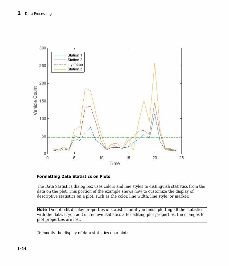
Example: Using MATLAB Data StatisticsThe Data Statistics dialog box helps you calculate and plot descriptive statistics with thedata. This example shows how to use MATLAB Data Statistics to calculate and plotstatistics for a 24-by-3 matrix, called count. The data represents how many vehiclespassed by traffic counting stations on three streets.
This section contains the following topics:
• “Calculating and Plotting Descriptive Statistics” on page 1-42• “Formatting Data Statistics on Plots” on page 1-44• “Saving Statistics to the MATLAB Workspace” on page 1-46
Descriptive Statistics
1-41

• “Generating Code Files” on page 1-47
Note MATLAB Data Statistics is available for 2-D plots only.
Calculating and Plotting Descriptive Statistics
1 Load and plot the data:
load count.dat[n,p] = size(count);
% Define the x-valuest = 1:n;
% Plot the data and annotate the graphplot(t,count)legend('Station 1','Station 2','Station 3','Location','northwest')xlabel('Time')ylabel('Vehicle Count')
1 Data Processing
1-42

Note The legend contains the name of each data set, as specified by the legendfunction: Station 1, Station 2, and Station 3. A data set refers to each columnof data in the array you plotted. If you do not name the data sets, default names areassigned: data1, data2, and so on.
2 In the Figure window, select Tools > Data Statistics.
The Data Statistics dialog box opens and displays descriptive statistics for the X- andY-data of the Station 1 data set.
Note The Data Statistics dialog box displays a range, which is the differencebetween the minimum and maximum values in the selected data set. The dialog boxdoes not display the range on the plot.
3 Select a different data set in the Statistics for list: Station 2.
This displays the statistics for the X and Y data of the Station 2 data set.4 Select the check box for each statistic you want to display on the plot, and then click
Save to workspace.
For example, to plot the mean of Station 2, select the mean check box in the Ycolumn.
This plots a horizontal line to represent the mean of Station 2 and updates thelegend to include this statistic.
Descriptive Statistics
1-43
Formatting Data Statistics on Plots
The Data Statistics dialog box uses colors and line styles to distinguish statistics from thedata on the plot. This portion of the example shows how to customize the display ofdescriptive statistics on a plot, such as the color, line width, line style, or marker.
Note Do not edit display properties of statistics until you finish plotting all the statisticswith the data. If you add or remove statistics after editing plot properties, the changes toplot properties are lost.
To modify the display of data statistics on a plot:
1 Data Processing
1-44

1In the MATLAB Figure window, click the (Edit Plot) button in the toolbar.
This step enables plot editing.2 Double-click the statistic on the plot for which you want to edit display properties.
For example, double-click the horizontal line representing the mean of Station 2.
This step opens the Property Editor below the MATLAB Figure window, where youcan modify the appearance of the line used to represent this statistic.
3 In the Property Editor, specify the Line and Marker styles, sizes, and colors.
Descriptive Statistics
1-45

Tip Alternatively, right-click the statistic on the plot, and select an option from theshortcut menu.
Saving Statistics to the MATLAB Workspace
Perform these steps to save the statistics to the MATLAB workspace.
Note When your plot contains multiple data sets, save statistics for each data setindividually. To display statistics for a different data set, select it from the Statistics forlist in the Data Statistics dialog box.
1 In the Data Statistics dialog box, click the Save to workspace button.2 In the Save Statistics to Workspace dialog box, select options to save statistics for
either X data, Y data, or both. Then, enter the corresponding variable names.
In this example, save only the Y data. Enter the variable name as Loc2countstats.
3 Click OK.
This step saves the descriptive statistics to a structure. The new variable is added tothe MATLAB workspace.
To view the new structure variable, type the variable name at the MATLAB prompt:
Loc2countstats
Loc2countstats =
min: 9 max: 145 mean: 46.5417 median: 36 mode: 9
1 Data Processing
1-46

std: 41.4057 range: 136
Generating Code Files
This portion of the example shows how to generate a file containing MATLAB code thatreproduces the format of the plot and the plotted statistics with new data.
1 In the Figure window, select File > Generate Code.
This step creates a function code file and displays it in the MATLAB Editor.2 Change the name of the function on the first line of the file from createfigure to
something more specific, like countplot. Save the file to your current folder withthe file name countplot.m.
3 Generate some new, random count data:
randcount = 300*rand(24,3);4 Reproduce the plot with the new data and the recomputed statistics:
countplot(t,randcount)
Descriptive Statistics
1-47

1 Data Processing
1-48

Interactive Data Exploration
• “What Is Interactive Data Exploration?” on page 2-2• “Marking Up Graphs with Data Brushing” on page 2-4• “Making Graphs Responsive with Data Linking” on page 2-12• “Interacting with Graphed Data” on page 2-22
2

What Is Interactive Data Exploration?
Interacting with MATLAB Data GraphsThe MATLAB data analysis and graphics tools for visual data exploration include thefollowing capabilities:
• Highlighting and editing observations on graphs with data brushing on page 2-4• Connecting data graphs with variables with data linking on page 2-12• Finding, adding, removing, and changing data values with the “Data Brushing with the
Variables Editor” on page 2-22• Describing observations on graphs with data tips on page 2-23
Used alone or together, these tools help you to perceive trends, noise, and relationships indata sets, and understand aspects of the phenomena you model.
Understanding Data Using Graphic Presentations
Finding patterns in numbers is a mathematical and an intuitive undertaking. When peoplecollect data to analyze, they often want to see how models, variables, and constantsexplain hypotheses. Sometimes they see patterns by scanning tables or sets of statistics,other times by contemplating graphical representations of models and data. An analyst'spowers of pattern recognition can lead to insights into data’s distribution, outliers,curvilinearity, associations between variables, goodness-of-fit to models, and more.Computers amplify those powers greatly.
Graphically exploring digital data interactively generally requires:
• Data displays for charts, graphs, and maps• A graphical user interface (UI) capable of directly manipulating the displays• Software that categorizes selected data performs operations on the categories, and
then updates or creates new data displays
This approach to understanding is often called exploratory data analysis (EDA), a termcoined during the infancy of computer graphics in the 1970s and generally attributed tostatistician John Tukey (who also invented the box plot). EDA complements statisticalmethods and tools to help analysts check hypotheses and validate models. An EDA UIusually lets analysts divide observations of variables on data plots into subsets usingmouse gestures, and then analyze further or eliminate selected observations.
2 Interactive Data Exploration
2-2

Part of EDA is simply looking at data graphics with an informed eye to observe patternsor lack of them. What makes EDA especially powerful, however, are interactive tools thatlet analysts probe, drill down, map, and spin data sets around, and select observationsand trace them through plots, tables, and models.
Well before digital tool sets like the MATLAB environment developed, curious quantitativetypes plotted graphs, maps, and other data diagrams to trigger insights into what theircollections of numbers might mean. If you are curious about what data might mean andlike to reflect on data graphics, MATLAB provides many options:
• Plotting data — scatter, line, area, bar, histogram and other types of graphs• Plotting thematic maps to show spatial relationships of point, lines and area data• Plotting N-D point, vector, contour, surface, and volume shapes• Overlaying other variables on points, lines, and surfaces (e.g. texture-maps)• Rendering portions of a 3-D display with transparency• Animating any of the above
All of these options generate static or dynamic displays that may reveal meaning in data.In many environments, however, users cannot interact with them; they can only changedata or parameters and redisplay the same or different data graphics. MATLAB toolsenable users to directly manipulate data displays to explore correlations and anomalies indata sets, as the following sections explain.
What Is Interactive Data Exploration?
2-3

Marking Up Graphs with Data BrushingIn this section...“What Is Data Brushing?” on page 2-4“How to Brush Data” on page 2-5“Effects of Brushing on Data” on page 2-8“Other Data Brushing Aspects” on page 2-10
What Is Data Brushing?When you brush data, you manually select observations on an interactive data display inthe course of assessing validity, testing hypotheses, or segregating observations forfurther processing. You can brush data on 2-D graphs, 3-D graphs, and surfaces. Most ofthe MATLAB high-level plotting functions allow you to brush on their displays. For a list ofthese functions, see “Types of Charts You Can Brush” in the brush function referencepage.
Data brushing is a MATLAB figure interactive mode like zooming, panning or plot editing.You can use data brushing mode to select, remove, and replace individual data values.
Activate data brushing in any of these ways:
•Click on the figure toolbar.
• Select Tools > Brush.• Right-click a cell in the Variables editor and select Brushing > Brushing on.• Call the brush function.
The figure toolbar data brushing button contains two parts:
•Data brushing button that toggles data brushing on and off.
• Data brushing button arrow ▼ that displays a drop-down menu for choosing thebrushing color.
You also can set the color with the brush function; it accepts ColorSpec names and RGBtriplets. For example:
2 Interactive Data Exploration
2-4

brush magentabrush([.1 .3 .5])
How to Brush DataTo brush observations on graphs and surface plots,
1To enter brushing mode, select the Data Brushing button in the figure toolbar.You also can select a brushing color with the Data Brushing button arrow ▼.
2 Drag a selection rectangle to highlight observations on a graph in the currentbrushing color.Instead of dragging out a rectangle, you can click any observation to select it.Double-clicking selects all the observations in a series.
3 To add other observations to the highlighted set, hold down the Shift key and brushthem.
4 Shift+clicking or Shift+dragging highlighted observations eliminates theirhighlighting and removes them from the selection set; this lets you select any set ofobservations.
The following figures show a scatter plot before and after brushing some outlyingobservations; the left-hand plot displays the Data Brushing tool palette for choosing abrush color.
Marking Up Graphs with Data Brushing
2-5

Brushed observations remain brushed even in other modes (pan, zoom, edit) until youdeselect them by brushing an empty area or by selecting Clear all brushing from thecontext menu. You can add and remove data tips to a brushed plot without disturbing itsbrushing.
Once you have brushed observations from one or more graphed variables, you canperform several tasks with the brushing set, either from the Tools menu or by right-clicking any brushed observation:
• Remove all brushed observations from the plot.• Remove all unbrushed observations from the plot.• Replace the brushed observations with NaN or constant values.• Copy the brushed data values to the clipboard.• Paste the brushed data values to the command window• Create a variable to hold the brushed data values• Clear brushing marks from the plot (context menu only)
The two following figures show a lineseries plot of a variable, along with constant linesshowing its mean and two standard deviations. On the left, the user is brushingobservations that lie beyond two standard deviations from the mean. On the right, theuser has eliminated these extreme values by selecting Brushing > Remove brushed
2 Interactive Data Exploration
2-6

from the Tools (or context) menu. The plot immediately redisplays with three fewer x-and y-values. The original workspace variable, however, remains unchanged.
Before removing the extreme values, you can save them as a new workspace variable withTools > Brushing > Create new variable. Doing this opens a dialog box for you todeclare a variable name.
Typing extremevals to name the variable and pressing OK to dismiss the dialogproduces
extremevals =
9.0000 3.5784 12.0000 3.0349 35.0000 -2.9443
Marking Up Graphs with Data Brushing
2-7

The new variable contains one row per observation selected. The first column containsthe x-values and the second column contains the y-values, copied from the lineseries’XData and YData. In graphs where multiple series are brushed, the Create New Variabledialog box helps you identify what series the new variable should represent, allowing youto select and name one at a time.
Effects of Brushing on DataBrushing simply highlights data points in a graph, without affecting data on which theplot is based. If you remove brushed or unbrushed observations or replace them withNaN values, the change applies to the XData, YData, and possibly ZData properties ofthe plot itself, but not to variables in the workspace. You can undo such changes.However, if you replot a brushed graph using the same workspace variables, not only doits brushing marks go away, all removed or replaced values are restored and you cannotundo it. If you want brushing to affect the underlying workspace data, you must link theplot to the variables it displays. See “Making Graphs Responsive with Data Linking” onpage 2-12 for more information.
Brushed 3-D Plots
When an axes displays three-dimensional graphics, brushing defines a region of interest(ROI) as an unbounded rectangular prism. The central axis of the prism is a lineperpendicular to the plane of the screen. Opposite corners of the prism pass throughpoints defined by the CurrentPoint associated with the initial mouse click and the valueof CurrentPoint during the drag. All vertices lying within the rectangular prism ROIhighlight as you brush them, even those that are hidden from view.
The next figure contains two views of a brushed ROI on a peaks surface plot. On the leftplot, only the cross-section of the rectangular prism is visible (the brown rectangle)because the central axis of the prism is perpendicular to the viewing plane. When theviewpoint rotates by about 90 degrees clockwise (right-hand plot), you see that the prismextends along the initial axis of view and that the brushed region conforms to the surface.
2 Interactive Data Exploration
2-8

Brushed Multiple Plots
When the same x-, y- or z-variable appears in several plots, brushing observations in oneplot highlights the related observations in the other plots when they are linked. If thebrushed variables are open in the Variables editor, the rows containing the brushedobservations are highlighted. For more information, see “Data Brushing with theVariables Editor” on page 2-22.
Organizing Plots for Brushing
Data brushing usually involves creating multiple views of related variables on graphs andin tables. Just as computer users organize their virtual desktops in many different ways,you can use various strategies for viewing sets of plots:
• Multiple overlapping figure windows• Tiled figure windows• Tabbed figure windows• Subplots presenting multiple views
When MATLAB figures are created, by default, they appear as separate windows. Manyusers keep them as such, arranging, overlapping, hiding and showing them as their workrequires. Any figure, however, can dock inside a figure group, which itself can float ordock in the MATLAB desktop. Once docked in a figure group, you can float and overlap
Marking Up Graphs with Data Brushing
2-9

the individual plots, tile them in various arrangements, or use tabs to show and hidethem.
Note For more information on managing figure windows, see “Document Layout”.
Another way of organizing plots is to arrange them as subplots within a single figurewindow, as illustrated in the example for “Linking vs. Refreshing Plots” on page 2-17.You create and organize subplots with the subplot function. Subplots are useful whenyou have an idea of how many graphs you want to work with simultaneously and how youwant to arrange them (they do not need to be all the same size).
Note You can easily set up MATLAB code files to create subplots; see subplot for moreinformation.
Other Data Brushing AspectsNot all types of graphs can be brushed, and each type that you can brush is marked up ina particular way. To be brushable, a graphic object must have XDataSource,YDataSource, and where applicable, ZDataSource properties. The one exception is theobjects produced by the histogram and histogram2 functions, which are brushable dueto the special handling they receive. In order to brush a histogram, you must put thefigure containing it into a linked state.
The brush function reference page explains how to apply brushing to different graphtypes, describes how to use different mouse gestures for brushing, and lists graph typesthat you can brush. See the following sections:
• “Types of Charts You Can Brush”• “Mouse Gestures for Data Brushing”
Keep in mind that data brushing is a mode that operates on entire figures, like zoom, pan,or other modes. This means that some figures can be in data brushing mode at the sametime other figures are in other modes. When you dock multiple figures into a figure group,there is only one toolbar, which reflects the state or mode of whatever figure docked inthe group you happen to select. Thus, even when docked, some graphs may be in databrushing mode while others are not.
2 Interactive Data Exploration
2-10

If an axes contains a plot type that cannot be brushed, such as an image object, you canselect the figure's Data Brushing tool and trace out a rectangle by dragging it, but nobrush marks appear. When you lay out graphs in subplots within a single figure and enterdata brushing mode, all the subplot axes become brushable as long as the graphic objectsthey contain are brushable. If the figure is also in a linked state, brushing one subplotmarks any other in the figure that shares a data source with it. Although this alsohappens when separate figures are linked and brushed, you can prevent individual figuresfrom being brushed by unlinking them from data sources.
Marking Up Graphs with Data Brushing
2-11

Making Graphs Responsive with Data LinkingIn this section...“What Is Data Linking?” on page 2-12“Why Use Linked Plots?” on page 2-13“How to Link Plots” on page 2-13“How Linked Plots Behave” on page 2-14“Linking vs. Refreshing Plots” on page 2-17“Using Linked Plot Controls” on page 2-19
What Is Data Linking?Linked plots are graphs in figure windows that visibly respond to changes in the currentworkspace variables they display and vice versa. This differs from the default behavior ofgraphs, which contain copies of variables they represent (their XData/YData/ZData) andmust be explicitly replotted in order to update them when a displayed variable changes.For example, if variable y in the workspace appears in a linked plot and y is modified inthe Command Window, the graphic representation of y in the linked plot updates withinhalf a second to reflect the change.
If you use the Variables editor, you might be familiar with data linking. When variableschange or go out of scope, the Variables editor updates itself. It continuously updatesvariables in the workspace when you add, change, or delete values. The Variables editorworks the same way with linked plots.
You can programmatically update a plot after the elements in one variable change. Forexample, the following code calls refreshdata to update the plot after y changes.
x = 0:.1:8*pi;y = sin(x);h = plot(x,y)set(h,'XDataSource','x');set(h,'YDataSource','y');y = sin(x.^3);refreshdata
For more information on this manual technique, see the refreshdata reference page.Prior to data linking, you need to explicitly update your plots to reflect changes in yourworkspace variables, as illustrated in “Linking vs. Refreshing Plots” on page 2-17.
2 Interactive Data Exploration
2-12

Why Use Linked Plots?If the same variable appears in plots in multiple figures, you can link any of the plots tothe variable. You can use linked plots in concert with “Marking Up Graphs with DataBrushing” on page 2-4, but also on their own. Linking plots lets you
• Make graphs respond to changes in variables in the base workspace or within afunction
• Make graphs respond when you change variables in the Variables editor andCommand Line
• Modify variables through data brushing that affect different graphical representationsof them at once
• Create graphical “watch windows” for debugging purposes
Watch windows are useful if you program in the MATLAB language. For example, whenrefining a data processing algorithm to step through your code, you can see graphsrespond to changes in variables as a function executes statements.
How to Link PlotsWhen you create a figure, by default, data linking is off. You can put a figure into a linkedstate in any of three ways:
•Click the Data Linking tool button on the figure toolbar.
• Select Link from the figure Tools menu.• Call the linkdata MATLAB function, e.g., linkdata on.• To disable data linking, click the Data Linking tool button, deselect Tools > Link, or
type linkdata off.
Once a figure is linked, its appearance changes; an information bar, called the linked plotinformation bar, appears beneath the figure toolbar to reflect its new linked state. Itidentifies all linked variables and gives you an opportunity to unlink or relink any of them.The linked plot information bar identifies a figure as being linked and displaysrelationships between graphic objects and the workspace variables they represent. Clickthe circular down arrow icon on its left side to display a legend that identifies the datasource for each graphic object in a graph.
For example, execute this code at the command line:
Making Graphs Responsive with Data Linking
2-13

y = randn(10,3);plot(y)
Then, click the Data Linking tool button , and click the circular down arrow icon onthe left side of the linked plot information bar.
Dropping down the linked plot legend is useful when many data sources are linked to agraph at once. Like legends created with the legend function, it identifies graphcomponents with variable expressions.
How Linked Plots BehaveOnce linked to its data source(s), a figure acts as if you called the MATLAB functionrefreshdata every time a workspace variable it displays changes. That is, any series orgroup graphic objects contained in the figure can update its own XData, YData, or ZDataproperties and redraw itself when one of its data sources is modified. If the linked state isset to 'off' using the linkdata function, by deselecting the Data Linking toolbarbutton, or by deselecting Link on the figure's Tools menu, automatic refreshing stops.
2 Interactive Data Exploration
2-14

When you turn linking on for a figure, the linking mechanism can usually identify the datasources for displayed graphs, but sometimes ambiguity exists about what variable orrange of a variable has been plotted. At such times, the Linked Plot information barinforms you that graphics have no data sources and gives you a chance to identify them.Click fix it to open a dialog box where you can specify the variables and ranges of any orall plotted variables.
For example, create a matrix of random data and plot a histogram of the fourth columnusing five bins.
x = rand(10);histogram(x(:,4),5)
Click the Data Linking tool button and then click fix it in the Linked Plot informationbar. Use the drop down menu under YDataSource to select the option x(:,1). Edit thecolumn index from 1 to 4 and select OK.
Making Graphs Responsive with Data Linking
2-15

Note You can create graphs that have no data sources. For example,plot(randn(100,1)) generates a line graph that has neither an XDataSource (the x-values are implicit) nor a YDataSource (no variable for y-values exists). Therefore, whileyou can brush such graphs, you cannot link them to data sources, because linkingrequires workspace data. Similarly, if you create a variable, graph it, and then clear thevariable from the workspace you will be unable to link that plot.
When you brush a graph that is not linked to data sources, you brush the graphics only.The brushing affects only the figure you interact with. However, when you brush a linkedplot, you are brushing the underlying variables. In this case, your brush marks alsodisplay on all linked plots that have the same data sources you brushed, as well as anydisplay of that data which you have opened in the Variables editor. The color of the brushmarks in all displays is the brush color you have selected for the figure in which you are
2 Interactive Data Exploration
2-16
brushing. This color can differ from the brush colors you have chosen to use in othersdisplay, and overrides those colors.
Linking vs. Refreshing PlotsBesides the linked plots feature, other MATLAB mechanisms connect graphic objects todata sources (workspace variables). The main techniques are:
• Directly update the XData/YData/ZData properties of a graph.• Set a graph’s XDataSource/YDataSource/ZDataSource and indirectly update
XData/YData/ZData by calling refreshdata.
For an example of updating object properties to animate graphics, see “Trace MarkerAlong Line”. Data linking is not a method intended for animating data graphs.
Linking plots automates these tasks and keeps graphs continuously in sync with thevariables they depict, making it the easiest technique to use. Data sources must still existin the workspace, but you do not need to explicitly declare them for linked plots unlesssome ambiguity exists. The following code examples iteratively approximate pi, andillustrate the difference between declaring and refreshing data sources yourself andletting the linkdata function handle it for you.
Making Graphs Responsive with Data Linking
2-17

Updating a Graph with refreshdata Updating a Graph with linkdatax1= [1 2];y1 = [4 4];ntimes = 100;denom = 1;k = -1;subplot(1,2,1)hp1 = plot(x1,y1);xlabel('Updated with REFRESHDATA')ylabel('\pi')set(gca,'Xlim',[0 ntimes],... 'Ylim',[2.5 4])set(hp1,'XDataSource', 'x1')set(hp1,'YDataSource', 'y1')for t = 3:ntimes denom = denom + 2; x1(t) = t; y1(t) = 4*(y1(t-1)/4 + k/denom); refreshdata drawnow k = -k;endline([0 ntimes], [pi pi],'color','c')
x2= [1 2];y2 = [4 4];ntimes = 100;denom = 1;k = -1;subplot(1,2,2)plot(x2,y2);xlabel('Updated with LINKDATA')ylabel('\pi')set(gca,'Xlim',[0 ntimes],... 'Ylim',[2.5 4])linkdata onfor t = 3:ntimes denom = denom + 2; x2(t) = t; y2(t) = 4*(y2(t-1)/4 + k/denom); k = -k;endline([0 ntimes], [pi pi],'color','c')
Differences are shown in italics. When you execute the code on the left, which usesrefreshdata, it animates the approximation process. The code on the right useslinkdata and does not animate; it runs much faster. (A drawnow command is notneeded, because data linking buffers update and refresh the graph at half-secondintervals.) The graphic results, shown in the next image, are identical. Because both plotsare in axes in the same figure, linking the second graph also links the first graph to itsvariables.
2 Interactive Data Exploration
2-18

Using Linked Plot ControlsTo minimize the Linked Plot information bar while remaining in linked mode, click thehide/show button on its right side; the button flips direction and the bar is hidden.Clicking the button again flips the arrow back and restores the Linked Plot informationbar. Turning off linking cuts all data source connections and removes the Linked Plotinformation bar from the figure. However, the data source properties remain set, and thebar reappears whenever a linked state is restored by selecting Tools > Link, depressingthe Linked Plot button, or calling the linkdata function. Whatever data sources wereestablished previously will then reconnect (assuming those variables still exist in thesame form).
Making Graphs Responsive with Data Linking
2-19

The Data Source Button
The down arrow button on the left side of the Linked Plot information bar drops downa legend (similar to what the legend function produces but without Display Names). Thelegend identifies workspace variables associated with plot objects for the entire figure(legend works on a per-axes basis), such as these linked lineseries from the previousexample, shown in the next image.
The drop-down legend names variable linked to the graphic objects in the figure. Foritems to appear there, a graph must have an XDataSource, YDataSource, or aZDataSource property that MATLAB can evaluate without error. The icon for each listentry reflects the Color, Linestyle and Marker of the corresponding graphic object,making clear which graphic objects link to which variables. The drop-down legend isinformational only; you can only dismiss it after reading it by clicking anywhere else onthe figure.
The Edit Button
Clicking the Edit link on the information bar opens the Specify Data Source Propertiesmodal dialog box for you to set the DisplayName, XDataSource, YDataSource, andZDataSource properties of plot objects in the figure to columns or vectors of workspacevariables. Changing a DisplayName updates text on a legend, if present for the variable,and has no other effects. The three columns on the right contain drop-down lists ofworkspace variables. You can also type variable names and ranges, or a MATLABexpression. When you change variables or their ranges on the fly with this dialog box,variables plotted against one another must be compatible types and have the samenumber of observations (as in any bivariate graph).
If you attempt to link a plot and linkdata can identify more than one possible workspacevariable for one or more plot objects, the Specify Data Source Properties dialog box
2 Interactive Data Exploration
2-20

appears for you to resolve the ambiguity. If you choose not to or are unable to do so andcancel the dialog box, data linking is not established for those graphic objects.
When Data Links Fail
Updating a linked plot can fail if the XDataSource, YDataSource, or ZDataSourceproperty values are incompatible with what is in the current workspace. Consequently,the corresponding XData, YData, and ZData cannot be updated. This happens most oftenbecause variables are cleared or no longer exist when the workspace changes (e.g., whenyou are debugging).
However, failing links do not affect the visual appearance of the object in the graph.Instead, a warning icon and message appears on the Linked Plot information bar whenthis occurs for any plotted data in the figure. The failing link warning is general, but you
can identify which variables are affected by clicking the Data Source button. If youhide the Linked Plot information bar (by clicking its Hide button), the bar reappearswhen a data links fails, alerting you to the issue.
Making Graphs Responsive with Data Linking
2-21

Interacting with Graphed DataIn this section...“Data Brushing with the Variables Editor” on page 2-22“Using Data Tips to Explore Graphs” on page 2-23“Example — Visually Exploring Demographic Statistics” on page 2-24
Data Brushing with the Variables EditorTo brush data in the Variables editor, link the figure windows associated with variable.Then right-click on a cell in the Variables editor and select Brushing > Brushing on inthe context menu. Select one or more cells to brush elements in the variable. Thecorresponding points on your plots highlight simultaneously.
You can brush observations that appear in multiple linked plots at the same time. You cando this only when your observations are in a matrix with the plot variables running alongseparate columns. For example, you can create two separate plots of observations in amatrix called data, which contains system response measurements at 50 different (x, y)points. The first column, data(:,1), contains the x-coordinates, data(:,2) contains y-coordinates, and data(:,3) contains the measured response at each point. The left plotbelow shows the response versus x. The plot on the right shows the response versus y. Ifyou brush a point in one plot, the corresponding point in the other plot highlights at thesame time. Furthermore, if you have the Variables editor open, the corresponding datarow is highlighted whenever you brush a point.
2 Interactive Data Exploration
2-22

For more information about the using the Variables editor, see the openvar referencepage.
Using Data Tips to Explore GraphsA data tip is a small display associated with an axes that reads out individual dataobservation values from a 2-D or 3-D graph. You create data tips by mouse clicks on
graphs using the Data Cursor tool from the figure toolbar. When you select this tool,you are in data cursor mode—signified by a hollow cross-hair cursor—in which youidentify x-, y-, and z-values of data points you click. Like data points you brush, exportsuch values to the workspace.
For descriptions of data cursor properties and how to use them, see
• “Display Data Values Interactively” and “Data Cursors with Histograms”• The MATLAB function reference page for datacursormode
Interacting with Graphed Data
2-23

The default behavior of data tips is to simply display the XData, YData, and ZData valuesof the selected observations as text in a box. Sometimes this information is not helpful byitself, and you might want to replace or augment it with other information. You can modifythis behavior to display other facts connected to observations. You customize data tipbehavior by constructing a data tip text update function (in MATLAB code) to constructtext for display in data tips and then instructing data cursor mode to use your functioninstead of the default one.
Customize data cursor update functions to display information such as
• Names associated with x-, y-, and z-values• Weights associated with x-, y-, and z-values• Differences in x-, y-, and z-values from the mean or their neighbors• Transformations of values (e.g., normalizations or to different units of measure)• Related variables
You can create data tip text update functions to display such information and change theirbehavior on the fly. You can even make the update function behave differently for distinctobservations in the same graph if your update function or the code calling it candistinguish groups of them. The next section contains an example of coding and using acustomized data cursor update function.
Example — Visually Exploring Demographic Statistics• “The Data Tip Text Update Function” on page 2-25• “Preparing, Plotting, and Annotating the Data” on page 2-26• “Explore the Graph with the Custom Data Cursor” on page 2-29• “Plot and Link a Histogram of a Related Variable” on page 2-31• “Explore the Linked Graphs with Data Brushing” on page 2-32• “Plot the Observations on a Linked Map” on page 2-33
The extended example that follows begins by using data tips to explore the incidence offatal traffic accidents tabulated for U.S. states, with respect to state populations. Theexample extends this analysis to brush, link, and map the data to discover spatial patternsin the data. Each section of the example has four or fewer steps. By executing them all,you gain insight into the data set and become familiar with useful graphical dataexploration techniques.
2 Interactive Data Exploration
2-24

Censuses of population and other national government statistics are valuable sources ofdemographic and socioeconomic data. An important aspect of census data is itsgeography, i.e., the regions to which a given set of statistics applies, and at what level ofgranularity. When exploring census data, you frequently need to identify what geographicunit any given observation represents.
This example uses data tips to show place names and statistics for individualobservations. You pass place names and the data matrix to a custom text update functionto enable this. The place names are for U.S. states and the District of Columbia. If allthese names were placed as labels on the x-axis, they would be too small or too crowdedto be legible, but they are readable one at a time as data tips.
The example also illustrates how sorting a data matrix by rows can enhanceinterpretation when the original ordering (in this case alphabetical by state) provides nospecial insight into relationships among observations and variables.
The Data Tip Text Update Function
Data tips can present other information beyond x-, y- and z-values. Read through theexample function labeldtips, which takes three more parameters than a defaultcallback, and displays the following information:
• Its y-value• Deviation from an expected y-value• Percent deviation from the expected y-value• The observation's label (state name)
Because it customizes data tips, the function must be a code file that you invoke from theCommand Window or from a script. This file, labeldtips.m, and the MAT-filesaccidents.mat and usapolygon.mat that the following examples also use, exist on theMATLAB path. Here is the code for the labeldtips data cursor callback function.
function output_txt = labeldtips(obj,event_obj,... xydata,labels,xymean)% Display an observation's Y-data and label for a data tip% obj Currently not used (empty)% event_obj Handle to event object% xydata Entire data matrix% labels State names identifying matrix row% xymean Ratio of y to x mean (avg. for all obs.)% output_txt Datatip text (character vector or cell array
Interacting with Graphed Data
2-25

% of character vectors)% This datacursor callback calculates a deviation from the% expected value and displays it, Y, and a label taken% from the cell array 'labels'; the data matrix is needed% to determine the index of the x-value for looking up the% label for that row. X values could be output, but are not.
pos = get(event_obj,'Position');x = pos(1); y = pos(2);output_txt = {['Y: ',num2str(y,4)]};ydev = round((y - x*xymean));ypct = round((100 * ydev) / (x*xymean));output_txt{end+1} = ['Yobs-Yexp: ' num2str(ydev) ... '; Pct. dev: ' num2str(ypct)];idx = find(xydata == x,1); % Find index to retrieve obs. name% The find is reliable only if there are no duplicate x values[row,col] = ind2sub(size(xydata),idx);output_txt{end+1} = cell2mat(labels(row));
The portion of the example called “Explore the Graph with the Custom Data Cursor” onpage 2-29 sets up data cursor mode and declares this function as a callback using thefollowing code:
hdt = datacursormode;set(hdt,'UpdateFcn',{@labeldtips,hwydata,statelabel,usmean})
The call to datacursormode puts the current figure in data cursor mode. hdt is thehandle of a data cursor mode object for the figure you want to explore. The function nameand its three formal arguments are a cell array.
Preparing, Plotting, and Annotating the Data
The following steps show how you load statistical data for U.S. states, plot some of it, andenter data cursor mode to explore the data:
Note To help you interpret graphs created in this example, the hwydata data matrix andits row labels have been presorted by rows to be in ascending order by total statepopulation. The 51-by-1 vector hwyidx contains indices from the presorting (the datawere originally in alphabetic order)
If you ever want to resort the data array and state labels alphabetically, you can sort onthe first column of the hwydata matrix, which contains Census Bureau state IDs thatascend in alphabetical order, as follows:
2 Interactive Data Exploration
2-26

[hwydata hwyidx] = sortrows(hwydata,1);statelabel = statelabel(hwyidx);
If you do resort the data, to make the graph easier to interpret you might plot it usingmarkers rather than lines. To do this, change the call to plot in section 2, below, to thefollowing:
plot(hwydata(:,14),hwydata(:,4),'.')
1 Load U.S. state data statistics from the National Transportation Safety HighwayAdministration and the Bureau of the Census and look at the variables:
load 'accidents.mat'whos Name Size Bytes Class
datasources 3x1 2568 cell hwycols 1x1 8 double hwydata 51x17 6936 double hwyheaders 1x17 1874 cell hwyidx 51x1 408 double hwyrows 1x1 8 double statelabel 51x1 3944 cell ushwydata 1x17 136 double uslabel 1x1 86 cell
The data set has 51 observations for 17 variables.
• The state-by-state statistics; the double 51-by-17 matrix hwydata• The variable (column) names; the 1-by-17 text cell array hwyheaders• The state names; the 51-by-1 text cell array statelabel• Values for the entire United States for the 17 variables; the 1-by-17 matrix
ushwydata• The label for the US values; the 1-by-1 cell array uslabel• Metadata describing data sources; the 3-by-1 cell array datasources
2 Plot a line graph of the population by state as x versus the number of traffic fatalitiesper state as y:
hf1 = figure;plot(hwydata(:,14),hwydata(:,4));
Interacting with Graphed Data
2-27

xlabel(hwyheaders(14))ylabel(hwyheaders(4))
Because the state observations are sorted by population size, the graph is monotonicin x. The larger a population a state has, the more variation in traffic accidentfatalities it tends to show.
3 Compute the per capita rate of traffic fatalities for the entire United States; in thenext part of this example, the data cursor update function uses this average tocompute an expected value for each state you query:
usmean = ushwydata(4)/ushwydata(14)
usmean = 1.5150e-004
The statistic shows that nationally, about 150 per 100,0000 people die in trafficaccidents every year.
Use usmean to compute the smallest and largest expected values by multiplying it bythe smallest and largest state populations, and draw a line connecting them:
2 Interactive Data Exploration
2-28

line([min(hwydata(:,14)) max(hwydata(:,14))],... [min(hwydata(:,14))*usmean max(hwydata(:,14)*usmean)],... 'Color','m');
Note The magenta line is not a regression line; it is a trend line that plots the number oftraffic deaths that a state of a given size would have if all states obeyed the nationalaverage.
Explore the Graph with the Custom Data Cursor
You can now explore the graphed data with the example custom data cursor updatefunction on page 2-25 labeldtips (which must be on the MATLAB path or in the currentfolder). labeldtips displays state names and y-deviations.
1 Turn on data cursor mode and invoke the custom callback:
hdt = datacursormode;set(hdt,'DisplayStyle','window');% Declare a custom datatip update function
Interacting with Graphed Data
2-29

% to display state names:set(hdt,'UpdateFcn',{@labeldtips,hwydata,statelabel,usmean})
The data cursor 'window' display style sends data tip output to a small window thatyou can move anywhere within the figure. This display style is best suited to data tipsthat contain more text than just x-, y-, and z-values. The labeldtips callbackremains active for that figure until you use set to replace it with another function (orempty, to restore the default data cursor behavior). Click the right-most point on theblue graph.
The data tip shows that California has the largest population and the largest numberof traffic fatalities, 4120. However, it had 1012, or 20%, fewer fatalities thanpredicted by the national average. The next data point to the left depicts Texas. Clickthat data point or press the left arrow to show its data tip. To see results from otherstates, move the data tip by dragging the black square or using the left or right arrowto step it along the graph. If you know a little about U.S. geography, you mightobserve a pattern.
2 Interactive Data Exploration
2-30

Plot and Link a Histogram of a Related Variable
The ninth column of hwydata, labeled "Fatalities per 100K Licensed Drivers,” is relatedto population. Plot a histogram of this variable to see which states have fewer or morefatalities per driver. To do this, link the plots to their data, and brush either of them.
1 Open a new figure and plot a histogram of Fatalities per 100K Licensed Drivers usingfive bins:
hf2 = figurehistogram(hwydata(:,9),5)xlabel(hwyheaders(9))
2 Link both the line graph and the histogram to their data sources in hwydata:
linkdata(hf1)linkdata(hf2)
You can also click the Link Plot tool on either figure. The first figure linksautomatically, however the histogram does not because linkdata cannot determinewith certainty the YDataSource for histograms. The Linked Plot information bar ontop of the histogram informs you No Graphics have data sources. Cannot linkplot: fix it.
3 Click fix it to open the Specify Data Source Properties dialog box. Type hwydata(:,9) into the YDataSource edit box and click OK.
The Linked Plot information bar displays the data source you identified.
Interacting with Graphed Data
2-31

Explore the Linked Graphs with Data Brushing
Now that you have linked both graphs to a common data set, you can brush portions ofone to see the effect on the other.
1 Arrange both figures on your computer screen so that they are simultaneouslyvisible.
2Select the Data Brushing tool on the histogram plot. Brush the three right-mostbars in the histogram by clicking the third bar and dragging to the right over the lasttwo bars. The brushed bars represent the number of fatalities ranging from 25 to 52per 100,000 drivers.
Notice the data points that are automatically highlighted on the line graph. Thesepoints generally correspond to the states with smaller populations, but above-averagetraffic fatality totals.
3 Click the line graph to make it the active figure and select its Data Brushing tool.Select all of the points falling below the straight-line average by holding the Shiftkey and either clicking or dragging your selections. It might be helpful to zoom in onthe graph to do this. What do you see happening on the histogram?
2 Interactive Data Exploration
2-32

Plot the Observations on a Linked Map
The hwydata matrix contains geographic location information in the form of latitude-longitude coordinates of a centroid for each state. You can make a crude map bygenerating a scatter plot of these coordinates, using longitude as x and latitude as y. Ifyou link the scatter plot, you can brush all the plots at once.
1 To provide a context for the map, plot an outline map of the conterminous UnitedStates. Obtain the latitude and longitude coordinates required from the MAT-fileusapolygon.mat:
hf3 = figure;load usapolygonpatch(uslon,uslat,[1 .9 .8],'Edgecolor','none');hold on
2 Map the centroid longitude and latitude as a scatter plot with filled circles. Plot arectangle over part of the map, as follows:
scatter(hwydata(:,2),hwydata(:,3),36,'b','filled');xlabel('Longitude')ylabel('Latitude')rectangle('Position',[-115,25,115-77,36-25],... 'EdgeColor',[.75 .75 .75])
Interacting with Graphed Data
2-33

The x- and y-limits change, shrinking the map, because the data matrix containsobservations for Alaska and Hawaii, but the map outline file does not include thesestates.
3 Align the map alongside the other two figures. Brush the map after turning on theData Linking and Data Brushing tools. Drag across the gray rectangle with the DataBrushing tool to highlight the southern-most states. The result should look like this:
2 Interactive Data Exploration
2-34

Data brushing and linking reveals that most of the states with above-average trafficfatality totals are in the southern part of the U.S.
Using graphic data exploration, you have identified some intriguing regularities in thisdata. However, you have not identified any causes for the patterns you found. That willtake more work with the data, and possibly additional data sets, along with somehypotheses and models.
Interacting with Graphed Data
2-35


Regression Analysis
• “Linear Correlation” on page 3-2• “Linear Regression” on page 3-6• “Interactive Fitting” on page 3-16• “Programmatic Fitting” on page 3-35
3

Linear Correlation
In this section...“Introduction” on page 3-2“Covariance” on page 3-3“Correlation Coefficients” on page 3-4
IntroductionCorrelation quantifies the strength of a linear relationship between two variables. Whenthere is no correlation between two variables, then there is no tendency for the values ofthe variables to increase or decrease in tandem. Two variables that are uncorrelated arenot necessarily independent, however, because they might have a nonlinear relationship.
You can use linear correlation to investigate whether a linear relationship exists betweenvariables without having to assume or fit a specific model to your data. Two variables thathave a small or no linear correlation might have a strong nonlinear relationship. However,calculating linear correlation before fitting a model is a useful way to identify variablesthat have a simple relationship. Another way to explore how variables are related is tomake scatter plots of your data.
Covariance quantifies the strength of a linear relationship between two variables in unitsrelative to their variances. Correlations are standardized covariances, giving adimensionless quantity that measures the degree of a linear relationship, separate fromthe scale of either variable.
The following three MATLAB functions compute sample correlation coefficients andcovariance. These sample coefficients are estimates of the true covariance and correlationcoefficients of the population from which the data sample is drawn.
Function Descriptioncorrcoef Correlation coefficient matrixcov Covariance matrixxcorr (a SignalProcessingToolbox™ function)
Cross-correlation sequence of a random process (includesautocorrelation)
3 Regression Analysis
3-2

CovarianceUse the MATLAB cov function to calculate the sample covariance matrix for a data matrix(where each column represents a separate quantity).
The sample covariance matrix has the following properties:
• cov(X) is symmetric.• diag(cov(X)) is a vector of variances for each data column. The variances represent
a measure of the spread or dispersion of data in the corresponding column. (The varfunction calculates variance.)
• sqrt(diag(cov(X))) is a vector of standard deviations. (The std functioncalculates standard deviation.)
• The off-diagonal elements of the covariance matrix represent the covariances betweenthe individual data columns.
Here, X can be a vector or a matrix. For an m-by-n matrix, the covariance matrix is n-by-n.
For an example of calculating the covariance, load the sample data in count.dat thatcontains a 24-by-3 matrix:
load count.dat
Calculate the covariance matrix for this data:
cov(count)
MATLAB responds with the following result:
ans = 1.0e+003 * 0.6437 0.9802 1.6567 0.9802 1.7144 2.6908 1.6567 2.6908 4.6278
The covariance matrix for this data has the following form:
s s s
s s s
s s s
s sij ji
2
11
2
12
2
13
2
21
2
22
2
23
2
31
2
32
2
33
2 2
È
Î
ÍÍÍ
˘
˚
˙˙˙
=
Linear Correlation
3-3
Here, s2ij is the sample covariance between column i and column j of the data. Because
the count matrix contains three columns, the covariance matrix is 3-by-3.
Note In the special case when a vector is the argument of cov, the function returns thevariance.
Correlation CoefficientsThe MATLAB function corrcoef produces a matrix of sample correlation coefficients fora data matrix (where each column represents a separate quantity). The correlationcoefficients range from -1 to 1, where
• Values close to 1 indicate that there is a positive linear relationship between the datacolumns.
• Values close to -1 indicate that one column of data has a negative linear relationship toanother column of data (anticorrelation).
• Values close to or equal to 0 suggest there is no linear relationship between the datacolumns.
For an m-by-n matrix, the correlation-coefficient matrix is n-by-n. The arrangement of theelements in the correlation coefficient matrix corresponds to the location of the elementsin the covariance matrix, as described in “Covariance” on page 3-3.
For an example of calculating correlation coefficients, load the sample data in count.datthat contains a 24-by-3 matrix:
load count.dat
Type the following syntax to calculate the correlation coefficients:
corrcoef(count)
This results in the following 3-by-3 matrix of correlation coefficients:
ans = 1.0000 0.9331 0.9599 0.9331 1.0000 0.9553 0.9599 0.9553 1.0000
3 Regression Analysis
3-4

Because all correlation coefficients are close to 1, there is a strong positive correlationbetween each pair of data columns in the count matrix.
Linear Correlation
3-5
Linear RegressionIn this section...“Introduction” on page 3-6“Simple Linear Regression” on page 3-7“Residuals and Goodness of Fit” on page 3-11“Fitting Data with Curve Fitting Toolbox Functions” on page 3-15
IntroductionA data model explicitly describes a relationship between predictor and responsevariables. Linear regression fits a data model that is linear in the model coefficients. Themost common type of linear regression is a least-squares fit, which can fit both lines andpolynomials, among other linear models.
Before you model the relationship between pairs of quantities, it is a good idea to performcorrelation analysis to establish if a linear relationship exists between these quantities. Beaware that variables can have nonlinear relationships, which correlation analysis cannotdetect. For more information, see “Linear Correlation” on page 3-2.
The MATLAB Basic Fitting UI helps you to fit your data, so you can calculate modelcoefficients and plot the model on top of the data. For an example, see “Example: UsingBasic Fitting UI” on page 3-18. You also can use the MATLAB polyfit and polyvalfunctions to fit your data to a model that is linear in the coefficients. For an example, see“Programmatic Fitting” on page 3-44.
If you need to fit data with a nonlinear model, transform the variables to make therelationship linear. Alternatively, try to fit a nonlinear function directly using either theStatistics and Machine Learning Toolbox nlinfit function, the Optimization Toolbox™lsqcurvefit function, or by applying functions in the Curve Fitting Toolbox™.
This topic explains how to:
• Perform simple linear regression using the \ operator.• Use correlation analysis to determine whether two quantities are related to justifyfitting the data.
• Fit a linear model to the data.
3 Regression Analysis
3-6

• Evaluate the goodness of fit by plotting residuals and looking for patterns.• Calculate measures of goodness of fit R2 and adjusted R2
Simple Linear RegressionThis example shows how to perform simple linear regression using the accidents
dataset. The example also shows you how to calculate the coefficient of determination to evaluate the regressions. The accidents dataset contains data for fatal trafficaccidents in U.S. states.
Linear regression models the relation between a dependent, or response, variable and
one or more independent, or predictor, variables . Simple linear regressionconsiders only one independent variable using the relation
where is the y-intercept, is the slope (or regression coefficient), and is the errorterm.
Start with a set of observed values of and given by , , ..., .Using the simple linear regression relation, these values form a system of linearequations. Represent these equations in matrix form as
Let
Linear Regression
3-7

The relation is now .
In MATLAB, you can find using the mldivide operator as B = X\Y.
From the dataset accidents, load accident data in y and state population data in x. Find
the linear regression relation between the accidents in a state and the populationof a state using the \ operator. The \ operator performs a least-squares regression.
load accidentsx = hwydata(:,14); %Population of statesy = hwydata(:,4); %Accidents per stateformat longb1 = x\y
b1 = 1.372716735564871e-04
b1 is the slope or regression coefficient. The linear relation is .
Calculate the accidents per state yCalc from x using the relation. Visualize theregression by plotting the actual values y and the calculated values yCalc.
yCalc1 = b1*x;scatter(x,y)hold onplot(x,yCalc1)xlabel('Population of state')ylabel('Fatal traffic accidents per state')title('Linear Regression Relation Between Accidents & Population')grid on
3 Regression Analysis
3-8

Improve the fit by including a y-intercept in your model as . Calculate by padding x with a column of ones and using the \ operator.
X = [ones(length(x),1) x];b = X\y
b = 2×1102 ×
1.427120171726537 0.000001256394274
Linear Regression
3-9

This result represents the relation .
Visualize the relation by plotting it on the same figure.
yCalc2 = X*b;plot(x,yCalc2,'--')legend('Data','Slope','Slope & Intercept','Location','best');
From the figure, the two fits look similar. One method to find the better fit is to calculate
the coefficient of determination, . is one measure of how well a model can predict
the data, and falls between and . The higher the value of , the better the model isat predicting the data.
3 Regression Analysis
3-10

Where represents the calculated values of and is the mean of , is defined as
Find the better fit of the two fits by comparing values of . As the values show, thesecond fit that includes a y-intercept is better.
Rsq1 = 1 - sum((y - yCalc1).^2)/sum((y - mean(y)).^2)
Rsq1 = 0.822235650485566
Rsq2 = 1 - sum((y - yCalc2).^2)/sum((y - mean(y)).^2)
Rsq2 = 0.838210531103428
Residuals and Goodness of FitResiduals are the difference between the observed values of the response (dependent)variable and the values that a model predicts. When you fit a model that is appropriate foryour data, the residuals approximate independent random errors. That is, the distributionof residuals ought not to exhibit a discernible pattern.
Producing a fit using a linear model requires minimizing the sum of the squares of theresiduals. This minimization yields what is called a least-squares fit. You can gain insightinto the “goodness” of a fit by visually examining a plot of the residuals. If the residualplot has a pattern (that is, residual data points do not appear to have a random scatter),the randomness indicates that the model does not properly fit the data.
Evaluate each fit you make in the context of your data. For example, if your goal of fittingthe data is to extract coefficients that have physical meaning, then it is important thatyour model reflect the physics of the data. Understanding what your data represents, howit was measured, and how it is modeled is important when evaluating the goodness of fit.
Linear Regression
3-11

One measure of goodness of fit is the coefficient of determination, or R2 (pronounced r-square). This statistic indicates how closely values you obtain from fitting a model matchthe dependent variable the model is intended to predict. Statisticians often define R2
using the residual variance from a fitted model:
R2 = 1 – SSresid / SStotal
SSresid is the sum of the squared residuals from the regression. SStotal is the sum of thesquared differences from the mean of the dependent variable (total sum of squares). Bothare positive scalars.
To learn how to compute R2 when you use the Basic Fitting tool, see “Derive R2, theCoefficient of Determination” on page 3-24. To learn more about calculating the R2
statistic and its multivariate generalization, continue reading here.
Example: Computing R2 from Polynomial Fits
You can derive R2 from the coefficients of a polynomial regression to determine how muchvariance in y a linear model explains, as the following example describes:
1 Create two variables, x and y, from the first two columns of the count variable in thedata file count.dat:
load count.datx = count(:,1);y = count(:,2);
2 Use polyfit to compute a linear regression that predicts y from x:
p = polyfit(x,y,1)
p = 1.5229 -2.1911
p(1) is the slope and p(2) is the intercept of the linear predictor. You can alsoobtain regression coefficients using the Basic Fitting UI on page 3-16.
3 Call polyval to use p to predict y, calling the result yfit:
yfit = polyval(p,x);
Using polyval saves you from typing the fit equation yourself, which in this caselooks like:
yfit = p(1) * x + p(2);
3 Regression Analysis
3-12

4 Compute the residual values as a vector of signed numbers:
yresid = y - yfit;5 Square the residuals and total them to obtain the residual sum of squares:
SSresid = sum(yresid.^2);6 Compute the total sum of squares of y by multiplying the variance of y by the number
of observations minus 1:
SStotal = (length(y)-1) * var(y);7 Compute R2 using the formula given in the introduction of this topic:
rsq = 1 - SSresid/SStotal
rsq = 0.8707
This demonstrates that the linear equation 1.5229 * x -2.1911 predicts 87% ofthe variance in the variable y.
Computing Adjusted R2 for Polynomial Regressions
You can usually reduce the residuals in a model by fitting a higher degree polynomial.When you add more terms, you increase the coefficient of determination, R2. You get acloser fit to the data, but at the expense of a more complex model, for which R2 cannotaccount. However, a refinement of this statistic, adjusted R2, does include a penalty forthe number of terms in a model. Adjusted R2, therefore, is more appropriate forcomparing how different models fit to the same data. The adjusted R2 is defined as:
R2adjusted = 1 - (SSresid / SStotal)*((n-1)/(n-d-1))
where n is the number of observations in your data, and d is the degree of the polynomial.(A linear fit has a degree of 1, a quadratic fit 2, a cubic fit 3, and so on.)
The following example repeats the steps of the previous example, “Example: ComputingR2 from Polynomial Fits” on page 3-12, but performs a cubic (degree 3) fit instead of alinear (degree 1) fit. From the cubic fit, you compute both simple and adjusted R2 valuesto evaluate whether the extra terms improve predictive power:
1 Create two variables, x and y, from the first two columns of the count variable in thedata file count.dat:
Linear Regression
3-13

load count.datx = count(:,1);y = count(:,2);
2 Call polyfit to generate a cubic fit to predict y from x:
p = polyfit(x,y,3)
p = -0.0003 0.0390 0.2233 6.2779
p(4) is the intercept of the cubic predictor. You can also obtain regressioncoefficients using the Basic Fitting UI on page 3-16.
3 Call polyval to use the coefficients in p to predict y, naming the result yfit:
yfit = polyval(p,x);
polyval evaluates the explicit equation you could manually enter as:
yfit = p(1) * x.^3 + p(2) * x.^2 + p(3) * x + p(4);4 Compute the residual values as a vector of signed numbers:
yresid = y - yfit;5 Square the residuals and total them to obtain the residual sum of squares:
SSresid = sum(yresid.^2);6 Compute the total sum of squares of y by multiplying the variance of y by the number
of observations minus 1:
SStotal = (length(y)-1) * var(y);7 Compute simple R2 for the cubic fit using the formula given in the introduction of this
topic:
rsq = 1 - SSresid/SStotal
rsq = 0.9083
8 Finally, compute adjusted R2 to account for degrees of freedom:rsq_adj = 1 - SSresid/SStotal * (length(y)-1)/(length(y)-length(p))
rsq_adj = 0.8945
3 Regression Analysis
3-14
The adjusted R2, 0.8945, is smaller than simple R2, .9083. It provides a more reliableestimate of the power of your polynomial model to predict.
In many polynomial regression models, adding terms to the equation increases both R2
and adjusted R2. In the preceding example, using a cubic fit increased both statisticscompared to a linear fit. (You can compute adjusted R2 for the linear fit for yourself todemonstrate that it has a lower value.) However, it is not always true that a linear fit isworse than a higher-order fit: a more complicated fit can have a lower adjusted R2 than asimpler fit, indicating that the increased complexity is not justified. Also, while R2 alwaysvaries between 0 and 1 for the polynomial regression models that the Basic Fitting toolgenerates, adjusted R2 for some models can be negative, indicating that a model that hastoo many terms.
Correlation does not imply causality. Always interpret coefficients of correlation anddetermination cautiously. The coefficients only quantify how much variance in adependent variable a fitted model removes. Such measures do not describe howappropriate your model—or the independent variables you select—are for explaining thebehavior of the variable the model predicts.
Fitting Data with Curve Fitting Toolbox FunctionsThe Curve Fitting Toolbox software extends core MATLAB functionality by enabling thefollowing data-fitting capabilities:
• Linear and nonlinear parametric fitting, including standard linear least squares,nonlinear least squares, weighted least squares, constrained least squares, and robustfitting procedures
• Nonparametric fitting• Statistics for determining the goodness of fit• Extrapolation, differentiation, and integration• Dialog box that facilitates data sectioning and smoothing• Saving fit results in various formats, including MATLAB code files, MAT-files, and
workspace variables
For more information, see the Curve Fitting Toolbox documentation.
Linear Regression
3-15

Interactive FittingIn this section...“The Basic Fitting UI” on page 3-16“Preparing for Basic Fitting” on page 3-16“Opening the Basic Fitting UI” on page 3-17“Example: Using Basic Fitting UI” on page 3-18
The Basic Fitting UIThe MATLAB Basic Fitting UI allows you to interactively:
• Model data using a spline interpolant, a shape-preserving interpolant, or a polynomialup to the tenth degree
• Plot one or more fits together with data• Plot the residuals of the fits• Compute model coefficients• Compute the norm of the residuals (a statistic you can use to analyze how well a modelfits your data)
• Use the model to interpolate or extrapolate outside of the data• Save coefficients and computed values to the MATLAB workspace for use outside of
the dialog box• Generate MATLAB code to recompute fits and reproduce plots with new data
Note The Basic Fitting UI is only available for 2-D plots. For more advanced fitting andregression analysis, see the Curve Fitting Toolbox documentation and the Statistics andMachine Learning Toolbox documentation.
Preparing for Basic FittingThe Basic Fitting UI sorts your data in ascending order before fitting. If your data set islarge and the values are not sorted in ascending order, it will take longer for the BasicFitting UI to preprocess your data before fitting.
3 Regression Analysis
3-16

You can speed up the Basic Fitting UI by first sorting your data. To create sorted vectorsx_sorted and y_sorted from data vectors x and y, use the MATLAB sort function:
[x_sorted, i] = sort(x);y_sorted = y(i);
Opening the Basic Fitting UITo use the Basic Fitting UI, you must first plot your data in a figure window, using anyMATLAB plotting command that produces (only) x and y data.
To open the Basic Fitting UI, select Tools > Basic Fitting from the menus at the top ofthe figure window.
When you fully expand it by twice clicking the arrow button in the lower right corner,the window displays three panels. Use these panels to:
• Select a model and plotting options• Examine and export model coefficients and norms of residuals• Examine and export interpolated and extrapolated values.
Interactive Fitting
3-17

To expand or collapse panels one-by-one, click the arrow button in the lower right cornerof the interface.
Example: Using Basic Fitting UIThis example shows how to use the Basic Fitting UI to fit, visualize, analyze, save, andgenerate code for polynomial regressions.
• “Load and Plot Census Data” on page 3-19• “Predict the Census Data with a Cubic Polynomial Fit” on page 3-19• “View and Save the Cubic Fit Parameters” on page 3-23• “Derive R2, the Coefficient of Determination” on page 3-24
3 Regression Analysis
3-18

• “Interpolate and Extrapolate Population Values” on page 3-28• “Generate a Code File to Reproduce the Result” on page 3-31• “Learn How the Basic Fitting Tool Computes Fits” on page 3-32
Load and Plot Census Data
The file, census.mat, contains U.S. population data for the years 1790 through 1990 at10 year intervals.
To load and plot the data, type the following commands at the MATLAB prompt:
load censusplot(cdate,pop,'ro')
The load command adds the following variables to the MATLAB workspace:
• cdate — A column vector containing the years from 1790 to 1990 in increments of 10.It is the predictor variable.
• pop — A column vector with U.S. population for each year in cdate. It is the responsevariable.
The data vectors are sorted in ascending order, by year. The plot shows the population asa function of year.
Now you are ready to fit an equation the data to model population growth over time.
Predict the Census Data with a Cubic Polynomial Fit
1 Open the Basic Fitting dialog box by selecting Tools > Basic Fitting in the Figurewindow.
2 In the Plot fits area of the Basic Fitting dialog box, select the cubic check box to fit acubic polynomial to the data.
MATLAB uses your selection to fit the data, and adds the cubic regression line to thegraph as follows.
Interactive Fitting
3-19

In computing the fit, MATLAB encounters problems and issues the following warning:
Polynomial is badly conditioned.Add points with distinct X values,select a polynomial with a lower degree, or select "Center and scale X data."
This warning indicates that the computed coefficients for the model are sensitive torandom errors in the response (the measured population). It also suggests somethings you can do to get a better fit.
3 Regression Analysis
3-20

3 Continue to use a cubic fit. As you cannot add new observations to the census data,improve the fit by transforming the values you have to z-scores before recomputing afit. Select the Center and scale X data check box in the dialog box to make theBasic Fitting tool perform the transformation.
To learn how centering and scaling data works, see “Learn How the Basic Fitting ToolComputes Fits” on page 3-32.
4 Now view the equations and display residuals. In addition to selecting the Centerand scale X data and cubic check boxes, select the following options:
• Show equations• Plot residuals• Show norm of residuals
Selecting Plot residuals creates a subplot of them as a bar graph. The following figuredisplays the results of the Basic Fitting UI options you selected.
Interactive Fitting
3-21

The cubic fit is a poor predictor before the year 1790, where it indicates a decreasingpopulation. The model seems to approximate the data reasonably well after 1790.However, a pattern in the residuals shows that the model does not meet the assumption ofnormal error, which is a basis for the least-squares fitting. The data 1 line identified inthe legend are the observed x (cdate) and y (pop) data values. The cubic regression linepresents the fit after centering and scaling data values. Notice that the figure shows theoriginal data units, even though the tool computes the fit using transformed z-scores.
For comparison, try fitting another polynomial equation to the census data by selecting itin the Plot fits area.
3 Regression Analysis
3-22

Tip You can change the default plot settings and rename data series. For moreinformation, see “Customize Graph Using Plot Tools”.
View and Save the Cubic Fit Parameters
In the Basic Fitting dialog box, click the arrow button to display the estimatedcoefficients and the norm of the residuals in the Numerical results panel.
To view a specific fit, select it from the Fit list. This displays the coefficients in the BasicFitting dialog box, but does not plot the fit in the figure window.
Note If you also want to display a fit on the plot, you must select the corresponding Plotfits check box.
Interactive Fitting
3-23

Save the fit data to the MATLAB workspace by clicking the Save to workspace button onthe Numerical results panel. The Save Fit to Workspace dialog box opens.
With all check boxes selected, click OK to save the fit parameters as a MATLAB structure:
fitfit = type: 'polynomial degree 3' coeff: [0.9210 25.1834 73.8598 61.7444]
Now, you can use the fit results in MATLAB programming, outside of the Basic Fitting UI.
Derive R2, the Coefficient of Determination
You can get an indication of how well a polynomial regression predicts your observed databy computing the coefficient of determination, or R-square (written as R2). The R2
statistic, which ranges from 0 to 1, measures how useful the independent variable is inpredicting values of the dependent variable:
• An R2 value near 0 indicates that the fit is not much better than the model y =constant.
• An R2 value near 1 indicates that the independent variable explains most of thevariability in the dependent variable.
To compute R2, first compute a fit, and then obtain residuals from it. A residual is thesigned difference between an observed dependent value and the value your fit predictsfor it.
residuals = yobserved - yfitted
The Basic Fitting tool can generate residuals for any fit it calculates. To view a graph ofresiduals, select the Plot residuals check box. You can view residuals as a bar, line orscatter plot.
After you have residual values, you can save them to the workspace, where you cancompute R2. Complete the preceding part of this example to fit a cubic polynomial to thecensus data, and then perform these steps:
Compute Residual Data and R2 for a Cubic Fit
1 Click the arrow button at the lower right to open the Numerical results tab if itis not already visible.
3 Regression Analysis
3-24

2 From the Fit drop-down menu, select cubic if it does not already show.3 Save the fit coefficients, norm of residuals, and residuals by clicking Save to
Workspace.
The Save Fit to Workspace dialog box opens with three check boxes and three textfields.
4 Select all three check boxes to save the fit coefficients, norm of residuals, andresidual values.
5 Identify the saved variables as belonging to a cubic fit. Change the variable names byadding a 3 to each default name (for example, fit3, normresid3, and resids3).The dialog box should look like this figure.
6 Click OK. Basic Fitting saves residuals as a column vector of numbers, fit coefficientsas a struct, and the norm of residuals as a scalar.
Notice that the value that Basic Fitting computes for norm of residuals is 12.2380.This number is the square root of the sum of squared residuals of the cubic fit.
7 Optionally, you can verify the norm-of-residuals value that the Basic Fitting toolprovided. Compute the norm-of-residuals yourself from the resids3 array that youjust saved:
mynormresid3 = sum(resids3.^2)^(1/2)
mynormresid3 = 12.2380
8 Compute the total sum of squares of the dependent variable, pop to compute R2.Total sum of squares is the sum of the squared differences of each value from themean of the variable. For example, use this code:
Interactive Fitting
3-25

SSpop = (length(pop)-1) * var(pop)
SSpop = 1.2356e+005
var(pop) computes the variance of the population vector. You multiply it by thenumber of observations after subtracting 1 to account for degrees of freedom. Boththe total sum of squares and the norm of residuals are positive scalars.
9 Now, compute R2, using the square of normresid3 and SSpop:
rsqcubic = 1 - normresid3^2 / SSpop
rsqcubic = 0.9988
10 Finally, compute R2 for a linear fit and compare it with the cubic R2 value that youjust derived. The Basic Fitting UI also provides you with the linear fit results. Toobtain the linear results, repeat steps 2-6, modifying your actions as follows:
• To calculate least-squares linear regression coefficients and statistics, in the Fitdrop-down on the Numerical results pane, select linear instead of cubic.
• In the Save to Workspace dialog, append 1 to each variable name to identify it asderiving from a linear fit, and click OK. The variables fit1, normresid1, andresids1 now exist in the workspace.
• Use the variable normresid1 (98.778) to compute R2 for the linear fit, as youdid in step 9 for the cubic fit:
rsqlinear = 1 - normresid1^2 / SSpop
rsqlinear = 0.9210
This result indicates that a linear least-squares fit of the population data explains92.1% of its variance. As the cubic fit of this data explains 99.9% of that variance, thelatter seems to be a better predictor. However, because a cubic fit predicts usingthree variables (x, x2, and x3), a basic R2 value does not fully reflect how robust the fitis. A more appropriate measure for evaluating the goodness of multivariate fits isadjusted R2. For information about computing and using adjusted R2, see “Residualsand Goodness of Fit” on page 3-11.
Caution R2 measures how well your polynomial equation predicts the dependentvariable, not how appropriate the polynomial model is for your data. When you analyze
3 Regression Analysis
3-26

inherently unpredictable data, a small value of R2 indicates that the independent variabledoes not predict the dependent variable precisely. However, it does not necessarily meanthat there is something wrong with the fit.
Compute Residual Data and R2 for a Linear Fit
In this next example, use the Basic Fitting UI to perform a linear fit, save the results tothe workspace, and compute R2 for the linear fit. You can then compare linear R2 with thecubic R2 value that you derive in the example “Compute Residual Data and R2 for a CubicFit” on page 3-24.
1 Click the arrow button at the lower right to open the Numerical results tab if itis not already visible.
2 Select the linear check box in the Plot fits area.3 From the Fit drop-down menu, select linear if it does not already show. The
Coefficients and norm of residuals area displays statistics for the linear fit.4 Save the fit coefficients, norm of residuals, and residuals by clicking Save to
Workspace.
The Save Fit to Workspace dialog box opens with three check boxes and three textfields.
5 Select all three check boxes to save the fit coefficients, norm of residuals, andresidual values.
6 Identify the saved variables as belonging to a linear fit. Change the variable names byadding a 1 to each default name (for example, fit1, normresid1, and resids1).
7 Click OK. Basic Fitting saves residuals as a column vector of numbers, fit coefficientsas a struct, and the norm of residuals as a scalar.
Notice that the value that Basic Fitting computes for norm of residuals is 98.778.This number is the square root of the sum of squared residuals of the linear fit.
8 Optionally, you can verify the norm-of-residuals value that the Basic Fitting toolprovided. Compute the norm-of-residuals yourself from the resids1 array that youjust saved:
mynormresid1 = sum(resids1.^2)^(1/2)
mynormresid1 = 98.7783
Interactive Fitting
3-27

9 Compute the total sum of squares of the dependent variable, pop to compute R2.Total sum of squares is the sum of the squared differences of each value from themean of the variable. For example, use this code:
SSpop = (length(pop)-1) * var(pop)
SSpop = 1.2356e+005
var(pop) computes the variance of the population vector. You multiply it by thenumber of observations after subtracting 1 to account for degrees of freedom. Boththe total sum of squares and the norm of residuals are positive scalars.
10 Now, compute R2, using the square of normresid1 and SSpop:
rsqlinear = 1 - normresid1^2 / SSpop
rsqcubic = 0.9210
This result indicates that a linear least-squares fit of the population data explains92.1% of its variance. As the cubic fit of this data explains 99.9% of that variance, thelatter seems to be a better predictor. However, a cubic fit has four coefficients (x, x2,x3, and a constant), while a linear fit has two coefficients (x and a constant). A simpleR2 statistic does not account for the different degrees of freedom. A more appropriatemeasure for evaluating polynomial fits is adjusted R2. For information aboutcomputing and using adjusted R2, see “Residuals and Goodness of Fit” on page 3-11.
Caution R2 measures how well your polynomial equation predicts the dependentvariable, not how appropriate the polynomial model is for your data. When you analyzeinherently unpredictable data, a small value of R2 indicates that the independent variabledoes not predict the dependent variable precisely. However, it does not necessarily meanthat there is something wrong with the fit.
Interpolate and Extrapolate Population Values
Suppose you want to use the cubic model to interpolate the U.S. population in 1965 (adate not provided in the original data).
1In the Basic Fitting dialog box, click the button to specify a vector of x values atwhich to evaluate the current fit.
3 Regression Analysis
3-28

2 In the Enter value(s)... field, type the following value:
1965
Note Use unscaled and uncentered x values. You do not need to center and scalefirst, even though you selected to scale x values to obtain the coefficients in “Predictthe Census Data with a Cubic Polynomial Fit” on page 3-19. The Basic Fitting toolmakes the necessary adjustments behind the scenes.
3 Click Evaluate.
The x values and the corresponding values for f(x) computed from the fit anddisplayed in a table, as shown below:
Interactive Fitting
3-29

4 Select the Plot evaluated results check box to display the interpolated value as adiamond marker:
5 Save the interpolated population in 1965 to the MATLAB workspace by clicking Saveto workspace.
This opens the following dialog box, where you specify the variable names:
3 Regression Analysis
3-30

6 Click OK, but keep the Figure window open if you intend to follow the steps in thenext section, “Generate a Code File to Reproduce the Result” on page 3-31.
Generate a Code File to Reproduce the Result
After completing a Basic Fitting session, you can generate MATLAB code that recomputesfits and reproduces plots with new data.
1 In the Figure window, select File > Generate Code.
This creates a function and displays it in the MATLAB Editor. The code shows youhow to programmatically reproduce what you did interactively with the Basic Fittingdialog box.
2 Change the name of the function on the first line from createfigure to somethingmore specific, like censusplot. Save the code file to your current folder with the filename censusplot.m The function begins with:
function censusplot(X1, Y1, valuesToEvaluate1)3 Generate some new, randomly perturbed census data:
randpop = pop + 10*randn(size(pop));4 Reproduce the plot with the new data and recompute the fit:
censusplot(cdate,randpop,1965)
You need three input arguments: x,y values (data 1) plotted in the original graph,plus an x-value for a marker.
The following figure displays the plot that the generated code produces. The new plotmatches the appearance of the figure from which you generated code except for the ydata values, the equation for the cubic fit, and the residual values in the bar graph, asexpected.
Interactive Fitting
3-31

Learn How the Basic Fitting Tool Computes Fits
The Basic Fitting tool calls the polyfit function to compute polynomial fits. It calls thepolyval function to evaluate the fits. polyfit analyzes its inputs to determine if thedata is well conditioned for the requested degree of fit.
When it finds badly conditioned data, polyfit computes a regression as well as it can,but it also returns a warning that the fit could be improved. The Basic Fitting examplesection “Predict the Census Data with a Cubic Polynomial Fit” on page 3-19 displays thiswarning.
One way to improve model reliability is to add data points. However, adding observationsto a data set is not always feasible. An alternative strategy is to transform the predictor
3 Regression Analysis
3-32

variable to normalize its center and scale. (In the example, the predictor is the vector ofcensus dates.)
The polyfit function normalizes by computing z-scores:
zx
=- m
s
where x is the predictor data, μ is the mean of x, and σ is the standard deviation of x. Thez-scores give the data a mean of 0 and a standard deviation of 1. In the Basic Fitting UI,you transform the predictor data to z-scores by selecting the Center and scale x datacheck box.
After centering and scaling, model coefficients are computed for the y data as a functionof z. These are different (and more robust) than the coefficients computed for y as afunction of x. The form of the model and the norm of the residuals do not change. TheBasic Fitting UI automatically rescales the z-scores so that the fit plots on the same scaleas the original x data.
To understand the way in which the centered and scaled data is used as an intermediaryto create the final plot, run the following code in the Command Window:
closeload censusx = cdate;y = pop;z = (x-mean(x))/std(x); % Compute z-scores of x data
plot(x,y,'ro') % Plot data as red markershold on % Prepare axes to accept new graph on top
zfit = linspace(z(1),z(end),100);pz = polyfit(z,y,3); % Compute conditioned fityfit = polyval(pz,zfit);
xfit = linspace(x(1),x(end),100);plot(xfit,yfit,'b-') % Plot conditioned fit vs. x data
The centered and scaled cubic polynomial plots as a blue line, as shown here:
Interactive Fitting
3-33

In the code, computation of z illustrates how to normalize data. The polyfit functionperforms the transformation itself if you provide three return arguments when calling it:
[p,S,mu] = polyfit(x,y,n)
The returned regression parameters, p, now are based on normalized x. The returnedvector, mu, contains the mean and standard deviation of x. For more information, see thepolyfit reference page.
3 Regression Analysis
3-34

Programmatic FittingIn this section...“MATLAB Functions for Polynomial Models” on page 3-35“Linear Model with Nonpolynomial Terms” on page 3-41“Multiple Regression” on page 3-42“Programmatic Fitting” on page 3-44
MATLAB Functions for Polynomial ModelsTwo MATLAB functions can model your data with a polynomial.
Polynomial Fit Functions
Function Descriptionpolyfit polyfit(x,y,n) finds the coefficients of a polynomial p(x) of
degree n that fits the y data by minimizing the sum of thesquares of the deviations of the data from the model (least-squares fit).
polyval polyval(p,x) returns the value of a polynomial of degree nthat was determined by polyfit, evaluated at x.
This example shows how to model data with a polynomial.
Measure a quantity y at several values of time t.
t = [0 0.3 0.8 1.1 1.6 2.3];y = [0.6 0.67 1.01 1.35 1.47 1.25];plot(t,y,'o')title('Plot of y Versus t')
Programmatic Fitting
3-35

You can try modeling this data using a second-degree polynomial function,
The unknown coefficients, , , and , are computed by minimizing the sum of thesquares of the deviations of the data from the model (least-squares fit).
Use polyfit to find the polynomial coefficients.
p = polyfit(t,y,2)
p = 1×3
3 Regression Analysis
3-36

-0.2942 1.0231 0.4981
MATLAB calculates the polynomial coefficients in descending powers.
The second-degree polynomial model of the data is given by the equation
Evaluate the polynomial at uniformly spaced times, t2. Then, plot the original data andthe model on the same plot.
t2 = 0:0.1:2.8;y2 = polyval(p,t2);figureplot(t,y,'o',t2,y2)title('Plot of Data (Points) and Model (Line)')
Programmatic Fitting
3-37

Evaluate model at the data time vector
y2 = polyval(p,t);
Calculate the residuals.
res = y - y2;
Plot the residuals.
figure, plot(t,res,'+')title('Plot of the Residuals')
3 Regression Analysis
3-38

Notice that the second-degree fit roughly follows the basic shape of the data, but does notcapture the smooth curve on which the data seems to lie. There appears to be a pattern inthe residuals, which indicates that a different model might be necessary. A fifth-degreepolynomial (shown next) does a better job of following the fluctuations in the data.
Repeat the exercise, this time using a fifth-degree polynomial from polyfit.
p5 = polyfit(t,y,5)
p5 = 1×6
0.7303 -3.5892 5.4281 -2.5175 0.5910 0.6000
Programmatic Fitting
3-39

Evaluate the polynomial at t2 and plot the fit on top of the data in a new figure window.
y3 = polyval(p5,t2); figureplot(t,y,'o',t2,y3)title('Fifth-Degree Polynomial Fit')
Note If you are trying to model a physical situation, it is always important to considerwhether a model of a specific order is meaningful in your situation.
3 Regression Analysis
3-40

Linear Model with Nonpolynomial TermsThis example shows how to fit data with a linear model containing nonpolynomial terms.
When a polynomial function does not produce a satisfactory model of your data, you cantry using a linear model with nonpolynomial terms. For example, consider the following
function that is linear in the parameters , , and , but nonlinear in the data:
You can compute the unknown coefficients , , and by constructing and solving aset of simultaneous equations and solving for the parameters. The following syntaxaccomplishes this by forming a design matrix, where each column represents a variableused to predict the response (a term in the model) and each row corresponds to oneobservation of those variables.
Enter t and y as column vectors.
t = [0 0.3 0.8 1.1 1.6 2.3]';y = [0.6 0.67 1.01 1.35 1.47 1.25]';
Form the design matrix.
X = [ones(size(t)) exp(-t) t.*exp(-t)];
Calculate model coefficients.
a = X\y
a = 3×1
1.3983 -0.8860 0.3085
Therefore, the model of the data is given by
Now evaluate the model at regularly spaced points and plot the model with the originaldata.
Programmatic Fitting
3-41

T = (0:0.1:2.5)';Y = [ones(size(T)) exp(-T) T.*exp(-T)]*a;plot(T,Y,'-',t,y,'o'), grid ontitle('Plot of Model and Original Data')
Multiple RegressionThis example shows how to use multiple regression to model data that is a function ofmore than one predictor variable.
3 Regression Analysis
3-42

When y is a function of more than one predictor variable, the matrix equations thatexpress the relationships among the variables must be expanded to accommodate theadditional data. This is called multiple regression.
Measure a quantity for several values of and . Store these values in vectors x1,x2, and y, respectively.
x1 = [.2 .5 .6 .8 1.0 1.1]';x2 = [.1 .3 .4 .9 1.1 1.4]';y = [.17 .26 .28 .23 .27 .24]';
A model of this data is of the form
Multiple regression solves for unknown coefficients , , and by minimizing the sumof the squares of the deviations of the data from the model (least-squares fit).
Construct and solve the set of simultaneous equations by forming a design matrix, X.
X = [ones(size(x1)) x1 x2];
Solve for the parameters by using the backslash operator.
a = X\y
a = 3×1
0.1018 0.4844 -0.2847
The least-squares fit model of the data is
To validate the model, find the maximum of the absolute value of the deviation of the datafrom the model.
Y = X*a;MaxErr = max(abs(Y - y))
Programmatic Fitting
3-43

MaxErr = 0.0038
This value is much smaller than any of the data values, indicating that this modelaccurately follows the data.
Programmatic FittingThis example shows how to use MATLAB functions to:
• “Calculate Correlation Coefficients” on page 3-45• “Fit a Polynomial to the Data” on page 3-46• “Plot and Calculate Confidence Bounds” on page 3-48
Load sample census data from census.mat, which contains U.S. population data fromthe years 1790 to 1990.
load census
This adds the following two variables to the MATLAB workspace.
• cdate is a column vector containing the years 1790 to 1990 in increments of 10.• pop is a column vector with the U.S. population numbers corresponding to each year
in cdate.
Plot the data.
plot(cdate,pop,'ro')title('U.S. Population from 1790 to 1990')
3 Regression Analysis
3-44

The plot shows a strong pattern, which indicates a high correlation between the variables.
Calculate Correlation Coefficients
In this portion of the example, you determine the statistical correlation between thevariables cdate and pop to justify modeling the data. For more information aboutcorrelation coefficients, see “Linear Correlation” on page 3-2.
Calculate the correlation-coefficient matrix.
corrcoef(cdate,pop)
ans = 2×2
Programmatic Fitting
3-45
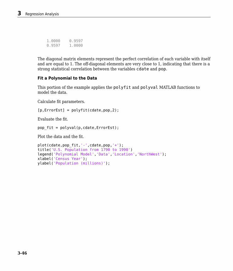
1.0000 0.9597 0.9597 1.0000
The diagonal matrix elements represent the perfect correlation of each variable with itselfand are equal to 1. The off-diagonal elements are very close to 1, indicating that there is astrong statistical correlation between the variables cdate and pop.
Fit a Polynomial to the Data
This portion of the example applies the polyfit and polyval MATLAB functions tomodel the data.
Calculate fit parameters.
[p,ErrorEst] = polyfit(cdate,pop,2);
Evaluate the fit.
pop_fit = polyval(p,cdate,ErrorEst);
Plot the data and the fit.
plot(cdate,pop_fit,'-',cdate,pop,'+');title('U.S. Population from 1790 to 1990')legend('Polynomial Model','Data','Location','NorthWest');xlabel('Census Year');ylabel('Population (millions)');
3 Regression Analysis
3-46

The plot shows that the quadratic-polynomial fit provides a good approximation to thedata.
Calculate the residuals for this fit.
res = pop - pop_fit;figure, plot(cdate,res,'+')title('Residuals for the Quadratic Polynomial Model')
Programmatic Fitting
3-47

Notice that the plot of the residuals exhibits a pattern, which indicates that a second-degree polynomial might not be appropriate for modeling this data.
Plot and Calculate Confidence Bounds
Confidence bounds are confidence intervals for a predicted response. The width of theinterval indicates the degree of certainty of the fit.
This portion of the example applies polyfit and polyval to the census sample data toproduce confidence bounds for a second-order polynomial model.
The following code uses an interval of ±2D , which corresponds to a 95% confidenceinterval for large samples.
3 Regression Analysis
3-48

Evaluate the fit and the prediction error estimate (delta).
[pop_fit,delta] = polyval(p,cdate,ErrorEst);
Plot the data, the fit, and the confidence bounds.
plot(cdate,pop,'+',... cdate,pop_fit,'g-',... cdate,pop_fit+2*delta,'r:',... cdate,pop_fit-2*delta,'r:'); xlabel('Census Year');ylabel('Population (millions)');title('Quadratic Polynomial Fit with Confidence Bounds')grid on
Programmatic Fitting
3-49

The 95% interval indicates that you have a 95% chance that a new observation will fallwithin the bounds.
3 Regression Analysis
3-50

Time Series Analysis
• “What Are Time Series?” on page 4-2• “Time Series Objects” on page 4-3
4

What Are Time Series?Time series are data vectors sampled over time, in order, often at regular intervals. Theyare distinguished from randomly sampled data, which form the basis of many other dataanalyses. Time series represent the time-evolution of a dynamic population or process.The linear ordering of time series gives them a distinctive place in data analysis, with aspecialized set of techniques.
Time series analysis is concerned with:
• Identifying patterns• Modeling patterns• Forecasting values
Several dedicated MATLAB functions perform time series analysis. This sectionintroduces objects and interactive tools for time series analysis.
4 Time Series Analysis
4-2

Time Series ObjectsIn this section...“Types of Time Series and Their Uses” on page 4-3“Time Series Data Sample” on page 4-3“Example: Time Series Objects and Methods” on page 4-5“Time Series Constructor” on page 4-17“Time Series Collection Constructor” on page 4-17
Types of Time Series and Their UsesMATLAB time series objects are of two types:
• timeseries — Stores data and time values, as well as the metadata information thatincludes units, events, data quality, and interpolation method
• tscollection — Stores a collection of timeseries objects that share a commontime vector, convenient for performing operations on synchronized time series withdifferent units
This section discusses the following topics:
• Using time series constructors to instantiate time series classes• Modifying object properties using set methods or dot notation• Calling time series functions and methods
To get a quick overview of programming with timeseries and tscollection objects,follow the steps in “Example: Time Series Objects and Methods” on page 4-5.
Time Series Data SampleTo properly understand the description of timeseries object properties and methods inthis documentation, it is important to clarify some terms related to storing data in atimeseries object—the difference between a data value and a data sample.
A data value is a single, scalar value recorded at a specific time. A data sample consists ofone or more values associated with a specific time in the timeseries object. Thenumber of data samples in a time series is the same as the length of the time vector.
Time Series Objects
4-3

For example, consider data that consists of three sensor signals: two signals represent theposition of an object in meters, and the third represents its velocity in meters/second.
To enter the data matrix, type the following at the MATLAB prompt:
x = [-0.2 -0.3 13; -0.1 -0.4 15; NaN 2.8 17; 0.5 0.3 NaN; -0.3 -0.1 15]
The NaN value represents a missing data value. MATLAB displays the following 5-by-3matrix:
x= -0.2000 -0.3000 13.0000 -0.1000 -0.4000 15.0000 NaN 2.8000 17.0000 0.5000 0.3000 NaN -0.3000 -0.1000 15.0000
The first two columns of x contain quantities with the same units and you can create amultivariate timeseries object to store these two time series. For more informationabout creating timeseries objects, see “Time Series Constructor” on page 4-17. Thefollowing command creates a timeseries object ts_pos to store the position values:
ts_pos = timeseries(x(:,1:2), 1:5, 'name', 'Position')
MATLAB responds by displaying the following properties of ts_pos:
timeseries
Common Properties: Name: 'Position' Time: [5x1 double] TimeInfo: [1x1 tsdata.timemetadata] Data: [5x2 double] DataInfo: [1x1 tsdata.datametadata]
More properties, Methods
The Length of the time vector, which is 5 in this example, equals the number of datasamples in the timeseries object. Find the size of the data sample in ts_pos by typingthe following at the MATLAB prompt:
4 Time Series Analysis
4-4

getdatasamplesize(ts_pos)
ans =
1 2
Similarly, you can create a second timeseries object to store the velocity data:
ts_vel = timeseries(x(:,3), 1:5, 'name', 'Velocity');
Find the size of each data sample in ts_vel by typing the following:
getdatasamplesize(ts_vel)
ans =
1 1
Notice that ts_vel has one data value in each data sample and ts_pos has two datavalues in each data sample.
Note In general, when the time series data is an M-by-N-by-P-by-... multidimensionalarray with M samples, the size of each data sample is N-by-P-by-... .
If you want to perform operations on the ts_pos and ts_vel timeseries objects whilekeeping them synchronized, group them in a time series collection. For more information,see “Time Series Collection Constructor Syntax” on page 4-18.
Example: Time Series Objects and Methods• “Creating Time Series Objects” on page 4-6• “Viewing Time Series Objects” on page 4-7• “Modifying Time Series Units and Interpolation Method” on page 4-9• “Defining Events” on page 4-9• “Creating Time Series Collection Objects” on page 4-10• “Resampling a Time Series Collection Object” on page 4-11• “Adding a Data Sample to a Time Series Collection Object” on page 4-12• “Removing and Interpolating Missing Data” on page 4-13
Time Series Objects
4-5

• “Removing a Time Series from a Time Series Collection” on page 4-15• “Displaying Time Vector Values as Date Strings” on page 4-15• “Plotting Time Series Collection Members” on page 4-15
Creating Time Series Objects
This portion of the example illustrates how to create several timeseries objects from anarray. For more information about the timeseries object, see “Time Series Constructor”on page 4-17.
Import the sample data from count.dat to the MATLAB workspace.
load count.dat
This adds the 24-by-3 matrix, count, to the workspace. Each column of count representshourly vehicle counts at each of three town intersections.
View the count matrix.
count
Create three timeseries objects to store the data collected at each intersection.
count1 = timeseries(count(:,1), 1:24,'name', 'intersection1');count2 = timeseries(count(:,2), 1:24,'name', 'intersection2');count3 = timeseries(count(:,3), 1:24,'name', 'intersection3');
Note In the above construction, timeseries objects have both a variable name (e.g.,count1) and an internal object name (e.g., intersection1). The variable name is usedwith MATLAB functions. The object name is a property of the object, accessed with objectmethods. For more information on timeseries object properties and methods, see “TimeSeries Properties” on page 4-17 and “Time Series Methods” on page 4-17.
By default, a time series has a time vector having units of seconds and a start time of 0sec. The example constructs the count1, count2, and count3 time series objects withstart times of 1 sec, end times of 24 sec, and 1-sec increments. You will change the timeunits to hours in “Modifying Time Series Units and Interpolation Method” on page 4-9.
Note If you want to create a timeseries object that groups the three data columns incount, use the following syntax:
4 Time Series Analysis
4-6

count_ts = timeseries(count, 1:24,'name','traffic_counts')
This is useful when all time series have the same units and you want to keep themsynchronized during calculations.
Viewing Time Series Objects
After creating a timeseries object, as described in “Creating Time Series Objects” onpage 4-6, you can view it in the Variables editor.
To view a timeseries object like count1 in the Variables editor, use either of thefollowing methods:
• Type open('count1') at the command prompt.• On the Home tab, in the Variable section, click Open Variable and select count1.
Time Series Objects
4-7
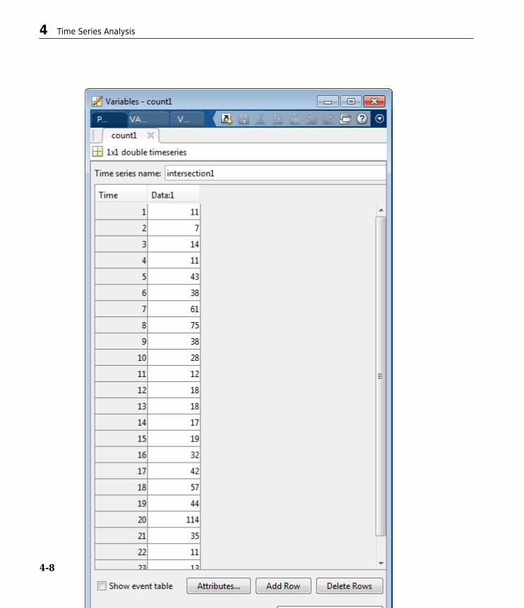
4 Time Series Analysis
4-8

Modifying Time Series Units and Interpolation Method
After creating a timeseries object, as described in “Creating Time Series Objects” onpage 4-6, you can modify its units and interpolation method using dot notation.
View the current properties of count1.
get(count1)
MATLAB displays the current property values of the count1 timeseries object.
View the current DataInfo properties using dot notation.
count1.DataInfo
Change the data units for count1 to 'cars'.
count1.DataInfo.Units = 'cars';
Set the interpolation method for count1 to zero-order hold.
count1.DataInfo.Interpolation = tsdata.interpolation('zoh');
Verify that the DataInfo properties have been modified.
count1.DataInfo
Modify the time units to be 'hours' for the three time series.
count1.TimeInfo.Units = 'hours';count2.TimeInfo.Units = 'hours';count3.TimeInfo.Units = 'hours';
Defining Events
This portion of the example illustrates how to define events for a timeseries object byusing the tsdata.event auxiliary object. Events mark the data at specific times. Whenyou plot the data, event markers are displayed on the plot. Events also provide aconvenient way to synchronize multiple time series.
Add two events to the data that mark the times of the AM commute and PM commute.
Construct and add the first event to all time series. The first event occurs at 8 AM.
e1 = tsdata.event('AMCommute',8);e1.Units = 'hours'; % Specify the units for time
Time Series Objects
4-9

count1 = addevent(count1,e1); % Add the event to count1count2 = addevent(count2,e1); % Add the event to count2count3 = addevent(count3,e1); % Add the event to count3
Construct and add the second event to all time series. The second event occurs at 6 PM.
e2 = tsdata.event('PMCommute',18);e2.Units = 'hours'; % Specify the units for timecount1 = addevent(count1,e2); % Add the event to count1count2 = addevent(count2,e2); % Add the event to count2count3 = addevent(count3,e2); % Add the event to count3
Plot the time series, count1.
figureplot(count1)
When you plot any of the time series, the plot method defined for time series objectsdisplays events as markers. By default markers are red filled circles.
The plot reflects that count1 uses zero-order-hold interpolation.
Plot count2.
plot(count2)
If you plot time series count2, it replaces the count1 display. You see its events and thatit uses linear interpolation.
Overlay time series plots by setting hold on.
hold onplot(count3)
Creating Time Series Collection Objects
This portion of the example illustrates how to create a tscollection object. Eachindividual time series in a collection is called a member. For more information about thetscollection object, see “Time Series Collection Constructor” on page 4-17.
Note Typically, you use the tscollection object to group synchronized time series thathave different units. In this simple example, all time series have the same units and thetscollection object does not provide an advantage over grouping the three time series
4 Time Series Analysis
4-10

in a single timeseries object. For an example of how to group several time series in onetimeseries object, see “Creating Time Series Objects” on page 4-6.
Create a tscollection object named count_coll and use the constructor syntax toimmediately add two of the three time series currently in the MATLAB workspace (youwill add the third time series later).
tsc = tscollection({count1 count2},'name', 'count_coll')
Note The time vectors of the timeseries objects you are adding to the tscollectionmust match.
Notice that the Name property of the timeseries objects is used to name the collectionmembers as intersection1 and intersection2.
Add the third timeseries object in the workspace to the tscollection.
tsc = addts(tsc, count3)
All three members in the collection are listed.
Resampling a Time Series Collection Object
This portion of the example illustrates how to resample each member in a tscollectionusing a new time vector. The resampling operation is used to either select existing data atspecific time values, or to interpolate data at finer intervals. If the new time vectorcontains time values that did not exist in the previous time vector, the new data values arecalculated using the default interpolation method you associated with the time series.
Resample the time series to include data values every 2 hours instead of every hour andsave it as a new tscollection object.
tsc1 = resample(tsc,1:2:24)
In some cases you might need a finer sampling of information than you currently have andit is reasonable to obtain it by interpolating data values.
Interpolate values at each half-hour mark.
tsc1 = resample(tsc,1:0.5:24)
Time Series Objects
4-11

To add values at each half-hour mark, the default interpolation method of a time series isused. For example, the new data points in intersection1 are calculated by using thezero-order hold interpolation method, which holds the value of the previous sampleconstant. You set the interpolation method for intersection1 as described in“Modifying Time Series Units and Interpolation Method” on page 4-9.
The new data points in intersection2 and intersection3 are calculated using linearinterpolation, which is the default method.
Plot the members of tsc1 with markers to see the results of interpolating.
hold off % Allow axes to clear before plottingplot(tsc1.intersection1,'-xb','Displayname','Intersection 1')
You can see that data points have been interpolated at half-hour intervals, and thatIntersection 1 uses zero-order-hold interpolation, while the other two members use linearinterpolation.
Maintain the graph in the figure while you add the other two members to the plot.Because the plot method suppresses the axis labels while hold is on, also add a legendto describe the three series.
hold onplot(tsc1.intersection2,'-.xm','Displayname','Intersection 2')plot(tsc1.intersection3,':xr','Displayname','Intersection 3')legend('show','Location','NorthWest')
Adding a Data Sample to a Time Series Collection Object
This portion of the example illustrates how to add a data sample to a tscollection.
Add a data sample to the intersection1 collection member at 3.25 hours (i.e., 15minutes after the hour).
tsc1 = addsampletocollection(tsc1,'time',3.25,... 'intersection1',5);
There are three members in the tsc1 collection, and adding a data sample to onemember adds a data sample to the other two members at 3.25 hours. However, becauseyou did not specify the data values for intersection2 and intersection3 in the newsample, the missing values are represented by NaNs for these members. To learn how toremove or interpolate missing data values, see “Removing Missing Data” on page 4-13and “Interpolating Missing Data” on page 4-14.
4 Time Series Analysis
4-12

tsc1 Data from 2.0 to 3.5 Hours
Hours Intersection 1 Intersection 2 Intersection 32.0 7 13 112.5 7 15 15.53.0 14 17 203.25 5 NaN NaN3.5 14 15 14.5
To view all intersection1 data (including the new sample at 3.25 hours), type
tsc1.intersection1
Similarly, to view all intersection2 data (including the new sample at 3.25 hourscontaining a NaN value), type
tsc1.intersection2
Removing and Interpolating Missing Data
Time series objects use NaNs to represent missing data. This portion of the exampleillustrates how to either remove missing data or interpolate values for it by using theinterpolation method you specified for that time series. In “Adding a Data Sample to aTime Series Collection Object” on page 4-12, you added a new data sample to the tsc1collection at 3.25 hours.
As the tsc1 collection has three members, adding a data sample to one member added adata sample to the other two members at 3.25 hours. However, because you did notspecify the data values for the intersection2 and intersection3 members at 3.25hours, they currently contain missing values, represented by NaNs.
Removing Missing Data
Find and remove the data samples containing NaN values in the tsc1 collection.
tsc1 = delsamplefromcollection(tsc1,'index',... find(isnan(tsc1.intersection2.Data)));
This command searches one tscollection member at a time—in this case,intersection2. When a missing value is located in intersection2, the data at thattime is removed from all members of the tscollection.
Time Series Objects
4-13

Note Use dot-notation syntax to access the Data property of the intersection2member in the tsc1 collection:
tsc1.intersection2.Data
For a complete list of timeseries properties, see “Time Series Properties” on page 4-17.
Interpolating Missing Data
For the sake of this example, reintroduce NaN values in intersection2 andintersection3.
tsc1 = addsampletocollection(tsc1,'time',3.25,... 'intersection1',5);
Interpolate the missing values in tsc1 using the current time vector (tsc1.Time).
tsc1 = resample(tsc1,tsc1.Time);
This replaces the NaN values in intersection2 and intersection3 by using linearinterpolation—the default interpolation method for these time series.
Note Dot notation tsc1.Time is used to access the Time property of the tsc1collection. For a complete list of tscollection properties, see “Time Series CollectionProperties” on page 4-19.
To view intersection2 data after interpolation, for example, type
tsc1.intersection2
4 Time Series Analysis
4-14

New tsc1 Data from 2.0 to 3.5 HoursHours Intersection 1 Intersection 2 Intersection 32.0 7 13 112.5 7 15 15.53.0 14 17 203.25 5 16 17.33.5 14 15 14.5
Removing a Time Series from a Time Series Collection
Remove the intersection3 time series from the tscollection object tsc1.
tsc1 = removets(tsc1,'intersection3')
Two time series as members in the collection are now listed.
Displaying Time Vector Values as Date Strings
This portion of the example illustrates how to control the format in which numerical timevector display, using MATLAB date strings. For a complete list of the MATLAB date-stringformats supported for timeseries and tscollection objects, see the definition of timevector definition in the timeseries reference page.
To use date strings, you must set the StartDate field of the TimeInfo property. Allvalues in the time vector are converted to date strings using StartDate as a referencedate.
Suppose the reference date occurs on December 25, 2009.
tsc1.TimeInfo.Units = 'hours';tsc1.TimeInfo.StartDate = '25-DEC-2009 00:00:00';
Similarly to what you did with the count1, count2, and count3 time series objects, setthe data units to of the tsc1 members to the string 'car count'.
tsc1.intersection1.DataInfo.Units = 'car count';tsc1.intersection2.DataInfo.Units = 'car count';
Plotting Time Series Collection Members
To plot data in a time series collection, you plot its members one at a time.
Time Series Objects
4-15

First graph tsc1 member intersection1.
hold offplot(tsc1.intersection1);
When you plot a member of a time series collection, its time units display on the x-axisand its data units display on the y-axis. The plot title is displayed as 'Time SeriesPlot:<member name>'.
If you use the same figure to plot a different member of the collection, no annotationsdisplay. The time series plot method does not attempt to update labels and titles whenhold is on because the descriptors for the series can be different.
Plot intersection1 and intersection2 in the same figure. Prevent overwriting theplot, but remove axis labels and title. Add a legend and set the DisplayName property ofthe line series to label each member.
plot(tsc1.intersection1,'-xb','Displayname','Intersection 1')hold onplot(tsc1.intersection2,'-.xm','Displayname','Intersection 2')legend('show','Location','NorthWest')
The plot now includes the two time series in the collection: intersection1 andintesection2. Plotting the second graph erased the labels on the first graph.
Finally, change the date strings on the x-axis to hours and plot the two time seriescollection members again with a legend.
Specify time units to be 'hours' for the collection.
tsc1.TimeInfo.Units = 'hours';
Specify the format for displaying time.
tsc1.TimeInfo.Format = 'HH:MM';
Recreate the last plot with new time units.
hold offplot(tsc1.intersection1,'-xb','Displayname','Intersection 1')
% Prevent overwriting plot, but remove axis labels and title.hold onplot(tsc1.intersection2,'-.xm','Displayname','Intersection 2')
4 Time Series Analysis
4-16

legend('show','Location','NorthWest')
% Restore the labels with the |xlabel| and |ylabel| commands and overlay a% data grid.xlabel('Time (hours)')ylabel('car count')grid on
For more information on plotting options for time series, see timeseries.
Time Series ConstructorBefore implementing the various MATLAB functions and methods specifically designed tohandle time series data, you must create a timeseries object to store the data. Seetimeseries for the timeseries object constructor syntax.
For an example of using the constructor, see “Creating Time Series Objects” on page 4-6.
Time Series Properties
See timeseries for a description of all the timeseries object properties. You canspecify the Data, IsTimeFirst, Name, Quality, and Time properties as inputarguments in the constructor. To assign other properties, use the set function or dotnotation.
Note To get property information from the command line, type help timeseries/tsprops at the MATLAB prompt.
For an example of editing timeseries object properties, see “Modifying Time SeriesUnits and Interpolation Method” on page 4-9.
Time Series Methods
For a description of all the time series methods, see timeseries.
Time Series Collection Constructor• “Introduction” on page 4-18• “Time Series Collection Constructor Syntax” on page 4-18
Time Series Objects
4-17

• “Time Series Collection Properties” on page 4-19• “Time Series Collection Methods” on page 4-20
Introduction
The MATLAB object, called tscollection, is a MATLAB variable that groups severaltime series with a common time vector. The timeseries objects that you include in thetscollection object are called members of this collection, and possess several methodsfor convenient analysis and manipulation of timeseries.
Time Series Collection Constructor Syntax
Before you implement the MATLAB methods specifically designed to operate on acollection of timeseries objects, you must create a tscollection object to store thedata.
The following table summarizes the syntax for using the tscollection constructor. Foran example of using this constructor, see “Creating Time Series Collection Objects” onpage 4-10.
4 Time Series Analysis
4-18

Time Series Collection Syntax Descriptions
Syntax Descriptiontsc = tscollection(ts) Creates a tscollection object tsc that
includes one or more timeseries objects.
The ts argument can be one of the following:
• Single timeseries object in the MATLABworkspace
• Cell array of timeseries objects in theMATLAB workspace
The timeseries objects share the same timevector in the tscollection.
tsc = tscollection(Time) Creates an empty tscollection object with thetime vector Time.
When time values are date strings, you mustspecify Time as a cell array of date strings.
tsc = tscollection(Time,TimeSeries, 'Parameter',Value, ...)
Optionally enter the following parameter-valuepairs after the Time and TimeSeries arguments:
• Name (see “Time Series Collection Properties”on page 4-19)
Time Series Collection Properties
This table lists the properties of the tscollection object. You can specify the Name,Time, and TimeInfo properties as input arguments in the tscollection constructor.
Time Series Objects
4-19

Time Series Collection Property Descriptions
Property DescriptionName tscollection object name entered as a string. This name can
differ from the name of the tscollection variable in theMATLAB workspace.
Time A vector of time values.
When TimeInfo.StartDate is empty, the numerical Timevalues are measured relative to 0 in specified units. WhenTimeInfo.StartDate is defined, the time values represent datestrings measured relative to StartDate in specified units.
The length of Time must match either the first or the lastdimension of the Data property of each tscollection member.
TimeInfo Uses the following fields to store contextual information aboutTime:
• Units — Time units with the following values: 'weeks','days', 'hours', 'minutes', 'seconds','milliseconds', 'microseconds', and 'nanoseconds'
• Start — Start time• End — End time (read-only)• Increment — Interval between two subsequent time values.
The increment is NaN when times are not uniformly sampled.• Length — Length of the time vector (read-only)• Format — String defining the date string display format. See
the MATLAB datestr function reference page for moreinformation.
• StartDate — Date string defining the reference date. Seethe MATLAB setabstime function reference page for moreinformation.
• UserData — Stores any additional user-defined information
Time Series Collection Methods
• “General Time Series Collection Methods” on page 4-21
4 Time Series Analysis
4-20

• “Data and Time Manipulation Methods” on page 4-21
General Time Series Collection Methods
Use the following methods to query and set object properties, and plot the data.
Methods for Querying Properties
Method Descriptionget Query tscollection object property values.isempty Evaluate to true for an empty tscollection
object.length Return the length of the time vector.plot Plot the time series in a collection.set Set tscollection property values.size Return the size of a tscollection object.
Data and Time Manipulation Methods
Use the following methods to add or delete data samples, and manipulate thetscollection object.
Time Series Objects
4-21

Methods for Manipulating Data and Time
Method Descriptionaddts Add a timeseries object to a tscollection
object.addsampletocollection Add data samples to a tscollection object.delsamplefromcollection Delete one or more data samples from a
tscollection object.getabstime Extract a date-string time vector from a
tscollection object into a cell array.getsampleusingtime Extract data samples from an existing
tscollectionobject into a new tscollectionobject.
gettimeseriesnames Return a cell array of time series names in atscollection object.
horzcat Horizontal concatenation of tscollection objects.Combines several timeseries objects with thesame time vector into one time series collection.
removets Remove one or more timeseries objects from atscollection object.
resample Select or interpolate data in a tscollection objectusing a new time vector.
setabstime Set the time values in the time vector of atscollection object as date strings.
settimeseriesnames Change the name of the selected timeseriesobject in a tscollection object.
vertcat Vertical concatenation of tscollection objects.Joins several tscollection objects along the timedimension.
4 Time Series Analysis
4-22