Embed Size (px)
Citation preview

NASA REASoN Project # NNL05AA00A
Application of ESE Data and Tools to Air Quality Management: Services for Helping the Air quality community use ESE Data (SHAirED)
Final Report
By Stefan Falke and Rudolf Husar
Washington University in St. Louis St. Louis, Missouri
Project Period of Performance November 2004 – October 2009
https://ntrs.nasa.gov/search.jsp?R=20120000702 2018-07-18T17:37:11+00:00Z

2
Abstract
The goal of this REASoN applications and technology project is to deliver and use Earth Science Enterprise (ESE) data and tools in support of air quality management. Its scope falls within the domain of air quality management and aims to develop a federated air quality information sharing network that includes data from NASA, EPA, US States and others. Project goals were achieved through a access of satellite and ground observation data, web services information technology, interoperability standards, and air quality community collaboration.
In contributing to a network of NASA ESE data in support of particulate air quality management, the project will develop access to distributed data, build Web infrastructure, and create tools for data processing and analysis. The key technologies used in the project include emerging web services for developing self describing and modular data access and processing tools, and service oriented architecture for chaining web services together to assemble customized air quality management applications.
The technology and tools required for this project were developed within DataFed.net, a shared infrastructure that supports collaborative atmospheric data sharing and processing web services. Much of the collaboration was facilitated through community interactions through the Federation of Earth Science Information Partners (ESIP) Air Quality Workgroup.
The main activities during the project that successfully advanced DataFed, enabled air quality applications and established community-oriented infrastructures were:
• develop access to distributed data (surface and satellite), • build Web infrastructure to support data access, processing and analysis • create tools for data processing and analysis • foster air quality community collaboration and interoperability

3
ContentsAbstract ................................................................................................................................................ 2 Quad Chart ........................................................................................................................................... 4 Introduction .......................................................................................................................................... 5 Technology Development: DataFed ..................................................................................................... 5
Overview .......................................................................................................................................... 6 Architecture ...................................................................................................................................... 6
Enterprise Viewpoint -Value Creation from Earth Observations ................................................ 7 Information Viewpoint - Earth Observations ............................................................................... 8 Computational Viewpoint - Service Oriented Interoperability .................................................... 9 Engineering Viewpoint – Interaction Between Components ..................................................... 12 Technology Viewpoint - Component Instances ......................................................................... 12 User Viewpoint - Integrated User Tools, Workspaces ............................................................... 13
Applications ....................................................................................................................................... 14 Exceptional Events ......................................................................................................................... 14
Georgia Smoke May 2007 .......................................................................................................... 14 Wildfire Smoke .............................................................................................................................. 16
Data ............................................................................................................................................ 16 Tools ........................................................................................................................................... 17 Near Real-time Application ....................................................................................................... 23
NO2 Patterns and Trends ................................................................................................................ 24 Community Collaboration .................................................................................................................. 25
ESDSWG ....................................................................................................................................... 26 Federation of Earth Science Information Partners (ESIP) ............................................................. 26
Sustainability ...................................................................................................................................... 27

4
Quad Chart

5
Introduction
ecent developments offer outstanding opportunities to fulfill the information needs for atmospheric sciences and air quality management. High-resolution satellite sensors with global coverage now provide near-real-time snapshots which depict the spatial and temporal pattern of haze, smoke, dust and other atmospheric constituents in stunning detail. The data from surface-based monitoring networks now routinely provide detailed chemical composition of the atmosphere. The ‘terabytes’ of data from these surface and remote sensors can now be stored, processed and delivered in near-real time and the instantaneous ‘horizontal’ diffusion of information via the Internet now permits, in principle, the delivery of the right information to the right people at the right place and time. Standardized computer-computer communication languages and Service-Oriented Architectures (SOA) now facilitate the flexible processing of raw data into high-grade ‘actionable’ knowledge. Last but not least, the World Wide Web has opened the way to generous sharing of data and tools leading to faster knowledge creation through collaborative analysis in real and virtual workgroups. Nevertheless, atmospheric scientists and air quality managers face significant hurdles. The production of Earth observations and models are rapidly outpacing the rate at which these observations are assimilated and metabolized into actionable knowledge that can produce societal benefits. The “data deluge” problem is especially acute for analysts interested in aerosol pollution, since the aerosol processes are inherently complex, the numerous relevant data range form detailed surface-based chemical measurements to extensive satellite remote sensing and the integration of these requires the use of sophisticated models. As a consequence, Earth Observations (EO) are under-utilized in making societal decisions. The REASoN project described in this report has made substantial contributions to alleviating the issues in working with satellite, surface and modeled data. DataFed has matured into a robust framework for sharing, accessing, analyzing and visualizing multi-sources of air quality related information. The project has also established an active community within air quality that collaborates in the use and application of the latest advances in information science to air quality research and management. Project activities are presented in this final report in the following sequence:
Technology Development – Advancement of DataFed Applications – Example uses in air quality research and management Community Collaboration – Interactions through ESIP, GEO and elsewhere Sustainability – Post-REASoN project continuation of air quality information networks
Technology Development: DataFed The primary technical research and development during the project was focused on extending the Web infrastructure of DataFed (www.datafed.net) for sharing distributed earth science data (surface and satellite) and creating tools for data processing and analysis, with particular emphasis on supporting air quality research and management.
R
6
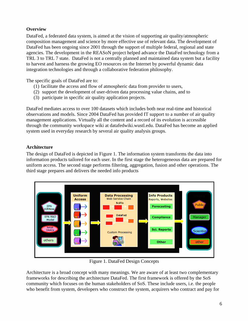
Overview
DataFed, a federated data system, is aimed at the vision of supporting air quality/atmospheric composition management and science by more effective use of relevant data. The development of DataFed has been ongoing since 2001 through the support of multiple federal, regional and state agencies. The development in the REASoN project helped advance the DataFed technology from a TRL 3 to TRL 7 state. DataFed is not a centrally planned and maintained data system but a facility to harvest and harness the growing EO resources on the Internet by powerful dynamic data integration technologies and through a collaborative federation philosophy. The specific goals of DataFed are to:
(1) facilitate the access and flow of atmospheric data from provider to users, (2) support the development of user-driven data processing value chains, and to (3) participate in specific air quality application projects.
DataFed mediates access to over 100 datasets which includes both near real-time and historical observations and models. Since 2004 DataFed has provided IT support to a number of air quality management applications. Virtually all the content and a record of its evolution is accessible through the community workspace wiki at datafedwiki.wustl.edu. DataFed has become an applied system used in everyday research by several air quality analysis groups.
Architecture
The design of DataFed is depicted in Figure 1. The information system transforms the data into information products tailored for each user. In the first stage the heterogeneous data are prepared for uniform access. The second stage performs filtering, aggregation, fusion and other operations. The third stage prepares and delivers the needed info products
Figure 1. DataFed Design Concepts
Architecture is a broad concept with many meanings. We are aware of at least two complementary frameworks for describing the architecture DataFed. The first framework is offered by the SoS community which focuses on the human stakeholders of SoS. These include users, i.e. the people who benefit from system, developers who construct the system, acquirers who contract and pay for

7
the system, testers who evaluate system for suitability, sustainers who keep the system up to date, trainers who insure that the users know how to use it and researchers who provide the next generation of ideas. The architecture of the enterprise is then described in terms of the activities of these stakeholders and the system components and connectivity that they require. Another, more formal, approach describes a system’s (not system of systems) architecture using the reference model for open distributed processing. RM-ODP, which is used the ISO 19100 series of geographic information standards. The GOESS architecture is also described using the RM-ODP framework. Using this reference model, the information system (IS) is described from five different points of view: enterprise, information, computational, engineering and technology using a specific language applied to each viewpoint. We are not aware of a reference model that is applicable to both systems and system of systems. For sake of simplicity and fluidity, in this report we use RM-ODP viewpoint categorization as a loose guide.
Enterprise Viewpoint -Value Creation from Earth Observations
The enterprise viewpoint focuses on the purpose, scope and policies of the SoS IS. From the perspective of the entire GEO Enterprise, the purpose of the system (of systems) is to provide societal benefits by better informed decision-making through the use of Earth observations and models. The overall model of the GEO Enterprise is shown in Figure 2, depicting a sensory-motor feedback loop. Earth observations and models provide the sensory and scientific input into the Decision Support System (DSS) which, in turn, produces actionable knowledge for decision-making at policy, management and personal levels. The adaptive functionality of GEOSS is maintained by the feedback loop which drives the adjustments to the observations, models as well as to the GEOSS infrastructure. For Earth observations and models, the role of GEOSS is to facilitate universal access to EO data as public good. This is to be accomplished by the GEOSS Core Architecture which serves as a broker between service providers and service users. Through this mediation, the GEOSS core infrastructure acquires the characteristics of a 'value network'. The core architecture that mediates the service exchange is agnostic of the end user and the SBAs it may serves.
Figure 2 GEOSS framework based on NASA Applications Framework Diagram.

8
Figure 3. Decision system patter for air quality
The right side of Figure 2, includes the decision section, depends strongly on the application area where the societal benefits are to be derived. For air quality, the components of the decision making system can be expressed in more detail, Fig. 3. The schematic indicates that the actors participating in air quality decision support system include data mangers, data processing technical analysts, and ‘informers’ who prepare the technical information for the decision makers. These classes of actors are necessary for most air quality decision support systems, including international policy making regarding hemispheric transport of pollutants, regulatory decisions as part of routine air quality management and in DSS for informing the public through real-time data delivery and forecasting. It is worth highlighting that key users of air quality decision systems are technical analysts and the IS needs to be tailored primarily to their needs. Also, much of the communication along the value chain in the DSS is between the human participants through reports and verbal communication rather than computer-computer interactions. In summary, the role of DataFed is to provide air quality-related data as services and to participate in the testing of the GEOSS core architecture. DataFed is also a decision support system for air quality management and contributes to the refinement of the user requirements in this field.
Information Viewpoint - Earth Observations
The information viewpoint focuses on the semantics of the information and information processing. The abstract data model used in DataFed is that of a four dimensional data cube (x, y, z, t) (Figure 4). The cube dimensions are expressed as the physical dimensions of the Earth system as latitude-longitude, elevation and time units. The 4-D data model is particularly applicable for representing space-time varying phenomena in Fluid Earth Sciences which include the atmosphere and the oceans.

9
Figure 4. Four-dimensional data model and typical slices through the 4D data cube.
All the data queries are formulated in terms of the 4-D data cube. Typical queries are slices across different dimensions of the data cube as shown schematically in Figure 4. This simple data model is consistent with the Open Geospatial Consortium (OGC) standard data access protocols, Web Map Service (WMS) and Web Coverage Service (WCS). For example, the WMS query returns an image representing a slice in the latitude-longitude plane. The WCS query is similar, but it returns numeric data rather than images. WCS is particularly applicable for representing space-time-varying phenomena in Fluid Earth Sciences, atmosphere and oceans. The main data types used in DataFed are map images, n-dimensional grids and tables representing station point monitoring data. These have direct correspondence with the formally defined data types in the OGC standards for Web Map Service (WMS), Web Coverage Service (WCS) and Web Feature Service (WFS) respectively. In some cases it is more convenient to serve point monitoring data through the WCS protocol since it allows data access through the powerful spate-time query.
Computational Viewpoint - Service Oriented Interoperability
This viewpoint of the IS architecture describes the functional relationship between the distributed components and their interaction at the interfaces. This viewpoint highlights the key difference between the traditional client-server architecture and the loosely coupled, networked architecture (Fig. 5).

10
Figure 5. Schematics of traditional client-server and mediated architectures.
In the client-server architecture the individual servers are designed and maintained as autonomous systems, each delivering information in its own way. Users who need to access multiple servers carry the burden of finding the servers, formulating the data access procedures, re-packing the query results and performing the necessary integration and homogenization of results. The chores of homogenizing the distributed, heterogeneous datasets are accomplished by wrappers and mediators. Wrappers provide a uniform interface to heterogeneous data by compensating for physical access and syntactic differences. Each wrapper has two sides, one facing the heterogeneous data source that requires custom programming. Data wrappers incorporate the physical server location, perform the space-time subsetting services, execute format translations etc. The other side of the wrapper faces outward toward the internet cloud and presents the uniform interface to the heterogeneous data, i.e. turning data into machine-consumable services. The wrapper can be physically located on the same server as the data source. However, in a networked environment the wrapping process can be performed as a service by a third party. This is non-intrusive, third party wrapping approach was taken by DataFed for most of the data lacking a standard interface. Initially, our intention was to use the wrappers only for legacy data systems that can not be equipped with WMS/WCS interfaces. Experience over the past four years has shown that the placement of lightweight wrapper and adopter components between network nodes is desirable for all network links, not only for legacy connections. They allow non-intrusive modification of service connections in response to environmental changes, e.g. an update of an interface standard. The result of this ‘wrapping’ process is an array of homogeneous, virtual datasets that can be queried by spatial and temporal attributes and processed into higher-grade data products. Mediators are aggregate software components that accept user queries and return data views. Mediator queries are analogous to the view queries in relational data systems and provide a flexible way of connecting diverse systems which may include legacy databases. The emergence of SOA has provided an additional impetus and technologies for data federation using mediators. Standardization of service interfaces now allows easy creation of mediators using workflow software. In DataFed, the orchestration of processing services is performed by a custom-designed workflow engine using SOAP/WSDL web service interfaces. The workflow is designed for chaining both

11
DataFed services as well as other, external web services. Likewise, DataFed’s services are available to, and have been integrated with, other organization’s workflow software. The Service Oriented Architecture (SOA) of DataFed is used to build data views by connecting the web service components (e.g. services for data access, transformation, fusion, rendering, etc.) in Lego-like assembly. The generic web-tools created in this fashion include browsers for spatial-temporal exploration, multi-view consoles, animators, multi-layer overlays, etc. Figure 6. illustrates a map view consisting of four independent data layers. The view shows the intrusion of forest fire smoke from Quebec to the N.E. United States. The color NASA satellite image is accessed through an OGC WMS data access service. The point monitoring data are accessed from an SQL server through a wrapper, which formulates the SQL queries, based on the geographic bounding box, time range and parameter selection in the OGC WCS query.
Figure 6. A typical web service program for the creation of multi-layer data views.
A data view is a user-specified representation of data accessible through DataFed. Data views consist of a stack of data layers, similar to the stack of spatial GIS data except that DataFed views can represent temporal and other dimensional pattern. Each data layer is created by chaining a set of web services, typically consisting of a DataAccessService which is followed by the services for processing, portrayal etc.. Data views are defined by an XML file which contains the instructions to create a data view. The view file is also used to store the state, i.e. the input settings of the view. Thus, given a valid view file, the DataFed workflow engine can execute the set of web services either the SOAP or the HTTP Get (REST) protocol. The workflow engine for the orchestration of web services is unique in the sense that the service flows generate data views that can be controlled and embedded directly into application software. DataFed has its own catalog where data can be registered for standards-based access for processing, visualization and exploration. DataFed has been registered as a catalog-serving component in the

12
GEOSS registry. For this reason, the datasets are made available for harvesting by the GEOSS Clearinghouse. The interface to the GEOSS Core Architecture is yet to be implemented. The SoS approach also places new demands on governance, in particular on determining the responsibilities of the participating component systems. In case of DataFed, the responsibility for providing data lies with the data providers/custodians. The responsibility for the wrappers and mediators lies with the DataFed community. Data discovery is through the data/service registries while the application programs are in the purview of the end user. Formal mechanisms for governance (e.g. service contracts) for such loosely coupled end-to-end applications are not yet developed.
Engineering Viewpoint – Interaction Between Components
This viewpoint focuses on the mechanisms required to support interaction between distributed components. It involves the identification of key components and their interactions through standard communication and data transfer protocols (Figure 6). In DataFed, we have adopted the OGC WMS and WCS protocols as the "convergence" protocols for the standards-based access for all datasets.
Figure 6. Key data types: sequential images, multidimensional grids and station-point data. And schematics
of OGC standard protocols, WMS and WCS.
OGC WCS is particularly applicable for representing space-time-varying phenomena in Fluid Earth Sciences, atmosphere and oceans. OGC WCS version 1.1 is limited to grids, or "simple” coverages, with homogeneous range sets but future revisions of the standard are anticipated to include support a broader set of coverages, including point coverages. An attractive feature of these services is that (1) they can be executed using the simple, universal HTTP GET/POST Internet protocol; (2) the services are described by formal XML documents (“GetCapabilities”, “DescribeCoverage”) and the output formats can be advertised in those service documents.
Technology Viewpoint - Component Instances
This viewpoint identifies the specific key technologies implemented in the system. The key DataFed technologies are data wrappers, web services and service orchestration as discussed above. Additional technologies are applied for building web-based applications fro the users. A further data federation service is data caching, i.e. local storage or pre-calculation of frequently requested queries. In DataFed the caching consists of densely packed numeric ‘data cubes’ suitable for fast and efficient queries for spatial and temporal views. The data cubes are updated hourly,
13
daily or intermittently as dictated by the data availability and user-need. DataFed also implements image caching. For frequently used views, the data are pre-rendered and stored as images for fast retrieval and interactive browsing. Since data views are themselves dynamically generated images, these can be embedded into web pages and their content controlled through standard controllers and through Javascript. By design, such light-weight web application pages can be designed and hosted on the user's server. The only relationship to DataFed is that the view images are produced dynamically by the DataFed workflow. The entire DataFed system was developed and operating in the Microsoft .NET environment and the production server consists of a pair of Dell redundant servers.
User Viewpoint - Integrated User Tools, Workspaces
Beyond the RM-ODP viewpoints, this section highlights DataFed functionality from the user perspective. DataFed is an integrated exploration and analysis system for advanced data analysts. It was designed and implemented by data analysts, themselves users of the system. The key user tools include:
Data Registry facilitates registering data in the federation and consists of a user-completed form that includes fixed entries required by the Catalog as well as parameters needed data access. For several key data sources (e.g. SQL Servers, sequential images, netCDF files), reusable wrapper templates were developed. There are multiple wrapper classes that produce different data views, i.e. map view and time view. Depending on the data source, data wrappers also require custom programming through Python scripts. Catalog is used for finding federated data. Each catalog record describes the dataset and the services to access to data.
Data Browser and Workflow Editor is the primary tool for the exploration of spatial-temporal pattern of pollutants. The multi-dimensional data are sliced and displayed in spatial views (maps) and in temporal views (time series). Each data view also accepts user input for point and click navigation in the data space. The DataFed browser is also an editor for data processing workflows using a dedicated SOAP-based workflow engine. A typical workflow for map view is shown in Fig. 4. Consoles or Dashboards are for displaying the state of the atmosphere through a collection of data views data from a variety of disparate providers where the sampling time and spatial subset (zoom rectangle) are synchronized. Google Earth Data Browser, is a software mashup between DataFed and Google Earth. The two applications are dynamically linked and the user can select and browse the spatial views of any federated dataset. The Google Earth user interface is particularly suitable for the overlay and display of overlapping, multi-sensory data. The temporal animation of sequential data in Google Earth is also instructive for the visualization of air pollutant dynamics and transport.
DataSpaces are hybrid structured and unstructured wiki pages are wiki pages dedicated to registered datasets (Figure 7). These DataSpaces are designed to harvest user-contributed metadata and connect data providers, mediators and users. These workspaces includes structured dataset descriptions, data lineage, data quality and user feedback as well as other user-submitted content relevant to a dataset.

14
Figure 7. Example DataSpace
Applications
Exceptional Events
The air quality standards for PM2.5 and ozone in the U.S. and E.U. provide for the exclusion of data for a given day when it is strongly influenced by "exceptional events" (EE), such as smoke from wildfires or windblown dust. In order to apply for EE exclusion, organizations must provide appropriate documentation to demonstrate the dominance of uncontrollable sources on that day. Most of the EE days are due to regional or continental-scale smoke or dust events. The availability of near real-time monitoring data from satellite remote sensing data and surface air quality data now allows the early assessment of such events. The candidate methodologies being developed for the quantification and documentation of EEs over the US, including:
(1) Observed/modeled pollutant transport based on trajectory and regional models; (2) Spatial pattern of pollutant derived from surface (AIRNOW, FRM, Visibility) and satellite
data (OMI, GOES, AVHRR, SEAWiFS, MODIS); (3) Temporal pattern analysis; (4) Chemical fingerprinting and source apportionment. The characteristics and initial
climatology of EEs over the US will also be presented along with approaches to iterative reconciliation of observations, emissions and forecast models.
Here we show the application of DataFed in supporting exceptional event analysis.
Georgia Smoke May 2007
The Sweetfarm fire in southern Georgia produced elevated smoke concentrations in the neighboring States for about a month in May 2007. Satellite images and satellite-derived aerosol products are

15
useful for the identification of exceptional events such as biomass burning and forest and agricultural fires, wind-blown dust events. Both the satellite images as well as the numeric data products are generally available in near-realtime. A limitation of the satellite data is that they are semi-quantitative, particularly for estimating surface concentrations. Furthermore, satellite observations of surface-based aerosols are only available during cloud-free conditions. The fire pixels, obtained from satellite and other observations, provide the most direct evidence for the existence and location of major fires (Figure 8). In the above map of fire pixels, the cluster of fires in southern Georgia is evident. The true color MODIS images from Terra (11am) and Aqua (1pm) show a rich texture of clouds, smoke/haze and land. The clouds over Georgia are clearly evident. Inspection of the images shows evidence of smoke/haze along the Mississippi River as well as over the Great Lakes. The Aerosol Optical Thickness (AOT), derived from MODIS Sensors (Terra and Aqua satellites), shows a data void over Georgia due to clouds. The Absorbing Aerosol Index provided by the OMI satellite shows intense smoke in the immediate vicinity of the fire pixels. The lack of OMI smoke signal further away from the fires indicates an absence of smoke. However, it is also possible that the smoke is below the cloud layer and therefore not visible from the satellite. Also, the OMI smoke signal is most sensitive to elevated smoke layers, while near-surface smoke is barely detected. On this day, 2007-05-24, the Tropospheric NO2 column concentration, derived from the OMI sensor, shows only a faint indication of the Georgia fire smoke. Here again, the obstruction by the clouds may be partly responsible for the lack of NO2 signal. Alternatively, the wet, low temperature smoldering fire in Georgia may not produce much NO2.
Figure 8. DataFed Console View of 2007 Georgia Fire and Smoke Event.

16
Wildfire Smoke
We conducted case studies for the type of “value-added” decision-support applications that can be developed using the DataFed infrastructure. The example applications provide tools for dynamically aggregating and comparing differences in fire location data through maps and time series.
Data
Fire related applications are well suited for use by distributed web services. A variety of government, academic, commercial, and non-profit web sites disseminate an impressive collection of fire related data. The data available on these http or ftp sites include fire location, fire characteristics, vegetation, fire weather, modeled smoke patterns, and air pollution concentrations. The prevalence of fire related data and applications on the web is due to a variety of factors including attention given to recent severe wildland fire seasons, the wide range of organizations involved in managing fire and air quality, the multiple uses of the data, a variety of sensors collecting fire data, and the relative simplicity in communicating and understanding the data (e.g., fire location points or satellite images clearly showing the spatial extent smoke plumes). DataFed was used to “wrap” numerous fire datasets through data access services, making them available for use by analysis and rendering services. A subset of the fire-related datasets catalogued in DataFed is described below. The Bureau of Land Management has compiled a collection of fire records from Bureau of Land Management, Bureau of Indian Affairs, U.S. Fish and Wildlife Service, National Park Service, and U.S. Forest Service. The dataset includes fire location, acres burned and likely cause. Forest Service Situation Reports provide daily summaries of fire activity including fire location and total acres burned. (http://famweb.nwcg.gov/) NOAA-NESDIS Hazard Mapping System provides North American fire location and smoke plume data derived from MODIS, GOES, and AVHRR (http://www.ssd.noaa.gov/PS/FIRE/). A satellite imagery analyst inspects the fire detection data, deletes false alarms from the datasets and supplements them with fire locations that are believed to have been missed by the satellite fire detection algorithms. The Forest Service Remote Sensing Applications Center provides maps and tables of active fires derived from MODIS. (http://activefiremaps.fs.fed.us/) EPA’s National Emissions Inventory contains county level emissions estimates for prescribed and wildland fires. (http://www.epa.gov/ttn/chief/net/neidata.html) The Forest Service’s Wildland Fire Assessment System provides fire weather data and information including national fire danger indices, drought indices, and meteorological measurements. (http://www.fs.fed.us/land/wfas/) The European Space Agency ATSR satellite-based sensor detects fire pixels using only nighttime observations. Data are provided with global spatial coverage. (http://dup.esrin.esa.it/ionia/wfa/index.asp)

17
The Canadian Wildland Fire Information System includes a compilation of field observation forest fire data collected by Province, Territory, and Parks Canada fire agencies (Stocks et al, 2001). The data set includes only fires greater than 200 hectares in final size. (http://cwfis.cfs.nrcan.gc.ca/en/historical/ha_lfdb_maps_e.php) The catalog of fire related datasets is accessible through the following URL: http://webapps.datafed.net/dvoy_services/datafed_catalog.aspx?domain=Fire.
Tools
Fire location data are typically presented as maps for a specific day or time period. Web applications were developed to extend the exploration of fire location data to temporal analysis and spatial/temporal aggregation. The DataFed infrastructure was used to create a web service that interactively defines a set of grid nodes at which neighboring fire locations are counted. Spatially aggregated fire counts lend themselves to spatial pattern analysis and. temporal trend analysis because the fire counts at each fixed location node create a record over time. Figure 9 illustrates an example using fire pixel data from the NOAA-NESDIS Hazard Mapping System. During the summer of 2004, a number of large fires burned in central Alaska. The map in Figure 9 shows the aggregated fire pixel count on August 18, 2004 at nodes centered on 50km2 radius grid cells. The size of each red square in the map is proportional to the number of fires counted at a node. The companion time series shows the temporal pattern of the fires for a particular node in the map. The time plot indicates an outbreak of fires in late July followed by a lull until substantial fire activity is detected again in mid-August. Clicking on another location in the map or a different date in the time plot will update the display for the respective location or date thereby allowing simple exploration of the dataset. Aggregating fire location data to a common spatial and temporal frame of reference offers a way to compare multiple datasets. MODIS and GOES fire pixel data are compared spatially and temporally through a web application interface in shown in Figure 2. On July 14, 2004 both MODIS and GOES fire pixel datasets from the NOAA-NESDIS HMS detect fires in Kansas. In general, GOES contains a larger number of fire pixels due, in part, to its higher sampling frequency (15 minutes versus approximately once per day for MODIS). This is particularly evident in the grid node highlighted by the cross hairs in the Figure 10 map. The corresponding June-October 2004 time series for the highlighted location superimposes the temporal trend of the MODIS (red) and GOES (blue) fire pixel count. Both sensors show a peak in fire pixel count on July 14, 2004 followed by a sharp decline on July 15 and 16. However, on July 18, 19, and 20, GOES again shows high fire activity whereas MODIS continues to decline. The differences exposed through the spatial and temporal analysis can assist in understanding the characteristics of each fire detection sensor and associated algorithm. Datasets containing more detailed parameters allow further analysis of fire locations. For example, the BLM fire history dataset includes acres burned and the date a fire was discovered. Figure 3 presents a web application that spatially aggregates acres burned on a 50km2 grid and temporally aggregates acres burned to a monthly resolution. The application includes a map with circles proportional to the sum of the acres burned at a location for a particular year and month. The time series plot shows the monthly total number of acres burned for a particular location. The example in

18
Figure 11 has selected a location in southeastern Idaho where about 2000 thousand acres burned in July 1999. The map reveals that acres burned in the Idaho location are substantially less than in northern Nevada during the same month while the time series highlights that the July 1999 fires were much smaller than the 7500 acres burned in July 1992 in the same part of Idaho.
Figure 9. Spatial-temporal analysis of fire counts. http://webapps.datafed.net/dvoy_services/datafed.aspx?page=Fire_Pixel_Count_AK

19
Figure 10. Spatial-temporal analysis of fire pixel data from MODIS (blue) and GOES (red). http://webapps.datafed.net/dvoy_services/datafed.aspx?page=Fire_Pixel_Count
Figure 11. Spatial-temporal analysis of fire pixel data between MODIS (blue) and GOES (red). http://webapps.datafed.net/dvoy_services/datafed.aspx?page=BLM_AcresBurned A web service was developed to conduct exploratory spatial-temporal analysis of fire location data among satellites and field observations. The service finds the nearest fire detection point in dataset

20
B for each fire detection point in dataset A. The distance and number of days between a fire detection point in dataset A and its nearest neighbor dataset B are calculated and displayed on a map. Figure 12 presents a comparison between GOES and MODIS fire pixels from the NOAA-NESDIS Hazard Mapping System where colored squares indicate the spatial and temporal correspondence between the two satellites derived fire pixel datasets. A red shaded square indicates the distance separating the MODIS and GOES pixels was small while a blue shaded square indicates the nearest neighbor between the datasets were far apart. A red outlined square indicates the nearest neighbor was detected on the same day while a blue outlined square indicates a longer time separation. Gray shaded and/or outlined squares indicate that a nearest neighbor was not found between the two datasets given the search parameters (in this example case, 100 km and 2 days). On July 17, 2004, both GOES and MODIS detected fires in the Central Plains. The distance (both in space and time) is small between GOES and MODIS pixels and are therefore colored red in the maps. The top map displays GOES fire locations colored by their distance to the nearest MODIS pixel. The bottom map displays MODIS fire locations colored by their distance to the nearest GOES pixel. While there is good agreement in Kansas, the fires detected by MODIS in northern Texas were not detected by GOES (and are therefore colored gray).

21
Figure 12. Spatial-temporal “distance” analysis of GOES and MODIS. Red indicates close correspondence between the two datasets http://www.datafed.net/WebApps/MiscApps/ModisGoes/FireLocationComparison.htm Further investigation is being conducted into integrating satellite derived with field observations of fires. Figure 13 presents an early comparison of MODIS derived fire pixels and fire incidents from the Forest Service Situation Report. As one might expect, on a day-to-day basis, the correspondence between the two datasets is mixed. On August 6, 2004 (top map in Figure 13) the two datasets show good correspondence in the Western US with the fires observed in the FS Situation Report and those derived from MODIS being near each other (in space and time). On the other hand, on August 24, MODIS does not detect fires in the vicinity of those observed by the Forest Service, perhaps due to cloud cover preventing detections by MODIS (bottom map in Figure 13)

22
Figure 13. Spatial-temporal analysis of correspondence between MODIS and fires reported in the Forest Service Situation Report. Effective analysis can also be conducted by a simpler aggregation of the data. Figure 14 presents a web application that displays all fire locations within a user-specified time range. In the case presented, the dates span the three week period, August 7 – August 27, 2004. The fire pixels derived from AVHRR are shown in the top map in Figure 14 while MODIS fires are displayed in the bottom map. MODIS and AVHRR show very similar spatial patterns in fire location distribution.
Figure 14. Time range comparison of fire pixels derived from AVHRR and MODIS. http://www.datafed.net/WebApps/MiscApps/Fire/FireLocation.htm

23
DataFed built web applications provide a set of tools for conducting custom and dynamic spatial and temporal analysis of fire data. These types of comparative analyses provide the foundation for more involved analysis of sensor characteristics and algorithms that lead to differences between fire location datasets. The tools are designed to be flexible and adaptive so that they can import other datasets, be extended with more advanced analysis algorithms, or be used in a “chain” of processing services for other applications.
Near Real-time Application
Drought and Santa Ana winds created a "perfect fire" situation in Southern California in late October 2007. A wealth of information created by diverse organizations was disseminated through the Web in near real time to help emergency responders, researchers, managers, and the public better understand and react to the active fires and smoke. Data resources included surface PM2.5 concentrations, satellite and aerial imagery of fire locations, burned area, and smoke plumes, and modeled forecasts of smoke emissions and concentrations. The Internet was also used to deliver “packaged” information reports that summarized data or presented status, such as air quality health alerts. Dissemination mechanisms ranged from ftp sites for “raw” data file download and simple web pages, to standard-based interfaces for accessing the data and dynamic “Web 2.0” web applications, such as blogs, wikis and mapping applications, to visualize and browse information. In many cases, information from one organization was used by another organization, processed or combined in some way to derive new information, and then re-disseminated through the Web. We review how smoke and air quality data and tools were generated, disseminated and used during the Southern California fire and smoke event and begin to assess the “degree” of their interoperability - the ability of one organization to use the data or tools from another organization in their own information processing, analysis or decision-making environment. Standards-based access to fire, smoke, and air quality datasets allowed a web application to be constructed using the GoogleMaps interface along with tables and time series for browsing satellite and surface based observation data in a web browser (Figures 15 and 16).
Figure 15. DataFed Console for multiple satellite, surface and model data during the Southern California Smoke Event.
Figure 16. Mashup of Google Map and Javascript/HTML tables and controls for browsing imagery and point data.

24
NO2 Patterns and Trends
Satellite-derived observations of NO2 include gridded values from the satellite sensors GOME, OMI, TOMS/OMI, MODIS, and MISR. These data are accessed either from their respective project servers or from the Giovanni data access portal. The utility of these satellite data is that they provide the basic observational data for model evaluation. In case of formaldehyde, the satellite data provide a unique opportunity to estimate the emission of volatile organics from biogenic sources. However, inverse modeling for extracting the emissions pattern is beyond the scope of this project. The TOMS AI data can be useful for (1) deriving emission fields for natural emissions such as wind-blown dust and smoke, (2) verifying existing inventories for the above; (3) estimating in-flow boundary conditions for regional air pollution models. It is now possible to develop a chemical climatology (2004-7) of tropospheric NO2 based on routine daily satellite observations (Figure 17). The data show a highly patchy pattern over the Continental US. Such data can aid the understanding of NO2 sources, atmospheric dynamics and potential impacts on human health and welfare. A broader elevated tropospheric NO2 is observed over the Ohio River valley, where a string of power plants are responsible for significant emissions.
Figure 17. Tropospheric OMI NO2 Average The DataFed Browser also provides for a temporal trend analysis of the aggregated NO2 values. Figure 18 shows an increase in observed NO2 during the late summer in Western Washington and Eastern Ohio due to biomass burning. A weekly aggregated analysis of observed NO2 is shown in Figure 19. the weekly pattern clearly shows a drop in NO2 during the weekend when industrial and vehicle activity decreases.

25
Figure 18. Temporal Analysis of aggregated OMI NO2.
Figure 19. Weekday vs weekend analysis of OMI NO2.
Community Collaboration The NASA REASoN program included requirement for at least 0.25 FTE participate in activities like ESIP and the NASA Earth Science Data Systems Work Group (ESDSWG). Our project participated in both ESIP and ESDSWG as well as other community collaboration activities. From

26
our perspective, we gained substantial value from that participation and in the second half of the project, spent considerable effort to enhance, lead, and grow these efforts.
ESDSWG
Our project was actively involved in primarily two ESDSWG workgroups. In the Technology Infusion workgroup, we helped define approaches to tech infusion and a framework for fostering infusion. In the Software Reuse work group we defined air quality-based use cases of software reuse.
Federation of Earth Science Information Partners (ESIP)
Air Quality was one of 12 Applications of National Priority as defined by NASA and one of 5 National Application Areas most frequently selected as an area of interest by ESIP members and stakeholders. An air quality focus group met during the 2005 ESIP Winter Meeting to discuss how ESIP might play a role in advancing the use of earth science data in air quality management. Interest was high within ESIP and air quality is recommended as a new ESIP Air Quality “Cluster” (later becoming the ESIP Air Quality Workgroup). The objective of the ESIP Air Quality Workgroup is to connect air quality data consumers with the providers of those data by:
bringing people and ideas together on how to deliver ES data to AQ researchers, managers and other users
facilitate and demonstrate the information flow among data providers to air quality consumers (Figure 20)
Figure 20. ESIP Air Quality Workgroup Goals
The ESIP Air Quality Workgroup has been successful in server as a forum to discuss the development, implementation, use and application of information technology to air quality science and management. The workgroup has evolved over its 5 years, solidifying into a stable group that interacts at meetings, telecons and online through the ESIP wiki (Figure 21). The group has also been instrumental in helping define the GEOSS Infrastructure by representing air quality

27
community interests in the process. Due to the workgroup interactions and activities, air quality is considered one of the more forward-looking earth science domains with respect to planning, coordination and adoption of interoperable information systems.
Figure 21. ESIP Air Quality Workgroup Timeline.
Sustainability The REASoN solicitation asked projects to examine sustainability plans that could support continued activity on the technologies and applications they developed. This is a particularly challenging task but we feel that through our community building, an understanding and environment has been established that will continue to advance the technologies developed, applications created, and interoperability concepts defined in our REASoN project. We are already seeing evidence that this is occurring. DataFed is being used by others in air quality data analysis and exceptional event assessments. The underlying web services and processing service engines are being used by third-party web applications. Also, the ESIP Air Quality workgroup is continuing to expand its activities, such as being central to the formation of a GEO Air Quality Community of Practice that will promote interoperability best practices and development across the international air quality organizations.