Embed Size (px)
Citation preview
Applied visual analytics for exploring the National Health and Nutrition Examination Survey
Silvia Oliveros Torres*, Heather Eicher-Miller+, Carol Boushey+, David Ebert*, Ross Maciejewski*
* Purdue University Regional Visualization and Analytics Center, + Dept. of Nutrition, Purdue University
Abstract The National Health and Nutrition Examination
Survey (NHANES) is a research program to assess the health and nutritional status of the population in the United States. In this work, we present a visual analytics system designed to help researchers explore patterns and form hypotheses within the NHANES dataset. The visualization component of the environment is an extension of traditional scatterplot matrices. Since the upper portion of the scatterplot matrix is a redundant encoding, we utilize this space, to show the projected N-dimensional clustering of points. The rows and columns of the matrix are automatically ordered using information about the cluster projection in each space as a means of showing the most meaningful dimensions. A comparison module has also been included that allows the user to compare groupings of people to the 2010 Dietary Guidelines for Americans. This tool enhances the analysis work by aiding discovery and hypothesis formation. Keywords: visual analytics, scatterplot, NHANES, diet records. 1. Introduction
The United States health sector has deployed many survey programs that produce large datasets with increasing complexity and dimensionality. One such survey program is the National Health and Nutrition Examination Survey (NHANES) [1], which is a population-based survey designed to collect information on the health and nutrition of the U.S. household population. NHANES collects data from physical examinations along with surveys where they ask the responder to recall their ingestion of food for the past 48 hours. The 2-day food recollection survey includes demographic questions such as gender, age and race/ethnicity.
Visual data exploration techniques have been shown to be an effective tool in aiding analysts in exploring and understanding these types of large, multivariate datasets. Our main contribution in this paper is the development of a visual analytics system for NHANES. The system will help researchers explore patterns, form hypotheses, understand the underlying structure of the dataset, and will also provide the researchers with means of presenting their findings. The visual analytics system relies on an interactive scatterplot matrix to visualize the different dimensions of the data set. The scatterplot matrix was chosen because it provides the user with an easy way to interpret relationships between different pairs of dimensions within the data. Distinguishing correlation between variables allows the user to understand how one variable affects the other. Additionally, we have incorporated advanced analytics tools for exploring this scatterplot matrix, including clustering and dimensional ordering that provides a more guided exploration of this large dataset. Our primary analytic tool is clustering. Cluster analysis is a powerful tool for the exploration of high dimensional data. Clustering can be used to discover hidden associations without a prior hypothesis, therefore, we included automatic clustering via k-means [11]. We have also included two different types of automatic dimension ordering based on cluster density and dimension similarity. Dimensional ordering has proven to reduce the clutter that obscures the underlying structures in high dimensional data [5]. By automatically ordering the way the scatterplots are presented, we can enhance the process of exploring the data for the users by ordering the data by its information content.
Along with automatic analysis, the user has the ability to filter the data depending on the problem being analyzed. The system provides users with the ability to filter the data based on age, gender, and ethnicity of the participants. The user also has full control over the number of dimensions displayed in the scatterplot matrix, providing both global and local analysis options. The size of the matrix can be
2012 45th Hawaii International Conference on System Sciences
978-0-7695-4525-7/12 $26.00 © 2012 IEEE
DOI 10.1109/HICSS.2012.116
1855
increased or decreased, and users can modify which dimensions are being shown. All these features provide the user with a fully customizable experience while navigating and analyzing the NHANES dataset.
Finally, the system also includes a familiar graphing/comparison model to aid the user in understanding the overall dataset while focusing on a specific variable. The system transforms the data points presented in the scatterplot matrix into bar graphs that are similar in style to the ones presented in publications by the U.S. Department of Health and Human Services [10]. These bar graphs can also be used to present the findings of the data exploration. Feedback from nutrition experts indicated that researchers would be familiar with these graphs, and find them to be easily understood.
The remainder of this paper is organized as follows. Section 2 provides a summary of related work. Section 3 provides an overview of the structure of the NHANES dataset. Section 4 discusses the visual analytics environment and its principal components such as the scatterplot matrix, clustering and dimension ordering. Section 5 introduces the graphing/comparison model being used with this dataset. Section 6 provides the reader with a usage scenario. Finally, conclusions and future work are discussed in Section 7. 2. Related work
Many multi-dimensional visualization tools exist that utilize scatterplots including XmdvTool [2], which supports many interaction modes and tools, and Polaris [3], which takes a database and projects the data into a scatterplot matrix. Other tools, such as ScatterDice[13], have also included interactive techniques for navigation within the scatterplot matrix and methods for dimension reordering designed to show correlation and differences between individual dimensions. Our work integrates some of the features seen in these previous tools, such as, brushing, linking, zooming, panning, and reordering of dimensions. We extend these features through the addition of clustering into a new tool to visualize this specific multidimensional dataset.
Furthermore our work also expands approaches for ordering and filtering the dimensions of multi-dimensional datasets. Ankerst et al. [4] explored a variety of clutter reduction metrics, along with some work in dimension reduction. Ankerst et al. proposed a method for arranging dimensions using pair wise similarity measures that are used to calculate a global optimization method. The similarity measure in this work was based on the Euclidean distance function
proposed by Ankerst et al. For one of the dimension reordering methods used in our system, the notion of a pair wise correlation is used to compute final scatterplot arrangement.
Recent work by Peng et al. [5], shows that by reordering the dimensions, clutter in a representation can be reduced without reducing the information content. Clutter is considered to be anything that interferes with the process of finding structures. For scatterplot displays Peng et al., proposed arranging the matrix based on scatterplot cardinality. For the high cardinality dimensions, the Pearson correlation coefficient is used to calculate the clutter measure and re-arrange accordingly. [We incorporate Peng et al.’s concept of using the Pearson correlation coefficient as one way to re-arrange the scatterplots in our matrix.] Tatu et al. [8] presented a ranking method for scatterplots that uses rotating variance, class density, and histogram density measures. We use their notion of density and apply it to the clustering of data points within the scatterplots.
Yang et al. [6,7] presented a framework that provides a multi-resolution view of the data via hierarchical clustering where the user can interactively explore the desired focus region at different levels of detail. The framework works upon hierarchical cluster trees of data sets, and makes use of proximity-based color to help identify and link relationships between clusters. Our system uses some of the clustering concepts and interactive exploration without the dimension reduction that Yang presented.
Sips et al. [9] presented the concept of class consistency in classes of n-Data shown in 2D scatterplots. Their quantitative methods of consistency are based on clusters center of gravity and on entropies of the spatial distributions of classes. We did not compute any measure of class consistency, nor do we have a method to qualify the placement of the scatterplots. However it is a topic that we are interested in and will leave this as part of the system’s future work.
3. Structure of NHANES Data
The NHANES interview includes demographic, socioeconomic, dietary, and health-related questions. The examination component consists of medical, dental, and physiological measurements, as well as laboratory tests administered by medical personnel. In this study, we focus exclusively on the dietary survey information collected.
NHANES collects data from a 2-day food recollection survey. The survey collects the types and
1856
quantities of food ingested during 48 hsurvey, health experts separate the foodgroups and calculate their caloric components.
The nutritional content is classdifferent Healthy Eating Indexes (HEI
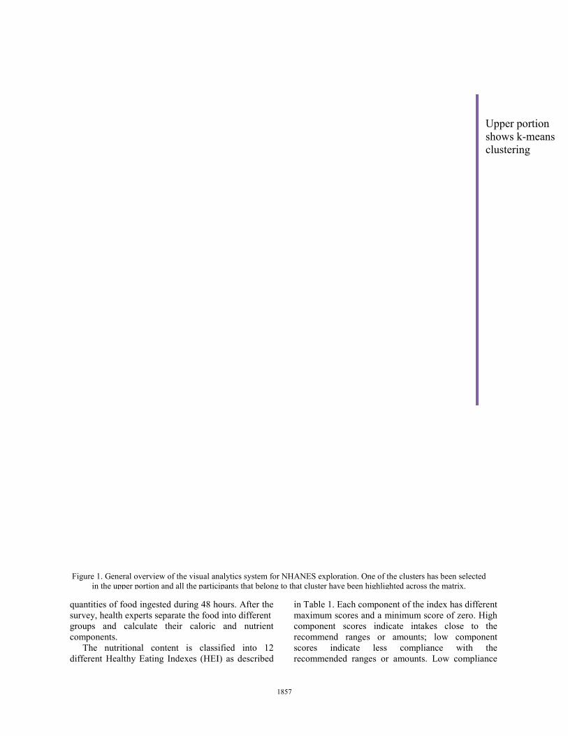
Figure 1. General overview of the visuain the upper portion and all the pa
hours. After the d into different
and nutrient
ified into 12 I) as described
in Table 1. Each component of thmaximum scores and a minimumcomponent scores indicate intrecommend ranges or amountscores indicate less comprecommended ranges or amount
al analytics system for NHANES exploration. One of the clusterarticipants that belong to that cluster have been highlighted acro
he index has different m score of zero. High takes close to the ts; low component pliance with the ts. Low compliance
Upper portion shows k-means clustering
rs has been selected oss the matrix.
1857
means a HEI score of zero. The HEI scores indicate levels, thus the scales are not normalized. Finally, all the components can be compounded and an overall HEI score is calculated and viewed as a measure of diet quality that assesses conformance to the federal dietary guidance [10].
HEI Description Range
1 Total Fruit 0-5 2 Whole Fruit 0-5 3 Total Vegetables 0-5
4 Dark green and orange vegetables and legumes 0-5
5 Total grains 0-5 6 Whole grains 0-5 7 Milk 0-10 8 Meat and beans 0-10 9 Oils 0-10 10 Saturated fat 0-10 11 Sodium 0-10
12 Calories from solid fats, alcoholic beverages, and added sugars 0-20
Table 1. HEI Components
4. Visual analytics environment
The visual analytics environment consists of a scatterplot matrix of selected variables that can be modified at any time. The upper diagonal portion of the matrix displays the same data as the lower diagonal but in a k-means clustered form as shown in Figure 1. The initial dimensions chosen are the result of dimension ordering. This ordering can be implemented using two different methods: one based on cluster density and the other on dimension correlation. The different user tools implemented in the system are described at the end of this Section. 4.1 Basic scatterplot matrix
The main component of the application consists
of a traditional scatterplot matrix set up initially as a 6x6 grid of default variables as shown in Figure 1. These default variables are determined based on two different methods of dimension ordering that are discussed in Section 4.3. In Figure 1, the variables are HEI 5, 7, 12, 10, 8, and 4. One of the main concerns while designing the system was the user. We do not want the user to become overwhelmed by the high dimensionality of the dataset. Instead, we want the user to be able to focus on a given scatterplot and explore it freely and completely. With
this in mind, we set the grid to be 6x6 which is half of the maximum number of HEI variables. The initial grid size was determined based on aesthetics. The chosen size displays all the necessary labels and fits multiple monitor sizes. As mentioned before, the user can choose to increase or decrease the number of dimensions shown at any time as he/she sees appropriate.
The matrix is divided diagonally into an upper and lower portion as shown in Figure 1. The lower diagonal portion shows the regular scatterplots of the components plotted against each other. The upper diagonal portion shows the clusters projected into each of the plots. In Figure 1, one of the clusters has been selected and all of the participants who belong to that cluster are highlighted across the entire matrix. We discuss the upper diagonal of the scatterplot matrix below. 4.2 Upper diagonal clustering
Clustering is one of the most frequently used methods to improve the perception and recognition of patterns in multivariate datasets. In our system the k-means [11] clustering algorithm is applied and a Euclidean distance metric between the points in the N-dimensional space is used.
In k-means, we are given a set of n data points in a d-dimensional space (in the NHANES case d=12) Rd , and an integer k. The problem is to determine a set of k points in Rd, called centers, which will minimize the mean square distance from each point to its nearest center. Our k-means clustering was computed using an enhanced form of a kd tree as specified by Kanugo et al. [11].
The clusters computed at the beginning of the program are projected into each of the 2D plots on the upper diagonal matrix. Each cluster is differentiated with the aid of different colors and occlusion is addressed by using transparency when we plot the different points. We revised the work of Chiang and Mirkin [14] about an intelligent choice of the number of clusters which described Hartigan’s rule as one of the best methods to calculate the initial number of clusters. Hartigan’s rule suggests using 25 different clusters for this specific dataset, however the initial number was reduced in order to not overwhelm the users and distract them from seeing general trends. A large number of clusters can compromise the legibility of the scatterplots. We leave the decision of the number of clusters to the user, who can modify it at any time as part of the exploration process.
Although there is no guarantee that the 2D projections will show a clear distinction between the
1858
clusters, the dimension ordering described in the following subsection can help in further separating the clusters. These computed clusters also provide a reference group of participants, which can be further explored with the aid of brushing and linking.
4.3 Dimension ordering
Our system automatically generates a default ordering scheme that the user can modify later. There are two different measures employed for reordering the scatterplot matrix.
The first measure arranges the dimensions according to their cluster density. This measure simply allows the user to view the scatterplots that present the most defined clusters calculated with k-means as explained in the previous section. Cluster density may be defined on a local or global scale within the N-dimensional space.
Global cluster density is a comparison across all the N-dimensions. Local cluster density compares only the projected dimensions for any given scatterplot. The cluster density, the variance, and standard deviation for each cluster are computed using Welford’s method [12].
Traditionally, the mathematical formula for computing the sample variance is:
∑ ∑
where s represents the variance, n is the size of the sample, and x is the data point being used. Welford’s method computes the variance as the x’s arrive, one at a time, and gives more arithmetic precision. Once the algorithm is initialized with 1 1 1 0 the subsequent x’s use the recurrence formulas:
1 1 / 1 1 . Welford's method is more efficient because it requires looping through all the data points only once. Welford's method is also more accurate since it does not use abnormally large numbers in calculation, compared to the sum of squares method.
Using these global metrics, we order the scatterplots such that the dimensions with the tightest clusters will be displayed to the left of the dimensional ordering lineup. These plots should potentially contain the most relative information as the projected clusters are the most compact in this space. The local scale is then used during the rendering of the clusters within a given 2D plot. Clusters are rendered in order of their local density, from smallest to largest. By rendering the clusters in
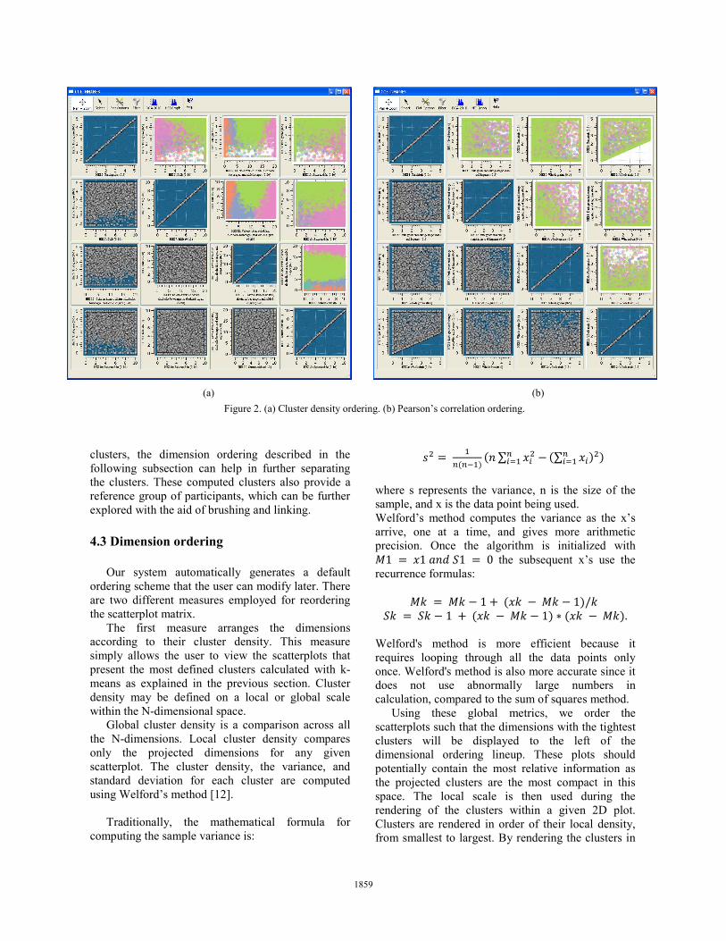
Figure 2. (a) Cluster density ordering. (b) Pearson’s correlation ordering. (a) (b)
1859
this manner, we also reduce some ofover-plotting.
The second measure is based correlation coefficient, which is definmeasure of the correlation (linearbetween two variables. The formula usthe coefficient is the following:
∑ 1
In the equation above the variables are and , with means and res
standard deviations, and respectivThe coefficient is calculated f
individually and plots are arranged bcoefficients. This measure also allows twith the most similar features to be peach other.
In Figure 2, we show how the methods reordered the given dimensimatrix. Figure 2(a) shows the re-ordecluster density. Since it presents the scthe most compact clusters, the useridentify the different clusters in scatterplots as clearly defined color areshows the re-arrangement based correlation. In Figure 2(b), the clusters important role when the correlaticomputed. In Figure 2(a) cluster ddefined clusters in the upper diagwhereas in Figure 2(b), Pearson's corrmore defined areas in the bottom diagon
4.4 User tools and interaction
Besides the normal interactive capabzooming and panning, our system alselection tool that allows the user to chof specific participants in the datasehighlighted across the scatterplot selection tool allows for regular brushin
Figure 3. Filtering tool.
f the issues in
on Pearson’s ned to be the
r dependence) sed to calculate
represented as pectively, and vely. for each plot based on their the scatterplots
plotted close to
two different ions in a 4x4 ering based on catterplots with r can visually some of the
eas. Figure 2(b) on Pearson’s do not play an
ion is being density shows gonal portion, relation shows nal portion.
abilities such as lso includes a hoose a subset
et that will be matrix. The
ng and linking.
Highlighted participants in a scatred points and this provides aobserve these participants behaother categories. The highlightinmatrix allows for a quick discovbetween different components. Fthe ability of further narrowing dfiltering the population beingscatterplots. There are filters avagender, race and ethnicity and caindex (BMI). 5. Comparison graphs
Every five years, the DietAmericans (DGA) are publishedDepartment of Health and Humand the U.S. Department of Agricwith the last one being publishguidelines provide authoritaAmericans, ages two and olderfewer calories, making informedbeing physically active to attahealthy weight, reduce risk of cpromote overall health. Since tfollowed and understood by mostin the country, our system has thtwo different graphs to transforminto familiar graphs and standarDGA.
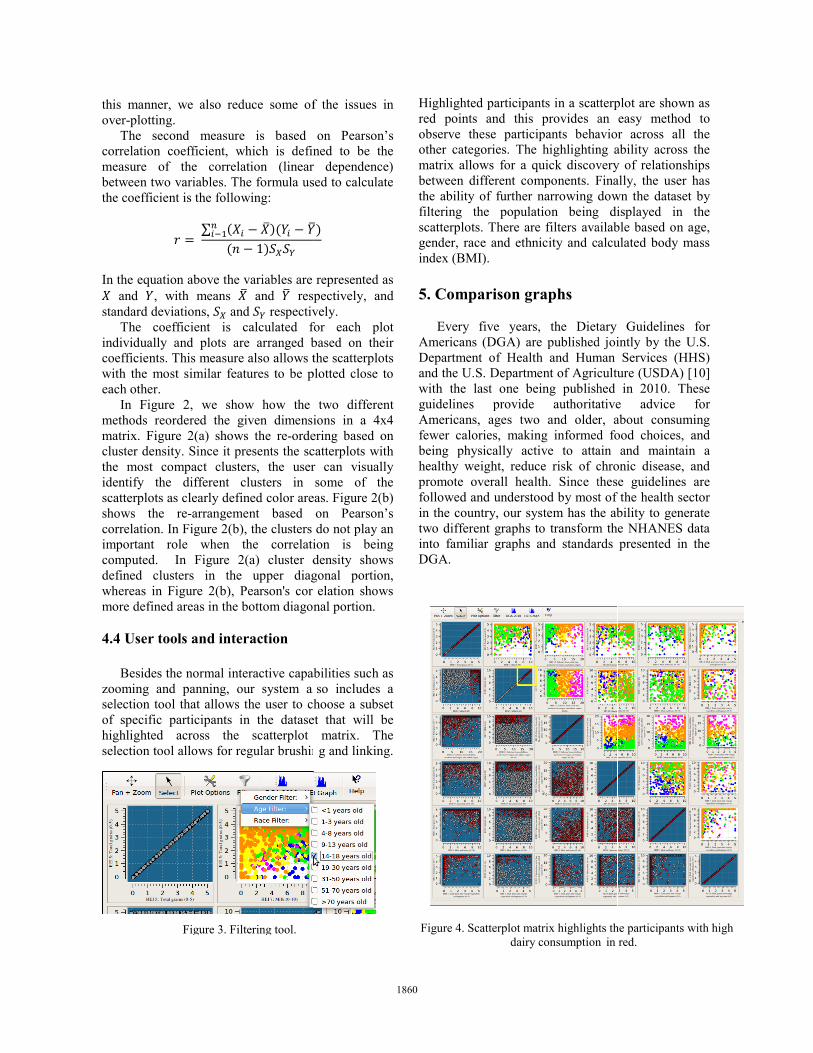
Figure 4. Scatterplot matrix highlights dairy consumption
tterplot are shown as an easy method to avior across all the ng ability across the very of relationships Finally, the user has down the dataset by displayed in the
ailable based on age, alculated body mass
tary Guidelines for d jointly by the U.S. man Services (HHS) culture (USDA) [10] hed in 2010. These ative advice for r, about consuming d food choices, and ain and maintain a chronic disease, and these guidelines are t of the health sector
he ability to generate m the NHANES data rds presented in the
the participants with high in red.
1860
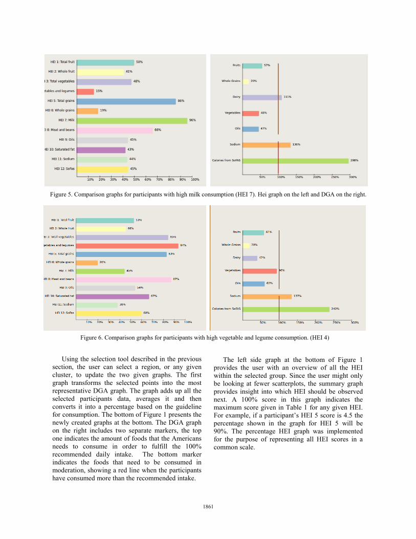
Using the selection tool described in the previous section, the user can select a region, or any given cluster, to update the two given graphs. The first graph transforms the selected points into the most representative DGA graph. The graph adds up all the selected participants data, averages it and then converts it into a percentage based on the guideline for consumption. The bottom of Figure 1 presents the newly created graphs at the bottom. The DGA graph on the right includes two separate markers, the top one indicates the amount of foods that the Americans needs to consume in order to fulfill the 100% recommended daily intake. The bottom marker indicates the foods that need to be consumed in moderation, showing a red line when the participants have consumed more than the recommended intake.
The left side graph at the bottom of Figure 1 provides the user with an overview of all the HEI within the selected group. Since the user might only be looking at fewer scatterplots, the summary graph provides insight into which HEI should be observed next. A 100% score in this graph indicates the maximum score given in Table 1 for any given HEI. For example, if a participant’s HEI 5 score is 4.5 the percentage shown in the graph for HEI 5 will be 90%. The percentage HEI graph was implemented for the purpose of representing all HEI scores in a common scale.
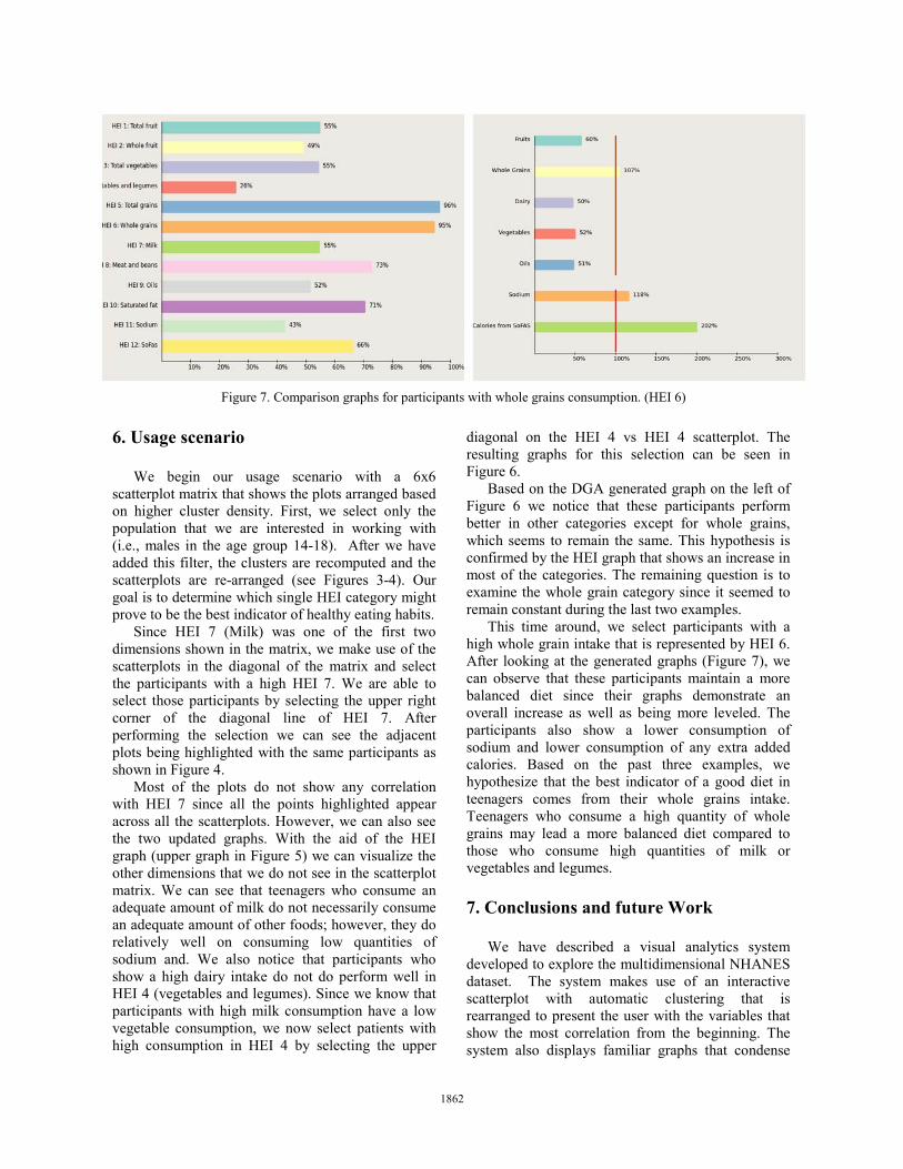
Figure 6. Comparison graphs for participants with high vegetable and legume consumption. (HEI 4)
Figure 5. Comparison graphs for participants with high milk consumption (HEI 7). Hei graph on the left and DGA on the right.
1861
6. Usage scenario
We begin our usage scenario with a 6x6 scatterplot matrix that shows the plots arranged based on higher cluster density. First, we select only the population that we are interested in working with (i.e., males in the age group 14-18). After we have added this filter, the clusters are recomputed and the scatterplots are re-arranged (see Figures 3-4). Our goal is to determine which single HEI category might prove to be the best indicator of healthy eating habits.
Since HEI 7 (Milk) was one of the first two dimensions shown in the matrix, we make use of the scatterplots in the diagonal of the matrix and select the participants with a high HEI 7. We are able to select those participants by selecting the upper right corner of the diagonal line of HEI 7. After performing the selection we can see the adjacent plots being highlighted with the same participants as shown in Figure 4.
Most of the plots do not show any correlation with HEI 7 since all the points highlighted appear across all the scatterplots. However, we can also see the two updated graphs. With the aid of the HEI graph (upper graph in Figure 5) we can visualize the other dimensions that we do not see in the scatterplot matrix. We can see that teenagers who consume an adequate amount of milk do not necessarily consume an adequate amount of other foods; however, they do relatively well on consuming low quantities of sodium and. We also notice that participants who show a high dairy intake do not do perform well in HEI 4 (vegetables and legumes). Since we know that participants with high milk consumption have a low vegetable consumption, we now select patients with high consumption in HEI 4 by selecting the upper
diagonal on the HEI 4 vs HEI 4 scatterplot. The resulting graphs for this selection can be seen in Figure 6.
Based on the DGA generated graph on the left of Figure 6 we notice that these participants perform better in other categories except for whole grains, which seems to remain the same. This hypothesis is confirmed by the HEI graph that shows an increase in most of the categories. The remaining question is to examine the whole grain category since it seemed to remain constant during the last two examples.
This time around, we select participants with a high whole grain intake that is represented by HEI 6. After looking at the generated graphs (Figure 7), we can observe that these participants maintain a more balanced diet since their graphs demonstrate an overall increase as well as being more leveled. The participants also show a lower consumption of sodium and lower consumption of any extra added calories. Based on the past three examples, we hypothesize that the best indicator of a good diet in teenagers comes from their whole grains intake. Teenagers who consume a high quantity of whole grains may lead a more balanced diet compared to those who consume high quantities of milk or vegetables and legumes. 7. Conclusions and future Work
We have described a visual analytics system developed to explore the multidimensional NHANES dataset. The system makes use of an interactive scatterplot with automatic clustering that is rearranged to present the user with the variables that show the most correlation from the beginning. The system also displays familiar graphs that condense
Figure 7. Comparison graphs for participants with whole grains consumption. (HEI 6)
1862
the information presented to the user. The system aids the user in developing and testing new hypotheses. We showed a usage scenario that demonstrates the use of the comparison/graphing system implemented to navigate the data.
We recognize there is still work that could be done to improve the system. We would like to experiment with new layouts to present the dietary elements that seem to have the most impact in the participants diet, possibly a combination of the methods used in this paper, as well as an extension exploring dimensionality reduction. In order to further differentiate the clusters, we are planning on adding an interactive exploration of the scatterplot matrix. This visualization system could also be used to analyze other types of complex data sets. Finally, future work will include modifying the system to fit similar datasets. 8. References [1] Centers for Disease Control and Prevention. National Health and Nutrition Examination Survey: http://www.cdc.gov/nchs/nhanes.htm May 27, 2011 [May 30, 2011] [2] Matthew O. Ward, "XmdvTool: Integrating Multiple Methods for Visualizing Multivariate Data," IEEE Conf. on Visualization '94, pp 326 - 333, Oct. 1994. [3] C. Stolte, D. Tang, and P. Hanrahan. Polaris: A system for query, analysis, and visualization of multidimensional relational databases. IEEE Transactions on Visualization and Computer Graphics, 8(1):52–65, 2002. [4] M. Ankerst, S. Berchtold, and D.A. Keim. Similarity clustering of dimensions for an enhanced visualization of multidimensional data. In Information Visualization, 1998. Proceedings. IEEE Symposium on, pages 52 –60, 153, October 1998. [5] Wei Peng, Matthew O. Ward, and Elke A. Rundensteiner. Clutter reduction in multi-dimensional data visualization using dimension reordering. In Proceedings of the IEEE Symposium on Information Visualization, pages 89–96, Washington, DC, USA, 2004. IEEE Computer Society. [6] J. Yang, M. O. Ward, E. A. Rundensteiner, and S. Huang. Visual hierarchical dimension reduction for exploration of high dimensional datasets Eurographics / IEEE TCVG Symposium on Visualization, pages 19–28, May 2003. [7] Jing Yang, Matthew O. Ward, and Elke A. Rundensteiner. Interactive hierarchical displays: a general framework for visualization and exploration of large multivariate data sets. Computers & Graphics, 27(2):265–283, April 2003. [8] A. Tatu, G. Albuquerque, M. Eisemann, J. Schneidewind, H. Theisel, M. Magnor, D. Keim. Combining automated analysis and visualization techniques for effective exploration of high-dimensional data. In Proceedings of IEEE Symposium on Visual Analytics
Science and Technology (IEEE VAST), Atlantic City, New Jersey, USA (2009) [9] Mike Sips, Boris Neubert, John P. Lewis, and Pat Hanrahan. Selecting good views of high-dimensional data using class consistency. Computer Graphics Forum, 28(3):831–838, June 2009. [10] U.S. Department of Agriculture and U.S. Department of Health and Human Services. Dietary Guidelines for Americans, 2010. 7th Edition, Washington, DC: U.S. Government Printing Office, December 2010. [11] Tapas Kanungo, David M. Mount, Nathan S. Netanyahu, Christine D. Piatko, Ruth Silverman, and Angela Y. Wu. A local search approximation algorithm for k-means clustering. Comput. Geom. Theory Appl., 28:89–112, June 2004. [12] Donald E. Knuth. The art of computer programming, volume 2 (3rd ed.): seminumerical algorithms. Addison-Wesley Longman Publishing Co., Inc., Boston, MA, USA, 1997. [13] N. Elmqvist, P. Dragicevic, J.-D. Fekete. Rolling the Dice: Multidimensional Visual Exploration using Scatterplot Matrix Navigation. In IEEE Transactions on Visualization and Computer Graphics (Proc. InfoVis 2008), 14(6):1141-1148, 2008. [14] Mark Ming-Tso Chiang and Boris Mirkin. 2010. Intelligent Choice of the Number of Clusters in K-Means Clustering: An Experimental Study with Different Cluster Spreads. J. Classif. 27, 1 (March 2010), 3-40.
1863