Embed Size (px)
Citation preview
1
From Novice to Intermediate in (Approximately) Sixty Minutes: II. SAS® Procedures Beyond the Basics
AnnMaria De Mars, The Julia Group, Santa Monica, CA ABSTRACT What’s your favorite proc? As a novice, you usually first learn PROC PRINT, PROC SORT, PROC FREQ and PROC CONTENTS. To go from novice to intermediate, it’s time to branch out in two ways. The first is to learn some additional features of the procedures you already know. The second is to learn new procedures. To be discussed in this hour: Freaky things with proc freq, My five favorite PROCS (I couldn’t choose just one) – FORMAT, can be used to change a numeric variable to character, perform a table look-up and just to make your output more
readable – TRANSPOSE, has the obvious use of changing data from the format you received it in to the format you want it in. It can also be
applied to the output of other procedures, such as freq or summary to create a dataset used to check for data quality – UNIVARIATE, almost all of the basic statistics – CORR, all the rest of basic statistics and a few less basic – TABULATE, the perfect answer to output for the web.
Disclaimer: If you even vaguely remember the one statistics class you took in college you will understand it all and leave looking brilliant!
INTRODUCTION Disclaimer and acknowledgements
Data used in these examples are from the United States Department of Justice, Federal Bureau of Investigation (2008) Hate Crimes Database, obtained through the Inter-university Consortium for Political and Social Research and from the Disability Access Research Utilization Award, to Spirit Lake Consulting, Inc. funded through the Southwest Educational Development Laboratory.
Results included here are for illustrative purposes only. In many examples, only partial output is shown.
“Just how do you define a novice programmer, anyway?” I was asked this question, and, a nationally representative random sample of people who are me produced the following definition. “Being a novice, as distinct from an expert programmer, is not merely a function of years of experience, it is also reflects quality and results of experience. A novice programmer is a person who is limited in knowledge of the field. Taking a course in a language doesn’t make you an expert programmer any more than learning English makes you Hemingway. An expert programmer is able to put together different pieces of knowledge, the what and when and why, apply what they know, integrating information on some subject area – be it marketing, statistics, genetics or what have you – and come up with a solution that is greater than the sum of the parts.
A novice programmer just hasn’t put in the hours yet to learn a wide array of techniques that can be useful in solving a variety of problems. This in NO WAY implies the person is dumb or incapable of learning to be a fantastic programmer. He or she just hasn’t become that yet.”
One difference between novice and expert programmers is hours put in on the job, but what exactly should you be learning in those hours? WHAT: A novice programmer is one who knows fairly limited set of procedures or solutions for most problems. For example, given the need to aggregate categories, he or she might consider several IF-THEN, ELSE statements and probably an ARRAY statement with a DO – LOOP. A more experienced programmer would consider other options such as PROC FORMAT or PROC FREQ, to name just two. A FEW OF MY FAVORITE THINGS WITH PROC FORMAT
Let’s start with non-statistical procedures. In the first session we talked a little about formats and understanding how SAS stores data. Let’s take a really simple task, the PRINT procedure. One of the basic building blocks of programming, which I think distinguishes a program from a database query is the need to pound the data into the shape you want it. The FORMAT procedure is wonderful for this. If you’re not familiar with it, well, officially the purpose of the procedure is to create your own formats and informats, and, of course, it can and is used for that very often. Let’s take a look at first how to code the FORMAT procedure and then examine different ways in which it can be applied.

2
The simplest form of PROC FORMAT is two statements:
Proc format ;
Value <$> Name
original-value = new-value ;
PROC FORMAT – well, that’s pretty obvious, it invokes the FORMAT procedure. VALUE - this names the format you are creating. If it is a character format, the word VALUE is followed by a $ sign. A character format is one for which the input is character data. So, if I have data entered as Y and N and I want to have this be displayed in my output as “Yes” and “No”, I have a character format. If the data are entered as 0 and 1, and I want to have the output read “Yes” and “No”, I have a numeric format. The determination of whether a format is numeric or character is based on the data on the left of the equals sign. The INVALUE statement names an informat you are creating, for reading in the data. While that may also be useful, today we’re going to concentrate on the uses of formats. Uses for PROC FORMAT: The next several examples use the 2008 data on hate crimes using the Uniform Crime Report statistics. Use of PROC FORMAT #1: Create formats – duh! Formats are used to print or display text descriptions of categories. Most common formats, and even many uncommon ones are already part of SAS, you just need to specify them. If you want a date in any format from 11/13/2010 (mmddyy8.) to 13 November 2010 (worddatx20. ) , SAS already has them. You may want formats specific to your organization, however, and even if you pay a bucket of money to them every year, you are not important enough for SAS Institute to have created formats especially for you. The Federal Bureau of Investigation database on hate crimes gives many examples where you may not have prewritten formats. SAS doesn't have a format for location, but this dataset has locations where violence occurred and it would be more informative to readers to have the actual location type rather than a number.
Proc format ; VALUE loccod1f 1='Terminal' 2='Bank' 3='Bar' 4='Church/Synagogue/Temple' 5='Office building' 6='Construction site' 15='Jail/prison' 25='Other/unknown' ;
Use of format #2 Aggregates categories or recode categories Common problem - you have 50 different categories in which responses can fall but
• 90% or more of your responses came from 5 or 6 of those. • You'd like to graph the 5 or 6 and have the rest be "other".
Hate crimes can be anti-black, anti-Catholic and on for a depressingly long list of groups that somebody somewhere has a bias against. There are three options for applying formats to the variable “biasmo1f”, which designates the bias motivation for the hate crime. 1. The worst solution ... Use a bunch of IF statements (are you getting the idea yet that this is seldom the correct solution?)
If biasmo1f = 11 then bias = "Anti-white" ; else if biasmo1f = 12 then bias = "Anti-black" ;
etc. to else If biasmo1f = 26 then bias = "Other" ; else if biasmo1f = 27 then bias = "Other" ;
Why this isn't the best solution :
a. It unnecessarily creates a new variable that may take up a lot of space. b. Pretty inefficient use of your time. In this particular dataset, it would require an IF statement and 44 ELSE statements.

3
2. Another bad solution You could include your five or six main categories and then use
Else bias = "Other" ;
I am generally an opponent of blanket ELSE statements because they so often end up with unexpected results. What the above statement means is put "everything" other than what I specified in the previous statements, into this category. I have just found that "everything" often includes stuff you had not considered. For example, all of the records with missing data would be put in the "other category" 3. A not so bad solution.
If biasmo1f = 11 then bias = "Anti-white" ; else if biasmo1f = 12 then bias = "Anti-black" ;
etc. to
else if biasmo1f > 25 then bias = "Other" ; This would work plus you get bonus points for knowing that missing data is considered less than zero so it would not get lumped into the "other" category. Either that or you were just lucky but we'll pretend it's knowledge. Here is the next part of being an experienced programmer - you realize the importance of knowing your data. The above statement would work except for the annoying fact that all of the "other" category does not come at the end but is scattered throughout. 4. One last solution we're not going to use. You could do the IF - ELSE statements and end with
If biasmo1f not in (11,12,21,32,45) then bias = "other" ; That would work and you get extra points for knowing the 'not in' construction for statements So, there are multiple solutions ranging from bad ideas to not so bad. However, we have a complicated problem here, which is the need to break down categories not just into "other" but "other anti-religion", "other anti-race" and so on. Here is how to solve this problem with PROC FORMAT
Proc format ; VALUE biasmo1f
11= 'Anti-White' 12= 'Anti-Black' 13 - 15= 'Anti-Other Race' 21= 'Anti-Jewish' 22 - 25 = 'Anti-Other Religion' 26 -27, 44 = 'Other' 32= 'Anti-Hispanic' 33= 'Other' 41 - 43, 45 ='Anti-Homosexual' 51 -52 = 'Anti-Disability' ;
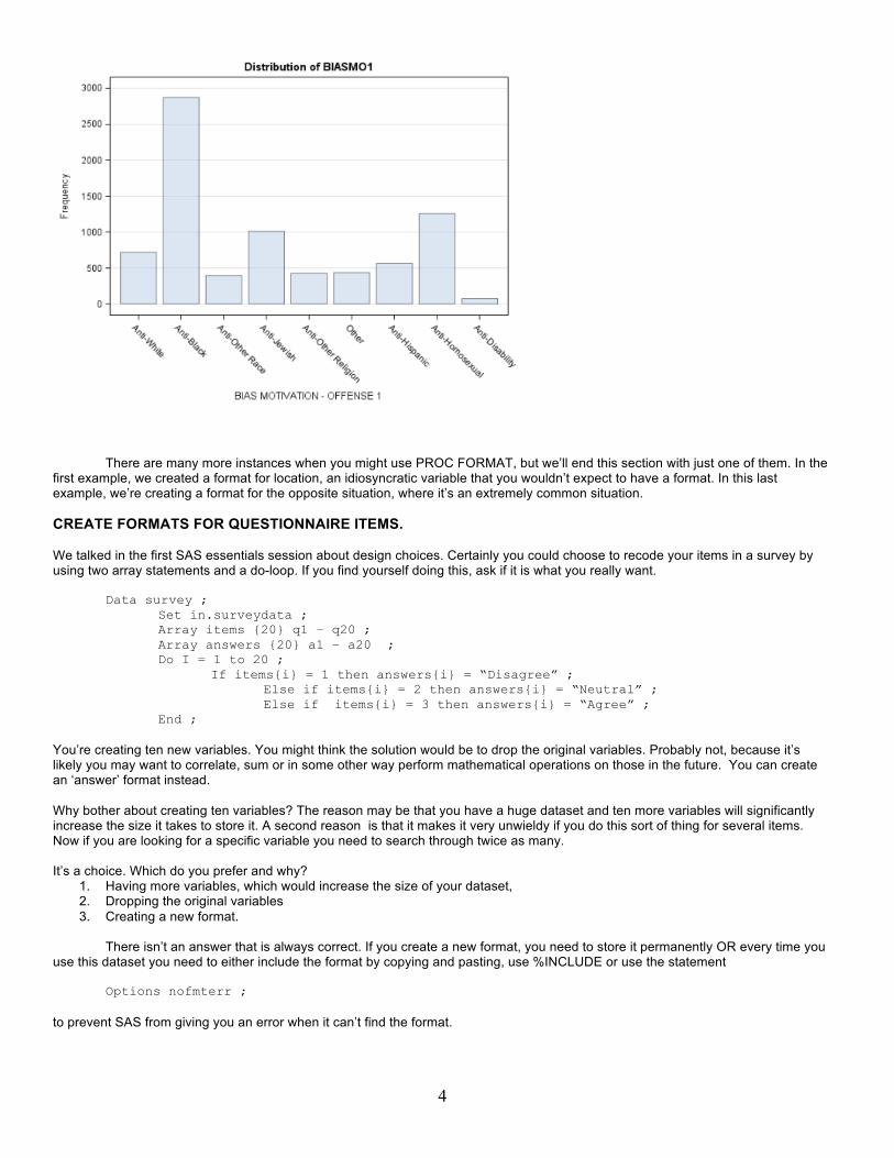
Notice three useful features of formats. 1. You can define a range, such as 13-15 2. You can define non-consecutive numbers simply by listing a comma in between them 3. You can combine #1 and # 2, as above with 41 - 43, 45 = "Anti-homosexual" Now that you've created the format, you can add an ODS GRAPHICS ON statement and produce a histogram using PROC FREQ.
ods graphics on ; proc freq data = in.hatecrime ; tables biasmo1 ; format biasmo1f. ; run; ods graphics off ; run ;
4
There are many more instances when you might use PROC FORMAT, but we’ll end this section with just one of them. In the first example, we created a format for location, an idiosyncratic variable that you wouldn’t expect to have a format. In this last example, we’re creating a format for the opposite situation, where it’s an extremely common situation. CREATE FORMATS FOR QUESTIONNAIRE ITEMS. We talked in the first SAS essentials session about design choices. Certainly you could choose to recode your items in a survey by using two array statements and a do-loop. If you find yourself doing this, ask if it is what you really want.
Data survey ; Set in.surveydata ; Array items {20} q1 – q20 ; Array answers {20} a1 – a20 ; Do I = 1 to 20 ; If items{i} = 1 then answers{i} = “Disagree” ; Else if items{i} = 2 then answers{i} = “Neutral” ; Else if items{i} = 3 then answers{i} = “Agree” ; End ;
You’re creating ten new variables. You might think the solution would be to drop the original variables. Probably not, because it’s likely you may want to correlate, sum or in some other way perform mathematical operations on those in the future. You can create an ‘answer’ format instead. Why bother about creating ten variables? The reason may be that you have a huge dataset and ten more variables will significantly increase the size it takes to store it. A second reason is that it makes it very unwieldy if you do this sort of thing for several items. Now if you are looking for a specific variable you need to search through twice as many. It’s a choice. Which do you prefer and why?
1. Having more variables, which would increase the size of your dataset, 2. Dropping the original variables 3. Creating a new format.
There isn’t an answer that is always correct. If you create a new format, you need to store it permanently OR every time you
use this dataset you need to either include the format by copying and pasting, use %INCLUDE or use the statement Options nofmterr ;
to prevent SAS from giving you an error when it can’t find the format.

5
Three points before we say a fond goodbye to formats for now. 1. You can create a format from a SAS dataset using the CNTLIN = option on your PROC FORMAT statement. 2. You can create a permanent format by using the CNTLOUT = and LIBRARY = options on your PROC FORMAT
statement. You would then use FMTSEARCH = in your OPTIONS statement to include that format. 3. There is a lot more to PROC FORMAT than we have covered here. The point of this discussion has been to
show you some possibilities so that you can begin discovering the possibilities. We’ve just touched on the uses and syntax of PROC FORMAT. Regional and national SAS user group papers are a great resource for learning more. I would suggest the two listed in the references by Shoemaker (2000), Ten Things You Can Do with PROC FORMAT and by Kupronis (2006), PROC FORMAT – An Analyst’s Buddy. PROC TRANSPOSE – LITERALLY GETTING YOUR DATA INTO SHAPE Let’s move from a procedure that has many possibilities to one that seems as first glance as if it is very limited – PROC TRANSPOSE. When I was a brand new SAS programmer and first saw this procedure I wondered why anyone would come up with anything so useless. All it does is transpose a matrix, turning the columns into rows and the rows into columns. That’s handy if you want to do matrix algebra but that’s about it, so I mistakenly thought. Many times since, I have found it to be useful because someone gave me a dataset that had, for example, the subject in the first column and the measurements taken on this subject on days one through three in the next three columns. That’s great for some analyses but others require the data to be set up so that when you have repeated measures you have one row per measurement. In other cases, it’s the opposite, where data are in multiple rows and you need the setup to be one row per subject. Since this is not the statistics section we won’t go into which ones those are, but just take my word for it that at some point, someone will come to you and ask if you can change these data. Let’s take this sample dataset with three scores per subject Subject Score1 Score2 Score3 Smith 5 7 9 Jones 6 3 7 proc sort data = wide ; by subject ; proc transpose data = wide out= long ; by subject ; Will change your dataset to be Subject _name_ col1 Smith Score1 5 Smith Score2 7 Smith Score3 9 You may have the reverse situation, where you want to change it from a long format to wide, which brings us back to our original hate crime dataset example … STATISTICAL PROCEDURES FOR PRODUCING OUTPUT DATASETS Let’s talk a minute about output as input, that is, using the output of one SAS procedure as the input of another. This is one example of a situation where you may need to transpose a dataset. Most often, statistical procedures are thought of in the context of producing statistics. That’s logical but there is another major use and that is to produce an output dataset that can then be used just like any other SAS dataset. Going back to our hate crimes dataset, let’s assume you are interested in the common types of victims. If this was a single categorical variable, you could just do a frequency distribution. Unfortunately for you, it isn’t. There are 25 variables that are all coded 0 = not present or 1 = present. (Twenty-five isn’t so bad but imagine having to do the same with hundreds of variables.) One solution is to do a PROC SUMMARY (which is the same as PROC MEANS but does not produce printed output), for all 25 variables related to victim type. This gives a very wide dataset with 5 observations and 25 variables, a part of which is shown below.

6
Obs _TYPE_ _FREQ_ _STAT_ VTYP_I1 VTYP_B1 VTYP_F1 VTYP_G1
1 0 7783 N 7783 7783 7783 7783
2 0 7783 MIN (0) Not victim (0) Not victim (0) Not victim (0) Not victim
3 0 7783 MAX (1) Individual victim (1) Business victim (1) Financial institution victim
(1) Government victim
4 0 7783 MEAN 0.79108312989849 0.05948862906334 0.00038545547989 0.04137222150841
5 0 7783 STD 0.4065610028497 0.23655215431177 0.01963049710389 0.19916238913055 What you want is a dataset with 25 observations and three variables. So, use PROC TRANSPOSE to transpose the dataset.
proc summary data = in.hatecrime ; output out = meanswide ; var vtyp_I1 -- vtyp_I4 ; proc transpose data = meanswide out= meanslong ; id _stat_ ; var vtyp_I1 -- vtyp_I4 ; data meanslong ; set meanslong ; where mean > .01 ; Keep _name_ _label_ mean ;
Now, you can read in this dataset and only keep those records where the victim type occurs > 1% of the time. [Note that if the data are coded 0 = absent, 1 = present the mean will give you the percentage of time this event occurred. ] An example of a report produced using this dataset is shown below.
Title "Common Victim Types " ; proc print data = meanslong ; id _label_ ; var mean ; format mean percent8.1 ; footnote "Multiple Offenses Allowable, May Sum to > 100 " ;
Common Victim Types
_LABEL_ MEAN
VICTIM TYPE - INDIVIDUAL: OFFENSE 1 79.1%
VICTIM TYPE - BUSINESS: OFFENSE 1 5.9%
VICTIM TYPE - GOVERNMENT: OFFENSE 1 4.1%
VICTIM TYPE - RELIGIOUS: OFFENSE 1 3.1%
VICTIM TYPE - OTHER: OFFENSE 1 8.2%
VICTIM TYPE - INDIVIDUAL: OFFENSE 2 3.3%
Multiple Offenses Allowable, May Sum to > 100
What if you wanted to actually create a dataset where you only had the more frequent locations of offenses? In this case, we have 30 types of locations recorded in the dataset. Maybe you’d like to do some analyses with the most common types but :
a. You don’t know which those are, and b. You don’t particularly want to list 25 or 30 values in a subsetting IF statement. (This especially true if you are me, because I
am a very bad typist and have bad eyesight, so the odds are I would miss one or two and have to start over. The more potential categories there are, the higher probability this will occur.)

7
One solution is to use the FREQ procedure. The OUT = option on the TABLES statement creates a new dataset and the (where = (percent > 4) ) selects only those categories of location where over 4% of the offenses occurred. You can sort these data and produce a fairly decent report just using the PRINT procedure.
proc freq data = in.hatecrime ; tables loccod1 / out = location (where = (percent > 4)) ; Proc sort data = location ; by descending count ; Title "Most Common Locations of Offenses " ; proc print data = location split = " " ; id loccod1 ; label loccod1 = "Location of Offense" count = “count” percent = “percent” ; format count comma9.0 percent 8.1 ;
Most Common Locations of Offenses Location
of Offense COUNT PERCENT
Residence/home 2,483 31.9
Highway/road/alley 1,354 17.4
Other/unknown 927 11.9
School/college 907 11.7
Parking lot/garage 473 6.1
Church/Synagogue/Temple 326 4.2 Then, merge the location dataset back with the original hatecrime dataset, by location code (loccod1). Use a subsetting IF statement to only include those with location codes found in my location dataset.
proc sort data = location ; by loccod1 ; proc sort data = in.hatecrime ; by loccod1 ; data common ; merge location (in = a) in.hatecrime ; by loccod1 ; if a ;
STATISTICAL PROCEDURES FOR PRODUCING STATISTICS
To specialize or not to specialize, in 140 characters or less Often there is a distinction made between programmers – who write code - and analysts, managers or other categories who use the results of that coding. Some would say that the secret to career success is to specialize. There is something about this view that bothers me, so I went to Twitter, quickly replacing Google and Wikipedia in my life as the source of all knowledge and asked fellow twitterers their opinions. Dr. Peter Flom, a statistician replied,
I am not a programmer, but as data analyst/statistician, I think you can be successful either way In my experience, there are a good number of people who have made a successful decades-long career as the maven of PROC REPORT or SAS/AF or some other specific niche that was of critical importance to some division of their organization. Jon Peltier, an Excel programmer answered, Depends on how much in demand your specialty is. Evan Stubbs, of SAS Institute in Australia put it best when he succinctly summed up what bothers me about the specialization paradigm.
Fly high, fall far; pay's good for specializing until you go the way of the buggy whip. Generalists fit anywhere, learn faster

8
Let’s be generalists then, and apply what we know about SAS to answer some questions using statistical procedures. In the first part of SAS Essentials, I said that one distinction between a novice and an intermediate programmer is being able to make design choices because he or she knows more than one way to achieve a task. A second distinction is being able to put together the things you know We’re going to try to put together some of the procedures you may know to understand a bit more about an incomprehensible subject – hate crimes. These are crimes that are motivated by bias against the victim’s race, religion, sexual orientation or disability status. We’ve already seen in a prior example the most common categories. How often does this happen and what do hate crimes look like? I want to start with the victims and offenders so I use PROC UNIVARIATE. The code below will give some initial statistics for both the number of victims and the number of offenders1 ;
ODS GRAPHICS ON ; Proc univariate data = in.hatecrime plots ; Var tnumvtms tnumoff ; Where hc_flag = 1 ;
Moments
N 7783 Sum Weights 7783
Mean 0.98419633 Sum Observations 7660
Std Deviation 1.08570394 Variance 1.17875304
Skewness 20.1061255 Kurtosis 787.293271
Uncorrected SS 16712 Corrected SS 9173.05615
Coeff Variation 110.313756 Std Error Mean 0.01230659
The first set of results is very interesting. This tells you that there were 7,783 hate crimes in the database in 2008 and the average had slightly less than one victim. Of course, this is very curious so let’s explore it further. In the table below, both the median (the score that half of the population falls above and half fall below) and mode (the most common score) are one. So, in general a hate crime seems to be perpetrated against an individual. In a normal distribution, the mean = the median = the mode. This would seem to meet that criteria with the mean for number of victims = .98, median = 1 and mean = 1. Yet, according to the statistics in the table above, the distribution is very far from normal. You can see this by looking at the skewness and kurtosis statistics, which are enormous.2 A kurtosis value for a normal distribution is 0. Ours is 787. Skewness measures how symmetric (or not) the curve is and kurtosis measures how flat or peaked it is (in contrast to the “bell” shape we would expect in a normal curve.
Basic Statistical Measures
Location Variability
Mean 0.984196 Std Deviation 1.08570
Median 1.000000 Variance 1.17875
Mode 1.000000 Range 50.00000
Interquartile Range 0 The standard deviation is about one, again, suggesting that most crimes are committed against a solitary victim with not a lot of variation from the mean. To gain a little more understanding, let’s take a look at the frequency distribution produced by PROC UNIVARIATE when we used the ODS GRAPHICS ON statement.
1 As an aside, in the knowing how procedures work category, PROC UNIVARIATE produces a “long” dataset rather than a wide one, so you don’t need to do the TRANSPOSE as you would with a SUMMARY or MEANS procedure. 2 The formula for kurtosis sometimes subtracts 3 (which makes the value for a normal distribution equal to 0), and sometimes doesn't. SAS software uses the formula that subtracts 3.

9
What this picture shows is that hate crimes are overwhelmingly likely to have only one victim. The next most common number is zero, which is weird, but we’ll get back to that in a minute.
Tests for Location: Mu0=0
Test Statistic p Value
Student's t t 79.97308 Pr > |t| <.0001
Sign M 3084 Pr >= |M| <.0001
Signed Rank S 9512598 Pr >= |S| <.0001 In this case, the t-test that the population mean is zero isn’t of much interest to us. We can see, unsurprisingly, that it is hugely significant. No real information here – the average number of victims of a hate crime in the population is not zero (duh). There are times when this statistic would be of interest. This isn’t one of those times. The next table is quite interesting, though. The minimum number of victims, and, in fact, up to the tenth percentile, is zero.
Quantiles (Definition 5)
Quantile Estimate
100% Max 50
99% 4
95% 2
90% 2
75% Q3 1
50% Median 1
25% Q1 1
10% 0
5% 0
1% 0
0% Min 0 When I look at the results for the number of offenders, I find a similar pattern, where 10% of the records show zero offenders. Something is definitely strange here, how can you have crimes with no victims and no offenders, and, if so, how do you know they are hate crimes? To learn a little bit more about this, I do the following:
10
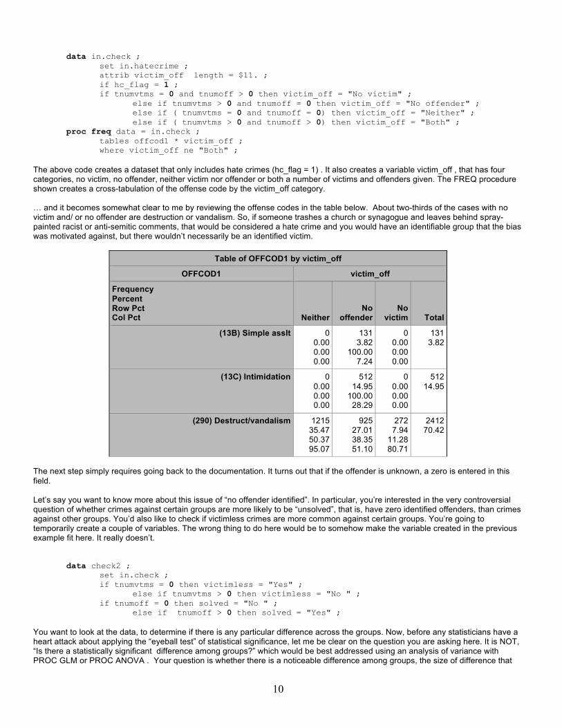
data in.check ; set in.hatecrime ; attrib victim_off length = $11. ; if hc_flag = 1 ; if tnumvtms = 0 and tnumoff > 0 then victim_off = "No victim" ; else if tnumvtms > 0 and tnumoff = 0 then victim_off = "No offender" ; else if ( tnumvtms = 0 and tnumoff = 0) then victim_off = "Neither" ;
else if ( tnumvtms > 0 and tnumoff > 0) then victim_off = "Both" ; proc freq data = in.check ;
tables offcod1 * victim_off ; where victim_off ne "Both" ; The above code creates a dataset that only includes hate crimes (hc_flag = 1) . It also creates a variable victim_off , that has four categories, no victim, no offender, neither victim nor offender or both a number of victims and offenders given. The FREQ procedure shown creates a cross-tabulation of the offense code by the victim_off category. … and it becomes somewhat clear to me by reviewing the offense codes in the table below. About two-thirds of the cases with no victim and/ or no offender are destruction or vandalism. So, if someone trashes a church or synagogue and leaves behind spray-painted racist or anti-semitic comments, that would be considered a hate crime and you would have an identifiable group that the bias was motivated against, but there wouldn’t necessarily be an identified victim.
Table of OFFCOD1 by victim_off
OFFCOD1 victim_off
Frequency Percent Row Pct Col Pct Neither
No offender
No victim Total
(13B) Simple asslt 0 0.00 0.00 0.00
131 3.82
100.00 7.24
0 0.00 0.00 0.00
131 3.82
(13C) Intimidation 0 0.00 0.00 0.00
512 14.95
100.00 28.29
0 0.00 0.00 0.00
512 14.95
(290) Destruct/vandalism 1215 35.47 50.37 95.07
925 27.01 38.35 51.10
272 7.94
11.28 80.71
2412 70.42
The next step simply requires going back to the documentation. It turns out that if the offender is unknown, a zero is entered in this field. Let’s say you want to know more about this issue of “no offender identified”. In particular, you’re interested in the very controversial question of whether crimes against certain groups are more likely to be “unsolved”, that is, have zero identified offenders, than crimes against other groups. You’d also like to check if victimless crimes are more common against certain groups. You’re going to temporarily create a couple of variables. The wrong thing to do here would be to somehow make the variable created in the previous example fit here. It really doesn’t.
data check2 ; set in.check ; if tnumvtms = 0 then victimless = "Yes" ; else if tnumvtms > 0 then victimless = "No " ; if tnumoff = 0 then solved = "No " ; else if tnumoff > 0 then solved = "Yes" ;
You want to look at the data, to determine if there is any particular difference across the groups. Now, before any statisticians have a heart attack about applying the “eyeball test” of statistical significance, let me be clear on the question you are asking here. It is NOT, “Is there a statistically significant difference among groups?” which would be best addressed using an analysis of variance with PROC GLM or PROC ANOVA . Your question is whether there is a noticeable difference among groups, the size of difference that

11
would raise questions in the community or on a legal or political level. So, you could use PROC TABULATE, which will create a table of summary statistics. The code for the table is given below.
PROC TABULATE DATA= CHECK2 ; CLASS victimless solved BIASMO1 ; Var tNumvtms ;
Label tnumvtms = "# Victims" Biasmo1 = “BIAS MOTIVATION” ;
TABLE BIASMO1*(RowPctN*f=8.1 N*f=comma8.0 ), victimless ; TABLE BIASMO1, solved*(tnumvtms* sum*f=comma8.0 rowpctn ) ;
Let’s look at each statement individually. The CLASS statement identifies which variables are classification variables. Our data are going to be classified by whether it was a victimless crime, whether it was solved and the bias motivation. The VAR statement specifies which variables will be used for analysis. These must be numeric variables. LABEL and FORMAT statements are not required but, if used, these override the formats and labels stored with the dataset. For example, the formats for biasmo1 and tnumvtms (the bias motivation and number of victims), were more verbose than necessary, so you can create new, shorter labels for use in this procedure. The TABLE statement defines the table of statistics to be produced. There can be more than one TABLE statement, and each will produce a different table. The format for the table statement is TABLE <<page-expression,> row-expression,> column-expression </ table-option(s)>; Only a column expression is required in the TABLE statement. It is the last expression in the statement. TABLE BIASMO1*(RowPctN*f=8.1 N*f=comma8.0 ), victimless ; In the example above, bias motivation (biasmo1) is the row variable. The statistics given will be the percentage of the row, which will have a format with a width of 8 and one decimal place, and N (number of records) with a numeric format with commas and no decimals. Formats are not required but it just seems a bit messy to have count data with a decimal, and numbers may be harder to read without commas. The columns for the table will be whether or not this was a victimless crime. A portion of the table produced is shown below. The two columns regarding religion are high-lighted for emphasis here. This highlighting does not appear on the actual output.
victimless
No Yes
BIASMO1
RowPctN 91.2 8.8 Anti-White
N 654 63
RowPctN 82.2 17.8 Anti-Black
N 2,365 512
RowPctN 76.0 24.0 Anti-Other Race
N 304 96
RowPctN 49.1 50.9 Anti-Jewish
N 497 516
RowPctN 48.9 51.1 Anti-Other Religion
N 209 218
RowPctN 95.2 4.8 Anti-Hispanic
N 534 27
RowPctN 93.8 6.2 Anti-Homosexual
N 1,187 78 It is evident that crimes against religious groups are more likely to be crimes without an identified victim than crimes committed biased against race, ethnicity or sexual orientation. Note (going back to the documentation again) that “victimless” doesn’t mean no one was

12
harmed. I would argue if someone burns down a synagogue or other place of worship that a lot of people are harmed. In this context it meant that a specific victim cannot be identified who was the target of the crime, unlike in a case like assault. Over 90% of crimes directed against white, Hispanic, and gay populations have an identified victim. While African-Americans are somewhat less likely, in terms of percentage, to be a direct victim of a hate crime, the absolute number of crimes against this population is the highest. There is about the same percentage of crimes without a specific victim from offenses directed at Jews and other religions. However, there are more than twice as many anti-Jewish hate crimes as all other religions put together. As a general rule, when exploring any new dataset any time you look at percentages, you want to look at the N as well. The statistic 82% is not nearly as informative if you don’t know 82% of how many. The second TABLE statement has bias motivation as the row variable. The total number of victims and the percentage of the row (bias motivation) are to be shown broken down by the column variable, ‘solved’ . TABLE BIASMO1, solved*(tnumvtms* sum*f=comma8.0 rowpctn ) ;
solved
No Yes
TNUMVTMS TNUMVTMS
Sum RowPctN Sum RowPctN
BIASMO1
Anti-White 162 25.1 593 74.9
Anti-Black 813 36.3 2,138 63.7
Anti-Jewish 315 73.5 243 26.5
Anti-Other Religion 81 56.9 164 43.1
Anti-Hispanic 137 24.1 588 75.9
Anti-Homosexual 317 27.5 1,216 72.5 Again, neither percentage alone nor total number of victims gives the full picture. For example, looking at percentage alone, there has been an offender identified in more of the anti-white crimes (74.9%) compared to the anti-black crimes (63.7%) . Yet, nearly four times as many African-American crime victims have had their offender identified as have white victims. As you can see, PROC TABULATE offers the opportunity to look at data sliced and diced in infinite variety. From here, you could go on to see if different types of offenses occur in different locations. I would think that racially-based hate crimes might be more common in prisons, for example. There may be different groups targeted in different regions of the country. It’s probable that bias against different groups varies across the country, or it just may be that if there are fewer of one group in a region there are going to be fewer crimes against that group. This has been a very brief introduction to PROC TABULATE. There are many other options, including many statistics that can be requested, including mean, standard deviation, minimum, maximum and the percentage of the total sample. There are a great many resources to learn more about PROC TABULATE, and, again, many of these are papers that were presented at regional or national user group meetings. One in particular I would recommend is the 2002 SUGI paper by Lauren Haworth listed in the reference section. THE MANY USES OF THE CORRELATION PROCEDURE Of course, not every procedure can be applied to the same dataset. For the next example, I have a dataset that was used in a study of parental involvement in a child’s Individualized Education Plan. It is federally mandated that schools encourage parental involvement. This dataset came from a study that had two major research questions; where do parents get information they use to exercise their rights to parental input and did a parent education program significantly increase parents’ knowledge. Two CORR procedures give us an extremely good start on analyzing these data.
proc corr data = iep alpha ; var workshops -- other1 ;
The variables specified in the VAR statement are questions on how often parents get information from various sources. The ALPHA option on the PROC CORR statement requests a Cronbach alpha, which is a measure of how internally consistent a test is. In other words, does it make statistical sense to put these items together ? First, the CORR procedure provides descriptive statistics for all of the variables. You can see that from 80 to 123 people answered each question. All of the items had answers across the full range, from 1 (= never) to 5 (=always) “…use information from this source

13
in meetings with my child’s school”. This was an extremely low-income population and, based on that, it might be assumed they would not be likely to have Internet access. In fact, they used in the Internet as much as newsletters from the school, radio or the newspaper as a source of information. Friend or family and school or agency personnel were still the most common sources.
Simple Statistics
Variable N Mean Std Dev Sum Minimum Maximum
Workshops 123 2.13821 1.31402 263.00000 1.00000 5.00000
Internet 114 1.98246 1.25495 226.00000 1.00000 5.00000
Newsletters 115 1.89565 1.14993 218.00000 1.00000 5.00000
Newspaper 113 1.96460 1.20955 222.00000 1.00000 5.00000
Radio 115 1.93043 1.27542 222.00000 1.00000 5.00000
Friends_or_Family 121 2.63636 1.39642 319.00000 1.00000 5.00000
School_or_agency_personnel 123 2.90244 1.53332 357.00000 1.00000 5.00000
Other1 80 1.81250 1.31297 145.00000 1.00000 5.00000
The next table tells you that the internal consistency coefficient is quite high. The possible range for this statistic is from zero to 1 and it is interpreted similarly to a correlation coefficient, so .89 is good. This means that the items generally correlate highly with one another, which is what you want to see if you are going to add these up for a total score. It doesn’t make sense to just add up a bunch of unrelated questions.
Cronbach Coefficient Alpha
Variables Alpha
Raw 0.886510
Standardized 0.897742
The next table tells you what the alpha would be if you did not include one of the items in a scale.
Cronbach Coefficient Alpha with Deleted Variable
Raw Variables Standardized Variables
Deleted Variable
Correlation with Total Alpha
Correlation with Total Alpha
Workshops 0.667092 0.871309 0.710564 0.882000
Internet 0.601147 0.877659 0.617063 0.890648
Newsletters 0.700389 0.869147 0.722160 0.880909
Newspaper 0.719356 0.866807 0.740208 0.879205
Radio 0.656242 0.872421 0.689217 0.883996
Friends_or_Family 0.767805 0.860539 0.773091 0.876075
School_or_agency_personnel 0.603813 0.879721 0.598821 0.892306
Other1 0.573180 0.880550 0.597775 0.892401
This is of interest particularly in this case because, after noticing that over a third of the respondents did not answer the question on other sources, you may want to drop it from the total score. You can see that this would make the alpha coefficient go down slightly, but it is very little difference and it is probably worth that small drop in internal consistency to increase the number of subjects. A section of the inter-term correlation matrix is shown below. You can see that most of the correlations (the first number in each row) are quite high. Underneath each number is the probability of getting a correlation this high just by chance if there is, in fact, no relationship between the two variables. The third number in each cell is the number of observations on which

14
this statistic is based. For example, the correlation between the item “How often do you use information you learned in workshops in meetings with your child’s school?” and “How often do you use information you learned from the Internet?” is. .657. The probability of this correlation occurring by chance is less than one in ten thousand ( p < .0001) and it is based on the 113 people who answered both items.
Pearson Correlation Coefficients Prob > |r| under H0: Rho=0 Number of Observations
Workshops Internet Newsletters Newspaper Radio
Workshops 1.00000
123
0.65718 <.0001
113
0.55007 <.0001
114
0.49188 <.0001
112
0.41077 <.0001
113
Internet 0.65718 <.0001
113
1.00000
114
0.47925 <.0001
113
0.43167 <.0001
113
0.46063 <.0001
113
Newsletters 0.55007 <.0001
114
0.47925 <.0001
113
1.00000
115
0.71878 <.0001
113
0.59300 <.0001
113 PROC CORR is useful for validating measures internally – checking to see if items relate to one another as they should. It is also useful for checking the reliability of measures across time and for some of the actual research questions you may have. The focus of this study was on whether the training program worked. On the way to answering that question though, it’s necessary to know if we have good measures. The survey on how parents get their information seems to be pretty adequate. There is also a test of parent’s knowledge about special education. Parents took this test before the training and after the training. Here is PROC CORR to answer all of these questions in four statements.
ods graphics on ; proc corr data = iep ; var info pre_total post_total yrs_educ ; ods graphics off ;
1. Did the average scores increase from the pretest to the posttest? 2. Do parents who report using more information sources (workshops, Internet, newsletters, etc.) come into the training
more knowledgeable than other parents? That is, is there a correlation between pretest and the information survey score (info) ?
3. Do parents with more education have more knowledge about special education? 4. Does the test given parents show stability over time (in technical terms, does it have high test-retest reliability?)
The ODS GRAPHICS on is not necessary but it does provide the graphical representation shown on the following page.
Simple Statistics
Variable N Mean Std Dev Sum Minimum Maximum
info 131 13.94656 6.91744 1827 3.00000 35.00000
pre_total 207 16.50242 10.01837 3416 0 39.00000
post_total 207 20.98068 12.58446 4343 0 48.00000
YRS_EDUC 175 11.92571 2.75591 2087 2.00000 20.00000 You can see that the average scores did increase. The mean for the pretest (pre_total) was 16.5 and for the posttest (post_total) was almost 21. An effect size of half a standard deviation (half of 10.01) , is generally regarded as pretty good. Two other points you ought to notice here. Under N – only 131 people had a score for your information survey, so there is substantial missing data there. Also, the minimum is three. How can that be? If there were seven questions on a scale of 1 to 5, the minimum possible should be zero. It seems that the score was taken using the SUM function. Given that there was a significant amount of missing data for the individual questions (which we just saw in the output from the previous CORR procedure), it appears these were effectively set to zero on a 1 to 5 scale. NOTE: A refresher of how the SUM function works – if all of the items are missing, it returns a missing value. Otherwise, it gives the sum of those items that were answered. If questions one, two and five were all answered with a 1 and no other questions were answered, the total survey score = 3.

15
The minimum years of education is 2. It is possible that someone in the study had a third-grade education, but it is more likely that the individual has two years of college or maybe two years of high school. Before doing anything else with these analyses, you should go back, fix these data and run the PROC CORR again. For now, though, let’s just take a look at what else PROC CORR tells you. It produces a table of correlations (not shown here) just as in the previous example. Also the ODS GRAPHICS statement produces the matrix of graphs on the following page.
Most interesting in this graph is the relationship between pre_total and post_total. You can see that it is a very substantial, linear relationship. This shows your test was consistent over time. The scatter from a perfect straight-line correlation is to be expected. Given the training that occurred, some parents would have paid more attention, attended more and just plain learned more than others. There is a pretty dark cluster of a lot of points at the bottom. The people who were very low stayed low. You should be asking more questions at this point. Was the training possibly two advanced for some parents? You could look at the graph of years of education by test score. It seems to be somewhat correlated, with parents who scored low in education scoring lower on both the pretest and the posttest. Why do you Iook at these graphs and not the table of correlations? Because, as you saw in the descriptive statistics, there are some errors in your data. Specifically there are those three outliers at the bottom that will have a substantial impact on your correlations. You can look at the graphs ignoring those three obviously incorrect data points and get a somewhat accurate picture of the relationship, which seems, from yet another “eyeball test” to exist but be somewhat modest.3
3 For those who want a number, the correlations of education with pretest and posttest scores were .27 when these outliers were included. Dropping these three in a subsequent analysis raised the correlation to .32 and .37, respectively.

16
Answers to our questions, based on the output from PROC CORR:
1. Did the average scores increase from the pretest to the posttest? Yes. 2. Do parents who report using more information sources (workshops, Internet, newsletters, etc.) come into the training
more knowledgeable than other parents? That is, is there a correlation between pretest and the information survey score (info) ?
3. Do parents with more education have more knowledge about special education? Yes. 4. Does the test given parents show stability over time (in technical terms, does it have high test-retest reliability?) Yes.
The answer to question #2 is that you cannot know until you fix the data. I did go back and fix the score to include the mean question rating and it correlated nearly zero with the rest of the variables. That would have been the end of it except that I got to thinking why should the average across a number of different sources from which parents get information relate to education? Some people may get all of their information from newspapers and the Internet and never listen to radio or read the school newsletter. Maybe it would make more sense to use the MAX function. That is, more educated parents may be more likely to always (=5) provide input on their child’s education, but the source of that information, regardless of whether they get that information from a workshop or discussions with school personnel.
CONCLUSION – TYING IT ALL TOGETHER What happened here? We started out talking about PROC FORMAT, ran through PROC FREQ, PROC SUMMARY, PROC TRANSPOSE, PROC UNIVARIATE and in the middle of PROC CORR ended up looking at descriptive statistics (means, minimum), discussing the SUM, MEAN and MAX function In the movie, At first sight, there is a story that goes something like this;
“An old virtuoso is listening to a young prodigy play the piano. In technical skill, he is even better than this musician who has played for seventy years. At the end, he smiles and says,
‘Young man, you are a very good piano player and if you keep at it, some day, you will learn to make music.’ “
As a novice programmer, you’ve learned to play piano, so to speak. In many courses on programming or statistics, procedures, statements and functions are presented one at a time. You learn all about functions and then you go on to PROC CORR. You can work that way. You can attach your output to an email and send it on to the next person on the team, having accomplished your task of producing the correlations requested.
OR … you can take the time to learn to make well, not music, but meaning, by putting together everything you know.
REFERENCES
United States Department of Justice. Federal Bureau of Investigation. (2008) Uniform Crime Reporting Program Data [United States]: Hate Crime Data, 2008 [Record-Type Files] [Computer file]. ICPSR27645-v1. Ann Arbor, MI: Inter-university Consortium for Political and Social Research [distributor], 2010-06-21. doi:10.3886/ICPSR27645 Haworth, L. (2002). Anyone Can Learn PROC TABULATE. Paper presented at the annual meeting of SAS Users Group International. http://www2.sas.com/proceedings/sugi27/p060-27.pdf Kupronis, B. (2006). PROC FORMAT – An analyst’s buddy. . Paper presented at the annual meeting of SAS Users Group International. http://www2.sas.com/proceedings/sugi31/084-31.pdf Shoemaker, J. (2002) Ten things you can do with PROC FORMAT. Paper presented at the annual meeting of the Northeast SAS Users Group. http://www.ats.ucla.edu/stat/sas/library/nesug00/bt3014.pdf

17
CONTACT INFORMATION Your comments and questions are valued and encouraged. Contact the author at:
Name: AnnMaria De Mars Enterprise: The Julia Group Address: 2111 7th St #8 City, State ZIP: Santa Monica, CA 90405 Work Phone: (310) 717-9089 Fax: (310) 396-0785 E-mail: [email protected] Web: http://www.thejuliagroup.com
SAS and all other SAS Institute Inc. product or service names are registered trademarks or trademarks of SAS Institute Inc. in the USA and other countries. ® indicates USA registration.
Other brand and product names are trademarks of their respective companies.