Embed Size (px)
Citation preview

Aptiv Brand Guidelines
April 24, 2018
Version 4
2 Aptiv Brand Guidelines� Table of Contents � Introduction
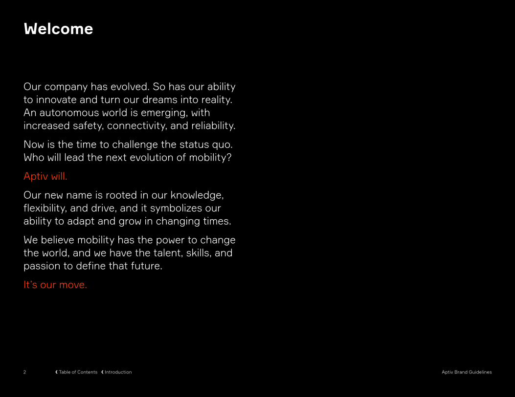
Our company has evolved. So has our ability to innovate and turn our dreams into reality. An autonomous world is emerging, with increased safety, connectivity, and reliability.
Now is the time to challenge the status quo. Who will lead the next evolution of mobility?
Aptiv will.
Our new name is rooted in our knowledge, flexibility, and drive, and it symbolizes our ability to adapt and grow in changing times.
We believe mobility has the power to change the world, and we have the talent, skills, and passion to define that future.
It’s our move.
Welcome

3 Aptiv Brand Guidelines� Table of Contents � Introduction
Why This Document Is Important
Our new brand is more than a logo. It’s a comprehensive system for communicating, and an expression of who we are and the relationships we want to build with our employees, customers, and partners.
Our brand guidelines allow us to maintain consistency when we communicate as Aptiv.
These guidelines will continue to evolve and grow as we do. Updated versions will be made available to all Aptiv employees.

4 Aptiv Brand Guidelines
Table of Contents
Welcome 2
Why This Document Is Important 3
Brand Strategy 5
Brand Positioning 6Brand Narrative 7
Visual Identity 8
Logo 9Use 10Logo: Misuse 11
Color 14Primary 14Secondary 15Primary Usage 16Secondary Usage 17Misuse 18
Typography 19Usage 20
Visual Identity
Points 21Concepts 22Usage 23Misuse 27
Data Visualization 28Usage 28Misuse 29
Pictograms 30Usage 30Misuse 31
Patterns 32Usage 32Misuse 33
Page Grid 34Photography 35
Selection 37Usage 38Misuse 39
Applications 40PowerPoint 41Logo Animation 42Email Signatures: Standard 43Email Signatures: Polish + German 44
Resources 84

5 Aptiv Brand Guidelines� Table of Contents � Brand Strategy
Brand Strategy

6 Aptiv Brand Guidelines� Table of Contents � Brand Strategy
Brand Idea
Mobility. Done.
Brand Positioning
Our brand positioning includes our brand idea, brand purpose, and brand beliefs. These concepts guide how we express ourselves. They are not externally facing copy or messaging.
A brand idea is not a tagline. It is the inspiration for how we look, what we say, how we say it, and how we behave, so our audience understands us.
Our brand purpose exemplifies why we exist and what we excel at.
Our brand beliefs describe our unique view of the world and the role we play in it.
To make the future of mobility work.
Brand Purpose
Innovation is only as valuable as its ability to be implemented.
We know how to get it done because we understand how it works.
The human mind is irreplaceable.
Brand Beliefs

7 Aptiv Brand Guidelines� Table of Contents � Brand Strategy
Our narrative is intended to bring our brand strategy to life. It is not externally facing copy or messaging
The potential of new mobility is immense. The power of new mobility—the convergence of safe, green, and connected technologies—to change the world is within reach. But the question is, “Can we actually get it done?”
At Aptiv, the answer is, “Yes.”
As we move toward an autonomous world, real progress means increased safety, more electrification, higher connectivity, and total reliability—no matter the time or the place. These demands require tremendous executional confidence, and that is where we thrive.
We get our hands dirty: experimenting, testing, and iterating to enable real mobility innovation. We couple our expertise in complex environments with an unparalleled ability to execute.
At Aptiv, we are working tirelessly to define the future of new mobility—and making it a reality.
Narrative

8 Aptiv Brand Guidelines� Table of Contents � Visual Identity8
Visual Identity
9 Aptiv Brand Guidelines� Table of Contents � Visual Identity
Logo
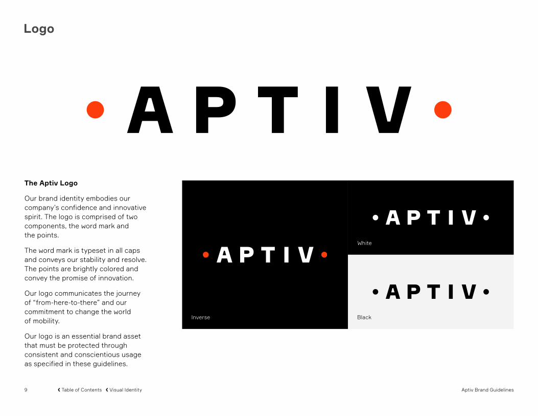
Inverse
White
Black
The Aptiv Logo
Our brand identity embodies our company’s confidence and innovative spirit. The logo is comprised of two components, the word mark and the points.
The word mark is typeset in all caps and conveys our stability and resolve. The points are brightly colored and convey the promise of innovation.
Our logo communicates the journey of “from-here-to-there” and our commitment to change the world of mobility.
Our logo is an essential brand asset that must be protected through consistent and conscientious usage as specified in these guidelines.

10 Aptiv Brand Guidelines� Table of Contents � Visual Identity
Logo
The Aptiv Logo
The Aptiv visual identity embodies our company’s innovative spirit. Our logo is an essential brand asset that must be protected through consistent and conscientious usage as specified in these guidelines.
Our logo files are available to download from the Aptiv Marketing Communications Sharepoint at this address:
http://s01.delphiauto.net/01/mcs/SitePages/index_page.aspx
Minimum Size
76 px, .75", 1,9 cm
The measurements and proportions of our logo should not be modified or altered. Always ensure the logo is legible and shown at or larger than the minimum size.
Clear Space
X
X
X
X
Other design elements should be kept clear of the logo by a minimum distance of one half the height of the logo.

11 Aptiv Brand Guidelines� Table of Contents � Visual Identity
Logo: Misuse
Examples of logo misuse are shown here. These treatments are not acceptable.
Any alteration of the logo negatively affects the integrity of our brand. Please always use approved logo artwork to ensure design consistency.
Do not recolor the logo Do not tint the color of the logo Do not modify the logo
Do not add a tagline to the logo Do not skew or condense the logo
Do not add foreign elements to the logo
Lorem Ipsum Tagline
Do not add a shadow to the logo
Do not delete points from the logo
Do not retype the logo

12 Aptiv Brand Guidelines� Table of Contents � Visual Identity
Logo: Corner Placement
The Aptiv logo should be placed in the corner of a page, allowing it to be read either first or last.
Our logo can appear in the top-left, bottom-left, or bottom-right corner.
It’s important to observe and maintain the rules for proper clear space
Portrait
Landscape
13 Aptiv Brand Guidelines� Table of Contents � Visual Identity
Logo: Center Placement
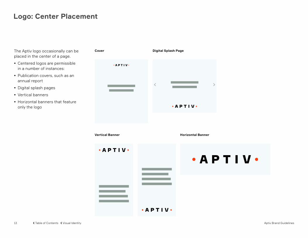
The Aptiv logo occasionally can be placed in the center of a page.
• Centered logos are permissible in a number of instances:
• Publication covers, such as an annual report
• Digital splash pages
• Vertical banners
• Horizontal banners that feature only the logo
Cover Digital Splash Page
Horizontal BannerVertical Banner

14 Aptiv Brand Guidelines� Table of Contents � Visual Identity
Color: Primary
Black Light Slate BlueAptiv Orange
Print coated Pantone Bright Red C CMYK: 0-79-96-0
Print uncoated Pantone 172 U CMYK: 0-68-89-0
Digital RGB: 248-64-24 Hex: #F84018
25%
Print coated Pantone 2204 C CMYK: 33-5-12-2
Print uncoatedPantone 2204 U CMYK: 33-5-13-2
Digital RGB: 183-209-207 Hex: #B7D1CF
Print coated/ uncoated CMYK: 0-0-0-100*
Digital RGB: 0-0-0 Hex: #000000
* A rich black formula is recommended for printed items with large black areas
The primary colors convey specific brand attributes.
Aptiv Orange signifies the promise of innovation. Black signifies strength and determination. Light Slate Blue signifies precision.
Aptiv Orange must be used sparingly to remain exceptional. It must not be used as a background color or in any manner that undermines its special designation.
Black should be used liberally and is especially appropriate as a background color.
Light Slate Blue should be used sparingly as a background color or as a 25% tint.
Our brand identity employs primary and secondary colors.

15 Aptiv Brand Guidelines� Table of Contents � Visual Identity
Color: Secondary
Print coated Pantone 2727 C CMYK: 76-48-0-0
Print uncoated Pantone 2727 U CMYK: 61-33-0-0
Digital RGB: 101-121-226 Hex: #6579E2
True Blue
Print coated Pantone 180 C CMYK: 5-90-86-7
Print uncoated Pantone 200 U CMYK: 3-100-70-7
Digital RGB: 207-51-53 Hex: #CF3335
Burnt Red
Print coated Pantone 143 C CMYK: 0-31-82-0
Print uncoated Pantone 142 U CMYK: 0-28-86-0
Digital RGB: 255-162-17 Hex: #FFA211
Sun
Print coated Pantone 326 C CMYK: 79-0-37-0
Print uncoated Pantone 3262 U CMYK: 78-0-46-0
Digital RGB: 0-172-158 Hex: #00AC9E
Turquoise
Print coated Pantone 2985 C CMYK: 55-0-5-0
Print uncoated Pantone 2985 U CMYK: 60-0-6-0
Digital RGB: 59-198-235 Hex: #3BC6EB
Sky
Print coated Pantone 7538 C CMYK: 24-7-23-33
Print uncoated Pantone 7538 U CMYK: 36-22-40-2
Digital RGB: 146-157-150 Hex: #929D96
Dark Gray
Print coated Pantone 2281 C CMYK: 21-0-57-0
Print uncoated Pantone 2281 U CMYK: 16-0-47-0
Digital RGB: 217-242-139 Hex: #D9F28B
Kiwi
Print coated Pantone 7697 C CMYK: 72-29-21-0
Print uncoated Pantone 2203 U CMYK: 92-0-16-22
Digital RGB: 78-124-136 Hex: #4E7C88
Dark Slate Blue
Print coated Pantone 7545 C CMYK: 57-32-18-59
Print uncoated Pantone 547 U CMYK: 84-42-36-37
Digital RGB: 56-57-66 Hex: #383942
Night
Print coated Pantone Cool Gray 1 C CMYK: 4-2-4-5
Print uncoated Pantone Cool Gray 1 U CMYK: 4-2-6-6
Digital RGB: 229-225-218 Hex: #E5E1DA
Light Gray
Print coated Pantone 7475 C CMYK: 65-7-30-36
Print uncoated Pantone 7474 U CMYK: 73-10-33-17
Digital RGB: 0-107-99 Hex: #006B63
Dark Turquoise
Our secondary colors can be used for backgrounds, data visualizations, and pictograms.
16 Aptiv Brand Guidelines� Table of Contents � Visual Identity
NULLA VESTIBULUM
Lorem ipsum dolor sit amet, consectetur adipiscin elit. Fusce a leo a eros ferentum sagittis nullam sed turpis in odio lacinia vehicula tempus at nunc commodo est sagittis nullam sed turpis in odio lacinia.
Fusce a ghy leo aeros fermentum sagittis. Nullam sed turpis in odio lacinia vehicula tempus at nunc. Commodo est.
Quis consectetur metus dictum nec. Aenean dapibus rutrum orci, eget hendrerit sem pulvinar sit amet. Interd um et malesuada fames ac ante ipsum primis in faucibus. Curabitur et elit Suspendisse sit amet eleme ntum Aenean dapi rerit sem. pulvinar sit.
PHASELLUS VIVERRA
Ultricies maximus, justo nisl tempor nisl, a hendrerit turpis quam at sem. Aliquam lacinia sit amet est sed semper. Mauris eget augue orci.
Maecen lacus est, venenatis nec usjnm vestibulum eu, sollicitudin et ligula. Ut pellentesque ass non eleifend viverra. Morbi maximus placerat metus acusi ornare. Aenean ferment umisn risus tellus, at lacinia tortor congue a. In tempus nisi situios amet consectetur venenatis. Donec purus ligula, ultricies eu.
QUIAM VOLEST CON RES
Ma ipsandignim sequamet.
Dam que saperum re velest quis recesti quidend igendant occuptiis versperat erumetur? Quiam volest, con res inverun tisciatiatin res inullab orporibus cum exerchilibea num et aut maximpos eos rem fugitis ipictorate pore, ut hilibusam aut estem sime dolupta volut apere nis ipit, simus ipsa volupta eroria saero core sit odia veniet quiam vent faccabor re, ommo doluptat. fuga. Et quis re comnist ipsa
Growth
Development Chart
25thNTEGER VOMMODO PURUS DOM
$7.4BNTEGER VOMMODO PURUS DOM
21.9%NTEGER VOMMODO PURUS DOM
51
30
19
USA
Europe
Pacific
Sample Circular Graph
5% 28% 32% 68% 89%
Color: Primary Usage
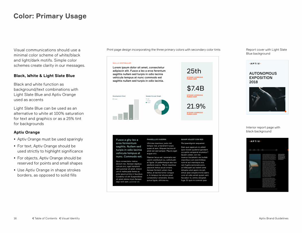
Visual communications should use a minimal color scheme of white/black and light/dark motifs. Simple color schemes create clarity in our messages.
Black, White & Light Slate Blue
Black and white function as background/text combinations with Light Slate Blue and Aptiv Orange used as accents
Light Slate Blue can be used as an alternative to white at 100% saturation for text and graphics or as a 25% tint for backgrounds
Aptiv Orange
• Aptiv Orange must be used sparingly
• For text, Aptiv Orange should be used strictly to highlight significance
• For objects, Aptiv Orange should be reserved for points and small shapes
• Use Aptiv Orange in shape strokes borders, as opposed to solid fills
Interior report page with black background
AUTONOMOUSEXPOSITION2018
Consectetur adipiscing elit. Fusce a leo a eros isios fermentum sagittis. Nullam sed turpis in odio lacinia vehicula tempus at nunc. Morbi commodo est lacus, quis consectetur metus dictum nec. Aenean dapibus rutrum orci, egeuit hendrerit sem pulvinar sit amet. Interdum et malesuada fames ac ante ipsum primis in faucibus. Curabitur et elit egestas, congue metus vel, egestas sapien. leo tellus, pretium eu tellus nec, euismod varius arcu.
Sed laoreet Mauris nibh sapien, egestas in elementu sed, hendrerit et mauris. Praesent ut velit quis metus condimentum dignissim et vitae quam. Maecenas mi elit, vehicula nowion elementum a, lobortis eget lacus. Vestibulum vestibulum massa a dduglit porttitor, sed cursus mi blandit. Sed eget dolor ex. Integer lorem risus, rhoncus eu lacus vitae, cursus fermentum libero. Aliquam turpis mi, condime ntum sed posuere vel, varius quis odio. a, lobortis eget lacus dkgwb fagattw. Quisque rutrum neque sed tellus eleifend, ut scelerisque nulla placerat. Praesent jahl keet euismod justo, sit amet iaculis turpis. Vivamus a quam placerat. Leo tellus, pretium eu tellus nec, euis vuis mod varius arcu. Sed laoreet Mauris nibh sapien, egestas in elementum sed, hendrerit et mauris. Praesent utvelit quis metus condimentum dignissim et Maecenas elit, vehicula non elementum a, lobor eget lacus. Vestibulum vestibulum massa a dduglit porttitor, sed cursus mi blandit. Sed eget dolor ex. Integer lorem risus, rhoncus eu lacus vitae dkjgbfvri ido. Maecenas mi elit, vehicula non elementum adw, lobortis eget lacus. Vestibulum vestibulum massa a dduglit porttitor, sed cursus mi bfdgwy.
Cursus fermentum libero. Aliquam turpis mi isow , condimentum sed lla placerat. Praesent jahlposuere vel, varius quis odio. Quisque rutrum neque sed tellus eleifend, ut scelerisque nulla placerat. Praesent jahl keet euism od justo, sit amet iaculis turpis. Vivamus a quam placerat, effi citur mi. Morbi commodo est lacus, quis consectetur metus dictum nec. Aenean dapibus rutrum lla placerat. Praesent jahlorci, eget hendrerit sem pulvinar sit amet. Interdum et malesuada fames a ante ipsum primis in faucibus. Curabitur et elit egestas, congue metus vel, egestas sapien. leo tellus, pretium eu tellus nec. Egestas in elementum sed, hendrerit et mauris. Praesent ut velit quis metus condsw imentum
A B C D E
Vestibulum vestibulum massa a dduglit porttitor, sed cursus mi blandit. Sed eget dolor ex. Integer lorem risus, rhoncus eu lacus vitae dkjgbfvri ido. Maecenas mi elit, vehicula non elementum adw, lobortis eget lacus.
Print page design incorporating the three primary colors with secondary color tints Report cover with Light Slate Blue background

17 Aptiv Brand Guidelines� Table of Contents � Visual Identity
Color: Secondary Usage
Warm, cool, and neutral colors should be carefully considered whenever they are used.
Use tints to differentiate between data fields. Tints should be graded at 10% increments.
The length of a document should correspond to the amount of secondary colors used. Shorter documents should use fewer secondary colors.
PowerPoint data visualization graphics harmoniously blend primary and secondary colors.
Start with neutral tints in the primary and secondary colors as backgrounds: White, Black, Light Slate Blue, Light Gray, Dark Gray, or Night.
Use appropriate logo version to ensure visibility of the lettering and Aptiv Orange on the page.
7Praesent
Vaculis
Nulla
Posuere
MalesuaDuis
Praesent
Vaculis
Lorem Ipsum
8
Praesent
Vaculis
Nulla
Malesua
Duis
CONSECTETUER ADIPISCING ELIT
ER SED NULLA7Praesent
Vaculis
Nulla
Posuere
MalesuaDuis
Praesent
Vaculis
Lorem Ipsum
8
Praesent
Vaculis
Nulla
Malesua
Duis
CONSECTETUER ADIPISCING ELIT
ER SED NULLA
7Praesent
Vaculis
Nulla
Posuere
MalesuaDuis
Praesent
Vaculis
Lorem Ipsum
8
Praesent
Vaculis
Nulla
Malesua
Duis
CONSECTETUER ADIPISCING ELIT
ER SED NULLA
7Praesent
Vaculis
Nulla
Posuere
MalesuaDuis
Praesent
Vaculis
Lorem Ipsum
8
Praesent
Vaculis
Nulla
Malesua
Duis
CONSECTETUER ADIPISCING ELIT
ER SED NULLA
7Praesent
Vaculis
Nulla
Posuere
MalesuaDuis
Praesent
Vaculis
Lorem Ipsum
8
Praesent
Vaculis
Nulla
Malesua
Duis
CONSECTETUER ADIPISCING ELIT
ER SED NULLA

18 Aptiv Brand Guidelines� Table of Contents � Visual Identity
Color: Misuse
L E A R N M O R E
L E A R N M O R E
Do not use Aptiv Orange as a color block or use any color other than Aptiv Orange for points
Do not design with low-contrast color tints
Do not use secondary colors in place of the primary color palette
Do not group together too many vivid colors
Using the colors in these guidelines will maximize the clarity of our visual communications.
Only use the specified colors according to the parameters detailed in this document.

19 Aptiv Brand Guidelines� Table of Contents � Visual Identity
Typography
ABCDEFGHIJKLMNOPQRSTUVWXYZabcdefghijklmnopqrstuvwxyz1234567890 ”.,?/!@#$&*
ABCDEFGHIJKLMNOPQRSTUVWXYZabcdefghijklmnopqrstuvwxyz1234567890 ”.,?/!@#$&*
Formular
Formular is our primary typeface. Formular Light should be used for most communication purposes. Formular Bold should be used to add emphasis.
Use Formular for all branded materials, such as our website, brochures, posters, and advertising.
Arial
Arial is our substitute typeface when Formular is not available. Arial is similar in style to Formular and is universally available in office software.
BoldCharacter Set
LightCharacter Set
Black
Bold
Medium
Regular
Light
FormularFormularFormularFormularFormular

20 Aptiv Brand Guidelines� Table of Contents � Visual Identity
Typography: Usage
Formular should be used in all Aptiv communications and messaging. The Aptiv logo is rendered in Formular Bold.
Typesetting
• Use only two font weights at a time
• Maintain distinct visual contrast between the two weights
• Main headlines should be set in Formular Bold
• All text should be left-aligned
• Use title case for short headlines and sentence case for long headlines and body copy
• Text can be set in all capital letters for display purposes
Line Spacing
It’s important to maintain consistent line spacing (also called leading)across our communications. Line spacing must be formulated to be 30% greater than the type size. For example, 10-point type should be set with 13-point line spacing.
The Formular font weights are employed based on their utility
Bold use of primary colors—accented by Aptiv Orange—paired with contrasting font weights exemplifies the Aptiv style
E Y E B R O W T E X T I S S E T I N S M A L L C A P S
This headline is set in Formular Bold.This body copy/text reads well in Formular Light. If text is smaller, using Formular Regular can help with readability.
C A L L T O A C T I O NL E A R N M O R E
P R E S E N T A T I O N T I T L E
Presenter NamePresenter Title
Presenter NamePresenter Title
August 8, 2018
Special Use: Positively tracked headlines in all capital letters are reserved for special uses, such as splash pages or covers
ErgoMate™ Mechanical Assist System wins PACE Award
Investors Careers Responsibility About Media
Special Use: Centered type should only be used on splash pages or covers with small amounts of copy

21 Aptiv Brand Guidelines� Table of Contents � Visual Identity
Points
Points are a graphic element consistent with our brand idea and brand purpose.
Points began as a depiction of “from-here-to-there” but evolved into a set of foundational principles. Points can be used metaphorically as either “nouns” or “verbs.”
Nouns
• A particular spot, place, or position in an area or on a map, object, or surface
• A particular stage of development or moment in time
• An essential idea put forth in a discussion
• A distinctive feature of a person, place, or thing
Verbs
• To direct someone’s attention to a spatial orientation, idea, or object
• To turn toward a particular direction
• To give force or emphasis to words or actions
22 Aptiv Brand Guidelines� Table of Contents � Visual Identity
Points: Concepts
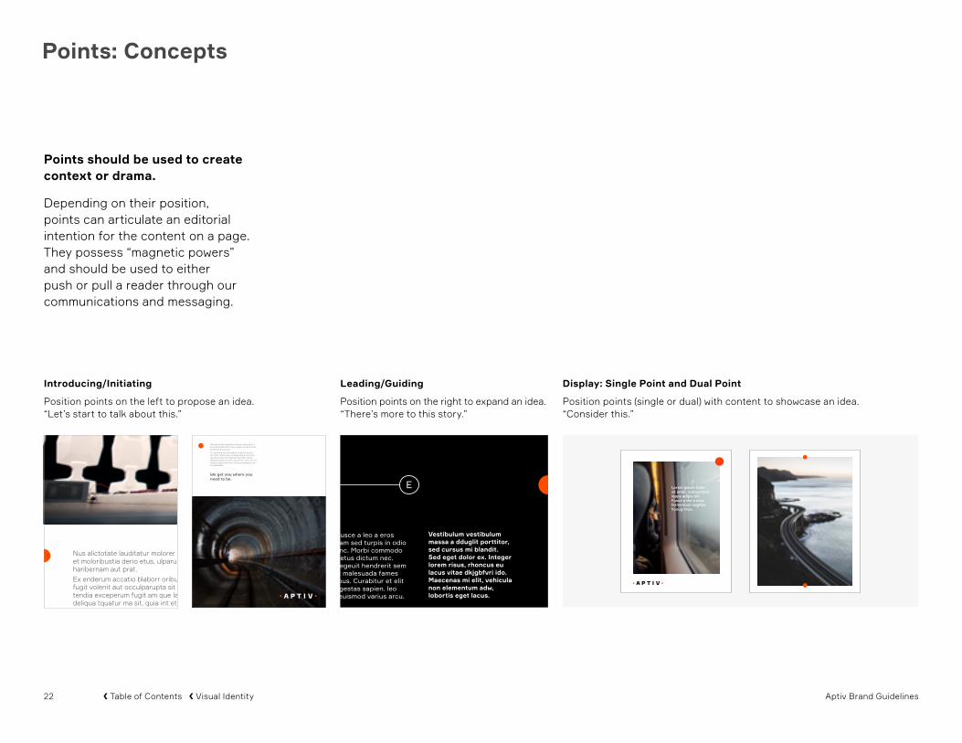
Introducing/Initiating
Position points on the left to propose an idea. “Let’s start to talk about this.”
Nus alictotate lauditatur molorer estiuribus il et moloribustia derio etus, ulparum idunt erum haribernam aut prat.Ex enderum accatio blaborr oribus exerum est fugit volenit aut occulparupta sit omnissi tendia exceperum fugit am que labo. Nequi deliqua tquatur ma sit, quia int et, cum rero mo totatus sequi offic tem volut eos essed qui re exceptaestes
Nus alictotate lauditatur molorer estiuribus il et moloribustia derio etus, ulparum idunt erum haribernam aut prat.Ex enderum accatio blaborr oribus exerum est fugit volenit aut occulparupta sit omnissi tendia exceperum fugit am que labo. Nequi deliqua tquatur ma sit, quia int et, cum rero mo totatus sequi offi c tem volut eos essed qui re exceptaestes.
We get you where you need to be.
Points should be used to create context or drama.
Depending on their position, points can articulate an editorial intention for the content on a page. They possess “magnetic powers” and should be used to either push or pull a reader through our communications and messaging.
Consectetur adipiscing elit. Fusce a leo a eros isios fermentum sagittis. Nullam sed turpis in odio lacinia vehicula tempus at nunc. Morbi commodo est lacus, quis consectetur metus dictum nec. Aenean dapibus rutrum orci, egeuit hendrerit sem pulvinar sit amet. Interdum et malesuada fames ac ante ipsum primis in faucibus. Curabitur et elit egestas, congue metus vel, egestas sapien. leo tellus, pretium eu tellus nec, euismod varius arcu.
Sed laoreet Mauris nibh sapien, egestas in elementu sed, hendrerit et mauris. Praesent ut velit quis metus condimentum dignissim et vitae quam. Maecenas mi elit, vehicula nowion elementum a, lobortis eget lacus. Vestibulum vestibulum massa a dduglit porttitor, sed cursus mi blandit. Sed eget dolor ex. Integer lorem risus, rhoncus eu lacus vitae, cursus fermentum libero. Aliquam turpis mi, condime ntum sed posuere vel, varius quis odio. a, lobortis eget lacus dkgwb fagattw. Quisque rutrum neque sed tellus eleifend, ut scelerisque nulla placerat. Praesent jahl keet euismod justo, sit amet iaculis turpis. Vivamus a quam placerat. Leo tellus, pretium eu tellus nec, euis vuis mod varius arcu. Sed laoreet Mauris nibh sapien, egestas in elementum sed, hendrerit et mauris. Praesent utvelit quis metus condimentum dignissim et Maecenas elit, vehicula non elementum a, lobor eget lacus. Vestibulum vestibulum massa a dduglit porttitor, sed cursus mi blandit. Sed eget dolor ex. Integer lorem risus, rhoncus eu lacus vitae dkjgbfvri ido. Maecenas mi elit, vehicula non elementum adw, lobortis eget lacus. Vestibulum vestibulum massa a dduglit porttitor, sed cursus mi bfdgwy.
Cursus fermentum libero. Aliquam turpis mi isow , condimentum sed lla placerat. Praesent jahlposuere vel, varius quis odio. Quisque rutrum neque sed tellus eleifend, ut scelerisque nulla placerat. Praesent jahl keet euism od justo, sit amet iaculis turpis. Vivamus a quam placerat, effi citur mi. Morbi commodo est lacus, quis consectetur metus dictum nec. Aenean dapibus rutrum lla placerat. Praesent jahlorci, eget hendrerit sem pulvinar sit amet. Interdum et malesuada fames a ante ipsum primis in faucibus. Curabitur et elit egestas, congue metus vel, egestas sapien. leo tellus, pretium eu tellus nec. Egestas in elementum sed, hendrerit et mauris. Praesent ut velit quis metus condsw imentum
A B C D E
Vestibulum vestibulum massa a dduglit porttitor, sed cursus mi blandit. Sed eget dolor ex. Integer lorem risus, rhoncus eu lacus vitae dkjgbfvri ido. Maecenas mi elit, vehicula non elementum adw, lobortis eget lacus.
Leading/Guiding
Position points on the right to expand an idea. “There’s more to this story.”
Display: Single Point and Dual Point
Position points (single or dual) with content to showcase an idea. “Consider this.”
23 Aptiv Brand Guidelines� Table of Contents � Visual Identity
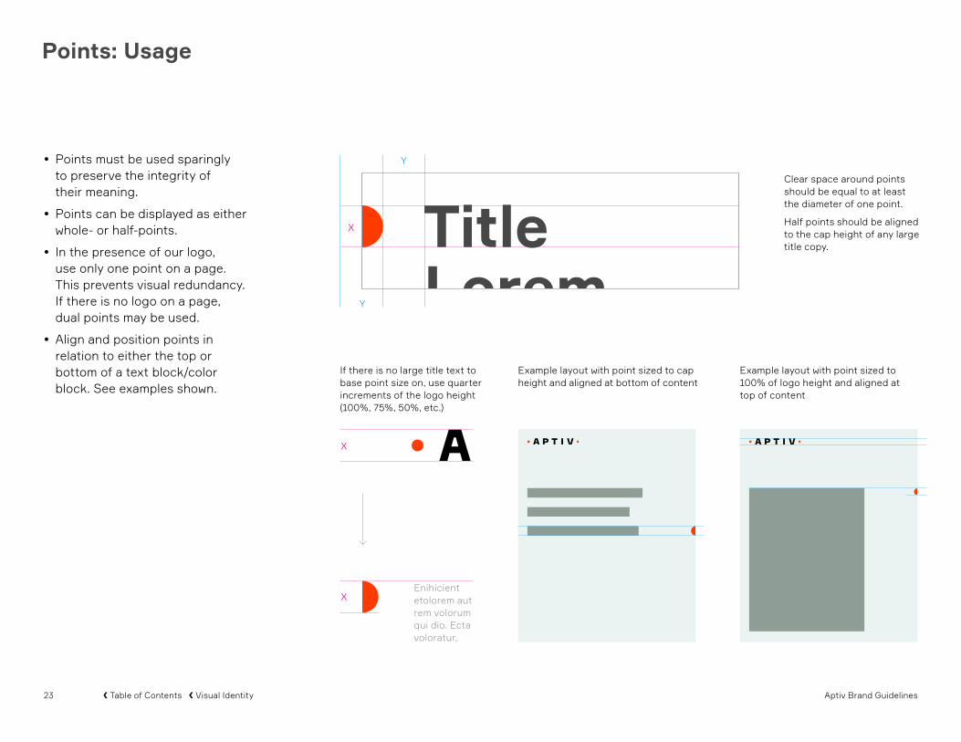
If there is no large title text to base point size on, use quarter increments of the logo height (100%, 75%, 50%, etc.)
Example layout with point sized to cap height and aligned at bottom of content
Example layout with point sized to 100% of logo height and aligned at top of content
Points: Usage
Clear space around points should be equal to at least the diameter of one point.
Half points should be aligned to the cap height of any large title copy.
• Points must be used sparingly to preserve the integrity of their meaning.
• Points can be displayed as either whole- or half-points.
• In the presence of our logo, use only one point on a page. This prevents visual redundancy. If there is no logo on a page, dual points may be used.
• Align and position points in relation to either the top or bottom of a text block/color block. See examples shown.
TitleLorem Upsum
X
Y
Y
X
X

24 Aptiv Brand Guidelines� Table of Contents � Visual Identity
Points: Usage
Diagonal Arrangement
Single points placed with the Aptiv logo can be arranged diagonally. This composition will highlight the magnetic qualities of points. Longer distances between the point and the logo will emphasize this magnetic pull.
Stacked Arrangement
Single points placed on the same side of a page as the Aptiv logo must maintain a comfortable distance between them.
Horizontal Arrangement
Single points placed on a horizontal page with the Aptiv logo can be arranged either aligned or diagonally.

25 Aptiv Brand Guidelines� Table of Contents � Visual Identity
Points: Usage
Narrative: Single Point
Single points should be placed strategically with text blocks. Placing the point on a page will introduce, guide, or display the content.
Check marks indicate acceptable point locations
Point clear space distance

26 Aptiv Brand Guidelines� Table of Contents � Visual Identity
Points: Usage
2 0 1 8
Display: Single Point
Single points should be centered on one corner of a photo or color block. If the point is placed on a page with the Aptiv logo, it should be positioned in a diagonal arrangement.
Display: Dual Points
Dual points should be center-aligned on a page in either a vertical or horizontal arrangement. They should never be displayed on a page with the Aptiv logo.
AUTONOMOUSEXPOSITION2018
AUTONOMOUSEXPOSITION2018

27 Aptiv Brand Guidelines� Table of Contents � Visual Identity
Examples of points misuse are shown here. These treatments are not acceptable.
• Points should be functional, not used as decoration or ornamentation
• Points should be intentional and inventive, not random
• Points should begin or end a story but not be the story
• Points should be used only as whole- or half-circles
Do not use dual points in the presence of logo
Do not place a point off the axis of a corner
Do not stretch a point into an oval
Do not misalign or place dual points on corners
Do not place points behind a frame
Do not use more than two points per layout
Do not place a point near text rag
Points: Misuse
Do not set text in or enlarge a point so it is overwhelming

28 Aptiv Brand Guidelines� Table of Contents � Visual Identity
Data Visualization
Fusce ac sem in sapienvolutpat posuere. Aliquam sodales, nibh a iaculisegestas, leo elit pretium tortor, vel sodales arcudiam quis orci. Vivamus porta at nisi in scelerisque. Vestibulum lobortis, semsit amet tempus luctus, nibh augue pulvinar.
DONEC MATTISIN URNA
60%VivamusElementum
12%In Dignissim
36%EgetDapibus
Praesent
Vaculis
Lorem Ipsum
Duis
Malesua
Complex data should be presented with clarity and beauty. Data visualizations suggest process and precision integral to Aptiv’s brand idea and brand purpose.
• Use a smart, clear, minimalist approach
• Use a balance of round and straight-edge shapes
• Use a balance of filled shapes and lines
• Do not use solid filled circles rendered in Aptiv Orange
• Use black or gray lines depending on needed contrast
• Use multiplying color fills Fusce ac sem in sapienvolutpat posuere. Aliquam sodales, nibh a iaculisegestas, leo elit pretium tortor, vel sodales arcudiam quis orci. Vivamus porta at nisi in scelerisque. Vestibulum lobortis, semsit amet tempus luctus, nibh augue pulvinar.
DONEC MATTISIN URNA
60%VivamusElementum
12%In Dignissim
36%EgetDapibus
Praesent
Vaculis
Lorem Ipsum
Duis
Malesua
ER SED NULLA7Praesent
Vaculis
Nulla
Posuere
MalesuaDuis
Praesent
Vaculis
Lorem Ipsum
8
Praesent
Vaculis
Nulla
Malesua
Duis
CONSECTETUER ADIPISCING ELIT
Fusce ac sem in sapienvolutpat posuere. Aliquam sodales, nibh a iaculisegestas, leo elit pretium tortor, vel sodales arcudiam quis orci. Vivamus porta at nisi in scelerisque. Vestibulum lobortis, semsit amet tempus luctus, nibh augue pulvinar.
DONEC MATTISIN URNA
60%VivamusElementum
12%In Dignissim
36%EgetDapibus
Praesent
Vaculis
Lorem Ipsum
Duis
Malesua
ER SED NULLA7Praesent
Vaculis
Nulla
Posuere
MalesuaDuis
Praesent
Vaculis
Lorem Ipsum
8
Praesent
Vaculis
Nulla
Malesua
Duis
CONSECTETUER ADIPISCING ELIT
NULLAM INPULVINAR DOLOR
Vel tincidunt ipsum. Sedid dictum nulla, eu posuere magna. Nam at dui hendre-rit, porttitor elit vel, viverra elit. Nunc tempor pellen-tesque feugiat. Mauris commodo tincidunt rutrum. Nulla ut dui felis. Duis molestie enim ac massa auctor fermentum. Etiam non neque bibendum, dapibus nunc sed, luctus dui. Cras porta dapibus odio, efficitur mollis dui facilisis at. Mauris augue tortor, lacinia ut porta non, iaculis at odio.
LOREMIPSUM
DOLORSIT AMET
DOLOREMAGNA ALIQUAM
CONSECTETUR

29 Aptiv Brand Guidelines� Table of Contents � Visual Identity
Data Visualization: Misuse
Do not embellish with drop shadows or gradients Do not use strokes that are too thick. Do not use a typeface that is not Formular or Arial.
Do not overuse circles and dilute the significance of pointsDo not have overly illustrative graphics that complicate communication
Do not use colors that are outside of the secondary color palette

30 Aptiv Brand Guidelines� Table of Contents � Visual Identity
Pictograms
Pictograms can be used to communicate with Aptiv employees or end users. They can be combined with text or images.
• Use only one line weight with rounded ends
• Use a maximum of two primary or secondary colors
• Use Aptiv Orange in a conscientious manner
• In one-color instances, use black, gray, or white
To create and use a pictogram not show here, please contact: [email protected]
Pictograms displayed are for illustrative purposes only.

31 Aptiv Brand Guidelines� Table of Contents � Visual Identity
Pictograms: Misuse
Do not use more than one line weight
Do not use colors that are too similar to one another
Do not render pictograms with gradients
Do not place pictograms in a low-contrast environment

32 Aptiv Brand Guidelines� Table of Contents � Visual Identity
Patterns
Patterns are made up of a series of circles fixed to a square grid. They can be placed on a page overlapping images or color blocks. Patterns must align with our page grid.
• Use patterns to enhance collateral without complicating the page
• Use patterns sparingly and with sophistication
• Each pattern should be rendered in only one color
• Use only black, white, light slate blue, or dark gray for patterns
Pattern on light slate blue background Pattern on dark background Pattern over image

33 Aptiv Brand Guidelines� Table of Contents � Visual Identity
Patterns: Misuse
Do not let pattern overlap the logo. Delete circles that interfere with the logo,
Do not allow pattern to distract from or obstruct imagery
Do not use Aptiv Orange
Do not use color combinations that prevent visibility
Do not use more than one color Do not let pattern affect legibility of type
Rati dem lacepratiisi corepe iumquati
Do not have more than one size of circle in the pattern

34 Aptiv Brand Guidelines� Table of Contents � Visual Identity
Page Grid
A 12 × 12 grid helps structure content and guide readers. This offers flexibility with both varying amounts of copy and application size, easily being split into sixths, quarters or thirds.
Recommended gutter sizes:
US Letter Portrait: 0.125” US Letter Landscape: 0.125” A4 ISO Portrait: 3mm A4 ISO Landscape: 3mm Narrow Vertical (Letter, 3-panel): 0.0625” Narrow Vertical (A4 ISO, 3-panel): 1.5mm
Standard 12 × 12
Sixths
US Letter Portrait
US Letter Landscape
ISO A4 Portrait
ISO A4 Landscape
Narrow Vertical
Wide Horizontal
Quarters
Thirds
The Aptiv page grid can apply to any size page and provides rules for consistent margins, columns, and rows.

35 Aptiv Brand Guidelines� Table of Contents � Visual Identity
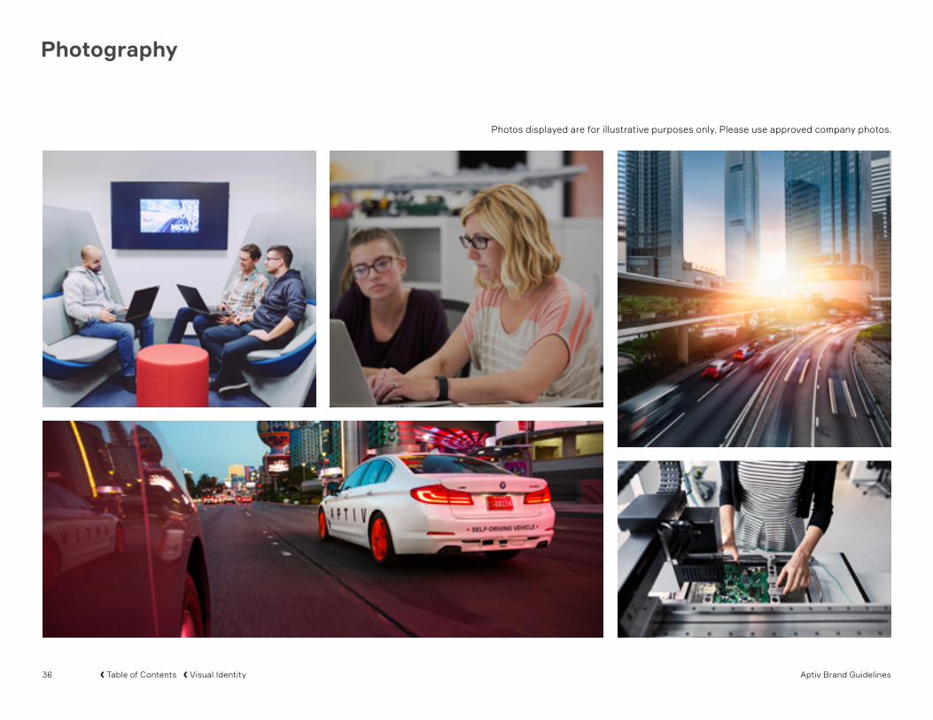
Photography
Our photographic style should feature people and places as the primary subjects.
Photographs of people should showcase either Aptiv employees or the end users of Aptiv’s products and services. Employees should be portrayed engaging with their work. End users should be portrayed enjoying our products and services.
Photographs of places should showcase locations where Aptiv’s technology thrives. Locations should portray the promise of mass mobility.
Images can be awash in light signifying precision and clarity or can have a single light source creating a chiaroscuro effect signifying new beginnings.
Photos displayed are for illustrative purposes only. Please use approved company photos.
36 Aptiv Brand Guidelines� Table of Contents � Visual Identity
Photography
Photos displayed are for illustrative purposes only. Please use approved company photos.

37 Aptiv Brand Guidelines� Table of Contents � Visual Identity
Do not use photographs with lens flares that make the image appear artificial
Photography: Selection
Do use photographs with a balance of highlights, middle tones, and shadows
Do use photographs that appear warm, even in the presence of cool colors
Do not use photographs that feel too cold Do not use photographs that have unnaturally high color saturation
Do not use photographs that are overexposed or have too much contrast
Do Select
Do Not Select
Do ensure deep blacks, regardless of the type of lighting

38 Aptiv Brand Guidelines� Table of Contents � Visual Identity
Photography: Usage
AUTONOMOUSEXPOSITION2018
• Photographs can be placed on a page as full-bleed or in a rectangle aligned to the Aptiv grid. Multiple images may be placed on a single page.
• Text or the Aptiv logo can be placed on a photograph. Legibility must be preserved for the text/logo and the photograph.
• Photographs may be darkened or lightened with black or white screens to aid in legibility or for dramatic effect.
Text over dark images
Use a black filled frame set to multiply blending mode at 50% opacity with white text. Adjust for visibility as needed.
Text over light images
Use a white filled frame set to normal blending mode at 90% opacity with black text. Adjust for visibility as needed.
D A M U S Q U A M A U T A S A N D A N D I C I T
D A M U S Q U A M A U T A S A N D A N D I C I TD A M U S Q U A M A U T A S A N D A N D I C I T
Aligned to grid margin Full-bleed image Logo over images
Ensure that the logo is legible at all times. Even if an image is sufficiently dark, adding a solid black or white bar enhances visibility. Consider the subject at hand and whether or not the bar is distracting.

39 Aptiv Brand Guidelines� Table of Contents � Visual Identity
Photography: Misuse
Do not place in circle frames to avoid trivializing the point silhouette
Do not apply a color treatment that separates an image from the system
Do not stretch a photo within a frame such that it appears disproportionate
Do not overlay multiple images
Do not use other holding shapes that are not rectangular
Do not overuse photos in a design
Do not crop a photo in ways that do not support its key idea
Do not deviate from the grid

40 Aptiv Brand Guidelines� Table of Contents � Applications
Applications

41 Aptiv Brand Guidelines� Table of Contents � Applications
PowerPoint
PRESENTATION TITLE
Month 00, Year Jane SmithCEO
Divider slide
Presentation Title | Date | Aptiv Confidential12
Divider slideCover slide
Make headlines compelling and concise
Three big points. Use Bold to highlight special words or phrases in boxed text.
Three big points. Use Bold to highlight special words or phrases in boxed text.
Three big points. Use Bold to highlight special words or phrases in boxed text.
Presentation Title | Date | Aptiv Confidential36
Slide with boxed text
Use indent level 1 for call outs with an image. Use Aptiv Orange to highlight words or phrases.
Presentation Title | Date | Aptiv Confidential47
Slide with text and photo
A new Aptiv-branded PowerPoint template has been installed on employee computers. Please read the template instructions. It’s important to follow the template rules to ensure our brand appears consistent with these guidelines.
To transfer content from an older template:
• Choose a slide from the new template that most closely matches the old content
• Copy the old content and paste it into the new template’s text/image fields
Do not copy an entire slide from an older template. Doing so will introduce design inconsistencies that will require manual reformatting.
Use indent level 2 to headline bodies of text and bulleted lists.Use indent level 3 for paragraphs. Try to keep text minimal and focus on imagery and takeaways.• Use indent level 4 for bullets
• Use indent level 5 tier two bullets- Use indent level 6 for tier three bullets
Use indent level 7 for occasional footnotes
Sales
1st Qtr 2nd Qtr 3rd Qtr 4th Qtr
Make headlines compelling and concise
Presentation Title | Date | Aptiv Confidential30
Slide with text and data visualization

42 Aptiv Brand Guidelines� Table of Contents � Applications
Logo Animation
Aptiv will use a logo animation in some digital applications or to begin/end a video. The animation will use choreography consistent with our brand idea and brand purpose.
There are three versions of the animation, each with an opening screen that is either Aptiv Orange, black, or white.

43 Aptiv Brand Guidelines� Table of Contents � Applications
Email Signatures: Standard
Firstname LastnameJob Title
[email protected]: +1 234.567.8900 | Mobile: +1 234.567.8900 1234 Streetname | Cityname, Statename, PostalCode | Countryname
Aptiv general signature
Placement of promotional banner atthe end of the signature
Firstname LastnameJob Title
[email protected]: +1 234.567.8900 | Mobile: +1 234.567.8900 1234 Streetname | Cityname, Statename, PostalCode | Countryname
Aptiv promotional signatureAptiv email signatures have been installed on employee computers in December 2017. Microsoft Exchange templates can be found at this location:
Select file / Options / Mail / Signatures / E-Mail Signatures
Firstname Lastname
[email protected]: +1 234.567.8900 | Mobile: +1 234.567.8900
Aptiv reply signature

44 Aptiv Brand Guidelines� Table of Contents � Applications
Email Signatures: Polish + German
Firstname Lastname Job Title
[email protected]: +1 234.567.8900 | Mobile: +1 234.567.8900
1234 Streetname | Cityname, Statename, PostalCode | Countryname
------------------------------------------------------------------------------------Sitz der Gesellschaft: Wuppertal; Registergericht: AG Wuppertal, HRB 21453Geschäftsführung: Kirsten Stenvers (Sprecherin), Uta Hoffmann, Markus Kerkhoff, Matthias LaumannAufsichtsrat: Michael Gassen (Vorsitzender)
Firstname LastnameJob Title
[email protected]: +1 234.567.8900 | Mobile: +1 234.567.8900 1234 Streetname | Cityname, Statename, PostalCode | Countryname
---------------------------------------------------------------------------------------------------------Delphi Poland S.A., ul. Podgórki Tynieckie 2, 30-399 Kraków, PolskaS d Rejestrowy: S d Rejonowy dla Krakowa – ródmie cia w Krakowie, XI Wydzia Gospodarczy Krajowego Rejestru S dowegoNumer wpisu do rejestru: KRS 0000015189, NIP: 684-00-01-364Kapita zak adowy: 276.133.416 PLN Kapita wp acony: 276.133.416 PLN
Aptiv email signatures have been installed on employee computers in December 2017. Microsoft Exchange templates can be found at this location:
Select file / Options / Mail / Signatures / E-Mail Signatures
Aptiv German signature Aptiv Polish signature

45 Aptiv Brand Guidelines� Table of Contents � Resources
For any questions regarding these guidelines, please contact:
Americas: Rachelle Valdez [email protected]
South America: Mariana Fontainhas [email protected]
Mexico: Vanya Gonzalez [email protected]
EMEA: Anna Homa [email protected]
Asia Pacific: Nicole Wang [email protected]
Resources

46 Aptiv Brand Guidelines� Table of Contents � Resources