Embed Size (px)
Citation preview
1
ArcGIS 10.x Basic Exercise– GMU Libraries
Goals of this exercise
To introduce basic functions available in ArcGIS 10.x to create a simple thematic map
You are going to create a thematic map using VA county data for elderly population (65 years old and
above). The exercise includes skills on adding data, joining tables, creating and calculating new field,
classifying functions by quantity, layout data with essential map elements, export a finished map, and
more.
Adding data to ArcMap
1. Create a folder (with your name) on the desktop on the lab computer (or Mesa account) or
your removable drive.
2. Download the data (“Download Basic Exercise Data”) from
http://dataservices.gmu.edu/software/arcgis and move them to your folder.
Use a zip tool such as WinZip to extract the ArcGIS tutdata.zip. You will see six files related to
a VA County shape file and one excel file for VA elderly population.
3. Open ArcMap. For most computers this can be done by going to Start->Programs-
>ArcGIS>ArcMap 10.x
4. Select to start with a Blank Map (go to Files>New if this is not the case).
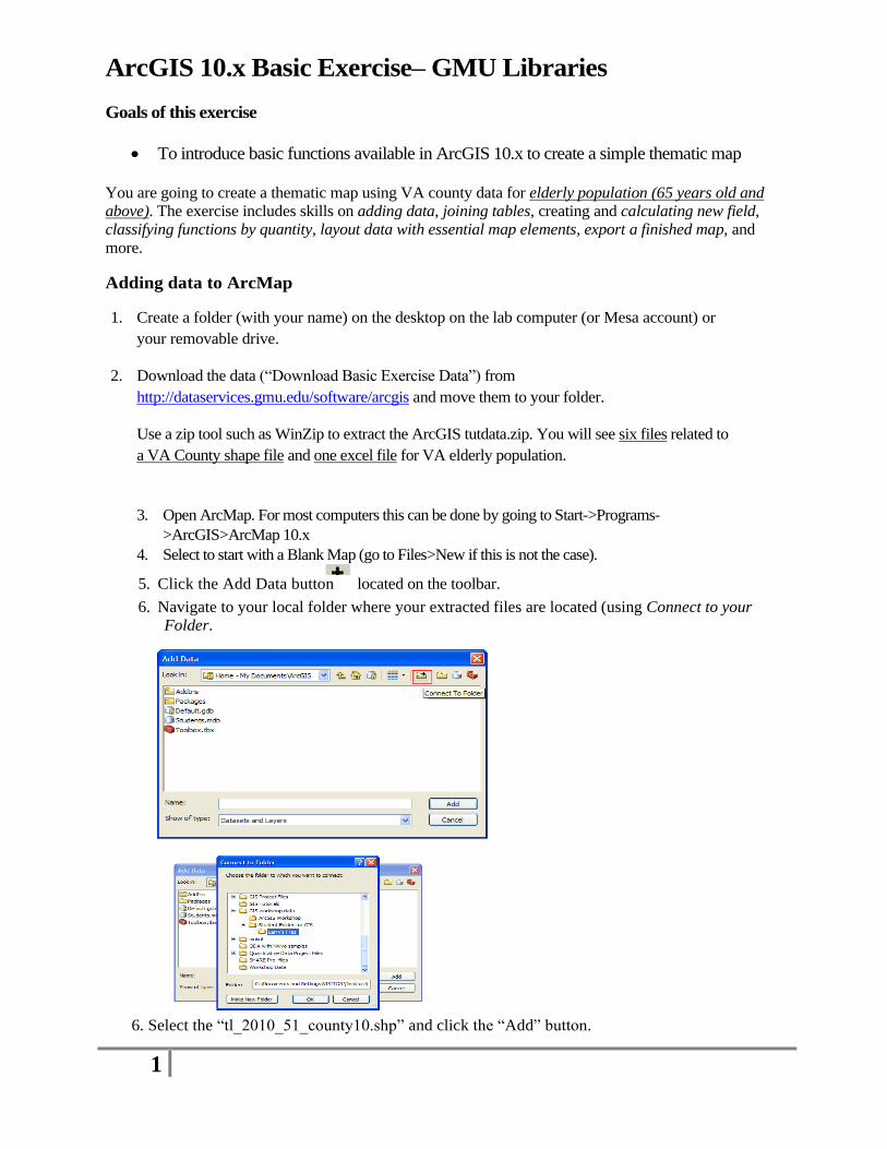
5. Click the Add Data button located on the toolbar.
6. Navigate to your local folder where your extracted files are located (using Connect to your
Folder.
6. Select the “tl_2010_51_county10.shp” and click the “Add” button.
2
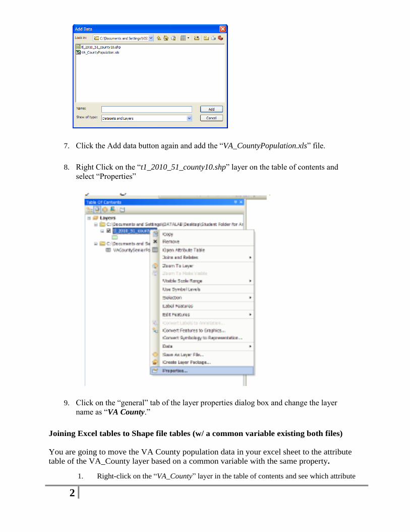
7. Click the Add data button again and add the “VA_CountyPopulation.xls” file.
8. Right Click on the “t1_2010_51_county10.shp” layer on the table of contents and
select “Properties”
9. Click on the “general” tab of the layer properties dialog box and change the layer
name as “VA County.”
Joining Excel tables to Shape file tables (w/ a common variable existing both files)
You are going to move the VA County population data in your excel sheet to the attribute
table of the VA_County layer based on a common variable with the same property.
1. Right-click on the “VA_County” layer in the table of contents and see which attribute
3
is the same property as the attribute in the excel file that you are going to join. If there are two
attributes that are common between two data tables, you can join two tables based on this
common attributes.
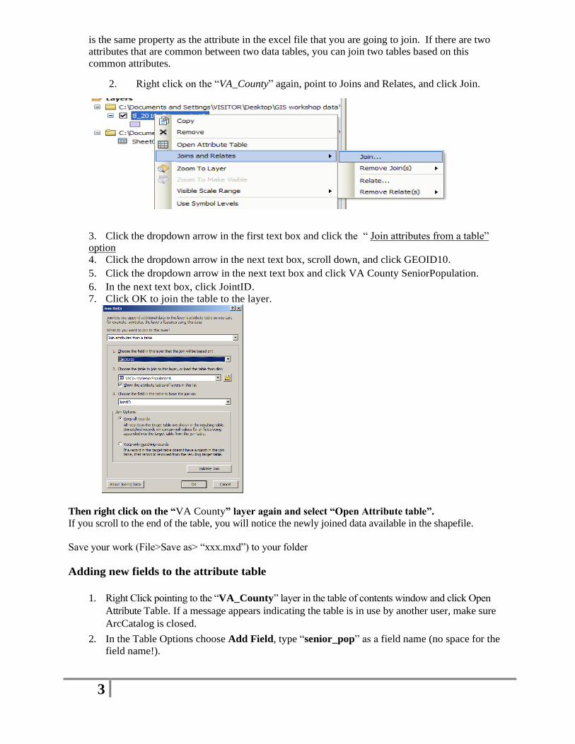
2. Right click on the “VA_County” again, point to Joins and Relates, and click Join.
3. Click the dropdown arrow in the first text box and click the “ Join attributes from a table”
option
4. Click the dropdown arrow in the next text box, scroll down, and click GEOID10.
5. Click the dropdown arrow in the next text box and click VA County SeniorPopulation.
6. In the next text box, click JointID.
7. Click OK to join the table to the layer.
Then right click on the “VA County” layer again and select “Open Attribute table”.
If you scroll to the end of the table, you will notice the newly joined data available in the shapefile.
Save your work (File>Save as> “xxx.mxd”) to your folder
Adding new fields to the attribute table
1. Right Click pointing to the “VA_County” layer in the table of contents window and click Open
Attribute Table. If a message appears indicating the table is in use by another user, make sure
ArcCatalog is closed.
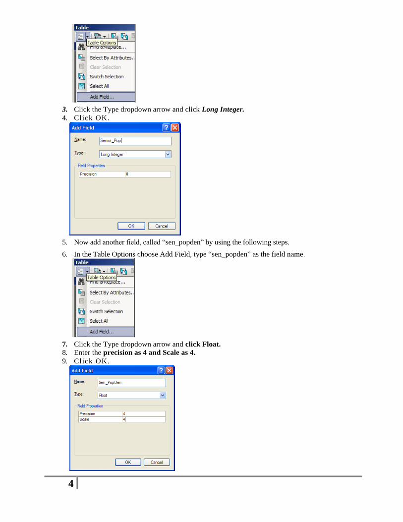
2. In the Table Options choose Add Field, type “senior_pop” as a field name (no space for the
field name!).
4
3. Click the Type dropdown arrow and click Long Integer.
4. Click OK.
5. Now add another field, called “sen_popden” by using the following steps.
6. In the Table Options choose Add Field, type “sen_popden” as the field name.
7. Click the Type dropdown arrow and click Float.
8. Enter the precision as 4 and Scale as 4.
9. Click OK.
5
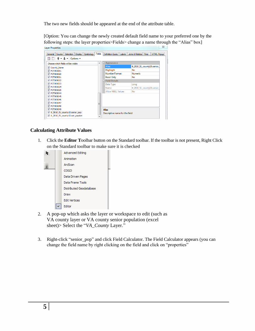
The two new fields should be appeared at the end of the attribute table.
[Option: You can change the newly created default field name to your preferred one by the
following steps: the layer properties>Fields> change a name through the “Alias” box]
Calculating Attribute Values
1. Click the Editor Toolbar button on the Standard toolbar. If the toolbar is not present, Right Click
on the Standard toolbar to make sure it is checked
2. A pop-up which asks the layer or workspace to edit (such as
VA county layer or VA county senior population (excel
sheet)> Select the “VA_County Layer.”
3. Right-click “senior_pop” and click Field Calculator. The Field Calculator appears (you can
change the field name by right clicking on the field and click on “properties”
6
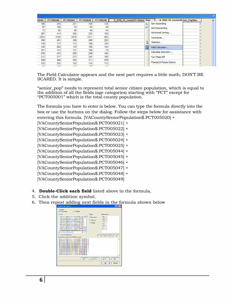
The Field Calculator appears and the next part requires a little math, DON’T BE SCARED. It is simple. “senior_pop” needs to represent total senior citizen population, which is equal to the addition of all the fields (age categories) starting with “PCT” except for “PCT005001” which is the total county population. The formula you have to enter is below. You can type the formula directly into the
box or use the buttons on the dialog. Follow the steps below for assistance with
entering this formula. [VACountySeniorPopulation$.PCT005020] +
[VACountySeniorPopulation$.PCT005021] +
[VACountySeniorPopulation$.PCT005022] +
[VACountySeniorPopulation$.PCT005023] +
[VACountySeniorPopulation$.PCT005024] +
[VACountySeniorPopulation$.PCT005025] +
[VACountySeniorPopulation$.PCT005044] +
[VACountySeniorPopulation$.PCT005045] +
[VACountySeniorPopulation$.PCT005046] +
[VACountySeniorPopulation$.PCT005047] +
[VACountySeniorPopulation$.PCT005048] +
[VACountySeniorPopulation$.PCT005049]
4. Double-Click each field listed above in the formula,
5. Click the addition symbol.
6. Then repeat adding next fields in the formula shown below
7
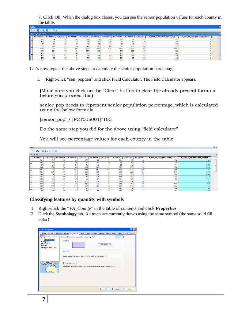
7. Click Ok. When the dialog box closes, you can see the senior population values for each county in
the table.
Let’s now repeat the above steps to calculate the senior population percentage
1. Right-click “sen_popden” and click Field Calculator. The Field Calculator appears.
(Make sure you click on the “Clear” button to clear the already present formula before you proceed this) senior_pop needs to represent senior population percentage, which is calculated using the below formula [senior_pop] / [PCT005001]*100 Do the same step you did for the above using “field calculator” You will see percentage values for each county in the table.
Classifying features by quantity with symbols
1. Right-click the “VA_County” in the table of contents and click Properties.
2. Click the Symbology tab. All tracts are currently drawn using the same symbol (the same solid fill
color)

8
3. Click Quantities in the Show box and pick up “Graduated Symbols” and choose the “Senior_pop”
as the field value to visualize (click on the “template” in the Symbology box to change the color
of the symbol).
4. Right Click on the VA County Layer, pick up “properties”>symbology>Quantiles option again. Then
choose and the Value dropdown arrow and click “sen_popden” as the field to use to shade the layers.
5. Click the Color Ramp dropdown arrow and choose a color ramp.
ArcMap chooses a classification scheme and the number of classes for you. You can modify them by
clicking the Classify button on the right in the Layer Properties dialog box. Click on and select
“Quantiles’ classification to see how it looks. For now, just use the default classification.
6. Now we see that the percent sign is not displayed in the labels. In order to add % sign in the classification data, go to the symbology box and click on “Label” and choose “format labels” and then choose percentage with two decimals (click on the “numeric options” box), then you will see like the figure below as well as the % signs appear in the classification data in the table of contents.

9
7. You will notice the newly created thematic map displayed as below .
Publish Your Map
1. Select View>Layout View from the menu bar. The layout toolbar will appear with a
special set of tools which differ from the data view toolbar.
2. Click “Insert” from the tool bar. You need five essential map elements to add to your
map:Title, Legend, Scale bar, N-S arrow & the source information (creator name, date of
publication, etc) in addition to your map that you created within “Data View”
[You can insert pictures, statistical charts, and an inset map on your map layout].
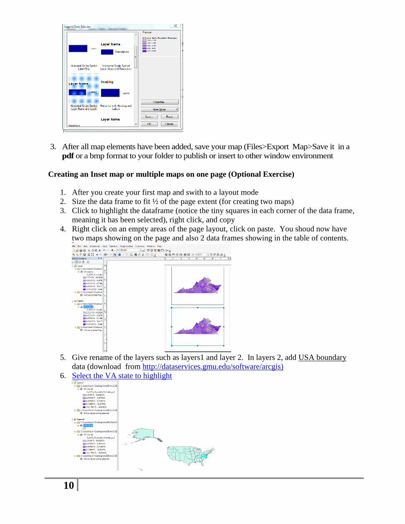
In order to style your legend, double click on the legend box on the map and choose,
Items>Styles, then select the option shown below to get ride of the “t1_2010…layer
name”above. You will notice the change.
10
3. After all map elements have been added, save your map (Files>Export Map>Save it in a
pdf or a bmp format to your folder to publish or insert to other window environment
Creating an Inset map or multiple maps on one page (Optional Exercise)
1. After you create your first map and swith to a layout mode
2. Size the data frame to fit ½ of the page extent (for creating two maps)
3. Click to highlight the dataframe (notice the tiny squares in each corner of the data frame,
meaning it has been selected), right click, and copy
4. Right click on an empty areas of the page layout, click on paste. You shoud now have
two maps showing on the page and also 2 data frames showing in the table of contents.
5. Give rename of the layers such as layers1 and layer 2. In layers 2, add USA boundary
data (download from http://dataservices.gmu.edu/software/arcgis)
6. Select the VA state to highlight

11
7. Change the color of the VA state to stand out (Click on the US State Layer, then go to the
layer properties>selection and change the color for the VA state (as well as the
background color of the US).
8. Switch to a Layout mode and adjust the size for your second map to make your final map
like the exmaple below
[An inset map (usually a smaller than the main map) is used as a locator map (or a vicinity map) that shows a larger study areas as well as a focused area. Another option to create multiple maps on a map is create a new data frame(s) (Insert>Data frame) in stead of manually resizing the data frame of the page extent]
9.

12
10. If you are satisfied with your style option, then save your map (File>Export Map>Pdf or
bmp format)
[Go back to the data view of this map and add a layer available from the ArcGIS online
(Add>ArcGIS online>) that you are found to be interested] to explore some spatial
relationship between two theme layers]
Updated August, 2017,
Contact: [email protected] for any questions.
Copyright: Data Scholarship Center at GMU Libraries.