Embed Size (px)
Citation preview
ArcGIS®
9ArcGIS Geostatistical Analyst Tutorial
Copyright © 2001, 2003–2006 ESRIAll Rights Reserved.Printed in the United States of America.
The information contained in this document is the exclusive property of ESRI. This work is protected under United States copyright law and the copyright lawsof the given countries of origin and applicable international laws, treaties, and/or conventions. No part of this work may be reproduced or transmitted in anyform or by any means, electronic or mechanical, including photocopying or recording, or by any information storage or retrieval system, except as expresslypermitted in writing by ESRI. All requests should be sent to Attention: Contracts Manager, ESRI, 380 New York Street, Redlands, CA 92373-8100, USA.
The information contained in this document is subject to change without notice.
DATA CREDITSCarpathian Mountains data supplied by USDA Forest Service, Riverside, California, and is used here with permission.
Radioceasium data supplied by International Sakharov Environmental University, Minsk, Belarus, and is used here with permission. Copyright © 1996.
Air quality data for California supplied by California Environmental Protection Agency, Air Resource Board, and is used here with permission.Copyright © 1997.
Radioceasium contamination in forest berries data supplied by the Institute of Radiation Safety “BELRAD”, Minsk, Belarus, and is used here withpermission. Copyright © 1996.
CONTRIBUTING WRITERSKevin Johnston, Jay M. Ver Hoef, Konstantin Krivoruchko, and Neil Lucas
DATA DISCLAIMER
THE DATA VENDOR(S) INCLUDED IN THIS WORK IS AN INDEPENDENT COMPANY AND, AS SUCH, ESRI MAKES NO GUARANTEES AS TO THEQUALITY, COMPLETENESS, AND/OR ACCURACY OF THE DATA. EVERY EFFORT HAS BEEN MADE TO ENSURE THE ACCURACY OF THE DATAINCLUDED IN THIS WORK, BUT THE INFORMATION IS DYNAMIC IN NATURE AND IS SUBJECT TO CHANGE WITHOUT NOTICE. ESRI ANDTHE DATA VENDOR(S) ARE NOT INVITING RELIANCE ON THE DATA, AND ONE SHOULD ALWAYS VERIFY ACTUAL DATA AND INFORMATION.ESRI DISCLAIMS ALL OTHER WARRANTIES OR REPRESENTATIONS, EITHER EXPRESSED OR IMPLIED, INCLUDING, BUT NOT LIMITED TO,THE IMPLIED WARRANTIES OF MERCHANTABILITY OR FITNESS FOR A PARTICULAR PURPOSE. ESRI AND THE DATA VENDOR(S) SHALLASSUME NO LIABILITY FOR INDIRECT, SPECIAL, EXEMPLARY, OR CONSEQUENTIAL DAMAGES, EVEN IF ADVISED OF THE POSSIBILITYTHEREOF.
U. S. GOVERNMENT RESTRICTED/LIMITED RIGHTS
Any software, documentation, and/or data delivered hereunder is subject to the terms of the License Agreement. In no event shall the U.S. Government acquiregreater than RESTRICTED/LIMITED RIGHTS. At a minimum, use, duplication, or disclosure by the U.S. Government is subject to restrictions as set forth inFAR §52.227-14 Alternates I, II, and III (JUN 1987); FAR §52.227-19 (JUN 1987) and/or FAR §12.211/12.212 (Commercial Technical Data/ComputerSoftware); and DFARS §252.227-7015 (NOV 1995) (Technical Data) and/or DFARS §227.7202 (Computer Software), as applicable. Contractor/Manufactureris ESRI, 380 New York Street, Redlands, CA 92373-8100, USA.
ESRI, SDE, the ESRI globe logo, ArcGIS, ArcInfo, ArcCatalog, ArcMap, 3D Analyst, and GIS by ESRI are trademarks, registered trademarks, or service marksof ESRI in the United States, the European Community, and certain other jurisdictions.
Other companies and products mentioned herein are trademarks or registered trademarks of their respective trademark owners.
Attribution.pmd 05/23/2006, 9:39 AM1
IN THIS TUTORIAL
1
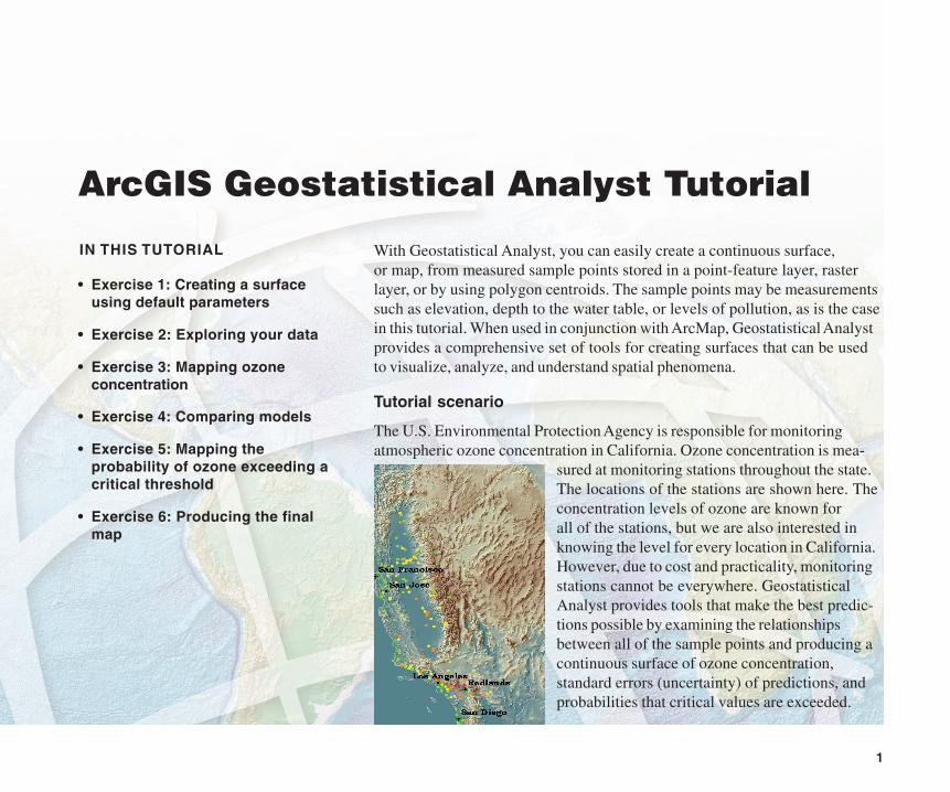
With Geostatistical Analyst, you can easily create a continuous surface,or map, from measured sample points stored in a point-feature layer, rasterlayer, or by using polygon centroids. The sample points may be measurementssuch as elevation, depth to the water table, or levels of pollution, as is the casein this tutorial. When used in conjunction with ArcMap, Geostatistical Analystprovides a comprehensive set of tools for creating surfaces that can be usedto visualize, analyze, and understand spatial phenomena.
Tutorial scenario
The U.S. Environmental Protection Agency is responsible for monitoringatmospheric ozone concentration in California. Ozone concentration is mea-
sured at monitoring stations throughout the state.The locations of the stations are shown here. Theconcentration levels of ozone are known forall of the stations, but we are also interested inknowing the level for every location in California.However, due to cost and practicality, monitoringstations cannot be everywhere. GeostatisticalAnalyst provides tools that make the best predic-tions possible by examining the relationshipsbetween all of the sample points and producing acontinuous surface of ozone concentration,standard errors (uncertainty) of predictions, andprobabilities that critical values are exceeded.
ArcGIS Geostatistical Analyst Tutorial
• Exercise 1: Creating a surfaceusing default parameters
• Exercise 2: Exploring your data
• Exercise 3: Mapping ozoneconcentration
• Exercise 4: Comparing models
• Exercise 5: Mapping theprobability of ozone exceeding acritical threshold
• Exercise 6: Producing the finalmap
ch02_Tutorial.pmd 05/23/2006, 9:31 AM1
2 ARCGIS GEOSTATISTICAL ANALYST TUTORIAL
The data you’ll need for this tutorial is included on theGeostatistical Analyst installation disk. The datasets wereprovided courtesy of the California Air Resources Board.
The datasets are:
Dataset Description
ca_outline Outline map of California
ca_ozone_pts Ozone point samples (ppm)
ca_cities Location of major California cities
ca_hillshade A hillshade map of California
The ozone dataset (ca_ozone_pts) represents the 1996maximum eight-hour average concentration of ozone inparts per million (ppm). (The measurements were takendaily and grouped into eight-hour blocks.) The original datahas been modified for the purposes of the tutorial andshould not be taken to be accurate data.
From the ozone point samples (measurements), you willproduce two continuous surfaces (maps), predicting thevalues of ozone concentration for every location in the Stateof California based on the sample points that you have. Thefirst map that you create will simply use all default optionsto show you how easy it is to create a surface from yoursample points. The second map that you produce will allowyou to incorporate more of the spatial relationships that arediscovered among the points. When creating this secondmap, you will use the ESDA tools to examine your data.You will also be introduced to some of the geostatisticaloptions that you can use to create a surface such asremoving trends and modeling spatial autocorrelation. By
Introduction to the tutorial
using the ESDA tools and working with the geostatisticalparameters, you will be able to create a more accuratesurface.
Many times it is not the actual values of some caustichealth risk that is of concern, but rather if it is above sometoxic level. If this is the case, immediate action must betaken. The third surface you create will assess the probabil-ity that a critical ozone threshold value has been exceeded.
For this tutorial, the critical threshold will be if the maximumaverage of ozone goes above 0.12 ppm in any eight-hourperiod during the year; then the location should be closelymonitored. You will use Geostatistical Analyst to predict theprobability of values complying with this standard.
This tutorial is divided into individual tasks that are designedto let you explore the capabilities of Geostatistical Analystat your own pace. To get additional help, explore theArcMap online Help system or sennnnnne Using ArcMap.
• Exercise 1 takes you through accessing GeostatisticalAnalyst and through the process of creating a surface ofozone concentration to show you how easy it is to createa surface using the default parameters.
• Exercise 2 guides you through the process of exploringyour data before you create the surface in order to spotoutliers in the data and to recognize trends.
• Exercise 3 creates the second surface that considersmore of the spatial relationships discovered in Exercise 2and improves on the surface you created in Exercise 1.This exercise also introduces you to some of the basicconcepts of geostatistics.
ch02_Tutorial.pmd 05/23/2006, 9:31 AM2

ARCGIS GEOSTATISTICAL ANALYST TUTORIAL 3
• Exercise 4 shows you how to compare the results of thetwo surfaces that you created in Exercises 1 and 3 inorder to decide which provides the better predictions ofthe unknown values.
• Exercise 5 takes you through the process of mapping theprobability that ozone exceeds a critical threshold, thuscreating the third surface.
• Exercise 6 shows you how to present the surfaces youcreated in Exercises 3 and 5 for final display, usingArcMap functionality.
You will need a few hours of focused time to complete thetutorial. However, you can also perform the exercises oneat a time if you wish, saving your results after eachexercise.
ch02_Tutorial.pmd 05/23/2006, 9:31 AM3
4 ARCGIS GEOSTATISTICAL ANALYST TUTORIAL
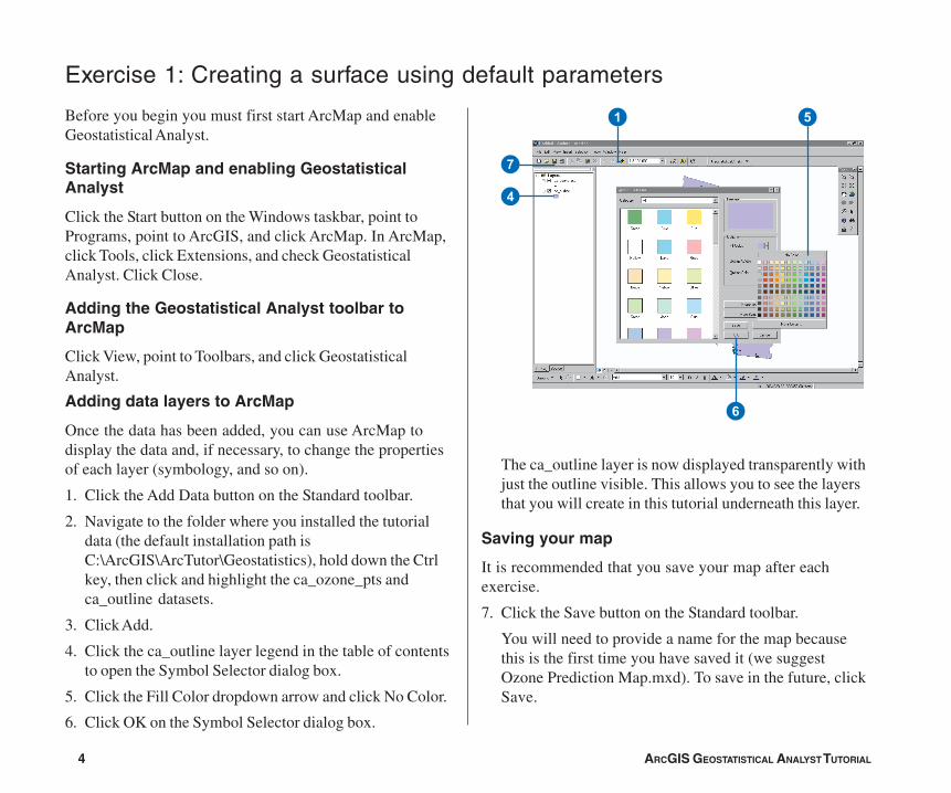
The ca_outline layer is now displayed transparently withjust the outline visible. This allows you to see the layersthat you will create in this tutorial underneath this layer.
Saving your map
It is recommended that you save your map after eachexercise.
7. Click the Save button on the Standard toolbar.
You will need to provide a name for the map becausethis is the first time you have saved it (we suggestOzone Prediction Map.mxd). To save in the future, clickSave.
Exercise 1: Creating a surface using default parameters
Before you begin you must first start ArcMap and enableGeostatistical Analyst.
Starting ArcMap and enabling GeostatisticalAnalyst
Click the Start button on the Windows taskbar, point toPrograms, point to ArcGIS, and click ArcMap. In ArcMap,click Tools, click Extensions, and check GeostatisticalAnalyst. Click Close.
Adding the Geostatistical Analyst toolbar toArcMap
Click View, point to Toolbars, and click GeostatisticalAnalyst.
Adding data layers to ArcMap
Once the data has been added, you can use ArcMap todisplay the data and, if necessary, to change the propertiesof each layer (symbology, and so on).
1. Click the Add Data button on the Standard toolbar.
2. Navigate to the folder where you installed the tutorialdata (the default installation path isC:\ArcGIS\ArcTutor\Geostatistics), hold down the Ctrlkey, then click and highlight the ca_ozone_pts andca_outline datasets.
3. Click Add.
4. Click the ca_outline layer legend in the table of contentsto open the Symbol Selector dialog box.
5. Click the Fill Color dropdown arrow and click No Color.
6. Click OK on the Symbol Selector dialog box.
5
4
7
1
6
ch02_Tutorial.pmd 05/23/2006, 9:31 AM4
ARCGIS GEOSTATISTICAL ANALYST TUTORIAL 5
Creating a surface using the defaults
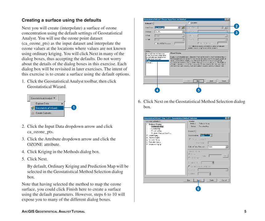
Next you will create (interpolate) a surface of ozoneconcentration using the default settings of GeostatisticalAnalyst. You will use the ozone point dataset(ca_ozone_pts) as the input dataset and interpolate theozone values at the locations where values are not knownusing ordinary kriging. You will click Next in many of thedialog boxes, thus accepting the defaults. Do not worryabout the details of the dialog boxes in this exercise. Eachdialog box will be revisited in later exercises. The intent ofthis exercise is to create a surface using the default options.
1. Click the Geostatistical Analyst toolbar, then clickGeostatistical Wizard.
2. Click the Input Data dropdown arrow and clickca_ozone_pts.
3. Click the Attribute dropdown arrow and click theOZONE attribute.
4. Click Kriging in the Methods dialog box.
5. Click Next.
By default, Ordinary Kriging and Prediction Map will beselected in the Geostatistical Method Selection dialogbox.
Note that having selected the method to map the ozonesurface, you could click Finish here to create a surfaceusing the default parameters. However, steps 6 to 10 willexpose you to many of the different dialog boxes.
6. Click Next on the Geostatistical Method Selection dialogbox.1
2
3
4 5
6
ch02_Tutorial.pmd 05/23/2006, 9:31 AM5
6 ARCGIS GEOSTATISTICAL ANALYST TUTORIAL
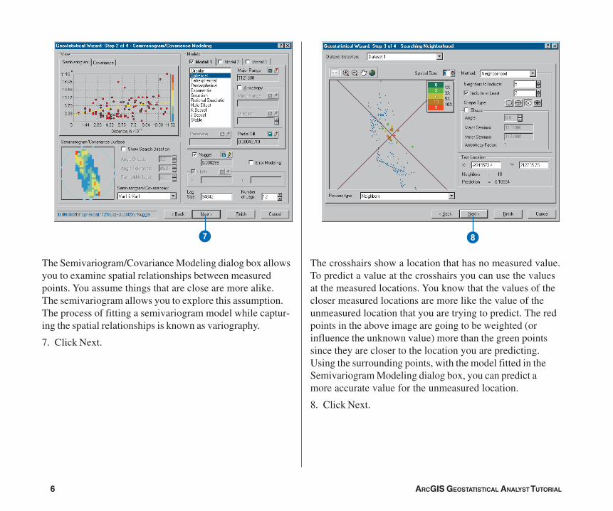
The Semivariogram/Covariance Modeling dialog box allowsyou to examine spatial relationships between measuredpoints. You assume things that are close are more alike.The semivariogram allows you to explore this assumption.The process of fitting a semivariogram model while captur-ing the spatial relationships is known as variography.
7. Click Next.
The crosshairs show a location that has no measured value.To predict a value at the crosshairs you can use the valuesat the measured locations. You know that the values of thecloser measured locations are more like the value of theunmeasured location that you are trying to predict. The redpoints in the above image are going to be weighted (orinfluence the unknown value) more than the green pointssince they are closer to the location you are predicting.Using the surrounding points, with the model fitted in theSemivariogram Modeling dialog box, you can predict amore accurate value for the unmeasured location.
8. Click Next.
7 8
ch02_Tutorial.pmd 05/23/2006, 9:31 AM6
ARCGIS GEOSTATISTICAL ANALYST TUTORIAL 7
W
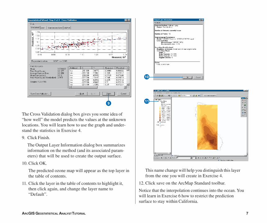
The Cross Validation dialog box gives you some idea of“how well” the model predicts the values at the unknownlocations. You will learn how to use the graph and under-stand the statistics in Exercise 4.
9. Click Finish.
The Output Layer Information dialog box summarizesinformation on the method (and its associated param-eters) that will be used to create the output surface.
10. Click OK.
The predicted ozone map will appear as the top layer inthe table of contents.
11. Click the layer in the table of contents to highlight it,then click again, and change the layer name to“Default”.
This name change will help you distinguish this layerfrom the one you will create in Exercise 4.
12. Click save on the ArcMap Standard toolbar.
Notice that the interpolation continues into the ocean. Youwill learn in Exercise 6 how to restrict the predictionsurface to stay within California.
9
Q
ch02_Tutorial.pmd 05/23/2006, 9:31 AM7
8 ARCGIS GEOSTATISTICAL ANALYST TUTORIAL
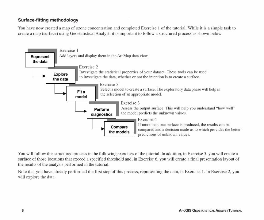
Surface-fitting methodology
You have now created a map of ozone concentration and completed Exercise 1 of the tutorial. While it is a simple task tocreate a map (surface) using Geostatistical Analyst, it is important to follow a structured process as shown below:
You will follow this structured process in the following exercises of the tutorial. In addition, in Exercise 5, you will create asurface of those locations that exceed a specified threshold and, in Exercise 6, you will create a final presentation layout ofthe results of the analysis performed in the tutorial.
Note that you have already performed the first step of this process, representing the data, in Exercise 1. In Exercise 2, youwill explore the data.
Represent the data
Explore the data
Fit a model
Perform diagnostics
Compare the models
Add layers and display them in the ArcMap data view.
Investigate the statistical properties of your dataset. These tools can be usedto investigate the data, whether or not the intention is to create a surface.
Select a model to create a surface. The exploratory data phase will help inthe selection of an appropriate model.
Assess the output surface. This will help you understand “how well”the model predicts the unknown values.
If more than one surface is produced, the results can becompared and a decision made as to which provides the betterpredictions of unknown values.
Exercise 1
Exercise 2
Exercise 3
Exercise 3
Exercise 4
ch02_Tutorial.pmd 05/23/2006, 9:31 AM8
ARCGIS GEOSTATISTICAL ANALYST TUTORIAL 9
In this exercise you will explore your data. As the struc-tured process on the previous page suggests, to make betterdecisions when creating a surface you should first exploreyour dataset to gain a better understanding of it. Whenexploring your data you should look for obvious errors in theinput sample data that may drastically affect the outputprediction surface, examine how the data is distributed,look for global trends, etc.
Geostatistical Analyst provides many data-exploration tools.
In this tutorial you will explore your data in three ways:
• Examine the distribution of your data.
• Identify the trends in your data, if any.
• Understand the spatial autocorrelation and directionalinfluences.
If you closed the map after Exercise 1, click the File menuand click Open. In the dialog box, click the Look in boxdropdown arrow and navigate to the folder where yousaved the map document (Ozone Prediction Map.mxd).Click Open.
Examining the distribution of your data
Histogram
The interpolation methods that are used to generate asurface give the best results if the data is normally distrib-uted (a bell-shaped curve). If your data is skewed (lop-sided) you may choose to transform the data to make itnormal. Thus, it is important to understand the distribution ofyour data before creating a surface. The Histogram toolplots frequency histograms for the attributes in the dataset,
Exercise 2: Exploring your data
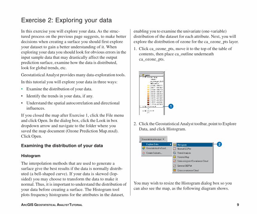
enabling you to examine the univariate (one-variable)distribution of the dataset for each attribute. Next, you willexplore the distribution of ozone for the ca_ozone_pts layer.
1. Click ca_ozone_pts, move it to the top of the table ofcontents, then place ca_outline underneathca_ozone_pts.
2. Click the Geostatistical Analyst toolbar, point to ExploreData, and click Histogram.
You may wish to resize the Histogram dialog box so youcan also see the map, as the following diagram shows.
1
2
ch02_Tutorial.pmd 05/23/2006, 9:31 AM9
10 ARCGIS GEOSTATISTICAL ANALYST TUTORIAL
3 4
5 6
1
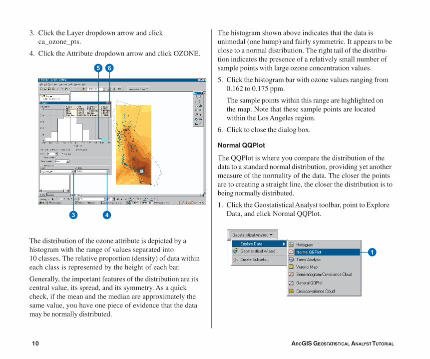
3. Click the Layer dropdown arrow and clickca_ozone_pts.
4. Click the Attribute dropdown arrow and click OZONE.
The distribution of the ozone attribute is depicted by ahistogram with the range of values separated into10 classes. The relative proportion (density) of data withineach class is represented by the height of each bar.
Generally, the important features of the distribution are itscentral value, its spread, and its symmetry. As a quickcheck, if the mean and the median are approximately thesame value, you have one piece of evidence that the datamay be normally distributed.
The histogram shown above indicates that the data isunimodal (one hump) and fairly symmetric. It appears to beclose to a normal distribution. The right tail of the distribu-tion indicates the presence of a relatively small number ofsample points with large ozone concentration values.
5. Click the histogram bar with ozone values ranging from0.162 to 0.175 ppm.
The sample points within this range are highlighted onthe map. Note that these sample points are locatedwithin the Los Angeles region.
6. Click to close the dialog box.
Normal QQPlot
The QQPlot is where you compare the distribution of thedata to a standard normal distribution, providing yet anothermeasure of the normality of the data. The closer the pointsare to creating a straight line, the closer the distribution is tobeing normally distributed.
1. Click the Geostatistical Analyst toolbar, point to ExploreData, and click Normal QQPlot.
ch02_Tutorial.pmd 05/23/2006, 9:31 AM10
ARCGIS GEOSTATISTICAL ANALYST TUTORIAL 11
4
32
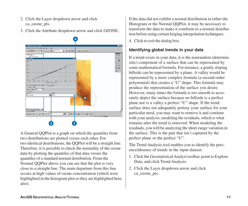
2. Click the Layer dropdown arrow and clickca_ozone_pts.
3. Click the Attribute dropdown arrow and click OZONE.
A General QQPlot is a graph on which the quantiles fromtwo distributions are plotted versus each other. Fortwo identical distributions, the QQPlot will be a straight line.Therefore, it is possible to check the normality of the ozonedata by plotting the quantiles of that data versus thequantiles of a standard normal distribution. From theNormal QQPlot above you can see that the plot is veryclose to a straight line. The main departure from this lineoccurs at high values of ozone concentration (which werehighlighted in the histogram plot so they are highlighted herealso).
If the data did not exhibit a normal distribution in either theHistogram or the Normal QQPlot, it may be necessary totransform the data to make it comform to a normal distribu-tion before using certain kriging interpolation techniques.
4. Click to exit the dialog box.
Identifying global trends in your data
If a trend exists in your data, it is the nonrandom (determin-istic) component of a surface that can be represented bysome mathematical formula. For instance, a gently slopinghillside can be represented by a plane. A valley would berepresented by a more complex formula (a second-orderpolynomial) that creates a “U” shape. This formula mayproduce the representation of the surface you desire.However, many times the formula is too smooth to accu-rately depict the surface because no hillside is a perfectplane nor is a valley a perfect “U” shape. If the trendsurface does not adequately portray your surface for yourparticular need, you may want to remove it and continuewith your analysis, modeling the residuals, which is whatremains after the trend is removed. When modeling theresiduals, you will be analyzing the short-range variation inthe surface. This is the part that isn’t captured by theperfect plane or the perfect “U”.
The Trend Analysis tool enables you to identify the pres-ence/absence of trends in the input dataset.
1. Click the Geostatistical Analyst toolbar, point to ExploreData, and click Trend Analysis.
2. Click the Layer dropdown arrow and clickca_ozone_pts.
ch02_Tutorial.pmd 05/23/2006, 9:31 AM11
12 ARCGIS GEOSTATISTICAL ANALYST TUTORIAL
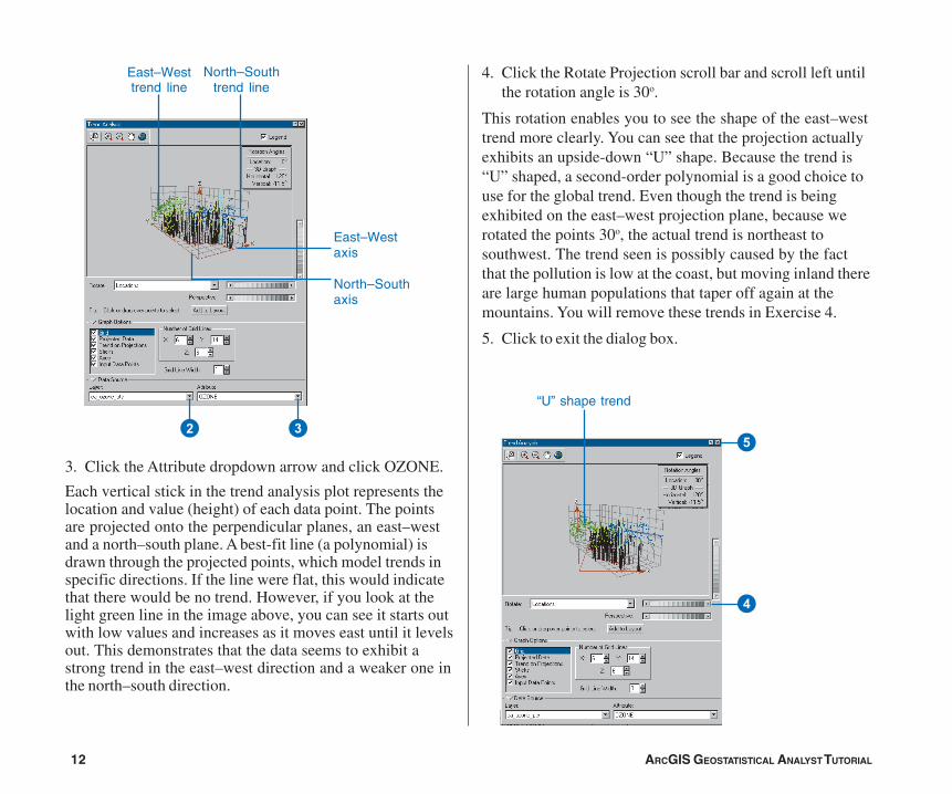
North–Southtrend line
East–Westtrend line
East–Westaxis
North–Southaxis
32
“U” shape trend
5
4
3. Click the Attribute dropdown arrow and click OZONE.
Each vertical stick in the trend analysis plot represents thelocation and value (height) of each data point. The pointsare projected onto the perpendicular planes, an east–westand a north–south plane. A best-fit line (a polynomial) isdrawn through the projected points, which model trends inspecific directions. If the line were flat, this would indicatethat there would be no trend. However, if you look at thelight green line in the image above, you can see it starts outwith low values and increases as it moves east until it levelsout. This demonstrates that the data seems to exhibit astrong trend in the east–west direction and a weaker one inthe north–south direction.
4. Click the Rotate Projection scroll bar and scroll left untilthe rotation angle is 30o.
This rotation enables you to see the shape of the east–westtrend more clearly. You can see that the projection actuallyexhibits an upside-down “U” shape. Because the trend is“U” shaped, a second-order polynomial is a good choice touse for the global trend. Even though the trend is beingexhibited on the east–west projection plane, because werotated the points 30o, the actual trend is northeast tosouthwest. The trend seen is possibly caused by the factthat the pollution is low at the coast, but moving inland thereare large human populations that taper off again at themountains. You will remove these trends in Exercise 4.
5. Click to exit the dialog box.
ch02_Tutorial.pmd 05/23/2006, 9:31 AM12
ARCGIS GEOSTATISTICAL ANALYST TUTORIAL 13
1
2 3
Understanding spatial autocorrelation anddirectional influences
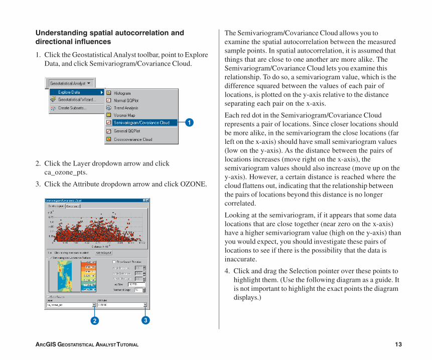
1. Click the Geostatistical Analyst toolbar, point to ExploreData, and click Semivariogram/Covariance Cloud.
2. Click the Layer dropdown arrow and clickca_ozone_pts.
3. Click the Attribute dropdown arrow and click OZONE.
The Semivariogram/Covariance Cloud allows you toexamine the spatial autocorrelation between the measuredsample points. In spatial autocorrelation, it is assumed thatthings that are close to one another are more alike. TheSemivariogram/Covariance Cloud lets you examine thisrelationship. To do so, a semivariogram value, which is thedifference squared between the values of each pair oflocations, is plotted on the y-axis relative to the distanceseparating each pair on the x-axis.
Each red dot in the Semivariogram/Covariance Cloudrepresents a pair of locations. Since closer locations shouldbe more alike, in the semivariogram the close locations (farleft on the x-axis) should have small semivariogram values(low on the y-axis). As the distance between the pairs oflocations increases (move right on the x-axis), thesemivariogram values should also increase (move up on they-axis). However, a certain distance is reached where thecloud flattens out, indicating that the relationship betweenthe pairs of locations beyond this distance is no longercorrelated.
Looking at the semivariogram, if it appears that some datalocations that are close together (near zero on the x-axis)have a higher semivariogram value (high on the y-axis) thanyou would expect, you should investigate these pairs oflocations to see if there is the possibility that the data isinaccurate.
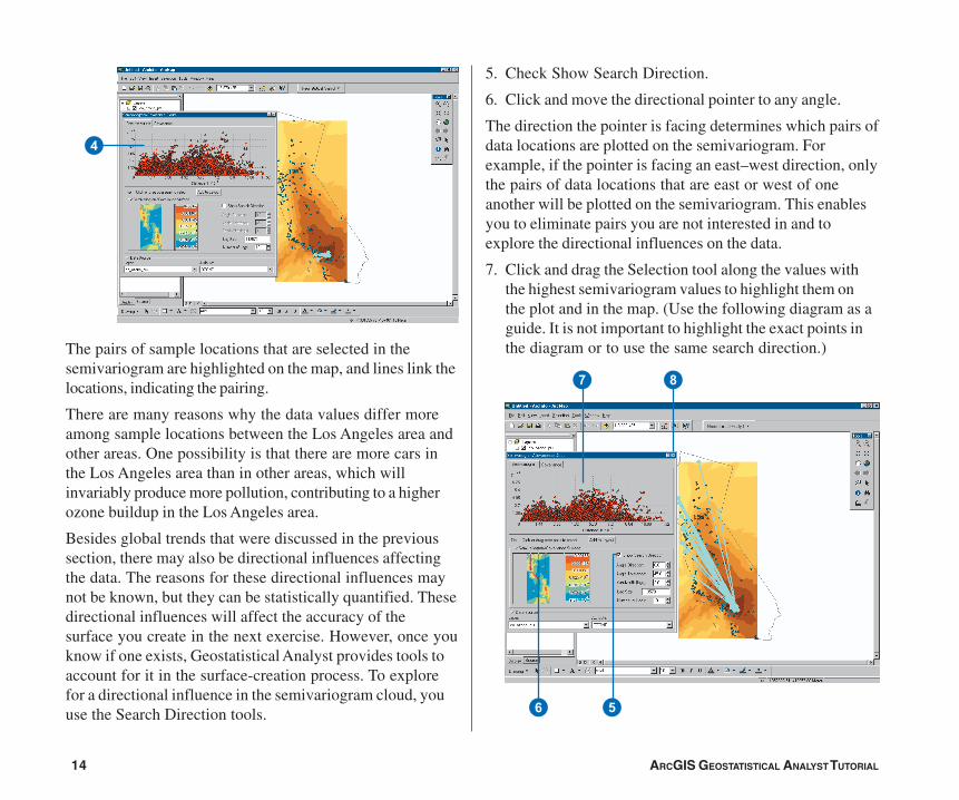
4. Click and drag the Selection pointer over these points tohighlight them. (Use the following diagram as a guide. Itis not important to highlight the exact points the diagramdisplays.)
ch02_Tutorial.pmd 05/23/2006, 9:31 AM13
14 ARCGIS GEOSTATISTICAL ANALYST TUTORIAL
4
7 8
56
The pairs of sample locations that are selected in thesemivariogram are highlighted on the map, and lines link thelocations, indicating the pairing.
There are many reasons why the data values differ moreamong sample locations between the Los Angeles area andother areas. One possibility is that there are more cars inthe Los Angeles area than in other areas, which willinvariably produce more pollution, contributing to a higherozone buildup in the Los Angeles area.
Besides global trends that were discussed in the previoussection, there may also be directional influences affectingthe data. The reasons for these directional influences maynot be known, but they can be statistically quantified. Thesedirectional influences will affect the accuracy of thesurface you create in the next exercise. However, once youknow if one exists, Geostatistical Analyst provides tools toaccount for it in the surface-creation process. To explorefor a directional influence in the semivariogram cloud, youuse the Search Direction tools.
5. Check Show Search Direction.
6. Click and move the directional pointer to any angle.
The direction the pointer is facing determines which pairs ofdata locations are plotted on the semivariogram. Forexample, if the pointer is facing an east–west direction, onlythe pairs of data locations that are east or west of oneanother will be plotted on the semivariogram. This enablesyou to eliminate pairs you are not interested in and toexplore the directional influences on the data.
7. Click and drag the Selection tool along the values withthe highest semivariogram values to highlight them onthe plot and in the map. (Use the following diagram as aguide. It is not important to highlight the exact points inthe diagram or to use the same search direction.)
ch02_Tutorial.pmd 05/23/2006, 9:31 AM14
ARCGIS GEOSTATISTICAL ANALYST TUTORIAL 15
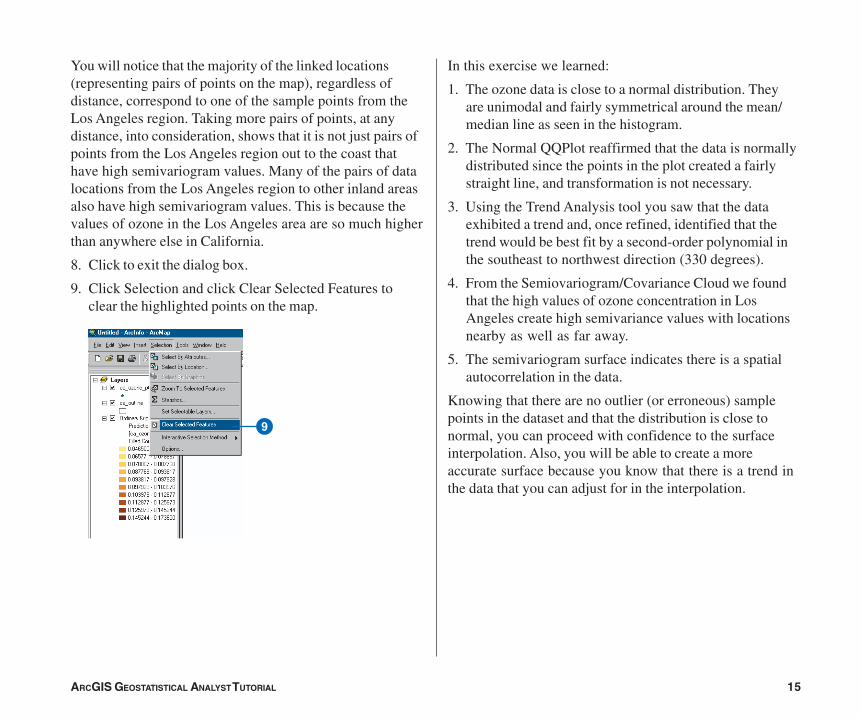
9
You will notice that the majority of the linked locations(representing pairs of points on the map), regardless ofdistance, correspond to one of the sample points from theLos Angeles region. Taking more pairs of points, at anydistance, into consideration, shows that it is not just pairs ofpoints from the Los Angeles region out to the coast thathave high semivariogram values. Many of the pairs of datalocations from the Los Angeles region to other inland areasalso have high semivariogram values. This is because thevalues of ozone in the Los Angeles area are so much higherthan anywhere else in California.
8. Click to exit the dialog box.
9. Click Selection and click Clear Selected Features toclear the highlighted points on the map.
In this exercise we learned:
1. The ozone data is close to a normal distribution. Theyare unimodal and fairly symmetrical around the mean/median line as seen in the histogram.
2. The Normal QQPlot reaffirmed that the data is normallydistributed since the points in the plot created a fairlystraight line, and transformation is not necessary.
3. Using the Trend Analysis tool you saw that the dataexhibited a trend and, once refined, identified that thetrend would be best fit by a second-order polynomial inthe southeast to northwest direction (330 degrees).
4. From the Semiovariogram/Covariance Cloud we foundthat the high values of ozone concentration in LosAngeles create high semivariance values with locationsnearby as well as far away.
5. The semivariogram surface indicates there is a spatialautocorrelation in the data.
Knowing that there are no outlier (or erroneous) samplepoints in the dataset and that the distribution is close tonormal, you can proceed with confidence to the surfaceinterpolation. Also, you will be able to create a moreaccurate surface because you know that there is a trend inthe data that you can adjust for in the interpolation.
ch02_Tutorial.pmd 05/23/2006, 9:31 AM15
16 ARCGIS GEOSTATISTICAL ANALYST TUTORIAL
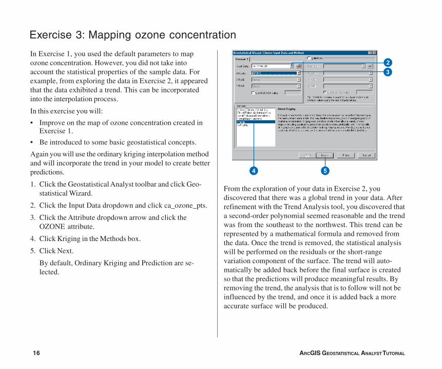
Exercise 3: Mapping ozone concentration
In Exercise 1, you used the default parameters to mapozone concentration. However, you did not take intoaccount the statistical properties of the sample data. Forexample, from exploring the data in Exercise 2, it appearedthat the data exhibited a trend. This can be incorporatedinto the interpolation process.
In this exercise you will:
• Improve on the map of ozone concentration created inExercise 1.
• Be introduced to some basic geostatistical concepts.
Again you will use the ordinary kriging interpolation methodand will incorporate the trend in your model to create betterpredictions.
1. Click the Geostatistical Analyst toolbar and click Geo-statistical Wizard.
2. Click the Input Data dropdown and click ca_ozone_pts.
3. Click the Attribute dropdown arrow and click theOZONE attribute.
4. Click Kriging in the Methods box.
5. Click Next.
By default, Ordinary Kriging and Prediction are se-lected.
From the exploration of your data in Exercise 2, youdiscovered that there was a global trend in your data. Afterrefinement with the Trend Analysis tool, you discovered thata second-order polynomial seemed reasonable and the trendwas from the southeast to the northwest. This trend can berepresented by a mathematical formula and removed fromthe data. Once the trend is removed, the statistical analysiswill be performed on the residuals or the short-rangevariation component of the surface. The trend will auto-matically be added back before the final surface is createdso that the predictions will produce meaningful results. Byremoving the trend, the analysis that is to follow will not beinfluenced by the trend, and once it is added back a moreaccurate surface will be produced.
4
32
5
ch02_Tutorial.pmd 05/23/2006, 9:31 AM16
ARCGIS GEOSTATISTICAL ANALYST TUTORIAL 17
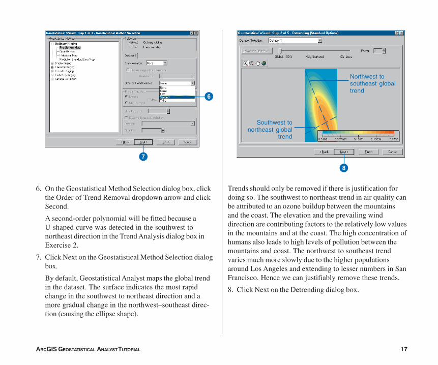
Trends should only be removed if there is justification fordoing so. The southwest to northeast trend in air quality canbe attributed to an ozone buildup between the mountainsand the coast. The elevation and the prevailing winddirection are contributing factors to the relatively low valuesin the mountains and at the coast. The high concentration ofhumans also leads to high levels of pollution between themountains and coast. The northwest to southeast trendvaries much more slowly due to the higher populationsaround Los Angeles and extending to lesser numbers in SanFrancisco. Hence we can justifiably remove these trends.
8. Click Next on the Detrending dialog box.
6. On the Geostatistical Method Selection dialog box, clickthe Order of Trend Removal dropdown arrow and clickSecond.
A second-order polynomial will be fitted because aU-shaped curve was detected in the southwest tonortheast direction in the Trend Analysis dialog box inExercise 2.
7. Click Next on the Geostatistical Method Selection dialogbox.
By default, Geostatistical Analyst maps the global trendin the dataset. The surface indicates the most rapidchange in the southwest to northeast direction and amore gradual change in the northwest–southeast direc-tion (causing the ellipse shape).
8
Southwest tonortheast global
trend
Northwest tosoutheast globaltrend
6
7
ch02_Tutorial.pmd 05/23/2006, 9:31 AM17
18 ARCGIS GEOSTATISTICAL ANALYST TUTORIAL
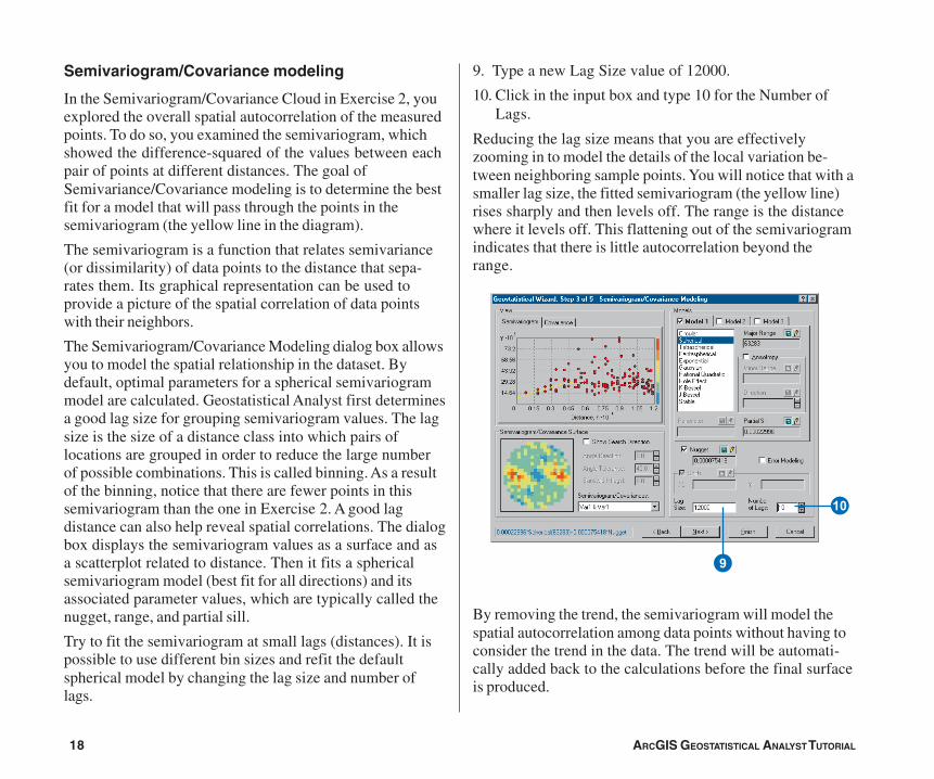
Semivariogram/Covariance modeling
In the Semivariogram/Covariance Cloud in Exercise 2, youexplored the overall spatial autocorrelation of the measuredpoints. To do so, you examined the semivariogram, whichshowed the difference-squared of the values between eachpair of points at different distances. The goal ofSemivariance/Covariance modeling is to determine the bestfit for a model that will pass through the points in thesemivariogram (the yellow line in the diagram).
The semivariogram is a function that relates semivariance(or dissimilarity) of data points to the distance that sepa-rates them. Its graphical representation can be used toprovide a picture of the spatial correlation of data pointswith their neighbors.
The Semivariogram/Covariance Modeling dialog box allowsyou to model the spatial relationship in the dataset. Bydefault, optimal parameters for a spherical semivariogrammodel are calculated. Geostatistical Analyst first determinesa good lag size for grouping semivariogram values. The lagsize is the size of a distance class into which pairs oflocations are grouped in order to reduce the large numberof possible combinations. This is called binning. As a resultof the binning, notice that there are fewer points in thissemivariogram than the one in Exercise 2. A good lagdistance can also help reveal spatial correlations. The dialogbox displays the semivariogram values as a surface and asa scatterplot related to distance. Then it fits a sphericalsemivariogram model (best fit for all directions) and itsassociated parameter values, which are typically called thenugget, range, and partial sill.
Try to fit the semivariogram at small lags (distances). It ispossible to use different bin sizes and refit the defaultspherical model by changing the lag size and number oflags.
9. Type a new Lag Size value of 12000.
10. Click in the input box and type 10 for the Number ofLags.
Reducing the lag size means that you are effectivelyzooming in to model the details of the local variation be-tween neighboring sample points. You will notice that with asmaller lag size, the fitted semivariogram (the yellow line)rises sharply and then levels off. The range is the distancewhere it levels off. This flattening out of the semivariogramindicates that there is little autocorrelation beyond therange.
By removing the trend, the semivariogram will model thespatial autocorrelation among data points without having toconsider the trend in the data. The trend will be automati-cally added back to the calculations before the final surfaceis produced.
Q
9
ch02_Tutorial.pmd 05/23/2006, 9:31 AM18
ARCGIS GEOSTATISTICAL ANALYST TUTORIAL 19
The color scale, which represents the calculated semivari-ogram value, provides a direct link between the empiricalsemivariogram values on the graph and those on thesemivariogram surface. The value of each “cell” in thesemivariogram surface is color coded, with lower valuesblue and green and higher values orange and red. Theaverage value for each cell of the semivariogram surface isplotted on the semivariogram graph. The x-axis on thesemivariogram graph is the distance from the center of thecell to the center of the semivariogram surface. The
semivariogram values represent dissimilarity. For ourexample, the semivariogram starts low at small distances(things close together are more similar) and increases asdistance increases (things get more dissimilar farther apart).Notice from the semivariogram surface that dissimilarityincreases more rapidly in the southwest to northeastdirection than in the southeast to northwest direction.Earlier, you removed a coarse-scale trend. Now it appearsthat there are directional components to the autocorrelationat finer scales, so we will model that next.
Semivariogramsurface
Semivariogram value
Fitted semivariogrammodel
Availablesemivariogrammodels
Associatedparametervalues
Empiricalsemivariogram
values
Color scale
ch02_Tutorial.pmd 05/23/2006, 9:31 AM19
20 ARCGIS GEOSTATISTICAL ANALYST TUTORIAL
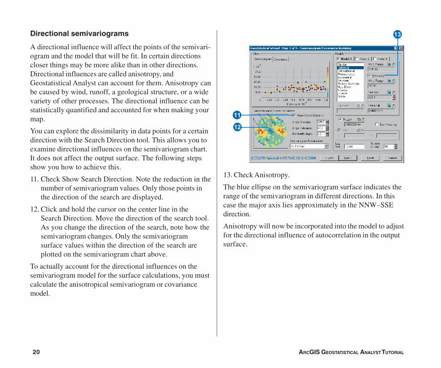
Directional semivariograms
A directional influence will affect the points of the semivari-ogram and the model that will be fit. In certain directionscloser things may be more alike than in other directions.Directional influences are called anisotropy, andGeostatistical Analyst can account for them. Anisotropy canbe caused by wind, runoff, a geological structure, or a widevariety of other processes. The directional influence can bestatistically quantified and accounted for when making yourmap.
You can explore the dissimilarity in data points for a certaindirection with the Search Direction tool. This allows you toexamine directional influences on the semivariogram chart.It does not affect the output surface. The following stepsshow you how to achieve this.
11. Check Show Search Direction. Note the reduction in thenumber of semivariogram values. Only those points inthe direction of the search are displayed.
12. Click and hold the cursor on the center line in theSearch Direction. Move the direction of the search tool.As you change the direction of the search, note how thesemivariogram changes. Only the semivariogramsurface values within the direction of the search areplotted on the semivariogram chart above.
To actually account for the directional influences on thesemivariogram model for the surface calculations, you mustcalculate the anisotropical semivariogram or covariancemodel.
13. Check Anisotropy.
The blue ellipse on the semivariogram surface indicates therange of the semivariogram in different directions. In thiscase the major axis lies approximately in the NNW–SSEdirection.
Anisotropy will now be incorporated into the model to adjustfor the directional influence of autocorrelation in the outputsurface.
E
W
R
ch02_Tutorial.pmd 05/23/2006, 9:31 AM20
ARCGIS GEOSTATISTICAL ANALYST TUTORIAL 21
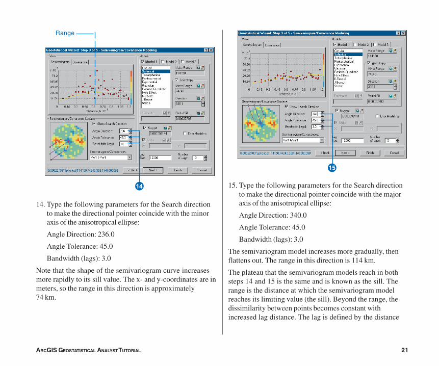
14. Type the following parameters for the Search directionto make the directional pointer coincide with the minoraxis of the anisotropical ellipse:
Angle Direction: 236.0
Angle Tolerance: 45.0
Bandwidth (lags): 3.0
Note that the shape of the semivariogram curve increasesmore rapidly to its sill value. The x- and y-coordinates are inmeters, so the range in this direction is approximately74 km.
15. Type the following parameters for the Search directionto make the directional pointer coincide with the majoraxis of the anisotropical ellipse:
Angle Direction: 340.0
Angle Tolerance: 45.0
Bandwidth (lags): 3.0
The semivariogram model increases more gradually, thenflattens out. The range in this direction is 114 km.
The plateau that the semivariogram models reach in bothsteps 14 and 15 is the same and is known as the sill. Therange is the distance at which the semivariogram modelreaches its limiting value (the sill). Beyond the range, thedissimilarity between points becomes constant withincreased lag distance. The lag is defined by the distance
Y
Range
T
ch02_Tutorial.pmd 05/23/2006, 9:31 AM21
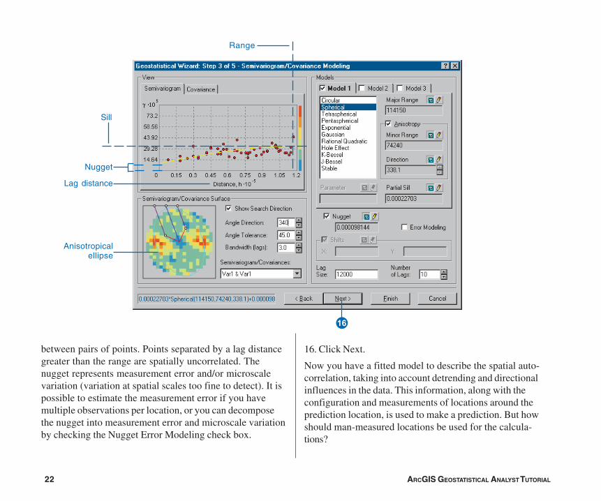
22 ARCGIS GEOSTATISTICAL ANALYST TUTORIAL
between pairs of points. Points separated by a lag distancegreater than the range are spatially uncorrelated. Thenugget represents measurement error and/or microscalevariation (variation at spatial scales too fine to detect). It ispossible to estimate the measurement error if you havemultiple observations per location, or you can decomposethe nugget into measurement error and microscale variationby checking the Nugget Error Modeling check box.
16. Click Next.
Now you have a fitted model to describe the spatial auto-correlation, taking into account detrending and directionalinfluences in the data. This information, along with theconfiguration and measurements of locations around theprediction location, is used to make a prediction. But howshould man-measured locations be used for the calcula-tions?
U
Range
Nugget
Sill
Lag distance
Anisotropicalellipse
ch02_Tutorial.pmd 05/23/2006, 9:32 AM22
ARCGIS GEOSTATISTICAL ANALYST TUTORIAL 23
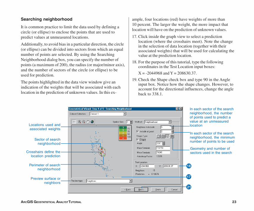
Searching neighborhood
It is common practice to limit the data used by defining acircle (or ellipse) to enclose the points that are used topredict values at unmeasured locations.
Additionally, to avoid bias in a particular direction, the circle(or ellipse) can be divided into sectors from which an equalnumber of points are selected. By using the SearchingNeighborhood dialog box, you can specify the number ofpoints (a maximum of 200), the radius (or major/minor axis),and the number of sectors of the circle (or ellipse) to beused for prediction.
The points highlighted in the data view window give anindication of the weights that will be associated with eachlocation in the prediction of unknown values. In this ex-
ample, four locations (red) have weights of more than10 percent. The larger the weight, the more impact thatlocation will have on the prediction of unknown values.
17. Click inside the graph view to select a predictionlocation (where the crosshairs meet). Note the changein the selection of data location (together with theirassociated weights) that will be used for calculating thevalue at the prediction location.
18. For the purpose of this tutorial, type the followingcoordinates in the Test Location input boxes:
X = -2044968 and Y = 208630.37.
19. Check the Shape check box and type 90 in the Angleinput box. Notice how the shape changes. However, toaccount for the directional influences, change the angleback to 338.1.
Crosshairs define thelocation prediction
Perimeter of searchneighborhood
Sector of searchneighborhood
Locations used andassociated weights
Preview surface orneighbors
I
S
In each sector of the searchneighborhood, the numberof points used to predict avalue at an unmeasuredlocation
In each sector of the searchneighborhood, the minimumnumber of points to be used
Geometry and number ofsectors used in the search
O
ch02_Tutorial.pmd 05/23/2006, 9:32 AM23
24 ARCGIS GEOSTATISTICAL ANALYST TUTORIAL
20. Uncheck the Shape check box—Geostatistical Analystwill use the default values (calculated in theSemivariogram/Covariance dialog earlier).
21. Click Next on the Searching Neighborhood dialog box.
Before you actually create the surface, you next use theCross Validation dialog box to perform diagnostics on theparameters to determine “how good” your model will be.
ch02_Tutorial.pmd 05/23/2006, 9:32 AM24
ARCGIS GEOSTATISTICAL ANALYST TUTORIAL 25
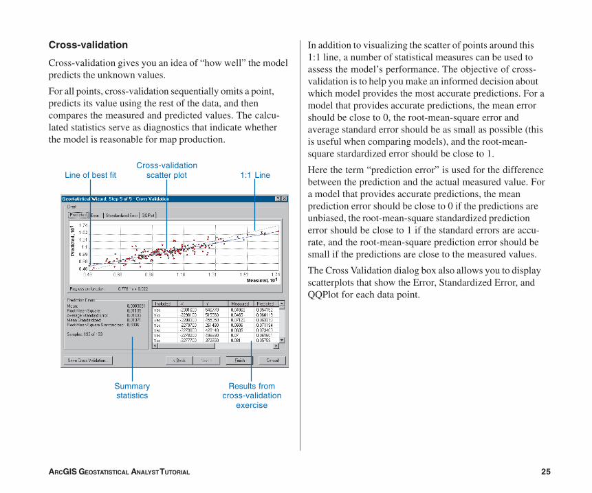
Cross-validation
Cross-validation gives you an idea of “how well” the modelpredicts the unknown values.
For all points, cross-validation sequentially omits a point,predicts its value using the rest of the data, and thencompares the measured and predicted values. The calcu-lated statistics serve as diagnostics that indicate whetherthe model is reasonable for map production.
In addition to visualizing the scatter of points around this1:1 line, a number of statistical measures can be used toassess the model’s performance. The objective of cross-validation is to help you make an informed decision aboutwhich model provides the most accurate predictions. For amodel that provides accurate predictions, the mean errorshould be close to 0, the root-mean-square error andaverage standard error should be as small as possible (thisis useful when comparing models), and the root-mean-square stardardized error should be close to 1.
Here the term “prediction error” is used for the differencebetween the prediction and the actual measured value. Fora model that provides accurate predictions, the meanprediction error should be close to 0 if the predictions areunbiased, the root-mean-square standardized predictionerror should be close to 1 if the standard errors are accu-rate, and the root-mean-square prediction error should besmall if the predictions are close to the measured values.
The Cross Validation dialog box also allows you to displayscatterplots that show the Error, Standardized Error, andQQPlot for each data point.
Line of best fit 1:1 Line
Results fromcross-validation
exercise
Summarystatistics
Cross-validationscatter plot
ch02_Tutorial.pmd 05/23/2006, 9:32 AM25
26 ARCGIS GEOSTATISTICAL ANALYST TUTORIAL
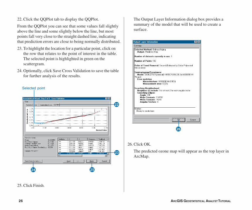
22. Click the QQPlot tab to display the QQPlot.
From the QQPlot you can see that some values fall slightlyabove the line and some slightly below the line, but mostpoints fall very close to the straight dashed line, indicatingthat prediction errors are close to being normally distributed.
23. To highlight the location for a particular point, click onthe row that relates to the point of interest in the table.The selected point is highlighted in green on thescattergram.
24. Optionally, click Save Cross Validation to save the tablefor further analysis of the results.
25. Click Finish.
The Output Layer Information dialog box provides asummary of the model that will be used to create asurface.
26. Click OK.
The predicted ozone map will appear as the top layer inArcMap.
J
H
F
G
D
Selected point
ch02_Tutorial.pmd 05/23/2006, 9:32 AM26
ARCGIS GEOSTATISTICAL ANALYST TUTORIAL 27
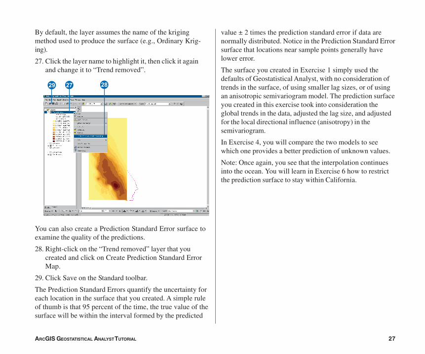
By default, the layer assumes the name of the krigingmethod used to produce the surface (e.g., Ordinary Krig-ing).
27. Click the layer name to highlight it, then click it againand change it to “Trend removed”.
You can also create a Prediction Standard Error surface toexamine the quality of the predictions.
28. Right-click on the “Trend removed” layer that youcreated and click on Create Prediction Standard ErrorMap.
29. Click Save on the Standard toolbar.
The Prediction Standard Errors quantify the uncertainty foreach location in the surface that you created. A simple ruleof thumb is that 95 percent of the time, the true value of thesurface will be within the interval formed by the predicted
LKZ
value ± 2 times the prediction standard error if data arenormally distributed. Notice in the Prediction Standard Errorsurface that locations near sample points generally havelower error.
The surface you created in Exercise 1 simply used thedefaults of Geostatistical Analyst, with no consideration oftrends in the surface, of using smaller lag sizes, or of usingan anisotropic semivariogram model. The prediction surfaceyou created in this exercise took into consideration theglobal trends in the data, adjusted the lag size, and adjustedfor the local directional influence (anisotropy) in thesemivariogram.
In Exercise 4, you will compare the two models to seewhich one provides a better prediction of unknown values.
Note: Once again, you see that the interpolation continuesinto the ocean. You will learn in Exercise 6 how to restrictthe prediction surface to stay within California.
ch02_Tutorial.pmd 05/23/2006, 9:32 AM27
28 ARCGIS GEOSTATISTICAL ANALYST TUTORIAL
Exercise 4: Comparing models
Using Geostatistical Analyst, you can compare the resultsof two mapped surfaces. This allows you to make aninformed decision as to which provides more accuratepredictions of ozone concentration based on cross-validationstatistics.
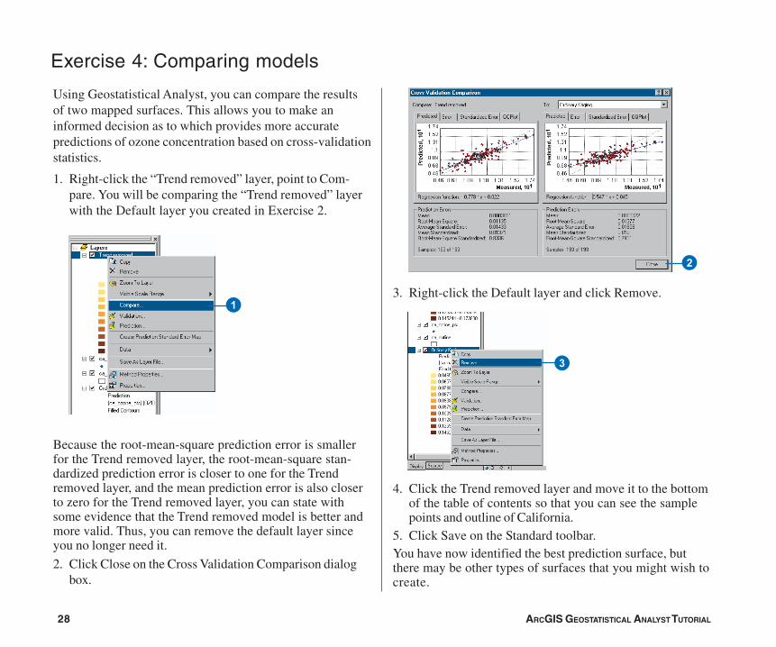
1. Right-click the “Trend removed” layer, point to Com-pare. You will be comparing the “Trend removed” layerwith the Default layer you created in Exercise 2.
Because the root-mean-square prediction error is smallerfor the Trend removed layer, the root-mean-square stan-dardized prediction error is closer to one for the Trendremoved layer, and the mean prediction error is also closerto zero for the Trend removed layer, you can state withsome evidence that the Trend removed model is better andmore valid. Thus, you can remove the default layer sinceyou no longer need it.
2. Click Close on the Cross Validation Comparison dialogbox.
13. Right-click the Default layer and click Remove.
4. Click the Trend removed layer and move it to the bottomof the table of contents so that you can see the samplepoints and outline of California.
5. Click Save on the Standard toolbar.You have now identified the best prediction surface, butthere may be other types of surfaces that you might wish tocreate.
3
2
ch02_Tutorial.pmd 05/23/2006, 9:32 AM28
ARCGIS GEOSTATISTICAL ANALYST TUTORIAL 29
Exercise 5: Mapping the probability of ozone exceeding a critical threshold
In Exercises 1 and 3 you used ordinary kriging to mapozone concentration in California using different param-eters. In the decision making process, care must be taken inusing a map of predicted ozone for identifying unsafe areasbecause it is necessary to understand the uncertainty of thepredictions. For example, suppose the critical thresholdozone value is 0.12 ppm for an eight-hour period, and youwould like to decide if any locations exceed this value. Toaid the decision making process, you can use GeostatisticalAnalyst to map the probability that ozone values exceed thethreshold.
While Geostatistical Analyst provides a number of methodsthat can perform this task, for this exercise you will use theindicator kriging technique. This technique does not requirethe dataset to conform to a particular distribution. The datavalues are transformed to a series of 0s and 1s according towhether the values of the data are below or above athreshold. If a threshold above 0.12 ppm is used, any valuebelow this threshold will be assigned a value of 0, whereasthe values above the threshold will be assigned a value of 1.Indicator kriging then uses a semivariogram model that iscalculated from the transformed 0–1 dataset.
1. Click the Geostatistical Analyst toolbar and click Geo-statistical Wizard.
2. Click the Layer dropdown arrow and clickca_ozone_pts.
3. Click the Attribute dropdown arrow and click theOZONE attribute.
4. Click Kriging in the method box.
5. Click Next on the Choose Input Data and Method dialogbox.
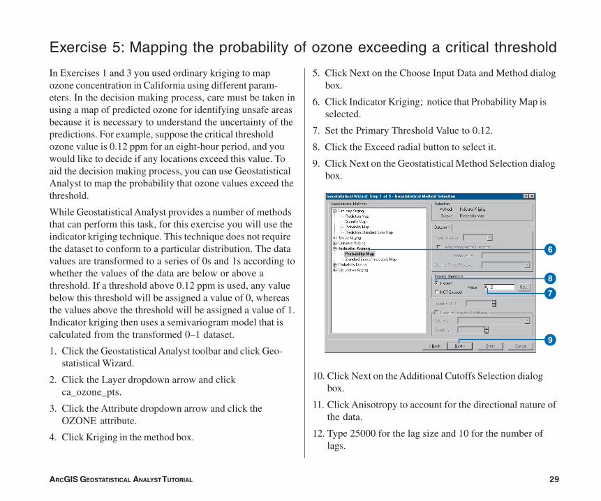
6. Click Indicator Kriging; notice that Probability Map isselected.
7. Set the Primary Threshold Value to 0.12.
8. Click the Exceed radial button to select it.
9. Click Next on the Geostatistical Method Selection dialogbox.
10. Click Next on the Additional Cutoffs Selection dialogbox.
11. Click Anisotropy to account for the directional nature ofthe data.
12. Type 25000 for the lag size and 10 for the number oflags.
6
7
9
8
ch02_Tutorial.pmd 05/23/2006, 9:32 AM29
30 ARCGIS GEOSTATISTICAL ANALYST TUTORIAL
13. Click Next on the Semivariogram/Covariance Modelingdialog box.
14. Click Next on the Searching Neighborhood dialog box.
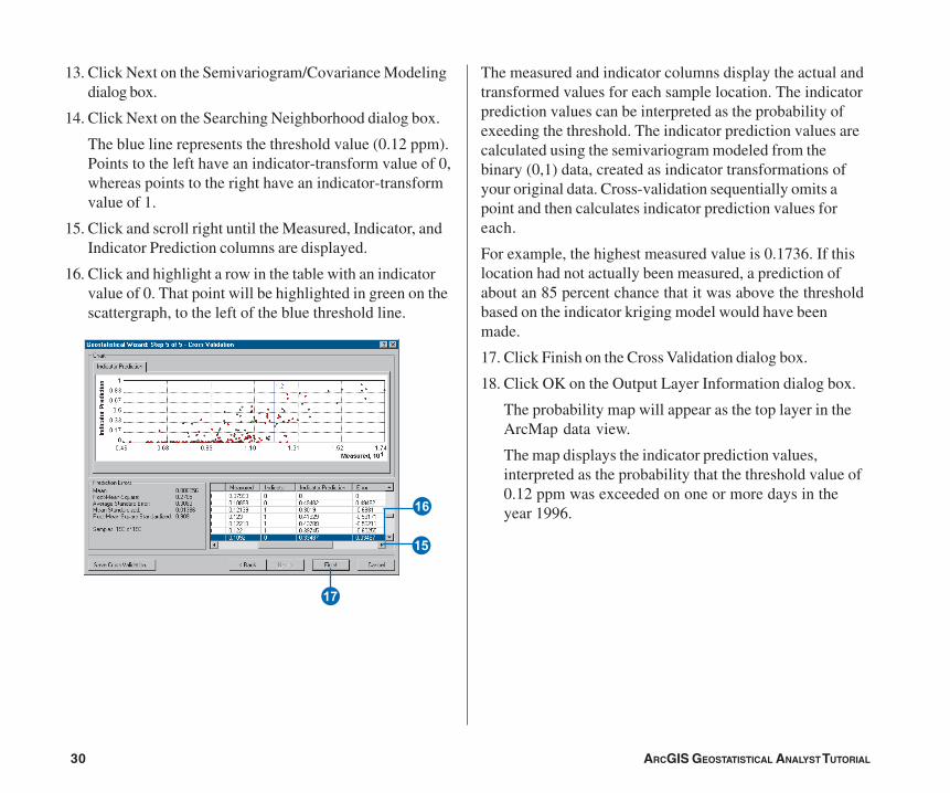
The blue line represents the threshold value (0.12 ppm).Points to the left have an indicator-transform value of 0,whereas points to the right have an indicator-transformvalue of 1.
15. Click and scroll right until the Measured, Indicator, andIndicator Prediction columns are displayed.
16. Click and highlight a row in the table with an indicatorvalue of 0. That point will be highlighted in green on thescattergraph, to the left of the blue threshold line.
The measured and indicator columns display the actual andtransformed values for each sample location. The indicatorprediction values can be interpreted as the probability ofexeeding the threshold. The indicator prediction values arecalculated using the semivariogram modeled from thebinary (0,1) data, created as indicator transformations ofyour original data. Cross-validation sequentially omits apoint and then calculates indicator prediction values foreach.
For example, the highest measured value is 0.1736. If thislocation had not actually been measured, a prediction ofabout an 85 percent chance that it was above the thresholdbased on the indicator kriging model would have beenmade.
17. Click Finish on the Cross Validation dialog box.
18. Click OK on the Output Layer Information dialog box.
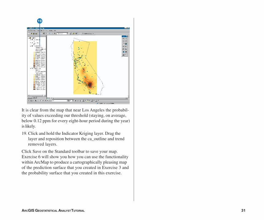
The probability map will appear as the top layer in theArcMap data view.
The map displays the indicator prediction values,interpreted as the probability that the threshold value of0.12 ppm was exceeded on one or more days in theyear 1996.U
I
Y
ch02_Tutorial.pmd 05/23/2006, 9:32 AM30
ARCGIS GEOSTATISTICAL ANALYST TUTORIAL 31
P
It is clear from the map that near Los Angeles the probabil-ity of values exceeding our threshold (staying, on average,below 0.12 ppm for every eight-hour period during the year)is likely.
19. Click and hold the Indicator Kriging layer. Drag thelayer and reposition between the ca_outline and trendremoved layers.
Click Save on the Standard toolbar to save your map.Exercise 6 will show you how you can use the functionalitywithin ArcMap to produce a cartographically pleasing mapof the prediction surface that you created in Exercise 3 andthe probability surface that you created in this exercise.
ch02_Tutorial.pmd 05/23/2006, 9:32 AM31
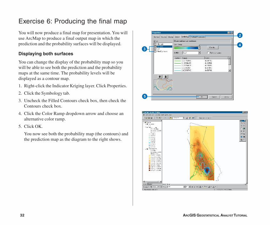
32 ARCGIS GEOSTATISTICAL ANALYST TUTORIAL
You will now produce a final map for presentation. You willuse ArcMap to produce a final output map in which theprediction and the probability surfaces will be displayed.
Displaying both surfaces
You can change the display of the probability map so youwill be able to see both the prediction and the probabilitymaps at the same time. The probability levels will bedisplayed as a contour map.
1. Right-click the Indicator Kriging layer. Click Properties.
2. Click the Symbology tab.
3. Uncheck the Filled Contours check box, then check theContours check box.
4. Click the Color Ramp dropdown arrow and choose analternative color ramp.
5. Click OK.
You now see both the probability map (the contours) andthe prediction map as the diagram to the right shows.
Exercise 6: Producing the final map
2
34
5
ch02_Tutorial.pmd 05/23/2006, 9:32 AM32
ARCGIS GEOSTATISTICAL ANALYST TUTORIAL 33
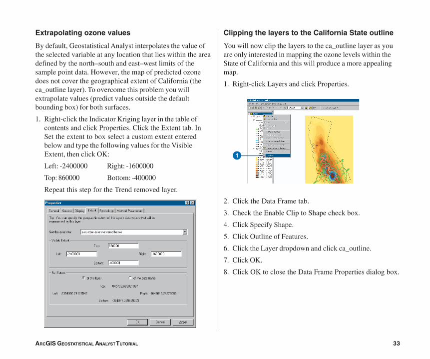
Extrapolating ozone values
By default, Geostatistical Analyst interpolates the value ofthe selected variable at any location that lies within the areadefined by the north–south and east–west limits of thesample point data. However, the map of predicted ozonedoes not cover the geographical extent of California (theca_outline layer). To overcome this problem you willextrapolate values (predict values outside the defaultbounding box) for both surfaces.
1. Right-click the Indicator Kriging layer in the table ofcontents and click Properties. Click the Extent tab. InSet the extent to box select a custom extent enteredbelow and type the following values for the VisibleExtent, then click OK:
Left: -2400000 Right: -1600000
Top: 860000 Bottom: -400000
Repeat this step for the Trend removed layer.
Clipping the layers to the California State outline
You will now clip the layers to the ca_outline layer as youare only interested in mapping the ozone levels within theState of California and this will produce a more appealingmap.
1. Right-click Layers and click Properties.
2. Click the Data Frame tab.
3. Check the Enable Clip to Shape check box.
4. Click Specify Shape.
5. Click Outline of Features.
6. Click the Layer dropdown and click ca_outline.
7. Click OK.
8. Click OK to close the Data Frame Properties dialog box.
1
ch02_Tutorial.pmd 05/23/2006, 9:32 AM33
34 ARCGIS GEOSTATISTICAL ANALYST TUTORIAL
2
3
4
8
7
6
5
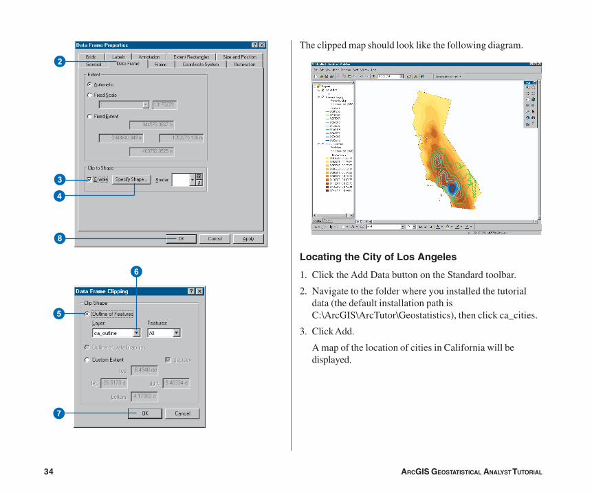
The clipped map should look like the following diagram.
Locating the City of Los Angeles
1. Click the Add Data button on the Standard toolbar.
2. Navigate to the folder where you installed the tutorialdata (the default installation path isC:\ArcGIS\ArcTutor\Geostatistics), then click ca_cities.
3. Click Add.
A map of the location of cities in California will bedisplayed.
ch02_Tutorial.pmd 05/23/2006, 9:32 AM34
ARCGIS GEOSTATISTICAL ANALYST TUTORIAL 35
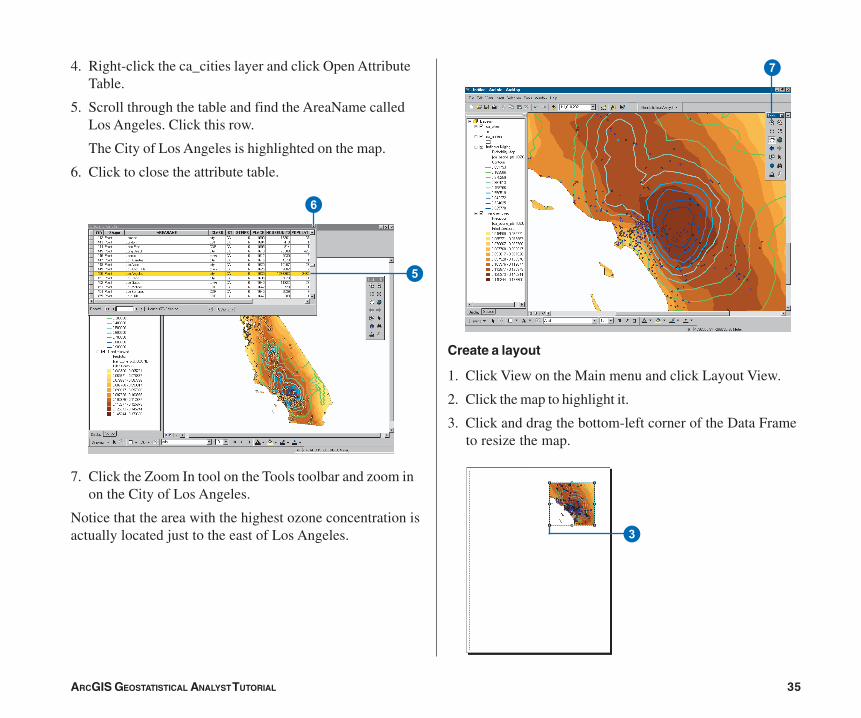
4. Right-click the ca_cities layer and click Open AttributeTable.
5. Scroll through the table and find the AreaName calledLos Angeles. Click this row.
The City of Los Angeles is highlighted on the map.
6. Click to close the attribute table.
7. Click the Zoom In tool on the Tools toolbar and zoom inon the City of Los Angeles.
Notice that the area with the highest ozone concentration isactually located just to the east of Los Angeles.
Create a layout
1. Click View on the Main menu and click Layout View.
2. Click the map to highlight it.
3. Click and drag the bottom-left corner of the Data Frameto resize the map.
5
6
7
3
ch02_Tutorial.pmd 05/23/2006, 9:32 AM35
36 ARCGIS GEOSTATISTICAL ANALYST TUTORIAL
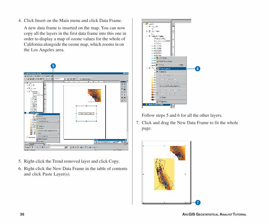
4. Click Insert on the Main menu and click Data Frame.
A new data frame is inserted on the map. You can nowcopy all the layers in the first data frame into this one inorder to display a map of ozone values for the whole ofCalifornia alongside the ozone map, which zooms in onthe Los Angeles area.
5. Right-click the Trend removed layer and click Copy.
6. Right-click the New Data Frame in the table of contentsand click Paste Layer(s).
Follow steps 5 and 6 for all the other layers.
7. Click and drag the New Data Frame to fit the wholepage.
56
7
ch02_Tutorial.pmd 05/23/2006, 9:32 AM36
ARCGIS GEOSTATISTICAL ANALYST TUTORIAL 37
8. Click the Full Extent button on the Tools toolbar to viewthe full extent of the map in the New Data Frame.
9. Right-click the New Data Frame and click Properties.
10. Click the Data Frame tab and, as you did for the firstData Frame, check Enable Clip to Shape and click theSpecify Shape button. Choose ca_outline as the layer toclip to, then click OK.
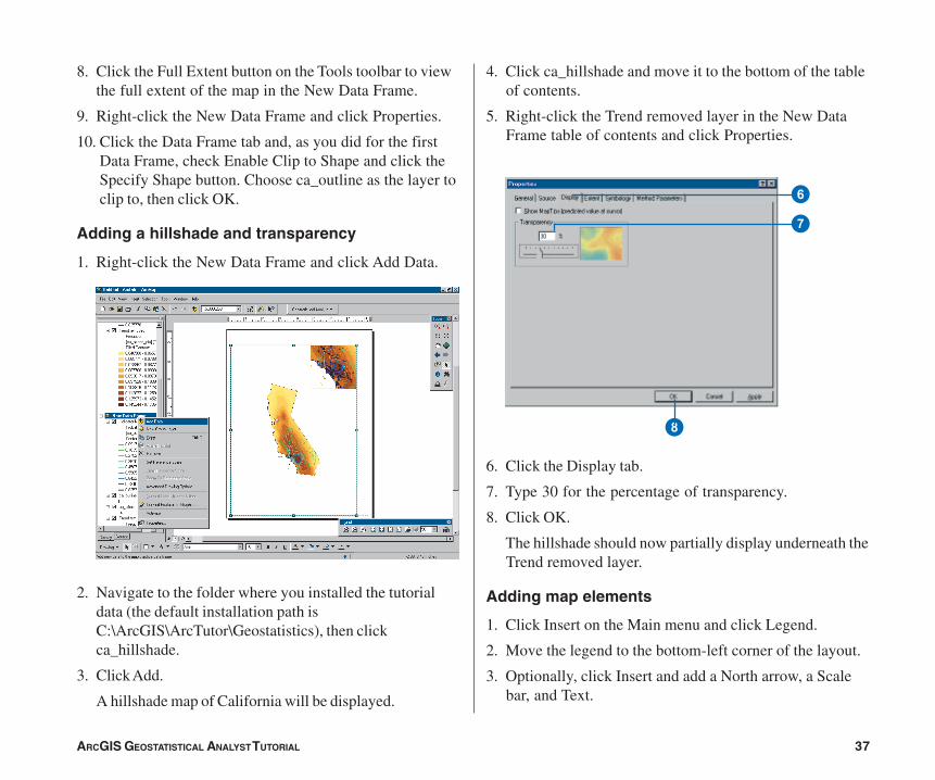
Adding a hillshade and transparency
1. Right-click the New Data Frame and click Add Data.
2. Navigate to the folder where you installed the tutorialdata (the default installation path isC:\ArcGIS\ArcTutor\Geostatistics), then clickca_hillshade.
3. Click Add.
A hillshade map of California will be displayed.
4. Click ca_hillshade and move it to the bottom of the tableof contents.
5. Right-click the Trend removed layer in the New DataFrame table of contents and click Properties.
6. Click the Display tab.
7. Type 30 for the percentage of transparency.
8. Click OK.
The hillshade should now partially display underneath theTrend removed layer.
Adding map elements
1. Click Insert on the Main menu and click Legend.
2. Move the legend to the bottom-left corner of the layout.
3. Optionally, click Insert and add a North arrow, a Scalebar, and Text.
8
6
7
ch02_Tutorial.pmd 05/23/2006, 9:32 AM37
38 ARCGIS GEOSTATISTICAL ANALYST TUTORIAL
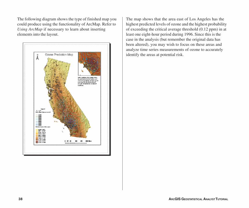
The following diagram shows the type of finished map youcould produce using the functionality of ArcMap. Refer toUsing ArcMap if necessary to learn about insertingelements into the layout.
The map shows that the area east of Los Angeles has thehighest predicted levels of ozone and the highest probabilityof exceeding the critical average threshold (0.12 ppm) in atleast one eight-hour period during 1996. Since this is thecase in the analysis (but remember the original data hasbeen altered), you may wish to focus on these areas andanalyze time series measurements of ozone to accuratelyidentify the areas at potential risk.
ch02_Tutorial.pmd 05/23/2006, 9:32 AM38