Embed Size (px)
Citation preview

ArchMiner
An exploratory data analysis tool for the Center for the Built Environment
Stephanie HornungLeah ZagreusMasters Candidates 2003

What is CBE?
• Center for the Built Environment (CBE)– Research group in the College of
Environmental Design – Aims to inform the building industry
of new building technologies and design strategies that improve efficiency and occupant comfort

Occupant Satisfaction Survey
• Web-based survey • Measures occupant satisfaction
with a variety of metrics (such as air quality, acoustics and lighting)
It’s cold at my desk, I think there’s a draft
There’s a terrible glare on my
screen in the afternoonEveryone can hear what I say on
the phone, and sometimes its
personalThe air would be so much better if we could open a window!

Benchmarking
• Survey data used to correlate occupant comfort with building technologies – How do the occupants in this building feel
about the temperature in their workspace?– Is the occupants’ feeling about the
temperature related to having a thermostat?
– How do the results from this building compare with other buildings in the same geographical area?

Analysis Process
• View survey results using in-house reporting tool
• Create many charts and pivot tables using Microsoft Excel to try to find interesting relationships
Process is inefficient and very time consuming!
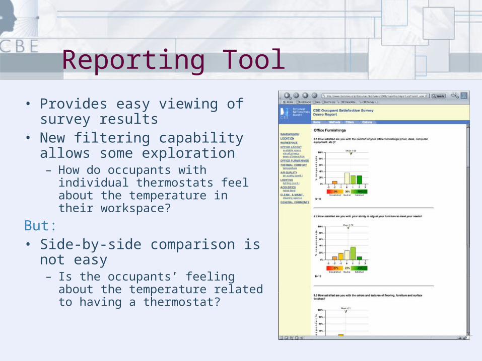
Reporting Tool
• Provides easy viewing of survey results
• New filtering capability allows some exploration– How do occupants with
individual thermostats feel about the temperature in their workspace?
But:• Side-by-side comparison is
not easy– Is the occupants’ feeling about
the temperature related to having a thermostat?

Microsoft Excel
• Researchers make charts and pivot tables looking for interesting relationships– Can result in many
charts, with only a few yielding results
• Chart-creation process is time consuming
• Raw data difficult to parse
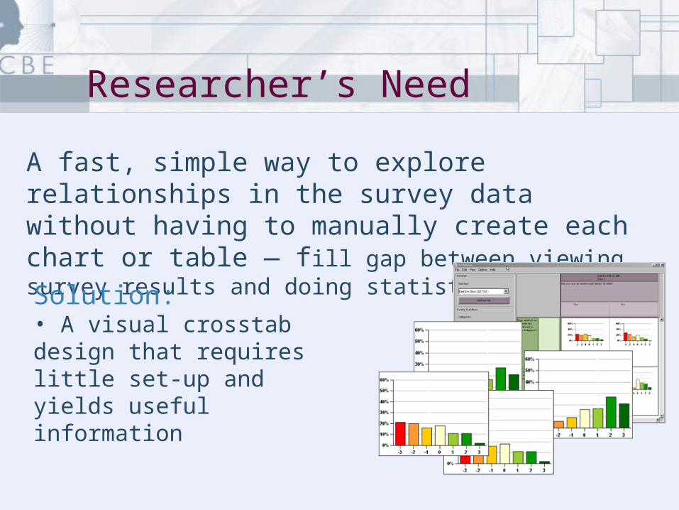
Researcher’s Need
A fast, simple way to explore relationships in the survey data without having to manually create each chart or table — fill gap between viewing survey results and doing statistical analysis
Solution:• A visual crosstab design that requires little set-up and yields useful information

Our Design Process
• Two rounds of low-fi prototype testing– Designs are easy to make and change, and
even easier to discard
• Heuristic Evaluation done by colleagues in is213
• Pilot usability test

ArchMiner Demo
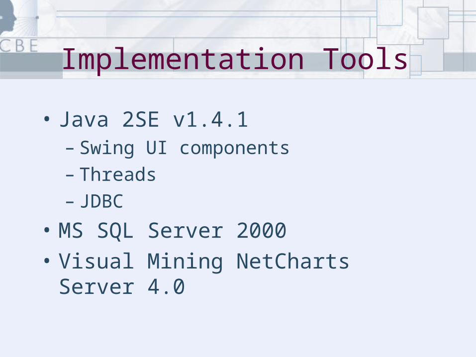
Implementation Tools
• Java 2SE v1.4.1– Swing UI components– Threads– JDBC
• MS SQL Server 2000• Visual Mining NetCharts Server 4.0

Evaluation and Feedback
• CBE partner meeting demo• Pilot usability study
– 3 typical users: 1 researcher, 2 GSRs– 7 typical tasks– Observation, “think aloud” techniques– Recorded time, task completion, error
rate – Post-test questionnaire with Likert
Scale followed by interview

Quotes
“Powerful!”
“Yahoo! When can I use it?”
“Easy to use”
“Everything is where I expect it to be”
“Very useful”

Pilot Usability Study Results
• All participants completed 5 of 7 tasks in ~ 2 min or less
• Overall: Easy to use, powerful, and intuitive interaction flow
General Question Average Score [1-Disagree] to [5-Agree]
The resulting charts and data would be useful for my research.
5
The workflow was natural. 5
I was satisfied with ArchMiner as a data exploratory tool.
4.7

Pilot Usability Study Results
General Question Average Score [1-Disagree] to [5-Agree]
It was difficult for me to select the survey(s) I was interested in. 1.3
It was difficult for me to select the question(s) I was interested in.
2.3
It was difficult for me to navigate the control panel on the left. 2.7
It was difficult for me to understand the correlation between the controls on the left and the grid displayed on the right.
1.7
It was difficult for me to see the relationship between the data in the column and the row.
2.3
Functions in the top menu bar were difficult to access. 2
After having generated some charts, it was difficult to add to the results.
2.3
It was difficult to navigate through the results using the scroll bars.
2
After having generated some charts, it was difficult to clear the results I did not want to see.
1.3

Pilot Usability Study Results
Problem Description Planned Interface Change
The order of the categories Currently displayed alphabetically were not familiar with seeing/ using them in this order
List categories in the same order as survey
Show/hide responses Biggest problem. No user selected the “View Columns by Responses” or “View Rows by Responses” choices in the menu bar
Change semantics on menu choices. May need more usability testing
Improve question selection Users could not see the whole question in one view
Better question selection. Wrap text. Still researching other options
Keeping one viewable query and comparing it with later built queries
Users have to rebuild old queries or scroll a lot to see comparisons from first and last queries built
Keep viewable query and compare it with later built queries
No shortcuts Would like quicker access to functionalities, other than just in the menu bar
Add shortcuts

Future Work v1.0
• Export• Permissions• Performance• Reporting tool integration
Future Work v2.0
• Undo• More chart types• Saving views• Freeze panes, show/hide rows• Preferences

Acknowledgements
• Dr. Marti Hearst• TAs Maggie Law and Kaichi Sung• Research Specialist Charlie
Huizenga• Center for the Built Environment
213 teammates Myra Liu and Anita Wilhelm
More Information
• ArchMinerhttp://dream.berkeley.edu/CBEdatamining
• Center for the Built Environmenthttp://www.cbe.berkeley.edu
• Occupant Satisfaction Surveyhttp://www.cbesurvey.org