Embed Size (px)
DESCRIPTION
design solutions by second year Graphic Communication students from the University of Wolverhampton, School of Art and Design
Citation preview
THE BEAUTY OF LANGUAGE
A selection of designs produced by
second year Graphic Communication
Students from the University of
Wolverhampton, School of Art and Design
P r o j e c t k i n d l y s u p p o r t e d
b y S h e a f f e r
T h i s m o d u l e w i l l e n a b l e y o u t o e n g a g e w i t h
t h e c o n c e p t s a n d s k i l l - s e t s n e c e s s a r y f o r t h e
p r o f e s s i o n a l p r a c t i c e o f g r a p h i c d e s i g n . Y o u
w i l l b e e n c o u r a g e d t o c o n s i d e r c o n t e m p o r a r y
c o m m u n i c a t i o n i s s u e s a n d t o f u r t h e r d e v e l o p
y o u r p r a c t i c a l e x p e r i e n c e i n a c h i e v i n g
e f f e c t i v e a n d r e l e v a n t d e s i g n s o l u t i o n s . Y o u
w i l l u n d e r t a k e a s s i g n m e n t s a r o u n d v i s u a l
i d e n t i t y , n a r r a t i v e a n d e f f e c t i v e
c o m m u n i c a t i o n u s i n g h i e r a r c h i c a l s t r u c t u r e s .
Y o u w i l l h a v e t h e o p p o r t u n i t y t o w o r k w i t h i n
m e d i a c o n t e x t s f o r b o t h p r i n t a n d s c r e e n .
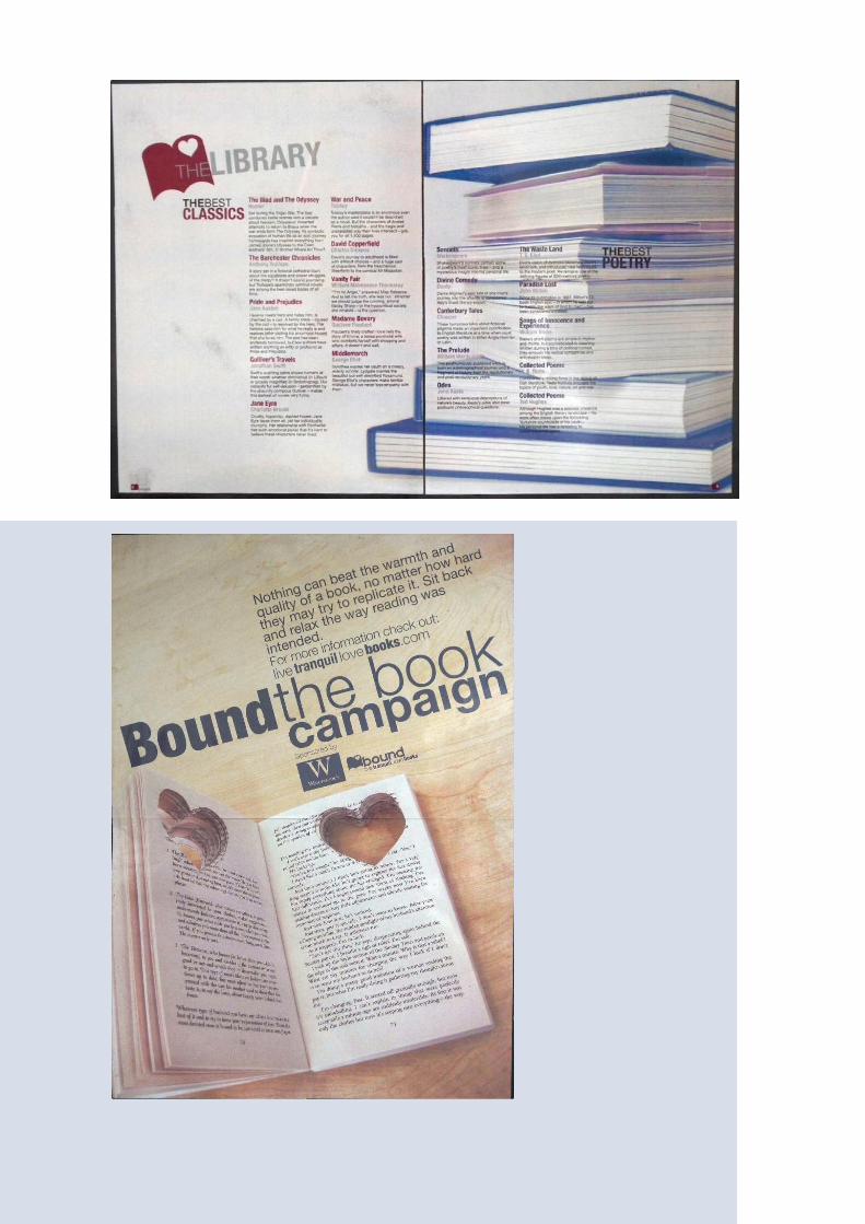
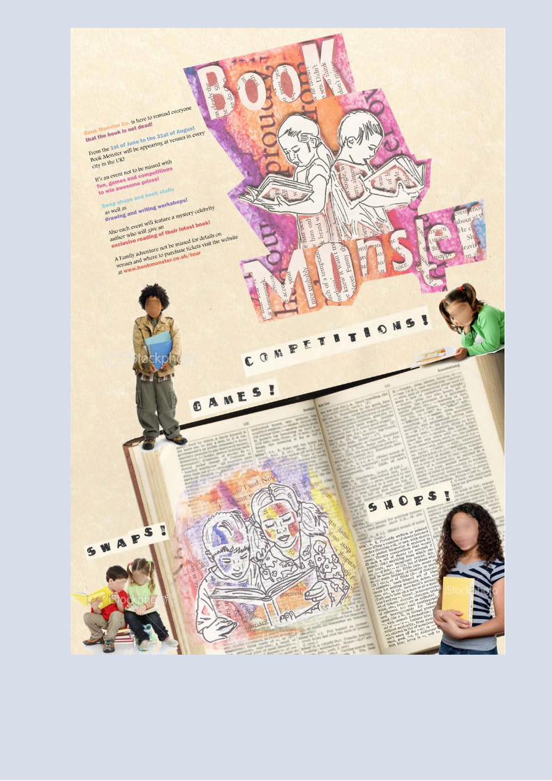
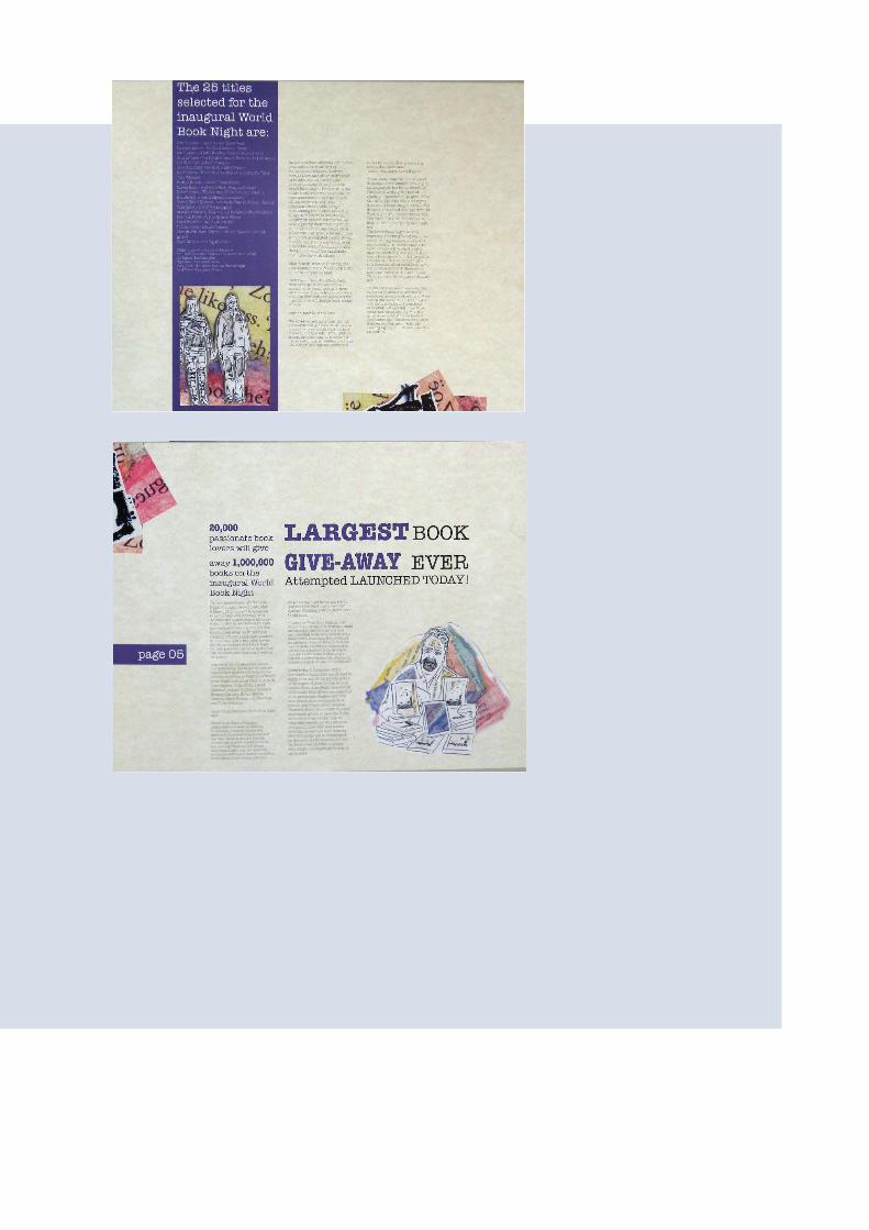
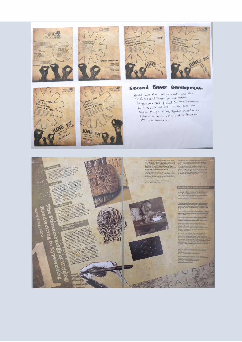
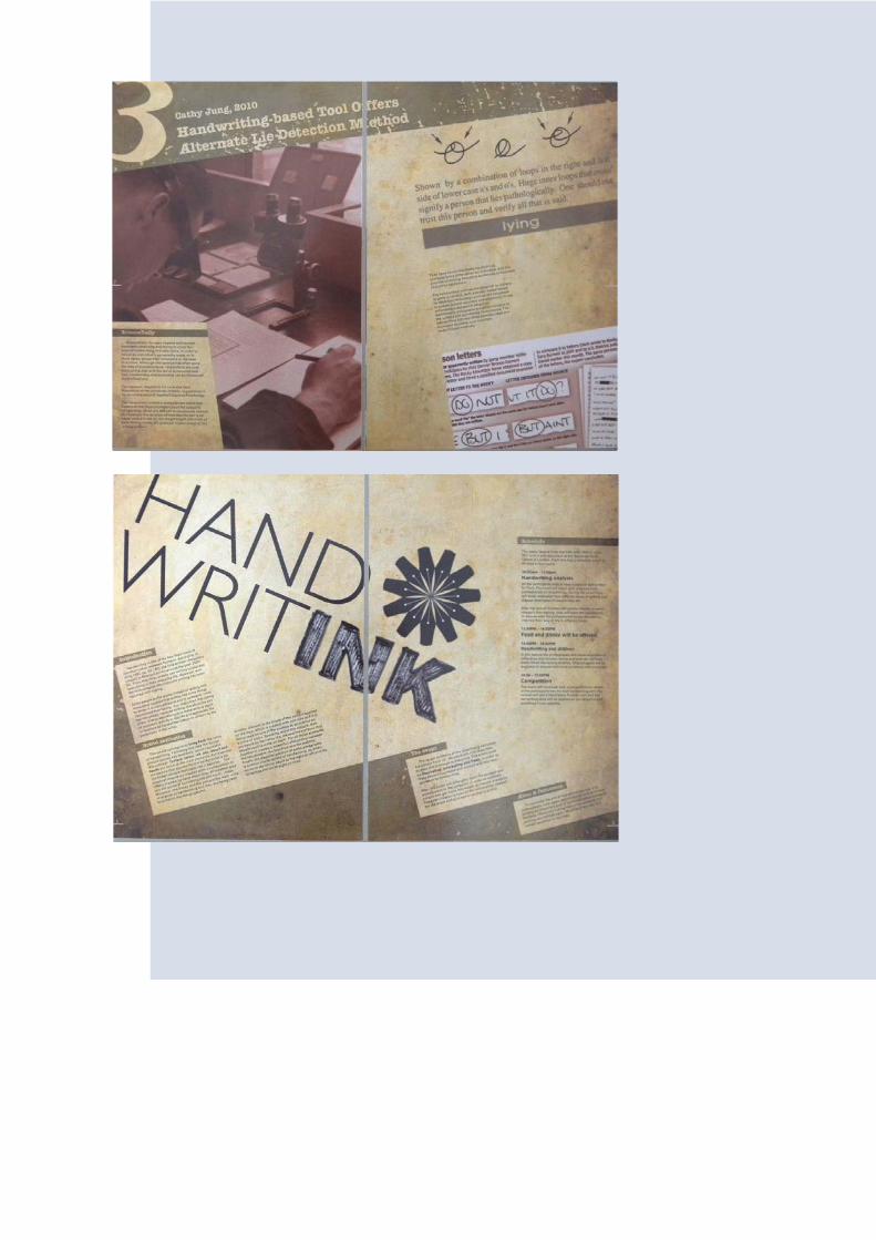
Visual identities are not necessarily just the logos/symbols thatprovide distinctive and enduring marks for companies ororganisations. Visual identities can frequently have the role ofcharacterising and drawing attention to events, exhibitions,shows or festivals and therefore have a limited life span, andoften very specific target markets. They can be applied in moreinnovative and less restrictive ways, across a broad range ofmedia and in varying contexts.
Students are to choose an event from the provided topics concerned
with the overall theme of THE BEAUTY OF LANGUAGE.
Students will research and expand upon the supplied information and
design an appropriate visual identity which involves considerably more
than creating and applying a logo/symbol. Students are to produce a
whole ‘palette’ of elements that must include:
• a namestyle and symbol, using the supplied name or an amended
version (namestyle to function with or without the symbol in both
single or multiple colour)
• a strapline
• typographic detailing that covers all levels of text (headlines, sub-
heads, bullet points/buttons, body copy, captions etc.)
• image detailing that includes all aspects of photographic/illustrative
content (cut outs/squared up/focus/media/composition/cropping etc.)
• a texture/graphic pattern
• spatial/compositional character – relating to groupings and to the
general style of and distribution of space
• selected colours for print and screen use (please note that visual
identity palettes will need to be ale to function in both full colour and
within a limited colour palette)
• materials (type/s of paper, plus any other appropriate surfaces)
Students have no externally imposed restrictions such as numbers of
colours, or techniques, but must analyse the circumstances and
determine the practical and aesthetic parameters for themselves.
S e l e c t a t o p i c f r o m t h e
f o l l o w i n g l i s t :
B o o k S T o r e P l a c e
e - r e a d e r S
T a l k i n g T o r e P l a c e
T e x T i n g
W r i T i n g T o r e P l a c e
T Y P i n g
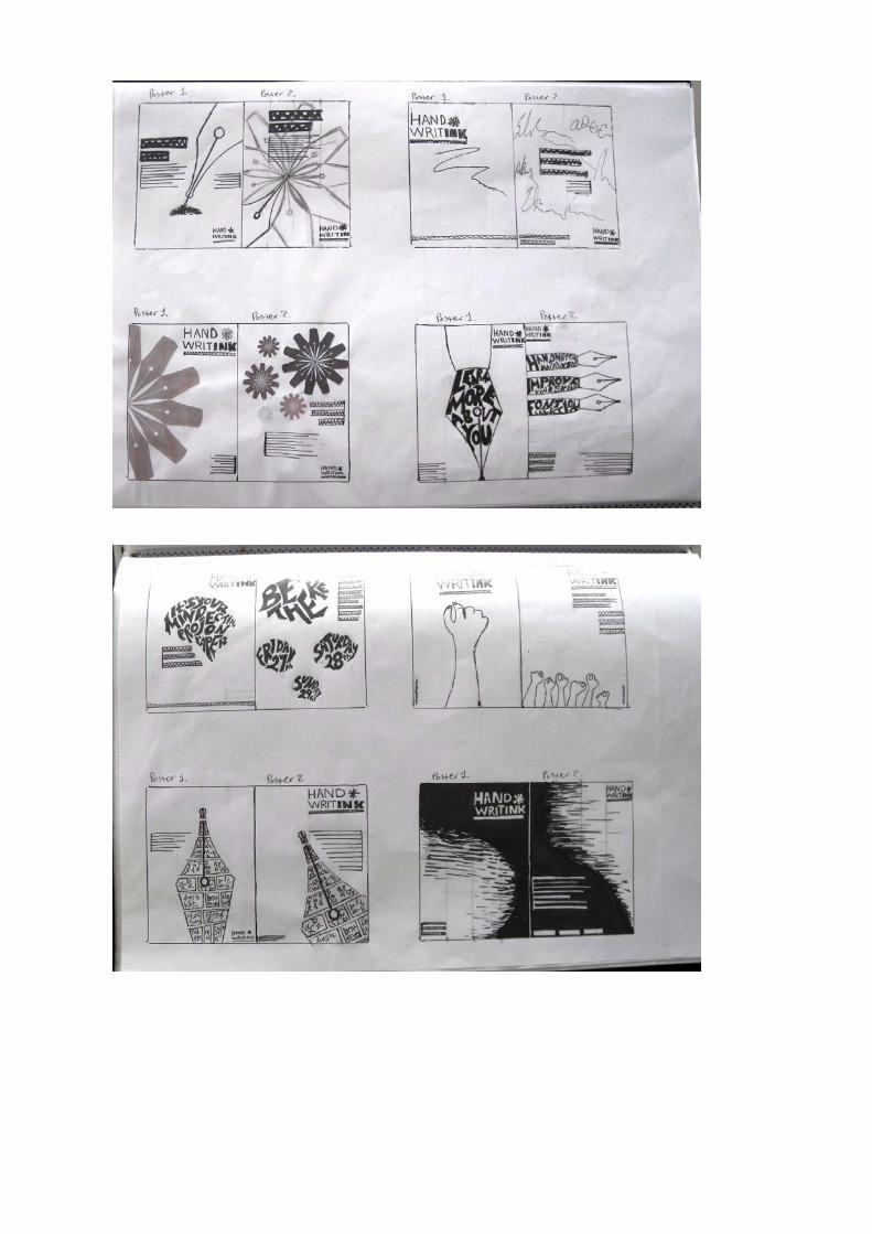
During the first weeks of this project students will develop and design a
branding palette for their event. The palette will clearly outline the
design approach and explain simply and clearly how all the various
design elements, typestyles, colours, shapes, patterns, imagery, materials
etc can be applied in differing contexts (as explained and shown during
the second presentation during the first week of the module). To
undertake the research necessary for this project it is vital that students
have a good understanding of their event (based on their outline of their
own elected festival/exhibition/conference/campaign) and also have a
broad overview of a range of branded items from both 2 and 3D
contexts for similar events. Knowledge and awareness of similar,
possibly competing or associated events and audiences is vital. Students
will analyse the use of typestyles, type relationships, combinations of
typographic detail, symbols, shapes and language (both visual and verbal)
that is used within the context of their selected variety of event whilst
appealing to their specified audience. Particular note should be taken of
colour use and possible shifts in priority. The research that underpins
the development of the branding palette will go on to examine the
employment and function of imagery – is there are recurring style of
photography or illustration and how are images grouped, positioned or
cropped? Graphic detail such as rules, dotted lines and dashed lines will
be analysed and spacing will be noted. The spatial elements of
typography will also be studied and observed. Patterns and textures will
be examined, as will key materials that may already form part of pre-
existing design convention that relates to the selected event.
By the end of this project, students will have developed an identity
palette that, not only reflects, enhances and functions successfully as a
consistent communication and promotional aid for their own individual
event, but they will also have applied this identity within a number of
contexts.

c h r i S k i n S e Y
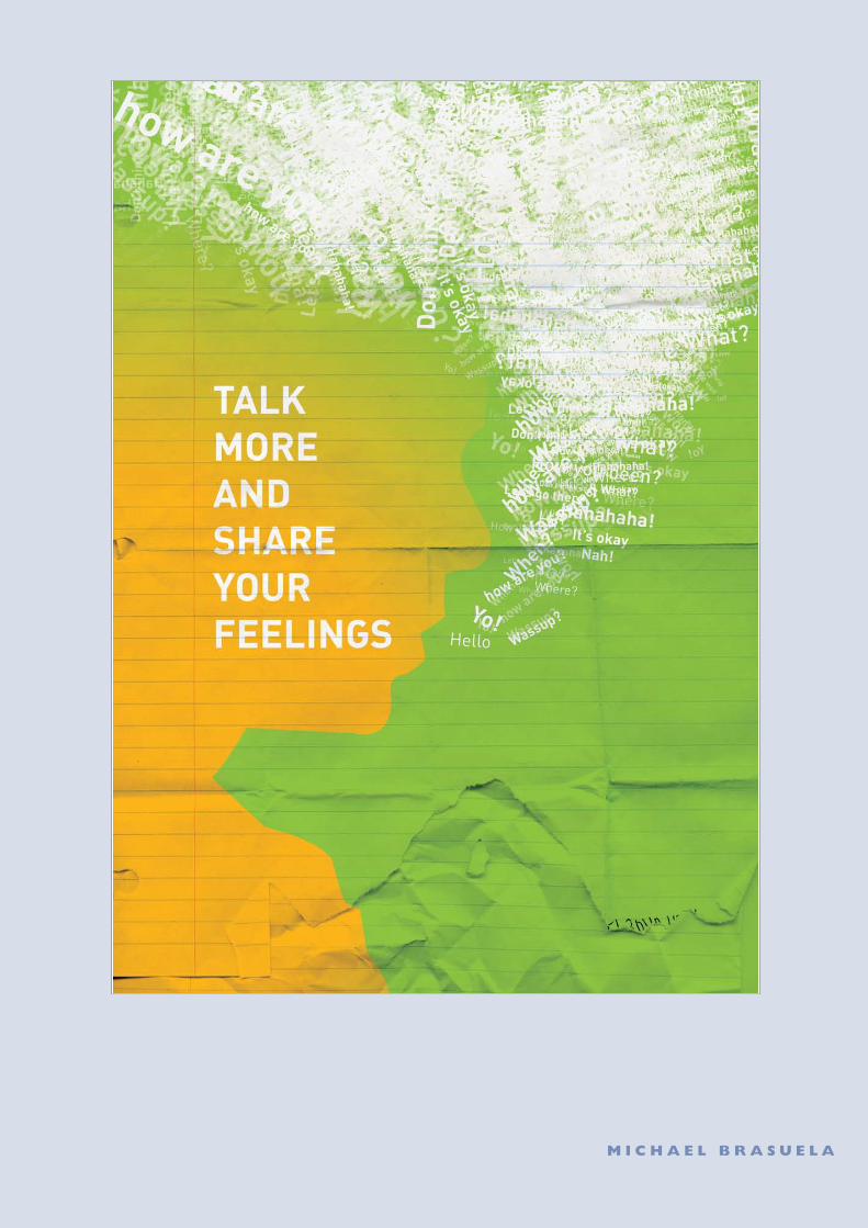
M i c h a e l B r a S U e l a
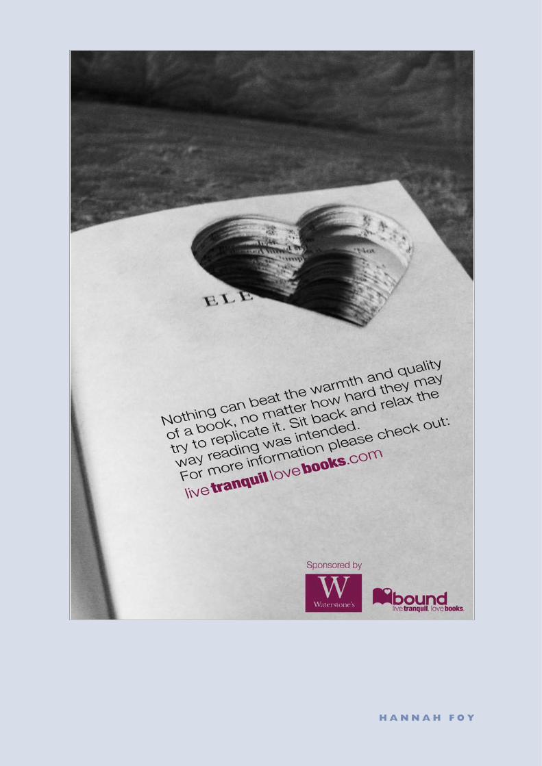
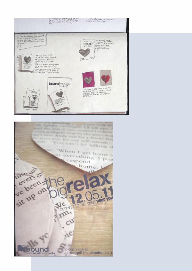
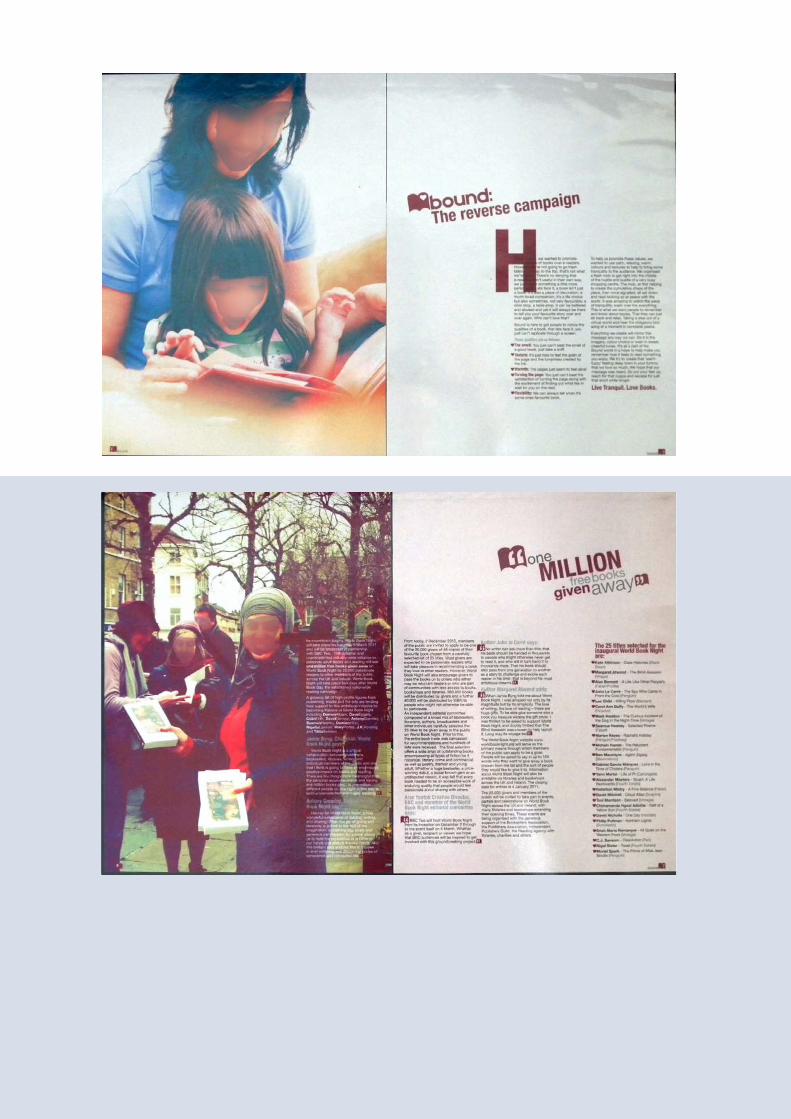
h a n n a h F o Y
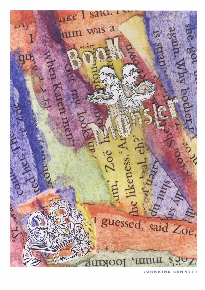
l o r r a i n e B e n n e T T
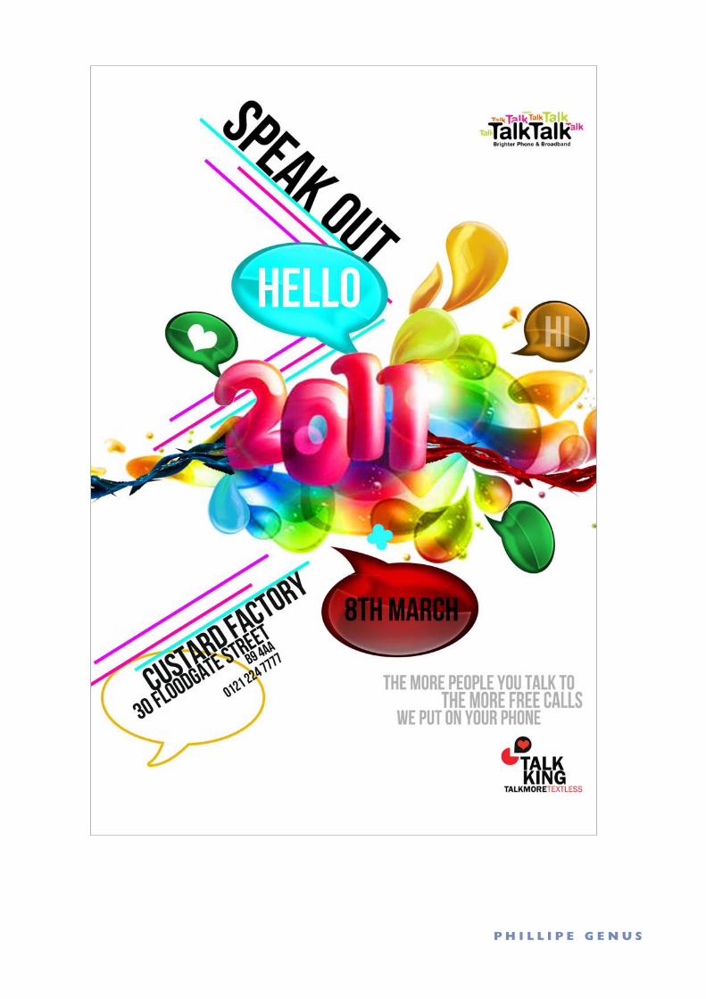
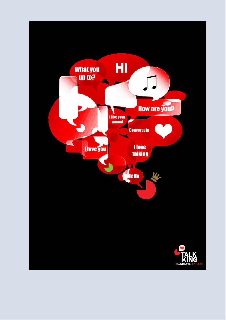
P h i l l i P e g e n U S
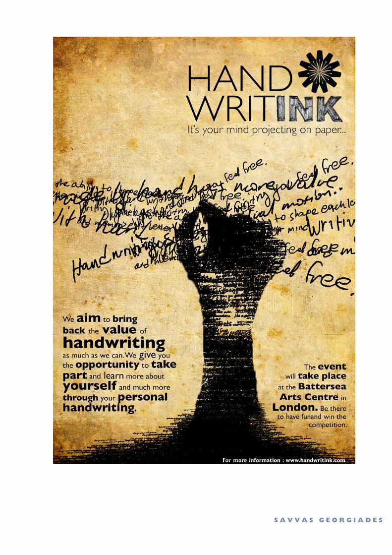
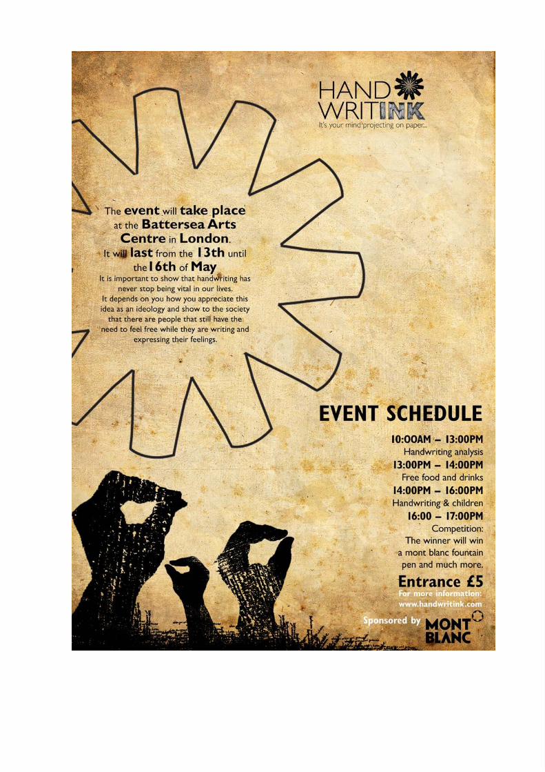
S a V V a S g e o r g i a d e S
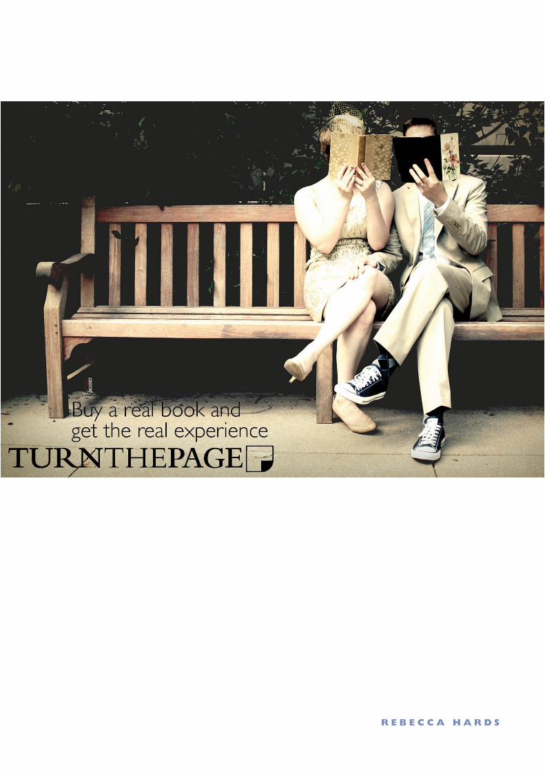
r e B e c c a h a r d S


![PAPER-01 LANGUAGE...Write an Essay on any one of the following topics in Hindi OR English Language — [ : 500 ] : 55 Folkculture of Uttarakhand (ii) Natural beauty of Devbhumi Uttarakhand](https://img.pdfslide.net/doc/110x75/60e4daf7261a2067203e6439/paper-01-language-write-an-essay-on-any-one-of-the-following-topics-in-hindi.jpg)