Embed Size (px)
Citation preview
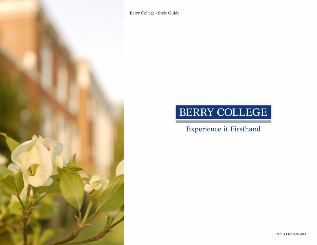
Berry College - Style Guide
#174/14-15: Sept. 2014
Table of Contents
Introduction 1
Primary Logos 2
Secondary Logos 3
One-Color Logos 4
Logo - Size Requirements 5
Tagline Location 6
Firsthand Mark 7
Color Use 8
Color Palette 9
Typography 10
Logo Extensions & Applications 11
Alumni Association Logo 12
Brand Extensions 13
Other College Symbols 14
Advertising: Double-Page Spread 15
Advertising: Single-Page 16
Letterhead 17
Envelope 18
Business Cards 19
Extended Usage 20
Please Do Not 21
Additional Resources 22
Berry College - Style Guide
Berry College - Style Guide
1 1
Introduction
The following style guide is a visual reference for the entire Berry College brand and identity system, including its respective schools and affiliate organizations.
For guidance, please reference this style guide, consult with the Creative Services office or visit www.berry.edu/pr to ensure that all communications are consistent with the messaging and printing standards for Berry College. If you have questions about the college’s visual guidelines, please contact:
Shannon BiggersDirector of Creative [email protected]

Berry College - Style Guide
2
Primary Logos
The primary logos are the horizontal and vertical versions of the blue box with a silver or gray line.
Using the logo with the tagline is preferred. Pantone Matching System (PMS) is used as the standard for identifying ink colors. The blue is PMS 281. PMS 877 metallic silver is preferred when metallic printing is an option. When metallic silver is not an option, please use gray (PMS 422) or 45% black.
“Berry College” will always appear in ALL CAPS and will be set in Concorde BQ, regular weight.
“Experience it Firsthand” will appear in upper and lower case and will be set in Concorde BQ, regular weight. “it” will always appear with a lower case “i”.
There is a white box that is behind the blue bar and the line. This allows the mark to stand out on a similar color or value, preventing the logo from being absorbed by its surroundings.
The primary color for the tagline is blue (PMS 281). The tagline can change between blue (PMS 281) and white, depending on the background color.
Berry College - Style Guide
3
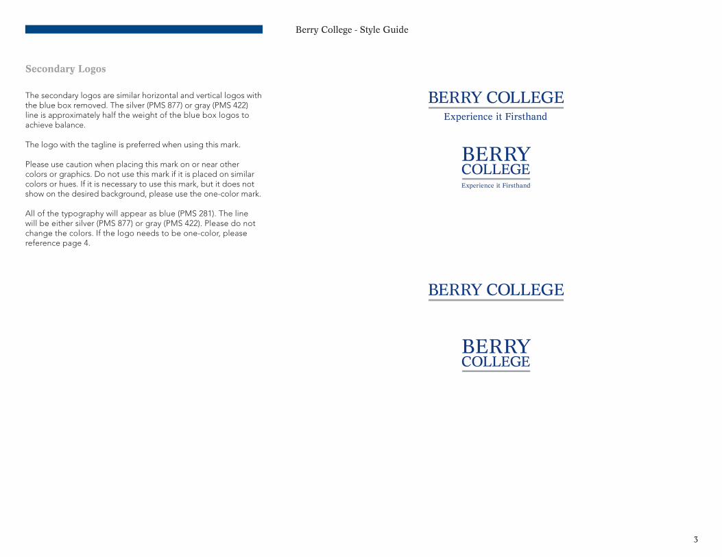
Secondary Logos
The secondary logos are similar horizontal and vertical logos with the blue box removed. The silver (PMS 877) or gray (PMS 422)line is approximately half the weight of the blue box logos to achieve balance.
The logo with the tagline is preferred when using this mark.
Please use caution when placing this mark on or near other colors or graphics. Do not use this mark if it is placed on similar colors or hues. If it is necessary to use this mark, but it does not show on the desired background, please use the one-color mark.
All of the typography will appear as blue (PMS 281). The line will be either silver (PMS 877) or gray (PMS 422). Please do not change the colors. If the logo needs to be one-color, please reference page 4.
Berry College - Style Guide
4
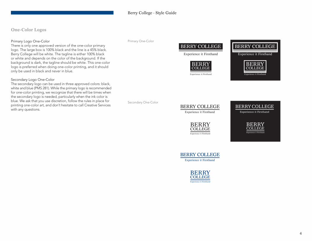
One-Color Logos
Primary Logo One-ColorThere is only one approved version of the one-color primary logo. The large box is 100% black and the line is a 45% black. Berry College will be white. The tagline is either 100% black or white and depends on the color of the background. If the background is dark, the tagline should be white. This one-color logo is preferred when doing one-color printing, and it should only be used in black and never in blue.
Secondary Logo One-ColorThe secondary logo can be used in three approved colors: black, white and blue (PMS 281). While the primary logo is recommended for one-color printing, we recognize that there will be times when the secondary logo is needed, particularly when the ink color is blue. We ask that you use discretion, follow the rules in place for printing one-color art, and don’t hesitate to call Creative Services with any questions.
Primary One-Color
Secondary One-Color
Berry College - Style Guide
5
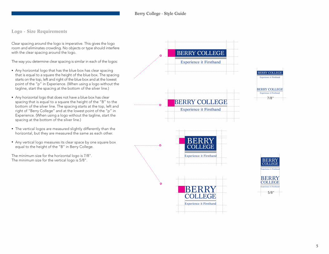
Logo - Size Requirements
Clear spacing around the logo is imperative. This gives the logo room and eliminates crowding. No objects or type should interfere with the clear spacing around the logo.
The way you determine clear spacing is similar in each of the logos:
Any horizontal logo that has the blue box has clear spacing that is equal to a square the height of the blue box. The spacing starts on the top, left and right of the blue box and at the lowest point of the “p” in Experience. (When using a logo without the tagline, start the spacing at the bottom of the silver line.)
Any horizontal logo that does not have a blue box has clear spacing that is equal to a square the height of the “B” to the bottom of the silver line. The spacing starts at the top, left and right of “Berry College” and at the lowest point of the “p” in Experience. (When using a logo without the tagline, start the spacing at the bottom of the silver line.)
The vertical logos are measured slightly differently than the horizontal, but they are measured the same as each other.
Any vertical logo measures its clear space by one square box equal to the height of the “B” in Berry College.
The minimum size for the horizontal logo is 7/8".The minimum size for the vertical logo is 5/8".
•
•
•
•
7/8"
5/8"
Berry College - Style Guide
6
Tagline Location
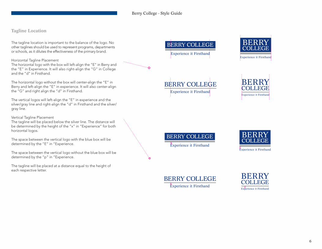
The tagline location is important to the balance of the logo. No other taglines should be used to represent programs, departments or schools, as it dilutes the effectiveness of the primary brand.
Horizontal Tagline PlacementThe horizontal logo with the box will left-align the “E” in Berry and the “E” in Experience. It will also right-align the “G” in College and the “d” in Firsthand.
The horizontal logo without the box will center-align the “E” in Berry and left-align the “E” in experience. It will also center-align the “G” and right align the “d” in Firsthand.
The vertical logos will left-align the “E” in experience and the silver/gray line and right-align the “d” in Firsthand and the silver/gray line.
Vertical Tagline PlacementThe tagline will be placed below the silver line. The distance will be determined by the height of the “x” in “Experience” for both horizontal logos.
The space between the vertical logo with the blue box will be determined by the “E” in “Experience.
The space between the vertical logo without the blue box will be determined by the “p” in “Experience.
The tagline will be placed at a distance equal to the height of each respective letter.
E
x
xp

Berry College - Style Guide
7
Firsthand Mark
The Firsthand mark is not to be deconstructed. The mark and text should continue to be a locked group and should not be used separately.
The mark should always be in 100% black, 45% black, 100% blue(PMS 281), 100% gray (PMS 422) or white.
The text should always be centered in the circle and should not touch any part of the circle. The mark and text will always be the same color.
The mark should be used judiciously. It should not be used on every piece of communication. The concept of the Firsthand experience should be realized in each use. For example, the mark is not needed on communication from the mail room but will be used heavily in advertising and marketing materials.
TM
TM
TM
TM

Berry College - Style Guide
8
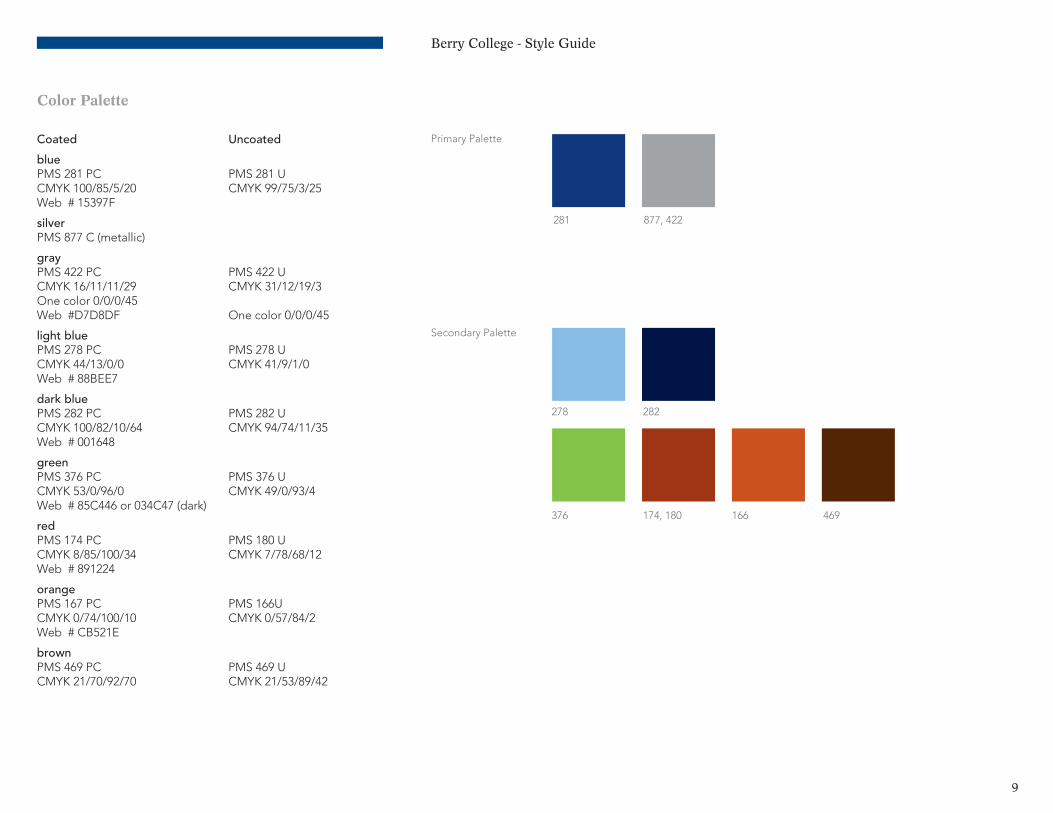
Color Use
Ink colors are specified according to the Pantone Matching System (PMS). The Pantone number, its process-color equivalent (CYMK) and the recommended screen colors (RGB) are indicated as a coated and uncoated color.
Due to the many variances in color printers and computer monitors, the colors shown on the next page will most likely display and print inaccurately. This document should not be used to match color on press. Please refer to a Pantone color selection book for correct rendition of color.
Primary PaletteThe official colors for Berry College are blue (PMS 281) and silver (PMS 877). Silver (PMS 877) may be replaced by gray (PMS 422) when it is not economical to print a metallic ink.
Secondary PaletteA secondary palette has been provided for the assistance of choosing colors while designing the many publications and other deliverables such as t-shirts, paper colors for fliers and other promotional or school related printed items. The palette is a triadic color scheme and has been chosen for its broad usability. These colors provide basic choices, and the use of these colors will encourage greater consistency.
The secondary palette is there to support the primary palette and should not be used to replace the blue or silver in the logo, letterhead or other primary use.
One-Color PrintingThere will be times when printing a single-color is necessary. Depending on the application, care should be used in choosing the ink color.
Rules:If there are any images in the single-color print job, black and white printing is the only acceptable process.
If printing one-color with no images, black or blue may be used as the primary color. Please reference the secondary palette on the next page for other colors.
Please reference one-color logo use on page 4 when dealing with logo colors.
Berry College - Style Guide
9
Color Palette
Coated Uncoated
bluePMS 281 PC PMS 281 UCMYK 100/85/5/20 CMYK 99/75/3/25Web # 15397F
silverPMS 877 C (metallic)
grayPMS 422 PC PMS 422 UCMYK 16/11/11/29 CMYK 31/12/19/3One color 0/0/0/45Web #D7D8DF One color 0/0/0/45
light bluePMS 278 PC PMS 278 UCMYK 44/13/0/0 CMYK 41/9/1/0Web # 88BEE7
dark bluePMS 282 PC PMS 282 UCMYK 100/82/10/64 CMYK 94/74/11/35Web # 001648
greenPMS 376 PC PMS 376 UCMYK 53/0/96/0 CMYK 49/0/93/4Web # 85C446 or 034C47 (dark)
redPMS 174 PC PMS 180 UCMYK 8/85/100/34 CMYK 7/78/68/12Web # 891224
orangePMS 167 PC PMS 166UCMYK 0/74/100/10 CMYK 0/57/84/2Web # CB521E
brownPMS 469 PC PMS 469 UCMYK 21/70/92/70 CMYK 21/53/89/42
Primary Palette
Secondary Palette
281 877, 422
278
376 166
282
174, 180 469
Berry College - Style Guide
10
Typography
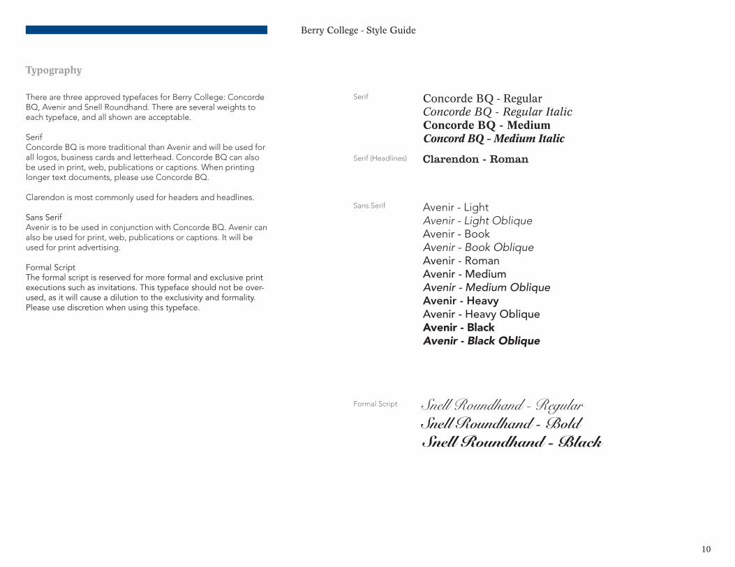
There are three approved typefaces for Berry College: Concorde BQ, Avenir and Snell Roundhand. There are several weights to each typeface, and all shown are acceptable.
SerifConcorde BQ is more traditional than Avenir and will be used for all logos, business cards and letterhead. Concorde BQ can also be used in print, web, publications or captions. When printing longer text documents, please use Concorde BQ.
Clarendon is most commonly used for headers and headlines.
Sans SerifAvenir is to be used in conjunction with Concorde BQ. Avenir can also be used for print, web, publications or captions. It will be used for print advertising.
Formal ScriptThe formal script is reserved for more formal and exclusive print executions such as invitations This typeface should not be over-used, as it will cause a dilution to the exclusivity and formality Please use discretion when using this typeface
Concorde BQ - RegularConcorde BQ - Regular ItalicConcorde BQ - MediumConcord BQ - Medium Italic
Clarendon - Roman
Avenir - LightAvenir - Light ObliqueAvenir - BookAvenir - Book ObliqueAvenir - RomanAvenir - MediumAvenir - Medium ObliqueAvenir - HeavyAvenir - Heavy ObliqueAvenir - Black Avenir - Black Oblique
Snell Roundhand - RegularSnell Roundhand - BoldSnell Roundhand - Black
Serif
Serif (Headlines)
Sans Serif
Formal Script
Berry College - Style Guide
11
Logo Extensions & Applications
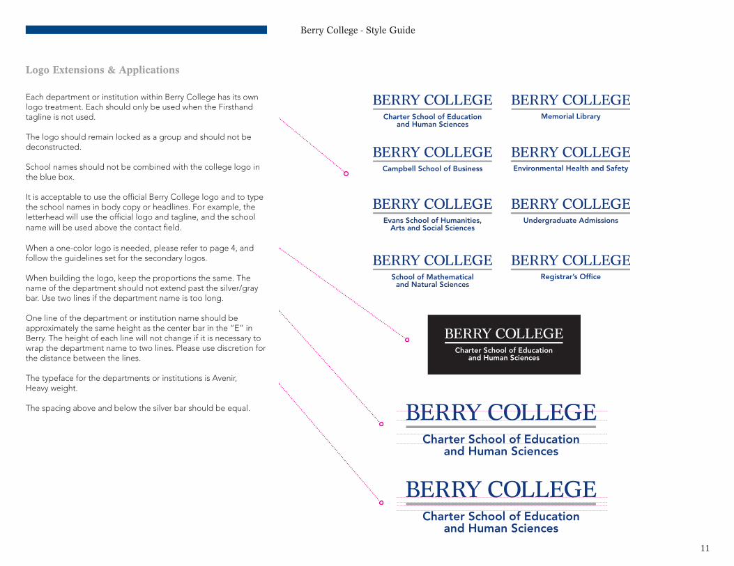
Each department or institution within Berry College has its own logo treatment. Each should only be used when the Firsthand tagline is not used.
The logo should remain locked as a group and should not be deconstructed.
School names should not be combined with the college logo in the blue box.
It is acceptable to use the official Berry College logo and to type the school names in body copy or headlines. For example, the letterhead will use the official logo and tagline, and the school name will be used above the contact field.
When a one-color logo is needed, please refer to page 4, and follow the guidelines set for the secondary logos.
When building the logo, keep the proportions the same. The name of the department should not extend past the silver/gray bar. Use two lines if the department name is too long.
One line of the department or institution name should be approximately the same height as the center bar in the “E” in Berry. The height of each line will not change if it is necessary to wrap the department name to two lines. Please use discretion for the distance between the lines.
The typeface for the departments or institutions is Avenir, Heavy weight.
The spacing above and below the silver bar should be equal.
Berry College - Style Guide
12
Alumni Association Logo
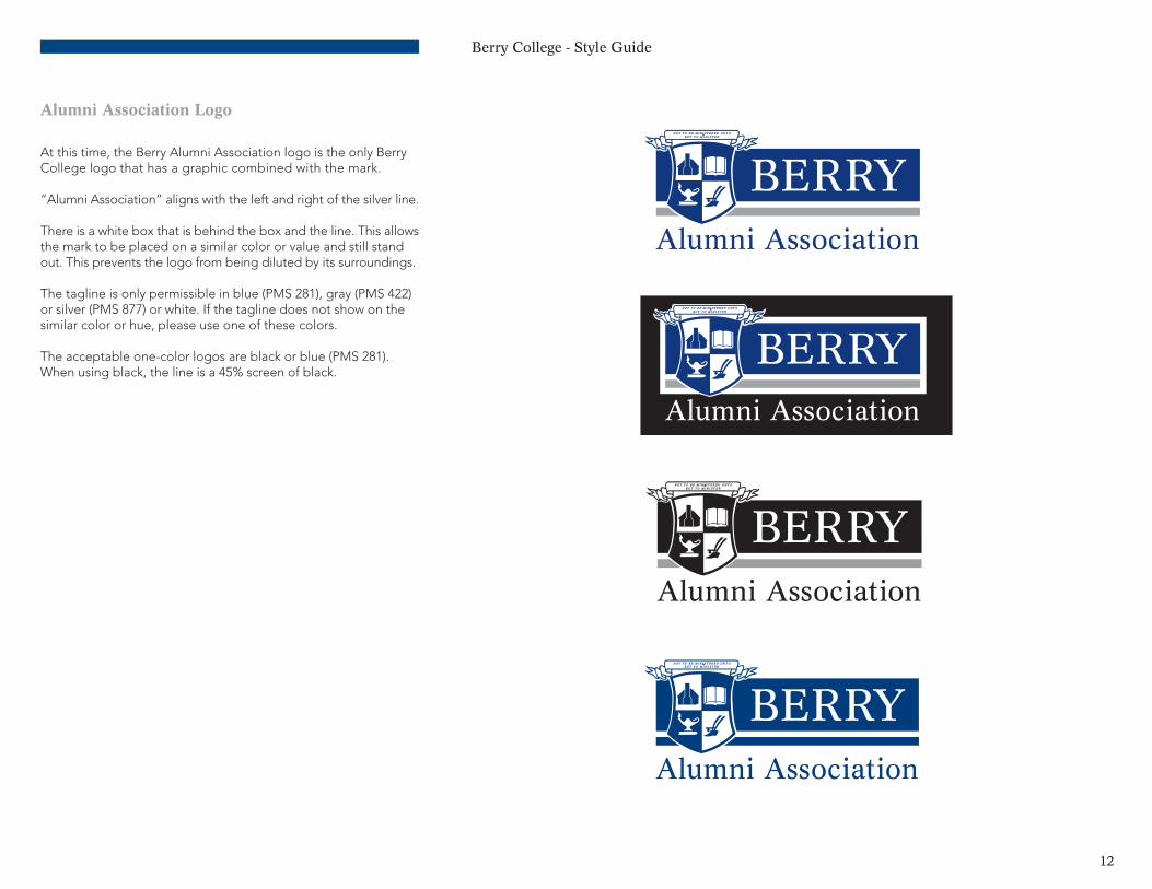
At this time, the Berry Alumni Association logo is the only Berry College logo that has a graphic combined with the mark.
“Alumni Association” aligns with the left and right of the silver line.
There is a white box that is behind the box and the line. This allows the mark to be placed on a similar color or value and still stand out. This prevents the logo from being diluted by its surroundings.
The tagline is only permissible in blue (PMS 281), gray (PMS 422) or silver (PMS 877) or white. If the tagline does not show on the similar color or hue, please use one of these colors.
The acceptable one-color logos are black or blue (PMS 281). When using black, the line is a 45% screen of black.
Berry College - Style Guide
13
Brand Extensions
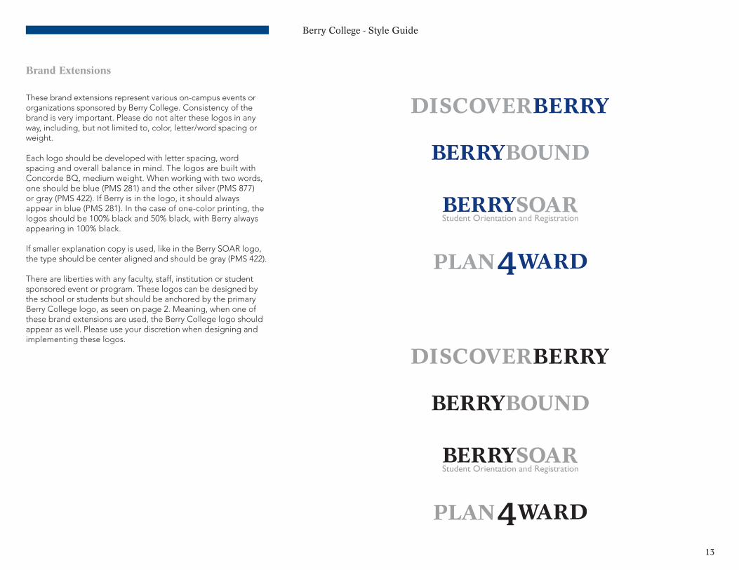
These brand extensions represent various on-campus events or organizations sponsored by Berry College. Consistency of the brand is very important. Please do not alter these logos in any way, including, but not limited to, color, letter/word spacing or weight.
Each logo should be developed with letter spacing, word spacing and overall balance in mind. The logos are built with Concorde BQ, medium weight. When working with two words, one should be blue (PMS 281) and the other silver (PMS 877) or gray (PMS 422). If Berry is in the logo, it should always appear in blue (PMS 281). In the case of one-color printing, the logos should be 100% black and 50% black, with Berry always appearing in 100% black.
If smaller explanation copy is used, like in the Berry SOAR logo, the type should be center aligned and should be gray (PMS 422).
There are liberties with any faculty, staff, institution or student sponsored event or program. These logos can be designed by the school or students but should be anchored by the primary Berry College logo, as seen on page 2. Meaning, when one of these brand extensions are used, the Berry College logo should appear as well. Please use your discretion when designing and implementing these logos.
Berry College - Style Guide
14
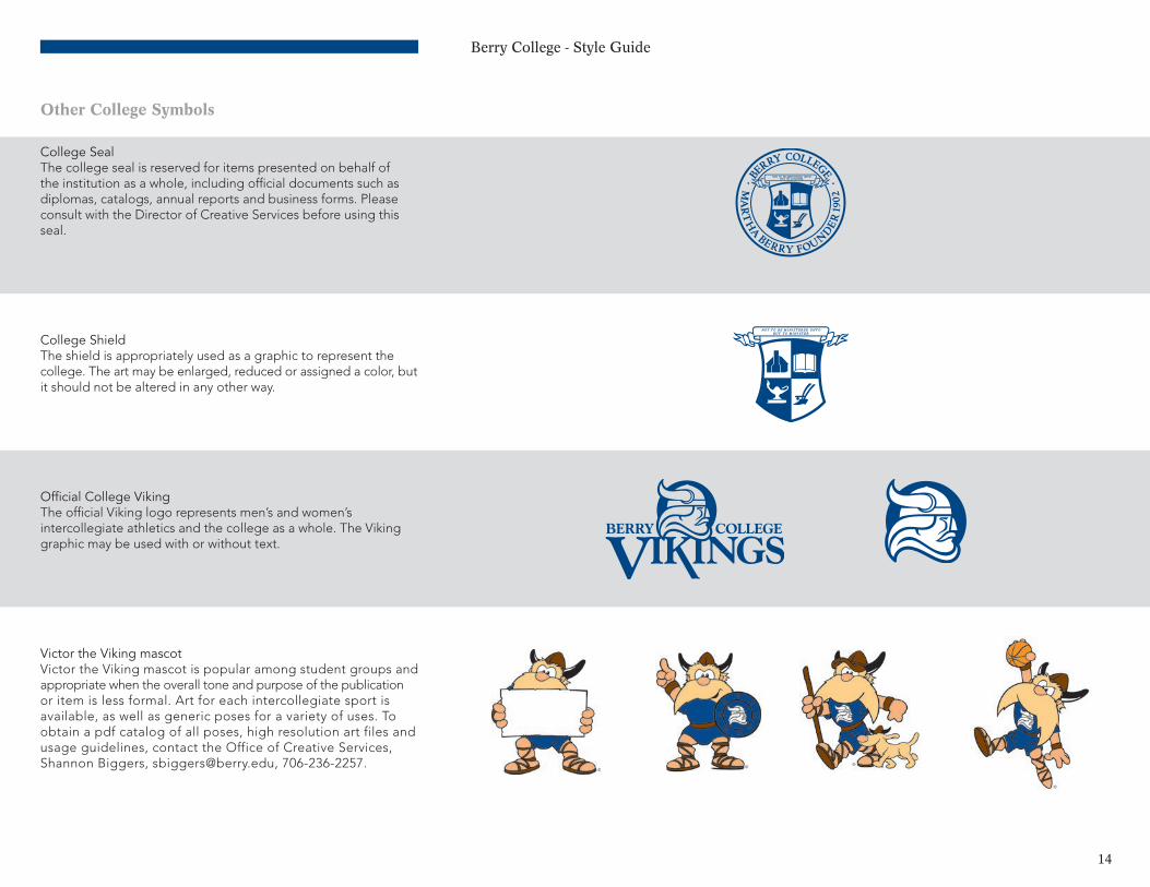
Other College Symbols
College SealThe college seal is reserved for items presented on behalf of the institution as a whole, including official documents such as diplomas, catalogs, annual reports and business forms. Please consult with the Director of Creative Services before using this seal.
College ShieldThe shield is appropriately used as a graphic to represent the college. The art may be enlarged, reduced or assigned a color, but it should not be altered in any other way.
Official College VikingThe official Viking logo represents men’s and women’s intercollegiate athletics and the college as a whole. The Viking graphic may be used with or without text.
Victor the Viking mascotVictor the Viking mascot is popular among student groups and appropriate when the overall tone and purpose of the publication or item is less formal. Art for each intercollegiate sport is available, as well as generic poses for a variety of uses. To obtain a pdf catalog of all poses, high resolution art files and usage guidelines, contact the Office of Creative Services, Shannon Biggers, [email protected], 706-236-2257.
N O T T O B E M I N I S T E R E D U N T OB U T T O M I N I S T E R
Berry College - Style Guide
15
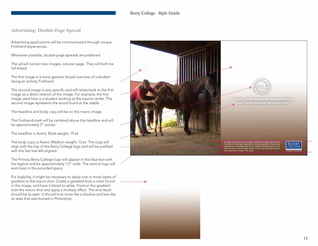
Advertising: Double-Page Spread
Advertising applications will be communicated through unique Firsthand experiences.
Whenever possible, double-page spreads are preferred.
The ad will contain two images, one per page. They will both be full-bleed.
The first image is a more general, broad overview of a student doing an activity Firsthand.
The second image is very specific and will relate back to the first image as a direct relation of the image. For example, the first image used here is a student working at the equine center. The second image represents the wood found at the stable.
The headline and body copy will be on the macro image.
The Firsthand mark will be centered above the headline and will be approximately 2" across.
The headline is Avenir, Black weight, 19 pt.
The body copy is Avenir, Medium weight, 12 pt. The copy will align with the top of the Berry College logo and will be justified with the last line left-aligned.
The Primary Berry College logo will appear in the blue box with the tagline and be approximately 1.5" wide. The vertical logo will work best in the provided space.
For legibility, it might be necessary to apply one or more layers of gradient to the macro shot. Create a gradient from a color found in the image, and have it bleed to white. Position the gradient over the macro shot and apply a multiply effect. The end result should be as seen. It should look more like a shadow and less like an area that was burned in Photoshop.
Through our hands-on work program Firsthand, students quickly learn the value of meaningful experiences. And by graduation, these same experiences are working hard for the students, opening doors to the jobs they want. Visit berry.edu today to learn more about the premier work experience college in the nation.
A lecture, three chapters on animal psychology and a career kicked in right about here.
100% 80% 60%
40% 20% 0%

Berry College - Style Guide
16
Advertising: Single-Page
There’s only one way to experienceall 26,000 acres.
100% 80% 60%
40% 20% 0%
Berry College students instantly learn the value of a complete education. The premier work experience program, first-rate academics and panoramic campus make it easy to roll up your sleeves and become a meaningful part of it all. To learn more, visit berry.edu today.
The single-page ad will contain two images. They will both be full bleed.
The Firsthand mark will be centered in the macro bar and will be approximately 2" across. The Firsthand mark and headline can move vertically for spacing and balance.
The headline is Avenir, Black weight, 19 pt. It should be center-aligned with the Firsthand mark and will be left-justified.
The body copy is Avenir, Medium weight, 11 pt. The copy should align with the top of the Berry College logo and will be justified with the last line left-aligned.
The Berry College logo will appear in blue box with the tagline and will be approximately 1.5" wide. The vertical logo will work best in the provided space.
The side bar with the macro shot should be approximately .25 of the width of the ad.
It might be necessary to apply one or more layers of gradient to the first shot. This will be used to help make the body copy legible.
Create a gradient from a color found in the image, and have it bleed to white. Position the gradient over the main shot, and ap-ply a multiply effect. The end result should be as seen. It should look more like a shadow and less like an area that was burned in Photoshop.
.25 .75
Berry College - Style Guide
17
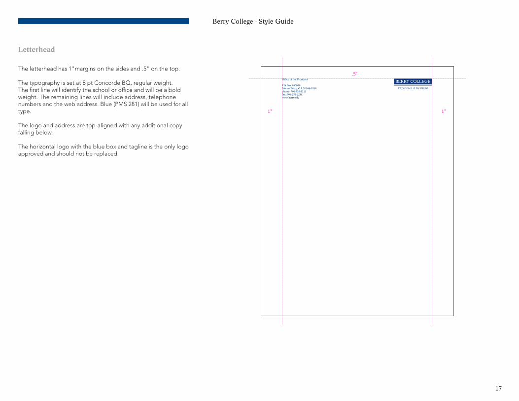
Letterhead
The letterhead has 1"margins on the sides and .5" on the top.
The typography is set at 8 pt Concorde BQ, regular weight. The first line will identify the school or office and will be a bold weight. The remaining lines will include address, telephone numbers and the web address. Blue (PMS 281) will be used for all type.
The logo and address are top-aligned with any additional copy falling below.
The horizontal logo with the blue box and tagline is the only logo approved and should not be replaced.
Office of the President
PO Box 490039Mount Berry, GA 30149-0039phone: 706-236-2211fax: 706-236-2238www.berry.edu
1"
.5"
1"
Berry College - Style Guide
18
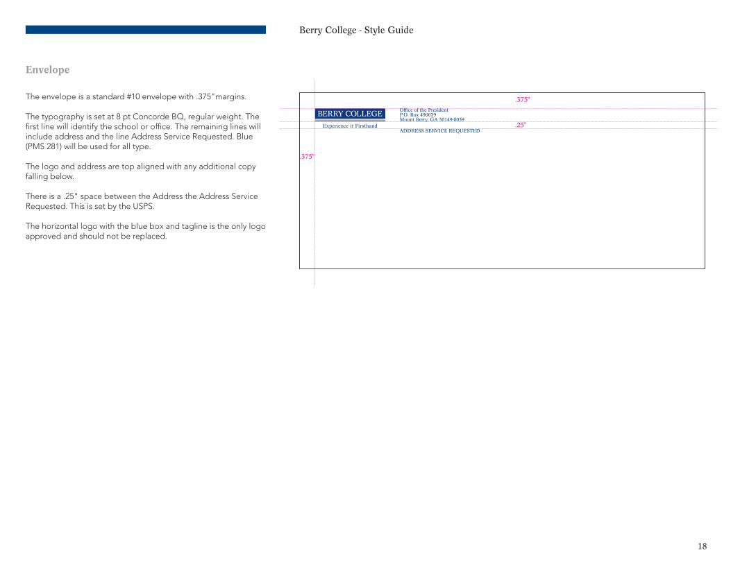
Envelope
The envelope is a standard #10 envelope with .375"margins.
The typography is set at 8 pt Concorde BQ, regular weight. The first line will identify the school or office. The remaining lines will include address and the line Address Service Requested. Blue (PMS 281) will be used for all type.
The logo and address are top aligned with any additional copy falling below.
There is a .25" space between the Address the Address Service Requested. This is set by the USPS.
The horizontal logo with the blue box and tagline is the only logo approved and should not be replaced.
.375"
.375"
.25"
Office of the PresidentP.O. Box 490039Mount Berry, GA 30149-0039
ADDRESS SERVICE REQUESTED
Berry College - Style Guide
19
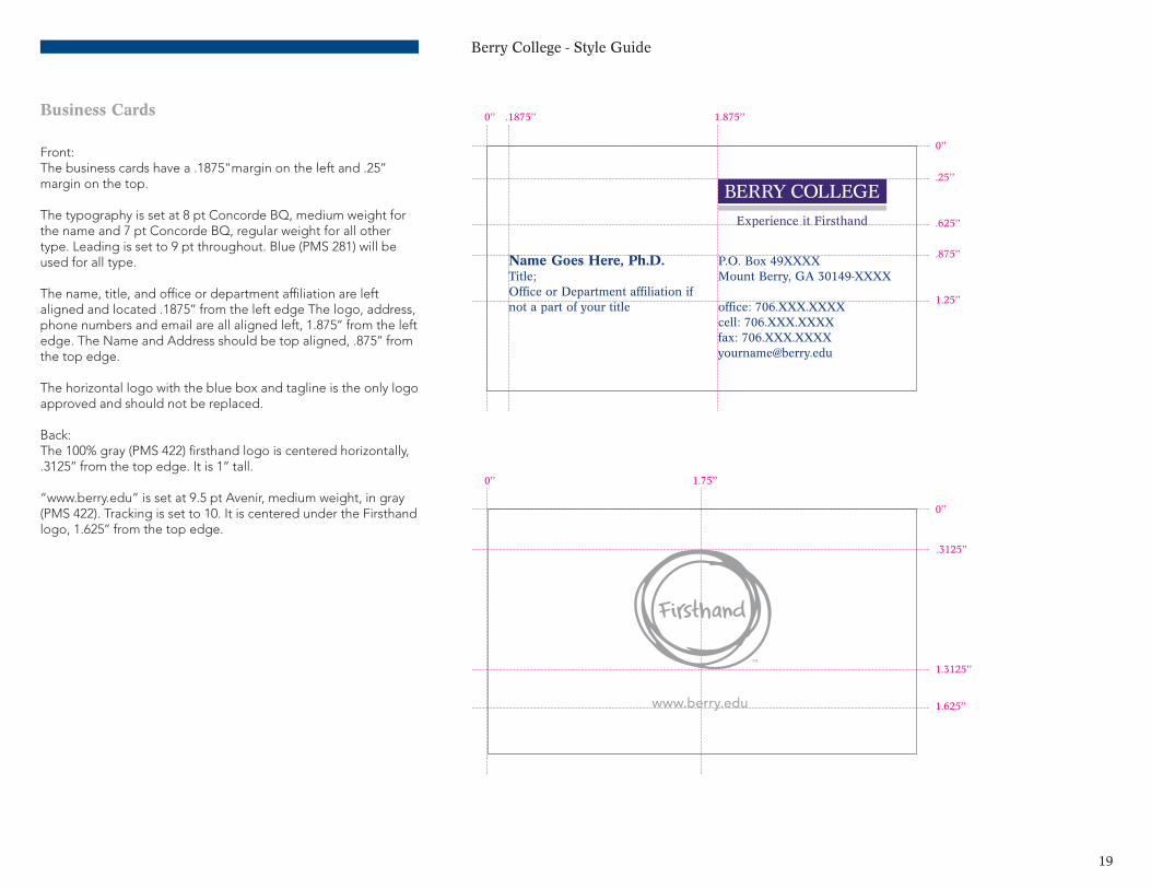
Business Cards
Front:The business cards have a .1875"margin on the left and .25’’ margin on the top.
The typography is set at 8 pt Concorde BQ, medium weight for the name and 7 pt Concorde BQ, regular weight for all other type. Leading is set to 9 pt throughout. Blue (PMS 281) will be used for all type.
The name, title, and office or department affiliation are left aligned and located .1875’’ from the left edge The logo, address, phone numbers and email are all aligned left, 1.875’’ from the left edge. The Name and Address should be top aligned, .875’’ from the top edge.
The horizontal logo with the blue box and tagline is the only logo approved and should not be replaced.
Back:The 100% gray (PMS 422) firsthand logo is centered horizontally, .3125’’ from the top edge. It is 1’’ tall.
“www.berry.edu” is set at 9.5 pt Avenir, medium weight, in gray (PMS 422). Tracking is set to 10. It is centered under the Firsthand logo, 1.625’’ from the top edge.
P.O. Box 49XXXXMount Berry, GA 30149-XXXX
office: 706.XXX.XXXXcell: 706.XXX.XXXXfax: [email protected]
Name Goes Here, Ph.D.Title;Office or Department affiliation ifnot a part of your title
.1875’’
.25’’
.625’’
.875’’
1.25’’
1.875’’
0’’
0’’
.3125’’
1.625’’
1.3125’’
1.75’’
0’’
0’’
TM
www.berry.edu
Berry College - Style Guide
20
Extended Usage
With so many possible secondary identity applications (merchandise, premiums, etc.), the approved extended usages are generalized and even loosened a little. If there is any question after reading the information below, feel free to ask Creative Services.
If possible, the logos should not change color from the recommended primary palette for either the primary or secondary logos as mandated on pages 2-4.
Please use discretion when placing a logo on a t-shirt or other products. For example, when printing on a t-shirt the logo should show up clearly with as much contrast as possible, e.g., a white logo on a black shirt or a blue logo on an ash gray shirt. While there is not always control with the colors of pre-made products, try to match or complement colors as closely as possible.
The secondary color palette is provided for guidance and suggestion, but does not necessarily need to be followed 100% when it comes to these applications. When it comes to these applications there will be instances for a more playful or simple font, colored fabrics or colored paper, and it will not match the primary or secondary palette. In these instances, please be mindful of the brand and try to adhere to the logo color rules. Our goal is to create brand consistency, so please use discretion and look to Creative Services with questions.
Berry College - Style Guide
21
Please Do Not
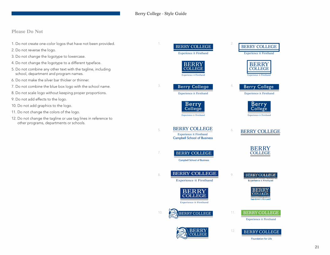
1. Do not create one-color logos that have not been provided.
2. Do not reverse the logo.
3. Do not change the logotype to lowercase.
4. Do not change the logotype to a different typeface.
5. Do not combine any other text with the tagline, including school, department and program names.
6. Do not make the silver bar thicker or thinner.
7. Do not combine the blue box logo with the school name.
8. Do not scale logo without keeping proper proportions.
9. Do not add effects to the logo.
10. Do not add graphics to the logo.
11. Do not change the colors of the logo.
12. Do not change the tagline or use tag lines in reference to other programs, departments or schools.
Berry College
BerryCollege
Berry College
BerryCollege
Foundation for Life
Berry College
BerryCollege
Berry College
BerryCollege
Foundation for Life
Berry College
BerryCollege
Berry College
BerryCollege
Foundation for Life
Berry College
BerryCollege
Berry College
BerryCollege
Foundation for Life
Berry College
BerryCollege
Berry College
BerryCollege
Foundation for Life
Berry College
BerryCollege
Berry College
BerryCollege
Foundation for Life
Berry College
BerryCollege
Berry College
BerryCollege
Foundation for Life
Berry College
BerryCollege
Berry College
BerryCollege
Foundation for Life
Berry College
BerryCollege
Berry College
BerryCollege
Foundation for Life
Berry College
BerryCollege
Berry College
BerryCollege
Foundation for Life
Berry College
BerryCollege
Berry College
BerryCollege
Foundation for Life
1.
3.
5.
7.
8.
10.
2.
4.
6.
9.
11.
12.
Berry College
BerryCollege
Berry College
BerryCollege
Foundation for Life
Berry College - Style Guide
22
Additional Resources
To initiate a project that requires design services:Berry College Office of Creative Services Hermann Hall 325 Director: Shannon Biggers [email protected], 706-236-2257Designer: Kathy Clements [email protected], 706-368-6763Designer: Meaghan Marr [email protected], 706-290-2657
Online resources:http://www.berry.edu/pr •IdentityStandardsStyleGuide(thisdocument) •EditorialStyleGuide •YourGuidetoPrinting(athoroughhow-toguideto
printing and graphic design services at Berry) •DownloadableBerrylogos
http://photos.berry.edu •Onlinephotodatabase