Embed Size (px)
Citation preview

Best practice in design on NREN websites
A heuristic evaluation made for TERENA TF-PRFebruary 2004
By Julia Gardner & Gitte Kudsk, UNI•C

2
Best practice – for whom?
What the sales department thinks is Best Practice
What the customer needs
Suggestion from the design department
Demand from the economics department
Result from the production department

3
Purpose of the evaluation
As a delivery for the TERENA Task Force inPublic Relations the purpose of the survey ofNREN websites is to find Best Practice on howto set up and maintain an NREN website.
The leaders of the deliverable will look at thecurrent websites of the NRENs and make anassessment, for a report to be given at the next meeting in February, and will also prepare a report/presentation at this time.

4
Ways to make an evaluation of a website
Qualitative user evaluations• Usability test• Field study• Workshops
Quantitative user evaluations• Questionnaires
Expert evaluation based on a list of established usabilityprinciples

5
A heuristic evaluation
A usability inspection where usability specialists examine the user
interface and judge whether each element complies with a list of
established usability principles (the “heuristics”).

6
Usability = User friendliness + Usefulness
(relevance)•Accessibility
– Is it possible for people with any kind of disability to use the website
•Navigation– Is it possible for any user to find the information he is looking for
•Content– Is it possible for the user to understand and use the information on the website. Is the information on the website relevant for the user.
8
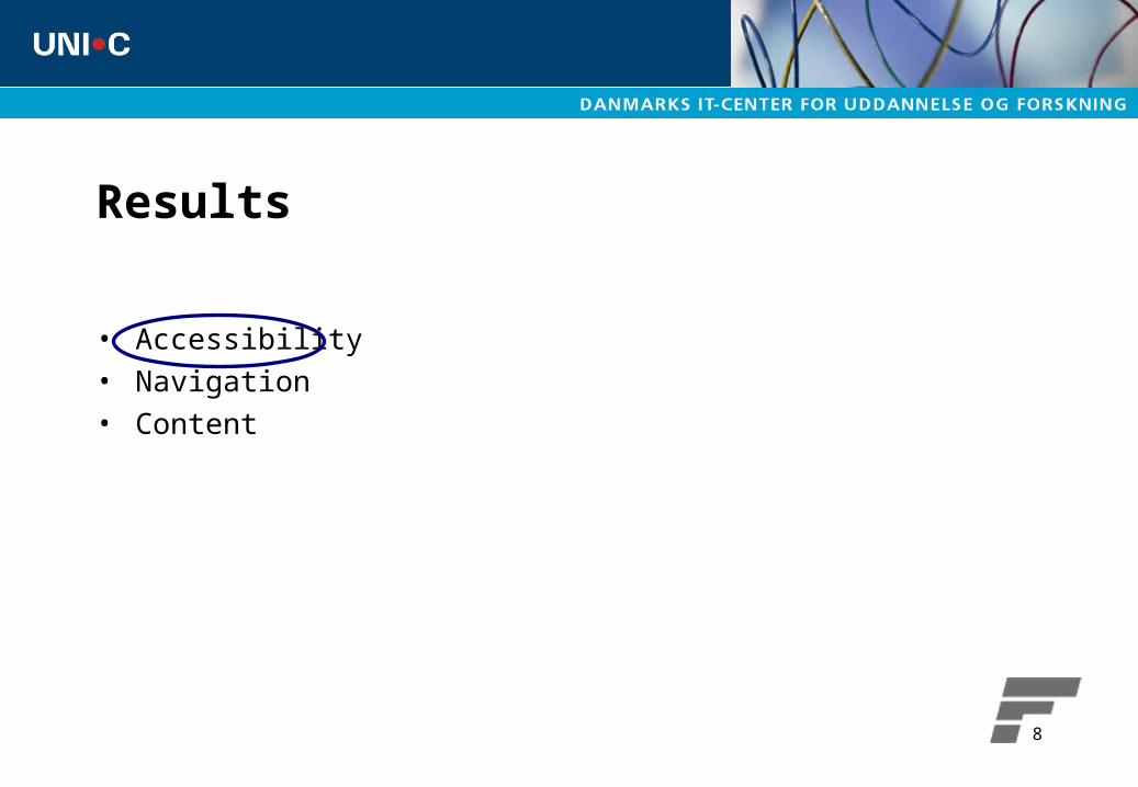
Results
• Accessibility• Navigation• Content

9
Every frame and page should have an unique title, so that identification and navigation is easier

10

11
Every non-text element should have a text equivalent
12
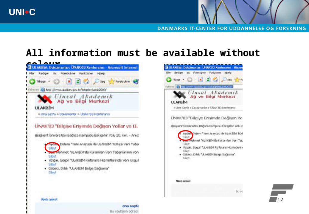
All information must be available without colour
13
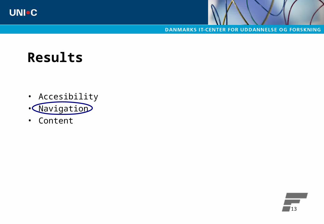
Results
• Accesibility• Navigation• Content

14
•All pages must include a clearly visible link to the homepage
•Site logos should link to the homepage

15
Provide access to the main menu from all parts of the site

16
Use the menu to clearly indicate where a certain page belongs
17
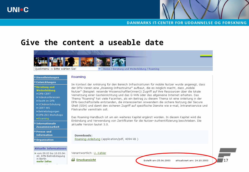
Give the content a useable date
18
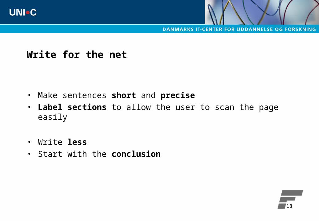
Write for the net
• Make sentences short and precise• Label sections to allow the user to scan the page easily
• Write less• Start with the conclusion

19
Do not write text in a different colour unless it is a link

20
Do not use animation to attract attention
21
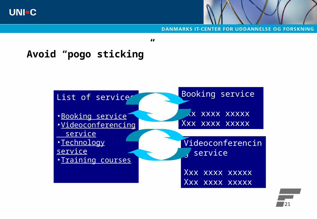
Avoid “pogo sticking”
List of services
•Booking service•Videoconferencing service•Technology service•Training courses
Booking service
Xxx xxxx xxxxxXxx xxxx xxxxx
Videoconferencing service
Xxx xxxx xxxxxXxx xxxx xxxxx
22
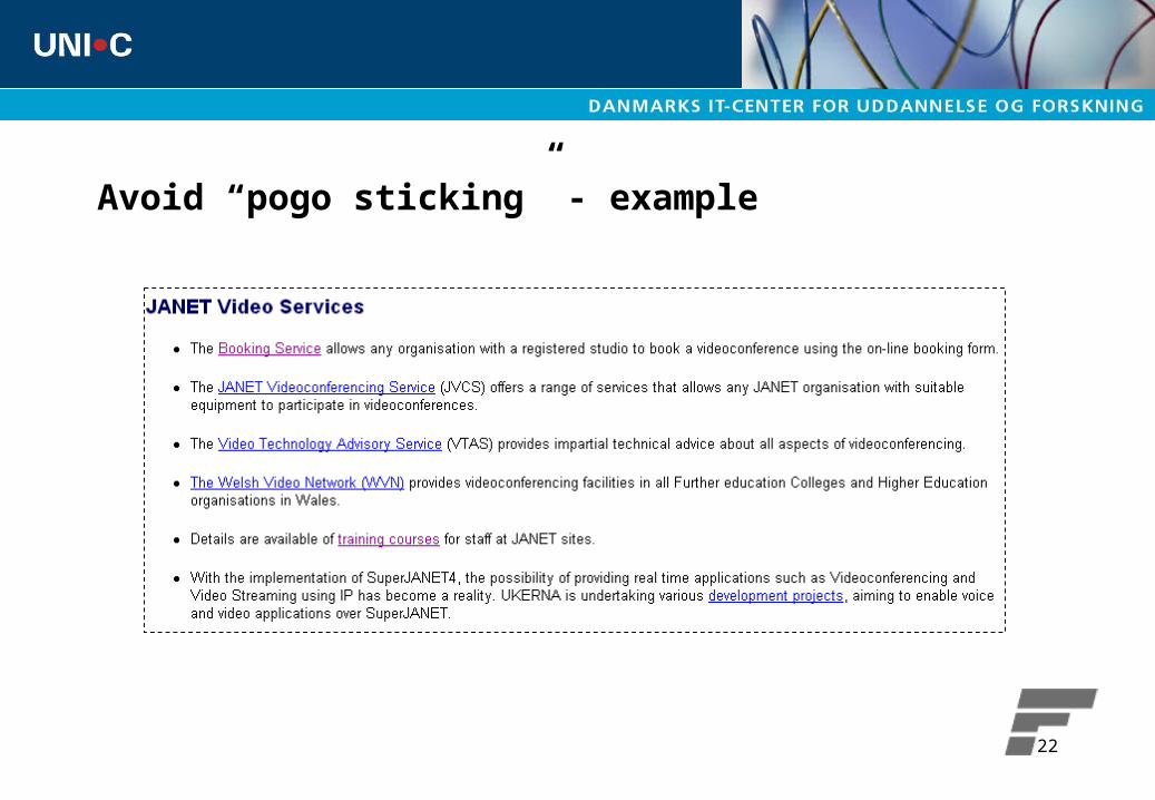
Avoid “pogo sticking” - example
23
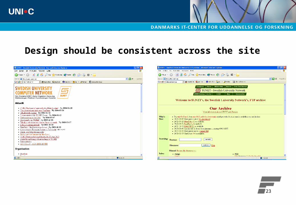
Design should be consistent across the site
24
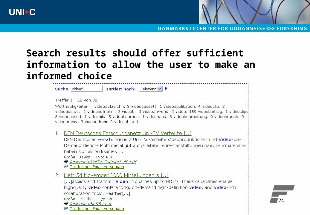
Search results should offer sufficient information to allow the user to make an informed choice

25
Results
• Accesibility• Navigation• Content
”Conte
nt is k
ing”

26
Make it clear to the user what is the purpose of your site- 1

27
Make it clear to the user what is the purpose of your site- 2

28
Offer direct access from the homepage to topics of special interest

29
Inform about problems from the homepage

30
A site map on the homepage is a concise introduction to your site
31
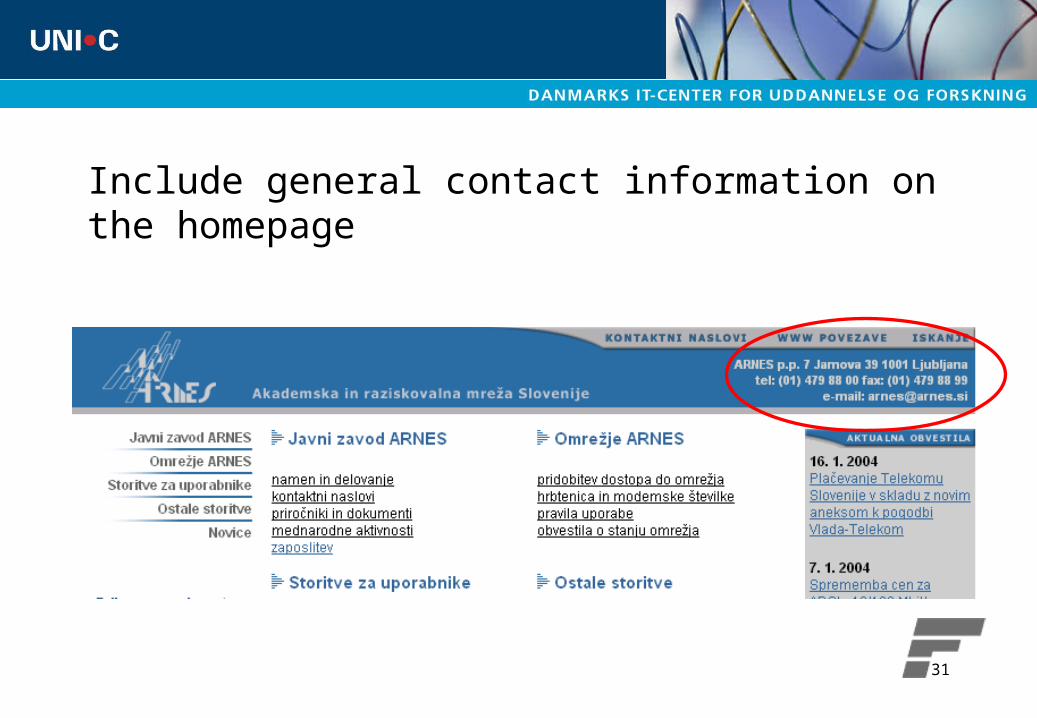
Include general contact information on the homepage

32
Avoid organizing the material on the web according to your own organisation

33
Use cross-linking

34
Clickable organisational charts

35
Customer support – helpdesk

36
News

37
Questions
? ?
?
?
??
?
?
38
Suggestion
• Read the rapport• Have a look at your own website• Can you do anything better?• Feel free to ask – [email protected]