Embed Size (px)
Citation preview
1HubSpot + Venngage • Brand Syle Guide Kit
AaBbCcDdEeFfGg1234567890
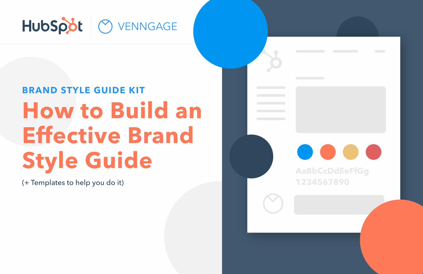
BRAND STYLE GUIDE KIT
How to Build an Effective Brand Style Guide (+ Templates to help you do it)
2HubSpot + Venngage • Brand Syle Guide Kit
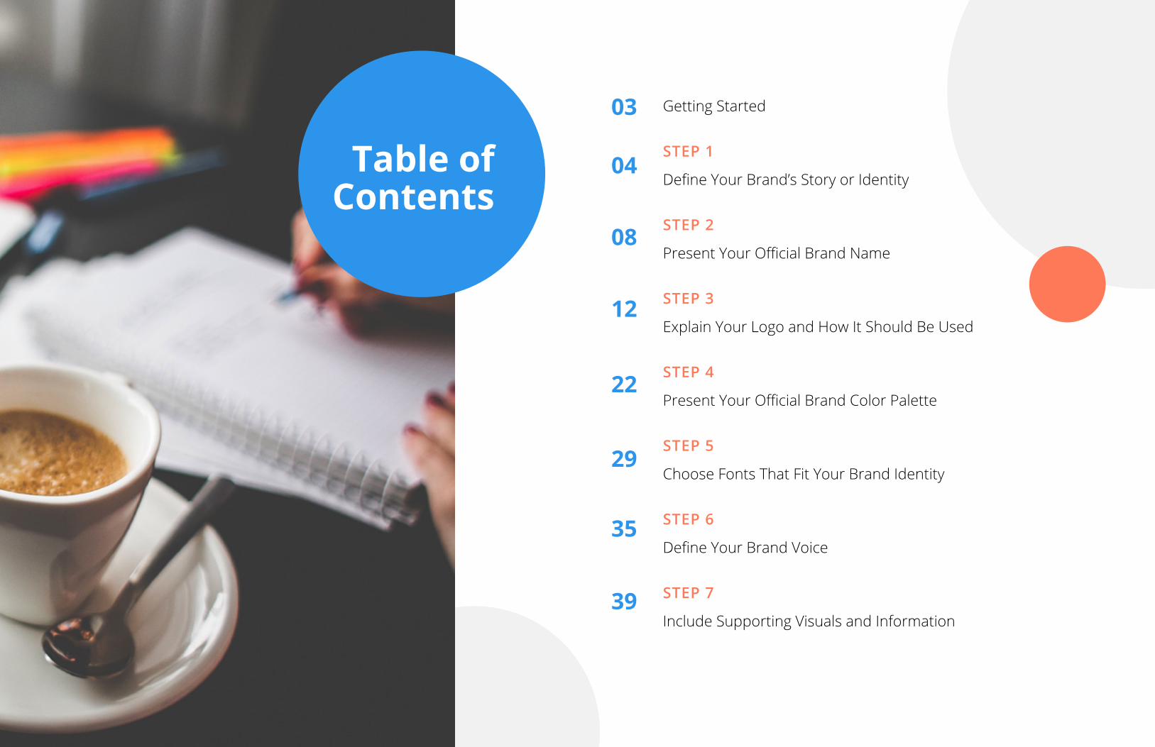
Getting Started
STEP 1
Define Your Brand’s Story or Identity
STEP 2
Present Your Official Brand Name
STEP 3
Explain Your Logo and How It Should Be Used
STEP 4
Present Your Official Brand Color Palette
STEP 5
Choose Fonts That Fit Your Brand Identity
STEP 6
Define Your Brand Voice
STEP 7
Include Supporting Visuals and Information
Table of Contents
03
04
08
12
22
29
35
39
3HubSpot + Venngage • Brand Syle Guide Kit
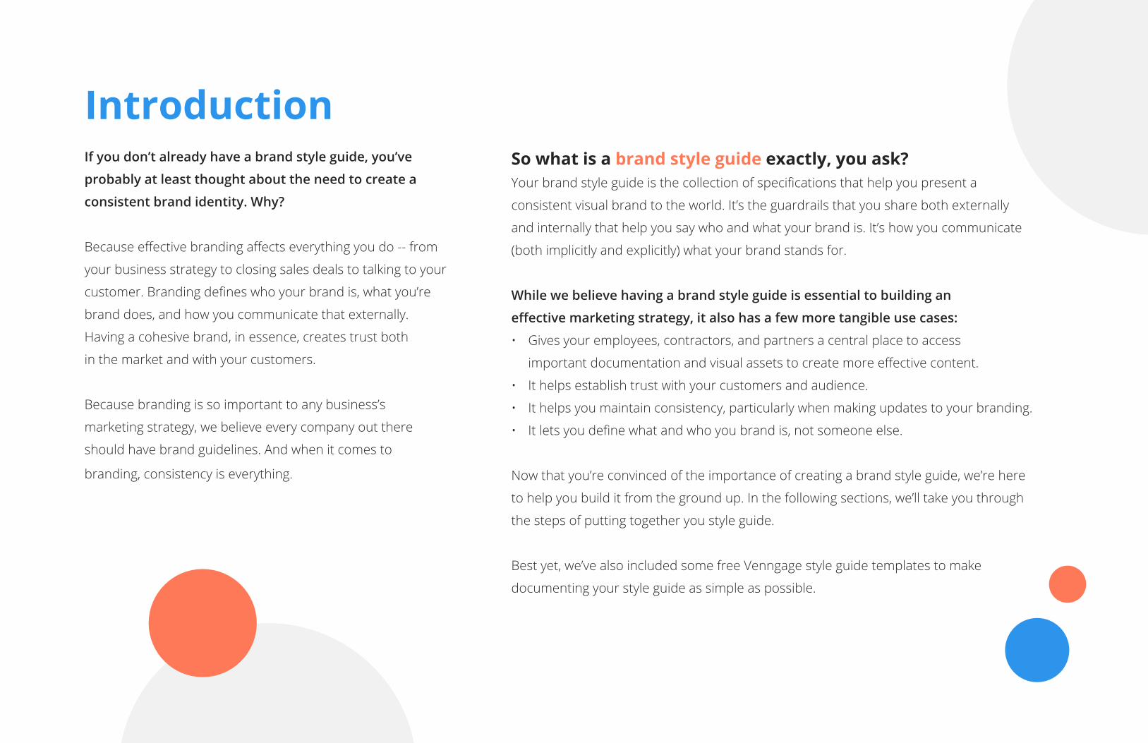
So what is a brand style guide exactly, you ask? Your brand style guide is the collection of specifications that help you present a
consistent visual brand to the world. It’s the guardrails that you share both externally
and internally that help you say who and what your brand is. It’s how you communicate
(both implicitly and explicitly) what your brand stands for.
While we believe having a brand style guide is essential to building an
effective marketing strategy, it also has a few more tangible use cases:
• Gives your employees, contractors, and partners a central place to access
important documentation and visual assets to create more effective content.
• It helps establish trust with your customers and audience.
• It helps you maintain consistency, particularly when making updates to your branding.
• It lets you define what and who you brand is, not someone else.
Now that you’re convinced of the importance of creating a brand style guide, we’re here
to help you build it from the ground up. In the following sections, we’ll take you through
the steps of putting together you style guide.
Best yet, we’ve also included some free Venngage style guide templates to make
documenting your style guide as simple as possible.
Introduction If you don’t already have a brand style guide, you’ve
probably at least thought about the need to create a
consistent brand identity. Why?
Because effective branding affects everything you do -- from
your business strategy to closing sales deals to talking to your
customer. Branding defines who your brand is, what you’re
brand does, and how you communicate that externally.
Having a cohesive brand, in essence, creates trust both
in the market and with your customers.
Because branding is so important to any business’s
marketing strategy, we believe every company out there
should have brand guidelines. And when it comes to
branding, consistency is everything.
4HubSpot + Venngage • Brand Syle Guide Kit
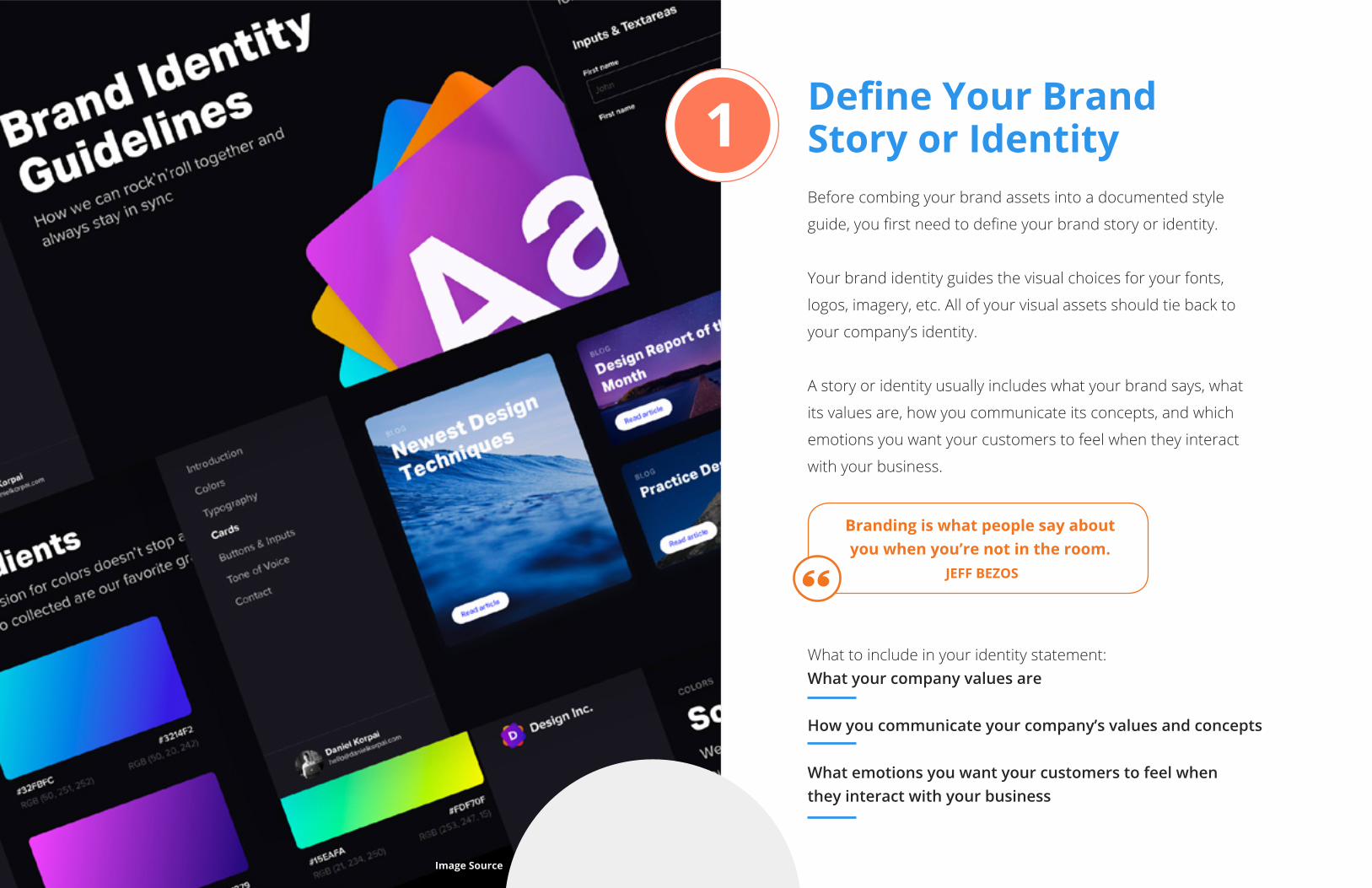
Define Your Brand Story or IdentityBefore combing your brand assets into a documented style
guide, you first need to define your brand story or identity.
Your brand identity guides the visual choices for your fonts,
logos, imagery, etc. All of your visual assets should tie back to
your company’s identity.
A story or identity usually includes what your brand says, what
its values are, how you communicate its concepts, and which
emotions you want your customers to feel when they interact
with your business.
What to include in your identity statement: What your company values are
How you communicate your company’s values and concepts
What emotions you want your customers to feel when they interact with your business
Branding is what people say about you when you’re not in the room.
JEFF BEZOS
1
Image Source
5HubSpot + Venngage • Brand Syle Guide Kit
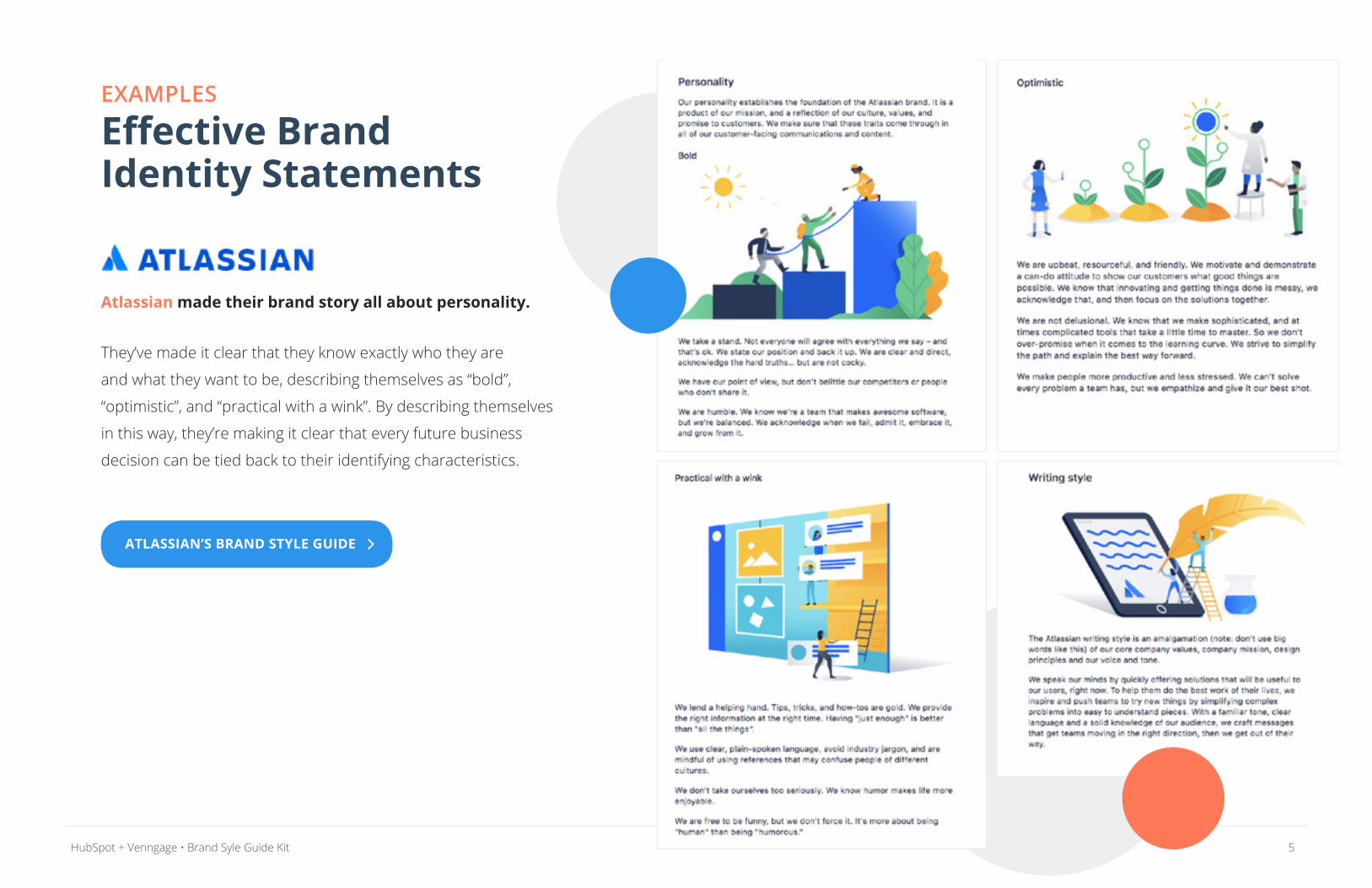
EXAMPLES Effective Brand Identity Statements
Atlassian made their brand story all about personality.
They’ve made it clear that they know exactly who they are
and what they want to be, describing themselves as “bold”,
“optimistic”, and “practical with a wink”. By describing themselves
in this way, they’re making it clear that every future business
decision can be tied back to their identifying characteristics.
ATLASSIAN’S BRAND STYLE GUIDE
6HubSpot + Venngage • Brand Syle Guide Kit
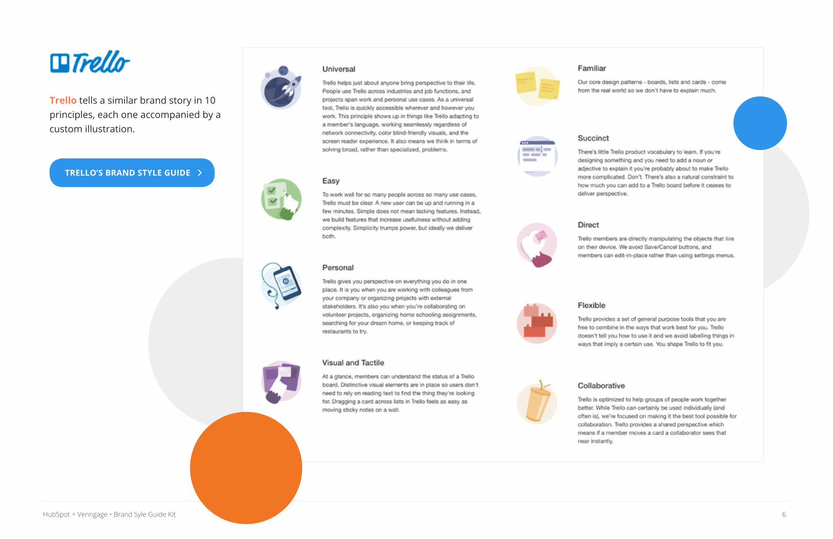
Trello tells a similar brand story in 10 principles, each one accompanied by a custom illustration.
TRELLO’S BRAND STYLE GUIDE
7HubSpot + Venngage • Brand Syle Guide Kit
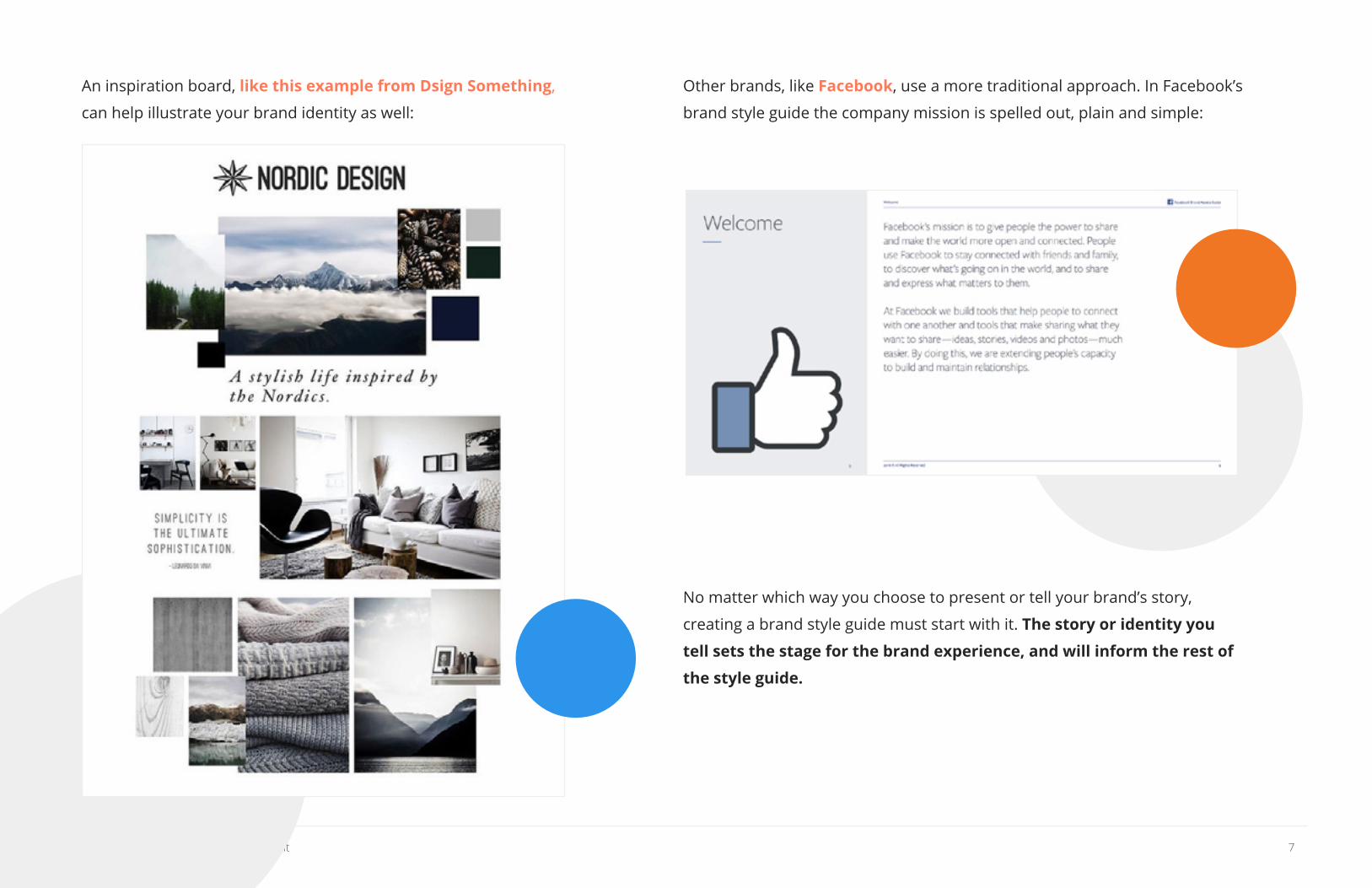
An inspiration board, like this example from Dsign Something,
can help illustrate your brand identity as well:
Other brands, like Facebook, use a more traditional approach. In Facebook’s
brand style guide the company mission is spelled out, plain and simple:
No matter which way you choose to present or tell your brand’s story,
creating a brand style guide must start with it. The story or identity you
tell sets the stage for the brand experience, and will inform the rest of
the style guide.
8HubSpot + Venngage • Brand Syle Guide Kit
Present Your Official Brand NameAfter explaining your brand identity and story, it’s time to talk
about your brand or company name. In this section you can
explain how you came up with the word or name that represents
your company. Or, you could talk strictly about how your brand’s
name should be presented in different contexts.
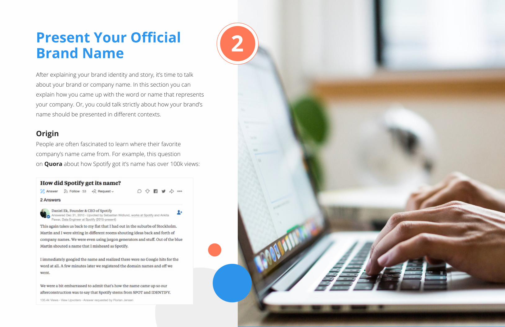
OriginPeople are often fascinated to learn where their favorite
company’s name came from. For example, this question
on Quora about how Spotify got it’s name has over 100k views:
2
9HubSpot + Venngage • Brand Syle Guide Kit
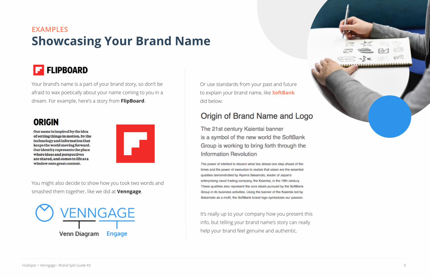
EXAMPLES Showcasing Your Brand Name
Your brand’s name is a part of your brand story, so don’t be
afraid to wax poetically about your name coming to you in a
dream. For example, here’s a story from FlipBoard.
You might also decide to show how you took two words and
smashed them together, like we did at Venngage.
Or use standards from your past and future
to explain your brand name, like SoftBank
did below:
It’s really up to your company how you present this
info, but telling your brand name’s story can really
help your brand feel genuine and authentic.
10HubSpot + Venngage • Brand Syle Guide Kit
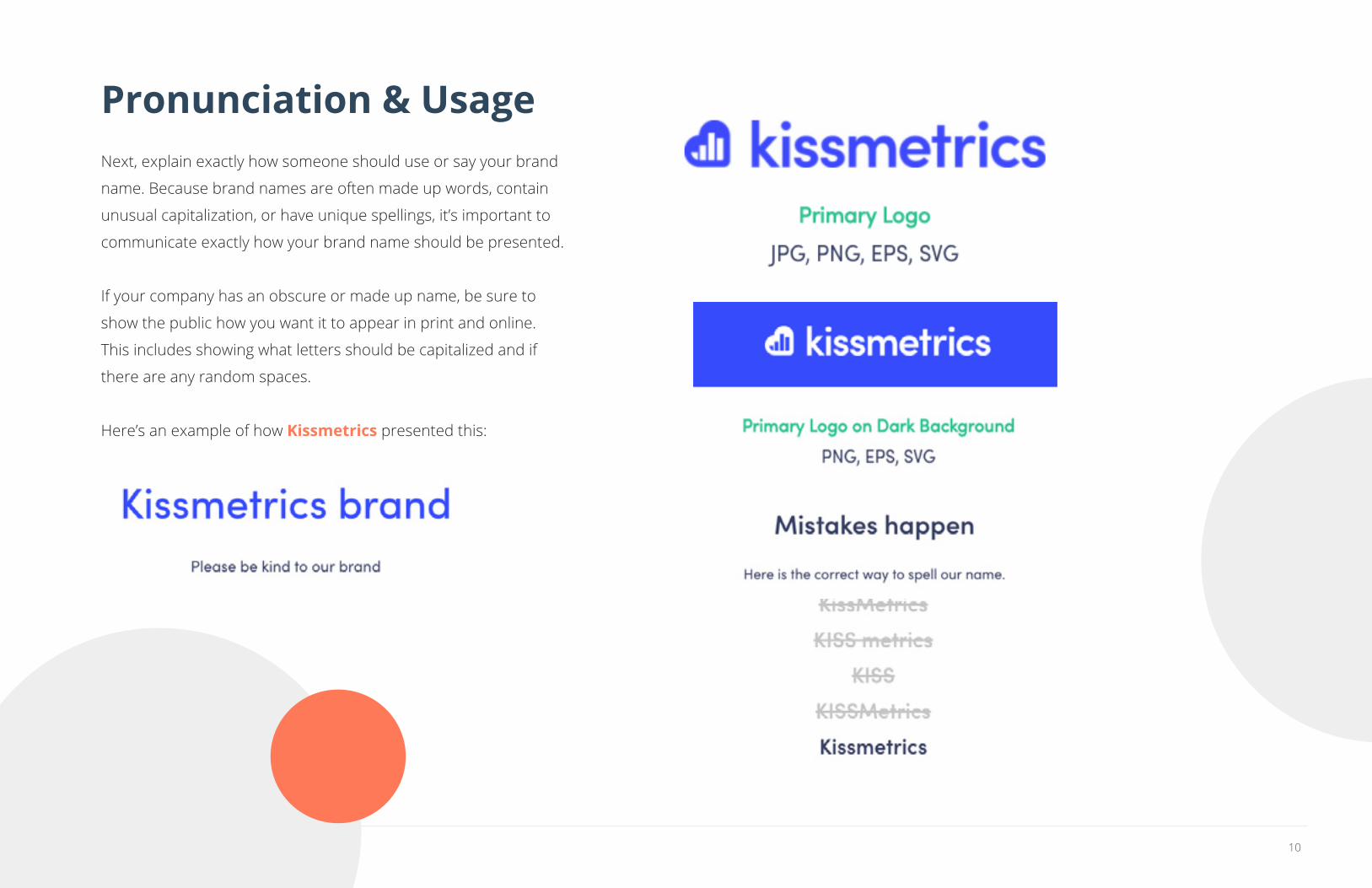
Pronunciation & Usage Next, explain exactly how someone should use or say your brand
name. Because brand names are often made up words, contain
unusual capitalization, or have unique spellings, it’s important to
communicate exactly how your brand name should be presented.
If your company has an obscure or made up name, be sure to
show the public how you want it to appear in print and online.
This includes showing what letters should be capitalized and if
there are any random spaces.
Here’s an example of how Kissmetrics presented this:
11HubSpot + Venngage • Brand Syle Guide Kit
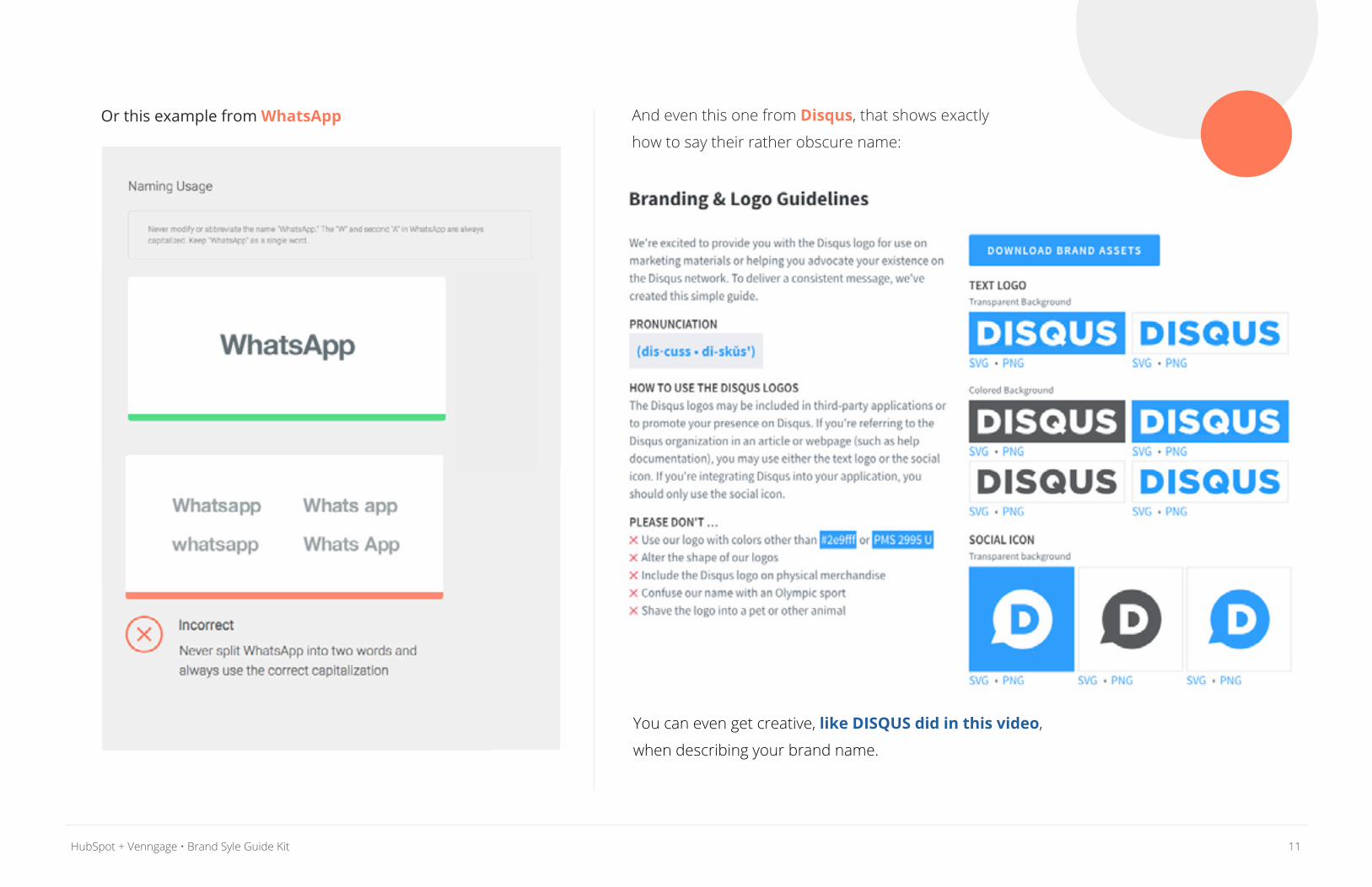
Or this example from WhatsApp And even this one from Disqus, that shows exactly
how to say their rather obscure name:
You can even get creative, like DISQUS did in this video,
when describing your brand name.
12HubSpot + Venngage • Brand Syle Guide Kit
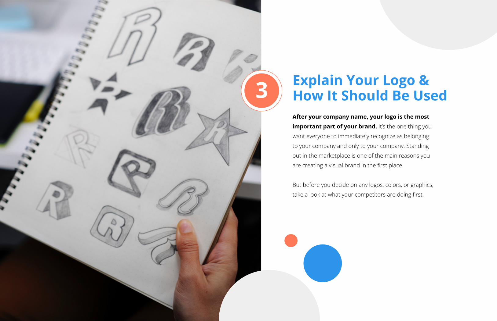
Explain Your Logo & How It Should Be UsedAfter your company name, your logo is the most
important part of your brand. It’s the one thing you
want everyone to immediately recognize as belonging
to your company and only to your company. Standing
out in the marketplace is one of the main reasons you
are creating a visual brand in the first place.
But before you decide on any logos, colors, or graphics,
take a look at what your competitors are doing first.
3
13HubSpot + Venngage • Brand Syle Guide Kit
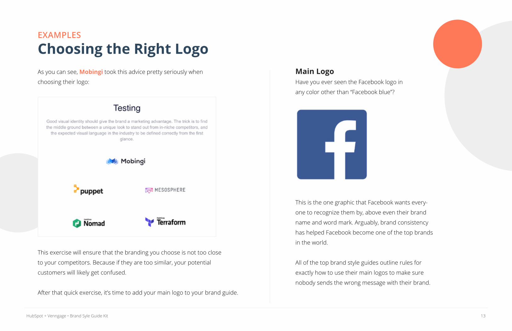
EXAMPLES Choosing the Right LogoAs you can see, Mobingi took this advice pretty seriously when
choosing their logo:
This exercise will ensure that the branding you choose is not too close
to your competitors. Because if they are too similar, your potential
customers will likely get confused.
After that quick exercise, it’s time to add your main logo to your brand guide.
Main LogoHave you ever seen the Facebook logo in
any color other than “Facebook blue”?
This is the one graphic that Facebook wants every-
one to recognize them by, above even their brand
name and word mark. Arguably, brand consistency
has helped Facebook become one of the top brands
in the world.
All of the top brand style guides outline rules for
exactly how to use their main logos to make sure
nobody sends the wrong message with their brand.
14HubSpot + Venngage • Brand Syle Guide Kit
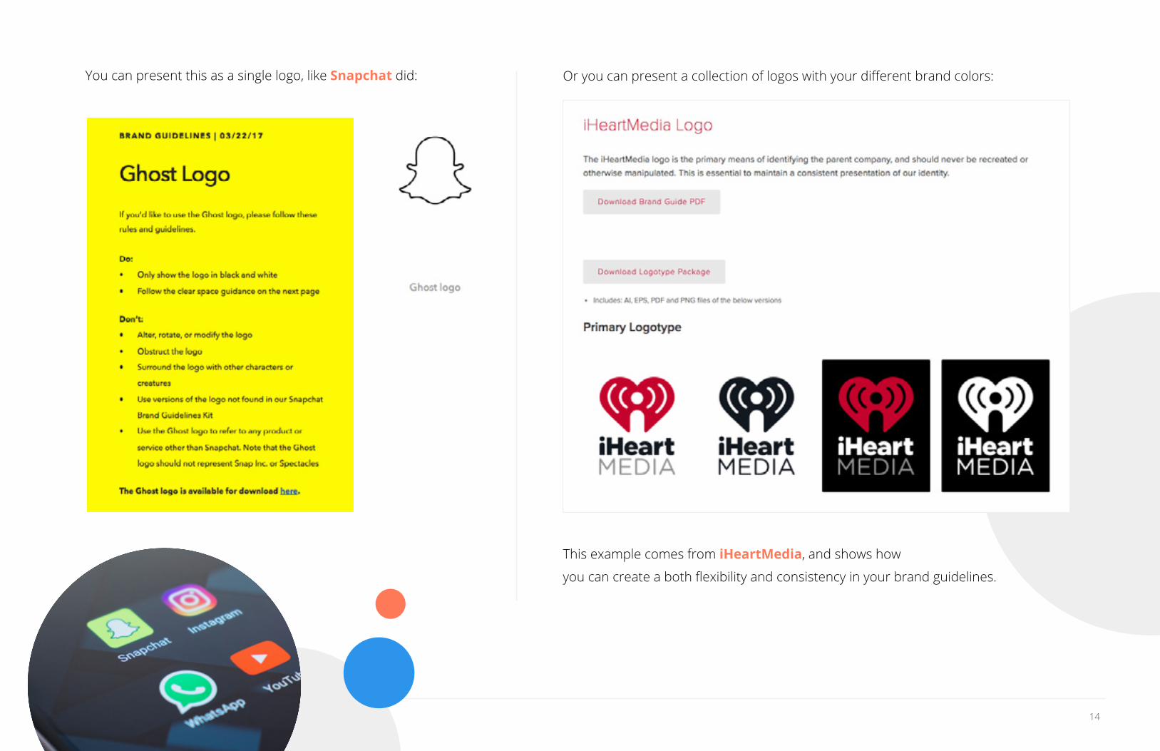
You can present this as a single logo, like Snapchat did: Or you can present a collection of logos with your different brand colors:
This example comes from iHeartMedia, and shows how
you can create a both flexibility and consistency in your brand guidelines.
15HubSpot + Venngage • Brand Syle Guide Kit
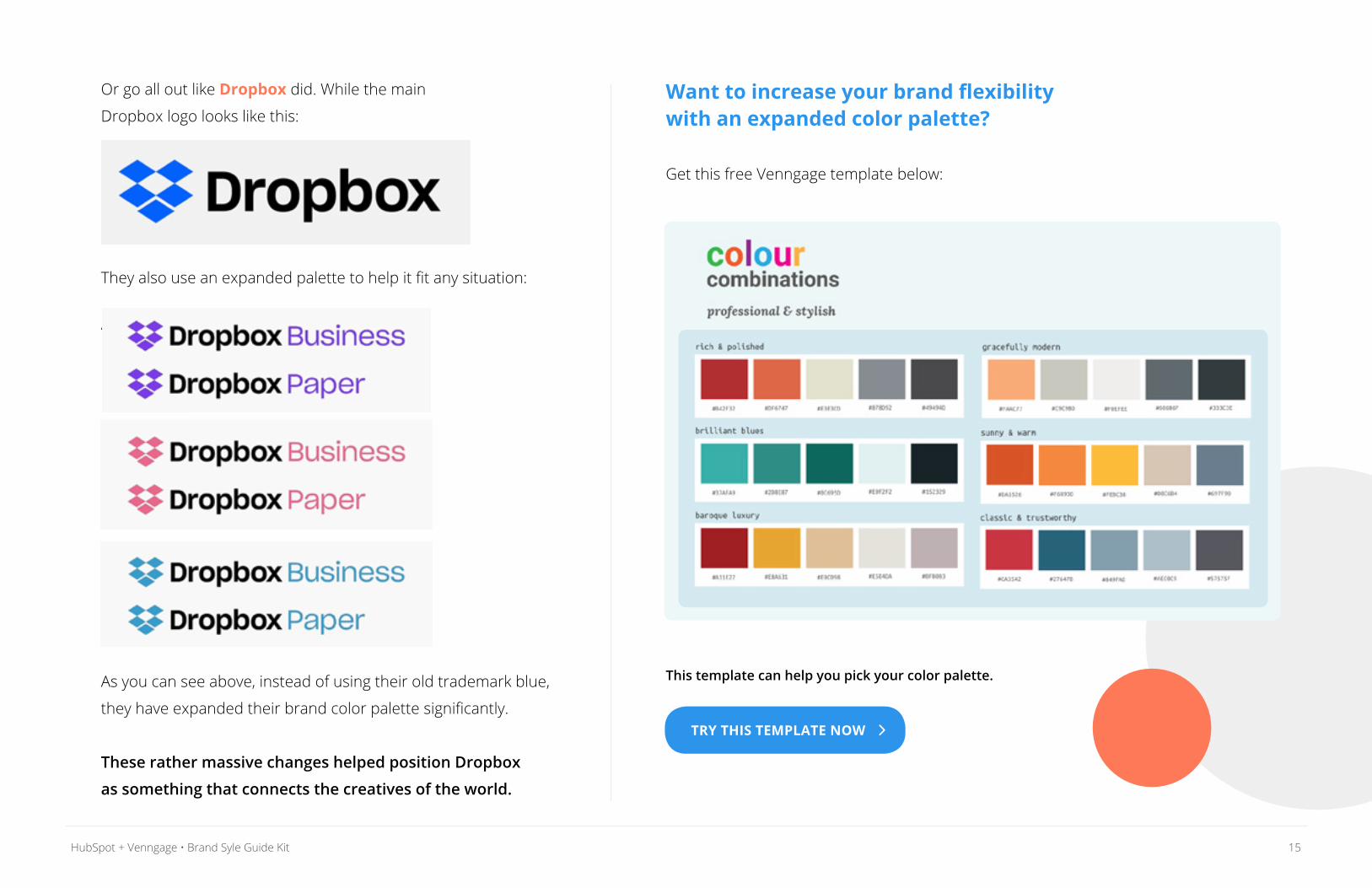
Or go all out like Dropbox did. While the main
Dropbox logo looks like this:
They also use an expanded palette to help it fit any situation:
‘
As you can see above, instead of using their old trademark blue,
they have expanded their brand color palette significantly.
These rather massive changes helped position Dropbox
as something that connects the creatives of the world.
Want to increase your brand flexibility with an expanded color palette?
Get this free Venngage template below:
This template can help you pick your color palette.
TRY THIS TEMPLATE NOW
16HubSpot + Venngage • Brand Syle Guide Kit
Secondary Logos, Marks & SymbolsAlmost every brand is going to have a secondary logo, mark, or
symbol that they use throughout their company communications.
Having this secondary logo is a necessity now because of the hundreds of ways
your logo could be used. By including a secondary logo, people won’t have to
modify or misuse your primary logo in situations where it really doesn’t fit.
An effective secondary logo takes parts from the main one, and simplifies
the design. This could be a minimalistic logo, short wordmark, or even
something as simple as a single letter.
Now if your brand or company has a very complicated logo,
it’s a good idea to create a simplified version of it.
A simplified logo can use a more basic font face or just the
initials of your company name. Like in this example:
A simplified logo gives designers and the press more
flexibility to use your logo in many situations.
For example, almost every large tech brand that you use each day
utilizes secondary logos. You may have even seen them so often
that you have mistaken them for primary logos.
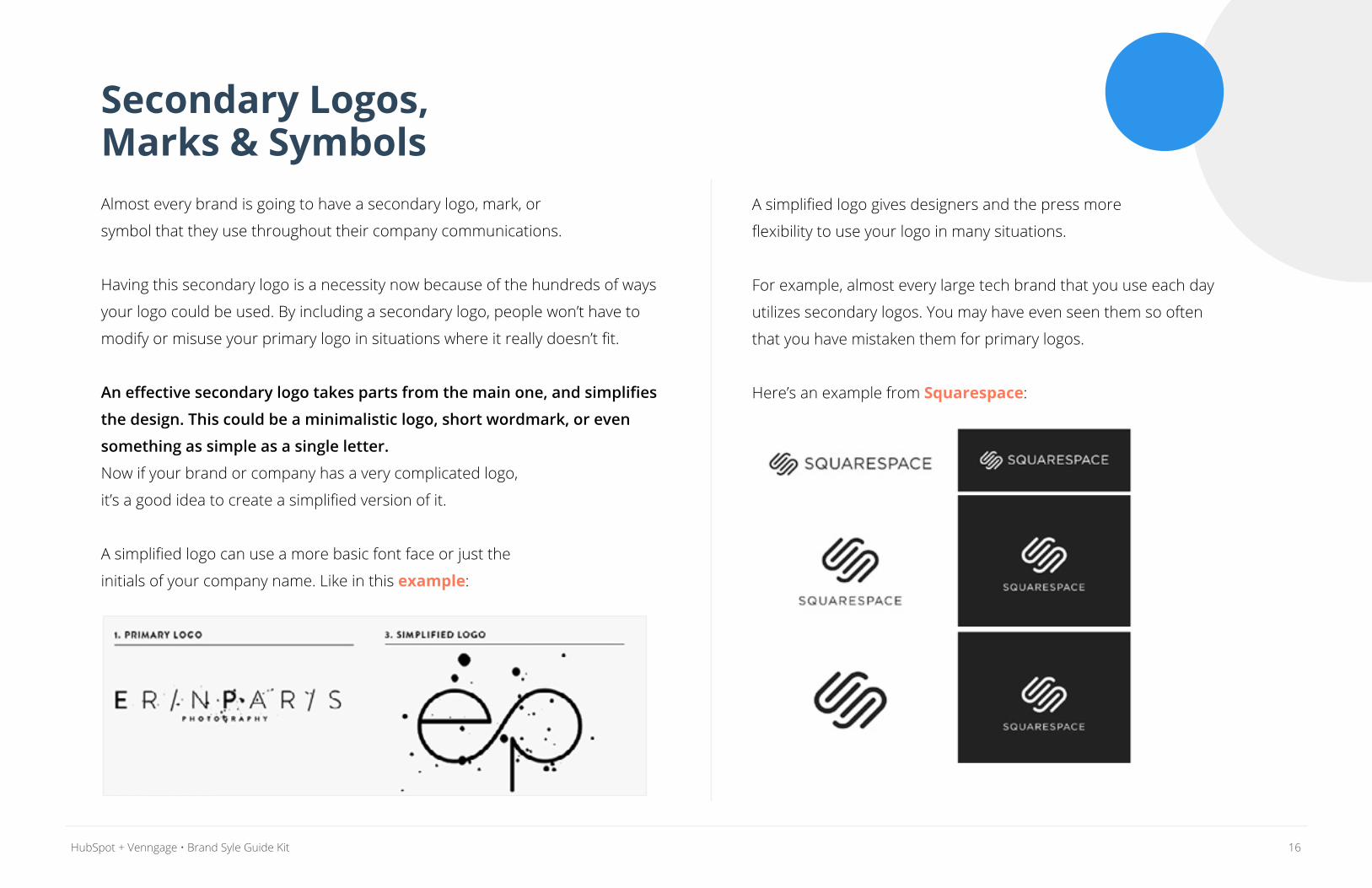
Here’s an example from Squarespace:
17HubSpot + Venngage • Brand Syle Guide Kit
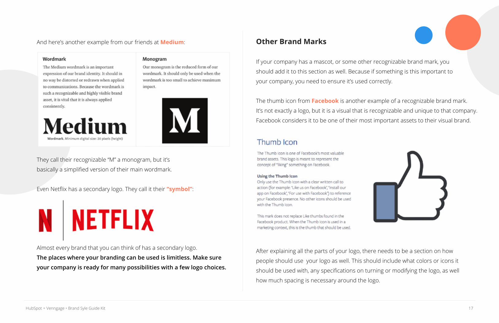
Other Brand Marks
If your company has a mascot, or some other recognizable brand mark, you
should add it to this section as well. Because if something is this important to
your company, you need to ensure it’s used correctly.
The thumb icon from Facebook is another example of a recognizable brand mark.
It’s not exactly a logo, but it is a visual that is recognizable and unique to that company.
Facebook considers it to be one of their most important assets to their visual brand.
After explaining all the parts of your logo, there needs to be a section on how
people should use your logo as well. This should include what colors or icons it
should be used with, any specifications on turning or modifying the logo, as well
how much spacing is necessary around the logo.
And here’s another example from our friends at Medium:
They call their recognizable “M” a monogram, but it’s
basically a simplified version of their main wordmark.
Even Netflix has a secondary logo. They call it their “symbol”:
Almost every brand that you can think of has a secondary logo.
The places where your branding can be used is limitless. Make sure
your company is ready for many possibilities with a few logo choices.
18HubSpot + Venngage • Brand Syle Guide Kit
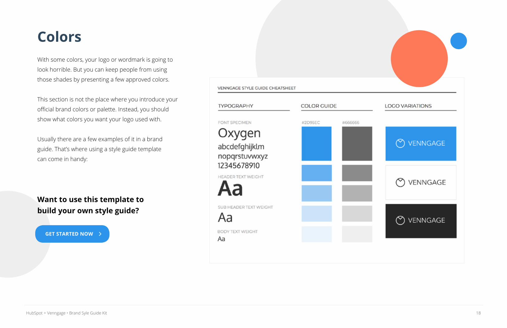
ColorsWith some colors, your logo or wordmark is going to
look horrible. But you can keep people from using
those shades by presenting a few approved colors.
This section is not the place where you introduce your
official brand colors or palette. Instead, you should
show what colors you want your logo used with.
Usually there are a few examples of it in a brand
guide. That’s where using a style guide template
can come in handy:
Want to use this template to build your own style guide?
GET STARTED NOW
19HubSpot + Venngage • Brand Syle Guide Kit
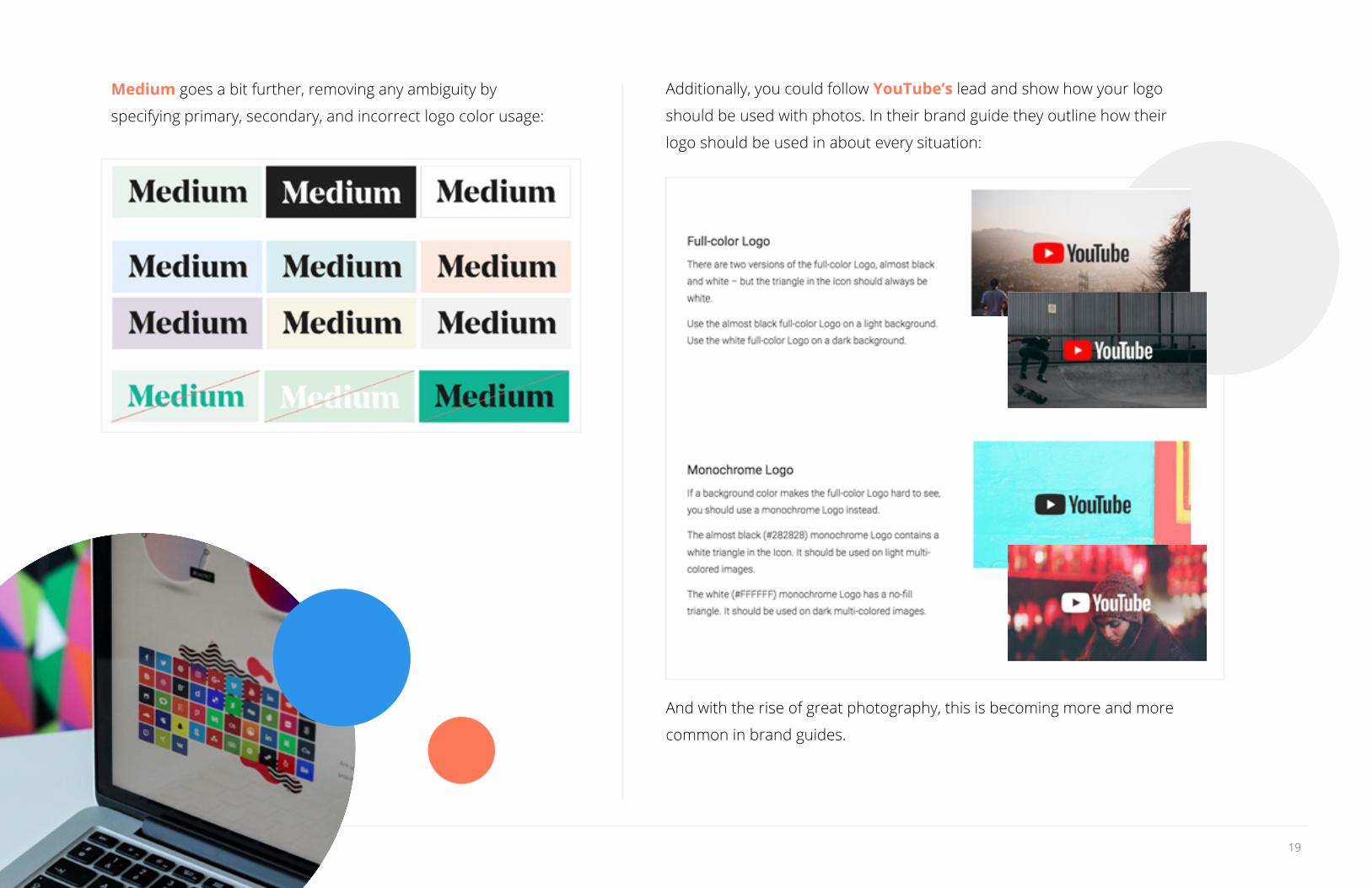
Medium goes a bit further, removing any ambiguity by
specifying primary, secondary, and incorrect logo color usage:
Additionally, you could follow YouTube’s lead and show how your logo
should be used with photos. In their brand guide they outline how their
logo should be used in about every situation:
And with the rise of great photography, this is becoming more and more
common in brand guides.
20HubSpot + Venngage • Brand Syle Guide Kit
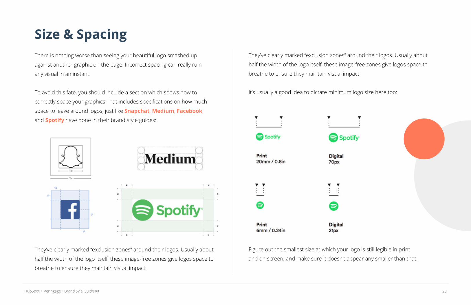
Size & SpacingThere is nothing worse than seeing your beautiful logo smashed up
against another graphic on the page. Incorrect spacing can really ruin
any visual in an instant.
To avoid this fate, you should include a section which shows how to
correctly space your graphics.That includes specifications on how much
space to leave around logos, just like Snapchat, Medium, Facebook,
and Spotify have done in their brand style guides:
They’ve clearly marked “exclusion zones” around their logos. Usually about
half the width of the logo itself, these image-free zones give logos space to
breathe to ensure they maintain visual impact.
They’ve clearly marked “exclusion zones” around their logos. Usually about
half the width of the logo itself, these image-free zones give logos space to
breathe to ensure they maintain visual impact.
It’s usually a good idea to dictate minimum logo size here too:
Figure out the smallest size at which your logo is still legible in print
and on screen, and make sure it doesn’t appear any smaller than that.
21HubSpot + Venngage • Brand Syle Guide Kit
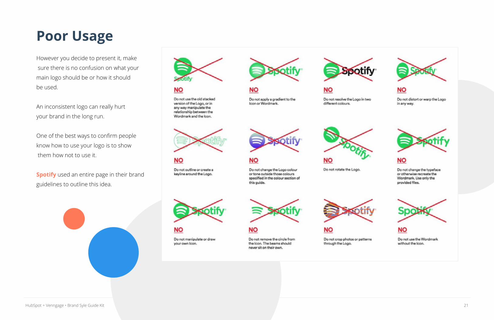
Poor UsageHowever you decide to present it, make
sure there is no confusion on what your
main logo should be or how it should
be used.
An inconsistent logo can really hurt
your brand in the long run.
One of the best ways to confirm people
know how to use your logo is to show
them how not to use it.
Spotify used an entire page in their brand
guidelines to outline this idea.
22HubSpot + Venngage • Brand Syle Guide Kit
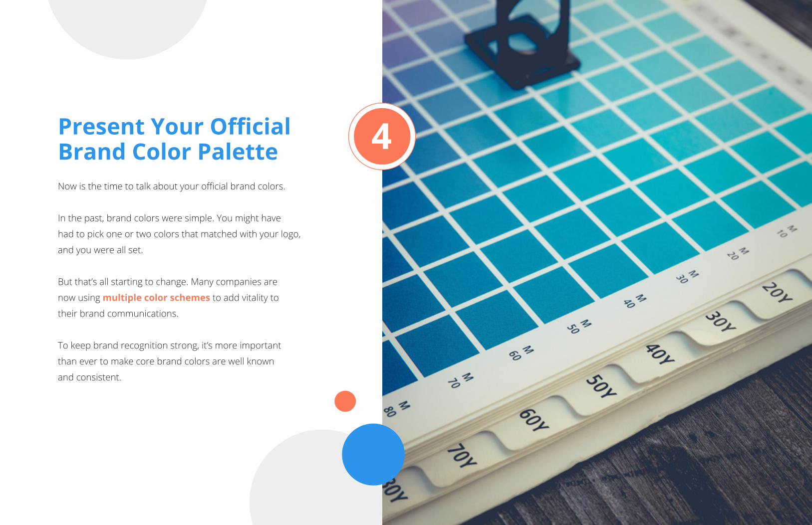
Present Your Official Brand Color PaletteNow is the time to talk about your official brand colors.
In the past, brand colors were simple. You might have
had to pick one or two colors that matched with your logo,
and you were all set.
But that’s all starting to change. Many companies are
now using multiple color schemes to add vitality to
their brand communications.
To keep brand recognition strong, it’s more important
than ever to make core brand colors are well known
and consistent.
4
23HubSpot + Venngage • Brand Syle Guide Kit
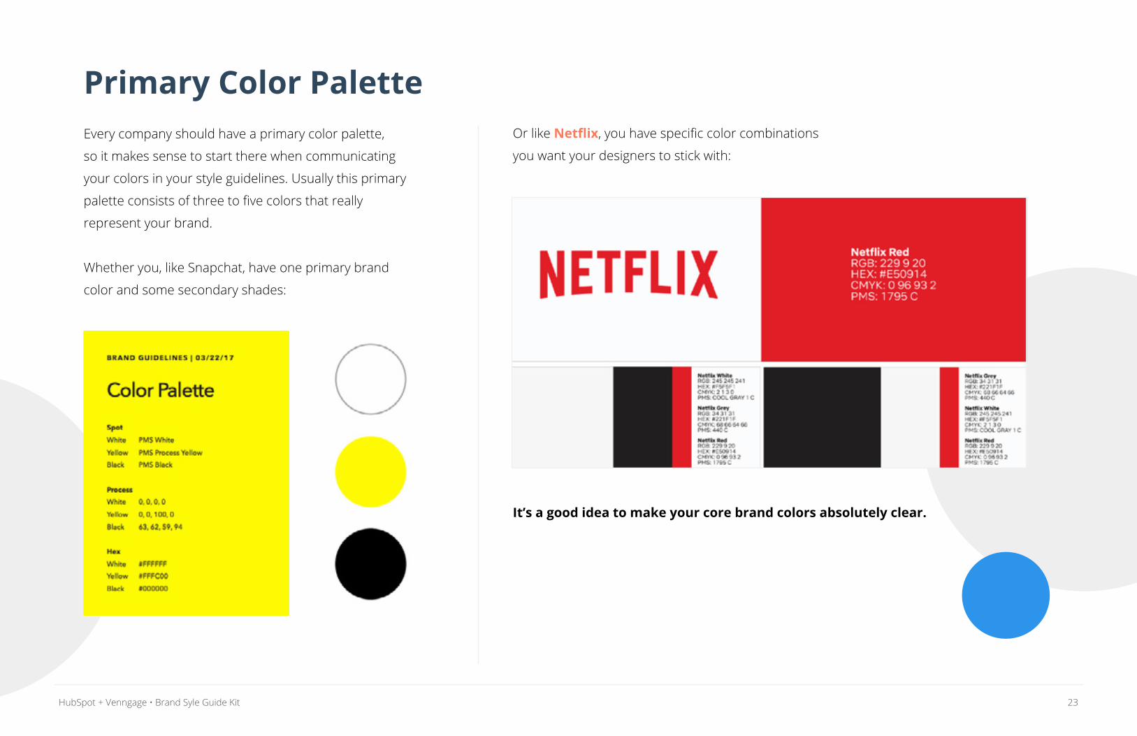
Primary Color PaletteEvery company should have a primary color palette,
so it makes sense to start there when communicating
your colors in your style guidelines. Usually this primary
palette consists of three to five colors that really
represent your brand.
Whether you, like Snapchat, have one primary brand
color and some secondary shades:
Or like Netflix, you have specific color combinations
you want your designers to stick with:
It’s a good idea to make your core brand colors absolutely clear.
24HubSpot + Venngage • Brand Syle Guide Kit
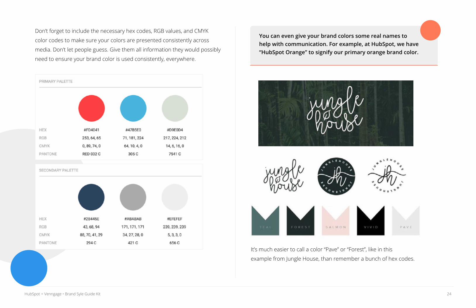
Don’t forget to include the necessary hex codes, RGB values, and CMYK
color codes to make sure your colors are presented consistently across
media. Don’t let people guess. Give them all information they would possibly
need to ensure your brand color is used consistently, everywhere.
It’s much easier to call a color “Pave” or “Forest”, like in this
example from Jungle House, than remember a bunch of hex codes.
You can even give your brand colors some real names to help with communication. For example, at HubSpot, we have “HubSpot Orange” to signify our primary orange brand color.
25HubSpot + Venngage • Brand Syle Guide Kit
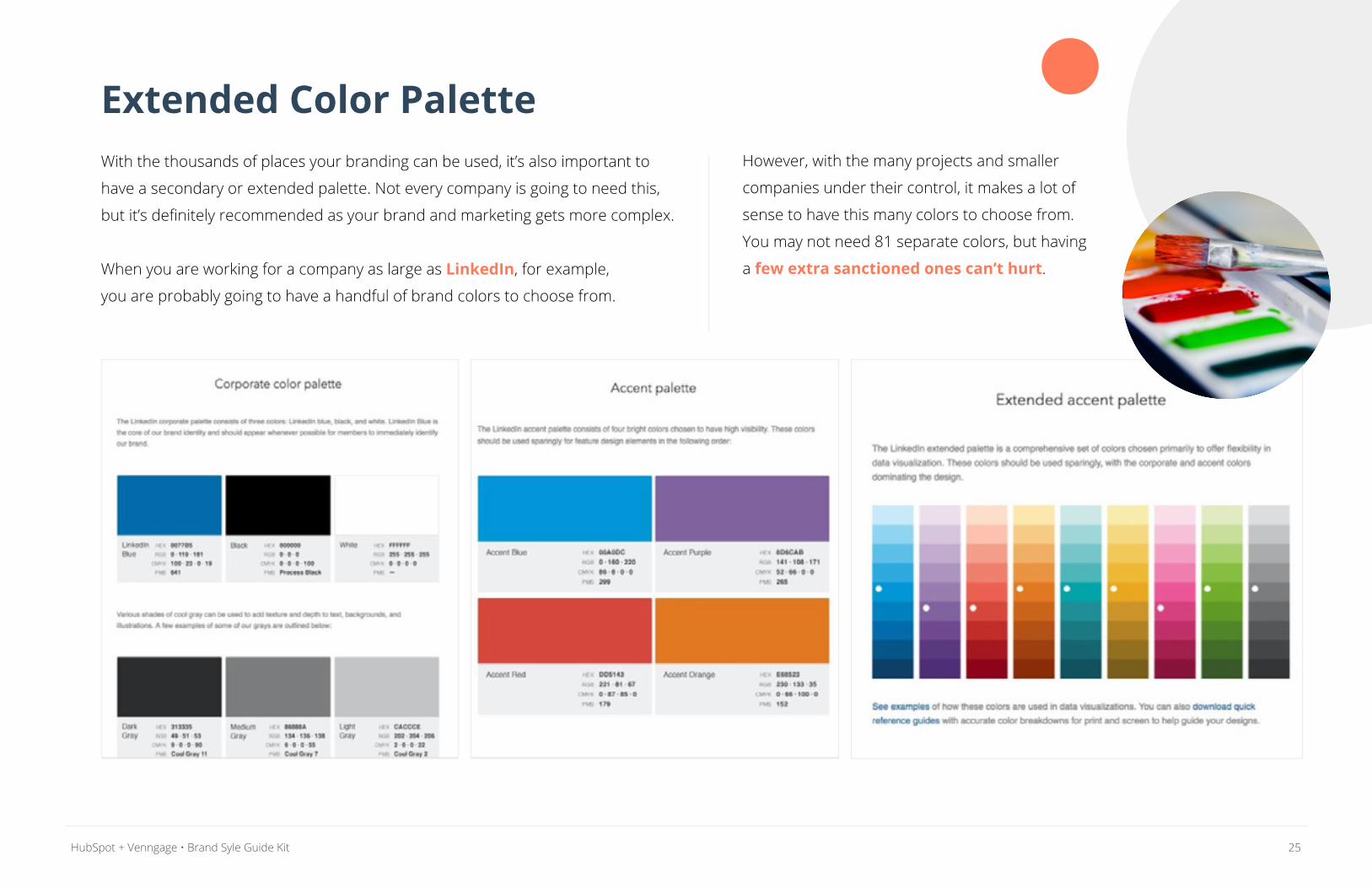
Extended Color PaletteWith the thousands of places your branding can be used, it’s also important to
have a secondary or extended palette. Not every company is going to need this,
but it’s definitely recommended as your brand and marketing gets more complex.
When you are working for a company as large as LinkedIn, for example,
you are probably going to have a handful of brand colors to choose from.
However, with the many projects and smaller
companies under their control, it makes a lot of
sense to have this many colors to choose from.
You may not need 81 separate colors, but having
a few extra sanctioned ones can’t hurt.
26HubSpot + Venngage • Brand Syle Guide Kit
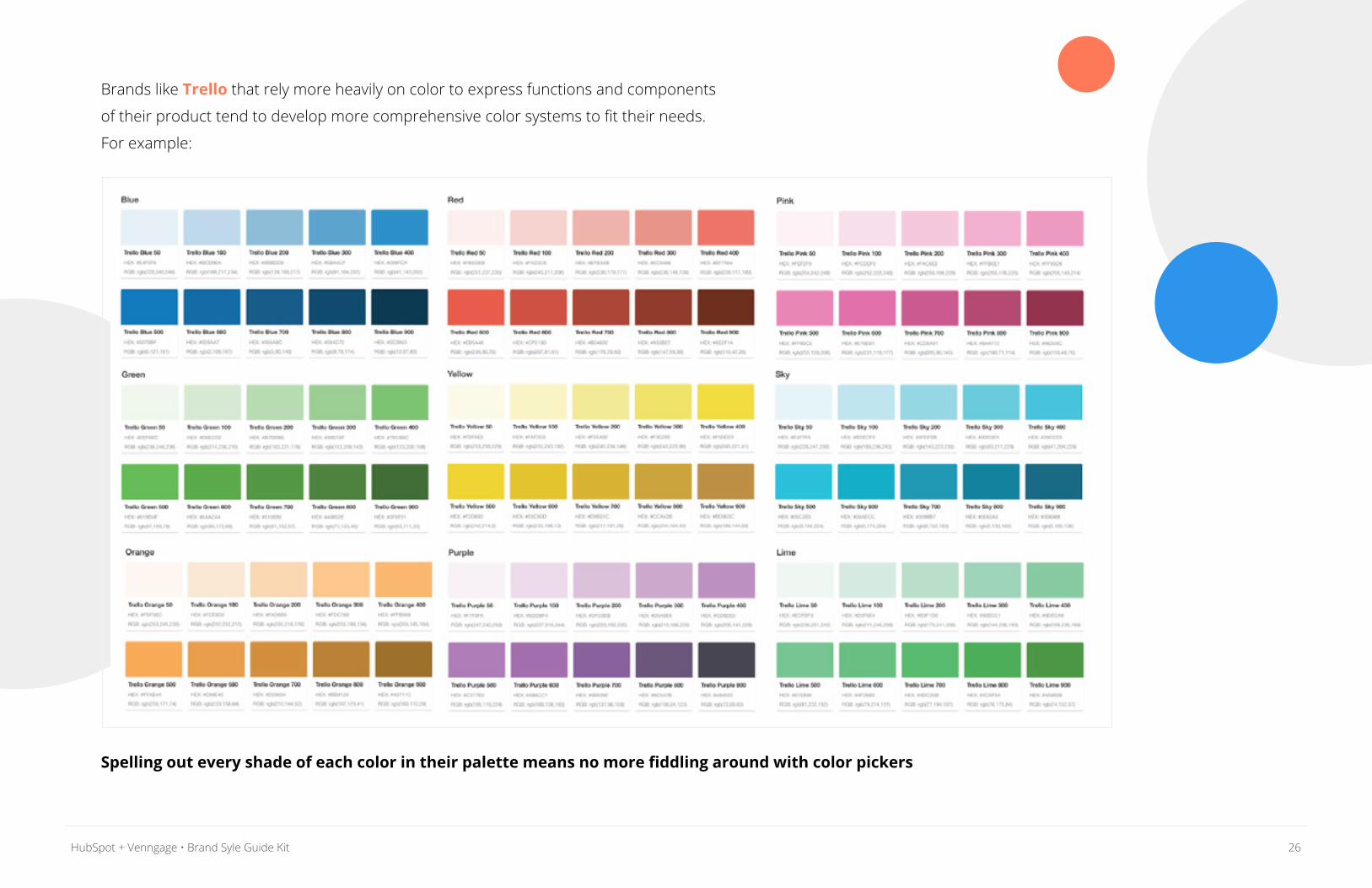
Brands like Trello that rely more heavily on color to express functions and components
of their product tend to develop more comprehensive color systems to fit their needs.
For example:
Spelling out every shade of each color in their palette means no more fiddling around with color pickers
27HubSpot + Venngage • Brand Syle Guide Kit
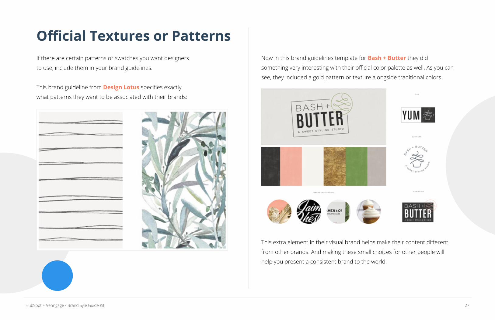
Official Textures or PatternsIf there are certain patterns or swatches you want designers
to use, include them in your brand guidelines.
This brand guideline from Design Lotus specifies exactly
what patterns they want to be associated with their brands:
Now in this brand guidelines template for Bash + Butter they did
something very interesting with their official color palette as well. As you can
see, they included a gold pattern or texture alongside traditional colors.
This extra element in their visual brand helps make their content different
from other brands. And making these small choices for other people will
help you present a consistent brand to the world.
28HubSpot + Venngage • Brand Syle Guide Kit
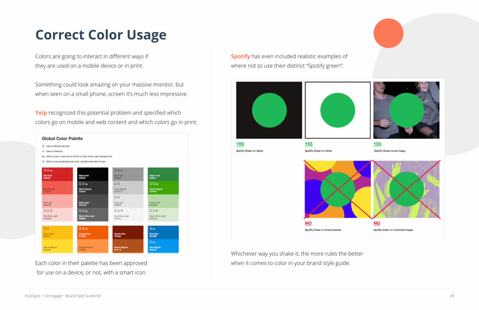
Correct Color UsageColors are going to interact in different ways if
they are used on a mobile device or in print.
Something could look amazing on your massive monitor, but
when seen on a small phone, screen it’s much less impressive.
Yelp recognized this potential problem and specified which
colors go on mobile and web content and which colors go in print.
Each color in their palette has been approved
for use on a device, or not, with a smart icon.
Spotify has even included realistic examples of
where not to use their distinct “Spotify green”:
Whichever way you shake it, the more rules the better
when it comes to color in your brand style guide.
29HubSpot + Venngage • Brand Syle Guide Kit
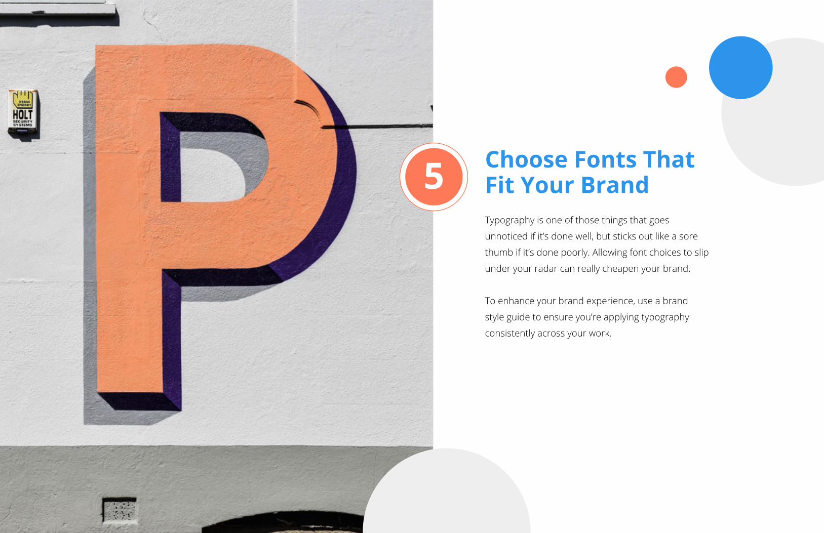
Choose Fonts That Fit Your Brand Typography is one of those things that goes
unnoticed if it’s done well, but sticks out like a sore
thumb if it’s done poorly. Allowing font choices to slip
under your radar can really cheapen your brand.
To enhance your brand experience, use a brand
style guide to ensure you’re applying typography
consistently across your work.
5
30HubSpot + Venngage • Brand Syle Guide Kit
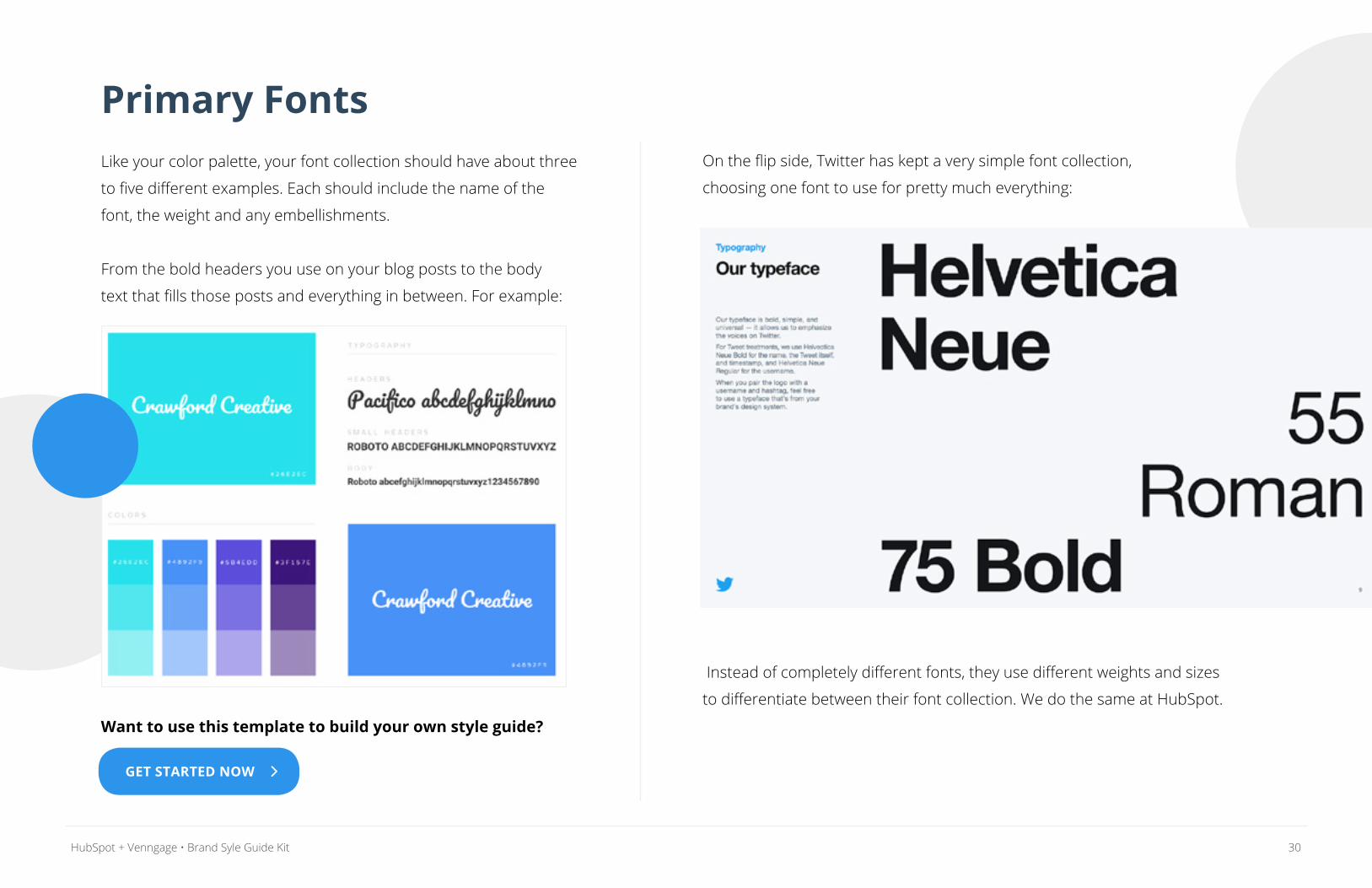
Primary FontsLike your color palette, your font collection should have about three
to five different examples. Each should include the name of the
font, the weight and any embellishments.
From the bold headers you use on your blog posts to the body
text that fills those posts and everything in between. For example:
Want to use this template to build your own style guide?
On the flip side, Twitter has kept a very simple font collection,
choosing one font to use for pretty much everything:
Instead of completely different fonts, they use different weights and sizes
to differentiate between their font collection. We do the same at HubSpot.
GET STARTED NOW
31HubSpot + Venngage • Brand Syle Guide Kit
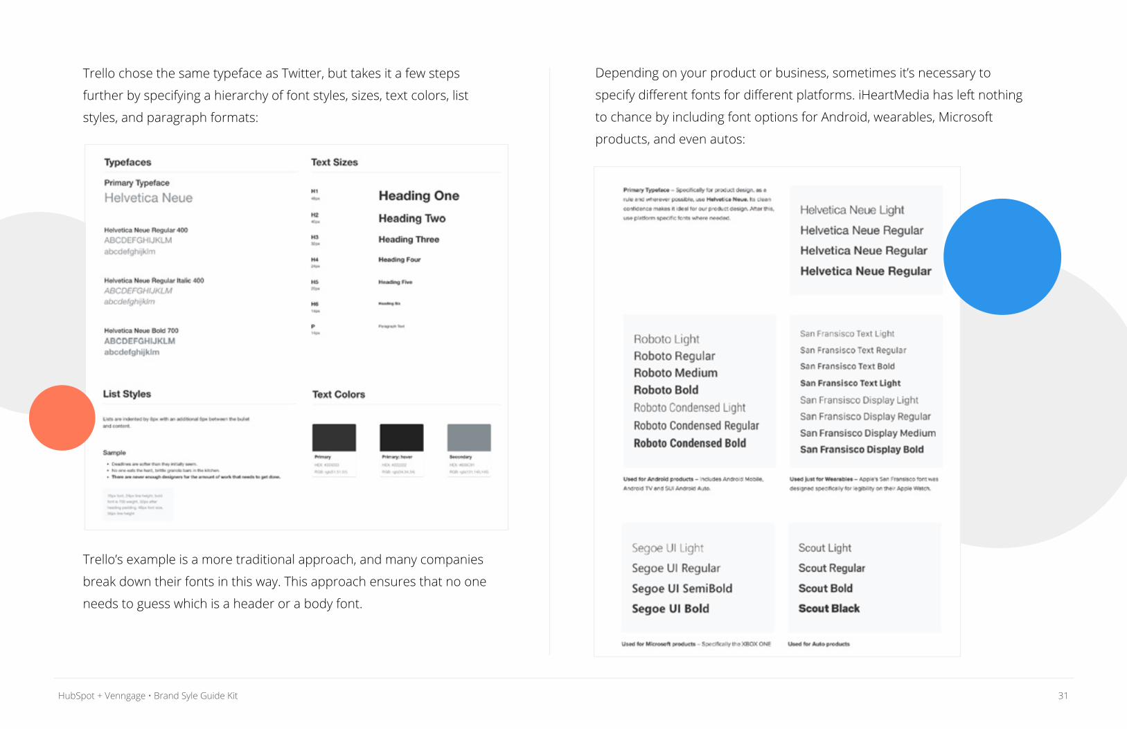
Trello chose the same typeface as Twitter, but takes it a few steps
further by specifying a hierarchy of font styles, sizes, text colors, list
styles, and paragraph formats:
Trello’s example is a more traditional approach, and many companies
break down their fonts in this way. This approach ensures that no one
needs to guess which is a header or a body font.
Depending on your product or business, sometimes it’s necessary to
specify different fonts for different platforms. iHeartMedia has left nothing
to chance by including font options for Android, wearables, Microsoft
products, and even autos:
32HubSpot + Venngage • Brand Syle Guide Kit
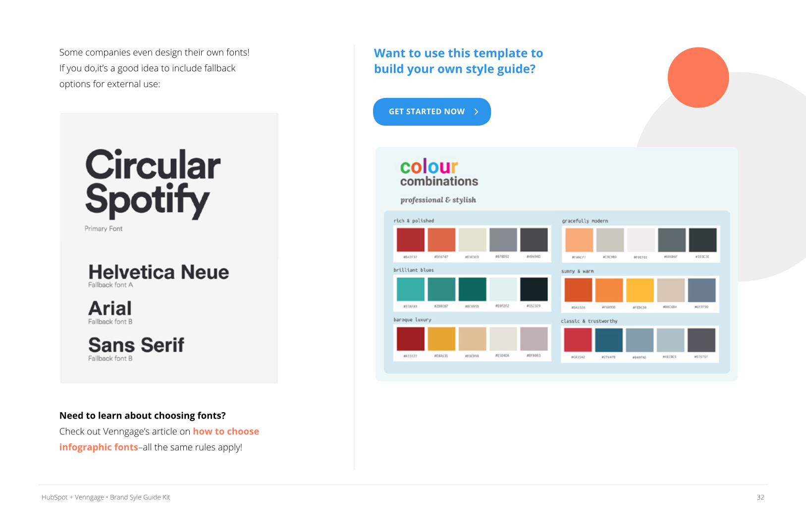
Some companies even design their own fonts!
If you do,it’s a good idea to include fallback
options for external use:
Need to learn about choosing fonts?
Check out Venngage’s article on how to choose
infographic fonts–all the same rules apply!
Want to use this template to build your own style guide?
GET STARTED NOW
33HubSpot + Venngage • Brand Syle Guide Kit
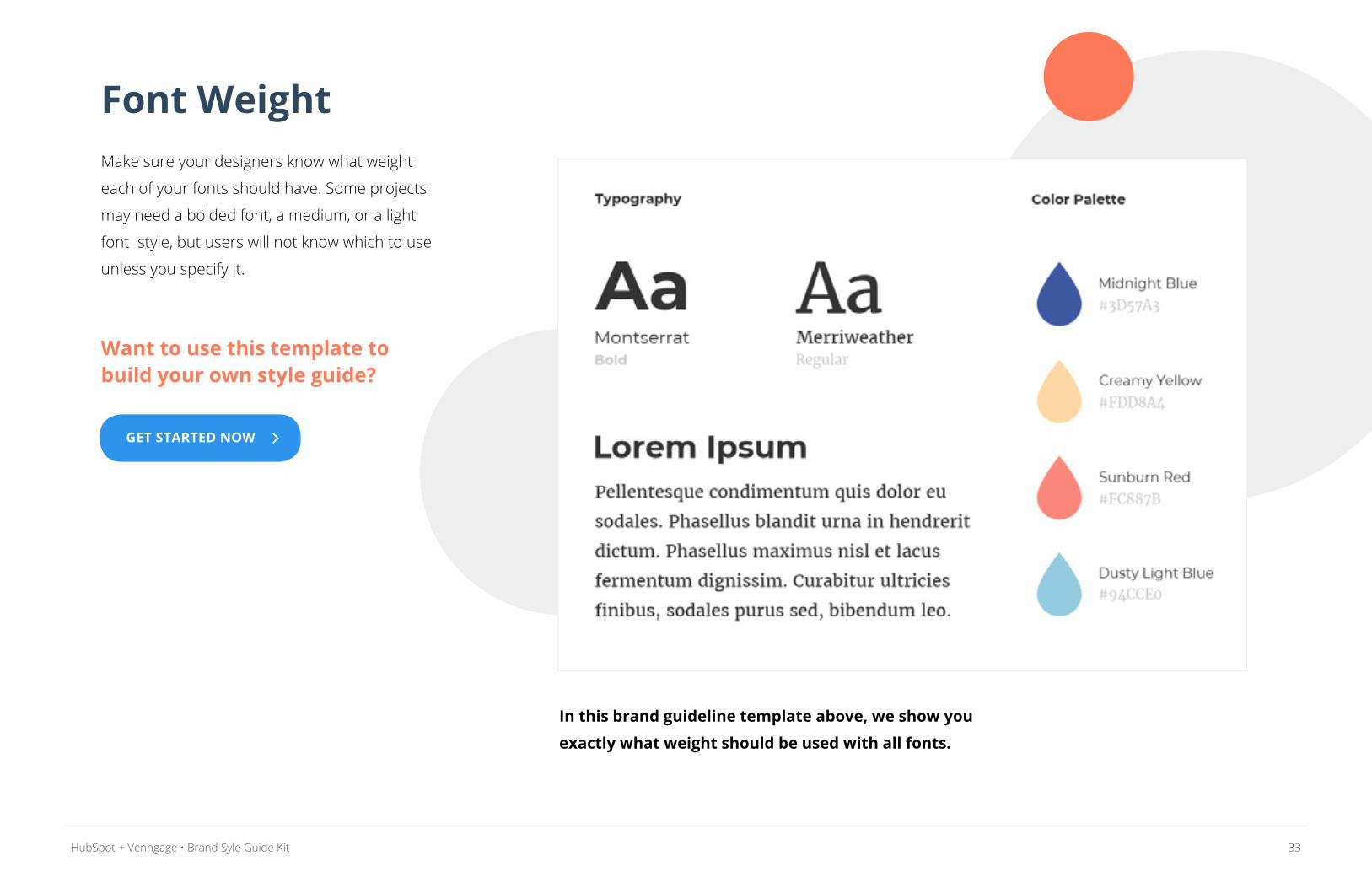
Font WeightMake sure your designers know what weight
each of your fonts should have. Some projects
may need a bolded font, a medium, or a light
font style, but users will not know which to use
unless you specify it.
Want to use this template to build your own style guide?
In this brand guideline template above, we show you
exactly what weight should be used with all fonts.
GET STARTED NOW
34HubSpot + Venngage • Brand Syle Guide Kit
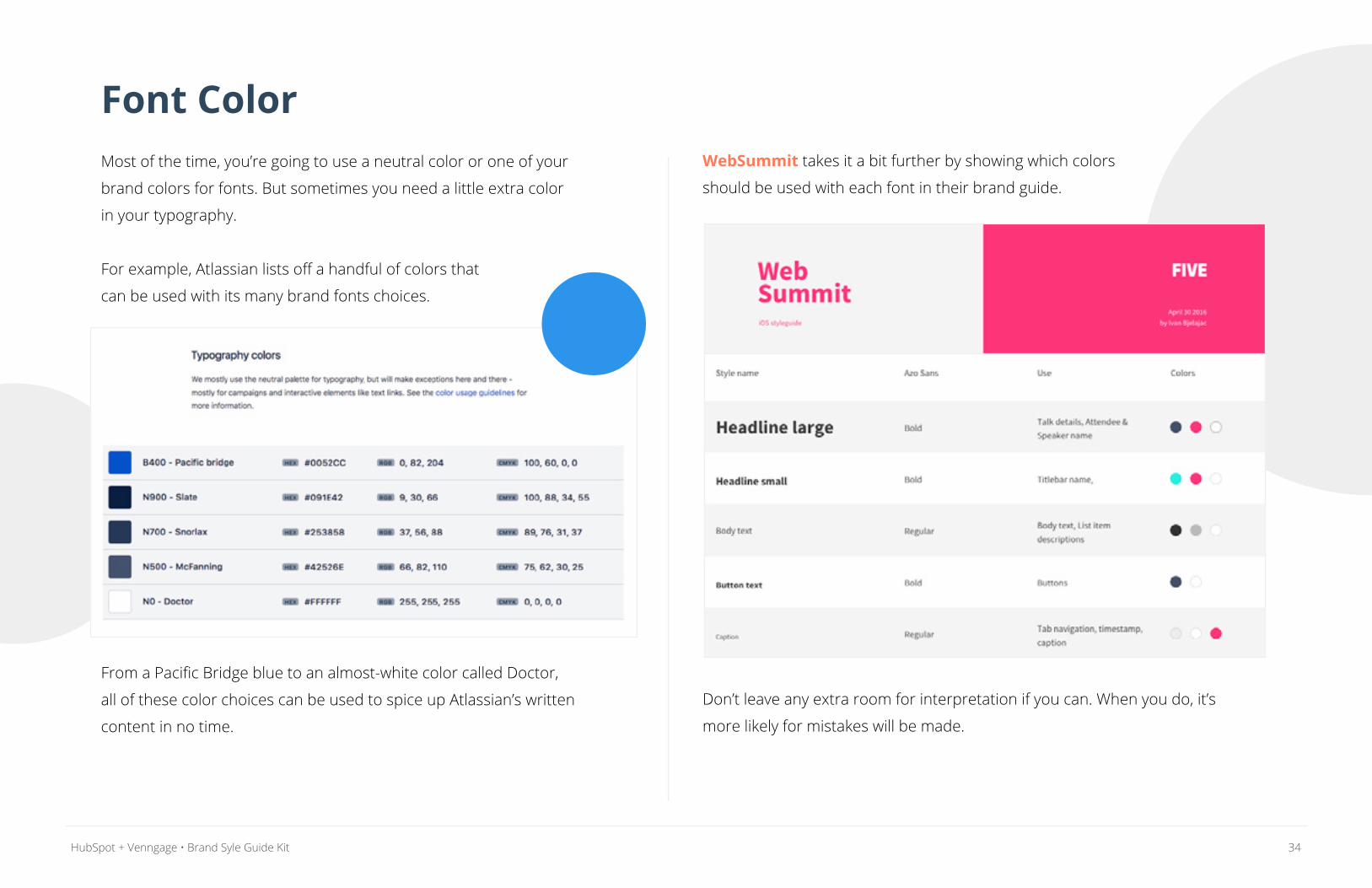
Font ColorMost of the time, you’re going to use a neutral color or one of your
brand colors for fonts. But sometimes you need a little extra color
in your typography.
For example, Atlassian lists off a handful of colors that
can be used with its many brand fonts choices.
From a Pacific Bridge blue to an almost-white color called Doctor,
all of these color choices can be used to spice up Atlassian’s written
content in no time.
WebSummit takes it a bit further by showing which colors
should be used with each font in their brand guide.
Don’t leave any extra room for interpretation if you can. When you do, it’s
more likely for mistakes will be made.

35HubSpot + Venngage • Brand Syle Guide Kit
Define Your Brand VoiceThe importance of having a consistent brand voice in
your messaging should not be underestimated. Spend
some time finding the style that resonates with your
audience and aligns with the personality of your brand.
Once you have it figured out, ensure that it’s replicated
across your channels by spelling it out in your brand
style guide.
6
36HubSpot + Venngage • Brand Syle Guide Kit
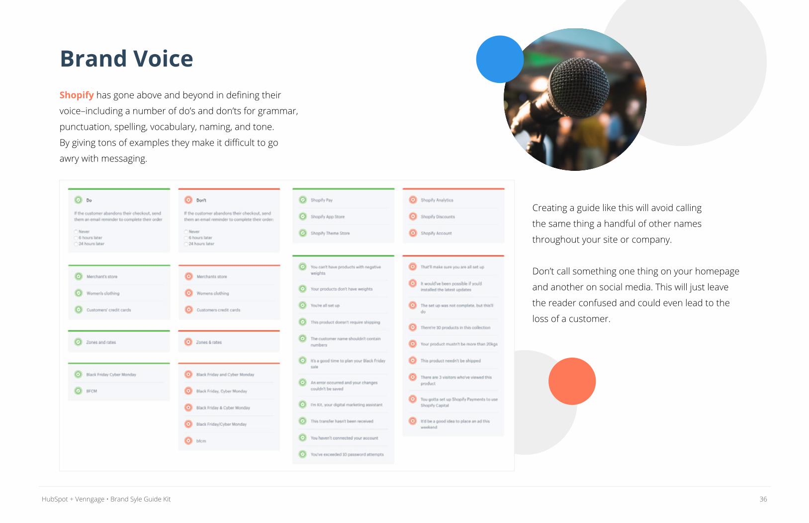
Brand VoiceShopify has gone above and beyond in defining their
voice–including a number of do’s and don’ts for grammar,
punctuation, spelling, vocabulary, naming, and tone.
By giving tons of examples they make it difficult to go
awry with messaging.
Creating a guide like this will avoid calling
the same thing a handful of other names
throughout your site or company.
Don’t call something one thing on your homepage
and another on social media. This will just leave
the reader confused and could even lead to the
loss of a customer.
37HubSpot + Venngage • Brand Syle Guide Kit
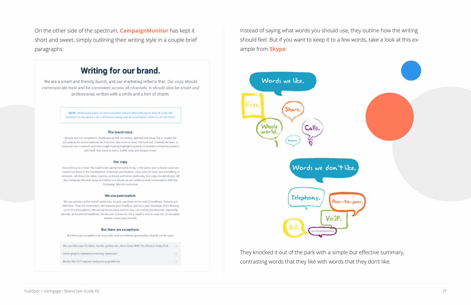
On the other side of the spectrum, CampaignMonitor has kept it
short and sweet, simply outlining their writing style in a couple brief
paragraphs:
Instead of saying what words you should use, they outline how the writing
should feel. But if you want to keep it to a few words, take a look at this ex-
ample from Skype:
They knocked it out of the park with a simple but effective summary,
contrasting words that they like with words that they don’t like.
38HubSpot + Venngage • Brand Syle Guide Kit
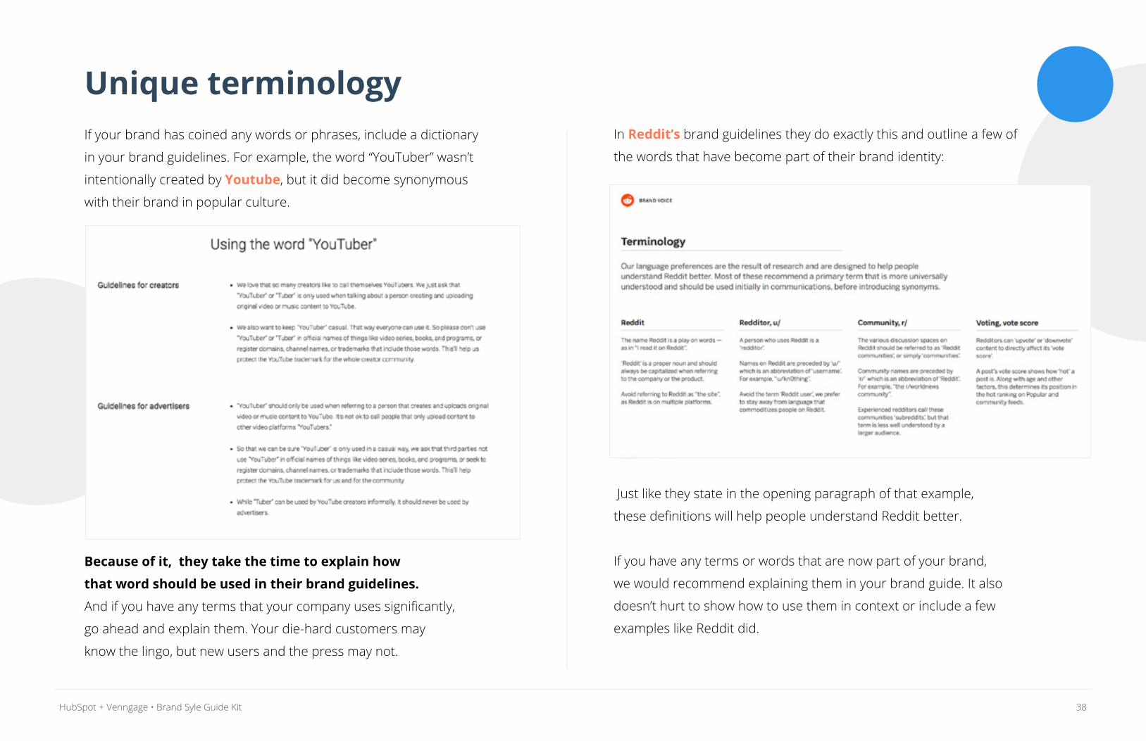
Unique terminologyIf your brand has coined any words or phrases, include a dictionary
in your brand guidelines. For example, the word “YouTuber” wasn’t
intentionally created by Youtube, but it did become synonymous
with their brand in popular culture.
Because of it, they take the time to explain how
that word should be used in their brand guidelines.
And if you have any terms that your company uses significantly,
go ahead and explain them. Your die-hard customers may
know the lingo, but new users and the press may not.
In Reddit’s brand guidelines they do exactly this and outline a few of
the words that have become part of their brand identity:
Just like they state in the opening paragraph of that example,
these definitions will help people understand Reddit better.
If you have any terms or words that are now part of your brand,
we would recommend explaining them in your brand guide. It also
doesn’t hurt to show how to use them in context or include a few
examples like Reddit did.
39HubSpot + Venngage • Brand Syle Guide Kit
Include Supporting Visuals & InfoLast but certainly not least, it’s time to talk imagery.
Everything about your imagery, including style, color,
and content, contributes to the perception of your brand.
Create some guidelines for imagery like photography,
illustrations, charts, infographics, etc. to include in your
brand style guide.
A lot of brands forget this step and it hurts them in the
long run, especially when it comes to data visualizations.
7
40HubSpot + Venngage • Brand Syle Guide Kit
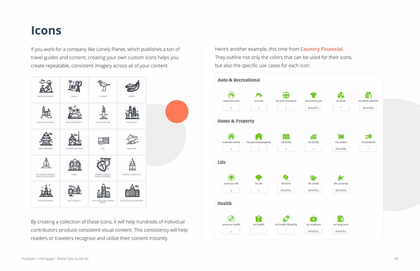
IconsIf you work for a company like Lonely Planet, which publishes a ton of
travel guides and content, creating your own custom icons helps you
create repeatable, consistent imagery across all of your content.
By creating a collection of these icons, it will help hundreds of individual
contributors produce consistent visual content. This consistency will help
readers or travelers recognize and utilize their content instantly.
Here’s another example, this time from Country Financial.
They outline not only the colors that can be used for their icons,
but also the specific use cases for each icon:
41HubSpot + Venngage • Brand Syle Guide Kit
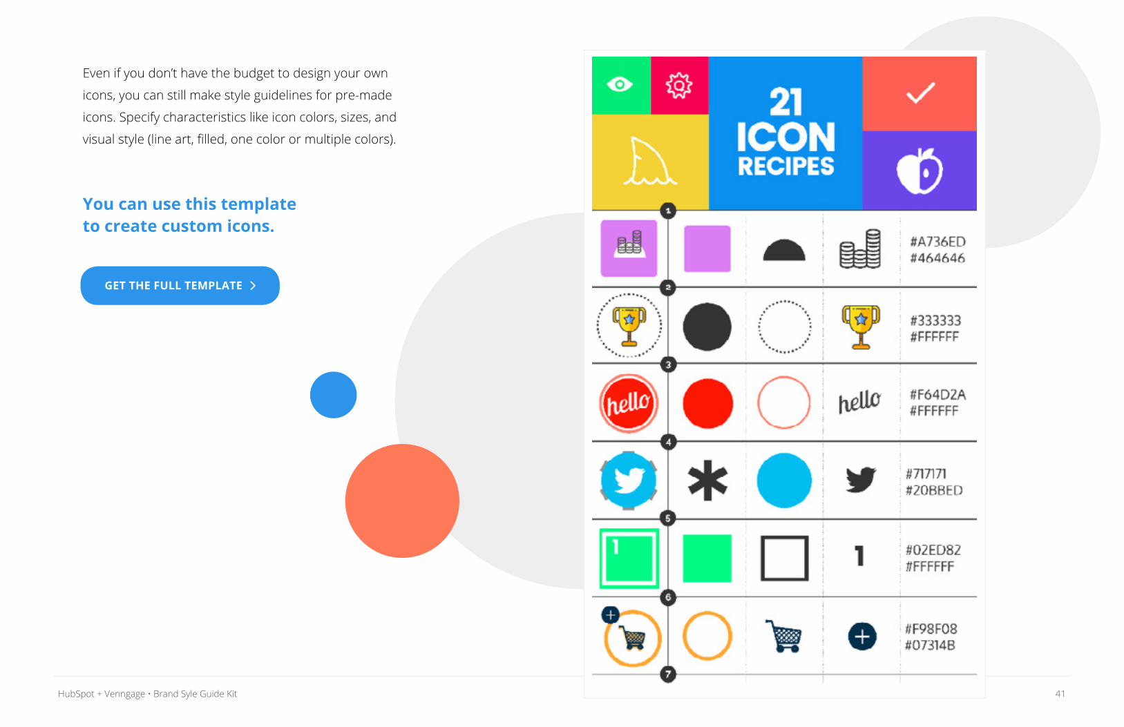
Even if you don’t have the budget to design your own
icons, you can still make style guidelines for pre-made
icons. Specify characteristics like icon colors, sizes, and
visual style (line art, filled, one color or multiple colors).
You can use this template to create custom icons.
GET THE FULL TEMPLATE
42HubSpot + Venngage • Brand Syle Guide Kit
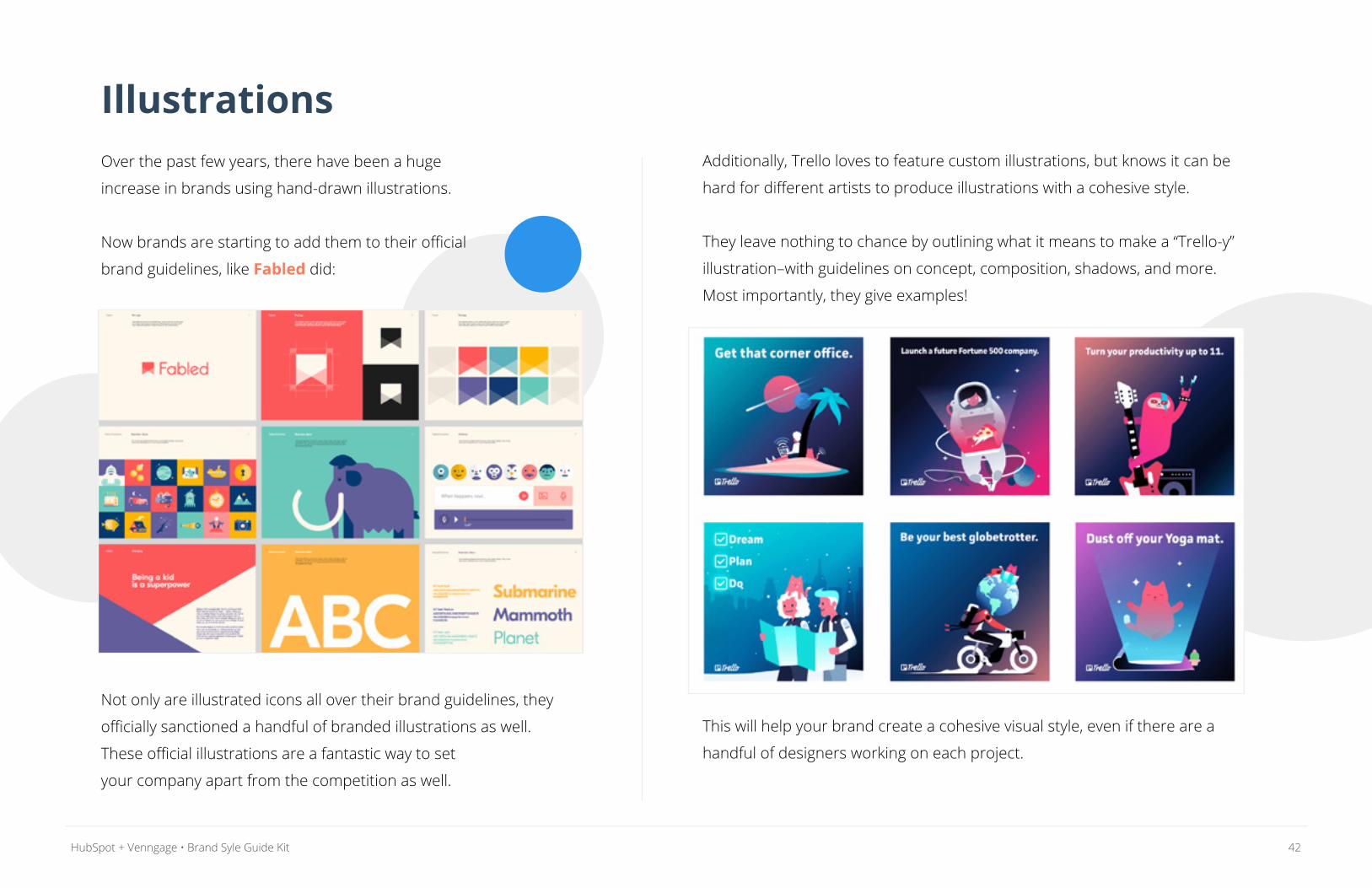
IllustrationsOver the past few years, there have been a huge
increase in brands using hand-drawn illustrations.
Now brands are starting to add them to their official
brand guidelines, like Fabled did:
Not only are illustrated icons all over their brand guidelines, they
officially sanctioned a handful of branded illustrations as well.
These official illustrations are a fantastic way to set
your company apart from the competition as well.
Additionally, Trello loves to feature custom illustrations, but knows it can be
hard for different artists to produce illustrations with a cohesive style.
They leave nothing to chance by outlining what it means to make a “Trello-y”
illustration–with guidelines on concept, composition, shadows, and more.
Most importantly, they give examples!
This will help your brand create a cohesive visual style, even if there are a
handful of designers working on each project.
43HubSpot + Venngage • Brand Syle Guide Kit
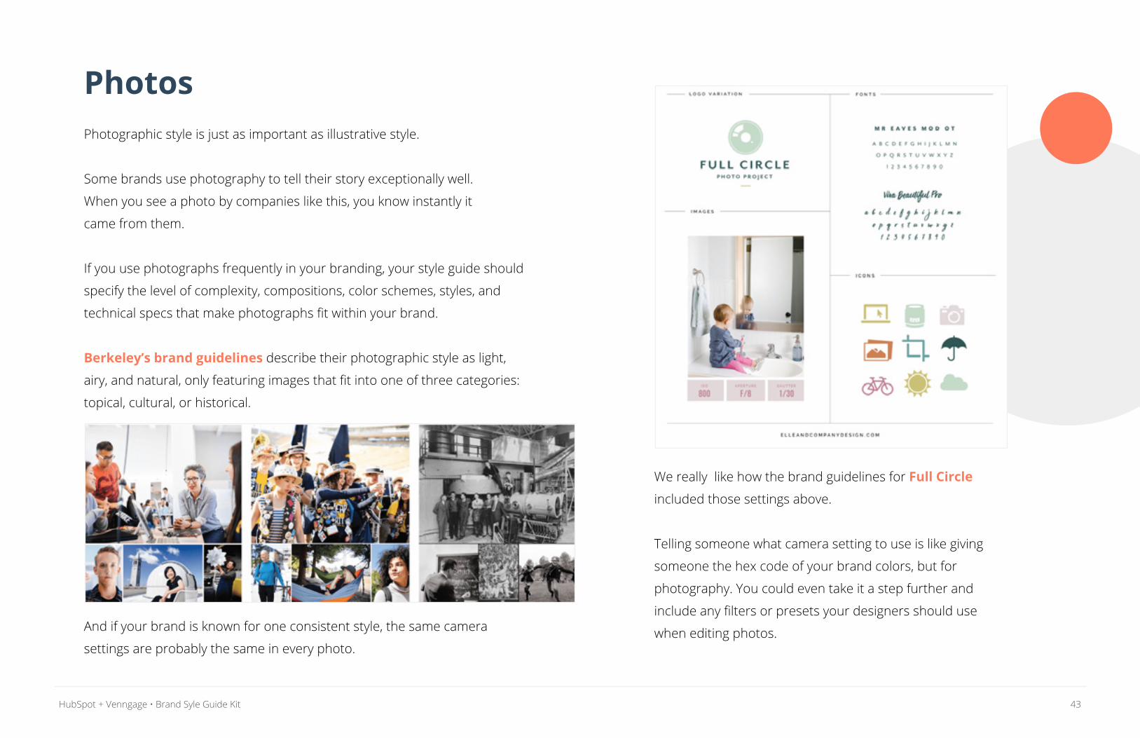
PhotosPhotographic style is just as important as illustrative style.
Some brands use photography to tell their story exceptionally well.
When you see a photo by companies like this, you know instantly it
came from them.
If you use photographs frequently in your branding, your style guide should
specify the level of complexity, compositions, color schemes, styles, and
technical specs that make photographs fit within your brand.
Berkeley’s brand guidelines describe their photographic style as light,
airy, and natural, only featuring images that fit into one of three categories:
topical, cultural, or historical.
And if your brand is known for one consistent style, the same camera
settings are probably the same in every photo.
We really like how the brand guidelines for Full Circle
included those settings above.
Telling someone what camera setting to use is like giving
someone the hex code of your brand colors, but for
photography. You could even take it a step further and
include any filters or presets your designers should use
when editing photos.
44HubSpot + Venngage • Brand Syle Guide Kit
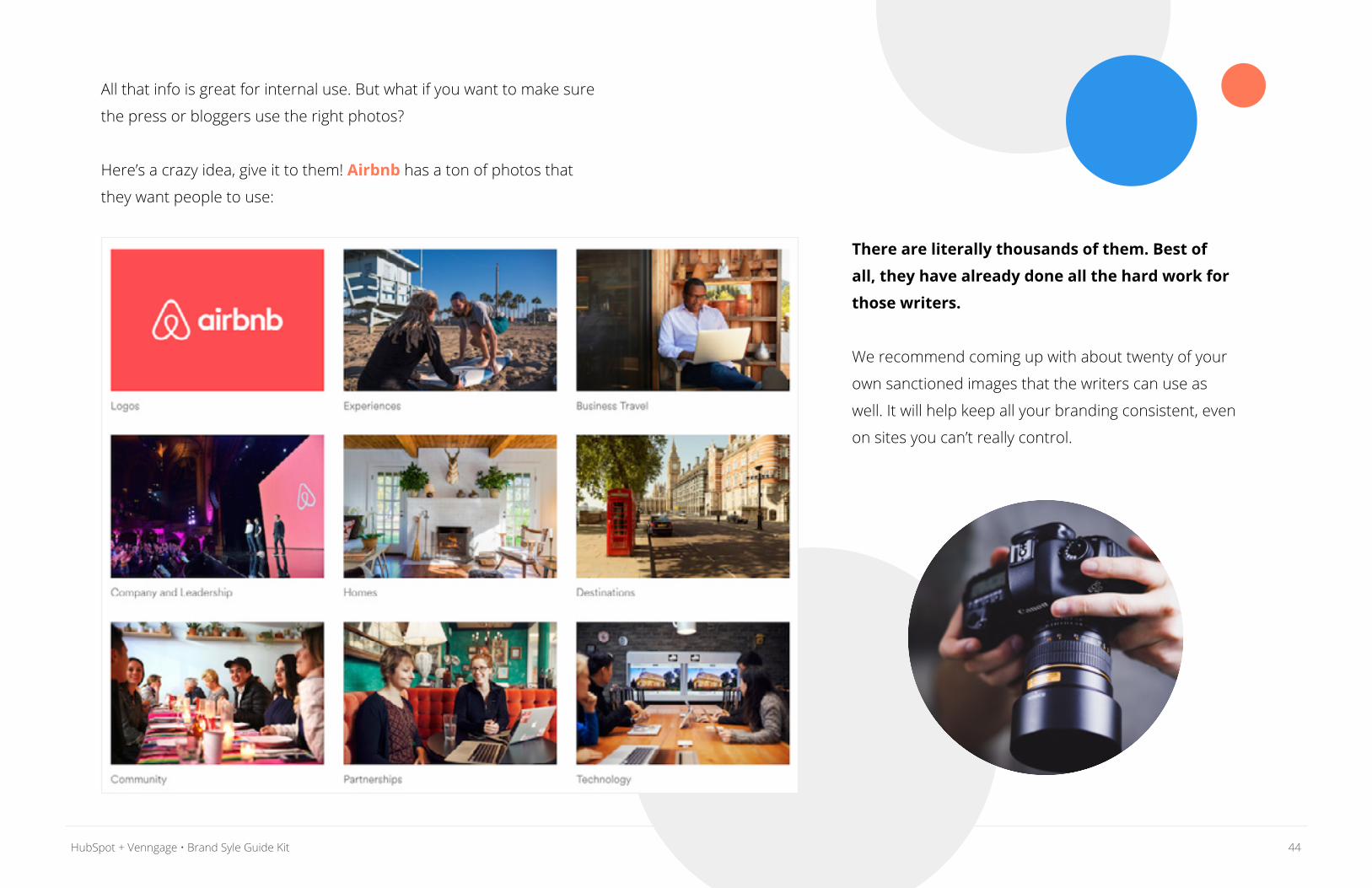
All that info is great for internal use. But what if you want to make sure
the press or bloggers use the right photos?
Here’s a crazy idea, give it to them! Airbnb has a ton of photos that
they want people to use:
There are literally thousands of them. Best of
all, they have already done all the hard work for
those writers.
We recommend coming up with about twenty of your
own sanctioned images that the writers can use as
well. It will help keep all your branding consistent, even
on sites you can’t really control.
45HubSpot + Venngage • Brand Syle Guide Kit
Data VisualizationIf your branding features infographics or data visualizations,
don’t forget to include some stylistic guidelines for them as well.
Presenting data in an effective, consistent and beautiful way is
a bit tricky sometimes. That’s why it’s important to outline how your
company visualizes data in your brand guidelines. Specify when and
where to use infographics and data visualizations, and include style
preferences and technical conventions.
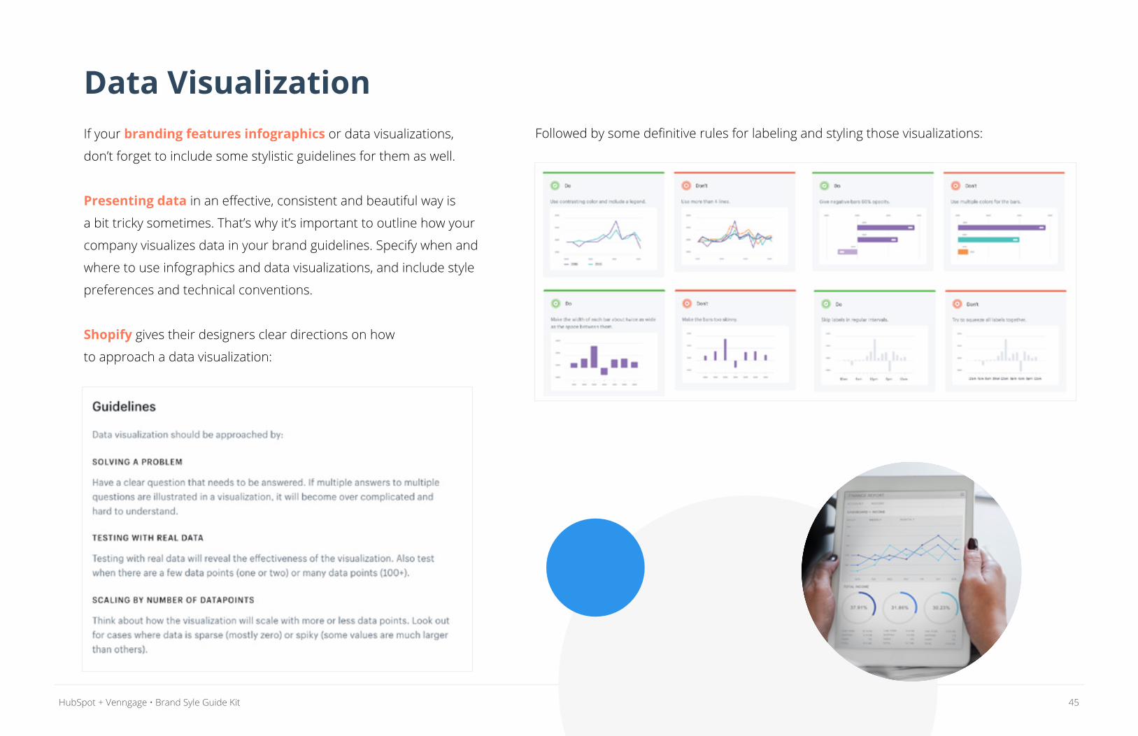
Shopify gives their designers clear directions on how
to approach a data visualization:
Followed by some definitive rules for labeling and styling those visualizations:
46HubSpot + Venngage • Brand Syle Guide Kit
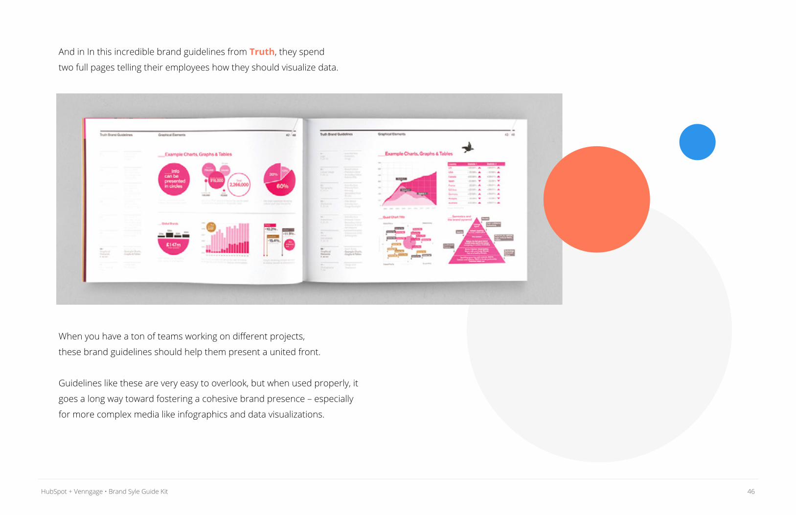
And in In this incredible brand guidelines from Truth, they spend
two full pages telling their employees how they should visualize data.
When you have a ton of teams working on different projects,
these brand guidelines should help them present a united front.
Guidelines like these are very easy to overlook, but when used properly, it
goes a long way toward fostering a cohesive brand presence – especially
for more complex media like infographics and data visualizations.
47HubSpot + Venngage • Brand Syle Guide Kit
Or work with one of our pre-designed templates–just pop
in your own branding and you’re off to the races!
If you find that something about your brand is not working, fix it!
A brand style guide should be an ever-evolving document, which
is why we’ve made editing and sharing a breeze.
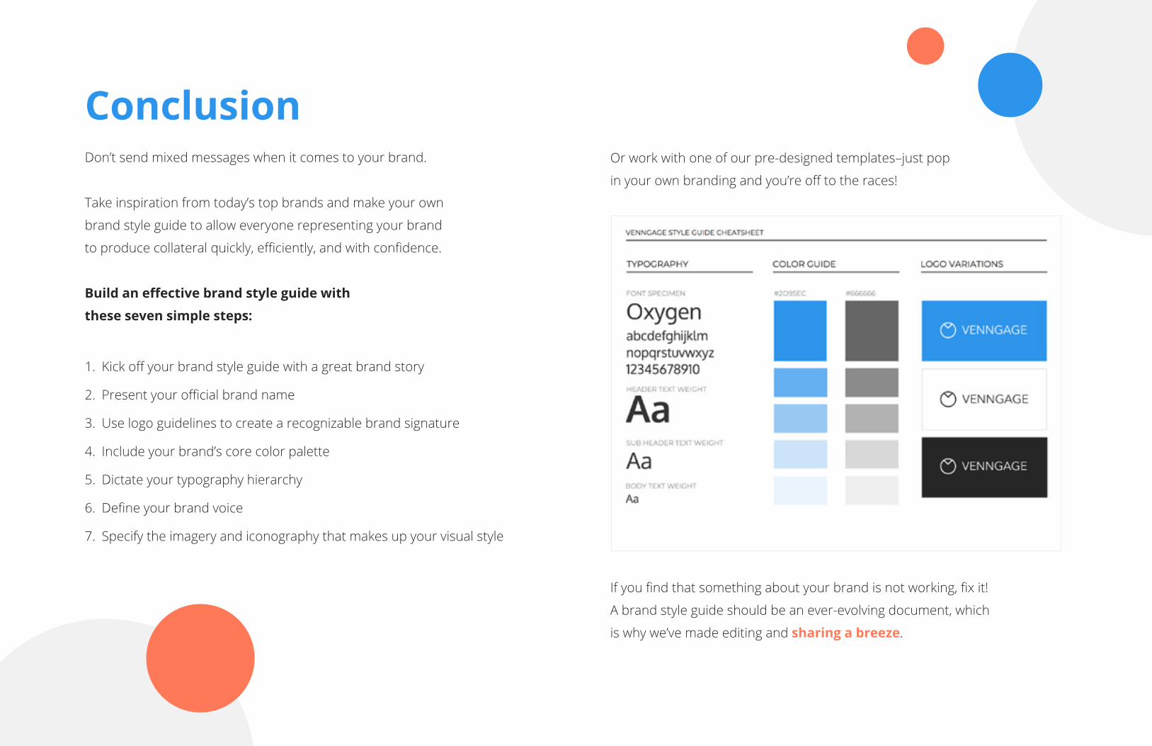
ConclusionDon’t send mixed messages when it comes to your brand.
Take inspiration from today’s top brands and make your own
brand style guide to allow everyone representing your brand
to produce collateral quickly, efficiently, and with confidence.
Build an effective brand style guide with
these seven simple steps:
1. Kick off your brand style guide with a great brand story
2. Present your official brand name
3. Use logo guidelines to create a recognizable brand signature
4. Include your brand’s core color palette
5. Dictate your typography hierarchy
6. Define your brand voice
7. Specify the imagery and iconography that makes up your visual style
48HubSpot + Venngage • Brand Syle Guide Kit
Hiring a graphic designer is pricey. With Venngage’s online graphic design
software, people of all design levels can create professional visuals.
Venngage’s Business plan offers over 500 customizable templates
for a wide variety of needs -- from infographics to presentations to
reports. Your Brand Kit makes it easy to apply your company logos,
brand fonts, and brand colors to any design.
Start designing like you never knew you could -- today!
Software to fuel your growth and build deeper relationships, from first hello to
happy customer and beyond.
With HubSpot’s marketing, sales, and CRM software, you
can focus on generating leads and revenue and forget
about managing a stack of scattered tools.
GET STARTED, FREE
GET STARTED


![[WEBINAR RECAP] Trade Secrets of Effective Brand Storytelling](https://img.pdfslide.net/doc/110x75/589e25611a28ab5c128b46f9/webinar-recap-trade-secrets-of-effective-brand-storytelling.jpg)