Embed Size (px)
Citation preview
Bulletin DECEMBER quaRtER 2012
Contents
article
Labour Market Turnover and Mobility 1
Dwelling Prices and Household Income 13
Households’ Interest-bearing Assets 23
India’s Services Exports 33
Australian OTC Derivatives Markets: Insights from the BIS Semiannual Survey 39
International Activities of Australian Banks 47
Foreign Exchange Reserves and the Reserve Bank’s Balance Sheet 57
Australia’s Financial Relationship with the International Monetary Fund 65
Speeches
Challenges for Central Banking – Governor 73
Producing Prosperity – Governor 81
What is Normal? – Deputy Governor 89
Australia and the World – Deputy Governor 97
The Labour Market, Structural Change and Recent Economic Developments – Deputy Governor 103
appendix
Reserve Bank Publications 111
Copyright and Disclaimer 113

The contents of this publication shall not be reproduced, sold or distributed without the prior consent of the Reserve Bank and, where applicable, the prior consent of the external source concerned. Requests for consent should be sent to the Head of Information Department at the address shown above.
ISSN 0725–0320 (Print)ISSN 1837–7211 (Online)
Print Post ApprovedPP 243459 / 00046
The Bulletin is published under the direction of the Publications Committee: Christopher Kent (Chairman), Ellis Connolly, Jacqui Dwyer, Peter Stebbing, James Holloway and Chris Thompson. The Committee Secretary is Paula Drew.
The Bulletin is published quarterly in March, June, September and December and is available at www.rba.gov.au. The next Bulletin is due for release on 21 March 2013.
For printed copies, the subscription of A$25.00 pa covers four quarterly issues each year and includes Goods and Services Tax and postage in Australia. Airmail and surface postage rates for overseas subscriptions are available on request. Subscriptions should be sent to the address below, with cheques made payable to Reserve Bank of Australia. Single copies are available at A$6.50 per copy if purchased in Australia.
Copies can be purchased by completing the publications order form on the Bank’s website or by writing to:
Mail Room SupervisorInformation DepartmentReserve Bank of AustraliaGPO Box 3947 Sydney NSW 2001
Bulletin Enquiries
Information DepartmentTel: (612) 9551 9830Facsimile: (612) 9551 8033Email: [email protected]
1Bulletin | D e c e m b e r Q ua r t e r 2012
IntroductionLabour mobility – the ability of workers to move between jobs – is an important aspect of economic flexibility that facilitates adjustment to economic shocks and structural change. Movements within the labour market allow workers to be matched with a suitable job that fits their preferences and in which they are economically productive. The process of matching workers to jobs is ongoing and is influenced by a range of factors. These include the career and life-cycle considerations of workers (which determine their job preferences) and economic developments, including the business cycle and structural change (which determine the number and types of jobs available in the economy).
Over the past decade, the resources boom and the associated appreciation of the exchange rate have created pressure for structural change, by changing the nature and location of available jobs. Although the degree of structural change has not been unprecedented in some respects (Productivity Commission 2012), there has nevertheless been considerable public discussion about the role of labour mobility in facilitating the necessary adjustment. This discussion has often focused on the
geographic aspects of matching jobs and workers, but there have also been important changes in the patterns of demand across industries and skills which require mobility between different types of jobs.
Although there are potential benefits associated with workers moving between jobs, there are also costs. In particular, it is widely recognised that job stability provides considerable benefits to workers in terms of economic security. Firms also benefit from retaining a stable and experienced workforce. The benefits of longer job tenure, and the costs associated with turnover, create a trade-off between labour mobility and job stability.
This article presents some stylised facts on labour turnover and assesses the role that labour mobility has played in the adjustment of the labour market over the past decade. The first section describes the extent of turnover within the labour market and the distribution of job tenure. The second section discusses the types of labour market turnover and their cyclical behaviour, focusing on the distinction between involuntary job changes, which tend to be countercyclical, and voluntary changes, which are procyclical. The final sections of the article focus on the industry and geographic aspects of labour market turnover and assess the role that
Labour Market Turnover and Mobility
* The authors are from Economic Analysis Department.
Patrick D’Arcy, Linus Gustafsson, Christine Lewis and Trent Wiltshire*
Labour mobility plays a role in allocating workers to suitable jobs and is important in helping the economy adjust to shocks and structural change. But there are also benefits from longer job tenure, and costs associated with workers changing jobs. This article presents some stylised facts about labour market movements and the role that labour mobility has played in facilitating economic adjustment over the past decade. While most worker turnover is associated with the normal process of workers moving between existing jobs, structural change and economic shocks also drive turnover by changing the number and type of jobs available in the economy. The movement of existing workers between different jobs has been an important mechanism facilitating changes in the industry and geographic structure of employment over the past decade.
2 ReseRve bank of austRalia
labouR MaRket tuRnoveR and Mobility
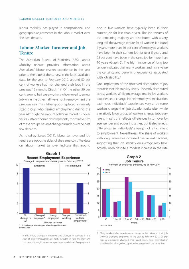
one in five workers have typically been in their current job for less than a year. The job tenures of the remaining majority are distributed with a very long tail: the average tenure for all workers is around 7 years, more than 40 per cent of employed workers have been in their current job for over 5 years, and 25 per cent have been in the same job for more than 10 years (Graph 2). The high incidence of long job tenure indicates that many workers and firms value the certainty and benefits of experience associated with job stability.2
One implication of the observed distribution of job tenure is that job stability is very unevenly distributed across workers. While on average one in five workers experiences a change in their employment situation each year, individuals’ experiences vary a lot: some workers change their job situation quite often while a relatively large group of workers change jobs very rarely. In part this reflects differences in turnover by age, gender and across industries, but it also reflects differences in individuals’ strength of attachment to employment. Nevertheless, the share of workers with long tenure has increased over recent decades, suggesting that job stability on average may have actually risen despite a modest increase in the rate
2 Many workers also experience a change in the nature of their job without changing employer; in the year to February 2012, 20 per cent of employees changed their usual hours, were promoted or transferred, or changed occupation but stayed with the same firm.
labour mobility has played in compositional and geographic adjustments in the labour market over the past decade.
Labour Market turnover and Job tenure The Australian Bureau of Statistics (ABS) Labour Mobility release provides information about Australians’ labour market experience in the year prior to the date of the survey. In the latest available data, for the year to February 2012, around 80 per cent of workers had not changed their jobs in the previous 12 months (Graph 1).1 Of the other 20 per cent, around half were workers who moved to a new job while the other half were not in employment the previous year. This latter group replaced a similarly sized group who ceased employment during the year. Although the amount of labour market turnover varies with economic developments, the relative size of these groups has not changed much over the past few decades.
As noted by Sweet (2011), labour turnover and job tenure are opposite sides of the same coin. The data on labour market turnover indicate that around
1 In this article, changes in employer and changes in business (in the case of owner-managers) are both included in ‘job changes’ and ‘turnover’, although owner-managers are a small share of employment.
Graph 1
0
2
4
6
8
0
2
4
6
8
Recent Employment ExperienceChange in employment status, year to February 2012
* Includes owner-managers who changed businessSource: ABS
Remainedoutside
employment
MEmployed
Worker turnover
M Not employed
Nochange in
job
Changedemployer*
Newlyemployed
Stoppedworking
Graph 2
0
5
10
15
20
25
30
0
5
10
15
20
25
30
Job TenurePer cent of employed persons, as at February
Source: ABS
%% n 1992n 2012
5 to <10 10 to <202 to <51 to <2<1Years
>20
3Bulletin | D e c e m b e r Q ua r t e r 2012
laBour Market turnover and MoBility
of casual employment over the course of the 1990s.3 This increase in tenure is partly due to the absence of a severe cyclical downturn over the past two decades.
Drivers of Labour Market turnover Some insight into labour market turnover can be obtained from the data on the reasons why workers separate from their job. It is useful to distinguish between two broad types of job separation based on whether it is the firm’s or the worker’s decision to separate. ‘Involuntary’ job separations are initiated by firms and account for about a third of all separations, while ‘voluntary’ separations are initiated by workers and account for around two-thirds of all separations (Table 1).4 Involuntary separations
3 Welters and Mitchell (2009) explore the relationship between worker characteristics and job security using the Household, Income and Labour Dynamics in Australia (HILDA) Survey; they characterise some workers as being trapped in casual employment that does not lead to more permanent forms of employment.
4 Note that the classifications of involuntary and voluntary separations used in this article differ slightly from those in the ABS Labour Mobility release. In particular, because the main distinction here is the party that initiated the separation, separations due to ill health are classified as voluntary.
include retrenchments and temporary jobs ending.5 Voluntary separations can be classified as ‘job-sorting resignations’, where workers leave a job with the intention of beginning or finding another job, or separations for life-cycle and personal reasons.
In theory both types of involuntary separations – retrenchments and temporary jobs ending – may be either a job closure (where a firm decides that the job is no longer economically viable and does not intend to replace the worker in that job) or a dismissal (where the intention is to find a more suitable replacement worker). Although the ABS data do not distinguish between job closures and dismissals, retrenchments are likely to be a good proxy for job closures.
From a macroeconomic perspective, retrenchments are important because they are driven by cyclical
5 Although in some cases it will be the worker’s preference to take on and finish a temporary job, temporary jobs ending are categorised as involuntary separations as it is assumed that in most cases workers available for a temporary job are available for, and would prefer to, work in an ongoing job.
Table 1: Reasons for Job SeparationsYear to February 2012
Type Number Share of all separations
’000 Per cent
Involuntary 813 32
– Retrenchments(a) 390 15
– Temporary jobs ending(b) 423 17
Voluntary 1 702 68
– Job-sorting(c) 912 36
– Life-cycle and personal reasons(d) 790 31
Total 2 514(e) 100(a) Reasons include retrenched or employer went out of business (b) Reasons include job was temporary or seasonal(c) Reasons include to obtain a better job or wanted a change, unsatisfactory work conditions, to start own or new business, and
closed or sold business for economic reasons(d) Reasons include family reasons, left holiday job to return to studies, own ill health or injury, closed or sold own business for
non-economic reasons and retirement(e) The total is larger than the sum of ‘changed employer’ and ‘stopped working’ in Graph 1 because it includes people who worked
during part of the year but not at the start or end; in Graph 1 they are included in ‘remained outside employment’Source: ABS
4 ReseRve bank of austRalia
labouR MaRket tuRnoveR and Mobility
and structural developments, and include jobs lost when a firm closes or downsizes its workforce, as often occurs in economic downturns. They are also driven by structural developments, such as changes in technology or the loss of competitiveness in a particular industry, that force firms to adjust their workforce by closing some jobs.
Separations from temporary jobs ending also reflect both job closures and dismissals. The number of temporary jobs ending has increased as a share of separations over recent decades. Although some jobs are inherently temporary in nature, it is possible that firms have increasingly used temporary employment to avoid some of the costs associated with dismissing unsuitable permanent employees. It could also reflect the increasing significance of temporary employment in the services sector.
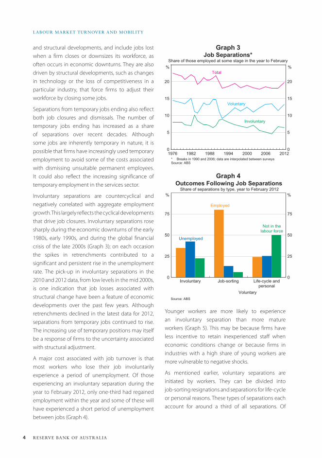
Involuntary separations are countercyclical and negatively correlated with aggregate employment growth. This largely reflects the cyclical developments that drive job closures. Involuntary separations rose sharply during the economic downturns of the early 1980s, early 1990s, and during the global financial crisis of the late 2000s (Graph 3); on each occasion the spikes in retrenchments contributed to a significant and persistent rise in the unemployment rate. The pick-up in involuntary separations in the 2010 and 2012 data, from low levels in the mid 2000s, is one indication that job losses associated with structural change have been a feature of economic developments over the past few years. Although retrenchments declined in the latest data for 2012, separations from temporary jobs continued to rise. The increasing use of temporary positions may itself be a response of firms to the uncertainty associated with structural adjustment.
A major cost associated with job turnover is that most workers who lose their job involuntarily experience a period of unemployment. Of those experiencing an involuntary separation during the year to February 2012, only one-third had regained employment within the year and some of these will have experienced a short period of unemployment between jobs (Graph 4).
Graph 3
Graph 4
0
5
10
15
20
0
5
10
15
20
Job Separations*Share of those employed at some stage in the year to February
* Breaks in 1990 and 2006; data are interpolated between surveysSource: ABS
2012
Total%%
Voluntary
Involuntary
200620001994198819821976
0
25
50
75
0
25
50
75
Outcomes Following Job Separations Share of separations by type, year to February 2012
Source: ABS
Life-cycle andpersonal
Unemployed
%%
Employed
Not in thelabour force
Job-sortingInvoluntary
Voluntary
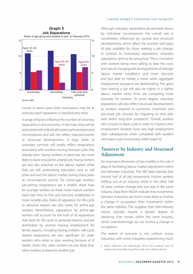
Younger workers are more likely to experience an involuntary separation than more mature workers (Graph 5). This may be because firms have less incentive to retain inexperienced staff when economic conditions change or because firms in industries with a high share of young workers are more vulnerable to negative shocks.
As mentioned earlier, voluntary separations are initiated by workers. They can be divided into job-sorting resignations and separations for life-cycle or personal reasons. These types of separations each account for around a third of all separations. Of
5Bulletin | D e c e m b e r Q ua r t e r 2012
laBour Market turnover and MoBility
Although voluntary separations are primarily driven by individual circumstances, the overall rate is nonetheless influenced by cyclical and structural developments, which affect the number and types of jobs available for those seeking a job change. In contrast to involuntary separations, voluntary separations tend to be procyclical. This is consistent with workers being most willing to bear the costs and risks of changing jobs during periods of stronger labour market conditions and more reluctant and less able to initiate a move when aggregate employment prospects are deteriorating. The gains from leaving a job will also be higher in a tighter labour market when firms are competing more intensely for workers. To some degree, voluntary separations will also reflect structural developments as workers respond to economic incentives and pre-empt job closures by migrating to new jobs with better long-term prospects.6 Overall, workers who choose to leave a job in order to improve their employment situation have very high employment rates subsequently when compared with workers who leave a job involuntarily (refer Graph 4).
turnover by Industry and Structural adjustmentAn important dimension of job mobility is the role it plays in facilitating labour market adjustment within and between industries. The ABS data indicate that around half of all job movements involve workers shifting out of an industry while in the other half of cases workers change jobs but stay in the same industry. Data from HILDA indicate that movements between industries are much more likely to involve a change in occupation than movements within the same industry. This suggests that inter-industry moves typically require a greater degree of retraining than moves within the same industry, which overwhelmingly do not involve a change in occupation.
The extent of turnover is not uniform across industries, with some industries experiencing much
6 Davis, Faberman and Haltiwanger (2012) find evidence that US workers are more likely to quit firms that are in relative decline.
Graph 5
0
5
10
0
5
10
Job Separations Share of age group who worked in year, to February 2012
Source: ABS
Life-cycle andpersonal
Aged 15–24years
%%
Aged 25–54years
Aged 55+years
Job-sortingInvoluntary
Voluntary
course in some cases both motivations may be at work but each separation is classified only once.
A range of factors influence the number of voluntary separations in the economy. In the main, they will be associated with individuals’ career paths and personal circumstances and will not reflect macroeconomic or structural developments. A large share of voluntary turnover will simply reflect resignations associated with workers moving between jobs that already exist. Young workers in particular are more likely to leave one job for a better job. Young workers are also less attached to the labour market while they are still undertaking education, and so will enter and exit the labour market during these years as circumstances permit. For prime-age workers, job-sorting resignations are a smaller share than for younger workers as these more mature workers have had time to find and become established in more suitable jobs. Rates of separation for life-cycle or personal reasons are also lower for prime-age workers. Nevertheless, separations by prime-age workers still account for the bulk of all separations that were for life-cycle or personal reasons, and are dominated by women leaving employment for family reasons, including having children. Life-cycle related separations are also significant for older workers who retire or stop working because of ill health. Given this, older workers are less likely than other workers to leave for another job.
6 ReseRve bank of austRalia
labouR MaRket tuRnoveR and Mobility
or industry. Conversely, younger workers with less experience specific to their firm or industry, and who typically earn relatively low wages, will not face the same disincentive to moving jobs.
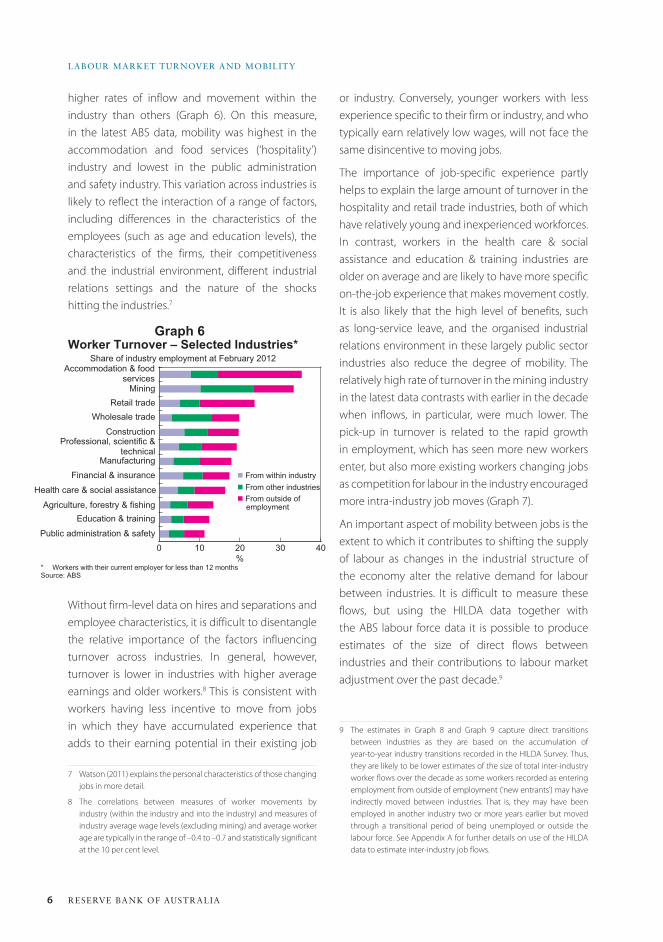
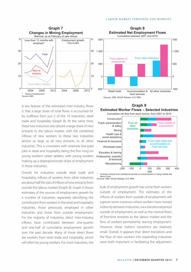
The importance of job-specific experience partly helps to explain the large amount of turnover in the hospitality and retail trade industries, both of which have relatively young and inexperienced workforces. In contrast, workers in the health care & social assistance and education & training industries are older on average and are likely to have more specific on-the-job experience that makes movement costly. It is also likely that the high level of benefits, such as long-service leave, and the organised industrial relations environment in these largely public sector industries also reduce the degree of mobility. The relatively high rate of turnover in the mining industry in the latest data contrasts with earlier in the decade when inflows, in particular, were much lower. The pick-up in turnover is related to the rapid growth in employment, which has seen more new workers enter, but also more existing workers changing jobs as competition for labour in the industry encouraged more intra-industry job moves (Graph 7).
An important aspect of mobility between jobs is the extent to which it contributes to shifting the supply of labour as changes in the industrial structure of the economy alter the relative demand for labour between industries. It is difficult to measure these flows, but using the HILDA data together with the ABS labour force data it is possible to produce estimates of the size of direct flows between industries and their contributions to labour market adjustment over the past decade.9
9 The estimates in Graph 8 and Graph 9 capture direct transitions between industries as they are based on the accumulation of year-to-year industry transitions recorded in the HILDA Survey. Thus, they are likely to be lower estimates of the size of total inter-industry worker flows over the decade as some workers recorded as entering employment from outside of employment (‘new entrants’) may have indirectly moved between industries. That is, they may have been employed in another industry two or more years earlier but moved through a transitional period of being unemployed or outside the labour force. See Appendix A for further details on use of the HILDA data to estimate inter-industry job flows.
higher rates of inflow and movement within the industry than others (Graph 6). On this measure, in the latest ABS data, mobility was highest in the accommodation and food services (‘hospitality’) industry and lowest in the public administration and safety industry. This variation across industries is likely to reflect the interaction of a range of factors, including differences in the characteristics of the employees (such as age and education levels), the characteristics of the firms, their competitiveness and the industrial environment, different industrial relations settings and the nature of the shocks hitting the industries.7
Without firm-level data on hires and separations and employee characteristics, it is difficult to disentangle the relative importance of the factors influencing turnover across industries. In general, however, turnover is lower in industries with higher average earnings and older workers.8 This is consistent with workers having less incentive to move from jobs in which they have accumulated experience that adds to their earning potential in their existing job
7 Watson (2011) explains the personal characteristics of those changing jobs in more detail.
8 The correlations between measures of worker movements by industry (within the industry and into the industry) and measures of industry average wage levels (excluding mining) and average worker age are typically in the range of –0.4 to –0.7 and statistically significant at the 10 per cent level.
Graph 6
0 10 20 30 40
Worker Turnover – Selected Industries*
%
Accommodation & foodservices
Agriculture, forestry & fishing
Construction
Education & training
Mining
Wholesale trade
Financial & insurance
Professional, scientific &technical
* Workers with their current employer for less than 12 monthsSource: ABS
Share of industry employment at February 2012
Manufacturingn From within industryn From other industriesn From outside of
employment
Retail trade
Public administration & safety
Health care & social assistance
7Bulletin | D e c e m b e r Q ua r t e r 2012
laBour Market turnover and MoBility
A key feature of the estimated inter-industry flows is that a large share of total flows is accounted for by outflows from just 2 of the 19 industries: retail trade and hospitality (Graph 8). At the same time, these two industries also absorb a large share of new entrants to the labour market, with the combined inflows of new workers to these two industries almost as large as all new entrants to all other industries. This is consistent with relatively low-paid jobs in retail and hospitality being the first ‘rung’ on young workers’ career ladders, with young workers making up a disproportionate share of employment in these industries.
Overall, for industries outside retail trade and hospitality, inflows of workers from other industries are about half the size of inflows of new entrants from outside the labour market (Graph 8). Graph 9 shows estimates of the sources of employment growth for a number of industries, separately identifying the contribution from workers in the retail and hospitality industries, those previously employed in other industries and those from outside employment. For the majority of industries, direct inter-industry inflows have contributed between one-quarter and one-half of cumulative employment growth over the past decade. Many of these direct flows are workers from retail trade and hospitality, which will often be young workers. For most industries, the
Graph 7 Graph 8
Graph 9
Changes in Mining EmploymentBiennial, as at February of year shown
0
10
20
30
0
10
20
30
* Share of employmentSource: ABS
2012
Total
% Less than 12 months withemployer*
%Employment growthYear-ended
New toindustry
From within industry
20082004 201220082004 -500
0
500
-500
0
500
Estimated Net Employment FlowsCumulative between 2001 and 2010
Sources: ABS; HILDA Release 10.0; RBA
All other industries
’000
Accommodation &food services
Retail trade
From outside ofemployment
’000
From other industries
1 0001 000
-200 -100 0 100 200 300 400
Estimated Worker Flows – Selected Industries
’000
Health care &social assistance
Public administration& safety
Construction
Education & training
Mining
Wholesale trade
Financial & insurance
Professional, scientific& technical
* Includes workers from transitional periods of unemployment or being outside thelabour force
Sources: ABS; HILDA Release 10.0; RBA
Cumulative net flow from each source, from 2001 to 2010
From allother
industries
From outside ofemployment*
From retail trade andaccommodation &
food services
Manufacturing
bulk of employment growth has come from workers outside of employment. The estimates of the inflows of workers from outside of employment will capture some instances where workers have moved indirectly between industries, via a transitional period outside of employment, as well as the normal flows of first-time entrants to the labour market and the flow of workers permanently leaving employment. However, these indirect transitions are relatively small. Overall, it appears that direct transitions and the flow of new workers into expanding industries were both important in facilitating the adjustment
8 ReseRve bank of austRalia
labouR MaRket tuRnoveR and Mobility
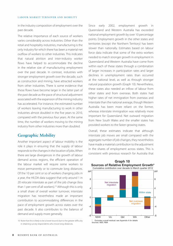
Since early 2002, employment growth in Queensland and Western Australia has exceeded national employment growth by over 10 percentage points. Employment growth in the other states and territories (except the Northern Territory) has been slower than nationally. Estimates based on labour force data indicate that some of the extra workers needed to match stronger growth in employment in Queensland and Western Australia have come from within each of these states through a combination of larger increases in participation rates and larger declines in unemployment rates than occurred at the national level, as well as through stronger natural population growth (Graph 10). Nevertheless, these states also needed an inflow of labour from other states and from overseas. Both states had higher rates of net immigration from overseas and interstate than the national average, though Western Australia has been more reliant on the former, whereas interstate immigration was relatively more important for Queensland. Net outward migration from New South Wales and the smaller states has provided workers to the faster-growing states.
Overall, these estimates indicate that although interstate job moves are small compared with the aggregate number of job changes, they nevertheless have made a material contribution to the adjustment in the shares of employment across states. This is consistent with previous research for Australia that
in the industry composition of employment over the past decade.
The relative importance of each source of workers varies considerably across industries. Other than the retail and hospitality industries, manufacturing is the only industry for which there has been a material net outflow of workers to other industries. This indicates that natural attrition and inter-industry worker flows have helped to accommodate the decline in the relative size of manufacturing employment over the past decade. In contrast, industries with stronger employment growth over the decade, such as construction and mining, have attracted workers from other industries. There is some evidence that these flows have become larger in the latter part of the past decade as the pace of structural adjustment associated with the expansion of the mining industry has accelerated. For instance, the estimated number of workers leaving manufacturing to work in other industries almost doubled in the five years to 2010, compared with the previous four years. At the same time, the number of workers moving to the mining industry from other industries more than doubled.
Geographic MobilityAnother important aspect of labour mobility is the role it plays in ensuring that the supply of labour responds to the changes in the location of jobs. When there are large divergences in the growth of labour demand across regions, the efficient operation of the labour market will require some workers to move permanently or to commute long distances. Of the 10 per cent or so of workers changing jobs in a year, the HILDA data suggest that only around 1 in 20 relocate interstate as part of the job change (less than 1 per cent of all workers).10 Although this is only a small share of overall worker turnover, interstate migration has nevertheless made an important contribution to accommodating differences in the pace of employment growth across states over the past decade. It also contributes to the balance of demand and supply more generally.
10 Note that this is likely to be a lower bound due to the greater difficulty in retaining survey respondents who move long distances.
Graph 10
-8
-4
0
4
8
-8
-4
0
4
8
Sources of Relative Employment Growth*Cumulative contribution over decade to March quarter 2012
* Excludes a small residual; see Appendix A for detailsSources: ABS; RBA
NSW
Net interstatemigration
ppt
Vic Qld WA Other
ppt
Within state
Net overseasmigration
9Bulletin | D e c e m b e r Q ua r t e r 2012
laBour Market turnover and MoBility
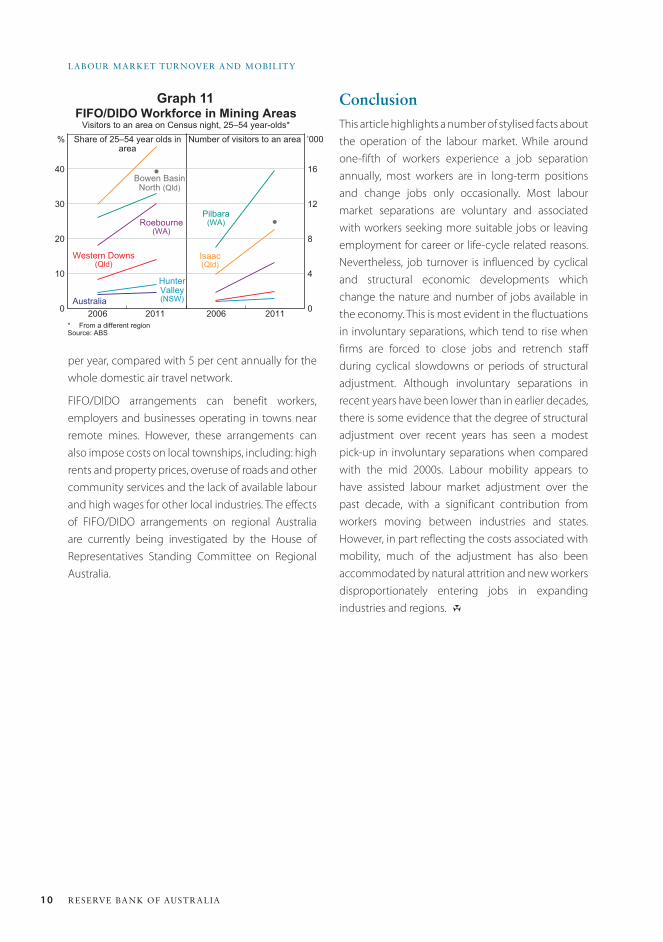
the 2011 Census suggest that around 1½ per cent of employed people commute interstate. This is around the same size as the group of employed people who had moved from another state in the previous year. While interstate commuters are a relatively small share of employment, they appear to have been important at the margin in recent years: between 2006 and 2011 there were significant increases in the number of commuters to Western Australia and the Northern Territory. The number of commuters to Western Australia more than doubled, to 13 600, with the net increase equivalent to 4 per cent of the net employment growth in Western Australia over that period. The data show that long-distance commuters disproportionately work in mining, construction and public administration. Most of the increase in commuting to Western Australia was to regional areas, where much of the mining-related work takes place.
This long-distance commuting – both by flying and driving – has been a defining characteristic of the current mining boom and helped employers to meet their labour demand requirements given the reluctance of workers to move permanently to remote areas. The increase in commuting discussed above partly reflects a significant increase in the use of fly-in fly-out and drive-in drive-out (FIFO/DIDO) workers in mining and related roles due to the rapid growth in mining investment over the past 5 to 10 years.14 Census data and other industry sources suggest that there are currently upwards of 50 000 FIFO/DIDO workers involved in mining and mining-related construction. In some mining regions – such as the Pilbara and the Bowen Basin – 30 to 40 per cent of all 25–54 year olds appear to be FIFO/DIDO workers, which is a 50 per cent rise in the shares since 2006 (Graph 11). This increase is also apparent in transportation data: over the past decade, passenger movements to and from airports located near mining towns grew by 10 to 20 per cent
14 These work practices involve a worker residing in accommodation near their workplace for a period of time while scheduled to work, before returning to their home when not working.
has found that migration is an important mechanism of labour market adjustment (Debelle and Vickery 1998; Lawson and Dwyer 2002).11
The different experiences of Queensland and Western Australia in attracting workers from interstate to meet an increase in labour demand are likely to reflect the nature of the costs and benefits of relocating.12 Western Australia has consistently recorded a lower unemployment rate, higher vacancy rate and higher average earnings than Queensland over the past decade. However, despite labour market prospects appearing to be stronger in Western Australia, it has attracted fewer workers from interstate than Queensland. There are two possible explanations for this. The first is that the non-economic costs of relocating to the west are perceived to be higher, perhaps because the amenity value of the job locations (in terms of lifestyle, social infrastructure, proximity to family and other networks) is perceived as being lower than in the eastern states. This is consistent with information from the Bank’s liaison program suggesting that firms often find workers in eastern states reluctant to move west. The second possible explanation is that there is a skills mismatch, with workers in the eastern states often not having the necessary skills to fill the available roles.
An alternative to permanent relocation that allows workers to take advantage of stronger labour market conditions without incurring all of the costs is long-distance commuting.13 This is particularly relevant when the work is not long term. Data from
11 It is possible that the responsiveness of migration to relative employment demand has increased in recent years. McKissack et al (2008) updated estimates from the Debelle and Vickery (1998) model and found the response of migration to be larger than in the original shorter sample.
12 Research using micro-level data shows that for Australia and several other countries, rates of interstate movement are higher for people who have higher incomes and have no children, which suggests that the financial and non-financial costs of moving are an important factor in the decision to migrate. For example, see Berger-Thomson and Roberts (2012).
13 We define commuting as the usual place of work being in a different state to the usual residence. Note that the Labour Force release will record commuters as being employed in their state of residence.
10 ReseRve bank of austRalia
labouR MaRket tuRnoveR and Mobility
per year, compared with 5 per cent annually for the whole domestic air travel network.
FIFO/DIDO arrangements can benefit workers, employers and businesses operating in towns near remote mines. However, these arrangements can also impose costs on local townships, including: high rents and property prices, overuse of roads and other community services and the lack of available labour and high wages for other local industries. The effects of FIFO/DIDO arrangements on regional Australia are currently being investigated by the House of Representatives Standing Committee on Regional Australia.
Graph 11FIFO/DIDO Workforce in Mining Areas
Visitors to an area on Census night, 25–54 year-olds*
0
10
20
30
40
0
4
8
12
16
* From a different regionSource: ABS
2011
Isaac(Qld)
’000Share of 25–54 year olds inarea
2011 20062006
Pilbara(WA)Roebourne
(WA)
Australia
HunterValley(NSW)
Western Downs(Qld)
Bowen BasinNorth (Qld)
% Number of visitors to an area
ConclusionThis article highlights a number of stylised facts about the operation of the labour market. While around one-fifth of workers experience a job separation annually, most workers are in long-term positions and change jobs only occasionally. Most labour market separations are voluntary and associated with workers seeking more suitable jobs or leaving employment for career or life-cycle related reasons. Nevertheless, job turnover is influenced by cyclical and structural economic developments which change the nature and number of jobs available in the economy. This is most evident in the fluctuations in involuntary separations, which tend to rise when firms are forced to close jobs and retrench staff during cyclical slowdowns or periods of structural adjustment. Although involuntary separations in recent years have been lower than in earlier decades, there is some evidence that the degree of structural adjustment over recent years has seen a modest pick-up in involuntary separations when compared with the mid 2000s. Labour mobility appears to have assisted labour market adjustment over the past decade, with a significant contribution from workers moving between industries and states. However, in part reflecting the costs associated with mobility, much of the adjustment has also been accommodated by natural attrition and new workers disproportionately entering jobs in expanding industries and regions. R
11Bulletin | D e c e m b e r Q ua r t e r 2012
laBour Market turnover and MoBility
Appendix A
Sources of employment growth by industry
The estimates of sources of employment growth by industry presented in this article have been produced using data from both the HILDA Survey and the ABS Labour Force release. By looking at changes between consecutive years in the HILDA variables on ‘Current main job industry’ (jbmi61) and ‘Labour force status – broad’ (esbrd) for individual respondents, annual estimates of the number of transitions between industries, and into and out of employment for each industry, were produced. However, in the HILDA dataset, a relatively large number of workers had their industry classifications changed even though they remained with the same employer. To try to correct for these spurious industry reclassifications, transitions between industries were only considered actual transitions if the worker also reported having changed employer over the year (using HILDA variables pjsemp and pjmsemp). It is important to note that because the estimates use year-to-year movements, they are best thought of as estimates of direct inter-industry flows.
The number of employed 15 year olds was also estimated for each industry, as these workers are new entrants not captured by the transitions within the labour force. For each industry, these data were used to estimate the number of workers that remained in the industry, the net flow of workers from other industries, the net number of workers entering from unemployment or from outside of the labour force, and employed 15 year olds.
The estimated composition for each industry was then applied to the level of industry employment (Emp) reported in the Labour Force release, giving estimates of the actual size of the annual employment flows that
contribute to employment growth:
For most industries, the estimated flows do not fully account for employment growth. The main reason for this is that the transitions within the labour force do not capture migrants that arrived or departed during the year. Due to its design, the HILDA Survey is not a comprehensive source of information on these year-to-year movements. In the results presented in this article, the residuals resulting from not having information on migrants have been included in the ‘from outside of employment’ component.
Sources of employment growth by state and territory
For each state and territory employment growth is decomposed into the contributions from the change in the ratio of employment to working-age population and the contribution from population growth as follows:
∆EmpFlow fromother industries
EmpEmp
Flow fromt
t
tt= +
uunemploymentEmp
Emp
Flow fromnot inthe labour fo
t
tt
+rrce
EmpEmp
Number of year oldsEmp
Emp residt
tt
t
tt+ +
15uual
HILDA HILDA
HILDA HILDA
∆ ∆ ∆EmpEmpPop
PopEmpPopt
t
tt i
t i
t i
=
+−
−
−
PPopEmpPop
Pop
EmpPop
tt
tt
t
t
( )+
( )
≈
∆ ∆
∆
+−
−
−=+Pop
EmpPop
Natural int it i
t ijiΣ 0
1 ccrease
EmpPop
Net interstatemi
t j
t i
t iji
−
−
−=+
( )
+ Σ 01 ggration
EmpPop
Net overseasmigt jt i
t iji
−−
−=+( )+ Σ 0
1 rrationt j−( )
12 ReseRve bank of austRalia
labouR MaRket tuRnoveR and Mobility
References Berger-Thomson L and N Roberts (2012), ‘Labour Market
Dynamics: Cross-country Insights from Panel Data’, RBA
Bulletin, March, pp 27–36.
Davis SJ, RJ Faberman and J Haltiwanger (2012), ‘Labor
Market Flows in the Cross Section and Over Time’, Journal of
Monetary Economics, 59(1), pp 1–18.
Debelle G and J Vickery (1998), ‘Labour Market
Adjustment: Evidence on Interstate Labour Mobility’, RBA
Research Discussion Paper No 9801.
Lawson J and J Dwyer (2002), ‘Labour Market Adjustment
in Regional Australia’, RBA Research Discussion Paper
No 2002-04.
where Emp is employment, Pop is population, t-i is the base period and Δ is the change in the variable from the base period to time t.
In the first equation, the first term is the contribution of the increase in the employment rate, the second term is contribution from the increase in population and the third term is the interaction effect between the change in the employment rate and population growth. In the second equation, population growth is decomposed into its three components: natural increase, net interstate migration and net overseas migration. In practice, the interaction effect between higher employment rates and population growth is small, at a maximum of 2 percentage points of employment growth, and is excluded from the second equation and Graph 10.
For each state and territory estimates of each source of working-age population growth are obtained by combining the flows from the Australian Demographic Statistics release with annual estimates of the share that was of working age based on other ABS publications. As these do not exactly total the growth in working-age population in each state, they are scaled up to the total. In Graph 10, contributions of the employment rate and natural increase are summed to produce ‘within state’. The national percentage point contributions are then subtracted from each state’s contributions, to assess the divergence from the national average.
McKissack A, J Chang, R Ewing and J Rahman (2008), ‘Structural Effects of a Sustained Rise in the Terms of Trade’,
Treasury Working Paper No 2008–01.
Productivity Commission (2012), Annual Report 2011–12.
Sweet R (2011), The Mobile Worker: Concepts, Issues,
Implications, National Centre for Vocational Education
Research Report, Adelaide.
Watson I (2011), Does Changing Your Job Leave You Better
Off? A Study of Labour Mobility in Australia, 2002 to 2008,
National Centre for Vocational Education Research Report,
Adelaide.
Welters R and W Mitchell (2009), ‘Locked-in Casual
Employment’, University of Newcastle Centre of Full
Employment and Equity Working Paper No 09–03.
13Bulletin | d e c e m b e r Q ua r t e r 2012
IntroductionThe purchase of a dwelling is, for many households, the largest financial decision they will make, and their home is their most valuable asset. Household net worth is therefore closely linked to dwelling prices, while a sizeable share of household income is devoted to mortgage interest payments. Developments in the housing market can also have significant effects on the wider economy, while residential mortgages constitute the majority of Australian banks’ assets, making a sound housing market important for financial stability. More broadly, dwellings are valuable as they provide an essential service – that of shelter – so the affordability of housing has important implications for welfare. For all these reasons the Reserve Bank analyses the housing market and tracks various housing market indicators, including prices, auction clearance rates, turnover and arrears.
This article analyses dwelling prices over the past four decades, concentrating on prices relative to household income. This ratio helps to take account of growth in real incomes and overall inflation, and is an intuitive measure because income is a major determinant of how much a prospective buyer can afford to pay for a dwelling. In other words, the price-to-income ratio gives an indication of the
relative expense of a home for a typical household. It is also widely cited by commentators, and is often taken as a summary statistic of over- or undervaluation in the housing market. However, many other relevant valuation metrics exist. The ‘user cost’ framework, for example, compares the cost of home ownership (consisting primarily of mortgage interest payments, maintenance, depreciation, insurance costs and property taxes, offset by any expected capital gains), with the alternative cost of renting.1 A related measure is the ratio of dwelling prices to rents, which is analogous to the price-to-earnings ratio for equities. Other measures of housing affordability include the deposit gap (the gap between a household’s borrowing capacity and the purchase price, as a share of disposable income) and the ratio of interest payments to income.2
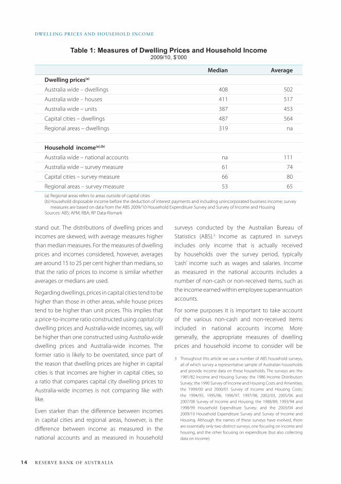
Measures of Dwelling Prices and Incomes for australiaOne complicating factor for this type of analysis is that there are many different measures of dwelling prices and household income. Table 1 lists a number of such measures, from which a few broad points
1 See, for example, Himmelberg, Mayer and Sinai (2005) and Brown et al (2011) for user cost studies applied to the United States and Australia, respectively.
2 Yates (2011) provides further information on some of these metrics, as well as analysis on particular age cohorts, tenure types and income quintiles.
Dwelling Prices and Household Income
* The authors are from Economic Analysis Department.
This article analyses trends in dwelling prices over the past four decades through the prism of the price-to-income ratio. Exactly which measures of dwelling prices and household income are the most appropriate depends on the question being analysed, but the various measures considered here all show broadly similar trends. Comparing equivalently defined price-to-income ratios across countries, Australia’s experience appears to be broadly in line with those of other advanced economies, with the exception of the United States and Japan which both have particularly low ratios.
Ryan Fox and Richard Finlay*
14 ReseRve bank of austRalia
Dwelling PRices anD HouseHolD income
surveys conducted by the Australian Bureau of Statistics (ABS).3 Income as captured in surveys includes only income that is actually received by households over the survey period, typically ‘cash’ income such as wages and salaries. Income as measured in the national accounts includes a number of non-cash or non-received items, such as the income earned within employee superannuation accounts.
For some purposes it is important to take account of the various non-cash and non-received items included in national accounts income. More generally, the appropriate measures of dwelling prices and household income to consider will be
3 Throughout this article we use a number of ABS household surveys, all of which survey a representative sample of Australian households and provide income data on these households. The surveys are: the 1981/82 Income and Housing Survey; the 1986 Income Distribution Survey; the 1990 Survey of Income and Housing Costs and Amenities; the 1999/00 and 2000/01 Survey of Income and Housing Costs; the 1994/95, 1995/96, 1996/97, 1997/98, 2002/03, 2005/06 and 2007/08 Survey of Income and Housing; the 1988/89, 1993/94 and 1998/99 Household Expenditure Survey; and the 2003/04 and 2009/10 Household Expenditure Survey and Survey of Income and Housing. Although the names of these surveys have evolved, there are essentially only two distinct surveys, one focusing on income and housing, and the other focusing on expenditure (but also collecting data on income).
stand out. The distributions of dwelling prices and incomes are skewed, with average measures higher than median measures. For the measures of dwelling prices and incomes considered, however, averages are around 15 to 25 per cent higher than medians, so that the ratio of prices to income is similar whether averages or medians are used.
Regarding dwellings, prices in capital cities tend to be higher than those in other areas, while house prices tend to be higher than unit prices. This implies that a price-to-income ratio constructed using capital city dwelling prices and Australia-wide incomes, say, will be higher than one constructed using Australia-wide dwelling prices and Australia-wide incomes. The former ratio is likely to be overstated, since part of the reason that dwelling prices are higher in capital cities is that incomes are higher in capital cities, so a ratio that compares capital city dwelling prices to Australia-wide incomes is not comparing like with like.
Even starker than the difference between incomes in capital cities and regional areas, however, is the difference between income as measured in the national accounts and as measured in household
Table 1: Measures of Dwelling Prices and Household Income2009/10, $’000
Median Average
Dwelling prices(a)
Australia wide – dwellings 408 502
Australia wide – houses 411 517
Australia wide – units 387 453
Capital cities – dwellings 487 564
Regional areas – dwellings 319 na
Household income(a),(b)
Australia wide – national accounts na 111
Australia wide – survey measure 61 74
Capital cities – survey measure 66 80
Regional areas – survey measure 53 65(a) Regional areas refers to areas outside of capital cities(b) Household disposable income before the deduction of interest payments and including unincorporated business income; survey
measures are based on data from the ABS 2009/10 Household Expenditure Survey and Survey of Income and HousingSources: ABS; APM; RBA; RP Data-Rismark
15Bulletin | d e c e m b e r Q ua r t e r 2012
Dwelling Prices anD HouseHolD income
Graph 1
influenced by the question that is being examined. For example, to assess how easily a typical household from Adelaide could purchase a typical Adelaide house, it would be appropriate to use the median Adelaide house price and compare that to the median disposable income of households living in Adelaide. Here a ‘typical household’ is taken as a household earning a median income. Similarly, a ‘typical dwelling’ is taken as a median-priced dwelling. Medians are more appropriate than averages in measuring what is ‘typical’, since averages can be heavily influenced by a small number of very high income earners or high-priced dwellings. Conversely, to compare price-to-income ratios across different countries, it is important to use internationally comparable measures of prices and incomes. The best internationally comparable measure of income is average household income from the national accounts (discussed in more detail below), which has the added advantage that it provides a longer time series than alternatives. In this case, for consistency, average dwelling prices should be used rather than median dwelling prices.4
4 In addition to those listed above, there are a number of other sources one can look to for data on incomes. The Household, Income and Labour Dynamics in Australia (HILDA) Survey is a household survey that is broadly similar to the ABS surveys, although its history is shorter. Median Australia-wide household income as recorded in HILDA in 2010 was $65 000, similar to that recorded in the ABS survey. The Census also provides data on incomes, with the 2011 Census suggesting that median before-tax household income was $64 000. The Australian Taxation Office (ATO) provides data on individual, although not household, income. In 2009/10, the median taxable income of individuals lodging tax returns was $69 000. Finally, the ABS provide data on average wage and salary earnings, again for individuals as opposed to households. These data imply average before-tax earnings from wages and salaries of $50 000 in 2010. The measures of income we use have a number of advantages over these alternative income measures. For median income, the ABS surveys provide a longer time series than HILDA does, are more frequent than the Census, and capture household income rather than individual income as per the ATO data. For average income, the national accounts capture income from sources other than wages and salaries, and again allow us to look at household income, not just individual income. Dwellings are typically purchased by households, rather than individuals within households, so it makes sense to consider household income rather than individual income. Nonetheless, price-to-income ratios based on these alternative income measures show broadly similar dynamics to those we concentrate on, with the ratios generally rising between the late 1980s and early 2000s, and stabilising more recently.
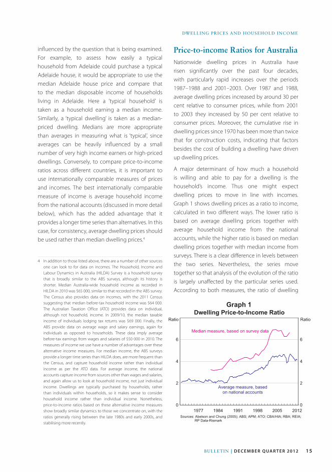
Price-to-income Ratios for australiaNationwide dwelling prices in Australia have risen significantly over the past four decades, with particularly rapid increases over the periods 1987–1988 and 2001–2003. Over 1987 and 1988, average dwelling prices increased by around 30 per cent relative to consumer prices, while from 2001 to 2003 they increased by 50 per cent relative to consumer prices. Moreover, the cumulative rise in dwelling prices since 1970 has been more than twice that for construction costs, indicating that factors besides the cost of building a dwelling have driven up dwelling prices.
A major determinant of how much a household is willing and able to pay for a dwelling is the household’s income. Thus one might expect dwelling prices to move in line with incomes. Graph 1 shows dwelling prices as a ratio to income, calculated in two different ways. The lower ratio is based on average dwelling prices together with average household income from the national accounts, while the higher ratio is based on median dwelling prices together with median income from surveys. There is a clear difference in levels between the two series. Nevertheless, the series move together so that analysis of the evolution of the ratio is largely unaffected by the particular series used. According to both measures, the ratio of dwelling
0
2
4
6
0
2
4
6
Dwelling Price-to-Income Ratio
Sources: Abelson and Chung (2005); ABS; APM; ATO; CBA/HIA; RBA; REIA;RP Data-Rismark
2012
Median measure, based on survey data
Ratio
20051998199119841977
Ratio
Average measure, basedon national accounts
16 ReseRve bank of austRalia
Dwelling PRices anD HouseHolD income
capacity over and above any rises in their income (Stevens 1997; RBA 2003). Since the late 1990s, changes in capital gains tax may have served to make dwellings more attractive to investors, while subsidies for first home buyers have supported their capacity to pay for dwellings.
Although Graph 1 appears to suggest that from the late 1980s to the mid 2000s it became harder for a typical household to purchase a typical house, and that more recently it has become a little easier, other factors have been at play, and the higher price-to-income ratio is as much a consequence of these other factors as independent evidence on ‘affordability’.
The analysis contained in Jääskelä and Windsor (2011) also suggests that housing is a superior good; that is, households have been prepared to spend proportionally more on housing as their incomes increased. Given this, one might expect prices to rise faster than incomes, and so for the price-to-income ratio to increase over time. Between 1980 and 2010, household disposable income has grown by almost 50 per cent after accounting for inflation, partly driven by rising female participation in the labour market. This has allowed households to devote a greater share of their income to housing while still improving their standard of living.
prices to income was relatively stable over the early to mid 1980s, but rose considerably during the late 1980s, the 1990s and the early 2000s, driven by rising dwelling prices. Since 2003, the ratios flattened and then trended lower.
Price-to-income ratios are often used in isolation to assess ‘affordability’, that is, to assess how easily a typical household can purchase a typical dwelling. However, this only makes sense if other factors affecting borrowing capacity are unchanged. As borrowing capacity increases, households have greater ability to purchase housing and so prices can be bid up more than the increase in incomes. So in this case, higher price-to-income ratios do not imply less affordable housing, but are a consequence of households’ greater ability to pay for housing.
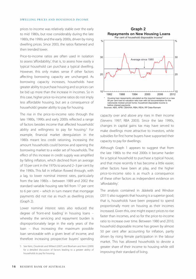
The rise in the price-to-income ratio through the late 1980s, 1990s and early 2000s reflected a range of factors besides income that affected households’ ability and willingness to pay for housing.5 For example, financial market deregulation in the 1980s meant less credit rationing, increasing the amount households could borrow and opening the borrowing market to a wider set of households. The effect of this increase in credit supply was amplified by falling inflation, which declined from an average of 10 per cent in the 1970s to around 2–3 per cent by the 1990s. This fall in inflation flowed through, with a lag, to lower nominal interest rates, particularly from the late 1980s – between 1989 and 2002 the standard variable housing rate fell from 17 per cent to 6 per cent – which in turn meant that mortgage payments did not rise as much as dwelling prices (Graph 2).
Lower nominal interest rates also reduced the degree of ‘front-end loading’ in housing loans – whereby the servicing and repayment burden is disproportionately large in the early years of the loan – thus increasing the maximum possible loan serviceable with a given level of income, and therefore increasing prospective buyers’ spending
5 See Kent, Ossolinski and Willard (2007) and Bloxham and Kent (2009) for a detailed discussion of factors leading to a greater ability of households to pay for housing.
Graph 2
10
20
30
10
20
30
Repayments on New Housing LoansPer cent of household disposable income*
* Housing loan repayments calculated as the required repayment on a new80 per cent loan-to-valuation ratio loan with full documentation for thenationwide median-priced home; household disposable income isbefore interest payments
Sources: ABS; APM; CBA/HIA; RBA; REIA; RP Data-Rismark
2012
%
20062000199419881982
Average since 1980
%
17Bulletin | d e c e m b e r Q ua r t e r 2012
Dwelling Prices anD HouseHolD income
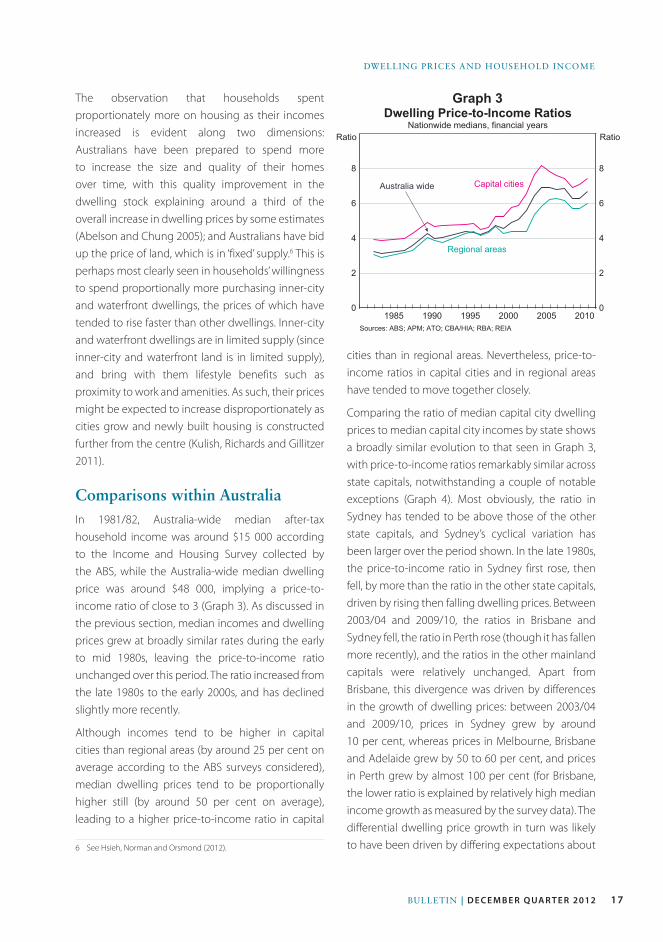
cities than in regional areas. Nevertheless, price-to-income ratios in capital cities and in regional areas have tended to move together closely.
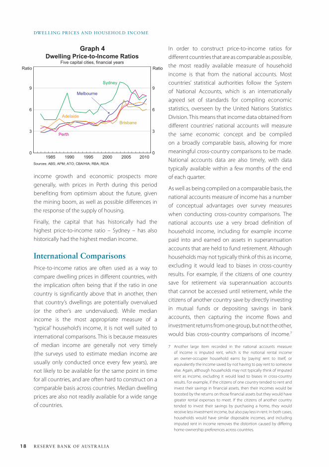
Comparing the ratio of median capital city dwelling prices to median capital city incomes by state shows a broadly similar evolution to that seen in Graph 3, with price-to-income ratios remarkably similar across state capitals, notwithstanding a couple of notable exceptions (Graph 4). Most obviously, the ratio in Sydney has tended to be above those of the other state capitals, and Sydney’s cyclical variation has been larger over the period shown. In the late 1980s, the price-to-income ratio in Sydney first rose, then fell, by more than the ratio in the other state capitals, driven by rising then falling dwelling prices. Between 2003/04 and 2009/10, the ratios in Brisbane and Sydney fell, the ratio in Perth rose (though it has fallen more recently), and the ratios in the other mainland capitals were relatively unchanged. Apart from Brisbane, this divergence was driven by differences in the growth of dwelling prices: between 2003/04 and 2009/10, prices in Sydney grew by around 10 per cent, whereas prices in Melbourne, Brisbane and Adelaide grew by 50 to 60 per cent, and prices in Perth grew by almost 100 per cent (for Brisbane, the lower ratio is explained by relatively high median income growth as measured by the survey data). The differential dwelling price growth in turn was likely to have been driven by differing expectations about
Graph 3The observation that households spent proportionately more on housing as their incomes increased is evident along two dimensions: Australians have been prepared to spend more to increase the size and quality of their homes over time, with this quality improvement in the dwelling stock explaining around a third of the overall increase in dwelling prices by some estimates (Abelson and Chung 2005); and Australians have bid up the price of land, which is in ‘fixed’ supply.6 This is perhaps most clearly seen in households’ willingness to spend proportionally more purchasing inner-city and waterfront dwellings, the prices of which have tended to rise faster than other dwellings. Inner-city and waterfront dwellings are in limited supply (since inner-city and waterfront land is in limited supply), and bring with them lifestyle benefits such as proximity to work and amenities. As such, their prices might be expected to increase disproportionately as cities grow and newly built housing is constructed further from the centre (Kulish, Richards and Gillitzer 2011).
Comparisons within australiaIn 1981/82, Australia-wide median after-tax household income was around $15 000 according to the Income and Housing Survey collected by the ABS, while the Australia-wide median dwelling price was around $48 000, implying a price-to-income ratio of close to 3 (Graph 3). As discussed in the previous section, median incomes and dwelling prices grew at broadly similar rates during the early to mid 1980s, leaving the price-to-income ratio unchanged over this period. The ratio increased from the late 1980s to the early 2000s, and has declined slightly more recently.
Although incomes tend to be higher in capital cities than regional areas (by around 25 per cent on average according to the ABS surveys considered), median dwelling prices tend to be proportionally higher still (by around 50 per cent on average), leading to a higher price-to-income ratio in capital
6 See Hsieh, Norman and Orsmond (2012).
0
2
4
6
8
0
2
4
6
8
Dwelling Price-to-Income RatiosNationwide medians, financial years
Sources: ABS; APM; ATO; CBA/HIA; RBA; REIA
2010
Capital cities
Ratio
20052000199519901985
Ratio
Regional areas
Australia wide
18 ReseRve bank of austRalia
Dwelling PRices anD HouseHolD income
Graph 4
income growth and economic prospects more generally, with prices in Perth during this period benefiting from optimism about the future, given the mining boom, as well as possible differences in the response of the supply of housing.
Finally, the capital that has historically had the highest price-to-income ratio – Sydney – has also historically had the highest median income.
International ComparisonsPrice-to-income ratios are often used as a way to compare dwelling prices in different countries, with the implication often being that if the ratio in one country is significantly above that in another, then that country’s dwellings are potentially overvalued (or the other’s are undervalued). While median income is the most appropriate measure of a ‘typical’ household’s income, it is not well suited to international comparisons. This is because measures of median income are generally not very timely (the surveys used to estimate median income are usually only conducted once every few years), are not likely to be available for the same point in time for all countries, and are often hard to construct on a comparable basis across countries. Median dwelling prices are also not readily available for a wide range of countries.
In order to construct price-to-income ratios for different countries that are as comparable as possible, the most readily available measure of household income is that from the national accounts. Most countries’ statistical authorities follow the System of National Accounts, which is an internationally agreed set of standards for compiling economic statistics, overseen by the United Nations Statistics Division. This means that income data obtained from different countries’ national accounts will measure the same economic concept and be compiled on a broadly comparable basis, allowing for more meaningful cross-country comparisons to be made. National accounts data are also timely, with data typically available within a few months of the end of each quarter.
As well as being compiled on a comparable basis, the national accounts measure of income has a number of conceptual advantages over survey measures when conducting cross-country comparisons. The national accounts use a very broad definition of household income, including for example income paid into and earned on assets in superannuation accounts that are held to fund retirement. Although households may not typically think of this as income, excluding it would lead to biases in cross-country results. For example, if the citizens of one country save for retirement via superannuation accounts that cannot be accessed until retirement, while the citizens of another country save by directly investing in mutual funds or depositing savings in bank accounts, then capturing the income flows and investment returns from one group, but not the other, would bias cross-country comparisons of income.7
7 Another large item recorded in the national accounts measure of income is imputed rent, which is the notional rental income an owner-occupier household earns by ‘paying’ rent to itself, or equivalently the income saved by not having to pay rent to someone else. Again, although households may not typically think of imputed rent as income, excluding it would lead to biases in cross-country results. For example, if the citizens of one country tended to rent and invest their savings in financial assets, then their incomes would be boosted by the returns on those financial assets but they would have greater rental expenses to meet. If the citizens of another country tended to invest their savings by purchasing a home, they would receive less investment income, but also pay less in rent. In both cases, households would have similar disposable incomes, and including imputed rent in income removes the distortion caused by differing home-ownership preferences across countries.
0
3
6
9
0
3
6
9
Dwelling Price-to-Income RatiosFive capital cities, financial years
Sources: ABS; APM; ATO; CBA/HIA; RBA; REIA
2010
Sydney
Ratio
20052000199519901985
Ratio
Melbourne
Perth
BrisbaneAdelaide
19Bulletin | d e c e m b e r Q ua r t e r 2012
Dwelling Prices anD HouseHolD income
Graph 5
The inclusion of earnings on superannuation in the national accounts measure of income, as well as a number of other non-cash or non-received items, has the mechanical effect of raising the measured level of income relative to survey measures, which typically include only ‘cash’ income. Nonetheless, price-to-income ratios based on national accounts measures of income behave in a similar way to ratios based on median ‘cash’ incomes.
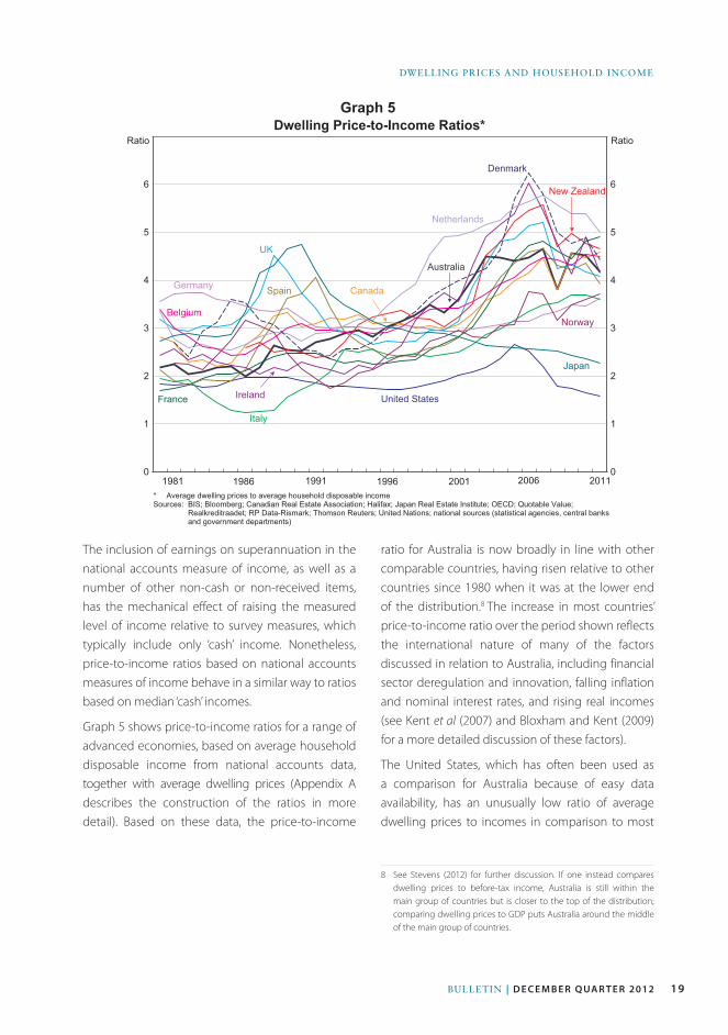
Graph 5 shows price-to-income ratios for a range of advanced economies, based on average household disposable income from national accounts data, together with average dwelling prices (Appendix A describes the construction of the ratios in more detail). Based on these data, the price-to-income
ratio for Australia is now broadly in line with other comparable countries, having risen relative to other countries since 1980 when it was at the lower end of the distribution.8 The increase in most countries’ price-to-income ratio over the period shown reflects the international nature of many of the factors discussed in relation to Australia, including financial sector deregulation and innovation, falling inflation and nominal interest rates, and rising real incomes (see Kent et al (2007) and Bloxham and Kent (2009) for a more detailed discussion of these factors).
The United States, which has often been used as a comparison for Australia because of easy data availability, has an unusually low ratio of average dwelling prices to incomes in comparison to most
8 See Stevens (2012) for further discussion. If one instead compares dwelling prices to before-tax income, Australia is still within the main group of countries but is closer to the top of the distribution; comparing dwelling prices to GDP puts Australia around the middle of the main group of countries.
0
1
2
3
4
5
6
0
1
2
3
4
5
6
Dwelling Price-to-Income Ratios*
2011
Denmark
Ratio
200620011996199119861981
Ratio
United States
* Average dwelling prices to average household disposable incomeSources: BIS; Bloomberg; Canadian Real Estate Association; Halifax; Japan Real Estate Institute; OECD; Quotable Value;
Realkreditraadet; RP Data-Rismark; Thomson Reuters; United Nations; national sources (statistical agencies, central banksand government departments)
Germany
Italy
France
UK
Ireland
Belgium
Canada
New Zealand
Japan
Netherlands
Spain
Australia
Norway
20 ReseRve bank of austRalia
Dwelling PRices anD HouseHolD income
other advanced economies, as does Japan.9 The price-to-income ratio in Japan was quite high in the late 1980s, but since the collapse of the asset price bubble there in the early 1990s prices have fallen almost continuously. The United States has had an unusually low and stable price-to-income ratio over the entire sample. In part, this is likely to reflect the relatively dispersed nature of the US population, which is spread across the country over a large number of cities, in contrast to Australia where the majority of the population live in just a handful of coastal cities. Land prices, and therefore dwelling prices, tend to be higher in larger cities, a phenomenon that is amplified in coastal cities, which are limited in their capacity to expand (Ellis 2008). Related to this, the responsiveness of housing supply to changes in prices appears to be higher in the United States than a lot of other developed countries. For example, Sanchez and Johansson (2011) estimate that the United States had, by a considerable margin, the most responsive (or ‘elastic’) housing supply in the OECD, while Glaeser and Gyourko (2003) estimate that dwelling prices were quite close to construction costs in many US cities.
ConclusionThis article has analysed trends in dwelling prices over the past four decades using price-to-income ratios. The appropriate price-to-income ratio to use depends somewhat on the economic question being analysed, although those considered here all show broadly similar trends, albeit with differences in levels. In particular, price-to-income ratios in Australia were relatively stable over the early to mid 1980s before rising over the late 1980s, the 1990s and the early 2000s. From the mid 2000s, price-to-income ratios have fallen a little. The earlier rises corresponded with a period of financial
9 The United States does not in fact follow the System of National Accounts, although the Bureau of Economic Analysis does release supplementary SNA-compliant data, available from <http://www.bea.gov/national/sna.htm>. For the United States, Graph 5 uses the US definition of income rather than the SNA definition; under the SNA definition, income is around 10 per cent higher, shifting the US price-to-income ratio lower by around 10 per cent.
deregulation and falling nominal interest rates, both of which increased households’ borrowing capacity. It appears that households used this extra borrowing capacity to bid up dwelling prices, which is perhaps not surprising given the earlier period of financial regulation and the fact that households appear to be prepared to spend proportionally more on housing as their incomes rise.
Comparing similarly defined price-to-income ratios across countries, the price-to-income ratio in Australia appears to be broadly in line with those of other advanced economies, although substantially higher than the ratio in the United States or Japan, both of which appear to have unusually low ratios. R
appendix aWhen constructing price-to-income ratios, the preferred measure of income is household disposable income before the deduction of interest payments.
• Household income is preferred to individual worker income. Using the income of a single wage-earner does not account for the structural rise in female participation in the labour force, and therefore does not reflect a household’s increased willingness and capacity to service loan repayments. The household is also the standard grouping used in most analysis of income, and it is typically a household that purchases a dwelling rather than an individual within a household. (For reference, the 2011 Census suggests that on average there are 2¾ people per household and 1¼ employed people per household.)
• After-tax income is more relevant than before-tax income, as this is money that can be allocated towards mortgage repayments. Interest payments are not subtracted from income as these are payments that are predominantly being used to service housing loans.
Given the above, when using national accounts data the appropriate measure of income is gross
21Bulletin | d e c e m b e r Q ua r t e r 2012
Dwelling Prices anD HouseHolD income
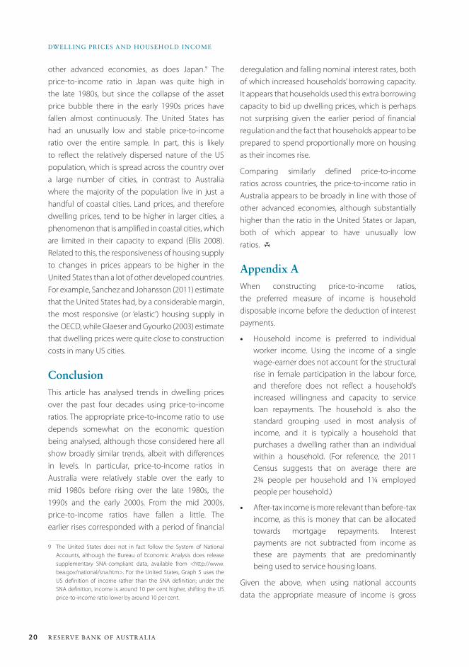
disposable income (GDI) plus interest payments, where GDI equals total sources minus total uses of income (in the national accounts, interest payments are subtracted from gross income when computing disposable income). When making international comparisons, profits from unincorporated enterprises are included in household income, which is slightly different from the measure the Bank would typically use when focusing just on Australia. Table A1 shows the components of GDI plus interest payments in Australia for 2011.
For the international comparisons, each country’s dwelling price data includes all regions (both urban and regional areas) and all manner of housing
(detached house, semi-detached and units). Average dwelling prices are used so as to align with average income, and also because these data are easier to source. Three methods are used to calculate average prices, depending on the country:
• An average transaction price index – Australia, Belgium, Canada, Ireland, the Netherlands and the United Kingdom.
• The market value of the entire dwelling stock (from national balance sheet data) divided by the number of dwellings (interpolated from the Census) – France, Germany, Italy, Japan, New Zealand and the United States.
Table A1: Components of Gross Disposable Income2011, $’000
Component Per household
Total sources 144
Primary 123
Compensation of employees 80
Gross mixed income 14
Imputed rent for owner-occupiers 12
Property income 17
Secondary 21
Social assistance benefits 13
Workers compensation 1
Non-life insurance claims 4
Other current transfers 4
Total uses 34
Primary 11
Interest expenses 10
Property income payable 1
Secondary 23
Income tax payable 17
Contributions to workers compensation 1
Non-life insurance premiums 3
Other current transfers 1
Gross disposable income(a) 110
Plus interest payments 120
(a) Total sources minus total usesSource: ABS national accounts
22 ReseRve bank of austRalia
Dwelling PRices anD HouseHolD income
• Average floor area multiplied by the price per square metre – Denmark, Norway and Spain.10
Public housing, which can constitute a relatively large share of dwellings in some European countries, is included in the dwelling stock where possible (see Table 5 of Ellis (2006) for information on the share of public housing in selected developed countries).
ReferencesAbelson P and D Chung (2005), ‘The Real Story of
Housing Prices in Australia from 1970 to 2003’, Australian
Economic Review, 38(3), pp 265–281.
Bloxham P and C Kent (2009), ‘Household Indebtedness’,
Australian Economic Review, 42(3), pp 327–339.
Brown R, R Brown, I O’Connor, G Schwann and C Scott (2011), ‘The Other Side of Housing Affordability: The User
Cost of Housing in Australia’, Economic Record, 87(279),
pp 558–574.
Ellis L (2006), ‘Housing and Housing Finance: The View
from Australia and Beyond’, RBA Research Discussion Paper
No 2006-12.
Ellis L (2008), ‘The Housing Meltdown: Why did it Happen
in the United States?’, Bank for International Settlements
Working Paper No 259.
Glaeser E and J Gyourko (2003), ‘The Impact of Building
Restrictions on Housing Affordability’, Federal Reserve Bank
of New York Economic Policy Review, June, pp 21–39.
Himmelberg C, C Mayer and T Sinai (2005), ‘Assessing
High House Prices: Bubbles, Fundamentals and
Misperceptions’, Journal of Economic Perspectives, 19(4),
pp 67–92.
10 In order to obtain a longer time series than is available from these data, the indices are extended using growth in an appropriate dwelling price index.
Hsieh W, D Norman and D Orsmond (2012), ‘Supply-
side Issues in the Housing Sector’, RBA Bulletin, September,
pp 11–19.
Jääskelä J and C Windsor (2011), ‘Insights from the
Household Expenditure Survey’, RBA Bulletin, December,
pp 1–12.
Kent C, C Ossolinski and L Willard (2007), ‘The Rise of
Household Indebtedness’, in C Kent and J Lawson (eds),
The Structure and Resilience of the Financial System,
Proceedings of a Conference, Reserve Bank of Australia,
Sydney, pp 123–163.
Kulish M, A Richards and C Gillitzer (2011), ‘Urban
Structure and Housing Prices: Some Evidence from
Australian Cities’, RBA Research Discussion Paper
No 2011-03.
RBA (Reserve Bank of Australia) (2003), ‘Household
Debt: What the Data Show’, RBA Bulletin, March, pp 1–11.
Sanchez A and Å Johansson (2011), ‘The Price
Responsiveness of Housing Supply in OECD Countries’,
OECD Economics Department Working Paper No 837.
Stevens G (1997), ‘Some Observations on Low Inflation
and Household Finances’, RBA Bulletin, October, pp 38–47.
Stevens G (2012), ‘The Lucky Country’, RBA Bulletin,
September, pp 75–83.
Yates J (2011), ‘Housing in Australia in the 2000s: On
the Agenda Too Late?’, in H Gerard and J Kearns (eds),
The Australian Economy in the 2000s, Proceedings of a
Conference, Reserve Bank of Australia, Sydney, pp 261–296.
23Bulletin | D E C E M B E R Q ua R t E R 2012
IntroductionHouseholds invest in deposits and interest-bearing securities, such as bonds and bank bills, since they are relatively secure assets and provide a relatively stable flow of income. Households tend to borrow when young to finance education and home ownership, generally maintaining modest deposits to facilitate transactions. As they age, households pay off their debts and accumulate financial assets to finance retirement. Retirees tend to seek more stable income streams, which can in part be provided through investments in deposits and other interest-bearing assets. It is unsurprising, therefore, that older households invest more than younger households in these assets, both in total and as a share of their financial assets.
The distribution of interest-bearing assets and liabilities across households is important for understanding one way in which movements in interest rates affect household income and spending. A reduction in interest rates boosts the cash flows of households with debt, while reducing the cash flows of households with interest-bearing assets.1 Because
1 Of course, changes in interest rates have other important effects which influence household incomes and spending.
the total value of household sector debt is larger than households’ interest-bearing assets, lower interest rates increase cash flows for the sector as a whole. Furthermore, a change in cash flows for households with debt is more likely to influence spending than for households with substantial interest-bearing assets, as the former are more likely to be liquidity constrained.2 Nevertheless, households with interest-bearing assets may still reduce their spending in response to lower interest rates, particularly if they are seeking to preserve their assets as a financial buffer against unanticipated events, such as medical expenses, or as a bequest.
Over recent years, Australian government bond yields have fallen to their lowest levels since Federation and the cash rate has been reduced to be clearly below its average of the past 16 years (Graph 1). When comparing interest rates over time, it is also important to take into account consumer price inflation since high inflation erodes the purchasing power of interest-bearing assets. While nominal interest rates are low currently, real interest rates are well above the levels that prevailed during the 1970s, when nominal interest rates were actually
2 For some Australian evidence on the relationship between household debt and financial constraints, see La Cava and Simon (2003).
Households’ Interest-bearing assets
* The authors are from Economic Analysis Department.
Ellis Connolly, Fiona Fleming and Jarkko Jääskelä*
Households invest around two-fifths of their financial assets in interest-bearing assets. These assets are predominantly held directly in deposits and also via superannuation and other investment funds. Deposits have grown strongly in recent years, although there has been no growth in interest-bearing securities. Compared with other advanced economies, interest-bearing assets represent a relatively small share of financial assets. For the household sector as a whole, interest-bearing assets are lower in value than debt, so household disposable income increases as interest rates decline. Interest-bearing assets tend to be held by retirees, while younger households are more likely to be in debt. Interest-bearing assets are expected to rise over time as the population ages.
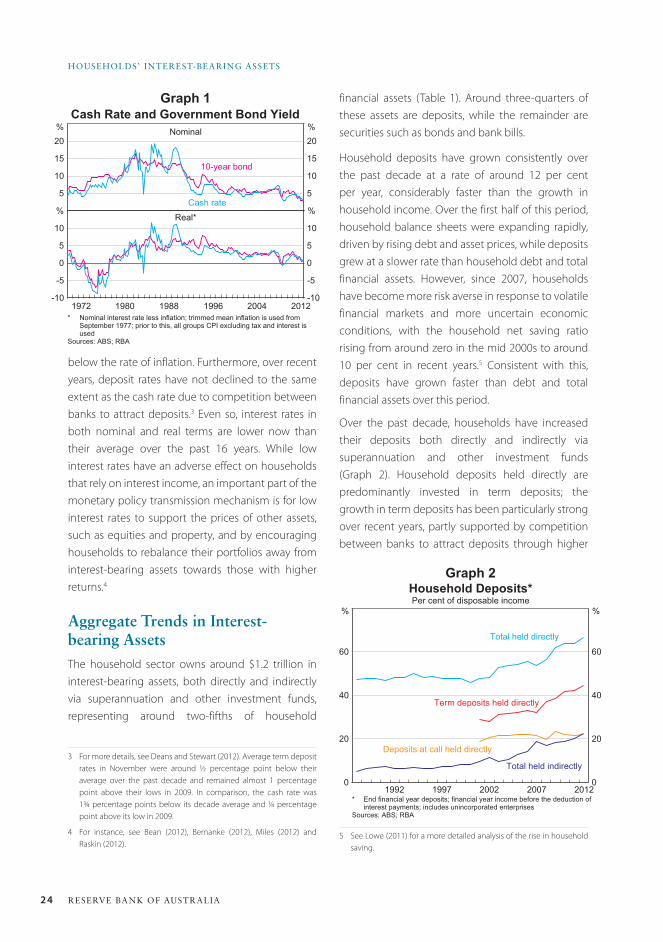
24 ReseRve bank of austRalia
HouseHolDs’ inteRest-beaRinG assets
financial assets (Table 1). Around three-quarters of these assets are deposits, while the remainder are securities such as bonds and bank bills.
Household deposits have grown consistently over the past decade at a rate of around 12 per cent per year, considerably faster than the growth in household income. Over the first half of this period, household balance sheets were expanding rapidly, driven by rising debt and asset prices, while deposits grew at a slower rate than household debt and total financial assets. However, since 2007, households have become more risk averse in response to volatile financial markets and more uncertain economic conditions, with the household net saving ratio rising from around zero in the mid 2000s to around 10 per cent in recent years.5 Consistent with this, deposits have grown faster than debt and total financial assets over this period.
Over the past decade, households have increased their deposits both directly and indirectly via superannuation and other investment funds (Graph 2). Household deposits held directly are predominantly invested in term deposits; the growth in term deposits has been particularly strong over recent years, partly supported by competition between banks to attract deposits through higher
5 See Lowe (2011) for a more detailed analysis of the rise in household saving.
Cash Rate and Government Bond Yield
2012
10-year bond
%Nominal
5
10
15
20
5
10
15
20
-10
-5
0
5
10
-10
-5
0
5
10Real*
20041996198819801972
%
%%Cash rate
* Nominal interest rate less inflation; trimmed mean inflation is used fromSeptember 1977; prior to this, all groups CPI excluding tax and interest isused
Sources: ABS; RBA
Graph 1
0
20
40
60
0
20
40
60
Household Deposits*Per cent of disposable income
* End financial year deposits; financial year income before the deduction ofinterest payments; includes unincorporated enterprises
Sources: ABS; RBA
2012
Total held indirectly
%
2007200219971992
%
Term deposits held directly
Total held directly
Deposits at call held directly
Graph 2
below the rate of inflation. Furthermore, over recent years, deposit rates have not declined to the same extent as the cash rate due to competition between banks to attract deposits.3 Even so, interest rates in both nominal and real terms are lower now than their average over the past 16 years. While low interest rates have an adverse effect on households that rely on interest income, an important part of the monetary policy transmission mechanism is for low interest rates to support the prices of other assets, such as equities and property, and by encouraging households to rebalance their portfolios away from interest-bearing assets towards those with higher returns.4
aggregate trends in Interest-bearing assetsThe household sector owns around $1.2 trillion in interest-bearing assets, both directly and indirectly via superannuation and other investment funds, representing around two-fifths of household
3 For more details, see Deans and Stewart (2012). Average term deposit rates in November were around ½ percentage point below their average over the past decade and remained almost 1 percentage point above their lows in 2009. In comparison, the cash rate was 1¾ percentage points below its decade average and ¼ percentage point above its low in 2009.
4 For instance, see Bean (2012), Bernanke (2012), Miles (2012) and Raskin (2012).
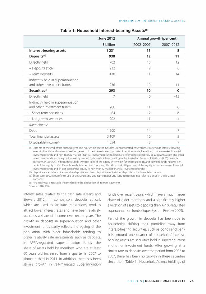
25Bulletin | D E C E M B E R Q ua R t E R 2012
HOuSeHOlDS’ inteReSt-BeARinG ASSetS
interest rates relative to the cash rate (Deans and Stewart 2012). In comparison, deposits at call, which are used to facilitate transactions, tend to attract lower interest rates and have been relatively stable as a share of income over recent years. The growth in deposits in superannuation and other investment funds partly reflects the ageing of the population, with older households tending to prefer relatively safe investments such as deposits. In APRA-regulated superannuation funds, the share of assets held by members who are at least 60 years old increased from a quarter in 2007 to almost a third in 2011. In addition, there has been strong growth in self-managed superannuation
Table 1: Household Interest-bearing Assets(a)
June 2012 Annual growth (per cent)
$ billion 2002–2007 2007–2012
Interest-bearing assets 1 231 11 8
Deposits(b) 938 12 11
Directly held 702 10 12
– Deposits at call 232 9 8
– Term deposits 470 11 14
Indirectly held in superannuation and other investment funds 236 19 11
Securities(c) 293 10 0
Directly held 7 0 –15
Indirectly held in superannuation and other investment funds 286 11 0
– Short-term securities 84 12 –6
– Long-term securities 202 11 4
Memo items:
Debt 1 600 14 7
Total financial assets 3 109 16 3
Disposable income(d) 1 054 8 7(a) Data are at the end of the financial year. The household sector includes unincorporated enterprises. Households’ interest-bearing
assets indirectly held are measured as the sum of the interest-bearing assets of pension funds, life offices, money market financial investment funds and non-money market financial investment funds. These are referred to collectively as superannuation and other investment funds, and are predominantly owned by households (according to the Australian Bureau of Statistics (ABS) financial accounts, in June 2012: households held 99.9 per cent of the equity in pension funds; households and pension funds held 95 per cent of the equity in life offices; households, pension funds and life offices held 98 per cent of the equity in money market financial investment funds and 84 per cent of the equity in non-money market financial investment funds).
(b) Deposits at call refer to ‘transferable deposits’ and term deposits refer to ‘other deposits’ in the financial accounts(c) Short-term securities refer to ‘bills of exchange’ and ‘one name paper’ and long-term securities refer to ‘bonds’ in the financial
accounts(d) Financial year disposable income before the deduction of interest paymentsSources: ABS; RBA
funds over recent years, which have a much larger share of older members and a significantly higher allocation of assets to deposits than APRA-regulated superannuation funds (Super System Review 2009).
Part of the growth in deposits has been due to households shifting their portfolios away from interest-bearing securities, such as bonds and bank bills. Around one quarter of households’ interest-bearing assets are securities held in superannuation and other investment funds. After growing at a similar rate to deposits over the period from 2002 to 2007, there has been no growth in these securities since then (Table 1). Households’ direct holdings of
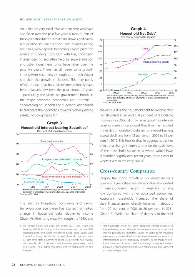
26 ReseRve bank of austRalia
HouseHolDs’ inteRest-beaRinG assets
securities are very small relative to income, and have also fallen over the past five years (Graph 3). Part of the explanation for this is that banks have significantly reduced their issuance of short-term interest-bearing securities, with deposits becoming a more preferred source of funding. Consistent with this, short-term interest-bearing securities held by superannuation and other investment funds have fallen over the past five years. There has still been some growth in long-term securities, although at a much slower rate than the growth in deposits. This may partly reflect the fact that bond yields internationally have been relatively low over the past couple of years – particularly the yields on government bonds in the major advanced economies and Australia – encouraging households and superannuation funds to reallocate their portfolios towards higher-yielding assets, including deposits.6
The shift in household borrowing and saving behaviour over recent years has resulted in a marked change in household debt relative to income (Graph 4). After rising steadily through the 1990s and
6 For further details, see Boge and Wilson (2011) and Heath and Manning (2012). According to the financial accounts, in June 2012 superannuation and other investment funds’ bond assets were invested in: foreign bonds (34 per cent); financial corporate bonds (31 per cent); state government bonds (15 per cent); non-financial corporate bonds (12 per cent); and Australian government bonds (8 per cent). These shares have been relatively stable over the past five years.
the early 2000s, the household debt-to-income ratio has stabilised at around 150 per cent of disposable income since 2006. Slightly faster growth in interest-bearing assets since around that time has resulted in net debt (household debt minus interest-bearing assets) declining from 42 per cent in 2006 to 35 per cent in 2012. This implies that, in aggregate, the net effect of a change in interest rates on the cash flows of the household sector as a whole would have diminished slightly over recent years, to be closer to where it was in the early 2000s.7
Cross-country ComparisonDespite the strong growth in household deposits over recent years, the share of financial assets invested in interest-bearing assets in Australia remains low compared with other advanced economies. Australian households increased the share of their financial assets directly invested in deposits from 20 per cent in 2006 to 26 per cent in 2011 (Graph 5). While the share of deposits in financial
7 The household sector has some additional indirect exposure to interest-bearing assets through the insurance industry. Investment income provides an important source of earnings for insurance companies, and around half of their financial assets are invested in interest-bearing assets, particularly in bonds. In the medium term, lower investment income could flow through to higher insurance premiums, which according to the ABS represent around 5 per cent of household spending.
0
10
20
30
40
0
10
20
30
40
Household Interest-bearing Securities*Per cent of disposable income
* End financial year securities holdings; financial year income before thededuction of interest payments; includes unincorporated enterprises
Sources: ABS; RBA
2012
Total held indirectly
%
2007200219971992
%
Long-term securities held indirectly
Total held directly
Short-term securities held indirectly
Graph 3
-25
0
25
50
75
100
125
150
-25
0
25
50
75
100
125
150
Household Net Debt*Per cent of disposable income
* End financial year interest-bearing assets and debt; financial year incomebefore the deduction of interest payments; includes unincorporatedenterprises
Sources: ABS; RBA
2012
Debt
%
2007200219971992
%
Interest-bearing assets
Net debt
Graph 4
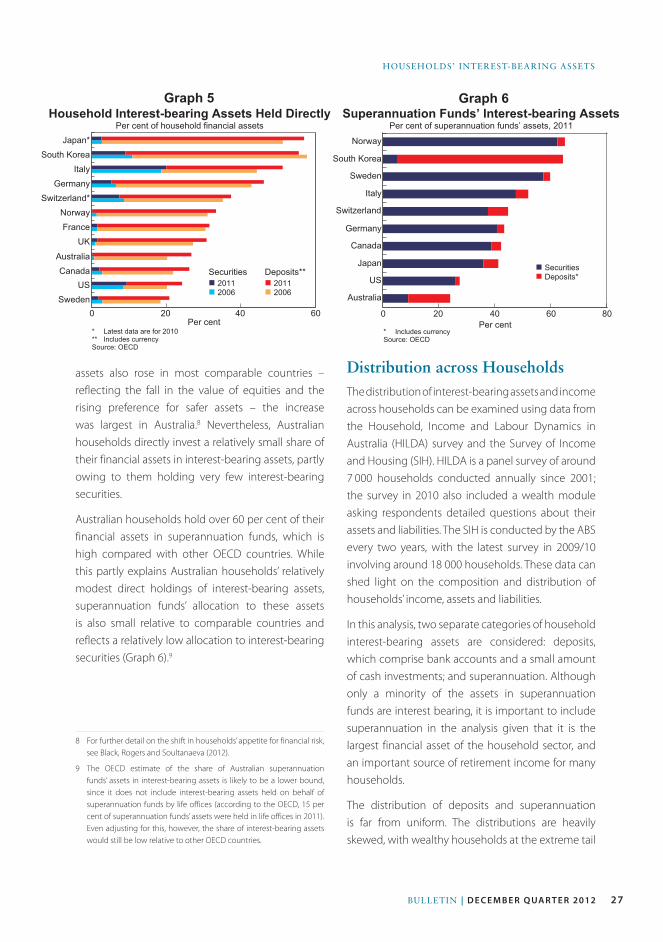
27Bulletin | D E C E M B E R Q ua R t E R 2012
HOuSeHOlDS’ inteReSt-BeARinG ASSetS
Household Interest-bearing Assets Held DirectlyPer cent of household financial assets
Securitiesn 2011n 2006
Per cent* Latest data are for 2010** Includes currencySource: OECD
6040200
Deposits**n 2011n 2006
SwedenUS
CanadaAustralia
UKFranceNorway
Switzerland*Germany
ItalySouth Korea
Japan*
Graph 5Superannuation Funds’ Interest-bearing Assets
Per cent of superannuation funds’ assets, 2011
Per cent* Includes currencySource: OECD
0
n Securitiesn Deposits*
Japan
US
Australia
Canada
Germany
Italy
Switzerland
Sweden
South Korea
Norway
20 40 60 80
Graph 6
Distribution across HouseholdsThe distribution of interest-bearing assets and income across households can be examined using data from the Household, Income and Labour Dynamics in Australia (HILDA) survey and the Survey of Income and Housing (SIH). HILDA is a panel survey of around 7 000 households conducted annually since 2001; the survey in 2010 also included a wealth module asking respondents detailed questions about their assets and liabilities. The SIH is conducted by the ABS every two years, with the latest survey in 2009/10 involving around 18 000 households. These data can shed light on the composition and distribution of households’ income, assets and liabilities.
In this analysis, two separate categories of household interest-bearing assets are considered: deposits, which comprise bank accounts and a small amount of cash investments; and superannuation. Although only a minority of the assets in superannuation funds are interest bearing, it is important to include superannuation in the analysis given that it is the largest financial asset of the household sector, and an important source of retirement income for many households.
The distribution of deposits and superannuation is far from uniform. The distributions are heavily skewed, with wealthy households at the extreme tail
assets also rose in most comparable countries – reflecting the fall in the value of equities and the rising preference for safer assets – the increase was largest in Australia.8 Nevertheless, Australian households directly invest a relatively small share of their financial assets in interest-bearing assets, partly owing to them holding very few interest-bearing securities.
Australian households hold over 60 per cent of their financial assets in superannuation funds, which is high compared with other OECD countries. While this partly explains Australian households’ relatively modest direct holdings of interest-bearing assets, superannuation funds’ allocation to these assets is also small relative to comparable countries and reflects a relatively low allocation to interest-bearing securities (Graph 6).9
8 For further detail on the shift in households’ appetite for financial risk, see Black, Rogers and Soultanaeva (2012).
9 The OECD estimate of the share of Australian superannuation funds’ assets in interest-bearing assets is likely to be a lower bound, since it does not include interest-bearing assets held on behalf of superannuation funds by life offices (according to the OECD, 15 per cent of superannuation funds’ assets were held in life offices in 2011). Even adjusting for this, however, the share of interest-bearing assets would still be low relative to other OECD countries.
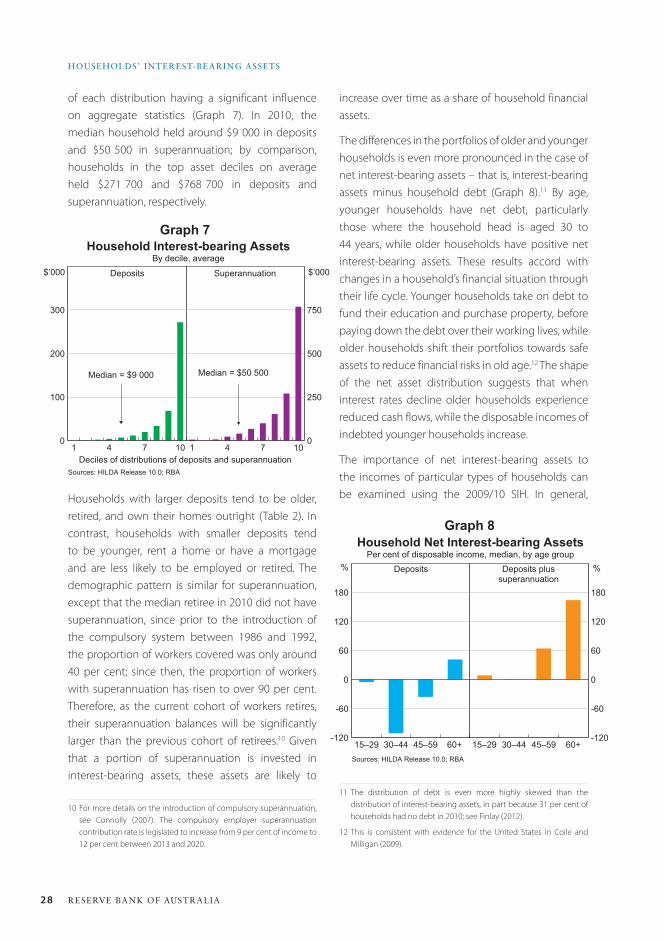
28 ReseRve bank of austRalia
HouseHolDs’ inteRest-beaRinG assets
increase over time as a share of household financial assets.
The differences in the portfolios of older and younger households is even more pronounced in the case of net interest-bearing assets – that is, interest-bearing assets minus household debt (Graph 8).11 By age, younger households have net debt, particularly those where the household head is aged 30 to 44 years, while older households have positive net interest-bearing assets. These results accord with changes in a household’s financial situation through their life cycle. Younger households take on debt to fund their education and purchase property, before paying down the debt over their working lives, while older households shift their portfolios towards safe assets to reduce financial risks in old age.12 The shape of the net asset distribution suggests that when interest rates decline older households experience reduced cash flows, while the disposable incomes of indebted younger households increase.
The importance of net interest-bearing assets to the incomes of particular types of households can be examined using the 2009/10 SIH. In general,
11 The distribution of debt is even more highly skewed than the distribution of interest-bearing assets, in part because 31 per cent of households had no debt in 2010; see Finlay (2012).
12 This is consistent with evidence for the United States in Coile and Milligan (2009).
of each distribution having a significant influence on aggregate statistics (Graph 7). In 2010, the median household held around $9 000 in deposits and $50 500 in superannuation; by comparison, households in the top asset deciles on average held $271 700 and $768 700 in deposits and superannuation, respectively.
1 4 7 100
100
200
300
Household Interest-bearing AssetsBy decile, average
Superannuation $’000Deposits
1 4 7 100
250
500
750
Sources: HILDA Release 10.0; RBA
$’000
Median = $50 500Median = $9 000
Deciles of distributions of deposits and superannuation
Graph 7
-120
-60
0
60
120
180
Household Net Interest-bearing AssetsPer cent of disposable income, median, by age group
Deposits plussuperannuation
%Deposits
-120
-60
0
60
120
180
Sources: HILDA Release 10.0; RBA
%
60+45–5930–4415–2960+45–5930–4415–29
Graph 8
Households with larger deposits tend to be older, retired, and own their homes outright (Table 2). In contrast, households with smaller deposits tend to be younger, rent a home or have a mortgage and are less likely to be employed or retired. The demographic pattern is similar for superannuation, except that the median retiree in 2010 did not have superannuation, since prior to the introduction of the compulsory system between 1986 and 1992, the proportion of workers covered was only around 40 per cent; since then, the proportion of workers with superannuation has risen to over 90 per cent. Therefore, as the current cohort of workers retires, their superannuation balances will be significantly larger than the previous cohort of retirees.10 Given that a portion of superannuation is invested in interest-bearing assets, these assets are likely to
10 For more details on the introduction of compulsory superannuation, see Connolly (2007). The compulsory employer superannuation contribution rate is legislated to increase from 9 per cent of income to 12 per cent between 2013 and 2020.
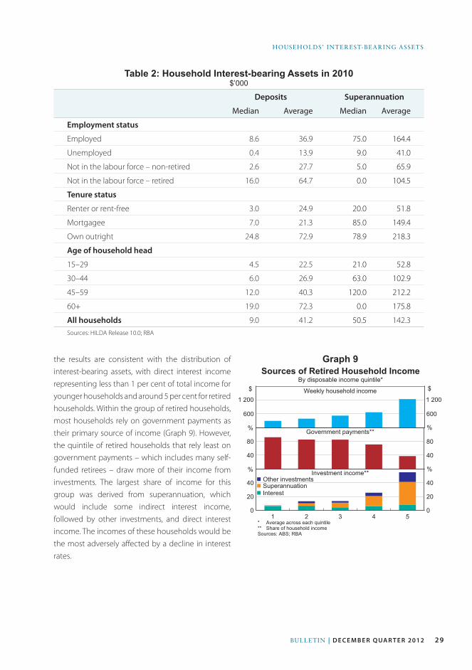
29Bulletin | D E C E M B E R Q ua R t E R 2012
HOuSeHOlDS’ inteReSt-BeARinG ASSetS
Table 2: Household Interest-bearing Assets in 2010$’000
Deposits Superannuation
Median Average Median Average
Employment status
Employed 8.6 36.9 75.0 164.4
Unemployed 0.4 13.9 9.0 41.0
Not in the labour force – non-retired 2.6 27.7 5.0 65.9
Not in the labour force – retired 16.0 64.7 0.0 104.5
Tenure status
Renter or rent-free 3.0 24.9 20.0 51.8
Mortgagee 7.0 21.3 85.0 149.4
Own outright 24.8 72.9 78.9 218.3
Age of household head
15–29 4.5 22.5 21.0 52.8
30–44 6.0 26.9 63.0 102.9
45–59 12.0 40.3 120.0 212.2
60+ 19.0 72.3 0.0 175.8
All households 9.0 41.2 50.5 142.3Sources: HILDA Release 10.0; RBA
600 600
1 2 3 4 50
20
40
0
20
40
40
80
40
80
Sources of Retired Household IncomeBy disposable income quintile*
* Average across each quintile** Share of household incomeSources: ABS; RBA
$Weekly household income
n Other investmentsn Superannuationn Interest
$
Government payments**
Investment income**
1 200 1 200
%%
%%
Graph 9the results are consistent with the distribution of interest-bearing assets, with direct interest income representing less than 1 per cent of total income for younger households and around 5 per cent for retired households. Within the group of retired households, most households rely on government payments as their primary source of income (Graph 9). However, the quintile of retired households that rely least on government payments – which includes many self-funded retirees – draw more of their income from investments. The largest share of income for this group was derived from superannuation, which would include some indirect interest income, followed by other investments, and direct interest income. The incomes of these households would be the most adversely affected by a decline in interest rates.
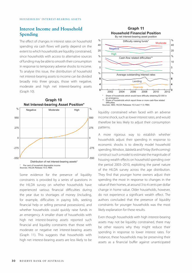
30 ReseRve bank of austRalia
HouseHolDs’ inteRest-beaRinG assets
Interest Income and Household SpendingThe effect of changes in interest rates on household spending via cash flows will partly depend on the extent to which households are liquidity constrained, since households with access to alternative sources of funding may be able to smooth their consumption in response to temporary adverse shocks to income. To analyse this issue, the distribution of household net interest-bearing assets to income can be divided broadly into three groups, those with negative, moderate and high net interest-bearing assets (Graph 10).
-550
-275
0
275
550
-550
-275
0
275
550
Net Interest-bearing Asset Position*
* Per cent of household disposable incomeSources: HILDA Release 10.0; RBA
Negative %Moderate High%
Distribution of net interest-bearing assets*
Graph 10
liquidity constrained when faced with an adverse income shock, such as lower interest rates, and would therefore be less likely to adjust their consumption patterns.
A more rigorous way to establish whether households adjust their spending in response to economic shocks is to directly model household spending. Windsor, Jääskelä and Finlay (forthcoming) construct such a model to estimate the magnitude of housing wealth effects on household spending over the period 2003–2010, exploiting the panel nature of the HILDA survey across the age distribution. They find that younger home owners adjust their spending the most in response to changes in the value of their homes, at around 3 to 4 cents per dollar change in home value. Older households, however, do not experience a significant wealth effect. The authors concluded that the presence of liquidity constraints for younger households was the most likely explanation for these results.
Even though households with high interest-bearing assets may not be liquidity constrained, there may be other reasons why they might reduce their spending in response to lower interest rates. For instance, these households may be preserving their assets as a financial buffer against unanticipated
20
40
20
40
0
4
8
0
4
8
0
4
8
0
4
8
5
10
5
10
Household Financial PositionBy net interest-bearing asset position
* Share of households which would have difficulty obtaining $3 000 inan emergency
** Share of households which report three or more cash-flow relateddifficulties
Sources: ABS; HILDA Releases 10.0 and 11.0; RBA
Difficulty raising funds*
Cash-flow related difficulties**
Average outstanding interest rates
%%
%%
Negative
High
Moderate%%
Lending
Deposits
20122008200620042002 2010
Graph 11
Some evidence for the presence of liquidity constraints is provided by a series of questions in the HILDA survey on whether households have experienced various financial difficulties during the year due to shortages of money (including, for example, difficulties in paying bills, seeking financial help or selling personal possessions), and whether households could quickly raise funds in an emergency. A smaller share of households with high net interest-bearing assets reported such financial and liquidity constraints than those with moderate or negative net interest-bearing assets (Graph 11). This suggests that households with high net interest-bearing assets are less likely to be
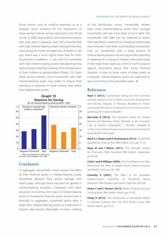
31Bulletin | D E C E M B E R Q ua R t E R 2012
HOuSeHOlDS’ inteReSt-BeARinG ASSetS
Negative Moderate High0
10
20
30
40
50
60
Reasons for SavingBy net interest-bearing asset position, 2006
Saving for family members* %Saving for emergencies,health or retirement*
Negative Moderate High0
5
10
15
20
25
30
* Share of households in each groupSources: HILDA Release 10.0; RBA
%
Graph 12
future events, such as medical expenses, or as a bequest. Some evidence for the importance of these saving motives can be observed in the HILDA survey. In 2006, respondents were asked the reasons they save, and in response, over half of households with high interest-bearing assets indicated that they were saving for future emergencies, ill health or old age, which was a much higher share than for other households. In addition, 17 per cent of households with high interest-bearing assets indicated that they were saving to help their relatives or for the education of their children or grandchildren (Graph 12). Given these saving motives, some households with high interest-bearing assets may prefer to reduce their spending in response to lower interest rates rather than deplete their assets.
ConclusionIn aggregate, households invest around two-fifths of their financial assets in interest-bearing assets. Household deposits have grown strongly over recent years, although there has been no growth in interest-bearing securities. Compared with other advanced economies, the share of interest-bearing assets in household financial assets remains low in Australia. In aggregate, household sector debt is larger than interest-bearing assets, so a reduction in interest rates boosts disposable incomes. Looking
at the distribution across households, retirees have more interest-bearing assets than younger households, who are more likely to be in debt. The households with debt can be expected to adjust their spending in response to changing interest rates since they are more likely to be liquidity constrained. Even so, households with a large amount of interest-bearing assets may also adjust their spending in response to a change in interest rates, particularly if they hold these assets as a form of ‘self-insurance’ against uncertainty about their future financial situation or plan to leave some of these assets as a bequest. Interest-bearing assets are expected to grow over time as the population ages. R
ReferencesBean C (2012), ‘Quantitative Easing and the Economic
Outlook’, Speech to the Scottish Council for Development
and Industry, Glasgow, 21 February. Available at <http://
www.bankofengland.co.uk/publications/Documents/
speeches/2012/speech546.pdf>.
Bernanke B (2012), ‘Five Questions about the Federal
Reserve and Monetary Policy’, Remarks at the Economic
Club of Indiana, Indianapolis, 1 October. Available at
<http://www.federalreserve.gov/newsevents/speech/
bernanke20121001a.pdf>.
Black S, L Rogers and A Soultanaeva (2012), ‘Households’
Appetite for Financial Risk’, RBA Bulletin, June, pp 37–42.
Boge M and I Wilson (2011), ‘The Domestic Market
for Short-term Debt Securities’, RBA Bulletin, September,
pp 39–48.
Coile C and K Milligan (2009), ‘How Portfolios Evolve After
Retirement: The Effect of Health Shocks’, Review of Income
and Wealth, 55(2), pp 226–248.
Connolly E (2007), ‘The Effect of the Australian
Superannuation Guarantee on Household Saving
Behaviour’, RBA Research Discussion Paper No 2007-08.
Deans C and C Stewart (2012), ‘Banks’ Funding Costs and
Lending Rates’, RBA Bulletin, March, pp 37–43.
Finlay R (2012), ‘The Distribution of Household Wealth
in Australia: Evidence from the 2010 HILDA Survey’, RBA
Bulletin, March, pp 19–27.
32 ReseRve bank of austRalia
HouseHolDs’ inteRest-beaRinG assets
Raskin S (2012), ‘Accommodative Monetary Policy and
Its Effects on Savers’, Remarks at the Y’s Men of Westport,
Westport, 1 March. Available at <http://www.federalreserve.
gov/newsevents/speech/raskin20120301a.pdf>.
Super System Review (2009), ‘A Statistical Summary
of Self-Managed Superannuation Funds’, Review into
the Governance, Efficiency, Structure and Operation
of Australia’s Superannuation System, 10 December.
Available at <http://www.supersystemreview.gov.au/
content/downloads/statistical_summary_smsf/SMSF_
statistical_summary_report.pdf>.
Windsor C, J Jääskelä and R Finlay (forthcoming), ‘Home
Values and Household Spending’, RBA Research Discussion
Paper.
Heath A and M Manning (2012), ‘Financial Regulation and
Australian Dollar Liquid Assets’, RBA Bulletin, September,
pp 43–52.
La Cava G and J Simon (2003), ‘A Tale of Two Surveys:
Household Debt and Financial Constraints in Australia’,
RBA Research Discussion Paper No 2003-08.
Lowe P (2011), ‘Changing Patterns in Household Saving
and Spending’, Speech to the Australian Economic Forum
2011, Sydney, 22 September. Available at <http://www.rba.
gov.au/speeches/2011/sp-ag-220911.html>.
Miles D (2012), ‘Asset Prices, Saving and the Wider Effects
of Monetary Policy’, Speech at the pro.Manchester Business
Conference, Manchester, 1 March. Available at <http://
www.bankofengland.co.uk/publications/Documents/
speeches/2012/speech549.pdf>.
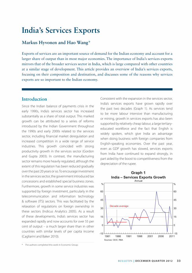
33Bulletin | D e c e m b e r Q ua r t e r 2012
IntroductionSince the Indian balance of payments crisis in the early 1990s, India’s services sector has increased substantially as a share of total output. This marked growth can be attributed to a series of reforms introduced by the Indian Government throughout the 1990s and early 2000s related to the services sector, including financial market deregulation and increased competition in a wide range of service industries. This growth coincided with strong productivity growth in the services sector (Gordon and Gupta 2003). In contrast, the manufacturing sector remains more heavily regulated, although the extent of this regulation has been reduced gradually over the past 20 years or so. To encourage investment in the services sector, the government introduced tax concessions and established special business zones. Furthermore, growth in some service industries was supported by foreign investment, particularly in the telecommunication and information technology & software (ITS) sectors. This was facilitated by the relaxation of regulations on foreign ownership in these sectors (Indicus Analytics 2005). As a result of these developments, India’s services sector has expanded rapidly and now accounts for over 55 per cent of output – a much larger share than in other countries with similar levels of per capita income (Cagliarini and Baker 2010).
Consistent with the expansion in the services sector, India’s services exports have grown rapidly over the past two decades (Graph 1). As services tend to be more labour intensive than manufacturing or mining, growth in services exports has also been supported by relatively cheap labour, a large tertiary-educated workforce and the fact that English is widely spoken, which give India an advantage when doing business with foreign companies from English-speaking economies. Over the past year, even as GDP growth has slowed, services exports from India have continued to expand strongly, in part aided by the boost to competitiveness from the depreciation of the rupee.
India’s Services Exports
* The authors completed this work in Economic Group.
Markus Hyvonen and Hao Wang*
Exports of services are an important source of demand for the Indian economy and account for a larger share of output than in most major economies. The importance of India’s services exports mirrors that of the broader services sector in India, which is large compared with other countries at a similar stage of development. This article provides an overview of India’s services exports, focusing on their composition and destination, and discusses some of the reasons why services exports are so important to the Indian economy.
-15
0
15
30
45
60
-15
0
15
30
45
60
India – Services Exports GrowthAnnual
Sources: CEIC; RBA
2011
Decade average
%
2006
%
20011996199119861981
Graph 1
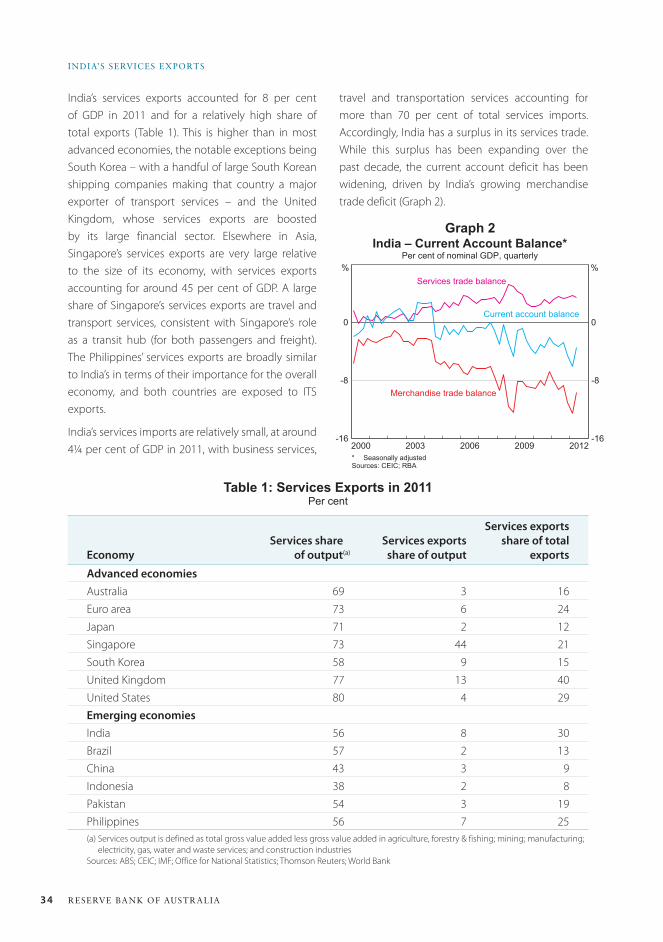
34 ReseRve bank of austRalia
india’s seRvices expoRts
India’s services exports accounted for 8 per cent of GDP in 2011 and for a relatively high share of total exports (Table 1). This is higher than in most advanced economies, the notable exceptions being South Korea – with a handful of large South Korean shipping companies making that country a major exporter of transport services – and the United Kingdom, whose services exports are boosted by its large financial sector. Elsewhere in Asia, Singapore’s services exports are very large relative to the size of its economy, with services exports accounting for around 45 per cent of GDP. A large share of Singapore’s services exports are travel and transport services, consistent with Singapore’s role as a transit hub (for both passengers and freight). The Philippines’ services exports are broadly similar to India’s in terms of their importance for the overall economy, and both countries are exposed to ITS exports.
India’s services imports are relatively small, at around 4¼ per cent of GDP in 2011, with business services,
travel and transportation services accounting for more than 70 per cent of total services imports. Accordingly, India has a surplus in its services trade. While this surplus has been expanding over the past decade, the current account deficit has been widening, driven by India’s growing merchandise trade deficit (Graph 2).
-16
-8
0
-16
-8
0
India – Current Account Balance*Per cent of nominal GDP, quarterly
* Seasonally adjustedSources: CEIC; RBA
2012
Services trade balance%%
Current account balance
Merchandise trade balance
2009200620032000
Graph 2
Table 1: Services Exports in 2011Per cent
Economy Services share
of output(a)Services exports
share of output
Services exports share of total
exports
Advanced economiesAustralia 69 3 16Euro area 73 6 24Japan 71 2 12Singapore 73 44 21South Korea 58 9 15United Kingdom 77 13 40United States 80 4 29Emerging economiesIndia 56 8 30Brazil 57 2 13China 43 3 9Indonesia 38 2 8Pakistan 54 3 19Philippines 56 7 25(a) Services output is defined as total gross value added less gross value added in agriculture, forestry & fishing; mining; manufacturing;
electricity, gas, water and waste services; and construction industriesSources: ABS; CEIC; IMF; Office for National Statistics; Thomson Reuters; World Bank
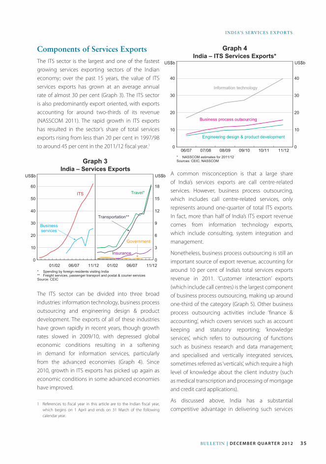
35Bulletin | D e c e m b e r Q ua r t e r 2012
india’s services exports
Components of Services ExportsThe ITS sector is the largest and one of the fastest growing services exporting sectors of the Indian economy; over the past 15 years, the value of ITS services exports has grown at an average annual rate of almost 30 per cent (Graph 3). The ITS sector is also predominantly export oriented, with exports accounting for around two-thirds of its revenue (NASSCOM 2011). The rapid growth in ITS exports has resulted in the sector’s share of total services exports rising from less than 20 per cent in 1997/98 to around 45 per cent in the 2011/12 fiscal year.1
The ITS sector can be divided into three broad industries: information technology, business process outsourcing and engineering design & product development. The exports of all of these industries have grown rapidly in recent years, though growth rates slowed in 2009/10, with depressed global economic conditions resulting in a softening in demand for information services, particularly from the advanced economies (Graph 4). Since 2010, growth in ITS exports has picked up again as economic conditions in some advanced economies have improved.
1 References to fiscal year in this article are to the Indian fiscal year, which begins on 1 April and ends on 31 March of the following calendar year.
A common misconception is that a large share of India’s services exports are call centre-related services. However, business process outsourcing, which includes call centre-related services, only represents around one-quarter of total ITS exports. In fact, more than half of India’s ITS export revenue comes from information technology exports, which include consulting, system integration and management.
Nonetheless, business process outsourcing is still an important source of export revenue, accounting for around 10 per cent of India’s total services exports revenue in 2011. ‘Customer interaction’ exports (which include call centres) is the largest component of business process outsourcing, making up around one-third of the category (Graph 5). Other business process outsourcing activities include ‘finance & accounting’, which covers services such as account keeping and statutory reporting; ‘knowledge services’, which refers to outsourcing of functions such as business research and data management; and specialised and vertically integrated services, sometimes referred as ‘verticals’, which require a high level of knowledge about the client industry (such as medical transcription and processing of mortgage and credit card applications).
As discussed above, India has a substantial competitive advantage in delivering such services
0
10
20
30
40
50
60
India – Services Exports
ITS
US$b
0
3
6
9
12
15
18
* Spending by foreign residents visiting India** Freight services, passenger transport and postal & courier servicesSource: CEIC
11/12
Businessservices
US$b
Travel*
Transportation**
Insurance
Government
06/0701/0201/02 11/1206/07
Graph 3
0
10
20
30
40
0
10
20
30
40
India – ITS Services Exports*
* NASSCOM estimates for 2011/12Sources: CEIC; NASSCOM
11/12
Information technology
US$b
Business process outsourcing
Engineering design & product development
08/0907/08 10/11
US$b
09/1006/07
Graph 4
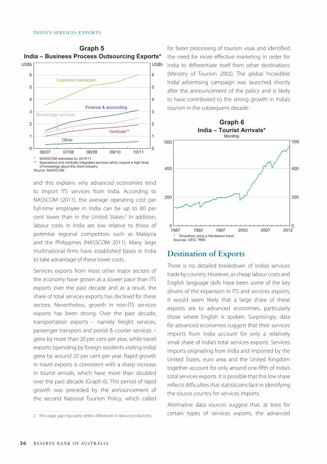
36 ReseRve bank of austRalia
india’s seRvices expoRts
for faster processing of tourism visas and identified the need for more effective marketing in order for India to differentiate itself from other destinations (Ministry of Tourism 2002). The global ‘Incredible India’ advertising campaign was launched shortly after the announcement of the policy and is likely to have contributed to the strong growth in India’s tourism in the subsequent decade.
0
1
2
3
4
5
6
0
1
2
3
4
5
6
India – Business Process Outsourcing Exports*
* NASSCOM estimates for 2010/11** Specialised and vertically integrated services which require a high level
of knowledge about the client industrySource: NASSCOM
10/11
Customer interaction
US$b
Finance & accounting
Other
07/0806/07 09/10
US$b
08/09
Knowledge services
Verticals**
Graph 5
0
200
400
0
200
400
India – Tourist Arrivals*Monthly
* Smoothed using a Henderson trendSources: CEIC; RBA
2012
’000
20072002199719921987
’000
Graph 6
Destination of ExportsThere is no detailed breakdown of India’s services trade by country. However, as cheap labour costs and English language skills have been some of the key drivers of the expansion in ITS and services exports, it would seem likely that a large share of these exports are to advanced economies, particularly those where English is spoken. Surprisingly, data for advanced economies suggest that their services imports from India account for only a relatively small share of India’s total services exports. Services imports originating from India and imported by the United States, euro area and the United Kingdom together account for only around one-fifth of India’s total services exports. It is possible that this low share reflects difficulties that statisticians face in identifying the source country for services imports.
Alternative data sources suggest that, at least for certain types of services exports, the advanced
and this explains why advanced economies tend to import ITS services from India. According to NASSCOM (2011), the average operating cost per full-time employee in India can be up to 80 per cent lower than in the United States.2 In addition, labour costs in India are low relative to those of potential regional competitors such as Malaysia and the Philippines (NASSCOM 2011). Many large multinational firms have established bases in India to take advantage of these lower costs.
Services exports from most other major sectors of the economy have grown at a slower pace than ITS exports over the past decade and as a result, the share of total services exports has declined for these sectors. Nevertheless, growth in non-ITS services exports has been strong. Over the past decade, transportation exports – namely freight services, passenger transport and postal & courier services – grew by more than 20 per cent per year, while travel exports (spending by foreign residents visiting India) grew by around 20 per cent per year. Rapid growth in travel exports is consistent with a sharp increase in tourist arrivals, which have more than doubled over the past decade (Graph 6). This period of rapid growth was preceded by the announcement of the second National Tourism Policy, which called
2 This wage gap may partly reflect differences in labour productivity.
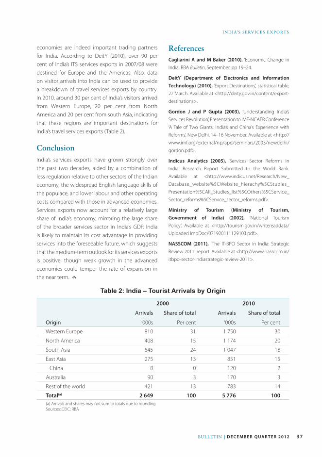
37Bulletin | D e c e m b e r Q ua r t e r 2012
india’s services exports
economies are indeed important trading partners for India. According to DeitY (2010), over 90 per cent of India’s ITS services exports in 2007/08 were destined for Europe and the Americas. Also, data on visitor arrivals into India can be used to provide a breakdown of travel services exports by country. In 2010, around 30 per cent of India’s visitors arrived from Western Europe, 20 per cent from North America and 20 per cent from south Asia, indicating that these regions are important destinations for India’s travel services exports (Table 2).
ConclusionIndia’s services exports have grown strongly over the past two decades, aided by a combination of less regulation relative to other sectors of the Indian economy, the widespread English language skills of the populace, and lower labour and other operating costs compared with those in advanced economies. Services exports now account for a relatively large share of India’s economy, mirroring the large share of the broader services sector in India’s GDP. India is likely to maintain its cost advantage in providing services into the foreseeable future, which suggests that the medium-term outlook for its services exports is positive, though weak growth in the advanced economies could temper the rate of expansion in the near term. R
ReferencesCagliarini A and M Baker (2010), ‘Economic Change in
India’, RBA Bulletin, September, pp 19–24.
DeitY (Department of Electronics and Information Technology) (2010), ‘Export Destinations’, statistical table,
27 March. Available at <http://deity.gov.in/content/export-
destinations>.
Gordon J and P Gupta (2003), ‘Understanding India’s
Services Revolution’, Presentation to IMF-NCAER Conference
‘A Tale of Two Giants: India’s and China’s Experience with
Reforms’, New Delhi, 14–16 November. Available at <http://
www.imf.org/external/np/apd/seminars/2003/newdelhi/
gordon.pdf>.
Indicus Analytics (2005), ‘Services Sector Reforms in
India’, Research Report Submitted to the World Bank.
Available at <http://www.indicus.net/Research/New_
Database_website%5CWebsite_hierachy%5CStudies_
Presentation%5CAll_Studies_list%5COthers%5CService_
Sector_reforms%5CService_sector_reforms.pdf>.
Ministry of Tourism (Ministry of Tourism, Government of India) (2002), ‘National Tourism
Policy’. Available at <http://tourism.gov.in/writereaddata/
Uploaded ImpDoc/071920111129103.pdf>.
NASSCOM (2011), ‘The IT-BPO Sector in India: Strategic
Review 2011’, report. Available at <http://www.nasscom.in/
itbpo-sector-indiastrategic-review-2011>.
Table 2: India – Tourist Arrivals by Origin
Origin
2000 2010
Arrivals Share of total Arrivals Share of total
‘000s Per cent ‘000s Per cent
Western Europe 810 31 1 750 30
North America 408 15 1 174 20
South Asia 645 24 1 047 18
East Asia 275 13 851 15
China 8 0 120 2
Australia 90 3 170 3
Rest of the world 421 13 783 14
Total(a) 2 649 100 5 776 100(a) Arrivals and shares may not sum to totals due to roundingSources: CEIC; RBA

38 ReseRve bank of austRalia
39Bulletin | d e c e m b e r Q ua r t e r 2012
The Reserve Bank of Australia recently commenced surveying participants in Australian over-the-counter (OTC) derivatives markets as part of the Bank for International Settlements’ (BIS) semiannual global OTC derivatives survey. Australia’s contribution to the survey complements regulatory efforts to improve the resilience and transparency of Australia’s OTC derivatives markets. It also facilitates a higher frequency comparison of the Australian and foreign OTC derivatives markets. The survey results show that the structure of the Australian market is broadly similar to that of global markets: Australia’s market is primarily an interbank market, with most activity in interest rate and foreign exchange derivatives contracts.
IntroductionOTC derivatives markets have attracted considerable attention from regulators since the onset of the global financial crisis. Reforms to improve the risk management practices and transparency of these markets are now underway in many jurisdictions, including Australia. These reforms include the reporting of all OTC derivatives transactions to trade repositories, the execution of transactions on organised trading platforms (where appropriate), the clearing of standardised trades through central counterparties, and the collateralisation of bilateral transactions not cleared through central counterparties.1
Complementing other initiatives to increase transparency in these markets, the Reserve Bank
1 In Australia, the Council of Financial Regulators has stated its preference for industry-led implementation of the reforms, with direct regulatory intervention if desired outcomes are not reached within acceptable time frames. See Council of Financial Regulators (2012). This policy stance was reaffirmed in a detailed report on OTC derivatives markets in Australia released in October, which included an assessment of whether direct regulatory intervention was required. See APRA, ASIC and RBA (2012).
australian OtC Derivatives Markets: Insights from the BIS Semiannual Survey
* The article was written by Mihovil Matić and Christian Vallence. Jason Ahn was responsible for establishing and administering the survey. The authors are from Domestic Markets Department and would like to thank Greg Moran for his assistance and comments.
Jason ahn, Mihovil Mati and Christian Vallence*
of Australia recently began surveying a selection of Australian banks as part of the BIS semiannual collection of OTC derivatives statistics, in addition to its long-running contribution to the BIS triennial survey. The semiannual collection has been the most authoritative source of data on global OTC derivatives markets to date. The Australian contribution provides an additional resource for local regulators to observe Australian banks’ activity in these markets. For example, it includes a comprehensive and higher frequency breakdown of the Australian market by product class, counterparty type, maturity profile and currency denomination. The survey will also assist in quantifying the impact on Australian banks of impending reforms in these markets. The BIS semiannual collection supplements other sources of data on institutions’ OTC derivatives markets activity and exposures collected by the Australian Prudential Regulation Authority (APRA) and the Australian Financial Markets Association (AFMA), as well as ad hoc surveys carried out in 2009 and 2012 by APRA, the Australian Securities and Investments Commission (ASIC) and the Bank.2
2 See APRA, ASIC and RBA (2009, 2012).
c
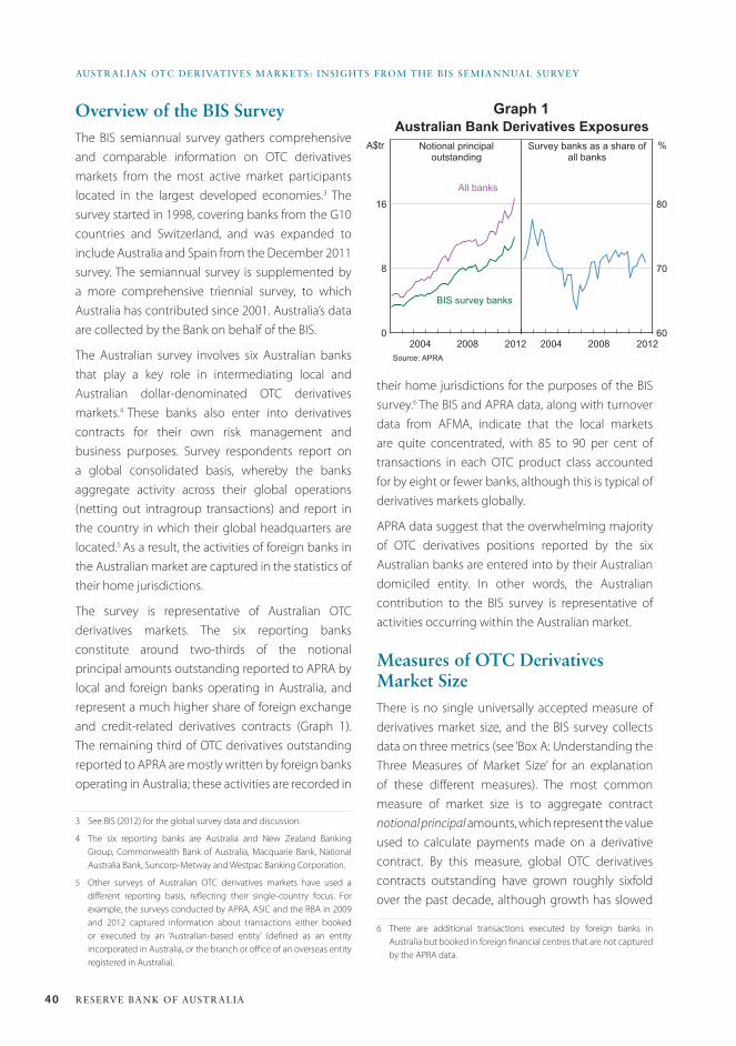
40 ReseRve bank of austRalia
austRalian otC DeRivatives MaRkets: insights fRoM the bis seMiannual suRvey
their home jurisdictions for the purposes of the BIS survey.6 The BIS and APRA data, along with turnover data from AFMA, indicate that the local markets are quite concentrated, with 85 to 90 per cent of transactions in each OTC product class accounted for by eight or fewer banks, although this is typical of derivatives markets globally.
APRA data suggest that the overwhelming majority of OTC derivatives positions reported by the six Australian banks are entered into by their Australian domiciled entity. In other words, the Australian contribution to the BIS survey is representative of activities occurring within the Australian market.
Measures of OtC Derivatives Market SizeThere is no single universally accepted measure of derivatives market size, and the BIS survey collects data on three metrics (see ‘Box A: Understanding the Three Measures of Market Size’ for an explanation of these different measures). The most common measure of market size is to aggregate contract notional principal amounts, which represent the value used to calculate payments made on a derivative contract. By this measure, global OTC derivatives contracts outstanding have grown roughly sixfold over the past decade, although growth has slowed
6 There are additional transactions executed by foreign banks in Australia but booked in foreign financial centres that are not captured by the APRA data.
Overview of the BIS SurveyThe BIS semiannual survey gathers comprehensive and comparable information on OTC derivatives markets from the most active market participants located in the largest developed economies.3 The survey started in 1998, covering banks from the G10 countries and Switzerland, and was expanded to include Australia and Spain from the December 2011 survey. The semiannual survey is supplemented by a more comprehensive triennial survey, to which Australia has contributed since 2001. Australia’s data are collected by the Bank on behalf of the BIS.
The Australian survey involves six Australian banks that play a key role in intermediating local and Australian dollar-denominated OTC derivatives markets.4 These banks also enter into derivatives contracts for their own risk management and business purposes. Survey respondents report on a global consolidated basis, whereby the banks aggregate activity across their global operations (netting out intragroup transactions) and report in the country in which their global headquarters are located.5 As a result, the activities of foreign banks in the Australian market are captured in the statistics of their home jurisdictions.
The survey is representative of Australian OTC derivatives markets. The six reporting banks constitute around two-thirds of the notional principal amounts outstanding reported to APRA by local and foreign banks operating in Australia, and represent a much higher share of foreign exchange and credit-related derivatives contracts (Graph 1). The remaining third of OTC derivatives outstanding reported to APRA are mostly written by foreign banks operating in Australia; these activities are recorded in
3 See BIS (2012) for the global survey data and discussion.
4 The six reporting banks are Australia and New Zealand Banking Group, Commonwealth Bank of Australia, Macquarie Bank, National Australia Bank, Suncorp-Metway and Westpac Banking Corporation.
5 Other surveys of Australian OTC derivatives markets have used a different reporting basis, reflecting their single-country focus. For example, the surveys conducted by APRA, ASIC and the RBA in 2009 and 2012 captured information about transactions either booked or executed by an ‘Australian-based entity’ (defined as an entity incorporated in Australia, or the branch or office of an overseas entity registered in Australia).
Graph 1Australian Bank Derivatives Exposures
Notional principaloutstanding
Source: APRA
2012
All banks
A$tr %
20082004
BIS survey banks
Survey banks as a share ofall banks
0
8
16
60
70
80
201220082004
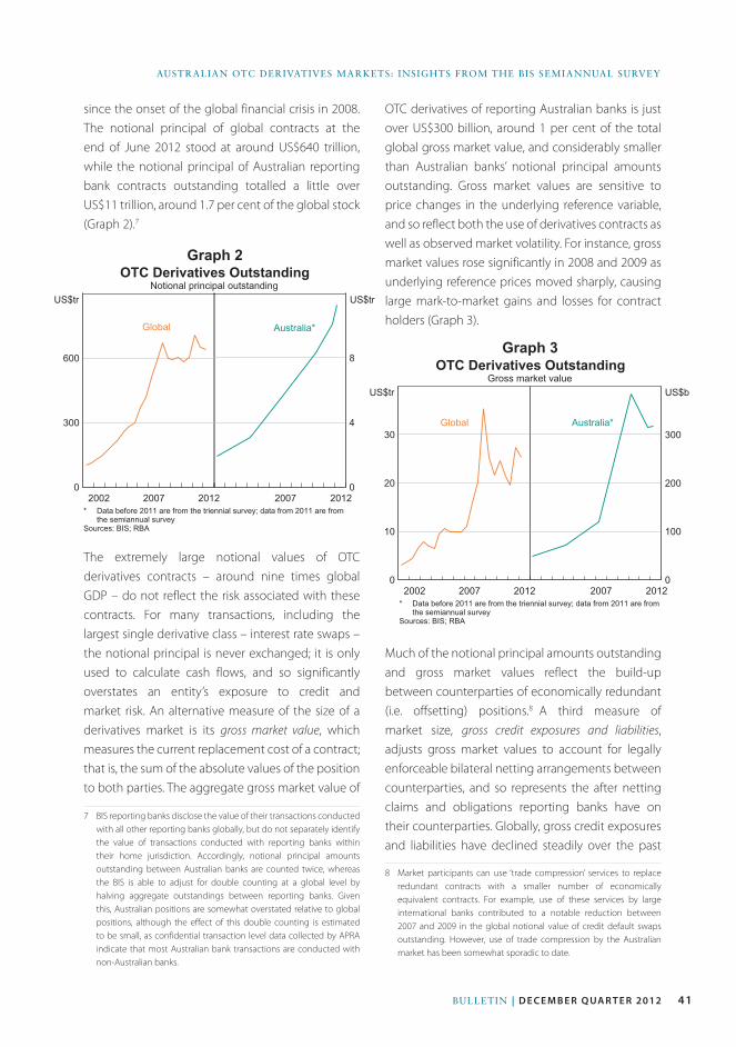
41Bulletin | d e c e m b e r Q ua r t e r 2012
AustrAliAn OtC DerivAtives MArkets: insights frOM the Bis seMiAnnuAl survey
OTC derivatives of reporting Australian banks is just over US$300 billion, around 1 per cent of the total global gross market value, and considerably smaller than Australian banks’ notional principal amounts outstanding. Gross market values are sensitive to price changes in the underlying reference variable, and so reflect both the use of derivatives contracts as well as observed market volatility. For instance, gross market values rose significantly in 2008 and 2009 as underlying reference prices moved sharply, causing large mark-to-market gains and losses for contract holders (Graph 3).
Much of the notional principal amounts outstanding and gross market values reflect the build-up between counterparties of economically redundant (i.e. offsetting) positions.8 A third measure of market size, gross credit exposures and liabilities, adjusts gross market values to account for legally enforceable bilateral netting arrangements between counterparties, and so represents the after netting claims and obligations reporting banks have on their counterparties. Globally, gross credit exposures and liabilities have declined steadily over the past
8 Market participants can use ‘trade compression’ services to replace redundant contracts with a smaller number of economically equivalent contracts. For example, use of these services by large international banks contributed to a notable reduction between 2007 and 2009 in the global notional value of credit default swaps outstanding. However, use of trade compression by the Australian market has been somewhat sporadic to date.
since the onset of the global financial crisis in 2008. The notional principal of global contracts at the end of June 2012 stood at around US$640 trillion, while the notional principal of Australian reporting bank contracts outstanding totalled a little over US$11 trillion, around 1.7 per cent of the global stock (Graph 2).7
The extremely large notional values of OTC derivatives contracts – around nine times global GDP – do not reflect the risk associated with these contracts. For many transactions, including the largest single derivative class – interest rate swaps – the notional principal is never exchanged; it is only used to calculate cash flows, and so significantly overstates an entity’s exposure to credit and market risk. An alternative measure of the size of a derivatives market is its gross market value, which measures the current replacement cost of a contract; that is, the sum of the absolute values of the position to both parties. The aggregate gross market value of
7 BIS reporting banks disclose the value of their transactions conducted with all other reporting banks globally, but do not separately identify the value of transactions conducted with reporting banks within their home jurisdiction. Accordingly, notional principal amounts outstanding between Australian banks are counted twice, whereas the BIS is able to adjust for double counting at a global level by halving aggregate outstandings between reporting banks. Given this, Australian positions are somewhat overstated relative to global positions, although the effect of this double counting is estimated to be small, as confidential transaction level data collected by APRA indicate that most Australian bank transactions are conducted with non-Australian banks.
Graph 2OTC Derivatives Outstanding
Notional principal outstanding
* Data before 2011 are from the triennial survey; data from 2011 are fromthe semiannual survey
Sources: BIS; RBA
2012
Global
US$tr US$tr
2007201220072002
Australia*
0
300
600
0
4
8OTC Derivatives Outstanding
Gross market value
* Data before 2011 are from the triennial survey; data from 2011 are fromthe semiannual survey
Sources: BIS; RBA
2012
Global
US$tr US$b
2007201220072002
Australia*
0
10
20
30
0
100
200
300
Graph 3
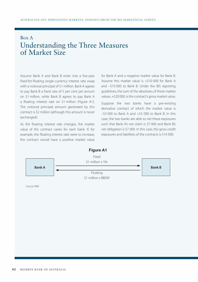
42 ReseRve bank of austRalia
austRalian otC DeRivatives MaRkets: insights fRoM the bis seMiannual suRvey
Assume Bank A and Bank B enter into a five-year fixed-for-floating single-currency interest rate swap with a notional principal of $1 million. Bank A agrees to pay Bank B a fixed rate of 5 per cent per annum on $1 million, while Bank B agrees to pay Bank A a floating interest rate on $1 million (Figure A1). The notional principal amount generated by this contract is $2 million (although this amount is never exchanged).
As the floating interest rate changes, the market value of the contract varies for each bank. If, for example, the floating interest rate were to increase, the contract would have a positive market value
Bank A Bank B
Fixed $1 million x 5%
Floating $1 million x BBSW
Figure A1
for Bank A and a negative market value for Bank B. Assume this market value is +$10 000 for Bank A and –$10 000 to Bank B. Under the BIS reporting guidelines, the sum of the absolutes of these market values, +$20 000, is the contract’s gross market value.
Suppose the two banks have a pre-existing derivative contract of which the market value is –$3 000 to Bank A and +$3 000 to Bank B. In this case, the two banks are able to net these exposures such that Bank A’s net claim is $7 000 and Bank B’s net obligation is $7 000. In this case, the gross credit exposures and liabilities of the contracts is $14 000.
Box A
Understanding the Three Measures of Market Size
Source: RBA
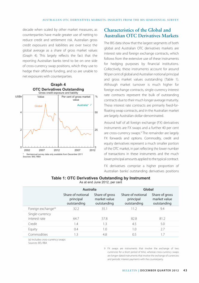
43BUlleTIn | d e c e m B e r Q uA r t e r 2012
AUSTRAlIAn OTC DeRIvATIveS MARkeTS: InSIghTS fROM The BIS SeMIAnnUAl SURvey
Table 1: OTC Derivatives Outstanding by Instrument As at end June 2012, per cent
Australia GlobalShare of notional
principal outstanding
Share of gross market value outstanding
Share of notional principal
outstanding
Share of gross market value outstanding
Foreign exchange(a) 32.2 35.1 11.2 9.4Single-currency interest rate 64.7 57.8 82.8 81.2Credit 1.4 1.3 4.5 5.0Equity 0.4 1.0 1.0 2.7Commodities 1.3 4.8 0.5 1.7(a) Includes cross-currency swapsSources: BIS; RBA
decade when scaled by other market measures, as counterparties have made greater use of netting to reduce credit and settlement risk. Australian gross credit exposures and liabilities are over twice the global average as a share of gross market values (Graph 4). This largely reflects the fact that the reporting Australian banks tend to be on one side of cross-currency swap positions, which they use to hedge their offshore funding, and so are unable to net exposures with counterparties.
Characteristics of the Global and Australian OTC Derivatives MarketsThe BIS data show that the largest segments of both global and Australian OTC derivatives markets are interest rate and foreign exchange contracts, which follows from the extensive use of these instruments for hedging purposes by financial institutions. Collectively, these instruments account for around 90 per cent of global and Australian notional principal and gross market values outstanding (Table 1). Although market turnover is much higher for foreign exchange contracts, single-currency interest rate contracts represent the bulk of outstanding contracts due to their much longer average maturity. These interest rate contracts are primarily fixed-for-floating swap contracts, and in the Australian market are largely Australian dollar-denominated.
Around half of all foreign exchange (FX) derivatives instruments are FX swaps and a further 40 per cent are cross-currency swaps.9 The remainder are largely FX forwards and options. Commodity, credit and equity derivatives represent a much smaller portion of the OTC market, in part reflecting the lower number of transactions in these instruments and the much lower principal amounts applied to the typical contract.
FX derivatives comprise a higher proportion of Australian banks’ outstanding derivatives positions
9 FX swaps are instruments that involve the exchange of two currencies for a short period of time, whereas cross-currency swaps are longer-dated instruments that involve the exchange of currencies and periodic interest payments with the counterparty.
OTC Derivatives Outstanding
* Semiannual survey data only available from December 2011Sources: BIS; RBA
2012
Global
US$tr %
2007201220072002
Australia*
0
2
4
0
25
50
Per cent of gross marketvalue
Gross credit exposure and liabilityValue
Graph 4
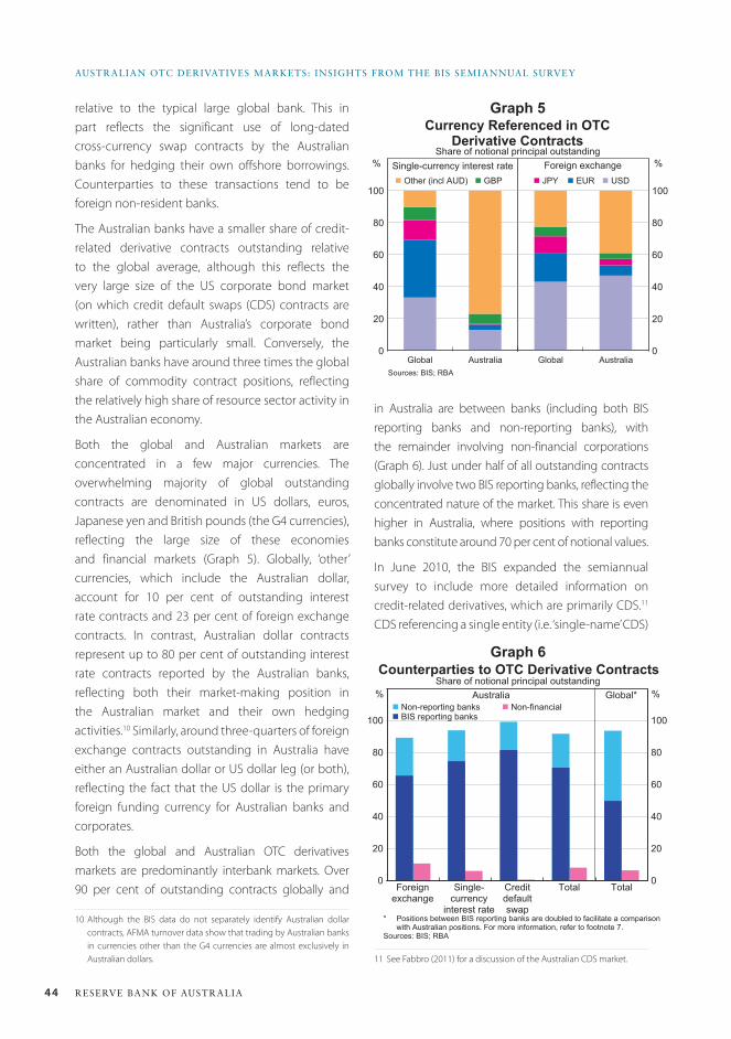
44 ReseRve bank of austRalia
austRalian otC DeRivatives MaRkets: insights fRoM the bis seMiannual suRvey
relative to the typical large global bank. This in part reflects the significant use of long-dated cross-currency swap contracts by the Australian banks for hedging their own offshore borrowings. Counterparties to these transactions tend to be foreign non-resident banks.
The Australian banks have a smaller share of credit-related derivative contracts outstanding relative to the global average, although this reflects the very large size of the US corporate bond market (on which credit default swaps (CDS) contracts are written), rather than Australia’s corporate bond market being particularly small. Conversely, the Australian banks have around three times the global share of commodity contract positions, reflecting the relatively high share of resource sector activity in the Australian economy.
Both the global and Australian markets are concentrated in a few major currencies. The overwhelming majority of global outstanding contracts are denominated in US dollars, euros, Japanese yen and British pounds (the G4 currencies), reflecting the large size of these economies and financial markets (Graph 5). Globally, ‘other’ currencies, which include the Australian dollar, account for 10 per cent of outstanding interest rate contracts and 23 per cent of foreign exchange contracts. In contrast, Australian dollar contracts represent up to 80 per cent of outstanding interest rate contracts reported by the Australian banks, reflecting both their market-making position in the Australian market and their own hedging activities.10 Similarly, around three-quarters of foreign exchange contracts outstanding in Australia have either an Australian dollar or US dollar leg (or both), reflecting the fact that the US dollar is the primary foreign funding currency for Australian banks and corporates.
Both the global and Australian OTC derivatives markets are predominantly interbank markets. Over 90 per cent of outstanding contracts globally and
10 Although the BIS data do not separately identify Australian dollar contracts, AFMA turnover data show that trading by Australian banks in currencies other than the G4 currencies are almost exclusively in Australian dollars.
in Australia are between banks (including both BIS reporting banks and non-reporting banks), with the remainder involving non-financial corporations (Graph 6). Just under half of all outstanding contracts globally involve two BIS reporting banks, reflecting the concentrated nature of the market. This share is even higher in Australia, where positions with reporting banks constitute around 70 per cent of notional values.
In June 2010, the BIS expanded the semiannual survey to include more detailed information on credit-related derivatives, which are primarily CDS.11 CDS referencing a single entity (i.e. ‘single-name’ CDS)
11 See Fabbro (2011) for a discussion of the Australian CDS market.
Currency Referenced in OTC
Derivative ContractsShare of notional principal outstanding
Sources: BIS; RBA
% %
Global Australia0
20
40
60
80
100
Global Australia0
20
40
60
80
100n Other (incl AUD) n USDn GBP n JPY n EUR
Single-currency interest rate Foreign exchange
Graph 5
Graph 6Counterparties to OTC Derivative Contracts
Share of notional principal outstanding
* Positions between BIS reporting banks are doubled to facilitate a comparisonwith Australian positions. For more information, refer to footnote 7.
Sources: BIS; RBA
% %
Single-currency
interest rate
Foreignexchange
0
20
40
60
80
100
0
20
40
60
80
100
Creditdefaultswap
Total
n Non-financial
Total
Global*Australia
n BIS reporting banksn Non-reporting banks
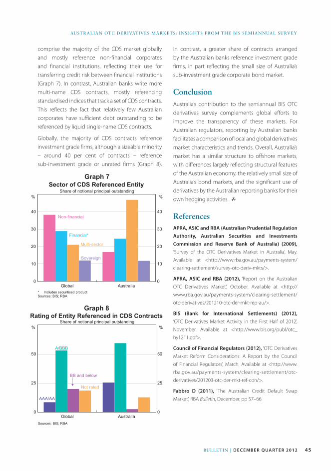
45Bulletin | d e c e m b e r Q ua r t e r 2012
AustrAliAn OtC DerivAtives MArkets: insights frOM the Bis seMiAnnuAl survey
comprise the majority of the CDS market globally and mostly reference non-financial corporates and financial institutions, reflecting their use for transferring credit risk between financial institutions (Graph 7). In contrast, Australian banks write more multi-name CDS contracts, mostly referencing standardised indices that track a set of CDS contracts. This reflects the fact that relatively few Australian corporates have sufficient debt outstanding to be referenced by liquid single-name CDS contracts.
Globally, the majority of CDS contracts reference investment grade firms, although a sizeable minority – around 40 per cent of contracts – reference sub-investment grade or unrated firms (Graph 8).
Graph 7Sector of CDS Referenced Entity
Share of notional principal outstanding
* Includes securitised productSources: BIS; RBA
% %
Non-financial
Global Australia0
10
20
30
40
0
10
20
30
40
Multi-sector
Financial*
Sovereign
Graph 8Rating of Entity Referenced in CDS Contracts
Share of notional principal outstanding
Sources: BIS; RBA
% %
AAA/AA
Global Australia0
25
50
0
25
50
BB and below
A/BBB
Not rated
In contrast, a greater share of contracts arranged by the Australian banks reference investment grade firms, in part reflecting the small size of Australia’s sub-investment grade corporate bond market.
ConclusionAustralia’s contribution to the semiannual BIS OTC derivatives survey complements global efforts to improve the transparency of these markets. For Australian regulators, reporting by Australian banks facilitates a comparison of local and global derivatives market characteristics and trends. Overall, Australia’s market has a similar structure to offshore markets, with differences largely reflecting structural features of the Australian economy, the relatively small size of Australia’s bond markets, and the significant use of derivatives by the Australian reporting banks for their own hedging activities. R
ReferencesAPRA, ASIC and RBA (Australian Prudential Regulation Authority, Australian Securities and Investments Commission and Reserve Bank of Australia) (2009), ‘Survey of the OTC Derivatives Market in Australia’, May.
Available at <http://www.rba.gov.au/payments-system/
clearing-settlement/survey-otc-deriv-mkts/>.
APRA, ASIC and RBA (2012), ‘Report on the Australian
OTC Derivatives Market’, October. Available at <http://
www.rba.gov.au/payments-system/clearing-settlement/
otc-derivatives/201210-otc-der-mkt-rep-au/>.
BIS (Bank for International Settlements) (2012), ‘OTC Derivatives Market Activity in the First Half of 2012’,
November. Available at <http://www.bis.org/publ/otc_
hy1211.pdf>.
Council of Financial Regulators (2012), ‘OTC Derivatives
Market Reform Considerations: A Report by the Council
of Financial Regulators’, March. Available at <http://www.
rba.gov.au/payments-system/clearing-settlement/otc-
derivatives/201203-otc-der-mkt-ref-con/>.
Fabbro D (2011), ‘The Australian Credit Default Swap
Market’, RBA Bulletin, December, pp 57–66.

46 ReseRve bank of austRalia
47Bulletin | D E C E M B E R Q ua R t E R 2012
IntroductionFollowing deregulation of the Australian financial system in the 1970s and 1980s, the Australian economy became more integrated with the global financial system. As a result, both foreign investment into Australia and Australian investment abroad has increased markedly. These developments have had notable benefits for Australia, including increasing access to offshore borrowing to fund productive investment.
The connections between Australian-located banks (hereafter ‘Australian banks’) and the global financial system provide benefits but can also pose risks to the domestic financial system by propagating external financial and macroeconomic shocks. This article examines the international activities of the Australian banks using the locational data in the International Banking Statistics (IBS), and discusses how these activities have changed over the past decade.1
1 The IBS are collected by 44 countries, including Australia, and published quarterly by the Bank for International Settlements (BIS) on its website: see <http://www.bis.org/statistics/bankstats.htm>. The IBS for Australia are collected by the Australian Prudential Regulation Authority, reported to the BIS, and published quarterly on the Reserve Bank website. For the locational data, see Statistical Tables B11.1 and B12.1 to B12.2.1 at <http://www.rba.gov.au/statistics/tables/index.html>.
The locational data in the IBS comprise the international assets and liabilities of all banking offices located in Australia. This includes the domestic operations of Australian-owned banks and the Australian operations (subsidiaries and branches) of foreign-owned banks. In particular, the locational data measure banks’ on-balance sheet assets and liabilities vis-à-vis non-residents denominated in all currencies, as well as assets and liabilities vis-à-vis Australian residents denominated in foreign currencies; the latter are considered part of banks’ international banking business.2 These data provide insights into the role of banks, and by extension the financial centres where banks are located, in intermediating international capital flows. The locational data measure the international positions of Australian banks on an unconsolidated basis. That is, they exclude the assets and liabilities of the foreign operations of Australian-owned banks but include cross-border positions between offices of the same banking group (intragroup positions). For example, the claim of an Australian bank on its New Zealand subsidiary is included in the locational data, but the claims of the New Zealand subsidiary on New Zealand or other countries are not included.
2 For more details on the measurement of the IBS locational data, see Yuksel and Schwartz (2004).
International activities of australian Banks
* The authors are from Financial Stability Department.
Owen Bailey, Luke Van uffelen and Kerry Wood*
The Australian banking system plays a significant role in intermediating funds from foreign savers to Australian borrowers. Consistent with this, most of the banks’ international liabilities are related to their funding activities in offshore markets. After increasing strongly over the decade prior to the global financial crisis, the outstanding value of these liabilities has been little changed as banks have responded to a more difficult offshore funding environment. By contrast, the international assets of the Australian banking system are relatively small, with a sizeable share of these assets in a few countries where Australian-owned banks operate their main offshore subsidiaries and branches.
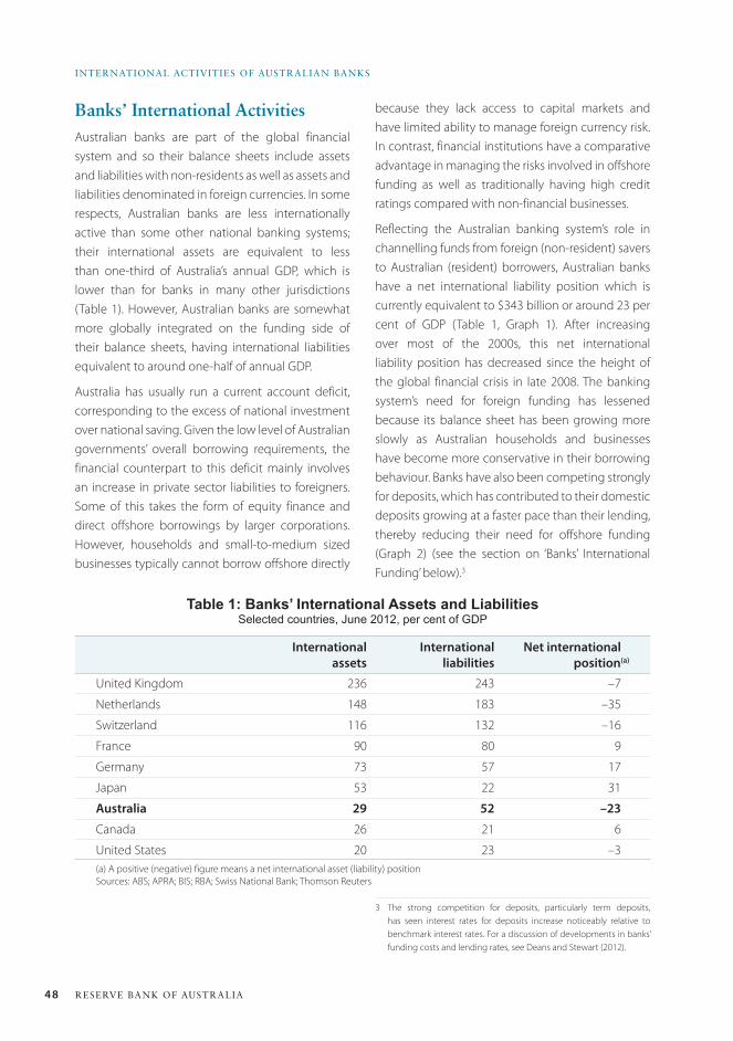
48 ReseRve bank of austRalia
inteRnational activities of austRalian banks
Banks’ International activitiesAustralian banks are part of the global financial system and so their balance sheets include assets and liabilities with non-residents as well as assets and liabilities denominated in foreign currencies. In some respects, Australian banks are less internationally active than some other national banking systems; their international assets are equivalent to less than one-third of Australia’s annual GDP, which is lower than for banks in many other jurisdictions (Table 1). However, Australian banks are somewhat more globally integrated on the funding side of their balance sheets, having international liabilities equivalent to around one-half of annual GDP.
Australia has usually run a current account deficit, corresponding to the excess of national investment over national saving. Given the low level of Australian governments’ overall borrowing requirements, the financial counterpart to this deficit mainly involves an increase in private sector liabilities to foreigners. Some of this takes the form of equity finance and direct offshore borrowings by larger corporations. However, households and small-to-medium sized businesses typically cannot borrow offshore directly
because they lack access to capital markets and have limited ability to manage foreign currency risk. In contrast, financial institutions have a comparative advantage in managing the risks involved in offshore funding as well as traditionally having high credit ratings compared with non-financial businesses.
Reflecting the Australian banking system’s role in channelling funds from foreign (non-resident) savers to Australian (resident) borrowers, Australian banks have a net international liability position which is currently equivalent to $343 billion or around 23 per cent of GDP (Table 1, Graph 1). After increasing over most of the 2000s, this net international liability position has decreased since the height of the global financial crisis in late 2008. The banking system’s need for foreign funding has lessened because its balance sheet has been growing more slowly as Australian households and businesses have become more conservative in their borrowing behaviour. Banks have also been competing strongly for deposits, which has contributed to their domestic deposits growing at a faster pace than their lending, thereby reducing their need for offshore funding (Graph 2) (see the section on ‘Banks’ International Funding’ below).3
3 The strong competition for deposits, particularly term deposits, has seen interest rates for deposits increase noticeably relative to benchmark interest rates. For a discussion of developments in banks’ funding costs and lending rates, see Deans and Stewart (2012).
Table 1: Banks’ International Assets and LiabilitiesSelected countries, June 2012, per cent of GDP
International assets
International liabilities
Net internationalposition(a)
United Kingdom 236 243 –7
Netherlands 148 183 –35
Switzerland 116 132 –16
France 90 80 9
Germany 73 57 17
Japan 53 22 31
Australia 29 52 –23
Canada 26 21 6
United States 20 23 –3(a) A positive (negative) figure means a net international asset (liability) positionSources: ABS; APRA; BIS; RBA; Swiss National Bank; Thomson Reuters
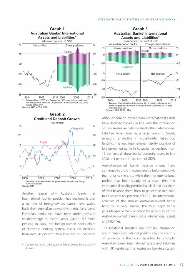
49Bulletin | D E C E M B E R Q ua R t E R 2012
international activities of australian Banks
Another reason why Australian banks’ net international liability position has declined is that a number of foreign-owned banks have scaled back their Australian operations, particularly some European banks that have been under pressure to deleverage in recent years (Graph 3).4 Since peaking in 2007, the foreign-owned banks’ share of domestic banking system assets has declined from over 20 per cent to a little over 10 per cent.
4 See RBA (2012) for a discussion of foreign-owned bank activity in Australia.
Although foreign-owned banks’ international assets have declined broadly in line with the contraction of their Australian balance sheets, their international liabilities have fallen by a larger amount, largely reflecting a decline in cross-border intragroup funding. The net international liability position of foreign-owned banks in Australia has declined from 16 per cent of these banks’ domestic assets in late 2008 to 4 per cent (1 per cent of GDP).
Australian-owned banks’ balance sheets have continued to grow in recent years, albeit more slowly than prior to the crisis, while their net international position has been steady. As a result, their net international liability position has declined as a share of their balance sheet, from 16 per cent in mid 2010 to 13 per cent (22 per cent of GDP). The international activities of the smaller Australian-owned banks tend to be very limited. The four major banks plus Macquarie Bank account for almost all of the Australian-owned banks’ gross international assets and liabilities.
The locational statistics also contain information about banks’ international positions by the country of residence of their counterparties, for example, Australian banks’ international assets and liabilities with UK residents. The Australian banking system
Graph 1
Graph 2
Graph 3
-35
-30
-25
-20
-15
-75
-50
-25
0
25
Gross positionsNet position
Australian Banks’ International
Assets and Liabilities*
All banks, per cent of GDP%
* Between March 2003 and September 2010, data include banks andsome Registered Financial Corporations; from December 2010, datainclude banks only
Sources: ABS; APRA; RBA
2012 2012200820082004 2004
%
Assets
Liabilities
0
5
10
15
20
0
5
10
15
20
Credit and Deposit Growth
Year-ended
* Excludes certificates of deposit, government deposits and foreigncurrency deposits
Source: RBA
Deposits*%%
200920062003
Credit
2000 2012
-40
0
Australian Banks’ International
Assets and Liabilities*By ownership, per cent of GDP
%
* Between March 2003 and September 2010, data include banks andsome Registered Financial Corporations; from December 2010, datainclude banks only
Sources: ABS; APRA; RBA
Australian-owned banks
-40
0
Foreign-owned banks
2008
%
-30
-20
-10
-15
-10
-5
%%
Gross positions Gross positions
Net positionNet position
Liabilities
Assets
2004 201220082004 2012
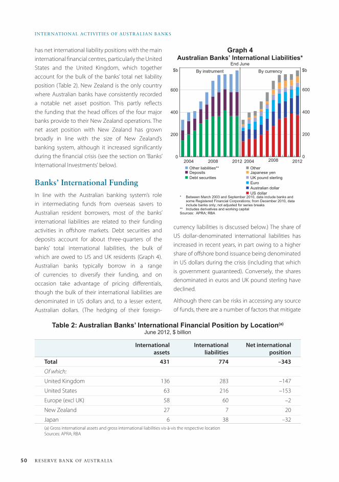
50 ReseRve bank of austRalia
inteRnational activities of austRalian banks
has net international liability positions with the main international financial centres, particularly the United States and the United Kingdom, which together account for the bulk of the banks’ total net liability position (Table 2). New Zealand is the only country where Australian banks have consistently recorded a notable net asset position. This partly reflects the funding that the head offices of the four major banks provide to their New Zealand operations. The net asset position with New Zealand has grown broadly in line with the size of New Zealand’s banking system, although it increased significantly during the financial crisis (see the section on ‘Banks’ International Investments’ below).
Banks’ International FundingIn line with the Australian banking system’s role in intermediating funds from overseas savers to Australian resident borrowers, most of the banks’ international liabilities are related to their funding activities in offshore markets. Debt securities and deposits account for about three-quarters of the banks’ total international liabilities, the bulk of which are owed to US and UK residents (Graph 4). Australian banks typically borrow in a range of currencies to diversify their funding, and on occasion take advantage of pricing differentials, though the bulk of their international liabilities are denominated in US dollars and, to a lesser extent, Australian dollars. (The hedging of their foreign-
Table 2: Australian Banks’ International Financial Position by Location(a)
June 2012, $ billion
International assets
International liabilities
Net international position
Total 431 774 –343
Of which:
United Kingdom 136 283 –147
United States 63 216 –153
Europe (excl UK) 58 60 –2
New Zealand 27 7 20
Japan 6 38 –32(a) Gross international assets and gross international liabilities vis-à-vis the respective locationSources: APRA; RBA
Graph 4
0
200
400
600
0
200
400
600
Australian Banks’ International Liabilities*
By instrument$b $bBy currency
* Between March 2003 and September 2010, data include banks andsome Registered Financial Corporations; from December 2010, datainclude banks only; not adjusted for series breaks
** Includes derivatives and working capitalSources: APRA; RBA
2008 20082004 2012
n Other liabilities**n Deposits
n Debt securities
End June
2004 2012
n Othern Japanese yen
n UK pound sterling
n Euro
n Australian dollar
n US dollar
currency liabilities is discussed below.) The share of US dollar-denominated international liabilities has increased in recent years, in part owing to a higher share of offshore bond issuance being denominated in US dollars during the crisis (including that which is government guaranteed). Conversely, the shares denominated in euros and UK pound sterling have declined.
Although there can be risks in accessing any source of funds, there are a number of factors that mitigate
51Bulletin | D E C E M B E R Q ua R t E R 2012
international activities of australian Banks
the risks of offshore foreign-currency funding. The Australian banking system’s use of international funding involves borrowing mainly in foreign currencies and lending predominantly in Australian dollars. However, the foreign currency liabilities are almost fully hedged by the banks using foreign exchange swaps, with the maturity of these hedges generally matching that of the underlying funding.5 Australian banks, therefore, do not face material maturity mismatches in foreign currency and, unlike some European banks during the global financial crisis, do not run the same sorts of risk in having to roll over funding in a currency in which they cannot access central bank liquidity. Reflecting this hedging, the large swings in the exchange rate of the Australian dollar over recent years have not had a material effect on Australian banks’ profitability, with neither losses nor gains flowing through to banks’ profits from these exchange rate movements. Australian banks also generally lend to their domestic customers in Australian dollars, which means that their customers are not exposed to foreign currency risk.
Globally, banks have been responding to market and regulatory pressures to reduce their reliance on short-term wholesale funding given that it has become more expensive (relative to risk-free benchmarks) and is seen as a less stable form of funding following the experience of the crisis. The Australian banking system has also responded to this changed environment by sourcing a greater share of its funding from domestic deposits, which are generally considered to be a more stable source of funding. They have also been increasing the share of long-term wholesale debt relative to short-term wholesale debt, thereby reducing rollover risk. The modest domestic credit growth of the past few years has supported the change in banks’ funding composition. The following sections look at banks’ international liabilities in more detail, particularly their international debt, deposit and intragroup funding.
5 For a discussion of the latest survey on foreign currency exposure and hedging in Australia, see D’Arcy, Shah ldil and Davis (2009).
Developments in international debt securities and deposit funding
In the years leading up to the global financial crisis, Australian banks’ international liabilities grew at a faster pace than their balance sheets. During this period, the major Australian banks raised funds domestically or in various offshore markets depending on where it was more cost-effective, even though over the longer run there was no systematic difference in issuance costs between onshore and offshore markets.6 A benefit of issuing in offshore markets is that it provides access to a larger and more diverse investor base and banks can issue in greater volume than can typically be absorbed onshore.
During the early stages of the financial crisis, conditions in offshore debt markets became unsettled and the cost of issuing offshore increased relative to the domestic market, both in terms of wider issuance spreads and higher costs to swap foreign currency borrowings into Australian dollars. Banks responded to this by reducing their short-term issuance offshore, although this was partly offset by banks’ issuance of government-guaranteed debt in offshore markets.7
Even though the costs of unguaranteed offshore and onshore issuance have converged, the outstanding value of Australian banks’ international debt securities has been little changed over the past couple of years, and now accounts for its smallest share of funding liabilities since at least 2003 (Graph 5). Banks have not increased their use of this source of funding as they have responded to market pressures and the forthcoming Basel III liquidity regulations – global reforms that will limit the maturity mismatch between banks’ assets and liabilities.
6 For an overview of banks’ bond issuance and funding costs over this period, see Black, Brassil and Hack (2010).
7 For a discussion of banks’ government guaranteed offshore issuance, see Black et al (2010).
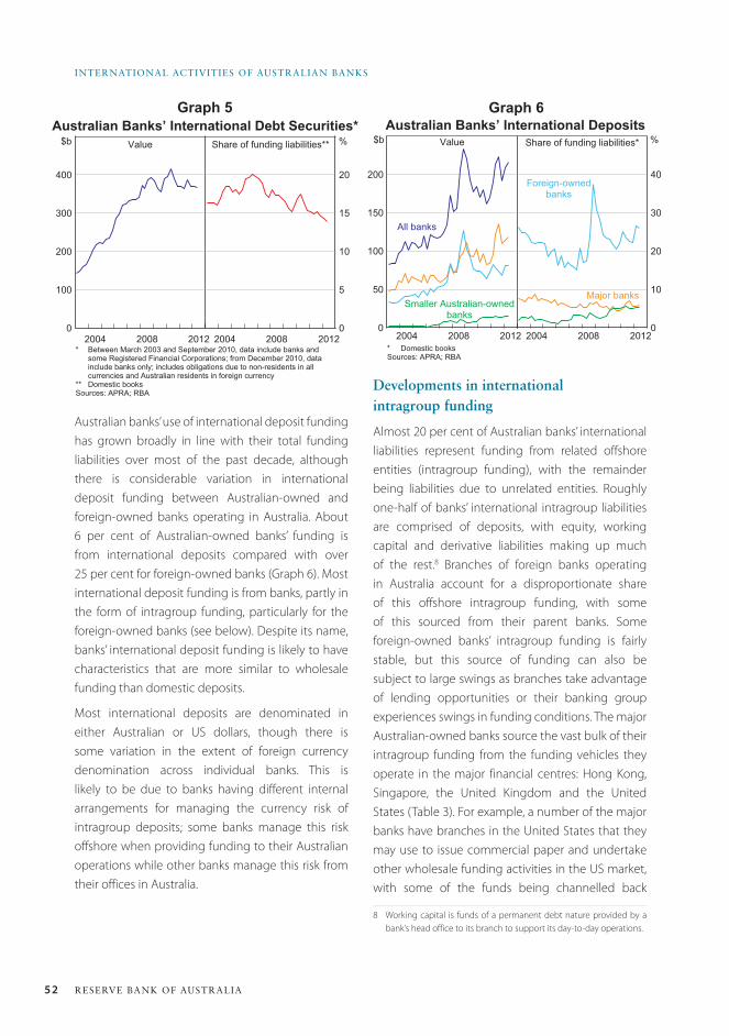
52 ReseRve bank of austRalia
inteRnational activities of austRalian banks
Developments in international intragroup funding
Almost 20 per cent of Australian banks’ international liabilities represent funding from related offshore entities (intragroup funding), with the remainder being liabilities due to unrelated entities. Roughly one-half of banks’ international intragroup liabilities are comprised of deposits, with equity, working capital and derivative liabilities making up much of the rest.8 Branches of foreign banks operating in Australia account for a disproportionate share of this offshore intragroup funding, with some of this sourced from their parent banks. Some foreign-owned banks’ intragroup funding is fairly stable, but this source of funding can also be subject to large swings as branches take advantage of lending opportunities or their banking group experiences swings in funding conditions. The major Australian-owned banks source the vast bulk of their intragroup funding from the funding vehicles they operate in the major financial centres: Hong Kong, Singapore, the United Kingdom and the United States (Table 3). For example, a number of the major banks have branches in the United States that they may use to issue commercial paper and undertake other wholesale funding activities in the US market, with some of the funds being channelled back
8 Working capital is funds of a permanent debt nature provided by a bank’s head office to its branch to support its day-to-day operations.
Graph 5 Graph 6
Australian banks’ use of international deposit funding has grown broadly in line with their total funding liabilities over most of the past decade, although there is considerable variation in international deposit funding between Australian-owned and foreign-owned banks operating in Australia. About 6 per cent of Australian-owned banks’ funding is from international deposits compared with over 25 per cent for foreign-owned banks (Graph 6). Most international deposit funding is from banks, partly in the form of intragroup funding, particularly for the foreign-owned banks (see below). Despite its name, banks’ international deposit funding is likely to have characteristics that are more similar to wholesale funding than domestic deposits.
Most international deposits are denominated in either Australian or US dollars, though there is some variation in the extent of foreign currency denomination across individual banks. This is likely to be due to banks having different internal arrangements for managing the currency risk of intragroup deposits; some banks manage this risk offshore when providing funding to their Australian operations while other banks manage this risk from their offices in Australia.
Australian Banks’ International Debt Securities*
0
100
200
300
400
0
5
10
15
20
* Between March 2003 and September 2010, data include banks andsome Registered Financial Corporations; from December 2010, datainclude banks only; includes obligations due to non-residents in allcurrencies and Australian residents in foreign currency
** Domestic booksSources: APRA; RBA
$b Value Share of funding liabilities** %
201220082004 20082004 2012
Australian Banks’ International Deposits
0
50
100
150
200
0
10
20
30
40
* Domestic booksSources: APRA; RBA
All banks
%Value Share of funding liabilities*$b
Major banks
Foreign-ownedbanks
Smaller Australian-ownedbanks
20082004201220082004 2012
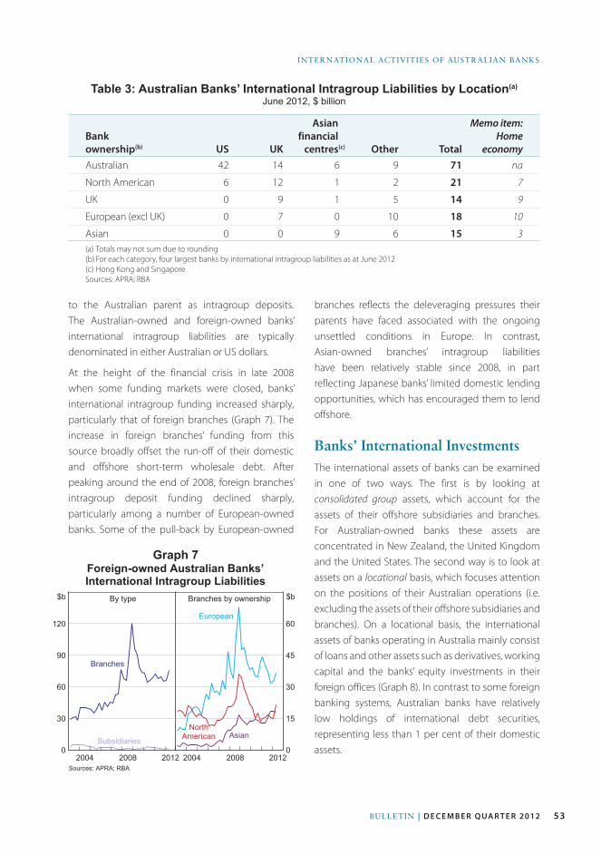
53Bulletin | D E C E M B E R Q ua R t E R 2012
international activities of australian Banks
to the Australian parent as intragroup deposits. The Australian-owned and foreign-owned banks’ international intragroup liabilities are typically denominated in either Australian or US dollars.
At the height of the financial crisis in late 2008 when some funding markets were closed, banks’ international intragroup funding increased sharply, particularly that of foreign branches (Graph 7). The increase in foreign branches’ funding from this source broadly offset the run-off of their domestic and offshore short-term wholesale debt. After peaking around the end of 2008, foreign branches’ intragroup deposit funding declined sharply, particularly among a number of European-owned banks. Some of the pull-back by European-owned
branches reflects the deleveraging pressures their parents have faced associated with the ongoing unsettled conditions in Europe. In contrast, Asian-owned branches’ intragroup liabilities have been relatively stable since 2008, in part reflecting Japanese banks’ limited domestic lending opportunities, which has encouraged them to lend offshore.
Banks’ International InvestmentsThe international assets of banks can be examined in one of two ways. The first is by looking at consolidated group assets, which account for the assets of their offshore subsidiaries and branches. For Australian-owned banks these assets are concentrated in New Zealand, the United Kingdom and the United States. The second way is to look at assets on a locational basis, which focuses attention on the positions of their Australian operations (i.e. excluding the assets of their offshore subsidiaries and branches). On a locational basis, the international assets of banks operating in Australia mainly consist of loans and other assets such as derivatives, working capital and the banks’ equity investments in their foreign offices (Graph 8). In contrast to some foreign banking systems, Australian banks have relatively low holdings of international debt securities, representing less than 1 per cent of their domestic assets.
Table 3: Australian Banks’ International Intragroup Liabilities by Location(a)
June 2012, $ billion
Bank ownership(b) uS uK
Asianfinancial
centres(c) Other Total
Memo item:Home
economyAustralian 42 14 6 9 71 na
North American 6 12 1 2 21 7
UK 0 9 1 5 14 9
European (excl UK) 0 7 0 10 18 10
Asian 0 0 9 6 15 3(a) Totals may not sum due to rounding(b) For each category, four largest banks by international intragroup liabilities as at June 2012(c) Hong Kong and SingaporeSources: APRA; RBA
Graph 7Foreign-owned Australian Banks’
International Intragroup Liabilities
0
30
60
90
120
0
15
30
45
60
Sources: APRA; RBA
European
$b By type Branches by ownership $b
AsianNorth
American
Branches
Subsidiaries
20082004201220082004 2012
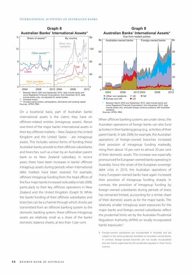
54 ReseRve bank of austRalia
inteRnational activities of austRalian banks
On a locational basis, part of Australian banks’ international assets is the claims they have on offshore-related entities (intragroup assets). About one-third of the major banks’ international assets in their key offshore markets – New Zealand, the United Kingdom and the United States – are intragroup assets. This includes various forms of funding these Australian banks provide to their offshore subsidiaries and branches, such as a loan by an Australian parent bank to its New Zealand subsidiary. In recent years, there have been increases in banks’ offshore intragroup assets during periods when international debt markets have been strained. For example, offshore intragroup funding from the head offices of the four major banks increased noticeably in late 2008, particularly to their key offshore operations in New Zealand and the United Kingdom (Graph 9). While the banks’ funding of their offshore subsidiaries and branches can be a channel through which shocks are transmitted from an offshore banking system to the domestic banking system, these offshore intragroup assets are relatively small as a share of the banks’ domestic balance sheets, at less than 3 per cent.
When offshore banking systems are under stress, the Australian operations of foreign banks can also fund activities in their banking group (e.g. activities of their parent bank). In late 2008, for example, the Australian operations of foreign-owned branches increased their provision of intragroup funding markedly, rising from about 10 per cent to almost 20 per cent of their domestic assets. This increase was especially pronounced for European-owned banks operating in Australia. Since the onset of the European sovereign debt crisis in 2010, the Australian operations of many European-owned banks have again increased their provision of intragroup funding sharply. In contrast, the provision of intragroup funding by foreign-owned subsidiaries during periods of stress has remained limited, accounting for a similar share of their domestic assets as for the major banks. The relatively smaller intragroup asset exposures for the major banks and foreign-owned subsidiaries reflect the prudential limits set by the Australian Prudential Regulation Authority (APRA) on locally incorporated banks’ exposures.9
9 Foreign-owned subsidiaries are incorporated in Australia and are subject to the same prudential standards as Australian-owned banks. In contrast, foreign-owned branches are not locally incorporated and are mainly supervised by the prudential regulator in their home country.
Graph 8 Graph 9
0
4
8
12
Australian Banks’ International Assets*
$bBy country
Other assets***
* Between March 2003 and September 2010, data include banks andsome Registered Financial Corporations; from December 2010, datainclude banks only; not adjusted for series breaks
** Domestic books*** Includes equity shares, participations, derivatives and working capitalSources: APRA; RBA
0
40
80
120
Share of assets**
Loans
Debt securities
20082004201220082004
%
US
Other non-residents
NZ
UK
2012
Australian Banks’ International Assets*Due from related parties
0
20
40
60
0
20
40
60
2012
$bForeign-owned banks$b Australian-owned banks
* Between March 2003 and September 2010, data include banks andsome Registered Financial Corporations; from December 2010, datainclude banks only; excludes foreign-currency positions with Australianresidents
Sources: APRA; RBA
20082008 20122004 2004n Other non-residentsn Europe excl UK
n UKn US
n NZ
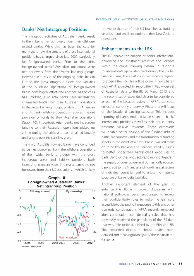
55Bulletin | D E C E M B E R Q ua R t E R 2012
international activities of australian Banks
Banks’ Net Intragroup PositionsThe intragroup activities of Australian banks result in them being net borrowers from their offshore-related parties. While this has been the case for many years now, the structure of these international positions has changed since late 2007, particularly for foreign-owned banks. Prior to the crisis, foreign-owned banks’ Australian operations were net borrowers from their wider banking groups. However, as a result of the ongoing difficulties in Europe, the gross intragroup assets and liabilities of the Australian operations of foreign-owned banks now largely offset one another. As the crisis has unfolded, euro area banks have increasingly channelled funds from their Australian operations to the wider banking groups, while North American and UK banks’ offshore operations reduced the net provision of funds to their Australian operations (Graph 10). In contrast, Asian banks’ net intragroup funding to their Australian operations picked up a little during the crisis, and has remained broadly unchanged over the past few years.
The major Australian-owned banks have continued to be net borrowers from the offshore operations of their wider banking groups, with the gross intragroup asset and liability positions both increasing in recent years. The major banks are net borrowers from their US operations – which is likely
to owe to the use of their US branches as funding vehicles – and small net lenders to their New Zealand operations.
Enhancements to the IBSThe IBS enable the analysis of banks’ international borrowing and investment activities and linkages within the global banking system. In response to several data gaps identified during the global financial crisis, the G-20 countries recently agreed to expand the IBS. This will be done in two phases, with APRA expected to report the initial, wider set of Australian data to the BIS by March 2013, and the second set of expanded data to be considered as part of the broader review of APRA’s statistical collection currently underway. Phase one will focus on the locational banking statistics. This includes reporting of banks’ entire balance sheets – banks’ international positions as well as their local currency positions vis-à-vis residents. These extensions will enable better analysis of the funding risks of particular countries and the transmission of funding shocks in the event of a crisis. Phase two will focus on three key banking and financial stability issues: to better understand banks’ credit exposures to particular countries and sectors; to monitor trends in the supply of cross-border and domestically sourced bank credit to the financial and non-financial sectors of individual countries; and to assess the maturity structure of banks’ debt liabilities.
Another important element of the plan to enhance the IBS is improved disclosure, with national authorities being encouraged to review their confidentiality rules to make the IBS more accessible to the public. In response to this and other domestic considerations, APRA recently removed, after consultation, confidentiality rules that had previously restricted the granularity of the IBS data that was able to be published by the RBA and BIS. This expanded disclosure should enable more detailed and meaningful analysis of these data in the future. R
Graph 10Foreign-owned Australian Banks’
Net Intragroup Position
-50
-40
-30
-20
-10
0
-21
-14
-7
0
7
14
Sources: APRA; RBA
Euro area
$bBy ownershipAll foreign-owned$b
20082004201220082004
Asian
UK
North American
2012
56 ReseRve bank of austRalia
inteRnational activities of austRalian banks
ReferencesBlack S, A Brassil and M Hack (2010), ‘Recent Trends
in Australian Banks’ Bond Issuance’, RBA Bulletin, March,
pp 27–33.
D’Arcy P, M Shah ldil and T Davis (2009), ‘Foreign
Currency Exposure and Hedging in Australia’, RBA Bulletin,
December, pp 1–10.
Deans C and C Stewart (2012), ‘Banks’ Funding Costs and
Lending Rates’, RBA Bulletin, March, pp 37–43.
RBA (Reserve Bank of Australia) (2012), ‘Foreign-owned
Bank Activity in Australia’, Financial Stability Review, March,
pp 38–40.
Yuksel M and C Schwartz (2004), ‘International Banking
Statistics for Australia’, RBA Bulletin, July, pp 18–24.
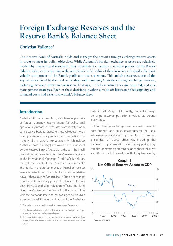
57Bulletin | D E C E M B E R Q ua R t E R 2012
IntroductionAustralia, like most countries, maintains a portfolio of foreign currency reserve assets for policy and operational purposes.1 These assets are invested on a conservative basis to facilitate these objectives, with an emphasis on liquidity and capital preservation. The majority of the nation’s reserve assets (which include Australia’s gold holdings) are owned and managed by the Reserve Bank of Australia, although the small proportion that constitutes Australia’s reserve position in the International Monetary Fund (IMF) is held on the balance sheet of the Australian Government.2
The Bank’s mandate to manage Australia’s reserve assets is established through the broad legislative powers that allow the Bank to deal in foreign exchange to achieve its monetary policy objectives. Reflecting both transactional and valuation effects, the level of Australia’s reserves has tended to fluctuate in line with the exchange rate, and has averaged a little over 3 per cent of GDP since the floating of the Australian
1 The Bank publishes a detailed review of its foreign exchange operations in its Annual Report each year.
2 For more information on the relationship between the Australian Government, the Reserve Bank of Australia and the IMF, see Poole (2012).
dollar in 1983 (Graph 1). Currently, the Bank’s foreign exchange reserves portfolio is valued at around A$42 billion.
Holding foreign exchange reserve assets presents both financial and policy challenges for the Bank. While reserves can be an important tool for meeting a number of policy objectives, including the successful implementation of monetary policy, they can also generate significant balance sheet risks that are difficult to eliminate without limiting the capacity
Foreign Exchange Reserves and the Reserve Bank’s Balance Sheet
* The author commenced this work in International Department.
Christian Vallence*
The Reserve Bank of Australia holds and manages the nation’s foreign exchange reserve assets in order to meet its policy objectives. While Australia’s foreign exchange reserves are relatively modest by international standards, they nonetheless constitute a sizeable portion of the Bank’s balance sheet, and variations in the Australian dollar value of these reserves are usually the most volatile component of the Bank’s profit and loss statement. This article discusses some of the key decisions faced by the Bank in holding and managing Australia’s foreign exchange reserves, including the appropriate size of reserve holdings, the way in which they are acquired, and risk management strategies. Each of these decisions involves a trade-off between policy capacity, and financial costs and risks to the Bank’s balance sheet.
Net Official Reserve Assets to GDP
Sources: ABS; RBA
2012
Average
%
2007200219970
2
4
6
0
2
4
6
%
19921987
Graph 1
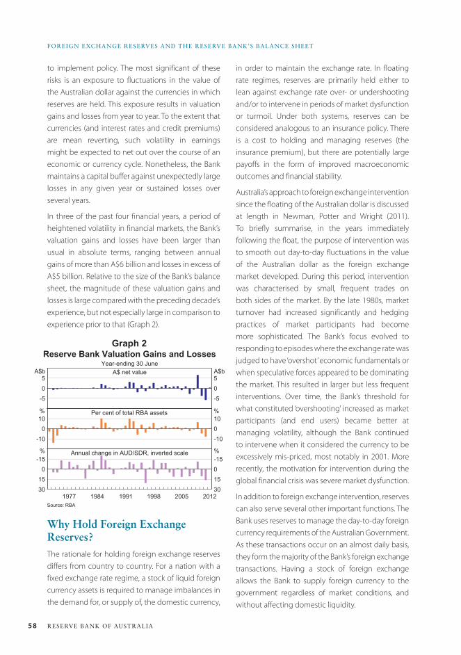
58 ReseRve bank of austRalia
foReiGn eXCHanGe ReseRves anD tHe ReseRve bank’s balanCe sHeet
Why Hold Foreign Exchange Reserves?The rationale for holding foreign exchange reserves differs from country to country. For a nation with a fixed exchange rate regime, a stock of liquid foreign currency assets is required to manage imbalances in the demand for, or supply of, the domestic currency,
to implement policy. The most significant of these risks is an exposure to fluctuations in the value of the Australian dollar against the currencies in which reserves are held. This exposure results in valuation gains and losses from year to year. To the extent that currencies (and interest rates and credit premiums) are mean reverting, such volatility in earnings might be expected to net out over the course of an economic or currency cycle. Nonetheless, the Bank maintains a capital buffer against unexpectedly large losses in any given year or sustained losses over several years.
In three of the past four financial years, a period of heightened volatility in financial markets, the Bank’s valuation gains and losses have been larger than usual in absolute terms, ranging between annual gains of more than A$6 billion and losses in excess of A$5 billion. Relative to the size of the Bank’s balance sheet, the magnitude of these valuation gains and losses is large compared with the preceding decade’s experience, but not especially large in comparison to experience prior to that (Graph 2).
-505
-505
30150
-15
30150-15
-100
10
-10010
Reserve Bank Valuation Gains and Losses
Year-ending 30 June
Source: RBA
2012
A$b
Per cent of total RBA assets
A$b
% %
% %Annual change in AUD/SDR, inverted scale
20051998199119841977
A$ net value
Graph 2
in order to maintain the exchange rate. In floating rate regimes, reserves are primarily held either to lean against exchange rate over- or undershooting and/or to intervene in periods of market dysfunction or turmoil. Under both systems, reserves can be considered analogous to an insurance policy. There is a cost to holding and managing reserves (the insurance premium), but there are potentially large payoffs in the form of improved macroeconomic outcomes and financial stability.
Australia’s approach to foreign exchange intervention since the floating of the Australian dollar is discussed at length in Newman, Potter and Wright (2011). To briefly summarise, in the years immediately following the float, the purpose of intervention was to smooth out day-to-day fluctuations in the value of the Australian dollar as the foreign exchange market developed. During this period, intervention was characterised by small, frequent trades on both sides of the market. By the late 1980s, market turnover had increased significantly and hedging practices of market participants had become more sophisticated. The Bank’s focus evolved to responding to episodes where the exchange rate was judged to have ‘overshot’ economic fundamentals or when speculative forces appeared to be dominating the market. This resulted in larger but less frequent interventions. Over time, the Bank’s threshold for what constituted ‘overshooting’ increased as market participants (and end users) became better at managing volatility, although the Bank continued to intervene when it considered the currency to be excessively mis-priced, most notably in 2001. More recently, the motivation for intervention during the global financial crisis was severe market dysfunction.
In addition to foreign exchange intervention, reserves can also serve several other important functions. The Bank uses reserves to manage the day-to-day foreign currency requirements of the Australian Government. As these transactions occur on an almost daily basis, they form the majority of the Bank’s foreign exchange transactions. Having a stock of foreign exchange allows the Bank to supply foreign currency to the government regardless of market conditions, and without affecting domestic liquidity.
59Bulletin | D E C E M B E R Q ua R t E R 2012
FOReiGn eXCHAnGe ReSeRVeS AnD tHe ReSeRVe BAnK’S BAlAnCe SHeet
The Bank also uses its reserves to assist in domestic liquidity management operations, complementing repurchase operations. Foreign exchange swaps are used to inject or remove Australian dollar liquidity by temporarily swapping Australian dollars and foreign currencies.3 The foreign currency lent or received in the swap transaction is borrowed from, or invested in, the Bank’s foreign currency reserves portfolios. Foreign exchange swaps can at times be more flexible and cost effective in adding or draining liquidity than repurchase operations.
In many emerging market economies, central banks and governments also consider reserves as useful for supporting financial systems and institutions. Recently, authorities in some developed markets have adopted a similar view. In particular, during the global financial crisis, in some countries reserves were used to provide foreign currency liquidity to banking systems, although this did not occur in Australia.
acquiring ReservesThere are three methods through which a central bank can acquire reserves (either singularly or in combination): by borrowing foreign currency directly, for example, by issuing foreign currency securities (either in the name of the central bank or with the central government acting as an intermediary); borrowing foreign currency through the foreign exchange swap or cross-currency swap markets; or purchasing reserves outright, by selling the domestic currency in exchange for foreign currency. Borrowing foreign currency generates a hedged foreign exchange position, while outright holdings leave a central bank unhedged. The different methods have different implications for the capacity of the central bank to intervene and manage its balance sheet risk.
The Reserve Bank of Australia accrues (and replenishes) the majority of its reserves by selling Australian dollars over time, and by reinvesting the earnings on its foreign assets. This generates a net ‘long’ or unhedged position in foreign currency.
3 For more information on the Bank’s open market operations, see <http://www.rba.gov.au/mkt-operations/index.html>.
The Bank considers the insurance characteristics of unhedged holdings to be superior to those of borrowed reserves as unhedged reserves carry little or no refinancing risk, as many of the Bank’s liabilities – most notably banknotes – are effectively perpetual. Conversely, foreign currency liabilities that fund borrowed reserves must be rolled over or repaid when they mature.4
A central bank that has intervened with borrowed reserves has entered into a ‘short’ foreign currency position, and may find rolling over or repaying its liabilities more costly if the depreciation of the domestic currency persists beyond the central bank’s refinancing horizon. If a central bank instead holds unhedged reserves then it may be able to wait for the exchange rate to move higher before replenishing reserves that had previously been drawn down. A central bank that borrows to fund reserves may also need to maintain a higher level of (gross) reserves to guard against this refinancing risk.
A central bank accumulating and deploying unhedged reserves counter-cyclically should, over time, earn a capital gain from such activities, as long as exchange rates are ultimately mean reverting. Unhedged reserve assets can be considered as a long position in foreign currency (or equally, a short position in the domestic currency). A central bank builds a long foreign currency position by accumulating foreign exchange as the domestic currency rises, and it effectively ‘closes’ this position profitably when intervening against a domestic currency depreciation (by selling foreign currency). Becker and Sinclair (2004) found that the Bank made a profit of around A$5 billion in stabilising the currency during three distinct exchange rate cycles from 1983 to 2003.
The Bank borrows reserves from time to time via the foreign exchange swap market. This hedged component of reserves is usually held on a temporary basis – most often for periods of less than three months – to assist with the management of domestic liquidity. The hedged and unhedged components together constitute the Bank’s gross
4 Countries with borrowed reserves typically issue foreign currency securities with maturities of three to five years.
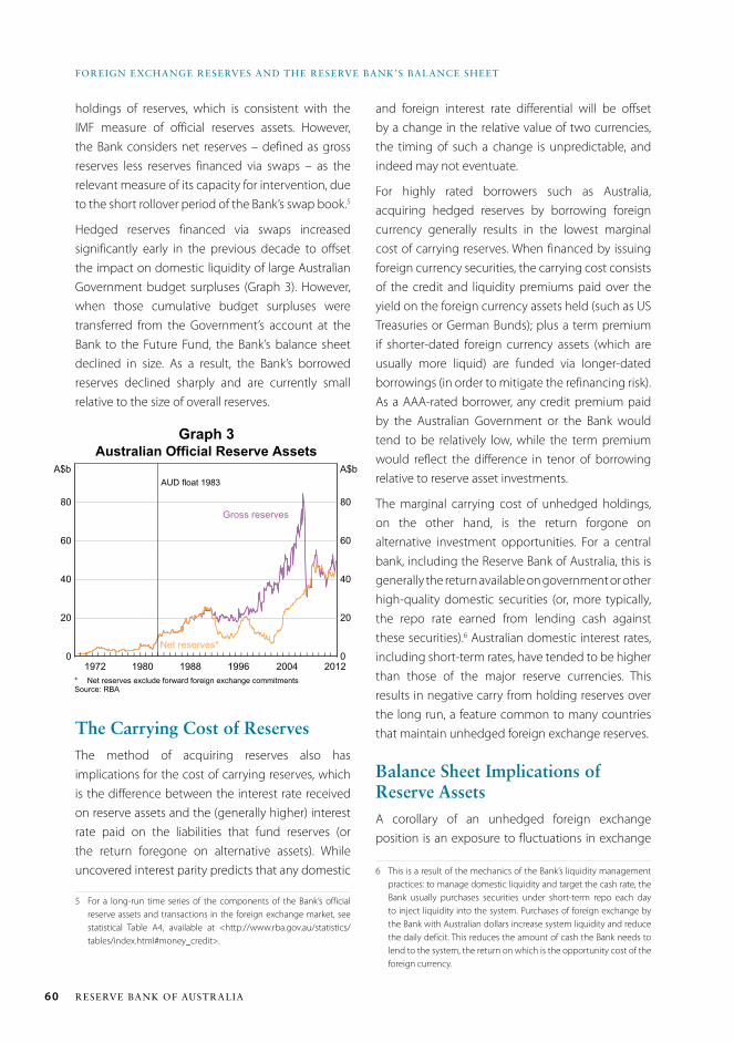
60 ReseRve bank of austRalia
foReiGn eXCHanGe ReseRves anD tHe ReseRve bank’s balanCe sHeet
and foreign interest rate differential will be offset by a change in the relative value of two currencies, the timing of such a change is unpredictable, and indeed may not eventuate.
For highly rated borrowers such as Australia, acquiring hedged reserves by borrowing foreign currency generally results in the lowest marginal cost of carrying reserves. When financed by issuing foreign currency securities, the carrying cost consists of the credit and liquidity premiums paid over the yield on the foreign currency assets held (such as US Treasuries or German Bunds); plus a term premium if shorter-dated foreign currency assets (which are usually more liquid) are funded via longer-dated borrowings (in order to mitigate the refinancing risk). As a AAA-rated borrower, any credit premium paid by the Australian Government or the Bank would tend to be relatively low, while the term premium would reflect the difference in tenor of borrowing relative to reserve asset investments.
The marginal carrying cost of unhedged holdings, on the other hand, is the return forgone on alternative investment opportunities. For a central bank, including the Reserve Bank of Australia, this is generally the return available on government or other high-quality domestic securities (or, more typically, the repo rate earned from lending cash against these securities).6 Australian domestic interest rates, including short-term rates, have tended to be higher than those of the major reserve currencies. This results in negative carry from holding reserves over the long run, a feature common to many countries that maintain unhedged foreign exchange reserves.
Balance Sheet Implications of Reserve AssetsA corollary of an unhedged foreign exchange position is an exposure to fluctuations in exchange
6 This is a result of the mechanics of the Bank’s liquidity management practices: to manage domestic liquidity and target the cash rate, the Bank usually purchases securities under short-term repo each day to inject liquidity into the system. Purchases of foreign exchange by the Bank with Australian dollars increase system liquidity and reduce the daily deficit. This reduces the amount of cash the Bank needs to lend to the system, the return on which is the opportunity cost of the foreign currency.
holdings of reserves, which is consistent with the IMF measure of official reserves assets. However, the Bank considers net reserves – defined as gross reserves less reserves financed via swaps – as the relevant measure of its capacity for intervention, due to the short rollover period of the Bank’s swap book.5
Hedged reserves financed via swaps increased significantly early in the previous decade to offset the impact on domestic liquidity of large Australian Government budget surpluses (Graph 3). However, when those cumulative budget surpluses were transferred from the Government’s account at the Bank to the Future Fund, the Bank’s balance sheet declined in size. As a result, the Bank’s borrowed reserves declined sharply and are currently small relative to the size of overall reserves.
The Carrying Cost of ReservesThe method of acquiring reserves also has implications for the cost of carrying reserves, which is the difference between the interest rate received on reserve assets and the (generally higher) interest rate paid on the liabilities that fund reserves (or the return foregone on alternative assets). While uncovered interest parity predicts that any domestic
5 For a long-run time series of the components of the Bank’s official reserve assets and transactions in the foreign exchange market, see statistical Table A4, available at <http://www.rba.gov.au/statistics/tables/index.html#money_credit>.
* Net reserves exclude forward foreign exchange commitmentsSource: RBA
2012
Gross reserves
200419961988
A$b
19801972l l l l l l l l l l l l l l l l l l l l l l l l l l l l l l l l l l l l l l l l l l l0
20
40
60
80
0
20
40
60
80
Australian Official Reserve Assets
AUD float 1983A$b
Net reserves*
Graph 3
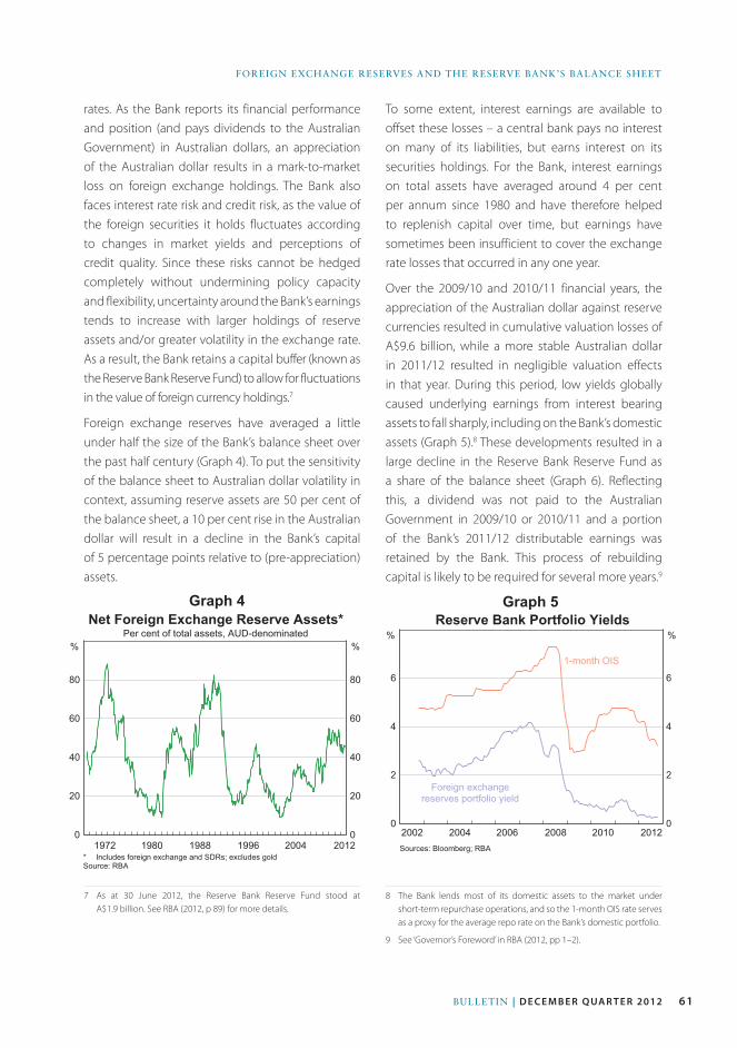
61Bulletin | D E C E M B E R Q ua R t E R 2012
FOReiGn eXCHAnGe ReSeRVeS AnD tHe ReSeRVe BAnK’S BAlAnCe SHeet
* Includes foreign exchange and SDRs; excludes goldSource: RBA
2012200419961988
%
198019720
20
40
60
80
0
20
40
60
80
Net Foreign Exchange Reserve Assets*
Per cent of total assets, AUD-denominated%
Graph 4
rates. As the Bank reports its financial performance and position (and pays dividends to the Australian Government) in Australian dollars, an appreciation of the Australian dollar results in a mark-to-market loss on foreign exchange holdings. The Bank also faces interest rate risk and credit risk, as the value of the foreign securities it holds fluctuates according to changes in market yields and perceptions of credit quality. Since these risks cannot be hedged completely without undermining policy capacity and flexibility, uncertainty around the Bank’s earnings tends to increase with larger holdings of reserve assets and/or greater volatility in the exchange rate. As a result, the Bank retains a capital buffer (known as the Reserve Bank Reserve Fund) to allow for fluctuations in the value of foreign currency holdings.7
Foreign exchange reserves have averaged a little under half the size of the Bank’s balance sheet over the past half century (Graph 4). To put the sensitivity of the balance sheet to Australian dollar volatility in context, assuming reserve assets are 50 per cent of the balance sheet, a 10 per cent rise in the Australian dollar will result in a decline in the Bank’s capital of 5 percentage points relative to (pre-appreciation) assets.
7 As at 30 June 2012, the Reserve Bank Reserve Fund stood at A$1.9 billion. See RBA (2012, p 89) for more details.
To some extent, interest earnings are available to offset these losses – a central bank pays no interest on many of its liabilities, but earns interest on its securities holdings. For the Bank, interest earnings on total assets have averaged around 4 per cent per annum since 1980 and have therefore helped to replenish capital over time, but earnings have sometimes been insufficient to cover the exchange rate losses that occurred in any one year.
Over the 2009/10 and 2010/11 financial years, the appreciation of the Australian dollar against reserve currencies resulted in cumulative valuation losses of A$9.6 billion, while a more stable Australian dollar in 2011/12 resulted in negligible valuation effects in that year. During this period, low yields globally caused underlying earnings from interest bearing assets to fall sharply, including on the Bank’s domestic assets (Graph 5).8 These developments resulted in a large decline in the Reserve Bank Reserve Fund as a share of the balance sheet (Graph 6). Reflecting this, a dividend was not paid to the Australian Government in 2009/10 or 2010/11 and a portion of the Bank’s 2011/12 distributable earnings was retained by the Bank. This process of rebuilding capital is likely to be required for several more years.9
8 The Bank lends most of its domestic assets to the market under short-term repurchase operations, and so the 1-month OIS rate serves as a proxy for the average repo rate on the Bank’s domestic portfolio.
9 See ‘Governor’s Foreword’ in RBA (2012, pp 1–2).
Sources: Bloomberg; RBA
2012201020082006
%
200420020
2
4
6
0
2
4
6
Reserve Bank Portfolio Yields
%
1-month OIS
Foreign exchangereserves portfolio yield
Graph 5
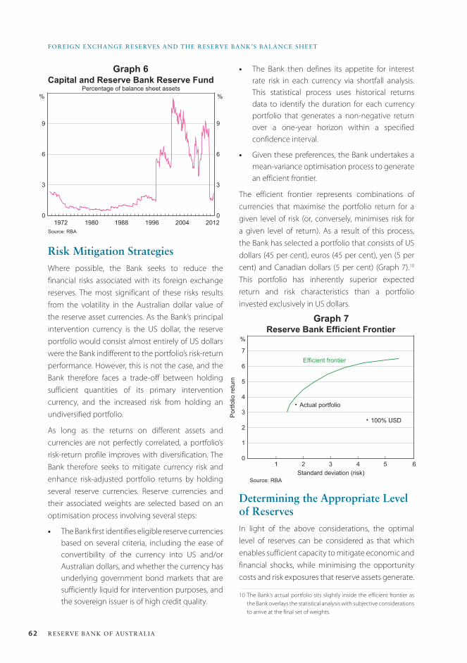
62 ReseRve bank of austRalia
foReiGn eXCHanGe ReseRves anD tHe ReseRve bank’s balanCe sHeet
• The Bank then defines its appetite for interest rate risk in each currency via shortfall analysis. This statistical process uses historical returns data to identify the duration for each currency portfolio that generates a non-negative return over a one-year horizon within a specified confidence interval.
• Given these preferences, the Bank undertakes a mean-variance optimisation process to generate an efficient frontier.
The efficient frontier represents combinations of currencies that maximise the portfolio return for a given level of risk (or, conversely, minimises risk for a given level of return). As a result of this process, the Bank has selected a portfolio that consists of US dollars (45 per cent), euros (45 per cent), yen (5 per cent) and Canadian dollars (5 per cent) (Graph 7).10 This portfolio has inherently superior expected return and risk characteristics than a portfolio invested exclusively in US dollars.
Determining the appropriate Level of ReservesIn light of the above considerations, the optimal level of reserves can be considered as that which enables sufficient capacity to mitigate economic and financial shocks, while minimising the opportunity costs and risk exposures that reserve assets generate.
10 The Bank’s actual portfolio sits slightly inside the efficient frontier as the Bank overlays the statistical analysis with subjective considerations to arrive at the final set of weights.
Risk Mitigation StrategiesWhere possible, the Bank seeks to reduce the financial risks associated with its foreign exchange reserves. The most significant of these risks results from the volatility in the Australian dollar value of the reserve asset currencies. As the Bank’s principal intervention currency is the US dollar, the reserve portfolio would consist almost entirely of US dollars were the Bank indifferent to the portfolio’s risk-return performance. However, this is not the case, and the Bank therefore faces a trade-off between holding sufficient quantities of its primary intervention currency, and the increased risk from holding an undiversified portfolio.
As long as the returns on different assets and currencies are not perfectly correlated, a portfolio’s risk-return profile improves with diversification. The Bank therefore seeks to mitigate currency risk and enhance risk-adjusted portfolio returns by holding several reserve currencies. Reserve currencies and their associated weights are selected based on an optimisation process involving several steps:
• The Bank first identifies eligible reserve currencies based on several criteria, including the ease of convertibility of the currency into US and/or Australian dollars, and whether the currency has underlying government bond markets that are sufficiently liquid for intervention purposes, and the sovereign issuer is of high credit quality.
Source: RBA
2012200419961988
%
198019720
3
6
9
0
3
6
9
Capital and Reserve Bank Reserve FundPercentage of balance sheet assets
%
Graph 6
�
�
l l l l l0
1
2
3
4
5
6
7
Reserve Bank Efficient Frontier
Standard deviation (risk)
%
Actual portfolio
Port
folio
retu
rn
100% USD
Efficient frontier
54321
Source: RBA
6
Graph 7
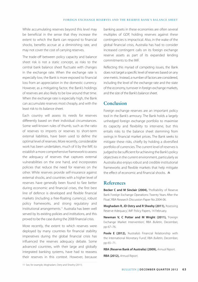
63Bulletin | D E C E M B E R Q ua R t E R 2012
FOReiGn eXCHAnGe ReSeRVeS AnD tHe ReSeRVe BAnK’S BAlAnCe SHeet
While accumulating reserves beyond this level may be beneficial in the sense that they increase the extent to which the Bank can respond to financial shocks, benefits accrue at a diminishing rate, and may not cover the cost of carrying reserves.
The trade-off between policy capacity and balance sheet risk is not a static concept, as risks to the central bank balance sheet fluctuate with changes in the exchange rate. When the exchange rate is especially low, the Bank is more exposed to financial loss from an appreciation in the domestic currency. However, as a mitigating factor, the Bank’s holdings of reserves are also likely to be low around that time. When the exchange rate is especially high, the Bank can accumulate reserves most cheaply, and with the least risk to its balance sheet.
Each country will assess its needs for reserves differently based on their individual circumstances. Some well-known rules of thumb, such as the ratio of reserves to imports or reserves to short-term external liabilities, have been used to define the optimal level of reserves. More recently, considerable work has been undertaken, much of it by the IMF, to establish a more comprehensive framework to assess the adequacy of reserves that captures external vulnerabilities on the one hand, and incorporates policies that reduce the need for reserves on the other. While reserves provide self-insurance against external shocks, and countries with a higher level of reserves have generally been found to fare better during economic and financial crises, the first best line of defence is developed and flexible financial markets (including a free-floating currency), robust policy frameworks, and strong regulatory and institutional arrangements.11 Australia has been well served by its existing policies and institutions, and this proved to be the case during the 2008 financial crisis.
More recently, the extent to which reserves were deployed by many countries for financial stability imperatives during the global financial crisis has influenced the reserves adequacy debate. Some advanced countries, with their large and globally integrated banking systems, have had to reassess their reserves in this context. However, because
11 See, for example, Moghadam, Ostry and Sheehy (2011).
banking assets in these economies are often several multiples of GDP, holding reserves against these contingencies is impractical. Also, in the wake of the global financial crisis, Australia has had to consider increased contingent calls on its foreign exchange reserve assets as part of its expanded lending commitments to the IMF.
Reflecting this myriad of competing issues, the Bank does not target a specific level of reserves based on any one metric. Instead, a number of factors are considered, including the level of the exchange rate and the state of the economy, turnover in foreign exchange markets, and the size of the Bank’s balance sheet.
ConclusionForeign exchange reserves are an important policy tool in the Bank’s armoury. The Bank holds a largely unhedged foreign exchange portfolio to maximise its capacity and flexibility to intervene, but this entails risks to the balance sheet stemming from swings in financial market prices. The Bank seeks to mitigate these risks, chiefly by holding a diversified portfolio of currencies. The current level of reserves is judged to be sufficient for achieving the Bank’s policy objectives in the current environment, particularly as Australia also enjoys robust and credible institutional frameworks and flexible markets that help mitigate the effect of economic and financial shocks. R
ReferencesBecker C and M Sinclair (2004), ‘Profitability of Reserve
Bank Foreign Exchange Operations: Twenty Years After the
Float’, RBA Research Discussion Paper No 2004-06.
Moghadam R, JD Ostry and R Sheehy (2011), ‘Assessing
Reserve Adequacy’, IMF Policy Papers, 14 February.
Newman V, C Potter and M Wright (2011), ‘Foreign
Exchange Market Intervention’, RBA Bulletin, December,
pp 67–76.
Poole E (2012), ‘Australia’s Financial Relationship with
the International Monetary Fund’, RBA Bulletin, December,
pp 65–71.
RBA (Reserve Bank of Australia) (2009), Annual Report.
RBA (2012), Annual Report.

64 RESERvE BAnk OF AUSTRALIA
65Bulletin | d e c e m b e r Q ua r t e r 2012
IntroductionThe significant increase in IMF lending commitments since the onset of the financial crisis has necessitated a large increase in IMF resources. As part of a global response, Australia has committed to lend the IMF SDR4.4 billion, if required, under a multilateral borrowing arrangement, and has pledged a further SDR4.6 billion under a bilateral arrangement (currently equivalent to A$6.4 billion and A$6.8 billion, respectively).1 These commitments made by Australia are contingent loans to the IMF itself, not directly to those countries that borrow from the IMF. When Australia lends to the IMF, the associated risks are judged to be low, with the IMF having a number of safeguards in place to protect country contributions. As a result, Australia’s outstanding lending to the IMF, referred to as Australia’s Reserve Position at the IMF, is classified by the IMF as a reserve asset.
The IMF is provided with foreign currency (often US dollars) out of foreign exchange reserves when it
1 The Special Drawing Right (SDR) is both the IMF’s unit of account and a claim on the four ‘freely usable’ currencies. The current currency composition of the SDR basket is: US dollar (41.9 per cent), euro (37.4 per cent), Japanese yen (9.4 per cent) and British pound (11.3 per cent). The SDR currency basket is re-evaluated every five years.
draws on funding from Australia. A broader measure of Australia’s foreign assets, known as official reserve assets (ORA), is not affected by such transactions, as the fall in foreign exchange reserves is offset by an increase in Australia’s Reserve Position at the IMF. While the transactions do change the composition of Australia’s ORA, the overall effect on the risk and returns to Australia’s ORA is not significant. Transactions related to Australia’s Special Drawing Rights (SDR) allocation (a separate IMF mechanism designed to enhance global liquidity) also affect the composition, but not the level, of Australia’s ORA.
This article examines the implications for Australia of the IMF’s lending programs, in particular the effect on the Reserve Bank and Australian Government balance sheets and Australia’s ORA. It also discusses Australia’s holdings of SDRs as part of the IMF’s SDR allocation mechanism.
Recent Developments in IMF Lending Programs and FinancingThe global financial crisis has led to substantial changes to the IMF’s lending programs.2 In particular, the average size of countries’ borrowing programs
2 See Edwards and Hsieh (2011) for more information on the changes in IMF lending programs since 2008.
australia’s Financial Relationship with the International Monetary Fund
* The author is from International Department.
Emily Poole*
The global financial crisis led to a significant increase in demand for actual and precautionary funding from the International Monetary Fund (IMF). As a result, the IMF expanded its available resources. Alongside many other countries, Australia has increased the amount it is willing to lend to the IMF to help the IMF fund its current and future commitments, although so far the IMF has only drawn on a small portion of the funding Australia has agreed to provide. These loans from Australia to the IMF are seen as having low risk, given the ‘safeguards’ the IMF has in place, and are treated accordingly as part of Australia’s official reserve assets.
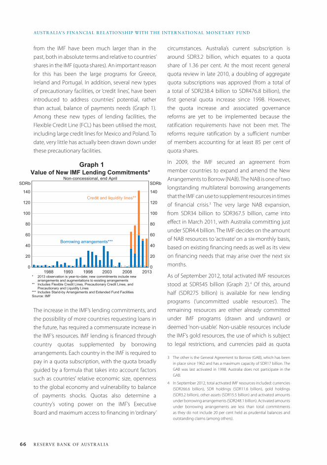
66 ReseRve bank of austRalia
austRalia’s financial Relationship with the inteRnational MonetaRY funD
0
20
40
60
80
100
120
140
0
20
40
60
80
100
120
140
Value of New IMF Lending Commitments*Non-concessional, end April
* 2013 observation is year-to-date; new commitments include new arrangements and augmentations to existing arrangements
** Includes Flexible Credit Lines, Precautionary Credit Lines, and Precautionary and Liquidity Lines
*** Includes Stand-by Arrangements and Extended Fund FacilitiesSource: IMF
2013
SDRb
200820031988 1998
SDRb
Credit and liquidity lines**
Borrowing arrangements***
1993
Graph 1
from the IMF have been much larger than in the past, both in absolute terms and relative to countries’ shares in the IMF (quota shares). An important reason for this has been the large programs for Greece, Ireland and Portugal. In addition, several new types of precautionary facilities, or ‘credit lines’, have been introduced to address countries’ potential, rather than actual, balance of payments needs (Graph 1). Among these new types of lending facilities, the Flexible Credit Line (FCL) has been utilised the most, including large credit lines for Mexico and Poland. To date, very little has actually been drawn down under these precautionary facilities.
circumstances. Australia’s current subscription is around SDR3.2 billion, which equates to a quota share of 1.36 per cent. At the most recent general quota review in late 2010, a doubling of aggregate quota subscriptions was approved (from a total of a total of SDR238.4 billion to SDR476.8 billion), the first general quota increase since 1998. However, the quota increase and associated governance reforms are yet to be implemented because the ratification requirements have not been met. The reforms require ratification by a sufficient number of members accounting for at least 85 per cent of quota shares.
In 2009, the IMF secured an agreement from member countries to expand and amend the New Arrangements to Borrow (NAB). The NAB is one of two longstanding multilateral borrowing arrangements that the IMF can use to supplement resources in times of financial crisis.3 The very large NAB expansion, from SDR34 billion to SDR367.5 billion, came into effect in March 2011, with Australia committing just under SDR4.4 billion. The IMF decides on the amount of NAB resources to ‘activate’ on a six-monthly basis, based on existing financing needs as well as its view on financing needs that may arise over the next six months.
As of September 2012, total activated IMF resources stood at SDR545 billion (Graph 2).4 Of this, around half (SDR275 billion) is available for new lending programs (‘uncommitted usable resources’). The remaining resources are either already committed under IMF programs (drawn and undrawn) or deemed ‘non-usable’. Non-usable resources include the IMF’s gold resources, the use of which is subject to legal restrictions, and currencies paid as quota
3 The other is the General Agreement to Borrow (GAB), which has been in place since 1962 and has a maximum capacity of SDR17 billion. The GAB was last activated in 1998. Australia does not participate in the GAB.
4 In September 2012, total activated IMF resources included: currencies (SDR266.6 billion), SDR holdings (SDR11.6 billion), gold holdings (SDR3.2 billion), other assets (SDR15.5 billion) and activated amounts under borrowing arrangements (SDR248.1 billion). Activated amounts under borrowing arrangements are less than total commitments as they do not include 20 per cent held as prudential balances and outstanding claims (among others).
The increase in the IMF’s lending commitments, and the possibility of more countries requesting loans in the future, has required a commensurate increase in the IMF’s resources. IMF lending is financed through country quotas supplemented by borrowing arrangements. Each country in the IMF is required to pay in a quota subscription, with the quota broadly guided by a formula that takes into account factors such as countries’ relative economic size, openness to the global economy and vulnerability to balance of payments shocks. Quotas also determine a country’s voting power on the IMF’s Executive Board and maximum access to financing in ‘ordinary’
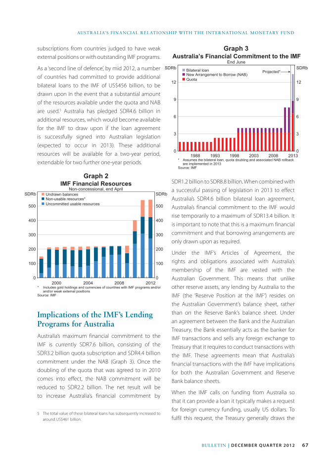
67Bulletin | D E c E m b E r Q ua r t E r 2012
AustrAliA’s FinAnciAl relAtionship with the internAtionAl MonetArY FunD
0
100
200
300
400
500
0
100
200
300
400
500
IMF Financial ResourcesNon-concessional, end April
* Includes gold holdings and currencies of countries with IMF programs and/orand/or weak external positions
Source: IMF
2012
SDRb
200820042000
SDRb n Undrawn balancesn Non-usable resources*n Uncommitted usable resources
0
3
6
9
12
0
3
6
9
12
Australia’s Financial Commitment to the IMFEnd June
* Assumes the bilateral loan, quota doubling and associated NAB rollbackare implemented in 2013
Source: IMF
2013
Projected*SDRbSDRb
20082003199819931988
n Bilateral loann New Arrangement to Borrow (NAB)n Quota
Graph 2
Graph 3subscriptions from countries judged to have weak external positions or with outstanding IMF programs.
As a ‘second line of defence’, by mid 2012, a number of countries had committed to provide additional bilateral loans to the IMF of US$456 billion, to be drawn upon in the event that a substantial amount of the resources available under the quota and NAB are used.5 Australia has pledged SDR4.6 billion in additional resources, which would become available for the IMF to draw upon if the loan agreement is successfully signed into Australian legislation (expected to occur in 2013). These additional resources will be available for a two-year period, extendable for two further one-year periods.
Implications of the IMF’s Lending Programs for australiaAustralia’s maximum financial commitment to the IMF is currently SDR7.6 billion, consisting of the SDR3.2 billion quota subscription and SDR4.4 billion commitment under the NAB (Graph 3). Once the doubling of the quota that was agreed to in 2010 comes into effect, the NAB commitment will be reduced to SDR2.2 billion. The net result will be to increase Australia’s financial commitment by
5 The total value of these bilateral loans has subsequently increased to around US$461 billion.
SDR1.2 billion to SDR8.8 billion. When combined with a successful passing of legislation in 2013 to effect Australia’s SDR4.6 billion bilateral loan agreement, Australia’s financial commitment to the IMF would rise temporarily to a maximum of SDR13.4 billion. It is important to note that this is a maximum financial commitment and that borrowing arrangements are only drawn upon as required.
Under the IMF’s Articles of Agreement, the rights and obligations associated with Australia’s membership of the IMF are vested with the Australian Government. This means that unlike other reserve assets, any lending by Australia to the IMF (the ‘Reserve Position at the IMF’) resides on the Australian Government’s balance sheet, rather than on the Reserve Bank’s balance sheet. Under an agreement between the Bank and the Australian Treasury, the Bank essentially acts as the banker for IMF transactions and sells any foreign exchange to Treasury that it requires to conduct transactions with the IMF. These agreements mean that Australia’s financial transactions with the IMF have implications for both the Australian Government and Reserve Bank balance sheets.
When the IMF calls on funding from Australia so that it can provide a loan it typically makes a request for foreign currency funding, usually US dollars. To fulfil this request, the Treasury generally draws the
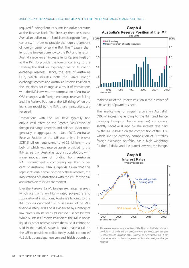
68 ReseRve bank of austRalia
austRalia’s financial Relationship with the inteRnational MonetaRY funD
required funding from its Australian dollar accounts at the Reserve Bank. The Treasury then sells these Australian dollars to the Bank in exchange for foreign currency, in order to provide the requisite amount of foreign currency to the IMF. The Treasury then lends the foreign currency to the IMF and in return Australia receives an increase in its Reserve Position at the IMF. To provide the foreign currency to the Treasury, the Bank will typically draw on its foreign exchange reserves. Hence, the level of Australia’s ORA, which includes both the Bank’s foreign exchange reserves and Australia’s Reserve Position at the IMF, does not change as a result of transactions with the IMF. However, the composition of Australia’s ORA changes, with foreign exchange reserves falling and the Reserve Position at the IMF rising. When the loans are repaid by the IMF, these transactions are reversed.
Transactions with the IMF have typically had only a small effect on the Reserve Bank’s stock of foreign exchange reserves and balance sheet more generally. In aggregate as at June 2012, Australia’s Reserve Position at the IMF was only a little over SDR1.5 billion (equivalent to A$2.3 billion) – the bulk of which was reserve assets provided to the IMF as part of Australia’s quota subscription, with more modest use of funding from Australia’s NAB commitment – comprising less than 5 per cent of Australia’s ORA (Graph 4). Given that this represents only a small portion of these reserves, the implications of transactions with the IMF for the risk and return on reserves are modest.
Like the Reserve Bank’s foreign exchange reserves, which are claims on highly rated sovereigns and supranational institutions, Australia’s lending to the IMF involves low credit risk. This is a result of the IMF’s financial safeguards and is evidenced by a history of low arrears on its loans (discussed further below). While Australia’s Reserve Position at the IMF is not as liquid as other reserve assets (because it cannot be sold in the market), Australia could make a call on the IMF to provide so-called ‘freely usable currencies’ (US dollar, euro, Japanese yen and British pound) up
to the value of the Reserve Position in the instance of a balances of payments need.
The implications for overall returns on Australia’s ORA of increasing lending to the IMF (and hence reducing foreign exchange reserves) are usually slightly negative (Graph 5). The interest rate paid by the IMF is based on the composition of the SDR, which like the currency composition of Australia’s foreign exchange portfolio, has a high weighting for the US dollar and the euro.6 However, the foreign
6 The current currency composition of the Reserve Bank’s benchmark portfolio is: US dollar (45 per cent); euro (45 per cent); Japanese yen (5 per cent); and Canadian dollar (5 per cent). See Vallence (2012) for more information on the management of Australia’s foreign exchange reserves.
0.0
0.5
1.0
1.5
2.0
0.0
0.5
1.0
1.5
2.0
Australia’s Reserve Position at the IMFEnd June
Source: IMF2012
SDRbn NAB lendingn Reserve portion of quota resources
SDRb
20072002199719921987
Graph 4
l l l l l l l l0
1
2
3
4
0
1
2
3
4
Interest Rates
Sources: IMF; RBA2012
%
2004 20102006 2008
%Weekly averages
SDR interest rate
Benchmark portfoliorunning yield
Graph 5
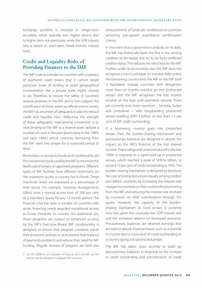
69Bulletin | D E c E m b E r Q ua r t E r 2012
AustrAliA’s FinAnciAl relAtionship with the internAtionAl MonetArY FunD
exchange portfolio is invested in longer-term securities, which typically earn higher returns due to higher term risk premiums, while the SDR interest rate is based on short-term (three-month) interest rates.
Credit and Liquidity Risks of Providing Finances to the IMFThe IMF’s role as a lender to countries with a balance of payments need means that it cannot target particular levels of lending or avoid geographical concentration like a private bank might choose to do. Therefore, to ensure the safety of countries’ reserve positions in the IMF, and in turn support the classification of these assets as official reserve assets, the IMF has a number of safeguards in place to reduce credit and liquidity risks.7 Reflecting the strength of these safeguards, international convention is to treat lending to the IMF as a reserve asset, despite a number of cases in the past (particularly in the 1980s and early 1990s) where countries borrowing from the IMF went into arrears for a sustained period of time.
Restrictions on access to funds and conditionality are the two primary tools used by the IMF to minimise the likelihood of arrears on approved programs. Different types of IMF facilities have different restrictions on the maximum access a country has to funds. These maximum levels are expressed as a percentage of their quota. For example, Stand-by Arrangements (SBAs) have a normal access limit of 200 per cent of a member’s quota for any 12-month period. The financial crisis has seen a number of countries with acute financing needs awarded exceptional access to funds. However, to counter the additional risk, these programs are subject to enhanced scrutiny by the IMF’s Executive Board. IMF conditionality is designed to ensure that program countries adjust their economic policies so as to resolve their balance of payments problems and reduce their need for IMF funding. Regular reviews of progress are held and
7 See IMF (2004) for an evaluation of financial risk in the IMF and the policies that are designed to safeguard IMF resources.
disbursements of funds are conditional on countries achieving pre-agreed quantitative performance criteria.
In the event that a government defaults on its debt, the IMF has historically been the first in line among creditors to be repaid due to its de facto preferred creditor status. This reduces the risk of loss for the IMF. Further, under its accounting rules, the IMF does not recognise a loss in principal on overdue debt unless the borrowing country exits the IMF or the IMF itself is liquidated. Instead, countries with obligations more than six months overdue go into ‘protracted arrears’ and the IMF recognises the lost interest income on the loan until payments resume. There are currently only three countries – Somalia, Sudan and Zimbabwe – with longstanding protracted arrears totalling SDR1.3 billion, or less than 1.5 per cent of IMF credit outstanding.
If a borrowing country goes into protracted arrears then the ‘burden-sharing mechanism’ and precautionary balances are designed to absorb the impact on the IMF’s finances of the lost interest income. These safeguards were introduced in the late 1980s in response to a rapid build-up in protracted arrears, which reached a peak of SDR3.6 billion, or around 13 per cent of credit outstanding in 1992. The burden-sharing mechanism is designed to distribute the cost of protracted arrears equally among creditor and debtor countries by increasing the interest rate charged to countries on their outstanding borrowing from the IMF and reducing the interest rate received by countries on their contributions through the quota. However, the capacity of the burden-sharing mechanism to fund arrears is currently very low, given the unusually low SDR interest rate and the increased reliance on borrowed resources. Precautionary balances are retained earnings that are held to absorb financial losses, such as a shortfall in income due to a low level of credit outstanding or a country going into protracted arrears.
The IMF has taken steps recently to build up precautionary balances in response to the increase in credit outstanding and concentration of credit
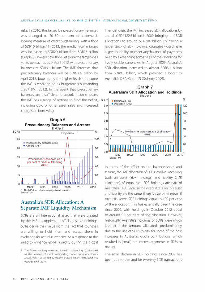
70 ReseRve bank of austRalia
austRalia’s financial Relationship with the inteRnational MonetaRY funD
risks. In 2010, the target for precautionary balances was changed to 20–30 per cent of a forward-looking measure of credit outstanding, with a floor of SDR10 billion.8 In 2012, the medium-term target was increased to SDR20 billion from SDR15 billion (Graph 6). However, the floor (let alone the target) was yet to be reached as of April 2012, with precautionary balances at SDR9.5 billion. The IMF forecasts that precautionary balances will be SDR21.6 billion by April 2018, boosted by the higher levels of income the IMF is receiving on its burgeoning outstanding credit (IMF 2012). In the event that precautionary balances are insufficient to absorb income losses, the IMF has a range of options to fund the deficit, including gold or other asset sales and increased charges on borrowing.
australia’s SDR allocation: a Separate IMF Liquidity MechanismSDRs are an international asset that were created by the IMF to supplement official reserve holdings. SDRs derive their value from the fact that countries are willing to hold them and accept them in exchange for actual currencies. As a response to the need to enhance global liquidity during the global
8 The forward-looking measure of credit outstanding is calculated as the average of credit outstanding under non-precautionary arrangements in the past 12 months and projections for the next two years. See IMF (2010).
financial crisis, the IMF increased SDR allocations by a total of SDR182.6 billion in 2009, bringing total SDR allocations to around SDR204 billion. By having a larger stock of SDR holdings, countries would have a greater ability to meet any balance of payments need by exchanging some or all of their holdings for freely usable currencies. In August 2009, Australia’s SDR allocation increased to almost SDR3.1 billion from SDR0.5 billion, which provided a boost to Australia’s ORA (Graph 7) (Doherty 2009).
0
5
10
15
20
25
0
20
40
60
80
100
Precautionary Balances and ArrearsEnd April
* The IMF does not provide projections for arrearsSource: IMF
2018
Projections %
n Precautionary balances (LHS)n Arrears (LHS)*
SDRb
20132008200319981993
Precautionary balances as aper cent of credit outstanding
(RHS)
0.0
0.5
1.0
1.5
2.0
2.5
3.0
0
20
40
60
80
100
120
Australia’s SDR Allocation and HoldingsEnd June
Source: IMF2012
%SDRb
20072002199719921987
n Holdings (LHS)n Allocation (LHS)
Holdings as a percentage of allocation(RHS)
Graph 6
Graph 7
In terms of the effect on the balance sheet and returns, the IMF allocation of SDRs involves receiving both an asset (SDR holdings) and liability (SDR allocation) of equal size. SDR holdings are part of Australia’s ORA. Because the interest rate on this asset and liability are the same, there is a zero net return if Australia keeps SDR holdings equal to 100 per cent of the allocation. This has essentially been the case since 2009, with holdings in October 2012 equal to around 95 per cent of the allocation. However, historically Australia’s holdings of SDRs were much less than the amount allocated, predominantly due to the use of SDRs to pay for some of the past increases in Australia’s quota contributions, which resulted in (small) net interest payments in SDRs to the IMF.
The small decline in SDR holdings since 2009 has been due to demand for two-way SDR transactions
71Bulletin | D E c E m b E r Q ua r t E r 2012
AustrAliA’s FinAnciAl relAtionship with the internAtionAl MonetArY FunD
from other countries. In these transactions, another country will typically buy SDRs from the Reserve Bank in exchange for US dollars. This results in a fall in the Reserve Bank’s SDR holdings and an increase in its foreign exchange reserves. Countries can also sell SDRs to the Bank in exchange for US dollars or euros. In either case, these transactions change the composition but not the level of Australia’s ORA. Therefore, as with lending to the IMF, the effect of these transactions on the risk and return of Australia’s ORA is minimal. While the exchange of SDRs for actual currencies between countries is usually voluntary, the IMF also has the power to designate countries with strong external positions to purchase SDRs from countries with weak external positions if necessary. There are currently 32 countries, including Australia, with voluntary SDR trading arrangements.9
ConclusionAustralia’s financial relationship with the IMF has implications for the composition of Australia’s official reserve assets. However, the impact on returns on Australia’s foreign reserves is typically small and the risk is low as the IMF has a number of safeguards in place to protect members’ financial contributions. R
9 Since 2009, Australia’s agreement is subject to the restriction that SDR holdings are kept within 50–150 per cent of the SDR allocation and individual transactions shall not exceed SDR1 billion. The RBA or Treasury has the right to refuse to conduct a transaction under the voluntary arrangement.
ReferencesDoherty E (2009), ‘IMF Initiatives to Bolster Funding and
Liquidity’, RBA Bulletin, November, pp 7–10.
Edwards K and W Hsieh (2011), ‘Recent Changes in IMF
Lending’, RBA Bulletin, December, pp 77–82.
IMF (International Monetary Fund) (2004), ‘Financial
Risk in the Fund and the Level of Precautionary Balances’,
Finance Department Report, February. Available at <http://
www.imf.org/external/np/tre/risk/2004/020304.htm>.
IMF (2010), ‘Review of the Adequacy of the Fund’s
Precautionary Balances’, Finance Department Report,
September. Available at <http://www.imf.org/external/np/
tre/risk/2010/082410.htm>.
IMF (2012), ‘The Consolidated Medium-term Income and
Expenditure Framework’, IMF Policy Paper, April. Available
at <http://www.imf.org/external/np/pp/eng/2012/041212.
pdf>.
Vallence C (2012), ‘Foreign Exchange Reserves and the
Reserve Bank’s Balance Sheet’, RBA Bulletin, December,
pp 57–63.

72 ReseRve bank of austRalia

73Bulletin | d e c e m b e r Q ua r t e r 2012
Monday marked the 70th anniversary of the commencement of operations of the Bank of Thailand, on 10 December 1942. Conceived under wartime occupation, the Bank has grown to be a key institution in Thailand. It is a pleasure and an honour to come to Bangkok to take part in one in a series of events to mark the anniversary, and I want to thank Governor Prasarn for the invitation.
The Reserve Bank of Australia has long enjoyed a strong relationship with the Bank of Thailand. In 1997, the RBA was among those central banks to enter a swap agreement with the Bank of Thailand shortly after the crisis broke. This was the first part of Australian assistance to the regional partners who were under pressure, which later extended to Korea and Indonesia. In fact, Australia and Japan were the only countries that offered direct financial support to all three countries.
It was a predecessor of mine, Bernie Fraser, who made the suggestion 17 years ago that cooperation in the Asian region might be improved by the establishment of a dedicated institution, along the lines of the Bank for International Settlements in Basel – the ‘Asian BIS’.1 Such a body has not come to pass – at least not yet! – but it is fair to say that this suggestion and others like it helped to spur the Basel BIS to reach out to Asia.2
1 Fraser B (1995), ‘Central Bank Cooperation in the Asian Region’, RBA Bulletin, October, pp 21–28.
2 There was a round of new shareholdings taken up by Asian central banks in the late 1990s, including Thailand in 2000. The BIS established an Asian office in Hong Kong in 1998, and the Asian Consultative Council in 2001. Admittedly, the major shareholdings of the BIS remain overwhelmingly North Atlantic in their focus. But the BIS has made a good deal of progress – more than many institutions perhaps – in addressing the imbalances in global financial governance, even if there is further to go.
The central banks of the region, taking the initiative through the Executives’ Meeting of East Asian-Pacific Central Banks – EMEAP (not the most attractive acronym) – have improved cooperation substantially over the years. Thanks to long-term efforts at building relationships, and the vision of key governors and deputy governors, including at the Bank of Thailand, EMEAP has developed into a mature forum for sharing information, and continues to develop its ability to find common positions on global issues and to promote crisis readiness.
Yet as the central banks have grown closer and become more effective in their cooperation, the challenges we face have only increased. Today I want to speak about three of them.3 First, I will talk about the framework for monetary policy and the need to allow that to consider financial stability. Secondly, I will make some observations about the more prominent role for central banks’ own balance sheets that we are seeing in some countries. Then, thirdly, I will offer some observations about international spillovers. In so doing, I am not seeking to deliver any particular messages about the near-term course of monetary policy in either Australia or Thailand.
Monetary Policy and Financial StabilityIt is more than two decades since the framework of inflation targeting (IT) was pioneered in New
3 The Bank of Thailand quite recently held a conference on exactly this topic, with a number of distinguished speakers. My remarks draw on some of their insights. See Challenges to Central Banks in the Era of the New Globalisation, Bank of Thailand International Symposium 2010, available at <http://www.bot.or.th/Thai/EconomicConditions/Semina/Pages/Inter_Symposium.aspx>.
Challenges for Central BankingGlenn Stevens, Governor
Address to the Bank of Thailand 70th Anniversary and 3rd Policy Forum Bangkok, 12 December 2012
74 ReseRve bank of austRalia
Challenges foR CentRal banking
Zealand and Canada. The United Kingdom was an enthusiastic early adopter from 1992. Australia adopted IT in 1993.
Among the early adopters, the move to IT was driven by a mixture of principle and pragmatism. The key principle was that monetary policy was, in the end, about anchoring the value of money – that is, about price stability. The pragmatism arose because one or more previous approaches designed to achieve that – monetary targeting, exchange-rate targeting, unconstrained discretion – had proved at best ineffective, and at worst destabilising, for the countries concerned. Hence many of the adopters shared a desire to strengthen the credibility of their policy frameworks. As the initial adopters came to have a measure of success in combining reasonable growth with low inflation, other countries were attracted to the model.
According to the International Monetary Fund (IMF), more than 30 countries now profess to follow some form of IT.4 The euro area could also be counted among this group though it also professes adherence to the ‘second pillar’ of ‘monetary analysis’. Even the United States can, I think, be counted as a (fairly recent) IT adopter, since the Federal Open Market Committee is these days quite explicit about its desired inflation performance.5
The Bank of Thailand was one of a number of emerging economies that adopted IT around the turn of the century. Twelve years on, Thailand can boast an impressive record of price stability under this framework. A high level of transparency has ensured that financial market participants understand the framework, and view it as credible. Moreover, price stability has not come at the cost of subdued economic growth, with output expanding at a brisk pace in the 2000s.
4 IMF (2012), Annual Report, Appendix II, pp 14–16, available at <http://www.imf.org/external/pubs/ft/ar/2012/eng/pdf/a2.pdf>.
5 The Fed points out, quite properly, that it has a dual mandate – ‘full employment’ being the other component. I don’t think this precludes being an exponent of IT: the Reserve Bank of Australia has always insisted that it is quite compatible to combine an objective for medium-term inflation performance with the notion that we give due weight to the path of economic activity.
While inflation targeting is not for everyone, the Thai experience illustrates that, when done well, it can enhance economic outcomes. I can endorse the favourable verdict offered on the Thai experience delivered by Grenville and Ito (2010).6
So I think that the adoption of IT, including in Thailand, can be seen as a success in terms of the straightforward objectives set for it. To make such a claim is not, however, to claim that controlling inflation is, alone, sufficient to underwrite stability in a broader sense. If there were any thought that controlling inflation over a two- or three-year horizon was ‘enough’, we have been well and truly disabused of that by experience over the past half decade. Price stability doesn’t guarantee financial stability.
Indeed it could be argued that the ‘great moderation’ – an undoubted success on the inflation/output metric – fostered, or at least allowed, a leverage build-up that was ultimately inimical to financial stability and hence macroeconomic stability. The success in lessening volatility in economic activity, inflation and interest rates over quite a lengthy period made it feasible for firms and individuals to think that a degree of increased leverage was safe.7 But higher leverage exposed people to more distress if and when a large negative shock eventually came along. This explanation still leaves, of course, a big role in causing the crisis – the major role in fact – for poor lending standards, even fraud in some cases, fed by distorted incentives and compounded by supervisory weaknesses and inability to see through the complexity of various financial instruments.
That price stability was, in itself, not enough to guarantee overall stability, should hardly be surprising, actually. It has been understood for some time that it is very difficult to model the financial sector, and that in many of the standard macroeconomic models in use, including in many central banks, this area was
6 Grenville S and T Ito (2010), ‘An Independent Evaluation of the Bank of Thailand’s Monetary Policy under the Inflation Targeting Framework, 2000–2010’, available at <http://www.bot.or.th/Thai/MonetaryPolicy/Documents/GrenvilleItoV10(Oct22).pdf>.
7 Stevens G (2006), ‘Risk and the Macroeconomy’, RBA Bulletin, June, pp 8–17.
75Bulletin | d e c e m b e r Q ua r t e r 2012
Challenges for Central Banking
underdeveloped. Mainstream macroeconomics was perhaps a bit slow to see the financial sector as it should be seen: that is, as having its own dynamic of innovation and risk-taking; as being not only an amplification mechanism for shocks but a possible source of shocks in its own right, rather than just as passively accommodating the other sectors in the economy.8
Notwithstanding the evident analytical difficulties, the critique being offered in some quarters is that central banks paid too little attention in the 2000s to the build-up of credit and leverage and to the role that easy monetary policy played in that. It is hard to disagree, though I would observe that this is somewhat ironical, given that IT was a model to which central banks were attracted after the shortcomings of targets for money and credit quantities in the 1980s. It could be noted as well that the European Central Bank (ECB) always had the second pillar, but the euro area still experienced the crisis – in part because of credit granted in or to peripheral countries, and in part because of exposures by banks in the core countries to excessive leverage in the US.
The upshot is that the relationship between monetary policy and financial stability is being re-evaluated. As this occurs, we seem to be moving on from the earlier, unhelpful, framing of this issue in terms of the question as to whether or not monetary policy should ‘prick bubbles’ and whether bubbles can even be identified. The issue is not whether something is, or is not, a bubble; that is always a subjective assessment anyway in real time. The issue is the potential for damaging financial instability when an economic expansion is accompanied
8 Some central banks have given a lot of thought to the question of how to manage financial stability concerns within a standard IT-type framework, though definitive answers have been hard to come by. See, for example, Bean C (2003), ‘Asset Prices, Financial Imbalances and Monetary Policy: Are Inflation Targets Enough?’, in A Richards and T Robinson (eds), Asset Prices and Monetary Policy, Proceedings of a Conference, Reserve Bank of Australia, Sydney, pp 48–76; Svensson L (2012), ‘Differing Views on Monetary Policy’, Speech delivered at the SNS/SIFR Finanspanel, Stockholm, 8 June, available at <http://www.bis.org/review/r120612c.pdf>. A significant problem is that financial cycles may have a much lower frequency than normal business cycles so incorporating them into a usual two- or three-year horizon for policymaking is difficult.
by a cocktail of rising asset values, rising leverage and declining lending standards. One can remain agnostic on the bubble/non-bubble question but still have concerns about the potential for a reversal to cause problems. Perhaps more fundamentally, although the connections between monetary policy and financial excesses can be complex, in the end central banks set the price of short-term borrowing. It cannot be denied that this affects risk-taking behaviour. Indeed that is one of the intended effects of low interest rates globally at present (which is not to say that this is wrong in an environment of extreme risk aversion).
It follows that broader financial stability considerations have to be given due weight in monetary policy decisions. This is becoming fairly widely accepted. The challenge for central banks, though, is to incorporate into our frameworks all we have learned from the recent experience about financial stability, but without throwing away all that is good about those frameworks. We learned a lot about the importance of price stability, and how to achieve it, through the 1970s, 80s and 90s. We learned too about the importance of institutional design. We shouldn’t discard those lessons in our desire to do more to assure financial stability. We shouldn’t make the error of ignoring older lessons in the desire to heed new ones.
Rather, we have to keep both sets of objectives in mind. We will have to accept the occasional need to make a judgement about short-term trade-offs, but that is the nature of policymaking. And in any event, over the long run price stability and financial stability surely cannot be in conflict. To the extent that they have not managed to coexist properly within the frameworks in use, that has been, in my judgement, in no small measure because the policy time horizon was too short, and perhaps also because people became too ambitious about finetuning.
We also must, of course, heed the lesson that, whatever the framework, the practice of financial supervision matters a great deal. Speaking of supervisory tools, these days it is, of course,
76 ReseRve bank of austRalia
Challenges foR CentRal banking
considered correct to mention that there are other means of ‘leaning against the wind’ of financial cycles, in the form of the grandly labelled ‘macroprudential tools’. Such measures used to be more plainly labelled ‘regulation’. They may be useful in some instances when applied in a complementary way to monetary policy, where the interest rate that seems appropriate for overall macroeconomic circumstances is nonetheless associated with excessive borrowing in some sector or other. In such a case it may be sensible to implement a sector-specific measure – using a loan-to-value ratio constraint or a capital requirement. (This is entirely separate to the case for higher capital in lending institutions in general.)
We need, however, to approach such measures with our eyes open. Macroprudential tools will have their place. But if the problem is fundamentally one of interest rates being too low for a protracted period, history suggests that the efforts of regulators to constrain balance sheet growth will ultimately not work. If the incentive to borrow is powerful and persistent enough, people will find a way to do it, even if that means the associated activity migrating beyond the regulatory perimeter. So in the new-found, or perhaps relearned, enthusiasm for such tools, let us be realists.
the Limits of Central BankingThat policy measures of any kind have their limitations is a theme with broader applications, especially for central banks. The central banks of major countries were certainly quite innovative in their responses to the unfolding crisis.9 Numerous programs to provide funding to private institutions, against vastly wider classes of collateral, were a key feature of the central bank response to the situation. In essence, when the private financial sector was suddenly under pressure to shrink its balance sheet,
9 I note parenthetically that several important cross-border initiatives to manage liquidity pressures were put in place very quickly by key central banks. This kind of cooperation at a technical level is something at which the central banks are actually quite good.
the central banks found themselves obliged to facilitate or slow the balance sheet adjustment by changing the size of their own balance sheets. This is the appropriate response, as dictated by long traditions of central banking stretching back to Bagehot.
Conceptually, at least initially, these balance sheet operations could be seen as distinct from the overall monetary policy stance of the central bank. But as the crisis has gone on such distinctions have inevitably become much less clear as ‘conventional’ monetary policy reached its limits.
It was fortuitous for some, perhaps, that the zero lower bound on nominal interest rates – modern parlance for what we learned about as the ‘liquidity trap’ – had gone from being a textbook curiosum to a real world problem in Japan in the 1990s. Japan subsequently pioneered the use of ‘quantitative easing’ in the modern era. This provided some experiential base for other central banks when the recession that unfolded from late 2008 was so deep that there was insufficient scope to cut interest rates in response. So in addition to programs to provide funding to intermediaries in order to prevent a collapse of the financial system when market funding dried up, there have been programs of ‘unconventional monetary policy’ in several major countries over recent years. These have been varyingly thought of as operating by one or more of:
• reducing longer-term interest rates on sovereign or quasi-sovereign debt by ‘taking duration out of the market’ once the overnight rate was effectively zero
• reducing credit spreads applying to private sector securities (‘credit easing’, operating via the ‘risk-taking’ channel)
• adding to the stock of monetary assets held by the private sector (the ‘money’ channel, appealing to quantity theory notions of the transmission of monetary policy)
• in the euro area in particular, commitments to lower the spreads applying to certain sovereign borrowers in the currency union (described as reducing ‘re-denomination risk’).
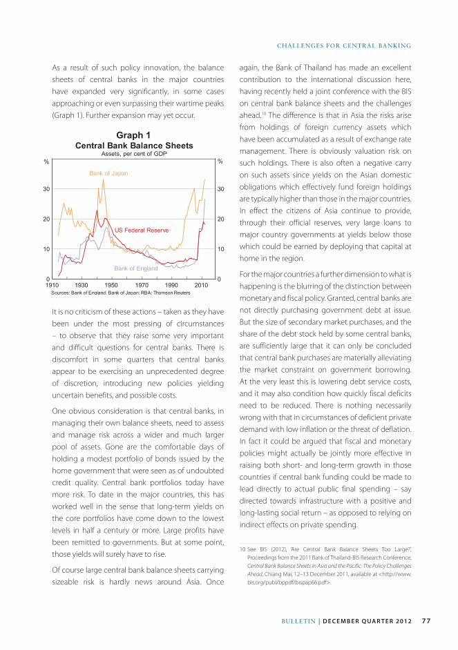
77Bulletin | d e c e m b e r Q ua r t e r 2012
Challenges for Central Banking
As a result of such policy innovation, the balance sheets of central banks in the major countries have expanded very significantly, in some cases approaching or even surpassing their wartime peaks (Graph 1). Further expansion may yet occur.
again, the Bank of Thailand has made an excellent contribution to the international discussion here, having recently held a joint conference with the BIS on central bank balance sheets and the challenges ahead.10 The difference is that in Asia the risks arise from holdings of foreign currency assets which have been accumulated as a result of exchange rate management. There is obviously valuation risk on such holdings. There is also often a negative carry on such assets since yields on the Asian domestic obligations which effectively fund foreign holdings are typically higher than those in the major countries. In effect the citizens of Asia continue to provide, through their official reserves, very large loans to major country governments at yields below those which could be earned by deploying that capital at home in the region.
For the major countries a further dimension to what is happening is the blurring of the distinction between monetary and fiscal policy. Granted, central banks are not directly purchasing government debt at issue. But the size of secondary market purchases, and the share of the debt stock held by some central banks, are sufficiently large that it can only be concluded that central bank purchases are materially alleviating the market constraint on government borrowing. At the very least this is lowering debt service costs, and it may also condition how quickly fiscal deficits need to be reduced. There is nothing necessarily wrong with that in circumstances of deficient private demand with low inflation or the threat of deflation. In fact it could be argued that fiscal and monetary policies might actually be jointly more effective in raising both short- and long-term growth in those countries if central bank funding could be made to lead directly to actual public final spending – say directed towards infrastructure with a positive and long-lasting social return – as opposed to relying on indirect effects on private spending.
10 See BIS (2012), ‘Are Central Bank Balance Sheets Too Large?’, Proceedings from the 2011 Bank of Thailand-BIS Research Conference, Central Bank Balance Sheets in Asia and the Pacific: The Policy Challenges Ahead, Chiang Mai, 12–13 December 2011, available at <http://www.bis.org/publ/bppdf/bispap66.pdf>.
Graph 1
It is no criticism of these actions – taken as they have been under the most pressing of circumstances – to observe that they raise some very important and difficult questions for central banks. There is discomfort in some quarters that central banks appear to be exercising an unprecedented degree of discretion, introducing new policies yielding uncertain benefits, and possible costs.
One obvious consideration is that central banks, in managing their own balance sheets, need to assess and manage risk across a wider and much larger pool of assets. Gone are the comfortable days of holding a modest portfolio of bonds issued by the home government that were seen as of undoubted credit quality. Central bank portfolios today have more risk. To date in the major countries, this has worked well in the sense that long-term yields on the core portfolios have come down to the lowest levels in half a century or more. Large profits have been remitted to governments. But at some point, those yields will surely have to rise.
Of course large central bank balance sheets carrying sizeable risk is hardly news around Asia. Once
78 ReseRve bank of austRalia
Challenges foR CentRal banking
One fears, in short, that while the central banks have been centre stage – rightly in many ways – in the early responses to the crisis, and in buying time for other adjustments by taking bold initiatives over the past couple of years, the limits of what they can do may become more apparent in the years ahead. A key task for central banks is to try to communicate these limits, all the while doing what they can to sustain confidence that solutions can in fact be found and pointing out from where they might come.
Challenges with SpilloversTalking about the challenges associated with large balance sheet activities leads naturally into a discussion about international spillovers.
In one sense, this is not a new issue. It has been a cause of anxiety and disagreement since the latter days of the Bretton Woods agreement at least. The remark attributed to the then Secretary of the US Treasury in regard to European concerns about the weakness of the US dollar in the 1970s of ‘it’s our currency, but your problem’ was perhaps emblematic of the spillovers of that time. There have been other episodes since.12 In a much earlier time there was, of course, the ‘beggar thy neighbour’ period of the 1930s – something which carries cogent lessons for current circumstances.
In recent years, as interest rates across a number of major jurisdictions have fallen towards zero and as central bank balance sheet measures have increased, these developments have been seen as contributing to cross-border flows of capital in search of higher returns. The extent of such spillovers is still in dispute. And, to the extent that they are material, some argue that a world in which extraordinary measures have
12 The very high US interest rates of the late 1970s and early 1980s had major spillover effects, not least in the western hemisphere. The US bond market sell-off of 1993 and 1994 affected many other countries and was a major point of debate in international meetings of the time. The reunification of Germany had spillover effects within Europe.
The problem will be the exit from these policies, and the restoration of the distinction between fiscal and monetary policy with the appropriate disciplines. The problem isn’t a technical one: the central banks will be able to design appropriate technical modalities for reversing quantitative easing when needed. The real issue is more likely to be that ending a lengthy period of guaranteed cheap funding for governments may prove politically difficult. There is history to suggest so. It is no surprise that some worry that we are heading some way back towards the world of the 1920s to 1960s where central banks were ‘captured’ by the Government of the day.11
Most fundamentally, the question is whether people are fully understanding of the limits to central banks’ abilities. It is, to repeat, not to be critical of actions to date to wonder whether private market participants, and perhaps more importantly governments, recognise what central banks cannot do. Central banks can provide liquidity to shore up financial stability and they can buy time for borrowers to adjust. But they cannot, in the end, put government finances on a sustainable course and they cannot create the real resources that need to be found from somewhere to strengthen bank capital. They cannot costlessly correct earlier misallocation of real capital investment. They cannot shield people from the implications of having mis-assessed their own lifetime budget constraints and as a result having consumed too much. They cannot combat the effects of population ageing or drive the innovation that raises productivity and creates new markets. Nor can they, or should they, put themselves in the position of deciding what real resource transfers should take place between countries in a currency union.
11 Goodhart C (2010), ‘The Changing Role of Central Banks’, BIS Working Paper No 326, available at <http://www.bis.org/publ/work326.pdf>. A further question is whether significant parts of private markets for which central banks are de facto a more or less complete substitute today will actually resume when central banks seek to step back, or whether those market capacities will have atrophied. This is something the Bank of Japan has long worried about – since it has been involved in QE for more than a decade. It will also be relevant in European interbank markets and probably elsewhere. Of course some may not mourn the loss of such markets, but that would be short-sighted.
79Bulletin | d e c e m b e r Q ua r t e r 2012
Challenges for Central Banking
been taken to prevent crises may still be a better place for all than the counterfactual.13
The degree of disquiet in the global policymaking community does seem, however, to have grown of late.14 Perhaps one reason is the following. In past episodes, expansionary policies in major countries, while having spillovers through capital flows, did demonstrably stimulate demand in the major countries. It is open to policymakers in those countries to claim that unconventional policies are having an expansionary effect in their own economies compared with what would otherwise have occurred. But the slowness of the recovery in the US, Europe and Japan, I suspect, leaves others wondering whether major countries are relying more on exporting their weaknesses than has been the case in most previous recoveries. One response to that can be efforts in emerging economies to make their financial systems more resilient to volatile capital flows, such as by developing local currency bond markets and currency hedging markets.15 This type of work is underway in various fora, such as the G-20 and EMEAP. But that takes time. Meanwhile people in the emerging economies, and for that matter several advanced economies, feel uncomfortable about the spillovers.
At the same time, it has to be said that spillovers go in more than one direction. While it was common for Asian (and European) policymakers to point the finger at the US for many years over the US current account deficit, with claims that the US was absorbing too
13 Bernanke B (2012), ‘U.S. Monetary Policy and International Implications’, Address to Challenges of the Global Financial System: Risks and Governance under Evolving Globalization, a High-Level Seminar Sponsored by Bank of Japan-International Monetary Fund, Tokyo, 14 October, available at <http://www.federalreserve.gov/newsevents/speech/bernanke20121014a.htm>.
14 See Caruana J (2012), ‘International Monetary Policy Interactions: Challenges and Prospects’, Address to the CEMLA-SEACEN Conference on ‘The Role of Central Banks in Macroeconomic and Financial Stability: the Challenges in an Uncertain and Volatile World’, Punta del Este, Uruguay, 16 November, available at <http://www.bis.org/speeches/sp121116.pdf>.
15 Nishimura K (2012), ‘Future of Central Bank Cooperation in Asia, Latin America, and Caribbean States’, Remarks at the BOJ-CEMLA Seminar on Regional Financial Cooperation, Tokyo, 11 October, available at <http://www.boj.or.jp/en/announcements/press/koen_2012/data/ko121011a1.pdf>.
great a proportion of the world’s saving, the fact was that those regions were supplying excess savings into the global capital market because they did not want to use them at home. That surely had an impact on the marginal cost of capital, to which borrowers and financial institutions in parts of the advanced world responded. We may want to say, in hindsight, that policymakers in the US and elsewhere should have worried more about the financial risks that were building up by the mix of policies that they ran. But we would also have to concede that the US policymakers sought to maintain full employment in a world that was conditioned by policies pursued in parts of the emerging world and especially Asia.
Not only do spillovers go in more than one direction, but those which might arise from policies in this region are much more important now than once was the case. The rapid growth in Asia’s economic weight means that policy incompatibilities which partly arise on this side of the Pacific have greater global significance. The traditional Asian strategy of export-driven growth assisted by a low exchange rate worked well when Asia was small. Asia isn’t small anymore and so the rest of the world will not be able to absorb the growth in Asian production in the same way as it once did. More of that production will have to be used at home. This is understood by Asian policymakers and progress has been made in reorienting the strategy. I suspect more will be needed.
For central banks in particular, there has been talk about spillovers from monetary policy settings being ‘internalised’ into individual central banks’ framework for decision-making. Exactly how that might be done is not entirely clear, and discussion is in its infancy; a consensus is yet to emerge. The IMF does useful work on spillovers and the IMF offers, at least in principle, a forum where incompatibilities can be at least recognised and discussed. One more far-reaching proposal is for there to be an ‘international monetary policy committee’.16 That seems a long way off at present.
16 Committee on International Economic Policy and Reform (2011), ‘Rethinking Central Banking’, September, available at <http://www.brookings.edu/research/reports/2011/09/ciepr-central-banking>.
80 ReseRve bank of austRalia
Challenges foR CentRal banking
on at least some issues. Internationally, the BIS of course is also a key forum for ‘truth telling’ in a collegiate and confidential setting and one in which the central banks of this region are playing an increasingly prominent role. There will need to be much more of this in the future.
ConclusionThe Bank of Thailand and the Reserve Bank of Australia have, in our respective histories, faced challenges, some of them severe ones. We have learned much from those experiences. In recent years, we have had our own distinct challenges. Fortunately, we have not been directly at the centre of the almost unprecedented challenges faced by our colleagues in major countries, though we have all been affected in various ways.
The future in Asia is full of potential, but to realise that we have to continue our efforts to strengthen our own policy frameworks, learn the appropriate lessons from the problems of others, and continue our efforts to cooperate on key issues of mutual interest. As the Bank of Thailand moves into its eighth decade, I am sure you will rise to the challenge.
Thank you again for the invitation to be here, and Happy Birthday! R
For spillovers to be effectively internalised, mandates for central banks would need to allow for that. At the present time most central banks are created by national legislatures, with mandates prescribed in national terms. (The ECB of course is the exception, with a mandate given via an international treaty.) It would be a very big step to change that and it certainly won’t occur easily or soon, though national sovereignty over monetary policy within the euro area was given up as part of the single currency – so big changes can occur if the benefits are deemed to be sufficient.
Whether or not such a step eventually occurs, it is clear that spillovers are with us now. All countries share a collective interest in preserving key elements of the international system, even as individual central banks do what it takes to fulfil their current mandates. It is vital, then, that central banks continue to talk frankly with each other about how we perceive the interconnections of global finance to be operating. We may be limited at times by the national natures of our respective mandates, but those limitations need not preclude cooperative action altogether, as has been demonstrated at various key moments over the past five years. In this region, the EMEAP forum offers great potential to further our mutual understanding and ability to come to joint positions
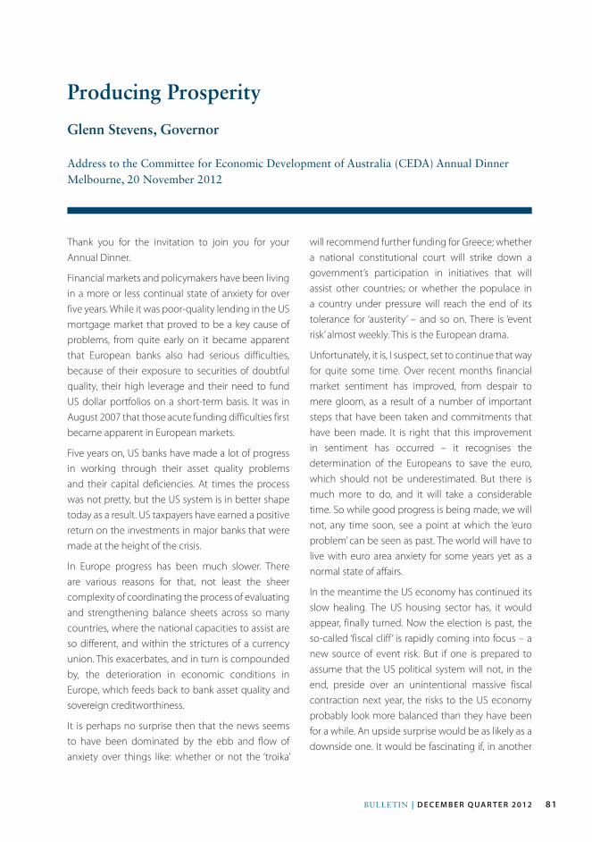
81Bulletin | d e c e m b e r Q ua r t e r 2012
Thank you for the invitation to join you for your Annual Dinner.
Financial markets and policymakers have been living in a more or less continual state of anxiety for over five years. While it was poor-quality lending in the US mortgage market that proved to be a key cause of problems, from quite early on it became apparent that European banks also had serious difficulties, because of their exposure to securities of doubtful quality, their high leverage and their need to fund US dollar portfolios on a short-term basis. It was in August 2007 that those acute funding difficulties first became apparent in European markets.
Five years on, US banks have made a lot of progress in working through their asset quality problems and their capital deficiencies. At times the process was not pretty, but the US system is in better shape today as a result. US taxpayers have earned a positive return on the investments in major banks that were made at the height of the crisis.
In Europe progress has been much slower. There are various reasons for that, not least the sheer complexity of coordinating the process of evaluating and strengthening balance sheets across so many countries, where the national capacities to assist are so different, and within the strictures of a currency union. This exacerbates, and in turn is compounded by, the deterioration in economic conditions in Europe, which feeds back to bank asset quality and sovereign creditworthiness.
It is perhaps no surprise then that the news seems to have been dominated by the ebb and flow of anxiety over things like: whether or not the ‘troika’
will recommend further funding for Greece; whether a national constitutional court will strike down a government’s participation in initiatives that will assist other countries; or whether the populace in a country under pressure will reach the end of its tolerance for ‘austerity’ – and so on. There is ‘event risk’ almost weekly. This is the European drama.
Unfortunately, it is, I suspect, set to continue that way for quite some time. Over recent months financial market sentiment has improved, from despair to mere gloom, as a result of a number of important steps that have been taken and commitments that have been made. It is right that this improvement in sentiment has occurred – it recognises the determination of the Europeans to save the euro, which should not be underestimated. But there is much more to do, and it will take a considerable time. So while good progress is being made, we will not, any time soon, see a point at which the ‘euro problem’ can be seen as past. The world will have to live with euro area anxiety for some years yet as a normal state of affairs.
In the meantime the US economy has continued its slow healing. The US housing sector has, it would appear, finally turned. Now the election is past, the so-called ‘fiscal cliff ’ is rapidly coming into focus – a new source of event risk. But if one is prepared to assume that the US political system will not, in the end, preside over an unintentional massive fiscal contraction next year, the risks to the US economy probably look more balanced than they have been for a while. An upside surprise would be as likely as a downside one. It would be fascinating if, in another
Producing Prosperity
Glenn Stevens, Governor
Address to the Committee for Economic Development of Australia (CEDA) Annual Dinner Melbourne, 20 november 2012
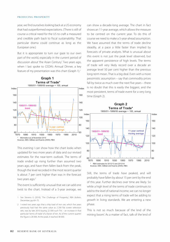
82 ReseRve bank of austRalia
PRoDuCinG PRosPeRitY
can show a decade-long average. The chart in fact shows an 11-year average, which allows the measure to be centred on the current year. To do this of course we need to make a 5-year-ahead assumption. We have assumed that the terms of trade decline steadily, at a pace a little faster than implied by forecasts of private analysts. What is unusual about this event is not just the peak level observed, but the apparent persistence of high levels. The terms of trade will very likely record over a decade an average level 50 per cent higher than the previous long-term mean. That is a big deal. Even with a more pessimistic assumption – say that commodity prices fall by twice as much over the next five years – there is no doubt that this is easily the biggest, and the most persistent, terms of trade event for a very long time (Graph 2).
Still, the terms of trade have peaked, and will probably have fallen by about 15 per cent by the end of this year. Further declines over time are likely. So while a high level of the terms of trade continues to add to the level of national income, we can no longer expect that a rising terms of trade will be adding to growth in living standards. We are entering a new phase.
This is not so much because of the ‘end of the mining boom’. As a matter of fact, talk of the ‘end of
year, we find ourselves looking back at a US economy that had outperformed expectations. (There is still of course a critical need for the US to craft a measured and credible path back to fiscal sustainability. That particular drama could continue as long as the European one.)
But it is appropriate to turn our gaze to our own part of the world, especially in the current period of discussion about ‘the Asian Century’. Two years ago, when I last spoke to CEDA’s Annual Dinner, a key feature of my presentation was this chart (Graph 1).1
This evening I can show how the chart looks when updated for two more years of data and our revised estimates for the near-term outlook. The terms of trade ended up rising further than assumed two years ago, and have then fallen back from the peak, though the level recorded in the most recent quarter is about 7 per cent higher than was in the forecast two years ago.2
The event is sufficiently unusual that we can add one twist to the chart. Instead of a 5-year average, we
1 See Stevens G (2010), ‘The Challenge of Prosperity’, RBA Bulletin, December, pp 69–75.
2 I noted two years ago that a ship load of iron ore, which five years previously had had the same value as 2 200 flat screen television sets, was by late 2010 buying 22 000 such TVs – an increase in that particular ‘terms of trade’ of a factor of ten. As of the current quarter the figure is 28 000. At the peak, it reached 38 000.
Graph 2
Graph 1
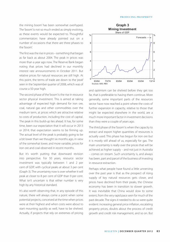
83Bulletin | d e c e m b e r Q ua r t e r 2012
PRODuCinG PROSPeRitY
the mining boom’ has been somewhat overhyped. The ‘boom’ is not so much ended as simply evolving, as these events would be expected to. Thoughtful commentators have already pointed out on a number of occasions that there are three phases to the ‘boom’.
The first was the rise in prices – something that began as far back as about 2004. The peak in prices was more than a year ago now. The Reserve Bank began noting that prices had declined in our monthly interest rate announcements in October 2011. But relative prices for natural resources are still high. At this point, the terms of trade are down to the ‘peak’ seen in the September quarter of 2008, which was of course a 50-year high.
The second phase of the ‘boom’ is the rise in resource sector physical investment. This is aimed at taking advantage of expected high demand for iron ore, coal, natural gas and other commodities over the medium term, at prices which are attractive relative to costs of production, including the cost of capital. The peak in this build-up lies ahead. It has, for some time, been our expectation that it will occur in 2013 or 2014; that expectation seems to be firming up. The actual level of the peak is probably going to be a bit lower than we thought six months ago, in view of the somewhat lower, and more variable, prices for iron ore and coal observed in recent months.
But it’s worth putting that downward revision into perspective. For 50 years, resource sector investment was typically between 1 and 2 per cent of GDP, with cyclical peaks at about 3 per cent (Graph 3). The uncertainty now is over whether it will peak at closer to 8 per cent of GDP than 9 per cent. What isn’t uncertain is that either number is very high by any historical standard.
It’s also worth observing that, in any episode of this nature, there will always come a point when some potential projects, conceived at the time when prices were at their highest and when costs were about to start mounting quickly as well, have to be shelved. Actually, if projects that rely on extremes of pricing
Graph 3
and optimism can be shelved before they get too far, that is preferable to having them continue. More generally, some important parts of the resources sector have now reached a point where the costs of further expansion in capacity, relative to those that might be expected elsewhere in the world, are a much more important factor in investment decisions than they were a couple of years ago.
The third phase of the ‘boom’ is when the capacity to extract and export higher quantities of resources is actually used. This phase has begun for iron ore but it is mostly still ahead of us, especially for gas. The main uncertainty is really over the prices that will be achieved as higher supply – and not just in Australia – comes on stream. Such uncertainty is, and always has been, part and parcel of the business of investing in resource extraction.
Perhaps what people have found a little unnerving over the past year is that as the prospect of rising supply of key natural resources gets closer, and prices have declined from their peaks, the Chinese economy has been in transition to slower growth. It was inevitable that China would slow to some extent, from the very rapid pace seen for much of the past decade. The signs it needed to do so were quite evident: increasing general price inflation, escalating property prices, doubts about the process of credit growth and credit risk management, and so on. But
84 ReseRve bank of austRalia
PRoDuCinG PRosPeRitY
‘ISM’.4 There is some tentative evidence that Chinese data ‘surprises’ have become increasingly influential in driving movements in Australian financial prices such as the exchange rate and share prices.
Turning then to Australia, two years ago I noted that we could not know how much of the rise in the terms of trade would be permanent, and that there was therefore a case to save a good proportion of the additional national income until it became clearer what the long-run prospects might be. In a manner of speaking, we have, as a community, done something like that. The marked rise in the rate of saving by households in 2008 and 2009 has been sustained. Corporations have also increased their saving considerably over the past five years, opting to repay debt and lower their gearing ratios.
Admittedly, government saving has been lower for a time, for countercyclical purposes, though that is now scheduled to rise as well. For the nation as a whole, the fact that the current account deficit has been lower on average in the past few years than in the period from 1985 to 2005, at the same time as the share of business investment in GDP has been exceptionally high, indicates that national saving has been higher. In fact it has been at its highest share of national income since the late 1980s.
This change can be seen as a sensible response to an unusually high level of the terms of trade. Something else has also been at work, though, in household behaviour. I have spoken about this before but it bears saying again, because it is fundamental to understanding the current economic situation.5 After a period in which high levels of confidence, macroeconomic stability, easy availability of credit and rising asset values saw Australian households borrow more and save less, households have over recent years changed their behaviour in respect of
4 I am old enough to remember when the ISM index was referred to as the ‘NAPM’ index, compiled by the National Association of Purchasing Management.
5 Stevens G (2011), ‘The Cautious Consumer’, RBA Bulletin, September, pp 77–82.
just how big a slowing was occurring? For much of this year, that was the question that people have been trying to answer. My assessment is that the slowdown has been more material than had been expected a year ago, but not disastrously so. There are some signs that the moderation may have run its course, though further data are needed before such a view could be offered with confidence.
So the Chinese economy has not crashed. But neither is it likely to return to the sorts of double-digit percentage rates of growth in real GDP, and 15 per cent growth rates for industrial production, that we saw for some years. People expecting that to resume are likely to experience disappointment.
These trends are entirely consistent with two propositions that we have advanced over the past several years. The first was that China’s economy would have an important and increasing weight in the regional and global economies. China’s economy is nearly three times the size it was a decade ago. One corollary of this is that even ‘moderate’ growth in China is quantitatively significant. If China grew by, say, ‘only’ 7 per cent in 2013, that would add more to global GDP than the 10 per cent growth recorded in 2003.3
The second proposition was that China, like all economies, has a business cycle. It is affected by what happens elsewhere in the world, and by its own internal dynamics, including the decisions of its policymakers. Swings in China’s economic performance are increasingly affecting Australia’s economy and that of the region – and the world. Hence the focus on monthly data reports from China these days in our business press, in addition to the focus on the Chinese political situation. The Chinese ‘purchasing managers index’ is now as keenly awaited, and is as potentially market moving, as the original US PMI measure, known these days as
3 In 2003, China’s growth in real GDP of 10 per cent added 0.8 of a percentage point to global GDP. If China’s growth in 2013 is 7 per cent, that will add a full percentage point to global GDP.
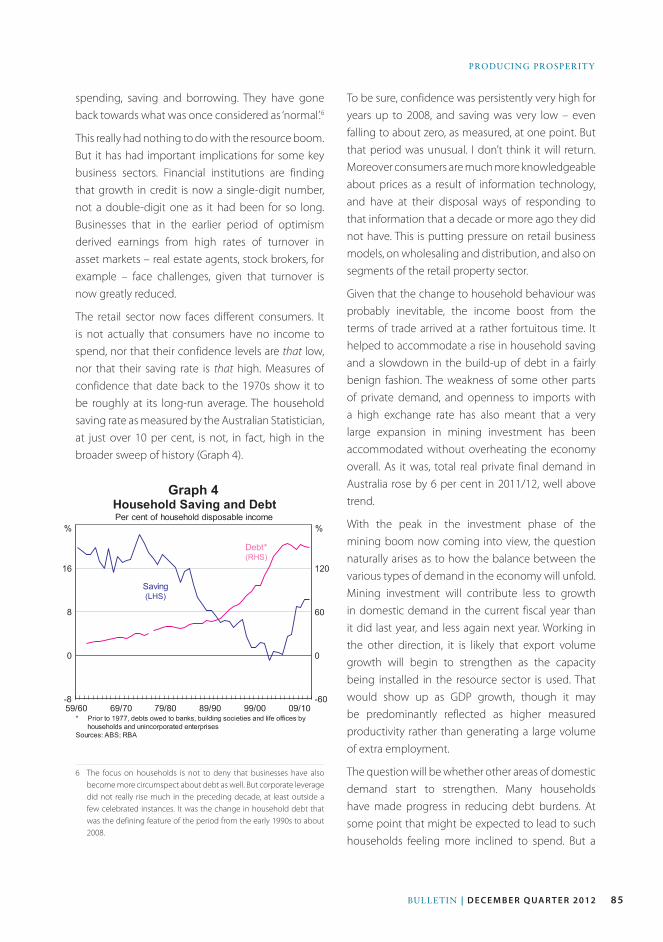
85Bulletin | d e c e m b e r Q ua r t e r 2012
PRODuCinG PROSPeRitY
spending, saving and borrowing. They have gone back towards what was once considered as ‘normal’.6
This really had nothing to do with the resource boom. But it has had important implications for some key business sectors. Financial institutions are finding that growth in credit is now a single-digit number, not a double-digit one as it had been for so long. Businesses that in the earlier period of optimism derived earnings from high rates of turnover in asset markets – real estate agents, stock brokers, for example – face challenges, given that turnover is now greatly reduced.
The retail sector now faces different consumers. It is not actually that consumers have no income to spend, nor that their confidence levels are that low, nor that their saving rate is that high. Measures of confidence that date back to the 1970s show it to be roughly at its long-run average. The household saving rate as measured by the Australian Statistician, at just over 10 per cent, is not, in fact, high in the broader sweep of history (Graph 4).
6 The focus on households is not to deny that businesses have also become more circumspect about debt as well. But corporate leverage did not really rise much in the preceding decade, at least outside a few celebrated instances. It was the change in household debt that was the defining feature of the period from the early 1990s to about 2008.
To be sure, confidence was persistently very high for years up to 2008, and saving was very low – even falling to about zero, as measured, at one point. But that period was unusual. I don’t think it will return. Moreover consumers are much more knowledgeable about prices as a result of information technology, and have at their disposal ways of responding to that information that a decade or more ago they did not have. This is putting pressure on retail business models, on wholesaling and distribution, and also on segments of the retail property sector.
Given that the change to household behaviour was probably inevitable, the income boost from the terms of trade arrived at a rather fortuitous time. It helped to accommodate a rise in household saving and a slowdown in the build-up of debt in a fairly benign fashion. The weakness of some other parts of private demand, and openness to imports with a high exchange rate has also meant that a very large expansion in mining investment has been accommodated without overheating the economy overall. As it was, total real private final demand in Australia rose by 6 per cent in 2011/12, well above trend.
With the peak in the investment phase of the mining boom now coming into view, the question naturally arises as to how the balance between the various types of demand in the economy will unfold. Mining investment will contribute less to growth in domestic demand in the current fiscal year than it did last year, and less again next year. Working in the other direction, it is likely that export volume growth will begin to strengthen as the capacity being installed in the resource sector is used. That would show up as GDP growth, though it may be predominantly reflected as higher measured productivity rather than generating a large volume of extra employment.
The question will be whether other areas of domestic demand start to strengthen. Many households have made progress in reducing debt burdens. At some point that might be expected to lead to such households feeling more inclined to spend. But a
Graph 4
86 ReseRve bank of austRalia
PRoDuCinG PRosPeRitY
complex interaction of factors – asset values and expectations about job security to mention two – will be at work in ways that are not amenable to accurate short-term forecasting. Overall, our assumption is that consumption will probably continue to grow at about trend pace, in line with income.
Public demand is scheduled to be subdued as governments seek to return budget positions to surplus. The near-term outlook for business investment spending outside the resources and resource-related sectors is subdued, judging by currently available leading indicators. In most cycles, it takes time for this sort of investment to turn; this episode looks like no exception. The exchange rate may also have some role in helping the needed rebalancing. While it’s not surprising that the Australian dollar has been very strong given the terms of trade event we have had, it is surprising that it has not declined much, at least so far, given that the terms of trade peaked more than a year ago. A lower exchange rate would, of course, need to be accompanied by a pace of growth of domestic unit costs below that seen for much of the past five years, in order to maintain low inflation.
One area of stronger potential demand growth is dwelling construction, which has been unusually weak. It is not clear, actually, that the degree of weakness has been adequately explained. Various explanations have been offered – interest rates too high, housing prices falling, zoning restrictions, planning delays, construction costs, lack of ‘confidence’, all have featured. At present, at least some of the preconditions one might expect to be needed for higher construction seem to be coming into place. Interest rates have declined, dwelling prices seem to have stopped falling, rental yields have risen, and the availability of tradespeople is assessed as having improved. We have, moreover, seen a rise in approvals to build. So there is some evidence of a turning point, albeit a belated one.
Will the net effect of these developments mean that aggregate demand rises roughly in line with the
economy’s supply potential over the next couple of years, or will a significant gap emerge? That is the question the Reserve Bank Board is trying to answer every month when it sits down to decide the stance of monetary policy.
As of the most recent meeting, as the minutes released earlier today show, the Board felt that further easing might be required over time. The Board was also conscious, though, that a significant easing of policy had already been put in place, the effects of which were still coming through and would be for a while. In addition, the latest inflation data, while not a major problem, were a bit on the high side, and the gloom internationally had lifted just a little. So it seemed prudent to sit still for the moment. Looking ahead, the question we will be asking is whether the current settings will appropriately foster conditions that will be consistent with our objectives – sustainable growth and inflation at 2–3 per cent.
Over the long run, though, the bigger question, for all of us here tonight and in the business and policymaking community generally, isn’t about the monthly interest rate decision. The big question is: what is the sustainable growth rate of the economy? Beyond its role of preserving the value of money, monetary policy can do little to affect that sustainable growth rate. Moreover, the initial contribution of rising mineral prices to our standard of living has now run its course. To be sure, a higher capital stock devoted to extracting resources at high prices, assuming they continue, will make its contribution for many years – to the extent that Australians own some of that capital, work with it or receive tax revenues. But the biggest contribution to growing living standards will be what it has always been other than in periods (usually not long-lived) of exceptional luck, and that is productivity performance. I noted two years ago that while our terms of trade are handed to us, for better or worse, by international relative prices, the efficiency with which we work is a variable we can actually do something about.7
7 See Stevens G (2010), ‘The Challenge of Prosperity’, RBA Bulletin, December, p 75.
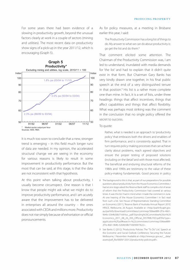
87Bulletin | d e c e m b e r Q ua r t e r 2012
PRODuCinG PROSPeRitY
For some years there had been evidence of a slowing in productivity growth, beyond the unusual factors clearly at work in a couple of sectors (mining and utilities). The most recent data on productivity show signs of a pick-up in the year 2011/12, which is encouraging (Graph 5).
It is much too soon to conclude that a new, stronger trend is emerging – in this field much longer runs of data are needed. In my opinion, the accelerated structural change we are seeing in the economy for various reasons is likely to result in some improvement in productivity performance. But the most that can be said, at this stage, is that the data are not inconsistent with that hypothesis.
At this point when talking about productivity, I usually become circumspect. One reason is that I know that people might ask what we might do to improve productivity performance, and I am acutely aware that the improvement has to be delivered in enterprises all around the country – the ones associated with CEDA and millions more. Productivity does not rise simply because of exhortation or official pronouncements.
As for policy measures, at a meeting in Brisbane earlier this year, I said:
The Productivity Commission has a long list of things to
do. My answer to what we can do about productivity is:
go get the list and do them.8
That comment elicited some attention. The Chairman of the Productivity Commission was, I am led to understand, inundated with media demands for ‘the list’ and had to explain that it didn’t quite exist in that form. But Chairman Gary Banks has very kindly drawn one together, in his final public speech at the end of a very distinguished tenure in that position.9 His list is a rather more complete one than mine. In fact, it is a set of lists, under three headings: things that affect incentives, things that affect capabilities and things that affect flexibility. What was perhaps most striking was the comment in the conclusion that no single policy offered the secret to success.
To quote:
Rather, what is needed is an approach to ‘productivity
policy’ that embraces both the drivers and enablers of
firm performance, and is consistently applied. That in
turn requires policy-making processes that can achieve
clarity about problems, reach agreed objectives and
ensure the proper testing of proposed solutions
(including on the ‘detail’ and with those most affected).
The beneficial and enduring structural reforms of the
1980s and 1990s are testimony to the value of these
policy-making fundamentals. Good process in policy
8 The background to this is that, as part of our preparations for possible questions about productivity from the House Economics Committee, I had at one stage asked the Reserve Bank staff to compile a list of areas of reform that the Productivity Commission had covered at various times. It was this list I had in mind when I made the comment in June. At one hearing of the House Economics Committee I in fact read from such a list. See House of Representatives Standing Committee on Economics (2011), ‘Reserve Bank of Australia Annual Report 2010’, HRSCE, Melbourne, 26 August. Available at <http://parlinfo.aph.gov.au/parlInfo/download/committees/commrep/306ee889-2f7e-4661-964b-5264b58b7169/toc_pdf/Standing%20Committee%20on%20Economics_2011_08_26_393_Official_DISTRIBUTED.pdf;fileType=application%2Fpdf#search=%22committees/commrep/306ee889-2f7e-4661-964b-5264b58b7169/0001%22>.
9 See Banks G (2012), ‘Productivity Policies: The “To Do” List’, Speech at the Economic and Social Outlook Conference, ‘Securing the Future’, Melbourne, 1 November. Available at <http://www.pc.gov.au/__data/assets/pdf_file/0009/120312/productivity-policies.pdf>.
Graph 5
88 ReseRve bank of austRalia
PRoDuCinG PRosPeRitY
formulation is accordingly the most important thing of
all on the ‘to do list’, if we are serious about securing
Australia’s future productivity and the prosperity that
depends on it.10
It couldn’t have been better put.
As the ‘mining boom’ moves from its second to its third phase over the next year or two, the world economy will continue to present its own challenges. Australia will, as always, need to adapt to the changing circumstances. Looking much further ahead, to ‘the Asian century’, our opportunities are large. But to grasp them, that same adaptability, combined with a clear focus and steadiness of purpose will be key. We need to produce our sought after prosperity; it won’t just come to us. All of us have our role to play, CEDA and its members included. I wish you every success. R
10 See Banks G (2012), op cit, p 20.
ReferenceGillitzer C and J Kearns (2005), ‘Long-term Patterns in
Australia’s Terms of Trade’, RBA Research Discussion Paper
No 2005-01.
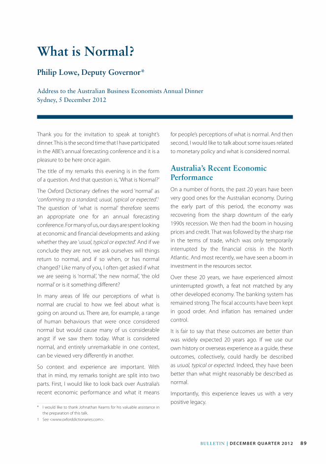
89Bulletin | d e c e m b e r Q ua r t e r 2012
Thank you for the invitation to speak at tonight’s dinner. This is the second time that I have participated in the ABE’s annual forecasting conference and it is a pleasure to be here once again.
The title of my remarks this evening is in the form of a question. And that question is, ‘What is Normal?’
The Oxford Dictionary defines the word ‘normal’ as ‘conforming to a standard; usual, typical or expected ’.1 The question of ‘what is normal’ therefore seems an appropriate one for an annual forecasting conference. For many of us, our days are spent looking at economic and financial developments and asking whether they are ‘usual, typical or expected’. And if we conclude they are not, we ask ourselves will things return to normal, and if so when, or has normal changed? Like many of you, I often get asked if what we are seeing is ‘normal’, ‘the new normal’, ‘the old normal’ or is it something different?
In many areas of life our perceptions of what is normal are crucial to how we feel about what is going on around us. There are, for example, a range of human behaviours that were once considered normal but would cause many of us considerable angst if we saw them today. What is considered normal, and entirely unremarkable in one context, can be viewed very differently in another.
So context and experience are important. With that in mind, my remarks tonight are split into two parts. First, I would like to look back over Australia’s recent economic performance and what it means
1 See <www.oxforddictionaries.com>.
for people’s perceptions of what is normal. And then second, I would like to talk about some issues related to monetary policy and what is considered normal.
Australia’s Recent Economic PerformanceOn a number of fronts, the past 20 years have been very good ones for the Australian economy. During the early part of this period, the economy was recovering from the sharp downturn of the early 1990s recession. We then had the boom in housing prices and credit. That was followed by the sharp rise in the terms of trade, which was only temporarily interrupted by the financial crisis in the North Atlantic. And most recently, we have seen a boom in investment in the resources sector.
Over these 20 years, we have experienced almost uninterrupted growth, a feat not matched by any other developed economy. The banking system has remained strong. The fiscal accounts have been kept in good order. And inflation has remained under control.
It is fair to say that these outcomes are better than was widely expected 20 years ago. If we use our own history or overseas experience as a guide, these outcomes, collectively, could hardly be described as usual, typical or expected. Indeed, they have been better than what might reasonably be described as normal.
Importantly, this experience leaves us with a very positive legacy.
What is Normal?Philip Lowe, Deputy Governor*
Address to the Australian Business Economists Annual Dinner Sydney, 5 December 2012
* I would like to thank Johnathan Kearns for his valuable assistance in the preparation of this talk.
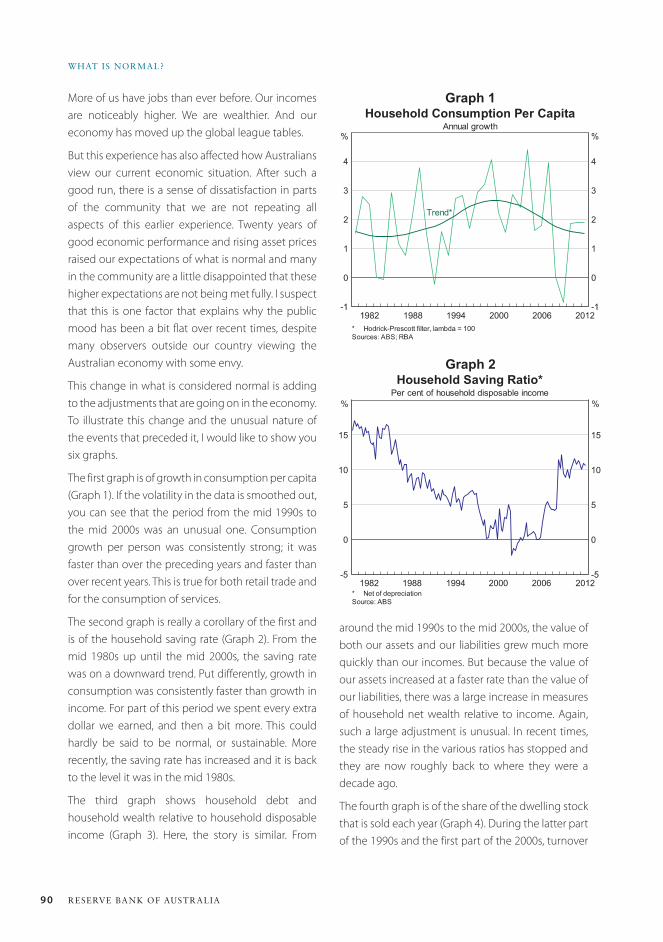
90 ReseRve bank of austRalia
WHat is noRMal?
More of us have jobs than ever before. Our incomes are noticeably higher. We are wealthier. And our economy has moved up the global league tables.
But this experience has also affected how Australians view our current economic situation. After such a good run, there is a sense of dissatisfaction in parts of the community that we are not repeating all aspects of this earlier experience. Twenty years of good economic performance and rising asset prices raised our expectations of what is normal and many in the community are a little disappointed that these higher expectations are not being met fully. I suspect that this is one factor that explains why the public mood has been a bit flat over recent times, despite many observers outside our country viewing the Australian economy with some envy.
This change in what is considered normal is adding to the adjustments that are going on in the economy. To illustrate this change and the unusual nature of the events that preceded it, I would like to show you six graphs.
The first graph is of growth in consumption per capita (Graph 1). If the volatility in the data is smoothed out, you can see that the period from the mid 1990s to the mid 2000s was an unusual one. Consumption growth per person was consistently strong; it was faster than over the preceding years and faster than over recent years. This is true for both retail trade and for the consumption of services.
The second graph is really a corollary of the first and is of the household saving rate (Graph 2). From the mid 1980s up until the mid 2000s, the saving rate was on a downward trend. Put differently, growth in consumption was consistently faster than growth in income. For part of this period we spent every extra dollar we earned, and then a bit more. This could hardly be said to be normal, or sustainable. More recently, the saving rate has increased and it is back to the level it was in the mid 1980s.
The third graph shows household debt and household wealth relative to household disposable income (Graph 3). Here, the story is similar. From
Graph 2
around the mid 1990s to the mid 2000s, the value of both our assets and our liabilities grew much more quickly than our incomes. But because the value of our assets increased at a faster rate than the value of our liabilities, there was a large increase in measures of household net wealth relative to income. Again, such a large adjustment is unusual. In recent times, the steady rise in the various ratios has stopped and they are now roughly back to where they were a decade ago.
The fourth graph is of the share of the dwelling stock that is sold each year (Graph 4). During the latter part of the 1990s and the first part of the 2000s, turnover
Graph 1
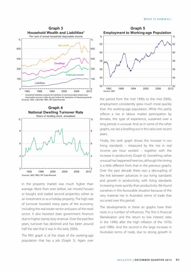
91Bulletin | d e c e m b e r Q ua r t e r 2012
WHAt iS nORMAl?
Graph 3
Graph 4
Graph 5
the period from the mid 1990s to the mid 2000s, employment consistently grew much more quickly than the working-age population. While this partly reflects a rise in labour market participation by females, this type of experience, sustained over a long period, is unusual. And, as in some of the other graphs, we see a levelling out in this ratio over recent years.
Finally, the sixth graph shows the increase in our living standards – measured by the rise in real income per hour worked – together with the increase in productivity (Graph 6). Something rather unusual has happened here too, although the timing is a little different from that in the previous graphs. Over the past decade there was a decoupling of the link between advances in our living standards and growth in productivity, with living standards increasing more quickly than productivity. We found ourselves in this favourable situation because of the very material rise in Australia’s terms of trade that occurred over this period.
The developments in these six graphs have their roots in a number of influences. The first is financial liberalisation and the return to low interest rates in the 1990s after the high inflation of the 1970s and 1980s. And the second is the large increase in Australia’s terms of trade, due to strong growth in
in the property market was much higher than average. More than ever before, we moved houses or bought and traded second properties, either as an investment or as a holiday property. The high rate of turnover boosted many parts of the economy, including the real estate sector and parts of the retail sector. It also boosted state government finances due to higher stamp duty revenue. Over the past few years, turnover has declined and has been around half the rate that it was in the early 2000s.
The fifth graph is of the share of the working-age population that has a job (Graph 5). Again over
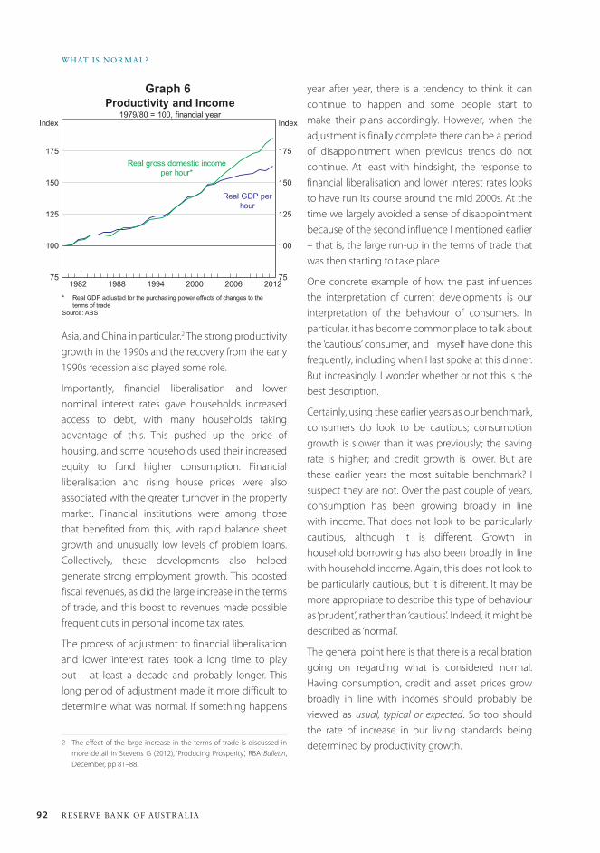
92 ReseRve bank of austRalia
WHat is noRMal?
year after year, there is a tendency to think it can continue to happen and some people start to make their plans accordingly. However, when the adjustment is finally complete there can be a period of disappointment when previous trends do not continue. At least with hindsight, the response to financial liberalisation and lower interest rates looks to have run its course around the mid 2000s. At the time we largely avoided a sense of disappointment because of the second influence I mentioned earlier – that is, the large run-up in the terms of trade that was then starting to take place.
One concrete example of how the past influences the interpretation of current developments is our interpretation of the behaviour of consumers. In particular, it has become commonplace to talk about the ‘cautious’ consumer, and I myself have done this frequently, including when I last spoke at this dinner. But increasingly, I wonder whether or not this is the best description.
Certainly, using these earlier years as our benchmark, consumers do look to be cautious; consumption growth is slower than it was previously; the saving rate is higher; and credit growth is lower. But are these earlier years the most suitable benchmark? I suspect they are not. Over the past couple of years, consumption has been growing broadly in line with income. That does not look to be particularly cautious, although it is different. Growth in household borrowing has also been broadly in line with household income. Again, this does not look to be particularly cautious, but it is different. It may be more appropriate to describe this type of behaviour as ‘prudent’, rather than ‘cautious’. Indeed, it might be described as ‘normal’.
The general point here is that there is a recalibration going on regarding what is considered normal. Having consumption, credit and asset prices grow broadly in line with incomes should probably be viewed as usual, typical or expected. So too should the rate of increase in our living standards being determined by productivity growth.
Asia, and China in particular.2 The strong productivity growth in the 1990s and the recovery from the early 1990s recession also played some role.
Importantly, financial liberalisation and lower nominal interest rates gave households increased access to debt, with many households taking advantage of this. This pushed up the price of housing, and some households used their increased equity to fund higher consumption. Financial liberalisation and rising house prices were also associated with the greater turnover in the property market. Financial institutions were among those that benefited from this, with rapid balance sheet growth and unusually low levels of problem loans. Collectively, these developments also helped generate strong employment growth. This boosted fiscal revenues, as did the large increase in the terms of trade, and this boost to revenues made possible frequent cuts in personal income tax rates.
The process of adjustment to financial liberalisation and lower interest rates took a long time to play out – at least a decade and probably longer. This long period of adjustment made it more difficult to determine what was normal. If something happens
2 The effect of the large increase in the terms of trade is discussed in more detail in Stevens G (2012), ‘Producing Prosperity’, RBA Bulletin, December, pp 81–88.
Graph 6
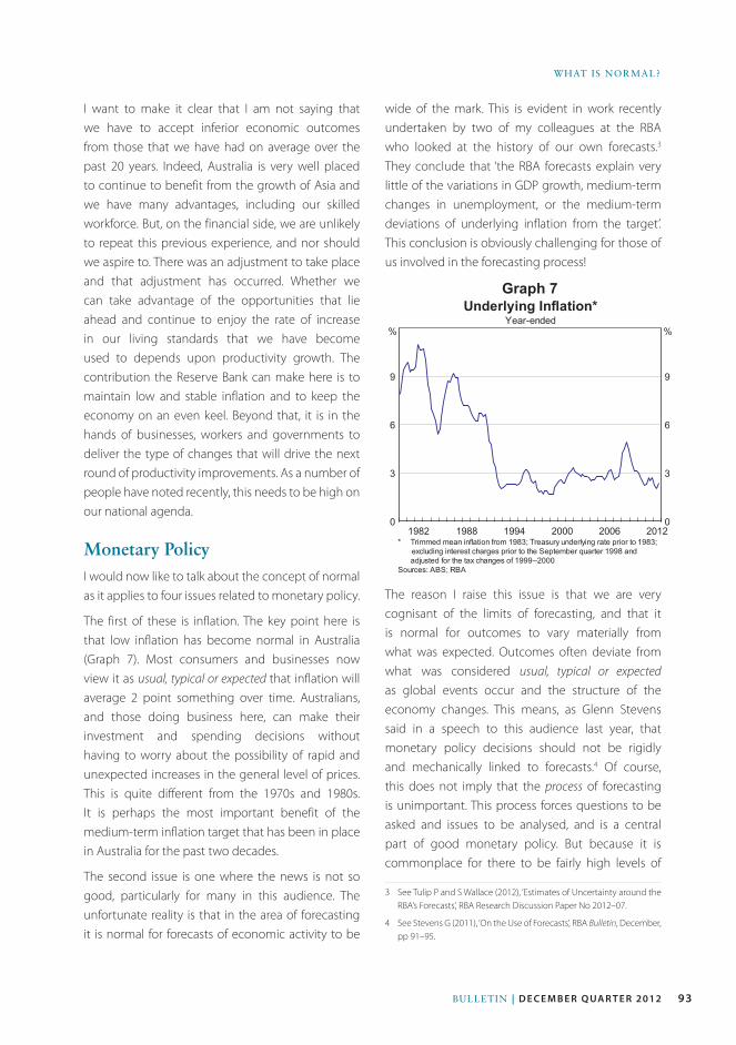
93Bulletin | d e c e m b e r Q ua r t e r 2012
WHAt iS nORMAl?
I want to make it clear that I am not saying that we have to accept inferior economic outcomes from those that we have had on average over the past 20 years. Indeed, Australia is very well placed to continue to benefit from the growth of Asia and we have many advantages, including our skilled workforce. But, on the financial side, we are unlikely to repeat this previous experience, and nor should we aspire to. There was an adjustment to take place and that adjustment has occurred. Whether we can take advantage of the opportunities that lie ahead and continue to enjoy the rate of increase in our living standards that we have become used to depends upon productivity growth. The contribution the Reserve Bank can make here is to maintain low and stable inflation and to keep the economy on an even keel. Beyond that, it is in the hands of businesses, workers and governments to deliver the type of changes that will drive the next round of productivity improvements. As a number of people have noted recently, this needs to be high on our national agenda.
Monetary PolicyI would now like to talk about the concept of normal as it applies to four issues related to monetary policy.
The first of these is inflation. The key point here is that low inflation has become normal in Australia (Graph 7). Most consumers and businesses now view it as usual, typical or expected that inflation will average 2 point something over time. Australians, and those doing business here, can make their investment and spending decisions without having to worry about the possibility of rapid and unexpected increases in the general level of prices. This is quite different from the 1970s and 1980s. It is perhaps the most important benefit of the medium-term inflation target that has been in place in Australia for the past two decades.
The second issue is one where the news is not so good, particularly for many in this audience. The unfortunate reality is that in the area of forecasting it is normal for forecasts of economic activity to be
wide of the mark. This is evident in work recently undertaken by two of my colleagues at the RBA who looked at the history of our own forecasts.3 They conclude that ‘the RBA forecasts explain very little of the variations in GDP growth, medium-term changes in unemployment, or the medium-term deviations of underlying inflation from the target’. This conclusion is obviously challenging for those of us involved in the forecasting process!
The reason I raise this issue is that we are very cognisant of the limits of forecasting, and that it is normal for outcomes to vary materially from what was expected. Outcomes often deviate from what was considered usual, typical or expected as global events occur and the structure of the economy changes. This means, as Glenn Stevens said in a speech to this audience last year, that monetary policy decisions should not be rigidly and mechanically linked to forecasts.4 Of course, this does not imply that the process of forecasting is unimportant. This process forces questions to be asked and issues to be analysed, and is a central part of good monetary policy. But because it is commonplace for there to be fairly high levels of
3 See Tulip P and S Wallace (2012), ‘Estimates of Uncertainty around the RBA’s Forecasts’, RBA Research Discussion Paper No 2012–07.
4 See Stevens G (2011), ‘On the Use of Forecasts’, RBA Bulletin, December, pp 91–95.
Graph 7
e
94 ReseRve bank of austRalia
WHat is noRMal?
uncertainty around the point forecasts, there is also an important role for judgement by policymakers.
The third issue that I would like to touch on is the normal level of interest rates.
For much of the decade or so before the financial crisis it was normal for headline mortgage rates to move in near lock step with the cash rate. This has obviously changed over recent years, as bank funding costs – and hence mortgage rates – have risen relative to the cash rate. As we have noted many times, the Board of the RBA has taken account of this in its monthly policy decisions. As a result, the cash rate today is around 1½ percentage points lower than it otherwise would have been. The fact that the Bank has offset the effect of higher funding costs on lending rates means that the normal level of the cash rate is lower than it otherwise would have been. A 3 per cent cash rate today is not the same as a 3 per cent cash rate in the past.
A more difficult issue to assess is the normal level of lending rates, as opposed to the normal level of the cash rate. It is difficult to be definitive here, but there are a couple of reasons why the normal level of lending rates may be lower, at least for a time, than was the case over the past two decades.
The first reason is the international environment. As I talked about in another speech recently, many of the countries that avoided the financial crisis are experiencing uncomfortably high exchange rates and low interest rates.5 Australia is one of these. With the major economies of the world quite weak, most other countries would see themselves as benefiting from a lower exchange rate to boost their exports. But, of course, given that exchange rates are relative prices, not every country can simultaneously have a lower exchange rate. It should not really come as a surprise that countries that are in relatively good shape and have not seen large-scale expansion of the central bank balance sheet are experiencing stronger currencies than those that are in relatively
5 See Lowe P (2012), ‘Australia and the World’, RBA Bulletin, December, pp 97–102.
poor shape. This is one of the mechanisms through which the weak conditions in most of the advanced economies are transmitted to the rest of the world. And in response to this, interest rates are lower than they otherwise would be to offset some of the effects of an uncomfortably high exchange rate.
The second factor that might have an influence on the normal level of lending rates is related to the issues that I spoke about at the outset. For most of the past 20 years we were benefiting from either the credit boom or the terms of trade boom. Under the influence of these two factors, one might expect, all else constant, higher average lending rates than otherwise, as both factors boost aggregate demand relative to supply at least for a period. Another way of thinking about this is that in the earlier period there was an increase in the rate of time discount and correspondingly an increase in the normal level of interest rates. Although the high terms of trade are still boosting aggregate demand, the aftermath of the credit boom and the gradual realisation that this experience is unlikely to be repeated is working in the other direction. All else constant, this might be expected to lead to lower average lending rates than during the earlier period.
Of course, all else is not constant, including the amount of spare capacity in the economy, the nature of capital flows and the rate of productivity growth. But it is possible that normal lending rates will be somewhat lower for a period owing to the combination of global factors and the legacy of the credit boom. Whether or not this turns out to be the case depends upon a whole range of factors, including how cost and price pressures in the economy evolve.
This brings me to the fourth and final issue. And that is whether we are seeing a normal response of the economy to the reductions in interest rates that have occurred over the past year or so.
Assessments in this area are difficult, not just because there is a very wide range of historical experience, but also because of the challenge of determining
95Bulletin | d e c e m b e r Q ua r t e r 2012
WHAt iS nORMAl?
what is the normal level of lending rates. However, the current response, across a large number of indicators, is falling within the range of outcomes that we have seen in the past. There do appear though, to be some differences in the behaviour of the household and the business indicators. In particular, while a number of household indicators have picked up somewhat, business confidence and conditions have not. This difference will obviously bear close watching over the period ahead. One other area where the response has been smaller than typical is the exchange rate, which has remained high. The more important conclusion, though, is that
monetary policy still looks like it is working. There are lags and different parts of the economy respond differently, but lower interest rates are still effective in providing a boost to the overall economy.
ConclusionSo to conclude, I wish you all the best of luck on your journey of discovery of what is normal; of what is usual, typical or expected. One difficulty that I suspect we all face is when we think we have found the answer, it seems to change again. Perhaps the one constant is that uncertainty is normal! R

96 ReseRve bank of austRalia
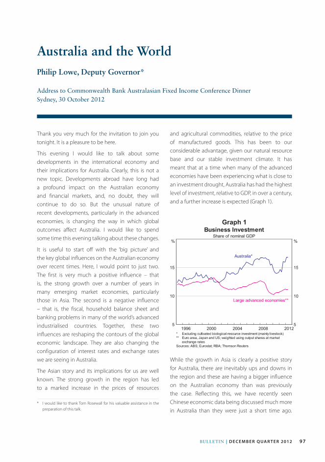
97Bulletin | d e c e m b e r Q ua r t e r 2012
Thank you very much for the invitation to join you tonight. It is a pleasure to be here.
This evening I would like to talk about some developments in the international economy and their implications for Australia. Clearly, this is not a new topic. Developments abroad have long had a profound impact on the Australian economy and financial markets, and, no doubt, they will continue to do so. But the unusual nature of recent developments, particularly in the advanced economies, is changing the way in which global outcomes affect Australia. I would like to spend some time this evening talking about these changes.
It is useful to start off with the ‘big picture’ and the key global influences on the Australian economy over recent times. Here, I would point to just two. The first is very much a positive influence – that is, the strong growth over a number of years in many emerging market economies, particularly those in Asia. The second is a negative influence – that is, the fiscal, household balance sheet and banking problems in many of the world’s advanced industrialised countries. Together, these two influences are reshaping the contours of the global economic landscape. They are also changing the configuration of interest rates and exchange rates we are seeing in Australia.
The Asian story and its implications for us are well known. The strong growth in the region has led to a marked increase in the prices of resources
and agricultural commodities, relative to the price of manufactured goods. This has been to our considerable advantage, given our natural resource base and our stable investment climate. It has meant that at a time when many of the advanced economies have been experiencing what is close to an investment drought, Australia has had the highest level of investment, relative to GDP, in over a century, and a further increase is expected (Graph 1).
Australia and the WorldPhilip Lowe, Deputy Governor*
Address to Commonwealth Bank Australasian Fixed Income Conference Dinner Sydney, 30 October 2012
* I would like to thank Tom Rosewall for his valuable assistance in the preparation of this talk.
Graph 1
While the growth in Asia is clearly a positive story for Australia, there are inevitably ups and downs in the region and these are having a bigger influence on the Australian economy than was previously the case. Reflecting this, we have recently seen Chinese economic data being discussed much more in Australia than they were just a short time ago.
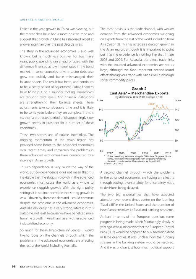
98 ReseRve bank of austRalia
austRalia and the WoRld
A second channel through which the problems in the advanced economies are having an effect is through adding to uncertainty, for uncertainty leads to decisions being delayed.
The two big uncertainties that have attracted attention over recent times centre on the looming ‘fiscal cliff ’ in the United States and the question of how Europe resolves its fiscal and banking problems.
At least in terms of the European question, some progress is being made, albeit frustratingly slowly. A year ago, it was unclear whether the European Central Bank (ECB) would be prepared to buy sovereign debt in large quantities. It was unclear how the funding stresses in the banking system would be resolved. And it was unclear just how much political support
Earlier in the year, growth in China was slowing, but the recent data have had a more positive tone and suggest that growth in China has stabilised, albeit at a lower rate than over the past decade or so.
The story in the advanced economies is also well known, but is much less positive. For too many years, public spending ran ahead of taxes, with the difference financed at low interest rates in the bond market. In some countries, private sector debt also grew too quickly and banks mismanaged their balance sheets. The result has been, and continues to be, a costly period of adjustment. Public finances have to be put on a sounder footing. Households are reducing debt levels. And financial institutions are strengthening their balance sheets. These adjustments take considerable time and it is likely to be some years before they are complete. If this is so, then a protracted period of disappointingly slow growth seems in prospect for a number of these economies.
These two stories are, of course, interlinked. The ongoing momentum in the Asian region has provided some boost to the advanced economies over recent times, and conversely the problems in these advanced economies have contributed to a slowing in Asian growth.
This co-dependence is very much the way of the world. But co-dependence does not mean that it is inevitable that the sluggish growth in the advanced economies must cause the world as a whole to experience sluggish growth. With the right policy settings, it is not inconceivable that strong growth in Asia – driven by domestic demand – could continue despite the problems in the advanced economies. Australia obviously has a very strong interest in this outcome, not least because we have benefited more from the growth in Asia than has any other advanced industrialised economy.
So much for these big-picture influences. I would like to focus on the channels through which the problems in the advanced economies are affecting the rest of the world, including Australia.
The most obvious is the trade channel, with weaker demand from the advanced economies weighing on exports from the rest of the world, including from Asia (Graph 2). This has acted as a drag on growth in the Asian region, although it is important to point out that the experience is nothing like that in late 2008 and 2009. For Australia, the direct trade links with the troubled advanced economies are not as large, although we face important second-round effects through our trade with Asia as well as through softer commodity prices.
Graph 2
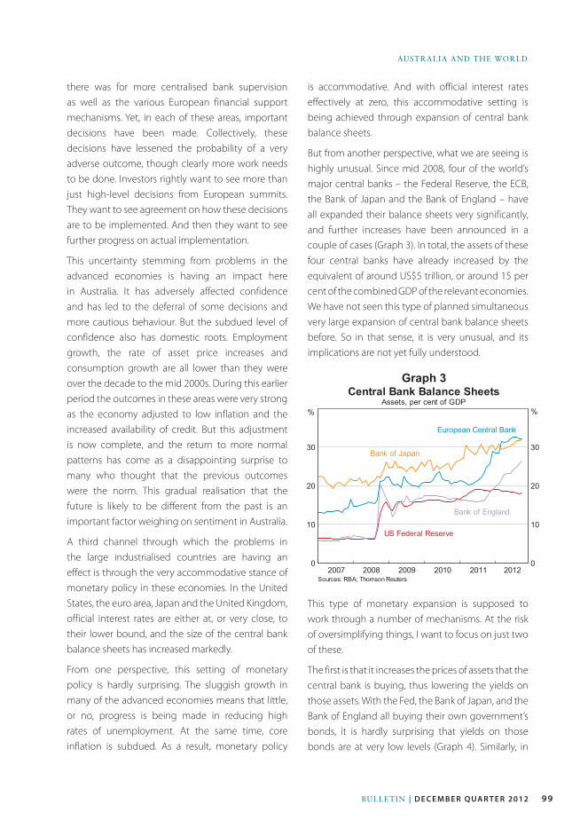
99Bulletin | d e c e m b e r Q ua r t e r 2012
AustrAliA And the World
Graph 3
there was for more centralised bank supervision as well as the various European financial support mechanisms. Yet, in each of these areas, important decisions have been made. Collectively, these decisions have lessened the probability of a very adverse outcome, though clearly more work needs to be done. Investors rightly want to see more than just high-level decisions from European summits. They want to see agreement on how these decisions are to be implemented. And then they want to see further progress on actual implementation.
This uncertainty stemming from problems in the advanced economies is having an impact here in Australia. It has adversely affected confidence and has led to the deferral of some decisions and more cautious behaviour. But the subdued level of confidence also has domestic roots. Employment growth, the rate of asset price increases and consumption growth are all lower than they were over the decade to the mid 2000s. During this earlier period the outcomes in these areas were very strong as the economy adjusted to low inflation and the increased availability of credit. But this adjustment is now complete, and the return to more normal patterns has come as a disappointing surprise to many who thought that the previous outcomes were the norm. This gradual realisation that the future is likely to be different from the past is an important factor weighing on sentiment in Australia.
A third channel through which the problems in the large industrialised countries are having an effect is through the very accommodative stance of monetary policy in these economies. In the United States, the euro area, Japan and the United Kingdom, official interest rates are either at, or very close, to their lower bound, and the size of the central bank balance sheets has increased markedly.
From one perspective, this setting of monetary policy is hardly surprising. The sluggish growth in many of the advanced economies means that little, or no, progress is being made in reducing high rates of unemployment. At the same time, core inflation is subdued. As a result, monetary policy
is accommodative. And with official interest rates effectively at zero, this accommodative setting is being achieved through expansion of central bank balance sheets.
But from another perspective, what we are seeing is highly unusual. Since mid 2008, four of the world’s major central banks – the Federal Reserve, the ECB, the Bank of Japan and the Bank of England – have all expanded their balance sheets very significantly, and further increases have been announced in a couple of cases (Graph 3). In total, the assets of these four central banks have already increased by the equivalent of around US$5 trillion, or around 15 per cent of the combined GDP of the relevant economies. We have not seen this type of planned simultaneous very large expansion of central bank balance sheets before. So in that sense, it is very unusual, and its implications are not yet fully understood.
This type of monetary expansion is supposed to work through a number of mechanisms. At the risk of oversimplifying things, I want to focus on just two of these.
The first is that it increases the prices of assets that the central bank is buying, thus lowering the yields on those assets. With the Fed, the Bank of Japan, and the Bank of England all buying their own government’s bonds, it is hardly surprising that yields on those bonds are at very low levels (Graph 4). Similarly, in
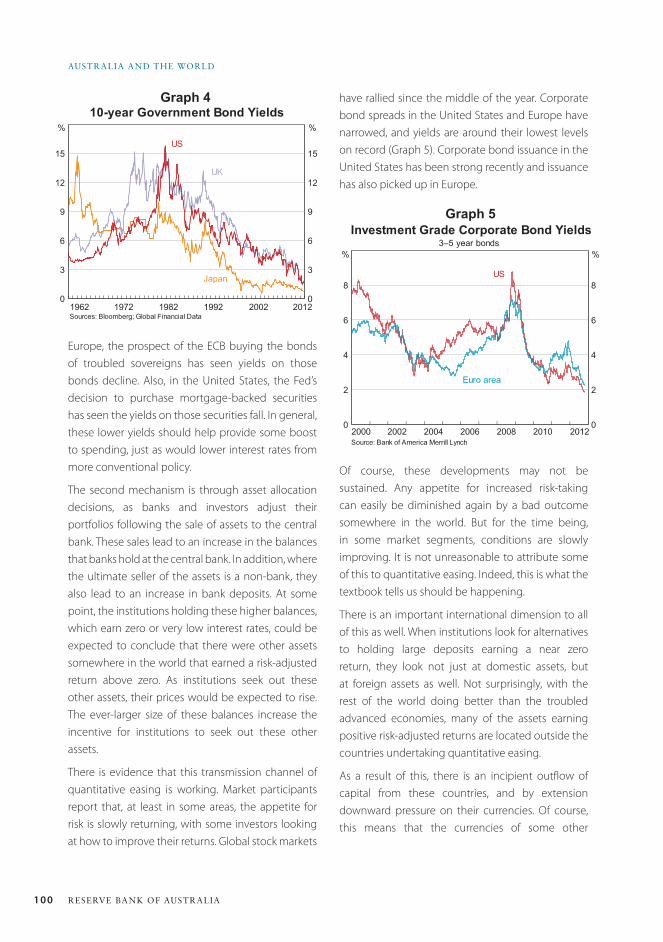
100 ReseRve bank of austRalia
austRalia and the WoRld
have rallied since the middle of the year. Corporate bond spreads in the United States and Europe have narrowed, and yields are around their lowest levels on record (Graph 5). Corporate bond issuance in the United States has been strong recently and issuance has also picked up in Europe.
Graph 4
Graph 5
Europe, the prospect of the ECB buying the bonds of troubled sovereigns has seen yields on those bonds decline. Also, in the United States, the Fed’s decision to purchase mortgage-backed securities has seen the yields on those securities fall. In general, these lower yields should help provide some boost to spending, just as would lower interest rates from more conventional policy.
The second mechanism is through asset allocation decisions, as banks and investors adjust their portfolios following the sale of assets to the central bank. These sales lead to an increase in the balances that banks hold at the central bank. In addition, where the ultimate seller of the assets is a non-bank, they also lead to an increase in bank deposits. At some point, the institutions holding these higher balances, which earn zero or very low interest rates, could be expected to conclude that there were other assets somewhere in the world that earned a risk-adjusted return above zero. As institutions seek out these other assets, their prices would be expected to rise. The ever-larger size of these balances increase the incentive for institutions to seek out these other assets.
There is evidence that this transmission channel of quantitative easing is working. Market participants report that, at least in some areas, the appetite for risk is slowly returning, with some investors looking at how to improve their returns. Global stock markets
Of course, these developments may not be sustained. Any appetite for increased risk-taking can easily be diminished again by a bad outcome somewhere in the world. But for the time being, in some market segments, conditions are slowly improving. It is not unreasonable to attribute some of this to quantitative easing. Indeed, this is what the textbook tells us should be happening.
There is an important international dimension to all of this as well. When institutions look for alternatives to holding large deposits earning a near zero return, they look not just at domestic assets, but at foreign assets as well. Not surprisingly, with the rest of the world doing better than the troubled advanced economies, many of the assets earning positive risk-adjusted returns are located outside the countries undertaking quantitative easing.
As a result of this, there is an incipient outflow of capital from these countries, and by extension downward pressure on their currencies. Of course, this means that the currencies of some other
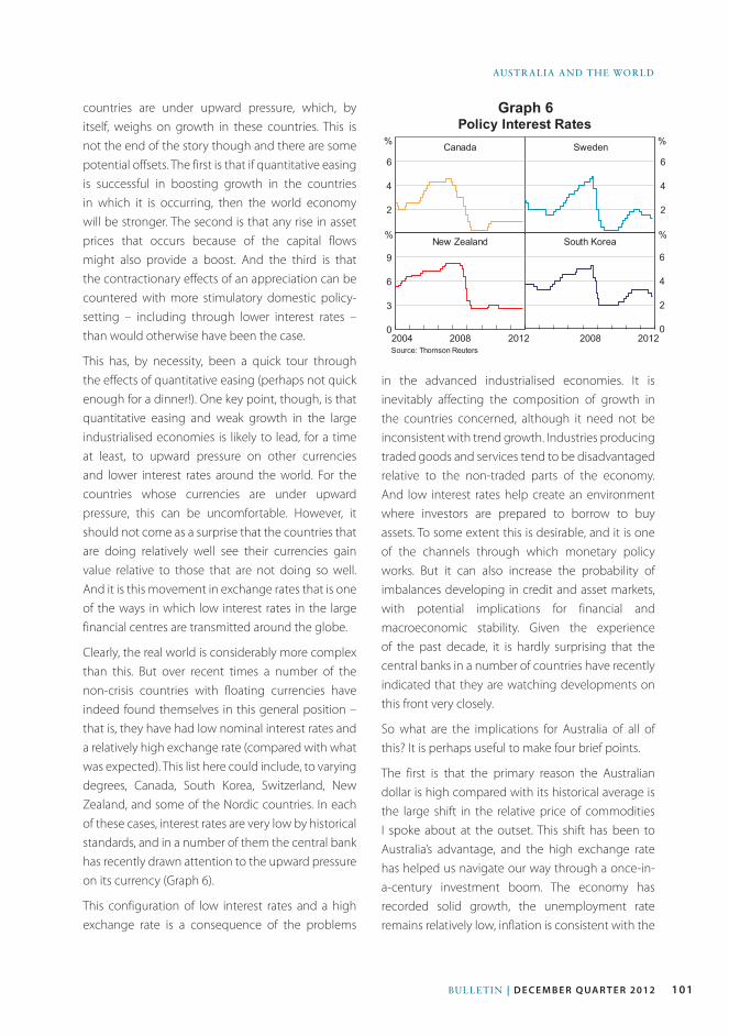
101Bulletin | d e c e m b e r Q ua r t e r 2012
AustrAliA And the World
countries are under upward pressure, which, by itself, weighs on growth in these countries. This is not the end of the story though and there are some potential offsets. The first is that if quantitative easing is successful in boosting growth in the countries in which it is occurring, then the world economy will be stronger. The second is that any rise in asset prices that occurs because of the capital flows might also provide a boost. And the third is that the contractionary effects of an appreciation can be countered with more stimulatory domestic policy-setting – including through lower interest rates – than would otherwise have been the case.
This has, by necessity, been a quick tour through the effects of quantitative easing (perhaps not quick enough for a dinner!). One key point, though, is that quantitative easing and weak growth in the large industrialised economies is likely to lead, for a time at least, to upward pressure on other currencies and lower interest rates around the world. For the countries whose currencies are under upward pressure, this can be uncomfortable. However, it should not come as a surprise that the countries that are doing relatively well see their currencies gain value relative to those that are not doing so well. And it is this movement in exchange rates that is one of the ways in which low interest rates in the large financial centres are transmitted around the globe.
Clearly, the real world is considerably more complex than this. But over recent times a number of the non-crisis countries with floating currencies have indeed found themselves in this general position – that is, they have had low nominal interest rates and a relatively high exchange rate (compared with what was expected). This list here could include, to varying degrees, Canada, South Korea, Switzerland, New Zealand, and some of the Nordic countries. In each of these cases, interest rates are very low by historical standards, and in a number of them the central bank has recently drawn attention to the upward pressure on its currency (Graph 6).
This configuration of low interest rates and a high exchange rate is a consequence of the problems
Graph 6
in the advanced industrialised economies. It is inevitably affecting the composition of growth in the countries concerned, although it need not be inconsistent with trend growth. Industries producing traded goods and services tend to be disadvantaged relative to the non-traded parts of the economy. And low interest rates help create an environment where investors are prepared to borrow to buy assets. To some extent this is desirable, and it is one of the channels through which monetary policy works. But it can also increase the probability of imbalances developing in credit and asset markets, with potential implications for financial and macroeconomic stability. Given the experience of the past decade, it is hardly surprising that the central banks in a number of countries have recently indicated that they are watching developments on this front very closely.
So what are the implications for Australia of all of this? It is perhaps useful to make four brief points.
The first is that the primary reason the Australian dollar is high compared with its historical average is the large shift in the relative price of commodities I spoke about at the outset. This shift has been to Australia’s advantage, and the high exchange rate has helped us navigate our way through a once-in-a-century investment boom. The economy has recorded solid growth, the unemployment rate remains relatively low, inflation is consistent with the
102 ReseRve bank of austRalia
austRalia and the WoRld
target, public debt is low and the banking system is sound. Few countries can make such claims.
The second is that the types of portfolio flows I talked about earlier do appear to be having an effect here. This effect is perhaps clearest in the government bond market, with yields near historic lows. But it is also evident in the credit markets, with credit spreads paid by banks having fallen recently. It is also likely that these portfolio flows help explain why the exchange rate has changed little since mid year despite a general softening of the global outlook and a decline in key export prices.
The third point is that Australia’s interest rates remain above those in other developed economies. The main reason for this is that the rate of return on new investment in Australia is higher than in many other countries, as evidenced by the high level of investment. The very low interest rates in many other economies should not be seen as a good thing or something to aspire to. They reflect those countries’ difficult economic circumstances, and particularly the low risk-adjusted returns available on new investment.
The fourth and final point is that while our interest rates are relatively high compared with other countries, they are relatively low compared with historical averages. The international connections
that I have talked about tonight help to explain this. These lower-than-average interest rates are providing some support to demand in the economy. There is also some sign that they have led to a slight improvement in the property market, although there has been little change in the appetite for debt. It would appear that, for the moment at least, the lower interest rates, rather than encouraging household borrowing, have allowed many households with mortgages to repay their loans slightly more quickly than was previously the case. These trends will obviously need close monitoring over the period ahead.
So to conclude. These competing influences from Asia and the troubled advanced economies are having a significant effect on the Australian economy, the exchange rate and interest rates. They are creating challenges for both policymakers and investors, and they have added to the sense of uncertainty. What seems clearer though is that Australia’s strong trade links with Asia, our solid financial system, our flexible markets and our credible policy framework mean that we are in a better position than many other countries to deal with these challenges. I wish you the best of luck as you navigate your way through this complex world. R
103Bulletin | d e c e m b e r Q ua r t e r 2012
It is a pleasure to be in Hobart today and I would very much like to thank Finsia for the invitation to this lunch.
My remarks this afternoon are largely centred on the Australian labour market. They pick up on two important issues. The first is one that the Reserve Bank has spoken about at length over recent years, and that is structural change. Today, I would like to focus on how this change has been affecting the operation of the Australian labour market. The second issue is a more timely one, and that is how recent developments in the labour market can help us better understand the current balance between supply and demand in the economy.
Structural ChangeNo doubt, you have all heard much discussion over recent times about structural change in Australia, and why it is occurring. At the centre of a number of the changes that are taking place is the industrialisation and growth of Asia. This has resulted in high prices for Australia’s commodity and food exports, as well as a high exchange rate. The most obvious effect is the rapid expansion of the resources sector that has been underway for some time. Another important factor has been the marked change in Australians’ propensity to borrow to buy assets, especially houses. And then there is the ongoing growth in our demand for services as our incomes grow and the
population ages. Just as other forces have done so for more than 200 years, these forces are reshaping our economy.
But the concept of structural change – which is talked about a lot by economists – is a fairly abstract one for many people. It does become very real though when it affects people’s jobs – the nature of their work, the industries they are employed in, the security of their employment, their career opportunities and the wages they get paid. The Reserve Bank must, by the nature of our responsibilities, focus primarily on aggregate outcomes. However, we also try to understand what is going on beneath these aggregates, and how people’s lives are being affected.
Before I talk about the detail, it is worth starting with the aggregate unemployment rate (Graph 1). The key point here is that unemployment remains low. In the past 30 years, there have only been four years in which the unemployment rate has averaged below its current 5¼ per cent. Australia has one of the lowest unemployment rates among the advanced economies, an outcome that seemed improbable for much of my professional career.
Underneath this low and steady unemployment rate, there is a great deal of movement at the individual worker level. Although it is still typical for most people to have relatively long tenure in a single job, a large number of people change jobs each year. The latest data available from the Australian Bureau of Statistics (ABS) show that at
The Labour Market, Structural Change and Recent Economic DevelopmentsPhilip Lowe, Deputy Governor*
Speech to the Financial Services Institute of Australasia (Finsia) Leadership Event Hobart, 9 October 2012
* I would like to thank Patrick D’Arcy for his valuable assistance in the preparation of this talk.
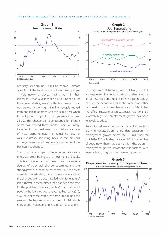
104 ReseRve bank of austRalia
the labouR MaRket, stRuctuRal change and Recent econoMic developMents
February 2012 around 2.3 million people – almost one-fifth of the total number of employed people – were newly employed, having been in their job for less than a year. While a little under half of these were starting work for the first time or were not previously working, 1.2 million people moved from one job to another. And this is in a year when the net growth in published employment was just 23 000. This changing in jobs occurred for a range of reasons. Around three-quarters were voluntary, including for personal reasons or to take advantage of new opportunities. The remaining quarter was involuntary, including because the previous employer went out of business or the nature of the business has changed.
The structural changes in the economy are clearly one factor contributing to this movement of people. This is of course nothing new. There is always a degree of structural change occurring, and the strong growth in the resources sector is but the latest example. Nevertheless, there is some evidence that the changes taking place have led to a higher rate of job turnover in recent times than has been the case for the past two decades (Graph 2). The number of people who left a job over the year to February 2012, as a share of those employed some time during the year, was the highest in two decades, with fairly high rates of both voluntary and involuntary separations.
This high rate of turnover, with relatively modest aggregate employment growth, is consistent with a lot of new job opportunities opening up in various parts of the economy and, at the same time, other jobs ceasing to exist. Another indication of this is that the official measure of job vacancies has remained relatively high, yet employment growth has been relatively subdued.
An additional way of looking at these changes is to examine the dispersion – or standard deviation – in employment growth across the 19 industries for which the ABS publishes data (Graph 3). For a number of years now, there has been a high dispersion in employment growth across these industries, with especially strong growth in the mining sector.
Graph 1 Graph 2
Graph 3
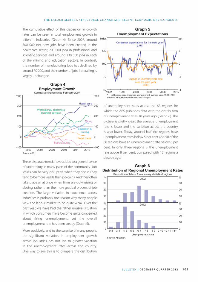
105Bulletin | d e c e m b e r Q ua r t e r 2012
the laBour Market, Structural change and recent econoMic developMentS
of unemployment rates across the 68 regions for which the ABS publishes data with the distribution of unemployment rates 10 years ago (Graph 6). The picture is pretty clear: the average unemployment rate is lower and the variation across the country is also lower. Today, around half the regions have unemployment rates below 5 per cent and 50 of the 68 regions have an unemployment rate below 6 per cent. In only three regions is the unemployment rate above 8 per cent, compared with 13 regions a decade ago.
The cumulative effect of this dispersion in growth rates can be seen in total employment growth in different industries (Graph 4). Since 2007, around 300 000 net new jobs have been created in the healthcare sector, 200 000 jobs in professional and scientific services and around 130 000 jobs in each of the mining and education sectors. In contrast, the number of manufacturing jobs has declined by around 70 000, and the number of jobs in retailing is largely unchanged.
Graph 4
Graph 5
Graph 6These disparate trends have added to a general sense of uncertainty in many parts of the community. Job losses can be very disruptive when they occur. They tend to be more visible than job gains. And they often take place all at once when firms are downsizing or closing, rather than the more gradual process of job creation. The large variation in experience across industries is probably one reason why many people view the labour market to be quite weak. Over the past year, we have had the rather unusual situation in which consumers have become quite concerned about rising unemployment, yet the overall unemployment rate has been steady (Graph 5).
More positively, and to the surprise of many people, the significant variation in employment growth across industries has not led to greater variation in the unemployment rates across the country. One way to see this is to compare the distribution
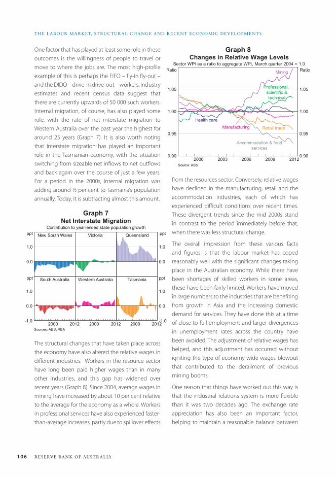
106 ReseRve bank of austRalia
the labouR MaRket, stRuctuRal change and Recent econoMic developMents
from the resources sector. Conversely, relative wages have declined in the manufacturing, retail and the accommodation industries, each of which has experienced difficult conditions over recent times. These divergent trends since the mid 2000s stand in contrast to the period immediately before that, when there was less structural change.
The overall impression from these various facts and figures is that the labour market has coped reasonably well with the significant changes taking place in the Australian economy. While there have been shortages of skilled workers in some areas, these have been fairly limited. Workers have moved in large numbers to the industries that are benefiting from growth in Asia and the increasing domestic demand for services. They have done this at a time of close to full employment and larger divergences in unemployment rates across the country have been avoided. The adjustment of relative wages has helped, and this adjustment has occurred without igniting the type of economy-wide wages blowout that contributed to the derailment of previous mining booms.
One reason that things have worked out this way is that the industrial relations system is more flexible than it was two decades ago. The exchange rate appreciation has also been an important factor, helping to maintain a reasonable balance between
One factor that has played at least some role in these outcomes is the willingness of people to travel or move to where the jobs are. The most high-profile example of this is perhaps the FIFO – fly-in fly-out – and the DIDO – drive-in drive-out – workers. Industry estimates and recent census data suggest that there are currently upwards of 50 000 such workers. Internal migration, of course, has also played some role, with the rate of net interstate migration to Western Australia over the past year the highest for around 25 years (Graph 7). It is also worth noting that interstate migration has played an important role in the Tasmanian economy, with the situation switching from sizeable net inflows to net outflows and back again over the course of just a few years. For a period in the 2000s, internal migration was adding around ½ per cent to Tasmania’s population annually. Today, it is subtracting almost this amount.
Graph 7
Graph 8
The structural changes that have taken place across the economy have also altered the relative wages in different industries. Workers in the resource sector have long been paid higher wages than in many other industries, and this gap has widened over recent years (Graph 8). Since 2004, average wages in mining have increased by about 10 per cent relative to the average for the economy as a whole. Workers in professional services have also experienced faster-than-average increases, partly due to spillover effects
107Bulletin | d e c e m b e r Q ua r t e r 2012
the laBour Market, Structural change and recent econoMic developMentS
demand and supply during what has turned out to be a once-in-a-century investment boom. Another factor has been Australia’s monetary policy regime, which has provided a strong anchor for both inflation and wage expectations. After two decades of the inflation-targeting regime there is a fairly broad understanding that unsustainable aggregate wage growth is likely to lead to higher inflation, and thus higher interest rates.
Looking forward, it is clear that the structure of the economy will continue to evolve. Over time, the strong growth in investment in the resources sector will give way to a large increase in exports of resources. This will likely mean some moderation in the demand for labour in the resources sector, and other forms of activity and employment will need to pick up. As this transition occurs, the types of new jobs that are created will also continue to evolve.
Inevitably, there are uncertainties as to what these new jobs will be, and where they will be located. In the face of this uncertainty, it is essential that the labour market retains its flexibility. The industrial relations laws and practices are important here, but they are by no means the full story. Flexibility also comes from having an adaptable workforce – one that has the right general skills, the right training and the right mindset. Over the medium term, whether or not Australia fully capitalises on the opportunities that the growth of Asia presents depends critically upon the ability of both workers and businesses to adapt, and to build and use our human capital. Many of these opportunities lie beyond the resources sector – in areas like the unique tourism experiences that are possible here in Tasmania, in high-end manufacturing, in high-quality food and in professional services. If we are to take advantage of these opportunities, a highly skilled and outward-looking workforce is critical.
Recent OutcomesI would now like to shorten my gaze a little to look at quite recent developments in the labour market and
what they tell us about the overall balance between supply and demand.
As I discussed at the outset, the current national unemployment rate is 5¼ per cent, and has been in the 5 to 5¼ per cent range for two years now. As I said, this is a very good outcome by international standards.
Notwithstanding this, the labour market appears to have generally softened in recent months, with only modest growth in total employment, a decline in average hours worked, and a decline in the employment-to-population ratio (Graph 9). Various indicators also suggest a lower rate of job creation than was the case a while ago.
Graph 9
Two industries stand out as having particularly weak employment growth over recent times (Graph 10). The first is the construction industry where, according to the ABS, there has been a net decline in employment of 70 000 over the past 12 months. Activity in important parts of the industry – including in house building and commercial construction – remains subdued, as does the immediate outlook, and this has led to a fair amount of job shedding. The second industry is public administration, where employment has fallen by 50 000 over the past year, with governments cutting back due to budgetary pressures.
108 ReseRve bank of austRalia
the labouR MaRket, stRuctuRal change and Recent econoMic developMents
Graph 11
Graph 10
One interesting aspect of the recent outcomes is that despite only modest overall employment growth, the unemployment rate has not moved up, as had been widely expected. Part of the reason for this is that there has been a decline in labour force participation – that is, in the share of the working-age population either with a job or looking for a job (Graph 11). While one always needs to interpret short-run movements with caution, the current participation rate is around ½ a percentage point lower than the average of the past five years. This stands in contrast to the general upward trend in participation over the past 30 years.
The Reserve Bank has recently spent some time trying to understand what is happening here and what it says about the balance of supply and demand in the labour market.
On the supply side, demographic changes are potentially an important factor. As with many other countries, the Australian population is ageing. This tends to reduce labour force participation, as older people are less likely to have a job, or be looking for a job, than are younger people. Our estimate is that this ageing effect, by itself, has reduced the participation rate by around 1 percentage point since the mid 2000s.
Over this period, however, this effect has been more than offset by the higher participation of successive generations of women in the workforce as well as a tendency for older workers in general to participate in the workforce longer than their predecessors. Taking account of this so-called cohort effect, as well as the ageing effect, it would appear that these longer-term supply-side factors are not a central part of the recent decline in participation.
A second potential factor is the relatively high rate of structural change in employment that I talked about earlier. With the increased rate of job turnover, it may be the case that workers who have left a job have decided not to re-enter the labour market immediately. This could be for a variety of reasons – perhaps employment prospects are poor or perhaps they are seeking to update their skills before re-entering the labour force. Unfortunately, the existing data make it difficult to assess how important these effects are. To the extent that they are playing some role, there is likely to be a bit more capacity in the labour market than indicated by the unemployment rate alone.
A third possibility is that the decline in participation is linked to the recent fall in demand for construction workers. There has been a large decline in the number of people who identify themselves as being

109Bulletin | d e c e m b e r Q ua r t e r 2012
the laBour Market, Structural change and recent econoMic developMentS
self-employed and many of these worked in the construction industry. It may be the case that some of these people are not recorded as unemployed, despite actually not working in the reference week and being available for additional work. Again, if this were the case it would suggest that there is a bit more capacity in the labour market than suggested by the unemployment rate alone.
This weakness in the construction sector, particularly of new homes, has been one of the bigger surprises in the economic outcomes over recent times. Looking forward, a pick-up in construction activity is one of the factors that could provide an offset to the eventual moderation in the current very high level of investment in the resources sector. A pick-up in other forms of investment could also play this role.
With the peak in mining investment now coming into view, it is not surprising that attention is turning to the questions of what forms of activity might pick up, where the future jobs might come from, and what combination of interest rates and exchange rates might keep the overall economy on an even keel. No doubt, international developments will
have an important bearing on the answers to these questions. Recently, the global outlook has softened somewhat and the various indicators that I have just mentioned suggest the labour market also has moved in this direction. Given these developments, and the outlook for contained inflation, the Board judged at its meeting last week that it was appropriate for the stance of monetary policy to be a little more accommodative than it had been.
Despite the recent focus on the weaker global economy, it is important not to lose sight of the longer-term benefits to the Australian economy of the growth of Asia. It remains the case that this growth provides Australia with tremendous opportunities. Over recent years we have seen these in the resources sector. But in coming years we are likely to see them more clearly in a wide range of other areas. Our flexible, adaptive and well-trained workforce will be the key to taking advantage of these opportunities.
Thank you for listening and I would be very happy to answer any questions. R

110 ReseRve bank of austRalia
1 1 1BULLETIn | D E C E M B E R Q uA R T E R 2012
reserve bank publications
Reserve Bank PublicationsMost of the publications listed below are available free of charge on the Bank’s website (www.rba.gov.au). Printed copies of these publications, as well as a wide range of earlier publications, are also available on request; for details refer to the enquiries information at the front of the Bulletin.
• Reserve Bank of Australia 50th Anniversary Symposium, July 2010
• Inflation in an Era of Relative Price Shocks, May 2010
• Lessons from the Financial Turmoil of 2007 and 2008, October 2008
• The Structure and Resilience of the Financial System, November 2007
• Demography and Financial Markets, October 2006
Other Publications
The Bank periodically produces other publications that may take the form of submissions to inquiries, surveys or consultation documents. Some recent examples include:
• New Financial Stability Standards: Final Standards and Regulation Impact Statement, December 2012
• Operational Incidents in Retail Payments Systems: Conclusions, November 2012
• The Regulatory Framework for the EFTPOS System: Final Reforms and Regulation Impact Statement, November 2012
• Guidance Note: Interpretation of the Surcharging Standards, November 2012
• RBA Core Criteria for a ‘Fast Payments’ Solution, November 2012
• Report on the Australian OTC Derivatives Market, October 2012
• Submission to the Inquiry Into Family Business in Australia, October 2012
• 2011/12 Assessment of Clearing and Settlement Facilities in Australia, September 2012
• A Variation to the Access Regime for the ATM System: Conclusions, August 2012
Statement on Monetary Policy
These statements, issued in February, May, August and November, assess current economic conditions and the prospects for inflation and output.
Financial Stability Review
These reviews, issued in March and September, assess the current condition of the financial system and potential risks to financial stability, and survey policy developments designed to improve financial stability.
annual Reports
• Reserve Bank of Australia Annual Report • Payments System Board Annual Report • Equity & Diversity Annual Report
Research Discussion Papers (RDPs)This series of papers is intended to make the results of current economic research within the Bank available for discussion and comment. The views expressed in these papers are those of the authors and not necessarily those of the Bank.
Abstracts or introductions of all RDPs, and the full text of RDPs published since 1988, are available on the Bank’s website.
Conference VolumesConference volumes have been published on the Bank’s website since 1993. The most recent titles are:
• Property Markets and Financial Stability, December 2012
• The Australian Economy in the 2000s, December 2011
1 1 2 RESERvE BAnk OF AUSTRALIA
reserve bank publications
Recent SpeechesChallenges for Central Banking, Glenn Stevens, Governor, December 2012
Macroeconomics at the Melbourne Institute, Guy Debelle, Assistant Governor (Financial Markets), December 2012
What is Normal?, Philip Lowe, Deputy Governor, December 2012
Producing Prosperity, Glenn Stevens, Governor, November 2012
The Outlook for Dwelling Investment, Jonathan Kearns, Head of Economic Analysis Department, November 2012
Australia and the World, Philip Lowe, Deputy Governor, October 2012
Five Years of Financial Crisis, Luci Ellis, Head of Financial Stability Department, October 2012
Enhancing Information on Securitisation, Guy Debelle, Assistant Governor (Financial Markets), October 2012
OTC Derivatives Regulation, Malcolm Edey, Assistant Governor (Financial System), October 2012
Macroprudential Policy: A Suite of Tools or a State of Mind?, Luci Ellis, Head of Financial Stability Department, October 2012
The Labour Market, Structural Change and Recent Economic Developments, Philip Lowe, Deputy Governor, October 2012
Macroprudential Supervision and the Role of Central Banks, Malcolm Edey, Assistant Governor (Financial System), September 2012
Credo et Fido: Credit and Trust, Guy Debelle, Assistant Governor (Financial Markets), September 2012
Implications for the Australian Economy of Strong Growth in Asia, Christopher Kent, Assistant Governor (Economic), September 2012
Regulatory Reforms and their Implications for Financial Markets, Funding Costs and Monetary Policy, Guy Debelle, Assistant Governor (Financial Markets), September 2012
The Lucky Country, Glenn Stevens, Governor, July 2012
Bank Regulation and the Future of Banking, Philip Lowe, Deputy Governor, July 2012
Recent Bulletin articles
September quarter 2012
Forecasting Business Investment Using the Capital Expenditure Survey
Supply-side Issues in the Housing Sector
Chinese Urban Residential Construction
Labour Market Dynamics: Cross-country Insights from Panel Data
Exploration and the Listed Resource Sector
Financial Regulation and Australian Dollar Liquid Assets
The Chinese Banking System
The Pricing of Crude Oil
June quarter 2012
Electronic Indicators of Economic Activity
Costs and Margins in the Retail Supply Chain
Australia’s Productivity Performance and Real Incomes
Households’ Appetite for Financial Risk
Banking Fees in Australia
Liquidity in the Australian Treasury Bond Futures Market
Central Counterparty Interoperability
Banknote Quality in Australia
Internationalising the Renminbi
Small Business Finance Roundtable: Summary of Discussion
March quarter 2012
The Recent Economic Performance of the States
Trends in National Saving and Investment
The Distribution of Household Wealth in Australia: Evidence from the 2010 HILDA Survey
India’s Steel Industry
Banks’ Funding Costs and Lending Rates
Extracting Information from Financial Market Instruments
The Personal Credit Card Market in Australia: Pricing over the Past Decade
Commodity Market Financialisation: A Closer Look at the Evidence
1 1 3Bulletin | d e c e m b e r q ua r t e r 2012
Copyright and Disclaimer Notices
Western Australia: Copyright – The State of Western Australia (DOLA), (2004). Licence No. PA75-2003. Based on information provided with the permission of DOLA.
Australian Capital Territory: The ACT data are the property of the Australian Capital Territory. No part of them may in any form or by any means (electronic, mechanical, microcopying, photocopying, recording or otherwise) be reproduced, stored in a retrieval system or transmitted without prior written permission. Enquiries should be directed to: The Executive Director, ACT Planning and Land Management GPO Box 1908 CANBERRA ACT 2601.
HILDaThe following Disclaimer applies to data obtained from the HILDA Survey and reported in the articles ‘Labour Market Turnover and Mobility’, ’Dwelling Prices and Household Income’ and ‘Households’ Interest-bearing Assets’ in this issue of the Bulletin.
Disclaimer
The Household, Income and Labour Dynamics in Australia (HILDA) Survey was initiated and is funded by the Australian Government Department of Families, Housing, Community Services and Indigenous Affairs (FaHCSIA), and is managed by the Melbourne Institute of Applied Economic and Social Research (Melbourne Institute). Findings and views based on these data should not be attributed to either FaHCSIA or the Melbourne Institute.
australian Property MonitorsThe following Copyright and Disclaimer Notices apply to data on dwelling prices obtained from Australian Property Monitors (APM) and reported in the article ‘Dwelling Prices and Household Income’ in this issue of the Bulletin.
Copyright
Copyright © 2004 Australian Property Monitors Pty Limited. The particular state and territory governments hold copyright in the government sourced data. Used with permission under licence. No liability accepted.
Disclaimers by State
In compiling this information APM relies upon information supplied by a number of external sources. The information is supplied on the basis that while APM believes that all the information in it will be correct at the time of publication, it does not warrant its accuracy or completeness.
Queensland: Underlying data for Queensland are copyrighted to State of Queensland for which no responsibility is accepted.
South Australia: Copyright in this information belongs to the South Australian Government and the South Australian Government does not accept any responsibility for the accuracy or completeness of the information or its suitability for any purpose.
Victoria: Some underlying Victorian information is copyrighted to State of Victoria (Department of Sustainability and Environment). Accuracy is not warranted. Use is on the basis that the State of Victoria shall bear no responsibility or liability whatsoever for any errors, faults, defects or omissions in that information.

1 1 4 ReseRve bank of austRalia