Embed Size (px)
Citation preview
Business Statistics - Unit 1 - Data collectionand descriptive statistics
Collection Editor:Collette Lemieux

Business Statistics - Unit 1 - Data collectionand descriptive statistics
Collection Editor:Collette Lemieux
Authors:Lyryx Learning
Collette Lemieux
Online:< http://cnx.org/content/col12239/1.1/ >

This selection and arrangement of content as a collection is copyrighted by Collette Lemieux. It is licensedunder the Creative Commons Attribution License 4.0 (http://creativecommons.org/licenses/by/4.0/).Collection structure revised: August 31, 2017PDF generated: October 7, 2019For copyright and attribution information for the modules contained in this collection, see p. 127.
Table of Contents
1 Common terms and sampling techniques1.1 Introduction – Sampling and Data – MtRoyal - Version2016RevA . . . . . . . . . . . . . . . . . 11.2 Definitions of Statistics, Probability, and Key Terms – MRU - C Lemieux
(2017) . . . . . . . . . . . . . . . . . . . . . . . . . . . . . . . . . . . . . . . . . . . . . . . . . . . . . . . . . . . . . . . . . . . . . . 21.3 Data, Sampling, and Variation – MRU - C Lemieux (2017) . . . . . . . . . . . . . . . . . . . . . . 101.4 Experimental Design and Ethics - Optional section . . . . . . . . . . . . . . . . . . . . . . . . . . . . . 30Solutions . . . . . . . . . . . . . . . . . . . . . . . . . . . . . . . . . . . . . . . . . . . . . . . . . . . . . . . . . . . . . . . . . . . . . . . 34
2 Descriptive statistics2.1 Introduction – Descriptive Statistics – MRU - C Lemieux (2017) . . . . . . . . . . . . . . . . . 402.2 Descriptive Statistics - Visual Representations of Data - MRU - C Lemieux
(2017) . . . . . . . . . . . . . . . . . . . . . . . . . . . . . . . . . . . . . . . . . . . . . . . . . . . . . . . . . . . . . . . . . . . . . 432.3 Descriptive Statistics - Numerical Summaries of Data - MRU - C Lemieux . . . . . . . . . 632.4 Measures of Location and Box Plots – MRU – C Lemieux (2017) . . . . . . . . . . . . . . . . 88Solutions . . . . . . . . . . . . . . . . . . . . . . . . . . . . . . . . . . . . . . . . . . . . . . . . . . . . . . . . . . . . . . . . . . . . . . 106
Glossary . . . . . . . . . . . . . . . . . . . . . . . . . . . . . . . . . . . . . . . . . . . . . . . . . . . . . . . . . . . . . . . . . . . . . . . . . . . 118Index . . . . . . . . . . . . . . . . . . . . . . . . . . . . . . . . . . . . . . . . . . . . . . . . . . . . . . . . . . . . . . . . . . . . . . . . . . . . . . 124Attributions . . . . . . . . . . . . . . . . . . . . . . . . . . . . . . . . . . . . . . . . . . . . . . . . . . . . . . . . . . . . . . . . . . . . . . . . 127

iv
Available for free at Connexions <http://cnx.org/content/col12239/1.1>
Chapter 1
Common terms and sampling techniques
1.1 Introduction – Sampling and Data – MtRoyal -Version2016RevA1
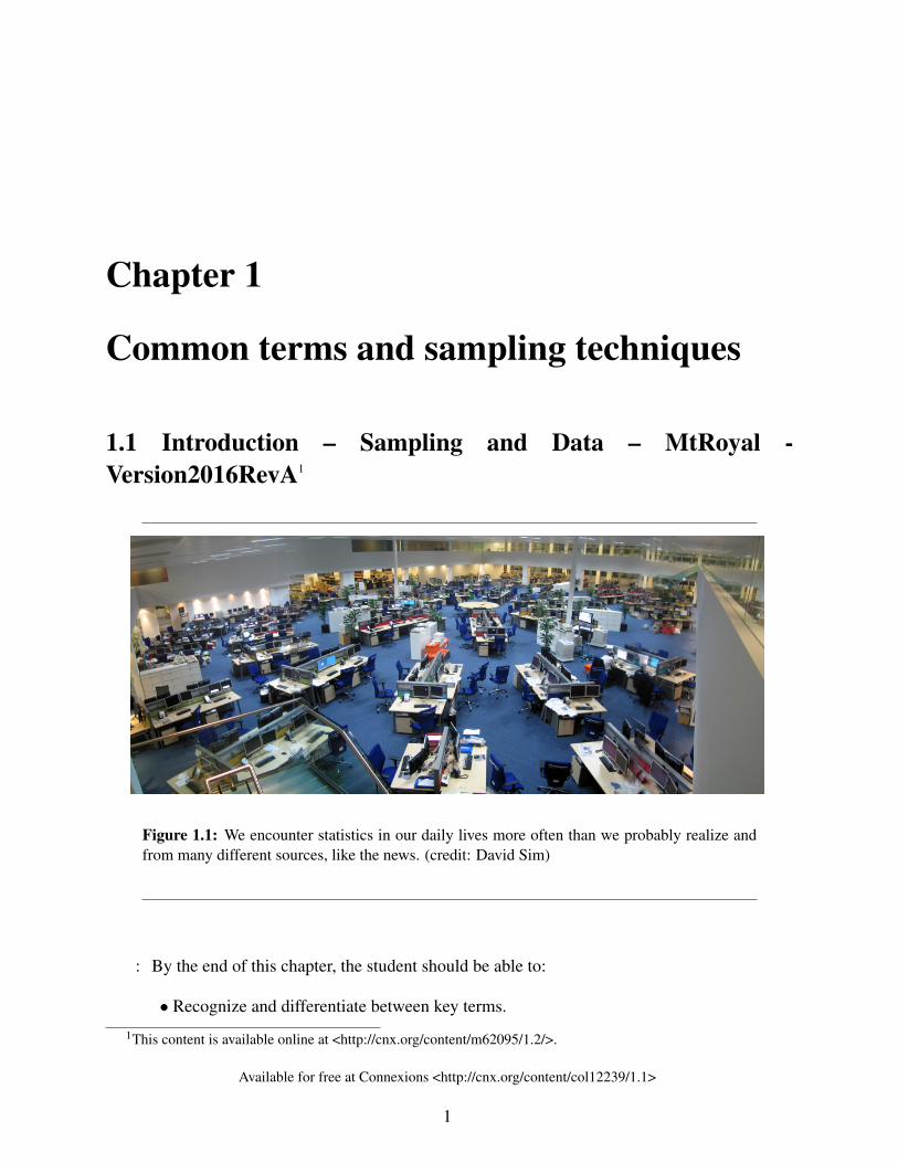
Figure 1.1: We encounter statistics in our daily lives more often than we probably realize andfrom many different sources, like the news. (credit: David Sim)
: By the end of this chapter, the student should be able to:
• Recognize and differentiate between key terms.
1This content is available online at <http://cnx.org/content/m62095/1.2/>.
Available for free at Connexions <http://cnx.org/content/col12239/1.1>
1
2 CHAPTER 1. COMMON TERMS AND SAMPLING TECHNIQUES
• Apply various types of sampling methods to data collection.
You are probably asking yourself the question, "When and where will I use statistics?" If you readany newspaper, watch television, or use the Internet, you will see statistical information. Thereare statistics about crime, sports, education, politics, and real estate. Typically, when you read anewspaper article or watch a television news program, you are given sample information. Withthis information, you may make a decision about the correctness of a statement, claim, or "fact."Statistical methods can help you make the "best educated guess."
Since you will undoubtedly be given statistical information at some point in your life, you needto know some techniques for analyzing the information thoughtfully. Think about buying a houseor managing a budget. Think about your chosen profession. The fields of economics, business,psychology, education, biology, law, computer science, police science, and early childhood devel-opment require at least one course in statistics.
Included in this chapter are the basic ideas and words of probability and statistics. You will soonunderstand that statistics and probability work together. You will also learn how data are gatheredand what "good" data can be distinguished from "bad."
1.2 Definitions of Statistics, Probability, and Key Terms – MRU- C Lemieux (2017)2
The science of statistics deals with the collection, analysis, interpretation, and presentation ofdata.
The process of statistical analysis follows these broad steps.
1. Defining the problem2. Planning the study3. Collecting the data for the study4. Analysis of the data5. Interpretations and conclusions based on the analysis
For example, we may wonder if there is a gap between how much men and women are paidfor doing the same job. This would be the problem we want to investigate. Before we do theinvestigation, we would want to spend some time defining the problem. This could include definingterms (e.g. what do we mean by “paid”? what constitutes the “same job”?). Then we would wantto state a research question. A research question is the overarching question that the study aimsto address. In this example, our research question might be: “Does the gender wage gap exist?”.
Once we have the problem clearly defined, we need to figure out how we are going to study theproblem. This would include determining how we are going to collect the data for the study. Since
2This content is available online at <http://cnx.org/content/m64275/1.2/>.
Available for free at Connexions <http://cnx.org/content/col12239/1.1>
3
it is unlikely we are going to find out the salary and position of every employee in the world (i.e.the population), we need to instead collect data from a subset of the whole (i.e. a sample). Theprocess of how we will collect the data is called the sampling technique. The overall plan of howthe study is designed is called the sampling design or methodology.
Once we have the methodology, we want to implement it and collect the actual data.
When we have the data, we will learn how to organize and summarize data. Organizing andsummarizing data is called descriptive statistics. Two ways to summarize data are by visuallysummarizing the data (for example, a histogram) and by numerically summarizing the data (forexample, the average). After we have summarized the data, we will use formal methods for draw-ing conclusions from "good" data. The formal methods are called inferential statistics. Statisticalinference uses probability to determine how confident we can be that our conclusions are correct.
Once we have summarized and analyzed the data, we want to see what kind of conclusions wecan draw. This would include attempting to answer the research question and recognizing thelimitations of the conclusions.
In this course, most of our time will be spent in the last two steps of the statistical analysis process(i.e. organizing, summarizing and analyzing data). To understand the process of making inferencesfrom the data, we must also learn about probability. This will help us understand the likelihood ofrandom events occurring.
1.2.1 Key Idea and TermsIn statistics, we generally want to study a population. You can think of a population as a collectionof persons, things, or objects under study. You can think of a population as a collection of persons,things, or objects under study. The person, thing or object under study (i.e. the object of study) iscalled the observational unit. What we are measuring or observing about the observational unitis called the variable. We often use the letters X or Y to represent a variable. A specific instanceof a variable is called data.
Example 1.1Suppose our research question is “Do current NHL forwards who make over $3 million ayear score, on average, more than 20 points a season?”
The population would be all of the NHL forwards who make over $3 million a year andwho are currently playing in the NHL. The observational unit is a single member of thepopulation, which would be any forward that made over $3 million year. The variable iswhat we are studying about the observation unit, which is the number points a forward inthe population gets in a season. A data value would be the actual number of points.
In the above example, it would be reasonable to look at the population when doing the statisticalanalysis as the population is very well defined, there are many websites that have this informationreadily available, and the population size is relatively small. But this is not always the case. Forexample, suppose you want to study the average profits of oil and gas companies in the world. This
Available for free at Connexions <http://cnx.org/content/col12239/1.1>
4 CHAPTER 1. COMMON TERMS AND SAMPLING TECHNIQUES
might be very hard to get a list of all of the oil and gas companies in the world and get access totheir financial reports. When the population is not easily accessible, we instead look at a sample.The idea of sampling (the process of collecting the sample) is to select a portion (or subset) of thelarger population and study that portion (the sample) to gain information about the population.
Because it takes a lot of time and money to examine an entire population, sampling is a verypractical technique. If you wished to compute the overall grade point average at your school, itwould make sense to select a sample of students who attend the school. The data collected fromthe sample would be the students’ grade point averages. In federal elections, opinion poll samplesof 1,000–2,000 people are taken. The opinion poll is supposed to represent the views of the peoplein the entire country. Manufacturers of canned carbonated drinks take samples to determine if a 16ounce can contains 16 ounces of carbonated drink.
It is important to note that though we might not know the population, when we decide to samplefrom it, it is fairly static. Going back to the example of the NHL forwards, if we were to gather thedata for the population right now that would be our fixed population. But if you took a sample fromthat population and your friend took a sample from that population, it is not surprising that youand your friend would get a different sample. That is, there is one population, but there are many,many different samples that can be drawn from the sample. How the samples vary from each otheris called sampling variability. The idea of sampling variability is a key concept in statistics andwe will come back to it over and over again.
NOTE: Data is plural. Datum is singular.
As mentioned above, a variable, or random variable, notated by capital letters such as X and Y, isa characteristic of interest for each person or thing in a population. Data are the actual values ofthe variable. Data and variables fall into two general types: either they are measuring somethingand they are not measuring. When a variable is measuring or counting something, it is calleda quantitative variable and the data is called quantitative. When a variable is not measuring orcounting something, it is called a categorical variable and the data is called categorical data. Fora variable to be considered quantitative, the distance between each number has to be fixed. Ingeneral, quantitative variables measure something and take on values with equal units such asweight in pounds or number of people in a line. Categorical variables place the person or thinginto a category such as colour of car or opinion on topic.
Example 1.2
• In the NHL forwards example, the variable is quantitative as we investigating thenumber of points a player has.
• In the gender gap example, there were three variables: the salary, gender, and theposition. The salary is a quantitative variable as we are investigating the amountpeople make. Gender is a categorical variable as we are categorizing someone’sgender. Position is also categorical as we are categorizing their type of employment.
• Sometimes though determining the type of a variable (i.e. quantitative or categori-cal) is not always cut and dry. In particular, Likert scales or rating scales are tricky
Available for free at Connexions <http://cnx.org/content/col12239/1.1>
5
to place. A Likert scale is any scale where you are asked to state your opinion on ascale. For example, you may be asked whether you strongly agree, agree, neutral,disagree or strongly disagree with a statement. Sometimes there is a number associ-ated with the rating. For example, write 5 if you strongly agree and 1 if you stronglydisagree. Technically, a Likert scale is a categorical data as we are categorizingpeople’s opinions and the number is just a short form for the category.
TIP: When you are asked to categorize the data or variable, first determine what the ob-servation unit is. Then determine the variable being studied. Then think about what thedata will look like. If the data is a number, then it is usually quantitative data (be wary ofLikert scales). If the data is word or category, then it is categorical data.
Exercise 1.2.1 (Solution on p. 34.)For the following research questions, state the observational unit, the variable being stud-ied, and the type of variable.
a. What is the average monthly temperature in Edmonton?b. What is the highest belt colour that most students of karate earn in Canada?c. What is the average weight of greyhound dogs?d. What is the average gross profit of movies made in 2016?e. What is the average user rating of Jessica Jones season 1 on IMDB?f. What is the most common colour of car in Nova Scotia?
Two words that come up often in statistics are mean and proportion. These are two example ofnumerical descriptive statistics. If you were to take three exams in your math classes and obtainscores of 86, 75, and 92, you would calculate your mean score by adding the three exam scoresand dividing by three (your mean score would be 84.3 to one decimal place). If, in your mathclass, there are 40 students and 22 are men then the proportion of men in the course is 55% and theproportion of women is 45%.
From the sample data, we can calculate a statistic. A statistic is a numerical summary that repre-sents a property of the sample. For example, if we consider one math class to be a sample of thepopulation of all math classes, then the mean number of points earned by students in that one mathclass at the end of the term is an example of a statistic. The statistic is an estimate of a populationparameter, in this case the mean. A parameter is a numerical summary that represents a propertyof the population. Since we considered all math classes to be the population, then the mean num-ber of points earned per student over all the math classes is an example of a parameter (i.e. thepopulation mean). If we took a sample of students from the math class and found the mean pointsearned per student in the sample, then we would have found a statistic (i.e. the sample mean).
Example 1.3In the NHL example, a sample of the population may be 31 forwards who make over $3
million per year. The sample was chosen by randomly choosing one forward who makesover $3 million from each team (if you are reading this after Sept. 2021, this would be
Available for free at Connexions <http://cnx.org/content/col12239/1.1>
6 CHAPTER 1. COMMON TERMS AND SAMPLING TECHNIQUES
changed to 32). The process of choosing the sample is called sampling. We would thencollect the data for the sample, which would be the number of points each player in oursample gets in one season. The statistic would be the mean of the total number of pointsfor the sample. The parameter at this point would be unknown, but we could estimateit with our statistic. To find the parameter, we would have to find the mean of the totalnumber of points for the population.
One of the main concerns in the field of statistics is how accurately a statistic estimates a parameter.The accuracy really depends on how well the sample represents the population. The sample mustcontain the characteristics of the population in order to be a representative sample. We are inter-ested in both the sample statistic and the population parameter in inferential statistics. In a laterchapter, we will use the sample statistic to test the validity of the established population parameter.
Example 1.4Determine what the key terms refer to in the following study. We want to know what
proportion of first-year students get to ABC college using public transit. We randomlysurvey 100 first year students at ABC college.
SolutionThe population is all first year students attending ABC college this term.
The sample depends on how we choose the students. One possible answer could be allstudents enrolled in one section of a beginning statistics course at ABC College (althoughthis sample would not be deemed random nor representative of the entire population).
The variable would be whether a first-year student uses public transportation to get toABC college or not.
The data are the actual values of the variable. As students would either use public trans-portation or not, the data would be "yes" or "no, or "public transporation" or "not publictransportation" (depending on how you chose to represent your data).
The statistic is the proportion of students in your SAMPLE who use public transportationto get to ABC college. (Note: The mean would not be an appropriate summary here asyou cannot find the mean of categorical data).
The parameter is the proportion of ALL first-year students who use public transportationto get to ABC college.
:
Available for free at Connexions <http://cnx.org/content/col12239/1.1>
7
Exercise 1.2.2 (Solution on p. 34.)
Determine what the key terms refer to in the following study. We want to knowthe average (mean) amount of money spent on school uniforms each year by fam-ilies with children at Knoll Academy. We randomly survey 100 families withchildren in the school. Three of the families spent $65, $75, and $95, respectively.
Example 1.5Determine what the key terms refer to in the following study.
A study was conducted at a local college to analyze the average cumulative GPA’s ofstudents who graduated last year. Fill in the letter of the phrase that best describes each ofthe items below.
1._____ Population 2._____ Statistic 3._____ Parameter 4._____ Sample 5._____ Vari-able 6._____ Data
a) all students who attended the college last yearb) the cumulative GPA of one student who graduated from the college last yearc) 3.65, 2.80, 1.50, 3.90d) a group of students who graduated from the college last year, randomly selectede) the average cumulative GPA of students who graduated from the college last yearf) all students who graduated from the college last yearg) the average cumulative GPA of students in the study who graduated from the college
last year
Solution1. f; 2. g; 3. e; 4. d; 5. b; 6. c
Example 1.6Determine what the key terms refer to in the following study.
As part of a study designed to test the safety of automobiles, the National TransportationSafety Board collected and reviewed data about the effects of an automobile crash on testdummies. Here is the criterion they used:
Speed at which Cars Crashed Location of “drive” (i.e. dummies)
35 miles/hour Front Seat
Table 1.1
Available for free at Connexions <http://cnx.org/content/col12239/1.1>
8 CHAPTER 1. COMMON TERMS AND SAMPLING TECHNIQUES
Cars with dummies in the front seats were crashed into a wall at a speed of 35 miles perhour. We want to know the proportion of dummies in the driver’s seat that would have hadhead injuries, if they had been actual drivers. We start with a simple random sample of 75cars.
SolutionThe population is all cars containing dummies in the front seat.
The sample is the 75 cars, selected by a simple random sample.
The parameter is the proportion of driver dummies (if they had been real people) whowould have suffered head injuries in the population.
The statistic is proportion of driver dummies (if they had been real people) who wouldhave suffered head injuries in the sample.
The variable X = the number of driver dummies (if they had been real people) who wouldhave suffered head injuries.
The data are either: yes, had head injury, or no, did not.
Example 1.7Determine what the key terms refer to in the following study.
An insurance company would like to determine the proportion of all medical doctors whohave been involved in one or more malpractice lawsuits. The company selects 500 doctorsat random from a professional directory and determines the number in the sample whohave been involved in a malpractice lawsuit.
SolutionThe population is all medical doctors listed in the professional directory.
The parameter is the proportion of medical doctors who have been involved in one ormore malpractice suits in the population.
The sample is the 500 doctors selected at random from the professional directory.
The statistic is the proportion of medical doctors who have been involved in one or moremalpractice suits in the sample.
The variable X = the number of medical doctors who have been involved in one or moremalpractice suits.
The data are either: yes, was involved in one or more malpractice lawsuits, or no, was not.
Available for free at Connexions <http://cnx.org/content/col12239/1.1>
9
1.2.2 ReferencesThe Data and Story Library, http://lib.stat.cmu.edu/DASL/Stories/CrashTestDummies.html (ac-cessed May 1, 2013).
1.2.3 Chapter ReviewThe mathematical theory of statistics is easier to learn when you know the language. This modulepresents important terms that will be used throughout the text.
1.2.4 HOMEWORKFor each of the following eight exercises, identify: a. the population, b. the sample, c. theparameter, d. the statistic, e. the variable, and f. the data. Give examples where appropriate.
Exercise 1.2.3A fitness center is interested in the mean amount of time a client exercises in the center
each week.Exercise 1.2.4 (Solution on p. 34.)Ski resorts are interested in the mean age that children take their first ski and snowboard
lessons. They need this information to plan their ski classes optimally.Exercise 1.2.5A cardiologist is interested in the mean recovery period of her patients who have had heartattacks.Exercise 1.2.6 (Solution on p. 34.)Insurance companies are interested in the mean health costs each year of their clients, so
that they can determine the costs of health insurance.Exercise 1.2.7A politician is interested in the proportion of voters in his district who think he is doing agood job.Exercise 1.2.8 (Solution on p. 34.)A marriage counselor is interested in the proportion of clients she counsels who stay
married.Exercise 1.2.9Political pollsters may be interested in the proportion of people who will vote for a par-
ticular cause.Exercise 1.2.10 (Solution on p. 35.)A marketing company is interested in the proportion of people who will buy a particular
product.
Available for free at Connexions <http://cnx.org/content/col12239/1.1>
10 CHAPTER 1. COMMON TERMS AND SAMPLING TECHNIQUES
Use the following information to answer the next three exercises: A Lake Tahoe CommunityCollege instructor is interested in the mean number of days Lake Tahoe Community College mathstudents are absent from class during a quarter.
Exercise 1.2.11What is the population she is interested in?
a. all Lake Tahoe Community College studentsb. all Lake Tahoe Community College English studentsc. all Lake Tahoe Community College students in her classesd. all Lake Tahoe Community College math students
Exercise 1.2.12 (Solution on p. 35.)Consider the following:
X = number of days a Lake Tahoe Community College math student is absent
In this case, X is an example of a:
a. variable.b. population.c. statistic.d. data.
Exercise 1.2.13The instructor’s sample produces a mean number of days absent of 3.5 days. This value
is an example of a:
a. parameter.b. data.c. statistic.d. variable.
1.3 Data, Sampling, and Variation – MRU - C Lemieux (2017)3
Data may come from a population or from a sample. Small letters like x or y generally are used torepresent data values. Most data can be put into the following categories:
• Categorical3This content is available online at <http://cnx.org/content/m64281/1.3/>.
Available for free at Connexions <http://cnx.org/content/col12239/1.1>
11
• Quantitative
Categorical data (also called qualitative data) are the result of categorizing or describing attributesof a population. Hair colour, blood type, ethnic group, the car a person drives, and the streeta person lives on are examples of categorical data. Categorical data are generally described bywords or letters. For instance, hair colour might be black, dark brown, light brown, blonde, grey,or red. Blood type might be AB+, O-, or B+. Researchers often prefer to use quantitative data overcategorical data because it lends itself more easily to mathematical analysis. For example, it doesnot make sense to find an average hair or colour or blood type.
There are two types of categorical data: nominal and ordinal. Nominal data is categorical datathat cannot be ordered in a meaningful way. For example, the colour of a car is categorical, butthe order of the colours are not meaningful. Ordinal data is categorical data that can be orderedin a meaningful way. For example, the level of satisfaction someone has with their experience at arestaurant from not at all satisfied to completely satisfied.
Quantitative data are always numbers. Quantitative data are the result of counting or measuringattributes of a population. Amount of money, pulse rate, weight, number of people living in yourtown, and number of students who take statistics are examples of quantitative data. Quantitativedata may be either discrete or continuous.
All data that are the result of counting are called quantitative discrete data. These data take ononly certain numerical values. If you count the number of phone calls you receive for each day ofthe week, you might get values such as zero, one, two, or three.
All data that are the result of measuring are quantitative continuous data assuming that we canmeasure accurately. Measuring time, distance, area, and so on; anything that can be subdivided andthen subdivided again and again is a continuous variable. If you and your friends carry backpackswith books in them to school, the numbers of books in the backpacks are discrete data and theweights of the backpacks are continuous data.
Example 1.8: Data Sample of Quantitative Discrete DataThe data are the number of books students carry in their backpacks. You sample fivestudents. Two students carry three books, one student carries four books, one studentcarries two books, and one student carries one book. The numbers of books (three, four,two, and one) are the quantitative discrete data.
:
Exercise 1.3.1 (Solution on p. 35.)
The data are the number of machines in a gym. You sample five gyms. One gymhas 12 machines, one gym has 15 machines, one gym has ten machines, one gymhas 22 machines, and the other gym has 20 machines. What type of data is this?
Available for free at Connexions <http://cnx.org/content/col12239/1.1>
12 CHAPTER 1. COMMON TERMS AND SAMPLING TECHNIQUES
Example 1.9: Data Sample of Quantitative Continuous DataThe data are the weights of backpacks with books in them. You sample the same fivestudents. The weights (in pounds) of their backpacks are 6.2, 7, 6.8, 9.1, 4.3. Noticethat backpacks carrying three books can have different weights. Weights are quantitativecontinuous data because weights are measured.
:
Exercise 1.3.2 (Solution on p. 35.)
The data are the areas of lawns in square feet. You sample five houses. The areasof the lawns are 144 sq. feet, 160 sq. feet, 190 sq. feet, 180 sq. feet, and 210 sq.feet. What type of data is this?
Example 1.10You go to the supermarket and purchase three cans of soup (19 ounces) tomato bisque,14.1 ounces lentil, and 19 ounces Italian wedding), two packages of nuts (walnuts andpeanuts), four different kinds of vegetable (broccoli, cauliflower, spinach, and carrots),and two desserts (16 ounces Cherry Garcia ice cream and two pounds (32 ounces chocolatechip cookies).ProblemName data sets that are quantitative discrete, quantitative continuous, categorical ordinal,and categorical nominal.
SolutionOne Possible Solution:
• The three cans of soup, two packages of nuts, four kinds of vegetables and twodesserts are quantitative discrete data because you count them.
• The weights of the soups (19 ounces, 14.1 ounces, 19 ounces) are quantitative con-tinuous data because you measure weights as precisely as possible.
• Types of soups, nuts, vegetables and desserts are categorical nominal data becausethey are categories and fundamentally words. Further, there is no meaningful order.
• Descriptions of amount of rain (e.g. light, heavy) are categorical ordinal data as theycategories but have a meaningful order.
Try to identify additional data sets in this example.
Example 1.11The data are the colors of backpacks. Again, you sample the same five students. Onestudent has a red backpack, two students have black backpacks, one student has a greenbackpack, and one student has a gray backpack. The colors red, black, black, green, andgray are categorical nominal data.
Available for free at Connexions <http://cnx.org/content/col12239/1.1>
13
:
Exercise 1.3.3 (Solution on p. 35.)
The data are the colors of houses. You sample five houses. The colors of thehouses are white, yellow, white, red, and white. What type of data is this?
: You may collect data as numbers and report it categorically. For example, the quizscores for each student are recorded throughout the term. At the end of the term, the quizscores are reported as A, B, C, D, or F. The data is ordinal as there is a meaningful order.
:
Exercise 1.3.4 (Solution on p. 35.)
Determine the correct data type (quantitative or categorical) for the number ofcars in a parking lot. Indicate whether quantitative data are continuous or discrete.
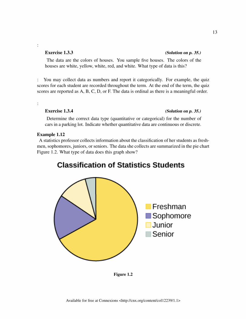
Example 1.12A statistics professor collects information about the classification of her students as fresh-
men, sophomores, juniors, or seniors. The data she collects are summarized in the pie chartFigure 1.2. What type of data does this graph show?
Figure 1.2
Available for free at Connexions <http://cnx.org/content/col12239/1.1>
14 CHAPTER 1. COMMON TERMS AND SAMPLING TECHNIQUES
SolutionThis pie chart shows the students in each year, which is categorical nominal data.
:
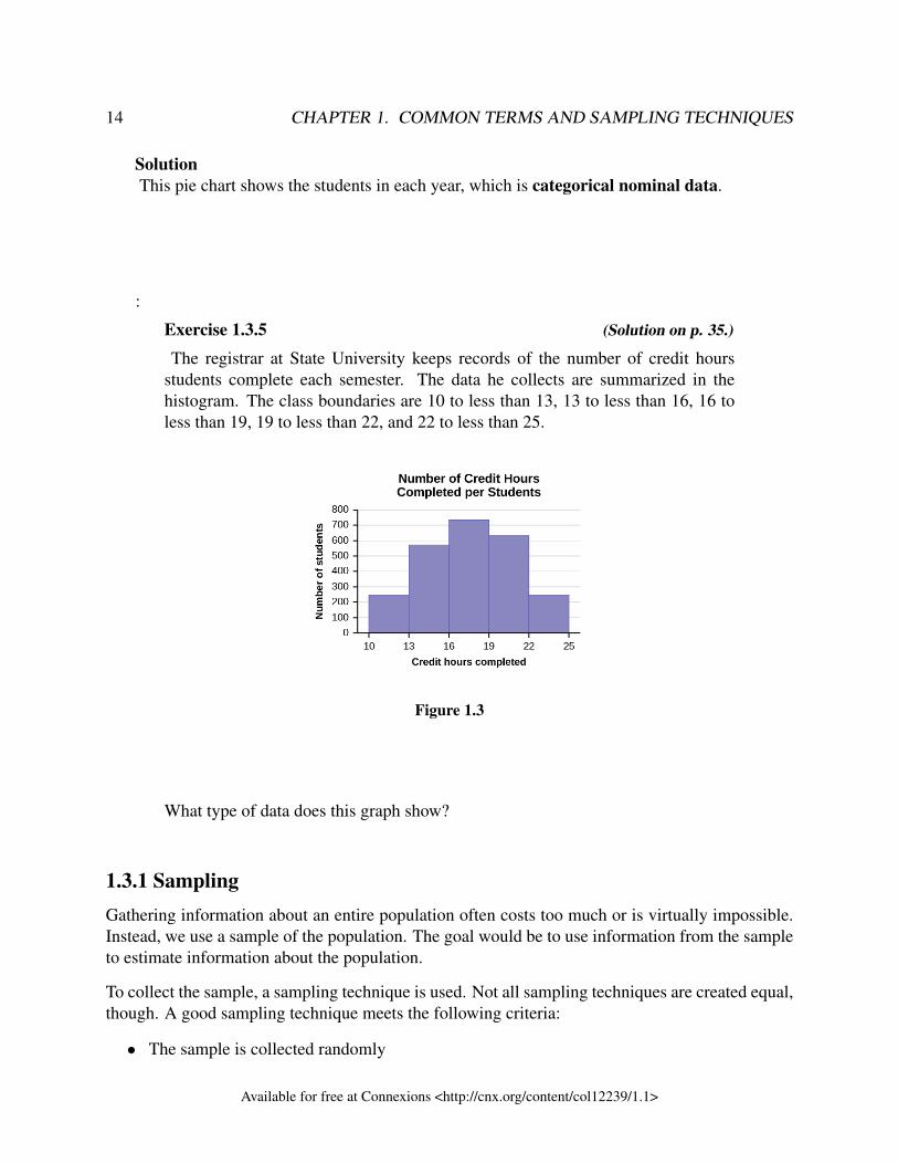
Exercise 1.3.5 (Solution on p. 35.)
The registrar at State University keeps records of the number of credit hoursstudents complete each semester. The data he collects are summarized in thehistogram. The class boundaries are 10 to less than 13, 13 to less than 16, 16 toless than 19, 19 to less than 22, and 22 to less than 25.
Figure 1.3
What type of data does this graph show?
1.3.1 SamplingGathering information about an entire population often costs too much or is virtually impossible.Instead, we use a sample of the population. The goal would be to use information from the sampleto estimate information about the population.
To collect the sample, a sampling technique is used. Not all sampling techniques are created equal,though. A good sampling technique meets the following criteria:
• The sample is collected randomly
Available for free at Connexions <http://cnx.org/content/col12239/1.1>
15
• The sample is representative of the population• The size of the sample is large enough
If a sampling technique does not meet these criteria, then it is not appropriate to make inferencesfrom the data. For example, it would not be appropriate to estimate the population mean from thesample mean.
A random sample reduces bias, promotes representativeness, and is a key component to sampling.To do any scientific statistical analysis on sample data, the sample has to be randomly se-lected. In a random sample, members of the population are selected in such a way that each hasan equal chance of being selected. To ensure that a sample is collected randomly, some element ofrandomness needs to be included in the sampling technique. This can involve using dice to choosethe time to start collecting data or using a random number generator to pick names from a list ofnames.
NOTE: Humans in general are not very random. Therefore, the randomness added to thesampling technique cannot be someone “randomly” choosing something. The randomnesshas to come from a random event (like rolling dice, flipping a coin, using a random numbergenerator).
A sample is representative if it shares similar characteristics to the population. For example,suppose that the students at a university are distributed as follows by faculty:
• Business: 20%• Arts: 25%• Science and Engineering: 30%• Nursing: 15%• Education: 10%
Then a sample would be representative of this population if the distribution of the students’ facultyin the sample was similar to the population. It doesn’t have to be exactly the same, but it should beclose. A random sample will generate a fairly representative sample, but it doesn’t guarantee it.
NOTE: What makes a sample representative depends on what is being studied. For ex-ample, if we are looking at the average age of students at a university, making sure weget students from each faculty would be important, but making sure we get students fromvarious political affiliations might not be.
Determining if a sample is large enough is a bit arbitrary and depends on the situation. In general,the larger the sample size the better, but issues such as time and money need to be taken intoaccount. You don’t want to interview 5000 people, when 50 people would do. In Chapter 7, wewill look at a formula that determines how many members of a population need to be in a sampledepending on the level of error we are comfortable with. Until then, as a general rule, if the datais quantitative, a sample of at least 30 is usually good enough. While if the data is categorical, asample of at least 100 is usually good enough.
Available for free at Connexions <http://cnx.org/content/col12239/1.1>
16 CHAPTER 1. COMMON TERMS AND SAMPLING TECHNIQUES
In general, even if a sample is collected extremely well, it will not be perfectly representative ofthe population. The discrepancy between the sample and the population is called chance errordue to sampling. When dealing with samples, there will always be error. Statistics helps us tounderstand and even measure this error. As a rule, the larger the random sample, in general thesmaller the sampling error.
NOTE: Generally, a sample that is collected randomly will likely be representative. Butthis is not guaranteed. For example, it is possible to collect a random sample of universitystudents that happens to only contain students from one faculty. It is unlikely but possible.
A large sample size does not guarantee a representative sample. Nor does a small sam-ple size guarantee a non-representative sample. To illustrate, a sample of ten universitystudents could be chosen so that proportion of students from each gender in the sample issimilar to the population, and the proportion of students from each faculty in the sample issimilar to the population. Thus, the sample of size 10 would be representative. The pointof a larger sample size is that the larger the sample, the more likely it is to be representa-tive.
Of the three characteristics of a good sample, the most important one for statistical analysisis that the sample is collected randomly.
Areas of concern for sampling biasWhen people publish their research, they include a description of their sampling technique. Thisis called the methodology. When evaluating a sampling technique, check to see if the sample wascollected randomly, if it is representative of the population, and if the sample is large enough. Hereare some examples of areas of concern when looking at methodologies:
1. Undercoverage occurs when a particular subset of the population is excluded from the pro-cess of selecting the sample. For example, if no one from the faculty of nursing is includedin the sample, then we would say that the faculty of nursing is undercovered. As anotherexample, undercoverage has been a specific concern in drug research over the years. In par-ticular, women have been traditionally excluded from drug studies because of their menstrualcycles, but this results in the research only indicating how well the drug works for men.
2. Nonresponse bias occurs when a member of the population that is selected as part of thesample cannot be contacted or refuses to participate. Have you ever refused to be part of atelephone study? If so, you are contributing to nonresponse bias.
• Similar to nonresponse bias is voluntary response bias. Here a large segment of the pop-ulation is contacted and people choose to participate or not. Examples of this are mail-out surveys or online polls. In these situations, usually the person is very invested inthe issue so that is why they take the time to answer. This results in non-representativesamples. Another form of voluntary response bias is online surveys. Here, only peoplefamiliar with the website are likely to participate or "volunteer" to be part of the survey.
Available for free at Connexions <http://cnx.org/content/col12239/1.1>
17
• Response rate is a measure of how many people responded out of the total contacted.If the response rate is low, then this suggests a very narrow segment of the populationanswered. This would raise concerns about representativeness.
3. Asking potentially awkward questions might result in untruthful responses. This is calledresponse bias. For example, if you are asked if you have ever had a sexually transmittedinfection, you may not want to divulge that. One way to minimize response bias is to allowparticipants in a study to answer the questions anonymously.
4. Improper wording of questions being asked might result in skewed answers. Here is anexample of a question that skews the results:
• Do you think it should be easier for seniors to make ends meet?· Yes – they’ve worked hard and helped build our country· No – seniors don’t need any help or recognition
The wording of this question makes it hard to say "no". Thus, skewing the resultstowards "yes".
A famous example of a survey that had a very poor methodology was the in-correct prediction by the Literary Digest that Dewey would beat Truman inthe 1936 US election. Check out the following website for more information:https://www.math.upenn.edu/∼deturck/m170/wk4/lecture/case2.html
1.3.1.1 Sampling techniques
Most statisticians and researchers use various methods of random sampling in an attempt to achievea good sample. This section will describe a few of the most common techniques: simple randomsampling, (proportional) stratified random sampling, cluster sampling, systematic random sam-pling, and convenience sampling.
Simple random samplingThe easiest method to describe is called a simple random sample. In this technique, a randomsample is taken from the members of the population. This can be done by putting the names (oridentifier) of all members of the population into a hat and pulling out those names (or identifiers)to choose the sample. Or the population can be numbered and a random number generator canchoose the sample. Here, each member of the population has an equal chance of being chosen.If the goal of the technique is to get a very random sample, this is the best method to use. But itrequires having a list of the whole population, which is not always realistic.
For example, suppose you want to take a random sample of university students. Each student isalready numbered by their student ID. You could randomly select the members of your sample byusing a random number generator to randomly select student ID numbers.
Stratified sampling and proportionate stratified samplingIf there are concerns that a random sample might not fully represent a population (e.g. one portionof the population is small compared to another), the best sampling technique to use is stratified
Available for free at Connexions <http://cnx.org/content/col12239/1.1>
18 CHAPTER 1. COMMON TERMS AND SAMPLING TECHNIQUES
random sampling. In this case, divide the population into groups called strata and then take arandom sample from each stratum. The stratum are chosen to be a portion of the population thatneeds to be represented in the sample. Each stratum needs to be mutually exclusive from any otherstrata. That means that each member of the population can only belong to one stratum.
For example, you could stratify (group) your university population by faculty and then choose asimple random sample from each stratum (each faculty) to get a stratified random sample. As astudent should only belong to one faculty, the groups are mutually exclusive. Further, this methodensures our sample is representative of the population by choosing students from each faculty atthe university. Using the students per faculty example above, if the sample size is 100, to get astratified sample, you would randomly select 20 students from each faculty (as there are 5 facultiesand 100 students, choose an equal number from each faculty).
If the size of the sample is proportionate to the size of the strata, this is called proportionatestratified random sampling. If you wanted a proportionate stratified random sample for studentsby faculty, you would randomly select 20 students from business, 25 students from arts, 30 fromscience and engineering, 15 from nursing, and 10 from education (i.e. proportional to the numberof students in each faculty). This technique is best used when there are large differences in theproportion of each group. For example, if the faculty of business had 50% of the students and thefaculty of nursing only had 1% of the students, it would not be good to have an equal number ofstudents from each faculty.
NOTE: To randomly choose students from each faculty, a random sampling techniqueneeds to be used. This could be simple random sampling or systematic random sampling(see below).
Cluster samplingTo choose a cluster sample, divide the population into clusters (groups) and then randomly selectone of the clusters. That cluster is your sample. Further, the clusters need to be homogeneous andeach cluster needs to be representative of the population. For example, suppose the university has aseries of foundational classes that every student has to take and that students in these classes comefrom all faculties. Then we would randomly select one of these classes to be our sample. Again,to randomly select the four departments, you have to use a random sampling technique. Here, youcould number all of the classes and then use a random number generator to choose one of them.
If one cluster is too small for the sample, you can choose more than one cluster. For example, ifyou want your sample to be 120 students but each of the foundational classes only have 30 studentsin them, you can randomly select 4 classes to get to your desired sample size.
Cluster sampling can be very convenient as the members of the sample are in one location. Inthe above example, the sample are in one class so you would just go to the one class and collectyour sample. Notice that for stratified sampling, we would have to find each student chosen fromeach faculty. Thus, cluster sampling can save time and money. But it does present a real chance ofundercoverage. If the foundational class chosen is at a time that nursing students are at a practicum,
Available for free at Connexions <http://cnx.org/content/col12239/1.1>
19
then that faculty would be undercovered. This means that cluster sampling can result in non-representative samples. This is only a good technique to use if the clusters are very similar to eachother and each cluster would be representative of the population.
NOTE: Cluster sampling and stratified sampling are often confused. In each case, thepopulation is divided into groups. But, in stratified sampling, a few people from all groups(strata) are chosen. While in cluster sampling, all of the people from a group (cluster) arechosen.
Additionally how the groups are chosen are different. In stratified sampling, the groupsare chosen to be heterogeneous (i.e. each group has a different quality). As an example,breaking a university into different faculties results in groups that are heterogeneous aseach group has a different quality (i.e. faculty) than the other groups. On the other hand,in cluster sampling, the groups are chosen to be homogeneous (i.e. the groups have similarqualities). That is, we want each cluster to be similar to the other groups.
Systematic random samplingTo choose a systematic random sample, randomly select a starting point and take every kth pieceof data from a list of the population. For example, to choose a random sample of universitystudents, you could use a list of all student names that are numbered by their student ID. Supposethere are 14,000 students at the university. To perform systematic random sampling, use a randomnumber generator to pick a student ID number that represents the first name in the sample. Thencalculate k. To do this, k is found by taking the population size (14,000) and dividing by thesize of the sample (100). In this case, this results in 140. Thus, from your random starting point,choose every 140th name thereafter until you have a total of 100 names. If you reach the end ofthe list before completing your sample you simply go back to the beginning and keep going untilthe sample is complete.
Be careful: k needs to be large enough to ensure that you cycle through all the names. Otherwisethe sample is not random nor is it representative. If k had been 10, then once the random startingpoint was chosen only 1000 names had a chance of being chosen which means that not everyonehas an equal chance of being chosen. Further, depending on how the list is sorted, it may not berepresentative. For example, if our list of students is by faculty, then only certain faculties couldmake it in our sample. In our example, any k larger than 140 would be appropriate. Systematicsampling is frequently chosen because it is a simple method that can be easily implemented. Butlike simple random sampling, a list of the population is needed to do it properly.
There is a variation of systematic random sampling that can be used when the list of the populationdoes not exist or is not available to the people doing the pull. For example, suppose you are doinga survey about people’s satisfaction with a certain mall’s hours. You won’t have a list of all ofthe people who go to the mall. Instead, you may stand at an entrance to the mall and ask everyfifth person who enters the mall to complete your survey. To ensure the sampling technique isrepresentative, you’ll want to do the survey multiple times at multiple locations. To ensure that thesampling technique is random, you’ll want to randomly choose your starting times and locations.
Available for free at Connexions <http://cnx.org/content/col12239/1.1>
20 CHAPTER 1. COMMON TERMS AND SAMPLING TECHNIQUES
Having said that, this method would never be completely representative nor random. But may beyour only choice if the population is not well defined.
NOTE: When we are performing a study, we cannot force people to be part of it. Peoplehave a right to say no and as researchers we need to seek informed consent. That is, theparticipants should know what they are being asked to do, how their information will bekept secure, if there are any risks to participation (and if so what they are), and how to seethe results of the study. As such, people can choose not to participant in a study.
Thus, all studies involving humans are never completely random nor completely represen-tative. Our goal when implementing sampling techniques is to minimize any bias that maycome into the study because of this.
Convenience samplingA type of sampling that is non-random is convenience sampling. Convenience sampling involvesusing results that are readily available. For example, a computer software store conducts a mar-keting study by interviewing potential customers who happen to be in the store browsing throughthe available software. The results of convenience sampling may be very good in some cases andhighly biased (favour certain outcomes) in others. This is not a valid sampling technique when itcomes to statistical inference. That is, if the data is collected using a convenience sample, then noconclusions can be made about the population from the sample.
With replacement or without replacementTrue random sampling is done with replacement. That is, once a member is picked, that membergoes back into the population and thus may be chosen more than once. However, for practicalreasons, in most populations, simple random sampling is done without replacement. Surveys aretypically done without replacement. That is, a member of the population may be chosen only once.Most samples are taken from large populations and the sample tends to be small in comparison tothe population. Since this is the case, sampling without replacement is approximately the same assampling with replacement because the chance of picking the same individual more than once withreplacement is very low.
Too illustrate how small of chance it is, consider a university with a population of 10,000 people.Suppose you want to pick a sample of 1,000 randomly for a survey. For any particular sampleof 1,000, if you are sampling with replacement,
• the chance of picking the first person is 1,000 out of 10,000 (0.1000);• the chance of picking a different second person for this sample is 999 out of 10,000 (0.0999);• the chance of picking the same person again is 1 out of 10,000 (very low).
If you are sampling without replacement,
• the chance of picking the first person for any particular sample is 1000 out of 10,000(0.1000);
Available for free at Connexions <http://cnx.org/content/col12239/1.1>
21
• the chance of picking a different second person is 999 out of 9,999 (0.0999);• you do not replace the first person before picking the next person.
Compare the fractions 999/10,000 and 999/9,999. For accuracy, carry the decimal answers to fourdecimal places. To four decimal places, these numbers are equivalent (0.0999).
Sampling without replacement instead of sampling with replacement becomes a mathematical is-sue only when the population is small. For example, if the population is 25 people, the sampleis ten, and you are sampling with replacement for any particular sample, then the chance ofpicking the first person is ten out of 25, and the chance of picking a different second person is nineout of 25 (you replace the first person).
If you sample without replacement, then the chance of picking the first person is ten out of 25,and then the chance of picking the second person (who is different) is nine out of 24 (you do notreplace the first person).
Compare the fractions 9/25 and 9/24. To four decimal places, 9/25 = 0.3600 and 9/24 = 0.3750.To four decimal places, these numbers are not equivalent.
Example 1.13A study is done to determine the average tuition that San Jose State undergraduate stu-
dents pay per semester. Each student in the following samples is asked how much tuitionhe or she paid for the Fall semester. What is the type of sampling in each case?
a. A sample of 100 undergraduate San Jose State students is taken by organizing thestudents’ names by classification (freshman, sophomore, junior, or senior), and thenselecting 25 students from each.
b. A random number generator is used to select a student from the alphabetical listingof all undergraduate students in the Fall semester. Starting with that student, every50th student is chosen until 75 students are included in the sample.
c. A completely random method is used to select 75 students. Each undergraduatestudent in the fall semester has the same probability of being chosen at any stage ofthe sampling process.
d. The freshman, sophomore, junior, and senior years are numbered one, two, three,and four, respectively. A random number generator is used to pick two of thoseyears. All students in those two years are in the sample.
e. An administrative assistant is asked to stand in front of the library one Wednesdayand to ask the first 100 undergraduate students he encounters what they paid fortuition the Fall semester. Those 100 students are the sample.
Solutiona. stratified; b. systematic; c. simple random; d. cluster; e. convenience
Available for free at Connexions <http://cnx.org/content/col12239/1.1>
22 CHAPTER 1. COMMON TERMS AND SAMPLING TECHNIQUES
Example 1.14Determine the type of sampling used (simple random, stratified, systematic, cluster, or
convenience).
a. A soccer coach selects six players from a group of boys aged eight to ten, sevenplayers from a group of boys aged 11 to 12, and three players from a group of boysaged 13 to 14 to form a recreational soccer team.
b. A pollster interviews all human resource personnel in five different high tech com-panies.
c. A high school educational researcher interviews 50 high school female teachers and50 high school male teachers.
d. A medical researcher interviews every third cancer patient from a list of cancerpatients at a local hospital.
e. A high school counselor uses a computer to generate 50 random numbers and thenpicks students whose names correspond to the numbers.
f. A student interviews classmates in his algebra class to determine how many pairs ofjeans a student owns, on the average.
Solutiona. stratified; b. cluster; c. stratified; d. systematic; e. simple random; f.convenience
:
Exercise 1.3.6 (Solution on p. 35.)
Determine the type of sampling used (simple random, stratified, systematic, clus-ter, or convenience).
A high school principal polls 50 freshmen, 50 sophomores, 50 juniors, and 50seniors regarding policy changes for after school activities.
If we were to examine two samples representing the same population, even if we used randomsampling methods for the samples, they would not be exactly the same. Just as there is variationin data, there is variation in samples. As you become accustomed to sampling, the variability willbegin to seem natural.
Example 1.15Suppose ABC College has 10,000 part-time students (the population). We are interested
in the average amount of money a part-time student spends on books in the fall term.Asking all 10,000 students is an almost impossible task.
Suppose we take two different samples.
Available for free at Connexions <http://cnx.org/content/col12239/1.1>
23
First, we use convenience sampling and survey ten students from a first term organic chem-istry class. Many of these students are taking first term calculus in addition to the organicchemistry class. The amount of money they spend on books is as follows:
$128; $87; $173; $116; $130; $204; $147; $189; $93; $153
The second sample is taken using a list of senior citizens who take P.E. classes and takingevery fifth senior citizen on the list, for a total of ten senior citizens. They spend:
$50; $40; $36; $15; $50; $100; $40; $53; $22; $22
It is unlikely that any student is in both samples.Problem 1a. Do you think that either of these samples is representative of (or is characteristic of)
the entire 10,000 part-time student population?
Solutiona. No. The first sample probably consists of science-oriented students. Besides the
chemistry course, some of them are also taking first-term calculus. Books for these classestend to be expensive. Most of these students are, more than likely, paying more than theaverage part-time student for their books. The second sample is a group of senior citizenswho are, more than likely, taking courses for health and interest. The amount of moneythey spend on books is probably much less than the average parttime student. Both samplesare biased. Also, in both cases, not all students have a chance to be in either sample.
Problem 2b. Since these samples are not representative of the entire population, is it wise to use theresults to describe the entire population?
Solutionb. No. For these samples, each member of the population did not have an equally likely
chance of being chosen.
Now, suppose we take a third sample. We choose ten different part-time students from thedisciplines of chemistry, math, English, psychology, sociology, history, nursing, physicaleducation, art, and early childhood development. (We assume that these are the onlydisciplines in which part-time students at ABC College are enrolled and that an equalnumber of part-time students are enrolled in each of the disciplines.) Each student ischosen using simple random sampling. Using a calculator, random numbers are generatedand a student from a particular discipline is selected if he or she has a correspondingnumber. The students spend the following amounts:
$180; $50; $150; $85; $260; $75; $180; $200; $200; $150
Available for free at Connexions <http://cnx.org/content/col12239/1.1>
24 CHAPTER 1. COMMON TERMS AND SAMPLING TECHNIQUES
Problem 3c. Is the sample biased?
Solutionc. The sample is unbiased, but a larger sample would be recommended to increase the
likelihood that the sample will be close to representative of the population. However, fora biased sampling technique, even a large sample runs the risk of not being representativeof the population.
Students often ask if it is "good enough" to take a sample, instead of surveying the entirepopulation. If the survey is done well, the answer is yes.
:
Exercise 1.3.7 (Solution on p. 35.)
A local radio station has a fan base of 20,000 listeners. The station wants to knowif its audience would prefer more music or more talk shows. Asking all 20,000listeners is an almost impossible task.
The station uses convenience sampling and surveys the first 200 people they meetat one of the station’s music concert events. 24 people said they’d prefer more talkshows, and 176 people said they’d prefer more music.
Do you think that this sample is representative of (or is characteristic of) the entire20,000 listener population?
1.3.2 Variation in DataVariation is present in any set of data. For example, 16-ounce cans of beverage may contain moreor less than 16 ounces of liquid. In one study, eight 16 ounce cans were measured and producedthe following amount (in ounces) of beverage:
15.8; 16.1; 15.2; 14.8; 15.8; 15.9; 16.0; 15.5
Measurements of the amount of beverage in a 16-ounce can may vary because different peoplemake the measurements or because the exact amount, 16 ounces of liquid, was not put into thecans. Manufacturers regularly run tests to determine if the amount of beverage in a 16-ounce canfalls within the desired range.
Be aware that as you take data, your data may vary somewhat from the data someone else is takingfor the same purpose. This is completely natural. However, if two or more of you are takingthe same data and get very different results, it is time for you and the others to reevaluate yourdata-taking methods and your accuracy.
Available for free at Connexions <http://cnx.org/content/col12239/1.1>
25
1.3.3 Variation in SamplesIt was mentioned previously that two or more samples from the same population, taken randomly,and having close to the same characteristics of the population will likely be different from eachother. Suppose Doreen and Jung both decide to study the average amount of time students attheir college sleep each night. Doreen and Jung each take samples of 500 students. Doreen usessystematic sampling and Jung uses cluster sampling. Doreen’s sample will be different from Jung’ssample. Even if Doreen and Jung used the same sampling method, in all likelihood their sampleswould be different. Neither would be wrong, however.
Think about what contributes to making Doreen’s and Jung’s samples different.
If Doreen and Jung took larger samples (i.e. the number of data values is increased), their sampleresults (the average amount of time a student sleeps) might be closer to the actual population aver-age. But still, their samples would be, in all likelihood, different from each other. This variabilityin samples cannot be stressed enough.
1.3.3.1 Size of a Sample
The size of a sample (often called the number of observations) is important. The examples youhave seen in this book so far have been small. Samples of only a few hundred observations, oreven smaller, are sufficient for many purposes. In polling, samples that are from 1,200 to 1,500observations are considered large enough and good enough if the survey is random and is welldone. You will learn why when you study confidence intervals.
Be aware that many large samples are biased. For example, call-in surveys are invariably biased,because people choose to respond or not.
1.3.4 Critical EvaluationWe need to evaluate the statistical studies we read about critically and analyze them before accept-ing the results of the studies. We listed common problems with sampling techniques above. Were-iterate them here and add a few additional ones.
• Problems with samples: A sample must be representative of the population. A sample thatis not representative of the population is biased. Biased samples that are not representativeof the population give results that are inaccurate and not valid.
• Self-selected samples: Responses only by people who choose to respond, such as call-insurveys, are often unreliable.
• Sample size issues: Samples that are too small may be unreliable. Larger samples are better,if possible. In some situations, having small samples is unavoidable and can still be used todraw conclusions. Examples: crash testing cars or medical testing for rare conditions
• Undue influence: collecting data or asking questions in a way that influences the response
Available for free at Connexions <http://cnx.org/content/col12239/1.1>
26 CHAPTER 1. COMMON TERMS AND SAMPLING TECHNIQUES
• Non-response or refusal of subject to participate: The collected responses may no longerbe representative of the population. Often, people with strong positive or negative opinionsmay answer surveys, which can affect the results.
• Causality: A relationship between two variables does not mean that one causes the otherto occur. They may be related (correlated) because of their relationship through a differentvariable.
• Self-funded or self-interest studies: A study performed by a person or organization in orderto support their claim. Is the study impartial? Read the study carefully to evaluate the work.Do not automatically assume that the study is good, but do not automatically assume thestudy is bad either. Evaluate it on its merits and the work done.
• Misleading use of data: improperly displayed graphs, incomplete data, or lack of context• Confounding: When the effects of multiple factors on a response cannot be separated. Con-
founding makes it difficult or impossible to draw valid conclusions about the effect of eachfactor.
1.3.5 ReferencesGallup-Healthways Well-Being Index. http://www.well-beingindex.com/default.asp (accessedMay 1, 2013).
Gallup-Healthways Well-Being Index. http://www.well-beingindex.com/methodology.asp (ac-cessed May 1, 2013).
Gallup-Healthways Well-Being Index. http://www.gallup.com/poll/146822/gallup-healthways-index-questions.aspx (accessed May 1, 2013).
Data from http://www.bookofodds.com/Relationships-Society/Articles/A0374-How-George-Gallup-Picked-the-President
Dominic Lusinchi, “’President’ Landon and the 1936 Literary Digest Poll: Were Automo-bile and Telephone Owners to Blame?” Social Science History 36, no. 1: 23-54 (2012),http://ssh.dukejournals.org/content/36/1/23.abstract (accessed May 1, 2013).
“The Literary Digest Poll,” Virtual Laboratories in Probability and Statisticshttp://www.math.uah.edu/stat/data/LiteraryDigest.html (accessed May 1, 2013).
“Gallup Presidential Election Trial-Heat Trends, 1936–2008,” Gallup Poli-tics http://www.gallup.com/poll/110548/gallup-presidential-election-trialheat-trends-19362004.aspx#4 (accessed May 1, 2013).
The Data and Story Library, http://lib.stat.cmu.edu/DASL/Datafiles/USCrime.html (accessed May1, 2013).
LBCC Distance Learning (DL) program data in 2010-2011, http://de.lbcc.edu/reports/2010-11/future/highlights.html#focus (accessed May 1, 2013).
Available for free at Connexions <http://cnx.org/content/col12239/1.1>
27
Data from San Jose Mercury News
1.3.6 Chapter ReviewData are individual items of information that come from a population or sample. Data may be clas-sified as categorical nominal, categorical ordinal, quantitative continuous, or quantitative discrete.
Because it is not practical to measure the entire population in a study, researchers use samples torepresent the population. A random sample is a representative group from the population chosenby using a method that gives each individual in the population an equal chance of being includedin the sample. Random sampling methods include simple random sampling, stratified sampling,cluster sampling, and systematic sampling. Convenience sampling is a nonrandom method ofchoosing a sample that often produces biased data.
Samples that contain different individuals result in different data. This is true even when the sam-ples are well-chosen and representative of the population. When properly selected, larger samplesmodel the population more closely than smaller samples. There are many different potential prob-lems that can affect the reliability of a sample. Statistical data needs to be critically analyzed, notsimply accepted.
1.3.7 HOMEWORKFor the following exercises, identify the type of data that would be used to describe a response(quantitative discrete, quantitative continuous, or categorical), and give an example of the data.
Exercise 1.3.8 (Solution on p. 35.)number of tickets sold to a concert
Exercise 1.3.9 (Solution on p. 35.)percent of body fat
Exercise 1.3.10 (Solution on p. 35.)favorite baseball team
Exercise 1.3.11 (Solution on p. 35.)time in line to buy groceries
Exercise 1.3.12 (Solution on p. 36.)number of students enrolled at Evergreen Valley College
Exercise 1.3.13 (Solution on p. 36.)most-watched television show
Exercise 1.3.14 (Solution on p. 36.)brand of toothpaste
Exercise 1.3.15 (Solution on p. 36.)distance to the closest movie theatre
Available for free at Connexions <http://cnx.org/content/col12239/1.1>
28 CHAPTER 1. COMMON TERMS AND SAMPLING TECHNIQUES
Exercise 1.3.16 (Solution on p. 36.)age of executives in Fortune 500 companies
Use the following information to answer the next two exercises: A study was done to determinethe age, number of times per week, and the duration (amount of time) of resident use of a localpark in Vancouver. The first house in the neighbourhood around the park was selected randomlyand then every 8th house in the neighbourhood around the park was interviewed.
Exercise 1.3.17 (Solution on p. 36.)“Number of times per week” is what type of data?
a. nominal categorical ordinalb. quantitative discretec. quantitative continuousd. categorical nominale. categorical ordinal
Exercise 1.3.18 (Solution on p. 36.)“Duration (amount of time)” is what type of data?
a. categorical discreteb. quantitative discretec. quantitative continuousd. categorical nominale. categorical ordinal
Exercise 1.3.19 (Solution on p. 36.)Airline companies are interested in the consistency of the number of babies on each flight,so that they have adequate safety equipment. Suppose an airline conducts a survey. OverThanksgiving weekend, it surveys six flights from Montreal to Halifax to determine thenumber of babies on the flights. It determines the amount of safety equipment needed bythe result of that study.
a. Using complete sentences, list three things wrong with the way the survey was con-ducted.
b. Using complete sentences, list three ways that you would improve the survey if itwere to be repeated.
Exercise 1.3.20 (Solution on p. 36.)Suppose you want to determine the mean number of cans of soda drunk each month by
students in their twenties at your school. Describe a possible sampling method in three tofive complete sentences. Make the description detailed.Exercise 1.3.21 (Solution on p. 36.)Name the sampling method used in each of the following situations:
Available for free at Connexions <http://cnx.org/content/col12239/1.1>
29
a. A woman in the airport is handing out questionnaires to travelers asking them toevaluate the airport’s service. She does not ask travelers who are hurrying throughthe airport with their hands full of luggage, but instead asks all travelers who aresitting near gates and not taking naps while they wait.
b. A teacher wants to know if her students are doing homework, so she randomly se-lects rows two and five and then calls on all students in row two and all students inrow five to present the solutions to homework problems to the class.
c. The marketing manager for an electronics chain store wants information about theages of its customers. Over the next two weeks, at each store location, 100 randomlyselected customers are given questionnaires to fill out asking for information aboutage, as well as about other variables of interest.
d. The librarian at a public library wants to determine what proportion of the libraryusers are children. The librarian has a tally sheet on which she marks whether booksare checked out by an adult or a child. She records this data for every fourth patronwho checks out books.
e. A political party wants to know the reaction of voters to a debate between the can-didates. The day after the debate, the party’s polling staff calls 1,200 randomlyselected phone numbers. If a registered voter answers the phone or is available tocome to the phone, that registered voter is asked whom he or she intends to vote forand whether the debate changed his or her opinion of the candidates.
Exercise 1.3.22 (Solution on p. 36.)In advance of the 1936 Presidential Election, a magazine titled Literary Digest released theresults of an opinion poll predicting that the republican candidate Alf Landon would winby a large margin. The magazine sent post cards to approximately 10,000,000 prospectivevoters. These prospective voters were selected from the subscription list of the maga-zine, from automobile registration lists, from phone lists, and from club membership lists.Approximately 2,300,000 people returned the postcards.
a. Think about the state of the United States in 1936. Explain why a sample chosenfrom magazine subscription lists, automobile registration lists, phone books, andclub membership lists was not representative of the population of the United Statesat that time.
b. What effect does the low response rate have on the reliability of the sample?c. Are these problems examples of sampling error or nonsampling error?d. During the same year, George Gallup conducted his own poll of 30,000 prospective
voters. His researchers used a method they called "quota sampling" to obtain surveyanswers from specific subsets of the population. Quota sampling is an example ofwhich sampling method described in this module?
Exercise 1.3.23 (Solution on p. 36.)YouPolls is a website that allows anyone to create and respond to polls. One question
posted April 15 asks:
Available for free at Connexions <http://cnx.org/content/col12239/1.1>
30 CHAPTER 1. COMMON TERMS AND SAMPLING TECHNIQUES
“Do you feel happy paying your taxes when members of the Obama administration areallowed to ignore their tax liabilities?”4
As of April 25, 11 people responded to this question. Each participant answered “NO!”
Which of the potential problems with samples discussed in this module could explain thisconnection?
1.4 Experimental Design and Ethics - Optional section5
Does aspirin reduce the risk of heart attacks? Is one brand of fertilizer more effective at growingroses than another? Is fatigue as dangerous to a driver as the influence of alcohol? Questionslike these are answered using randomized experiments. In this module, you will learn importantaspects of experimental design. Proper study design ensures the production of reliable, accuratedata.
The purpose of an experiment is to investigate the relationship between two variables. Whenone variable causes change in another, we call the first variable the independent variable or ex-planatory variable. The affected variable is called the dependent variable or response variable.In a randomized experiment, the researcher manipulates values of the explanatory variable andmeasures the resulting changes in the response variable. The different values of the explanatoryvariable are called treatments. An experimental unit is a single object or individual to be mea-sured.
You want to investigate the effectiveness of vitamin E in preventing disease. You recruit a groupof subjects and ask them if they regularly take vitamin E. You notice that the subjects who takevitamin E exhibit better health on average than those who do not. Does this prove that vitamin Eis effective in disease prevention? It does not. There are many differences between the two groupscompared in addition to vitamin E consumption. People who take vitamin E regularly often takeother steps to improve their health: exercise, diet, other vitamin supplements, choosing not tosmoke. Any one of these factors could be influencing health. As described, this study does notprove that vitamin E is the key to disease prevention.
Additional variables that can cloud a study are called lurking variables. In order to prove that theexplanatory variable is causing a change in the response variable, it is necessary to isolate the ex-planatory variable. The researcher must design her experiment in such a way that there is only onedifference between groups being compared: the planned treatments. This is accomplished by therandom assignment of experimental units to treatment groups. When subjects are assigned treat-ments randomly, all of the potential lurking variables are spread equally among the groups. At this
4lastbaldeagle. 2013. On Tax Day, House to Call for Firing Federal Workers Who Owe Back Taxes. Opinion pollposted online at: http://www.youpolls.com/details.aspx?id=12328 (accessed May 1, 2013).
5This content is available online at <http://cnx.org/content/m62317/1.1/>.
Available for free at Connexions <http://cnx.org/content/col12239/1.1>
31
point the only difference between groups is the one imposed by the researcher. Different outcomesmeasured in the response variable, therefore, must be a direct result of the different treatments.In this way, an experiment can prove a cause-and-effect connection between the explanatory andresponse variables.
The power of suggestion can have an important influence on the outcome of an experiment. Studieshave shown that the expectation of the study participant can be as important as the actual medica-tion. In one study of performance-enhancing drugs, researchers noted:
Results showed that believing one had taken the substance resulted in [performance] times almostas fast as those associated with consuming the drug itself. In contrast, taking the drug withoutknowledge yielded no significant performance increment.6
When participation in a study prompts a physical response from a participant, it is difficult to isolatethe effects of the explanatory variable. To counter the power of suggestion, researchers set asideone treatment group as a control group. This group is given a placebo treatment–a treatment thatcannot influence the response variable. The control group helps researchers balance the effects ofbeing in an experiment with the effects of the active treatments. Of course, if you are participatingin a study and you know that you are receiving a pill which contains no actual medication, thenthe power of suggestion is no longer a factor. Blinding in a randomized experiment preserves thepower of suggestion. When a person involved in a research study is blinded, he does not know whois receiving the active treatment(s) and who is receiving the placebo treatment. A double-blindexperiment is one in which both the subjects and the researchers involved with the subjects areblinded.
Example 1.16The Smell & Taste Treatment and Research Foundation conducted a study to investigate
whether smell can affect learning. Subjects completed mazes multiple times while wearingmasks. They completed the pencil and paper mazes three times wearing floral-scentedmasks, and three times with unscented masks. Participants were assigned at random towear the floral mask during the first three trials or during the last three trials. For each trial,researchers recorded the time it took to complete the maze and the subject’s impression ofthe mask’s scent: positive, negative, or neutral.
a. Describe the explanatory and response variables in this study.b. What are the treatments?c. Identify any lurking variables that could interfere with this study.d. Is it possible to use blinding in this study?
Solution
a. The explanatory variable is scent, and the response variable is the time it takes tocomplete the maze.
6McClung, M. Collins, D. “Because I know it will!”: placebo effects of an ergogenic aid on athletic performance.Journal of Sport & Exercise Psychology. 2007 Jun. 29(3):382-94. Web. April 30, 2013.
Available for free at Connexions <http://cnx.org/content/col12239/1.1>
32 CHAPTER 1. COMMON TERMS AND SAMPLING TECHNIQUES
b. There are two treatments: a floral-scented mask and an unscented mask.c. All subjects experienced both treatments. The order of treatments was randomly
assigned so there were no differences between the treatment groups. Random as-signment eliminates the problem of lurking variables.
d. Subjects will clearly know whether they can smell flowers or not, so subjects cannotbe blinded in this study. Researchers timing the mazes can be blinded, though. Theresearcher who is observing a subject will not know which mask is being worn.
1.4.1 References“Vitamin E and Health,” Nutrition Source, Harvard School of Public Health,http://www.hsph.harvard.edu/nutritionsource/vitamin-e/ (accessed May 1, 2013).
Stan Reents. “Don’t Underestimate the Power of Suggestion,” athleteinme.com,http://www.athleteinme.com/ArticleView.aspx?id=1053 (accessed May 1, 2013).
Ankita Mehta. “Daily Dose of Aspiring Helps Reduce Heart Attacks: Study,” International Busi-ness Times, July 21, 2011. Also available online at http://www.ibtimes.com/daily-dose-aspirin-helps-reduce-heart-attacks-study-300443 (accessed May 1, 2013).
The Data and Story Library, http://lib.stat.cmu.edu/DASL/Stories/ScentsandLearning.html (ac-cessed May 1, 2013).
M.L. Jacskon et al., “Cognitive Components of Simulated Driving Performance: SleepLoss effect and Predictors,” Accident Analysis and Prevention Journal, Jan no. 50 (2013),http://www.ncbi.nlm.nih.gov/pubmed/22721550 (accessed May 1, 2013).
“Earthquake Information by Year,” U.S. Geological Survey.http://earthquake.usgs.gov/earthquakes/eqarchives/year/ (accessed May 1, 2013).
“Fatality Analysis Report Systems (FARS) Encyclopedia,” National Highway Traffic and SafetyAdministration. http://www-fars.nhtsa.dot.gov/Main/index.aspx (accessed May 1, 2013).
Data from www.businessweek.com (accessed May 1, 2013).
Data from www.forbes.com (accessed May 1, 2013).
“America’s Best Small Companies,” http://www.forbes.com/best-small-companies/list/ (accessedMay 1, 2013).
Available for free at Connexions <http://cnx.org/content/col12239/1.1>
33
U.S. Department of Health and Human Services, Code of Federal Regulations Title 45 PublicWelfare Department of Health and Human Services Part 46 Protection of Human Subjects revisedJanuary 15, 2009. Section 46.111:Criteria for IRB Approval of Research.
“April 2013 Air Travel Consumer Report,” U.S. Department of Transportation, April 11 (2013),http://www.dot.gov/airconsumer/april-2013-air-travel-consumer-report (accessed May 1, 2013).
Lori Alden, “Statistics can be Misleading,” econoclass.com,http://www.econoclass.com/misleadingstats.html (accessed May 1, 2013).
Maria de los A. Medina, “Ethics in Statistics,” Based on “Building an Ethics Module for Busi-ness, Science, and Engineering Students” by Jose A. Cruz-Cruz and William Frey, Connexions,http://cnx.org/content/m15555/latest/ (accessed May 1, 2013).
1.4.2 Chapter ReviewA poorly designed study will not produce reliable data. There are certain key components thatmust be included in every experiment. To eliminate lurking variables, subjects must be assignedrandomly to different treatment groups. One of the groups must act as a control group, demon-strating what happens when the active treatment is not applied. Participants in the control groupreceive a placebo treatment that looks exactly like the active treatments but cannot influence theresponse variable. To preserve the integrity of the placebo, both researchers and subjects may beblinded. When a study is designed properly, the only difference between treatment groups is theone imposed by the researcher. Therefore, when groups respond differently to different treatments,the difference must be due to the influence of the explanatory variable.
“An ethics problem arises when you are considering an action that benefits you or some cause yousupport, hurts or reduces benefits to others, and violates some rule.”7 Ethical violations in statisticsare not always easy to spot. Professional associations and federal agencies post guidelines forproper conduct. It is important that you learn basic statistical procedures so that you can recognizeproper data analysis.
7Andrew Gelman, “Open Data and Open Methods,” Ethics and Statistics,http://www.stat.columbia.edu/∼gelman/research/published/ChanceEthics1.pdf (accessed May 1, 2013).
Available for free at Connexions <http://cnx.org/content/col12239/1.1>
34 CHAPTER 1. COMMON TERMS AND SAMPLING TECHNIQUES
Solutions to Exercises in Chapter 1Solution to Exercise 1.2.1 (p. 5)
a. Observational unit: Edmonton. Variable: Monthly Temperature. Type: Quantitative.b. Observational unit: Student of karate in Canada. Variable: Highest colour of belt earned.
Type: Categorical.c. Observational unit: Greyhounds. Variable: Weight. Type: Quantitative.d. Observational unit: Movies made in 2016. Variable: Gross profit. Type: Quantitative.e. Observational unit: Jessica Jones. Variable: User ratings. Type: Categorical.f. Observational unit: Cars in Nova Scotia. Variable: Colour. Type: Categorical.
to Exercise 1.2.2 (p. 6): Try It SolutionsThe population is all families with children attending Knoll Academy.
The sample is a random selection of 100 families with children attending Knoll Academy.
The parameter is the average (mean) amount of money spent on school uniforms by families withchildren at Knoll Academy.
The statistic is the average (mean) amount of money spent on school uniforms by families in thesample.
The variable is the amount of money spent by one family. Let X = the amount of money spent onschool uniforms by one family with children attending Knoll Academy.
The data are the dollar amounts spent by the families. Examples of the data are $65, $75, and $95.Solution to Exercise 1.2.4 (p. 9)
a. all children who take ski or snowboard lessonsb. a group of these childrenc. the population mean age of children who take their first snowboard lessond. the sample mean age of children who take their first snowboard lessone. X = the age of one child who takes his or her first ski or snowboard lessonf. values for X, such as 3, 7, and so on
Solution to Exercise 1.2.6 (p. 9)
a. the clients of the insurance companiesb. a group of the clientsc. the mean health costs of the clientsd. the mean health costs of the samplee. X = the health costs of one clientf. values for X, such as 34, 9, 82, and so on
Solution to Exercise 1.2.8 (p. 9)
Available for free at Connexions <http://cnx.org/content/col12239/1.1>
35
a. all the clients of this counselorb. a group of clients of this marriage counselorc. the proportion of all her clients who stay marriedd. the proportion of the sample of the counselor’s clients who stay marriede. X = the number of couples who stay marriedf. yes, no
Solution to Exercise 1.2.10 (p. 9)
a. all people (maybe in a certain geographic area, such as the United States)b. a group of the peoplec. the proportion of all people who will buy the productd. the proportion of the sample who will buy the producte. X = the number of people who will buy itf. buy, not buy
Solution to Exercise 1.2.12 (p. 10)ato Exercise 1.3.1 (p. 11): Try It Solutionsquantitative discrete datato Exercise 1.3.2 (p. 12): Try It Solutionsquantitative continuous datato Exercise 1.3.3 (p. 13): Try It Solutionscategorical nominal datato Exercise 1.3.4 (p. 13): Try It Solutionsquantitative discreteto Exercise 1.3.5 (p. 14): Try It SolutionsA histogram is used to display quantitative data: the numbers of credit hours completed. Because
students can complete only a whole number of hours (no fractions of hours allowed), this data isquantitative discrete.to Exercise 1.3.6 (p. 22)stratifiedto Exercise 1.3.7 (p. 24): Try It SolutionsThe sample probably consists more of people who prefer music because it is a concert event. Also,the sample represents only those who showed up to the event earlier than the majority. The sampleprobably doesn’t represent the entire fan base and is probably biased towards people who wouldprefer music.Solution to Exercise 1.3.8 (p. 27)quantitative discrete, 150
Solution to Exercise 1.3.9 (p. 27)quantitative continuous, 19.2%
Solution to Exercise 1.3.10 (p. 27)categorical, Oakland A’s
Available for free at Connexions <http://cnx.org/content/col12239/1.1>
36 CHAPTER 1. COMMON TERMS AND SAMPLING TECHNIQUES
Solution to Exercise 1.3.11 (p. 27)quantitative continuous, 7.2 minutes
Solution to Exercise 1.3.12 (p. 27)quantitative discrete, 11,234 students
Solution to Exercise 1.3.13 (p. 27)categorical, Dancing with the Stars
Solution to Exercise 1.3.14 (p. 27)categorical, Crest
Solution to Exercise 1.3.15 (p. 27)quantitative continuous, 8.32 miles
Solution to Exercise 1.3.16 (p. 28)quantitative continuous, 47.3 years
Solution to Exercise 1.3.17 (p. 28)b
Solution to Exercise 1.3.18 (p. 28)c
Solution to Exercise 1.3.19 (p. 28)
a. The survey was conducted using six similar flights.The survey would not be a true representation of the entire population of air travelers.Conducting the survey on a holiday weekend will not produce representative results.
b. Conduct the survey during different times of the year.Conduct the survey using flights to and from various locations.Conduct the survey on different days of the week.
Solution to Exercise 1.3.20 (p. 28)Answers will vary. Sample Answer: You could use a systematic sampling method. Stop the tenth
person as they leave one of the buildings on campus at 9:50 in the morning. Then stop the tenthperson as they leave a different building on campus at 1:50 in the afternoon.Solution to Exercise 1.3.21 (p. 28)a. convenience; a. cluster; a. stratified ; a. systematic; a. simple random
Solution to Exercise 1.3.22 (p. 29)
a. The country was in the middle of the Great Depression and many people could not affordthese “luxury” items and therefore not able to be included in the survey.
b. Samples that are too small can lead to sampling bias.c. sampling errord. stratified
Solution to Exercise 1.3.23 (p. 29)Self-Selected Samples: Only people who are interested in the topic are choosing to respond.
Sample Size Issues: A sample with only 11 participants will not accurately represent the opinionsof a nation.
Available for free at Connexions <http://cnx.org/content/col12239/1.1>
37
Undue Influence: The question is wording in a specific way to generate a specific response. Self-Funded or Self-Interest Studies: This question was generated to support one person’s claim and itwas designed to get the answer that the person desires.
Available for free at Connexions <http://cnx.org/content/col12239/1.1>

38 CHAPTER 1. COMMON TERMS AND SAMPLING TECHNIQUES
Available for free at Connexions <http://cnx.org/content/col12239/1.1>

Available for free at Connexions <http://cnx.org/content/col12239/1.1>
39
40 CHAPTER 2. DESCRIPTIVE STATISTICS
Chapter 2
Descriptive statistics
2.1 Introduction – Descriptive Statistics – MRU - C Lemieux(2017)1
Figure 2.1: When you have large amounts of data, you will need to organize it in a way thatmakes sense. These ballots from an election are rolled together with similar ballots to keep themorganized. (credit: William Greeson)
1This content is available online at <http://cnx.org/content/m64282/1.1/>.
Available for free at Connexions <http://cnx.org/content/col12239/1.1>
41
: By the end of this chapter, the student should be able to:
• Display data graphically and interpret graphs: pie charts, bar graphs, histograms andbox plots.• Recognize, describe, calculate, and interpret measures of location: quartiles and per-
centiles.• Recognize, describe, calculate, and interpret measures of centre: mean, median and
mode.• Recognize, describe, calculate, and interpret measures of variation: variance, stan-
dard deviation, range, interquartile range and coefficient of variation.
Once you have collected data, what will you do with it? Data can be described and presented inmany different formats. For example, suppose you are interested in buying a house in a particulararea. You may have no clue about the house prices, so you might ask your real estate agent to giveyou a sample data set of prices. Looking at all the prices in the sample often is overwhelming.A better way might be to look at the median price and the variation of prices. The median andvariation are just two ways that you will learn to describe data. Your agent might also provide youwith a graph of the data.
In this chapter, you will study visual and numerical ways to describe and display your data. Thisarea of statistics is called Descriptive Statistics. If you have collected 200 data values, just lookingat them won’t tell anyone much about the data. Instead, you want to summarize the raw data in away that you can better understand what’s going on.
Categorical data is summarized usually using a visual representation like a pie chart or a bar graph.The numerical summary for categorical data would be a percentage, fraction or decimal.
For quantitative data, it is a bit more involved. In general, there are three components to a goodsummary of quantitative data: a visual representation, a measure of centre, and a measure ofvariation.
The visual representation can give you a sense of the centre and variation in the data, but is veryuseful for determining the shape of the data. Is the data all clustered together? Are there a bunch ofdata on one side, but a few on the other? Do all of the data values occur with the same frequency?The shape describes this. Histograms and box plots are both visual representations of quantitativedata.
Measures of centre, also known as averages or measures of central tendency, provide a value(s)that gives us a sense of a typical value in the data set. This doesn’t tell us about a specific memberof the population, but instead lets us know what the average one is like. Measures of centre we willlearn about include the mean, median, and mode.
Though a measure of centre tells us about a typical value in a data set, measures of variation tellus how much the data values vary from each other. Are they all clumped together? Are they allspread out? Measures of variation can tell us how consistent or how volatile the data is. If we are
Available for free at Connexions <http://cnx.org/content/col12239/1.1>
42 CHAPTER 2. DESCRIPTIVE STATISTICS
analyzing stock prices, the more variation there is then the more volatile and risky the investmentis. But the rewards may be greater! Measures of variation that we will learn about include range,variance, standard deviation, interquartile range, and the coefficient of variation.
When we describe the shape, centre, and variation of the data, we are describing the distributionof the data. If we only focus on one aspect of the distribution (say the centre), then we miss outon some important information, which is why we always want to consider all three aspects whensummarizing quantitative data. For example, suppose two stock prices have the same averageprice. If we only look at the average, we might think they are equivalent. But if one of them hasgreater variation, then that means that one is more volatile and riskier than the other one.
Box plots (or box and whisker diagrams) are a special type of visual representation that includesboth visual and numerical elements. A box plot divides the data into quarters (or quartiles). Thus,a box plot contains a measure of centre (the second quartile is the halfway point, called the median)and a measure of variation (the distance between the first quartile and the third quartile is calledthe interquartile range). The box plot can also give a sense of the data’s shape. The box plotthen is the only representation that we will see that gives us a sense of the distribution all in onerepresentation (i.e. gives a sense of centre, variation, and distribution). It also has an additionalbenefit of identifying outliers. Outliers are data values that are abnormal. That is, they differsignificantly from the other data values. A box plot shows if there are any outliers.
This chapter will go over descriptive statistics by focusing on visual and numerical representationsof data. Though categorical data is discussed, the main focus will be on determining the distributionand outliers for quantitative data.
The vast majority of the time when conducting statistical studies, we will only have access tosample data. In this situation, we will want to analyze the sample data to see if we can come to anyconclusions about the population data. Once we make the leap from simply describing a sampleto using that sample to draw conclusions about the population, we are doing inferential statistics.These concepts and techniques are covered in chapter seven and eight.
IMPORTANT: The distribution of sample data ideally mimics the distribution of the popu-lation. But the smaller the sample size the greater the potential for there to be differencesbetween the two distributions. This means that, for a large enough sample size, the dis-tribution of the sample generally gives a good idea of distribution of the population. Thisis an example of the law of large numbers. In other words, if the sample size is largeenough and the data is collected properly, then the sample mean will most likely be a goodestimate of the population mean, the sample standard deviation will most likely be a goodestimate of the population standard deviation, and the shape of the sample data will mostlikely be a good estimate of the shape of the population.
Available for free at Connexions <http://cnx.org/content/col12239/1.1>
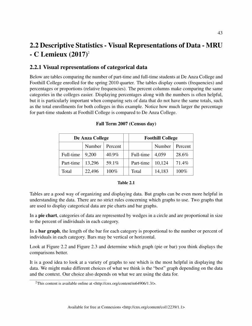
43
2.2 Descriptive Statistics - Visual Representations of Data - MRU- C Lemieux (2017)2
2.2.1 Visual representations of categorical dataBelow are tables comparing the number of part-time and full-time students at De Anza College andFoothill College enrolled for the spring 2010 quarter. The tables display counts (frequencies) andpercentages or proportions (relative frequencies). The percent columns make comparing the samecategories in the colleges easier. Displaying percentages along with the numbers is often helpful,but it is particularly important when comparing sets of data that do not have the same totals, suchas the total enrollments for both colleges in this example. Notice how much larger the percentagefor part-time students at Foothill College is compared to De Anza College.
Fall Term 2007 (Census day)
De Anza College Foothill College
Number Percent Number Percent
Full-time 9,200 40.9% Full-time 4,059 28.6%
Part-time 13,296 59.1% Part-time 10,124 71.4%
Total 22,496 100% Total 14,183 100%
Table 2.1
Tables are a good way of organizing and displaying data. But graphs can be even more helpful inunderstanding the data. There are no strict rules concerning which graphs to use. Two graphs thatare used to display categorical data are pie charts and bar graphs.
In a pie chart, categories of data are represented by wedges in a circle and are proportional in sizeto the percent of individuals in each category.
In a bar graph, the length of the bar for each category is proportional to the number or percent ofindividuals in each category. Bars may be vertical or horizontal.
Look at Figure 2.2 and Figure 2.3 and determine which graph (pie or bar) you think displays thecomparisons better.
It is a good idea to look at a variety of graphs to see which is the most helpful in displaying thedata. We might make different choices of what we think is the “best” graph depending on the dataand the context. Our choice also depends on what we are using the data for.
2This content is available online at <http://cnx.org/content/m64906/1.3/>.
Available for free at Connexions <http://cnx.org/content/col12239/1.1>
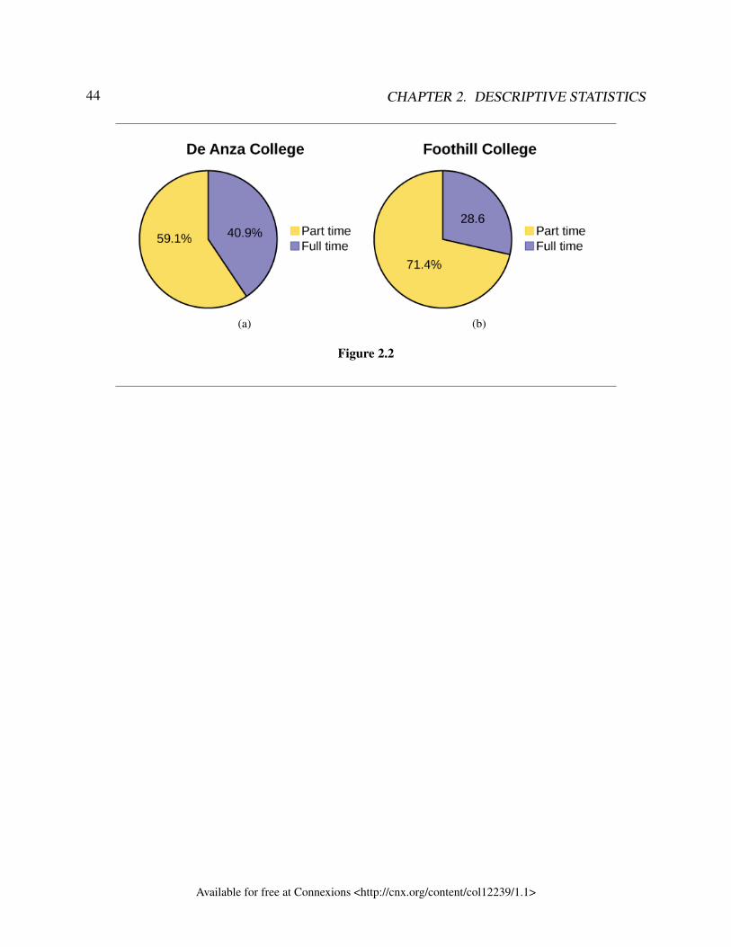
44 CHAPTER 2. DESCRIPTIVE STATISTICS
(a) (b)
Figure 2.2
Available for free at Connexions <http://cnx.org/content/col12239/1.1>
45
Figure 2.3
2.2.2 Visual Representations of Quantitative Data2.2.2.1 Bar Graphs
Bar graphs can also be used to summarize discrete quantitative data and categorical data. Bargraphs consist of bars that are separated from each other. The bars can be rectangles or they canbe rectangular boxes (used in three-dimensional plots), and they can be vertical or horizontal. Thebar graph shown in has age groups represented on the x-axis and proportions on the y-axis.
Exercise 2.2.1 (Solution on p. 106.)By the end of 2011, Facebook had over 146 million users in the United States. Table 2.2
shows three age groups, the number of users in each age group, and the proportion (%) ofusers in each age group. Construct a bar graph using this data.
Available for free at Connexions <http://cnx.org/content/col12239/1.1>
46 CHAPTER 2. DESCRIPTIVE STATISTICS
Age groups Number of Facebook users Proportion (%) of Facebook users
13–25 65,082,280 45%
26–44 53,300,200 36%
45–64 27,885,100 19%
Table 2.2
:
Exercise 2.2.2 (Solution on p. 106.)
Park city is broken down into six voting districts. The table shows the percent ofthe total registered voter population that lives in each district as well as the percenttotal of the entire population that lives in each district. Construct a bar graph thatshows the registered voter population by district.
District Registered voter population Overall city population
1 15.5% 19.4%
2 12.2% 15.6%
3 9.8% 9.0%
4 17.4% 18.5%
5 22.8% 20.7%
6 22.3% 16.8%
Table 2.3
2.2.2.2 Frequency tables
Twenty students were asked how many hours they worked per day. Their responses, in hours, areas follows: 5; 6; 3; 3; 2; 4; 7; 5; 2; 3; 5; 6; 5; 4; 4; 3; 5; 2; 5; 3.
Table 2.4: Frequency Table of Student Work Hours lists the different data values in ascending orderand their frequencies.
Available for free at Connexions <http://cnx.org/content/col12239/1.1>
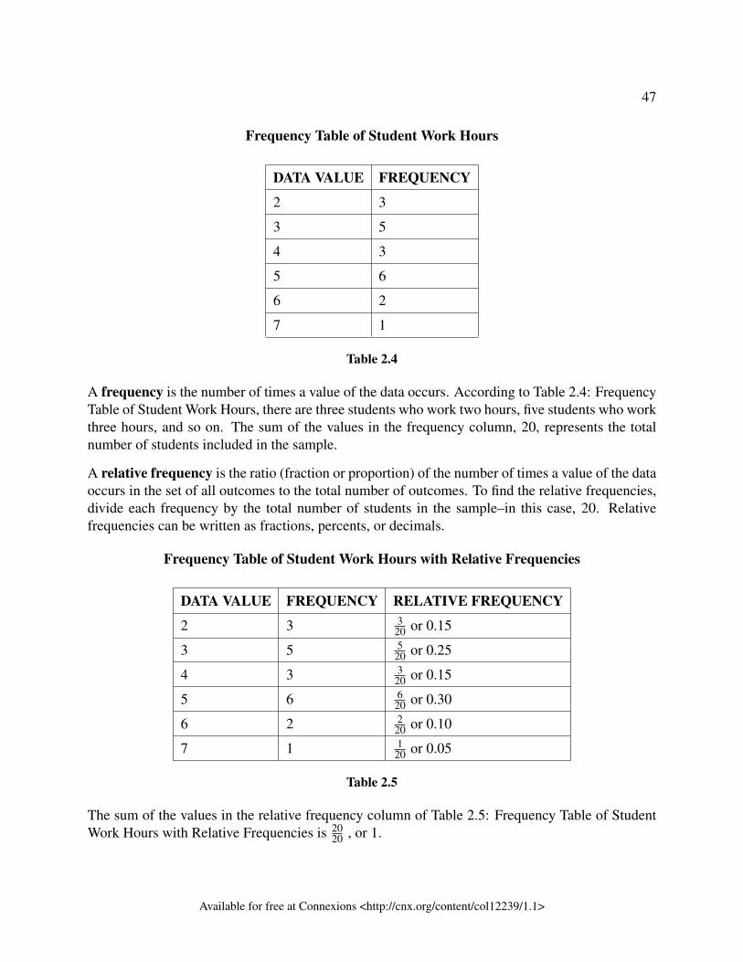
47
Frequency Table of Student Work Hours
DATA VALUE FREQUENCY
2 3
3 5
4 3
5 6
6 2
7 1
Table 2.4
A frequency is the number of times a value of the data occurs. According to Table 2.4: FrequencyTable of Student Work Hours, there are three students who work two hours, five students who workthree hours, and so on. The sum of the values in the frequency column, 20, represents the totalnumber of students included in the sample.
A relative frequency is the ratio (fraction or proportion) of the number of times a value of the dataoccurs in the set of all outcomes to the total number of outcomes. To find the relative frequencies,divide each frequency by the total number of students in the sample–in this case, 20. Relativefrequencies can be written as fractions, percents, or decimals.
Frequency Table of Student Work Hours with Relative Frequencies
DATA VALUE FREQUENCY RELATIVE FREQUENCY
2 3 320 or 0.15
3 5 520 or 0.25
4 3 320 or 0.15
5 6 620 or 0.30
6 2 220 or 0.10
7 1 120 or 0.05
Table 2.5
The sum of the values in the relative frequency column of Table 2.5: Frequency Table of StudentWork Hours with Relative Frequencies is 20
20 , or 1.
Available for free at Connexions <http://cnx.org/content/col12239/1.1>
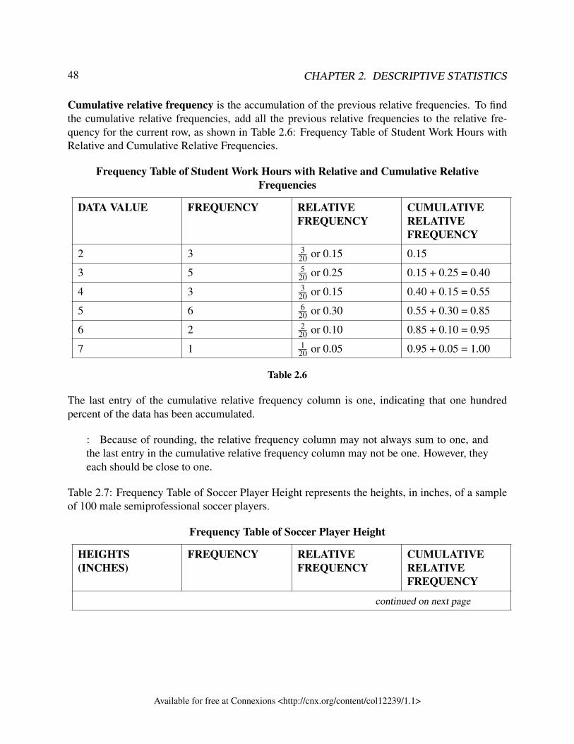
48 CHAPTER 2. DESCRIPTIVE STATISTICS
Cumulative relative frequency is the accumulation of the previous relative frequencies. To findthe cumulative relative frequencies, add all the previous relative frequencies to the relative fre-quency for the current row, as shown in Table 2.6: Frequency Table of Student Work Hours withRelative and Cumulative Relative Frequencies.
Frequency Table of Student Work Hours with Relative and Cumulative RelativeFrequencies
DATA VALUE FREQUENCY RELATIVEFREQUENCY
CUMULATIVERELATIVEFREQUENCY
2 3 320 or 0.15 0.15
3 5 520 or 0.25 0.15 + 0.25 = 0.40
4 3 320 or 0.15 0.40 + 0.15 = 0.55
5 6 620 or 0.30 0.55 + 0.30 = 0.85
6 2 220 or 0.10 0.85 + 0.10 = 0.95
7 1 120 or 0.05 0.95 + 0.05 = 1.00
Table 2.6
The last entry of the cumulative relative frequency column is one, indicating that one hundredpercent of the data has been accumulated.
: Because of rounding, the relative frequency column may not always sum to one, andthe last entry in the cumulative relative frequency column may not be one. However, theyeach should be close to one.
Table 2.7: Frequency Table of Soccer Player Height represents the heights, in inches, of a sampleof 100 male semiprofessional soccer players.
Frequency Table of Soccer Player Height
HEIGHTS(INCHES)
FREQUENCY RELATIVEFREQUENCY
CUMULATIVERELATIVEFREQUENCY
continued on next page
Available for free at Connexions <http://cnx.org/content/col12239/1.1>
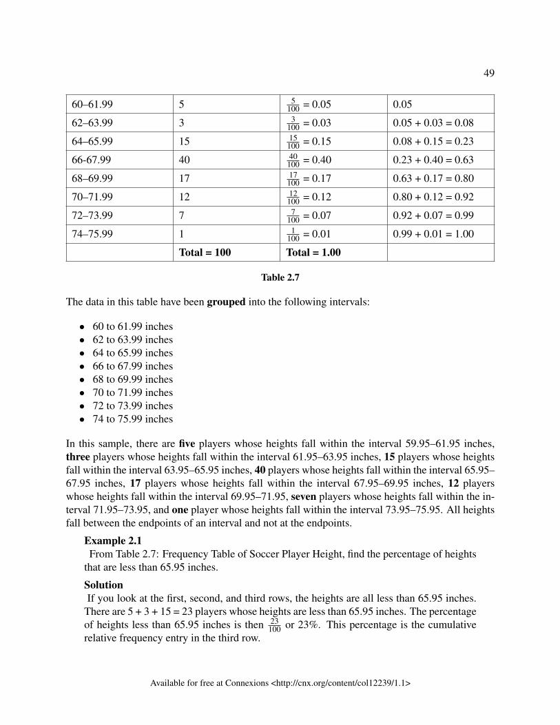
49
60–61.99 5 5100 = 0.05 0.05
62–63.99 3 3100 = 0.03 0.05 + 0.03 = 0.08
64–65.99 15 15100 = 0.15 0.08 + 0.15 = 0.23
66-67.99 40 40100 = 0.40 0.23 + 0.40 = 0.63
68–69.99 17 17100 = 0.17 0.63 + 0.17 = 0.80
70–71.99 12 12100 = 0.12 0.80 + 0.12 = 0.92
72–73.99 7 7100 = 0.07 0.92 + 0.07 = 0.99
74–75.99 1 1100 = 0.01 0.99 + 0.01 = 1.00
Total = 100 Total = 1.00
Table 2.7
The data in this table have been grouped into the following intervals:
• 60 to 61.99 inches• 62 to 63.99 inches• 64 to 65.99 inches• 66 to 67.99 inches• 68 to 69.99 inches• 70 to 71.99 inches• 72 to 73.99 inches• 74 to 75.99 inches
In this sample, there are five players whose heights fall within the interval 59.95–61.95 inches,three players whose heights fall within the interval 61.95–63.95 inches, 15 players whose heightsfall within the interval 63.95–65.95 inches, 40 players whose heights fall within the interval 65.95–67.95 inches, 17 players whose heights fall within the interval 67.95–69.95 inches, 12 playerswhose heights fall within the interval 69.95–71.95, seven players whose heights fall within the in-terval 71.95–73.95, and one player whose heights fall within the interval 73.95–75.95. All heightsfall between the endpoints of an interval and not at the endpoints.
Example 2.1From Table 2.7: Frequency Table of Soccer Player Height, find the percentage of heights
that are less than 65.95 inches.
SolutionIf you look at the first, second, and third rows, the heights are all less than 65.95 inches.
There are 5 + 3 + 15 = 23 players whose heights are less than 65.95 inches. The percentageof heights less than 65.95 inches is then 23
100 or 23%. This percentage is the cumulativerelative frequency entry in the third row.
Available for free at Connexions <http://cnx.org/content/col12239/1.1>
50 CHAPTER 2. DESCRIPTIVE STATISTICS
:
Exercise 2.2.3 (Solution on p. 107.)
Table 2.8 shows the amount, in inches, of annual rainfall in a sample of towns.
Rainfall (Inches) Frequency Relative Frequency Cumulative Relative Frequency
3–4.99 6 650 = 0.12 0.12
5–6.99 7 750 = 0.14 0.12 + 0.14 = 0.26
7–9.99 15 1550 = 0.30 0.26 + 0.30 = 0.56
10–11.99 8 850 = 0.16 0.56 + 0.16 = 0.72
12–12.99 9 950 = 0.18 0.72 + 0.18 = 0.90
13–14.99 5 550 = 0.10 0.90 + 0.10 = 1.00
Total = 50 Total = 1.00
Table 2.8
From Table 2.8, find the percentage of rainfall that is less than 9.99 inches.
Example 2.2From Table 2.7: Frequency Table of Soccer Player Height, find the percentage of heights
that fall between 61.95 and 65.95 inches.
SolutionAdd the relative frequencies in the second and third rows: 0.03 + 0.15 = 0.18 or 18%.
:
Exercise 2.2.4 (Solution on p. 107.)
From Table 2.8, find the percentage of rainfall that is between 7.00 and 12.99inches.
Available for free at Connexions <http://cnx.org/content/col12239/1.1>
51
Example 2.3Use the heights of the 100 male semiprofessional soccer players in Table 2.7: Frequency
Table of Soccer Player Height. Fill in the blanks and check your answers.
a. The percentage of heights that are from 67.95 to 71.95 inches is: ____.b. The percentage of heights that are from 67.95 to 73.95 inches is: ____.c. The percentage of heights that are more than 65.95 inches is: ____.d. The number of players in the sample who are between 61.95 and 71.95 inches tall
is: ____.e. What kind of data are the heights?f. Describe how you could gather this data (the heights) so that the data are character-
istic of all male semiprofessional soccer players.
Remember, you count frequencies. To find the relative frequency, divide the frequencyby the total number of data values. To find the cumulative relative frequency, add all ofthe previous relative frequencies to the relative frequency for the current row.
Solution
a. 29%b. 36%c. 77%d. 87e. quantitative continuousf. get rosters from each team and choose a simple random sample from each
Example 2.4Nineteen people were asked how many miles, to the nearest mile, they commute to workeach day. The data are as follows: 2; 5; 7; 3; 2; 10; 18; 15; 20; 7; 10; 18; 5; 12; 13; 12; 4;5; 10. Table 2.9: Frequency of Commuting Distances was produced:
Frequency of Commuting Distances
DATA FREQUENCY RELATIVEFREQUENCY
CUMULATIVERELATIVEFREQUENCY
continued on next page
Available for free at Connexions <http://cnx.org/content/col12239/1.1>
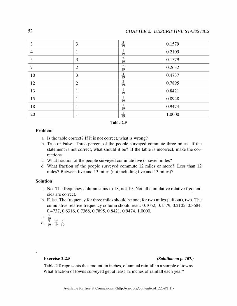
52 CHAPTER 2. DESCRIPTIVE STATISTICS
3 3 319 0.1579
4 1 119 0.2105
5 3 319 0.1579
7 2 219 0.2632
10 3 419 0.4737
12 2 219 0.7895
13 1 119 0.8421
15 1 119 0.8948
18 1 119 0.9474
20 1 119 1.0000
Table 2.9
Problem
a. Is the table correct? If it is not correct, what is wrong?b. True or False: Three percent of the people surveyed commute three miles. If the
statement is not correct, what should it be? If the table is incorrect, make the cor-rections.
c. What fraction of the people surveyed commute five or seven miles?d. What fraction of the people surveyed commute 12 miles or more? Less than 12
miles? Between five and 13 miles (not including five and 13 miles)?
Solution
a. No. The frequency column sums to 18, not 19. Not all cumulative relative frequen-cies are correct.
b. False. The frequency for three miles should be one; for two miles (left out), two. Thecumulative relative frequency column should read: 0.1052, 0.1579, 0.2105, 0.3684,0.4737, 0.6316, 0.7368, 0.7895, 0.8421, 0.9474, 1.0000.
c. 519
d. 719 , 12
19 , 719
:
Exercise 2.2.5 (Solution on p. 107.)
Table 2.8 represents the amount, in inches, of annual rainfall in a sample of towns.What fraction of towns surveyed get at least 12 inches of rainfall each year?
Available for free at Connexions <http://cnx.org/content/col12239/1.1>
53
2.2.2.3 Histograms
In the introduction, the idea of distribution was introduced. The distribution refers to the shape,centre and variation of quantitative data. To determine the shape of the data, we need to look at avisual representation of the data. The best visual representation to look at is the histogram.
NOTE: Bar graphs and histograms look very similar. They both have bars whose heightsrepresent the frequency of the data. But bar graphs are used for categorical data anddiscrete quantitative data (i.e. whole number data). Histograms are used for continuousquantitative data (i.e. numbers with decimals) and sometimes discrete quantitative data aswell. Since there is a gap between categories and whole numbers, the bars in bar graphsdo not touch. But for continuous data, there is no gap between the numbers, so the barsfor histograms do touch.
For most of the work you do in this book, you will use a histogram to display the data. Oneadvantage of a histogram is that it can readily display large data sets. The following explains howto make a histogram by hand, but you can use statistical software to do this quite quickly.
A histogram consists of contiguous (adjoining) boxes. It has both a horizontal axis and a verticalaxis. The horizontal axis is labeled with what the data represents (for instance, distance from yourhome to school). The vertical axis is labeled either frequency or relative frequency (or percentfrequency or probability). The graph will have the same shape with either label. The histogram(like the stemplot) can give you the shape of the data, the center, and the spread of the data.
The relative frequency is equal to the frequency for an observed value of the data divided by thetotal number of data values in the sample.(Remember, frequency is defined as the number of timesan answer occurs.) If:
• f = frequency• n = total number of data values (or the sum of the individual frequencies), and• RF = relative frequency,
then:RF =
fn
(2.3)
For example, if three students in Mr. Ahab’s English class of 40 students received from 90% to100%, then, f = 3, n = 40, and RF = f
n = 340 = 0.075. 7.5% of the students received 90–100%.
90–100% are quantitative measures.
To construct a histogram, first decide how many bars or intervals, also called classes, representthe data. Many histograms consist of five to 15 bars or classes for clarity. The number of bars needsto be chosen. Choose a starting point for the first interval to be less than the smallest data value.A convenient starting point is a lower value carried out to one more decimal place than the valuewith the most decimal places. For example, if the value with the most decimal places is 6.1 and
Available for free at Connexions <http://cnx.org/content/col12239/1.1>
54 CHAPTER 2. DESCRIPTIVE STATISTICS
this is the smallest value, a convenient starting point is 6.05 (6.1 – 0.05 = 6.05). We say that 6.05has more precision. If the value with the most decimal places is 2.23 and the lowest value is 1.5, aconvenient starting point is 1.495 (1.5 – 0.005 = 1.495). If the value with the most decimal placesis 3.234 and the lowest value is 1.0, a convenient starting point is 0.9995 (1.0 – 0.0005 = 0.9995).If all the data happen to be integers and the smallest value is two, then a convenient starting point is1.5 (2 – 0.5 = 1.5). Also, when the starting point and other boundaries are carried to one additionaldecimal place, no data value will fall on a boundary. The next two examples go into detail abouthow to construct a histogram using continuous data and how to create a histogram using discretedata.
Example 2.5The following data are the heights (in inches to the nearest half inch) of 100 male semipro-fessional soccer players. The heights are continuous data, since height is measured.60; 60.5; 61; 61; 61.563.5; 63.5; 63.564; 64; 64; 64; 64; 64; 64; 64.5; 64.5; 64.5; 64.5; 64.5; 64.5; 64.5; 64.566; 66; 66; 66; 66; 66; 66; 66; 66; 66; 66.5; 66.5; 66.5; 66.5; 66.5; 66.5; 66.5; 66.5; 66.5;66.5; 66.5; 67; 67; 67; 67; 67; 67; 67; 67; 67; 67; 67; 67; 67.5; 67.5; 67.5; 67.5; 67.5;67.5; 67.568; 68; 69; 69; 69; 69; 69; 69; 69; 69; 69; 69; 69.5; 69.5; 69.5; 69.5; 69.570; 70; 70; 70; 70; 70; 70.5; 70.5; 70.5; 71; 71; 7172; 72; 72; 72.5; 72.5; 73; 73.574
The smallest data value is 60. Since the data with the most decimal places has one decimal(for instance, 61.5), we want our starting point to have two decimal places. Since thenumbers 0.5, 0.05, 0.005, etc. are convenient numbers, use 0.05 and subtract it from 60,the smallest value, for the convenient starting point.
60 – 0.05 = 59.95 which is more precise than, say, 61.5 by one decimal place. The startingpoint is, then, 59.95.
The largest value is 74, so 74 + 0.05 = 74.05 is the ending value.
Next, calculate the width of each bar or class interval. To calculate this width, subtract thestarting point from the ending value and divide by the number of bars (you must choosethe number of bars you desire). Suppose you choose eight bars.
74.05−59.958
= 1.76 (2.3)
: We will round up to two and make each bar or class interval two units wide. Roundingup to two is one way to prevent a value from falling on a boundary. Rounding to the nextnumber is often necessary even if it goes against the standard rules of rounding. For this
Available for free at Connexions <http://cnx.org/content/col12239/1.1>
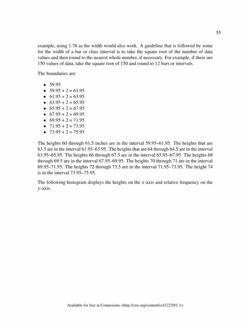
55
example, using 1.76 as the width would also work. A guideline that is followed by somefor the width of a bar or class interval is to take the square root of the number of datavalues and then round to the nearest whole number, if necessary. For example, if there are150 values of data, take the square root of 150 and round to 12 bars or intervals.
The boundaries are:
• 59.95• 59.95 + 2 = 61.95• 61.95 + 2 = 63.95• 63.95 + 2 = 65.95• 65.95 + 2 = 67.95• 67.95 + 2 = 69.95• 69.95 + 2 = 71.95• 71.95 + 2 = 73.95• 73.95 + 2 = 75.95
The heights 60 through 61.5 inches are in the interval 59.95–61.95. The heights that are63.5 are in the interval 61.95–63.95. The heights that are 64 through 64.5 are in the interval63.95–65.95. The heights 66 through 67.5 are in the interval 65.95–67.95. The heights 68through 69.5 are in the interval 67.95–69.95. The heights 70 through 71 are in the interval69.95–71.95. The heights 72 through 73.5 are in the interval 71.95–73.95. The height 74is in the interval 73.95–75.95.
The following histogram displays the heights on the x-axis and relative frequency on they-axis.
Available for free at Connexions <http://cnx.org/content/col12239/1.1>
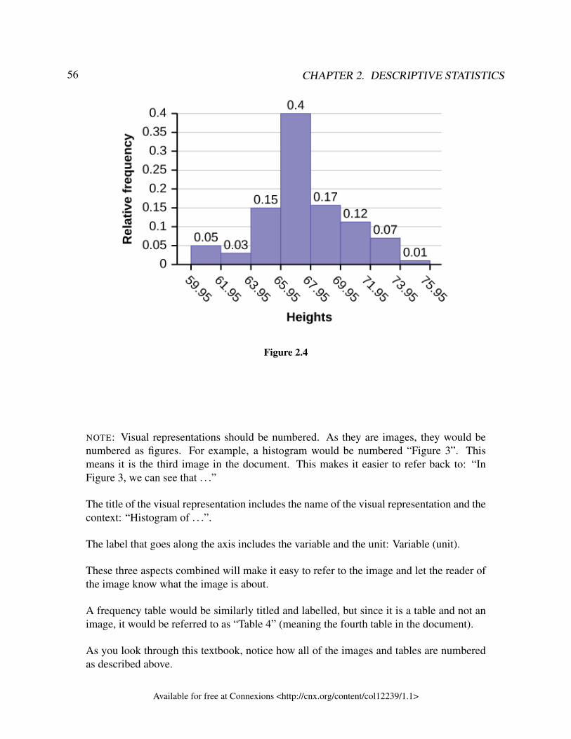
56 CHAPTER 2. DESCRIPTIVE STATISTICS
Figure 2.4
NOTE: Visual representations should be numbered. As they are images, they would benumbered as figures. For example, a histogram would be numbered “Figure 3”. Thismeans it is the third image in the document. This makes it easier to refer back to: “InFigure 3, we can see that . . .”
The title of the visual representation includes the name of the visual representation and thecontext: “Histogram of . . .”.
The label that goes along the axis includes the variable and the unit: Variable (unit).
These three aspects combined will make it easy to refer to the image and let the reader ofthe image know what the image is about.
A frequency table would be similarly titled and labelled, but since it is a table and not animage, it would be referred to as “Table 4” (meaning the fourth table in the document).
As you look through this textbook, notice how all of the images and tables are numberedas described above.
Available for free at Connexions <http://cnx.org/content/col12239/1.1>
57
:
Exercise 2.2.6 (Solution on p. 107.)
The following data are the shoe sizes of 50 male students. The sizes are contin-uous data since shoe size is measured. Construct a histogram and calculate thewidth of each bar or class interval. Suppose you choose six bars.9; 9; 9.5; 9.5; 10; 10; 10; 10; 10; 10; 10.5; 10.5; 10.5; 10.5; 10.5; 10.5; 10.5; 10.511; 11; 11; 11; 11; 11; 11; 11; 11; 11; 11; 11; 11; 11.5; 11.5; 11.5; 11.5; 11.5;11.5; 11.512; 12; 12; 12; 12; 12; 12; 12.5; 12.5; 12.5; 12.5; 14
2.2.2.3.1 Shape
The shape of the data helps us understand what kind of pattern the data has. For example, if all ofthe data values have the same frequency, then the shape will be distinct (it is called uniform). If thedata has a skew in it, then that helps us understand the measure of centre better (to be discussed inthe next section). Overall, the shape helps us see how the data is behaving. Data that has similarshapes will behave in similar ways.
The shape of the data set is determined by looking at a visual representation of the data and usuallythe histogram. Common ways of describing the shape include whether it is symmetrical or not,how many distinct peaks it has (unimodal, bimodal, multimodal), and whether the data has a tailonly on one side (skew).
• Data is symmetric if the shape is same on both sides of centre.• Skewed data has a "tail" on one side. This means that there are some data values that are far
from the centre but only one one side. This is a type of non-symmetric data.• For a histogram, the term "modal" refers to the number of distinct peaks. You almost want
to think about mountain peaks. If there are multiple, distinct mountain peaks, then we saythe data is multi-modal. If there is only one distinct peak, then the data is uni-modal. Not alldata has a distinct peak.
• Uniform data occurs if the frequency of each interval is about the same. This will result in aflat looking histogram.
• A very important shape in statistics is the bell-curve (the shape in the first row, secondcolumn). This shape is symmetric, uni-modal and looks like a bell. If data has this shape(and satisfies a few other properties that will be discussed in Chapter 5), we call this datanormal.
Here are some examples of different shapes of data:
Available for free at Connexions <http://cnx.org/content/col12239/1.1>
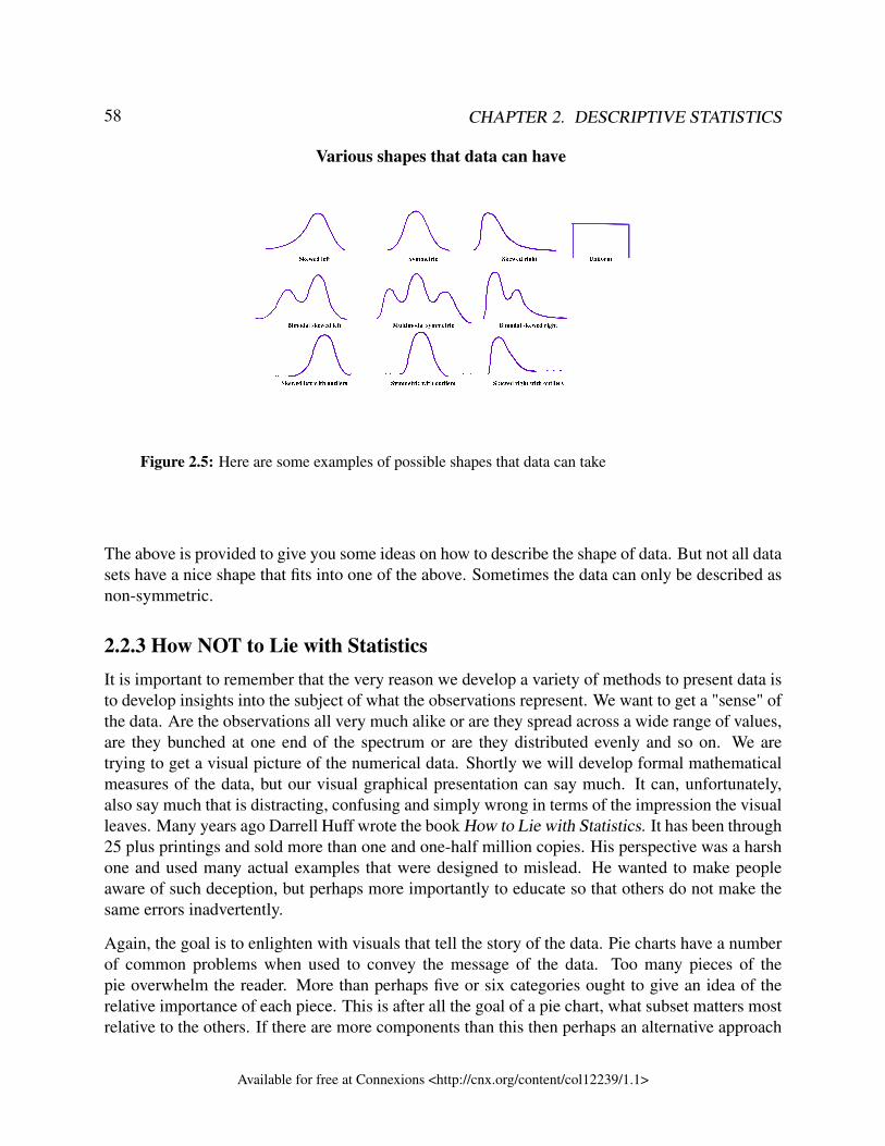
58 CHAPTER 2. DESCRIPTIVE STATISTICS
Various shapes that data can have
Figure 2.5: Here are some examples of possible shapes that data can take
The above is provided to give you some ideas on how to describe the shape of data. But not all datasets have a nice shape that fits into one of the above. Sometimes the data can only be described asnon-symmetric.
2.2.3 How NOT to Lie with StatisticsIt is important to remember that the very reason we develop a variety of methods to present data isto develop insights into the subject of what the observations represent. We want to get a "sense" ofthe data. Are the observations all very much alike or are they spread across a wide range of values,are they bunched at one end of the spectrum or are they distributed evenly and so on. We aretrying to get a visual picture of the numerical data. Shortly we will develop formal mathematicalmeasures of the data, but our visual graphical presentation can say much. It can, unfortunately,also say much that is distracting, confusing and simply wrong in terms of the impression the visualleaves. Many years ago Darrell Huff wrote the book How to Lie with Statistics. It has been through25 plus printings and sold more than one and one-half million copies. His perspective was a harshone and used many actual examples that were designed to mislead. He wanted to make peopleaware of such deception, but perhaps more importantly to educate so that others do not make thesame errors inadvertently.
Again, the goal is to enlighten with visuals that tell the story of the data. Pie charts have a numberof common problems when used to convey the message of the data. Too many pieces of thepie overwhelm the reader. More than perhaps five or six categories ought to give an idea of therelative importance of each piece. This is after all the goal of a pie chart, what subset matters mostrelative to the others. If there are more components than this then perhaps an alternative approach
Available for free at Connexions <http://cnx.org/content/col12239/1.1>
59
would be better or perhaps some can be consolidated into an "other" category. Pie charts cannotshow changes over time, although we see this attempted all too often. In federal, state, and cityfinance documents pie charts are often presented to show the components of revenue available tothe governing body for appropriation: income tax, sales tax motor vehicle taxes and so on. In andof itself this is interesting information and can be nicely done with a pie chart. The error occurswhen two years are set side-by-side. Because the total revenues change year to year, but the size ofthe pie is fixed, no real information is provided and the relative size of each piece of the pie cannotbe meaningfully compared.
Histograms can be very helpful in understanding the data. Properly presented, they can be a quickvisual way to present probabilities of different categories by the simple visual of comparing relativeareas in each category. Here the error, purposeful or not, is to vary the width of the categories. Thisof course makes comparison to the other categories impossible. It does embellish the importanceof the category with the expanded width because it has a greater area, inappropriately, and thusvisually "says" that that category has a higher probability of occurrence.
Changing the units of measurement of the axis can smooth out a drop or accentuate one. If youwant to show large changes, then measure the variable in small units, penny rather than thousandsof dollars. And of course to continue the fraud, be sure that the axis does not begin at zero, zero.If it begins at zero, zero, then it becomes apparent that the axis has been manipulated.
Again, the goal of descriptive statistics is to convey meaningful visuals that tell the story of thedata. Purposeful manipulation is fraud and unethical at the worst, but even at its best, making thesetype of errors will lead to confusion on the part of the analysis.
2.2.4 ReferencesBurbary, Ken. Facebook Demographics Revisited – 2001 Statistics, 2011. Available onlineat http://www.kenburbary.com/2011/03/facebook-demographics-revisited-2011-statistics-2/ (ac-cessed August 21, 2013).
“9th Annual AP Report to the Nation.” CollegeBoard, 2013. Available online athttp://apreport.collegeboard.org/goals-and-findings/promoting-equity (accessed September 13,2013).
“Overweight and Obesity: Adult Obesity Facts.” Centers for Disease Control and Prevention.Available online at http://www.cdc.gov/obesity/data/adult.html (accessed September 13, 2013).
Data on annual homicides in Detroit, 1961–73, from Gunst & Mason’s book ‘Regression Analysisand its Application’, Marcel Dekker
“Timeline: Guide to the U.S. Presidents: Information on every president’s birthplace,political party, term of office, and more.” Scholastic, 2013. Available online athttp://www.scholastic.com/teachers/article/timeline-guide-us-presidents (accessed April 3, 2013).
Available for free at Connexions <http://cnx.org/content/col12239/1.1>
60 CHAPTER 2. DESCRIPTIVE STATISTICS
“Presidents.” Fact Monster. Pearson Education, 2007. Available online athttp://www.factmonster.com/ipka/A0194030.html (accessed April 3, 2013).
“Food Security Statistics.” Food and Agriculture Organization of the United Nations. Availableonline at http://www.fao.org/economic/ess/ess-fs/en/ (accessed April 3, 2013).
“Consumer Price Index.” United States Department of Labor: Bureau of Labor Statistics. Avail-able online at http://data.bls.gov/pdq/SurveyOutputServlet (accessed April 3, 2013).
“CO2 emissions (kt).” The World Bank, 2013. Available online athttp://databank.worldbank.org/data/home.aspx (accessed April 3, 2013).
“Births Time Series Data.” General Register Office For Scotland, 2013. Available onlineat http://www.gro-scotland.gov.uk/statistics/theme/vital-events/births/time-series.html (accessedApril 3, 2013).
“Demographics: Children under the age of 5 years underweight.” Indexmundi. Available online athttp://www.indexmundi.com/g/r.aspx?t=50&v=2224&aml=en (accessed April 3, 2013).
Gunst, Richard, Robert Mason. Regression Analysis and Its Application: A Data-Oriented Ap-proach. CRC Press: 1980.
“Overweight and Obesity: Adult Obesity Facts.” Centers for Disease Control and Prevention.Available online at http://www.cdc.gov/obesity/data/adult.html (accessed September 13, 2013).
2.2.5 Chapter ReviewA bar graph is a chart that uses either horizontal or vertical bars to show comparisons amongcategories. One axis of the chart shows the specific categories being compared, and the other axisrepresents a discrete value. Some bar graphs present bars clustered in groups of more than one(grouped bar graphs), and others show the bars divided into subparts to show cumulative effect(stacked bar graphs). Bar graphs are especially useful when categorical data is being used, butthey can also be used for quantitative discrete data.
A histogram is a graphic version of a frequency distribution. The graph consists of bars of equalwidth drawn adjacent to each other. The horizontal scale represents classes of quantitative data val-ues and the vertical scale represents frequencies. The heights of the bars correspond to frequencyvalues. Histograms are typically used for large, continuous, quantitative data sets.
Available for free at Connexions <http://cnx.org/content/col12239/1.1>
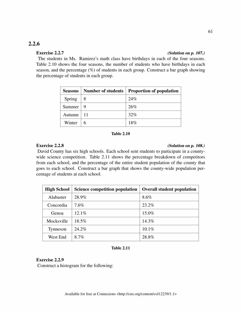
61
2.2.6Exercise 2.2.7 (Solution on p. 107.)The students in Ms. Ramirez’s math class have birthdays in each of the four seasons.
Table 2.10 shows the four seasons, the number of students who have birthdays in eachseason, and the percentage (%) of students in each group. Construct a bar graph showingthe percentage of students in each group.
Seasons Number of students Proportion of population
Spring 8 24%
Summer 9 26%
Autumn 11 32%
Winter 6 18%
Table 2.10
Exercise 2.2.8 (Solution on p. 108.)David County has six high schools. Each school sent students to participate in a county-
wide science competition. Table 2.11 shows the percentage breakdown of competitorsfrom each school, and the percentage of the entire student population of the county thatgoes to each school. Construct a bar graph that shows the county-wide population per-centage of students at each school.
High School Science competition population Overall student population
Alabaster 28.9% 8.6%
Concordia 7.6% 23.2%
Genoa 12.1% 15.0%
Mocksville 18.5% 14.3%
Tynneson 24.2% 10.1%
West End 8.7% 28.8%
Table 2.11
Exercise 2.2.9Construct a histogram for the following:
Available for free at Connexions <http://cnx.org/content/col12239/1.1>
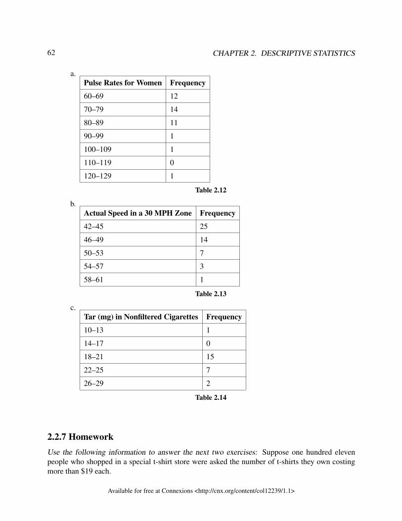
62 CHAPTER 2. DESCRIPTIVE STATISTICS
a.Pulse Rates for Women Frequency
60–69 12
70–79 14
80–89 11
90–99 1
100–109 1
110–119 0
120–129 1
Table 2.12
b.Actual Speed in a 30 MPH Zone Frequency
42–45 25
46–49 14
50–53 7
54–57 3
58–61 1
Table 2.13
c.Tar (mg) in Nonfiltered Cigarettes Frequency
10–13 1
14–17 0
18–21 15
22–25 7
26–29 2
Table 2.14
2.2.7 HomeworkUse the following information to answer the next two exercises: Suppose one hundred elevenpeople who shopped in a special t-shirt store were asked the number of t-shirts they own costingmore than $19 each.
Available for free at Connexions <http://cnx.org/content/col12239/1.1>
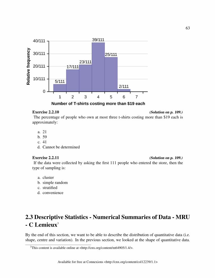
63
Exercise 2.2.10 (Solution on p. 109.)The percentage of people who own at most three t-shirts costing more than $19 each is
approximately:
a. 21b. 59c. 41d. Cannot be determined
Exercise 2.2.11 (Solution on p. 109.)If the data were collected by asking the first 111 people who entered the store, then the
type of sampling is:
a. clusterb. simple randomc. stratifiedd. convenience
2.3 Descriptive Statistics - Numerical Summaries of Data - MRU- C Lemieux3
By the end of this section, we want to be able to describe the distribution of quantitative data (i.e.shape, centre and variation). In the previous section, we looked at the shape of quantitative data.
3This content is available online at <http://cnx.org/content/m64905/1.4/>.
Available for free at Connexions <http://cnx.org/content/col12239/1.1>
64 CHAPTER 2. DESCRIPTIVE STATISTICS
This section focuses on numerical summaries of data for quantitative data. In particular, it focuseson measures of centre and measures of variation.
There are other numerical summaries of data called measures of location, which will be discussedin the next section.
2.3.1 Measures of centreMeasures of centre or average give us a sense of what a typical value in a data set is. For example,the average number of children in a family in Canada is 1.9. This means that a typical family willhave about 1.9 children. Obviously, no family has exactly 1.9 children, but this gives a sense ofhow many children families have on average. Further, some families may have 8 children. Othersmay have no children. The measure of centre gives a sense of what is going on in the middle ofthe data set.
NOTE: Even though you may wish to round an average to a whole number (especiallywhen it is about the number of people), this is not necessary nor is it appropriate as it isgiving a sense of the centre of the data, which is not necessarily an actual data value.
The "center" of a data set is a way of describing a typical value in a data set. The three most widelyused measures of the "center" of the data are the mean, median and mode.
To explain these three measures of centre, let’s look at an example. Suppose we want to find theaverage weight of 50 people. To calculate the mean weight of the 50 people, we would add the50 weights together and divide by 50. To find the median weight of the 50 people, order the datafrom least heavy to most heavy, and find the weight that splits the data into two equal parts. Themode is the most commonly occurring value. To find the mode, find the weight that occurs themost frequently.
This section provides more details on how to find the measures of centre, the notation for themeasures, and when it is best to used which measure.
: Though the words “mean” and “average” are sometimes used interchangeably, they donot necessarily mean the same thing. In general, “average” is any measure of centre and“mean” is a specific type of centre. Many people use average and mean as the same, butnot always. For example, when people talk about average housing price, they are usuallyreferring to the median house price.
2.3.1.1 Mean
The mean of a data set can be thought of as a balancing point (or fulcrum). If you think of numbersas weighted, then the mean is the number that will balance the data values evenly. Suppose yourdata values are 1, 2, 3, 4, 5. Then the number that balances the data is 3. To go a little deeper, the
Available for free at Connexions <http://cnx.org/content/col12239/1.1>
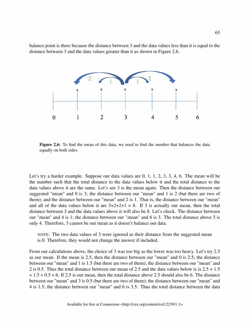
65
balance point is three because the distance between 3 and the data values less than it is equal to thedistance between 3 and the data values greater than it as shown in Figure 2.6.
Figure 2.6: To find the mean of this data, we need to find the number that balances the dataequally on both sides.
Let’s try a harder example. Suppose our data values are 0, 1, 1, 2, 3, 3, 4, 6. The mean will bethe number such that the total distance to the data values below it and the total distance to thedata values above it are the same. Let’s see 3 is the mean again. Then the distance between oursuggested "mean" and 0 is 3; the distance between our "mean" and 1 is 2 (but there are two ofthem); and the distance between our "mean" and 2 is 1. That is, the distance between our "mean"and all of the data values below it are 3+2+2+1 = 8. If 3 is actually our mean, then the totaldistance between 3 and the data values above it will also be 8. Let’s check. The distance betweenour "mean" and 4 is 1; the distance between our "mean" and 6 is 3. The total distance above 3 isonly 4. Therefore, 3 cannot be our mean as it doesn’t balance our data.
NOTE: The two data values of 3 were ignored as their distance from the suggested meanis 0. Therefore, they would not change the answer if included.
From our calculations above, the choice of 3 was too big as the lower was too heavy. Let’s try 2.5as our mean. If the mean is 2.5, then the distance between our "mean" and 0 is 2.5; the distancebetween our "mean" and 1 is 1.5 (but there are two of them); the distance between our "mean" and2 is 0.5. Thus the total distance between our mean of 2.5 and the data values below is is 2.5 + 1.5+ 1.5 + 0.5 = 6. If 2.5 is our mean, then the total distance above 2.5 should also be 6. The distancebetween our "mean" and 3 is 0.5 (but there are two of them); the distance between our "mean" and4 is 1.5; the distance between our "mean" and 6 is 3.5. Thus the total distance between the data
Available for free at Connexions <http://cnx.org/content/col12239/1.1>
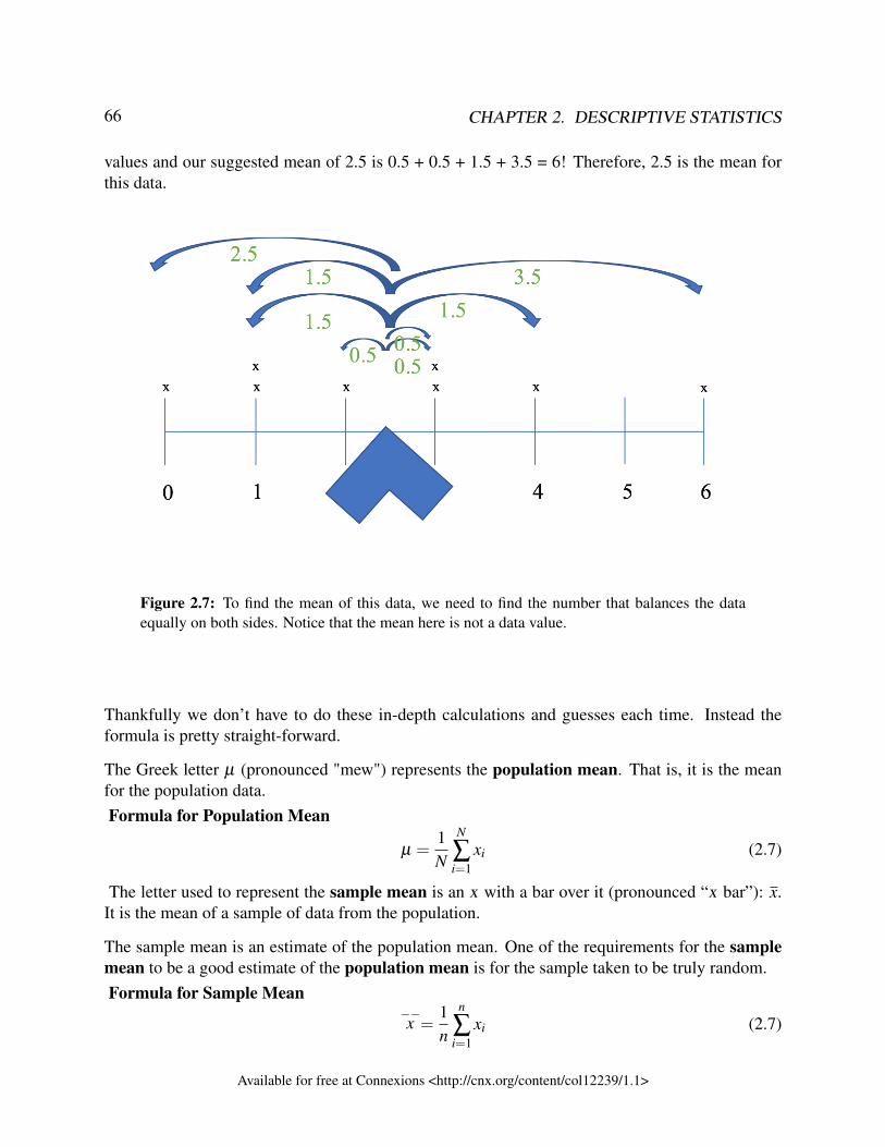
66 CHAPTER 2. DESCRIPTIVE STATISTICS
values and our suggested mean of 2.5 is 0.5 + 0.5 + 1.5 + 3.5 = 6! Therefore, 2.5 is the mean forthis data.
Figure 2.7: To find the mean of this data, we need to find the number that balances the dataequally on both sides. Notice that the mean here is not a data value.
Thankfully we don’t have to do these in-depth calculations and guesses each time. Instead theformula is pretty straight-forward.
The Greek letter µ (pronounced "mew") represents the population mean. That is, it is the meanfor the population data.Formula for Population Mean
µ =1N
N
∑i=1
xi (2.7)
The letter used to represent the sample mean is an x with a bar over it (pronounced “x bar”): x.It is the mean of a sample of data from the population.
The sample mean is an estimate of the population mean. One of the requirements for the samplemean to be a good estimate of the population mean is for the sample taken to be truly random.Formula for Sample Mean
−−x =
1n
n
∑i=1
xi (2.7)
Available for free at Connexions <http://cnx.org/content/col12239/1.1>
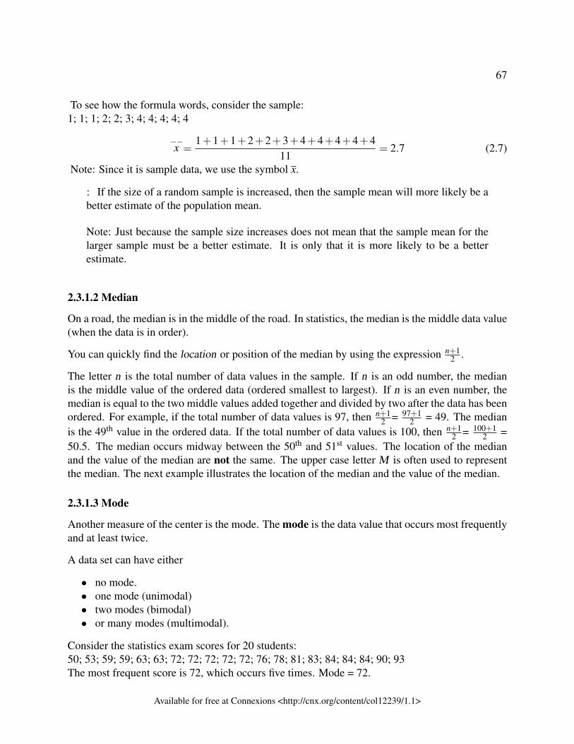
67
To see how the formula words, consider the sample:1; 1; 1; 2; 2; 3; 4; 4; 4; 4; 4
−−x =
1+1+1+2+2+3+4+4+4+4+411
= 2.7 (2.7)
Note: Since it is sample data, we use the symbol x.
: If the size of a random sample is increased, then the sample mean will more likely be abetter estimate of the population mean.
Note: Just because the sample size increases does not mean that the sample mean for thelarger sample must be a better estimate. It is only that it is more likely to be a betterestimate.
2.3.1.2 Median
On a road, the median is in the middle of the road. In statistics, the median is the middle data value(when the data is in order).
You can quickly find the location or position of the median by using the expression n+12 .
The letter n is the total number of data values in the sample. If n is an odd number, the medianis the middle value of the ordered data (ordered smallest to largest). If n is an even number, themedian is equal to the two middle values added together and divided by two after the data has beenordered. For example, if the total number of data values is 97, then n+1
2 = 97+12 = 49. The median
is the 49th value in the ordered data. If the total number of data values is 100, then n+12 = 100+1
2 =50.5. The median occurs midway between the 50th and 51st values. The location of the medianand the value of the median are not the same. The upper case letter M is often used to representthe median. The next example illustrates the location of the median and the value of the median.
2.3.1.3 Mode
Another measure of the center is the mode. The mode is the data value that occurs most frequentlyand at least twice.
A data set can have either
• no mode.• one mode (unimodal)• two modes (bimodal)• or many modes (multimodal).
Consider the statistics exam scores for 20 students:50; 53; 59; 59; 63; 63; 72; 72; 72; 72; 72; 76; 78; 81; 83; 84; 84; 84; 90; 93The most frequent score is 72, which occurs five times. Mode = 72.
Available for free at Connexions <http://cnx.org/content/col12239/1.1>
68 CHAPTER 2. DESCRIPTIVE STATISTICS
: The mode can be calculated for qualitative data as well as for quantitative data. Forexample, if the data set is: red, red, red, green, green, yellow, purple, black, blue, themode is red.
Example 2.6AIDS data indicating the number of months a patient with AIDS lives after taking a new
antibody drug are as follows (smallest to largest):3; 4; 8; 8; 10; 11; 12; 13; 14; 15; 15; 16; 16; 17; 17; 18; 21; 22; 22; 24; 24; 25; 26; 26; 27;27; 29; 29; 31; 32; 33; 33; 34; 34; 35; 37; 40; 44; 44; 47;Calculate the mean, median and mode.
SolutionThe calculation for the mean is:−−x = [3+4+(8)(2)+10+11+12+13+14+(15)(2)+(16)(2)+...+35+37+40+(44)(2)+47]
40 = 23.6To find the median, M, first use the formula for the location. The location is:n+1
2 = 40+12 = 20.5
Starting at the smallest value, the median is located between the 20th and 21st values (thetwo 24s):3; 4; 8; 8; 10; 11; 12; 13; 14; 15; 15; 16; 16; 17; 17; 18; 21; 22; 22; 24; 24; 25; 26; 26; 27;27; 29; 29; 31; 32; 33; 33; 34; 34; 35; 37; 40; 44; 44; 47;
M = 24+242 = 24 To find the mode, we first have to determine if any data values repeat.
If no data values repeat, there is no mode. Since 8 repeats, we know there is a mode. 8repeats twice. We need to check if any data value repeats more than twice. If a data valuerepeats more than twice, then it is the mode. Since no data value repeats more than twice,any data value that repeats twice is the mode.Therefore, the modes are 8, 15, 16, 17, 22, 24, 26, 27, 29, 34, 44. This data set is multi-modal.
Example 2.7Suppose that in a small town of 50 people, one person earns $5,000,000 per year and the
other 49 each earn $30,000. Which is the better measure of the "center": the mean, themedian or the mode?
Solution−−x = 5,000,000+49(30,000)
50 = 129,400
M = 30,000
(There are 49 people who earn $30,000 and one person who earns $5,000,000.)
The mode is 30,000 as this data value occurs 49 times.
Available for free at Connexions <http://cnx.org/content/col12239/1.1>
69
Since the median and mode are equal, lets focus on the median. The median is a bettermeasure of the "center" than the mean because 49 of the values are 30,000 and one is5,000,000. The 5,000,000 is an outlier. The 30,000 gives us a better sense of the middleof the data.
IMPORTANT: The above example highlights two important ideas:
• Outliers: We have defined outliers as data values that are significantly different fromother data values, but we have not provided a way of finding them. This will bediscussed in the next section. Regardless, we can see that 5 million is significantlydifferent than 30 thousand in the above example.• Skew: When a data set has outliers, the outliers have the potential to skew the mean.
In the above example, the centre of the data is 30,000, but the mean is 129,400. Thusthe outlier of 5 million is pulling the mean up. That is, it is skewing the centre valueby pulling it to the right on the number line.
2.3.1.4 Comparing measures of centre
Above we have described how to find each of the measures of centre. But how do you choosewhich measure of centre to use in which situation? One option is to provide all three measures ofcentre, but sometimes this can be overwhelming to the audience. Instead you want to pick the bestone that best describes that data. The following are some general guidelines for choosing the bestmeasure of centre.
The mean is often the best measure of centre to use because it is the most well-known and familiarof the measures of centre. It is also the only measure of centre that is computed using all of thesample values. But the mean is susceptible to outliers. As was seen in Example 2.7, if there is anoutlier, the mean can be pulled in one direction away from the centre.
Outliers are any data value that are significantly different from the other data values. In Exam-ple 2.7, the outlier is 5 million as it is significantly higher than the other data values. We willdiscuss how to find outliers in the section 2.3 (Boxplots).
If there is an outlier in the data set that is skewing the mean, the best measure of centre to use isthe median as it is not susceptible to outliers.
But be careful: The presence of outliers does not necessarily mean that the median is the bestmeasure of centre. Here are a couple of examples where this is the case:
1. Suppose there are 200 data values in a sample and one data value is an outlier, then the meanwill most likely not be affected by the outlier.
Available for free at Connexions <http://cnx.org/content/col12239/1.1>
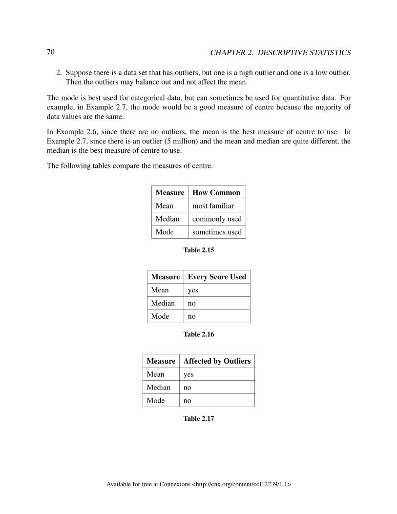
70 CHAPTER 2. DESCRIPTIVE STATISTICS
2. Suppose there is a data set that has outliers, but one is a high outlier and one is a low outlier.Then the outliers may balance out and not affect the mean.
The mode is best used for categorical data, but can sometimes be used for quantitative data. Forexample, in Example 2.7, the mode would be a good measure of centre because the majority ofdata values are the same.
In Example 2.6, since there are no outliers, the mean is the best measure of centre to use. InExample 2.7, since there is an outlier (5 million) and the mean and median are quite different, themedian is the best measure of centre to use.
The following tables compare the measures of centre.
Measure How Common
Mean most familiar
Median commonly used
Mode sometimes used
Table 2.15
Measure Every Score Used
Mean yes
Median no
Mode no
Table 2.16
Measure Affected by Outliers
Mean yes
Median no
Mode no
Table 2.17
Available for free at Connexions <http://cnx.org/content/col12239/1.1>
71
2.3.1.5 How to mislead with averages
Consider the following situation:
As you arrive at an open house in your preferred new home location, a neighbourcomes up to you while he is walking his dog. “This is a great neighbourhood to livein! The average income in this neighbourhood is $60,000,” he tells you. You arepleased to hear how affluent the community is. A year after you’ve moved into yournew home, the same neighbour comes to your door and asks you to sign a petition.“The city is overvaluing the homes in our neighbourhood again, which means moretaxes. The average income in this neighbourhood is $20,000. We can’t afford theseincreases.” You dutifully sign the petition because you don’t want to pay more taxes,but you’re also confused. Wasn’t the average income a lot higher last year? Whathappened? Is your neighbour a liar?
In this example, there are many different possible scenarios that could explain the discrepancy. Butno matter what the scenario is, the neighbour is picking his statistics to fit his situation.
One scenario: The neighbour may be picking and choosing which measure of centre to use. Sup-pose that most people in the neighbourhood make around $20,000 a year, but there are a few peoplewho live on the street with the super nice view who make $300,000 a year. Then in the first case,when he says the average income is $60,000, he has used the mean which has been pulled higher bythe outliers of $300,000. He chose to use the mean to make the neighbourhood look more affluentthan it really is.
But when he wanted to make the argument that the neighbourhood wasn’t as affluent and shouldbe in a lower tax bracket, he changed which measure of centre to use. Instead he may have theused the median or mode because they aren’t influenced by the outliers.
Another scenario: The neighbour may be choosing how he defines income to help make his point.In the first case, he may have only used those who are employed to come up with the averagesalary. While in the second case, he may have used all adults in the neighbourhood includingstudents living with their parents, stay-at-home parents, retired people or people out of work. Theirincomes may be very low or non-existent which would skew the average to being lower. In thisscenario, he may be using the same measure of centre, but is picking what he means by income toget the results he wants.
There are other possible scenarios. Can you think of any?
2.3.1.6 Skew
As has been noted above, if there are outliers in a data set, this can cause the mean to be pulledup or down (i.e. be either higher than expected or lower than expected) by these outliers. Outliersdon’t have to be present for this to happen. Essentially, any time that there are data values thatcause the mean and median to be significantly different, then we say the data is skewed.
Available for free at Connexions <http://cnx.org/content/col12239/1.1>
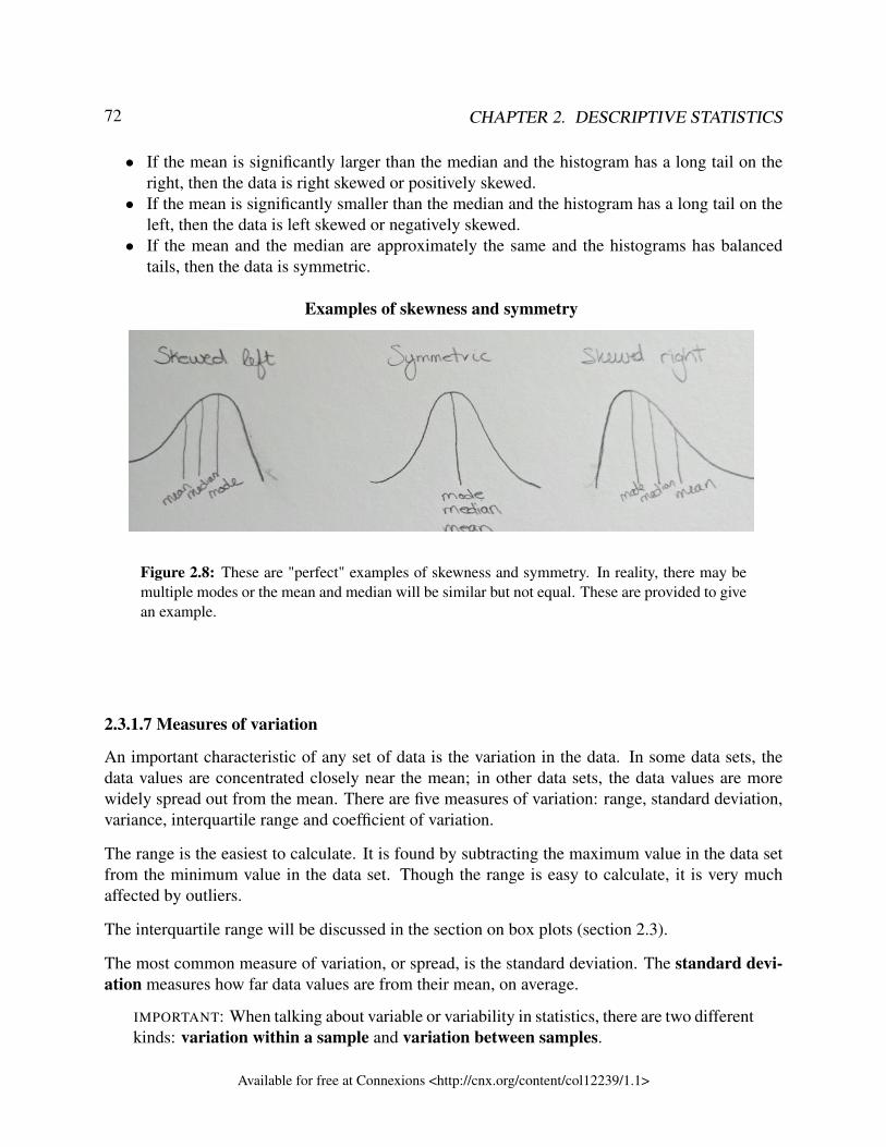
72 CHAPTER 2. DESCRIPTIVE STATISTICS
• If the mean is significantly larger than the median and the histogram has a long tail on theright, then the data is right skewed or positively skewed.
• If the mean is significantly smaller than the median and the histogram has a long tail on theleft, then the data is left skewed or negatively skewed.
• If the mean and the median are approximately the same and the histograms has balancedtails, then the data is symmetric.
Examples of skewness and symmetry
Figure 2.8: These are "perfect" examples of skewness and symmetry. In reality, there may bemultiple modes or the mean and median will be similar but not equal. These are provided to givean example.
2.3.1.7 Measures of variation
An important characteristic of any set of data is the variation in the data. In some data sets, thedata values are concentrated closely near the mean; in other data sets, the data values are morewidely spread out from the mean. There are five measures of variation: range, standard deviation,variance, interquartile range and coefficient of variation.
The range is the easiest to calculate. It is found by subtracting the maximum value in the data setfrom the minimum value in the data set. Though the range is easy to calculate, it is very muchaffected by outliers.
The interquartile range will be discussed in the section on box plots (section 2.3).
The most common measure of variation, or spread, is the standard deviation. The standard devi-ation measures how far data values are from their mean, on average.
IMPORTANT: When talking about variable or variability in statistics, there are two differentkinds: variation within a sample and variation between samples.
Available for free at Connexions <http://cnx.org/content/col12239/1.1>
73
When we discuss finding the standard deviation, range or any measure of variation of asample, we are discussing variation within a sample. In this case, we are looking at howthe data values vary from each other. Most of the time, when we talk about variation thisis what we are talking about.
We can also talk about how much different samples vary from each other. For example,we could take multiple samples and find the sample mean of each sample. If we talk abouthow much the means vary from each other, we are discussing variation between samples.We will discuss this specific type of variation in Chapter 6.
The law of large numbers saws that, for random samples, as the sample size increases,then the sample will more closely resemble the population. For example, as the samplesize increases, the sample standard deviation will approach the population standard devi-ation. Thus, the variation within the sample will more closely mimic the variation withinthe population as the sample size increases. But as the sample size increases, the sam-ple means will approach the population mean. Thus, there will be less variation betweenthe sample means. This means that the variation between samples decreases, as the sam-ple size increases. When we discuss sampling variability, we are discussing variationbetween samples.
For this chapter, we are focusing on variation within a sample.
2.3.1.7.1 The standard deviation (and variance)
• provides a numerical measure of the overall amount of variation in a data set, and• can be used to determine whether a particular data value is close to or far from the mean.
2.3.1.7.1.1 The standard deviation provides a measure of the overall variation in a data set
The standard deviation is small when the data are all concentrated close to the mean, exhibitinglittle variation or spread. The standard deviation is larger when the data values are more spread outfrom the mean, exhibiting more variation.
Suppose that we are studying the amount of time customers wait in line at the checkout at super-market A and supermarket B. It is known that the average wait time at both supermarkets is aboutfive minutes. At supermarket A, though, the standard deviation for the wait time is two minutes; atsupermarket B the standard deviation for the wait time is four minutes.
Because supermarket B has a higher standard deviation, we know that there is more variation inthe wait times at supermarket B. Overall, wait times at supermarket B are more spread out fromthe average; wait times at supermarket A are more concentrated near the average. This meansthat at supermarket B, you have a greater chance of having a short wait time, but also a greater
Available for free at Connexions <http://cnx.org/content/col12239/1.1>
74 CHAPTER 2. DESCRIPTIVE STATISTICS
chance of having a long wait time, compared to supermarket A. That means the wait times aremore volatile at supermarket B. On the other hand, you will be waiting about the same amount oftime at supermarket A. That means there are more consistent waits times at supermarket A.
One way, we could summarize the supermarket situation is as follows:
• A typical wait time at supermarket A is 5 minutes give or take 2 minutes. This means thatsomeone typically has to wait 3 to 7 minutes in the checkout line.
• A typical wait time at supermarket B is 5 minutes give or take 4 minutes. This means thatsomeone typically has to wait 1 to 9 minutes in the checkout line.
Here the term “typical” means common, normal. So normally people will wait between 3 to 7minutes at supermarket A, but there will be some people who only wait 2 minutes and some whowait 10 minutes at the checkout. That is, the typical range only provides a sense of what is goingon in the middle of the data, but there are values occurring outside of that range.
NOTE: For the typical value, you can use any measure of centre. But for the give or takevalue, you have to use standard deviation. No other measure of variation works.
2.3.1.7.1.2 Calculating the Standard Deviation
NOTE: The following explains how to calculate the standard deviation by hand. We willbe using computer software to do this. Thus it is not important to know this section indetail, but it is helpful to know the basics of how the standard deviation is calculated tohelp understand what the standard deviation is.
If x is a number, then the difference "x – mean" is called its deviation. In a data set, there are asmany deviations as there are items in the data set. The deviations are used to calculate the standarddeviation. If the numbers belong to a population, in symbols a deviation is x – µ . For sample data,
in symbols a deviation is x –−−x .
The procedure to calculate the standard deviation depends on whether the numbers are the entirepopulation or are data from a sample. The calculations are similar, but not identical. Thereforethe symbol used to represent the standard deviation depends on whether it is calculated from apopulation or a sample. The lower case letter s represents the sample standard deviation and theGreek letter σ (sigma, lower case) represents the population standard deviation. If the sample hasthe same characteristics as the population, then s should be a good estimate of σ .
To calculate the standard deviation, we need to calculate the variance first. The variance is theaverage of the squares of the deviations (the x –
−−x values for a sample, or the x – µ values for a
population). The symbol σ2 represents the population variance; the population standard deviationσ is the square root of the population variance. The symbol s2 represents the sample variance;the sample standard deviation s is the square root of the sample variance. You can think of thestandard deviation as a special average of the deviations.
Available for free at Connexions <http://cnx.org/content/col12239/1.1>
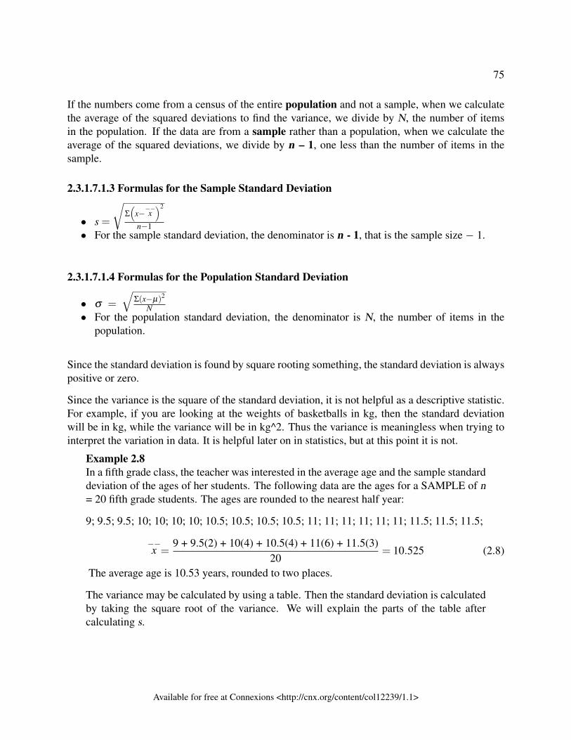
75
If the numbers come from a census of the entire population and not a sample, when we calculatethe average of the squared deviations to find the variance, we divide by N, the number of itemsin the population. If the data are from a sample rather than a population, when we calculate theaverage of the squared deviations, we divide by n – 1, one less than the number of items in thesample.
2.3.1.7.1.3 Formulas for the Sample Standard Deviation
• s =
√Σ
(x−−−x
)2
n−1• For the sample standard deviation, the denominator is n - 1, that is the sample size − 1.
2.3.1.7.1.4 Formulas for the Population Standard Deviation
• σ =
√Σ(x−µ)2
N• For the population standard deviation, the denominator is N, the number of items in the
population.
Since the standard deviation is found by square rooting something, the standard deviation is alwayspositive or zero.
Since the variance is the square of the standard deviation, it is not helpful as a descriptive statistic.For example, if you are looking at the weights of basketballs in kg, then the standard deviationwill be in kg, while the variance will be in kg^2. Thus the variance is meaningless when trying tointerpret the variation in data. It is helpful later on in statistics, but at this point it is not.
Example 2.8In a fifth grade class, the teacher was interested in the average age and the sample standarddeviation of the ages of her students. The following data are the ages for a SAMPLE of n= 20 fifth grade students. The ages are rounded to the nearest half year:
9; 9.5; 9.5; 10; 10; 10; 10; 10.5; 10.5; 10.5; 10.5; 11; 11; 11; 11; 11; 11; 11.5; 11.5; 11.5;
−−x =
9 + 9.5(2) + 10(4) + 10.5(4) + 11(6) + 11.5(3)20
= 10.525 (2.8)
The average age is 10.53 years, rounded to two places.
The variance may be calculated by using a table. Then the standard deviation is calculatedby taking the square root of the variance. We will explain the parts of the table aftercalculating s.
Available for free at Connexions <http://cnx.org/content/col12239/1.1>
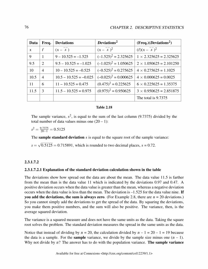
76 CHAPTER 2. DESCRIPTIVE STATISTICS
Data Freq. Deviations Deviations2 (Freq.)(Deviations2)
x f (x –−−x ) (x –
−−x )2 (f )(x –
−−x )2
9 1 9 – 10.525 = –1.525 (–1.525)2 = 2.325625 1 × 2.325625 = 2.325625
9.5 2 9.5 – 10.525 = –1.025 (–1.025)2 = 1.050625 2 × 1.050625 = 2.101250
10 4 10 – 10.525 = –0.525 (–0.525)2 = 0.275625 4 × 0.275625 = 1.1025
10.5 4 10.5 – 10.525 = –0.025 (–0.025)2 = 0.000625 4 × 0.000625 = 0.0025
11 6 11 – 10.525 = 0.475 (0.475)2 = 0.225625 6 × 0.225625 = 1.35375
11.5 3 11.5 – 10.525 = 0.975 (0.975)2 = 0.950625 3 × 0.950625 = 2.851875
The total is 9.7375
Table 2.18
The sample variance, s2, is equal to the sum of the last column (9.7375) divided by thetotal number of data values minus one (20 – 1):
s2 = 9.737520−1 = 0.5125
The sample standard deviation s is equal to the square root of the sample variance:
s =√
0.5125 = 0.715891, which is rounded to two decimal places, s = 0.72.
2.3.1.7.2
2.3.1.7.2.1 Explanation of the standard deviation calculation shown in the table
The deviations show how spread out the data are about the mean. The data value 11.5 is fartherfrom the mean than is the data value 11 which is indicated by the deviations 0.97 and 0.47. Apositive deviation occurs when the data value is greater than the mean, whereas a negative deviationoccurs when the data value is less than the mean. The deviation is –1.525 for the data value nine. Ifyou add the deviations, the sum is always zero. (For Example 2.8, there are n = 20 deviations.)So you cannot simply add the deviations to get the spread of the data. By squaring the deviations,you make them positive numbers, and the sum will also be positive. The variance, then, is theaverage squared deviation.
The variance is a squared measure and does not have the same units as the data. Taking the squareroot solves the problem. The standard deviation measures the spread in the same units as the data.
Notice that instead of dividing by n = 20, the calculation divided by n – 1 = 20 – 1 = 19 becausethe data is a sample. For the sample variance, we divide by the sample size minus one (n – 1).Why not divide by n? The answer has to do with the population variance. The sample variance
Available for free at Connexions <http://cnx.org/content/col12239/1.1>
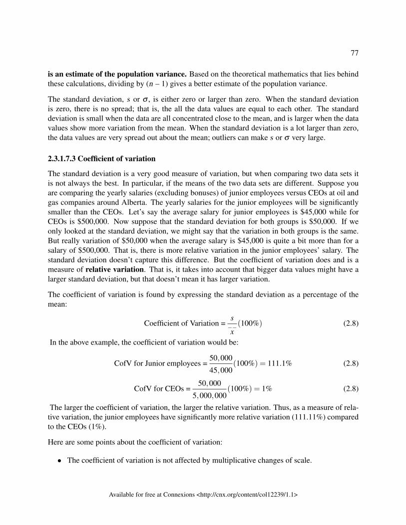
77
is an estimate of the population variance. Based on the theoretical mathematics that lies behindthese calculations, dividing by (n – 1) gives a better estimate of the population variance.
The standard deviation, s or σ , is either zero or larger than zero. When the standard deviationis zero, there is no spread; that is, the all the data values are equal to each other. The standarddeviation is small when the data are all concentrated close to the mean, and is larger when the datavalues show more variation from the mean. When the standard deviation is a lot larger than zero,the data values are very spread out about the mean; outliers can make s or σ very large.
2.3.1.7.3 Coefficient of variation
The standard deviation is a very good measure of variation, but when comparing two data sets itis not always the best. In particular, if the means of the two data sets are different. Suppose youare comparing the yearly salaries (excluding bonuses) of junior employees versus CEOs at oil andgas companies around Alberta. The yearly salaries for the junior employees will be significantlysmaller than the CEOs. Let’s say the average salary for junior employees is $45,000 while forCEOs is $500,000. Now suppose that the standard deviation for both groups is $50,000. If weonly looked at the standard deviation, we might say that the variation in both groups is the same.But really variation of $50,000 when the average salary is $45,000 is quite a bit more than for asalary of $500,000. That is, there is more relative variation in the junior employees’ salary. Thestandard deviation doesn’t capture this difference. But the coefficient of variation does and is ameasure of relative variation. That is, it takes into account that bigger data values might have alarger standard deviation, but that doesn’t mean it has larger variation.
The coefficient of variation is found by expressing the standard deviation as a percentage of themean:
Coefficient of Variation =s−−x(100%) (2.8)
In the above example, the coefficient of variation would be:
CofV for Junior employees =50,000
45,000(100%) = 111.1% (2.8)
CofV for CEOs =50,000
5,000,000(100%) = 1% (2.8)
The larger the coefficient of variation, the larger the relative variation. Thus, as a measure of rela-tive variation, the junior employees have significantly more relative variation (111.11%) comparedto the CEOs (1%).
Here are some points about the coefficient of variation:
• The coefficient of variation is not affected by multiplicative changes of scale.
Available for free at Connexions <http://cnx.org/content/col12239/1.1>
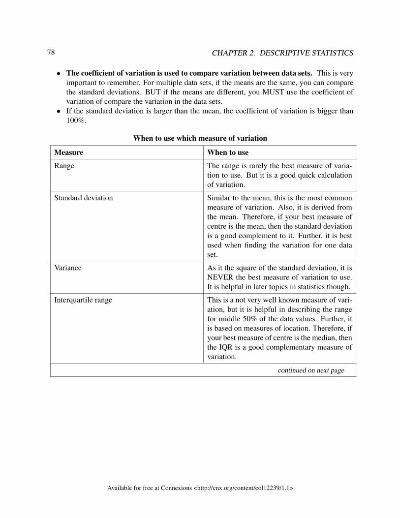
78 CHAPTER 2. DESCRIPTIVE STATISTICS
• The coefficient of variation is used to compare variation between data sets. This is veryimportant to remember. For multiple data sets, if the means are the same, you can comparethe standard deviations. BUT if the means are different, you MUST use the coefficient ofvariation of compare the variation in the data sets.
• If the standard deviation is larger than the mean, the coefficient of variation is bigger than100%.
When to use which measure of variation
Measure When to use
Range The range is rarely the best measure of varia-tion to use. But it is a good quick calculationof variation.
Standard deviation Similar to the mean, this is the most commonmeasure of variation. Also, it is derived fromthe mean. Therefore, if your best measure ofcentre is the mean, then the standard deviationis a good complement to it. Further, it is bestused when finding the variation for one dataset.
Variance As it the square of the standard deviation, it isNEVER the best measure of variation to use.It is helpful in later topics in statistics though.
Interquartile range This is a not very well known measure of vari-ation, but it is helpful in describing the rangefor middle 50% of the data values. Further, itis based on measures of location. Therefore, ifyour best measure of centre is the median, thenthe IQR is a good complementary measure ofvariation.
continued on next page
Available for free at Connexions <http://cnx.org/content/col12239/1.1>
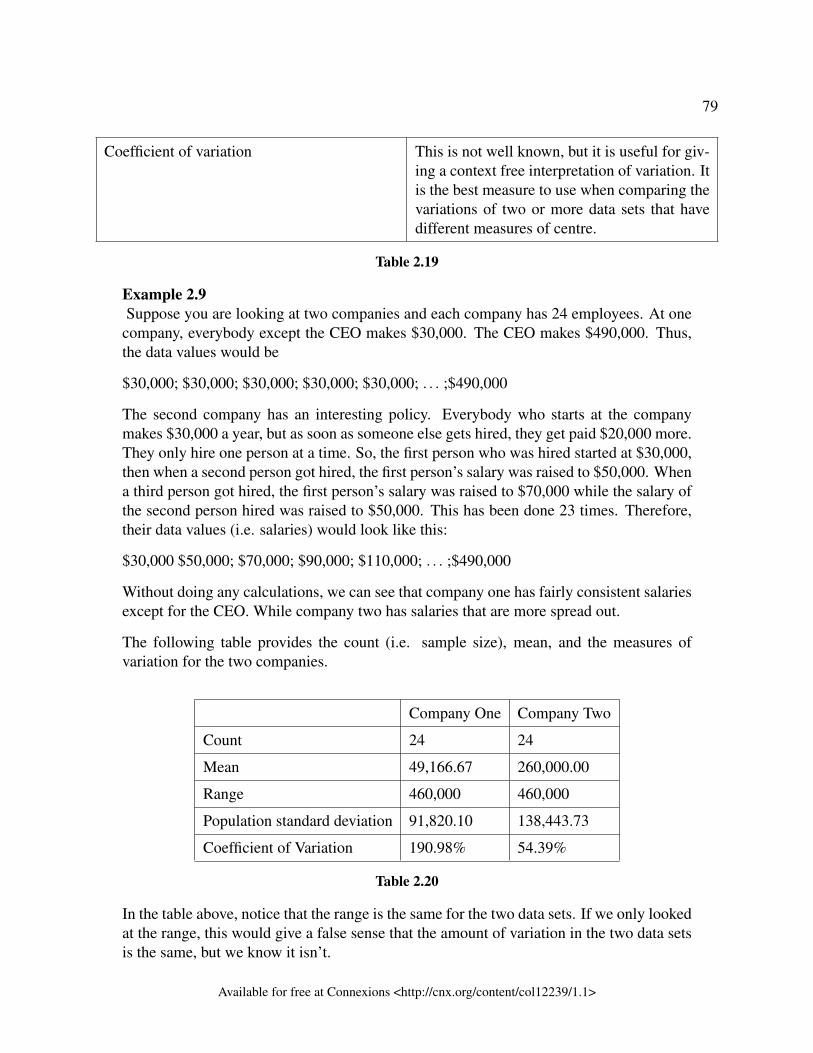
79
Coefficient of variation This is not well known, but it is useful for giv-ing a context free interpretation of variation. Itis the best measure to use when comparing thevariations of two or more data sets that havedifferent measures of centre.
Table 2.19
Example 2.9Suppose you are looking at two companies and each company has 24 employees. At one
company, everybody except the CEO makes $30,000. The CEO makes $490,000. Thus,the data values would be
$30,000; $30,000; $30,000; $30,000; $30,000; . . . ;$490,000
The second company has an interesting policy. Everybody who starts at the companymakes $30,000 a year, but as soon as someone else gets hired, they get paid $20,000 more.They only hire one person at a time. So, the first person who was hired started at $30,000,then when a second person got hired, the first person’s salary was raised to $50,000. Whena third person got hired, the first person’s salary was raised to $70,000 while the salary ofthe second person hired was raised to $50,000. This has been done 23 times. Therefore,their data values (i.e. salaries) would look like this:
$30,000 $50,000; $70,000; $90,000; $110,000; . . . ;$490,000
Without doing any calculations, we can see that company one has fairly consistent salariesexcept for the CEO. While company two has salaries that are more spread out.
The following table provides the count (i.e. sample size), mean, and the measures ofvariation for the two companies.
Company One Company Two
Count 24 24
Mean 49,166.67 260,000.00
Range 460,000 460,000
Population standard deviation 91,820.10 138,443.73
Coefficient of Variation 190.98% 54.39%
Table 2.20
In the table above, notice that the range is the same for the two data sets. If we only lookedat the range, this would give a false sense that the amount of variation in the two data setsis the same, but we know it isn’t.
Available for free at Connexions <http://cnx.org/content/col12239/1.1>
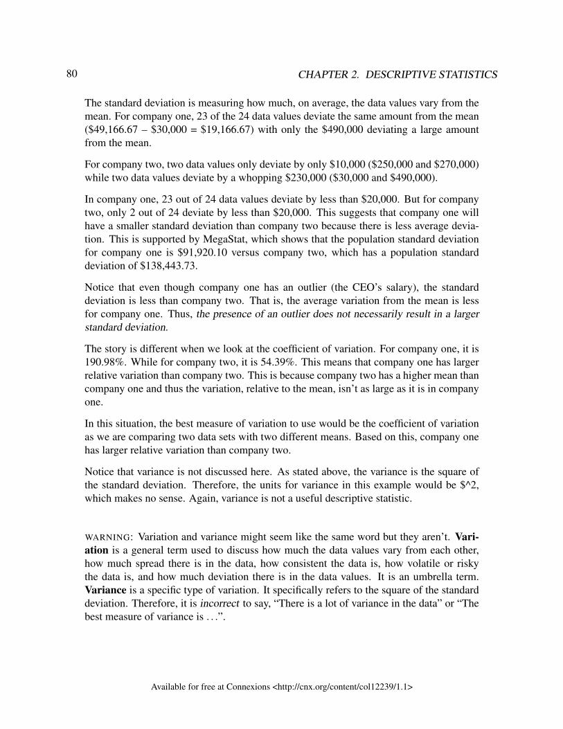
80 CHAPTER 2. DESCRIPTIVE STATISTICS
The standard deviation is measuring how much, on average, the data values vary from themean. For company one, 23 of the 24 data values deviate the same amount from the mean($49,166.67 – $30,000 = $19,166.67) with only the $490,000 deviating a large amountfrom the mean.
For company two, two data values only deviate by only $10,000 ($250,000 and $270,000)while two data values deviate by a whopping $230,000 ($30,000 and $490,000).
In company one, 23 out of 24 data values deviate by less than $20,000. But for companytwo, only 2 out of 24 deviate by less than $20,000. This suggests that company one willhave a smaller standard deviation than company two because there is less average devia-tion. This is supported by MegaStat, which shows that the population standard deviationfor company one is $91,920.10 versus company two, which has a population standarddeviation of $138,443.73.
Notice that even though company one has an outlier (the CEO’s salary), the standarddeviation is less than company two. That is, the average variation from the mean is lessfor company one. Thus, the presence of an outlier does not necessarily result in a largerstandard deviation.
The story is different when we look at the coefficient of variation. For company one, it is190.98%. While for company two, it is 54.39%. This means that company one has largerrelative variation than company two. This is because company two has a higher mean thancompany one and thus the variation, relative to the mean, isn’t as large as it is in companyone.
In this situation, the best measure of variation to use would be the coefficient of variationas we are comparing two data sets with two different means. Based on this, company onehas larger relative variation than company two.
Notice that variance is not discussed here. As stated above, the variance is the square ofthe standard deviation. Therefore, the units for variance in this example would be $^2,which makes no sense. Again, variance is not a useful descriptive statistic.
WARNING: Variation and variance might seem like the same word but they aren’t. Vari-ation is a general term used to discuss how much the data values vary from each other,how much spread there is in the data, how consistent the data is, how volatile or riskythe data is, and how much deviation there is in the data values. It is an umbrella term.Variance is a specific type of variation. It specifically refers to the square of the standarddeviation. Therefore, it is incorrect to say, “There is a lot of variance in the data” or “Thebest measure of variance is . . .”.
Available for free at Connexions <http://cnx.org/content/col12239/1.1>
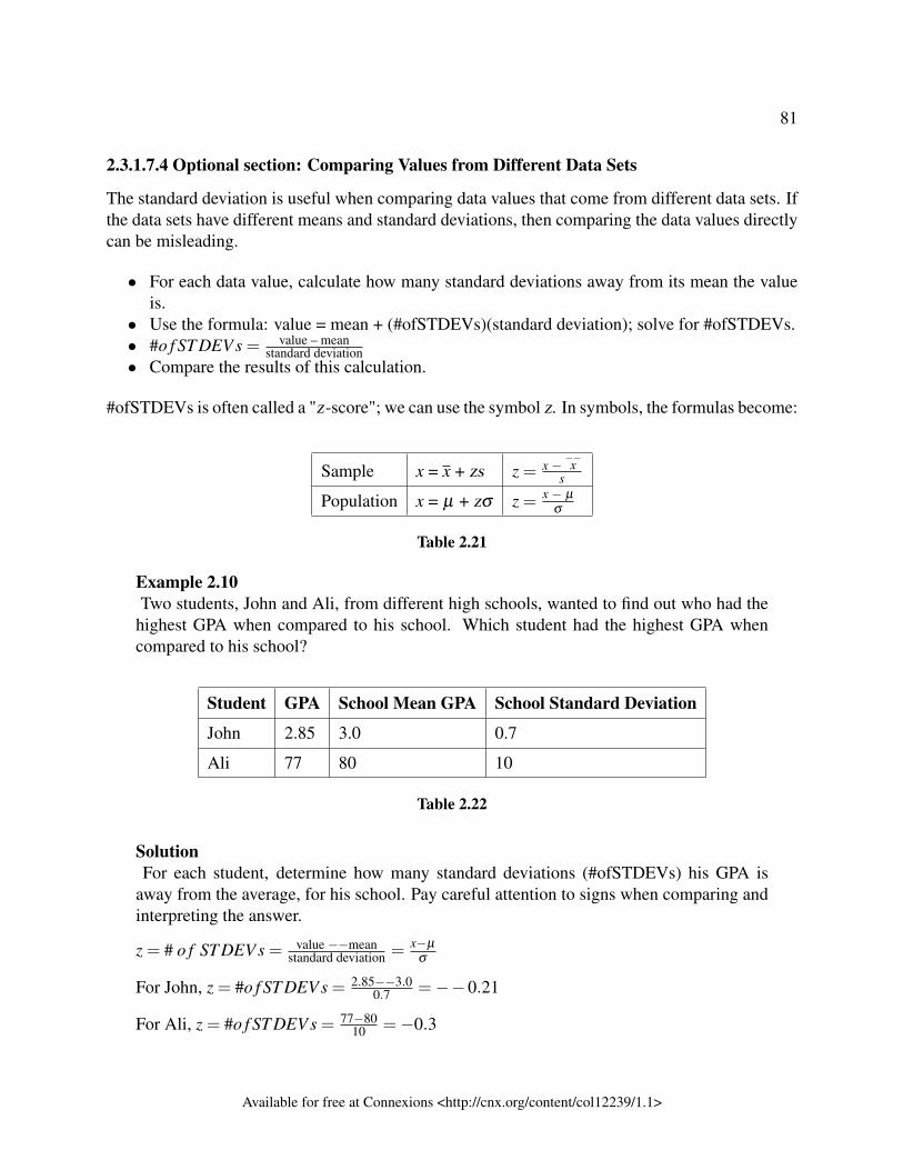
81
2.3.1.7.4 Optional section: Comparing Values from Different Data Sets
The standard deviation is useful when comparing data values that come from different data sets. Ifthe data sets have different means and standard deviations, then comparing the data values directlycan be misleading.
• For each data value, calculate how many standard deviations away from its mean the valueis.
• Use the formula: value = mean + (#ofSTDEVs)(standard deviation); solve for #ofSTDEVs.• #o f ST DEV s = value – mean
standard deviation• Compare the results of this calculation.
#ofSTDEVs is often called a "z-score"; we can use the symbol z. In symbols, the formulas become:
Sample x = x + zs z = x − −−xs
Population x = µ + zσ z = x − µ
σ
Table 2.21
Example 2.10Two students, John and Ali, from different high schools, wanted to find out who had the
highest GPA when compared to his school. Which student had the highest GPA whencompared to his school?
Student GPA School Mean GPA School Standard Deviation
John 2.85 3.0 0.7
Ali 77 80 10
Table 2.22
SolutionFor each student, determine how many standard deviations (#ofSTDEVs) his GPA is
away from the average, for his school. Pay careful attention to signs when comparing andinterpreting the answer.
z = # o f ST DEV s = value −−meanstandard deviation = x−µ
σ
For John, z = #o f ST DEV s = 2.85−−3.00.7 =−−0.21
For Ali, z = #o f ST DEV s = 77−8010 =−0.3
Available for free at Connexions <http://cnx.org/content/col12239/1.1>
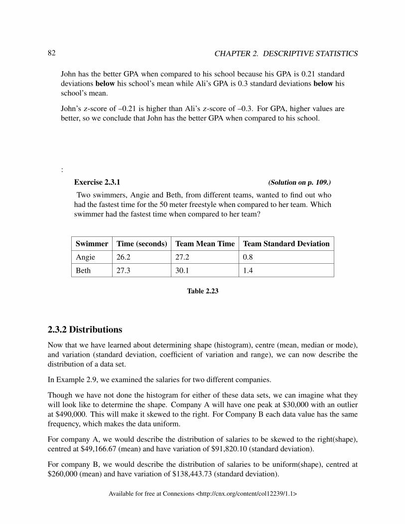
82 CHAPTER 2. DESCRIPTIVE STATISTICS
John has the better GPA when compared to his school because his GPA is 0.21 standarddeviations below his school’s mean while Ali’s GPA is 0.3 standard deviations below hisschool’s mean.
John’s z-score of –0.21 is higher than Ali’s z-score of –0.3. For GPA, higher values arebetter, so we conclude that John has the better GPA when compared to his school.
:
Exercise 2.3.1 (Solution on p. 109.)
Two swimmers, Angie and Beth, from different teams, wanted to find out whohad the fastest time for the 50 meter freestyle when compared to her team. Whichswimmer had the fastest time when compared to her team?
Swimmer Time (seconds) Team Mean Time Team Standard Deviation
Angie 26.2 27.2 0.8
Beth 27.3 30.1 1.4
Table 2.23
2.3.2 DistributionsNow that we have learned about determining shape (histogram), centre (mean, median or mode),and variation (standard deviation, coefficient of variation and range), we can now describe thedistribution of a data set.
In Example 2.9, we examined the salaries for two different companies.
Though we have not done the histogram for either of these data sets, we can imagine what theywill look like to determine the shape. Company A will have one peak at $30,000 with an outlierat $490,000. This will make it skewed to the right. For Company B each data value has the samefrequency, which makes the data uniform.
For company A, we would describe the distribution of salaries to be skewed to the right(shape),centred at $49,166.67 (mean) and have variation of $91,820.10 (standard deviation).
For company B, we would describe the distribution of salaries to be uniform(shape), centred at$260,000 (mean) and have variation of $138,443.73 (standard deviation).
Available for free at Connexions <http://cnx.org/content/col12239/1.1>
83
2.3.3 ReferencesData from The World Bank, available online at http://www.worldbank.org (accessed April 3,2013).
“Demographics: Obesity – adult prevalence rate.” Indexmundi. Available online athttp://www.indexmundi.com/g/r.aspx?t=50&v=2228&l=en (accessed April 3, 2013).
2.3.4 Chapter ReviewThe mean and the median can be calculated to help you find the "center" of a data set. The meanis the best estimate for the actual data set, but the median is the best measurement when a data setcontains several outliers or extreme values. The mode will tell you the most frequently occuringdatum (or data) in your data set. The mean, median, and mode are extremely helpful when youneed to analyze your data, but if your data set consists of ranges which lack specific values, themean may seem impossible to calculate. However, the mean can be approximated if you add thelower boundary with the upper boundary and divide by two to find the midpoint of each interval.Multiply each midpoint by the number of values found in the corresponding range. Divide the sumof these values by the total number of data values in the set.
The standard deviation can help you calculate the spread of data. There are different equations touse if are calculating the standard deviation of a sample or of a population.
• The Standard Deviation allows us to compare individual data or classes to the data set meannumerically.
• s =
√∑
(x−−−x
)2
n−1 or s =
√∑ f(
x−−−x)2
n−1 is the formula for calculating the standard deviation ofa sample. To calculate the standard deviation of a population, we would use the population
mean, µ , and the formula σ =√
∑(x−µ)2
N or σ =√
∑ f (x−µ)2
N .
Available for free at Connexions <http://cnx.org/content/col12239/1.1>
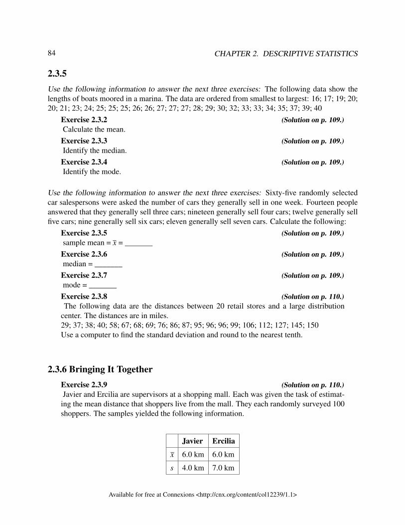
84 CHAPTER 2. DESCRIPTIVE STATISTICS
2.3.5Use the following information to answer the next three exercises: The following data show thelengths of boats moored in a marina. The data are ordered from smallest to largest: 16; 17; 19; 20;20; 21; 23; 24; 25; 25; 25; 26; 26; 27; 27; 27; 28; 29; 30; 32; 33; 33; 34; 35; 37; 39; 40
Exercise 2.3.2 (Solution on p. 109.)Calculate the mean.
Exercise 2.3.3 (Solution on p. 109.)Identify the median.
Exercise 2.3.4 (Solution on p. 109.)Identify the mode.
Use the following information to answer the next three exercises: Sixty-five randomly selectedcar salespersons were asked the number of cars they generally sell in one week. Fourteen peopleanswered that they generally sell three cars; nineteen generally sell four cars; twelve generally sellfive cars; nine generally sell six cars; eleven generally sell seven cars. Calculate the following:
Exercise 2.3.5 (Solution on p. 109.)sample mean = x = _______
Exercise 2.3.6 (Solution on p. 109.)median = _______
Exercise 2.3.7 (Solution on p. 109.)mode = _______
Exercise 2.3.8 (Solution on p. 110.)The following data are the distances between 20 retail stores and a large distribution
center. The distances are in miles.29; 37; 38; 40; 58; 67; 68; 69; 76; 86; 87; 95; 96; 96; 99; 106; 112; 127; 145; 150Use a computer to find the standard deviation and round to the nearest tenth.
2.3.6 Bringing It TogetherExercise 2.3.9 (Solution on p. 110.)Javier and Ercilia are supervisors at a shopping mall. Each was given the task of estimat-
ing the mean distance that shoppers live from the mall. They each randomly surveyed 100shoppers. The samples yielded the following information.
Javier Ercilia
x 6.0 km 6.0 km
s 4.0 km 7.0 km
Available for free at Connexions <http://cnx.org/content/col12239/1.1>
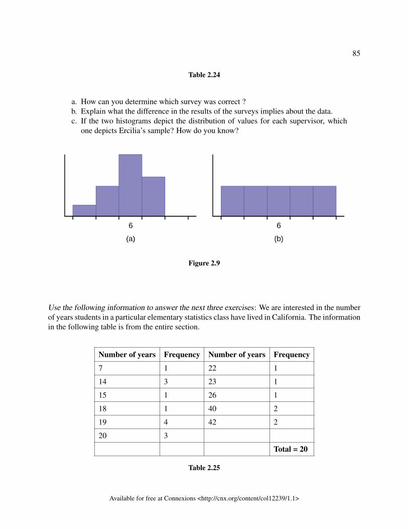
85
Table 2.24
a. How can you determine which survey was correct ?b. Explain what the difference in the results of the surveys implies about the data.c. If the two histograms depict the distribution of values for each supervisor, which
one depicts Ercilia’s sample? How do you know?
Figure 2.9
Use the following information to answer the next three exercises: We are interested in the numberof years students in a particular elementary statistics class have lived in California. The informationin the following table is from the entire section.
Number of years Frequency Number of years Frequency
7 1 22 1
14 3 23 1
15 1 26 1
18 1 40 2
19 4 42 2
20 3
Total = 20
Table 2.25
Available for free at Connexions <http://cnx.org/content/col12239/1.1>
86 CHAPTER 2. DESCRIPTIVE STATISTICS
Exercise 2.3.10 (Solution on p. 110.)What is the mode?
a. 19b. 19.5c. 14 and 20d. 22.65
Exercise 2.3.11 (Solution on p. 110.)Is this a sample or the entire population?
a. sampleb. entire populationc. neither
Exercise 2.3.12 (Solution on p. 110.)A survey of enrollment at 35 community colleges across the United States yielded the
following figures:
6414; 1550; 2109; 9350; 21828; 4300; 5944; 5722; 2825; 2044; 5481; 5200; 5853; 2750;10012; 6357; 27000; 9414; 7681; 3200; 17500; 9200; 7380; 18314; 6557; 13713; 17768;7493; 2771; 2861; 1263; 7285; 28165; 5080; 11622
a. Organize the data into a chart with six intervals of equal width. Label the twocolumns "Enrollment" and "Frequency."
b. Construct a histogram of the data.c. What is the shape of the data? What does the shape tell you about the enrollment at
these community colleges?d. What is the best measure of centre for this data and why? State the measure.e. What is the best measure of variation for this data and why? State the measure.f. If you were to build a new community college, what is the typical range for the
enrollment? Why would this information be helpful? What caveats would you wantto think about when you look at this typical range?
Exercise 2.3.13 (Solution on p. 111.)You work for a soda pop company that is producing a new label for their Asian market.
Three different labels your company is considering are the same, except the colours aredifferent. The colour choices are blue, green and orange.
To determine which label consumers prefer, focus groups were done. One such focusgroup asked 15 participants to rate the cans from 1 to 10. A score of 1 means they hatedthe label and 10 means they loved the label. The results follow.
Available for free at Connexions <http://cnx.org/content/col12239/1.1>
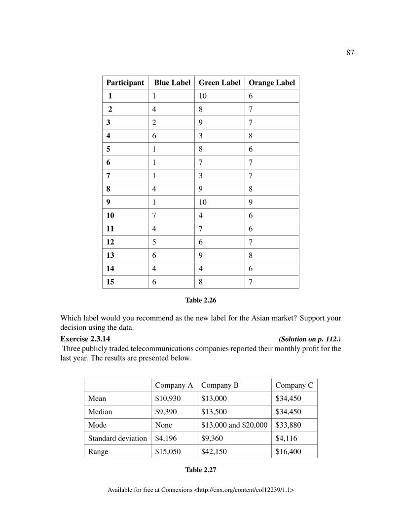
87
Participant Blue Label Green Label Orange Label
1 1 10 6
2 4 8 7
3 2 9 7
4 6 3 8
5 1 8 6
6 1 7 7
7 1 3 7
8 4 9 8
9 1 10 9
10 7 4 6
11 4 7 6
12 5 6 7
13 6 9 8
14 4 4 6
15 6 8 7
Table 2.26
Which label would you recommend as the new label for the Asian market? Support yourdecision using the data.Exercise 2.3.14 (Solution on p. 112.)Three publicly traded telecommunications companies reported their monthly profit for thelast year. The results are presented below.
Company A Company B Company C
Mean $10,930 $13,000 $34,450
Median $9,390 $13,500 $34,450
Mode None $13,000 and $20,000 $33,880
Standard deviation $4,196 $9,360 $4,116
Range $15,050 $42,150 $16,400
Table 2.27
Available for free at Connexions <http://cnx.org/content/col12239/1.1>
88 CHAPTER 2. DESCRIPTIVE STATISTICS
1. Donna is close to retirement and wants to invest in one of the three companies. Shedoesn’t want to see her investment drop significantly as she doesn’t want to see herretirement savings dwindle. Which company would you recommend she invest inand why?
2. What information is missing from the list that you might want to have to help youanswer the above question?
3. What information below is not necessary for making this decision?
2.4 Measures of Location and Box Plots – MRU – C Lemieux(2017)4
2.4.1 IntroductionMeasures of location help us to understand where data values are located relative to other datavalues. We’ve already seen a measure of location - the median. It tells us what data value is inthe middle of the data set. The most common measure of position is a percentile . Percentilesdivide ordered data into hundredths. To score in the 90th percentile of an exam does not mean,necessarily, that you received 90% on a test. It means that 90% of test scores are the same or lessthan your score and 10% of the test scores are the same or greater than your test score. The medianis the 50th percentile
A special type of percentile are called quartiles. Quartiles divide ordered data into quarters. Thefirst quartile, Q 1, is the same as the 25th percentile, and the third quartile, Q 3, is the same as the75th percentile. The median, M, is called both the second quartile and the 50th percentile.
A visual representation of measures of location is called a box plot.
In this section, we will learn how to find quartiles and use those quartiles to find the interquartilerange and outliers. Then we will visually represent this information on a box plot. Unlike his-tograms and bar graphs, box plots require the use of numerical summaries. Thus the box plot is arepresentation that combines both visual and numerical summaries of the data.
2.4.2 Measures of locationAs described in the introduction, a common measure of location are percentiles. Percentiles areuseful for comparing values. For this reason, universities and colleges use percentiles extensively.One instance in which colleges and universities use percentiles is when SAT results are used todetermine a minimum testing score that will be used as an acceptance factor. For example, suppose
4This content is available online at <http://cnx.org/content/m64907/1.1/>.
Available for free at Connexions <http://cnx.org/content/col12239/1.1>
89
Duke accepts SAT scores at or above the 75th percentile. That translates into a score of at least1220.
Percentiles are mostly used with very large populations. Therefore, if you were to say that 90% ofthe test scores are less (and not the same or less) than your score, it would be acceptable becauseremoving one particular data value is not significant.
The median is a number that measures the "center" of the data. You can think of the median asthe "middle value," but it does not actually have to be one of the observed values. It is a numberthat separates ordered data into halves. Half the values are the same number or smaller than themedian, and half the values are the same number or larger. For example, consider the followingdata.1; 11.5; 6; 7.2; 4; 8; 9; 10; 6.8; 8.3; 2; 2; 10; 1Ordered from smallest to largest:1; 1; 2; 2; 4; 6; 6.8; 7.2; 8; 8.3; 9; 10; 10; 11.5
Since there are 14 observations, the median is between the seventh value, 6.8, and the eighth value,7.2. To find the median, add the two values together and divide by two.
6.8+7.22
= 7 (2.9)
The median is seven. Half of the values are smaller than seven and half of the values are largerthan seven.
Quartiles are numbers that separate the data into quarters. Quartiles may or may not be part ofthe data. To find the quartiles, first find the median or second quartile. The first quartile, Q 1, isthe middle value of the lower half of the data, and the third quartile, Q 3, is the middle value, ormedian, of the upper half of the data. To get the idea, consider the same data set:1; 1; 2; 2; 4; 6; 6.8; 7.2; 8; 8.3; 9; 10; 10; 11.5
Quartiles are numbers that separate the data into quarters. Quartiles may or may not be part ofthe data. To find the quartiles, first find the median or second quartile. The first quartile, Q 1, isthe middle value of the lower half of the data, and the third quartile, Q 3, is the middle value, ormedian, of the upper half of the data. To get the idea, consider the same data set:1; 1; 2; 2; 4; 6; 6.8; 7.2; 8; 8.3; 9; 10; 10; 11.5
The median or second quartile is seven. The lower half of the data are 1, 1, 2, 2, 4, 6, 6.8. Themiddle value of the lower half is two.1; 1; 2; 2; 4; 6; 6.8
The number two, which is part of the data, is the first quartile. One-fourth of the entire sets ofvalues are the same as or less than two and three-fourths of the values are more than two.
The upper half of the data is 7.2, 8, 8.3, 9, 10, 10, 11.5. The middle value of the upper half is nine.
Available for free at Connexions <http://cnx.org/content/col12239/1.1>
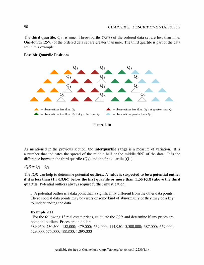
90 CHAPTER 2. DESCRIPTIVE STATISTICS
The third quartile, Q3, is nine. Three-fourths (75%) of the ordered data set are less than nine.One-fourth (25%) of the ordered data set are greater than nine. The third quartile is part of the dataset in this example.
Possible Quartile Positions
Figure 2.10
As mentioned in the previous section, the interquartile range is a measure of variation. It isa number that indicates the spread of the middle half or the middle 50% of the data. It is thedifference between the third quartile (Q 3) and the first quartile (Q 1).
IQR = Q 3 – Q 1
The IQR can help to determine potential outliers. A value is suspected to be a potential outlierif it is less than (1.5)(IQR ) below the first quartile or more than (1.5)(IQR ) above the thirdquartile. Potential outliers always require further investigation.
: A potential outlier is a data point that is significantly different from the other data points.These special data points may be errors or some kind of abnormality or they may be a keyto understanding the data.
Example 2.11For the following 13 real estate prices, calculate the IQR and determine if any prices are
potential outliers. Prices are in dollars.389,950; 230,500; 158,000; 479,000; 639,000; 114,950; 5,500,000; 387,000; 659,000;529,000; 575,000; 488,800; 1,095,000
Available for free at Connexions <http://cnx.org/content/col12239/1.1>
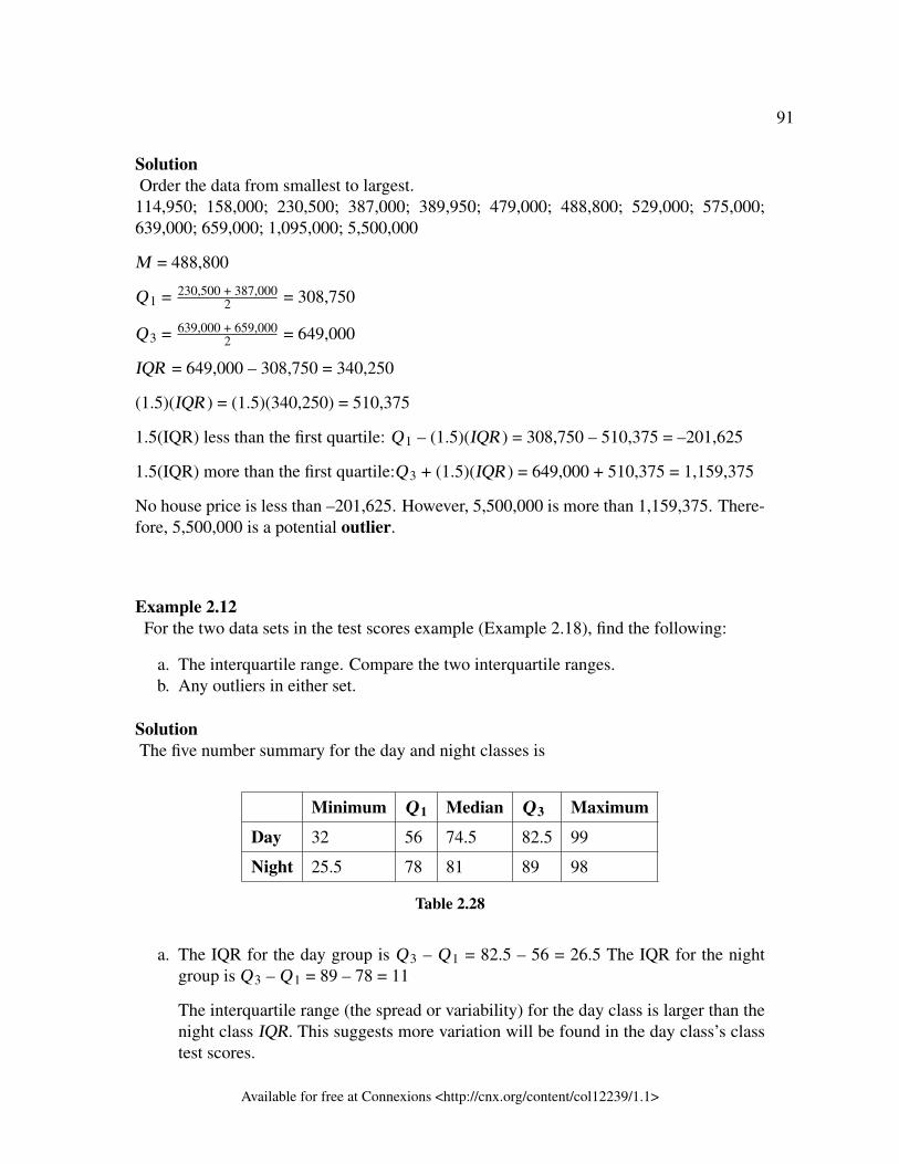
91
SolutionOrder the data from smallest to largest.
114,950; 158,000; 230,500; 387,000; 389,950; 479,000; 488,800; 529,000; 575,000;639,000; 659,000; 1,095,000; 5,500,000
M = 488,800
Q 1 = 230,500 + 387,0002 = 308,750
Q 3 = 639,000 + 659,0002 = 649,000
IQR = 649,000 – 308,750 = 340,250
(1.5)(IQR ) = (1.5)(340,250) = 510,375
1.5(IQR) less than the first quartile: Q 1 – (1.5)(IQR ) = 308,750 – 510,375 = –201,625
1.5(IQR) more than the first quartile:Q 3 + (1.5)(IQR ) = 649,000 + 510,375 = 1,159,375
No house price is less than –201,625. However, 5,500,000 is more than 1,159,375. There-fore, 5,500,000 is a potential outlier.
Example 2.12For the two data sets in the test scores example (Example 2.18), find the following:
a. The interquartile range. Compare the two interquartile ranges.b. Any outliers in either set.
SolutionThe five number summary for the day and night classes is
Minimum Q 1 Median Q 3 Maximum
Day 32 56 74.5 82.5 99
Night 25.5 78 81 89 98
Table 2.28
a. The IQR for the day group is Q 3 – Q 1 = 82.5 – 56 = 26.5 The IQR for the nightgroup is Q 3 – Q 1 = 89 – 78 = 11
The interquartile range (the spread or variability) for the day class is larger than thenight class IQR. This suggests more variation will be found in the day class’s classtest scores.
Available for free at Connexions <http://cnx.org/content/col12239/1.1>
92 CHAPTER 2. DESCRIPTIVE STATISTICS
b. Day class outliers are found using the IQR times 1.5 rule. So,
Q 1 - IQR (1.5) = 56 – 26.5(1.5) = 16.25Q 3 + IQR (1.5) = 82.5 + 26.5(1.5) = 122.25
Since the minimum and maximum values for the day class are greater than 16.25and less than 122.25, there are no outliers.
Night class outliers are calculated as:
Q 1 – IQR (1.5) = 78 – 11(1.5) = 61.5Q 3 + IQR(1.5) = 89 + 11(1.5) = 105.5
For this class, any test score less than 61.5 is an outlier. Therefore, the scores of 45and 25.5 are outliers. Since no test score is greater than 105.5, there is no upper endoutlier.
2.4.2.1 Interpreting Percentiles, Quartiles, and Median
A percentile indicates the relative standing of a data value when data are sorted into numerical orderfrom smallest to largest. Percentages of data values are less than or equal to the pth percentile. Forexample, 15% of data values are less than or equal to the 15th percentile.
• Low percentiles always correspond to lower data values.• High percentiles always correspond to higher data values.
A percentile may or may not correspond to a value judgment about whether it is "good" or "bad."The interpretation of whether a certain percentile is "good" or "bad" depends on the context ofthe situation to which the data applies. In some situations, a low percentile would be considered"good;" in other contexts a high percentile might be considered "good". In many situations, thereis no value judgment that applies.
Understanding how to interpret percentiles properly is important not only when describing data,but also when calculating probabilities in later chapters of this text.
: When writing the interpretation of a percentile in the context of the given data, thesentence should contain the following information.
• information about the context of the situation being considered• the data value (value of the variable) that represents the percentile• the percent of individuals or items with data values below the percentile• the percent of individuals or items with data values above the percentile.
Available for free at Connexions <http://cnx.org/content/col12239/1.1>
93
Example 2.13On a timed math test, the first quartile for time it took to finish the exam was 35 minutes.
Interpret the first quartile in the context of this situation.
Solution• Twenty-five percent of students finished the exam in 35 minutes or less.• Seventy-five percent of students finished the exam in 35 minutes or more.• A low percentile could be considered good, as finishing more quickly on a timed
exam is desirable. (If you take too long, you might not be able to finish.)
Example 2.14On a 20 question math test, the 70th percentile for number of correct answers was 16.
Interpret the 70th percentile in the context of this situation.
Solution• Seventy percent of students answered 16 or fewer questions correctly.• Thirty percent of students answered 16 or more questions correctly.• A higher percentile could be considered good, as answering more questions cor-
rectly is desirable.
:
Exercise 2.4.1 (Solution on p. 112.)
On a 60 point written assignment, the 80th percentile for the number of pointsearned was 49. Interpret the 80th percentile in the context of this situation.
Example 2.15At a community college, it was found that the 30th percentile of credit units that students
are enrolled for is seven units. Interpret the 30th percentile in the context of this situation.
Solution• Thirty percent of students are enrolled in seven or fewer credit units.• Seventy percent of students are enrolled in seven or more credit units.• In this example, there is no "good" or "bad" value judgment associated with a
higher or lower percentile. Students attend community college for varied reasonsand needs, and their course load varies according to their needs.
Available for free at Connexions <http://cnx.org/content/col12239/1.1>
94 CHAPTER 2. DESCRIPTIVE STATISTICS
2.4.2.2 Outliers
Above the idea of potential outliers were discussed. This section will look more in depth at how tofind outliers and how to categorize them.
Quartiles can also be used to determine if there are any outliers in a data set. To determine if thereare outliers, we need to first calculate the inner and outer fences. The fences define the boundarybetween a “normal” data value and an “abnormal” data value (or outlier). Any data values thatfall between the inner fences are normal data values. Any data values that fall outside the innerfences are considered outliers.
The fences are calculated as follows:
The inner fences are Q 1 - IQR (1.5) and Q 3 + IQR (1.5).
The outer fences are Q 1 - IQR (3) and Q 3 + IQR (3).
A mild outlier is any data value between the inner and outer fences.
An extreme outlier is any data value to the extreme of the outer fence.Example 2.16: Finding outliersSharpe Middle School is applying for a grant that will be used to add fitness equipment tothe gym. The principal surveyed 15 anonymous students to determine how many minutes aday the students spend exercising. The results from the 15 anonymous students are shown.
0 minutes; 40 minutes; 60 minutes; 30 minutes; 60 minutes 10 minutes; 45 minutes; 30minutes; 300 minutes; 90 minutes; 30 minutes; 120 minutes; 60 minutes; 0 minutes; 20minutes
The five-number summary is determined to be: Min = 0; Q1 = 20; Med = 40; Q3 = 60;Max = 300.
Are there any students who are exercising significantly more or less than the other stu-dents?
To answer this question, we have to determine if there are any outliers.
To do this, determine the inner fences.
The IQR is 60-20=40.
The lower inner fence is Q 1 - IQR (1.5) = 20 – 40(1.5) = -40$ and the upper inner fenceis Q 3 + IQR (1.5) = 60 + 40(1.5) = 120$. Thus, any student who exercises between -40minutes and 120 minutes is exercising a “normal” amount of time (relative to the rest ofthe students). Since someone can’t exercise -40 minutes, this is really 0 minutes to 120minutes. Therefore, 300 minutes appears to be an outlier. But is it a mild outlier or anextreme outlier?
Available for free at Connexions <http://cnx.org/content/col12239/1.1>
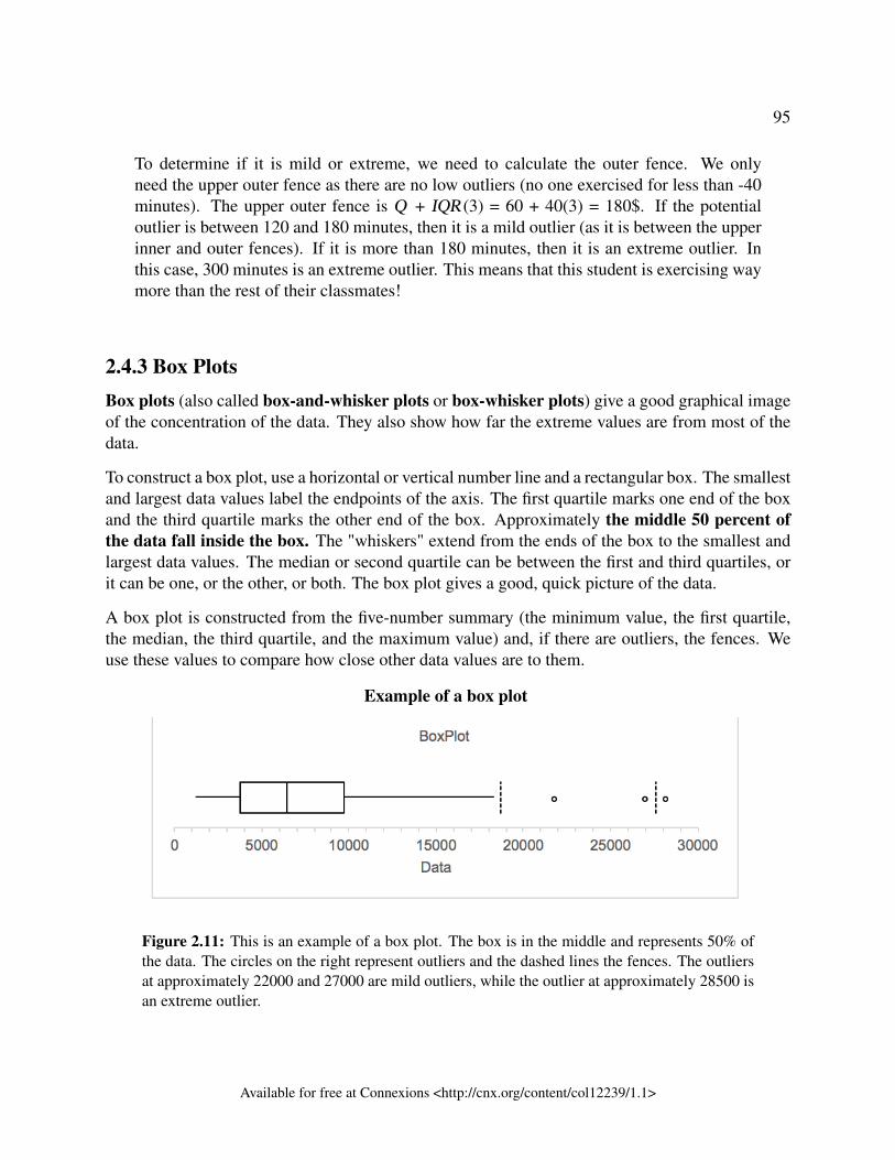
95
To determine if it is mild or extreme, we need to calculate the outer fence. We onlyneed the upper outer fence as there are no low outliers (no one exercised for less than -40minutes). The upper outer fence is Q + IQR (3) = 60 + 40(3) = 180$. If the potentialoutlier is between 120 and 180 minutes, then it is a mild outlier (as it is between the upperinner and outer fences). If it is more than 180 minutes, then it is an extreme outlier. Inthis case, 300 minutes is an extreme outlier. This means that this student is exercising waymore than the rest of their classmates!
2.4.3 Box PlotsBox plots (also called box-and-whisker plots or box-whisker plots) give a good graphical imageof the concentration of the data. They also show how far the extreme values are from most of thedata.
To construct a box plot, use a horizontal or vertical number line and a rectangular box. The smallestand largest data values label the endpoints of the axis. The first quartile marks one end of the boxand the third quartile marks the other end of the box. Approximately the middle 50 percent ofthe data fall inside the box. The "whiskers" extend from the ends of the box to the smallest andlargest data values. The median or second quartile can be between the first and third quartiles, orit can be one, or the other, or both. The box plot gives a good, quick picture of the data.
A box plot is constructed from the five-number summary (the minimum value, the first quartile,the median, the third quartile, and the maximum value) and, if there are outliers, the fences. Weuse these values to compare how close other data values are to them.
Example of a box plot
Figure 2.11: This is an example of a box plot. The box is in the middle and represents 50% ofthe data. The circles on the right represent outliers and the dashed lines the fences. The outliersat approximately 22000 and 27000 are mild outliers, while the outlier at approximately 28500 isan extreme outlier.
Available for free at Connexions <http://cnx.org/content/col12239/1.1>
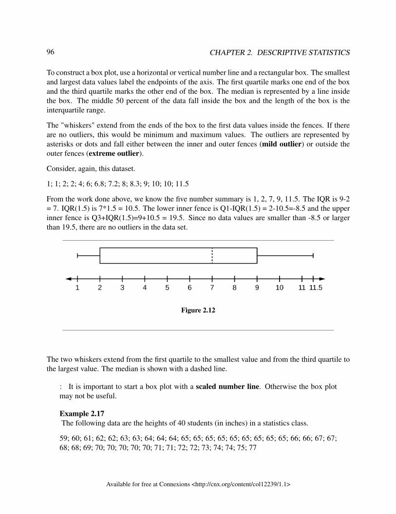
96 CHAPTER 2. DESCRIPTIVE STATISTICS
To construct a box plot, use a horizontal or vertical number line and a rectangular box. The smallestand largest data values label the endpoints of the axis. The first quartile marks one end of the boxand the third quartile marks the other end of the box. The median is represented by a line insidethe box. The middle 50 percent of the data fall inside the box and the length of the box is theinterquartile range.
The "whiskers" extend from the ends of the box to the first data values inside the fences. If thereare no outliers, this would be minimum and maximum values. The outliers are represented byasterisks or dots and fall either between the inner and outer fences (mild outlier) or outside theouter fences (extreme outlier).
Consider, again, this dataset.
1; 1; 2; 2; 4; 6; 6.8; 7.2; 8; 8.3; 9; 10; 10; 11.5
From the work done above, we know the five number summary is 1, 2, 7, 9, 11.5. The IQR is 9-2= 7. IQR(1.5) is 7*1.5 = 10.5. The lower inner fence is Q1-IQR(1.5) = 2-10.5=-8.5 and the upperinner fence is Q3+IQR(1.5)=9+10.5 = 19.5. Since no data values are smaller than -8.5 or largerthan 19.5, there are no outliers in the data set.
Figure 2.12
The two whiskers extend from the first quartile to the smallest value and from the third quartile tothe largest value. The median is shown with a dashed line.
: It is important to start a box plot with a scaled number line. Otherwise the box plotmay not be useful.
Example 2.17The following data are the heights of 40 students (in inches) in a statistics class.
59; 60; 61; 62; 62; 63; 63; 64; 64; 64; 65; 65; 65; 65; 65; 65; 65; 65; 65; 66; 66; 67; 67;68; 68; 69; 70; 70; 70; 70; 70; 71; 71; 72; 72; 73; 74; 74; 75; 77
Available for free at Connexions <http://cnx.org/content/col12239/1.1>
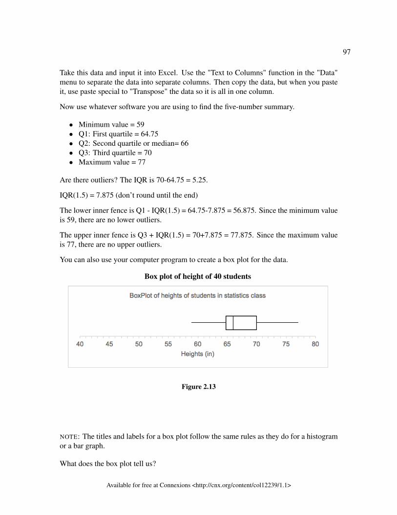
97
Take this data and input it into Excel. Use the "Text to Columns" function in the "Data"menu to separate the data into separate columns. Then copy the data, but when you pasteit, use paste special to "Transpose" the data so it is all in one column.
Now use whatever software you are using to find the five-number summary.
• Minimum value = 59• Q1: First quartile = 64.75• Q2: Second quartile or median= 66• Q3: Third quartile = 70• Maximum value = 77
Are there outliers? The IQR is 70-64.75 = 5.25.
IQR(1.5) = 7.875 (don’t round until the end)
The lower inner fence is Q1 - IQR(1.5) = 64.75-7.875 = 56.875. Since the minimum valueis 59, there are no lower outliers.
The upper inner fence is Q3 + IQR(1.5) = 70+7.875 = 77.875. Since the maximum valueis 77, there are no upper outliers.
You can also use your computer program to create a box plot for the data.
Box plot of height of 40 students
Figure 2.13
NOTE: The titles and labels for a box plot follow the same rules as they do for a histogramor a bar graph.
What does the box plot tell us?
Available for free at Connexions <http://cnx.org/content/col12239/1.1>
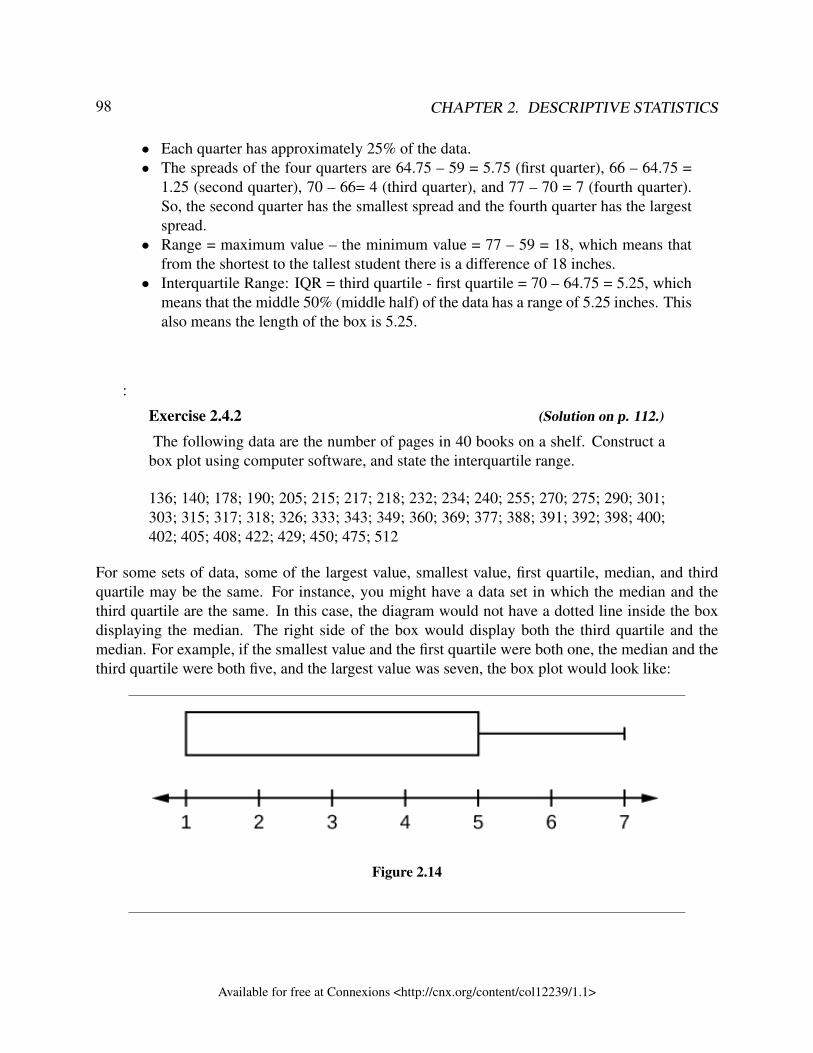
98 CHAPTER 2. DESCRIPTIVE STATISTICS
• Each quarter has approximately 25% of the data.• The spreads of the four quarters are 64.75 – 59 = 5.75 (first quarter), 66 – 64.75 =
1.25 (second quarter), 70 – 66= 4 (third quarter), and 77 – 70 = 7 (fourth quarter).So, the second quarter has the smallest spread and the fourth quarter has the largestspread.
• Range = maximum value – the minimum value = 77 – 59 = 18, which means thatfrom the shortest to the tallest student there is a difference of 18 inches.
• Interquartile Range: IQR = third quartile - first quartile = 70 – 64.75 = 5.25, whichmeans that the middle 50% (middle half) of the data has a range of 5.25 inches. Thisalso means the length of the box is 5.25.
:
Exercise 2.4.2 (Solution on p. 112.)
The following data are the number of pages in 40 books on a shelf. Construct abox plot using computer software, and state the interquartile range.
136; 140; 178; 190; 205; 215; 217; 218; 232; 234; 240; 255; 270; 275; 290; 301;303; 315; 317; 318; 326; 333; 343; 349; 360; 369; 377; 388; 391; 392; 398; 400;402; 405; 408; 422; 429; 450; 475; 512
For some sets of data, some of the largest value, smallest value, first quartile, median, and thirdquartile may be the same. For instance, you might have a data set in which the median and thethird quartile are the same. In this case, the diagram would not have a dotted line inside the boxdisplaying the median. The right side of the box would display both the third quartile and themedian. For example, if the smallest value and the first quartile were both one, the median and thethird quartile were both five, and the largest value was seven, the box plot would look like:
Figure 2.14
Available for free at Connexions <http://cnx.org/content/col12239/1.1>
99
In this case, at least 25% of the values are equal to one. Twenty-five percent of the values arebetween one and five, inclusive. At least 25% of the values are equal to five. The top 25% of thevalues fall between five and seven, inclusive.
Example 2.18Test scores for a college statistics class held during the day are:
99; 56; 78; 55.5; 32; 90; 80; 81; 56; 59; 45; 77; 84.5; 84; 70; 72; 68; 32; 79; 90
Test scores for a college statistics class held during the evening are:
98; 78; 68; 83; 81; 89; 88; 76; 65; 45; 98; 90; 80; 84.5; 85; 79; 78; 98; 90; 79; 81; 25.5Problem (Solution on p. 112.)
a. Find the smallest and largest values, the median, and the first and third quartile forthe day class.
b. Find the smallest and largest values, the median, and the first and third quartile forthe night class.
c. For each data set, what percentage of the data is between the smallest value and thefirst quartile? the first quartile and the median? the median and the third quartile?the third quartile and the largest value? What percentage of the data is between thefirst quartile and the largest value?
d. Create a box plot for each set of data. Use one number line for both box plots.e. Which box plot has the widest spread for the middle 50% of the data (the data
between the first and third quartiles)? What does this mean for that set of data incomparison to the other set of data?
:
Exercise 2.4.3 (Solution on p. 113.)
The following data set shows the heights in inches for the boys in a class of 40students.
66; 66; 67; 67; 68; 68; 68; 68; 68; 69; 69; 69; 70; 71; 72; 72; 72; 73; 73; 74The following data set shows the heights in inches for the girls in a class of 40students.61; 61; 62; 62; 63; 63; 63; 65; 65; 65; 66; 66; 66; 67; 68; 68; 68; 69; 69; 69Construct a box plot using computer software for each data set, and state whichbox plot has the wider spread for the middle 50% of the data.
Available for free at Connexions <http://cnx.org/content/col12239/1.1>
100 CHAPTER 2. DESCRIPTIVE STATISTICS
2.4.4 ReferencesData from West Magazine.
Cauchon, Dennis, Paul Overberg. “Census data shows minorities now a majority of U.S. births.”USA Today, 2012. Available online at http://usatoday30.usatoday.com/news/nation/story/2012-05-17/minority-birthscensus/55029100/1 (accessed April 3, 2013).
Data from the United States Department of Commerce: United States Census Bureau. Availableonline at http://www.census.gov/ (accessed April 3, 2013).
“1990 Census.” United States Department of Commerce: United States Census Bureau. Availableonline at http://www.census.gov/main/www/cen1990.html (accessed April 3, 2013).
Data from San Jose Mercury News.
Data from Time Magazine; survey by Yankelovich Partners, Inc.
2.4.5 Chapter ReviewThe values that divide a rank-ordered set of data into 100 equal parts are called percentiles. Per-centiles are used to compare and interpret data. For example, an observation at the 50th percentilewould be greater than 50 percent of the other obeservations in the set. Quartiles divide data intoquarters. The first quartile (Q 1) is the 25th percentile,the second quartile (Q 2 or median) is 50th
percentile, and the third quartile (Q 3) is the the 75th percentile. The interquartile range, or IQR, isthe range of the middle 50 percent of the data values. The IQR is found by subtracting Q 1 fromQ 3, and can help determine outliers by using the following two expressions.
• Q 3 + IQR (1.5)• Q 1 – IQR (1.5)
Box plots are a type of graph that can help visually organize data. To graph a box plot the followingdata points must be calculated: the minimum value, the first quartile, the median, the third quartile,and the maximum value. Once the box plot is graphed, you can display and compare distributionsof data.
Available for free at Connexions <http://cnx.org/content/col12239/1.1>
101
2.4.6Exercise 2.4.4 (Solution on p. 114.)On an exam, would it be more desirable to earn a grade with a high or low percentile?
Explain.Exercise 2.4.5 (Solution on p. 114.)Mina is waiting in line at the Department of Motor Vehicles (DMV). Her wait time of
32 minutes is the 85th percentile of wait times. Is that good or bad? Write a sentenceinterpreting the 85th percentile in the context of this situation.Exercise 2.4.6 (Solution on p. 114.)In a study collecting data about the repair costs of damage to automobiles in a certain typeof crash tests, a certain model of car had $1,700 in damage and was in the 90th percentile.Should the manufacturer and the consumer be pleased or upset by this result? Explain andwrite a sentence that interprets the 90th percentile in the context of this problem.Exercise 2.4.7 (Solution on p. 114.)Suppose that you are buying a house. You and your realtor have determined that the
most expensive house you can afford is the 34th percentile. The 34th percentile of housingprices is $240,000 in the town you want to move to. In this town, can you afford 34% ofthe houses or 66% of the houses?Exercise 2.4.8 (Solution on p. 114.)Sixty-five randomly selected car salespersons were asked the number of cars they gen-
erally sell in one week. Fourteen people answered that they generally sell three cars;nineteen generally sell four cars; twelve generally sell five cars; nine generally sell sixcars; eleven generally sell seven cars. Construct a box plot for this data.Exercise 2.4.9 (Solution on p. 114.)Looking at your box plot in the exercise above, does it appear that the data are concen-
trated together, spread out evenly, or concentrated in some areas, but not in others? Howcan you tell?Exercise 2.4.10 (Solution on p. 114.)In a survey of 20-year-olds in China, Germany, and the United States, people were asked
the number of foreign countries they had visited in their lifetime. The following box plotsdisplay the results.
Available for free at Connexions <http://cnx.org/content/col12239/1.1>
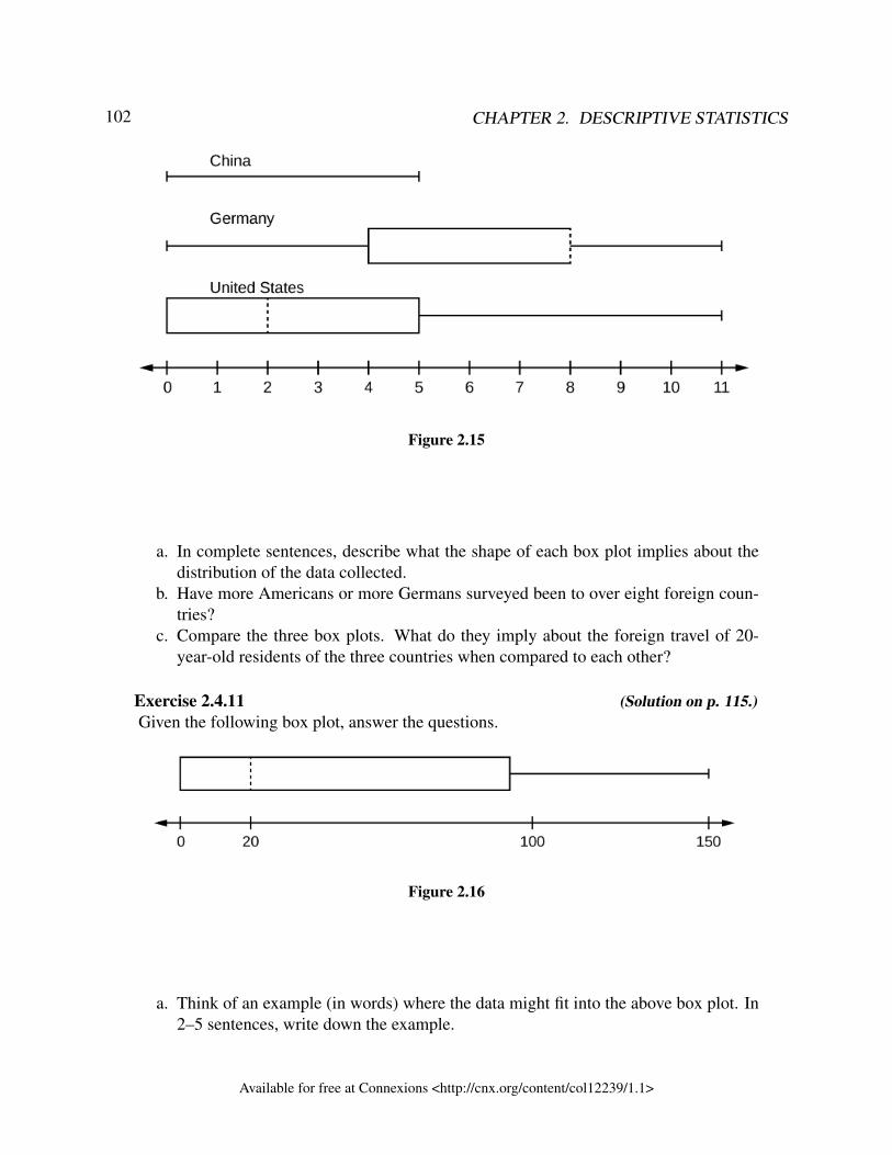
102 CHAPTER 2. DESCRIPTIVE STATISTICS
Figure 2.15
a. In complete sentences, describe what the shape of each box plot implies about thedistribution of the data collected.
b. Have more Americans or more Germans surveyed been to over eight foreign coun-tries?
c. Compare the three box plots. What do they imply about the foreign travel of 20-year-old residents of the three countries when compared to each other?
Exercise 2.4.11 (Solution on p. 115.)Given the following box plot, answer the questions.
Figure 2.16
a. Think of an example (in words) where the data might fit into the above box plot. In2–5 sentences, write down the example.
Available for free at Connexions <http://cnx.org/content/col12239/1.1>
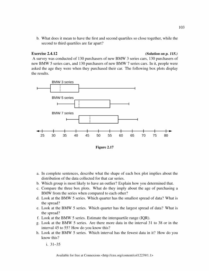
103
b. What does it mean to have the first and second quartiles so close together, while thesecond to third quartiles are far apart?
Exercise 2.4.12 (Solution on p. 115.)A survey was conducted of 130 purchasers of new BMW 3 series cars, 130 purchasers ofnew BMW 5 series cars, and 130 purchasers of new BMW 7 series cars. In it, people wereasked the age they were when they purchased their car. The following box plots displaythe results.
Figure 2.17
a. In complete sentences, describe what the shape of each box plot implies about thedistribution of the data collected for that car series.
b. Which group is most likely to have an outlier? Explain how you determined that.c. Compare the three box plots. What do they imply about the age of purchasing a
BMW from the series when compared to each other?d. Look at the BMW 5 series. Which quarter has the smallest spread of data? What is
the spread?e. Look at the BMW 5 series. Which quarter has the largest spread of data? What is
the spread?f. Look at the BMW 5 series. Estimate the interquartile range (IQR).g. Look at the BMW 5 series. Are there more data in the interval 31 to 38 or in the
interval 45 to 55? How do you know this?h. Look at the BMW 5 series. Which interval has the fewest data in it? How do you
know this?
i. 31–35
Available for free at Connexions <http://cnx.org/content/col12239/1.1>
104 CHAPTER 2. DESCRIPTIVE STATISTICS
ii. 38–41iii. 41–64
Exercise 2.4.13 (Solution on p. 115.)The following data represents the number of passengers per flight on the AirBus from
Calgary to Edmonton for 24 flights.
8, 19, 22, 23, 29, 30, 34, 35, 37, 39, 41, 44, 44, 46, 46, 47, 48, 49, 50, 52, 54, 55, 61, 65
a. Generate the boxplot for this data.b. Identify the outliers in the data. Are they low or high outliers? Are the extreme or
mild outliers?c. Interpret the outliers in the context of the question.d. What is the IQR? Interpret it in the context of the question.e. Which quarter of the data is the most concentrated? The least concentrated?f. What is the five-number summary (minimum, first quartile, median, third quartile,
maximum)?
2.4.7 Bringing It TogetherExercise 2.4.14 (Solution on p. 116.)Santa Clara County, CA, has approximately 27,873 Japanese-Americans. Their ages are
as follows:
Age Group Percent of Community
0–17 18.9
18–24 8.0
25–34 22.8
35–44 15.0
45–54 13.1
55–64 11.9
65+ 10.3
Table 2.29
a. Construct a histogram of the Japanese-American community in Santa Clara County,CA. The bars will not be the same width for this example. Why not? What impactdoes this have on the reliability of the graph?
Available for free at Connexions <http://cnx.org/content/col12239/1.1>
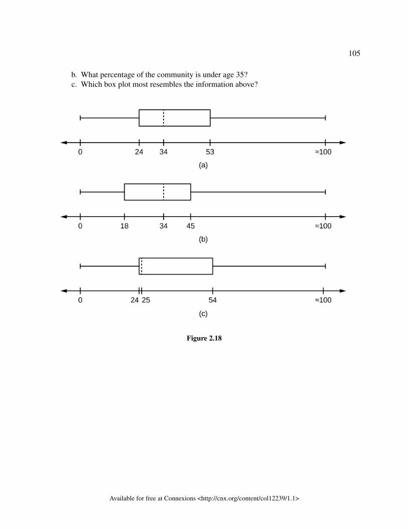
105
b. What percentage of the community is under age 35?c. Which box plot most resembles the information above?
Figure 2.18
Available for free at Connexions <http://cnx.org/content/col12239/1.1>
106 CHAPTER 2. DESCRIPTIVE STATISTICS
Solutions to Exercises in Chapter 2Solution to Exercise 2.2.1 (p. 45)
Figure 2.19
to Exercise 2.2.2 (p. 46)
Available for free at Connexions <http://cnx.org/content/col12239/1.1>
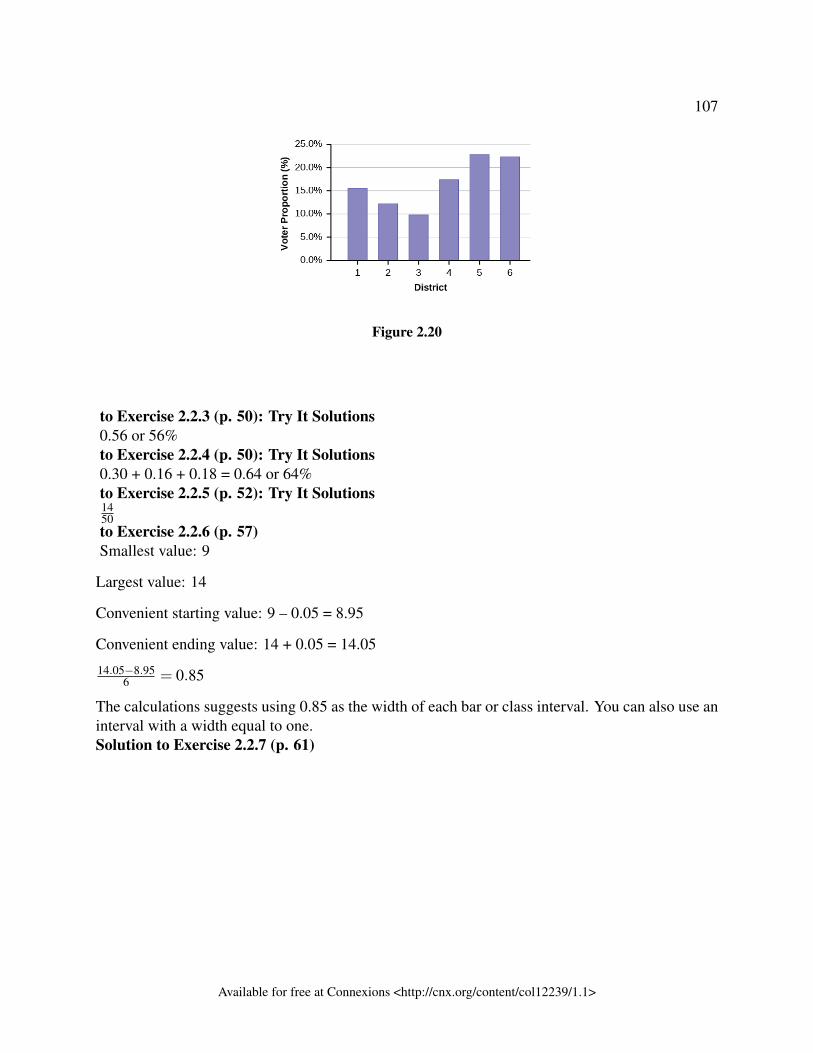
107
Figure 2.20
to Exercise 2.2.3 (p. 50): Try It Solutions0.56 or 56%to Exercise 2.2.4 (p. 50): Try It Solutions0.30 + 0.16 + 0.18 = 0.64 or 64%to Exercise 2.2.5 (p. 52): Try It Solutions1450to Exercise 2.2.6 (p. 57)Smallest value: 9
Largest value: 14
Convenient starting value: 9 – 0.05 = 8.95
Convenient ending value: 14 + 0.05 = 14.05
14.05−8.956 = 0.85
The calculations suggests using 0.85 as the width of each bar or class interval. You can also use aninterval with a width equal to one.Solution to Exercise 2.2.7 (p. 61)
Available for free at Connexions <http://cnx.org/content/col12239/1.1>
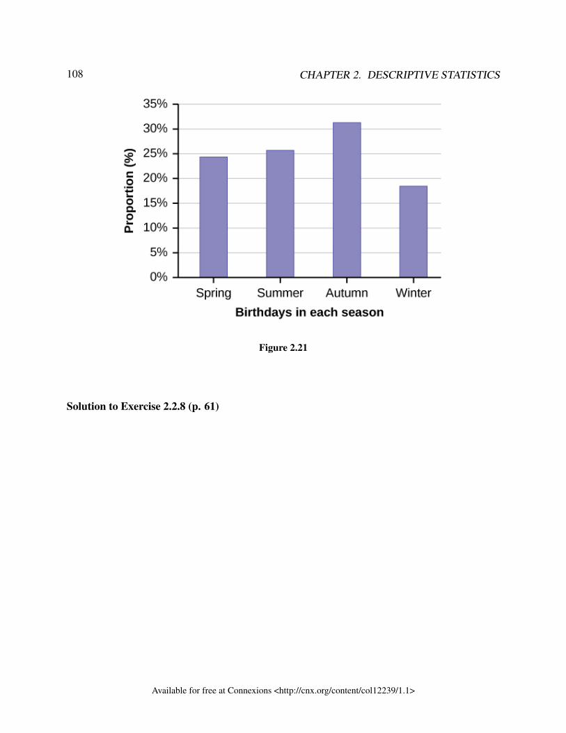
108 CHAPTER 2. DESCRIPTIVE STATISTICS
Figure 2.21
Solution to Exercise 2.2.8 (p. 61)
Available for free at Connexions <http://cnx.org/content/col12239/1.1>
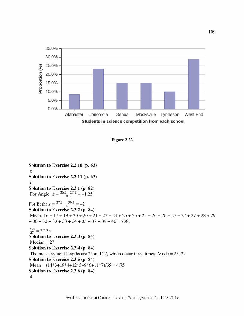
109
Figure 2.22
Solution to Exercise 2.2.10 (p. 63)c
Solution to Exercise 2.2.11 (p. 63)d
Solution to Exercise 2.3.1 (p. 82)For Angie: z = 26.2 – 27.2
0.8 = –1.25
For Beth: z = 27.3−−30.11.4 = –2
Solution to Exercise 2.3.2 (p. 84)Mean: 16 + 17 + 19 + 20 + 20 + 21 + 23 + 24 + 25 + 25 + 25 + 26 + 26 + 27 + 27 + 27 + 28 + 29+ 30 + 32 + 33 + 33 + 34 + 35 + 37 + 39 + 40 = 738;
73827 = 27.33
Solution to Exercise 2.3.3 (p. 84)Median = 27
Solution to Exercise 2.3.4 (p. 84)The most frequent lengths are 25 and 27, which occur three times. Mode = 25, 27
Solution to Exercise 2.3.5 (p. 84)Mean = (14*3+19*4+12*5+9*6+11*7)/65 = 4.75
Solution to Exercise 2.3.6 (p. 84)4
Available for free at Connexions <http://cnx.org/content/col12239/1.1>
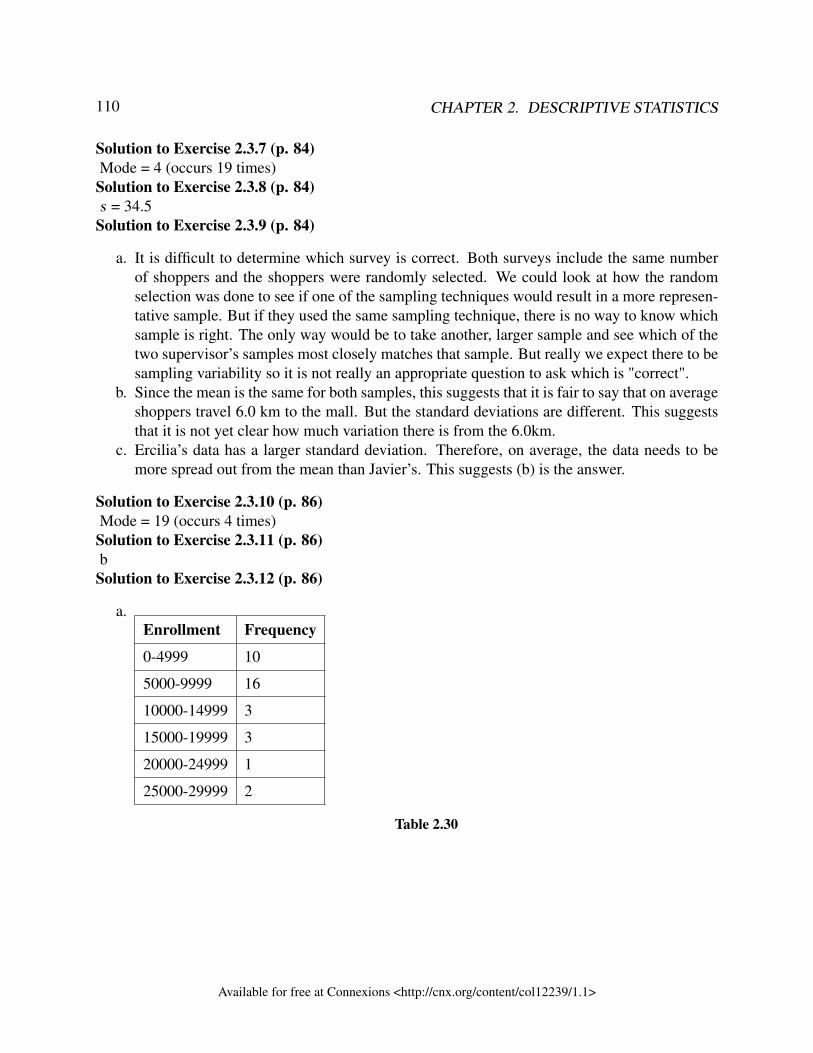
110 CHAPTER 2. DESCRIPTIVE STATISTICS
Solution to Exercise 2.3.7 (p. 84)Mode = 4 (occurs 19 times)
Solution to Exercise 2.3.8 (p. 84)s = 34.5
Solution to Exercise 2.3.9 (p. 84)
a. It is difficult to determine which survey is correct. Both surveys include the same numberof shoppers and the shoppers were randomly selected. We could look at how the randomselection was done to see if one of the sampling techniques would result in a more represen-tative sample. But if they used the same sampling technique, there is no way to know whichsample is right. The only way would be to take another, larger sample and see which of thetwo supervisor’s samples most closely matches that sample. But really we expect there to besampling variability so it is not really an appropriate question to ask which is "correct".
b. Since the mean is the same for both samples, this suggests that it is fair to say that on averageshoppers travel 6.0 km to the mall. But the standard deviations are different. This suggeststhat it is not yet clear how much variation there is from the 6.0km.
c. Ercilia’s data has a larger standard deviation. Therefore, on average, the data needs to bemore spread out from the mean than Javier’s. This suggests (b) is the answer.
Solution to Exercise 2.3.10 (p. 86)Mode = 19 (occurs 4 times)
Solution to Exercise 2.3.11 (p. 86)b
Solution to Exercise 2.3.12 (p. 86)
a.Enrollment Frequency
0-4999 10
5000-9999 16
10000-14999 3
15000-19999 3
20000-24999 1
25000-29999 2
Table 2.30
Available for free at Connexions <http://cnx.org/content/col12239/1.1>
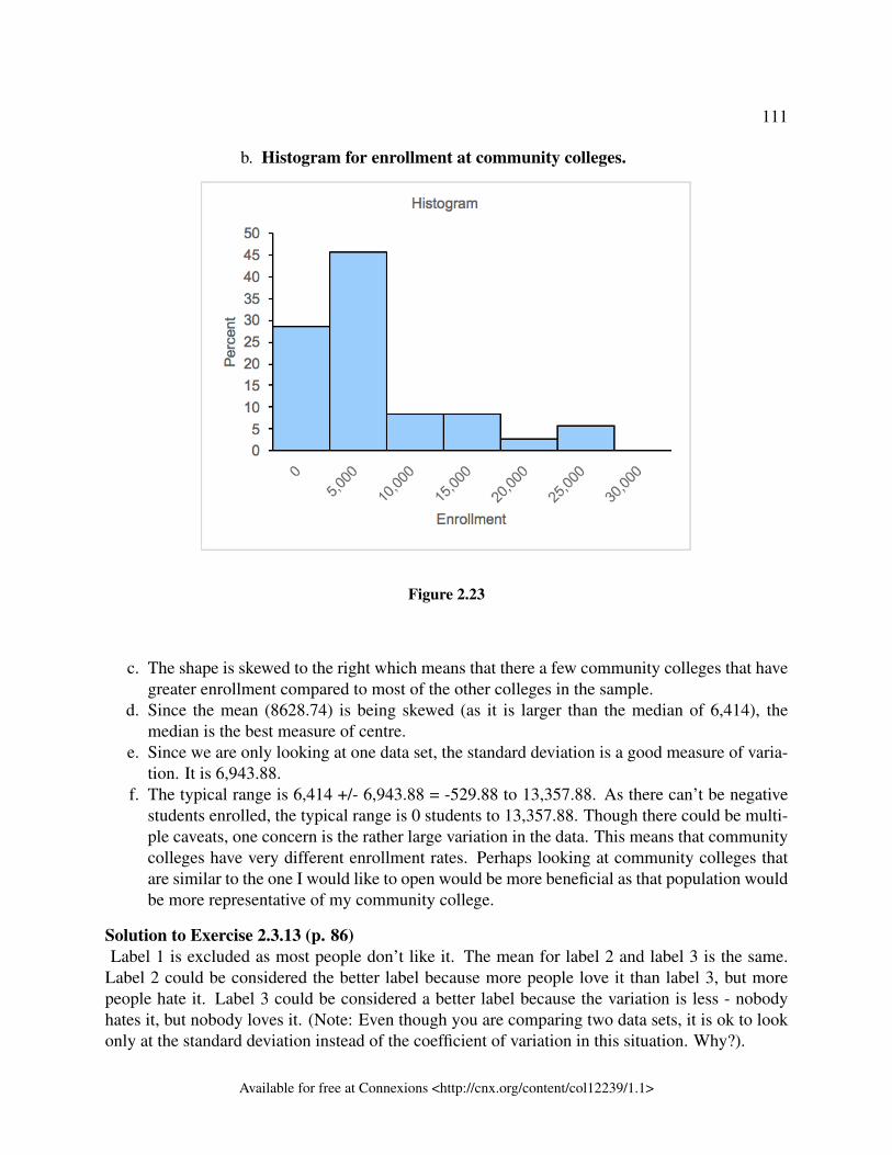
111
b. Histogram for enrollment at community colleges.
Figure 2.23
c. The shape is skewed to the right which means that there a few community colleges that havegreater enrollment compared to most of the other colleges in the sample.
d. Since the mean (8628.74) is being skewed (as it is larger than the median of 6,414), themedian is the best measure of centre.
e. Since we are only looking at one data set, the standard deviation is a good measure of varia-tion. It is 6,943.88.
f. The typical range is 6,414 +/- 6,943.88 = -529.88 to 13,357.88. As there can’t be negativestudents enrolled, the typical range is 0 students to 13,357.88. Though there could be multi-ple caveats, one concern is the rather large variation in the data. This means that communitycolleges have very different enrollment rates. Perhaps looking at community colleges thatare similar to the one I would like to open would be more beneficial as that population wouldbe more representative of my community college.
Solution to Exercise 2.3.13 (p. 86)Label 1 is excluded as most people don’t like it. The mean for label 2 and label 3 is the same.
Label 2 could be considered the better label because more people love it than label 3, but morepeople hate it. Label 3 could be considered a better label because the variation is less - nobodyhates it, but nobody loves it. (Note: Even though you are comparing two data sets, it is ok to lookonly at the standard deviation instead of the coefficient of variation in this situation. Why?).
Available for free at Connexions <http://cnx.org/content/col12239/1.1>
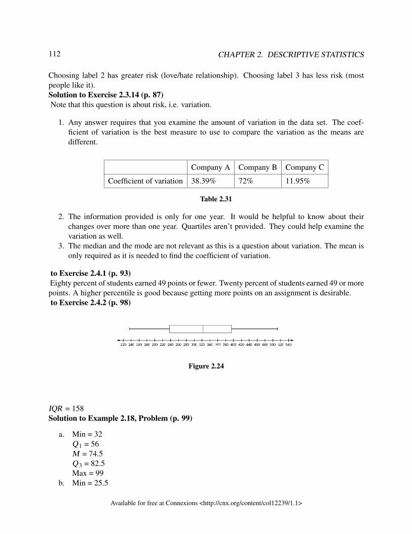
112 CHAPTER 2. DESCRIPTIVE STATISTICS
Choosing label 2 has greater risk (love/hate relationship). Choosing label 3 has less risk (mostpeople like it).Solution to Exercise 2.3.14 (p. 87)Note that this question is about risk, i.e. variation.
1. Any answer requires that you examine the amount of variation in the data set. The coef-ficient of variation is the best measure to use to compare the variation as the means aredifferent.
Company A Company B Company C
Coefficient of variation 38.39% 72% 11.95%
Table 2.31
2. The information provided is only for one year. It would be helpful to know about theirchanges over more than one year. Quartiles aren’t provided. They could help examine thevariation as well.
3. The median and the mode are not relevant as this is a question about variation. The mean isonly required as it is needed to find the coefficient of variation.
to Exercise 2.4.1 (p. 93)Eighty percent of students earned 49 points or fewer. Twenty percent of students earned 49 or morepoints. A higher percentile is good because getting more points on an assignment is desirable.to Exercise 2.4.2 (p. 98)
Figure 2.24
IQR = 158Solution to Example 2.18, Problem (p. 99)
a. Min = 32Q 1 = 56M = 74.5Q 3 = 82.5Max = 99
b. Min = 25.5
Available for free at Connexions <http://cnx.org/content/col12239/1.1>
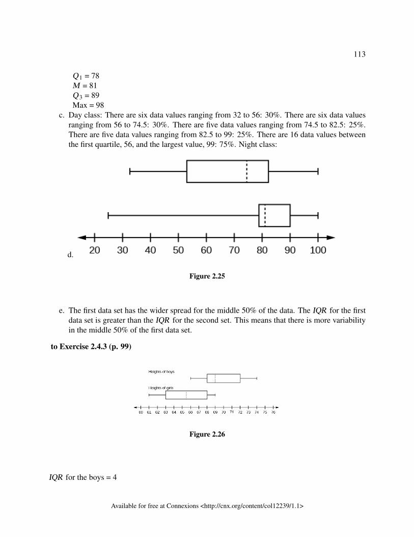
113
Q 1 = 78M = 81Q 3 = 89Max = 98
c. Day class: There are six data values ranging from 32 to 56: 30%. There are six data valuesranging from 56 to 74.5: 30%. There are five data values ranging from 74.5 to 82.5: 25%.There are five data values ranging from 82.5 to 99: 25%. There are 16 data values betweenthe first quartile, 56, and the largest value, 99: 75%. Night class:
d.
Figure 2.25
e. The first data set has the wider spread for the middle 50% of the data. The IQR for the firstdata set is greater than the IQR for the second set. This means that there is more variabilityin the middle 50% of the first data set.
to Exercise 2.4.3 (p. 99)
Figure 2.26
IQR for the boys = 4
Available for free at Connexions <http://cnx.org/content/col12239/1.1>
114 CHAPTER 2. DESCRIPTIVE STATISTICS
IQR for the girls = 5
The box plot for the heights of the girls has the wider spread for the middle 50% of the data.Solution to Exercise 2.4.4 (p. 101)It is better to earn a grade in a high percentile as that means that you have done better on the examrelative to your classmates.Solution to Exercise 2.4.5 (p. 101)When waiting in line at the DMV, the 85th percentile would be a long wait time compared to
the other people waiting. 85% of people had shorter wait times than Mina. In this context, Minawould prefer a wait time corresponding to a lower percentile. 85% of people at the DMV waited32 minutes or less. 15% of people at the DMV waited 32 minutes or longer.Solution to Exercise 2.4.6 (p. 101)The manufacturer and the consumer would be upset. This is a large repair cost for the damages,
compared to the other cars in the sample. INTERPRETATION: 90% of the crash tested cars haddamage repair costs of $1700 or less; only 10% had damage repair costs of $1700 or more.Solution to Exercise 2.4.7 (p. 101)You can afford 34% of houses. 66% of the houses are too expensive for your budget. INTERPRE-TATION: 34% of houses cost $240,000 or less. 66% of houses cost $240,000 or more.Solution to Exercise 2.4.8 (p. 101)
Figure 2.27
Solution to Exercise 2.4.9 (p. 101)More than 25% of salespersons sell four cars in a typical week. You can see this concentration in
the box plot because the first quartile is equal to the median. The top 25% and the bottom 25% arespread out evenly; the whiskers have the same length.Solution to Exercise 2.4.10 (p. 101)
a. The shape of China suggests that either every person they surveyed except one either visited0 foreign countries or 5 foreign countries. For example, if 30 people were interviewed in
Available for free at Connexions <http://cnx.org/content/col12239/1.1>
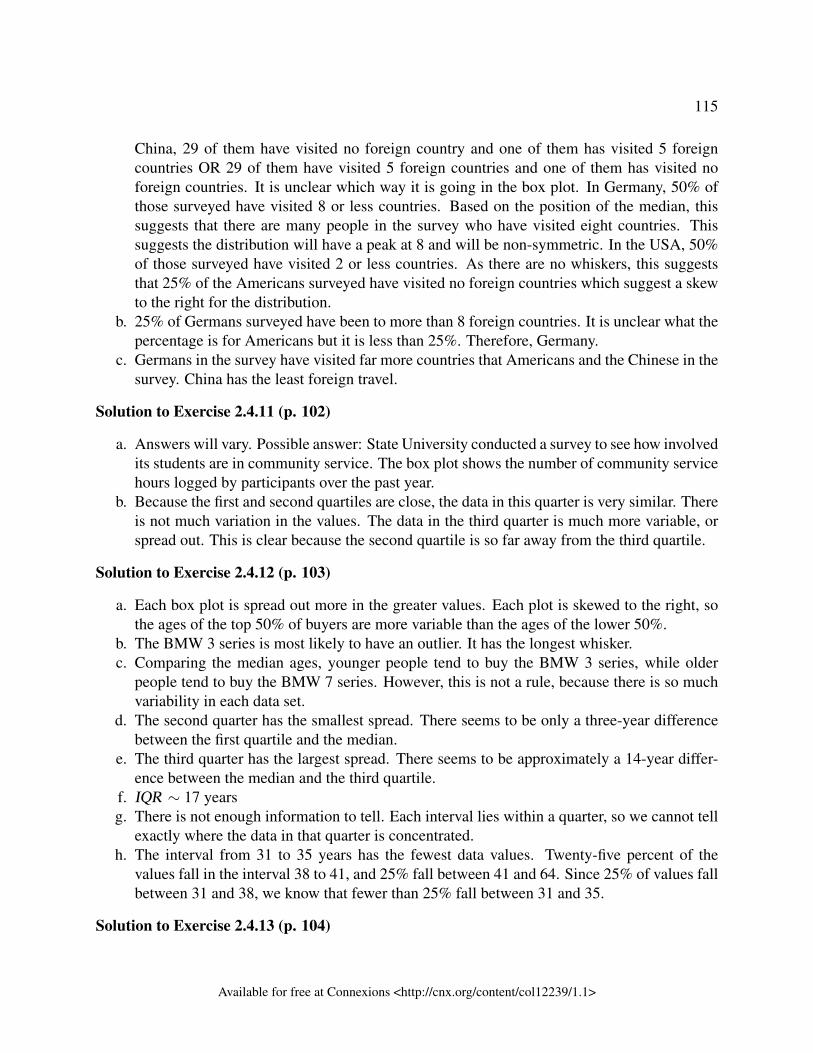
115
China, 29 of them have visited no foreign country and one of them has visited 5 foreigncountries OR 29 of them have visited 5 foreign countries and one of them has visited noforeign countries. It is unclear which way it is going in the box plot. In Germany, 50% ofthose surveyed have visited 8 or less countries. Based on the position of the median, thissuggests that there are many people in the survey who have visited eight countries. Thissuggests the distribution will have a peak at 8 and will be non-symmetric. In the USA, 50%of those surveyed have visited 2 or less countries. As there are no whiskers, this suggeststhat 25% of the Americans surveyed have visited no foreign countries which suggest a skewto the right for the distribution.
b. 25% of Germans surveyed have been to more than 8 foreign countries. It is unclear what thepercentage is for Americans but it is less than 25%. Therefore, Germany.
c. Germans in the survey have visited far more countries that Americans and the Chinese in thesurvey. China has the least foreign travel.
Solution to Exercise 2.4.11 (p. 102)
a. Answers will vary. Possible answer: State University conducted a survey to see how involvedits students are in community service. The box plot shows the number of community servicehours logged by participants over the past year.
b. Because the first and second quartiles are close, the data in this quarter is very similar. Thereis not much variation in the values. The data in the third quarter is much more variable, orspread out. This is clear because the second quartile is so far away from the third quartile.
Solution to Exercise 2.4.12 (p. 103)
a. Each box plot is spread out more in the greater values. Each plot is skewed to the right, sothe ages of the top 50% of buyers are more variable than the ages of the lower 50%.
b. The BMW 3 series is most likely to have an outlier. It has the longest whisker.c. Comparing the median ages, younger people tend to buy the BMW 3 series, while older
people tend to buy the BMW 7 series. However, this is not a rule, because there is so muchvariability in each data set.
d. The second quarter has the smallest spread. There seems to be only a three-year differencebetween the first quartile and the median.
e. The third quarter has the largest spread. There seems to be approximately a 14-year differ-ence between the median and the third quartile.
f. IQR ∼ 17 yearsg. There is not enough information to tell. Each interval lies within a quarter, so we cannot tell
exactly where the data in that quarter is concentrated.h. The interval from 31 to 35 years has the fewest data values. Twenty-five percent of the
values fall in the interval 38 to 41, and 25% fall between 41 and 64. Since 25% of values fallbetween 31 and 38, we know that fewer than 25% fall between 31 and 35.
Solution to Exercise 2.4.13 (p. 104)
Available for free at Connexions <http://cnx.org/content/col12239/1.1>
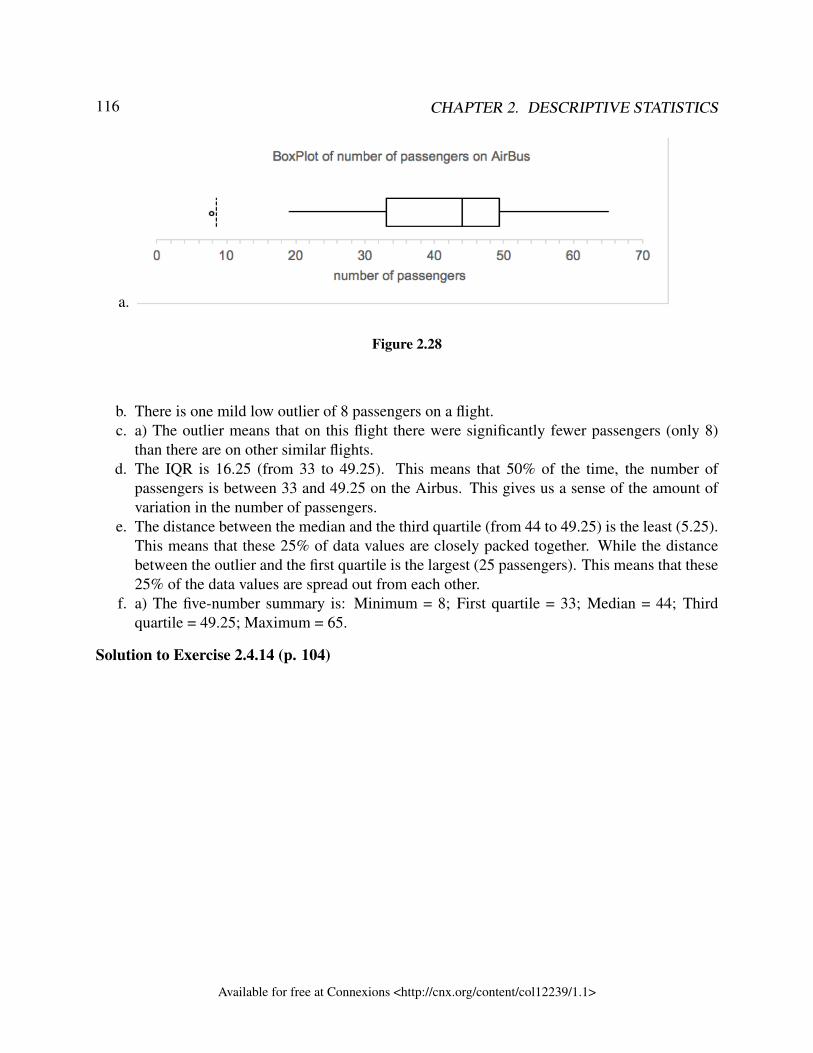
116 CHAPTER 2. DESCRIPTIVE STATISTICS
a.
Figure 2.28
b. There is one mild low outlier of 8 passengers on a flight.c. a) The outlier means that on this flight there were significantly fewer passengers (only 8)
than there are on other similar flights.d. The IQR is 16.25 (from 33 to 49.25). This means that 50% of the time, the number of
passengers is between 33 and 49.25 on the Airbus. This gives us a sense of the amount ofvariation in the number of passengers.
e. The distance between the median and the third quartile (from 44 to 49.25) is the least (5.25).This means that these 25% of data values are closely packed together. While the distancebetween the outlier and the first quartile is the largest (25 passengers). This means that these25% of the data values are spread out from each other.
f. a) The five-number summary is: Minimum = 8; First quartile = 33; Median = 44; Thirdquartile = 49.25; Maximum = 65.
Solution to Exercise 2.4.14 (p. 104)
Available for free at Connexions <http://cnx.org/content/col12239/1.1>
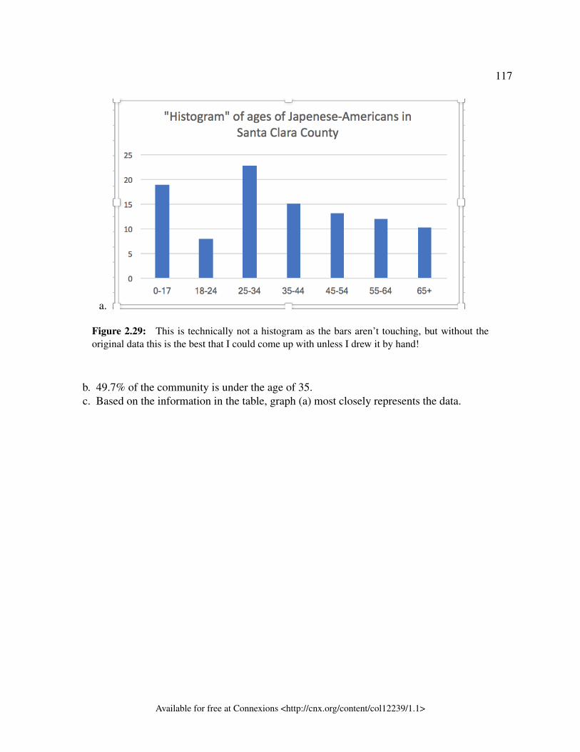
117
a.
Figure 2.29: This is technically not a histogram as the bars aren’t touching, but without theoriginal data this is the best that I could come up with unless I drew it by hand!
b. 49.7% of the community is under the age of 35.c. Based on the information in the table, graph (a) most closely represents the data.
Available for free at Connexions <http://cnx.org/content/col12239/1.1>
118 GLOSSARY
Glossary
A Averagealso called mean or arithmetic mean; a number that describes the central tendency of the
data
B Blindingnot telling participants which treatment a subject is receiving
Box plota graph that gives a quick picture of the middle 50% of the data
C Categorical Variablevariables that take on values that are names or labels
Cluster Samplinga method for selecting a random sample and dividing the population into groups
(clusters); use simple random sampling to select a set of clusters. Every individual inthe chosen clusters is included in the sample.
Continuous Random Variablea random variable (RV) whose outcomes are measured; the height of trees in the forest
is a continuous RV.
Control Groupa group in a randomized experiment that receives an inactive treatment but is otherwise
managed exactly as the other groups
Convenience Samplinga nonrandom method of selecting a sample; this method selects individuals that are
easily accessible and may result in biased data.
D Dataa set of observations (a set of possible outcomes); most data used in statistical research
can be put into two groups: categorical (an attribute whose value is a label) orquantitative (an attribute whose value is indicated by a number). Categorical data canbe separated into two subgroups: nominal and ordinal. Data is nominal if it cannotbe meaningfully ordered. Data is ordinal if the data can be meaningfully ordered.
Available for free at Connexions <http://cnx.org/content/col12239/1.1>
GLOSSARY 119
Quantitative data can be separated into two subgroups: discrete and continuous. Datais discrete if it is the result of counting (such as the number of students of a givenethnic group in a class or the number of books on a shelf). Data is continuous if it isthe result of measuring (such as distance traveled or weight of luggage)
Discrete Random Variablea random variable (RV) whose outcomes are counted
Double-blindingthe act of blinding both the subjects of an experiment and the researchers who work
with the subjects
E Experimental Unitany individual or object to be measured
Explanatory Variablethe independent variable in an experiment; the value controlled by researchers
F First Quartilethe value that is the median of the of the lower half of the ordered data set
Frequency Polygonlooks like a line graph but uses intervals to display ranges of large amounts of data
Frequency Tablea data representation in which grouped data is displayed along with the correspondingfrequencies
Frequencythe number of times a value of the data occurs
H Histograma graphical representation in x-y form of the distribution of data in a data set; xrepresents the data and y represents the frequency, or relative frequency. The graphconsists of contiguous rectangles.
I Informed ConsentAny human subject in a research study must be cognizant of any risks or costs
associated with the study. The subject has the right to know the nature of thetreatments included in the study, their potential risks, and their potential benefits.Consent must be given freely by an informed, fit participant.
Institutional Review Boarda committee tasked with oversight of research programs that involve human subjects
Available for free at Connexions <http://cnx.org/content/col12239/1.1>
120 GLOSSARY
Intervalalso called a class interval; an interval represents a range of data and is used when
displaying large data sets
L Lurking Variablea variable that has an effect on a study even though it is neither an explanatory variable
nor a response variable
M Meana number that measures the central tendency of the data; a common name for mean is’average.’ The term ’mean’ is a shortened form of ’arithmetic mean.’ By definition,
the mean for a sample (denoted by x) is−−x = Sum of all values in the sample
Number of values in the sample , and the
mean for a population (denoted by µ) is µ = Sum of all values in the populationNumber of values in the population .
Mediana number that separates ordered data into halves; half the values are the same numberor smaller than the median and half the values are the same number or larger than themedian. The median may or may not be part of the data.
Midpointthe mean of an interval in a frequency table
Modethe value that appears most frequently in a set of data
N Nonsampling Erroran issue that affects the reliability of sampling data other than natural variation; it
includes a variety of human errors including poor study design, biased samplingmethods, inaccurate information provided by study participants, data entry errors, andpoor analysis.
Numerical Variablevariables that take on values that are indicated by numbers
P Paired Data Settwo data sets that have a one to one relationship so that:
• both data sets are the same size, and• each data point in one data set is matched with exactly one point from the other
set.
Parameter
Available for free at Connexions <http://cnx.org/content/col12239/1.1>
GLOSSARY 121
a number that is used to represent a population characteristic and that generally cannotbe determined easily
Placeboan inactive treatment that has no real effect on the explanatory variable
Populationall individuals, objects, or measurements whose properties are being studied
Probabilitya number between zero and one, inclusive, that gives the likelihood that a specific event
will occur
Proportionthe number of successes divided by the total number in the sample
Q Qualitative DataSee Data5 .
Quantitative Data
R Random Assignmentthe act of organizing experimental units into treatment groups using random methods
Random Samplinga method of selecting a sample that gives every member of the population an equal
chance of being selected.
Relative Frequencythe ratio of the number of times a value of the data occurs in the set of all outcomes tothe number of all outcomes
Representative Samplea subset of the population that has the same characteristics as the population
Response Variablethe dependent variable in an experiment; the value that is measured for change at the
end of an experiment
S Samplea subset of the population studied
Sampling Biasnot all members of the population are equally likely to be selected
5http://cnx.org/content/m64281/latest/
Available for free at Connexions <http://cnx.org/content/col12239/1.1>
122 GLOSSARY
Sampling Errorthe natural variation that results from selecting a sample to represent a larger
population; this variation decreases as the sample size increases, so selecting largersamples reduces sampling error.
Sampling with ReplacementOnce a member of the population is selected for inclusion in a sample, that member is
returned to the population for the selection of the next individual.
Sampling without ReplacementA member of the population may be chosen for inclusion in a sample only once. If
chosen, the member is not returned to the population before the next selection.
Simple Random Samplinga straightforward method for selecting a random sample; give each member of the
population a number. Use a random number generator to select a set of labels. Theserandomly selected labels identify the members of your sample.
Skewedused to describe data that is not symmetrical; when the right side of a graph looks
“chopped off” compared the left side, we say it is “skewed to the left.” When the leftside of the graph looks “chopped off” compared to the right side, we say the data is“skewed to the right.” Alternatively: when the lower values of the data are morespread out, we say the data are skewed to the left. When the greater values are morespread out, the data are skewed to the right.
Statistica numerical characteristic of the sample; a statistic estimates the corresponding
population parameter.
Stratified Samplinga method for selecting a random sample used to ensure that subgroups of the population
are represented adequately; divide the population into groups (strata). Use simplerandom sampling to identify a proportionate number of individuals from each stratum.
Systematic Samplinga method for selecting a random sample; list the members of the population. Use simple
random sampling to select a starting point in the population. Let k = (number ofindividuals in the population)/(number of individuals needed in the sample). Chooseevery kth individual in the list starting with the one that was randomly selected. Ifnecessary, return to the beginning of the population list to complete your sample.
T Treatmentsdifferent values or components of the explanatory variable applied in an experiment
Available for free at Connexions <http://cnx.org/content/col12239/1.1>

GLOSSARY 123
V Variablea characteristic of interest for each person or object in a population
Available for free at Connexions <http://cnx.org/content/col12239/1.1>
124 INDEX
Index of Keywords and TermsKeywords are listed by the section with that keyword (page numbers are in parentheses).Keywords do not necessarily appear in the text of the page. They are merely associated withthat section. Ex. apples, § 1.1 (1) Terms are referenced by the page they appear on. Ex.apples, 1
A average, § 1.1(1), § 1.2(2)
B bar graph, § 1.1(1), § 1.3(10), § 2.2(43),43blinding, § 1.1(1), § 1.4(30), 31box plot, § 2.4(88)Box plots, 42, 95box-and-whisker plot, § 2.4(88)box-and-whisker plots, 95box-whisker plots, 95Boxplot, § 2.1(40), § 2.4(88)
C categorical, 4Categorical data, 11categorical variable, § 1.1(1), § 1.2(2)causality, § 1.1(1), § 1.3(10)chance error due to sampling, 16cluster sample, § 1.1(1), § 1.3(10)cluster sampling, § 1.1(1), § 1.3(10)coefficient of variation, § 2.3(63)confounding data, § 1.1(1), § 1.3(10)continuous, 11continuous data, § 2.2(43)continuous random variable, § 1.1(1),§ 1.3(10)control group, § 1.1(1), § 1.4(30), 31convenience sample, § 1.1(1), § 1.3(10)convenience sampling, § 1.1(1),§ 1.3(10), 20convenient starting point, § 2.2(43)cumulative relative frequency, § 1.1(1),§ 2.2(43), 47
D data, § 1.1(1), § 1.2(2), 2, 3datum, § 1.1(1), § 1.2(2)dependent variable, 30descriptive statistics, 3discrete, 11discrete data, § 2.2(43)discrete random variable, § 1.1(1),§ 1.3(10)distribution, 42dot plot, § 1.1(1), § 1.2(2)double blind, § 1.1(1), § 1.4(30)double-blind experiment, 31double-blinding, § 1.1(1), § 1.4(30)
E ethics, § 1.1(1), § 1.4(30)experiment design, § 1.1(1), § 1.4(30)experimental unit, § 1.1(1), § 1.4(30), 30explanatory variable, § 1.1(1), § 1.4(30),30extreme value, § 2.2(43)
F fair coin, § 1.1(1), § 1.2(2)final significant digit, § 2.2(43)First Quartile, § 2.1(40), § 2.4(88), 89frequency, § 1.1(1), § 2.1(40), § 2.2(43),47, 53Frequency Polygon, § 2.1(40), § 2.2(43)Frequency Table, § 2.1(40)frequency tables, § 1.1(1)
H Histogram, § 2.1(40), § 2.2(43), 53
I independent variable, 30
Available for free at Connexions <http://cnx.org/content/col12239/1.1>
INDEX 125
inferential statistics, 3, 42informed consent, § 1.1(1), § 1.4(30)institution review board, § 1.1(1),§ 1.4(30)Interquartile Range, § 2.1(40), § 2.4(88),90Interval, § 2.1(40)interval scale, § 1.1(1)intervals, § 2.2(43)IQR, § 2.4(88)
K Karl Pearson, § 1.1(1), § 1.2(2)key terms, § 1.1(1), § 1.2(2)
L law of large numbers, 42, § 2.3(63)levels of measurement, § 1.1(1)Likert scales, 4lurking variable, § 1.1(1), § 1.4(30)lurking variables, 30
M mean, § 1.1(1), § 1.2(2), 5, § 2.1(40),§ 2.3(63), 64Measures of centre, 41measures of variation, 41Median, § 2.1(40), § 2.3(63), 64,§ 2.4(88), 89methodology, 3Midpoint, § 2.1(40), § 2.3(63), § 2.4(88)misleading data, § 1.1(1), § 1.3(10)Mode, § 2.1(40), 64, 67
N Nominal data, 11nominal scale, § 1.1(1)nonsampling error, § 1.1(1), § 1.3(10)numerical variable, § 1.1(1), § 1.2(2)
O observational unit, 3Ordinal data, 11ordinal scale, § 1.1(1)Outlier, § 2.1(40), § 2.2(43), 91Outliers, 42
P Paired Data Set, § 2.1(40), § 2.2(43)parameter, § 1.1(1), § 1.2(2), 5Pareto chart, § 1.1(1), § 1.3(10)
Percentile, § 2.1(40), § 2.4(88)pie chart, § 1.1(1), § 1.3(10), 43placebo, § 1.1(1), § 1.4(30), 31population, § 1.1(1), § 1.2(2), 3,§ 1.3(10), 25population mean, § 2.3(63)probability, § 1.1(1), § 1.2(2)proportion, § 1.1(1), § 1.2(2), 5proportionate stratified random sampling,18
Q qualitative data, § 1.1(1), § 1.3(10)quantitative, 4quantitative continuous data, § 1.1(1),§ 1.3(10), 11Quantitative data, 11quantitative date, § 1.1(1), § 1.3(10)quantitative discrete data, § 1.1(1),§ 1.3(10), 11quartile, § 2.4(88)Quartiles, § 2.1(40), 42, 89, 89
R random assignment, § 1.1(1), § 1.4(30),30random sample, 15random sampling, § 1.1(1), § 1.3(10)range, § 2.3(63)ratio scale, § 1.1(1)relative frequency, § 1.1(1), § 2.1(40),§ 2.2(43), 47, 53relative frequency distribution, § 2.3(63)relative frequency table, § 2.3(63)replacement, 20representative, 15representative sample, § 1.1(1), § 1.2(2)research question, 2response variable, § 1.1(1), § 1.4(30), 30rounding, § 1.1(1)rounding off, § 1.1(1)
S sample, § 1.1(1), § 1.2(2), 4, § 1.3(10)sample mean, § 2.3(63)sample size, § 1.1(1), § 1.3(10)samples, 25
Available for free at Connexions <http://cnx.org/content/col12239/1.1>
126 INDEX
sampling, 4sampling bias, § 1.1(1), § 1.3(10)sampling design, 3sampling distribution, § 2.3(63)sampling error, § 1.1(1), § 1.3(10)sampling technique, 3sampling variability, 4sampling with replacement, § 1.1(1),§ 1.3(10)sampling without replacement, § 1.1(1),§ 1.3(10)scaled number line, § 2.4(88)second quartile, § 2.4(88)self-funded study, § 1.1(1), § 1.3(10)self-interested study, § 1.1(1), § 1.3(10)self-selected sample, § 1.1(1), § 1.3(10)shape, 41side by side stemplot, § 2.2(43)side-by-side stem-and-leaf plot, § 2.2(43)simple random sample, § 1.1(1),§ 1.3(10), 17simple random sampling, § 1.1(1),§ 1.3(10)
Skewed, § 2.1(40), 71Standard Deviation, § 2.1(40), § 2.3(63),72statistic, 5statistics, § 1.1(1), § 1.2(2), 2stats, § 1.1(1), § 1.2(2)stem and leaf graph, § 2.2(43)stem-and-leaf graph, § 2.2(43)stemplot, § 2.2(43)stratified random sampling, 17stratified sample, § 1.1(1), § 1.3(10)stratified sampling, § 1.1(1), § 1.3(10)systematic random sample, 19systematic sample, § 1.1(1), § 1.3(10)systematic sampling, § 1.1(1), § 1.3(10)
T third quartile, § 2.4(88), 90time series graph, § 2.2(43)treatments, § 1.1(1), § 1.4(30), 30
U undue influence, § 1.1(1), § 1.3(10)
V variable, § 1.1(1), § 1.2(2), 3Variance, § 2.1(40), § 2.3(63), 74Variation, 24
Available for free at Connexions <http://cnx.org/content/col12239/1.1>
ATTRIBUTIONS 127
Attributions
Collection: Business Statistics - Unit 1 - Data collection and descriptive statisticsEdited by: Collette LemieuxURL: http://cnx.org/content/col12239/1.1/License: http://creativecommons.org/licenses/by/4.0/
Module: "Introduction – Sampling and Data – MtRoyal - Version2016RevA"By: Lyryx LearningURL: http://cnx.org/content/m62095/1.2/Pages: 1-2Copyright: Lyryx LearningLicense: http://creativecommons.org/licenses/by/4.0/Based on: IntroductionBy: OpenStax, OpenStax Business StatisticsURL: http://cnx.org/content/m54035/1.2/
Module: "Definitions of Statistics, Probability, and Key Terms – MRU - C Lemieux (2017)"By: Collette LemieuxURL: http://cnx.org/content/m64275/1.2/Pages: 2-10Copyright: Collette LemieuxLicense: http://creativecommons.org/licenses/by/4.0/Based on: Definitions of Statistics, Probability, and Key Terms – MtRoyal - Version2016RevABy: OpenStax, OpenStax Business Statistics, Lyryx LearningURL: http://cnx.org/content/m62097/1.2/
Module: "Data, Sampling, and Variation – MRU - C Lemieux (2017)"By: Collette LemieuxURL: http://cnx.org/content/m64281/1.3/Pages: 10-30Copyright: Collette LemieuxLicense: http://creativecommons.org/licenses/by/4.0/Based on: Data, Sampling, and Variation – MtRoyal - Version2016RevABy: OpenStax, OpenStax Business Statistics, Lyryx LearningURL: http://cnx.org/content/m62319/1.2/
Available for free at Connexions <http://cnx.org/content/col12239/1.1>
128 ATTRIBUTIONS
Module: "Experimental Design and Ethics – MtRoyal - Version2016RevA"Used here as: "Experimental Design and Ethics - Optional section"By: Lyryx LearningURL: http://cnx.org/content/m62317/1.1/Pages: 30-33Copyright: Lyryx LearningLicense: http://creativecommons.org/licenses/by/4.0/Based on: Experimental Design and EthicsBy: OpenStax, OpenStax Business StatisticsURL: http://cnx.org/content/m54056/1.3/
Module: "Introduction – Descriptive Statistics – MRU - C Lemieux (2017)"By: Collette LemieuxURL: http://cnx.org/content/m64282/1.1/Pages: 40-42Copyright: Collette LemieuxLicense: http://creativecommons.org/licenses/by/4.0/Based on: Introduction – Descriptive Statistics – MtRoyal - Version2016RevABy: OpenStax, OpenStax Business Statistics, Lyryx LearningURL: http://cnx.org/content/m62325/1.1/
Module: "Descriptive Statistics - Visual Representations of Data - MRU - C Lemieux (2017)"By: Collette LemieuxURL: http://cnx.org/content/m64906/1.3/Pages: 43-63Copyright: Collette LemieuxLicense: http://creativecommons.org/licenses/by/4.0/Based on: Display Data – Descriptive Statistics – MtRoyal - Version2016RevABy: OpenStax, OpenStax Business Statistics, Lyryx LearningURL: http://cnx.org/content/m62323/1.1/
Module: "Descriptive Statistics - Numerical Summaries of Data - MRU - C Lemieux"By: Collette LemieuxURL: http://cnx.org/content/m64905/1.4/Pages: 63-88Copyright: Collette LemieuxLicense: http://creativecommons.org/licenses/by/4.0/Based on: Measures of the Center of the Data – MtRoyal - Version2016RevABy: OpenStax, OpenStax Business Statistics, Lyryx LearningURL: http://cnx.org/content/m62320/1.2/
Available for free at Connexions <http://cnx.org/content/col12239/1.1>

ATTRIBUTIONS 129
Module: "Measures of Location and Box Plots – MRU – C Lemieux (2017)"By: Collette LemieuxURL: http://cnx.org/content/m64907/1.1/Pages: 88-105Copyright: Collette LemieuxLicense: http://creativecommons.org/licenses/by/4.0/Based on: Box Plots – MtRoyal - Version2016RevABy: OpenStax, OpenStax Business Statistics, Lyryx LearningURL: http://cnx.org/content/m61599/1.2/
Available for free at Connexions <http://cnx.org/content/col12239/1.1>

AboutRhaptos is a web-based collaborative publishing system for educational material.