Embed Size (px)
Citation preview

Cinemer
Case Study Movie Ticketing App
Taito Iikura

Unlike Genie, we do not have unlimited
resources. Paper is no exception to this rule.
Cinemer was designed to promote paperless
movie theater tickets.
OverviewBackground
July 19 2021
|
August 11 2021
Duration

While paperless is advancing in our society,
many people still print out paper tickets at
movie theaters.
Problem
Create a designable and convenient App
that makes users willingly choose to use
E-tickets of their own accord.
Goal
Overview

・User research
・Pain points
・Personas
・User journey maps
Research

User research
“I want to share my ticket not QR on Instagram.”
Negative aspects
SAY THINK
DO FEEL
“I want to save all my tickets as my memories.”
“How can I get detail information from a QR code?”
They think E-tickets don’t worth to share.
They think E-tickets don’t contain proper informations.
Print paper tickets at theater.
Check the confirmation email.
Prefer not to use online booking.
They don't like the design of the E-tickets.
E-ticket information is insufficient for them.
They think E-tickets are unsuitable for scrapping.
They feel paper tickets are more comfortable.
33%67%Paper
E
The results of the interviews
showed that 67% of the
respondents preferred paper
tickets, because of the design,
information amount on the tickets,
scrap-ability as their memories.
Frustrating Summary

1. Design
Don't want to share tickets after watching movies.
2. Information
Just a few information is obtained on E-ticket.
3. Scrap-ability
There's no fun in looking back at E-tickets.
4. Lines
Eventually, need to be in line for 🍿, 🧋 and entry.
Pain Points

Aroon is a student
who wants to
better designed
tickets to share on
Instagram.
Persona1

Maanu is a movie-
mad who needs
more information
on ticket so that
they can keep it as
memory.
Persona2

Helena is a retired
host mother who
needs simple
process because
they's not used to
smartphones.
Persona3

User journey map
of how Aroon
books a ticket,
watches a movie,
and posts it on
Instagram.

User journey map
of how Maanu
books a ticket,
watches a movie,
and looks back
after watching it.

User journey map
of how Helena
books a ticket,
and watches the
movie at the
theater.

・Wireframe
・Lo-Fi Prototype
・Usability Study#1
Beginning the design

Paper Wireframes
I used pen and paper
to create Wireframes
in order to iterate as
much as possible and
determine the
direction of the
design as fast as
possible.

Lo-Fi Prototype
I digitized the paper
wireframes with
Figma and
prototyped with
that these before
creating the Hi-Fi
prototype,
Link to figma

Round1
Users need more information about movies, not only text explanation.
Usability Study Findings
Users need better and faster access to look back their tickets’ memories.
Users need a way to confirm their order before booking.
Round2
It is easier to use a larger QR for the ticket loading target.
For users, action buttons should be more button-like in design and easier to recognize if they are a different color from other accent colors.

Affinity diagram
The Affinity diagram
that I created to
discover Insights
from the feedbacks
by participants in
the first usability
study.

Refining the design
・Iterations
・Mockups
・Hi-Fi Prototype
・Style Guide
・Accessibility

Iteration Change1
In response to feedback
that users were confused
about where to start
looking at their history, I
added the menu to the
home menu as well as the
sidebar.

Iteration Change2
Throughout usability studies,
I find out that users want to
check outside information
such as trailers and iMDB.
Therefore, I added buttons to
each webpages.

Iteration Change3
In response to a suggestion
that it was difficult to
understand how to add a seat,
I added a simple explanation.
Also, the label moved from the
middle of the photo to the
right edge to clear the view.

Iteration Change4
Made the QR code bigger to
QR reader can read codes
correctly and immediately
when users use this ticket.
Bring buttons out of QR area
so that users will not be
confused what buttons for.

Iteration Change5
-For accessibility, the titles are
displayed.
-Pen marks are displayed to make
sure users can see how to edit at
a glance
-The Book button has been
changed to a floating button with
a new color scheme.
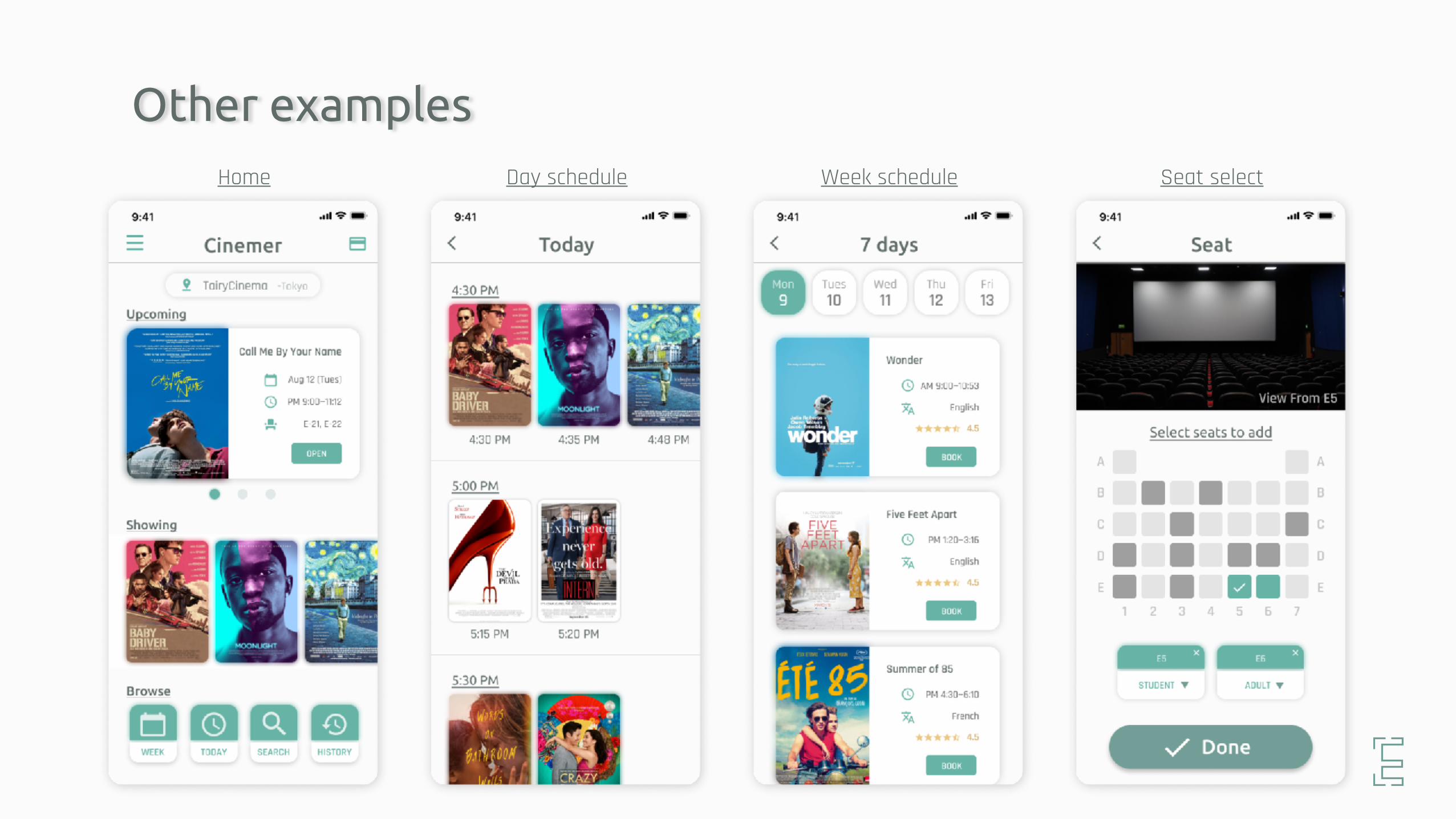
Other examplesHome Day schedule Week schedule Seat select

Hi-Fi Prototype
The finalized High Fidelity
prototype has a cleaner
user flow for booking tickets
and checking reserved
tickets. It also meets the
needs of users who want to
share tickets and look back
on past tickets.
Link to figma

IA
Information
architecture that
summarizes the
process from starting
the app to completing
the reservation.


Accessibility considerations
3. Size
Large size tickets and QR codes are provided to avoid confusion when using tickets.
2. Information
Easy access from the app to information outside web.
1. Visual
Put both text title and icons for
action buttons.

Conclusion
・Impacts & learnings
・Acknowledges
・Contacts

I received many feedbacks which were
mentioned the straightforwardness. So, this
app makes users feel like easy to book and
use E-ticket.
Impacts & learningsImpacts
This was my first UX projects, so I learned
literally tons of things includes ideas,
technology and so forth. Also, throughout
interviews and usability studies I learned
others’ perspectives.
learnings

This was my first case study and I was able to
finish it because of the many participants.
Thank you so much.
Acknowledges Participants
Thank you so much for giving me feedbacks
through this Causera course,
Peers
I don't think I could finish this if I hadn’t take
the Google UX Design Certificate program on
Cousera. Thank you very much!
Google, Googlers, and Causera

Please google my name “Taito Iikura”
or visit
www.taitoiikura.com
Contact me??
Thank you so much for checking Cinemer!