Embed Size (px)
Citation preview
+
Chapter 1: Exploring Data Section 1.2
Displaying Quantitative Data with Graphs
The Practice of Statistics, 4th edition - For AP*
STARNES, YATES, MOORE
+ Chapter 1
Exploring Data
Introduction: Data Analysis: Making Sense of Data
1.1 Analyzing Categorical Data
1.2 Displaying Quantitative Data with Graphs
1.3 Describing Quantitative Data with Numbers
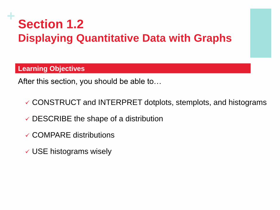
+ Section 1.2 Displaying Quantitative Data with Graphs
After this section, you should be able to…
CONSTRUCT and INTERPRET dotplots, stemplots, and histograms
DESCRIBE the shape of a distribution
COMPARE distributions
USE histograms wisely
Learning Objectives
+
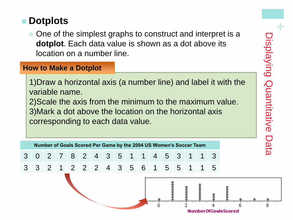
1)Draw a horizontal axis (a number line) and label it with the
variable name.
2)Scale the axis from the minimum to the maximum value.
3)Mark a dot above the location on the horizontal axis
corresponding to each data value.
Dis
pla
yin
g Q
uantita
tive D
ata
Dotplots
One of the simplest graphs to construct and interpret is a
dotplot. Each data value is shown as a dot above its
location on a number line.
How to Make a Dotplot
Number of Goals Scored Per Game by the 2004 US Women’s Soccer Team
3 0 2 7 8 2 4 3 5 1 1 4 5 3 1 1 3
3 3 2 1 2 2 2 4 3 5 6 1 5 5 1 1 5
+
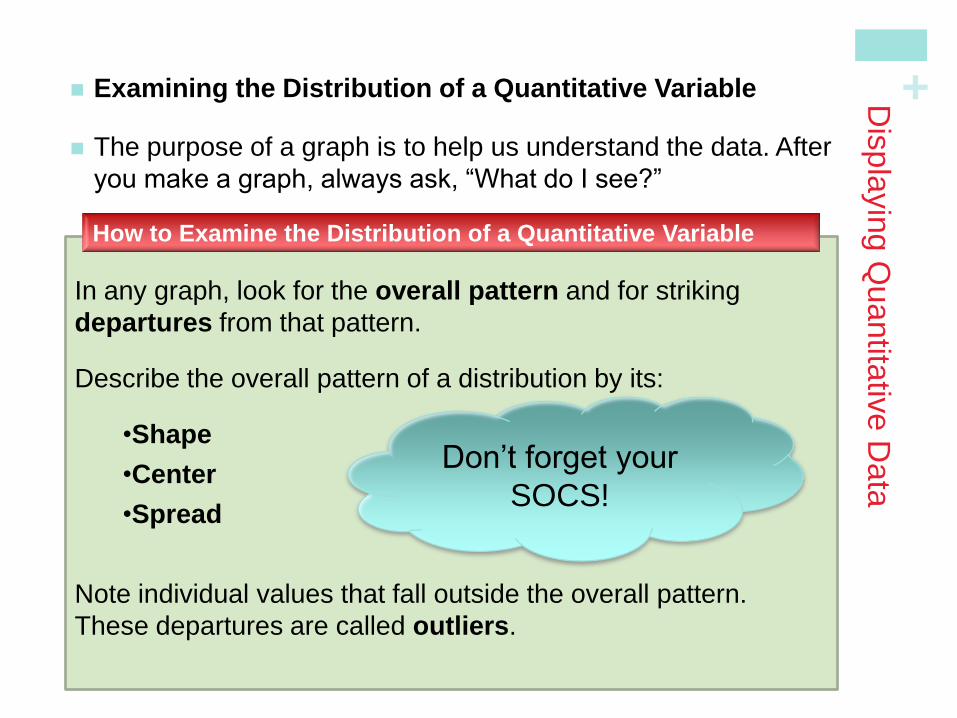
Examining the Distribution of a Quantitative Variable
The purpose of a graph is to help us understand the data. After
you make a graph, always ask, “What do I see?”
In any graph, look for the overall pattern and for striking
departures from that pattern.
Describe the overall pattern of a distribution by its:
•Shape
•Center
•Spread
Note individual values that fall outside the overall pattern.
These departures are called outliers.
How to Examine the Distribution of a Quantitative Variable
Dis
pla
yin
g Q
uantita
tive D
ata
Don’t forget your
SOCS!
+
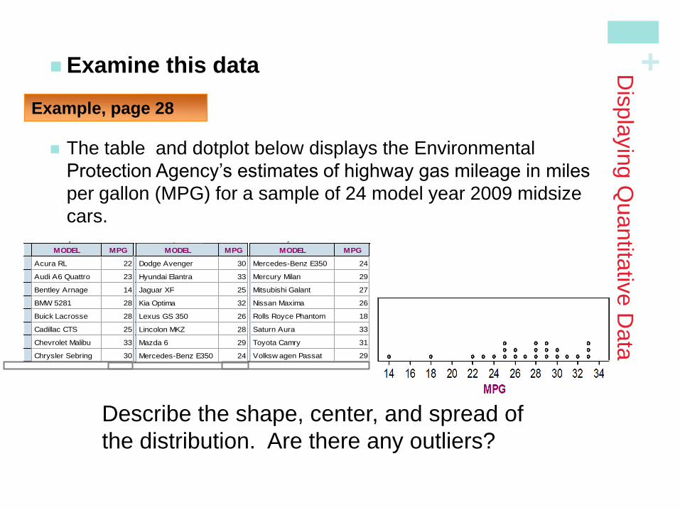
Examine this data
The table and dotplot below displays the Environmental
Protection Agency’s estimates of highway gas mileage in miles
per gallon (MPG) for a sample of 24 model year 2009 midsize
cars.
Dis
pla
yin
g Q
uantita
tive D
ata
Describe the shape, center, and spread of
the distribution. Are there any outliers?
2009 Fuel Economy Guide
MODEL MPG
1
2
3
4
5
6
7
8
9
Acura RL 22
Audi A6 Quattro 23
Bentley Arnage 14
BMW 5281 28
Buick Lacrosse 28
Cadillac CTS 25
Chevrolet Malibu 33
Chrysler Sebring 30
Dodge Avenger 30
2009 Fuel Economy Guide
MODEL MPG <new>
9
10
11
12
13
14
15
16
17
Dodge Avenger 30
Hyundai Elantra 33
Jaguar XF 25
Kia Optima 32
Lexus GS 350 26
Lincolon MKZ 28
Mazda 6 29
Mercedes-Benz E350 24
Mercury Milan 29
2009 Fuel Economy Guide
MODEL MPG <new>
16
17
18
19
20
21
22
23
24
Mercedes-Benz E350 24
Mercury Milan 29
Mitsubishi Galant 27
Nissan Maxima 26
Rolls Royce Phantom 18
Saturn Aura 33
Toyota Camry 31
Volksw agen Passat 29
Volvo S80 25
Example, page 28
+
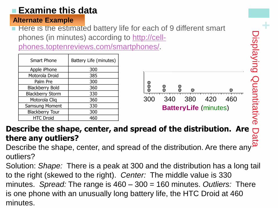
Examine this data
Here is the estimated battery life for each of 9 different smart
phones (in minutes) according to http://cell-
phones.toptenreviews.com/smartphones/.
Dis
pla
yin
g Q
uantita
tive D
ata
Describe the shape, center, and spread of the distribution. Are there any outliers? Describe the shape, center, and spread of the distribution. Are there any
outliers?
Solution: Shape: There is a peak at 300 and the distribution has a long tail
to the right (skewed to the right). Center: The middle value is 330
minutes. Spread: The range is 460 – 300 = 160 minutes. Outliers: There
is one phone with an unusually long battery life, the HTC Droid at 460
minutes.
Alternate Example
Smart Phone Battery Life (minutes)
Apple iPhone 300
Motorola Droid 385
Palm Pre 300
Blackberry Bold 360
Blackberry Storm 330
Motorola Cliq 360
Samsung Moment 330
Blackberry Tour 300
HTC Droid 460
BatteryLife (minutes)
300 340 380 420 460
Collection 1 Dot Plot
+
Dis
pla
yin
g Q
uantita
tive D
ata
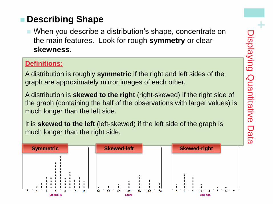
Describing Shape
When you describe a distribution’s shape, concentrate on
the main features. Look for rough symmetry or clear
skewness.
Definitions:
A distribution is roughly symmetric if the right and left sides of the
graph are approximately mirror images of each other.
A distribution is skewed to the right (right-skewed) if the right side of
the graph (containing the half of the observations with larger values) is
much longer than the left side.
It is skewed to the left (left-skewed) if the left side of the graph is
much longer than the right side.
Symmetric Skewed-left Skewed-right
+
Dis
pla
yin
g Q
uantita
tive D
ata
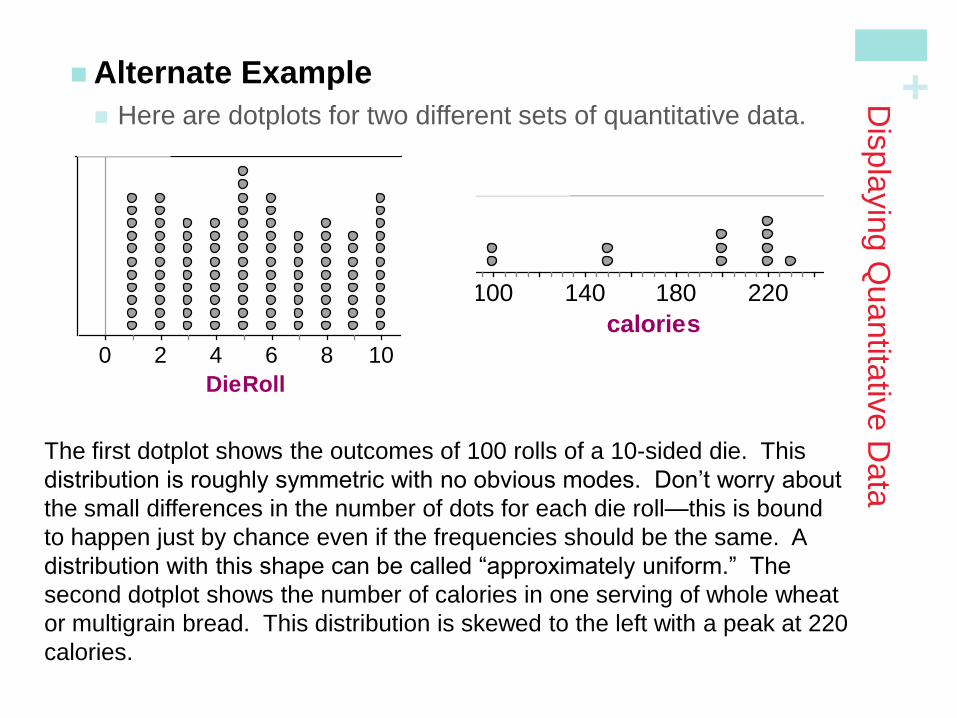
Alternate Example
Here are dotplots for two different sets of quantitative data.
DieRoll
0 2 4 6 8 10
Collection 2 Dot Plot
calories
100 140 180 220
Collection 1 Dot Plot
The first dotplot shows the outcomes of 100 rolls of a 10-sided die. This
distribution is roughly symmetric with no obvious modes. Don’t worry about
the small differences in the number of dots for each die roll—this is bound
to happen just by chance even if the frequencies should be the same. A
distribution with this shape can be called “approximately uniform.” The
second dotplot shows the number of calories in one serving of whole wheat
or multigrain bread. This distribution is skewed to the left with a peak at 220
calories.
+
Dis
pla
yin
g Q
uantita
tive D
ata
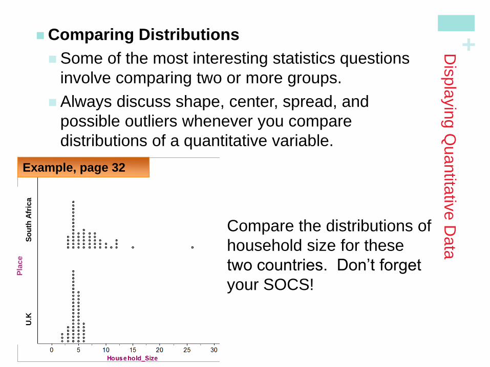
Comparing Distributions
Some of the most interesting statistics questions
involve comparing two or more groups.
Always discuss shape, center, spread, and
possible outliers whenever you compare
distributions of a quantitative variable.
Example, page 32
Compare the distributions of
household size for these
two countries. Don’t forget
your SOCS!
Pla
ce
U
.K
So
uth
Afr
ica
+
Dis
pla
yin
g Q
uantita
tive D
ata
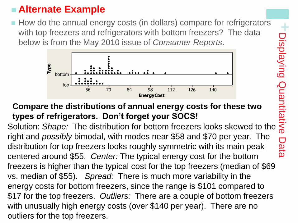
Alternate Example
How do the annual energy costs (in dollars) compare for refrigerators
with top freezers and refrigerators with bottom freezers? The data
below is from the May 2010 issue of Consumer Reports.
Compare the distributions of annual energy costs for these two
types of refrigerators. Don’t forget your SOCS!
EnergyCost
Ty
pe
14012611298847056
bottom
top
Dotplot of EnergyCost vs Type
Solution: Shape: The distribution for bottom freezers looks skewed to the
right and possibly bimodal, with modes near $58 and $70 per year. The
distribution for top freezers looks roughly symmetric with its main peak
centered around $55. Center: The typical energy cost for the bottom
freezers is higher than the typical cost for the top freezers (median of $69
vs. median of $55). Spread: There is much more variability in the
energy costs for bottom freezers, since the range is $101 compared to
$17 for the top freezers. Outliers: There are a couple of bottom freezers
with unusually high energy costs (over $140 per year). There are no
outliers for the top freezers.
+
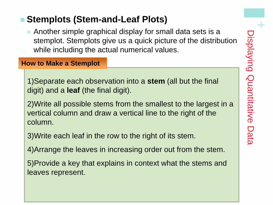
1)Separate each observation into a stem (all but the final
digit) and a leaf (the final digit).
2)Write all possible stems from the smallest to the largest in a
vertical column and draw a vertical line to the right of the
column.
3)Write each leaf in the row to the right of its stem.
4)Arrange the leaves in increasing order out from the stem.
5)Provide a key that explains in context what the stems and
leaves represent.
Dis
pla
yin
g Q
uantita
tive D
ata
Stemplots (Stem-and-Leaf Plots)
Another simple graphical display for small data sets is a
stemplot. Stemplots give us a quick picture of the distribution
while including the actual numerical values.
How to Make a Stemplot
+
Dis
pla
yin
g Q
uantita
tive D
ata
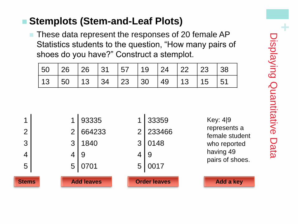
Stemplots (Stem-and-Leaf Plots)
These data represent the responses of 20 female AP
Statistics students to the question, “How many pairs of
shoes do you have?” Construct a stemplot.
50 26 26 31 57 19 24 22 23 38
13 50 13 34 23 30 49 13 15 51
Stems
1
2
3
4
5
Add leaves
1 93335
2 664233
3 1840
4 9
5 0701
Order leaves
1 33359
2 233466
3 0148
4 9
5 0017
Add a key
Key: 4|9
represents a
female student
who reported
having 49
pairs of shoes.
+
Dis
pla
yin
g Q
uantita
tive D
ata
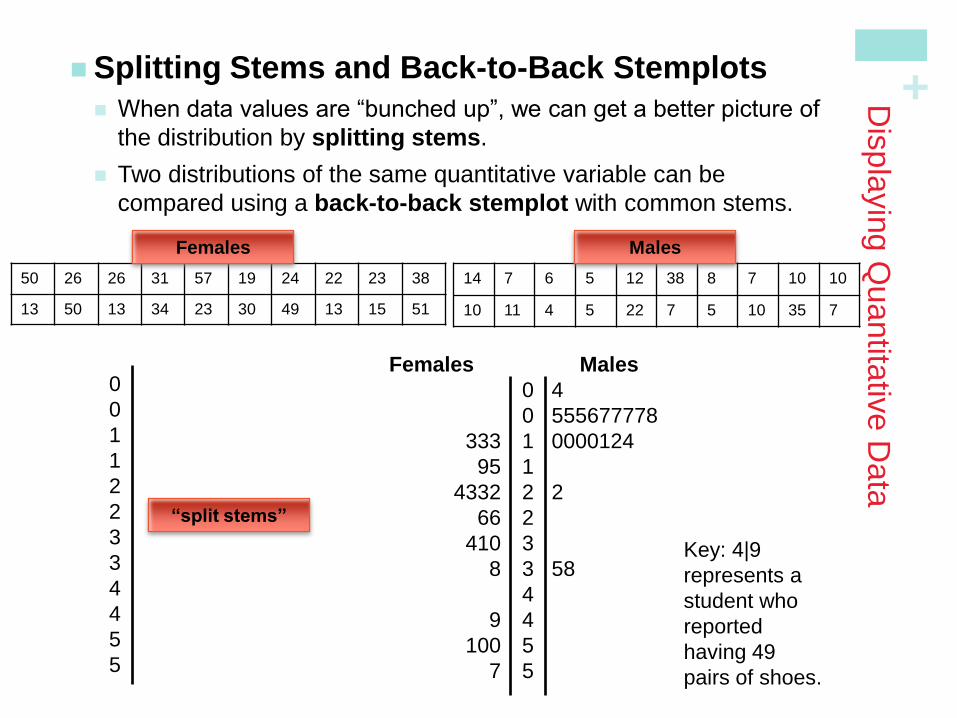
Splitting Stems and Back-to-Back Stemplots
When data values are “bunched up”, we can get a better picture of
the distribution by splitting stems.
Two distributions of the same quantitative variable can be
compared using a back-to-back stemplot with common stems.
50 26 26 31 57 19 24 22 23 38
13 50 13 34 23 30 49 13 15 51
0
0
1
1
2
2
3
3
4
4
5
5
Key: 4|9
represents a
student who
reported
having 49
pairs of shoes.
Females
14 7 6 5 12 38 8 7 10 10
10 11 4 5 22 7 5 10 35 7
Males
0 4
0 555677778
1 0000124
1
2 2
2
3
3 58
4
4
5
5
Females
333
95
4332
66
410
8
9
100
7
Males
“split stems”
+
Dis
pla
yin
g Q
uantita
tive D
ata
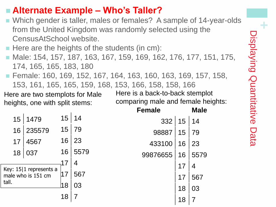
Alternate Example – Who’s Taller? Which gender is taller, males or females? A sample of 14-year-olds
from the United Kingdom was randomly selected using the
CensusAtSchool website.
Here are the heights of the students (in cm):
Male: 154, 157, 187, 163, 167, 159, 169, 162, 176, 177, 151, 175,
174, 165, 165, 183, 180
Female: 160, 169, 152, 167, 164, 163, 160, 163, 169, 157, 158,
153, 161, 165, 165, 159, 168, 153, 166, 158, 158, 166
15 1479
16 235579
17 4567
18 037
15 14
15 79
16 23
16 5579
17 4
17 567
18 03
18 7
Key: 15|1 represents a male who is 151 cm tall.
Here are two stemplots for Male
heights, one with split stems:
Here is a back-to-back stemplot
comparing male and female heights:
Female Male
332 15 14
98887 15 79
433100 16 23
99876655 16 5579
17 4
17 567
18 03
18 7

+
Dis
pla
yin
g Q
uantita
tive D
ata
Splitting Stems and Back-to-Back Stemplots
When data values are “bunched up”, we can get a better picture of
the distribution by splitting stems.
Two distributions of the same quantitative variable can be
compared using a back-to-back stemplot with common stems.
50 26 26 31 57 19 24 22 23 38
13 50 13 34 23 30 49 13 15 51
0
0
1
1
2
2
3
3
4
4
5
5
Key: 4|9
represents a
student who
reported
having 49
pairs of shoes.
Females
14 7 6 5 12 38 8 7 10 10
10 11 4 5 22 7 5 10 35 7
Males
0 4
0 555677778
1 0000124
1
2 2
2
3
3 58
4
4
5
5
Females
333
95
4332
66
410
8
9
100
7
Males
“split stems”
+
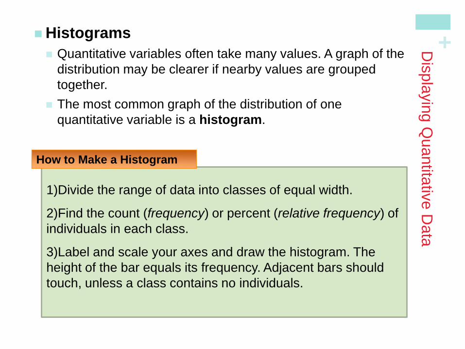
1)Divide the range of data into classes of equal width.
2)Find the count (frequency) or percent (relative frequency) of
individuals in each class.
3)Label and scale your axes and draw the histogram. The
height of the bar equals its frequency. Adjacent bars should
touch, unless a class contains no individuals.
Dis
pla
yin
g Q
uantita
tive D
ata
Histograms
Quantitative variables often take many values. A graph of the
distribution may be clearer if nearby values are grouped
together.
The most common graph of the distribution of one
quantitative variable is a histogram.
How to Make a Histogram
+
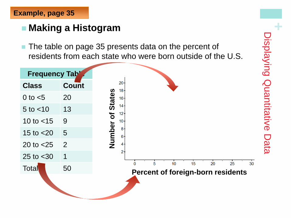
Making a Histogram
The table on page 35 presents data on the percent of
residents from each state who were born outside of the U.S.
Dis
pla
yin
g Q
uantita
tive D
ata
Example, page 35
Frequency Table
Class Count
0 to <5 20
5 to <10 13
10 to <15 9
15 to <20 5
20 to <25 2
25 to <30 1
Total 50 Percent of foreign-born residents
Nu
mb
er
of
Sta
tes
+
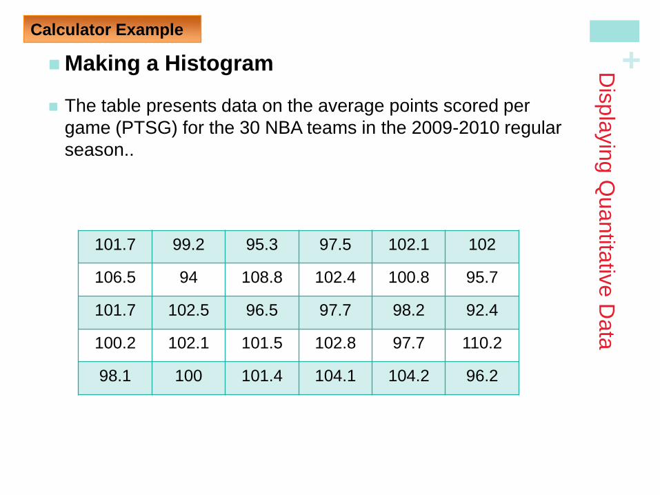
Making a Histogram
The table presents data on the average points scored per
game (PTSG) for the 30 NBA teams in the 2009-2010 regular
season..
Dis
pla
yin
g Q
uantita
tive D
ata
Calculator Example
101.7 99.2 95.3 97.5 102.1 102
106.5 94 108.8 102.4 100.8 95.7
101.7 102.5 96.5 97.7 98.2 92.4
100.2 102.1 101.5 102.8 97.7 110.2
98.1 100 101.4 104.1 104.2 96.2
+
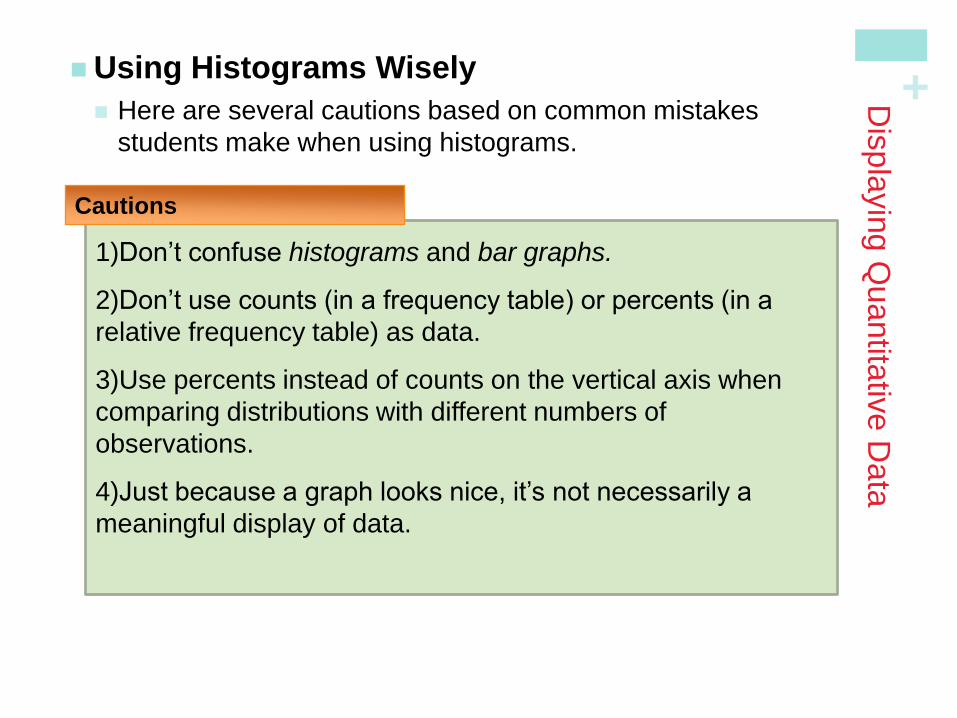
1)Don’t confuse histograms and bar graphs.
2)Don’t use counts (in a frequency table) or percents (in a
relative frequency table) as data.
3)Use percents instead of counts on the vertical axis when
comparing distributions with different numbers of
observations.
4)Just because a graph looks nice, it’s not necessarily a
meaningful display of data.
Dis
pla
yin
g Q
uantita
tive D
ata
Using Histograms Wisely
Here are several cautions based on common mistakes
students make when using histograms.
Cautions
+
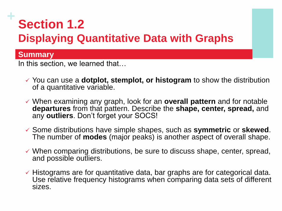
In this section, we learned that…
You can use a dotplot, stemplot, or histogram to show the distribution of a quantitative variable.
When examining any graph, look for an overall pattern and for notable departures from that pattern. Describe the shape, center, spread, and any outliers. Don’t forget your SOCS!
Some distributions have simple shapes, such as symmetric or skewed. The number of modes (major peaks) is another aspect of overall shape.
When comparing distributions, be sure to discuss shape, center, spread, and possible outliers.
Histograms are for quantitative data, bar graphs are for categorical data. Use relative frequency histograms when comparing data sets of different sizes.
Summary
Section 1.2 Displaying Quantitative Data with Graphs
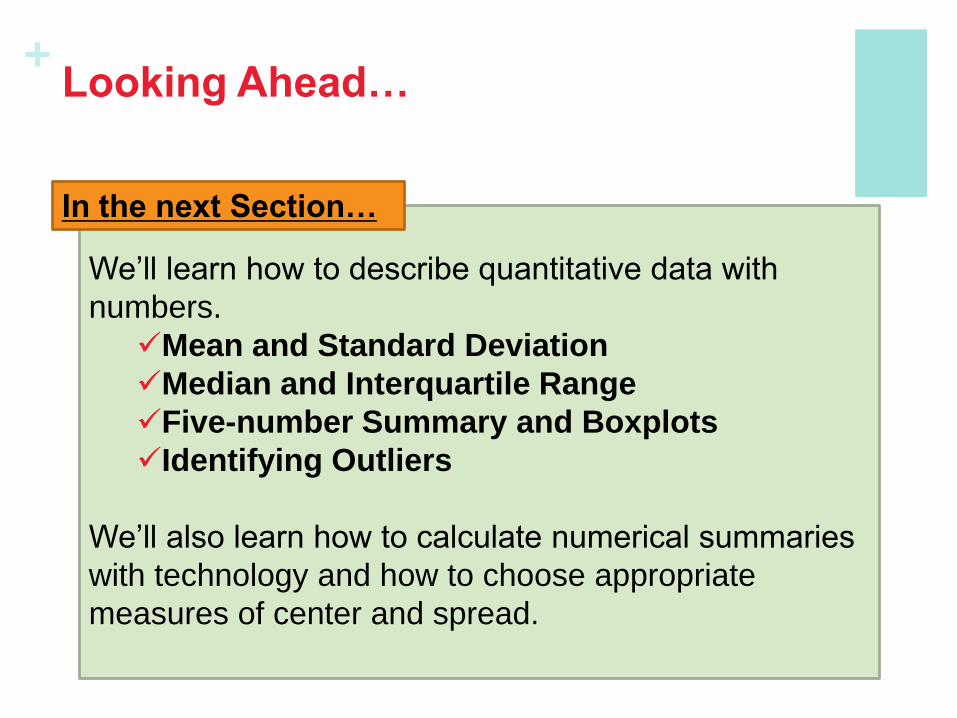
+ Looking Ahead…
We’ll learn how to describe quantitative data with
numbers.
Mean and Standard Deviation
Median and Interquartile Range
Five-number Summary and Boxplots
Identifying Outliers
We’ll also learn how to calculate numerical summaries
with technology and how to choose appropriate
measures of center and spread.
In the next Section…