Embed Size (px)
Citation preview
Slide 1Copyright © 2018, 2014, 2010 Pearson Education Inc. A L W A Y S L E A R N I N G
Descriptive Statistics
14.1
Slide 2Copyright © 2018, 2014, 2010 Pearson Education Inc. A L W A Y S L E A R N I N G
Organizing and Visualizing Data
14.1
• Explain the difference between a sample and a population.
• Organize data in a frequency table.• Use a variety of methods to represent
data visually.
Slide 3Copyright © 2018, 2014, 2010 Pearson Education Inc. A L W A Y S L E A R N I N G
Populations and Samples
Statistics is an area of mathematics in which we are interested in gathering, organizing, analyzing, and making predictions from numerical information called data.
The set of all items under consideration is called the population. Often only a sample or subset of the population is considered.
We will describe a sample as biased if it does not accurately reflect the population as a whole with regard to the data that we are gathering.
Slide 4Copyright © 2018, 2014, 2010 Pearson Education Inc. A L W A Y S L E A R N I N G
Populations and Samples
Bias could occur because of the way in which we decide how to choose the people to participate in the survey. This is called selection bias.
Another issue that can affect the reliability of a survey is the way we ask the questions, which is called leading-question bias.
Slide 5Copyright © 2018, 2014, 2010 Pearson Education Inc. A L W A Y S L E A R N I N G
Frequency Tables
We refer to a collection of information as data. Data can be qualitative or quantitative.
Qualitative data consists of information about a characteristic such as eye color or gender; e.g. Marriage Patterns of U.S. adults.
Quantitative data gives a meaningful numerical measurement – e.g. Gasoline Prices for the years 2015, 2016, 2017, and 2018.
Slide 6Copyright © 2018, 2014, 2010 Pearson Education Inc. A L W A Y S L E A R N I N G
Frequency Tables
Frequency table is one method used to organize data. To construct a frequency distribution, we determine the count, or frequency ( f ), with which each value occurs.We show the percent of the time that each item occurs in a frequency distribution using a relative frequency distribution ( rf ). We often present a frequency distribution as a frequency table where we list the values in one column and the frequencies of the values in another column.
Slide 7Copyright © 2018, 2014, 2010 Pearson Education Inc. A L W A Y S L E A R N I N G
Example: Using Tables to Summarize TV Program EvaluationsAssume that 25 viewers were surveyed to evaluate a preview of an episode of NCIS.The possible evaluations are (E)xcellent, (A)boveaverage, a(V)erage, (B)elow average, (P)oor.
After the show, the 25 evaluations were as follows:A, V, V, B, P, E, A, E, V, V, A, E, P, B, V, V, A, A, A, E, B, V, A, B, V.
Construct a frequency table and a relative frequency table for this list of evaluations.
Slide 8Copyright © 2018, 2014, 2010 Pearson Education Inc. A L W A Y S L E A R N I N G
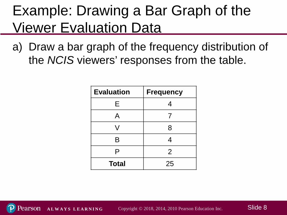
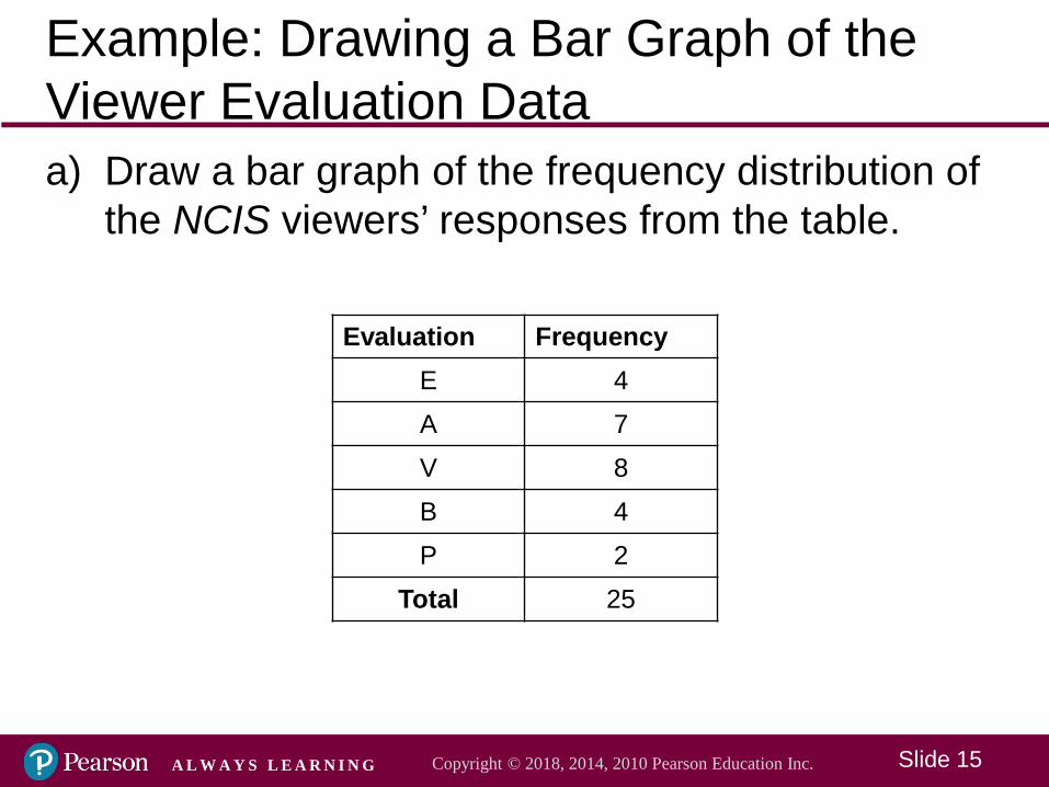
Example: Drawing a Bar Graph of the Viewer Evaluation Dataa) Draw a bar graph of the frequency distribution of
the NCIS viewers’ responses from the table.
Evaluation FrequencyE 4A 7V 8B 4P 2
Total 25
Slide 9Copyright © 2018, 2014, 2010 Pearson Education Inc. A L W A Y S L E A R N I N G
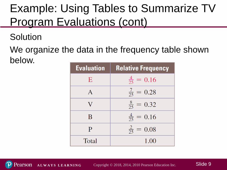
Example: Using Tables to Summarize TV Program Evaluations (cont)SolutionWe organize the data in the frequency table shown below.
Slide 10Copyright © 2018, 2014, 2010 Pearson Education Inc. A L W A Y S L E A R N I N G
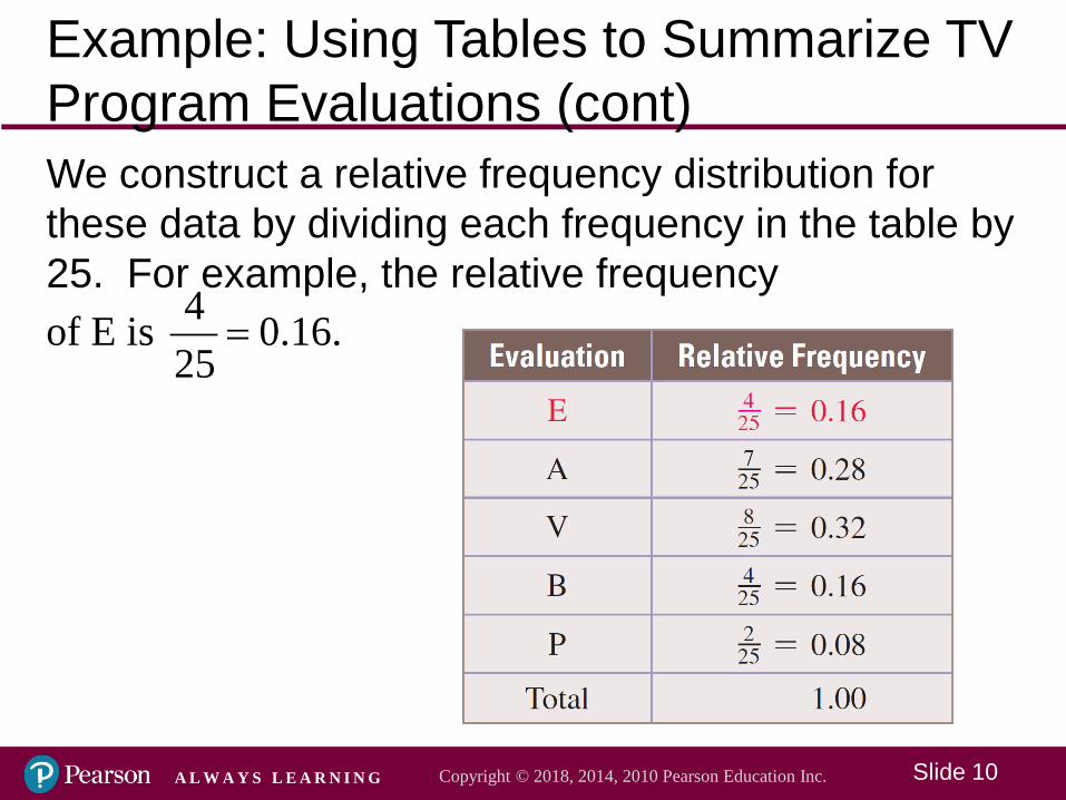
Example: Using Tables to Summarize TV Program Evaluations (cont)We construct a relative frequency distribution for these data by dividing each frequency in the table by 25. For example, the relative frequency
4of E is 0.16.25
=
Slide 11Copyright © 2018, 2014, 2010 Pearson Education Inc. A L W A Y S L E A R N I N G
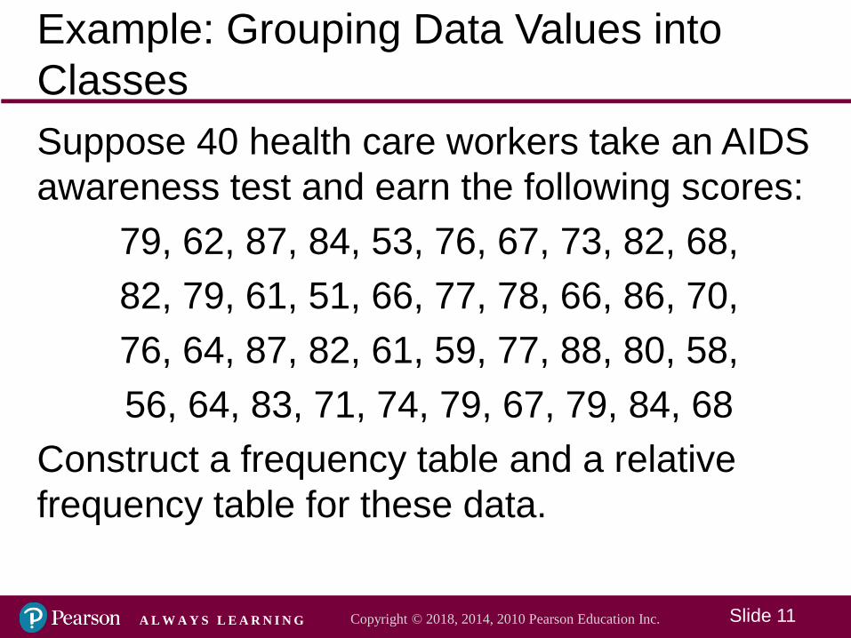
Example: Grouping Data Values into ClassesSuppose 40 health care workers take an AIDS awareness test and earn the following scores:
79, 62, 87, 84, 53, 76, 67, 73, 82, 68,82, 79, 61, 51, 66, 77, 78, 66, 86, 70,76, 64, 87, 82, 61, 59, 77, 88, 80, 58,56, 64, 83, 71, 74, 79, 67, 79, 84, 68
Construct a frequency table and a relative frequency table for these data.
Slide 12Copyright © 2018, 2014, 2010 Pearson Education Inc. A L W A Y S L E A R N I N G
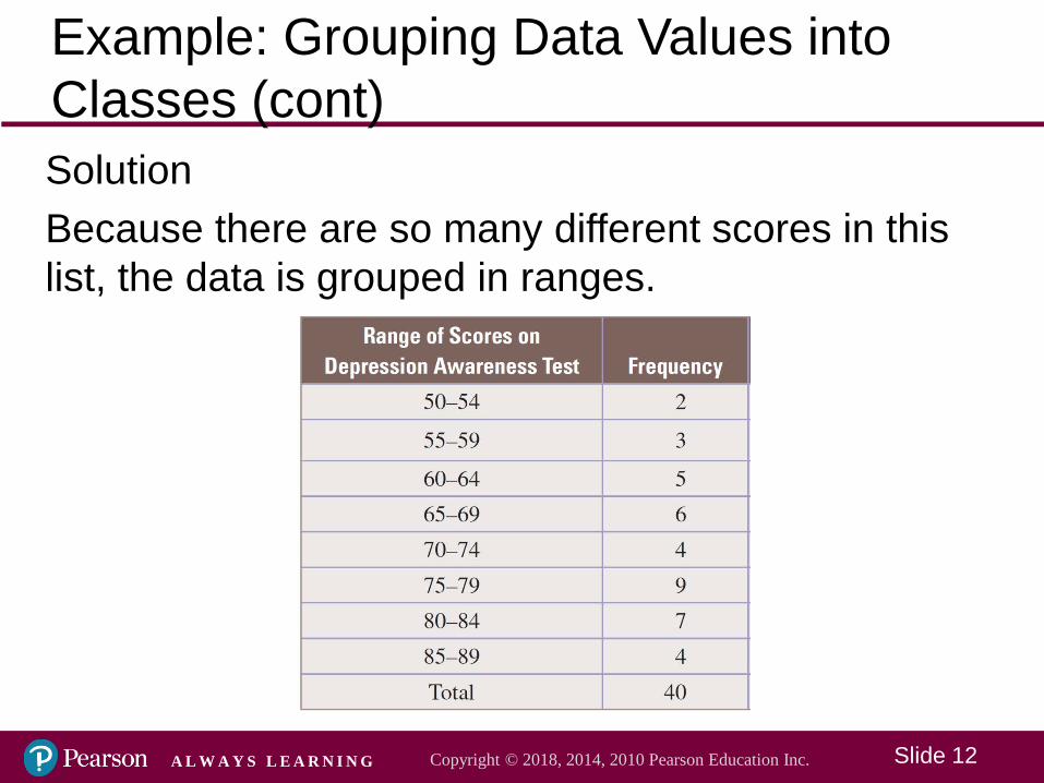
Example: Grouping Data Values into Classes (cont)SolutionBecause there are so many different scores in this list, the data is grouped in ranges.
Slide 13Copyright © 2018, 2014, 2010 Pearson Education Inc. A L W A Y S L E A R N I N G
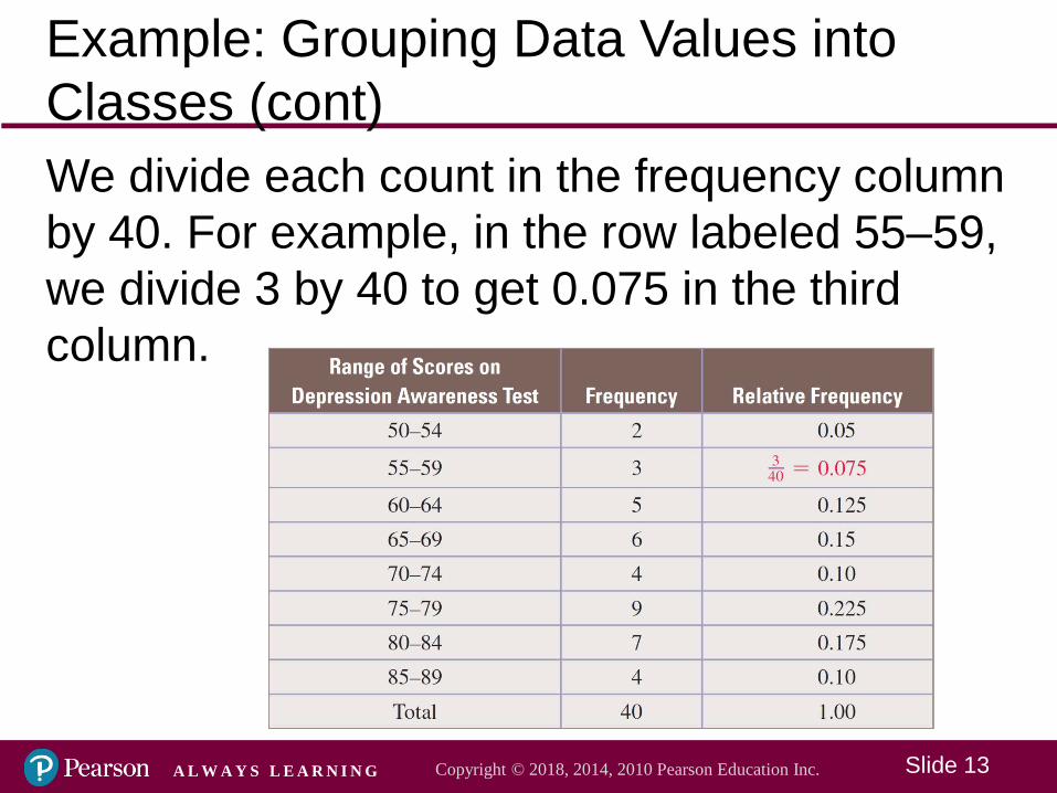
Example: Grouping Data Values into Classes (cont)We divide each count in the frequency column by 40. For example, in the row labeled 55–59, we divide 3 by 40 to get 0.075 in the third column.
Slide 14Copyright © 2018, 2014, 2010 Pearson Education Inc. A L W A Y S L E A R N I N G
Representing Data Visually
A bar graph is one way to visualize a frequency distribution. In drawing a bar graph, we specify the classes on the horizontal axis and the frequencies on the vertical axis. If we are graphing a relative frequency distribution, then the heights of the bars correspond to the size of the relative frequencies. Graphing the relative frequencies, rather than the actual values in data sets, allows us to compare the distributions.
Slide 15Copyright © 2018, 2014, 2010 Pearson Education Inc. A L W A Y S L E A R N I N G
Example: Drawing a Bar Graph of the Viewer Evaluation Dataa) Draw a bar graph of the frequency distribution of
the NCIS viewers’ responses from the table.
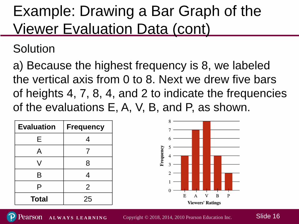
Evaluation FrequencyE 4A 7V 8B 4P 2
Total 25
Slide 16Copyright © 2018, 2014, 2010 Pearson Education Inc. A L W A Y S L E A R N I N G
Example: Drawing a Bar Graph of the Viewer Evaluation Data (cont)Solutiona) Because the highest frequency is 8, we labeled the vertical axis from 0 to 8. Next we drew five bars of heights 4, 7, 8, 4, and 2 to indicate the frequencies of the evaluations E, A, V, B, and P, as shown.
Evaluation FrequencyE 4A 7V 8B 4P 2
Total 25
Slide 17Copyright © 2018, 2014, 2010 Pearson Education Inc. A L W A Y S L E A R N I N G
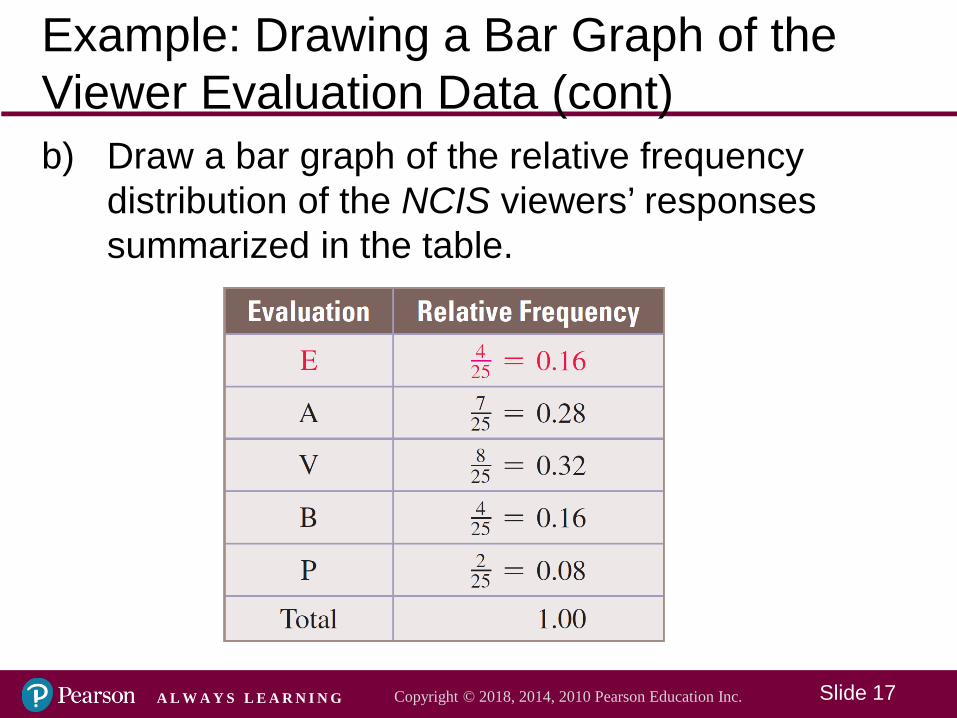
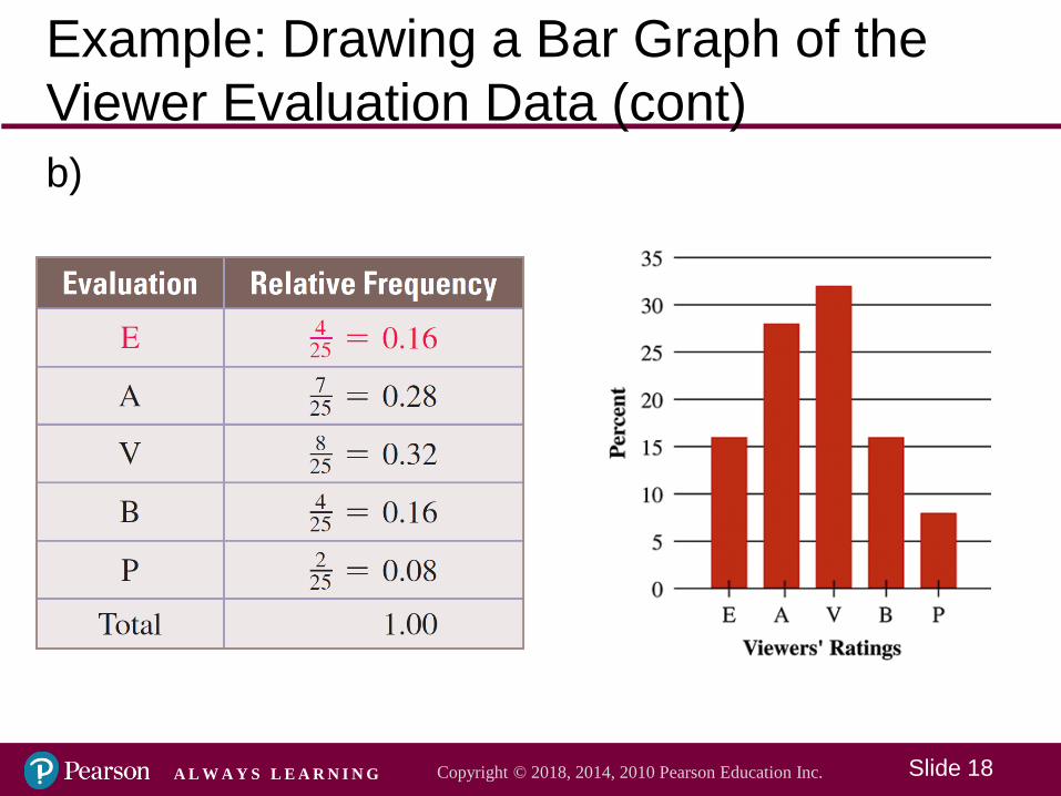
Example: Drawing a Bar Graph of the Viewer Evaluation Data (cont)b) Draw a bar graph of the relative frequency
distribution of the NCIS viewers’ responses summarized in the table.
Slide 18Copyright © 2018, 2014, 2010 Pearson Education Inc. A L W A Y S L E A R N I N G
Example: Drawing a Bar Graph of the Viewer Evaluation Data (cont)b)
Slide 19Copyright © 2018, 2014, 2010 Pearson Education Inc. A L W A Y S L E A R N I N G
Representing Data Visually
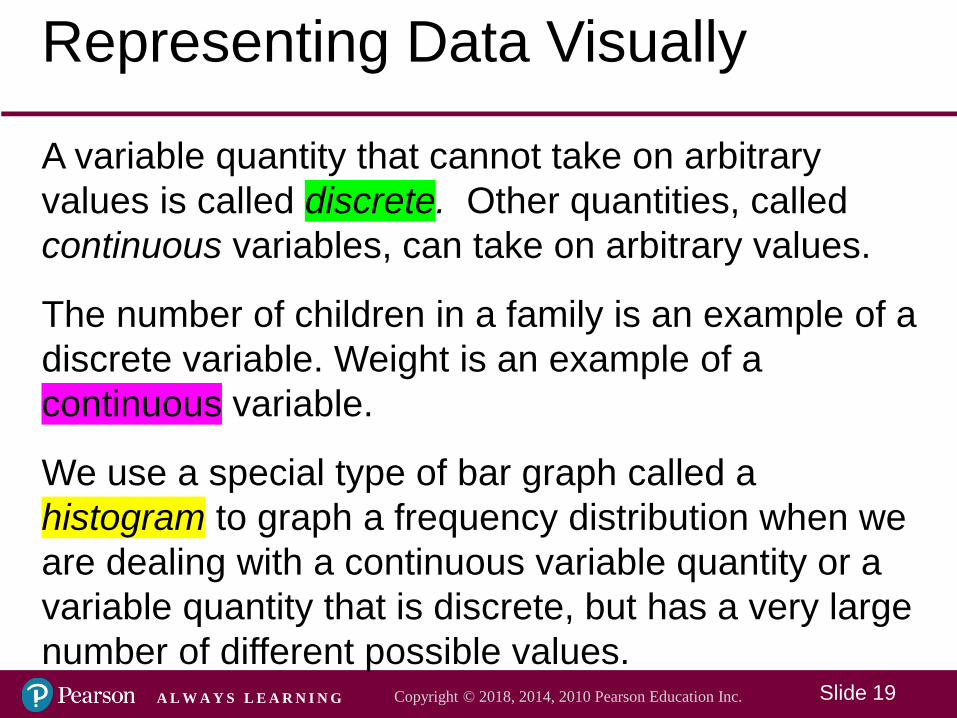
A variable quantity that cannot take on arbitrary values is called discrete. Other quantities, called continuous variables, can take on arbitrary values.
The number of children in a family is an example of a discrete variable. Weight is an example of a continuous variable.
We use a special type of bar graph called a histogram to graph a frequency distribution when we are dealing with a continuous variable quantity or a variable quantity that is discrete, but has a very large number of different possible values.

Slide 20Copyright © 2018, 2014, 2010 Pearson Education Inc. A L W A Y S L E A R N I N G
Example: Drawing a Histogram to Represent an Increase in Exam ScoresA professor has collected data regarding the increase in test scores by her students after a ban on the use of all social media during class. The data, which includes some fractional values, is organized in the table. Compute the relative frequencies and then use them to draw a histogram.
Slide 21Copyright © 2018, 2014, 2010 Pearson Education Inc. A L W A Y S L E A R N I N G
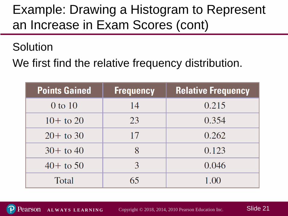
Example: Drawing a Histogram to Represent an Increase in Exam Scores (cont)SolutionWe first find the relative frequency distribution.
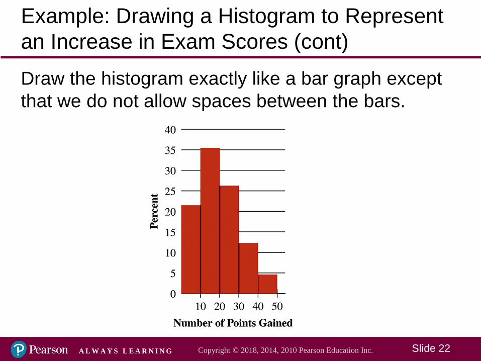
Slide 22Copyright © 2018, 2014, 2010 Pearson Education Inc. A L W A Y S L E A R N I N G
Example: Drawing a Histogram to Represent an Increase in Exam Scores (cont)Draw the histogram exactly like a bar graph except that we do not allow spaces between the bars.
Slide 23Copyright © 2018, 2014, 2010 Pearson Education Inc. A L W A Y S L E A R N I N G
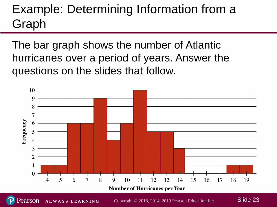
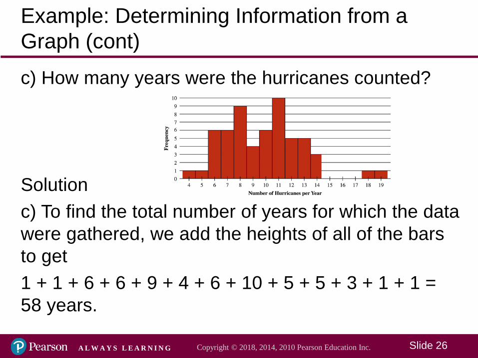
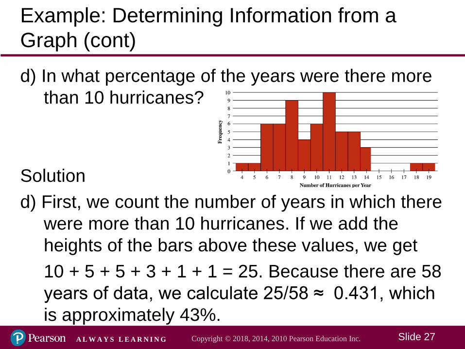
Example: Determining Information from a GraphThe bar graph shows the number of Atlantic hurricanes over a period of years. Answer the questions on the slides that follow.
Slide 24Copyright © 2018, 2014, 2010 Pearson Education Inc. A L W A Y S L E A R N I N G
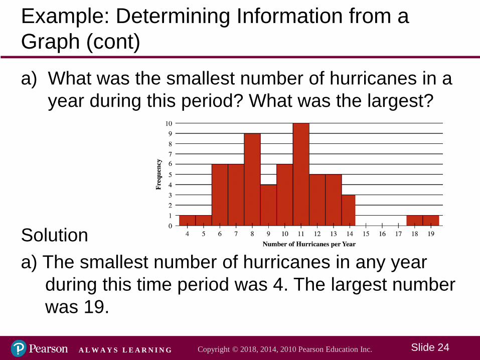
Example: Determining Information from a Graph (cont)a) What was the smallest number of hurricanes in a
year during this period? What was the largest?
Solutiona) The smallest number of hurricanes in any year
during this time period was 4. The largest number was 19.
Slide 25Copyright © 2018, 2014, 2010 Pearson Education Inc. A L W A Y S L E A R N I N G
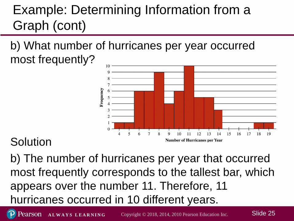
Example: Determining Information from a Graph (cont)b) What number of hurricanes per year occurred most frequently?
Solutionb) The number of hurricanes per year that occurred most frequently corresponds to the tallest bar, which appears over the number 11. Therefore, 11 hurricanes occurred in 10 different years.
Slide 26Copyright © 2018, 2014, 2010 Pearson Education Inc. A L W A Y S L E A R N I N G
Example: Determining Information from a Graph (cont)c) How many years were the hurricanes counted?
Solutionc) To find the total number of years for which the data were gathered, we add the heights of all of the bars to get1 + 1 + 6 + 6 + 9 + 4 + 6 + 10 + 5 + 5 + 3 + 1 + 1 = 58 years.
Slide 27Copyright © 2018, 2014, 2010 Pearson Education Inc. A L W A Y S L E A R N I N G
Example: Determining Information from a Graph (cont)d) In what percentage of the years were there more
than 10 hurricanes?
Solutiond) First, we count the number of years in which there
were more than 10 hurricanes. If we add the heights of the bars above these values, we get 10 + 5 + 5 + 3 + 1 + 1 = 25. Because there are 58 years of data, we calculate 25/58 ≈ 0.431, which is approximately 43%.