Embed Size (px)
Citation preview
Chapter 2 Analysis of Growth2.2 Graphs: Picturing growth
1
Learning Objectives:• Study various types of graphs: bar graphs,
scatterplots, and line graphs• Learn how to interpret the patterns• Analyze the graphs critically• Determine advantages and disadvantages of each
type of graph
Chapter 2 Analysis of Growth2.2 Graphs: Picturing growth
2
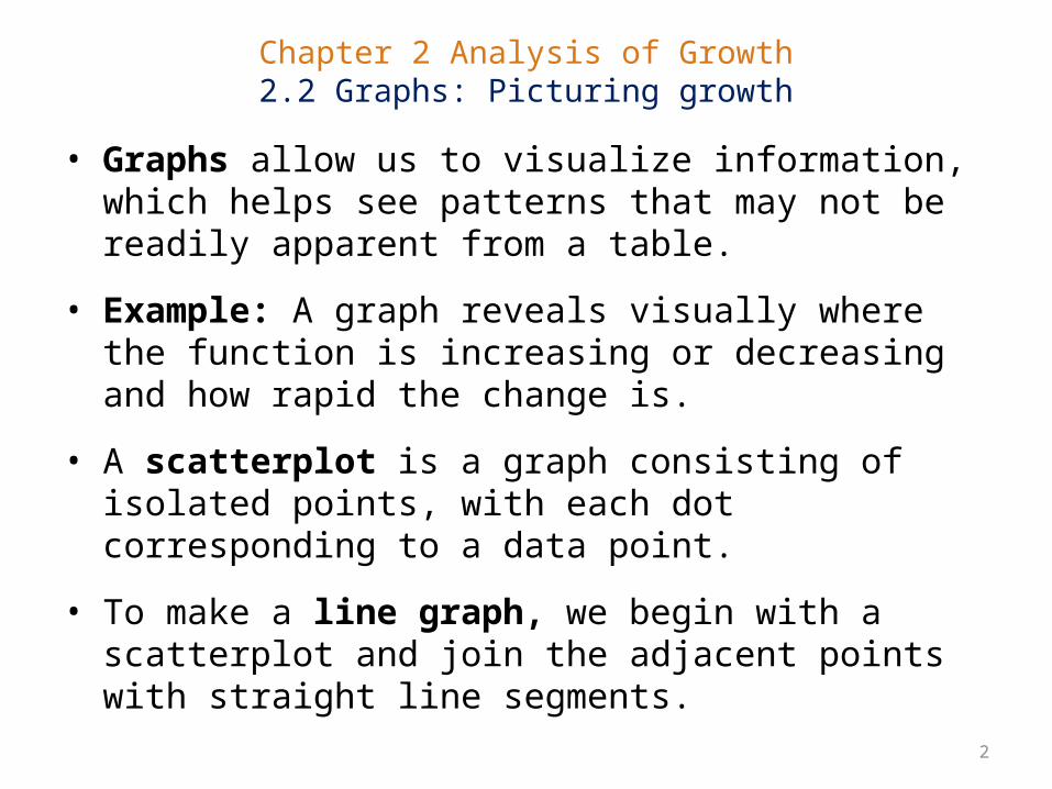
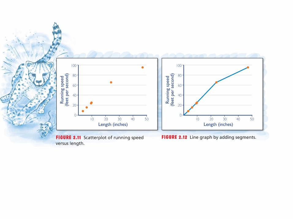
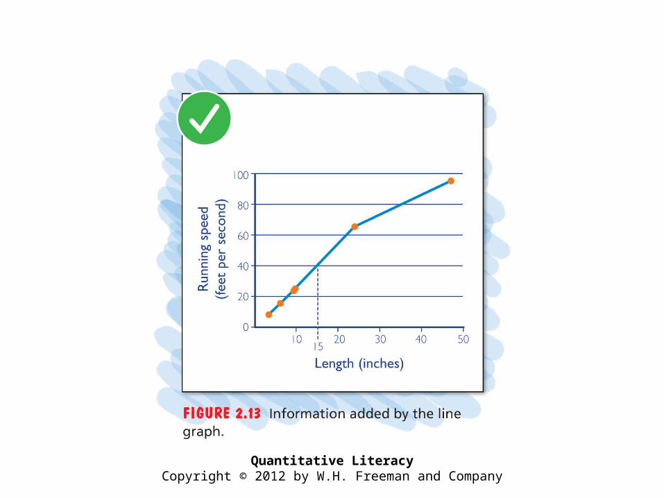
• Graphs allow us to visualize information, which helps see patterns that may not be readily apparent from a table.
• Example: A graph reveals visually where the function is increasing or decreasing and how rapid the change is.
• A scatterplot is a graph consisting of isolated points, with each dot corresponding to a data point.
• To make a line graph, we begin with a scatterplot and join the adjacent points with straight line segments.
Quantitative LiteracyCopyright © 2012 by W.H. Freeman and Company
Chapter 2 Analysis of Growth2.2 Graphs: Picturing growth
5
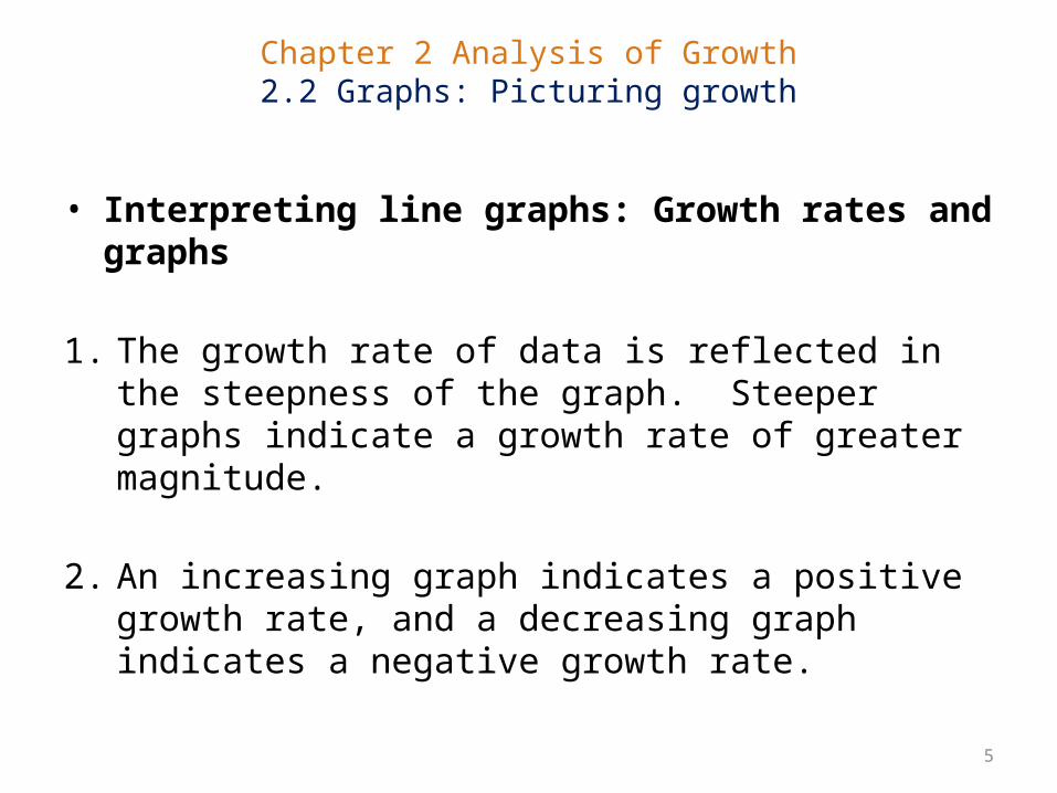
• Interpreting line graphs: Growth rates and graphs
1. The growth rate of data is reflected in the steepness of the graph. Steeper graphs indicate a growth rate of greater magnitude.
2. An increasing graph indicates a positive growth rate, and a decreasing graph indicates a negative growth rate.
Chapter 2 Analysis of Growth2.2 Graphs: Picturing growth
6
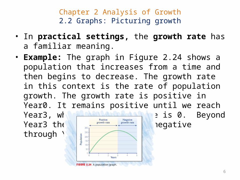
• In practical settings, the growth rate has a familiar meaning.• Example: The graph in Figure 2.24 shows a population that
increases from a time and then begins to decrease. The growth rate in this context is the rate of population growth. The growth rate is positive in Year0. It remains positive until we reach Year3, where the growth rate is 0. Beyond Year3 the growth rate gets negative through Year5.
Chapter 2 Analysis of Growth2.2 Graphs: Picturing growth
7
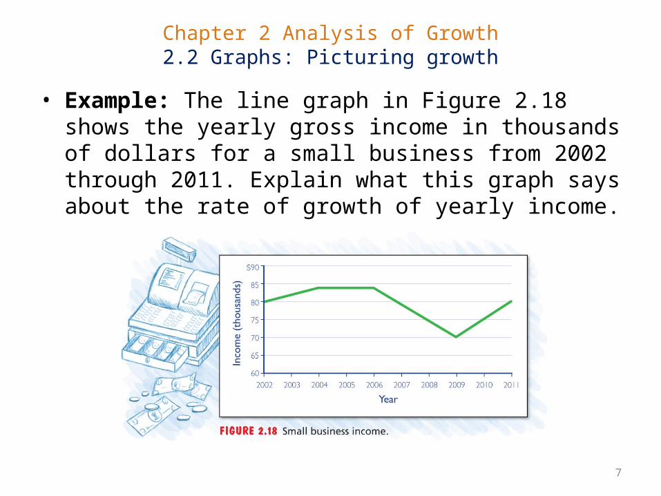
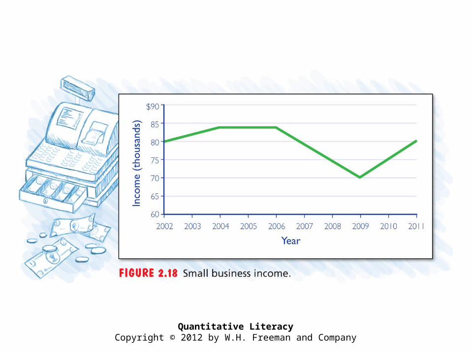
• Example: The line graph in Figure 2.18 shows the yearly gross income in thousands of dollars for a small business from 2002 through 2011. Explain what this graph says about the rate of growth of yearly income.
Quantitative LiteracyCopyright © 2012 by W.H. Freeman and Company
Chapter 2 Analysis of Growth2.2 Graphs: Picturing growth
9
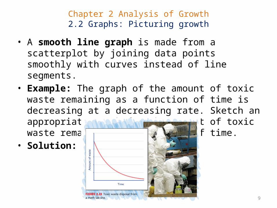
• A smooth line graph is made from a scatterplot by joining data points smoothly with curves instead of line segments.
• Example: The graph of the amount of toxic waste remaining as a function of time is decreasing at a decreasing rate. Sketch an appropriate graph for the amount of toxic waste remaining as a function of time.
• Solution:
Quantitative LiteracyCopyright © 2012 by W.H. Freeman and Company