Embed Size (px)
Citation preview
Copyright © 2018 Pearson Education, Inc. 11
Chapter 2: Graphs, Charts, and Tables—Describing Your Data
When applicable, the first few problems in each section will be done following the appropriate step by step procedures outlined in the corresponding sections of the chapter. Following problems will provide key points and the answers to the questions, but all answers can be arrived at using the appropriate steps.
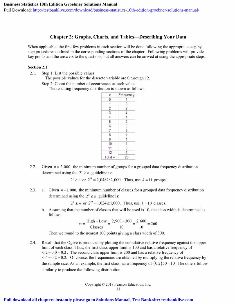
Section 2.1 2.1. Step 1: List the possible values.
The possible values for the discrete variable are 0 through 12. Step 2: Count the number of occurrences at each value.
The resulting frequency distribution is shown as follows:
2.2. Given 2,000,n the minimum number of groups for a grouped data frequency distribution determined using the 2k n guideline is:
2k n or 112 2,048 2,000 . Thus, use 11k groups.
2.3. a. Given 1,000,n the minimum number of classes for a grouped data frequency distribution determined using the 2k n guideline is:
2k n or 102 1,024 1,000 . Thus, use 10k classes. b. Assuming that the number of classes that will be used is 10, the class width is determined as
follows: High Low 2,900 300 2,600 260
Classes 10 10w
Then we round to the nearest 100 points giving a class width of 300.
2.4. Recall that the Ogive is produced by plotting the cumulative relative frequency against the upper limit of each class. Thus, the first class upper limit is 100 and has a relative frequency of 0.2 0.0 0.2 . The second class upper limit is 200 and has a relative frequency of 0.4 0.2 0.2. Of course, the frequencies are obtained by multiplying the relative frequency by the sample size. As an example, the first class has a frequency of 0.2 50 10 . The others follow similarly to produce the following distribution
Business Statistics 10th Edition Groebner Solutions ManualFull Download: http://testbanklive.com/download/business-statistics-10th-edition-groebner-solutions-manual/
Full download all chapters instantly please go to Solutions Manual, Test Bank site: testbanklive.com
12 Business Statistics: A Decision-Making Approach, Tenth Edition
Copyright © 2018 Pearson Education, Inc.
Class Frequency Relative Frequency Cumulative
Relative Frequency 0 – < 100 10 0.20 0.20 100 – < 200 10 0.20 0.40 200 – < 300 5 0.10 0.50 300 – < 400 5 0.10 0.60 400 – < 500 20 0.40 1.00 500 – < 600 0 0.00 1.00
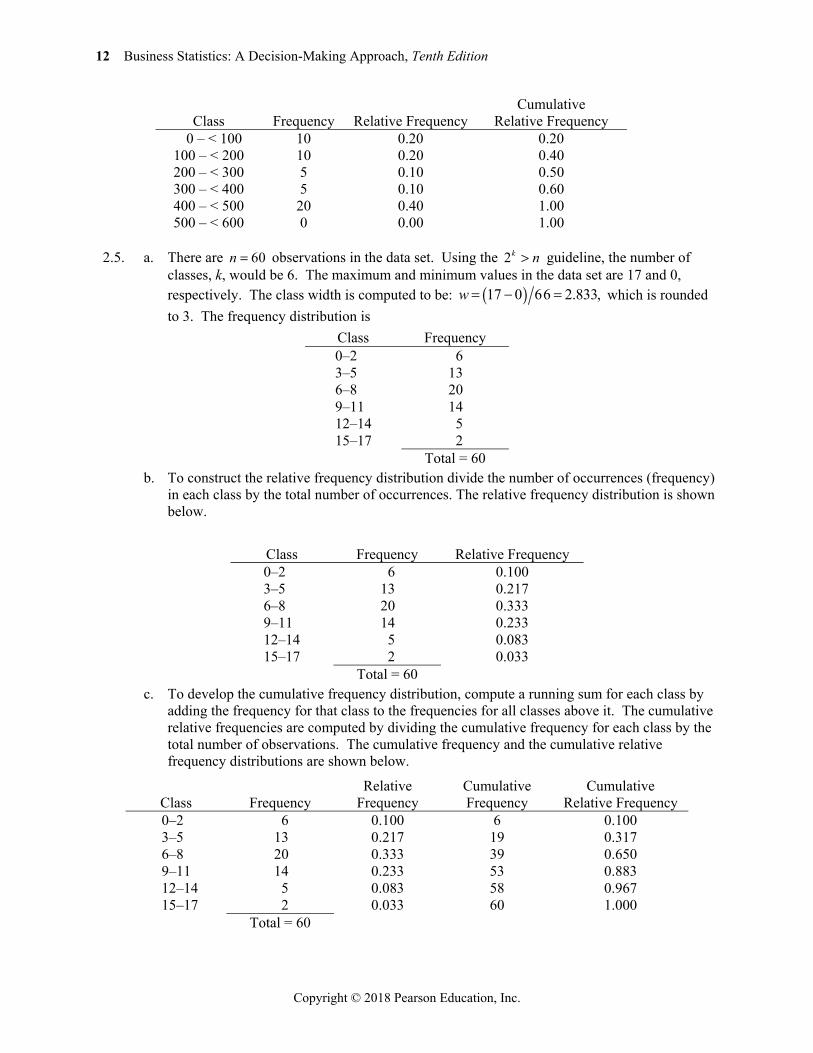
2.5. a. There are 60n observations in the data set. Using the 2k n guideline, the number of classes, k, would be 6. The maximum and minimum values in the data set are 17 and 0, respectively. The class width is computed to be: 17 0 66 2.833,w which is rounded to 3. The frequency distribution is
Class Frequency 0–2 6 3–5 13 6–8 20 9–11 14 12–14 5 15–17 2
Total = 60 b. To construct the relative frequency distribution divide the number of occurrences (frequency)
in each class by the total number of occurrences. The relative frequency distribution is shown below.
Class Frequency Relative Frequency 0–2 6 0.100 3–5 13 0.217 6–8 20 0.333 9–11 14 0.233 12–14 5 0.083 15–17 2 0.033
Total = 60 c. To develop the cumulative frequency distribution, compute a running sum for each class by
adding the frequency for that class to the frequencies for all classes above it. The cumulative relative frequencies are computed by dividing the cumulative frequency for each class by the total number of observations. The cumulative frequency and the cumulative relative frequency distributions are shown below.
Class Frequency Relative
Frequency Cumulative Frequency
Cumulative Relative Frequency
0–2 6 0.100 6 0.100 3–5 13 0.217 19 0.317 6–8 20 0.333 39 0.650 9–11 14 0.233 53 0.883 12–14 5 0.083 58 0.967 15–17 2 0.033 60 1.000
Total = 60
Chapter 2: Graphs, Charts, and Tables—Describing Your Data 13
Copyright © 2018 Pearson Education, Inc.
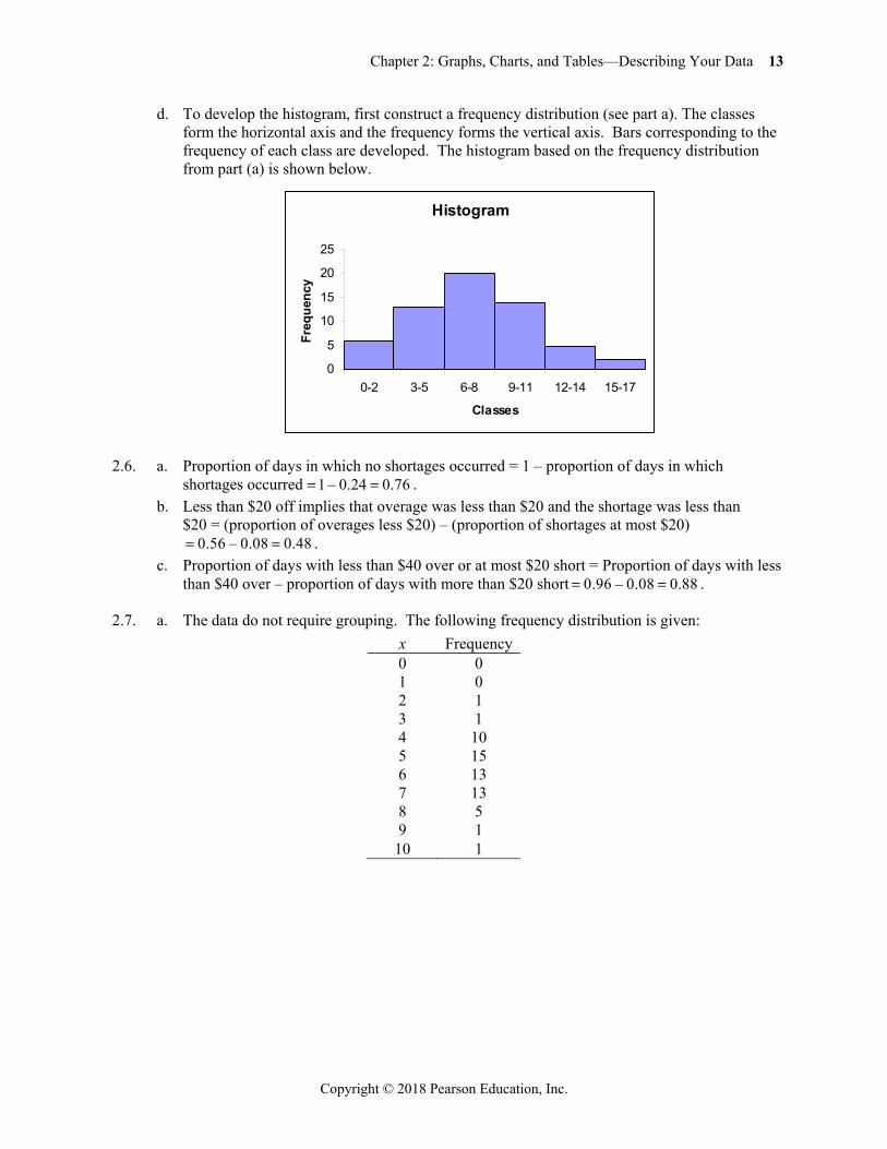
d. To develop the histogram, first construct a frequency distribution (see part a). The classes form the horizontal axis and the frequency forms the vertical axis. Bars corresponding to the frequency of each class are developed. The histogram based on the frequency distribution from part (a) is shown below.
2.6. a. Proportion of days in which no shortages occurred = 1 – proportion of days in which shortages occurred 1 – 0.24 0.76 .
b. Less than $20 off implies that overage was less than $20 and the shortage was less than $20 = (proportion of overages less $20) – (proportion of shortages at most $20)
0.56 – 0.08 0.48 . c. Proportion of days with less than $40 over or at most $20 short = Proportion of days with less
than $40 over – proportion of days with more than $20 short 0.96 – 0.08 0.88 .
2.7. a. The data do not require grouping. The following frequency distribution is given: x Frequency 0 0 1 0 2 1 3 1 4 10 5 15 6 13 7 13 8 5 9 1
10 1
Histogram
0
5
10
15
20
25
0-2 3-5 6-8 9-11 12-14 15-17
Classes
Freq
uenc
y
14 Business Statistics: A Decision-Making Approach, Tenth Edition
Copyright © 2018 Pearson Education, Inc.
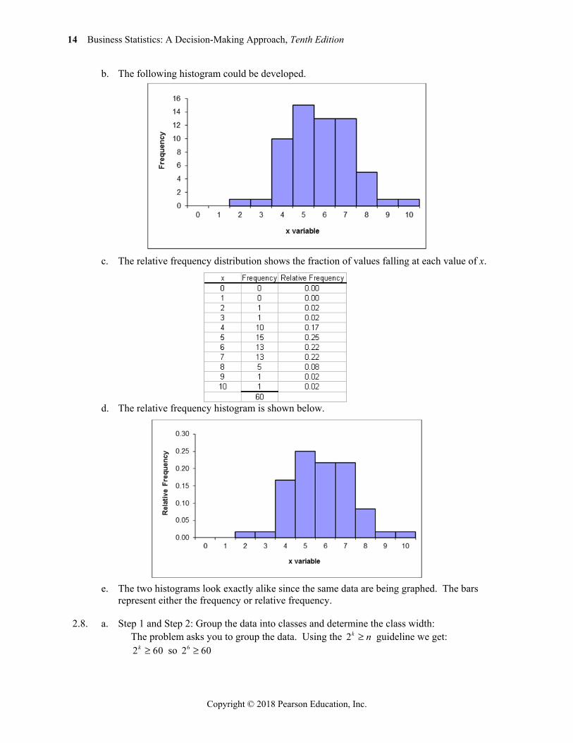
b. The following histogram could be developed.
c. The relative frequency distribution shows the fraction of values falling at each value of x.
d. The relative frequency histogram is shown below.
e. The two histograms look exactly alike since the same data are being graphed. The bars
represent either the frequency or relative frequency.
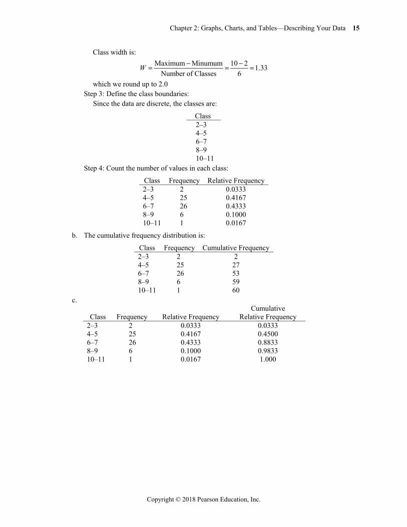
2.8. a. Step 1 and Step 2: Group the data into classes and determine the class width: The problem asks you to group the data. Using the 2k n guideline we get:
2 60k so 62 60
Chapter 2: Graphs, Charts, and Tables—Describing Your Data 15
Copyright © 2018 Pearson Education, Inc.
Class width is: Maximum Minumum 10 2 1.33
Number of Classes 6W
which we round up to 2.0 Step 3: Define the class boundaries: Since the data are discrete, the classes are:
Class 2–3 4–5 6–7 8–9 10–11
Step 4: Count the number of values in each class:
Class Frequency Relative Frequency 2–3 2 0.0333 4–5 25 0.4167 6–7 26 0.4333 8–9 6 0.1000 10–11 1 0.0167
b. The cumulative frequency distribution is:
Class Frequency Cumulative Frequency 2–3 2 2 4–5 25 27 6–7 26 53 8–9 6 59 10–11 1 60
c.
Class Frequency Relative Frequency Cumulative
Relative Frequency 2–3 2 0.0333 0.0333 4–5 25 0.4167 0.4500 6–7 26 0.4333 0.8833 8–9 6 0.1000 0.9833 10–11 1 0.0167 1.000
16 Business Statistics: A Decision-Making Approach, Tenth Edition
Copyright © 2018 Pearson Education, Inc.
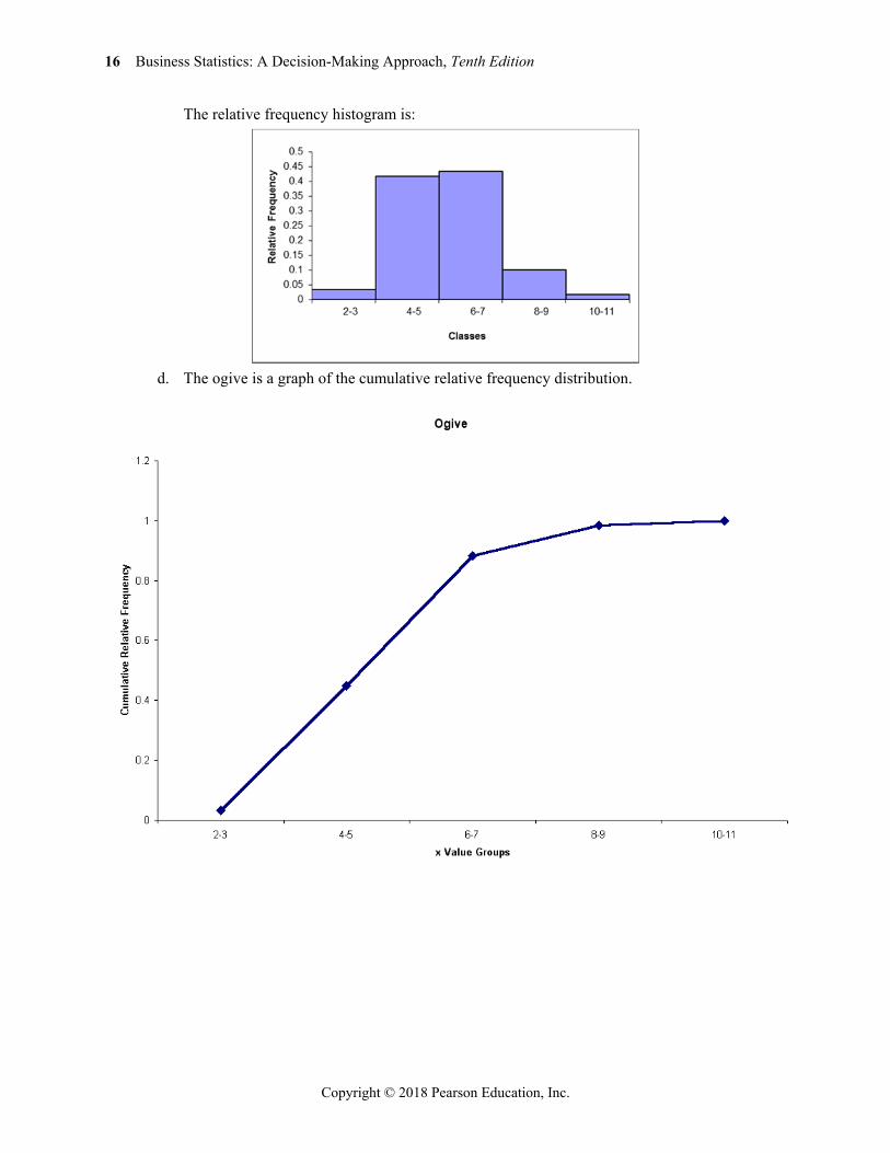
The relative frequency histogram is:
d. The ogive is a graph of the cumulative relative frequency distribution.
Chapter 2: Graphs, Charts, and Tables—Describing Your Data 17
Copyright © 2018 Pearson Education, Inc.
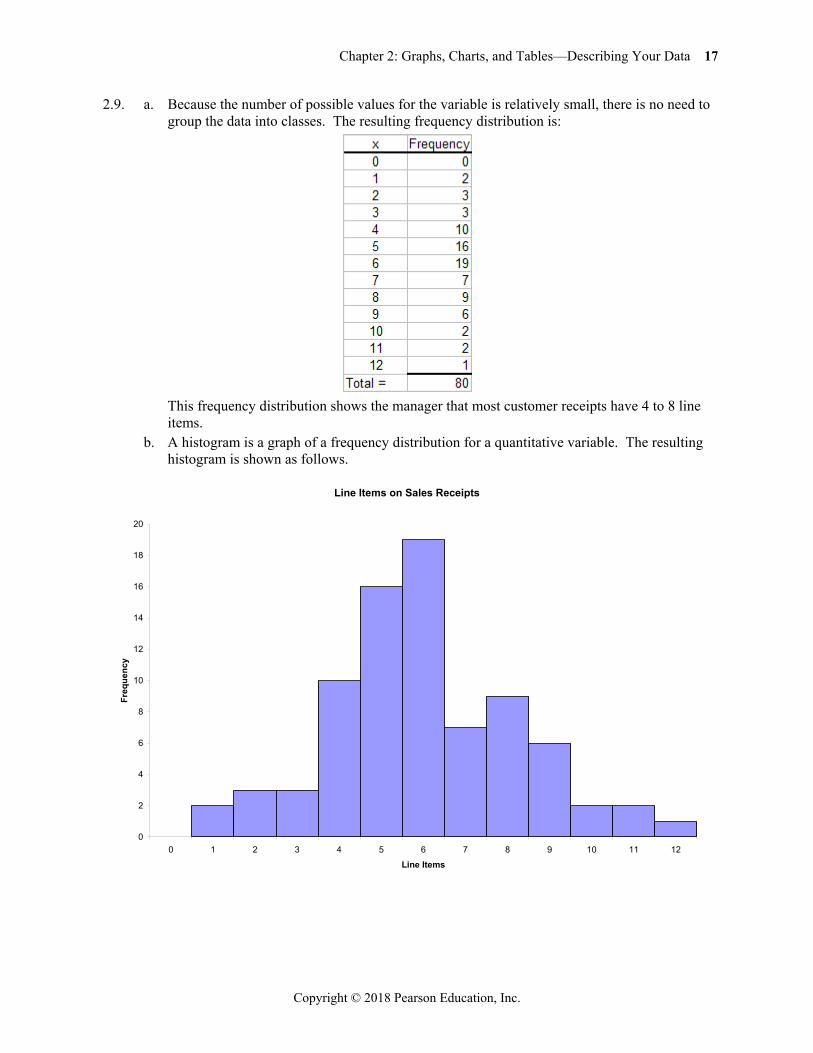
2.9. a. Because the number of possible values for the variable is relatively small, there is no need to group the data into classes. The resulting frequency distribution is:
This frequency distribution shows the manager that most customer receipts have 4 to 8 line
items. b. A histogram is a graph of a frequency distribution for a quantitative variable. The resulting
histogram is shown as follows.
Line Items on Sales Receipts
0
2
4
6
8
10
12
14
16
18
20
0 1 2 3 4 5 6 7 8 9 10 11 12
Line Items
Freq
uenc
y
18 Business Statistics: A Decision-Making Approach, Tenth Edition
Copyright © 2018 Pearson Education, Inc.
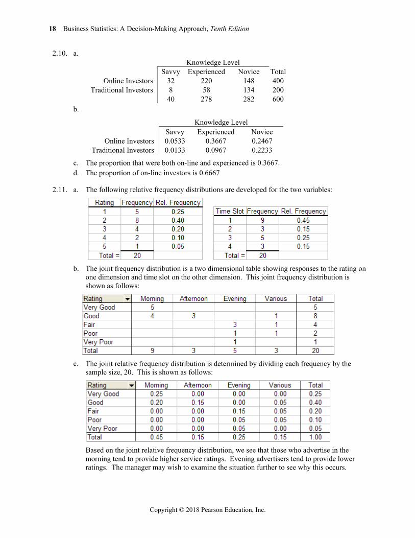
2.10. a. Knowledge Level Savvy Experienced Novice Total
Online Investors 32 220 148 400 Traditional Investors 8 58 134 200
40 278 282 600 b.
Knowledge Level Savvy Experienced Novice
Online Investors 0.0533 0.3667 0.2467 Traditional Investors 0.0133 0.0967 0.2233
c. The proportion that were both on-line and experienced is 0.3667. d. The proportion of on-line investors is 0.6667
2.11. a. The following relative frequency distributions are developed for the two variables:
b. The joint frequency distribution is a two dimensional table showing responses to the rating on
one dimension and time slot on the other dimension. This joint frequency distribution is shown as follows:
c. The joint relative frequency distribution is determined by dividing each frequency by the
sample size, 20. This is shown as follows:
Based on the joint relative frequency distribution, we see that those who advertise in the
morning tend to provide higher service ratings. Evening advertisers tend to provide lower ratings. The manager may wish to examine the situation further to see why this occurs.
Chapter 2: Graphs, Charts, and Tables—Describing Your Data 19
Copyright © 2018 Pearson Education, Inc.
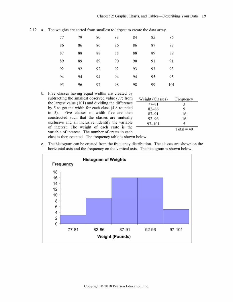
2.12. a. The weights are sorted from smallest to largest to create the data array.
77 79 80 83 84 85 86
86 86 86 86 86 87 87
87 88 88 88 88 89 89
89 89 89 90 90 91 91
92 92 92 92 93 93 93
94 94 94 94 94 95 95
95 96 97 98 98 99 101
b. Five classes having equal widths are created by subtracting the smallest observed value (77) from the largest value (101) and dividing the difference by 5 to get the width for each class (4.8 rounded to 5). Five classes of width five are then constructed such that the classes are mutually exclusive and all inclusive. Identify the variable of interest. The weight of each crate is the variable of interest. The number of crates in each class is then counted. The frequency table is shown below.
c. The histogram can be created from the frequency distribution. The classes are shown on the horizontal axis and the frequency on the vertical axis. The histogram is shown below.
Weight (Classes) Frequency 77–81 3 82–86 9 87–91 16 92–96 16
97–101 5 Total = 49
20 Business Statistics: A Decision-Making Approach, Tenth Edition
Copyright © 2018 Pearson Education, Inc.
d. Convert the frequency distribution into relative frequencies and cumulative relative frequencies as shown below.
Weights (Classes) Frequency
Relative Frequency
Cumulative Relative Frequency
77–81 3 0.0612 0.0612 82–86 9 0.1837 0.2449 87–91 16 0.3265 0.5714 92–96 16 0.3265 0.8980
97–101 5 0.1020 1.0000 Total = 49
The percentage of sampled crates with weights greater than 96 pounds is 10.20%.
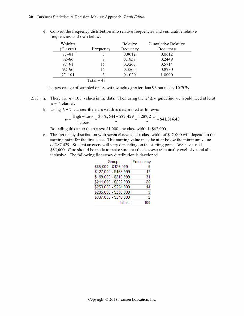
2.13. a. There are 100n values in the data. Then using the 2k n guideline we would need at least 7k classes.
b. Using 7k classes, the class width is determined as follows: High Low $376,644 $87,429 $289,215 $41,316.43
Classes 7 7w
Rounding this up to the nearest $1,000, the class width is $42,000. c. The frequency distribution with seven classes and a class width of $42,000 will depend on the
starting point for the first class. This starting value must be at or below the minimum value of $87,429. Student answers will vary depending on the starting point. We have used $85,000. Care should be made to make sure that the classes are mutually exclusive and all-inclusive. The following frequency distribution is developed:
Chapter 2: Graphs, Charts, and Tables—Describing Your Data 21
Copyright © 2018 Pearson Education, Inc.
d. The histogram for the frequency distribution in part c is shown as follows:
Interpretation should involve a discussion of the range of values with a discussion of where
the major classes are located.
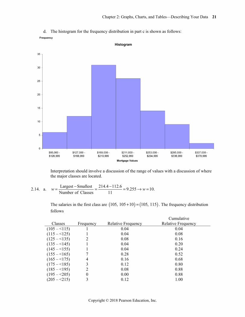
2.14. a. Largest Smallest 214.4 112.6Number of Clas
9ses 11
.255 10.w w
The salaries in the first class are 105, 105 10 105, 115 . The frequency distribution follows
Classes Frequency Relative Frequency Cumulative
Relative Frequency (105 – <115) 1 0.04 0.04 (115 – <125) 1 0.04 0.08 (125 – <135) 2 0.08 0.16 (135 – <145) 1 0.04 0.20 (145 – <155) 1 0.04 0.24 (155 – <165) 7 0.28 0.52 (165 – <175) 4 0.16 0.68 (175 – <185) 3 0.12 0.80 (185 – <195) 2 0.08 0.88 (195 – <205) 0 0.00 0.88 (205 – <215) 3 0.12 1.00
22 Business Statistics: A Decision-Making Approach, Tenth Edition
Copyright © 2018 Pearson Education, Inc.
b. The data shows 8 of the 25, or 0.32 of the salaries are at least 175,000 c. The data shows 18 of the 25, or 0.72 having salaries that are at most $205,000 and a least
$135,000.
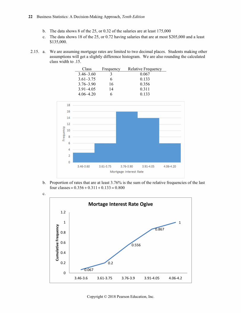
2.15. a. We are assuming mortgage rates are limited to two decimal places. Students making other assumptions will get a slightly difference histogram. We are also rounding the calculated class width to .15.
Class Frequency Relative Frequency 3.46–3.60 3 0.067 3.61–3.75 6 0.133 3.76–3.90 16 0.356 3.91–4.05 14 0.311 4.06–4.20 6 0.133
b. Proportion of rates that are at least 3.76% is the sum of the relative frequencies of the last
four classes 0.356 0.311 0.133 0.800 c.
0.067
0.2
0.556
0.867
1
0
0.2
0.4
0.6
0.8
1
1.2
3.46-3.6 3.61-3.75 3.76-3.9 3.91-4.05 4.06-4.2
Cum
ulat
ive
Freq
uenc
y
Mortage Interest Rate Ogive
Chapter 2: Graphs, Charts, and Tables—Describing Your Data 23
Copyright © 2018 Pearson Education, Inc.
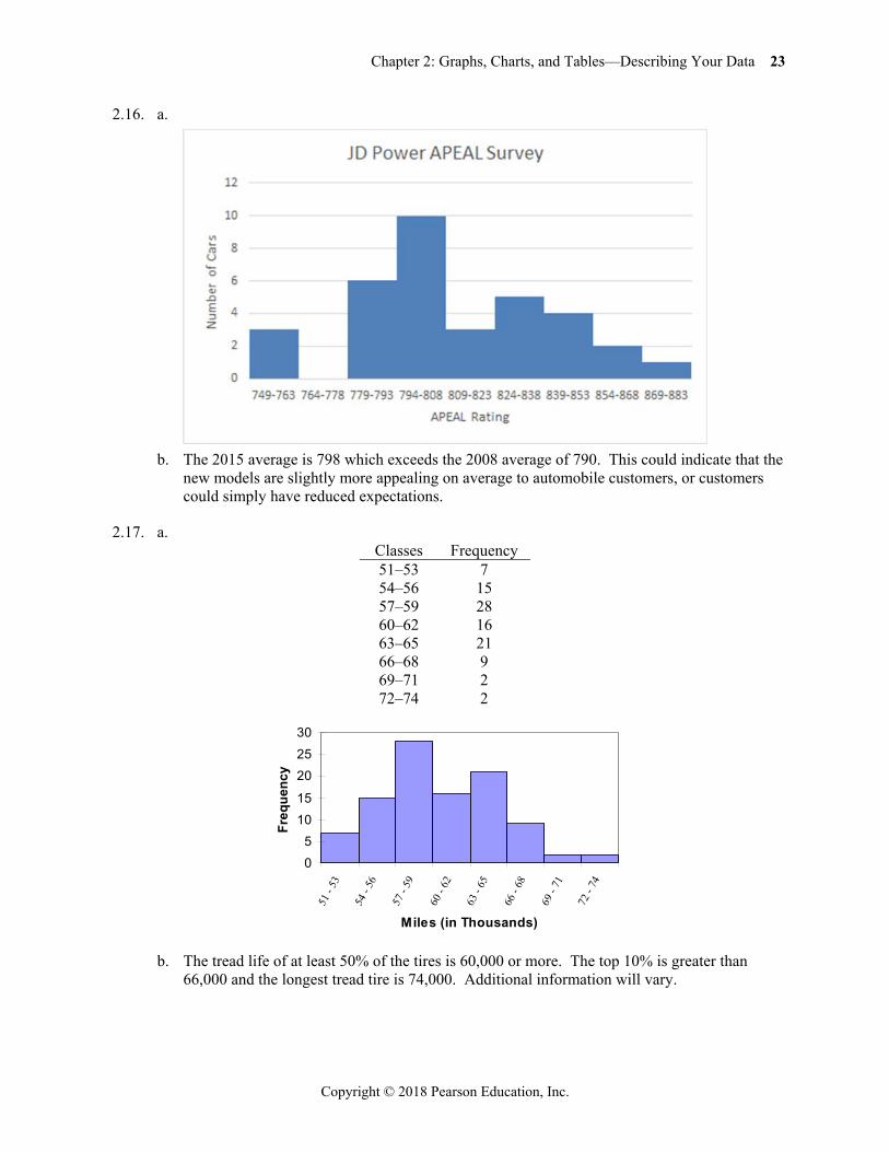
2.16. a.
b. The 2015 average is 798 which exceeds the 2008 average of 790. This could indicate that the
new models are slightly more appealing on average to automobile customers, or customers could simply have reduced expectations.
2.17. a. Classes Frequency 51–53 7 54–56 15 57–59 28 60–62 16 63–65 21 66–68 9 69–71 2 72–74 2
b. The tread life of at least 50% of the tires is 60,000 or more. The top 10% is greater than
66,000 and the longest tread tire is 74,000. Additional information will vary.
05
1015
202530
51 -
53
54 -
56
57 -
59
60 -
62
63 -
65
66 -
68
69 -
71
72 -
74
Miles (in Thousands)
Freq
uenc
y
24 Business Statistics: A Decision-Making Approach, Tenth Edition
Copyright © 2018 Pearson Education, Inc.
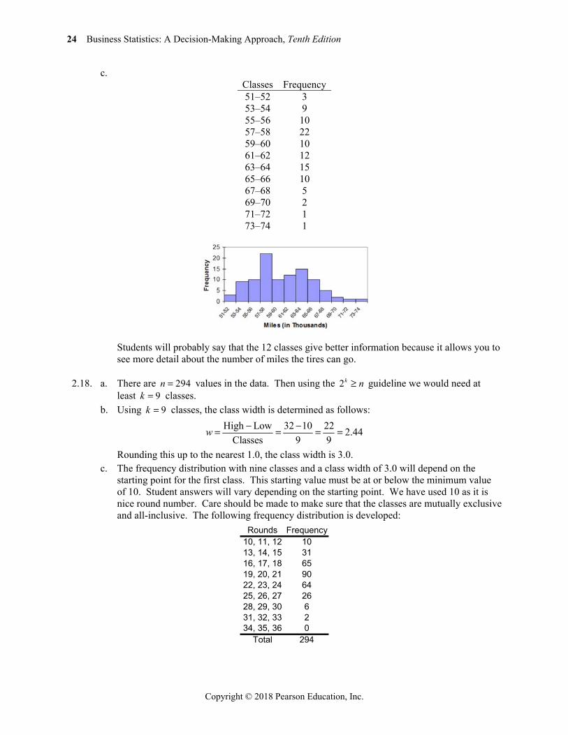
c. Classes Frequency 51–52 3 53–54 9 55–56 10 57–58 22 59–60 10 61–62 12 63–64 15 65–66 10 67–68 5 69–70 2 71–72 1 73–74 1
Students will probably say that the 12 classes give better information because it allows you to
see more detail about the number of miles the tires can go.
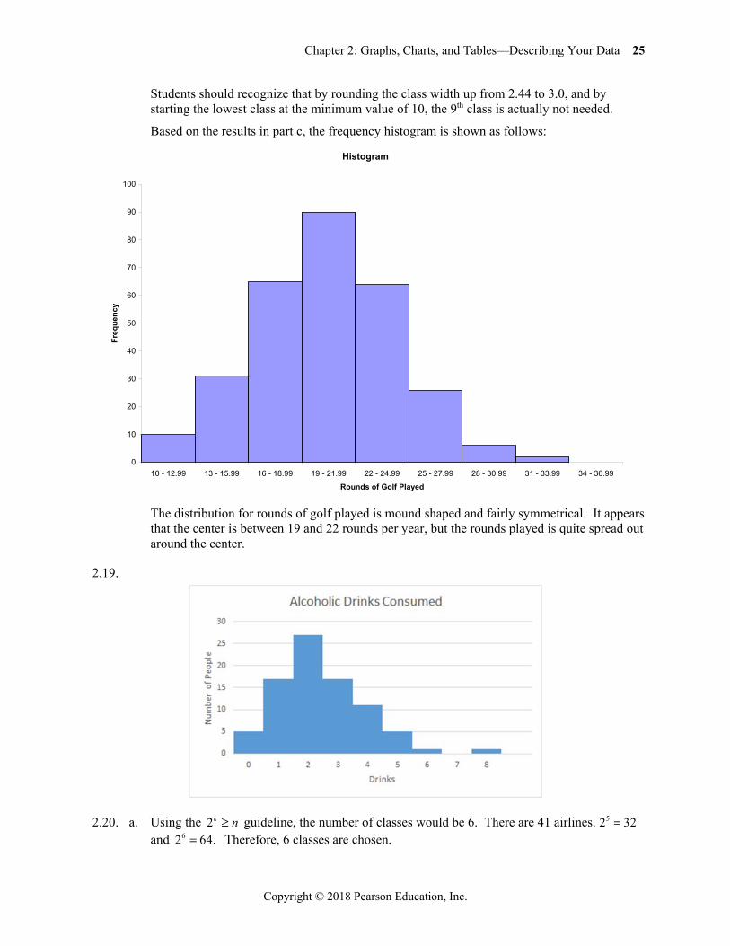
2.18. a. There are 294n values in the data. Then using the 2k n guideline we would need at least 9k classes.
b. Using 9k classes, the class width is determined as follows: High Low 32 10 22 2.44
Classes 9 9w
Rounding this up to the nearest 1.0, the class width is 3.0. c. The frequency distribution with nine classes and a class width of 3.0 will depend on the
starting point for the first class. This starting value must be at or below the minimum value of 10. Student answers will vary depending on the starting point. We have used 10 as it is nice round number. Care should be made to make sure that the classes are mutually exclusive and all-inclusive. The following frequency distribution is developed:
Rounds Frequency10, 11, 12 1013, 14, 15 3116, 17, 18 6519, 20, 21 9022, 23, 24 6425, 26, 27 2628, 29, 30 631, 32, 33 234, 35, 36 0
Total 294
Chapter 2: Graphs, Charts, and Tables—Describing Your Data 25
Copyright © 2018 Pearson Education, Inc.
Students should recognize that by rounding the class width up from 2.44 to 3.0, and by starting the lowest class at the minimum value of 10, the 9th class is actually not needed.
Based on the results in part c, the frequency histogram is shown as follows:
The distribution for rounds of golf played is mound shaped and fairly symmetrical. It appears
that the center is between 19 and 22 rounds per year, but the rounds played is quite spread out around the center.
2.19.
2.20. a. Using the 2k n guideline, the number of classes would be 6. There are 41 airlines. 5 2 32 and 62 64. Therefore, 6 classes are chosen.
Histogram
0
10
20
30
40
50
60
70
80
90
100
10 - 12.99 13 - 15.99 16 - 18.99 19 - 21.99 22 - 24.99 25 - 27.99 28 - 30.99 31 - 33.99 34 - 36.99
Rounds of Golf Played
Freq
uenc
y
26 Business Statistics: A Decision-Making Approach, Tenth Edition
Copyright © 2018 Pearson Education, Inc.
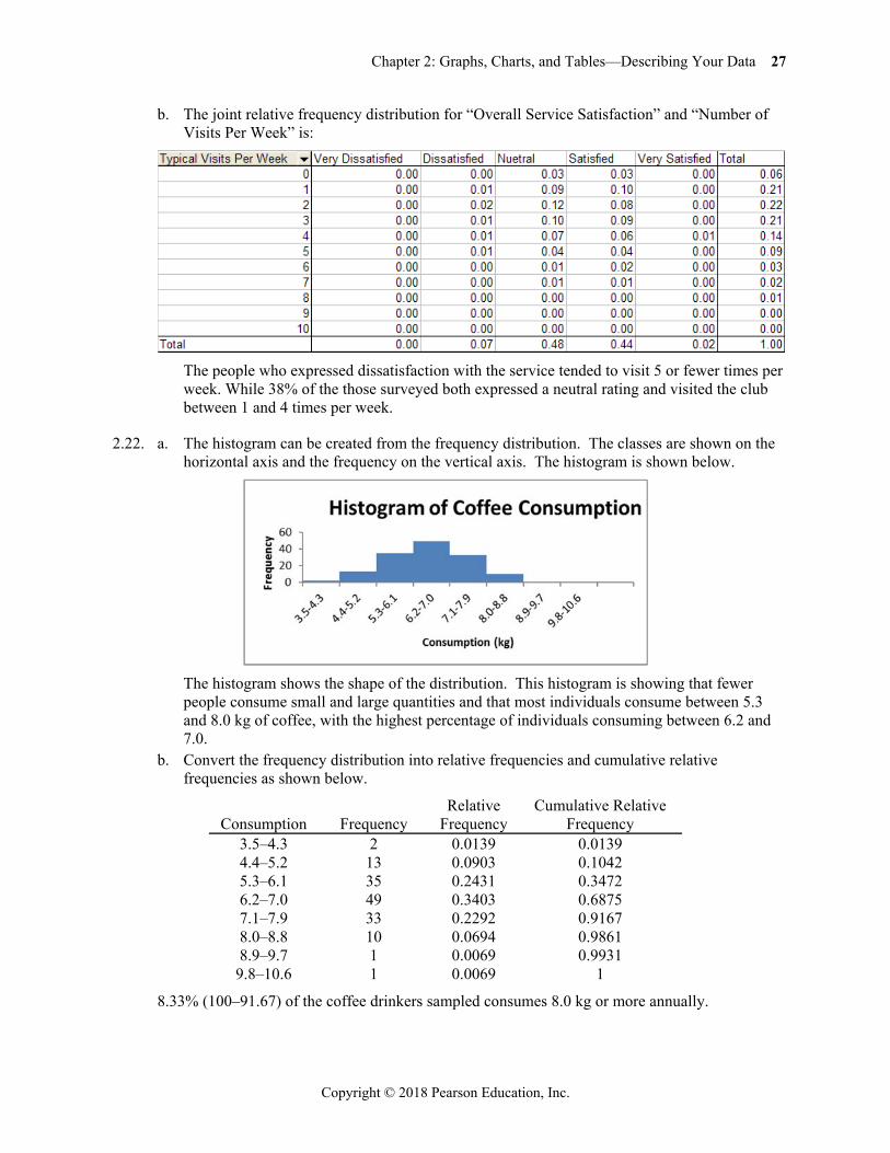
b. The maximum value is 602,708 and the minimum value is 160 from the Total column. The difference is 602,708 –160 602548. The class width would be 602548 6 100424.67. Rounding up to the nearest 1,000 produces a class width of 101,000.
c. Class Frequency
0 – < 101,000 33 101,000 – < 202,000 2 202,000 – < 303,000 2 303,000 – < 404,000 1 404,000 – < 505,000 2 505,000 – < 606,000 1
Histogram follows:
The vast majority of airlines had fewer than 101,000 monthly passengers for December 2011.
2.21. a. The frequency distribution is: Satisfaction Level Frequency
1 = Very Dissatisfied 1 2 = Dissatisfied 82 3 = Neutral 578 4 = Satisfied 530 5 = Very Satisfied 23 Total = 1214
The frequency distribution shows that over 1,100 people rated the overall service as either neutral or satisfied. While only 83 people expressed dissatisfaction, the manager should be concerned that so many people were in the neutral category. It looks like there is much room for improvement.
Chapter 2: Graphs, Charts, and Tables—Describing Your Data 27
Copyright © 2018 Pearson Education, Inc.
b. The joint relative frequency distribution for “Overall Service Satisfaction” and “Number of Visits Per Week” is:
The people who expressed dissatisfaction with the service tended to visit 5 or fewer times per
week. While 38% of the those surveyed both expressed a neutral rating and visited the club between 1 and 4 times per week.
2.22. a. The histogram can be created from the frequency distribution. The classes are shown on the horizontal axis and the frequency on the vertical axis. The histogram is shown below.
The histogram shows the shape of the distribution. This histogram is showing that fewer
people consume small and large quantities and that most individuals consume between 5.3 and 8.0 kg of coffee, with the highest percentage of individuals consuming between 6.2 and 7.0.
b. Convert the frequency distribution into relative frequencies and cumulative relative frequencies as shown below.
Consumption Frequency Relative
Frequency Cumulative Relative
Frequency 3.5–4.3 2 0.0139 0.0139 4.4–5.2 13 0.0903 0.1042 5.3–6.1 35 0.2431 0.3472 6.2–7.0 49 0.3403 0.6875 7.1–7.9 33 0.2292 0.9167 8.0–8.8 10 0.0694 0.9861 8.9–9.7 1 0.0069 0.9931
9.8–10.6 1 0.0069 1
8.33% (100–91.67) of the coffee drinkers sampled consumes 8.0 kg or more annually.
28 Business Statistics: A Decision-Making Approach, Tenth Edition
Copyright © 2018 Pearson Education, Inc.
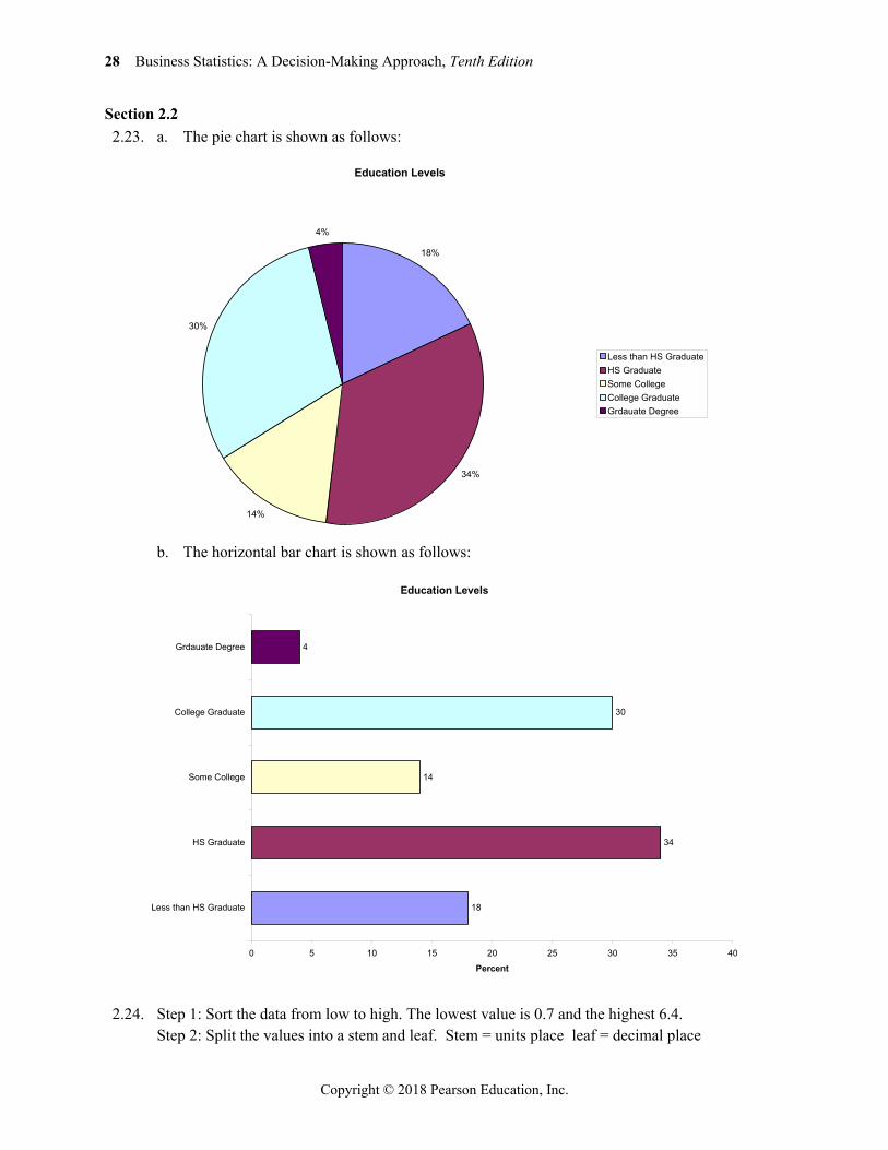
Section 2.2 2.23. a. The pie chart is shown as follows:
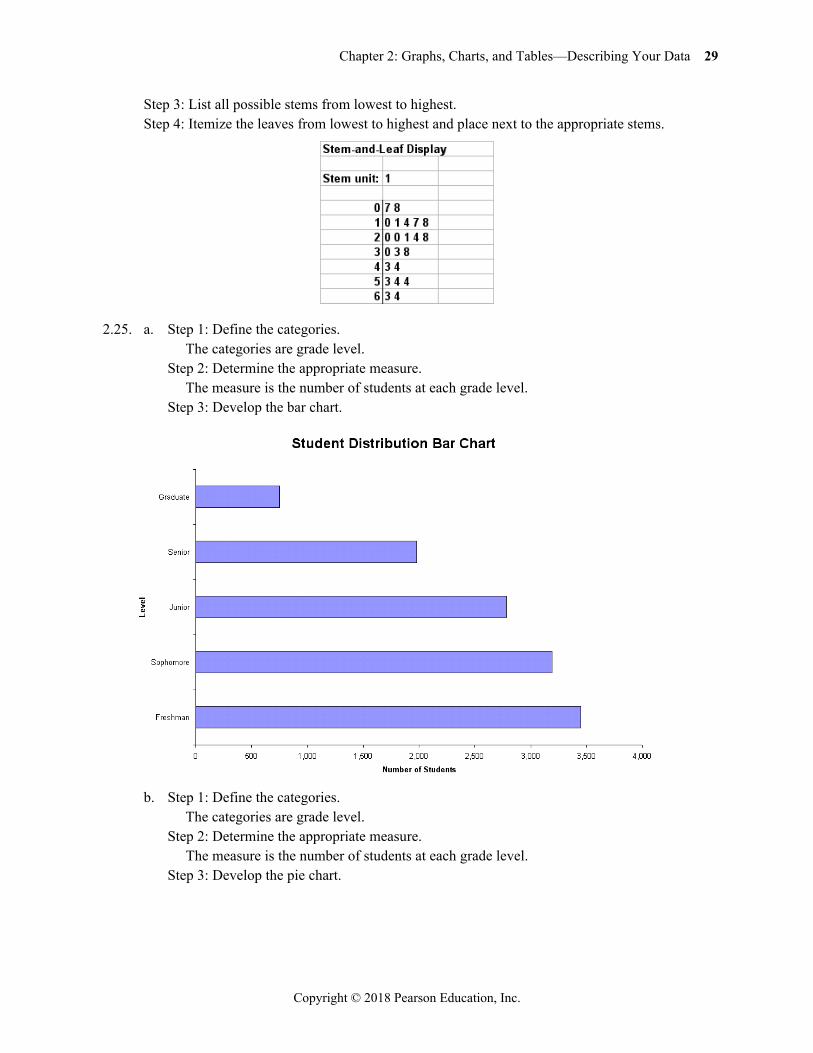
b. The horizontal bar chart is shown as follows:
2.24. Step 1: Sort the data from low to high. The lowest value is 0.7 and the highest 6.4. Step 2: Split the values into a stem and leaf. Stem = units place leaf = decimal place
Education Levels
18%
34%
14%
30%
4%
Less than HS GraduateHS GraduateSome CollegeCollege GraduateGrdauate Degree
Education Levels
18
34
14
30
4
0 5 10 15 20 25 30 35 40
Less than HS Graduate
HS Graduate
Some College
College Graduate
Grdauate Degree
Percent
Chapter 2: Graphs, Charts, and Tables—Describing Your Data 29
Copyright © 2018 Pearson Education, Inc.
Step 3: List all possible stems from lowest to highest. Step 4: Itemize the leaves from lowest to highest and place next to the appropriate stems.
2.25. a. Step 1: Define the categories. The categories are grade level. Step 2: Determine the appropriate measure. The measure is the number of students at each grade level. Step 3: Develop the bar chart.
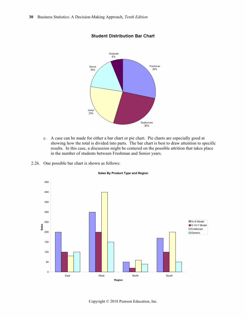
b. Step 1: Define the categories. The categories are grade level. Step 2: Determine the appropriate measure. The measure is the number of students at each grade level. Step 3: Develop the pie chart.
30 Business Statistics: A Decision-Making Approach, Tenth Edition
Copyright © 2018 Pearson Education, Inc.
c. A case can be made for either a bar chart or pie chart. Pie charts are especially good at
showing how the total is divided into parts. The bar chart is best to draw attention to specific results. In this case, a discussion might be centered on the possible attrition that takes place in the number of students between Freshman and Senior years.
2.26. One possible bar chart is shown as follows:
Sales By Product Type and Region
0
50
100
150
200
250
300
350
400
450
East West North South
Region
Sale
s
XJ-6 ModelX-15-Y ModelCraftsmanGeneric
Chapter 2: Graphs, Charts, and Tables—Describing Your Data 31
Copyright © 2018 Pearson Education, Inc.
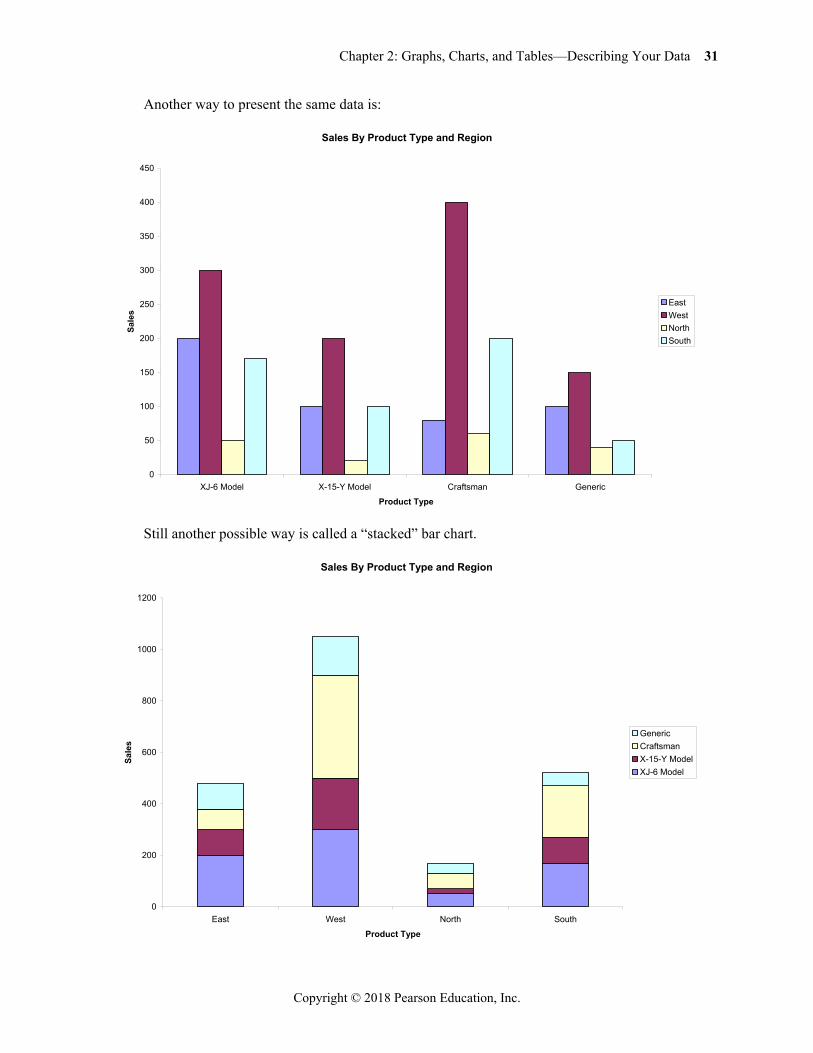
Another way to present the same data is:
Still another possible way is called a “stacked” bar chart.
Sales By Product Type and Region
0
50
100
150
200
250
300
350
400
450
XJ-6 Model X-15-Y Model Craftsman Generic
Product Type
Sale
s
EastWestNorthSouth
Sales By Product Type and Region
0
200
400
600
800
1000
1200
East West North South
Product Type
Sale
s
GenericCraftsmanX-15-Y ModelXJ-6 Model
32 Business Statistics: A Decision-Making Approach, Tenth Edition
Copyright © 2018 Pearson Education, Inc.
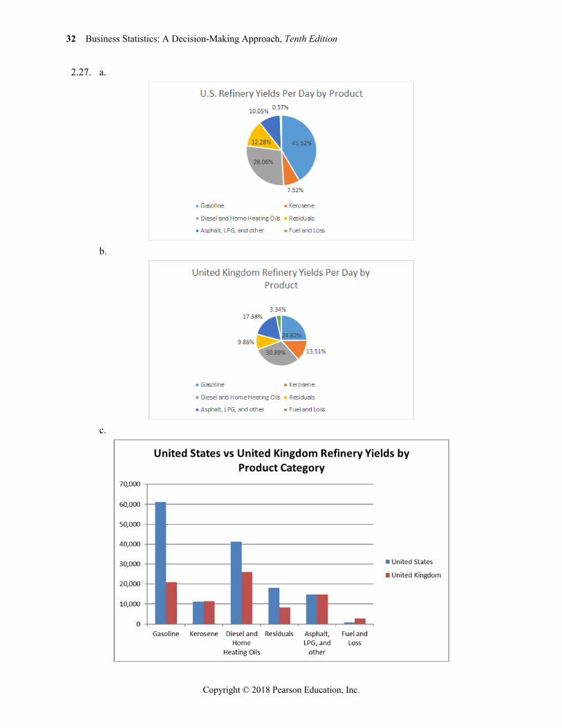
2.27. a.
b.
c.
Chapter 2: Graphs, Charts, and Tables—Describing Your Data 33
Copyright © 2018 Pearson Education, Inc.
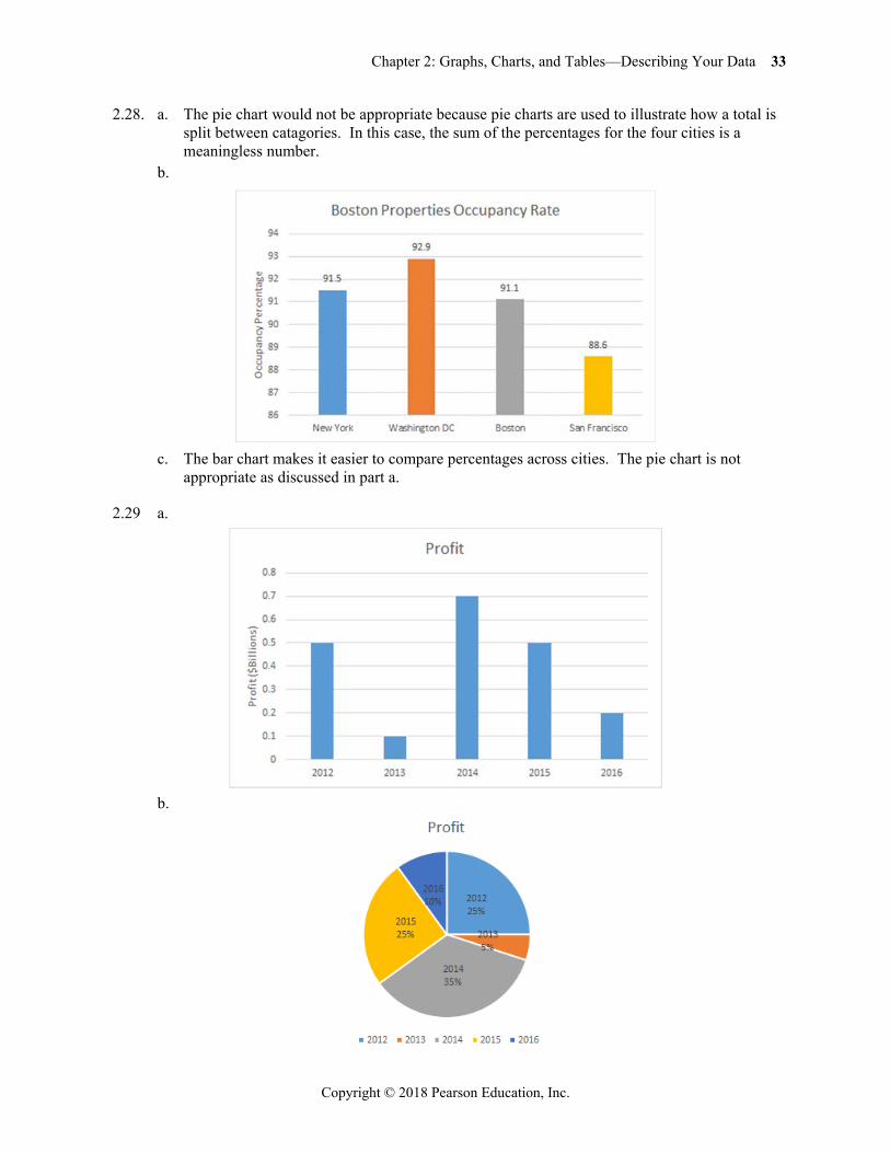
2.28. a. The pie chart would not be appropriate because pie charts are used to illustrate how a total is split between catagories. In this case, the sum of the percentages for the four cities is a meaningless number.
b.
c. The bar chart makes it easier to compare percentages across cities. The pie chart is not
appropriate as discussed in part a.
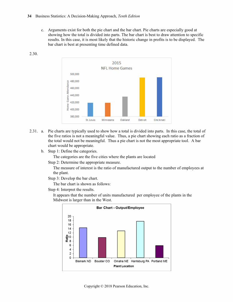
2.29 a.
b.
34 Business Statistics: A Decision-Making Approach, Tenth Edition
Copyright © 2018 Pearson Education, Inc.
c. Arguments exist for both the pie chart and the bar chart. Pie charts are especially good at showing how the total is divided into parts. The bar chart is best to draw attention to specific results. In this case, it is most likely that the historic change in profits is to be displayed. The bar chart is best at presenting time defined data.
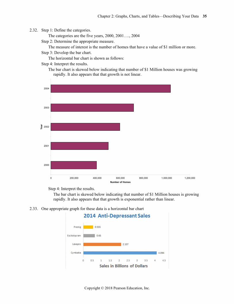
2.30.
2.31. a. Pie charts are typically used to show how a total is divided into parts. In this case, the total of the five ratios is not a meaningful value. Thus, a pie chart showing each ratio as a fraction of the total would not be meaningful. Thus a pie chart is not the most appropriate tool. A bar chart would be appropriate.
b. Step 1: Define the categories. The categories are the five cities where the plants are located Step 2: Determine the appropriate measure. The measure of interest is the ratio of manufactured output to the number of employees at
the plant. Step 3: Develop the bar chart. The bar chart is shown as follows: Step 4: Interpret the results. It appears that the number of units manufactured per employee of the plants in the
Midwest is larger than in the West.
Chapter 2: Graphs, Charts, and Tables—Describing Your Data 35
Copyright © 2018 Pearson Education, Inc.
2.32. Step 1: Define the categories. The categories are the five years, 2000, 2001…., 2004 Step 2: Determine the appropriate measure. The measure of interest is the number of homes that have a value of $1 million or more. Step 3: Develop the bar chart. The horizontal bar chart is shown as follows: Step 4: Interpret the results. The bar chart is skewed below indicating that number of $1 Million houses was growing
rapidly. It also appears that that growth is not linear.
Step 4: Interpret the results. The bar chart is skewed below indicating that number of $1 Million houses is growing
rapidly. It also appears that that growth is exponential rather than linear.
2.33. One appropriate graph for these data is a horizontal bar chart
0 200,000 400,000 600,000 800,000 1,000,000 1,200,000
2000
2001
2002
2003
2004
Year
Number of Homes
36 Business Statistics: A Decision-Making Approach, Tenth Edition
Copyright © 2018 Pearson Education, Inc.
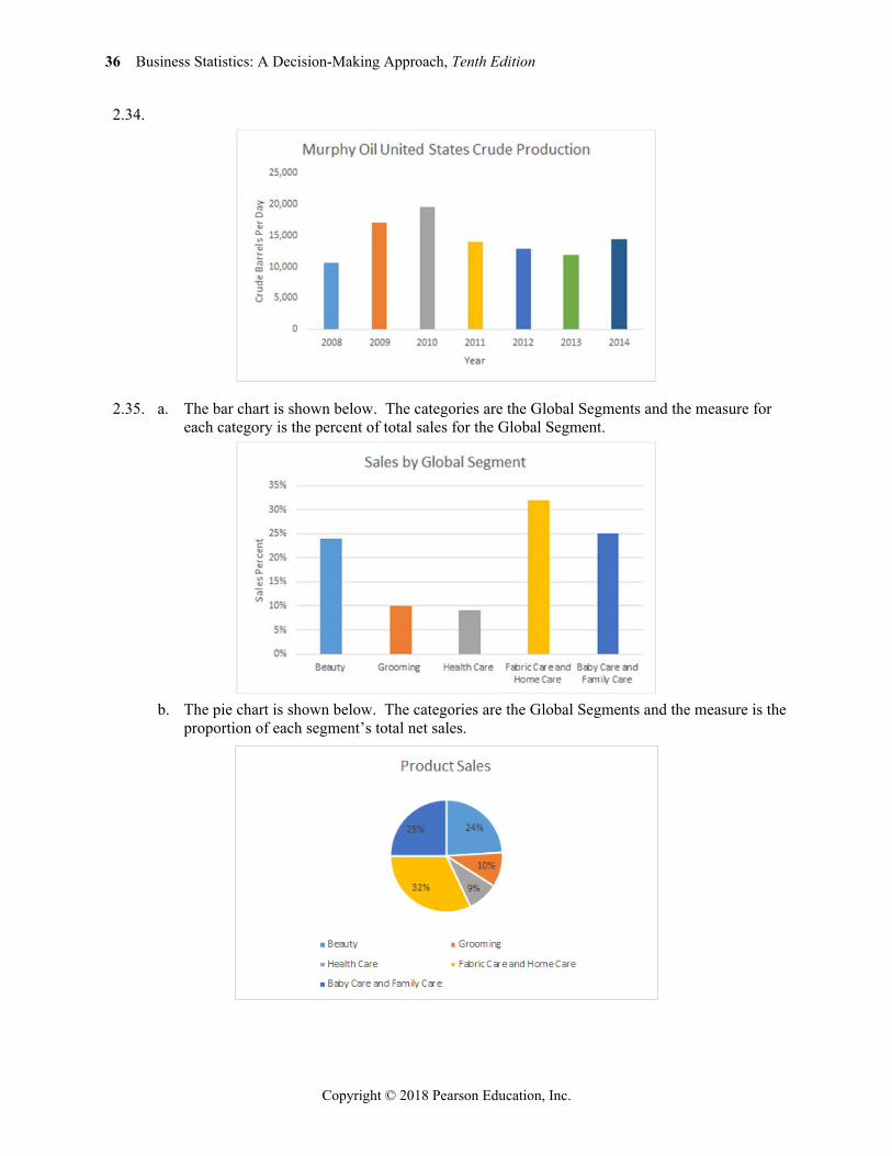
2.34.
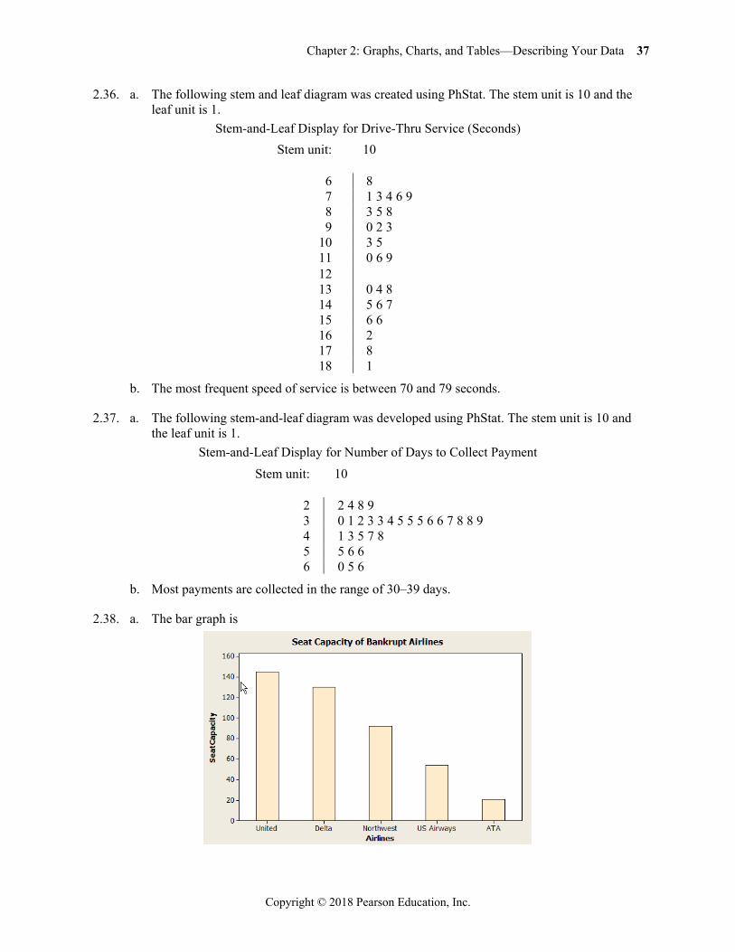
2.35. a. The bar chart is shown below. The categories are the Global Segments and the measure for each category is the percent of total sales for the Global Segment.
b. The pie chart is shown below. The categories are the Global Segments and the measure is the
proportion of each segment’s total net sales.
Chapter 2: Graphs, Charts, and Tables—Describing Your Data 37
Copyright © 2018 Pearson Education, Inc.
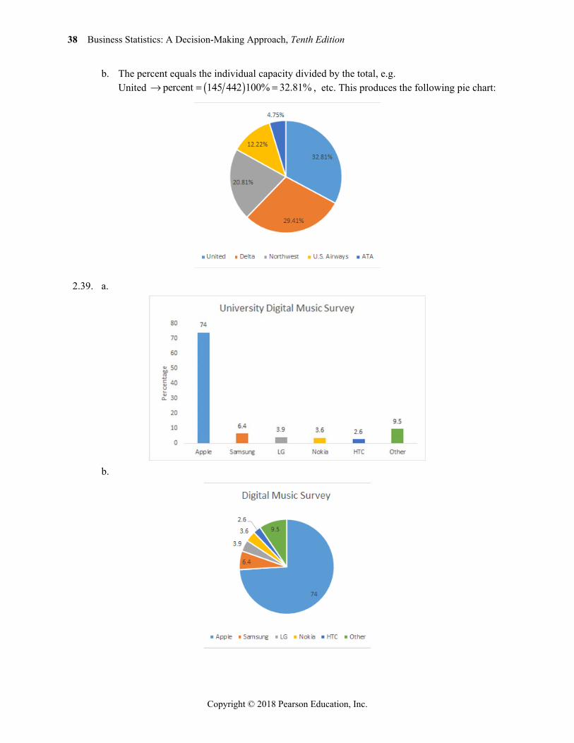
2.36. a. The following stem and leaf diagram was created using PhStat. The stem unit is 10 and the leaf unit is 1.
Stem-and-Leaf Display for Drive-Thru Service (Seconds) Stem unit: 10
6 8 7 1 3 4 6 9 8 3 5 8 9 0 2 3
10 3 5 11 0 6 9 12 13 0 4 8 14 5 6 7 15 6 6 16 2 17 8 18 1
b. The most frequent speed of service is between 70 and 79 seconds.
2.37. a. The following stem-and-leaf diagram was developed using PhStat. The stem unit is 10 and the leaf unit is 1.
Stem-and-Leaf Display for Number of Days to Collect Payment Stem unit: 10
2 2 4 8 9 3 0 1 2 3 3 4 5 5 5 6 6 7 8 8 9 4 1 3 5 7 8 5 5 6 6 6 0 5 6
b. Most payments are collected in the range of 30–39 days.
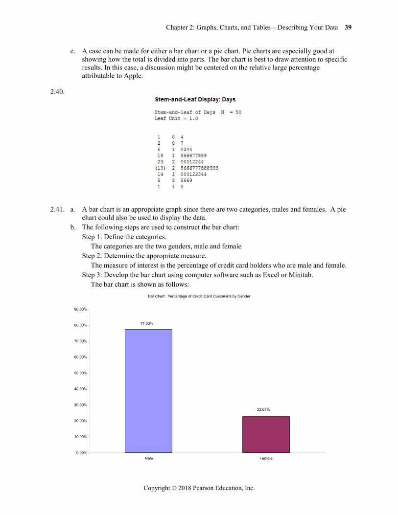
2.38. a. The bar graph is
38 Business Statistics: A Decision-Making Approach, Tenth Edition
Copyright © 2018 Pearson Education, Inc.
b. The percent equals the individual capacity divided by the total, e.g. United percent 145 442 100% 32.81% , etc. This produces the following pie chart:
2.39. a.
b.
Chapter 2: Graphs, Charts, and Tables—Describing Your Data 39
Copyright © 2018 Pearson Education, Inc.
c. A case can be made for either a bar chart or a pie chart. Pie charts are especially good at showing how the total is divided into parts. The bar chart is best to draw attention to specific results. In this case, a discussion might be centered on the relative large percentage attributable to Apple.
2.40.
2.41. a. A bar chart is an appropriate graph since there are two categories, males and females. A pie chart could also be used to display the data.
b. The following steps are used to construct the bar chart: Step 1: Define the categories. The categories are the two genders, male and female Step 2: Determine the appropriate measure. The measure of interest is the percentage of credit card holders who are male and female. Step 3: Develop the bar chart using computer software such as Excel or Minitab. The bar chart is shown as follows:
Bar Chart: Percentage of Credit Card Customers by Gender
22.67%
77.33%
0.00%
10.00%
20.00%
30.00%
40.00%
50.00%
60.00%
70.00%
80.00%
90.00%
Male Female
40 Business Statistics: A Decision-Making Approach, Tenth Edition
Copyright © 2018 Pearson Education, Inc.
Step 4: Interpret the results. This shows that a clear majority of credit card holders are males (77.33%)
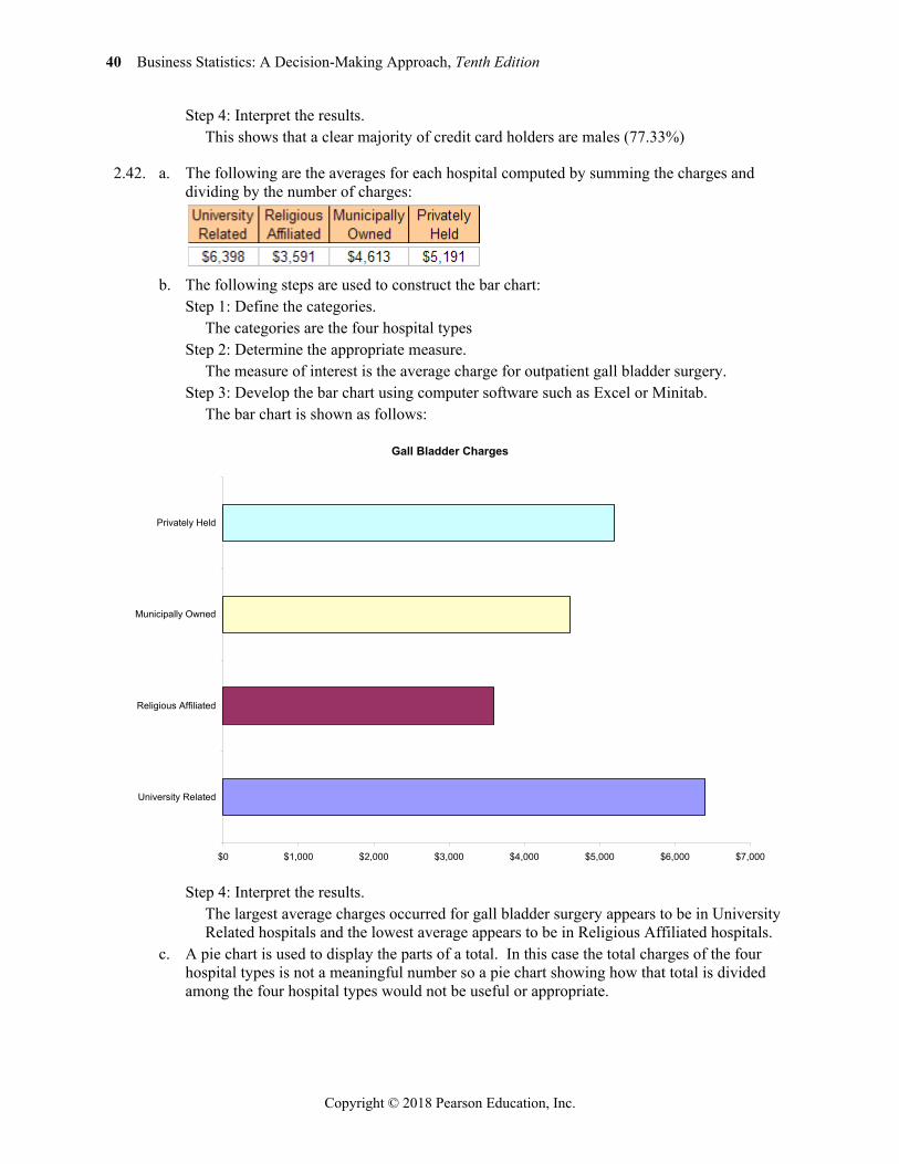
2.42. a. The following are the averages for each hospital computed by summing the charges and dividing by the number of charges:
b. The following steps are used to construct the bar chart:
Step 1: Define the categories. The categories are the four hospital types Step 2: Determine the appropriate measure. The measure of interest is the average charge for outpatient gall bladder surgery. Step 3: Develop the bar chart using computer software such as Excel or Minitab. The bar chart is shown as follows:
Step 4: Interpret the results. The largest average charges occurred for gall bladder surgery appears to be in University
Related hospitals and the lowest average appears to be in Religious Affiliated hospitals. c. A pie chart is used to display the parts of a total. In this case the total charges of the four
hospital types is not a meaningful number so a pie chart showing how that total is divided among the four hospital types would not be useful or appropriate.
Gall Bladder Charges
$0 $1,000 $2,000 $3,000 $4,000 $5,000 $6,000 $7,000
University Related
Religious Affiliated
Municipally Owned
Privately Held
Chapter 2: Graphs, Charts, and Tables—Describing Your Data 41
Copyright © 2018 Pearson Education, Inc.
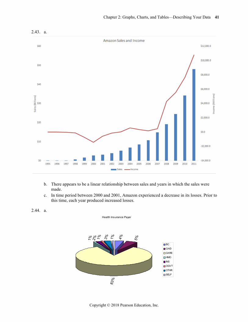
2.43. a.
b. There appears to be a linear relationship between sales and years in which the sales were
made. c. In time period between 2000 and 2001, Amazon experienced a decrease in its losses. Prior to
this time, each year produced increased losses.
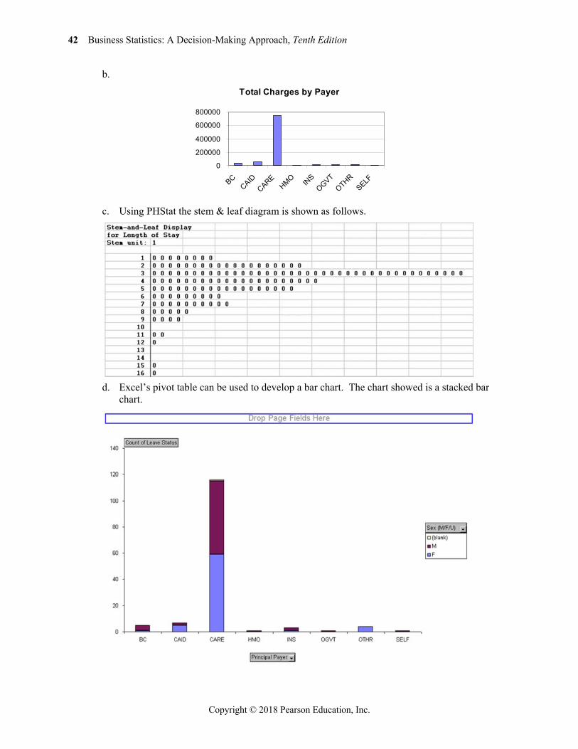
2.44. a.
Health Insurance Payer
4% 5%
83%
1% 2% 1% 3% 1%
BC
CAID
CARE
HMO
INS
OGVT
OTHR
SELF
42 Business Statistics: A Decision-Making Approach, Tenth Edition
Copyright © 2018 Pearson Education, Inc.
b.
c. Using PHStat the stem & leaf diagram is shown as follows.
d. Excel’s pivot table can be used to develop a bar chart. The chart showed is a stacked bar
chart.
Total Charges by Payer
0
200000
400000
600000
800000
BCCAID
CAREHMO IN
SOGVT
OTHRSELF
Chapter 2: Graphs, Charts, and Tables—Describing Your Data 43
Copyright © 2018 Pearson Education, Inc.
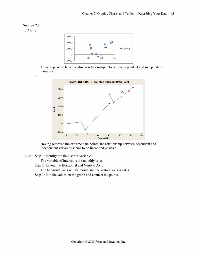
Section 2.3 2.45. a.
There appears to be a curvilinear relationship between the dependent and independent
variables. b.
Having removed the extreme data points, the relationship between dependent and
independent variables seems to be linear and positive.
2.46. Step 1: Identify the time-series variable The variable of interest is the monthly sales. Step 2: Layout the Horizontal and Vertical Axis The horizontal axis will be month and the vertical axis is sales. Step 3: Plot the values on the graph and connect the points
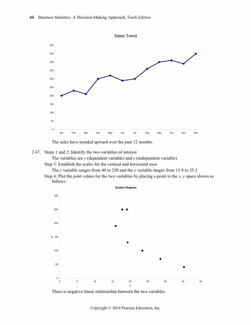
44 Business Statistics: A Decision-Making Approach, Tenth Edition
Copyright © 2018 Pearson Education, Inc.
The sales have trended upward over the past 12 months.
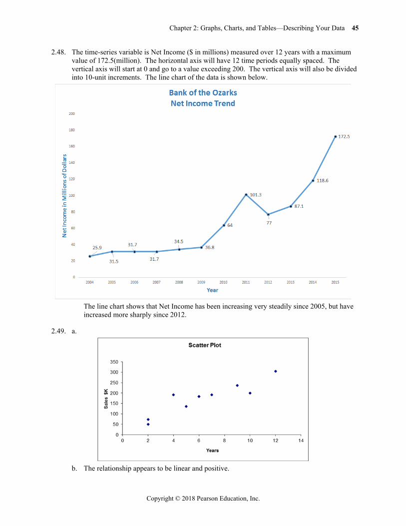
2.47. Steps 1 and 2: Identify the two variables of interest The variables are y (dependent variable) and x (independent variable) Step 3: Establish the scales for the vertical and horizontal axes The y variable ranges from 40 to 250 and the x variable ranges from 15.9 to 35.3 Step 4: Plot the joint values for the two variables by placing a point in the x, y space shown as
follows:
There is negative linear relationship between the two variables.
Sales Trend
0
50
100
150
200
250
300
350
400
450
500
Jan Feb Mar Apr May Jun Jul Aug Sep Oct Nov Dec
Scatter Diagram
0
50
100
150
200
250
300
0 5 10 15 20 25 30 35 40
x
y
Chapter 2: Graphs, Charts, and Tables—Describing Your Data 45
Copyright © 2018 Pearson Education, Inc.
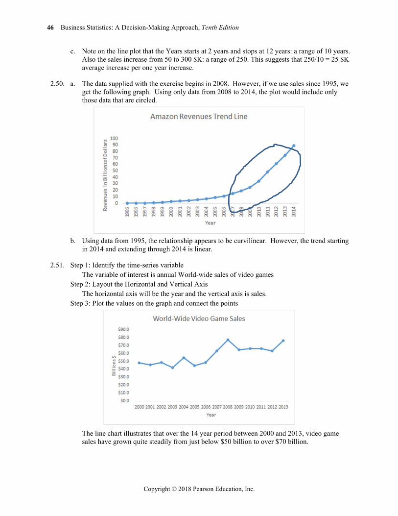
2.48. The time-series variable is Net Income ($ in millions) measured over 12 years with a maximum value of 172.5(million). The horizontal axis will have 12 time periods equally spaced. The vertical axis will start at 0 and go to a value exceeding 200. The vertical axis will also be divided into 10-unit increments. The line chart of the data is shown below.
The line chart shows that Net Income has been increasing very steadily since 2005, but have
increased more sharply since 2012.
2.49. a.
b. The relationship appears to be linear and positive.
46 Business Statistics: A Decision-Making Approach, Tenth Edition
Copyright © 2018 Pearson Education, Inc.
c. Note on the line plot that the Years starts at 2 years and stops at 12 years: a range of 10 years. Also the sales increase from 50 to 300 $K: a range of 250. This suggests that 250/10 = 25 $K average increase per one year increase.
2.50. a. The data supplied with the exercise begins in 2008. However, if we use sales since 1995, we get the following graph. Using only data from 2008 to 2014, the plot would include only those data that are circled.
b. Using data from 1995, the relationship appears to be curvilinear. However, the trend starting
in 2014 and extending through 2014 is linear.
2.51. Step 1: Identify the time-series variable The variable of interest is annual World-wide sales of video games Step 2: Layout the Horizontal and Vertical Axis The horizontal axis will be the year and the vertical axis is sales. Step 3: Plot the values on the graph and connect the points
The line chart illustrates that over the 14 year period between 2000 and 2013, video game
sales have grown quite steadily from just below $50 billion to over $70 billion.
Chapter 2: Graphs, Charts, and Tables—Describing Your Data 47
Copyright © 2018 Pearson Education, Inc.
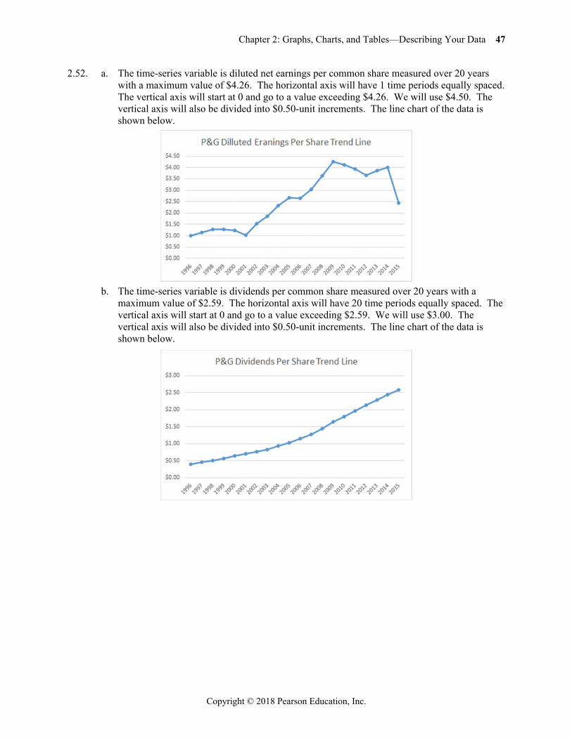
2.52. a. The time-series variable is diluted net earnings per common share measured over 20 years with a maximum value of $4.26. The horizontal axis will have 1 time periods equally spaced. The vertical axis will start at 0 and go to a value exceeding $4.26. We will use $4.50. The vertical axis will also be divided into $0.50-unit increments. The line chart of the data is shown below.
b. The time-series variable is dividends per common share measured over 20 years with a
maximum value of $2.59. The horizontal axis will have 20 time periods equally spaced. The vertical axis will start at 0 and go to a value exceeding $2.59. We will use $3.00. The vertical axis will also be divided into $0.50-unit increments. The line chart of the data is shown below.
48 Business Statistics: A Decision-Making Approach, Tenth Edition
Copyright © 2018 Pearson Education, Inc.
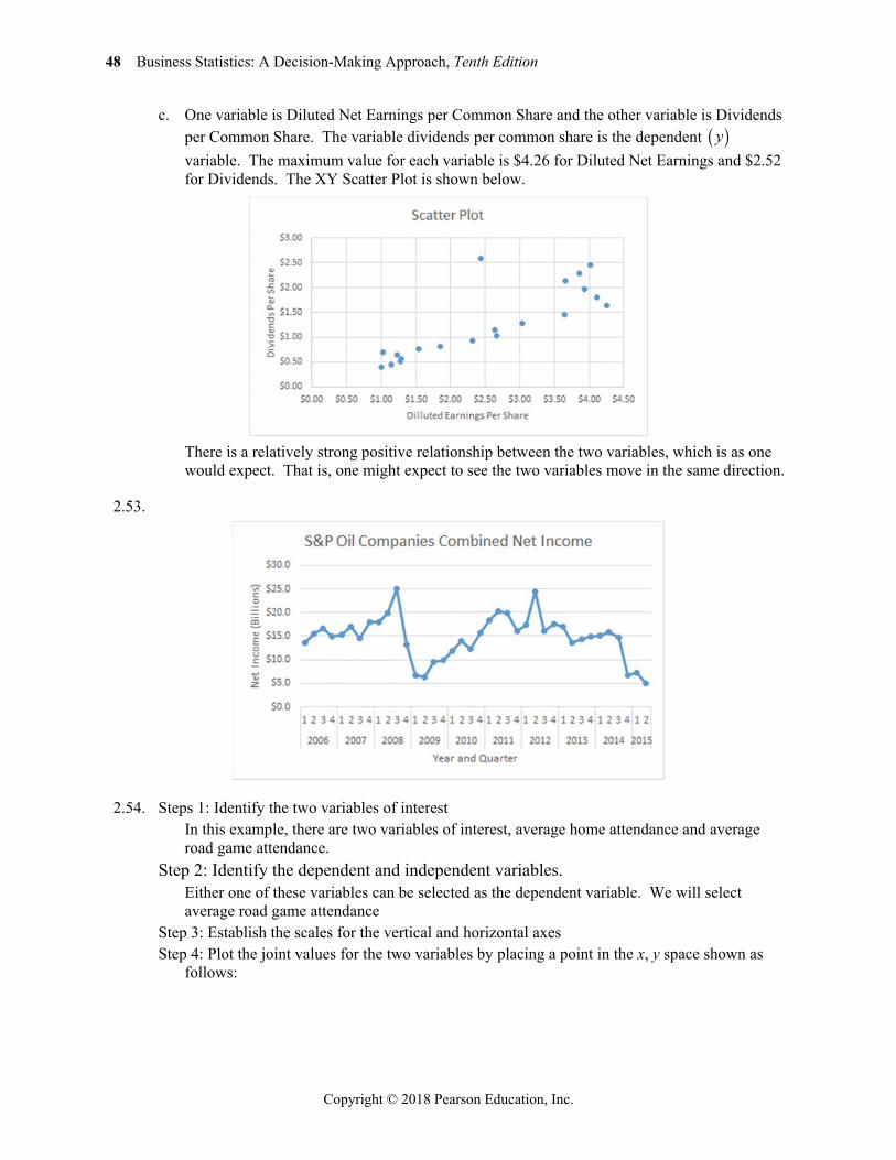
c. One variable is Diluted Net Earnings per Common Share and the other variable is Dividends per Common Share. The variable dividends per common share is the dependent y variable. The maximum value for each variable is $4.26 for Diluted Net Earnings and $2.52 for Dividends. The XY Scatter Plot is shown below.
There is a relatively strong positive relationship between the two variables, which is as one
would expect. That is, one might expect to see the two variables move in the same direction.
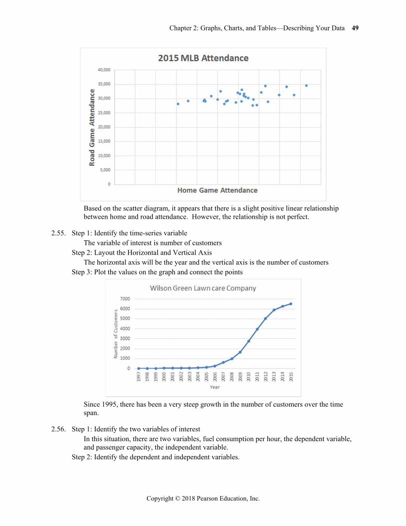
2.53.
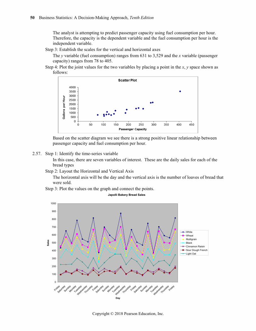
2.54. Steps 1: Identify the two variables of interest In this example, there are two variables of interest, average home attendance and average
road game attendance. Step 2: Identify the dependent and independent variables. Either one of these variables can be selected as the dependent variable. We will select
average road game attendance Step 3: Establish the scales for the vertical and horizontal axes Step 4: Plot the joint values for the two variables by placing a point in the x, y space shown as
follows:
Chapter 2: Graphs, Charts, and Tables—Describing Your Data 49
Copyright © 2018 Pearson Education, Inc.
Based on the scatter diagram, it appears that there is a slight positive linear relationship
between home and road attendance. However, the relationship is not perfect.
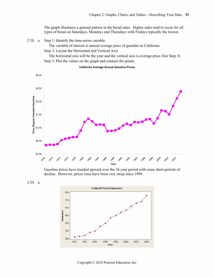
2.55. Step 1: Identify the time-series variable The variable of interest is number of customers Step 2: Layout the Horizontal and Vertical Axis The horizontal axis will be the year and the vertical axis is the number of customers Step 3: Plot the values on the graph and connect the points
Since 1995, there has been a very steep growth in the number of customers over the time
span.
2.56. Step 1: Identify the two variables of interest In this situation, there are two variables, fuel consumption per hour, the dependent variable,
and passenger capacity, the independent variable. Step 2: Identify the dependent and independent variables.
50 Business Statistics: A Decision-Making Approach, Tenth Edition
Copyright © 2018 Pearson Education, Inc.
The analyst is attempting to predict passenger capacity using fuel consumption per hour. Therefore, the capacity is the dependent variable and the fuel consumption per hour is the independent variable.
Step 3: Establish the scales for the vertical and horizontal axes The y variable (fuel consumption) ranges from 631 to 3,529 and the x variable (passenger
capacity) ranges from 78 to 405. Step 4: Plot the joint values for the two variables by placing a point in the x, y space shown as
follows:
Based on the scatter diagram we see there is a strong positive linear relationship between
passenger capacity and fuel consumption per hour.
2.57. Step 1: Identify the time-series variable In this case, there are seven variables of interest. These are the daily sales for each of the
bread types Step 2: Layout the Horizontal and Vertical Axis The horizontal axis will be the day and the vertical axis is the number of loaves of bread that
were sold. Step 3: Plot the values on the graph and connect the points.
Japolli Bakery Bread Sales
0
100
200
300
400
500
600
700
800
900
1000
Friday
Saturda
y
Sunda
y
Monda
y
Tuesd
ay
Wedne
sday
Thursd
ayFrid
ay
Saturda
y
Sunda
y
Monda
y
Tuesd
ay
Wedne
sday
Thursd
ayFrid
ay
Saturda
y
Sunda
y
Monda
y
Tuesd
ay
Wedne
sday
Thursd
ayFrid
ay
Day
Sale
s
WhiteWheatMultigrainBlackCinnamon RaisinSour Dough FrenchLight Oat
Chapter 2: Graphs, Charts, and Tables—Describing Your Data 51
Copyright © 2018 Pearson Education, Inc.
The graph illustrates a general pattern in the bread sales. Higher sales tend to occur for all types of bread on Saturdays, Mondays and Thursdays with Fridays typically the lowest.
2.58. a. Step 1: Identify the time-series variable The variable of interest is annual average price of gasoline in California Step 2: Layout the Horizontal and Vertical Axis The horizontal axis will be the year and the vertical axis is average price (See Step 3) Step 3: Plot the values on the graph and connect the points
Gasoline prices have trended upward over the 36 year period with some short periods of
decline. However, prices rises have been very steep since 1999.
2.59. a.
California Average Annual Gasoline Prices
$0.00
$0.50
$1.00
$1.50
$2.00
$2.50
$3.00
1970
1972
1974
1976
1978
1980
1982
1984
1986
1988
1990
1992
1994
1996
1998
2000
2002
2004
Year
Pric
e (R
egul
ar U
nlea
ded
Gas
olin
e)
52 Business Statistics: A Decision-Making Approach, Tenth Edition
Copyright © 2018 Pearson Education, Inc.
b. The relationship appears to be linear and positive. c. The average equals the sum divided by the number of data points 6830 15 455.33.
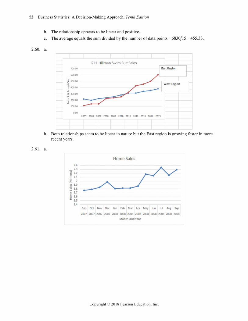
2.60. a.
b. Both relationships seem to be linear in nature but the East region is growing faster in more
recent years.
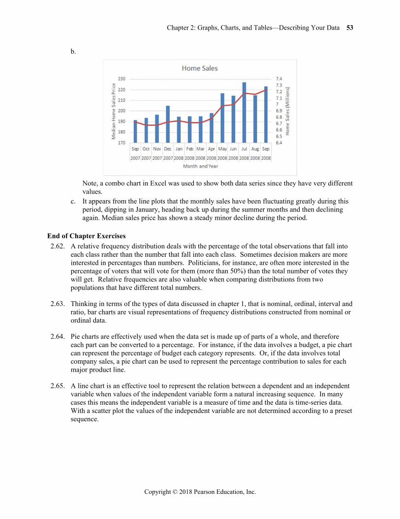
2.61. a.
Chapter 2: Graphs, Charts, and Tables—Describing Your Data 53
Copyright © 2018 Pearson Education, Inc.
b.
Note, a combo chart in Excel was used to show both data series since they have very different
values. c. It appears from the line plots that the monthly sales have been fluctuating greatly during this
period, dipping in January, heading back up during the summer months and then declining again. Median sales price has shown a steady minor decline during the period.
End of Chapter Exercises 2.62. A relative frequency distribution deals with the percentage of the total observations that fall into
each class rather than the number that fall into each class. Sometimes decision makers are more interested in percentages than numbers. Politicians, for instance, are often more interested in the percentage of voters that will vote for them (more than 50%) than the total number of votes they will get. Relative frequencies are also valuable when comparing distributions from two populations that have different total numbers.
2.63. Thinking in terms of the types of data discussed in chapter 1, that is nominal, ordinal, interval and ratio, bar charts are visual representations of frequency distributions constructed from nominal or ordinal data.
2.64. Pie charts are effectively used when the data set is made up of parts of a whole, and therefore each part can be converted to a percentage. For instance, if the data involves a budget, a pie chart can represent the percentage of budget each category represents. Or, if the data involves total company sales, a pie chart can be used to represent the percentage contribution to sales for each major product line.
2.65. A line chart is an effective tool to represent the relation between a dependent and an independent variable when values of the independent variable form a natural increasing sequence. In many cases this means the independent variable is a measure of time and the data is time-series data. With a scatter plot the values of the independent variable are not determined according to a preset sequence.
54 Business Statistics: A Decision-Making Approach, Tenth Edition
Copyright © 2018 Pearson Education, Inc.
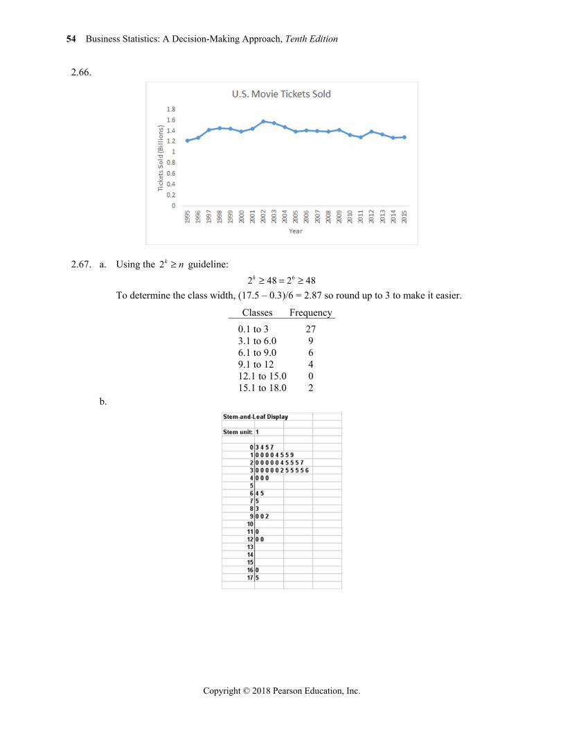
2.66.
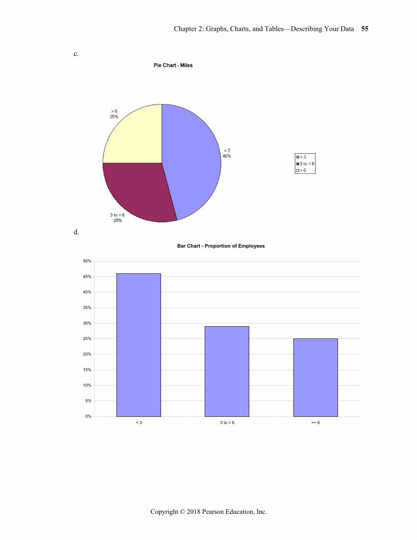
2.67. a. Using the 2k n guideline: 62 48 2 48k
To determine the class width, (17.5 – 0.3)/6 = 2.87 so round up to 3 to make it easier.
Classes Frequency 0.1 to 3 27 3.1 to 6.0 9 6.1 to 9.0 6 9.1 to 12 4 12.1 to 15.0 0 15.1 to 18.0 2
b.
Chapter 2: Graphs, Charts, and Tables—Describing Your Data 55
Copyright © 2018 Pearson Education, Inc.
c.
d.
Bar Chart - Proportion of Employees
0%
5%
10%
15%
20%
25%
30%
35%
40%
45%
50%
< 3 3 to < 6 >= 6
56 Business Statistics: A Decision-Making Approach, Tenth Edition
Copyright © 2018 Pearson Education, Inc.
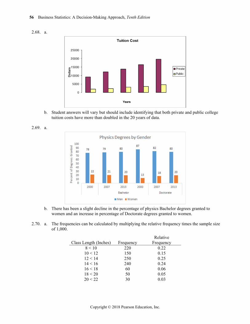
2.68. a.
b. Student answers will vary but should include identifying that both private and public college
tuition costs have more than doubled in the 20 years of data.
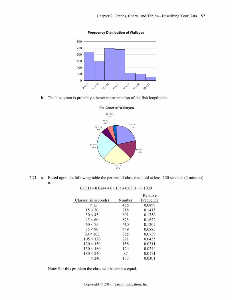
2.69. a.
b. There has been a slight decline in the percentage of physics Bachelor degrees granted to
women and an increase in percentage of Doctorate degrees granted to women.
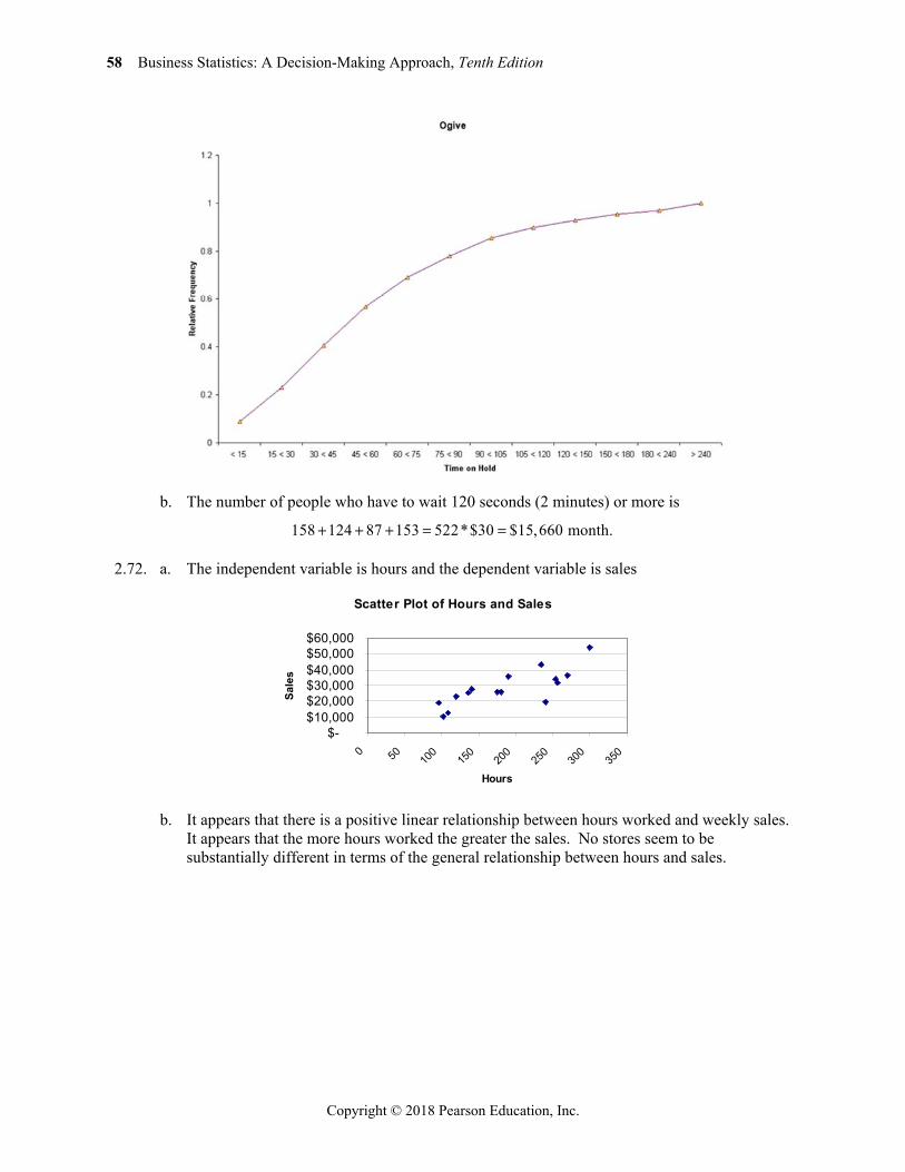
2.70. a. The frequencies can be calculated by multiplying the relative frequency times the sample size of 1,000.
Class Length (Inches) Frequency Relative
Frequency 8 < 10 220 0.22
10 < 12 150 0.15 12 < 14 250 0.25 14 < 16 240 0.24 16 < 18 60 0.06 18 < 20 50 0.05 20 < 22 30 0.03
Chapter 2: Graphs, Charts, and Tables—Describing Your Data 57
Copyright © 2018 Pearson Education, Inc.
b. The histogram is probably a better representation of the fish length data.
2.71. a. Based upon the following table the percent of class that hold at least 120 seconds (2 minutes) is
0.0311 0.0244 0.0171 0.0301 0.1029
Classes (in seconds) Number Relative
Frequency < 15 456 0.0899
15 < 30 718 0.1415 30 < 45 891 0.1756 45 < 60 823 0.1622 60 < 75 610 0.1202 75 < 90 449 0.0885 90 < 105 385 0.0759
105 < 120 221 0.0435 120 < 150 158 0.0311 150 < 180 124 0.0244 180 < 240 87 0.0171 ≥ 240 153 0.0301
Note: For this problem the class widths are not equal.
Frequency Distribution of Walleyes
0
50
100
150
200
250
300
8 < 10
10 < 12
12 < 14
14 < 16
16 < 18
18 < 20
20 < 22
Pie Chart of Walleyes
8 < 1022%
10 < 1215%
12 < 1425%
14 < 1624%
16 < 186%
18 < 205%
20 < 223%
58 Business Statistics: A Decision-Making Approach, Tenth Edition
Copyright © 2018 Pearson Education, Inc.
b. The number of people who have to wait 120 seconds (2 minutes) or more is
158 124 87 153 522*$30 $15,660 month.
2.72. a. The independent variable is hours and the dependent variable is sales
b. It appears that there is a positive linear relationship between hours worked and weekly sales.
It appears that the more hours worked the greater the sales. No stores seem to be substantially different in terms of the general relationship between hours and sales.
Scatter Plot of Hours and Sales
$-$10,000$20,000$30,000$40,000$50,000$60,000
0 50 100
150
200
250
300
350
Hours
Sale
s
Chapter 2: Graphs, Charts, and Tables—Describing Your Data 59
Copyright © 2018 Pearson Education, Inc.
2.73. a.
Student reports will vary but should discuss the negative trend in diesel prices over the time
period given.
2.74.
2.75. a. Using the 2k n 2 100k so 72 128
Determine the width: (310494 – 70464)/7 = 34,290. Round to 35,000
Classes Frequency 70,000–104,999 43
105,000–139,999 34 140,000–174,999 13 175,000–209,999 5 210,000–244,999 2 245,000–274,999 1 280,000–314,999 2
60 Business Statistics: A Decision-Making Approach, Tenth Edition
Copyright © 2018 Pearson Education, Inc.
b.
Classes Frequency Relative
Frequency Cumulative Relative
Frequency 70,000–104,999 43 0.43 0.43
105,000–139,999 34 0.34 0.77 140,000–174,999 13 0.13 0.90 175,000–209,999 5 0.05 0.95 210,000–244,999 2 0.02 0.97 245,000–274,999 1 0.01 0.98 280,000–314,999 2 0.02 1.00
2.76. a.
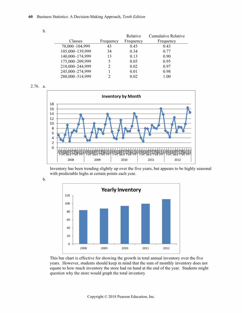
Inventory has been trending slightly up over the five years, but appears to be highly seasonal
with predictable highs at certain points each year. b.
This bar chart is effective for showing the growth in total annual inventory over the five
years. However, students should keep in mind that the sum of monthly inventory does not equate to how much inventory the store had on hand at the end of the year. Students might question why the store would graph the total inventory
Chapter 2: Graphs, Charts, and Tables—Describing Your Data 61
Copyright © 2018 Pearson Education, Inc.
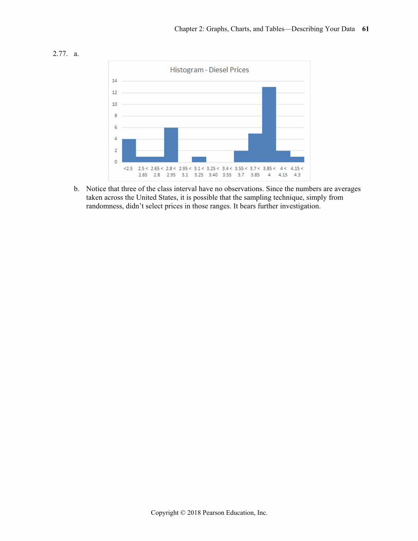
2.77. a.
b. Notice that three of the class interval have no observations. Since the numbers are averages
taken across the United States, it is possible that the sampling technique, simply from randomness, didn’t select prices in those ranges. It bears further investigation.

Business Statistics 10th Edition Groebner Solutions ManualFull Download: http://testbanklive.com/download/business-statistics-10th-edition-groebner-solutions-manual/
Full download all chapters instantly please go to Solutions Manual, Test Bank site: testbanklive.com