Embed Size (px)
Citation preview
3-1
Chapter 3 : Charts and Graphs The Rule of 4 says that quantitative information (data, numbers, values) can be represented four different ways: a written or oral description, numbers in a table, an equation, or as a graph or diagram. Throughout this textbook, information is presented in all four versions as much as possible, to help you understand the material. For example, the graph below (Figure 3-1) illustrates the energy use in quadrillions of British Thermal Units by various regions of the world for the year 2000.1 The energy use in this pictograph is scaled to the size of the light bulb for a quick visual assessment.
Figure 3-1: World energy use, 2000. In this chapter, we introduce some common graphs and diagrams that visually represent numbers or values. There are two basic kinds of quantitative data that can be graphed. Univariate data are associated with one variable or changeable quantity. The amount of lead measured in drinking water and the energy use in a region of the world are examples of univariate data. Univariate data are often shown graphically by pie charts, bar charts and histograms.
3-2
Bivariate data are associated with two quantities. In each household, the lead content of the tap water (one quantity) and the age of the household pipes (a second quantity) could be measured or determined. Bivariate data come in pairs (lead content and pipe age for each household), and can be represented graphically by scatterplots.
Pie Charts Pie charts (circle diagrams or circle charts) illustrate the fractions or percentages that make up a total or a sum. Each “slice” of the pie is sized according to its percentage of the total. Pie charts can be constructed by hand using a compass (to make circles) and a protractor (to measure angles). Pie charts can also be easily constructed using computer graphics programs.
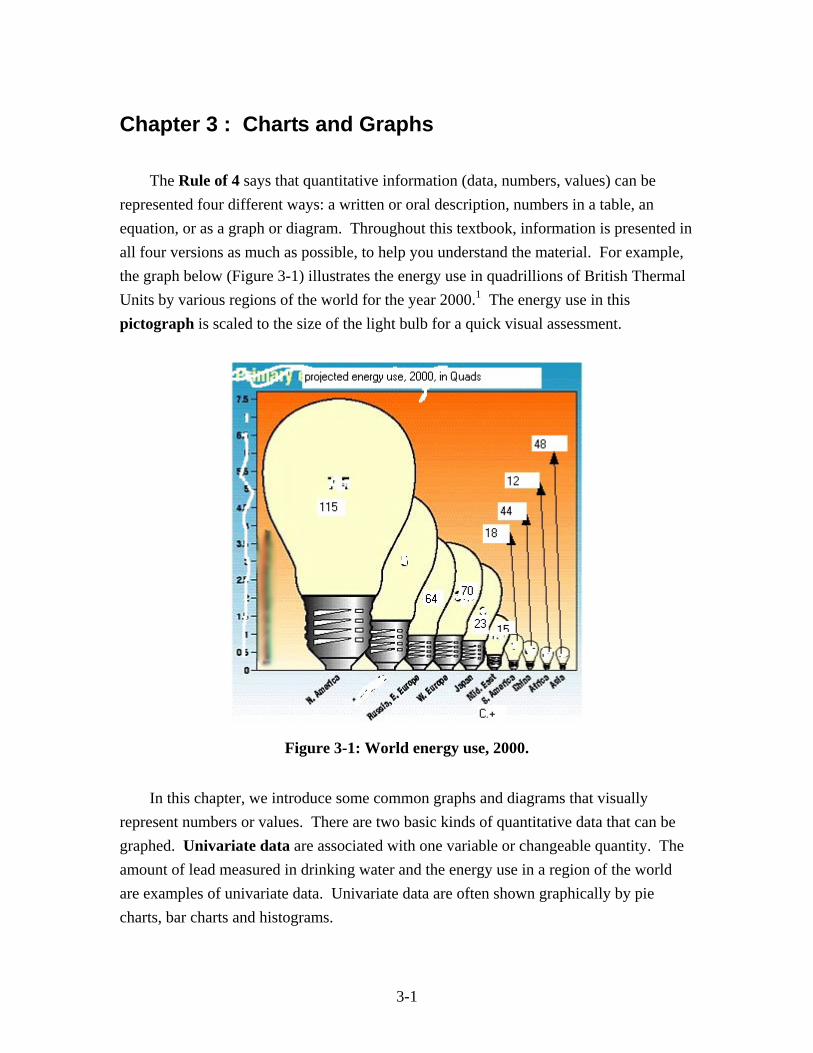
Example 3-1: Surface water use, Oregon, 1990. Table 3-1 and Figure 3-2 show the use of surface water from the Willamette basin in western Oregon in 1990.2
Use of Water Amount % of total public water supply 300 acre-feet per day 43% industrial/mining 211 acre-feet per day 30%
agriculture 189 acre-feet per day 27% total 700 acre-feet per day 100%
Table 3-1
Figure 3-2: Pie chart of daily water use.
3-3
Glancing at Figure 3-2, it is apparent that industrial/mining and agricultural water use are about the same, and both are less than municipal (public) water use, which is less than half of the total.
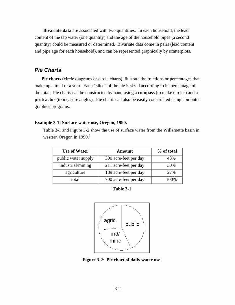
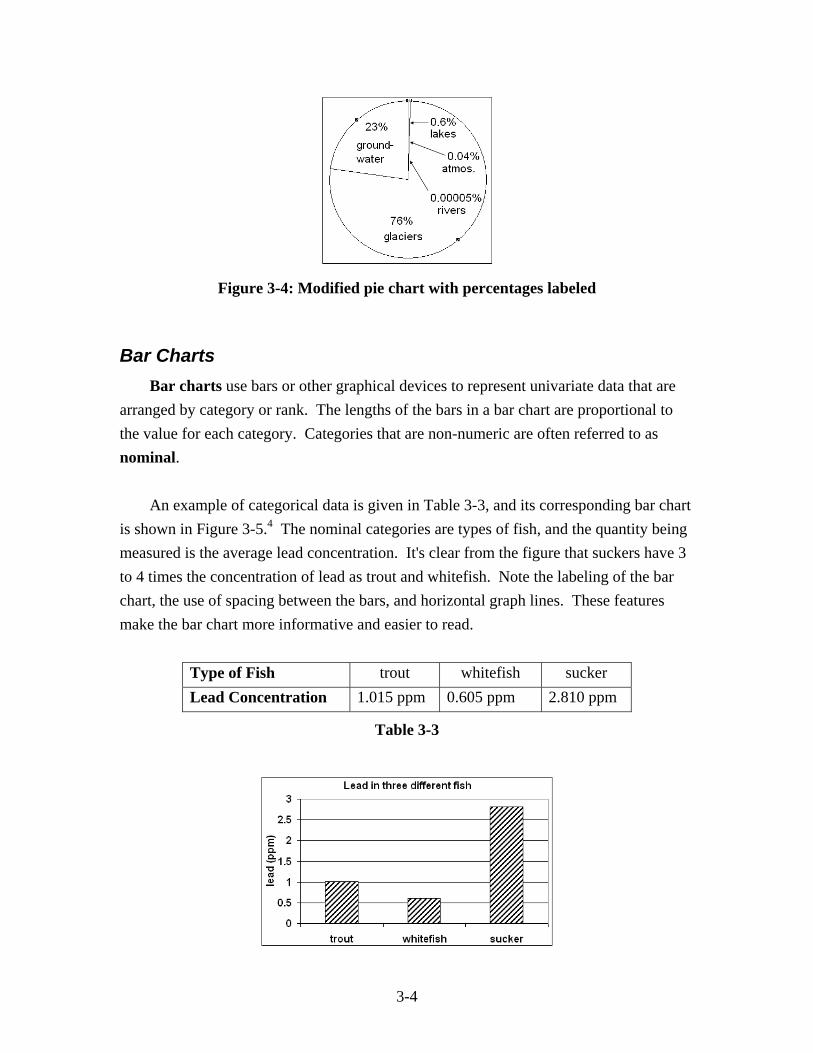
Pie charts are not as useful when some categories of data have very small percentages. For example, Table 3-2 and Figure 3-3 show the distribution of sources of fresh water world-wide.3
Source Volume % of total glaciers 27.5 million km3 76.56%
groundwater 8.2 million km3 22.83%
lakes and seas 205 thousand km3 0.57%
atmosphere 13 thousand km3 0.04%
rivers 1.7 thousand km3 0.00005%
total 35.9 million km3 100.00%
Table 3-2
Figure 3-3: Pie chart of Earth's fresh water
Three of the five categories of fresh water sources cannot be distinguished in Figure 3-3, because the values are too small. There are big differences between lakes, the atmosphere and rivers, and those differences are not apparent on the chart. To make this pie chart more useful, the actual values or percentages could be written next to the category labels (Figure 3-4).
3-4
Figure 3-4: Modified pie chart with percentages labeled
Bar Charts Bar charts use bars or other graphical devices to represent univariate data that are arranged by category or rank. The lengths of the bars in a bar chart are proportional to the value for each category. Categories that are non-numeric are often referred to as nominal. An example of categorical data is given in Table 3-3, and its corresponding bar chart is shown in Figure 3-5.4 The nominal categories are types of fish, and the quantity being measured is the average lead concentration. It's clear from the figure that suckers have 3 to 4 times the concentration of lead as trout and whitefish. Note the labeling of the bar chart, the use of spacing between the bars, and horizontal graph lines. These features make the bar chart more informative and easier to read.
Type of Fish trout whitefish sucker Lead Concentration 1.015 ppm 0.605 ppm 2.810 ppm
Table 3-3
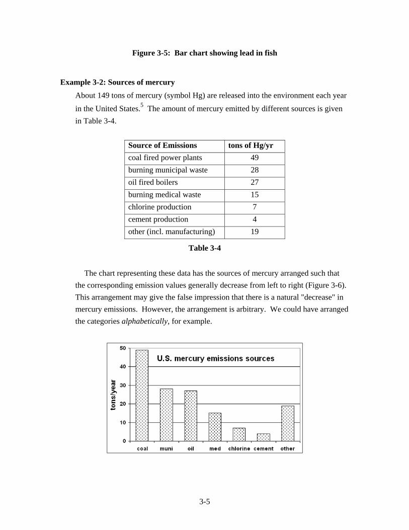
3-5
Figure 3-5: Bar chart showing lead in fish
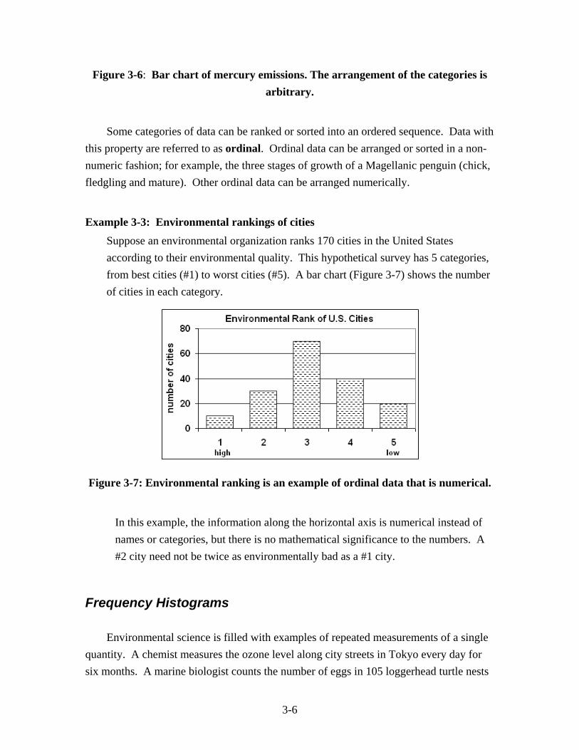
Example 3-2: Sources of mercury About 149 tons of mercury (symbol Hg) are released into the environment each year
in the United States.5 The amount of mercury emitted by different sources is given in Table 3-4.
Source of Emissions tons of Hg/yr coal fired power plants 49 burning municipal waste 28 oil fired boilers 27 burning medical waste 15 chlorine production 7 cement production 4 other (incl. manufacturing) 19
Table 3-4
The chart representing these data has the sources of mercury arranged such that the corresponding emission values generally decrease from left to right (Figure 3-6). This arrangement may give the false impression that there is a natural "decrease" in mercury emissions. However, the arrangement is arbitrary. We could have arranged the categories alphabetically, for example.
3-6
Figure 3-6: Bar chart of mercury emissions. The arrangement of the categories is arbitrary.
Some categories of data can be ranked or sorted into an ordered sequence. Data with this property are referred to as ordinal. Ordinal data can be arranged or sorted in a non-numeric fashion; for example, the three stages of growth of a Magellanic penguin (chick, fledgling and mature). Other ordinal data can be arranged numerically.
Example 3-3: Environmental rankings of cities Suppose an environmental organization ranks 170 cities in the United States according to their environmental quality. This hypothetical survey has 5 categories, from best cities (#1) to worst cities (#5). A bar chart (Figure 3-7) shows the number of cities in each category.
Figure 3-7: Environmental ranking is an example of ordinal data that is numerical.
In this example, the information along the horizontal axis is numerical instead of names or categories, but there is no mathematical significance to the numbers. A #2 city need not be twice as environmentally bad as a #1 city.
Frequency Histograms Environmental science is filled with examples of repeated measurements of a single quantity. A chemist measures the ozone level along city streets in Tokyo every day for six months. A marine biologist counts the number of eggs in 105 loggerhead turtle nests
3-7
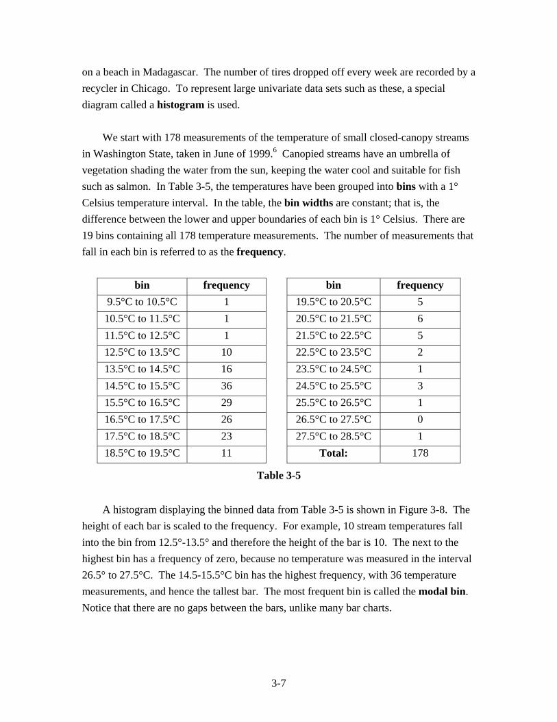
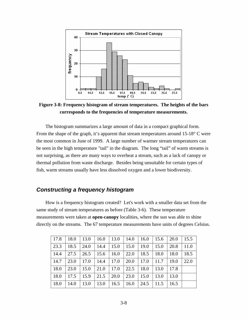
on a beach in Madagascar. The number of tires dropped off every week are recorded by a recycler in Chicago. To represent large univariate data sets such as these, a special diagram called a histogram is used. We start with 178 measurements of the temperature of small closed-canopy streams in Washington State, taken in June of 1999.6 Canopied streams have an umbrella of vegetation shading the water from the sun, keeping the water cool and suitable for fish such as salmon. In Table 3-5, the temperatures have been grouped into bins with a 1° Celsius temperature interval. In the table, the bin widths are constant; that is, the difference between the lower and upper boundaries of each bin is 1° Celsius. There are 19 bins containing all 178 temperature measurements. The number of measurements that fall in each bin is referred to as the frequency.
bin frequency bin frequency 9.5°C to 10.5°C 1 19.5°C to 20.5°C 5 10.5°C to 11.5°C 1 20.5°C to 21.5°C 6 11.5°C to 12.5°C 1 21.5°C to 22.5°C 5 12.5°C to 13.5°C 10 22.5°C to 23.5°C 2 13.5°C to 14.5°C 16 23.5°C to 24.5°C 1 14.5°C to 15.5°C 36 24.5°C to 25.5°C 3 15.5°C to 16.5°C 29 25.5°C to 26.5°C 1 16.5°C to 17.5°C 26 26.5°C to 27.5°C 0 17.5°C to 18.5°C 23 27.5°C to 28.5°C 1 18.5°C to 19.5°C 11 Total: 178
Table 3-5
A histogram displaying the binned data from Table 3-5 is shown in Figure 3-8. The height of each bar is scaled to the frequency. For example, 10 stream temperatures fall into the bin from 12.5°-13.5° and therefore the height of the bar is 10. The next to the highest bin has a frequency of zero, because no temperature was measured in the interval 26.5° to 27.5°C. The 14.5-15.5°C bin has the highest frequency, with 36 temperature measurements, and hence the tallest bar. The most frequent bin is called the modal bin. Notice that there are no gaps between the bars, unlike many bar charts.
3-8
Figure 3-8: Frequency histogram of stream temperatures. The heights of the bars
corresponds to the frequencies of temperature measurements. The histogram summarizes a large amount of data in a compact graphical form. From the shape of the graph, it’s apparent that stream temperatures around 15-18° C were the most common in June of 1999. A large number of warmer stream temperatures can be seen in the high temperature "tail" in the diagram. The long “tail” of warm streams is not surprising, as there are many ways to overheat a stream, such as a lack of canopy or thermal pollution from waste discharge. Besides being unsuitable for certain types of fish, warm streams usually have less dissolved oxygen and a lower biodiversity.
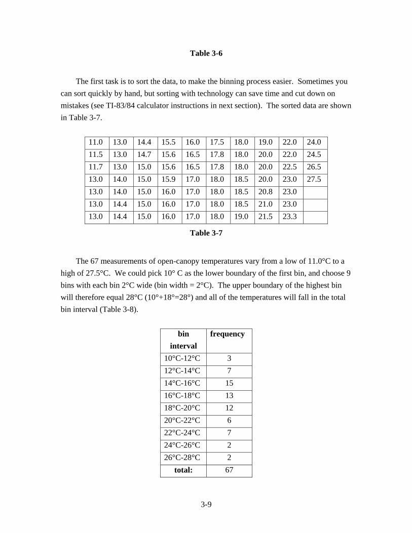
Constructing a frequency histogram How is a frequency histogram created? Let's work with a smaller data set from the same study of stream temperatures as before (Table 3-6). These temperature measurements were taken at open-canopy localities, where the sun was able to shine directly on the streams. The 67 temperature measurements have units of degrees Celsius.
17.8 18.0 13.0 16.0 13.0 14.0 16.0 15.6 20.0 15.5 23.3 18.5 24.0 14.4 15.0 15.0 19.0 15.0 20.8 11.0 14.4 27.5 26.5 15.6 16.0 22.0 18.5 18.0 18.0 18.5 14.7 23.0 17.0 14.4 17.0 20.0 17.0 11.7 19.0 22.0 18.0 23.0 15.0 21.0 17.0 22.5 18.0 13.0 17.8 18.0 17.5 15.9 21.5 20.0 23.0 15.0 13.0 13.0 18.0 14.0 13.0 13.0 16.5 16.0 24.5 11.5 16.5
3-9
Table 3-6
The first task is to sort the data, to make the binning process easier. Sometimes you can sort quickly by hand, but sorting with technology can save time and cut down on mistakes (see TI-83/84 calculator instructions in next section). The sorted data are shown in Table 3-7.
11.0 13.0 14.4 15.5 16.0 17.5 18.0 19.0 22.0 24.0 11.5 13.0 14.7 15.6 16.5 17.8 18.0 20.0 22.0 24.5 11.7 13.0 15.0 15.6 16.5 17.8 18.0 20.0 22.5 26.5 13.0 14.0 15.0 15.9 17.0 18.0 18.5 20.0 23.0 27.5 13.0 14.0 15.0 16.0 17.0 18.0 18.5 20.8 23.0 13.0 14.4 15.0 16.0 17.0 18.0 18.5 21.0 23.0 13.0 14.4 15.0 16.0 17.0 18.0 19.0 21.5 23.3
Table 3-7
The 67 measurements of open-canopy temperatures vary from a low of 11.0°C to a high of 27.5°C. We could pick 10° C as the lower boundary of the first bin, and choose 9 bins with each bin 2°C wide (bin width = 2°C). The upper boundary of the highest bin will therefore equal 28°C (10°+18°=28°) and all of the temperatures will fall in the total bin interval (Table 3-8).
bin interval
frequency
10°C-12°C 3 12°C-14°C 7 14°C-16°C 15 16°C-18°C 13 18°C-20°C 12 20°C-22°C 6 22°C-24°C 7 24°C-26°C 2 26°C-28°C 2
total: 67
3-10
Table 3-8
In Table 3-7 there are two measurements equal to 14.0°C. These values fall exactly on a bin boundary. Which bin should these measurements be placed in? The most common practice is to “bin up” by placing a value that falls on a bin boundary in the higher bin. We will follow the common practice. After placing all values in the appropriate bins, it’s good to add up the frequencies, to ensure that they sum to the total number of measurements. A histogram of the frequency distribution in Table 3-8 is shown in Figure 3-9.
Figure 3-9: Histogram of open-canopy stream temperatures.
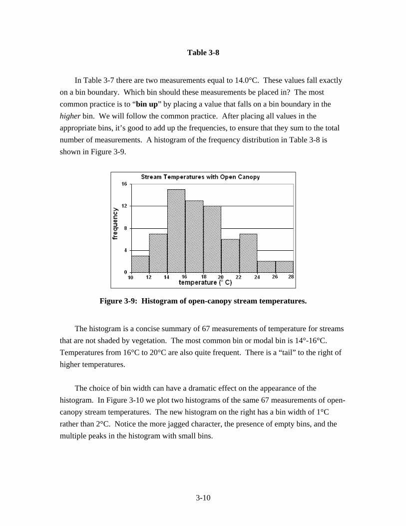
The histogram is a concise summary of 67 measurements of temperature for streams that are not shaded by vegetation. The most common bin or modal bin is 14°-16°C. Temperatures from 16°C to 20°C are also quite frequent. There is a “tail” to the right of higher temperatures. The choice of bin width can have a dramatic effect on the appearance of the histogram. In Figure 3-10 we plot two histograms of the same 67 measurements of open-canopy stream temperatures. The new histogram on the right has a bin width of 1°C rather than 2°C. Notice the more jagged character, the presence of empty bins, and the multiple peaks in the histogram with small bins.
3-11
Figure 3-10: Comparison of large and small bins for the same data.
Which diagram is "best?" There is no simple answer to this question. The histogram should be a fair and accurate graphical representation of the numerical data. The histogram should be readily understood and should not be misleading. The graphing calculator or computer software makes the construction of histograms much easier and faster, and allows us to explore how bin width affects the resulting histogram shape.
Example 3-4: Lengths of bonnethead sharks
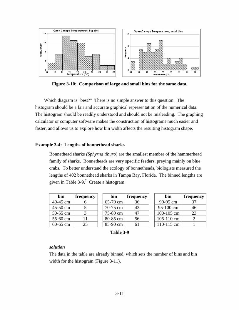
Bonnethead sharks (Sphyrna tiburo) are the smallest member of the hammerhead family of sharks. Bonnetheads are very specific feeders, preying mainly on blue crabs. To better understand the ecology of bonnetheads, biologists measured the lengths of 402 bonnethead sharks in Tampa Bay, Florida. The binned lengths are given in Table 3-9.7 Create a histogram.
bin frequency bin frequency bin frequency40-45 cm 6 65-70 cm 36 90-95 cm 37 45-50 cm 5 70-75 cm 43 95-100 cm 46 50-55 cm 3 75-80 cm 47 100-105 cm 23 55-60 cm 11 80-85 cm 56 105-110 cm 2 60-65 cm 25 85-90 cm 61 110-115 cm 1
Table 3-9 solution The data in the table are already binned, which sets the number of bins and bin width for the histogram (Figure 3-11).
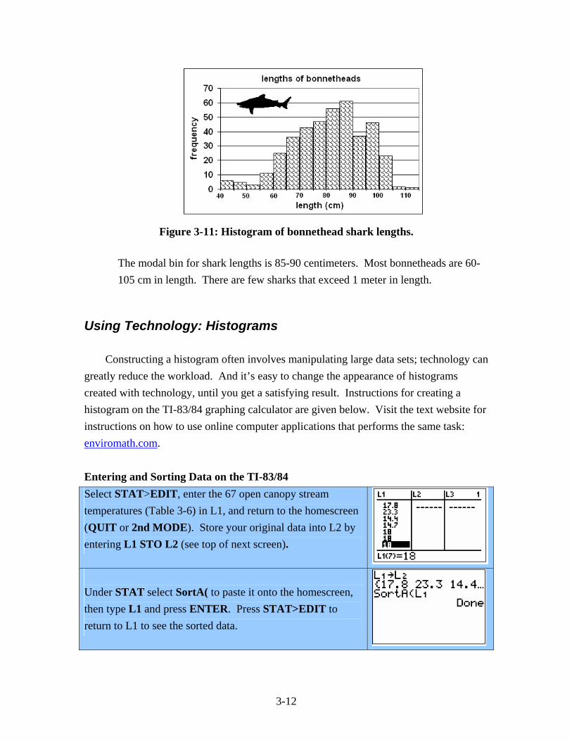
3-12
Figure 3-11: Histogram of bonnethead shark lengths.
The modal bin for shark lengths is 85-90 centimeters. Most bonnetheads are 60-105 cm in length. There are few sharks that exceed 1 meter in length.
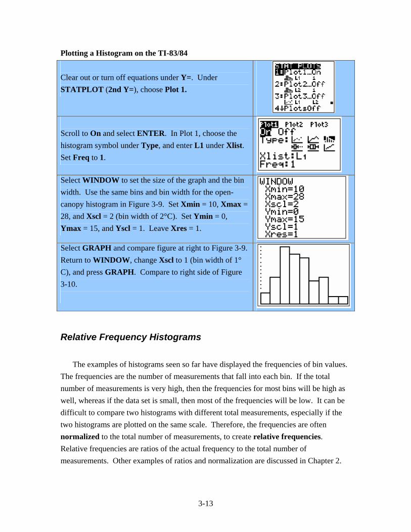
Using Technology: Histograms Constructing a histogram often involves manipulating large data sets; technology can greatly reduce the workload. And it’s easy to change the appearance of histograms created with technology, until you get a satisfying result. Instructions for creating a histogram on the TI-83/84 graphing calculator are given below. Visit the text website for instructions on how to use online computer applications that performs the same task: enviromath.com. Entering and Sorting Data on the TI-83/84 Select STAT>EDIT, enter the 67 open canopy stream temperatures (Table 3-6) in L1, and return to the homescreen (QUIT or 2nd MODE). Store your original data into L2 by entering L1 STO L2 (see top of next screen).
Under STAT select SortA( to paste it onto the homescreen, then type L1 and press ENTER. Press STAT>EDIT to return to L1 to see the sorted data.
3-13
Plotting a Histogram on the TI-83/84 Clear out or turn off equations under Y=. Under STATPLOT (2nd Y=), choose Plot 1.
Scroll to On and select ENTER. In Plot 1, choose the histogram symbol under Type, and enter L1 under Xlist. Set Freq to 1.
Select WINDOW to set the size of the graph and the bin width. Use the same bins and bin width for the open-canopy histogram in Figure 3-9. Set Xmin = 10, Xmax = 28, and Xscl = 2 (bin width of 2°C). Set Ymin = 0, Ymax = 15, and Yscl = 1. Leave Xres = 1.
Select GRAPH and compare figure at right to Figure 3-9. Return to WINDOW, change Xscl to 1 (bin width of 1° C), and press GRAPH. Compare to right side of Figure 3-10.
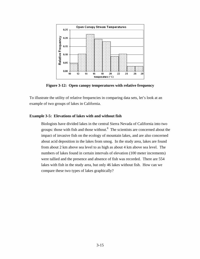
Relative Frequency Histograms The examples of histograms seen so far have displayed the frequencies of bin values. The frequencies are the number of measurements that fall into each bin. If the total number of measurements is very high, then the frequencies for most bins will be high as well, whereas if the data set is small, then most of the frequencies will be low. It can be difficult to compare two histograms with different total measurements, especially if the two histograms are plotted on the same scale. Therefore, the frequencies are often normalized to the total number of measurements, to create relative frequencies. Relative frequencies are ratios of the actual frequency to the total number of measurements. Other examples of ratios and normalization are discussed in Chapter 2.
3-14
We return once more to the temperatures of streams with an open canopy of vegetation. To determine the relative frequencies, each frequency is divided by the total number of measurements, which is 67 (Table 3-10).
bin interval
actual frequency
relative frequency
10°C-12°C 3 3 = 0.045 = 4.5%67
12°C-14°C 7 7 = 0.104 = 10.4%67
14°C-16°C 15 15 = 0.224 = 22.4%67
16°C-18°C 13 13 = 0.194 = 19.4%67
18°C-20°C 12 12 = 0.179 = 17.9%67
20°C-22°C 6 6 = 0.090 = 9.0%67
22°C-24°C 7 7 = 0.104 = 10.4%67
24°C-26°C 2 2 = 0.030 = 3.0%67
26°C-28°C 2 2 = 0.030 = 3.0%67
total: 67 67 = 1.000 = 100.0%67
Table 3-10
The relative frequencies represent the fractions of the total measurements that fall into each bin, therefore the sum of the relative frequencies is equal to 1 or 100%. The relative frequency histogram (Figure 3-12) has the same overall shape as the histogram of actual frequencies, but the vertical scale has changed.
3-15
Figure 3-12: Open canopy temperatures with relative frequency
To illustrate the utility of relative frequencies in comparing data sets, let’s look at an example of two groups of lakes in California.
Example 3-5: Elevations of lakes with and without fish
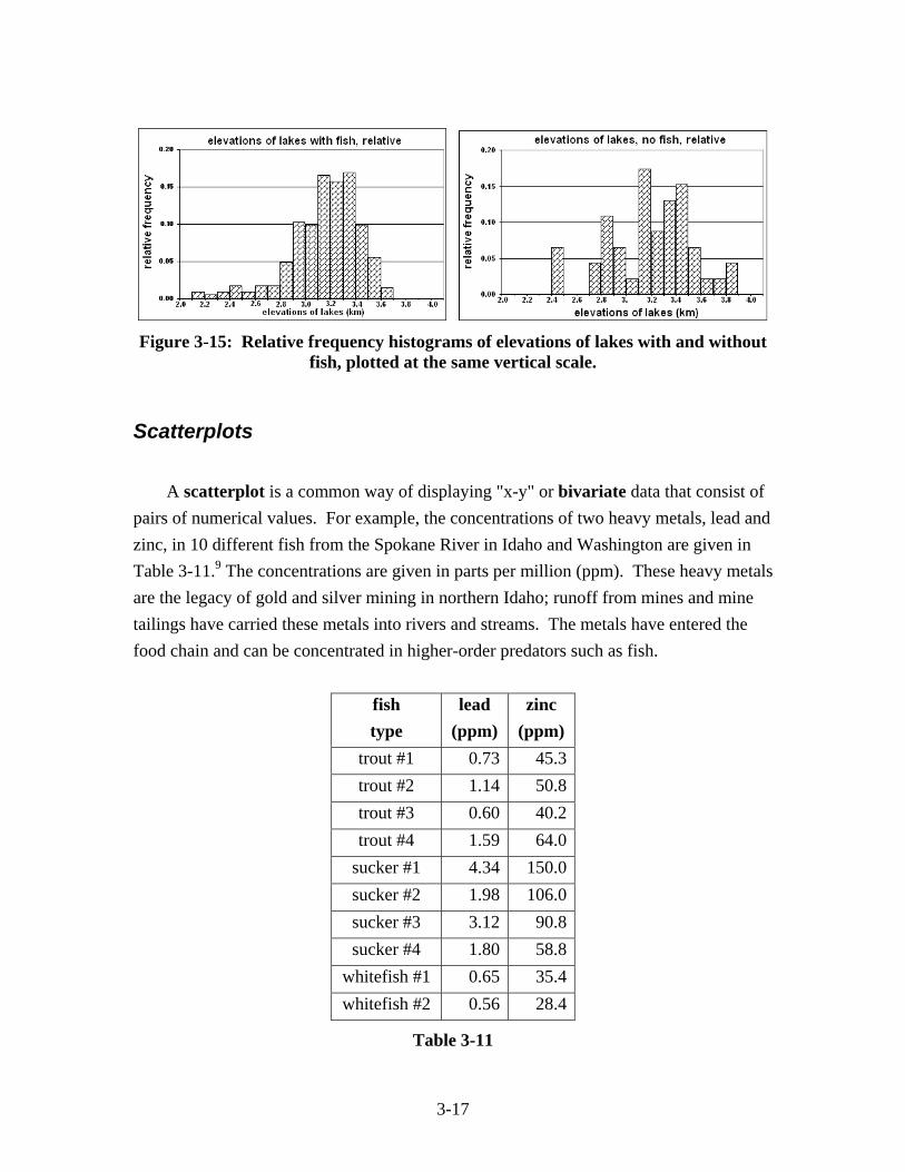
Biologists have divided lakes in the central Sierra Nevada of California into two groups: those with fish and those without.8 The scientists are concerned about the impact of invasive fish on the ecology of mountain lakes, and are also concerned about acid deposition in the lakes from smog. In the study area, lakes are found from about 2 km above sea level to as high as about 4 km above sea level. The numbers of lakes found in certain intervals of elevation (100 meter increments) were tallied and the presence and absence of fish was recorded. There are 554 lakes with fish in the study area, but only 46 lakes without fish. How can we compare these two types of lakes graphically?
3-16
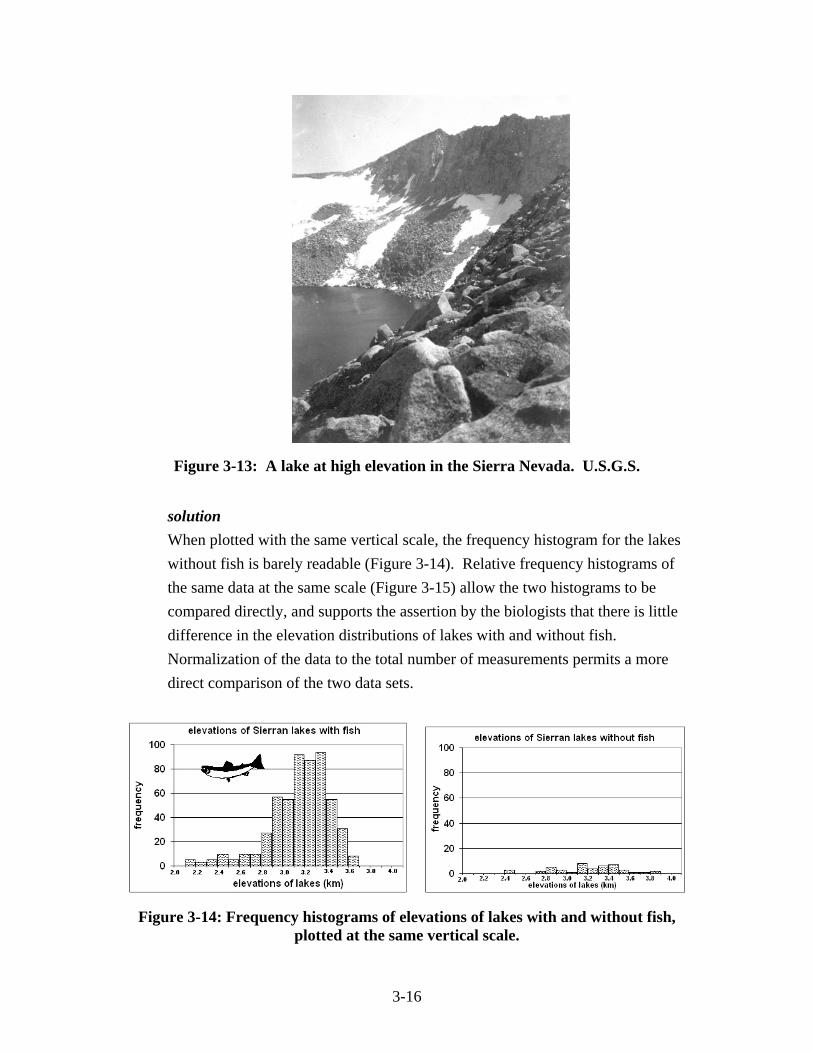
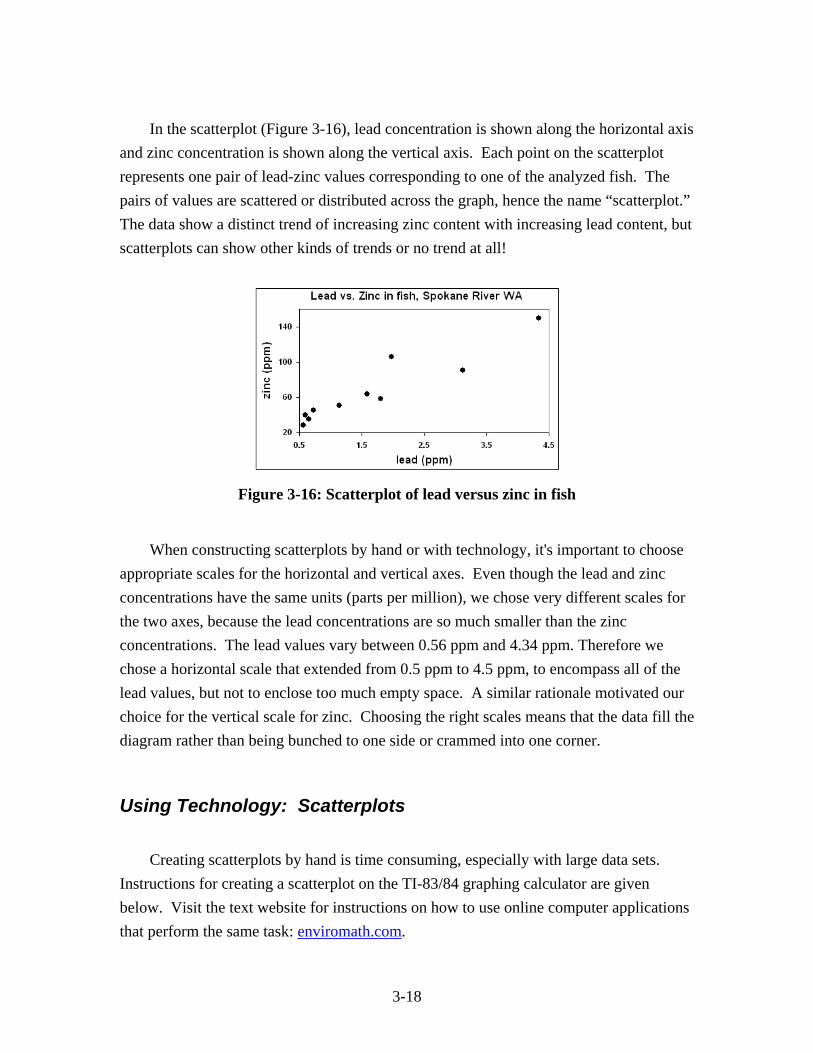
Figure 3-13: A lake at high elevation in the Sierra Nevada. U.S.G.S. solution When plotted with the same vertical scale, the frequency histogram for the lakes without fish is barely readable (Figure 3-14). Relative frequency histograms of the same data at the same scale (Figure 3-15) allow the two histograms to be compared directly, and supports the assertion by the biologists that there is little difference in the elevation distributions of lakes with and without fish. Normalization of the data to the total number of measurements permits a more direct comparison of the two data sets.
Figure 3-14: Frequency histograms of elevations of lakes with and without fish, plotted at the same vertical scale.
3-17
Figure 3-15: Relative frequency histograms of elevations of lakes with and without
fish, plotted at the same vertical scale.
Scatterplots A scatterplot is a common way of displaying "x-y" or bivariate data that consist of pairs of numerical values. For example, the concentrations of two heavy metals, lead and zinc, in 10 different fish from the Spokane River in Idaho and Washington are given in Table 3-11.9 The concentrations are given in parts per million (ppm). These heavy metals are the legacy of gold and silver mining in northern Idaho; runoff from mines and mine tailings have carried these metals into rivers and streams. The metals have entered the food chain and can be concentrated in higher-order predators such as fish.
fish type
lead (ppm)
zinc (ppm)
trout #1 0.73 45.3trout #2 1.14 50.8trout #3 0.60 40.2trout #4 1.59 64.0
sucker #1 4.34 150.0sucker #2 1.98 106.0sucker #3 3.12 90.8sucker #4 1.80 58.8
whitefish #1 0.65 35.4whitefish #2 0.56 28.4
Table 3-11
3-18
In the scatterplot (Figure 3-16), lead concentration is shown along the horizontal axis and zinc concentration is shown along the vertical axis. Each point on the scatterplot represents one pair of lead-zinc values corresponding to one of the analyzed fish. The pairs of values are scattered or distributed across the graph, hence the name “scatterplot.” The data show a distinct trend of increasing zinc content with increasing lead content, but scatterplots can show other kinds of trends or no trend at all!
Figure 3-16: Scatterplot of lead versus zinc in fish
When constructing scatterplots by hand or with technology, it's important to choose appropriate scales for the horizontal and vertical axes. Even though the lead and zinc concentrations have the same units (parts per million), we chose very different scales for the two axes, because the lead concentrations are so much smaller than the zinc concentrations. The lead values vary between 0.56 ppm and 4.34 ppm. Therefore we chose a horizontal scale that extended from 0.5 ppm to 4.5 ppm, to encompass all of the lead values, but not to enclose too much empty space. A similar rationale motivated our choice for the vertical scale for zinc. Choosing the right scales means that the data fill the diagram rather than being bunched to one side or crammed into one corner.
Using Technology: Scatterplots Creating scatterplots by hand is time consuming, especially with large data sets. Instructions for creating a scatterplot on the TI-83/84 graphing calculator are given below. Visit the text website for instructions on how to use online computer applications that perform the same task: enviromath.com.
3-19
Scatterplots on the TI-83/84 Select STAT>EDIT and enter the lead-zinc pairs from Table 3-11 into L1 and L2. If you do not enter the same number of values in each column, you will eventually get the error message DIM MISMATCH. Return to the homescreen (QUIT or 2nd MODE). Clear or turn off equations under Y=. Go to STATPLOT (2nd Y=). In Plot1, select On, then choose the scatterplot icon in Type. Assign L1 (lead) to Xlist and L2 (zinc) to Ylist.
Press ZOOM>9:ZoomStat to automatically scale and graph your scatterplot. Compare this scatterplot with Figure 3-16.
Press WINDOW to display the window dimensions. It’s common to choose different window parameters so that both axes and both sets of tick marks are visible.
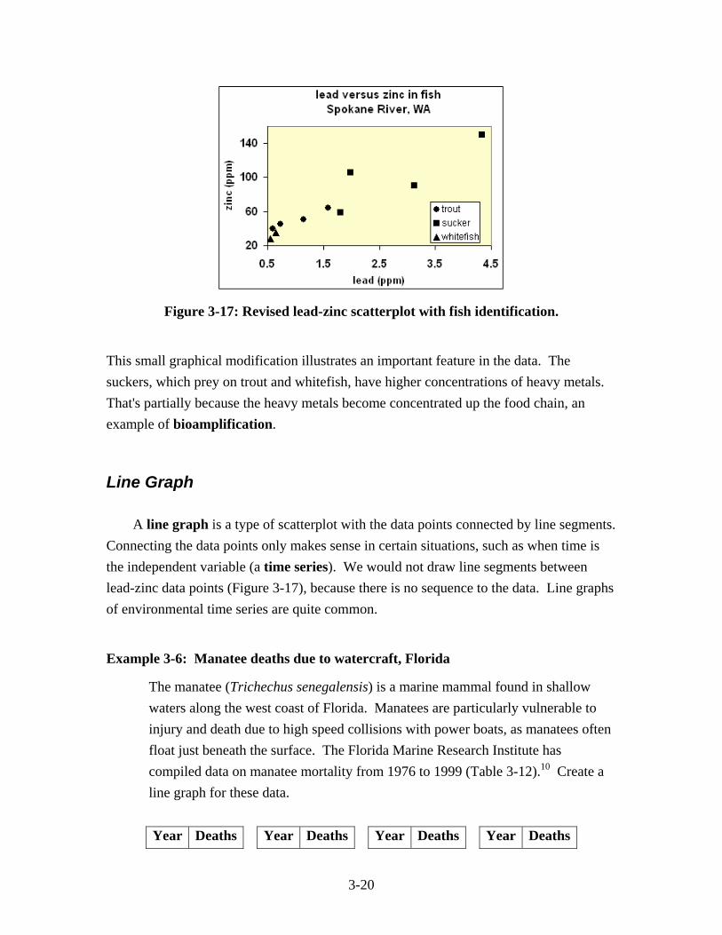
When constructing scatterplots by hand or with software, label both horizontal and vertical axes (if possible), and include the units! An informative title at the top of the graph is also desirable. Note that three different types of fish were listed in Table 3-11, but that extra information on fish type did not make it onto the graphing calculator scatterplot. A scatterplot produced with advanced software shows the different species of fish with a different symbol (Figure 3-17).
3-20
Figure 3-17: Revised lead-zinc scatterplot with fish identification.
This small graphical modification illustrates an important feature in the data. The suckers, which prey on trout and whitefish, have higher concentrations of heavy metals. That's partially because the heavy metals become concentrated up the food chain, an example of bioamplification.
Line Graph A line graph is a type of scatterplot with the data points connected by line segments. Connecting the data points only makes sense in certain situations, such as when time is the independent variable (a time series). We would not draw line segments between lead-zinc data points (Figure 3-17), because there is no sequence to the data. Line graphs of environmental time series are quite common.
Example 3-6: Manatee deaths due to watercraft, Florida
The manatee (Trichechus senegalensis) is a marine mammal found in shallow waters along the west coast of Florida. Manatees are particularly vulnerable to injury and death due to high speed collisions with power boats, as manatees often float just beneath the surface. The Florida Marine Research Institute has compiled data on manatee mortality from 1976 to 1999 (Table 3-12).10 Create a line graph for these data. Year Deaths Year Deaths Year Deaths Year Deaths
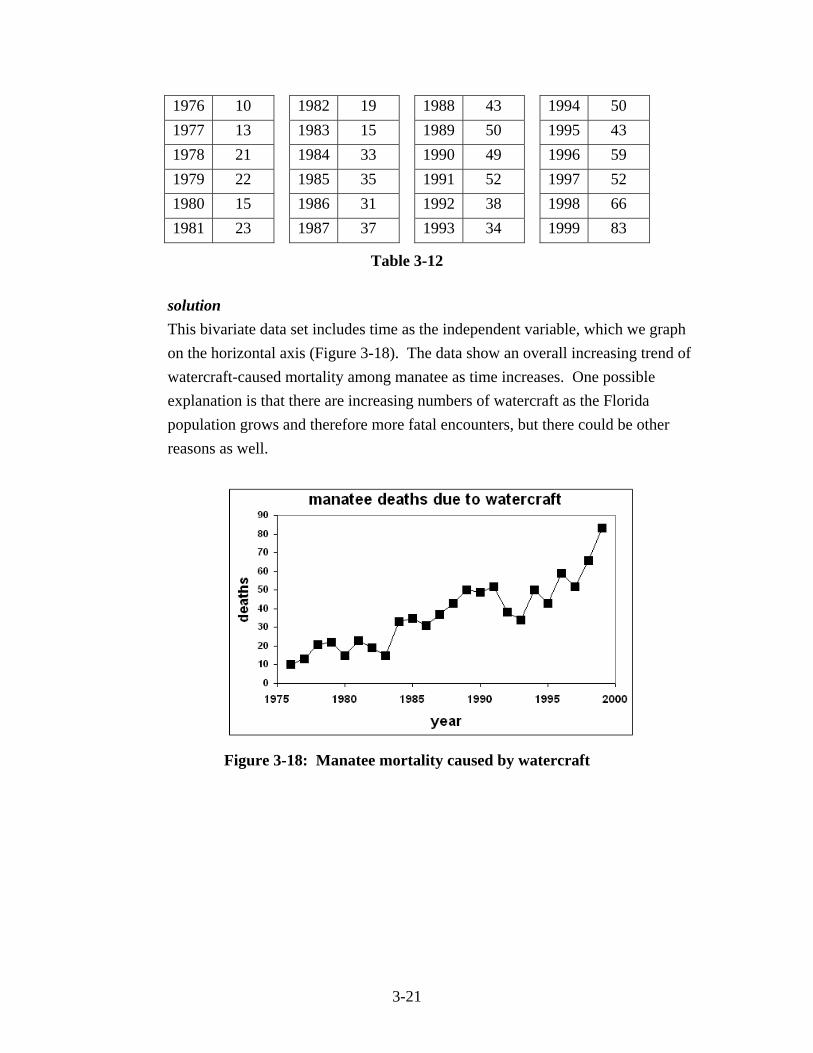
3-21
1976 10 1982 19 1988 43 1994 50 1977 13 1983 15 1989 50 1995 43 1978 21 1984 33 1990 49 1996 59 1979 22 1985 35 1991 52 1997 52 1980 15 1986 31 1992 38 1998 66 1981 23 1987 37 1993 34 1999 83
Table 3-12
solution This bivariate data set includes time as the independent variable, which we graph on the horizontal axis (Figure 3-18). The data show an overall increasing trend of watercraft-caused mortality among manatee as time increases. One possible explanation is that there are increasing numbers of watercraft as the Florida population grows and therefore more fatal encounters, but there could be other reasons as well.
Figure 3-18: Manatee mortality caused by watercraft
3-22
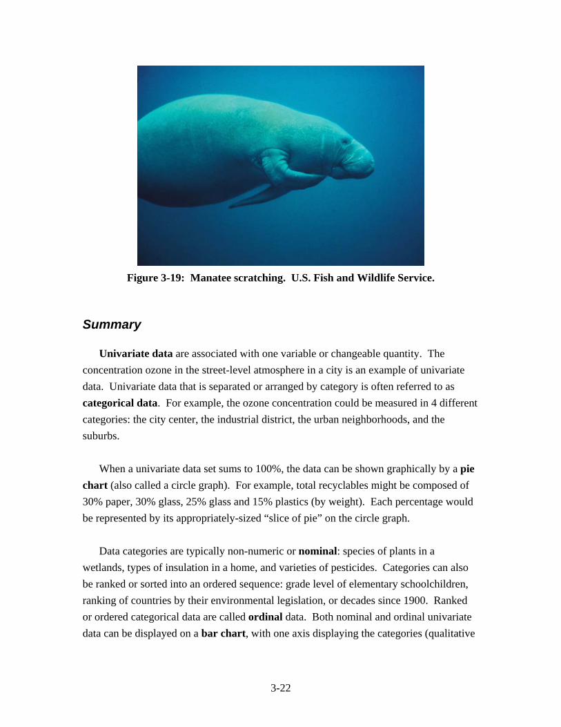
Figure 3-19: Manatee scratching. U.S. Fish and Wildlife Service.
Summary Univariate data are associated with one variable or changeable quantity. The concentration ozone in the street-level atmosphere in a city is an example of univariate data. Univariate data that is separated or arranged by category is often referred to as categorical data. For example, the ozone concentration could be measured in 4 different categories: the city center, the industrial district, the urban neighborhoods, and the suburbs. When a univariate data set sums to 100%, the data can be shown graphically by a pie chart (also called a circle graph). For example, total recyclables might be composed of 30% paper, 30% glass, 25% glass and 15% plastics (by weight). Each percentage would be represented by its appropriately-sized “slice of pie” on the circle graph. Data categories are typically non-numeric or nominal: species of plants in a wetlands, types of insulation in a home, and varieties of pesticides. Categories can also be ranked or sorted into an ordered sequence: grade level of elementary schoolchildren, ranking of countries by their environmental legislation, or decades since 1900. Ranked or ordered categorical data are called ordinal data. Both nominal and ordinal univariate data can be displayed on a bar chart, with one axis displaying the categories (qualitative
3-23
information) and the other axis showing the measured values (quantitative information) for each of those categories. Histograms are used to display a collection of repeated measurements of a single quantity, such as the density of beetles on each pine tree in a Texas forest or the thickness of soil in the upland forests of Costa Rica. The data are grouped into bins of equal width, and arranged on the horizontal axis. The vertical axis is the frequency or number of values in each bin. The height of each bar corresponds to the frequency. Frequencies can be normalized to the total number of measurements to produce relative frequencies. Bivariate data are associated with two quantities. For example, the amounts of fertilizer in pounds per acre (one quantity) and the corresponding average heights of corn in feet (second quantity) could be measured for 50 farms in Iowa. The pairs of values (pounds per acre, average heights) for each farm are represented by a point on a scatterplot. If one variable “drives” or regulates another, the independent variable (pounds per acre) is typically graphed on the horizontal axis, with the dependent variable (average height) on the vertical axis.
A line graph is a scatterplot with the individual points on the diagram connected by line segments. Line graphs are typically associated with a time series of data, where time is the independent variable.
Exercises
Pie Charts
1) The pie chart in Figure 3-20 shows the contribution to global warming of three greenhouse gases: carbon dioxide (CO2), methane (CH4) and nitrous oxide (N2O).11 Estimate the percentage contribution of each.
3-24
Figure 3-20: Pie chart of greenhouse gases.
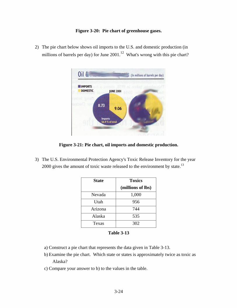
2) The pie chart below shows oil imports to the U.S. and domestic production (in
millions of barrels per day) for June 2001.12 What's wrong with this pie chart?
Figure 3-21: Pie chart, oil imports and domestic production.
3) The U.S. Environmental Protection Agency's Toxic Release Inventory for the year
2000 gives the amount of toxic waste released to the environment by state.13
State Toxics (millions of lbs)
Nevada 1,000 Utah 956
Arizona 744 Alaska 535 Texas 302
Table 3-13
a) Construct a pie chart that represents the data given in Table 3-13. b) Examine the pie chart. Which state or states is approximately twice as toxic as
Alaska? c) Compare your answer to b) to the values in the table.
3-25
4) Values for the amount of electricity (in trillions of watt-hours) generated by sector for the United States in 1999 are given in Table 3-14.14
Fuel Source Electricity (TWh)
coal 1,882 natural gas 565 petroleum 119
nuclear 728 hydropower 307
other renewables 89
Table 3-14
a) Construct a pie chart for these data. b) Fossil fuels are what percentage of the total? Shade in the fossil fuels on the pie
chart. c) Renewable energy sources are what percentage of the total? Show the renewables
with cross-hatching. 5) The data in Table 3-15 show the tons of recycled materials by category for 1986 and
1998 in Washington State.15
Category 1986 1998Papers 391,994 821,994Metals 9,528 318,710
Organics 0 815,809Plastics 349 9,871
Glass 48,013 113,338Others 352 87,657
Table 3-15
a) Construct a pie chart for each year. b) Are all categories visible on each pie chart? c) Based on the pie charts, briefly describe two differences between the two years.
3-26
6) Lead emissions by source for Europe are given in Table 3-16 for three different years,
1955, 1975 and 1995.16
Source 1955 1975 1995 cars and trucks on roads 49.5% 74.9% 68.7% non-iron metals manufacturing 21.1% 10.1% 11.8% stationary fuel combustion 8.7% 3.8% 9.5% iron & steel manufacturing 11.2% 7.0% 7.8% waste disposal 0.2% 0.4% 0.9% cement production 1.2% 1.1% 0.0% other 8.1% 2.8% 1.2% Total emissions (tonnes) 62,532 159,233 28,390
Table 3-16
a) Construct a pie chart for each of the three years. b) The total amount of lead and its distribution among sources changed from 1955 to
1975. What was the most likely cause of these simultaneous changes? c) The total amount of lead emitted decreased from 1975 to 1995 but the distribution
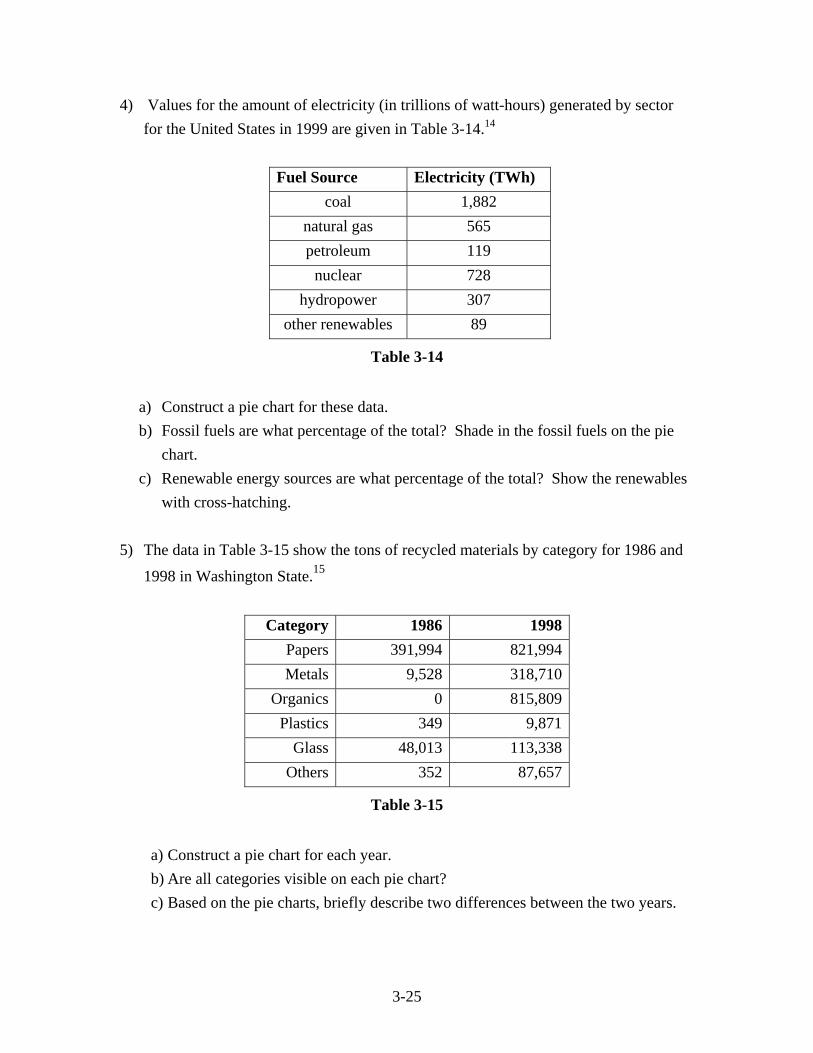
remained almost the same. What was the most likely cause of this pattern? Bar Charts 7) The ecological footprint of a country is the area of land and sea necessary to produce
the renewable resources for that country’s people. Renewable resources can grow back or replenish themselves naturally. The bar chart (Figure 3-22) shows the ecological footprint for 6 countries in 1999.17
3-27
Figure 3-22: Ecological footprint for 6 countries in 1999.
a) What are the units for the ecological footprint? b) Name a few renewable resources consumed by people in these countries. c) What is the ratio of the Canadian footprint to the Haitian footprint?
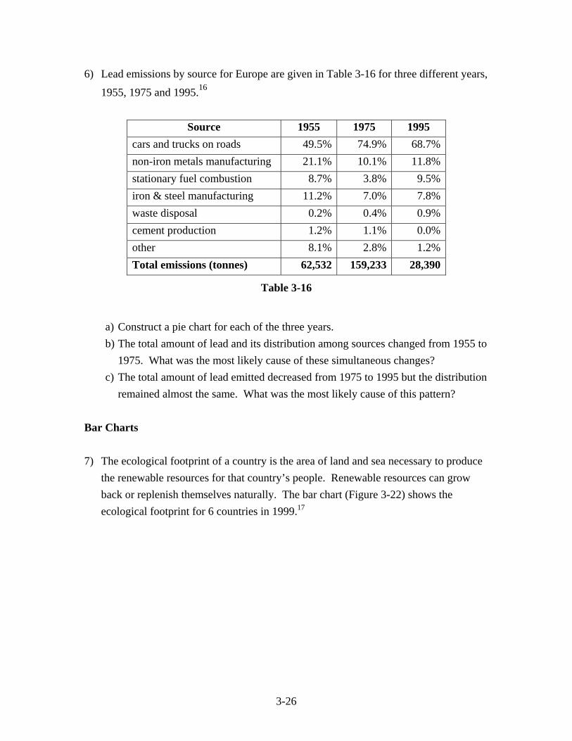
8) The bar chart in Figure 3-23 shows the average monthly discharge measured at the
Altamira measuring station on the Xingu River, Amazon basin, Brazil.18 Discharge is the volume of water flowing by the measuring station in a certain amount of time. In this chart, discharge is given in cubic meters per second.
Figure 3-23: Bar chart, mean monthly discharge, Xingu River.
a) Which month of the year has the highest discharge (on average)? What is that
discharge?
3-28
b) Which month has the lowest discharge (on average)? What is that discharge? c) What is the usual discharge during the month of May?
9) U.S. energy consumption (in quadrillions of BTUs) by energy source in April, 2002 is
given in Table 3-17.19
Source of energy
Consumption (Quads)
Nuclear 0.61 Petroleum 3.11 Natural Gas 1.84 Coal 1.69 Hydroelectric 0.31
Table 3-17
a) Create a bar chart that represents these data. b) Of the 5 sources of energy, which (if any) are renewable? c) Which sources of energy are missing from the bar chart?
10) Italians are the third largest consumer of meat on Planet Earth, averaging about 82
kilograms of meat per person per year.20 Table 3-18 gives a breakdown of the categories of meat consumption.
category consumption
(kg/person) beef 26 pork 35
poultry 19 mutton 2
Table 3-18
a) Construct a bar chart of the consumption data, in the order given in the table. b) Should pork have been plotted as the first bar, because it has the highest
consumption? Explain.
3-29
c) Using the bar chart, estimate the total meat consumption per person per year, and compare with the value of 82 kg per person per year.
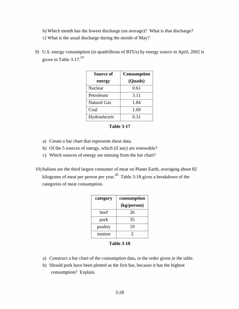
Frequency Histograms 11) Frequency histograms are often used to display population data. The number of
females in Bangladesh in 2000 is shown in the frequency histogram in Figure 3-24.21
Figure 3-24: Frequency histogram of Bangladesh females by age.
a) What is the bin width? b) All of the bins have the same width except one. Which bin is that? c) Estimate the total female population in 2000.
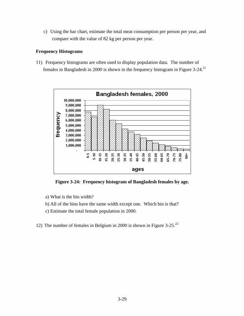
12) The number of females in Belgium in 2000 is shown in Figure 3-25.22
3-30
Figure 3-25: Frequency histogram of Belgium females by age.
a) What is the bin width? b) What is the most common bin (the modal bin)? c) Estimate the number of fertile women in 2000. Fertile women are defined as
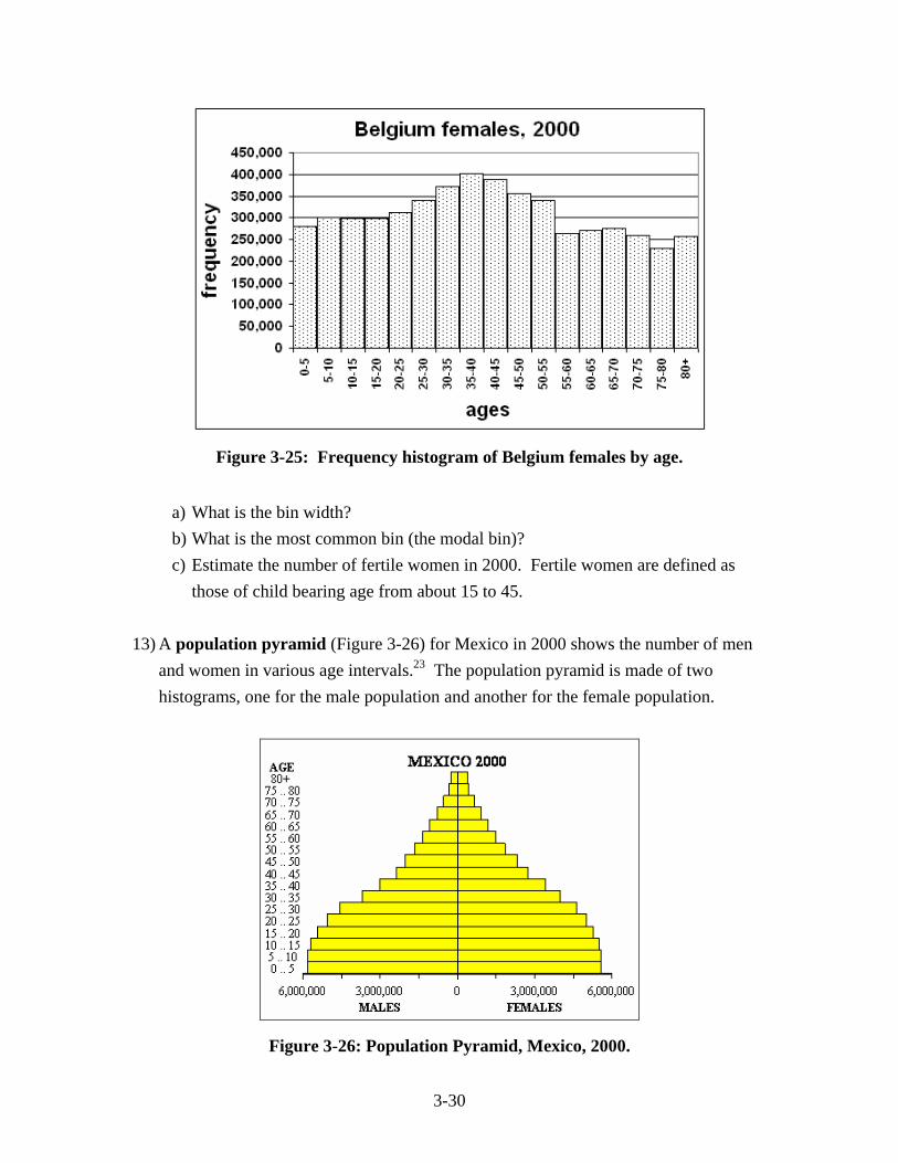
those of child bearing age from about 15 to 45. 13) A population pyramid (Figure 3-26) for Mexico in 2000 shows the number of men
and women in various age intervals.23 The population pyramid is made of two histograms, one for the male population and another for the female population.
Figure 3-26: Population Pyramid, Mexico, 2000.
3-31
a) What is the bin width? b) All of the bins have the same width except which bin? c) About at what age do females become more populous than males? d) What is the total number of people in their 60's in the year 2000 (approximately)?
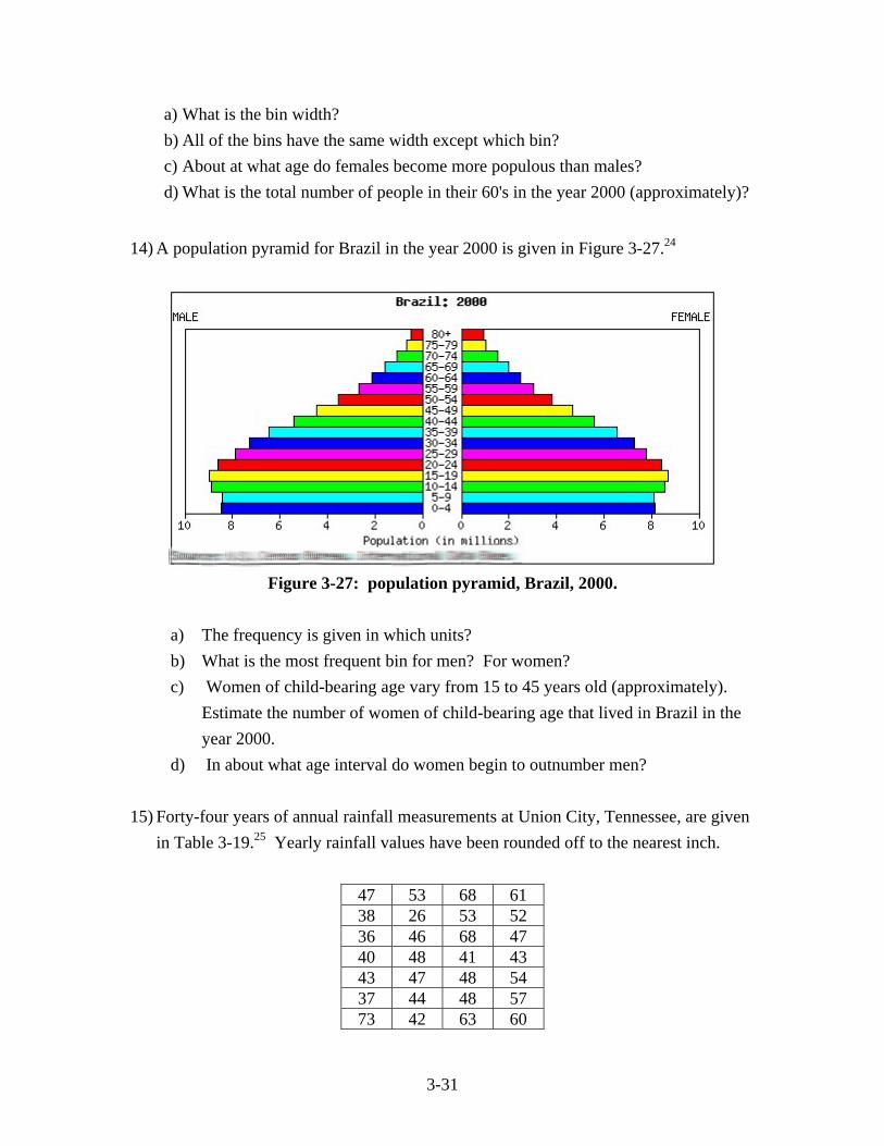
14) A population pyramid for Brazil in the year 2000 is given in Figure 3-27.24
Figure 3-27: population pyramid, Brazil, 2000.
a) The frequency is given in which units? b) What is the most frequent bin for men? For women? c) Women of child-bearing age vary from 15 to 45 years old (approximately).
Estimate the number of women of child-bearing age that lived in Brazil in the year 2000.
d) In about what age interval do women begin to outnumber men? 15) Forty-four years of annual rainfall measurements at Union City, Tennessee, are given
in Table 3-19.25 Yearly rainfall values have been rounded off to the nearest inch.
47 53 68 61 38 26 53 52 36 46 68 47 40 48 41 43 43 47 48 54 37 44 48 57 73 42 63 60
3-32
43 52 39 49 41 55 42 44 38 43 55 49 53 54 48 51
Table 3-19
a) Sort and bin the data, then construct a histogram. Choose appropriate bin
widths, scales and labels. b) Are there any empty bins in your histogram? If so, identify the bin intervals. c) What is the most frequent or modal bin? d) How many values fall above the modal bin and how many values fall below the
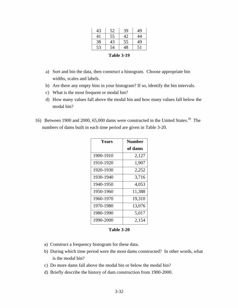
modal bin? 16) Between 1900 and 2000, 65,000 dams were constructed in the United States.26 The
numbers of dams built in each time period are given in Table 3-20.
Years Number of dams
1900-1910 2,1271910-1920 1,9071920-1930 2,2521930-1940 3,7161940-1950 4,0531950-1960 11,3881960-1970 19,3101970-1980 13,0761980-1990 5,0171990-2000 2,154
Table 3-20
a) Construct a frequency histogram for these data. b) During which time period were the most dams constructed? In other words, what
is the modal bin? c) Do more dams fall above the modal bin or below the modal bin? d) Briefly describe the history of dam construction from 1900-2000.
3-33
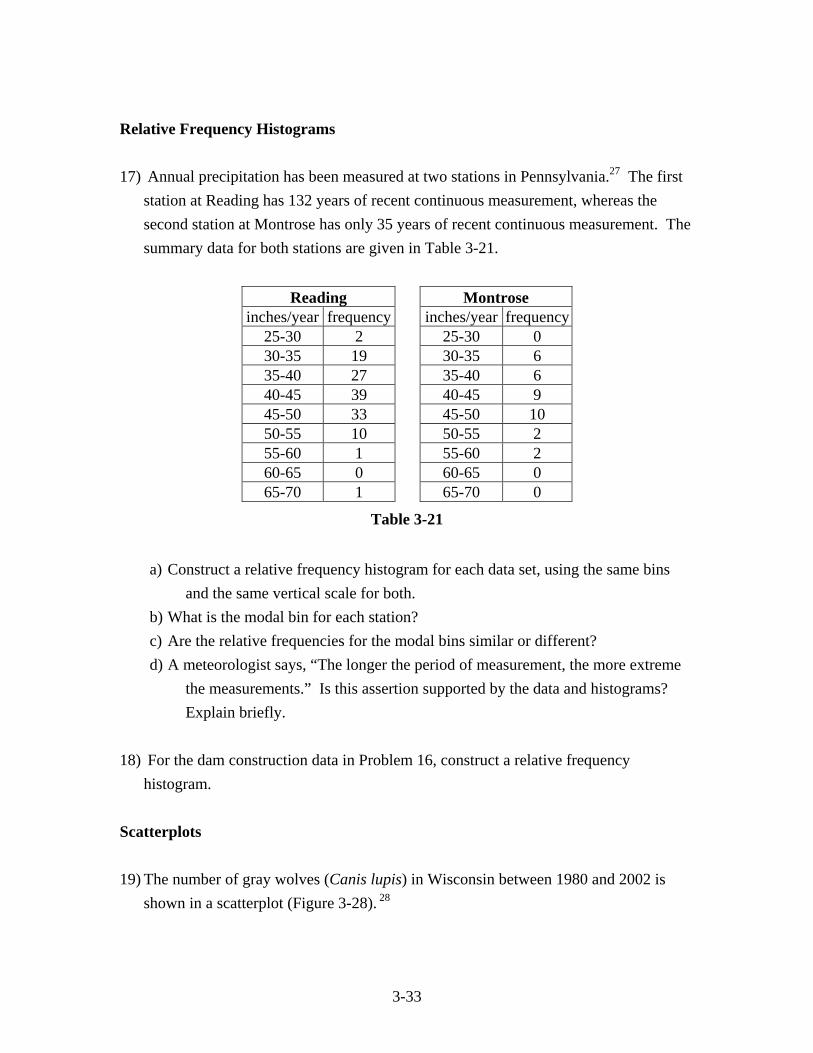
Relative Frequency Histograms 17) Annual precipitation has been measured at two stations in Pennsylvania.27 The first
station at Reading has 132 years of recent continuous measurement, whereas the second station at Montrose has only 35 years of recent continuous measurement. The summary data for both stations are given in Table 3-21.
Reading Montrose
inches/year frequency inches/year frequency25-30 2 25-30 0 30-35 19 30-35 6 35-40 27 35-40 6 40-45 39 40-45 9 45-50 33 45-50 10 50-55 10 50-55 2 55-60 1 55-60 2 60-65 0 60-65 0 65-70 1 65-70 0
Table 3-21 a) Construct a relative frequency histogram for each data set, using the same bins
and the same vertical scale for both. b) What is the modal bin for each station? c) Are the relative frequencies for the modal bins similar or different? d) A meteorologist says, “The longer the period of measurement, the more extreme
the measurements.” Is this assertion supported by the data and histograms? Explain briefly.
18) For the dam construction data in Problem 16, construct a relative frequency
histogram. Scatterplots 19) The number of gray wolves (Canis lupis) in Wisconsin between 1980 and 2002 is
shown in a scatterplot (Figure 3-28). 28
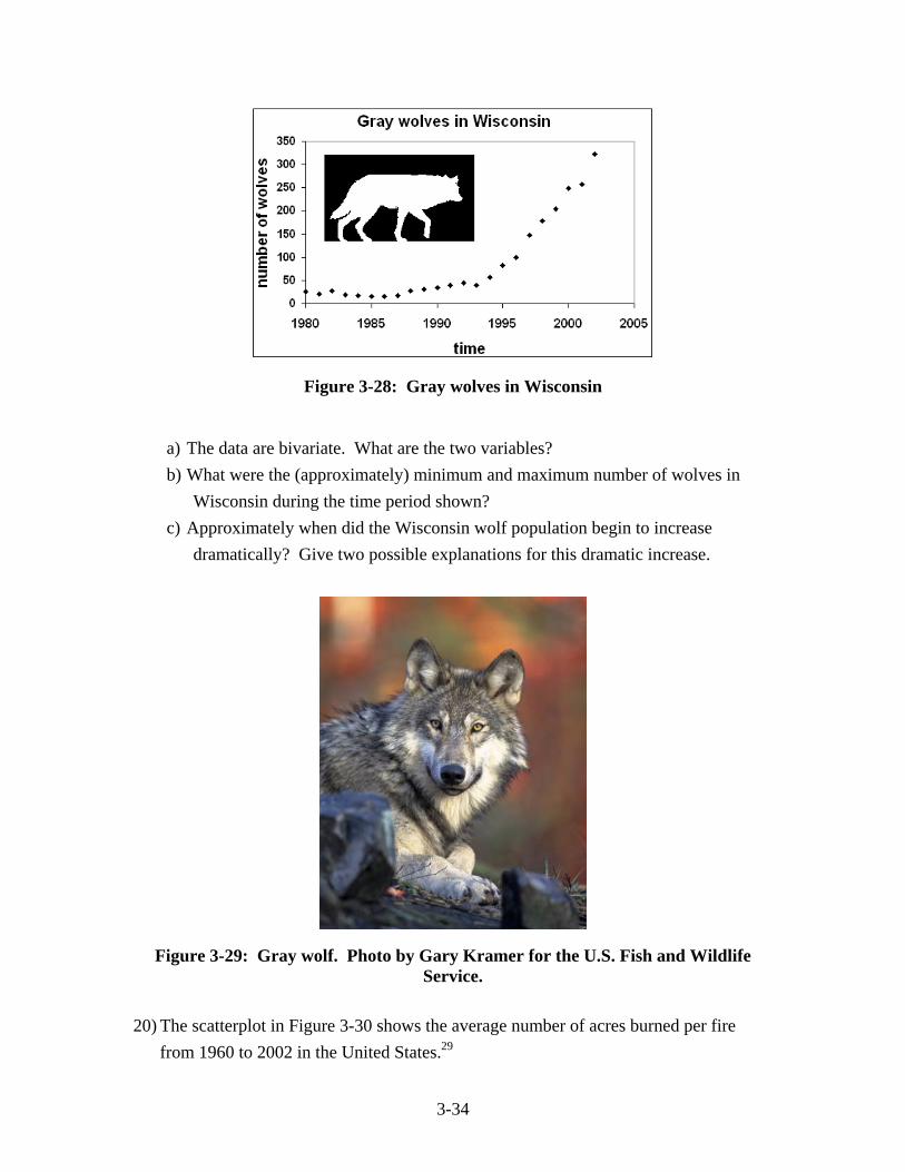
3-34
Figure 3-28: Gray wolves in Wisconsin
a) The data are bivariate. What are the two variables? b) What were the (approximately) minimum and maximum number of wolves in
Wisconsin during the time period shown? c) Approximately when did the Wisconsin wolf population begin to increase
dramatically? Give two possible explanations for this dramatic increase.
Figure 3-29: Gray wolf. Photo by Gary Kramer for the U.S. Fish and Wildlife Service.
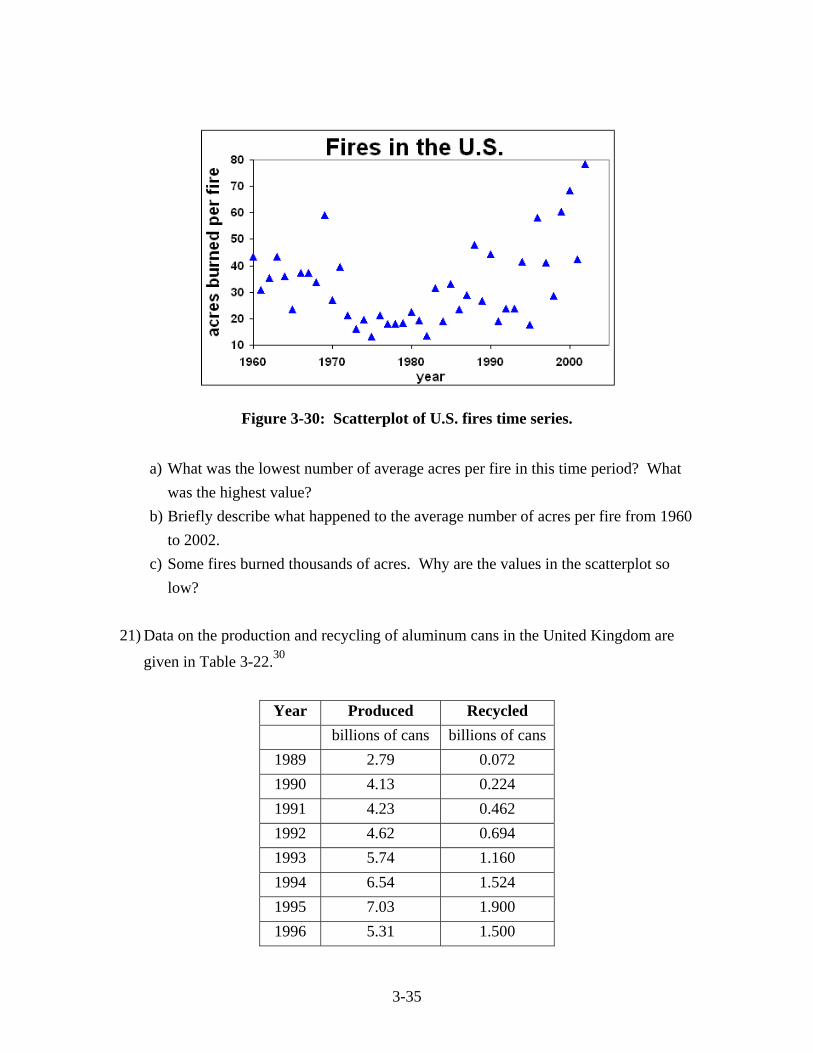
20) The scatterplot in Figure 3-30 shows the average number of acres burned per fire
from 1960 to 2002 in the United States.29
3-35
Figure 3-30: Scatterplot of U.S. fires time series.
a) What was the lowest number of average acres per fire in this time period? What
was the highest value? b) Briefly describe what happened to the average number of acres per fire from 1960
to 2002. c) Some fires burned thousands of acres. Why are the values in the scatterplot so
low? 21) Data on the production and recycling of aluminum cans in the United Kingdom are
given in Table 3-22.30
Year Produced Recycled billions of cans billions of cans
1989 2.79 0.072 1990 4.13 0.224 1991 4.23 0.462 1992 4.62 0.694 1993 5.74 1.160 1994 6.54 1.524 1995 7.03 1.900 1996 5.31 1.500
3-36
1997 4.58 1.506 1998 4.47 1.547
Table 3-22
a) By hand, construct a scatterplot of cans recycled (vertical axis) versus cans produced (horizontal axis). Choose appropriate scales and labels.
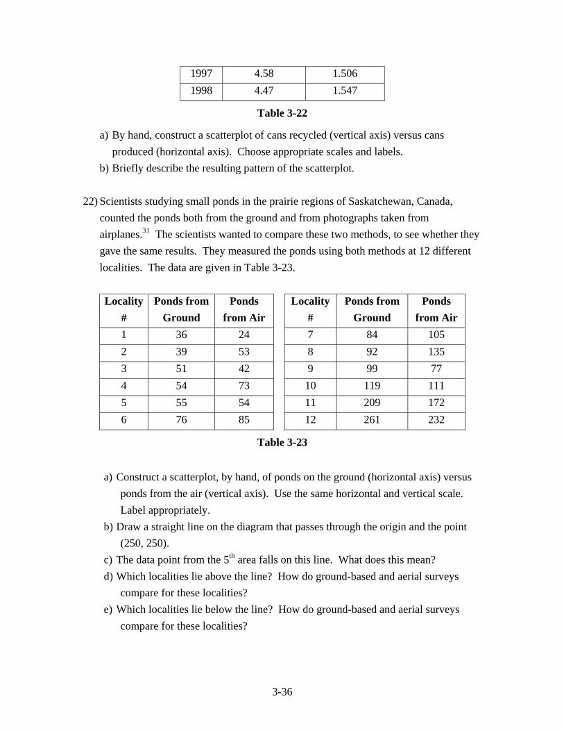
b) Briefly describe the resulting pattern of the scatterplot. 22) Scientists studying small ponds in the prairie regions of Saskatchewan, Canada,
counted the ponds both from the ground and from photographs taken from airplanes.31 The scientists wanted to compare these two methods, to see whether they gave the same results. They measured the ponds using both methods at 12 different localities. The data are given in Table 3-23.
Locality
# Ponds from
Ground Ponds
from Air Locality
# Ponds from
Ground Ponds
from Air 1 36 24 7 84 105 2 39 53 8 92 135 3 51 42 9 99 77 4 54 73 10 119 111 5 55 54 11 209 172 6 76 85 12 261 232
Table 3-23
a) Construct a scatterplot, by hand, of ponds on the ground (horizontal axis) versus ponds from the air (vertical axis). Use the same horizontal and vertical scale. Label appropriately.
b) Draw a straight line on the diagram that passes through the origin and the point (250, 250).
c) The data point from the 5th area falls on this line. What does this mean? d) Which localities lie above the line? How do ground-based and aerial surveys
compare for these localities? e) Which localities lie below the line? How do ground-based and aerial surveys
compare for these localities?
3-37
Scatterplots using technology 23) Using technology, generate a scatterplot using the same graph parameters (Xmin,
Xmax, etc.) as your hand-drawn scatterplot in Exercise #21. 24) Using, technology, generate a scatterplot using the same graph parameters (Xmin,
Xmax, etc.) as your hand-drawn scatterplot in Exercise #22.
Science in Depth: Energy Demand and the Arctic National Wildlife Refuge The United States is the single largest consumer of energy on Earth.32 The total
energy demand by all countries each year is approximately 15400×10 British Thermal
Units or 400 quadrillion BTUs. The United States represents 25% of that total or 100 “Quads” per year. Demand for energy in the U.S. is growing at about 1.5% per year, about the same as the world-wide increase. The U.S. consumes about 15 Quads of energy from domestically produced petroleum each year and about 25 Quads of imports. U.S. domestic petroleum production peaked in the 1970’s and has declined since.33 Known reserves of U.S. petroleum are estimated to be about 22 billion barrels of crude oil with an energy equivalent of approximately 130 Quads. The U.S. reserves of petroleum would barely last a decade at the current rate of domestic consumption. The only way to sustain this consumption without relying on more imports is to find new reserves of U.S. petroleum. The Arctic National Wildlife Refuge (ANWR, pronounced an-whar) was established in 1980 by the Alaska National Interest Lands Conservation Act.34 The creation of the refuge by the U.S. Congress was in response to the discovery and development of petroleum fields to the west of ANWR around Prudhoe Bay and adjacent areas on the North Slope of Alaska. Congress was concerned about the environmental impact of both exploration and extraction in northernmost Alaska, and preserved ANWR to balance the damage done to the west. ANWR protects an important arctic ecosystem, which sustains the vast Porcupine caribou herd (see Chapter 10). The ANWR contains about 19 million acres of land between the Trans-Alaska Pipeline on the west and the Canadian border on the east (Figure 3-31). ANWR contains two subsections, the Wilderness Area (8 million
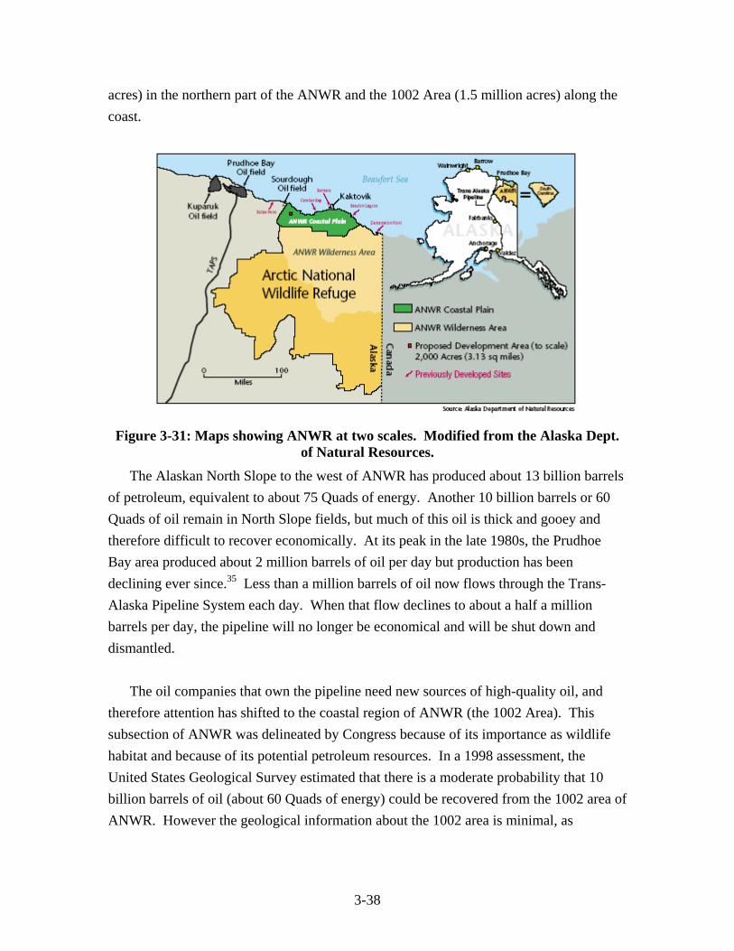
3-38
acres) in the northern part of the ANWR and the 1002 Area (1.5 million acres) along the coast.
Figure 3-31: Maps showing ANWR at two scales. Modified from the Alaska Dept. of Natural Resources.
The Alaskan North Slope to the west of ANWR has produced about 13 billion barrels of petroleum, equivalent to about 75 Quads of energy. Another 10 billion barrels or 60 Quads of oil remain in North Slope fields, but much of this oil is thick and gooey and therefore difficult to recover economically. At its peak in the late 1980s, the Prudhoe Bay area produced about 2 million barrels of oil per day but production has been declining ever since.35 Less than a million barrels of oil now flows through the Trans-Alaska Pipeline System each day. When that flow declines to about a half a million barrels per day, the pipeline will no longer be economical and will be shut down and dismantled. The oil companies that own the pipeline need new sources of high-quality oil, and therefore attention has shifted to the coastal region of ANWR (the 1002 Area). This subsection of ANWR was delineated by Congress because of its importance as wildlife habitat and because of its potential petroleum resources. In a 1998 assessment, the United States Geological Survey estimated that there is a moderate probability that 10 billion barrels of oil (about 60 Quads of energy) could be recovered from the 1002 area of ANWR. However the geological information about the 1002 area is minimal, as
3-39
exploration for oil in this region is currently forbidden. As a result, there is a lot of uncertainty in the estimates of petroleum in ANWR.
Chapter Project The United States is the largest single consumer of energy on Earth. At the current rate of growth, energy demand in the U.S. will double in the next 50 years. Besides petroleum, what are the sources of energy consumed in the U.S.? How much energy comes from renewable sources? What parts of U.S. society consume the most energy? In the companion project for this chapter found at the 6 Billion and Counting website (enviromath.com), you will be introduced to a very rich and informative graph that illustrates U.S. energy production and consumption for the year 2003. You’ll answer a number of questions about the sources and sinks of energy in the U.S., and look at the role of alternative and renewable energy sources in the current energy picture. Visit the website!
Notes 1 U.S. Dept of Energy, Energy Information Agency, Annual Energy Outlook 1996. 2 Phillip L. Jackson and A. Jon Kimerling, Atlas of the Pacific Northwest (Corvallis, OR: Oregon State University Press, 1993), 77. 3 U.S. Geological Survey, Water-Resources Investigations Report 98-4086, 1998, http://ga.water.usgs.gov/edu/waterdistribution.html. 4 A. Johnson, “Results from Analyzing Metals in 1999 Spokane River Fish and Crayfish Samples,” Washington State Dept. of Ecology Report 00-03-017, 2000, http://www.ecy.wa.gov/biblio/0003017.html. 5 U.S. Environmental Protection Agency, Mercury Study Report to Congress (1997), http://www.epa.gov/oar/mercury.html. 6University of Washington, Center for Water and Watershed Studies, Regional, Synchronous Field Determination Of Summertime Stream Temperatures In Western Washington, 2001, http://depts.washington.edu/cwws/Research/Projects/regionalstreamtemperature.html.
3-40
7 E. Cortés and G. R. Parsons, “Comparative Demography Of Two Populations Of The Bonnethead Shark (Sphyrna tiburo),” Canadian Journal of Fisheries and Aquatic Sciences 53 (1996): 709-718. 8 Roland Knapp, “Non-Native Trout in Natural Lakes of the Sierra Nevada: An Analysis of Their Distribution and Impacts on Native Aquatic Biota”, Sierra Nevada Ecosystem Project: Final report to Congress, vol. III, Assessments And Scientific Basis For Management Options. University of California-Davis, Centers for Water and Wildland Resources, 1996, http://ceres.ca.gov/snep/pubs/v3.html. 9 A. Johnson, “Results from Analyzing Metals in 1999 Spokane River Fish and Crayfish Samples,” Washington State Dept. of Ecology Report 00-03-017, 2000, http://www.ecy.wa.gov/biblio/0003017.html. 10 Florida Fish and Wildlife Conservation Commission, Fish and Wildlife Research Institute, http://www.floridamarine.org/. 11 U.S. Environmental Protection Agency, Greenhouse Gases and Global Warming Potential Values - Excerpt from the Inventory of U.S. Greenhouse Gas Emissions and Sinks: 1990-2000, http://yosemite.epa.gov/OAR/globalwarming.nsf/content/Emissions.html. 12 Lisa M. Pinsker, “Energy Notes,” Geotimes, September 2002, 31. 13 Associated Press, “Coal Plants and Mines Biggest Polluters,” by John Heilprin, Seattle Daily Journal of Commerce, May 28, 2002. 14 U.S. Dept of Energy, Energy Information Administration, Electricity Power Annual 1999, http://www.eia.doe.gov/cneaf/electricity/epa/backissues.html. 15 Washington State Dept of Ecology, Solid Waste and Financial Assistance Program, http://www.ecy.wa.gov/programs/swfa/solidwastedata/recyclin.asp. 16 Hans von Storch et al., “Reassessing Past European Gasoline Lead Policies,” EOS (Transactions of the AGU), September 3, 2002, 393 and 399. 17 World Wildlife Fund, Living Planet Report 2002, http://www.panda.org/news_facts/publications/general/livingplanet/index.cfm. 18 University of New Hampshire, Global Runoff Data Center, http://www.grdc.sr.unh.edu/html/Polygons/P3630050.html. 19 U.S. Dept of Energy, Energy Information Administration, Monthly Energy Review: April 2002, http://www.eia.doe.gov/cneaf/electricity/epm/epm_sum.html.
3-41
20 Worldwatch Institute, “United States Leads World Meat Stampede,” http://www.worldwatch.org/press/news/1998/07/02/. 21 U.S. Census Bureau, World Population Information, http://www.census.gov/ipc/www/world.html. 22 ibid. 23 ibid. 24 ibid. 25 U.S. Historical Climate Network, Carbon Dioxide Information Analysis Center, http://cdiac.ornl.gov/epubs/ndp019/state/TN/tennessee.html. 26 U.S. Army Corps of Engineers, National Inventory of Dams, http://crunch.tec.army.mil/nid/webpages/nid.cfm. 27 U.S. Historical Climate Network, Carbon Dioxide Information Analysis Center, http://cdiac.esd.ornl.gov/r3d/ushcn/statepcp.html. 28 Wisconsin Dept of Natural Resources, Status Of The Timber Wolf In Wisconsin, by Adrian P. Wydeven and Jane E. Wiedenhoeft, Endangered Resources Report #121 (2002), http://www.dnr.state.wi.us/org/land/er/publications/reports/reports.htm. 29 U.S. National Interagency Fire Center, “Wildland Fire Statistics,” http://www.nifc.gov/stats/wildlandfirestats.html. 30 U.K. Dept for Environment, Food and Rural Affairs, Digest of Environmental Statistics, http://www.defra.gov.uk/environment/statistics/des/index.htm. 31 L.L. Strong and L.M. Cowardin, “Improving Prairie Pond Counts,” Journal of Wildlife Management 59 (1995): 708–19. 32 Paul Weisz, “Basic Choices And Constraints On Long-Term Energy Supplies”, Physics Today, July 2004, 47–52. 33 Jon Spencer and Steven Rauzi, “Crude Oil Supply And Demand: Long-Term Trends,” Arizona Geology 31 (2001). 34 U.S. Geological Survey, “Arctic National Wildlife Refuge, 1002 Area, Petroleum Assessment, 1998, Including Economic Analysis,” USGS Fact Sheet FS-028-01. http://pubs.usgs.gov/fs/fs-0028-01/fs-0028-01.pdf. 35 Laura Wright, “ANWR In Black And White,” Geotimes, May 2001.


![[Psy] ch03](https://img.pdfslide.net/doc/110x75/555d741ad8b42a687b8b53c6/psy-ch03.jpg)