Embed Size (px)
Citation preview
9/21/2016
1
Chapter 3: Examining Relationships
Intro:• This section is going to focus on relationships
among several variables for the same group of individuals. In these relationships, does one variable cause the other variable to change?
• Explanatory Variable: • Attempts to explain the observed outcomes• Independent variable
• Response Variable:• Measures an outcome of a study• Dependent variable
2
9/21/2016
2
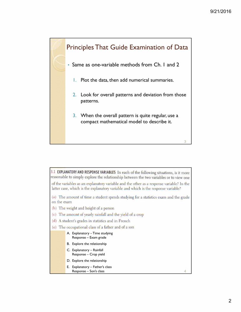
Principles That Guide Examination of Data
• Same as one-variable methods from Ch. 1 and 2
1. Plot the data, then add numerical summaries.
2. Look for overall patterns and deviation from those patterns.
3. When the overall pattern is quite regular, use a compact mathematical model to describe it.
3
4
A. Explanatory – Time studyingResponse – Exam grade
B. Explore the relationship
C. Explanatory – RainfallResponse – Crop yield
D. Explore the relationship
E. Explanatory – Father’s classResponse – Son’s class
9/21/2016
3
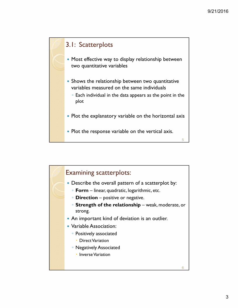
3.1: Scatterplots
Most effective way to display relationship between two quantitative variables
Shows the relationship between two quantitative variables measured on the same individuals◦ Each individual in the data appears as the point in the
plot
Plot the explanatory variable on the horizontal axis
Plot the response variable on the vertical axis.
5
Examining scatterplots: Describe the overall pattern of a scatterplot by:◦ Form – linear, quadratic, logarithmic, etc. ◦ Direction – positive or negative. ◦ Strength of the relationship – weak, moderate, or
strong.
An important kind of deviation is an outlier. Variable Association:◦ Positively associated Direct Variation
◦ Negatively Associated Inverse Variation
6
9/21/2016
4
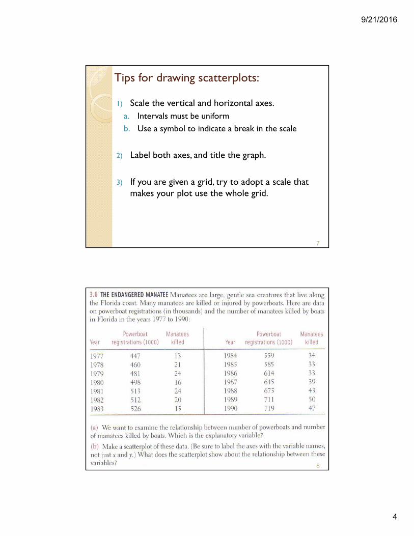
Tips for drawing scatterplots:
1) Scale the vertical and horizontal axes.a. Intervals must be uniformb. Use a symbol to indicate a break in the scale
2) Label both axes, and title the graph.
3) If you are given a grid, try to adopt a scale that makes your plot use the whole grid.
7
8
9/21/2016
5
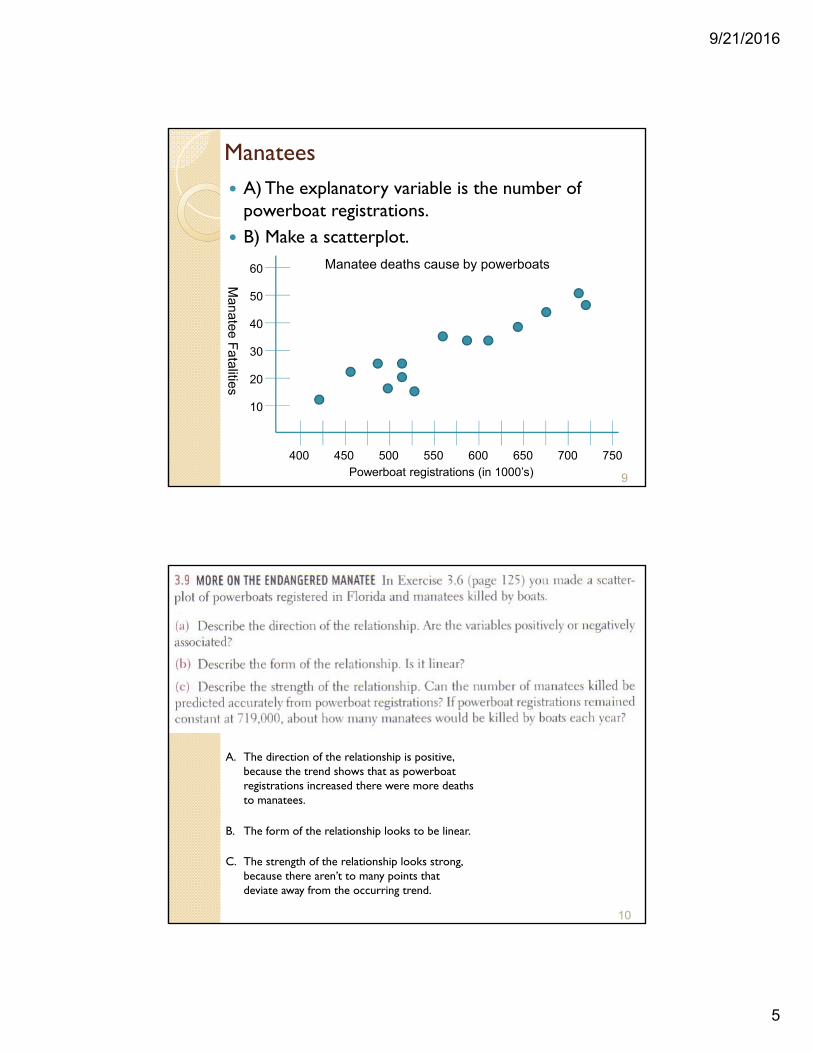
Manatees A) The explanatory variable is the number of
powerboat registrations. B) Make a scatterplot.
9Powerboat registrations (in 1000’s)400 450 500 550 600 650 700 750
10
20
30
40
50
60 Manatee deaths cause by powerboats
Manatee F
atalities
10
A. The direction of the relationship is positive, because the trend shows that as powerboat registrations increased there were more deaths to manatees.
B. The form of the relationship looks to be linear.
C. The strength of the relationship looks strong, because there aren’t to many points that deviate away from the occurring trend.
9/21/2016
6
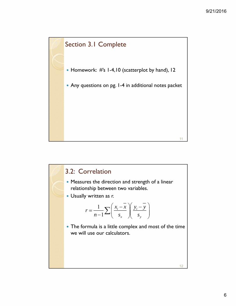
Section 3.1 Complete
Homework: #’s 1-4,10 (scatterplot by hand), 12
Any questions on pg. 1-4 in additional notes packet
11
3.2: Correlation Measures the direction and strength of a linear
relationship between two variables. Usually written as r.
The formula is a little complex and most of the time we will use our calculators.
12
1
1i i
x y
x x y yr
n s s
9/21/2016
7
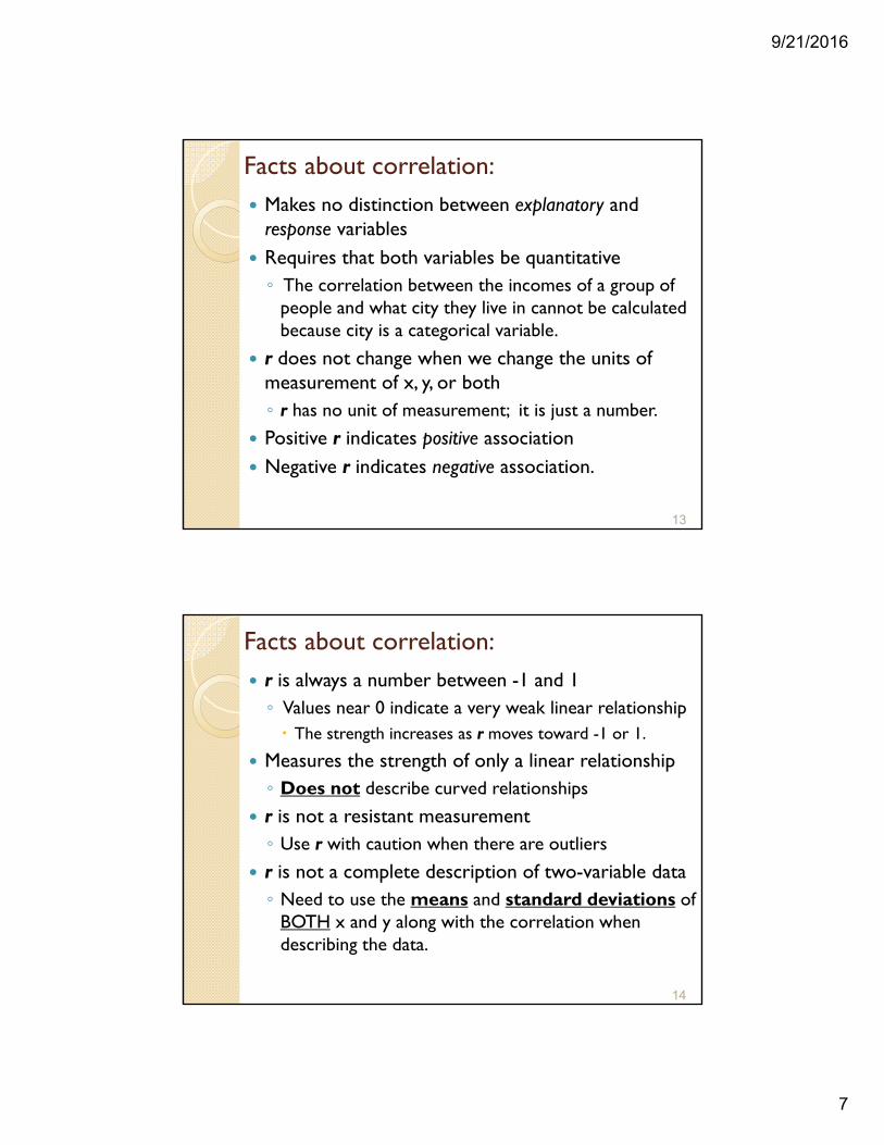
Facts about correlation: Makes no distinction between explanatory and response variables
Requires that both variables be quantitative◦ The correlation between the incomes of a group of
people and what city they live in cannot be calculated because city is a categorical variable.
r does not change when we change the units of measurement of x, y, or both◦ r has no unit of measurement; it is just a number.
Positive r indicates positive association Negative r indicates negative association.
13
Facts about correlation: r is always a number between -1 and 1◦ Values near 0 indicate a very weak linear relationship The strength increases as r moves toward -1 or 1.
Measures the strength of only a linear relationship◦ Does not describe curved relationships
r is not a resistant measurement◦ Use r with caution when there are outliers
r is not a complete description of two-variable data◦ Need to use the means and standard deviations of
BOTH x and y along with the correlation when describing the data.
14
9/21/2016
8
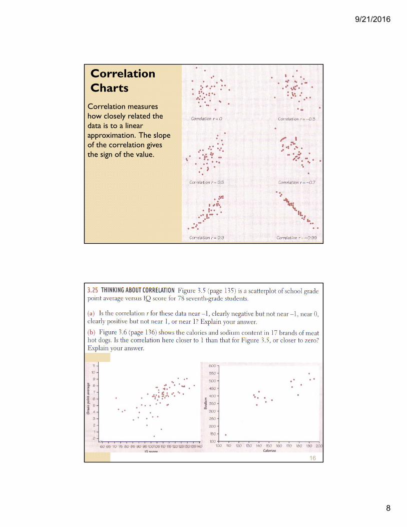
Correlation measures how closely related the data is to a linear approximation. The slope of the correlation gives the sign of the value.
15
Correlation Charts
16
9/21/2016
9
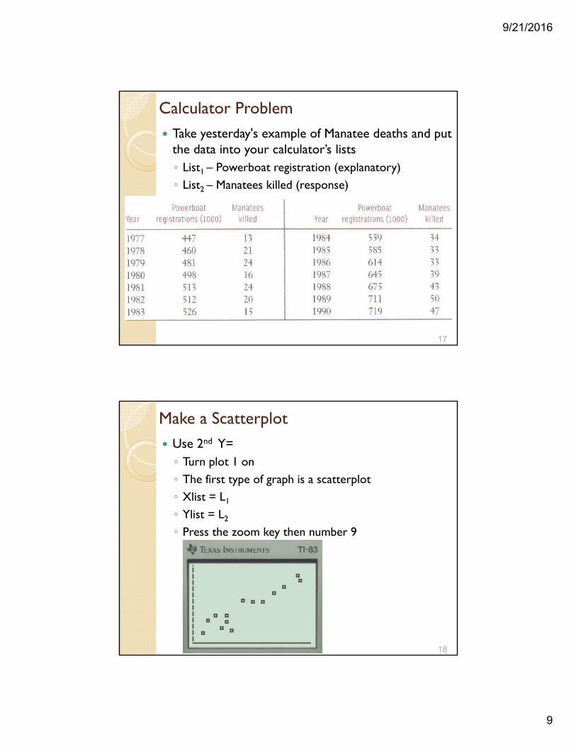
Calculator Problem Take yesterday's example of Manatee deaths and put
the data into your calculator’s lists◦ List1 – Powerboat registration (explanatory)◦ List2 – Manatees killed (response)
17
Make a Scatterplot Use 2nd Y=◦ Turn plot 1 on◦ The first type of graph is a scatterplot◦ Xlist = L1
◦ Ylist = L2
◦ Press the zoom key then number 9
18
9/21/2016
10
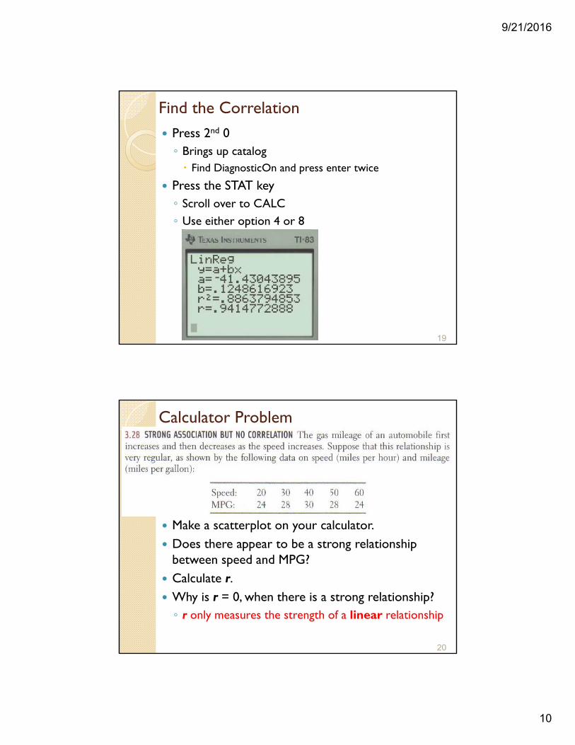
Find the Correlation Press 2nd 0◦ Brings up catalog Find DiagnosticOn and press enter twice
Press the STAT key◦ Scroll over to CALC◦ Use either option 4 or 8
19
Calculator Problem
Make a scatterplot on your calculator. Does there appear to be a strong relationship
between speed and MPG? Calculate r. Why is r = 0, when there is a strong relationship?◦ r only measures the strength of a linear relationship
20
9/21/2016
11
Section 3.2 Complete
Homework: #’s 15, 17, 19(calculator for b), 21, 23
Any questions on pg. 5-8 in additional notes packet
21
3.3: Least-Squares Regression Correlation measures the strength and direction of
the linear relationship Least-squares regression◦ Method for finding a line that summarizes that
relationship in a specific setting.◦ Describes how a response variable y changes as an
explanatory variable x changes◦ Used to predict the value of y for a given value of x◦ Unlike correlation, requires an explanatory and response variable.
22
9/21/2016
12
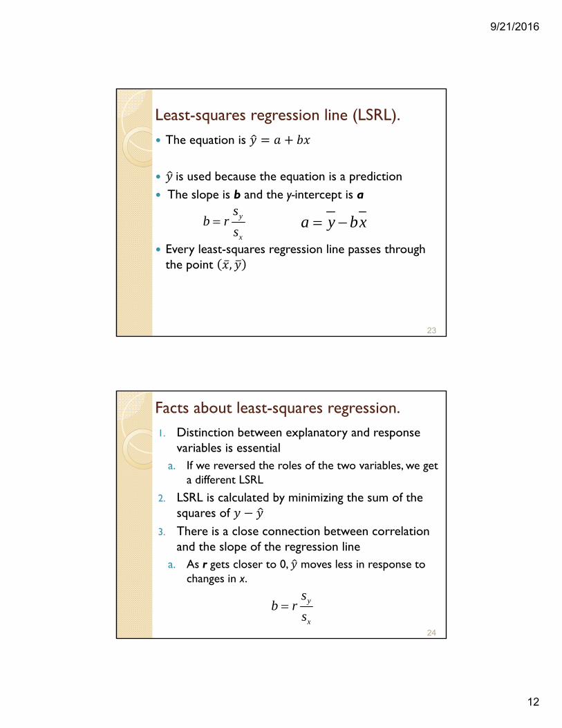
Least-squares regression line (LSRL). The equation is
is used because the equation is a prediction The slope is b and the y-intercept is a
Every least-squares regression line passes through the point ̅ ,
23
y
x
sb r
s a y bx
Facts about least-squares regression.1. Distinction between explanatory and response
variables is essentiala. If we reversed the roles of the two variables, we get
a different LSRL
2. LSRL is calculated by minimizing the sum of the squares of
3. There is a close connection between correlation and the slope of the regression line
a. As r gets closer to 0, moves less in response to changes in x.
24
y
x
sb r
s
9/21/2016
13
Interpretation of LSRL
Slope◦ For every unit increase in x, there is on average a
change of b units in
y-intercept ◦ Value of when x = 0◦ Only meaningful when x can actually take values close
to zero.
25
26
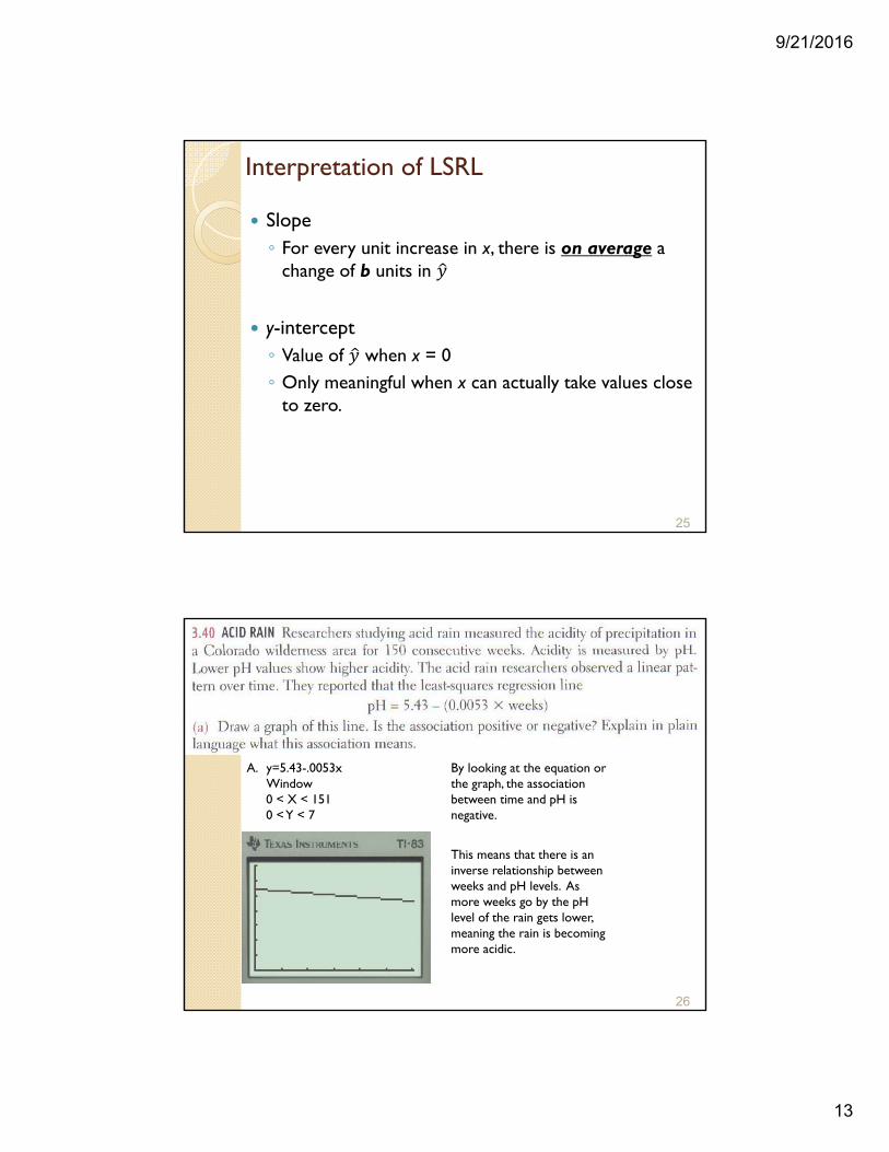
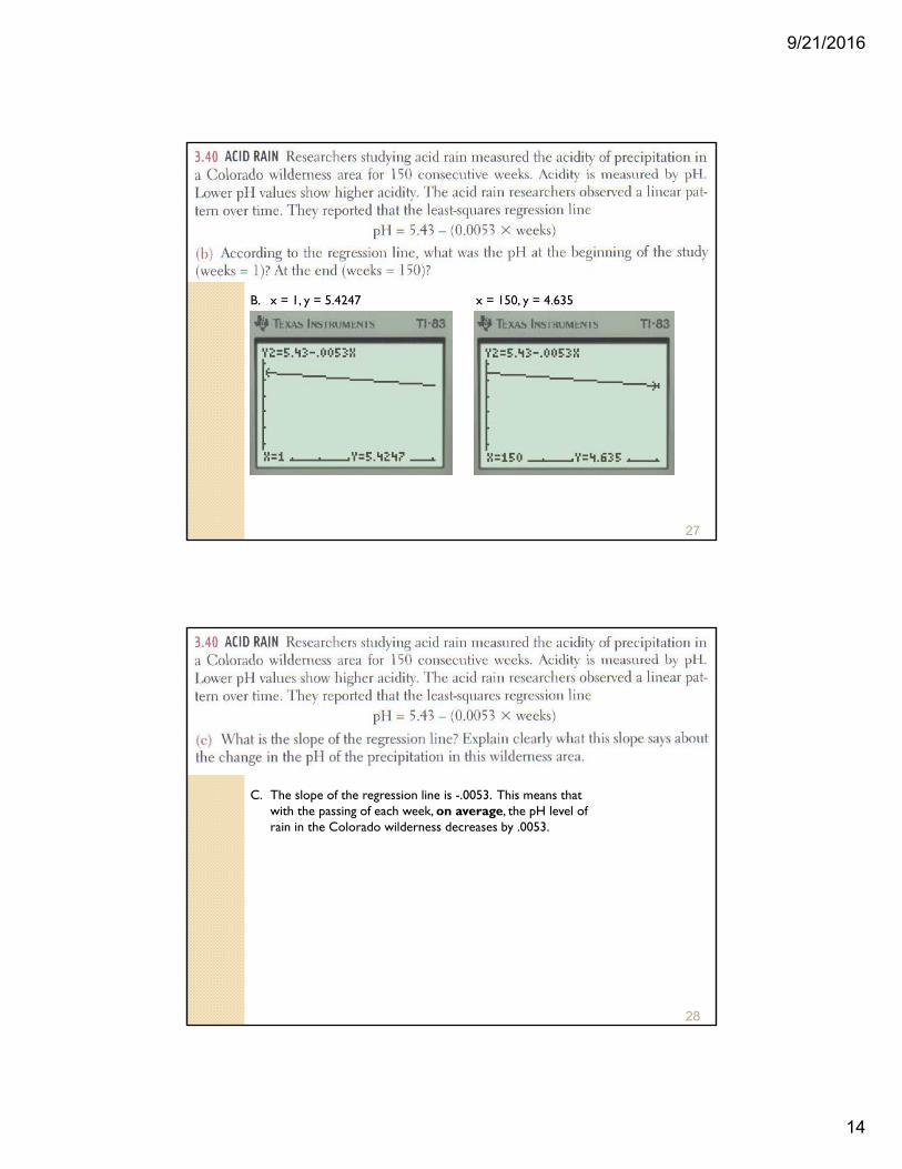
A. y=5.43-.0053xWindow0 < X < 1510 < Y < 7
By looking at the equation or the graph, the association between time and pH is negative.
This means that there is an inverse relationship between weeks and pH levels. As more weeks go by the pH level of the rain gets lower, meaning the rain is becoming more acidic.
9/21/2016
14
27
B. x = 1, y = 5.4247 x = 150, y = 4.635
28
C. The slope of the regression line is -.0053. This means that with the passing of each week, on average, the pH level of rain in the Colorado wilderness decreases by .0053.
9/21/2016
15
29
y a bx
y
x
sb r
s
a y bx
15.35.596
5.36b
1.7068b
6.08% 1.71%y x
9.07 1.7068(1.75)a
6.0831a
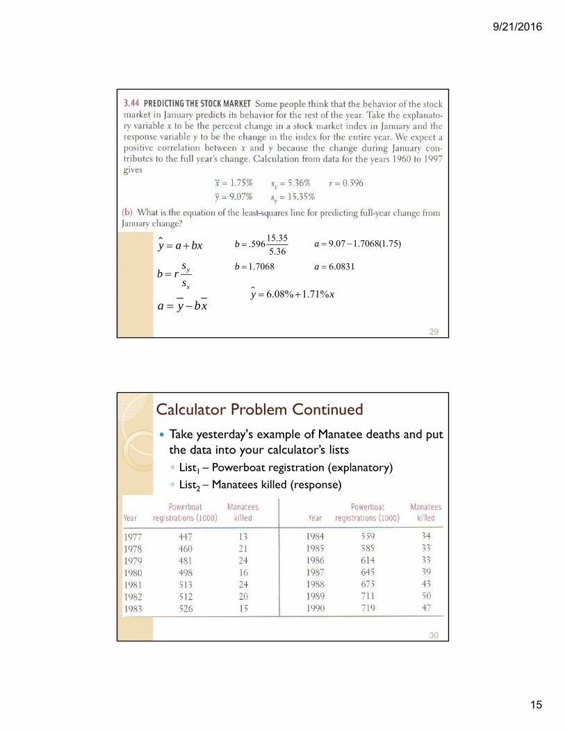
Calculator Problem Continued Take yesterday's example of Manatee deaths and put
the data into your calculator’s lists◦ List1 – Powerboat registration (explanatory)◦ List2 – Manatees killed (response)
30
9/21/2016
16
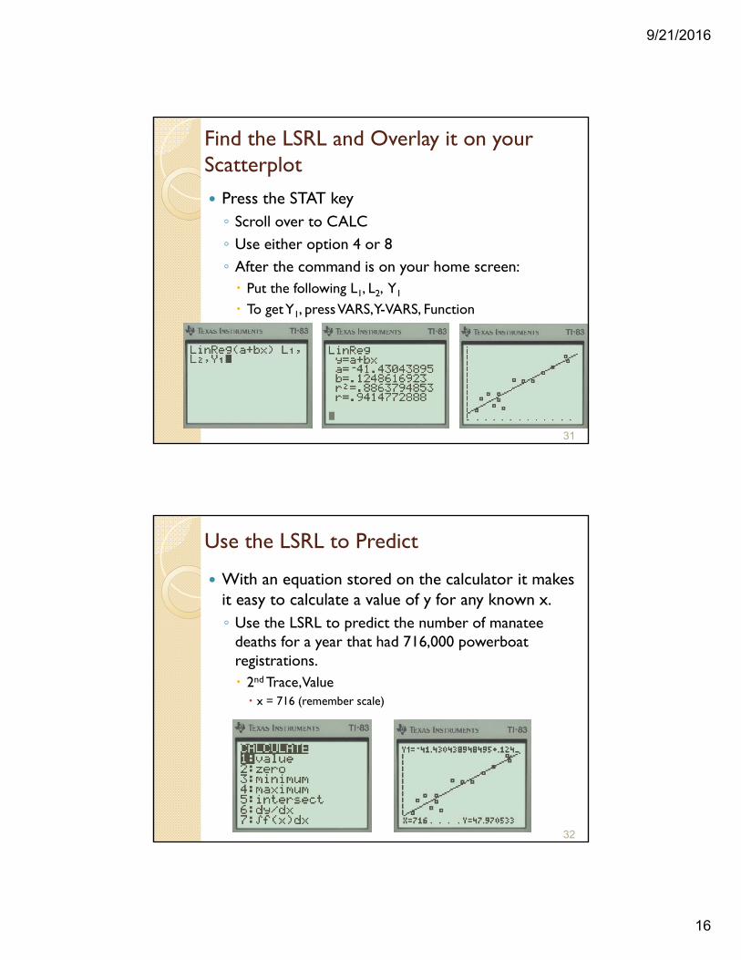
Find the LSRL and Overlay it on your Scatterplot
Press the STAT key◦ Scroll over to CALC◦ Use either option 4 or 8◦ After the command is on your home screen: Put the following L1, L2, Y1
To get Y1, press VARS, Y-VARS, Function
31
Use the LSRL to Predict
With an equation stored on the calculator it makes it easy to calculate a value of y for any known x.◦ Use the LSRL to predict the number of manatee
deaths for a year that had 716,000 powerboat registrations. 2nd Trace, Value x = 716 (remember scale)
32
9/21/2016
17
The role of r2 in regression. Coefficient of determination◦ The fraction of the variation in the values of y that is
explained by least-squares regression of y on x.◦ Measurement of the contribution of x in predicting y.◦ Equation is tedious
◦ But it can be shown algebraically to be equal to the correlation coefficient squared (r2)
33
22
2
y y y y
y y
Example - Calculation
The wording of this question gives the value of r2.◦ Take the square root
34
.16
.4
9/21/2016
18
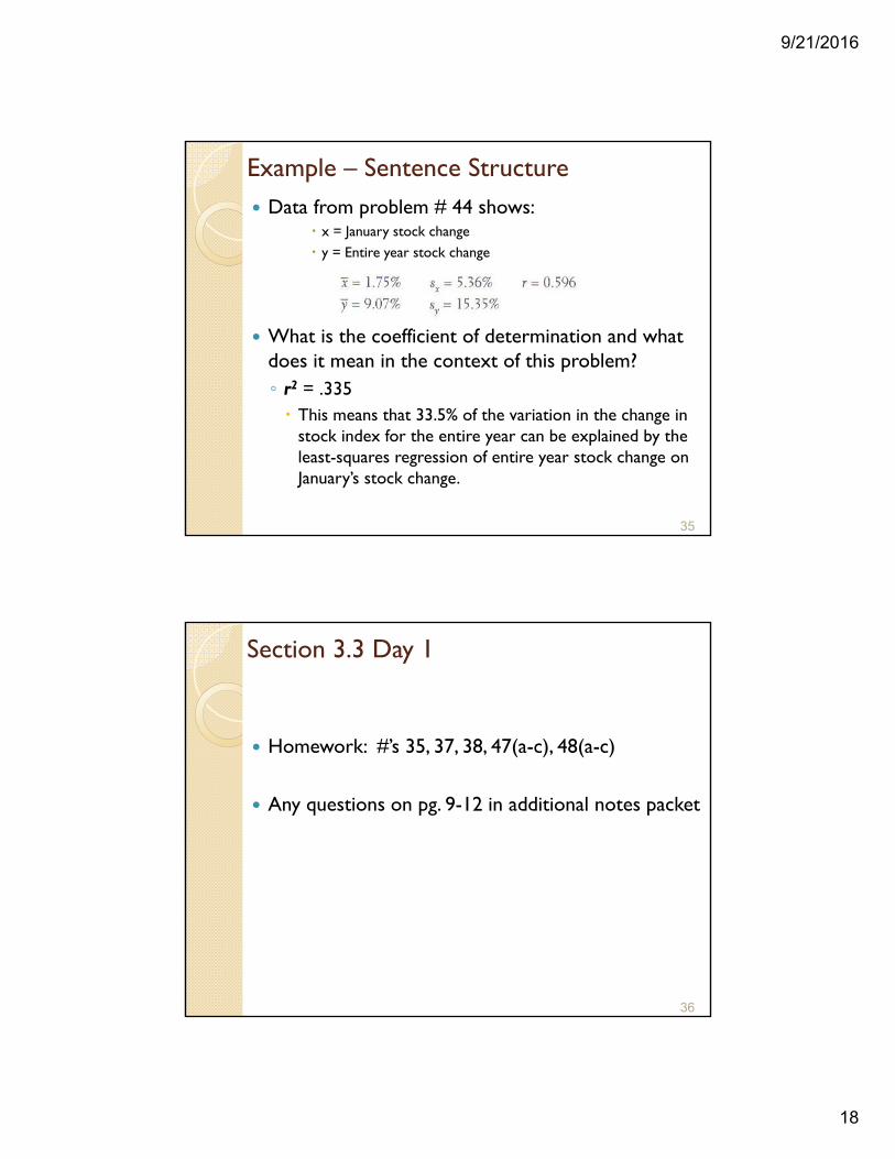
Example – Sentence Structure Data from problem # 44 shows:
x = January stock change y = Entire year stock change
What is the coefficient of determination and what does it mean in the context of this problem?◦ r2 = .335 This means that 33.5% of the variation in the change in
stock index for the entire year can be explained by the least-squares regression of entire year stock change on January’s stock change.
35
Section 3.3 Day 1
Homework: #’s 35, 37, 38, 47(a-c), 48(a-c)
Any questions on pg. 9-12 in additional notes packet
36
9/21/2016
19
3.3: Least-Squares Regression – Day 2 Residuals◦ Deviations from the overall pattern Measured as vertical distances
◦ Difference between an observed value of the response variable and the value predicted by the regression line Observed y – predicted
◦ The sum of the least-squares residuals are always zero
37
residual y y
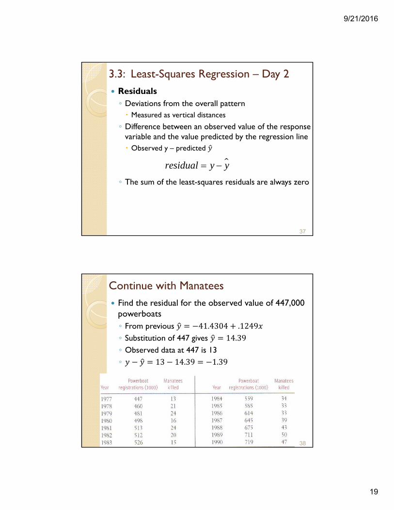
Continue with Manatees Find the residual for the observed value of 447,000
powerboats◦ From previous 41.4304 .1249◦ Substitution of 447 gives 14.39◦ Observed data at 447 is 13 ◦ 13 14.39 1.39
38
9/21/2016
20
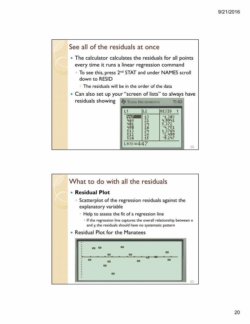
See all of the residuals at once The calculator calculates the residuals for all points
every time it runs a linear regression command◦ To see this, press 2nd STAT and under NAMES scroll
down to RESID The residuals will be in the order of the data
Can also set up your “screen of lists” to always have residuals showing
39
What to do with all the residuals Residual Plot◦ Scatterplot of the regression residuals against the
explanatory variable Help to assess the fit of a regression line If the regression line captures the overall relationship between x
and y, the residuals should have no systematic pattern
Residual Plot for the Manatees
40
9/21/2016
21
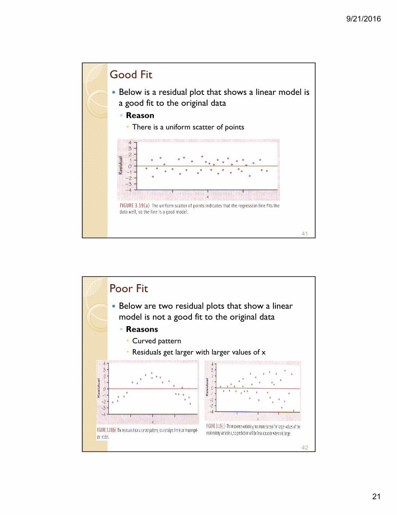
Good Fit Below is a residual plot that shows a linear model is
a good fit to the original data◦ Reason There is a uniform scatter of points
41
Poor Fit Below are two residual plots that show a linear
model is not a good fit to the original data◦ Reasons Curved pattern Residuals get larger with larger values of x
42
9/21/2016
22
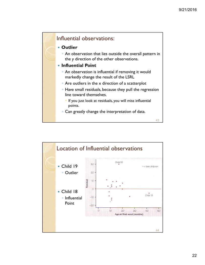
Influential observations: Outlier◦ An observation that lies outside the overall pattern in
the y direction of the other observations.
Influential Point◦ An observation is influential if removing it would
markedly change the result of the LSRL ◦ Are outliers in the x direction of a scatterplot◦ Have small residuals, because they pull the regression
line toward themselves. If you just look at residuals, you will miss influential
points.
◦ Can greatly change the interpretation of data.
43
Location of Influential observations
Child 19◦ Outlier
Child 18◦ Influential
Point
44
9/21/2016
23
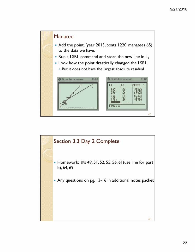
Manatee Add the point, (year 2013, boats 1220, manatees 65)
to the data we have. Run a LSRL command and store the new line in L2
Look how the point drastically changed the LSRL◦ But it does not have the largest absolute residual
45
Section 3.3 Day 2 Complete
Homework: #’s 49, 51, 52, 55, 56, 61(use line for part b), 64, 69
Any questions on pg. 13-16 in additional notes packet
46
9/21/2016
24
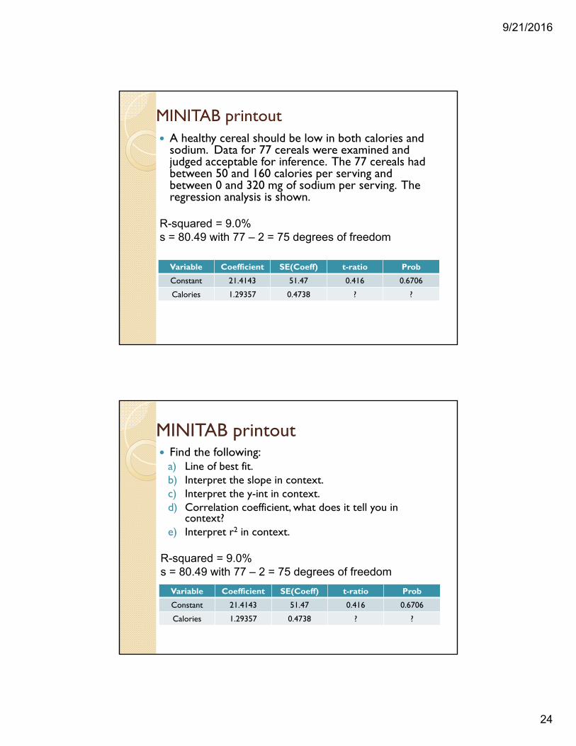
MINITAB printout A healthy cereal should be low in both calories and
sodium. Data for 77 cereals were examined and judged acceptable for inference. The 77 cereals had between 50 and 160 calories per serving and between 0 and 320 mg of sodium per serving. The regression analysis is shown.
R-squared = 9.0%s = 80.49 with 77 – 2 = 75 degrees of freedom
Variable Coefficient SE(Coeff) t-ratio Prob
Constant 21.4143 51.47 0.416 0.6706
Calories 1.29357 0.4738 ? ?
Find the following:a) Line of best fit.b) Interpret the slope in context.c) Interpret the y-int in context.d) Correlation coefficient, what does it tell you in
context?e) Interpret r2 in context.
MINITAB printout
R-squared = 9.0%s = 80.49 with 77 – 2 = 75 degrees of freedom
Variable Coefficient SE(Coeff) t-ratio Prob
Constant 21.4143 51.47 0.416 0.6706
Calories 1.29357 0.4738 ? ?
9/21/2016
25
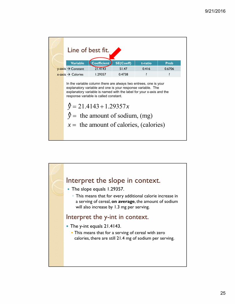
Line of best fit.
Variable Coefficient SE(Coeff) t-ratio Prob
Constant 21.4143 51.47 0.416 0.6706
Calories 1.29357 0.4738 ? ?
In the variable column there are always two entrees, one is your explanatory variable and one is your response variable. The explanatory variable is named with the label for your x-axis and the response variable is called constant.
x-axis
y-axis
21.4143 1.29357y x ^
the amount of sodium, (mg)y ^
the amount of calories, (calories)x
Interpret the y-int in context.
The slope equals 1.29357.◦ This means that for every additional calorie increase in
a serving of cereal, on average, the amount of sodium will also increase by 1.3 mg per serving.
Interpret the slope in context.
The y-int equals 21.4143. This means that for a serving of cereal with zero
calories, there are still 21.4 mg of sodium per serving.
9/21/2016
26
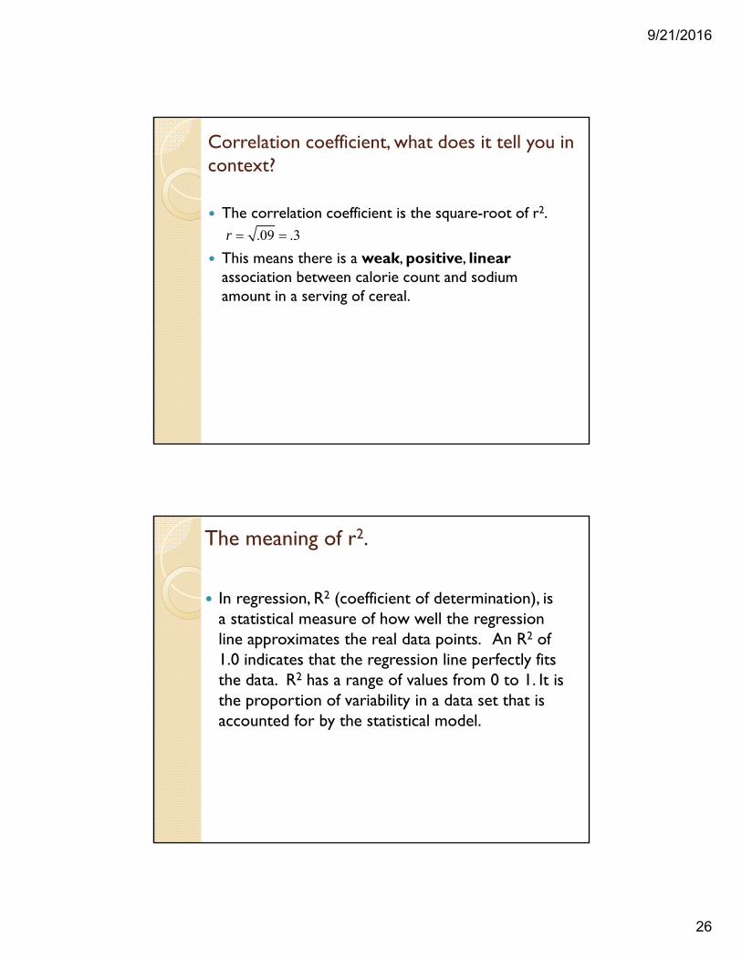
Correlation coefficient, what does it tell you in context?
The correlation coefficient is the square-root of r2.
This means there is a weak, positive, linearassociation between calorie count and sodium amount in a serving of cereal.
.09 .3r
The meaning of r2.
In regression, R2 (coefficient of determination), is a statistical measure of how well the regression line approximates the real data points. An R2 of 1.0 indicates that the regression line perfectly fits the data. R2 has a range of values from 0 to 1. It is the proportion of variability in a data set that is accounted for by the statistical model.
9/21/2016
27
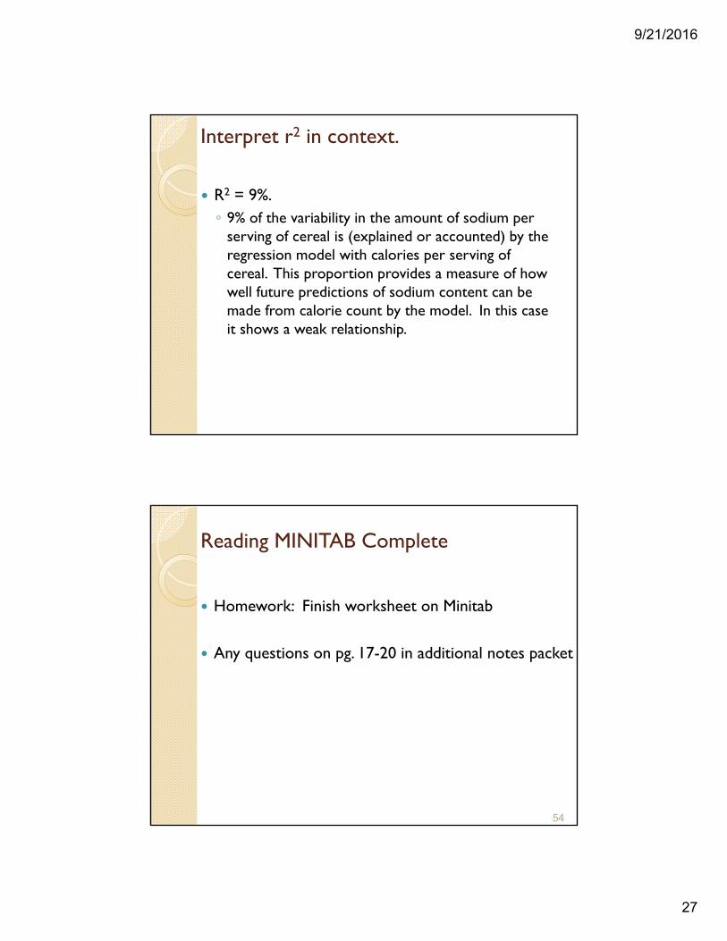
Interpret r2 in context.
R2 = 9%.◦ 9% of the variability in the amount of sodium per
serving of cereal is (explained or accounted) by the regression model with calories per serving of cereal. This proportion provides a measure of how well future predictions of sodium content can be made from calorie count by the model. In this case it shows a weak relationship.
Reading MINITAB Complete
Homework: Finish worksheet on Minitab
Any questions on pg. 17-20 in additional notes packet
54
9/21/2016
28
Chapter Review
55
56
9/21/2016
29
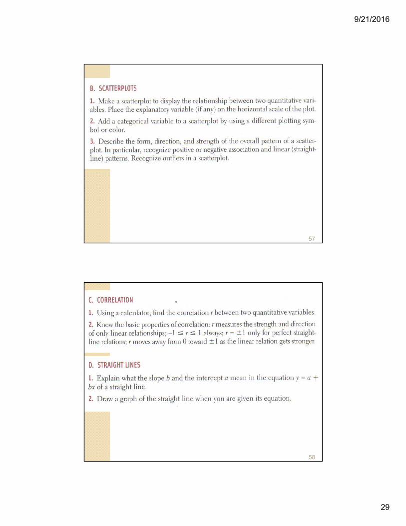
57
58

9/21/2016
30
59
Chapter 3 Complete
Homework: #’s 62, 63, 68a&b, 71
Any questions on pg. 21-24 in additional notes packet
60