Embed Size (px)
Citation preview

Chapter 3Examining Relationships
AP StatisticsHamilton/Mann
Introduction• A medical study finds that short women are more
likely to have heart attacks than women of average height, while tall women have the fewest heart attacks.
• An insurance group reports that heavier cars have fewer deaths per 100,000 vehicles than do lighter cars.
• These and many other statistical studies look at the relationship between two variables. Statistical relationships are overall tendencies, not ironclad rules. They allow individual exceptions.

Introduction• For example, smokers on average die younger than
non-smokers, but some smokers who smoke three packs a day live to be 90.
• To understand a statistical relationship between two variables, we measure both variables on the same individuals.
• Often we must measure other variables as well.• To conclude that shorter women have higher risk of
heart attacks, the researchers had to eliminate the effect of other variables such as weight and exercise habits.

Introduction• One thing to always remember is that the
relationship between two variables can be strongly influenced by other variables that are lurking in the background.
• When examining the relationship between two or more variables, ask these key questions:– Who are the individuals described by the data?– What are the variables?– Why were the data gathered?– When, where, how, and by whom were the data
produced?
Introduction• When we have data on several variables, categorical
variables are often present and of interest to us.• For example, a medical study may record each
subject’s sex and smoking status along with quantitative data such as weight, blood pressure and cholesterol levels.
• We may be interested in the relationship between two quantitative variables (weight and blood pressure), between a categorical and quantitative variable (sex and blood pressure) or between two categorical variables (sex and smoking status).
• This chapter focuses on quantitative variables.

Introduction• When you examine relationships among variables, a
new question becomes important– Do you want simply to explore the nature of the
relationship, or do you think that some of the variables help explain or even cause changes in the others?
• This gets to the idea of response and explanatory variables.
• Explanatory variables are often called independent variables and response dependent variables.

Introduction• Prediction requires that we identify an explanatory
and response variable.• Remember that calling one variable explanatory and
the other a response does not mean that changes in one cause changes in the other.
• To examine the data we will do the following:1. Plot the data and compute numerical summaries.2. Look for overall patterns and deviations from these
patterns.3. When the pattern is quite regular, use a compact
mathematical model to describe it.

CHAPTER 3 SECTION 1Scatterplots and Correlation
HW: 3.21, 3.22, 3.23, 3.25

Scatterplots• The most effective way to display the relationship between two
quantitative variables is a scatterplot.
• Tips for drawing scatterplots by hand:1. Plot the explanatory variable on the horizontal axis (x-axis). The
explanatory variable is usually called x and the response variable is usually called y.
2. Label both axes.3. Scale the horizontal and vertical axes. The intervals must be
uniform; that is, the distance between tick marks must be the same.
4. If you are given a grid, try to use a scale so your plot uses the whole grid. Make the plot large enough so details can be seen.
State SAT Math Scores• More than a million high school seniors take the SAT
each year. We sometimes see state school systems “rated” by the average SAT score of their seniors. This is not proper because the percent of high school seniors who take the SAT varies from state to state. Let’s examine the relationship between the percents of a state’s high school seniors who took the exam in 2005 and the mean SAT score in the state that year.
• We think that percent taking will cause some change in the mean score. So percent taking will be the explanatory variable (on the x-axis) and mean score will be the response variable (on the y-axis). The scatterplot is on the next slide.

State SAT Math Scores
Continue! Go back!

Interpreting Scatterplots• To interpret a scatterplot, look for patterns and any
important deviations from those patterns.
• What patterns did we see in the State SAT Math Scores scatterplot?
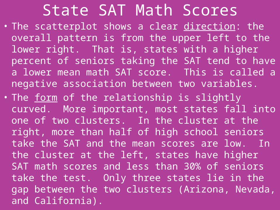
State SAT Math Scores• The scatterplot shows a clear direction: the overall
pattern is from the upper left to the lower right. That is, states with a higher percent of seniors taking the SAT tend to have a lower mean math SAT score. This is called a negative association between two variables.
• The form of the relationship is slightly curved. More important, most states fall into one of two clusters. In the cluster at the right, more than half of high school seniors take the SAT and the mean scores are low. In the cluster at the left, states have higher SAT math scores and less than 30% of seniors take the test. Only three states lie in the gap between the two clusters (Arizona, Nevada, and California).

State SAT Math Scores• What explains the clusters?
– There are two tests students can take for acceptance into college: the SAT and the ACT. The cluster at the left are states that tend to prefer the ACT while the cluster at the right are states that prefer the SAT. The students in ACT states who take the SAT tend to be students who are applying to highly selective colleges. Therefore, the mean SAT score for these states is higher because the mean score for the best students will be higher than that for all students.
State SAT Math Scores• The strength of a relationship in a scatterplot is
determined by how closely the points follow a clear form. For our example, is only moderately strong because states with the same percent taking the SAT show quite a bit of scatter in their mean scores.
• Are there any deviations from the pattern?• West Virginia, where 20% of high school seniors
take the SAT, but the mean SAT Math score is only 511 stands out. This point is an outlier.

Beer and Blood Alcohol• How well does the number of beers a student
drinks predict his or her blood alcohol content (BAC)? Sixteen student volunteers at The Ohio State University drank a randomly assigned number of cans of beer. Thirty minutes later, a police officer measured their BAC. The data are below.
Student: 1 2 3 4 5 6 7 8
Beers: 5 2 9 8 3 7 3 5
BAC: 0.10 0.03 0.19 0.12 0.04 0.095 0.07 0.06
Student: 9 10 11 12 13 14 15 16
Beers: 3 5 4 6 5 7 1 4
BAC: 0.02 0.05 0.07 0.10 0.085 0.09 0.01 0.05
Beer and Blood Alcohol• The students were equally divided between men
and women and differed in weight and drinking habits.
• Because of this variation, many students don’t believe that number of drinks will predict BAC well? What do the data say?
Beer and Blood Alcohol

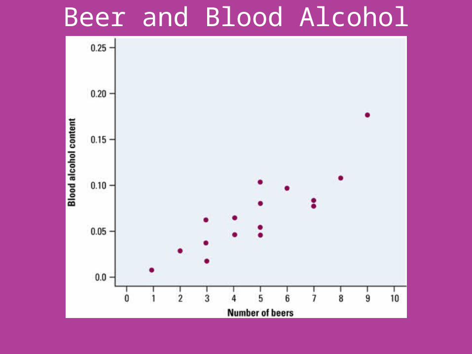
Beer and Blood Alcohol• The scatterplot shows a fairly strong positive
association. Generally, more beers consumed will results in a higher BAC.
• The form of this relationship is linear. That is the points lie in a straight-line pattern.
• It is a fairly strong relationship because the points fall pretty close to a line, with relatively little scatter.
• If we know how many beers a student has consumed, we can predict BAC quite accurately from the scatterplot.

• Not all relationships have a simple form and a clear direction that we can describe as positive association or negative association.

Adding Categorical Variables to Scatterplots• The South has long lagged behind the rest of the
country in the performance of its schools. Efforts to improve our education have reduced the gap. We wonder if the south stands out in the study of average SAT math scores.
• To observe this relationship, we will plot the 12 southern states in blue and observe what happens.
• Most of the southern states blend in with the rest of the country. Several southern states do lie at the lower edges of their clusters. Florida, Georgia, South Carolina, and West Virginia have lower SAT math scores than we would expect from their percent of high school seniors who take the examination.

Adding Categorical Variables to Scatterplots• Dividing the states into “southern” and
“nonsouthern” introduces a third variable into the scatterplot.
• This is a categorical variable that has only two values.
• The two values are displayed by the two different plotting colors.
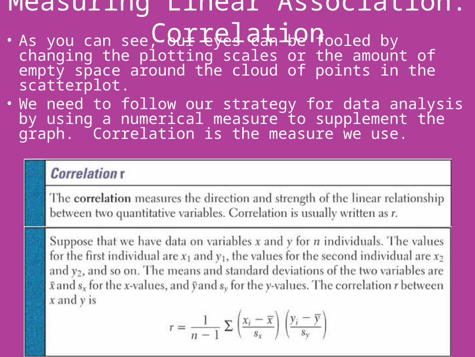
Measuring Linear Association: Correlation• A scatterplot displays the direction, form, and
strength of the relationship between two quantitative variables.
• Linear relations are particularly important because a straight line is a simple pattern that is quite common.
• We say a linear relation is quite strong if the points lie close to a straight line, and weak if they are widely scattered about a line.
• Unfortunately, our eyes are not good judges of how strong a linear relationship is.
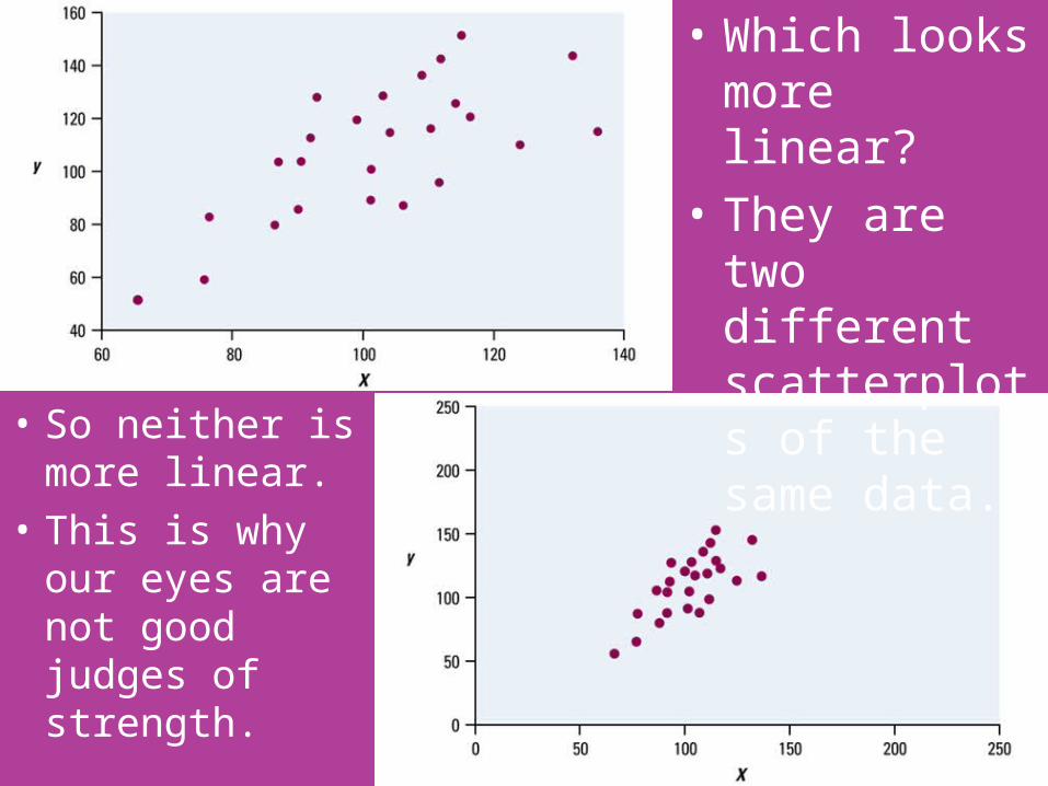
• So neither is more linear.
• This is why our eyes are not good judges of strength.
• Which looks more linear?
• They are two different scatterplots of the same data.
Measuring Linear Association: Correlation• As you can see, our eyes can be fooled by changing the
plotting scales or the amount of empty space around the cloud of points in the scatterplot.
• We need to follow our strategy for data analysis by using a numerical measure to supplement the graph. Correlation is the measure we use.

Measuring Linear Association: Correlation• Notice that the two terms inside the summation
notation, are just standardized values for x and y.
• The formula helps us to see what correlation is, but, in practice, is much too difficult to calculate by hand. Instead we will find correlation on the calculator.
• Input the following in list 1 and list 2.
Body Weight (lb): 120 187 109 103 131 165 158 116
Bacpack Weight (lb): 26 30 26 24 29 35 31 28
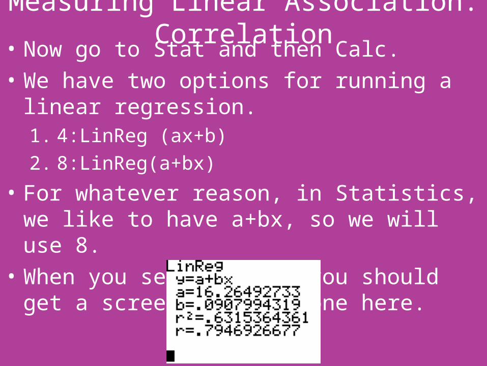
Measuring Linear Association: Correlation• Now go to Stat and then Calc.• We have two options for running a linear
regression.1. 4:LinReg (ax+b)2. 8:LinReg(a+bx)
• For whatever reason, in Statistics, we like to have a+bx, so we will use 8.
• When you select this, you should get a screen like the one here.

Measuring Linear Association: Correlation• If you did not get the r and r2, then we need to fix a
setting on your calculator.• To do this:
1. click the 2nd key and then 0 to go to Catalog2. Click on the D (it’s above x-1)3. Scroll down to Diagnostic On and click enter4. Hit enter again5. Now do the LinReg(a+bx) again and it should all be
there.

Facts about Correlation• The formula for correlation helps us see that r is
positive when there is a positive association between the variables.
• Height and weight, for example, have a positive association. People who are above average in height tend to be above average in weight.
• Let’s play with a correlation applet.

Facts about Correlation• Here is what you need to know in order to interpret
correlation.1. Correlation makes no distinction between explanatory
and response variable. It makes no difference which variable you call x and y in calculating the correlation.
2. Because r uses the standardized values of the observations, r does not change when we change the units of measurement of x, y, or both. Measuring height in centimeters rather than inches and weight in kilograms rather than pounds does not change the correlation between height and weight. The correlation r itself has no unit of measurement; it is just a number.
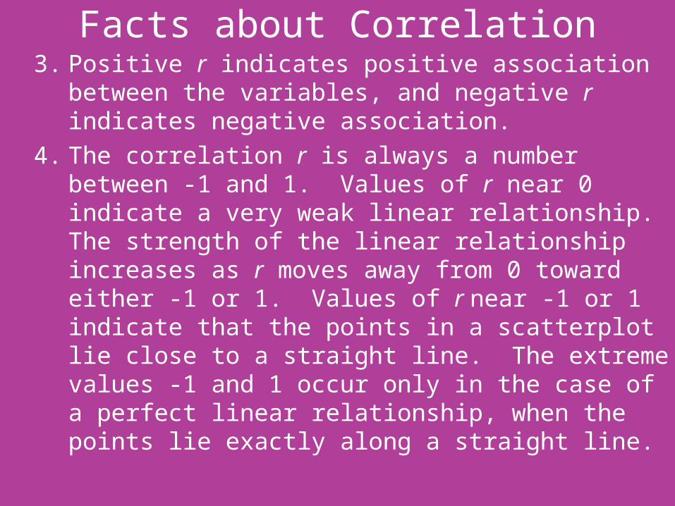
Facts about Correlation3. Positive r indicates positive association between the
variables, and negative r indicates negative association.4. The correlation r is always a number between -1 and 1.
Values of r near 0 indicate a very weak linear relationship. The strength of the linear relationship increases as r moves away from 0 toward either -1 or 1. Values of r near -1 or 1 indicate that the points in a scatterplot lie close to a straight line. The extreme values -1 and 1 occur only in the case of a perfect linear relationship, when the points lie exactly along a straight line.
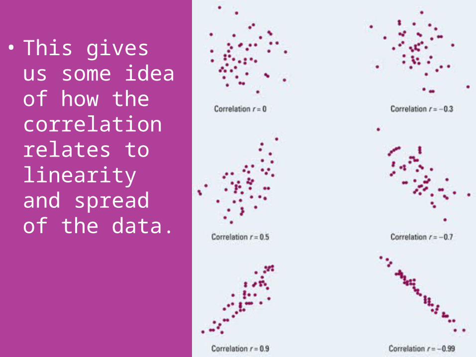
• This gives us some idea of how the correlation relates to linearity and spread of the data.

Facts about Correlation• Describing the relationship between two variables is
more complex than describing the distribution of one variable. Here are some cautions to keep in mind.1. Correlation requires that both variables be
quantitative, so it makes sense to do the arithmetic indicated by the formula for r.
2. Correlation describes the strength of only the linear relationship between variables. Correlation does not describe curved relationships between variables, no matter how strong they are.
Facts about Correlation3. Like the mean and standard deviation, the correlation
is not resistant: r is strongly affected by a few outlying observations.
4. Correlation is not a complete summary of two-variable data, even when the relationship between two variables is linear. You should give the means and standard deviations of both x and y along with the correlation.
• Because the formula for correlation uses the means and standard deviations, these measures are the proper choice to accompany a correlation.
Scoring Figure Skaters• Two judges, Pierre and Elena, have awarded scores
for many figure skaters. Our question is how well do they agree.
• We calculate that the correlation between their scores is r = 0.9, but the mean of Pierre’s scores is 0.8 point lower than Elena’s mean.
• The mean score shows that Pierre awards lower scores than Elena, but because he gives about 0.8 point lower than Elena, the correlation remains high.
• Adding the same number to all values of x or y does not change the correlation.
Scoring Figure Skaters• If both judges score the same skaters, the
competition is scored consistently because Pierre and Elena agree on which performances are better than others.
• But if Pierre scores some skaters and Elena others, we must add 0.8 point to Pierre’s scores to arrive at a fair comparison.

Word of Warning• Even giving means, standard deviations, and
correlation for “state SAT math scores” and “percent taking” will not point out the clusters that we saw in the scatterplot.
• Numerical summaries complement plots of data, but they do not replace them.

CHAPTER 3 SECTION 2Least-Squares Regression Line
HW: 3.29, 3.30, 3.32, 3.34, 3.35 due Thursday3.40, 3.41, 3.43, 3.44, 3.46 due Tuesday after spring break!!! Along with section 1 quizzes

Least-Squares Regression• Linear (straight-line) relationships between two
quantitative variables are easy to understand and are quite common.
• In Section 1, we found linear relationships in settings as varied as sparrowhawk colonies, sodium and calories in hot dogs, and blood alcohol levels.
• Correlation measures the strength and direction of these relationships.
• When a scatterplot shows a linear relationship, we would like to summarize the overall pattern by drawing a line on the scatterplot.
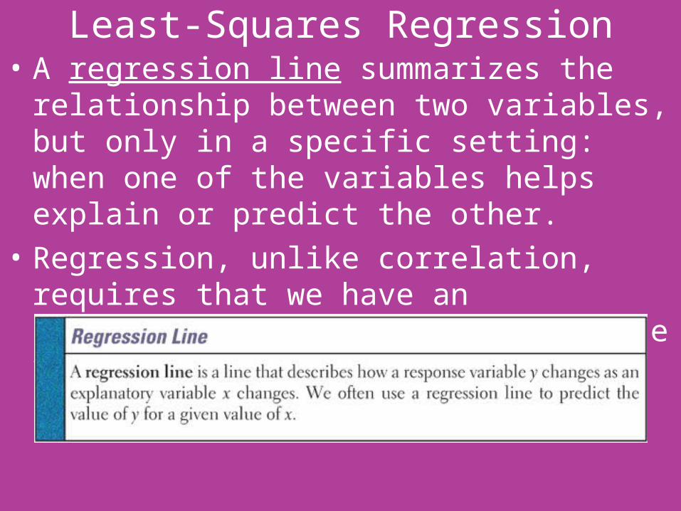
Least-Squares Regression• A regression line summarizes the relationship
between two variables, but only in a specific setting: when one of the variables helps explain or predict the other.
• Regression, unlike correlation, requires that we have an explanatory variable and a response variable.
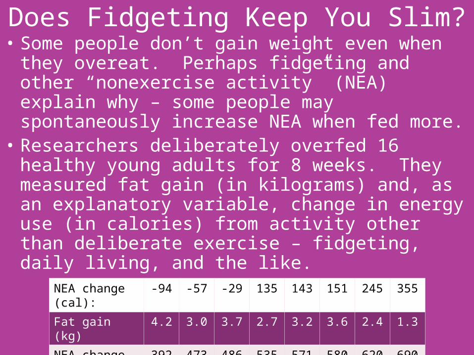
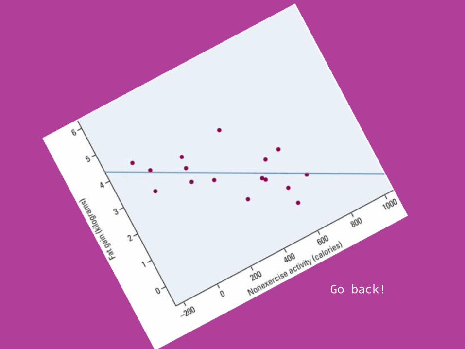
Does Fidgeting Keep You Slim?• Some people don’t gain weight even when they
overeat. Perhaps fidgeting and other “nonexercise activity” (NEA) explain why – some people may spontaneously increase NEA when fed more.
• Researchers deliberately overfed 16 healthy young adults for 8 weeks. They measured fat gain (in kilograms) and, as an explanatory variable, change in energy use (in calories) from activity other than deliberate exercise – fidgeting, daily living, and the like.
NEA change (cal): -94 -57 -29 135 143 151 245 355
Fat gain (kg) 4.2 3.0 3.7 2.7 3.2 3.6 2.4 1.3
NEA change (cal): 392 473 486 535 571 580 620 690
Fat gain (kg) 3.8 1.7 1.6 2.2 1.0 0.4 2.3 1.1

Does Fidgeting Keep You Slim?1. Who? The individuals are 16 healthy young adults
who participated in a study on overeating.2. What? The explanatory variable is change in NEA
(in calories), and the response variable is fat gain (kilograms).
3. Why? Researchers wondered whether changes in fidgeting and other NEA would help explain weight gain in individuals who overeat.
4. When, Where, How, and By Whom? The data come from a controlled experiment in which subjects were forced to overeat for an 8-week period. The results of the study were published in Science magazine in 1999.
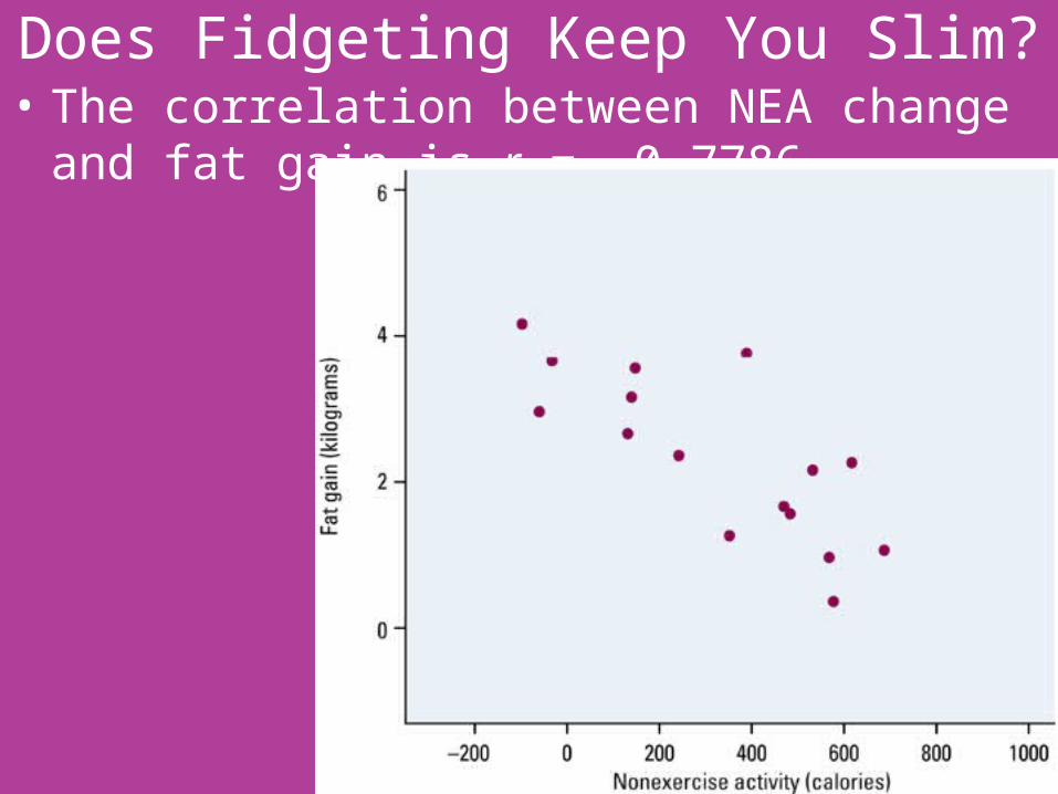
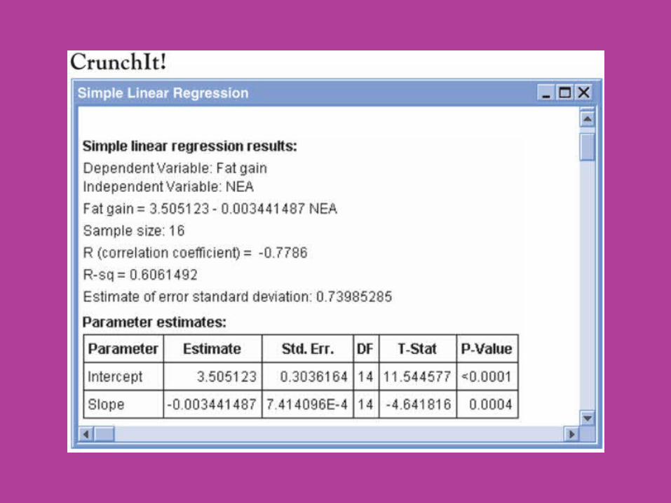
Does Fidgeting Keep You Slim?• The correlation between NEA change and fat gain is
r = -0.7786.

Does Fidgeting Keep You Slim?• Interpretation: the scatterplot shows a moderately
strong negative linear association between NEA change and fat gain, with no outliers.
• People with larger increases in NEA do indeed gain less fat.
• A line drawn through the points will describe the overall pattern well. This is what we wish to learn to do in this section.
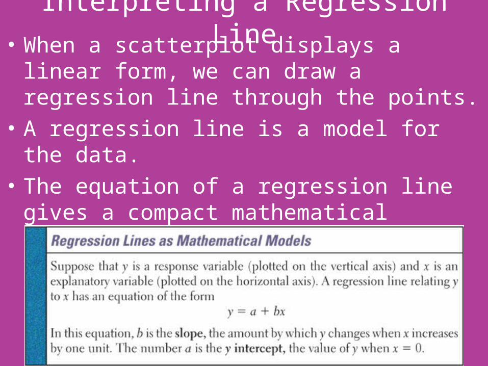
Interpreting a Regression Line• When a scatterplot displays a linear form, we can
draw a regression line through the points.• A regression line is a model for the data.• The equation of a regression line gives a compact
mathematical description of what this model tells us about the dependence of the response variable y on the explanatory variable x.
Interpreting a Regression Line• Although you are familiar with the form y = mx + b
for the equation of a line from algebra, statisticians have adopted y = a + bx as the form for the equation of the regression line.
• We will also adopt this form too, so we will be consistent with notation that is used by others.

Does Fidgeting Keep You Slim?• Any straight line describing the nonexercise activity
data has the formfat gain = a + b(NEA change)
• In the plot below, the regression line with equation fat gain = 3.505 – 0.00344(NEA change)
has been drawn.• The plot shows that the
line fits the data well.• Go back!• Go back!
Does Fidgeting Keep You Slim?• Interpreting Slope
– The slope b = -0.00344 tells us that fat gained goes down by 0.00344 kilogram for each added calorie of NEA, according to this linear model.
– The slope of a regression line y = a +bx is the predicted rate of change in the response y as the explanatory variable x changes.
– The slope of the regression line is an important numerical description of the relationship between two variables.
Does Fidgeting Keep You Slim?• Interpreting the y-intercept
– The y-intercept, a = 3.505 kilograms, is the fat gain estimated by this model if NEA does not change when a person overeats.
– Although we need the value of the y-intercept to draw the line, it is statistically meaningful only when x can actually take values close to zero.
Does Fidgeting Keep You Slim?• The slope b = -0.00344 is small for our example.• This does not mean that change in NEA has little
effect on fat gain. The size of a regression slope depends on the units in which we measure the two variables.
• For our example, the slope is the change in kilograms when NEA increases by 1 calorie.
• There are 1000 grams in a kilogram. So if we measured in grams instead, the slope would be 1000 times larger or b =-3.44.
• The point is, you cannot say how important a relationship is by looking at how big the regression slope is.

Prediction• We can use a regression line to predict the response y
for a specific value of the explanatory variable x.• For our example, we want to use the regression line to
predict the fat gain for an individual whose NEA increase by 400 calories when she overeats.
• The easiest, and most accurate, way to do this is to substitute x = 400 into the regression equation.
• The predicted fat gain is fat gain = 3.505 – 0.00344(400) = 2.13 kilograms
• The accuracy of predictions from a regression line depends on how much scatter about the line the data shows. Our scatterplot shows that similar changes in NEA show a spread of 1 or 2 kilograms in fat gain.
• The regression line summarizes the pattern but gives only roughly accurate predictions.

Prediction• Can we predict the fat gain for someone whose NEA
increases by 1500 calories when she overeats?• Obviously we can substitute x = 1500 into the
equation.• The prediction is
fat gain = 3.505 – 0.00344(1500) = -1.66 kilograms• That is, we predict that this individual will lose
weight when she overeats. This prediction makes no sense.
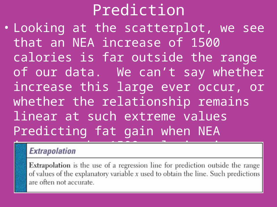
Prediction• Looking at the scatterplot, we see that an NEA
increase of 1500 calories is far outside the range of our data. We can’t say whether increase this large ever occur, or whether the relationship remains linear at such extreme values Predicting fat gain when NEA increases by 1500 calories is an extrapolation of the relationship beyond what the data show.
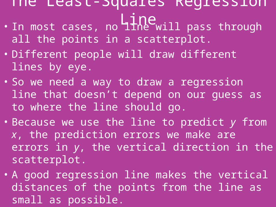
The Least-Squares Regression Line• In most cases, no line will pass through all the
points in a scatterplot.• Different people will draw different lines by eye.• So we need a way to draw a regression line that
doesn’t depend on our guess as to where the line should go.
• Because we use the line to predict y from x, the prediction errors we make are errors in y, the vertical direction in the scatterplot.
• A good regression line makes the vertical distances of the points from the line as small as possible.
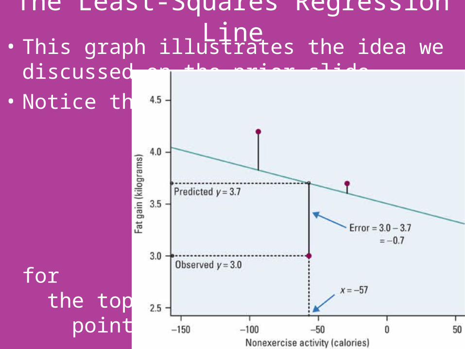
The Least-Squares Regression Line• This graph illustrates the idea we discussed on the
prior slide.• Notice that
if we move the line down, we would
increase the distance for
the top two points.

The Least-Squares Regression Line• There are many ways to make the collection of
vertical distances “as small as possible.”• The most common is the “least-squares” method.• The line for the NEA and weight gain example was
the least-squares regression line.
• The next slide has a visual representation of this idea using hiker weight and backpack weight from a problem in the book.

The Least-Squares Regression Line• The least-squares regression line shown minimizes
the sum of the squared vertical distances of the points from the line to 30.90. No other line would give a smaller sum of squared errors.
• What is the equation of the least-squares regression line?
• Is it the same equation we got on the calculator?
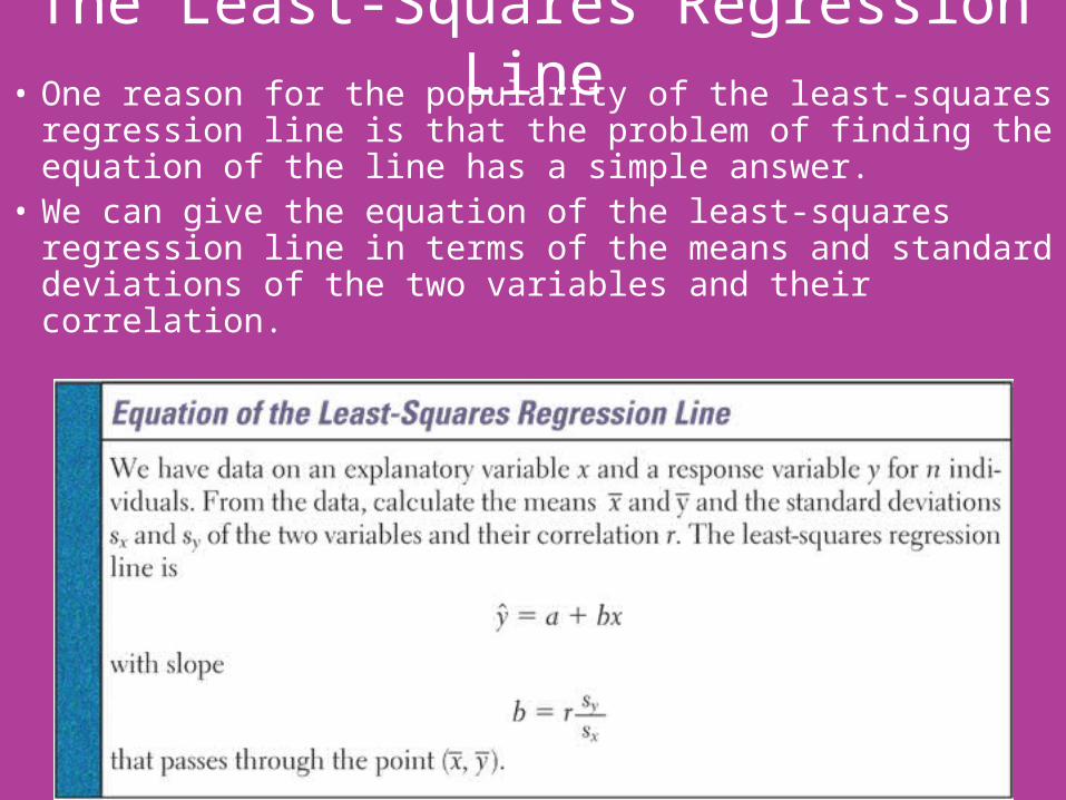
The Least-Squares Regression Line• One reason for the popularity of the least-squares
regression line is that the problem of finding the equation of the line has a simple answer.
• We can give the equation of the least-squares regression line in terms of the means and standard deviations of the two variables and their correlation.
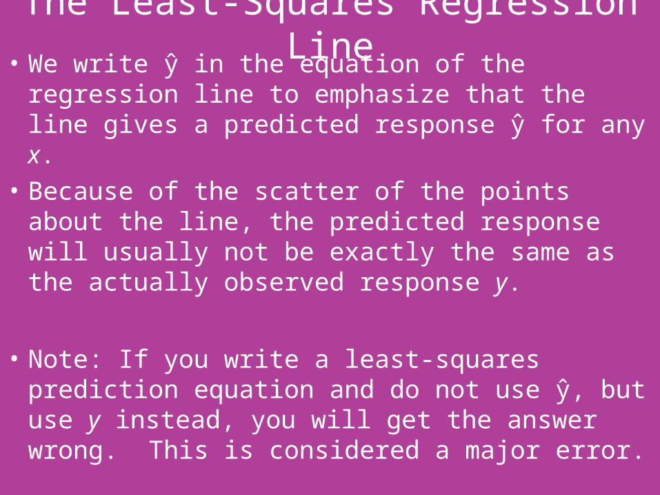
The Least-Squares Regression Line• We write ŷ� in the equation of the regression line to emphasize that the line gives a predicted response ŷ� for anŷ x.• Because of the scatter of the points about the line, the predicted response will usuallŷ not be exactlŷ the same as the actuallŷ observed response ŷ.• Note: If ŷou write a least-squares prediction equation and do not use ŷ�, but use ŷ instead, ŷou will get the answer wrong. This is considered a major error.
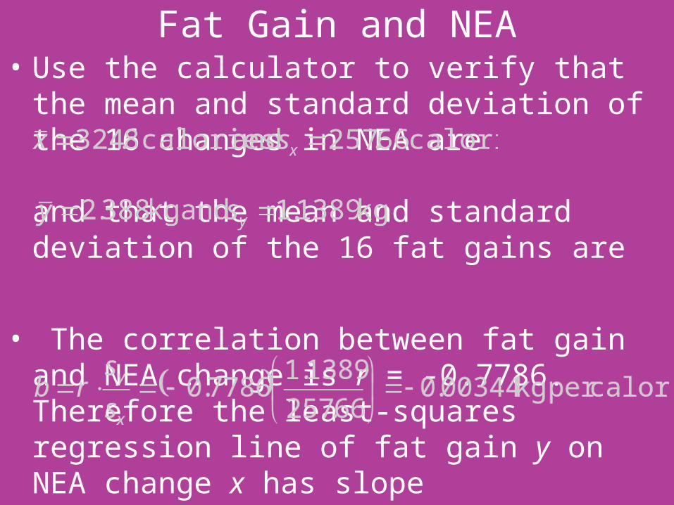
Fat Gain and NEA• Use the calculator to verify that the mean and
standard deviation of the 16 changes in NEA are and that the mean and standard deviation of the 16 fat gains are
• The correlation between fat gain and NEA change is r = -0.7786. Therefore the least-squares regression line of fat gain y on NEA change x has slope
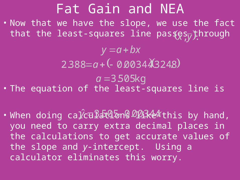
Fat Gain and NEA• Now that we have the slope, we use the fact that
the least-squares line passes through
• The equation of the least-squares line is
• When doing calculations like this by hand, you need to carry extra decimal places in the calculations to get accurate values of the slope and y-intercept. Using a calculator eliminates this worry.
Using Technology• In practice, we do not have to calculate the means,
standard deviations, and correlation first.• The calculator will give the slope b and intercept a
of the least-squares line from keyed in values of the variables x and y.
• This allows us to concentrate on understanding and using the regression line.
• Some software output are given on the next slides.


How Well the Line Fits the Data: Residuals• One of the first principles of data analysis is to look
for an overall pattern and also for striking deviations from the pattern.
• A regression line describes the overall pattern of a linear relationship between an explanatory variable and a response variable.
• We see deviations from this pattern by looking at the scatter of the data points about the regression line.
• The vertical distances from the points to the least-squares regression line are as small as possible, in the sense that they have the smallest possible sum of squares.

How Well the Line Fits the Data: Residuals• Because they represent “leftover” variation in the
response after fitting the regression line, these distances are called residuals.

Fat Gain and NEA• The graph below is the scatterplot of the NEA and
fat gain data with the least-squares regression line superimposed on it.
Go back!

Residuals: Fat Gain and NEA• For one subject, NEA rose by 135 calories while the
subject gained 2.7 kg.• The predicted gain for 135 calories would be
• So the residual for this subject would be

Residuals: Fat Gain and NEA• The residual for this subject was negative because
the data point lies below the LSRL.• The 16 data points used in calculating the least-
squares line produce 16 residuals. Rounded to two decimal places, they are
Most graphing calculators will calculate and store these residuals for you.
• Because the residuals show how far the data are from the regression line, examining the residuals helps assess how well the line describes the data.
0.37 -0.70 0.10 -0.34 0.19 0.61 -0.26 -0.98
1.64 -0.18 -0.23 0.54 -0.54 -1.11 0.93 -0.03

Residuals: Fat Gain and NEA• Residuals can be calculated from any model that is
fitted to a line. The residuals from a least-squares line have a special property: the sum of the least-squares residuals is always zero.
• You can see the residuals by looking at the scatterplot. This, however, is a little difficult. It’s easier to see if we can rotate the graph.
• A residual plot makes it easier to study the residuals by plotting them against the explanatory variable.
• Because the mean of the residuals is always zero, the horizontal line at zero helps to orient us. This horizontal line corresponds to the regression line.
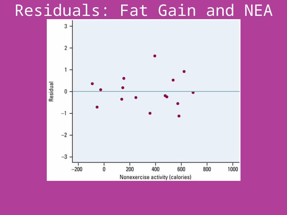
Residuals: Fat Gain and NEA

Residual Plots
• The residual plot magnifies the deviations from the line to make the patterns easier to see.
• If the regression line captures the overall pattern of the data, there should be no pattern in the residuals.
• Let’s look at two residual plots to better understand this point.
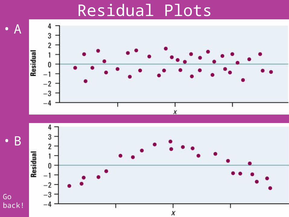
Residual Plots• A
• B
Go back!

Residual Plots• Two important things to look for when you examine a
residual plot.1. The residual plot should show no obvious pattern.
• A curved pattern shows that the relationship is not linear. This was like plot B on the prior slide. In this case, a straight line may not be the best model for the data.
• Increasing (or decreasing) spread about the line as x increases indicates that prediction of y will be less accurate for larger x (for smaller x). An example is below.

Residual Plots2. The residuals should be relatively small in size. A
regression line in a model that fits the data well should come “close” to most of the points. That is, the residuals should be fairly small. How do we decide if the residuals are “small enough”? We consider the size of a “typical” prediction error.
• For the fat gain and NEA data, almost all of the residuals are between –0.7 and 0.7. For these individuals, the predicted fat gain is within 0.7 kg of their actual fat gain during the study. This sounds pretty good.
• The subjects, however, gained only between 0.4 kg and 4.2 kg. So a prediction error of 0.7 kg is relatively large compared with the actual fat gain for an individual.
• The largest residual, 1.64, corresponds to a prediction error of 1.64 kg. This subject’s actual fat gain was 3.8 kg, but the regression line only predicted a gain of 2.16 kg. That’s a pretty large error!

Residual Plots• A commonly used measure of typical prediction
error is the standard deviation of the residuals, which is given by
• For the NEA and fat gain data,
• Researchers would have to decide whether they would feel comfortable using this linear model to make predictions that might be consistently “off” by 0.74 kg.
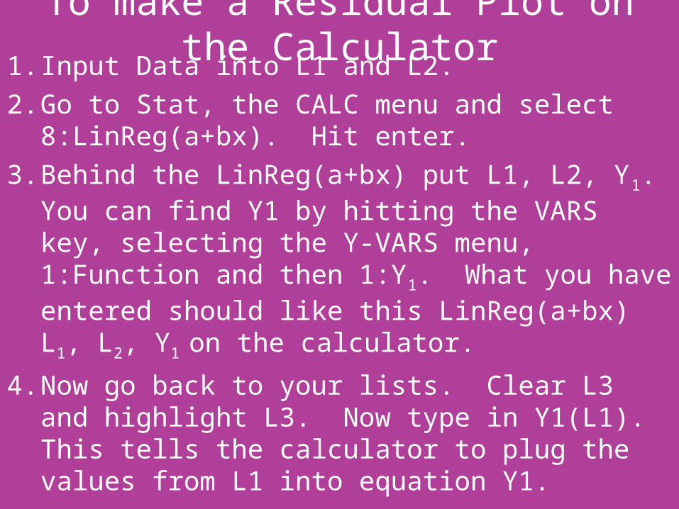
To make a Residual Plot on the Calculator1. Input Data into L1 and L2.2. Go to Stat, the CALC menu and select
8:LinReg(a+bx). Hit enter.3. Behind the LinReg(a+bx) put L1, L2, Y1. You can
find Y1 by hitting the VARS key, selecting the Y-VARS menu, 1:Function and then 1:Y1. What you have entered should like this LinReg(a+bx) L1, L2, Y1
on the calculator.4. Now go back to your lists. Clear L3 and highlight
L3. Now type in Y1(L1). This tells the calculator to plug the values from L1 into equation Y1.
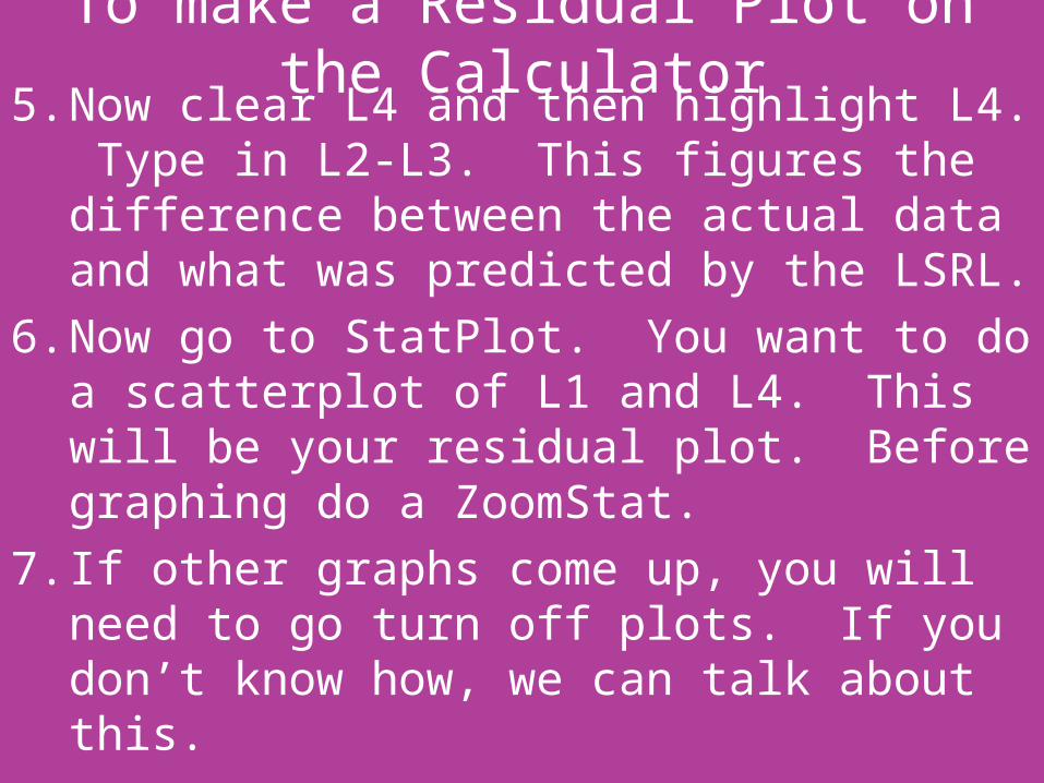
To make a Residual Plot on the Calculator5. Now clear L4 and then highlight L4. Type in L2-L3.
This figures the difference between the actual data and what was predicted by the LSRL.
6. Now go to StatPlot. You want to do a scatterplot of L1 and L4. This will be your residual plot. Before graphing do a ZoomStat.
7. If other graphs come up, you will need to go turn off plots. If you don’t know how, we can talk about this.
The Role of r2 in Regression• We also have a numerical value that helps us
determine how well the least-squares line does at predicting values of the response variable y.
• This value is r2, the coefficient of determination.• Some computer packages call it “R-sq.”• r2 is the square of r, the correlation, but it tells us
much more than that.• What if our least-squares line does not help predict
the values of the response variable y as x changes?• Then our best guess would be the mean of y.
The Role of r2 in Regression• The idea of r2 is this: how much better is the least-
squares line at predicting responses y than if we just used as our predictor for every point?
• For each point, we could ask: Which comes closer to the actual y-value, the least-squares line or the horizontal line Then we could count how many times each was closer, and declare a “winner.”
• This approach, however, does not take into account how much better one line is than the other.
• r2 does take into account how much better one line is than the other.
The Role of r2 in Regression
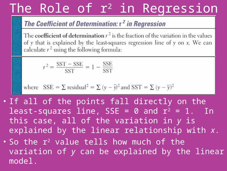
• If all of the points fall directly on the least-squares line, SSE = 0 and r2 = 1. In this case, all of the variation in y is explained by the linear relationship with x.
• So the r2 value tells how much of the variation of y can be explained by the linear model.

Fat Gain and NEA• Let’s look back at our example.• What was r2? How can we find it?• It was 0.606.• What does this mean?• About 61% of the variation in y among the
individual subjects is due to the straight-line relationship between y and x.

Facts about Least-Squares Regression• One reason for the popularity of LSRLs is that they
have many convenient special properties. Here is a summary of several important facts about LSRLs.1. The distinction between explanatory and response
variable is essential in regression because the LSRL minimizes distances only in the y direction. If we reverse the role of the two variables, we would get a different LSRL.
2. There is a close connection between correlation and the slope of the least-squares line. The slope is
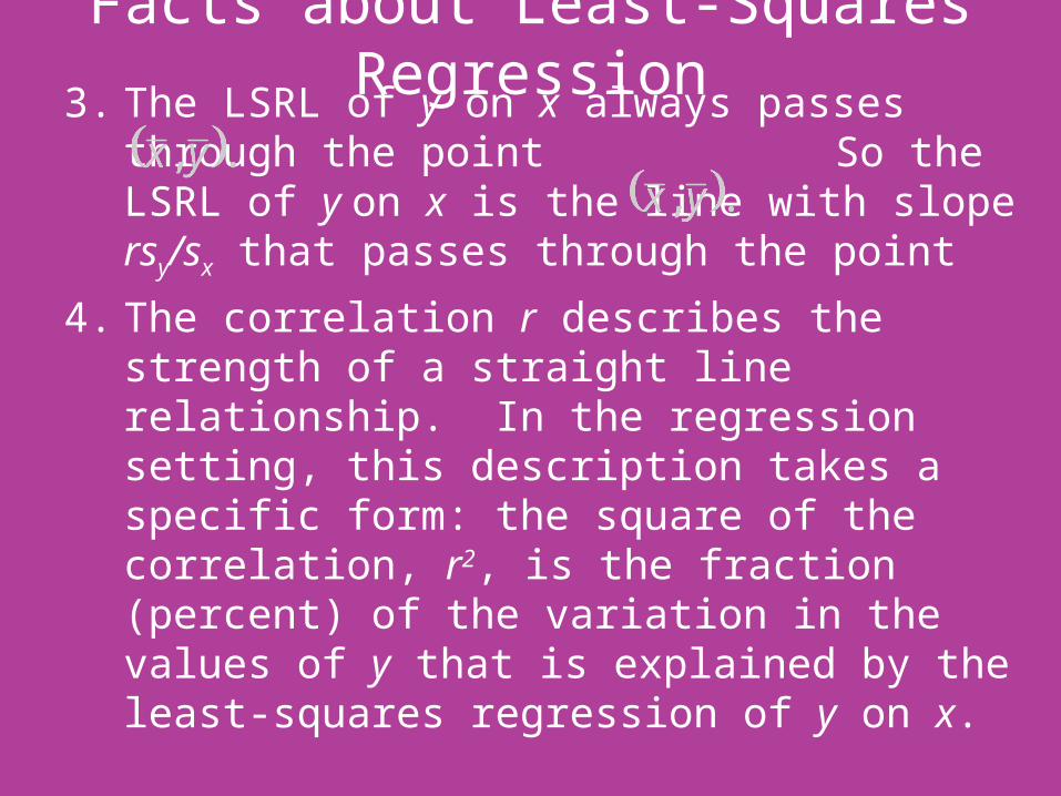
Facts about Least-Squares Regression3. The LSRL of y on x always passes through the point
So the LSRL of y on x is the line with slope rsy/sx that passes through the point
4. The correlation r describes the strength of a straight line relationship. In the regression setting, this description takes a specific form: the square of the correlation, r2, is the fraction (percent) of the variation in the values of y that is explained by the least-squares regression of y on x.
CHAPTER 3 SECTION 3Correlation and Regression Wisdom
HW: 3.59, 3.60, 3.62, 3.64, 3.65, 3.70
Correlation and Regression• Correlation and regression are powerful tools for
describing the relationship between two variables. When you use these tools, remember that they have limitations that we’ve already discussed:– Correlation and regression describe only linear
relationships. The calculations can be done for any two quantitative variables, but the results are only useful if the scatterplot shows a linear pattern.
– Extrapolation often produces unreliable predictions.– Correlation is not resistant. Always plot your data and look
for unusual observations before you interpret correlation.• Here are some other cautions to keep in mind when
you apply correlation and regression or read accounts of their use.

Look for Outliers and Influential Observations• We already know that the correlation r is not
resistant. One unusual point in a scatterplot can greatly change the value of r.
• Is the least-squares line resistant? The example on the next few slides should shed some light on this question.

Talking Age and Mental Ability• We wonder if the age (in months) at which a child
begins to talk can predict the child’s later score on a test of mental ability.
• A study recorded this information for 21 children. The data are listed below.
Child Age Score Child Age Score Child Age Score
1 15 95 8 11 100 15 11 102
2 26 71 9 8 104 16 10 100
3 10 83 10 20 94 17 12 105
4 9 91 11 7 113 18 42 57
5 15 102 12 9 96 19 17 121
6 20 87 13 10 83 20 11 86
7 18 93 14 11 84 21 10 100
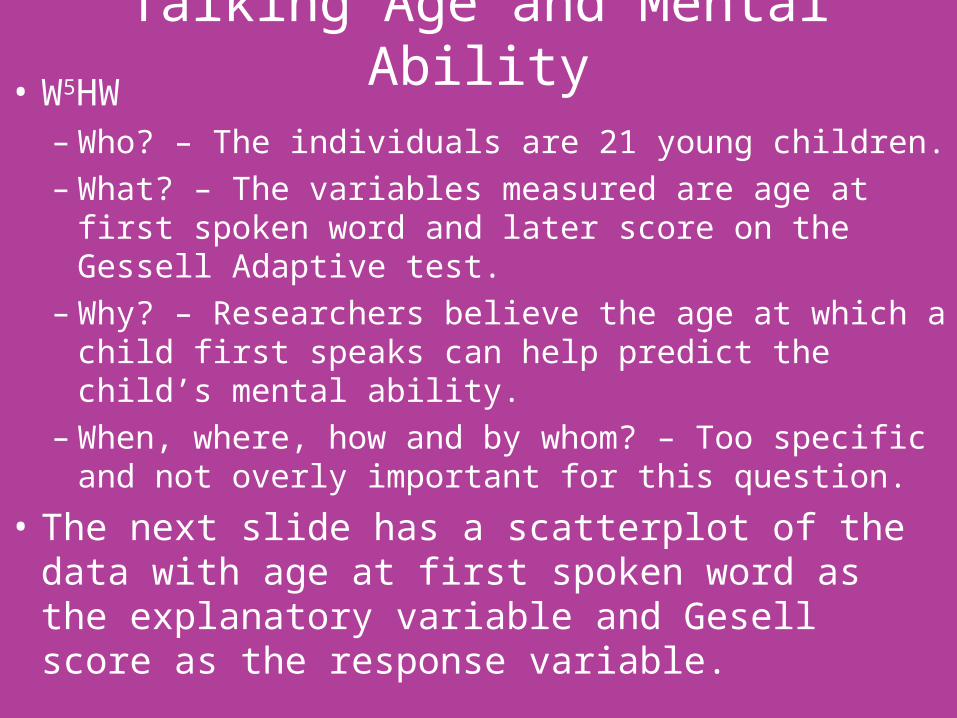
Talking Age and Mental Ability• W5HW
– Who? – The individuals are 21 young children.– What? – The variables measured are age at first spoken
word and later score on the Gessell Adaptive test.– Why? – Researchers believe the age at which a child first
speaks can help predict the child’s mental ability.– When, where, how and by whom? – Too specific and not
overly important for this question.
• The next slide has a scatterplot of the data with age at first spoken word as the explanatory variable and Gesell score as the response variable.
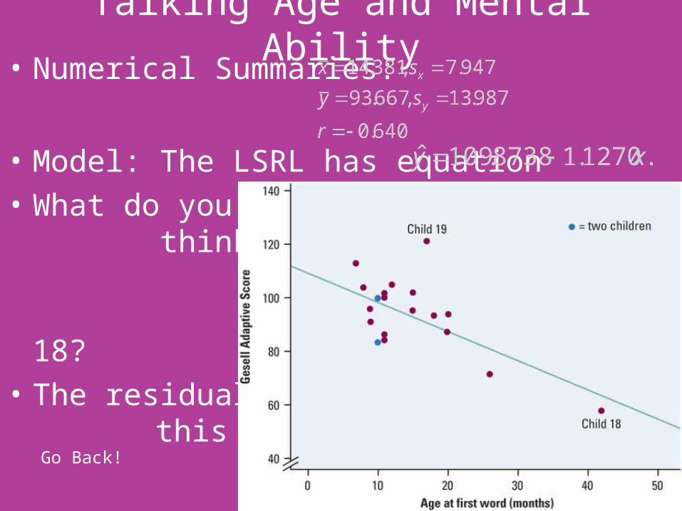
Talking Age and Mental Ability• Numerical Summaries:
• Model: The LSRL has equation• What do you
think about Child 19 and Child 18?
• The residual for this plot is on the next slide.Go Back!
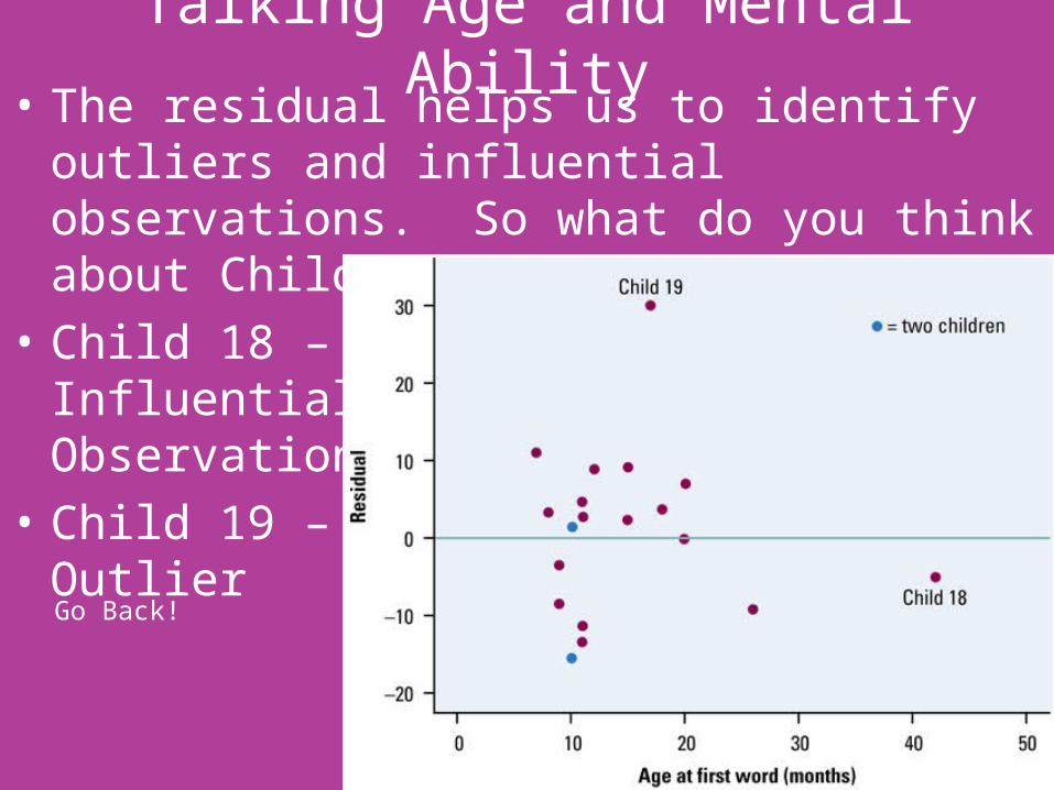
Talking Age and Mental Ability• The residual helps us to identify outliers and
influential observations. So what do you think about Children 18 and 19 now?
• Child 18 – Influential Observation
• Child 19 – Outlier
Go Back!

Talking Age and Mental Ability• Interpretation
– The scatterplot (and the correlation) shows a negative association. That is, children who speak later tend to have lower test scores than early talkers. The correlation tells us that the overall pattern is moderately linear.
– The slope of the regression line tells us that for every month older a child is when he or she first talks, the Gesell score will decrease by 1.13 points. The y-intercept of 109.87 means that a child who speaks at age 0 months would score a 109.87 on the Gesell test. This is obviously ridiculous due to extrapolation.

Talking Age and Mental Ability• Interpretation (continued)
– How well does the LSRL fit the data? The residual plot shows a fairly “random” scatter of points around the “residual = 0” line. There is one very large positive residual. Most of the prediction errors (residuals) are 10 points or fewer on the Gesell test.
– Since r2 = 0.41, 41% of the variation in Gesell scores can be explained by the LSRL of Gesell scores on age at first spoken word. That leaves 59% of the variation is Gesell scores unexplained by the linear relationship.
– Children 18 and 19 are both special points. Child 19 lies far from the regression line and is an outlier. Child 18 lies close to the line but far out in the x direction and is an influential observation.
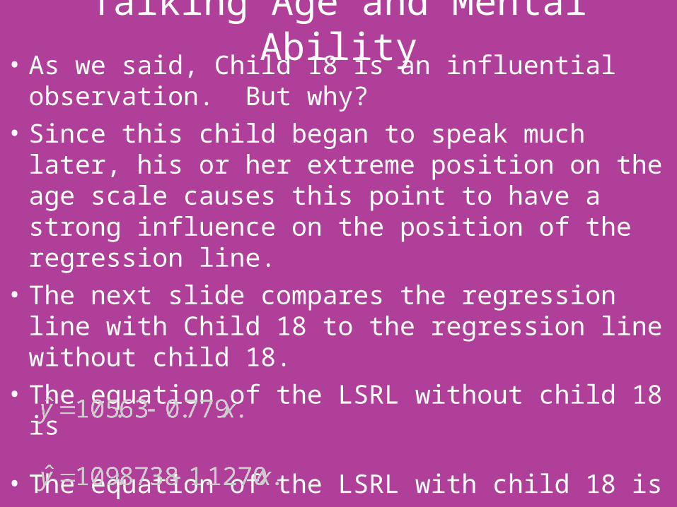
Talking Age and Mental Ability• As we said, Child 18 is an influential observation.
But why?• Since this child began to speak much later, his or her
extreme position on the age scale causes this point to have a strong influence on the position of the regression line.
• The next slide compares the regression line with Child 18 to the regression line without child 18.
• The equation of the LSRL without child 18 is
• The equation of the LSRL with child 18 is

Talking Age and Mental Ability• Since the LSRL makes the sum of the squares of the
vertical distances to the points as small as possible, a point that is extreme in the x direction with no other point near it, pulls the line toward itself. We call these points influential.

• The LSRL is most likely to be heavily influenced by observations that are outliers in the x direction. The scatterplot will alert you to such observations. Influential points will often have small residuals because they pull the regression line toward themselves. If you look at a residual plot, you may miss influential points.
• The surest way to verify that a point is influential is to find the regression line with and without the suspect point. If the line moves more than a small amount, the point is influential.
Talking Age and Mental Ability• The strong influence of Child 18 makes the original
regression of Gesell scores on age at first word misleading. The original data have r2 = 0.41. The relationship is strong enough to be interesting to parents. If we leave out Child 18, r2 drops to 11%. The strength of the association was due largely to a single influential observation.
• What should the researcher do? – Should she exclude Child 18? If so, there is basically no
relationship. – Should she keep Child 18? If so, then she must collect
data on other children that are slow to begin talking so that the analysis is not so dependent on just one child.

Beware the Lurking Variable• Another caution is perhaps even more important:
the relationship between two variables can often be understood only by taking other variables into account.
• Lurking variables can make a correlation or regression misleading.
• You should always think about possible lurking variables before you draw conclusions based on correlation or regression.

Is Math the Key to College Success?• A College Board study of 15,941 high school graduates
found a strong correlation between how much math minority students took in high school and their later success in college.
• News articles quoted College Board as saying that “math is the gatekeeper for success in college.”
• This might be true, but we should also consider lurking variables.
• Minority students from middle-class homes with educated parents no doubt take more high school math courses. They are also more likely to have a stable family, parents who emphasize education and can pay for college, and so on. As you can see, family background is a lurking variable for this study.
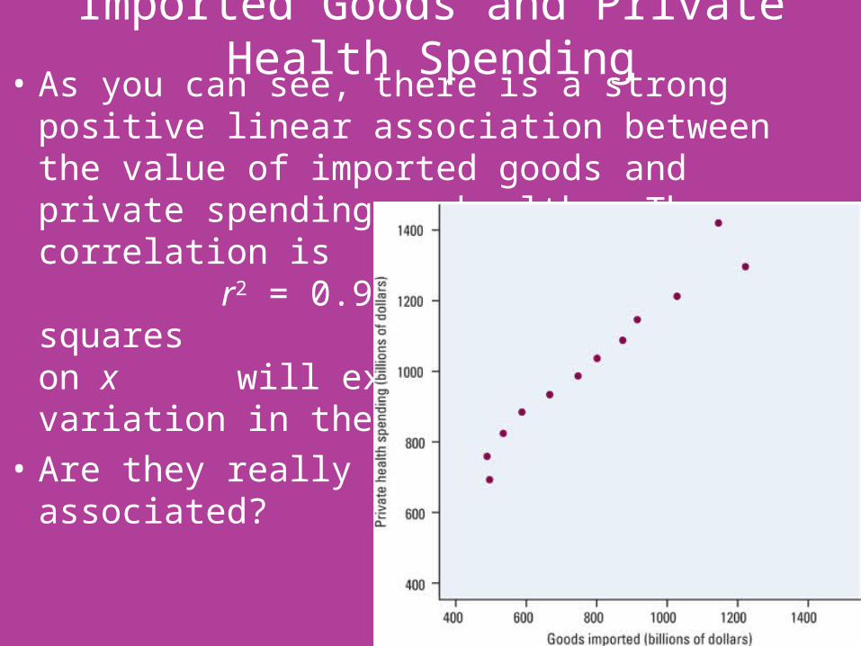
Imported Goods and Private Health Spending• As you can see, there is a strong positive linear
association between the value of imported goods and private spending on health. The correlation is r = 0.9749. Because r2 = 0.9504, least-squares regression of y on x will explain 95% of the variation in the values of y.
• Are they really this associated?
Imported Goods and Private Health Spending• The explanatory variable was the dollar value of
goods imported into the U.S. in the years 1990 to 2001.
• The response variable is private spending on health in these years.
• There is no economic relationship between these variables. The strong association is due entirely to the fact that both imports and health spending grew rapidly in these years. The common year is a lurking variable for each point.
• Any two variables that both increase over time will show a strong association. This does not mean that one variable explains or influences the other.
Lurking Variables• Correlations such as that between imported goods
and private health spending are sometimes called “nonsense correlations.” The correlation is real. What is nonsense is the idea that the variables are directly related so that changing one of the variables causes changes in the other.
• This example shows that association does not imply causation.
Housing and Health• A study of housing conditions in the city of Hull,
England, measured a large number of variables for each of the wards in the city. Two of the variables were a measure of overcrowding x and a measure of the lack of indoor toilets y.
• Because x and y are both a measure of inadequate housing, we expect a high correlation.
• However, our correlation is only r = 0.08. How can this be?
Housing and Health• Investigation found that some poor wards had a lot
of public housing. These wards had high values of x but low values of y because public housing always includes indoor toilets.
• Other poor wards lacked public housing, and these wards had high values of both x and y.
• Within wards of both type, there was a strong positive association between x and y.
• Analyzing all wards together ignored the lurking variable – amount of public housing – and hid the nature of the relationship between x and y.
Housing and Health• The scatterplot shows the two distinct groups
formed by the lurking variable.• There is a strong correlation between x and y in
each of the two groups.• In fact, r = 0.85 and r = 0.91 in the two groups.• However, because similar values of x correspond to
very different values of y, x alone is of little use in predicting y.
• This example is another reminder of why it is important to plot the data instead of simply calculating numerical measures.
Beware Correlations Based on Averages• Many regression or correlation studies work with
averages or other measures that combine information from many individuals.
• For example, if we plot the average height of young children against their age in months, we will see a very strong positive association with correlation near 1.
• But individual children of the same age vary a great deal in height. A plot of height against age for individual children will show much more scatter and lower correlation than the plot of average height against age.
• Correlations based on averages are usually too high when applied to individuals.
• This is another reminder that it is important to note exactly what variables were measured in a study.

Adding Categorical Variables to Scatterplots
• Go Back!
Go back!

Housing and Health
Go back!