Embed Size (px)
Citation preview
Big Ideas Math Green Copyright © Big Ideas Learning, LLC Resources by Chapter All rights reserved. 332
Chapter 10 Family and Community Involvement (English) .......................................... 333
Family and Community Involvement (Spanish) ......................................... 334
Section 10.1 ................................................................................................. 335
Section 10.2 ................................................................................................. 341
Section 10.3 ................................................................................................. 347
Extension 10.3 ............................................................................................. 353
Section 10.4 ................................................................................................. 355
Technology Connection ............................................................................... 361
Copyright © Big Ideas Learning, LLC Big Ideas Math Green All rights reserved. Resources by Chapter
333
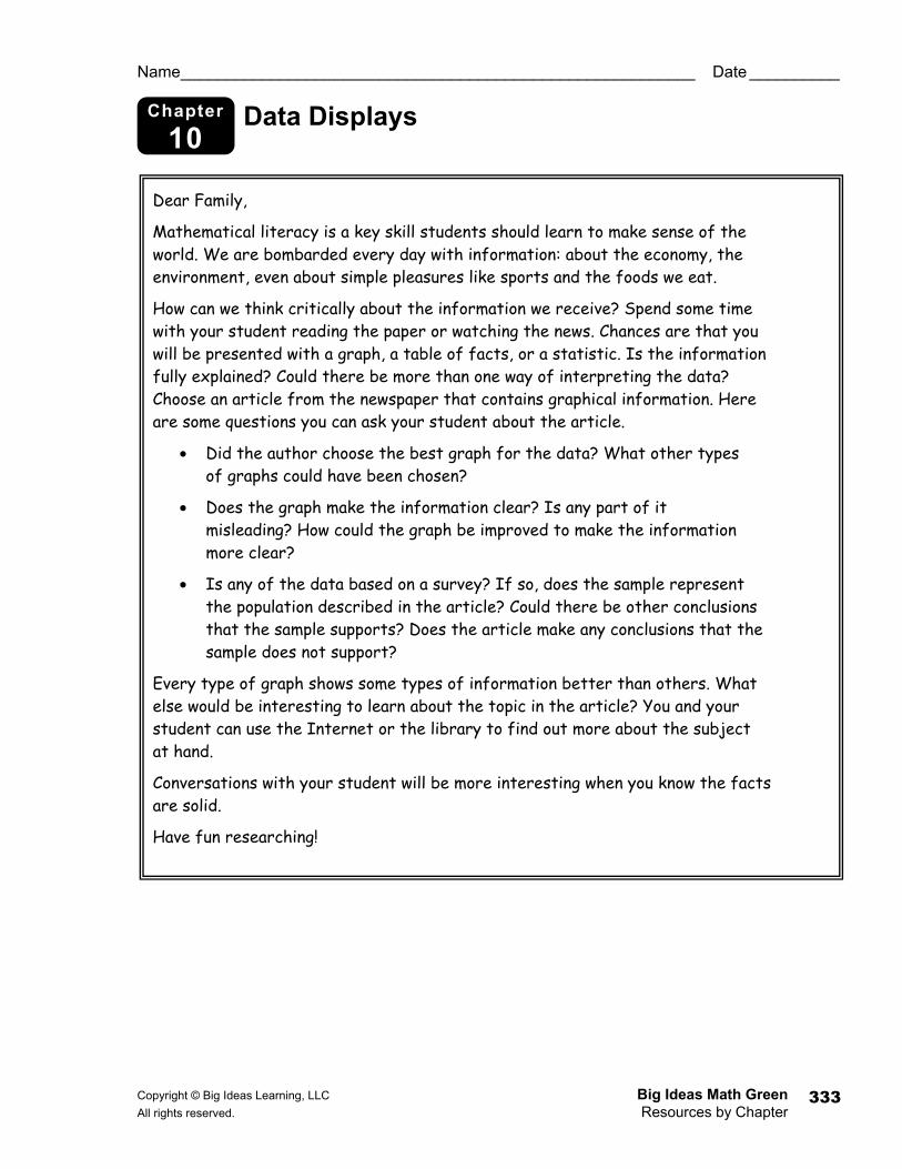
Chapter
10 Data Displays
Name _________________________________________________________ Date __________
Dear Family,
Mathematical literacy is a key skill students should learn to make sense of the world. We are bombarded every day with information: about the economy, the environment, even about simple pleasures like sports and the foods we eat.
How can we think critically about the information we receive? Spend some time with your student reading the paper or watching the news. Chances are that you will be presented with a graph, a table of facts, or a statistic. Is the information fully explained? Could there be more than one way of interpreting the data? Choose an article from the newspaper that contains graphical information. Here are some questions you can ask your student about the article.
• Did the author choose the best graph for the data? What other types of graphs could have been chosen?
• Does the graph make the information clear? Is any part of it misleading? How could the graph be improved to make the information more clear?
• Is any of the data based on a survey? If so, does the sample represent the population described in the article? Could there be other conclusions that the sample supports? Does the article make any conclusions that the sample does not support?
Every type of graph shows some types of information better than others. What else would be interesting to learn about the topic in the article? You and your student can use the Internet or the library to find out more about the subject at hand.
Conversations with your student will be more interesting when you know the facts are solid.
Have fun researching!
Big Ideas Math Green Copyright © Big Ideas Learning, LLC Resources by Chapter All rights reserved. 334
Capítulo
10 Representaciones de datos
Nombre _______________________________________________________ Fecha ________
Estimada Familia:
Las nociones matemáticas constituyen una habilidad clave que los estudiantes deben aprender para que el mundo tenga sentido: acerca de la economía, el ambiente, incluso acerca de simples placeres como deportes y las comidas que comemos.
¿Cómo podemos pensar de manera crítica acerca de la información que recibimos? Pase algo de tiempo con su estudiante leyendo el periódico o viendo las noticias. Hay posibilidades de que se les presente un gráfico, una tabla de hechos o una estadística. ¿La información fue totalmente explicada? ¿Puede haber más de una forma de interpretar los datos? Elijan un artículo del periódico que contenga información gráfica. A continuación, algunas preguntas que puede preguntar a su estudiante acerca del artículo.
• ¿El autor eligió el mejor gráfico para los datos? ¿Qué otros tipos de gráficos se hubiera podido escoger?
• ¿El gráfico esclarece la información? ¿Hay alguna parte de éste que sea engañoso? ¿Cómo podría mejorarse el gráfico para esclarecer la información?
• ¿Algo de los datos se basa en una encuesta? Si es así, ¿la muestra representa a la población descrita en el artículo? ¿Podrían sacarse otras conclusiones respaldadas por la muestra? ¿El artículo hace alguna conclusión que la muestra no respalde?
Cada tipo de gráfico muestra alguna clase de información mejor que otros. ¿Qué otras cosas serían interesantes aprender acerca del tema del artículo? Usted y su estudiante pueden usar la Internet o biblioteca para averiguar sobre el tema en cuestión.
Las conversaciones con su estudiante serán más interesantes cuando saben que los hechos son concretos.
¡Que se diviertan en su investigación!
Copyright © Big Ideas Learning, LLC Big Ideas Math Green All rights reserved. Resources by Chapter
335
Activity
10.1 Start Thinking! For use before Activity 10.1
Activity
10.1 Warm Up For use before Activity 10.1
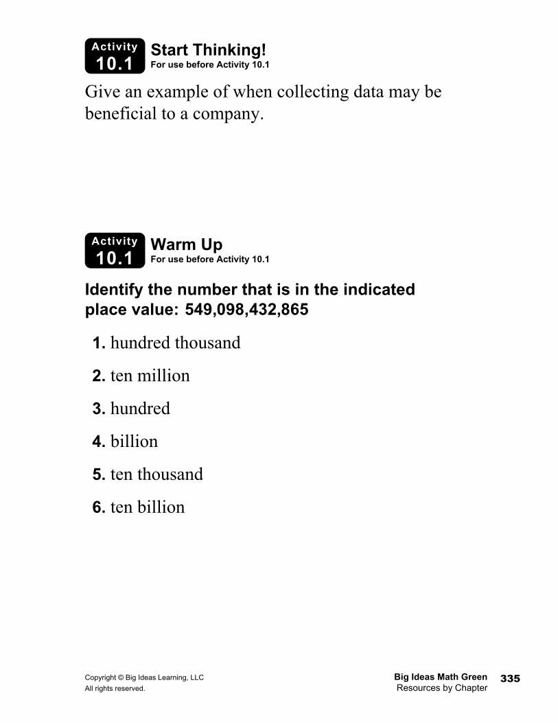
Give an example of when collecting data may be beneficial to a company.
Identify the number that is in the indicated place value: 549,098,432,865
1. hundred thousand
2. ten million
3. hundred
4. billion
5. ten thousand
6. ten billion
Big Ideas Math Green Copyright © Big Ideas Learning, LLC Resources by Chapter All rights reserved. 336
Lesson
10.1 Warm Up For use before Lesson 10.1
Lesson
10.1 Start Thinking! For use before Lesson 10.1
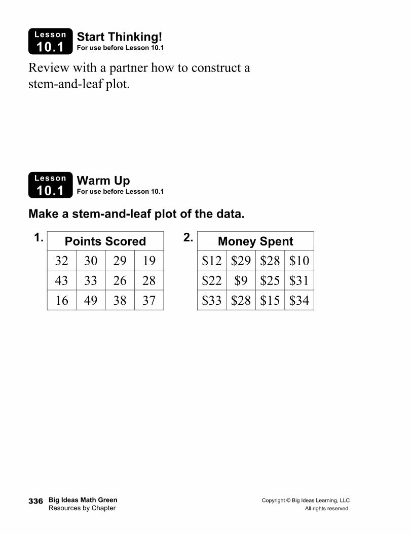
Review with a partner how to construct a stem-and-leaf plot.
Make a stem-and-leaf plot of the data.
1. 2.
Points Scored 32 30 29 19
43 33 26 28
16 49 38 37
Money Spent $12 $29 $28 $10
$22 $9 $25 $31
$33 $28 $15 $34
Copyright © Big Ideas Learning, LLC Big Ideas Math Green All rights reserved. Resources by Chapter
337
10.1 Practice A
Name _________________________________________________________ Date __________
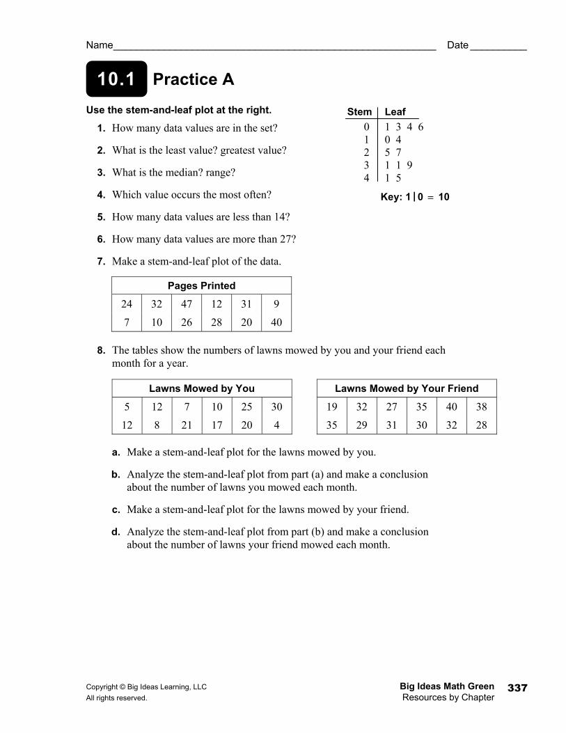
Use the stem-and-leaf plot at the right.
1. How many data values are in the set?
2. What is the least value? greatest value?
3. What is the median? range?
4. Which value occurs the most often?
5. How many data values are less than 14?
6. How many data values are more than 27?
7. Make a stem-and-leaf plot of the data.
8. The tables show the numbers of lawns mowed by you and your friend each month for a year.
a. Make a stem-and-leaf plot for the lawns mowed by you.
b. Analyze the stem-and-leaf plot from part (a) and make a conclusion about the number of lawns you mowed each month.
c. Make a stem-and-leaf plot for the lawns mowed by your friend.
d. Analyze the stem-and-leaf plot from part (b) and make a conclusion about the number of lawns your friend mowed each month.
Pages Printed
24 32 47 12 31 9
7 10 26 28 20 40
Lawns Mowed by You
5 12 7 10 25 30
12 8 21 17 20 4
Lawns Mowed by Your Friend
19 32 27 35 40 38
35 29 31 30 32 28
Stem Leaf 0 1 3 4 6 1 0 4 2 5 7 3 1 1 9 4 1 5
Key: 1 | 0 = 10
Big Ideas Math Green Copyright © Big Ideas Learning, LLC Resources by Chapter All rights reserved. 338
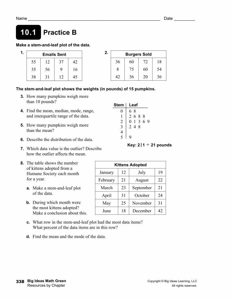
10.1 Practice B
Name _________________________________________________________ Date _________
Make a stem-and-leaf plot of the data.
1. 2.
The stem-and-leaf plot shows the weights (in pounds) of 15 pumpkins.
3. How many pumpkins weigh more than 10 pounds?
4. Find the mean, median, mode, range, and interquartile range of the data.
5. How many pumpkins weigh more than the mean?
6. Describe the distribution of the data.
7. Which data value is the outlier? Describe how the outlier affects the mean.
8. The table shows the number of kittens adopted from a Humane Society each month for a year.
a. Make a stem-and-leaf plot of the data.
b. During which month were the most kittens adopted? Make a conclusion about this.
c. What row in the stem-and-leaf plot had the most data items? What percent of the data items are in this row?
d. Find the mean and the mode of the data.
Burgers Sold
36 60 72 18
8 75 60 54
42 36 20 36
Emails Sent
55 12 37 42
35 56 9 16
38 31 12 45
Kittens Adopted
January 12 July 19
February 21 August 22
March 23 September 21
April 31 October 24
May 25 November 31
June 18 December 42
Stem Leaf 0 6 8 1 2 6 8 8 2 0 1 3 6 9 3 2 4 8 4 5 9
Key: 2 | 1 = 21 pounds
Copyright © Big Ideas Learning, LLC Big Ideas Math Green All rights reserved. Resources by Chapter
339
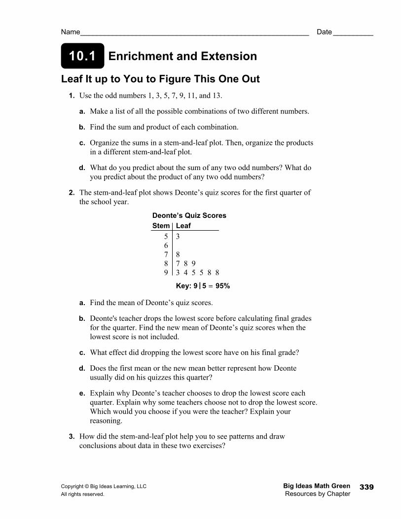
10.1 Enrichment and Extension
Name _________________________________________________________ Date __________
Leaf It up to You to Figure This One Out 1. Use the odd numbers 1, 3, 5, 7, 9, 11, and 13.
a. Make a list of all the possible combinations of two different numbers.
b. Find the sum and product of each combination.
c. Organize the sums in a stem-and-leaf plot. Then, organize the products in a different stem-and-leaf plot.
d. What do you predict about the sum of any two odd numbers? What do you predict about the product of any two odd numbers?
2. The stem-and-leaf plot shows Deonte’s quiz scores for the first quarter of the school year.
a. Find the mean of Deonte’s quiz scores.
b. Deonte's teacher drops the lowest score before calculating final grades for the quarter. Find the new mean of Deonte’s quiz scores when the lowest score is not included.
c. What effect did dropping the lowest score have on his final grade?
d. Does the first mean or the new mean better represent how Deonte usually did on his quizzes this quarter?
e. Explain why Deonte’s teacher chooses to drop the lowest score each quarter. Explain why some teachers choose not to drop the lowest score. Which would you choose if you were the teacher? Explain your reasoning.
3. How did the stem-and-leaf plot help you to see patterns and draw conclusions about data in these two exercises?
Deonte’s Quiz Scores Stem Leaf 5 3 6 7 8 8 7 8 9 9 3 4 5 5 8 8
Key: 9 | 5 = 95%
Big Ideas Math Green Copyright © Big Ideas Learning, LLC Resources by Chapter All rights reserved. 340
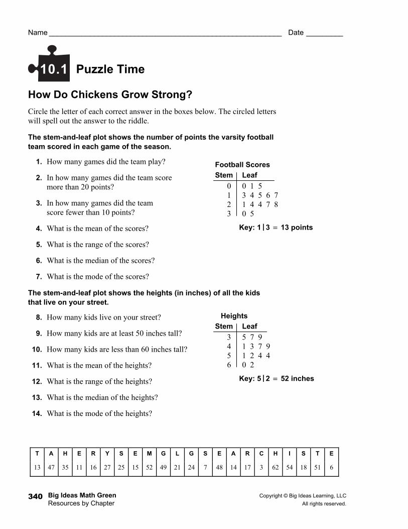
Puzzle Time
Name _________________________________________________________ Date _________
How Do Chickens Grow Strong? Circle the letter of each correct answer in the boxes below. The circled letters will spell out the answer to the riddle.
The stem-and-leaf plot shows the number of points the varsity football team scored in each game of the season.
1. How many games did the team play?
2. In how many games did the team score more than 20 points?
3. In how many games did the team score fewer than 10 points?
4. What is the mean of the scores?
5. What is the range of the scores?
6. What is the median of the scores?
7. What is the mode of the scores?
The stem-and-leaf plot shows the heights (in inches) of all the kids that live on your street.
8. How many kids live on your street?
9. How many kids are at least 50 inches tall?
10. How many kids are less than 60 inches tall?
11. What is the mean of the heights?
12. What is the range of the heights?
13. What is the median of the heights?
14. What is the mode of the heights?
10.1
T A H E R Y S E M G L G S E A R C H I S T E
13 47 35 11 16 27 25 15 52 49 21 24 7 48 14 17 3 62 54 18 51 6
Football Scores Stem Leaf 0 0 1 5 1 3 4 5 6 7 2 1 4 4 7 8 3 0 5
Key: 1 | 3 = 13 points
Heights Stem Leaf 3 5 7 9 4 1 3 7 9 5 1 2 4 4 6 0 2
Key: 5 | 2 = 52 inches
Copyright © Big Ideas Learning, LLC Big Ideas Math Green All rights reserved. Resources by Chapter
341
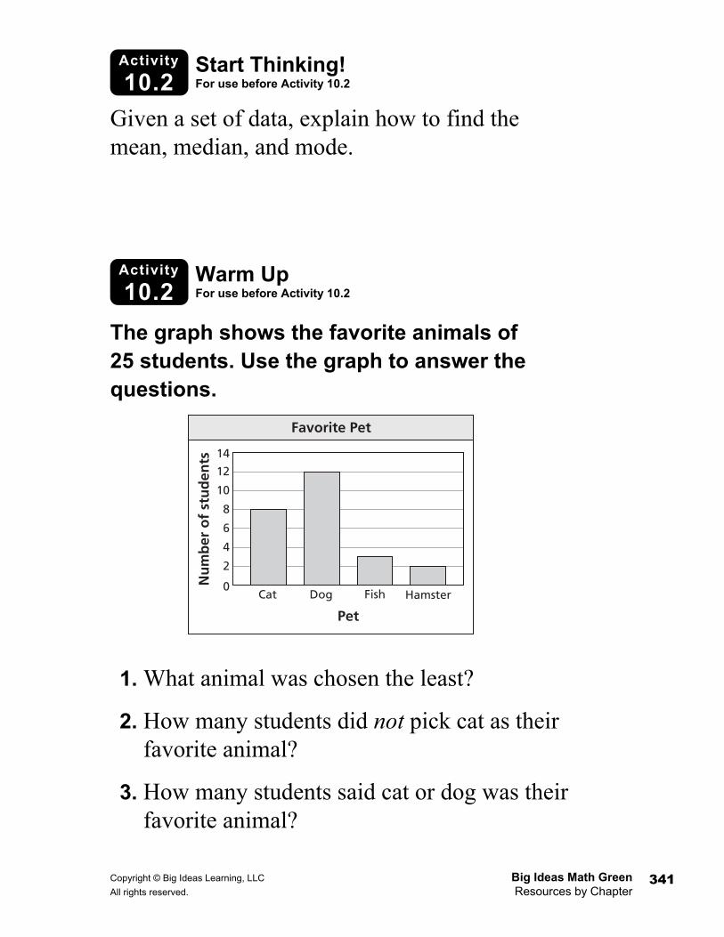
Activity
10.2 Start Thinking! For use before Activity 10.2
Activity
10.2 Warm Up For use before Activity 10.2
Given a set of data, explain how to find the mean, median, and mode.
The graph shows the favorite animals of 25 students. Use the graph to answer the questions.
1. What animal was chosen the least?
2. How many students did not pick cat as their favorite animal?
3. How many students said cat or dog was their favorite animal?
2
0
4
6
8
10
12
14
Cat Dog Fish Hamster
Pet
Nu
mb
er o
f st
ud
ents
Favorite Pet
Big Ideas Math Green Copyright © Big Ideas Learning, LLC Resources by Chapter All rights reserved. 342
Lesson
10.2 Warm Up For use before Lesson 10.2
Lesson
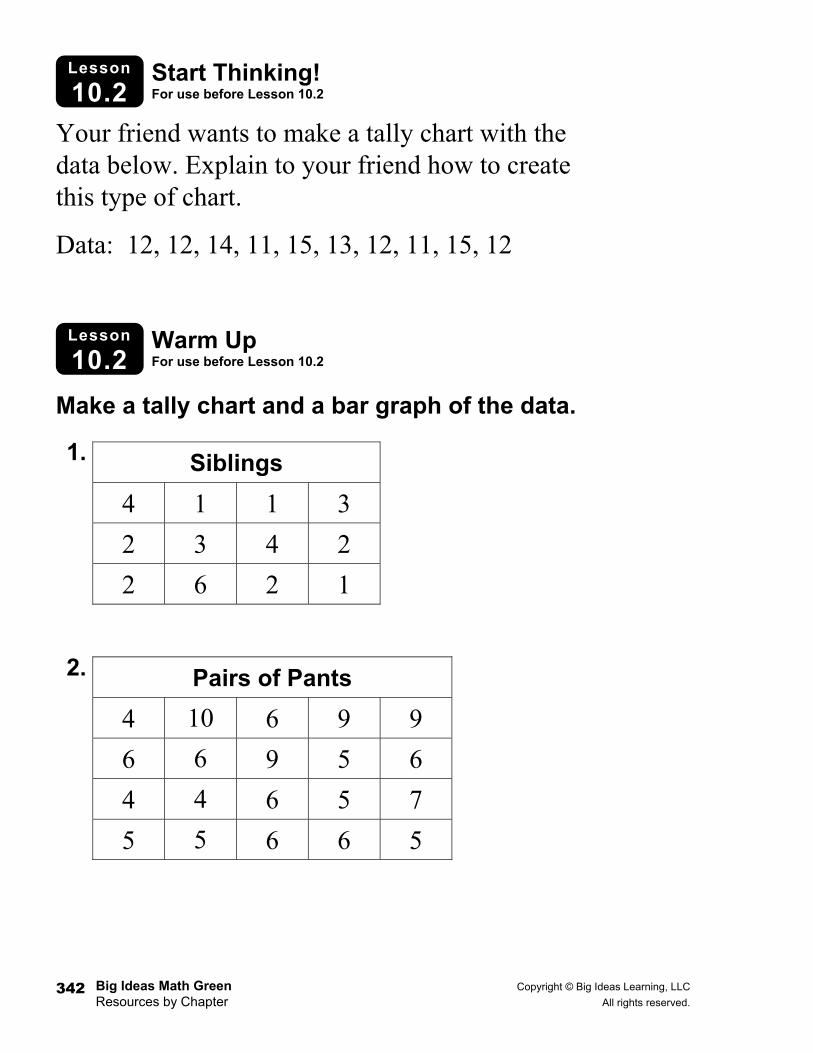
10.2 Start Thinking! For use before Lesson 10.2
Your friend wants to make a tally chart with the data below. Explain to your friend how to create this type of chart.
Data: 12, 12, 14, 11, 15, 13, 12, 11, 15, 12
Make a tally chart and a bar graph of the data.
1.
2.
Siblings 4 1 1 3
2 3 4 2
2 6 2 1
Pairs of Pants 4 10 6 9 9
6 6 9 5 6
4 4 6 5 7
5 5 6 6 5
Copyright © Big Ideas Learning, LLC Big Ideas Math Green All rights reserved. Resources by Chapter
343
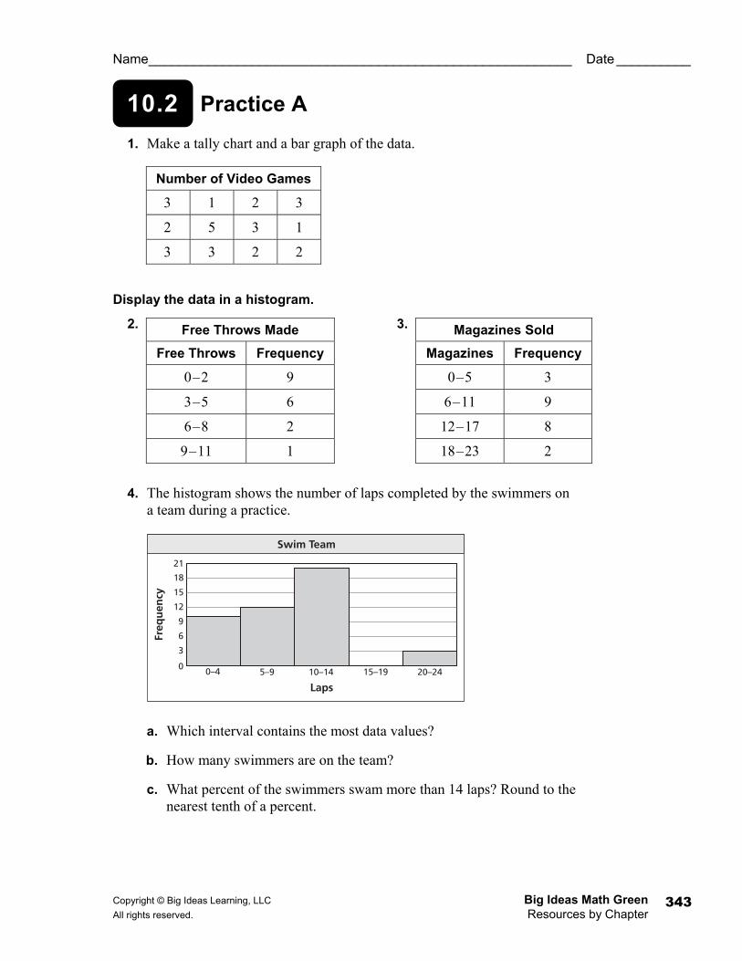
10.2 Practice A
Name _________________________________________________________ Date __________
1. Make a tally chart and a bar graph of the data.
Display the data in a histogram.
2. 3.
4. The histogram shows the number of laps completed by the swimmers on a team during a practice.
a. Which interval contains the most data values?
b. How many swimmers are on the team?
c. What percent of the swimmers swam more than 14 laps? Round to the nearest tenth of a percent.
Free Throws Made
Free Throws Frequency
0–2 9
3–5 6
6–8 2
9–11 1
Magazines Sold
Magazines Frequency
0–5 3
6–11 9
12–17 8
18–23 2
Number of Video Games
3 1 2 3
2 5 3 1
3 3 2 2
3
0
6
9
12
15
18
21
0–4 5–9 10–14 15–19 20–24
Laps
Freq
uen
cy
Swim Team
Big Ideas Math Green Copyright © Big Ideas Learning, LLC Resources by Chapter All rights reserved. 344
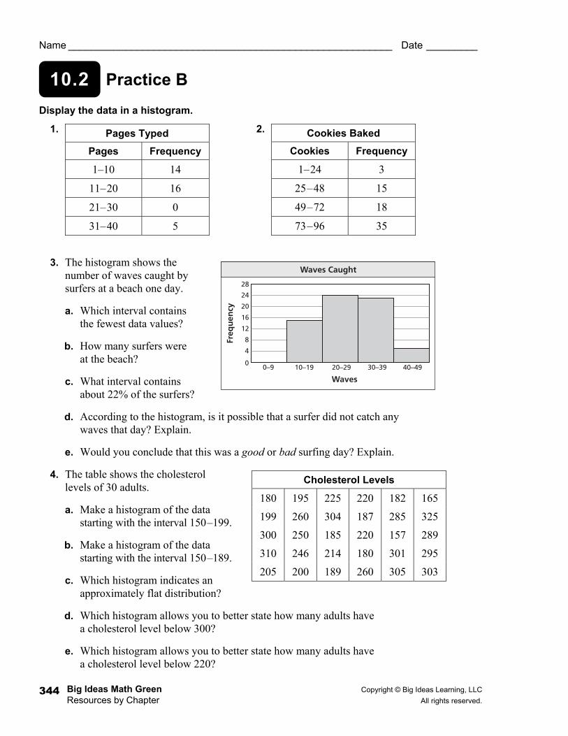
10.2 Practice B
Name _________________________________________________________ Date _________
Display the data in a histogram.
1. 2.
3. The histogram shows the number of waves caught by surfers at a beach one day.
a. Which interval contains the fewest data values?
b. How many surfers were at the beach?
c. What interval contains about 22% of the surfers?
d. According to the histogram, is it possible that a surfer did not catch any waves that day? Explain.
e. Would you conclude that this was a good or bad surfing day? Explain.
4. The table shows the cholesterol levels of 30 adults.
a. Make a histogram of the data starting with the interval 150–199.
b. Make a histogram of the data starting with the interval 150–189.
c. Which histogram indicates an approximately flat distribution?
d. Which histogram allows you to better state how many adults have a cholesterol level below 300?
e. Which histogram allows you to better state how many adults have a cholesterol level below 220?
Pages Typed
Pages Frequency
1–10 14
11–20 16
21–30 0
31–40 5
Cookies Baked
Cookies Frequency
1–24 3
25–48 15
49–72 18
73–96 35
Cholesterol Levels
180 195 225 220 182 165
199 260 304 187 285 325
300 250 185 220 157 289
310 246 214 180 301 295
205 200 189 260 305 303
4
0
8
12
16
20
24
28
0–9 10–19 20–29 30–39 40–49
Waves
Freq
uen
cy
Waves Caught
Copyright © Big Ideas Learning, LLC Big Ideas Math Green All rights reserved. Resources by Chapter
345
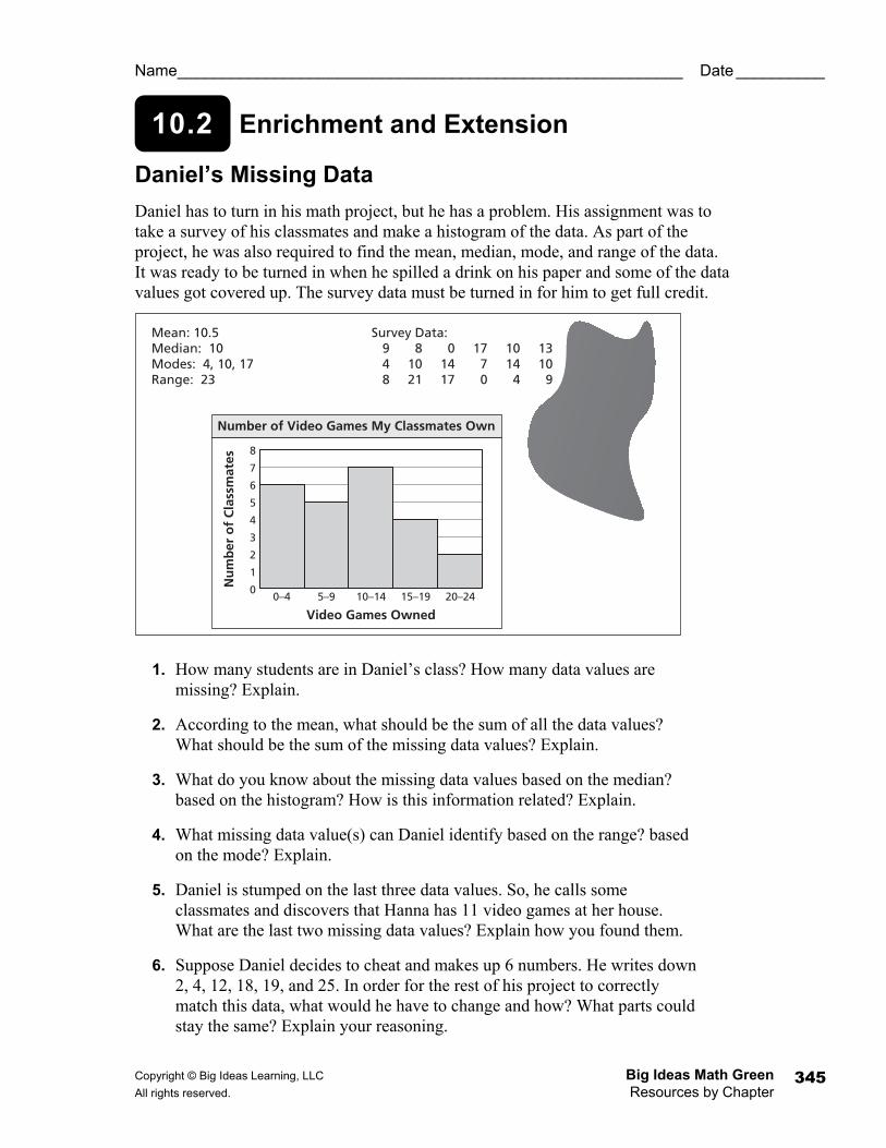
10.2 Enrichment and Extension
Name _________________________________________________________ Date __________
Daniel’s Missing Data Daniel has to turn in his math project, but he has a problem. His assignment was to take a survey of his classmates and make a histogram of the data. As part of the project, he was also required to find the mean, median, mode, and range of the data. It was ready to be turned in when he spilled a drink on his paper and some of the data values got covered up. The survey data must be turned in for him to get full credit.
1. How many students are in Daniel’s class? How many data values are missing? Explain.
2. According to the mean, what should be the sum of all the data values? What should be the sum of the missing data values? Explain.
3. What do you know about the missing data values based on the median? based on the histogram? How is this information related? Explain.
4. What missing data value(s) can Daniel identify based on the range? based on the mode? Explain.
5. Daniel is stumped on the last three data values. So, he calls some classmates and discovers that Hanna has 11 video games at her house. What are the last two missing data values? Explain how you found them.
6. Suppose Daniel decides to cheat and makes up 6 numbers. He writes down 2, 4, 12, 18, 19, and 25. In order for the rest of his project to correctly match this data, what would he have to change and how? What parts could stay the same? Explain your reasoning.
Number of Video Games My Classmates Own
0–4 5–9 10–14 15–19 20–24
7
8
6
5
4
3
0
1
2
Video Games Owned
Nu
mb
er o
f C
lass
mat
es
Mean: 10.5Median: 10Modes: 4, 10, 17Range: 23
Survey Data: 9 8 0 17 10 13 4 10 14 7 14 10 8 21 17 0 4 9
Big Ideas Math Green Copyright © Big Ideas Learning, LLC Resources by Chapter All rights reserved. 346
Puzzle Time
Name _________________________________________________________ Date _________
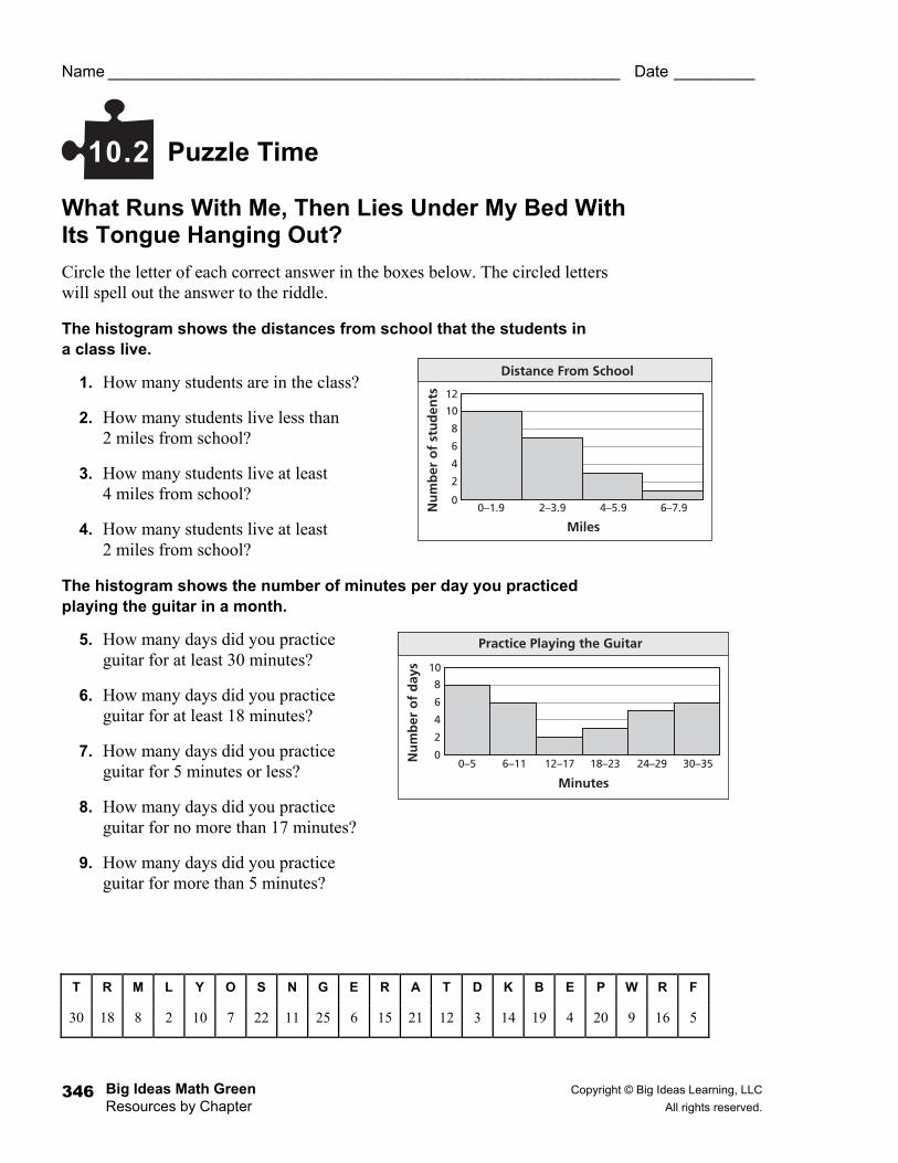
What Runs With Me, Then Lies Under My Bed With Its Tongue Hanging Out? Circle the letter of each correct answer in the boxes below. The circled letters will spell out the answer to the riddle.
The histogram shows the distances from school that the students in a class live.
1. How many students are in the class?
2. How many students live less than 2 miles from school?
3. How many students live at least 4 miles from school?
4. How many students live at least 2 miles from school?
The histogram shows the number of minutes per day you practiced playing the guitar in a month.
5. How many days did you practice guitar for at least 30 minutes?
6. How many days did you practice guitar for at least 18 minutes?
7. How many days did you practice guitar for 5 minutes or less?
8. How many days did you practice guitar for no more than 17 minutes?
9. How many days did you practice guitar for more than 5 minutes?
10.2
T R M L Y O S N G E R A T D K B E P W R F
30 18 8 2 10 7 22 11 25 6 15 21 12 3 14 19 4 20 9 16 5
2
0
4
6
8
10
12
0–1.9 4–5.92–3.9 6–7.9
Miles
Nu
mb
er o
f st
ud
ents
Distance From School
2
0
4
6
8
10
0–5 6–11 12–17 18–23 24–29 30–35
Minutes
Nu
mb
er o
f d
ays
Practice Playing the Guitar
Copyright © Big Ideas Learning, LLC Big Ideas Math Green All rights reserved. Resources by Chapter
347
Activity
10.3 Start Thinking! For use before Activity 10.3
Activity
10.3 Warm Up For use before Activity 10.3
What are some similarities and differences of a bar graph and a histogram?
Use the stem-and-leaf plot.
1. How many data values are in the set?
2. What is the least value? greatest value?
3. What is the median? range?
4. Is the value 24 in the set? Explain.
Stem Leaf 0 3 5 6 1 2 2 2 5 7 8 3 0 3 7 9 9
Key: 2|2 = 22
Big Ideas Math Green Copyright © Big Ideas Learning, LLC Resources by Chapter All rights reserved. 348
Lesson
10.3 Start Thinking! For use before Lesson 10.3
Lesson
10.3 Warm Up For use before Lesson 10.3
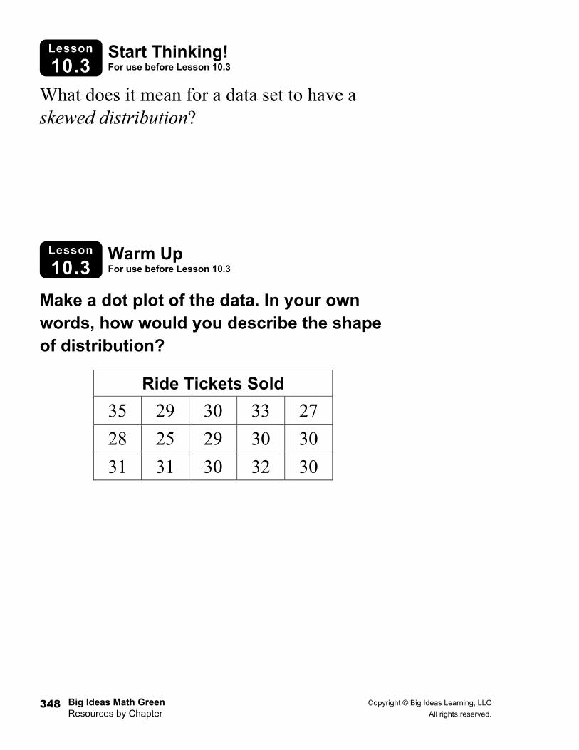
What does it mean for a data set to have a skewed distribution?
Make a dot plot of the data. In your own words, how would you describe the shape of distribution?
Ride Tickets Sold 35 29 30 33 27
28 25 29 30 30
31 31 30 32 30
Copyright © Big Ideas Learning, LLC Big Ideas Math Green All rights reserved. Resources by Chapter
349
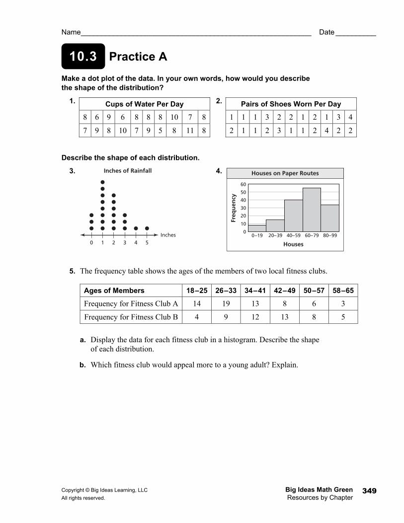
10.3 Practice A
Name _________________________________________________________ Date __________
Make a dot plot of the data. In your own words, how would you describe the shape of the distribution?
1. 2.
Describe the shape of each distribution.
3. 4.
5. The frequency table shows the ages of the members of two local fitness clubs.
a. Display the data for each fitness club in a histogram. Describe the shape of each distribution.
b. Which fitness club would appeal more to a young adult? Explain.
Cups of Water Per Day
8 6 9 6 8 8 8 10 7 8
7 9 8 10 7 9 5 8 11 8
Pairs of Shoes Worn Per Day
1 1 1 3 2 2 1 2 1 3 4
2 1 1 2 3 1 1 2 4 2 2
0 1 2 43 5Inches
Inches of Rainfall
10
20
30
40
50
60
00–19 20–39 40–59 60–79 80–99
Houses
Freq
uen
cy
Houses on Paper Routes
Ages of Members 18–25 26–33 34–41 42–49 50–57 58–65
Frequency for Fitness Club A 14 19 13 8 6 3
Frequency for Fitness Club B 4 9 12 13 8 5
Big Ideas Math Green Copyright © Big Ideas Learning, LLC Resources by Chapter All rights reserved. 350
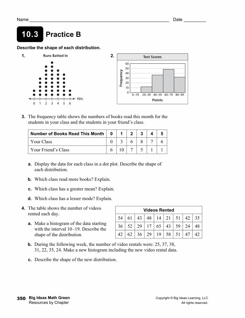
10.3 Practice B
Name _________________________________________________________ Date _________
Describe the shape of each distribution.
1. 2.
3. The frequency table shows the numbers of books read this month for the students in your class and the students in your friend’s class.
a. Display the data for each class in a dot plot. Describe the shape of each distribution.
b. Which class read more books? Explain.
c. Which class has a greater mean? Explain.
d. Which class has a lesser mode? Explain.
4. The table shows the number of videos rented each day.
a. Make a histogram of the data starting with the interval 10–19. Describe the shape of the distribution.
b. During the following week, the number of video rentals were: 25, 37, 38, 31, 22, 35, 24. Make a new histogram including the new video rental data.
c. Describe the shape of the new distribution.
0 1 2 43 5 6RBIs
Runs Batted In
10
20
30
40
50
60
00–19 20–39 40–59 60–79 80–99
Points
Freq
uen
cy
Test Scores
Number of Books Read This Month 0 1 2 3 4 5
Your Class 0 3 6 8 7 6
Your Friend’s Class 6 10 7 5 1 1
Videos Rented
54 61 43 48 14 21 51 42 35
36 52 29 17 65 43 59 24 48
42 62 36 29 19 58 51 47 42
Copyright © Big Ideas Learning, LLC Big Ideas Math Green All rights reserved. Resources by Chapter
351
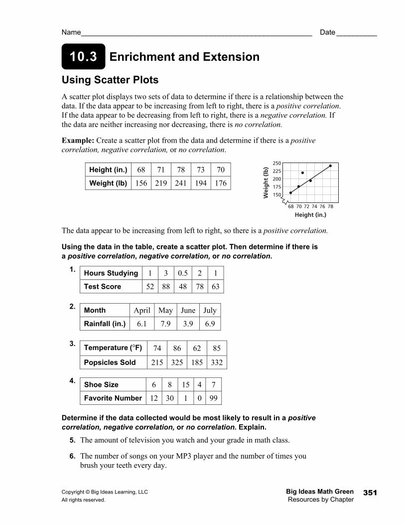
10.3 Enrichment and Extension
Name _________________________________________________________ Date __________
Using Scatter Plots A scatter plot displays two sets of data to determine if there is a relationship between the data. If the data appear to be increasing from left to right, there is a positive correlation. If the data appear to be decreasing from left to right, there is a negative correlation. If the data are neither increasing nor decreasing, there is no correlation.
Example: Create a scatter plot from the data and determine if there is a positive correlation, negative correlation, or no correlation.
The data appear to be increasing from left to right, so there is a positive correlation.
Using the data in the table, create a scatter plot. Then determine if there is a positive correlation, negative correlation, or no correlation.
1.
2.
3.
4.
Determine if the data collected would be most likely to result in a positive correlation, negative correlation, or no correlation. Explain.
5. The amount of television you watch and your grade in math class.
6. The number of songs on your MP3 player and the number of times you brush your teeth every day.
Height (in.) 68 71 78 73 70
Weight (lb) 156 219 241 194 176
Hours Studying 1 3 0.5 2 1
Test Score 52 88 48 78 63
Month April May June July
Rainfall (in.) 6.1 7.9 3.9 6.9
Temperature °( F) 74 86 62 85
Popsicles Sold 215 325 185 332
Shoe Size 6 8 15 4 7
Favorite Number 12 30 1 0 99
68 70 72 74 76 78
250
225
200
175
150
Height (in.)
Wei
gh
t (l
b)
Big Ideas Math Green Copyright © Big Ideas Learning, LLC Resources by Chapter All rights reserved. 352
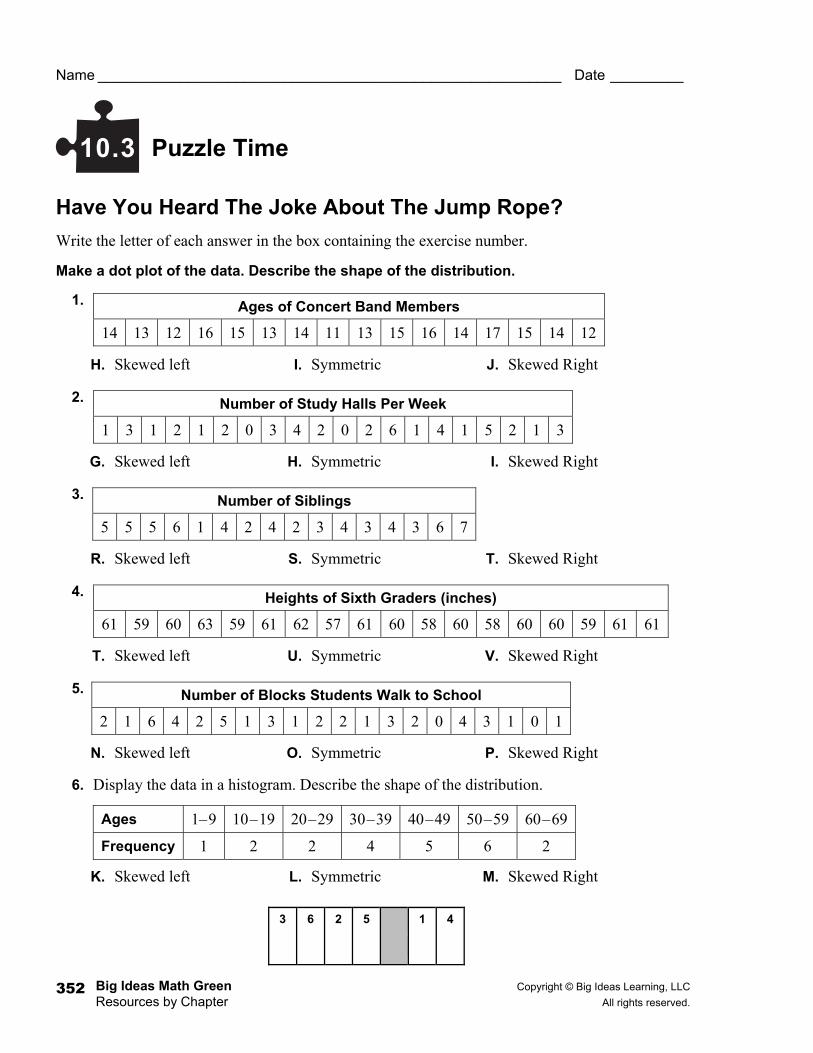
Puzzle Time
Name _________________________________________________________ Date _________
Have You Heard The Joke About The Jump Rope? Write the letter of each answer in the box containing the exercise number.
Make a dot plot of the data. Describe the shape of the distribution.
1.
H. Skewed left I. Symmetric J. Skewed Right
2.
G. Skewed left H. Symmetric I. Skewed Right
3.
R. Skewed left S. Symmetric T. Skewed Right
4.
T. Skewed left U. Symmetric V. Skewed Right
5.
N. Skewed left O. Symmetric P. Skewed Right
6. Display the data in a histogram. Describe the shape of the distribution.
K. Skewed left L. Symmetric M. Skewed Right
10.3
Ages of Concert Band Members
14 13 12 16 15 13 14 11 13 15 16 14 17 15 14 12
Number of Study Halls Per Week
1 3 1 2 1 2 0 3 4 2 0 2 6 1 4 1 5 2 1 3
Number of Siblings
5 5 5 6 1 4 2 4 2 3 4 3 4 3 6 7
Heights of Sixth Graders (inches)
61 59 60 63 59 61 62 57 61 60 58 60 58 60 60 59 61 61
Number of Blocks Students Walk to School
2 1 6 4 2 5 1 3 1 2 2 1 3 2 0 4 3 1 0 1
Ages 1–9 10–19 20–29 30–39 40–49 50–59 60–69
Frequency 1 2 2 4 5 6 2
3 6 2 5 1 4
Copyright © Big Ideas Learning, LLC Big Ideas Math Green All rights reserved. Resources by Chapter
353
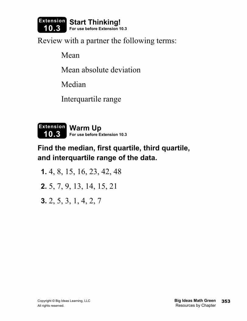
Activity
1.5b Start Thinking! For use before Extension 10.3
Extension
10.3 Warm Up For use before Extension 10.3
Extension
10.3 Review with a partner the following terms:
Mean
Mean absolute deviation
Median
Interquartile range
Find the median, first quartile, third quartile, and interquartile range of the data.
1. 4, 8, 15, 16, 23, 42, 48
2. 5, 7, 9, 13, 14, 15, 21
3. 2, 5, 3, 1, 4, 2, 7
Big Ideas Math Green Copyright © Big Ideas Learning, LLC Resources by Chapter All rights reserved. 354
Extension
10.3 Practice
Name _________________________________________________________ Date _________
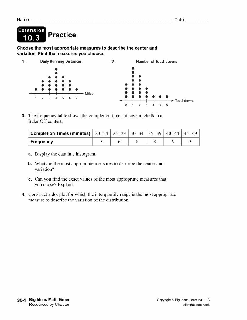
Choose the most appropriate measures to describe the center and variation. Find the measures you choose.
1. 2.
3. The frequency table shows the completion times of several chefs in a Bake-Off contest.
a. Display the data in a histogram.
b. What are the most appropriate measures to describe the center and variation?
c. Can you find the exact values of the most appropriate measures that you chose? Explain.
4. Construct a dot plot for which the interquartile range is the most appropriate measure to describe the variation of the distribution.
1 2 43 6 7Miles
Daily Running Distances
5
10 2 43 6Touchdowns
Number of Touchdowns
5
Completion Times (minutes) 20–24 25–29 30–34 35–39 40–44 45–49
Frequency 3 6 8 8 6 3
Copyright © Big Ideas Learning, LLC Big Ideas Math Green All rights reserved. Resources by Chapter
355
Activity
10.4 Start Thinking! For use before Activity 10.4
Activity
10.4 Warm Up For use before Activity 10.4
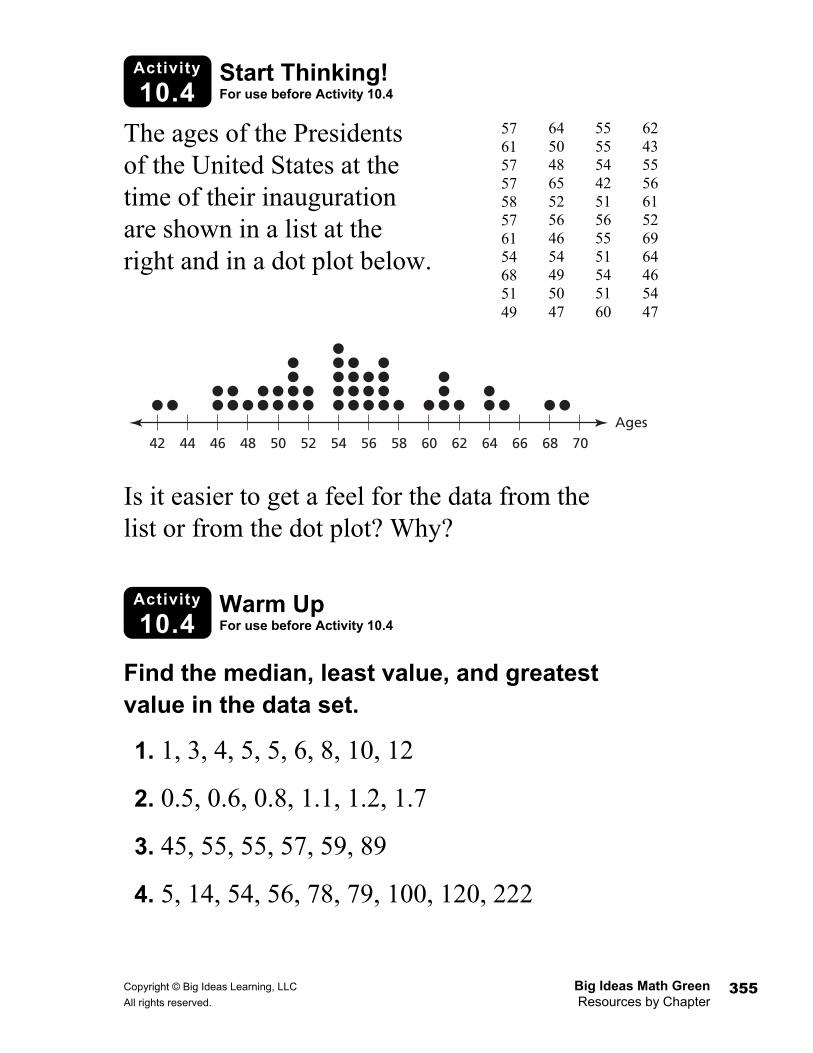
The ages of the Presidents of the United States at the time of their inauguration are shown in a list at the right and in a dot plot below.
Is it easier to get a feel for the data from the list or from the dot plot? Why?
Find the median, least value, and greatest value in the data set.
1. 1, 3, 4, 5, 5, 6, 8, 10, 12
2. 0.5, 0.6, 0.8, 1.1, 1.2, 1.7
3. 45, 55, 55, 57, 59, 89
4. 5, 14, 54, 56, 78, 79, 100, 120, 222
57 61 57 57 58 57 61 54 68 51 49
55 55 54 42 51 56 55 51 54 51 60
64 50 48 65 52 56 46 54 49 50 47
62 43 55 56 61 52 69 64 46 54 47
42 44 46 48 50 52 54 56 58 60 62 64 66 68 70Ages
Big Ideas Math Green Copyright © Big Ideas Learning, LLC Resources by Chapter All rights reserved. 356
Lesson
10.4 Start Thinking! For use before Lesson 10.4
Lesson
10.4 Warm Up For use before Lesson 10.4
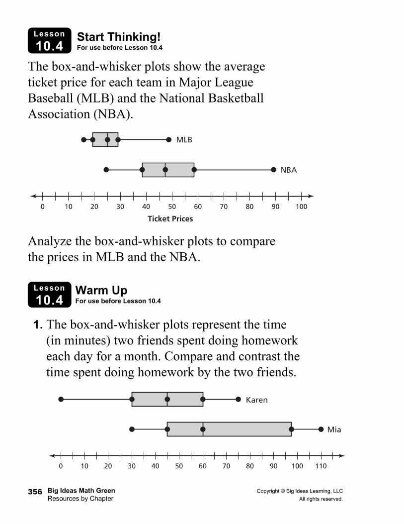
The box-and-whisker plots show the average ticket price for each team in Major League Baseball (MLB) and the National Basketball Association (NBA).
Analyze the box-and-whisker plots to compare the prices in MLB and the NBA.
1. The box-and-whisker plots represent the time (in minutes) two friends spent doing homework each day for a month. Compare and contrast the time spent doing homework by the two friends.
0 10 20 30 40 50 60 70 80 90 100
MLB
NBA
Ticket Prices
Karen
Mia
0 10 20 30 40 50 60 70 80 90 100 110
Copyright © Big Ideas Learning, LLC Big Ideas Math Green All rights reserved. Resources by Chapter
357
10.4 Practice A
Name _________________________________________________________ Date __________
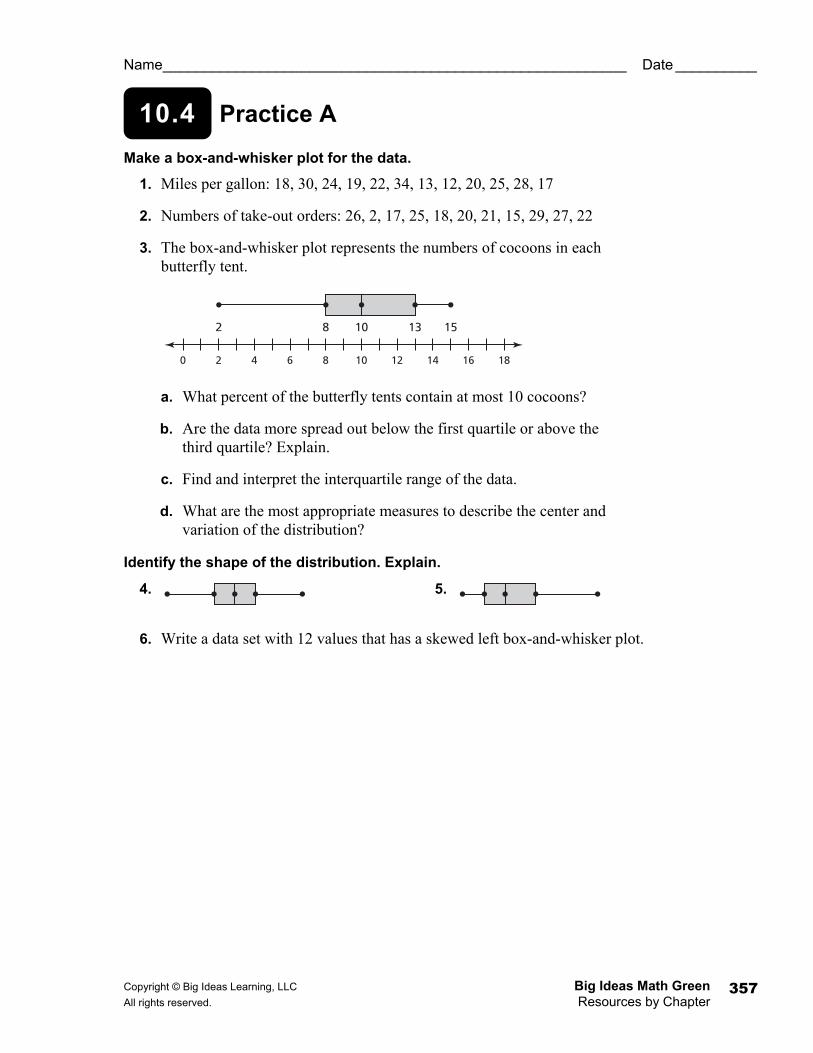
Make a box-and-whisker plot for the data.
1. Miles per gallon: 18, 30, 24, 19, 22, 34, 13, 12, 20, 25, 28, 17
2. Numbers of take-out orders: 26, 2, 17, 25, 18, 20, 21, 15, 29, 27, 22
3. The box-and-whisker plot represents the numbers of cocoons in each butterfly tent.
a. What percent of the butterfly tents contain at most 10 cocoons?
b. Are the data more spread out below the first quartile or above the third quartile? Explain.
c. Find and interpret the interquartile range of the data.
d. What are the most appropriate measures to describe the center and variation of the distribution?
Identify the shape of the distribution. Explain.
4. 5.
6. Write a data set with 12 values that has a skewed left box-and-whisker plot.
0 2 4 6 8 10 12 14 16 18
2 8 10 13 15
Big Ideas Math Green Copyright © Big Ideas Learning, LLC Resources by Chapter All rights reserved. 358
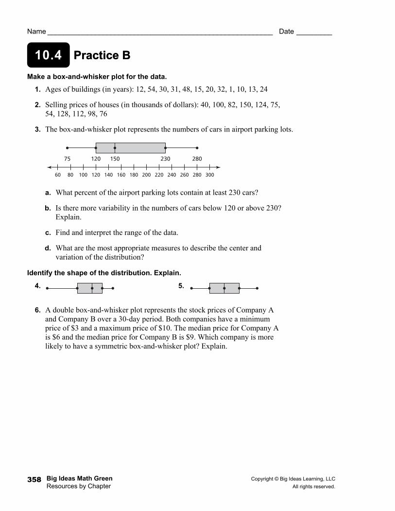
Practice B 10.4 Practice B
Name _________________________________________________________ Date _________
Make a box-and-whisker plot for the data.
1. Ages of buildings (in years): 12, 54, 30, 31, 48, 15, 20, 32, 1, 10, 13, 24
2. Selling prices of houses (in thousands of dollars): 40, 100, 82, 150, 124, 75, 54, 128, 112, 98, 76
3. The box-and-whisker plot represents the numbers of cars in airport parking lots.
a. What percent of the airport parking lots contain at least 230 cars?
b. Is there more variability in the numbers of cars below 120 or above 230? Explain.
c. Find and interpret the range of the data.
d. What are the most appropriate measures to describe the center and variation of the distribution?
Identify the shape of the distribution. Explain.
4. 5.
6. A double box-and-whisker plot represents the stock prices of Company A and Company B over a 30-day period. Both companies have a minimum price of $3 and a maximum price of $10. The median price for Company A is $6 and the median price for Company B is $9. Which company is more likely to have a symmetric box-and-whisker plot? Explain.
60 100 140 180 220 260 30080
75 150120 230 280
120 160 200 240 280
Copyright © Big Ideas Learning, LLC Big Ideas Math Green All rights reserved. Resources by Chapter
359
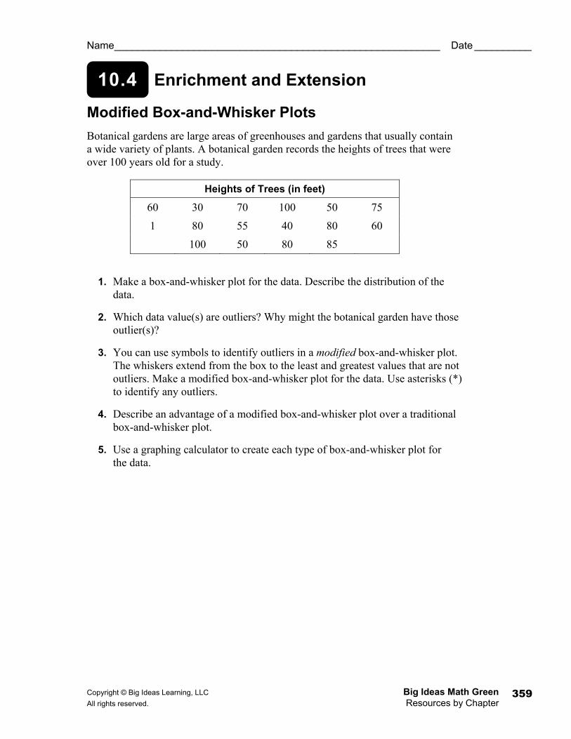
10.4 Enrichment and Extension
Name _________________________________________________________ Date __________
Modified Box-and-Whisker Plots Botanical gardens are large areas of greenhouses and gardens that usually contain a wide variety of plants. A botanical garden records the heights of trees that were over 100 years old for a study.
1. Make a box-and-whisker plot for the data. Describe the distribution of the data.
2. Which data value(s) are outliers? Why might the botanical garden have those outlier(s)?
3. You can use symbols to identify outliers in a modified box-and-whisker plot. The whiskers extend from the box to the least and greatest values that are not outliers. Make a modified box-and-whisker plot for the data. Use asterisks (*) to identify any outliers.
4. Describe an advantage of a modified box-and-whisker plot over a traditional box-and-whisker plot.
5. Use a graphing calculator to create each type of box-and-whisker plot for the data.
Heights of Trees (in feet)
60 30 70 100 50 75
1 80 55 40 80 60
100 50 80 85
Big Ideas Math Green Copyright © Big Ideas Learning, LLC Resources by Chapter All rights reserved. 360
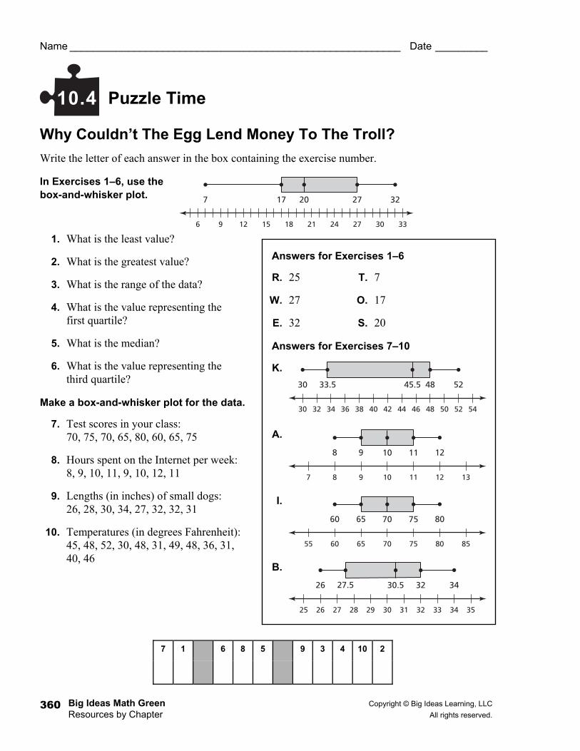
Puzzle Time
Answers for Exercises 1–6
R. 25 T. 7
W. 27 O. 17
E. 32 S. 20
Answers for Exercises 7–10
K.
A.
I.
B.
Name _________________________________________________________ Date _________
Why Couldn’t The Egg Lend Money To The Troll? Write the letter of each answer in the box containing the exercise number.
In Exercises 1–6, use the box-and-whisker plot.
1. What is the least value?
2. What is the greatest value?
3. What is the range of the data?
4. What is the value representing the first quartile?
5. What is the median?
6. What is the value representing the third quartile?
Make a box-and-whisker plot for the data.
7. Test scores in your class: 70, 75, 70, 65, 80, 60, 65, 75
8. Hours spent on the Internet per week: 8, 9, 10, 11, 9, 10, 12, 11
9. Lengths (in inches) of small dogs: 26, 28, 30, 34, 27, 32, 32, 31
10. Temperatures (in degrees Fahrenheit): 45, 48, 52, 30, 48, 31, 49, 48, 36, 31, 40, 46
10.4
7 1 6 8 5 9 3 4 10 2
6 9 12 15 18 21 24 27 30 33
17 27 32207
30 32 34 36 38 40 42 44 46 48 50 52 54
33.5 48 5245.530
7 8 9 10 11 12 13
9 11 12108
55 60 65 70 75 80 85
65 75 807060
25 26 27 28 29 30 31 32 33 34 35
27.5 32 3430.526
Copyright © Big Ideas Learning, LLC Big Ideas Math Green All rights reserved. Resources by Chapter
361
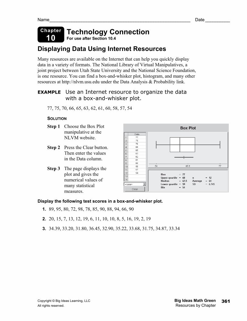
Chapter
10 Technology Connection For use after Section 10.4
Name _________________________________________________________ Date __________
Displaying Data Using Internet Resources Many resources are available on the Internet that can help you quickly display data in a variety of formats. The National Library of Virtual Manipulatives, a joint project between Utah State University and the National Science Foundation, is one resource. You can find a box-and-whisker plot, histogram, and many other resources at http://nlvm.usu.edu under the Data Analysis & Probability link.
EXAMPLE Use an Internet resource to organize the data with a box-and-whisker plot.
77, 75, 70, 66, 65, 63, 62, 61, 60, 58, 57, 54
SOLUTION
Step 1 Choose the Box Plot manipulative at the NLVM website.
Step 2 Press the Clear button. Then enter the values in the Data column.
Step 3 The page displays the plot and gives the numerical values of many statistical measures.
Display the following test scores in a box-and-whisker plot.
1. 89, 95, 80, 72, 98, 78, 85, 90, 88, 94, 66, 90
2. 20, 15, 7, 13, 12, 19, 6, 11, 10, 10, 8, 5, 16, 19, 2, 19
3. 34.39, 33.20, 31.80, 36.45, 32.90, 35.22, 33.68, 31.75, 34.87, 33.34