Embed Size (px)
Citation preview

Chapter 9
Correlation and Regression

Lesson 9-1/9-2, Part 1
Correlation

Registered Florida Pleasure Crafts and Watercraft
Related Manatee Deaths
020
4060
80
100
1991 1993 1995 1997 1999
Year
Boats in Ten Thousands Manatee Deaths

9-1 Overview
This chapter introduces methods for making
inferences based on sample data that come
in pairs or bivariate data.
Is there a relationship between the data?
If so, what is the equation?
Use that equation for prediction.

Correlation
A correlation exists between two variables
when one of them is related to the other in
some way.

Scatter Diagram
A scatterplot (or scatter diagram) is a graph
in which the paired (x, y) sample data are
plotted with a horizontal x-axis and a vertical
y-axis. Each individual (x, y) pair is plotted as
a single point.
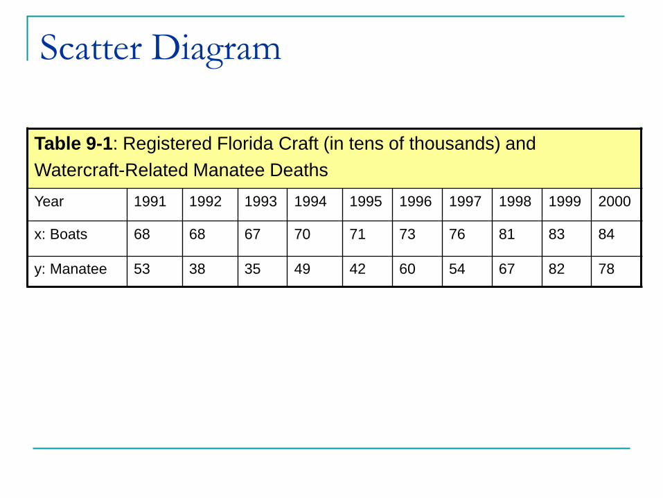
Table 9-1: Registered Florida Craft (in tens of thousands) and
Watercraft-Related Manatee Deaths
Year 1991 1992 1993 1994 1995 1996 1997 1998 1999 2000
x: Boats 68 68 67 70 71 73 76 81 83 84
y: Manatee 53 38 35 49 42 60 54 67 82 78
Scatter Diagram

Scatter Plots – TI83

Scatter Plot
Registered Boats (tens of thousands)
Ma
nate
e D
ea
ths f
rom
Boats
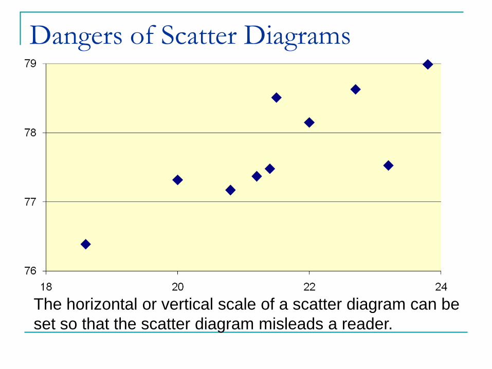
Dangers of Scatter Diagrams
The horizontal or vertical scale of a scatter diagram can be
set so that the scatter diagram misleads a reader.

Dangers of Scatter Diagrams
Because of this danger you must use numerical summaries
of paired data in conjunction with graphs in order to determine
the type of relationship.

Positive Linear Correlations
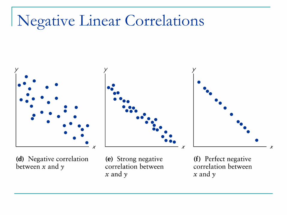
Negative Linear Correlations
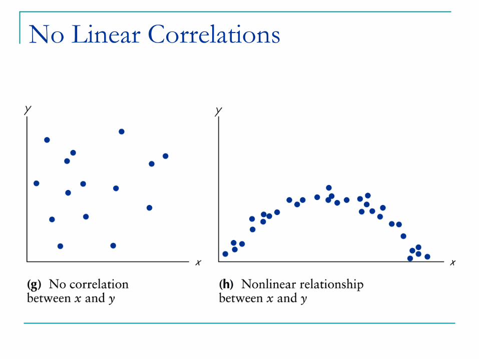
No Linear Correlations
Linear Correlation Coefficient
The linear correlation coefficient (r )
measures the direction and strength of the
linear relationship between paired x and y
values in a sample.
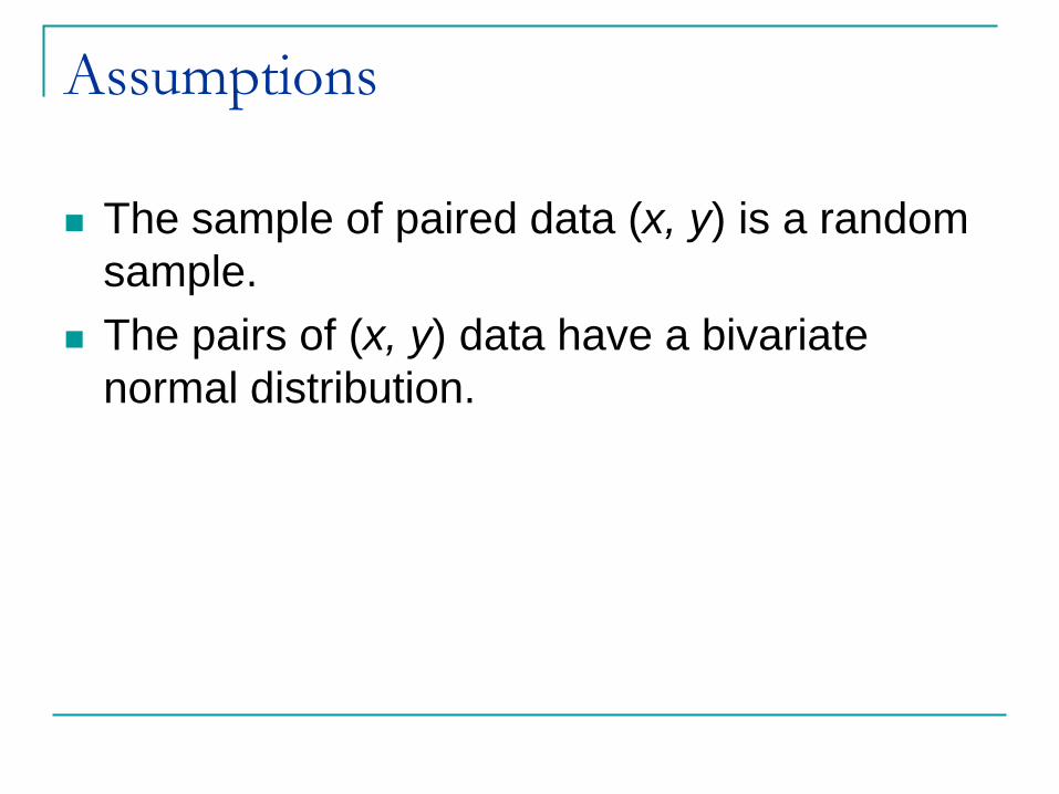
Assumptions
The sample of paired data (x, y) is a random
sample.
The pairs of (x, y) data have a bivariate
normal distribution.

Notation for the Linear
Correlation Coefficient n number of pairs of data present
x the sum of all x-values
2x the x-value should be squared and then those
squares added.
xy
linear correlation coefficient for a sample
2
x the sum of all x-values and the total then squared
r
the x-value should be multiplied by its corresponding
y-value
ρ linear correlation coefficient for a population

Formula for the Linear
Correlation Coefficient
2 22 2
n xy x yr
n x x n y y

Figure 9-7
Justification for r formula
1 x y
x x y yr
n s s
,x y centriod

Interpreting the Linear
Correlation Coefficient1) Linear correlation coefficient r is always between 1 and
– 1.
2) The closer r is to 1, the stronger the evidence of positive
association between the two variables.
3) The closer r is to a – 1, the stronger the evidence of
negative relationship between two variables.
4) If r is closer to 0, does not rule out any strong relationship
between x and y, there could still be a strong relationship
but one that is not linear.
5) The units of x and y plays no role in the interpretation of r.
6) Correlation is strongly effected by outlying observations.
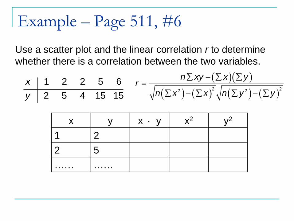
Example – Page 511, #6
Use a scatter plot and the linear correlation r to determine
whether there is a correlation between the two variables.
1 2 2 5 6
2 5 4 15 15
x
y
2 22 2
n xy x yr
n x x n y y
x y x y x2 y2
1 2
2 5
…… ……

Example – Page 511, #6
2 22 2
n xy x yr
n x x n y y
x y xy x2 y2
1 2 2 1 4
2 5 10 4 25
2 4 8 4 16
5 15 75 25 225
6 15 90 36 225
x = 16 y = 41 xy = 185 x = 70 x = 495

Example – Page 511, #6
2 22 2
n xy x yr
n x x n y y
x = 16 y = 41 xy = 185 x2 = 70 y2 = 495
2 2
5(185) 16 410.985
5 70 16 5 495 41r

Example – Page 511, #6
x = 16 y = 41 xy = 185 x2 = 70 y2 = 495

Example – Page 511, #6

Example – Page 511, #6
Using Table A-6, n = 5 and assuming = 0.05
Critical Value = 0.878; therefore r = 0.984 indicates
significant (positive) linear correlation.
Lesson 9-1/9-2, Part 2
Correlation

Interpreting the Linear
Correlation Coefficient The absolute value of the computed value
of r exceeds the value in Table A-6,
conclude that there is significant linear
correlation.
Otherwise there is not significant evidence
to support the conclusion of significant
linear correlation.

– 1 r 1
Value of r does not change if all values of
either variable are converted to a different
scale.
The r is not affected by the choice of x and y.
Interchange x and y and the value r will not
change.
r measures the strength of a linear
relationship.
Properties of the Linear
Correlation Coefficient
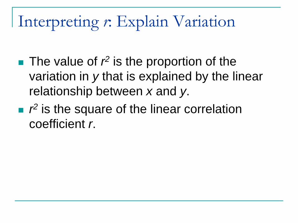
Interpreting r: Explain Variation
The value of r2 is the proportion of the
variation in y that is explained by the linear
relationship between x and y.
r2 is the square of the linear correlation
coefficient r.

Table 9-1: Registered Florida Craft (in tens of thousands) and
Watercraft-Related Manatee Deaths
Year 1991 1992 1993 1994 1995 1996 1997 1998 1999 2000
x: Boats 68 68 67 70 71 73 76 81 83 84
y: Manatee 53 38 35 49 42 60 54 67 82 78
Example: Boats and Manatees
A. Find the value of the linear correlation coefficient r.
B. What proportion of the variation of the manatee deaths can
be explained the variation in the number of boat
registrations?

Example: Boats and Manatees
with r = 0.922, we get r2 = 0.850.
We can conclude that 0.850 (or about 85%) of the
variation in manatee deaths can be explained by the
linear relationship between the number of boat
registrations and the number of manatee deaths from
boats. This implies that 15% of the variation of manatee
deaths cannot be explained by the number of boat
registrations.

Hypothesis Test – Method 1
We wish to determine whether there is a
significant linear correlation between two
variables.
Let Ho: = 0 No significant linear
correlation
Let H1: ≠ 0 Significant linear correlation
Let H1: > 0 Significant positive linear
correlation
Let H1: < 0 Significant negative linear
correlation

Test Statistic
21
2
rt
r
n
Critical Values: Use table A-3 with df = n - 2

Table 9-1: Registered Florida Craft (in tens of thousands) and
Watercraft-Related Manatee Deaths
Year 1991 1992 1993 1994 1995 1996 1997 1998 1999 2000
x: Boats 68 68 67 70 71 73 76 81 83 84
y: Manatee 53 38 35 49 42 60 54 67 82 78
Example: Boats and ManateesTest the claim that there is a linear correlation between
the number of registered boats and the number of manatee
deaths from boats.
Ho: = 0
H1: ≠ 0

Example: Boats and Manatees
21
2
rt
r
n
2
0.9226.71
1 0.922
10 2
p-value = 1.51E – 4

Example: Boats and Manatees6.71
0.0001
0.05
2 8
t
p value
df n
0.025 0.025
– 2.306 2.306
Critical Values
Example: Boats and Manatees
There is sufficient evidence to reject Ho, since
p-value = 0.0001 < = 0.05 and conclude that
there is significant correlation between the
number of registered boats and the number of
manatee deaths from boats.

Hypothesis Test – Method 2
We wish to determine whether there is a
significant linear correlation between two
variables.
Test statistic is r
Critical values refer to Table A-6 with no degrees
of freedom.

Example – Page 511, #2
Using data collected from the FBI and the Bureau of Alcohol,
Tobacco, and Firearms, the number of registered automatic
Weapons and the murder rate (in murders per 100,000
people) was obtained for each of eight randomly selected
states. Statdisk was used to find the value of the linear
correlation Coefficient is r = 0.885.
a) Is there a significant linear correlation between the
number of registered automatic weapons and the
murder rate?
8
0.885
n
r
Use table A-6 assume = 0.05

Example – Page 511, #2
Since the absolute value of 0.885 is greater
than 0.707 there is significant positive
correlation
critical values = 0.707

Example – Page 511, #2
0.885r 2 2(0.885) 0.783r
b) What proportion of the variation in the murder rate can be
explained by the linear relationship between the murder
rate and the number of registered automatic weapons?
The proportion of the variation in murder rate
that can be explained in terms of variation in
registered automatic weapons is 78.3%.

Example – Page 512, #8
Listed below are the numbers of fires (in thousands) and the
acres that were burned (in millions) in 11 western states in
year of the last decade (based on the data from USA Today.
Is there a correlation?
73 69 58 48 84 62 57 45 70 63 48
6.2 4.2 1.9 2.7 5.0 1.6 3.0 1.6 1.5 2.0 3.7
Fires
Acres
Burned

Example – Page 512, #8
LinRegTTest
1
: 0
: 0
0.05
oH ρ
H ρ
α
2
0.1031
0.5173
26.8%
p value
r
r
There is sufficient evidence to fail to reject Ho since
the p-value > α and are unable to conclude that there
is significant linear correlation between the number
of fires and the numbers of acres burned.
Example – Page 512, #8
The results do not support any conclusion about
the removal of trees affecting the risk of fires,
because none of the variables addresses the
removal/density of trees.
The data were listed under a headline of “Loggers seize
on fires to argue for more cutting.” Do the data support the
argument that as loggers remove more trees, the risk of fire
decreases because the forests are less dense?

Common Errors Involving
Correlation Causation: It is wrong to conclude that
correlation implies causality.
Averages: Averages suppress individual
variation and may inflate the correlation
coefficient.
Linearity: There may be some relationship
between x and y even when there is no
significant linear correlation.

Example – Page 515, #26
Describe the error in the stated conclusion.
Given: There is significant linear correlation between
personal income and years of education.
Conclusion: More education causes a person‟s income to
rise.
The presence of a significant linear correlation does
not necessarily mean that one of the variables
causes the other. Correlation does not imply
causality.
Example – Page 515, #28
Describe the error in the stated conclusion.
Given: There is significant linear correlation between
state average tax burdens and state average incomes.
Conclusion: There is significant linear correlation between
Individual tax burdens and individual incomes rise.
Averages tend to suppress variation among
individuals, so a correlation among averages does
not necessary mean that there is correlation among
individuals.
Lesson 9-3, Part 1
Regression

Objective
In lesson 9-2 we use a scatter diagram and
linear correlation coefficient to indicate that a
linear relation exists between two variables.
In lesson 9-3 we are going to find a linear
equation that describes the relation between
the two variables.

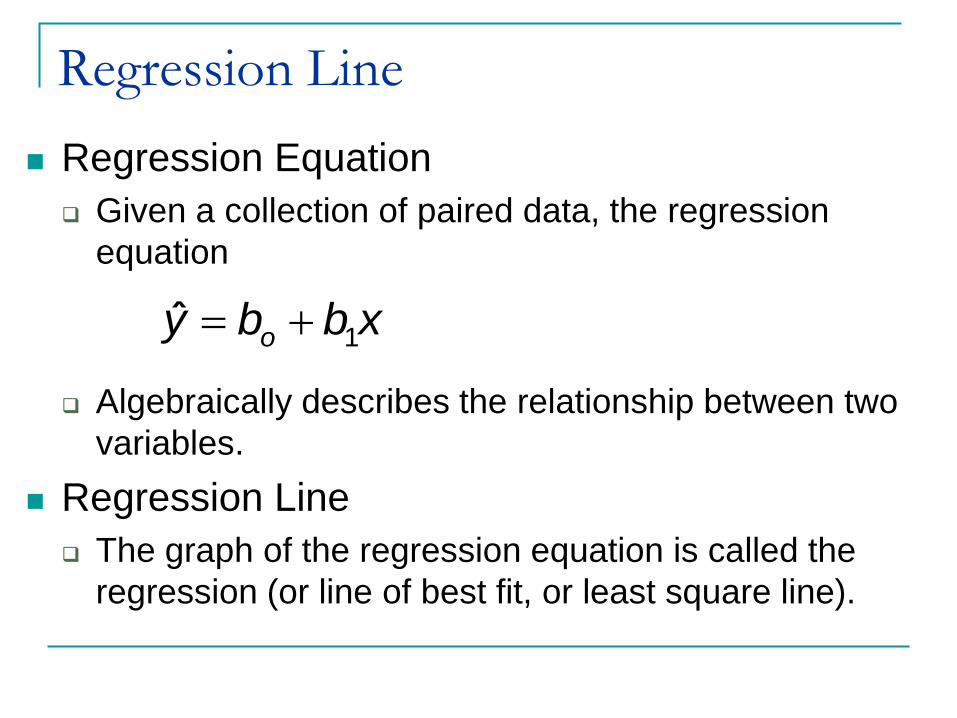
Regression Equation
The regression equation expresses a
relationship between x (called the
independent variable, predictor variable or
explanatory variable), and y (called the
dependent variable or response variable)
The typical equation of a straight line
is expressed in form , where bo is
the y-intercept and b1 is the slope.
y mx b
1ˆ
oy b b x

Assumptions
We are investigating only linear relationships
For each x-value, y is a random variable having a
normal (bell-shaped) distribution.
All of these y distributions have the same
variance.
For a given value of x, the distribution of y-values
has a mean that lies on the regression line.
Results are not seriously affected if departures
from normal distributions and equal variances are
not too extreme.
Regression Line
Regression Equation
Given a collection of paired data, the regression
equation
Algebraically describes the relationship between two
variables.
Regression Line
The graph of the regression equation is called the
regression (or line of best fit, or least square line).
1ˆ
oy b b x

Notation for Regression Equation
Population
Parameter
Sample
Statistic
TI
y-intercept of
Regression
equationo bo a
Slope of
regression
equation1 b1 b
Equation of the
regression line y = o + 1x y = a + bx1
ˆoy b b x

Formulas for bo and b1
Formula 9-2 (Slope)
Formula 9-3 (y-intercept)
1 22
n xy x yb
n x x
1ob y b x
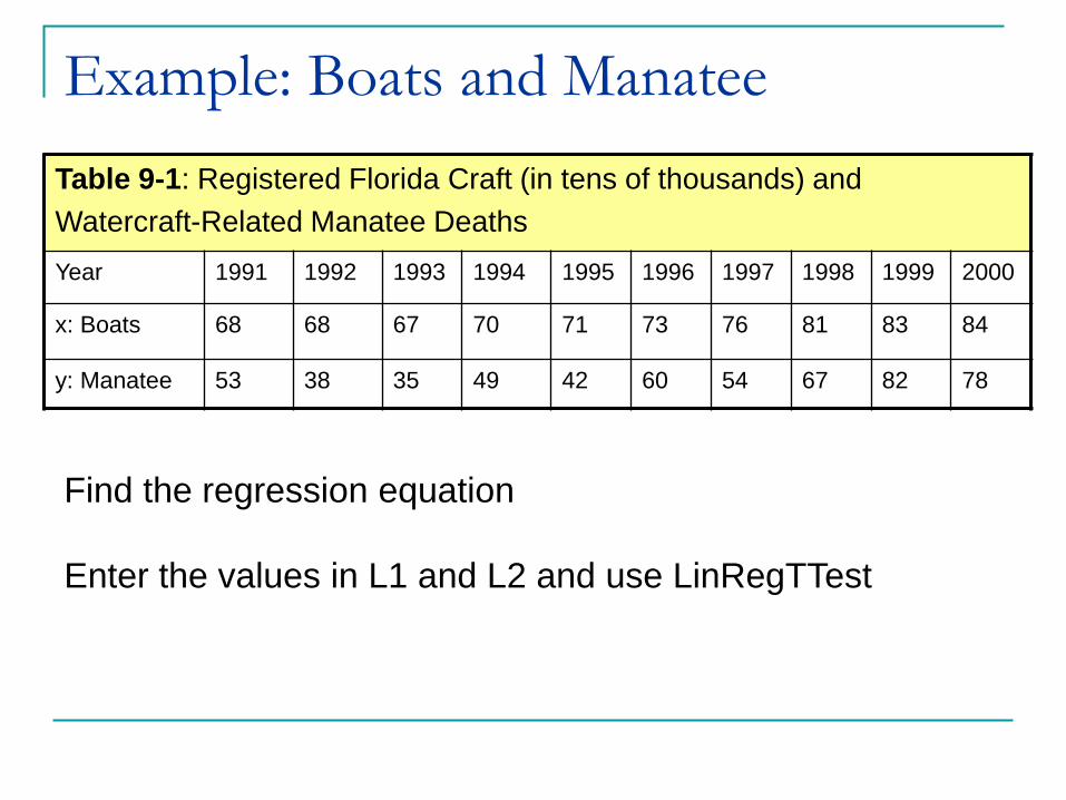
Table 9-1: Registered Florida Craft (in tens of thousands) and
Watercraft-Related Manatee Deaths
Year 1991 1992 1993 1994 1995 1996 1997 1998 1999 2000
x: Boats 68 68 67 70 71 73 76 81 83 84
y: Manatee 53 38 35 49 42 60 54 67 82 78
Example: Boats and Manatee
Find the regression equation
Enter the values in L1 and L2 and use LinRegTTest
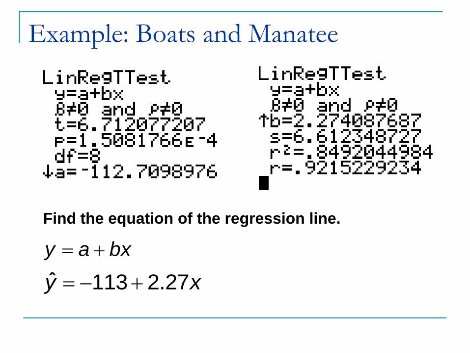
Example: Boats and Manatee
Find the equation of the regression line.
y a bx
ˆ 113 2.27y x
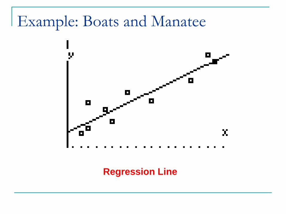
Example: Boats and Manatee
Regression Line

Example – Page 527, #6
Find the equation of the regression line. Use the given data.
1 2 2 5 6
2 5 4 15 15
x
y
Enter the data into L1 and L2 and use LinRegTTest

Example – Page 527, #6
ˆ 0.957 2.86y x

Using the Regression Equation
for Predictions
In predicting a value of y based on some given
value of x…
If there is not a significant linear correlation, the
best predicted y-value is
If there is significant linear correlation, the best
predicated y-value is found by substituting the
x-value into the regression equation.
( ).y
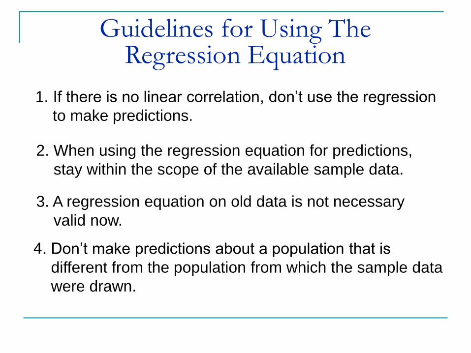
Guidelines for Using TheRegression Equation
1. If there is no linear correlation, don‟t use the regression
to make predictions.
2. When using the regression equation for predictions,
stay within the scope of the available sample data.
3. A regression equation on old data is not necessary
valid now.
4. Don‟t make predictions about a population that is
different from the population from which the sample data
were drawn.
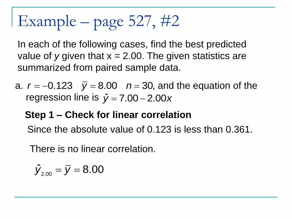
Example – page 527, #2
In each of the following cases, find the best predicted
value of y given that x = 2.00. The given statistics are
summarized from paired sample data.
0.123 8.00 30,r y n a. and the equation of the
regression line is ˆ 7.00 2.00y x
Step 1 – Check for linear correlation
Since the absolute value of 0.123 is less than 0.361.
There is no linear correlation.
2.00ˆ 8.00y y

Example – page 527, #2
0.567 8.00 30,r y n b. and the equation of the
regression line is ˆ 7.00 2.00y x
Step 1 – Check for linear correlation
Since the absolute value of 0.567 is greater than 0.361.
There is linear correlation.
2.00
ˆ 7.00 2.00
ˆ 7.00 2.00(2.00)
y x
y
2.00ˆ 3.00y

Example – Page 528, #8Find the best predicted value for the number of acres burned
given that there was 80 fires.
73 69 58 48 84 62 57 45 70 63 48
6.2 4.2 1.9 2.7 5.0 1.6 3.0 1.6 1.5 2.0 3.7
Fires
Acres
Burned
Enter data into L1 and L2 and use LinRegTTest to check
for linear correlation.

Lesson 9-3, Part 2
Regression

Example – Page 528, #8
P-value > α there is no significant linear correlation.
Use for predication when
ˆ 1.13 0.0677y x Regression Equation:
y 80.x
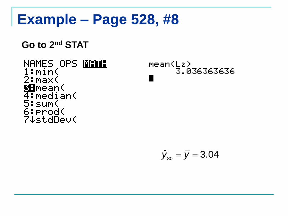
Example – Page 528, #8
80ˆ 3.04y y
Go to 2nd STAT

Interpreting the Regression Equation
Marginal change is the amount that a variable
changes when the other variable changes by
exactly one unit.
Outlier is a point lying far away from the other
data points.
Influential point strongly effects the graph of
the regression line.

Example – Page 530, #26
Refer to the sample data listed in Table 9-1. If we include
another pair of values consisting of x = 120 (for 1,200,000
boats) and y = 10 (manatee deaths from boats), is this new
point an outlier? Is it an influential point?
Table 9-1: Registered Florida Craft (in tens of thousands) and
Watercraft-Related Manatee Deaths
Year 1991 1992 1993 1994 1995 1996 1997 1998 1999 2000
x: Boats 68 68 67 70 71 73 76 81 83 84
y: Manatee 53 38 35 49 42 60 54 67 82 78

Example – Page 530, #26
Yes; the point is an outlier,
since it is far from the other
data points – 120 is far from
other boat values, and 10 is
far from the other manatee
death values.
Yes; the point is an influential one, since it will
dramatically alter the regression line – the original regression
line predicts and so the new
regression line will have to change considerably to come close
to (120, 10).
ˆ 113 2.27(120) 159.4,y

Residuals and Least-Square Property
Residual
For a sample paired (x, y) data, the difference
between the observed sample y-value and y-value
that is predicted by using the regression equation.
Least-Square Property
A straight line satisfies this property if the sum of the
squares of the line residuals is the smallest sum
possible.
ˆy y

Example: Residuals
1 2 4 5
4 24 8 32
x
y
ˆ 5 4y x
1 2 4 5
ˆ 9 13 21 25
x
y

The Method Least-Square
The line that “best” describes the relation
between two variables is the one that makes
the residuals “as small as possible.”
The least-square regression line minimizes
the square of the vertical distance between
observed values and predicated values.
Minimize (residuals)2

Lesson 9-4, Part 1
Variation and
Prediction Intervals

Different types of Variation
We consider different types of variation that
can be used for two major applications:
To determine the proportion of the variation in y
that can be explained by the linear relationship
between x and y.
To construct interval estimates of predicted y-
values such intervals are called prediction
intervals.

Total and Explained Deviations
Total Deviation from the mean of the particular
point (x, y) is the vertical distance which
is the distance between the point (x, y) and the
horizontal line passing through the sample
mean .
Explained Deviation is the vertical distance
which is the distance between the
predicted y-value and the horizontal line
passing through the sample mean .
y y
y
y y
y
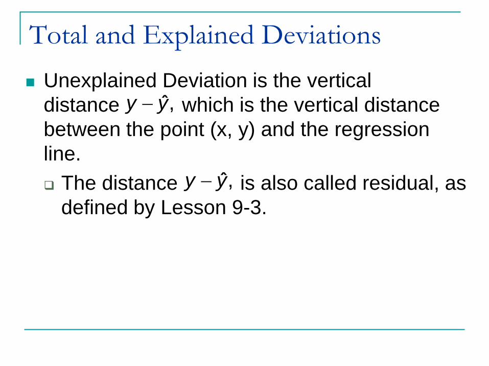
Total and Explained Deviations
Unexplained Deviation is the vertical
distance which is the vertical distance
between the point (x, y) and the regression
line.
The distance is also called residual, as
defined by Lesson 9-3.
ˆ,y y
ˆ,y y

Deviations

Total Deviation
(total deviation) = (explained deviation) + (unexplained deviation)
y y y y ˆy y
2
y y 2
y y 2
ˆy y
Formula 9-4

Coefficient of Determination
The coefficient of determination measures
the percentage of total variation in the y-value
that is explained by the regression line.
2
2
2
y yr
y y
explained variation
total variation

Example – Page 538, #2
Use the value of the linear correlation coefficient r to find the
coefficient of determination and the percentage of the total
variation that can be explained by the linear relationship
between the two variables.
0.6r
2 2( 0.6) 0.36r
The portion of the total variation explained by the regression
line is 36%

Standard Error of Estimate
The standard error of estimate is a measure
of the differences (or distances) between the
observed sample y-values and the predicted
y-values that are obtained using the
regression equation.
2 2
1ˆ
2 2
o
e
y y y b y b xys
n n
y

Example – Page 539, #10
Fourteen different second-year medical students took
blood pressure measurements of the same patient and
the results are listed below.
138 130 135 140 120 125 120 130 130 144 143 140 130 150
82 91 100 100 80 90 80 80 80 98 105 85 70 100
Systolic
Diastolic
Enter the data into L1 and L2 and use LinRegTtest

Example – Page 539, #10
A. Find the explained variation .
Step 1 – Find the regression equation
ˆ 14.38 0.769y x
2
y y

Example – Page 539, #10
Step 2 – Use L3 to find y

Example – Page 539, #10
Step 3 – Use L4 to find y
Use 2nd Stat

Example – Page 539, #10
Step 4 – Use L4 to find 2
y y

Example – Page 539, #10
Step 5 – Find
Explained Variation 2
y y
2
y y
Use 2nd Stat
628.58

Example – Page 539, #10
B. Find the unexplained variation . 2
ˆy y
Step 1 – Use L5 to find 2ˆ( )y y
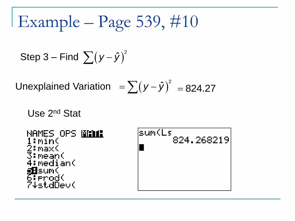
Example – Page 539, #10
Step 3 – Find
Unexplained Variation 2
ˆy y
2
ˆy y
Use 2nd Stat
824.27

Example – Page 539, #10
C. Find the total variation
TV EV UV
628.58 824.27
1452.85
2
y y

Example – Page 539, #10
D. Find the coefficient of determination.
2 0.4328r

Example – Page 539, #10
E. Find the standard error of estimate
8.2878e
s

Lesson 9-4, Part 2
Variation and
Prediction Intervals

Prediction Intervals
Prediction Intervals are intervals constructed
about the predicted value of y that are used
to measure the accuracy of a single predicted
value.

Predication Interval
for an Individual y
ˆ ˆy E y y E
2
222
( )11 o
α e
n x xE t s
n n x x
xo = the given value of x
t/2 = has n – 2 degree of freedom in table A-3
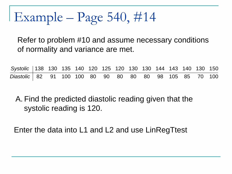
Example – Page 540, #14
Refer to problem #10 and assume necessary conditions
of normality and variance are met.
138 130 135 140 120 125 120 130 130 144 143 140 130 150
82 91 100 100 80 90 80 80 80 98 105 85 70 100
Systolic
Diastolic
A. Find the predicted diastolic reading given that the
systolic reading is 120.
Enter the data into L1 and L2 and use LinRegTtest

Example – Page 540, #14
Step 1 – Find the regression equation
ˆ 14.38 0.769y x
14.38 0.769(120)
77.9 78

Example – Page 540, #14
B. Find a 95% predication interval estimate of the diastolic
reading given that the systolic reading is 120.
Step 1 – Identify the calculations needed for the
margin of error formula
n 14
x 18752x 252179
x 133.929
2
2n x x 14881

Example – Page 540, #14
n 14
x 18752x 252179
x 133.929
2
2 14881n x x
12,0.0252.179t 8.2878
es
2
22
2
( )11 o
α e
n x xE t s
n n x x
21 14(120 133.929)
2.179 8.2878 1 20.2214 14881

Example – Page 540, #14
Step 2 – Use and margin of errory
ˆ ˆy E y y E
78 20.22 78 20.22y
12057.78 98.22y
When x = 120, (78) we are 95% certain that the
corresponding y-value is between 57.78 and 98.22

Interpreting a Computer DisplayMinitabThe regression equation isNicotine = 0.154 + 0.0651 Tar
Predictor Coef SE Coef T PConstant 0.15403 0.04635 3.32 0.003Tar 0.065052 0.003585 18.15 0.000
S = 0.08785 R-Sq = 92.4% R-Sq(adj) = 92.1%
Predicted values for New ObservationsNew Obs Fit SE Fit 95.0% CI 95.0% PI1 1.2599 0.0240 (1.2107, 1.3091) (1.0731, 1.4468)
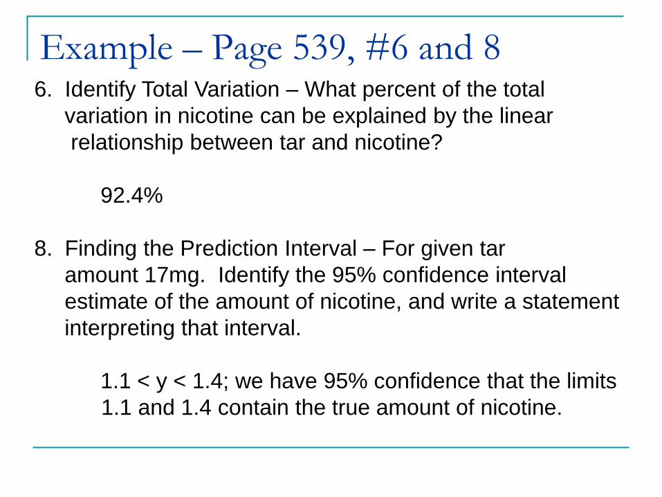
Example – Page 539, #6 and 86. Identify Total Variation – What percent of the total
variation in nicotine can be explained by the linear
relationship between tar and nicotine?
92.4%
8. Finding the Prediction Interval – For given tar
amount 17mg. Identify the 95% confidence interval
estimate of the amount of nicotine, and write a statement
interpreting that interval.
1.1 < y < 1.4; we have 95% confidence that the limits
1.1 and 1.4 contain the true amount of nicotine.

Lesson 9-6
Modeling

Mathematical Modeling
A mathematical model is a mathematical
function that „fits‟ or describes real-world data

y a bx
TI Generic Models2y ax bx c lny a b x
xy abby ax 1 bx
cy
ae
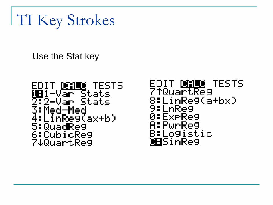
TI Key Strokes
Use the Stat key

Development of a
Good Mathematics Model Look for a Pattern in the Graph
Examine the graph of the plotted points and compare
the basic pattern to the known generic graphs.
Find and Compare Values of R2
Select functions that result in larger values of R2,
because such larger values correspond to functions
that better fit the observed points.
Think
Use common sense. Don‟t use a model that lead to
predicted values known to be totally unrealistic.

Example – Page 554, #2
Construct a scatterplot and identify the mathematical
model that best fits the given data. Assume that the model
is to be used only for the scope of the given data, and
considered only linear, quadratic, logarithmic, exponential
and power models.
1 2 3 4 5 6
3 8 13 18 23 28
x
y

Example – Page 554, #2
GRAPH Zoom #9:Zoomstat

Example – Page 554, #2
Step 3 – Decide which mathematical model
Linear: ˆ 5 2y x

Example – Page 554, #4
Construct a scatterplot and identify the mathematical
model that best fits the given data. Assume that the model
is to be used only for the scope of the given data, and
considered only linear, quadratic, logarithmic, exponential
and power models.
1 2 3 4 5 6
2 2.828 3.464 4 4.472 4.899
x
y

Example – Page 554, #4
GRAPH Zoom #9:Zoomstat

Example – Page 554, #4
Step 3 – Decide which mathematical model
Power: 12ˆ 2y x

Example – Page 555, #6
Refer to the annual high values of the Dow-Jones Industrial
Average that are listed in Data Set 25 in Appendix B. What is
the best predicted value for the year 2001? Given that the
Actual high value in 2001 was 11,350, how good was the
predicted value? What does the pattern suggest about the
stock market for investment purposes?

Example – Page 555, #6

Example – Page 555, #6
Decide which mathematical model
Exponential: ˆ 762.701 1.13456x
y

Example – Page 555, #6
What is the best predicted value for the year 2001?
Given that the actual high value in 2001 was 11,350, how
good was the predicted value?
ˆ 762.701 1.13456x
y
2222
ˆ 762.701(1.13456) 12,262y
It misses by a fairly large amount.