Embed Size (px)
Citation preview
Full Terms & Conditions of access and use can be found athttp://www.tandfonline.com/action/journalInformation?journalCode=pwsr20
Download by: [Washington University in St Louis] Date: 22 July 2016, At: 13:17
Writing Systems Research
ISSN: 1758-6801 (Print) 1758-681X (Online) Journal homepage: http://www.tandfonline.com/loi/pwsr20
Characteristics of print in books for preschoolchildren
Rebecca Treiman, Nicole Rosales & Brett Kessler
To cite this article: Rebecca Treiman, Nicole Rosales & Brett Kessler (2016) Characteristicsof print in books for preschool children, Writing Systems Research, 8:1, 120-132, DOI:10.1080/17586801.2015.1074058
To link to this article: http://dx.doi.org/10.1080/17586801.2015.1074058
Published online: 09 Oct 2015.
Submit your article to this journal
Article views: 68
View related articles
View Crossmark data
Characteristics of print in books for preschool children
Rebecca Treiman, Nicole Rosales, and Brett Kessler
Department of Psychology, Washington University in St. Louis, St. Louis, USA
Children begin to learn about the characteristics of print well before formal literacy instructionbegins. Reading to children can expose them to print and help them learn about its characteris-tics. This may be especially true if the print is visually salient, for studies suggest that prereaderspay more attention to such print than to print that is visually less salient. To shed light on thecharacteristics of the print that US children see in books, especially those characteristics thatmay contribute to visual salience, we report a quantitative analysis of 73 books that werechosen to be representative of those seen by preschoolers. We found that print that is visuallysalient due to colour, variation and other features tends to be more common on the covers ofbooks than in the interiors. It also tends to be more common in recently published booksthan in older books. Even in recent books, however, the print is much less visually salientthan the accompanying pictures. Many studies have examined the behaviour of adults and chil-dren during shared reading, but little research has examined the characteristics of books them-selves. Our results provide quantitative information about this topic for one set of characteristicsin books for young US children.
Keywords: Books; Book reading; Preschool children; Print concepts; Print awareness; Printsalience.
Formal literacy instruction begins around six years of age in many countries. Before thattime, however, children in the US and other modern societies are exposed to a good dealof print. Writing appears on such places as cereal boxes and signs; some toys, such asblocks, may even be formed in the shapes of letters. Experience with such materials giveschildren a chance to begin learning about the characteristics of written language, forexample, that it is composed of units that repeat across words. Such knowledge, oftenreferred to as print awareness or concepts about print, helps children to benefit from theformal literacy instruction that is provided at school (Storch & Whitehurst, 2002; Stuart,1995). One avenue through which preschool children are exposed to print is being readto from books that are especially designed for children, or from looking at such books ontheir own. This is a common activity, with about half of the parents of 1- to 5-year-oldsin a representative US sample reporting that a family member reads to the child at leastonce a day (US Census Bureau, 2010) and other studies reporting that preschool childrenlook at books on their own several times a week (Scarborough, Dobrich, & Hager, 1991).In the present study, we examined the characteristics of the print in a large sample of
Correspondence Rebecca Treiman, Department of Psychology, Washington University in St. Louis, One Brook-ings Drive, St. Louis MO 63130, USA [email protected]
WRITING SYSTEMS RESEARCH, 2016Vol. 8, No. 1, 120–132, http://dx.doi.org/10.1080/17586801.2015.1074058
© 2015 Taylor & Francis
Dow
nloa
ded
by [
Was
hing
ton
Uni
vers
ity in
St L
ouis
] at
13:
17 2
2 Ju
ly 2
016
books that were chosen to be representative of those seen by middle class US 3- to 5-year-olds. We sought to provide a quantitative description of the print in these books and, by sodoing, to shed light on what children may learn about print from exposure to books beforethey are able to read the print themselves.
One aspect of print that was of particular interest in this study was print that is visuallysalient due to its colour, size or other characteristics. It has been suggested that books thatcontain a good deal of such print are an important vehicle for early literacy learning becausethey support the development of print awareness (Cetin & Bay, 2015; Zucker, Justice, &Piasta, 2009). This idea is based on the finding that preschool children pay more attentionto writing that is large or bold or embedded in pictures than writing that does not havethese characteristics (Neumann, Acosta, & Neumann, 2014; Neumann, Summerfield, &Neumann, 2015; Smolkin, Conlon, & Yaden, 1988; Smolkin, Yaden, Brown, & Hofius,1992). When reading to children, moreover, teachers of preschool children appear to talkmore often about the printed letters and words if books are high in print salience than ifthey are low (Dynia, Justice, Pentimonti, & Piasta, 2013; Zucker et al., 2009).
If print-salient books are an important vehicle for promoting print awareness, are suchbooks common among those that US preschoolers see? What specific types of visuallysalient print do books include? Given the potential value of print-salient books, it is impor-tant to examine these issues. In one of the few studies to have done so, Zucker et al. (2009)developed a measure of print salience that combines a number of characteristics, includingvariation in the style and colour of letters and embedding of written words in illustrations.Researchers reported one to two salient print features per page, on average, when they exam-ined the print in 15 books for US preschool children (Dynia et al., 2013; Zucker et al., 2009).In addition, the studies found a good deal of variation across books. However, books wereselected for these studies in part because they contained visually salient print. They may notbe representative of the books to which young children are normally exposed. Also, becauseZucker and colleagues combined a number of attributes into their measure of print salience,studies using this measure do not provide information about the specific kinds of visuallysalient print that appears in books.
In the only other study, to our knowledge, to have examined these issues, Cetin and Bay(2015) examined the print in 100 books designed for US preschoolers. They found that mostof the books contained several instances of visually salient print. Among the most commonwere print embedded in illustrations or speech balloons and changes in the orientation,colour or size of letters. When Cetin and Bay compared the US books to a sample of 100books for preschoolers in Turkey, they found that the US books included more examplesof visually salient print. A weakness of the Cetin and Bay study is that the books were ran-domly chosen from libraries, bookshops and preschool classrooms, meaning that theselected books were not necessarily the ones that children see most often.
The present study was designed to examine a variety of features of the print in books forUS preschool children, especially features that are thought to contribute to visual salience,and to compare the print to the pictures on several dimensions. We selected a sample ofbooks that, as judged by parents, teachers and children’s librarians, are popular amongmiddle-class US 3- to 5-year-olds. Going beyond the previous studies, we examined bothprint on the covers of books and print on the interior pages. We hypothesised that,because covers of books are designed in part to attract attention, the print on covers maybe larger, more colourful and more varied than the print on interior pages. Such a resultmight be taken to suggest that parents and teachers would do well to point out anddiscuss the writing on book covers when sharing books with children. We also consideredpossible differences across the books as a function of year of publication. For example, isprint that is embedded in illustrations more common in recent books than in older books?
WRITING SYSTEMS RESEARCH 121
Dow
nloa
ded
by [
Was
hing
ton
Uni
vers
ity in
St L
ouis
] at
13:
17 2
2 Ju
ly 2
016
Newer technology makes such layouts easier and more inexpensive than in the past, and sowe suspected that such things as embedded print and coloured print would be more commonin recent books than in older ones. In what follows, we describe the features that we codedand our reasons for examining each one.
Print colour. Children prefer bright colours over black (e.g., Malter, 1948), and colouredprint has been considered visually salient (Cetin & Bay, 2015; Zucker et al., 2009). Wecoded whether words were printed all in black or whether they included coloured letters.
Background colour. Although the background on which a word is printed has not beenconsidered in previous studies of print salience, children might find writing on a colouredbackground to be more attractive than writing on a white background.
Font and letter style. We examined whether letters were in an upright font of the kindtypically used in books for adults (e.g., ‹K›, ‹K›) or whether they were in an atypicalstyle, such as cursive, bold or a decorative font. The latter styles have been described asvisually salient (Cetin & Bay, 2015), and studies suggest that they draw preschoolers’ atten-tion (Neumann et al., 2014). We also coded whether the letters of the randomly chosen wordwere in a serif font (e.g., ‹k›) or a font without serifs (e.g., ‹k›). Although this is not an aspectof print salience per se, it is of interest given that teachers generally consider fonts withoutserifs to be easier for children than serif fonts (Walker & Reynolds, 2003), perhaps in partbecause the former look simpler and are more similar to the block printing that childrenproduce. Also, Walker and Reynolds suggested that fonts without serifs are morecommon in recent books than in older books.
Letter case. Upper-case letters are more visually distinctive and often larger than lower-case ones, and use of upper-case letters in books has been considered to increase print sal-ience (Zucker et al., 2009). We determined how often words were written in all upper-caseletters and how often they had other patterns, including all lower-case letters or an initialupper-case letter followed by all lower-case ones.
Spatial arrangement.Words in which the letters have an arrangement other than the stan-dard horizontal have been considered to be high in salience (Cetin & Bay, 2015; Zuckeret al., 2009). We examined the frequency with which alternative arrangements were used.
Embedding. Studies suggest that children look more at print when it is embedded in illus-trations or speech bubbles and that, when being read to, they make more comments on suchprint (Cetin & Bay, 2015; Neumann et al., 2014; Smolkin et al., 1988; Zucker et al., 2009).We coded the books in our study for this feature.
Size of print. Studies suggest that prereaders are more likely to look at print that is largerthan print that is smaller (Neumann et al., 2014). We analysed print size by measuring theheight of the letters.
Variation in print features. Variation in print features, such as variation in colour acrossthe words on a page, has been considered an important aspect of print salience (Cetin & Bay,2015; Zucker et al., 2009). Studies suggest that such variation is associated with increasedtalk about print by preschool teachers (Dynia et al., 2013). Whereas previous studies havelumped together variation in different features, we distinguished variation in print colour,background colour, letter style, font size and spatial arrangement. We also distinguished var-iation within words and variation across words. If variation is more common across wordsthan within words, this could suggest that words have a typographical uniformity that mighthelp children learn that they function as units.
Colour of print as compared to pictures. Previous studies have assessed the print salienceof books in terms of characteristics of the print itself, but it is also informative to compare theprint to the pictures. We coded pages containing print for whether the print was all black orwhether it included some colour, and we did the same for pictures. By comparing the resultsfor print and pictures, we could determine whether colour was more common in pictures
122 R. TREIMAN ET AL.
Dow
nloa
ded
by [
Was
hing
ton
Uni
vers
ity in
St L
ouis
] at
13:
17 2
2 Ju
ly 2
016
than in print, and whether this differed for book covers and interiors, and for newer booksand older books.
Amount of print and amount of print as compared to pictures. As another way of com-paring print and pictures, we compared the number of pages containing print to the numberof pages containing pictures. For pages that contained both, we also compared the areadevoted to print and the area devoted to pictures. This comparison is of interest giventhat prereaders spend more time looking at printed words if they are larger than the surround-ing pictures than if they are smaller (Neumann et al., 2015). A final measure of amount ofprint was the number of words on each page.
Method
Book selection
To obtain a sample of books that would be representative of those commonly seen by USpreschoolers, we asked the parents of nine children ranging in age from three years andfive months to five years and four months to get their children to pick their three favouritebooks. These children were from monolingual families in two US states, Maryland and Mis-souri, and they were reported to be developing normally. We also asked three children’slibrarians who worked at public libraries in some of the same communities to recommendfive books each that were popular among 3- to 5-year-olds. In addition, we solicited bookrecommendations from 10 preschool teachers in some of the same communities. Eachteacher selected five books that, in her experience, were popular among children aged 3–5 years. The parents, teachers and librarians who provided the book recommendationswere predominantly White and from middle-class backgrounds. Some books were recom-mended by different sources, in some cases as many as four separate times. In all, 73 differ-ent books were analysed for the study (see the Appendix for a list). Although we gaverespondents no specific directions about what type of book to choose, almost all thebooks were storybooks (the one exception was an alphabet book).
Coding
We analysed the front cover of each book and each page of text. In those few cases in whicha book had more than 25 interior pages, we randomly chose 25 pages for analysis. In all,1851 pages were analysed. The sections that follow describe how we coded each variable.
Print colour. For each page that contained print, we chose one word by counting thenumber of words on the page and using a computer programme to pick one number atrandom. We determined whether all of the letters of the randomly chosen word were black.
Background colour. We coded whether all of the letters of the randomly chosen wordsappeared on a white background.
Font and letter style. We examined whether the randomly chosen word included anyletters in an atypical style, such as cursive, bold, handwriting or a decorative font. Wealso coded whether the letters of the word had serifs (e.g., ‹k›) or not (e.g., ‹k›). Whenthe first word that was chosen was not printed in letters of the Latin alphabet, which occurred0.2% of the time (for Egyptian hieroglyphs), we randomly chose a different word from thesame page for this analysis.
Letter case. Using the randomly chosen word that was printed in letters of the Latinalphabet, we determined whether it was written in all lower-case letters, with an initialupper-case letter, with all upper-case letters, or with some other pattern.
WRITING SYSTEMS RESEARCH 123
Dow
nloa
ded
by [
Was
hing
ton
Uni
vers
ity in
St L
ouis
] at
13:
17 2
2 Ju
ly 2
016
Spatial arrangement. We coded whether the letters in the randomly chosen word werearranged horizontally or whether they had some other arrangement. Words that containeda single letter were excluded from this analysis.
Embedding. If the randomly chosen word was printed in a picture or a speech bubble, itwas coded as an instance of embedded print.
Size of print. This was the height of the tallest letter in the randomly chosen word.Within-word variation. Aword with print colour variation was one in which all the letters
were not the same colour. Background colour variation was coded if all of the letters werenot on the same colour background. Within-word variation in letter style and font size wasscored if all of the letters were judged to be not of the same style (e.g., ‹At›) or font size(‹At›). Variation in spatial arrangement was scored if, for example, the first two letters ina word were printed along a horizontal line and the third letter was printed underneaththe second. Cases in which the randomly chosen word had a single letter were omittedwhen examining variation in print colour, background colour, style and font size becauseno variation is possible in these cases. For the same reason, cases in which the randomlychosen word had one or two letters were omitted when examining variation in spatialarrangement.
Between-word variation. For each page that included more than one printed word, wedetermined whether there was any variation among the words in print colour, backgroundcolour, letter style, spatial arrangement and font size.
Colour of print as compared to pictures. We coded each page containing print for whetherthe print was all black or whether it included colour. Each page containing pictures was like-wise scored for whether the pictures were all black or whether they included colour.
Amount of print and amount of print as compared to pictures. We coded each page forwhether it contained any print and whether it contained any pictures. For pages that includedboth, we determined whether the total area covered by print was larger or smaller than thearea covered by pictures. We also counted the number of words on each page.
Two judges who independently scored approximately 6% of the data agreed on catego-rical coding decisions 95% of the time. The judges’measurements correlated .95 and .99 forthe continuous variables of print height and number of words, respectively.
Results
In the sections that follow, we present the results for each characteristic. Given our interest inpossible variations as a function of cover versus interior and year of publication, we
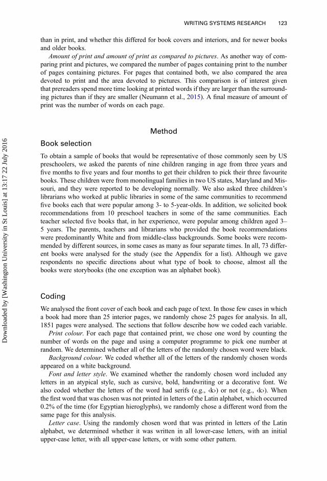
Table 1.
Proportion of words on interior pages and covers with various characteristics
Characteristic
Interior Cover
Older Newer Older Newer
Black print .96 .83 .58 .26White background .81 .54 .42 .23Atypical letter style .11 .27 .45 .51Serif font .89 .70 .50 .51All lowercase letters .80 .69 .08 .11Horizontal .96 .90 .79 .76Embedded in picture or speech bubble .07 .17 .21 .20
124 R. TREIMAN ET AL.
Dow
nloa
ded
by [
Was
hing
ton
Uni
vers
ity in
St L
ouis
] at
13:
17 2
2 Ju
ly 2
016
conducted multilevel analyses using book as a random factor and location (cover versusinterior) and original year of publication as fixed factors. Year of publication had a moderatedegree of negative skew, so it was reflected and square root transformed prior to analysis.For binary dependent variables, we used a logit link function. For most of the analyses,we first built a model with the main effects of location and year of publication. In asecond model, the interaction between the two factors was added. We used a log likelihoodtest to determine whether the second model accounted for significantly more variance thanthe first model. If so, we report the results from the second and more complex model. If not,we interpret the results from the simpler model. When we conducted a different type of ana-lysis, as we did for some variables, we describe the procedure in the relevant section.
Print colour. Table 1 shows the proportion of words in which all of the letters were blackas a function of whether the word was on the cover or an interior page and whether the bookwas originally published before 1992, the median year for the books in the study, or in 1992or after. Black print was less common for words on the covers of books (42%) than for wordsin the interiors (90%). Also, black print was less common in newer books than in older ones.Confirming these impressions, we found significant effects for location (p < .001) and yearof publication (p = .002).
Background colour. As Table 1 shows, print was less likely to appear on a white back-ground on the covers of books than in the interiors. White backgrounds were also lesscommon in newer books than in older ones. Differences as a function of year of publicationwere larger for words in the interiors of books than for words on the covers. In line withthese impressions, statistical analyses showed significant main effects of location (p< .001) and publication year (p = .003) and also a significant interaction (p = .006).
Font and letter style. As Table 1 shows, atypical print styles such as cursive, italics, hand-writing and decorative fonts were less common in the interior pages of books (18%) than onthe covers (48%). The effect of location was statistically significant (p < .001), and therewere no other significant effects.
Table 1 shows how often the letters of the randomly chosen word were in a serif font asopposed to one without serifs. On interior pages, serif fonts were less common in newerbooks than in older books. Words on covers were less likely to have serif fonts thanwords on interior pages, and year of publication did not have an effect for words oncovers. Confirming these impressions, statistical analyses revealed main effects of location(p < .001) and publication year (p = .031) and a significant interaction (p = .009).
Letter case. Table 1 provides information about the cases of the letters in the randomlychosen words. In the interiors of books, about three quarters of the words had all lower-case letters, as in <cat>. This pattern was much less common on book covers (10%), yieldinga significant effect of location (p < .001). (For this variable, models that included year ofpublication did not converge and so we could not examine its effects statistically.) Ofwords that were not in all lower-case letters, 53% of those on covers were in all uppercase. The figure was 38% for words on interior pages. The effect of location was statisticallysignificant (p < .001), and there were no significant effects involving year of publication.Words on interior pages that did not have the all-lower-case pattern tended to have thefirst letter in upper case and the remaining letters in lower case, the conventional patternfor sentence-initial words and proper nouns.
Spatial arrangement. Table 1 shows the proportion of words in which all of the letterswere arranged horizontally. This arrangement was significantly more common in the inter-iors of books (93%) than on the covers (78%; p < .001). There was a small but significanteffect of year of publication, such that non-horizontal arrangements were more commonin newer books than in older ones (p = .046).
WRITING SYSTEMS RESEARCH 125
Dow
nloa
ded
by [
Was
hing
ton
Uni
vers
ity in
St L
ouis
] at
13:
17 2
2 Ju
ly 2
016
Embedded print. The last line of data in Table 1 shows how often the randomly chosenword was embedded in a picture or a speech bubble. This was more likely to occur on thecovers of books (21%) than in the interiors (11%, p = .008). In addition, embedding wasmore common in recently published books than in older ones (p = .018).
Size of print. The mean height of the tallest letter in the randomly chosen word was 0.65cm for words on interior pages of books and 1.43 cm for words on covers. This differencewas statistically significant (p < .001; height was log transformed prior to analysis in order tomake its distribution more normal), and there were no significant effects involving year ofpublication.
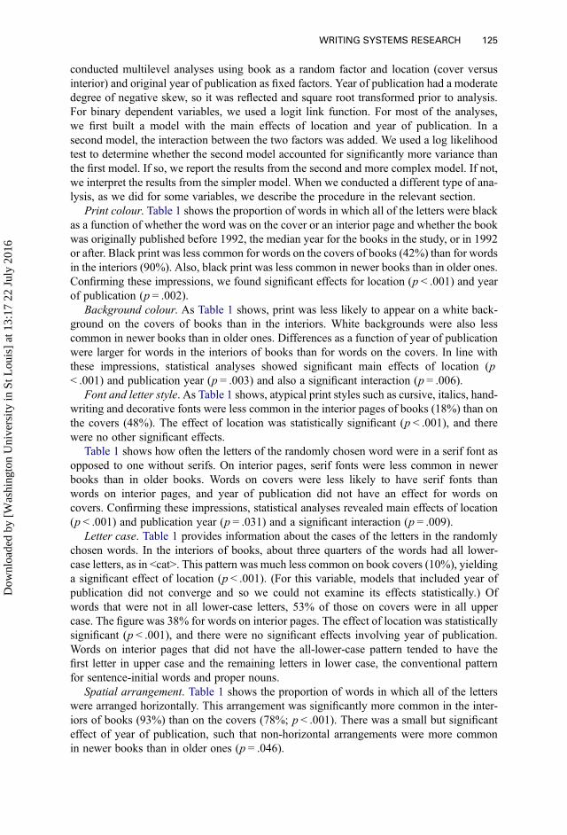
Within-word variation. The results in Table 2 show that within-word variation in printcolour, background colour, font size and spatial arrangement occurred in just a small propor-tion of the words. Variation within a word in letter style was virtually nonexistent, and thisvariable was therefore not subjected to statistical analysis. For variation in backgroundcolour, font size and spatial arrangement, there were significant main effects for year of pub-lication (p = .006, p = .043 and p = .044, respectively). The trend was for more within-wordvariation in recent books than in older ones. The analyses of background colour and font sizeshowed significant main effects of location, with more variation on covers than interiors (p= .005 and p < .001, respectively). For background colour and spatial arrangement, we foundsignificant interactions between year of publication and location (p = .035 and p = .044,respectively), such that changes across year of publication differed in magnitude forcovers and interiors.
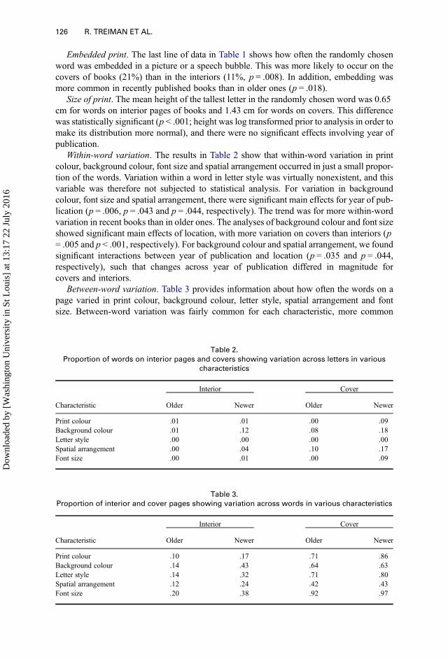
Between-word variation. Table 3 provides information about how often the words on apage varied in print colour, background colour, letter style, spatial arrangement and fontsize. Between-word variation was fairly common for each characteristic, more common
Table 2.
Proportion of words on interior pages and covers showing variation across letters in various
characteristics
Characteristic
Interior Cover
Older Newer Older Newer
Print colour .01 .01 .00 .09Background colour .01 .12 .08 .18Letter style .00 .00 .00 .00Spatial arrangement .00 .04 .10 .17Font size .00 .01 .00 .09
Table 3.
Proportion of interior and cover pages showing variation across words in various characteristics
Characteristic
Interior Cover
Older Newer Older Newer
Print colour .10 .17 .71 .86Background colour .14 .43 .64 .63Letter style .14 .32 .71 .80Spatial arrangement .12 .24 .42 .43Font size .20 .38 .92 .97
126 R. TREIMAN ET AL.
Dow
nloa
ded
by [
Was
hing
ton
Uni
vers
ity in
St L
ouis
] at
13:
17 2
2 Ju
ly 2
016
than within-word variation. In general, variation across the words on a page was morecommon on the covers of books than in the interiors and more common in recent booksthan in older ones. Confirming these impressions, we found a significant main effect of loca-tion for each type of variation (p < .001 for all). For background colour, letter style, spatialarrangement and font size, there was also a main effect of year of publication (p < .001 forbackground colour and font size, p = .002 for letter style, p = .003 for spatial arrangement).In the case of background colour and spatial arrangement, year of publication and locationinteracted (p < .001 for background colour, p = .006 for spatial arrangement) such thatchanges as a function of year of publication were observed primarily for words in the inter-iors of books.
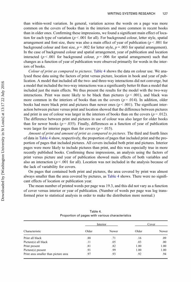
Colour of print as compared to pictures. Table 4 shows the data on colour use. We ana-lysed these data using the factors of print versus picture, location in book and year of pub-lication. A model that included all the two- and three-way interactions did not converge, buta model that included the two-way interactions was a significantly better fit than a model thatincluded just the main effects. We thus present the results for the model with the two-wayinteractions. Print was more likely to be black than pictures (p < .001), and black wasmore common in the interiors of books than on the covers (p = .014). In addition, olderbooks had more black print and pictures than newer ones (p < .001). The significant inter-action between picture versus print and location showed that the difference between picturesand print in use of colour was larger in the interiors of books than on the covers (p = .012).The difference between print and pictures in use of colour was also larger for older booksthan for newer books (p = .035). Finally, differences as a function of year of publicationwere larger for interior pages than for covers (p = .015).
Amount of print and amount of print as compared to pictures. The third and fourth linesof data in Table 4 show, respectively, the proportion of pages that included print and the pro-portion of pages that included pictures. All covers included both print and pictures. Interiorpages were more likely to include pictures than print, and this was especially true in morerecently published books. Confirming these impressions, an analysis using the factors ofprint versus picture and year of publication showed main effects of both variables andalso an interaction (p < .001 for all). Location was not included in the analysis because ofthe lack of variability for covers.
On pages that contained both print and pictures, the area covered by print was almostalways smaller than the area covered by pictures, as Table 4 shows. There were no signifi-cant effects of location or publication year.
The mean number of printed words per page was 19.3, and this did not vary as a functionof cover versus interior or year of publication. (Number of words per page was log trans-formed prior to statistical analysis in order to make the distribution more normal.)
Table 4.
Proportion of pages with various characteristics
Characteristic
Interior Cover
Older Newer Older Newer
Print all black .88 .71 .16 .09Picture(s) all black .11 .05 .03 .00Print present .81 .82 1.00 1.00Picture(s) present .91 .99 1.00 1.00Print area smaller than picture area .97 .93 .92 .94
WRITING SYSTEMS RESEARCH 127
Dow
nloa
ded
by [
Was
hing
ton
Uni
vers
ity in
St L
ouis
] at
13:
17 2
2 Ju
ly 2
016
Discussion
Reading books to children is a valued activity in the US and many other societies. Manydays, preschool children spend some time being read to or looking at books on their own(Scarborough et al., 1991; US Census Bureau, 2010). Although preschool children spendsubstantially more time looking at the pictures in books than at the print, they sometimeslook at the print (Evans & Saint-Aubin, 2005; Evans, Williamson, & Pursoo, 2008;Justice, Skibbe, & Canning, 2005) and, under favourable conditions, remember some ofits characteristics (Apel, Wolter, & Masterson, 2006; Evans et al., 2008). Given thatbooks are one source of input to children about what writing looks like and how it functions,the present study was designed to examine the characteristics of the print that US 3- to 5-year-olds see in books. We were particularly interested in the frequency and nature ofvisually salient print, such as print that is embedded in illustrations or in which the lettersvary in colour. Such print appears to draw the attention of young children and of theadults who are reading to them (Dynia et al., 2013; Justice et al., 2005; Smolkin et al.,1988; Smolkin et al., 1992; Zucker et al., 2009). It has thus been proposed that print-salient books are an important vehicle for the development of print awareness in children(Cetin & Bay, 2015; Zucker et al., 2009).
Only a few previous studies have examined the characteristics of print in books for pre-school children (Cetin & Bay, 2015; Dynia et al., 2013; Zucker et al., 2009). We wentbeyond these studies, first, by comparing the visual salience of print on the covers of booksto that in the interiors. We found that visually salient print was more likely to occur on thecovers. This is probably because book covers are designed to draw attention. Studies of chil-dren’s attention to print in books appear to have used interior pages only (Evans & Saint-Aubin, 2005; Evans et al., 2008; Justice et al., 2005), and research is needed to examine chil-dren’s attention to the print on covers. Based on the idea that visually salient print is a goodvehicle for early literacy learning, it might be suggested that parents and teachers pay specialattention to the print on book covers and talk about it while reading to children.
Whereas the print salience measure introduced by Zucker et al. (2009) combines severalfeatures into a single measure of print salience, we examined individual features separately.In so doing, we found that typographical variation in such features as colour and font sizewas quite uncommon within the letters of individual words and more common across thewords on a page. This finding suggests that the design of books makes words salient. Thespaces that separate words in print are rather small, and some preschool children paylittle attention to them (Ganapole, 1987). The fact that the letters in the words are generallysimilar in such things as colour and size, whereas these properties sometimes vary acrosswords, could help young children to learn about one important characteristic of writing:that letters are grouped into units. This idea, sometimes called concept of word, isthought to be important for early literacy (Morris, 1993).
Although previous studies (e.g., Zucker et al., 2009) suggested that books for US pre-schoolers differ substantially from one another in their use of visually salient print, theresults did not shed light on possible factors associated with this variation. Some of the dif-ferences, our results suggest, reflect changes in publication practices over time. For example,there was more variation across words on a page in font size and letter style in recently pub-lished books than in older books. Also, embedding of print in illustrations was morecommon in recent books. These differences, we suspect, reflect the fact that it is easierand cheaper to produce books with visually salient print than in the past. Also, the frequentuse of such print on the internet may encourage its use in books.
Even though the print in recent books is more visually salient in some respects than theprint in older books, the print continues to lose out to the pictures in visual salience. Thus,
128 R. TREIMAN ET AL.
Dow
nloa
ded
by [
Was
hing
ton
Uni
vers
ity in
St L
ouis
] at
13:
17 2
2 Ju
ly 2
016
pictures take up more space than print and appear on more pages. They are also more likelyto be in colour. Of course, pictures are also more meaningful than written words to childrenwho do not know how to read. Prereaders thus have many reasons to prefer the pictures.Indeed, they spend more time looking at the pictures in books than at the print and theyremember the pictures better (e.g., Evans et al., 2008). A style of reading in which adultspoint to and comment on the print appears to cause children to look at the print morethan they otherwise would, and this style of reading may promote the learning of print con-cepts (Gettinger & Stoiber, 2014; Justice & Ezell, 2000; Piasta & Justice, 2012; but see Sim,Berthelsen, Walker, Nicholson, & Fielding-Barnsley, 2014). However, the print in booksmust always compete with the more attractive pictures. Therefore, we believe that it isnot realistic to rely solely on book reading to teach children about the characteristics ofprint. Activities that feature letters and words without accompanying pictures, such asthose in which children watch adults write or try to write themselves, have an importantrole to play (e.g., Levin & Aram, 2012).
Caution is called for in increasing the visual salience of print in books as a way ofencouraging young children to attend to and learn about it. Decorative styles of print candraw children’s attention, for example, but the letters have some atypical characteristics.Similarly, printing letters in bright colours or laying them out in unconventional ways cangive children misleading ideas about what writing normally looks like. Making printmore colourful or decorative also makes it more similar to pictures. This could be aproblem because one important aspect of early literacy development is learning about thedifferences between print and pictures in form and function. These differences are notalways obvious to young children. For example, children sometimes point to the picturesin a book when asked where one should read (Ferreiro & Teberosky, 1982) or say thatone ‘draws’ a word (Robins & Treiman, 2009). It has also been suggested that the moreinteresting and attractive a symbol is as an object, the more difficult it is for children tounderstand that it functions as a symbol, and there is some evidence for this view in thecase of letters (Chiong & DeLoache, 2012). If so, then making printed words visually attrac-tive may have some negative consequences.
Our data speak not only to the visual salience of print in books for children but also to theinput that children get that can help them learn about the properties of print. The attempts ofeven very young children to write their names and other words often show some of the visualfeatures typical of writing, such as use of a linear arrangement (see Treiman &Kessler, 2014,for a review). Similarly, US preschoolers who are asked to judge whether various displays areexamples of writing tend to prefer certain types of displays, such as horizontal ones (Gana-pole, 1987; Lavine, 1977; Treiman, Mulqueeny, & Kessler, 2015). Children’s ideas aboutthe appearance of writing must come in part from the writing to which they are exposed,among this being the writing in books. Studies of the characteristics of book print help toshow what children may learn from exposure to it.
Reading books to preschool children can expose them to print and help them learn aboutits characteristics, but it does much more than this. Importantly, it exposes children togrammar and vocabulary that they might not otherwise encounter very often, boostingtheir linguistic skills and their eventual ability to comprehend what they read (e.g., Dickin-son, Griffith, Golinkoff, & Hirsh-Pasek, 2012). It is in part for this reason that reading aloudto young children has been argued to be “the single most important activity for developingthe knowledge required for eventual success in reading” (Anderson, Hiebert, Scott, & Wilk-inson, 1985, p. 23). These characteristics of books for children, however, have been littlestudied (Van Kleeck, 2003). The present study is one of the first attempts to do this forone set of characteristics in books for US preschoolers—characteristics of the print—andit joins a small number of other studies that have explored other properties of books,
WRITING SYSTEMS RESEARCH 129
Dow
nloa
ded
by [
Was
hing
ton
Uni
vers
ity in
St L
ouis
] at
13:
17 2
2 Ju
ly 2
016
such as the nature of the vocabulary (e.g., Hayes & Ahrens, 1988). Further work is needed toexplore these and other properties of books for children of different ages and from differentsocial groups.
Acknowledgements
We thank Katherine Hutson, Jessica Gordon and Dina Ghosh for their contributions to the study andthe members of the Reading and Language Lab for comments on a draft of the manuscript.
Funding
The research was supported in part by NIH [under grant HD051610] and NSF [under grant BCS-1421279].
Disclosure statement
No potential conflict of interest was reported by the authors.
Manuscript received 5 November 2014Revised manuscript accepted 13 July 2015
First published online 1 August 2015
References
Anderson, R. C., Hiebert, E. H., Scott, J. A., & Wilkinson, I. (1985). Becoming a nation of readers: The report of thecommission on reading. Washington, DC: National Institute of Education.
Apel, K., Wolter, J. A., & Masterson, J. J. (2006). Effects of phonotactic and orthotactic probabilities during fastmapping on 5-year-olds’ learning to spell. Developmental Neuropsychology, 29, 21–42. doi:10.1207/s15326942dn2901_3
Cetin, O. S., & Bay, N. (2015). Enhancing the early reading skills: Examining the print features of preschool children’sbook. International Education Studies, 8, 113–124. doi:10.5539/ies.v8n1p113
Chiong, C., & DeLoache, J. S. (2012). Learning the ABCs: What kinds of picture books facilitate young children’slearning? Journal of Early Childhood Literacy, 13, 225–241. doi:10.1177/1468798411430091
Dickinson, D. K., Griffith, J. A., Golinkoff, R. M., & Hirsh-Pasek, K. (2012). How reading books fosters languagedevelopment around the world. Child Development Research. doi:10.1155/2012/602807
Dynia, J. M., Justice, L. M., Pentimonti, J. M., & Piasta, S. B. (2013). Text features and preschool teachers’ use of printreferencing. Journal of Research in Reading, 36, 261–279. doi:10.1111/j.1467-9817.2011.01502.x
Evans, M. A., & Saint-Aubin, J. (2005). What children are looking at during shared storybook reading: Evidence fromeye movement monitoring. Psychological Science, 16, 913–920. doi:10.1111/j.1467-9280.2005.01636.x
Evans, M. A., Williamson, K., & Pursoo, T. (2008). Preschoolers’ attention to print during shared book reading.Scientific Studies of Reading, 12, 106–129. doi:10.1080/10888430701773884
Ferreiro, E., & Teberosky, A. (1982). Literacy before schooling. New York: Heinemann.Ganapole, S. J. (1987). The development of word consciousness prior to first grade. Journal of Reading Behavior, 19,
415–436. doi:10.1080/10862968709547614Gettinger, M., & Stoiber, K. C. (2014). Increasing opportunities to respond to print during storybook reading: Effects of
evocative print-referencing techniques. Early Childhood Research Quarterly, 29, 283–297.Hayes, D. P., & Ahrens, M. G. (1988). Vocabulary simplification for children: A special case of “motherese”? Journal
of Child Language, 15, 395–410. doi:10.1017/s0305000900012411Justice, L. M., & Ezell, H. K. (2000). Enhancing children’s print and word awareness through home-based parent inter-
vention. American Journal of Speech-Language Pathology, 9, 257–269.Justice, L. M., Skibbe, L., & Canning, A. (2005). Pre-schoolers, print and storybooks: An observational study using eye
movement analysis. Journal of Research in Reading, 28, 229–243. doi:10.1111/j.1467-9817.2005.00267.xLavine, L. O. (1977). Differentiation of letterlike forms in prereading children. Developmental Psychology, 13, 89–94.
doi:10.1037//0012-1649.13.2.89Levin, I., & Aram, D. (2012). Mother–child joint writing and storybook reading and their effects on kindergartners’
literacy: An intervention study. Reading and Writing: An Interdisciplinary Journal, 25, 217–249. doi:10.1007/s11145-010-9254-y
130 R. TREIMAN ET AL.
Dow
nloa
ded
by [
Was
hing
ton
Uni
vers
ity in
St L
ouis
] at
13:
17 2
2 Ju
ly 2
016
Malter, M. S. (1948). Children’s preferences for illustrative materials. The Journal of Educational Research, 41, 378–385.
Morris, D. (1993). The relationship between children’s concept of word in text and phoneme awareness in learning toread: A longitudinal-study. Research in the Teaching of English, 27, 133–154.
Neumann, M. M., Acosta, C., & Neumann, D. L. (2014). Young children’s visual attention to environmental print asmeasured by eye tracker analysis. Reading Research Quarterly, 49, 157–167.
Neumann, M. M., Summerfield, K., & Neumann, D. L. (2015). Visual attention to print-salient and picture-salientenvironmental print in young children. Reading and Writing: An Interdisciplinary Journal. doi:10.1007/s11145-014-9531-
Piasta, S. B., & Justice, L. M. (2012). Increasing young children’s contact with print during shared reading:Longitudinal effects on literacy achievement. Child Development, 83, 810–820. doi:10.1111/j.1467-8624.2012.01754.x
Robins, S., & Treiman, R. (2009). Talking about writing: What we can learn from conversations between parents andtheir young children. Applied Psycholinguistics, 30, 463–484. doi:10.1017/S0142716409090237
Scarborough, H. S., Dobrich, W., & Hager, M. (1991). Preschool literacy experience and later reading achievement.Journal of Learning Disabilities, 24, 508–511. doi:10.1177/002221949102400811
Sim, S. S. H., Berthelsen, D., Walker, S., Nicholson, J. M., & Fielding-Barnsley, R. (2014). A shared reading interven-tion with parents to enhance young children’s early literacy skills. Early Child Development and Care, 184, 1531–1549. doi:10.1080/03004430.2013.862532
Smolkin, L. B., Conlon, A., & Yaden, D. B. (1988). Print salient illustrations in children’s picture books: The emer-gence of written language awareness. National Reading Conference Yearbook, 37, 59–68.
Smolkin, L. B., Yaden, D. B., Brown, L., & Hofius, B. (1992). The effects of genre, visual design choices, and dis-course structure on preschoolers’ responses to picture books during parent-child read-alouds. National ReadingConference Yearbook, 41, 291–301.
Storch, S. A., & Whitehurst, G. J. (2002). Oral language and code-related precursors to reading: Evidence from a long-itudinal structural model. Developmental Psychology, 38, 934–947. doi:10.1037//0012-1649.38.6.934
Stuart, M. (1995). Prediction and qualitative assessment of five-and six-year-old children’s reading: A longitudinalstudy. British Journal of Educational Psychology, 65, 287–296. doi:10.1111/j.2044-8279.1995.tb01150.x
Treiman, R., & Kessler, B. (2014). How children learn to write words. New York, NY: Oxford University Press.Treiman, R., Mulqueeny, K., & Kessler, B. (2015). Young children’s knowledge about the spatial layout of writing.
Writing Systems Research.Treiman, R., Mulqueeny, K., & Kessler, B. (2015). Young children’s knowledge about the spatial layout of writing.
Writing Systems Research, 7, 235–244. doi:10.1080/17586801.2014.924386United States Census Bureau. (2010). A child’s day, 2009: Selected indicators of child well-being. Table D10: Reading
to children by any family member: Characteristics of families and households with children age 1 to 5, 2009.Retrieved from https://www.census.gov/hhes/socdemo/children/data/sipp/well2009/09tabD10.xls
Van Kleeck, A. (2003). Research on book sharing: Another critical look. In A. van Kleeck, S. A. Stahl, & E. B. Bauer(Eds.), On reading books to children: Parents and teachers (pp. 271–320). Mahwah, NJ: Erlbaum.
Walker, S., & Reynolds, L. (2003). Serifs, sans serifs and infant characters in children’s reading books. InformationDesign Journal + Document Design, 11, 106–122.
Zucker, T. A., Justice, L. M., & Piasta, S. B. (2009). Prekindergarten teachers’ verbal references to print during class-room-based, large-group shared reading. Language Speech and Hearing Services in Schools, 40, 376–392. doi:10.1044/0161-1461(2009/08-0059)
Appendix
A Fish Out of Water; A Frog in the Bog; Abiyoyo; Alfie Gives a Hand; Amazing Grace;Are You My Mother?; Bear’s Bargain; Brown Bear, Brown Bear, What Do You See?;ButNot The Hippopotamus; Caps For Sale; CLICK, CLACK, MOO Cows That Type;Corduroy; Curious George; Curious George Goes to the Hospital; Curious George Rides aBike; Doctor De Soto; Dora and the Rainbow Kite Festival; Dr. Seuss’s ABC;Fancy Nancy; Ginger; Go Away, Big Green Monster; Go, Dog, Go!; Go, Train, Go!;Harry the Dirty Dog; Horton Hatches the Egg; How to Lose All Your Friends; I Ain’t GonnaPaint No More!; I Have a Loose Tooth; I Love You All Day Long; I Love You, Blue Kan-garoo!; I Love You, Stinky Face; If You Give a Moose a Muffin; If You Give a Mouse a
WRITING SYSTEMS RESEARCH 131
Dow
nloa
ded
by [
Was
hing
ton
Uni
vers
ity in
St L
ouis
] at
13:
17 2
2 Ju
ly 2
016
Cookie; If You Give a Pig a Pancake; If You’re Happy and You Know It; Jumanji; KnuffleBunny Too; Llama Llama Red Pajama; Mike Mulligan & His Steam Shovel; Mouse Count;Mr. Brown Can Moo! Can You?; No, David!; Owl Babies; Pete’s A Pizza; Rooster Can’tCock-a-Doodle-Doo; Seven Blind Mice; Sheila Rae, the BraveSitting Ducks; Skippyjon Jones; Skippyjon Jones in Mummy Trouble; Snuggle Puppy! ALittle Love Song; Spot Goes to the Beach; Stellaluna; The Big Hungry Bear; The Cat inThe Hat; The Children’s Book of Virtues; The Gingerbread Boy; The Great Fuzz FrenzyThe Hungry Thing; The Little Engine That Could; The Rainbow Fish; The Recess Queen;The Runaway Bunny; The Seals on the Bus; The Snowy Day; The Story of Ferdinand; TheVery Hungry Caterpillar; There’s a Hippo in My Bath!; There’s a Wocket in my Pocket!;Time to Say Please; We’re Going on a Bear Hunt; Where the Wild Things Are; WhiteRabbit’s Color Book
132 R. TREIMAN ET AL.
Dow
nloa
ded
by [
Was
hing
ton
Uni
vers
ity in
St L
ouis
] at
13:
17 2
2 Ju
ly 2
016