Embed Size (px)
DESCRIPTION
Graphic Design Portfolio
Citation preview
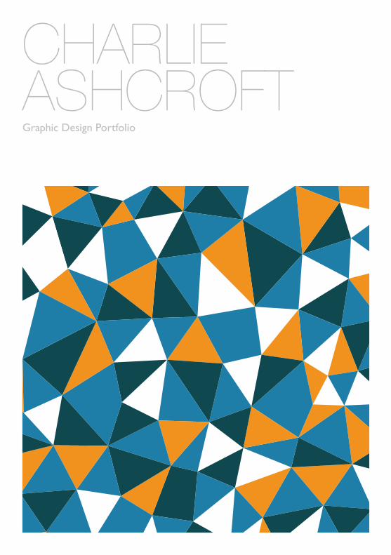
CHARLIEASHCROFTGraphic Design Portfolio
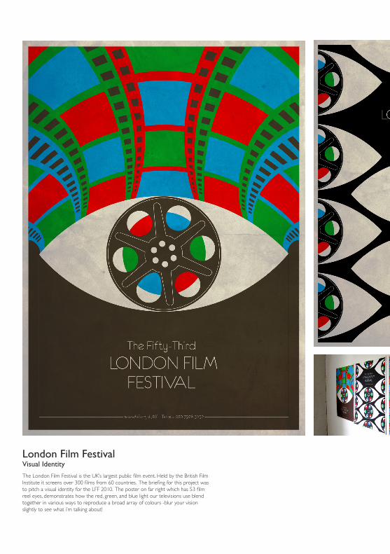
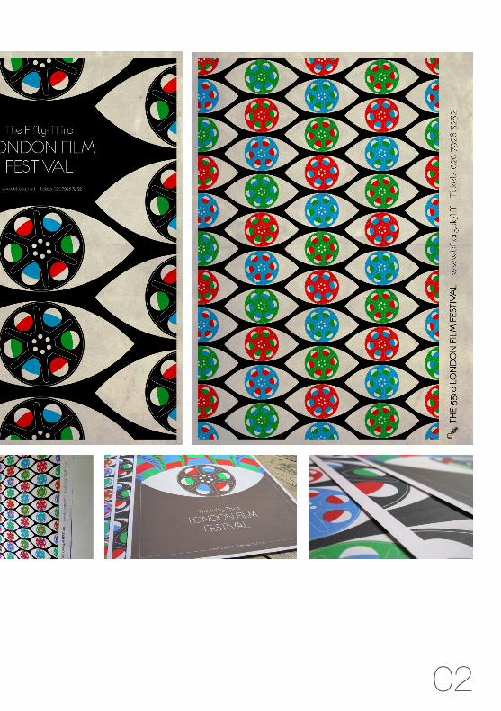
London Film FestivalVisual Identity
The London Film Festival is the UK’s largest public film event. Held by the British Film Institute it screens over 300 films from 60 countries. The briefing for this project was to pitch a visual identity for the LFF 2010. The poster on far right which has 53 film reel eyes, demonstrates how the red, green, and blue light our televisions use blend together in various ways to reproduce a broad array of colours -blur your vision slightly to see what i’m talking about!
02
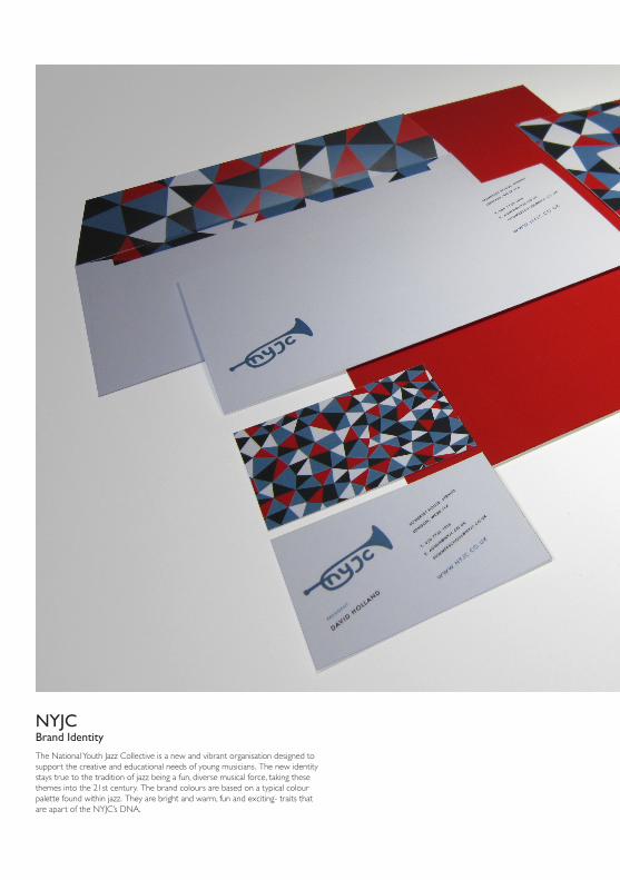
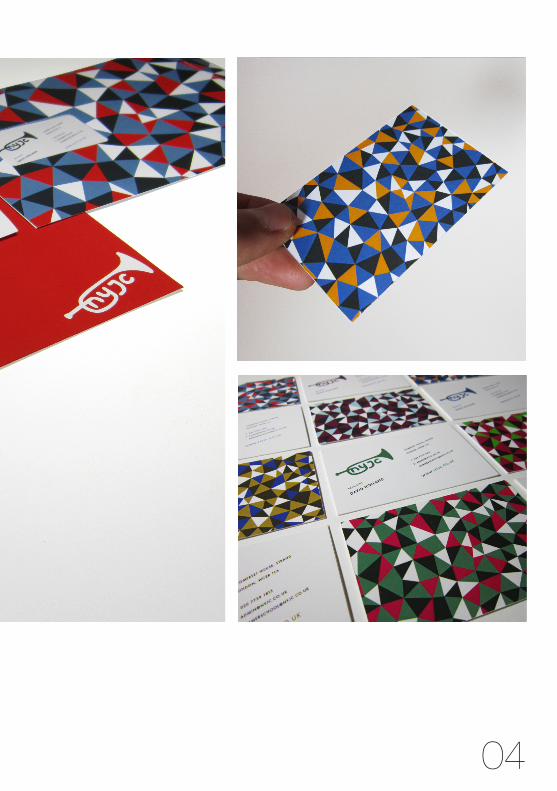
NYJCBrand Identity
The National Youth Jazz Collective is a new and vibrant organisation designed to support the creative and educational needs of young musicians. The new identity stays true to the tradition of jazz being a fun, diverse musical force, taking these themes into the 21st century. The brand colours are based on a typical colour palette found within jazz. They are bright and warm, fun and exciting- traits that are apart of the NYJC’s DNA.
04
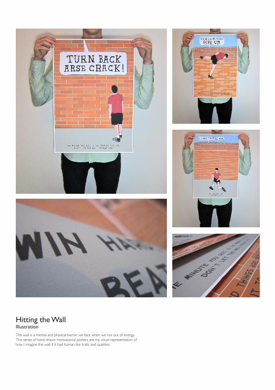
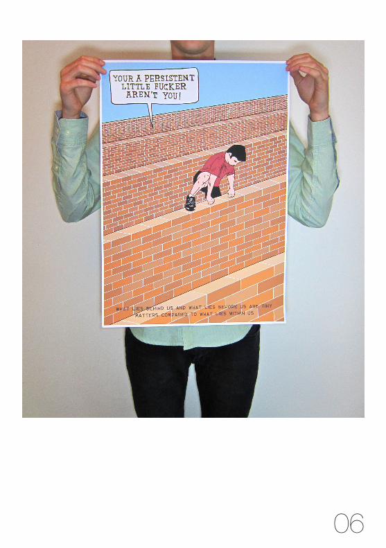
Hitting the WallIllustration
The wall is a mental and physical barrier we face when we run out of energy. This series of hand drawn motivational posters are my visual representation of how I imagine the wall if it had human like traits and qualities.
06
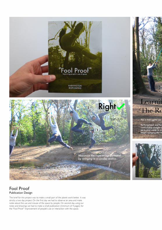
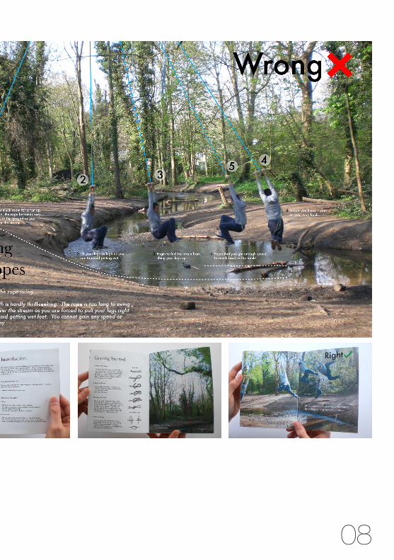
Fool ProofPublication Design
The brief for this project was to make a small part of the planet work better. It was strictly a two day project. On the first day we had to observe an area and make notes about the use and misuse of the space by people. On second day, using our notes and drawings we had to make a small publication (minimum of 4 pages) for the “Fool Proof ” improvement of people’s use or interaction with the space.
08
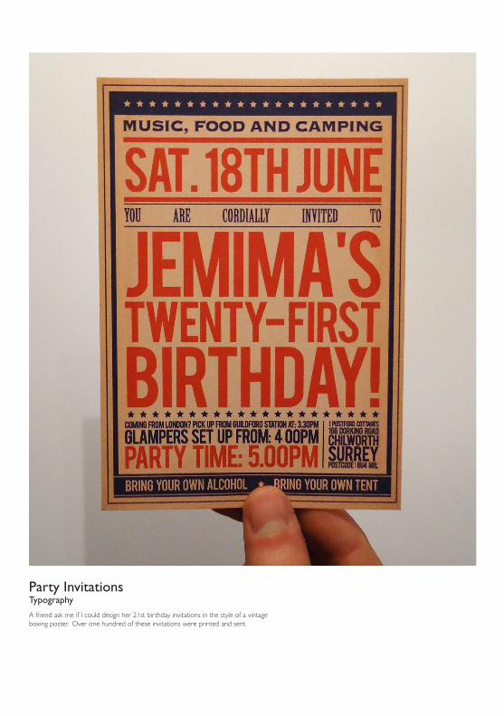
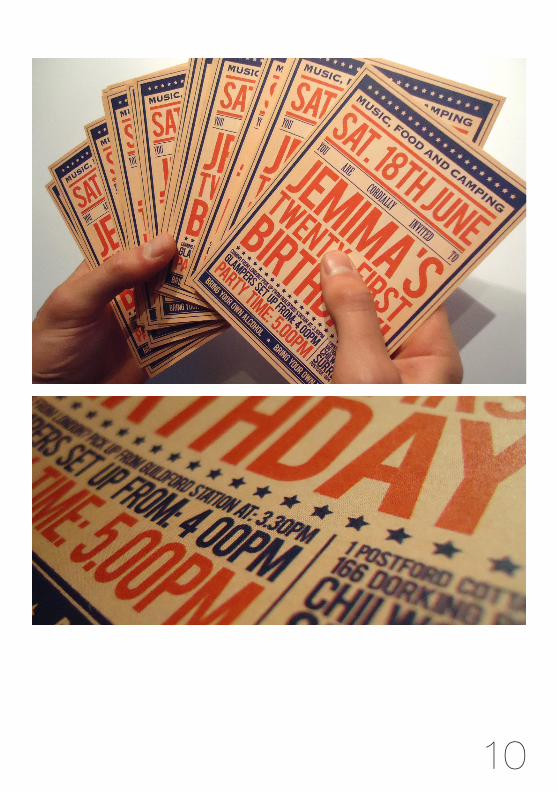
Party InvitationsTypography
A friend ask me if I could design her 21st birthday invitations in the style of a vintage boxing poster. Over one hundred of these invitations were printed and sent.
10
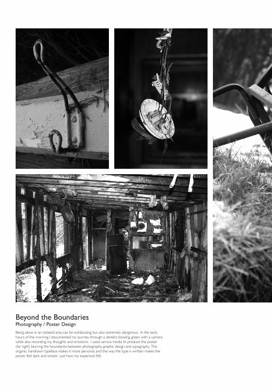
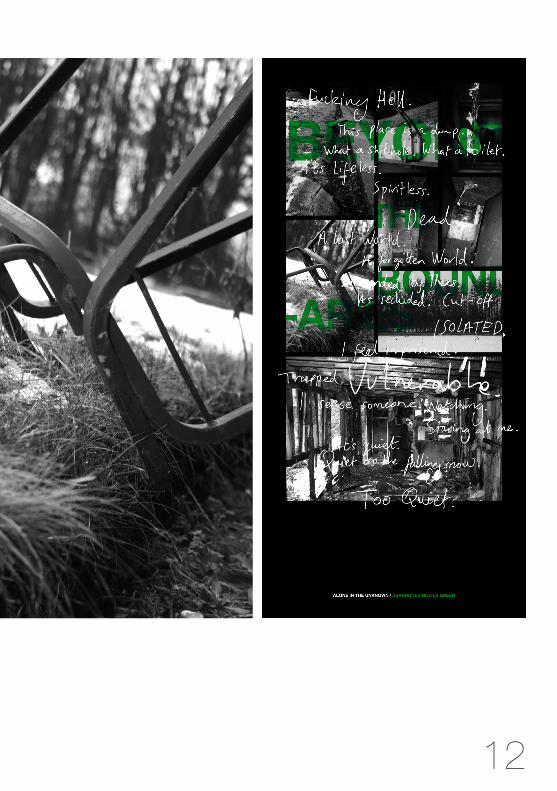
Beyond the BoundariesPhotography / Poster Design
Being alone in an isolated area can be exhilarating but also extremely dangerous. In the early hours of the morning I documented my journey through a derelict bowling green with a camera while also recording my thoughts and emotions. I used various media to produce the poster (far right) blurring the boundaries between photography, graphic design and typography. The organic, handrawn typeface makes it more personal, and the way the type is written makes the poster feel dark and sinister -just how my experince felt.
12