Embed Size (px)
Citation preview
Learning Unit 2
16
Charts in RapidMiner
Introduction 17
Study core 17
1 Line Charts and Scatter Plots in RapidMiner 17
2 Histogram 22
3 Pie Charts 22
4 Box Plots 23
5 Bubble Charts 24
6 Heat Maps 25

Charting in RapidMiner
17
Learning Unit 2
Charts in RapidMiner
I N T R O D U C T I O N
In the second learning unit students will be introduced to data
visualization for data analytics. A set of charts and graphs is presented in
this section of the workbook.
These are:
Line charts
Bar charts
Pie charts
2D and 3D scatter plots
Bubble charts
Histograms
Heat maps
LEARNING OBJECTIVES
After studying this unit the students will have knowledge of
- installing RapidMiner
- the basic use of RapidMiner
- graphs and charts that are available in RapidMiner
- performing an initial exploratory analysis with RapidMiner.
Study hints
The workload is about 16.5 hours. This does not include reading the
references, which is not required. This section presents a set of charts that
can be produced in RapidMiner. As an exercise, students are expected to
reproduce the same figures with the RapidMiner tool. The charting
techniques presented in this learning unit (LU) have been selected
because these are the most frequently used in the data mining process.
Another frequently used charting technique is contour plots; these are not
available in RapidMiner and will not be not introduced here since their
interpretation is highly mathematical and beyond the scope of this
course.
S T U D Y C O R E
1 Line Charts and Scatter Plots in RapidMiner
In this section we will use RapidMiner to plot data from the Iris Flower
dataset, which is included in the tool download.

Open Universiteit Data Analytics
18
First, download RapidMiner using the following link:
https://my.rapidminer.com/nexus/account/index.html#downloads
Download the version corresponding to your laptop or workstation
settings. The installation file is a typical executable file: double-click on it
and the installation will start. After completing the installation, launch
RapidMiner. Accept the EULA agreement (you cannot use RapidMiner
otherwise). The first time that you execute RapidMiner, it will ask you to
register an account by specifying an email address and a password; the
registration is mandatory to use the tool. After finishing the registration
process, you should see a screen as depicted in Figure 1. This screen
contains all the tabs in the RapidMiner environment. You should see the
following tabs: Repository (upper left), Operators (lower left), Process
(centre) Parameters (upper right) and Help (lower right).
Figure 1: The first screen of RapidMiner.
The Iris dataset is a common benchmark dataset used to quickly test the
effectiveness of classification algorithms. As reported on Wikipedia:1
‘The data set consists of 50 samples from each of three species of Iris (Iris
setosa, Iris virginica and Iris versicolor). Four features were measured from
each sample: the length and the width of the sepals and petals, in
centimeters (…)’.
An extract of such a dataset can be found in Table 1, with the Species
column listing the class of each of the records. Historically speaking, the
Iris dataset is the very first example of a supervised classification
problem that you will encounter.
Sepal length Sepal width Petal length Petal width
Species
5.1 3.5 1.4 0.2 I. setosa
1 https://en.wikipedia.org/wiki/Iris_flower_data_set
Download RapidMiner
Register an account for
RapidMiner

Charting in RapidMiner
19
4.9 3.0 1.4 0.2 I. setosa
4.7 3.2 1.3 0.2 I. setosa
7.0 3.2 4.7 1.4 I. versicolor
6.4 3.2 4.5 1.5 I. versicolor
6.9 3.1 4.9 1.5 I. versicolor
5.8 2.7 5.1 1.9 I. virginica
6.8 3.2 5.9 2.3 I. virginica
Table 1: Iris dataset extract
For clarity’s sake, remember that such a dataset contains entities that
have four features: sepal length, sepal width, petal length and petal
width; and one target variable, in this case the species attribute. In a
supervised algorithm, given a new item with an unknown target variable
value, the question is which class this item belongs to.
Figure 2 shows how to select the Iris dataset. Figure 3 shows how to
create a block and Figure 4 shows how to connect the block to the output.
After you connect to the output, execute as shown in Figure 5. Then go to
the result interface Figure 6.
The resulting interface shows you a lot of possibilities in terms of
visualisation, in this case we will use the advanced plotting facilities of
RapidMiner. In the advanced charts tab set the domain dimension to a1
of the iris dataset, then set the axis to a2 and the colour dimension to the
label. A simple way to get a 3D scatter plot is to add a dimension on the
axis in a 2D scatter plot. A 3D representation of the data is then produced
by the advanced charting services of RapidMiner (see Figure 7). If now
you rather want to plot a line chart, the procedure is the same, although
now you need to set the format as lines (see Figure 8).
Plotting
Scatter Plot
Line Chart

Open Universiteit Data Analytics
20
Figure 2: The Iris dataset.
Figure 3: Adding the Iris dataset to RapidMiner.
Figure 4: Connecting the Iris dataset to the output in RapidMiner.

Charting in RapidMiner
21
Figure 5: Execute.
Figure 6: Result interface.
Figure 7: 2D Scatter plot.

Open Universiteit Data Analytics
22
Figure 8: Line chart.
Scatter plots are generally useful with datasets in which the items are
static points in time. The line charts are very useful when we plot time
series.
2 Histogram
Other than a scatter plot, a histogram is a chart that plots the frequency
of the occurrence of a particular value. More specifically, this means that
a set of bins is created for the range values of one of the axis. Once again,
consider the iris dataset and the a2, a3 and a4 axis. To plot a histogram in
RapidMiner, go to the charts tab (as we have seen in the previous
section) and select a2, a3 and a4. Now set the number of bins to 40. This
should result in the plot depicted in Figure 9.
Figure 9: Histograms in RapidMiner.
Histograms are important to understand how an attribute or a set of
attributes is distributed in terms of value.
Brundtland report:
sustainable
development

Charting in RapidMiner
23
3 Pie Charts
A pie chart is usually represented by a circle divided into sectors, in
which each sector represents a proportion of a certain quantity. Very
often each of the sectors, or slices, is also annotated with a percentage
representing how much of the total falls under a certain category.
In the case of data analytics, pie charts can be useful to observe the
proportion of data points belonging to each of the classes in the dataset.
Figure 10: Pie chart in RapidMiner.
In order to generate this chart with RapidMiner, click on the Design tab,
click on the Charts tab on the left and then select Pie chart. Pie charts take
only one value in input and in this case the column with the label should
be considered to be the input. Figure 10 shows an example of such an
interface. Specifically speaking, pie charts offer an easy way to show how
balanced a dataset is. The Iris dataset is perfectly balanced, as you can see
in Figure 10, with the area equally split between the three classes in the
dataset.
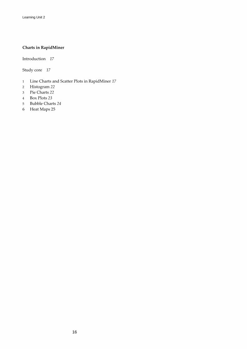
4 Box Plots
A box plot is a simple way to represent data by its means and quartiles.
Figure 11 shows a box plot in RapidMiner. In a box plot five important
statistics are presented: minimum, first quartile, median, third quartile
and maximum. The first and third quartile delimit the area of the box, the
minimum and the maximum are represented as whiskers, the median
falls inside the box plot. The outliers are usually presented as white dots.
Box plots are an important way of seeing whether the features of the
dataset present outliers. It is a first way of learning the quality of a
dataset and whether outlier removal methods are necessary to clean the
dataset.
Pie charts
Box plots
Open Universiteit Data Analytics
24
Figure 11: Box plots in RapidMiner.
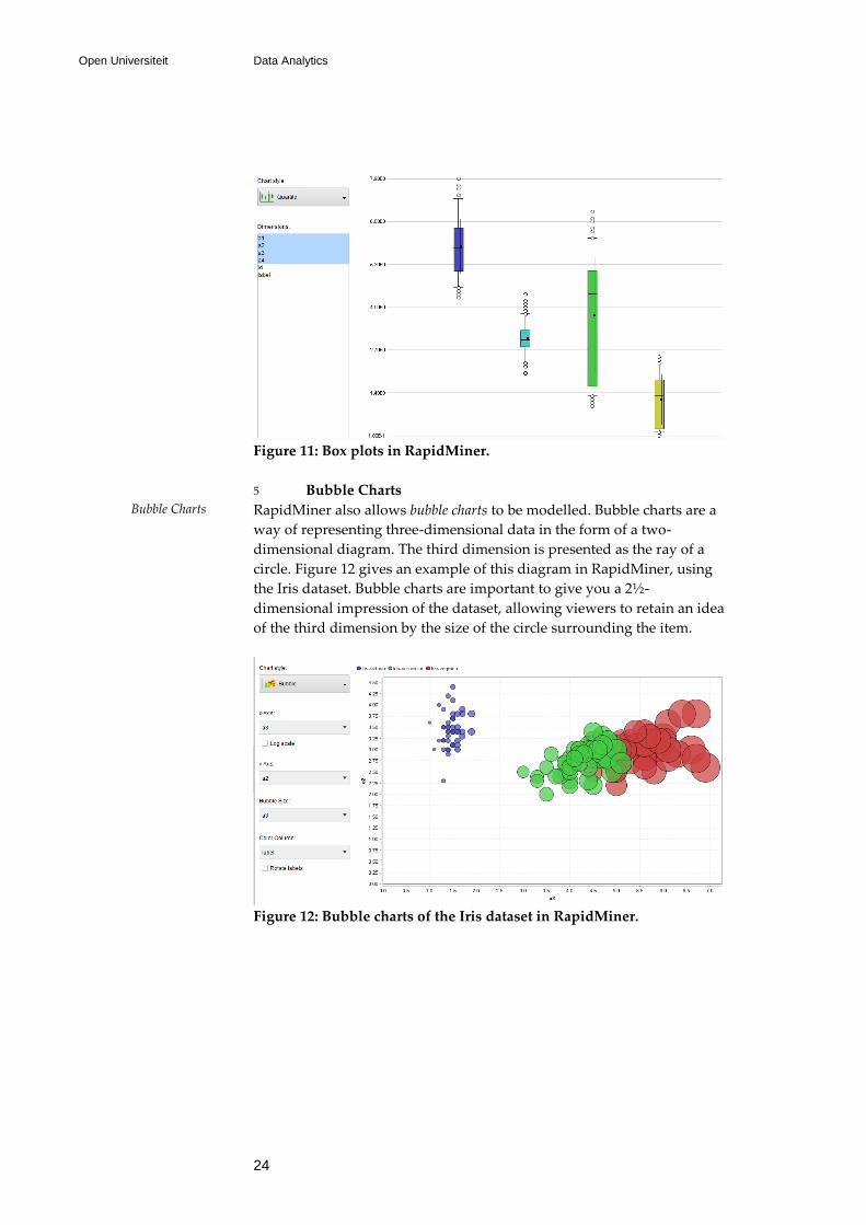
5 Bubble Charts
RapidMiner also allows bubble charts to be modelled. Bubble charts are a
way of representing three-dimensional data in the form of a two-
dimensional diagram. The third dimension is presented as the ray of a
circle. Figure 12 gives an example of this diagram in RapidMiner, using
the Iris dataset. Bubble charts are important to give you a 2½-
dimensional impression of the dataset, allowing viewers to retain an idea
of the third dimension by the size of the circle surrounding the item.
Figure 12: Bubble charts of the Iris dataset in RapidMiner.
Bubble Charts

Charting in RapidMiner
25
6 Heat Maps/Density Maps
RapidMiner allows to represent datasets in terms of density. Figure 13 is
an example of this. A density or heat map shows how dense a region is;
for the Iris dataset this is rendered with more intense colours in regions
where there are more points of a certain class. When the location of a
point has an important meaning (e.g. a geographical interpretation), heat
or density maps provide a better understanding of the dataset.
Figure 13: Heat map, also known as a density map, in RapidMiner.