Embed Size (px)
Citation preview

CMSC 838SInformation Visualization
Spring 2006Assignment 1

Static Displays of Census Data
Abhinav Gupta
0%
10%
20%
30%
40%
50%
60%
70%
80%
90%
100%
1950 1960 1970 1980 1990 2000 2003Year
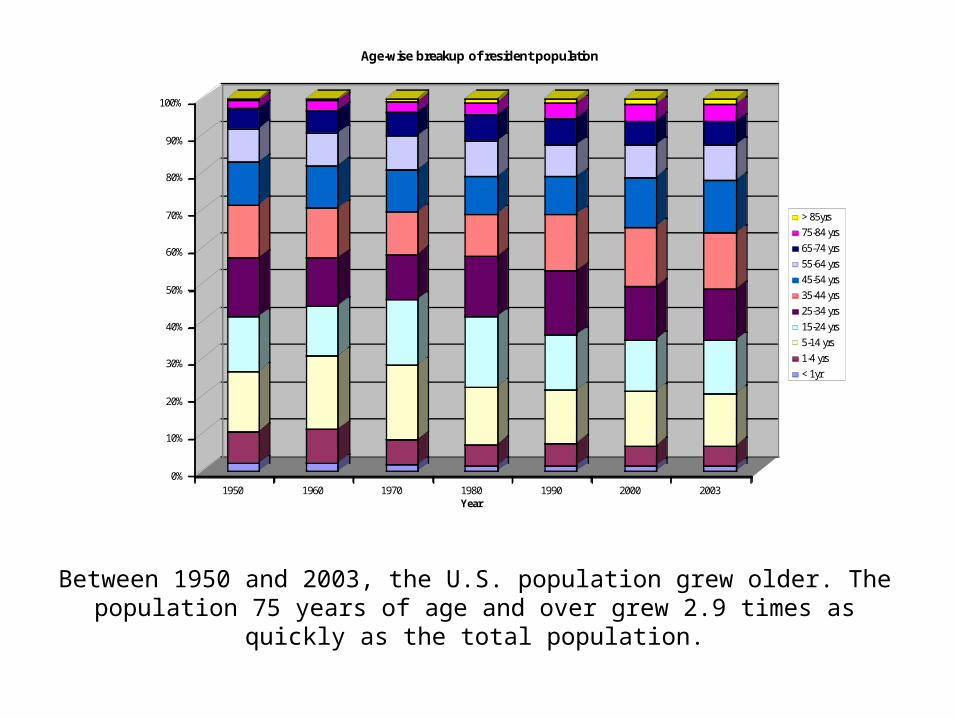
Age-wise breakup of resident population
> 85yrs
75-84 yrs
65-74 yrs
55-64 yrs
45-54 yrs
35-44 yrs
25-34 yrs
15-24 yrs
5-14 yrs
1-4 yrs
< 1yr
Between 1950 and 2003, the U.S. population grew older. The population 75 years of age and over grew 2.9 times as quickly as the total population.

In recent decades the percent of the population that is of Hispanic origin or Asian has more than doubled. In 2004, more than 30% of the population identified themselves as Hispanic, black, Asian, American Indian or Alaska Native, or
Native Hawaiian or Other Pacific Islander.
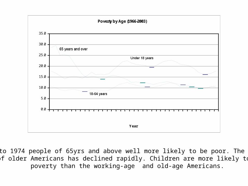
Poverty by Age (1966-2003)
0.0
5.0
10.0
15.0
20.0
25.0
30.0
35.0
1966 1968 1970 1972 1974 1976 1978 1980 1982 1984 1986 1988 1990 1992 1994 1996 1998 2000 2002
Year
Percent
Prior to 1974 people of 65yrs and above well more likely to be poor. The poverty rate of older Americans has declined rapidly. Children are more likely to be in
poverty than the working-age and old-age Americans.

Adam Phillippy
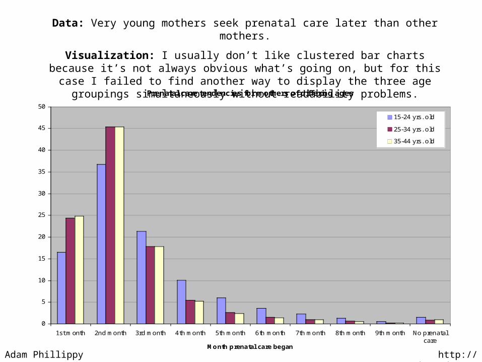
Prenatal care tendencies for mothers of differing ages
0
5
10
15
20
25
30
35
40
45
50
1st month 2nd month 3rd month 4th month 5th month 6th month 7th month 8th month 9th month No prenatalcare
Month prenatal care began
%of births
15-24 yrs. old
25-34 yrs. old
35-44 yrs. old
Data: Very young mothers seek prenatal care later than other mothers.
Visualization: I usually don’t like clustered bar charts because it’s not always obvious what’s going on, but for this case I failed to find another way to display the three age
groupings simultaneously without readability problems.
http://wonder.cdc.govAdam Phillippy

Data: Uneducated mothers seek prenatal care later than other mothers.
Visualization: It’s easier for my eye to compare continuous distributions, but maybe not for the average reader. This line plot gives me a better “first impression” over the
clustered bar chart, but only when dealing with a few categories.
Adam Phillippy http://wonder.cdc.gov
Prenatal care tendencies for mothers over 20 of differing education
0
10
20
30
40
50
60
1st month 2nd month 3rd month 4th month 5th month 6th month 7th month 8th month 9th month No prenatalcare
Month prenatal care began
%of births
0-12 yrs. eductation
13-16+ yrs. education

Top causes of male deaths over the past 20 years
0
20
40
60
80
100
120
140
160
180
Heart attack
Coronary disease
Lung cancer
Stroke
Cardiovascular diseasePulmonary disease
Ischemic heart disease
Colon cancerPneumonia
Deaths per 100,000
1979-1982
1983-1986
1987-1990
1991-1994
1995-1998
Adam Phillippy http://wonder.cdc.gov
Data: Heart disease is on the decline, but the rest are steady or increasing.
Visualization: Back to the clustered bar charts, but this time clustering categories instead of time points. Change over time was my main interest, so clustering by
category makes the most sense for spotting changes. (Category names are rough translations)
Estimated Life Expectancy in United States, 1900 – 2002
Chang [email protected]
1. Growing trend in the past century
2. Life expectancy between women and man
3. Life expectancy between white and black
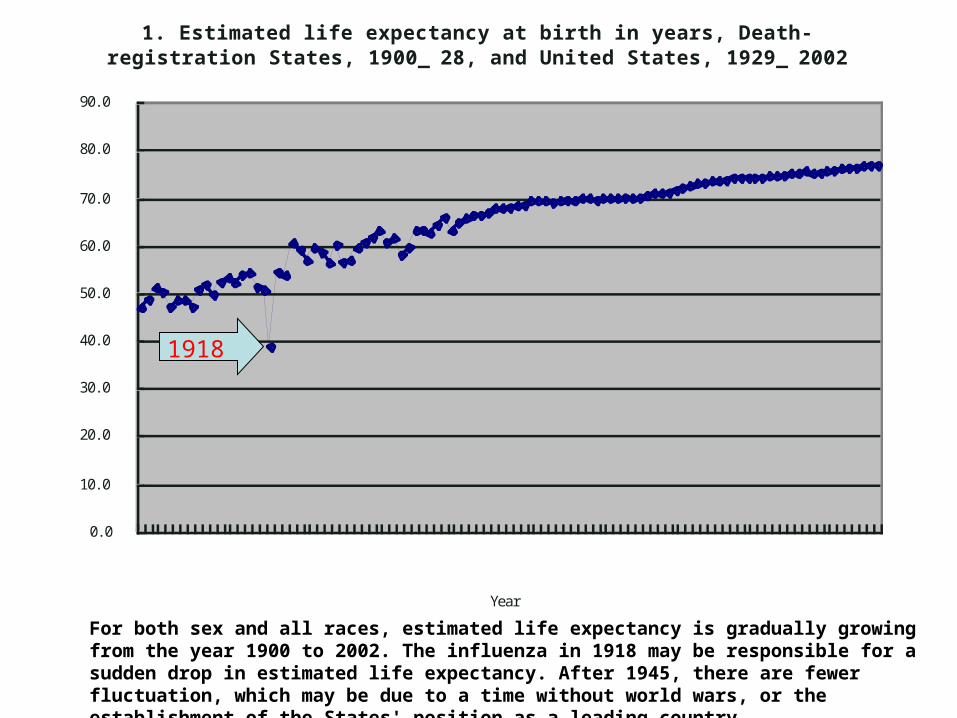
For both sex and all races, estimated life expectancy is gradually growing from the year 1900 to 2002. The influenza in 1918 may be responsible for a sudden drop in estimated life expectancy. After 1945, there are fewer fluctuation, which may be due to a time without world wars, or the establishment of the States' position as a leading country.
1. Est i mated l i f e expectancy at bi rth i n years, Death-regi strat i on States, 1900_ 28, and Uni ted States, 1929_ 2002
0. 0
10. 0
20. 0
30. 0
40. 0
50. 0
60. 0
70. 0
80. 0
90. 0
19001904190819121916192019241928193219361940194419481952195619601964196819721976198019841988199219962000Year
Age1918
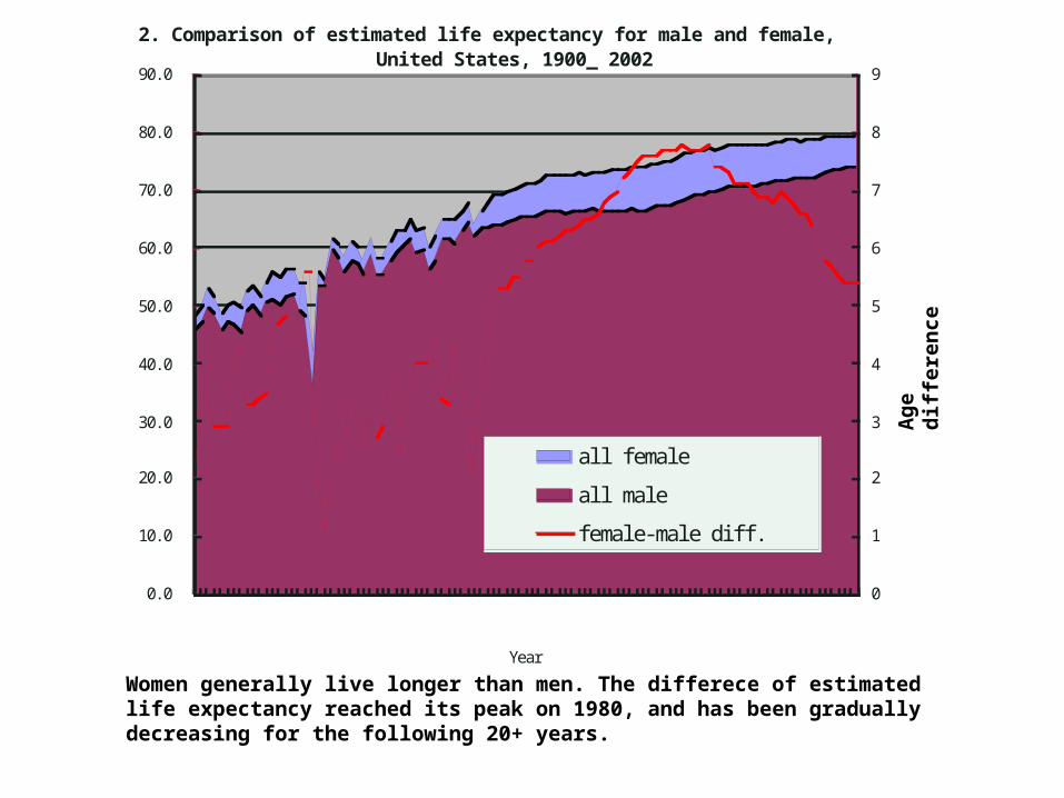
Women generally live longer than men. The differece of estimated life expectancy reached its peak on 1980, and has been gradually decreasing for the following 20+ years.
2. Compari son of esti mated l i fe expectancy for mal e and femal e,Uni ted States, 1900_ 2002
0. 0
10. 0
20. 0
30. 0
40. 0
50. 0
60. 0
70. 0
80. 0
90. 0
19001904190819121916192019241928193219361940194419481952195619601964196819721976198019841988199219962000Year
Age
0
1
2
3
4
5
6
7
8
9
al l f emal e
al l mal e
femal e-mal e di f f .
Ag
e d
iffe
ren
ce

African American's life expectancy is significantly lower than average, whereas white people's life expectancy is slightly higher than average. This has been true for at least the past century.

Derek Juba

1940 1950 1960 1970 1980 1990 2000 20100
20
40
60
80
100
120
140
160
U.S. Syphilis rate (all types)
Year
Cas
es p
er 1
00k
peop
le
U.S. Syphilis rates have been generally dropping since 1950, except for a spike around 1990. Data reporting frequency increased in 1988.
Derek Juba
1940 1950 1960 1970 1980 1990 2000 20100
1
2
3
4
5
6
7
8
9
10
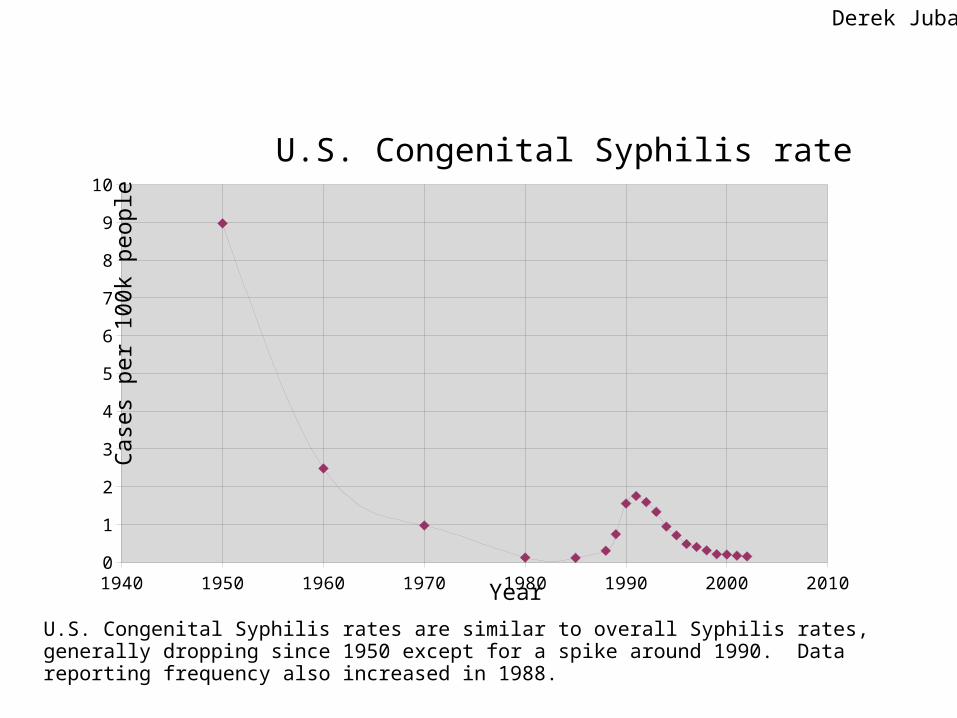
U.S. Congenital Syphilis rate
Year
Cas
es p
er 1
00k
peo
ple
U.S. Congenital Syphilis rates are similar to overall Syphilis rates, generally dropping since 1950 except for a spike around 1990. Data reporting frequency also increased in 1988.
Derek Juba
1940 1950 1960 1970 1980 1990 2000 20100
50
100
150
200
250
300
350
400
450
500
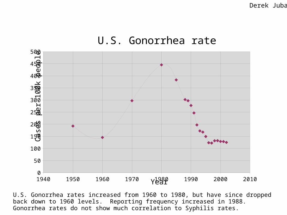
U.S. Gonorrhea rate
Year
Cas
es p
er 1
00k
peop
le
U.S. Gonorrhea rates increased from 1960 to 1980, but have since dropped back down to 1960 levels. Reporting frequency increased in 1988. Gonorrhea rates do not show much correlation to Syphilis rates.
Derek Juba

Pedal Cyclists Killed By Motor Vehicle
Gleneesha Johnson
CMSC 838S
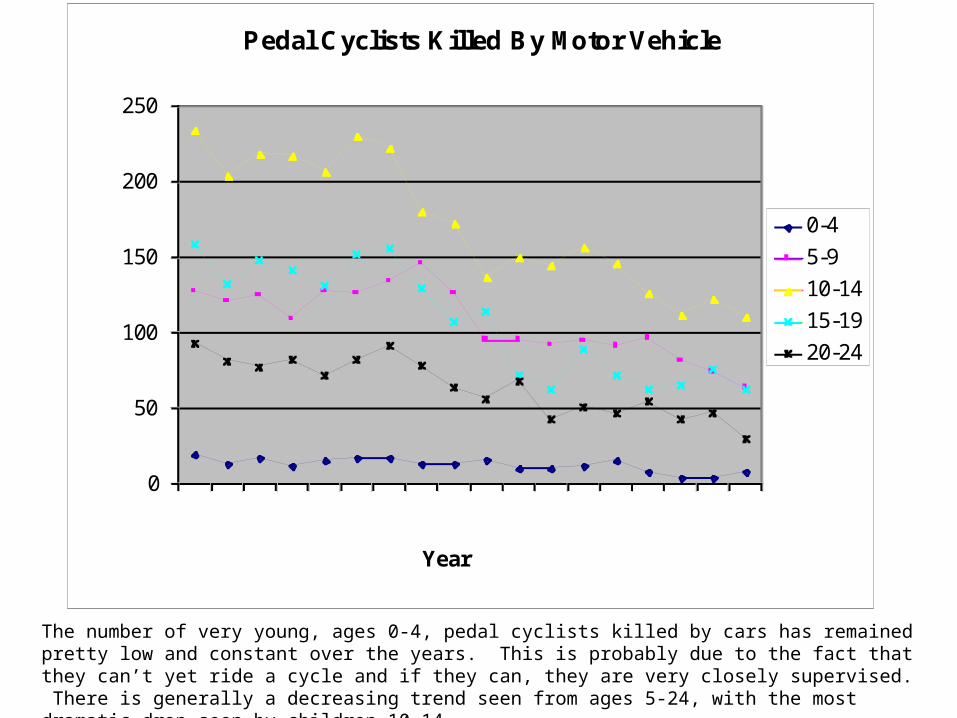
Pedal Cyclists Killed By Motor Vehicle
0
50
100
150
200
250
1981 1983 1985 1987 1989 1991 1993 1995 1997Year
Number Killed
0-4
5-9
10-14
15-19
20-24
The number of very young, ages 0-4, pedal cyclists killed by cars has remained pretty low and constant over the years. This is probably due to the fact that they can’t yet ride a cycle and if they can, they are very closely supervised. There is generally a decreasing trend seen from ages 5-24, with the most dramatic drop seen by children 10-14.

Every year between 1981-1998, at least four times more Male cyclists were killed by cars than Female cyclists.
0
100
200
300
400
500
600
700
800
Number Killed
1981 1984 1987 1990 1993 1996
Year
Pedal Cyclists Killed By Motor Vehicle
Male
Female
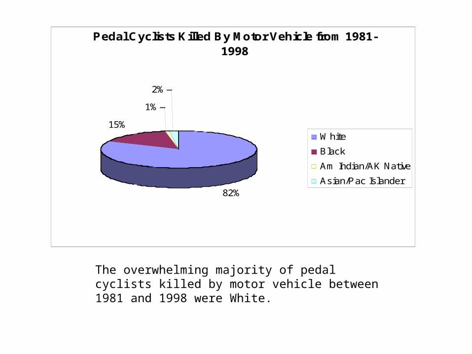
Pedal Cyclists Killed By Motor Vehicle from 1981-1998
82%
15%
1%
2%
White
Black
Am Indian/AK Native
Asian/Pac Islander
The overwhelming majority of pedal cyclists killed by motor vehicle between 1981 and 1998 were White.

Georg Apitz

CMSC 838S © by geapi , 2006
Population Changes
Increase in Population by Race in the U.S.
0
5000
10000
15000
20000
25000
30000
35000
40000
1974 1976 1978 1980 1982 1984 1986 1988 1990 1992 1994 1996 1998 2000 2002
Year
Number of People in Thousands
Hispanic
Black
White
- increase in population
- white and hispanic increasing
- black almost constant

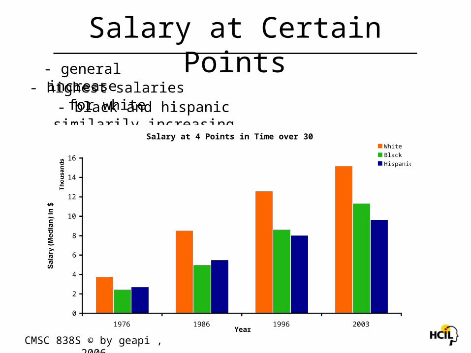
Increase in Salary by Race
0
2
4
6
8
10
12
14
16
1974 1976 1978 1980 1982 1984 1986 1988 1990 1992 1994 1996 1998 2000 2002
Thousands
Year
Salary (Median)
White
Black
Hispanic
CMSC 838S © by geapi , 2006
Salary Changes- general increase
- black and hispanic similarily increasing
- highest salaries for white
CMSC 838S © by geapi , 2006
Salary at Certain Points- general increase
- black and hispanic similarily increasing
- highest salaries for white
Salary at 4 Points in Time over 30 years
0
2
4
6
8
10
12
14
16
1976 1986 1996 2003
Thousands
Year
Salary (Median) in $
White
Black
Hispanic

Cancer Incidence in the US
Hamid Haidarian Shahri
Data provided by:
National Program of Cancer Registries Invasive Cancer Incidence
URL: http://wonder.cdc.gov/controller/datarequest/D11

Cancer Incidence Rate for Different Races
Age-Adjusted Cancer Incidence Rate Per 100000for Different Races
0
100
200
300
400
500
600
Asian or Pacific Islander Black or AfricanAmerican
White
Why is cancer less common in Asians?
Why is cancer less common in Asians?

Cancer Incidences at Various Ages
• 70-74 is the riskiest age group for cancer,and men are at a higher risk than women.
Cancer Incidences for Various Age Groups
0100000200000300000400000500000600000700000800000
< 1 year5-9 years15-19 years25-29 years35-39 years45-49 years55-59 years65-69 years75-79 years
85+ years
Age Groups
Cancer Incidences
Female
Male

Cancer Incidence Rate Per 100000in Various States
• Where should we be living, or does it really matter?

Change and difference in obesity among different states in US:
(1) change in 8 years of gap (2) difference between gender
Hyunyoung Song2006 Spring 838S Info Vis

States with least obesity problem
0 5 10 15 20HawaiiColorado
New Mexico
ArizonaMontana
OregonMarylandMassachusetts
Rhode Island
Wyoming
ArkansasWashington
Obese/Overweight
diff2001-20031993-1995
States with most obesity problems
0 5 10 15 20 25 30
Wisconsin
Delaware
Illinois
Mississippi
Pennsylvania
Louisiana
Ohio
Iowa
North Dakota
District of Columbia
Alaska
Michigan
Obese/Overweight
diff2001-20031993-1995
• In 8 years, people became more obese with range of 2.3% (Alaska) to 12.4% increase (Michigan).
• Average of 15~22% of the population are obese in United States in year 2003.
Change in obesity in 8 years of gap (1)

• There are less Obese/Overweight people near coastline and mid-west.
• States around lake Erie are high in obese population.
Change in obesity in 8 years of gap (2)

• In red tone states female are more obese than male in general. Notice that Maryland is one of them.
• In blue tone states, male are more obese than female.• In more than half of the states, male are overweight compared to
women.
Difference in obesity in different states

Maryam Farboodi
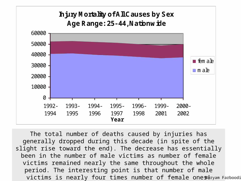
The total number of deaths caused by injuries has generally dropped during this decade (in spite of the slight rise toward the end). The decrease has
essentially been in the number of male victims as number of female victims remained nearly the same throughout the whole period. The interesting point
is that number of male victims is nearly four times number of female ones!
Maryam Farboodi
Injury Mortality of All Causes by Sex Age Range: 25- 44, Nationwide
0
10000
20000
30000
40000
50000
60000
1992-1994
1993-1995
1994-1996
1995-1997
1996-1998
1999-2001
2000-2002
Year
Number of Victims
female
male

As the chart shows, the most important causes of injury mortality in US are firearms, motor-vehicle traffic and poisoning. Number of firearm deaths has a decreasing trend over the decade under consideration so that although there is no considerable change in number of traffic deaths, it became the
most common cause over the end of the decade. Moreover, number of deaths caused by poisoning has constantly risen and ranked two after
traffic deaths in the last two years.Maryam Farboodi
Different Causes of Injury Mortality by Year Age Range: 25- 44, Nationwide
02000400060008000
1000012000140001600018000
1992-1994
1993-1995
1994-1996
1995-1997
1996-1998
1999-2001
2000-2002
Year
Number of Victims
Motor-vehicle traffic
MVT-pedestrian
Fall
Suffocation
Fire/hot object/substance
Firearm
Poisoning

Number of suicides has been nearly unchanged for many years and has only slightly decreased in the last three years. On the contrary, number of unintentional mortal injuries has increased in the same period. Number of murders has dropped
34% during the above 10 years. Interestingly, number of suicides has been constantly greater than number of murders!
Maryam Farboodi
Mortal Injuries Classified by Intent/Manner Age Range: 25- 44, Nationwide
0
5000
10000
15000
20000
25000
30000
1992-1994
1993-1995
1994-1996
1995-1997
1996-1998
1999-2001
2000-2002
Year
Number of Victims
Unintentional
Suicide
Homicide

Cancer Death Rates
Michael Schatz
2/2/2006CMSC 838S Information Visualization

Cancer Deaths by EthnicityOverall Cancer Deaths by Ethnicity
(age adjusted per 100,000 standard population)
0
50
100
150
200
250
300
1998 2001 2004 2007 2010
Year
Deaths
American Indian or Alaska Native
Asian or Pacif ic Islander
Black or African American
White
Hispanic or Latino
Black or African Americans have the highest cancer death rate, and is almost twice as high as the ethnicity with the lowest cancer death rate, that of Asian or Pacific Islanders. Fortunately, there is a decreasing trend for all ethnicities aimed at or below the rate targeted for 2010. It is hard to rule out genetic biases, lifestyle/cultural differences, access to medical care, or other factors as the cause of the discrepancy without additional information.
ftp://ftp.cdc.gov/pub/Health_Statistics/NCHS/Datasets/DATA2010/FOCUS03.XLS
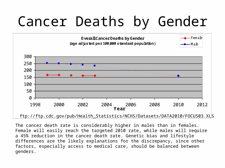
Cancer Deaths by GenderOverall Cancer Deaths by Gender
(age adjusted per 100,000 standard population)
0
50
100
150
200
250
300
1998 2000 2002 2004 2006 2008 2010 2012Year
Deaths
Female
Male
The cancer death rate is considerably higher in males than in females. Female will easily reach the targeted 2010 rate, while males will require a 45% reduction in the cancer death rate. Genetic bias and lifestyle differences are the likely explanations for the discrepancy, since other factors, especially access to medical care, should be balanced between genders.
ftp://ftp.cdc.gov/pub/Health_Statistics/NCHS/Datasets/DATA2010/FOCUS03.XLS

Cancer Deaths by EducationOverall Cancer Deaths by Education
(age adjusted per 100,000 standard population)
020406080
100120140160180
1999 2000 2001 2002 2003
Year
Deaths
Less than high school
High school graduate
At least some college
ftp://ftp.cdc.gov/pub/Health_Statistics/NCHS/Datasets/DATA2010/FOCUS03.XLS
People that have attended some college have approximately ½ the cancer death rate than those that have not for all years in the study. Furthermore, the rate for people with some college education dropped slightly during these years, while it rose slightly for the others. This is presumably because college education correlates with a higher standard of living and access to medical care, rather than the lifestyle experienced while in college.

Mudit Agrawal([email protected])
Datasets used:
http://lib.stat.cmu.edu/
http://www.cdc.gov/nchs/Default.htm

The graph clearly shows why mammals like Man, Horse are known as active species – their ratio of sleep to lifebeing the lowest. On the other hand, opossum, guinea pig sleep much more. No doubt, sleep like a pigand run like a horse come in our vocabulary!
Life Span : Sleep in Mammals
African elephant
African giant pouched rat
Arctic Fox
Asian elephant
Baboon
Big brown bat
Brazilian tapirCat
Chimpanzee
Chinchilla
Cow
Donkey
Eastern American mole
Echidna
European hedgehog
Galago
Genet
Giant armadillo
Goat
Golden hamster
GorillaGray seal
Gray wolf
Ground squirrel
Jaguar
Lesser short-tailed shrew
Little brown bat
MouseMusk shrew
N. American opossumNine-banded armadillo
Owl monkey
Patas monkey
Phanlanger
Pig
Rabbit
Raccoon
Rat
Red fox
Rhesus monkey
Rock hyrax (Hetero. b)Rock hyrax (Procavia hab)
Roe deer
Sheep
Slow loris
Star nosed moleTenrecTree hyrax
Tree shrew
Vervet
Water opossum
Guinea pig
Horse
Man
0
20
40
60
80
100
120
Life Span in Years Hours of Sleep per day

Due to color-similarity between the PIE and names, the confusion between lower % causes is avoided.It is clear that Congenital Anomalies and Short Gestation are among the main reasons of death in infants,whereas Circulatory, respiratory diseases etc. are very not that serious and prominent. Does that mean, deaths are mainly due to anomalies present before births?
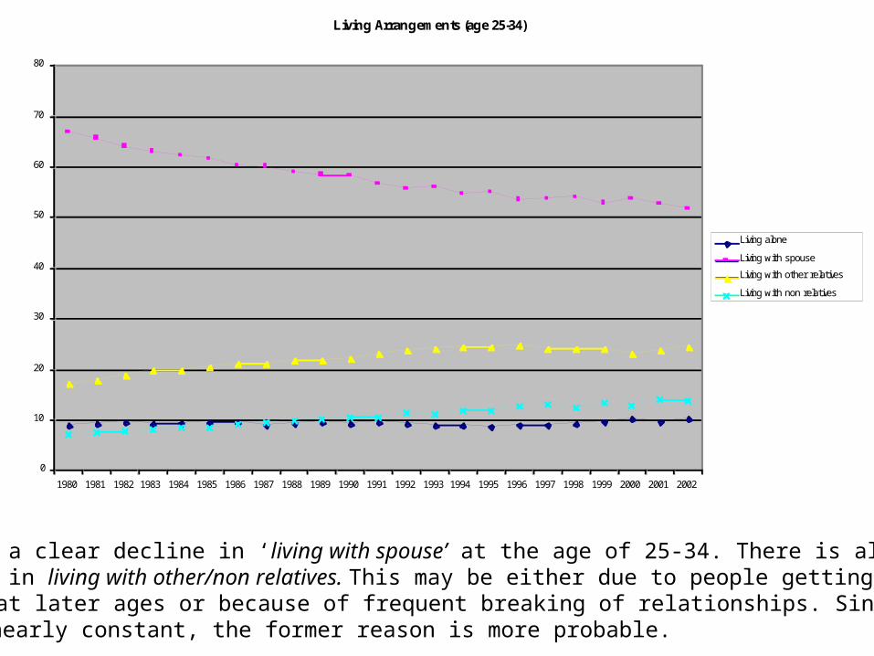
Living Arrangements (age 25-34)
0
10
20
30
40
50
60
70
80
1980 1981 1982 1983 1984 1985 1986 1987 1988 1989 1990 1991 1992 1993 1994 1995 1996 1997 1998 1999 2000 2001 2002
Percentage of people per year
Living alone
Living with spouse
Living with other relatives
Living with non relatives
There is a clear decline in ‘living with spouse’ at the age of 25-34. There is also an increase in living with other/non relatives. This may be either due to people getting married at later ages or because of frequent breaking of relationships. Since living alone is nearly constant, the former reason is more probable.

Assignment 1Living Arrangement data of US
population by age and sex
Neeti Ogale

1980 1985 1990 1995 2000 200550525456586062646668707274767880
Percentage of population living with spouse
(Male and Female)
Year
Age:35-44 Age:45-54 Age:55-64 Age:65+ Age:25-34
Percentage of people of different age groups who live with spouse
It can be seen that percentage of people of age above 60 that live with spouse is increasing. But for all other age groups, the percentage is decreasing over the years.

1980 1985 1990 1995 20000
10
20
30
40
50
60
70
80
Percentage of population Age: 35-44
(Male and Female)
Year
Living alone Living with spouse Living with relative Living with non relative
Data of living arrangements for people of age 35-44
It can be seen that percent of people within age 35-44 living with spouse is decreasing while those living with relatives and alone is increasing over the years.
1980 1985 1990 1995 2000
0
10
20
30
40
50
60
70
80
90
100
Percent of male population of age: 35-44
Year
1980 1985 1990 1995 20000
10
20
30
40
50
60
70
80
90
100
Percent of female population of age: 35-44
Year
Living with spouse
Living with relative
Living alone
Living with non relative
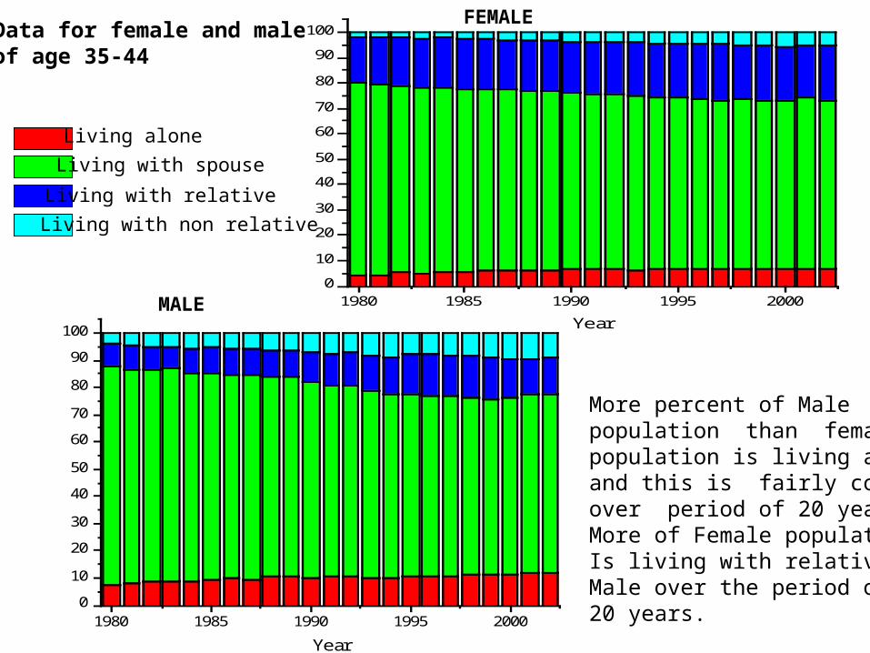
Data for female and male of age 35-44
More percent of Malepopulation than female population is living alone,and this is fairly constantover period of 20 years. More of Female populationIs living with relatives thanMale over the period of 20 years.
MALE
FEMALE

Factors In Polio Vaccination Falling Behind Schedule
Nicholas Chen

Mother’s Education Level
NOTE CROPPED Y AXIS. Current polio vaccination guidelines suggest that children be given three vaccination doses by 18 months of age. We would like to examine the factors that may cause a child to fall behind the recommended vaccination schedule. All data sets use vaccination data for children aged 18-35 months. Here, we see that the highest level of education attained by the mother (or female guardian) correlates with the likelihood a child will be on schedule. A similar trend is seen when we bin using the age range of the mother, which should not be surprising, because women having children at older ages tend to be better educated.
Distribution of Polio Doses Received by Mother's Education Level
0%
2%
4%
6%
8%
10%
12%
14%
16%
18%
20%
Some HighSchool
High School Some College College
Mother's Education Level
Three or more doses
Two doses
One dose
No doses
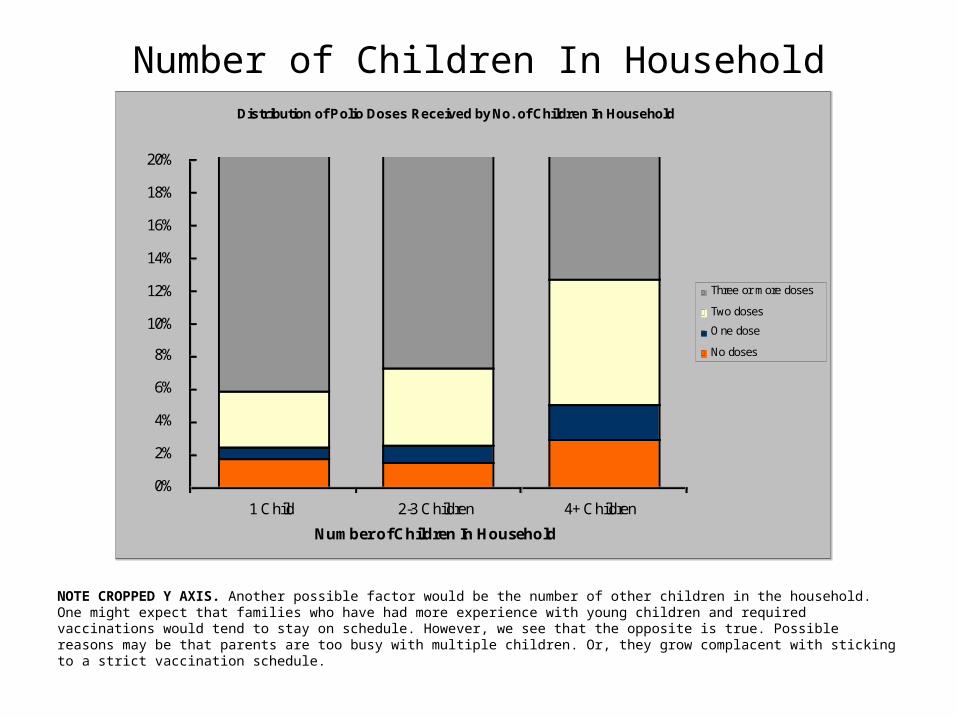
Number of Children In Household
NOTE CROPPED Y AXIS. Another possible factor would be the number of other children in the household. One might expect that families who have had more experience with young children and required vaccinations would tend to stay on schedule. However, we see that the opposite is true. Possible reasons may be that parents are too busy with multiple children. Or, they grow complacent with sticking to a strict vaccination schedule.
Distribution of Polio Doses Received by No. of Children In Household
0%
2%
4%
6%
8%
10%
12%
14%
16%
18%
20%
1 Child 2-3 Children 4+ Children
Number of Children In Household
Three or more doses
Two doses
One dose
No doses
Income
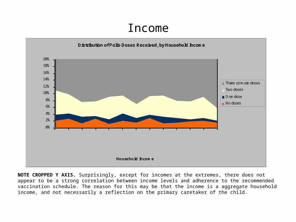
NOTE CROPPED Y AXIS. Surprisingly, except for incomes at the extremes, there does not appear to be a strong correlation between income levels and adherence to the recommended vaccination schedule. The reason for this may be that the income is a aggregate household income, and not necessarily a reflection on the primary caretaker of the child.
Distribution of Polio Doses Received, by Household Income
0%
2%
4%
6%
8%
10%
12%
14%
16%
18%
20%
$0-$7500
$7501-$10000$10001-$12500$12501-$15500$15501-$17500$17501-$20000$20001-$25000$25001-$30000$30001-$35000$35001-$40000$40001-$45000$45001-$50000
$50001+
Household Income
Three or more doses
Two doses
One dose
No doses

Rachael Bradley

Asthma Related Deaths 1998-2002
0100020003000400050006000700080009000
100001100012000130001400015000
1998-2000 1999-2001 2000-2002Years
Number of Deaths
0-4 5-17 18+ Age:
The majority of asthma related deaths occur in individuals over the age of 18. Relatively few occur
before the age of 4. The number of asthma related deaths has decreased since 1998.
The majority of asthma related deaths occur in individuals over the age of 18. Relatively few occur
before the age of 4. The number of asthma related deaths has decreased since 1998.
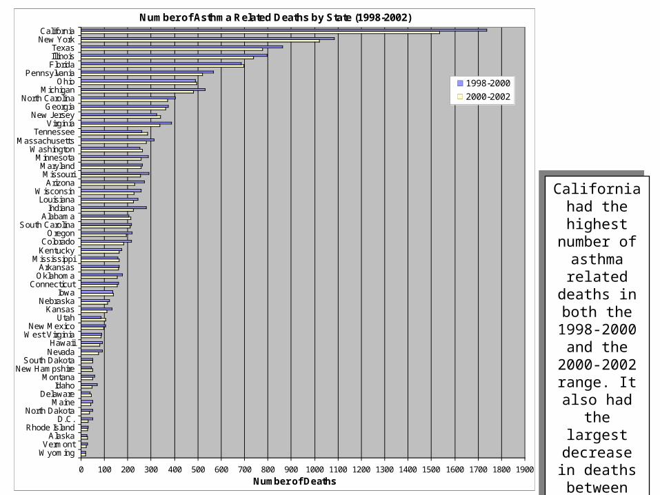
Number of Asthma Related Deaths by State (1998-2002)
0 100 200 300 400 500 600 700 800 900 1000 1100 1200 1300 1400 1500 1600 1700 1800 1900
WyomingVermont
AlaskaRhode Island
D.C.North Dakota
MaineDelaware
IdahoMontana
New HampshireSouth Dakota
NevadaHawaii
West VirginiaNew Mexico
UtahKansas
NebraskaIowa
ConnecticutOklahomaArkansas
MississippiKentuckyColorado
OregonSouth Carolina
AlabamaIndiana
LouisianaWisconsin
ArizonaMissouri
MarylandMinnesota
WashingtonMassachusetts
TennesseeVirginia
New JerseyGeorgia
North CarolinaMichigan
OhioPennsylvania
FloridaIllinoisTexas
New YorkCalifornia
Number of Deaths
1998-2000
2000-2002
California had the highest number of
asthma related deaths in both the 1998-2000 and the 2000-2002 range. It also had the
largest decrease in
deaths between those years.
California had the highest number of
asthma related deaths in both the 1998-2000 and the 2000-2002 range. It also had the
largest decrease in
deaths between those years.

Change in Asthma Related Deaths Between 1998-2000 and 2000-2002
TennesseeUtahNew Jersey
FloridaWashingtonAlabamaDelawareMississippiOhioNew HampshireIowaAlaskaSouth DakotaWyoming
Rhode Island
Arkansas
West Virginia
VermontMaryland
South CarolinaConnecticut
NebraskaNew Mexico
MontanaMaine
HawaiiGeorgiaKentucky
North DakotaLouisiana
Nevada
OklahomaKansas
D.C.Idaho
Oregon
MinnesotaWisconsinColorado
North CarolinaMassachusetts
MissouriArizona
Pennsylvania
VirginiaMichiganIndianaIllinois
New YorkTexas
California
-220-210-200-190-180-170
-160-150-140-130-120-110-100
-90-80-70-60-50-40-30-20
-100
10203040
California had the largest decrease in asthma related deaths while Tennessee had the largest increase.California had the largest decrease in asthma related deaths while Tennessee had the largest increase.

Samah Ramadan

0.0
5.0
10.0
15.0
20.0
25.0
1989 1990 1991 1992 1993 1994 1995 1996 1997 1998 1999 2000 2001 2002
Year
Percentage
All races
White
Black or African American
American Indian or Alaska Native
Asian or Pacific Islander
Hispanic or Latino
Declining rate of smoking mother except for native Americans where decline is slower.
Mothers smoking during pregnancy categorized by race
Samah RamadanSamah Ramadan
0.0
5.0
10.0
15.0
20.0
25.0
30.0
35.0
1997 1998 1999 2000 2001 2002 2003
Male -Severe headache or migraine
Female- Severe headache or migraine
Male- Low back pain
Female- Low back pain
Male- Neck pain
Female- Neck pain
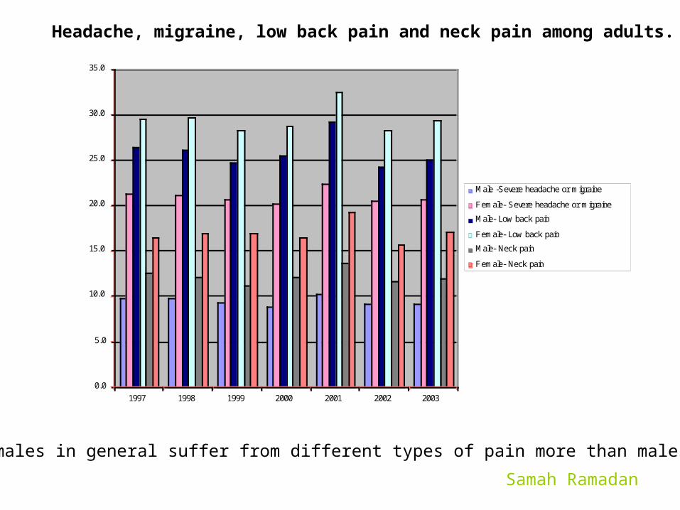
Females in general suffer from different types of pain more than males.
Headache, migraine, low back pain and neck pain among adults.
Samah Ramadan

Scott Nestler

Scott Nestler, CMSC 838S, Assignment 1, 31 JAN 2006, Slide 1 of 3Source: 2004 National Immunization Survey, National Center for Health Statistics, http://www.cdc.gov/nchs
Average Time to Vaccination
0 50 100 150 200 250 300 350 400 450 500
MMR
VRC
PCV
POLIO
HIB
DTP
HEPB
Vaccine
Age (in days)
Not
Firstborn
It appears that, in general, parents get their firstborn childvaccinated in a more timely manner than subsequent children.

Scott Nestler, CMSC 838S, Assignment 1, 31 JAN 2006, Slide 1 of 3Source: 2004 National Immunization Survey, National Center for Health Statistics, http://www.cdc.gov/nchs
Boys and girls receive the recommended vaccinationsat approximately the same rates.
Male
Yes
47%
No
38%
Don't Know
15%
Refused
0%
Yes
No
Don't Know
Refused
Female
Yes
46%
No
39%
Don't Know
15%
Refused
0%
Yes
No
Don't Know
Refused
Gender Impact on Immunizations
0.00%
10.00%
20.00%
30.00%
40.00%
50.00%
Percentage of Responses
Yes No Don't Know Refused
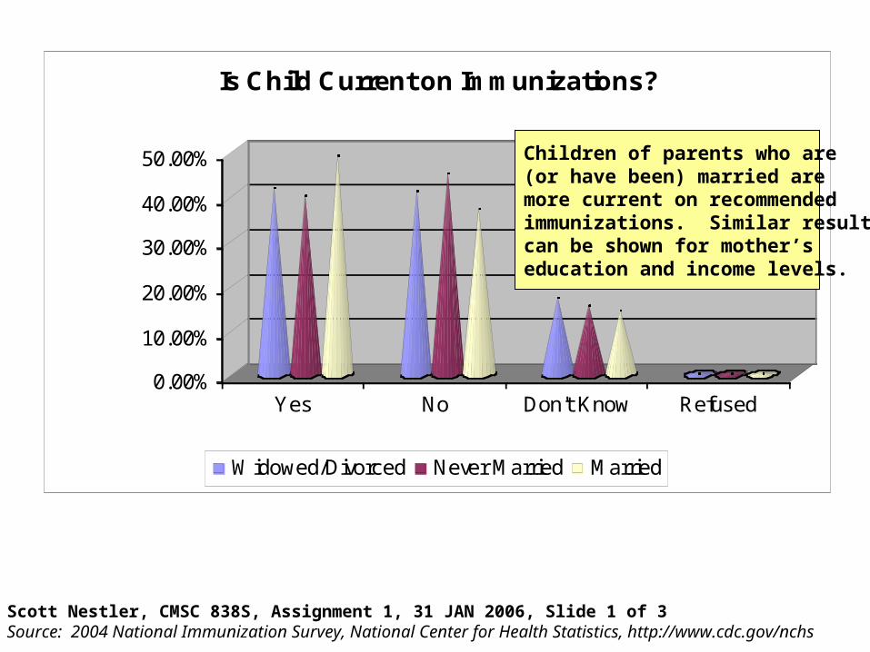
Is Child Current on Immunizations?
Widowed/Divorced Never Married Married
Scott Nestler, CMSC 838S, Assignment 1, 31 JAN 2006, Slide 1 of 3Source: 2004 National Immunization Survey, National Center for Health Statistics, http://www.cdc.gov/nchs
Children of parents who are(or have been) married aremore current on recommendedimmunizations. Similar resultscan be shown for mother’seducation and income levels.

0.0
10.0
20.0
30.0
40.0
50.0
60.0
70.0
1974-79 1980-82 1983-85 1986-88 1989-91 1992-2000
White Both Genders
White Males
White Females
Balck both genders
Black Males
Black Females
Generally increasing survival rate. Rate is higher in whites than blacks.
Cancer survival rate categorized by race and gender
Samah Ramadan

Timur Chabuk

1-1011-20
21-3031-40
41-5051-60
0
5000
10000
15000
20000
25000
30000
35000
40000
45000
Number of Deaths
Age at Death (Years)
Top 5 Causes of Death (Accidental Injury) 1999-2003
Drowning
Fire
Fall
Poison
Motor Vehicle
In this graph you can see that particular types of injuries cause deaths in some age groups more than others. Unsurprisingly, the number of fatal injuries caused by falling down is higher in older age groups. Though slightly more subtle, one can see that the number of fatal injuries caused by fires is higher among young and old age groups than among middle aged groups. Deaths from motor vehicle related injuries are much more numerous in the 10-20 age group than the 1-10 age group. (Timur Chabuk)

Top 5 Causes of Death (Accidental Injury) 1999-2003 by Gender
0
20000
40000
60000
80000
100000
120000
140000
Motor Vehicle Poison Falling Drowning Fire
Cause of Death
Number of Deaths
Female
Male
Its clear from this graph that more men than women die from accidental injuries. One could imagine reasons that more men than women die from traffic accidents, but the fact that more men than women die from poisoning is quite peculiar. (Timur Chabuk)
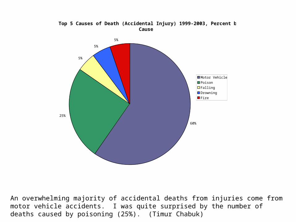
Top 5 Causes of Death (Accidental Injury) 1999-2003, Percent by Cause
60%
25%
5%
5%
5%
Motor Vehicles
Poison
Falling
Drowning
Fire
An overwhelming majority of accidental deaths from injuries come from motor vehicle accidents. I was quite surprised by the number of deaths caused by poisoning (25%). (Timur Chabuk)

Vlad Morariu

Mean Income of Males and Females of Age 45-54
0
10000
20000
30000
40000
50000
60000
197419751976197719781979198019811982198319841985198619871988198919901991199219931994199519961997199819992000200120022003
Year
Income (dollars)
Male
Female
Here we can see that the mean income of males and females aged 45-54 has been increasing steadily since 1974 for both groups. We notice that the income of males is still much higher than that of females, though we can see that in 1974 the income of males was roughly double that of females, but less than double in 2003.
Vlad Morariu

Mean Income of Persons 65 and Older in 2003 Dollars
0
5000
10000
15000
20000
25000
30000
1976197719781979198019811982198319841985198619871988198919901991199219931994199519961997199819992000200120022003
Year
Income (2003 adjusted dollar value)
White
Black
Hispanic
Here we see that the mean income of Whites aged 65 and above is higher than that of Blacks and Hispanics from 1976 to 2003. However, as a percentage of the income of the Whites, the income of Blacks and Hispanics has been increasing. Also, we note that starting in 1995, the income of Blacks surpassed that of Hispanics.
Vlad Morariu
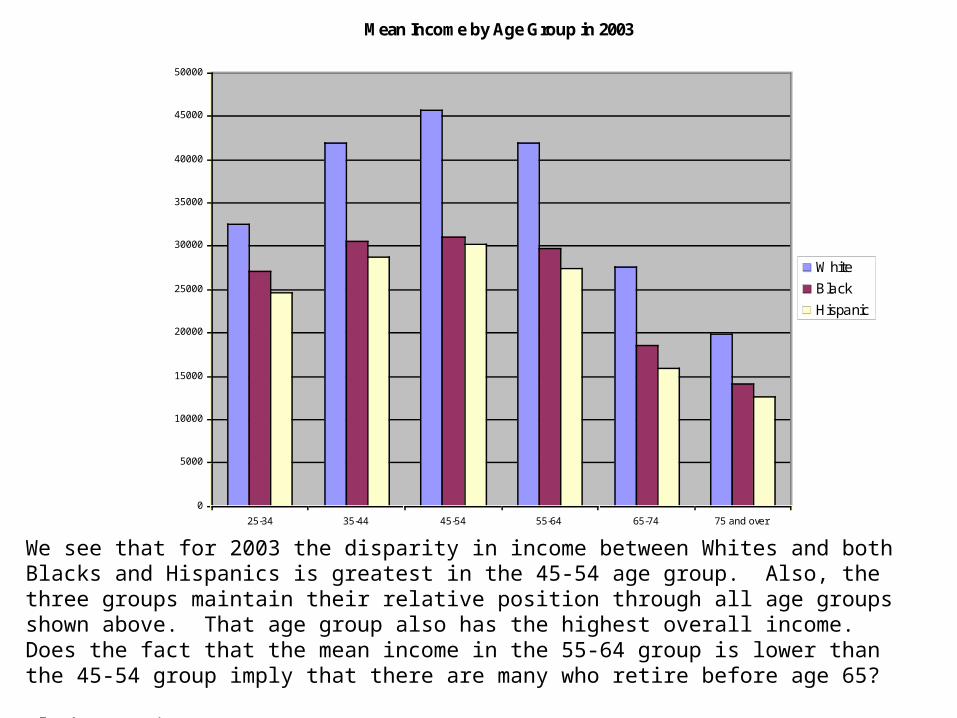
Mean Income by Age Group in 2003
0
5000
10000
15000
20000
25000
30000
35000
40000
45000
50000
25-34 35-44 45-54 55-64 65-74 75 and over
Age Group
Mean Income
White
Black
Hispanic
We see that for 2003 the disparity in income between Whites and both Blacks and Hispanics is greatest in the 45-54 age group. Also, the three groups maintain their relative position through all age groups shown above. That age group also has the highest overall income. Does the fact that the mean income in the 55-64 group is lower than the 45-54 group imply that there are many who retire before age 65?
Vlad Morariu

Nathanial Ayewah

0.0
2.0
4.0
6.0
8.0
10.0
12.0
Deaths per 100,000 workers per year
5,000
5,500
6,000
6,500
7,000
7,500
8,000
8,500
9,000
1992 1993 1994 1995 1996 1997 1998 1999 2000 2001 2002
Deaths per year
Nat AyewahNat AyewahUS Occupational Injury Deaths and Rates: 1992 - 2002US Occupational Injury Deaths and Rates: 1992 - 2002 Source: http://www.cdc.gov/nchs/fastats/osh.htm
Including fatalities from Sept 11, 2001
Rate Rate versusversus Actual Count Actual Count
The first graph shows a steady decline in the rate of occup-ational deaths from 1994. This trend is more unstable in the second graph because the “deaths per year” depend on the size of the workforce that year.

Nat AyewahNat AyewahUS Occupational Injury Deaths and Rates: 1992 - 2002US Occupational Injury Deaths and Rates: 1992 - 2002 Source: http://www.cdc.gov/nchs/fastats/osh.htm
Rate Rate versusversus Actual Count Actual Count
At first glance, the rate of deaths indicates that Mining and Agriculture are the most dangerous industries while the Retail and Services industries are quite safe.
But the latter two industries contribute many more deaths than the first two because they employ more people.
So where should a polititian place his or her focus?
0.00
5.00
10.00
15.00
20.00
25.00
30.00
Deaths per 100,000 workers
Average 1992-2002 2002
2002 was better than the average over this period in almost all industries!

Nat AyewahNat AyewahUS Occupational Injury Deaths and Rates: 1992 - 2002US Occupational Injury Deaths and Rates: 1992 - 2002 Source: http://www.cdc.gov/nchs/fastats/osh.htm
Thought the rate of death among white workers is comparable to the rates of other races, they make up almost 75% of the actual deaths per year. Many factors could account for this including the size of the workforce and the nature of employment.
0.00
1.00
2.00
3.00
4.00
5.00
6.00
White Black or AfricanAmerican
Hispanic or Latino
Deaths per 100,000 workers