Embed Size (px)
Citation preview
CNV Quality Assurance TutorialRelease 8.1
Golden Helix, Inc.
March 1, 2014


Contents
1. Overview 2
2. Generate Normalized Log Ratios 4A. Importing Affymetrix CEL Files . . . . . . . . . . . . . . . . . . . . . . . . . . . . . . . . . . . . . . 4
3. Derivative Log Ratio Spread 7
4. Wave Detection 13
5. Gender Screening 19
6. Chromosomal Abnormality Screening 23
7. PCA for Detection and Correction of Batch Effects 27A. How is PCA of LR data different from PCA of SNP data? . . . . . . . . . . . . . . . . . . . . . . . . . 27B. Detecting the Presence of Batch Effects . . . . . . . . . . . . . . . . . . . . . . . . . . . . . . . . . . . 27C. Determining the Correct Number of Principal Components to Correct For . . . . . . . . . . . . . . . . . 31D. Correcting for Batch Effects . . . . . . . . . . . . . . . . . . . . . . . . . . . . . . . . . . . . . . . . . 32
8. Additional Tips and Ideas 33A. “Master” QC spreadsheet and Alternate Method for Filtering Samples . . . . . . . . . . . . . . . . . . . 33B. Further exploration of Principal Components . . . . . . . . . . . . . . . . . . . . . . . . . . . . . . . . 34C. Filter Samples on Autosomal Segment Counts . . . . . . . . . . . . . . . . . . . . . . . . . . . . . . . 34D. Reprocessing Samples Prior to Analysis . . . . . . . . . . . . . . . . . . . . . . . . . . . . . . . . . . 34
i

ii
CNV Quality Assurance Tutorial, Release 8.1
Updated: March 1st, 2014
Level: Advanced
Packages: CNV Analysis, Power Seat
This tutorial covers a typical workflow for quality assurance procedures for whole genome CNV analysis. It alsoincludes some discussion of importing and processing raw data files prior to beginning a CNV analysis project. Thetutorial is built around the Affymetrix 500K array, but the workflows are generally applicable to most genotypingarrays and aCGH platforms. There are some anomalies with Illumina data where certain analysis steps may notdirectly apply. For more information on what to watch for with Illumina data, see CNV Analysis Tips for IlluminaData.
Requirements
To complete this tutorial you will need to download and unzip the following file, which includes several datasets.
DownloadSVS_CNV_QA_Tutorial.zip
File included in the above ZIP file:
• Sample CNV Data Project file - contains Matching, LogR (samples columnwise and rowwise, explained fur-ther in tutorial) and Phenotype spreadsheets.
We hope you enjoy the experience and look forward to your feedback.
Contents 1
1. Overview
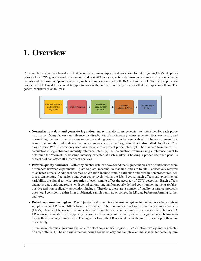
Copy number analysis is a broad term that encompasses many aspects and workflows for interrogating CNVs. Applica-tions include CNV genome-wide association studies (GWAS), cytogenetics, de novo copy number detection betweenparents and offspring, or “paired analysis”, such as comparing normal cell DNA to tumor cell DNA. Each applicationhas its own set of workflows and data types to work with, but there are many processes that overlap among them. Thegeneral workflow is as follows:
• Normalize raw data and generate log ratios. Array manufacturers generate raw intensities for each probeon an array. Many factors can influence the distribution of raw intensity values generated from each chip, andnormalizing the raw values is necessary before making comparisons between subjects. The measurement thatis most commonly used to determine copy number status is the “log ratio” (LR), also called “log-2 ratio” or“log-R ratio” (“R” is commonly used as a variable to represent probe intensity). The standard formula for LRcalculation is log2(observed intensity/reference intensity). LR calculation requires using a reference panel todetermine the “normal” or baseline intensity expected at each marker. Choosing a proper reference panel iscritical as it can affect all subsequent analyses.
• Perform quality assurance. With copy number data, we have found that significant bias can be introduced fromdifferences between experiments – plate-to-plate, machine -to-machine, and site-to-site – collectively referredto as batch effects. Additional sources of variation include sample extraction and preparation procedures, celltypes, temperature fluctuations and even ozone levels within the lab. Beyond batch effects and experimentalvariability, the signal-to-noise properties of each sample affect the accuracy of CNV detection. Batch effectsand noisy data confound results, with complications ranging from poorly defined copy number segments to false-positive and non-replicable association findings. Therefore, there are a number of quality assurance protocolsone should consider to either filter problematic samples entirely or correct the LR data before performing furtheranalyses.
• Detect copy number regions. The objective in this step is to determine regions in the genome where a givensample’s mean LR value differs from the reference. These regions are referred to as copy number variants(CNVs). A mean LR around zero indicates that a sample has the same number of copies as the reference. ALR segment mean above zero typically means there is a copy number gain, and a LR segment mean below zeromeans there is a copy number loss. The higher or lower the LR segment mean, the more or less copies there arerespectively.
There are numerous algorithms available to detect copy number regions. SVS employs two optimal segmenta-tion algorithms. 1) The univariate method, which considers only one sample at a time, is ideal for detecting rare
2
CNV Quality Assurance Tutorial, Release 8.1
and/or large CNVs. 2) The multivariate method, which simultaneously considers all subjects, is ideal for detect-ing small, common CNVs. Some CNV detection algorithms also assign actual copy number calls (0,1,2,3. . . )for a segment based on thresholds of LR segment means, though there are some reasons why this is problematic(see CNV Analysis Tips for Illumina Data).
• Analyze the copy number variations. Here you look at the LR segment means (or copy number calls) tofind differences between two or more groups (case/control, tumor/normal, parent/offspring, etc.). This can bedone visually using advanced plotting techniques, or statistically using simple summary statistics or advancedassociation and regression analysis. We advocate a combination of all to ensure copy number differences areindeed real and not just data processing anomalies.
• Make sense of the findings. This can be done in a number of ways, (looking at genomic annotations, pathwayanalysis, gene ontologies, etc.) and in some respects, is outside the scope of this tutorial, though we will touchon a few sense-making techniques.
Considering this generalized workflow, you may begin copy number analysis at any of the steps using SVS dependingon the data you have access to. For example, if your data provider has only given you access to pre-processed and calledcopy number data, then you can simply import the copy number calls and begin visualizing the data or performingassociation analysis. If you’re an Illumina customer and have access to GenomeStudio, you will most likely be ableto export the normalized LRs, with which you can export and perform quality assurance or go right into copy numberdetection.
Whenever possible (and depending on how comfortable you are with upstream analysis), we recommend you startwith the raw intensity data as there are a number of things to consider during each step of the process that can haveprofound ramifications for downstream analysis. This tutorial leads you through each step listed above with a focus onCNV-based GWAS using Affymetrix microarray data, but please keep in mind that no single tutorial can cover everyaspect of copy number analysis. As Bryce Christensen aptly states in his blog post:
“Let’s face it: CNV analysis is not easy. While SNP-based GWAS follows a largely standardized process,there are few conventions for CNV analysis. CNV studies typically require extensive craftsmanship tofully understand the contents of the data and explain the findings. As much as we would like to automatethe process, there are always factors that require the researcher to make informed decisions or educatedguesses about how to proceed.”
3
2. Generate Normalized Log Ratios
The following steps outline the process for generating log ratios (LRs) from Affymetrix CEL files. However, CELfiles are rather large and the import process can be time intensive. Therefore, rather than provide the CEL files andhave you import them, we simply outline the process here and provide the results from the import process, including:Affy 500K CNV LogR - Samples Columnwise and Affy 500K CNV LogR - Samples Rowwise. For your reference,we’ve also provided the spreadsheet used to merge the two NSP and STY sets (unique to the Affymetrix 500K array)during import.
To learn more about the quantile normalization methodology in SVS 8, see the Appendix of the SVS Manual.
A. Importing Affymetrix CEL Files
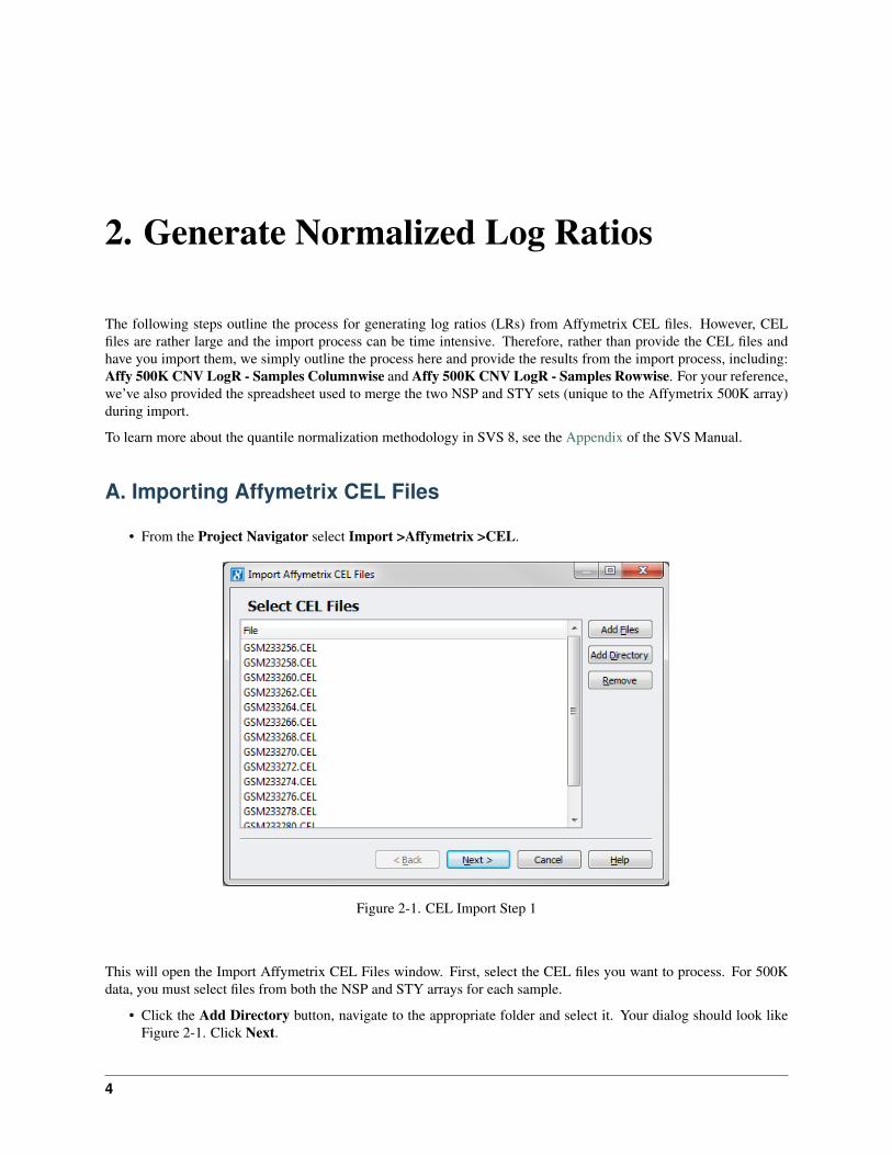
• From the Project Navigator select Import >Affymetrix >CEL.
Figure 2-1. CEL Import Step 1
This will open the Import Affymetrix CEL Files window. First, select the CEL files you want to process. For 500Kdata, you must select files from both the NSP and STY arrays for each sample.
• Click the Add Directory button, navigate to the appropriate folder and select it. Your dialog should look likeFigure 2-1. Click Next.
4
CNV Quality Assurance Tutorial, Release 8.1
The CEL files you selected will first be scanned to ensure proper file formatting. The next window will have moreoptions for importing the files.
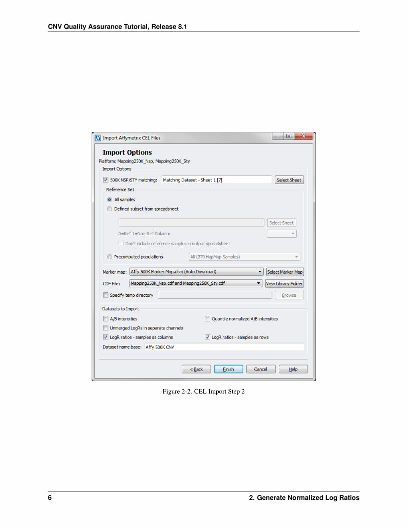
• Check the 500K NSP/STY Matching box and click Choose Sheet. Select the Matching Dataset – Sheet 1spreadsheet and click OK. – Again this step is unique for the Affymetrix 500K array.
In most cases we recommend using all your samples as a pooled reference set. However, there may be times when it’sbetter to use a subset of your samples (e.g. controls or samples that previously passed QC filtering) or a more commonreference, such as one or more HapMap populations, which may be needed when only importing a few samples. Inorder to use a subset of your data, you need a reference spreadsheet with a column that contains 0’s for all of thesamples you wish to use as a reference in the calculation and 1’s otherwise. If you wish to use the HapMap samplesyou can choose the appropriate population from the HapMap pre-computed populations drop down. For this tutorial,we used all samples.
• Leave the radio button All samples selected under Reference Set.
If you have not yet downloaded the Affymetrix 500K Marker Map, the default option for Marker Map: will be Affy500K Marker Map.dsm (Auto Download). If you have downloaded the 500K marker map and it’s saved in theappropriate directory, the software will recognize this and it will be listed. If you wish to choose a different markermap, click on Choose Marker Map and select the appropriate one.
• If your project is located on a shared network drive, you will want to check the Specify Temp Directory boxand Browse to an appropriate folder on your local machine. This folder will be used to store large intermediatefiles.
Under Output Options there are a number of options to choose from. Each can be used in a number of ways.
• For this tutorial we checked LogR ratios – samples rowwise and LogR ratios – samples columnwise.
• Change the Dataset name base: to Affy 500K CNV.
The window should look like Figure 2-2. Click Finish.
The normalization process can take several minutes per CEL file to complete depending on your hardware. Uponcompletion, the spreadsheets selected during the import process will be created in your project.
A. Importing Affymetrix CEL Files 5
CNV Quality Assurance Tutorial, Release 8.1
Figure 2-2. CEL Import Step 2
6 2. Generate Normalized Log Ratios
3. Derivative Log Ratio Spread
Sample quality assurance (QA) is absolutely critical in copy number analysis. If not addressed early, bad sampleswill lead to poorly defined copy number segments resulting in false-positive and non-replicable association findings.The following section leads you through a few of the more standard quality assurance (QA) procedures to identifysamples that have poor quality log ratio data (e.g. excessive noise, genomic waves, and cell line artifacts) and thosewhose identity is of question (gender mismatch). There are a number of other quality assurance steps you might wantto consider in your own study. To learn more about copy number QA methods, see the Genome-Wide Success Part IIIwebcast.
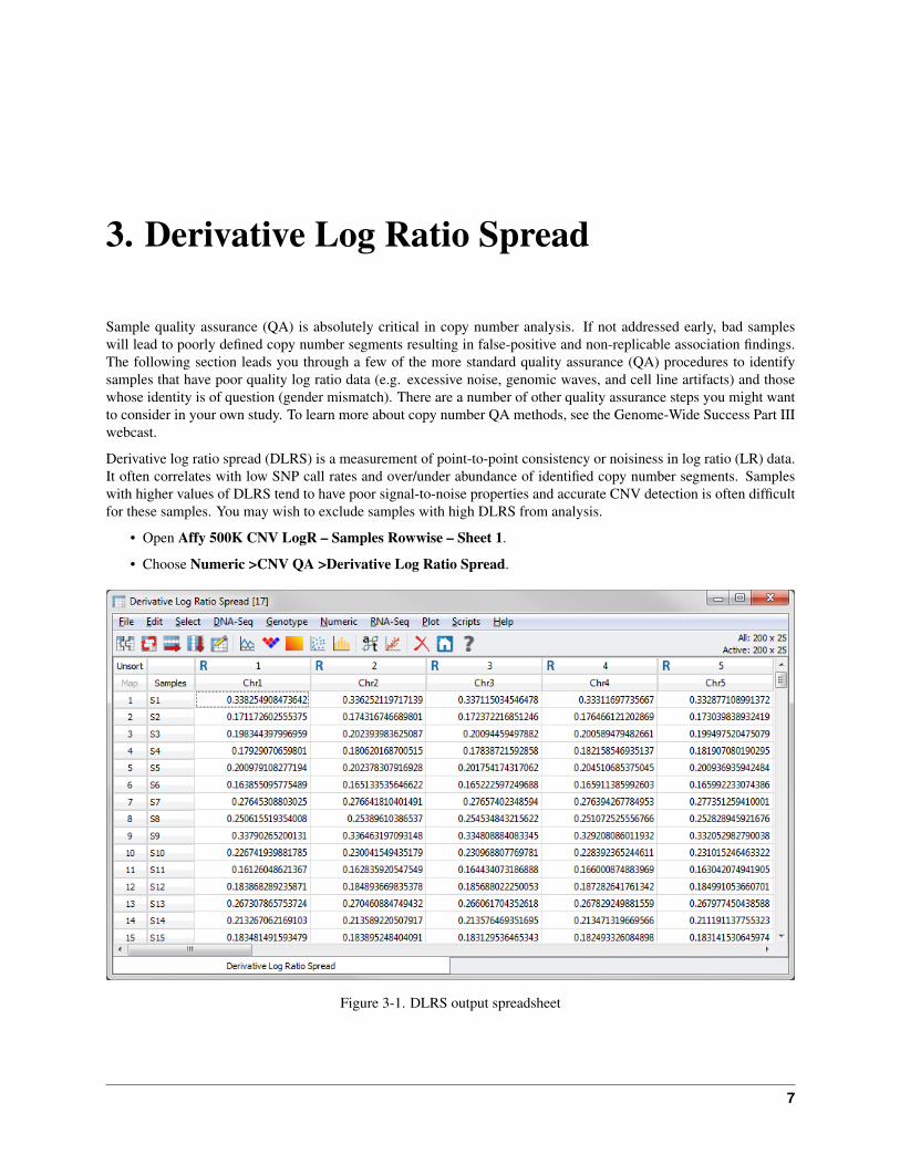
Derivative log ratio spread (DLRS) is a measurement of point-to-point consistency or noisiness in log ratio (LR) data.It often correlates with low SNP call rates and over/under abundance of identified copy number segments. Sampleswith higher values of DLRS tend to have poor signal-to-noise properties and accurate CNV detection is often difficultfor these samples. You may wish to exclude samples with high DLRS from analysis.
• Open Affy 500K CNV LogR – Samples Rowwise – Sheet 1.
• Choose Numeric >CNV QA >Derivative Log Ratio Spread.
Figure 3-1. DLRS output spreadsheet
7
CNV Quality Assurance Tutorial, Release 8.1
The resulting spreadsheet contains DLRS values for every sample by chromosome and then two summary columns;‘All’ and ‘Median’ (Figure 3-1). “All” is the genome-wide DLRS value, and “Median” is the median of the by-chromosome DLRS values. The by-chromosome values will usually be very consistent throughout the autosomes.We suggest using the ”Median” column for QC purposes, as it is robust to effects from the sex chromosomes. The Ychromosome, for example, has very different DLRS properties in males and females.
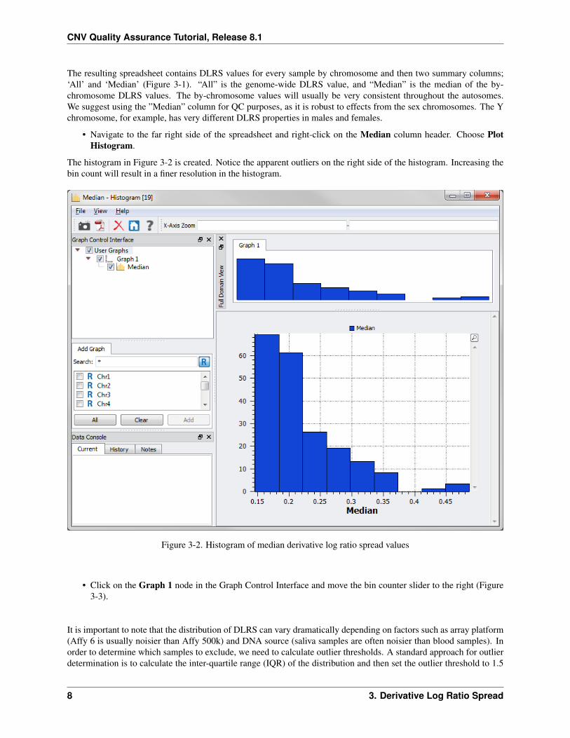
• Navigate to the far right side of the spreadsheet and right-click on the Median column header. Choose PlotHistogram.
The histogram in Figure 3-2 is created. Notice the apparent outliers on the right side of the histogram. Increasing thebin count will result in a finer resolution in the histogram.
Figure 3-2. Histogram of median derivative log ratio spread values
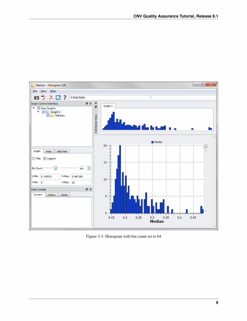
• Click on the Graph 1 node in the Graph Control Interface and move the bin counter slider to the right (Figure3-3).
It is important to note that the distribution of DLRS can vary dramatically depending on factors such as array platform(Affy 6 is usually noisier than Affy 500k) and DNA source (saliva samples are often noisier than blood samples). Inorder to determine which samples to exclude, we need to calculate outlier thresholds. A standard approach for outlierdetermination is to calculate the inter-quartile range (IQR) of the distribution and then set the outlier threshold to 1.5
8 3. Derivative Log Ratio Spread
CNV Quality Assurance Tutorial, Release 8.1
Figure 3-3. Histogram with bin count set to 64
9
CNV Quality Assurance Tutorial, Release 8.1
IQRs from the third quartile.
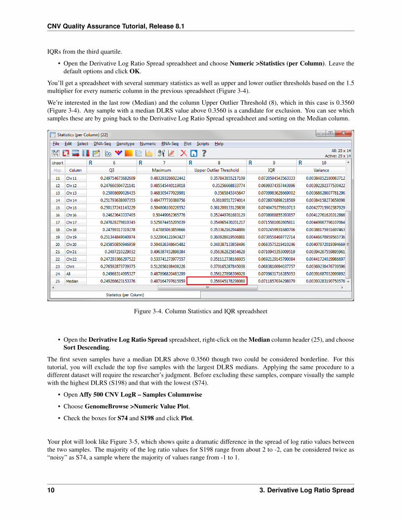
• Open the Derivative Log Ratio Spread spreadsheet and choose Numeric >Statistics (per Column). Leave thedefault options and click OK.
You’ll get a spreadsheet with several summary statistics as well as upper and lower outlier thresholds based on the 1.5multiplier for every numeric column in the previous spreadsheet (Figure 3-4).
We’re interested in the last row (Median) and the column Upper Outlier Threshold (8), which in this case is 0.3560(Figure 3-4). Any sample with a median DLRS value above 0.3560 is a candidate for exclusion. You can see whichsamples these are by going back to the Derivative Log Ratio Spread spreadsheet and sorting on the Median column.
Figure 3-4. Column Statistics and IQR spreadsheet
• Open the Derivative Log Ratio Spread spreadsheet, right-click on the Median column header (25), and chooseSort Descending.
The first seven samples have a median DLRS above 0.3560 though two could be considered borderline. For thistutorial, you will exclude the top five samples with the largest DLRS medians. Applying the same procedure to adifferent dataset will require the researcher’s judgment. Before excluding these samples, compare visually the samplewith the highest DLRS (S198) and that with the lowest (S74).
• Open Affy 500 CNV LogR – Samples Columnwise
• Choose GenomeBrowse >Numeric Value Plot.
• Check the boxes for S74 and S198 and click Plot.
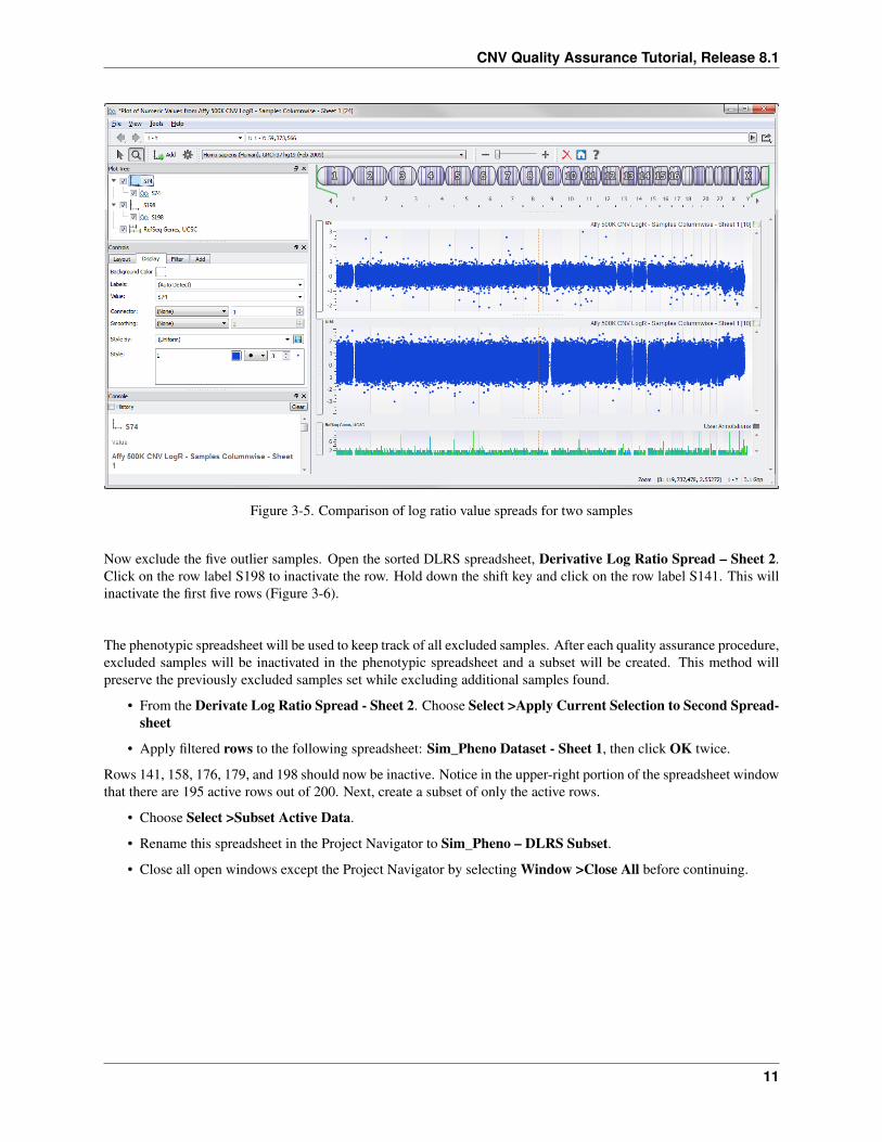
Your plot will look like Figure 3-5, which shows quite a dramatic difference in the spread of log ratio values betweenthe two samples. The majority of the log ratio values for S198 range from about 2 to -2, can be considered twice as“noisy” as S74, a sample where the majority of values range from -1 to 1.
10 3. Derivative Log Ratio Spread
CNV Quality Assurance Tutorial, Release 8.1
Figure 3-5. Comparison of log ratio value spreads for two samples
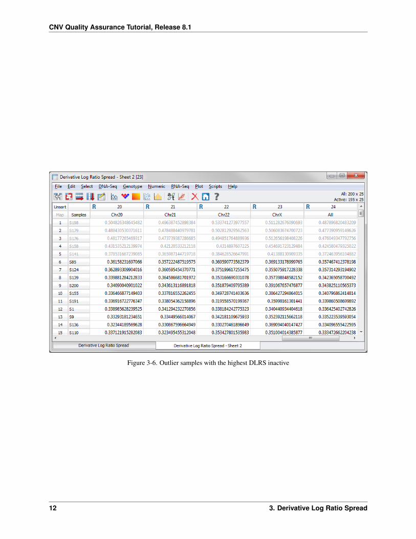
Now exclude the five outlier samples. Open the sorted DLRS spreadsheet, Derivative Log Ratio Spread – Sheet 2.Click on the row label S198 to inactivate the row. Hold down the shift key and click on the row label S141. This willinactivate the first five rows (Figure 3-6).
The phenotypic spreadsheet will be used to keep track of all excluded samples. After each quality assurance procedure,excluded samples will be inactivated in the phenotypic spreadsheet and a subset will be created. This method willpreserve the previously excluded samples set while excluding additional samples found.
• From the Derivate Log Ratio Spread - Sheet 2. Choose Select >Apply Current Selection to Second Spread-sheet
• Apply filtered rows to the following spreadsheet: Sim_Pheno Dataset - Sheet 1, then click OK twice.
Rows 141, 158, 176, 179, and 198 should now be inactive. Notice in the upper-right portion of the spreadsheet windowthat there are 195 active rows out of 200. Next, create a subset of only the active rows.
• Choose Select >Subset Active Data.
• Rename this spreadsheet in the Project Navigator to Sim_Pheno – DLRS Subset.
• Close all open windows except the Project Navigator by selecting Window >Close All before continuing.
11
CNV Quality Assurance Tutorial, Release 8.1
Figure 3-6. Outlier samples with the highest DLRS inactive
12 3. Derivative Log Ratio Spread

4. Wave Detection
The next quality assurance step involves detecting samples with genomic waves in their log ratio data. Genomic wavesare phenomena whereby, despite normalization, the log ratio data appear to have a long-range wave pattern whenplotted in genomic space. Waviness is hypothesized to be correlated with the GC content of the probes themselves inaddition to the GC content of the region around the probes. This wave pattern wreaks havoc on copy number detectionalgorithms. SVS employs a wave correction algorithm (Diskin, et. al., 2008) but there are some cases when this canbe more problematic than beneficial. Therefore, the approach used in this tutorial will simply remove samples withextreme wave factors.
• Open Affy 500K CNV LogR – Samples Rowwise - Sheet 1. Choose Numeric >CNV QA >Wave Detec-tion/Correction.
• Leave the default parameters and click Run.
• The Wave Detection/Correction algorithm requires a reference file containing GC content information. This filewill be automatically downloaded.
Note: If there is not a GC digest file available for your species email [email protected] and we cancreate the necessary file.
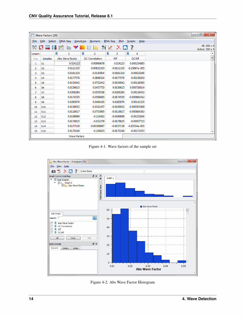
Now plot a histogram of the Abs Wave Factors column.
• Right-click on the Abs Wave Factor column header (1) and choose Plot Histogram.
The histogram looks like Figure 4-2. (Again, you can adjust the bin count of the graph to create a finer resolution).
Again, there are outliers visible in this histogram that should be considered for exclusion. The authors of the wavedetection method (Diskin, et. al., 2008) suggest a cutoff of 0.05, but we have found that the optimal cutoff point variesacross studies and platforms. The tutorial will use the outlier thresholds to determine which samples warrant a secondlook.
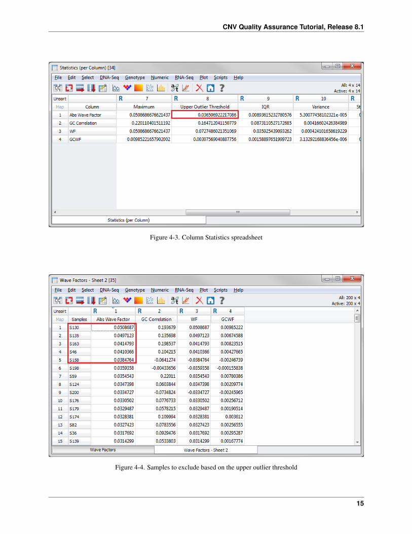
• From the Wave Factors spreadsheet, choose Numeric >Statistics (per Column).
• Leave the default options and click OK.
The upper outlier threshold (8th Column) for Abs Wave Factor in this case is roughly 0.037 (Figure 4-3).
Now sort the Wave Factors spreadsheet to determine which samples have an Abs Wave Factor above 0.037.
• From the Wave Factors spreadsheet, right-click on the Abs Wave Factors column header (1) and choose SortDescending.
There are five samples that are considered outliers according to the IQR multiplier (Figure 4-4). After visualizing thewave effect, you will inactivate these samples using the same method as before.
13
CNV Quality Assurance Tutorial, Release 8.1
Figure 4-1. Wave factors of the sample set
Figure 4-2. Abs Wave Factor Histogram
14 4. Wave Detection
CNV Quality Assurance Tutorial, Release 8.1
Figure 4-3. Column Statistics spreadsheet
Figure 4-4. Samples to exclude based on the upper outlier threshold
15
CNV Quality Assurance Tutorial, Release 8.1
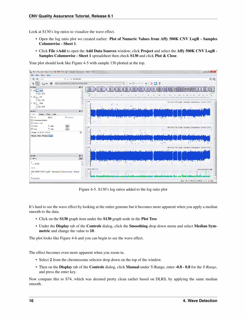
Look at S130’s log ratios to visualize the wave effect.
• Open the log ratio plot we created earlier: Plot of Numeric Values from Affy 500K CNV LogR - SamplesColumnwise - Sheet 1.
• Click File >Add to open the Add Data Sources window, click Project and select the Affy 500K CNV LogR -Samples Columnwise - Sheet 1 spreadsheet then check S130 and click Plot & Close.
Your plot should look like Figure 4-5 with sample 130 plotted at the top.
Figure 4-5. S130’s log ratios added to the log ratio plot
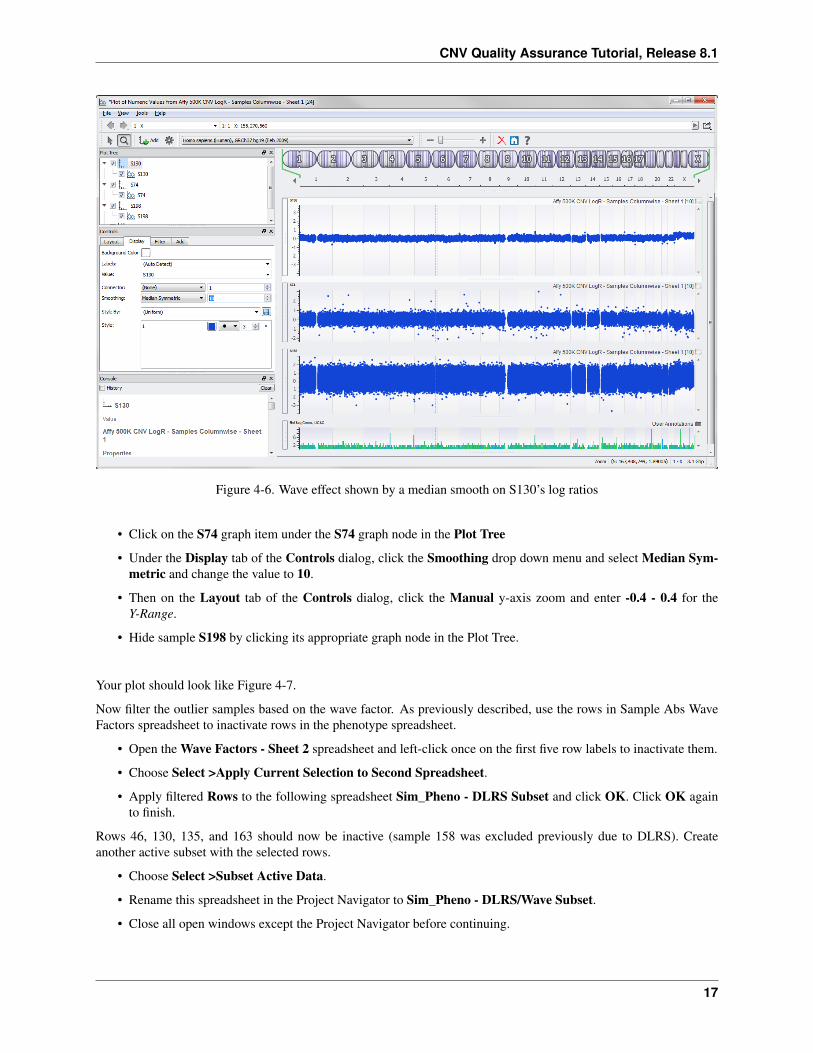
It’s hard to see the wave effect by looking at the entire genome but it becomes more apparent when you apply a mediansmooth to the data.
• Click on the S130 graph item under the S130 graph node in the Plot Tree
• Under the Display tab of the Controls dialog, click the Smoothing drop down menu and select Median Sym-metric and change the value to 10.
The plot looks like Figure 4-6 and you can begin to see the wave effect.
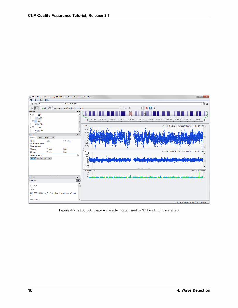
The effect becomes even more apparent when you zoom in.
• Select 2 from the chromosome selector drop down on the top of the window.
• Then on the Display tab of the Controls dialog, click Manual under Y-Range, enter -0.8 - 0.8 for the Y-Range,and press the enter key.
Now compare this to S74, which was deemed pretty clean earlier based on DLRS, by applying the same mediansmooth.
16 4. Wave Detection
CNV Quality Assurance Tutorial, Release 8.1
Figure 4-6. Wave effect shown by a median smooth on S130’s log ratios
• Click on the S74 graph item under the S74 graph node in the Plot Tree
• Under the Display tab of the Controls dialog, click the Smoothing drop down menu and select Median Sym-metric and change the value to 10.
• Then on the Layout tab of the Controls dialog, click the Manual y-axis zoom and enter -0.4 - 0.4 for theY-Range.
• Hide sample S198 by clicking its appropriate graph node in the Plot Tree.
Your plot should look like Figure 4-7.
Now filter the outlier samples based on the wave factor. As previously described, use the rows in Sample Abs WaveFactors spreadsheet to inactivate rows in the phenotype spreadsheet.
• Open the Wave Factors - Sheet 2 spreadsheet and left-click once on the first five row labels to inactivate them.
• Choose Select >Apply Current Selection to Second Spreadsheet.
• Apply filtered Rows to the following spreadsheet Sim_Pheno - DLRS Subset and click OK. Click OK againto finish.
Rows 46, 130, 135, and 163 should now be inactive (sample 158 was excluded previously due to DLRS). Createanother active subset with the selected rows.
• Choose Select >Subset Active Data.
• Rename this spreadsheet in the Project Navigator to Sim_Pheno - DLRS/Wave Subset.
• Close all open windows except the Project Navigator before continuing.
17
CNV Quality Assurance Tutorial, Release 8.1
Figure 4-7. S130 with large wave effect compared to S74 with no wave effect
18 4. Wave Detection
5. Gender Screening
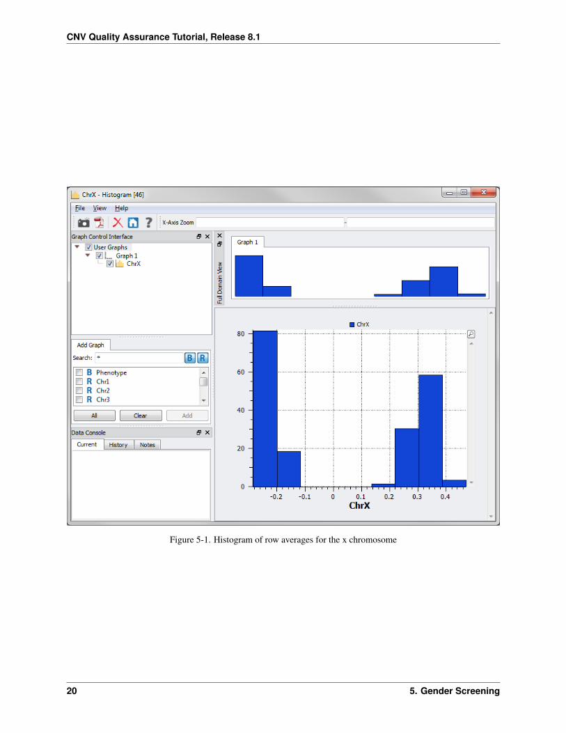
There are a few ways to verify whether a sample’s reported gender is consistent with the inferred gender. In SNPanalysis, we can analyze X chromosome heterozygosity using genotype calls as discussed in the SNP GWAS Tutorial.In CNV analysis, we can examine the average observed intensity of the sex chromosomes to infer gender and to identifyabnormalities of the sex chromosomes (i.e. XXY, XYY). If you are analyzing a dataset for which Y chromosome datais available, it can be useful to plot the chromosome X and Y intensities together in a scatterplot. Viewing the datain two dimensions will usually reveal distinct clusters for males and females, and combinations other than XX or XYwill appear as outliers in the plot. Affy 500K array does not contain the Y chromosome, so for this tutorial you willinvestigate log ratio averages using only the X chromosome.
• Open Affy 500K CNV LogR – Samples Rowwise –Sheet 1 and choose Numeric >Statistics (per Row).
• Make sure only Mean is checked under Output Options and check Output results by chromosome. Select thePer Statistic radio button. (leave Integer Columns and Real columns selected under Include in calculations)
• Click OK.
A Statistics (per Row) - Mean spreadsheet is created with each sample’s average log ratio value across each chro-mosome. We’ll look at the X chromosome row mean to check gender. First join the phenotype spreadsheet, whichcontains reported gender, with this spreadsheet.
• Open Sim_Pheno Dataset – DLRS/Wave Subset and choose File >Join or Merge Spreadsheets.
• Select Statistics (per Row) - Mean from the spreadsheet list and click OK.
• In the Join or Merge spreadsheet window, leave the default options and click OK.
• From the resulting Sim_Pheno Dataset - DLRS/Wave Subset + Statistics (per Row) - Mean spreadsheet,right-click on the ChrX column header (25) select Plot Histogram.
There are two distinct distributions (Figure 5-1). The left one represents males and the right one females.
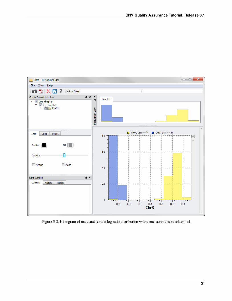
Now split on reported gender to identify any discrepancies.
• Click on the ChrX node in the Graph Control Interface and select the Color tab. Select the By Variable radiobutton and click Select Variable....
• Choose Sex and click OK. Then click the blue box for the Sex==’F’ option and change the color to yellow.Then click the green box for the Sex==’M’ option and change the color to blue.
By changing the opacity of the colors you can see if there are any samples that have a reported gender different thanwhat’s inferred from the log ratios.
• Click on the Item tab move the opacity bar half way to the left.
In this example, there is one sample who’s reported gender is female but according to the log ratios the sample ischaracteristic of a male (Figure 5-2). Next you will determine which sample this is.
19
CNV Quality Assurance Tutorial, Release 8.1
Figure 5-1. Histogram of row averages for the x chromosome
20 5. Gender Screening
CNV Quality Assurance Tutorial, Release 8.1
Figure 5-2. Histogram of male and female log ratio distribution where one sample is misclassified
21
CNV Quality Assurance Tutorial, Release 8.1
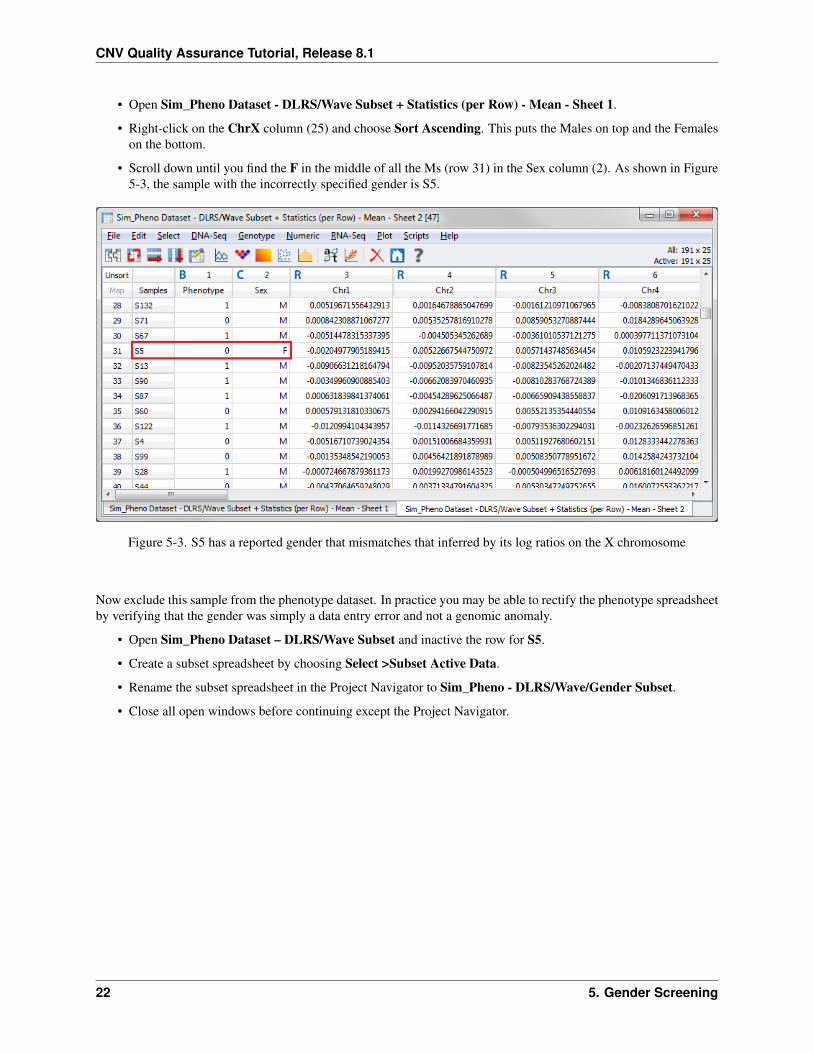
• Open Sim_Pheno Dataset - DLRS/Wave Subset + Statistics (per Row) - Mean - Sheet 1.
• Right-click on the ChrX column (25) and choose Sort Ascending. This puts the Males on top and the Femaleson the bottom.
• Scroll down until you find the F in the middle of all the Ms (row 31) in the Sex column (2). As shown in Figure5-3, the sample with the incorrectly specified gender is S5.
Figure 5-3. S5 has a reported gender that mismatches that inferred by its log ratios on the X chromosome
Now exclude this sample from the phenotype dataset. In practice you may be able to rectify the phenotype spreadsheetby verifying that the gender was simply a data entry error and not a genomic anomaly.
• Open Sim_Pheno Dataset – DLRS/Wave Subset and inactive the row for S5.
• Create a subset spreadsheet by choosing Select >Subset Active Data.
• Rename the subset spreadsheet in the Project Navigator to Sim_Pheno - DLRS/Wave/Gender Subset.
• Close all open windows before continuing except the Project Navigator.
22 5. Gender Screening

6. Chromosomal Abnormality Screening
Detecting large chromosomal aberrations is both a quality assurance step and an analysis step. For example, we areextra cautious when dealing with cell line data, where we’ve seen some samples to have amplifications of several entirechromosomes. In these cases, we would remove such samples from analysis. On the other hand, large chromosomalaberrations might be real (e.g. Down’s Syndrome as we’ll see in this study) and instrumental in detecting diseasecausing loci.
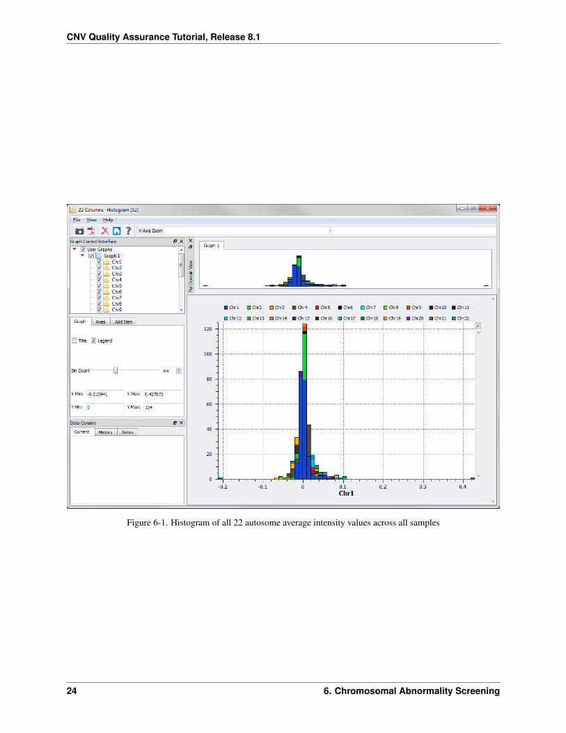
One cursory way to detect large chromosomal aberrations is to look at the average log ratios across all autosomalchromosomes, similar to how we verified gender.
• Open the Statistics (per Row) - Mean spreadsheet again and choose Plot >Histograms.
• Check all the boxes except ChrX and Phenotype. Select Plot all items in one graph under Select itemarrangement, and click Plot.
The resulting plot looks like Figure 6-1 (with a bin count of 64).
Notice the two outliers: one to the left and one to the right of the plot. The point on the right indicates that one samplehas a much higher average than the others for chromosome 21 (as indicated by the legend on the top of the graph orby clicking on the purple bar in this histogram). Similarly, the point on the left indicates that one sample has a muchlower average than the others for chromosome 18.
• From the Statistics (per Row) - Mean spreadsheet right-click on the Chr18 column (18) and select Sort As-cending.
This brings the sample with the lowest log ratio average for chromosome 18 to the top, which is sample 200.
• Next, right-click on the Chr21 column (21) and select Sort Descending.
This brings the sample with the highest log ratio average for chromosome 21 to the top, which is sample 139. Nowplot these samples.
• Open Affy 500K CNV LogR - Samples Columnwise and choose GenomeBrowse >Numeric Value Plot.
• Select the boxes for S139 and S200 and click Plot.
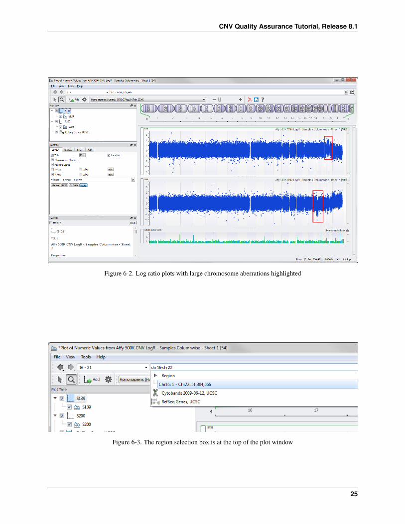
You get the plot in Figure 6-2. Notice the large chromosomal aberrations in chromosome 21 for S139 and chromosome18 for S200. Zoom in for a closer look.
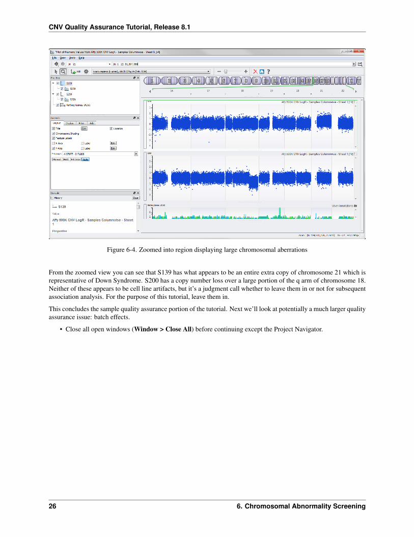
• At the top of the plot window there is a region selection box (see Figure 6-3). Enter chr16-chr22 and pressEnter.
Now you can see better resolution of those two chromosomes in context of the surrounding normal chromosomes(Figure 6-4).
23
CNV Quality Assurance Tutorial, Release 8.1
Figure 6-1. Histogram of all 22 autosome average intensity values across all samples
24 6. Chromosomal Abnormality Screening
CNV Quality Assurance Tutorial, Release 8.1
Figure 6-2. Log ratio plots with large chromosome aberrations highlighted
Figure 6-3. The region selection box is at the top of the plot window
25
CNV Quality Assurance Tutorial, Release 8.1
Figure 6-4. Zoomed into region displaying large chromosomal aberrations
From the zoomed view you can see that S139 has what appears to be an entire extra copy of chromosome 21 which isrepresentative of Down Syndrome. S200 has a copy number loss over a large portion of the q arm of chromosome 18.Neither of these appears to be cell line artifacts, but it’s a judgment call whether to leave them in or not for subsequentassociation analysis. For the purpose of this tutorial, leave them in.
This concludes the sample quality assurance portion of the tutorial. Next we’ll look at potentially a much larger qualityassurance issue: batch effects.
• Close all open windows (Window > Close All) before continuing except the Project Navigator.
26 6. Chromosomal Abnormality Screening
7. PCA for Detection and Correction ofBatch Effects
This section outlines the process for detecting the presence of batch effects and other technical artifacts using principalcomponent analysis (PCA), as well as correcting the log ratio data based on the PCA results.
A. How is PCA of LR data different from PCA of SNP data?
The raw signal intensity data produced by genotyping arrays is inherently noisy. For any given marker, the subjects ina study may have a wide range of intensity values for each of the two assayed alleles. The process of making genotypecalls simplifies this noisy quantitative data, assigning each data point to one of three possible genotype categories.After removing the noise from the data, and assigning each individual to one of just three categories for a very largenumber of variables, it is possible to detect patterns in the data reflecting inherent differences between large subgroupsof the study cohort.
The SNP GWAS tutorial demonstrates the use of principal components analysis to detect population stratification ina study cohort. Performing PCA with SNP data requires converting all of the genotypes to a numeric form. This isusually accomplished by converting each genotype call to 0, 1, or 2, representing the number of copies of the rareallele present at each locus. With PCA of LR data, the approach is somewhat different.
The LR values for SNP markers are based on the combined intensity of the probes for both possible alleles. Wetherefore assume that there are (almost) always two copies present at each marker, and we aren’t concerned aboutwhich alleles are present. Although the raw signal intensities are normalized prior to LR calculation, some substantialvariation usually remains. In almost all cases, we have found that PCA of LR data reveals the subtle but systematicdifferences in genome-wide intensity distributions that result from experimental variability. We have repeatedly ob-served clustering patterns in the principal components that correlate directly with laboratory variables such as plates,array scanners, array manufacturing lots, processing order and/or date, DNA source, etc.
Note: See Dr. Christophe Lambert’s blog about study design for more examples.
B. Detecting the Presence of Batch Effects
Detecting the presence of batch effects and other technical artifacts can be accomplished in a variety of ways. A simplemethod is to perform tests of association between the genome-wide LR values and various experimental variables (e.g.batch) to see if there are a large number of spurious associations across the genome. If batch effects are present, theQ-Q plot for such a test will indicate a major inflation of significant results. Another method, outlined here, is to useprincipal component analysis (PCA), which not only detects the presence of batch effects, but in some instances canalso be used to correct the data.
27
CNV Quality Assurance Tutorial, Release 8.1
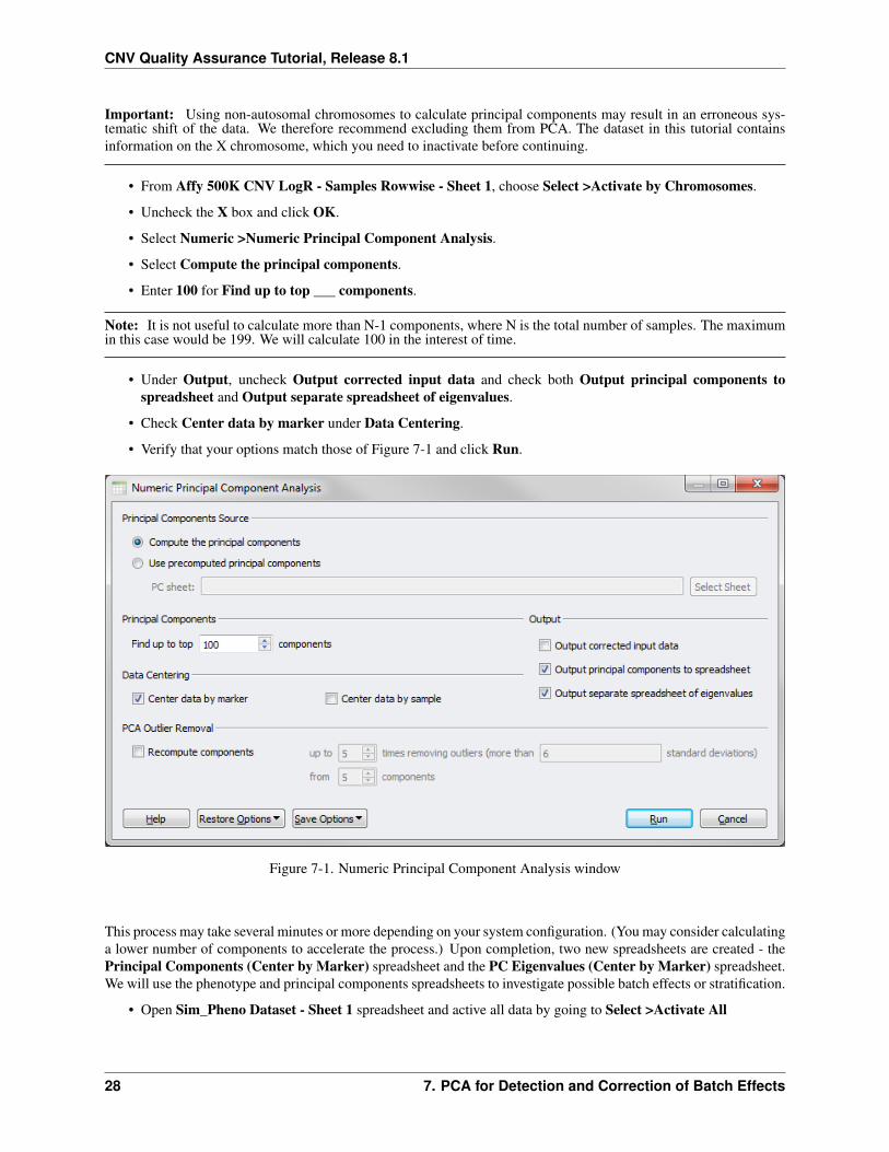
Important: Using non-autosomal chromosomes to calculate principal components may result in an erroneous sys-tematic shift of the data. We therefore recommend excluding them from PCA. The dataset in this tutorial containsinformation on the X chromosome, which you need to inactivate before continuing.
• From Affy 500K CNV LogR - Samples Rowwise - Sheet 1, choose Select >Activate by Chromosomes.
• Uncheck the X box and click OK.
• Select Numeric >Numeric Principal Component Analysis.
• Select Compute the principal components.
• Enter 100 for Find up to top ___ components.
Note: It is not useful to calculate more than N-1 components, where N is the total number of samples. The maximumin this case would be 199. We will calculate 100 in the interest of time.
• Under Output, uncheck Output corrected input data and check both Output principal components tospreadsheet and Output separate spreadsheet of eigenvalues.
• Check Center data by marker under Data Centering.
• Verify that your options match those of Figure 7-1 and click Run.
Figure 7-1. Numeric Principal Component Analysis window
This process may take several minutes or more depending on your system configuration. (You may consider calculatinga lower number of components to accelerate the process.) Upon completion, two new spreadsheets are created - thePrincipal Components (Center by Marker) spreadsheet and the PC Eigenvalues (Center by Marker) spreadsheet.We will use the phenotype and principal components spreadsheets to investigate possible batch effects or stratification.
• Open Sim_Pheno Dataset - Sheet 1 spreadsheet and active all data by going to Select >Activate All
28 7. PCA for Detection and Correction of Batch Effects
CNV Quality Assurance Tutorial, Release 8.1
• Then choose File >Join or Merge Spreadsheets. Select the Principal Components (Center by Marker)spreadsheet and click OK.
• From the join window, enter Pheno + PCs as the New Dataset Name, leave all other parameters as the defaultsand click OK.
Joining the two spreadsheets together enables you to color-code each sample or data point according to a respectivephenotypic or experimental variable from the spreadsheet. Ideally, the spreadsheet would contain related batch infor-mation that could be used to color-segregate the data. In this tutorial, other phenotypic variables are used to illustratethe same idea.
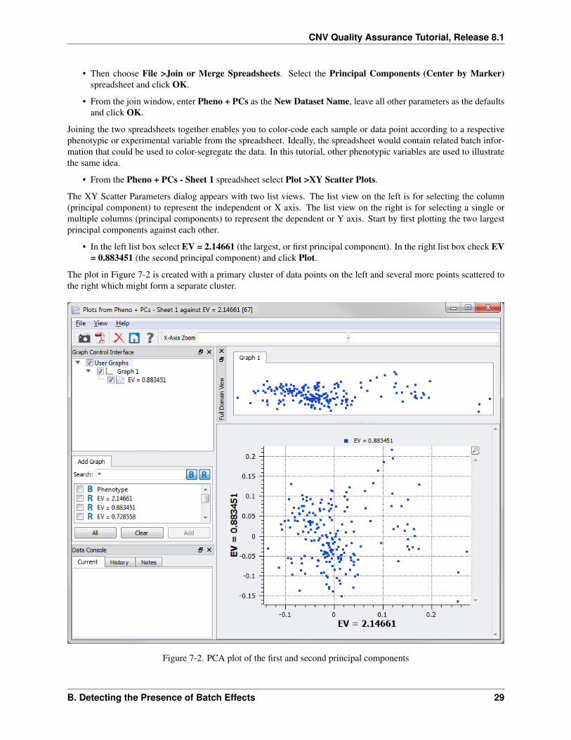
• From the Pheno + PCs - Sheet 1 spreadsheet select Plot >XY Scatter Plots.
The XY Scatter Parameters dialog appears with two list views. The list view on the left is for selecting the column(principal component) to represent the independent or X axis. The list view on the right is for selecting a single ormultiple columns (principal components) to represent the dependent or Y axis. Start by first plotting the two largestprincipal components against each other.
• In the left list box select EV = 2.14661 (the largest, or first principal component). In the right list box check EV= 0.883451 (the second principal component) and click Plot.
The plot in Figure 7-2 is created with a primary cluster of data points on the left and several more points scattered tothe right which might form a separate cluster.
Figure 7-2. PCA plot of the first and second principal components
B. Detecting the Presence of Batch Effects 29
CNV Quality Assurance Tutorial, Release 8.1
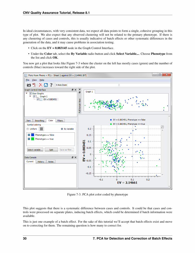
In ideal circumstances, with very consistent data, we expect all data points to form a single, cohesive grouping in thistype of plot. We also expect that any observed clustering will not be related to the primary phenotype. If there isany clustering of cases and controls, this is usually indicative of batch effects or other systematic differences in thegeneration of the data, and it may cause problems in association testing.
• Click on the EV = 0.883145 node in the Graph Control Interface.
• Under the Color tab, select the By Variable radio button and click Select Variable.... Choose Phenotype fromthe list and click OK.
You now get a plot that looks like Figure 7-3 where the cluster on the left has mostly cases (green) and the number ofcontrols (blue) increases toward the right side of the plot.
Figure 7-3. PCA plot color coded by phenotype
This plot suggests that there is a systematic difference between cases and controls. It could be that cases and con-trols were processed on separate plates, inducing batch effects, which could be determined if batch information wereavailable.
This is just one example of a batch effect. For the sake of this tutorial we’ll accept that batch effects exist and moveon to correcting for them. The remaining question is how many to correct for.
30 7. PCA for Detection and Correction of Batch Effects
CNV Quality Assurance Tutorial, Release 8.1
C. Determining the Correct Number of Principal Components to Cor-rect For
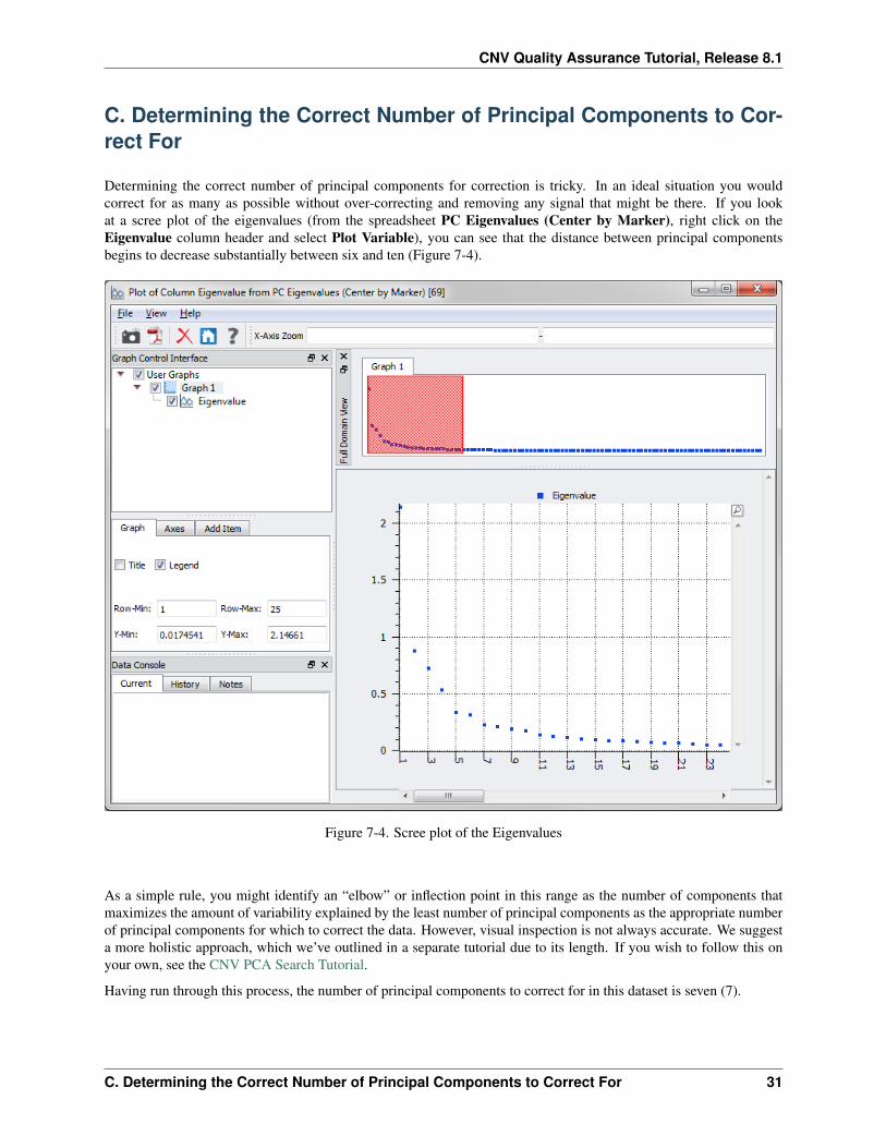
Determining the correct number of principal components for correction is tricky. In an ideal situation you wouldcorrect for as many as possible without over-correcting and removing any signal that might be there. If you lookat a scree plot of the eigenvalues (from the spreadsheet PC Eigenvalues (Center by Marker), right click on theEigenvalue column header and select Plot Variable), you can see that the distance between principal componentsbegins to decrease substantially between six and ten (Figure 7-4).
Figure 7-4. Scree plot of the Eigenvalues
As a simple rule, you might identify an “elbow” or inflection point in this range as the number of components thatmaximizes the amount of variability explained by the least number of principal components as the appropriate numberof principal components for which to correct the data. However, visual inspection is not always accurate. We suggesta more holistic approach, which we’ve outlined in a separate tutorial due to its length. If you wish to follow this onyour own, see the CNV PCA Search Tutorial.
Having run through this process, the number of principal components to correct for in this dataset is seven (7).
C. Determining the Correct Number of Principal Components to Correct For 31

CNV Quality Assurance Tutorial, Release 8.1
D. Correcting for Batch Effects
Now rerun PCA analysis on the log ratios, this time outputting data corrected for seven principal components.
• From the Principal Components (Center by Marker) spreadsheet, inactivate all columns except the first 7.
• To do this scroll to column 8 and left-click the column label header twice turning the column gray.
• Holding the Shift key, scroll to the end of the spreadsheet and left-click the last column header. All the columnsin between will become inactive.
Notice a new spreadsheet tab is created, Principal Components (Center by Marker) - Sheet 2, as the originalPrincipal Components (Center by Marker) spreadsheet is being used by the join with the Sim_Pheno spreadsheet.
• Open Affy 500K CNV LogR - Samples Rowwise - Sheet 2 and select Numeric >Numeric Principal Com-ponent Analysis.
• Choose Use precomputed principal components. Click Select Sheet and select Principal Components (Cen-ter by Marker) - Sheet 2. Click OK.
• Check the Output corrected input data box. Make sure Center data by marker is still checked and uncheckeverything else. Click Run.
The result is a new PCA-Corrected Data (Center by Marker assumed) spreadsheet upon which you can performCNAM Optimal Segmenting to identify copy number variations.
Note: When using principal components as a QC tool for identifying technical artifacts, we recommend using allavailable subjects, as doing so may help to bring out underlying effects in the data. However, if you are using PCA tocorrect LR data as a final step prior to data analysis, It is often advisable to remove the low-quality samples prior tocalculating the PCs.
32 7. PCA for Detection and Correction of Batch Effects
8. Additional Tips and Ideas
Congratulations! You have now worked your way through an entire copy number QC process, no easy task. Thesteps described in this tutorial are appropriate for assessing sample quality for most CNV analysis applications. Afew additional ideas are shown below. We wish you the best of luck on your own study. As always, if you have anyquestions or need help with any portion of this tutorial or your own analysis, please contact us.
A. “Master” QC spreadsheet and Alternate Method for Filtering Sam-ples
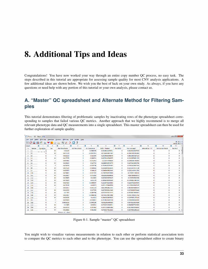
This tutorial demonstrates filtering of problematic samples by inactivating rows of the phenotype spreadsheet corre-sponding to samples that failed various QC metrics. Another approach that we highly recommend is to merge allrelevant phenotype data and QC measurements into a single spreadsheet. This master spreadsheet can then be used forfurther exploration of sample quality.
Figure 8-1. Sample “master” QC spreadsheet
You might wish to visualize various measurements in relation to each other or perform statistical association teststo compare the QC metrics to each other and to the phenotype. You can use the spreadsheet editor to create binary
33
CNV Quality Assurance Tutorial, Release 8.1
indicator variables to identify samples that pass or fail each metric and to create the master index for which samplesto use for downstream analysis. An example of what such a spreadsheet might look like is Figure 8-1.
B. Further exploration of Principal Components
The tutorial demonstrates how to plot the first and second principal components to visually examine the data for strat-ification. It is usually good to look at additional principal components as well. You might consider plotting additionalscatter plots, or you might plot histograms of the individual components. Typically, any evidence of stratification willappear in the components with the largest eigenvalues. If you identify one or more principal components with evi-dence of stratification, you can merge the components with the master phenotype and QC spreadsheet in order to helpidentify the cause of the stratification. If the stratification is the result of a particular feature in the LR data (such as avery common large deletion), you can find this out by merging the principal components with the LR data and runninga genome-wide numeric association test using the PC in question as the dependent variable. If a particular genomicregion is causing the stratification, that region will be obvious in a Manhattan plot of the p-values. If the stratificationis the result of experimental variation/batch effects, no single region is likely to be emphasized in the Manhattan plot.
C. Filter Samples on Autosomal Segment Counts
One useful QC tool that is not shown in this tutorial is counting the number of copy number segments identified ineach sample by the univariate segmentation algorithm. This can only be done after segmentation is completed, and isdemonstrated in the CNV analysis tutorial. Especially noisy samples tend to have a large number of CNV segmentsidentified. High segment counts generally correlate with high waviness measurements.
D. Reprocessing Samples Prior to Analysis
After identifying problematic samples, you may wish to repeat the data normalization and LR calculations. This isparticularly useful with Affymetrix data, where you have greater control over the selection of the reference data usedfor LR calculations. (Illumina’s GenomeStudio software uses reference intensity values calculated from a panel ofHapMap subjects.) If you originally processed the data using all samples or even all controls as a pooled reference, thenthe presence of problematic samples might have introduced some unexpected artifacts. Repeating the data processingusing only the “clean” samples may lead to a better final dataset for analysis.
34 8. Additional Tips and Ideas