Embed Size (px)
Citation preview
Color Gamut Mapping and the Printing of Digital Color Images
MAUREEN C. STONE Xerox Palo Alto Research Center
WILLIAM B. COWAN
National Research Council of Canada
and JOHN C. BEATTY
University of Waterloo
Principles and techniques useful for calibrated color reproduction are defined. These results are derived from a project to take digital images designed on a variety of different color monitors and accurately reproduce them in a journal using digital offset printing. Most of the images printed were reproduced without access to the image as viewed in its original form; the color specification was derived entirely from calorimetric specification. The techniques described here are not specific to offset printing and can be applied equally well to other digital color devices.
The reproduction system described is calibrated using CIE tristimulus values. An image is represented as a set of three-dimensional points, and the color output device as a three-dimensional solid surrounding the set of all reproducible colors for that device, called its gamut. The shapes of the monitor and the printer gamuts are very different, so it is necessary to transform the image points to fit into the destination gamut, a process we call gamut mopping. This paper describes the principles that control gamut mapping. Included also are some details on monitor and printer calibration, and a brief description of how digital halftone screens for offset printing are prepared.
Categories and Subject Descriptors: 1.3.4 [Computer Graphics]: Graphics Utilities; 1.4.3 [Image Processing]: Enhancement
General Terms: Algorithms, Experimentation
Additional Keywords and Phrases: Color, color correction, color reproduction, color printing
INTRODUCTION
There are many different computer-controlled devices for making color images, and people eagerly use them all. Unfortunately, images prepared for one device are often disappointing when viewed on a different one. Why this is so and what can be done to improve the situation are the crux of cross-rendering, the difficult
Authors’ addresses: M. C. Stone, Computer Science Laboratory, Xerox Palo Alto Research Center, 3333 Coyote Hill Road, Palo Alto, CA 94304; W. B. Cowan, National Research Council of Canada, Ottawa, Ontario, Canada; current address: J. C. Beatty, Computer Science, University of Waterloo, Waterloo, Ontario, N2L 3Gl Canada. Permission to copy without fee all or part of this material is granted provided that the copies are not made or distributed for direct commercial advantage, the ACM copyright notice and the title of the publication and its date appear, and notice is given that copying is by permission of the Association for Computing Machinery. To copy otherwise, or to republish, requires a fee and/or specific permission. 0 1988 ACM 0730-0301/88/1000-0249 $01.50
ACM Transactions on Graphics, Vol. 7, No. 4, October 1988, Pages 249-292.

250 l M. C. Stone et al.
problem of making two examples of an image appear similar when produced on output devices that are very different. Successful cross-rendering depends on two radically different types of expertise: the color-rendering properties of output devices, and the psychophysics of color appearance. Neither is a solved problem, so cross-rendering is very (difficult. Yet, in many applications, it is solvable, since image reproduction is routinely done in the graphic arts business.
The advent of affordable digital color printing devices is bringing problems familiar to the graphic arts community to the attention of the computer graphics community. A typical graphics environment has significant experience and equipment available to ma.nipulate colored images. What is lacking is the knowl- edge of which manipulations are necessary to get visually pleasing results. Successful color reproduction in the graphic arts, however, is a combination of experience, folklore, taste, and quantitative controls. Making this knowledge explicit will enable automatic or semiautomatic production of images under computer control. Furthe.rmore, graphic arts practice will benefit from a con- trolled scientific treatment of its craft. The results that follow put some of the graphic arts “know-how” onto a scientific basis, demonstrating some of the principles and algorithms that underlie cross-rendering. We claim that these advances bring the compu.ter generation of high-quality images across a variety of output media significantly closer to reality.
The project that acted as a forcing function for our work on the cross-rendering problem was a commitment made by the Xerox Palo Alto Research Center to prepare, in printable form, the images illustrating the special issue of Color Research and Application that constitutes the proceedings for the 1986 AIC (Association Internationale de la Couleur) Interim Meeting on Color in Computer Generated Displays. Images supplied in digital form by authors of the conference papers were used to produce screened color separations for offset printing. A short paper presented at the conference [19] gave a narrative account of the project but supplied little technical detail, since it was written while the work was in progress. Because this was a real project with a real deadline, we were unable to pursue every scientific opportunity and occasionally had to be satisfied with algorithms that were merely adequate rather than elegant. Nevertheless, we believe that the principles discovered during this project and presented here significantly advance the :&ate of the art of digital color reproduction, and that leads we were unable to follow owing to time pressures point the way to a great deal of productive research. Examples of images from Color Research and Appli- cation are used as illustrations throughout this paper.
The results reported here deal with the following aspects of the cross-rendering problem: Given images defined by monitor coordinates, what transformations should be performed on them before they are rendered on a variety of color printers, with color offset being the definitive output medium? The expertise necessary to perform these transformations requires a mastery of monitor cali- bration, printer calibration, screen technology, and color transformations. The first three are gained by introducing techniques of radiometry and graphic arts into the digital domain. The fourth amalgamates the psychophysics of color appearance and the folk ,wisdom of the printer into interactive techniques for color transformation. Our mastery of the fourth problem is not, however, com- plete; from time to time we had to take arbitrary leaps over chasms of ignorance. ACM Transactions on Graphics, Vol. 7, No. 4, October 1988.

Color Gamut Mapping and the Printing of Digital Color Images 251
Consequently, it is important to describe significant areas of this problem where more research can profitably be undertaken.
An essential part of cross-rendering is to quantify precisely both the images to be rendered and the characteristics of the source and destination devices. For this purpose, techniques and terminology standardized by the Commission Inter- nationale de 1’Eclairage (CIE) serve well. Each color device requires a calibration that maps each value of the device coordinates to the corresponding CIE tristim- ulus values. The calibration makes it possible to convert device coordinates to tristimulus values and back again. Monitor calibration is, by now, routine [2, 31. Characterizing the offset printing process, on the other hand, is novel.
In offset printing, a set of color separations is a set of films containing halftone patterns, one film for each color. These separations are used to produce the printing plates, as well as a color proof, which is a cheaper and simpler way of viewing the separations than setting up an offset press. Standard practice is to adjust the separations until the proof is satisfactory and trust to the skill of the printer to duplicate the appearance of the color proof on the printed page. In line with this practice and as it was impractical to do otherwise, the output we measured to calibrate the printing process was the proof. Once the journal was printed, however, we were also able to measure how well the printer duplicated the proof.
A naive view of color reproduction might consider the problem to be solved once device colors are specified in a common form: Simply reproduce the input tristimulus values on the output device. However, unless the input and output devices are very similar (e.g., two color monitors), this approach does not produce satisfactory results [S]. Even on similar devices there will be a problem with colors that exist in the set of possible colors for one device (its gamut), but not in the other. To create a satisfactory reproduction, the tristimulus values must be modified significantly to accommodate the difference between the reproduction properties of the printer, the monitor, and the associated viewing environments. We call this process gamut mapping.
Gamut mapping is similar to the adjustments a graphic arts professional makes when preparing color separations from original artwork. It is not yet possible to do this step algorithmically; we developed computer tools to produce the trans- formations interactively, using human aesthetic judgment as the criterion, just as in the graphic arts. We also developed a tool that creates a fixed mapping between a monitor and a printer so that a user may interactively select colors that lie inside both gamuts.
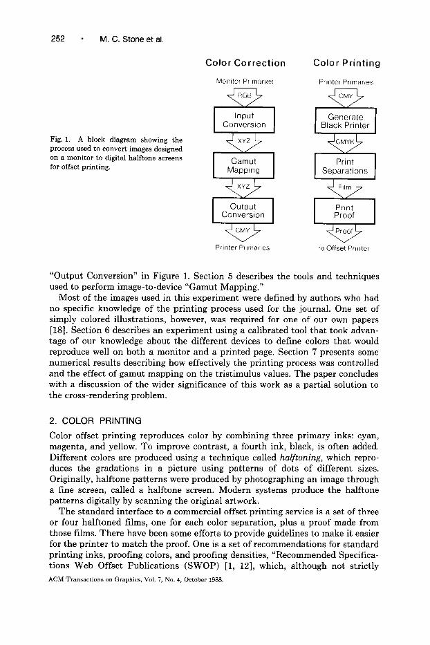
The entire process is summarized in Figure 1, and the rest of this paper expands upon the boxes in this diagram. Our system for printing color separa- tions, “Color Printing,” is not particularly novel. -Nevertheless, since color print- ing is increasingly important in the computer graphics community and it is necessary to understand this process to understand this paper, we include a brief description in Section 2. More detail on our specific implementation is provided in a technical report [20]. Sections 3-5 discuss the specific algorithms used to perform the processes in the half of the diagram labeled “Color Correction.” Section 3 describes how to calibrate input and output devices, and discusses the color gamuts of these devices. Section 4 describes the device-to-tristimulus transformation and its inverse, the blocks labeled “Input Conversion” and
ACM Transactions on Graphics, Vol. 7, No. 4, October 1988.
252 - M. C. Stone et al.
Color Correction Color Printing
Fig. 1. A block diagram showing the process used to convert images designed on a monitor to digital halftone screens for offset printing.
Monitor PrImarIes Printer PrImarIes
Input Converslon
XYZ
Gamut Mapping
XYZ
output Conversion
Prmter PrImarIes to Offset Printer
“Output Conversion” in Fibmre 1. Section 5 describes the tools and techniques used to perform image-to-device “Gamut Mapping.”
Most of the images used in this experiment were defined by authors who had no specific knowledge of the printing process used for the journal. One set of simply colored illustrations, however, was required for one of our own papers [18]. Section 6 describes an experiment using a calibrated tool that took advan- tage of our knowledge about the different devices to define colors that would reproduce well on both a monitor and a printed page. Section 7 presents some numerical results describing how effectively the printing process was controlled and the effect of gamut mapping on the tristimulus values. The paper concludes with a discussion of the wider significance of this work as a partial solution to the cross-rendering problem.
2. COLOR PRINTING
Color offset printing reproduces color by combining three primary inks: cyan, magenta, and yellow. To improve contrast, a fourth ink, black, is often added. Different colors are produced using a technique called halftoning, which repro- duces the gradations in a picture using patterns of dots of different sizes. Originally, halftone patterns were produced by photographing an image through a fine screen, called a halftone screen. Modern systems produce the halftone patterns digitally by scanning the original artwork.
The standard interface to, a commercial offset printing service is a set of three or four halftoned films, one for each color separation, plus a proof made from those films. There have been some efforts to provide guidelines to make it easier for the printer to match the proof. One is a set of recommendations for standard printing inks, proofing colors, and proofing densities, “Recommended Specifica- tions Web Offset Publicat.ions (SWOP) [l, 121, which, although not strictly
ACM Transactions on Graphics, Vol. 7, No. 4, October 1988.

Color Gamut Mapping and the Printing of Digital Color Images 253
EED l 0 ::ifl 50”/ 00 o 0 0 ED l *
y;; 25%
(a) (b)
Fig. 2. (a) Halftone patterns for 25%, 50% and 85% dot areas. (b) Digitally produced halftone patterns for 25%, 50% and 85% dot areas using Holladay’s algorithm. Original image by Chuck Haines, Xerox Corporation.
controlled, provides some mechanisms for ensuring that a duplication of the proof is practical. The printer’s skill and judgment, however, are still the most significant factors in the success of the reproduction.
We made the color separations for this project on an experimental, high- resolution, laser film printer [17] and developed the film in-house. The color proofs were then commercially produced from the separations using a DuPont process called Cromalin,’ which, when properly controlled, is as stable and reliable a process as is commercially available. We took great care to produce suitable high-contrast negatives, from which a proofing house made SWOP-standard proofs for the printer. It was very important for the success of this experiment that we meet the standard expectations of the printing industry, since we had no special relationship with the printer. This section describes the basic steps we performed to make our printing process work effectively.
2.1 Halftone Patterns
Halftone patterns are defined by the spacing of the dots measured in dots per inch, called screen frequency, and the percentage area covered by ink in the resulting patterns, called dot area. The dot spacing defines the sharpness of the resulting image, with 133-150-dot-per-inch screens typical for magazine-quality offset printing. The percentage area defines the lightness/darkness of the result- ing area. Figure 2a shows halftone patterns for 25%, 50% and 85% dot areas.
Figure 2a shows the round dots that would be produced using a traditional mechanical halftone screen, but other shapes can be used either to produce textures for artistic reasons or to accommodate a scanning output device such as a film plotter. When a halftone pattern is generated on a raster printer, a pattern like the one shown in Figure 2b is often used [6].
In color printing, the four separations are printed one over the other. To minimize interference between the different colors, the halftone patterns on each
’ Cromalin is a registered trademark of the DuPont Corporation.
ACM Transactions on Graphics, Vol. 7, No. 4, October 1988.

M. C. Stone et al.
separation are oriented along lines of different angles. Mechanically, this differ-ence is produced by rotating the halftone screen when photographing the image.Digitally, the effect of this rotation must be simulated (Holladay provides ameans of doing this). Typical screen angles are 105, 75, 90, and 45, for cyan,magenta, yellow, and black, respectively, though some recommendations ex-change the values for magenta and black. Figure 3 shows a magnified version ofa portion of a screened color image.
When printed on film, a halftone pattern should contain only opaque and clearareas. Gray areas in the pattern will make the pattern overly sensitive to exposuretime when making the printing plate. The dot area of a properly screened filmcan be accurately measured using a densitometer, which is crucial for maintainingquality control of the film printing process. Film fog, which affects the transpar-ency of the background film, inadequately opaque dark areas, and insufficientlysharp edges will all invalidate this measurement and jeopardize the reproductionprocess. It is essential to use high-contrast film and carefully control the devel-opment process to achieve reliable results.
2.2 Tone Reproduction
The basic measure of a reproduction technology is its tone reproduction curve,abbreviated TRC. This function defines the mapping from the input gray or tonevalues to the output values. In traditional printing these tone values are measuredas density, a logarithmic function of reflectance. The tone reproduction curverelates density values in the original image to those in the reproduction, and anideal reproduction maps the original values to identical values on the print.Where the original image is in digital form, however, the concept of a TRC mustbe redefined, because there is no set of density measurements for the originalimage. The optimal mapping from monitor intensity to print density has not yetACM Transactions on Graphics, Vol. 7, No. 4, October 1988.

Color Gamut Mapping and the Printing of Digital Color Images 255
been defined, so for this experiment we chose to use the default mapping for our existing printing system, which maps intensity to dot area.
In this paper TRC is used to describe the function that controls the mapping between the requested tone values and those actually produced by the mechanics of the printing process. The spots produced by any mechanical device are not the idealized squares or disks shown in Figures 1-3, so the bit patterns sent to the printer must be modified to accommodate the tone reproduction characteristics of the device. This compensation can be provided by a table that is the inverse of the tone reproduction curve for the device. Significant time was spent con- trolling the film printing process so that the dot area requested was actually produced on the film. Even so, this process was not as reliable as is commercially achievable owing to the experimental nature of our printing system.
2.3 Gray Balance
One of the most basic criteria for a good color reproduction process is that it be able to reproduce the neutral colors in a picture accurately. The three guns on a color monitor are usually balanced so that equal amounts of the primary colors produce a neutral gray color. In printing, it is not usually possible to use equal amounts of the primary colors to produce a gray. The process of adjusting the mix of the three primaries to produce a neutral color is called gray balancing. It is a straightforward task to find an approximately neutral progression of grays from a set of color patches containing nearly equal amounts of the primary colors. These data are used to produce a table of values that compensates each of the primaries to produce a neutral gray scale. For example, a color whose ideal value is a 50% gray might actually be produced as [C: 50%, M: 47%, Y: 47%].
Given that we adjust the mix of cyan, magenta, and yellow to produce gray colors, what about colors that are nearly gray? If we do not compensate those also, there will be a discontinuity in our color space. Most colors contain some amount of gray, called the gray component, which is simply min[C, M, Y]. For example, the color defined as [C: lOO%, M: 75%, Y: 80%] has a gray component of 75%. The obvious solution is to treat the gray component exactly as we would a gray color, and this is often done. For our process, however, we found we got better results by gray balancing less than the full gray component for colors off the gray axis, using a function inversely proportional to the “distance” of the color from the gray axis. For this calculation, distance from the gray axis was defined as max[C, M, Y] minus the gray component.
Gray balancing is a standard part of the commercial color separation process. Although in theory the color coordinate mapping used in our process should transform source gray to device gray whether or not the neutral axis corresponds to equal values of the printing primaries, the amount of adjustment necessary for gray balancing is smaller than the spacing of the color samples used for calibration. Therefore, it seemed necessary to include the balancing as part of the production process.
2.4 The Black Separation
The three primary colors of the offset printing process are cyan, magenta, and yellow. In four-color printing, black is used as well. The black separation is used to accomplish two things: to increase the contrast by increasing the density in
ACM Transactions on Graphics, Vol. 7, No. 4, October 1988.
256 - M. C. Stone et al.
the dark areas of the picture and to replace some percentage of the three primaries for economic or mechanical reasons. The use of black for contrast was left to our own aesthetic judgment. Egut, to keep the paper from getting too wet with ink when printing, we were restricted to a maximum dot area of 280% (four solid colors = 400%) in any one area. This required us to substitute black ink for mixtures of cyan, magenta,, and yellow, a process called undercolor removal or, in its more general form, gray component replacement (GCR). Printing is distinctly nonlinear, SO it is difficult to predict how much black ink is required to match the density of the colored ink removed. If not done correctly, dark areas of the print, which are subject to GCR, will actually appear lighter than supposedly lighter tones not subject to GCR.
The correct design of the black separation is a topic of much interest in the color printing field today. Traditionally limited by effects obtainable with pho- tographic processes, the use of computer-controlled scanners and printers has made a wide range of effects possible [9]. In this experiment we chose a very conservative approach based on data used in a commercial environment. We provide no detail here beca.use we feel our implementation was too ad hoc to be reported.
For the purpose of defining the printing gamut, the black separation is treated as a device characteristic l.ike the gray balancing and compensation tables that control the TRC. The color calibration data are indexed by the three primaries alone. The fact that black may be used in the printing is invisible in the color correction part of the process.
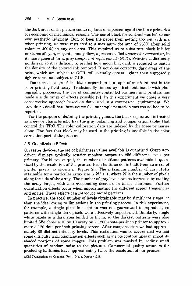
2.5 Quantization Effects
On raster devices, the set of brightness values available is quantized. Computer- driven displays typically restrict monitor output to 256 different levels per primary. For bilevel output, the number of halftone patterns available is quan- tized by the resolution of the printer. Each halftone dot is built from an array of printer pixels, as shown in Figure 2b. The maximum number of gray levels attainable for a particular array size is N2 + 1, where N is the number of pixels along the side of the array. The number of gray levels can be increased by making the array larger, with a corresponding decrease in image sharpness. Further quantization effects occur when approximating the different screen frequencies and angles. These effects can introduce moire patterns.
In practice, the total number of levels obtainable may be significantly smaller than the ideal owing to limitations in the printing process. In this experiment, for example, a single pixel in isolation was not guaranteed to reproduce, so patterns with single dark pixels were effectively unpatterned. Similarly, single white pixels in a dark area tended to fill in, so the darkest patterns were also limited. We chose a 10 by 10 array on a 1200-spots-per-inch printer to approxi- mate a 120-dots-per-inch printing screen. After compensation we had approxi- mately 80 distinct intensity levels. This restriction was so severe that we had some difficulty with quantization effects such as visible contour lines in smoothly shaded portions of some images. This problem was masked by adding small quantities of random noise to the pictures. Commercial-quality scanners for producing halftones have approximately twice the resolution of our printer.
ACM Transactions on Graphics, Vol. 7, No. 4, October 1988.

Color Gamut Mapping and the Printing of Digital Color Images l 257
Quantization effects also arose from sampling the images for the halftoning calculations. For speed, our halftoning software uses point sampling. To avoid aliasing and improve performance, we generated filtered lower resolution images from the original data, sized such that each pixel was sampled a minimum number of times during the halftoning process. Averaging adjacent pixels can produce colors in the printed image that did not actually exist in the original. Rounding the averaged colors to fit into the byte format we use for images produced discontinuities in some very dark, continuously shaded areas.
3. CALIBRATION
Calibration establishes a correspondence between device coordinates and some universal metric (in this case, CIE tristimulus values). The calibration is produced by making some measurements that define the colors produced by the device. How do we measure color? Human beings see color when light is reflected off a colored object, transmitted through a colored filter, or emitted directly as in the phosphors of a color monitor. Light is a physical quantity, but color depends on the interaction of light with the human visual system and is thus a psychophysical quantity. Research in vision has determined sets of physical properties of light that are well correlated with sets of psychophysical properties of color. We use those physical properties, many of which have been standardized by the CIE, as the basis of our color transformation techniques. There are several reference works on color science and calorimetry [7, 221. Some relevant calorimetric terms are summarized here for convenience.
3.1 Calorimetric Terminology
In any given light there is a distribution of photons of differing wavelengths called the spectral power distribution of the light. Lights of identical spectral power distribution, when seen in the same visual environments, are perceived to be exactly the same color. Lights of differing spectral power distribution can also be seen as the same color. Whether or not two lights differ in color can be determined objectively using the empirically determined color-matching functions. Two lights are the same color if, for each color-matching function, the integrals over the light spectrum weighted by the color-matching function are equal. For humans there are three color-matching functions. The three integrals of the spectral power distribution weighted by the three color-matching functions are known as the tristimulus values of a light. A second light is the same color if and only if it has the same tristimulus values. The CIE tristimulus values are X, Y and 2, and can be measured with a spectroradiometer, spectrophotometer, or calorimeter.
Multiplying the spectral power distribution by the same multiple at every wavelength does not change the perceived color much since the tristimulus values are multiplied by the same factor. There is a two-dimensional representation that eliminates this intensity information, which is a projective transformation of the tristimulus values. The resulting two-dimensional representation is known as the chromaticity coordinates of the color. The commonly used chromaticity coordinates are x and y, where x: = X/(X + Y + 2) and y = Y/(X + Y + 2).
ACM Transactions on Graphics, Vol. 7, No. 4, October 1988.
258 l M. C. Stone et al.
Tristimulus values determine whether two colors, seen in identical visual environments, are identical in appearance. They do not, however, determine color appearance, which can be strongly influenced, for example, by the color of surrounding areas of color. A color of chromaticity coordinates x: 0.55, y: 0.45, for example, looks orange when surrounded by a darker area and brown when surrounded by a brighter one. In this paper we are careful to use color appearance words, such as black or white, in relation to the gamut of an image or a device, rather than in reference to particular sets of tristimulus values.
The closest calorimetric equivalent to the brightness of a light is luminance, which corresponds to the tristimulus value Y. Luminance is not, however, the best measure of brightness. In the first place, adaptation makes brightness relative rather than absolute-a color monitor in a darkened room looks as bright or brighter than a white piece of paper in a bright room, but the light reflecting off the paper has a much higher luminance. Second, evenly spaced steps in luminance do not produce uniform changes in perceived brightness. There are several other metrics that are more informative than luminance. One proposed by the CIE as part of their color difference standards (CIELAB and CIELUV) is called L* (L-star) and is proportional to the cube root of the luminance. Precisely,
Y, = the luminance of a reference white; L* = 116(Y/Y,,)“3 - 16, for Y/Y” > 0.008856; L* = 903.29(Y/Y,), for Y/Y,, 5 0.008856.
The value of L* lies between 0 and 100.
3.2 Calibration Tables and Interpolation
The method chosen to calibrate a device depends on the sophistication of our model of the device behavior. With a good model, measuring a few parameters is sufficient to calibrate the device; without one, tables of measurements and interpolation are the only solution. It was possible to use a model of an ideal monitor for the source gamut of most of the images in our project [2, 31. There is no good model, however, for the performance of our printers or for the proofing process. For these devices, we sampled the color space of the device, measured the colors produced to make a calibration table, and then interpolated to generate a complete calibration. This is a very general technique that can be applied to any color-producing device. For example, we calibrated a monitor and a low- resolution printer by this rnethod to provide a quick proofing device. Note that, by using this general method, the effect of the ambient light on the monitor appearance is easily included in the calibration.
How often these measurements must be taken depends critically on the stability of the devices used. Our approach assumed device stability adequate for us to calibrate the device once and then use the calibration throughout the project. For CRTs, stability is known to be good [4]; for our proofing process, we were able to measure it (discussed in Section 7); but for the offset printing process itself, nothing quantitative could be done initially. We were able to measure its
ACM Transactions on Graphics, Vol. 7, No. 4, October 1988.

Color Gamut Mapping and the Printing of Digital Color images 259
reliability after the special issue of Color Research and Application was completed, however, and found it similar to other steps in the process.
The basic calibration procedure is to measure color samples spaced linearly in device coordinates, dividing the device gamut into cubes with respect to device coordinates. For this experiment, we used 8 values for each of the 3 degrees of color freedom, 512 samples in all, which divides the device gamut into 7 X 7 X 7 = 343 cubes. These decisions were made for convenience. The decision to sample linearly assumes that a well-designed color production device will have device coordinates that sample perceptual color spaces more or less evenly. The decision to measure only 512 samples was forced on us by the inefficiency of our measurement technique: 512 measurements required 4-6 hours. This sampling density did give us some problems, particularly when it was necessary to project colors outside the gamut onto the gamut surface (discussed in Section 5). The question of sampling density merits more consideration. Another researcher [ 151 suggests 6561 samples, 9 levels each of 4 variables, but does not specify the interpolation algorithm. An alternate scheme (a private communication from B. Saunders) suggests 4096 samples, 16 levels each of 3 variables. However, a commercial vendor, Imageset (a private communication from Lenny Schafer), uses a technique based on only 64 samples with spline interpolation. Research to investigate the sampling density needed for good color rendition is clearly needed, and we are automating the sampling process so that further work in this area can be accomplished.
3.2.1 Table Production. Production of a calibration table means producing a set of colors that adequately sample the device gamut and then measuring the CIE tristimulus values of each sample. The procedure is different for printing devices than it is for monitors.
The main practical problem in measuring monitors is the relatively poor brightness stability of monitor colors as they are moved about on the screen. As a color patch is moved from the center of the screen to the corner, it can decline in brightness by as much as 30%. Thus, it is essential that all measurements be made on the same part of the screen. Our method consisted of the following steps:
(1) The monitor was set up where it was to be used. Lighting was adjusted to reduce glare from the monitor screen and to maintain the office in dim illumination. The black point of the monitor was set so that the dark screen was just below visual threshold and the contrast was set to produce pleasing images. These controls were then left unchanged until the end of the project.
(2) A Photo-Research SpectraScan’ Model PR-710A spectroradiometer was set up 2.5 meters from the monitor screen on a line perpendicular to the screen. It was focused on a small region in the center of the screen.
(3) Under program control the full screen was set to each of the 512 sample colors in turn. The tristimulus values of the light emitted were measured for each sample.
’ Photo-Research Spectra&an is a registered trademark of the Kollmorgen Corporation.
ACM Transactions on Graphics, Vol. 7, No. 4, October 1988.

260 l M. C. Stone et al.
(4) The measurements were collected into a table that was used for the monitor- to-CIE coordinate transformations.
The main practical problem in measuring printed colors, as with all reflected colors, is holding the light source constant. We used a Macbeth Prooflit illumi- nation booth, held the radiometer position constant, and moved the color samples to solve this problem. Our method consisted of the following steps:
(1) The 512 samples were printed using exactly the same procedures as those to be used for the production images.
(2) The samples were pos,itioned inside the viewing booth lying horizontal so that the illumination direction was 90 degrees. The radiometer was positioned at 45 degrees from the horizontal at a distance of 35 centimeters. At this distance its measurement field covered 1.0 by 0.8 centimeters; the samples were 1.5 by 1.0 centimeters. The back of the booth was covered by black cloth to eliminate specular reflection from the surface of the samples. The usual graphic arts standard illuminant, DsooO, was used in the booth.
(3) The samples were measured in turn by sliding the paper along the bottom of the booth to bring each new sample into the radiometer’s measurement field.
(4) The measurements were collected into a table that was used for printer-to- CIE coordinate transformations.
Hand movement of the sa.mples is tedious, and the amount of time needed to measure 512 samples is too long to perform the calibration as often as would be ideal. This process clearly needs to be automated. We chose a 90/45 illumination geometry because it was the easiest configuration to maintain that adequately controlled gloss and glare, which were a significant problem with the shiny Cromalin proofs.
3.2.2 Interpolation. The tables described above are the raw material on which the calibration procedure is based. The actual mapping from device coordinates to CIE tristimulus values is performed by interpolation within the table. Of the many types of interpolation that can be done, we chose trilinear interpolation. There is an obvious trade-off between the complexity of the interpolation function and the size of the data table. We did not examine this question in any detail, but it is probably an important question for future research. The details of our implementation are discussed in Section 4.
3.3 Device Gamuts
The envelope of the measurements taken to build the calibration table defines the boundary of the device gamut, which is the set of colors that can be created by the device. Two colors in the gamut should be distinguished: Source white is the brightest achromatic color in the source gamut and almost always the brightest color of any chromaticity; source black is the darkest achromatic color in the source gamut and almost always the darkest color of any chromaticity. The black-white axis, also called the gray axis, is the straight line joining black and white in the space of tristimulus values.
3 Macbeth Prooflit is a registered trademark of the Kollmorgen Corporation.
ACM Transactions on Graphics, Vol. ‘7, No. 4, October 1988.

Color Gamut Mapping and the Printing of Digital Color Images - 261
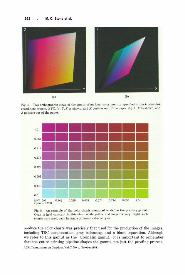
The gamut for a device can be viewed as a three-dimensional (3-D) solid in the tristimulus value coordinate system. The color solids shown in this section (Figures 4, 6, and 7, shown later) were generated by mapping the surface of an 8 x 8 x 8 mesh cube point by point through the calibration table. The resulting values were used to create polyhedrons composed of triangular polygons, which were then displayed using a 3-D rendering system. Each point on the cube was colored relative to the monitor primaries; that is, the colors are not the color of the tristimulus value but are labels on the original cube. For example, the point on the cube that starts halfway along the red-black edge is always colored [R: 0.5, G: 0, B: 01. Figures 4, 6, and 7 are all viewed with the eye perpendicular to the YZ or XY plane and centered on the center-of-mass of the gamut. The sizes of the gamuts have been normalized for this set of illustrations.
3.3.1 Monitor Gamuts. A monitor gamut is usually displayed in a coordinate system defined by its device coordinates. In such a system, it is a cube with one corner at the origin (where no signal is given to the guns) and the diagonally opposite corner at [R: max R, G: max G, B: max B], where full signals are given to all three guns. Assuming an ideal monitor with the black level at zero and no light reflected from the screen, transforming this shape to the space of CIE tristimulus values produces a parallelepiped with one corner at the origin and sides defined by the three vectors specified by the maximum light output when each gun is turned on independently of the others. The effect of a nonzero black level and of turning on room lights is to displace the origin of the parallelepiped to the point know as device black for the monitor. For images produced on unknown monitors, we assumed zero black level and no ambient reflection. This assumption, which is almost always invalid, is an acceptable simplification, since our gamut transformation techniques (Section 5) translate the black point of the image to agree with the black point of the destination device.
The gamut of an ideal video monitor is shown in Figure 4. The shape is a parallelepiped, so it has no concavities and the six sides are planes. The black point is at [X: 0, Y: 0, 2: 01. The widest part of the gamut is approximately one- half the distance along the black-white axis. The solid angle around the black point is approximately 0.157r steradians.
3.3.2 Printer Gamuts. We measured two printer gamuts in the course of this experiment, one defined by the Cromalin proof of our separations, and one a raster, thermal transfer printer. The proof print provided the calibration for the final prints. The thermal transfer printer was used as a fast turnaround printing device, along with the calibrated monitor, to test our algorithms.
The printing gamuts were measured from color charts like those in Figure 5. The 512 color patches represent even steps in cyan, magenta, and yellow dot areas. The black separation and gray balancing are treated as device properties and are applied “silently” (without being explicitly called for) to the cyan, magenta, and yellow values requested. For example, a color that is 50% gray may actually be printed as [C: 50%, M: 47%, Y: 47%, K: 3%], but the table is built assuming [C: 50%, M: 50%, Y: 50%].
The. Cromalin Proof Gamut. The gamut we used for the proceedings was measured from a Cromalin color proof of our test charts. The process used to
ACM Transactions on Graphics, Vol. 7, No. 4, October 1988.
262 l M. C. Stone et al.
produce the color charts was precisely that used for the production of the images,including TRC compensation, gray balancing, and a black separation. Althoughwe refer to this gamut as the “Cromalin gamut,” it is important to rememberthat the entire printing pipeline shapes the gamut, not just the proofing process.ACM Transactions on Graphics, Vol. 7, No. 4, October 1988.
Color Gamut Mapping and the Printing of Digital Color Images
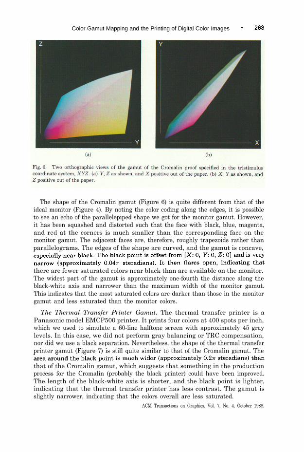
The shape of the Cromalin gamut (Figure 6) is quite different from that of theideal monitor (Figure 4). By noting the color coding along the edges, it is possibleto see an echo of the parallelepiped shape we got for the monitor gamut. However,it has been squashed and distorted such that the face with black, blue, magenta,and red at the corners is much smaller than the corresponding face on themonitor gamut. The adjacent faces are, therefore, roughly trapezoids rather thanparallelograms. The edges of the shape are curved, and the gamut is concave,
there are fewer saturated colors near black than are available on the monitor.The widest part of the gamut is approximately one-fourth the distance along theblack-white axis and narrower than the maximum width of the monitor gamut.This indicates that the most saturated colors are darker than those in the monitorgamut and less saturated than the monitor colors.
The Thermal Transfer Printer Gamut. The thermal transfer printer is aPanasonic model EMCP500 printer. It prints four colors at 400 spots per inch,which we used to simulate a 60-line halftone screen with approximately 45 graylevels. In this case, we did not perform gray balancing or TRC compensation,nor did we use a black separation. Nevertheless, the shape of the thermal transferprinter gamut (Figure 7) is still quite similar to that of the Cromalin gamut. The
that of the Cromalin gamut, which suggests that something in the productionprocess for the Cromalin (probably the black printer) could have been improved.The length of the black-white axis is shorter, and the black point is lighter,indicating that the thermal transfer printer has less contrast. The gamut isslightly narrower, indicating that the colors overall are less saturated.
ACM Transactions on Graphics, Vol. 7, No. 4, October 1988.

264 l M. C. Stone et al.
3.3.3 Printers versus Monitors. As indicated, the monitor and printer gamutsare quite different. The differences that produced the most problems when gamutmapping were the narrow region around black on the Cromalin and the differ-ences in the blue part of the gamut. The narrowness of the gamut near the blackpoint meant that any dark, saturated monitor color lay outside the printinggamut. Translating the image gamut to place these colors inside the device gamutsignificantly reduced contrast. To understand the limitations in reproducingsaturated values, it is useful to view these gamuts in a different form.
Tristimulus values can be projected into two dimensions as chromaticity values,(x, y). Loosely speaking, this projection factors out the brightness of the color,leaving the “colorfulness.” Figure 8 shows the outline of the chromaticity plot ofthe monitor gamut overlaid on the full plot of the printer gamut. The triangle isthe projection of the monitor gamut, with red, green, and blue at its vertices.Magenta, cyan, and yellow are marked along its sides, and the white point is thewhite circle near the center. The projection of the printer gamut is roughly a six-sided polygon, and printer gamuts are often approximated as such on chromaticitydiagrams. This more exact representation was created by constructing a coloredsolid from the calibration data, (x, y, L*), and viewing it along the L* axis usingthe 3-D software. Notice that the primary values and the white points are notthe same color, although yellow is similar. Most of the monitor primaries aremore saturated (farther away from the white point) than the printer primaries.The difference between the printer blue and the monitor blue is especiallysignificant.
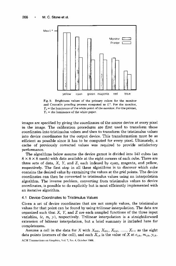
Figure 9 compares the maximum brightness values, here computed as L*, foreach of the primary colors for each device. The color names refer to the deviceprimaries, not specific chromaticity values. For example, “blue” is [R: 0, G: 0,
ACM Transactions on Graphics, Vol. 7, No. 4, October 1988.

Color Gamut Mapping and the Printing of Digital Color Images -
to note is that the maximum brightness of the saturated colors other than yellowis lower for printers than for monitors.
This analysis indicates that print media cannot reproduce bright, saturatedcolors, as compared with monitors. Typical monitor usage, which emphasizes theuse of the fully saturated primary and secondary colors, produces images thatcontain the very colors that are impossible to reproduce on print media.
4. IMPLEMENTING COORDINATE TRANSFORMATIONS
The calibration procedures discussed above enable us to determine, for a givenset of device coordinates, the corresponding CIE tristimulus values. Typically,
ACM Transactions on Graphics, Vol. 7, No. 4, October 1988.
266 - M. C. Stone et al.
Max L*
1
Monitor 0
Printer 0
yellow cyan green magenta red blue
Fig. 9. Brightness values of the primary colors for the monitor and Cromalin proofing process computed as L*. For the monitor, Y,, = the luminance of the white point of the monitor. For the printer, Y, = the luminance of the white paper.
images are specified by giving the coordinates of the source device at every pixel in the image. The calibration procedures are first used to transform those coordinates into tristimulus values and then to transform the tristimulus values into device coordinates for the output device. This transformation must be as efficient as possible since it has to be computed for every pixel. Ultimately, a cache of previously corrected values was required to provide satisfactory performance.
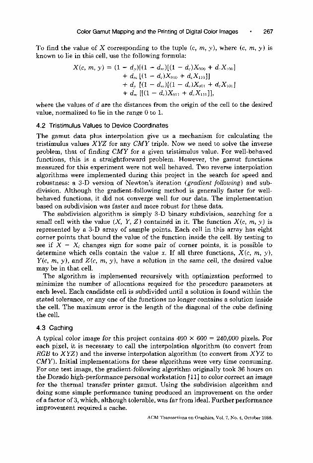
The algorithms below assume the device gamut is divided into 343 cubes (an 8 x 8 X 8 mesh) with data. available at the eight corners of each cube. There are three sets of data, X, Y, and 2, each indexed by cyan, magenta, and yellow, respectively. The first step in all these algorithms is to discover which cube contains the desired value by examining the values at the grid points. The device coordinates can then be converted to tristimulus values using an interpolation algorithm. The inverse problem, converting from tristimulus values to device coordinates, is possible to do explicitly but is most efficiently implemented with an iterative algorithm.
4.1 Device Coordinates to Tristimulus Values
Given a set of device coordinates that are not sample values, the tristimulus values for that point can be found by using trilinear interpolation. The data are organized such that X, Y, and 2 are each sampled functions of the three input variables, (c, m, y), respectively. Trilinear interpolation is a straightforward extension of bilinear interpolation, but a brief summary is included here for completeness.
Assume a cell in the data for X with XOOO, XOOl, XOIO, . . . , XIII as the eight data points (corners of the cell), and each Xi,, is the value of X at ci,k, mljk, yijke
ACM Transactions on Graphics, Vol. 7, No. 4, October 1988.
Color Gamut Mapping and the Printing of Digital Color Images l 267
To find the value of X corresponding to the tuple (c, m, y), where (c, m, y) is known to lie in this cell, use the following formula:
X(c, m, y) = (1 - d,)[(l - d,)[(l - d,LG30 + dcXlOOl + dm [Cl - &Klm + G=G1011 + dy [(l - d,)[(l - d,P&, + ~cxml + d, [[(l - dcL&l, + G=L,,ll,
where the values of d are the distances from the origin of the cell to the desired value, normalized to lie in the range 0 to 1.
4.2 Tristimulus Values to Device Coordinates
The gamut data plus interpolation give us a mechanism for calculating the tristimulus values XYZ for any CMY triple. Now we need to solve the inverse problem, that of finding CMY for a given tristimulus value. For well-behaved functions, this is a straightforward problem. However, the gamut functions measured for this experiment were not well behaved. Two reverse interpolation algorithms were implemented during this project in the search for speed and robustness: a 3-D version of Newton’s iteration (gradient following) and sub- division. Although the gradient-following method is generally faster for well- behaved functions, it did not converge well for our data. The implementation based on subdivision was faster and more robust for these data.
The subdivision algorithm is simply 3-D binary subdivision, searching for a small cell with the value (X, Y, 2) contained in it. The function X(c, m, y) is represented by a 3-D array of sample points. Each cell in this array has eight corner points that bound the value of the function inside the cell. By testing to see if X - Xi changes sign for some pair of corner points, it is possible to determine which cells contain the value x. If all three functions, X(c, m, y), Y(c, m, y), and Z(c, m, y), have a solution in the same cell, the desired value may be in that cell.
The algorithm is implemented recursively with optimization performed to minimize the number of allocations required for the procedure parameters at each level. Each candidate cell is subdivided until a solution is found within the stated tolerance, or any one of the functions no longer contains a solution inside the cell. The maximum error is the length of the diagonal of the cube defining the cell.
4.3 Caching
A typical color image for this project contains 400 X 600 = 240,000 pixels. For each pixel, it is necessary to call the interpolation algorithm (to convert from RGB to XYZ) and the inverse interpolation algorithm (to convert from XYZ to CMY). Initial implementations for these algorithms were very time consuming. For one test image, the gradient-following algorithm originally took 36 hours on the Dorado high-performance personal workstation [ 1 l] to color correct an image for the thermal transfer printer gamut. Using the subdivision algorithm and doing some simple performance tuning produced an improvement on the order of a factor of 3, which, although tolerable, was far from ideal. Further performance improvement required a cache.
ACM Transactions on Graphics, Vol. 7, No. 4, October 1988.

268 - M. C. Stone et al
The monitor RGB values are quantized to 8 bits each, as are the CMY values. The cache mapped the input values using a simple hashing function (XOR, shift, and add) to a fixed number of table entries with unlimited chaining. Hit rates for our data varied from 73.4% to 99.6%. High-resolution versions of an image have a better hit rate th.an low-resolution versions of the same scene. Syn- thetically generated images have a significantly better hit rate than scanned images.
Use of the cache further reduced the time to process the test image from about 12 hours to about 1.5 hours. With the current algorithms and hardware, it takes, on the average, 450 milliseconds to correct one pixel the first time on a Dorado, which is very roughly twice as fast as a VAX 780. The time to access the value in the cache is negligible in comparison. The pictures used in this project took from 10 seconds to 1.5 hours to correct, depending on the cache hit rate and the number of pixels in the image. Further performance improvements will be the focus of future work.
5. GAMUT MAPPING
The objective in color reproduction is to produce an identical color appearance. Doing so does not usually mean producing an exact match of tristimulus values as color appearance is affected by many other variables, such as the state of adaptation or the overall viewing conditions. For example, what the visual system perceives as black or white depends on the entire field of view: The darkest approximately achromatic object in the field of view is generally perceived as black, whereas the brightest is generally perceived as white. Consider the follow- ing specific problem: A typical white point for a monitor is [X = 23.8, Y = 25.0, 2 = 27.21. The measured white point of the Cromalin gamut (blank paper illuminated by a D,,.,, source) is [X = 495, Y = 526,Z = 4131. Within the Cromalin gamut, a color with the same tristimulus values as the white point of the monitor does not appear to be white, but a dark blue near gray. Uniform scaling to normalize luminance (scale by 526/25) brings the white point of the monitor to [X = 501, Y = 526, 2 = 5721, which is outside the Cromalin gamut. Comparing the chromaticity values for the monitor [x: 0.31, y: 0.331 with those for the printer [x: 0.36, y: 0.371, we see that a smaller scale factor would bring the white point inside the printing gamut, but would not map it to the paper white. To map the monitor white to the white defined by the paper, more complex transformations than luminance scaling are needed. This section describes the transformations used to make the reproduction as close a match as possible to the appearance of the original.
The problem of determining the tristimulus values that produce the same color appearance as a given set of tristimulus values in another visual environment is unsolved in general. Any mapping that solves the problem must relate three gamuts: that of the source device, that of the destination device, and that of the image. Our technique for gamut mapping manipulates points representing colors within 3-D solids representing device gamuts (see Section 3), represented in the CIE XYZ coordinate system. A gamut transformation, therefore, is a trans- formation from XYZ space into XYZ space. The gamut transformations are ACM Transactions on Graphics, Vol. ‘7, No. 4, October 1988.
Color Gamut Mapping and the Printing of Digital Color Images l 269
constructed interactively by visualizing the relevant gamut and applying trans- formations that change the tristimulus values while preserving the appearance of the image.
As the objective for each image is to define a sequence of transformations that preserve the image appearance while fitting the image gamut into the destination gamut, each transformation should minimally change the appearance of the image. To accomplish this, the transformations are based on widely accepted graphic arts and psychophysical principles, which are the most precise definition available of what it means to “preserve the appearance” of an image. We summarize the principles as follows:
(1) The gray axis of the image should be preserved. (2) Maximum luminance contrast is desirable. (3) Few colors should lie outside the destination gamut. (4) Hue and saturation shifts should be minimized. (5) It is better to increase than to decrease the color saturation.
These are listed roughly in order of importance and are reflected in the transfor- mations discussed below. Their relative importance changes, however, as the content and purpose of an image changes. A further point worth mentioning here is that perception of an image includes the viewer’s knowledge of object color and the names of these colors. For example, a lemon is yellow, and the sky is blue. If the reproduction process shifts the color over a name boundary (i.e., the lemon becomes orange or the sky becomes purple), the reproduction will be unacceptable, even though metrically the actual hue or lightness shift may be small. We cannot apply this principle using pixel-level transformations except by minimizing the hue shift, principle (4). As it is sometimes important to shift the hues to get a good reproduction, we must depend on the interactive nature of this process, which allows us to view the result of the transformations as they are being computed, to preserve this principle.
Any good gamut mapping achieves all the objectives listed above. In addition, the best mappings leave a few colors slightly outside the destination gamut, typically the highlight colors, to maximize contrast. Doing so helps to compensate for the smaller dynamic range of printing compared with natural scenes, whether scanned or synthetic. The out-of-gamut colors are handled by projecting them onto the surface of the destination gamut. A suitable projection algorithm is given at the end of this section.
This approach to solving the cross-rendering problem, then, is to begin with a set of elementary transformations, each designed to preserve color appearance. These transformations are combined and adjusted until the image gamut fits properly into the destination gamut. The combination and adjustment, which must include human aesthetic judgment, are performed interactively. To control this process, it is necessary to visualize the effects of the mapping on the appearance of the image. Section 5.1 describes tools to aid this visualization. Then, Sections 5.2 and 5.3 describe the specific transformations we have applied to images to get a satisfactory reproduction: translation, scaling, and rotation of the image gamut, and a desaturation transformation we call the umbrella trans- formation, used in extreme cases when translation, scaling, and rotation fail to
ACM Transactions on Graphics, Vol. 7, No. 4, October 1988.
270 l M. C. Stone et al.
bring the image inside the destination gamut without severe loss of contrast. Section 5.4 describes our projection algorithm for out-of-gamut colors.
5.1 Visualizing Gamuts
Visualizing gamuts is important because human judgment is required to define the appropriate transformations for any pixel-by-pixel technique. The most heavily used interactive tool in our system uses projection for visualizing the various gamuts. Recall tha.t each color in an image is represented as a point in the CIE XYZ coordinate system. To visualize these 3-D scatter plots, each color is projected onto the X-Y, Y-Z, and X-Z planes. With a little practice, it is possible to see in the projections those colors that will be difficult to reproduce.
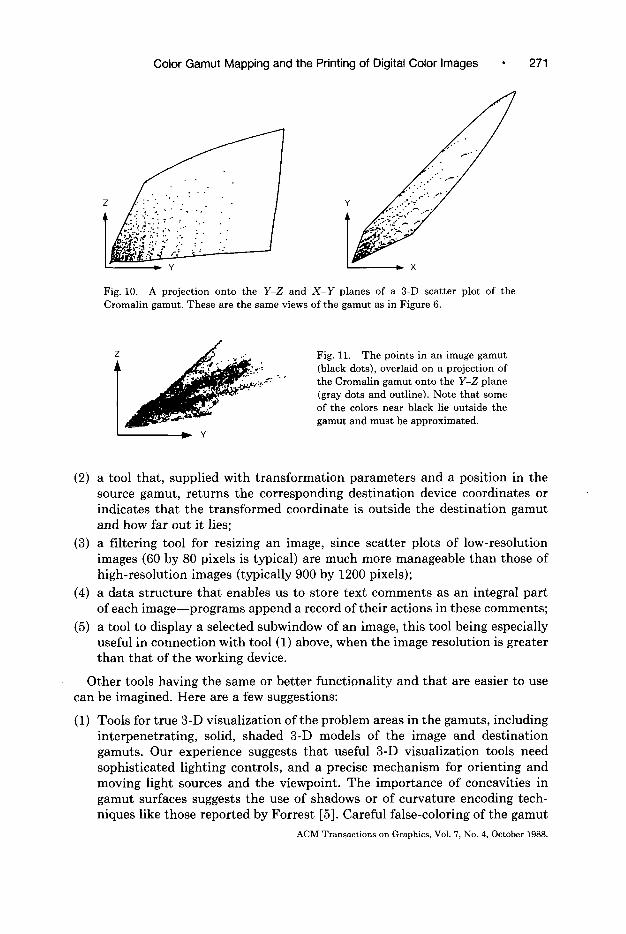
Figure 10 shows two projections of the Cromalin gamut. The black dots are the sample points, and the black outline was added by hand to emphasize the shape. The point nearest the origin is black, and the farthest one diagonally opposite is white. When i:nterpreting these scatter plots, it may help to recall that X, Y, and 2 are scale factors for the CIE color-matching functions which peak (roughly speaking) in the red, green, and blue portions of the spectrum, respectively. Therefore, one may think of X, Y, and 2 as being very roughly equivalent to R, G, and B, respectively.
Figure 11 shows an image gamut (black dots) overlaid on the Cromalin gamut (gray dots and outline). The image is the one shown later in Figure 14. Note particularly the region of the image near black that lies just outside of the gray gamut outline. This dense set of points are the shadows and some of the shading on the table.
Given a projection and examining the image on a CRT, problem colors can be located with respect to the image. Certain colors are of particular importance:
(1) Highlights. These usually determine the gray axis of the image. They are often left slightly outside the destination gamut to maximize luminance contrast.
(2) Colors near black. The shape of an image gamut near black and the transfor- mations needed to bring that portion of the image gamut inside the destina- tion gamut have a profound effect on contrast and saturation of the repro- duction.
(3) Highly saturated colors. These are often outside printing gamuts. High- intensity blues from CRTs are especially problematic.
(4) Colors lying on the boundary of the image gamut and occupying large areas of the image. It is undesirable to project these colors to the surface of the gamut because this can map many image colors to the same destination color. Therefore, such colors should all be inside the printing gamut after gamut mapping.
In addition to the scatter plots, the following “utility tools” are useful for determining the best gamut transformations:
(1) a mouse-driven tracker that displays in an auxiliary window the RGB (source device) coordinates of Ipixels in an image;
ACM Transactions on Graphics, Vol. 7, No. 4, October 1988.
Color Gamut Mapping and the Printing of Digital Color Images 271
Fig. 10. A projection onto the Y-Z and X-Y planes of a 3-D scatter plot of the Cromalin gamut. These are the same views of the gamut as in Figure 6.
‘. I
Fig. 11. The points in an image gamut (black dots), overlaid on a projection of the Cromalin gamut onto the Y-Z plane (gray dots and outline). Note that some of the colors near black lie outside the gamut and must be approximated.
(2) a tool that, supplied with transformation parameters and a position in the source gamut, returns the corresponding destination device coordinates or indicates that the transformed coordinate is outside the destination gamut and how far out it lies;
(3) a filtering tool for resizing an image, since scatter plots of low-resolution images (60 by 80 pixels is typical) are much more manageable than those of high-resolution images (typically 900 by 1200 pixels);
(4) a data structure that enables us to store text comments as an integral part of each image-programs append a record of their actions in these comments;
(5) a tool to display a selected subwindow of an image, this tool being especially useful in connection with tool (1) above, when the image resolution is greater than that of the working device.
Other tools having the same or better functionality and that are easier to use can be imagined. Here are a few suggestions:
(1) Tools for true 3-D visualization of the problem areas in the gamuts, including interpenetrating, solid, shaded 3-D models of the image and destination gamuts. Our experience suggests that useful 3-D visualization tools need sophisticated lighting controls, and a precise mechanism for orienting and moving light sources and the viewpoint. The importance of concavities in gamut surfaces suggests the use of shadows or of curvature encoding tech- niques like those reported by Forrest [5]. Careful false-coloring of the gamut
ACM Transactions on Graphics, Vol. 7, No. 4, October 1988.

272 l M. C. Stone et al.
surfaces may help to orient the observer. Transparency would be useful for simultaneous viewing of the source and destination gamuts, which necessarily intersect.
(2) An interactive tool to indicate source image pixels corresponding to a selected color in a gamut disp1a.y and its converse.
(3) Automatic and simultaneous highlighting of all out-of-gamut colors, both in gamut displays and in the source image.
(4) Interactive feedback showing changes in a gamut display when transforma- tion parameters are varied.
(5) Interactive tools for diefining gamut mapping transformations. Specifying translation distances, tscaling, and rotation factors by pointing at positions in gamut plots would be very useful.
(6) Automatic computation of interrelated parameters. Sometimes the transfor- mations interact in such a way that increasing one parameter requires decreasing another. (The parameters bs and csf, introduced in the next section, behave in thi:s way.) Such cascading changes could be computed automatically.
It is possible to anticipate algorithms that automatically select gamut trans- formations. Human input will always be needed for the best results, but it should be possible to automaticahy determine transformations that produce images of acceptable quality, analogous to the color correction performed for mass-produced snapshots.
5.2 Translation, Scaling, and Gray Axis Rotation
The importance of achieving the right appearance for the gray axis is well known in graphic arts [16, p. 27; 23, chap. 51. The purpose of translation, scaling, and gray axis rotation is to match the appearance of the image and destination gray axes while maximizing achromatic contrast (objectives (1) and (2)). The remain- der of the image gamut is “carried along,” maintaining the relationships between colors. Our description of the transformations uses the following notation:
Bi tristimulus coordinates of image black, Bd tristimulus coordinates of destination black, Wi tristimulus coordinates of image white, Wd tristimulus coordinates of destination white, Xi tristimulus coordinates of an image pixel, Xd tristimulus coordinates of a destination pixel, R a rotation matrix, bs black shift, csf contrast scale factor.
The general transformation for mapping an image color Xi to a destination color Xd is
Xd=Bd+CSfXRX(Xi-Bi).
This transformation translates image black to destination black, scales image colors so that they spread over a range that roughly fills the destination gamut,
ACM Transactions on Graphics, Vol. 5, No. 4, October 1988.
Color Gamut Mapping and the Printing of Digital Color Images 273
(4 (b)
(cl (4
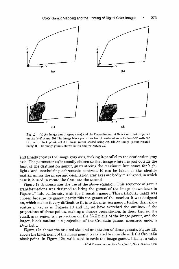
Fig. 12. (a) An image gamut (gray area) and the Cromalin gamut (black outline) projected on the Y-Z plane. (b) The image black point has been translated so as to coincide with the Cromalin black point. (c) An image gamut scaled using csf. (d) An image gamut rotated using R. The image gamut shown is the one for Figure 17.
and finally rotates the image gray axis, making it parallel to the destination gray axis. The parameter csf is usually chosen so that image white lies just outside the limit of the destination gamut, guaranteeing the maximum luminance for high- lights and maximizing achromatic contrast. R can be taken as the ide.ntity matrix, unless the image and destination gray axes are badly misaligned, in which case it is used to rotate the first into the second.
Figure 12 demonstrates the use of the above equation. This sequence of gamut transformations was designed to bring the gamut of the image shown later in Figure 17 into conformity with the Cromalin gamut. This particular image was chosen because its gamut nearly fills the gamut of the monitor it was designed on, which makes it very difficult to fit into the printing gamut. Rather than show scatter plots, as in Figures 10 and 11, we have sketched the outlines of the projections of these points, making a clearer presentation. In these figures, the small, gray region is a projection on the Y-Z plane of the image gamut, and the larger, black outline is a projection of the Cromalin gamut, measured under a &oo light.
Figure 12a shows the original size and orientation of these gamuts. Figure 12b shows the black point of the image gamut translated to coincide with the Cromalin black point. In Figure 12c, csf is used to scale the image gamut. Ideally, a value
ACM Transactions on Graphics, Vol. 7, No. 4, October 1988.

274 l M. C. Stone et ad.
Fig. 13. The image gamut in Figure 12d translated along the gray axis using bs in such a way that all colors lie inside of the destination gamut.
of csf would be used that transformed the image gamut to fill the Cromalin gamut, as it did the monitor gamut. However, such a value of csf applied to this image would place too many colors outside the destination gamut, so the effect of applying a smaller va1u.e is shown here. Figure 12d shows the scaled image gamut rotated clockwise to align its gray axis with that of the Cromalin gamut. Note that portions of the image gamut still lie outside the destination gamut, a problem that will be solved with an umbrella transformation, described in the next section.
Once the black points are aligned, the shape of the gamut near black is very significant, especially for images representing natural scenes, which often have important detail in dark colors. A small difference between rates of convergence of the destination and image gamuts near the black point can cause many dark pixels in the image to lie outside the destination gamut. Because the monitor gamut is much broader near black than the printing gamut, transforming image black to destination black may cause many dark image colors to be projected onto the surface of the destination gamut. This can cause undesirable hue shifts due to quantization errors, as well as loss of detail. Moving image black a small distance along the gray axis of the destination gamut can bring these colors into the destination gamut, at the cost of decreasing achromatic contrast.
Let GAd be the gray axis of the destination gamut, defined by
GAd = Wd - Bd
and suitably normalized. Then, if bs is the displacement along the gray axis of image black, the new transformation is
X, = Bd + bs X GAd + CSf X R X (Xi - Bi).
Positive values of bs translate image black along the destination gray axis toward the destination white point. This transformation preserves the hue of image colors. Note that increases in bs should be balanced by decreases in csf. Figure 13 shows the effect of applying bs on the image gamut in Figure 12d. This is a large translation that would desaturate the image badly.
Values of bs and csf are selected in three ways:
(1) by selecting trial values for bs and csf, and then examining the scatter-plot projections of the tramformed image and destination gamuts;
ACM Transactions on Graphics, Vol. i, No. 4, October 1988

Color Gamut Mapping and the Printing of Digital Color Images * 275
(2) by subjecting particular test colors to the gamut transformation, and then using the XYZ-to-CMY printing transformation to determine whether or not the result lies inside the destination gamut;
(3) by color correcting a low-resolution version of the image and then eventually the complete image, The out-of-gamut colors encountered are used to supply additional test colors for subsequent iterations of method (2).
These techniques are used to refine the choice of values for bs and csf. Methods (1) and (3) can be performed fairly rapidly on a low-resolution version of an image (roughly 1 minute and 5 minutes, respectively, on the Dorado). Note that the low-resolution version of the image does not have precisely the same gamut as the high-resolution one, owing to the effect of averaging adjacent pixels. These differences can be handled, however, by probing the full-resolution image to produce the correct color values once problem areas have been located.
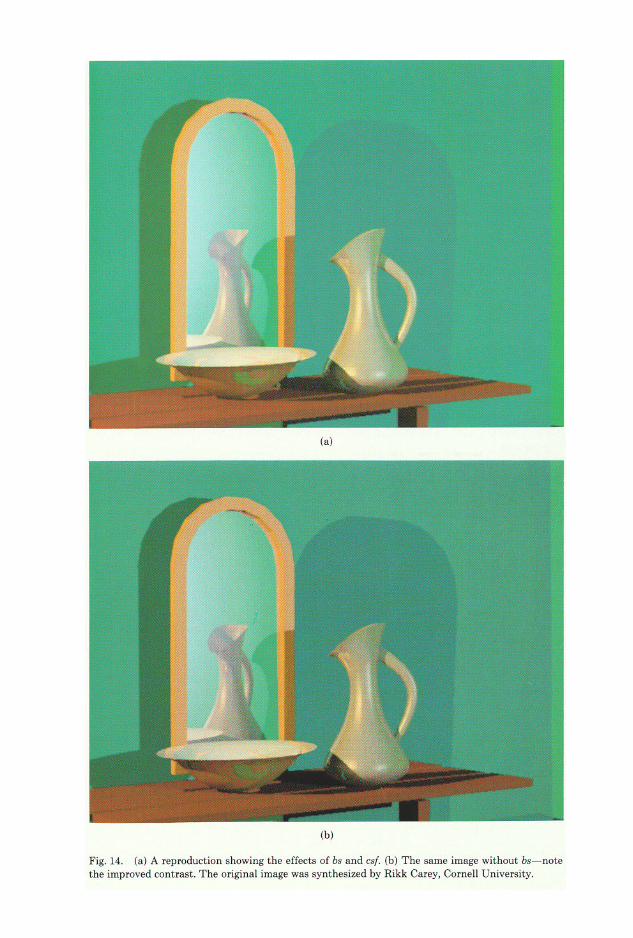
Figure 14 shows an example of the effects of adjusting bs and csf as described above. The original image is from the Cornell University Program of Computer Graphics and was included in the AIC proceedings [lo] as an example of ray tracing. In Figure 14a, a positive value of bs and a small value of csf force the image gamut to lie entirely inside the printing gamut. Figure 14b has better overall achromatic contrast, because bs is zero and a larger value of csf has been used. Many of the dark colors, however, lie outside the printing gamut and have been approximated. The scatter plot shown in Figure 11 shows the mapping for Figure 14b.
5.3 Desaturation and Oversaturation: The Umbrella Transformation
Using the above transformation alone to bring the image inside of the device gamut may produce an unacceptable loss of contrast for images that make extensive use of highly saturated colors in the CRT gamut. Thus, a transforma- tion that desaturates the image while retaining full luminance contrast is re- quired. Using it corresponds to an application of principles (2) and (3), at the cost of principle (4).
For images defined on CRTs and produced by the excitation of three phosphors, desaturation can be elegantly accomplished by moving the phosphor chromatic- ities toward the white point. After this transformation the image appears as it would on a monitor with less saturated phosphors or with a higher level of ambient light. Since people often view images on different monitors or in different viewing conditions without being aware that they differ, this desaturation is psychophysically justified. Suppose that an image was. originally computed in terms of phosphors with chromaticities R,, G,, and B, balanced for a white point of W,, and that the data were supplied as pixel values, R, G, and B, representing relative intensities of these phosphors. The image is desaturated by selecting new phosphor chromaticities R,, G,, and B, that are inside the destination gamut. This transforms an arbitrary source color
into the new color
RxR,+GxG,+BxB,
Rx R,+GxG,+ Bx B,. ACM Transactions on Graphics, Vol. 7, No. 4, October 1988.
Color Gamut Mapping and the Printing of Digital Color Images l 277
I I I I
’ 0.6 I
0:o 0.1 02 0.3 0.4 05 06 0.7
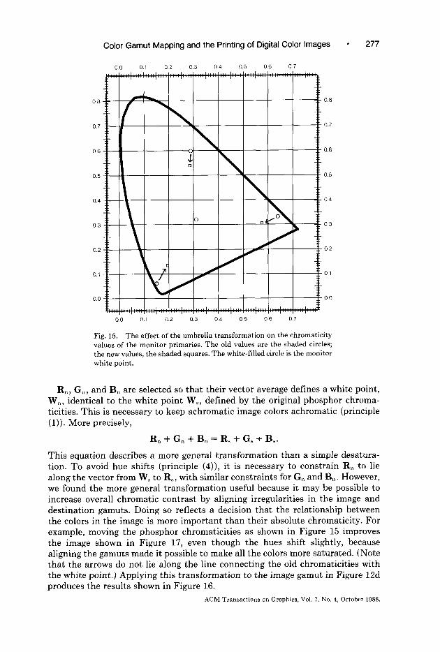
Fig. 15. The effect of the umbrella transformation on the chromaticity values of the monitor primaries. The old values are the shaded circles; the new values, the shaded squares. The white-filled circle is the monitor white point.
R,, G,, and B, are selected so that their vector average defines a white point, W,, identical to the white point W,, defined by the original phosphor chroma- ticities. This is necessary to keep achromatic image colors achromatic (principle (1)). More precisely,
R, + G, + B, = R, + G, + B,.
This equation describes a more general transformation than a simple desatura- tion. To avoid hue shifts (principle (4)), it is necessary to constrain R, to lie along the vector from W, to R,, with similar constraints for G, and B,. However, we found the more general transformation useful because it may be possible to increase overall chromatic contrast by aligning irregularities in the image and destination gamuts. Doing so reflects a decision that the relationship between the colors in the image is more important than their absolute chromaticity. For example, moving the phosphor chromaticities as shown in Figure 15 improves the image shown in Figure 17, even though the hues shift slightly, because aligning the gamuts made it possible to make all the colors more saturated. (Note that the arrows do not lie along the line connecting the old chromaticities with the white point.) Applying this transformation to the image gamut in Figure Ed produces the results shown in Figure 16.
ACM Transactions on Graphics, Vol. 7, No. 4, October 1988.

278 l M. C. Stone et al.
Fig. 16. The image gamut in Figure 12d after the um- brella transformation.
Figure 17 is a view of a portion of the Munsell color solid generated by the Cornell University Progra:m of Computer Graphics for the AIC proceedings [lo]. Figure 17a shows this image with gray axis rotation, black point translation, a moderate contrast scale factor, and no umbrella transformation applied to its gamut. (The sequence shown in Figure 12). The blues on the left side of the picture, which are still far outside the gamut, have been approximated as cyan. Figure 17b shows the effect of a modest folding of the umbrella (Figure 16): the cyan shift is less pronounced, but the colors are less saturated. The relationship between colors is better preserved in 17b because far fewer of them are being projected, even though a s:mall consistent hue shift has been introduced and the image has been slightly deisaturated.
A final point is worth making. The umbrella transformation can reduce the saturation of images that are too saturated for the destination gamut. It can also increase the saturation of an image whose gamut is considerably smaller than the destination gamut. To do so we would choose destination R,, G,, and B, that are further from the white point than are the source chromaticities R,, G,, and B,.
5.4 Projective Clipping
Transforming an image gamut to fit completely inside the destination device gamut can result in a reproduction with unacceptably low achromatic or chro- matic contrast. It is preferable to have some image colors outside the destination gamut and approximate them by projecting them back onto the surface of the printable gamut. The gamut surface is defined as a polygon with triangular faces. A point outside the gamut can be approximated by the nearest point on the surface. To compute this projection, we use the following approach:
(1) Try to find a perpendicular projection of the color to the nearest triangular face of the destination gamut. Note that concavities result in more than one acceptable projection, of which we use the closest.
(2) If perpendicular projection to a polygon is impossible, find a perpendicular projection of the color ,to the nearest edge of a polygon on the surface of the gamut.
(3) If methods (1) and (2) fail, use the closest surface vertex of the destination gamut.
ACM Transactions on Graphics, Vol. 7, No. 4, October 1988.

Color Gamut Mapping and the Printing of Digital Color Images
This approach results in continuous projections where the destination gamut hasa convex surface, but where the surface is concave, smoothly varying image colorstransform discontinuously in the destination gamut. Printing gamuts are notcompletely convex, and the worst concavities are near the black point, wherecolor quantization can produce problems.
It is important to compute the projections in the order given above. It is notpossible, for example, to locate first the closest vertex and then test to determinewhether the probe should be projected instead onto one of the edges incident tothe closest vertex. This occurs because a vertex on the far surface of the gamutmay be closer to the probe color than any vertex of the closest polygon. Similarly,an edge on the far side may be closer to a probe than any edge of the closestpolygon, so that it is not always possible to find the closest polygon by findingthe closest edge.
How might the projection process be improved? The Euclidean distancesbetween tristimulus values are not a precise measure of perceived color difference.Better difference metrics (such as CIELAB and CIELUV) have been devised,and projection based on a better metric certainly seems preferable. Note thatthese color difference equations (such as CIELAB and CIELUV) were designedfor the colorant industries, where large juxtaposed areas of uniform color mustbe imperceptibly different [22]; the suitability of these formulas for coloredimagery has not yet been investigated. Nevertheless, although not ideal, theseprobably offer an improvement over the projection methods used here.
Better solutions are likely to require consideration of the reproduction princi-ples mentioned above, particularly the preservation of hue. Recent research oncolor categories [21] may point the way. A simpler solution, and a better one formost images, is to keep the distance of any projection very small, as we did inour project. Then there is likely to be little difference between the results ofdifferent projection techniques.
ACM Transactions on Graphics, Vol. 7, No. 4, October 1988.
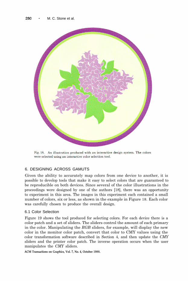
M. C. Stone et al.
6. DESIGNING ACROSS GAMUTS
Given the ability to accurately map colors from one device to another, it ispossible to develop tools that make it easy to select colors that are guaranteed tobe reproducible on both devices. Since several of the color illustrations in theproceedings were designed by one of the authors [18], there was an opportunityto experiment in this area. The images in this experiment each contained a smallnumber of colors, six or less, as shown in the example in Figure 18. Each colorwas carefully chosen to produce the overall design.
6.1 Color Selection
Figure 19 shows the tool produced for selecting colors. For each device there is acolor patch and a set of sliders. The sliders control the amount of each primaryin the color. Manipulating the RGB sliders, for example, will display the newcolor in the monitor color patch, convert that color to CMY values using thecolor transformation software described in Section 4, and then update the CMYsliders and the printer color patch. The inverse operation occurs when the usermanipulates the CMY sliders.ACM Transactions on Graphics, Vol. 7, No. 4, October 1988.
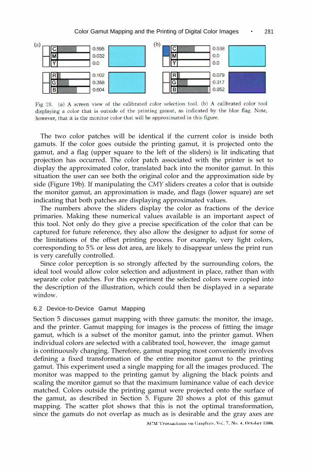
Color Gamut Mapping and the Printing of Digital Color Images 281
The two color patches will be identical if the current color is inside bothgamuts. If the color goes outside the printing gamut, it is projected onto thegamut, and a flag (upper square to the left of the sliders) is lit indicating thatprojection has occurred. The color patch associated with the printer is set todisplay the approximated color, translated back into the monitor gamut. In thissituation the user can see both the original color and the approximation side byside (Figure 19b). If manipulating the CMY sliders creates a color that is outsidethe monitor gamut, an approximation is made, and flags (lower square) are setindicating that both patches are displaying approximated values.
The numbers above the sliders display the color as fractions of the deviceprimaries. Making these numerical values available is an important aspect ofthis tool. Not only do they give a precise specification of the color that can becaptured for future reference, they also allow the designer to adjust for some ofthe limitations of the offset printing process. For example, very light colors,corresponding to 5% or less dot area, are likely to disappear unless the print runis very carefully controlled.
Since color perception is so strongly affected by the surrounding colors, theideal tool would allow color selection and adjustment in place, rather than withseparate color patches. For this experiment the selected colors were copied intothe description of the illustration, which could then be displayed in a separatewindow.
6.2 Device-to-Device Gamut Mapping
Section 5 discusses gamut mapping with three gamuts: the monitor, the image,and the printer. Gamut mapping for images is the process of fitting the imagegamut, which is a subset of the monitor gamut, into the printer gamut. Whenindividual colors are selected with a calibrated tool, however, the “image gamut”is continuously changing. Therefore, gamut mapping most conveniently involvesdefining a fixed transformation of the entire monitor gamut to the printinggamut. This experiment used a single mapping for all the images produced. Themonitor was mapped to the printing gamut by aligning the black points andscaling the monitor gamut so that the maximum luminance value of each devicematched. Colors outside the printing gamut were projected onto the surface ofthe gamut, as described in Section 5. Figure 20 shows a plot of this gamutmapping. The scatter plot shows that this is not the optimal transformation,since the gamuts do not overlap as much as is desirable and the gray axes are

282 l M. C. Stone et al
not aligned. The most obvious improvement would be to rotate the monitorgamut to align the neutral axes, which would also have the effect of increasingthe area of overlap.
Each color in the illustrations was chosen using this tool, and both the tooland the illustration were displayed on a monitor calibrated using the samplingtechnique defined in Section 3. This calibration includes the effect of the roomlights, which were three low-wattage desk lamps. When the designer was satisfied,the illustration was printed and proofed. The results were acceptable, though theoverall appearance of the illustrations seemed less vivid than the monitorrendering.
Some variation was expected, since the viewing environment for the monitorwas controlled but not ideal. It is important to remember, however, that it isactually impossible to do an effective side-by-side comparison of a print imageand a monitor. The print has been corrected for viewing under a bright, whitelight. A typical monitor environment is dim, and the monitor “white” is notnecessarily the same color as the white in the viewing booth. Nevertheless, oncethe viewer is adapted to either environment, the colors seem quite normal. Howhuman vision performs this transformation cannot yet be modeled. Until thereare better models for this phenomenon, color selection tools will have to rely onthe experience of the user to adjust for adaptation phenomena. Experience hasshown that people can learn to make this transformation, if allowed enoughiterations. The immediate goal of design tools is to reduce the number of iterationsneeded.
7. RESULTS
This section presents some quantitative data we collected while processing theimages for the AIC conference proceedings. As an experiment in publishing, theproceedings are a success. The authors generally agree that the printed imageslook like the pictures they. submitted. Such qualitative “satisfaction” with thereproduction is an important criterion of success in this type of work. It validates

Color Gamut Mapping and the Printing of Digital Color Images 283
our gamut-mapping techniques as a means of producing satisfactory color repro- ductions; the methods used do produce visually good results. The procedure as applied to the calibrated images sent from Cornell University [lo], where we were able to base our corrections entirely on their calibration, demonstrates a way to publish computer-generated images with more color fidelity than is currently possible using conventional techniques.
The project also has as its output two sets of quantitative data that are worth reporting. The first reports the stability of the offset printing process, beginning with the corrected image through the halftone and printing processing steps. This stability is of interest to the computer graphics community because offset printing is the path by which all our color images are currently published. Furthermore, this data can serve as a baseline for other work on color correction for conventional publication.
The second set of data describes the extent of the variation in tristimulus values introduced by the gamut mapping. Although the changes introduced in the mappings were deliberately kept small, they are large enough to be percep- tually significant. These data provide an important first set of metrics toward the goal of making the practice of “good color reproduction” quantitative.
The data presented include the standard deviation throughout the printing process (film making, proofing, and printing), computed by measuring test patches at each stage of the process. The accuracy of the interpolation and iteration algorithms was computed by transforming test values through the algorithms and back again. The effect of gamut mapping was measured by comparing mapped and unmapped tristimulus values for each pixel in represent- ative pictures to produce the variation caused by the different mappings.
7.1 Printing Process Variation
The printing process variation measures the production of the halftone screens, of the color proofs, and of the printed pages. To measure the repeatability of the film-making and proofing processes, included on each set of films were patches of O%, 5%, 25%, 50%, 75%, 95%, and 100% dot areas for cyan, magenta, yellow, and black. To measure the accuracy of the printed pages, we selected a few uniformly colored regions of the images and measured several copies of the proceedings.
To determine the accuracy of the halftone generation process, we measured the film density for the test patches with a Macbeth TR524 transmission densitometer (accuracy of 0.02D) as the films were being processed. The goals for the processing were to keep the background density of the opaque part of the film greater than 3.OD and the patches to the predicted value within the accuracy of the densitometer. Density can be computed from the transmittance of the patch by D = log[l/T]. The films are negatives, so a 5% patch is 95% black, 5% clear, with a transmittance of 0.05. This procedure was suggested to us by our consultants in the graphic arts industry. The ideal densities for each percentage are 1.30, 0.60, 0.30, 0.12, and 0.02, respectively. The densitometer accuracy is 0.02D. The results of our test measurements are summarized in Table I.
All but the 5% patch were consistent within the accuracy of the densitometer, although the mean for 95% is so close to the densitometer accuracy that the
ACM Transactions on Graphics, Vol. ‘7, No. 4, October 1988.

284 l M. C. Stone et a.l.
Table I. Mean Film Densities Plus Standard Deviation for the Test Patches (19 samples)
5% 25% 50% 75% 95%
Cyan 1.37 f 0.06 0.59 f 0.01 0.31 f 0.01 0.11 f 0.01 0.01 f 0.01 Magenta 1.42 f 0.08 0.60 f 0.01 0.30 + 0.01 0.11 f 0.01 0.01 + 0.01 Yellow 1.38 f 0.06 0.60 + 0.01 0.29 + 0.01 0.12 * 0.01 0.01 rt 0.01 Black 1.25 f 0.03 0.59 f 0.01 0.30 f 0.01 0.12 + 0.01 0.02 + 0.01
Table II. Mean Maximum Densities Plus Standard Deviation for each Color as Measured by the Proofing House from the Brunner
Strips (12 samples)
Cyan 1.30 z!z 0.03 Magenta 1.41 * 0.02 Yellow 1.03 -+ 0.03 Black 1.69 + 0.03
halftone patterns must be visually checked as well. The values are slightly different for each color, since the simulated screen rotation makes the raster pattern different for each screen.
The inaccuracy of the 5% patch probably indicates a flaw in the compensation curve for the film plotter, making it impossible to reliably produce a 5% screen with the specified dot pattern without compromising the other test values. This patch, which contains small isolated white dots on a black background, is also particularly susceptible to plotter noise and quantization effects.
The proofing house controls its process by measuring standard test patches supplied by DuPont, called. “Brunner strips,” which are processed along with the proof. The standard quality check is to measure the density of the 100% patches with a reflection densitometer (accuracy of 0.02D). Table II summarizes the measurements supplied with each set of proofs.
We made similar densit,y measurements on the proofs of the test patches we provided using an X-Rite 384 color reflection densitometer (accuracy of 0.02D). Each color is measured by shining a standard light on it and measuring the reflectance through an appropriate filter to produce an equivalent neutral density, that is, the density of a gray color of the same reflectance. Note that the density measurement for clear film (low film density) corresponds to full ink (high printed density). Table III summarizes these measurements. There are fewer samples here than for the films, as the proofing house damaged some of the test patches.
The important numbers in Table III are the deviations, since the absolute relationship between the dot area and the density as measured with a reflection densitometer is not easy to predict accurately. Chapter 8 of Yule’s book [23] discusses this problem in detail. The density of a screened patch is a function of the 100% density for that color, so the mean densities at a particular dot area should not necessarily be the same for all colors.
The maximum densities on our patches vary more than those measured by the proofing house. This is attributed to variation across the proof, since the variation in clear film density was not significant. The deviation on the screened areas is
ACM Transactions on Graphics, Vol. 7, No. 4, October 1988.
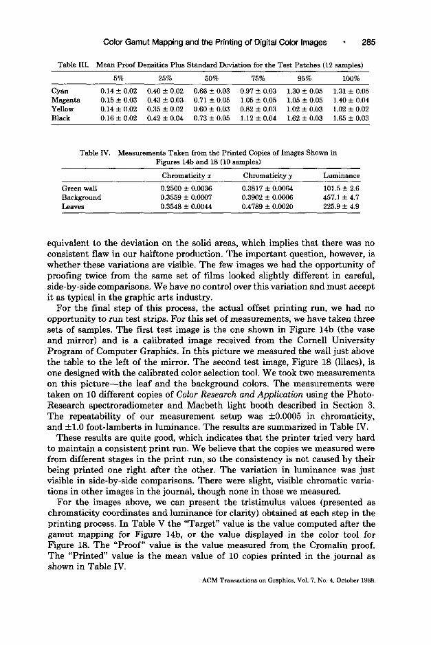
Color Gamut Mapping and the Printing of Digital Color Images l 285
Table III. Mean Proof Densities Plus Standard Deviation for the Test Patches 112 samnles)
5% 25% 50% 75% 95% 100%
Cyan 0.14 f 0.02 0.40 & 0.02 0.66 + 0.03 0.97 f 0.03 1.30 f 0.05 1.31 f 0.05 Magenta 0.15 + 0.03 0.43 f 0.03 0.71 * 0.05 1.05 f 0.05 1.05 + 0.05 1.40 f 0.04 Yellow 0.14 f 0.02 0.35 f 0.02 0.60 f 0.03 0.82 f 0.03 1.02 f 0.03 1.02 + 0.02 Black 0.16 f 0.02 0.42 + 0.04 0.73 + 0.05 1.12 f 0.04 1.62 + 0.03 1.65 rt 0.03
Table IV. Measurements Taken from the Printed Copies of Images Shown in Figures 14b and 18 (10 samples)
Green wall Background Leaves
Chromaticity x Chromaticity y
0.2500 AZ 0.0036 0.3817 f 0.0064 0.3559 f 0.0007 0.3902 f 0.0006 0.3548 + 0.0044 0.4789 * 0.0020
Luminance
101.5 f 2.6 457.1 + 4.7 225.9 2 4.9
equivalent to the deviation on the solid areas, which implies that there was no consistent flaw in our halftone production. The important question, however, is whether these variations are visible. The few images we had the opportunity of proofing twice from the same set of films looked slightly different in careful, side-by-side comparisons. We have no control over this variation and must accept it as typical in the graphic arts industry.
For the final step of this process, the actual offset printing run, we had no opportunity to run test strips. For this set of measurements, we have taken three sets of samples. The first test image is the one shown in Figure 14b (the vase and mirror) and is a calibrated image received from the Cornell University Program of Computer Graphics. In this picture we measured the wall just above the table to the left of the mirror. The second test image, Figure 18 (lilacs), is one designed with the calibrated color selection tool. We took two measurements on this picture-the leaf and the background colors. The measurements were taken on 10 different copies of Color Research and Application using the Photo- Research spectroradiometer and Macbeth light booth described in Section 3. The repeatability of our measurement setup was +0.0005 in chromaticity, and kl.0 foot-lamberts in luminance. The results are summarized in Table IV.
These results are quite good, which indicates that the printer tried very hard to maintain a consistent print run. We believe that the copies we measured were from different stages in the print run, so the consistency is not caused by their being printed one right after the other. The variation in luminance was just visible in side-by-side comparisons. There were slight, visible chromatic varia- tions in other images in the journal, though none in those we measured.
For the images above, we can present the tristimulus values (presented as chromaticity coordinates and luminance for clarity) obtained at each step in the printing process. In Table V the “Target” value is the value computed after the gamut mapping for Figure 14b, or the value displayed in the color tool for Figure 18. The “Proof” value is the value measured from the Cromalin proof. The “Printed” value is the mean value of 10 copies printed in the journal as shown in Table IV.
ACM Transactions on Graphics, Vol. 7, No. 4, October 1988.
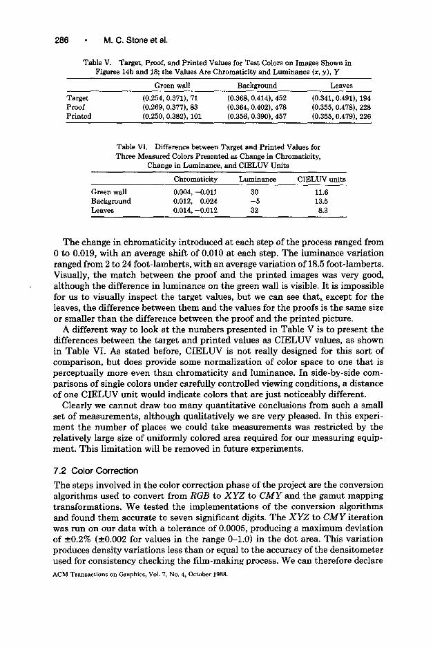
286 l M. C. Stone et al.
Table V. Target, Proof, and Printed Values for Test Colors on Images Shown in Figures 14b and 18; the Values Are Chromaticity and Luminance (x, y), Y
Gr’een wall Background Leaves
Target (0.254, 0.371), 71 (0.368,0.414), 452 (0.341,0.491), 194 Proof (0.269, 0.377), 83 (0.364,0.402), 478 (0.355,0.478), 228 Printed (0.250, 0.382), 101 (0.356,0.390), 457 (0.355,0.479), 226
Table VI. Difference between Target and Printed Values for Three Measured Colors Presented as Change in Chromaticity,
Change in Luminance, and CIELUV Units
Green wall Background Leaves
Chromaticity Luminance
0.004, -0.011 30 0.012, 0.024 -5 0.014, -0.012 32
CIELW units
11.6 13.5 8.3
The change in chromaticity introduced at each step of the process ranged from 0 to 0.019, with an average shift of 0.010 at each step. The luminance variation ranged from 2 to 24 foot-lamberts, with an average variation of 18.5 foot-lamberts. Visually, the match between the proof and the printed images was very good, although the difference in luminance on the green wall is visible. It is impossible for us to visually inspect the target values, but we can see that, except for the leaves, the difference between them and the values for the proofs is the same size or smaller than the difference between the proof and the printed picture.
A different way to look at the numbers presented in Table V is to present the differences between the target and printed values as CIELUV values, as shown in Table VI. As stated before, CIELUV is not really designed for this sort of comparison, but does provide some normalization of color space to one that is perceptually more even than chromaticity and luminance. In side-by-side com- parisons of single colors under carefully controlled viewing conditions, a distance of one CIELUV unit would indicate colors that are just noticeably different.
Clearly we cannot draw too many quantitative conclusions from such a small set of measurements, although qualitatively we are very pleased. In this experi- ment the number of places, we could take measurements was restricted by the relatively large size of uniformly colored area required for our measuring equip- ment. This limitation will be removed in future experiments.
7.2 Color Correction
The steps involved in the color correction phase of the project are the conversion algorithms used to convert from RGB to XYZ to CMY and the gamut mapping transformations. We tested the implementations of the conversion algorithms and found them accurate to seven significant digits. The XYZ to CMY iteration was run on our data with a tolerance of 0.0005, producing a maximum deviation of +0.2% (kO.002 for values in the range O-1.0) in the dot area. This variation produces density variations less than or equal to the accuracy of the densitometer used for consistency checking the film-making process. We can therefore declare ACM Transactions on Graphics, Vol. 7, No. 4, October 1988.
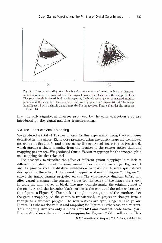
Color Gamut Mapping and the Printing of Digital Color Images l 287
that the only significant changes produced by the color correction step areintroduced by the gamut-mapping transformations.
7.3 The Effect of Gamut Mapping
We produced a total of 11 color images for this experiment, using the techniquesdescribed in this paper. Eight were produced using the gamut-mapping techniquesdescribed in Section 5, and three using the color tool described in Section 6,which applies a single mapping from the monitor to the printer rather than onemapping per image. We produced four different mappings for the images, plusone mapping for the color tool.
The best way to visualize the effect of different gamut mappings is to look atdifferent reproductions of the same image under different mappings. Figures 14and 17 provide such qualitative side-by-side comparisons. A more quantitativedescription of the effect of the gamut mapping is shown in Figure 21. Figure 21shows the image gamuts projected on the CIE chromaticity diagram before andafter gamut mapping. The original values for the colors in the image are shownin gray; the final values in black. The gray triangle marks the original gamut ofthe monitor, and the irregular black outline is the gamut of the printer (comparethis figure to Figure 8). The black “triangle” is the gamut of the monitor afterthe gamut mapping. As the gamut is transformed, its projection changes from atriangle to a six-sided polygon. The new vertices are cyan, magenta, and yellow.Figure 21a shows the gamut and mapping for Figure 14 (the vase and mirror).This mapping involves only a black shift (bs) and contrast scale factor (csf).Figure 21b shows the gamut and mapping for Figure 17 (Munsell solid). This
ACM Transactions on Graphics, Vol. 7, No. 4, October 1988.

288 - M. C. Stone et al.
mapping includes a black shift, a contrast scale factor, a gray axis rotation, and an umbrella transformation. The large change in size of the monitor gamut clearly demonstrates that this is a more extreme mapping.
It is also easy to see in Figure 21 why the umbrella transformation was necessary for Figure 17. The original image colors fill the monitor gamut, extending well beyond the boundaries of the printing gamut. Although the original device gamut for Figure 14 is the same as for Figure 17, the image gamut for Figure 14 is much smaller. In fact, it looks as if the original gamut for Figure 14 would have fit inside of the printing gamut. However, this is not really the case. The projection shown here factors out the brightness of the colors. Therefore, a color may be inside the gamut, but only at a much lower brightness level than desired. In general, it is difficult to get vivid, bright colors on the printer. To preserve the overall lightn.ess, it is often necessary to desaturate the colors, which is what the motion of the colors toward the center of the diagram indicates.
While the motion of the colors on these diagrams is clear, what do the distances mean? It is well understood that distances on the chromaticity diagram do not correspond to perceptual distance. That is, the change in chromaticity that corresponds to a just barely visible color change is different in different parts of the diagram. This variation can be graphically demonstrated on the chromaticity diagram by plotting ellipses whose boundaries represent the set of chromaticities that are just visible from the color at the center of the ellipse. These ellipses can be computed using the formula for color differences in CIELUV, assuming a constant L* and finding the equation for a circle as a function of the metric chromaticity coordinates, u’, u’. The metric chromaticity coordinates are related to the CIE standard chromaticity coordinates such that a circle becomes an ellipse. However, in the iscale shown here, these ellipses would be very small; furthermore, our changes were larger than a single CIELUV unit. Figure 22 shows a set of ellipses for L* = 50 and a color difference of 10 CIELUV units overlaid on the chromaticity diagrams in Figure 21.
The choice of L* = 50 is somewhat arbitrary. For lower values of L* (darker colors), the ellipses are larger, and for higher values they are smaller. The choice of 10 CIELUV units not only makes the ellipses clearly visible, but is similar in size to the overall change in color produced by the printing process, as indicated in Table VI. If we plotted the shift in chromaticity introduced by the printing process, we would get lines that were approximately the diameter of the ellipses shown for the three places we measured. The print-to-print variation, however, is an order of magnitude smaller.
These diagrams show the effect of the gamut mapping on the chromaticities of the colors. It is also important to remember that luminance scaling, the use of csf, is the most significant numeric change in the tristimulus values. The maxi- mum luminance for the monitor is 25 foot-lamberts; the maximum for the printer is 526. Depending on the image, we scaled the luminance by a factor of 10 (Figure 17b) to 25 (Figure 14b). A source image color, placed beside such scaled up versions of itself, looks very dark. However, the human visual system easily adapts to much larger changes in the overall viewing environment.
In summary, we started with the simple theory that we should map tristimulus values to tristimulus values. Inspection of the device gamuts indicated that this ACM Transactions on Graphics, Vol. 7, No. 4, October 1988.

Color Gamut Mapping and the Printing of Digital Color Images
is not a correct goal. We then investigated mapping chromaticity values tochromaticity values, that is, simply scaling the luminance. We found that this,too, is not the right goal for good reproduction, and we modified the imagegamuts in a number of ways. Numerically, the variations in luminance introducedby gamut mapping are the most significant, though it is worth noting that thehuman visual system is very good at adapting to global luminance changes. Thechromaticity variations produced by the gamut mapping are unevenly distributedaround the color space and are shown graphically in Figure 21. Figure 22 showsthat the change in chromaticity produced by the gamut mapping is perceptuallysignificant.
8. DISCUSSION AND CONCLUSIONS
This project represents a first step in the direction of solving the problem ofreproducing images defined for one medium on another. The particular repro-duction task was successful, and the methods developed during the project shouldbe generally applicable. The use of CIE standards for calibration provided a goodnumeric basis for manipulation of device and image gamuts. The specific sampleset and transformation methods were adequate, but further work in this areashould provide significant improvements in the performance of the coordinatetransformation algorithms.
The transformations used for gamut mapping were deliberately chosen to beconservative, and owing to time constraints, once we had a mapping that worked,we tended to move on to the next image. Nevertheless, we feel this work providesa first step toward encoding the printer’s art in a set of algorithms. It is here thatcomputer tools may provide significant insight into the definition of a goodreproduction of an image because they allow us to work quantitatively, pixel bypixel. Further research in this area may also yield results that contribute to theunderstanding of color appearance, which would be a significant contribution tothe solution of the general cross-rendering problem.
ACM Transactions on Graphics, Vol. 7, No. 4, October 1988.
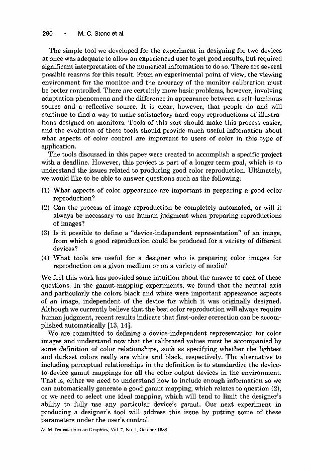
290 ’ M. C. Stone et al.
The simple tool we developed for the experiment in designing for two devices at once was adequate to allow an experienced user to get good results, but required significant interpretation of the numerical information to do so. There are several possible reasons for this result. From an experimental point of view, the viewing environment for the monitor and the accuracy of the monitor calibration must be better controlled. There are certainly more basic problems, however, involving adaptation phenomena and the difference in appearance between a self-luminous source and a reflective source. It is clear, however, that people do and will continue to find a way to make satisfactory hard-copy reproductions of illustra- tions designed on monitors. Tools of this sort should make this process easier, and the evolution of these tools should provide much useful information about what aspects of color control are important to users of color in this type of application.
The tools discussed in this paper were created to accomplish a specific project with a deadline. However, this project is part of a longer term goal, which is to understand the issues rel.ated to producing good color reproduction. Ultimately, we would like to be able to answer questions such as the following:
(1) What aspects of color appearance are important in preparing a good color reproduction?
(2) Can the process of image reproduction be completely automated, or will it always be necessary to use human judgment when preparing reproductions of images?
(3) Is it possible to define a “device-independent representation” of an image, from which a good reproduction could be produced for a variety of different devices?
(4) What tools are useful for a designer who is preparing color images for reproduction on a given medium or on a variety of media?
We feel this work has provided some intuition about the answer to each of these questions. In the gamut-mapping experiments, we found that the neutral axis and particularly the colors black and white were important appearance aspects of an image, independent of the device for which it was originally designed. Although we currently believe that the best color reproduction will always require human judgment, recent results indicate that first-order correction can be accom- plished automatically [ 13, 141.
We are committed to defining a device-independent representation for color images and understand n.ow that the calibrated values must be accompanied by some definition of color relationships, such as specifying whether the lightest and darkest colors really are white and black, respectively. The alternative to including perceptual reltitionships in the definition is to standardize the device- to-device gamut mappings for all the color output devices in the environment. That is, either we need to understand how to include enough information so we can automatically generate a good gamut mapping, which relates to question (2), or we need to select one ideal mapping, which will tend to limit the designer’s ability to fully use any particular device’s gamut. Our next experiment in producing a designer’s tool will address this issue by putting some of these parameters under the user’s control. ACM Transactions on Graphics, Vcl. 7, No. 4, October 1988.
Color Gamut Mapping and the Printing of Digital Color Images l 291
Addressing these questions also suggests questions about the lower level processes of image reproduction, generalized as “What device properties are necessary for good reproduction ?” The most interesting question related to device properties we found in this project is “Why is the printing gamut concave?” It was contrary to our intuition that any device gamut would be concave, since a concavity means that as a series of colors of a single hue and maximum saturation progress from light to dark, the saturation varies from high to low, and back again. Are the gamuts concave because we measured them incorrectly, because the halftoning algorithm is flawed, or because it is some intrinsic property of halftoned reproduction? Would a different technique, such as color dithering, give better results? A detailed answer must wait for more work and another paper.
ACKNOWLEDGMENTS
This work was supported by a number of people and organizations. Among them are the management at Xerox PARC, the production staff at John Wiley and Sons, the publishers of Color Research and Application, Mack Printing, who did an excellent job printing the journal, and the organizing committee for the AIC meeting.
We would particularly like to thank Eric Larson for his craftsmanship in printing the separations, Gary Starkweather for making his photometric and digital printing facilities available to us, and the production staff at Kedie-Orent for their professional advice and extraordinary service proofing our separations. Two people who provided particularly strong and invaluable support for this project are Rick Beach, the manager of the Imaging Area in the Computer Science Laboratory at Xerox PARC, and Fred Billmeyer, Jr., the editor of Color Research and Application.
REFERENCES
1. BRUNO, M. H. Principles of Color Proofing. Gama Communications, Salem, N.H., 1986. 2. COWAN, W. B. An inexpensive method for the CIE calibration of color monitors. Comput.
Graph. 11, 3 (July 1983), 315-321. 3. COWAN, W. B. CIE calibration of video monitors. Tech. Rep. NRC, Pub. 25362, National
Research Council of Canada, Ottawa, Ontario, 1986. 4. COWAN, W. B., AND ROWELL, N. L. Phosphor constancy and gun independence in color video
monitors. Color Res. Appl. 11, Suppl. (1986), S34-S38. 5. FORREST, A. R. On the rendering of surfaces. In Proceedings of the 1979 SZGGRAPH Conference.
Comput. Graph. 13,2 (Aug. 1979), 253-259. 6. HOLLADAY, T. M. An optimum algorithm for halftone generation for displays and hard copies.
In Proceedings of the Society for Information Display, vol. 21, no. 2. Society for Information Display, Playa de1 Rey, Calif., 1980, pp. 185-192.
7. HUNT, R. W. G. The Reproduction of Color. 3rd ed. Wiley, New York, 1975. 8. HUNT, R. W. G., PITT, I. T., AND WINTER, L. M. The preferred reproduction of blue sky, green
grass and Caucasian skin in colour photography. J. Photogr. Sci. 22, 3 (1974), 144-150.
9. JOHNSON, T. Polychromatic colour removal-Revolution or evolution? In Proceedings of the Technical Association of the Graphic Arts (TAGA). Technical Association for the Graphic Arts, Rochester, N.Y., 1985, pp. l-15.
10. MEYER, G. W., AND GREENBERG, D. P. Color education and color synthesis in computer graphics. Color Res. Appl. 2 1, Suppl. (June 1986), S39-S44.
ACM Transactions on Graphics, Vol. ‘7, No. 4, October 1988.
292 - M. C. Stone et al.
11. PIER, K. A. A retrospective on the Dorado, a high-performance personal computer. In Proceed- ings of the 10th Symposium. on Computer Architecture, SIGARCHIIEEE (Stockholm, Sweden, June). ACM, New York, 1983, pp. 252-269.
12. Recommended specification:, web offset publications, S.W.O.P. Available from the Graphic Arts Technical Foundation, Pittsburgh, Pa.
13. RHODES, W. L., AND LAMMING, M. G. Towards WYSIWYG color. Presented at “SPSE International Symposium and Exposition on Electronic Imaging Devices and Systems ‘88” (Baltimore, Md., Jan. lo), 1988. Proceedings to be published.
14. RHODES, W. L., AND LAMMING, M. G. Towards WYSIWYG color. Tech. Rep. EDL-88-2, Xerox Palo Alto Research Center, Palo Alto, Calif., Apr. 1988.
15. SCHREIBER, W. F. A color prepress system using appearance variables. Imaging Technal. 17, 4 (Aug. 1986), 200, 210.
16. SOUTHWORTH, M. Color Separation Techniques. 2nd ed. Graphics Arts, Livonia, Mich., 1979. 17. STARKWEATHER, G. K. A high resolution laser printer. J. Imaging Technol. 12, 6 (1985),
300-305. 18. STONE, M. Color, computer graphics and graphic design. Color Res. Appl. 11, Suppl. (June
1986), S75-S83. 19. STONE, M., COWAN, W. B., AND BEATTY, J. C. A description of the reproduction methods used
for color pictures in this issue of Color Research and Application. Color Res. Appl. 11, Suppl. (June 1986), S83-S88.
20. STONE, M.,, COWAN, W. B., AND BEATTY, J. C. Gamut mapping and the printing of digital color images. Tech. Rep. EDL-88-1, Xerox Palo Alto Research Center, Palo Alto, Calif., Apr. 1988.
21. UCHIKAWA, K., AND BOY~ITON, R. M. Categorical color perception of Japanese observers: Comparison with that of Americans. Vision Res. 27, 10 (1987), 1825-1833.
22. WYSZECKI, G., AND STILES, W. S. Color Science. 2nd ed. Wiley, New York, 1982. 23. YULE, J. A. C. Principles of Color Reproduction. Wiley, New York, 1967.
Received February 1987; revised February 1988; accepted March 1988
ACM Transactions on Graphics, Vol. 7, No. 4, October 1988.


![Chromaticity gamut enhancement by heptatone multi-color ...ostrom/publications/pdf/SPIE93_Heptatone.pdf · mentioned in [HUN87, p. 139], the color gamut of films is quite close to](https://img.pdfslide.net/doc/110x75/5e878c160a65913536294dc3/chromaticity-gamut-enhancement-by-heptatone-multi-color-ostrompublicationspdfspie93heptatonepdf.jpg)