Embed Size (px)
Citation preview
Ashleigh Benn
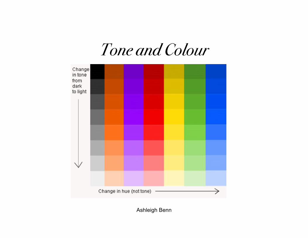
Tone and Colour
Ashleigh Benn
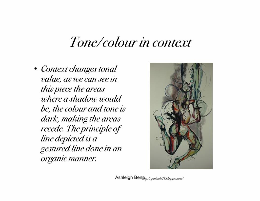
Tone/colour in context• Context changes tonal
value, as we can see inthis piece the areaswhere a shadow wouldbe, the colour and tone isdark, making the areasrecede. The principle ofline depicted is agestured line done in anorganic manner.
http://gratitude28.blogspot.com/
Ashleigh Benn
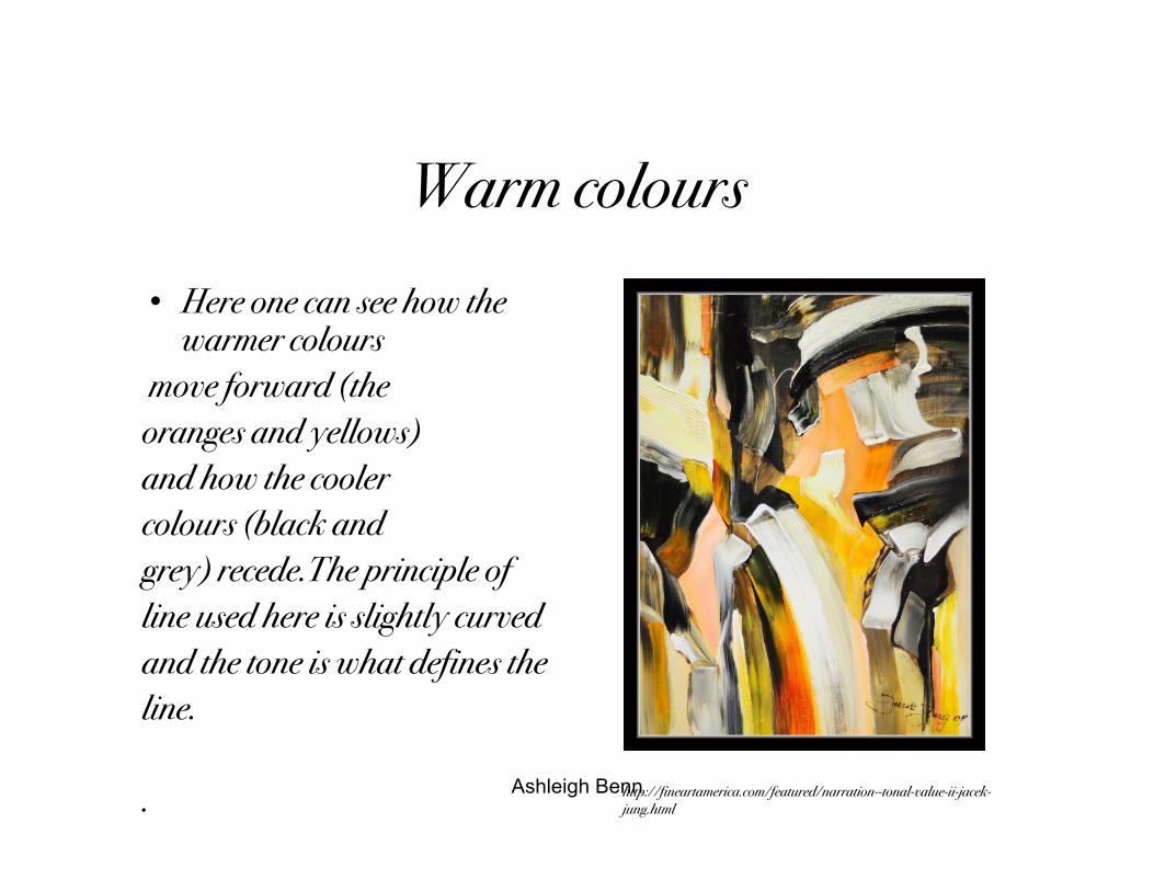
Warm colours• Here one can see how the
warmer colours move forward (theoranges and yellows)and how the coolercolours (black andgrey) recede.The principle ofline used here is slightly curvedand the tone is what defines theline.
. http://fineartamerica.com/featured/narration--tonal-value-ii-jacek-jung.html
Ashleigh Benn
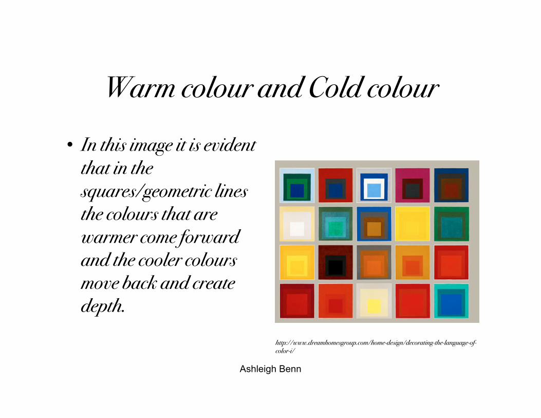
Warm colour and Cold colour
• In this image it is evidentthat in thesquares/geometric linesthe colours that arewarmer come forwardand the cooler coloursmove back and createdepth.
http://www.dreamhomesgroup.com/home-design/decorating-the-language-of-color-i/
Ashleigh Benn
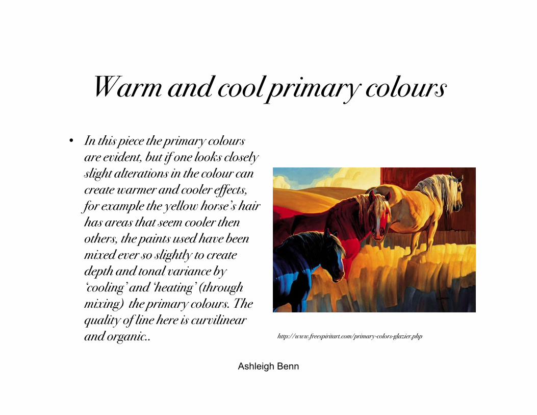
Warm and cool primary colours• In this piece the primary colours
are evident, but if one looks closelyslight alterations in the colour cancreate warmer and cooler effects,for example the yellow horse’s hairhas areas that seem cooler thenothers, the paints used have beenmixed ever so slightly to createdepth and tonal variance by‘cooling’ and ‘heating’ (throughmixing) the primary colours. Thequality of line here is curvilinearand organic.. http://www.freespiritart.com/primary-colors-glazier.php
Ashleigh Benn
Tertiary Colours
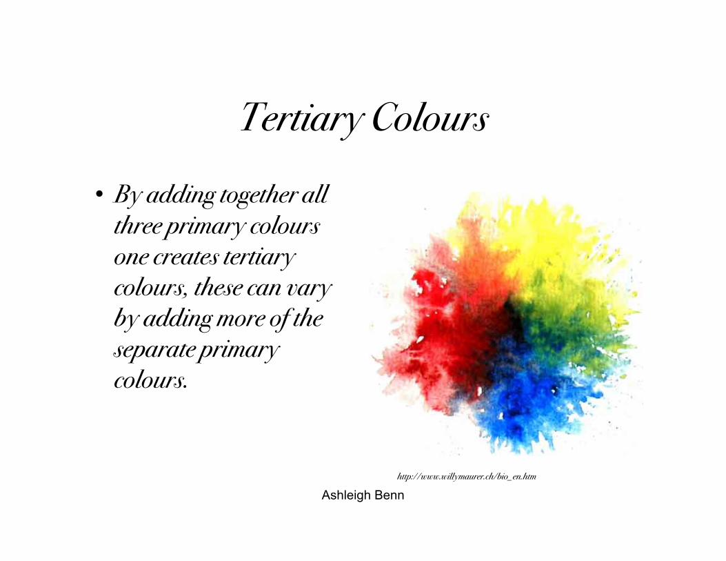
• By adding together allthree primary coloursone creates tertiarycolours, these can varyby adding more of theseparate primarycolours.
http://www.willymaurer.ch/bio_en.htm
Ashleigh Benn
Tertiary Colours
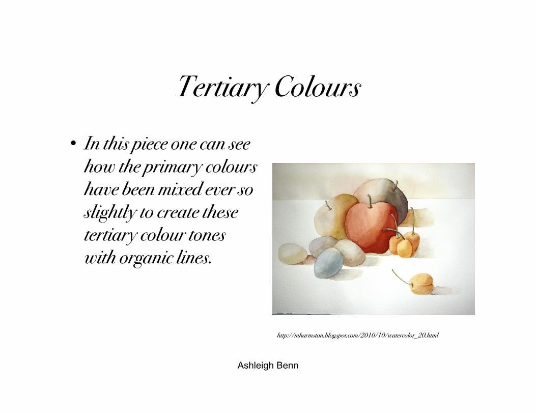
• In this piece one can seehow the primary colourshave been mixed ever soslightly to create thesetertiary colour toneswith organic lines.
http://mharmston.blogspot.com/2010/10/watercolor_20.html
Ashleigh Benn
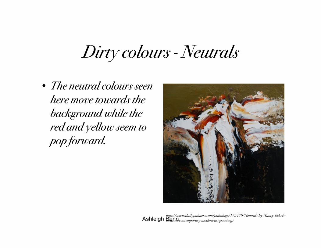
Dirty colours - Neutrals
• The neutral colours seenhere move towards thebackground while thered and yellow seem topop forward.
http://www.dailypainters.com/paintings/175470/Neutrals-by-Nancy-Eckels-abstract-contemporary-modern-art-painting/
Ashleigh Benn
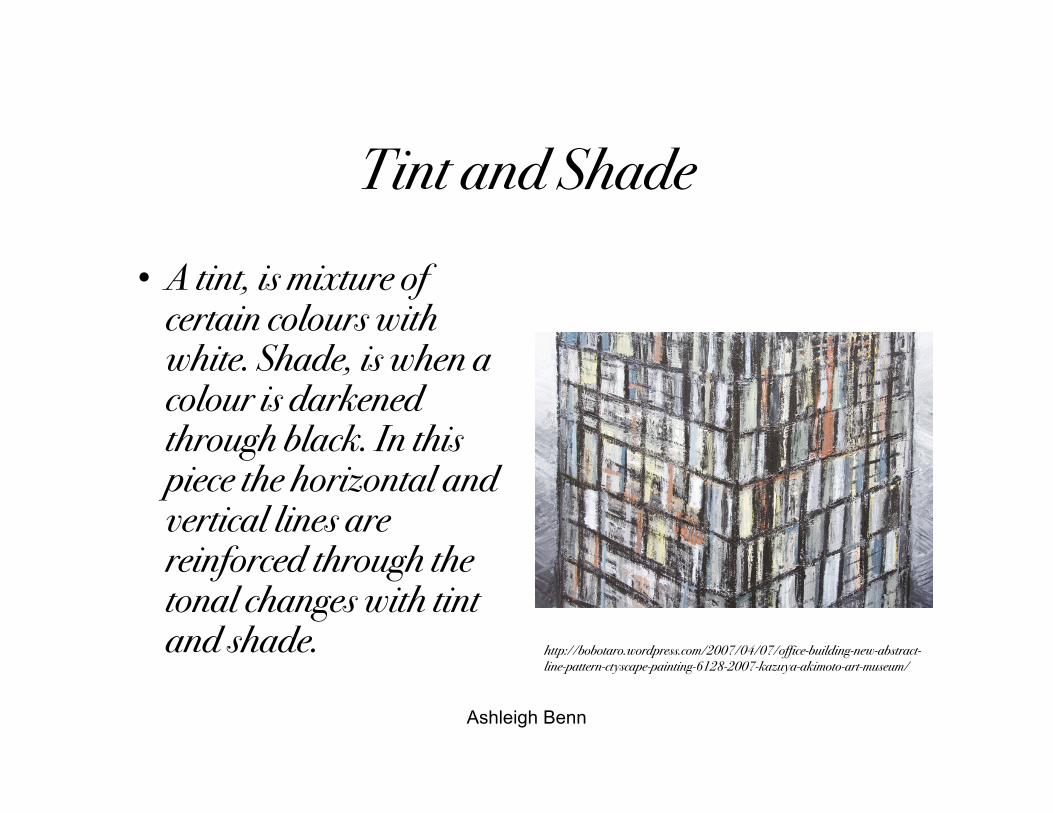
Tint and Shade• A tint, is mixture of
certain colours withwhite. Shade, is when acolour is darkenedthrough black. In thispiece the horizontal andvertical lines arereinforced through thetonal changes with tintand shade. http://bobotaro.wordpress.com/2007/04/07/office-building-new-abstract-
line-pattern-ctyscape-painting-6128-2007-kazuya-akimoto-art-museum/
Ashleigh Benn
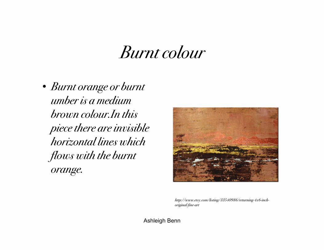
Burnt colour
• Burnt orange or burntumber is a mediumbrown colour.In thispiece there are invisiblehorizontal lines whichflows with the burntorange.
http://www.etsy.com/listing/33540986/returning-4x6-inch-original-fine-art
Ashleigh Benn
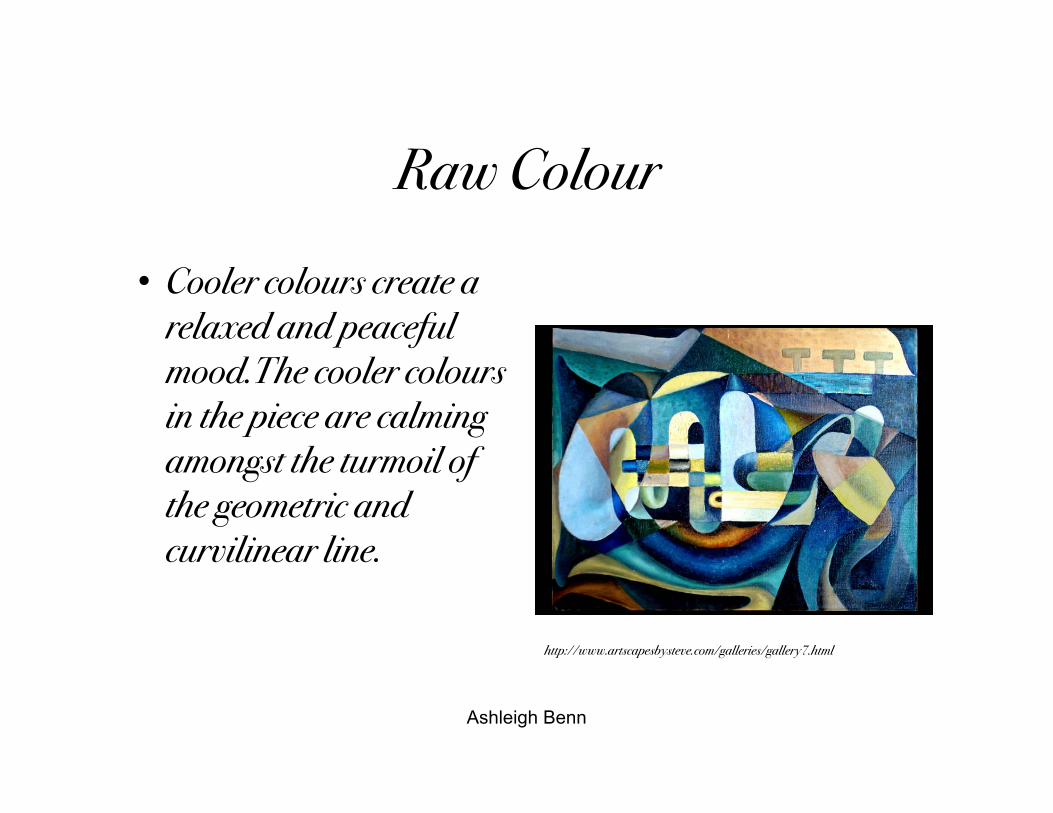
Raw Colour
• Cooler colours create arelaxed and peacefulmood.The cooler coloursin the piece are calmingamongst the turmoil ofthe geometric andcurvilinear line.
http://www.artscapesbysteve.com/galleries/gallery7.html
Ashleigh Benn
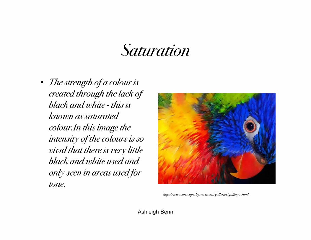
Saturation• The strength of a colour is
created through the lack ofblack and white - this isknown as saturatedcolour.In this image theintensity of the colours is sovivid that there is very littleblack and white used andonly seen in areas used fortone.
http://www.artscapesbysteve.com/galleries/gallery7.html
Ashleigh Benn
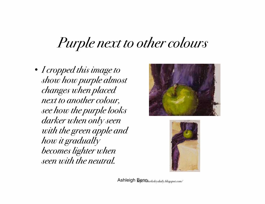
Purple next to other colours• I cropped this image to
show how purple almostchanges when placednext to another colour,see how the purple looksdarker when only seenwith the green apple andhow it graduallybecomes lighter whenseen with the neutral.
http://aberkeleydaily.blogspot.com/
Ashleigh Benn
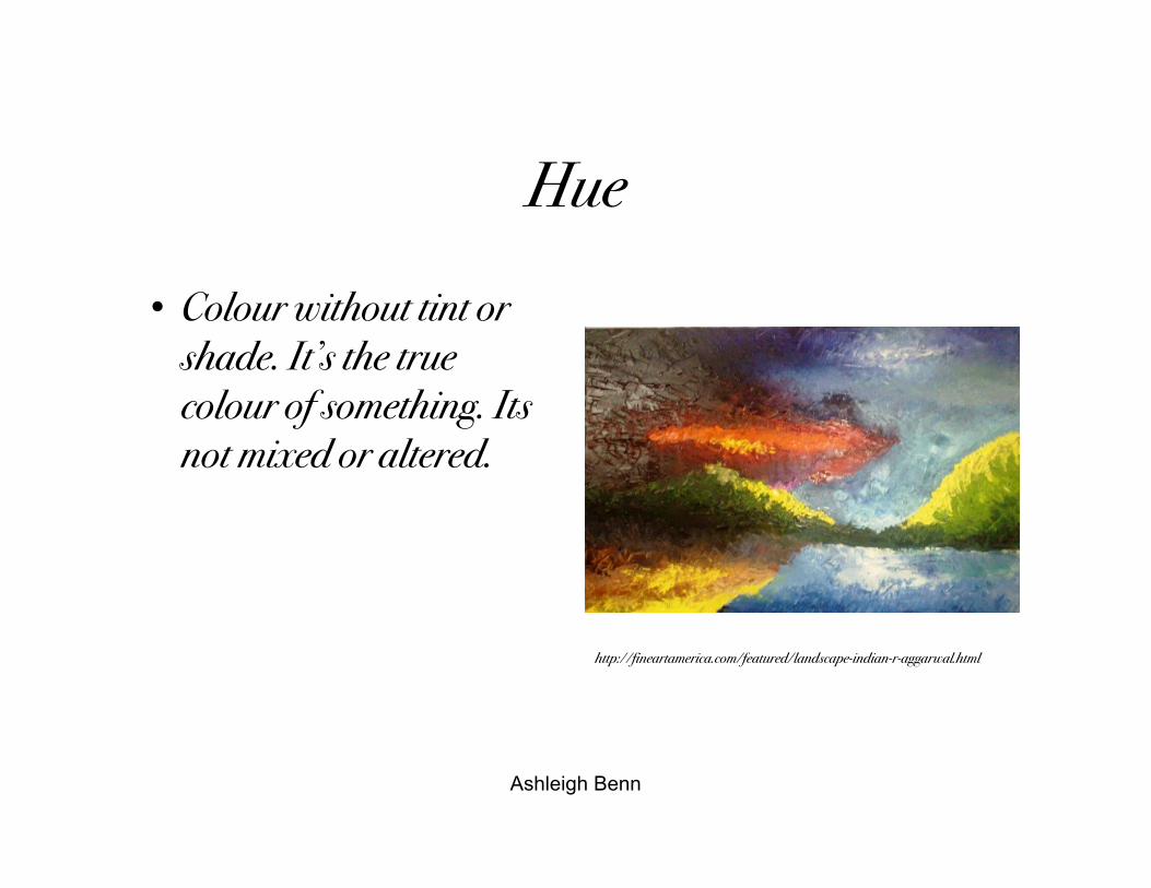
Hue
• Colour without tint orshade. It’s the truecolour of something. Itsnot mixed or altered.
http://fineartamerica.com/featured/landscape-indian-r-aggarwal.html
Ashleigh Benn
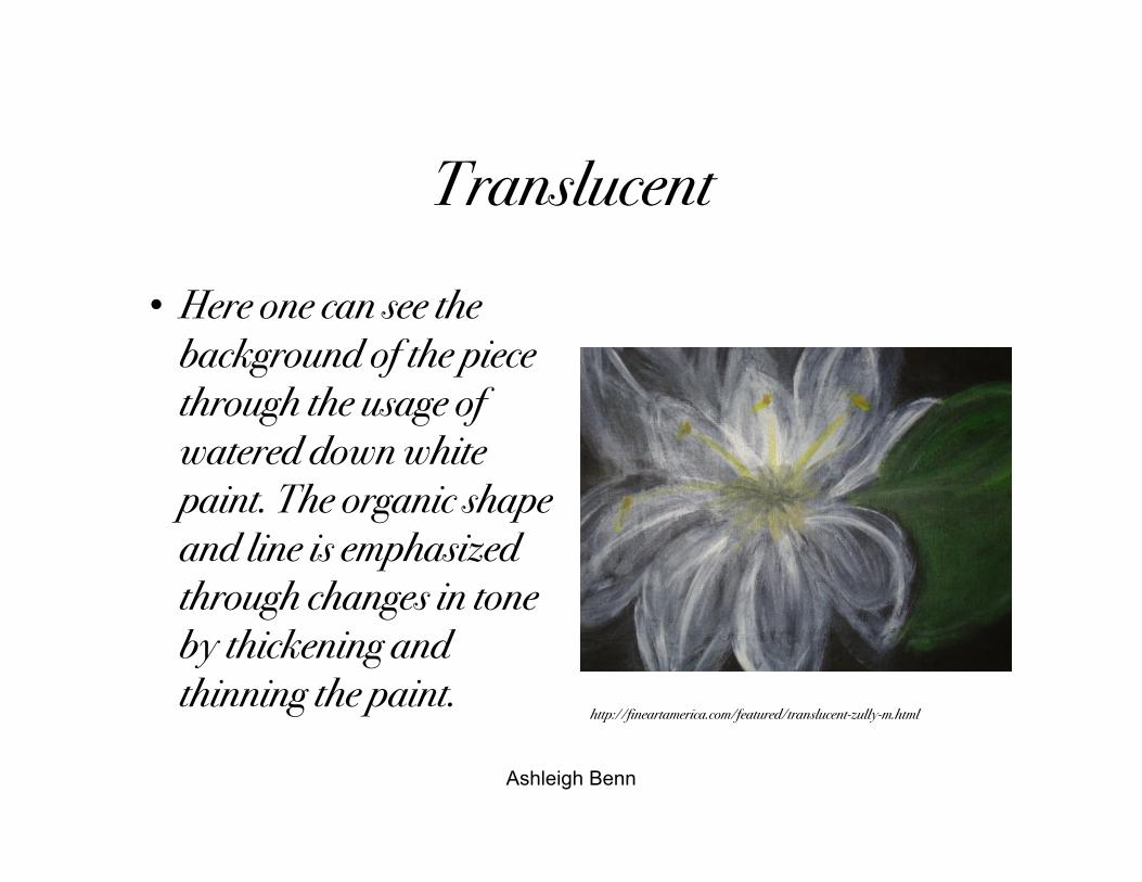
Translucent
• Here one can see thebackground of the piecethrough the usage ofwatered down whitepaint. The organic shapeand line is emphasizedthrough changes in toneby thickening andthinning the paint.
http://fineartamerica.com/featured/translucent-zully-m.html
Ashleigh Benn
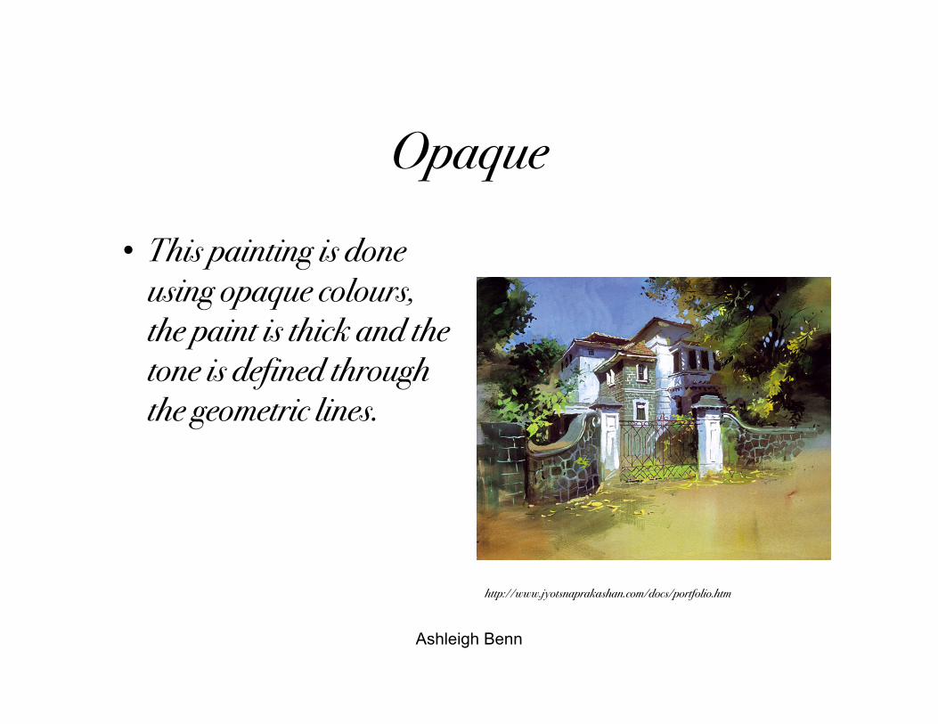
Opaque
• This painting is doneusing opaque colours,the paint is thick and thetone is defined throughthe geometric lines.
http://www.jyotsnaprakashan.com/docs/portfolio.htm
Ashleigh Benn
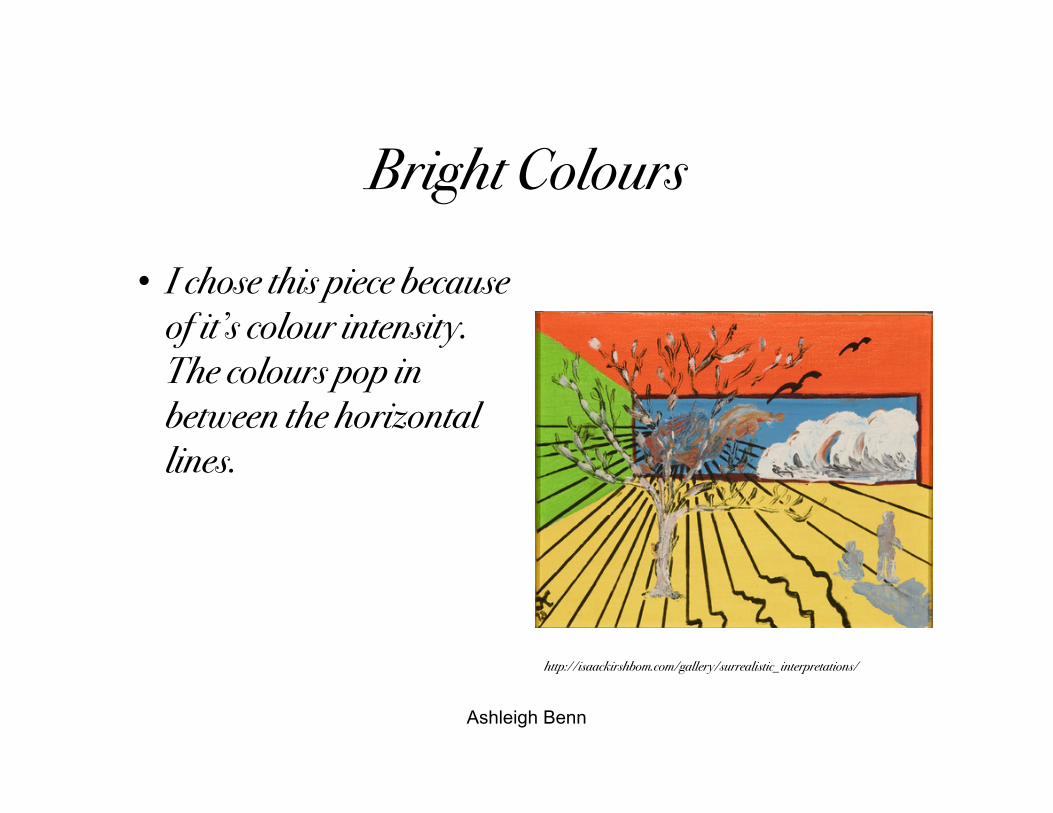
Bright Colours
• I chose this piece becauseof it’s colour intensity.The colours pop inbetween the horizontallines.
http://isaackirshbom.com/gallery/surrealistic_interpretations/
Ashleigh Benn
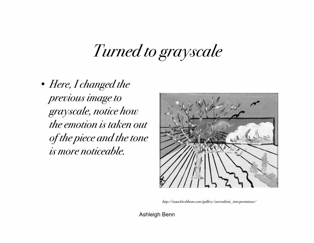
Turned to grayscale
• Here, I changed theprevious image tograyscale, notice howthe emotion is taken outof the piece and the toneis more noticeable.
http://isaackirshbom.com/gallery/surrealistic_interpretations/
Ashleigh Benn
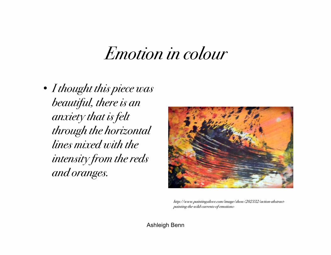
Emotion in colour
• I thought this piece wasbeautiful, there is ananxiety that is feltthrough the horizontallines mixed with theintensity from the redsand oranges.
http://www.paintingsilove.com/image/show/202332/action-abstract-painting-the-wild-currents-of-emotions-
Ashleigh Benn
Thank you