Embed Size (px)
Citation preview
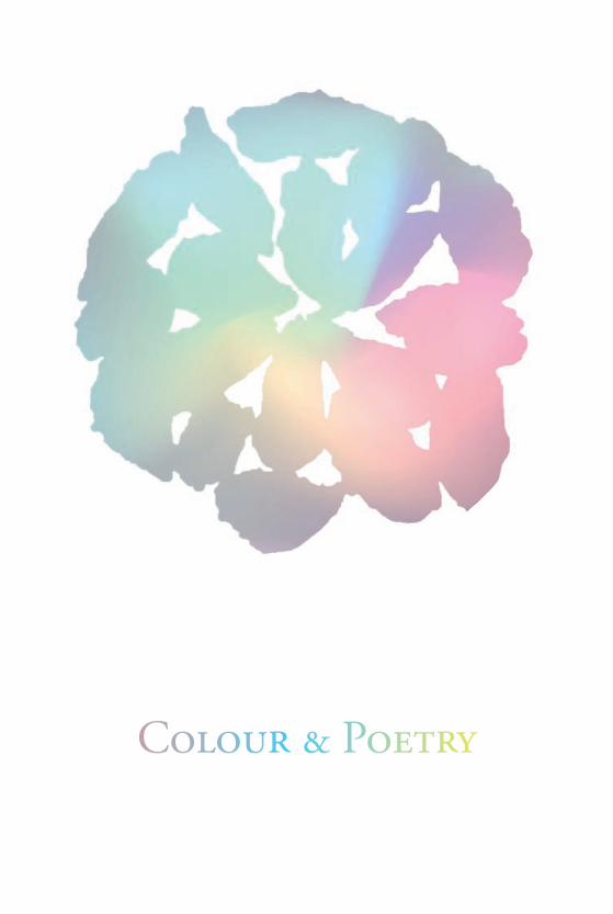
Colour & Poetry
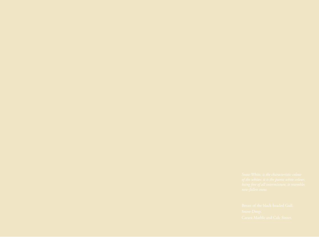
Snow White, is the characteristic colour of the whites; it is the purest white colour; being free of all intermixture, it resembles new-fallen snow.
Breast of the black-headed Gull.Snow-Drop.Carara Marble and Calc Sinter.
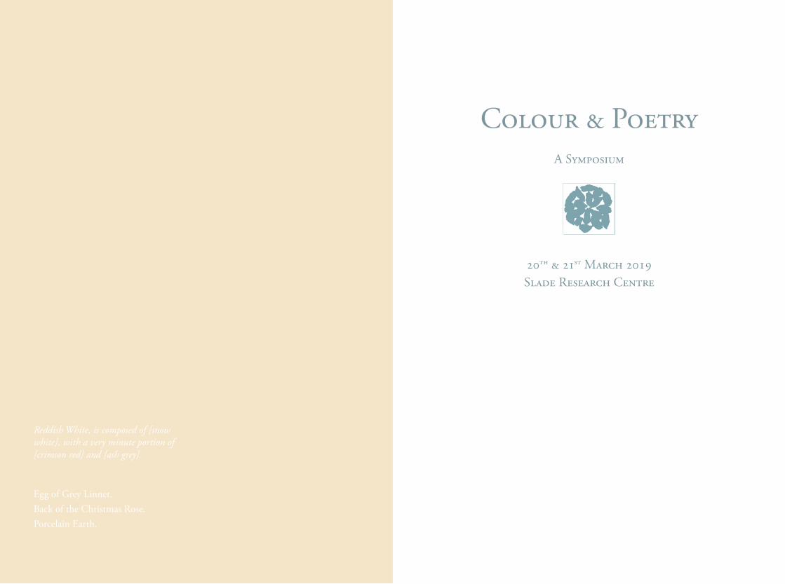
Colour & PoetryA Symposium
20th & 21st March 2019 Slade Research Centre
Reddish White, is composed of [snow white], with a very minute portion of [crimson red] and [ash grey].
Egg of Grey Linnet.Back of the Christmas Rose.Porcelain Earth.
IntroductIon
‘Then the man in the blue suit reaches into his pocket and takes out a large sheet of paper, which he carefully unfolds and hands to me. It is covered with Picasso’s handwriting – less spasmodic, more studied than usual. At first sight, it resembles a poem. Twenty or so verses are assembled in a column, surrounded by broad white margins. Each verse is prolonged with a dash, occasionally a very long one. But it is not a poem; it is Picasso’s most recent order for colours…For once, all the anonymous heroes of Picasso’s palette trooped forth from the shadows, with Permanent White at their head. Each had distinguished himself in some great battle – the Blue Period, the Rose Period, Cubism, Guernica… each could say: ‘I too, I was there…’ And Picasso, reviewing his old comrades-in-arms, gives to each of them a sweep of his pen, a long dash that seems a fraternal salute: ‘Welcome Persian Red! Welcome Emerald Green! Cerulean Blue, Ivory Black, Cobalt Violet, clear and deep, welcome! Welcome!
Brassai, Conversation avec Picasso (1964)
This publication documents and celebrates Colour & Poetry: A Symposium, a cross and interdisciplinary two-day event held at Slade Research Centre to celebrate both International Colour Day and World Poetry Day. The symposium brought together a range of people representing the arts and humanities, science and industry, from within and outside UCL, who spoke on colour and its surrounding research interspersed with poetry readings, material demonstrations and performances.
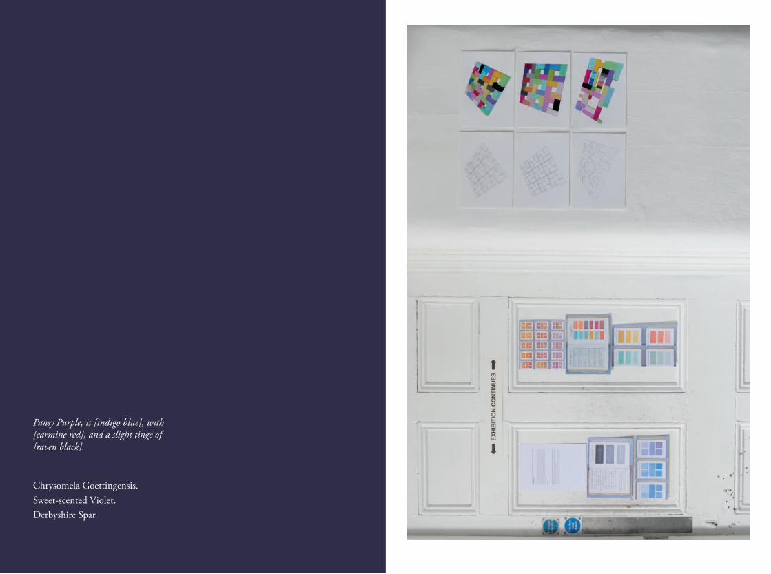
At the heart of the symposium was the exhibition The Nomenclature of Colours named after and inspired by Werner’s 1814 Nomenclature of Colour, a taxonomic guide to the colours of the natural world. Slade staff, students, alumni and guests were invited to produce a single piece with the title of the show being the theme for the work. Stephanie Nebbia, artist and Global TFAC Manager for ColArt, took on the complex role of curating the show with imagination and finesse.
The exhibition included a range of materials related to image and text, poetry publications, colour charts and timelines with a display of rare pigments in the Material Museum. The symposium was a timely opportunity to showcase 10 years of the Material Research Project and its established collaborations, the Discourse Project, Small Press Project and Slade Poetry Reading Group.
The symposium offered the opportunity to view a selection of rare prints from Josef Alber’s first limited edition of Interaction of Color, Jean Spencer’s Colour Archive and a display of early manuscripts from Rare Books, UCL Special Collections. It also hosted the launch of the UCL Materials Innovation Network, introduced by Jo Townshend, with a panel discussion to examine ways in which to develop academic vision between the arts, sciences and industry.
Finally, I would like to take this opportunity to thank all of the artists who took part in the exhibition, symposium speakers and panellists, The Fine Art Collective, ColArt and my colleagues at the Slade School of Fine Art, whose generosity and support have enriched the culture of the school by making the event and this publication possible. Also UCL EPSRC Impact Acceleration Account for supporting its production.
Jo Volley
This publication is dedicated to the memory of
Klaas Hoek, artist, educator and friend.
the colour of Books
Lesley Sharpe
The most beautiful and perfect book in the world is a book with only blank pages, in the same way that the most complete language is that which lies beyond all that the words of a man can say.
Ulises Carrion, 1975
When we make a book, the choices available to us are endless. Is the paper white, off white, cream, coloured, smooth, rough, textured, thin, thick, opaque, transparent? Do all the pages use the same paper stock? Are they all the same size? Are they perfect bound or sewn? What colour of thread is used? Is the spine exposed or concealed by a cover? Is the cover soft, hard or no cover at all? How is it printed? How many are printed? Is the run limited or open? These are just the questions asked when deciding its form.
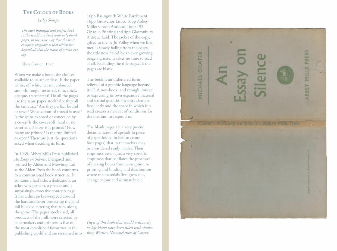
In 1969, Abbey Mills Press published An Essay on Silence. Designed and printed by Alden and Mowbray Ltd at the Alden Press the book conforms to a conventional book structure. It contains a half title, a dedication, an acknowledgement, a preface and a surprisingly evocative contents page. It has a dust jacket wrapped around the hardcase cover protecting the gold foil blocked lettering that runs along the spine. The paper stock used, all products of the mill, were selected by papermakers and printers as five of the most established favourites in the publishing world and are sectioned into
16pp Basingwerk White Parchment, 16pp Grosvenor Litho, 16pp Abbey Miller Cream Antique, 16pp 193 Opaque Printing and 4pp Glastonbury Antique Laid. The jacket of the copy, gifted to me by Jo Volley when we first met, is slowly fading from the edges, the title now halo’d by an ever growing beige vignette. It takes no time to read at all. Excluding the title pages all the pages are blank.
The book is an unfettered form relieved of a graphic language beyond itself. A non-book, and though limited to expressing its own expansive material and spatial qualities it’s story changes frequently and the space in which it is read creates a new set of conditions for the medium to respond to.
The blank pages are a very precise documentation of spreads (a piece of paper folded in half to create four pages) that in themselves may be considered ready mades. Their emptiness catalogues a very specific emptiness that conflates the processes of making books from conception to printing and binding and distribution where the materials live, grow old, change colour and ultimately die.
Pages of this book that would ordinarily be left blank have been filled with shades from Werners Nomenclature of Colour.
experIencIng colour wIth Josef AlBers
Malina Busch
Josef Albers often said “colour is magic” and as an artist this perfectly describes why I love colour. This lecture reflected on how Albers first encountered colour, transformed his ideas into colour performances for students, and my own experiences with Albers as an artist.
When Albers joined the Bauhaus as a student in 1920, Johannes Itten, Paul Klee, and Wassily Kandinsky were all teaching colour. Enrolling on Itten’s Preliminary Course, Albers was introduced to writings by Goethe and Chevreul. Goethe’s Study of Colour was widely read at the Bauhaus and highlighted the importance of empirical rather than theoretical studies. This idea resonated with the Bauhaus’ hand’s-on approach, specifically, Goethe’s insistence that the eye was the final and best judge of colour, and his distinction between how colour appears on objects versus colour that exists only in the eye or mind.
Itten also introduced Chevreul, whose work with simultaneous contrast demonstrated that colour is inherently unstable, and can change appearance in relation to neighbouring colours. This idea profoundly impacted Albers, re-emphasising Goethe’s empirical approach and eventually becoming the foundation for his colour courses. While Albers rejected many theories from Itten’s course, he held onto ideas
about colour relativity. These studies combined with work by German Gestaltists, and artist-led experiments at the Bauhaus began to provide Albers with alternative models for thinking about colour.
In 1933, Albers established a new art programme at Black Mountain College and began developing his colour course. There, he encouraged playful experimentation and learning based on doing. The exercises Albers set were intended to sharpen students’ eyes, provide an understanding of colour behaviour, and develop a heightened sensitivity to colour through experience.
Albers called colour “the most relative medium in art,” and encouraged students to manipulate colour in ways that would surprise. He did this by helping students see colour in action, and get a feel for how it relates to things around it. When perceiving colour, the important question became not “What is the colour?” but how does a colour relate to its surroundings. During the lecture this was illustrated using examples from Albers’ Interaction of Color, alongside prints from the Slade Archive. Specifically, the lecture highlighted Albers’ work with visual memory, colour relativity, reversed grounds, subtraction of colour, transparency with spatial illusion, middle mixtures, colour intervals and transformation, and colour juxtaposition. For Albers the goal of each exercise was the journey students took while solving a problem and how
they arrived at a solution, rather than the solution itself.
The lecture also reflected on the idiosyncratic language Albers used to bring colour to life; with examples of the down-to-earth vocabulary, analogies and storytelling he used to help students see a colour performance. Albers’ language may have grown out of Goethe, who gave different characteristics to colours, or from Kandinsky, who used synaesthesia to relate colour to other senses. However as seen in his exercises, for Albers a colour could take on a variety of characteristics and behave in unanticipated ways. Throughout his career, Albers travelled and lectured widely and continues to have a lasting impact on American art education. His strength is that he never imposed a particular personal style, with many former students carrying his ideas forward into fine art, architecture and design. At university and as an artist, I have continually re-encountered Albers’ ideas. As I make work, what resonates with me is how Albers embraced the visual possibilities of all colours without any pre-conceived ideas, the value placed on playful experimentation and an empirical approach, and a striving to distil complex ideas into a form that has the ability to communicate simply and directly with viewers.
When Albers published The Interaction of Color in 1963, the book was created as a guide for teachers—not students. Although Albers took great care with
his book, it is important to note that he regularly improvised during his teaching and his exercises are intended as a starting point for teachers to adapt and use for spontaneous discoveries. For artists and teachers today, the challenge is to build upon and adapt this starting point so that Albers’ assertion that “colour is magic” can be brought to life.
on trAnslAtIng rImBAud
Andy Leak
Arthur Rimbaud’s sonnet ‘Voyelles’ (Vowels) provoked controversy from the moment of its publication in 1883; the most common epithet employed to describe it was ‘fameux’, meaning ‘much talked about’, but not necessarily admired. The ‘meaning’ of the poem remains contentious to this day.
Yet, its theme is introduced with exemplary clarity in the first line:
A noir, E blanc, I rouge, U vert, O bleu: voyelles
(A black, E white, I red, U green, O blue: vowels)
Critics have maintained that the sonnet represents the high point of the nineteenth century’s fascination with the phenomenon of synaesthesia. Could it have been that Rimbaud ‘suffered’ from grapheme-colour synaesthesia? That is, that he perceived letters as being inherently coloured. The poem doubtless privileges the graphic image by capitalising the letters A,E,I,O,U throughout. But are we to believe that the poet’s synaesthetic experience was only triggered by uppercase images and that a, e, i, o and u remained colourless? Rimbaud wrote ‘Voyelles’ nearly thirty years before Mallarmé sent his word-dice rolling across the page, and fifty years before Apollinaire’s Calligrammes, meaning that he was likely still more interested in the sounds of words
than their appearance on the page. But it is difficult to maintain that the synaesthesia of the poem operates between sounds and colours. The problem would be: which sounds? The sound of the letter E (i.e. when pronounced as a letter of the alphabet: [ø]) is relatively rare in French compared to its five other sonic realisations – in ‘de’, ‘dé’, ‘dès’, ‘dense’, ‘Benjamin’ . Put briefly, the problem is that French does not have five vowel sounds, it has approximately seventeen.
There is perhaps a more interesting question than ‘what does the poem mean?’ and that is ‘what can we do with it?’ No sooner had ‘Voyelles’ been published than people started to write their own ‘translations’ of it, by no means only in French. Given that the poem already presents itself as a translation of sorts (from graphic form into colour) it is fitting that it should itself have been so translated down the years. Early translations were banal and intralingual (e.g. into English or into German), and it is true that the in the vast majority of acts of translation the source language (SL) and the target language (TL) are natural languages. But this need not be the case. Why not use as the TL a version of French that is incomplete – lacking, for example, one of the vowels... That feat was performed by French writer Georges Perec in his 1969 novel La Disparition (translated by Gilbert Adair as A Void) in which he renders ‘Voyelles’ as a lipogram – in this instance, without the letter E.
The first line gives some idea of the procedure:
A noir (un blanc), I roux, U safran, O azur
Nous saurons au jour dit ta vocalisation.
(It will be noted that U has here become (saffron) yellow due to the lack of words for ‘green’ in French that do not contain the letter E!)
The Canadian poet Christian Bök, himself inspired by Perec and the latter’s fellow experimentalists in the OuLiPo, produced ‘Five translations of Arthur Rimbaud’s “Voyelles”’. One of these is a homophonic translation of ‘Voyelles’ – reproducing the source text’s sequence of sounds but ignoring the semantic content. So, ‘A noir, E blanc, I rouge’ becomes ‘Anywhere near blank rage’. Another is a homovocalic translation which preserves the sequence of the vowels in the source text but replaces the consonants around them. Rimbaud’s first line becomes:
‘Phantom’s infernal,
without refuge or return – phonemes’
Bök’s treatment of Rimbaud is the very opposite of sacrilegious: what more appropriate homage could there be to the author of ‘L’Alchimie du Verbe’ (the Alchemy of the Word) than this virtuosic poetic transubstantiation? The crowning glory of Bök’s homage is the poem ‘Vocables’ which is a perfect
anagram of ‘Voyelles’ (that is, it uses a lexicon derived from ‘Voyelles’: 34 As, 29 Ns etc.) and which even manages to respect the rhyme scheme and the alexandrine lines of the original.
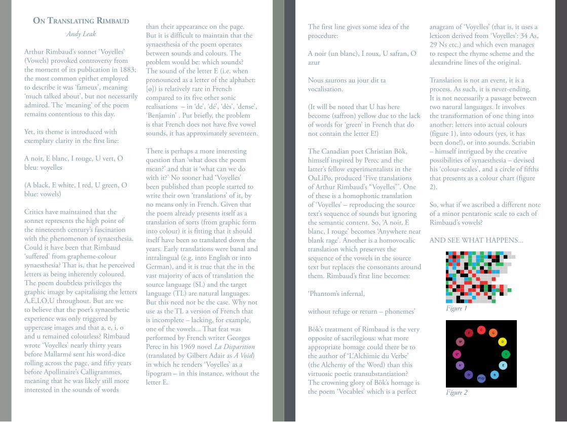
Translation is not an event, it is a process. As such, it is never-ending. It is not necessarily a passage between two natural languages. It involves the transformation of one thing into another: letters into actual colours (figure 1), into odours (yes, it has been done!), or into sounds. Scriabin – himself intrigued by the creative possibilities of synaesthesia – devised his ‘colour-scales’, and a circle of fifths that presents as a colour chart (figure 2).
So, what if we ascribed a different note of a minor pentatonic scale to each of Rimbaud’s vowels?
AND SEE WHAT HAPPENS...
Figure 1
Figure 2
on trAnslAtIng polychromAtIc poetry
wIthout the use of words
Roland-François Lack
My proposal here comes from considering the difficulties faced by translators of the poems in Théophile Gautier’s 1852 collection Emaux et Camées, ‘Enamels and Cameos’. Transpositions into English of these delicately shaped miniatures inevitably fail to reproduce effectively a number of central features of these poems, mostly but not solely prosodic. I am proposing here a partial answer to the translator’s difficulties, regarding one particular semantic aspect of these poems, their colour schemes.
Forty-six of the fifty-three poems in the 1895 definitive edition of Emaux et Camées mention colours. The most frequent is white, followed by blue, red, black, pink, gold, silver, green, yellow, brown, violet, orange and grey. Among the poems mentioning colours are several that are composed according to a patterned arrangement of these mentions, and of those several signal this compositional premise in the title. The most famous of these are ‘Symphonie en blanc majeur’ and ‘A une robe rose’. My calling Gautier’s poetry in Emaux et Camées polychromatic is sanctioned by the name of the series in which that definitive edition from 1895 appeared, the ‘Collection Polychrôme’ published by Charpentier and Fasquelle, with colour illustrations by Henri Caruchet.
Caruchet’s illustrations are visualisations of the poems, i.e. translations, though they do not systematically translate the colours mentioned in the poems. A striking example is the poem called ‘La Rose-thé’, ‘The Tea-Rose’, which describes a rose that is almost imperceptibly pink, but is illustrated by Caruchet with a rose that is distinctly yellow. ‘Jaune’, ‘yellow’, is not one of the eight colour-words in that poem’s scheme: ‘carmin - blanche – rougir – rose – incarnat – noircit – bruns – vermeil’ (‘carmine – white – red – pink – incarnadine – black – brown -vermilion’). Curiously, and inexplicably, when the artist Wighead illustrated this poem for a later edition of Gautier’s book, he too depicted a yellow rose, ignoring the palette proposed by the poem.
Variegated schemes are common in Emaux et Camées, and for some poems, I would argue, they are the matrix of sense. My proposition here is that translators of polychromatic poetry such as this should deploy a technique that would render exactly this essential sense of the poems. Rather than substituting words for colours in the source language with equivalent words for those colours in the target language, the translator simply places a patch of the colour in question where the word should be.
The results so far have been illuminating. The poem ‘Symphonie en blanc majeur’, as the name suggests, is dominated by the idea of whiteness. Every one of its eighteen stanzas
mentions a word for white, with forty-seven instances in total. When for each of these words a patch of white is substituted the formal arrangement of whiteness in the poem is precisely illustrated, i.e. translated. Moreover, when the poem’s other colour-mentions are rendered in the same way - with a patch of yellow in the sixth stanza, of blue in the ninth, of black in the fifteenth and of pink in the eighteenth - we perceive directly and precisely the chromaticism of Gautier’s ‘symphony’.
It will no doubt be argued that something is lost when we translate only the colour-words of a poem, and translate them not with words but with patches of colour, but I would argue in reply that anyway something, indeed a great deal, is always lost when we translate only with words, and that for polychromatic poetry at least my colour-block method offers the reader a version of the poem that she can be confident has rendered exactly something essential to that poem.
I have been experimenting with the idea of substituing blocks of colour not just for the words that name those colours but also for the words that describe something understood to be of that colour. For the ‘Symphonie en blanc majeur’ this has produced a translation consisting almost entirely of large wordless blocks of white arranged in lines (with flashes of yellow, blue, black and pink), to the point that the poem is barely recognisable as a poem, resembling more Marcel Broodthaers’s 1969
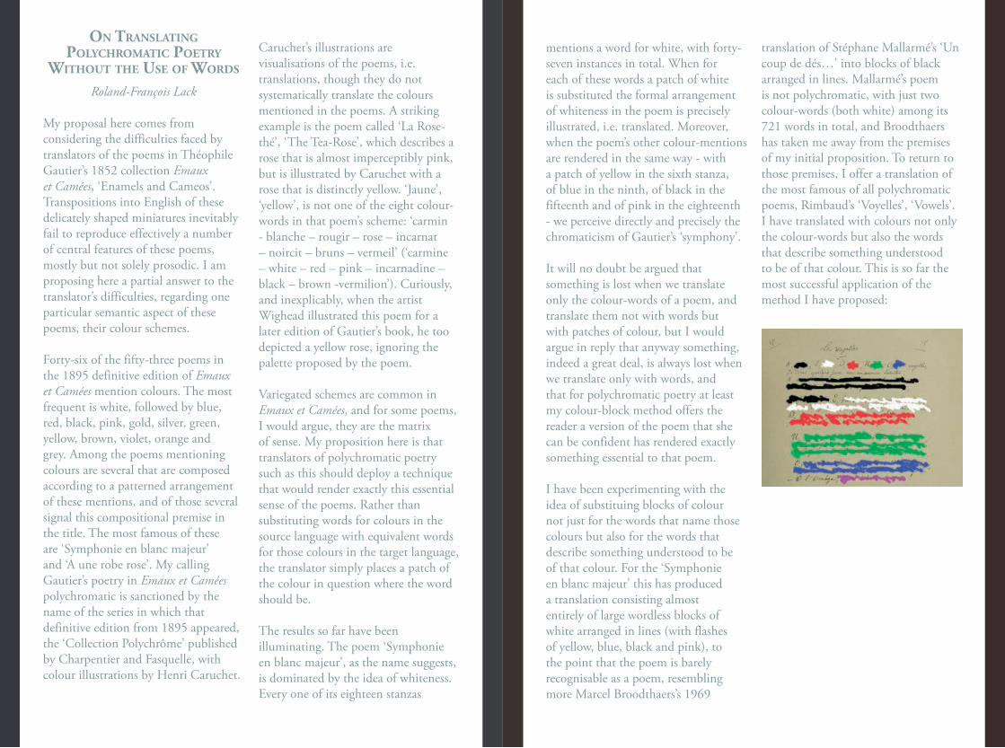
translation of Stéphane Mallarmé’s ‘Un coup de dés…’ into blocks of black arranged in lines. Mallarmé’s poem is not polychromatic, with just two colour-words (both white) among its 721 words in total, and Broodthaers has taken me away from the premises of my initial proposition. To return to those premises, I offer a translation of the most famous of all polychromatic poems, Rimbaud’s ‘Voyelles’, ‘Vowels’. I have translated with colours not only the colour-words but also the words that describe something understood to be of that colour. This is so far the most successful application of the method I have proposed:
lAndscApe’s AccIdentAl colour
(from coAl mIne wAste to lAndscApe pAIntIng)
Onya McCausland
My primary interest has never been for colour but the materiality of paint and its physical presence on a surface marked with a brush. Colour created a problem for me by drawing in unwieldy associations outside the physical and temporal presence of the painting - de-materialising.
I attempted to locate or pin down colour in the painting by draining out all of its external associative referents: its colourfullness. I did this by mixing complimentary colours: orange and blue - to make different greys or working with very diluted paint. This seemed to be a way to deal with paint as physical substance rather than as colour. This had the unexpected effect of exposing the structure of different coloured pigments - as they became more dilute their particulate form suspended in medium became more visible. The differences between lamp black and mars black when they are very diluted becomes more noticeable. One reveals a faint pinkish tone (mars) the other blue (lamp). These differences provoked questions about the material make up of colour. What is it made of and where does it come from?
Shortly after this - while on a residency at Gloucester Cathedral - I noticed traces of a red coloured pigment embedded into the creases of the old
limestone walls. This appeared to be the residue of painted images that had been erased, the colour alone indicated of the presence of something beyond the stripped bare walls.
What struck me was the force these specks of colour had - linking across time to a particular historical event - a trace of the reformation. A colour’s residual presence suddenly contained an agency I had never experienced or noticed before.
I began to search for sources of colour in the earth - I found salt green, vivianite, black chalk as well as various different ochres, to make paintings and understand their art historical and geological relevance. But these colours - including the famous ones named by their place of origin in the landscape siena, umber, verona green, are not so easily found any more. They are mostly mined out, exist in tiny quantities or can be bought only as synthesised versions.
CUTHILL
As I travelled I found another kind of earth colour - not famous or named, but forming in very large quantities all over the country. These are ochre colours that are an accidental residue of the mining industry.
Iron oxide minerals are carried in flood water, leaching out into rivers and polluting ground water supplies. Ochre sludge forms as a by-product of the process of treating this mine
water pollution. This is an industrial by-process of the end of mining and is occurring in ex-mining regions across the country.
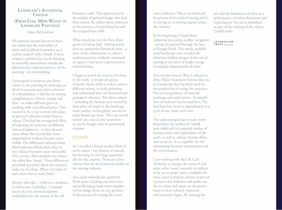
In the beginning I found these industrial sites using satellite navigation - seeing the ground through the lens of Google Earth. This newly available aerial landscape view revealed the otherwise hidden images of the end of mining in the form of bright orange rectangular shaped pools of ochre.
One of these sites in West Lothian is a Mine Water Treatment Scheme that sits in a landscape that has been used for the production of energy for centuries. Part of a long history of material exchange and exploitation - Scotland’s first oil industry was located here. The land has since been re-appropriated in a cycle of use, waste and reuse.
The ochre pumped up in water from deep below the surface at Cuthill near Addiewell is a material residue of human action and exploitation of the earth, as well as culture, human effort and creativity. It is a signifier for the relationship between communities and the environment.
I am working with the UK Coal Authority to change the status of coal mine ochre ‘waste’ material, to redirect it for use as paint, and to establish the mine water treatment scheme as part of a process that indicates and marks out the ex-mines and opens an alternative route to their cultural, industrial and economic legacy. By naming the
site and the formation of ochre as a performance of colour formation and ‘manufacture’ the site is identified as part of the making of the colour; Cuthill ochre.
Cut
hill
min
e wat
er tr
eatm
ent s
ite.
Sour
ce: G
oogl
e Ear
th; I
mag
e cap
ture
d Ju
ly 20
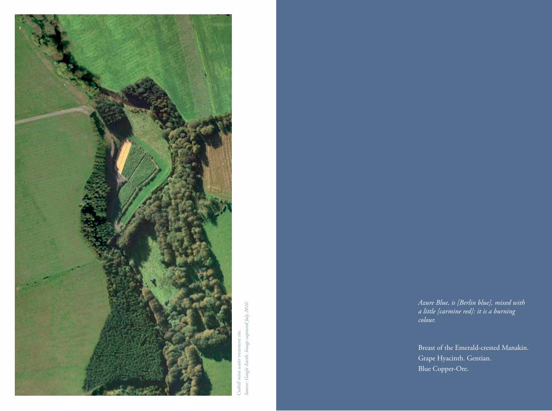
16 Azure Blue, is [Berlin blue], mixed with a little [carmine red]: it is a burning colour.
Breast of the Emerald-crested Manakin.Grape Hyacinth. Gentian.Blue Copper-Ore.
kodAchrome’s (rAther) JewIsh musIcAl hIstory
Michael Berkowitz
The history of the Kodachrome colour film process is, well, bizarre. Although it was perfected and later mass-produced from the late 1920s to early 1930s at the Eastman Kodak Company in Rochester, New York, its origins reside well outside the realm of normative industrial research. It was created by a couple of musicians. There would have been no Kodachrome if not for the confluence of classical and jazz music in the mid-1920s, and likewise, Kodachrome would have been unimaginable outside the intersection of Jewish migration and occupational patterns, the development of corporate finance (particularly with regard to risk), Hollywood, liberal arts education in the United States, the patent system, and the evolving character of science and secular culture that increasingly allowed for the inclusion of Jews and others regarded as outsiders. Poetry, along with music, is intricately interwoven in Kodachrome’s history.
Kodachrome was itself poetic. It emerged from the articulation and synthesis of dreams, ideas, concepts, scientific principles, chemicals, and raw materials that were simultaneously harmonious and discordant, resulting in a revolutionary leap in creativity and the possibilities of imagining, preserving, and sharing culture and memory. The chief inspiration for Leopold Mannes and Leopold
Godowsky, Jr. to devise Kodachrome was their desire to endow the movies with clear and realistic sound as well as colour. As teenagers (after the end of ‘the war to end all wars’) they found it deplorable, and frankly, unacceptable, that it was possible reproduce, more-or-less, a full range of sound for mass audiences through amplification, records, and radio—but that the capture and transmission of sight was restricted to a fraction of the color spectrum. The colour processes that did exist—such as autochrome--were inconsistent and inaccessible to the broad public.
Mannes and Godowsky were spectacularly successful. Man & God, as they were known as Kodak, spurred for the creation (or more precisely, the re-invention) of Kodachrome and a number of advances in colour photography that were applied to motion pictures, slides, and prints. They largely owed their unconventional embrace of complexity to Leopold Godowsky, Sr, with regard to his wildly expansive, fiery interpretation of scores by Chopin, Liszt, and Schubert. His son, Leo, Jr., and his friend and scientific/business partner, Leopold Mannes—with their own inadvertent allowance for complexity--figured out a way to mass-manufacture a film with multiple layers that was nevertheless thin and light, easy to insert in a camera, safe for anyone handling it, and relatively free of the of the danger of spoilage. Their efforts were encouraged and assisted by Frankie Gershwin Godowsky, a
brilliant and multi-talented woman who was the sister of their dear friends George and Ira Gershwin.
At the heart of the Kodachrome process is the phenomenal range of colour released in the development process. (That’s why the film itself was so inexpensive.) With the exception of ‘instant’ and later, digital photography that totally bypasses film, the family of films later used were (and are) the progeny, to varying degrees, of Kodachrome—including the highly-mythologized Technicolor process. Kodachrome became synonymous with a trustworthy bond between lived experience and memory, especially by virtue of its vivid, realistic reproduction of colour. Kodachrome was cheap, ubiquitous, endlessly reproducible, and simple to use. It remained the film of choice of not only amateurs, but thousands of professional photographers even after its discontinuation by Eastman Kodak in June, 2009.
In the words of Paul Simon,
Kodachrome You give us those nice bright colors You give us the greens of summers Makes you think all the world’s a sunny day, oh yeah! I got a Nikon camera I love to take a photograph So Mama, don’t take my Kodachrome away
It would be interesting to know if Paul Simon has any appreciation for the
fact that the creators of his beloved Kodachrome were fellow musicians—even, like him, the sons of musicians. The reference to this clever and intelligent song is not happenstance, or coincidental kitsch--but underscores the connections between photography, music, the means of conceiving and conveying sound and images, mass-appeal entertainment, commercialism--and a lightly-worn Jewishness--that figure into Mannes and Godowsky’s pioneering work on Kodachrome. Perhaps it is appropriate that Kodachrome is most fondly and precisely recalled in popular culture through Paul Simon’s “Kodachrome” and Marc Raso’s 2018 film of the same name. But with the exception of Out of the Darkroom: A Short History of the Photofinishing Industry by Peter Rockwell and Peter Knaack (2006) and Jack Coote’s The Illustrated History of Colour Photography (1993), Kodachrome is given short-shrift in the vast sea of writing about colour in general, and colour photography in particular. Is there any greater poetic injustice that one of the greatest boons to creativity and memory, with its richly-textured, fascinating history, is ignored and nearly forgotten?
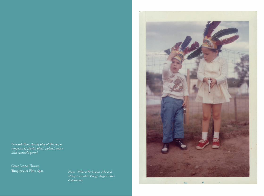
Photo: William Berkowitz, Edie and Mikey at Frontier Village, August 1962, Kodachrome.
Greenish Blue, the sky blue of Werner, is composed of [Berlin blue], [white], and a little [emerald green].
Great Fennel Flower.Turquoise or Flour Spar.
the pIgment tImelIne proJect
Ruth Siddall
For many years I have worked on the use of geological materials in cultural heritage, an interest very much sparked by my experience working in the Wiener Laboratory of the American School of Classical Studies at Athens and at their excavations at Ancient Corinth. My initial interest was working in construction materials and primarily lime mortars, but my interest began to drift from plastered walls to the paintings produced on these surfaces. Subsequent work on the characterisation of pigments led to the co-authoring of The Pigment Compendium and a lifelong interest in furthering understanding of materials used as artists’ pigments.
Working at the Slade School with Jo Volley, who has a profound interest in materiality within her practice has enabled a long-term collaboration between artist and scientist which has brought me to another level of knowledge, that of the craft of painting and an insight into the consistency and workability of paint. This has subsequently manifested itself in the ambitious Pigment Timeline Project, an award generously made by the UCL Centre of Humanities Interdisciplinary Research Projects panel to Jo, Gary Woodley, Malina Busch and myself. The aim is to discover and then represent how pigments are identified, understood and used by the UCL community. Initially, the project
involved a questionnaire distributed to all UCL staff, asking how pigments featured in their research, directly or indirectly. We received responses from 32 academic and administrative divisions throughout the institution, which enabled us to map departments, in terms of location and colour. Gary designed a representation of these parameters in real space which gradually evolved to produce colour blocks representing departments in an imagined space which could be virtually navigated.
My contribution to this project has been to write and to encourage writing about pigments. A diverse and fascinating scope of pigment knowledge has emerged. Contributions were received from researchers with widely ranging academic specialisms and the importance of pigments revealed tales from the traditional to the unexpected. Three of these pigment stories are summarised here.
Nicholas Grindle works in UCL’s Arena Centre for Research-Based Education. His background is in art history and he has worked on an English painter of landscapes, George Morland (1763-1804). No formal analyses of Morland’s palette have been made. G. Dawe eloquently put it in 1807 that ‘[Morland’s] principles were few and obvious, though for the most part … a portion of pure red should be introduced somewhere in a picture; accordingly we never see a landscape of his without a red cloak, coat, or cap; and this is uniformly accompanied by a blue jacket, or petticoat
… there should always be a touch of vermillion in the lips.’ Looking at his paintings, this use of colour is clearly a trope of Morland’s practice. We can assume the use of costly vermillion from Dawe’s writing, but perhaps adulterated with cheaper reds. We may speculate that the blues are perhaps Prussian Blue. Though prolific in talent, Morland squandered his income and died in penury. His lifestyle had been too lavish, perhaps he economised in his pigments? Scientific analyses of Morland’s palette is the only way to answer such questions.
Mark Carnall and Paolo Viscardi (formerly) of the UCL Grant Museum of Zoology nominated squid ink as their pigment, a complex organic compound, almost black in colour and dominated by melanin. The ink is produced as a defence mechanism by the coleoid cephalopods which include species of squid and cuttlefish. Within the body of the creature, the ink is stored in sacs. In the Grant Museum, this was clear on a microscope slide, containing a tiny embryo of a squid, only a few millimetres in length, already endowed with a perfect ink sac. The ink from ancient coleoids has fossilised and is preserved in the geological record and the Museum also holds specimens of 160 million-year-old cephalopods preserved with fossil ink sacs. In 1833, Elizabeth Philpott used paint made from Jurassic ink to illustrate fossils she found on the beach at Lyme Regis. This is a pigment I have used in my own practice, to print directly from crustaceans, using the
Japanese technique of gyotaku.
Finally, Lewis Griffin of UCL Computer Science has been collaborating in life-saving work that can alert new parents to digestive problems encountered in new born babies. The inability of some children to produce the required enzymes to digest milk can be directly observed in the colour of their faeces. This is in turn dictated by the presence or absence of pigments bilirubin, stercobilin and urobilin which can promote shades of yellow through brown. Without the presence of these compounds, baby’s faeces are putty-coloured. Simple colour charts have been devised which can rapidly alert parents and health practitioners to causes for concern by matching the colour of their child’s stools to recognised ‘healthy and ‘unhealthy’ stool colours.
The Pigment Timeline Project will continue to collect pigment stories about the UCL community’s interactions with colour, and these and more stories can be read on the Project blog and this collection will continue to grow (blogs.ucl.ac.uk/pigment-timeline).
Pansy Purple, is [indigo blue], with [carmine red], and a slight tinge of [raven black].
Chrysomela Goettingensis.Sweet-scented Violet.Derbyshire Spar.
An AnnotAted BIBlIogrAphy of rAre Books And mAnuscrIpts from ucl specIAl collectIons on colour And poetry,
exhIBIted mArch 2019Dr Tabitha Tuckett
Red pigment corroded to white leadMS FRAG/MUSIC/8Two parchment manuscript fragments from an antiphonal, probably early 11th
century from western Germany, later re-used for book binding. They include adiastematic Germanic neumes (the tick-like marks above the text): an early form of musical notation. Some rubricated (red) letters now appear white or silver after corrosion.
Green pigment corroding parchmentMS FRAG/LAT/68Two parchment folios from a 12th-century manuscript copy of St Gregory’s Commentary On Job. Green pigment used for a decorated initial ‘Q’ has, over time, almost destroyed the animal skin on which the letter was written.
Colour in a Hebrew religious manuscriptMS MOCATTA/1A parchment manuscript Haggadah (Jewish order of service for Passover) from the late 13th or early 14th century, possibly Castilian. The text is written and decorated in blue, red, silver and gold, with animals, geometric patterns and, in micrographic images formed of miniature writing, candelabras.
Colour in an illuminated Middle English poemMS FRAG/ANGL/1Gold, blue and red decorate and divide the text in these parchment leaves from an illuminated 15th-century manuscript copy of John Gower’s poem, Confessio Amantis.
19th-century understanding of Renaissance colourMS LAT/25An Italian manuscript book of hours, copied by a Venetian scribe on unusually fine parchment, c.1470-1480. It contains both 15th-century decorated initials, and full-page, brightly coloured illustrations and decorative borders added by Caleb W. Wing in the 19th century. Wing restored Mediaeval manuscripts for the London collector and dealer John Boykett Jarman that had been damaged by flood in 1846. Wing went on to produce many illustrations for insertion into early manuscripts. It is not known whether his work here was passed off as 15th-century, or presented as restoration or facsimile.
Lacquered bookbinding and illuminated Persian poetryMS PERS/1A highly illuminated manuscript copy from 1749, on paper, of the Masnavi-i Akbar Sultan (‘Romance of the Sultan Akbar’) by Persian poet Jalāl al-Dín Muhammad Rūmī, bound in lacquered boards decorated with flower patterns.
Claiming legitimacy for the throne of EnglandMS ANGL/3A late 15th-century parchment roll, containing a genealogical table of the Kings of England to Edward IV. It claims lineage from Adam and Eve, through Julius Caesar, Brutus, Arthur and others. Key figures are named in coloured roundels, topped by gold crowns for monarchs. Lines of descent are marked by red, blue and green lines throughout this 6-metre document.
Iron-gall ink corroding parchmentMS FRAG/LAT/6/1Parchment folio from a 14th-century manuscript of Justinian’s Codex. Red and blue divide the text and highlight passages. The iron-gall ink, now appearing black, has in some places eaten through the parchment.
Early printed rubric imitates manuscriptsINCUNABULA QUARTO 2mGratian, Decretum cum summario Joannis de Deo Hispani (Nuremberg, 1483). An incunable (printed in Europe before 1501) using red printed text to indicate the beginning of sections, in imitation of manuscript conventions.
Early printed colour in book illustrationSTRONG ROOM C 1530 G2Gersdorff, Feldtbuch der Wundartzney (Strassburg, 1530). This German surgery handbook for use in the battlefield contains some early colour printing for illustrations, as well as hand colouring.
Colour in 18th-century landscapesSTRONG ROOM JOHNSTON LAVIS LARGE FOLIO 1776 H1William Hamilton, Campi Phlegraei: observations on the volcanoes of the two Sicilies (Naples, 1776-9).Hamilton and the artist Fabris appear as red and blue figures in many of these landscapes.
Colour used to explain mathsEUCLID 1847 (3)Euclid, ed. Oliver Byrne, The first six books of the Elements of Euclid in which
coloured diagrams and symbols are used instead of letters for the greater ease of learners (London, 1847).
Trading dye ingredientsSTRONG ROOM E 481 S3John Holroyd, Earl of Sheffield, Observations on the commerce of the American states (London, 1783). Tables showing imports and exports of indigo and cochineal.
Colour and scienceSTRONG ROOM E 805 B6 (10)Robert Boyle, Experiments and considerations touching colours (London, 1670)
Early Modern treatise on paintingSTRONG ROOM OGDEN A 804 and GRAVES 18.i.24William Salmon, Polygraphice; or the art of drawing, engraving, etching, limning, painting, washing, varnishing, colouring, and dying (London, 1672) and (London, 1685)The later copy contains further illustrations.
Coleridge’s annotated KantSTRONG ROOM OGDEN A 385/1-3Kant, Imanuel Kant’s vermischte Schriften 3 vols. (Halle, 1799).
Pale Blackish Purple, is [lavender purple] mixed with a little [red] and [black].
Porcelain Jasper.
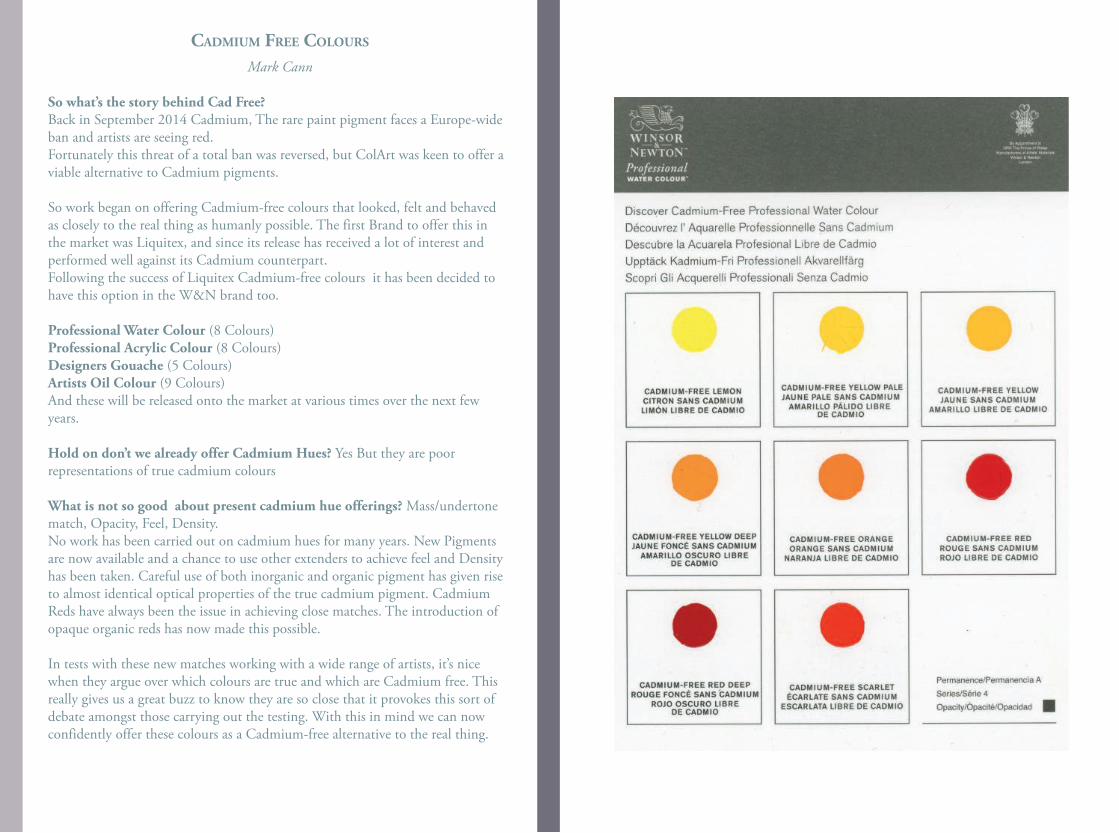
cAdmIum free colours
Mark Cann
So what’s the story behind Cad Free?Back in September 2014 Cadmium, The rare paint pigment faces a Europe-wide ban and artists are seeing red.Fortunately this threat of a total ban was reversed, but ColArt was keen to offer a viable alternative to Cadmium pigments.
So work began on offering Cadmium-free colours that looked, felt and behaved as closely to the real thing as humanly possible. The first Brand to offer this in the market was Liquitex, and since its release has received a lot of interest and performed well against its Cadmium counterpart.Following the success of Liquitex Cadmium-free colours it has been decided to have this option in the W&N brand too.
Professional Water Colour (8 Colours)Professional Acrylic Colour (8 Colours)Designers Gouache (5 Colours)Artists Oil Colour (9 Colours)And these will be released onto the market at various times over the next few years.
Hold on don’t we already offer Cadmium Hues? Yes But they are poor representations of true cadmium colours
What is not so good about present cadmium hue offerings? Mass/undertone match, Opacity, Feel, Density.No work has been carried out on cadmium hues for many years. New Pigments are now available and a chance to use other extenders to achieve feel and Density has been taken. Careful use of both inorganic and organic pigment has given rise to almost identical optical properties of the true cadmium pigment. Cadmium Reds have always been the issue in achieving close matches. The introduction of opaque organic reds has now made this possible.
In tests with these new matches working with a wide range of artists, it’s nice when they argue over which colours are true and which are Cadmium free. This really gives us a great buzz to know they are so close that it provokes this sort of debate amongst those carrying out the testing. With this in mind we can now confidently offer these colours as a Cadmium-free alternative to the real thing.
INSERT CADMIUM SCAN
HERE
George Szirtes, 2019
sAp green: old school
The copper dome of the old school had turned into the colour of soup they used to serve on certain Fridays. The dining-hall lights burned, low in the autumn gloom, You boys deserve
all you get, muttered the head into his gown. A desperate smell of tobacco. The old man had a bad smoker’s cough, his fingers brown with age and decay, faintly reptilian.
Retreating backwards into the fog, the class of ’65 were entering the pool of memory through dark translucent glass the colour of sap. It was time’s own school,
uniforms languishing in cloakroom showers; the loss, the charm of wasted after hours.
copper Brown
And when it was worn smooth, a Victorian bun with all its features drowned, obliterate,a kind of pessary or wafer, without dateor motto, when it could hardly hurt anyone, under a garden clod or in a forgotten tin along with buttons, old stamps, bits of lace, with its horrendous apology for a face,a half-cock ghost next to a rusty pin,it still disturbed, if only for the hands you knew had touched it once, its princely sum part of a historical continuum that would eventually present its strict demands, when it would stand there pounding at your door like death in the simple annals of the poor.
colours
1Burlywood, Chartreuse, Gainsboro, Ghostwhite, Greenberg, Maroon, Orchid, Moccasin, Peru, Demosthenes, Snow, Papayawhip, Popper, Peachpuff, Hotpink, Hothot,Darkred, Darkgrey, Dodgerblue, Drudgery, Derrida,
Fuchsia, Fondle, Fricassee, Firebrick, Fenfall,Coral, Cornsilk, Crimson, Coleridge, Coolidge, Honeydew, Hellebore, Hartshorn, Honegger, Jet, Jellaby, Lavenderblush, Lascar, Lightcyan, Lightlight,
Gray, Grey-Green, Garrulous, Golightly, Garrick, Indignant, Insolence, Irked, Ivory, Ilk,Jeremiad, Asclepius, Goldenrod, Arriviste, Glock, Cyan, Chocolate, Cadetblue, Camisole,
Fallen Grey, Flecked, Lost Blue, Amaretto, Shrubbery, Yearning, Absinthe, Abstinence, Grey Holes in Green.
2 Had these been voices, the wind might have sung them Through a hedge or an empty head. It was winter Then spring then summer then autumn. Thunder And lightning. The beating of a red drum.
Had it been blue guitar, or purple rose, or black Sunday... Had it been brown study, devil’s dyke, or dunAs in dunnock... Had it been greyfriar or redeyeOr permanganate or potassium..
Had their names been their being... Had the retina Been in service... Had the hot stores burned away With the seasons... Had it been anything but dinner In the provinces... Had the spectrum not gone awry...
Had it ever fallen out like this with the light lostIn the jungle of the voice with its brilliance and dust.
dIsruptIng the stABle world of the ArenA chApel
frescoes
Henrietta Simson
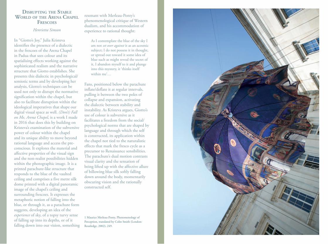
In “Giotto’s Joy,” Julia Kristeva identifies the presence of a dialectic in the frescoes of the Arena Chapel in Padua that sees colour and its spatialising effects working against the sophisticated realism and the narrative structure that Giotto establishes. She presents this dialectic in psychological/semiotic terms and by developing her analysis, Giotto’s techniques can be used not only to disrupt the normative signification within the chapel, but also to facilitate disruption within the ideological imperatives that shape our digital visual space as well. (Don’t) Fall on Me, Arena Chapel, is a work I made in 2016 that does this by building on Kristeva’s examination of the subversive power of colour within the chapel and its unique ability to move beyond rational language and access the pre-conscious. It explores the material and affective properties of the visual sign and the non-realist possibilities hidden within the photographic image. It is a printed parachute-like structure that responds to the blue of the vaulted ceiling and comprises a five metre silk dome printed with a digital panoramic image of the chapel’s ceiling and surrounding frescoes. It expresses the metaphoric notion of falling into the blue, or through it, as a parachute form suggests, developing an idea of the experience of sky, of a topsy turvy sense of falling up into its depths, or of it falling down into our vision, something
resonant with Merleau-Ponty’s phenomenological critique of Western dualism, and his accommodation of experience to rational thought:
As I contemplate the blue of the sky I am not set over against it as an acosmic subject; I do not possess it in thought, or spread out toward it some idea of blue such as might reveal the secret of it, I abandon myself to it and plunge into this mystery, it ‘thinks itself within me’…
Fans, positioned below the parachute inflate/deflate it at regular intervals, pulling it between the two poles of collapse and expansion, activating the dialectic between stability and instability. As Kristeva argues, Giotto’s use of colour is subversive as it facilitates a freedom from the social/psychological norms that are shaped by language and through which the self is constructed, its application within the chapel not tied to the naturalistic effects that mark the fresco cycle as a precursor to Renaissance sensibilities. The parachute’s dual motion contrasts visual clarity and the sensation of being lifted up with the affective allure of billowing blue silk softly falling down around the body, momentarily obscuring vision and the rationally constructed self.
1 Maurice Merleau-Ponty, Phenomenology of Perception, translated by Colin Smith (London: Routledge, 2002), 249.
the colour of words from dAugAvpIls, lAtvIA, the BIrth
plAce of mArk rothko:Jane Bustin
Even the notebook from Rimi is brown, the bed sheets are brown, the curtains are charcoal grey, the wood is walnut and the light only comes across diagonally from the corner window.Is it a cell? a special Rothko cell? womb like, warm, dense and dark.The kind of darkness that comes from within, when you wake at night and your heart drops to your stomach for no apparent reason.
WhiteThe egg man came today, his van was white, he wore beige, he handed me white foods, titanium white eggs, ivory white yogurt, zinc white cottage cheese. I put them on the pale grey table, white goods from the east, so proud of its paleness and whiteness.
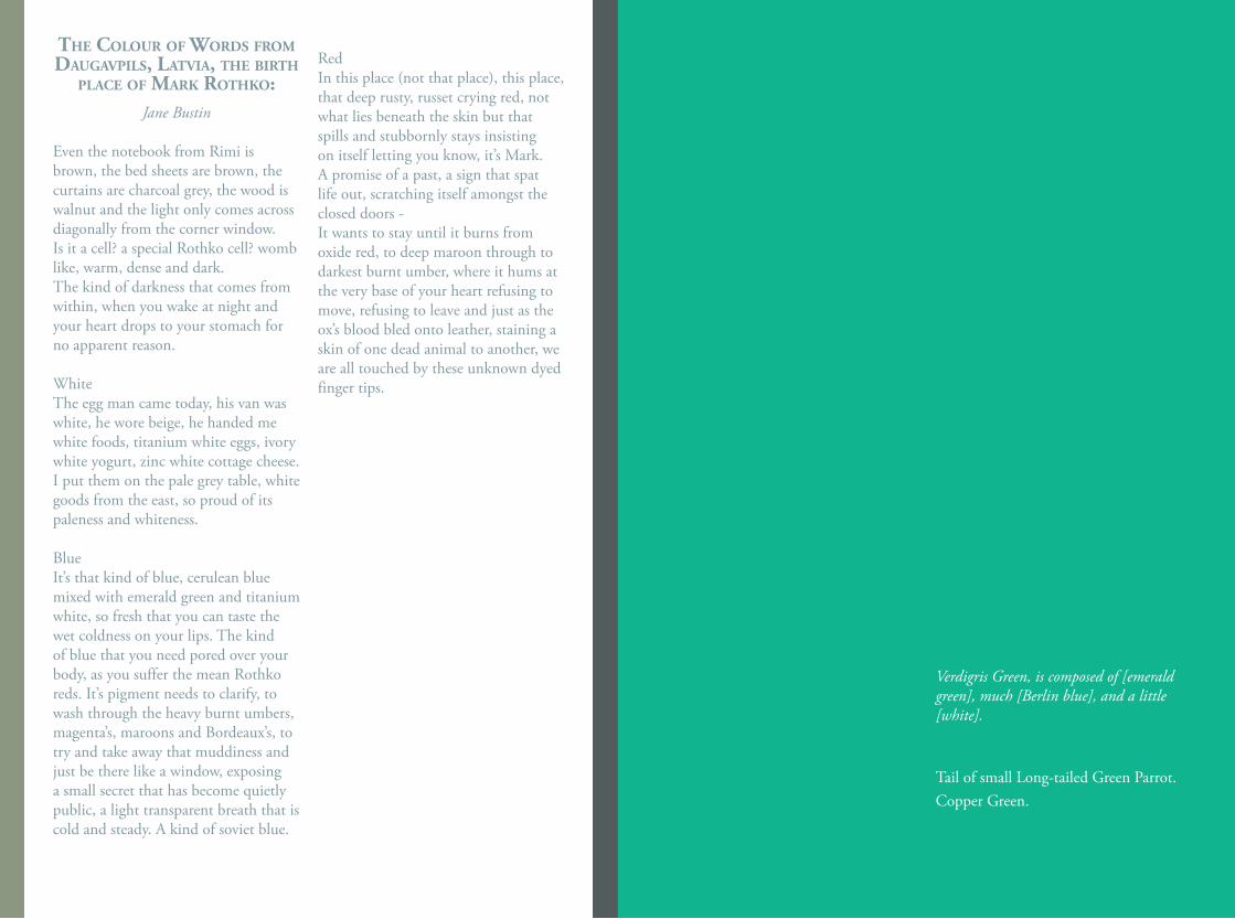
BlueIt’s that kind of blue, cerulean blue mixed with emerald green and titanium white, so fresh that you can taste the wet coldness on your lips. The kind of blue that you need pored over your body, as you suffer the mean Rothko reds. It’s pigment needs to clarify, to wash through the heavy burnt umbers, magenta’s, maroons and Bordeaux’s, to try and take away that muddiness and just be there like a window, exposing a small secret that has become quietly public, a light transparent breath that is cold and steady. A kind of soviet blue.
Red In this place (not that place), this place,that deep rusty, russet crying red, not what lies beneath the skin but that spills and stubbornly stays insisting on itself letting you know, it’s Mark. A promise of a past, a sign that spat life out, scratching itself amongst the closed doors - It wants to stay until it burns from oxide red, to deep maroon through to darkest burnt umber, where it hums at the very base of your heart refusing to move, refusing to leave and just as the ox’s blood bled onto leather, staining a skin of one dead animal to another, we are all touched by these unknown dyed finger tips.
Verdigris Green, is composed of [emerald green], much [Berlin blue], and a little [white].
Tail of small Long-tailed Green Parrot.Copper Green.
colour (chroma, hue) ‘filtered out’ and the formal features of colour (value) ‘filtered in’.
kAnt on chArm (fIrst-glAnce)
At first glance, Kant may be thought to exclude colour from aesthetic judgments altogether. In §13, he considers any (pure) aesthetic judgment influenced by an object’s colour to be judged in error. On this view, it seems the paradigm Kantian aesthetic object ought to be strictly achromatic. This first-glance reading of Kant may be illustrated through an ‘achromatism test’ (AT): Apply a ‘grayscale filter’ to an object; all and only those features that remain constitute the relevant aesthetic form of the object. Given AT, what constitute the basis for an aesthetic judgment are the lines, shapes, and spaces formed by differences in colour value, but not the colours themselves.
kAnt on chArm (second-glAnce)
At second-glance, Kant may actually be thought to include colour in aesthetic judgments -- but only colour of a certain sort. In §14, he re-considers (pure) aesthetic judgments influenced by an object’s colour in light of the ‘pure-impure’ distinction: “[S]ensations of color ... deserve being considered beautiful only insofar as they are pure. And that is an attribute that already concerns form ...” (emphasis added). On this view, it seems the Kantian aesthetic object need not be strictly achromatic, after all. But Kant requires some
(Im)pure colour: kAnt on chArm And form
Taylor Enoch
Kantian aesthetics is a formalist aesthetics. Formalism is the view that aesthetic appreciation depends upon an object’s form or formal features, e.g. line, shape, space, colour. In the Critique of Judgment (1790) Kant presents his analysis and deduction of aesthetic judgments, given a hierarchy of cognitive faculties: the low-level faculty of sensibility, the mid-level faculties of imagination and judgment, and the high-level faculties of understanding and reason. According to Kant, a crucial difference between the phenomena of colour and form is the faculties to which they appeal: form to higher-level and colour to lower-level. He therefore calls colour mere ‘charm’.
kAnt on form
Kantian philosophy aims to account for universal conditions of experience, and Kantian aesthetics aims to account for universal conditions of aesthetic experience and judgment. Only the higher-level faculties can do this. Thus, Kant concludes all aesthetic judgment to be based on form, though one may distinguish between two types: ‘impure’ aesthetic judgments are also influenced by charm or emotion, whereas ‘pure’ aesthetic judgments are not (§13). Presumably, then, the form relevant to pure aesthetic judgments would be achromatic, grayscale or black-and-white, with the charming features of
method by which to differentiate pure, formal colour and impure, non-formal colour. This second-glance reading of Kant may be illustrated through a revised version of the achromatism test (AT*): Apply a ‘grayscale filter’ to an object; all features that remain plus any formal features that change constitute the relevant aesthetic form of the object. Given AT*, what constitute the basis for an aesthetic judgment are the lines, shapes, and spaces formed by differences in colour value, plus the colours formulating those differences.
kAnt on chArm And form
This prompts an interesting question for Kantian formalism about the relationship between colour and form, namely, what it is like for colour to be a matter of form. Recall that, given AT*, colour is not a matter of form in cases where ‘filtering’ it out does not alter form, but colour is a matter of form in cases where ‘filtering’ it out does alter form. I urge anyone to apply AT* in their own experience.
Cezanné’s method of colour modulation to establish pictorial space, from farther-reaching cool colours to nearer-reaching warm colours, is a prime example of colour as a matter of form. Application of AT* to, e.g. Cezanné›s still life paintings, Pollock›s drip paintings, Rothko›s colour field paintings, and even Klein›s monochrome paintings, renders their grayscale versions perceptually flattened, thus altering the form by altering the formal feature of space.
(This simply does not occur in cases of, e.g. floral wallpaper design, an example noted in §16). Yet, perhaps the most telling case, or set-of-cases, is Monet›s Rouen Cathedral series, given their one subject and one viewpoint with differences in colour only. Application of AT* renders compositional areas not only flattened but deleted, thus altering the form in the strictest sense possible. One may therefore conclude these cases to exemplify ‹pure› colour, that is, colour as a matter of form, and its role in any ‹pure› aesthetic judgment.
References:Kant, I. (1790) Critique of Judgment. Pluhar transl., 1987, Hackett Publishing.
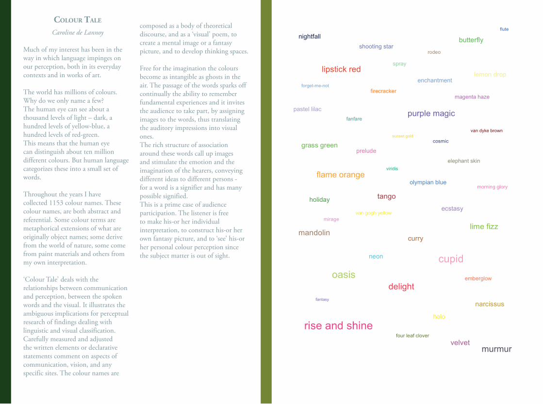
colour tAle
Caroline de Lannoy
Much of my interest has been in the way in which language impinges on our perception, both in its everyday contexts and in works of art.
The world has millions of colours. Why do we only name a few? The human eye can see about a thousand levels of light – dark, a hundred levels of yellow-blue, a hundred levels of red-green. This means that the human eye can distinguish about ten million different colours. But human language categorizes these into a small set of words.
Throughout the years I have collected 1153 colour names. These colour names, are both abstract and referential. Some colour terms are metaphorical extensions of what are originally object names; some derive from the world of nature, some come from paint materials and others from my own interpretation.
‘Colour Tale’ deals with the relationships between communication and perception, between the spoken words and the visual. It illustrates the ambiguous implications for perceptual research of findings dealing with linguistic and visual classification.Carefully measured and adjusted the written elements or declarative statements comment on aspects of communication, vision, and any specific sites. The colour names are
composed as a body of theoretical discourse, and as a ‘visual’ poem, to create a mental image or a fantasy picture, and to develop thinking spaces.
Free for the imagination the colours become as intangible as ghosts in the air. The passage of the words sparks off continually the ability to remember fundamental experiences and it invites the audience to take part, by assigning images to the words, thus translating the auditory impressions into visual ones. The rich structure of association around these words call up images and stimulate the emotion and the imagination of the hearers, conveying different ideas to different persons - for a word is a signifier and has many possible signified.This is a prime case of audience participation. The listener is free to make his-or her individual interpretation, to construct his-or her own fantasy picture, and to ‘see’ his-or her personal colour perception since the subject matter is out of sight.
lipstick red
shooting star
firecracker
spray
elephant skin
sunset gold
olympian blue
purple magic fanfare
rodeo
narcissus
four leaf clover
mandolin
oasis
delight
flame orange
enchantment
nightfall
murmur
magenta haze
lemon drop
halo
curry
holiday
grass green prelude
flute
pastel lilac
morning glory
van gogh yellow
van dyke brown
rise and shine
neon
mirage
butterfly
ecstasy
lime fizz
tango
cupid
forget-me-not
cosmic
viridis
fantasy
velvet
emberglow
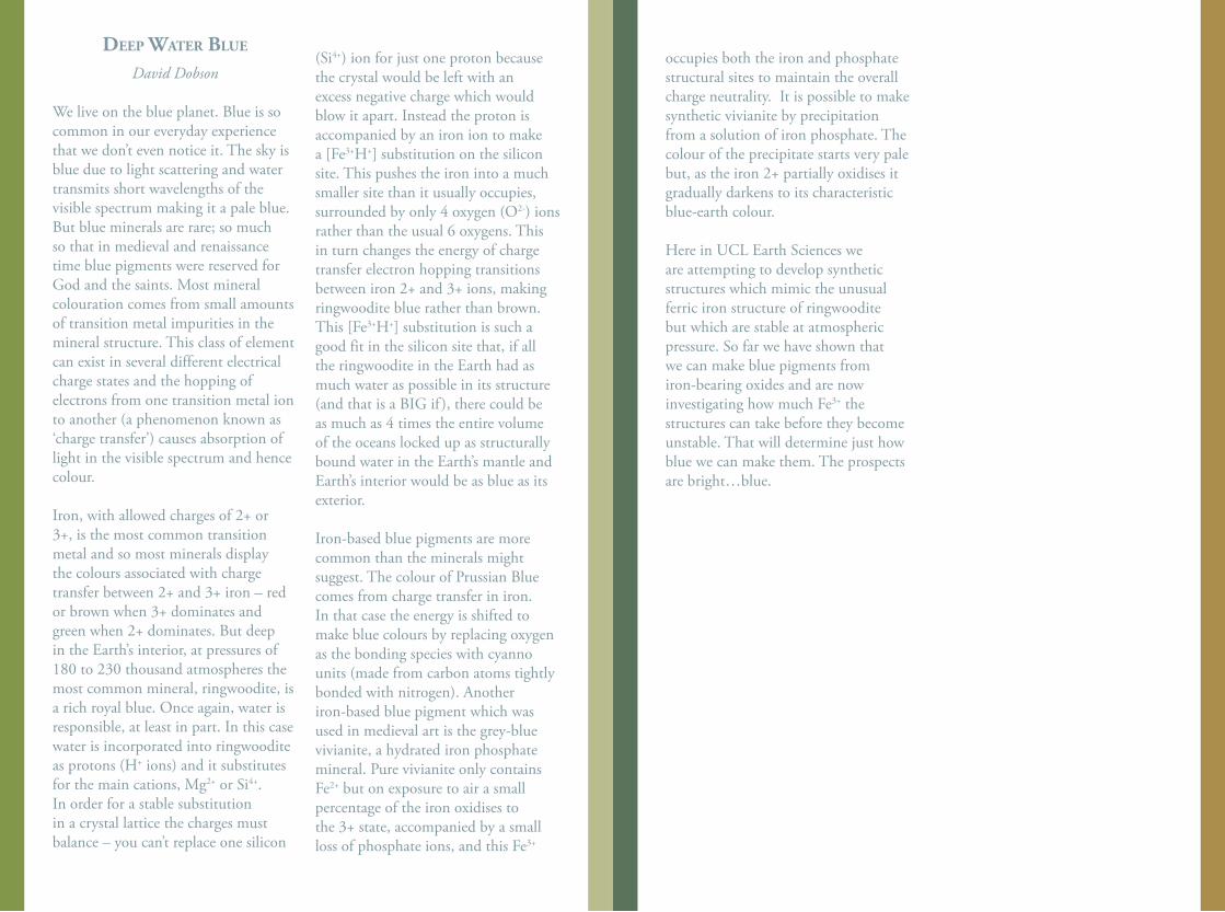
deep wAter Blue
David Dobson
We live on the blue planet. Blue is so common in our everyday experience that we don’t even notice it. The sky is blue due to light scattering and water transmits short wavelengths of the visible spectrum making it a pale blue. But blue minerals are rare; so much so that in medieval and renaissance time blue pigments were reserved for God and the saints. Most mineral colouration comes from small amounts of transition metal impurities in the mineral structure. This class of element can exist in several different electrical charge states and the hopping of electrons from one transition metal ion to another (a phenomenon known as ‘charge transfer’) causes absorption of light in the visible spectrum and hence colour.
Iron, with allowed charges of 2+ or 3+, is the most common transition metal and so most minerals display the colours associated with charge transfer between 2+ and 3+ iron – red or brown when 3+ dominates and green when 2+ dominates. But deep in the Earth’s interior, at pressures of 180 to 230 thousand atmospheres the most common mineral, ringwoodite, is a rich royal blue. Once again, water is responsible, at least in part. In this case water is incorporated into ringwoodite as protons (H+ ions) and it substitutes for the main cations, Mg2+ or Si4+. In order for a stable substitution in a crystal lattice the charges must balance – you can’t replace one silicon
(Si4+) ion for just one proton because the crystal would be left with an excess negative charge which would blow it apart. Instead the proton is accompanied by an iron ion to make a [Fe3+H+] substitution on the silicon site. This pushes the iron into a much smaller site than it usually occupies, surrounded by only 4 oxygen (O2-) ions rather than the usual 6 oxygens. This in turn changes the energy of charge transfer electron hopping transitions between iron 2+ and 3+ ions, making ringwoodite blue rather than brown. This [Fe3+H+] substitution is such a good fit in the silicon site that, if all the ringwoodite in the Earth had as much water as possible in its structure (and that is a BIG if ), there could be as much as 4 times the entire volume of the oceans locked up as structurally bound water in the Earth’s mantle and Earth’s interior would be as blue as its exterior.
Iron-based blue pigments are more common than the minerals might suggest. The colour of Prussian Blue comes from charge transfer in iron. In that case the energy is shifted to make blue colours by replacing oxygen as the bonding species with cyanno units (made from carbon atoms tightly bonded with nitrogen). Another iron-based blue pigment which was used in medieval art is the grey-blue vivianite, a hydrated iron phosphate mineral. Pure vivianite only contains Fe2+ but on exposure to air a small percentage of the iron oxidises to the 3+ state, accompanied by a small loss of phosphate ions, and this Fe3+
occupies both the iron and phosphate structural sites to maintain the overall charge neutrality. It is possible to make synthetic vivianite by precipitation from a solution of iron phosphate. The colour of the precipitate starts very pale but, as the iron 2+ partially oxidises it gradually darkens to its characteristic blue-earth colour.
Here in UCL Earth Sciences we are attempting to develop synthetic structures which mimic the unusual ferric iron structure of ringwoodite but which are stable at atmospheric pressure. So far we have shown that we can make blue pigments from iron-bearing oxides and are now investigating how much Fe3+ the structures can take before they become unstable. That will determine just how blue we can make them. The prospects are bright…blue.
Iron gAll Ink
Jo Volley
Ingredients;Oak gall nuts, oak apples or oak marbles 18 parts by weight (2oz of crushed galls)Iron (II) Sulphate 8 parts by weight (1oz of iron sulphate)Rain water/ distilled water or wine 145 parts by weight (1 pint of water)Gum Arabic 8 parts by weight (or add to get right consistency) 8 assorted Slade Graduate students
Method:Firstly enthuse your graduate tutor group to go for a walk on Hampstead Heath. Take the entrance nearest the Lido and up the path that skirts the edge of the dyke for it is here you will find a row of young oak trees that are rich in galls. When you have exhausted these walk due north across the heath to the copse of trees known as Tumulus and there after down the path that leads to the ladies pond and on up to Kenwood House. After a visit to warm yourselves both physically and spiritually take the path across the meadows passed the allotments and up to the Flask Inn. Tell them Hogarth drew here and buy a round of drinks, plan making the ink. Late winter is a good time to go as the trees have shed there leaves and the galls are more easily spotted. Never pick them in spring, as the gall wasps are ready to leave the galls. Remember to take a bag to put the oak apples in. When the ink is made each make a drawing, scan and print out then bind into a book.
“To make common yncke of Wyne take a quart,Two ounces of gomme, let that be a parte,Five ounces of galles, of copres take three,Long standing dooth make it better to be;
If wyne ye do want, rayne water is best,And as much stuffe as above at the least:
If yncke be to thick, put vinegar in,For water dooth make the colour more dimme.
In hast for a shift when ye have a great nead,Take woll, or wollen to stand you in steede;
which burnt in the fire the powder bette smallWith vinegre, or water make yncke with all.
If yncke ye desire to keep long in storePut bay salte therein, and it will not hoare.
Of that common yncke be not to your mindeSome lampblack thereto with gomme water grinde”
‘A Book Containing Divers Sorts of Hands’ John de Beau Chesne and M. John Baildon 1571
oAk Apple dAy Take an iron pot, pestle and mortar,
1lb of oak marble galls, bruisethen steep in a gallon of water,add iron sulphate and gum arabic, macerate for a day until blackand in the air, blacken:
take inspiration from the gallin this ink and let yourself speak; write new laws and beware of the personhood of corporations;remember Strength is Unityand shake out the oak.
Sharon Morris
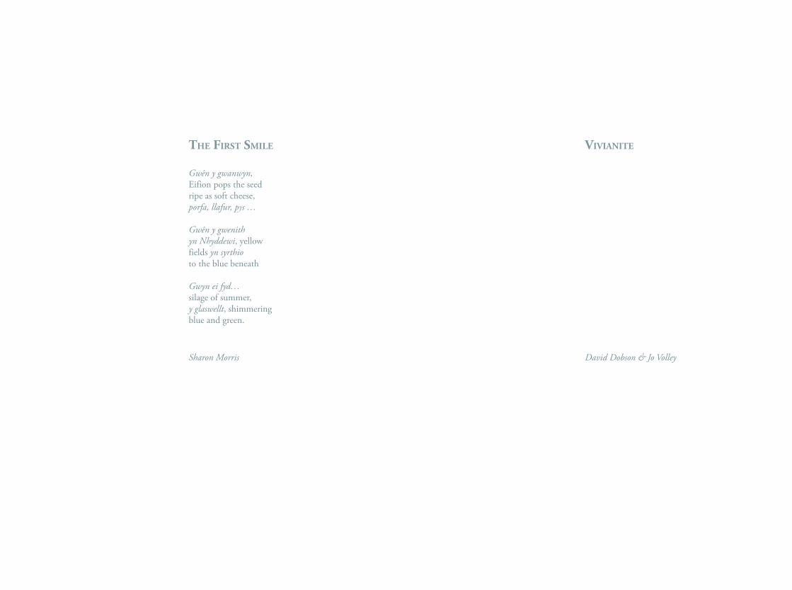
the fIrst smIle
Gwên y gwanwyn,Eifion pops the seedripe as soft cheese,porfa, llafur, pys …
Gwên y gwenithyn Nhyddewi, yellowfields yn syrthioto the blue beneath
Gwyn ei fyd…silage of summer,y glaswellt, shimmeringblue and green.
Sharon Morris
vIvIAnIte
David Dobson & Jo Volley
ArtIsts, colours, words
Estelle Thompson
There is a largely uncharted history of visual artists for whom words, written ideology or expression, as poetry, fiction, Art theory and Art criticism have been paramount. Artists, often painters, specifically writing about colour experience and formulating colour theory, writing on materials and process, in notebooks, journals, essays and via articles and letters give inspiration and allow us to contemplate colour relationships, colour symbolism and optical effect. There is also a significant parallel history of visual artists’ writing per se, as poetry, novels, plays, screenplays, journals and diaries.
Colour theory is associated with the Bauhaus artists Johannes Itten, Josef Albers and Paul Klee. Itten wrote The Art of Color, The Elements of Colour and Albers’ Interaction of Color and Paul Klee notably produced picture-poems, concerned with colours and words. Kandinsky and Piet Mondrian explored and wrote about the symbolic power of colour and later Patrick Heron, Agnes Martin and Bridget Riley contextualized their own palettes. Derek Jarman wrote CHROMA (A book of colour) and more recently David Batchelor, Chromophobia (2000).
The artist-writer tradition stretches from Alberti’s 1435 De picture (On Painting) via Leonardo da Vinci’s Treatise on Painting, Michelangelo’s poetry, Giorgio Vasari’s Lives to the
manuals of Joshua Reynolds and The Journal of Eugene Delacroix. In Europe, in the modern period, Vincent Van Gogh, Maurice Denis, Paul Signac, Henri Matisse, Georges Braque, Wyndham Lewis and later William Coldstream, William Townsend, Roland Penrose, Peter de Francia, John Golding, John Berger, David Hockney, R.B Kitaj, Joseph Beuys, Bernard Frize, Sophie Calle, Susan Hiller and Edward Allington all add to that history. In the USA, Marsden Hartley, Barnett Newman, Robert Motherwell. Jasper Johns, Richard Serra, Sol LeWitt, Frank Stella, Donald Judd, Alex Katz and Jenny Holtzer are notable and contemporary artists such as Perry Roberts, Merlin James and Ed Atkins continue the tradition.
Literature, in the form of poems, novels, correspondence, statements, diaries, autobiography, or artists’ books provides a vast study area and in poetry alone spans the Sonnets of Michelangelo and Degas to Marcel Broodthaers and Yoko Ono. In 1937 Picasso produced The Dream and Lie of Franco, a three-sheet volume of panel sketches accompanied by prose poems and he also wrote two Surrealist plays, Desire Caught by the Tail and The Four Little Girls. Other examples include Salvador Dali, who co-wrote two screenplays with fellow Spanish surrealist Luis Buñuel, Un Chien Andalou and L’Age d’Or. My preferred fiction list includes Marcel Broodthaers, Jean Cocteau, Giorgio de Chirico, Leonora Carrington, Dorothea Tanning and John Berger.
I
If I could find anything blacker than black I'd use it I fell in love with black; it contained all color It wasn't a negation of colorBlack is the most aristocratic color of allYou can be quiet, and it contains the whole thingBefore, when I didn't know what colour to put down, I put down black
A certain blue enters your soul A certain red has an effect on your blood pressure Why do two colors, put one next to the other, sing? Red protects itself No colour is as territorial
The color of truth is gray In the hierarchy of colors, green represents the social middle class, self-satis-fied, immovable, narrowWhat a horrible thing yellow isIndian yellow, bannedPurple does something strange to meBlue has no dimensions; it is beyond dimensionsthe other colours are not...
All colours will agree in the darkColor is the essence of painting, which the subject always killedColor... thinks by itself, independently of the object it clothesColor becomes significant only when it becomes formColor is only beautiful when it means somethingThere is no model; there is only colorColor and I are oneI am a painter.
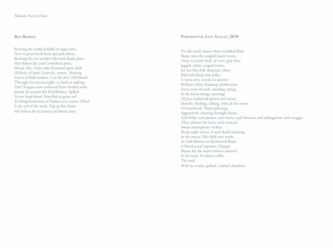
Mataio Austin Dean
red BerBIce
Burning the cardinal fields of sugar cane, Now it pisses forth from spit pale fibres. Burning the wet mother laboured death plane. Slim flames lip suck Corinthian pires, Wood, fake, white stab: fictioned upon theftOf flesh, of land. Councils, armies, chiming Voices of field workers. Cut the first. Fall bless’d,Through the viscous night, to land on sighing Fists! Tongues now unburied from divided soils: Joined all around this Red Berbice. SpilledTo my head blood. Pencilled as geese toilTo bring brownness of feathers o’er waters. Filled Is the red of the work. Dig up the chimeMy fathers slit to masters of labour time.
portsmouth, lAte August, 2018
On the small stones where wrinkled fleshSlopes into the tangled beach waves,There is a hard shell, of even, grey skin, Jagged, white, cusped arches,Jut out like dull, desperate chins,Bald and sharp and milky.It turns over, reveals its interior:Brilliant white, foaming calcification.Great rows of teeth, standing, piling In the brick-orange openingsOf post-industrial ghosts and stoneyMouths. Smiling, talking, with all the waterOf sisterhood. Three girls sing,Aggressively chiming through chainsAnd fields, and plastics, and streets, and America, and subjugation, and struggle.They reframe the lyrics with terracedMessy monophony of theirSharp night voices. A seed death chantingIn the motor. His child now worksAt Owl Motors on Richmond Road.A blood vessel ruptures. OxygenMeant for the man’s brain is released In his neck. A walnut coffin. The seed:With its ovular, quilted, vaulted chambers.
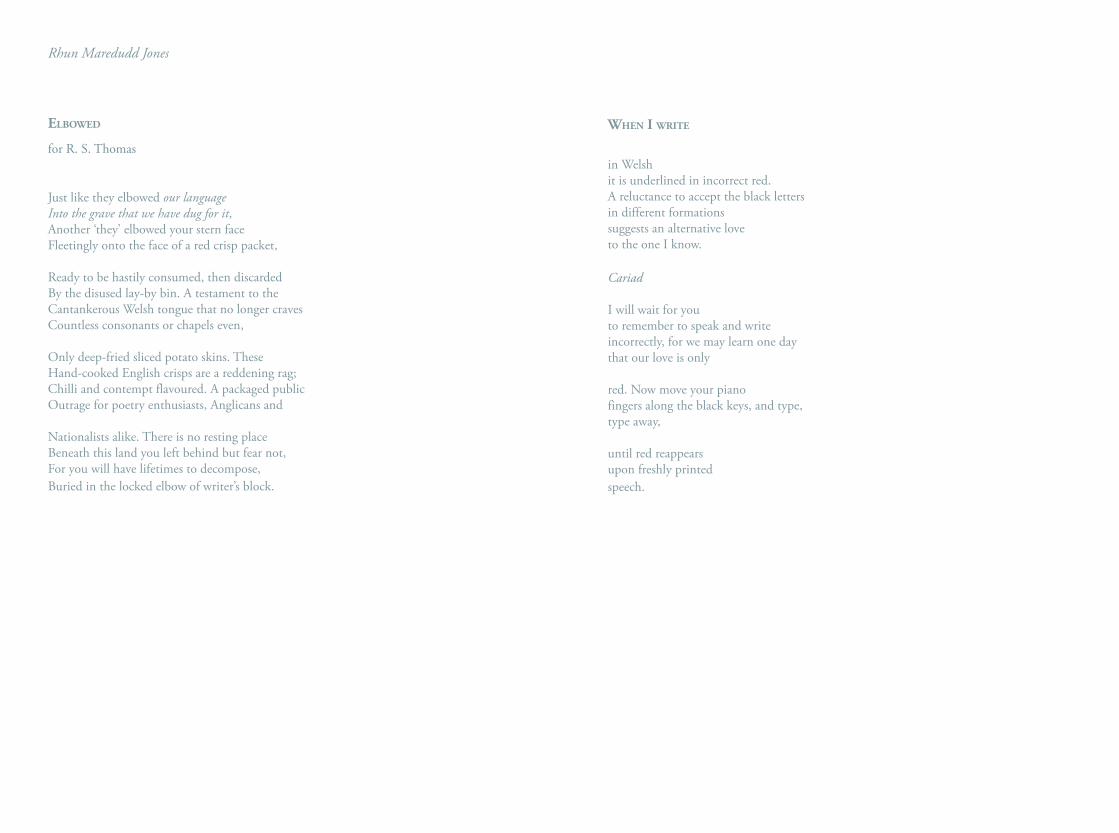
Rhun Maredudd Jones
elBowed
for R. S. Thomas
Just like they elbowed our languageInto the grave that we have dug for it,Another ‘they’ elbowed your stern faceFleetingly onto the face of a red crisp packet,
Ready to be hastily consumed, then discardedBy the disused lay-by bin. A testament to the Cantankerous Welsh tongue that no longer craves Countless consonants or chapels even,
Only deep-fried sliced potato skins. These Hand-cooked English crisps are a reddening rag;Chilli and contempt flavoured. A packaged publicOutrage for poetry enthusiasts, Anglicans and
Nationalists alike. There is no resting place Beneath this land you left behind but fear not,For you will have lifetimes to decompose,Buried in the locked elbow of writer’s block.
when I wrIte
in Welshit is underlined in incorrect red.A reluctance to accept the black lettersin different formations suggests an alternative love to the one I know.
Cariad
I will wait for you to remember to speak and write incorrectly, for we may learn one daythat our love is only
red. Now move your piano fingers along the black keys, and type, type away,
until red reappears upon freshly printed speech.
nAvIgAtIng perceIved colour
Ian Rowlands
A workshop with the aim of developing an understanding of the key functions or attributes of colours within the palette. The workshop, through a hands-on experience, explores, tone, hue, saturation, and colour unity
In my own practice, when painting from appearances, there has been an ongoing, fascinating battle to understand and articulate colour. Teaching painting and the necessary research involved has helped me formalize and develop working strategies.
One such strategy of restricting colour to a primary triad has been a positive experience allowing an intuitive or heartfelt approach to defining and translating observed colour. Working with primaries is a great habit breaker, encouraging an unprejudiced eye when looking. The journey becomes more interesting; the notion of grey or brown is turned on its head when one questions how to reach the objective from pure colours. Another likely outcome is that the observer will understand the relativity of colour in both the subject and their painting. As many mixtures contain all three primaries, commonalities within the mixes create a great sense of unity on both the palette and painting, a phenomenon that has been appropriately referred to as family resemblance.
The colours Winsor lemon, Cadmium red, and French ultramarine sit equidistantly on the colour wheel creating great balance and ensuring that no hue dominates the palette. If, however, Alizarin were to replace cadmium red in the triad, its violet undertone and that of Ultramarine would dominate the palette and attempts at producing a neutral grey would see-saw between green or violet; so, it is a very particular selection that makes up the triad.
Using a palette knife and adding colours sparingly, begin by mixing an equivalent to black. In doing so, the seemingly raw prismatic colours are tamed and a starting point for experiment reached. Check the mixtures’ neutrality by taking a small portion and adding Titanium white; this will expose any bias towards colour in the mixture. Such bias can be nullified by adding its complimentary (opposite) colour. Within the triad any primary’s complimentary is a secondary mixture of the other two and this is a two-way relationship. So, should the grey lean towards blue, both red and yellow would be added to achieve a more neutral result. It is worth making a decent quantity of the black.
One of the primaries and a small amount of white can now be added to some of the black to create a chromatic grey. A swatch can be transferred to paper before adding more of the same primary and repeating until an evolving scale of chromatic greys is achieved. This process can be repeated with
each primary. Adding Titanium white expands the value range and cools the mixtures to a surprising degree. Further experiment, or ‘colour play’ can focus on adding combinations of two or all of the primaries and by doing so a huge range of beautifully harmonious mixtures will result. Many of these will arrive at equivalents of familiar colours such as yellow ochre and the umbers and will help to develop an understanding of precisely where they sit in the spectrum.
A further structured set of mixtures can help explain the key shifts or attributes from the prismatic (or unaltered) colour. For instance, by taking Cadmium red and adding Titanium white in five increments, or tints, the value is altered upwards and becomes lighter. Similarly, add the mixed black in five increments, or shades, and the value or tone is altered downwards and becomes darker.
By adding Winsor lemon in five increments it is possible to shift the red hue to orange as the influence of the yellow gains weight. With five more increments a total shift to lemon could result. This process could be repeated by intermixing any of the triad with another.
The final set of mixtures explores saturation. Mix the black and Titanium white to achieve a neutral grey, aiming for the same tonal value as the cadmium red. The grey is added in five increments which will desaturate the red without altering its tonal value.
Each of the triad can and should be selected for these experiments to give a balanced view of their behavior. It is worth noting that tonal shifts also tend to desaturate the chosen colour and saturation shifts tend to alter hue. For instance, Winsor lemon will shift towards green when tone and saturation are explored. Being a dark toned colour, Ultramarine can be lightened in value only.
The beauty of the triad aside from its huge learning potential is that its limitations help to understand the qualities that the omitted co-primaries can bring to the palette.
colour / spAce InterActIons
Antoni Malinowski
Goethe: Thinking is more interesting than knowing but not than looking.
Gaston Bachelard in his Poetics of Space observes that poets and painters are born phenomenologists. Painters tend to look at light and how it interacts with surfaces. Light triggers the play of electrons that we call colour. It is the crystalline and molecular micro structure of pigments that produces a particular hue, shade and tone, and I have consciously used these effects in my work.
The Vermilion Wall at the Royal Court Theatre interacts with the specific light of London — light that is influenced both by the North Sea and by the Atlantic. It carries with it a certain darkness from the cold depths of the ocean, visible in the almost black shadows.
Already the ancient Greeks remarked on vermilion’s tonal changeability. In very bright sunshine this colour may appear whiter than white; in reduced light conditions it may be darker than black. This astonishing range of tonal values calls for a musical analogy. The eminent cellist Mario Brunello once told me that a note played on a really wonderful old instrument produces a sound in which it is possible to hear simultaneously a number of harmonics in the lower register and a number of harmonics in the higher register. In the language of musicians — you can hear the light and the dark at the same time.
It is the reverberation / interaction between the two that produces a particular depth of sound. Vermilion reveals to us the dark and the light simultaneously. In the constantly changing daylight the colour oscillates between white reflection, greyish velvet, deep pink, bright red, orange, plum-skin purple, luminous darkness, absolute black.
It is the oldest synthetic pigment, a fusion of sulphur and mercury, extensively used by the Romans, but also by the Chinese. An alchemical secret during the Middle Ages, genuine vermilion, mercuric sulfide, happens to absorb all wavelengths but one — the red. For our brains, which are accustomed to processing mixtures of wavelengths, vermilion presents a bizarre task. Its one wavelength information cannot be slotted into the usual chromatic categories. Therefore the colour appears as a constantly changing phenomenon, modulated by light, shadow and human activity. This performance of colour creates a visually expanding mental space of reverie.
I look at a juncture of the architectural and pictorial spaces. There is a paradox: we build walls, shelters to inhabit, but the minute they are enclosed we begin to paint on them; we create painterly spaces in order to overcome the physical limitations of rooms.
The ancient tradition of painted ceilings fascinates me. I love exploring those perceptually vertiginous limits that painting a large ceiling can offer. The Liverpool’s Everyman Theatre
ceiling is a journey between two different shades of vermilion and the two different rhythms of copper-paint brush strokes. The resulting shimmering swarm follows the Liverpool sunsets piercing through the windows and, across the thinnest of crimson border lines, a different direction of copper strokes that follow the bar lamp’s glow. This undulating alizarin crimson threadlike line guides a visitor through the whole of the nearly 50m long foyer.
Then the space of the Mathematical Institute foyer in Oxford became a place of prismatic colour reflections and refractions. I sensitised two large facing walls by painting them with mica and then following a sketched line, an elongated quasi diagonal, painted with the spectral progression of colours from the Vermilion to the Yellow Ochre on the South facing wall and from the Green Earth to the deep Smalto on the North facing wall. These subtractive pigments are combined with other layers of brush strokes — the wavelengths bending interference pigments. The combination of these diverse micro-structures provokes light to scatter, creating a mother of pearl colour saturated space. The organic, hand-movement generated rhythms of brush strokes make quasi Fibonacci patterns visible across the walls’ expanses. Due to the dichromatic nature of the nano-technology pigments and the variegated mica reflections, the colours and the patterns are constantly alternating, changing with the movement of viewers in the
large space. I hope that this variability inspires the mathematicians, especially those working on the stochastic patterns detected in apparently random reality.
I called this wall diptych Spectral Flip.
Ochre Yellow, is [sienna yellow], with a litlte light [chestnut brown].
Vent Coverts of Red Start.Porcelain Jasper.
the rain is spitting sunlight at the shine on the marble shoe somewhere a cave speaks softly a secret is given if someone asks for it a landscape somewhere where does veronese green spring from the head rests on the big oak table thinking about colour it mouths blue the garlic bow tie you will find the grey here if you ask is that what you said lapis lazuli shakes its radiant tongue in the rocks and speaks out of a red nape of course of course a floorboard hums a hue I’m drawing attention to magenta and emerald it will be mixed on the palette you’ll see the result and swoon conjure a mood paste on the stormy sky he says the boy the cloud is a dog crush the rocks dig the ground there is the thing there is the response there is the choice there is the carpet strewn with tongues whose languages are open to the split man a willing split there is only one apple I can hear the red coming a fortnight ago blue was in the cave locked into rock the crushers came just like the diggers before them the head continued pondering the lanes and which route to take the head chose its composition flesh and blood sticks stone colour was in the gaps we can hear the rumbling goods train on the desert tracks in its wagons the words pile up and the jars of pigment rattle and chink before their nuptial rites with churning oil on the landscape-sized carpet the tongues lie as I said in rows neatly or haphazard the split head approaches the thing is a thing whether said or coloured or shouted or brushed that brush spoken in yellow dips into the cliff face and under the earth the dismembered head mumbling about yesterday’s speckled stroll don’t look through the periscope the man says horse he draws a horse colours it in a blue horse like the one in that painting he picks up a tongue it is green it turns the sun to black behind the door the head still lies on the table this side the split brain gapes at the beckoning index finger
fabian peake, 2019
puzzlIng ABout colour
Edward Winters
IThe primary/secondary quality distinction, as provided by John Locke, tells us that secondary qualities are accessible only to one mode of perception – so: colour to sight, sound to hearing and so on. Whereas primary qualities are accessible to other modes – so: shape to sight and touch. Primary qualities are qualities that things have in themselves, whereas secondary qualities belong to the appearances of things. Dogs can hear sounds we cannot. Bats negotiate their nocturnal environment by sonic pulses; and so they use sounds much in the way that humans use sight. What it is like for a bat to perceive its environment is different from what it is for a human to perceive hers. Presumably, bats discern shape through sonar scanning – but not colour. If God is both omnipresent and ubiquitous, then there is no time at which He is not present and no place at which He is not to be found. Omnipresence throws up a difficulty. For, taken together with His perfect knowledge, it implies that He must exist outside of time. Like science, God cannot ‘see’ things from a particular perspective; and hence there can be no phenomenological description of the ‘Mind of God’. Nor is there any particular perspective revealed by science. Science, as it were, provides us with ‘the view from nowhere’.Suppose now that someone says that
seeing a telephone box and noticing that it is red is to make an ascription that can be verified in terms of the light-waves emitted by the object. This is the claim that secondary qualities can be re-described in terms of primary qualities – that the former rest upon the latter. It is unlikely that any such claim could be convincingly established. Even if it were, it would not give us what we want. What we want is an account of what it’s like to see the red of the telephone box, over there. We do not see light waves; only colours.1
IIThose of us taught in art schools, and others interested in colour, will be acquainted with the colour wheel, as introduced by Goethe. As it spreads out, from secondary to tertiary colours and beyond, we end up at a circumference of colours each of which blends seamlessly into the next. Why is the colour wheel circular? (Wavelengths do not explain this.) Tonal distribution from white to black, by contrast, is linear. And if we think of a globe with the colour circle at its equator, and the tonal range as its axis, we can imagine that the entire range of colours, shades and tints are accommodated therein. The absolute centre of this sphere is mid-grey. This three-dimensional image seems to provide us with a colour geometry. It seems to provide us with subjective necessities analogous to the logical necessities of geometry.
IIIAssorted puzzles appear in Wittgesnstein. In thinking about colour, we should be alert to these conundrums:
423. I want to say there is a geometrical gap, not a physical one, between green and red. [Cf. Zettel 354.]2
426. We have a colour system as we have a number system. Do the systems reside in our nature or in the nature of things? How are
we to put it? – Not in the nature of numbers or colours. [Z357]3
724. “Just now I looked at the shape rather than the colour.” Do not let such phrases confuse you. Above all, don’t wonder “What can be going on in the eyes or brain here?” [Cf. Philosophical Investigations, II, xi, p. 211c]4
624. “There’s no such thing as reddish green” is akin to the propositions that we use as axioms in mathematics. [Cf. Z346.]5
644. Don’t believe that you have the concept of colour within you because, wherever you look, you look upon a coloured object. (Any more than you have the concept of a negative number because you are in debt.) [Cf. Z332]6
1 I am grateful for helpful discussions on this point with Professor David Dobson and Mircea Teleaga2 Ludwig Wittgenstein, Remarks on the Philosophy of Psychology, (volume II), Oxford: Basil Blackwell, 19803 Ibid.4 Ludwig Wittgenstein, Last Writings on the Philosophy of Psychology, Oxford: Blackwell, 19805 Ludwig Wittgenstein, Remarks on the Philosophy of Psychology, (volume I), Oxford: Blackwell, 19806 Ibid.
perpetuAl rIde to knowhere
Dimitris Mylonas
Colour naming describes the intriguing cognitive capacity to organise millions of discriminable colours into a smaller set of colour categories; named, for example, as yellow, navy blue and dark olive green. Colour names vary across languages, lexically, in number and in range of reference. To augment colour communication within and between different languages, it is necessary to have a worldwide method for mapping perceptual to cognitive aspects of colour.
In today’s interconnected world, understanding how people name colours is important for those wishing to bring arts and sciences together. A bright and early example was Werner’s Nomenclature of Colours (Syme, 1814/2018) – a taxonomic catalogue including an extensive range of more than a hundred colour tints with their associated colour names and references to animals, vegetables and minerals for chromatic comparisons. The colour scheme of the catalogue was subdivided into ten main colour categories: whites, greys, blacks, blues, purples, greens, yellows, oranges, reds and browns but little is known about why this set of colours was chosen over other colours. In a seminal study, Berlin and Kay (1969/1991) proposed a universal inventory of eleven basic colour terms; the ten main colours described above plus pink. Their criteria for identification was based on multiple factors (e.g. single word terms that are
not the name of an object) judged by experts as not being equally applicable across languages. The quest for a cross-culturally legitimate approach to determine basic colour categories across languages remains unsettled.
Since 2009, we have led an international collaborative project to collect unconstrained colour names with their corresponding colour ranges through an online experiment with thousands of observers in tens of languages (Mylonas & MacDonald, 2010). This ongoing research is endorsed by the International Colour Association through its Study Group on the Language of Colour, and has attracted notable media attention, including articles in the Economist, New Scientist, United Press International and the Metro newspaper. Recently, we replicated the online experimental methodology in laboratory conditions using calibrated monitors and showed that both web- and lab- based approaches produce consistent results (Mylonas, Griffin & Stockman, 2019). In addition, we redesigned the interface of the online experiment to run on all new mobile devices (available at: https://colournaming.org).
In regard to the assignment of colours to colour names that are meaningful to speakers of different languages, we have developed robust computational tools trained by these multilingual datasets to automate the colour naming task across the full colour space to different degrees of granularity (Mylonas,
MacDonald & Wuerger, 2010; Mylonas, Andrews & Griffin, 2016; Griffin & Mylonas, 2019). Considering which colour names are shared and well comprehended among speakers in each language, we proposed a simple, language-independent measure – called dispensability – that produces a graded scale of basicness from both web- and lab- based unconstrained colour naming data in different languages (Mylonas, Stockman & Griffin, 2018). Dispensability determines basic colours by identifying which colour names cannot be replaced with any other name to identify a colour sample – hence the title we have given to our measure. We showed that in three datasets in English (British, American and International) the 11 basic colour terms had lower dispensability scores than all non-basics. Our measure was also able to capture the indispensability of the proposed basic terms in other languages, such as Greek, Russian, Thai and Turkish.
The use of colour names in colour communication systems may seem inappropriate as they may convey different information to different speakers (Munsell, 1905). The advent of perceptual colour systems allows an unambiguous, numerical specification of colours, but the vast majority of people continue to use natural language in their everyday colour communication tasks, such as describing the colour of a garment or a car in a continually changing visual world. People-centred design for scientific colour
communication systems requires an understanding of both the physical and the cognitive capabilities of the population it addresses (Bichard & Gheerawo, 2011). This need for better understanding calls for the development of new technologies through interdisciplinary research that will benefit each discipline and society as a whole.
“seedBeds, outposts, AvAntgArde, vAngArde, Ivory towers”: ucl’s smAll press
collectIons
Liz Lawes
In the preparatory notes for his public ‘Lunchtime Lecture’ at UCL sometime in the mid-1980s, Librarian Geoffrey Soar contemplates the Little Magazine as a ‘growing point’ for radical art and literature, an outlet for experimental work in word and image, a collaborative forum where artists and writers co-exist, making material the freedom afforded to those practicing outside of the mainstream.
The wide variety of magazines and other ephemeral print items he collected for UCL’s Small Press Collections from 1964 thus bear poetry, prose, concrete text and other visual elements. Critical to this is a dynamic relationship between text and image, both on and off the page: the verbi-visual, or, what Marshall McCluhen referred to in his 1967 Something Else Press publication Verbi-Voco-Visual Explorations, the word as sound and sight. Colour is an integral component in these publications; they are rich in visual poetry, they document performance or happening, they are sound scores for voice and other noise, and utilise a variety of material qualities, with or without bindings.
Critically, the true Small Press object is not a unique object; multiplicity activates its potential for distribution and the formats produced – magazines,
postcards, pamphlets - exploit this via economic production values. It is an item to be handed out freely at a reading or performance, sold for enough to cover the cost of the next edition, or simply popped in the post for the price of a stamp, bypassing mainstream literary publishers and art market conventions, creating international social networks where boundaries are blurred between disciplines.
Artists have used this flexibility to their advantage, adopting distributed print material and utilising it as a new and accessible medium which enabled unprededented levels of control for the individual over their output. As a result, the literary and artistic movements of the 19th and 20th centuries have invariably expressed their most challenging ideas in some part via Little Magazines and other text bearing print objects.
The Yellow Book, a periodical published between 1894 and 1897 and co-edited by American novelist Henry Harland and English Symbolist artist Aubrey Beardsley, sported a vibrant yellow cover, radical because of its association with illicit French fiction of the period (a yellow wrapped book indicated lewd content). The content is not especially controversial to the modern eye but its treatment of images as artwork (not as illustration of text) was progressive. So influential was it in Britain, the 1890s became known as ‘The Yellow Nineties’.
Like The Yellow Book, the two issues of literary and visual art magazine/manifesto, Blast, were published by John Lane’s Bodley Head. In the summer of 1914, when he launched his first issue, it seems inconceivable that editor Percy Wyndham Lewis would have been unaware of the furore caused some twenty years earlier by a single, simple colour. Lewis’ choice of a bright crimson cover, violently punctuated by a geometric block of dark, Modernist text, seems an ominous portent of the bloodshed of the First World War, which claimed the lives of some of those listed amongst its pages. So notorious was Blast for its obnoxiously bright cover that it became known in literary circles as “the puce monster”.
In the middle of the 20th century the magazine became an alternative site for a dematerialised practice, independent of dealers and the commercialisation of the art world. Conceptual artists exploited everyday materials and used text as a medium, pioneering the ‘assembling’ magazine as a genre – a minimally edited collection of verbi-visual pieces cheaply produced on a stencil duplicating machine, collated with the most basic of bindings (usually staples) and distributed as widely as possible.
The muted palate of the mimeograph, a sort of anti-colour, defines these publications; invariably black text on a heavy, off-white paper with a rough, absorbent surface. For the seven issues of 0-9 (published in New York between 1967 and 1969), editors Vito Acconci
and Bernadette Mayer were restricted to the colours of found materials – a cover of cheap yellow sugar paper, or a flimsy blue recycled duplicator stencil, crudely stapled to the front of the magazine. It’s no wonder not many of these survive.
The Small Press Collections are punctuated by myriad iterations of colour as it interacts with text, poetry, prose, in concrete and abstract forms: Paula Claire’s photocopied and folded pamphlets on bright primaries; the fragile, non-linear, monochrome Poema/Processo of Wlademir Dias-Pino; the delicately tinted drawings and bucolic texts of Laurie Clark - all providing a unique picture of distributed text and image by those working outside of the mainstream in art and literature from the middle of the 19th century to the present day.
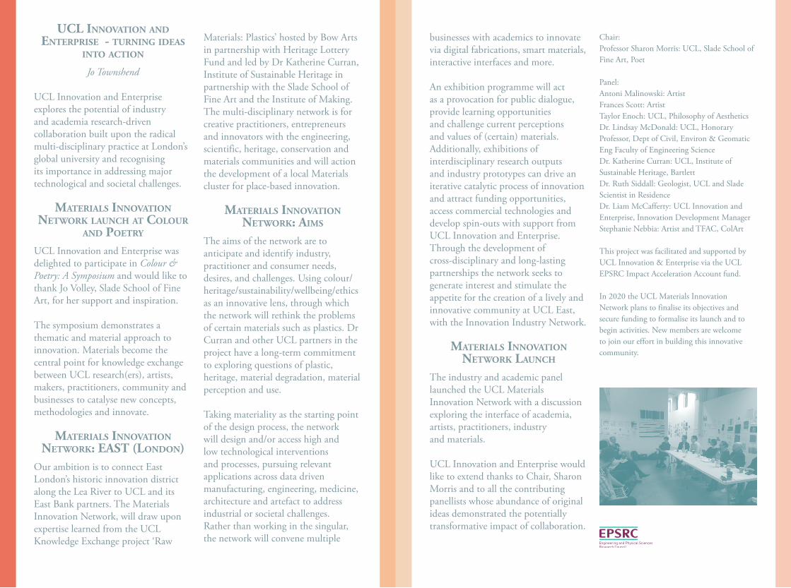
ucl InnovAtIon And enterprIse - turnIng IdeAs
Into ActIon
Jo Townshend
UCL Innovation and Enterprise explores the potential of industry and academia research-driven collaboration built upon the radical multi-disciplinary practice at London’s global university and recognising its importance in addressing major technological and societal challenges.
mAterIAls InnovAtIon network lAunch At colour
And poetry
UCL Innovation and Enterprise was delighted to participate in Colour & Poetry: A Symposium and would like to thank Jo Volley, Slade School of Fine Art, for her support and inspiration.
The symposium demonstrates a thematic and material approach to innovation. Materials become the central point for knowledge exchange between UCL research(ers), artists, makers, practitioners, community and businesses to catalyse new concepts, methodologies and innovate.
mAterIAls InnovAtIon network: eAst (london)
Our ambition is to connect East London’s historic innovation district along the Lea River to UCL and its East Bank partners. The Materials Innovation Network, will draw upon expertise learned from the UCL Knowledge Exchange project ‘Raw
Materials: Plastics’ hosted by Bow Arts in partnership with Heritage Lottery Fund and led by Dr Katherine Curran, Institute of Sustainable Heritage in partnership with the Slade School of Fine Art and the Institute of Making. The multi-disciplinary network is for creative practitioners, entrepreneurs and innovators with the engineering, scientific, heritage, conservation and materials communities and will action the development of a local Materials cluster for place-based innovation.
mAterIAls InnovAtIon network: AIms
The aims of the network are to anticipate and identify industry, practitioner and consumer needs, desires, and challenges. Using colour/heritage/sustainability/wellbeing/ethics as an innovative lens, through which the network will rethink the problems of certain materials such as plastics. Dr Curran and other UCL partners in the project have a long-term commitment to exploring questions of plastic, heritage, material degradation, material perception and use.
Taking materiality as the starting point of the design process, the network will design and/or access high and low technological interventions and processes, pursuing relevant applications across data driven manufacturing, engineering, medicine, architecture and artefact to address industrial or societal challenges. Rather than working in the singular, the network will convene multiple
businesses with academics to innovate via digital fabrications, smart materials, interactive interfaces and more.
An exhibition programme will act as a provocation for public dialogue, provide learning opportunities and challenge current perceptions and values of (certain) materials. Additionally, exhibitions of interdisciplinary research outputs and industry prototypes can drive an iterative catalytic process of innovation and attract funding opportunities, access commercial technologies and develop spin-outs with support from UCL Innovation and Enterprise. Through the development of cross-disciplinary and long-lasting partnerships the network seeks to generate interest and stimulate the appetite for the creation of a lively and innovative community at UCL East, with the Innovation Industry Network.
mAterIAls InnovAtIon network lAunch
The industry and academic panel launched the UCL Materials Innovation Network with a discussion exploring the interface of academia, artists, practitioners, industry and materials.
UCL Innovation and Enterprise would like to extend thanks to Chair, Sharon Morris and to all the contributing panellists whose abundance of original ideas demonstrated the potentially transformative impact of collaboration.
Chair: Professor Sharon Morris: UCL, Slade School of Fine Art, Poet
Panel: Antoni Malinowski: Artist Frances Scott: Artist Taylor Enoch: UCL, Philosophy of Aesthetics Dr. Lindsay McDonald: UCL, Honorary Professor, Dept of Civil, Environ & Geomatic Eng Faculty of Engineering Science Dr. Katherine Curran: UCL, Institute of Sustainable Heritage, Bartlett Dr. Ruth Siddall: Geologist, UCL and Slade Scientist in Residence Dr. Liam McCafferty: UCL Innovation and Enterprise, Innovation Development Manager Stephanie Nebbia: Artist and TFAC, ColArt
This project was facilitated and supported by UCL Innovation & Enterprise via the UCL EPSRC Impact Acceleration Account fund.
In 2020 the UCL Materials Innovation Network plans to finalise its objectives and secure funding to formalise its launch and to begin activities. New members are welcome to join our effort in building this innovative community.
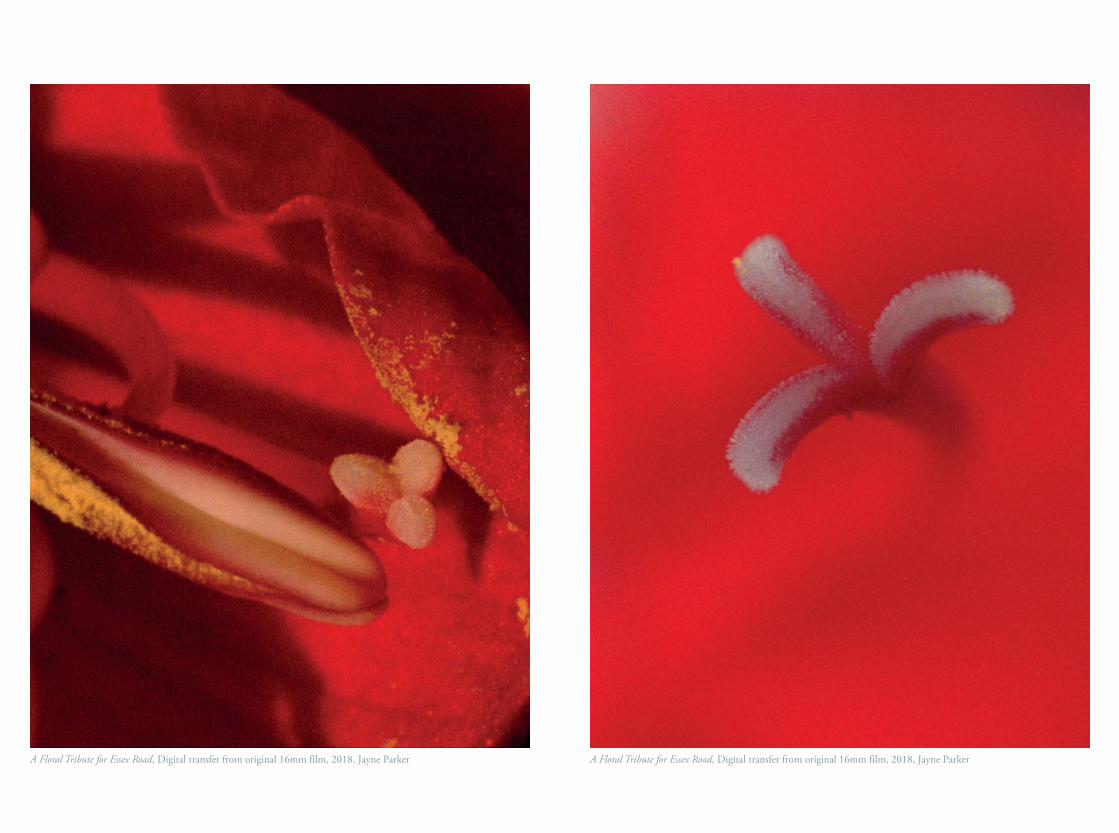
A Floral Tribute for Essex Road, Digital transfer from original 16mm film, 2018, Jayne Parker A Floral Tribute for Essex Road, Digital transfer from original 16mm film, 2018, Jayne Parker
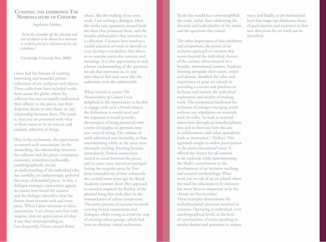
curAtIng the exhIBItIon the nomenclAture of colours
Stephanie Nebbia
‘To be the caretaker of, the selection and care of objects to be shown in a museum or to form part of a collection of art, an exhibition.’
(Cambridge University Press 2008).
I have had the fortune of curatinginteresting and beautiful privatecollections of art, sculpture and objects.These collections have included worksfrom across the globe, where thecollector has not necessarily understoodtheir affinity to the pieces, nor theirdesperate desire to own them, or, anyrelationship between them. The resultis, that you are presented with whatto them seems to be an eclectic andrandom, selection of things.
Here is the excitement, the opportunityto unravel such associations. In theunravelling, the relationship, betweenthe collector and the pieces (sometimeseconomic, sometimes profoundlyautobiographical), revealsan understanding of the individual who has carefully, yet unknowingly, gathered this array of beautiful pieces. In this, a dialogue emerges; connections appear, no matter how broad the context and the dialogue identifies what has drawn them towards each and every piece. When I draw attention to these associations I am always met first with surprise, then an appreciation of what it was they wereresponding to.Less frequently, I have curated shows
where, like the making of my ownwork, I am seeking a dialogue. Herethe works raise questions around boththe ideas that produced them, and thebroader philosophies they articulate asa collection. Curation here involves acareful selection of work to identify oreven develop a vocabulary that allowsus to examine particular contexts andmeanings. It is this opportunity to seeka better understanding of the questionswe ask that motivates us, to stepinto what at first may seem like theunknown, even the unknowable.
When invited to curate TheNomenclature of Colours I wasdelighted in the opportunity to be ableto engage with such a broad subject,the definitions it would need andthe responses it would provoke, the prospect of being presented with a series of insights or apertures into new ways of seeing. The volume of work submitted was inevitably, at first, overwhelming whilst at the same time extremely exciting. Exciting because, immediately, formal connections started to occur between the pieces and in some cases, narratives emerged. Seeing the exquisite piece by Tess Jaray reminded me of how coherently she curated some years ago the Royal Academy summer show. Her approach to curation inspired the fluidity of the physical hang that took place in the nomenclature of colour symposium. The entire process of curation involved weaving formal connections and dialogues whilst trying to avoid the trap of creating colour groups, which had been an obvious initial inclination.
To do this would have over-simplified the work, rather than celebrating the diversity and individuality of the artists and the questions they raised.
The other importance of this exhibition and symposium; the power of an inclusive approach to curation that moves beyond the individual choices of the curator, when situated in a broader, institutional context. Students showing alongside their tutors, artists and alumni, heralded the value and importance of great art schools in providing a context and platform to facilitate and nurture the individual exploration and totality of making work. The symposium facilitated the inclusion of younger emerging artists without any stipulation on materialsused, in order, “to look at materialinnovation through an interdisciplinarylens and to showcase how the artsin collaboration with other specialismsleads to innovation.” (Volley). Thisapproach sought to widen participationin the truest educational sense. Itoffered the chance for all contextsto be explored, while demonstratingthe Slade’s commitment to thedevelopment of an inclusive teachingand research methodology. Whatmore can we ask of an art school wherethe need for education to be inclusivehas never been so important as in theclimate we live in today?These examples demonstrate themultidirectional processes involved incuration. Operating at individual, evenautobiographical levels; at the levelof communities of artists speaking tosimilar themes and questions in unique
ways; and finally, at an institutionallevel that maps out distinctive formsof participation and inclusion so thatnew directions for art itself can beidentified.
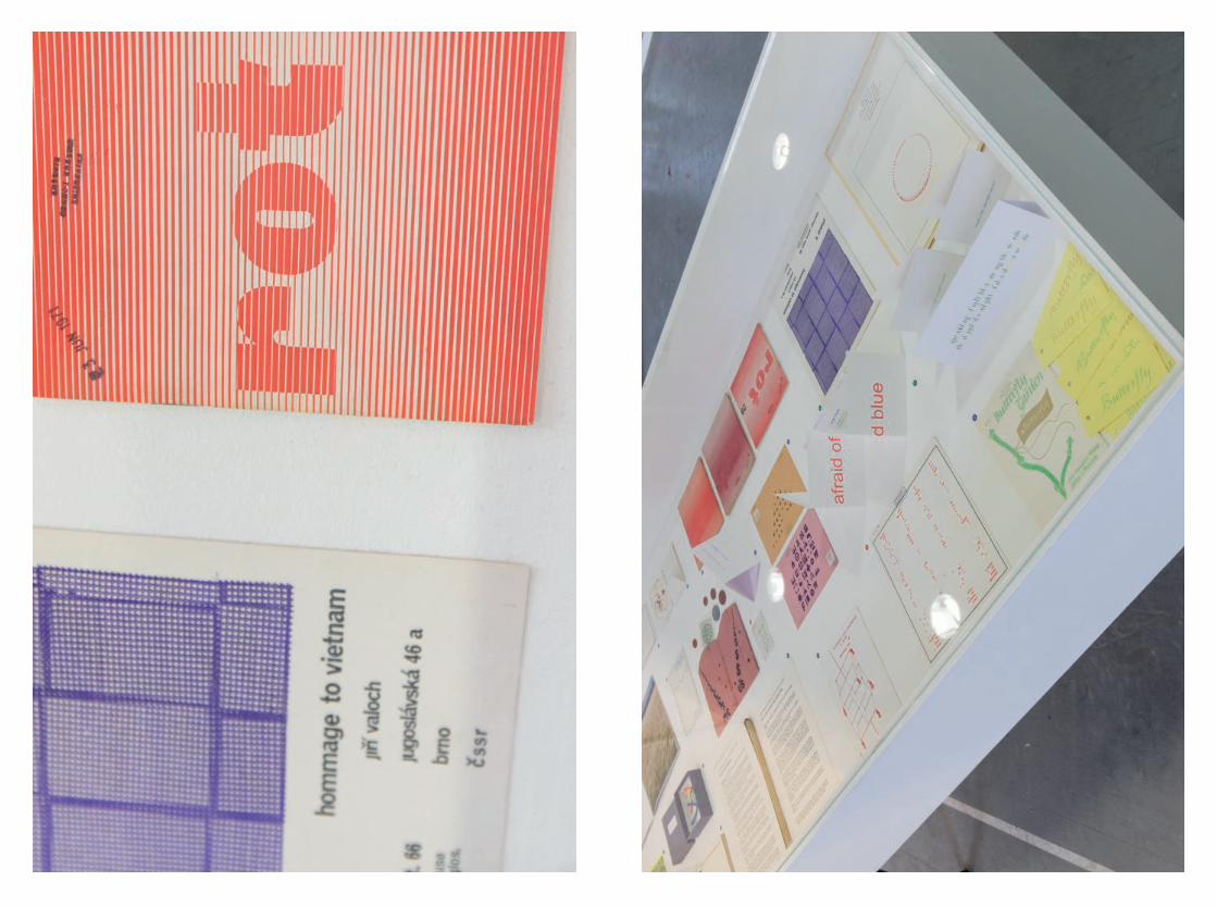
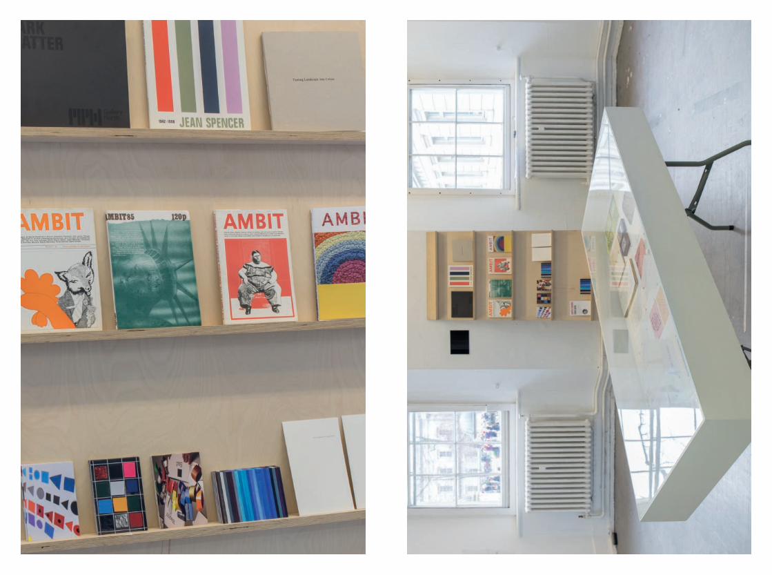
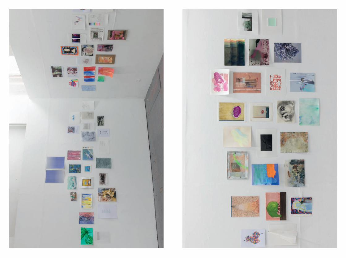
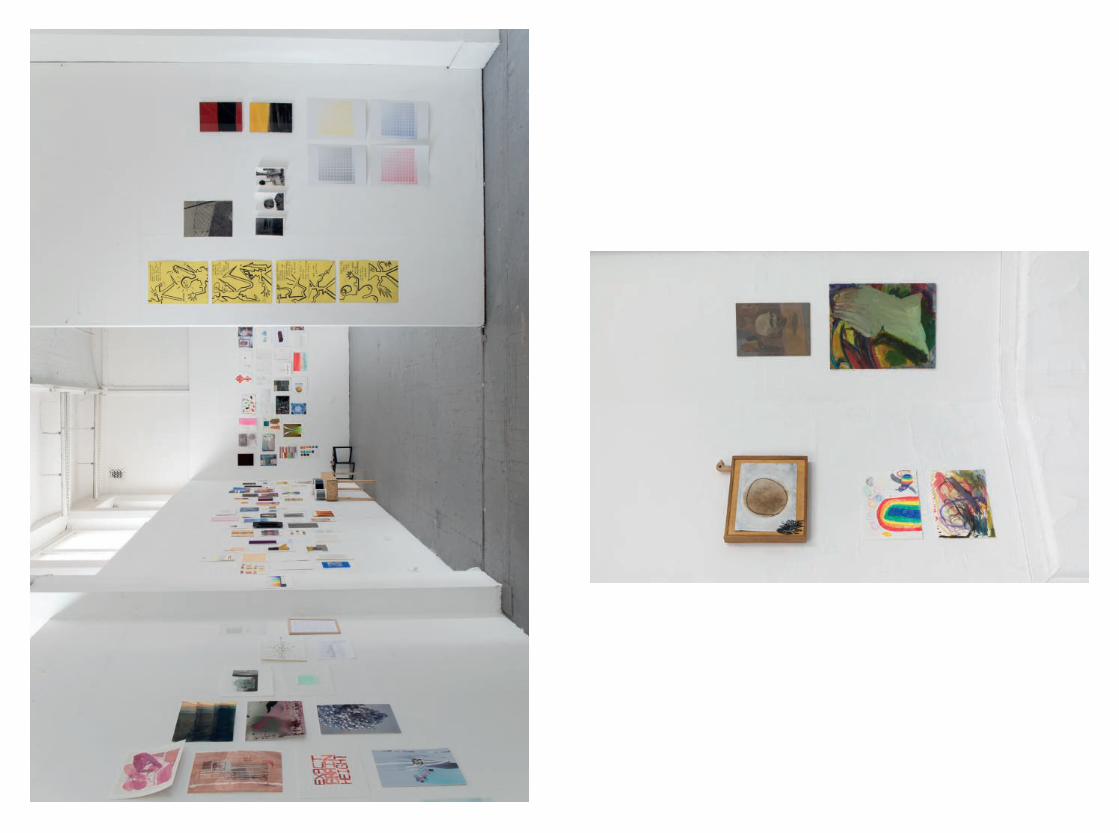
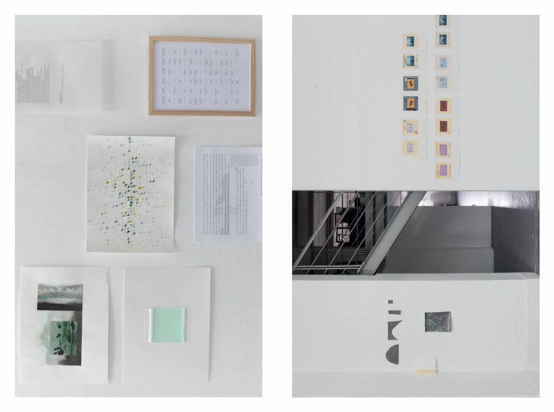
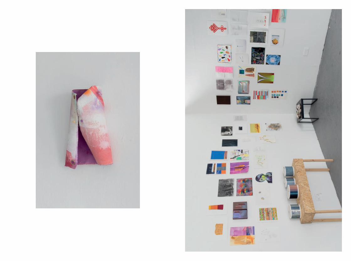
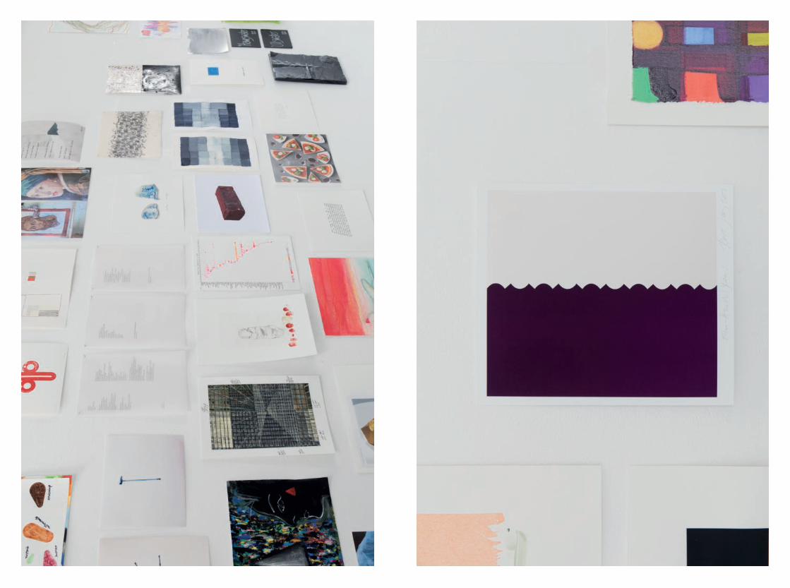
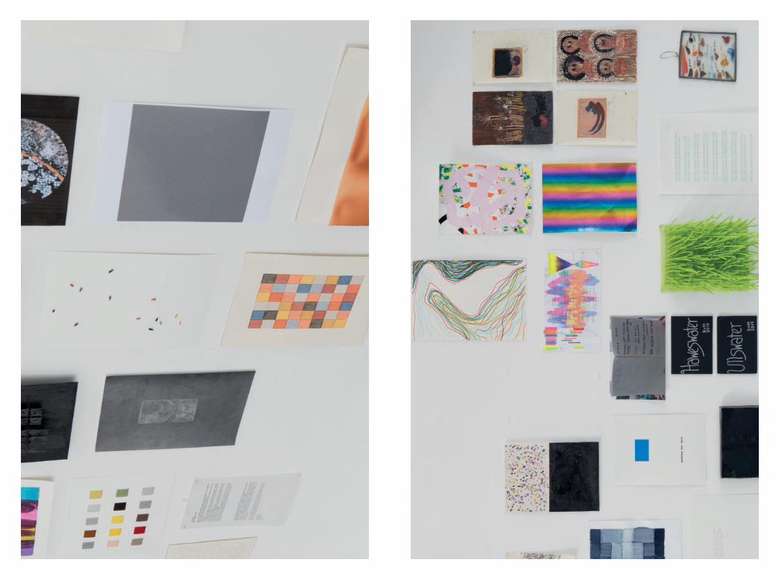
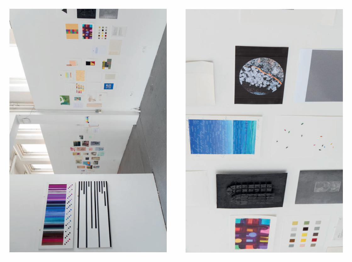
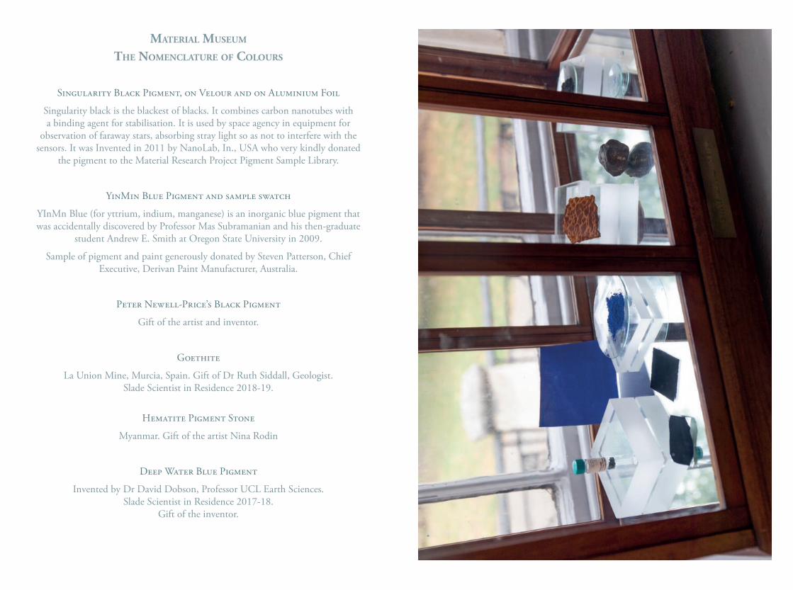
mAterIAl museum
the nomenclAture of colours
Singularity Black Pigment, on Velour and on Aluminium Foil
Singularity black is the blackest of blacks. It combines carbon nanotubes with a binding agent for stabilisation. It is used by space agency in equipment for
observation of faraway stars, absorbing stray light so as not to interfere with the sensors. It was Invented in 2011 by NanoLab, In., USA who very kindly donated
the pigment to the Material Research Project Pigment Sample Library.
YinMin Blue Pigment and sample swatch
YInMn Blue (for yttrium, indium, manganese) is an inorganic blue pigment that was accidentally discovered by Professor Mas Subramanian and his then-graduate
student Andrew E. Smith at Oregon State University in 2009.
Sample of pigment and paint generously donated by Steven Patterson, Chief Executive, Derivan Paint Manufacturer, Australia.
Peter Newell-Price’s Black Pigment
Gift of the artist and inventor.
Goethite
La Union Mine, Murcia, Spain. Gift of Dr Ruth Siddall, Geologist.Slade Scientist in Residence 2018-19.
Hematite Pigment Stone
Myanmar. Gift of the artist Nina Rodin
Deep Water Blue Pigment
Invented by Dr David Dobson, Professor UCL Earth Sciences. Slade Scientist in Residence 2017-18.
Gift of the inventor.
Michael Berkowitz is Professor of Jewish history at UCL. He is a native of Rochester, New York, where he worked as a ‘melter’s helper’ in the film emulsion division of Eastman Kodak Company in the late 1970s. He has attempted, in several works, to integrate a critical treatment of photography into Jewish, European, and American history. His most recent book is Jews and Photography in Britain (University of Texas Press, 2015), and he produced an original musical based on his Kodachrome research, Man & God, at UCL’s Bloomsbury Theatre Studio, 18 May 2019.
Malina Busch is a London-based artist and Lecturer at Morley College. Her work explores colour as a physical substance and its ability to alter sensory perception and elicit visceral responses. She studied at Slade School of Fine Art, MFA; The School of the Art Institute of Chicago, BFA; The College of William and Mary, BA; and was Honorary Research Associate for the Material Research Project at the Slade. She has exhibited in the UK and abroad at Trestle Gallery, NY; The Courtauld Institute of Art, London; Jerwood Space, London; Exeter Phoenix Gallery, UK; and Collyer Bristow Gallery, London.
Jane Bustin born 1964, London, studied at Portsmouth University and is represented by Copperfield, London; Jane Lombard, New York and Fox Jensen, Sydney and Auckland. She has had solo shows in London, Berlin, New York, Sydney, as well as group shows at Whitechapel, London; Ingleby Gallery, Edinburgh; Salon 94, New York; Royal Academy, London; Walker Gallery, Liverpool and Kettle’s Yard, Cambridge. She is a recipient of the Pollock-Krasner, British Council awards and the Mark Rothko Memorial Fund Award. Bustin has work in public collections including Victoria & Albert Museum, Ferens Museum and Yale Centre. A performance project - Faun including live music and dance was presented for Art Night London 2018 at London County Hall, Southbank.
Mark Cann Technical Exellence Manager, ColArt has worked on many interesting and varied projects in his time at Colart being brought in initially to be responsible for the move of Liquitex acrylics from the USA to the UK, since then he has worked with various artists ranges and different media, Liquitex, W&N and Reeves to mention just a few. As part of his new responsibilities he now gets the chance to build relationships with Artists, Professional organisations and schools. It’s a great privilege to build these relationships and is one of the many aspects of his job that he really enjoys.
Mataio Austin Dean, who is currently studying at the Slade School of Fine Art, was born in 1996 to a Guyanese mother and an English father, and grew up in Portsmouth. His practice is often centred around an interrogation of Marxism as a tool for emancipatory praxis. His work is concerned with the relationship between printmaking and orality: with works often consisting of etchings and other printed matter: along with singing, writing, reciting, and speaking. Austin Dean is interested in these forms as having actant, embodied potentialities for liberation. Red Berbice, presented here, seeks to use the rhythm and rhyme of the sonnet form to pierce the teleological surface of the
contemporary socio-political imaginary. It re-enacts and invokes the memory of the 1763 Guyanese Berbice Slave Uprising, thus re-embodying a moment of revolutionary success in the context of today’s world of neo-colonial capitalism.
David Dobson is Professor of Earth Materials at University College London Department of Earth Sciences. He is an accomplished wood engraver and print maker and exhibits regularly with the Society of Wood Engravers. His art ranges from the figurative to explorations of materiality and process-driven works. He was the inaugural Slade Scientist in Residence in 2016-2017.
Taylor Enoch is a PhD candidate and teaching assistant in philosophy at University College London. His research is in aesthetics, neuroesthetics, and philosophy of art, with a focus in the phenomenology of aesthetic experience. Taylor has lectured at the Slade and the Bartlett, and is an associate of the UCL Laboratory of Neurobiology and TCNJ Experimental Philosophy Laboratory.
Roland-François Lack teaches French and film at University College London. He is the curator of The Cine-Tourist, a website about connections between maps and films, and other things: https://www.thecinetourist.net/
Tess Jaray studied at St Martin’s School of Art and the Slade School of Fine Art where she later taught for many years. She has work in many public collections including the Tate Gallery, the Arts Council and the British Museum, and has exhibited nationally and internationally. She was made an RA in 2010. Ridinghouse recently published a book of her public works, ‘Desire Lines’, which documents her public works, and in 2012 a monograph ‘The Art of Tess Jaray’. The RA has published two volumes of her essays, ‘Painting: Mysteries and Confessions’ and ‘The Blue Cupboard: Inspirations and Recollections’.
Rhun Maredudd Jones (born. 1996 Carmarthen, Wales) is a student at the Slade School of Fine Art. – The two poems Elbowed and When I write were presented for their shared themes, which consider the writing process, aspects of national identity and aptly for this publication, the colour red.
Caroline de Lannoy is an interdisciplinary artist based in London. She studied at the Slade School of Fine Art - University College London, Central Saint Martins - University of the Arts London and Athens School of Fine Arts. Her varied artistic vocabulary encompasses painting, drawing, text, sound, performance and video. Her work has been presented at numerous institutions in both the UK and internationally. She has completed major commissions worldwide. Her work is included in private and public collections in Europe, Canada and US.
Liz Lawes is the UCL Subject Liaison Librarian for Fine Art, History of Art, & Film Studies and works closely with the staff and students of the Slade School of Fine Art. She also curates and manages the UCL Special Collections’ extensive Small Press Collections which consist of the Poetry Store, Little Magazines and Alternative Presses. Liz has worked in various academic art libraries as well as at the Poetry Library, Royal Festival Hall, and is especially interested in visual poetry and text by artists.
Andy Leak is Emeritus Professor of French and Francophone Studies at University College London. He is one of Georges Perec’s English translators.
Antoni Malinowski is an artist who works with pigment, light, movement and time, investigating the dynamic relationship between pictorial and architectural spaces. Since his first wall drawings in the mid 1980s Malinowski has engaged with many different buildings and installations. Following his major solo exhibition at the Camden Arts Centre in 1997, he spent several months at the British School at Rome researching ancient Roman wall paintings. This triggered collaborations with several architects. Malinowski has exhibited internationally and his paintings are in many private and public collections, including Tate Collection. He also teaches Materiality of Colour at the Architectural Association.
Onya McCausland is currently Senior Research Fellow at the Slade School of Fine Art with a Leverhulme Early Career Fellowship. She is collaborating with the UK Coal Authority (a non-departmental government organisation tasked with the remediation of the coal mining industry) to effect the way coal mine waste is used and perceived. Recent exhibitions and projects have been supported by Newlyn Gallery 2011/2019, Flat Time House 2019, Camden Arts Centre 2014, the Delfina Foundation 2013, Kettle’s Yard, Cambridge 2011. She was shortlisted for the prestigious Wollaston Award at the Royal Academy 2012, and the John Moores Painting Prize 2012 and was commissioned by the Forest of Dean Sculpture Trust in 2016. She completed an AHRC funded practice based PhD in 2017.
Sharon Morris, born in west Wales, trained at the Slade School of Fine Art, UCL, where she is currently a professor and head of the doctoral programme. Her artworks include photography, installations, film-poems, and live performances with projections: these have recently been exhibited in Film in Space, Camden Arts Centre, 2013, and The Moon and a Smile, Glynn Vivian Art Gallery, Swansea, 2017. Her poetry has been published in a range of journals including Poetry Review and Poetry Wales, and anthologies such as the Forward Book of Poetry, 2008, and Poetic Biopolitics, 2016; her collections False Spring, 2007, and Gospel Oak, 2013, were published by Enitharmon Press. The Moon is Shining on my Mother, a set of artist’s books, was published by Enitharmon Editions in 2017.
Dimitris Mylonas holds a PhD in Colour Communication Within Different Languages from the Department of Computer Science, University College London. Dimitris has also obtained an MSc in Digital Colour Imaging from the University of the Arts, London and completed an MRes in Media and Arts Technology at the School of Electronic Engineering and Computer Science, Queen Mary University of London. He held research positions at the School of Psychology, University of Liverpool, and in the Wellcome Laboratory of Neurobiology, University College London. Since 2015, Dimitris Mylonas has been Chairman of the Study Group ‘Language of Colour’ of the International Colour Association (AIC). Stephanie Nebbia studied fine art BA and MA at the UAL. Painter and printmaker whose work explores space, light and abstraction. She curates private collections as well as public exhibitions; most recently for the Fondamenta space in Rome. Works part time for Colart; managing their fine art collective programme globally, to support emerging fine art practice.
Jayne Parker is an artist and filmmaker whose work has been widely shown in art institutions, on television and in film and music festivals. She studied at Canterbury College of Art (1977-80) and the Slade School of Fine Art, UCL (1980-82) where she is currently Head of Graduate Fine Art Media. Working with 16mm film, analogue photographic processes and object making, including stone carving, much of her recent work explores the form and expression of music. In 2008 the British Film Institute released a DVD compilation of her film works in their British Artists’ Film series. Her films are distributed by LUX www.lux.org.uk.
Fabian Peake studied painting at Chelsea College of Art and the Royal College of Art. He lives and works in London. He taught part time in many U.K. art schools, including a position as Senior Lecturer in Painting at Manchester Metropolitan University. Fabian Peake has shown his paintings and other visual forms in the U.K. and other countries, including the U.S.A., Mexico, China, Europe and the Dominican Republic. Towards the end of 2019 there will be a solo exhibition of his work at the Kunstmuseum in Lucerne, Switzerland. While painting has always been his main occupation, Fabian Peake has been writing poetry for more than thirty years. As with his painting, his writing is mostly preoccupied with experimentation and form. The idea of responding to life’s experiences in two such different ways as painting and writing is something that is a continuous source of fascination.
Ian Rowlands, born Liverpool 1959, studied at Norwich School of Art 1980-83 and Royal Academy Schools 1984-87. He has taught on the Slade Summer School and Salde short courses since 1993 to the present and from 2015 as a visiting lecturer on materials as part of ‘The Fine Art Collective’. Published works include ‘Foundation Course – Life Drawing’ Cassell Illustrated 2005 and a regular contributor to ‘The Artist’ and ‘Artists
and Illustrators’ magazines 1998 – 2016. He is currently co-writing an Art School Guide to Material Practice Vol. I: Supports, Surfaces & Grounds. In 2016 he was a runner up in the Lynn Painters-Stainers Prize.
Ruth Siddall is a geologist, who applies analytical techniques from the field of Earth sciences to further the understanding of cultural material, primarily pigments, construction and decorative stone, ceramics and plasters. Ruth has a BSc in Geology from the University of Birmingham and a PhD in Tectonics from UCL. She has worked for the American School of Classical studies in Athens’s Corinth Excavations, and has been involved in a number of archaeological surveys in the eastern Mediterranean. She is the co-author of the Pigment Compendium, a dictionary of historical pigments and has worked on the analysis of pigments in works of art from the Neolithic to the modern era. She is currently Scientist in Residence at the UCL Slade School of Fine Art (2018-2019). Lesley Sharpe is Senior Teaching Fellow in Print at the Slade School of Fine Art. She works predominantly in print with an interest in hybrid processes combining both traditional and digital techniques. Researching specific subjects relating to architecture and the anthropology of place as departure points, her work explores the conceptual and material interpretation of landscape through the printed image. One strand of her practice centres around the production of fine art print and book design in collaboration with and for artists. These have in part been produced through imprint The Small Press which was founded in 2008 and editions practice Holding Page, co-founded in 2011.
Henrietta Simson works with the landscape image through its historical and cultural development, and its current definition within a digital context framed by ecological crisis. She draws from late medieval and early Renaissance imagery, presenting an idea that challenges landscape’s designation within human/nonhuman dichotomies. She completed an MA in painting at the Slade in 2007, and a practice-related PhD in 2017. In 2011 she won the Threadneedle Prize for Painting and Sculpture. She has taught undergraduate and graduate students at the Slade School of Fine Art and currently teaches at the University of the Arts, London.
George Szirtes’s first book of poems, The Slant Door was joint-winner of the Faber Prize in 1979. He has published many since then, his collection, Reel, winning the T S Eliot Prize in 2004, for which he has been twice shortlisted since. His latest is Mapping the Delta (Bloodaxe 2016). His memoir of his mother, The Photographer at Sixteen, was published by MacLehose in February 2019. He is a Fellow of the Royal Society of Literature and of the English Association.
Estelle Thompson is a painter and printmaker whose work is concerned with Painting’s language, light and colour. She studied painting at the Royal College of Art (1983-86) and is Associate Professor at the Slade where she is currently Head of
Graduate Painting. She has taught at the RCA, Ruskin, St Martin’s and many other UK universities. She has exhibited internationally for over thirty years, including one person and retrospective shows in the UK, Europe and America and South East Asia. Her work is in private and public collections, including the Arts Council of Great Britain, British Council, British Museum, Pallant House Gallery, Oldam Art Gallery and New York Public Library. Major public artworks and corporate commissions include; South Bristol Community Hospital, Milton Keynes Theatre and Quaglino’s, London. Awards include UCL Research Catalyst Awards 2016 and the Prudential Award for the Arts 1990/Arts Council Special Award 1990.
Jo Townshend is the Senior Partnerships Manager (Creative) in the department of Innovation and Enterprise, UCL. Working at the interface of academic research and industry, Jo is responsible for identifying and developing strategic partnerships in the Creative Industries, arts, humanities and social sciences. She specialises in facilitating multi-disciplinary and interdisciplinary collaborations across the performing, production and visual arts, museums, galleries and business. Jo is a Trustee of the De La Warr Pavilion, Bexhill, a Fellow of the RSA and an alumna of the Royal Academy schools.
Tabitha Tuckett is Rare-Books Librarian at UCL. Formerly a librarian at Magdalen College, Oxford and the Warburg Institute, she has also worked as a Junior Research Fellow and tutor in Classical and Renaissance literature and philosophy at Oxford University, as an editor on the Oxford English Dictionary, and as a musician. Her poems have been published by Faber, Hodder and Stoughton, and others.
Jo Volley is an artist and currently Deputy Director (Projects), Coordinator, Material Research Project and Material Museum at the Slade School of Fine Art, UCL where she studied as both an undergraduate and graduate from 1972-77. Her three most recent funded interdisciplinary research projects include: The Pigment Timeline Project; From Pigments to Solar Power; Colour & Emotion Toolkit and is currently co-writing an Art School Guide to Material Practice Vol.I: Supports, Surfaces & Grounds. Latest exhibitions include The Adjacent Possible, Muscarelle Museum of Art, Williamsburg VA, and at Fondementa exhibition space from her residency at MACRO Asilo in Rome. In 2019 she established and directed Colour & Poetry: A Symposium to commemorate International Colour Day and World Poetry Day.
Edward Winters studied painting at the Slade and, much later, wrote his PhD in Philosophy at UCL. He has published extensively on aesthetics and art criticism. He is presently writing a book on everyday aesthetics. He taught at University of Westminster and at University of Kent. He was also Head of Fine Art at West Dean College. He continues to write and make art.
Clove BrownheAd And neck of mAle kestrIl
stems of BlAck currAnt Bush
AxInIte, rok crIstAl
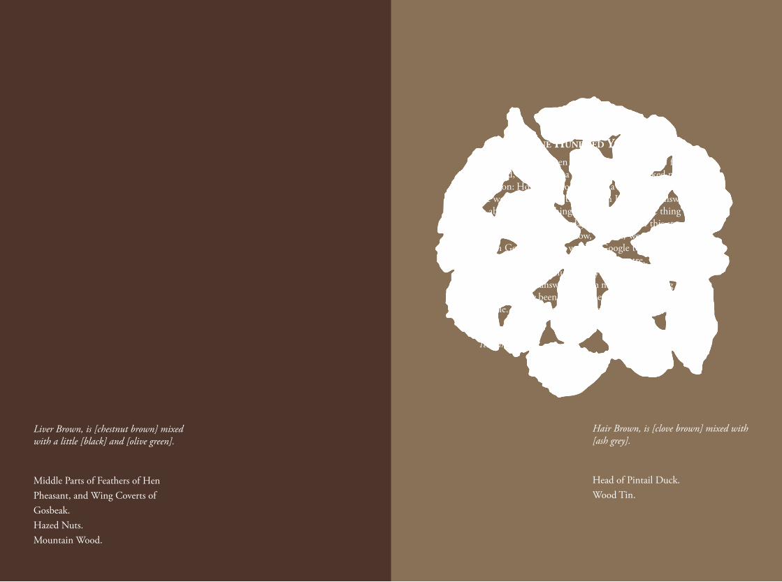
Liver Brown, is [chestnut brown] mixed with a little [black] and [olive green].
Middle Parts of Feathers of Hen Pheasant, and Wing Coverts of Gosbeak.Hazed Nuts.Mountain Wood.
one hundred yeArs
Many years ago, when my grandson Harry was four years old, we went on a walk together. He asked me a question: How long would it take a snail to go around the world? I told him that though I knew the answer to absolutely everything else, that was the one thing I didn’t know. Then one day recently, I told this story to a friend. That’s easy now, he said, we can look it up on Google. Which we did. Google told us that it took an hour for a snail to go one metre, which we then only had to multiply by the circumference of the planet. The answer, though not really allowing for what may have been some impediments en route, was simple. And, I thought, lovely: One Hundred Years.
Tess Jaray, 2017
Hair Brown, is [clove brown] mixed with [ash grey].
Head of Pintail Duck.Wood Tin.
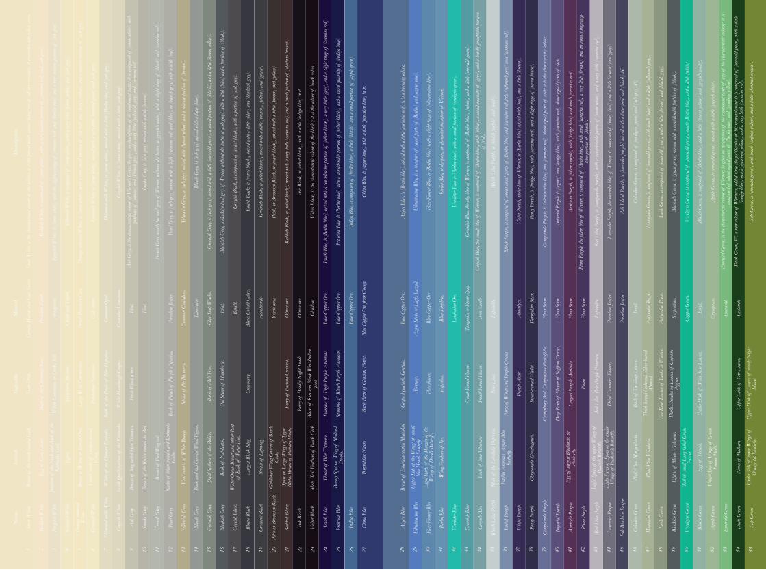
1 2 3 4 5 6 7 8 9 10 11 12 13 14 15 16 17 18 19 20 21 22 23 24 25 26 27
Snow
Whi
te
Nam
e
Brea
st of
the b
lack-
head
ed G
ull.
Ani
mal
Egr
et.
Whi
te of
the H
uman
Eyeb
alls.
Brea
st of
the R
obin
roun
d th
e Red
.
Ven
t cov
erts o
f W
hite
Rum
p.
Back
of N
ut-h
atch
.
Brea
st of
Lap
wing
Beau
ty Sp
ot on
Win
g of
Mall
ard
Dra
ke.
Snow
-Dro
p.
Vege
tabl
e
Berr
y of
Fuch
sia C
occin
ea.
Polya
nthu
s Nar
cissu
s.
Old
Stem
s of
Haw
thor
n.
Back
of th
e Chr
istma
s Ros
e.
Back
of P
etals
of P
urple
Hep
atica
.
Berr
y of
Dea
dly N
ight S
hade
Back
of th
e Peta
ls of
Blu
e Hep
atica
.
Back
Par
ts of
Gen
tian
Flow
er.
Whi
te G
erani
um or
Stor
ks B
ill.
Stem
s of
the B
arbe
rry.
Blac
k of
Red
and
Blac
k W
est-In
dian
peas
.
Haw
thor
n Bl
osso
m.
Stam
ina
of S
ingle
Pur
ple A
nemo
ne.
Fresh
Woo
d as
hes.
Whi
te H
ambu
rgh
Gra
pes.
Crow
berr
y.
Larg
e Wild
Con
volvu
lus.
Bark
of A
sh T
ree.
Stam
ina
of B
luish
Pur
ple A
nemo
ne.
Cara
ra M
arble
and
Calc
Sin
ter.
Min
eral
Flin
t.
Basa
lt.
Porce
lain
Ear
th.
Flin
t.
Blac
k Co
balt
Och
re.
Arr
agon
ite.
Hor
nblen
de
Chalk
and
Trip
oli.
Porce
lain
Jasp
er.
Yeni
te mi
ca
Fren
ch P
orcel
ain C
lay.
Comm
on C
alced
ony.
Oliv
en or
e
Calc
sinter
.
Lime
stone
Oliv
en or
e
Comm
on O
pal.
Clay
Slat
e Wac
ke.
Obs
idian
Gra
nular
Lim
eston
e.
Flin
t.
Blue
Cop
per O
re.
Blue
Cop
per O
re.
Blue
Cop
per O
re.
Blue
Cop
per O
re fro
m Ch
essy.
Snow
Whi
te, is
the c
hara
cteris
tic co
lour o
f th
e whi
tes; i
t is t
he p
urest
whi
te col
our;
bein
g free
of a
ll in
termi
xtur
e, it
resem
bles n
ew-fa
llen
snow
.
Des
crip
tion
Skim
med-
milk
Whi
te, is
[sno
w wh
ite],
mixe
d wi
th a
littl
e [Be
rlin
blue]
and
[ash
grey]
.
Yello
wish
Grey
, is [
ash
grey]
mix
ed w
ith [l
emon
yello
w] a
nd a
min
ute p
ortio
n of
[bro
wn].
Gree
nish
Blac
k, is
[velv
et bla
ck],
mixe
d wi
th a
littl
e [br
own]
, [yel
low],
and
[green
].
Redd
ish W
hite,
is co
mpos
ed of
[sno
w wh
ite],
with
a ve
ry m
inut
e por
tion
of [c
rimso
n red
] and
[ash
grey]
.
Grey
ish W
hite,
is [s
now
white
], mi
xed
with
a li
ttle [
ash
grey]
.
Blui
sh G
rey, i
s [as
h gr
ey] m
ixed
with
a li
ttle [
blue].
Pitch
, or B
rown
ish B
lack,
is [v
elvet
black
], mi
xed
with
a li
ttle [
brow
n] a
nd [y
ellow
].
Purp
lish
Whi
te, is
[sno
w wh
ite],
with
the s
light
est ti
nge o
f [cr
imso
n red
] and
[Berl
in b
lue],
and
a ve
ry m
inut
e por
tion
of [a
sh gr
ey].
Ash
Grey
, is t
he ch
arac
terist
ic col
our o
f W
erner’
s Grey
s; he
give
s no d
escrip
tion
of it
s com
pone
nt p
arts;
it is
comp
osed
of [s
now
white
], wi
th
porti
ons o
f [sm
oke]
and
[Fren
ch gr
ey], a
nd a
very
littl
e [yel
lowish
grey]
and
[car
mine
red]
.
Gree
nish
Grey
, is [
ash
grey]
mix
ed w
ith a
littl
e [em
erald
green
], a
small
por
tion
of [b
lack]
, and
a li
ttle [
lemon
yello
w].
Redd
ish B
lack,
is [v
elvet
black
], mi
xed
with
a ve
ry li
ttle [
carm
ine r
ed],
and
a sm
all p
ortio
n of
[che
stnut
bro
wn].
Yello
wish
Whi
te, is
comp
osed
of [s
now
white
], wi
th a
very
littl
e [lem
on ye
llow]
and
[ash
grey]
.
Smok
e Grey
, is [
ash
grey]
mix
ed w
ith a
littl
e [br
own]
.
Blac
kish
Grey
, a b
lacki
sh le
ad gr
ey of
Wern
er wi
thou
t the
lustr
e is [
ash
grey]
, with
a li
ttle [
blue]
and
a po
rtion
of [b
lack]
.
Ink
Blac
k, is
[velv
et bla
ck],
with
a li
ttle [
indig
o blu
e] in
it.
Ora
nge-c
olour
ed W
hite,
is [s
now
white
], wi
th a
very
small
por
tion
of [t
ile re
d] a
nd [k
ing’s
yello
w], a
nd a
min
ute p
ortio
n of
[ash
grey]
.
Fren
ch G
rey, n
early
the s
teel g
rey of
Wern
er, w
ithou
t the
lustr
e, is
[greyi
sh w
hite]
, with
a sl
ight t
inge
of [b
lack]
and
[car
mine
red]
.
Grey
ish B
lack,
is co
mpos
ed of
[velv
et bla
ck],
with
a p
ortio
n of
[ash
grey]
.
Velv
et Bl
ack,
is th
e cha
racte
ristic
colou
r of
the b
lacks
; it i
s the
colou
r of
black
velve
t.
Gree
nish
Whi
te, is
[sno
w wh
ite],
mixe
d wi
th a
very
littl
e [em
erald
green
] and
[ash
grey]
.
Pear
l Grey
, is [
ash
grey]
mix
ed w
ith a
littl
e [cri
mson
red]
and
[blu
e], or
[blu
ish gr
ey] w
ith a
littl
e [red
].
Blui
sh B
lack,
is [v
elvet
black
], mi
xed
with
a li
ttle [
blue]
and
[blac
kish
grey]
.
Scotc
h Bl
ue, i
s [Be
rlin
blue],
mix
ed w
ith a
cons
idera
ble p
ortio
n of
[velv
et bla
ck],
a ve
ry li
ttle [
grey]
, and
a sl
ight t
inge
of [c
armi
ne re
d].
Prus
sian
Blue
, is [
Berli
n blu
e], w
ith a
cons
idera
ble p
ortio
n of
[velv
et bla
ck],
and
a sm
all q
uant
ity of
[ind
igo b
lue].
Indig
o Blu
e, is
compo
sed of
[berl
in b
lue],
a li
ttle [
black
], an
d a
small
por
tion
of [a
pple
green
].
Chin
a Bl
ue, i
s [az
ure b
lue],
with
a li
ttle [
prus
sian
blue]
in it
.
Egg
of G
rey L
inne
t
Brea
st of
Whi
te or
Scre
ech O
wl.
Insid
e Qui
ll-fea
thers
of th
e Kitt
iwak
e.
Brea
st of
Pied
Wag
tail.
Back
and
tail
Cove
rts W
ood
Pigeo
n.
Wat
er O
usel.
Brea
st an
d up
per P
art
of B
ack
of W
ater
Hen
.
Gui
llemo
t Win
g Cov
erts o
f Bl
ack
Cock
.
Mole
. Tail
Fea
thers
of B
lack
Cock
.
Junc
tion
of th
e Neck
and
Bac
k of
the
Kitti
wake
Gul
l.
Ven
t Cov
erts o
f G
olden
crest
ed
Wren
.
Brea
st of
long
taile
d H
en T
itmou
se.
Back
s of
black
hea
ded
and
Kitti
wake
G
ulls.
Qui
ll fea
thers
of th
e Rob
in.
Larg
est B
lack
Slug
Spots
on L
arge
Win
gs of
Tyg
er M
oth. B
reast
of P
ochar
d D
uck.
Thro
at of
Blu
e Titm
ouse.
Rhyn
chite
s Nite
ns
Redd
ish W
hite
Purp
lish
Whi
te
Yello
wish
Whi
te
Ora
nge c
olour
ed
Whi
te
Gree
nish
Whi
te
Skim
med
milk
Whi
te
Yello
wish
Grey
Gree
nish
Blac
k
Grey
ish W
hite
Blui
sh G
rey
Pitch
or B
rown
ish B
lack
Ash
Grey
Gree
nish
Grey
Redd
ish B
lack
Smok
e Grey
Blac
kish
Grey
Ink
Blac
k
Fren
ch G
rey
Grey
ish B
lack
Velv
et Bl
ack
Pear
l Grey
Blui
sh B
lack
Scotc
h Bl
ue
Prus
sian
Blue
Indig
o Blu
e
Chin
a Bl
ue
Brea
st of
Eme
rald-
creste
d M
anak
in
Win
g Fea
thers
of Ja
y.
Back
of b
lue T
itmou
se
Ligh
t Spo
ts of
the u
pper
Win
gs of
Pe
acock
But
terfly
.
PhalÅ
“na.
Mar
garit
aria.
Elyt
ra of
Melo
e Viol
aceu
s.
Und
er Si
de of
Win
gs of
Gree
n Br
oom
Moth
.
Gra
pe H
yacin
th. G
entia
n.
Sweet
-scen
ted V
iolet.
Sea
Kale.
Lea
ves o
f Le
eks i
n W
inter
.
Grea
t Fen
nel F
lower.
Red
Lilac
. Pale
Pur
ple P
rimro
se.
Borr
age.
Cant
erbur
y Bell
. Cam
panu
la Pe
rsicif
olia.
Dar
k St
reaks
on L
eave
s of
Cayen
ne
Pepp
er.
Small
Fen
nel F
lower.
Drie
d La
vend
er Fl
owers
.
Upp
er D
isk of
Yew
Lea
ves.
Upp
er D
isk of
Lea
ves o
f wo
ody N
ight
Shad
e.
Flax
flow
er.
Deep
Par
ts of
Flow
er of
Saf
fron
Crocu
s.
Hep
atica
.
Larg
est P
urple
Aur
icula.
Und
er D
isk of
Wild
Ros
e Lea
ves.
Parts
of W
hite
and
Purp
le Cr
ocus.
Back
of T
ussil
age L
eave
s.
Blue
Lila
c.
Plum
.
Purp
le A
ster.
Thick
leav
ed C
udwe
ed. S
ilver-
leave
d A
lmon
d.
Blue
Cop
per O
re.
Porce
lain
Jasp
er.
Azu
re St
one o
r Lap
is La
zuli.
Ame
thyst
.
Porce
lain
Jasp
er.
Blue
Cop
per O
re
Derb
yshire
Spa
r.
Bery
l.
Blue
Sap
phire
.
Fluo
r Spa
r.
Acty
nolit
e Ber
yl.
Lent
icular
Ore.
Fluo
r Spa
r.
Acty
nolit
e Pra
se.
Turq
uoise
or F
lour S
par.
Fluo
r Spa
r.
Serp
entin
e.
Iron
Ear
th.
Fluo
r Spa
r.
Copp
er G
reen.
Lepid
olite.
Lepid
olite.
Bery
l.
Cryso
pras
e.
Eme
rald.
Ceyla
nite
Azu
re Bl
ue, i
s [Be
rlin
blue],
mix
ed w
ith a
littl
e [ca
rmin
e red
]: it
is a
burn
ing c
olour
.
Grey
ish B
lue,
the s
malt
blue o
f W
erner,
is co
mpos
ed of
[Berl
in b
lue],
with
[whi
te], a
small
qua
ntity
of [g
rey],
and
a ha
rdly
perce
ptibl
e por
tion
of [r
ed].
Impe
rial P
urple
, is [
azur
e] an
d [in
digo b
lue],
with
[car
mine
red]
, abo
ut eq
ual p
arts
of ea
ch.
Celin
dine G
reen,
is co
mpos
ed of
[verd
igris
green
] and
[ash
grey]
.‡
Ultr
amar
ine B
lue,
is a
mixt
ure o
f eq
ual p
arts
of [B
erlin
] and
[azu
re blu
e].
Blui
sh L
ilac P
urple
, is [
bluish
pur
ple] a
nd [w
hite]
.
Aur
icula
Purp
le, is
[plu
m pu
rple]
, with
[ind
igo b
lue]
and
much
[car
mine
red]
.
Mou
ntain
Gree
n, is
comp
osed
of [e
mera
ld gr
een],
with
muc
h [b
lue]
and
a lit
tle [y
ellow
ish gr
ey].
Flax
-Flow
er Bl
ue, i
s [Be
rlin
blue],
with
a sl
ight t
inge
of [u
ltram
arin
e blu
e].
Blui
sh P
urple
, is c
ompo
sed of
abo
ut eq
ual p
arts
of [B
erlin
blu
e] an
d [ca
rmin
e red
].ittl
e [yel
lowish
grey]
and
[car
mine
red]
.
Plum
Pur
ple, t
he p
lum
blue o
f W
erner,
is co
mpos
ed of
[Berl
in b
lue],
with
muc
h [ca
rmin
e red
], a
very
littl
e [br
own]
, and
an
almos
t imp
ercep
-tib
le po
rtion
of [b
lack]
.
Leek
Gree
n, is
comp
osed
of [e
mera
ld gr
een],
with
a li
ttle [
brow
n] a
nd [b
luish
grey]
.
Berli
n Bl
ue, i
s the
pur
e, or
char
acter
istic
colou
r of
Wern
er.
Viol
et Pu
rple,
viole
t blu
e of
Wern
er, is
[Berl
in b
lue]
mixe
d wi
th [r
ed],
and
a lit
tle [b
rown
].
Red
Lilac
Pur
ple, i
s [ca
mpan
ula
purp
le], w
ith a
cons
idera
ble p
ortio
of [s
now
white
], an
d a
very
littl
e [ca
rmin
e red
].
Blac
kish
Gree
n, is
[gra
ss gr
een] m
ixed
with
a co
nside
rable
por
tion
of [b
lack]
.
Verd
itter
Blue
, is [
Berli
n blu
e], w
ith a
small
por
tion
of [v
erdigr
is gr
een].
Pans
y Pur
ple, i
s [in
digo b
lue],
with
[car
mine
red]
, and
a sl
ight t
inge
of [r
aven
blac
k].
Lave
nder
Purp
le, th
e lav
ende
r blu
e of
Wern
er, is
comp
osed
of [b
lue],
[red
], an
d a
little
[bro
wn] a
nd [g
rey].
Verd
igris
Gree
n, is
comp
osed
of [e
mera
ld gr
een],
much
[Berl
in b
lue],
and
a li
ttle [
white
].
Gree
nish
Blu
e, th
e sky
blu
e of
Wern
er, is
comp
osed
of [B
erlin
blu
e], [w
hite]
, and
a li
ttle [
emera
ld gr
een].
Camp
anul
a Pu
rple,
is [u
ltram
arin
e blu
e] an
d [ca
rmin
e red
], ab
out e
qual
parts
of ea
ch: i
t is t
he ch
arac
terist
ic col
our.
Pale
Blui
sh P
urple
, is [
lave
nder
purp
le] m
ixed
with
a li
ttle [
red] a
nd [b
lack]
.â€
Blui
sh G
reen,
is co
mpos
ed of
[Berl
in b
lue],
and
a li
ttle [
lemon
yello
w] a
nd [g
reyish
whi
te].
App
le G
reen,
is [e
mera
ld gr
een] m
ixed
with
a li
ttle [
greyi
sh w
hite]
.
Eme
rald
Gree
n, is
the c
hara
cteris
tic co
lour o
f W
erner
; he g
ives n
o desc
riptio
n of
the c
ompo
nent
par
ts of
any
of th
e cha
racte
ristic
colou
rs; it
is
compo
sed of
abo
ut eq
ual p
arts
of [B
erlin
blu
e] an
d [ga
mbog
e yell
ow].
Duc
k G
reen,
W. a
new
colou
r of
Wern
er’s,
adde
d sin
ce th
e pub
licat
ion of
his
nome
nclat
ure;
it is
compo
sed of
[eme
rald
green
], wi
th a
littl
e [in
digo b
lue],
muc
h [ga
mbog
e yell
ow],
and
a ve
ry li
ttle [
carm
ine r
ed].
Sap
Gree
n, is
[eme
rald
green
], wi
th m
uch
[saffr
on ye
llow]
, and
a li
ttle [
chest
nut b
rown
].
Upp
er Si
de of
the W
ings
of sm
all
blue H
eath
But
terfly
.
Male
of th
e Leb
ellul
a D
epres
sa.
Chry
some
la G
oetti
ngen
sis.
Egg
of la
rgest
Blu
ebott
le. or
Fl
esh F
ly.
Ligh
t Par
ts of
Spo
ts on
the u
nder
Win
gs of
Pea
kcock
But
terfly
.
PhalÅ
“na
Viri
daria
.
Tail
of sm
all L
ong-t
ailed
Gree
n Pa
rrot.
Ligh
t Par
ts of
the M
argin
of th
e W
ings
of D
evil’s
But
terfly
.
Papil
io A
rgeo
tus.
Azu
re Bl
ue
Butte
rfly.
Egg
of T
hrus
h.
Neck
of M
allar
d
Und
er Si
de of
lowe
r Win
gs of
O
rang
e tip
Butte
rfly
Azu
re Bl
ue
Verd
itter
Blue
Blui
sh P
urple
Impe
rial P
urple
Lave
nder
Purp
le
Leek
Gree
n
App
le G
reen
Ultr
amar
ine B
lue
Gree
nish
Blu
e
Viol
et Pu
rple
Aur
icula
Purp
le
Pale
Blac
kish
Pur
ple
Blac
kish
Gree
n
Eme
rald
Gree
n
Flax
-Flow
er Bl
ue
Grey
ish B
lue
Pans
y Pur
ple
Plum
Pur
ple
Celad
ine G
reen
Verd
igris
Gree
n
Duc
k G
reen
Berli
n Bl
ue
Blui
sh L
ilac P
urple
Camp
anul
a Pu
rple
Red
Lilac
Pur
ple
Mou
ntain
Gree
n
Blui
sh G
reen
Sap
Gree
n
28 29 30 31 32 33 34 35 36 37 38 39 40 41 42 43 44 45 46 47 48 49 50 51 52 53 54 55
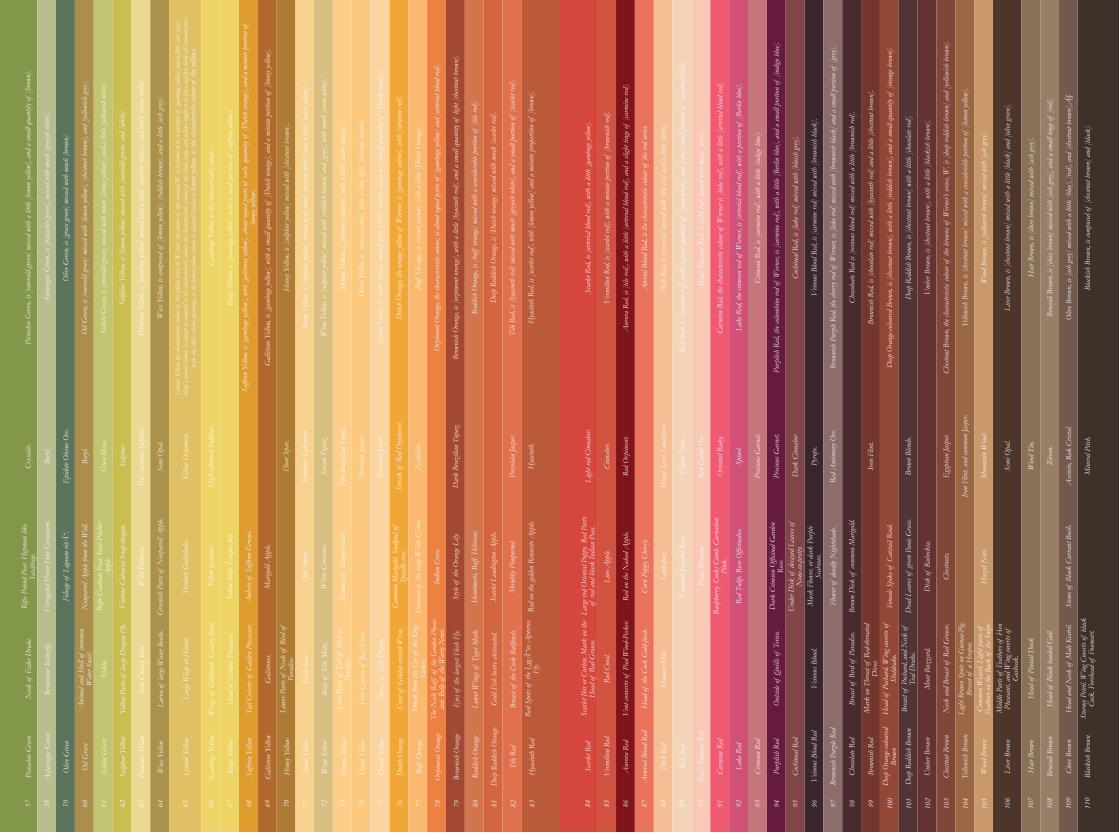
57 58 59 60 61 62 63 64 66 67 68 69 70 71 72 73 74 75 76 77 78 79 80 81 82 83
Pista
chio
Gree
nN
eck of
Eide
r Dra
ke
Ani
mal a
nd S
hell
of co
mmon
W
ater
Snail
.
Pale
Cana
ry B
ird.
Win
gs of
Gold
finch
. Can
ary B
ird.
Gall
stone
s.
Body
of S
ilk M
oth.
Brea
st of
Tea
l Dra
ke.
The N
eck R
uff
of th
e Gold
en P
heas
-an
t. Be
lly of
the W
arty
New
t.
Gold
Fish
lustr
e abs
tracte
d.
Ripe
Pou
nd P
ear.
Hyp
man
like
Saxi
frage.
Yello
w tu
lip. C
inqu
e foil
.
Stam
ina
of th
e lar
ge W
hite
Cistu
s.
Var
ious C
olour
ed S
nap
drag
on.
Whi
te Cu
rran
ts.
Shru
bby P
impe
rnel.
Veri
egated
Hor
se-Sh
oe G
erani
um.
Anh
ers of
Saf
fron
Gro
cus.
India
n Cr
ess.
Wild
Prim
rose
Stam
ina
of H
oney-
suck
le.
Red
on th
e gold
en R
enne
tte A
pple.
Folia
ge of
Lign
um vi
tœ.
Mar
igold
App
le.
Style
of th
e Ora
nge L
ily.
Non
parei
l App
le fro
m th
e Wall
.
Hem
imeri
s. Bu
ff H
ibiscu
s.
Shru
bby G
oldylo
cks.
Gree
nish
Par
ts of
Non
parei
l App
le.
Ripe
Coa
lmar
Pea
r. Iri
sh P
itche
r A
pple.
Oat
Stra
w.
Scar
let L
eadin
gton
App
le.
Yello
w Ja
smin
e.
Comm
on M
arigo
ld. S
eedpo
d of
Sp
indle
-tree.
Cryso
lite.
Yello
w O
rpim
ent.
Pale
Braz
ilian
Top
az.
Bery
l.
High
colou
red S
ulph
ur.
Porce
lain
Jasp
er.
Epid
ote O
lvene
Ore.
Porce
lain
Jasp
er.
Bery
l.
Strea
k of
Red
Orp
imen
t.
Ura
n M
ica.
Nat
rolit
e.
Sulp
hur
Fluo
r Spa
r.
Pale
colou
red S
ulph
ur.
Scho
rlite.
Cala
mine
.
Dar
k Br
azili
an T
opaz
.
Semi
Opa
l.
Saxo
n To
paz.
Porce
lain
Jasp
er.
Hya
cinth
.
Pista
chio
Gree
n, is
[eme
rald
green
] mix
ed w
ith a
littl
e [lem
on ye
llow]
, and
a sm
all q
uant
ity of
[bro
wn].
Prim
rose
Yello
w, is
[gam
boge
yellow
] mix
ed w
ith a
littl
e [su
lphur
yello
w], a
nd m
uch
[snow
whi
te].
Gall
stone
Yell
ow, i
s [ga
mbog
e yell
ow],
with
a sm
all q
uant
ity of
[Dut
ch or
ange]
, and
a m
inut
e por
tion
of [h
oney
yellow
].
Crea
m Ye
llow,
is [o
chre
yellow
] mix
ed w
ith a
littl
e [wh
ite] a
nd a
very
small
qua
ntity
of [D
utch
oran
ge].
Asp
arag
us G
reen,
is [p
istac
hio g
reen]
, mix
ed w
ith m
uch
[greyi
sh w
hite]
.
Wax
Yell
ow, i
s com
posed
of [l
emon
yello
w], [
reddis
h br
own]
, and
a li
ttle [
ash
grey]
.
Hon
ey Ye
llow,
is [s
ulph
ur ye
llow]
mix
ed w
ith [c
hestn
ut b
rown
].
Dut
ch O
rang
e, th
e ora
nge y
ellow
of W
erner,
is [g
ambo
ge yel
low],
with
[car
mine
red]
.
Oliv
e Gree
n, is
[gra
ss gr
een] m
ixed
with
muc
h [b
rown
].
Lemo
n Ye
llow,
the c
hara
cteris
tic co
lour o
f th
e yell
ow se
ries o
f W
erner,
the c
olour
of ri
pe le
mons
; W. i
t is f
ound
to b
e a m
ixtu
re of
[gam
boge
yellow
] and
a li
ttle [
ash
grey]
: be
ing a
mix
ed co
lour,
it ca
nnot
be a
dopt
ed a
s the
char
acter
istic
colou
r; th
e cha
racte
ristic
colou
rs of
the b
lues,
reds
, and
yello
ws ou
ght t
o be p
ure a
nd fr
ee fro
m all
inter
mixt
ure
with
any
othe
r colo
ur; g
ambo
ge, a
s the
pur
est ye
llow
colou
r, is
adop
ted in
stead
of le
mon
yellow
, as t
he ch
arac
terist
ic col
our o
f th
e yell
ows.
Stra
w Ye
llow,
is [s
ulph
ur ye
llow]
mix
ed w
ith m
uch
[greyi
sh w
hite]
and
a li
ttle [
ochre
yellow
].
Buff
Ora
nge,
is [si
enna
yello
w], w
ith a
littl
e [D
utch
Ora
nge].
Oil
Gree
n, is
[eme
rald
green
] mix
ed w
ith [l
emon
yello
w], [
chest
nut b
rown
], an
d [ye
llowi
sh gr
ey].
Gam
boge
Yello
w, is
the c
hara
cteris
tic co
lour.
Win
e Yell
ow, i
s [su
lphu
r yell
ow] m
ixed
with
[red
dish
brow
n] a
nd [g
rey],
with
muc
h [sn
ow w
hite]
.
Orp
imen
t Ora
nge,
the c
hara
cteris
tic co
lour,
is ab
out e
qual
parts
of [g
ambo
ge yel
low] a
nd [a
rteria
l bloo
d red
].
Sisk
in G
reen,
is [e
mera
ld gr
een] m
ixed
with
muc
h [le
mon
yellow
], an
d a
little
[yell
owish
whi
te].
King
s Yell
ow, i
s [ga
mbog
e yell
ow],
with
a sm
all p
ortio
n of
[saf
fron
yellow
].
Sien
na Y
ellow
, is [
prim
rose
yellow
], wi
th a
littl
e [och
re yel
low].
Brow
nish
Ora
nge,
is [o
rpim
ent o
rang
e], w
ith a
littl
e [hy
acin
th re
d], a
nd a
small
qua
ntity
of li
ght [
chest
nut b
rown
].
Sulp
hur Y
ellow
, is [
lemon
yello
w] m
ixed
with
[eme
rald
green
] and
[whi
te].
Saffr
on Y
ellow
, is [
gamb
oge y
ellow
], wi
th [g
allsto
ne ye
llow]
, abo
ut eq
ual p
arts
of ea
ch. q
uant
ity of
[Dut
ch or
ange]
, and
a m
inut
e por
tion
of
[hon
ey yel
low].
Och
re Ye
llow,
is [s
ienna
yello
w], w
ith a
litlt
e ligh
t [ch
estnu
t bro
wn].
Redd
ish O
rang
e, is
[buf
f or
ange]
mix
ed w
ith a
cons
idera
ble p
ortio
n of
[tile
red]
.
Deep
Red
dish
Ora
nge,
is [D
utch
oran
ge] m
ixed
with
muc
h [sc
arlet
red]
.
Tile
Red,
is [h
yacin
th re
d] m
ixed
with
muc
h [gr
eyish
whi
te], a
nd a
small
por
tion
of [s
carle
t red
].
Hya
cinth
Red
, is [
scarle
t red
], wi
th [l
emon
yello
w] a
nd a
min
ute p
ropo
rtion
of [b
rown
].
Brim
stone
But
terfly
.
Sisk
in.
Larv
a of
larg
e Wat
er Be
etle.
Hea
d of
Gold
en P
heas
ant.
Lowe
r Par
ts of
Neck
of B
ird of
Pa
radis
e.
Ven
t Par
ts of
Tail
of B
ird of
Pa
radis
e.
Crest
of G
olden
crest
ed W
ren.
Eyes
of th
e lar
gest F
lesh
Fly.
Brea
st of
the C
ock B
ullfi
nch.
Yello
w Pa
rts of
larg
e Dra
gon
Fly.
Larg
e Was
p or
Hor
net
Tail
Cove
rts of
Gold
en P
heas
ant.
Polar
Bea
r.
Ven
t Cov
erts o
f Re
d St
art.
Strea
k fro
m th
e Eye
of th
e Kin
g Fi
sher.
Lowe
r Win
gs of
Tyg
er M
oth.
Red
Spots
of th
e Lyg
Å“n
s Apt
erus
Fly.
Asp
arag
us G
reen
Oliv
e Gree
n
Oil
Gree
n
Sisk
in G
reen
Sulp
hur Y
ellow
Prim
rose
Yello
w
Gall
stone
Yell
ow
Crea
m Ye
llow
Wax
Yell
ow
Hon
ey Ye
llow
Dut
ch O
rang
e
Lemo
n Ye
llow
Stra
w Ye
llow
Buff
Ora
nge
Gam
boge
Yello
w
Win
e Yell
ow
Orp
imen
t Ora
nge
King
s Yell
ow
Sien
na Y
ellow
Brow
nish
Ora
nge
Saffr
on Y
ellow
Och
re Ye
llow
Redd
ish O
rang
e
Deep
Red
dish
Ora
nge
Tile
Red
Hya
cinth
Red
65
Larg
e red
Orie
ntal
Popp
y. Re
d Pa
rts
of re
d an
d bla
ck In
dian
Peas
.
Corn
Pop
py C
herr
y.
Peac
h Bl
osso
m.
Mus
k Fl
ower,
or d
ark
Purp
le Sc
abiou
s.
Disk
of R
ubeck
ia.
Haz
ed N
uts.
Ligh
t red
Cin
nabe
r.
Preci
ous G
arne
t.
Iron
Flin
t, an
d com
mon
Jasp
er.
Figu
re St
one.
Iron
Flin
t.
Axi
nite,
Rok
Cris
tal.
Cinn
aber.
Dar
k Ci
nnab
er
Mou
ntain
Woo
d.
Red
Cobo
lt O
re.
Min
eral P
itch.
Red
Orp
imen
t.
Pyro
pe.
Semi
Opa
l.
Red
Ant
imon
y Ore.
Woo
d Ti
n.
Spin
el.
Orie
ntal
Rub
y.
Brow
n Bl
ende
.
Hea
vy S
par.
Lime
stone
.
Zirco
n.
Preci
ous G
arne
t.
Egy
ptian
Jasp
er.
Scar
let R
ed, i
s [ar
terial
bloo
d red
], wi
th a
littl
e [ga
mbog
e yell
ow].
Lake
Red
, the
crim
son
red of
Wern
er, is
[arte
rial b
lood
red],
with
a p
ortio
n of
[Berl
in b
lue].
Deep
Ora
nge-c
olour
ed B
rown
, is [
chest
nut b
rown
], wi
th a
littl
e [red
dish
brow
n], a
nd a
small
qua
ntity
of [o
rang
e bro
wn].
Verm
ilion
Red
, is [
scarle
t red
], wi
th a
min
ute p
ortio
n of
[bro
wnish
red]
.
Crim
son
Red,
is [ca
rmin
e red
], wi
th a
littl
e [in
digo b
lue].
Deep
Red
dish
Brow
n, is
[che
stnut
bro
wn] w
ith a
littl
e [ch
ocolat
e red
].
Aur
ora
Red,
is [ti
le red
], wi
th a
littl
e [ar
terial
bloo
d red
], an
d a
sligh
t tin
ge of
[car
mine
red]
.
Purp
lish
Red,
the c
olumb
ine r
ed of
Wern
er, is
[car
mine
red]
, with
a li
ttle [
Berli
n blu
e], a
nd a
small
por
tion
of [i
ndigo
blu
e].
Umb
er Br
own,
is [c
hestn
ut b
rown
], wi
th a
littl
e [bla
ckish
bro
wn].
Ater
ial B
lood
Red,
is th
e cha
racte
ristic
colou
r of
the r
ed se
ries.
Coch
inea
l Red
, is [
lake r
ed] m
ixed
with
[blu
ish gr
ey].
Chest
nut B
rown
, the
char
acter
istic
colou
r of
the b
rown
s of
Wern
er’s s
eries,
W. i
s [de
ep re
ddish
bro
wn] a
nd [y
ellow
ish b
rown
].
Flesh
Red
, is [
rose
red] m
ixed
with
[tile
red]
and
a li
ttle [
white
].
Vein
ous B
lood
Red,
is [ca
rmin
e red
] mix
ed w
ith [b
rown
ish b
lack]
.
Yello
wish
Bro
wn, i
s [ch
estnu
t bro
wn] m
ixed
with
a co
nside
rable
por
tion
of [l
emon
yello
w].
Rose
Red,
is [ca
rmin
e red
], wi
th a
grea
t qua
ntity
of [s
now
white
], an
d a
very
small
por
tion
of [c
ochin
eal r
ed].
Brow
nish
Pur
ple R
ed, t
he ch
erry r
ed of
Wern
er, is
[lak
e red
] mix
ed w
ith [b
rown
ish b
lack]
and
a sm
all p
ortio
n of
[grey
].
Woo
d Br
own,
is [y
ellow
ish b
rown
] mix
ed w
ith [a
sh gr
ey].
Peac
h Bl
osso
m Re
d, is
[lake
red]
mix
ed w
ith m
uch
[whi
te].
Choco
loate
Red
is [v
einou
s bloo
d red
] mix
ed w
ith a
littl
e [br
owni
sh re
d].
Live
r Bro
wn, i
s [ch
estnu
t bro
wn] m
ixed
with
a li
ttle [
black
] and
[oliv
e gree
n].
Carm
ine R
ed, t
he ch
arac
terist
ic col
our o
f W
erner
is [la
ke re
d], w
ith a
littl
e [ar
terial
bloo
d red
].
Brow
nish
Red
, is [
choco
late r
ed] m
ixed
with
[hya
cinth
red]
and
a li
ttle [
chest
nut b
rown
].
Hair
Bro
wn, i
s [clo
ve b
rown
] mix
ed w
ith [a
sh gr
ey].
Brocc
oli B
rown
, is [
clove
bro
wn] m
ixed
with
[ash
grey]
, and
a sm
all ti
nge o
f [re
d].
Oliv
e Bro
wn, i
s [as
h gr
ey] m
ixed
with
a li
ttle [
blue],
[red
], an
d [ch
estnu
t bro
wn].Â
§
Blac
kish
Bro
wn, i
s com
posed
of [c
hestn
ut b
rown
] and
[blac
k].
Love
App
le.
Lark
spur
.
Ras
pberr
y. Co
cks C
omb.
Carn
ation
Pi
nk.
Dar
k Cr
imso
n O
fficin
al G
arde
n Ro
se.
Flow
er of
dea
dly N
ightsh
ade.
Fema
le Sp
ike o
f Ca
tstail
Reed
.
Chest
nuts.
Stem
s of
Blac
k Cu
rran
t Bus
h.
Red
on th
e Nak
ed A
pple.
Comm
on G
arde
n Ro
se.
Red
Tulip
. Ros
e Offi
cinalu
s.
Und
er D
isk of
deca
yed L
eave
s of
Non
e-so-p
retty.
Brow
n D
isk of
comm
on M
arigo
ld.
Dea
d Le
aves
of gr
een P
anic
Gra
ss.
Scar
let R
ed
Flesh
Red
Lake
Red
Vein
ous B
lood
Red
Deep
Ora
nge-c
olour
ed
Brow
n
Yello
wish
Bro
wn
Brocc
oli B
rown
Verm
ilion
Red
Rose
Red
Crim
son
Red
Brow
nish
Pur
ple R
ed
Deep
Red
dish
Brow
n
Woo
d Br
own
Clov
e Bro
wn
Aur
ora
Red
Peac
h Bl
osso
m Re
d
Purp
lish
Red
Choco
late R
ed
Umb
er Br
own
Live
r Bro
wn
Blac
kish
Bro
wn
Arte
rial B
lood
Red
Carm
ine R
ed
Coch
inea
l Red
Brow
nish
Red
Chest
nut B
rown
Hair
Bro
wn
84 85 86 87 88 89 90 91 92 93 94 95 96 97 98 99 100
101
102
103
104
105
Scar
let Ib
is or
Cur
lew. M
ark
on th
e H
ead
of R
ed G
rous
e.
Hea
d of
the C
ock G
old-fi
nch.
Vein
ous B
lood.
Mar
k on
Thr
oat o
f Re
d-th
roat
ed
Dive
r.
Moo
r Buz
zard
.
Comm
on W
easel
. Ligh
t par
ts of
Fe
athe
rs on
the B
ack
of th
e Sni
pe.
Hea
d of
Blac
k he
aded
Gul
l.
Red
Cora
l.
Hum
an S
kin.
Out
side o
f Q
uills
of T
erico.
Hea
d of
Poch
ard.
Win
g cov
erts o
f Sh
eldra
ke.
Neck
and
Brea
st of
Red
Gro
use.
Midd
le Pa
rts of
Fea
thers
of H
en
Phea
sant
, and
Win
g cov
erts o
f G
osbe
ak.
Hea
d an
d N
eck of
Male
Kest
ril.
Ven
t con
verts
of P
ied W
ood-
Peck
er.
Brea
st of
Bird
of P
arad
ise.
Brea
st of
Poch
ard,
and
Neck
of
Teal
Dra
ke.
Ligh
t Bro
wn S
pots
on G
uine
a-Pi
g. Br
east
of a
Hoo
poe.
Hea
d of
Pin
tail
Duc
k
Stor
my P
etril.
Win
g Cov
erts o
f bla
ck
Cock
. For
ehea
d of
Fou
mart.
106
107
108
109
110
Broccoli Brown, is [clove brown] mixed with [ash grey], and a small tinge of [red].
Head of Black headed Gull.Zircon.
AcknowledgmentsGeorge Szirtes, New & Collected Poems (Bloodaxe Books, 2008)George Szirtes, Bad Machine (Bloodaxe Books, 2013)
Sharon Morris, The Moon is Shining on my Mother (London: Enitharmon Editions, 2017)Gospel Oak (London: Enitharmon Editions, 2012)
From Gospel Oak, (London: Enitharmon Press, 2013)with permission from Enitharmon Editions.
UCL Special Collections are open to the public by appointment.www.ucl.ac.uk/library/special-collections and Gill Furlong, Treasures from UCL (London, 2015):www.ucldigitalpress.co.uk/Book/Article/2/9/0/
editor Jo Volley
DesignLesley Sharpe
Photography Thomas Jenkins
PrintingPureprint Group
PublishingSlade PressISBN - 978-0-903305-29
Special thanksGeorgina Amos Andrea BeetisonLaura BovoMinyoung ChoiDavid DobsonMichael DuffyGabriela Giroletti Grace HailstonePaul HorneThomas JenkinsNayoung JeongJames Keith Rebecca LowethSharon MorrisStephanie NebbiaSteven Patterson Ian RowlandsPaolo SalvadorNir SegalRuth SiddallJulian SzegoAndreea TeleagaMircea TeleagaJo Townshend Edward Winters
Slade Colour Tale ChoristersMoza AlmatrooshiRuby WroeIzzy NakhlaYuli SerfatyBo ChoyAndreea TeleagaGeri Snell
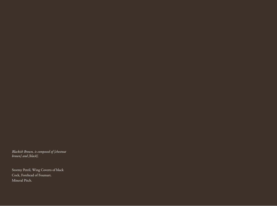
Blackish Brown, is composed of [chestnut brown] and [black].
Stormy Petril, Wing Coverts of black Cock, Forehead of Foumart.Mineral Pitch.
Moza Almatrooshi / Georgina Amos / Malgorzata Bany / Charlie Barlow / Pamela Bartlett / Johanna Baudou / Anna Baumgart / Olivia Bax / Kimberley Beach / Sara Berman / James Berrington / Ishwari Bhalerao / Andrew Bick / Lewis Biggs / Araminta Blue / Joe Boon / Sophie Bouvier Auslander / Flora Bradwell / John Bremner / Ben Brown / Clare Bryan / Malina Busch / Jane Bustin / Rebecca Byrne / Kanad Chakra / Gun Chansuwan / Qiuyu Chen / Zhichu Cheng / Yan Cheng / Minyoung Choi / Catalina Christensen / David Christopher / Egidija Čiricaitė / Lea Collet / Susan Collins / Hannah Dargavel-Leafe / Rose Davey / Caroline De Lannoy / Christina Della Giustina / Dominic Dispirito / David Dobson / Jazmin Donaldson / Claire Dorsett / Olga Doulkeridou / Simon Faithfull / Gweneifur Fereday / Sarah Fortais / Hejiang Fu / Dawn Gaietto / Farnaz Gholami / Mathew Gibson / Lyndsey Gilmour / Gabriela Giroletti / Kika Goh-Hatfield / Joy Gregory / Oona Grimes / Tony Grisoni / Grace Hailstone / Marielle Hehir / Jim Hobbs / Joan Hodgekiss / Klaas Hoek / Liuyeer Hong / Agibail Hunt / Jonathan Hurry / Caroline Isgar / Tess Jaray / Thomas Jenkins / Nayoung Jeong / Mew Jirasirikul / Steve Johnson / Agnes Keith / James Keith / Robert Kesseler / Ahae Kim / Kitengela Hot Glass / Isabel Langtry / Will Leach / Eunkyung Lee / Zhenpeng Li / Tom Lomax / Rebecca Loweth / Ellie MacGarry / Nadine Mahoney / Lydia Makin / Antoni Malinowski / Donal Maloney / Claudia Martinez / Onya McCausland / Tess E McKenzie / Elizabeth Mead / Robert Mead / Fanling Meng / Liam Mertens / Dylan Mize / Emmeline Mole / Tom Mole / Hannah Morgan / Mali Morris / Matt Morris / Sharon Morris / Florence Mytum / Izzy Nakhla / Stephanie Nebbia / Peter Newell-Price / Philip O’Reilly / Sophie Ormerod / Maria Teresa Ortoleva / Roy Osborne / Deborah Padfield / Andy Pankhurst / Billy Parker / Jayne Parker / Jane Patterson / Fabian Peake / Robyn Pender / Monica Perez Vega / Sarah Pettit / Robert Philips / Michal Raz / Ivo Reed / Robert Rivers / Carol Robertson / Nina Rodin / Ian Rowlands / Nina Royle / Paolo Salvador / Rania Schorestsaniti / Lottie Scott / Yuli Serfaty / Nima Shafiani / Lara Shahnavaz / Lesley Sharpe / Bingchen Shi / Ruth Siddall / Henrietta Simson / Taylor Smith / Geraldine Snell / Andrew Stahl / Minna Stevens / Andrew Stonyer / Lucian Strindberg / Jack Sutherland / Trevor Sutton / Kai Syng Tan / Milan Tarascas / Damian Taylor / Elena-Andreea Teleaga / Mircea Teleaga / Sarah Tew / Estelle Thompson / Long Tian / Patricia Townsend / Arielle Tse / Alaena Turner / Clarissa Upchurch / Marina Visic / Jo Volley / Roy Volley / Jake Walker / Robert Welch / Martin Ward / Jack West / Patrick White / Tessa Whitehead / Sarah Kate Wilson / Polly Wilson / Erika Winstone / Edward Winters / Ruby Wroe / Xingyuan Wu / Weixuan Xu / Jane Yang / Yu Yang / Xuyu Yang / Chen Yu / Bingye Yuan / Xiaofeng Zhang / Tianqi Zhao / Min Zhou / Yannis Ziogas / Magdalena Żołędź