Embed Size (px)
Citation preview
1
Preliminary Not for circulation
Comparing the Quality of Health Care Providers
Mark McClellanStanford University and the NBER
and
Douglas StaigerDartmouth College and the NBER
Prepared for the NBER conference on Frontiers in Health Policy Research, June 17,1999, Washington DC. This paper draws heavily on our own ongoing work, and workwith various collaborators. The National Institute of Aging, The Health Care FinancingAdministration, and the Olin Foundation provided financial support at various times forthis work. We thank Jon Skinner and Jeff Geppert for helpful comments on an earlierdraft. We also thank our collaborators, including Jeffrey Geppert, Jeffrey Horbar,Thomas Kane, Haruko Noguchi, Jeannette Rogowski, and Yu-Chu Shen.

Abstract
This paper introduces a new approach for evaluating the quality of health care providersthat provides an integrated solution to a number of problems that limit the usefulness ofavailable methods. Our approach optimally combines information from all the qualityindicators available for a provider (e.g. from other years, other patients, or otherindicators for the same patients) in order to more accurately estimate the provider’sprevious or expected quality. The approach also provides an empirical basis forcomparing and combining alternative quality indicators, thereby enabling policymakersto choose among potential indicators, explore the potential bias in alternative measures,and increase the value of quality measures for assessing and improving care. Usinghospital care for elderly heart attack patients as an example, we demonstrate that thesemethods can be used to create reliable, precise predictions about provider quality.Comparing quality of care across providers may be far more feasible than many nowbelieve.
1
1. Introduction
Comparing quality of care across providers is becoming increasingly important,
both as a contracting and quality improvement tool for health plans and payers, and as
“report cards” to help consumers and others compare quality of care. Examples include
rankings of the “best” hospitals published by magazines such as US News and World
Report, scorecards issued by state regulators in Pennsylvania and New York, and hospital
quality reports produced by the Health Care Financing Administration and the Agency
for Health Care Policy Research.
Despite enormous interest in developing such quality assessment tools in health
care, these measures have generated much controversy and skepticism. The problem
with many of these rankings is that they simply are not viewed as very informative
(Hofer et al., 1999; Iezzoni, 1997). This is especially true for measures based on
important patient outcomes which, because of the relatively small samples of patients
seen by most providers in a single year, tend to be very imprecise and particularly
susceptible to differences in patient severity and comorbidity. In particular, providers
identified as providing high quality care in one year often appear to provide low quality
care in the subsequent year. For example, Table 1 shows how hospital’s identified in
1990 as the “best” (top 10%) hospitals on one common quality indicator, 30-day
mortality rate following a heart attack, were ranked in subsequent years (this data is
described in more detail below). Hospitals that were identified as the “best” in 1990 were
nearly as likely to be ranked among the worst (14.7%) as among the best (16.7%) by
1994. In fact, average mortality rates among these hospitals were actually higher than
2
average by 1994. It is this type of evidence that has led many to wonder whether
rankings based on such data do more harm than good (Bindman, 1999).
Most of the existing provider report cards have responded to these perceived
problems by moving away from an emphasis on serious outcomes of important health
problems. For example, HEDIS measures have emphasized screening and relatively
common process measures of care. Other evaluators have focused on larger hospitals or
groups of physicians. Others have argued for expensive collection of detailed case-mix
measures to reduce noise and bias. Still others have advocated collecting large numbers
of measures and aggregating them according to a priori rules.
These perceived problems with provider report cards have resulted in
considerable debate over the uses of such information. But given the growing pressures
placed on health care providers to provide efficient high quality care, the trend toward
greater accountability will continue – with increasing pressure to develop and apply
measures to finer levels of analysis (e.g. individual physicians, particular groups of
patients). The fundamental question, therefore, is whether we can develop better
methods for comparing quality across providers in such situations.
In a series of recent papers (McClellan and Staiger, 1999a,b,c) we have developed
methods that address these concerns, and have applied our approach in ongoing work to
implement better quality evaluation and improvement methods for private health plans,
health care purchasing groups, and Medicare. We refer to our new quality indicators as
“filtered” estimates of provider quality, since one of the key advantages of these
indicators is that they optimally filter out the estimation error that plagues conventional
quality indicators and that leads to the type of instability seen in Table 1. By integrating
3
these methods with measures of important processes and outcomes of care, we can
develop more precise, comprehensive, and informative quality evaluations than have
previously been possible. This paper provides an overview of the method, and illustrates
its application in evaluating the quality of hospital care for elderly heart attack patients.
Readers interested in the technical details, along with a more comprehensive empirical
evaluation of the performance of our approach, are referred to our earlier papers,
particularly McClellan and Staiger (1999a).
Our method optimally combines information from all the quality indicators
available for a provider (e.g. from other years, other patients, or other indicators for the
same patients) in order to more precisely estimate the provider’s current or future quality
level. The basic idea is simple. Any single quality indicator for a provider will be a
noisy (often very noisy) measure of that provider’s quality. But the array of quality
indicators that we observe for a provider are likely to be related across different quality
measures and over time. Therefore, the core idea of our method is to use these
relationships between multiple measures and over time to better extract the “signal” in
each particular measure. In addition to improving the precision of the estimated quality
indicators, our method provides an empirical basis for comparing alternative quality
indicators and exploring potential biases. This enables one to choose among potential
indicators and in many cases limit the number of quality indicators either collected or
reported.
Our particular application of these methods illustrates many of the challenges
facing quality evaluation in health care. On the one hand, heart disease is the leading
cause of death in the United States, and is clearly a condition for which the quality of

4
medical care may have a substantial impact on an individual’s health. On the other hand,
most hospitals treat relatively few heart attack patients in any given year, and
conventional quality indicators of the most important outcomes, such as survival, are
very imprecise because of the influence of many factors besides hospital quality. We use
this example to demonstrate how our filtering methods can be used to create reliable,
precise predictions about provider quality. In the conclusion we discus additional
promising applications of our work to improving health care quality.
5
2. Uses and Limitations of Conventional Quality Indicators
A. Uses of Quality Indicators
Comparing quality of care across providers is becoming an increasingly important
tool as the health care market becomes more competitive. The Institute of Medicine
(1990) has defined quality as “the degree to which health services for individuals and
populations increase the likelihood of desired health outcomes and are consistent with
current professional knowledge.” But to translate this general definition into concrete
quality indicators, one must ask to what end the indicators will be used and consider the
features that are required of a quality indicator in that use.
Why do we measure quality? Ultimately, the goal is to help guide decision-
making and improve quality of care. To achieve this goal, information on provider
quality is used primarily in three ways: for contracting with providers, for guiding
consumers to make informed choices among providers, and for identifying exemplary
providers to serve as models of best practice.
Quality information is used in contracts between purchasers and providers as a
way of providing incentives to the provider to maintain quality of care. Such incentives
have become an increasingly important safeguard, as purchasers have moved toward
capitation and other fixed-price contracts that place financial pressure on providers to
reduce the cost of care. This use of quality information is largely backward looking, for
example basing financial rewards on whether the provider achieved concrete and
quantifiable quality standards over the previous year.
Quality information is also used to guide consumers (and other purchasers such as
employers and health plans) in making informed choices among providers. In today’s
6
health care market, providers are increasingly competing for patients on the basis of
price, which in turn increases the incentives for providers to reduce the amount of care
being given to patients. Not surprisingly, lack of accurate quality information can result
in the under-provision of quality in a competitive market (Dranove and Satterthwaite,
1992). Therefore, providing purchasers with accurate quality information, so that they
can make informed tradeoffs between cost and quality, is a cornerstone of competitive
approaches (Enthoven and Kronick, 1989). This use of quality information is largely
forward looking, trying to forecast current or future quality based on available data from
the past.
Finally, quality information is used to identify exemplary providers that serve as
models of best practice (or to identify under-performing providers for some form of
intervention). This approach is a management tool used to encourage the adoption of
best practice as part of many quality improvement initiatives. This use of quality
information also tends to be forward looking, using data from the past to identify
providers for which the quality of care is likely to currently be particularly good or bad.
B. Limitations of Conventional Quality Indicators
A key obstacle to using quality indicators in any of these ways is the substantial
amount of noise associated with virtually all important measures of provider quality.
Most serious health problems, such as heart attacks, are relatively infrequent; many
hospitals may treat only a few dozen patients or fewer over an entire year. And most
major outcomes, such as long-term mortality, will be influenced by an enormous number
of factors other than the quality of the provider. Therefore, it is almost impossible to
7
assess any single outcome measure for a particular provider with any degree of precision.
As a result, these measures are often poor indicators of past and future performance.
This lack of precision in conventional quality indicators limits their practical
value. Contracts that reward providers based on a noisy indicator provide weak
incentives (since the reward is only weakly related to actual quality of care) while
exposing providers to unnecessary financial risk. Inaccuracy can also lead to a lack of
trust in the quality indicators, leading both purchasers and health providers to ignore the
measures entirely in decision making (Bindman, 1999; Schneider and Epstein, 1998).
Finally, the noise in conventional quality indicators will lead to a mislabeling of many
ordinary providers as “exemplary” (as was suggested in Table 1), thereby limiting our
ability to learn from the experience of successful providers.
The natural response to this lack of precision is to refocus attention on measures
for which the noise problem is less of an issue: Health plans or medical groups rather
than individual physicians; large teaching hospitals rather than all hospitals in a
community; or preventive care and common illnesses rather than more serious illness.
For example, the National Committee for Quality Assurance (NCQA), one of the leading
organizations in the development of quality assessment measures, has focused on
developing measures for which more than 400 cases per sample can reasonably be
collected in a specific time period (e.g. six months or a year). This approach rules out
measures for small providers (e.g. physicians) and for nearly all conditions serious
enough to require hospital care.
Unfortunately, this push toward more aggregation moves us the wrong way in
terms of how consumers, purchasers, and health plans would like to use quality measures.
8
Such aggregate measures provide poorly targeted incentives and are at best crude guides
for identifying “exemplary” providers. By excluding many providers from consideration,
we reduce the relevance of the measures for guiding decisions – especially since quality
problems are often greater for lower-volume providers.
Another response to the lack of precision in conventional quality indicators has
been to collect and report information on a large number of indicators, in hopes that this
will overcome the limitations of any one indicator. Most provider report cards report
information on a wide number of quality indicators, including measures of patient
satisfaction, preventive care, process of care, and patient outcomes such as death or
important complications. For example, the California Healthcare Foundation medical
group report card (QA Tool) will have almost 1100 measures.
The multi-dimensionality of current quality information raises two important
problems. First, the cost of collecting and processing this data is significant (Medicine &
Health, 1997). Some measures, such as long-term mortality, require costly follow-up and
necessarily involve long reporting delays. Other measures require detailed chart review,
which can be even more costly. Thus, from a practical perspective we would like to
target scarce resources on a few core indicators, and eliminate redundant or otherwise
unnecessary measures, particularly those that require additional costly data collection or
lead to delay. A second problem with the multi-dimensionality of current quality report
cards is that the complexity makes them difficult to interpret. One expects that many of
the measures are capturing a similar dimension of quality (e.g. surgical skill, or quality of
the staff in a particular specialty such as obstetrics). Thus, a systematic method that
9
could reduce many closely related measures into one, or identify the one measure that
best summarized this dimension, would be valuable.
A final response to the perceived lack of reliability of conventional quality
indicators has been to collect more detailed information on patient condition (severity and
comorbity), often from patient charts, in order to better control for differences in patient
condition across providers. The debate has been extensive over the potential bias in
conventional quality indicators because of not controlling carefully for patient condition,
but the empirical evidence for the existence of bias is mixed (Landon, et al., 1996;
Krakauer et al., 1992; Park et al., 1990). This debate is critical to the future of quality
assessment, because the high cost of gathering detailed information on patient condition
could make quality assessment infeasible in the long term. For example, in a recent
attempt to investigate this issue, HCFA collected chart information on all Medicare
hospital admissions for cardiac conditions in 1994-1995 but the cost was over $100 per
case (Jeffrey Newman, personal communication). Obviously, it would be useful to have
a systematic method for determining whether the additional expense of such measures
was necessary.
10
3. A Brief Overview of the Filtering Method
Past work comparing quality of care in hospitals has generally relied on a single
hospital outcome measure in a given year. For example, to compare mortality rates at two
hospitals, one would simply calculate the average mortality rate at each hospital, generally
adjusting for differences across hospitals in patient demographics and comorbidities, and
assess whether the difference in this risk-adjusted mortality rate between the two hospitals
was statistically significant. The limitation of this approach is that the estimates of mortality
rates at any given hospital are generally very imprecise because of the typically small
samples of patients treated at a given hospital. For example, in a sample with 100 patients in
each hospital, this approach generally cannot detect a significant difference if one hospital is
estimated to have a 16% mortality rate and the other a 24% mortality rate. Typically, quality
indicators are based on even smaller samples and the imprecision is even worse.
Alternatively, one can combine information from all the outcome measures available
for a given hospital (e.g. other years, other patients, other outcomes for the same patients) in
order to more precisely estimate a hospital’s current quality. This is the approach taken by
McClellan and Staiger (1999a). We provide a non-technical overview of the method below.
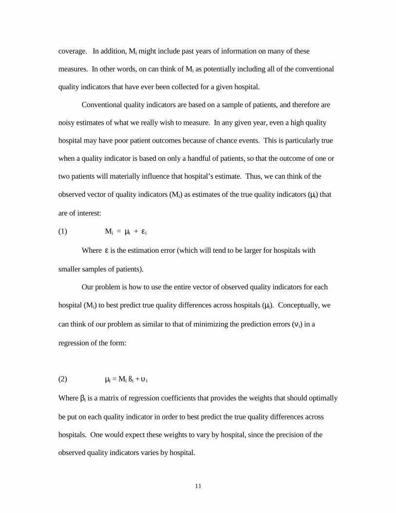
Suppose we observe a vector of conventional quality indicators (Mi) for each hospital
(i). Each quality indicator is an estimate of the average of some variable thought to be related
to quality of care, based on a sample of patients treated at that hospital over a specified period
of time (e.g. one year). Thus, Mi might include measures of risk-adjusted mortality rates,
average length of stay, rates of certain treatments, complication rates, or patient satisfaction
levels. Each of these measures may be available for a number of patient samples such as
heart attack patients, very-low-birthweight infants, or samples differentiated by insurance
11
coverage. In addition, Mi might include past years of information on many of these
measures. In other words, on can think of Mi as potentially including all of the conventional
quality indicators that have ever been collected for a given hospital.
Conventional quality indicators are based on a sample of patients, and therefore are
noisy estimates of what we really wish to measure. In any given year, even a high quality
hospital may have poor patient outcomes because of chance events. This is particularly true
when a quality indicator is based on only a handful of patients, so that the outcome of one or
two patients will materially influence that hospital’s estimate. Thus, we can think of the
observed vector of quality indicators (Mi) as estimates of the true quality indicators (µi) that
are of interest:
(1) Mi = µi + εi
Where ε is the estimation error (which will tend to be larger for hospitals with
smaller samples of patients).
Our problem is how to use the entire vector of observed quality indicators for each
hospital (Mi) to best predict true quality differences across hospitals (µi). Conceptually, we
can think of our problem as similar to that of minimizing the prediction errors (νi) in a
regression of the form:
(2) µi = Mi ßi + υ i
Where βi is a matrix of regression coefficients that provides the weights that should optimally
be put on each quality indicator in order to best predict the true quality differences across
hospitals. One would expect these weights to vary by hospital, since the precision of the
observed quality indicators varies by hospital.
12
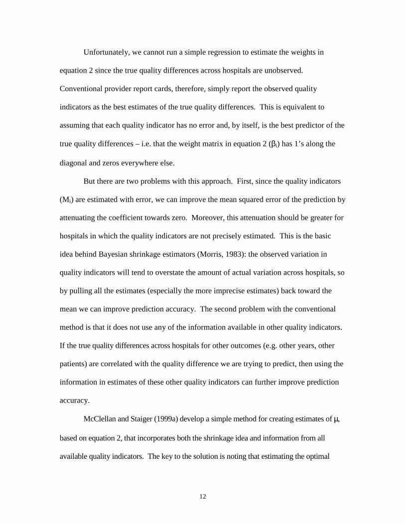
Unfortunately, we cannot run a simple regression to estimate the weights in
equation 2 since the true quality differences across hospitals are unobserved.
Conventional provider report cards, therefore, simply report the observed quality
indicators as the best estimates of the true quality differences. This is equivalent to
assuming that each quality indicator has no error and, by itself, is the best predictor of the
true quality differences – i.e. that the weight matrix in equation 2 (βi) has 1’s along the
diagonal and zeros everywhere else.
But there are two problems with this approach. First, since the quality indicators
(Mi) are estimated with error, we can improve the mean squared error of the prediction by
attenuating the coefficient towards zero. Moreover, this attenuation should be greater for
hospitals in which the quality indicators are not precisely estimated. This is the basic
idea behind Bayesian shrinkage estimators (Morris, 1983): the observed variation in
quality indicators will tend to overstate the amount of actual variation across hospitals, so
by pulling all the estimates (especially the more imprecise estimates) back toward the
mean we can improve prediction accuracy. The second problem with the conventional
method is that it does not use any of the information available in other quality indicators.
If the true quality differences across hospitals for other outcomes (e.g. other years, other
patients) are correlated with the quality difference we are trying to predict, then using the
information in estimates of these other quality indicators can further improve prediction
accuracy.
McClellan and Staiger (1999a) develop a simple method for creating estimates of µ,
based on equation 2, that incorporates both the shrinkage idea and information from all
available quality indicators. The key to the solution is noting that estimating the optimal
13
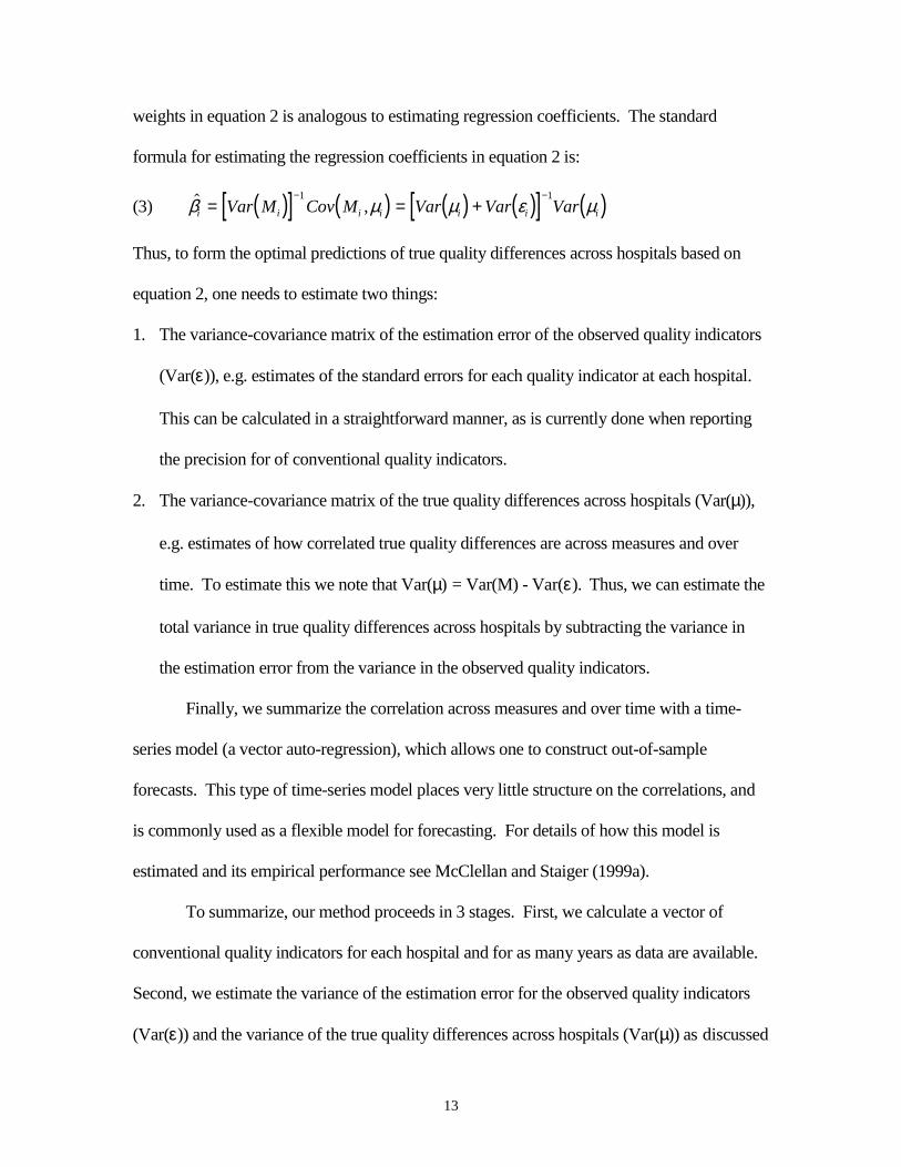
weights in equation 2 is analogous to estimating regression coefficients. The standard
formula for estimating the regression coefficients in equation 2 is:
(3) ( )[ ] ( ) ( ) ( )[ ] ( )� ,β µ µ ε µi i i i i i iVar M Cov M Var Var Var= = +− −1 1
Thus, to form the optimal predictions of true quality differences across hospitals based on
equation 2, one needs to estimate two things:
1. The variance-covariance matrix of the estimation error of the observed quality indicators
(Var(ε)), e.g. estimates of the standard errors for each quality indicator at each hospital.
This can be calculated in a straightforward manner, as is currently done when reporting
the precision for of conventional quality indicators.
2. The variance-covariance matrix of the true quality differences across hospitals (Var(µ)),
e.g. estimates of how correlated true quality differences are across measures and over
time. To estimate this we note that Var(µ) = Var(M) - Var(ε). Thus, we can estimate the
total variance in true quality differences across hospitals by subtracting the variance in
the estimation error from the variance in the observed quality indicators.
Finally, we summarize the correlation across measures and over time with a time-
series model (a vector auto-regression), which allows one to construct out-of-sample
forecasts. This type of time-series model places very little structure on the correlations, and
is commonly used as a flexible model for forecasting. For details of how this model is
estimated and its empirical performance see McClellan and Staiger (1999a).
To summarize, our method proceeds in 3 stages. First, we calculate a vector of
conventional quality indicators for each hospital and for as many years as data are available.
Second, we estimate the variance of the estimation error for the observed quality indicators
(Var(ε)) and the variance of the true quality differences across hospitals (Var(µ)) as discussed

14
above. Finally, we use these variance estimates to form predictions of true quality
differences across hospitals based on equation (2), using optimal weights derived from
equation (3). We refer to estimates based on equation (2) as “filtered” estimates, since these
estimates are attempting to filter out the estimation error in the conventional quality
indicators (and because our method is closely related to the idea of filtering in time series).
15
4. Comparing Hospitals Based on Outcomes for Elderly Heart Attack Patients
In this section, we summarize some of our recent work applying these methods to
compare hospitals based on their quality of care for elderly heart attack patients
(McClellan and Staiger, 1999a,b,c). We begin by briefly describing the data. We then
use three illustrative examples to demonstrate the value of our filtering method. First, we
show that rankings based on the filtered measures are relatively stable over time, and able
to forecast sizeable differences across hospitals 2-4 years in the future. Second, we show
that the filtered measures can be used to compare alternative quality indicators, choose
among potential indicators, and evaluate the bias in measures that do not fully control for
differences in patient severity and comorbidity across hospitals. Finally, we show that
the filtered measures can be used to make meaningful comparisons across hospitals in a
large metropolitan region.
A. Data
We use the same data as in McClellan and Staiger (1999a) for this analysis. Our
hospital performance measures include serious outcomes – mortality, and cardiac
complications requiring rehospitalization -- for all elderly Medicare beneficiaries hospitalized
with new occurrences of acute myocardial infarction (AMI, or heart attacks) from 1984
through 1994, as well as for all elderly beneficiaries hospitalized for ischemic heart disease
(IHD) from 1984 through 1994. To evaluate quality of care from the standpoint of a person
in the community experiencing heart disease, we assign each patient to the hospital to which
she was first admitted with that diagnosis. Our population includes over 200,000 AMI
patients and over 350,000 IHD patients per year. We limit our analysis of hospital
16
performance to U.S. general short term hospitals with at least two admissions in each year, a
total of 3954 hospitals that collectively treated over 92 percent of these patients.
For each AMI and IHD patient, our mortality measure is whether the patient died (for
any reason) within 7, 30, or 365 days of admission. Mortality information includes all out-
of-hospital deaths. Our complication measure is whether the patient was readmitted (at any
hospital) between 30 and 365 days of admission for a cardiac related diagnosis. For each
hospital, we construct risk-adjusted outcome rates for each year and each diagnosis. These
are the estimated hospital-specific intercepts from a patient level regression (run separately
by year, diagnosis, and outcome measure) that estimates the average outcome rate in each
hospital, controlling for a fully-interacted set of indicators for age, gender, black or non-black
race, and rural location. These estimates provide the conventional quality indicators, on
which our filtered estimates are based.
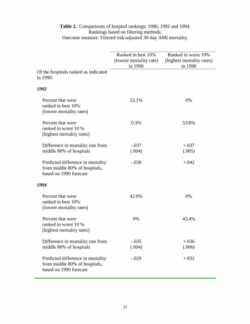
B. Identifying High Quality Hospitals
As was seen in Table 1, conventional quality indicators are unstable over time and
are poor predictors of future hospital performance. In Table 2, we show that this is not
the case when hospitals are ranked based on our filtered quality estimates. As in Table 1,
we focus on 30-day AMI mortality as the outcome measure. Based on filtered estimates
(using data available from 1984-1990), we identified the “best” and “worst” hospitals in
1990 as those in the top and bottom deciles in terms of 30-day AMI mortality. The
“best” hospitals are those with the best outcomes, e.g. in the lowest decile of filtered
mortality rates. Table 2 indicates how these best (column 1) and worst (column 2)
hospitals performed 2 and 4 years later.
17
In contrast with conventional methods (see Table 1), our filtering method is able
to consistently identify best and worst hospitals and forecast future performance. Table 2
shows that of the hospitals ranked in the best 10% by filtered measures in 1990, 52.1%
are still ranked in the best 10% in 1992 and 42% are still in the best 10% in 1994.
Almost none of these hospitals show up in the worst 10% in 1992 and 1994. The
performance of hospitals we rank in the worst 10% in 1990 is similar, with 53.8%
(43.4%) remaining in the worst 10% in 1992 (1994), and none showing up in the best
10%. Obviously, the difference between the results for conventional measures of 30-day
mortality (Table 1) and the filtered measures (Table 2) reflect the fact that conventional
quality indicators in any given year are quite noisy. As a result, the correlation in a
hospital’s ranking from one year to the next is quite low – below 0.2 between any two
given years for conventional 30-day AMI mortality rates. In contrast, filtered estimates
of 30-day AMI mortality rates do not change much over time: filtered estimates are
correlated .96 between 1994 and 1992, and .89 between 1994 and 1990.
Even more importantly, mortality rates in 1992 and 1994 for the hospitals ranked
in the best and worst 10% in 1990 are significantly different from the remaining 80% of
hospitals (see Table 2). Hospitals ranked in the best 10% in 1990 had, on average, 3.8
percentage points lower mortality in 1992, and 3.5 percentage points lower mortality in
1994, relative to the middle 80% of hospitals. Conversely, hospitals ranked in the worst
10% in 1990 had 3.7 percentage points higher mortality in 1992, and 3.6 percentage
points higher mortality in 1994, relative to the middle 80% of hospitals. These are quite
large difference in mortality relative to the average 30-day mortality rate for AMI
patients of about 19% in 1994. They imply that the hospitals we rank in the best 10%
18
using filtered data in 1990 had a mortality rate of 15.5% in 1994, while the hospitals
ranked in the worst 10% in 1990 had a mortality rate of 22.6% in 1994. In fact, forecasts
derived from the filtering methodology, based only on data available through 1990,
accurately predicted these differences in 1992 and 1994 as seen in the 4th and 8th rows of
Table 2. Thus, hospital rankings based on the filtered estimates appear to be able to
identify large and persistent differences across hospitals in patient outcomes.
C. Comparing Alternative Quality Indicators
Is 30-day AMI mortality the right quality indicator to focus on? Would hospital
rankings change if one controlled for additional (but costly) information on differences in
patient severity and comorbidity across hospitals? Ideally we would like to limit the
number of quality indicators being collected and reported, both to reduce data collection
costs and to simplify reporting. One method of doing this would be to compare hospital
rankings across quality indicators: If two quality indicators produce similar rankings,
then one of them (the more expensive, or the one that identifies smaller differences across
hospitals) might be eliminated. Unfortunately, the noise found in conventional quality
indicators makes such a comparison difficult, since this can generate a low correlation
between any two quality indicators (as we saw in comparisons from one year to the next).
By eliminating the noise found in conventional quality indicators, filtered measures can
more easily be used to compare alternative quality indicators, choose among potential
indicators, and evaluate the bias in measures that do not fully control for differences in
patient severity and comorbidity across hospitals.
19
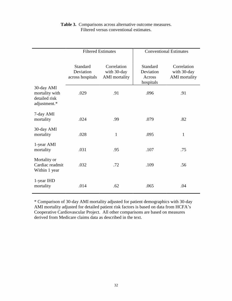
Table 3 contains estimates from 1994 of the relationship between various quality
indicators and 30-day AMI mortality. The first two columns are based on filtered
measures, and the second two columns are based on conventional estimates (unfiltered).
For both filtered and conventional estimates, we report the standard deviation of each
quality indicator across hospitals (a measure of the variation in the estimated outcome
rate across hospitals) and the correlation of each indicator with 30-day AMI mortality.
We consider a variety of alternative quality indicators. First, we consider an
alternative measure of 30-day AMI mortality that controls for a detailed set of patient
severity and comorbity variables developed from comprehensive chart reviews; these
patient data are far more detailed than the information available in claims. These data,
which were developed for the hospitals in our study through HCFA’s Cooperative
Cardiovascular Project, can provide evidence on whether rankings based on claims data
are biased by the lack of detailed risk adjusters. We also compare 30-day mortality to 7-
day and 1-year mortality for AMI patients. The correct amount of follow-up time is
unclear, and shorter-term mortality is generally cheaper to collect. In a third comparison,
we consider a measure capturing a broader range of adverse outcomes for AMI: Either
death or readmission for a cardiac diagnosis within 1 year. We do not count readmissions
in the first 30 days as adverse events because many of these are for appropriate follow-up
care, e.g. bypass surgery. Finally, we consider a quality indicator for an entirely different
sample of patients: 1-year mortality for patients with Ischemic Heart Disease (IHD).
Like AMI, IHD is a cardiac condition and one would expect quality of care to be
positively correlated across these two closely related medical conditions.
20
Two facts are apparent from Table 3. First, the filtered measures vary
considerably across hospital (column 1), with a standard deviation of around 3 percentage
points for the AMI measures (7-day, 30-day and 1-year mortality, and 1-year mortality or
readmit), and 1.4 percentage points for 1-year IHD mortality. Conventional estimates are
considerably more variable for every quality indicator (column 3) – but most of this
variation is because of the noise in conventional estimates.
The second fact apparent from Table 3 is that many of the filtered measures are
highly correlated. Most importantly, we find that the filtered 30-day AMI mortality rate
(which only controls for differences across hospitals in a limited set of patient
demographics) is highly correlated (0.91) with a filtered 30-day AMI mortality rate based
on detailed risk adjustment. In other words, filtered AMI mortality rates, based on
limited risk-adjustment using only the patient variables commonly available in claims
data, generate essentially the same rankings as measures based on more detailed risk
adjustment that require more extensive data collection. Thus, for this example, there
appears to be little bias in hospital rankings that rely on AMI mortality measures derived
from claims data.
Filtered 30-day AMI mortality rates are even more highly correlated (over 0.95)
with 7-day and 1-year mortality. In other words, filtered short-term (even 7-day)
mortality rates generate essentially the same rankings as long-term mortality measures
that require more extensive patient follow-up. Thus, at least for AMI admissions, there
appears to be little reason to incur the extra costs and delays involved in collecting long-
term mortality information.
21
Finally, the correlation of filtered 30-day mortality with the remaining measures
(AMI mortality or cardiac readmission within 1 year, 1-year IHD mortality) is less
strong, but still above 0.6. While these quality indicators are related to AMI mortality,
they do seem to capture independent information on hospital quality along other
dimensions. Thus, these two measures may provide useful additional information for
comparing hospitals.
Our conclusions would have been quite different if we had tried to do a similar
analysis using conventional estimates of these quality indicators. Because these
conventional estimates are based on small samples from a single year, they are quite
noisy. As a result, they tend to understate the correlation between 30-day AMI mortality
and the alternative measures considerably. This is especially true when making
comparisons to a measure from a different sample of patients (e.g. 1-year IHD mortality)
because the estimation error in such measures is uncorrelated. For other measures (e.g.
30-day AMI mortality with detailed risk adjustment) the conventional estimates remain
highly correlated because the noise in the two measures is highly correlated – e.g. a
chance death for a few average patients will adversely effect both measures.
Overall, this example illustrates how comparisons across filtered quality measures
can be used to identify a subset of core quality indicators. This provides and empirical
basis on which to eliminate redundant measures (such as long-term mortality). It also
provides an empirical basis on which to explore the potential bias in claims-based
measures.
D. Comparing Hospitals in a Metropolitan Market
22
One of the goals in developing quality indicators is to allow meaningful
comparisons to be made across hospitals in a given region or market. Thus, from a
practical standpoint, quality indicators must be precise enough to allow one to
consistently identify the best (and worst) hospitals in a market. The filtered estimates for
30-day AMI mortality are quite precise relative to conventional quality indicators, and
appear to be quite useful for making comparisons of hospitals within markets (for
example, see McClellan and Staiger, 1999b).
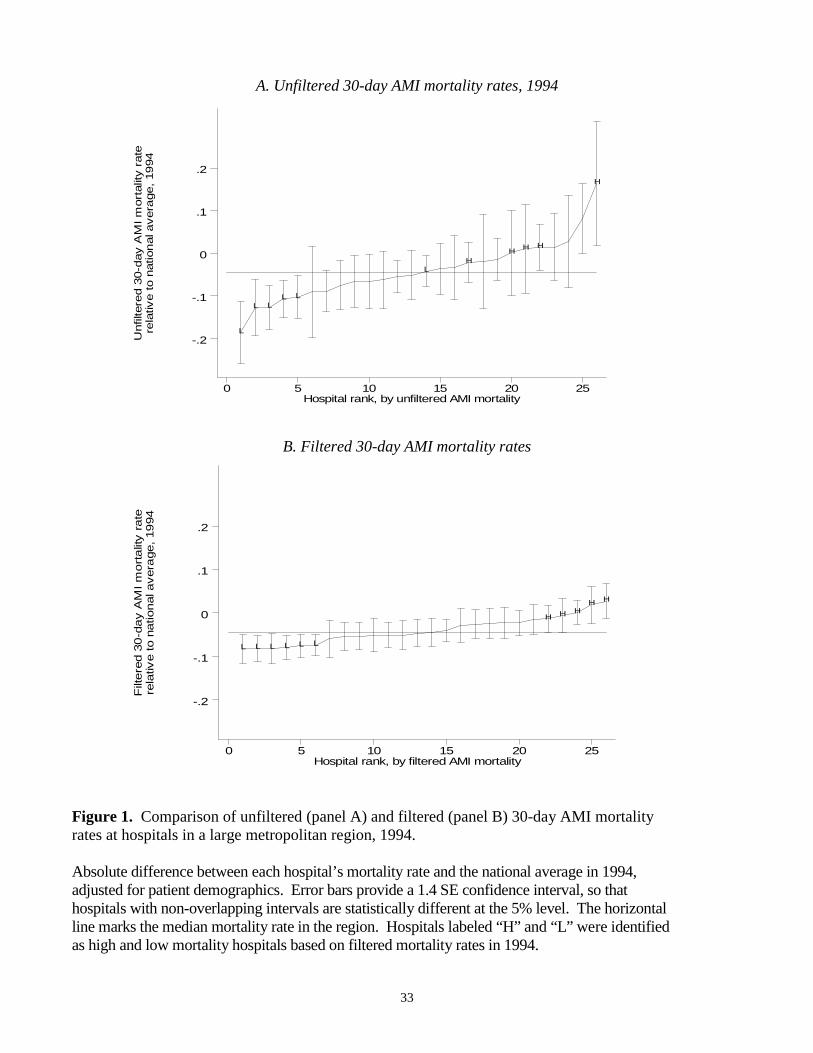
To illustrate this point, Figure 1 presents plots of filtered and conventional
estimates of 30-day AMI mortality rates for 1994 (relative to the national average) for 26
hospitals, ranging in size from 15 to 175 AMI admissions, located in a large metropolitan
area. In this figure, hospitals are ordered from left to right according to how they rank
among the 26 hospitals in terms of the filtered (bottom panel) and conventional (top
panel) measures. The vertical axis gives the estimated mortality rate (relative to the
national average), with a value of –0.1, for example, indicating that mortality at the
hospital was 10 percentage points below the national average. Confidence bars indicate a
1.4 standard error confidence interval around each hospital’s estimate, so that hospital’s
with non-overlapping confidence intervals are statistically different at the 5% level. In
each panel, we have drawn a horizontal line through the median mortality rate in the area
as a reference point.
It is apparent that the filtered estimates (bottom panel) are much more precise
than conventional estimates (top panel). The confidence intervals on the filtered
estimates are roughly half the size of the intervals on the conventional estimates, with the
23
improvement in precision much greater for the smallest hospitals.1 Moreover, the
extreme estimates apparent in the conventional measures (with a few hospital’s mortality
more than 15 percentage points away from the median) are not present in the filtered
estimates. Nonetheless, the filtered estimates identify large differences in mortality rates:
six hospitals (marked “L” in Figure1) have filtered confidence intervals lying entirely
below the median, while another five hospitals (marked “H” in Figure1) have filtered
confidence intervals lying entirely above the median. The difference in average
estimated mortality rates between hospitals in these low and high mortality groups is over
8 percentage points.
Another way to demonstrate the ability of the filtered estimates to consistently
identify differences across hospitals is to plot the measures over time. Figure 2 plots
conventional estimates of 30-day AMI mortality rates for each hospital in the region
between 1984 and 1994. To reduce clutter, we have broken the sample into four roughly
equal sized groups, based on the average annual number of AMI admissions at each
hospital over this time period, and plot the data for each group separately. For
comparison, we continue to label those hospitals identified by the filtered measures as
having high (H) and low (L) mortality in 1994.
The noise in conventional estimates is immediately apparent from Figure 2. The
conventional mortality estimates change dramatically from year to year following no
apparent pattern. As a result, it is nearly impossible to identify hospitals that have
consistently low or high mortality, and equally impossible to discern any trends in these
measures over time.
1 Note that one cannot make direct comparison across the two panels, because hospitalsare ranked differently by the two measures.
24
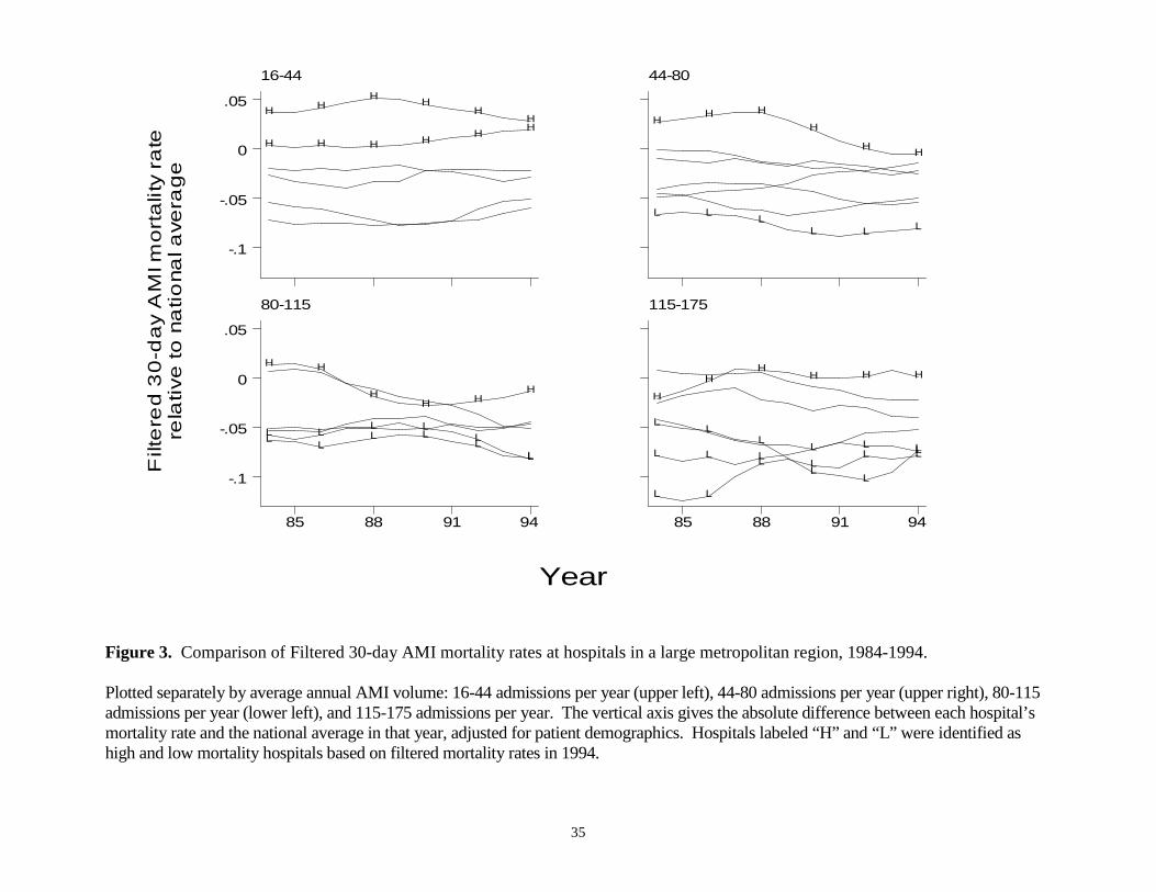
In contrast, the same plot using filtered data (Figure 3) is able to clearly identify
differences across hospitals and over time. Hospitals that were ranked as having high (H)
mortality in 1994 are seen to have consistently had high mortality over this period,
although some showed more improvement over time than others. Similarly, hospitals
that were ranked as having low mortality in 1994 tended to be larger hospitals and have
low mortality throughout the period. Among the largest hospitals (115-175 AMI
admissions) the filtered estimates are able to identify interesting changes in the relative
rankings among the three best hospitals in the region. Thus, this example suggests that
the filtered measures can be used to make meaningful comparisons across hospitals and
over time within a large metropolitan region.
25
5. Implications
This paper provides a brief overview of how our method for extracting the signal
from many noisy quality measures can support better evaluations of the quality of health
care providers. The simple examples presented here illustrate how the method may offer
an integrated solution to the key problems that limit the usefulness of currently available
quality indicators. Compared to existing methods for assessing the quality of health care
providers, our approach has a number of advantages. It limits measurement costs, by
providing a sound empirical basis for comparing and choosing among alternative quality
indicators. More importantly, our method performs far better than alternative approaches
for eliminating the noise problem that has plagued efforts to develop and apply practical
quality indicators.
We are applying these methods to a larger range of health problems, patient
populations, and provider networks, and integrating them into quality improvement
programs. These efforts require collaboration between analysts, health plans, providers,
purchasing groups, and government agencies to collect and integrate relevant information
to construct the quality measures, and to use them to help guide decision-making and
improve provider quality.
One feature of our collaborative work is the use of meaningful quality measures
that would be difficult or impossible for individual participants in the collaboration to
obtain. For example, the most important performance measures for serious health
conditions like heart disease and cancer involve long-term outcomes (e.g., 2-year
mortality), which are costly or impossible for providers and health insurers to collect. In
contrast, government agencies commonly collect mortality and disease surveillance data
26
needed for constructing such measures, but they may not have information on the
responsible medical groups or physicians for the patients involved. Through the
participation of all of these groups, constructing measures of quality for serious health
conditions becomes feasible.
Another feature of our approach is to optimize the use of detailed but costly
clinical data to account for patient characteristics that may result in biased measures of
quality. As we illustrated here, we include some measures based on clinically-detailed
risk adjustment (e.g., with data drawn from chart abstracts) for some of the patients in our
analysis, to evaluate potentially important differences across providers in patient severity
of illness. Using these ‘gold standard’ measures, we can identify valid proxy measures
that are less costly and more readily available, or adjust these measures appropriately. As
a result, we can extract more “signal” about true provider quality from the lower-cost
measures. These steps help minimize the overall resource burden of our data collection
and measure development, and improve their validity.
A third component of our collaboration has involved integrating our new
outcome-based measures with those developed in established continuous quality
improvement initiatives, for example the standardized measures of patient satisfaction
and process of care developed by NCQA. These measures have been extensively tested
and applied, but their relationship with important outcomes of care is not well
understood. We are investigating the relationship between performance in these
dimensions of quality and important outcomes of care, to determine the extent to which
these readily-available measures can substitute for more comprehensive outcome
evaluations.

27
The most important goal for many of our collaborators is to use these measures to
improve quality of care. First, we are identifying the structural features and processes of
care that are most closely related to important outcomes, to identify specific practice
changes that are most likely to improve provider quality. Our methods provide empirical
evidence of the magnitude and direction of relationships between these modifiable factors
and outcomes. Such evidence can be used to assure that continuous quality initiatives
focus on identifying and changing provider practices where there is the greatest ‘bang for
the buck.’ Second, our methods can be used to obtain much more precise estimates of the
impact of interventions such as provider training or patient education.
Through all of these steps, our collaborative approach to quality evaluation and
improvement is developing performance measures that are precise and reliable, and
therefore more acceptable to providers and payers. This is a complex and long-term
undertaking, but our results to date suggest that the potential for quality improvement in
health care is much greater than many experts now believe.
28
References
Bindman, AB, 1999, “Can Physician Profiles Be Trusted?” JAMA, 281(22):2142-2143.
Dranove, D and MA Satterthwaite, 1992, “Monopolistic Competition when Price and
Quality are Imperfectly Observable,” The RAND Journal of Economics, 23(4):518-
534.
Enthoven, A and R Kronick, 1989, “A Consumer-Choice Health Plan for the 1990s:
Universal Health Insurance in a System Designed to Promote Quality and
Economy,” New England Journal of Medicine, 320(1):29-37 (part 1) and 320(2):94-
101 (part 2).
Hofer, TP, RA Hayward, S Greenfield, EH Wagner, SH Kaplan, and WG Manning,
1999, “The Unreliability of Individual Physician ‘Report Cards’ for Assessing the
Costs and Quality of Care of a Chronic Disease,” JAMA, 281(22):2098-2105.
Iezzoni, L, 1997, Risk Adjustment for Measuring Healthcare Outcomes, Chicago: Health
Administration Press.
Institute of Medicine (IOM), 1990, Medicare: A Strategy for Quality Assurance, I,
Washington, DC: National Academy Press.
Krakauer, H, RC Bailey, KJ Skellan, et al., 1992, “Evaluation of the HCFA model for the
analysis of mortality following hospitalization,” Health Services Research,
27(3):317-335.
Landon, B, LI Iezzoni, AS Ash, et al., 1996, “Judging hospitals by severity-adjusted
mortality rates: the case of CABG surgery,” Inquiry, 33(2):155-166.
McClellan, M and D Staiger, 1999a, “The Quality of Health Care Providers,” National
Bureau of Economic Research working paper.
29
McClellan, M and D Staiger, 1999b, “Comparing Hospital Quality at For-Profit and Not-
for-Profit Hospitals,” forthcoming in D. Cutler (ed.), Not-for-Profit Hospitals
(tentative title), Chicago: University of Chicago Press.
McClellan, M and D Staiger, 1999c, “Estimating treatment effects with observational
data: A new approach using hospital-level variation in treatment intensity,”
manuscript, March 1999.
Medicine & Health, 1997, “Gauging quality regulation’s impact on premium costs,” 51:1.
Morris, C, 1983, “Parametric Empirical Bayes Inference: Theory and Applications,”
JASA, 78(381):47-55.
Park, RE, RH Brook, J Kosecoff, et al., 1990, “Explaining variations in hospital death
rates: Randomness, severity of illness, quality of care,” JAMA, 264(4):484-90.
Schneider, EC and AM Epstein, 1998, “Use of public performance reports: a survey of
patients undergoing cardiac surgery,” JAMA, 279(20):1638-42.
30
Table 1. Comparisons of hospital rankings: 1990, 1992 and 1994.Rankings based on conventional profiling methods.
Outcome measure: Risk-adjusted 30-day AMI mortality among the elderly.
Ranked in best 10%(lowest mortality rate)
in 1990Of the hospitals ranked in the best 10%in 1990:
1992
What percent were still ranked in the best 10%? (lowest mortality rates)
17.0%
What percent were ranked in the worst 10 %? (highest mortality rates)
10.4%
Average difference in mortality rate from all other hospitals (standard error of estimate)
-.014(.005)
1994
What percent were still ranked in the best 10%? (lowest mortality rates)
16.7%
What percent were ranked in the worst 10 %? (highest mortality rates)
14.7%
Average difference in mortality rate from all other hospitals (standard error of estimate)
+.005(.006)
31
Table 2. Comparisons of hospital rankings: 1990, 1992 and 1994.Rankings based on filtering methods.
Outcome measure: Filtered risk-adjusted 30-day AMI mortality.
Ranked in best 10%(lowest mortality rate)
in 1990
Ranked in worst 10%(highest mortality rates)
in 1990Of the hospitals ranked as indicatedin 1990:
1992
Percent that wereranked in best 10%(lowest mortality rates)
52.1% 0%
Percent that wereranked in worst 10 %(highest mortality rates)
0.3% 53.8%
Difference in mortality rate frommiddle 80% of hospitals
-.037(.004)
+.037(.005)
Predicted difference in mortalityfrom middle 80% of hospitals,based on 1990 forecast
-.038 +.042
1994
Percent that wereranked in best 10%(lowest mortality rates)
42.0% 0%
Percent that wereranked in worst 10 %(highest mortality rates)
0% 43.4%
Difference in mortality rate frommiddle 80% of hospitals
-.035(.004)
+.036(.006)
Predicted difference in mortalityfrom middle 80% of hospitals,based on 1990 forecast
-.029 +.032
32
Table 3. Comparisons across alternative outcome measures.Filtered versus conventional estimates.
Filtered Estimates Conventional Estimates
StandardDeviation
across hospitals
Correlationwith 30-day
AMI mortality
StandardDeviation
Acrosshospitals
Correlationwith 30-day
AMI mortality
30-day AMImortality withdetailed riskadjustment.*
.029 .91 .096 .91
7-day AMImortality .024 .99 .079 .82
30-day AMImortality .028 1 .095 1
1-year AMImortality .031 .95 .107 .75
Mortality orCardiac readmitWithin 1 year
.032 .72 .109 .56
1-year IHDmortality .014 .62 .065 .04
* Comparison of 30-day AMI mortality adjusted for patient demographics with 30-dayAMI mortality adjusted for detailed patient risk factors is based on data from HCFA’sCooperative Cardiovascular Project. All other comparisons are based on measuresderived from Medicare claims data as described in the text.
33
A. Unfiltered 30-day AMI mortality rates, 1994
B. Filtered 30-day AMI mortality rates
Figure 1. Comparison of unfiltered (panel A) and filtered (panel B) 30-day AMI mortalityrates at hospitals in a large metropolitan region, 1994.
Absolute difference between each hospital’s mortality rate and the national average in 1994,adjusted for patient demographics. Error bars provide a 1.4 SE confidence interval, so thathospitals with non-overlapping intervals are statistically different at the 5% level. The horizontalline marks the median mortality rate in the region. Hospitals labeled “H” and “L” were identifiedas high and low mortality hospitals based on filtered mortality rates in 1994.
Unf
ilter
ed 3
0-da
y A
MI m
orta
lity
rate
rela
tive
to n
atio
nal a
vera
ge, 1
994
Hospital rank, by unfiltered AMI mortality0 5 10 15 20 25
-.2
-.1
0
.1
.2
L
L LL L
LH
H H H
H
Filt
ered
30-
day
AM
I mor
talit
y ra
tere
lativ
e to
nat
iona
l ave
rage
, 199
4
Hospital rank, by filtered AMI mortality0 5 10 15 20 25
-.2
-.1
0
.1
.2
L L L L L L
H H HH H
34
Figure 2. Comparison of Unfiltered 30-day AMI mortality rates at hospitals in a large metropolitan region, 1984-1994.
Plotted separately by average annual AMI volume: 16-44 admissions per year (upper left), 44-80 admissions per year (upper right), 80-115admissions per year (lower left), and 115-175 admissions per year. The vertical axis gives the absolute difference between each hospital’smortality rate and the national average in that year, adjusted for patient demographics. Hospitals labeled “H” and “L” were identified ashigh and low mortality hospitals based on filtered mortality rates in 1994.
Unf
ilte
red
30
-da
y A
MI m
ort
alit
y ra
tere
lativ
e to
na
tiona
l ave
rag
e
Year
16-44
-.2
-.1
0
.1
.2
H
H
H
H
H
H
H
H
HH
H
H
44-80
HH
H
H
H
H
LL
L
L
L
L
80-115
85 88 91 94
-.2
-.1
0
.1
.2
L L
L LL
L
HH
H HH H
LL
L L L
L
115-175
85 88 91 94
LL
L L LL
HH H H H H
L LL
L L
L
LL
L
L
L
L
35
Figure 3. Comparison of Filtered 30-day AMI mortality rates at hospitals in a large metropolitan region, 1984-1994.
Plotted separately by average annual AMI volume: 16-44 admissions per year (upper left), 44-80 admissions per year (upper right), 80-115admissions per year (lower left), and 115-175 admissions per year. The vertical axis gives the absolute difference between each hospital’smortality rate and the national average in that year, adjusted for patient demographics. Hospitals labeled “H” and “L” were identified ashigh and low mortality hospitals based on filtered mortality rates in 1994.
Filt
ere
d 3
0-d
ay
AM
I mo
rta
lity
rate
rela
tive
to n
atio
nal a
vera
ge
Year
16-44
-.1
-.05
0
.05H H
H HH
H
H H H H H H
44-80
H H HH
H H
L L LL L L
80-115
85 88 91 94
-.1
-.05
0
.05
L L L LL
L
H H
HH H
H
L LL L
LL
115-175
85 88 91 94
L L LL L L
H
HH
H H H
LL
L
LL
L
L L
L LL L